At some point, every well-designed room has a thermostat on the wall. And at some point, nearly every well-designed room has been slightly let down by it. That’s the quiet irony of home design. We agonize over paint colors, hunt for the perfect light fixtures, spend weekends debating sofa legs, and then right there at eye level lives a beige plastic rectangle covered in tiny buttons that no one fully understands. We’ve simply accepted it as the ugly compromise of functional living.
Uriel Electronics, a design-focused electronics brand, apparently decided that compromise is no longer necessary. Their new temperature controllers, the USH-02 and the UEH-02, make a surprisingly compelling argument that utility and beauty don’t have to negotiate a truce. They can just coexist, elegantly, without one apologizing to the other.
Designer: Uriel Electronics
I’ll be upfront: I didn’t expect to have strong opinions about thermostats. But these two pieces carry a clarity of intention that’s difficult to walk past. Both models are built around the same core idea: strip away the complexity, keep only what matters, and make it look like it belongs on the wall rather than just stuck to it. A single rotary dial. A clean display showing the temperature. A refined body that reads more like a considered object than a hardware accessory. No confusing menu navigation, no crowded button grid, no searching through a manual to figure out how to lower the temperature by two degrees.
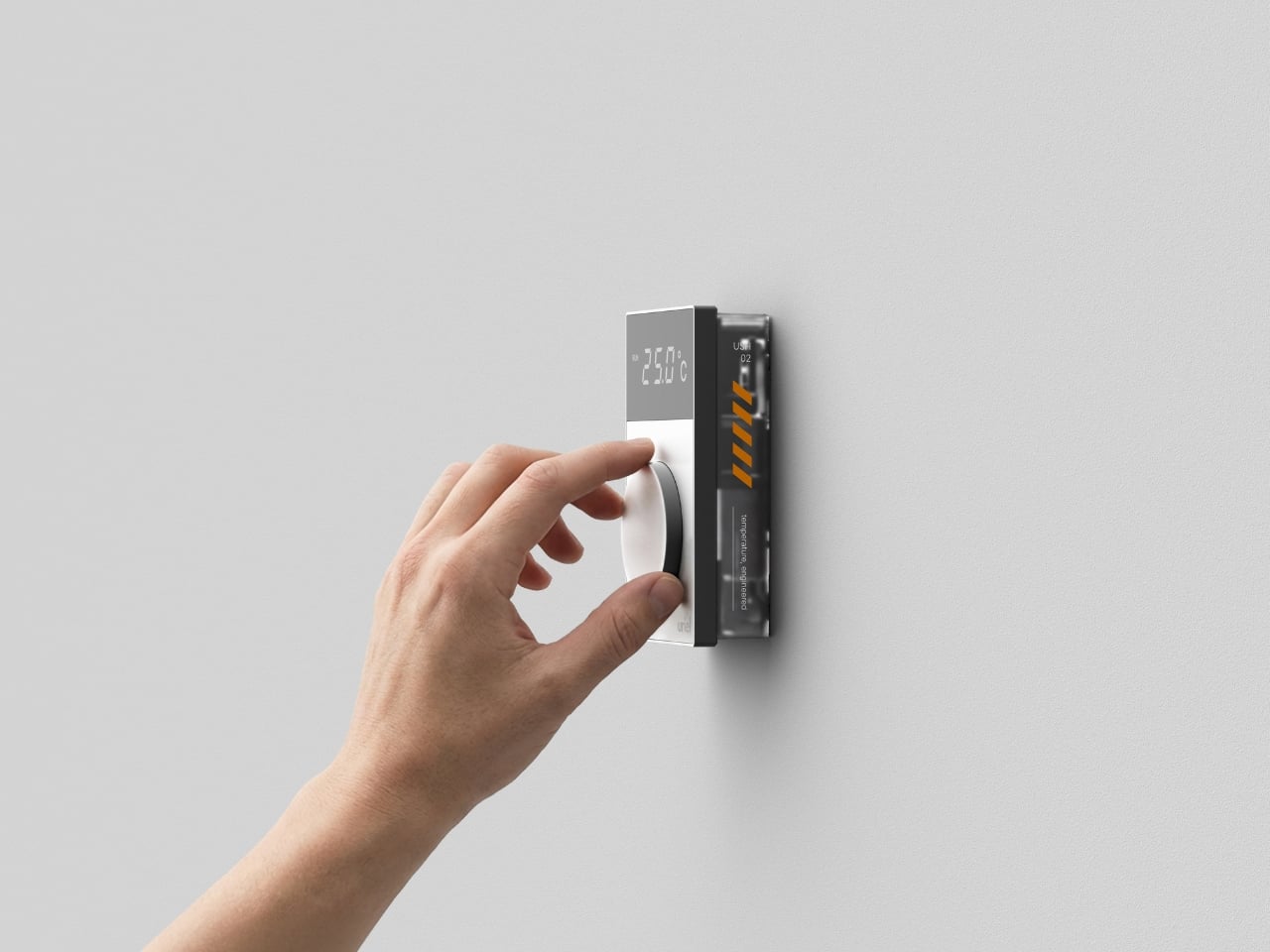
The USH-02 is the surface-mounted version, and it’s the one with visible personality. Its translucent skeleton design lets you glimpse the hardware inside, which feels like a little gift to anyone who appreciates how things are made. The graphic detailing adds visual wit to what could have easily been a clean but flat minimalist slab. It sits on the wall in a way that makes you actually stop and look, which is a strange thing to say about a thermostat, but here we are. It doesn’t disappear into the surface; it quietly introduces itself.
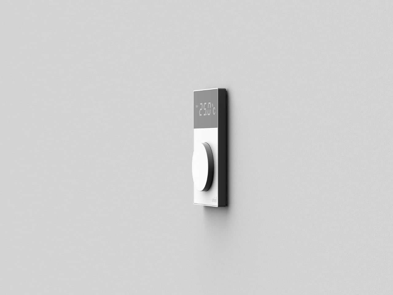
The UEH-02 takes the opposite route. Flush-mounted and incredibly slim, it’s designed to nearly vanish. The profile barely protrudes from the wall, creating the kind of visual quiet that interior designers specifically obsess over. If the USH-02 says “notice me,” the UEH-02 says “I’m here, I work perfectly, and I won’t interrupt your space.” Both approaches are valid. Both are well-executed. The choice between them is really just a question of how much personality you want your walls to carry.
The discipline behind this project is worth calling out. It is genuinely difficult to design something that is both beautiful and immediately intuitive, especially in a category most manufacturers have treated as purely functional. Removing complexity rather than adding features is a confident design move, and we’re living through a moment when more is still frequently mistaken for better in tech. Seeing a product that resolves itself into a single tactile dial and a clear display feels almost like a statement. The rotary control has a satisfying physicality that touchscreens never quite manage to replicate. High-end audio equipment and quality appliances have kept the dial alive for exactly this reason: turning something to get a result is one of the most natural gestures there is. It’s a reminder that good design often means returning to what already worked, done with more intention.
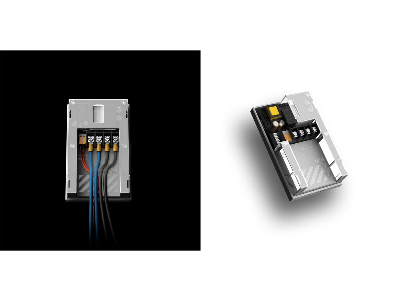
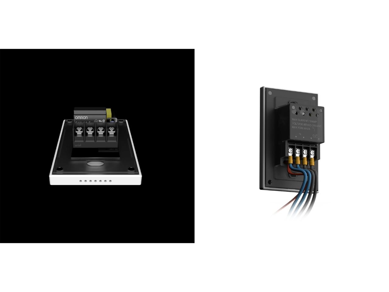
The engineering side, visible in the controllers’ back panels, confirms this isn’t just a surface-deep exercise. Components are neatly organized, an Omron relay handles the heavy work, and the specs support voltages between 85V and 265VAC with a max current of 18A. The function is serious. The form just happens to be beautiful.
That balance is rarer than it should be. Home tech has long been given a pass on aesthetics in a way that furniture or lighting simply would not tolerate. Uriel Electronics is quietly making the argument that it shouldn’t. Your thermostat is on your wall every single day, in full view of everyone who walks into that room. It might as well earn its place there.
The post The Thermostat That Finally Looks Like It Was Designed first appeared on Yanko Design.