7 Best Tiny Home Outdoor Accessories That Turn a 300-Square-Foot Yard Into an Actual Living Room

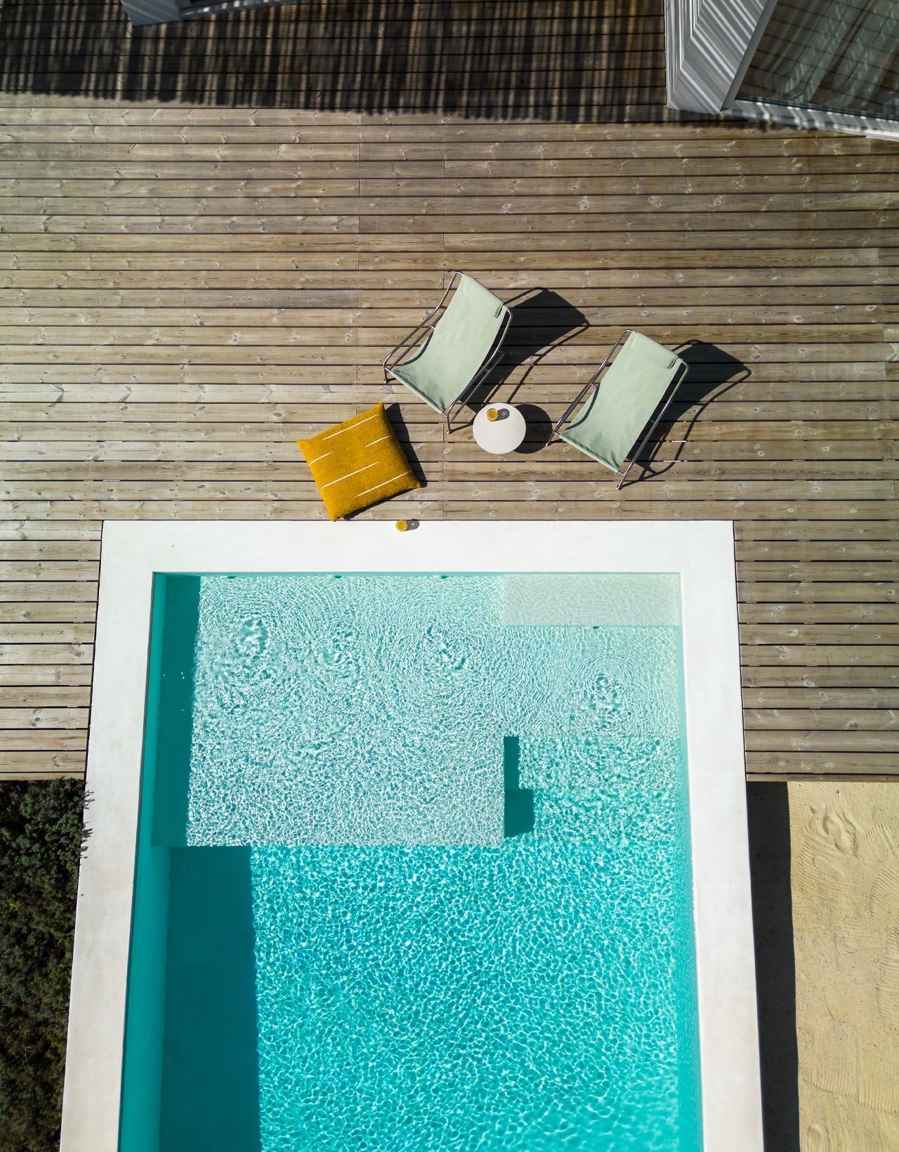
Small outdoor spaces have a way of revealing exactly how much thought went into the objects inside them. When every square foot counts, the things you choose to bring outside need to earn their place — not just functionally, but visually. The best tiny backyard accessories fold away when you’re done, grow upward instead of outward, and look like they were designed rather than assembled. These seven picks do exactly that.

The difference between a cramped yard and a considered one rarely comes down to square footage. It comes down to objects that understand their role — a fire pit that manages its own smoke, a dining set that lives inside a cylinder, a herb garden that climbs the wall instead of spreading across the ground. Each of these seven accessories solves a real outdoor living problem without creating a new one, which is the baseline requirement for anything going into a space this deliberate.

1. All-in-One Grill

The first question any small outdoor space asks of a grill is whether it can disappear when not in use. This modular tabletop grill answers that cleanly. Its parts separate and stack to support barbecuing, frying, grilling, steaming, smoking, or slow-cooking a stew — all on a surface small enough to sit on any patio table. The design doesn’t try to be everything at once; it brings exactly what you need for the style of cooking you’re doing that evening, then gets out of the way.

There’s also a bottle-warming module in the mix, which sounds like a novelty until the first cold autumn evening when mulled wine becomes the plan. Cleanup is as thorough as cooking; every modular part disassembles for washing, and nothing requires more effort than it should. For a compact yard where a full outdoor kitchen isn’t on the table, this is the kind of object that makes the limitation feel like a deliberate choice rather than a compromise.

Click Here to Buy Now: $449

What we like:

  • Modular design covers six styles of cooking without occupying a permanent outdoor space
  • Parts disassemble quickly, keeping cleanup as easy as the setup

What we dislike:

  • Multiple components mean multiple things to keep organized between uses
  • Better suited for cooking for two or four than for a larger gathering

2. porTable
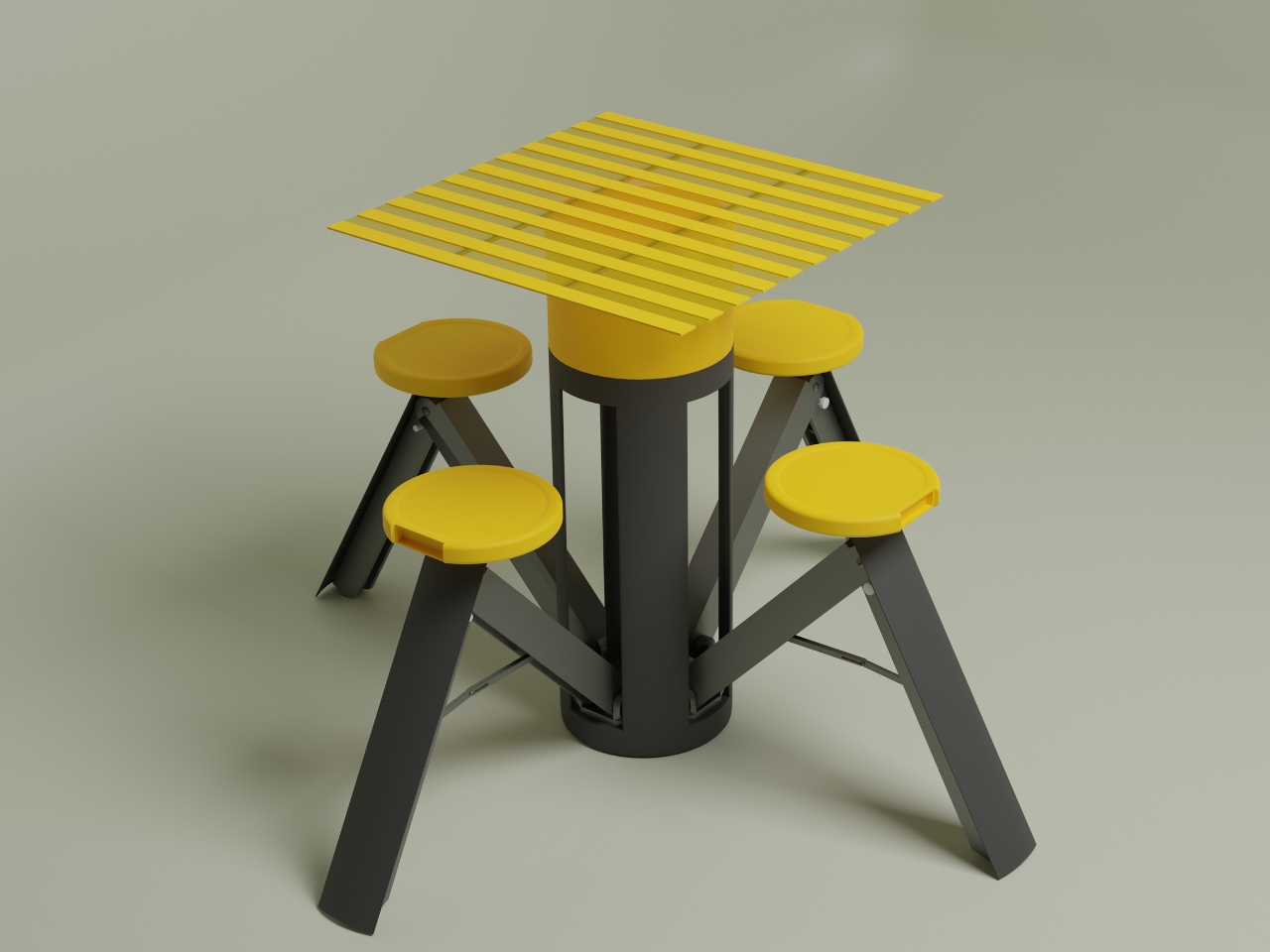
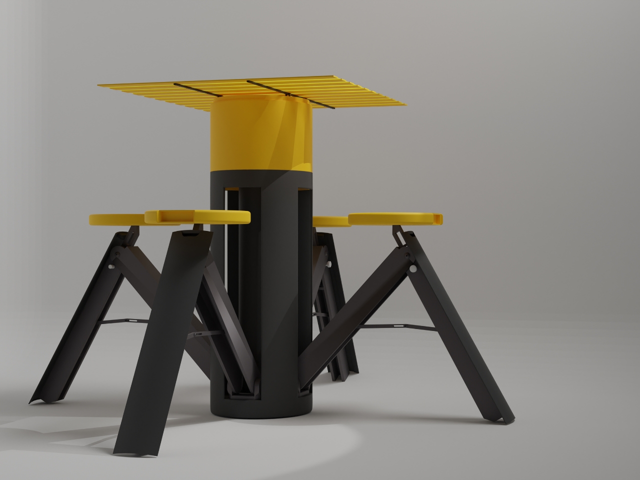
At rest, porTable looks like a bold geometric container — yellow lid, charcoal body, the kind of object you’d leave on a shelf without apology. In use, it becomes a complete outdoor dining setup for four: fold-out seats, a sturdy tabletop, no tools required, no leftover parts. The transformation from container to furniture takes under a minute, which means the decision to eat outside is never more than sixty seconds away from actually happening.

The yellow and charcoal palette is doing real design work here — friendly without being childish, modern without being cold. More importantly, the concept solves the core tension of tiny outdoor living: you want furniture, but you don’t want furniture taking up space when it’s not in use. porTable collapses that contradiction entirely. It lives as a single compact cylinder until the moment it’s needed, then opens into something genuinely functional and good-looking. That kind of thinking is exactly what a small yard rewards.

What we like:

  • An entire four-person dining set stores as a single portable object
  • No tools or assembly knowledge needed to set up or break down

What we dislike:

  • As a concept design, long-term durability in real outdoor conditions is still unproven
  • The bold yellow colorway is a personality commitment that won’t suit every space

3. Birdbuddy Pro Solar
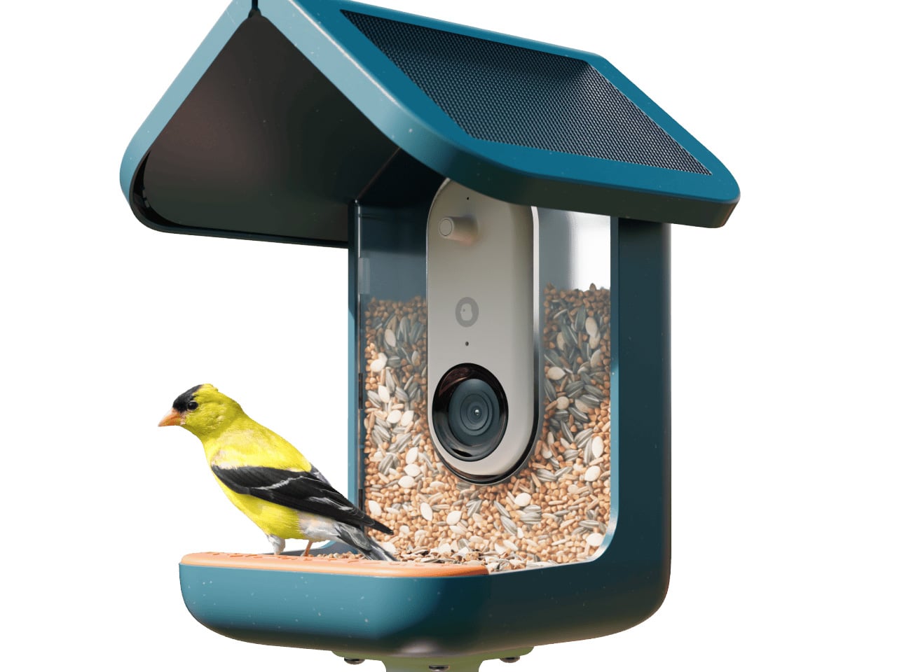
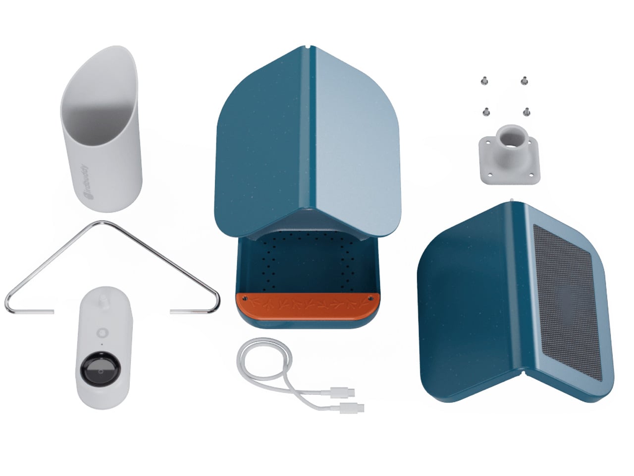
A bird feeder is, in most hands, a lump of plastic with seeds in it. The Birdbuddy Pro Solar is something else entirely — a solar-powered AI camera system that identifies visiting birds, captures slow-motion HD video, and delivers it to your phone via a free app. The expanded field of view and improved sensor handled dappled backyard light without washing out the image. What you get isn’t just a feeder. It’s a front-row seat to the wildlife that was already there.

For a tiny outdoor space, this might be the most meaningful addition on this list. It doesn’t take up floor area. It hangs from a fence or mounts to a wall, taking up exactly zero square footage. And it changes the character of the yard in a way that furniture simply can’t — from static backdrop to living environment. The AI identification runs automatically, building a personal record of every species that visits over time. It’s the rare outdoor product that gets better the longer it sits there.

What we like:

  • Solar-powered design means no cables crossing the yard
  • AI species identification works passively — no effort required from the user

What we dislike:

  • Full camera functionality depends on a consistent Wi-Fi signal reaching the yard
  • Ongoing seed refills add a small but real maintenance commitment

4. Slim Fold Dish Rack
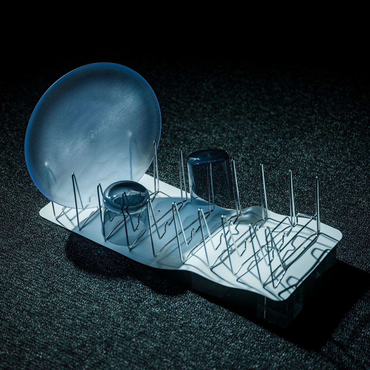
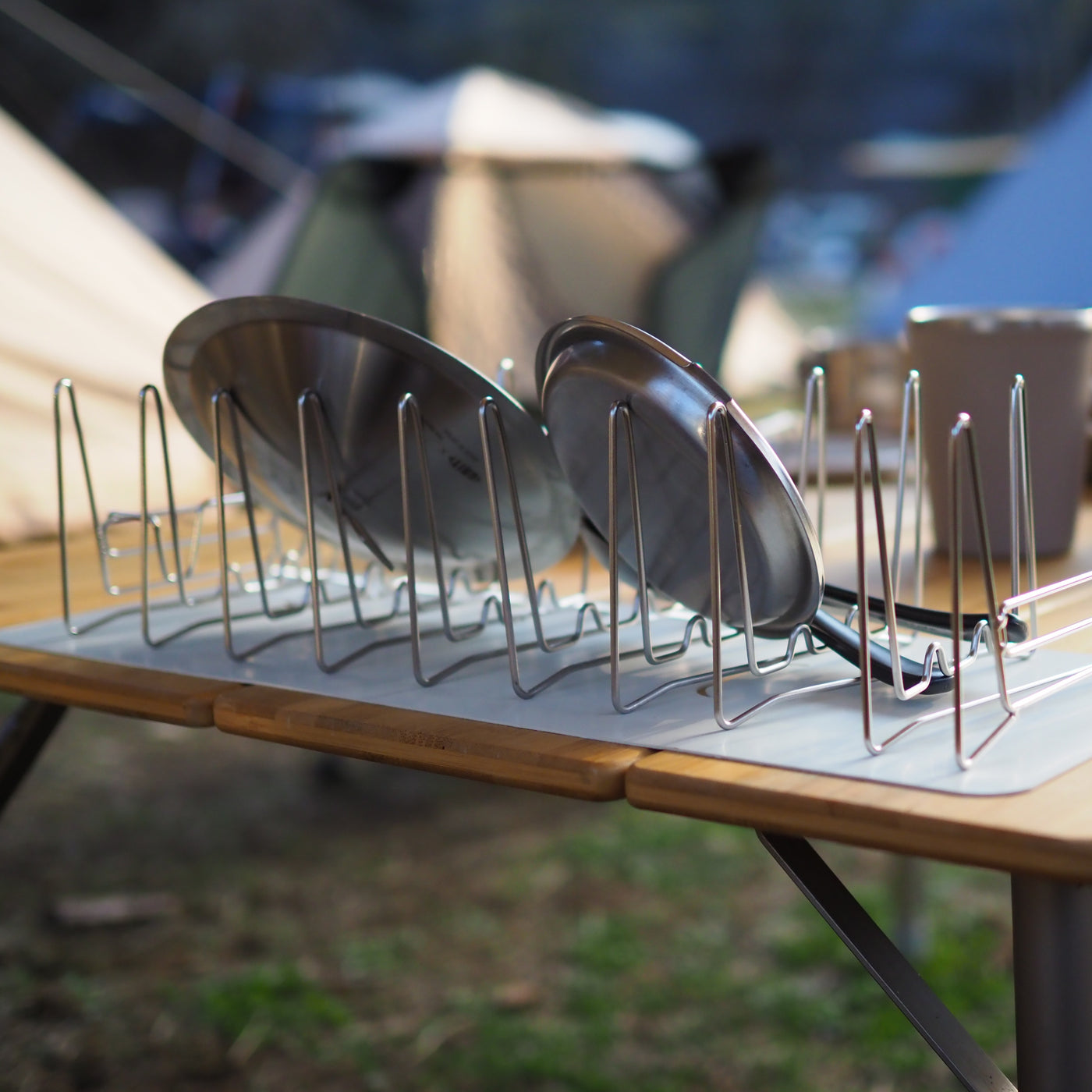
Most dish racks are compromises — too large for small spaces, too flimsy for daily use, too visually noisy to leave out. The Slim Fold Dish Rack collapses this problem with a patent-pending spring mechanism that shrinks a full 14-inch rack to 1.2 inches in under a second. That’s the difference between a dish rack that permanently occupies counter space and one that lives in a bag or a pocket. For outdoor cooking situations where surface area is already borrowed, that distinction is significant.

The ventilation geometry is engineered for real airflow — plates, utensils, and cookware of any size dry properly without needing to be repositioned or fanned out. The design is minimal enough that leaving it out doesn’t create visual clutter; storing it away feels almost like a trick. It’s also dishwasher-safe, which closes the loop on a product that exists to make cleaning easier. In a space where every object has to justify its presence, this one earns it quietly and completely.

Click Here to Buy Now: $75.00

What we like:

  • Collapses to 1.2 inches — genuinely pocketable when not in use
  • Dishwasher-safe, so the cleaning tool is easy to clean

What we dislike:

  • The spring mechanism’s long-term durability across daily use remains to be tested
  • At full extension, very large pots and baking trays will likely overhang the edges

5. Stack & Sprout

A 1×1 square-foot footprint for a full working herb garden is not a compromise — it is the point. Stack & Sprout’s modular tower stacks as high as the wall and ambition allow, with each module holding individual growing pods loaded with smart soil capsules. Fill the water tank, add seeds, and the system manages hydration from there. The result is a vertical column of living herbs that climbs the fence instead of spreading across the ground, leaving every inch of floor space exactly where it was.

What makes this work for a small outdoor space is how little it asks of the person using it. No specialized knowledge, no guesswork about watering schedules, no particular green thumb required. The modular format means you can start with three modules — basil, mint, rosemary — and add more as confidence grows. Fresh herbs picked ten seconds before they go into a dish taste genuinely different from ones that have spent a week in a grocery bag. Stack & Sprout makes that difference accessible to anyone.

What we like:

  • Modular height adapts to any wall space, from a single tier to a full vertical installation
  • Self-watering system removes the most common reason home herb gardens fail

What we dislike:

  • Proprietary smart soil capsules create an ongoing replacement cost
  • Taller configurations may need wall anchoring to stay stable in the wind

6. Forest Cooperage Cedar Soaking Tub

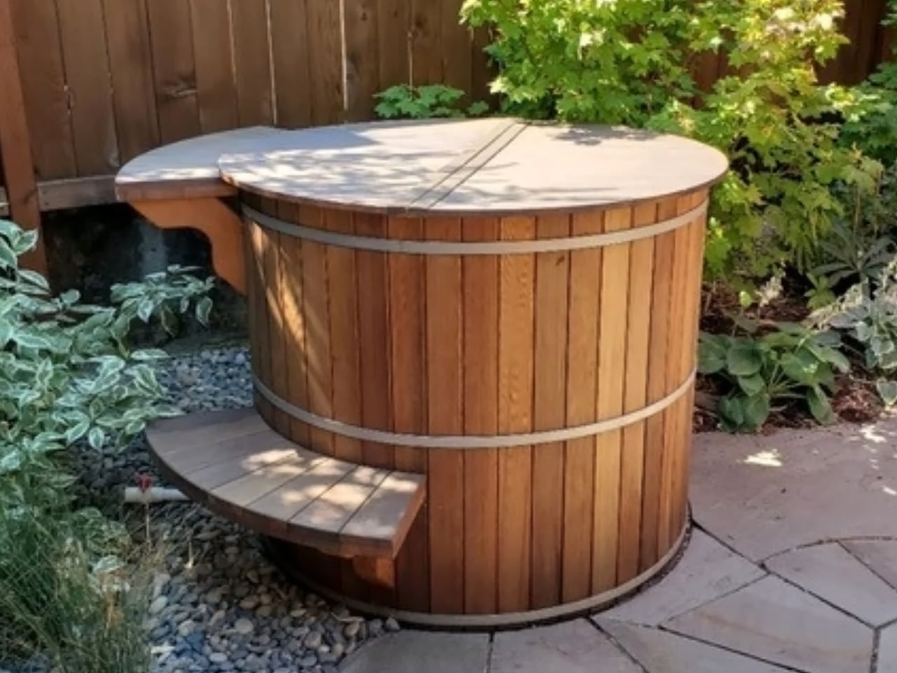
The Forest Cooperage cedar soaking tub is handcrafted on Vancouver Island from clear vertical grain Western Red Cedar, secured with stainless steel hoops. It sits directly on any level surface, fills from a garden hose, and heats with a wood-fired or electric immersion heater — no plumber, no electrician, no permanent installation required. The stave-and-hoop construction is the same method used in barrel-making for centuries, which is why it looks entirely at home outdoors next to bamboo, stone, and weathered wood.

What a cedar tub does to a small outdoor space is harder to explain than it sounds. It gives the space a reason to exist — not as a passageway or storage area, but as a genuine destination. An evening soak in a backyard cedar tub, surrounded by the natural scent of the wood and the quiet of a well-arranged small yard, is a genuinely different experience from anything else available at this price. In 300 square feet, this is the object that makes everything else around it feel intentional.

What we like:

  • No permanent installation — fills from a hose and heats without any plumbing
  • Cedar weathers beautifully outdoors, developing character rather than deteriorating

What we dislike:

  • Regular maintenance is needed to keep the cedar properly hydrated and sealed
  • Wood-fired heating requires planning ahead — this is not a spontaneous soak situation

7. Airflow 8-Panel Fire Pit

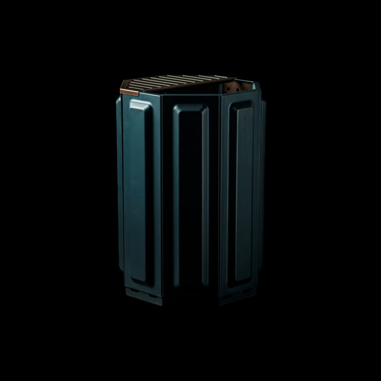
The Airflow fire pit is built around a single engineering insight: clean combustion requires oxygen at the base and a secondary combustion loop at the top. The eight removable panels form an octagonal cylinder with holes positioned precisely to channel fresh air to the base as the primary feed, then up through a double-walled cavity to the top vents as secondary combustion. The fire burns hotter, produces significantly less smoke, and leaves far less ash than a conventional open pit.

The eight-panel removable design does more than manage airflow — it gives you direct control over intensity. Remove panels to widen the burn; keep them assembled for a focused and efficient fire. For a small outdoor space where heavy smoke would ruin the evening entirely, this is the detail that separates a fire you can actually sit around from one that keeps everyone constantly repositioning their chairs.

Click Here to Buy Now: $325.00

What we like:

  • Eight removable panels allow direct, intuitive control over fire intensity
  • Secondary combustion system dramatically reduces smoke output in compact spaces

What we dislike:

  • Eight separate panels add to the number of components to store between uses
  • Steel construction will need occasional treatment to stay ahead of rust in wet climates

Small Space, Considered Objects

A well-used 300-square-foot yard doesn’t need more things in it. It needs the right things — objects that fold away cleanly, grow upward rather than outward, and look like someone thought carefully before placing them there. Each of these seven picks solves a real outdoor living problem without creating a new one, which is the baseline requirement for anything going into a space this small and this deliberately arranged.

The best version of a tiny outdoor space isn’t a smaller version of a large one. It’s something more deliberate — a set of objects that each do their job beautifully and step back when they’re not needed. Get these seven right, and a 300-square-foot yard stops feeling like a constraint entirely. It starts feeling like a choice you made on purpose.

The post 7 Best Tiny Home Outdoor Accessories That Turn a 300-Square-Foot Yard Into an Actual Living Room first appeared on Yanko Design.
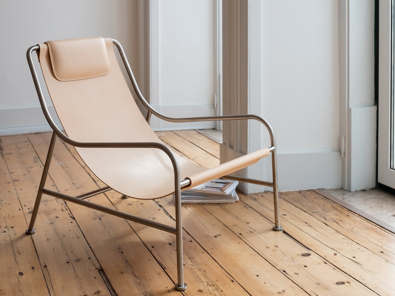
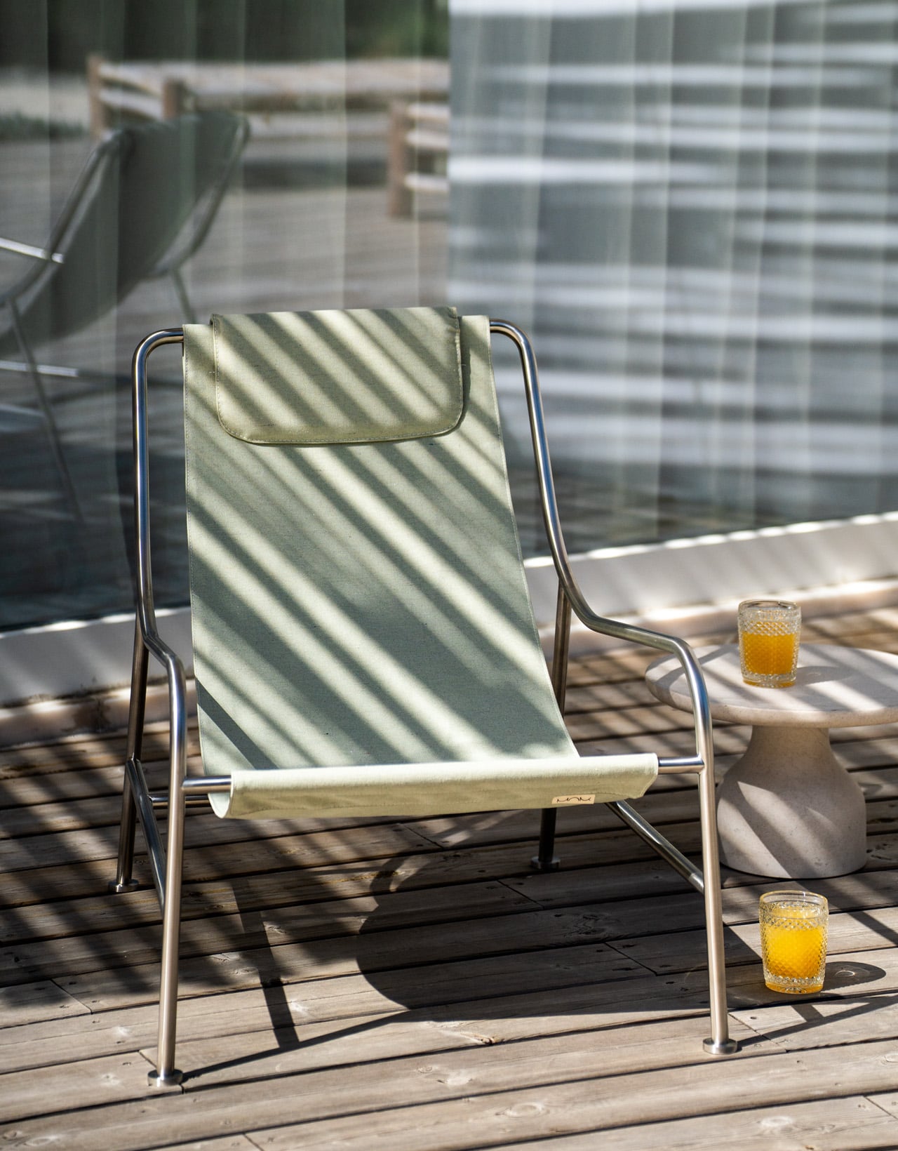
This Lounge Chair Was Designed to Never Be Replaced — Indoors or Out

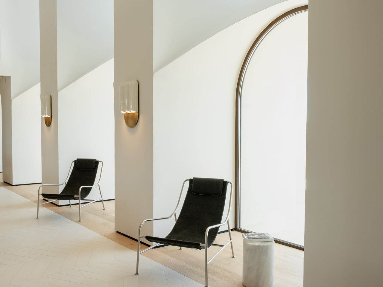
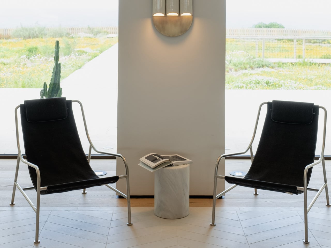
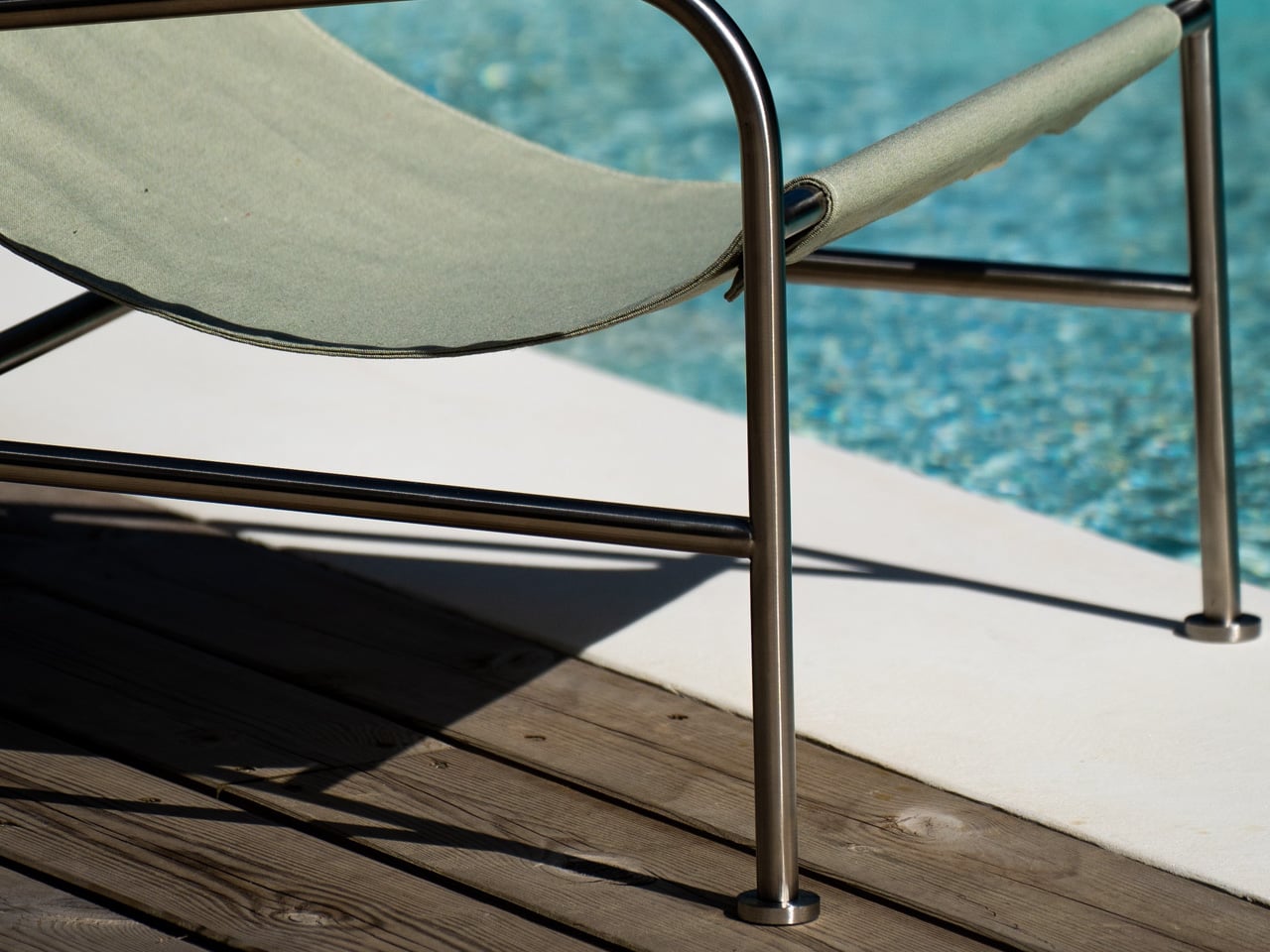
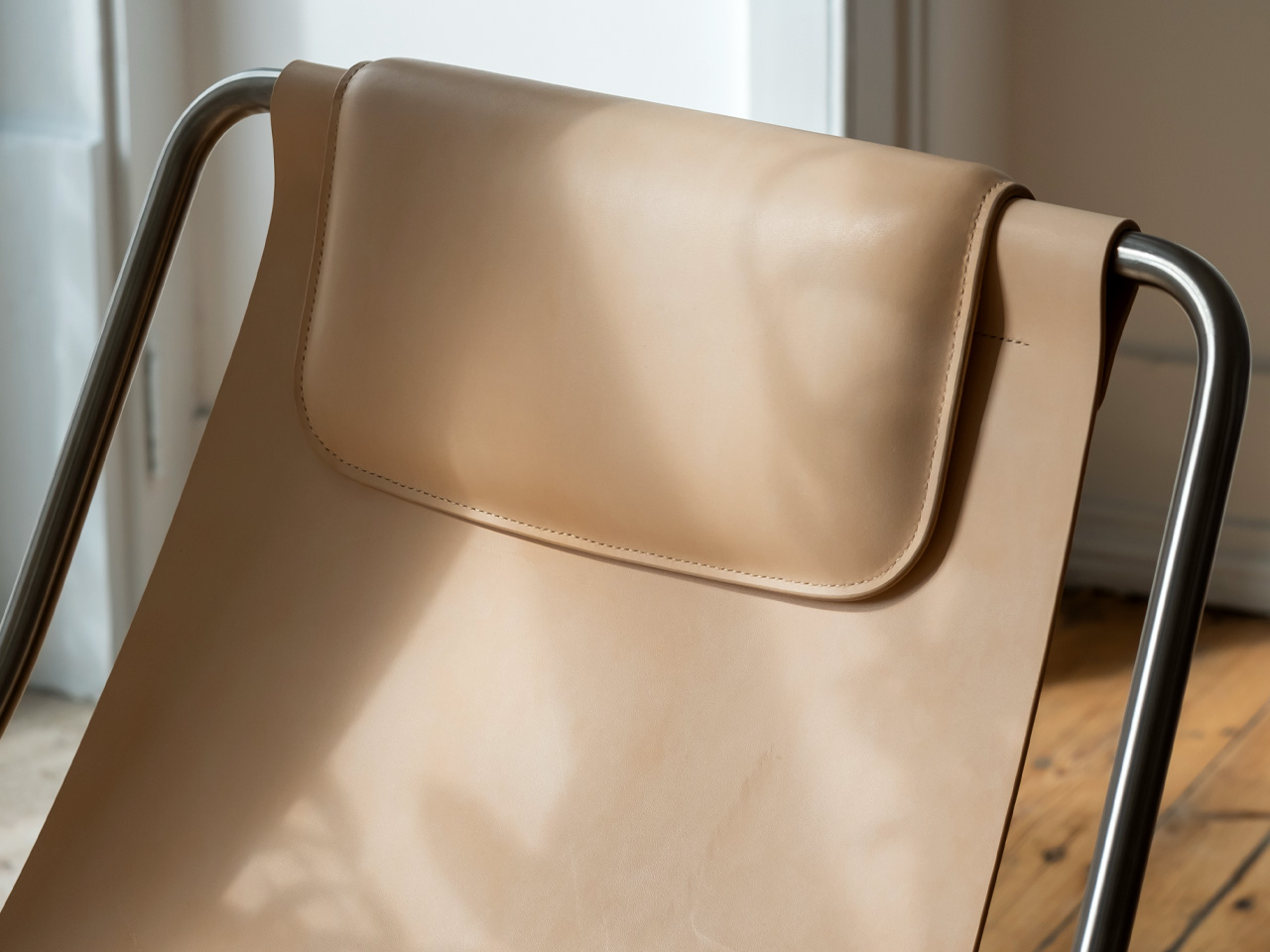
The best furniture doesn’t freeze time. It moves with you. That’s the quiet logic behind the LISBOA Lounge Chair, designed by Keiji Takeuchi for MOR Design. The chair is defined by a kind of lightness, both visual and physical. An open stainless-steel frame, a suspended sling seat, a silhouette that sits low and easy in a room without demanding attention. What’s even more interesting is the system that takes that lightness further: two interchangeable seats, one in textile, one in leather, that can be swapped depending on where you are, how you’re living, and what the space asks for.

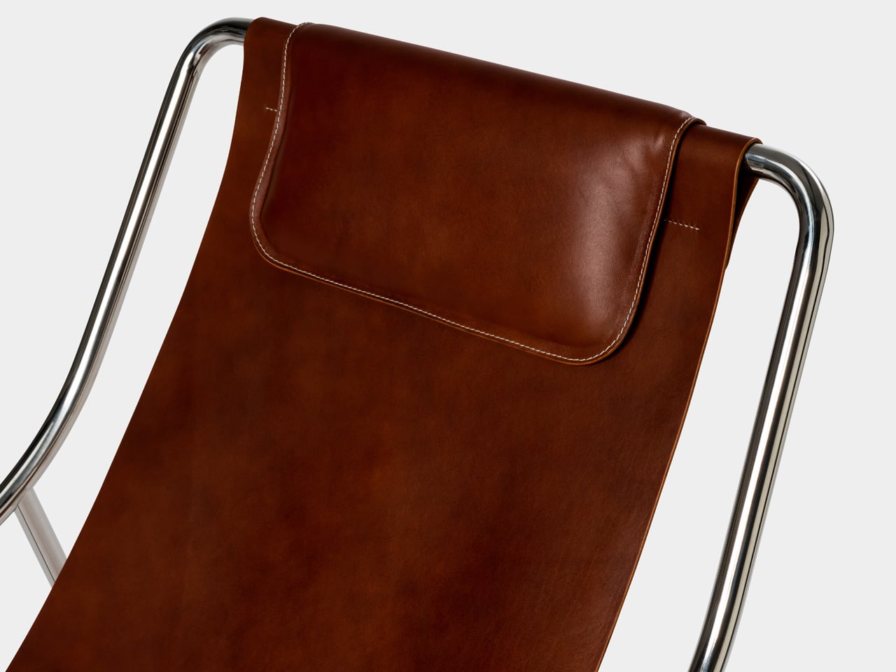
It sounds simple. That’s because it is. The seat detaches cleanly from the frame, which is available in brushed or polished stainless steel. Swap the leather for textile, and the chair moves from a living room to a terrace without missing a beat. The frame stays the same, as does the identity. What changes is the layer of the chair closest to you.

Designer: Keiji Takeuchi for MOR Design

This matters more than it might first appear. Most furniture is bought for a fixed version of your life. LISBOA accommodates the version that’s still becoming. Keiji Takeuchi conceived the chair during the 2020 lockdown, thinking about how people might bring the ease of outdoor living into their everyday interiors. He understood that the boundary between inside and outside had already started to blur. The interchangeable seat system is a direct extension of that thinking. It doesn’t ask you to replace the chair when your context changes. It asks you to change the seat.

For a brand like MOR Design, founded in Portugal with a commitment to material integrity and longevity, this is the logical next step. Beautiful objects should last. But lasting doesn’t mean staying the same. The leather seat reads warm and deliberate in a residential interior. The textile option, weather-resistant and easy to clean, handles a poolside or garden setting just as naturally. Both sit within the same architectural frame, which is what allows the chair to belong in hospitality and contract spaces as readily as it does at home.

LISBOA was shown at Maison&Objet 2026, where the conversation around adaptable, considered consumption is hard to avoid. The chair arrives at the right moment. Not as a statement about sustainability or modularity, but as something quieter: a piece of furniture that knows your life will change, and is already ready for it. It is, as MOR Design puts it, your chair, and your moment.

The post This Lounge Chair Was Designed to Never Be Replaced — Indoors or Out first appeared on Yanko Design.
5 Cool Desk Clocks That Actually Deserve a Spot on Your Desk in 2026

Your desk says a lot about the way you think. The objects you deliberately choose for it, rather than the ones that simply accumulate, reflect your values, your taste, and the kind of environment you want to work in. A great desk clock earns its place twice over: as a functional tool and as something genuinely worth looking at every day. The market is full of forgettable options, but the most interesting clocks right now are rethinking what a clock even needs to be, questioning material, interaction, and presence in equal measure.

Whether you work from a home studio, a shared office, or somewhere between the two, the right clock changes the feeling of an entire space. These five designs prove that telling time is still a conversation worth having, and that choosing a clock carefully is an act worth taking seriously.

1. Rolling World Clock

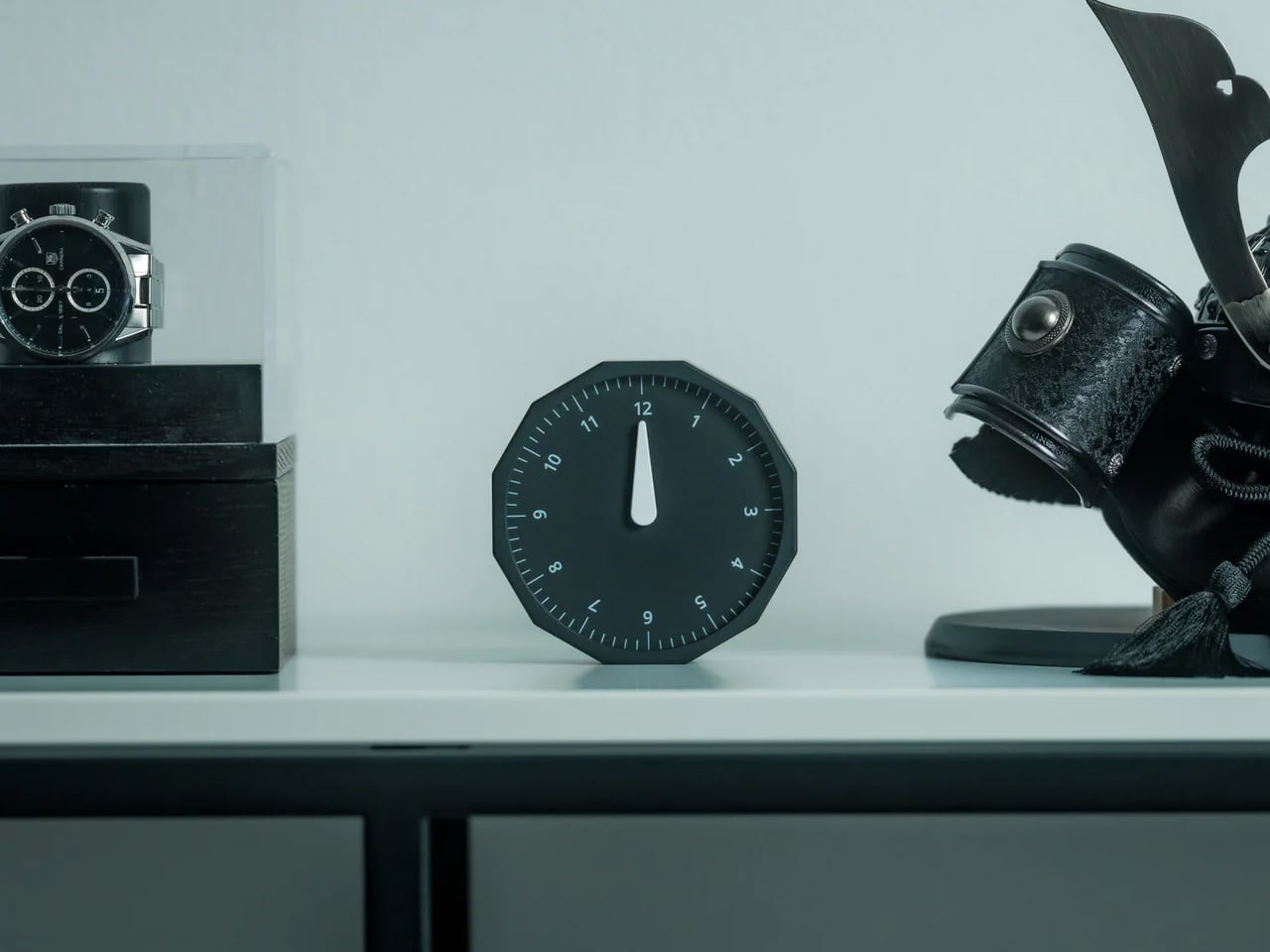
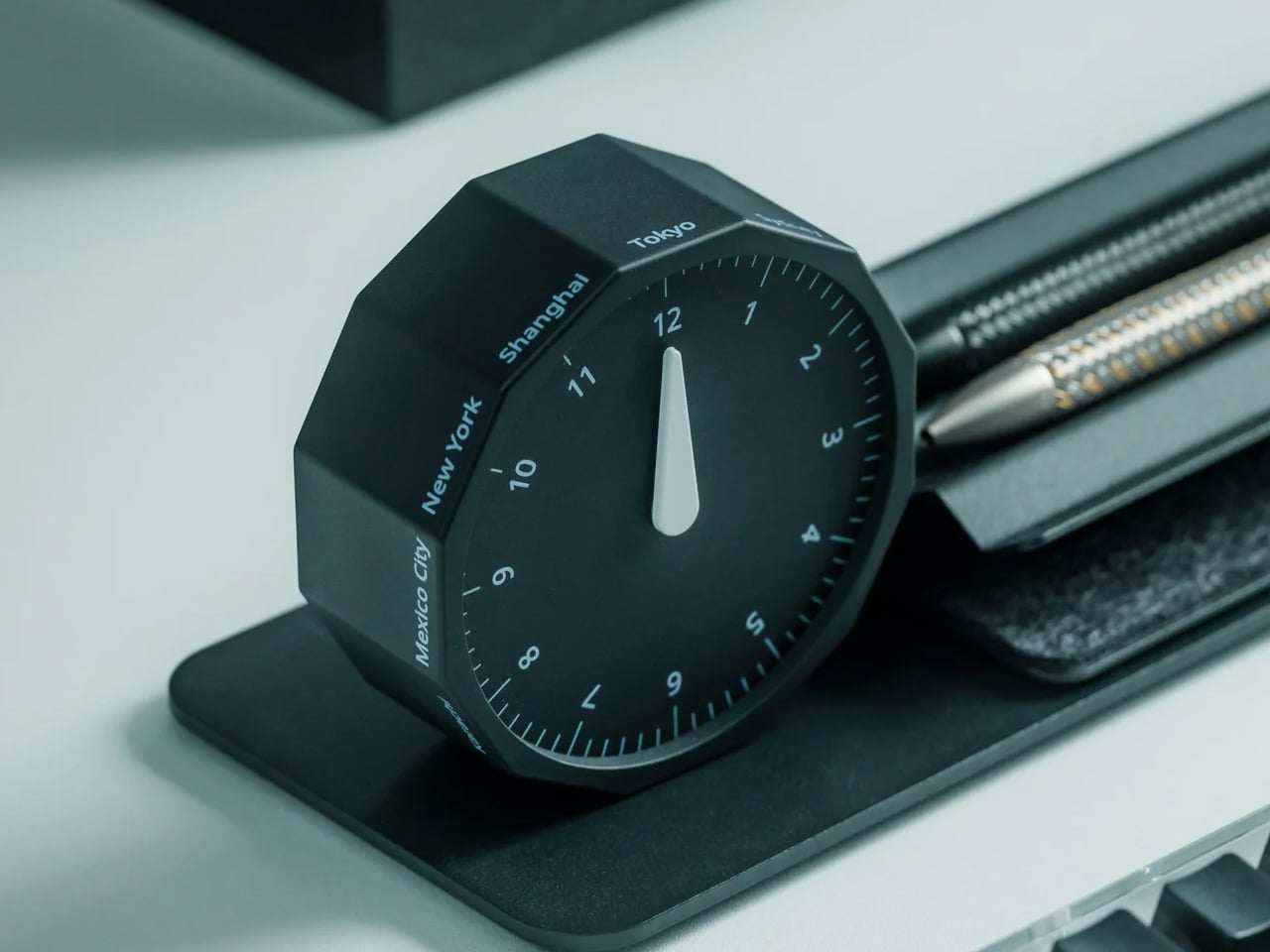
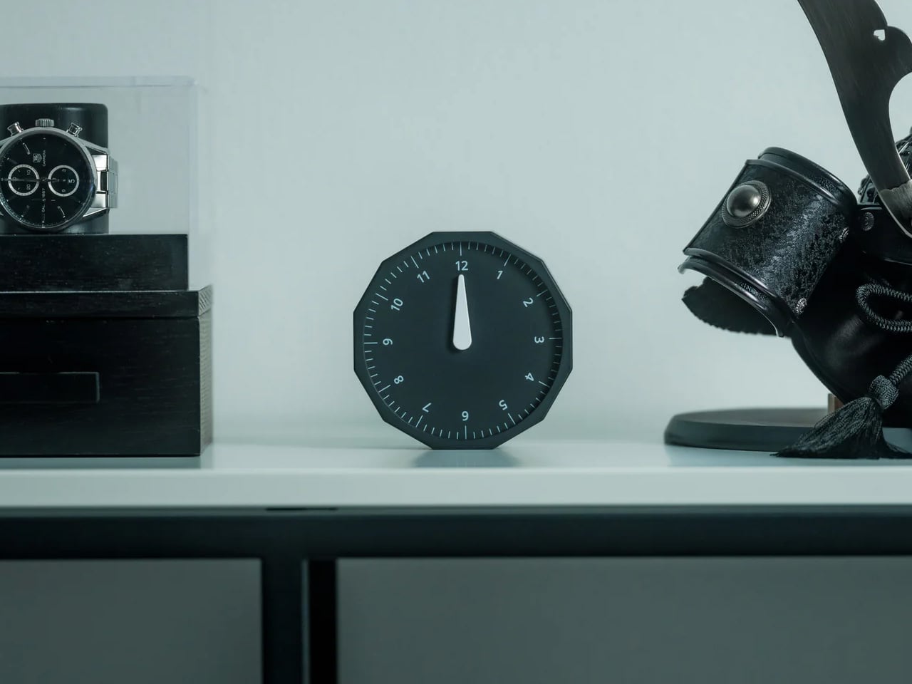
For anyone who regularly works across time zones, converting time in your head is a small but persistent irritation. The Rolling World Clock removes that friction with an approach so intuitive it almost feels obvious: a 12-sided form with a major city on each face, from London and Paris to Tokyo, Sydney, and New York, read by a single hand. Roll the clock until your desired city faces upward and the hand tells you exactly where things stand. No screen, no calculation, no second device needed.

What keeps this clock compelling beyond its core function is the physicality of using it. Rolling a 12-sided object to check the time in Cape Town or Karachi is a tactile experience that no phone interface can replicate; it turns a routine check into something deliberate and satisfying. The minimalist form, available in both black and white, sits cleanly on any desk without visual competition, and the single hand keeps everything honest and uncluttered. It is a rare thing: a genuine conversation piece with a practical reason to exist.

Click Here to Buy Now: $49.00

What We Like

  • The rolling interaction gives checking global time a tactile quality that feels intentional rather than reflexive, adding a small moment of satisfaction to an everyday action.
  • The minimal form in black or white works across almost any desk aesthetic, functioning equally well as a decorative object and a practical timekeeping tool.

What We Dislike

  • Only 12 cities are represented, which means time zones outside those locations will still require some mental conversion on your part.
  • As an analog clock, precision is limited to the nearest quarter-hour, which may not suit those who need exact time readings at a glance.

2. Minimalist Desk Clock

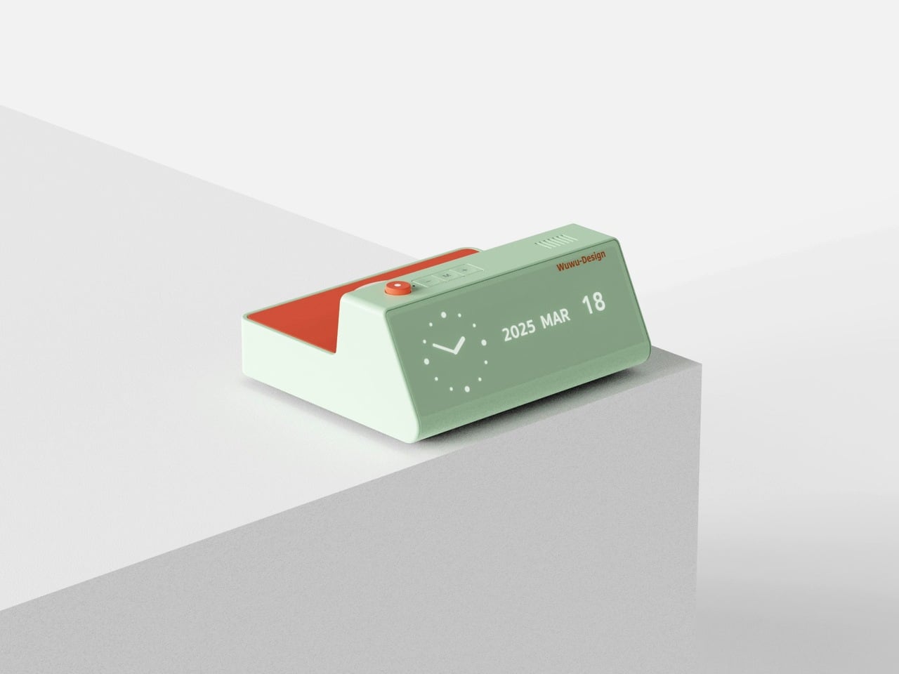
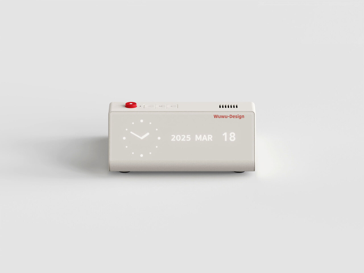
Products that combine two functions usually compromise on both. This desk clock concept draws inspiration from Dieter Rams’ legendary Braun DN40, channeling the same visual restraint while placing a wireless charging pad on the top surface in a way that actually makes sense for daily use. The digital time display sits off to one side of the matte face, balanced by a date readout on the opposite end. Both are embedded flush into the surface, creating a presence that is visible when needed but never demanding your attention when you do not.

The placement of the wireless charger on top is obvious in the best possible way: your phone charges exactly where you can still see it, and the clock keeps doing its job without either function disrupting the other. The asymmetrical display layout reflects genuine compositional thinking, creating deliberate visual balance rather than defaulting to center alignment. For a desk already holding a notebook, a coffee cup, and a tangle of cables, this clock earns its spot by doing double duty without making a scene about it.

What We Like

  • The wireless charging surface sits intuitively on top, keeping your phone visible and accessible while it charges, without requiring a separate pad taking up additional desk space.
  • The asymmetrical display arrangement shows real compositional intention, making the object feel considered and specific rather than generically functional.

What We Dislike

  • This is currently a concept design and is not available to purchase, which limits it to an aspirational reference rather than a practical recommendation right now.
  • The matte embedded displays may lose legibility in dim environments without a backlight or ambient brightness adjustment, which the concept does not appear to address.

3. CAST

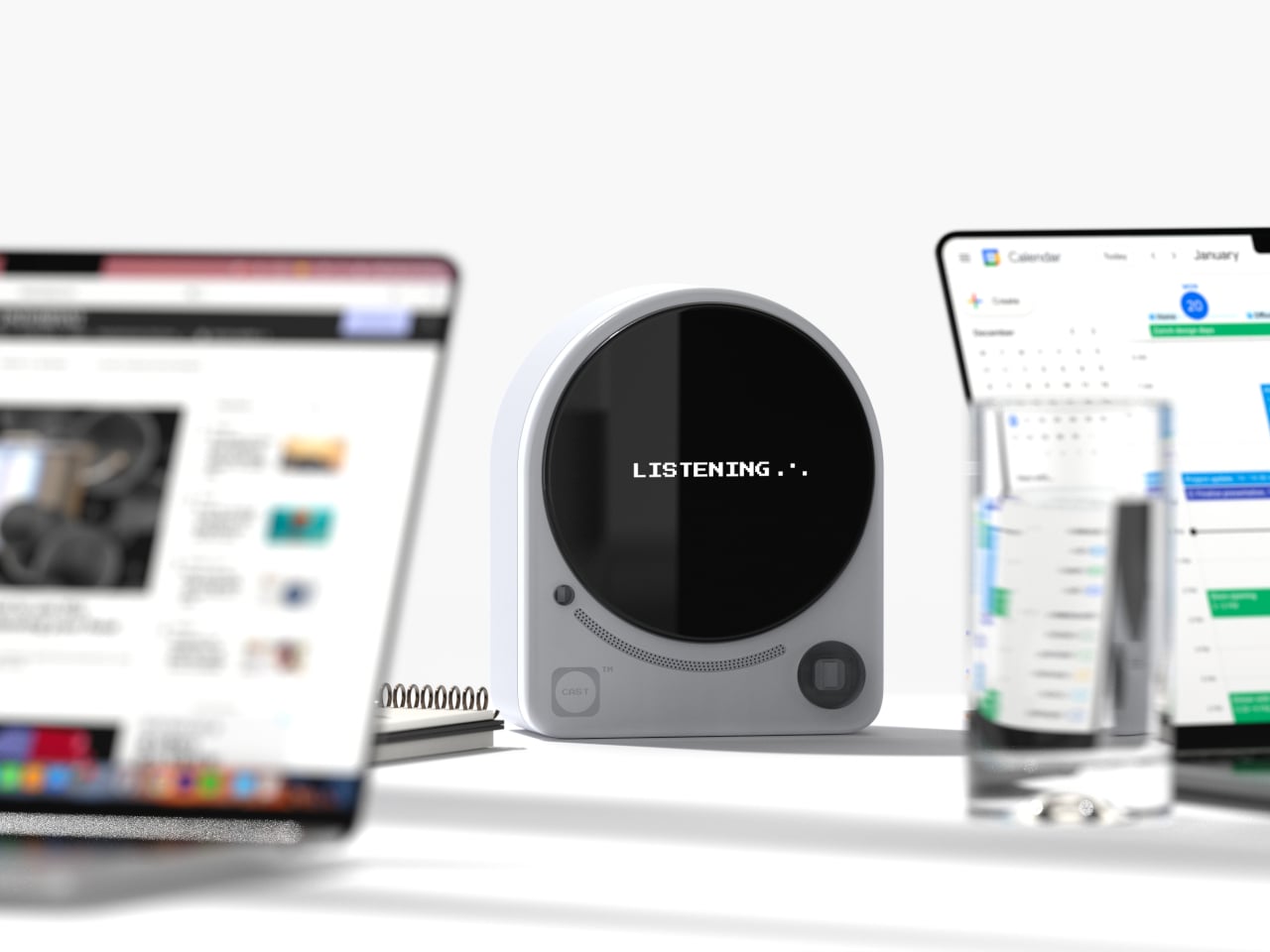
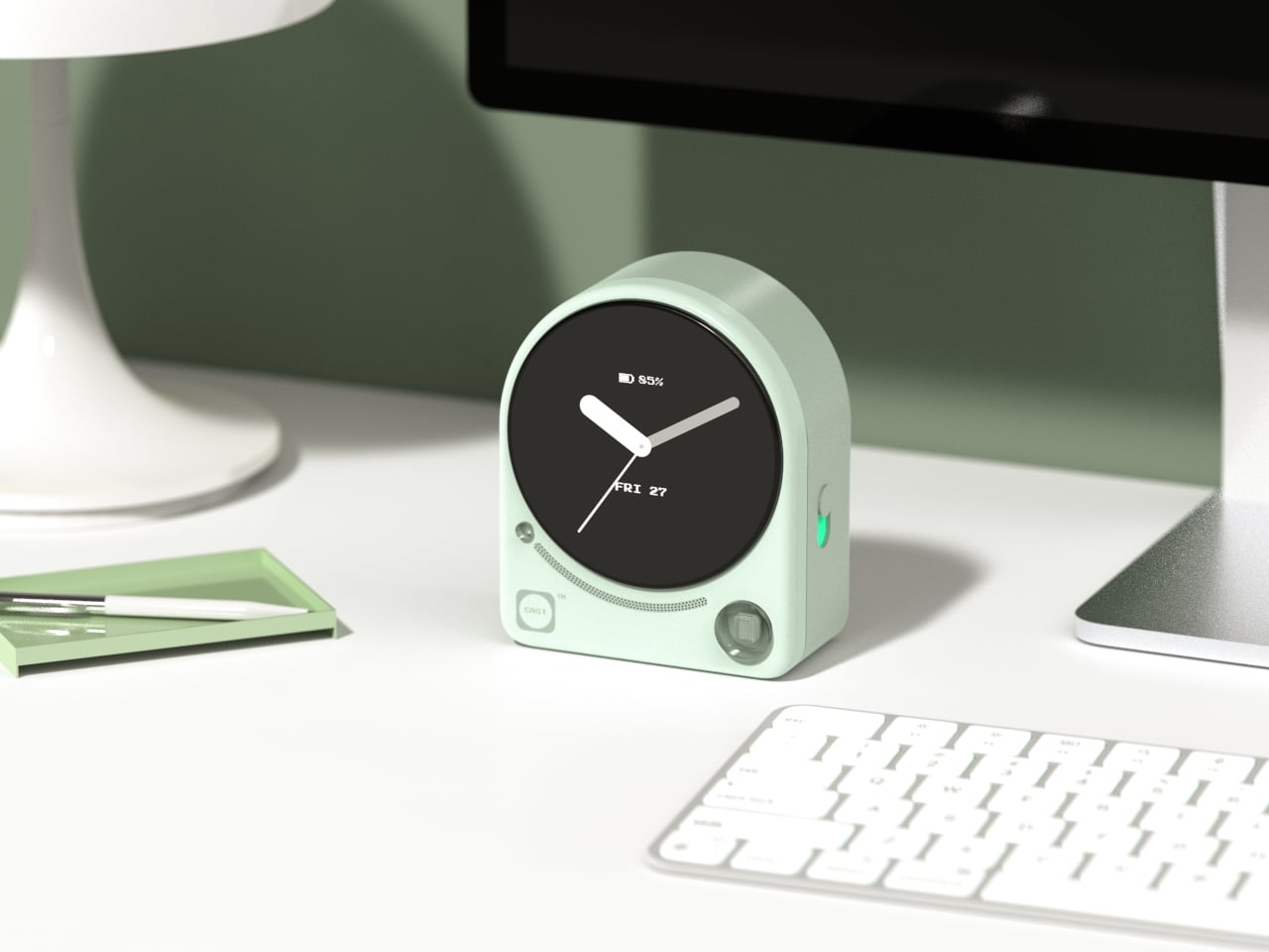
Meetings lose things. Good ideas get spoken into the room and never make it to a document, and most tools designed to fix that problem are more intrusive than the problem itself. CAST, a concept by designer Minseo Lee, takes a different approach entirely. Drawing its form from the Braun BC22, the device arrives as an arch-shaped tabletop companion with a circular display, tactile buttons, and a neutral finish that reads as a clock before it reads as anything else. It sits on the conference table and quietly gets to work.

During a meeting, CAST listens, identifies key points, and generates a concise summary when the session ends. A QR code appears on the display, and participants scan it to access their notes instantly, with no app download or login required. Outside of meetings, it functions as a standard clock, maintaining its understated presence without demanding attention. The dotted graphic details and calm proportions mean it suits an open-plan office as naturally as a private home studio. The best AI tools do not announce themselves; they simply make the room function a little more smoothly, and CAST embodies that idea completely.

What We Like

  • The QR code summary system is a genuinely clever solution, distributing meeting notes to every participant instantly without requiring anyone to install a specific app or create an account.
  • The Braun-inspired design ensures CAST reads as a clock first, which meaningfully reduces the psychological discomfort of having a recording device present during a conversation.

What We Dislike

  • As a concept, CAST is not yet available for purchase, meaning its real-world performance in noisy or complex meeting environments remains completely untested.
  • The quality of the AI-generated summaries will depend on microphone sensitivity and processing power, which are factors the industrial design itself ultimately cannot control.

4. Wooden Desk Clock

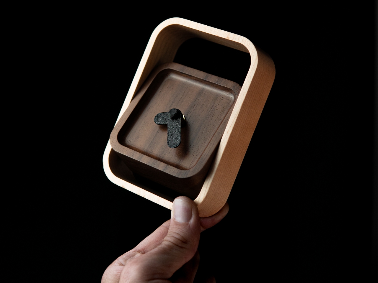
There is something quietly refreshing about a clock that does not try to do anything beyond telling the time beautifully. This wooden desk clock, developed in collaboration with Shapr3D, is exactly that kind of object. CNC-machined from walnut, cherry, or maple, each version uses the natural contrast of warm wood tones and smooth curved surfaces to create something that belongs on a desk the way a well-chosen book or a ceramic cup does. The analog face reads the hour in the most satisfying way possible, without apology.

The clock comprises two parts: a clock head that displays the time and a supportive frame that serves as both a base and a functional handle for adjusting the vertical viewing angle. It is a small detail, but one that shows genuine thought about how the object actually gets used on a real desk by a real person. In an era dominated by aluminum, glass, and screens, a clock machined from actual wood makes a quiet but firm statement about material honesty and the pleasure of things that simply do what they are supposed to do.

What We Like

  • Three wood type options, walnut, cherry, and maple, give the clock a material warmth and versatility that suits a genuinely wide range of desk setups and personal aesthetics.
  • The adjustable vertical viewing angle through the supportive frame reflects thoughtful, user-centered design that considers how the object will actually be used day to day.

What We Dislike

  • Natural wood requires more care than synthetic materials and may be susceptible to scratches or moisture damage over time without proper surface treatment or regular maintenance.
  • The purely analog format offers no smart features, which will not appeal to anyone who expects additional functionality beyond time-telling from a desk object in this category.

5. Moon Rocket Clock

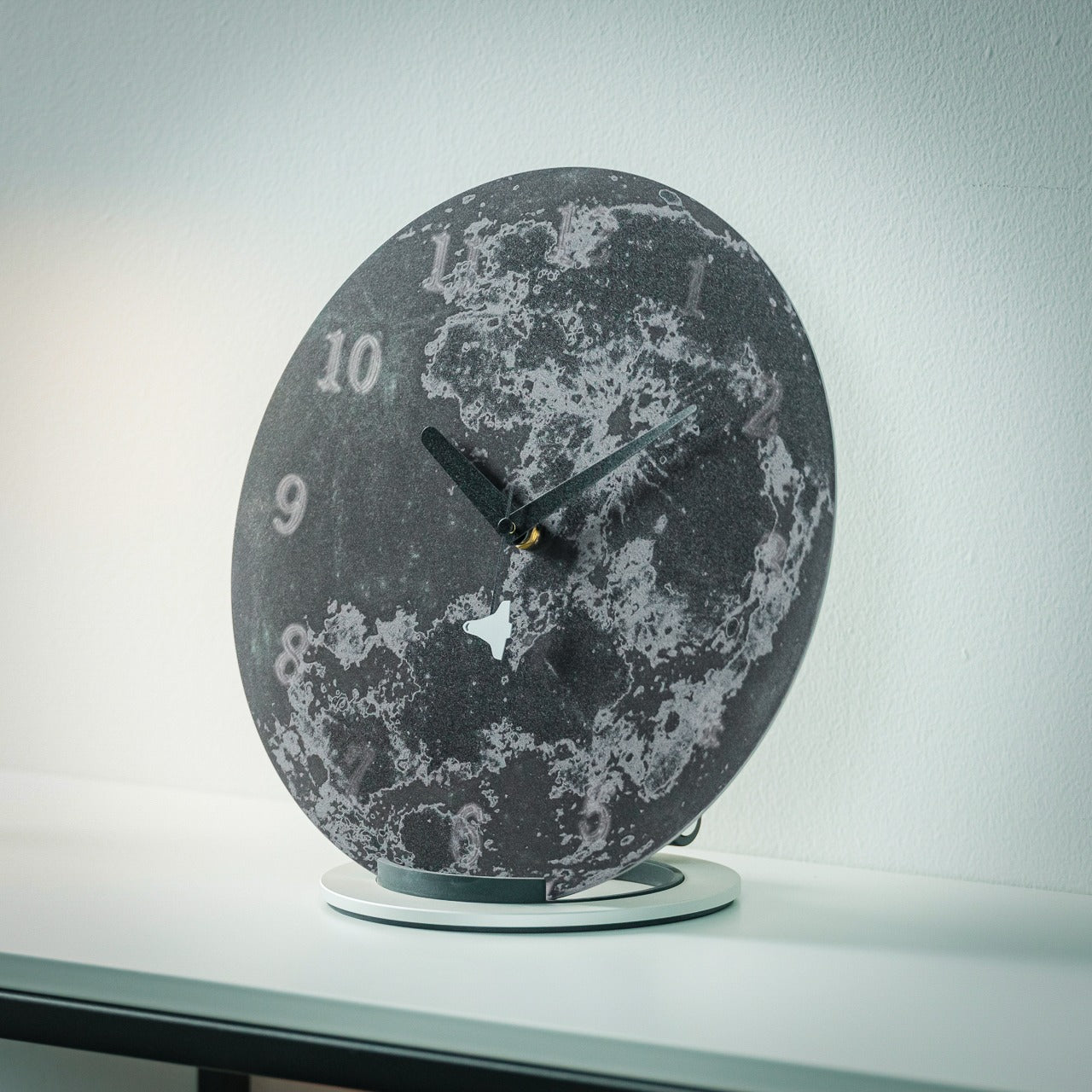
A note upfront: this is not a typical desk clock. It is larger than everything else on this list, more visually assertive, and designed to occupy space rather than disappear into it. Made from specially polished stainless steel, the Moon Rocket Clock is a circular timepiece where printed numbers appear to float and gradually fade around the edges of the face, echoing the visual rhythm of the moon’s phases. The second hand carries a small rocket ship on its tip, which sounds ornamental until you watch it move and recognize the emotional charge the detail actually carries.

This clock works best where it has room to be itself, on a wide desk, a generous shelf, or a statement surface in a home studio. The polished stainless steel construction is durable and catches light in ways that cheaper materials simply do not, giving it a presence that reads as genuinely considered rather than simply bold. More than any other clock on this list, this one carries emotional meaning: a daily reminder to take your ambitions seriously, framed through the imagery of space travel and lunar exploration. It is bigger than usual, demands more visual real estate than a standard timepiece, and earns every bit of space it claims.

Click Here to Buy Now: $325.00

What We Like

  • The specially polished stainless steel construction gives the clock a premium material quality that holds up to daily visual scrutiny and looks better the more closely you examine it.
  • The rocket ship, second-hand, transforms an ordinary glance at the time into a small, recurring moment of inspiration that does not wear out with repetition.

What We Dislike

  • The larger footprint demands more desk space than a standard clock and may feel visually overwhelming on smaller or more tightly curated setups.
  • The bold, distinctive aesthetic is strong enough to require a specific kind of environment to land well, meaning it will not suit every desk or room it is placed in.

The Best Desk Objects Ask Nothing Back

A desk clock was never supposed to disappear. It got displaced gradually by phones and computers, and the slow collapse of single-purpose objects into multipurpose screens. But these five designs are a reminder of what that displacement costs. A clock sitting on your desk is a fundamentally different presence than a clock on your phone. It exists only to mark time, without asking you to respond to anything, check a message, or make a decision. That kind of quiet object has a value that is easy to underestimate and harder to replace.

Good design does not need to solve every problem at once. Sometimes it is about doing one thing well and doing it in a way that earns a permanent place in a room. Whether it is a rolling 12-sided clock that translates time zones through touch or a stainless steel moon keeping a rocket on its seconds hand, each of these clocks has earned its spot. The best desk objects are the ones that make you glad they are there each morning, and every single one of these is exactly that kind of thing.

The post 5 Cool Desk Clocks That Actually Deserve a Spot on Your Desk in 2026 first appeared on Yanko Design.
5 Best LEGO Builds of April 2026 We Wish Were Already Official Sets (One Takes 90 Trillion Years to Work)

LEGO has always occupied a peculiar space between toy and medium. For most of us, the bricks are nostalgic — associated with childhood bedrooms, pieces stepped on in the dark, and the specific satisfaction of snapping something into place after searching the floor for ten minutes. For a different kind of builder, LEGO is something closer to a precision instrument: a material that responds to spatial thinking with the same seriousness that marble responds to a sculptor’s chisel. April 2026 made a compelling case for the latter.

This month produced five builds that sit comfortably outside any toy aisle — a gear-driven monument to exponential mathematics disguised as abstract art, a 1,106-brick variant of my favorite dessert ever, a retro desk piece hiding a fully functional modern computer, a sharp recreation of the most universally procrastinated game in office history, and a kinetic brick portrait of the greatest basketball player who ever played the game.

1. LEGO Eternal Mosaic — The Gear Train That Outlasts the Universe

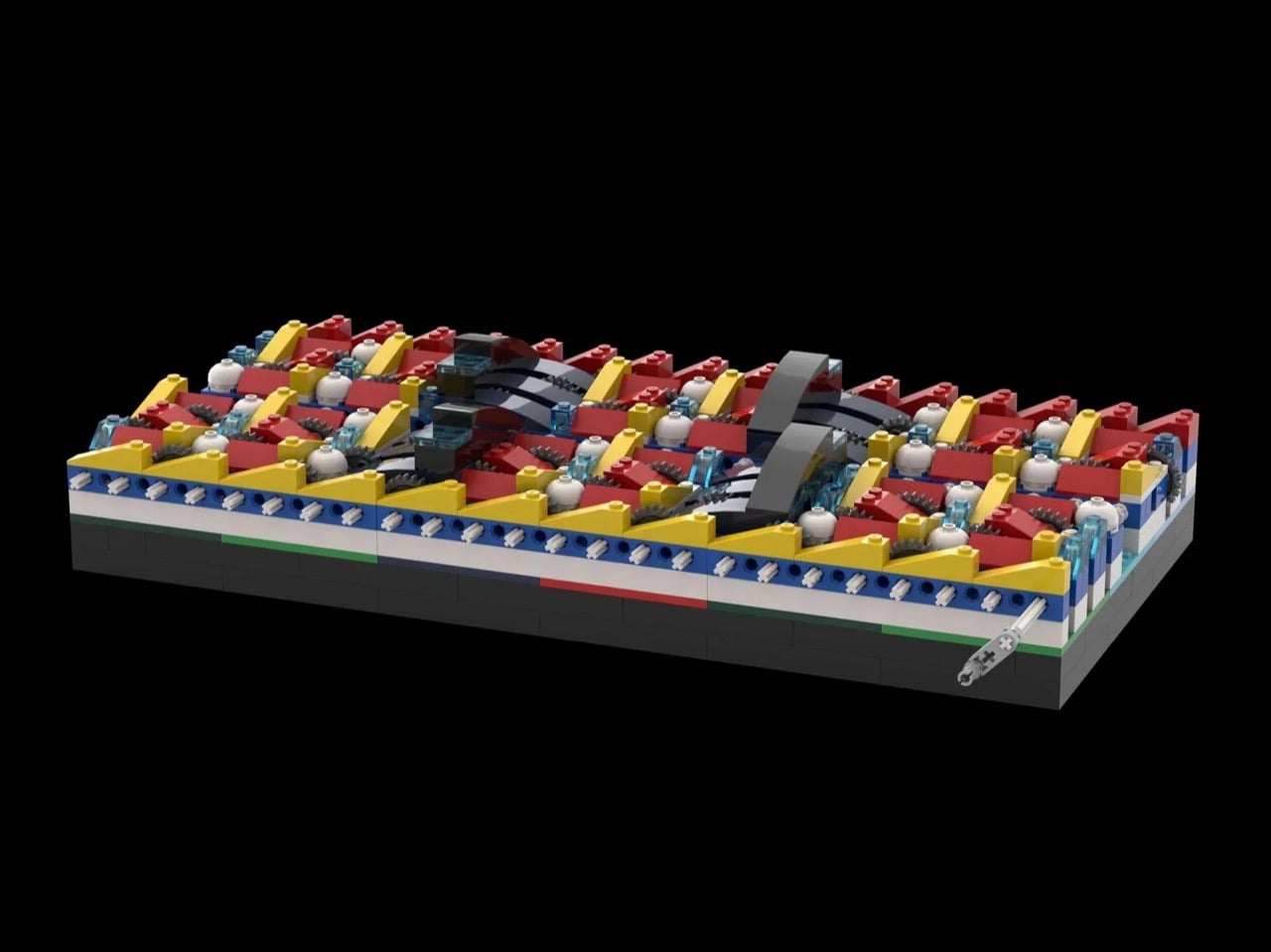
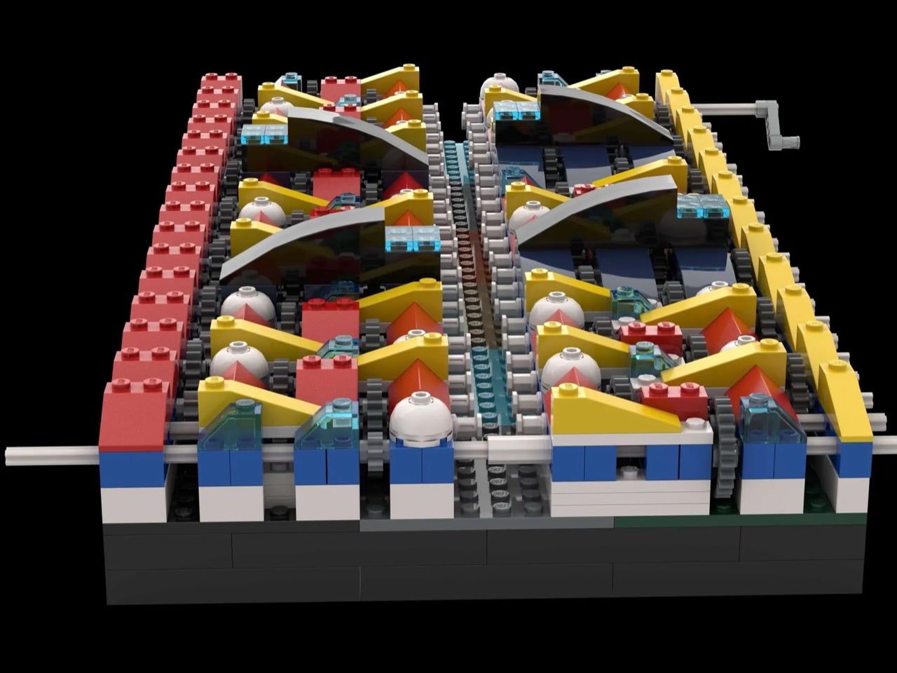
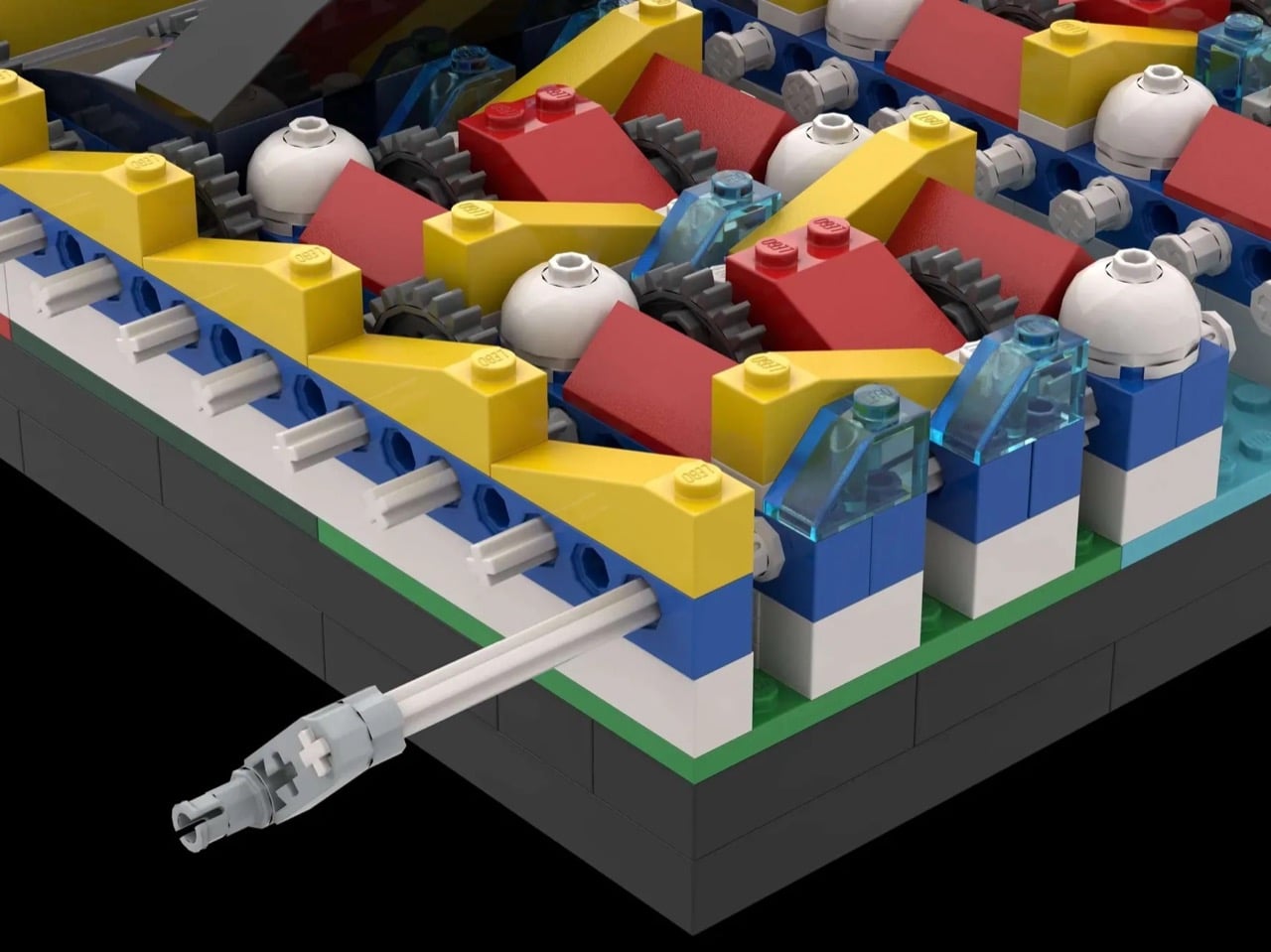
The Eternal Mosaic is a 655-piece LEGO Ideas concept that bridges the visual language of Mondrian’s De Stijl compositions with the mechanical logic of compound gear reduction. The build contains 46 stages of gear reduction using 24-tooth to 8-tooth ratios at every step. Compound that across all 46 stages and you arrive at a total gear reduction of approximately 9 billion trillion to one — a number that stops making intuitive sense almost immediately and doesn’t start again.

At 100 RPM, the first gear completes a rotation every 0.6 seconds. The final gear, embedded in the Mondrian-inspired color panel, will complete its first full rotation in approximately 90 trillion years — the universe is 13.8 billion years old by comparison. The Mondrian connection isn’t cosmetic. The rigid geometry of De Stijl shares an underlying grammar with compound gear logic: both systems operate by fixed, uncompromising rules and produce results that appear arbitrary until the governing principle becomes visible.

2. LEGO Tiramisu — The Food MOC That Makes You Question What You’re Actually Looking At

Tiramisu crossed out of northeastern Italy in the late 1960s and spent the next few decades becoming the world’s most universally loved no-bake dessert. LEGO Ideas creator Micdud has now built one from 1,106 bricks at nearly 1:1 scale — a corner slice served on a decorative round plate, complete with chocolate drizzle, cream dollops, and a fork mid-bite suspended in the air on a transparent support. The result makes you do a genuine double-take.

The cocoa topping is a masterclass in using disparate brown elements to simulate an organic, dusty texture — the kind of surface detail that food MOCs either nail or miss entirely. Micdud hid a raspberry made from a red clown hairpiece and blueberries built from purple astronaut helmets beneath the garnish, which is exactly the lateral thinking that makes a build memorable. Food MOCs live and die by their surface detail, and this one gets every layer right.

3. Michael Jordan LEGO Relief Poster — Air, Rendered in Brick

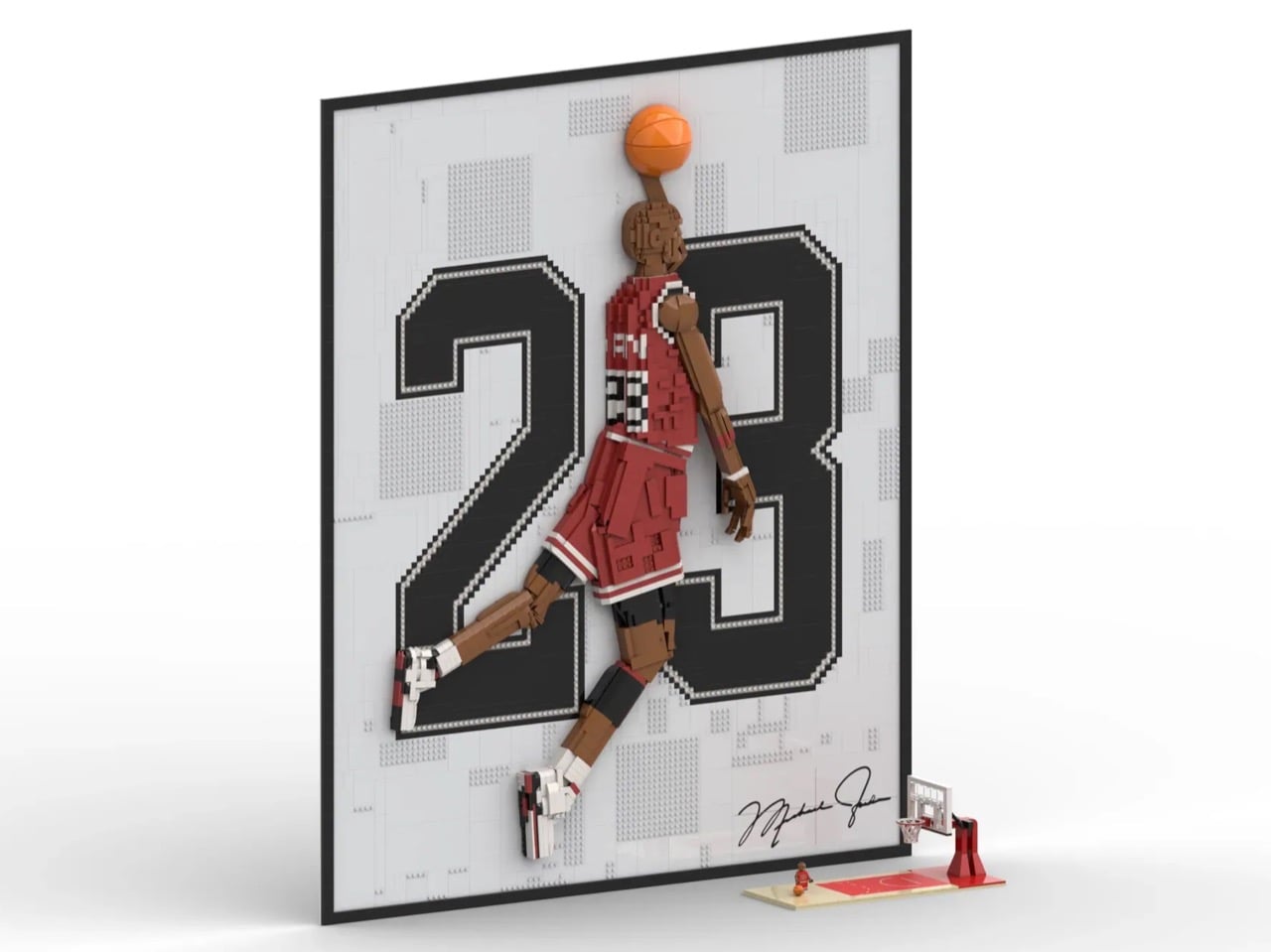
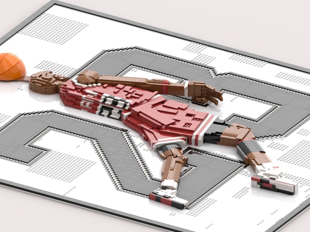
Most LEGO art stays flat. Builder LAFS85 made the harder choice with this 3,424-brick Michael Jordan portrait — a relief sculpture where Jordan’s figure physically protrudes from the background plane through layered brickwork, so the silhouette genuinely leaps toward you. In the front-facing renders, Jordan is mid-flight, ball raised, and the bold pixelated “23” filling the dark grey background amplifies the drama in the way confident typography always does when it knows exactly what it’s doing.

The technical decisions here reward close attention. LAFS85 used SNOT — Studs Not On Top — techniques throughout the figure to capture the flow of jersey fabric and the muscular geometry of Jordan’s legs. Flat tile surfaces read as smooth fabric. Angled plates suggest tension in the limbs. The red and white of the Chicago Bulls uniform pops hard against the dark grey background, and the brick-built recreation of Jordan’s signature in the lower corner is a genuinely considered finishing touch.

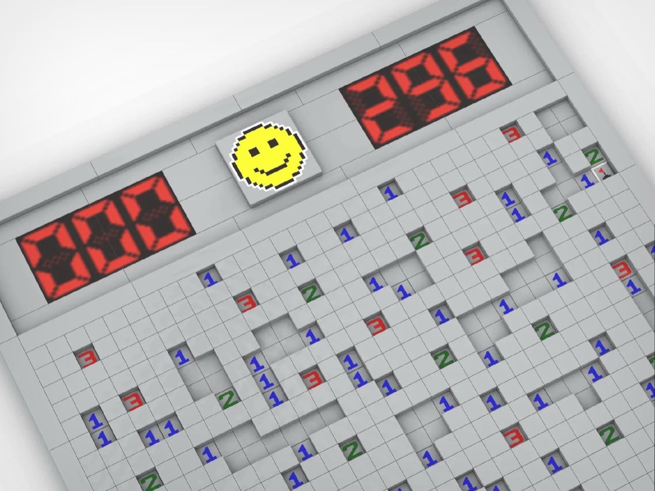
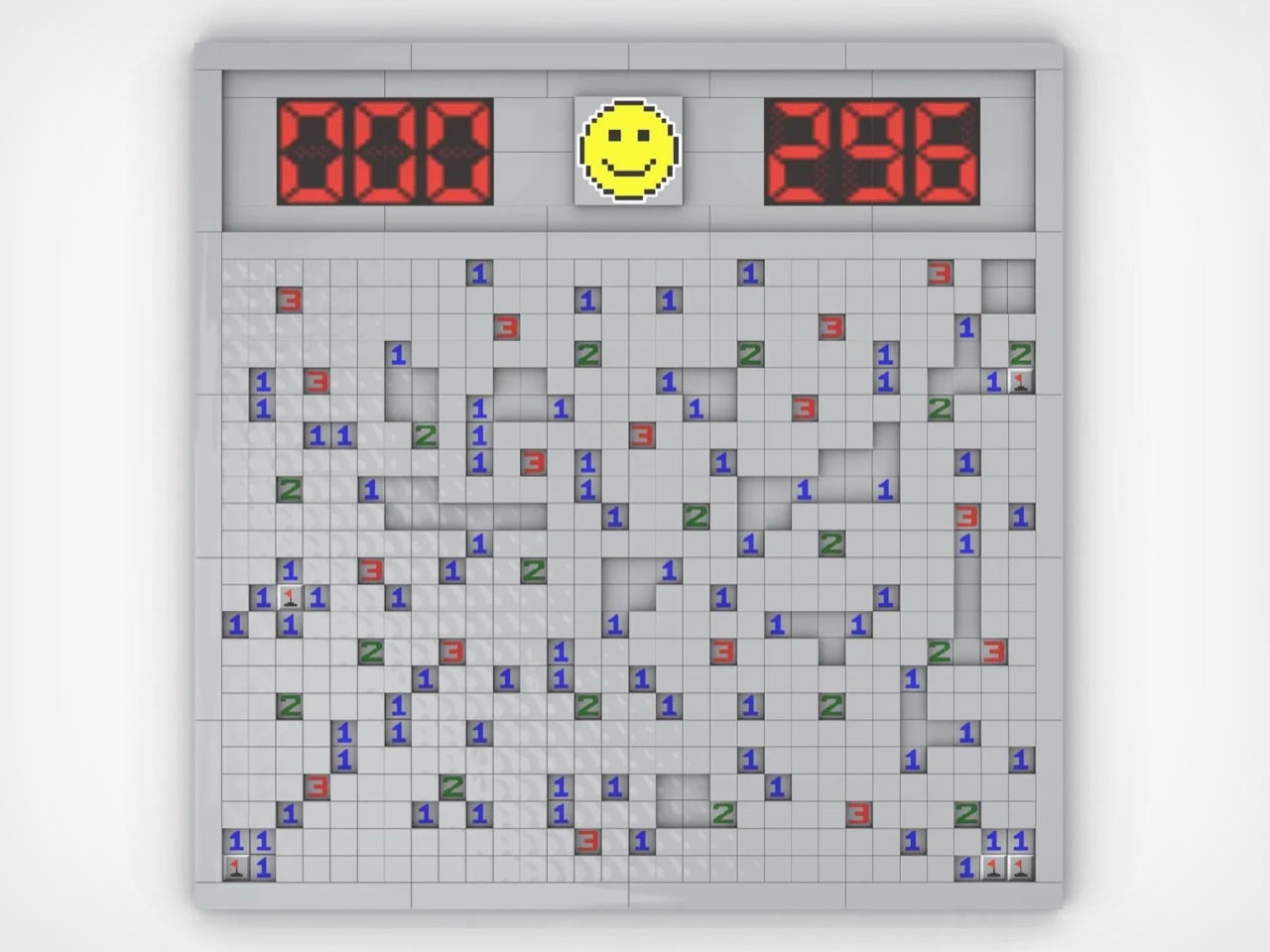
4. LEGO Minesweeper — A Functional Tribute to the World’s Most Productive Distraction

Before social media had the chance to dismantle workplace productivity, Minesweeper was already doing it quietly and for free. Created by Robert Donner and Curt Johnson for Microsoft in 1990, it shipped with every copy of Windows from 1992 onwards and spread through offices with the calm efficiency of something nobody wanted to admit spending time on. Conservative commentators were calling it a genuine threat to American business productivity. The alt-tab reflex became a survival skill.

LEGO builder carlos_silva94 rebuilt that gray grid in brick with more deliberateness than the concept strictly required. The build replicates the Windows 95 interface with real accuracy — raised tile surfaces recreating the three-dimensional texture of unpressed buttons, working seven-segment displays tracking mine counts and elapsed time, and the iconic yellow smiley face watching from above. The textured tiles are the detail that lifts this from casual tribute to considered design object, giving the build physical weight and tactile presence.

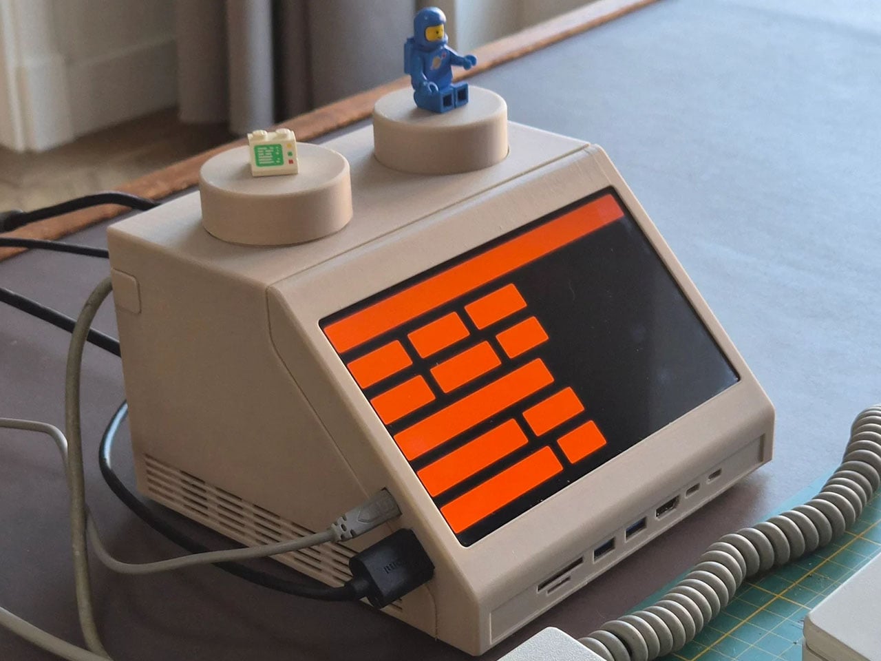
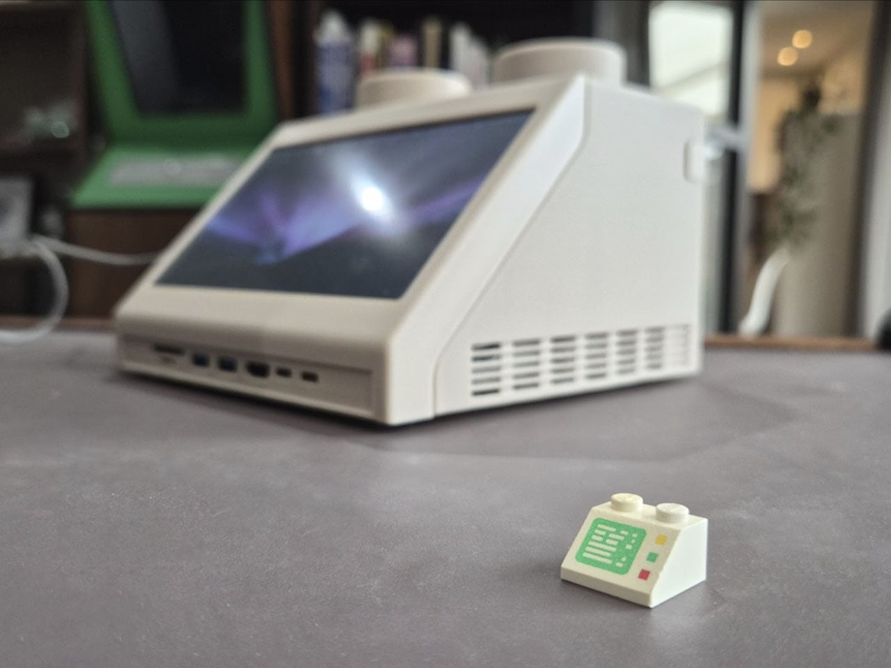
5. LEGO M2x2 Workstation — The 1979 LEGO Brick That Actually Runs macOS

Dutch designer Paul Staal took the iconic LEGO Slope 45 2×2 brick — a wedge-shaped piece introduced in 1979 that appeared in classic space-themed sets as a visual shorthand for spacecraft computer terminals — and scaled it up to roughly ten times its original size. The result is a fully operational desktop computer housing that looks like it was pulled from a vintage LEGO Space playset and placed directly onto a modern desk.

Inside that oversized brick sits an Apple Mac mini equipped with Apple’s M4 chip, transforming a retro toy aesthetic into a capable, fully functional desktop system. What elevates this beyond novelty is the design intelligence underneath. Staal honored the Slope 45’s cultural memory while operating at a completely different scale and purpose. The M2x2 earns the term “conversation piece” without sacrificing utility — quietly asking why computing hardware defaults to featureless black rectangles when it could look like this.

The Month LEGO Stopped Playing Around

April 2026 demonstrated something the LEGO community has always known but rarely gets to show all at once: the brick is not a limitation, it’s a vocabulary. These five builds span engineering, portraiture, product design, retro computing, and food sculpture, and each one executes its concept with a precision that makes the medium feel like the only logical choice. Whether 655 pieces or 1,106, the ambition is entirely consistent.

What ties all five together is the specificity of vision behind them. The Eternal Mosaic is conceptually staggering in a way no other medium could reproduce. The Tiramisu challenges your eyes to accept that plastic bricks can convincingly look edible. The Jordan portrait rewards inspection at every level. The Minesweeper build lands immediately for anyone who worked in an office before 2000. And the M2x2 makes you rethink what computing hardware could look like. That is a strong month by any standard, in any medium.

The post 5 Best LEGO Builds of April 2026 We Wish Were Already Official Sets (One Takes 90 Trillion Years to Work) first appeared on Yanko Design.
Four Dark Cedar Volumes Stepping Down a Tahoe Slope — This Is What a Smart Cabin Looks Like

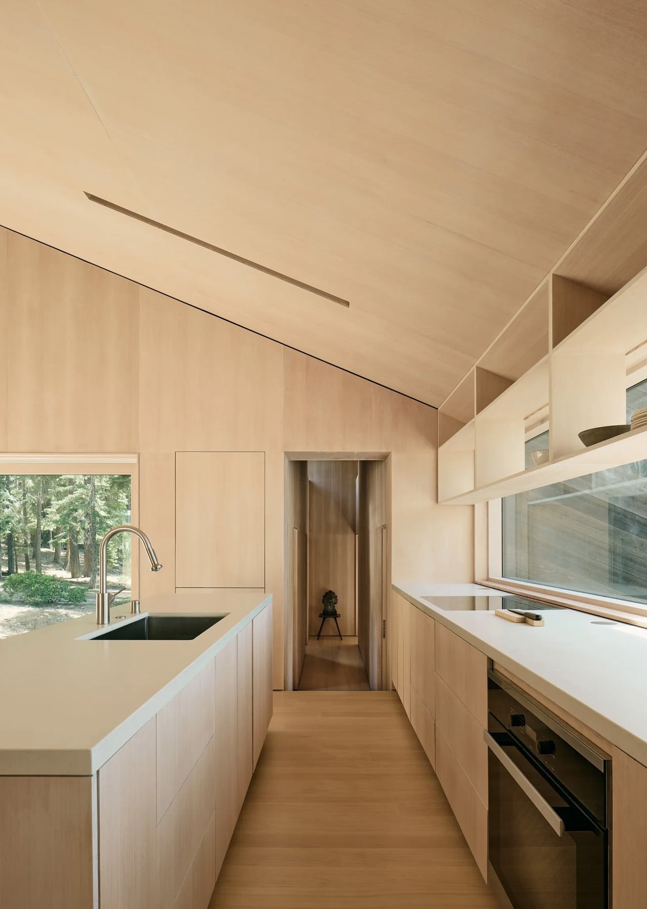
Most mountain cabins treat the landscape as a backdrop. Mork-Ulnes Architects’ Staggered Cabin treats it as a collaborator. Completed in the summer of 2024 and situated at an elevation of over 6,000 feet where South Lake Tahoe meets the foot of the Sierra Nevada, the project doesn’t fight the slope it sits on — it moves with it. Four dark-stained cedar-clad volumes shift and step down the alpine terrain, preserving existing granite boulders and Jeffrey Pines rather than displacing them, a decision that sets the entire design logic in motion from the outset.

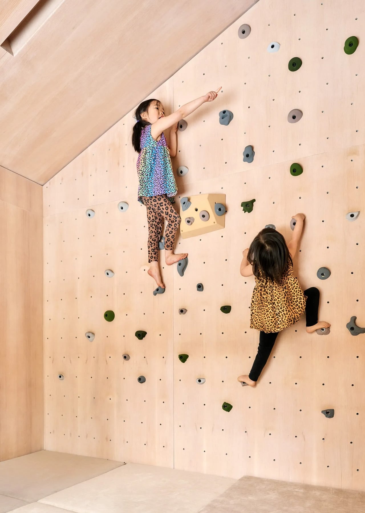
The staggered footprint does more than navigate the slope. As the volumes shift against each other, they carve out compact exterior courtyards between them, creating protected outdoor pockets that catch the sun and shelter from the wind. These aren’t residual spaces. They extend daily life outdoors for much of the year, whether that means a morning coffee in a snow-framed clearing or children moving freely between the cabin’s interior and the forest edge. It’s a quiet but considered move, one that turns the gaps in the architecture into some of the most usable square footage on the site.

Designer: Mork-Ulnes Architects

The exterior reads as restrained and deliberate. Rough-sawn western red cedar is clad in a deep dark stain, with boards running diagonally to emphasize the pitch of the roofs and reinforce the sense of directional movement down the hill. Standing-seam metal roofs cap each volume, with engineered snow guards holding a continuous layer of snow in place through winter, adding insulation and moderating melt. Over time, the finish will weather toward the tones of bark and shadow, letting the cabin settle further into the forest rather than announce itself against it.

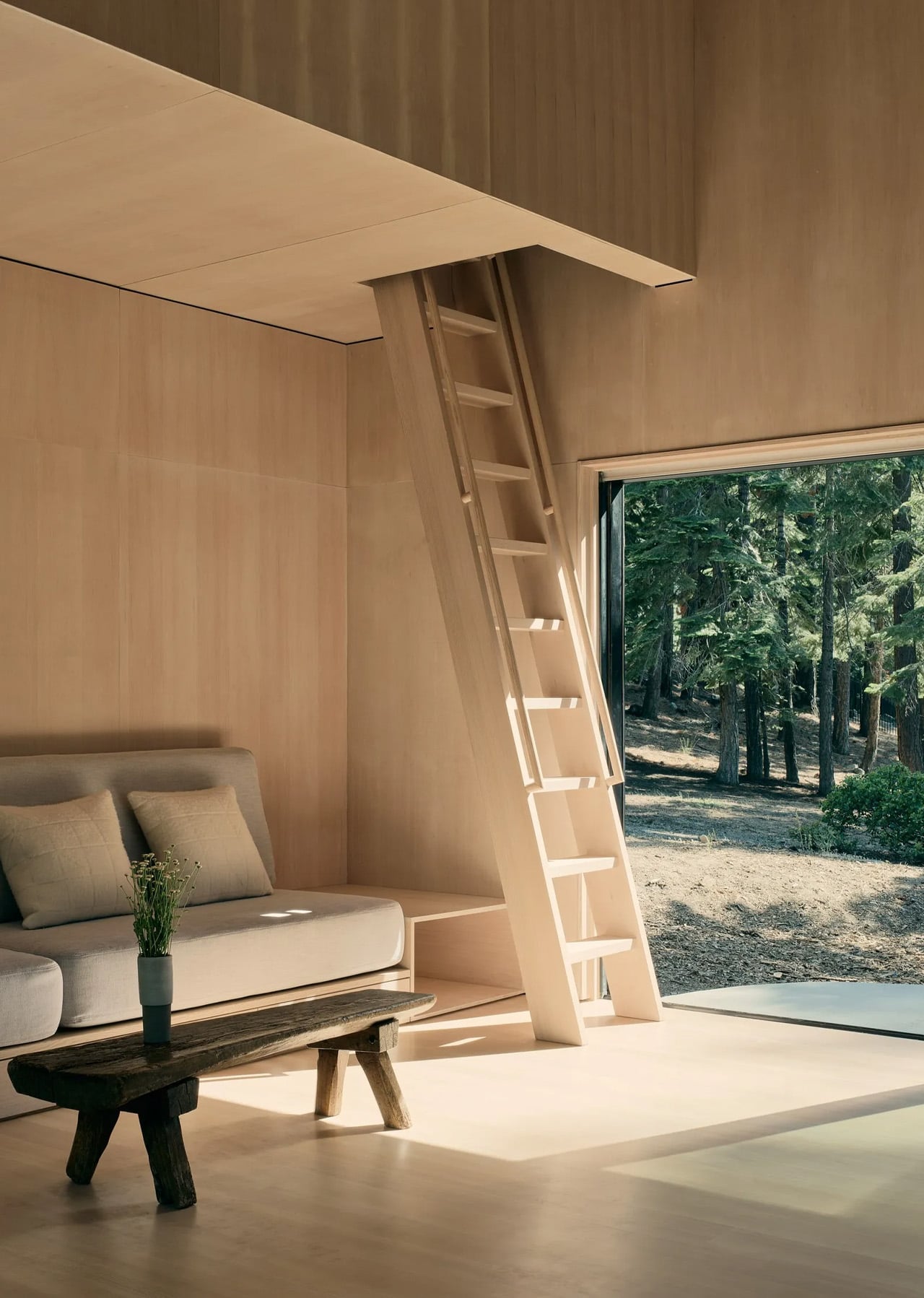
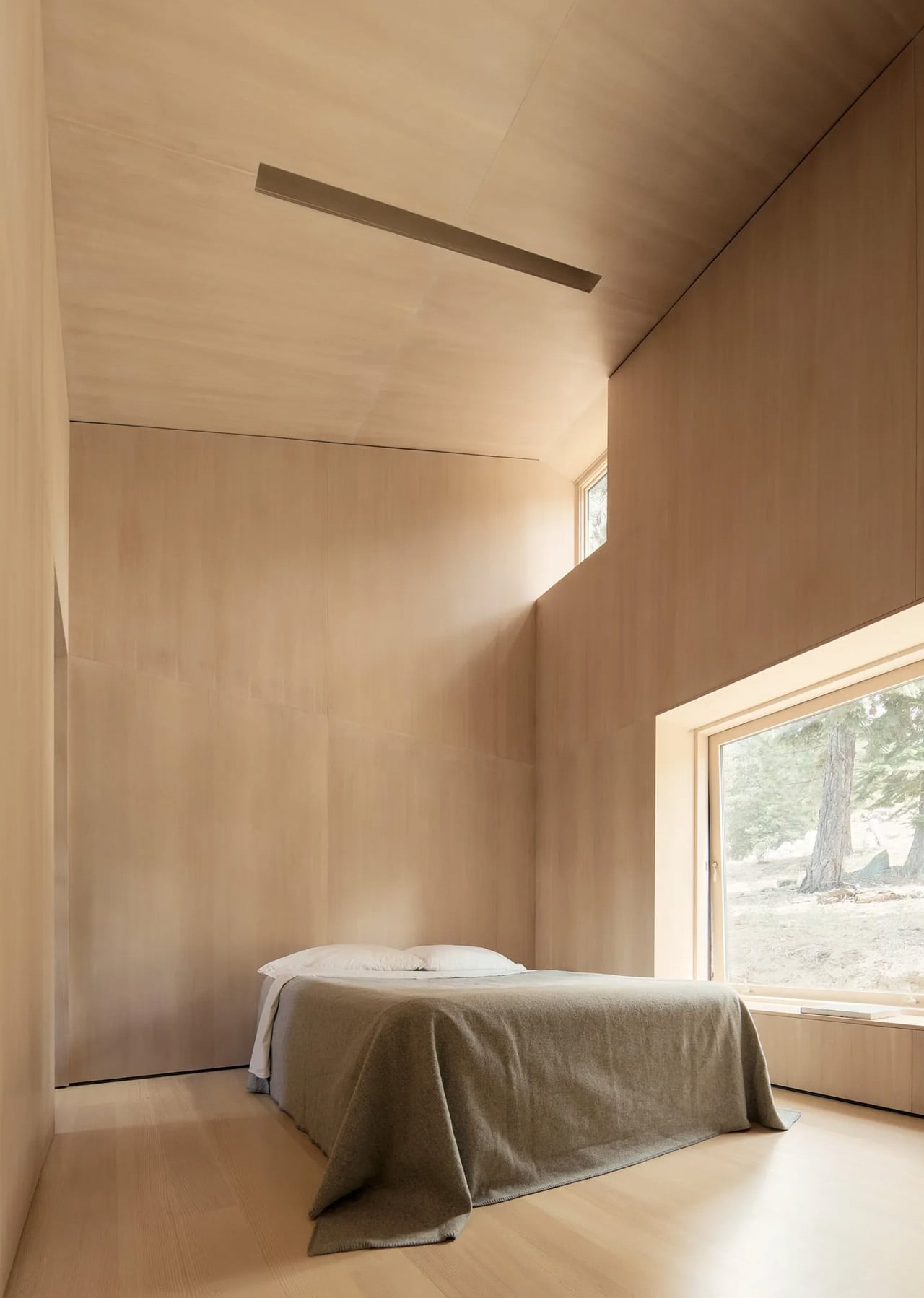
Inside, the 1,400-square-foot plan organizes sleeping quarters around a central living and dining space that opens to the outdoors on either side. Douglas fir plywood runs continuously across walls, ceilings, and custom cabinetry, creating a unified warmth that glows under Sierra light. The steeply pitched shed-roof geometry is put to work capturing mezzanine spaces above, with a plywood ladder accessing a compact home office tucked beneath the roofline. Clerestory windows frame the pine canopy overhead, drawing the eye upward and making the 1,469-square-foot footprint feel considerably more generous than its dimensions suggest.

The work of Mork-Ulnes has long bridged Scandinavian and Northern Californian sensibilities, and the Staggered Cabin sits squarely within that lineage. The shed-roof silhouettes recall Nordic precedents while nodding to the A-frame tradition of the Sierra. Designed as a full-time residence for a young family of four, it’s a cabin that doesn’t ask you to trade comfort for place. It offers both, at 6,000 feet, without compromise.

The post Four Dark Cedar Volumes Stepping Down a Tahoe Slope — This Is What a Smart Cabin Looks Like first appeared on Yanko Design.
8 Best Desk Gadgets Every Digital Nomad Quietly Keeps in Their Bag & Finally Deserves a Permanent Home

Most desk setups are inherited. The nomad’s is earned. Everything that makes it into the bag has already passed a strict and largely unconscious test — weight, versatility, the ability to make a stranger’s table feel like a place worth working from. Over months and years of moving between cities, time zones, and co-working spaces, the digital nomad ends up with a carefully curated set of tools that are small by necessity but thoughtful by design.

The interesting thing about these objects is what happens when the travel slows down. When a lease gets signed, a proper desk arrives, and the bag starts being unpacked with more intention. The tools that survived the road do not lose their relevance on a permanent surface. Many of them were built with the kind of considered design that rewards exactly this kind of scrutiny. They look better than most things bought specifically for a home office, hold up longer, and carry the kind of personal history that makes a workspace feel genuinely inhabited. This is for that moment. Eight objects that lived in the bag for a reason, and deserve a permanent home for the same one.

1. OrigamiSwift Folding Mouse

The OrigamiSwift is what happens when industrial design takes portability seriously. Weighing just 40 grams and folding flat to a profile thin enough to slip between notebook pages, it removes the usual tension between compact and comfortable. On a desk, it unfolds in under half a second, snapping into a full-sized ergonomic shape that sits naturally in the hand. For anyone who has suffered through the cramped mechanics of a standard travel mouse, this feels like a genuine upgrade.

The Bluetooth connectivity is quick, and the origami-inspired fold keeps the mechanism tactile enough that using it becomes a small ritual rather than a chore. At the desk, it earns a permanent spot not because it compensates for a lack of options, but because the transformation itself is satisfying. It is the kind of tool that makes you reconsider how you work, and then makes the work feel slightly more considered. Portable by design, permanent by choice.

Click Here to Buy Now: $85.00

What we like

  • Folds to near-invisible thinness at just 4.5mm, making it one of the most carry-friendly mice ever built without compromising on ergonomic full-size comfort
  • Activates in under half a second with a single flip, making the transition from travel bag to working mouse feel immediate and effortless

What we dislike

  • At 40 grams, the lightweight build may feel insubstantial for users accustomed to the heft and resistance of a traditional full-sized mouse
  • Bluetooth-only connectivity means no wired fallback for tasks where even minor wireless latency becomes a frustration

2. Fidget Cube

The Fidget Cube arrived at a time when open-plan offices made visible restlessness a liability and invisible anxiety a norm. Antsy Labs built something straightforward in response: a small cube with six distinct tactile surfaces, each mapped to a different kind of fidget. Click. Glide. Flip. Breathe. Roll. Spin. The vocabulary is simple, the execution is precise, and the result is a desk object that earns its keep without demanding attention from anyone but you.

For digital nomads who have spent years suppressing the impulse to tap or spin something through a long layover or tense client call, the Fidget Cube offers quiet permission. On a permanent desk, it sits within reach without asking for attention. The black and graphite colorways blend cleanly into most setups, looking less like a toy and more like a considered detail. It is not a gimmick. It is self-awareness shaped into an object.

What we like

  • Six distinct tactile surfaces cover a wide range of fidgeting behaviors in a single pocket-sized cube, making it genuinely versatile across different stress responses and focus modes
  • Discreet colorways like Midnight Black and Graphite blend seamlessly into professional setups without drawing unwanted attention in shared or client-facing workspaces

What we dislike

  • The clicking surfaces can produce audible sounds that may distract colleagues in quiet, open-plan, or library-style work environments
  • The cube format offers no digital or productivity-tracking integration for users who want data on their focus habits or stress patterns

3. Nothing Power (1) Battery Bank

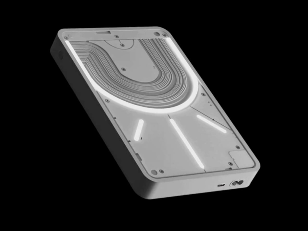
Nothing built its reputation on the Glyph interface, a grid of LED lights that turned the back of a phone into a notification display and a design statement. The Power (1) carries that language into a battery bank, using transparent layers, bold light paths, and illuminated interactions to make a utilitarian object feel worth looking at. The design philosophy is direct: good design is not just about appearance, it is about how an object makes you feel when you reach for it.

For a nomad who has charged devices from airport benches and café stools, a power bank is rarely a display piece. The Nothing Power (1) challenges that. Sitting on a desk, the Glyph illumination gives charging status a visual presence that feels more like an ambient display than a simple indicator light. It treats the desk as a stage and every object on it as a conscious choice. Few battery banks have ever earned that kind of consideration.

What we like

  • The Glyph interface turns a charging indicator into a visual experience, making it arguably the only power bank designed to look genuinely intentional, sitting on a desk permanently
  • Transparent design layers reflect Nothing’s ethos of honest, open construction, giving the object a premium quality that stands apart from every other battery bank on the market

What we dislike

  • The Nothing Power (1) is currently a concept design and is not yet available as a finished commercial product
  • Exact battery capacity, output wattage, and pricing remain unconfirmed, making direct comparison with available alternatives difficult at this stage

4. HubKey Gen2

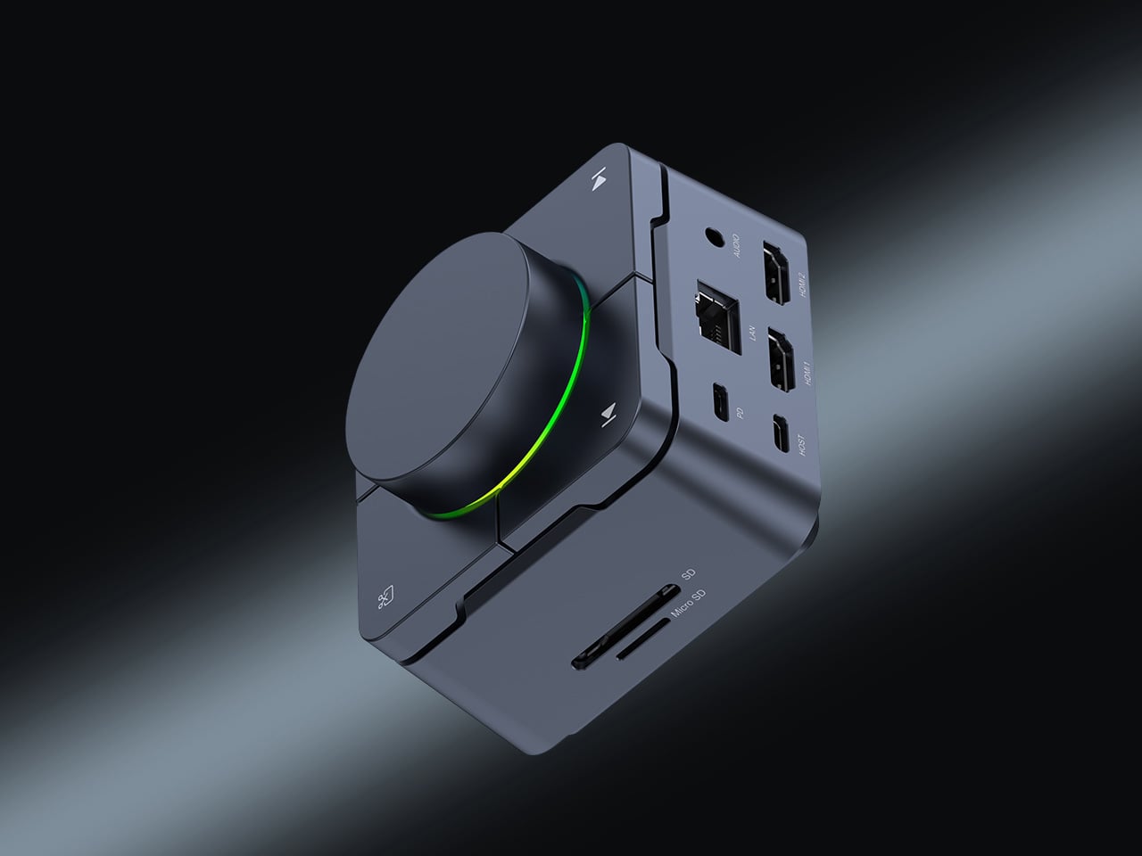
Desk clutter tends to accumulate in layers: a dock for the monitor, an adapter for the second screen, a hub for storage. Somewhere between them sits a tangle of cables that each solves a single problem in isolation. The HubKey Gen2 treats that as a design problem worth solving from the inside out. It is an 11-in-1 USB-C hub with a hardware control surface on top, offering programmable shortcut keys, a central dial, 100W power delivery, and 2.5Gbps Ethernet in a compact cube footprint.

The display support is what separates it from a standard hub. Two HDMI ports, each running a 4K display at 60Hz, mean a laptop becomes a proper dual-monitor workstation without extra adapters. For a nomad settling in, that shift from single-screen café work to a dual-screen editing setup is significant. The shortcut keys and central dial bring a physical control layer to software-heavy workflows, keeping hands on the desk rather than hunting through menus on a trackpad.

What we like

  • Dual 4K HDMI outputs at 60Hz eliminate the need for a separate display dock when transitioning from a travel setup to a full home workstation
  • The programmable shortcut keys and central knob return a satisfying physical dimension to digital workflows, reducing time spent navigating software menus

What we dislike

  • The compact cube form factor may feel crowded once all 11 ports are simultaneously in active use, which limits clean cable management around the unit
  • Fully customizing the shortcut keys requires additional software configuration, adding a setup investment before the productivity benefit becomes fully apparent

5. Rolling World Clock

Keeping track of time zones is one of the quieter friction points of nomadic life. The Rolling World Clock solves it most physically: you roll it. A 12-sided form with each face representing a major timezone city, a single hand reads the local time wherever it lands. London. Tokyo. New York. The gesture is intuitive, and the result is a genuinely useful desk object without trying to be more.

Available in black and white, this is the kind of object that earns its place through curiosity rather than scale. Guests pick it up. Colleagues ask about it. It turns a functional necessity into a small conversation. For the nomad who has lived across time zones and built relationships across continents, there is something quietly satisfying about having those cities represented not on a screen, but held in your hand.

Click Here to Buy Now: $49.00

What we like

  • The tactile rolling interaction makes checking international time a deliberate, physical gesture rather than a reflexive phone unlock
  • Covers 12 major timezone cities in a clean, minimalist form that works equally well as a functional desk piece or a shelf object

What we dislike

  • Limited to 12 preset cities, which may not include every timezone relevant to users with contacts in less commonly represented regions
  • The single analog hand offers general time orientation rather than precise minute-level accuracy, which may not suit users with tight cross-timezone scheduling needs

6. Orbitkey Desk Mat Slim

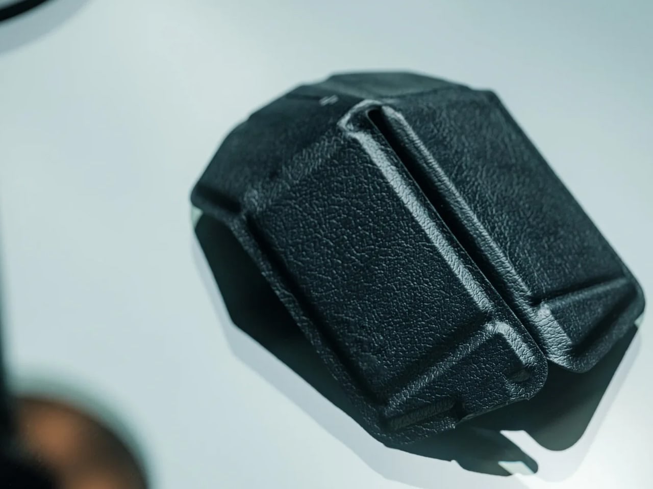
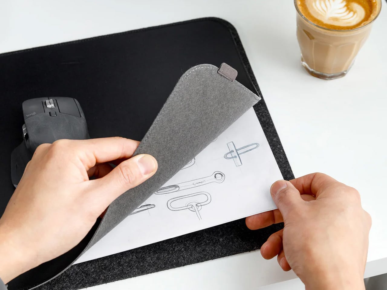
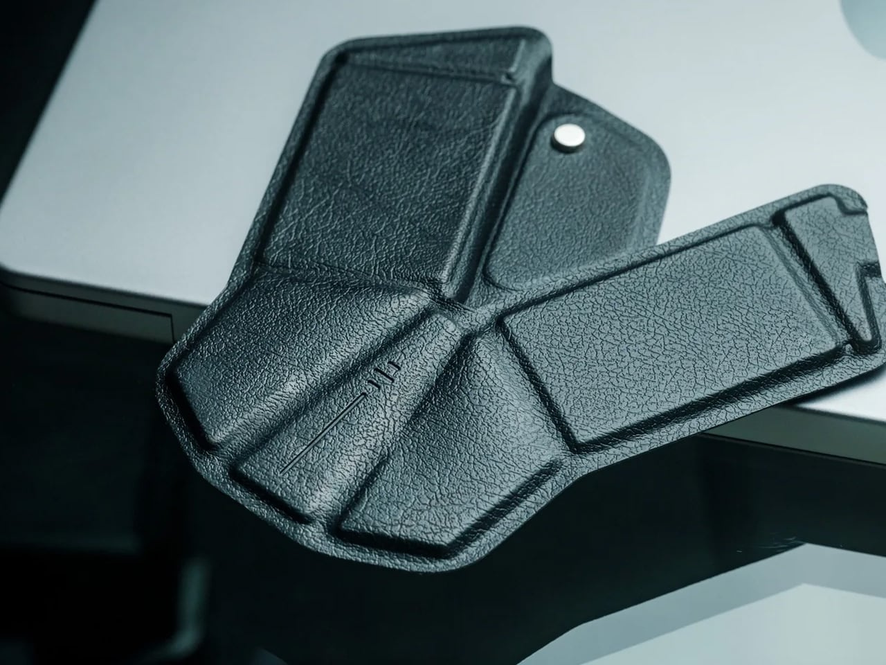
A desk mat either disappears into the background or it becomes the visual anchor of the entire setup. The Orbitkey Desk Mat Slim is built for the second outcome, designed with the restraint of the first. Made from premium vegan leather on top and 100% recycled PET felt underneath, it layers material integrity with practical function. The anti-slip backing holds the mat planted, while the magnetic cable holder keeps wires from drifting toward the edges, where they become a distraction.

Notes, receipts, and napkin sketches are the inevitable artifacts of nomadic work, and they tend to pile up without a clear home. The document hideaway is the detail that tips this mat from surface to organizer. The slim front pocket keeps loose papers horizontal, accessible, and out of sight. For someone accustomed to a shared café counter or a hotel tray table, this level of surface order feels less like a feature and more like a quiet exhale.

What we like

  • The document hideaway pocket reduces visible desk clutter without adding bulk, making it one of the more intelligent storage details found on any desk mat
  • Vegan leather and recycled PET felt construction deliver both a refined visual quality and a material responsibility that most desk accessories still lack

What we dislike

  • The slim format may feel too narrow for users with wide multi-monitor setups who need significant horizontal coverage across their full desk surface
  • The magnetic cable holder works best with a small number of cables and may become less effective in more heavily wired configurations

7. Flow Timer

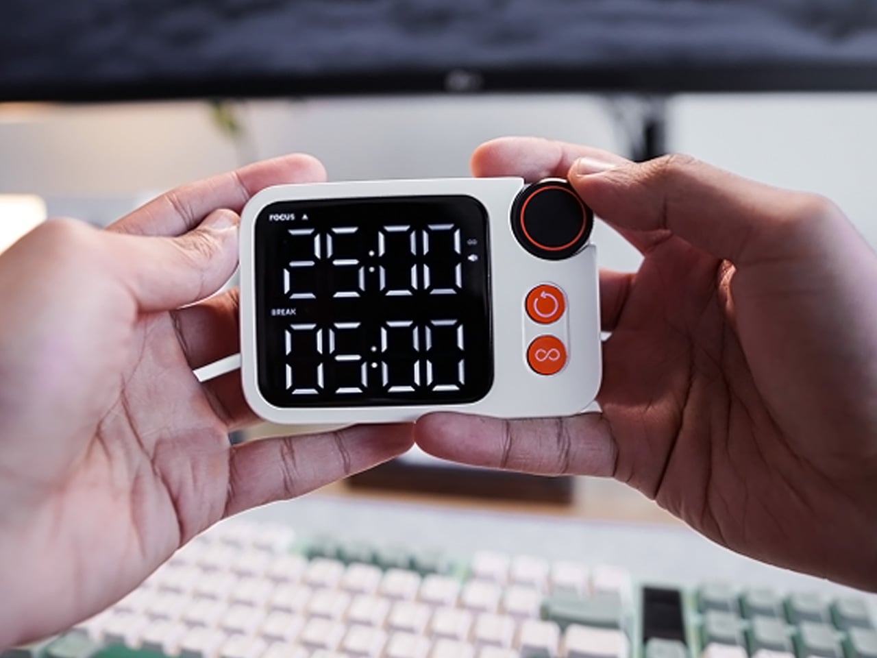
The Pomodoro method has been around since the late 1980s, and most people who use it rely on a phone timer or a browser tab. Neither is ideal. The Flow Timer replaces that with something solid. Cast in metal, with dual customizable presets for focus and break intervals, it lives on the desk as a functional timer and an object of intention. The visual arc tells you where you are in the session without a notification or a screen unlock.

For nomads who have long been their own productivity managers, a physical timer brings a different quality of commitment than a screen-based one. The act of setting it is deliberate. The focus-to-break transition is automatic. Sitting in a permanent spot, it becomes a small anchor for the rhythm of the day. Available in three colorways, the Flow Timer is one of those rare accessories that improves both how you work and how the desk looks while you do it.

What we like

  • Automatic switching between focus and break intervals removes the friction of resetting a timer mid-session, keeping the workflow continuous and uninterrupted
  • Solid metal construction and three considered colorways make it an aesthetic desk object as much as a productivity tool

What we dislike

  • The absence of a digital display means reading the visual arc requires a brief adjustment period before the feedback becomes truly instinctive
  • As a dedicated single-function device, it competes for surface space against multi-purpose tools in more minimal or compact desk setups

8. Memento Business Card Log

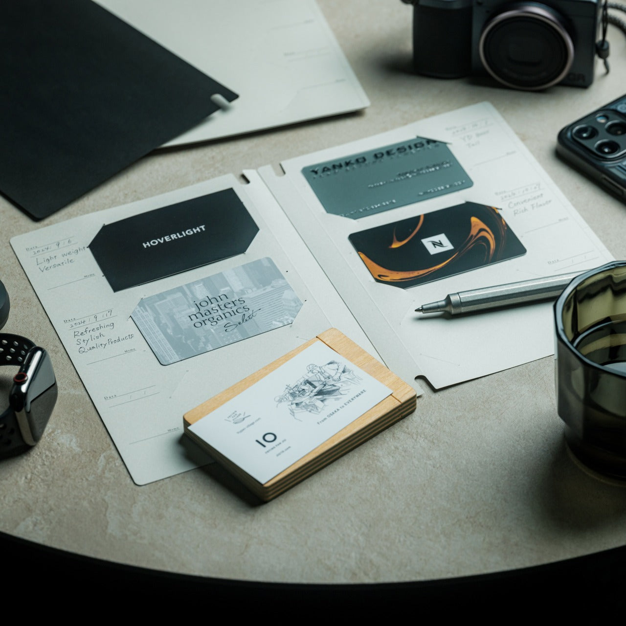
There is a specific quality to the business cards that collect at the bottom of a travel bag. Each one marks a moment, a conversation, a person worth remembering. The Memento Business Card Log was made for exactly this. Designed by Re+g, a Japanese brand with roots in thoughtful stationery craft, it holds up to 120 cards with a dedicated handwriting space beside each one for a characteristic, a date, or a detail that brings the memory back clearly.

The two-point slit system keeps cards secure without sleeves or adhesive, and the special binding allows pages to be easily reordered as professional relationships evolve. For a nomad building a network across cities and industries, this is the kind of object that earns its desk placement not through technology but through intention. It is a record of everywhere you have been and everyone who mattered enough to keep. That is rare, and the design knows it.

Click Here to Buy Now: $35.00

What we like

  • The two-point slit system and reorderable binding make the organization genuinely flexible, allowing the log to grow and shift alongside a professional network over time
  • Handwritten note spaces beside each card transform a simple storage product into a meaningful personal archive of the conversations that shaped a career on the road

What we dislike

  • A maximum of 120 cards may feel limiting for high-volume networkers who accumulate contacts rapidly across multiple cities, conferences, and industries
  • The analog format, while entirely intentional, offers no digital sync or search capability for users who need to cross-reference contacts across devices

These Gadgets Were Never Just for the Bag

There is a moment in every nomad’s life when the bag starts feeling less like freedom and more like a deadline. When the tools that carried you through airports and co-working spaces deserve something more settled. These eight objects were always portable by design, but built with the kind of intention that reads just as well on a permanent desk. Good design does not ask where it is. It just works.

The idea here is not to stop moving. It is to stop treating permanence as a downgrade. A folding mouse, a tactile timer, a rolling clock, a mat that holds your cables and your notes — taken together, they form a desk that feels chosen rather than assembled. The nomad who gives these a home is not giving anything up. They are just finally working somewhere worthy of the tools they already carry.

The post 8 Best Desk Gadgets Every Digital Nomad Quietly Keeps in Their Bag & Finally Deserves a Permanent Home first appeared on Yanko Design.
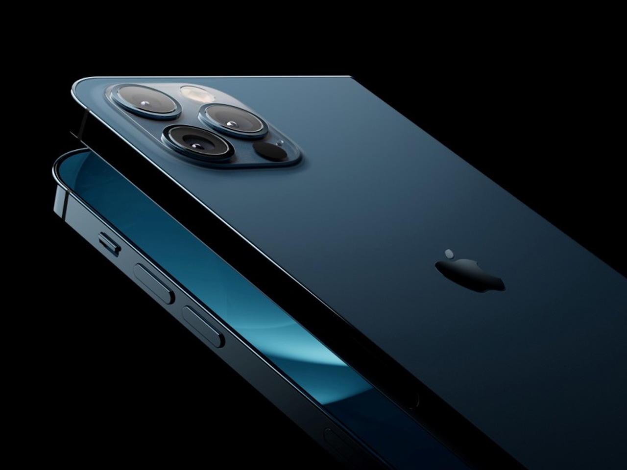
Apple Turns 50, and Its Most Ambitious Phone Hasn’t Even Launched Yet — 5 iPhone Fold Concepts

On April 1st, 2026, Apple turns 50. For a company that has spent half a century rewriting the rules of consumer technology, the milestone deserves something genuinely transformative. The Macintosh redefined personal computing. The iPod gave an entire generation a new relationship with music. The original iPhone, unveiled in 2007, combined a phone, a music player, and the internet into a single glass rectangle and made every competitor look outdated overnight. The iPhone Fold is real, and it’s coming.

Leaks from early 2026 paint a detailed picture: a book-style foldable powered by the A20 Pro chip on a 2nm process, backed by a 5,500mAh battery, with a 7.8-inch creaseless OLED inner display and a 5.5-inch outer screen. Pricing is expected to start around $2,400, and while a September announcement seems likely, most analysts believe shipments may not begin until December. Designers, modders, and concept artists have spent years filling the void with their own visions of a folding iPhone, each carrying a distinct theory about what Apple should prioritize. These five concepts map the full range of that imagination and capture exactly how much is riding on the real thing.

1. iPhone iFold by Michal Dufka — The Clamshell That Makes Sense

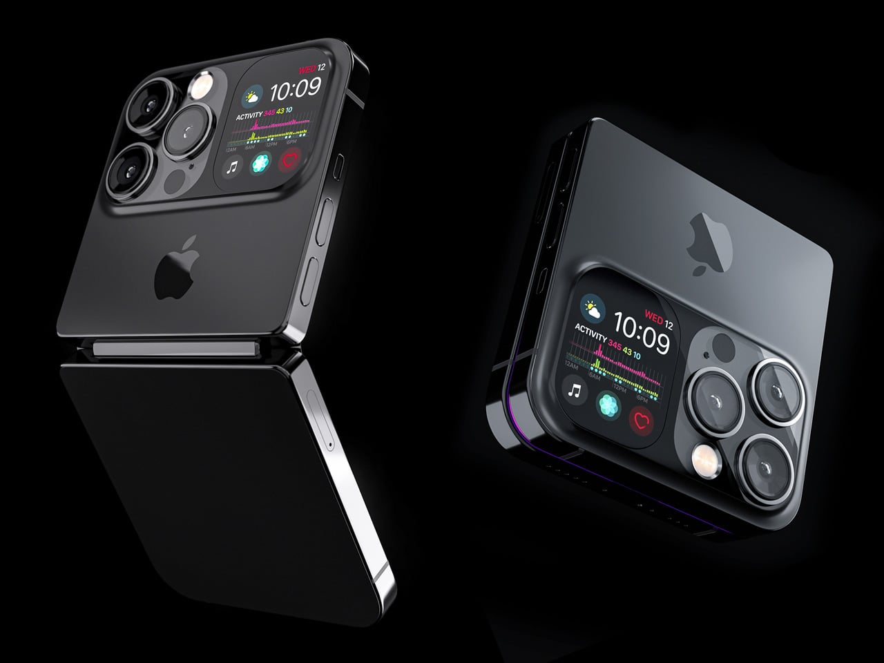
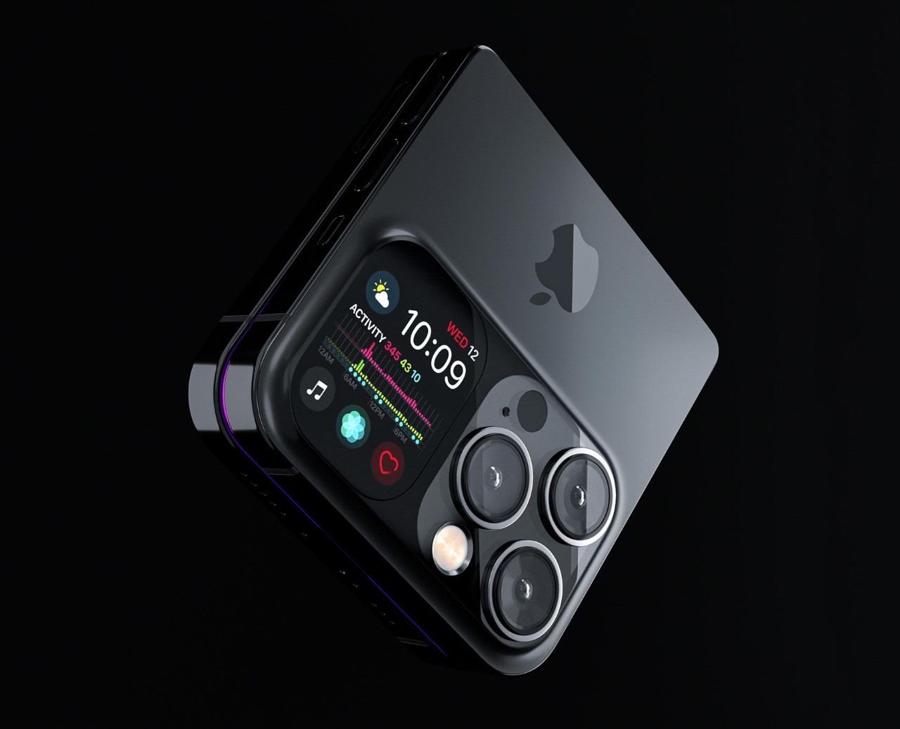
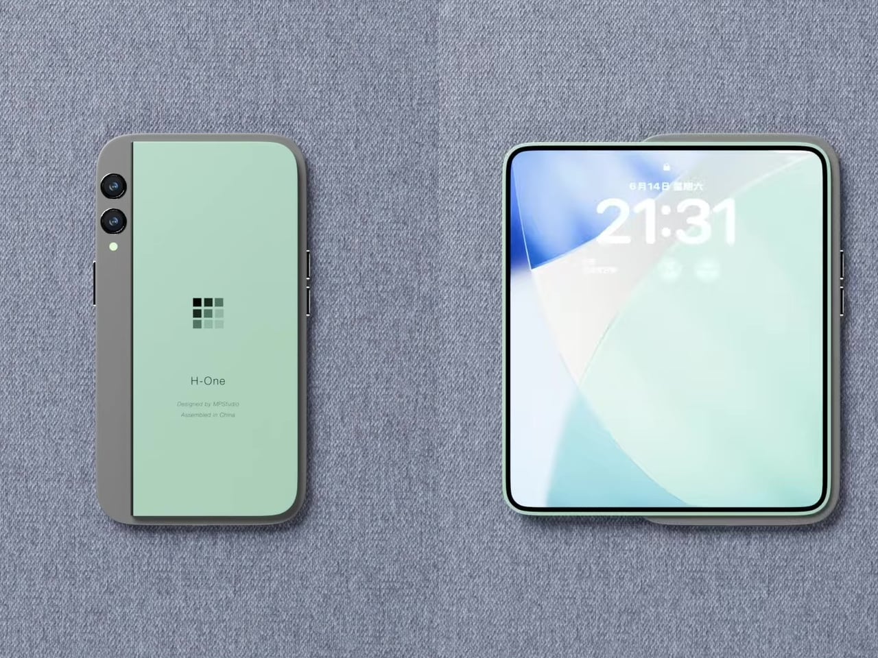
Designer Michal Dufka’s iPhone iFold is built on restraint. Rather than reinventing the iPhone’s entire identity, it applies a clamshell fold to the form factor people already love, drawing direct inspiration from the MotoRAZR and Samsung Galaxy Z Flip. The phone closes into a compact, pocketable square and opens into a full iPhone experience with a generously large display. For anyone who has quietly missed a phone that actually fits in a jeans pocket, this concept speaks to that feeling.

What sets the iFold apart is the secondary display placed beside the camera bump. When the phone is closed, that smaller screen surfaces notifications, time, and essential stats without requiring you to open the device at all. It functions almost like an Apple Watch built into the back of the phone. With Apple’s always-on display technology mature enough for this kind of ambient use, the dual-display setup feels less like speculation and more like a logical next step.

What We Like

  • The secondary display mirrors Apple Watch notification behavior, making glanceable information genuinely useful without ever opening the phone
  • The clamshell format makes the iPhone pocket-friendly for the first time in years without sacrificing screen size when it matters

What We Dislike

  • The clamshell form limits overall screen real estate compared to the expanded tablet surface that a book-style foldable provides
  • Hinge durability over sustained daily use is entirely unexplored here, and it remains the most critical engineering question for any clamshell design

2. iPhone Fold Ultra by 4RMD — When the Specs Match the Ambition

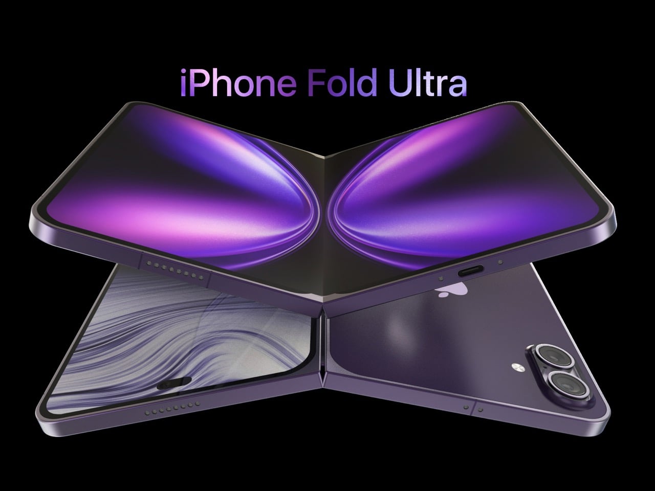
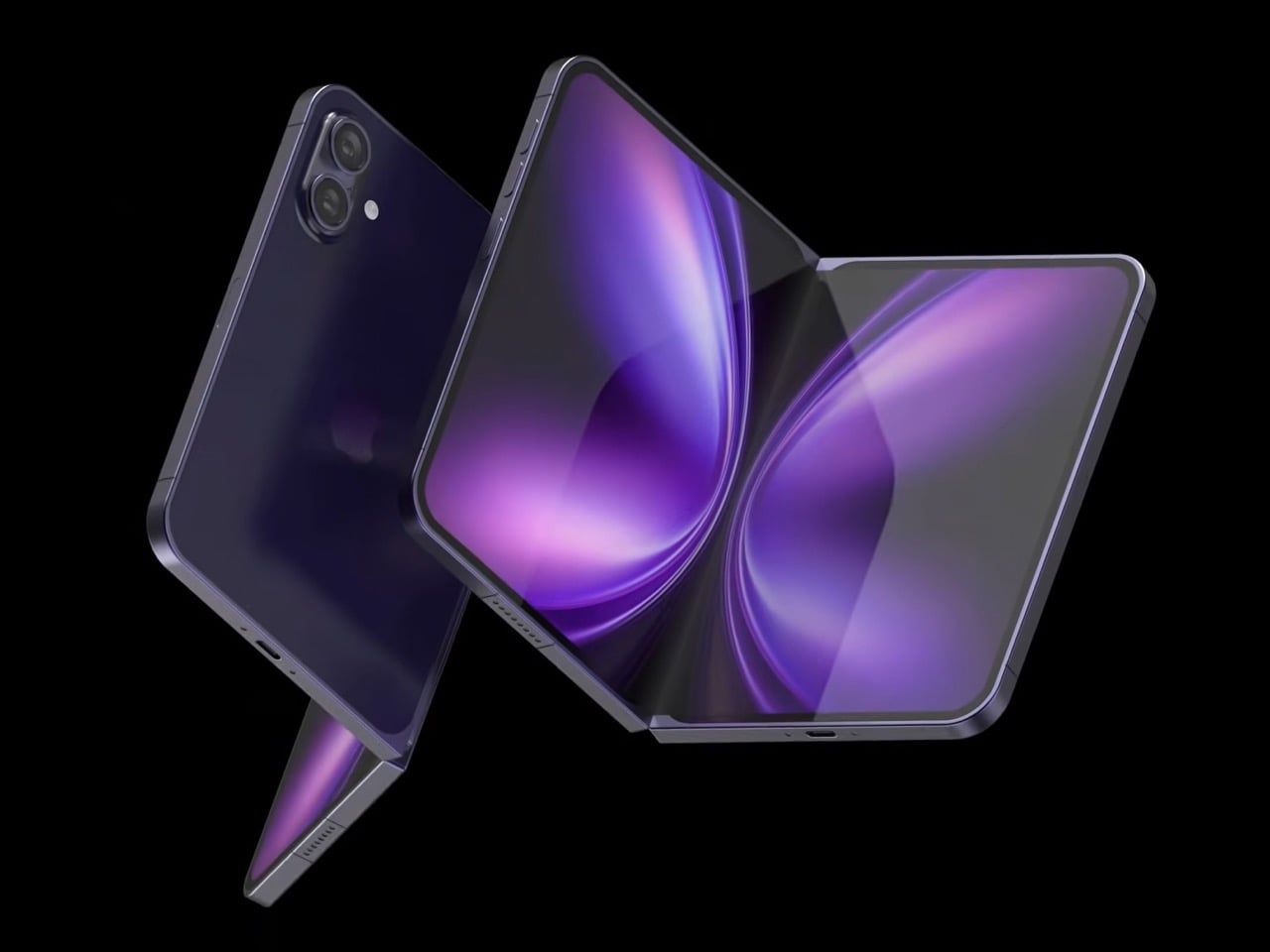
Design studio 4RMD’s iPhone Fold Ultra is grounded in credibility. Built directly from reported leaks rather than pure creative license, the concept presents a book-style foldable with dual 48MP rear cameras, a 24MP ultra-wide front camera, and the A20 Pro chip running on a 2nm process. Three color options appear across the renders: White, Black, and Deep Purple. At an estimated $2,299, this concept sits at the very top of Apple’s lineup with total conviction.

That Deep Purple colorway deserves its own moment. It is a deliberate callback to the iPhone 14 Pro’s most celebrated finish, and it lands differently on a book-style foldable. Something about that color on a device this ambitious reads as genuinely luxurious, the kind of finish that reframes a $2,299 price tag from a shock into a statement. 4RMD clearly understands Apple’s visual grammar, and this concept shows what happens when research and aesthetics share the same design space.

What We Like

  • Specs pulled from verified leaks give this concept real credibility, making it feel like a preview of what is actually coming rather than pure speculation
  • The Deep Purple colorway is a smart, crowd-pleasing callback to one of Apple’s most recognized and beloved finishes

What We Dislike

  • The “Ultra” label sets an expectation that demands exceptional build quality, and no concept can fully address whether the real device will deliver on that promise
  • Crease visibility across the inner display remains unaddressed, which continues to be the most persistent criticism of every book-style foldable on the market

3. iPhone Fold by Svyatoslav Alexandrov — The One That Replaces Two Devices

Svyatoslav Alexandrov’s iPhone Fold concept, created for the YouTube channel ConceptsiPhone, thinks in bigger terms than anything else on this list. Starting as a standard smartphone with a 6.3-inch outer display, it unfolds into a squarish 8-inch tablet that sits clearly in iPad Mini territory. This is not a phone with a bonus screen bolted on. It is a device designed to make carrying both an iPhone and an iPad feel genuinely redundant.

Alexandrov replaces Face ID with a full-display Touch ID fingerprint sensor, keeping the front notch minimal and clean. The rear carries the iPhone 12 Pro’s complete camera array: wide, ultra-wide, telephoto lenses, a LiDAR scanner, and flash. MagSafe compatibility and 5G readiness are already confirmed in the concept, adding meaningful weight to its productivity pitch. Whether the device supports the Apple Pencil is left open, but given an 8-inch inner display, its absence would feel like a missed opportunity.

What We Like

  • The full-display Touch ID is a clean and creative solution that keeps the front uncluttered while solving Face ID’s known complications on foldable form factors
  • The iPad Mini-sized inner screen makes a practical, real-world case for consolidating two devices into one without any meaningful compromise

What We Dislike

  • Removing Face ID eliminates one of the iPhone’s most seamless and trusted authentication features, which most users rely on dozens of times every day
  • Leaving Apple Pencil support unconfirmed weakens what should naturally be this concept’s strongest argument for productivity

4. iPhone Fold by Mechanical Pixel — The Foldable That Doesn’t Actually Fold

Mechanical Pixel’s concept takes the most unconventional approach on this list, and the reasoning is worth understanding. Rather than bending the iPhone itself, the design keeps the main body completely rigid and attaches a separate foldable display to the rear panel instead. The core phone experience remains exactly as people know it, maintaining the familiar dimensions and feel that iPhone users already rely on. That additional screen only enters the picture when a larger surface is specifically needed.

That rear foldable panel sits raised on a platform above the phone’s back, unfolding outward into a larger, squarish tablet surface when required. The layered profile is clearly visible from the side, giving the device a deliberately experimental and modular quality. The camera module remains in its standard position, completely unaffected by the additional display layer. The logic is unconventional, but the core argument of preserving the primary iPhone experience from any foldable compromise is genuinely hard to dismiss.

What We Like

  • Keeping the main body rigid entirely sidesteps the crease and long-term hinge durability problems that define every conventional foldable on the market today
  • The modular approach means the everyday iPhone experience is never degraded or compromised by the mechanics of the foldable element

What We Dislike

  • The raised rear platform creates an unrefined, layered side profile that sits well outside anything Apple’s design language has ever produced or endorsed
  • The prototype-like aesthetic makes it very difficult to imagine this direction surviving Apple’s notoriously demanding and detail-oriented product design process

5. iPhone V — The One Someone Actually Built

Every concept on this list exists as a digital render. The iPhone V is different. A YouTuber modder physically dismantled an iPhone X, extracted its internal components, and rebuilt the entire device inside a Motorola Razr chassis. The result is a working, folding iPhone that runs real iOS, carries a Retina-quality display, and folds in half like a classic flip phone. As a proof of concept, it is extraordinary. As a finished product, every question comes flooding in.

What makes the iPhone V genuinely compelling is not fit, finish, or polish, because it has none in any conventional sense. It is the straightforward fact that someone cared enough to prove the idea could actually work using parts that already exist. The folding mechanism and device thickness still need serious refinement. A working clamshell iPhone running authentic iOS is, in the end, a more persuasive argument for this form factor than any polished render has managed to be.

What We Like

  • The iPhone V is the only entry on this list that is fully functional, running real iOS inside an actual working clamshell device
  • Its physical existence proves the clamshell iPhone concept is viable using genuine Apple hardware, well beyond anything a render can demonstrate

What We Dislike

  • The repurposed Motorola Razr chassis produces a build that falls far short of consumer-grade fit, finish, and structural refinement
  • Hinge mechanism quality and overall device thickness remain significant engineering challenges that the mod cannot resolve, and they are exactly what Apple needs to solve

The Concepts That Made the Wait Worthwhile

Fifty years in, Apple is still the company that makes you wait. The iPhone Fold concepts here are not just exercises in creative imagination — they are a record of what designers and makers have been asking for, year after year. Some nailed the form factor. Others got the specs exactly right. A few did both. Together, they have shaped the entire conversation around a device that already feels utterly inevitable.

When the real iPhone Fold arrives, it will be measured against each of these visions. That is the power of concept design — it sets the bar before the product ships. Apple turning 50 while holding back its most ambitious device is pure theater. The design community has been writing this script for years. The only question is whether the real thing can live up to what the imagination has already built.

The post Apple Turns 50, and Its Most Ambitious Phone Hasn’t Even Launched Yet — 5 iPhone Fold Concepts first appeared on Yanko Design.
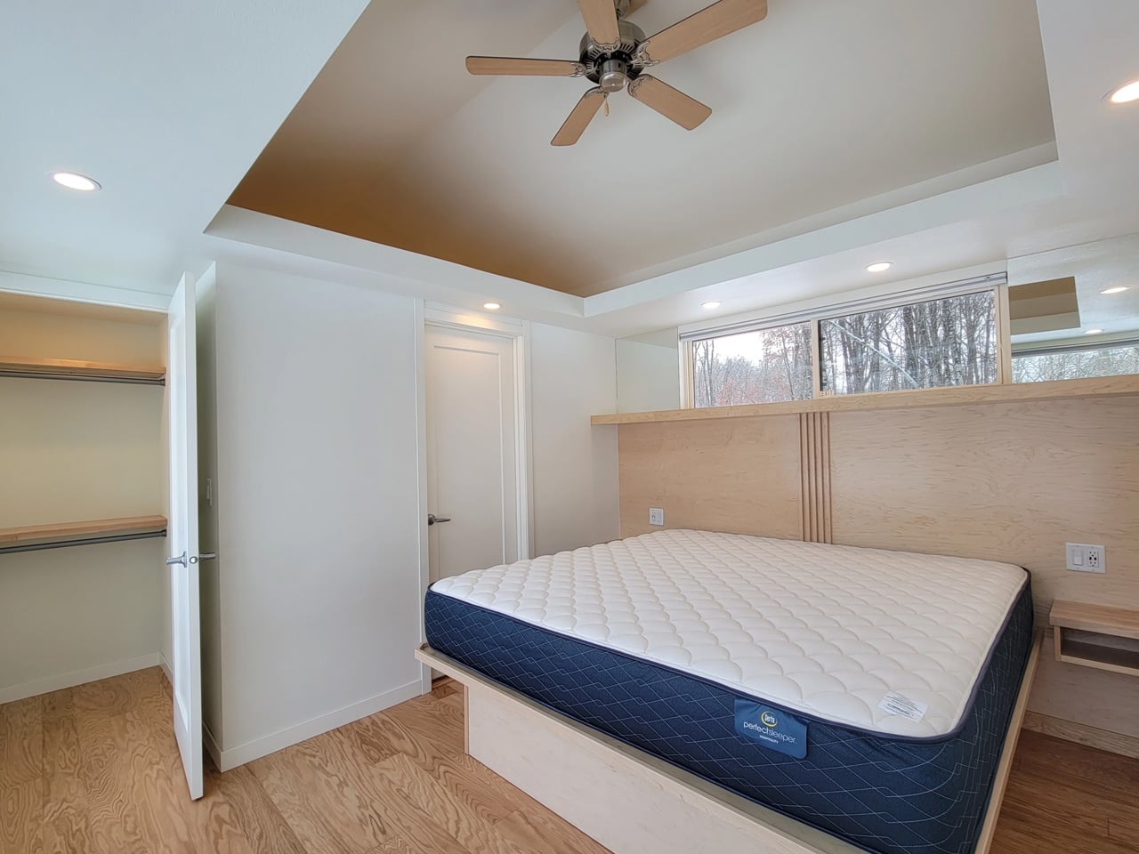
This Tiny House Has 30 Feet of Glass and Feels Nothing Like a Tiny House

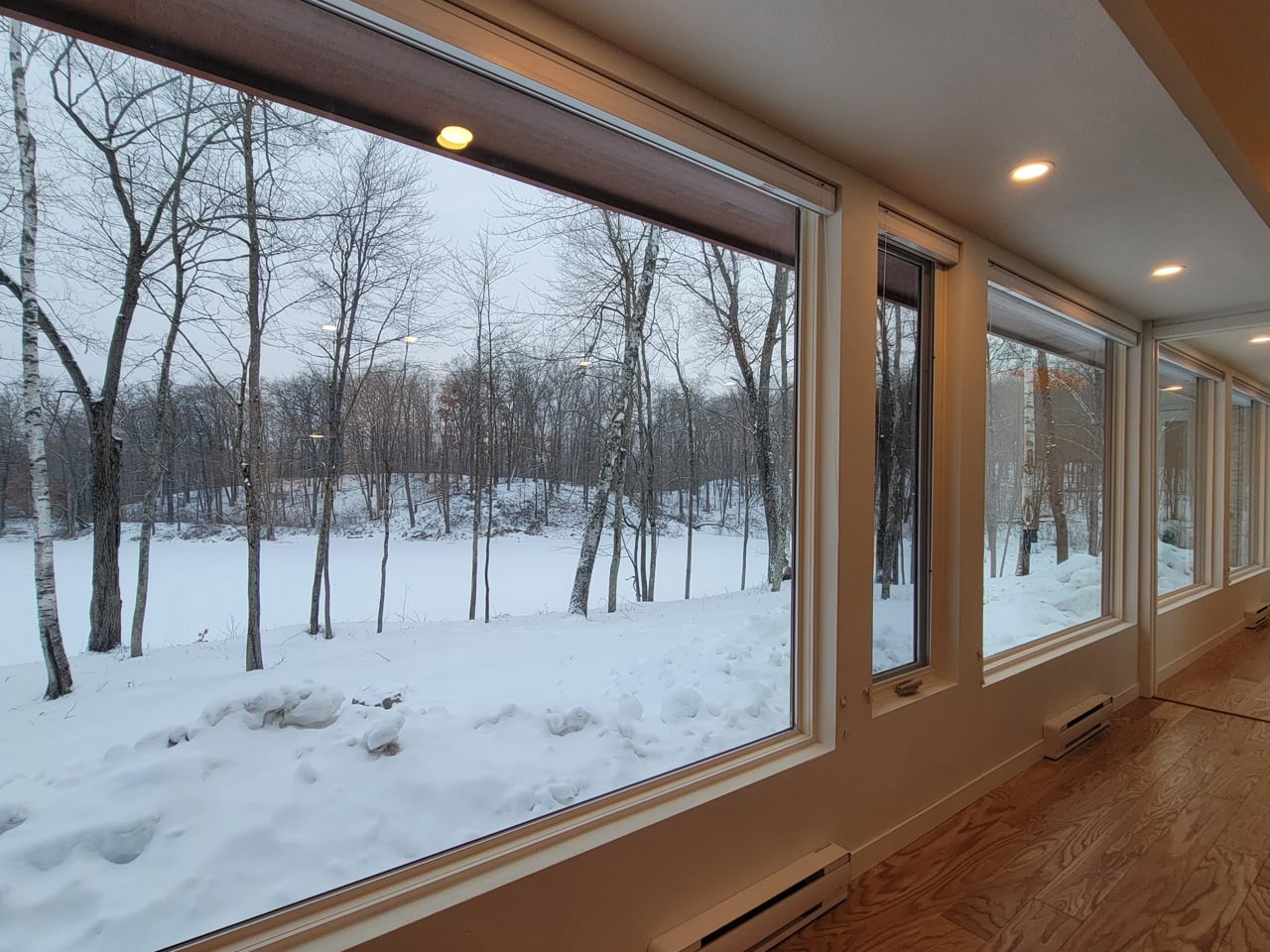
The tiny house world has long wrestled with one unavoidable tension — the desire for light, openness, and space against the hard constraints of a compact footprint. Escape’s Shoreline Glass House doesn’t just address that tension; it dissolves it entirely. This recently completed park model is one of the most spatially generous and light-saturated tiny homes to come out of the category in recent memory, and it earns that distinction without resorting to multi-level gymnastics or lofted sleeping quarters.

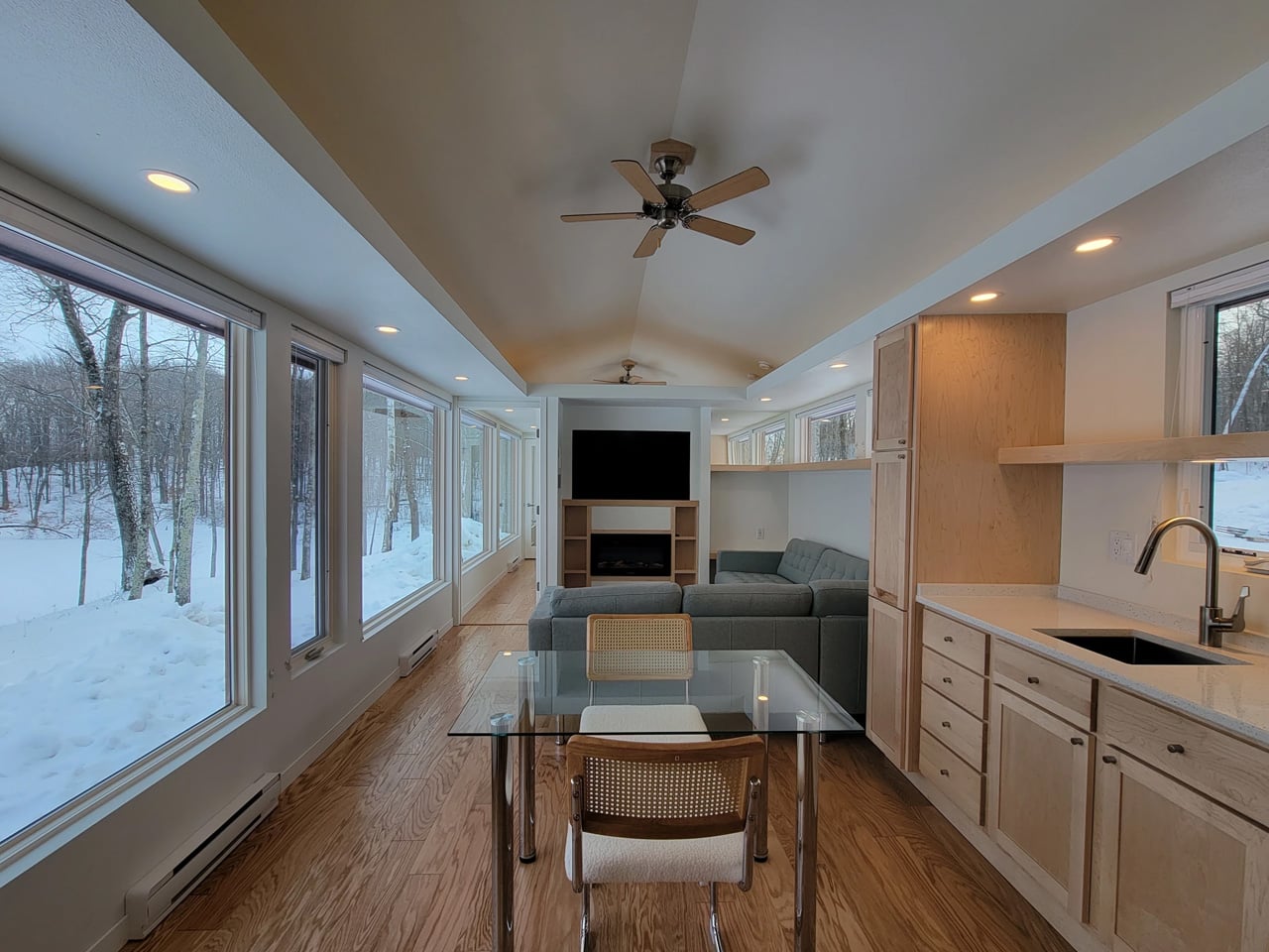
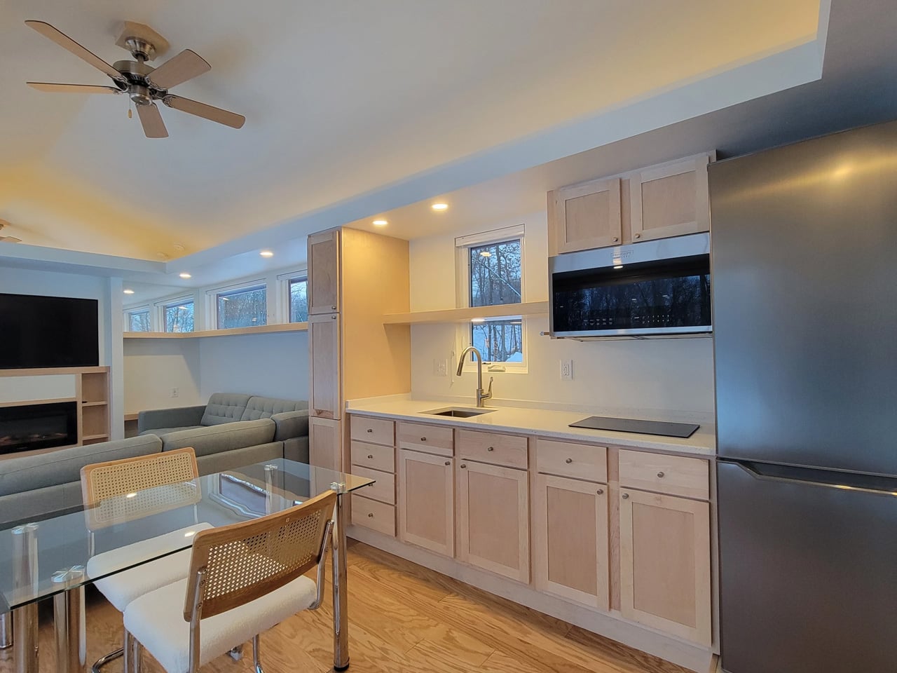
What immediately sets the Shoreline Glass House apart is its commitment to single-floor living. It has a length of 47 ft (14.3 m) and an increased width of 12 ft (3.6 m), which makes for a much larger interior than is typical for the format, comparable in fact to a small apartment. That extra width is the key differentiator. Where most tiny homes feel like corridors with furniture squeezed in, the Shoreline opens up laterally, giving rooms a genuine sense of proportion that doesn’t demand you constantly recalibrate your spatial expectations.

Designer: Escape

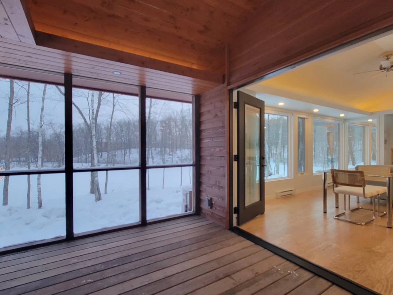
The name earns its keep on the exterior, too. The Shoreline Glass House features a light-filled interior thanks to 30 ft (9 m) of glazing running along one wall, flooding every corner of the home with natural light throughout the day. It’s a design move that blurs the line between inside and out, making the home feel anchored to its surroundings rather than sealed off from them. Entry is through a large enclosed porch, a smart buffer zone that expands the functional living area while adding that coveted semi-outdoor layer that tiny home dwellers often sacrifice first.

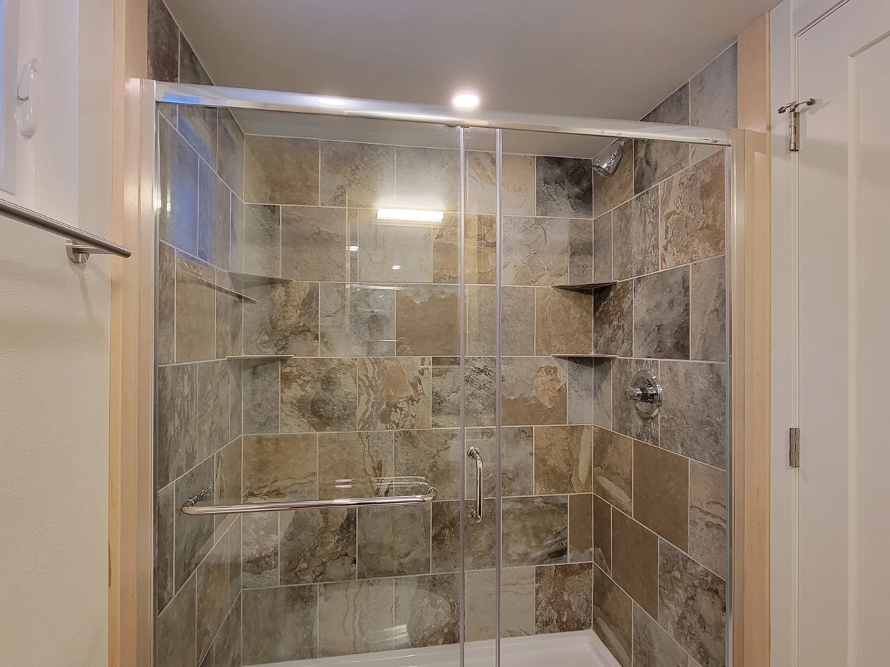
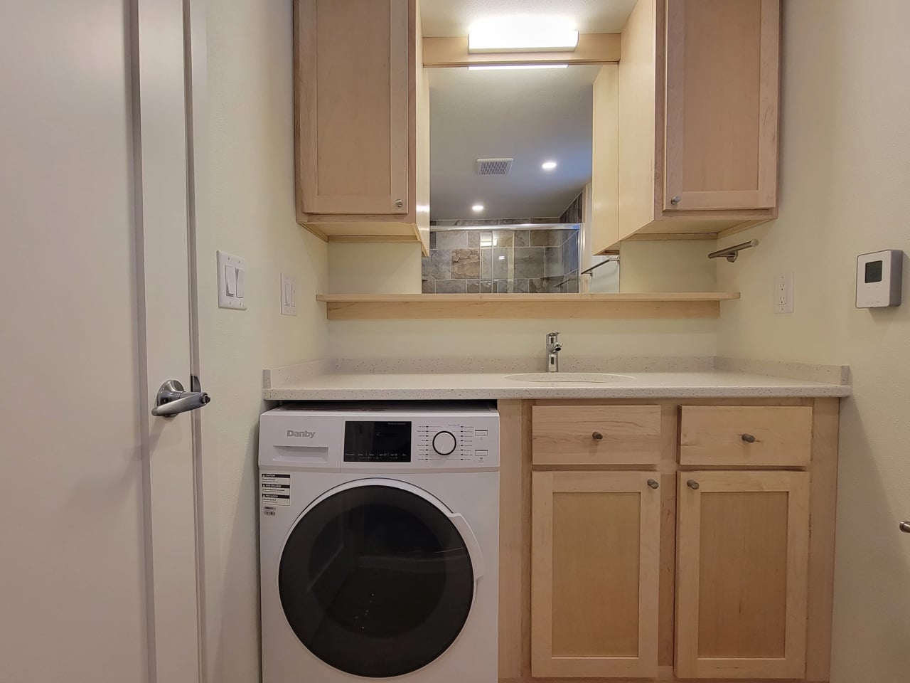
Inside, the layout is open-plan, with the living and kitchen area flowing seamlessly from one end to the other. The bathroom includes a large glass-enclosed shower with a width of 5 ft (1.5 m), a specification that sounds modest until you realize most tiny house showers are barely wide enough to raise both arms. A walk-in closet rounds out the domestic comforts, alongside an oversized sofa that signals Escape’s intent clearly: this is a home designed for staying in, not just passing through.

As a non-towable park model, the Shoreline Glass House isn’t chasing the nomadic lifestyle that defines much of the tiny house market. It’s built for permanence, or at least long-term settlement, and the design reflects that. Every decision, from the floor-to-ceiling glazing to the full-width bathroom, prioritizes livability over portability. The result is a tiny house that finally makes the case that going small doesn’t have to mean giving anything up.

The post This Tiny House Has 30 Feet of Glass and Feels Nothing Like a Tiny House first appeared on Yanko Design.
This Coin-Sized Sensor Turns Any Analog Watch Into a Fitness Tracker

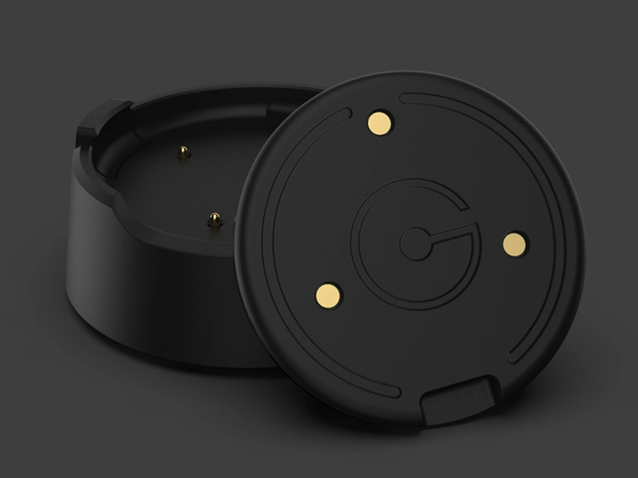
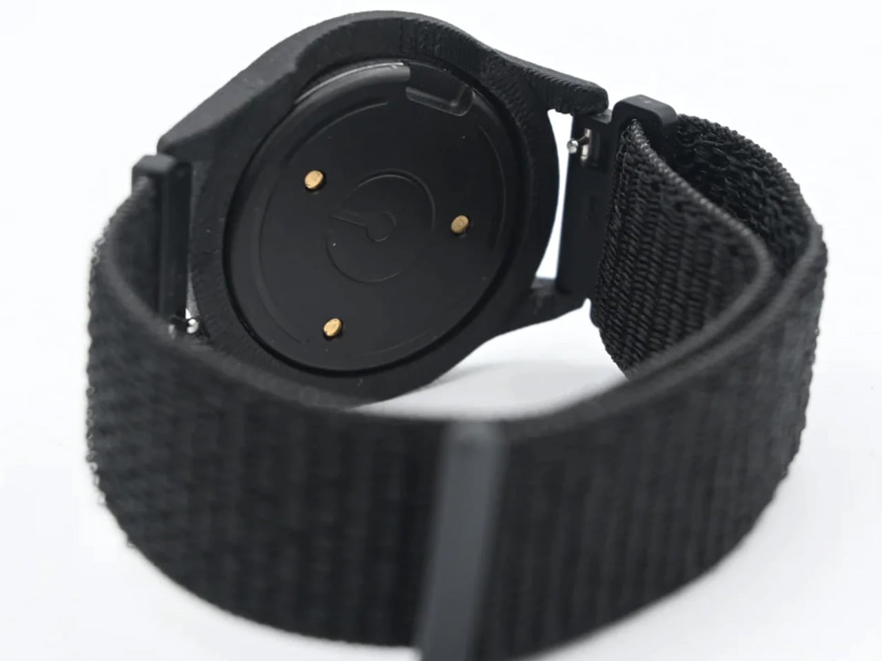
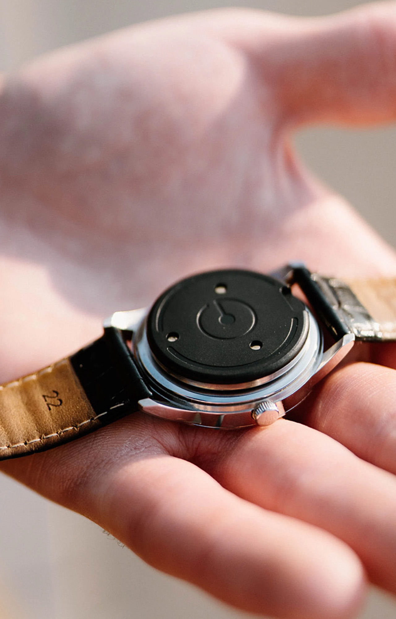
There is always a persistent tension in the watch world. Smartwatches do a lot, but they rarely look good doing it. Analog watches look exceptional, but they’ll never ping you when you’ve hit 10,000 steps. The Ganance Heir is a small, coin-sized sensor that quietly sits on the caseback of your watch and bridges that gap… no screen, no subscription, no compromise.

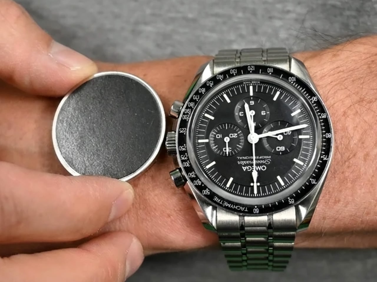
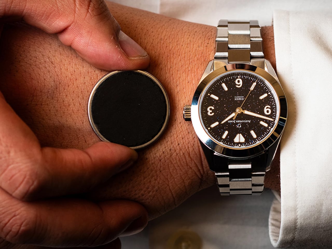
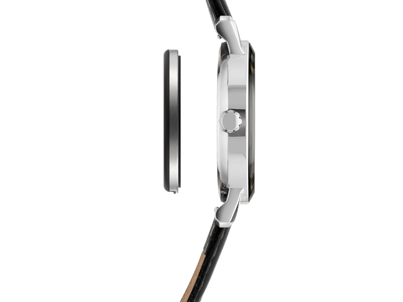
Developed by a Chicago-based startup with a focus on intentional technology, the Heir attaches to the caseback of most watches using a micro suction disc. At 30 mm in diameter and just 3 mm thick, it weighs a feather-light 5 grams. You’d barely know it’s there. Swap it between watches in seconds, slot it into the HeirBand for gym days when you’d rather not ruin a leather strap with sweat, and carry on.

Designer: Ganance

The feature set is deliberately restrained. The Heir tracks steps, distance, and calories, pushing that data to the Ganance iPhone app and Apple Health. It vibrates to alert you to incoming calls and texts, and a single or double tap controls media playback. Three levels of vibration strength give you a degree of personalization, and tap input can be disabled entirely through the app. No heart rate sensor, no always-on display, no noise.

An Android app is currently in development, expected around late June alongside the next batch of shipments. At that point, the device will also sync with Google’s Health Connect, opening it up to a wider ecosystem of fitness apps. Future updates already on the roadmap include activity type splitting, sedentary time tracking, adaptive goals, a silent alarm, WhatsApp and Slack vibration alerts, task reminders, and weather-based activity recommendations.

The Heir isn’t without its limitations. Battery life sits at 42 hours, meaning a daily top-up via the proprietary dock is essentially non-negotiable. Early adopter reviews have flagged some inconsistencies with step tracking and connectivity, though Ganance says those issues are actively being addressed.

Ganance isn’t the first to explore this concept — the Chronos and Germany’s Trivoly tried similar approaches without gaining lasting traction. Whether the Heir has the staying power its predecessors lacked remains to be seen. The Heir is available to pre-order at $149, with the HeirBand priced at $39 or bundled together for $169. Shipping is expected this spring across the US, Canada, the UK, and select European countries.

The post This Coin-Sized Sensor Turns Any Analog Watch Into a Fitness Tracker first appeared on Yanko Design.
SOM’s New Kazakhstan Towers Look Like a Sci-Fi Set. They’re Not.

Kazakhstan is building a new city, and it just got a centerpiece worthy of the ambition. On March 5, 2026, Skidmore, Owings & Merrill unveiled the Alatau Iconic Complex and Gateway District, a pair of pyramidal towers set to define the skyline of Alatau, a brand-new city rising along the Almaty–Qonaev highway in south-eastern Kazakhstan. This is the same firm behind the Burj Khalifa, One World Trade Center, and Jin Mao Tower. The pedigree speaks for itself.
Alatau is planned to span 88,000 hectares across four districts, positioned along the Western Europe–Western China transport corridor, with a master plan stretching through 2050. SOM’s Iconic Complex sits at the heart of the city’s fourth zone, the Gateway District, designed as a dense, walkable neighborhood anchored by multimodal transit. It’s not just a building drop. It’s a full urban proposition.

Designer: Skidmore, Owings & Merrill

The complex totals 276,800 square meters across two towers: a 272-meter, 56-floor primary skyscraper housing offices and premium residences, and an 80-meter luxury hotel tower with branded residences and retail. When complete, the taller structure will be the tallest building in the region. The design concept, titled “Mountain Landscape,” pulls directly from the Trans-Ili Alatau, a 350-kilometer range of valleys, glaciers, and stratified terrain that forms the natural backdrop to the site. SOM translated that geology into architecture through stepped, wedge-shaped volumes, each level lined with external terraces and large central atria that pull light deep into the interiors.

Engineering the towers required serious thinking. The region sits in a high-seismic zone, which led to a dual structural strategy: a Japanese seismic damping model that absorbs earthquake energy through controlled structural movement, paired with an American reinforced framework built around a high-strength steel skeleton. The project also integrates eVTOL infrastructure alongside pedestrian and transit networks, future-proofing the complex well beyond its 2029 completion date.

Construction has been handed to China State Construction Engineering Corporation, a partnership announced during President Kassym-Jomart Tokayev’s state visit to China in September 2025. Full-scale excavation is scheduled to begin in May 2026, with total private investment exceeding $800 million.

For Kazakhstan, this goes beyond architecture. With Parliament recently approving a Constitutional Law on Alatau’s special status, the Iconic Complex is set to become the economic and cultural core of Central Asia’s most closely watched new city. SOM has built skyline-defining towers before. This one carries the weight of an entire nation’s next chapter.

The post SOM’s New Kazakhstan Towers Look Like a Sci-Fi Set. They’re Not. first appeared on Yanko Design.