For most people, the smartphone screen is where focus goes to die. Even when you pick one up with a purpose, the bright OLED glare, the notifications, and the endless scroll have a way of pulling you elsewhere. Screen fatigue is real, blue light is a genuine concern, and the push for digital wellness has grown loud enough that even tech companies have started quietly acknowledging it.
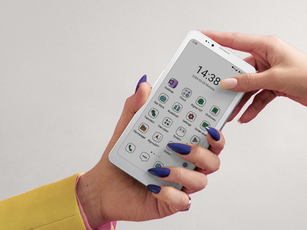
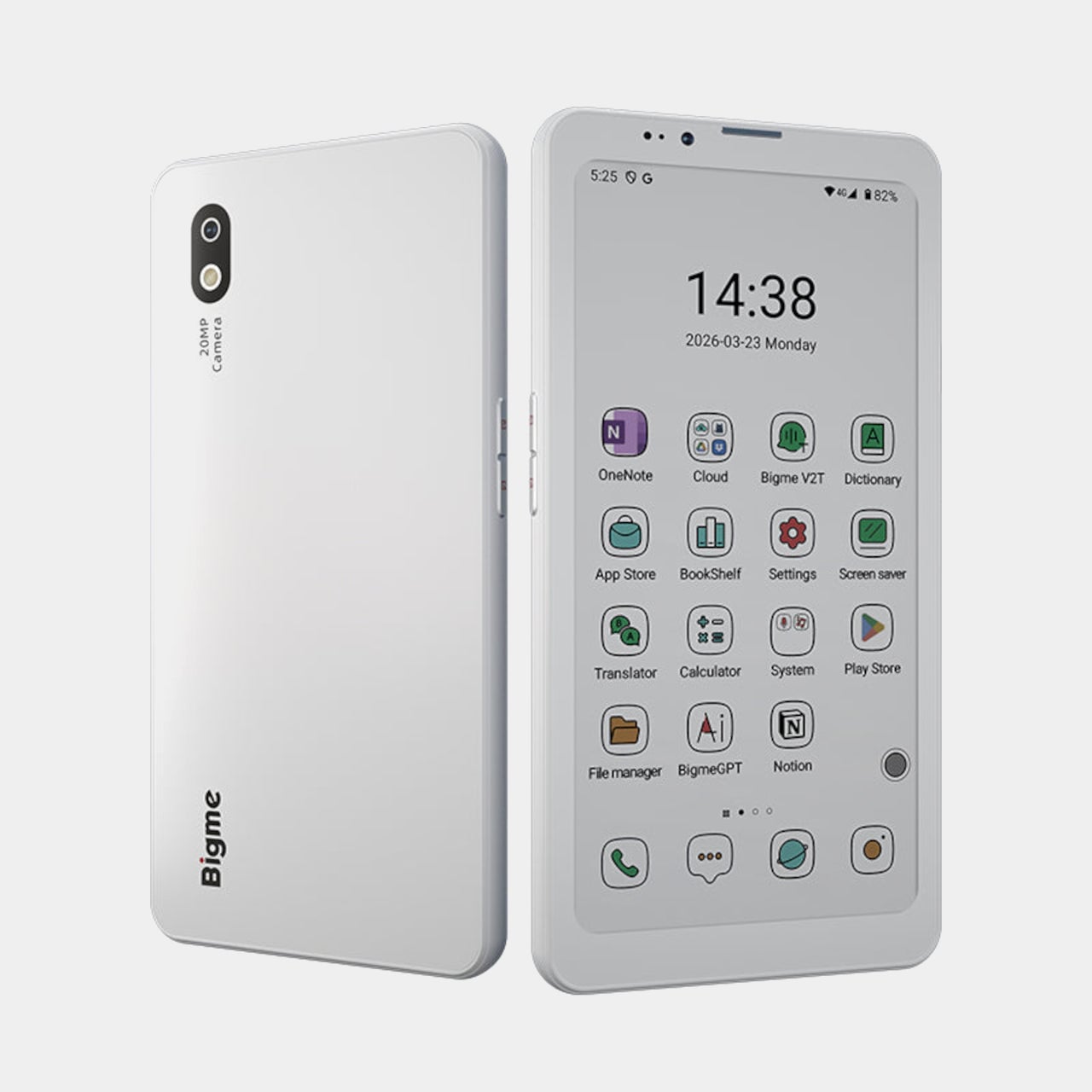
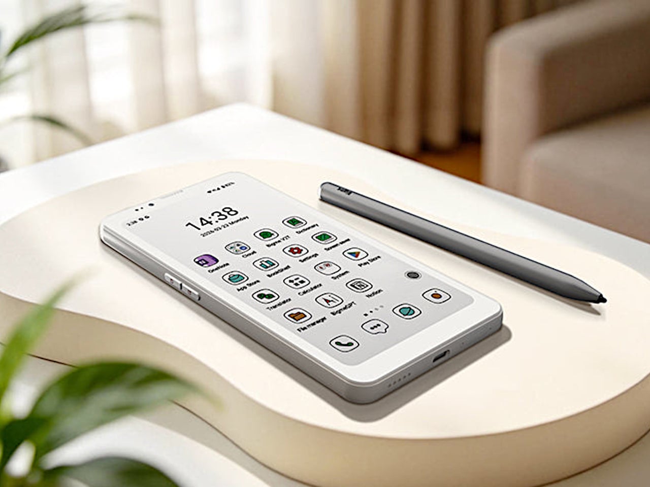
The Bigme HiBreak Plus takes a different approach to the smartphone entirely. Built around a 6.13-inch E Ink Kaleido 3 color display, it runs on Android 14 with full Google Play support and connects via dual 4G SIM, making it a genuinely functional phone. But unlike everything else in your pocket, it defaults to a mode that’s easier on the eyes and harder to mindlessly abuse.
Designer: Bigme
E Ink displays on smartphones have always had one obvious weakness: the refresh rate. Previous devices refreshed so slowly that casual scrolling felt like a real chore. The HiBreak Plus addresses that with a remarkably high 52 FPS refresh rate for an E Ink display, making it responsive enough for reading, annotating, and light browsing without the ghost-image flicker that dogged earlier E Ink phones.
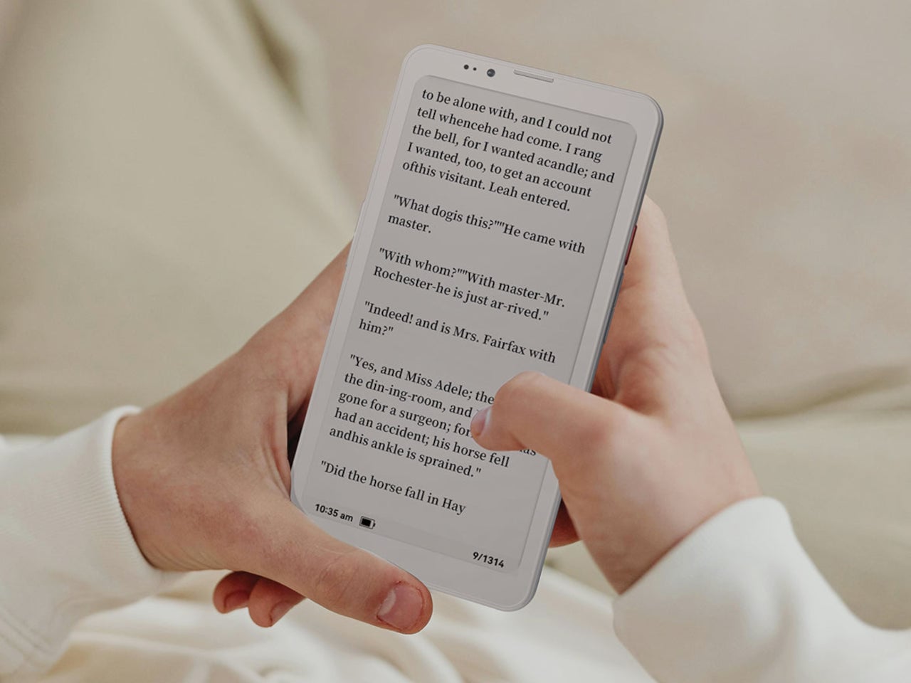
The display’s advantages don’t stop at being easy to look at. E Ink panels are naturally readable under direct sunlight without any brightness cranked up, which means you can check maps, take notes outdoors, or read in the afternoon light without squinting. There’s no backlight shining toward your face either, just a soft, paper-like surface that reflects the ambient light around it.
A front light with 36 brightness levels handles the dimmer end of things. It reads the surrounding environment and automatically calibrates brightness and color temperature, going from a cool, crisp tone for morning work to a warm amber glow at night. There’s no digging through menus or manually adjusting sliders; the phone handles it quietly in the background, adapting to wherever you happen to be.
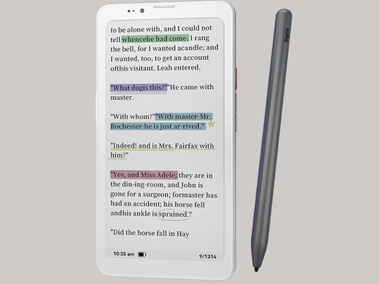
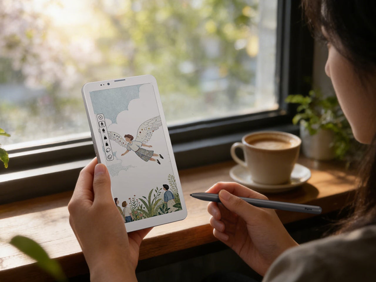
Handwriting support, via an optional stylus, adds another layer to what the phone can do. Writing directly on the E Ink surface feels closer to putting pen to paper than tapping on glass. It makes the HiBreak Plus a natural fit for jotting down thoughts during a commute, capturing ideas in a meeting, or working through a long reading session with annotations in the margins.
The rest of the specs are functional rather than flashy: an octa-core processor, 4GB of RAM, 64GB of storage, GPS, a fingerprint sensor in the power button, and a 4500 mAh battery that should comfortably outlast most conventional smartphones thanks to the energy-efficient E Ink display. The whole package weighs just 193g, light enough to slip into a shirt pocket without a second thought.
Of course, there are some downsides as well, ones that go beyond the screen refresh rate and color vibrancy. Although not exactly outdated, 4G LTE caps data speed significantly, and the rather modest RAM and storage capacity don’t do it any favors either. That said, at a $299 price point ($249 on pre-order), you are getting a pocket-sized color e-reader that can also make calls and connect to the Internet, without the usual distracting trappings of a smartphone.
The post This $299 Android Phone Says Glowing Screens Are Already Obsolete first appeared on Yanko Design.
 `
` `
` `
`