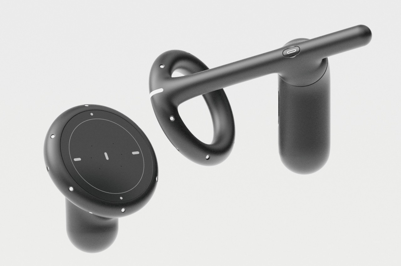
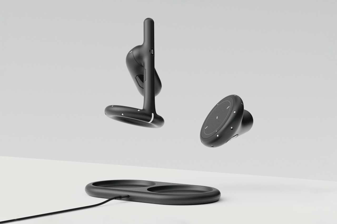
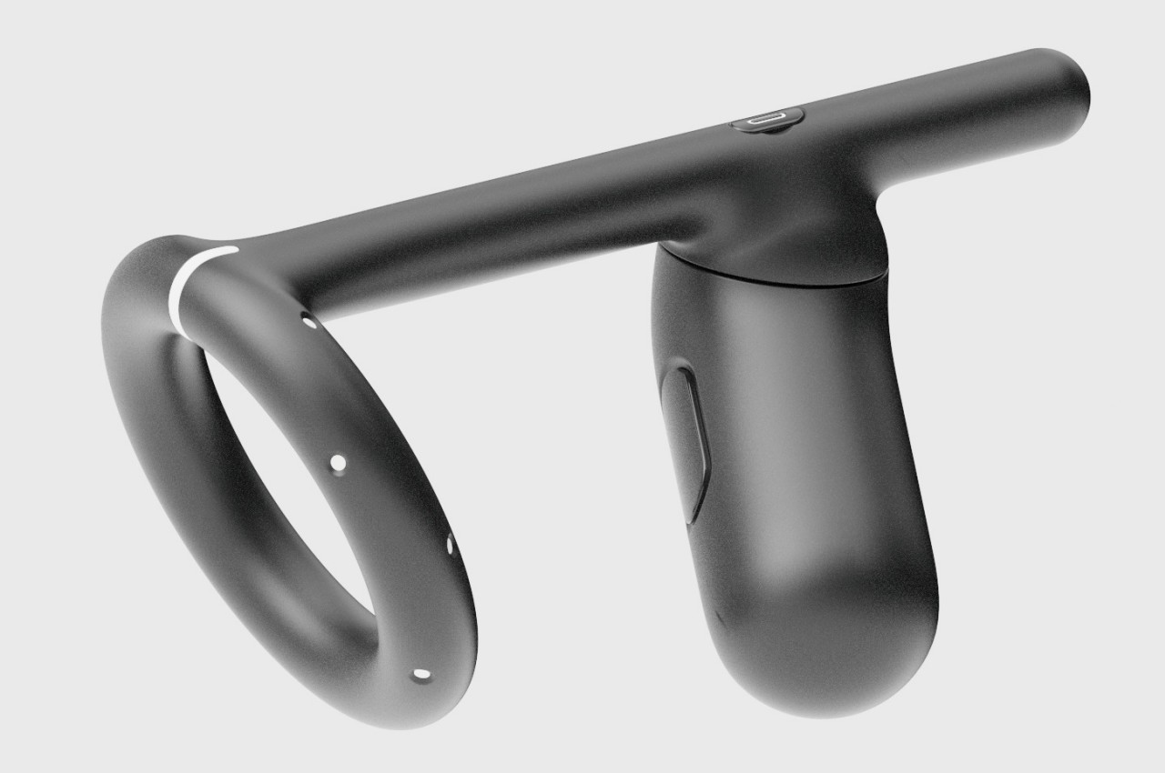
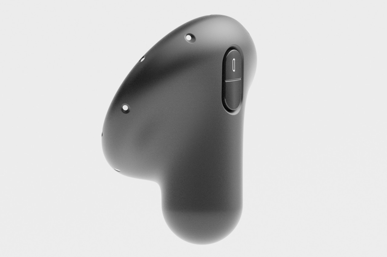
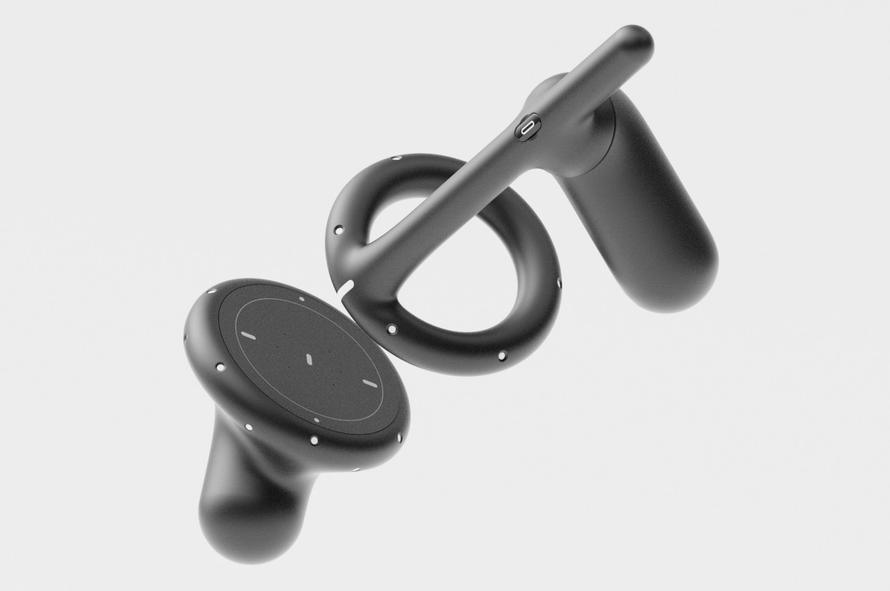
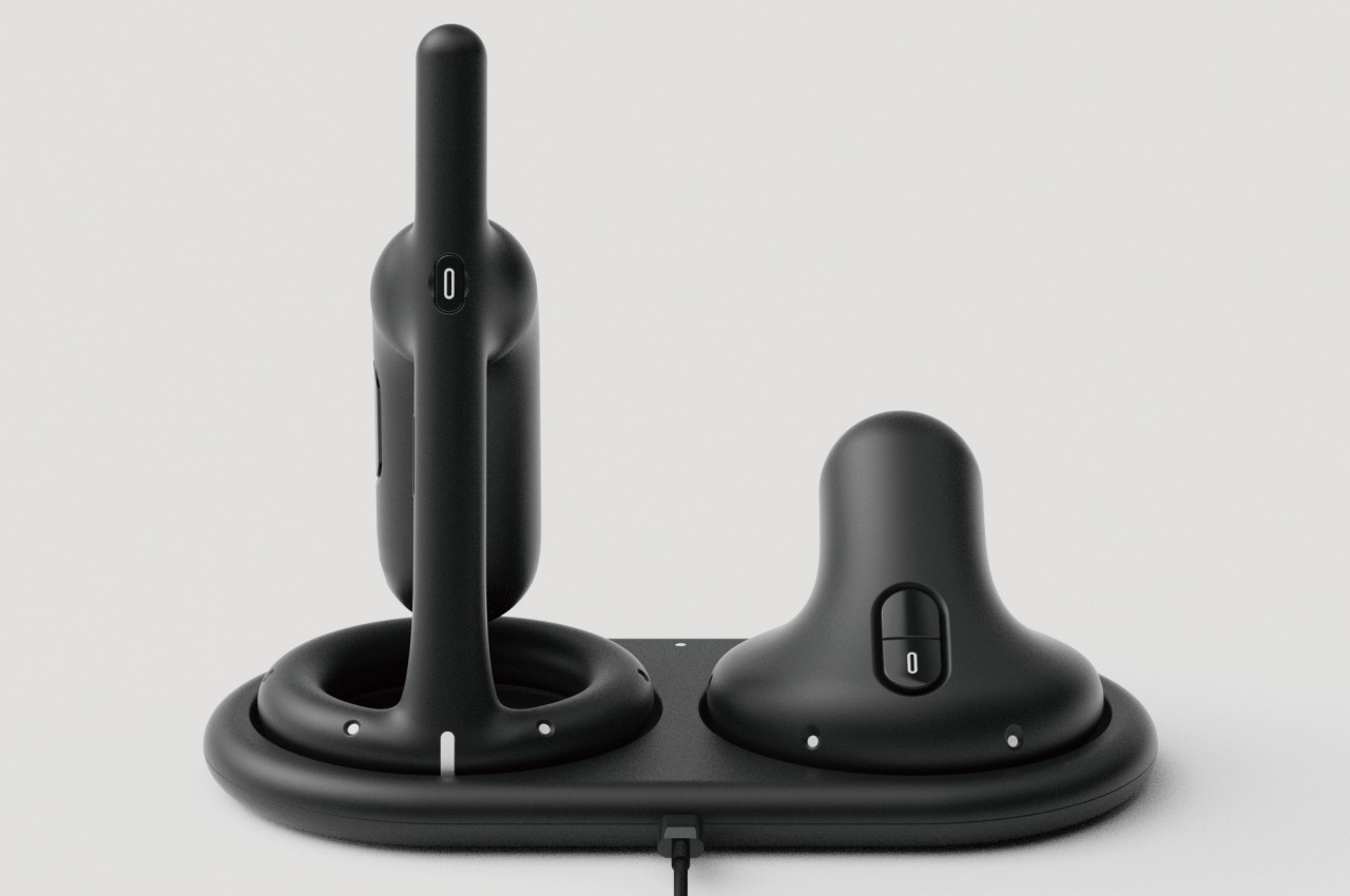
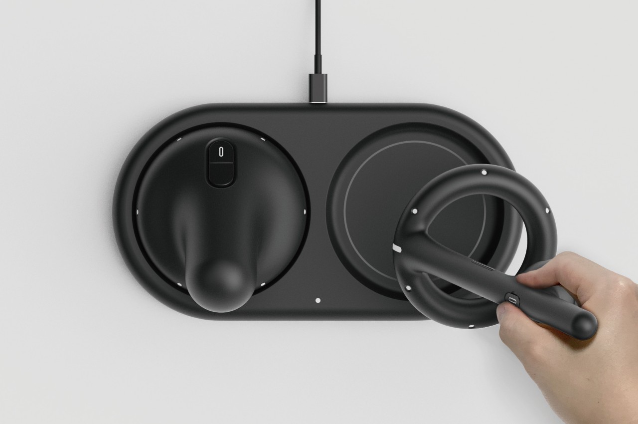
The Apple Vision Pro’s take on spatial computing would have us imagine a seamless integration of the physical and digital worlds. That dream of the future is shared by virtual, augmented, and mixed reality technologies, and they almost deliver that promise when it comes to the visual aspect. The illusion, however, breaks when you start interacting with and manipulating those virtual entities, an experience that quickly becomes less natural compared to how we do it with physical objects. The problem lies in the tools we use for this, which are often a game controller or two sticks that function in the same way. This concept for a virtual reality controller tries to reshape that standard design into something that, while still technically the same, offers a more familiar form for artists and designers.
Designer: Jiwoong Yan
When you think about it, it’s almost amazing how digital creatives are able to make do with the input tools available to use in the present. At the very least, a stylus approximates the experience of drawing with a pen on paper, though some people are even able to create mind-blowing art using a keyboard and a mouse. On the one hand, it’s pretty convenient that we don’t have to deal with a dozen different pens, brushes, and other tools when creating digital art, but, at the same time, the disconnect between the tool and the desired outcome is often jarring.
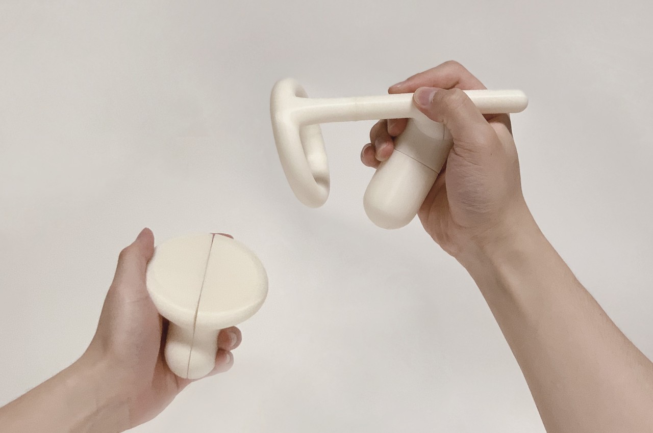
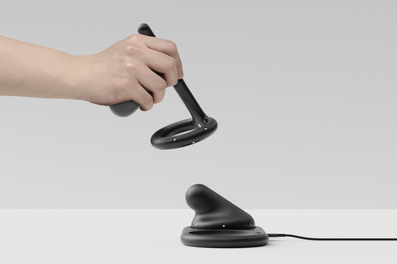
This is especially true in a world that tries to have some fidelity with reality like VR. It’s even worse because it makes us believe we’re seeing virtual objects we can touch, but we can never really touch them and have to be satisfied with pointing and clicking with both hands. Medium is a concept design that offers a compelling compromise for artists and designers. It still has that same two-piece approach that puts a controller in each hand, but ones that are designed to actually mimic the tools that artists would be familiar with.
The right hand, for example, can be held either like a paintbrush or a can of spray paint, and the handle can be rotated to accommodate different ways people hold these tools. The left-hand controller, on the other hand (no pun intended), is like a painter’s palette, though it will probably show more than just colors in the virtual representation that you’ll see through VR glasses. Using these two pieces might feel intuitive for some artists familiar with painting, with the “palette” providing tools and options for the “brush” that you draw with.
Such a design is theoretically already possible with today’s technologies, but it requires a manufacturer to take the risk of actually producing a device that might appeal only to a small segment of VR users. But with these companies trying to push mixed reality and spatial computing harder, it might only be a matter of time before more specialized variants of controllers become available, at least as a stopgap measure until we can directly manipulate those virtual worlds with nothing but our hands.
The young live-streaming industry has introduced a standard lighting technique to the masses, giving birth to the now popular “ring light” that’s even making its way to smartphone cameras. The literal ring of light is meant to provide more natural-looking illumination while minimizing the casting of shadows due to both its shape and its position in relation to the camera. It’s a visually interesting piece of lighting equipment, but its design is extremely focused and limited to that use case. This lamp, however, tries to take that same idea but gives it an even more interesting interpretation, generating light that doesn’t shine in just one direction but goes almost everywhere except where the lamp is facing.
Although circular lamps have been around for decades, ring lights are still a bit of a novelty to those outside the professional photography world. After all, circular lamps are often mounted on ceilings and walls, but this “halo on a stick” can be placed almost anywhere it’s needed to have a well-lit shoot or stream. It also uses LEDs versus the traditional fluorescent, though it technically can be any light source as long as it can take a circular form.
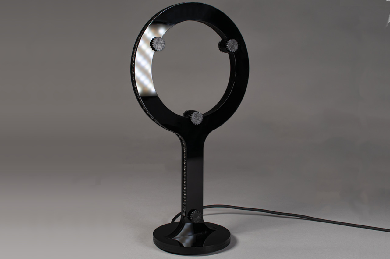
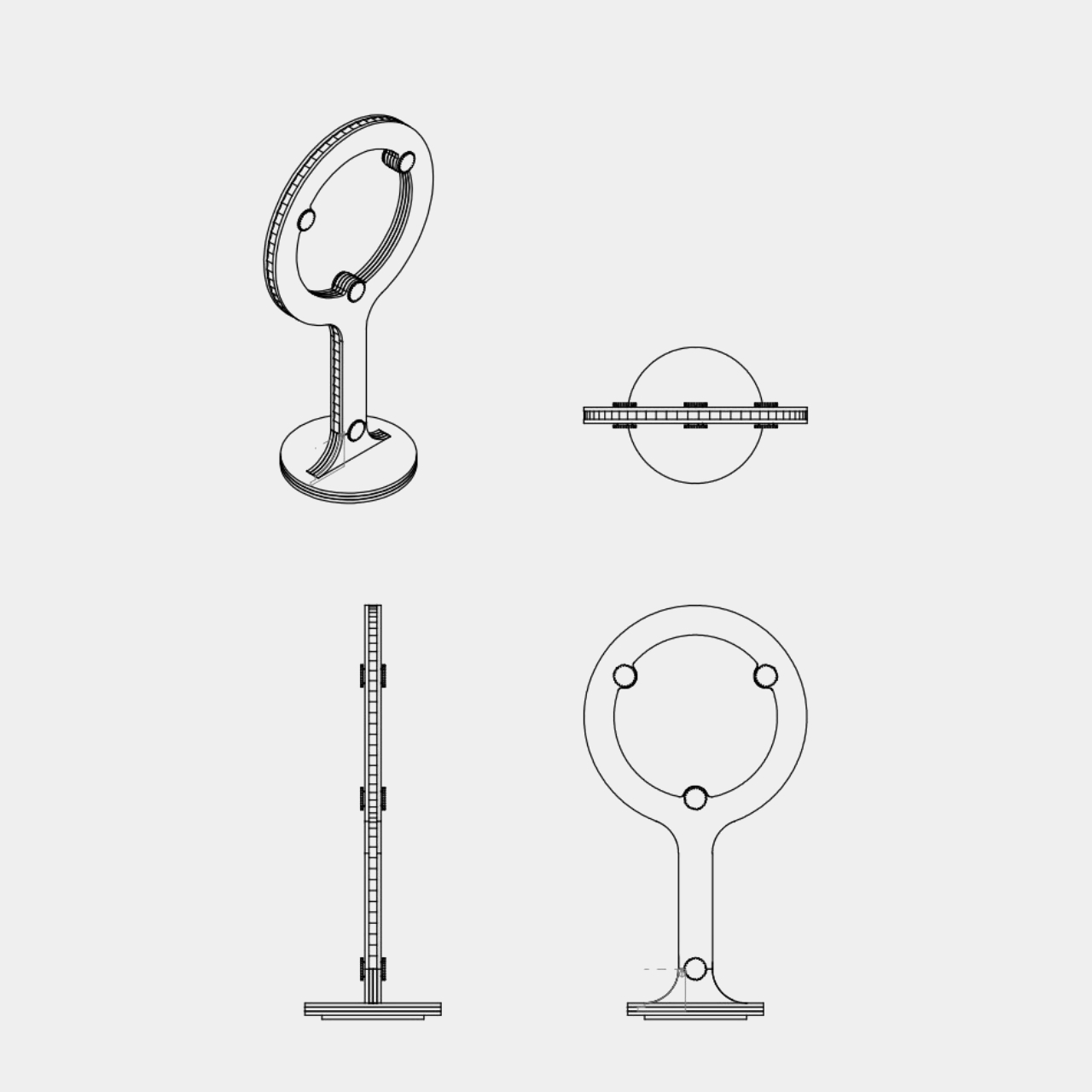
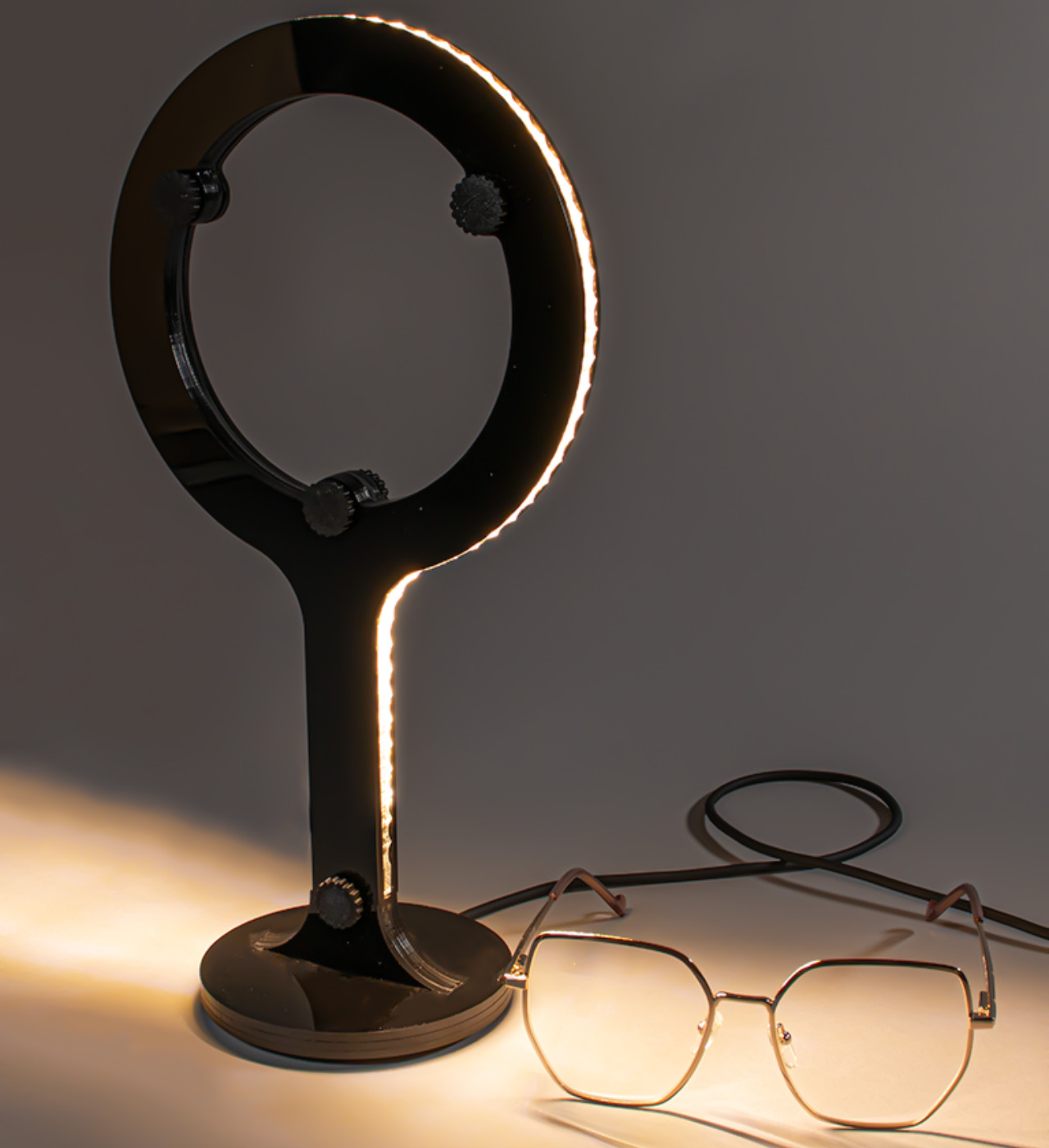
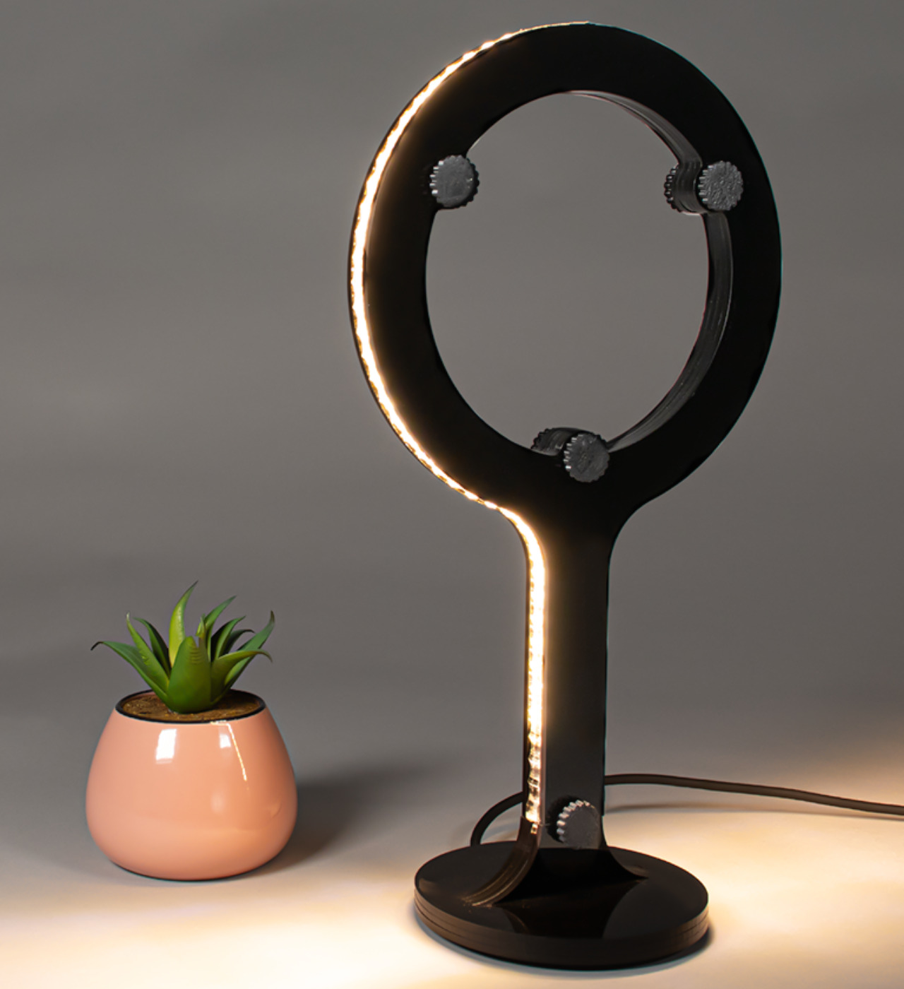
“Spot” is a concept for a lamp that is inspired by the shape of these ring lights but almost does in the opposite direction. Despite a ring light’s circular shape, it still shines its light mostly forward, with some illumination scattered around it only as a side effect. In contrast, Spot’s light comes from the structure’s side, and there is actually no light from its front or even its back.
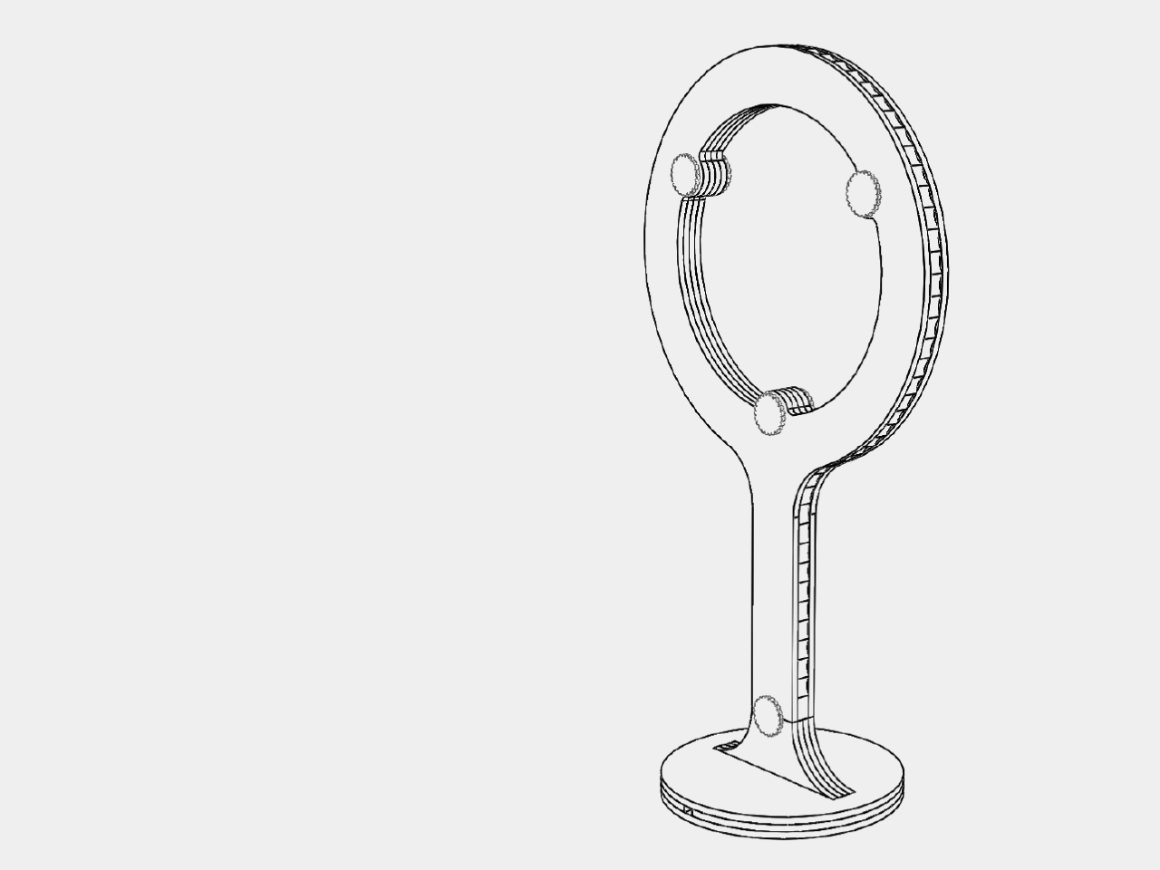
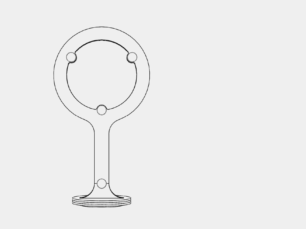
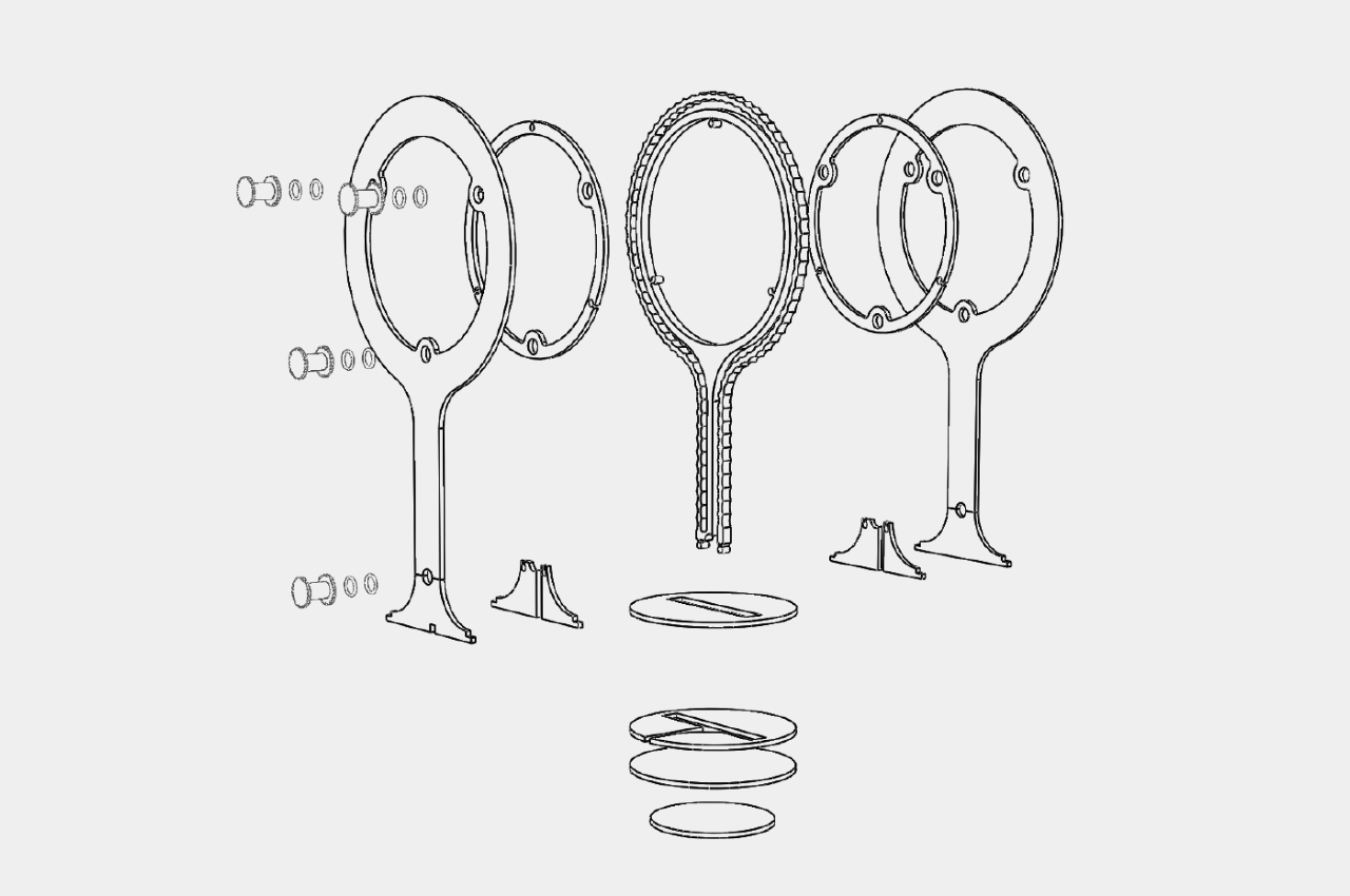
The design shares the same basic combination of a ring on a stand, but the key difference is that an LED strip runs outside along the edges of the shape. This strip is supported by an internal structure that is sandwiched between two opaque covers, making sure the light is really projected only from the sides of the lamp. Another key design element is that Spot makes it easy to take the product apart in order to replace the LED strip, making maintenance and repair trivial.
Because of the way it illuminates from the sides rather than in a single direction, Spot functions more as a decorative lighting fixture or a night lamp at best. The contrast of the dark body and the lighting shining around it creates an almost eerie appearance, one that will easily grab attention and serve as a conversation starter, despite its seemingly simple design.
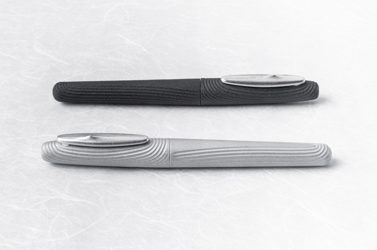
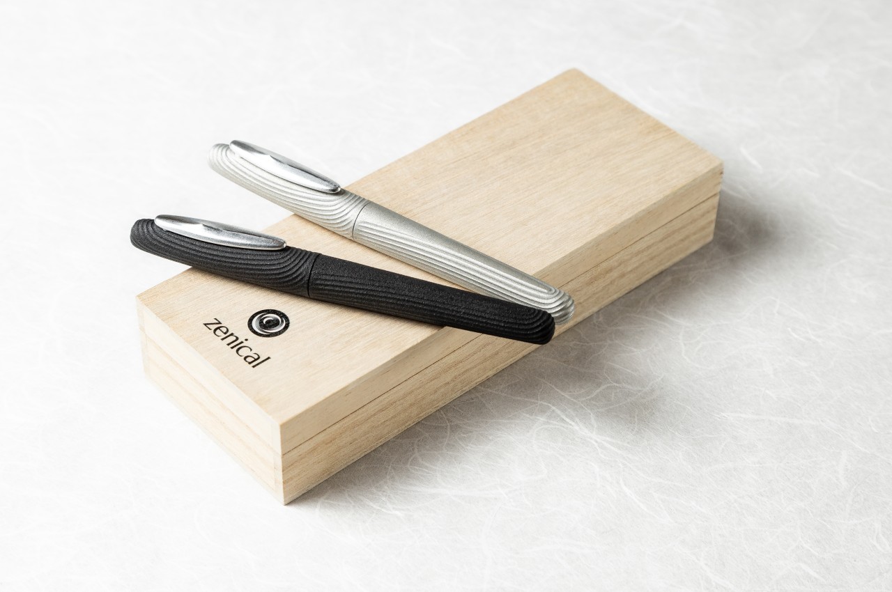
Pens, regardless of design, are almost always associated with productivity and creativity, in other words, activity. While you can use the writing instrument to clear your head and achieve a state of calm, that’s only after you’ve actively used it. Rarely does a pen by its mere appearance actually take you to that state, but that is exactly what this unique-looking pen tries to accomplish. Using not only visuals but also texture, this Japanese-made pen aims to help you become mindful of the present, even if only for a moment, taking inspiration from the easily distinguishable composition of a Zen garden, sand and stone and all.
It’s almost miraculous how a dry landscape and a meticulous arrangement of stone in gravel or sand can nudge the mind into a meditative state. That, however, is the magic and science that Zen Buddhist monks have discovered and developed over centuries, combining contrasting elements, minimalist arrangements, and natural elements to design a space meant to inspire calm and maybe clear a few cobwebs inside the brain. The stillness of the rock standing amid the thin lines of movement drawn on gravel around it, the smoothness of the pebbles contrasting with the coarseness of the sand, and the presence of living trees or shrubs standing defiant on lifeless ground, all these elements work in harmony to take the mind for a peaceful journey.
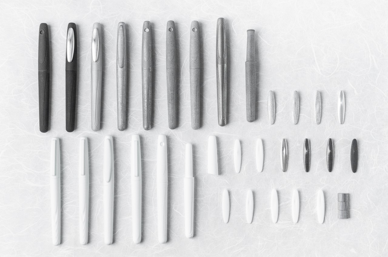
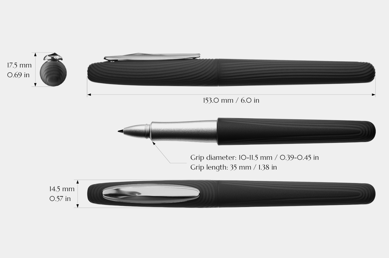
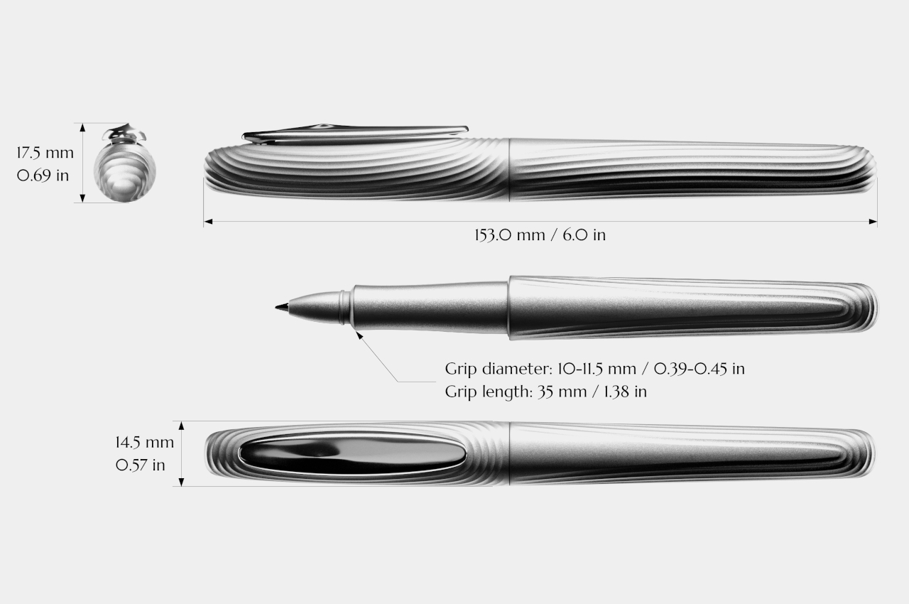
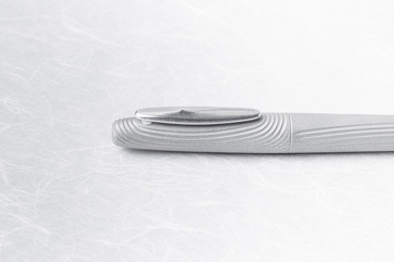
These rock gardens have become so popular that a few people have miniature Zen gardens on shelves or even their desks, but they can neither take these with them wherever they go nor always have them available when they need to. The Zen Pen tries to bring that same experience to an even smaller scale by recreating the key elements of a Zen garden in a way that you can see and feel in your hand. A part of that is clearly seen in the 3D-printed grooves that snake around the barrel and the cap, easily reminiscent of the thin lines and circles drawn on a rock garden.
It doesn’t stop there, however. The clip, which is often regarded as a utilitarian element, also contributes to the composition. Its smooth, oval shape is like one of those rocks or pebbles lying on the gravel, and you can see the typical circles radiating from its position. That position is actually off-center, doubling down on the contrasting themes of balance and asymmetry associated with Zen gardens.
The Zen Pen isn’t just a visual treat but also a tactile one, thanks to the handiwork of skilled Japanese craftsmen utilizing modern technologies like 3D printing and milling. While the grip near the nib is smooth and plain in order to be comfortable to hold, the rest of the barrel and the cap feature this textured surface that delights the fingertips. And as many variations of fidget toys have proven, mindlessly stimulating those fingers, even just by gliding over those grooves, can also help stimulate the mind.
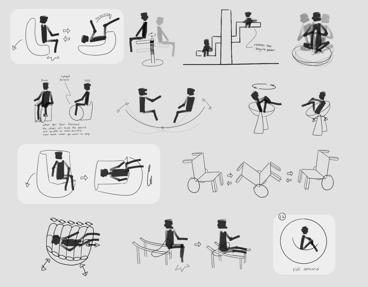
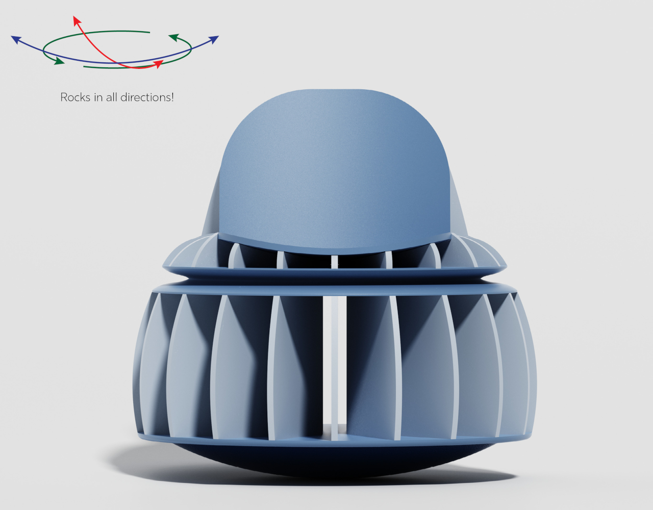
We expect chairs to be stable, otherwise, we will never have the confidence or even the courage to take a seat on them. There are seats that are designed to move, though, from the wheels on office chairs to the rocking motion of a rocking chair, swing, or hammock. But what if the instability is actually an intentional part of the design, generating not fear but a sense of thrill and even playfulness? That’s the kind of experience that this odd-looking chair concept tries to offer, with a design that makes it look like a cross between a spacecraft seat and a child’s toy top. It turns out, it even moves like one as well!
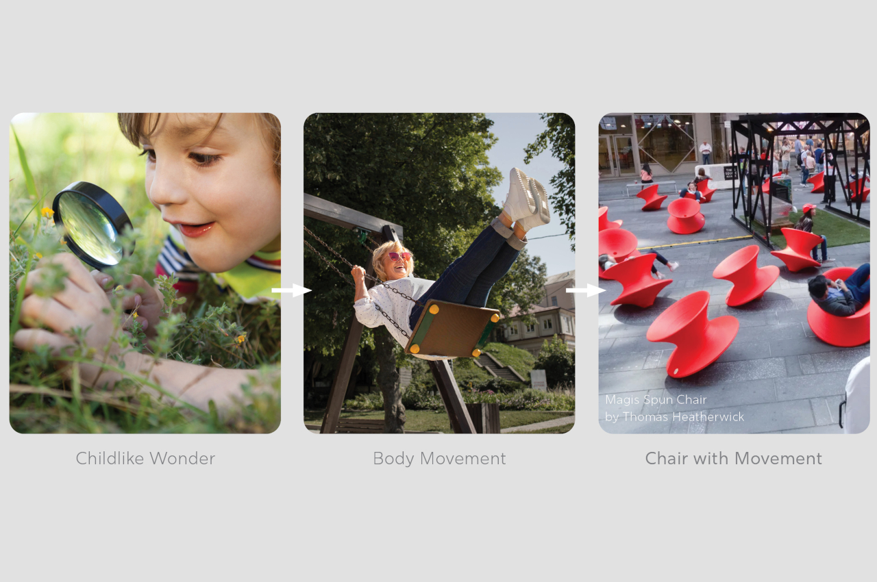
A wobbling chair is probably the last thing you’d want to rest your body on, but if you’re actually looking for a more engaging and dynamic experience, this almost spherical seat is probably something you’d want to try out. After all, no one sits on a swing to relax but to actually be pumped up, enjoy, and maybe even trigger one’s creativity and imagination. At the same time, however, it has to be not only comfortable but also reassuring, as you don’t want your wobbling experience to be your last.
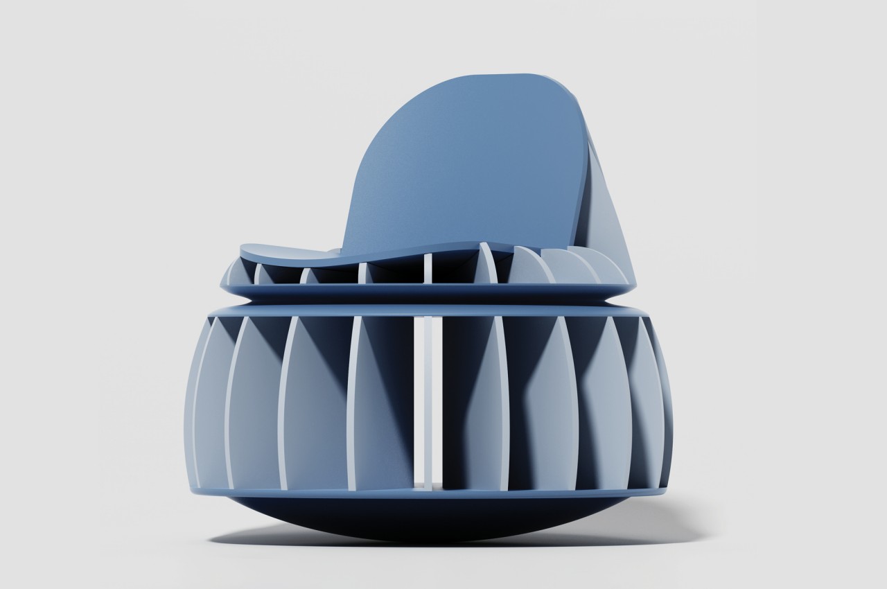
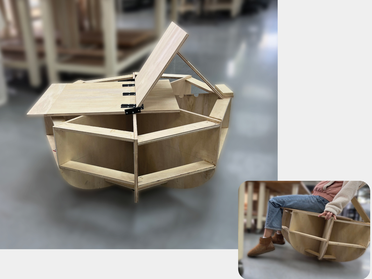
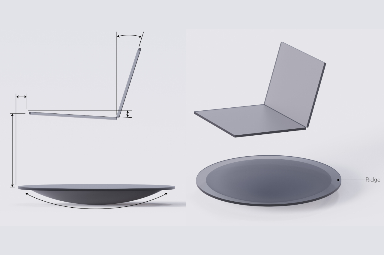
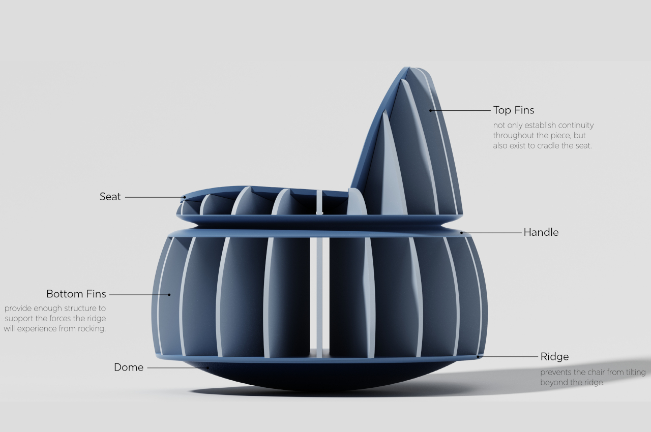
Designing a chair that rocks in all directions isn’t easy, even after you get the idea to use a concave base. You have to make sure you don’t completely tip over to any side, which is what a lip or ridge around the base is for. You’ll also have to come up with a design for the rest of the chair that not only provides support but also properly conveys the design’s more dynamic nature.
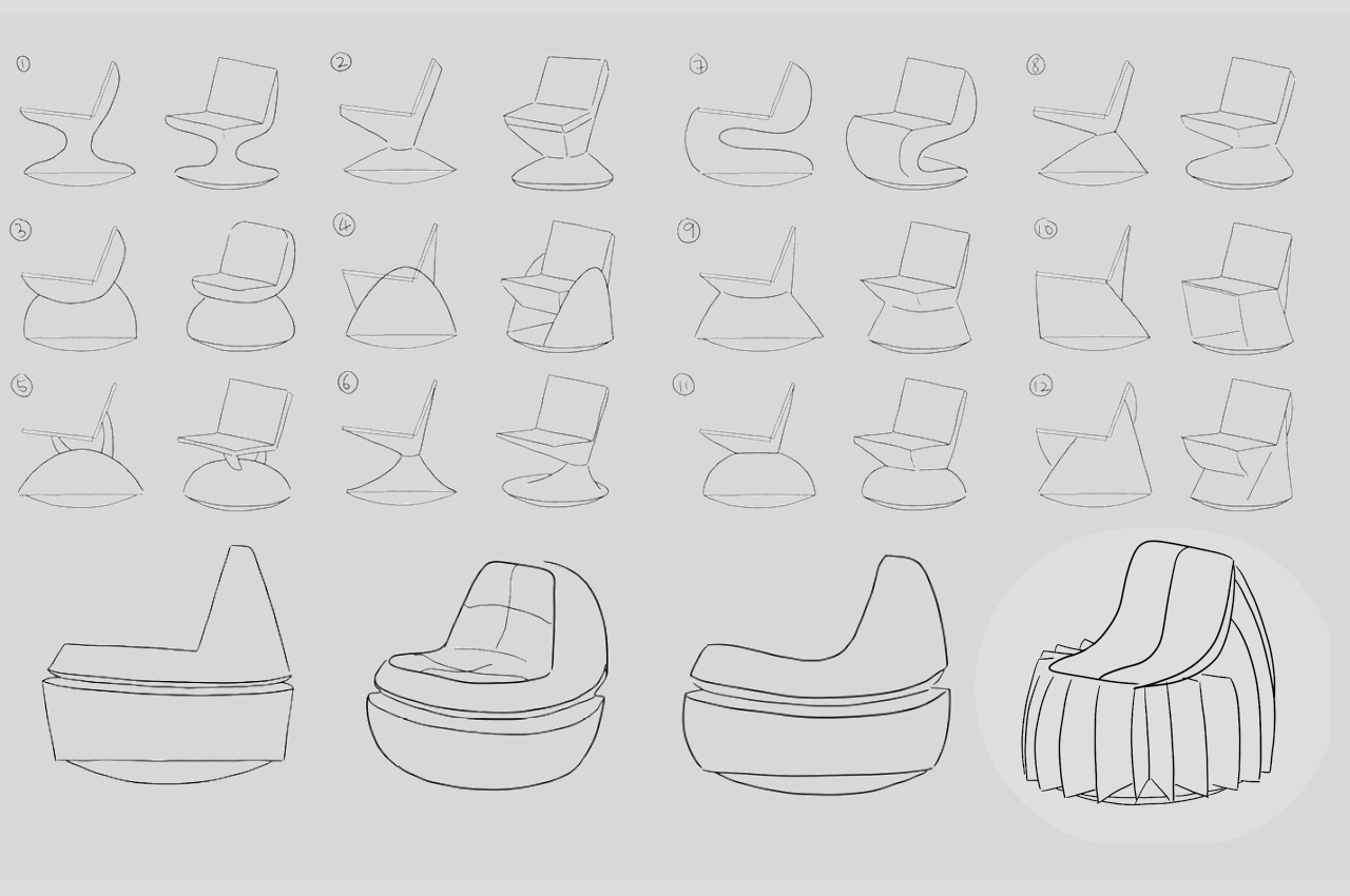
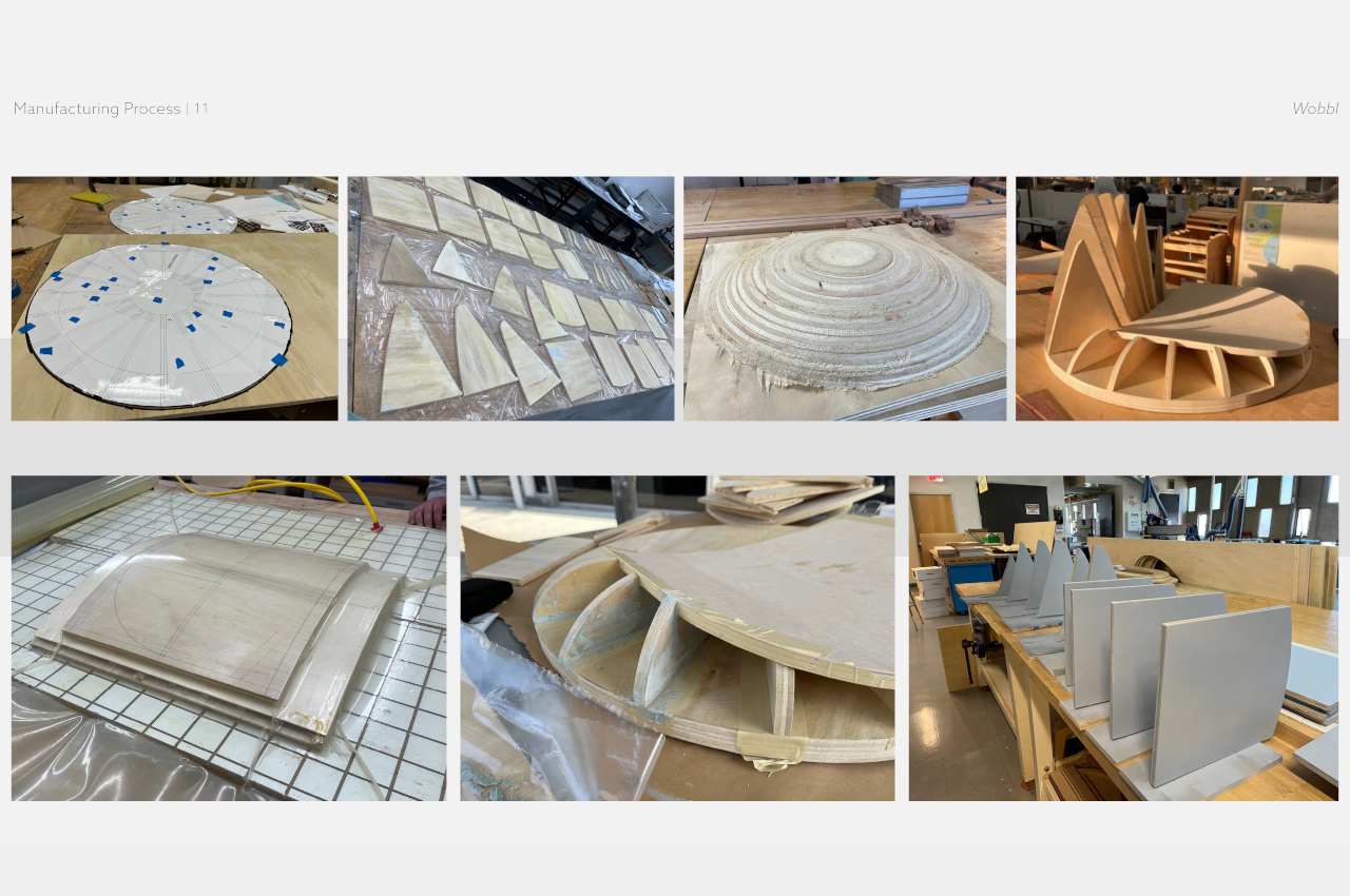
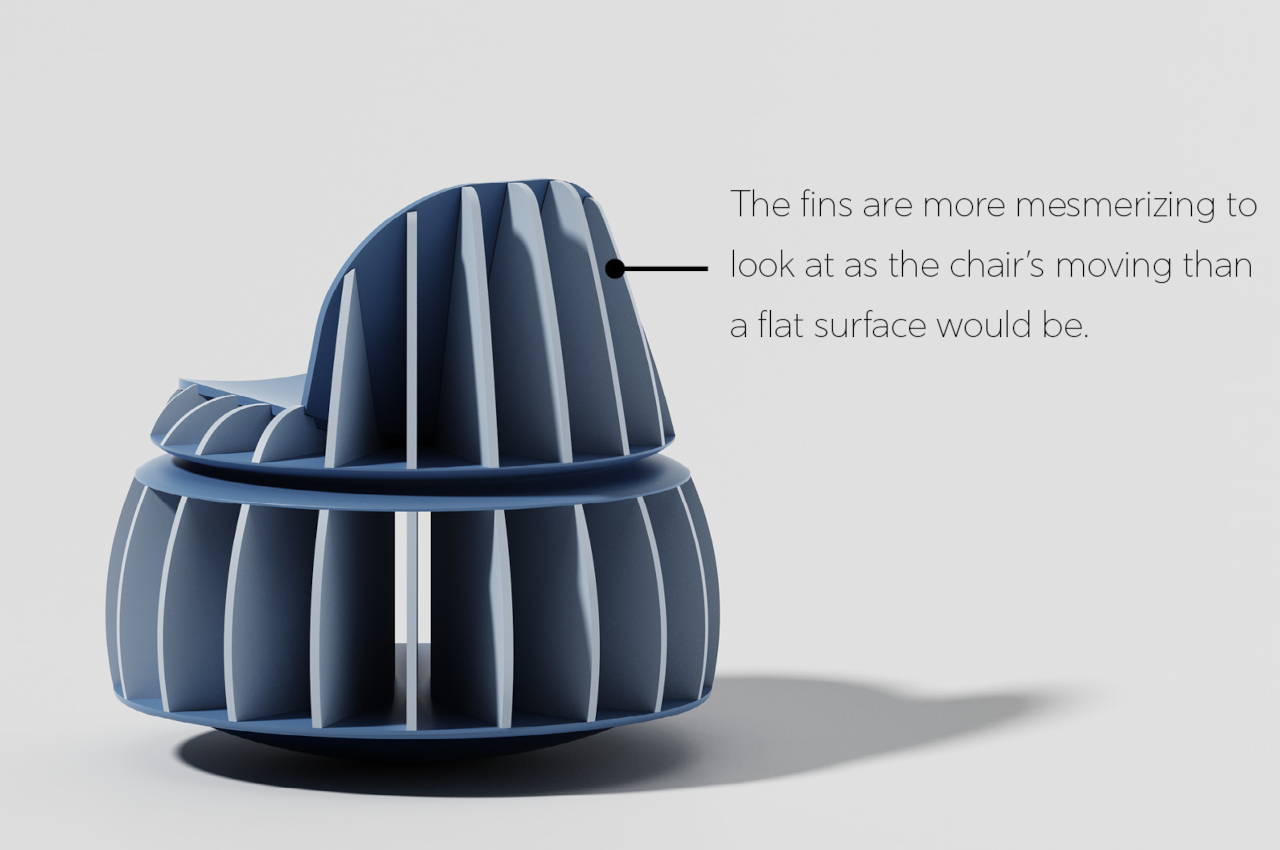
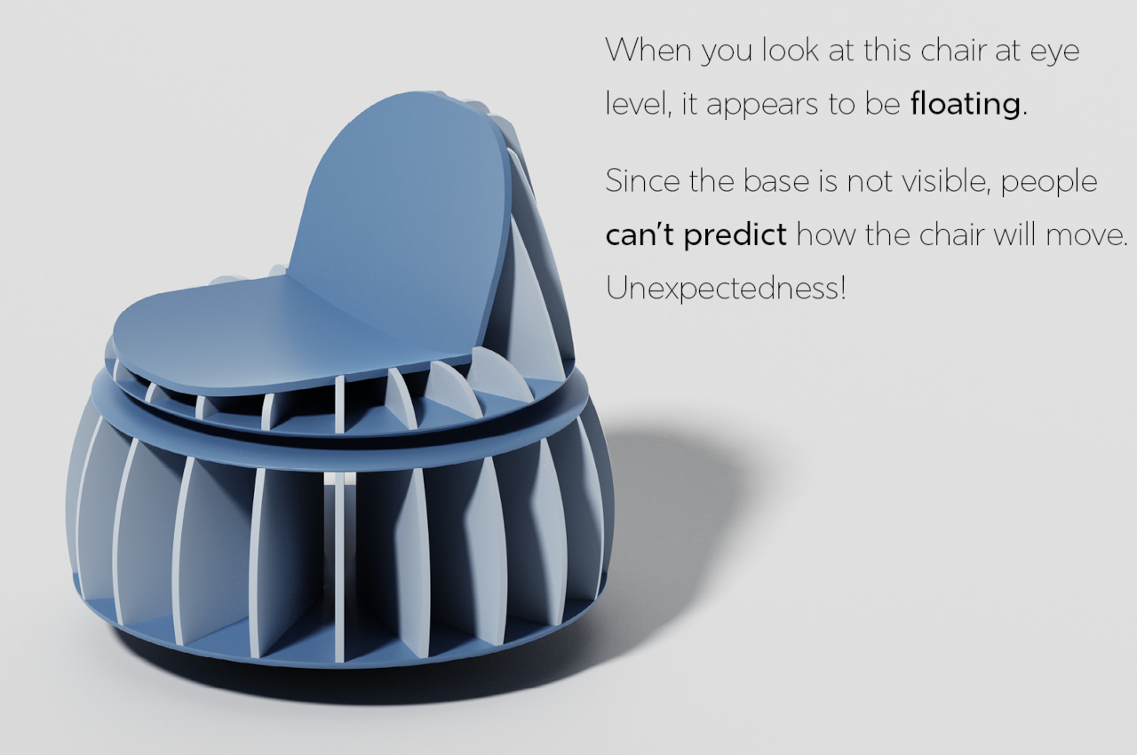
Thus, a circular chair is born with fins extruding from the middle like spokes on a wheel. The chair looks more like a turbine than a piece of furniture, but the design of each part is by no means based on whimsy. The top fins better cradle the seat and integrate it with the circular bottom half, while the bottom fins actually support the forces that the ridge will encounter with its rocking motion. Plus, it looks a lot more interesting, and its radial design immediately conveys the idea that it can move in almost any direction. As a bonus, the structure of the base and the ridge make it look like the chair is floating, adding to its sci-fi identity.
The end result is a chair that wobbles with pride and confidence, allowing the person on top to experience childlike play in every movement. It’s not going to replace any office or home chair, and it’s hardly an ergonomic design. But no one’s going to blame you for having a bit of fun rocking and spinning around on a chair that’s clearly designed to help you enjoy the lighter moments in life.
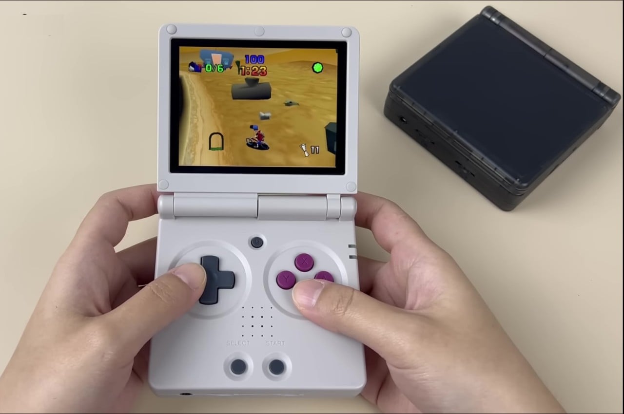
Retro gaming consoles and computers are still going strong, with many designs still left to be revived, resized, and retrofitted for modern times. Most of these products try to recreate the experience of those original machines, at least with the games they used to run on very limited hardware. That said, you can only go so far trying to recreate the past. Sooner or later, you will hit a wall, as demonstrated by the limited number of titles supported by many of these retro consoles. This reinterpretation of a Game Boy classic design, however, isn’t exactly a simple copy of the clamshell handheld. Instead, it takes the same spirit of portable adventure that the Game Boy Advance SP embodied and wraps it in a body that’s well-suited for modern gaming styles.
It’s honestly a bit of a gray legal area whenever third-party brands try to embrace a design so close to something from the annals of video gaming history. That hasn’t stopped the likes of Anbernic from taking obvious inspiration from those bygone designs but with enough modifications to skirt infringement accusations. Of course, Anbernic has its own original designs, but the ones that really grab your attention are those that pay homage to icons like the Nintendo Game Boy.
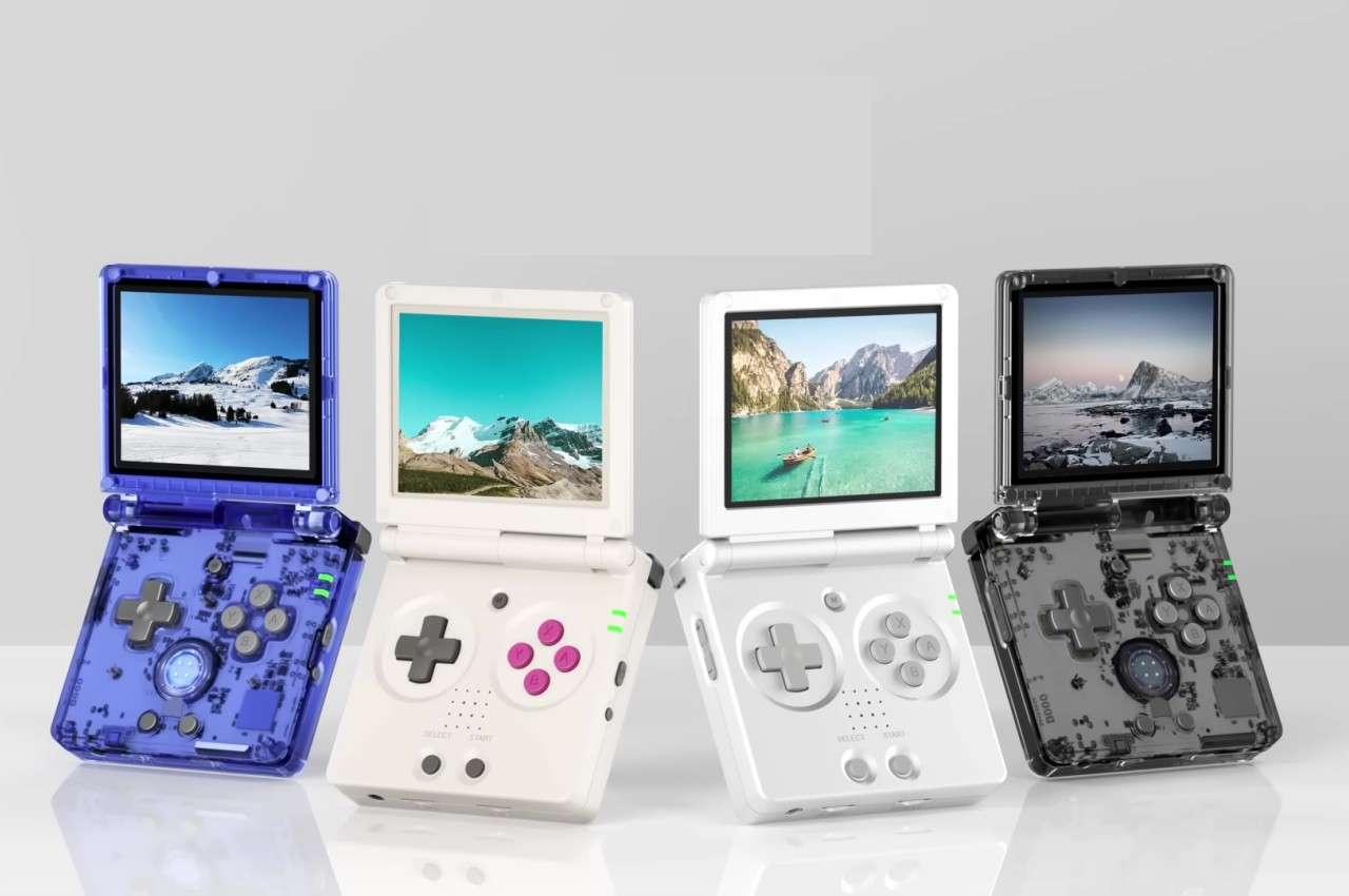
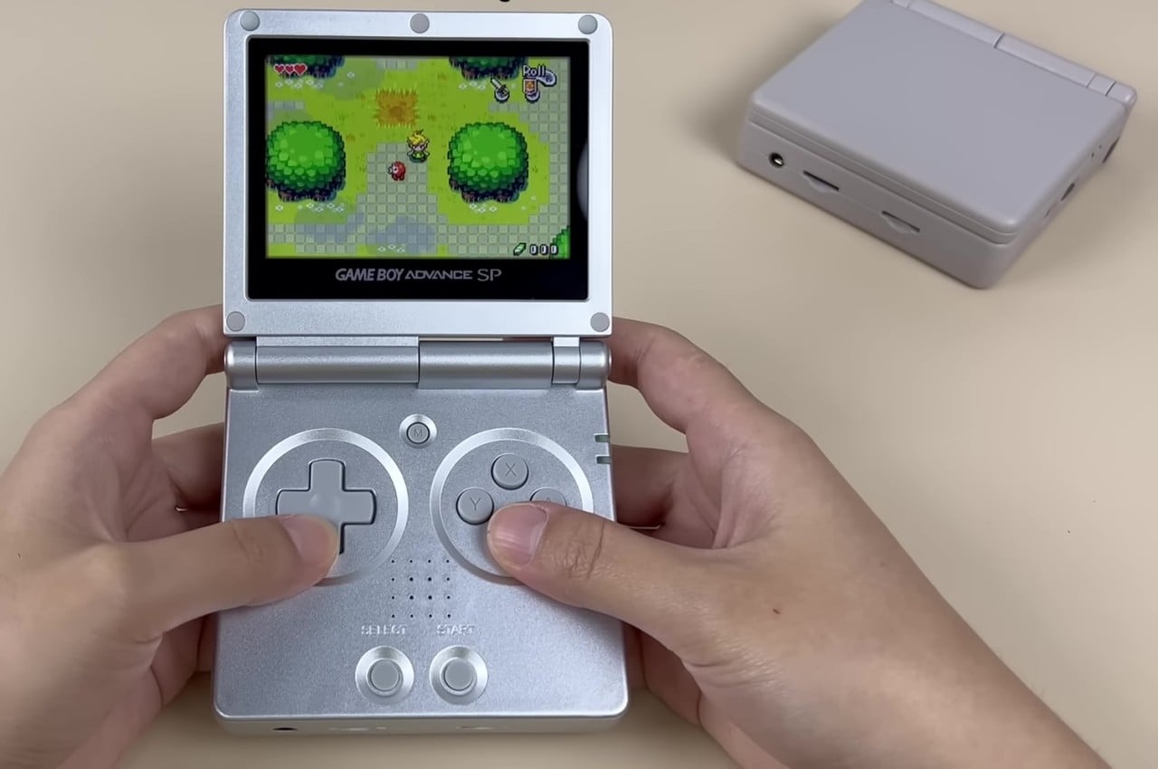
With the uninspiring name of Anbernic RG35XXSP, the prolific gaming handheld manufacturer is bringing the Game Boy Advance SP back to life, or at least the pocket-sized clamshell design that made it quite a hit. It’s just as blocky and thick as the original, but that’s also part of the device’s charm. For better or worse, however, that’s where the similarities end to the point that you can even say that the RG35XXSP was simply “inspired” by Nintendo’s handheld.
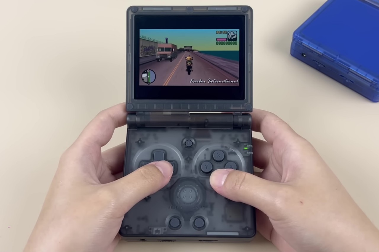
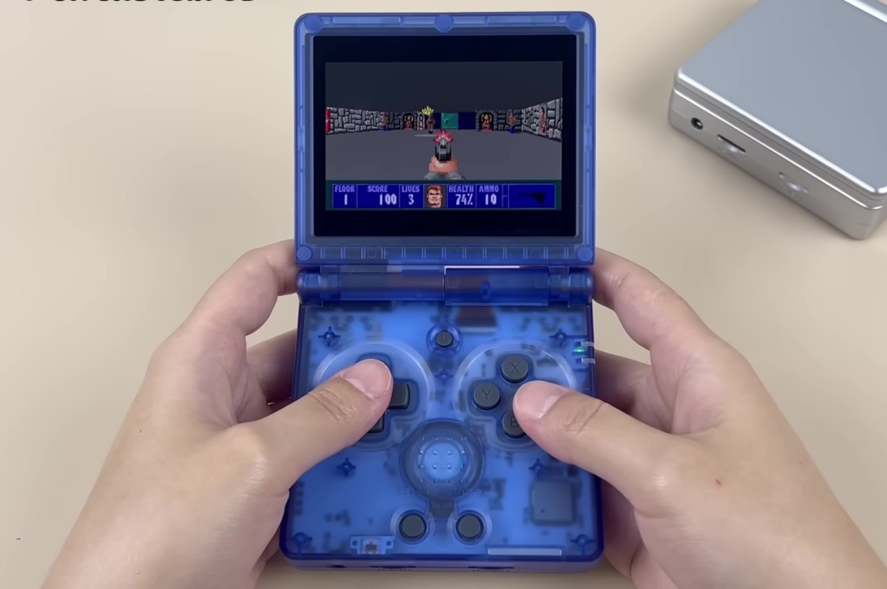
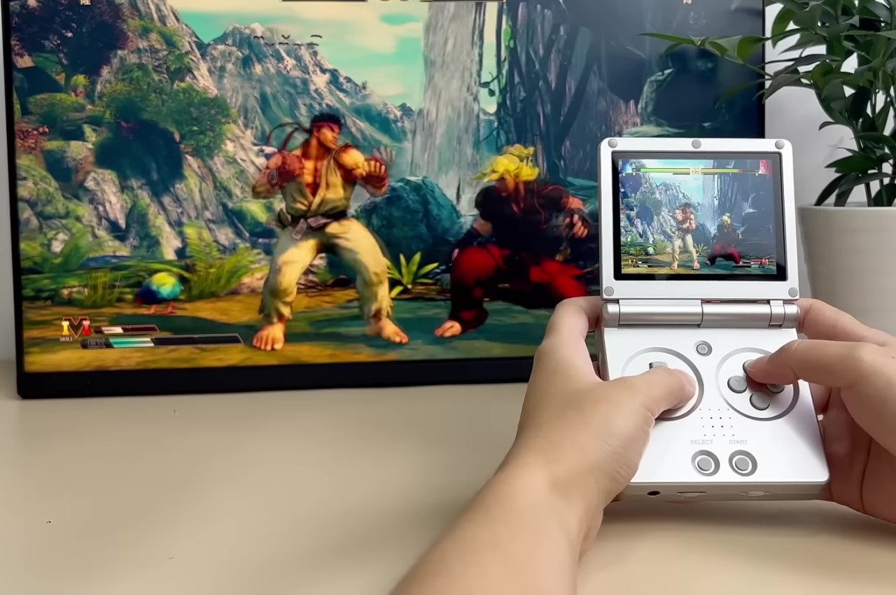
Deep inside, it uses the same guts as all the other iterations of the RG35XX, which means that it’s practically a mini computer that runs the Linux operating system. Specifically, it uses an emulation platform that can support a whole plethora of games from the likes of the Nintendo 64, PlayStation 1, PlayStation Portable, or even MS-DOS. And, yes, it can probably run Game Boy games as well, though you’re left to your own devices on how to make all these work.
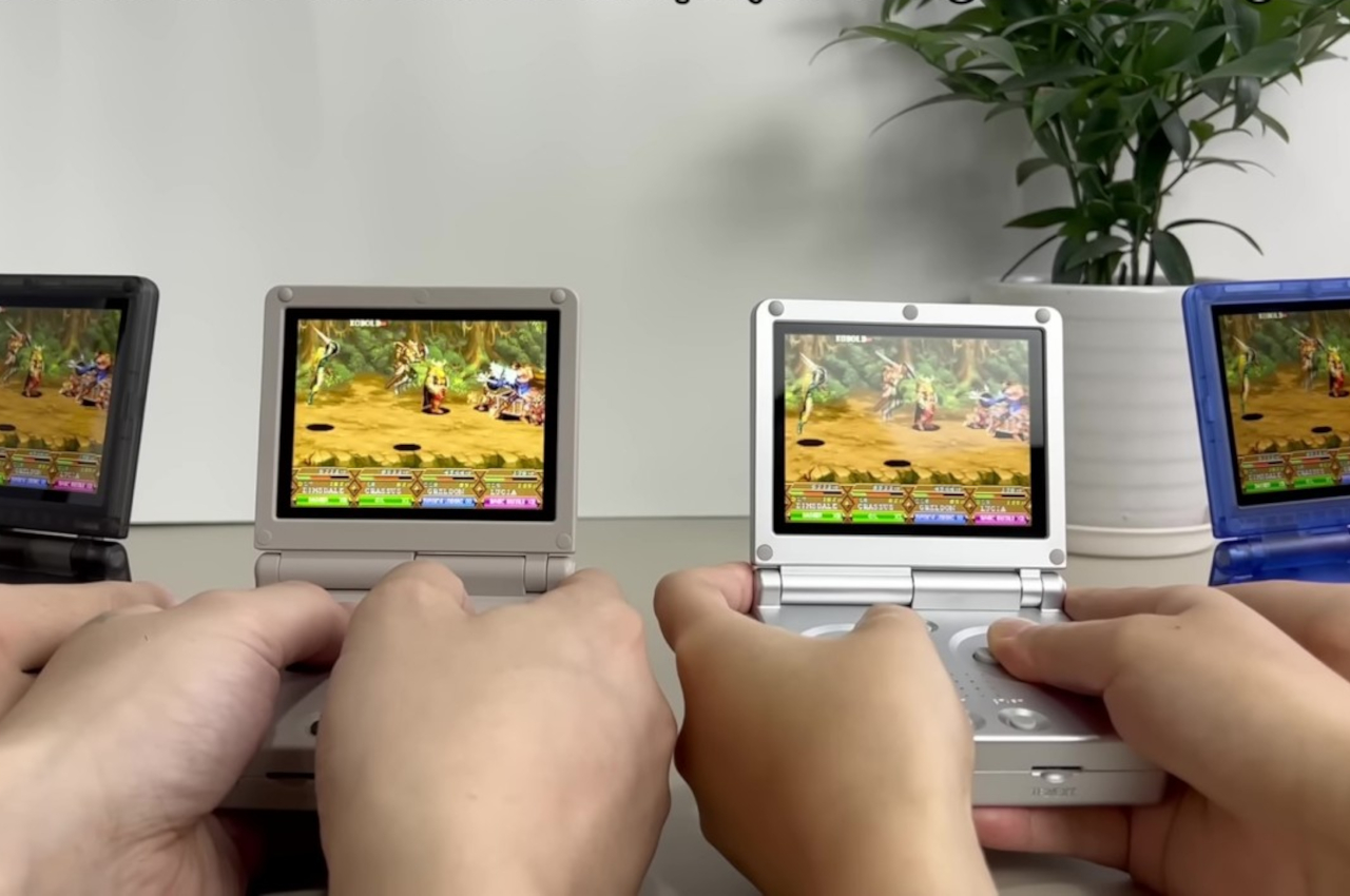
What’s more important, however, is that the RG35XXSP doesn’t use the limited controls of the Game Boy Advance SP. Instead, it has enough buttons to support all those gaming platforms, though don’t expect any analog joystick here. The pocketable gaming handheld is also described to be equipped with modern technologies, like Wi-Fi and 5G for local multiplayer gaming, HDMI for TV output, and support for Bluetooth peripherals like controllers, keyboards, and mice. Shown off in four designs that give tribute to those consoles and handhelds of the past, launch details for the Anbernic RG35XXSP are unfortunately still unavailable at this moment.
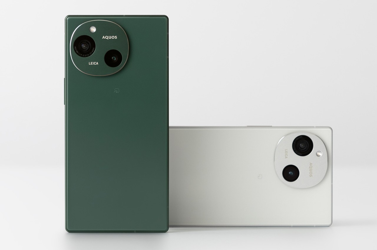
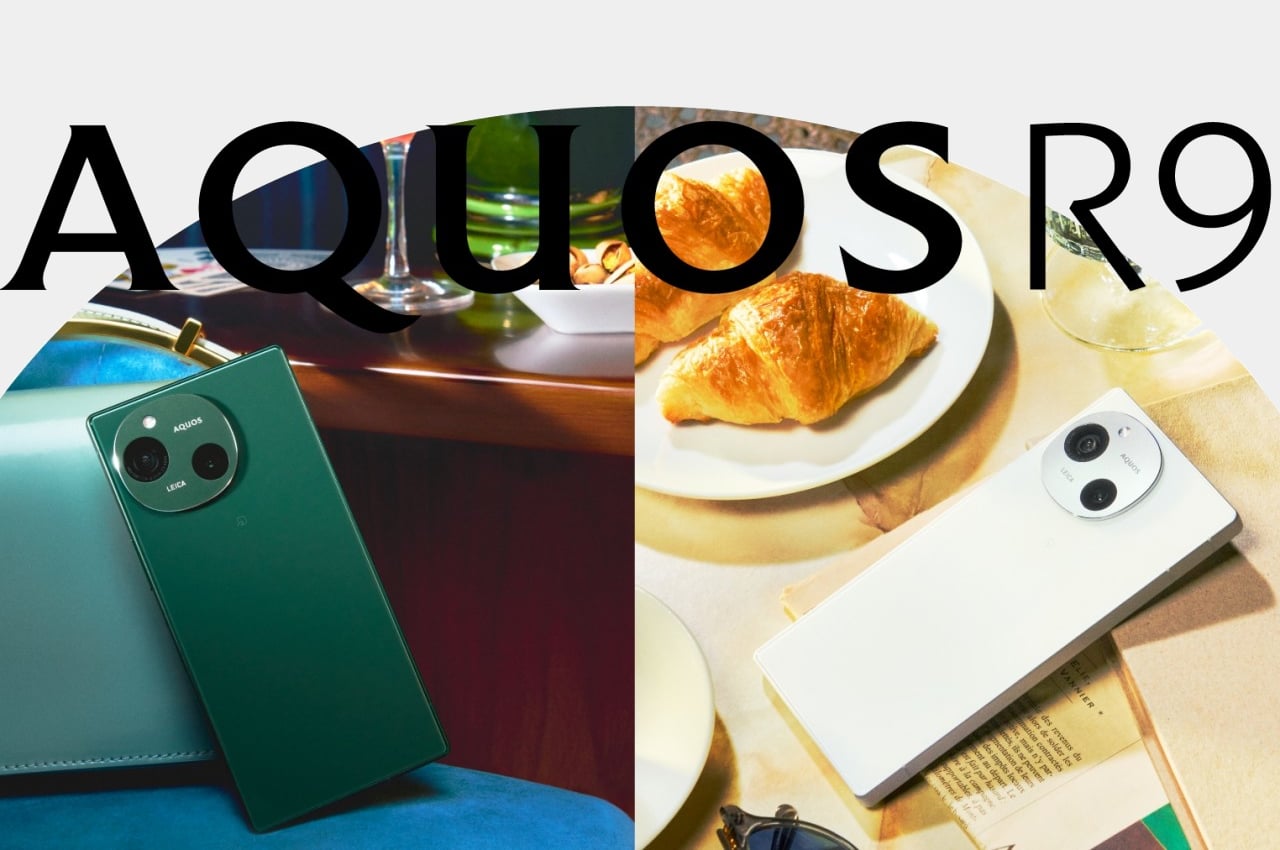
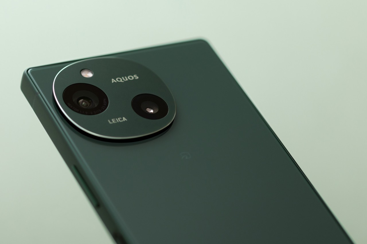
The mobile phone market is a very aggressive one, so it’s no surprise that even big companies bow out eventually. Nokia raised the white flag after numerous failed attempts with both Windows Phone and Android. BlackBerry also closed shop after failing to find a profitable market for its QWERTY phones, while LG opted to focus on its other businesses other than mobile. Some brands, on the other hand, simply downsize their operations, like HTC mostly in China, and Sony only through online shops. Sharp, is part of this latter group, though its presence has been so small you’d hardly notice it still existed. In fact, it just announced its latest handset, and while the Sharp AQUOS R9 looks rather elegant in its simplicity, a single design element, unfortunately, mars its otherwise clean appearance.
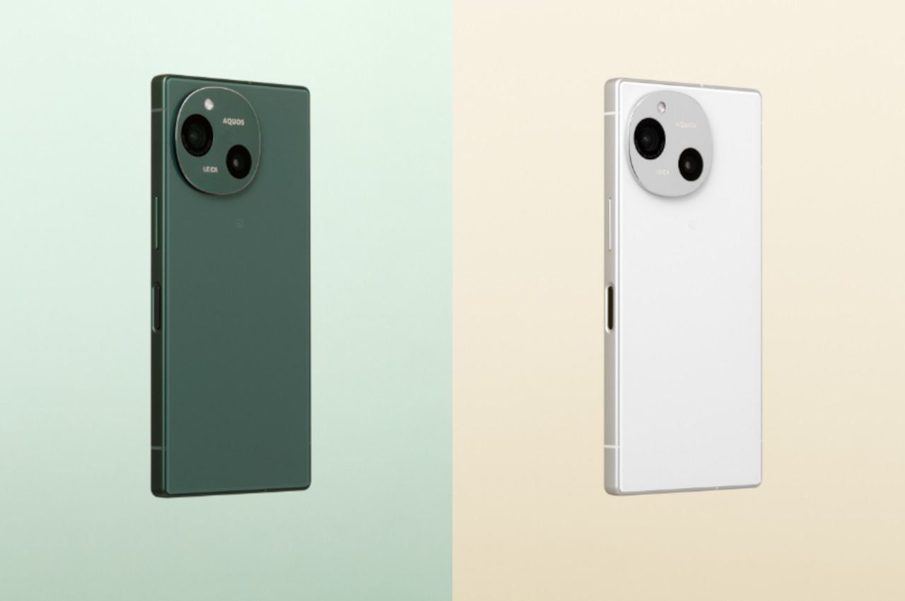
When it comes to minimalism, the two cultures that are considered to be the epitome of this style and lifestyle are Scandinavian and Japanese. In that regard, it shouldn’t be a surprise that Sharp’s new smartphone embodies minimalism almost to the extreme. It barely has any branding on the back of the phone aside from the small “AQUOS” and “LEICA” texts in the camera circle. With flat surfaces and edges, plain colors, and the lack of almost any embellishments, the Sharp AQUOS R9 is like a breath of fresh air in the smartphone market.
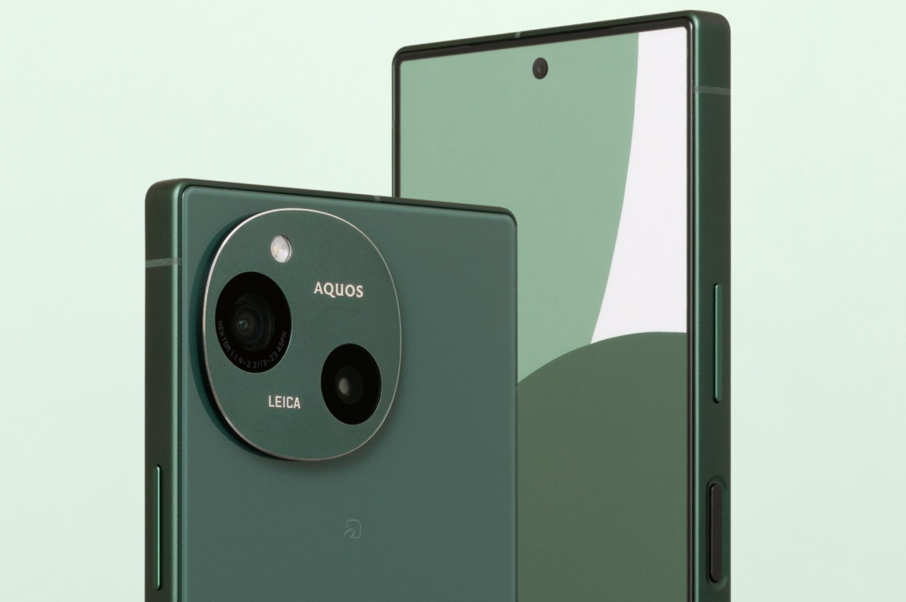
Unfortunately, it’s because of that very simplicity that your eyes are immediately drawn to the one conspicuous element on the phone’s back: its cameras. The design, while simple, looks a bit skewed, lopsided, and uncertain as if it can’t decide if it wants to be a square or a circle, the two predominant camera designs in the market today. Even more unbalanced, despite being an even number, are the camera lenses, positioned diagonally and off-center and with slightly different sizes. We’ll just have to take Leica’s unspoken word that this is the optimal placement for these cameras.
In terms of hardware, the Sharp AQUOS R9 looks quite competitive, at least on paper. It’s powered by a mid-range Qualcomm Snapdragon 7+ Gen 3 processor with 12GB of RAM, with a large 5,000mAh battery to keep it running. The 6.5-inch Full HD screen boasts TV maker Sharp’s Pro IGZO OLED technology and is capable of 240Hz refresh rates. Those two odd cameras on its back both have 50MP sensors, and the front-facing camera for selfies and video calls has a similar 50MP hardware. As mentioned, Sharp is proudly flaunting LEICA’s brand, indicating how its imaging system has been approved by one of the biggest names in the optics industry.
There’s no word yet on how much the Sharp AQUOS R9 will cost or if it will even be available outside of Japan. It’s definitely an odd design choice, one whose elegant minimalism is juxtaposed with an asymmetrical camera bump. It’s not ugly, for sure, but it’s an appearance that looks a little confusing and disconcerting, creating a bit of a visual discomfort whenever you try to appreciate its clean looks.
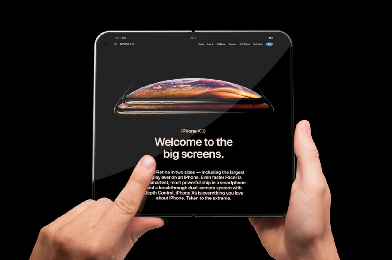
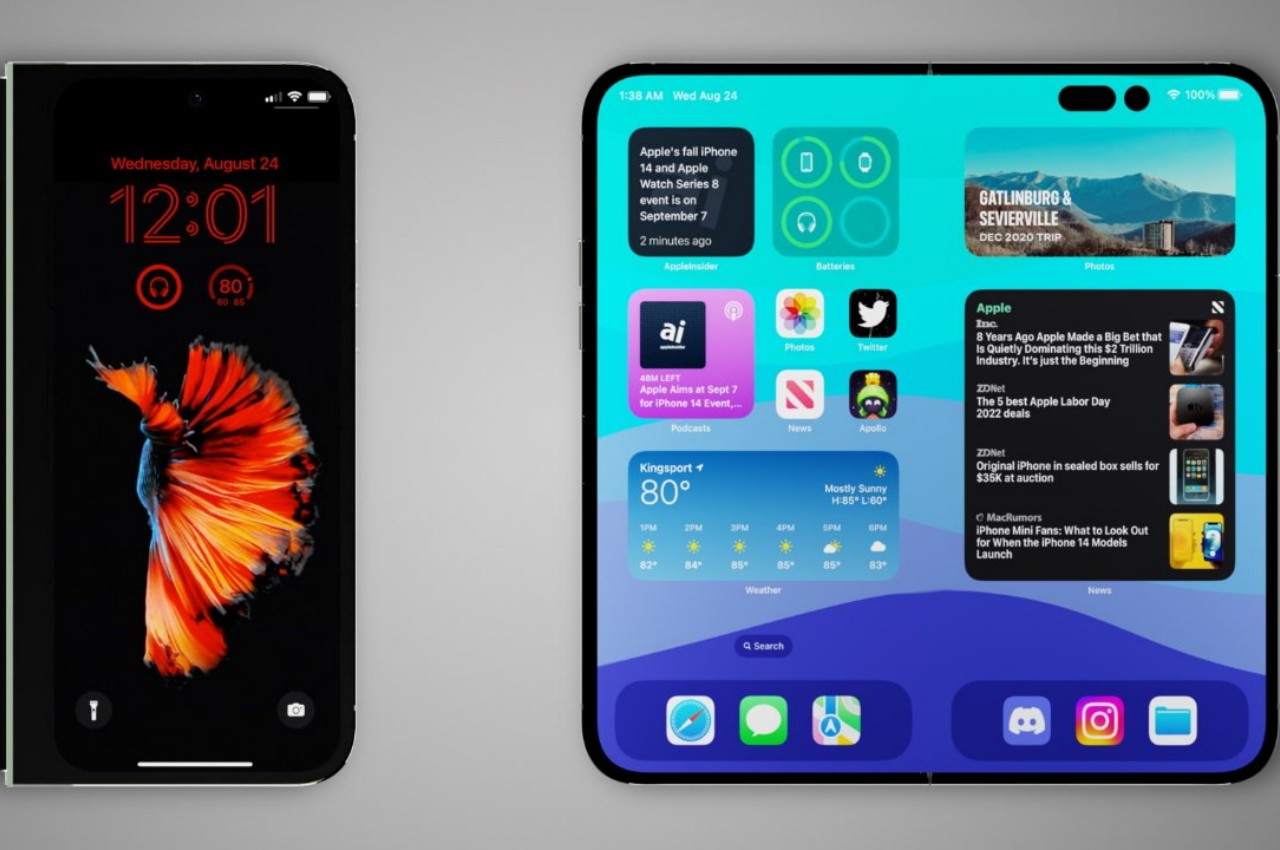
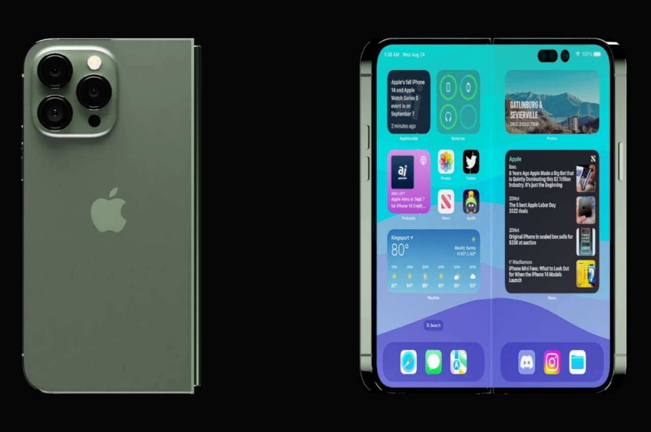
Apple just announced what might be the biggest upgrade to the iPad line since the iPad Pro was introduced in 2015. In addition to switching to an OLED panel, with all the benefits that it entails, as well as gaining a new Apple Pencil Pro, the new iPad Pro is possibly one of if not the thinnest tablets in the market, especially for its 13-inch size. But while Apple’s new tablets are definitely worthy of attention, the company’s fans are still holding their breath for a foldable iPhone. Rumors claim that could be coming in two years, but it could also be canned at the last minute, just like the AirPower wireless charging mat if the design and performance don’t meet the meticulous company’s standards. Then again, some probably consider foldable devices as a passing fad, but that couldn’t be farther from the truth. Apple should launch a foldable phone sooner rather than later because these devices aren’t going away, and here are the reasons why.
Chances are, you’re using your phone less for calls and more for content, which does include activities like instant messaging and chatting. The screen is the most important part of the device because it is the part that we see and use the most. Content is the primary reason for having a smartphone, whether it’s for consuming content or sometimes even creating it, so any technology that lets people enjoy more content or gives them more ways to enjoy content is always a winner. Is it any wonder, then, why phablets or phones with large screens are now the norm, despite how much Apple ridiculed its size at first?
Foldable devices solve this in two ways. Large foldable phones in the style of the Google Pixel Fold offer an experience similar to a mini iPad mini that you can still shove in your pocket and use as a regular phone to some extent. In theory, it delivers the best of both worlds, with a screen that can contain as much content as possible while still in a portable format.
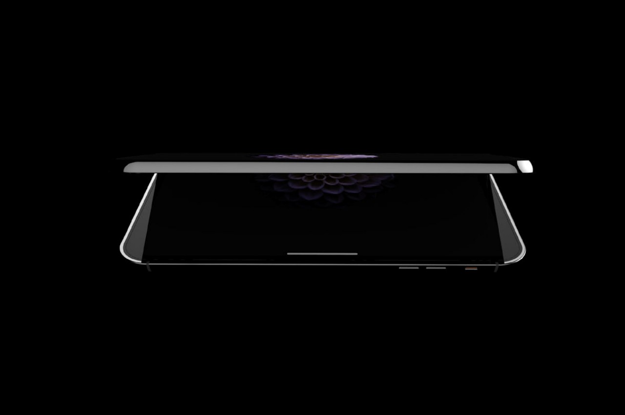
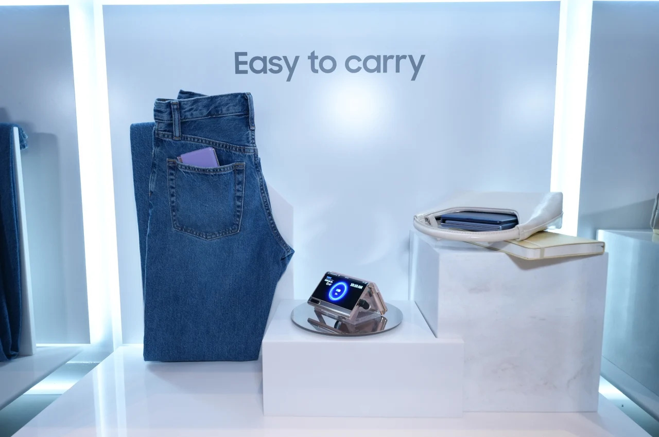
Conversely, clamshell-style foldables like the Samsung Galaxy Z Flip series strike the problem from the opposite end. It provides a screen experience that’s exactly like a normal large phone but lets you conveniently cram the device in very small purses and pockets. It still prizes the role of content but delivers it in a design that doesn’t get in your way because of its size.
2. Falling Prices
One of the reasons why people avoid foldable phones and why they see them as luxurious fads is because of their rather mind-blowing prices. Yes, it’s expected that novel technologies and designs would cost more at the start, but foldable phones have been around for almost half a decade now, and yet most still cost a premium flagship and a half. Fortunately, things are changing for the better, even if slowly.
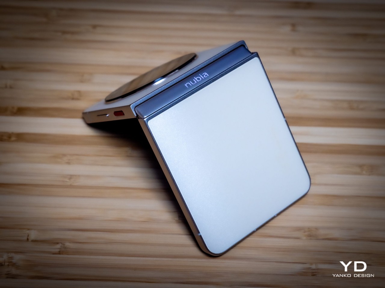
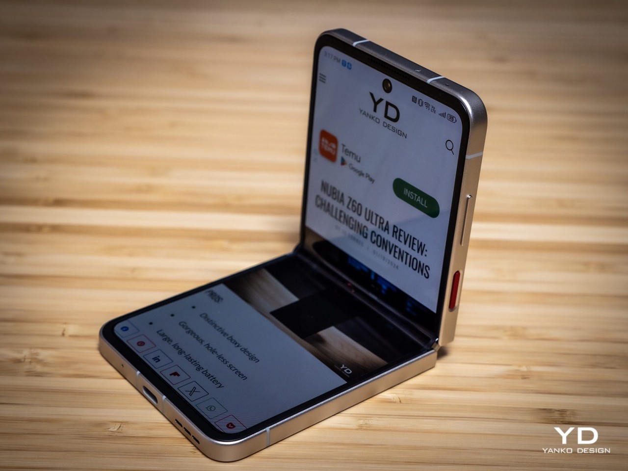
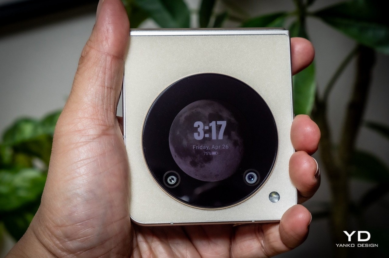
As the technologies and components become more common, the cost of their production will start to decrease as well. Given that there’s still plenty of room for newer designs that will involve more costs, high-end foldable phones won’t be going away any time soon. At the same time, however, that still leaves the door wide open for options on the lower rung of the price ladder. The new nubia Flip 5G, for example, is currently the most affordable among the relatively cheaper clamshell foldables. Sure, it does cut corners in a few aspects, but that is also proof that you can have “mid-tier” foldable phones in this market.
There’s definitely a great deal of interest in a cheaper book-style foldable, and that might be coming this year if not from Samsung then from its growing number of rivals. Admittedly, it might take another year before more affordable foldables become more common, but it’s something that will happen sooner rather than later.
3. Design Refinement
Even after five years, the foldable phone design is still relatively young. Given how it strays so far from normal phones, it’s not surprising that perfection still feels so far away. In other words, there’s still much to be done, and smartphone makers continue to push the boundaries, refusing to settle for the status quo. In a way, it’s a matter of pride for these brands, as well as refusing to admit defeat after investing so heavily in foldable designs.
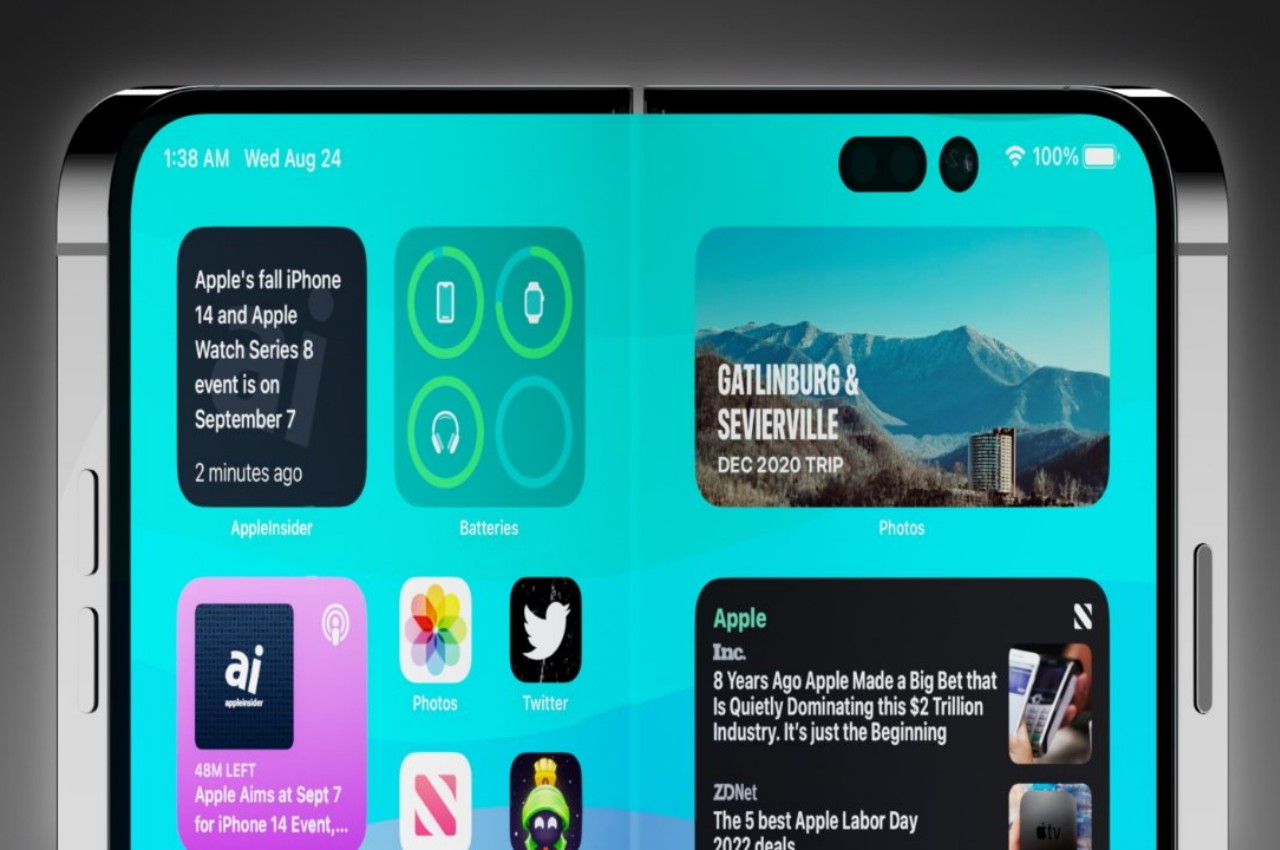
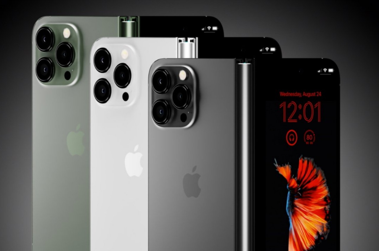
Images courtesy of AppleInsider
Foldable phones are getting thinner to the point that a folded phone no longer feels like you have two regular phones stacked together. At the same time, others are cramming more powerful and larger cameras into these ultra-thin devices, trying to get them on the same playing field as any other flagship model. While standard smartphone designs seem to have settled down after many tumultuous years, things are just heating up for foldables. There’s still a lot to be explored, and we’re far from reaching the peak.
4. Stylish Trendsetters
Smartphones have graduated from being technological products that only tech-savvy people can truly appreciate to lifestyle items that reflect the owner’s design tastes and personal preferences. Smartphone expressiveness is becoming an important factor in how people choose devices these days, from the design of the cameras to the overall style of the phone itself. That’s part of the reason why “flip” foldable phones are reported to be outselling their larger cousins, precisely because they bring back that classy image of flip phones from decades ago.
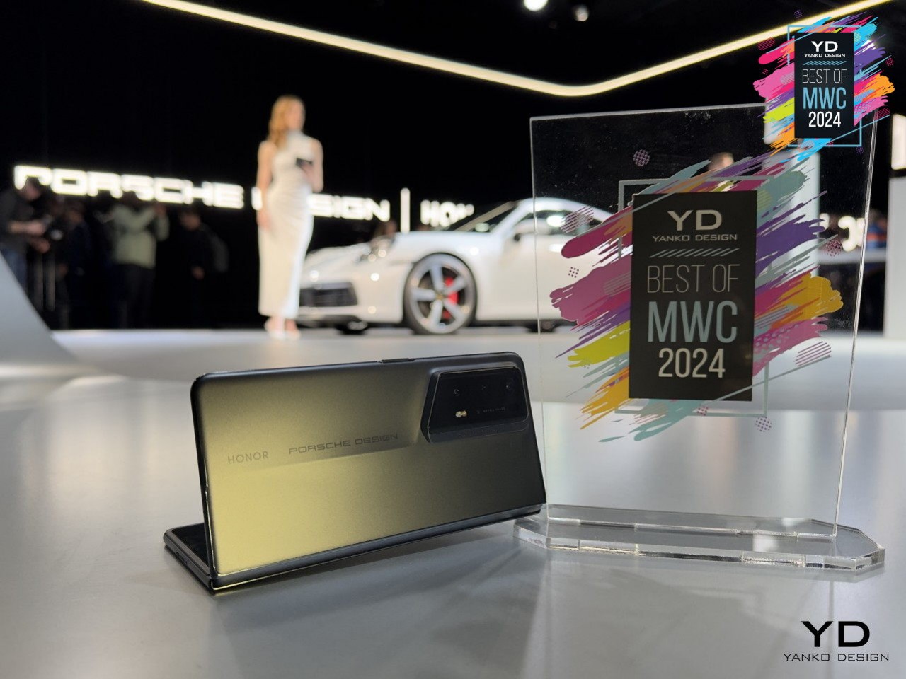
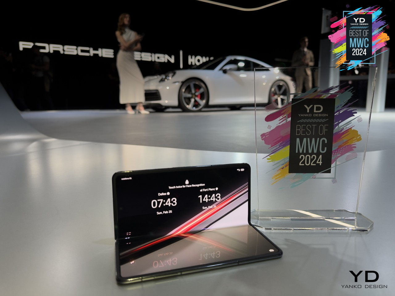
Designer: Honor
Yes, you can dress up your regular phone slab as much as you want, but the way you open and close a foldable phone is going to be fashionable for quite a while. And you can also dress them up as much as you want, and may even offer more customization options and creativity with the styles of cases and accessories used. Everything you can do on standard phones, you can also do with foldables but with more pizzazz and a “wow!” factor.
There’s also the aspect of offering more customization options inside as well. The foldable screen is a bigger canvas you can play on, and some external Cover Screens can get creative with their designs as well. It’s a new playground for designers and creative users who want to truly make their smartphones an extension of themselves.
5. Innovation Has Just Begun
Foldable phones are just the start, however, because they are the most accessible and easiest to comprehend. Once the idea of foldable screens has become cemented in people’s minds, it will be easier to introduce newer designs that can provide even better solutions. The current foldable designs are far from perfect, but they’re paving the way for future foldable devices.
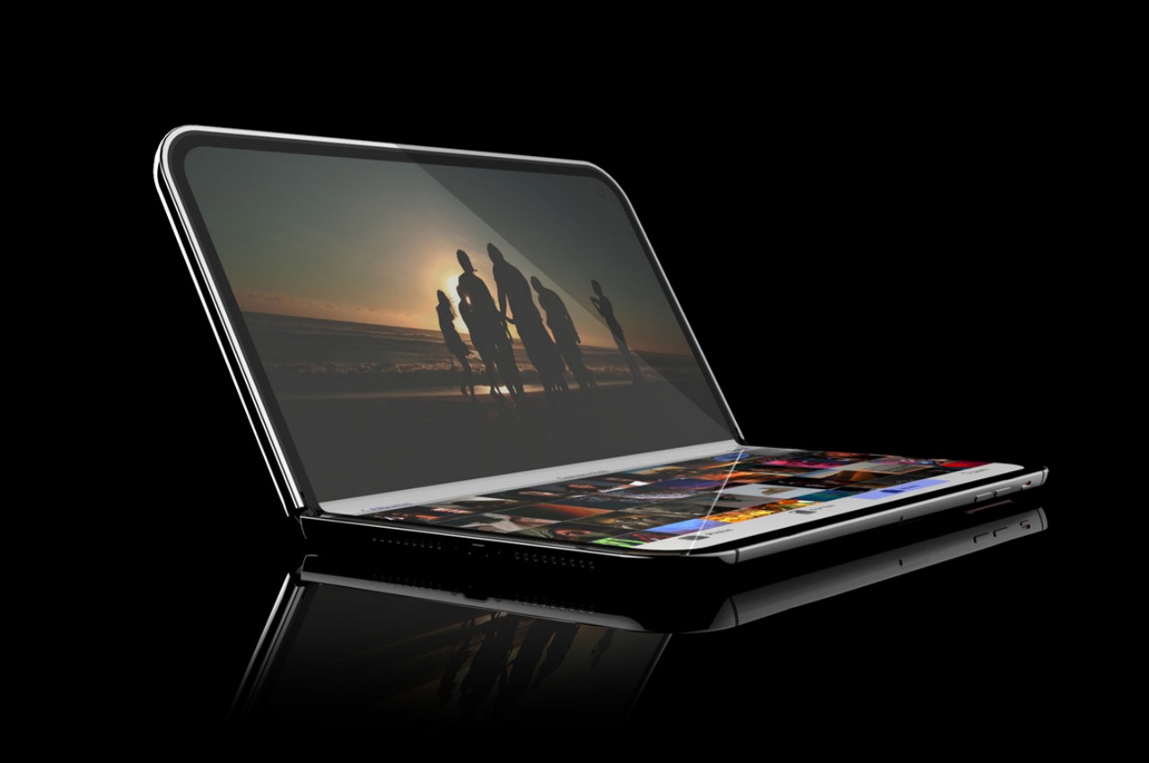
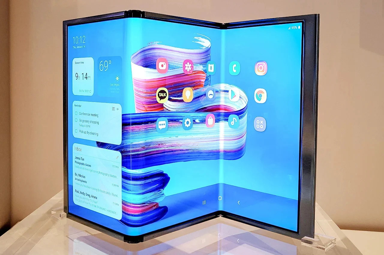
We’re already seeing that in the PC market with the introduction of foldable laptops, but we don’t need to go that far for proof. Samsung has already shown off working prototypes of tri-fold devices that turn the phone into a larger, and more conventional tablet design. We’ll see other foldable technologies unfold (no pun intended) in the future as well, including a phone that folds both ways. And don’t forget those rollable screens that offer an alternative answer to the same screen size problem.
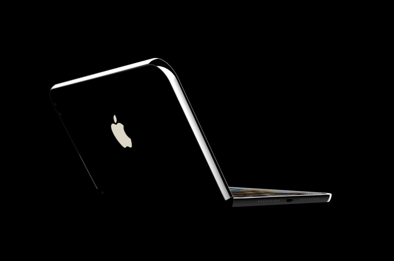
Apple is rumored to unveil a foldable laptop next year, with a foldable iPhone following in 2026. Honestly, the order should probably be reversed, given how MacBook owners are more meticulous about how new designs affect functionality, sometimes negatively. Either way, Apple really needs to jump on this train soon, not just because it’s trending but because it can have a significant impact in driving innovation in this space forward by leaps and bounds.
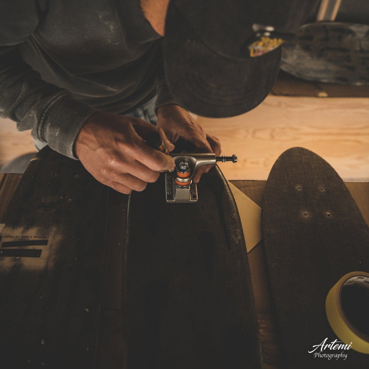
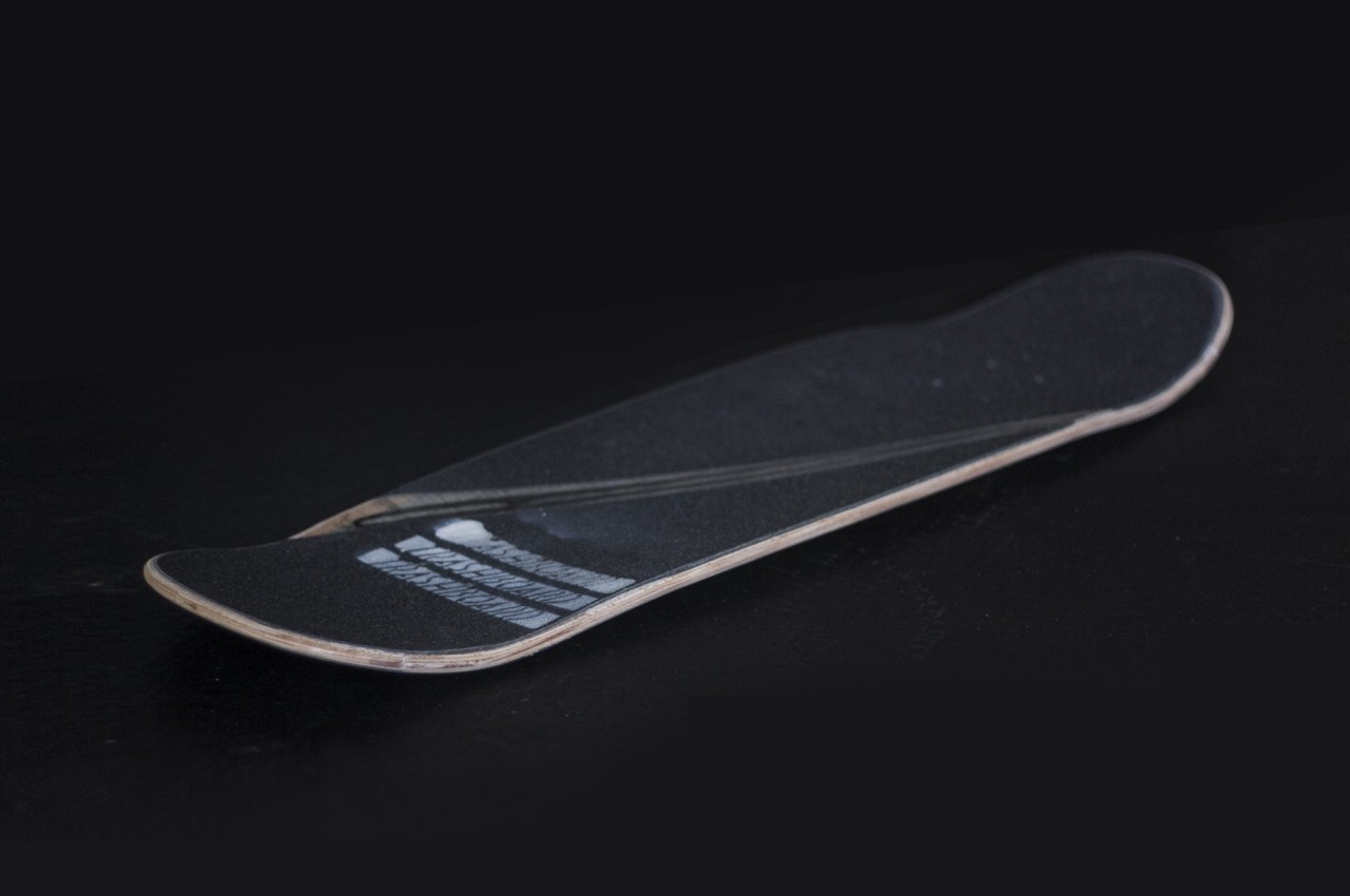
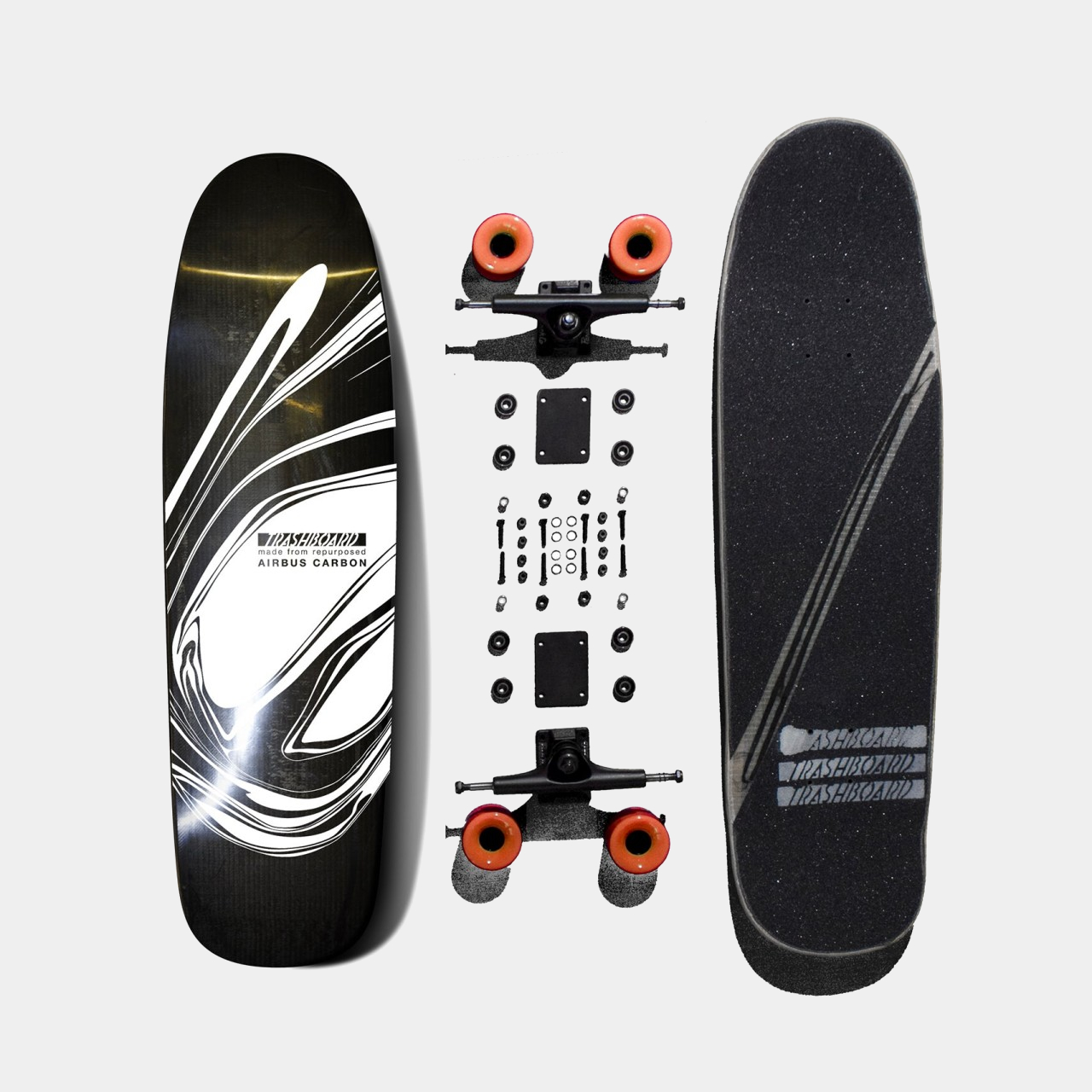
To most people outside of that community, a skateboard is nothing more than a wooden plank on wheels with sometimes outrageous artwork painted on it. The probably surprising reality is that a great deal of design and engineering goes into making these skateboards to keep them aerodynamic while also light and sturdy. While it’s fine to stick to nearly perfected traditions when it comes to materials and processing, there’s also a need to push the envelope in order to design a product that will not only stand the test of time but will also help the planet last a little bit longer as well. That’s the kind of innovation that this seemingly normal sustainable skateboard brings to the market with a little help from airplane maker Airbus.
To be fair, much of a skateboard’s composition, particularly its deck, already uses sustainable materials like wood. That said, there’s also such a thing as the overuse of fresh wood, which can lead to deforestation and other related environmental consequences. While skateboards themselves can be recycled or upcycled, the use of recycled materials like recycled wood hasn’t exactly born much fruit.
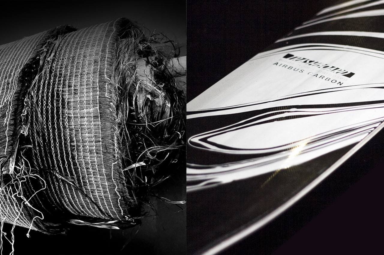
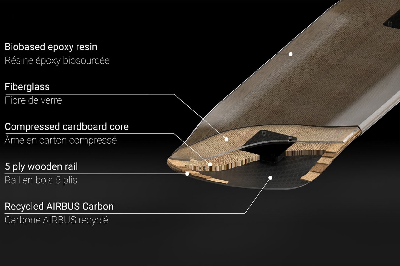
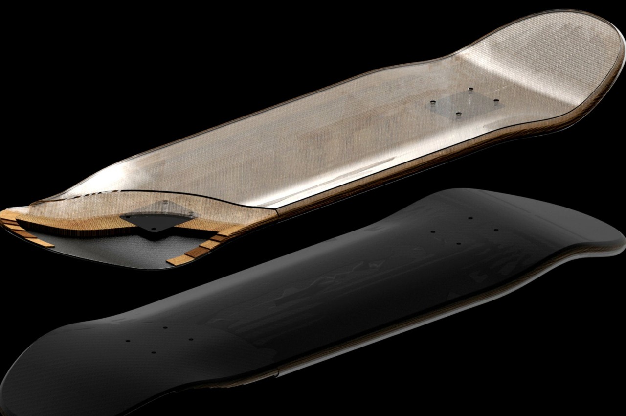
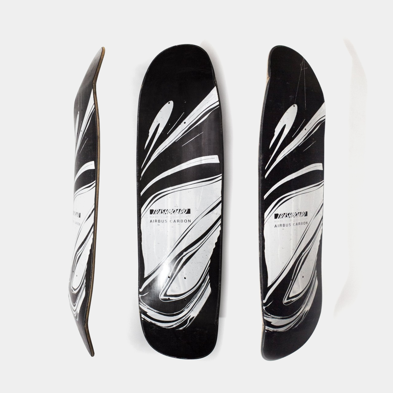
Enter the Trashboard, a sustainable design that uses recycled materials that aren’t wood. Building upon an earlier project that successfully used packaging cardboard to make a surfboard, the Trashboard combines recycled and upcycled materials to make a unique deck that still feels like the genuine item. In particular, it uses upcycled carbon from discarded aeronautic components courtesy of Airbus to minimize the use of raw new materials. It also uses compressed recycled cardboard for the deck’s flex core and binds the layers together using bio-sourced epoxy resin.
From the outside, you wouldn’t even realize that the Trashboard is made differently. It still retains the same standard form that gives skateboards their smooth gliding power, and it also has rather artistic prints, though leaning more towards a monochromatic tone that gives the decks a more elegant aesthetic. All in all, Trashboard promises to deliver the same exhilarating cruising experience, while also allowing skaters to share in the responsibility of helping keep our planet alive.
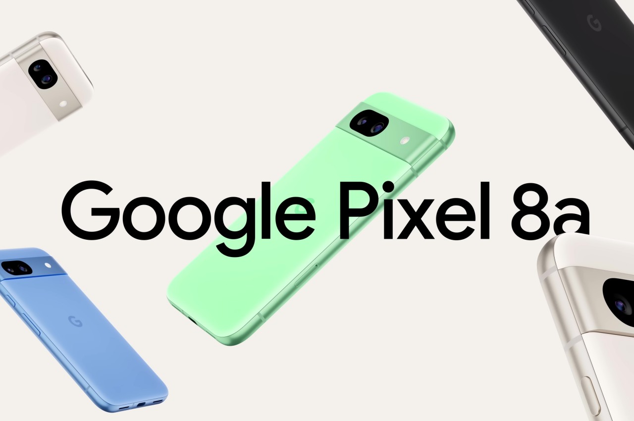
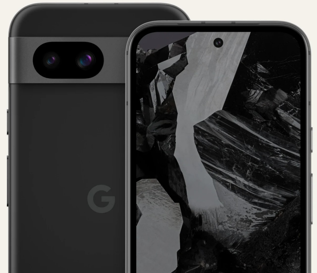
Even before AI and machine learning became buzzwords, Google was already utilizing these technologies behind the scenes to power services like Search and Google Assistant. In line with recent trends, however, it has started applying and advertising AI for anything and everything, especially for its Pixel devices. AI features, however, are normally accessed through online services, which incurs security and privacy issues, or on the device itself, which requires powerful hardware that’s often available only on more expensive flagships. That’s the kind of situation that the new Google Pixel 8a is trying to change, offering a more accessible device to access Google’s AI-powered features and services for years on end.
Designer: Google
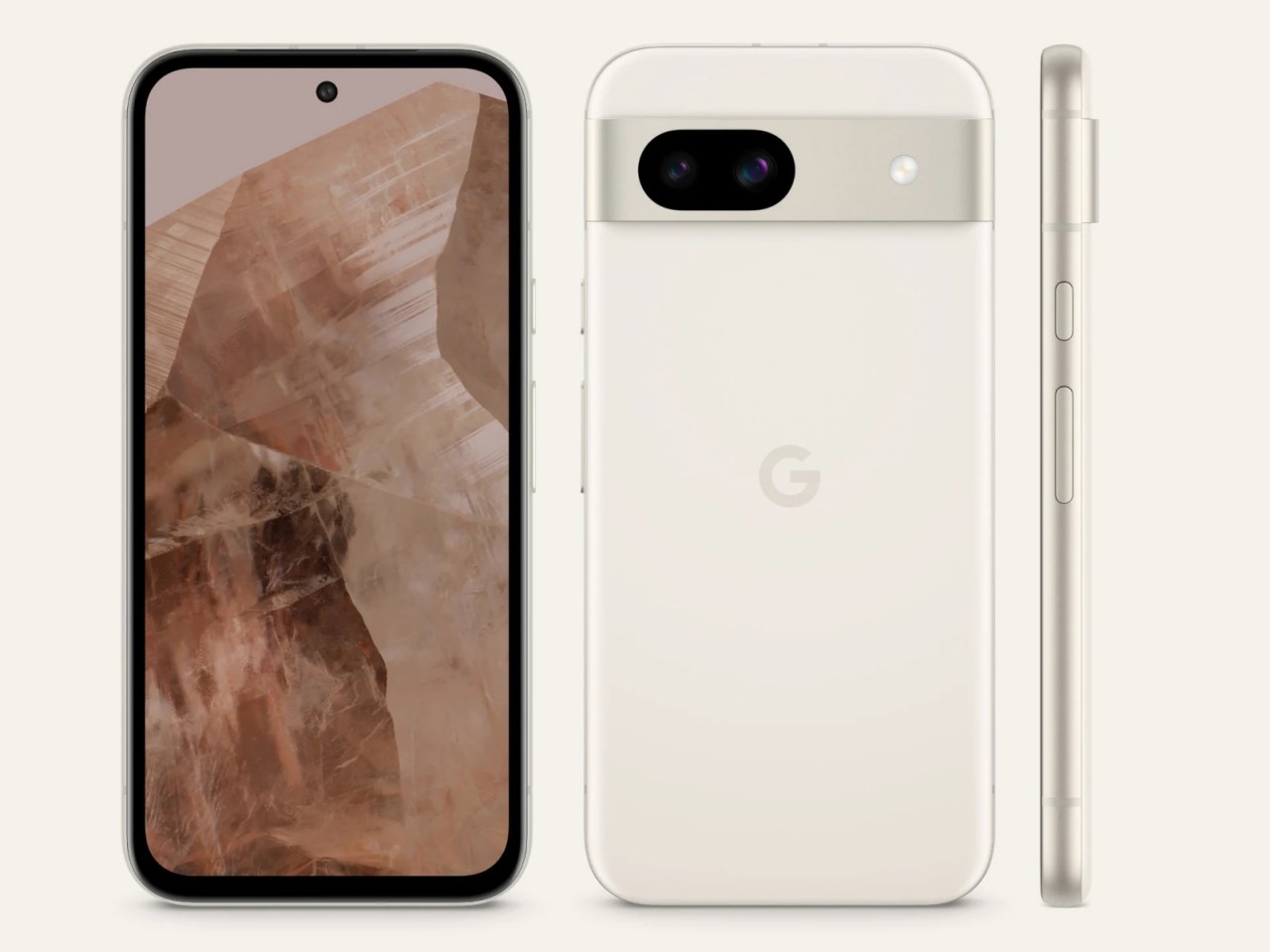
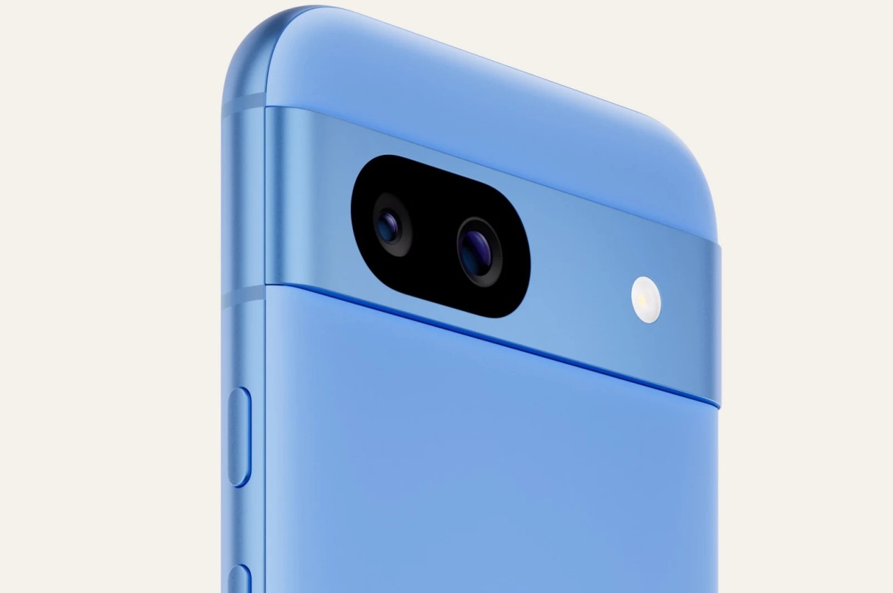
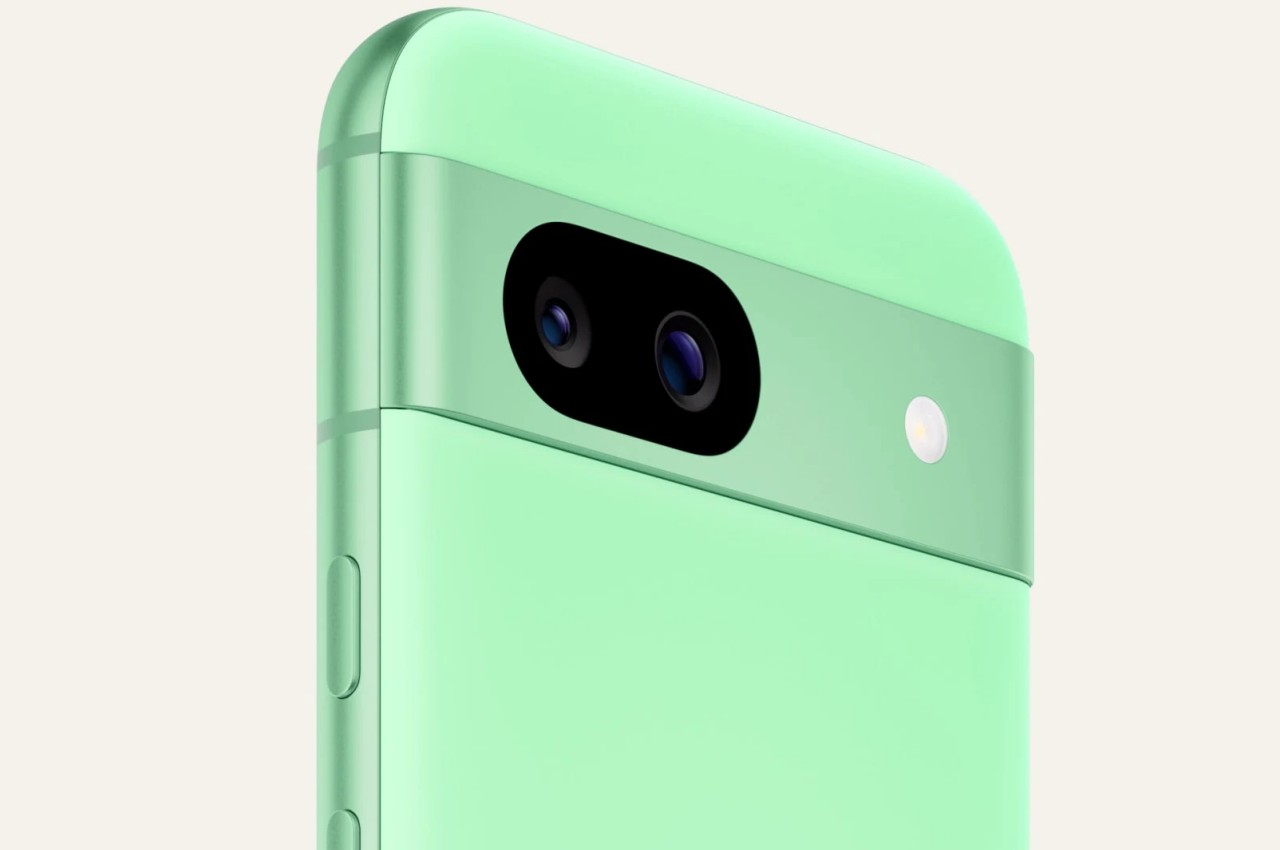
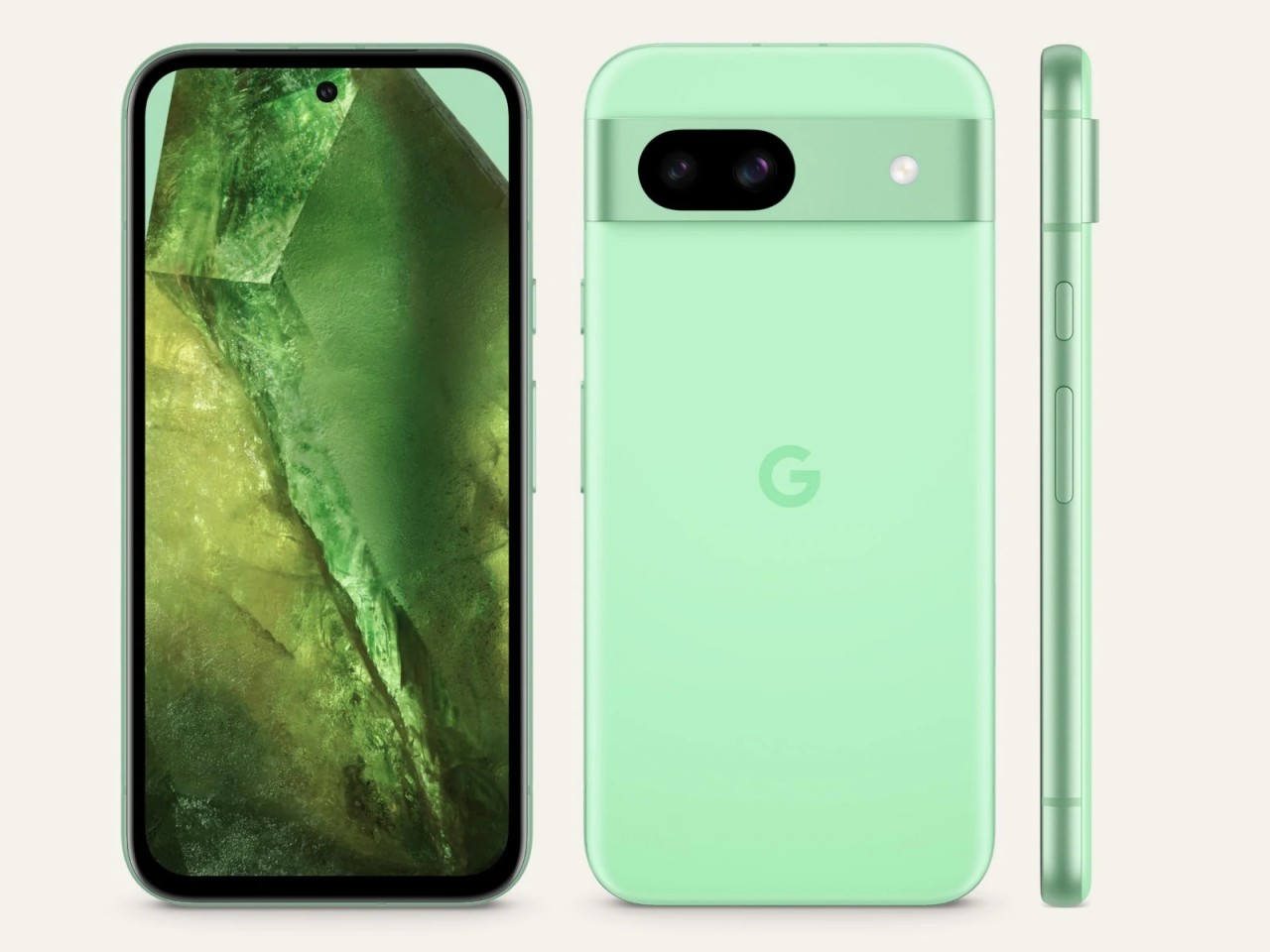
The Pixel 8a is practically the Pixel 8 in both design and spirit. It has the exact same appearance, though in a slightly smaller size and one important change in materials. The back of this newer Pixel phone is a matte composite instead of the Pixel 8’s glass rear. The color options available are also slightly different, with the Pixel 8a leaning more towards fun and saturated hues like Aloe green and Bay blue. Otherwise, the two are almost exactly identical, which some Pixel fans have grown pretty fond of.
The Pixel 8a even shares the same Tensor G3 processor as the current flagship, though we won’t be surprised if we find out later that it has been dialed down a bit. That said, it still has enough power to support almost all of Google’s AI features on the Pixel, from Circle to Search to Gemini assistant for summarizing pages or notes to removing background noise from recorded video. There will still be some features exclusive to the Pixel 8, of course, but you can already enjoy most of what’s available on the Pixel 8a, especially when it comes to photography.
It will definitely need it because one of the biggest corners that Google had to cut was the camera system. Neither the 64MP main camera nor the 13MP ultra-wide has autofocus, and both have slightly lower specs than the Pixel 8. In other words, the Pixel 8a will rely more heavily on AI and algorithms to compensate for the camera hardware’s limitation. There are also some other key differences, like a slower (but still fast) 18W charging speed.
All in all, you’re getting nearly the same Pixel 8 experience for $200 less, with the Pixel 8a going for $499 for 128GB of storage and $549 for the first-ever 256GB option for a Pixel “a” series. Aside from the camera, none of the “downgrades” are deal-breakers, making the Pixel 8a a very worthwhile investment for the future, especially since the phone will also be getting Android updates for seven years.
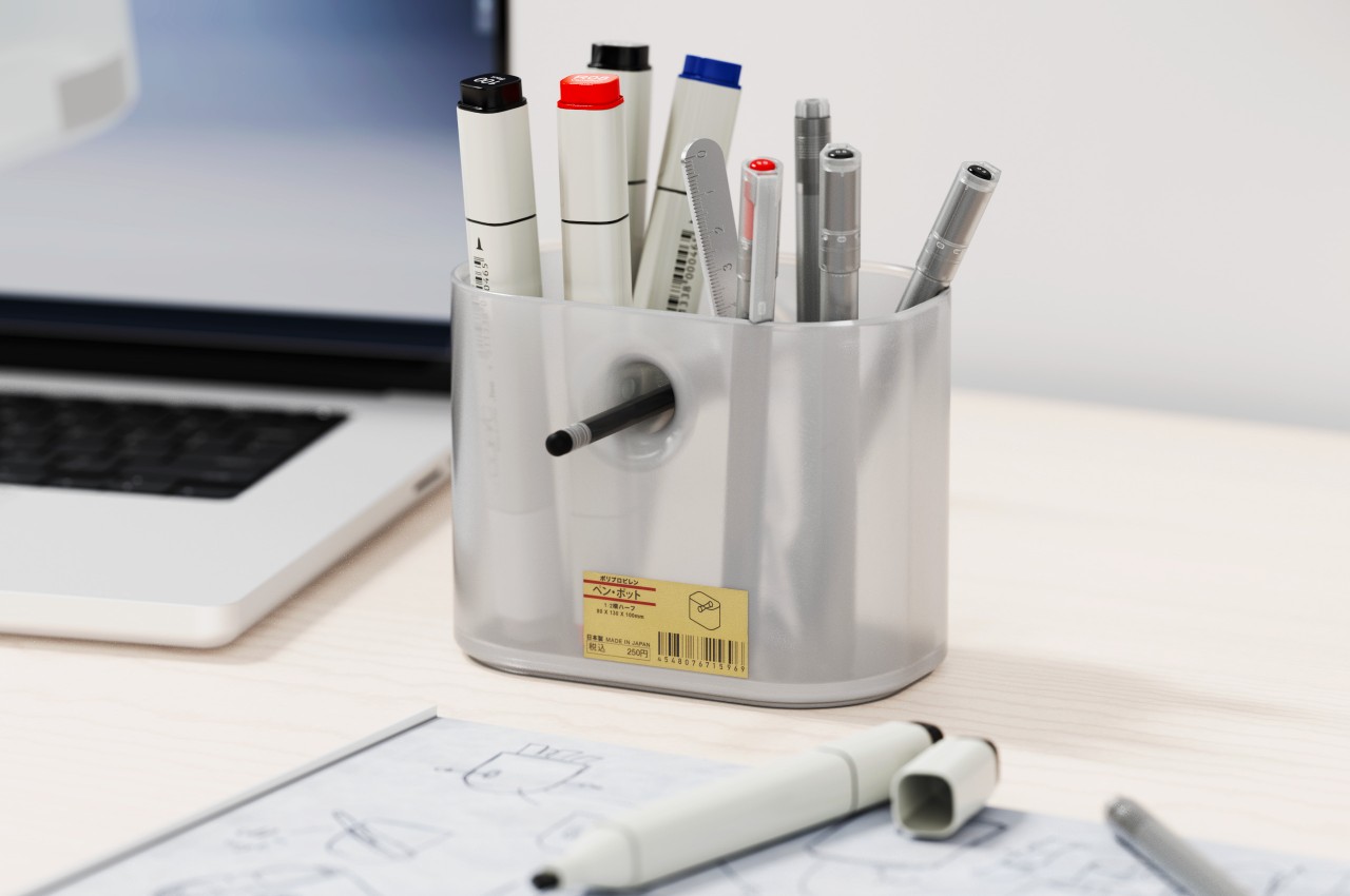
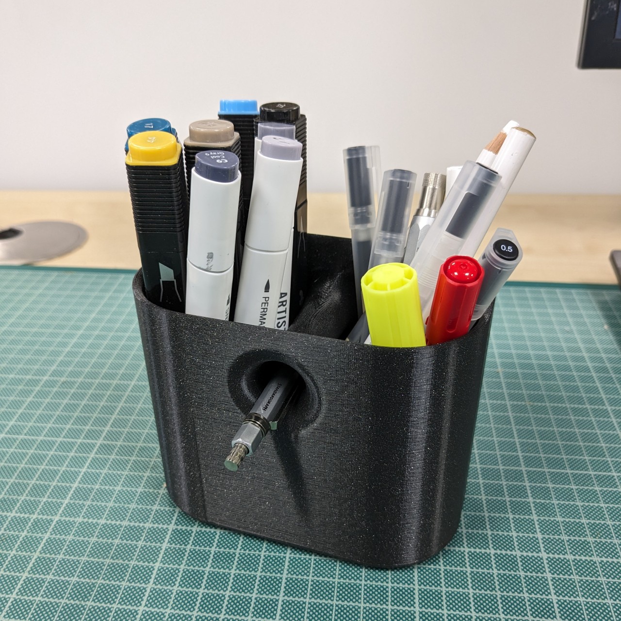
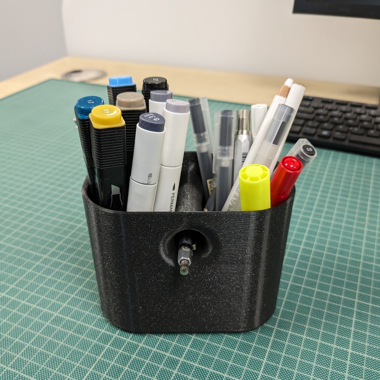
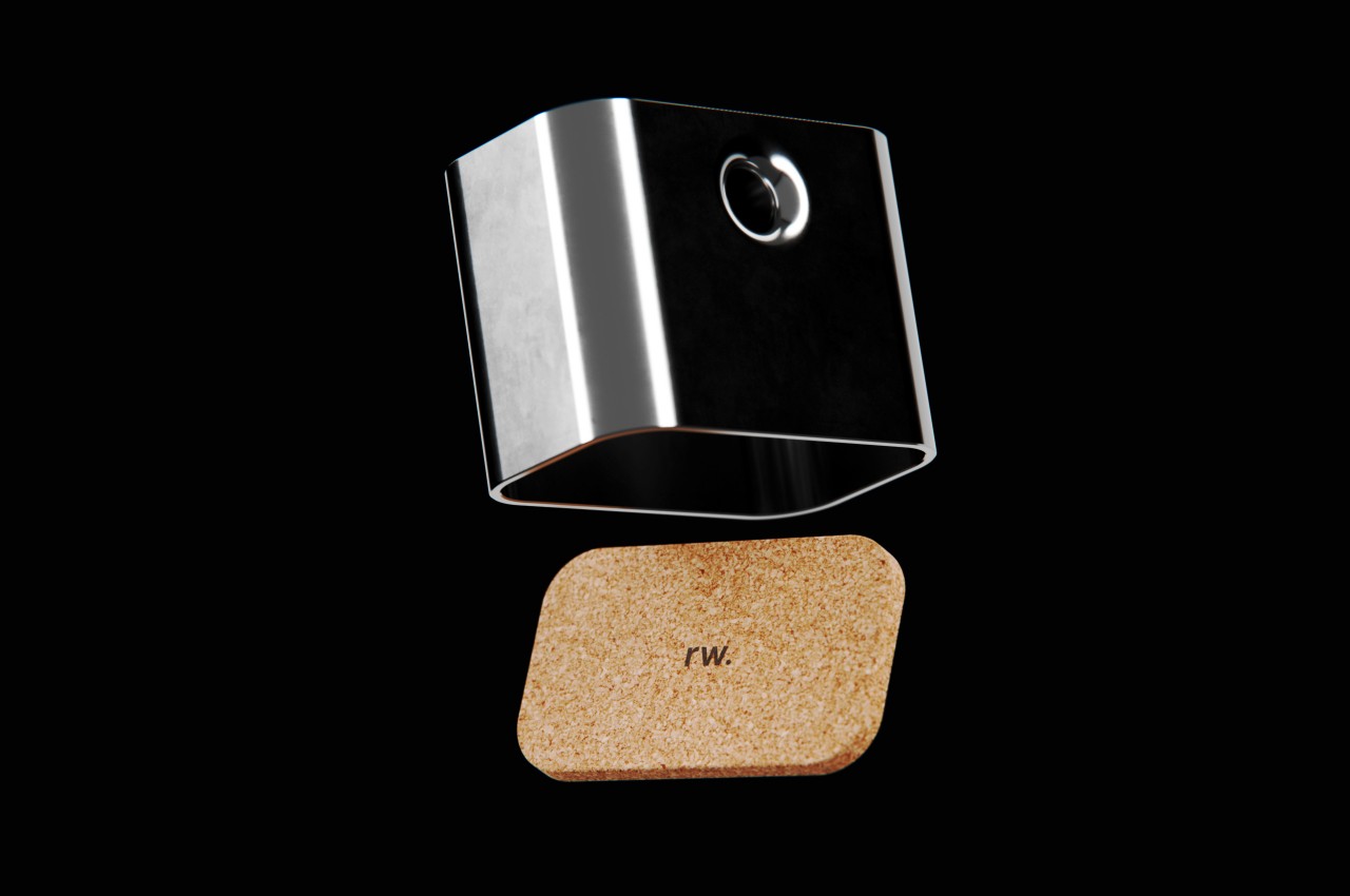
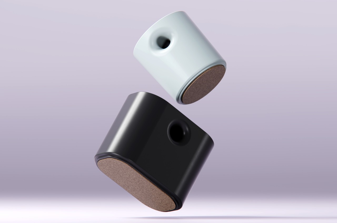
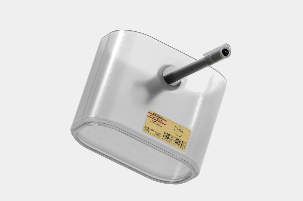
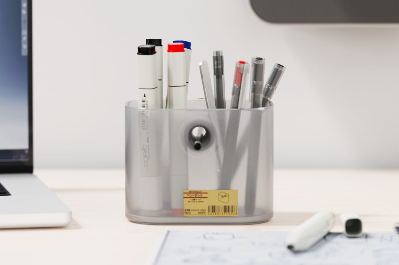
The key design elements for a pen holder or pen pot are pretty simple. It just needs to be tall enough to support writing instruments of different heights without them tipping over and would have enough room for at least a handful of pens, pencils, markers, and the like. Beyond that, the designer is free to interpret the shape of the container, and some even have dividers to segregate the different tools. But while pen holders are a convenient way to keep your pens together, they don’t really make it easy to pick out your favorite one from among the bundle. Some people would use a separate stand just for that single pen, which takes up unnecessary space on your desk. This concept design has a rather curious answer to the problem, one that pretty much leaves a conspicuous hole in the middle of the pill-shaped pot.
Usually, having a hole in the middle of a container is considered to be a defect, one that not only weakens the structure of the shape but also mars its visual integrity. After, something that cuts through an otherwise clean and whole form is sure to bother one’s aesthetic sense. In this case, however, that hole is not only intentional but also functional, setting the Void Pen Pot apart from your run-of-the-mill pen holders.
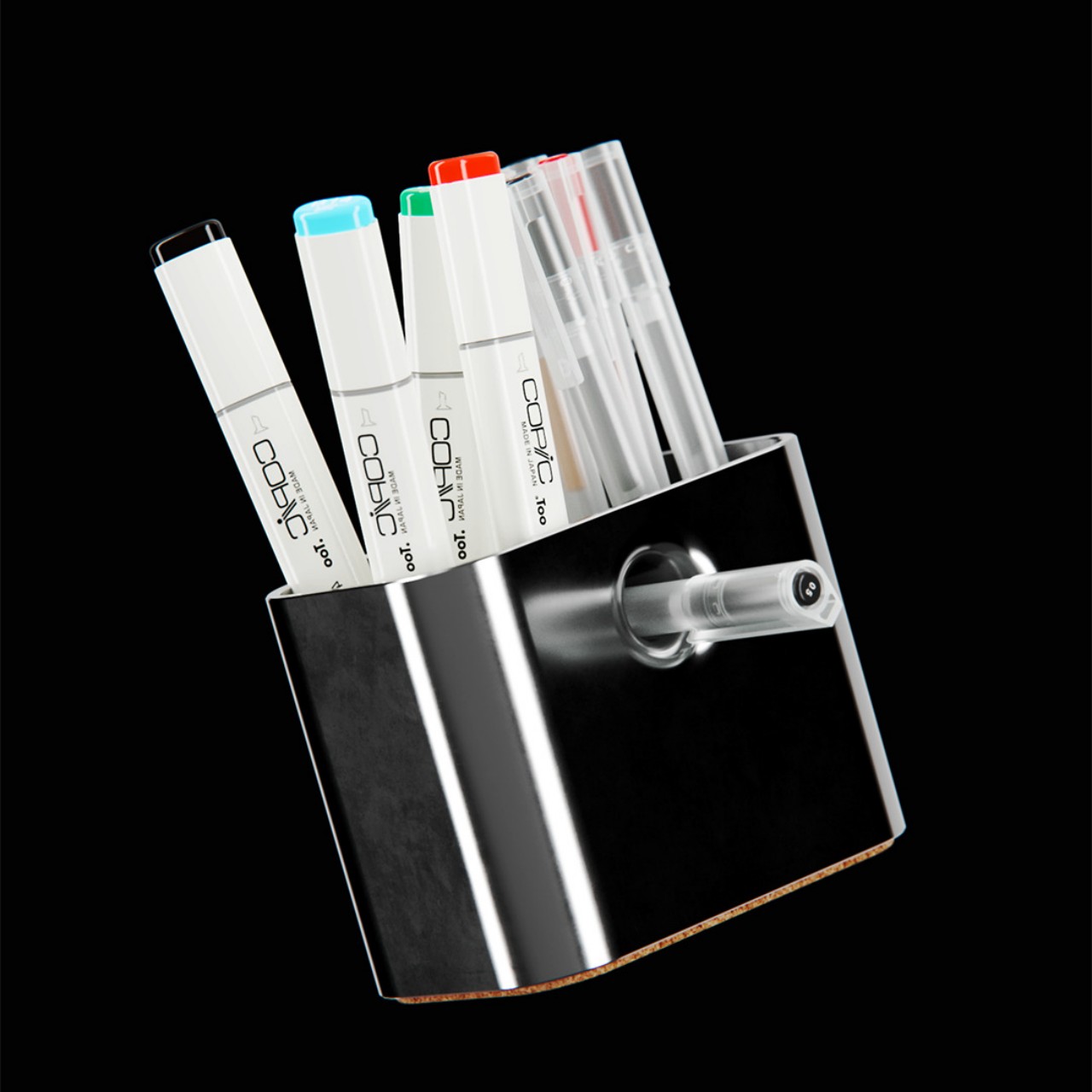
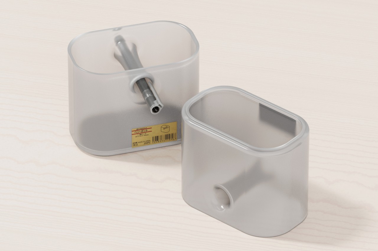
The hole that runs through the body of the pill-shaped container actually provides a convenient resting place for your most-used pen or pencil. Instead of wasting time and effort looking for that pen among half a dozen similar-looking rods, you can simply pull it out from its hole and start using it immediately. And when you’re done, you can just shove it back in to wait for the next time you need it.
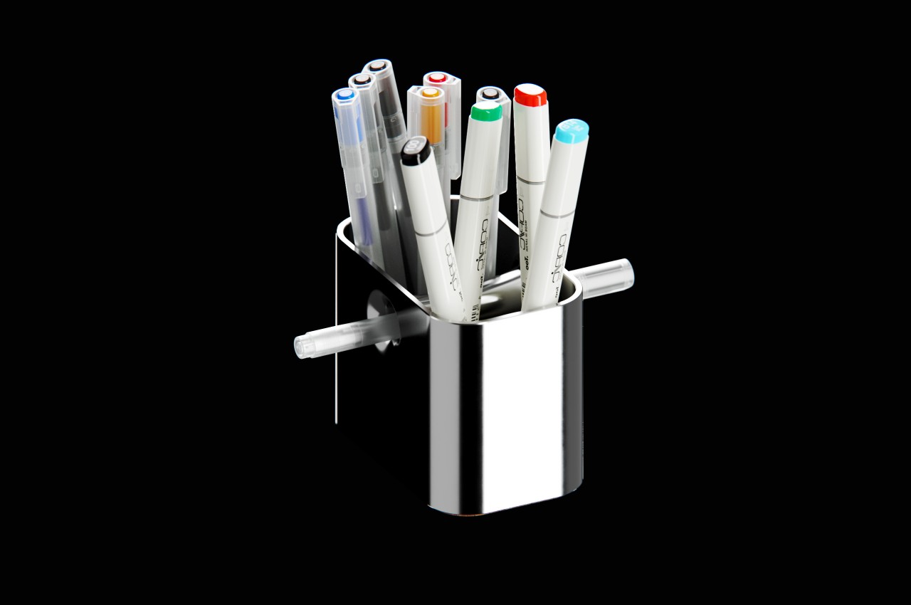
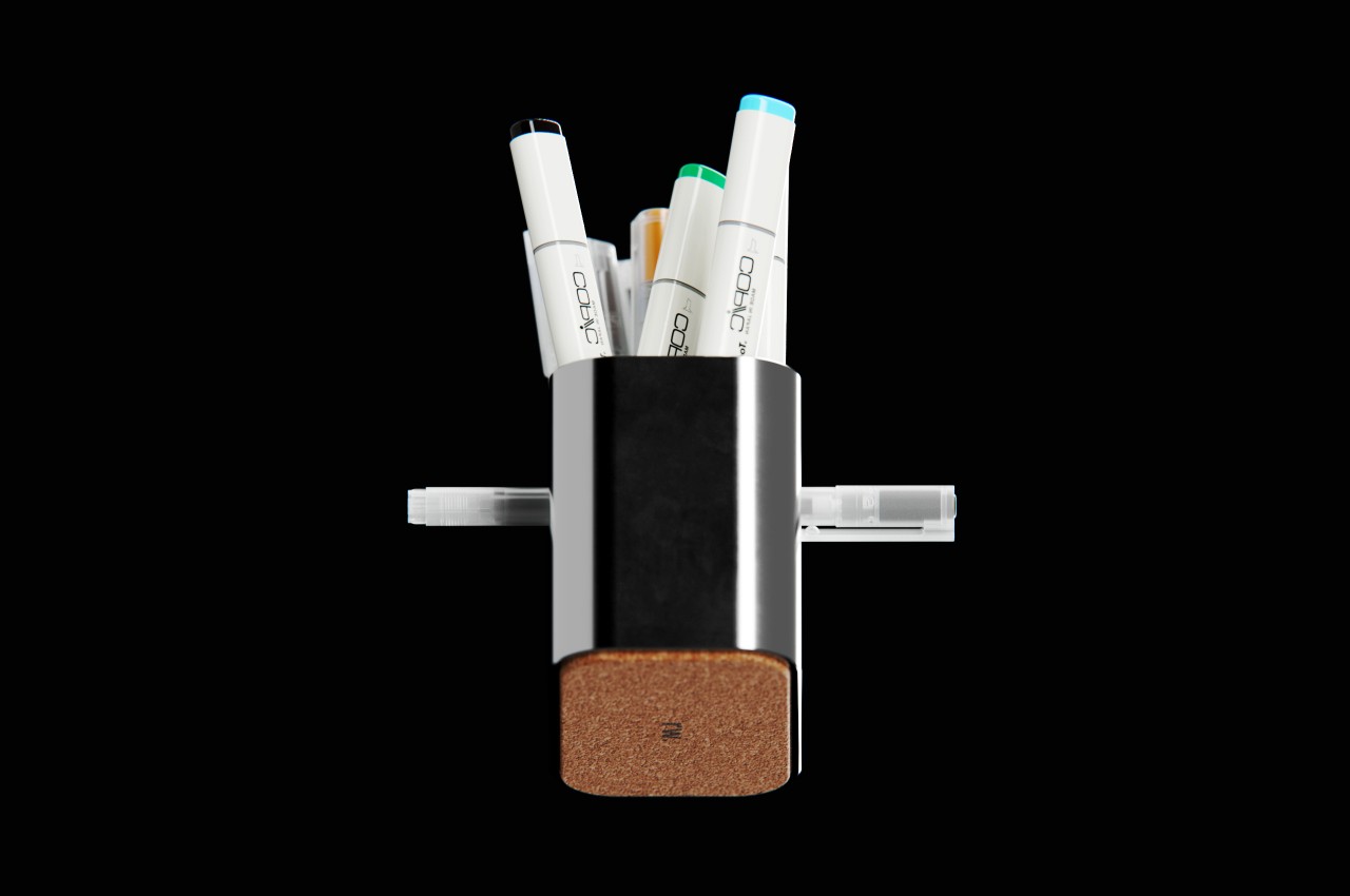
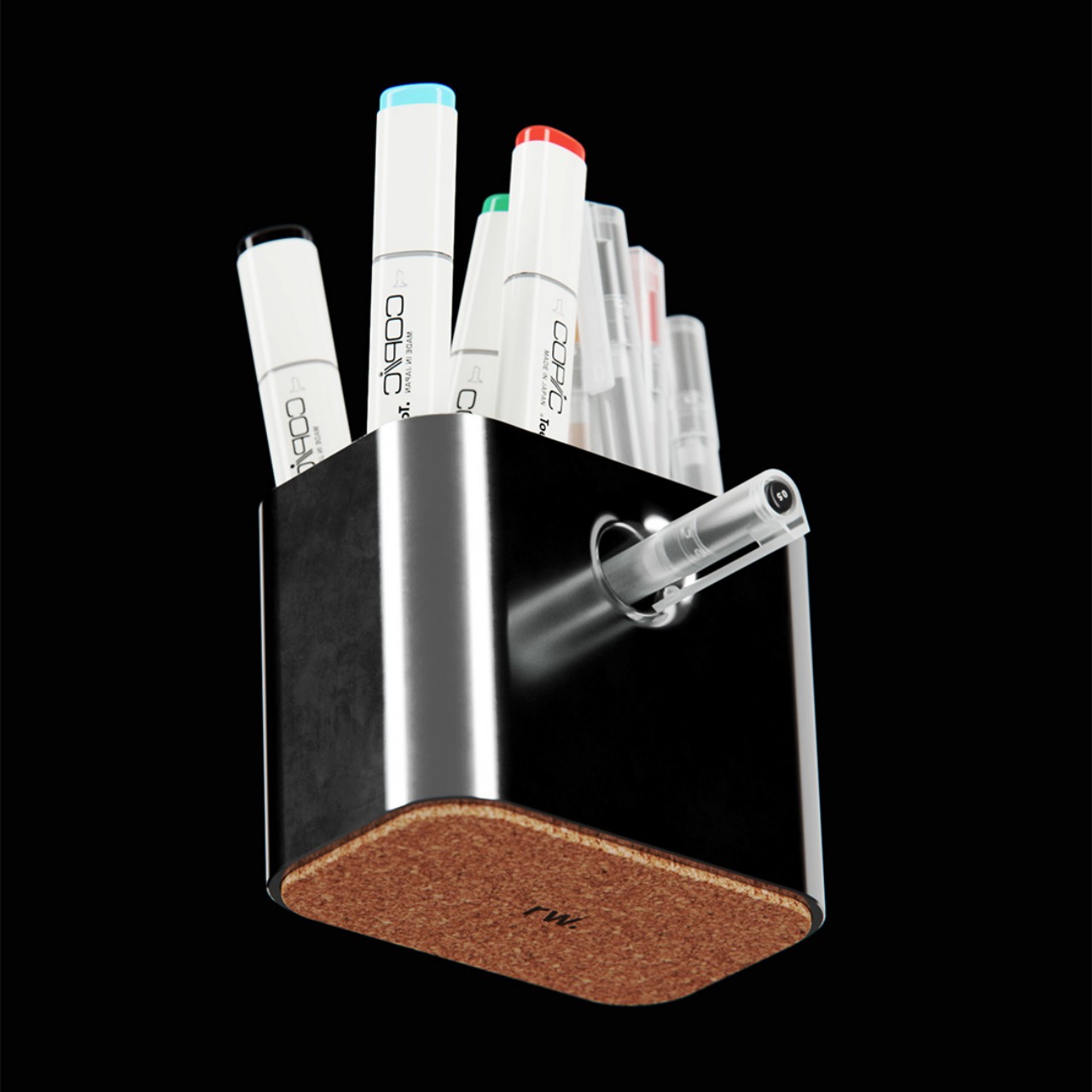
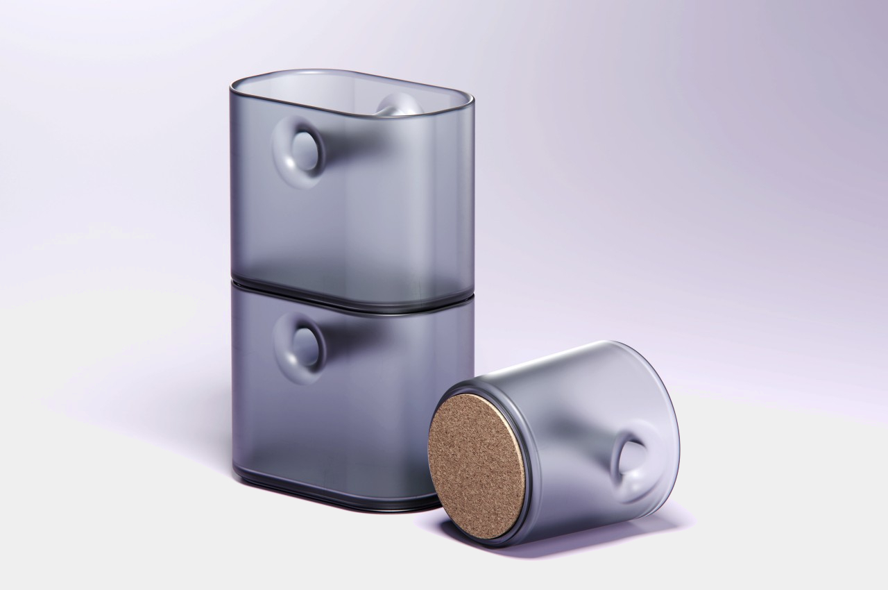
Since that hole practically bisects the container, it also acts as a built-in divider that lets you group your pens into two. That said, this also means you’re not able to maximize the entire space of the container for your pens, specifically the area above and below the “tunnel” made by this hole.
The concept comes in two flavors, four if you consider the pen holder can be pill-shaped or a conventional can. One design employs a polished chrome body, while the other tries to adopt Japanese minimalist brand MUJI’s signature frosted polypropylene, both with cork bottoms. While the function of having an odd yet special place for your favorite pen is definitely useful, it still raises the question of whether such a quirky design will be appealing or off-putting instead, with a pen sticking out from an otherwise blemish-free surface.