There’s something oddly satisfying about watching a company completely reinvent its own playbook. Dyson has built its reputation on that bladeless Air Multiplier technology, the kind of innovation that made you stop and think, “Wait, how does that even work?” But with the HushJet Compact Purifier, the brand is taking a totally different approach, drawing inspiration from an unexpected source: jet engines.
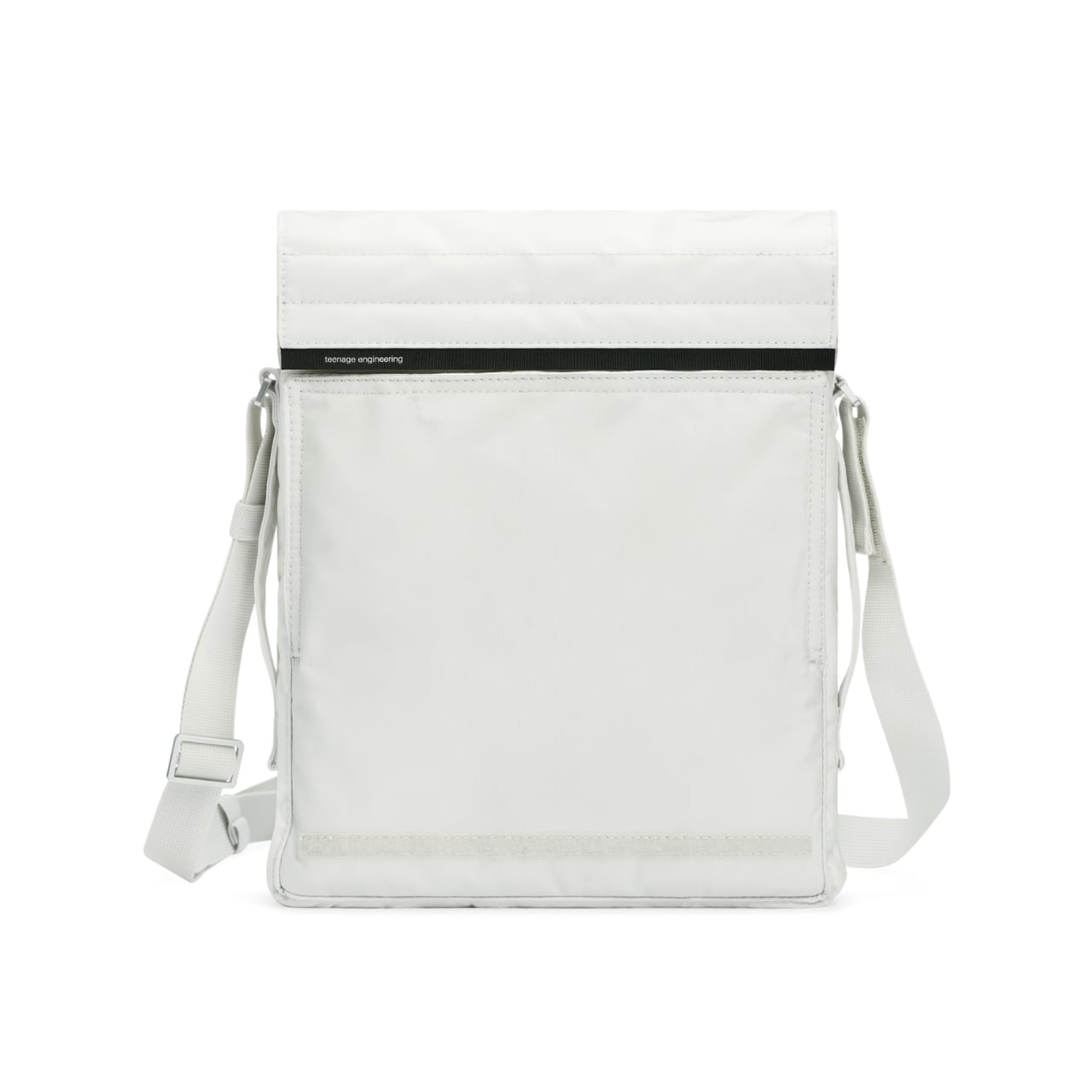
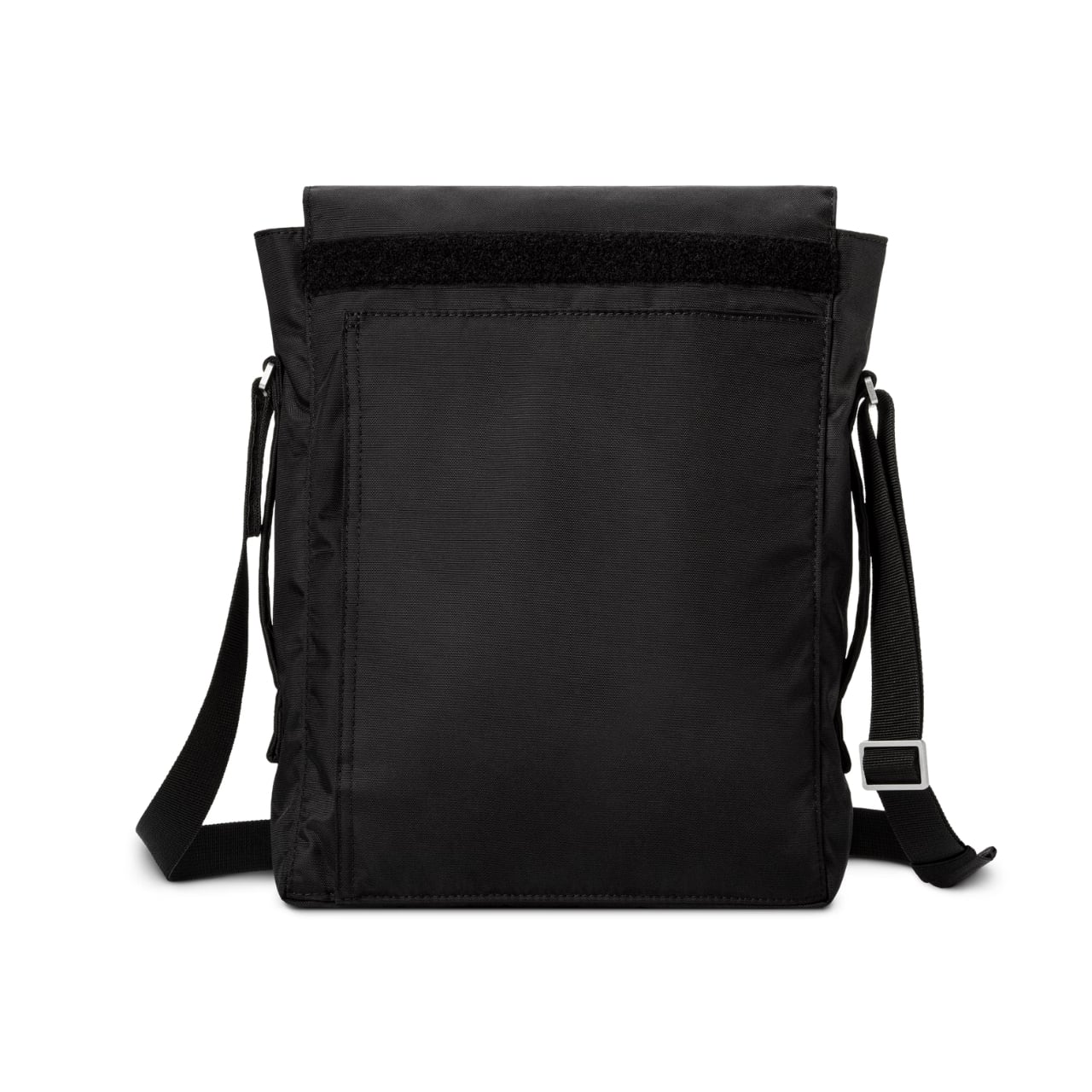
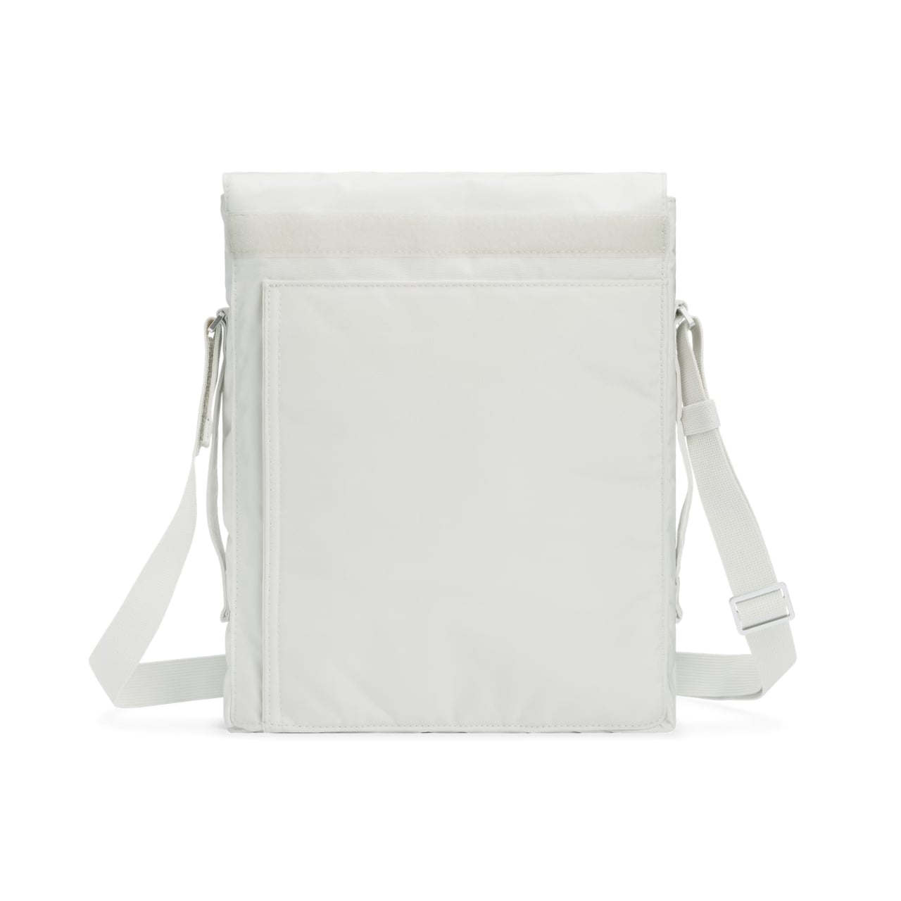
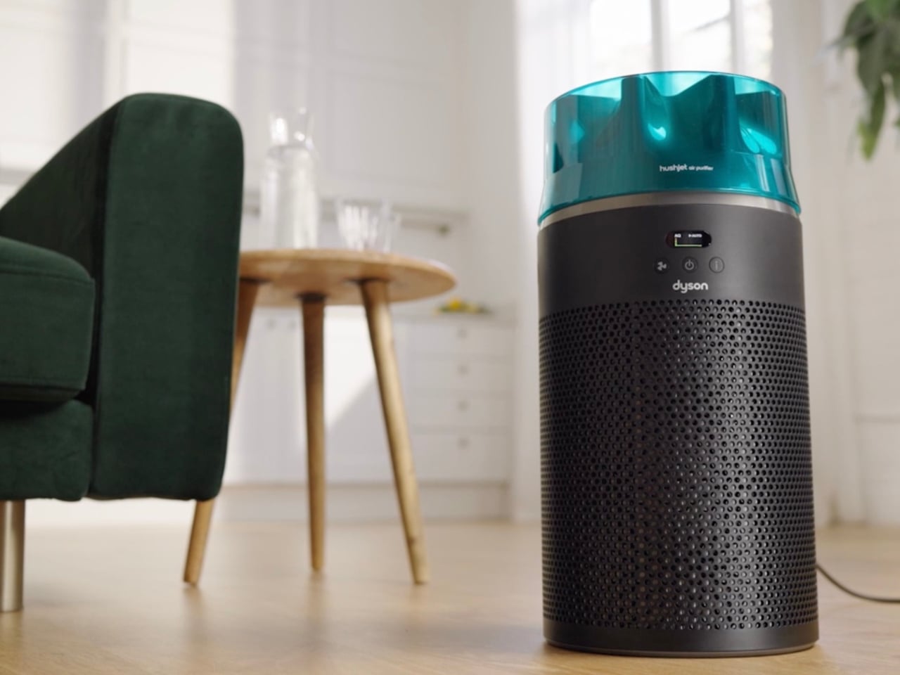
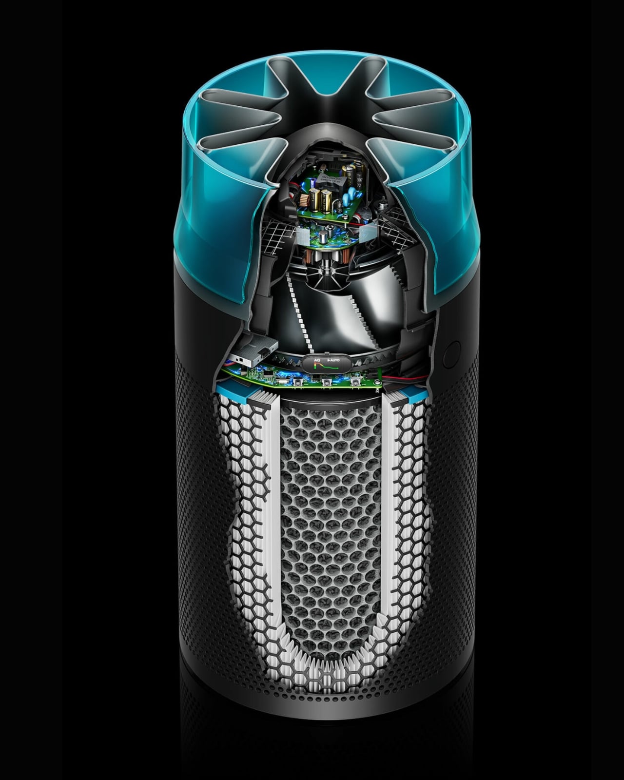
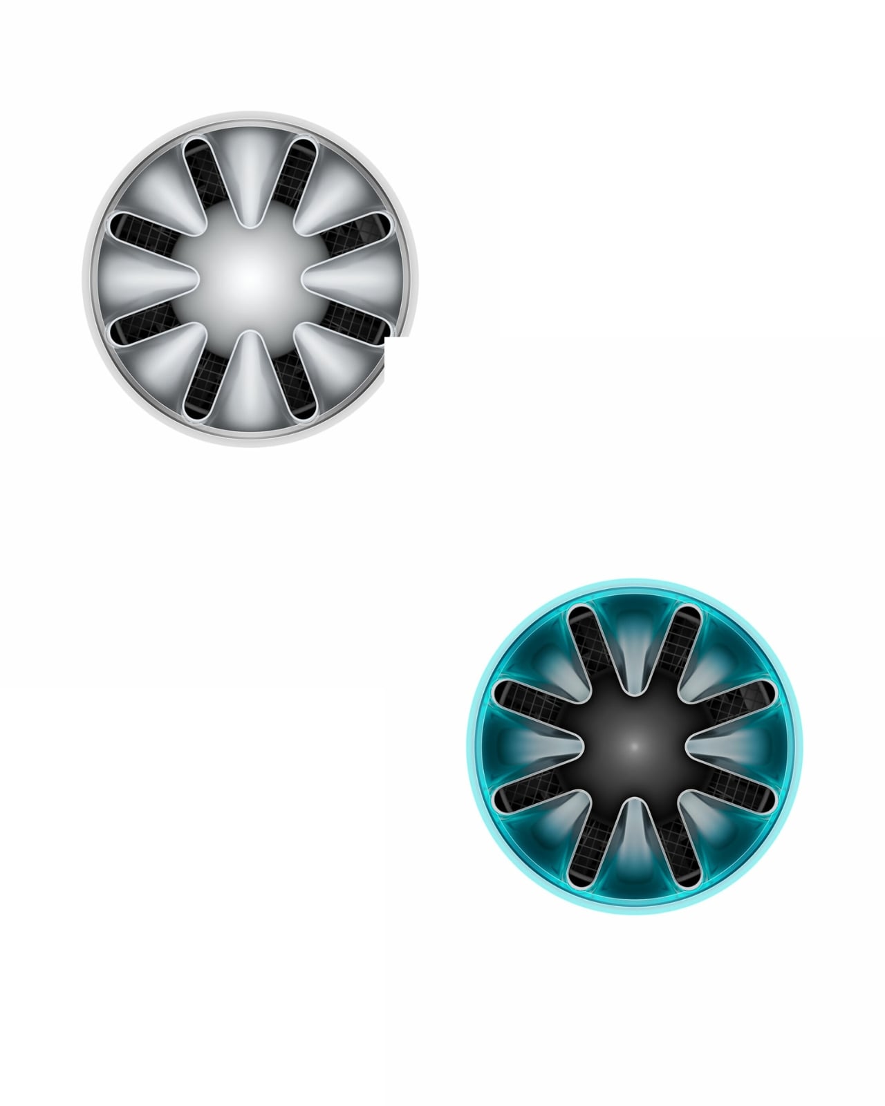
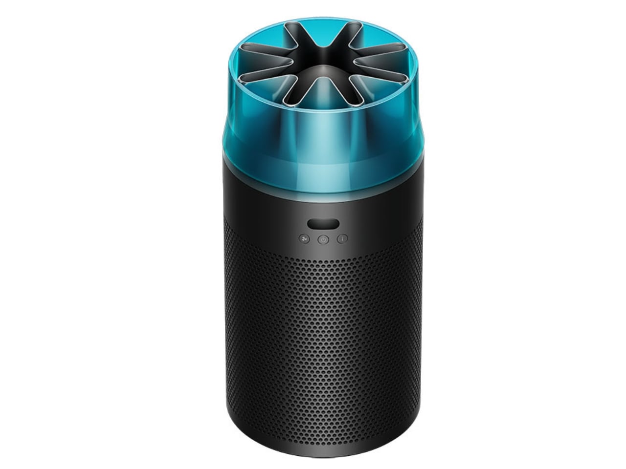
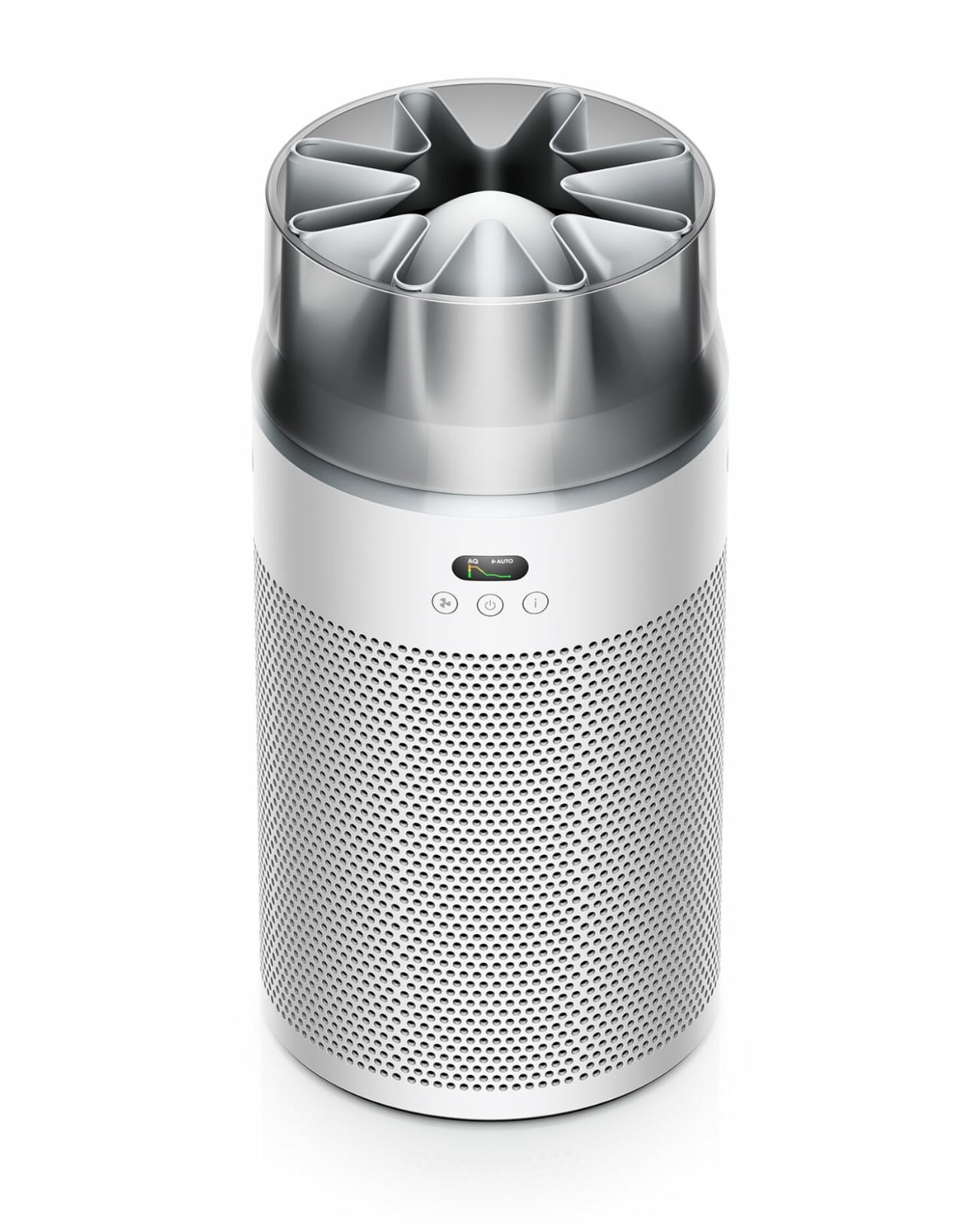
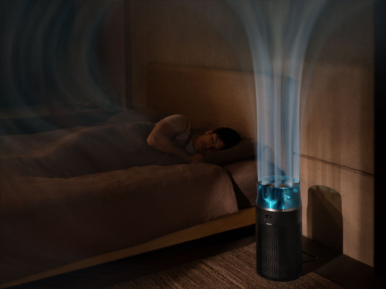
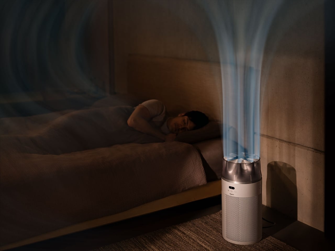
This little machine marks a departure from what we’ve come to expect from Dyson’s air purifiers. Instead of that signature circular opening, you get a star-shaped nozzle that looks like it belongs in an aerospace engineering lab. It’s not just for show, though. That unique design channels high-velocity airflow while keeping things whisper-quiet, hitting just 24 decibels in night mode. For context, that’s quieter than your average library and about the same volume as someone whispering sweet nothings into your ear.
Designer: Dyson
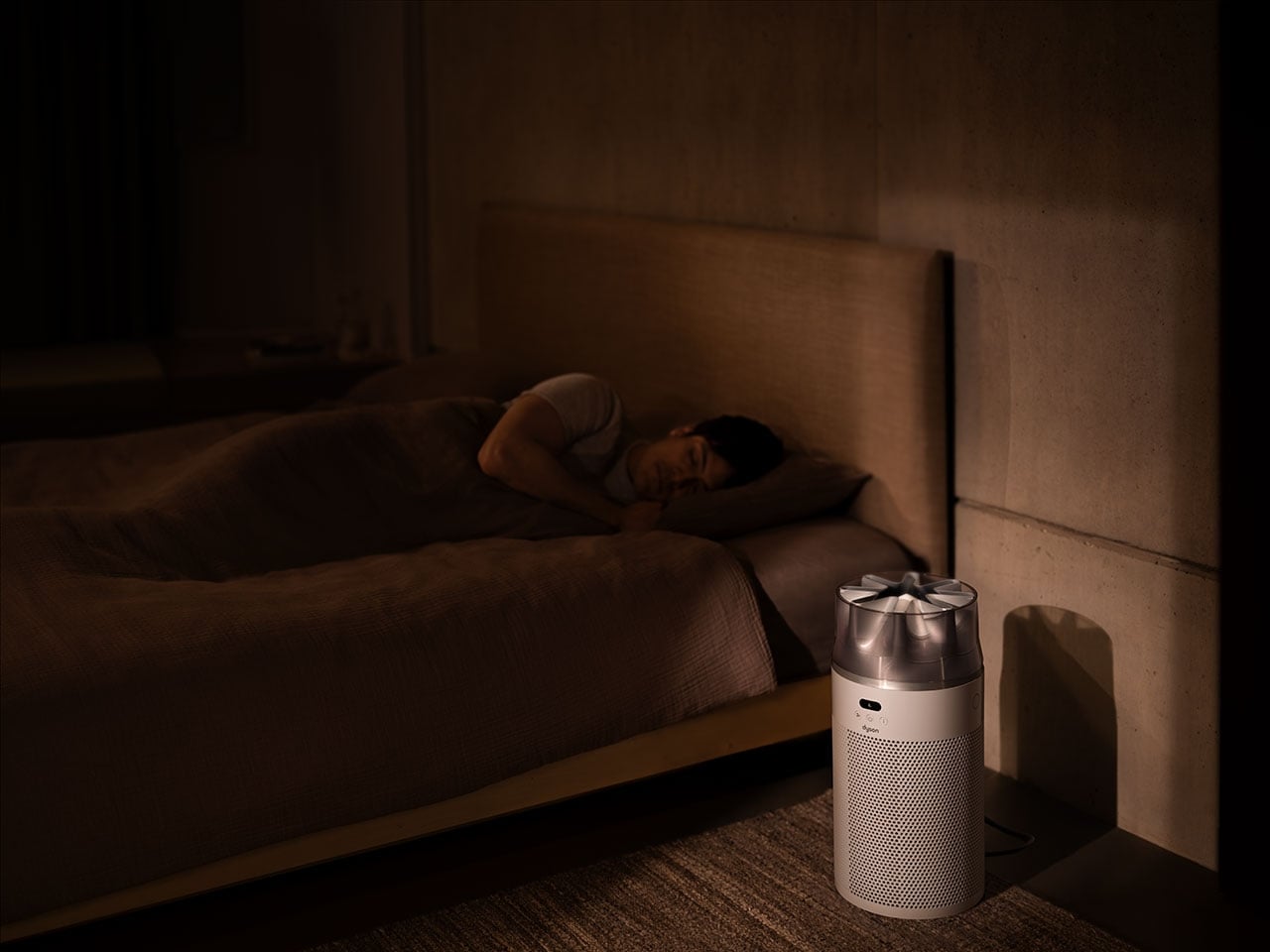
The HushJet measures 18.5 inches tall and just over 9 inches in diameter, weighing in at a manageable 7 pounds. It’s genuinely compact, the kind of appliance that can slip into a corner of your bedroom or perch on a kitchen counter without demanding attention. But don’t let the small footprint fool you. This purifier can handle rooms up to 203 square feet, making it perfectly suited for bedrooms, home offices, or cozy apartments.
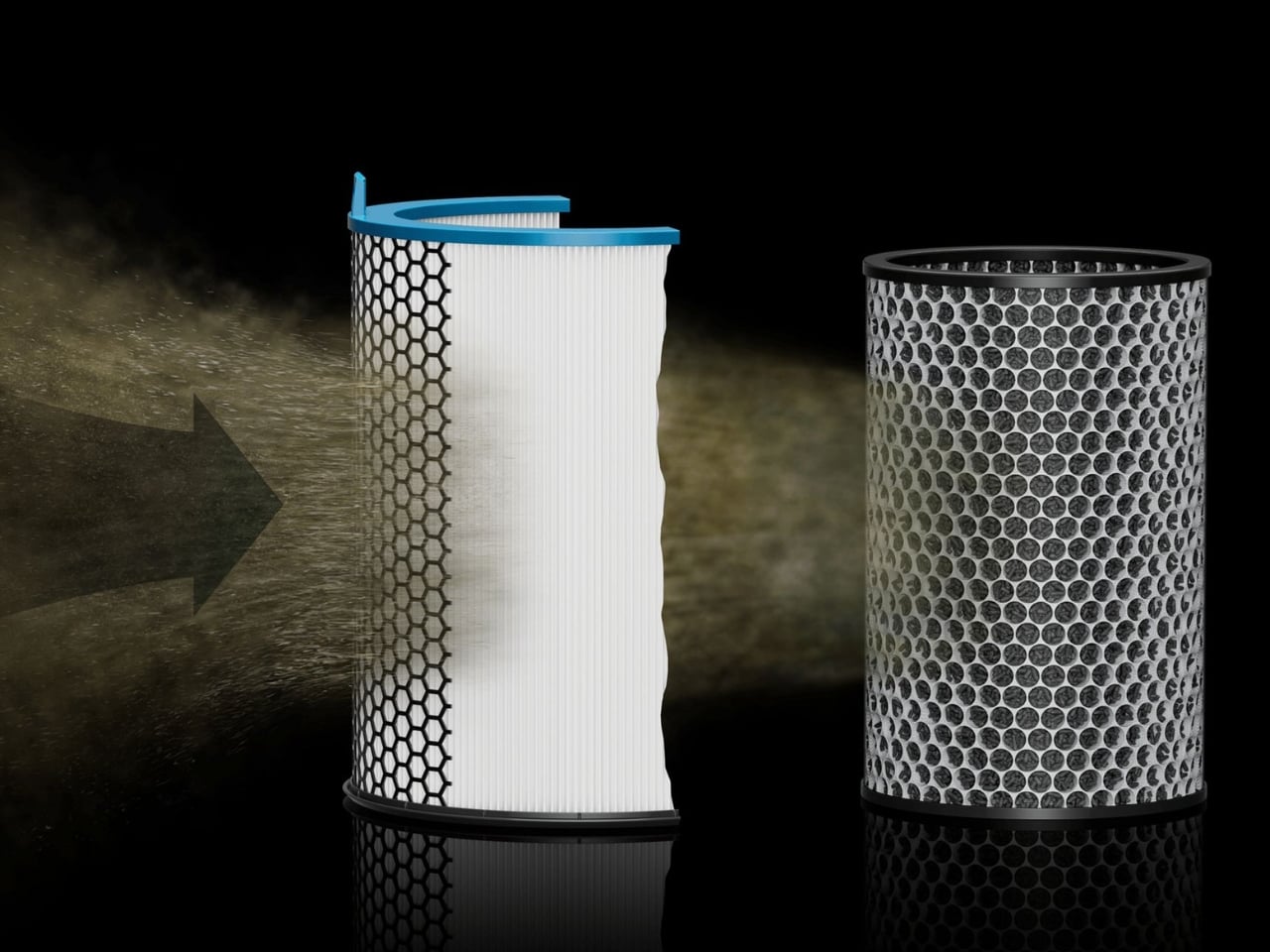
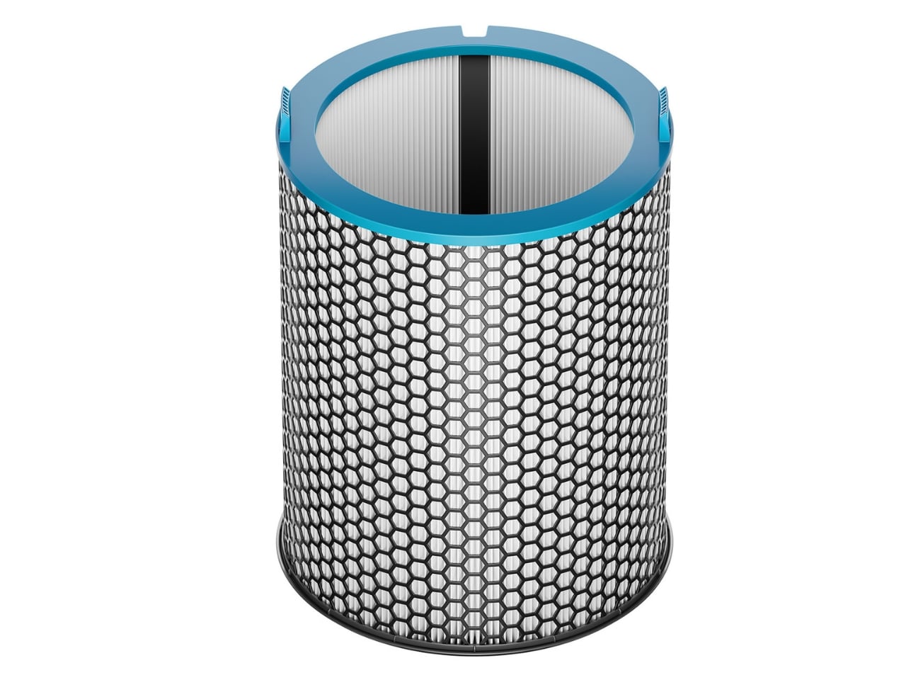
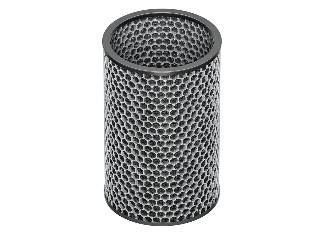
What really sets the HushJet apart is its new filtration system. The electrostatic filter captures 99.97% of particles as small as 0.3 microns, including the usual suspects like pollen, dust, and pet dander. If you’ve got pets at home, this matters more than you might think. Those microscopic skin cells and protein particles from Fluffy’s grooming sessions become airborne allergens, and the HushJet’s activated carbon layer tackles both the dander and the inevitable pet odors.
Here’s where things get interesting from a sustainability standpoint. The electrostatic filter lasts up to five years, which is five times longer than previous Dyson filters. That means fewer replacements, less waste, and one less thing to remember on your shopping list. The filter uses less material while being more energy efficient, a win across the board for anyone trying to lighten their environmental footprint.
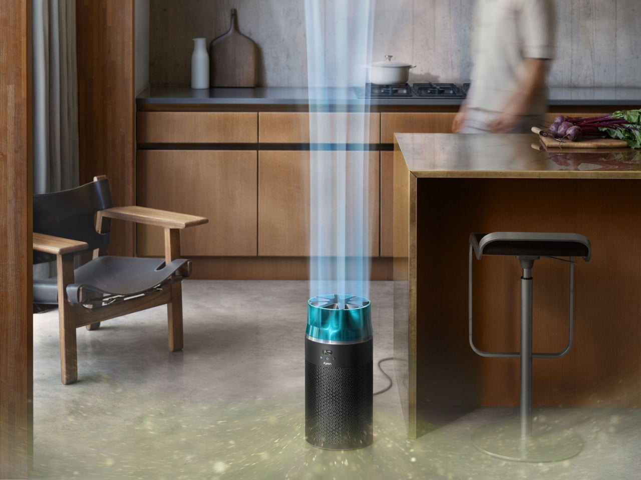
The technology powering this thing is genuinely clever. Dyson’s engineers borrowed aerodynamic principles from jet engines to create that focused stream of purified air. The star-shaped nozzle reduces turbulence and attenuates sound waves from the high-speed compressor, which is how they achieved that library-quiet operation. The whole system is fully sealed, meaning the nasty stuff it captures stays trapped inside rather than escaping back into your breathing space.
Smart features come standard. The built-in sensors monitor air quality in real time, automatically adjusting performance based on what’s floating around your room. You can also control everything through the MyDyson app, tweaking settings from your phone or setting schedules so the purifier runs only when you need it. That auto mode is particularly useful for energy efficiency, since the machine only kicks into gear when pollution levels actually warrant it.
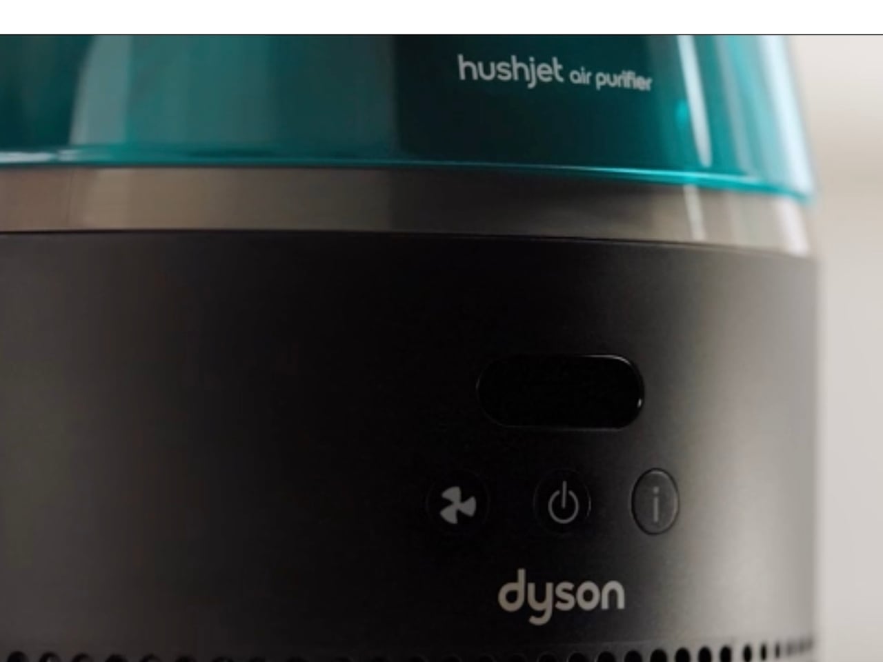
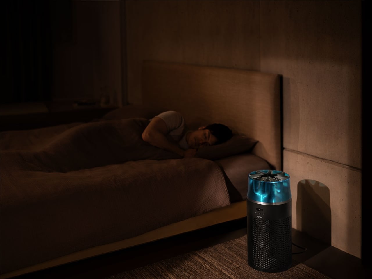
The HushJet comes in two color options: Black/Teal and White/Silver. Both have that sleek, minimalist aesthetic Dyson is known for, the kind of design that doesn’t scream “appliance” but instead quietly complements your space. At $349.99, it sits at the higher end of the compact purifier market, though the combination of performance, filter longevity, and that jet-engine-inspired engineering might justify the price tag for air quality enthusiasts.
For anyone dealing with allergies, the HushJet makes a solid case for itself. By pulling pollen, dust, and other allergens out of circulation, it can help reduce those annoying symptoms like sniffles, scratchy throats, and itchy eyes that tend to worsen at night. Better air quality translates to better sleep, which is something most of us could use more of.
What Dyson has done here is take everything they learned from years of air purification technology and compress it into a surprisingly powerful package. The jet engine inspiration isn’t just a marketing gimmick. It’s a fundamental rethinking of how to move air efficiently and quietly in a small space. Whether you’re sensitive to noise, short on square footage, or just appreciate clever engineering, the HushJet Compact Purifier delivers on its promise to be small but mighty.
The post This $350 Dyson Air Purifier Borrowed Tech From Jet Engines first appeared on Yanko Design.