AI Finally Solved the Desk Organizer Nobody Actually Uses

Most desk organizers ask you to adapt to them. You get a tray with fixed compartments, you shove your stuff in, and either it fits or it doesn’t. Then you give up, and everything ends up in a pile again. Seoul-based industrial designer Youngbin Kwon decided that the tray should be the one doing the adapting, and the result is Mosaic, a concept that’s quietly one of the more genuinely smart ideas to come out of the AI-meets-product-design conversation this year.

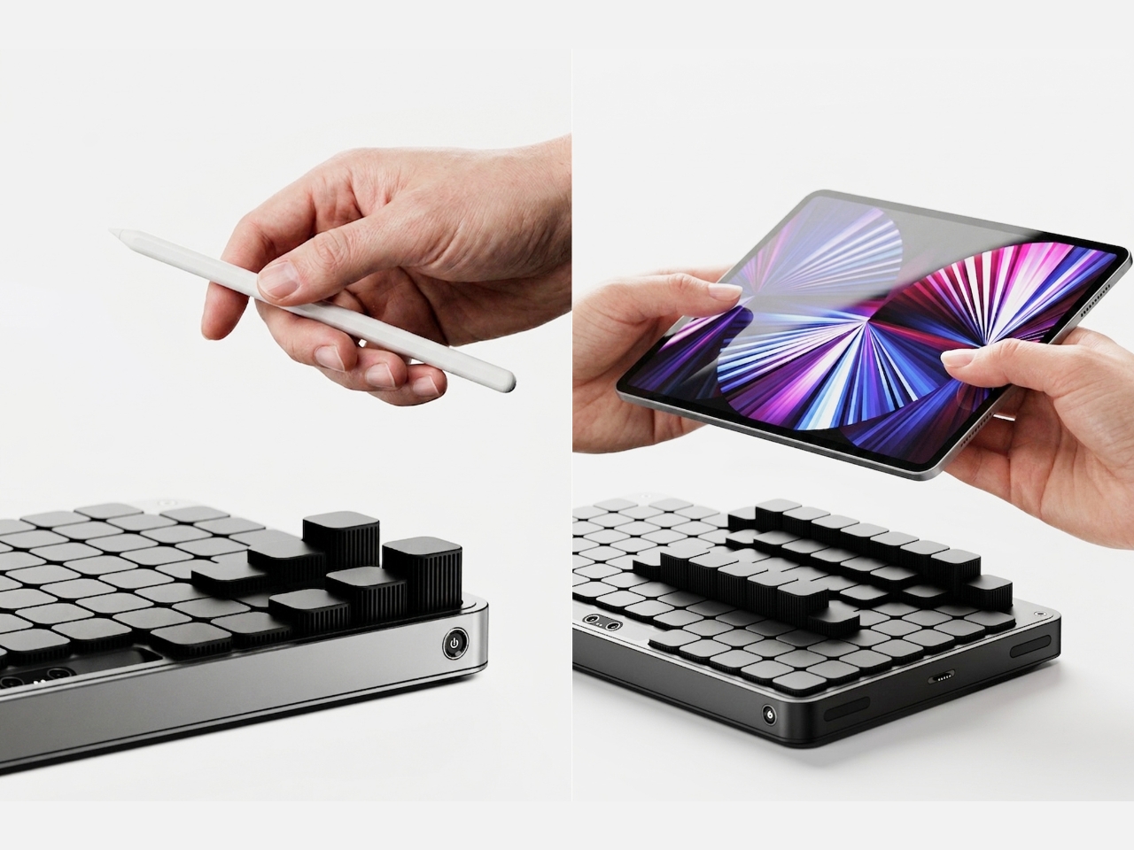
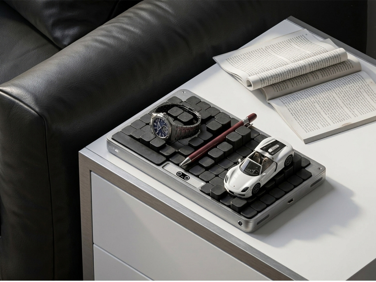
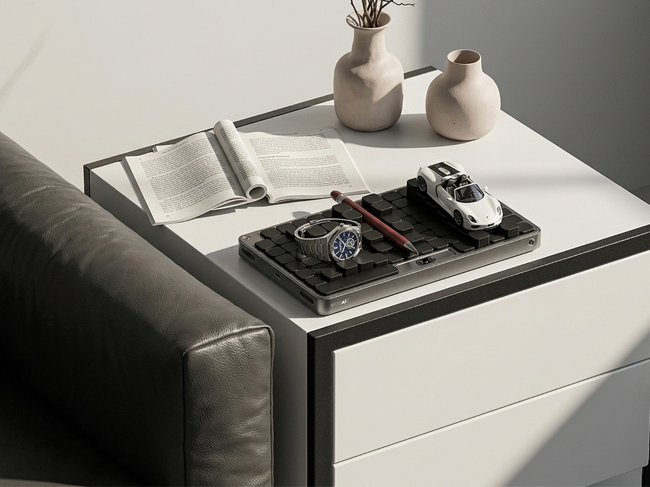
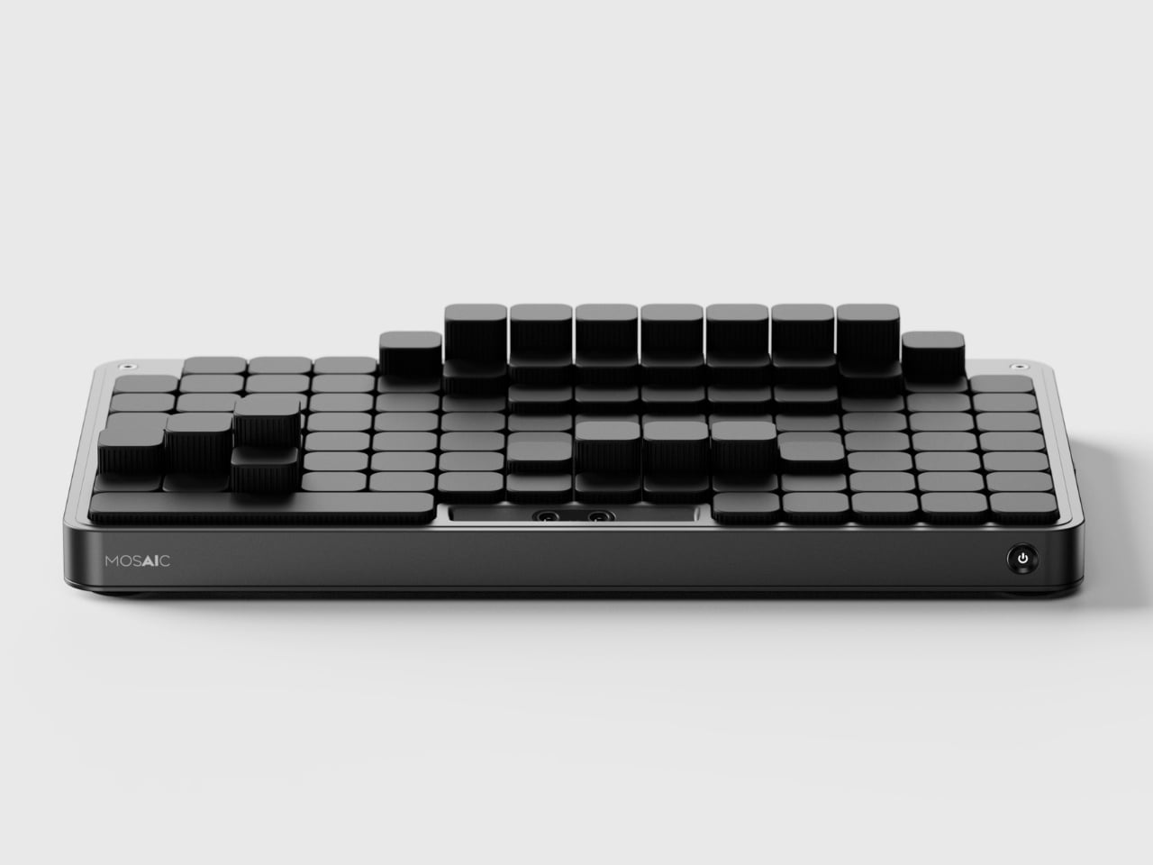
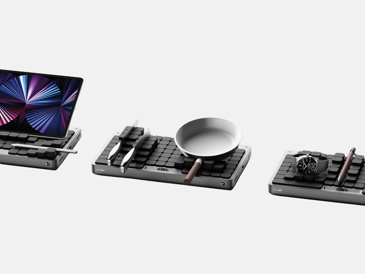
Mosaic is an AI tray that transforms its shape depending on what you place on it. The idea, at its simplest: put your things down, and the tray reconfigures around them. The modular structure shifts and reorganizes to accommodate whatever you’re dropping in: your phone, your keys, a charging cable, a stray lip balm. It reads the objects and makes room for them. What the concept proposes is essentially the end of the one-size-fits-all desk organizer, and I think that’s a very good thing.

Designer Name: Youngbin Kwon
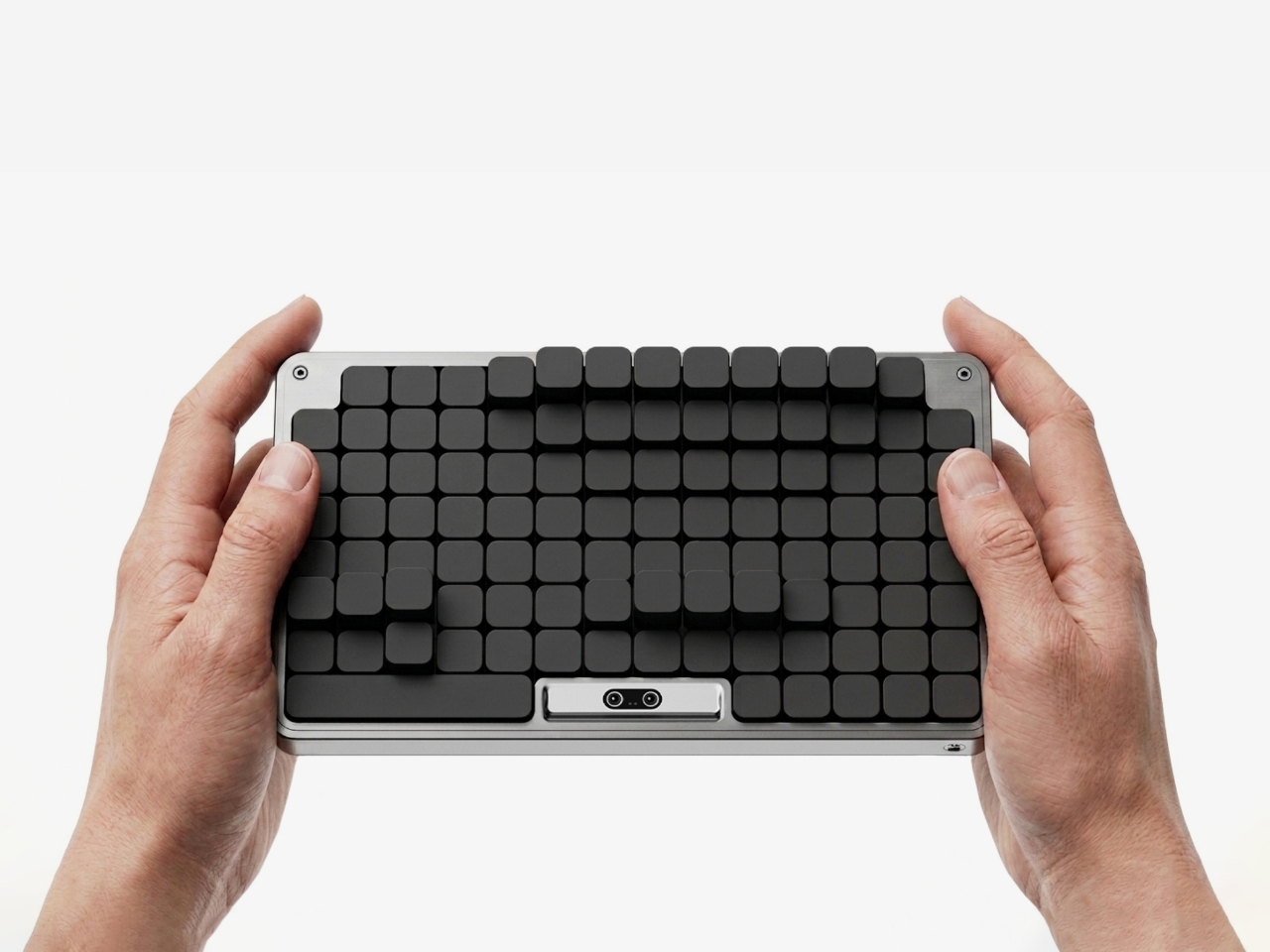
The design is the work of Kwon, an industrial design student from Chung-Ang University in Seoul, published this May on Behance, where it’s been pulling in appreciations at a rate that suggests the design community noticed. Built in Rhinoceros and rendered in Keyshot, the concept is visually clean and grounded, with a restraint that keeps the focus on the idea rather than the spectacle. This isn’t speculative design that lives only in dreamland. It feels like something that could exist with the right engineering team behind it.

1

But the part of the concept that deserves more attention than the mechanics is the philosophy behind it. Kwon describes the act of placing objects with AI assistance as being “as if playing,” and the idea is that this playfulness is exactly what leads people to actually develop organizational habits over time. Not guilt. Not a beautiful, aspirational flat-lay that makes you feel bad about your desk. Just play. That distinction is easy to underestimate.
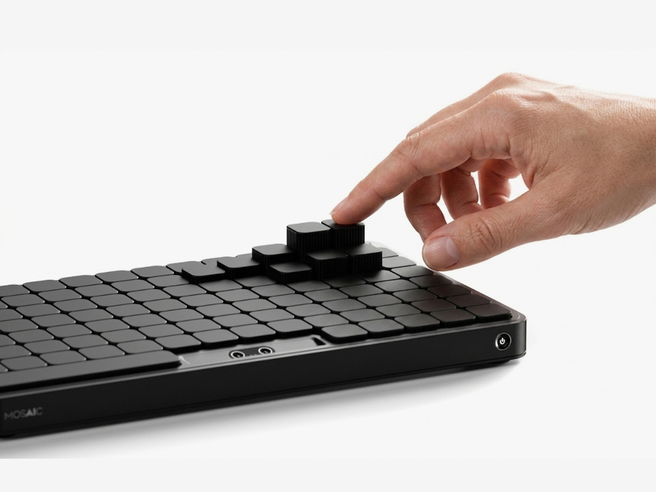
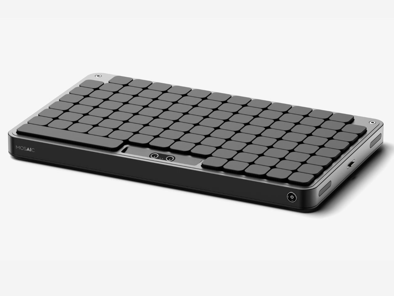
That reframing matters more than it might seem at first. The market for organization products is enormous, and so is the gap between things people buy to get organized and how long they actually stay organized. That gap usually comes down to friction. The system is too rigid, or too much effort to maintain. Mosaic proposes that if the system flexes with you instead of demanding you flex with it, you’re far more likely to stick with it. Gamification applied to the most mundane domestic task. It’s clever.
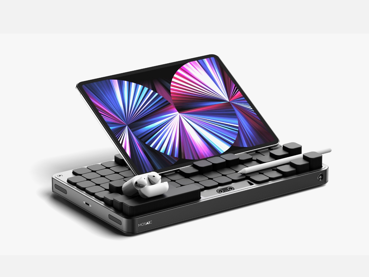
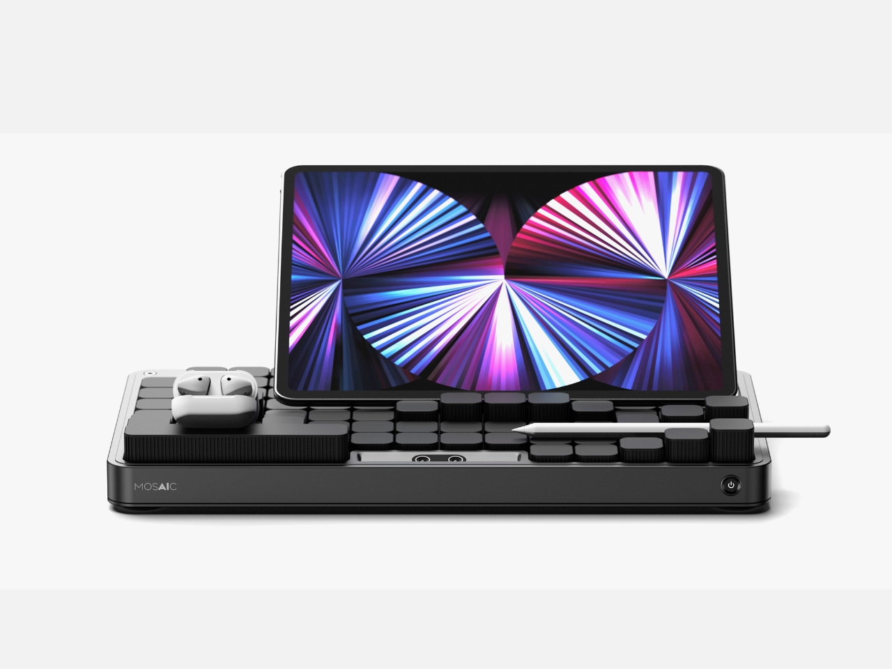
I’ll admit that the name Mosaic might be the most elegant thing about it. A mosaic is a picture made of small, individually unremarkable pieces that together create something intentional and whole. That’s exactly what the tray does. The modular components rearrange into a layout that looks curated, even when you’ve just dropped everything in at the end of a long day. The name does real conceptual work, and that’s rarer than you’d expect from a student project.
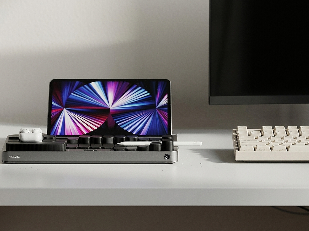
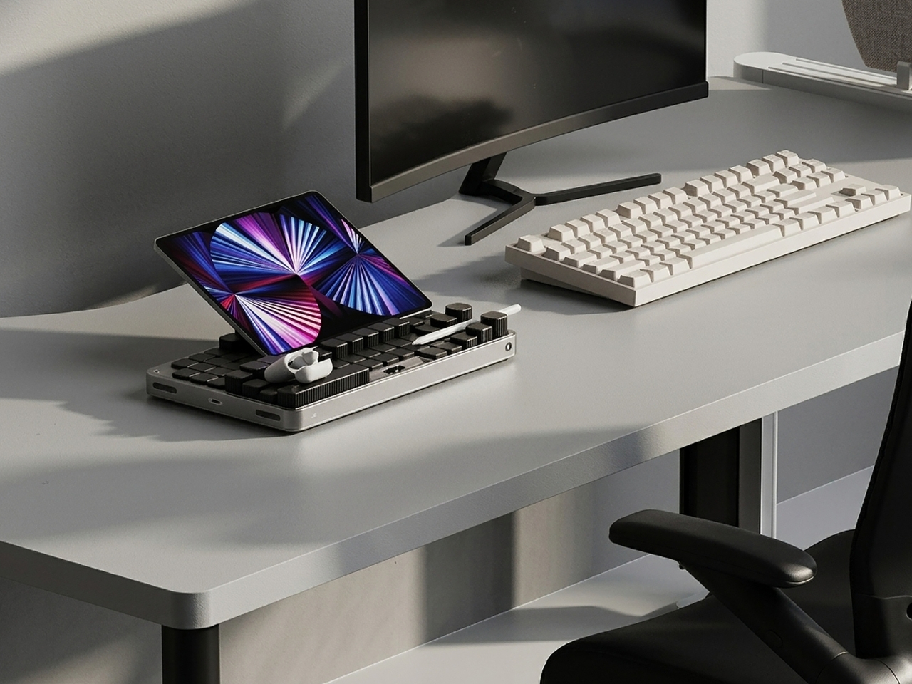
There are real questions left unanswered, as there always are at the concept stage. How exactly the AI identifies objects, whether it uses cameras, weight sensors, or something else, isn’t detailed in the project. The durability of moving parts in a daily-use context is worth thinking about. Whether the transformation happens visibly and slowly, like something mechanical, or snaps quickly into place, would change the entire experience of using it. These are the things that turn a concept into a product, and Kwon’s Mosaic is still very much a concept.
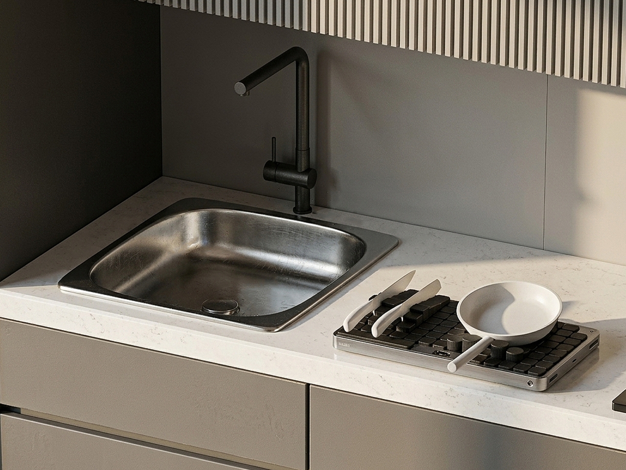
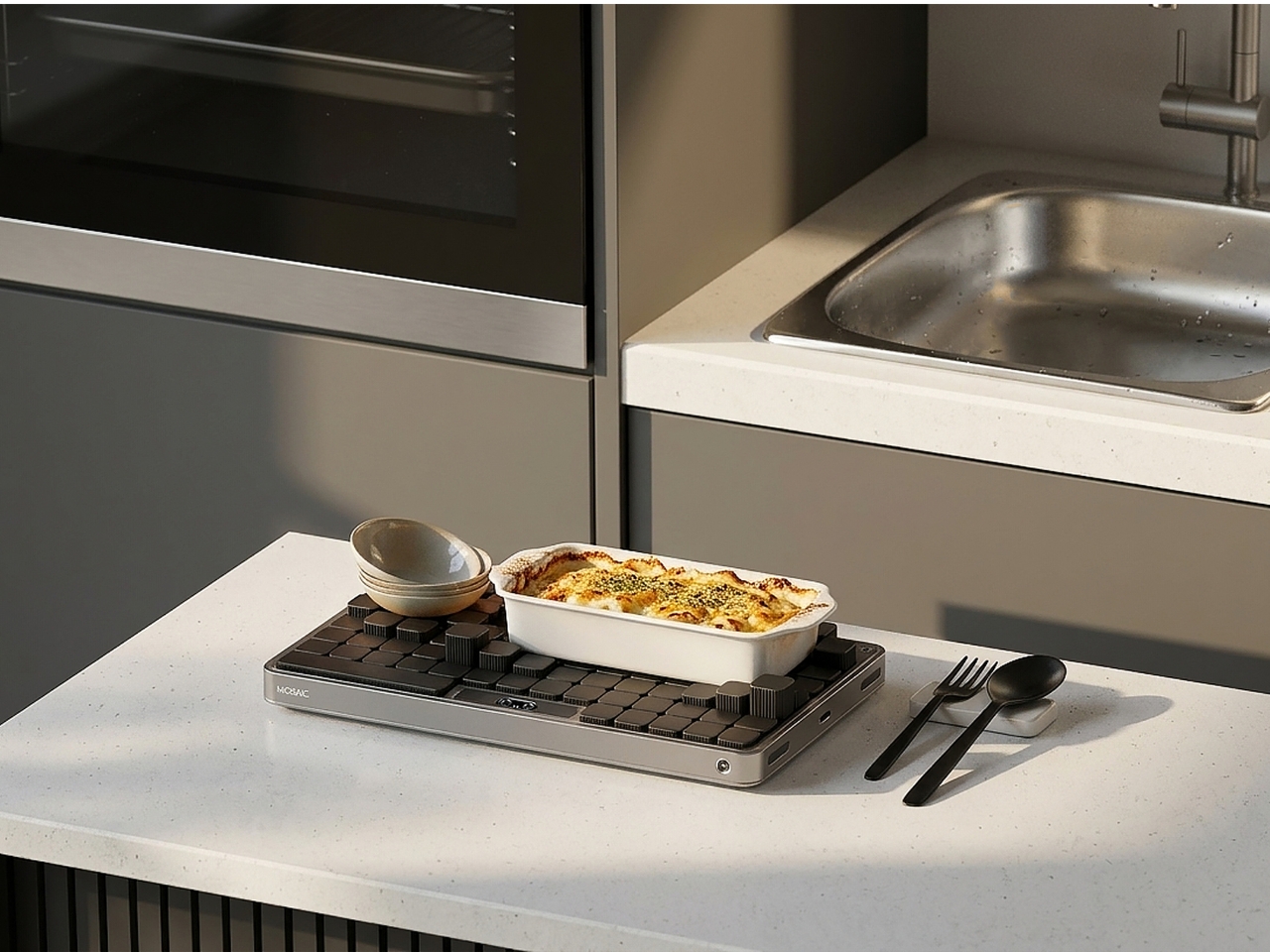
But good concepts don’t need to be finished products to be worth paying attention to. What Mosaic does well is identify a real and relatable failure mode, the organizational system that doesn’t survive contact with actual human behavior, and propose a solution that works with people rather than against them. The tray that meets you where you are. That’s not a small idea dressed up in a sleek render. That’s a fundamental rethink of what we expect everyday objects to do, and it’s worth watching where it goes.
The post AI Finally Solved the Desk Organizer Nobody Actually Uses first appeared on Yanko Design.
A Maker Just Gave the Fortune Cookie a $10 Hardware Glow-Up

I don’t know who decided that wisdom should come wrapped in a brittle shell and a strip of paper, but I’ve always found the fortune cookie oddly charming. Not because of the fortunes themselves, which range from “a smile is your best accessory” to something you’d find stitched on a decorative pillow, but because of what they represent: a tiny, physical moment of pause. A ritual. A reason to crack something open and pay attention to what falls out. In a culture addicted to scrolling, that single sentence on a slip of paper still manages to land.

So when I came across gokux’s eFortune Cookie on Hackaday, I felt a very specific kind of joy. The kind you feel when someone takes a beloved, low-tech ritual and gives it exactly the upgrade it deserves, without ruining what made it special in the first place.

Designer: gokux

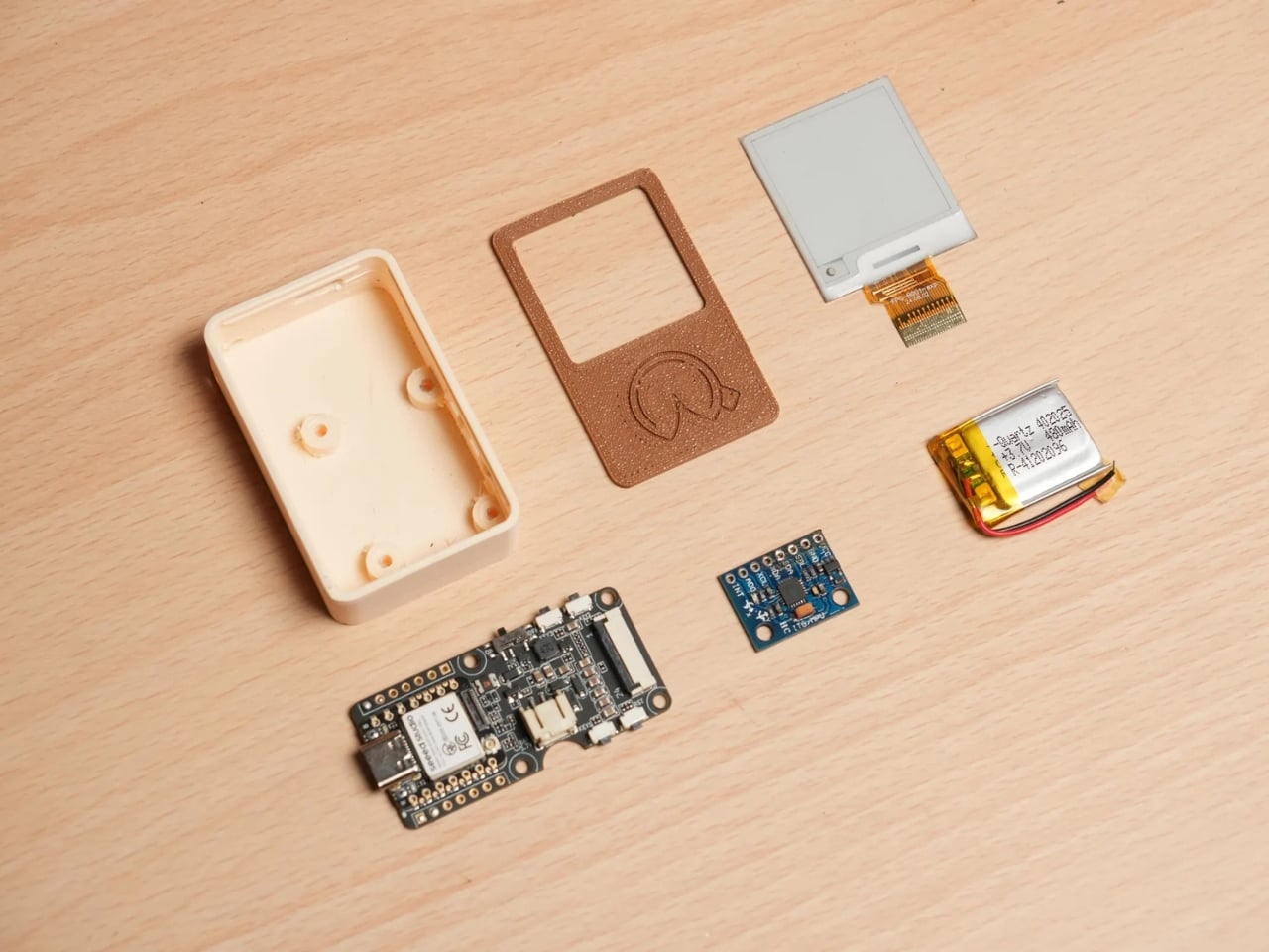
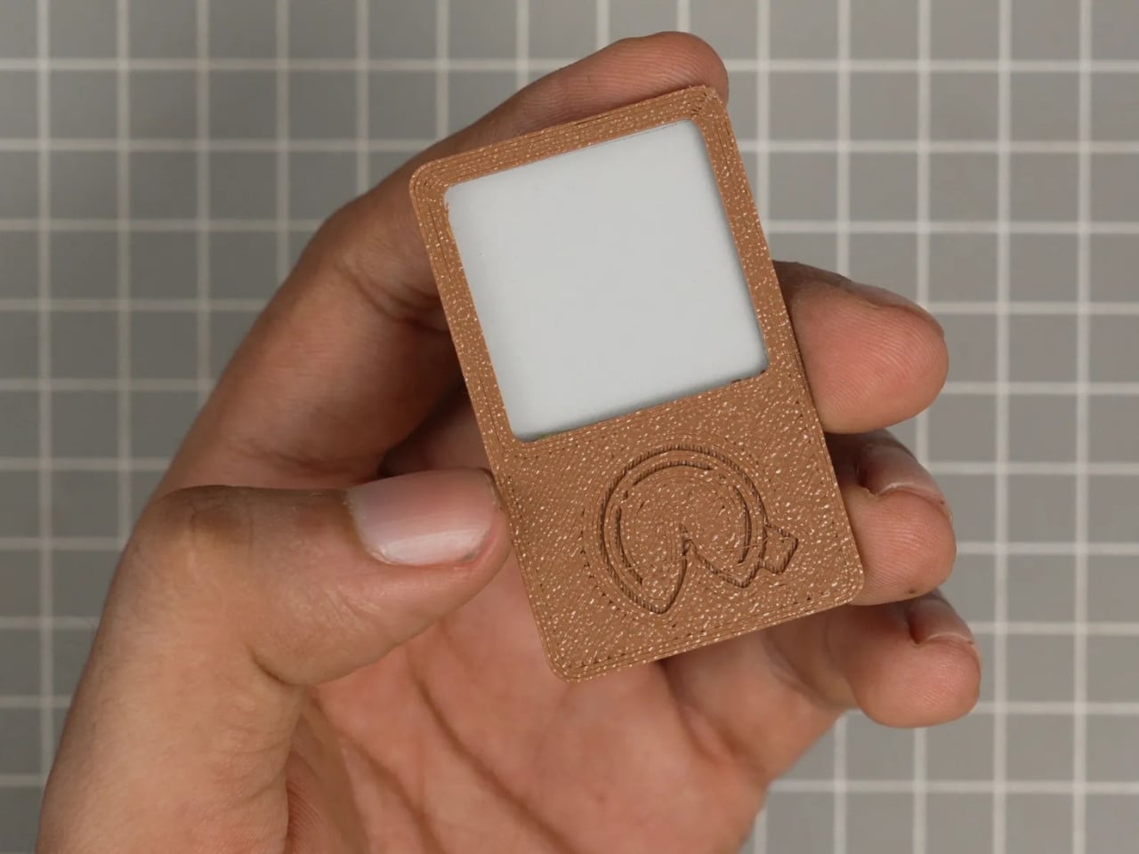
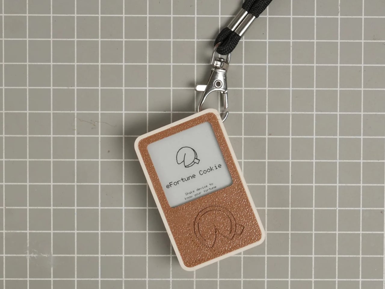
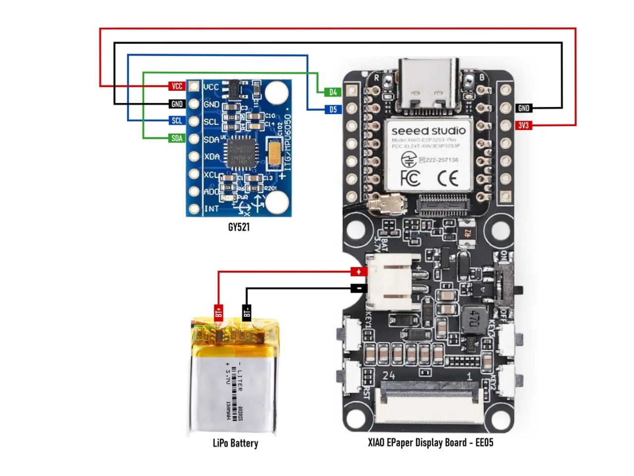
The concept is beautifully simple. gokux built a tiny, 3D-printed gadget in the shape and spirit of a fortune cookie, fitted with a Seeed Xiao ESP32-S3 Plus and a 1.54-inch e-paper display. To get your fortune, you shake it. That’s it. Shake it, and a random fortune appears on the little screen. No apps to download. No Wi-Fi required. No subscription tier. The device stores over 3,000 fortunes entirely offline, which makes it more dependable than half the smart gadgets currently collecting dust on people’s kitchen counters.

The commitment to the gesture is actually the most underrated part of this build. gokux chose to activate the fortune with a shake, not a tap or a button press, and that single decision changes everything about how the object feels to use. A shake carries energy, intention, a little theatrical flair. It mirrors what you’d do with a Magic 8-Ball or a set of dice. It makes the act of asking feel deliberate, even playful. That kind of interaction design is easy to overlook, but it’s often the difference between something you use once and something you keep picking up off the desk.

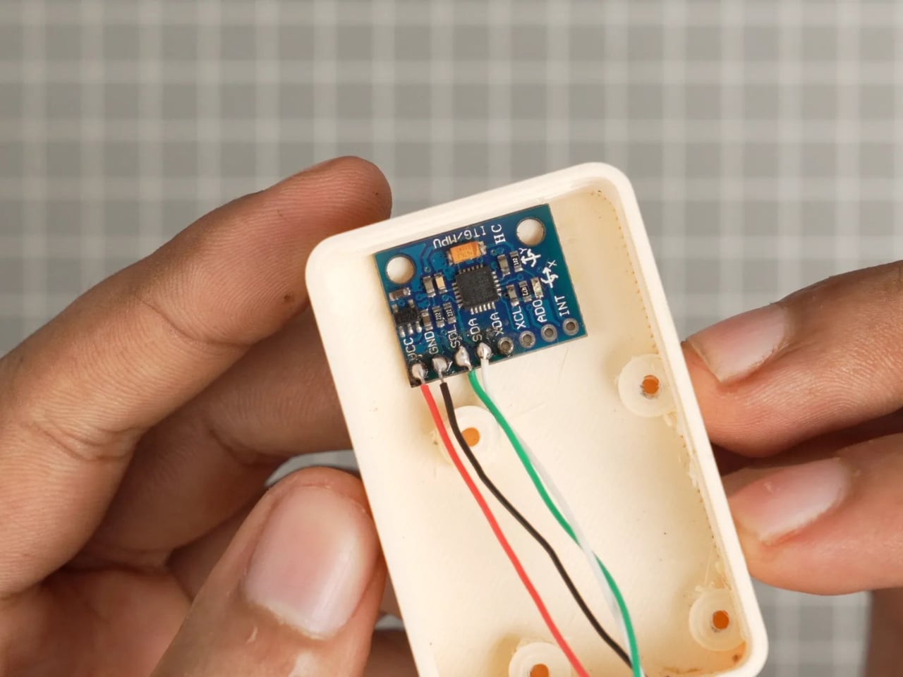
The eFortune Cookie is not a one-trick gadget, either. Side buttons let you toggle between three modes: fortune telling, dice rolling, and coin flipping, each one activated the same way. Just shake. The MPU-6050 accelerometer inside detects the motion and responds accordingly. For a small indie maker project, the level of thoughtfulness packed into something this compact is genuinely impressive. The e-paper display is a smart material choice, too. It’s low power, easy to read in any lighting, and gives the whole thing a slightly analog, slightly mysterious quality that feels exactly right for a device meant to dispense tiny slices of fate.

I’ll be transparent about what the eFortune Cookie is not. It is not artificially intelligent. It is not learning your patterns or curating insights based on your mood. The fortunes are pre-loaded, the shake is random, and the outcome is whatever it is. Some people might see that as a limitation. I see it as the point. We live in an era where every gadget wants to personalize, predict, and optimize us. A device that just shakes out a fortune and doesn’t know a single thing about you feels almost radical by comparison.

The sample fortune visible in gokux’s build photos reads: “Your next firmware update will both solve and create problems.” It’s clearly written for makers, but it captures something universally true. Most things in life both solve and create problems. That’s not pessimism. That’s just the loop we’re all in, firmware or otherwise.

What gokux made here is a small, physical object that does something the internet cannot reliably do: it makes you stop for two seconds and read a single sentence. No notification badge to clear. No thread to fall into. Just a little e-paper screen, a fortune, and whatever you decide to do with it. That’s not nothing. For a weekend project built around a $10 microcontroller and a handful of components, it’s actually quite a lot. Sometimes the simplest ideas make the most enduring objects.

The post A Maker Just Gave the Fortune Cookie a $10 Hardware Glow-Up first appeared on Yanko Design.

Nike Just Turned Air Into a Fabric, and It Actually Works

There are moments in design when a product looks so strange that you can’t stop staring at it, and then you find out how it works and it suddenly makes perfect sense. That’s exactly what happened when trail runner Caleb Olson crossed the finish line at the 2025 Western States Endurance Run in the second fastest time in the race’s history. People clapped. Then they immediately started asking: what is he wearing?

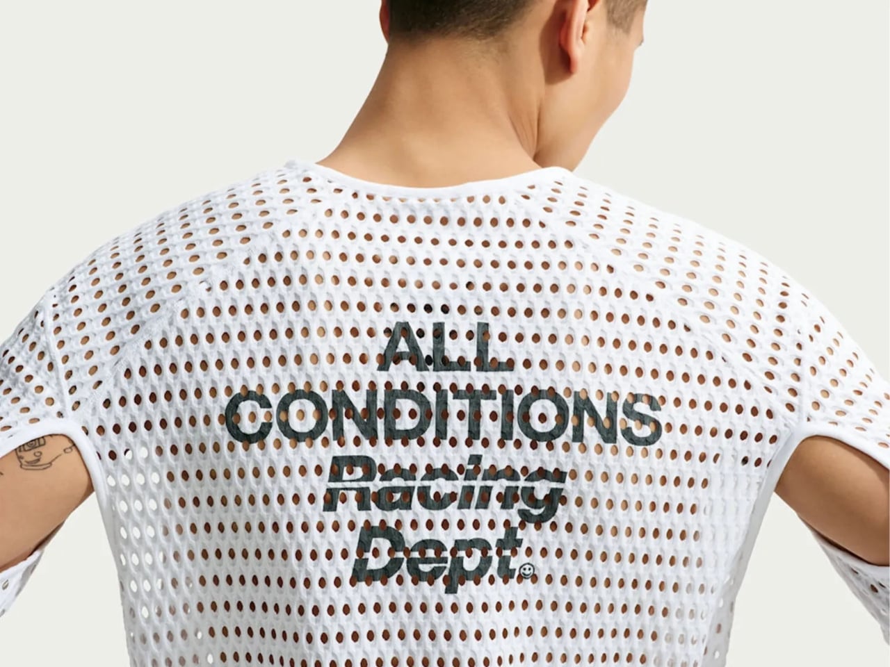
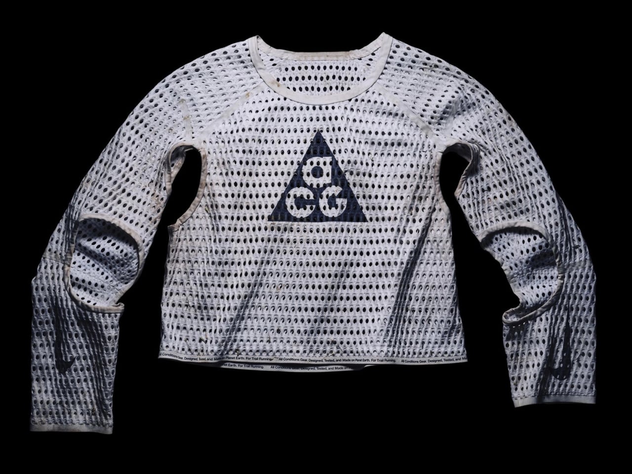
The shirt is the Nike ACG Radical AirFlow, and calling it a “shirt” feels generous. It looks more like a sweater that had an encounter with a drill press. Cone-shaped holes punctuate the fabric in deliberate patterns, creating what Nike calls airducts. They’re not just decorative (though they definitely are that, too). They’re functional in a very specific, physics-driven way. The design harnesses the Bernoulli principle and the Venturi effect, two concepts most of us haven’t thought about since a physics class we may or may not have paid attention to. The short version: as air moves through a narrowed opening, it speeds up and pressure drops. Nike essentially engineered that phenomenon into a fabric layer sitting on your body while you run.

Designer: Nike

The result, according to Nike’s own testing, is a top that absorbs and retains 50% less sweat than DriFit, the brand’s long-trusted performance fabric. It’s also 25% less resistant to the evaporation of sweat. For those of us not running ultramarathons in the California mountains, those numbers might sound abstract, but the principle holds whether you’re hiking a trail in August or doing anything remotely active in heat. The body cools itself through sweat, and anything that helps that process happen faster is worth paying attention to.

What makes this interesting beyond the performance specs is how it got here. The Radical AirFlow came out of Nike’s All Conditions Gear line, a sub-brand with a very specific purpose: designing for the outdoors, not the gym. ACG lives by the motto “Designed, Tested, and Made on Planet Earth,” which sounds like a marketing line until you realize the top was debuted mid-race at one of trail running’s most grueling events. The testing wasn’t a controlled brand activation. It was a competitive ultra-marathon.

The design itself doesn’t pretend to be subtle. It’s a cropped silhouette, worn long-sleeved, with large cutouts under the arms and at the elbows for mobility. The airducts are visible and intentional. It reads more like a prototype from a materials science lab than a rack piece at your local athletic retailer. And I think that’s the point. Nike ACG has always occupied that niche space between gear and fashion, performance and provocation. The Radical AirFlow leans all the way into that tension.

It also went viral in a way that athletic apparel rarely does, because the response was split. Some people immediately understood it. Others were convinced it was a joke. Trail runner Drew Holmen, an ACG athlete who tested the garment, said it plainly: “When I first saw the product, it was like nothing I had ever seen before.” That reaction, repeated by thousands of people online, is actually a good sign in design. If no one’s confused, nothing is new.

The broader conversation Radical AirFlow opens up is one about where performance apparel is headed. For a long time, innovation in this space meant better synthetic blends, tighter weaves, smarter seam placement. The Radical AirFlow goes in the opposite direction. It removes material entirely, then structures the absence of it. The holes aren’t a compromise or a cost-cutting measure. They’re the technology.

Whether you’d actually wear it outside of a race context is a fair question, and a cap version built on the same technology is already on the way, which might make the concept more accessible. But the full racing top is a genuine design statement, one that prioritizes function in a way that can’t be hidden. You can see it working. That kind of transparency, in design, is rarer than it should be.

The post Nike Just Turned Air Into a Fabric, and It Actually Works first appeared on Yanko Design.
Scaffolding Was Never Meant to Be Beautiful, Estrade Disagrees.

Most furniture begins with a brief. A sketch. A mood board pulled from somewhere between a Scandinavian design blog and a decades-old auction catalog. French industrial designer Pierre Villez did something different. He started at the construction site.

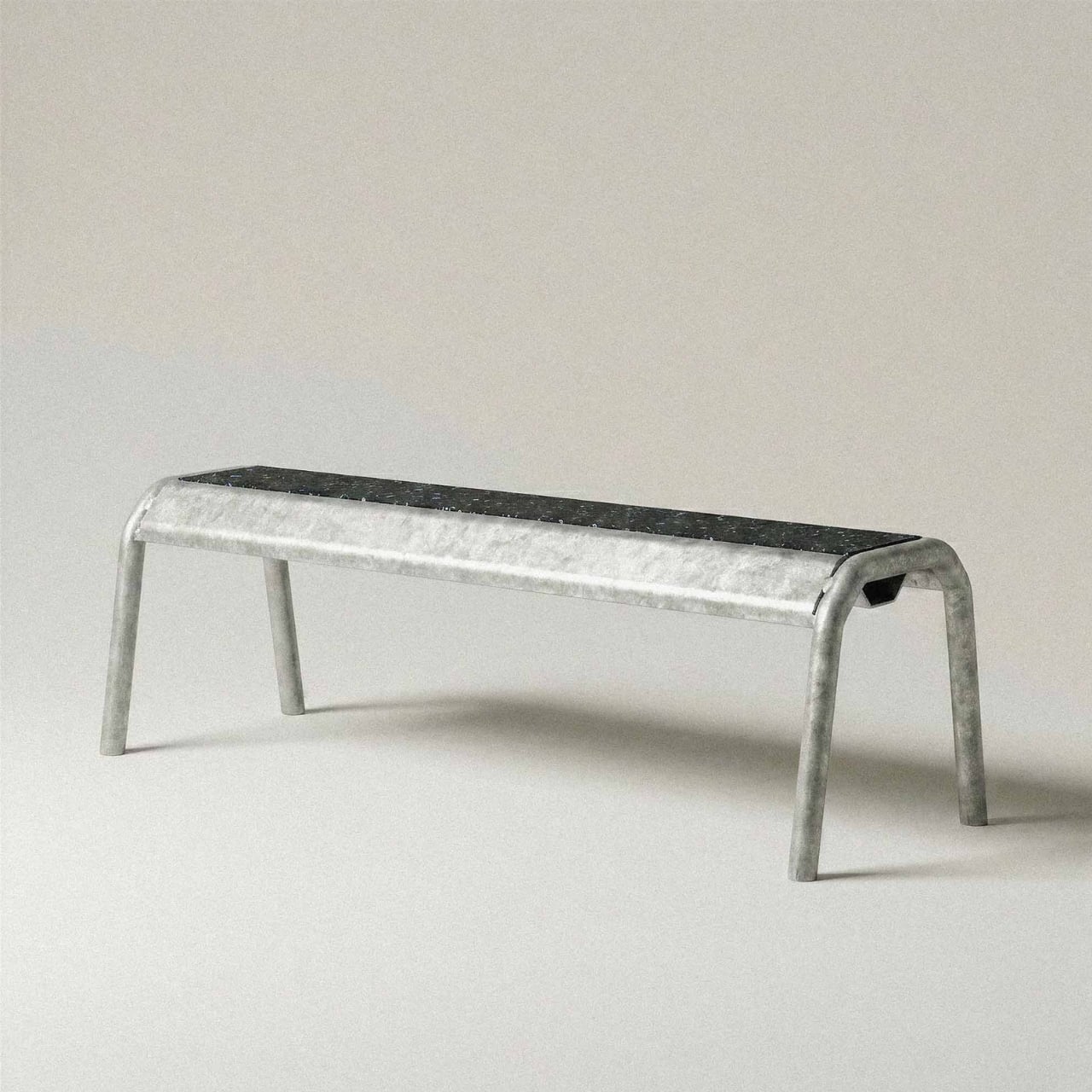
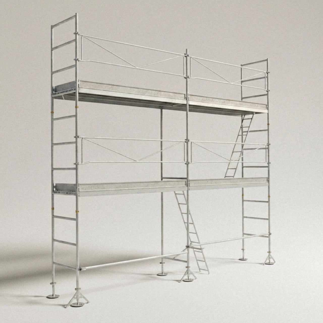
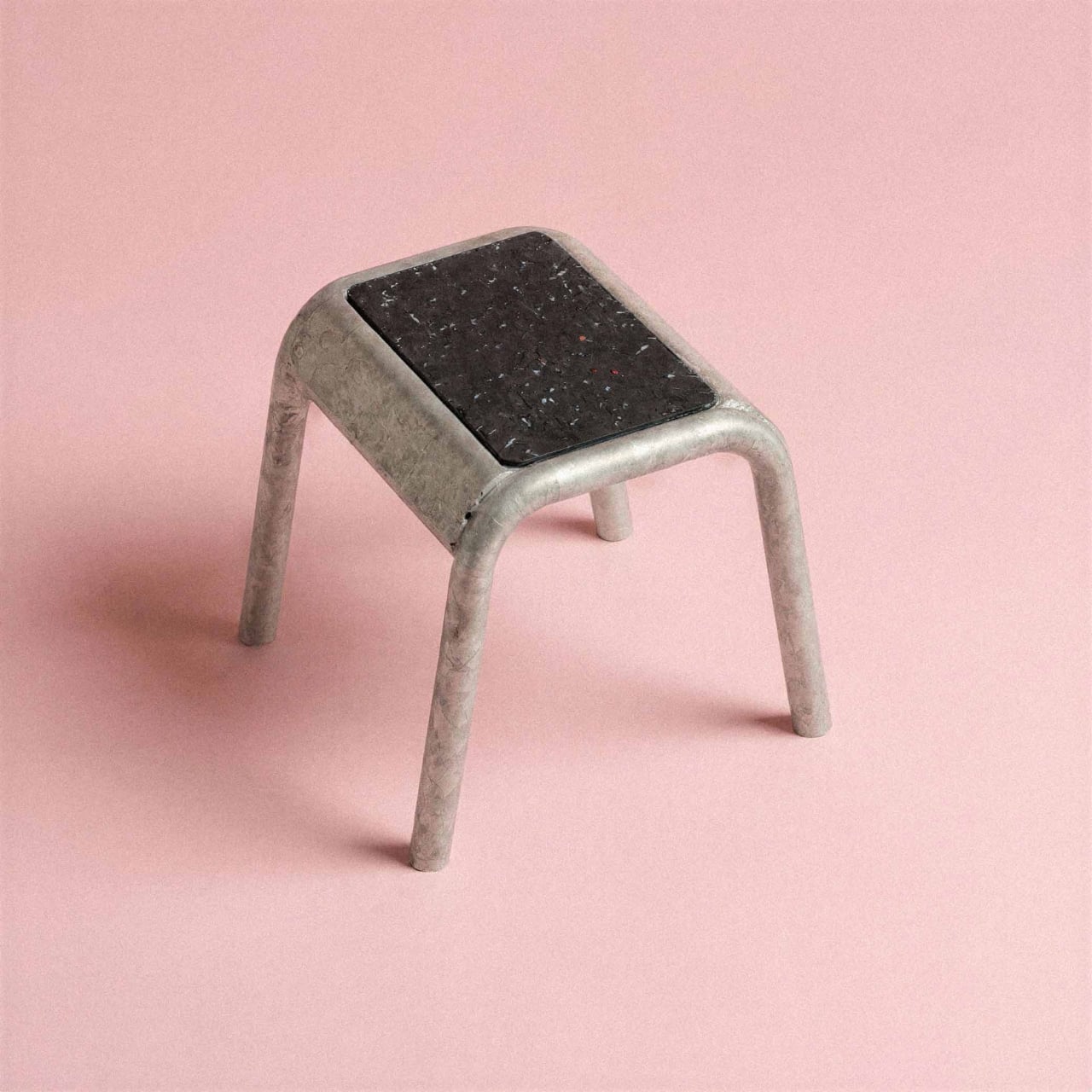
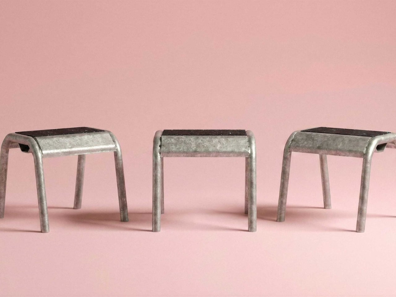
His project Estrade, which takes its name from the French word for a raised platform or stage, is exactly the kind of design that makes you pause and rethink what you assumed you knew about materials and their purpose. It takes scaffolding, one of the most utilitarian objects in the built environment, and repurposes it into furniture with a presence that feels both raw and considered. The idea isn’t complicated. What’s remarkable is how clearly it works.

Designer: Pierre Villez

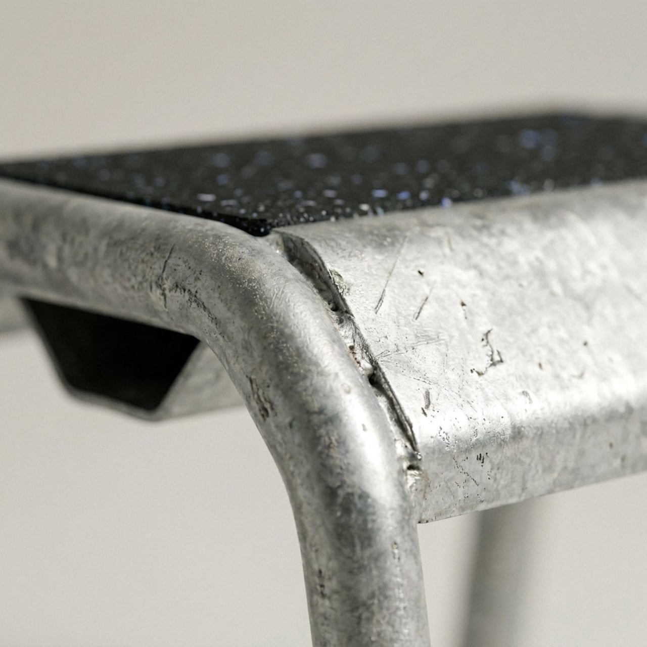
The execution is built around scaffolding tubes and components, the galvanized steel poles and fittings that temporarily hold up the facades of buildings under construction. These become the structural bones of a usable, liveable object. The material doesn’t get disguised or prettied up. It stays exactly as it is, marks and all, which is where the real honesty of the design lives. There’s no apology in it.

There’s a broader conversation happening right now in the design world about where materials come from and what happens to them once their original job is done. Construction materials sit at an interesting intersection: they’re industrial, abundant, and structurally engineered to last far longer than the projects that use them. Scaffolding in particular gets a rough deal in this sense. It does some of the most important work on a building site and then disappears entirely, either stacked away in a storage yard or eventually scrapped. Villez’s response is simply to ask whether disappearing is really necessary.

What makes Estrade worth paying attention to, beyond the sustainability angle, is that it doesn’t feel like it’s compensating for its origins. A lot of upcycled design falls into the trap of trying too hard to look polished, as if the designer was vaguely embarrassed by the material they started with. Estrade leans the other way. The scaffolding reads as scaffolding. The proportions are deliberately architectural, almost structural in feeling, and that industrial quality isn’t softened so much as it’s redirected. You’re not looking at furniture that happens to be made from scaffolding tubes. You’re looking at scaffolding that has decided to become furniture, on its own terms.

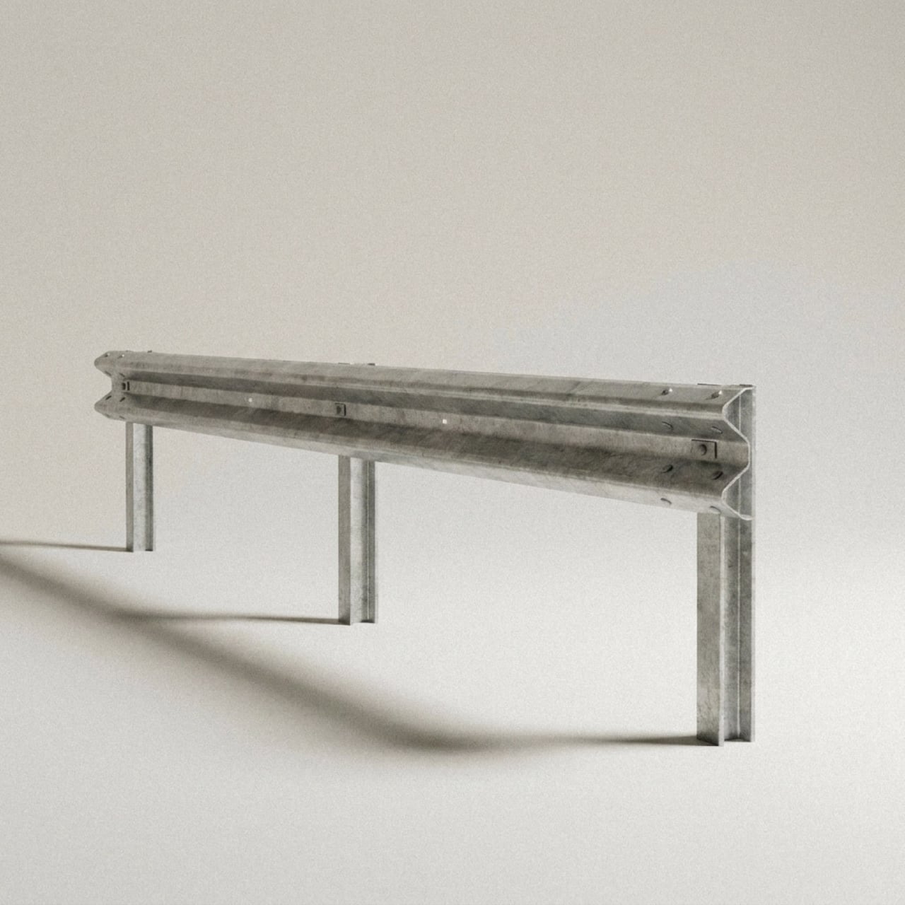
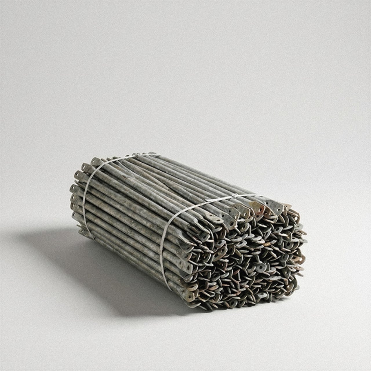
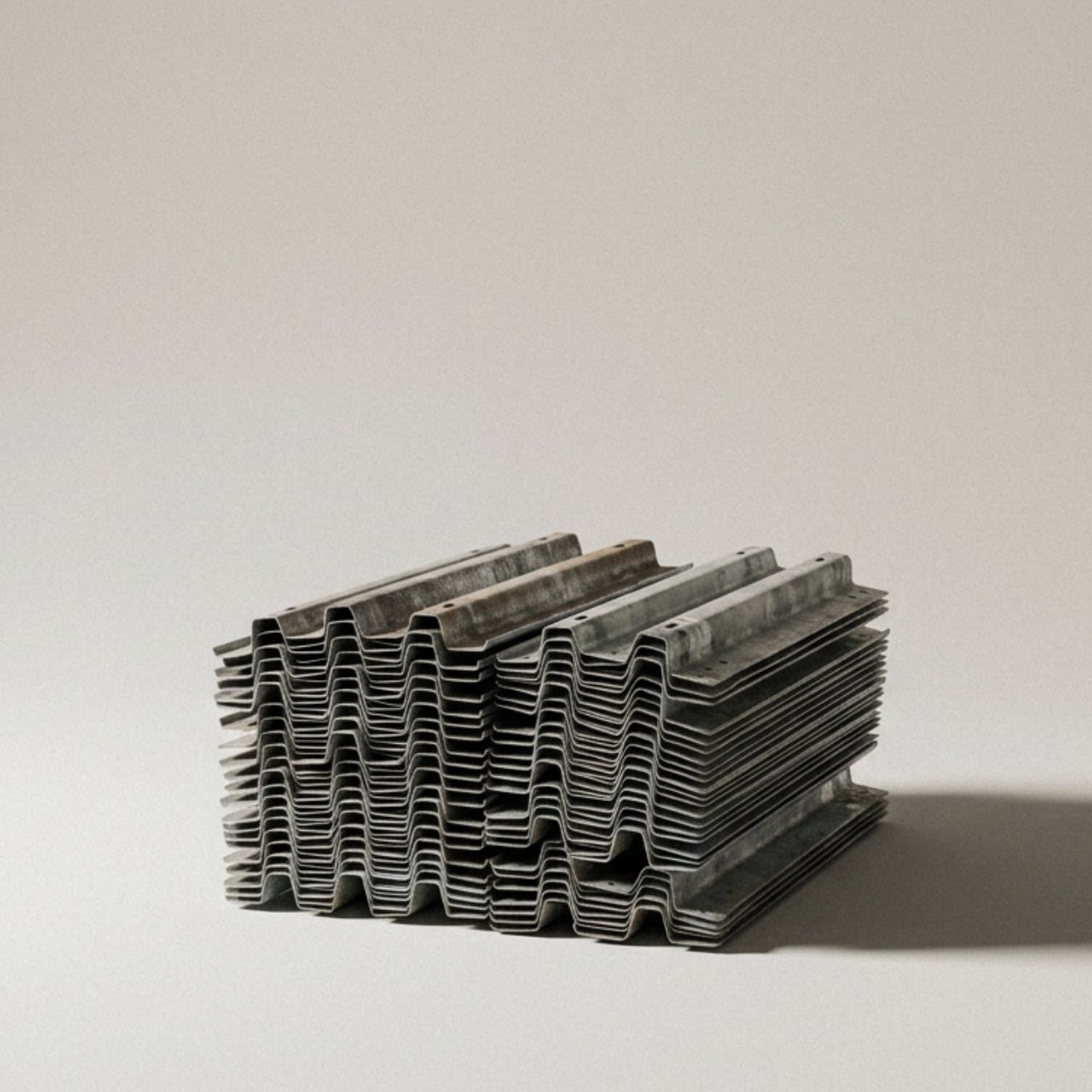
That kind of design thinking takes a real confidence in the material. It requires trusting that what you’re working with has enough inherent value to carry the work, without heavy intervention or stylistic decoration layered on top. Pierre Villez, who is based in Lille, France, clearly believes it does. His portfolio also includes ALAIN, a project that applies the same logic to crash barriers, which tells you this isn’t a one-off experiment. It’s a considered way of looking at the built world and asking what gets left behind, and why.

For anyone paying attention to where design is heading, Estrade feels like a meaningful signal. The sustainability conversation in design has been running for years and has sometimes drifted into the theoretical or the performative, becoming more about messaging than material reality. A project like this cuts through that. It’s grounded and specific. It takes one material, one context, and one question: can this be something else? The answer that comes back is yes, and it looks good while saying it.

The name is a small detail that rewards a second look. An estrade is a platform you stand on, a raised surface that offers a different vantage point. It’s a quietly clever choice for a project that asks us to look at a familiar, overlooked material from a completely different angle. Not everything in design needs to be precious or brand new. Some of the most interesting work happens when a designer takes what’s already there and asks a better question of it. Pierre Villez asked a good one.

Three metal stools with black seats lined up on a pink background.

The post Scaffolding Was Never Meant to Be Beautiful, Estrade Disagrees. first appeared on Yanko Design.
Gantri’s Helia Finally Makes Wireless Lamps Worth Buying

Every lamp in your home is tethered to a wall. Most of us have made peace with that, tucking cords under rugs, running them behind furniture, pretending they aren’t there. We’ve accepted the cord as the price of light. But Gantri and Ammunition just launched something that makes you realize how much quiet compromise we’ve been living with.

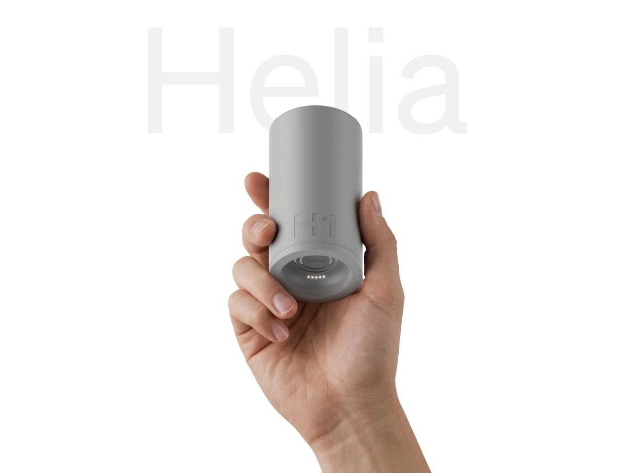
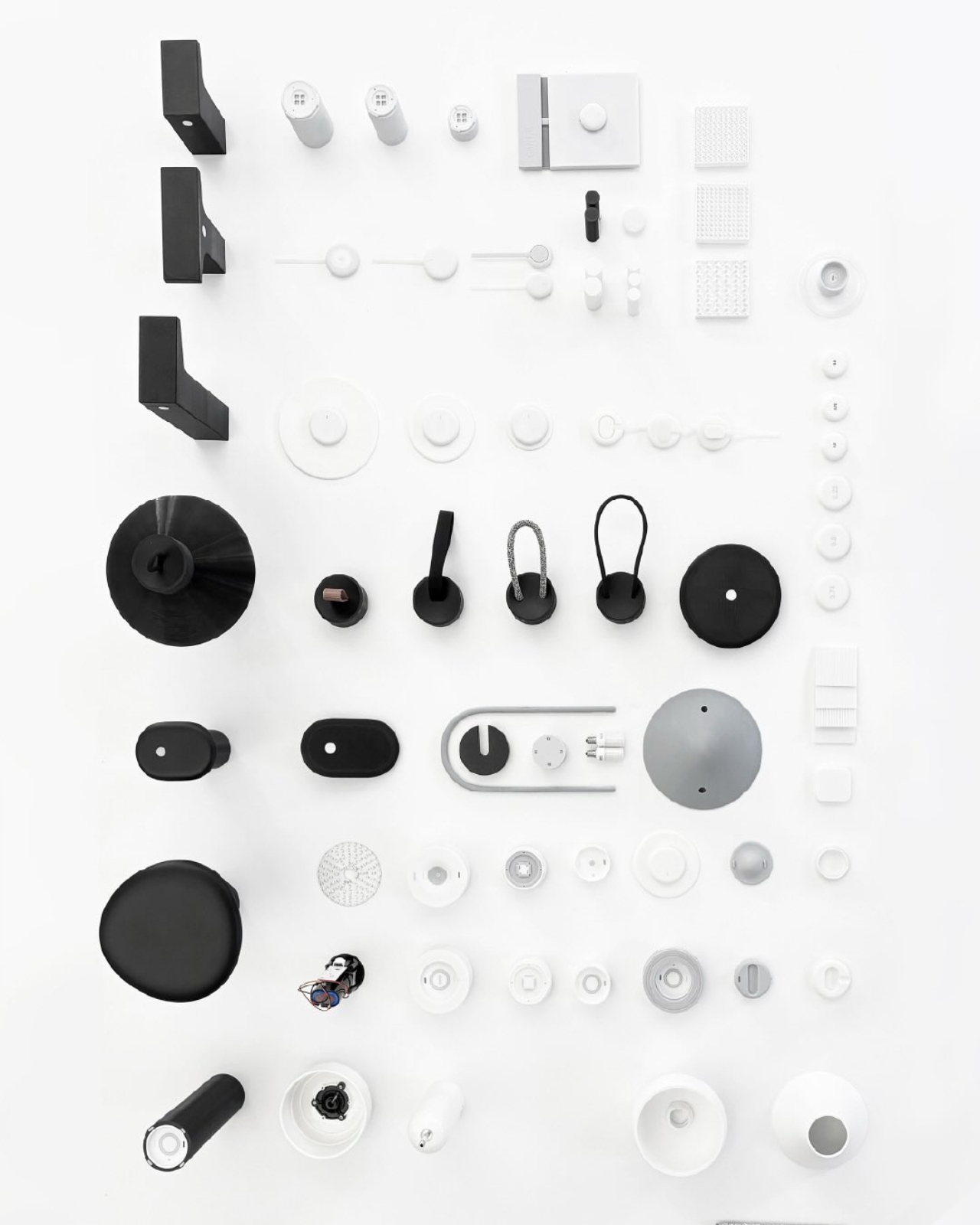
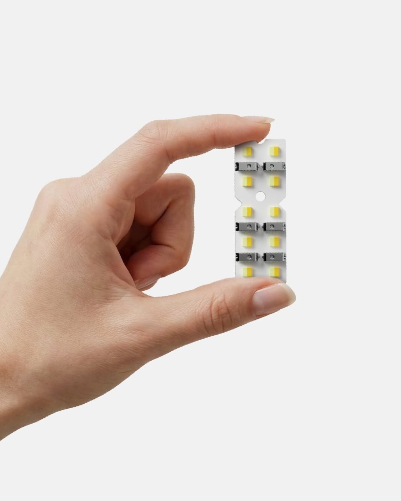
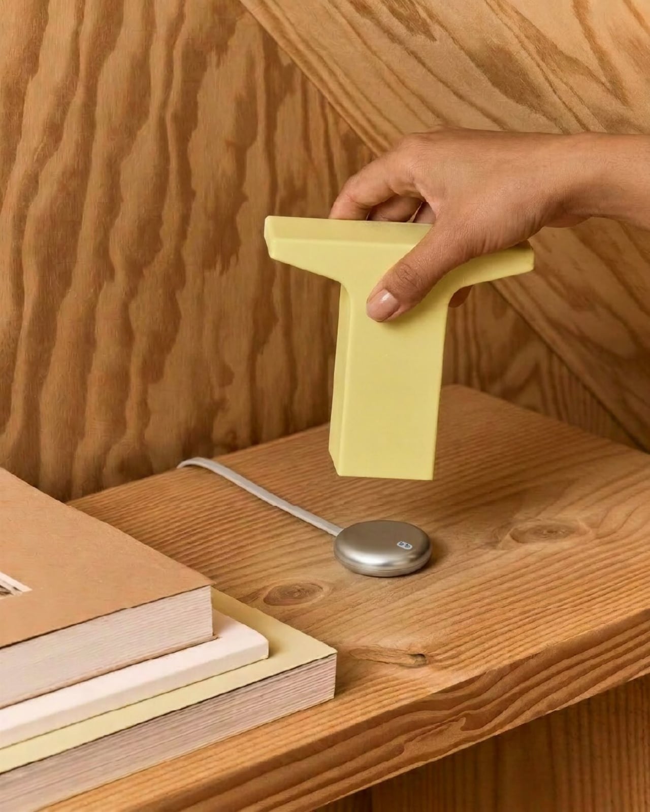
Helia is Gantri’s new wireless lighting platform, designed in collaboration with Ammunition, the San Francisco studio behind some of the most considered product design of the last decade. What makes Helia more interesting than your average rechargeable lamp is that it isn’t a product, it’s an architecture. A shared internal system that lives inside every light in the collection: a battery, customizable LED modules, a touch-sensitive control board, and a charging puck. The whole thing is modular, meaning the same technological core can be wrapped in an entirely different shell and still belong to the same family. Achille Biteau, director of industrial design at Ammunition, put it plainly: “all of a sudden you have that same platform that can be used on a range of designs. It could be in the hundreds or the thousands of designs.”

Designer: Gantri x Ammunition

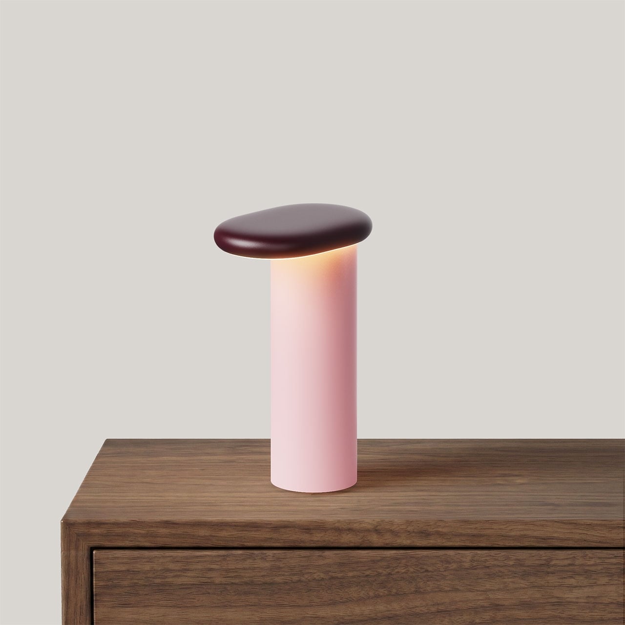
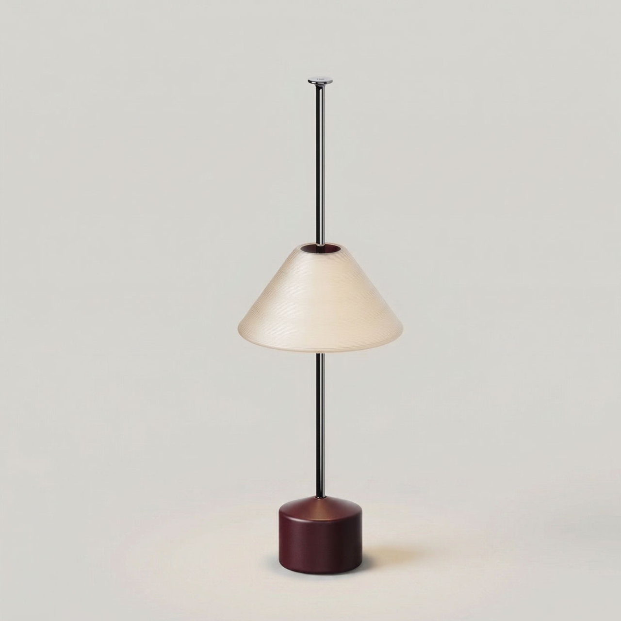
The practical result is a collection of lights that sit on small polished stainless steel charging pucks, lift off with a single gesture, and go wherever you need them. Beside the bed, across the room, out to the patio, onto the dining table. No unplugging. No relocating a power strip. Just pick it up and go. The interaction is so simple it almost feels obvious, which is usually the sign that something was designed very carefully.

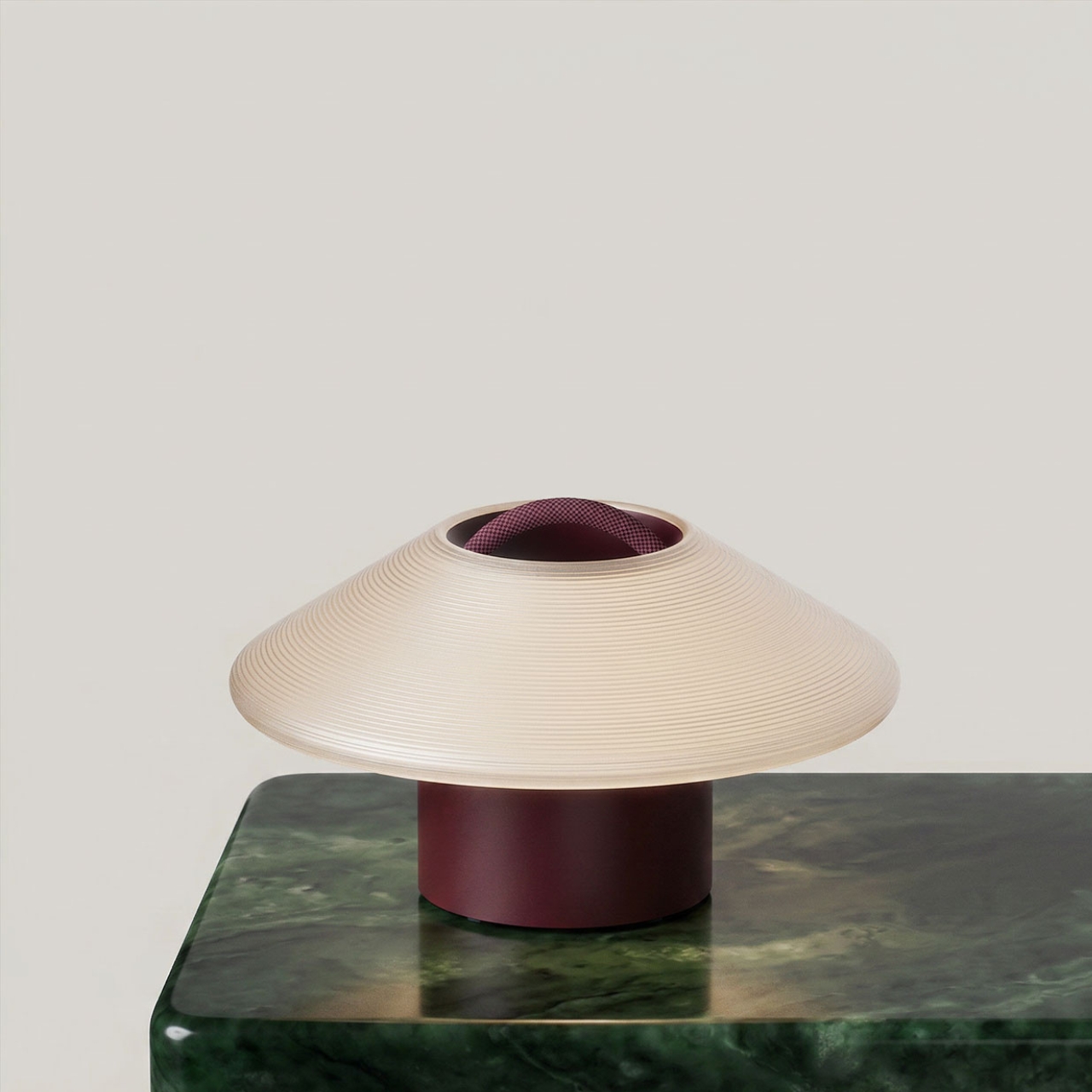
I’m going to be real: cordless lamps have existed for a while, but they’ve mostly been an exercise in compromise. They tend to be dim, plasticky, and styled like a product that knows it’s a second-rate option. The Helia-powered collection doesn’t feel like that. Ammunition brings a seriousness of intent to these forms that portable lighting rarely gets. The studio has won the Cooper Hewitt National Design Award for Product Design and has been named one of Fast Company’s Most Innovative Companies in Design five times over. That pedigree shows. The Drift collection feels sculptural, the Pier collection feels architectural, and the Eave reads almost like a proposition about what a lamp’s silhouette could be. These are lights that don’t look like they’re apologizing for not being plugged in.

The system is also designed to scale, and that’s one of the details that separates a good product from a genuinely interesting platform. For homes, the single charging puck does the job perfectly. For restaurants, hotels, or any hospitality space that needs multiple lights ready at once, Gantri offers a six-port charging tray. The imagery of someone carrying a tray of softly glowing lights to a dinner table, like a modern version of candlelight service, is one of the most quietly compelling visuals to come out of a design launch in recent memory.

Gantri founder Ian Yang has described the project as returning light to what he calls its “older state,” one that lives with you, moves with you, and shapes how you experience a space in a more human way. That framing resonates. For most of human history, light was carried. Torches, lanterns, candles. We only stopped moving it around when electricity offered us a more convenient option. The cord was a feature that quietly became a limitation.

The bigger story here is that Helia isn’t just powering three collections. Gantri’s manufacturing platform is opening up so other designers can build their own wireless lights using the same internal system. That makes this less of a product launch and more of the beginning of an ecosystem, which is exactly the kind of ambition that tends to age well. Wireless lighting has been hovering at the edges of serious design conversations for years. Gantri and Ammunition may have just pulled it to the center.

The post Gantri’s Helia Finally Makes Wireless Lamps Worth Buying first appeared on Yanko Design.

One Speaker, 10 Drivers, 400 Watts: DALI’s Vega Changes the Game

The audio world has always had a bit of a hoarding problem. Amplifiers, preamps, turntables, towers, subwoofers, cables that cost more than a weekend trip. The traditional hi-fi setup has never been known for its minimalism. It’s a rabbit hole, and a beautiful one at that, but a rabbit hole nonetheless. So when a 43-year-old Danish speaker company decides to put everything into a single box and call it done, it’s worth paying attention. That’s exactly what DALI did with the Vega, and I’ll say upfront: I didn’t expect to be as interested in it as I am.

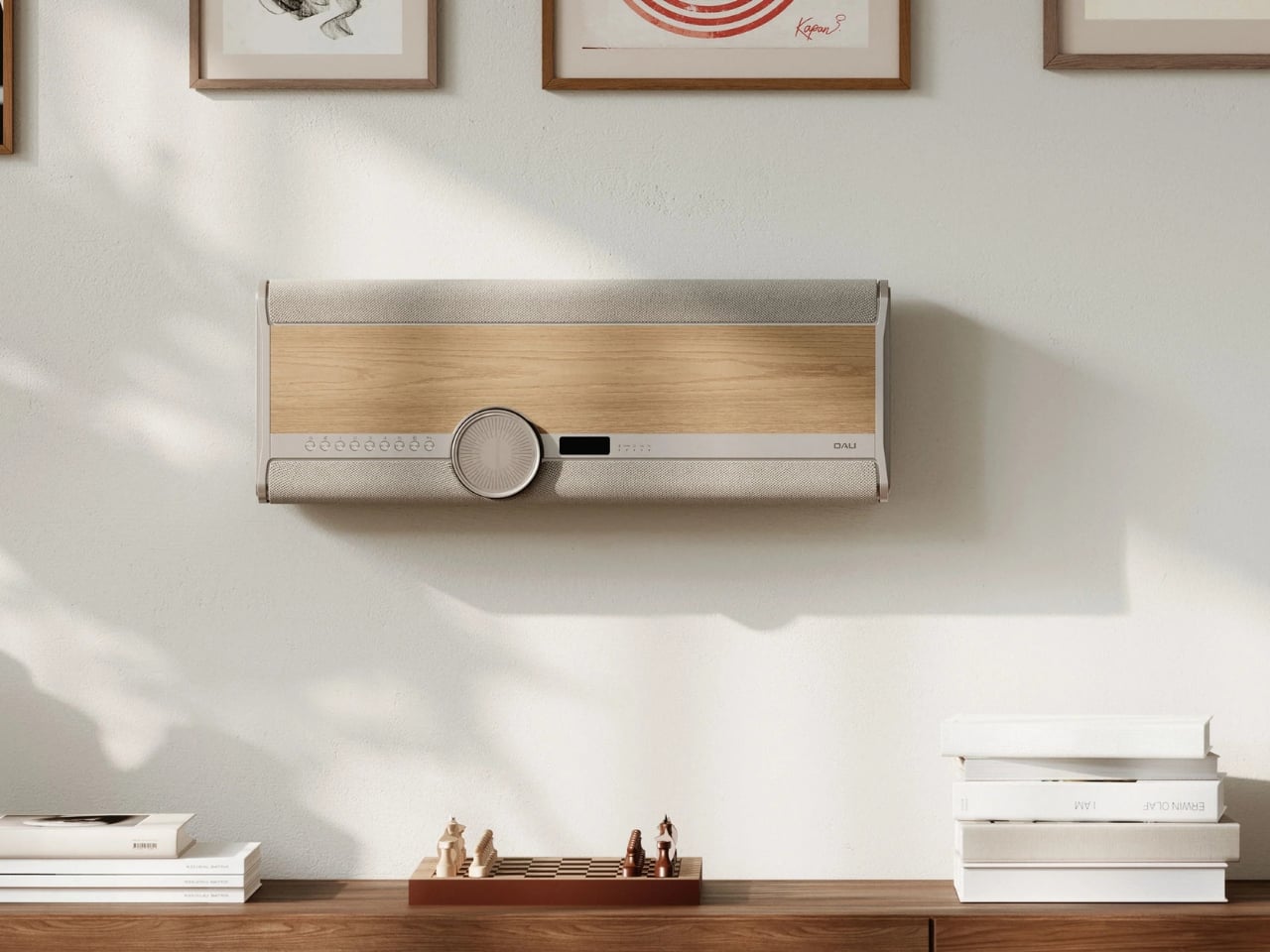
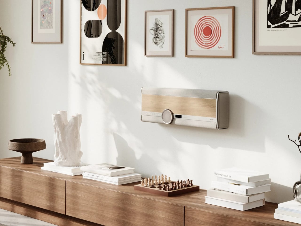
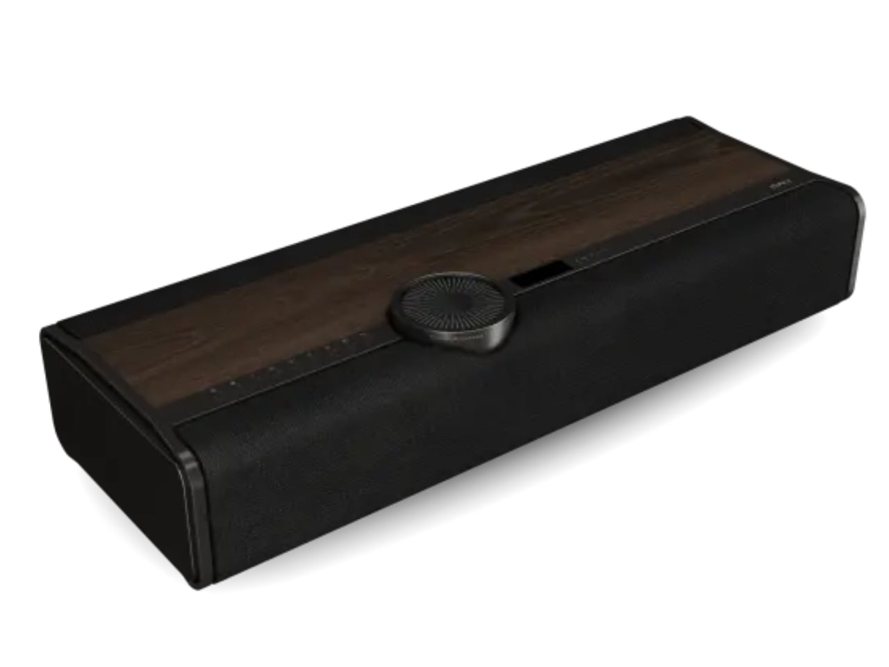
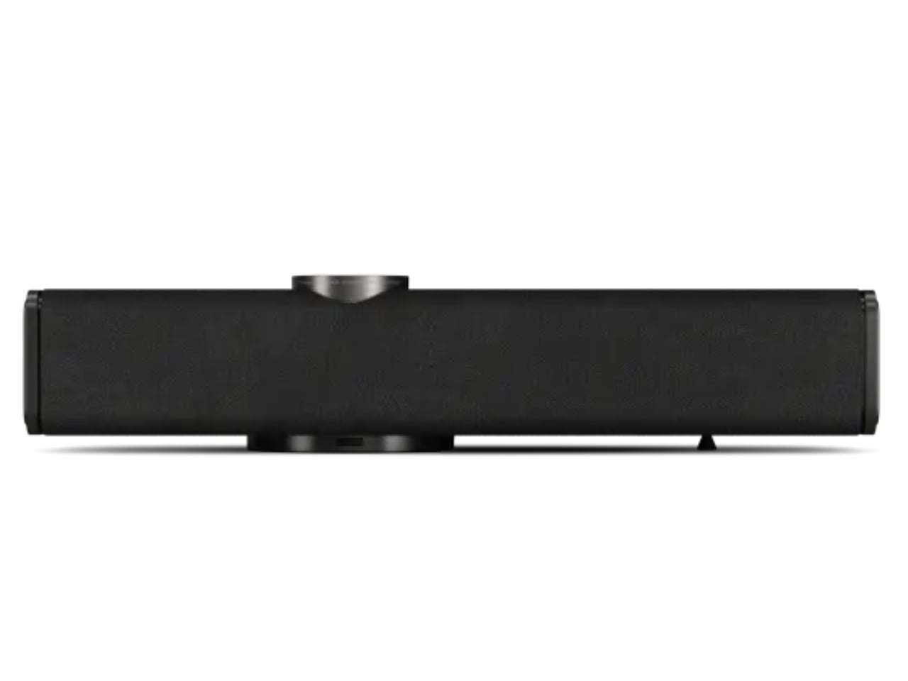
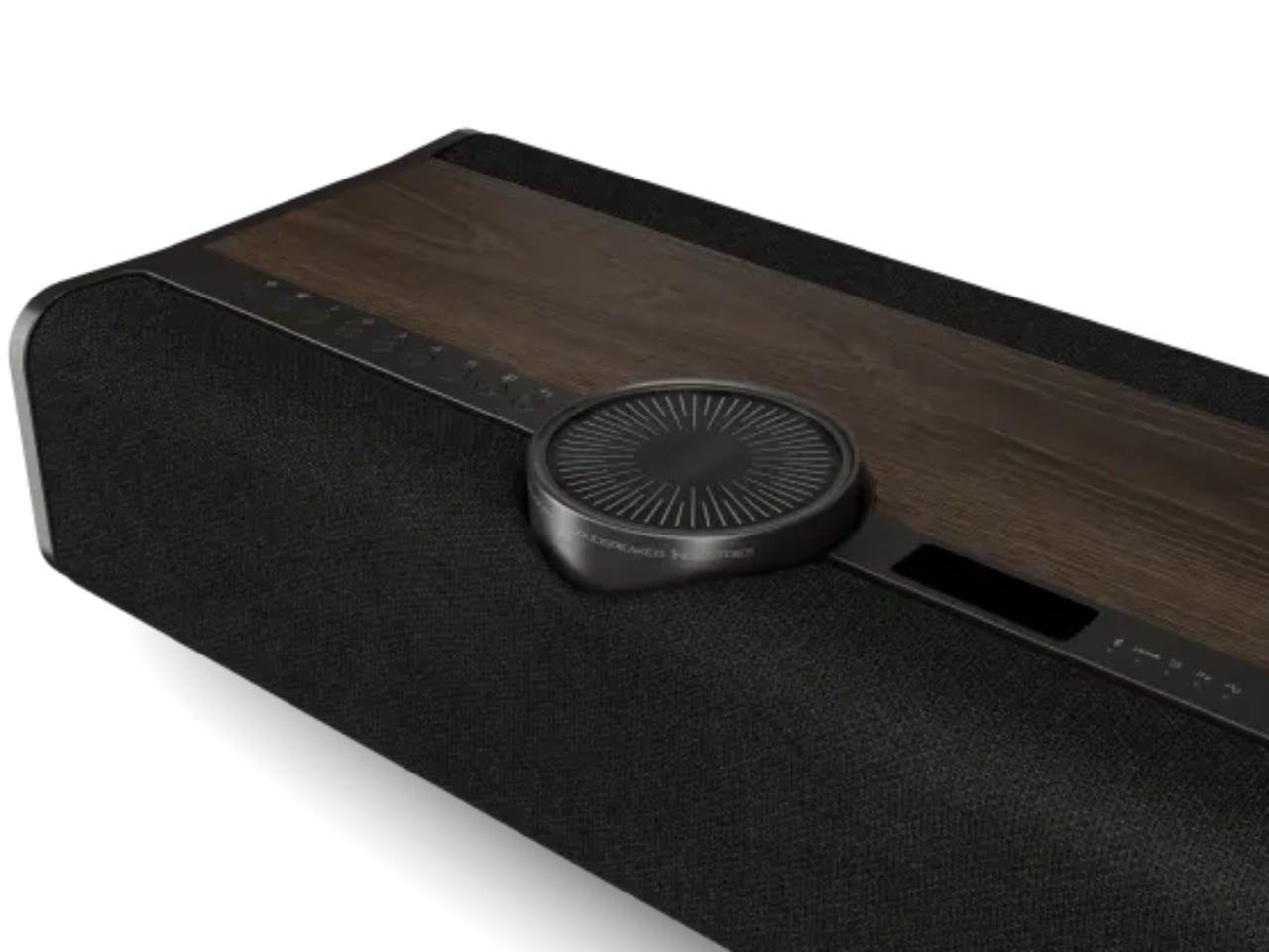
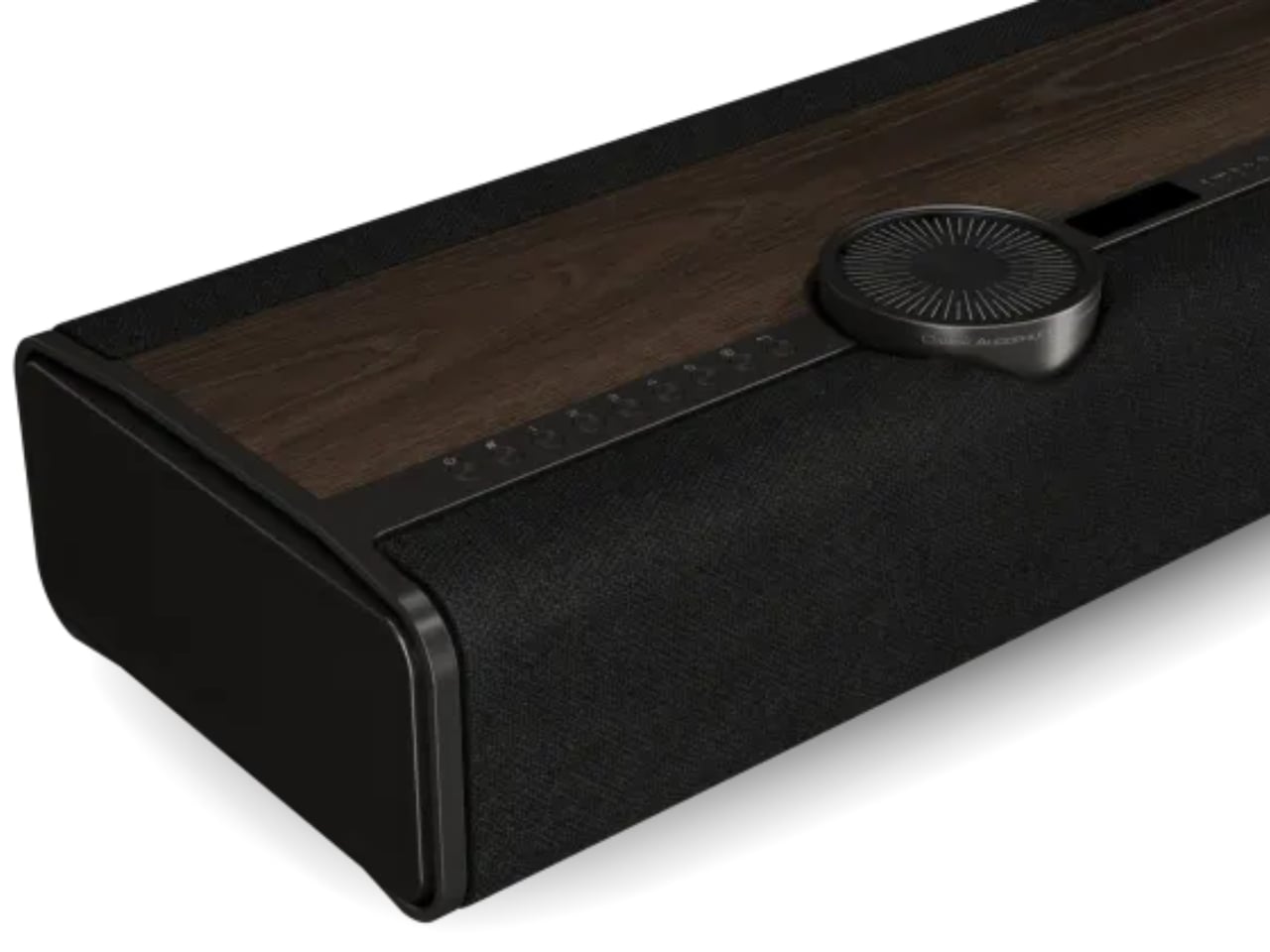
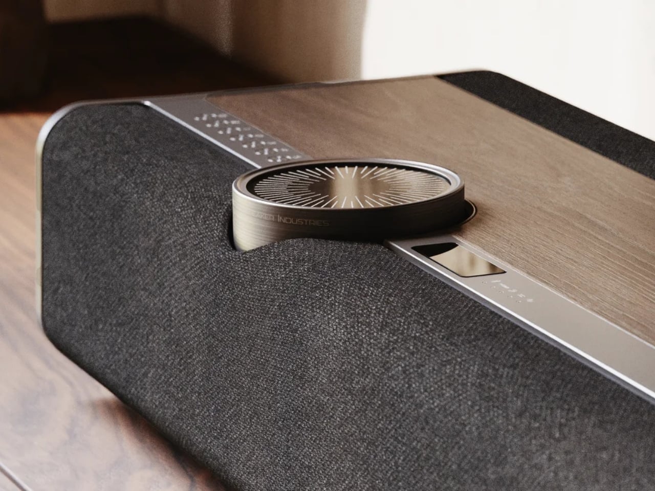
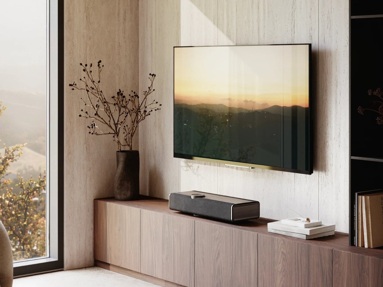
The Vega is an all-in-one wireless sound system built from the ground up. Drivers, amplification, DSP control, all of it developed in-house. The result is a single unit that sits in your room like a piece of furniture and quietly does the work of an entire rack of equipment. It packs 10 drivers into its slim 683mm-wide enclosure, including ultra-light 25mm soft dome tweeters and bass-midrange drivers arranged back-to-back to minimize cabinet resonance. Total amplification lands at 400 watts across eight channels. For a single speaker, those are serious numbers.

Designer: DALI Speakers

What makes the Vega interesting beyond the specs is how it actually approaches the problem of sound in a room. DALI developed a proprietary technology called Adaptive Stereo Enhancement (ASE), which creates a wide soundstage from a single unit in real time. It’s not a gimmick simulation of stereo. It’s an adaptive system that reads the incoming signal and responds accordingly, without introducing the artificial artifacts that can make these kinds of technologies feel forced. Whether it fully delivers on that promise is something we’ll have to wait until it reaches more listening rooms to confirm, but the approach itself is genuinely thoughtful.

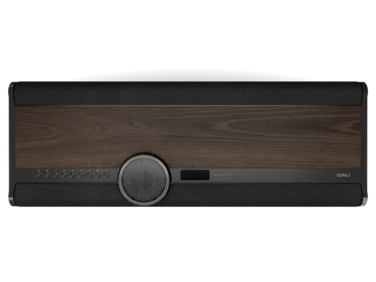
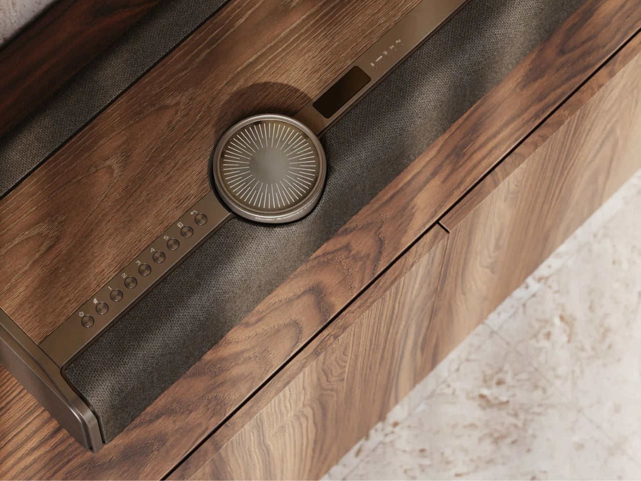
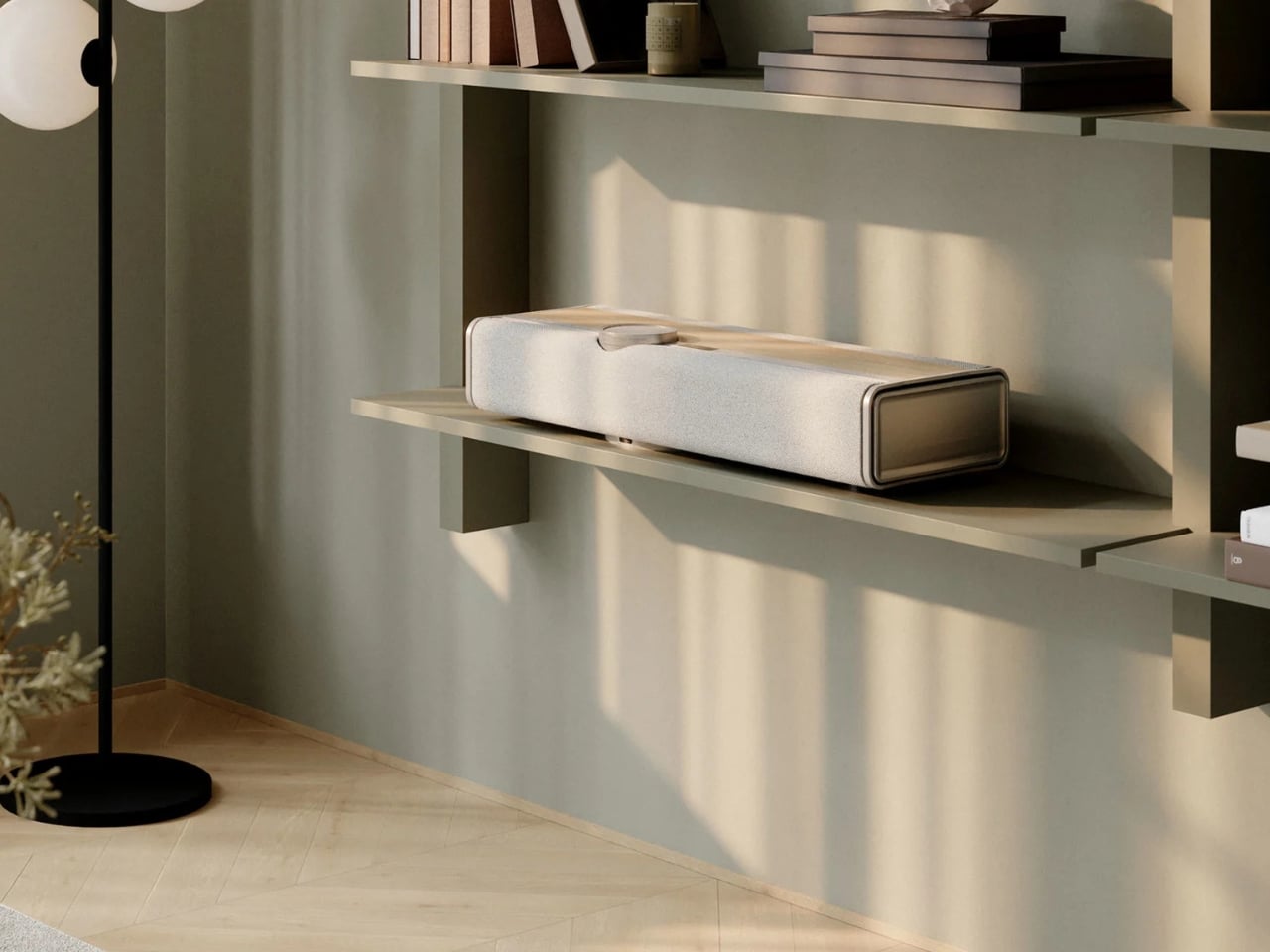
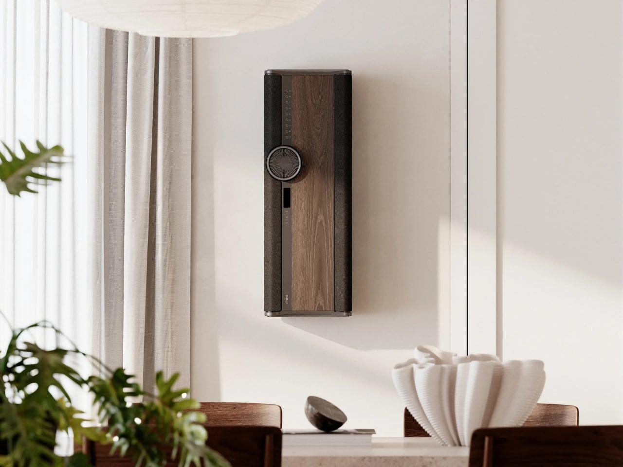
Then there’s the Adaptive Orientation Adjustment (AOA), which automatically optimizes the speaker’s output based on how you’ve placed it. Standing upright on a shelf, mounted flat against a wall in landscape, hung vertically in portrait. The Vega adjusts in real time for each scenario. It even includes an OLED display that rotates with the unit’s orientation. That’s the kind of considered detail that separates a product designed by people who actually care from one that was designed by committee to hit a price point.

And speaking of price points: $4,500 USD is not a casual purchase. I won’t pretend otherwise. But when you start comparing it to the cost of assembling a proper separates setup at equivalent quality, the math starts to look different. A decent amplifier, a quality streamer, a pair of speakers at this level, the cables to connect them all. It adds up fast. The Vega consolidates all of that into one device, one box, one cable to a power outlet.

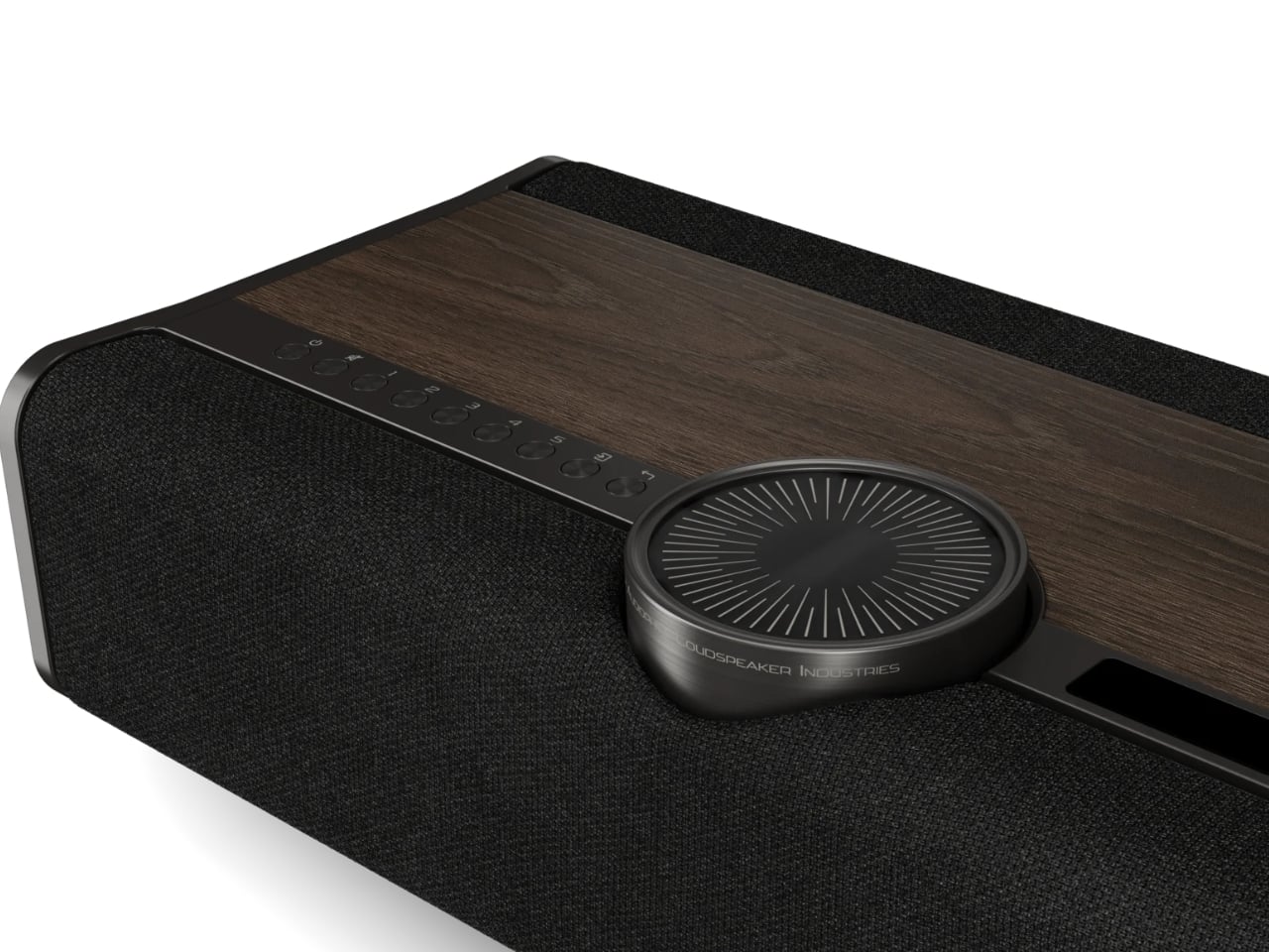
Aesthetically, DALI made choices I genuinely respect. Real wood veneer in Dark Oak or Natural Oak, anodized aluminium details, custom woven fabric. It looks more like something you’d find in a well-appointed Scandinavian living room than a piece of audio equipment. The volume wheel alone is its own small obsession: glass, acrylic, and anodized aluminium riding on an aerospace-grade ball-bearing mechanism. That’s not a specification; that’s a tactile experience someone designed on purpose.

Connectivity is thorough without being overwhelming. BluOS handles streaming and multi-room audio. HDMI, optical, analogue, USB audio, and Bluetooth cover wired sources. Spotify Connect, Tidal Connect, and Apple AirPlay 2 round out the wireless side. You can plug in a turntable or connect a TV, and the Vega handles both within the same system.

The Vega launches in select markets in September 2026, with broader availability following in October and November. Whether the hi-fi world embraces it or resists it on principle is a conversation that will be had loudly in forums and listening rooms for months. But the idea at its core, that great sound shouldn’t require great complexity, is one that’s long overdue for a proper answer. DALI’s version of that answer is elegant, ambitious, and a little bit expensive. Most good answers are.

The post One Speaker, 10 Drivers, 400 Watts: DALI’s Vega Changes the Game first appeared on Yanko Design.

A 10mm Tech Pouch That Finally Replaces 5 Things in Your Bag

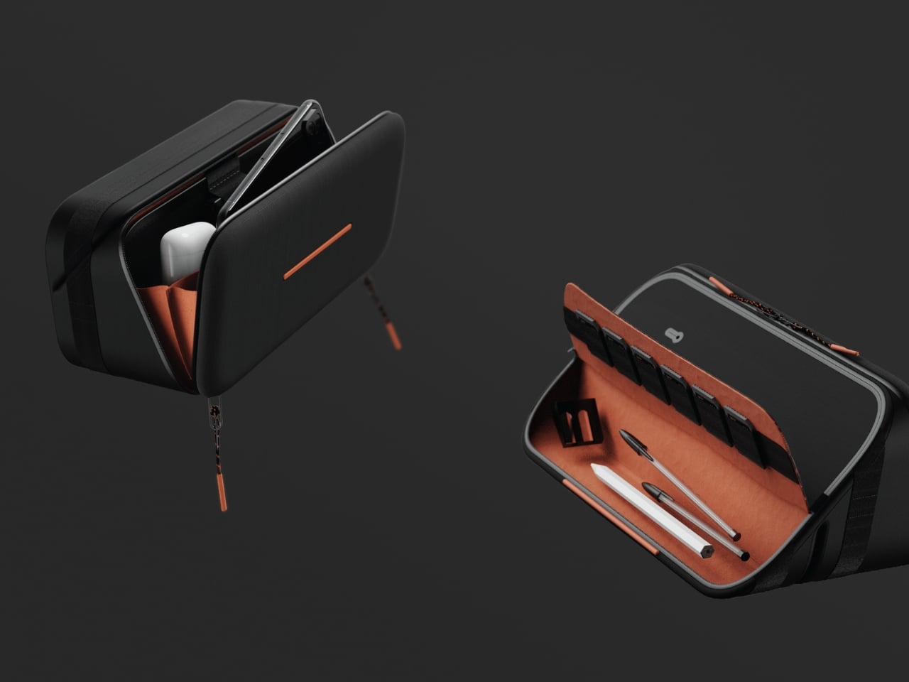
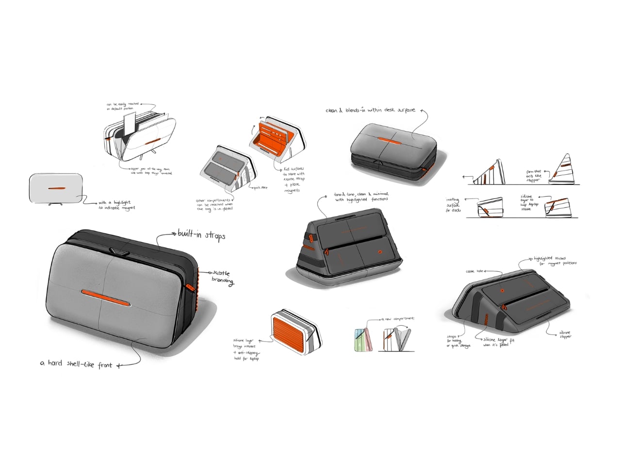
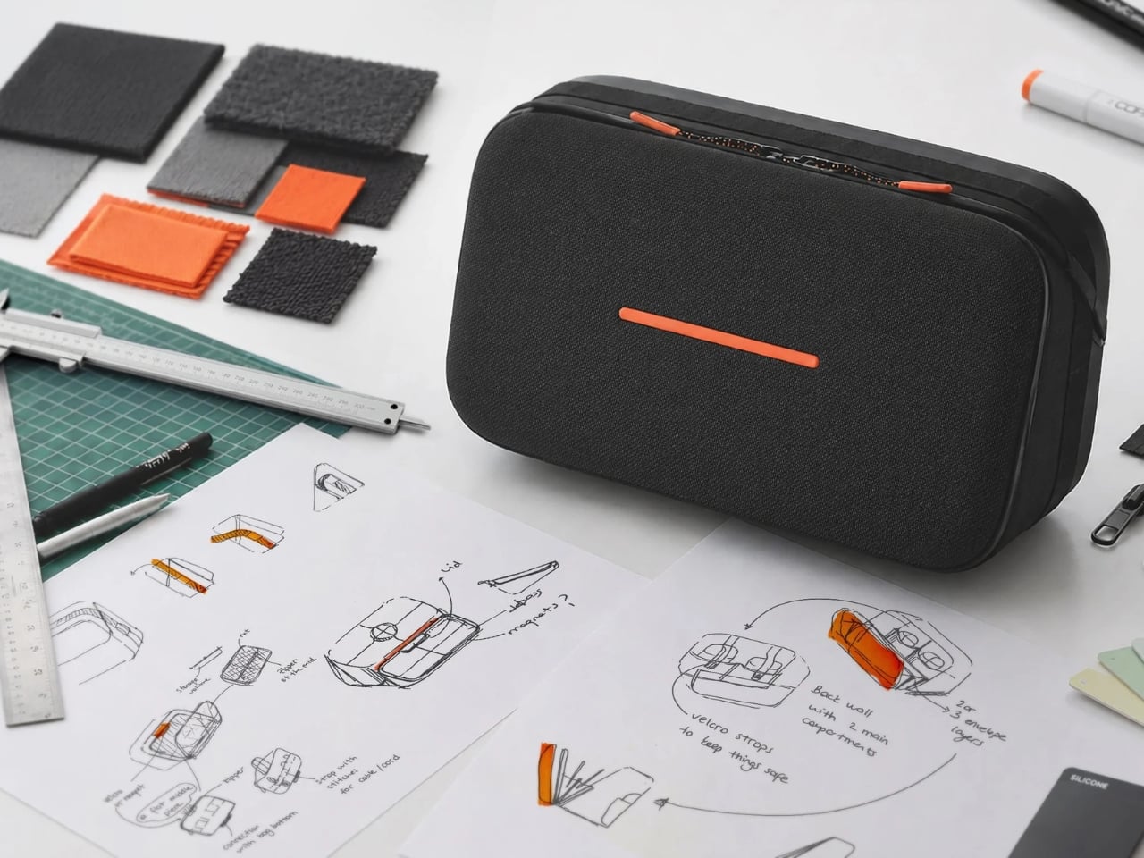
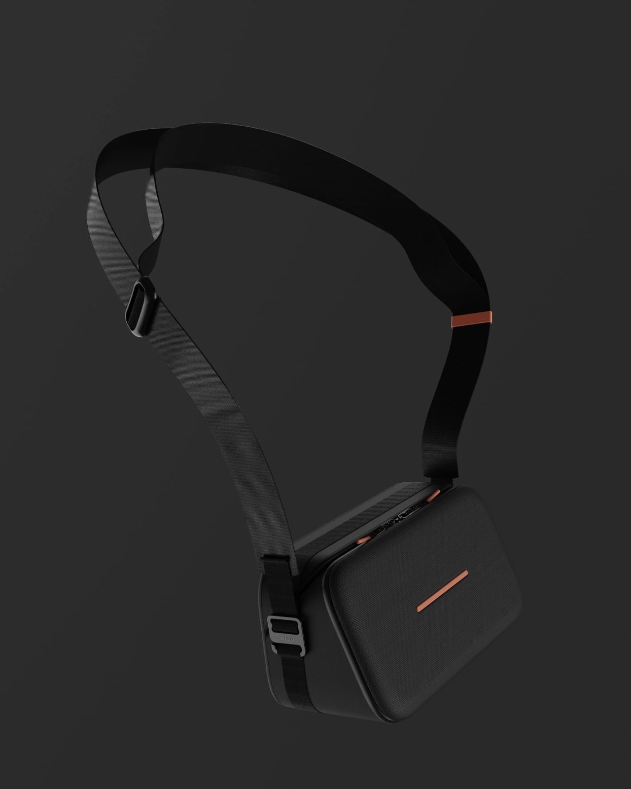
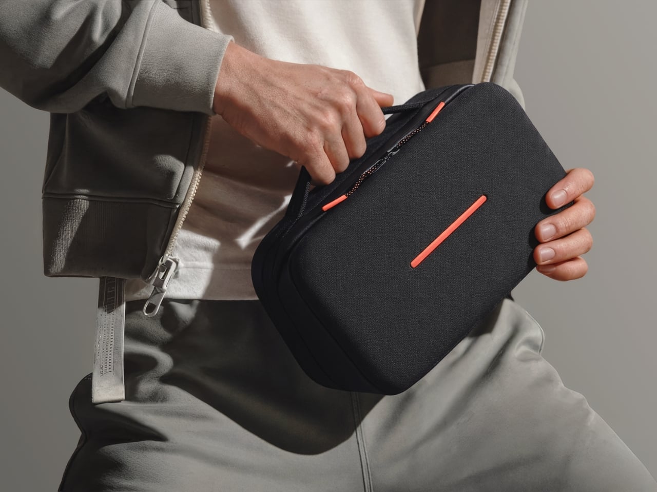
Every time I travel for work or even just settle into a coffee shop for a few hours, I find myself unpacking the same small chaos from my bag. A charging cable here, a power bank there, earbuds somewhere, a phone stand that I bought separately and never quite like. It’s the modern tech tax: you carry things that exist only because the other things you carry aren’t designed well enough to stand on their own. MICO, a transformable tech pouch designed by Fulden Dehneli of Fuldende Design, is a direct, elegant argument against all of that.

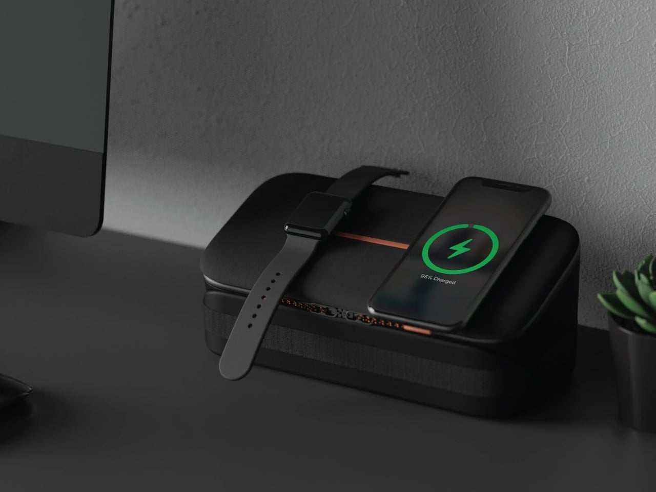
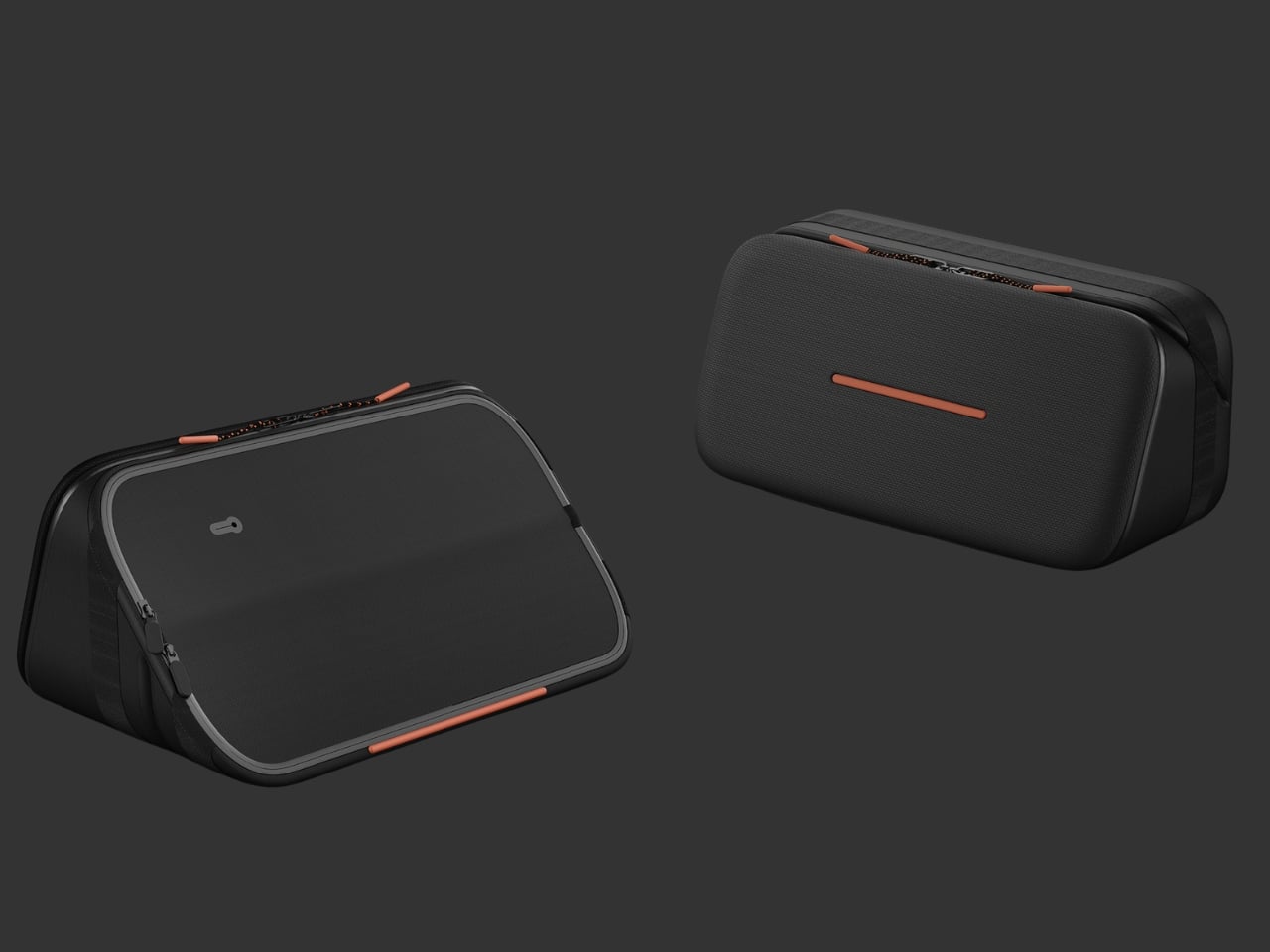
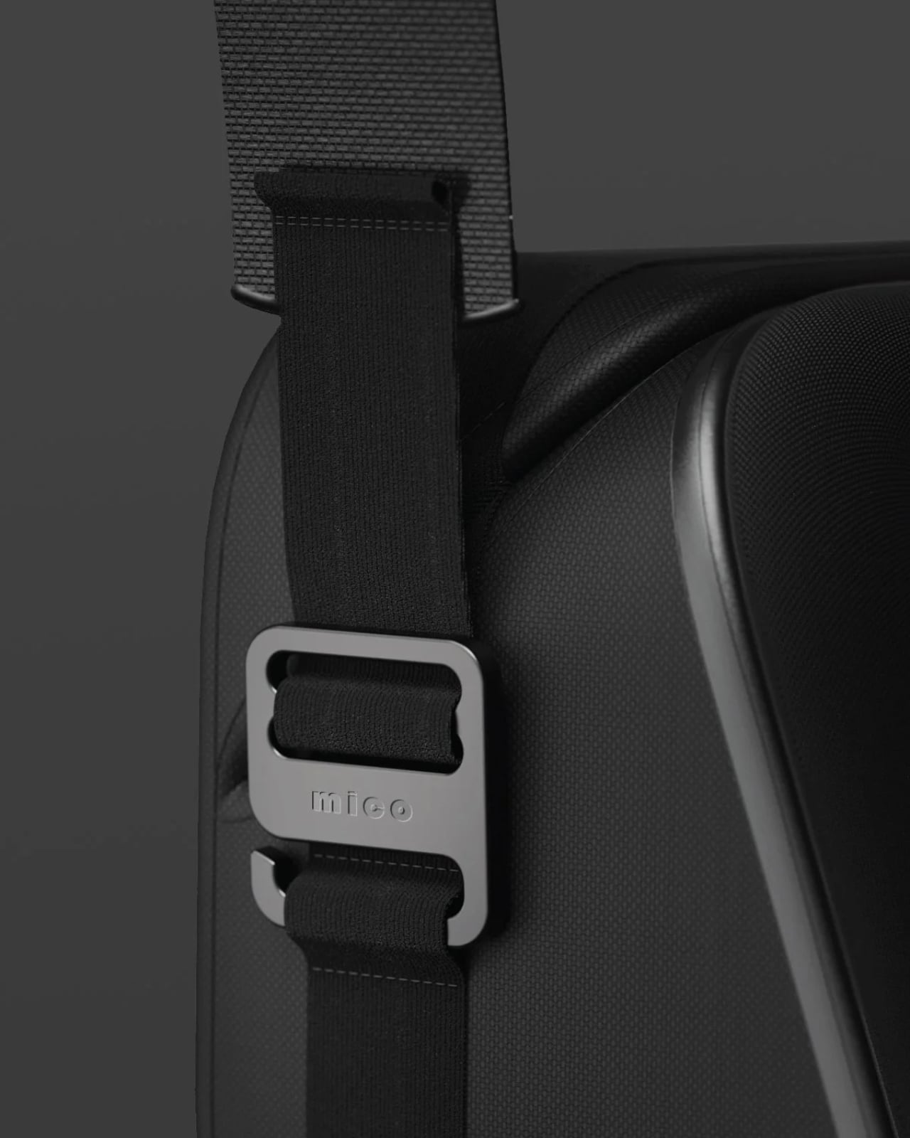
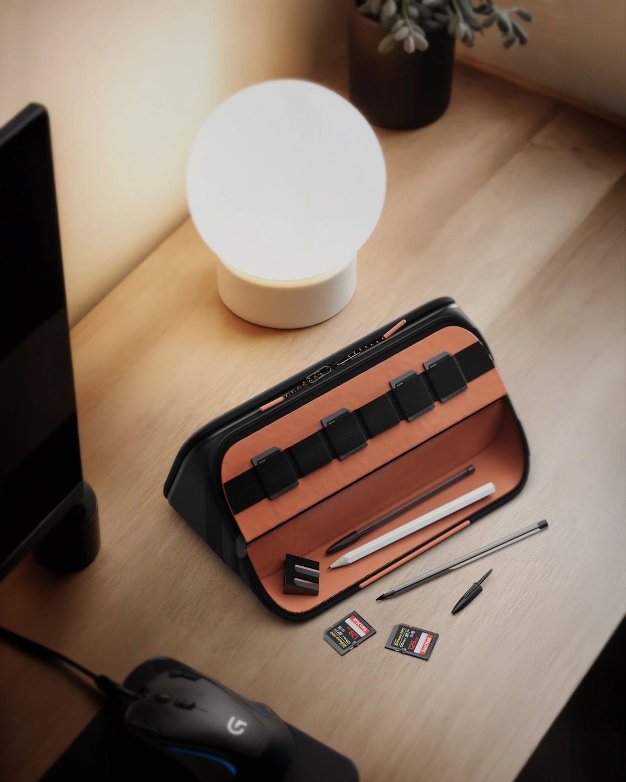
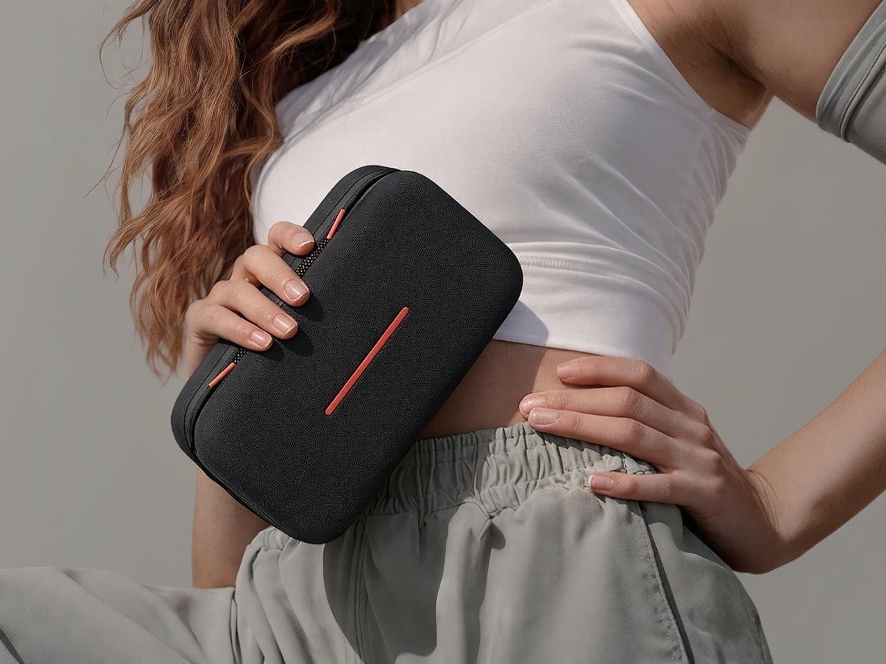
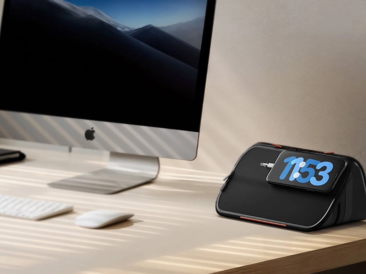
The concept is straightforward, but the execution is genuinely clever. MICO folds through an intuitive mechanism to transform into a laptop stand, a phone stand, and a charging dock, all within seconds. It also comes with a built-in tracker, a built-in alarm, and a wirelessly rechargeable battery. And it does all of this while sitting at just 10mm thin. That last detail is worth pausing on. Ten millimeters is barely thicker than a pencil, and yet the thing is designed to hold your tech, prop up your laptop, and charge your devices.

Designer Name: Fulden Dehneli

The philosophy behind MICO is what Dehneli calls minimalist consumption: the idea that a well-designed product should let you do more with less. It’s a principle worth taking seriously right now, when most of us are already drowning in accessories and adapters that promise to solve one problem but quietly become another. A pouch that organizes your gear, charges it, props it up, and tracks it is not just convenient. It’s a genuinely different way of thinking about what an everyday object can be.

Dehneli is an award-winning industrial designer and the founder and creative director of Fuldende Design, a global design consultancy she established in Shanghai in 2019. She started her career in Stockholm, and over more than 13 years of practice across Turkey, Sweden, and China, she’s built a cross-cultural perspective that shows up in her work. Her portfolio has earned her multiple Red Dot and iF Product Design Awards, and MICO itself holds a Red Dot Award in the Design Concept category for Travel. That recognition isn’t incidental. It signals that the design community sees something in this product beyond a clever prototype.

The folding mechanism is where the real thinking shows. Instead of adding complexity to look impressive, it keeps things intuitive and human-friendly. You don’t need instructions. The transformation from pouch to stand to dock is the sort of thing that makes people at the airport stare for a moment before quietly wishing they had one. It doesn’t try to be beautiful in a loud way either. It’s clean, slim, considered. The kind of object you pick up and immediately understand.

The tech accessories market is crowded with products that do too much or too little. There’s rarely a middle ground where every feature actually earns its place. MICO sits in that rare zone, and the 10mm profile is a big reason why. Working within that kind of physical constraint forces better decisions across the board. You can’t be lazy about materials or mechanisms when you have almost no room to hide your shortcuts.

MICO is currently listed as Ready to Launch, meaning it hasn’t hit the mass market yet. But the interest is already there. The design has been celebrated on Behance with thousands of views, earned its Red Dot recognition, and comes from a designer with a consistent track record of taking strong ideas all the way through. If it makes it to production without losing what makes it interesting on paper, it has a real shot at changing how people think about the things they carry.

The best kind of product design doesn’t ask for your attention. It just shows up, does exactly what you need, and leaves you wondering why no one thought of it sooner. That’s the energy MICO is bringing to a category that was long overdue for a rethink.

The post A 10mm Tech Pouch That Finally Replaces 5 Things in Your Bag first appeared on Yanko Design.

Google’s Android XR Glasses Pick Gentle Monster and Warby Parker

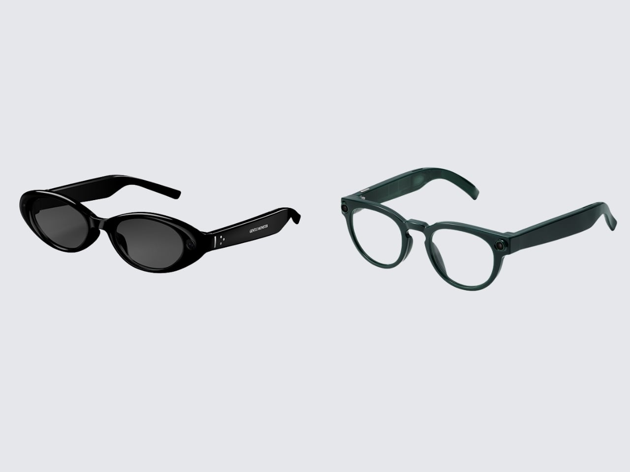
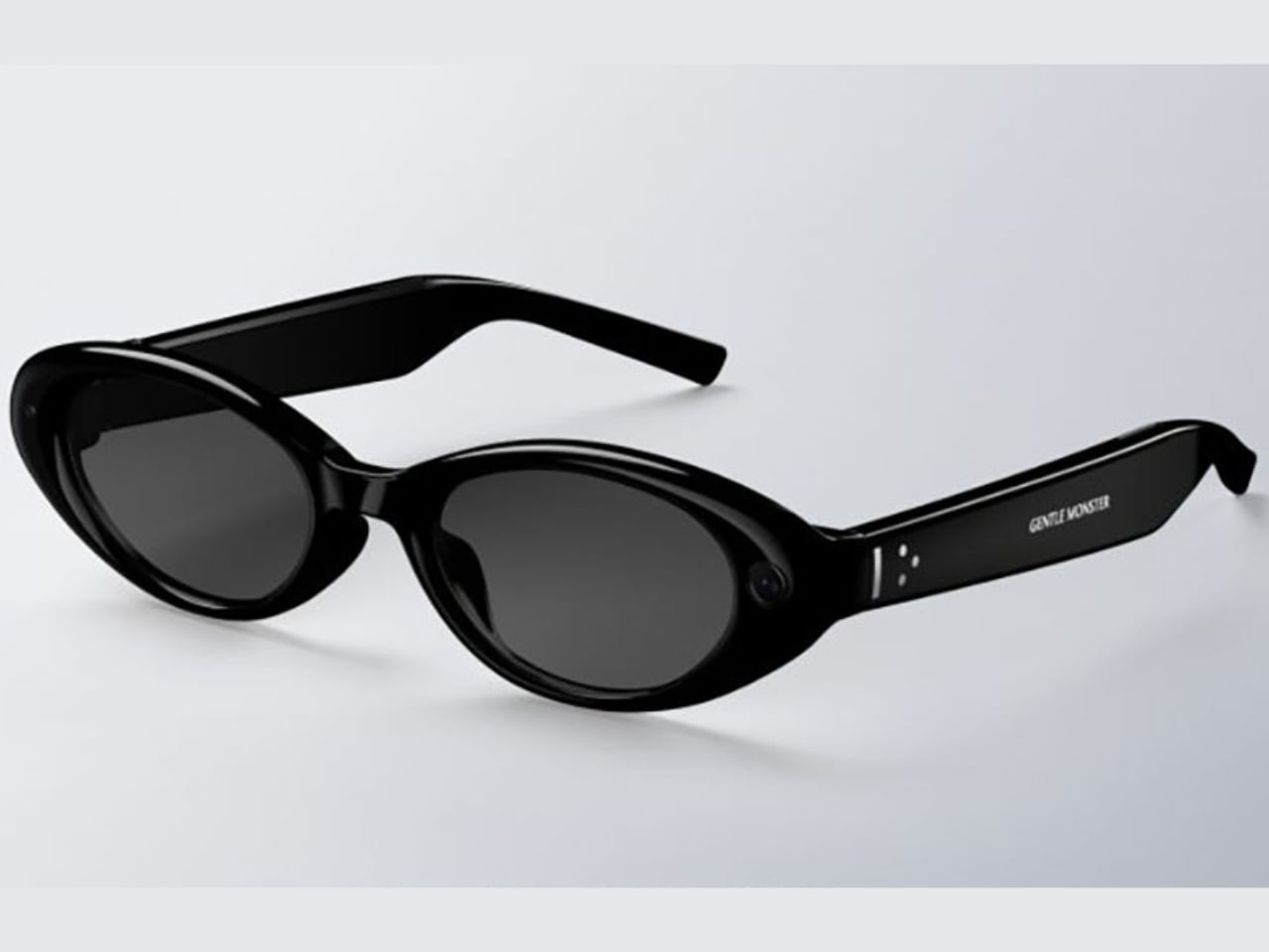
The biggest design announcement to come out of Google I/O 2026 did not involve a language model. It involved a pair of frames. On May 19, Google and Samsung unveiled their Android XR intelligent eyewear, a product that still has no official name, no confirmed price, and no exact ship date beyond “this fall.” What it does have is two very deliberate aesthetic camps: Gentle Monster on the disruptive end, Warby Parker anchoring the refined and timeless side. And leading with eyewear partners instead of chipset specs felt like the most coherent product launch decision Google has made in years.

Two form factors are on the way. Audio glasses ship first, landing later this fall. Display glasses follow at some point after that. The audio version is exactly what it sounds like: Gemini in your ear, accessed by saying “Hey Google” or tapping the frame. From there, you can pull up turn-by-turn navigation, real-time translation, hands-free calls, photo capture, and multi-step task execution through third-party apps like DoorDash and Uber. The glasses work with both Android and iOS, which is smarter than it sounds. Picking a platform fight at launch would have cut the potential audience in half before a single pair hit a face.

Designer: Google x Samsung

The more interesting story, though, is what the Gentle Monster and Warby Parker pairing actually signals. These are not interchangeable options with different colorways. Gentle Monster built its entire identity on turning eyewear into conceptual art, the kind of brand that stages gallery-scale retail installations and has never been embarrassed to make a statement. Warby Parker, on the other hand, is the brand that convinced a whole generation that glasses could be accessible, thoughtful, and quietly cool without trying too hard. Putting both on the same platform is Google saying, very clearly, that Android XR is not a single-consumer product. It is a platform designed to flex across aesthetic identities the same way Android flexes across phone manufacturers.

That framing matters a lot when you look at the competitive landscape. When Meta launched its Ray-Ban Display glasses with EssilorLuxottica, it made a calculated bet on one legacy brand and one aesthetic: cool-casual, lifestyle-adjacent, slightly sporty. The strategy has worked reasonably well. Google is trying something architecturally different. Two visual identities, baked in from day one, each with its own mood and customer. Whether that becomes a genuine advantage or a positioning headache will depend entirely on execution, but the intent is worth paying attention to.

The missing information in this announcement is not accidental. No price. No product name. No exact release date. All of that has been deliberately saved for fall, which means we are still in the phase where the visual story matters more than the spec sheet. That is the right call. If Google had led with processor benchmarks and battery life numbers right now, the conversation would have immediately turned into a hardware comparison against Meta. By leading with Gentle Monster and Warby Parker, they shifted the frame entirely. We are not talking about a spec race. We are talking about what you actually want to wear.

Industrially, the frames read as genuinely wearable. Temple thickness, hinge detailing, and touchpad placement all suggest that someone with a real brief about daily wear and aesthetic integrity was in the room during development. The original Google Glass was technically ambitious and aesthetically alienating, and that gap between capability and wearability became the most expensive lesson in smart glasses history. The Android XR eyewear, at least from what has been shown, appears to have absorbed it.

The fall window is real. Prescriptions, pricing, and the question of what this product is actually called will all arrive before year’s end. But right now, two days out from the reveal, the conversation that Google and Samsung have started feels like the right one. Not what can these glasses do, but who are these glasses for. When the design partners are Gentle Monster and Warby Parker, the answer is already pretty interesting.

The post Google’s Android XR Glasses Pick Gentle Monster and Warby Parker first appeared on Yanko Design.

IDOM’s 42-Meter Steel Buoy Just Proved Wave Energy Can Actually Work

Off the rugged coast of Bilbao, quietly bobbing in the Bay of Biscay, is a 42-meter steel buoy most people have never heard of. It has no viral launch campaign, no sleek consumer interface, and no celebrity endorsement attached to it. But the MARMOK-A-5, designed by Spanish engineering firm IDOM, just did something that deserves far more attention than it’s getting. It may be one of the more quietly significant design stories of the year.

In May 2026, an updated version of the MARMOK-A-5 was successfully deployed at the Biscay Marine Energy Platform (BiMEP), off the coast of Bilbao, as part of the EuropeWave Pre-Commercial Procurement program. IDOM is one of three finalists competing for a share of a €13.4 million budget to develop and test next-generation wave energy technology. And unlike a lot of clean energy news that tends to stay in the realm of promises and projections, this one is already in the water, already connected to the grid, and already generating real-world data.

Designer: IDOM

The MARMOK-A-5 is a wave energy converter, and it works on a principle that’s almost elegant in its simplicity. The main structure is a floating spar buoy, 5 meters in diameter and weighing 162 tons. Inside it sits a cylindrical water column. As ocean waves pass through, the water inside rises and falls like a piston. That motion compresses and expands an air chamber at the top of the buoy, and the resulting rush of air spins a turbine. That turbine generates electricity, which travels to shore through a subsea cable. No burning, no drilling, no fuel. Just water moving the way it always has.

The technology has been in development for years. IDOM first deployed the original MARMOK-A-5 at BiMEP back in 2016, making it the first wave energy converter ever connected to the Spanish state electricity grid. That alone was historic. The version now in the water is significantly upgraded, featuring a newly developed power take-off system, controllable turbine blades, onboard batteries, and intelligent control systems built to optimize performance in real, unpredictable high-seas conditions.

What strikes me about this project is how deliberately it was built. Every iteration, every sea campaign, fed into a deeper understanding of how ocean energy behaves at scale. IDOM didn’t rush to market. They observed, adjusted, and came back smarter. The redesigned system focuses on improving power performance while keeping the one quality that sea deployments demand above all else: reliability. A beautiful machine that can’t survive the North Atlantic is just expensive wreckage.

Among the milestones from this latest deployment, one is worth calling out: the MARMOK-A-5 is now the first WEC to connect electrically to the grid through the HarshLab buoy at BiMEP. It sounds like a technical footnote, but it’s a meaningful shift in how ocean energy infrastructure can be tested and eventually scaled. The ability to gather live, grid-connected data from a genuinely harsh marine environment is exactly the kind of proof point that moves wave energy from “promising concept” to “serious contender.”

Wave energy has long sat in the shadow of wind and solar. It’s messier to engineer, harder to deploy, and slower to scale. But it has one clear advantage that doesn’t get discussed enough: oceans are predictable. Waves don’t stop at night and don’t pause on cloudy days, and the world’s coastlines happen to overlap heavily with its most energy-hungry regions. The ocean covers more than two-thirds of the planet’s surface, and most of that constant motion still goes completely untapped. The MARMOK-A-5 is still a prototype, rated at just 30 kilowatts. But prototypes are how industries start.

I keep thinking about how much of what will eventually power our lives is currently sitting, mostly unnoticed, off some coast. Not announced with a keynote. Not trending. Just quietly working, enduring salt and storm, sending electricity down a cable while the rest of us scroll past. The MARMOK-A-5 might be one of the least glamorous objects in clean energy right now. But it might also be one of the most important.

The post IDOM’s 42-Meter Steel Buoy Just Proved Wave Energy Can Actually Work first appeared on Yanko Design.

When F1 Engineering Becomes the Chair You Sit In

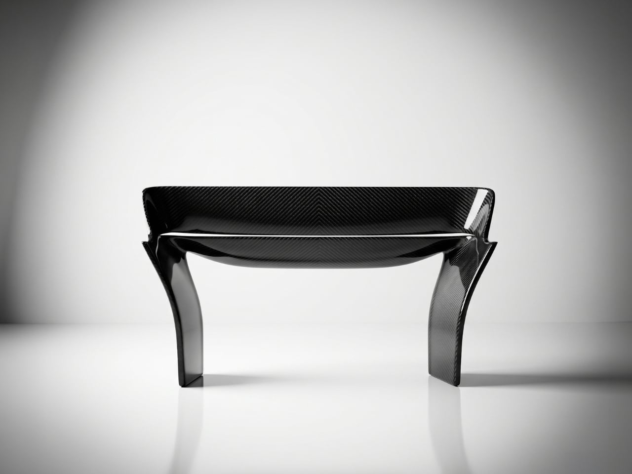
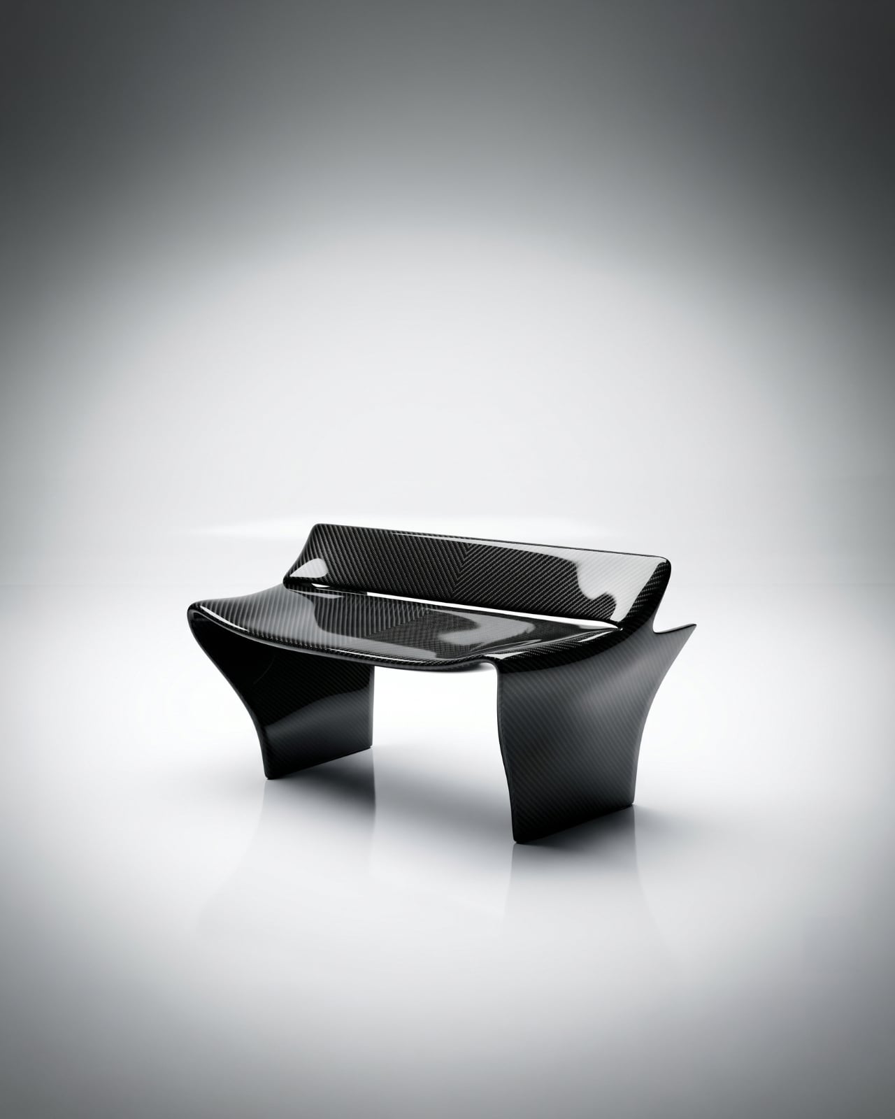
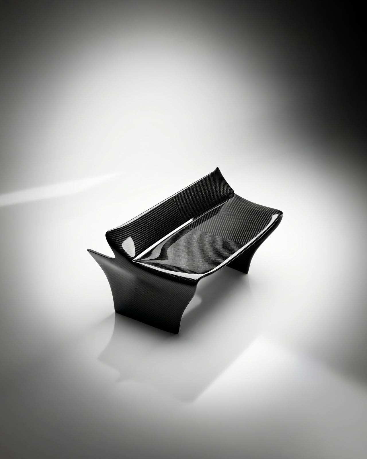
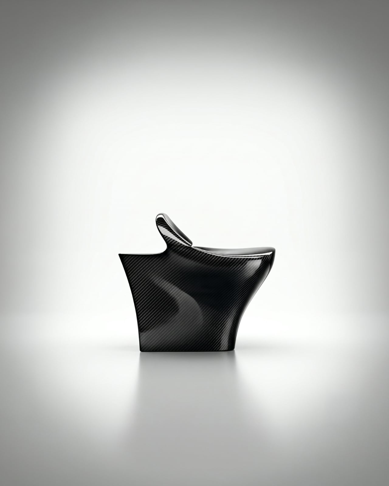
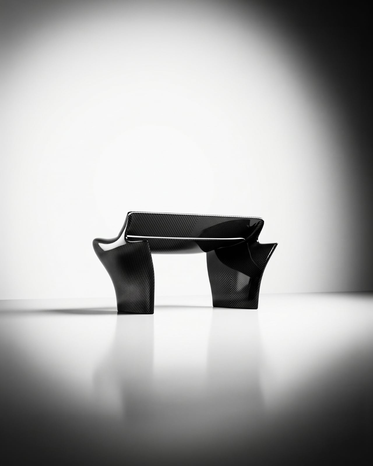
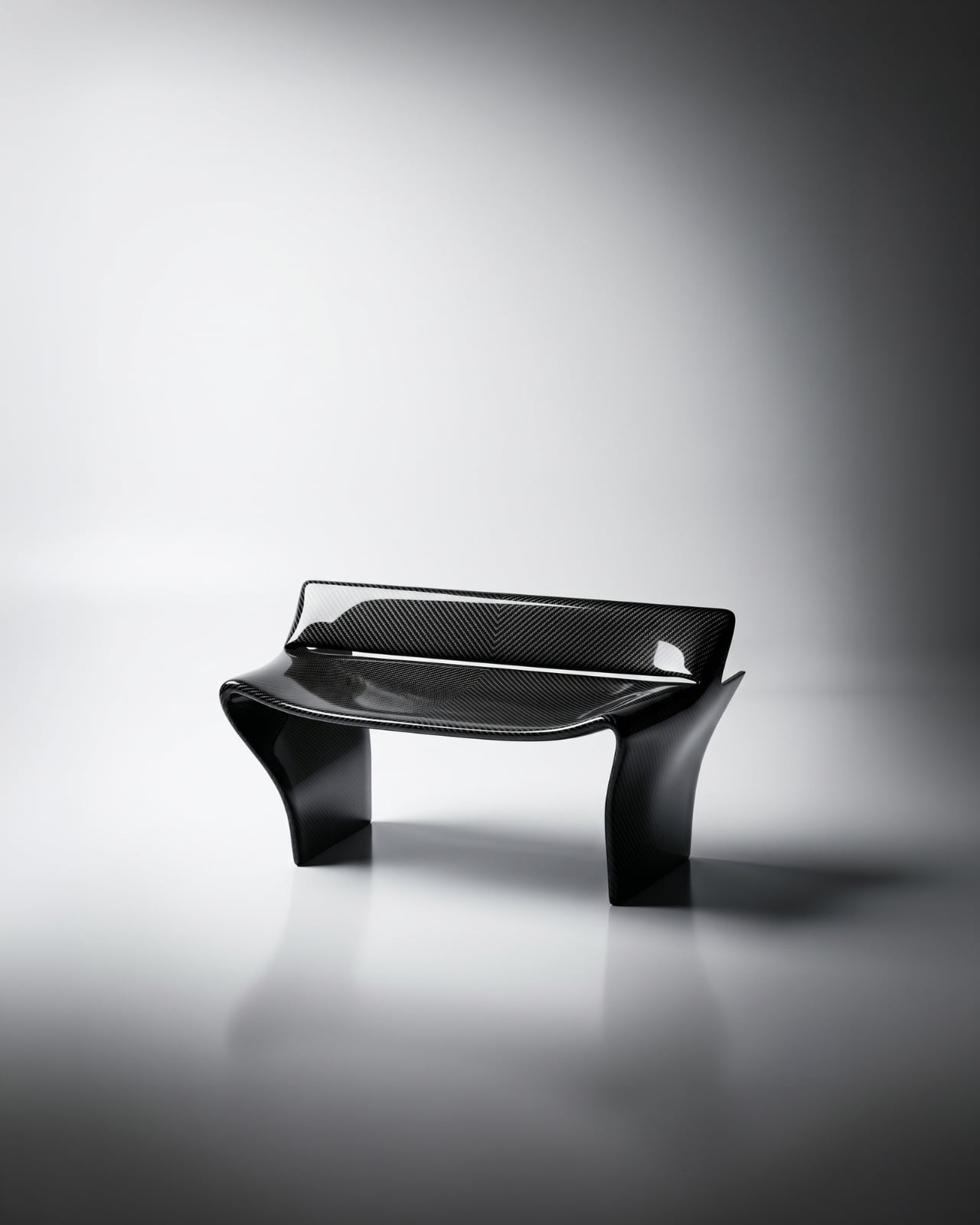
The first time I saw images of the Rear Wing Chair by Keon-Jo, I genuinely had to look twice. Not because it’s strange, but because it’s so precisely right that your brain takes a moment to catch up with what it’s actually looking at. That wide, sweeping profile. Those curved, grounded legs. The unmistakable geometry of an F1 rear wing, scaled and reoriented into something you can actually sit in.
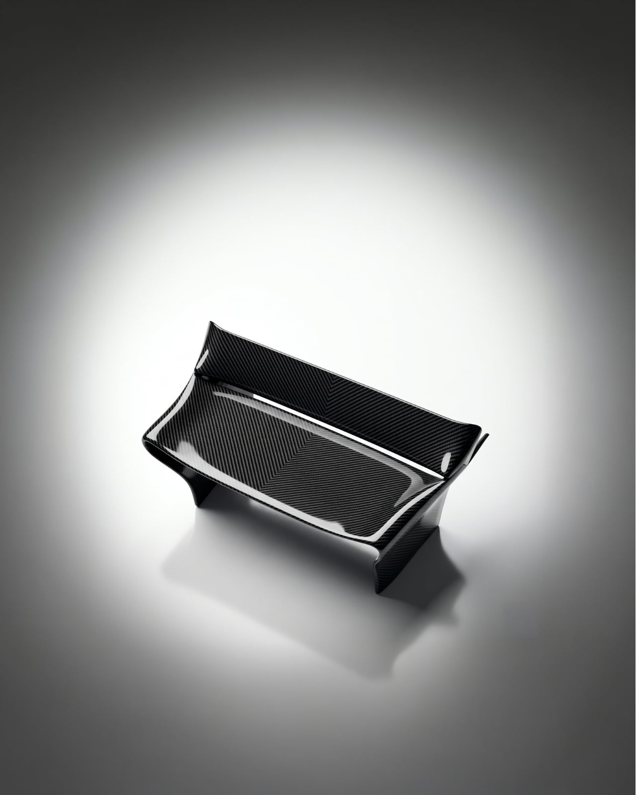
And that’s the thing about this piece: it isn’t motorsport-themed furniture. It’s not a chair with a racing stripe or a decorative spoiler bolted on for effect. Designer Keon-Jo took the actual geometry of an F1 rear wing, the profile, the curvature, the aerodynamic structure, and translated every element with full fidelity into a functional object. The result is 100% carbon fibre, unmodified and unapologetic, with every surface showing the raw woven weave exactly as it comes. Nothing softened, nothing added.

Designer: Keon-Jo

I think that restraint is everything here. A lesser approach would have tried to make it more accessible, more livable, more palatable for people who might not know or care what a rear wing actually does. Keon-Jo didn’t do that, and the piece is stronger for it. The chair carries the authority of the original object because it commits to the original object, completely.

The question that started all of this was a good one: what would one of the most engineered components in motorsport look like if it stopped being a car part and became something you lived with? F1 rear wings are products of obsessive precision. Aerodynamicists and engineers spend entire seasons calculating the exact angles and curves that will shave fractions of a second off a lap time. Every millimetre is deliberate. Every surface has a reason. Keon-Jo took that same philosophy and asked what happens when you apply it to the home.

The answer is a chair that sits at the edge of sculpture and engineering in a way that very few objects manage. It doesn’t look like it’s trying to be art. It also doesn’t look like it’s trying to be furniture. It looks like what it is: an engineered object, repurposed through a specific creative lens, and built with a level of craft that the source material demands.

The launch timing is as considered as the chair itself. The Rear Wing Chair is debuting during Monaco Grand Prix weekend, June 6 to 8, 2026. Monaco is where engineering culture and design culture genuinely converge on the F1 calendar. The streets, the yachts, the paddock, all of it operates at a level of precision and detail that matches the ethos of this piece exactly. It’s a smart choice, and not an obvious one.

This is also only Keon-Jo’s second physical object. The first was the Front Wing Wall Art, a wall-mounted sculptural piece built from F1 front wing geometry, working from the same core idea: take what motorsport engineers obsess over and translate it into something people actually live with. Two pieces in, the studio already has a clear and convincing point of view. That’s harder than it sounds. A lot of design studios spend years finding their language. Keon-Jo arrived with theirs already formed.

At 1200 x 760 x 670mm, the Rear Wing Chair is a substantial presence in a space. This isn’t a subtle accent piece. It’s a statement, and it knows it. The kind of object that defines a room rather than decorates it. For anyone who grew up around motorsport, or who simply cares about the relationship between engineering and form, this is the piece that gives both equal weight.

Whether you follow F1 or not, the Rear Wing Chair makes an argument that precision has genuine aesthetic value, that the same thinking that wins races can produce something beautiful enough to own and live alongside. Keon-Jo is building a body of work around that idea, and with only two pieces, it already feels like a compelling one. See more at keon-jo.com.

The post When F1 Engineering Becomes the Chair You Sit In first appeared on Yanko Design.