Sway’s Compostable Bags Rethink Plastic as a Temporary Material

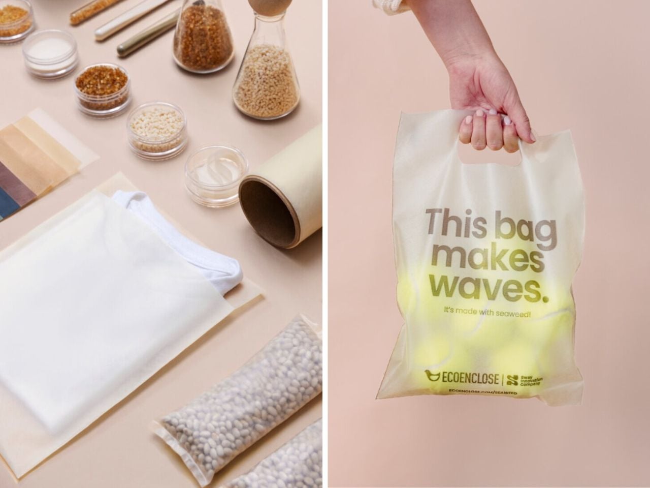
Sway continues to evolve its compostable plastic bags made from seaweed, offering a clear alternative to traditional plastic packaging that has long dominated retail and shipping. Instead of relying on petroleum-based materials that persist in landfills and oceans for decades, the team at Sway uses seaweed as a foundational input to create packaging that performs reliably during use and then safely returns to the soil. The result is a material that is designed to exist only for as long as it is needed, rather than becoming a permanent environmental burden.

According to the company, seaweed allows their bags to be stronger, easier to manufacture, more affordable at scale, and healthier for the environment overall. When these compostable plastic bags reach the end of their life, they are meant to break down naturally instead of fragmenting into microplastics. This means they do not linger in ecosystems or waterways, and instead decompose into soil that can support future growth.

Designer: Sway

The current range includes polybags, die-cut handle bags, and flexible film wraps, all produced using the same seaweed-based material system. Visually, the bags have a smooth surface with a soft frosted texture. Their translucent exterior allows users to see what is inside, which adds both practicality and a subtle design appeal. The die-cut handle bags are ideal for everyday shopping and in-store use, while the polybags are designed for businesses that need a secure option for shipping products.

All of these formats are made from a blend of seaweed, plant-based materials, and compostable polymers. It is clear that this packaging line is designed for composting rather than recycling. After use, the bags can be placed in home compost systems or industrial compost facilities, where they break down into healthy soil without leaving behind toxic residue. If composting is not available, the team advises disposing of the bags in the trash. While this outcome is not ideal, the material still avoids the long term damage associated with conventional plastic.

At the same time, the emergence of materials like this highlights a larger question. If bioplastics and compostable packaging already exist, why are they still not common in everyday life? Much of the challenge lies in the systems surrounding packaging rather than the materials themselves. Manufacturing infrastructure, pricing models, and waste systems have been optimized for traditional plastic for decades. Compostable materials often require new production processes and clearer consumer understanding of disposal. Confusion between recycling and composting, limited access to compost facilities, and expectations shaped by plastic durability all slow widespread adoption. As a result, innovations like Sway’s tend to move faster than the infrastructure meant to support them.

In January 2026, the Sway team shared that they had further improved their compostable plastic bags made from seaweed. Through processing changes, the material is now stronger, more refined in appearance, and available in higher volumes at a lower price point. The frosted design remains consistent, but the updated bags can carry heavier loads while still breaking down after use. Home compost certification for the newest versions is still in progress, while earlier versions have already received industrial compost certification from TUV Austria.

To expand access, Sway works with partners such as EcoEnclose to distribute the bags to businesses, small markets, and shipping operations. At the center of this effort is TPSea Flex, the company’s in-house material that blends seaweed, plant-based inputs, and compostable polymers. Together, these developments point toward a future where packaging serves its purpose and then steps aside, returning to the soil instead of remaining in landfills or oceans for generations.

The post Sway’s Compostable Bags Rethink Plastic as a Temporary Material first appeared on Yanko Design.

Forget CarPlay: Sherpa’s AR Glasses Decode Road Signs and Dashboard Icons For Nervous New Drivers

The AR glasses market keeps promising us augmented productivity and enhanced experiences, then delivering expensive ways to check notifications without pulling out your phone. Sherpa takes a different approach by targeting a specific moment of genuine incompetence: those first few months behind the wheel when every intersection feels like a pop quiz you didn’t study for. The concept uses heads-up displays to overlay directional cues and translate dashboard indicators, theoretically keeping your eyes on the road instead of darting between the windshield and that mysterious warning light.

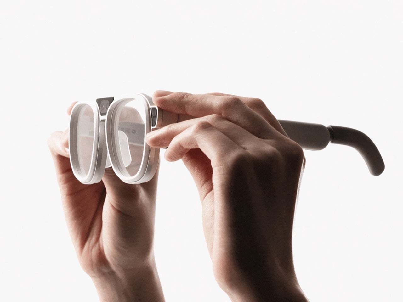
What makes this Hongik University project interesting isn’t the hardware, which looks like standard-issue smart glasses in white plastic. It’s the learning system built around it. After each drive, the companion app analyzes your performance and identifies patterns in your mistakes. Miss the same type of turn signal three times? The AI notices. Struggle with a particular intersection? It breaks down what went wrong. Most new drivers get feedback in the form of angry horns and passenger-seat panic. This proposes something more useful, assuming you’re willing to let an algorithm critique your lane changes.

Designers: Yeongjun Yun, Jaeyun Lee

The hardware itself follows the current playbook for consumer AR: rounded frames thick enough to house display optics, visible sensor cutouts on the nose bridge (likely cameras for environmental and eye tracking), and an adjustable temple mechanism that looks borrowed from premium eyewear design. They’ve skipped the usual temptation to make it look aggressively futuristic, which matters when your target audience already feels self-conscious about their driving abilities. The cylindrical charging case suggests they’re thinking about daily use patterns rather than occasional deployment, treating this like essential equipment you grab before every drive during those first nervous months.

Where this gets genuinely clever is the integration with what they’re calling SDV, or software-defined vehicles. Modern cars already collect absurd amounts of data through their sensor arrays. Sherpa appears designed to tap into that information stream and translate it into actionable guidance. The system knows when you’ve entered a complex intersection, can read your hesitation through eye tracking, and overlay exactly what you’re supposed to watch for at that moment. Then it remembers that you struggle with this specific scenario and adjusts future guidance accordingly.

Unlike entertainment-focused AR wearables, this actually solves a real use case, which puts it ahead of most AR glasses the industry is trying to push down our throats. Driving schools teach you mechanics but abandon you at the precise moment when contextual learning would help most. If Sherpa can fill that gap between instruction and competence, it might be the first consumer AR application that people actually need rather than tolerate. Whether novice drivers will adopt glasses that broadcast their inexperience is a different question entirely, but at minimum someone’s finally asking AR to do actual work.

The post Forget CarPlay: Sherpa’s AR Glasses Decode Road Signs and Dashboard Icons For Nervous New Drivers first appeared on Yanko Design.

Fold the Corners of This Wooden Cube Lamp and Watch the Light Change

Most contemporary lamps are adjusted with a dimmer on the cord, a touch sensor on the base, or a slider in an app. That makes light feel like another setting in a menu, slightly detached from the object itself. There is something satisfying about changing light by physically moving parts, as if you are sculpting both the fixture and the atmosphere around it, which is what smart bulbs and app-controlled RGB strips quietly leave out.

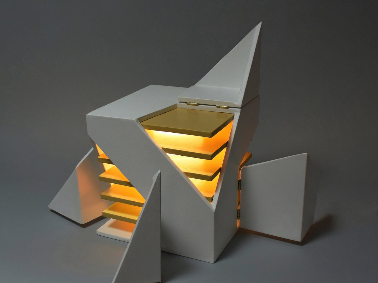
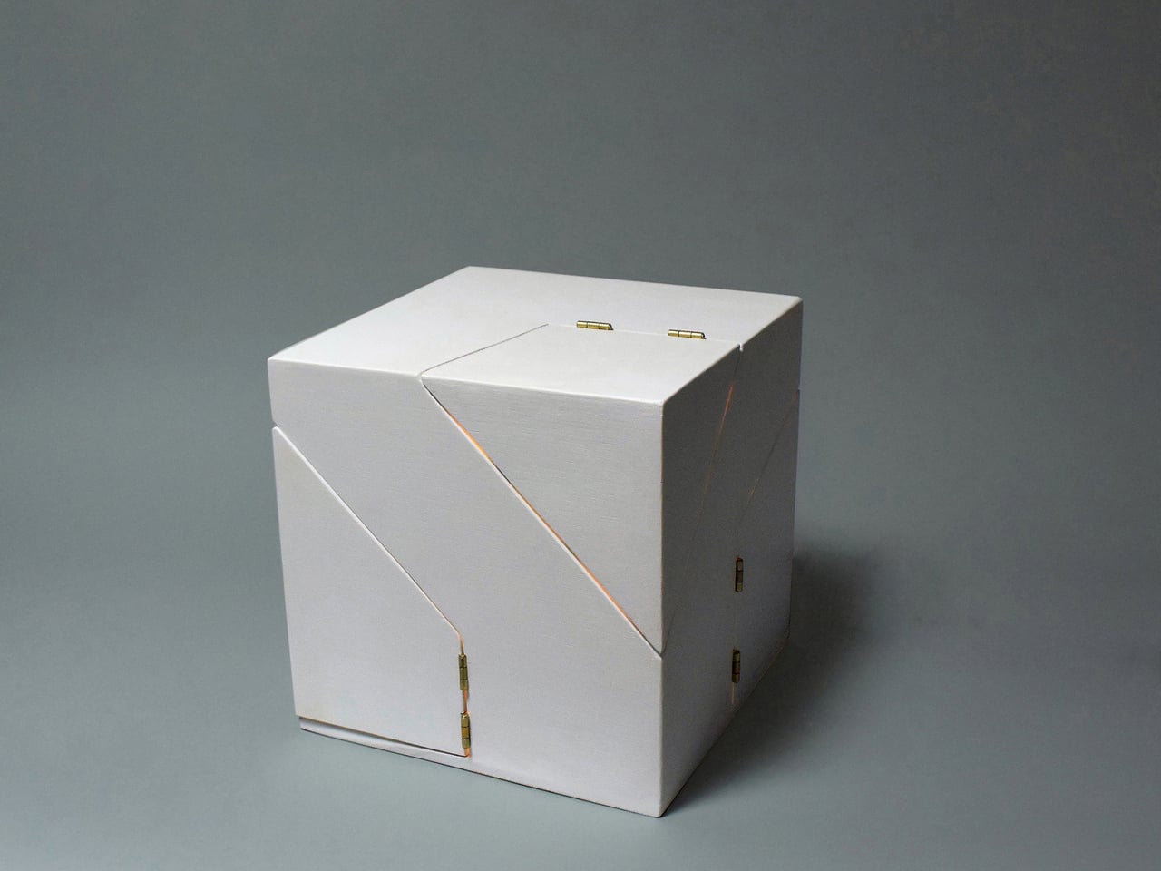
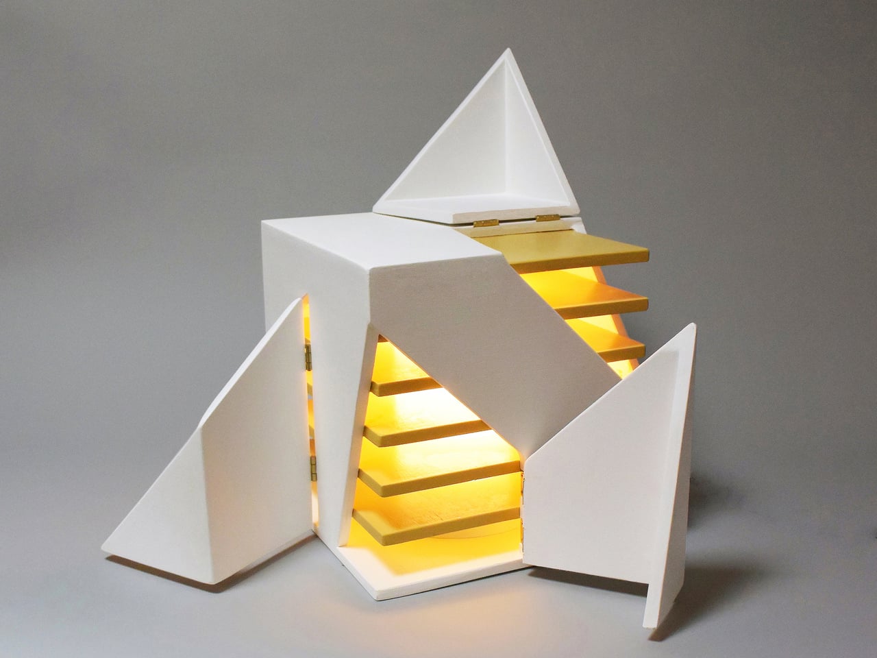
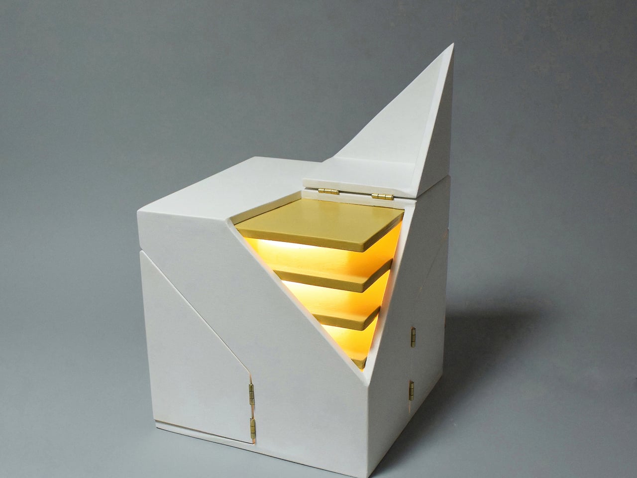
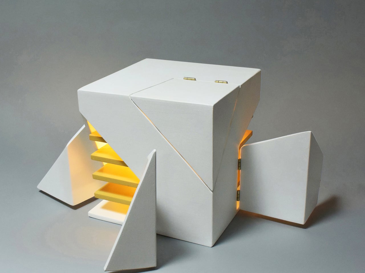
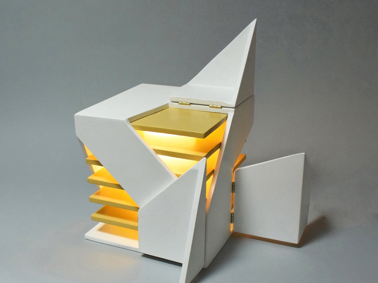
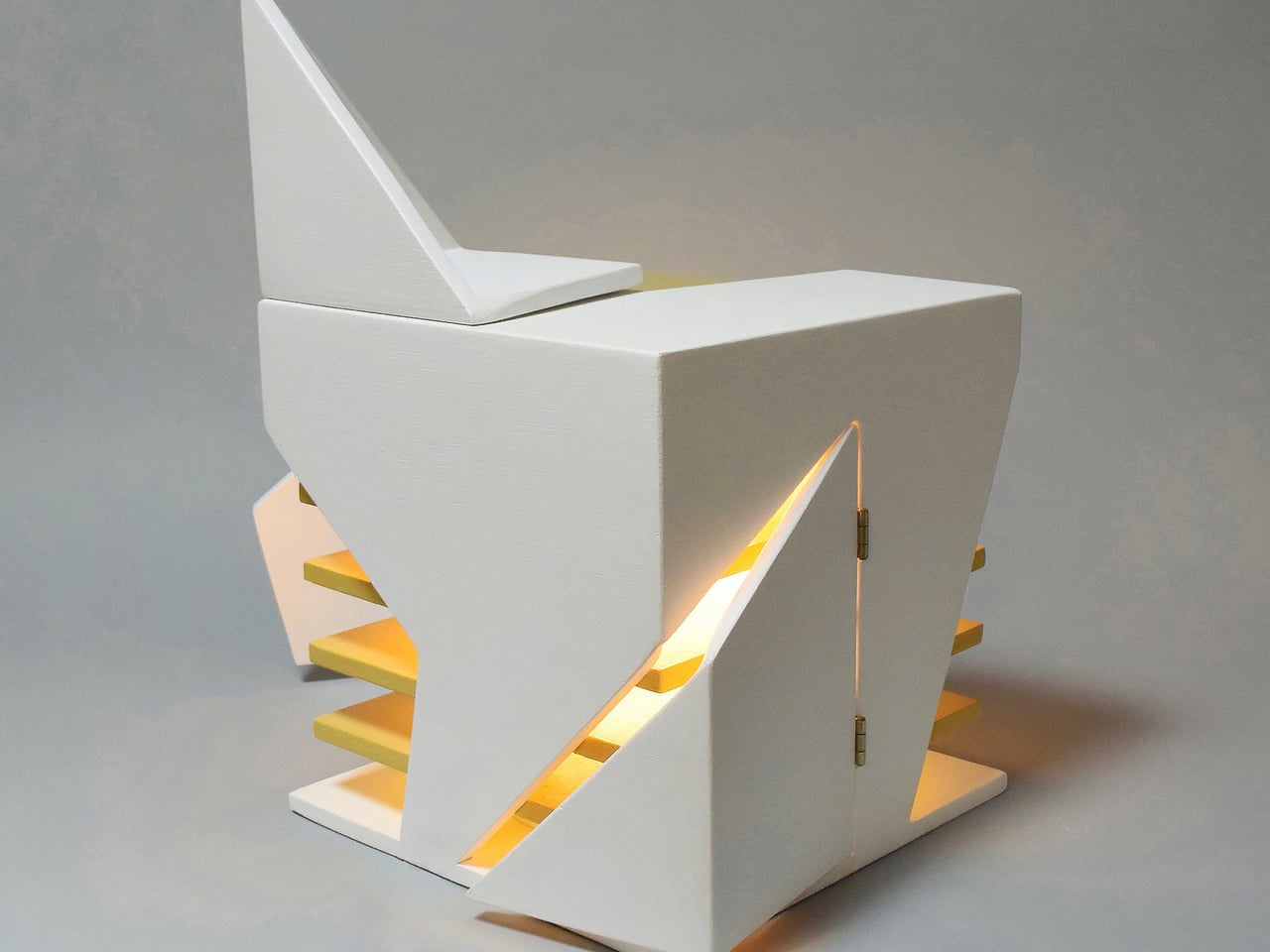
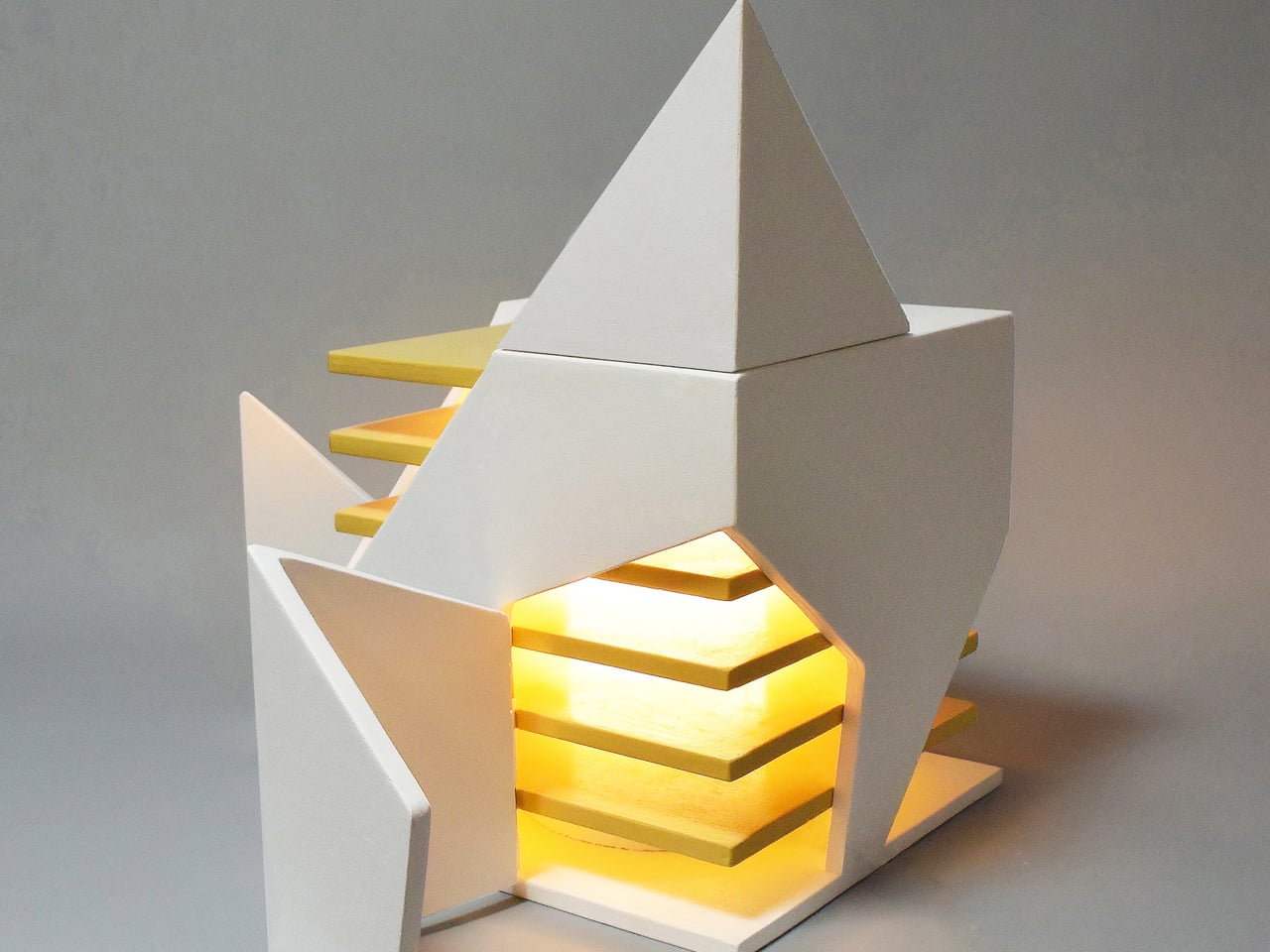
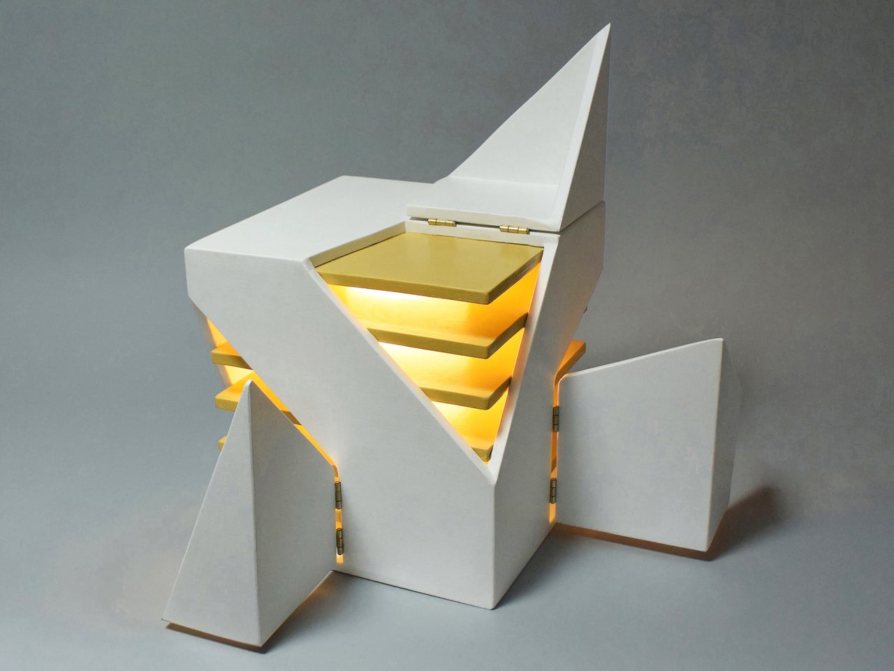
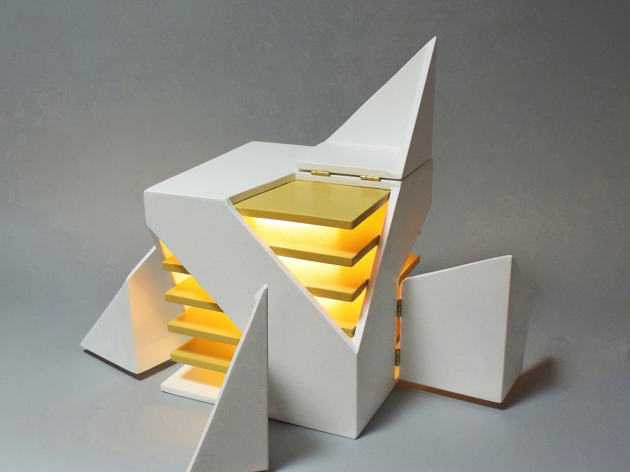
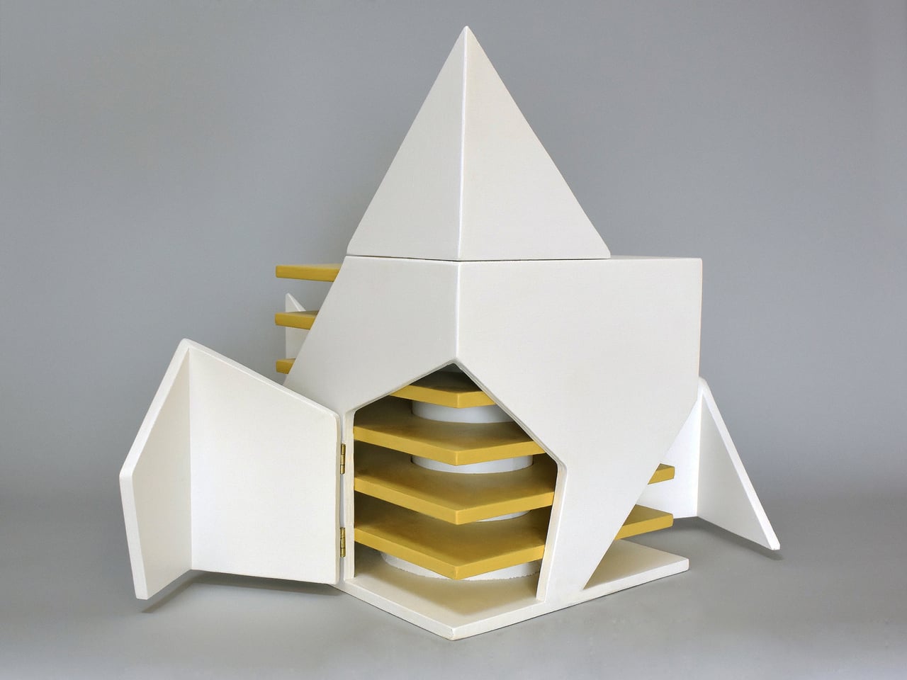
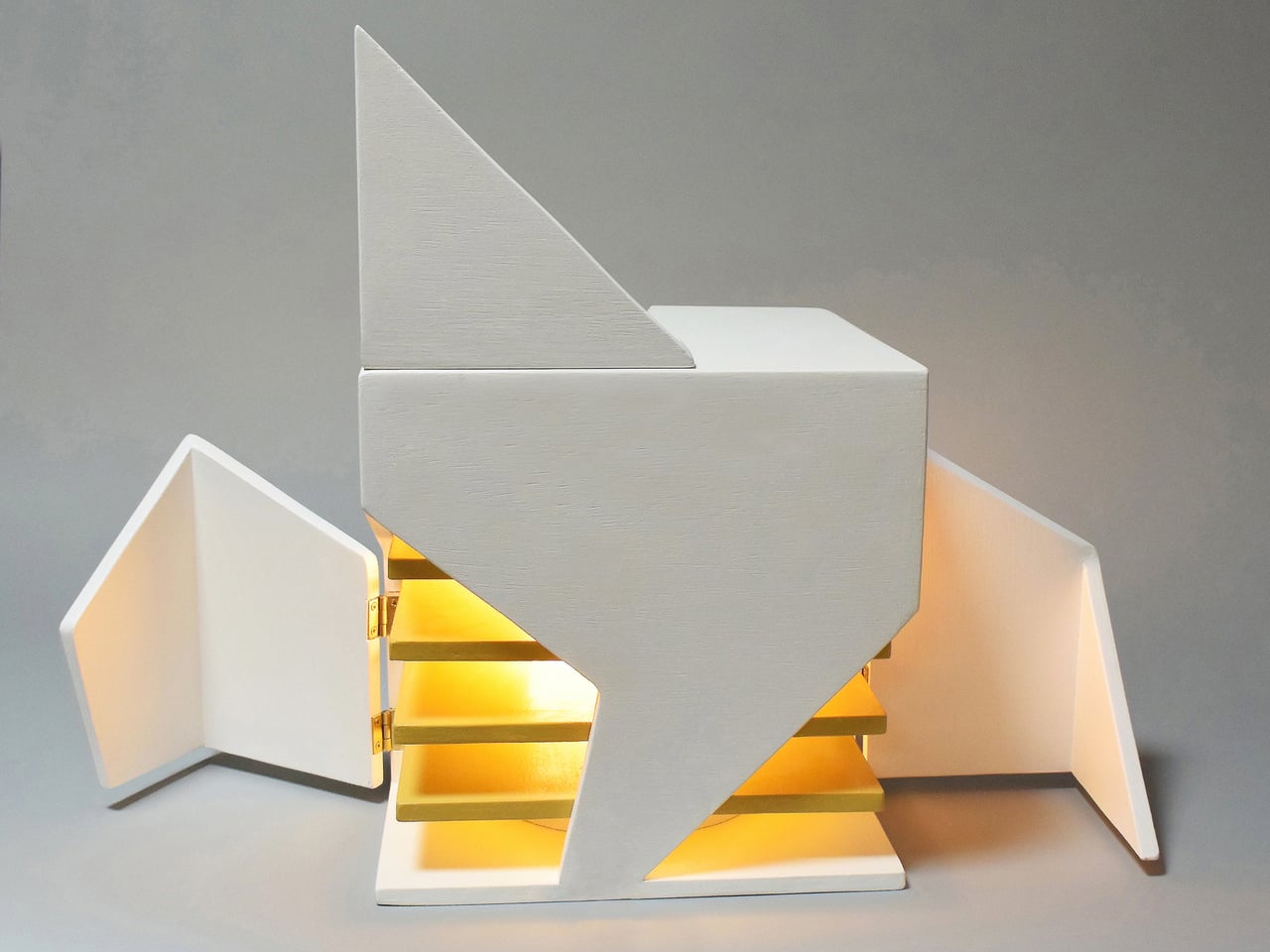
Michael Jantzen’s Interactive Folding Lamp is a small, painted wooden cube that quietly invites that kind of interaction. Four corners of the cube have been cut into different geometric shapes and hinged, so they can swing open and closed. When you start to move them, you aren’t just revealing the light but also changing how much of it escapes. At the same time, you are also changing what the lamp looks like from every side, turning the adjustment into a compositional act.

Designer: Michael Jantzen

A single energy-efficient bulb sits at the center, wrapped in a light-diffusing shield and surrounded by six horizontal yellow planes, evenly spaced like a tiny louvered tower. As you open the hinged corners, more of those yellow planes come into view, catching the light and turning it into a warm, layered glow that spills out through the gaps you have created, contrasting with the cool white painted exterior.

This plays out over a day. The lamp closed down to a near-solid cube with just thin seams of light when you want a soft background presence. One corner folded out to throw a slice of light across a book or keyboard. Multiple panels opened wide when you want the object to become a small, glowing sculpture in the room. Each adjustment is a quick, tactile decision rather than a number on a scale, making the ritual feel manual and deliberate.

Jantzen sees the lamp as part of a larger exploration into re-inventing the built environment through unexpected interactivity. The cube can be read as a piece of micro-architecture, its hinged faces acting like tiny façades or shutters that you reposition to modulate light and form. It compresses the logic of folding pavilions and responsive buildings into something that fits on a side table or desk, letting you interact with architectural ideas at hand scale.

The Interactive Folding Lamp gives you a direct, analog way to tune your space, asking you to touch wood, feel hinges, and watch how light responds. It turns a basic act, turning on a lamp, into a small moment of play and composition. In a time when so much interaction is mediated by screens and voice commands, a lamp that responds only to your hands, opening and closing its own geometry to let light out or hold it in, feels like a quiet reset worth keeping in a corner.

The post Fold the Corners of This Wooden Cube Lamp and Watch the Light Change first appeared on Yanko Design.

AI Mini PCs Don’t Need to Hide: This One’s a Sci-Fi Pyramid

Mini PCs used to be defined by how invisible they could be, small black rectangles tucked behind monitors or under shelves. That made sense when they were just low-power desktops, but feels out of step now that these machines are running models, listening, watching, and routing data. If AI is going to sit on your desk, it might as well look like it belongs there instead of hiding like a piece of infrastructure.

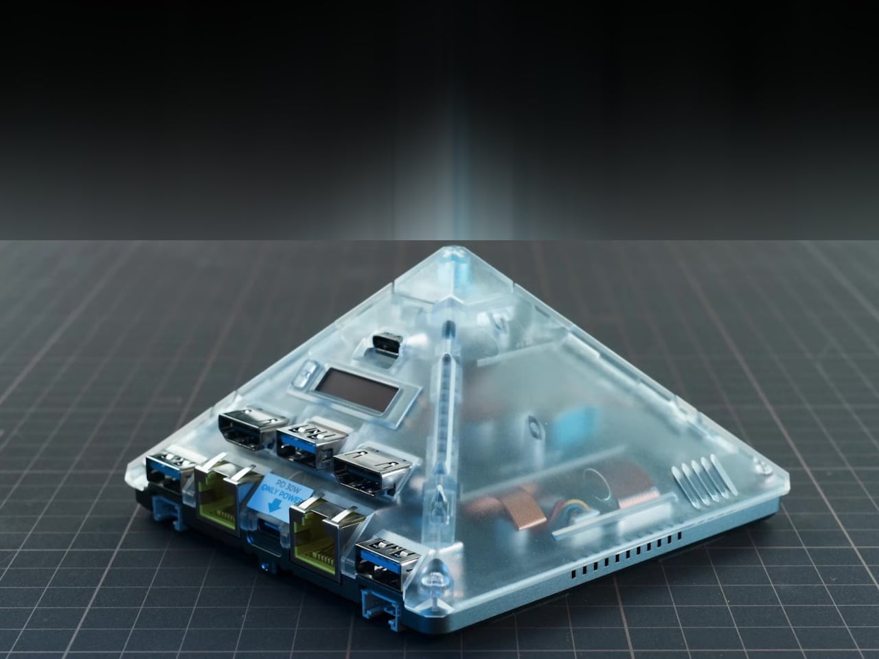
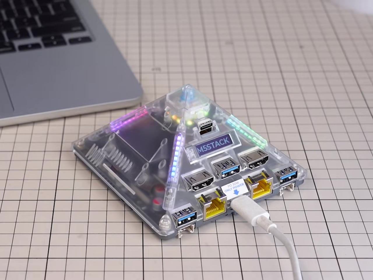
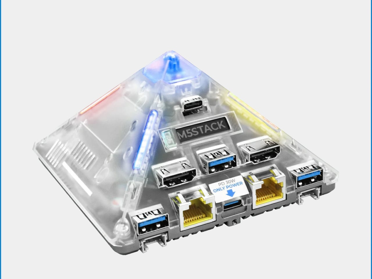
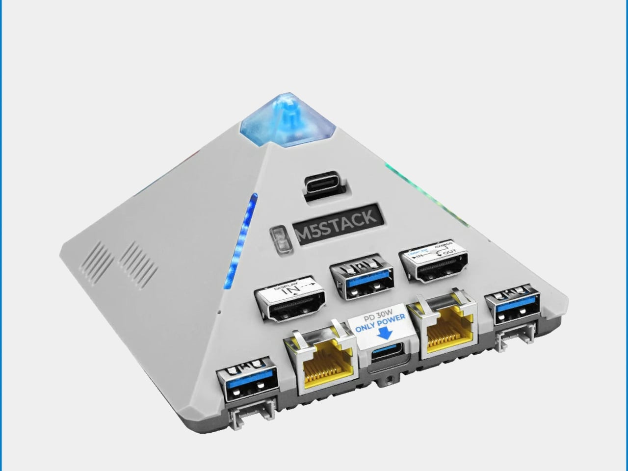
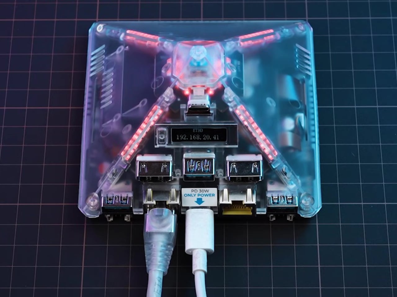
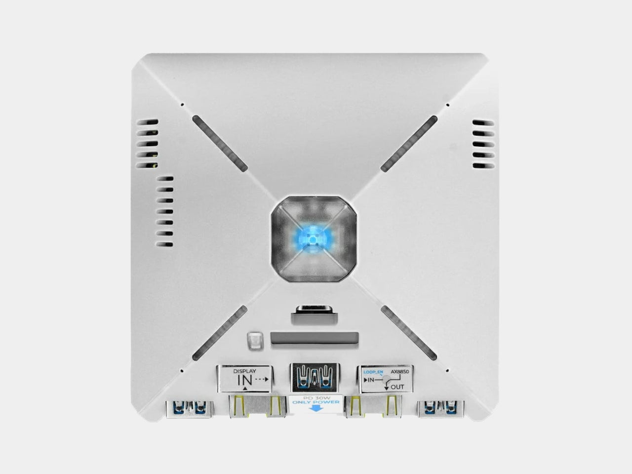
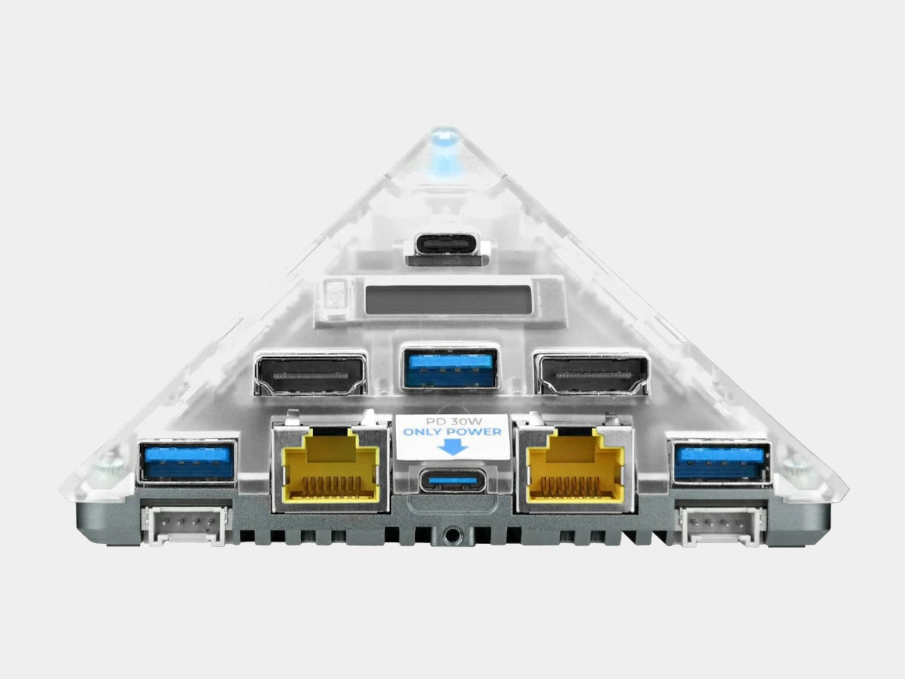
M5Stack’s AI Pyramid Computing Box leans into that idea, turning an edge-AI platform into a small pyramid that looks more like a sci-fi artifact than a router. There are two versions, a transparent 4 GB model that shows off its internals and RGB light bars, and a Pro 8 GB version in a solid gray shell that keeps the same silhouette but reads more like a piece of industrial hardware. Both share the pyramid form and the underlying platform.

Designer: M5Stack

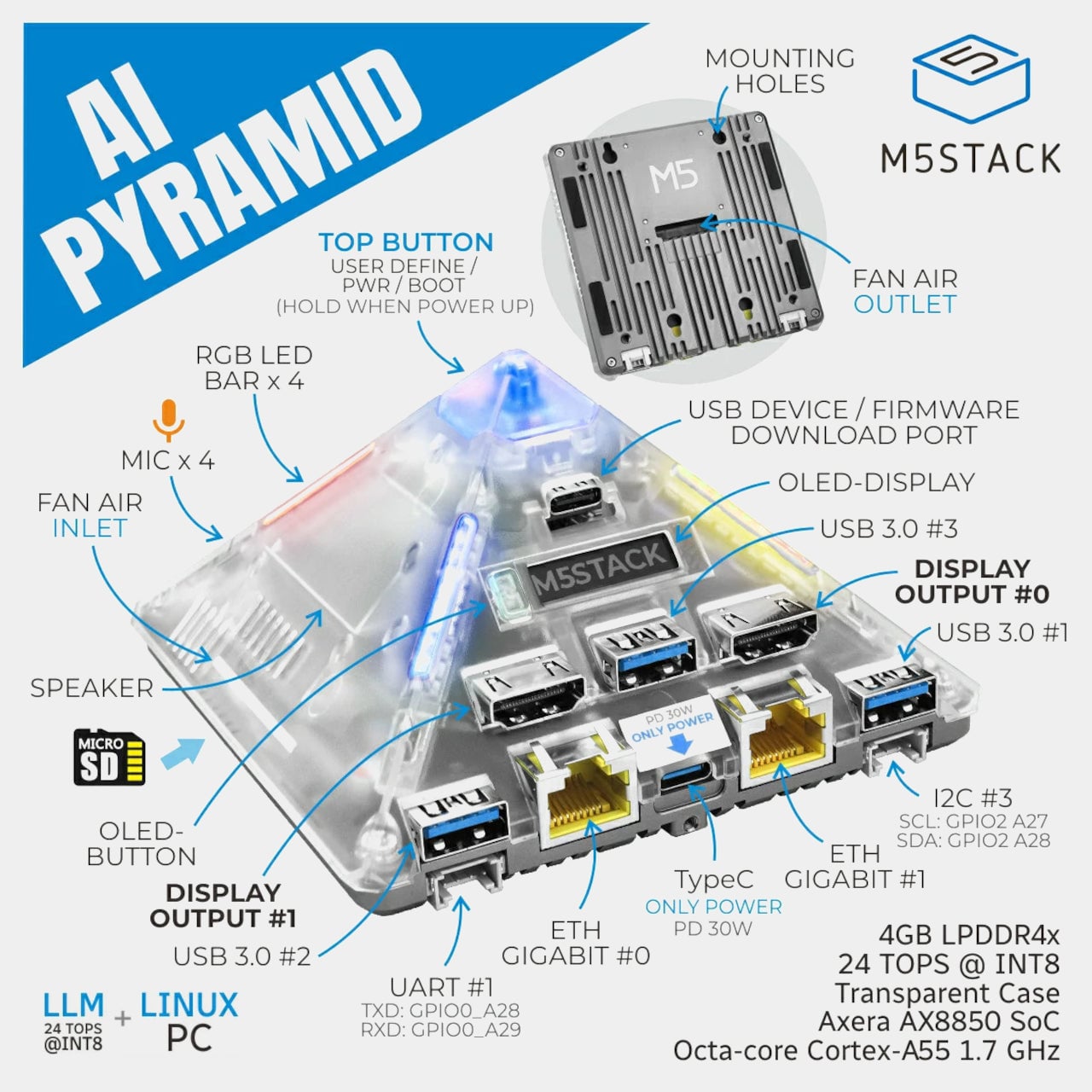
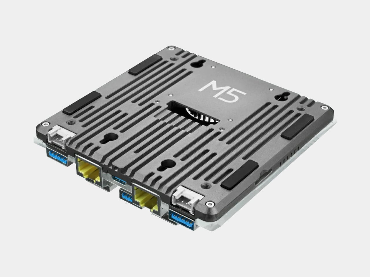
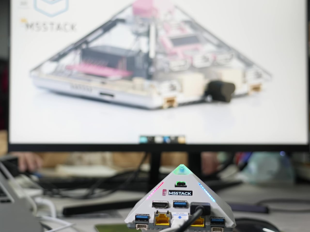
The pyramid shape goes beyond visual gimmick and gives the device a clear front edge where all the serious ports live, dual HDMI, dual Gigabit Ethernet, four USB-A, and USB-C power, while the sloping faces leave room for vertical RGB strips and a small OLED status window. The top becomes a natural exhaust point for the turbo fan, turning the whole volume into a kind of thermal chimney that glows when the system is alive.

Inside the pyramid is Axera’s AX8850 SoC, an octa-core Cortex-A55 at 1.7 GHz paired with a 24 TOPS NPU and hardware 8K H.264/H.265 encode and decode. The 4 GB model splits its LPDDR4x as 2 GB for the system and 2 GB for accelerators, while the Pro doubles that to 4 GB plus 4 GB, giving more headroom for local vision pipelines, speech models, or compact language models running under Linux.

On a desk, the AI Pyramid sits between a monitor and a small camera array, its dual HDMI outputs or input-plus-output feeding displays while the dual Ethernet ports bridge a home network and an isolated camera VLAN. The four-mic array and built-in speaker let it act as a local assistant or meeting transcriber, while the OLED strip quietly shows IP addresses or system load, and the RGB bars pulse to indicate activity.

Giving an AI mini PC a recognizable silhouette changes how you relate to it. A flat box disappears, which is fine for a dumb hub, but a device that is running models, listening, and orchestrating other hardware benefits from a form you can read at a glance. The AI Pyramid leans into that, making the thermal core, the ports, and even the status lights part of a small, legible object that feels like it was designed to share your desk rather than hide behind it.

The post AI Mini PCs Don’t Need to Hide: This One’s a Sci-Fi Pyramid first appeared on Yanko Design.

6 Reasons Why Apple Needs to Build a Clamshell iPhone Flip (And 1 Reason It Shouldn’t)

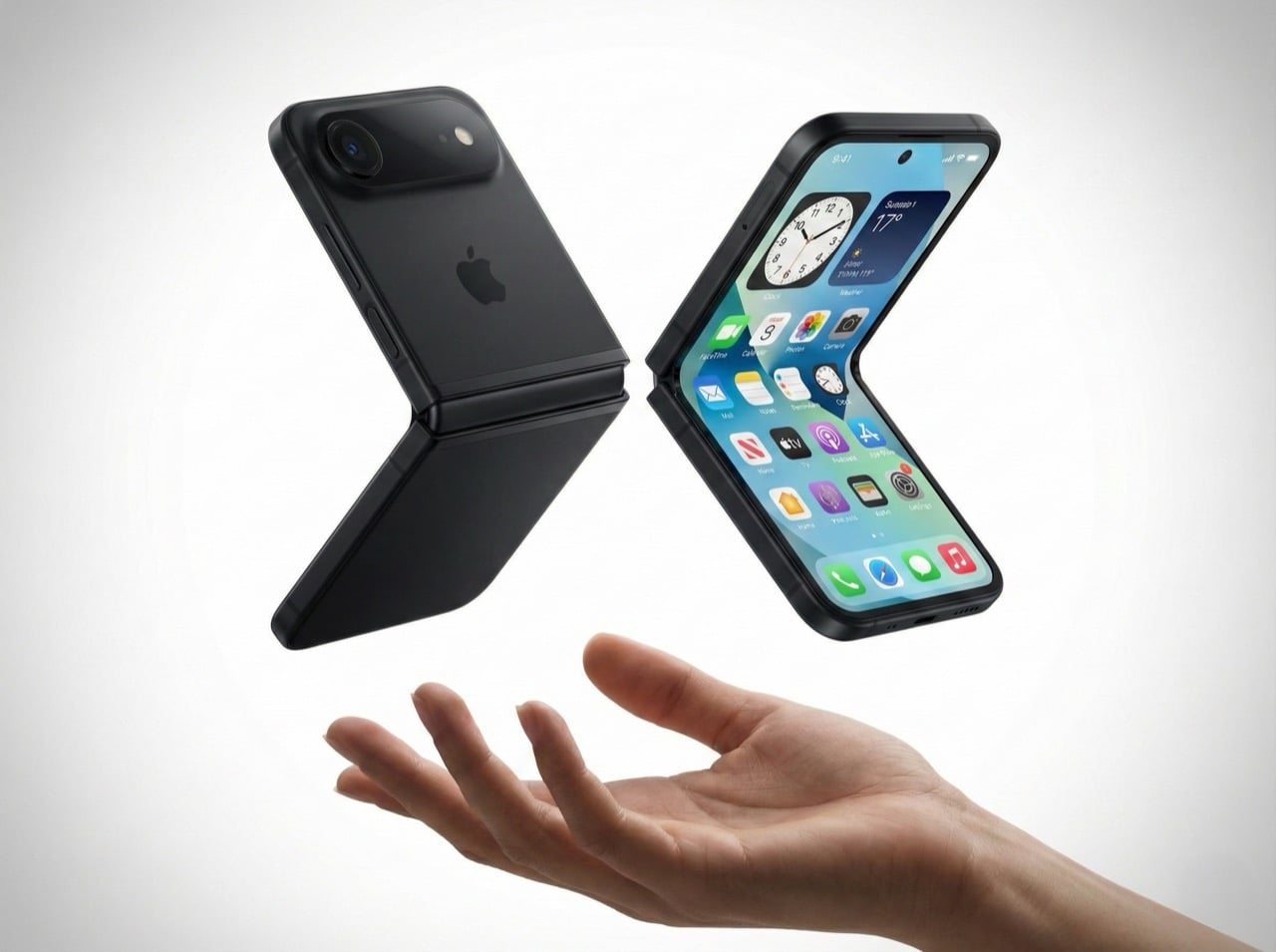
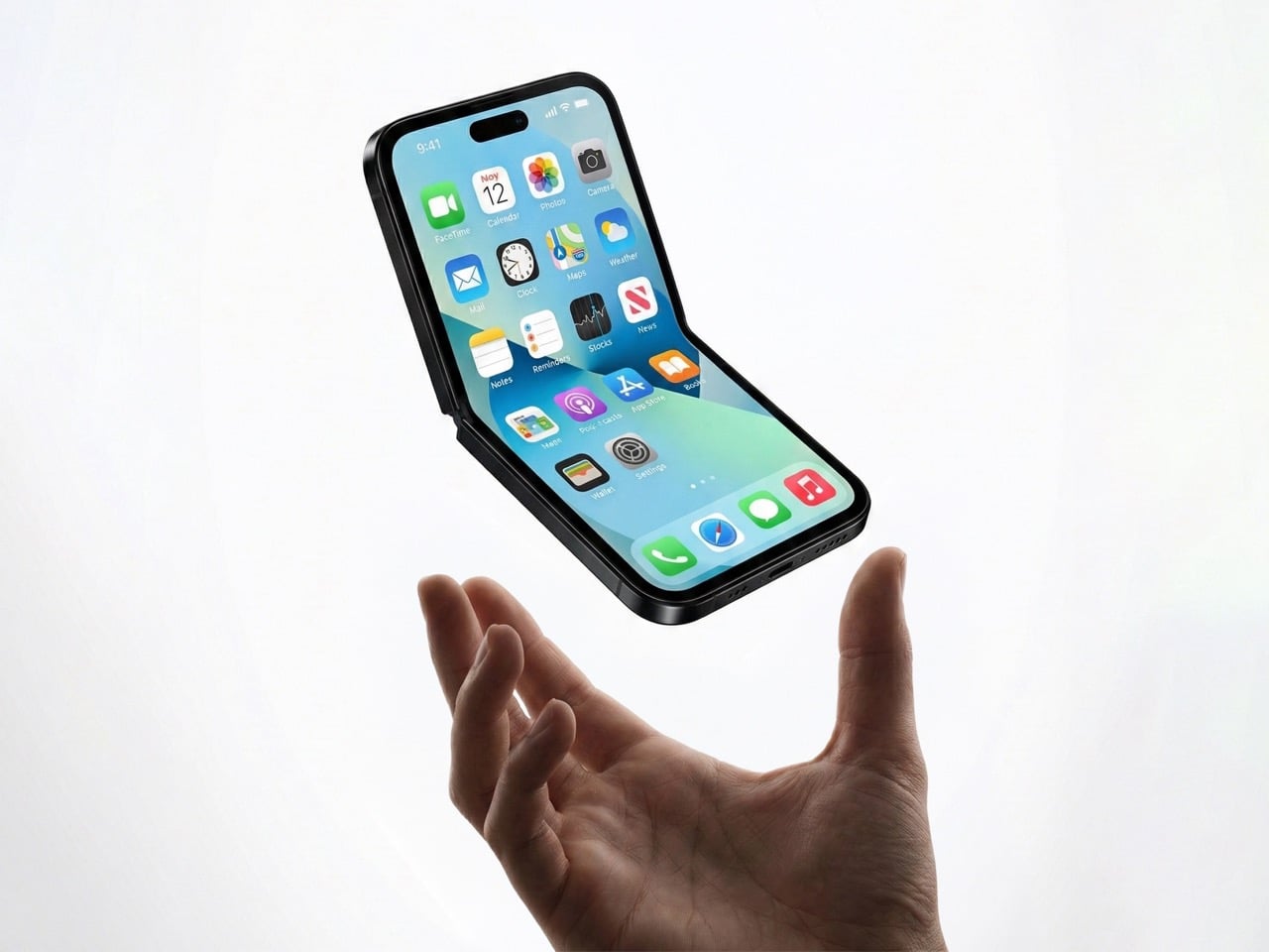
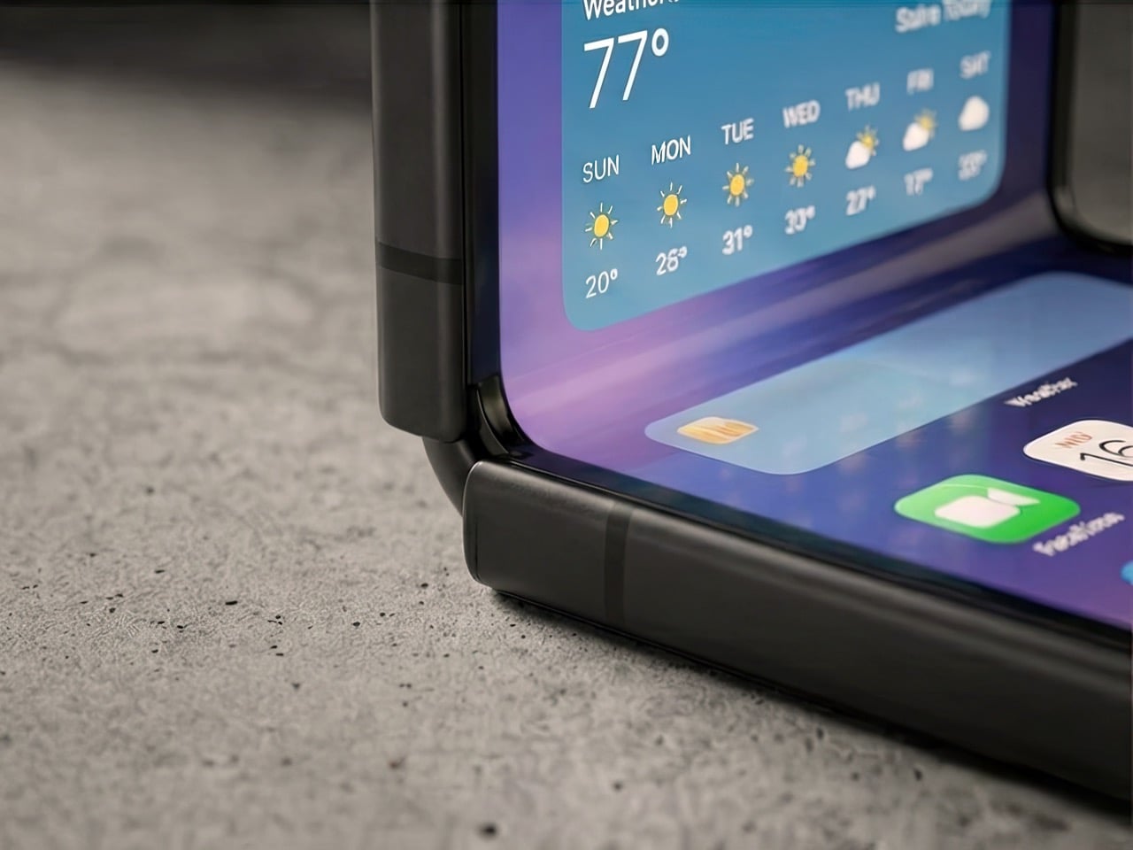
Remember when phones got smaller? The iPhone 13 Mini had a cult following, but Apple killed it because most people wanted bigger screens. Here’s the plot twist: a clamshell foldable iPhone could bring back that beloved compact size without sacrificing screen real estate. You get a full-size display when you need it, and a pocketable square when you don’t. It’s the best of both worlds, and Apple knows it.

Mark Gurman’s latest report suggests Apple is seriously exploring this form factor. It wouldn’t be their first foldable (a larger model is rumored for later this year), but it might be their smartest. A clamshell iPhone makes sense for reasons that go way beyond nostalgia. It’s cheaper to build than a book-style fold, it doesn’t compete with the iPad Mini, and it opens up a market where Samsung is basically the only serious player. There are six solid reasons why Apple should do this, and one big reason why it might not work. Let’s dig in.

The iPhone Mini lives on (just folded in half)

Apple discontinued the iPhone 13 Mini because the sales numbers didn’t justify keeping it around. Turns out most people prefer bigger screens, even if it means carrying a brick in their pocket. But the Mini’s fans were passionate, and they’ve been vocal about wanting a truly compact iPhone ever since. A clamshell solves this problem in the most elegant way possible.

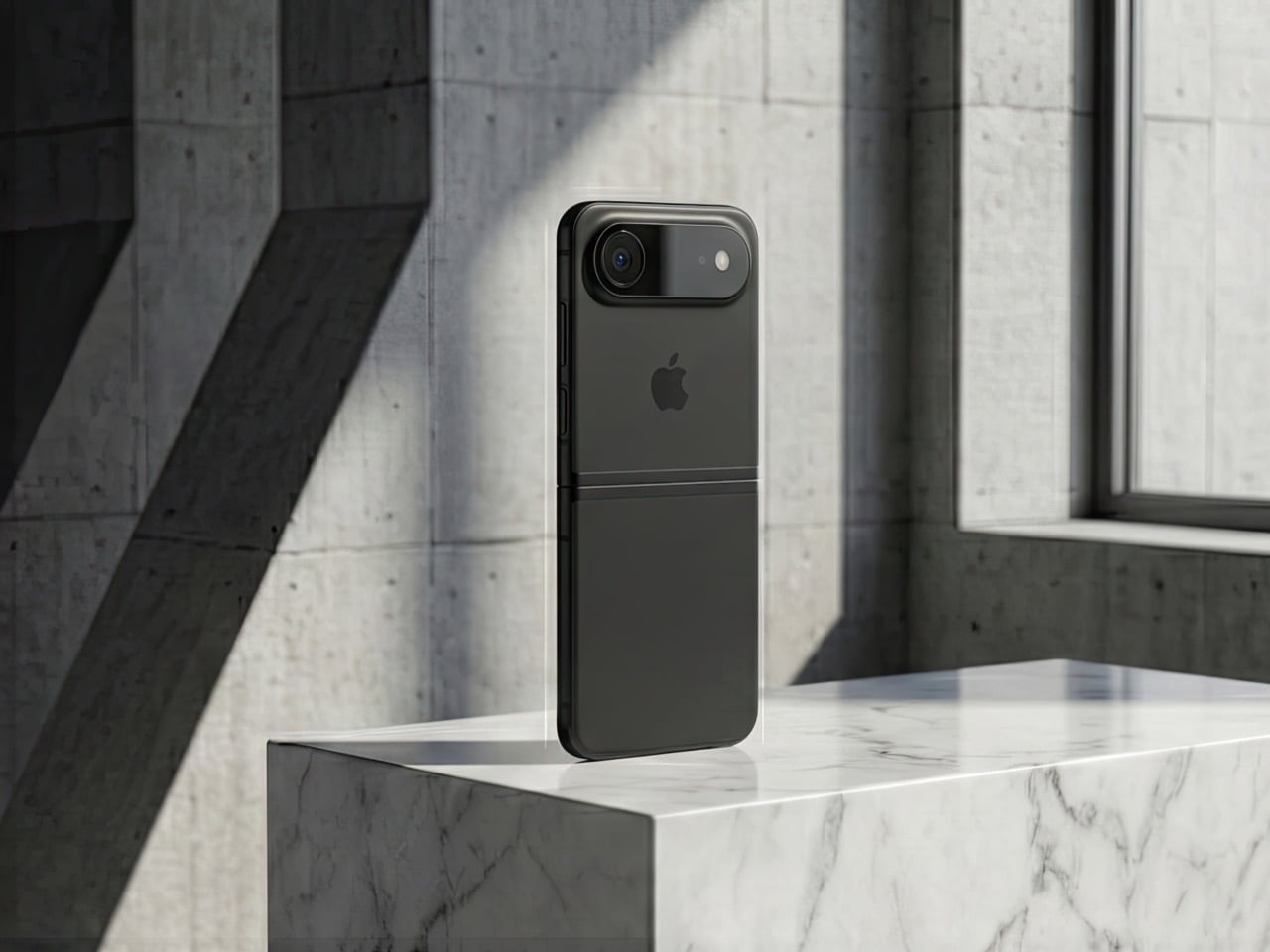
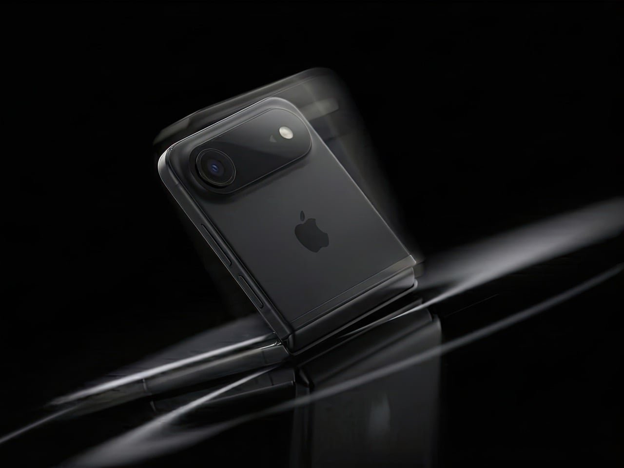
When folded, it’s roughly the size of the Mini, maybe even smaller depending on how thick the hinge is. When unfolded, you get a full 6.1-inch or 6.7-inch display, same as the regular iPhone or Pro Max. The people who loved the Mini weren’t asking for a smaller screen, they were asking for a phone that didn’t dominate their pocket or require two hands for basic tasks. A clamshell gives them that portability without forcing them to squint at a 5.4-inch display.

This isn’t just about bringing back a discontinued product. It’s about proving that compact phones can exist in 2026 without compromising on screen size. The form factor itself becomes the feature.

It doesn’t murder the iPad Mini

Here’s the uncomfortable truth about book-style foldables: they’re iPad killers. If Apple released an iPhone that unfolds into an 8-inch display, who’s buying an iPad Mini? The overlap would be brutal. You’d have a device that fits in your pocket, runs iOS, makes calls, and gives you a tablet-sized screen when you need it. The iPad Mini’s entire value proposition collapses.

A clamshell doesn’t have this problem. Even at its largest, a clamshell iPhone would max out at maybe 6.9 inches unfolded. That’s still firmly in phone territory, not tablet territory. The iPad Mini’s 8.3-inch display remains the smallest “real” iPad you can buy, and it stays relevant for people who want that in-between size for reading, note-taking, or media consumption.

Apple’s product lineup is carefully segmented, and a clamshell iPhone slots in without disrupting the hierarchy. It’s a phone that folds smaller, not a tablet that folds into a phone. That distinction matters when you’re trying to sell both devices to the same customer.

Samsung owns this space, but they’re beatable

The Galaxy Z Flip has been around since 2020, and Samsung’s refined it through multiple generations. They’re the dominant player in the clamshell category, but “dominant” doesn’t mean “unbeatable.” Motorola’s putting up a fight with the Razr, but Google hasn’t touched this form factor yet. No Pixel Flip. No Nothing Flip. No OnePlus Flip. It’s basically Samsung’s game, and that’s an opportunity for Apple.

Apple doesn’t need to be first. They need to be better. And in a market where there’s only one major competitor, “better” is achievable. Samsung’s Z Flip 6 is solid, but it’s not perfect. The cover screen still feels like an afterthought, the crease is visible, and the software experience is classic Samsung (which is to say, inconsistent). If Apple can deliver a smoother hinge, a more useful outer display, and that signature iOS polish, they could own this category within a generation.

The fact that Google isn’t competing here is huge. The Pixel is Apple’s biggest threat in terms of owning both hardware and software (plus Gemini is vastly more superior than any AI Apple’s managed to roll out), and if there’s no Pixel Flip to compete with an iPhone Flip, Apple has a clear shot at Android users who want this form factor but don’t want Samsung’s ecosystem.

Smaller hinge, lower risk

Building a book-style foldable is expensive and complicated. You’re engineering a hinge that supports a massive, fragile display. You’re solving durability issues that Samsung and others have been wrestling with for years. You’re creating an entirely new product category that might flop. The R&D costs are enormous, and if it doesn’t sell, you’ve burned a ton of money.

A clamshell is cheaper to prototype, cheaper to manufacture, and cheaper to fail with. The display is smaller, the hinge mechanism is simpler, and the overall engineering challenge is less daunting. If Apple wants to dip their toes into foldables without betting the farm, a clamshell is the way to do it.

This also means Apple can price it more competitively. A book-style iPhone Fold would probably start at $1,799 or higher. A clamshell could reasonably launch at $1,199, maybe $1,299. That’s still premium, but it’s within reach of people who’d normally buy a Pro model. The lower price point expands the potential customer base, and if it sells well, Apple can use that momentum to justify a larger foldable later.

Hands-free everything

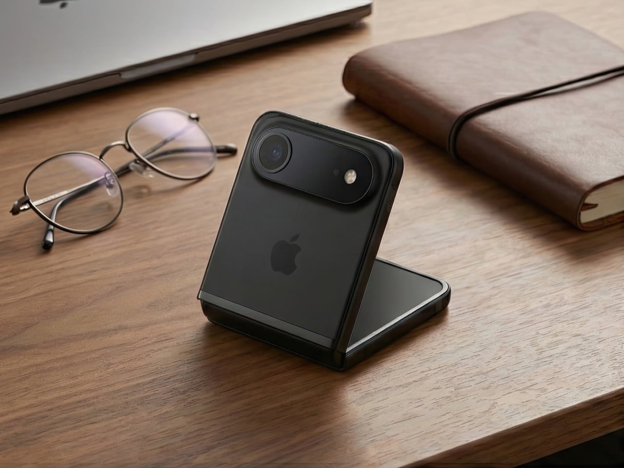
The half-folded “laptop mode” is one of the best features of clamshell foldables, and it’s criminally underrated. You can prop the phone up on a table, angle the screen however you want, and suddenly you’ve got a hands-free setup for FaceTime, vlogging, watching videos, or taking photos. No tripod required. No awkward propping it against a water bottle. It just works.

Apple’s been positioning the iPhone as a serious content creation tool for years. ProRes video, Cinematic Mode, all those camera upgrades, they’re aimed at people who make stuff. A clamshell iPhone would give those creators a built-in tripod mode that’s actually useful. Imagine shooting a cooking tutorial, a makeup video, or a product unboxing without needing extra gear. The phone holds itself at the perfect angle, and you’re free to use both hands.

This isn’t a niche use case. Every vertical video you’ve ever seen on TikTok or Instagram could’ve been easier to shoot with a clamshell. Apple knows this, and they know it’s a selling point that most mobile brands haven’t fully capitalized on yet.

Big screen, small pocket

Here’s the paradox of modern smartphones: people want huge screens, but they hate carrying huge phones. The iPhone 15 Pro Max is a phenomenal device, but it’s a slab that dominates your pocket, your bag, and your hand. A clamshell solves this in the most obvious way possible: make the screen big, then fold it in half.

When unfolded, you get all the screen real estate of a Pro or Pro Max. When folded, it’s a compact square that sits comfortably in any pocket. You’re not sacrificing display size, you’re just rearranging it. This is especially appealing for people who want big screens but don’t want to upgrade their wardrobe to accommodate a 6.7-inch rectangle.

The folded form factor also changes how you carry the phone. It’s less likely to slide out of a pocket, it doesn’t create that awkward bulge in tight jeans, and it’s easier to grip when you’re pulling it out. These are small quality-of-life improvements, but they add up. A clamshell makes the big-screen experience more portable, and that’s a real advantage.

The one problem: MagSafe doesn’t love squares

Here’s where things get tricky. Apple’s entire MagSafe ecosystem is built around vertical rectangles. Wallets, battery packs, car mounts, wireless chargers, they all assume your iPhone is shaped like, well, an iPhone. A clamshell changes that. When folded, it’s a square. When unfolded, it’s a normal phone shape. But MagSafe accessories are designed to stick to the back of a phone that’s always the same shape.

How does a MagSafe wallet work on a folded clamshell? Does it attach to the outer cover, which is probably glass or plastic? Does Apple redesign the entire accessory lineup to accommodate a square form factor? Do they create clamshell-specific MagSafe products? None of these solutions are great.

This isn’t a dealbreaker, but it’s a complication. Apple’s accessory ecosystem is a huge part of their strategy, and a clamshell iPhone disrupts that in ways a book-style fold wouldn’t. You could argue that a book-style fold, when closed, is still roughly phone-shaped, so MagSafe accessories might work. A clamshell is just different enough to break compatibility.

Apple could solve this with clever engineering. Maybe the MagSafe ring is on the outer screen side, and accessories attach there. Maybe they introduce a new “MagSafe Flip” standard with different magnets. Or maybe they just accept that clamshell buyers won’t use traditional MagSafe accessories and move on. Either way, it’s a problem that doesn’t exist with their current lineup, and it’s worth considering.

So, is this happening?

Gurman’s report is credible, but it’s not a product announcement. Apple explores lots of things that never ship. They’ve been prototyping foldables for years, and we’ve seen patents dating back to 2016. The fact that they’re actively working on a clamshell now doesn’t mean it’ll hit shelves in 2027 or even 2028.

But the logic is there. A clamshell iPhone solves more problems than it creates. It brings back the Mini’s form factor without shrinking the screen. It enters a market where Apple could actually win. It’s cheaper and less risky than a book-style fold. And it gives Apple a foothold in foldables without cannibalizing their other products.

If Apple does this right, a clamshell iPhone could be the foldable that finally makes sense for people who aren’t early adopters. It’s practical, it’s pocketable, and it’s exactly the kind of product Apple excels at making. The only question is whether they’re willing to rethink MagSafe to make it work.

(Images via AI)

The post 6 Reasons Why Apple Needs to Build a Clamshell iPhone Flip (And 1 Reason It Shouldn’t) first appeared on Yanko Design.

3D-Printed Guitar Amp Desk Organizer Brings Concert Energy to Your Boring Monday Morning

The contrast between Sunday night at a concert and Monday morning at your desk is brutal. One moment you’re lost in the music, feeling every guitar riff vibrate through your chest. The next, you’re answering emails and pretending last night’s euphoria wasn’t real. The transition back to routine work feels especially cruel when the weekend gave you a taste of something electric.

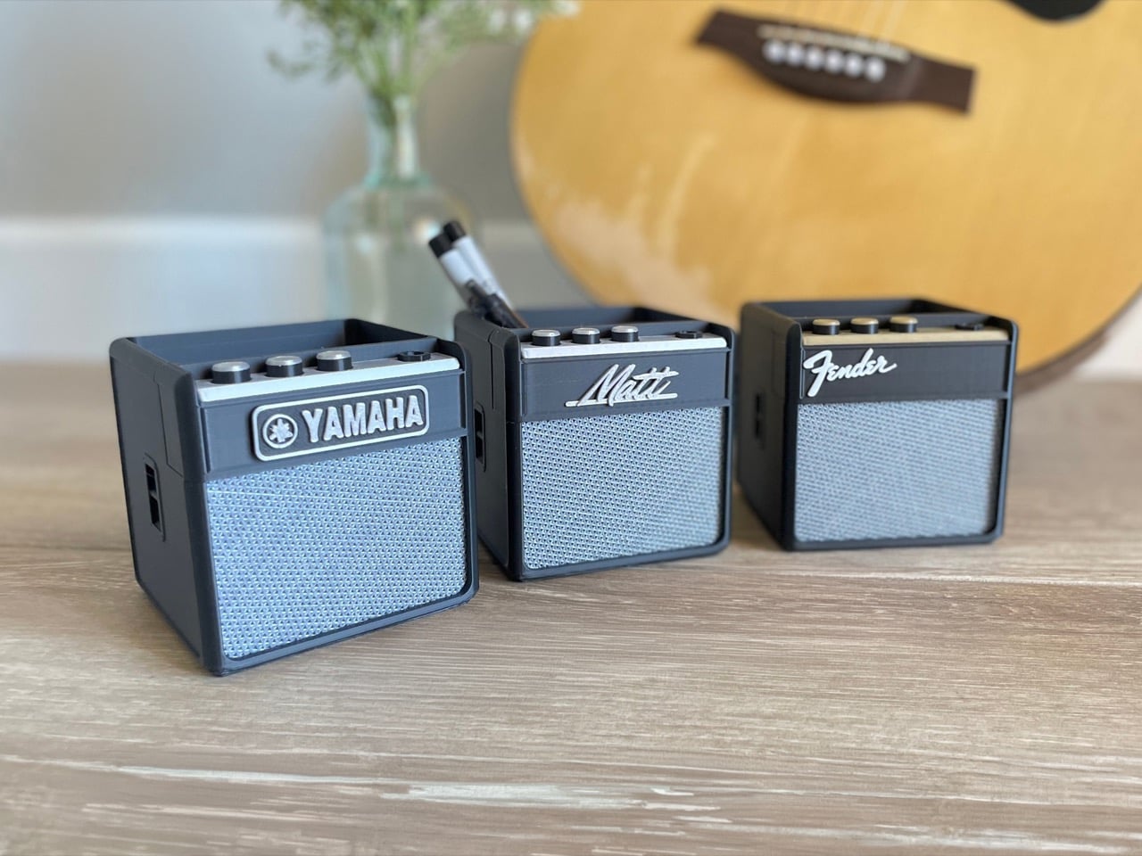
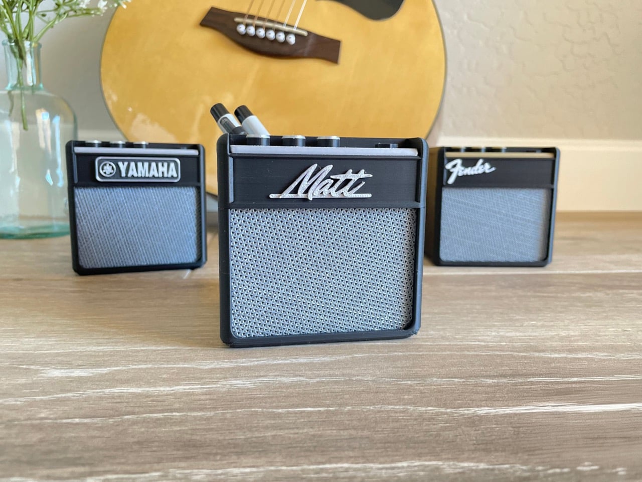
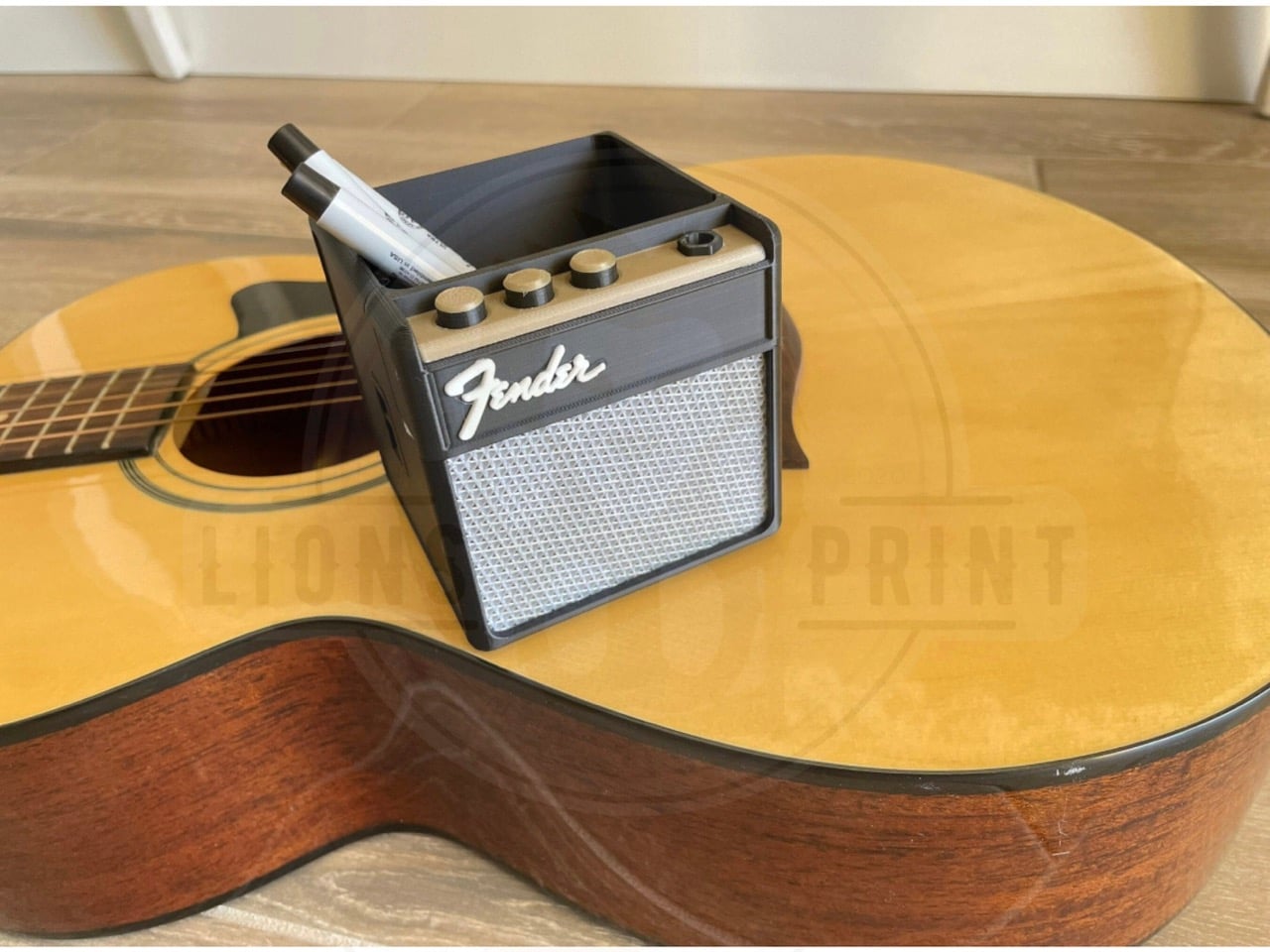
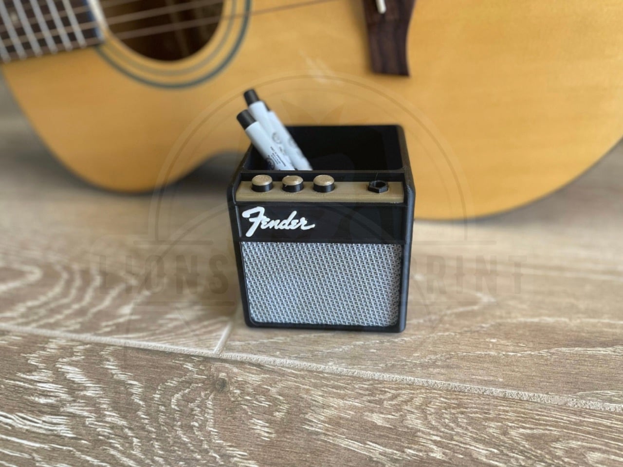
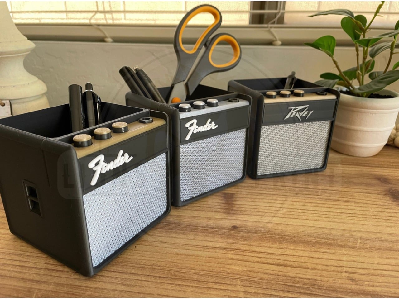
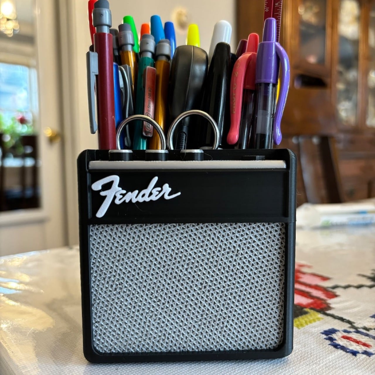
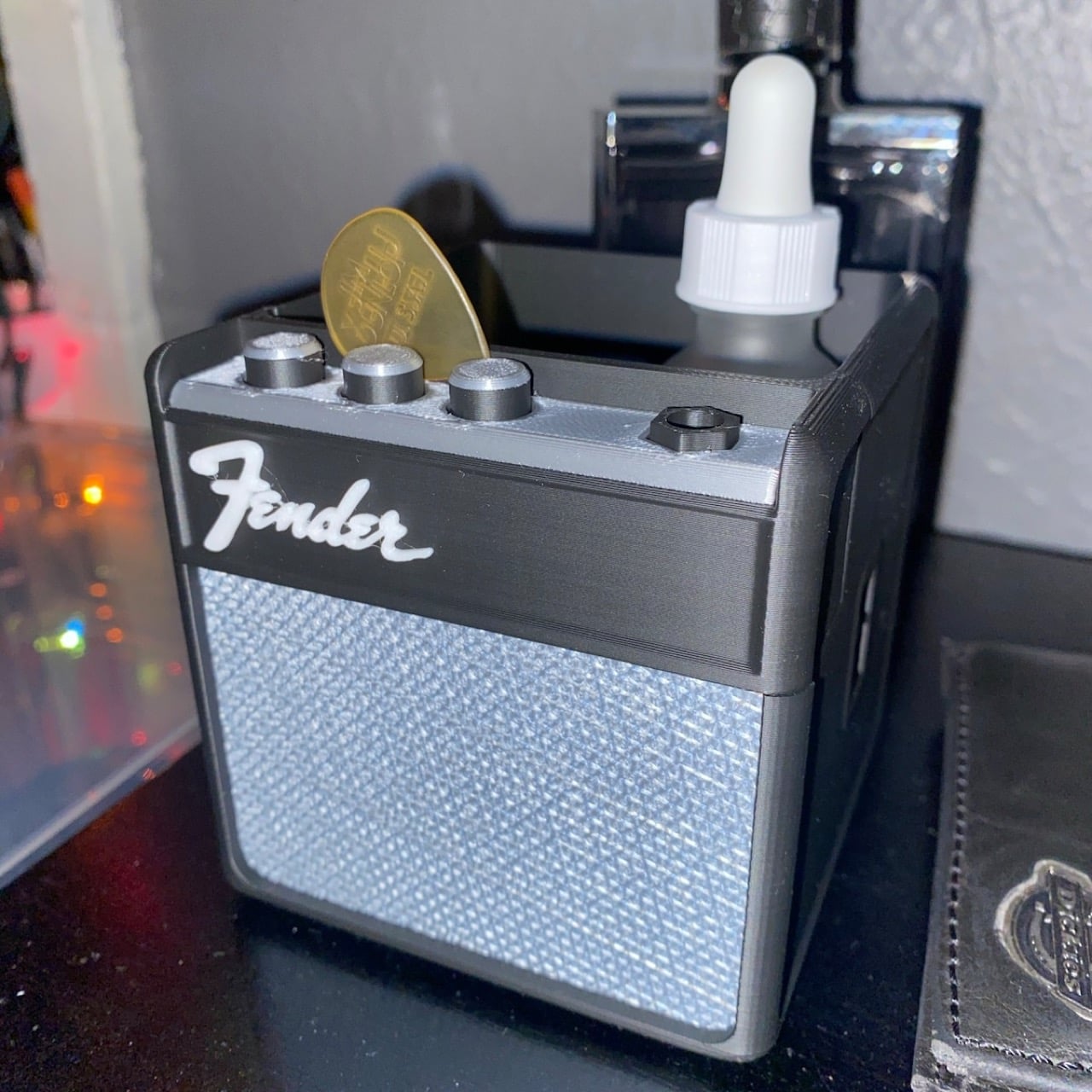
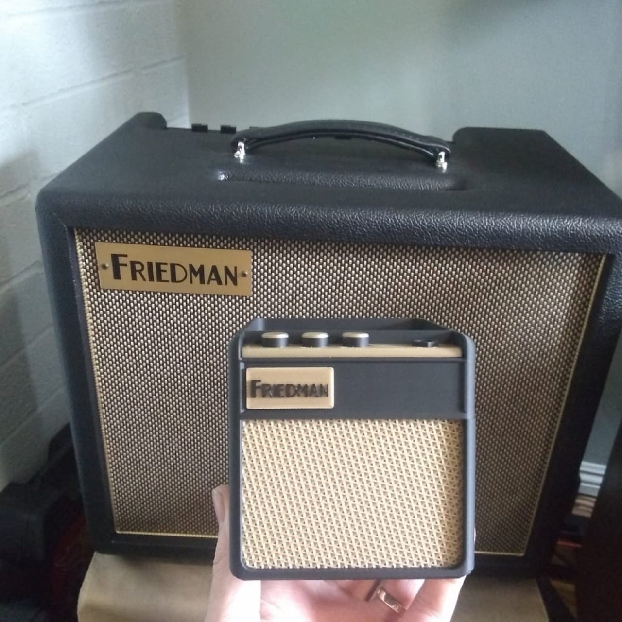
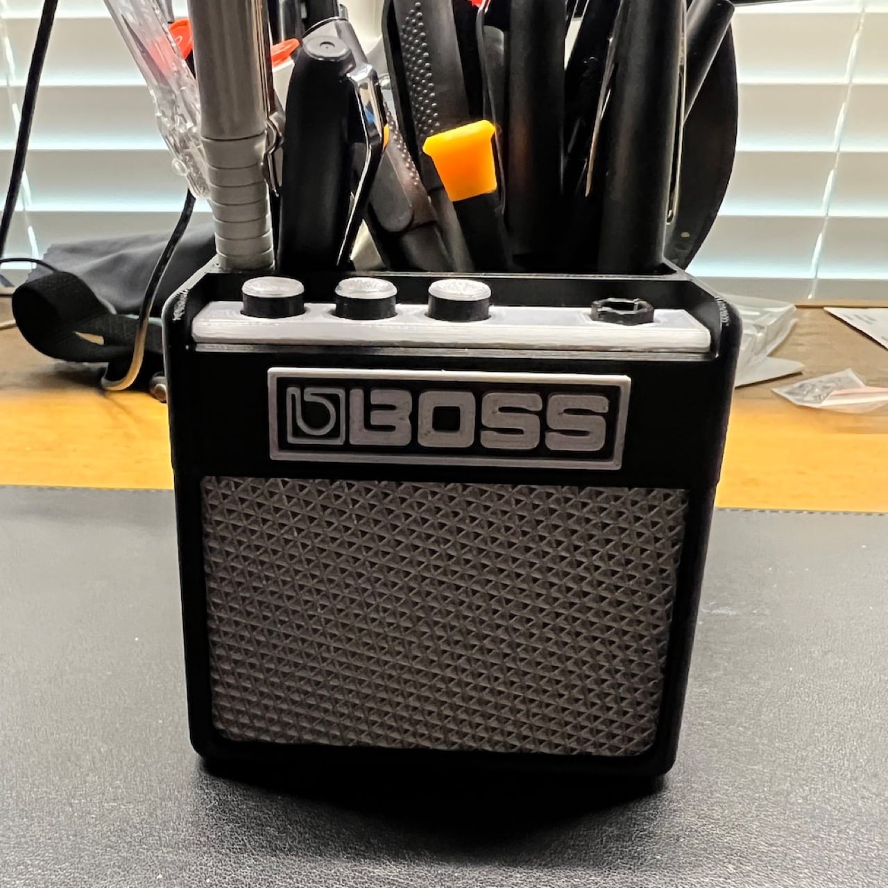
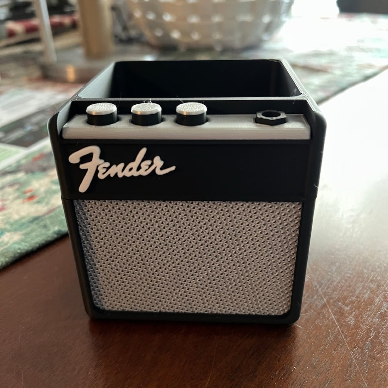
That’s where a little whimsy helps. These 3D-printed guitar amp pen holders from LionsPrint bring a fragment of that musical energy to your workspace. They’re compact at 3.5 inches per side, but the details are spot-on: authentic speaker grilles, control panels, and designs inspired by the amplifiers that power actual rock shows. You can personalize them with custom text in silver or gold. They won’t replace the thrill of live music, but they’re a small reminder that the mundane is just temporary.

Designer: LionsPrint

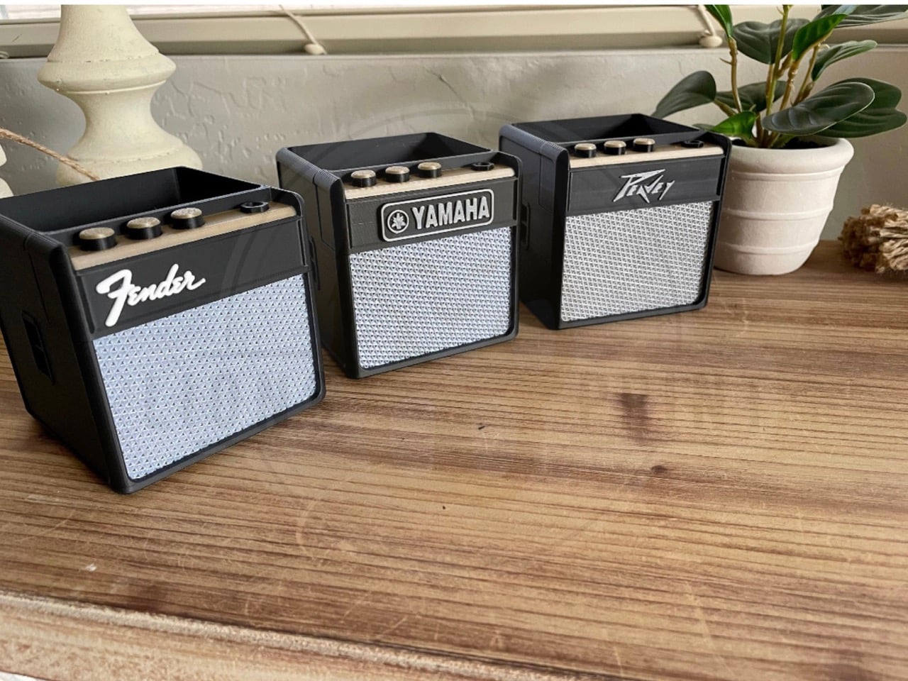
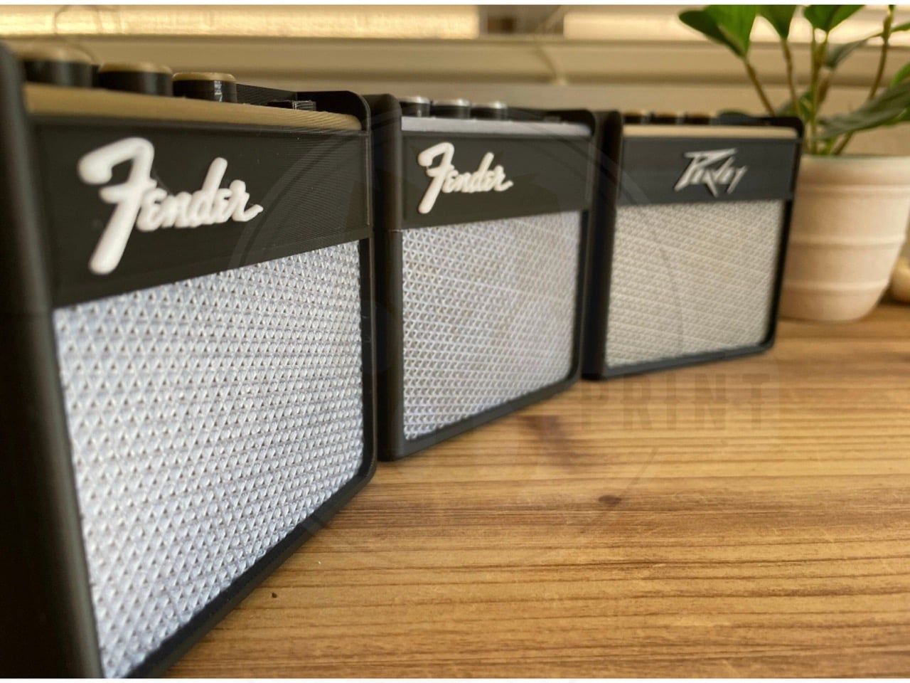
The thing about good desk accessories is they need to justify their existence beyond pure function. A pen holder is essentially a container with holes. You could use a coffee mug. But LionsPrint clearly understood that musicians and music fans have a specific relationship with amplifiers that goes beyond their utility. These aren’t random music references slapped onto office supplies. They’re recognizable silhouettes: Marshall stacks with their iconic script logo, Fender’s clean lines, Yamaha’s distinctive branding. The 3D printing allows for texture work that would be impossible with traditional manufacturing. Those speaker grilles have depth and pattern variation that catches light differently depending on angle.

At 3.5 x 3.5 x 3.5 inches, the dimensions work perfectly for standard desk real estate. Small enough that they don’t dominate your workspace, large enough that they actually hold a functional amount of pens, scissors, and whatever other tools accumulate throughout a workday. The cube format keeps them stable. No tipping over when you’re fishing for a specific marker at 2 AM during a deadline crunch.

The customization option elevates these beyond typical musician merch. You can add text in metallic silver or gold finishes, which means your studio name, your band’s logo, or even an inside joke with your bandmates can live on your desk. Most “gifts for guitarists” feel like afterthoughts, designed by people who think all musicians are the same. This actually lets you claim ownership of the aesthetic instead of just passively receiving someone else’s idea of what music fans want.

LionsPrint sells these through Etsy starting at $19.98 USD before shipping. The price sits in that sweet spot where it’s low enough to impulse buy after a particularly soul-crushing Monday, but high enough that the 3D printing quality actually delivers on the details. You pick your amp style, add your custom text if you want it, and suddenly your desk has at least one object that doesn’t make you question your life choices. Small victories count when you’re counting down to the weekend.

The post 3D-Printed Guitar Amp Desk Organizer Brings Concert Energy to Your Boring Monday Morning first appeared on Yanko Design.

This $400 Wooden Keyboard Goes Through Over 15 Hand-Finishing Steps Before You Can Type On It

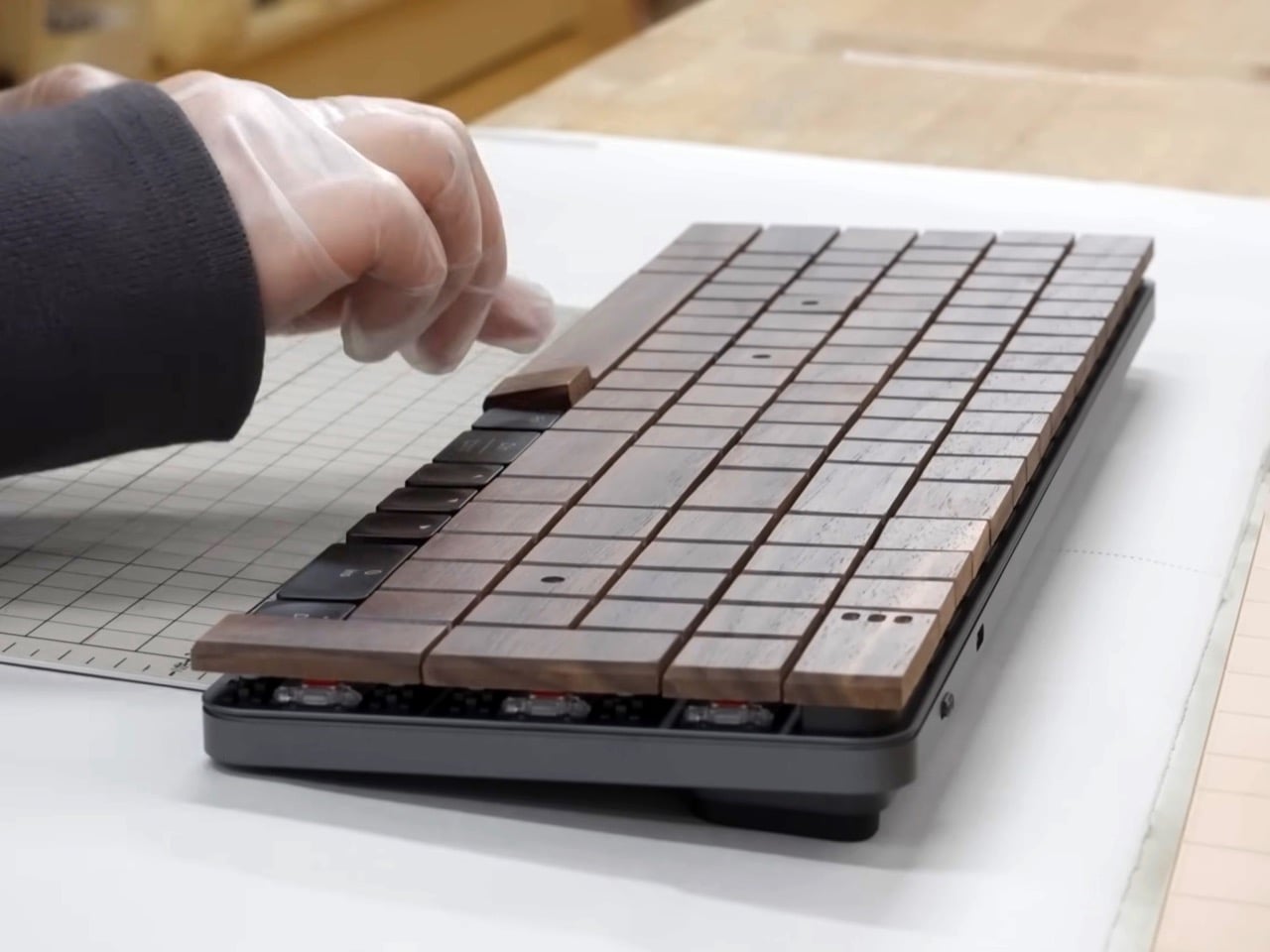
Tech moves fast, breaks things, ships updates, iterates. The entire industry is built on the assumption that this year’s product will be obsolete by next year, and that’s fine because next year’s version will be better anyway. Then you see someone in Fukui Prefecture spending twenty minutes hand-sanding a single wooden keyboard key, checking it by touch, and the whole paradigm feels suddenly optional. Hacoa has been making wooden keyboards this way for four generations now. The current craftspeople learned from their parents, who learned from theirs.

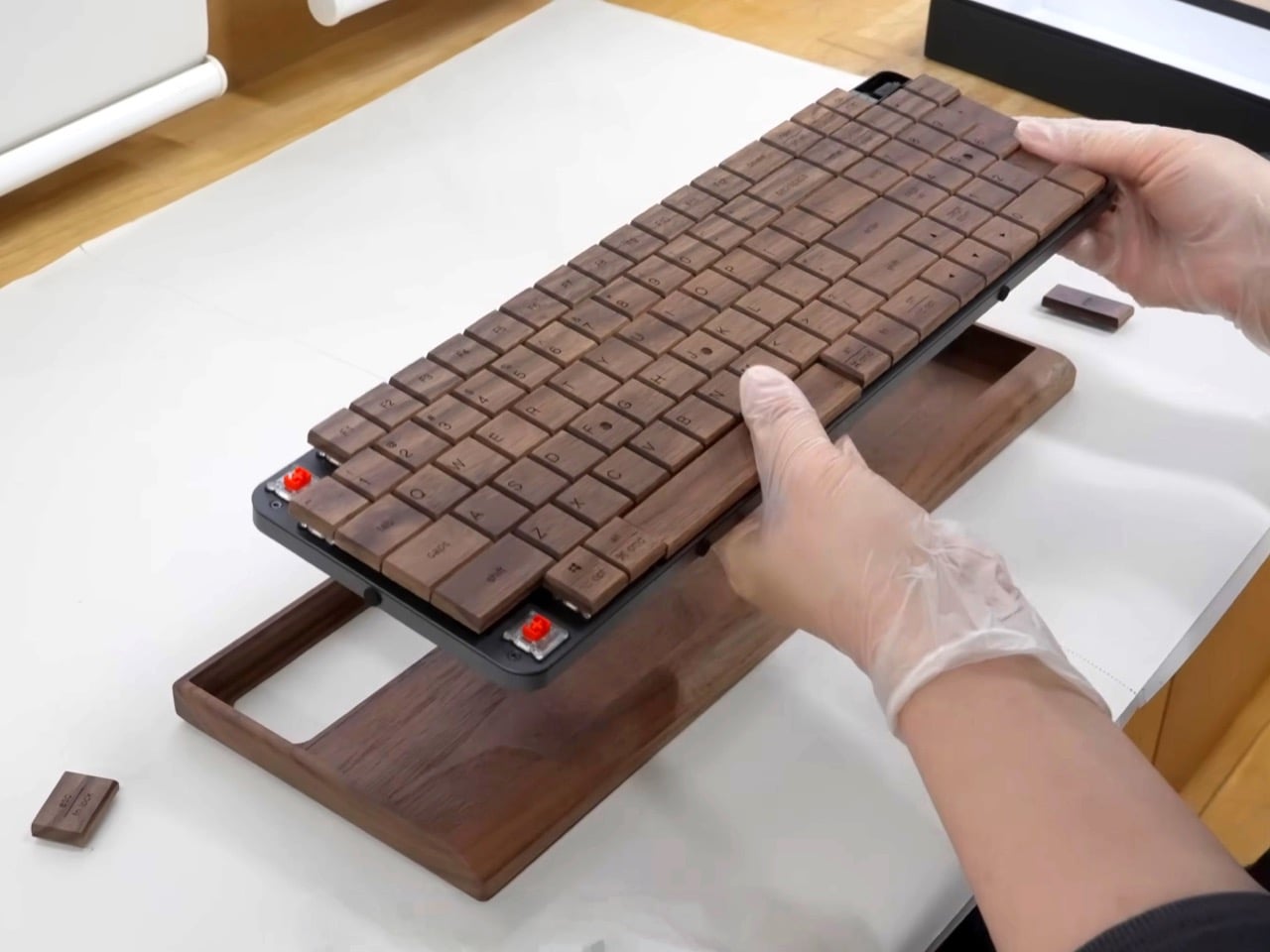
What makes this remarkable isn’t just the craftsmanship, though watching wood move from lumber to finished keys is genuinely mesmerizing. It’s the underlying assumption that contradicts everything tech culture preaches. These keyboards are built to last decades. They’re made from a material that ages visibly, that will show wear and patina and the passage of time. They’re designed for people who want their tools to have history rather than version numbers. And they’re assembled onto standard mechanical keyboard bases, so they actually work for the thing you’d use a keyboard for: typing, every day, for years.

Designer: Hacoa workshop

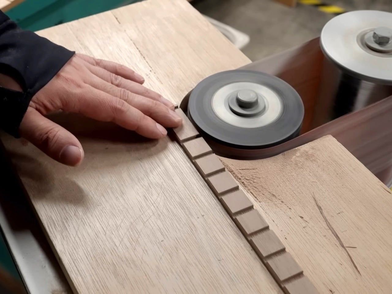
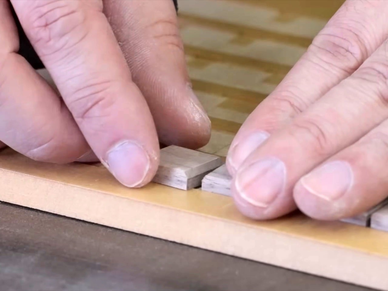
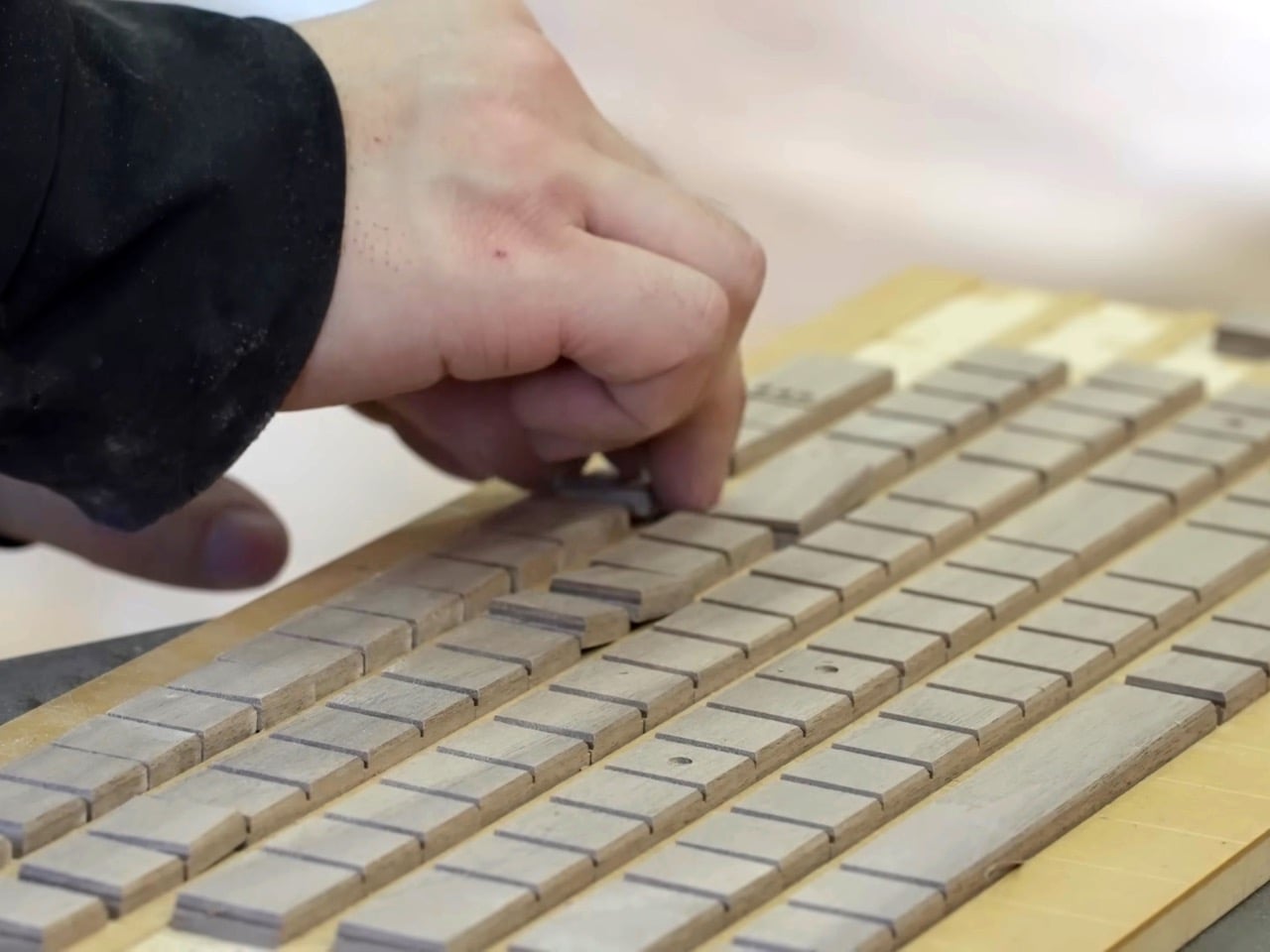
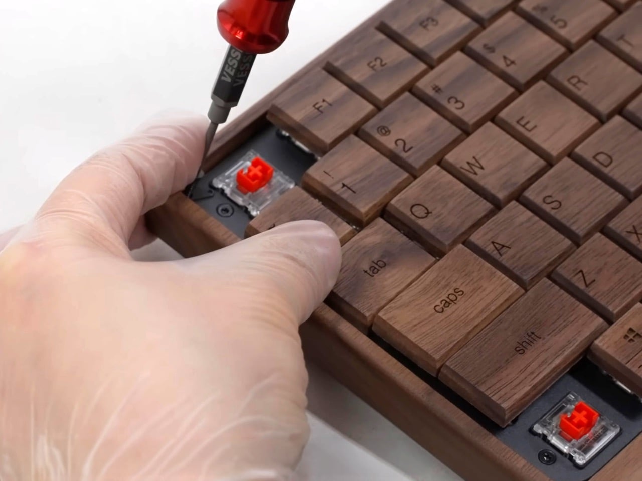
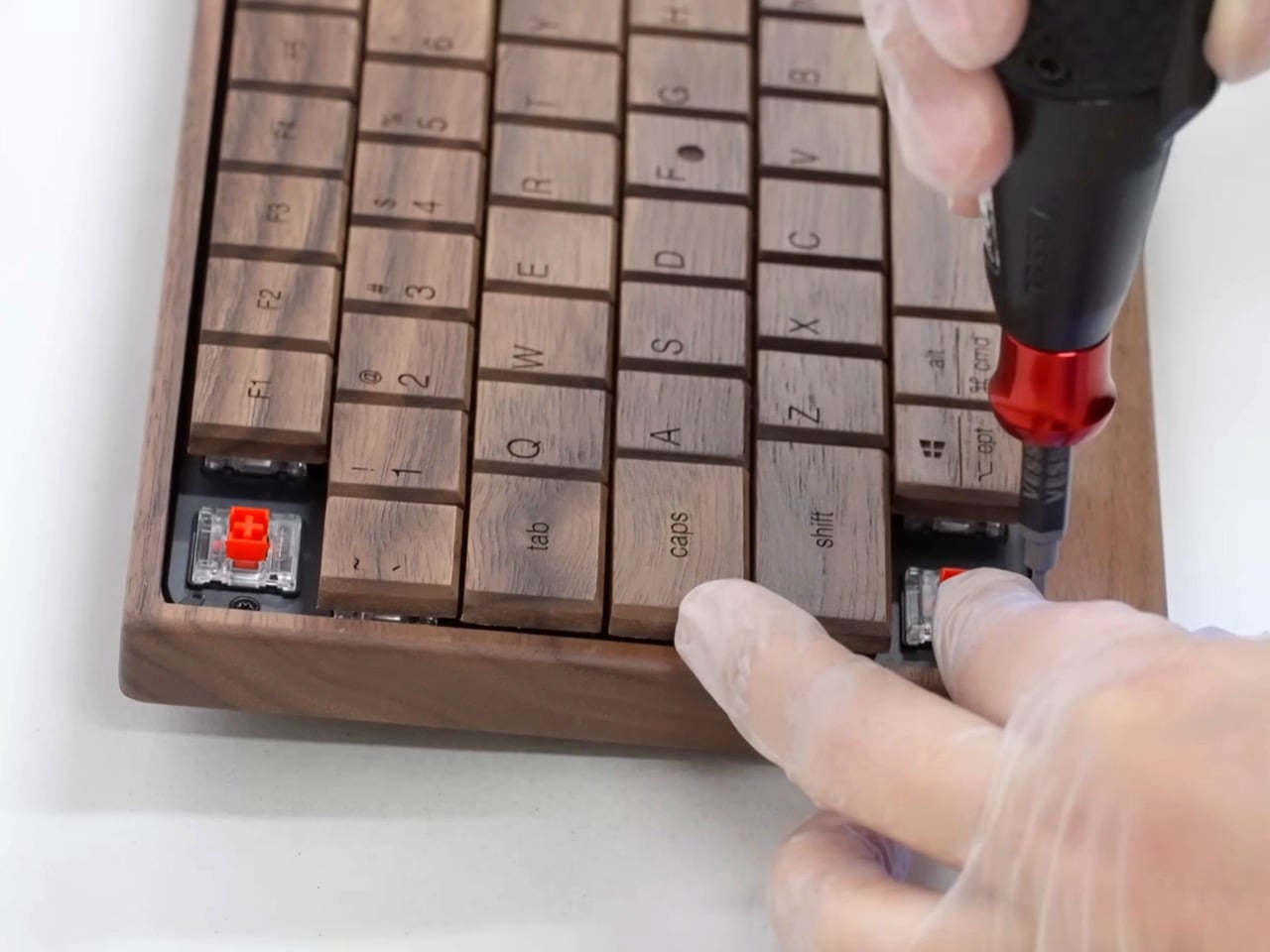
The process starts with lumber selection, which already tells you everything about how different this is from injection-molded ABS keycaps. Someone at the Hacoa workshop in Sabae City examines the grain patterns and decides which pieces are suitable for a keyboard. They measure carefully so nothing gets wasted, then plane the wood down to uniform thickness. This is furniture-grade attention being applied to something most of us buy on Amazon and forget about. The wood gets machined with multiple blade changes between operations, chamfered at the edges so the corners feel softer under your fingers, then cut into individual key blanks.

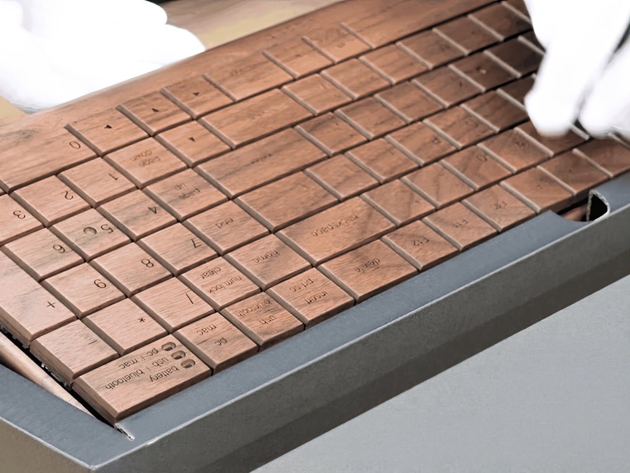
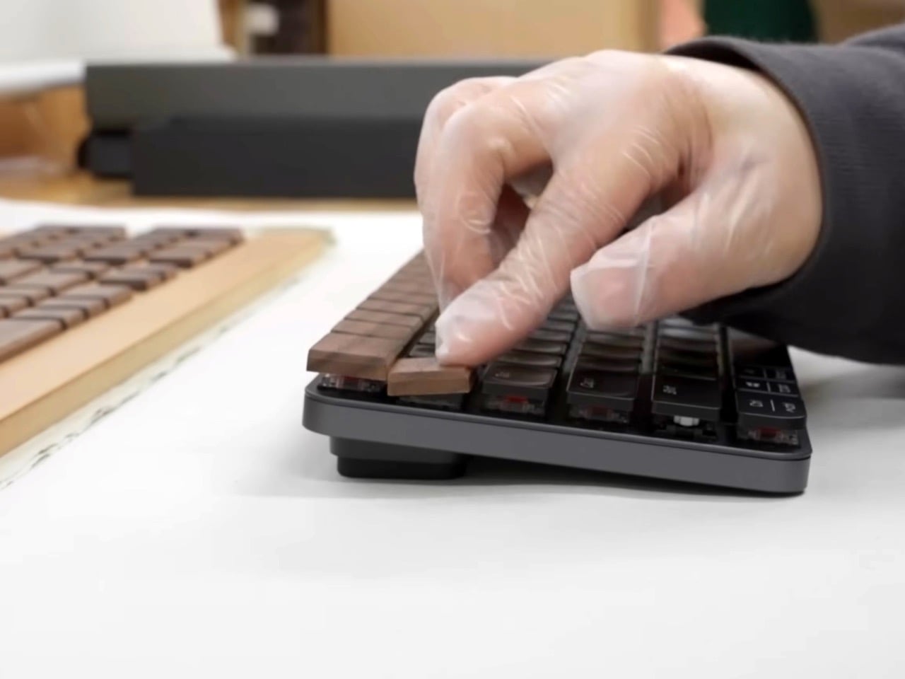
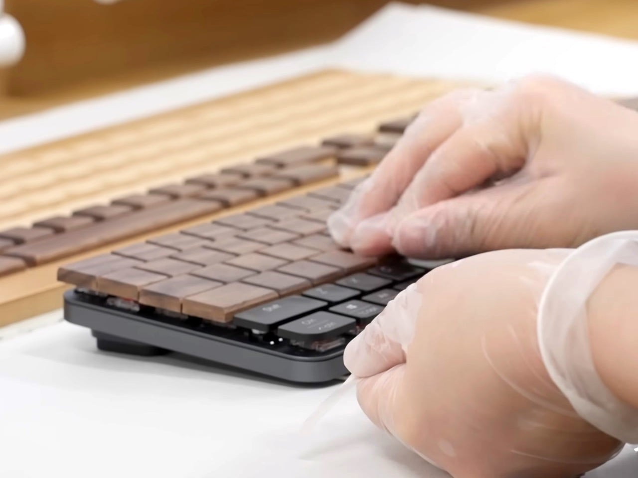
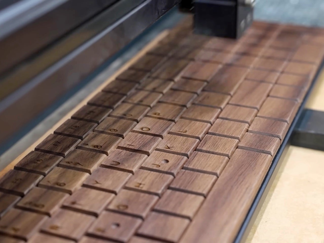
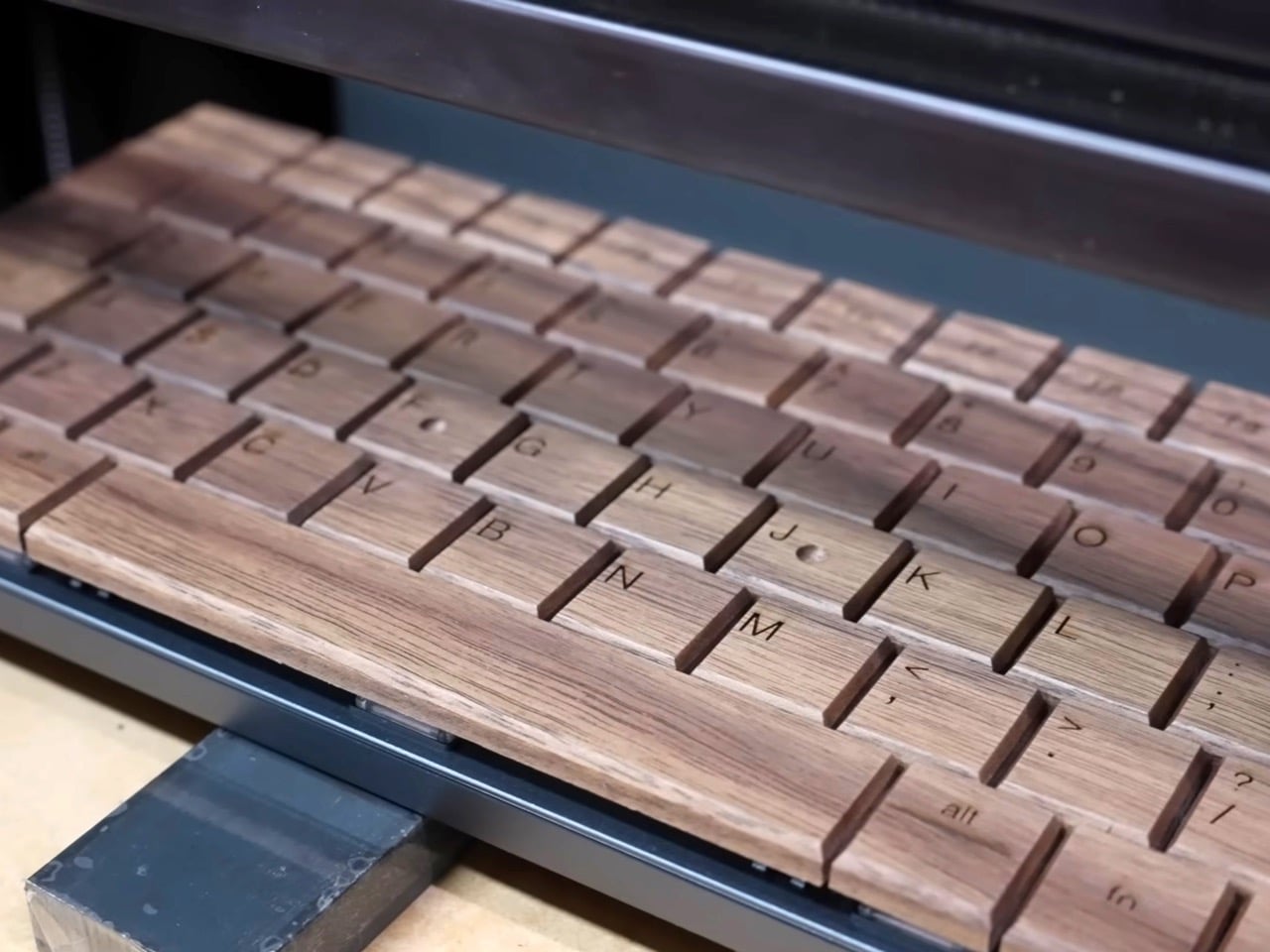
Then the hand work begins. Each key gets shaped individually, sanded on the end grain to refine the tactile experience, finished by craftspeople who use their palms as quality control instruments. They’re literally checking by feel whether each key is ready. The surface gets sanded extensively, taking as long as it takes, because rushing would defeat the entire point. Quality verification happens through touch, which is perfect given that touching these keys will be the whole experience once someone owns the keyboard. After that comes laser engraving for the legends, residue cleanup, and final assembly onto a mechanical keyboard base with standard switches.

What gets me is the very deliberate disconnect between effort and function. A $30 membrane keyboard from any big-box store does the same job in purely utilitarian terms. You press keys, letters appear on screen, your email gets written. But we spend hours every day with our hands on these things. The texture matters. The sound matters. Whether the object feels disposable or permanent matters, even if we can’t always articulate why. Hacoa seems to understand that the keyboard isn’t just an input device, it’s the primary physical interface between you and every digital thing you make.

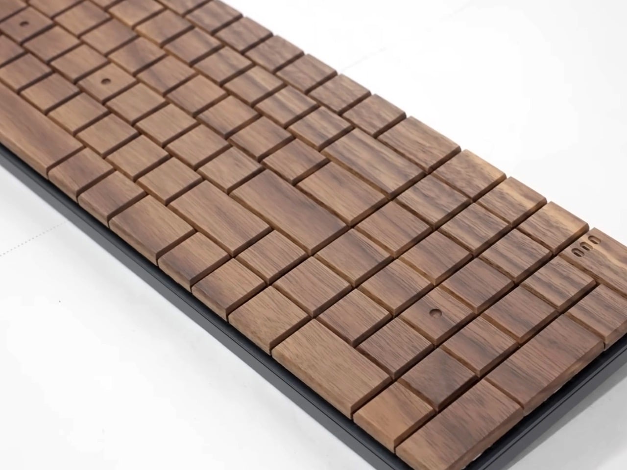
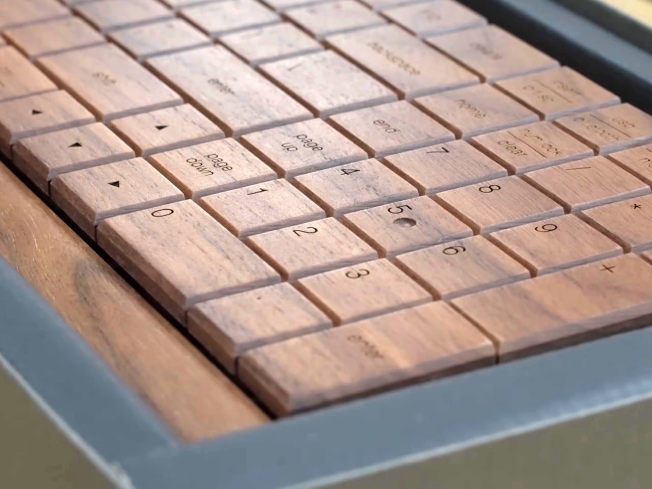
The final product shows visible wood grain variation across every key. Some are lighter, some darker, because that’s what wood does. Each keyboard carries unique patterns that came from whatever tree the lumber came from, which means no two are identical. They’re mounted on dark bases that contrast with the natural wood tones, and the whole thing works with standard mechanical switches. You can actually use this daily without treating it like a museum piece, which honestly makes it more interesting than if it were purely decorative.

Four generations of craftsmanship went into mastering the material and this product category. That timeline alone makes it weird in tech terms, where four generations might mean four years of product iterations. Here it means actual humans passing down technique and judgment through family lines, the kind of knowledge transfer that only happens when someone works beside their parent for years. The current craftspeople at Hacoa learned by watching, by doing it wrong, by developing the muscle memory that lets them know when a piece of wood is ready just by running their hand across it.

I think about planned obsolescence a lot, probably too much. The assumption baked into most consumer tech that you’ll replace it soon anyway, so why build it to last. These keyboards operate in a completely different value system where the goal is creating something worth keeping. Whether that makes financial sense for most people is debatable. Whether it’s a more sane way to think about the objects we use constantly is not.

The post This $400 Wooden Keyboard Goes Through Over 15 Hand-Finishing Steps Before You Can Type On It first appeared on Yanko Design.

Nader Gammas’ Vessels Turns Light Into a Slow, Living Presence

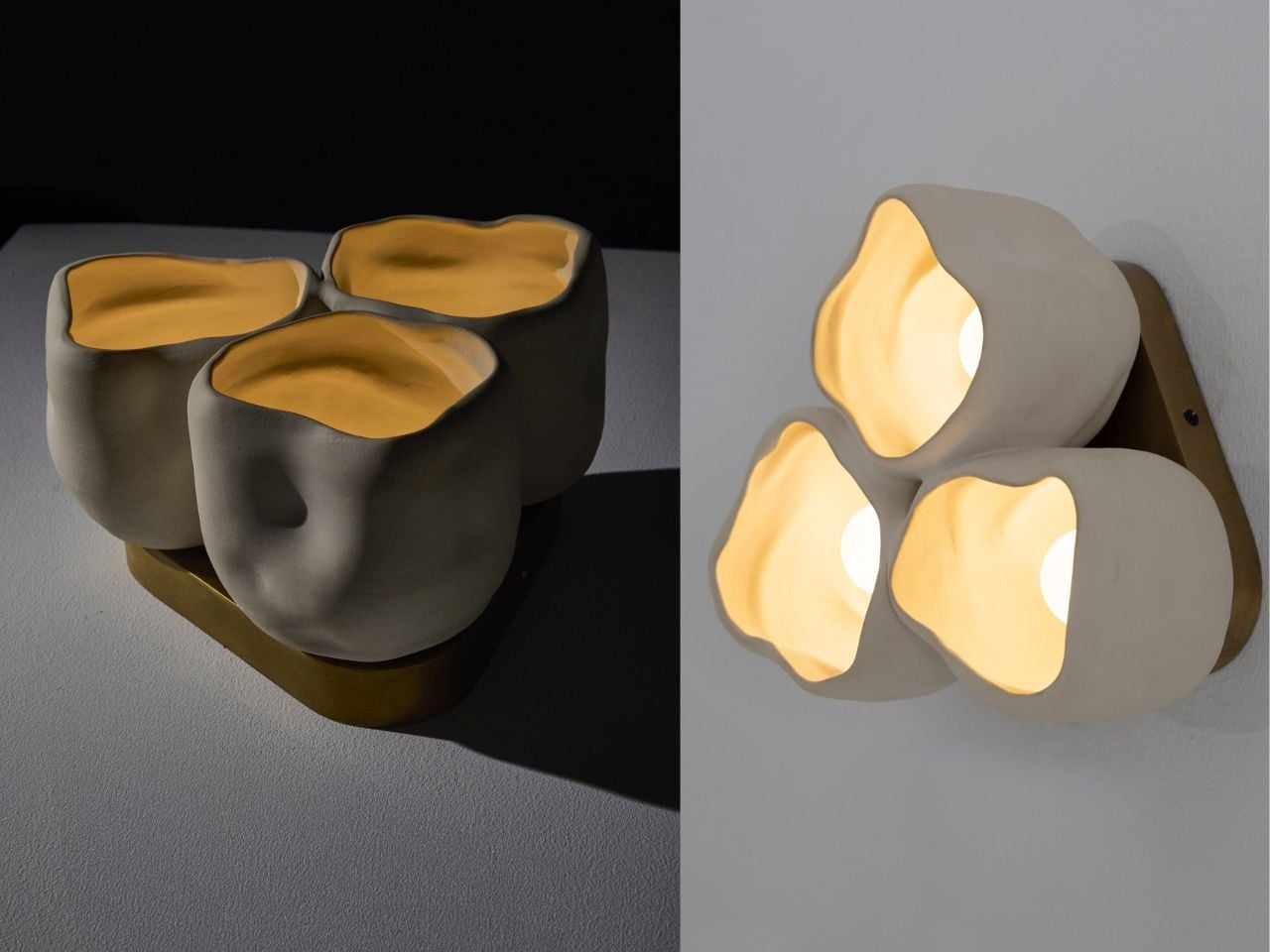
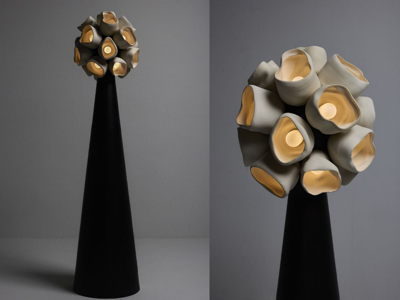
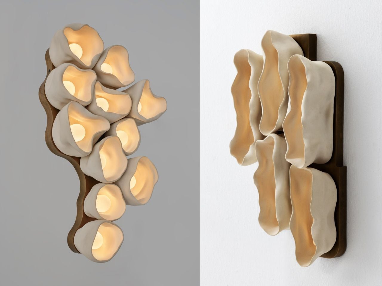
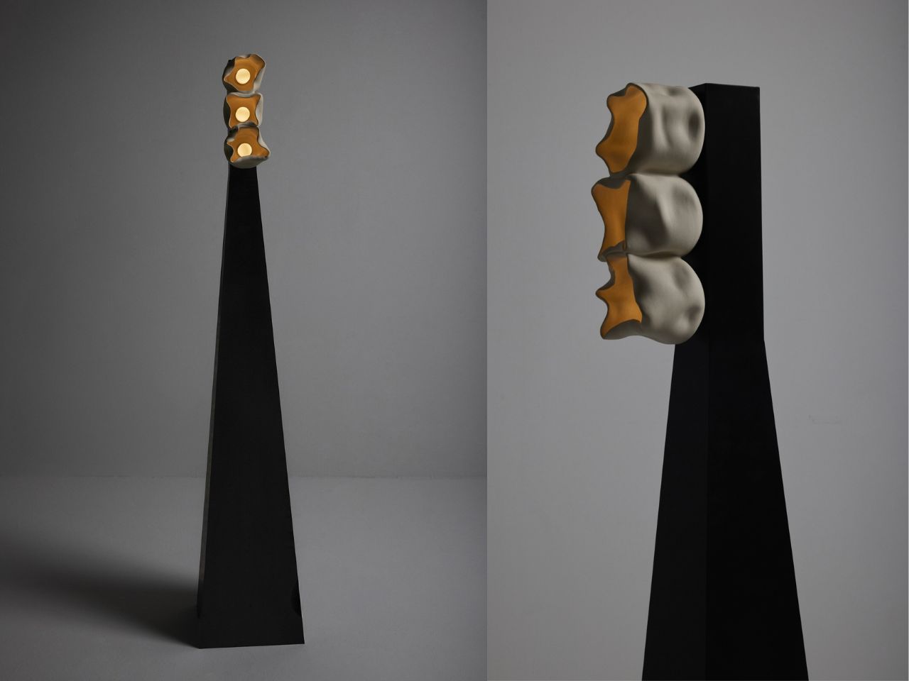
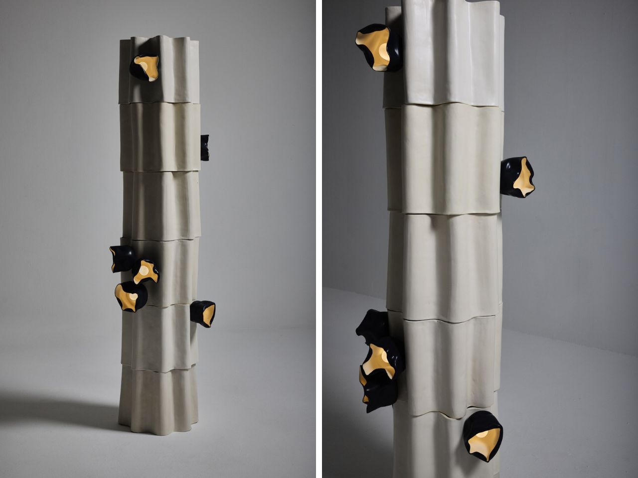
The Vessels collection feels like a quiet confession from Nader Gammas. Known for lighting defined by brutalist strength and architectural discipline, Gammas takes an unexpected turn inward with this series. The sharp certainty that once shaped his work softens here, replaced by forms that feel grown rather than constructed. These lights do not announce themselves. They linger. They unfold slowly, like something discovered rather than designed.

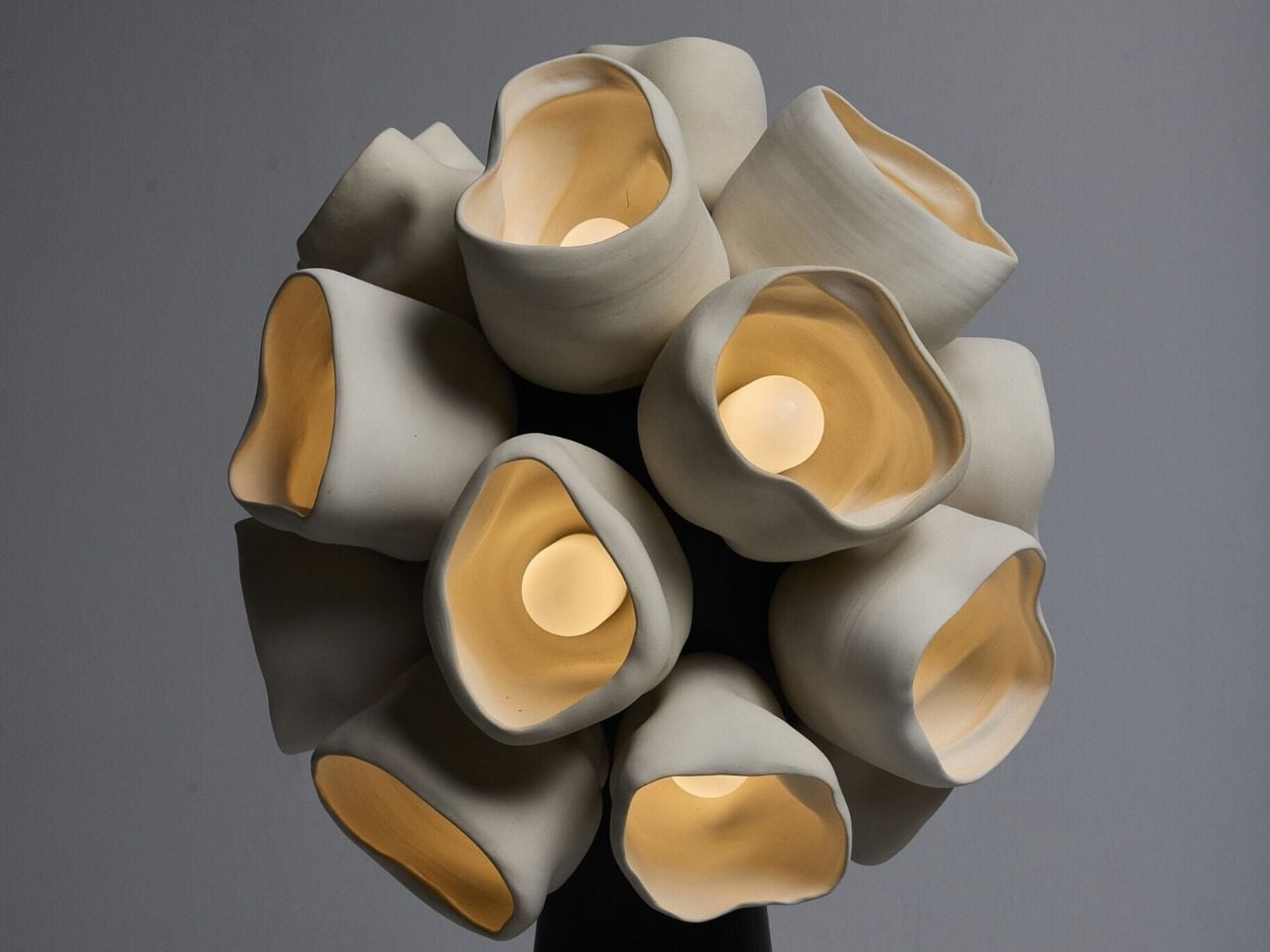
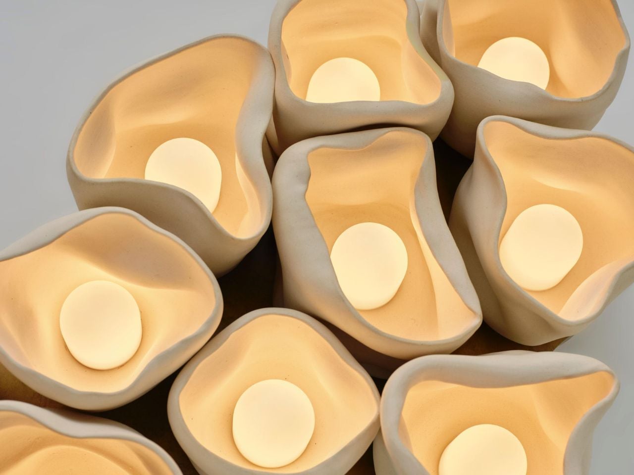
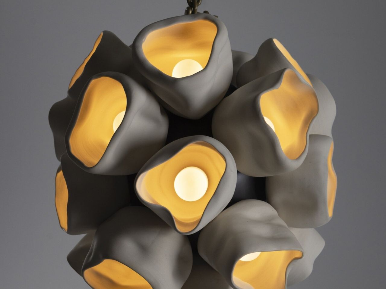
The inspiration comes from cup fungi, a modest yet mesmerizing group of organisms that bloom close to the earth. Their clustered growth patterns and delicately rippled rims become the emotional backbone of the collection. Instead of rigid symmetry, the vessels curve and open organically, as if responding to an internal logic of growth. Light is not forced outward. It is held, filtered, and gently released, echoing the way fungi cradle moisture and air within their fragile structures.

Designer: Nader Gammas

This natural influence marks a clear departure from the heavy brass and assertive geometries that have long defined Gammas’ work. In Vessels, the language shifts toward softness and restraint. Ceramic takes center stage, valued for its warmth and sensitivity to touch. Its surface carries subtle variations in thickness and texture, details that only emerge through hand shaping. Brass remains present, but now it plays a supporting role, adding quiet warmth rather than visual weight.

Each piece is shaped entirely by hand, without molds or replication. This process ensures that every vessel is singular, carrying its own proportions, curves, and imperfections. The result is a collection that feels almost alive. As light passes through the ceramic forms, it creates a slow interplay of glow and shadow, giving the impression that the object itself is breathing. These are not fixtures designed to disappear into a ceiling or wall. They are characters within a space, each with its own presence and mood.

While the aesthetic has softened, the philosophy behind the work remains firmly rooted. Gammas has always believed that lighting is fundamental to how people experience a space emotionally. That belief traces back to his early life growing up in the United States with Syrian roots, where he developed an instinctive understanding of how form and function shape atmosphere. His academic path, from architecture at the University of Jordan to an MFA in Lighting Design at Parsons School of Design, refined that instinct with technical precision.

Today, with exclusive representation by STUDIOTWENTYSEVEN, Gammas stands confidently on the global design stage. Yet Vessels feels deeply personal, almost like a return to intuition. It is a collection that listens more than it declares, allowing nature to guide form and light to guide emotion.

Vessels is a lighting series, but with a meditation on growth, material, and restraint. Through handmade ceramic forms accented with brass, the collection transforms light into something felt rather than seen, shaping spaces with a quiet and lasting intimacy.

The post Nader Gammas’ Vessels Turns Light Into a Slow, Living Presence first appeared on Yanko Design.

5 Product Designs That Brought the Moon Indoors: They’re All Stunning

The moon in product design is no longer just a romantic reference. It has become a quiet source of structure and meaning. Designers now draw from its sense of absence, soft geometry, textured surfaces, and the gentle play of light and shadow. Rather than literal moon shapes, the influence appears through restraint, calm proportions, and tactile depth.

Using the moon as a muse helps create products that feel grounded and timeless. This approach values emotional longevity over visual noise, allowing objects to connect with users on a deeper, more intuitive level. By echoing the moon’s permanence and stillness, design gains a timeless quality in an otherwise fast-changing world, influencing everything from sculptural lighting, celestial timepieces, and orbit-inspired furniture to architectural forms, tactile décor objects, and calm, minimalist technology products.

1. Furniture: Interpreting the Moon’s Surface Through Form

Lunar-inspired furniture moves away from polished perfection toward raw, tactile expression. Surfaces echo the moon’s terrain through uneven textures, carved contours, and matte finishes that invite touch. Materials such as cast metal, stone, and concrete reflect a quiet strength, translating celestial ruggedness into functional, grounded forms.

These pieces act as visual and spatial anchors within an interior. Their weight and texture create a sense of stability, offering emotional comfort through material honesty. Beyond aesthetics, such furniture delivers long-term value—designed to endure, age gracefully, and remain relevant across generations rather than follow fleeting trends.
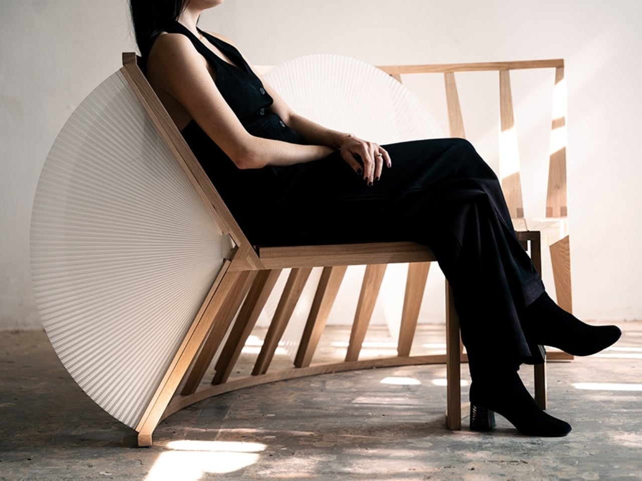
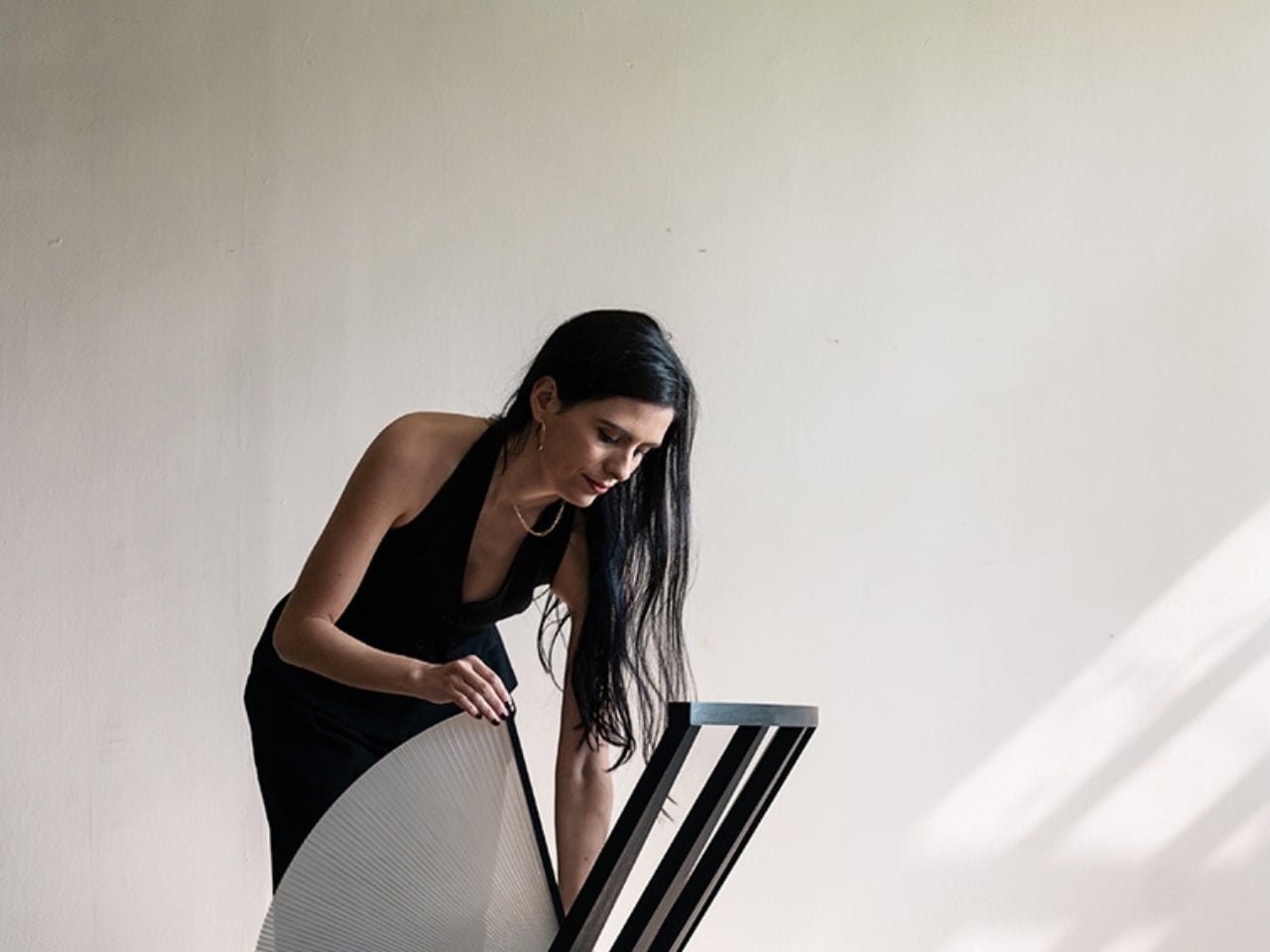
The Moon Series by Craft of Both and MADE encourages users to play, adjust, and reshape their space through a pleated, fan-like form inspired by radial geometry. Designed by Christina Standaloft and Jay Jordan, the Moon Chair and Moon Bench unfold gently, turning everyday use into a calm, tactile experience.
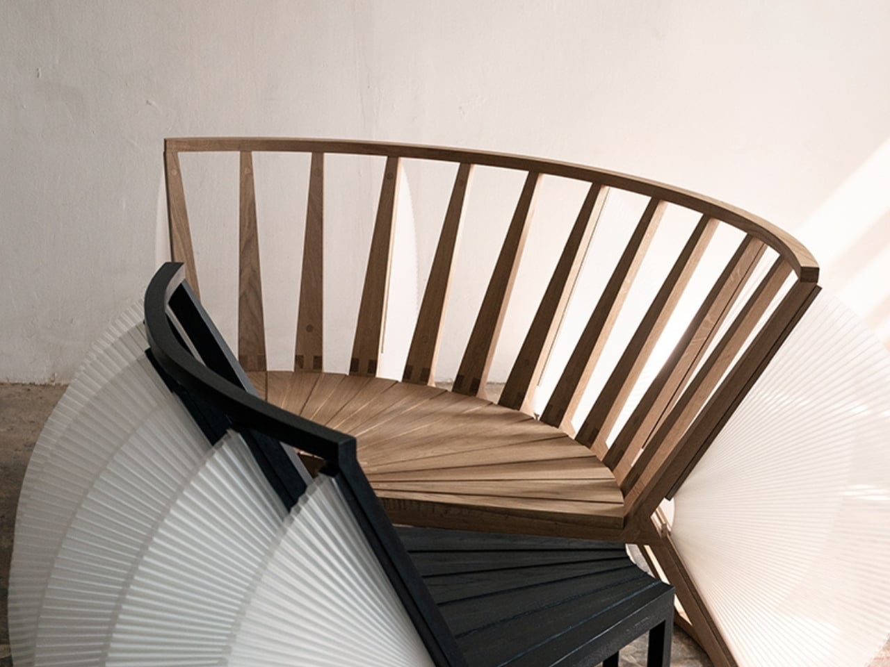
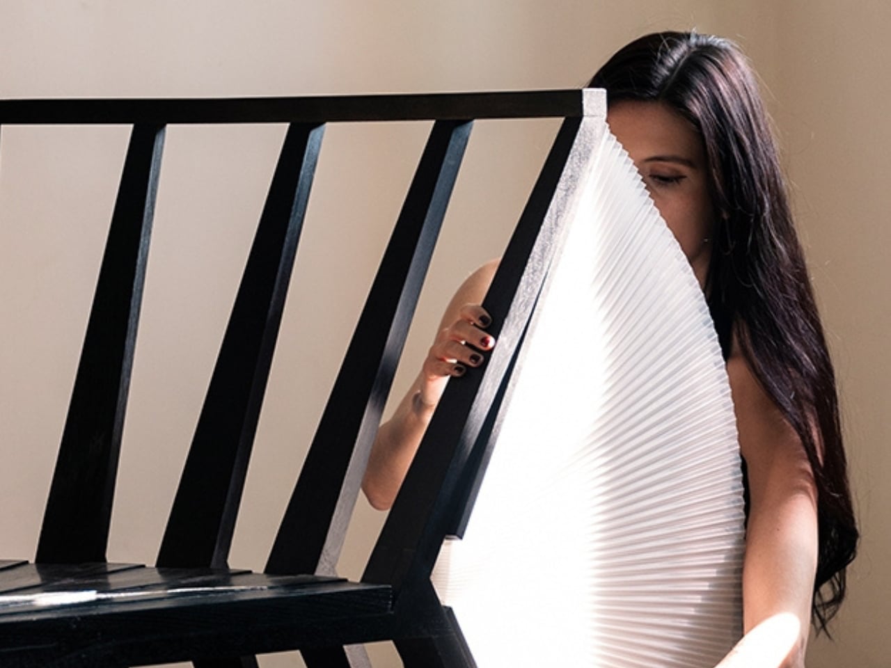
What defines the series is its modular intelligence. Elements can be added or removed to change comfort, privacy, and visual impact. When combined, the pieces form sculptural seating landscapes. Blending Eastern inspiration with contemporary design, the Moon Series balances adaptability, craftsmanship, and enduring elegance.

2. Lighting: Creating Atmospheres Through Lunar Glow

Lunar-inspired lighting focuses on softness rather than intensity. The design language shifts away from direct glare toward indirect, diffused illumination that mimics the moon’s changing phases. Gentle gradations of light create calm, responsive environments instead of static brightness.

These fixtures are designed as experiences, not just utilities. By filtering and softening light, they introduce a sense of sanctuary within modern interiors dominated by glass and steel. The result is an ambient glow that feels natural and restorative, subtly shaping mood, rhythm, and spatial comfort throughout the day.
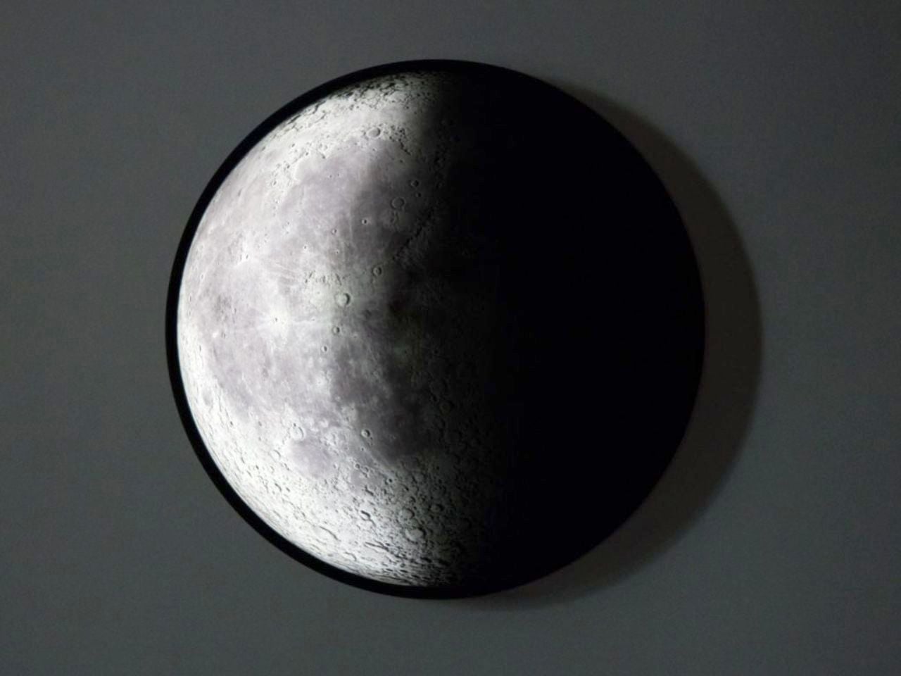
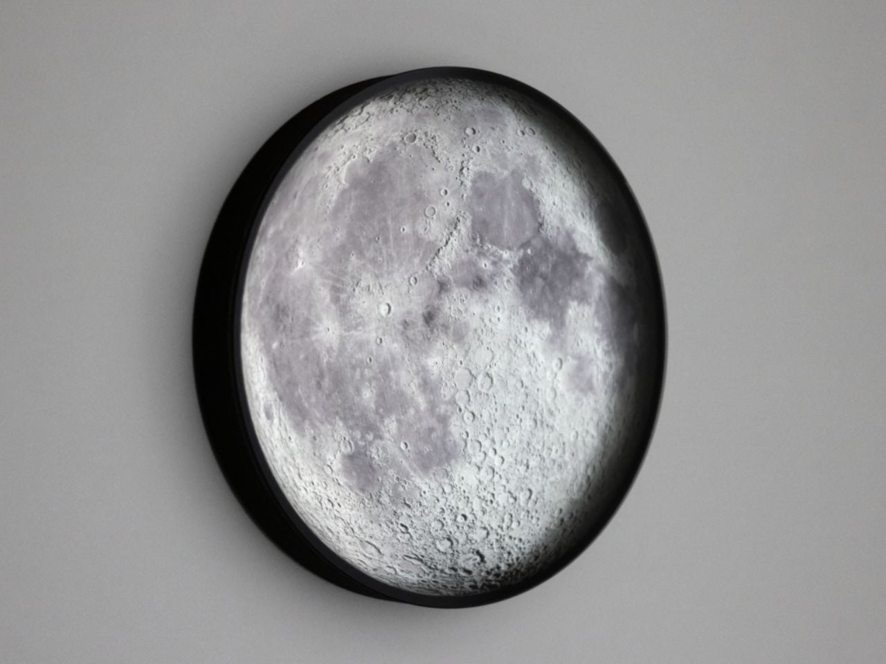
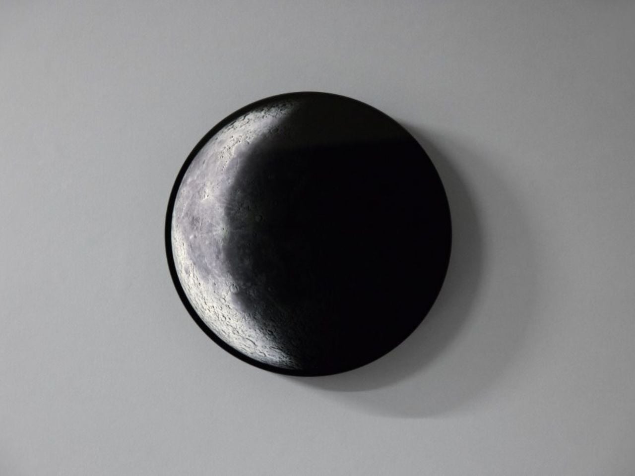
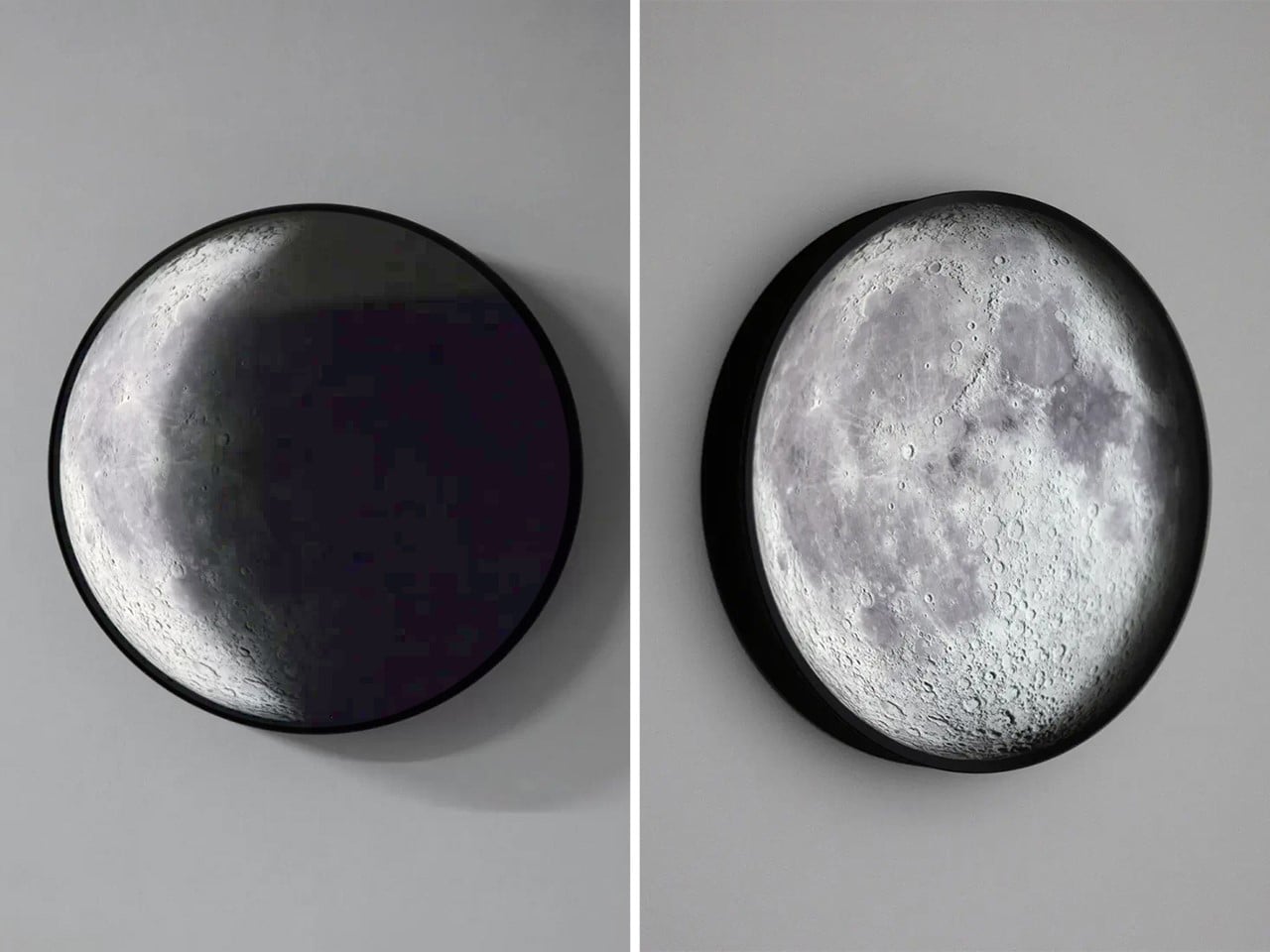
Phase is a sculptural lighting object that reimagines our relationship with time and light by replicating the moon’s real-time orbit around Earth. Developed by London-based studio Relative Distance over four years of research and engineering, the lamp transforms astronomical data into an immersive visual experience. Light passing through its smoked glass surface reveals the moon’s topography in striking detail, creating a soft, hypnotic glow that feels both intimate and expansive.
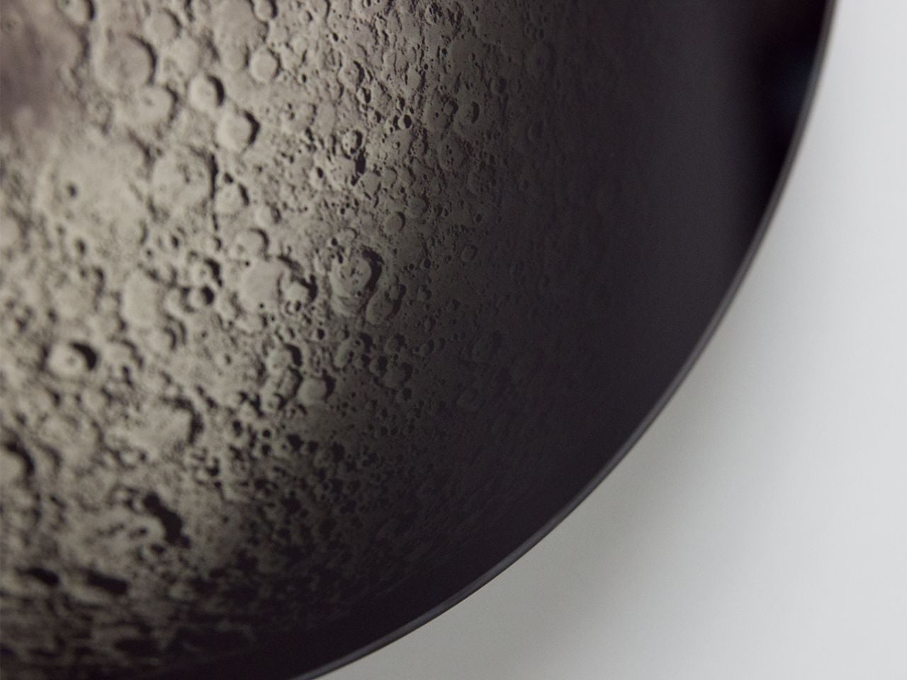
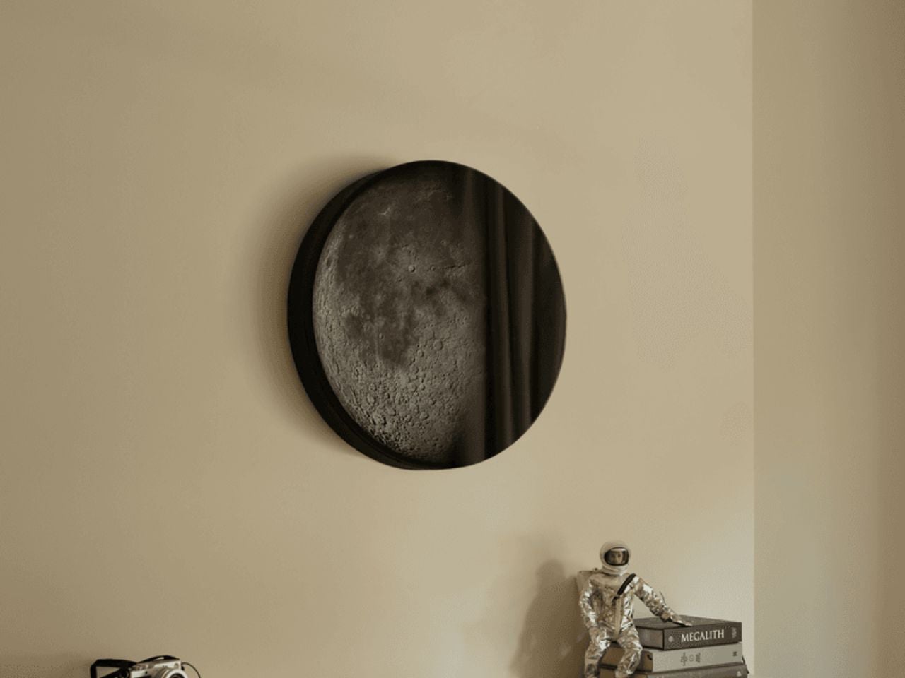
The lunar imagery is derived from a high-resolution NASA composite and applied with extreme precision, housed within a minimalist mineral-composite case inspired by extraterrestrial materials. Phase operates without apps or connectivity, relying instead on a simple three-button interface to control time, brightness, and viewing modes. With carefully tuned optics that mimic the subtle diffusion of true moonlight, the lamp offers a calm alternative to screen-based light—an object that slows perception and deepens spatial awareness.

3. Architecture: The Lunar Dome Perspective

The domical form offers a softer, more immersive interpretation of lunar architecture. Inspired by the moon’s curved horizon, dome-shaped spaces dissolve sharp edges and create a continuous spatial flow. Light moves gently along the curved surfaces, enhancing a sense of enclosure while maintaining openness to the sky.

From a performance standpoint, domical architecture is inherently efficient. The form encourages natural air circulation and evenly distributes light, reducing heat gain and energy demand. Beyond efficiency, the dome creates a primal sense of shelter—an architectural echo of the moon itself, grounding the home in cosmic reference and human comfort.

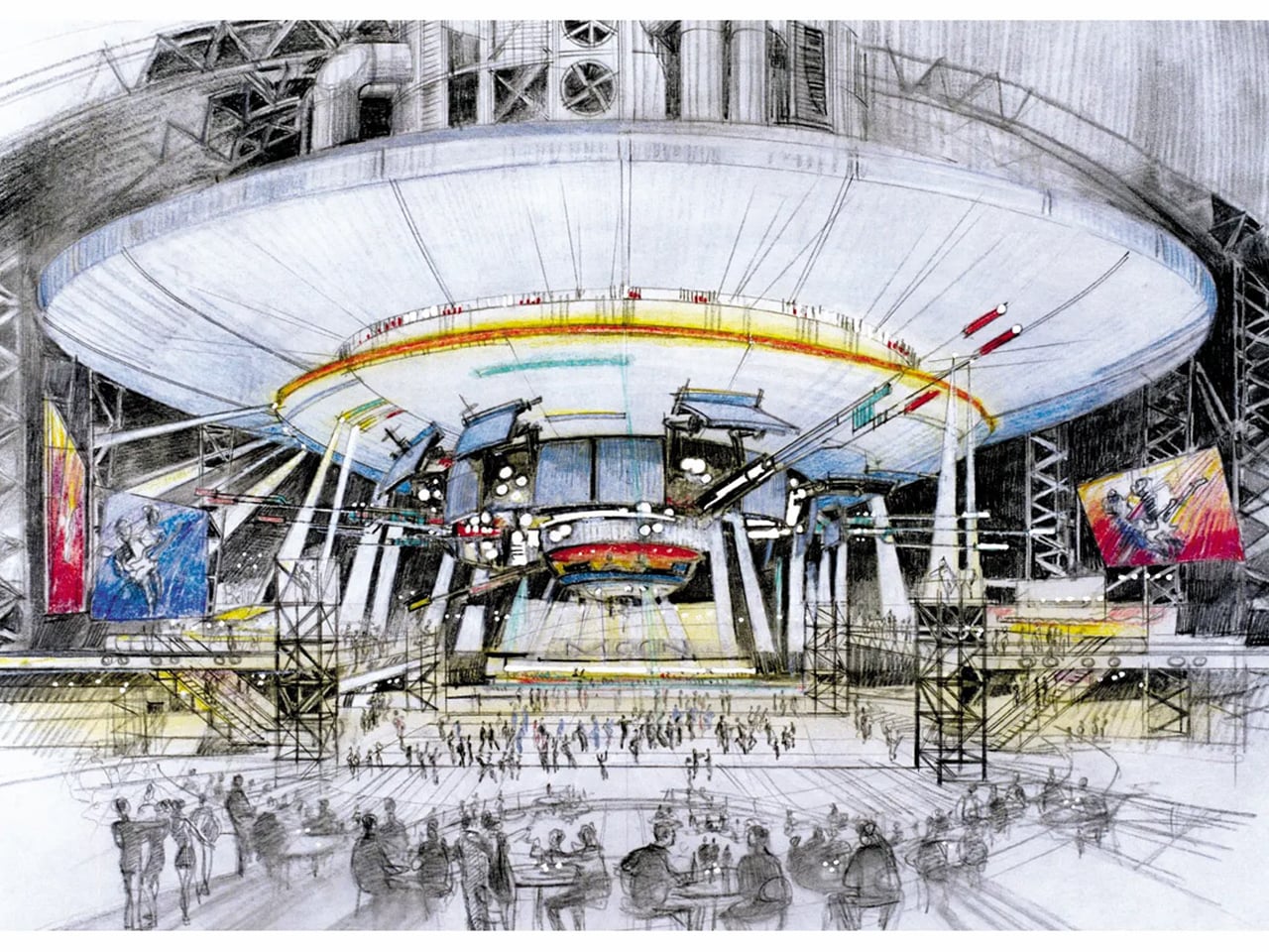
Conceived as an architectural spectacle, Moon is a 224-meter-tall spherical resort that translates lunar form into inhabitable design. Developed by Moon World Resorts Inc., the structure is envisioned as a hyper-realistic representation of Earth’s satellite, combining monumental scale with precision engineering. The project is organized around a three-storey circular base that supports a colossal orb above – designed to be the world’s largest sphere. The exterior of the orb mirrors the moon’s surface, constructed from a steel framework clad in carbon-fiber composite, with integrated solar panels enabling energy self-sufficiency.

Function and form are tightly interwoven throughout the design. The base accommodates public amenities such as the hotel lobby, spa, and convention facilities, while the spherical volume above houses approximately 4,000 suites. At its core lies an immersive lunar environment, featuring acres of undulating terrain and a detailed simulated colony. Designed to meet LEED Gold five-star standards, Moon positions architecture as experience – where structure, sustainability, and spectacle converge into a singular, otherworldly destination.

4. Clock Design: Reconnecting Time with Lunar Cycles

Clock design is shifting away from precise minute-counting toward a more intuitive understanding of time. Instead of emphasizing speed and schedules, these pieces track lunar phases and cyclical movement, reminding users that time is fluid rather than strictly linear.

Beyond function, such clocks carry a quiet educational role. They reconnect daily life with natural rhythms and inherited ways of measuring time. Crafted as sculptural objects, they balance motion, material, and meaning – serving as instruments of awareness and enduring design statements within the home.
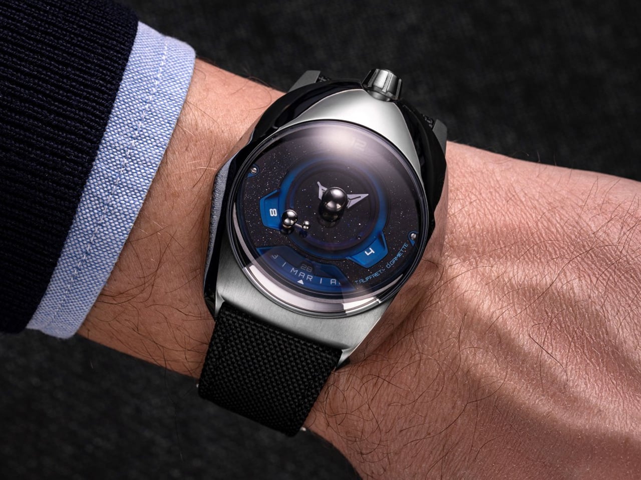
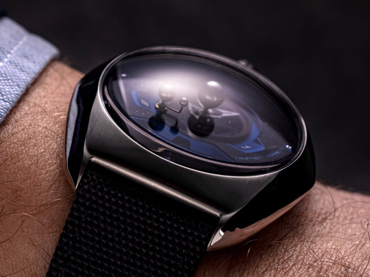
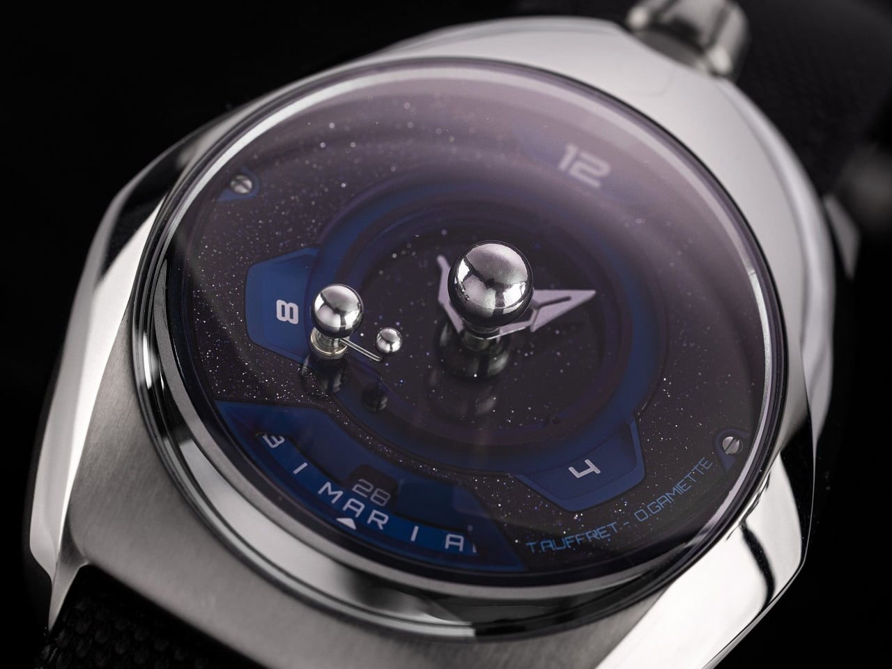
Time may be a human system of measurement, but its logic is rooted in celestial motion. The SpaceOne Tellurium translates this cosmic rhythm into an elegant mechanical object, merging daily timekeeping with the orbital dance of Earth and Moon. Beyond hours and minutes, the watch presents a miniature solar system at its center, where scaled representations of the Earth and Moon revolve around a fixed sun. These elements do not move symbolically; their motion is precisely calibrated to reflect real astronomical cycles, turning the dial into a living model of time and space.
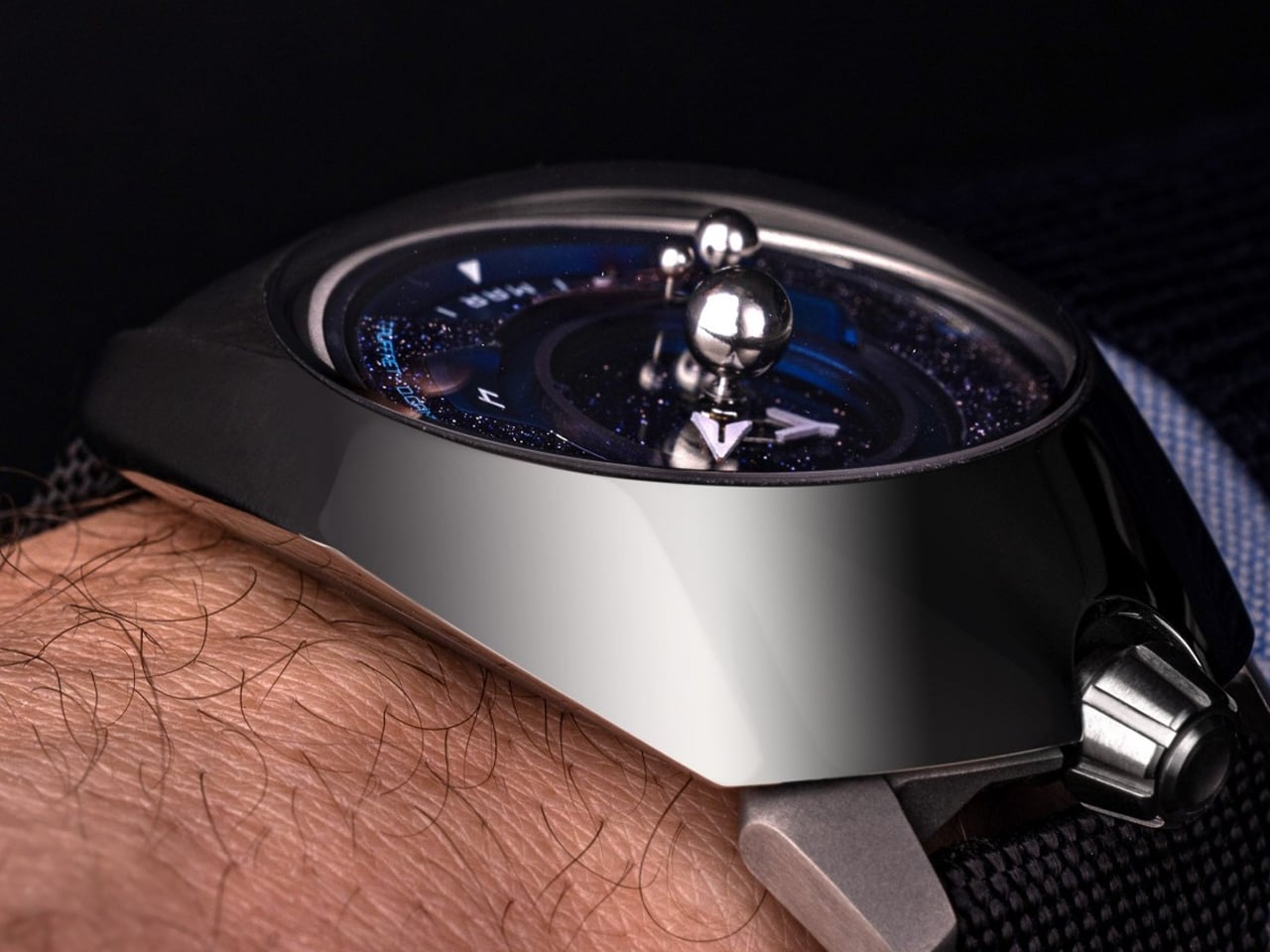
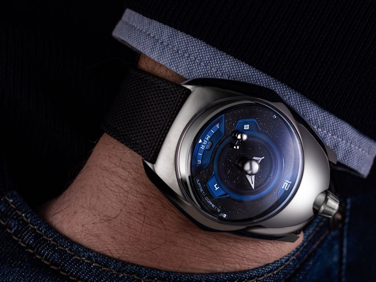
This complexity is driven by an intricate mechanical architecture built around the Soprod Caliber P024. A series of star wheels governs days, months, and orbital movement, allowing the Earth to complete one full revolution each year while guiding the Moon’s phases with remarkable accuracy. Housed in a lightweight Grade 5 titanium case, the design departs from traditional dial layouts, using a triangular division that reinforces its futuristic character. A deep black-and-blue palette, scattered with star-like markers, completes the watch’s refined celestial aesthetic.

5. Sculptural Art: Experiencing the Lunar Sublime

Lunar-inspired art shifts toward scale, silence, and depth. Large monolithic works use light-absorbing surfaces to create moments of visual disappearance, where form feels both present and absent. These pieces are less about image and more about sensation, drawing the viewer into stillness.

This approach treats art as a spatial experience rather than an ornament. Confronting the idea of the void, it challenges perception and spatial awareness. Positioned deliberately often at the end of a passage, such works create a journey through architecture, culminating in a quiet moment of reflection and cosmic pause.
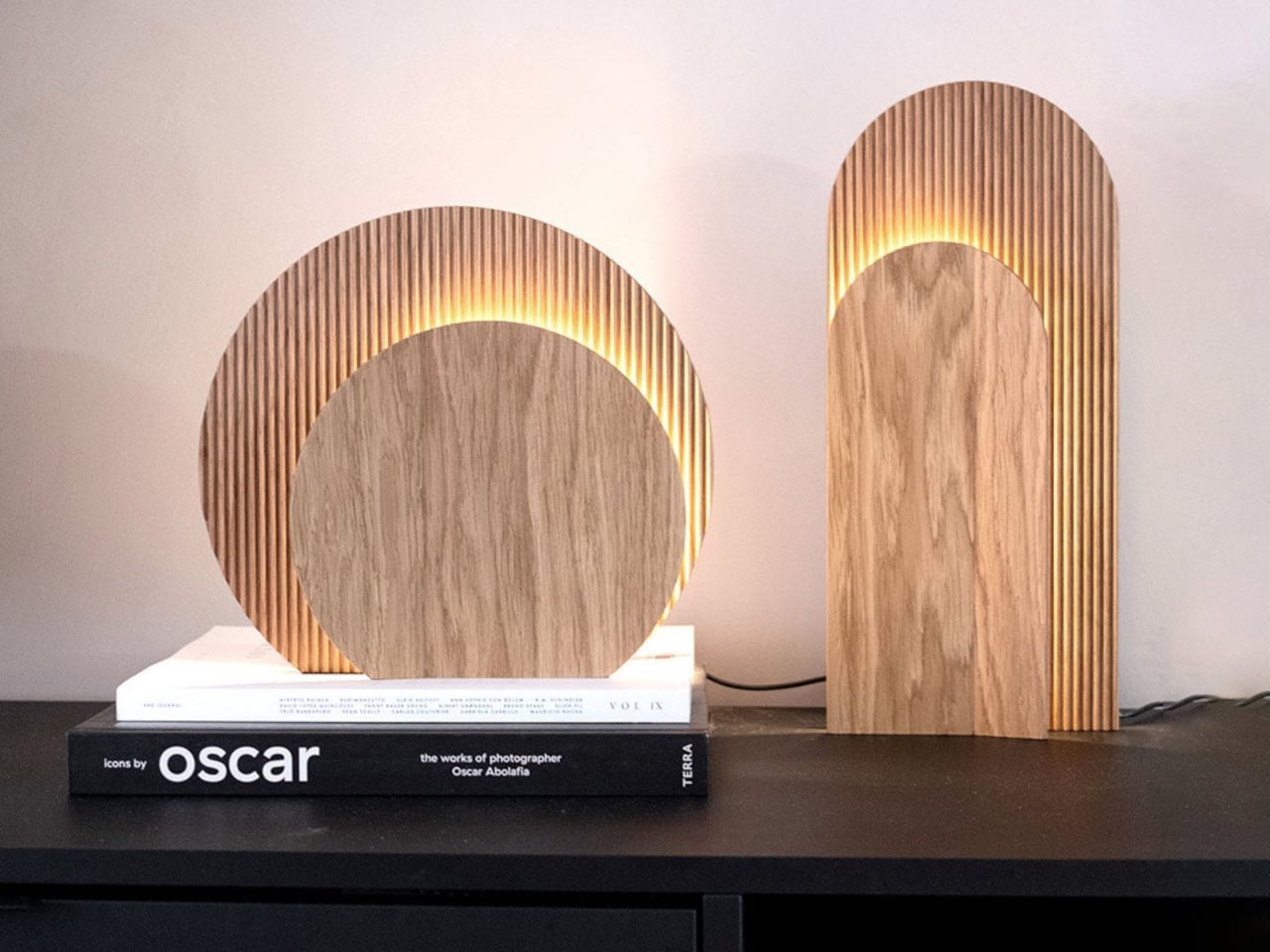
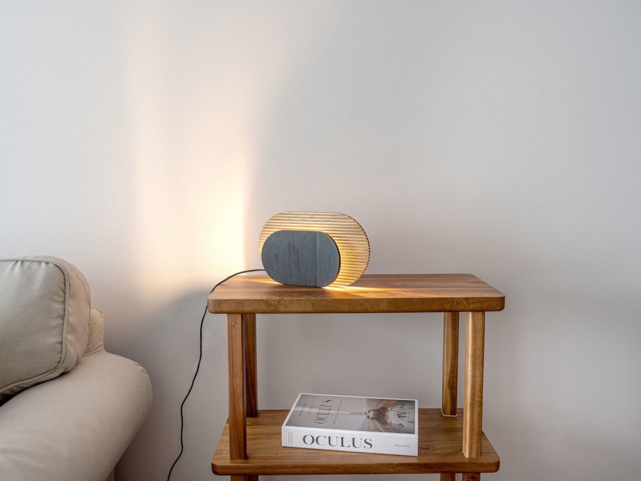
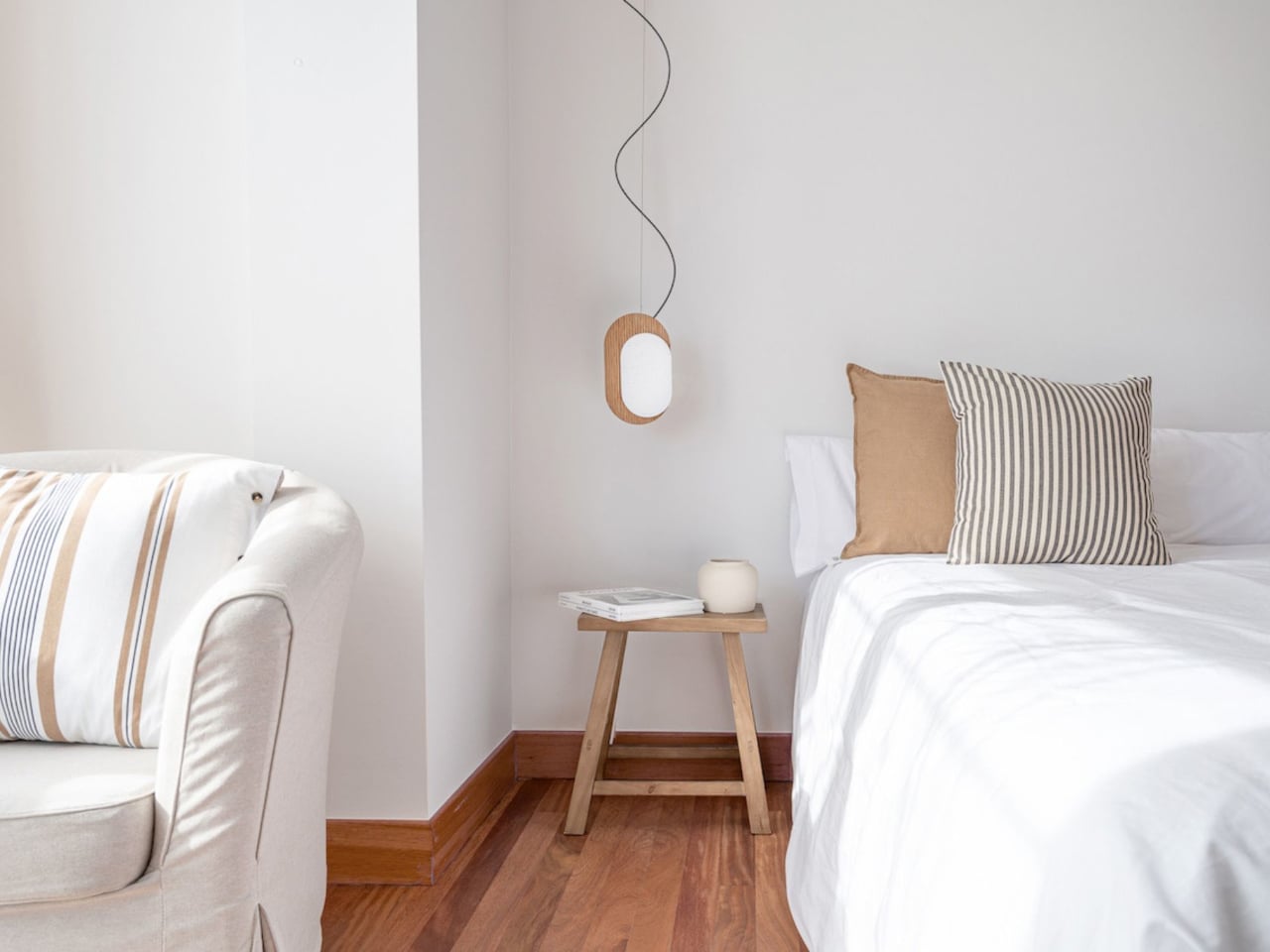
LUA is conceived as a sculptural lighting object that blurs the line between functional design and contemporary art. Created by Madrid-based brand Woodendot, the piece draws directly from the quiet poetry of the moon, translating celestial calm into a tactile, three-dimensional form. Its softly contoured geometry and layered construction allow light to emerge gently, creating an ethereal presence rather than a conventional source of illumination. As an object, LUA feels composed and intentional—designed to be viewed as much as it is to be used.
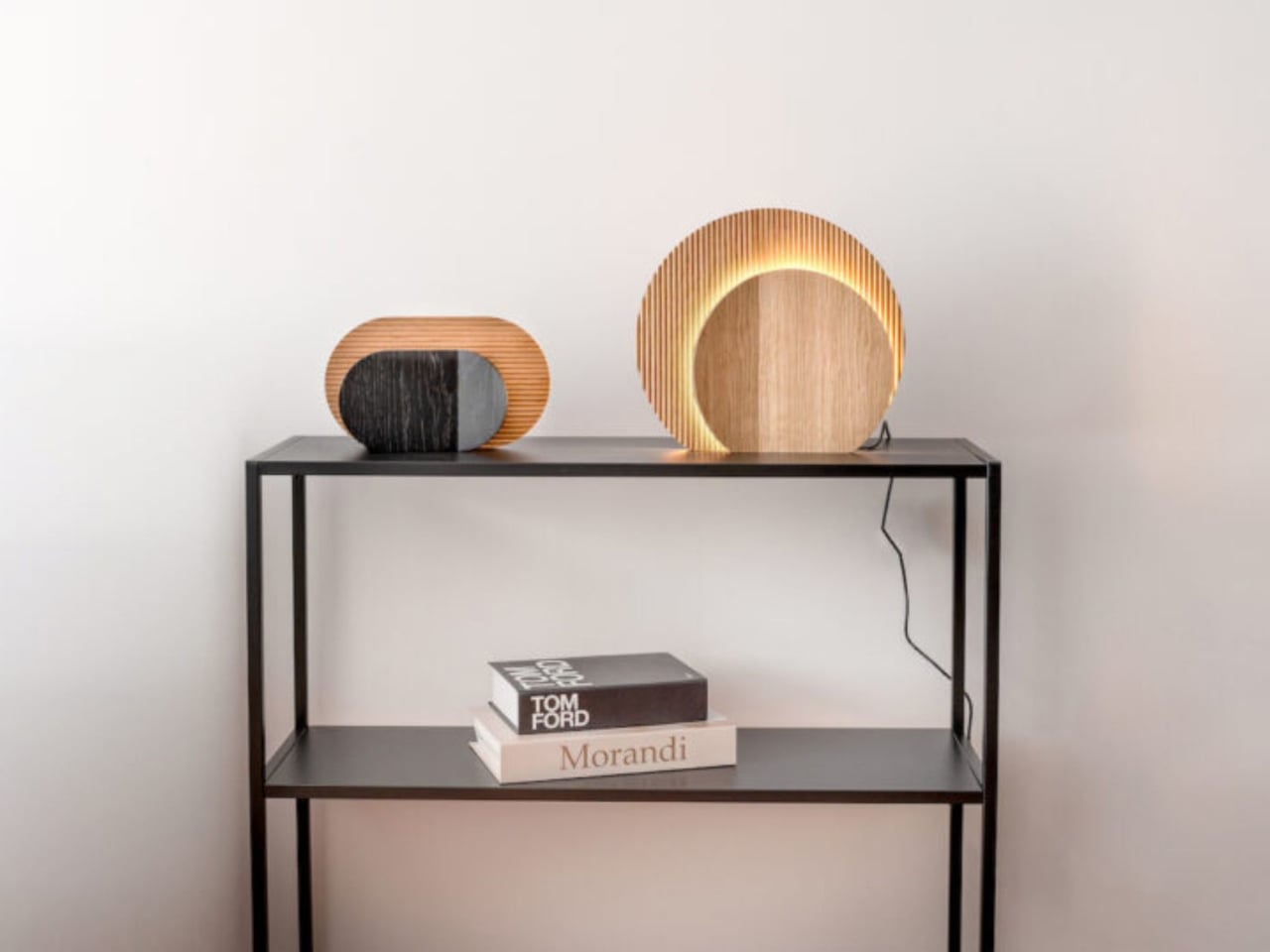
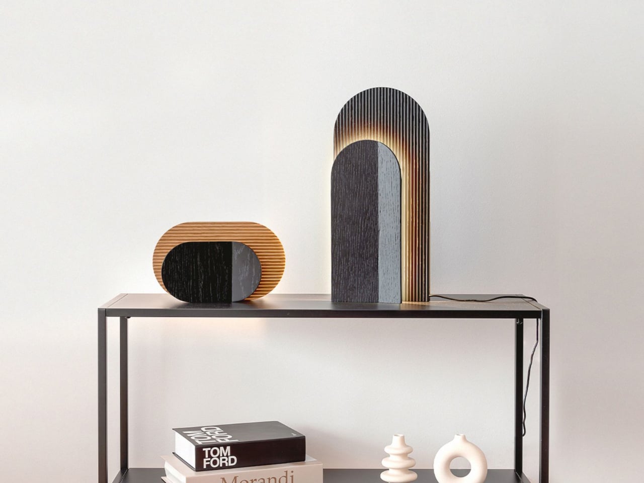
The sculptural quality of LUA lies in its interplay of planes, textures, and shadow. Two wooden panels form the core composition: a corrugated back panel that adds depth and material richness, and a smaller folded front panel that partially obscures the light, producing an eclipse-like halo. This subtle manipulation of form and light creates a dynamic visual effect that changes with perspective. Available in multiple shapes, sizes, and finishes, LUA functions as a quiet centerpiece—an artful intervention that enhances spatial mood through restraint, balance, and material expression.

“Moon as Muse” is not a passing trend but a deeper shift toward thoughtful and lasting design. It encourages designers to slow down and find balance between technology and emotion, structure and softness. By looking to the moon, design becomes more reflective and intentional.

This approach defines a quieter kind of luxury. It is not about excess, but about clarity—honest materials, restrained forms, and the careful use of light. In this stillness, spaces feel timeless, meaningful, and deeply connected to the way we experience our homes and the natural world.

The post 5 Product Designs That Brought the Moon Indoors: They’re All Stunning first appeared on Yanko Design.

This Practically Bulletproof Titanium Travel-Case Makes Your ‘Fragile’ Luxury Luggage Look Cheap

Aluminum dents. That is the trade you accept with most “premium” luggage. The grooves look great in the lounge, then a few trips later you are quietly cataloguing every new crease and corner hit. You can baby it, you can wince every time it goes into an overhead bin, but eventually the shell starts to look tired. Premium luggage, economy behavior.

Titanium changes the terms of that deal. AERIONN Forma treats aluminum the way iPhone Pro treats the regular iPhone: same category, different league. Apple moves the Pro models to titanium because it signals intent and performance in one move. Forma does the same. It uses certified Grade 1 titanium for the shell, formed as a single continuous body, so the case flexes under impact and returns to shape instead of locking in dents. It is the “Pro” material choice for people who live in airports and prefer their luggage to age, not degrade.

Designer: AERIONN

Click Here to Buy Now: $499 $1799 (72%). Hurry, only 3/688 left! Raised over $654,000.

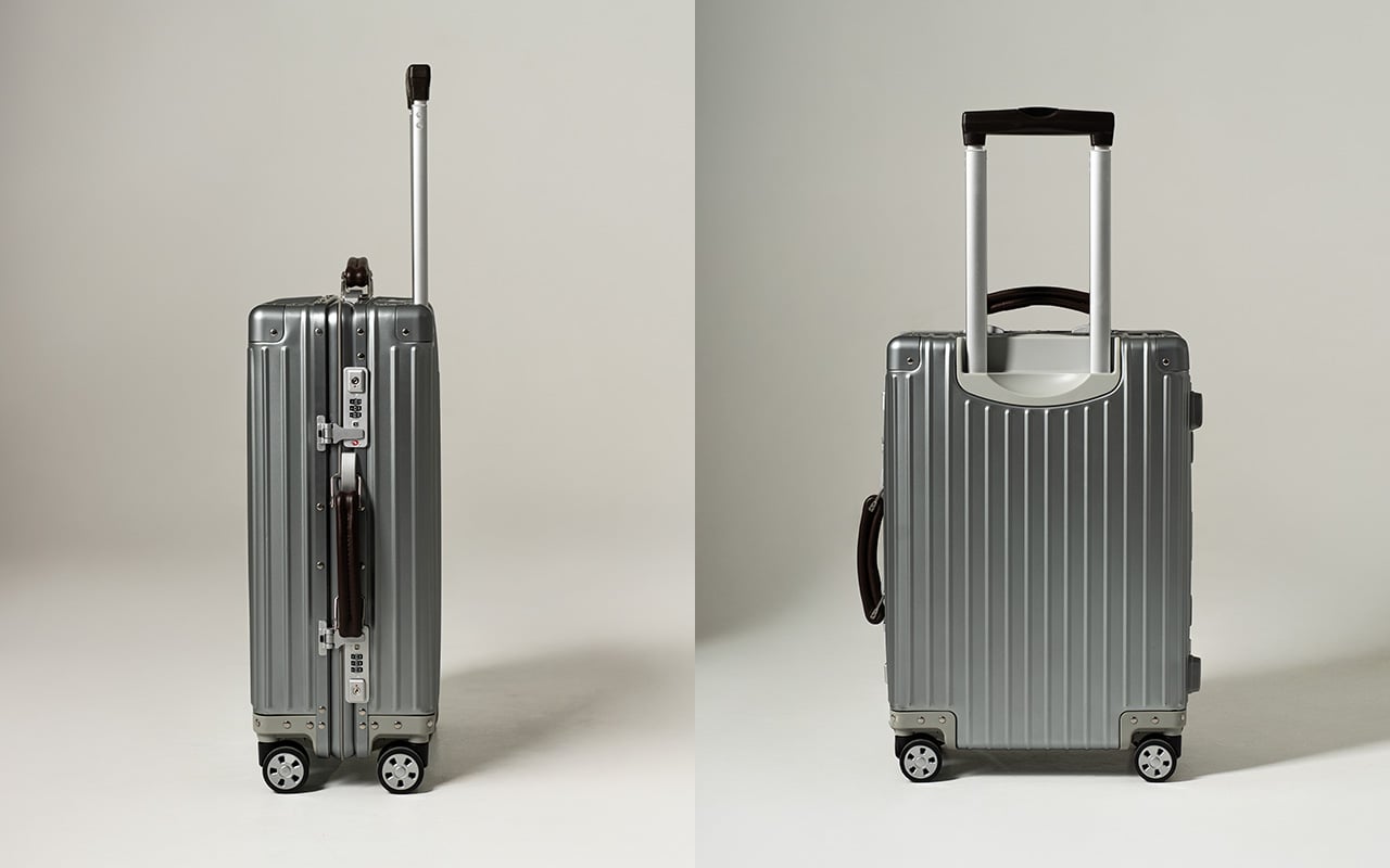
There’s a specific moment frequent travelers recognize. You’ve got lounge access, priority boarding, a seat that actually reclines, and you’re pulling luggage designed to be replaced in a few years. First class isn’t just a ticket, it’s a standard. AERIONN Forma was designed for travelers who understand that distinction. The Milanese design shows restraint where most luggage shows decoration. Clean architectural lines, a matte brushed titanium surface that resists fingerprints and develops subtle patina over time. The kind of wear that looks earned rather than abused. Leather-wrapped handles add warmth without competing for attention. This case looks like it belongs in the first-class cabin, carried by someone who travels often enough to know visible damage shouldn’t be part of the premium experience.
Apple uses aluminum for the standard iPhone. The Pro models get titanium. Same exact decision tree applies here. Titanium signals intent. It’s a more precious material than aluminum, harder to source, more expensive to work with, and significantly more durable under real-world stress. Grade 1 commercially pure titanium meets ASTM B265-15 certification standards, with tensile strength in the 290 to 310 MPa range, significantly higher than aluminum alloys used in luxury luggage. The shell has undergone thousands of repeated drop tests, bending tests, ultrasonic inspection, and dimensional verification. The testing isn’t about proving indestructibility, it’s about ensuring resilience under conditions where aluminum would show permanent damage. Titanium flexes to absorb impact, and only shows signs of wear and tear with rough use. Aluminum dents easy… and it stays dented.

The single continuous shell construction eliminates seams and structural weak points. Despite using industrial-grade material, the case weighs 4kg with weight distributed evenly across the entire structure. Lift it into an overhead bin and the weight doesn’t fight you. Roll it through a terminal and it tracks cleanly without pull or wobble. That movement comes from the AIRMOVE dual spinner wheels, engineered for low drag and quiet operation. No rattle, no vibration, just smooth motion that keeps pace instead of slowing you down. The multi-stage telescopic handle extends smoothly and locks firmly, with leather-wrapped touchpoints that feel substantial. Good luggage disappears during travel, requiring no conscious effort to manage.

Security is handled without zippers, which remain the most common failure point in luggage. A precision TSA latch system sits flush with the titanium shell, allowing inspections without damage while removing fabric, teeth, and stress points entirely. It’s invisible when closed, dependable when needed. Metal latches integrated into aerospace-grade titanium don’t have the failure modes that plague zipper-based systems. The TSA-approved combination lock integrates directly into the shell. No exposed mechanisms, no added bulk, no interruption to the clean form. This approach to security makes the case look refined while actually being more secure than conventional designs.

The matte brushed titanium surface does something interesting over time. It develops a natural patina that reflects use without looking damaged. Fingerprints don’t show. Minor contact marks blend into the finish rather than standing out. After years of travel, the surface tells a story without looking beaten up. This separates objects you keep from objects you replace. Titanium naturally resists corrosion, so the shell maintains structural integrity without protective coatings or finishes that eventually wear through. Temperature extremes don’t compromise strength. A precision-fit silicone seal keeps water out, protecting belongings from rain and splashes during transit. The case is designed to be used repeatedly and to look better for it.

The interior uses a dual-compartment layout that keeps packing organized from departure to arrival. Compression straps on one side secure clothing and minimize wrinkles. A full divider panel on the other side contains shoes, toiletries, and essentials. Integrated pockets hold smaller items so you’re not digging through layers to find what you need. The durable nylon lining wipes clean easily and holds shape after repeated use. Nothing flashy, nothing wasted. Dimensions are 55 x 36 x 23 cm, fitting standard airline carry-on requirements while offering 38L capacity. The layout supports efficient packing and easy access, which matters when you’re moving through multiple cities in compressed timeframes.

For EDC enthusiasts and design-focused travelers, durability is status. Knowing your carry-on can handle abuse that would destroy conventional luggage is the quiet flex. Soft-shell Samsonite is lighter, cheaper, and never dents because it’s designed for economy class standards. It won’t be noticed from ten feet away and it won’t give you the VIP feeling that comes with carrying something genuinely exceptional. Titanium luggage exists in a different category entirely. It’s luggage meant to last decades, not seasons. The buy-once philosophy changes the economics. A $1,500 aluminum case that needs replacement after five years costs more over time than a $1,799 titanium case that lasts twenty years. Longevity becomes luxury when the alternative is planned obsolescence.

AERIONN Forma is currently available with Super Early Bird pricing at $499, Early Bird at $699, and a two-pack bundle at $975. Standard retail pricing is $1,799. Shipping begins July 2026, with fulfillment handled globally. Aluminum carry-ons from established luxury brands typically range from $1,200 to $1,700 depending on size and features. Titanium luggage rarely appears in this segment, and when it does, pricing usually exceeds $2,000. Early pricing positions aerospace-grade materials as accessible for travelers who recognize that upfront cost matters less than total cost of ownership. This case represents a shift in how premium luggage gets engineered and priced.

Click Here to Buy Now: $499 $1799 (72%). Hurry, only 3/688 left! Raised over $654,000.

The post This Practically Bulletproof Titanium Travel-Case Makes Your ‘Fragile’ Luxury Luggage Look Cheap first appeared on Yanko Design.