This Modular Console Changes Layout With Magnetic Snap-In Controls

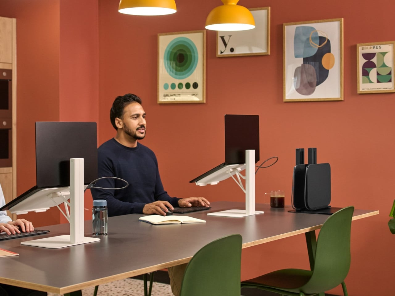
Modern creative desks are covered in controllers. A Stream Deck for macros, a MIDI controller for faders, a tablet for drawing, maybe a separate panel for color grading. Each tool is great at one thing but locks its layout in place, so switching from streaming to editing to design means mentally remapping controls or physically swapping gear, sometimes both when you’re already behind schedule.

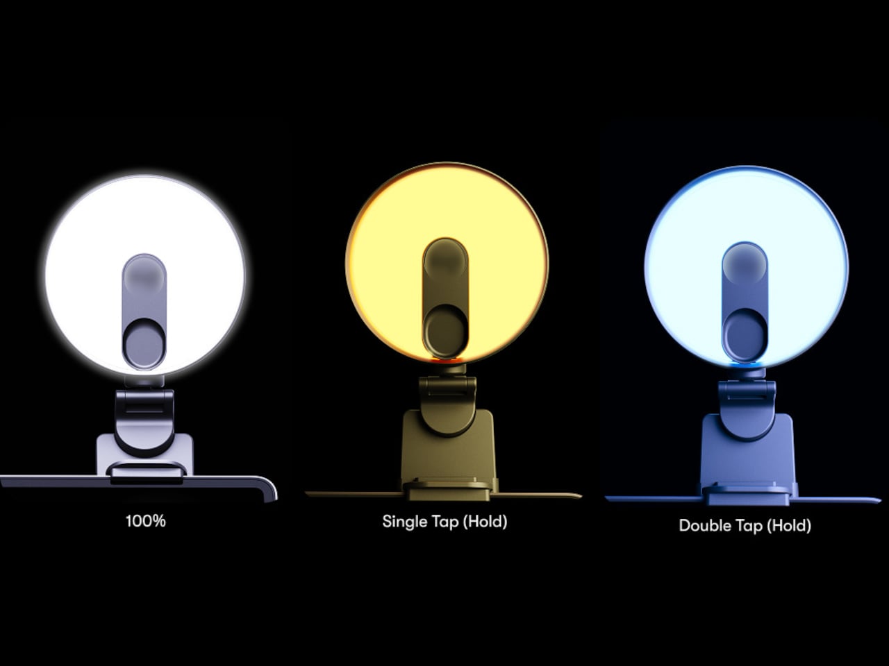
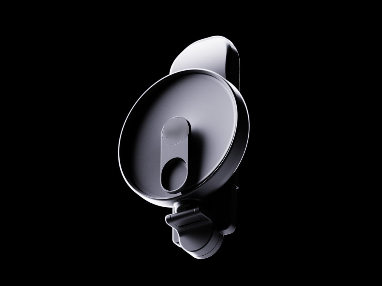
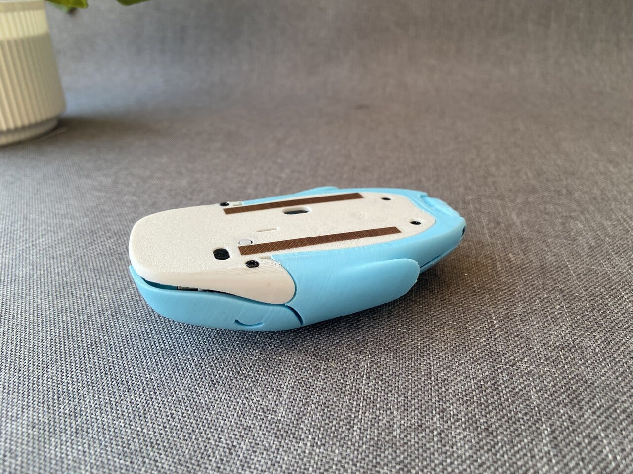
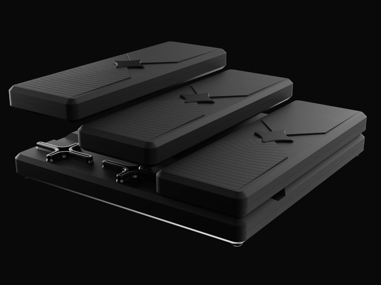
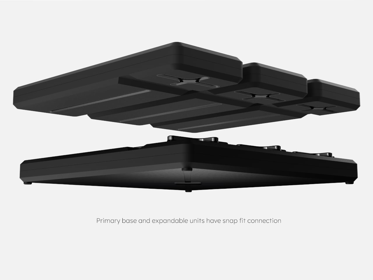
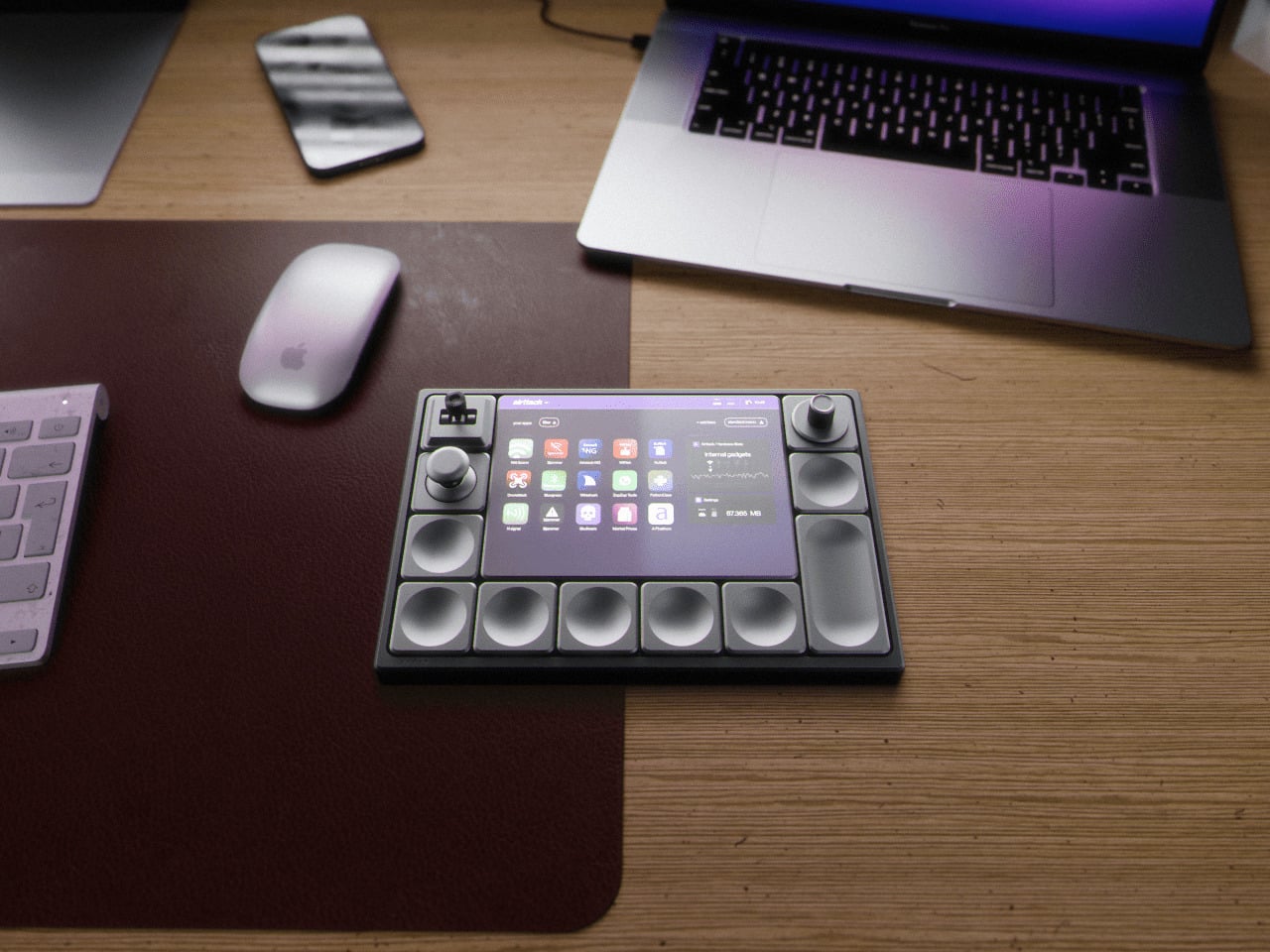
Airttack One is a concept that imagines a single, modular slab that can become any of those controllers in seconds. Described as a “modular revolution,” it’s a minimalist device with a magnetic base that accepts different hardware modules, LCD screens, knobs, joysticks, and button clusters. You rebuild the surface for the task instead of living with a one-size-fits-all grid that only makes sense for one app.

Designer: Alberto Cristino, Mateus Otto (Prosper Visuals)

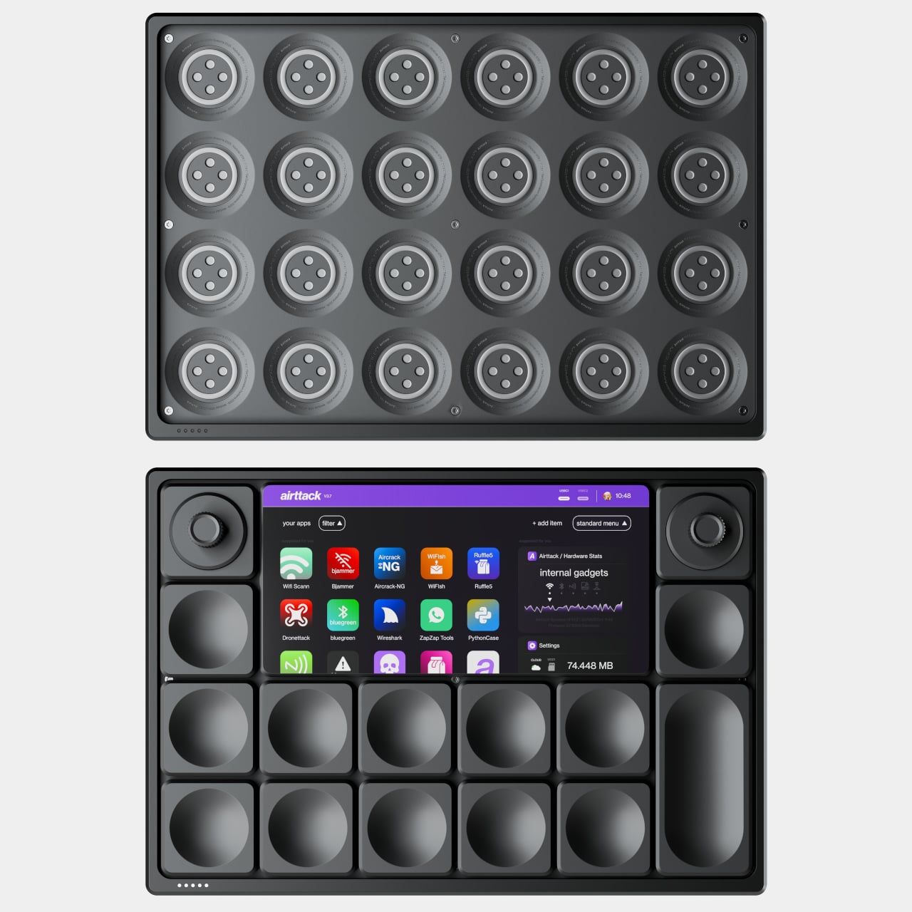
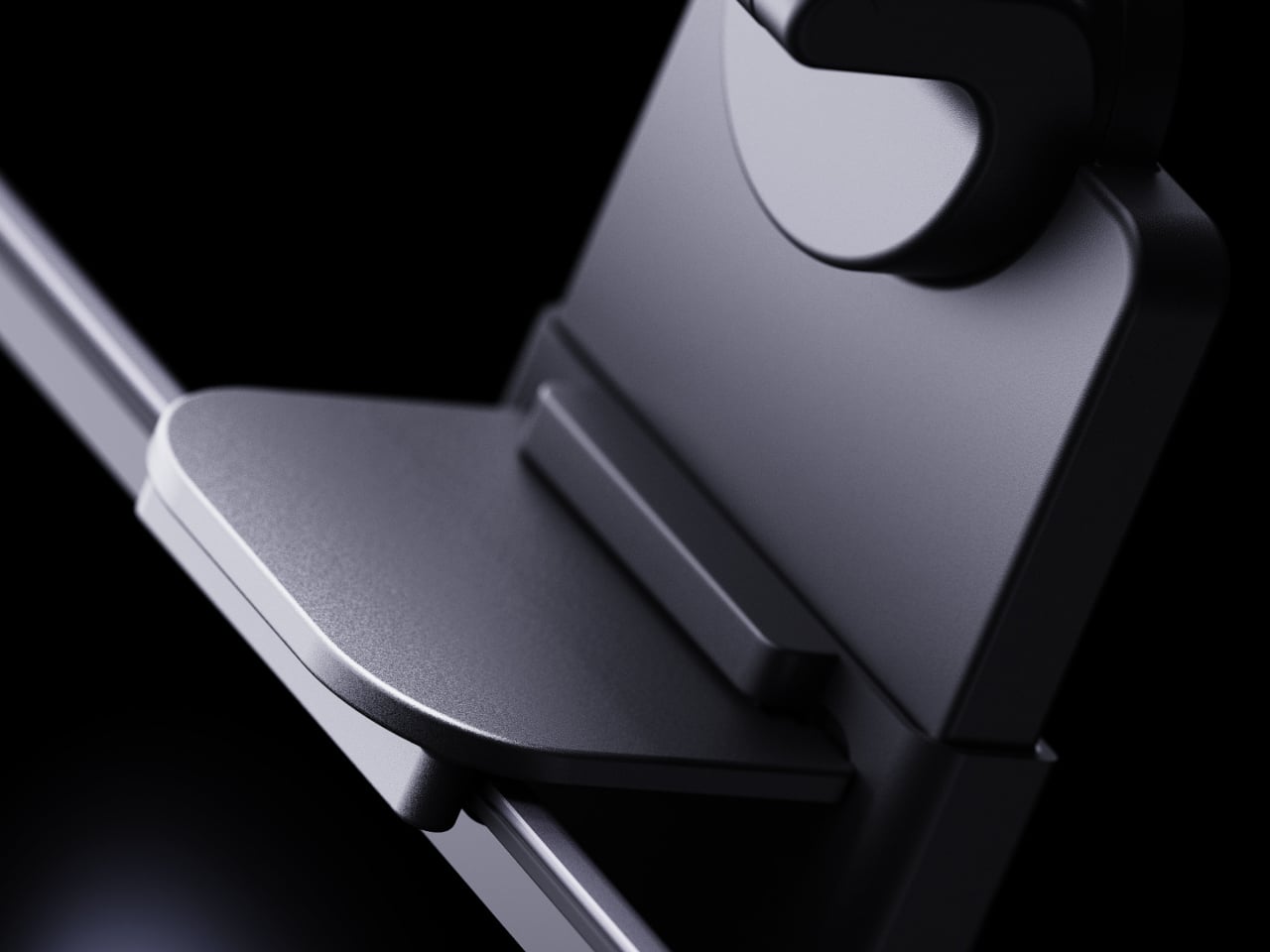
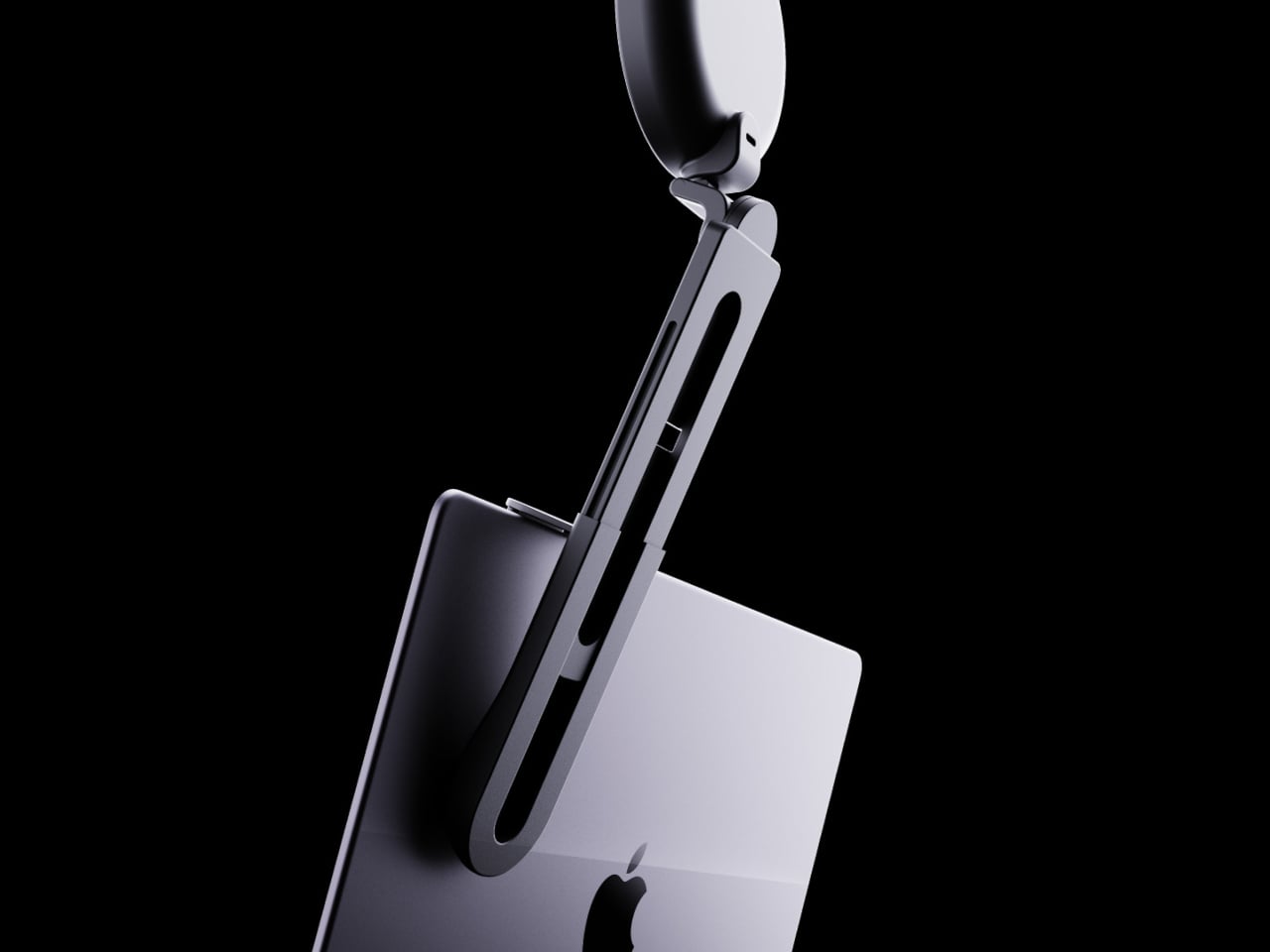
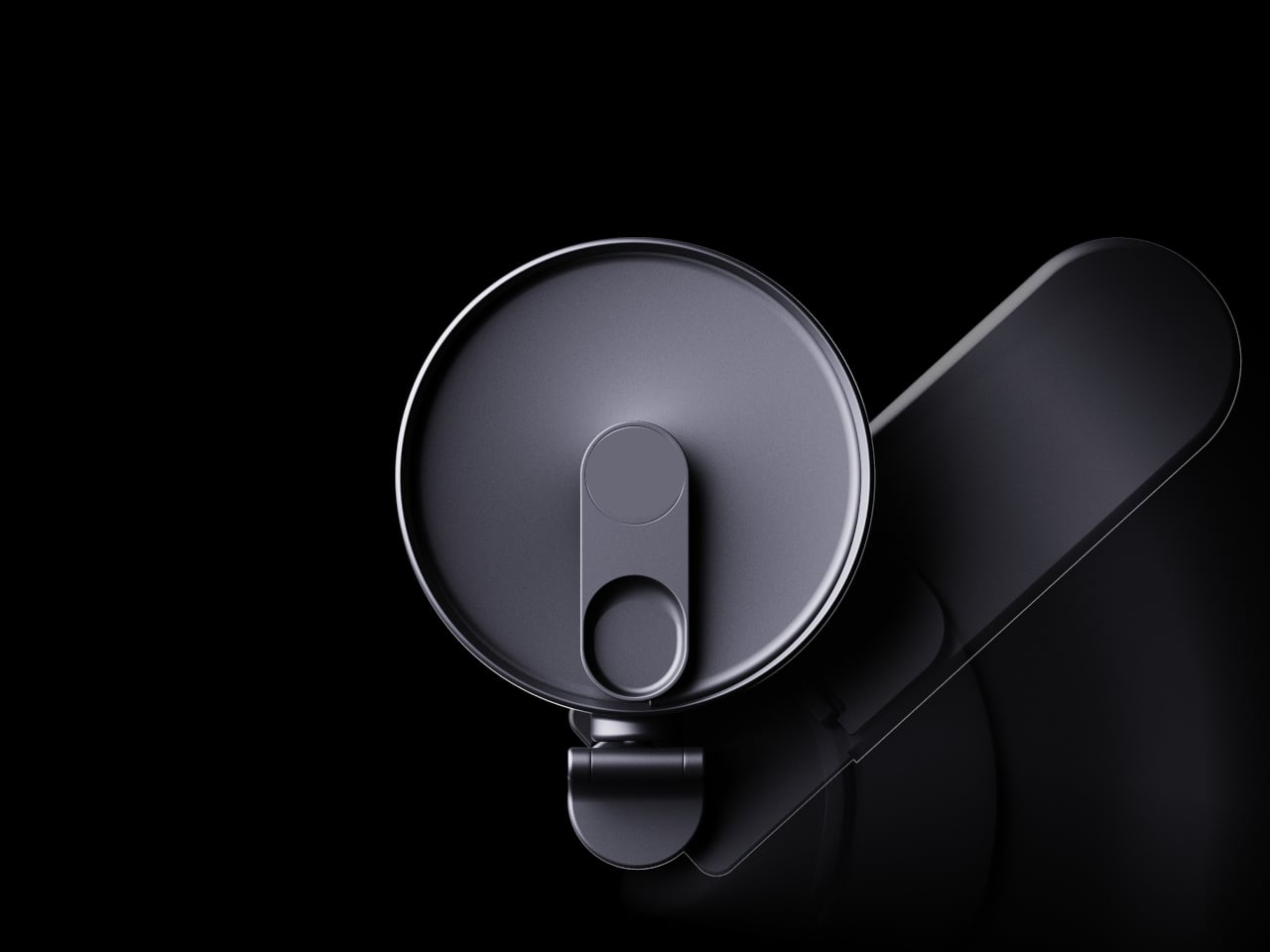
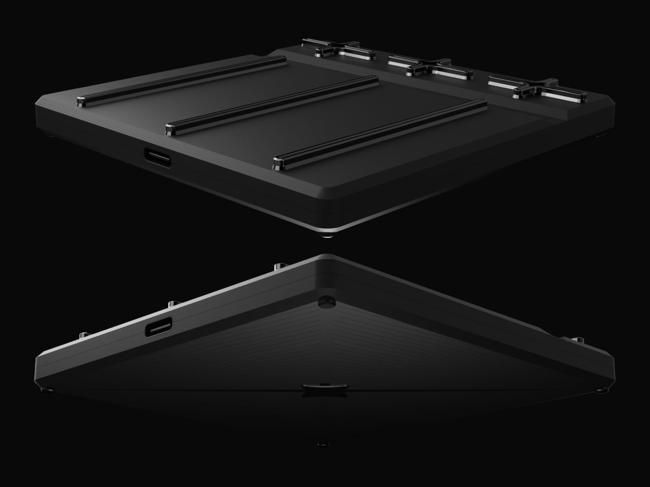
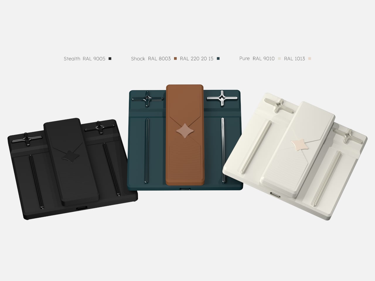
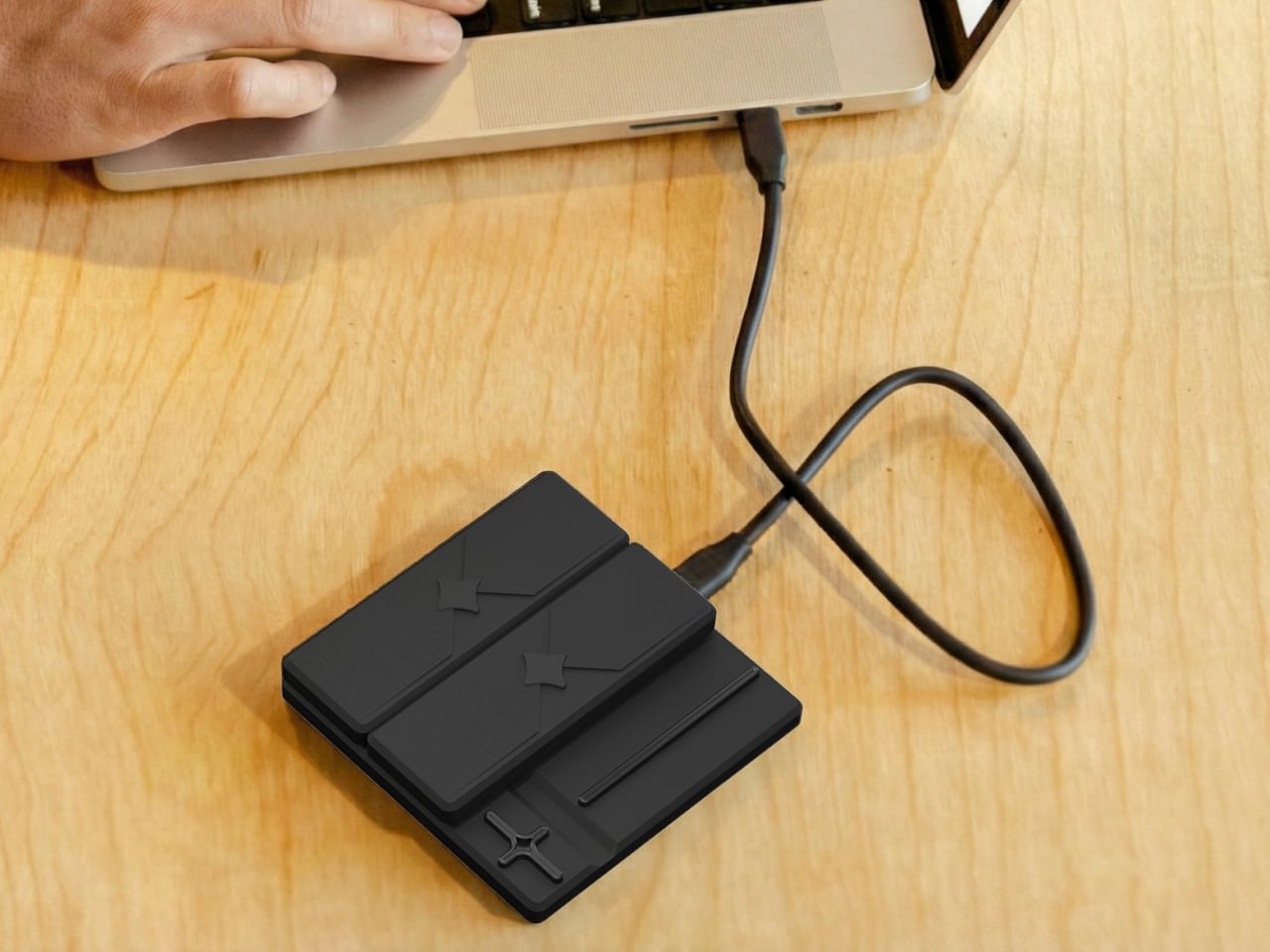
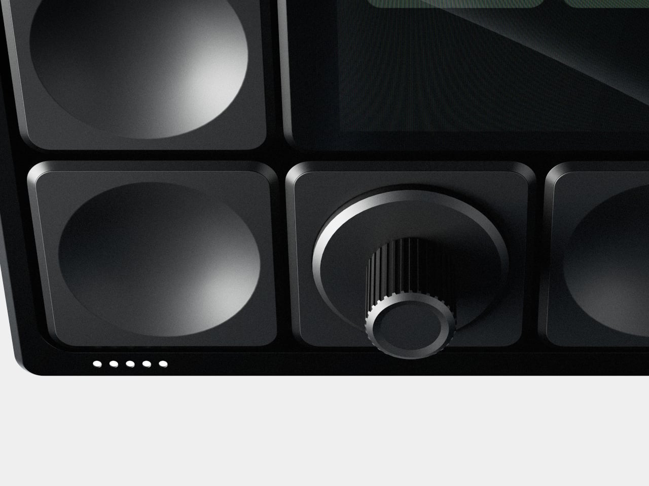
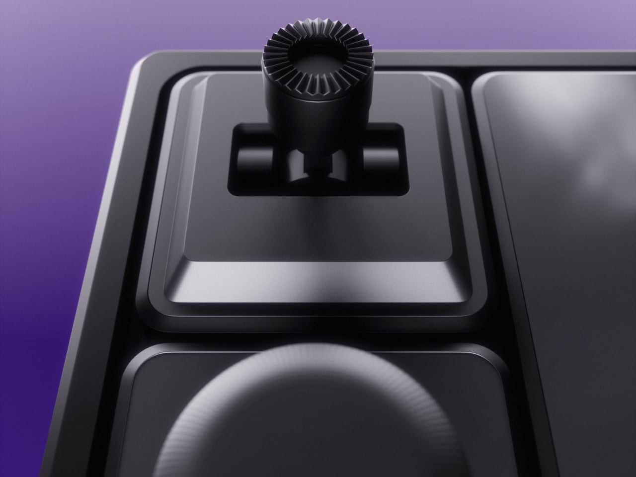
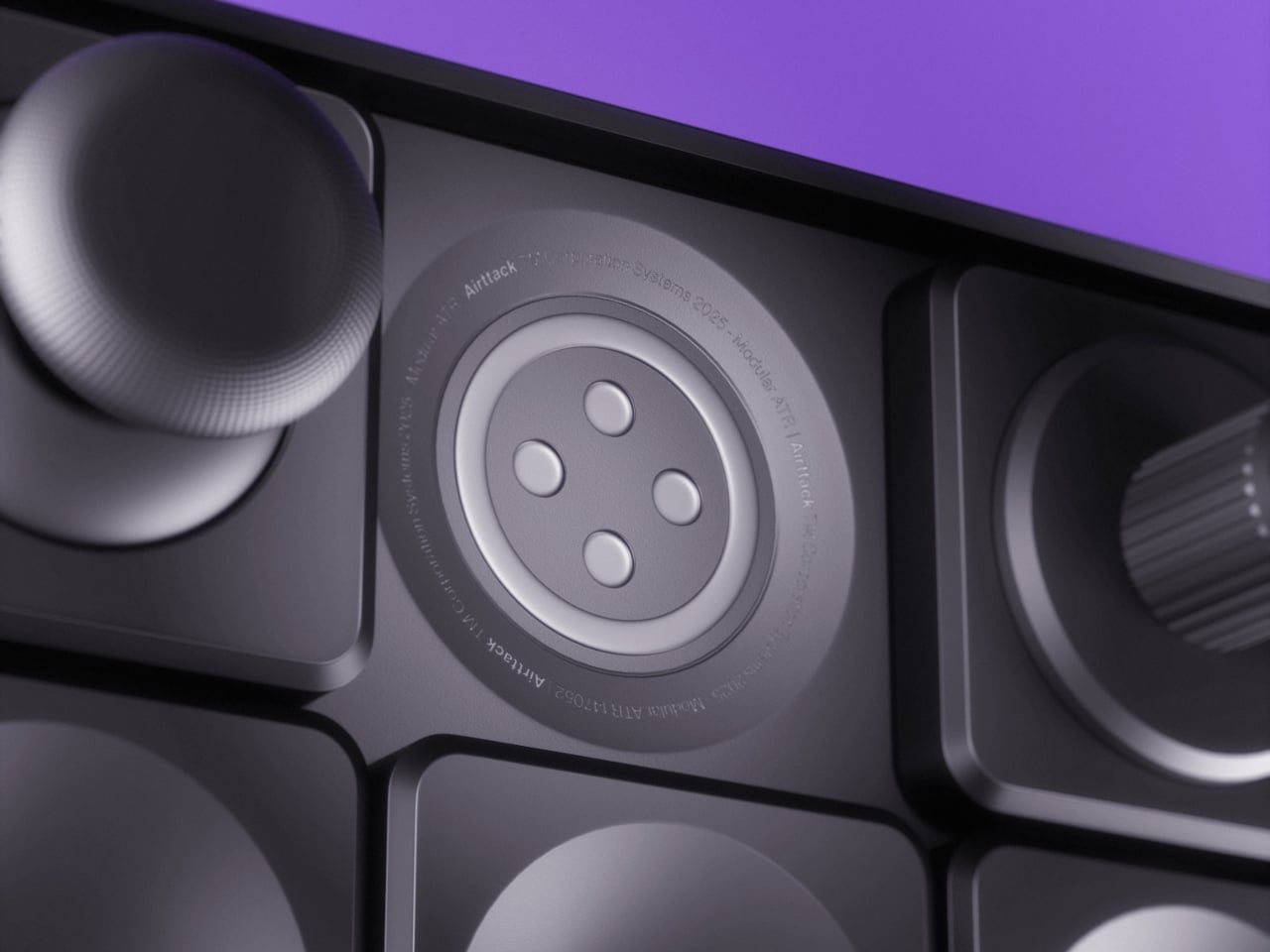
The base is a grid of circular sockets with power and data contacts. You snap in modules in whatever arrangement makes sense. A streaming session might use a central screen for scenes and chat, surrounded by buttons for triggers and a fader strip for audio. A video edit later that night swaps those for jog wheels, scrub knobs, and dedicated cut keys, each magnetically locked into place without tools or software reassignments.

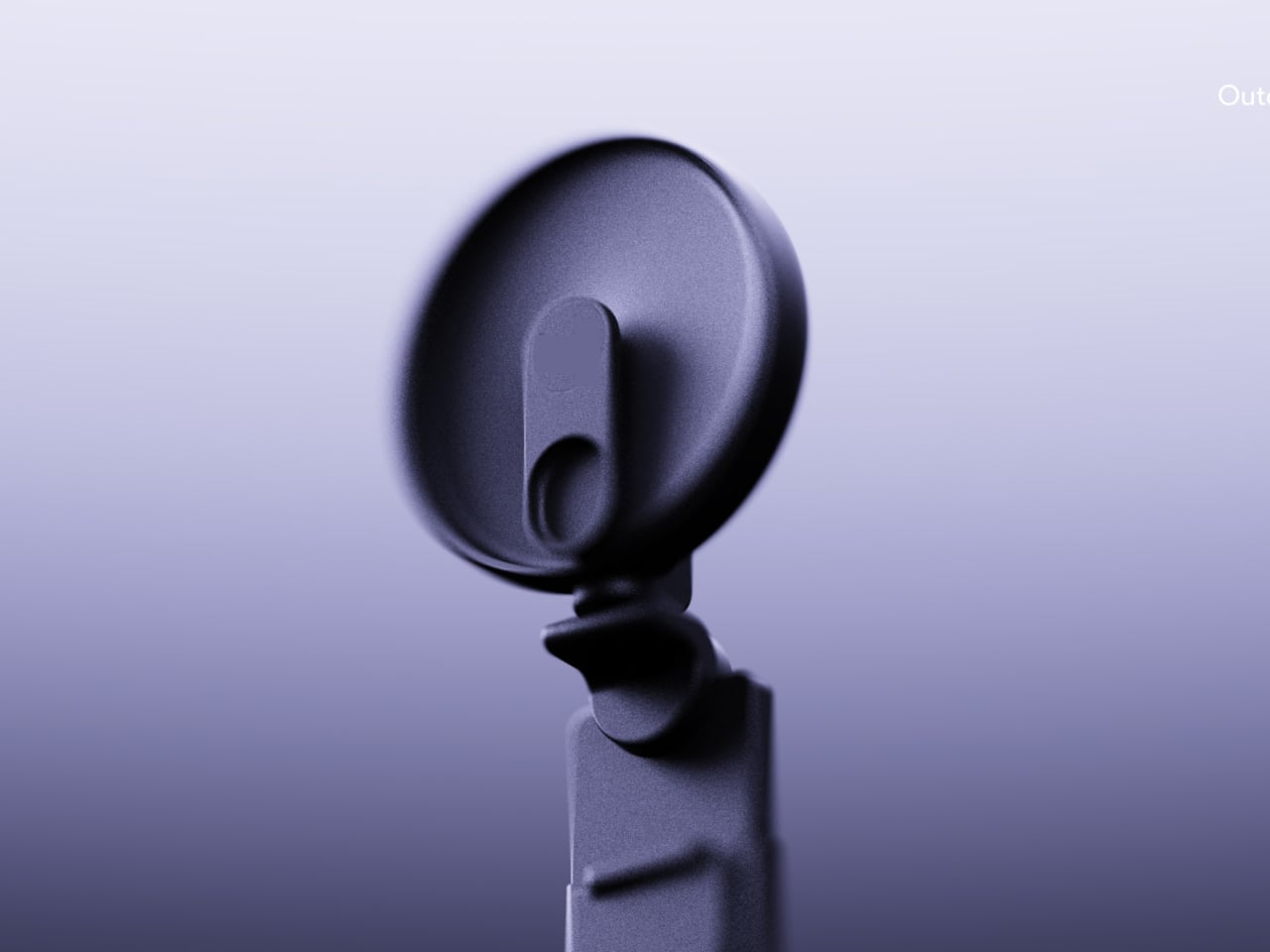
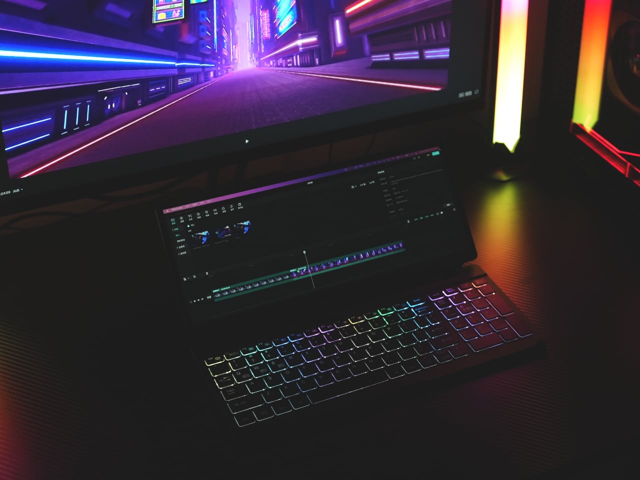
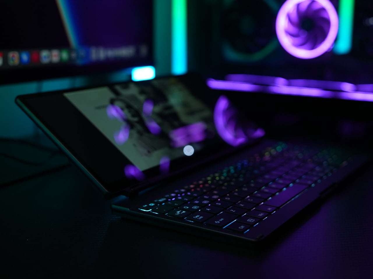
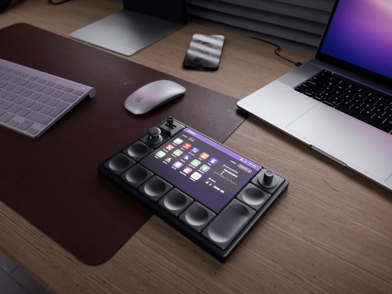
The software side runs on a 1500-nit touchscreen that stays readable under studio lights. An iOS-inspired interface shows a grid of apps, and a third-party store extends what the hardware can do, from streaming overlays to DAW controllers to brush panels. Each app can push its own layout to the modules, so the same physical knobs and screens behave differently in Resolve, Ableton, or Blender without manual mapping.

Dual cameras with a LiDAR sensor hint at depth-aware capture, AR previews, or motion-tracked controls. The concept also references radio and network tools, which in creative terms could mean wireless camera management, multi-device streaming, or interactive installations. The hardware isn’t locked to one discipline. It’s a blank, magnetic canvas for whatever combination of inputs your project needs.

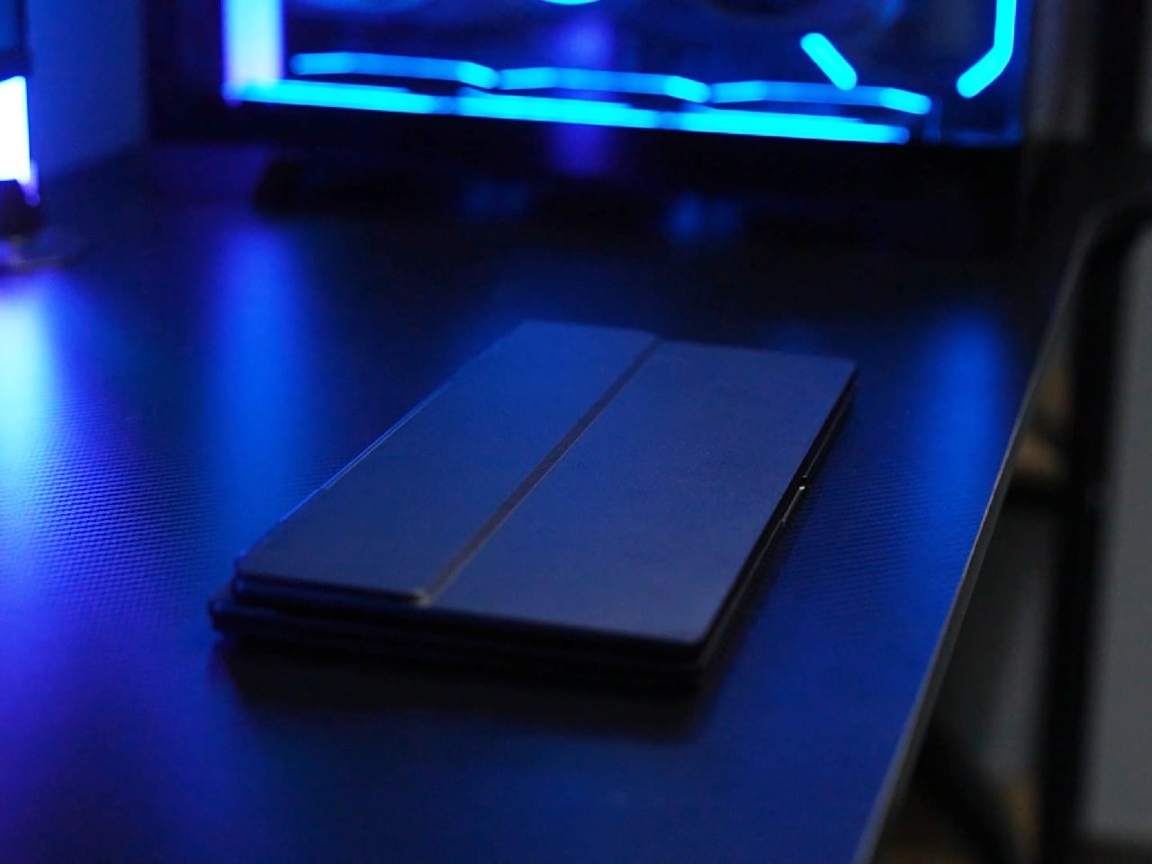
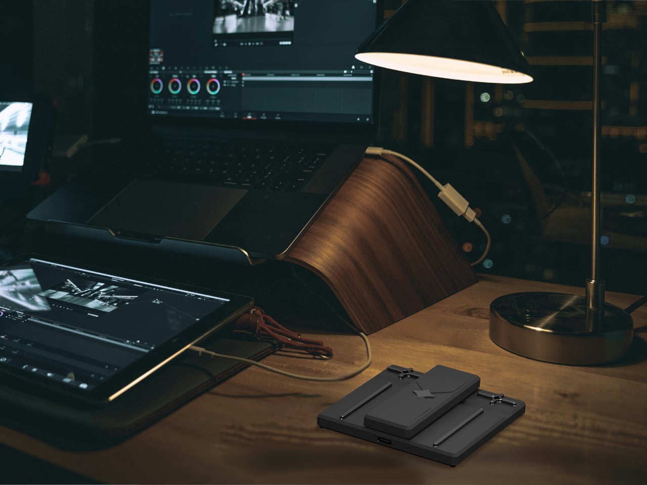
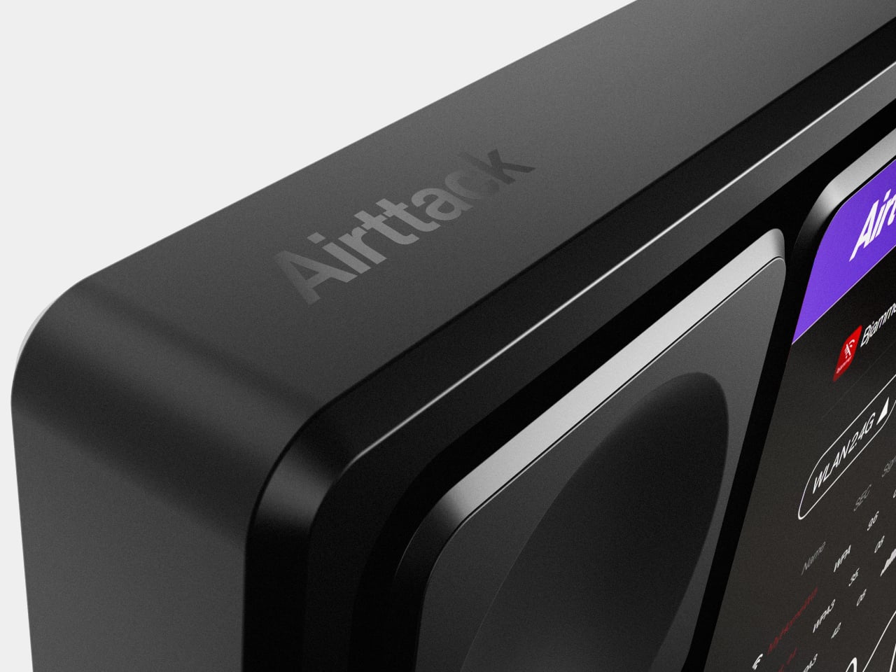
Airttack lives on a desk as a control surface during the day, then drops into a bag with different modules for an on-site shoot or live event. The industrial design stays low-profile and discreet, with metallic textures and magnetic connectors hidden under a clean grid, so it reads as a serious tool even when the layout is playful, full of knobs and joysticks for a VJ set or game stream.

Airttack One imagines hardware catching up to the way creative software already works: modular, layered, and context-aware. Instead of buying a new controller every time your workflow evolves, you rearrange the same base, load a different app set, and keep going. Whether or not this exact device ships, the idea of a shape-shifting creative console that molds itself to your projects feels overdue when most of us already juggle three controllers that could have been one.

The post This Modular Console Changes Layout With Magnetic Snap-In Controls first appeared on Yanko Design.

Edrin 6-in-1 Carabiner-Knife Lives on Your Belt, Not in Your Bag

You technically own the right tools: a knife in a bag pocket, a small driver in a drawer, a keychain gadget somewhere under receipts. But when something needs cutting or tightening, the moment passes while you are still searching. The real problem isn’t capability but access, and the tools you actually use are the ones that live where your hand already goes instead of being buried at the bottom of a pack.

Edrin is a titanium carabiner-first knife that treats the clip, not the blade, as the starting point. It is a compact 6-in-1 tool built around a GR5 titanium frame with an integrated carabiner, a separate D-ring for keys, and a folding D2 blade tucked into the side. The goal is simple: it stays clipped to your belt loop, pack strap, or pocket edge all day, instead of disappearing into a bag.

Designer: MR. GADGET

Click Here to Buy Now: $75 $109 (31% off). Hurry, 88/100 left!

The body is CNC-machined from Grade 5 titanium, which keeps weight down to around 1.54oz while staying rigid and corrosion-resistant. Carbon fiber inlays add grip and a bit of contrast without bulk. At about 3.29 inches long and just over half an inch thick, it feels more like a small piece of industrial jewelry than a lump of hardware, which makes it easier to justify keeping it on you every day.

1

The blade is a compact D2 steel folder designed for control rather than drama. It opens with either hand, locks in place with a dedicated mechanism, and is meant for the kind of cutting you actually do: opening boxes, trimming cord, slicing tape, or cutting a loose thread. High-hardness D2 holds an edge well, so you are not constantly babying it, and the short length keeps it precise.

1

1

The magnetic 4mm bit driver is built into the frame, with a slot that stores the bit under strong magnets so it does not rattle or fall out. Day after day, it is the same little jobs: a loose screw on a tripod, a battery cover that needs a quarter turn, a handle that is starting to wobble. Having a bit driver literally hanging off your belt means those fixes happen in the moment instead of becoming another mental note.

1

The bottle opener and nail puller are integrated into the skeleton of the carabiner, so popping a cap or lifting a small nail does not require digging for another tool. The emergency glass breaker sits quietly at one end, a hardened point that you hope never to use but that is always there if a car window or barrier needs to go in a hurry. Best of all, none of these functions adds much size.

Six tiny tritium slots are machined into the body, ready for optional vials that glow on their own without batteries or charging. In a dark car, a tent, or a hallway, that steady, low-level glow makes it easier to find the tool and orient it without fumbling for a flashlight. It is a small detail, but it reinforces the idea that Edrin is meant to be found and used quickly.

A tool like this quietly changes your routine. Instead of asking whether you should bring a knife or a multi-tool, you clip one titanium carabiner to your usual spot and forget about it until something needs cutting, opening, adjusting, or breaking. The combination of GR5 titanium, carbon fiber, D2 steel, magnets, and tritium sounds overbuilt for a 3.29-inch object, but that is exactly what makes it feel like a small, reliable anchor in a pocket full of temporary things that change every season.

Click Here to Buy Now: $75 $109 (31% off). Hurry, 88/100 left!

The post Edrin 6-in-1 Carabiner-Knife Lives on Your Belt, Not in Your Bag first appeared on Yanko Design.

The Umbrella Stand That Refuses to Be Grey or Boring

There’s something quietly rebellious about a product that announces its refusal to blend into the background right there in its name. Meet notgrey, an umbrella stand from designer Joffey that’s basically the antithesis of every sad, utilitarian coat rack you’ve ever ignored in a hotel lobby.

At first glance, it looks almost like a piece of kinetic sculpture that wandered out of a modern art museum and decided to make itself useful. A slender black metal frame rises from a bold blue base, punctuated by a cone-shaped holder in that perfect burnt orange-red that interior designers are always calling “terracotta” but really just makes you think of summer sunsets and Spanish roof tiles. Perched on one of the extending arms is a warm orange dish that could easily pass for a decorative accent if it weren’t so brilliantly practical.

Designer: Design by Joffey

The genius of notgrey is how it takes something most of us barely think about and turns it into a conversation piece. Umbrella stands traditionally occupy that weird category of household objects we know we probably need but can never quite get excited about. They’re the sensible shoes of home furnishings. But Joffey has created something that makes you actually want to display your rainy day clutter.

Let’s talk about what it actually does, because this isn’t just pretty geometry. The cone holder catches your dripping umbrella without taking up much floor space. The extending arm supports a coat hook that can handle your wet jacket. That orange dish? Perfect for corralling keys, sunglasses, your phone, or whatever else you’re juggling when you stumble through the door. And at the base, there’s room to kick off your shoes, keeping everything you need for coming and going in one tidy vertical arrangement.

What makes this design particularly smart is how it maximizes vertical space. Small entryways are notoriously tricky to organize, you need storage but you can’t sacrifice precious square footage. Notgrey solves this by building up instead of out. The slender profile means it tucks nicely beside a door without creating an obstacle course, while still offering multiple functions stacked on that single pole.

The color choices feel intentional in a way that goes beyond just being eye-catching. That blue base grounds the whole piece, literally and visually. The red cone creates a focal point that draws your eye without overwhelming the space. And the orange dish adds warmth that keeps the primary colors from feeling too stark or toy-like. Together, they create a palette that feels both playful and sophisticated, which is a surprisingly tricky balance to strike.

There’s also something refreshing about a functional object that doesn’t apologize for taking up visual space. So much contemporary design is obsessed with disappearing, with being invisible and unobtrusive. Everything’s supposed to be minimalist and neutral and blend seamlessly into your carefully curated aesthetic. But notgrey takes the opposite approach. It says, if I’m going to be in your home, if I’m going to serve a purpose, I might as well look interesting while I’m at it.

This is exactly the kind of design that makes mundane routines feel a little more special. Coming home on a grey, drizzly day and having somewhere cheerful and organized to stash your soggy belongings is the kind of small pleasure that accumulates over time. It’s not going to change your life, but it might change how you feel about your entryway, which is more than most umbrella stands can claim.

For anyone who’s been looking at their cluttered doorway and thinking there has to be a better solution than a pile of wet coats on the floor and umbrellas propped against the wall, notgrey offers an answer that’s both practical and genuinely delightful to look at. It’s proof that even the most ordinary household problems deserve solutions with a little personality.

In a market saturated with beige and white and “goes with everything” neutrals, here’s a design that confidently announces its presence. And really, isn’t that exactly what you want from something whose literal name is a rejection of dullness?

The post The Umbrella Stand That Refuses to Be Grey or Boring first appeared on Yanko Design.

Pebblebee Clip 5 Hot Coral and Subzero Trackers Won’t Be Restocked

Bluetooth trackers usually behave like small discs or tags you hide on keys and bags and forget about until something goes missing. They tend to come in grayscale, designed to disappear, even though they live on things you carry every day. There’s room for a tracker that feels more like a deliberate accessory choice instead of invisible insurance dangling off your keychain.

Pebblebee’s Evercolor program is a limited-edition color drop series for Clip 5, and Freeze Frame is the latest release. The brand launched two new colors, Subzero and Hot Coral, framed around temperature as “our first teacher.” The drop is time-limited, never repeated, and meant to make carrying a tracker feel personal and collectible rather than generic, more like picking a phone case than just buying another black tag.

Designer: Pebblebee

Pebblebee positions Subzero as a restrained, icy blue that reflects calm, control, and stillness, and Hot Coral as a warm, saturated coral red that signals energy, urgency, and action. The pair is meant to capture that early lesson of cold and heat, pause and response, turning the act of clipping a tag to your keys or bag into a small statement about how you relate to that item.

Under the new colors sits the same Clip 5 hardware. It’s Pebblebee’s latest item finder, with brighter LED strobes, a louder buzzer, and a more modern, rounded design. It runs for up to twelve months on a single USB-C charge, has an IP66 water resistance rating, and reaches up to 500 ft over Bluetooth. It’s built to be found by sound, by sight, and now by style.

Clip 5 can join Apple’s Find My network on iOS or Google’s Find Hub on Android, so billions of devices quietly help you find lost items. There’s also a built-in Alert personal safety feature, where rapid presses trigger a siren, strobe, and SMS location ping to your chosen Safety Circle. That makes the color choice feel a bit more loaded when you think about where you clip it and when you might need it.

Evercolor drops are designed as moments, not permanent SKUs, and these shades won’t be restocked once they sell out. That scarcity nudges trackers into the same mental space as seasonal phone cases or watch bands, something you pick on purpose for a specific bag, coat, or set of keys instead of a default tag you never think about after you buy it.

Freeze Frame is less about changing what Clip 5 can do and more about changing how it feels to carry it. A Subzero tag on a camera bag or winter coat reads as calm and controlled, a Hot Coral one on keys or a gym bag feels like a bright “do not lose this” marker. When the whole point is not losing what matters, making it easier to care about the tag itself is smart design thinking most trackers skip entirely.

The post Pebblebee Clip 5 Hot Coral and Subzero Trackers Won’t Be Restocked first appeared on Yanko Design.

3D-Printed Faces for Robot Vacuums Get Messy Every Time They Bump

Robot vacuums quietly patrol floors as anonymous discs, efficient but a little eerie, especially for kids and pets who aren’t quite sure what to make of a machine that roams around on its own. They slide under sofas, bump into chair legs, and dock again without anyone feeling particularly attached to them. It doesn’t take much to turn that same machine into something closer to a small pet that happens to vacuum.

This 3D-printed cat/dog robot vacuum decoration, sold under the Petokka name, is a small kit that gives the robot a face, ears, and movable eyes. Rather than stickers, it’s a set of PLA parts that sit on top of the vacuum and react to how it moves, so the cleaning bot comes back from a run looking like it’s had its own adventure.

Designer: Zakka Gyou

A vacuum starts a cycle with wide eyes and perky ears, then bumps into table legs and skirting boards. Each impact nudges the eye assemblies, twisting pupils into crossed or sleepy positions, while crawling under furniture folds the hinged ears back. When the robot docks, its face is slightly scrambled, and you can read its route in the way its expression has shifted, one eye drowsy, one ear still folded down.

The kit works without wiring or electronics. The eyes sit on low-friction pivots, the ears are hinged triangles, and everything is 3D-printed in PLA and resin. There’s no battery, just gravity and inertia doing the work. The seller includes a choking-hazard warning, noting that parts aren’t meant for toddlers or pets that chew, with an option to request only ears or sticker faces if small pieces are a concern.

Petokka is designed for basic IR or bump-type cleaners with flat tops, like many Roomba-style bots. If a vacuum uses a LiDAR turret or top camera, those areas need to stay uncovered, or mapping can suffer, though some tests showed no interference. The kit is an overlay, not a hack, meant to respect the robot’s sensors while giving it a personality that changes with every session.

Each set is printed in a small Japanese atelier, with visible layer lines and tiny imperfections from 3D printing. The maker calls this an early test edition, with certification in progress and materials documented with safety data sheets. It’s a limited-run experiment rather than a mass-market accessory, which makes it feel more like a crafted character than a licensed skin you buy from a retailer.

A handful of plastic parts can change the emotional temperature of a room. The vacuum still cleans the same way, but now it looks back at you with lopsided eyes and folded ears after working its way around furniture. It’s hard not to say “nice job” when it docks looking like it just survived an obstacle course, which is a reminder that sometimes making home tech friendlier isn’t about new sensors or AI, it’s a face that gets a little messed up while it works.

The post 3D-Printed Faces for Robot Vacuums Get Messy Every Time They Bump first appeared on Yanko Design.

This Concept Fixes the Logitech Litra Glow’s Biggest Problems

Logitech’s Litra Glow sits on top of monitors as a small plastic square with no case, no real protection, and controls you reach over your screen to adjust. Creators toss them into backpacks wrapped in T‑shirts, or bolt them to third‑party arms that make the whole setup bulkier and less portable than the light intended. It works well enough at a desk, but it travels poorly and feels awkward the moment you move it.

Athul Krishnav’s Logitech Litraglow concept asks what a more travel‑friendly, ergonomically sane version could look like. The student project keeps the idea of a compact, soft light for creators but turns it into a circular head on an integrated clamp and handle, with built‑in rotation, tilt, and protection. It behaves more like a proper tool than a naked accessory needing extra hardware just to stay safe in transit.

Designer: Athul Krishnav

Picture a streamer packing a bag for a trip, sliding the circular Litraglow into a sleeve without worrying about scratching the diffuser or snapping the mount. At the destination, they clamp it to a laptop lid, shelf, or tripod, rotate the head to frame their face, and tilt it precisely without wrestling with a separate arm or stand that adds weight and friction to every adjustment.

The concept builds 360‑degree rotation and smooth tilt into the head and stem, so you can swing the light from one angle to another mid‑call or mid‑shoot without loosening knobs or repositioning the whole clamp. It’s the difference between nudging a spotlight with your fingers and re‑rigging a mini studio every time you change posture or move your camera, which happens more often once you start shooting anywhere other than a fixed desk.

The rotary control dial at the base of the head has simple icons for off, low, and higher brightness, plus tap‑and‑hold gestures for color temperature. You can reach up, feel one control, and know what it’ll do without hunting for tiny buttons on the back. In the middle of a live session, that low cognitive load matters more than a long feature list nobody remembers under pressure.

Of course, the circular head, soft edges, and subtle “logi” branding pull from Logitech’s existing design language, so the light looks at home next to MX mice and keyboards instead of like a random third‑party gadget. Neutral color options keep it from stealing focus on camera, and the integrated clamp and handle mean you aren’t adding another mismatched piece of hardware to an already crowded desk or backpack.

The Litraglow concept doesn’t reinvent lighting but just fixes the small, annoying things around it: the lack of a case, an awkward reach, and clumsy mounts. For creators who live out of backpacks and shoot in whatever corner they can find, a light that travels safely, clamps cleanly, and adjusts with one hand is the kind of quiet upgrade that makes more difference than another spec bump or lumen count increase.

The post This Concept Fixes the Logitech Litra Glow’s Biggest Problems first appeared on Yanko Design.

3D-Printed Whale-Shaped Mouse Began as a Bored Classroom Sketch

Sitting in class, bored, doodling in the corner of a notebook with no plan beyond passing time is how a lot of throwaway sketches happen. Most stay throwaway. Sometimes, though, one curved line that looks a bit like a wave or a tail slowly becomes something that sticks in your head, and you keep drawing it until it isn’t just a line anymore, it’s a character with a face.

That’s how Whaley started. A whale character drawn during class kept showing up in sketches, gaining expressions and variations until it felt like a proper mascot. The creator turned it into stickers for friends and WeChat moments, and seeing Whaley on other people’s notebooks made the idea feel more real, a small proof that a doodle could be shared and enjoyed beyond the original page.

Designer: Ayanvitta Kalsi

Curiosity pushed the project into three dimensions. With help from a parent, online tutorials, and trial and error, the whale became a 3D model, then a series of 3D‑printed shells. Early prints had rough surfaces and cracks, but they were enough to sit on a desk as a reminder that the character could exist off paper, even if it just collected dust and made visitors smile.

The next step was turning Whaley into a working mouse by transplanting electronics from a cheap wireless mouse. The original shell came off, leaving a PCB with an optical sensor, scroll wheel, switches, and a 14500 Li‑ion cell. That assembly dropped into a new 3D‑printed base, so the hard part of tracking and clicking was already solved, and the focus could stay on the whale’s shape and feel.

Multiple printed shells followed, each one tweaking the fit around the scroll wheel, refining the back curve, and dialing in how the left and right buttons flexed. Layer lines and seams slowly gave way to a smoother, polished blue whale body with a small smile cut into each side, a tail at the back, and a white underside that still let the sensor and glides do their job.

The finished Whaley Mouse behaves like any other compact wireless mouse on a desk. Left and right clicks are integrated into the head, the scroll wheel sits where a blowhole might be, and the body fits under the hand like a small creature rather than a generic plastic shell. It’s playful without being unusable, showing that peripherals can have personalities without sacrificing basic ergonomics.

This project grew step by step, from boredom to doodle, from stickers to 3D prints, from donor mouse to finished product. It’s a neat example of how following a small idea a little further than usual can leave you with something you can actually use every day: a whale‑shaped mouse that quietly proves a sketch doesn’t have to stay in a notebook if you’re willing to keep asking what comes next.

The post 3D-Printed Whale-Shaped Mouse Began as a Bored Classroom Sketch first appeared on Yanko Design.

Stop Carrying Three Devices: This Keyboard Has a 4K Screen Built In

Working away from a main desk often means a laptop balanced on a café table or airplane tray, maybe a separate portable monitor propped up on a stand, a compact keyboard wedged in front, and a tangle of USB-C cables. This works in theory, but often feels like overpacking, especially when all you wanted was a bit more screen space and a better typing angle without turning a small table into a tech puzzle.

KeyGo Gen2 is a response to that clutter, an ultra-slim folding keyboard with a built-in 13-inch 4K touch screen and speakers that carry like a thin notebook. When it’s closed, it is a flat CNC-machined aluminum slab that slides into a sleeve. When it opens, it becomes a low-profile strip of keys and glass that turns any USB-C laptop into a dual-screen workstation.

Designer: KeyGo

Click Here to Buy Now: $279 $658 ($379 off). Hurry, only 383/500 left! Raised over $41,000.

1

The original 720p panel has been replaced with a 4K/60 Hz IPS display, stretched to 13.0 inches and bright enough for offices and cafés, with adjustable brightness for late-night sessions. That upgrade means editing footage at native resolution, keeping dense spreadsheets visible without squinting, parking timelines, chat windows, or reference material on the lower screen so the main laptop display can stay focused on the primary task.

1

The 10-point capacitive touch layer sits just above the scissor-switch keys, so you can drag windows, scrub through a timeline, or tap controls directly on the display while your hands stay near the keyboard. Key travel has been shortened by 1 mm compared to the first generation, making keys feel snappier and more responsive for long writing or coding sessions.

The CNC aluminum body and under-2-cm profile matter when you are actually on the move. The 32cm x 15 cm footprint fits on a tray table or narrow counter without overhanging. The 1,000g weight feels substantial enough not to slide around, yet light enough to carry daily without feeling like you’re packing a second laptop.

Built-in speakers mean video edits, calls, or background music come from the same strip you are typing on, avoiding the weak audio of many laptops and the need for extra gear. The sound comes from right where you’re working, which makes video playback and calls feel more focused without hunting for a dongle or Bluetooth pairing.

1

The KeyGo Gen2 moves between roles, plugged into a Windows laptop in a coworking space as a second screen for tools, attached to a compact Linux machine at home as a primary display and keyboard, or paired with an Android tablet for streaming and note-taking. Compatibility with Windows, macOS, Linux, and Android means it can follow your devices rather than being locked to one ecosystem.

The 180-degree fold and single USB-C connection change how quickly you can set up in tight spaces. Instead of assembling a portable monitor stand, routing cables, and finding room for a separate keyboard, you unfold one piece, plug in, and start working. That reduction in friction means you are more likely to actually deploy the dual-screen setup instead of making do with a cramped laptop panel.

The KeyGo Gen2 feels like a thoughtful second pass. It has sharper 4K visuals, a slightly larger 13-inch canvas, a thinner body, refined key feel, brightness control, and audio all tuned to the way hybrid workers, creators, and coders actually move through spaces. With so many separate pieces and improvised stands flooding the market, a single folding strip of aluminum, glass, and keys that opens into a complete little command center feels like an integrated design worth carrying every day.

Click Here to Buy Now: $279 $658 ($379 off). Hurry, only 383/500 left! Raised over $41,000.

The post Stop Carrying Three Devices: This Keyboard Has a 4K Screen Built In first appeared on Yanko Design.

Stop Hunching Over Your Laptop: This Stand Has a USB Hub Built In

Working from whatever surface is available means café tables, office booths, hot desks, all places where the laptop is always too low and the power outlet is always just out of reach. People stack laptops on books, hunch over for hours, and drag a small zoo of dongles and chargers around just to make a temporary spot feel like a real workstation for a few hours before packing up and moving again.

The Lana laptop stand from Colebrook Bosson Saunders is a compact riser that lifts your laptop to eye level and hides an integrated USB hub in its spine, so your keyboard, mouse, and power all run through a single USB-C cable. You drop your laptop on it, plug in one cable, and the temporary desk suddenly feels less temporary, less improvised, and less like you’re working from a surface that was meant for lunch rather than spreadsheets.

Designer: Colebrook Bosson Saunders

Imagine a scenario where you arrive at a shared bench or booth, and Lana is already in place. You sit down, plug your laptop into the stand’s USB-C, and everything comes to life: an external keyboard, mouse, maybe a charger if the stand’s hub is connected to power. There won’t be any crawling under the desk for sockets or untangling cables from the previous person, just one motion that turns a generic surface into your setup.

Lana is designed to “eliminate musculoskeletal strain and fatigue,” adjusting instantly for healthy posture even in “temporary touchdown spaces.” You raise the laptop until the top of the screen is roughly at eye level, use a separate keyboard on the desk, and your back, shoulders, and eyes stop paying the price for every impromptu session. It’s a small change that matters more when you’re constantly moving between locations instead of staying put.

The stand fits into the variety of furniture it’s meant for, pods, booths, and communal benches, where there’s rarely room for monitor arms or full docking stations. Lana’s footprint is small enough for a booth table but tall enough to get the screen where it needs to be. It’s flexible, convenient, and “uncompromisingly ergonomic,” as Colebrook Bosson Saunders puts it, which is a rare combination in spaces that were never designed for long stretches of work.

The 12-year warranty that CBS offers says a lot about how confident they are in the mechanics of the stand. The plastic-free packaging goal and the fact that Lana is part of a British-designed and engineered lineup tie it back to a broader ecosystem of ergonomic products rather than a one-off gadget. It’s meant to be a long-term fixture in shared spaces, not a disposable accessory you replace every year.

Lana is less about reinventing the laptop stand and more about making hybrid work setups feel intentional instead of improvised. By combining a proper riser with a USB hub and a single-cable plug-in, it turns pods, booths, and benches into places where you can actually work without wrecking your posture or your patience. For something that just sits there, that’s a surprisingly big job done quietly well.

The post Stop Hunching Over Your Laptop: This Stand Has a USB Hub Built In first appeared on Yanko Design.

Uroq Modular SSD Lets Your Portable Storage Grow Instead of Multiply

Filling yet another portable SSD means labeling it, tossing it into a drawer next to three others, and mentally tracking what lives where. Storage upgrades usually mean buying a whole new enclosure, then juggling multiple icons on your desktop and physical clutter in your bag, even though you really just needed more capacity on the same device you already use every day.

Uroq is a concept that treats portable storage like something you grow over time instead of something you keep replacing. It starts as a flat base SSD with a USB-C port, and when you run out of space, you snap new modules onto the top. Each module adds more M.2 SSD capacity, so the same drive quietly expands instead of forcing you to add another box to the pile.

Designer: Emre Kocaer

Imagine a photographer or video editor who hits the limit on a 1 TB base, then adds a 2 TB module rather than buying a second drive. The stack still plugs in with a single USB-C cable, sits in the same spot on the desk, and shows up as one consolidated volume. Their workflow stays the same, but the storage ceiling jumps without another device to track or misplace somewhere at the bottom of a backpack.

The base hides power and data rails under its surface, carrying electricity and PCIe or SATA signals to each module. The modules have matching contacts and snap-fit geometry, so stacking them is more like adding bricks to a foundation than daisy-chaining separate drives. Inside, each layer holds an M.2 SSD and dedicated power and data circuits, all wrapped in ABS injection-molded covers that protect the hardware.

Anti-skid pads on the underside keep the base steady even when fully loaded, and the low, square footprint behaves more like a small dock than a loose drive. On a crowded desk with a laptop, tablet, and monitor, Uroq stays put instead of sliding around with every cable tug. One cable runs to the computer, while the rest of the complexity stays hidden inside the stack.

Of course, Uroq comes in palettes like Stealth black, Shock brown with deep teal, and Pure white and cream, so it can match different setups instead of looking like generic tech. The idea is that this is a long-term desk companion you’ll keep upgrading rather than replacing, a single object that absorbs years of projects without spawning a family of mismatched drives that all look the same until you read the labels.

Uroq suggests that more storage doesn’t have to mean more devices. By making capacity modular and treating the enclosure as a platform instead of a disposable shell, it points toward a quieter, more sustainable way to handle digital growth. Anyone who’s already tired of labeling yet another SSD and wondering which drawer it ended up in will probably love the idea of a drive that grows with you instead of multiplying around you like gremlins fed after midnight.

The post Uroq Modular SSD Lets Your Portable Storage Grow Instead of Multiply first appeared on Yanko Design.