At some point, the nightstand became a charging station. What started as a place for a glass of water and a book has evolved into a tangle of cables, pucks, and adapters competing for the same two outlets. The watch charger is somewhere near the back. The earbuds case is balanced on top of something it shouldn’t be on. And the phone is either plugged in or forgotten, depending on how tired you were when you got into bed.
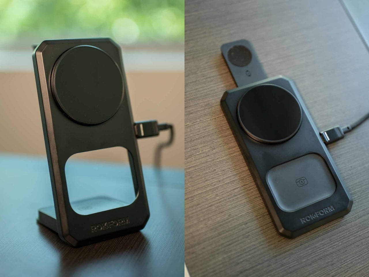
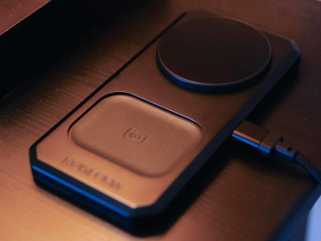
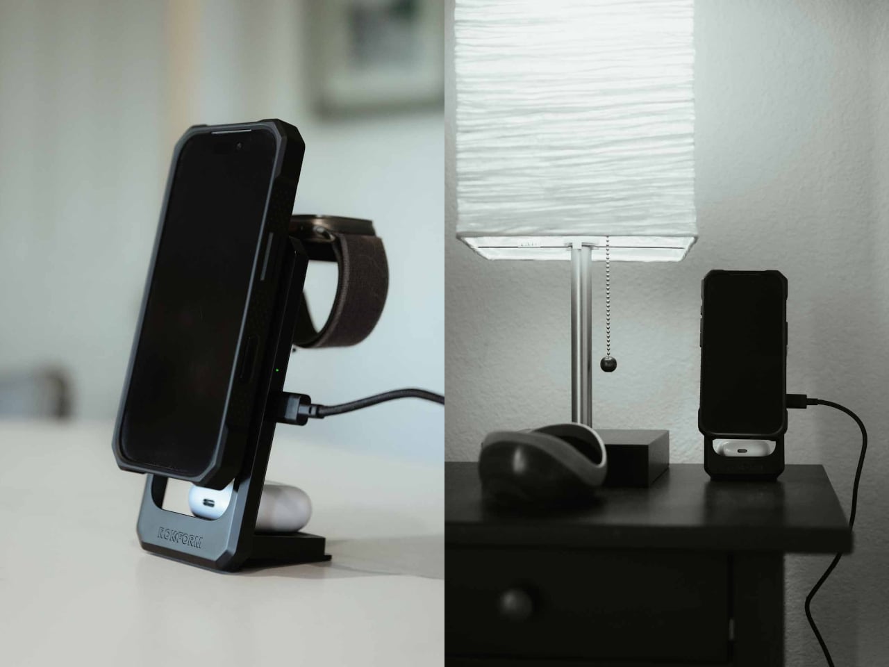
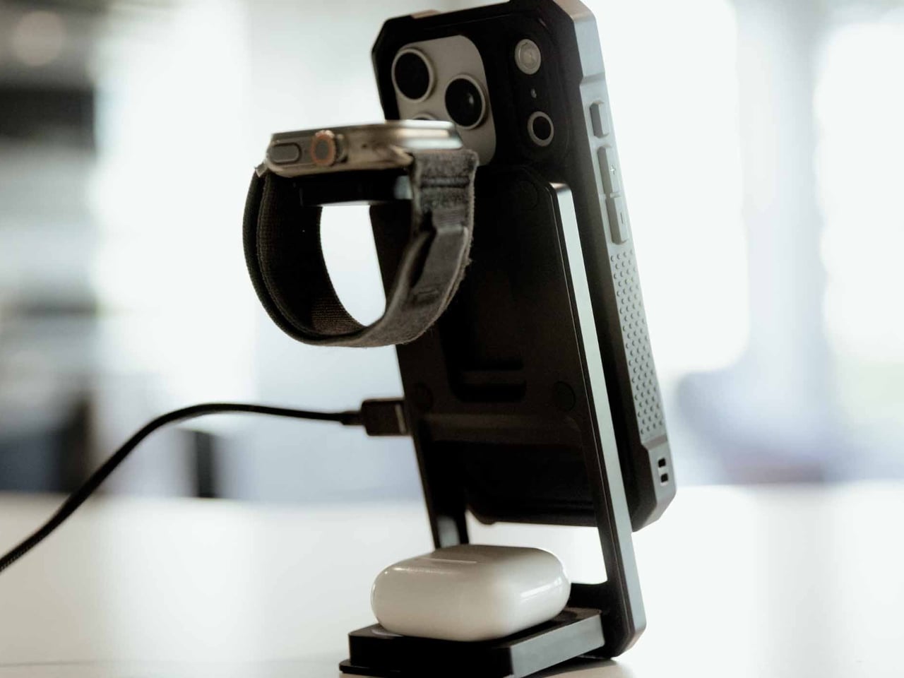
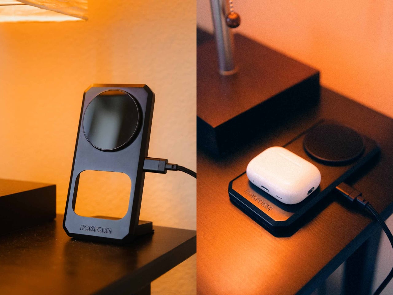
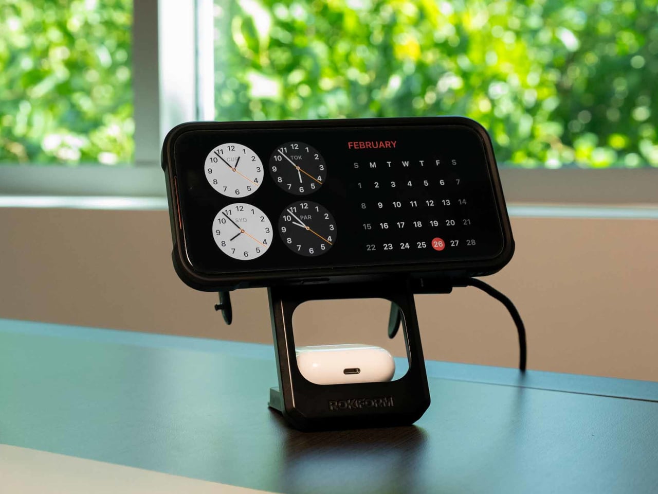
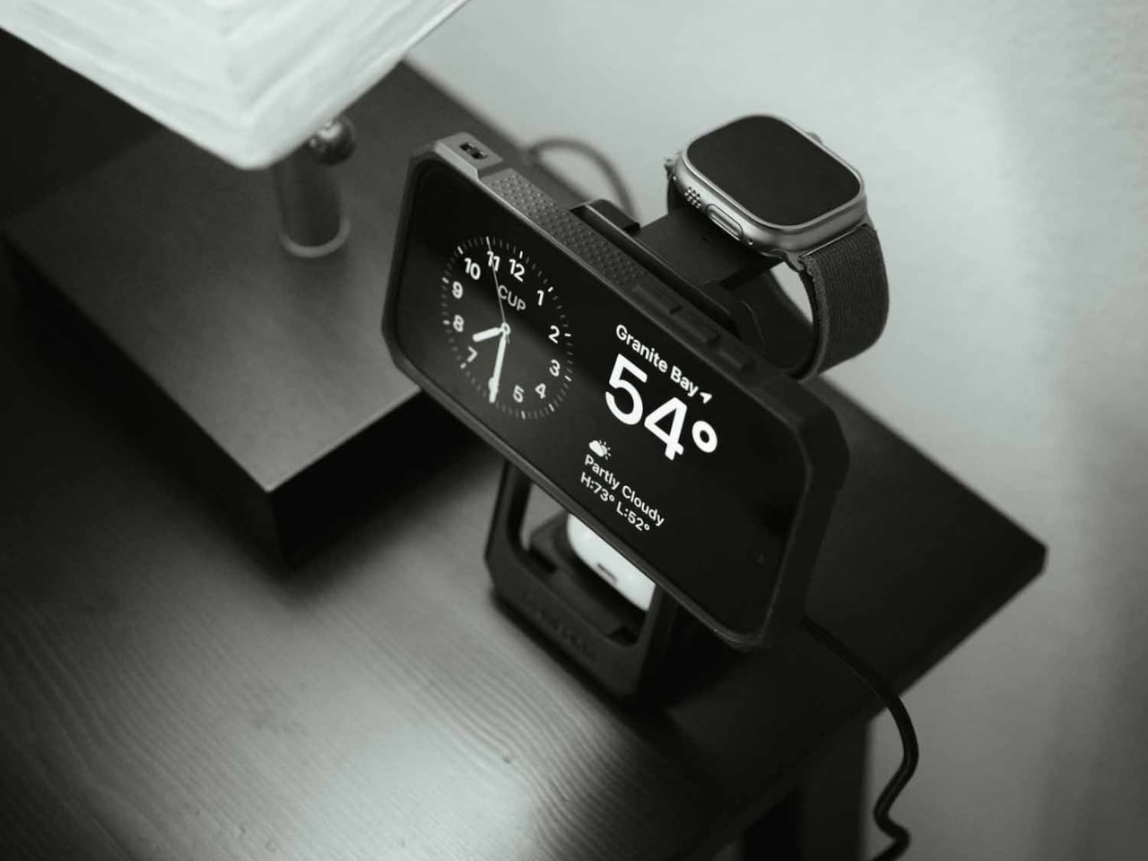
Rokform’s 3-in-1 Foldable Wireless Charging Stand addresses that specific kind of chaos with a single compact unit that charges a phone, an Apple Watch, and wireless earbuds all at once, without any cables beyond the single USB-C feeding the stand itself. The phone pad delivers up to 15W, the earbud pad handles 5W, and the Apple Watch arm tucks out when needed and folds back flat when not. One cable, three devices, done.
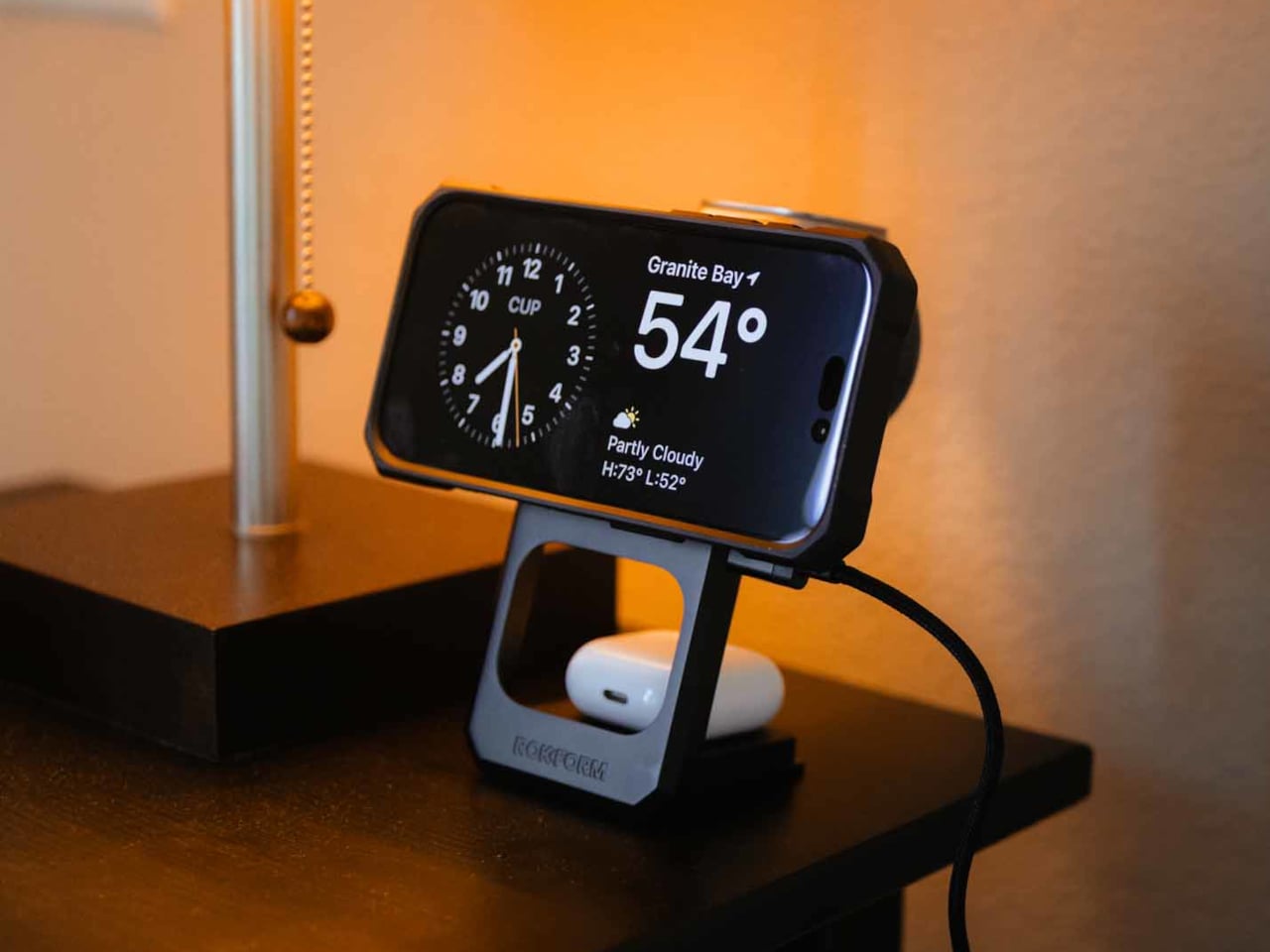
The build is zinc alloy and glass, which puts it in different company than the plastic pads that flex slightly when you press on them. That combination reads as dense and grounded, designed to stay in place rather than slide around while you fumble for your phone at midnight. The phone pad adjusts between portrait and landscape, which matters if you use a nighttime clock display or want to follow a recipe without picking the phone up.
The travel argument is where the design earns its $99.99 most directly. The whole unit collapses to just over 15 mm flat, thin enough to slide into a bag without dedicated padding. Anyone who has hunted down enough hotel outlets to charge three separate devices before a morning flight will understand the appeal immediately. One folded stand and one cable replace the whole pile, though a 30W USB-C adapter is required and not included.
That last detail is worth pausing on, because the absence of a power adapter is a legitimate inconvenience. Rokform specifies a minimum 30W USB-C adapter and recommends their own PowerTrip 65W GaN Fast Charger for full performance. That is a reasonable recommendation, but it also means the stand does not actually replace your charging setup on day one without an additional purchase, unless you already own a high-wattage USB-C adapter.
The Watch pad compatibility is Apple Watch only, which Android-primary users will notice immediately. The phone and earbud pads both support Android devices with Qi wireless charging, so the stand is not completely Apple-exclusive. It does, however, skew toward households already invested in the Apple ecosystem, where the combination of iPhone, AirPods, and Apple Watch is common enough that a dedicated three-device stand makes immediate sense.
At that price tag, Rokform is competing against a field of 3-in-1 charging stands from Belkin, Anker, and others at comparable or lower price points. The zinc alloy and glass construction and the sub-16mm folded profile are the real differentiators, neither of which is trivial if you travel frequently or care about what sits on your desk. The premium over a $60 alternative is harder to justify for someone who mostly keeps it plugged in on the nightstand than for someone who packs it every week.
The bag you carry is a design decision. Every object inside it is a small vote for how you move through the world, what you value, what you’re willing to lug, and what deserves a slot in your pocket or your pack. For too long, tech accessories defaulted to bulk. More power meant more weight. More connectivity meant more dongles. Better audio meant a bigger case. The implicit trade was always the same: capability costs space.
That trade is becoming optional. A new generation of everyday carry tech is rethinking its own geometry, collapsing into pockets, shedding grams, and using smarter materials and tighter engineering to pack more utility into less volume. These are not spec-sheet products assembled to fill a gap. They are designed to disappear into your day and show up exactly when you need them. From a power bank thinner than any phone to a keyboard built for a jacket pocket, these seven picks redefine what it means to carry less and own more.
1. Xiaomi UltraThin Magnetic Power Bank 5000 15W
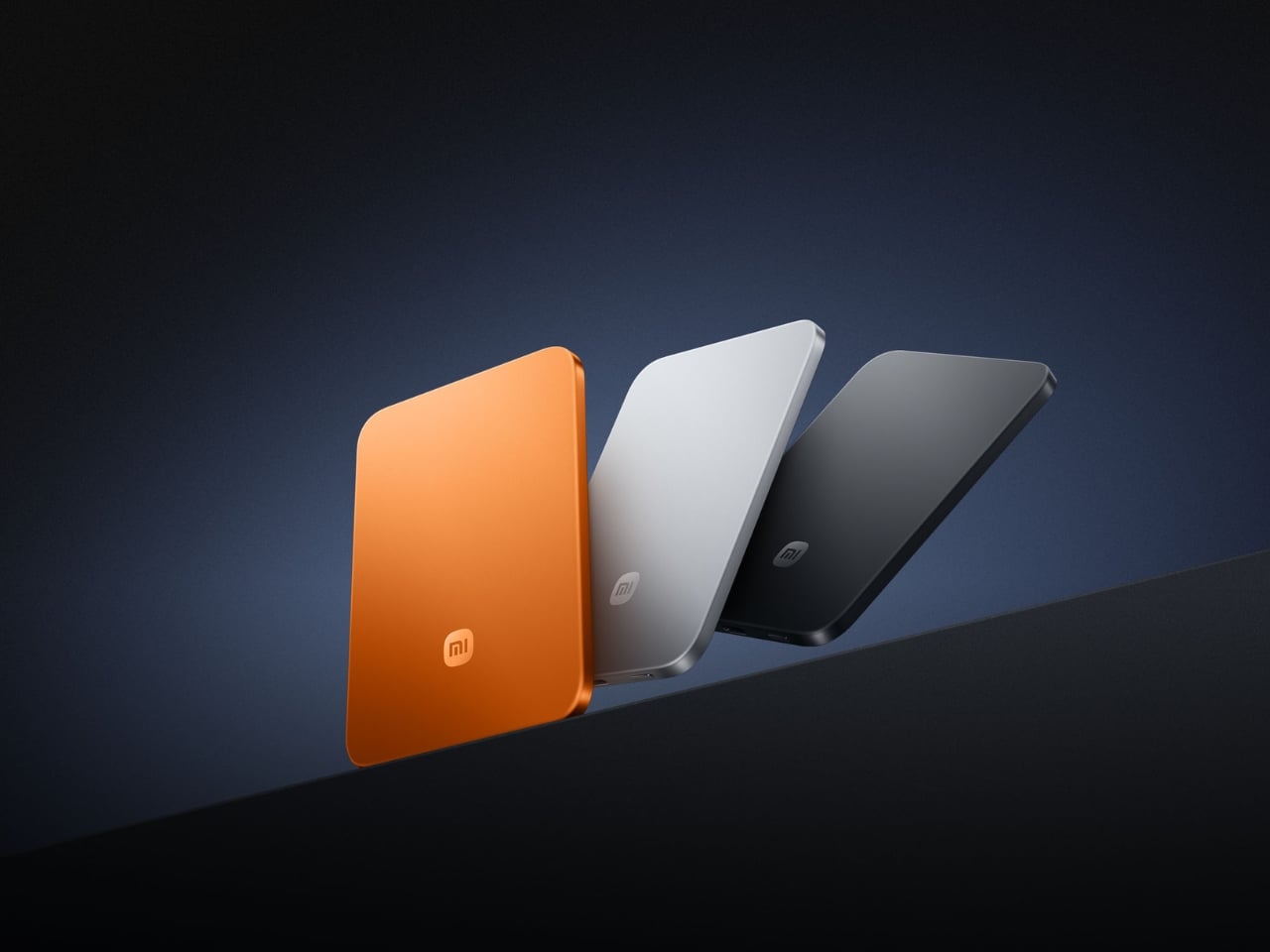
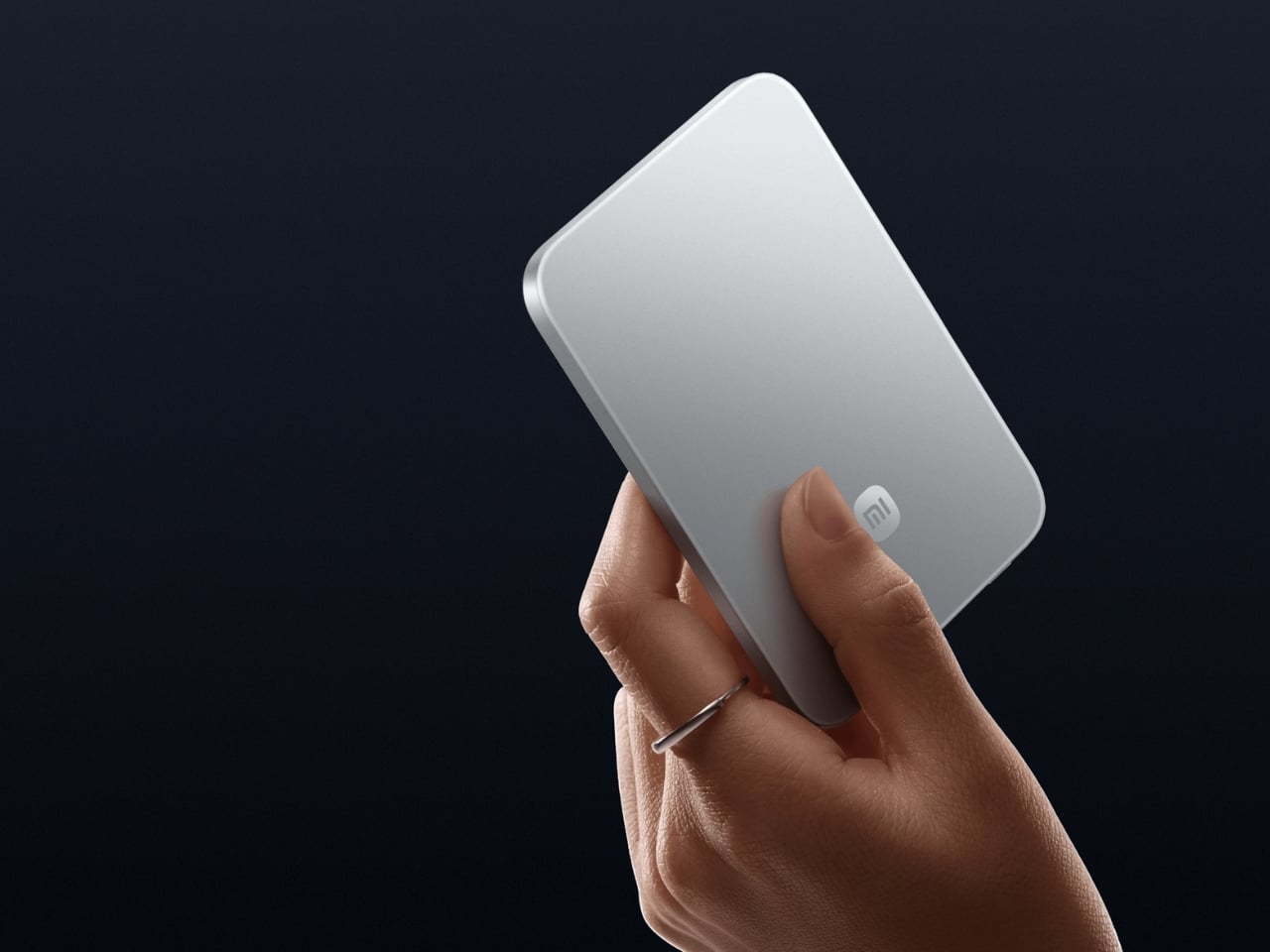
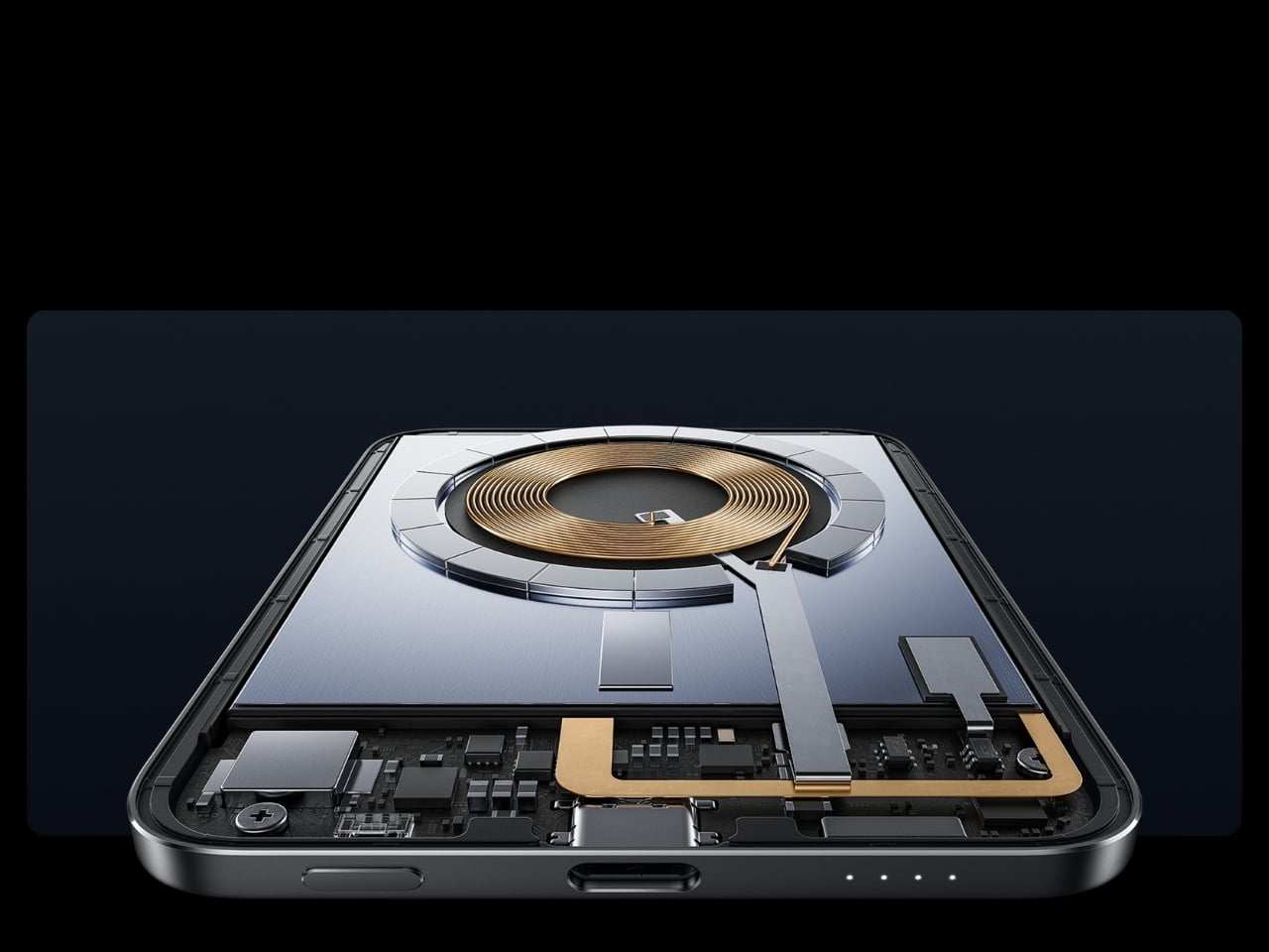
Power banks have always had a design problem. They’re essential and clunky, reliable and bulky, always appreciated but never comfortable to carry. Xiaomi’s UltraThin Magnetic Power Bank 5000 addresses that problem by starting where no other power bank has dared: at 6mm. That is thinner than most smartphones currently shipping. The aluminum alloy shell comes in Glacier Silver, Graphite Black, and Radiant Orange, each finished with a photolithographically etched logo that signals careful intention rather than assembly-line output. The fire-resistant fiberglass phone-facing surface handles heat management invisibly, keeping the exterior clean of vents or grilles. At 98 grams, it weighs less than two eggs, and carrying it feels like carrying nothing at all.
The engineering behind that form is silicon-carbon battery chemistry with 16% silicon content, enabling the energy density required to fit 5,000mAh into a body this slim. It supports 15W wireless charging for compatible Android devices, 7.5W for iPhone, and 22.5W wired via USB-C, with the practical addition of charging two devices simultaneously while being recharged itself. Showcased at MWC 2026 in Barcelona and priced at €59.99 in Europe for the Silver and Black versions, this is a power bank that earns its place by eliminating the bulk compromise the category has always required. For anyone committed to carrying less, this is the first power bank that doesn’t feel like a concession.
What We Like:
6mm profile and 98g weight make it the most pocket-friendly 5,000mAh power bank available
Silicon-carbon battery chemistry delivers a full 5,000mAh capacity without dimensional sacrifice
What We Dislike:
Wireless charging for iPhone is capped at 7.5W maximum
Rated capacity sits at 3,000mAh at 5V/2A, lower than the typical 5,000mAh figure
2. OrigamiSwift Mouse
A mouse seems immovable in form. Wide, arched, and desk-bound. The OrigamiSwift dismantles that assumption by doing exactly what the name implies: it folds. Inspired by the precision of origami, it compresses into a flat, slim profile that slips into a bag or jacket pocket without protest, then springs open in under 0.5 seconds into a full-sized, ergonomically shaped Bluetooth mouse that feels nothing like a compromise. It weighs 40 grams. That figure deserves a moment. Most full-sized mice weigh three to four times as much. The OrigamiSwift delivers all the comfort and tracking precision of a conventional mouse while occupying the footprint of a notepad when packed.
For the digital nomad setting up at a café, or the professional moving between meetings with a laptop under one arm, this is the kind of tool that quietly changes the texture of the day. The ergonomic form is shaped to fit naturally in the hand during extended work sessions, reducing the fatigue that accumulates from hours spent on a trackpad. The Bluetooth connection keeps the desk or surface clean. The ultra-thin folded profile sits flat in any bag compartment without creating bulk or claiming space disproportionate to its value. Minimalist carry is about tools that show up without announcing themselves, and the OrigamiSwift does exactly that: invisible when packed, essential when open.
Folds flat for pocket carry and opens into a full ergonomic mouse in under 0.5 seconds
At just 40 grams, it is one of the lightest full-form productivity mice available
What We Dislike:
The folding mechanism may require adjustment time for users accustomed to traditional mice
A 40-gram build may feel less substantial to users who prefer a weighted mouse
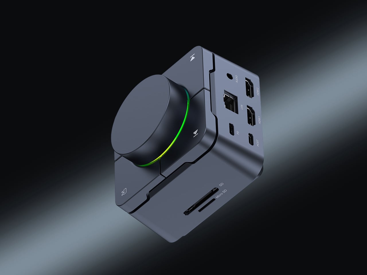
3. HubKey Gen2
The modern desk accumulates workarounds. Two USB-C ports become four, then six, spread across a tangle of adapters that creep outward from the laptop until the workspace feels less like a setup and more like a wiring diagram. HubKey Gen2 is built to end that creep. It is an 11-in-1 USB-C hub inside a compact cube, and the more interesting detail is what lives on top: four physical shortcut keys and a central control knob that handle media playback, privacy shortcuts, and daily actions without a software menu or a keyboard combination you can never quite remember. One object consolidates what used to require a cluster of small fixes, turning a patchwork of compromises into something coherent.
Dual 4K display support makes it relevant for anyone running an expanded screen setup, while the physical controls restore a directness that software interfaces have quietly taken away. Volume knobs, mute buttons, and display toggles should not require a three-key shortcut or a settings dive. HubKey Gen2 puts that control back within arm’s reach. It handles power, storage, network, and displays from a single USB-C connection, and transforms a desk covered in small adaptations into something intentional and calm. The headline is carry less, own more, and at the desk, that translates directly: one compact cube where eleven separate solutions used to live.
What We Like:
Consolidates 11 connections and physical shortcut controls into a single compact cube
Dual 4K display support covers multi-monitor setups without additional adapters
What We Dislike:
Desk-bound design means it is a workspace consolidation tool rather than a pocketable carry item
Physical shortcut keys offer fewer customization options compared to software-based control surfaces
4. Battery-Free Amplifying iSpeakers
The charging cable is the one obligation that minimalist carry never fully escapes. Every wireless device is a deferred maintenance task, a battery you will have to tend to eventually. The Duralumin battery-free iSpeakers sidestep that dependency entirely. No power source, no cable, no charging ritual. You place your smartphone inside the enclosure, and the geometric cavity amplifies sound through acoustic engineering alone, using the golden ratio in its design to optimize resonance and distribute the audio across the room. It is the kind of object that looks precisely like it belongs on a desk and sounds as considered as it looks.
The material choice deepens the story. Duralumin is the same aluminum alloy used in aircraft construction, a combination of lightness and structural rigidity that allows the speaker to resonate without distorting. The result is a passive amplifier that genuinely improves your phone’s audio while functioning as a deliberate desktop object. Modular compatibility with the sold-separately +Bloom and +Jet sound-directing additions means it can adapt to different spatial setups without ever adding an electronic dependency. For carry with intention, this is what owning more looks like: an object that does its job through physics, needs nothing from a wall outlet, and occupies any surface as though it was designed specifically for it.
Requires no battery or electricity, making it zero-maintenance and usable anywhere
Aircraft-grade Duralumin construction delivers structural integrity alongside a refined aesthetic
What We Dislike:
Audio output is entirely dependent on the quality of the phone’s built-in speaker
Directional sound control requires purchasing the +Bloom or +Jet mods separately
5. NanoPhone Pro
There is a version of the smartphone that has been lost in the pursuit of bigger screens and faster processors. It is the phone that fits in a coin pocket, asks nothing of your attention beyond the call and the navigation prompt, and treats connectivity as a utility rather than an experience. The NanoPhone Pro returns to that idea with a credit-card-sized 4G device running Android 12 and certified for Google Play apps. It browses, calls, navigates, plays music, and handles real-time navigation. It does not demand to be the center of your day, and that restraint is the entire point.
A 5MP rear camera and 2MP front shooter cover quick captures and video calls without positioning this as a photography device. That deliberate limitation is the product’s philosophy: it does everything a smartphone needs to do and none of what a smartphone has quietly drifted into doing over the last decade. As a secondary phone for travel, for screen-time reduction, or for users who simply want connectivity without the gravitational pull of a large-format device, the NanoPhone Pro is a precise instrument. Minimalist carry is often defined by what you leave behind, and this phone argues convincingly that you can leave behind the bulk of a modern device without surrendering any of its real utility.
What We Like:
Credit-card footprint eliminates smartphone bulk while retaining 4G connectivity and Google Play
Android 12 certification ensures a complete app ecosystem without compatibility compromises
What We Dislike:
The 5MP rear camera is not a substitute for a primary smartphone’s imaging system
Small screen dimensions limit usability for media consumption or extended reading
6. Keychron B11 Pro
Most portable keyboards solve one problem while ignoring another. They compress the footprint but flatten the key geometry, leaving your wrists to negotiate a straight layout through a full working day in a hotel room or an airport lounge. The Keychron B11 Pro approaches the problem differently. It uses a 65% Alice layout, splitting and angling the two key clusters slightly inward for a more natural wrist position, and then folds in half when not in use. Folded, it measures 196.3 × 143mm and weighs 258 grams, closer in footprint to a paperback book than a keyboard, adding almost nothing to a bag already loaded with a laptop and a water bottle.
The Alice geometry is the more considered design decision here. Angling both hands naturally inward reduces the lateral wrist strain that builds over a long typing session away from a dedicated desk. Keychron already applies this same geometry to the desk-bound K11 Max, but putting it into a foldable form at $64.99 is an entirely different proposition. Most foldable keyboards treat compactness as the only ergonomic consideration on the road. The B11 Pro argues that wrist health doesn’t stop mattering when you leave the office. For writers, remote workers, and anyone who types seriously while traveling, this is the keyboard that proves you don’t have to choose between ergonomic design and fitting your gear into a jacket pocket.
What We Like:
The Alice split geometry reduces lateral wrist strain during long typing sessions away from a desk
Folds to 196.3 × 143mm and 258g, small enough for a jacket pocket or bag side compartment
What We Dislike:
65% layout omits the function row and numpad, which may limit certain professional workflows
The angled Alice geometry requires adjustment time for users moving from a standard keyboard layout
7. TWS Earbuds with Built-in Cameras
Every company building AI hardware is betting on a form factor. Smartglasses, pins, pocket companions: each one asks you to wear a new device, adopt a new habit, and accept a new object into your daily carry. This concept asks a quieter question. What if the best AI hardware is something you already wear? These conceptual TWS earbuds add a single modification to a familiar form: each bud carries a built-in camera positioned along an extra stem, close to your natural line of sight. Paired with ChatGPT, those lenses become a live visual feed for an assistant that lives in your ears, reading menus, interpreting signage, and guiding you through an unfamiliar city without a screen in sight.
The carry implications are significant. A case the size of a lip balm replaces a phone query, a smartwatch notification, and a spoken search. The familiarity of the earbud form is the concept’s strongest argument: people already carry these, already charge them, and already wear them for hours at a stretch. Layering AI visual capability onto that without adding bulk or asking you to change how you move through the world is exactly what makes this vision compelling. Carry less, own more: this concept takes that headline literally. If the goal is capability without compromise, an assistant that can see, hear, and understand the world from inside a pair of earbuds is the most minimal possible version of that idea.
What We Like:
AI visual and audio capability in an earbud form factor requires no new carry habits or added bulk
Familiar TWS design eliminates the adoption friction that has limited other AI hardware categories
What We Dislike:
Currently a concept product with no confirmed release date or commercial availability
Built-in cameras positioned near the face raise valid and ongoing concerns about privacy in everyday use
The Best Tech Is the Tech You Actually Carry
Minimalism in everyday carry is not about owning less for its own sake. It is about refusing to let the objects you depend on become a burden. The best gear earns its place by doing more with less, compressing capability into a form that fits your life without requiring your life to reorganize around it. Every product on this list represents that thinking: a power bank that weighs less than two eggs, a keyboard that folds into a jacket pocket, a speaker that needs no power at all, and earbuds that could soon carry an AI capable of reading the world for you.
The shift is real, and it is accelerating. Engineering is finally catching up to the design ambition that minimalist carry has always implied. You no longer have to choose between a fully equipped setup and a light bag. These seven accessories make that argument in the most convincing way possible: not with a manifesto, but with their dimensions.
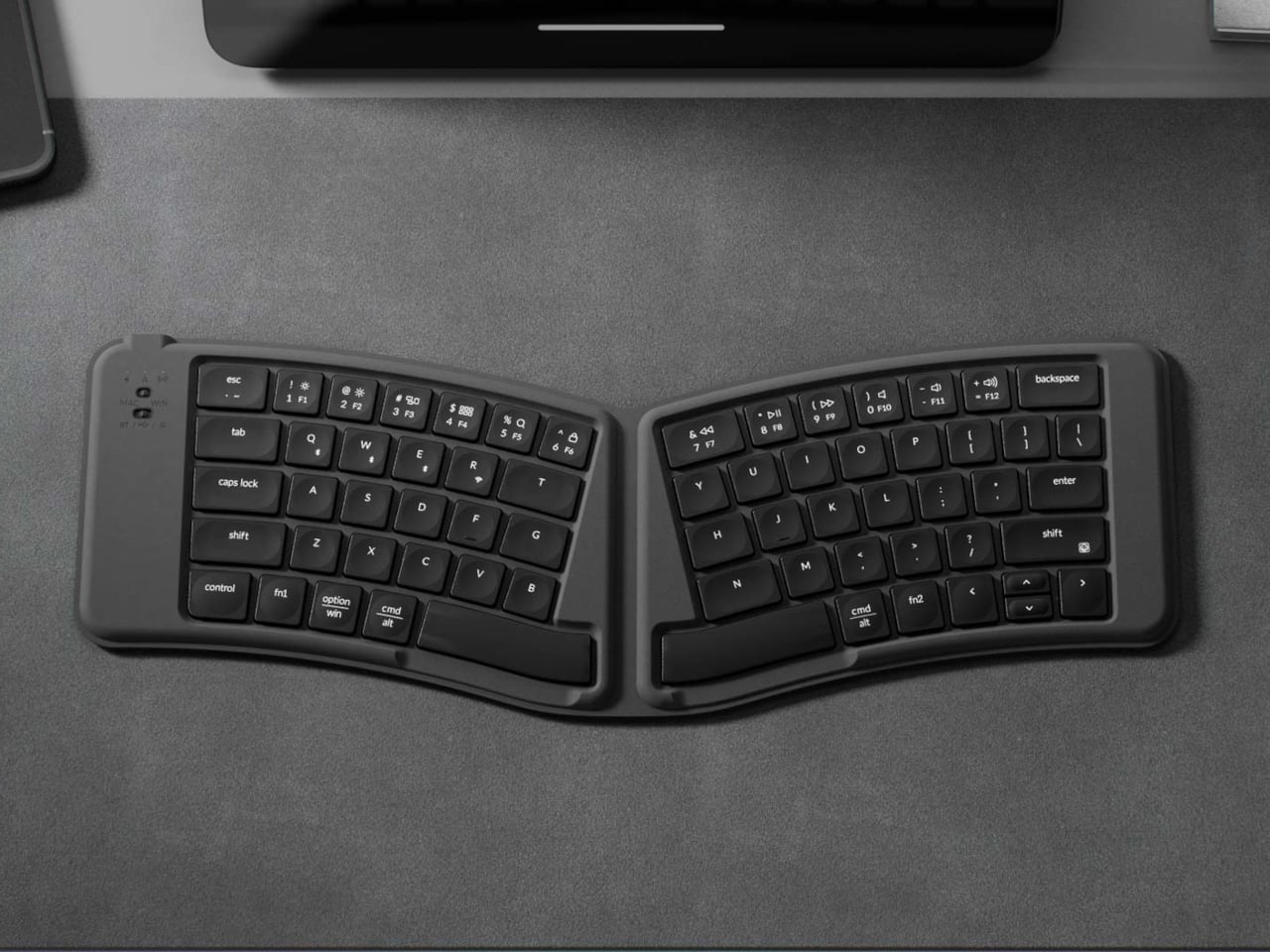
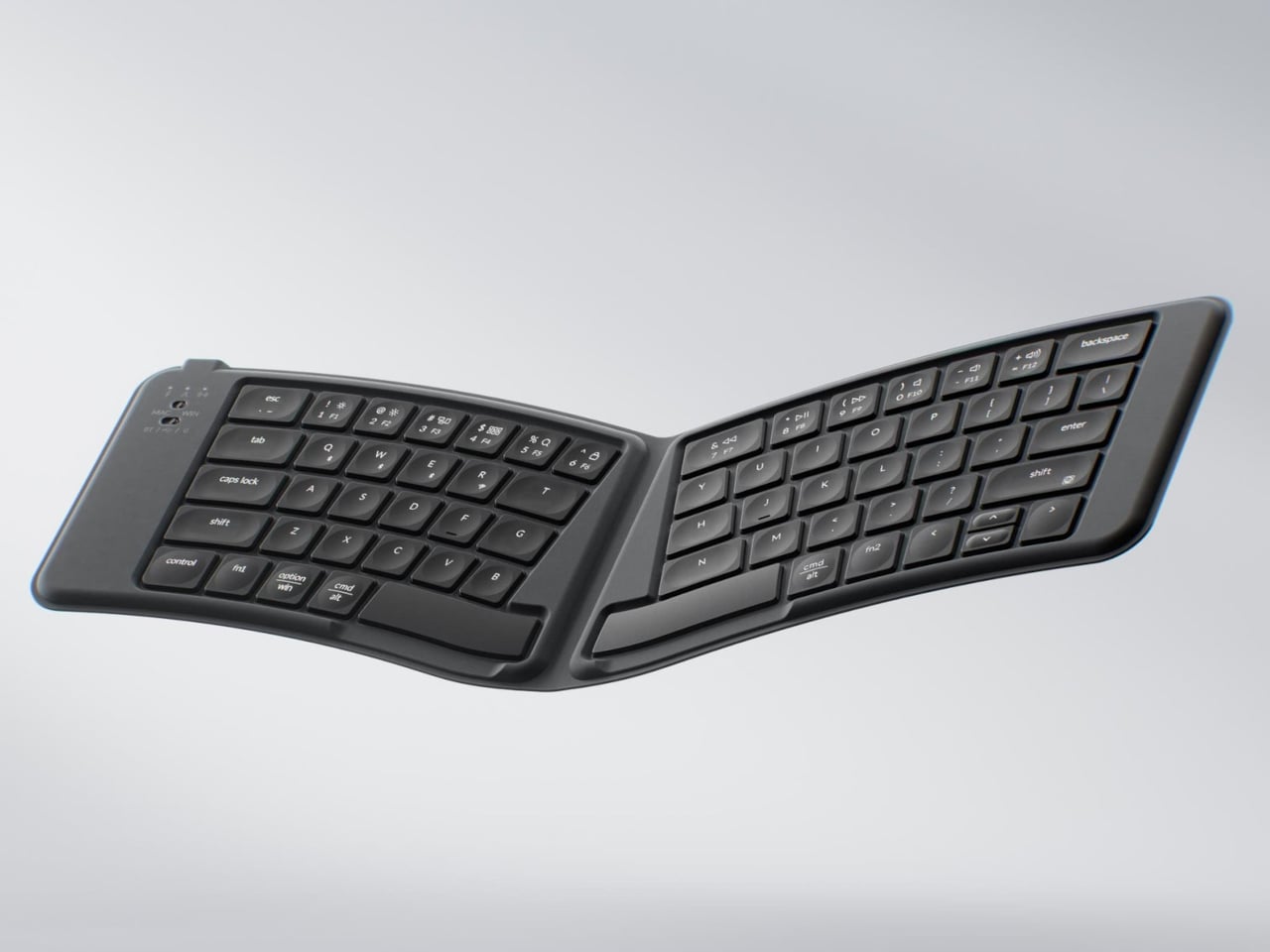
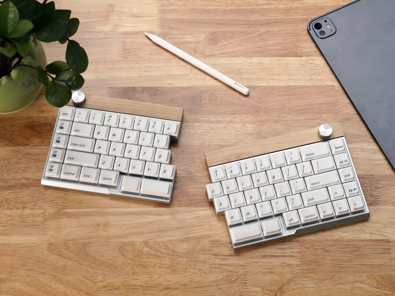
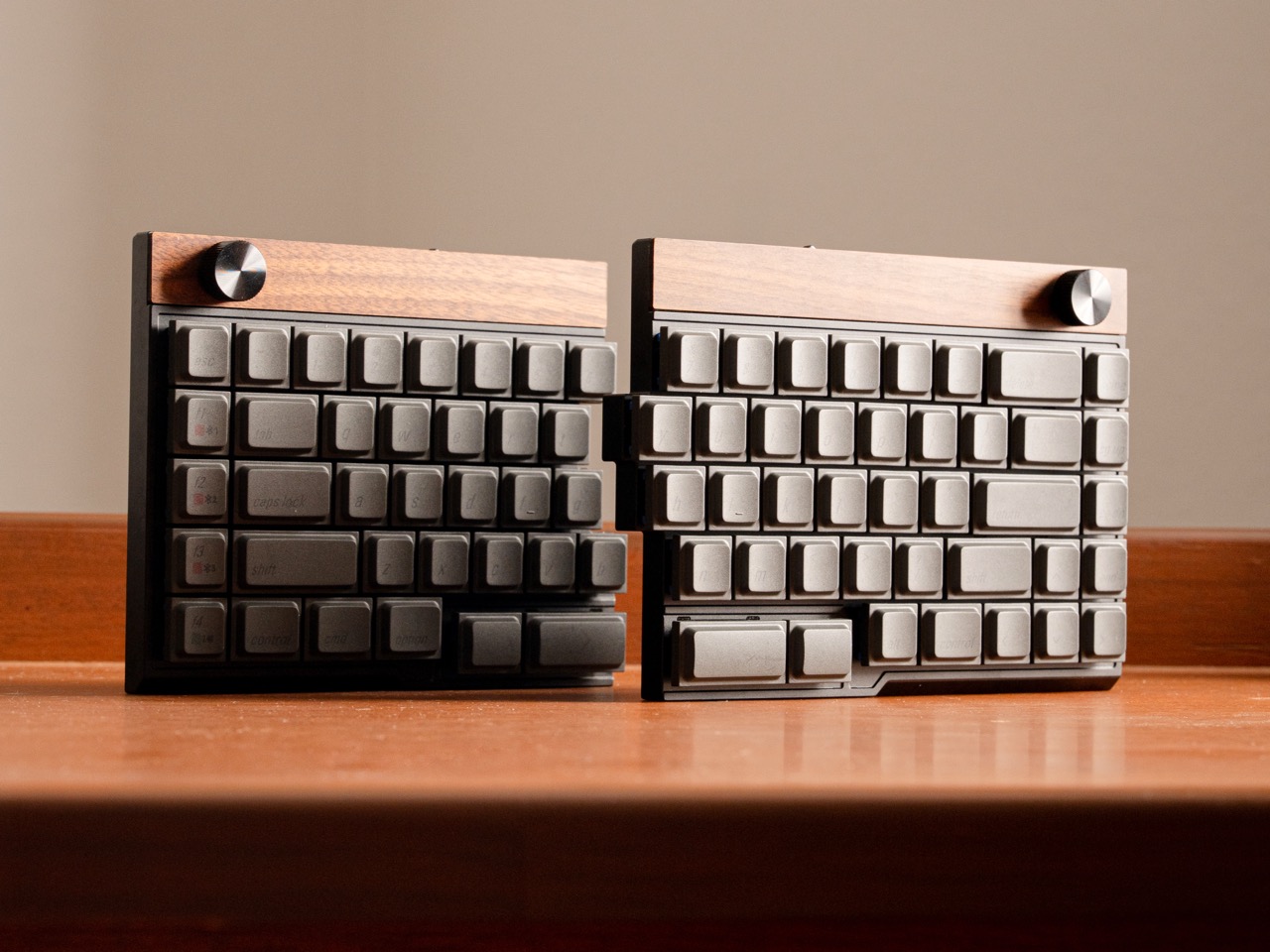
If you’ve spent any time in mechanical keyboard spaces online, you’ve probably seen someone evangelizing split keyboards as the solution to all your ergonomic problems. They’re usually right, but the barrier to entry has been high. Most split boards either require assembly, force you onto ortholinear or column-stagger layouts, or look like something out of a cyberpunk cosplay. The Jiffy75 takes a simpler approach: it’s a regular 75 percent keyboard that happens to come in two pieces.
JezailFunder, the company behind it, is running a Kickstarter campaign that’s already blown past its $5,000 goal and landed over $170,000 in pledges. The keyboard itself is CNC-machined aluminum with wood trim, fully wireless between halves and across devices, and hot-swappable so you can pick your own switches or swap them later. There’s also a programmable knob, which has become table stakes for premium keyboards at this point. Pricing starts at $199 for early backers, and shipping is planned for May if production stays on schedule.
JezailFunder’s previous product, the Cornix, found an audience in the ergonomic keyboard community, but user feedback revealed something important. People were buying it to relieve physical discomfort and strain from traditional one-piece keyboards, but the Cornix’s specialized layout created its own learning curve that made it unsuitable for everyone. That insight drove the team to build something with broader appeal, a split keyboard that keeps the familiar 75 percent row-staggered layout so the ergonomic benefit doesn’t come with weeks of retraining your muscle memory. The result is a keyboard that you can theoretically start using the day it arrives without hunting and pecking your way through your first email.
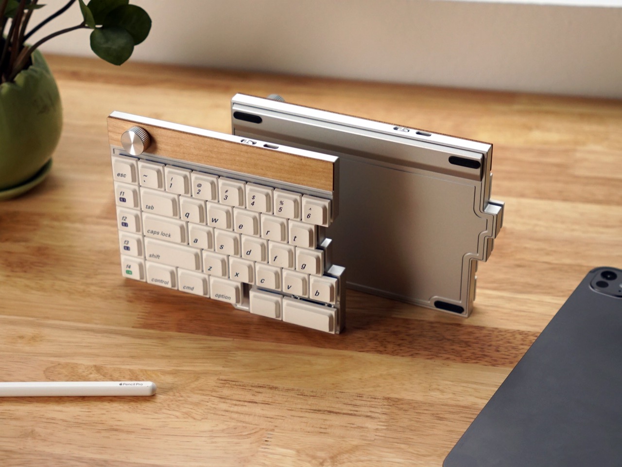
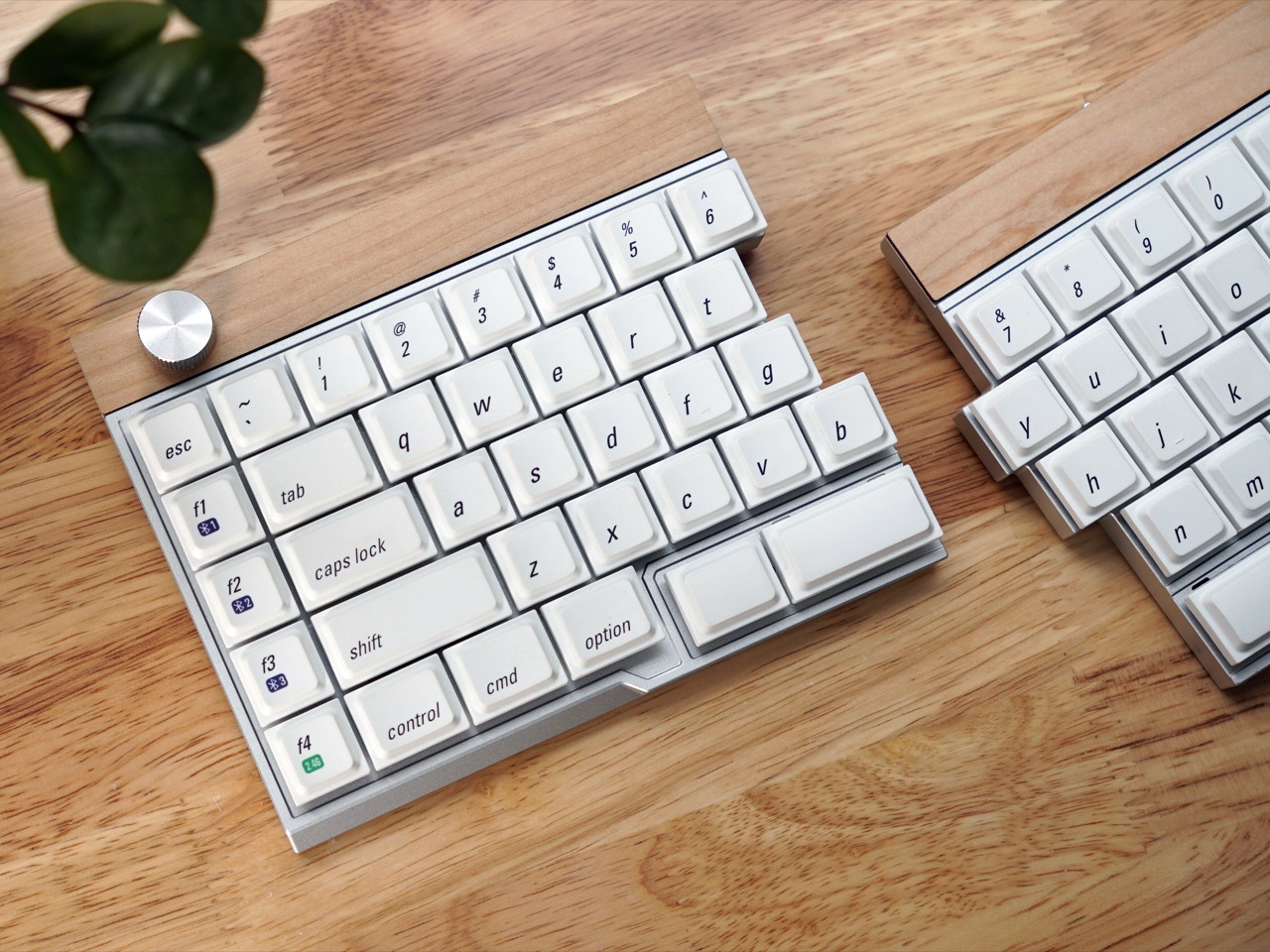
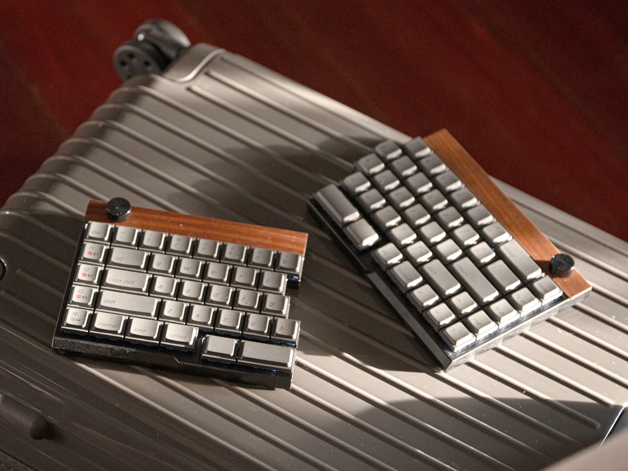
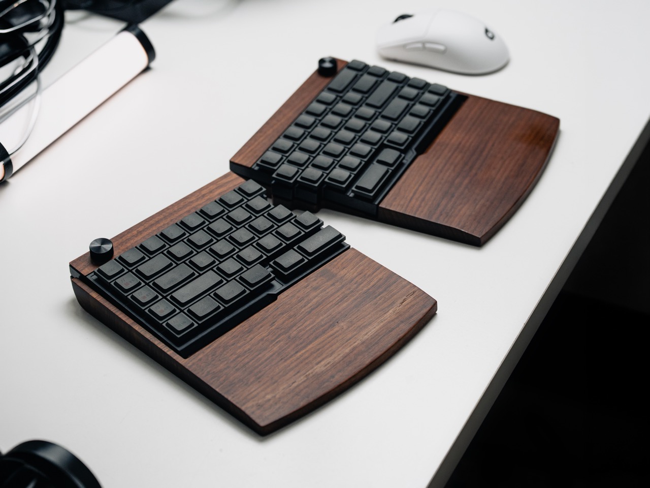
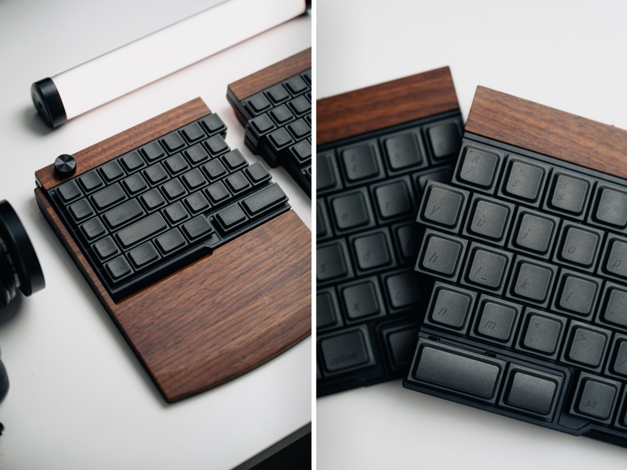
The Jiffy75’s body is CNC-machined from a single block of aerospace-grade aluminum, which JezailFunder calls a unibody construction. This approach guarantees better structural integrity and tighter tolerances than stamped metal cases, and the entire surface is anodized for a scratch-resistant finish with a subtle premium glow. A strip of natural wood runs along the top edge of each half, breaking up the metal with a warmer material accent that gives the whole thing a more furniture-like presence on a desk. Optional solid wood wrist rests come in walnut and maple, each one custom-engineered to match the keyboard’s profile with a precise slope and height calibrated to keep your wrists in a neutral position during long typing sessions.
The design philosophy here centers on the 75 percent layout, which research JezailFunder cites shows as a user favorite. Splitting that configuration relieves shoulder and wrist discomfort by allowing a more open, relaxed posture, and it also opens up the center of your workspace for tablets or other devices, which can improve workflow productivity depending on how you use your desk. That center-space argument matters more than it sounds like at first. If you’ve ever tried to reference a tablet or a notebook while typing on a full-width keyboard, you know how awkward the geometry gets. A split layout solves that by design.
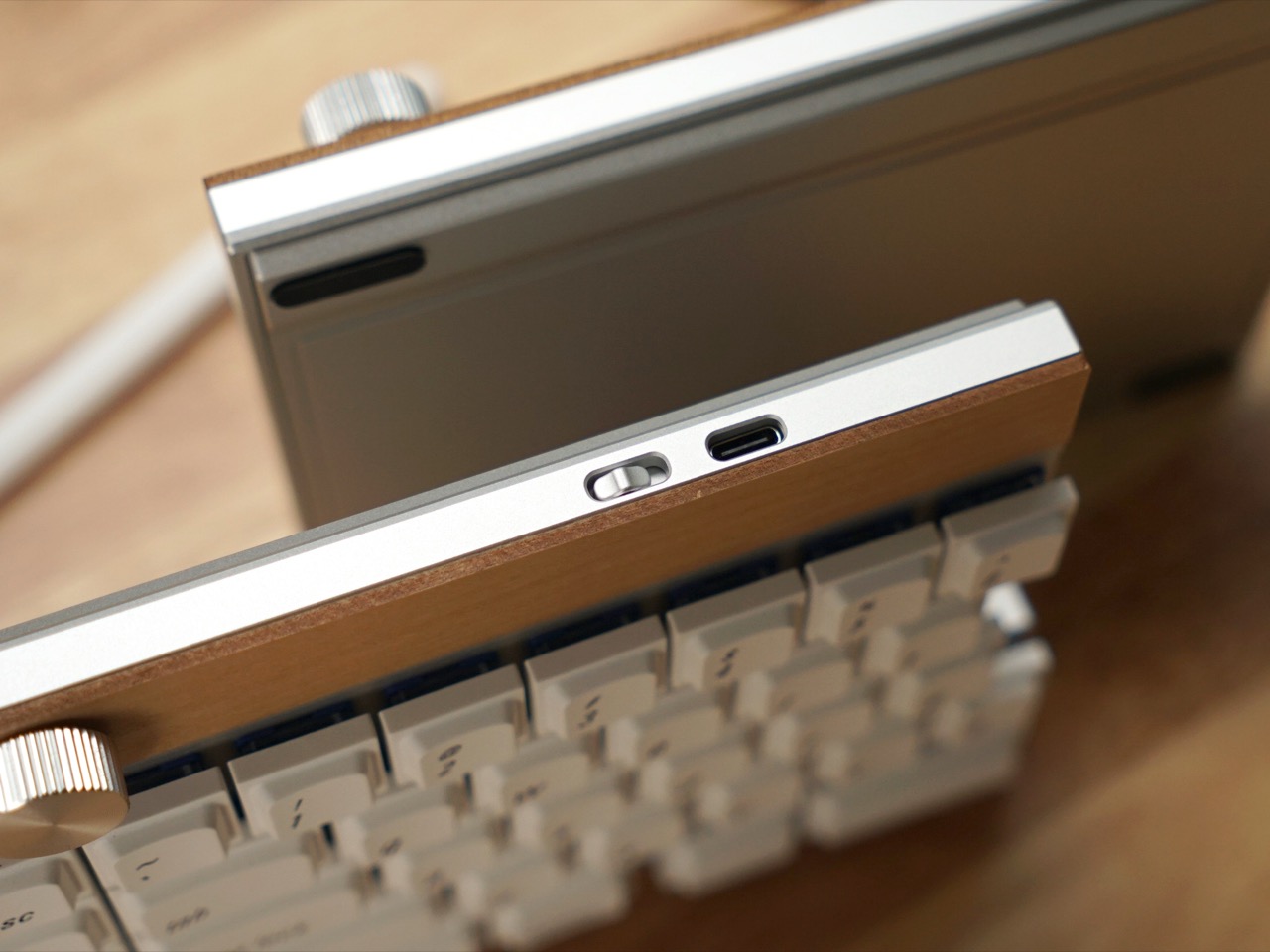
Both halves connect to each other wirelessly, and the whole keyboard supports tri-mode connectivity: USB-C, Bluetooth, and 2.4GHz wireless via an included dongle. You can pair it with up to three devices simultaneously and switch between them on the fly, which makes it useful for people who bounce between a laptop, a desktop, and a tablet throughout the day. Each half houses its own 2,800mAh battery. JezailFunder rates the left module at up to 1.5 months of battery life and the right module at up to 2 months, though real-world longevity will depend on usage patterns and whether you’re running Bluetooth or 2.4GHz most of the time.
The keyboard features a remapping tool called the Jzf Hub, which allows full-key customization. Layout arrangements, rotary knob functions, and every other input can be redefined by the user. The programmable rotary encoder can handle volume control, page scrolling, or any custom function you assign to it. Hot-swap support means you can swap switches without soldering, and the campaign offers two switch options out of the box: Cloudshell White, a linear switch, and JZF Mist, a custom 37g silent switch designed specifically for users who prioritize a quiet typing experience. JezailFunder developed the Mist based on user research showing that split 75 percent enthusiasts wanted a silent typing experience with zero disturbance to others while still delivering superior tactile feel. The custom 37g silent switch was the result.
The Jiffy75’s beauty is its non-hobbyist design language. With an aesthetic that feels truly universal, JezailFunder says this keyboard’s practically for everyone. The neutral aesthetic appeals to people who love to stick to classics, while a vibrant range of colorways offers the freedom to choose a look that feels personal. Variants include ones with white, black, and pastel bodies, along with wood-accented options that lean into a Scandinavian minimalist vibe. There’s also a custom hardshell carrying case included by default, designed specifically for mobile professionals. The shock-resistant exterior shields the keyboard from impacts, the soft-fleece interior prevents scratches, and the whole thing stays compact and lightweight enough to travel with regularly.
Early bird pricing for the Jiffy75 starts at $219, and all units will include the keyboard, carrying case, USB-C cable, two backup switches, a 2.4GHz dongle, and a keycap puller. Add-ons include a keycap set for $29, low-profile Kailh switches for $39, the carrying case separately for $39, and wooden wrist rests for $99. Global shipping is planned to begin in early to mid-May 2026.
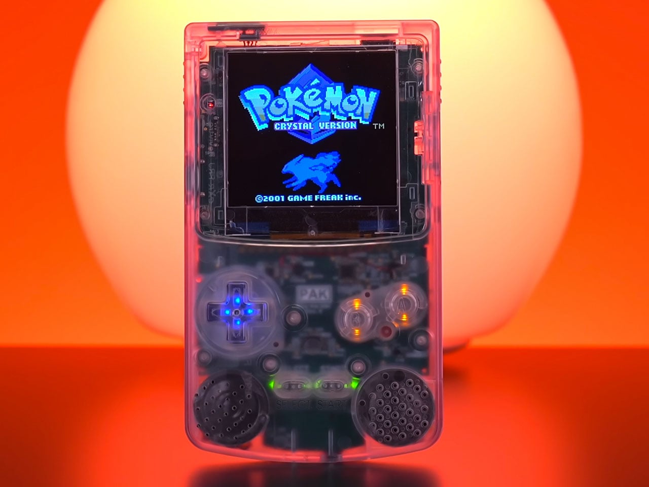
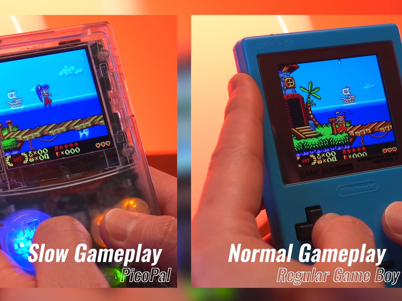
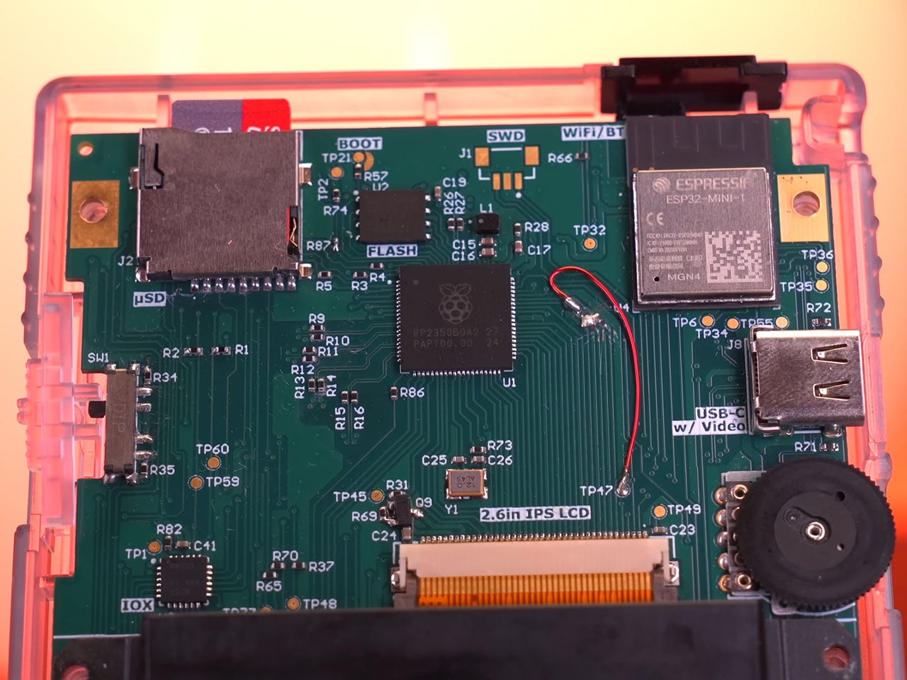
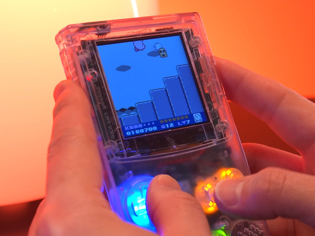
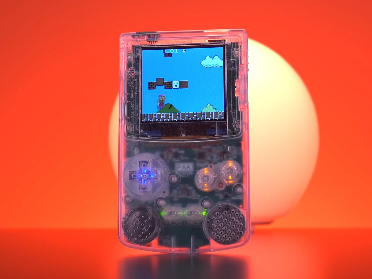
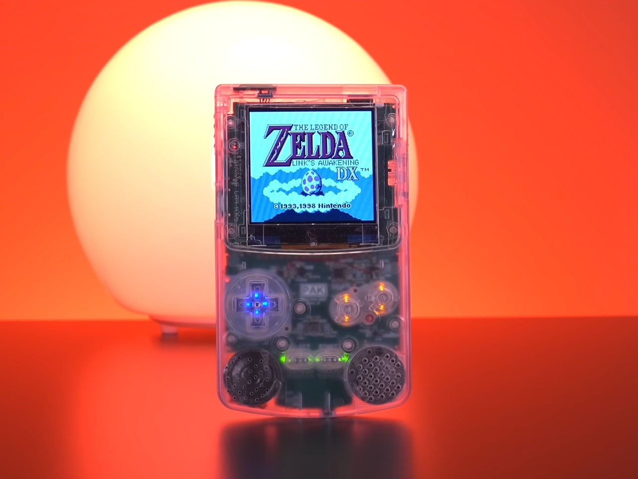
Retro gaming continues to inspire modern hardware projects, and the Pico-Pal handheld console is another thoughtful reinterpretation of one of the most recognizable portable gaming designs. Developed by hardware designer Peter Khouly, the handheld draws clear inspiration from the classic Nintendo Game Boy Color while integrating modern microcontrollers, wireless connectivity, and expanded functionality. Rather than replicating the original hardware exactly, the Pico-Pal blends nostalgia with a flexible development platform aimed at gamers and hackers alike.
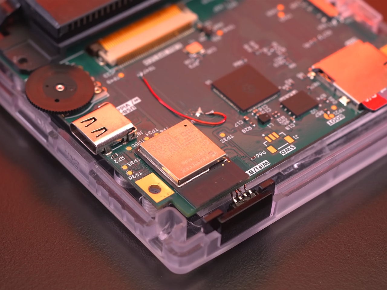
At its core, the handheld is powered by a Raspberry Pi RP2350B microcontroller paired with an Espressif ESP32 coprocessor. The RP2350B serves as the primary processing unit, handling emulation and system control, while the ESP32 provides wireless connectivity via integrated Wi-Fi and Bluetooth. This secondary chip also includes 4MB of flash storage and supports functions such as Bluetooth audio or network communication. The RP2350B itself features 16MB of flash memory, giving the device sufficient storage and processing headroom for running classic handheld titles and additional utilities.
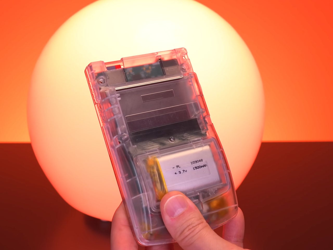
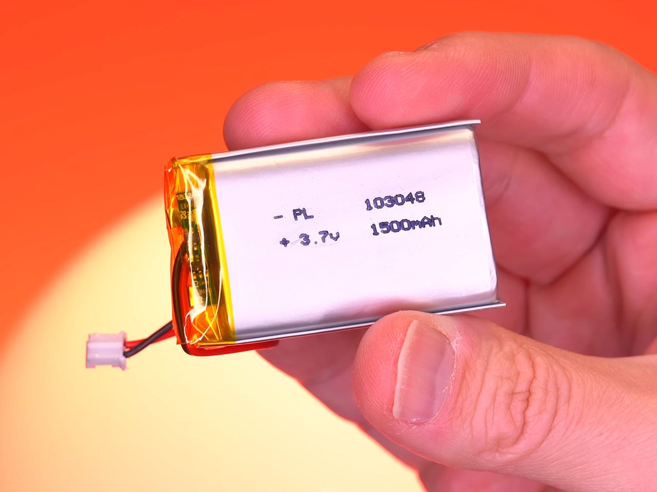
Instead of the reflective LCD panel used in the original Game Boy Color, the handheld uses a 2.6-inch IPS screen with a resolution of 320 × 320 pixels. Its square 1:1 aspect ratio suits classic handheld games particularly well, allowing retro titles to appear sharp while maintaining the visual proportions they were originally designed for. The improved screen technology also delivers wider viewing angles and brighter colors compared with older displays. Powering the device is a 1,500 mAh lithium-polymer battery that charges through a USB-C port supporting 5V/1.45A input. This rechargeable setup replaces the disposable batteries used by earlier handheld systems and provides several hours of gameplay on a single charge. Current development estimates suggest that the handheld can operate for around five hours during normal use.
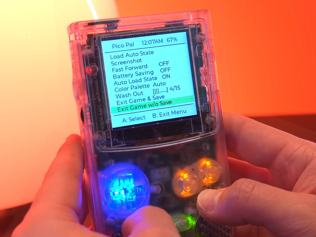
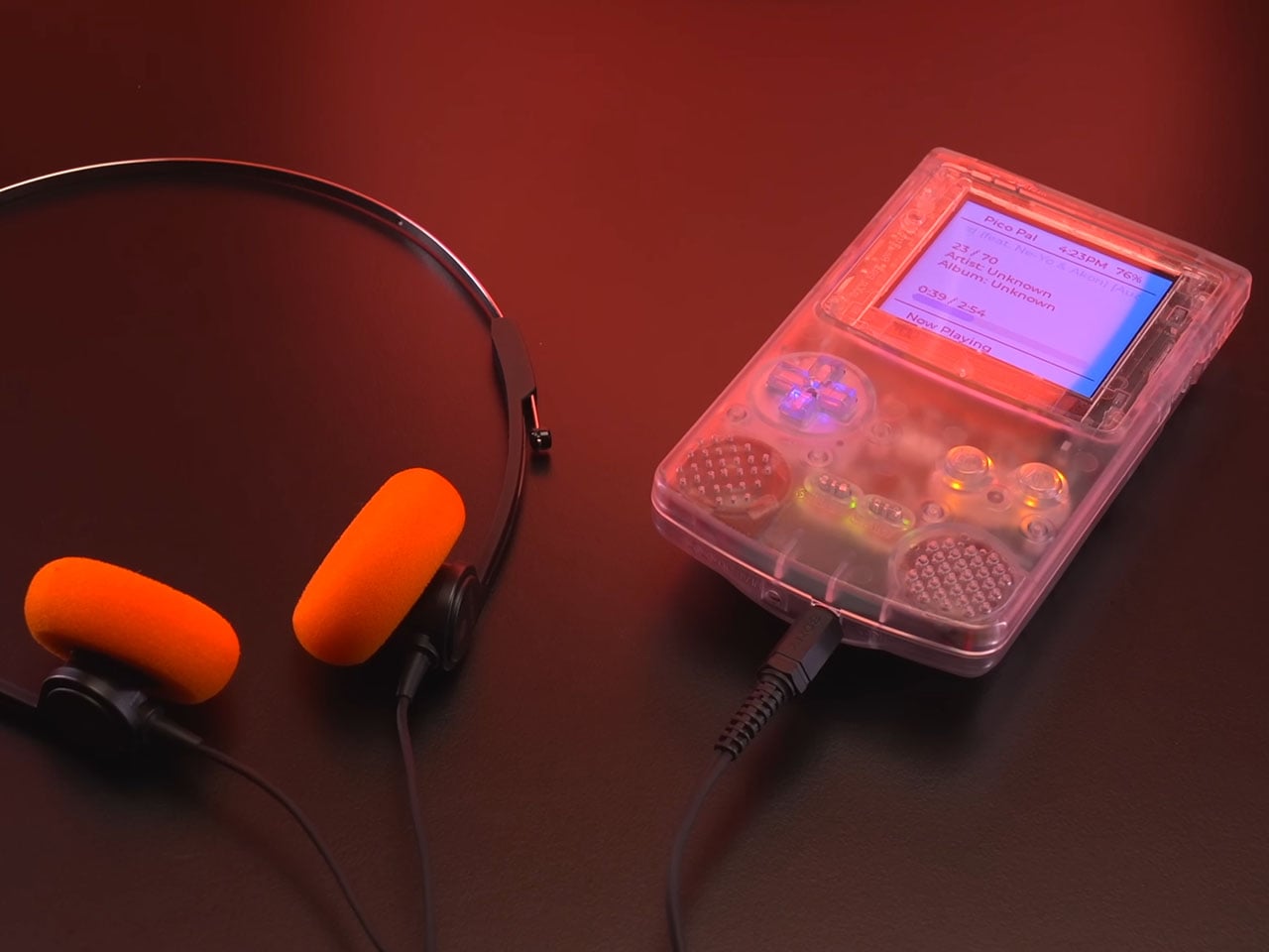
Beyond its role as a retro gaming handheld, the Pico-Pal has been designed as a flexible development platform. According to Peter, the device includes various input/output capabilities and compatibility with common communication interfaces such as SPI and I²C. This allows developers to use the handheld as a portable development kit for the RP2350 platform, enabling projects ranging from custom software tools to experimental hardware integrations. The platform can even function as a universal remote, portable music player, pedometer, or security testing device capable of simulating Bluetooth or USB input signals.
The design also incorporates several modern usability improvements compared to traditional handheld consoles. One example is the soft-power system, where the physical power switch triggers the console to save its current state before entering a low-power standby mode. Instead of abruptly cutting power like older devices, the Pico-Pal can quickly resume gameplay from where the user left off. Development updates also mention additional features such as real-time clock support for games that rely on time tracking, Bluetooth audio functionality, and digital video output that could allow the handheld to connect to external displays. Though one feature that is an absolute steal is the ability to play MP3 files off the storage, for music buffs like me.
Although the Pico-Pal closely resembles a Game Boy Color at first glance, its philosophy is quite different from modern FPGA-based retro consoles. Rather than focusing on perfect hardware recreation, the project embraces a microcontroller-driven design that balances efficiency and versatility.
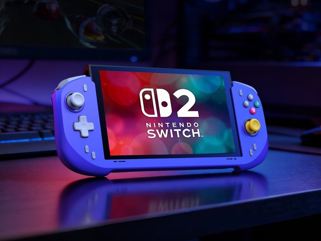
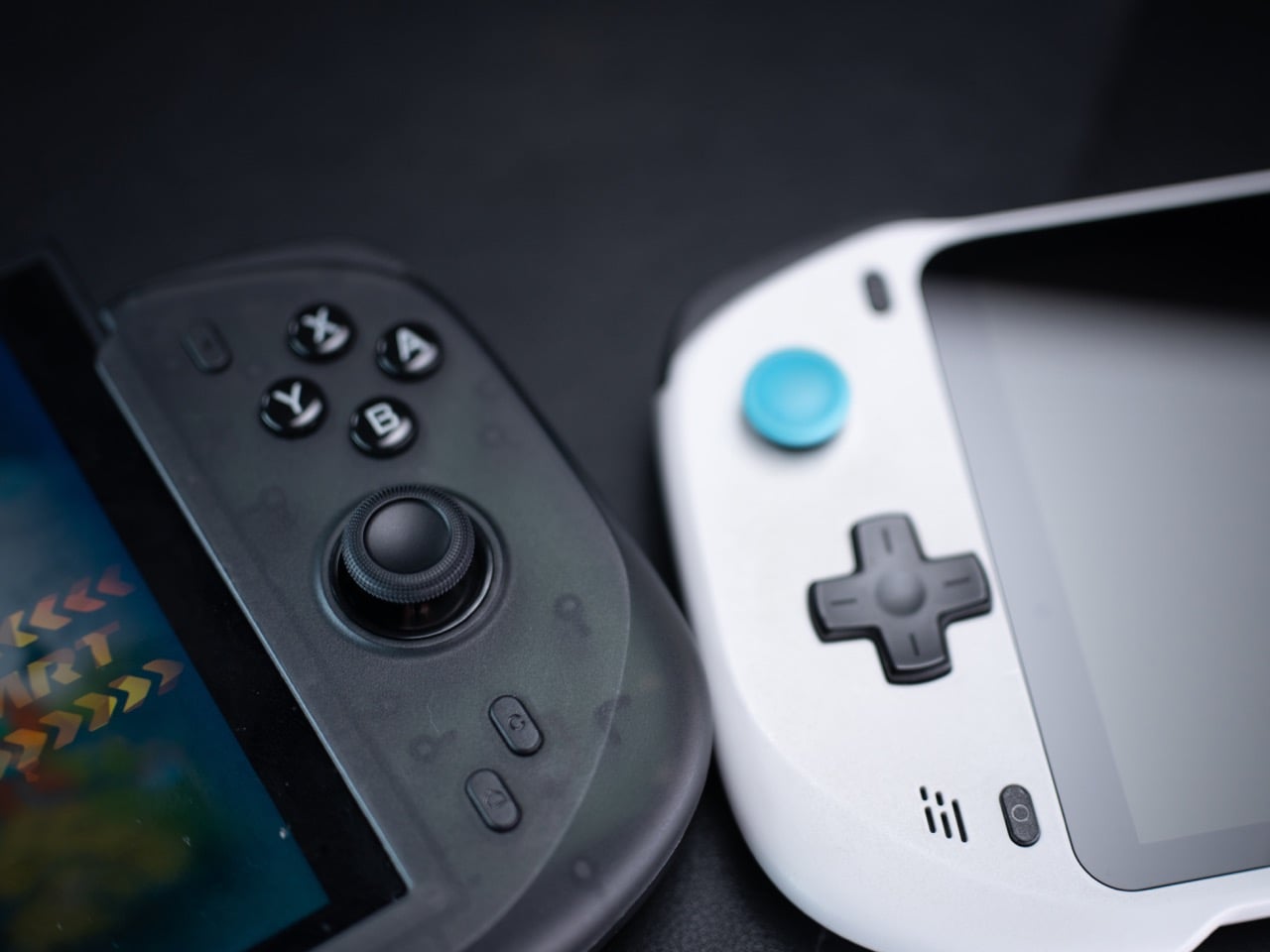
When the Nintendo Switch 2 arrived in June 2025 at $449.99, it came with a 7.9-inch display, a faster processor, and a Joy-Con that doubles as a mouse. What it didn’t come with was a comfortable way to hold it for long sessions. The handheld form factor has always been a compromise between portability and ergonomics, and for players who log serious hours, that compromise starts showing up as wrist fatigue, awkward thumb angles, and a nagging wish for something with a proper grip. The accessory market has tried to fill that space for years, with results ranging from decent to deeply uninspiring.
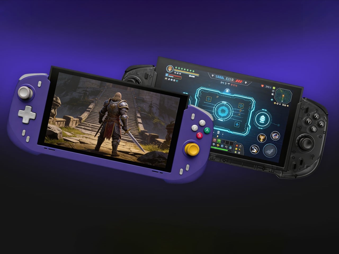
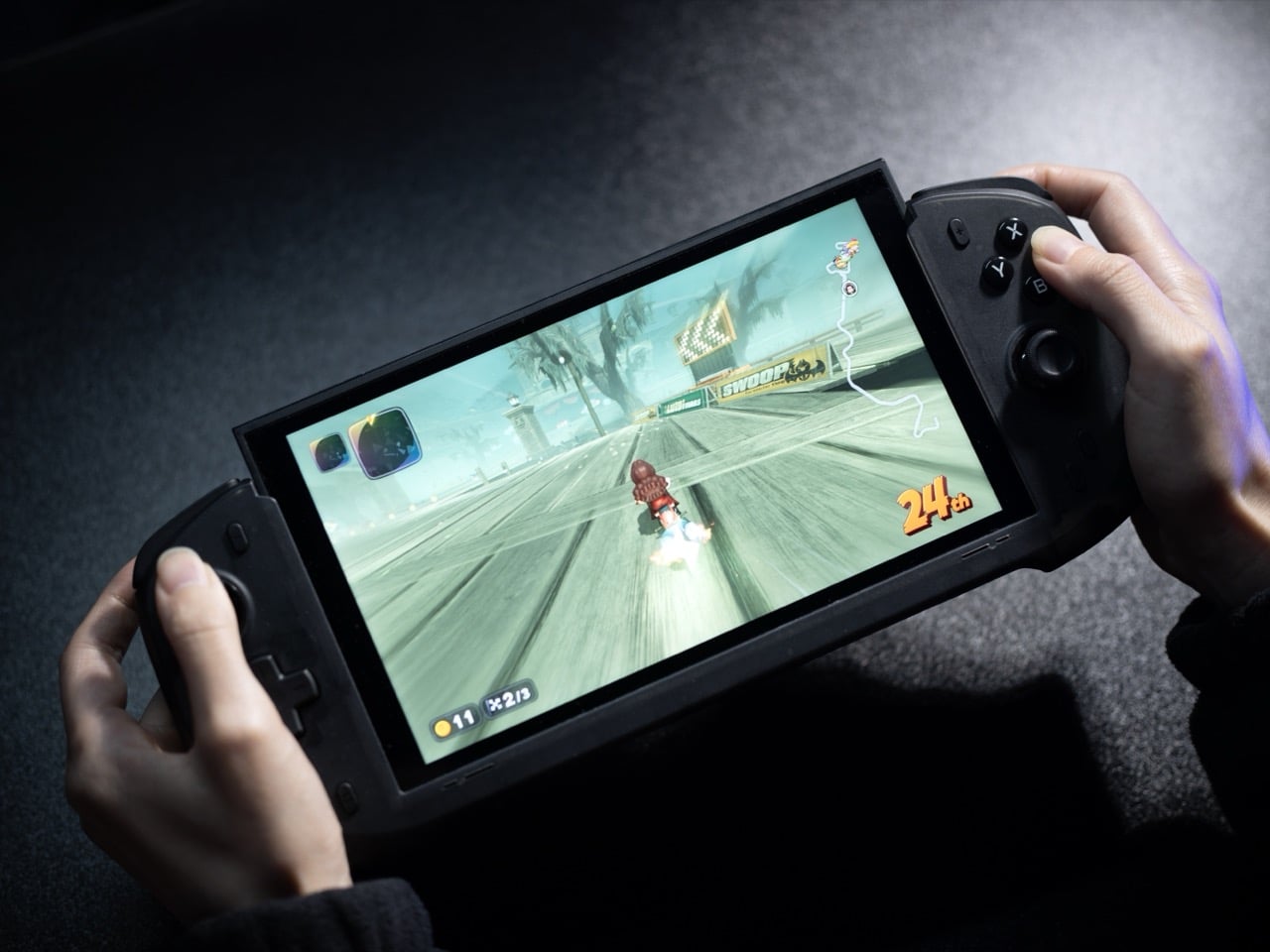
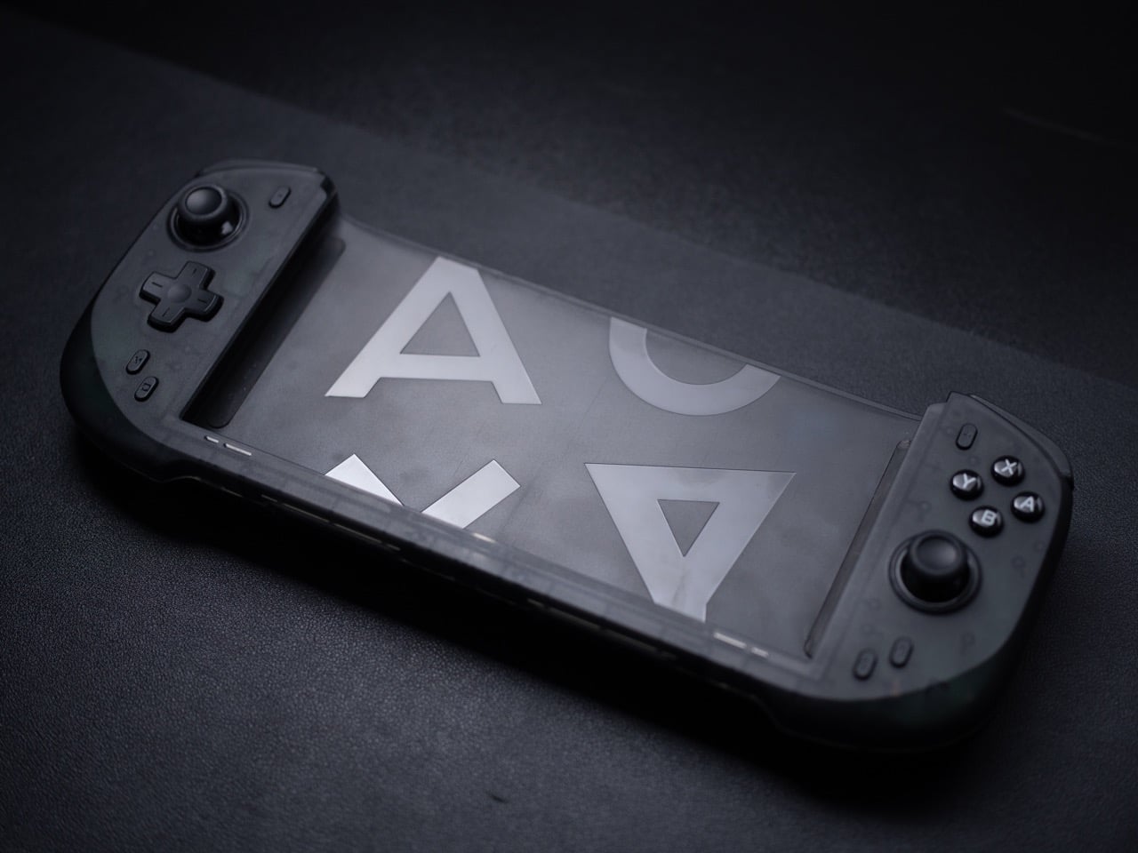
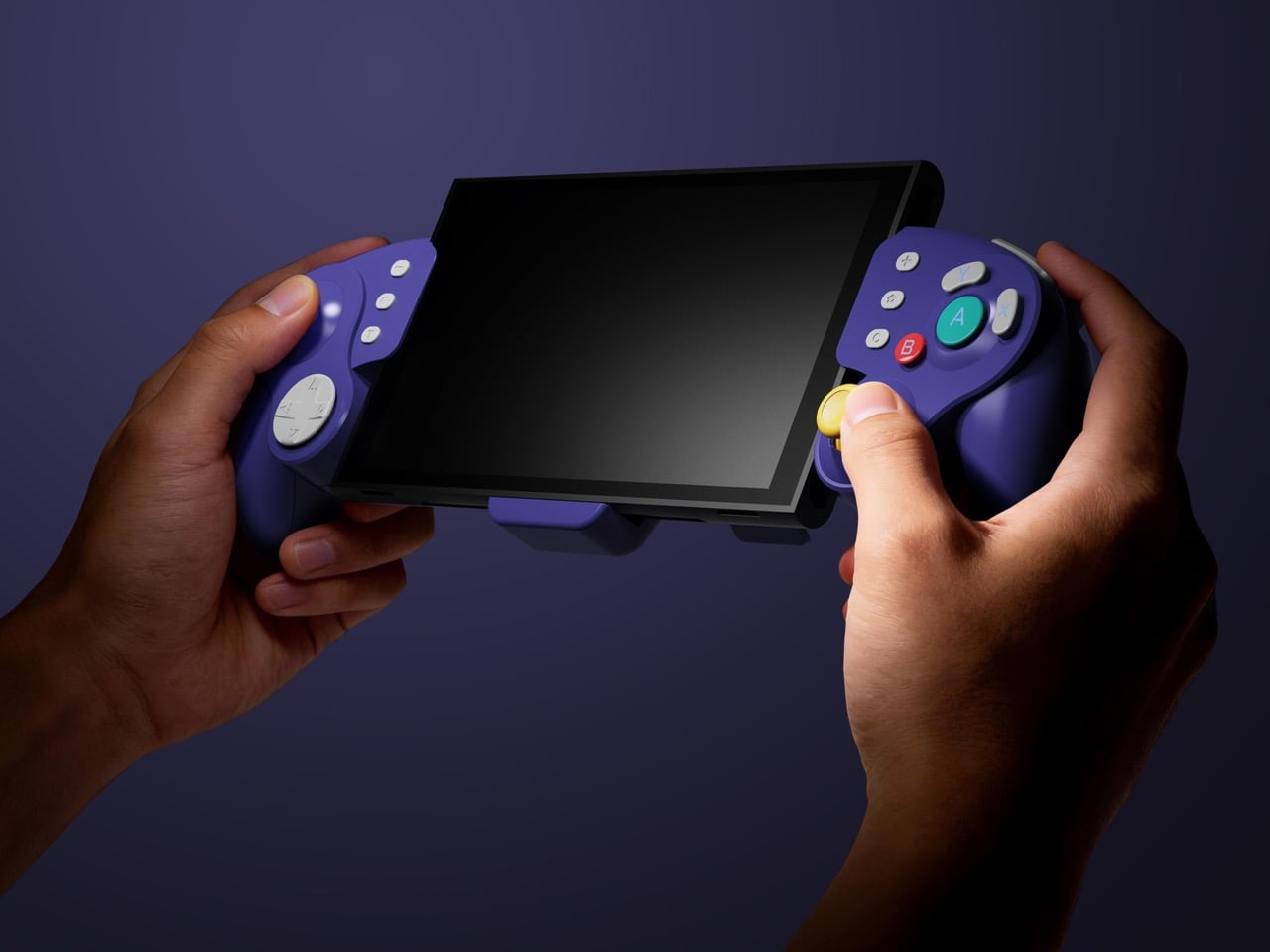
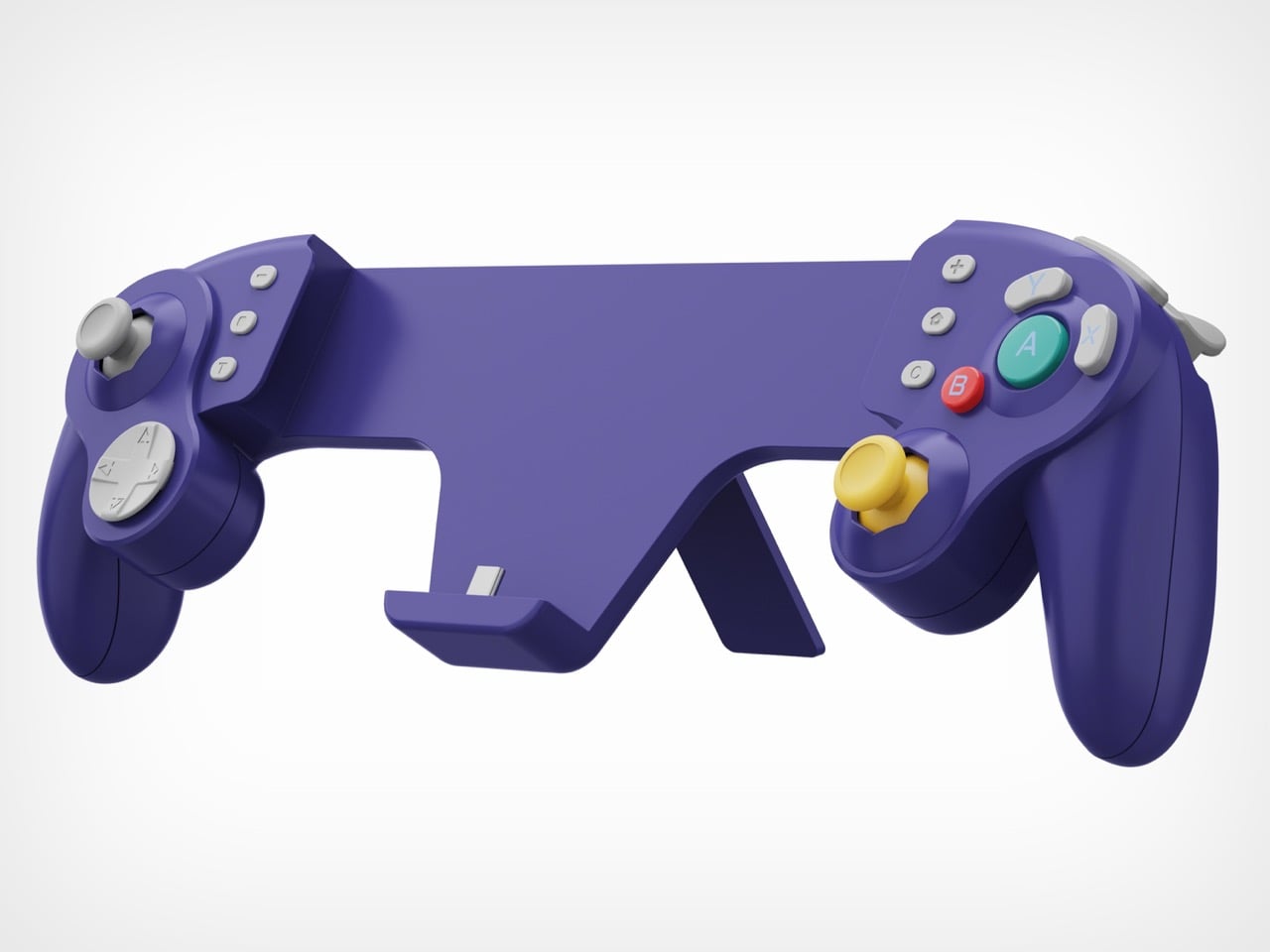
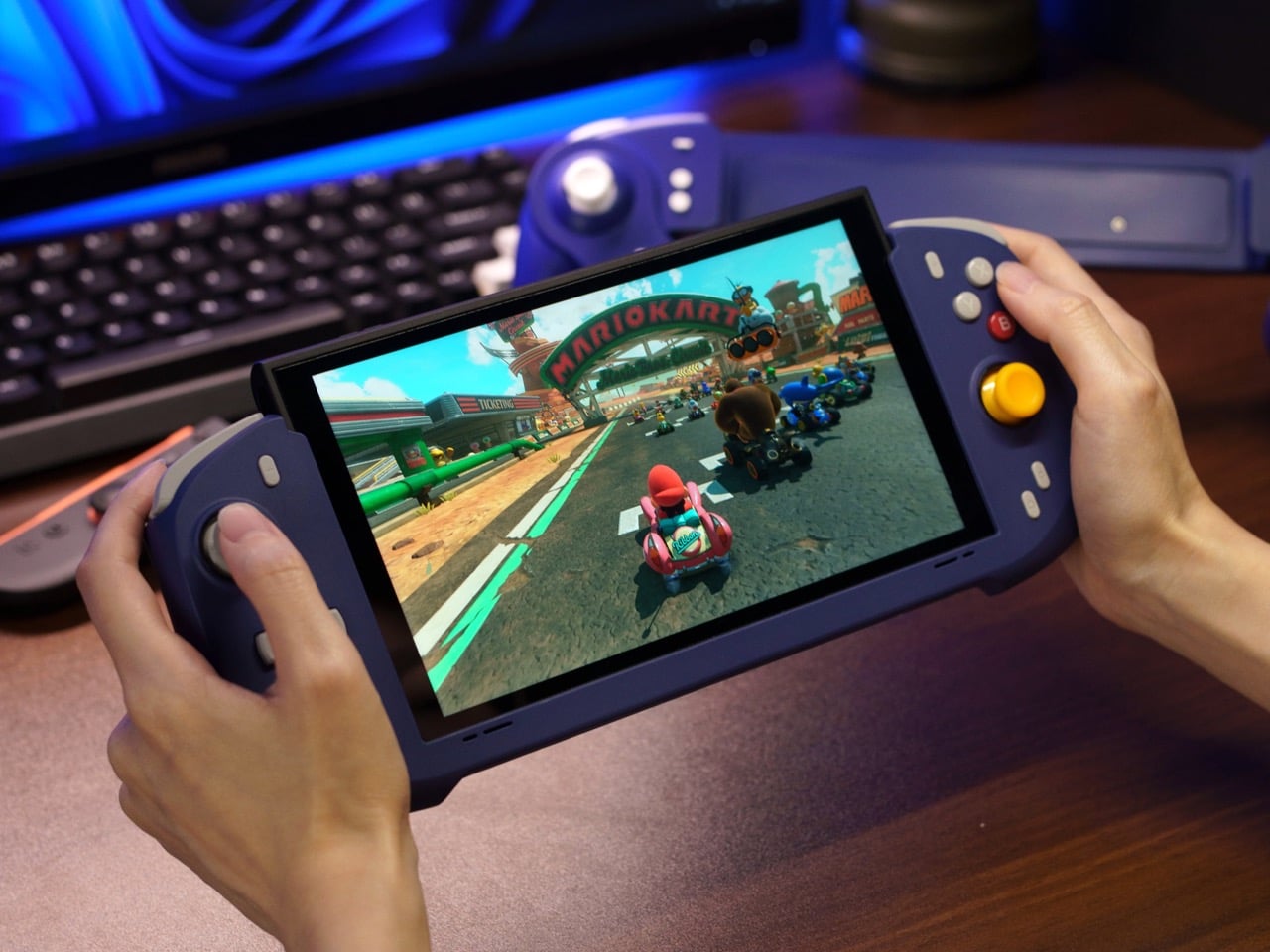
Abxylute’s answer comes in two forms: the N6 and the N9C, both deck-style controllers purpose-built for Switch 2 play. The N6 wraps the console in a full-size ergonomic grip with Hall-effect joysticks, native 9-axis motion control, a dedicated C Button for GameChat, and adjustable vibration levels the player can cycle through without leaving a session. The N9C leans into personality, drawing from GameCube design DNA with mechanical buttons, trigger switches, and a capacitive joystick system paired with swappable gates.
Joy-Cons were engineered for flexibility: detachable, shareable, usable solo or in pairs, functional as individual controllers for two-player sessions on a single console. That versatility comes at the cost of ergonomics, because a controller small enough to slide into a rail and function independently will never offer the grip depth, trigger travel, or palm support of something purpose-built for extended solo play. The N6 and N9C abandon that modularity entirely in favor of doing one thing exceptionally well, which is making handheld Switch 2 sessions feel like you’re holding a full-size controller instead of a tablet with thumbsticks glued to the sides. The tactile feedback is immediate and familiar, the kind of responsiveness you get from hardware designed around sustained single-player sessions rather than multi-function compromise. Both controllers connect via wired USB-C, skipping wireless pairing lag entirely, because when the target is solo handheld performance, eliminating variables takes priority over flexibility.
The N6’s open-top design is the first thing people will argue about online, and they’ll mostly be wrong. The Switch 2 stands over 11 cm tall, and a fully enclosed grip pushes that height further, putting your palms in the kind of awkward hover position that builds exactly the fatigue you were trying to avoid. Abxylute held the grip height at 8.5 cm, matching full-size controller proportions, so your palms have something to rest against rather than squeeze. The 7-inch grip width sits narrower than the console body deliberately, keeping your hands at a natural, relaxed spread instead of forcing them wide across a bulky frame. The physics of holding something for two hours straight are pretty straightforward, and this design reads those physics correctly.
Hall-effect joysticks solve a specific, measurable problem that standard potentiometer sticks fundamentally cannot. Potentiometer sticks use resistive contact that physically degrades over repeated use, which is why drift rates climb after a year or two of regular play. Hall-effect reads joystick position magnetically, with zero physical contact between moving components, and the N6 bumps the stick travel angle to 23 degrees compared to 18 degrees on Joy-Con, giving your thumbs more range for fine-grained inputs. A POM anti-wear ring around each stick handles mechanical stability without adding stiffness or noise to the movement. It’s a small detail, but the kind that separates purpose-built hardware from a generic controller with a different shell. On a device you use daily, that engineering choice compounds in your favor in a way that contact-based sticks simply never will.
Inputs across the N6 break down by material type, and the distinctions matter. ABXY buttons use conductive rubber for cushioned presses that reduce finger fatigue; the D-pad uses tactile switches for sharper directional accuracy; shoulder buttons deliver tactile clicks for faster responses in action-heavy play; and the linear digital triggers provide a genuine 0-100% input range rather than binary on/off clicks. That trigger range matters considerably in racing games and anything relying on gradual pressure inputs. Vibration adjusts at four levels, 0%, 40%, 70%, and 100%, switchable via button combo directly on the controller, bypassing the game-by-game settings adjustment that the Pro Controller requires. The grip’s internal structure forms a resonance chamber that redirects the Switch 2’s speakers forward and reinforces bass by around 10%, which you’ll register in a quiet room as fuller, punchier audio than bare Joy-Cons produce.
The N9C is doing something more niche and, honestly, more interesting. Where the N6 chases Pro Controller parity, the N9C chases the GameCube controller’s specific feel, complete with a centered A button and asymmetric face layout, rebuilt for a modern console using mechanical micro-switches and ALPS tactile shoulder buttons. Capacitive joysticks sidestep magnetic interference entirely, and the swappable 8-way and circular gate rings mean you can dial in a tight directional gate for fighters and swap to a smooth circular gate for platformers. A built-in battery hatch holds two replaceable batteries that reverse-charge the Switch 2 directly during play. Most grips on the market ignore battery life almost entirely, and a reverse charge system that powers the Switch 2 directly from the controller is a differentiator almost nothing else in this category offers.
The N9C carries four programmable rear buttons, two per side compared to the N6’s one per side, and each supports the same macro-recording system that chains directional inputs and actions into a single trigger. Switch 2 system-level button remapping works natively, requiring no third-party software, so a custom layout travels across every game without reconfiguring anything. An integrated rear stand sets the N9C apart from virtually every grip in this category, giving the Switch 2 a propped tabletop angle without relying on the console’s own kickstand. The primary connection is wired USB-C for ultra-low latency, with BLE available for configuration only, keeping the input chain clean during actual play. Every N9C ships with both C-stick and ring-style joystick caps in the box, so players can dial in the stick feel before the packaging hits the trash.
Mass production kicked off in March 2026, with shipping expected between April and June. Super Early Bird pricing runs $79 for the N6 (retail $110) and $89 for the N9C (retail $120), with a bundle sitting at $159. Nintendo’s own Pro Controller for Switch 2 retails at $79.99 and carries none of the Hall-effect sticks, programmable back buttons, or turbo functionality. Abxylute has shipped over 120,000 units across more than 20 projects to 100,000-plus customers, so the production infrastructure exists. What they’re solving for is specific: handheld Switch 2 play that performs at Pro Controller level without forcing players to accept the Joy-Con’s ergonomic ceiling as permanent.
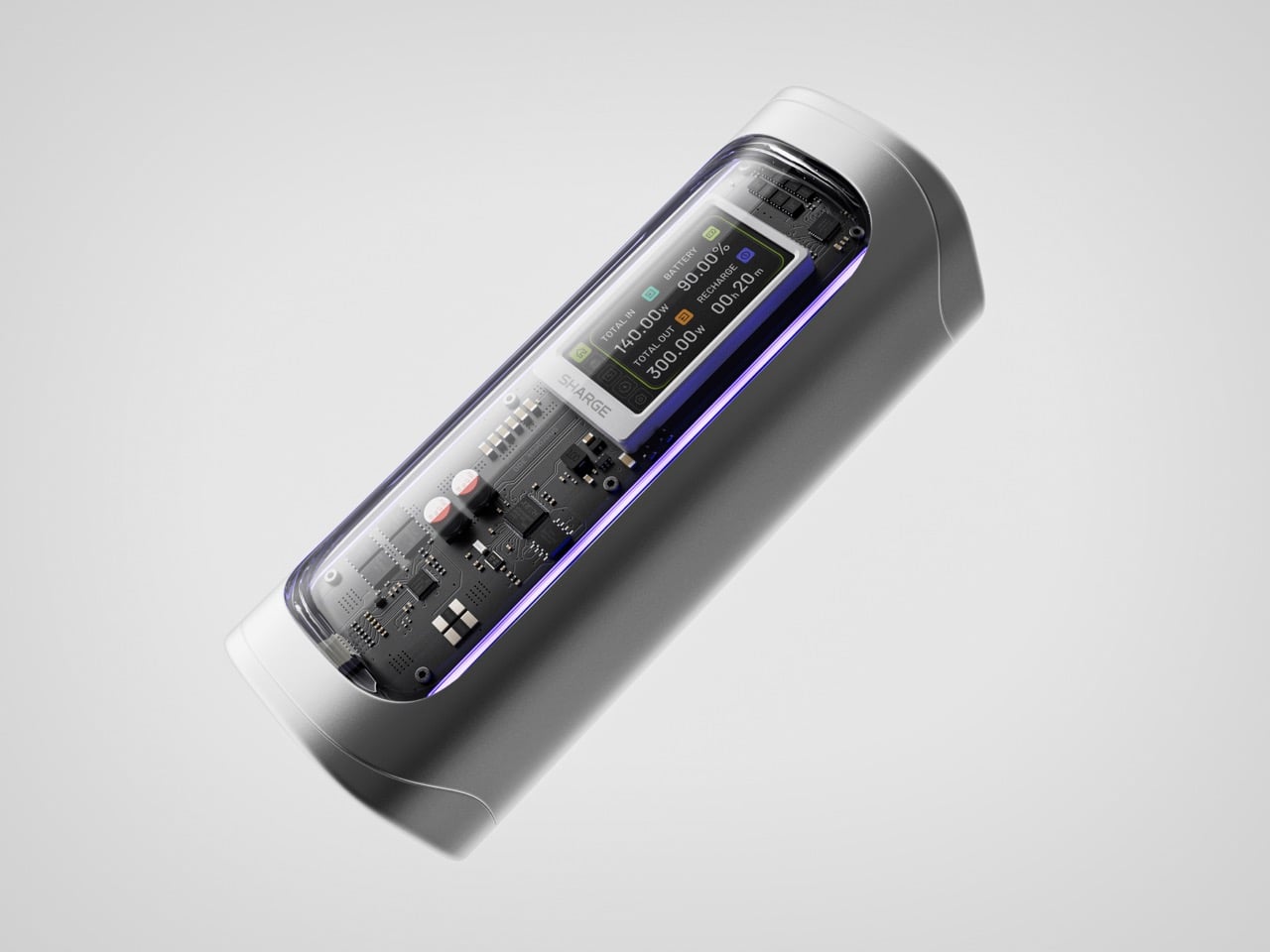
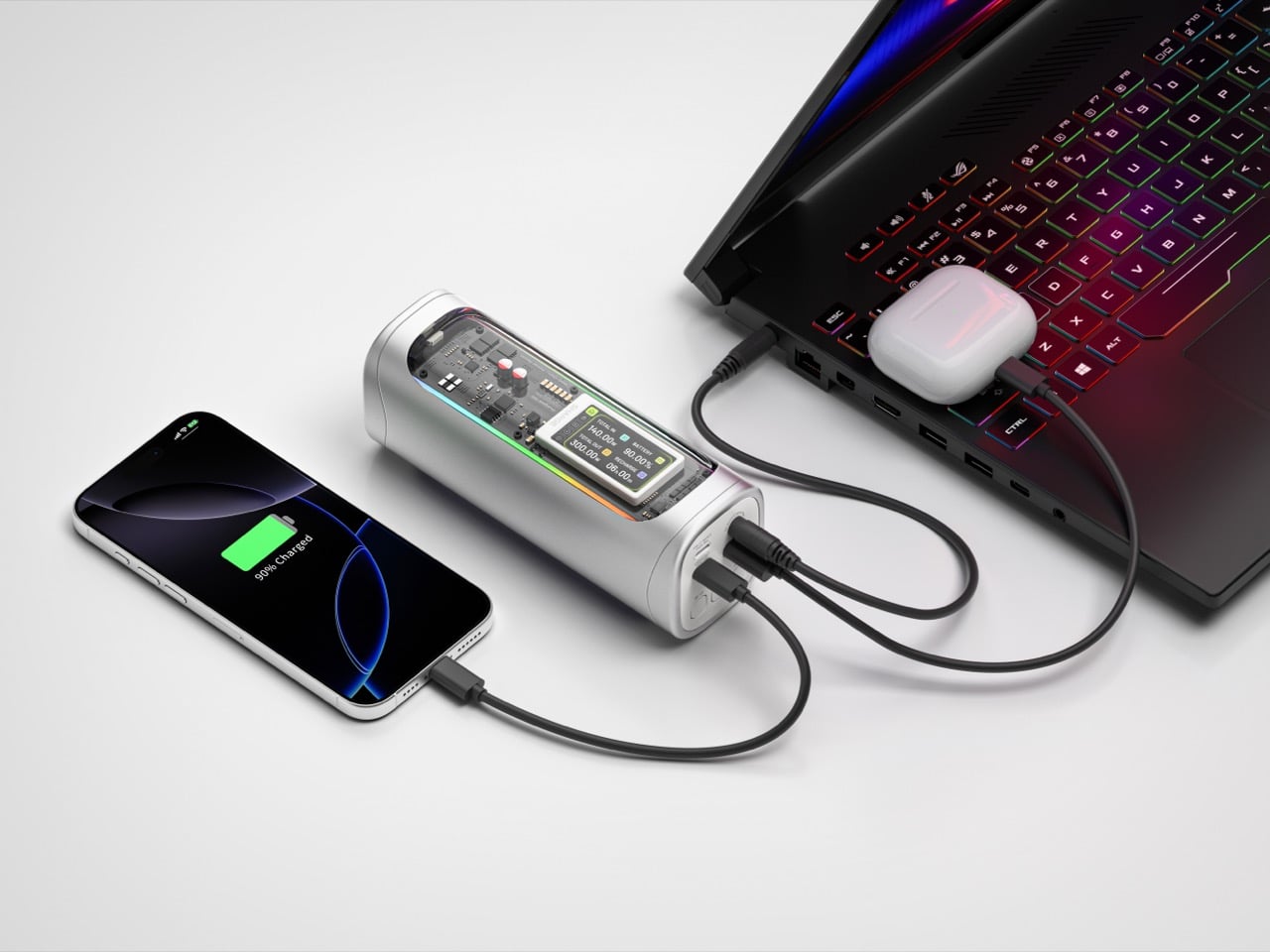
Power banks have spent years being boring on purpose. Black rectangles, white rectangles, the occasional textured finish. The category settled into a kind of utilitarian invisibility, as if the industry collectively decided that anything carrying electrons should look like a bar of soap. SHARGE never got that memo. The Shargeek 300 looks like a prop from a near-future thriller, with transparent panels revealing glowing circuitry beneath, RGB light bars running along its flanks, and a CNC aluminum body that catches light the way expensive things tend to. It belongs on a desk you’d actually want to show people.
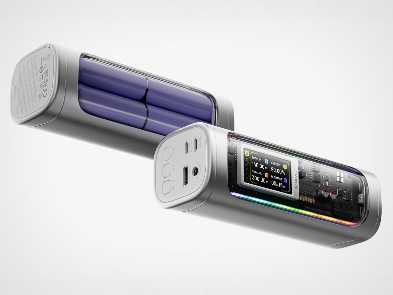
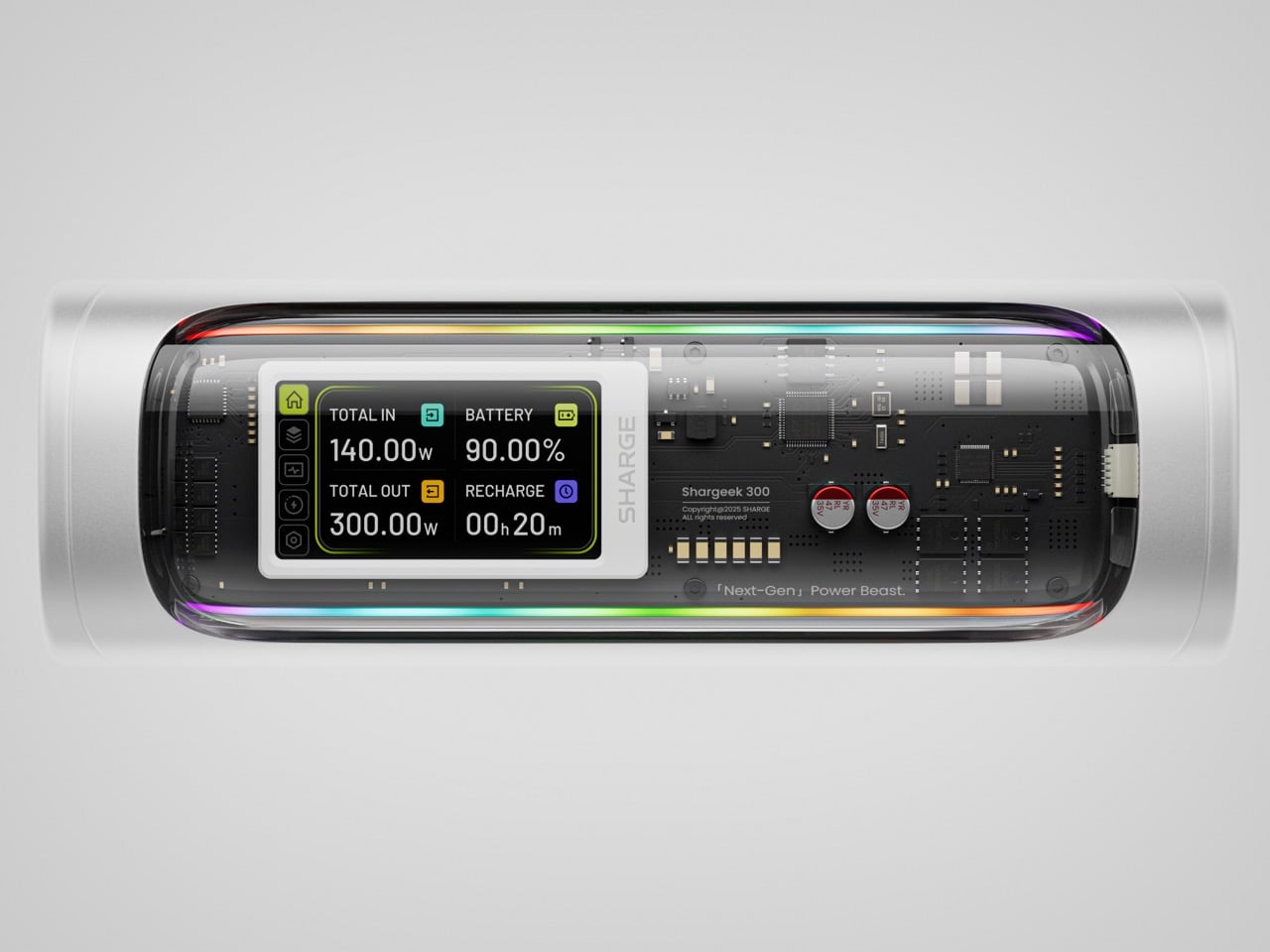
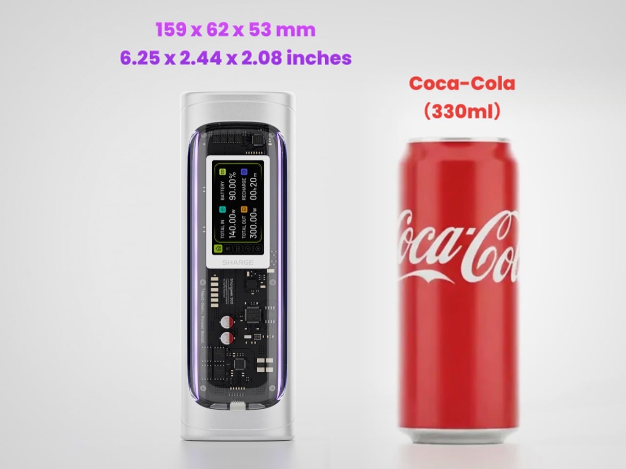
Founded in 2020, SHARGE built its identity around the conviction that charging hardware deserves the same design attention as the devices it powers. The original Shargeek 100, launched in 2021, was the proof of concept: a transparent, display-equipped power bank with DC charging that found a devoted audience almost immediately. The Shargeek 300 is what four years of that bet looks like fully cashed in. It pushes 300 watts of total output, enough to charge two 16-inch MacBook Pros simultaneously while still fast-charging a smartphone on a third port. The 24,000mAh battery lands at 86.4Wh, sitting just under the 100Wh threshold airlines enforce for carry-on batteries. Recharge time from flat to full is 75 minutes with a 140W input. The whole unit is roughly the size of a 330ml can of cola. SHARGE spent 40 months getting here, and the result makes most rivals in the category look underprepared.
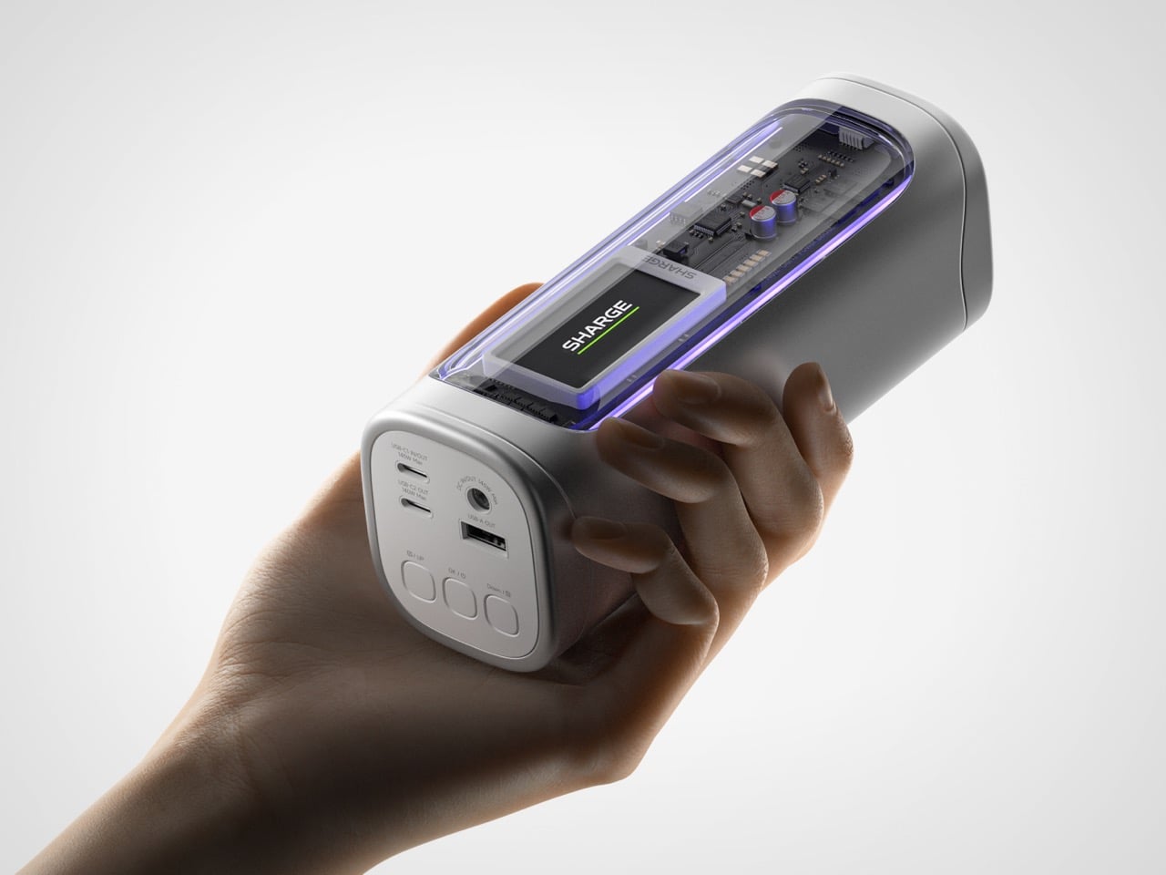
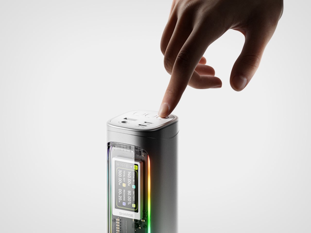
That meticulous attention to detail is most obvious in the physical construction. The main body is a matte silver CNC aluminum frame, which is then given a 180-grit sandblasted, anodized finish for a smooth, premium feel. The company’s head of production is even quoted as personally comparing the feel of every unit to an iPhone to ensure they are equally premium. The signature transparent casing is not just a window, but a piece of safety equipment, made from V0 flame-retardant, UL94-certified polycarbonate that resists both scratches and heat. The dual RGB light bars are fully customizable, allowing users to adjust brightness, change colors, and cycle through effects via the onboard display, turning a functional object into a piece of personalized desk art.
Inside that striking shell is technology that sets a new benchmark for portable power. The Shargeek 300 is the first power bank to use the same Full-Tab Battery Cell technology pioneered by Tesla. This design significantly lowers internal resistance compared to conventional cells, a change that unlocks faster charging speeds, higher sustained output, and superior heat dissipation. This internal efficiency is the key to how a device this compact can safely manage a 300W total output without overheating or degrading quickly. The advanced battery structure results in a longer-lasting, more stable power source that can handle the demanding, continuous power draws required by high-performance laptops and other professional equipment, putting truly next-generation power in your hands.
This power is routed through a versatile array of four output ports designed to handle nearly any device. The stars of the show are the two USB-C ports, both of which support the Power Delivery 3.1 standard to deliver a massive 140W of power each. This is what allows the Shargeek 300 to simultaneously fast-charge two 16-inch MacBook Pros at their maximum charging speed. A third USB-A port provides up to 20W for legacy devices and smartphones. The fourth and most unique port is the adjustable DC barrel port, a feature carried over from the Shargeek 100. It now supports up to 140W and its voltage can be manually set between 5V and 28V, unlocking compatibility with a world of gear that USB-C cannot serve, from professional camera equipment to high-performance drones. The 24,000mAh capacity provides enough energy for approximately one full charge of a modern MacBook Pro, six charges for an iPhone 16 Pro, or two charges for an iPad Pro.
The user experience is managed through a 1.9-inch IPS display, which is 60% larger than the screen on the previous model. It provides a level of control that is unheard of in this category. Beyond showing real-time input and output wattage, the display allows you to monitor battery health, track charging cycles, and check internal temperatures. You can use it to precisely adjust the DC output voltage, set a custom welcome message, and configure the RGB lighting. This smart display transforms the power bank from a simple battery into an intelligent power hub. This intelligence extends to its handling of delicate electronics. A dedicated Low-current Mode ensures that devices like earbuds, smartwatches, and fitness trackers receive a safe, optimized charge, preventing the overcharging that can damage the small batteries in those devices.
This combination of raw power and intelligent control is backed by a comprehensive suite of safety features, including overvoltage, undervoltage, short-circuit, and real-time temperature protection. This commitment to safety extends to its travel-readiness. Crucially, the power bank’s 24,000mAh capacity is engineered to a rating of 86.4Wh, keeping it comfortably under the 100Wh limit imposed by airlines for carry-on luggage. This makes it one of the most powerful charging solutions that can be legally carried onto a plane, a critical detail for mobile professionals. The low standby power consumption is another practical benefit, allowing the Shargeek 300 to retain over 90% of its charge after 15 days of inactivity. For anyone who has pulled a power bank from a bag after weeks only to find it unexpectedly dead, this is a genuinely valuable feature.
The Shargeek 300 starts at $199 but is available at a discounted $159 price for earlybird backers. Cobble together $209 and you can get the power bank along with its companion Pixel 140W PD 3.1 wall charger from Sharge with its adorable pixel-matrix display. The Shargeek 300 comes with a 12-month warranty, and ships globally as early as May 2026.
The retro handheld market has a strange problem. The hardware keeps getting better, the screens get sharper, the processors get faster, and yet most of these devices land looking like prototypes someone forgot to finish. Generic shells, forgettable proportions, and LED lighting as a substitute for actual design thinking. For a category built entirely on nostalgia, very few of these devices actually look like they belong to any era at all.
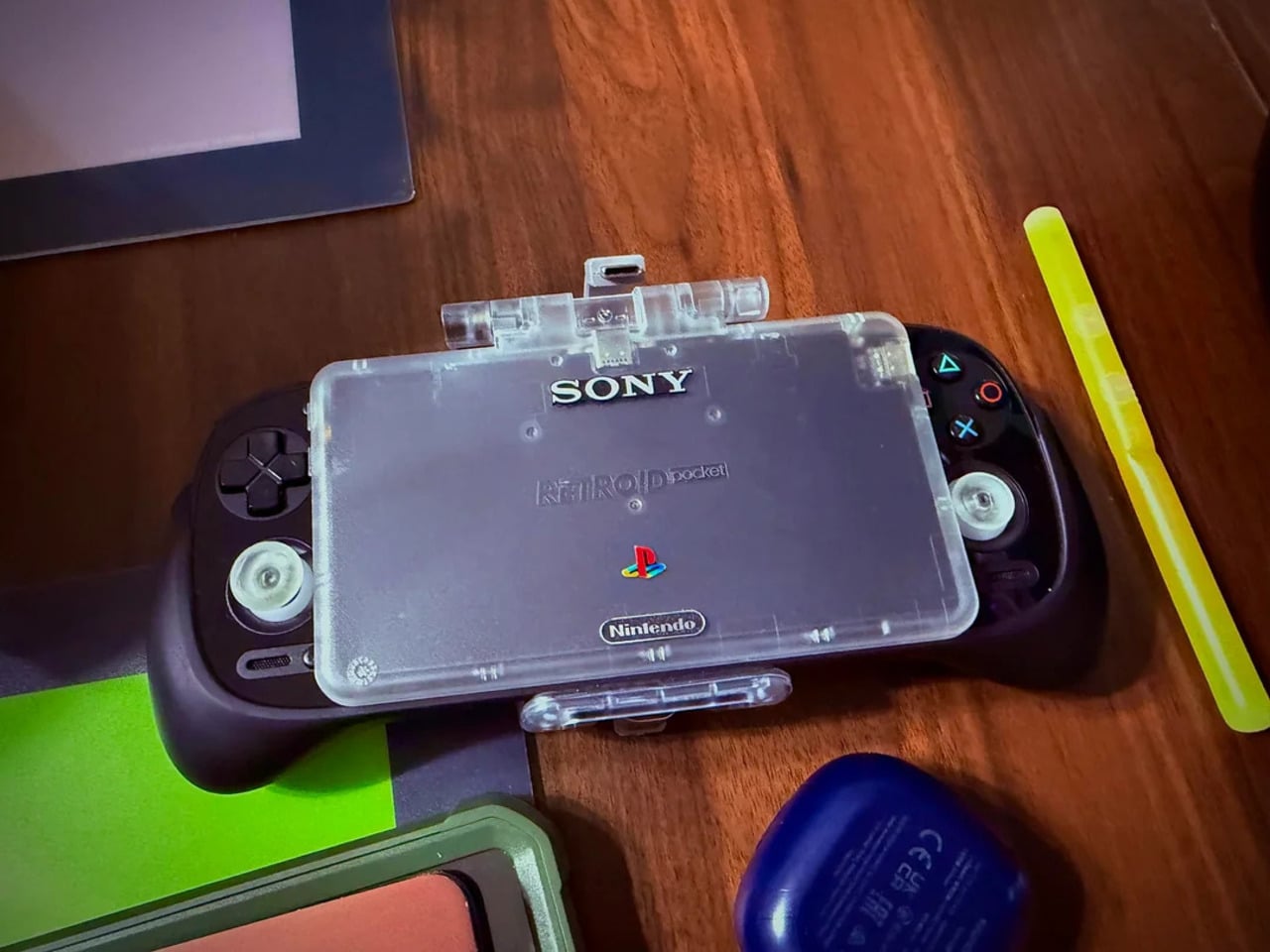
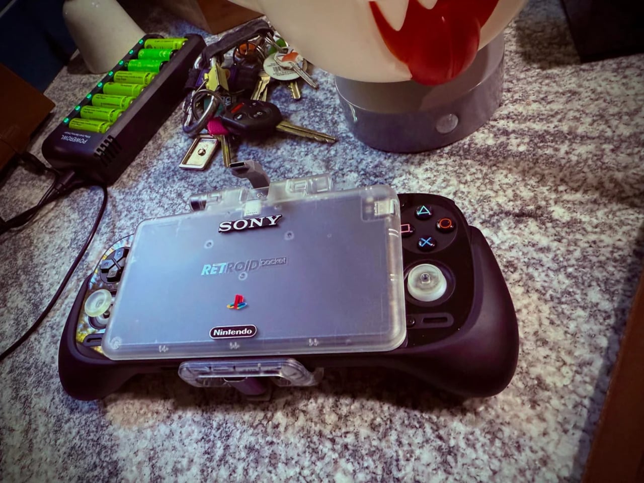
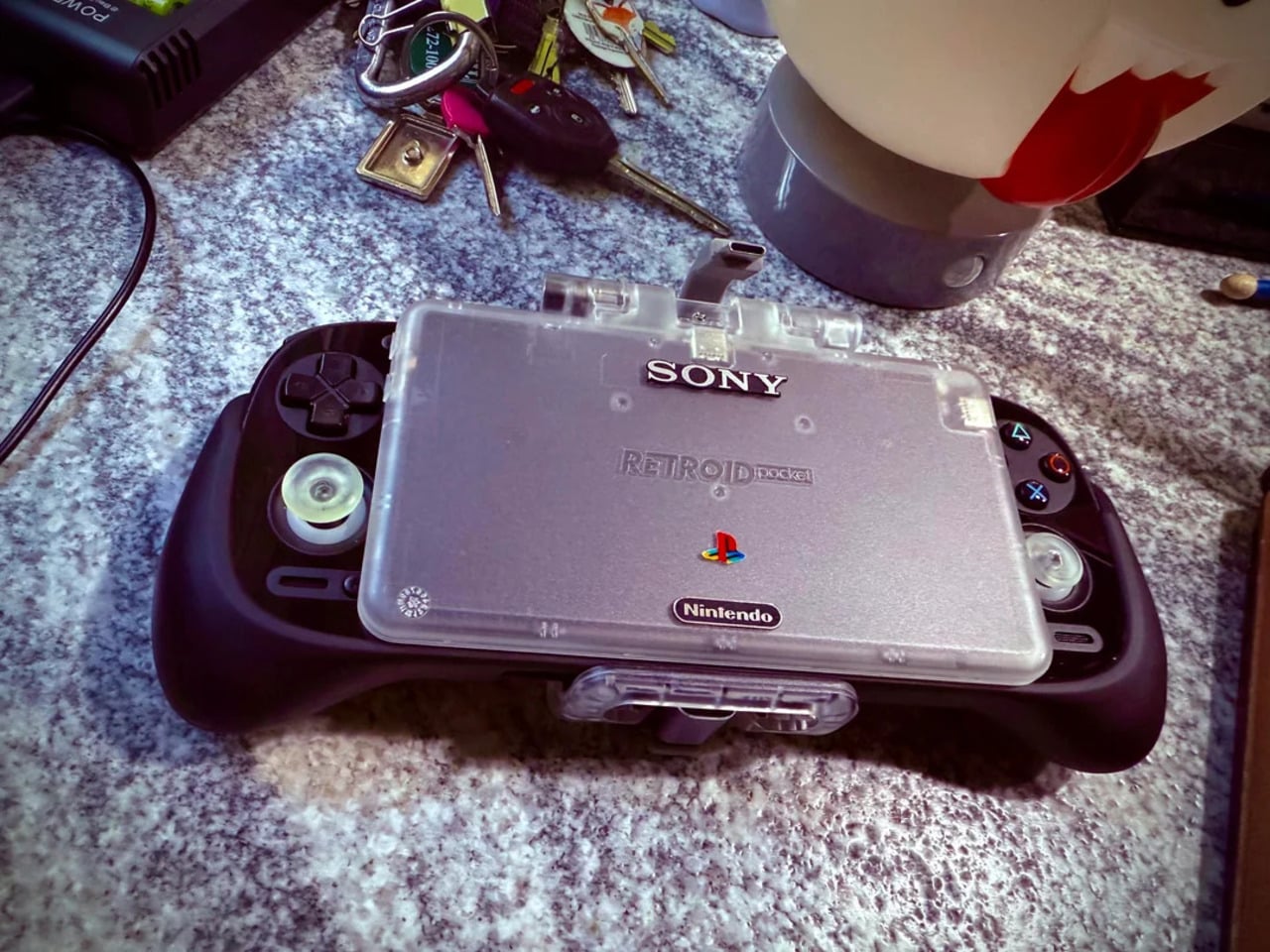
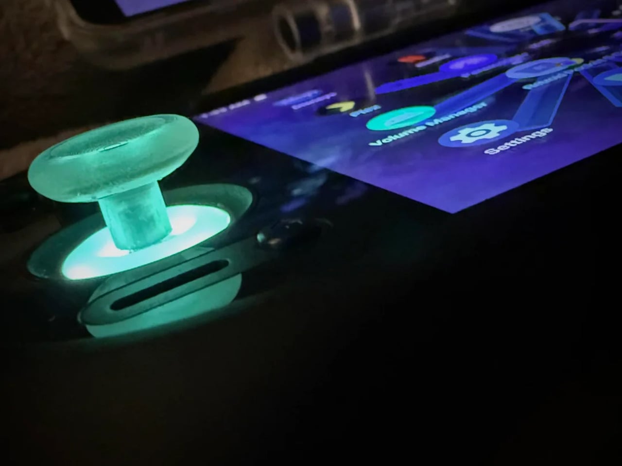
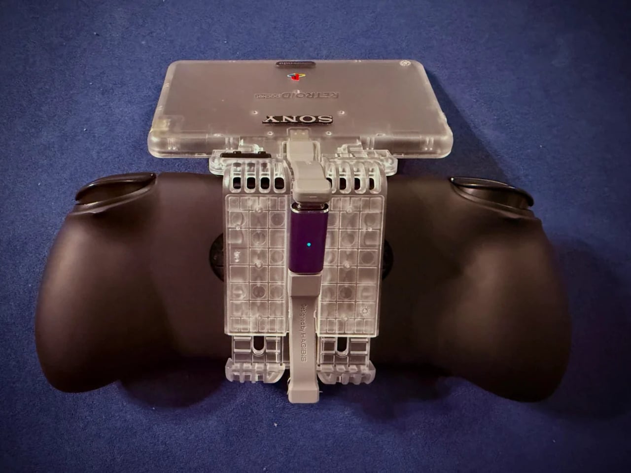
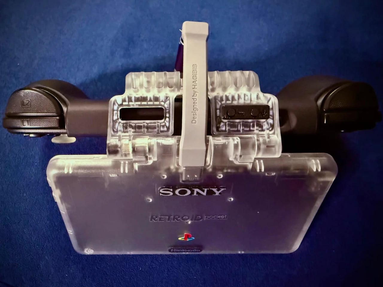
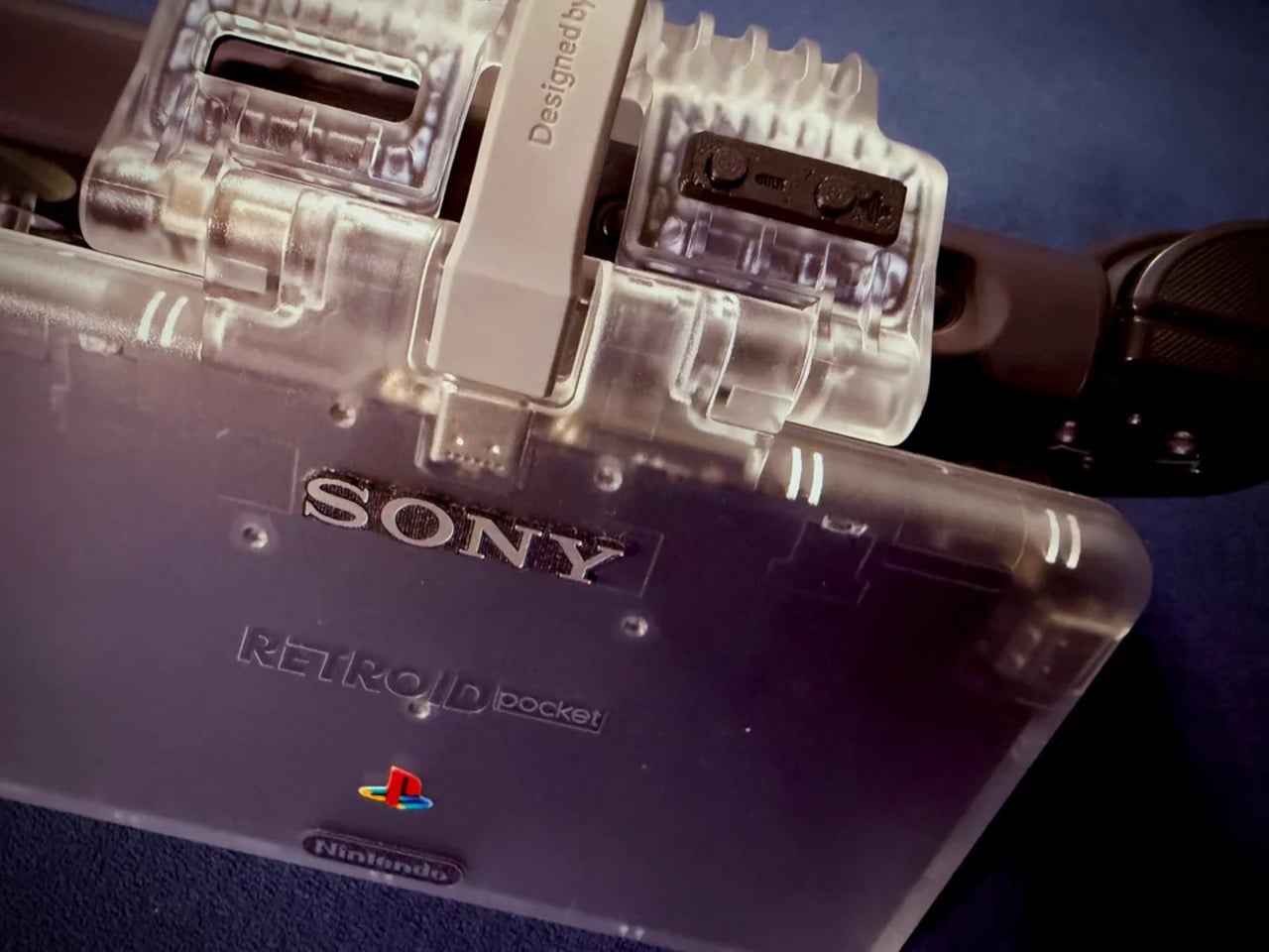
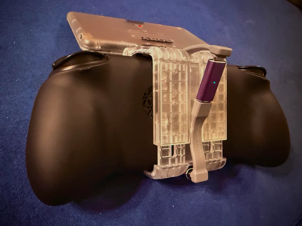
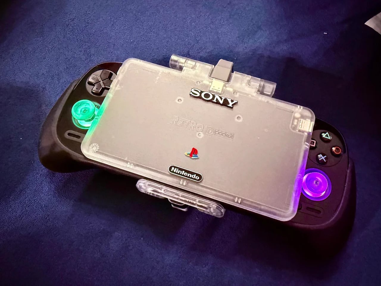
That tension is what one Reddit user decided to address. Starting with a Retroid Pocket 5, a $199 Android handheld running a Snapdragon 865 and a 5.5-inch AMOLED display, the mod layers Sony and Nintendo branding onto the same shell. Vinyl decals, translucent polycarbonate, a 3D-printed volume rocker from Etsy, and a cable replaced in PS2 color. The result looks less like a sticker job and more like a concept render from an alternate 1999.
The translucent shell is doing most of the work. It pulls from the visual language of the N64’s Funtastic series, those clear and atomic-purple controllers Nintendo released in the late 1990s, where showing the circuitry was the design choice rather than concealing it. Over a piano-black grip body with PlayStation-colored face buttons, the frosted polycarbonate shifts from grey to near-white depending on the light. It shouldn’t feel considered. It does.
The branding placement is where intent becomes clear. The Sony wordmark sits centered on the upper face, exactly where it appeared on a PSOne. Below it, the PlayStation four-color logo. At the bottom bezel, the Nintendo badge mirrors its position on a Game Boy Advance SP. None of it is licensed, of course. These are adhesive vinyls placed by someone who grew up with both systems and wanted their coexistence on one device to feel inevitable rather than absurd.
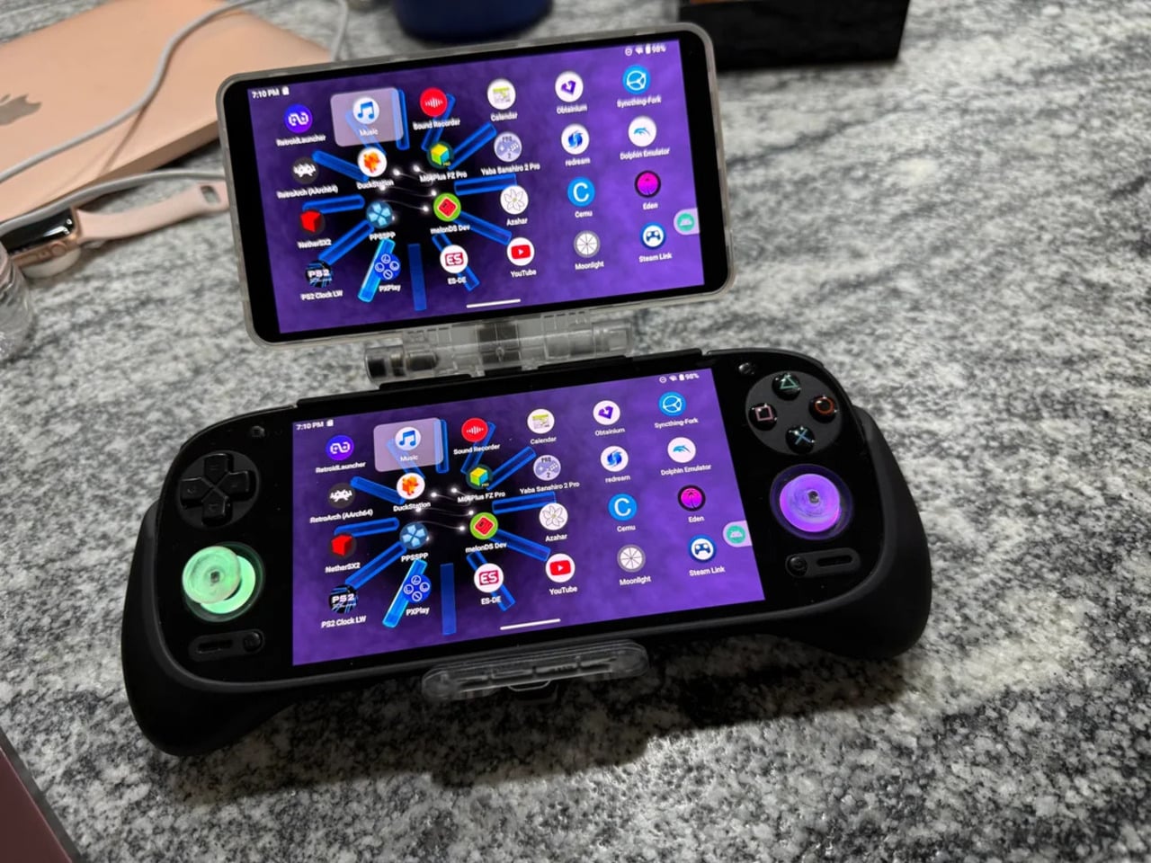
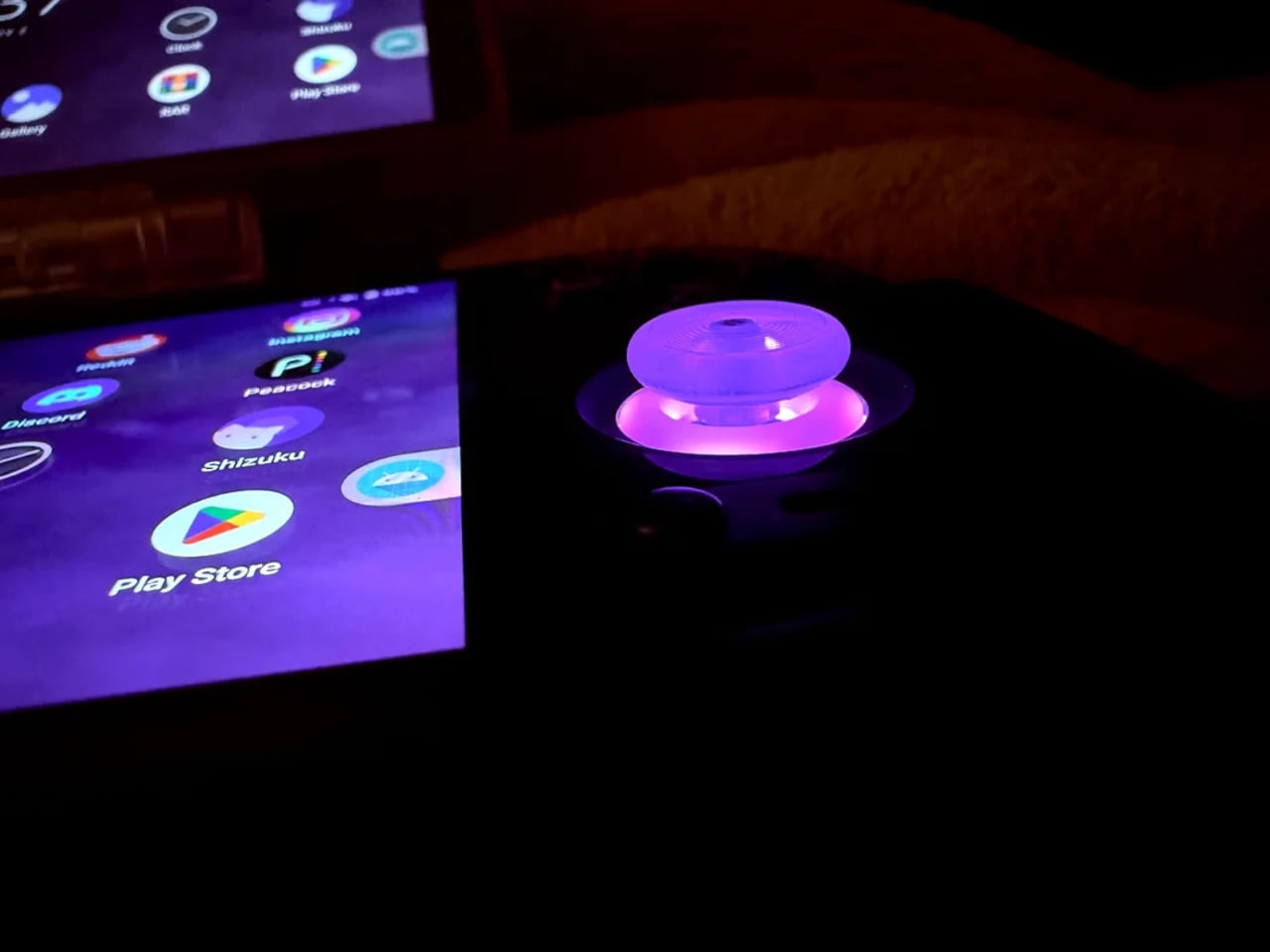
Not everything here reaches backward. The analog sticks are translucent caps over hall-effect sensors, lit teal on the left and purple on the right, owing nothing to 1999. That generation didn’t have RGB anything. The lighting reads as a concession to the present; the one feature announcing this is still an Android device in 2025, not a prototype from some alternate Sony-Nintendo licensing meeting. Whether it sits comfortably alongside the retro shell is a fair question.
The rear view shifts the frame again. A large dual-grip body in smooth black rubber dominates the back, a clear plastic hinge connecting the screen to grip in full view, structural and unapologetic. The 3D-printed volume rocker at the top edge puts a physical control where fingers naturally land. The back half feels closer to a DualShock than a Game Boy, which is either the point or the problem, depending on what you wanted this thing to be.
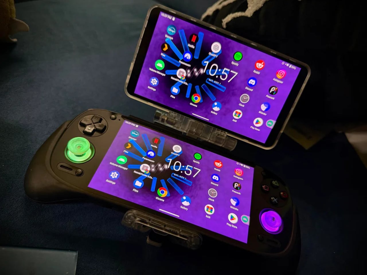
Flip to the front screen, and the emulator grid makes the whole thing literal. DuckStation for PS1, Dolphin for GameCube, PPSSPP for PSP, melonDS for Nintendo DS, and a live PS2 wallpaper cycling behind all of it. This device runs both companies’ libraries simultaneously without asking permission from either. The branding on the shell, in that context, stops being a novelty and starts reading as a plain statement of what the hardware already does.
The retro handheld category is large enough now that sameness has become its default. The Retroid Pocket 6, the current flagship from the same manufacturer, drew community criticism for being indistinguishable from competitors: glass front, LED sticks, rounded edges, and no particular character. A fan mod building identity out of borrowed logos is one response to a problem the manufacturers haven’t solved. It’s also just someone enjoying a hobby and being honest about what they want.
The hardware to play PS1, PS2, GameCube, and Game Boy Advance all on one screen already exists and costs under $200. What the market hasn’t resolved is what that device should actually look like, or whose name should go on it. This mod doesn’t answer either question. It just makes the gap between what’s technically possible and what anyone has bothered to design feel a little harder to dismiss.
For the unpressumable, the good old calculator is a gadget of yesteryears, as the smartphone does all the multitasking. However, for someone who works with numbers, this device is a no-brainer. Retail personnel, accountants, and professionals handling a high volume of calculations always reach for a calculator. The rugged device with its analog input doesn’t have the shenanigans of a touchscreen that misbehaves when touched with wet hands or with gloves on.
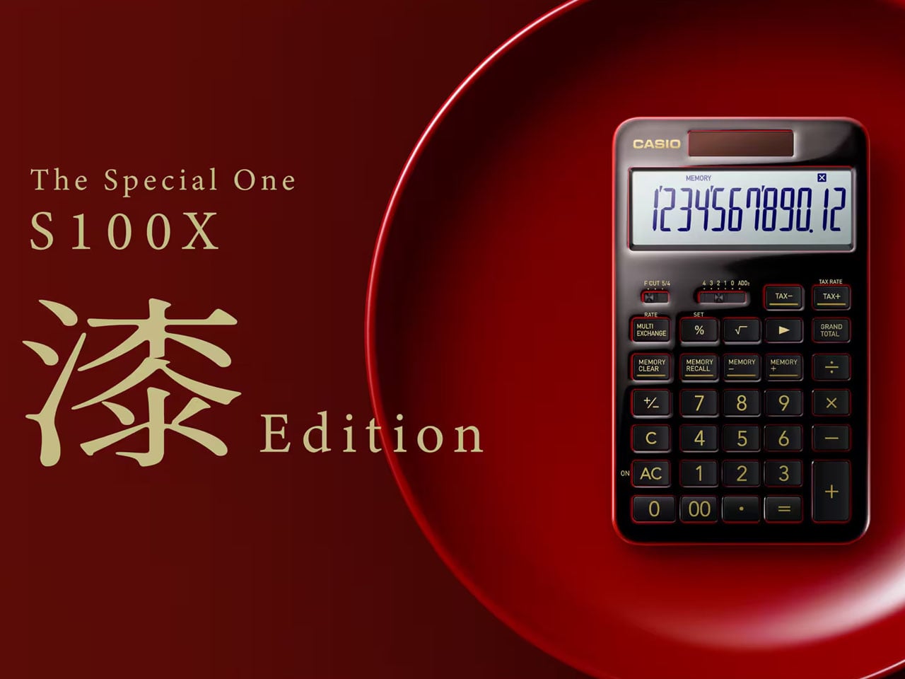
Casio pioneered the design of an all-electronic calculator dubbed 14-A (designed by the Kashio brothers) way back in the 1950s. The computing machine turned into a household name when the Casio Mini arrived in the early 1970s. The handheld device was a holy grail when it came to churning out numbers in professional circles as well as homes. Come 2026, the Japanese company has decided to give the trusted calculator a unique, handmade twist that carries a lot of substance.
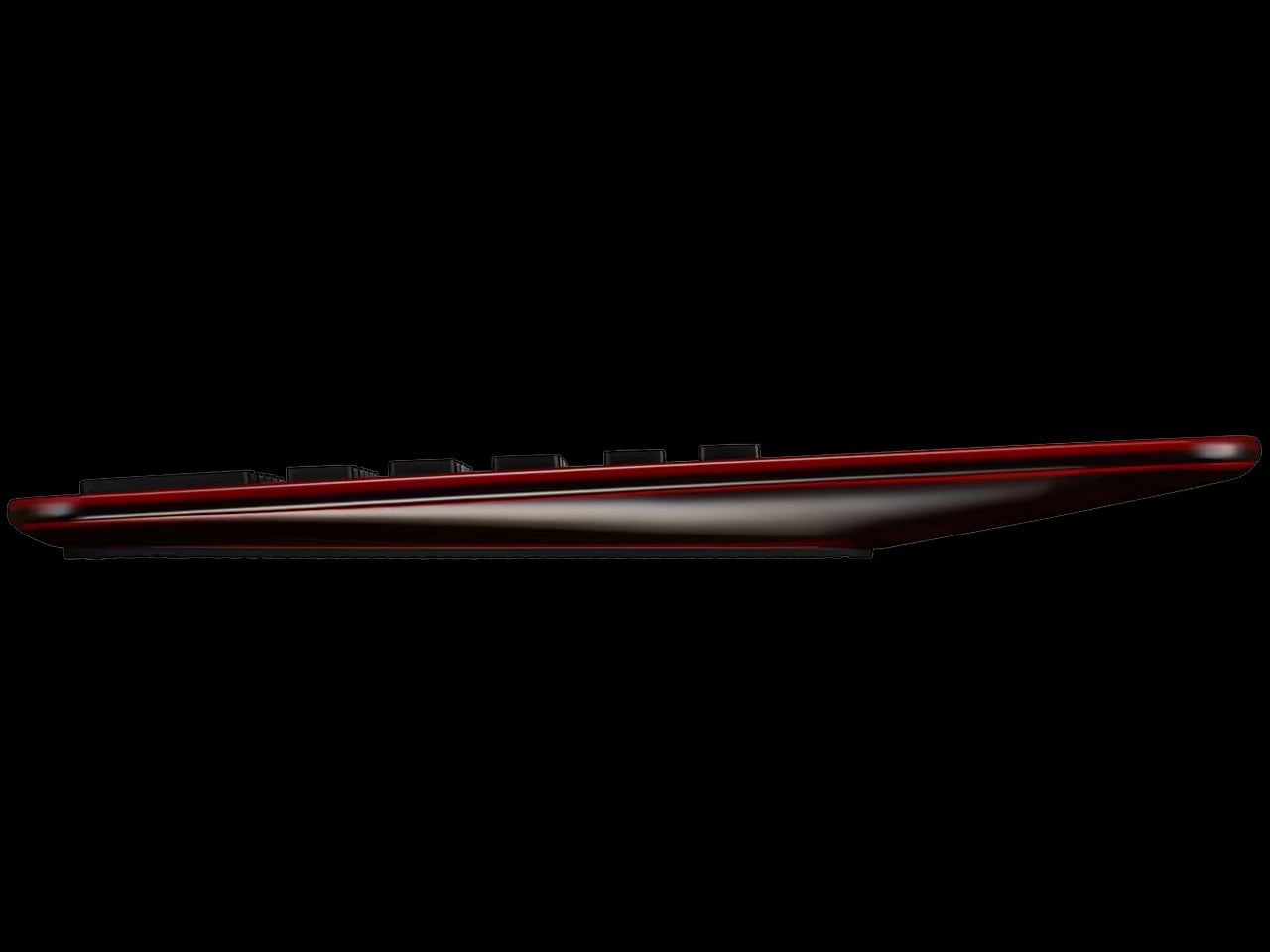
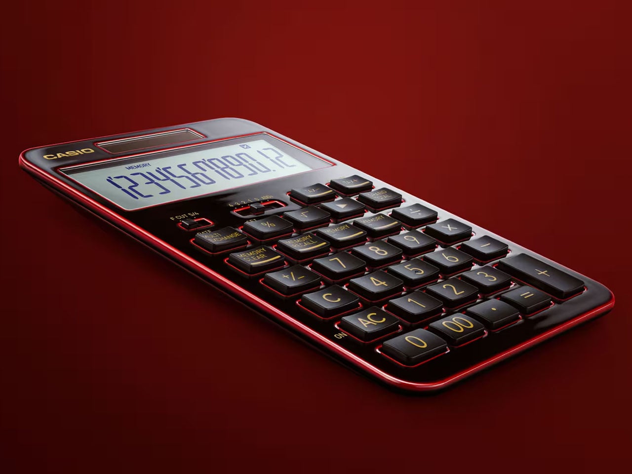
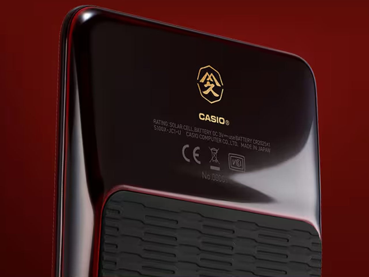
Based on Casio’s flagship S100 calculator, the S100X Urushi Edition, a.k.a. The Special One, is a limited edition desktop calculator designed using century-old Japanese Urushi lacquer technique. To handcraft the body of the device, Casio looked up to none other than Yamakyu Shitsuki, a lacquerware workshop expertising in the craft since 1930. Mater crafter Ryuji Umeda himself handcrafted the design involving a technique called tamenuri, which took a month of perfecting. The craft involves layering laquer tree’s filtered sap on the milled aluminum housing and achieving a sense of depth with repeated applications over a period of a week. Finally, the calculator is polished for that mirror-like shine and luxury feel.
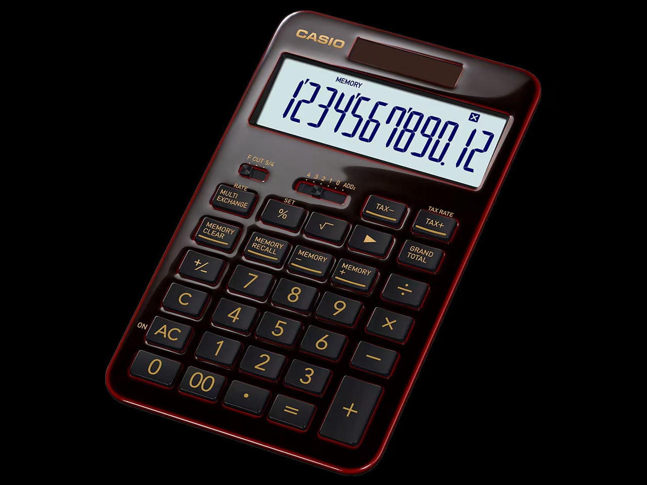
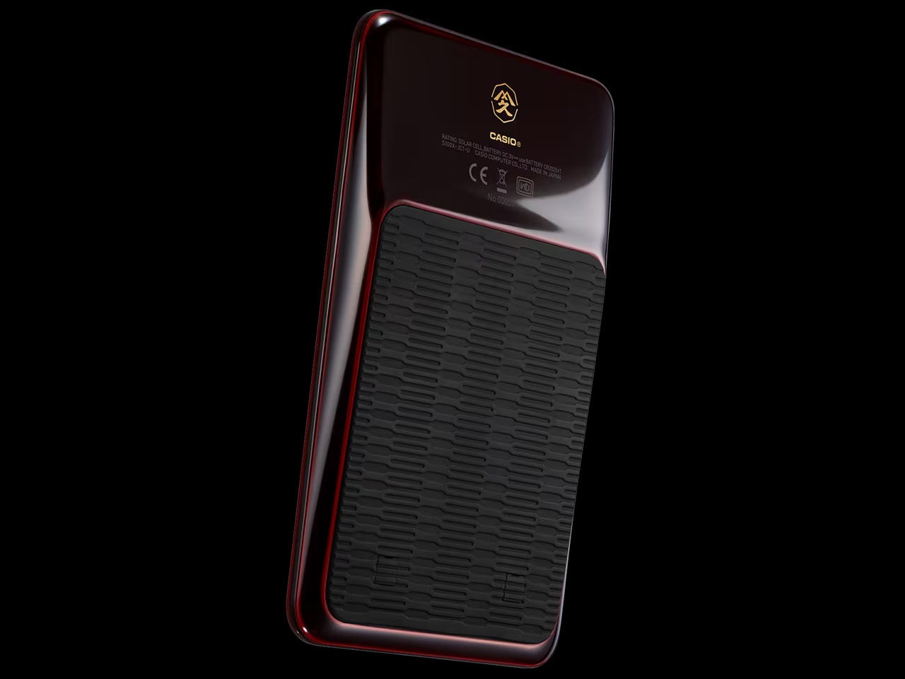
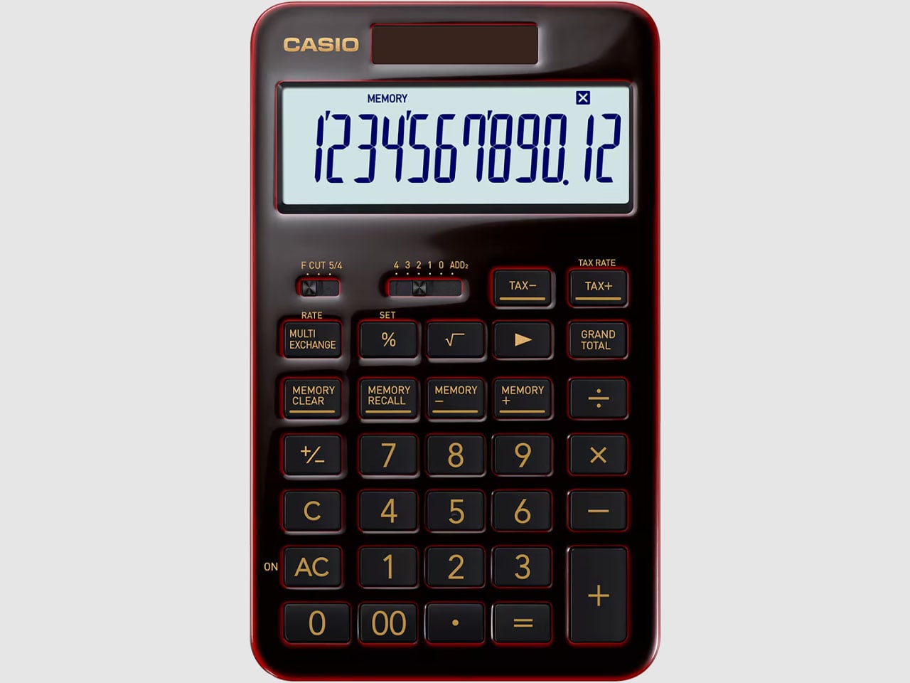
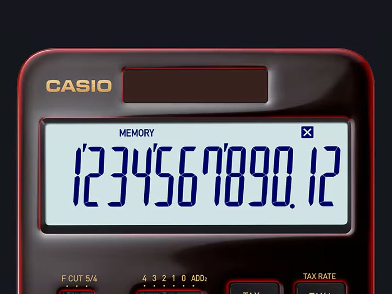
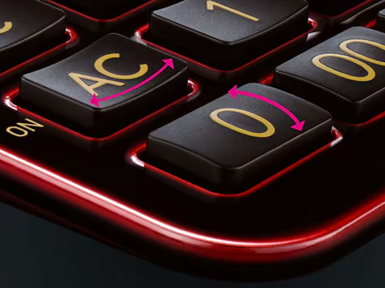
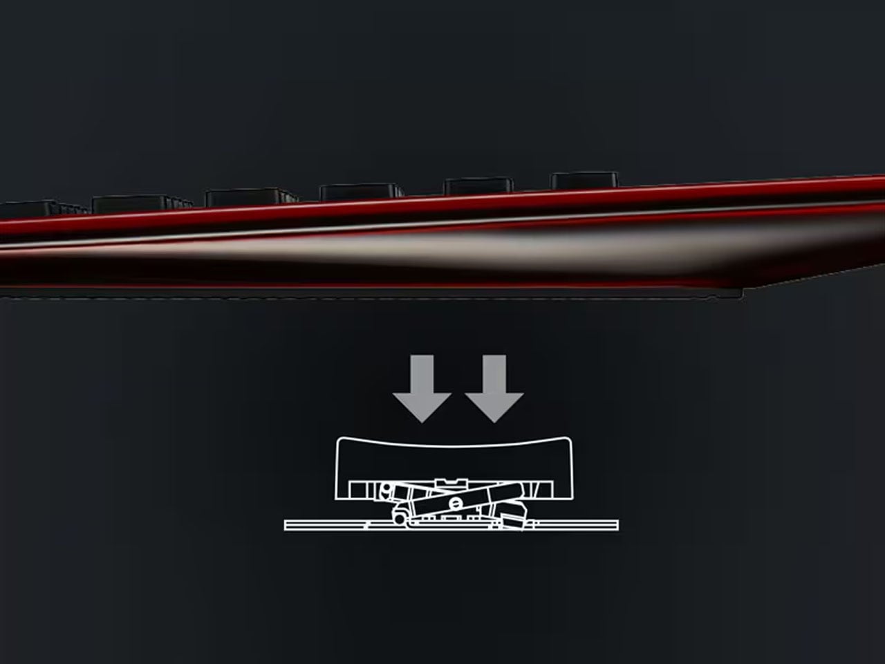
Each of the 625 limited edition calculator’s is handcrafted carefully at the workshop, rendering each one of them unique in their look depending on the viewing angle. To carry the premium feel, the machined aluminum body housing the buttons on top and the LCD screen ensures a satisfying presence. This display comes with a dual-sided AR coating for reduced reflections and the navy blue text color mimics the fountain pen ink. For enhanced tactile sensation of pressing the isolation-type keys, they come with the pantograph mechanism and an ergonomic shape nestling the fingers. The 3-key rollover tech ensures rapid typing as the keystroke is accurately recognized for up to 3 keystrokes.
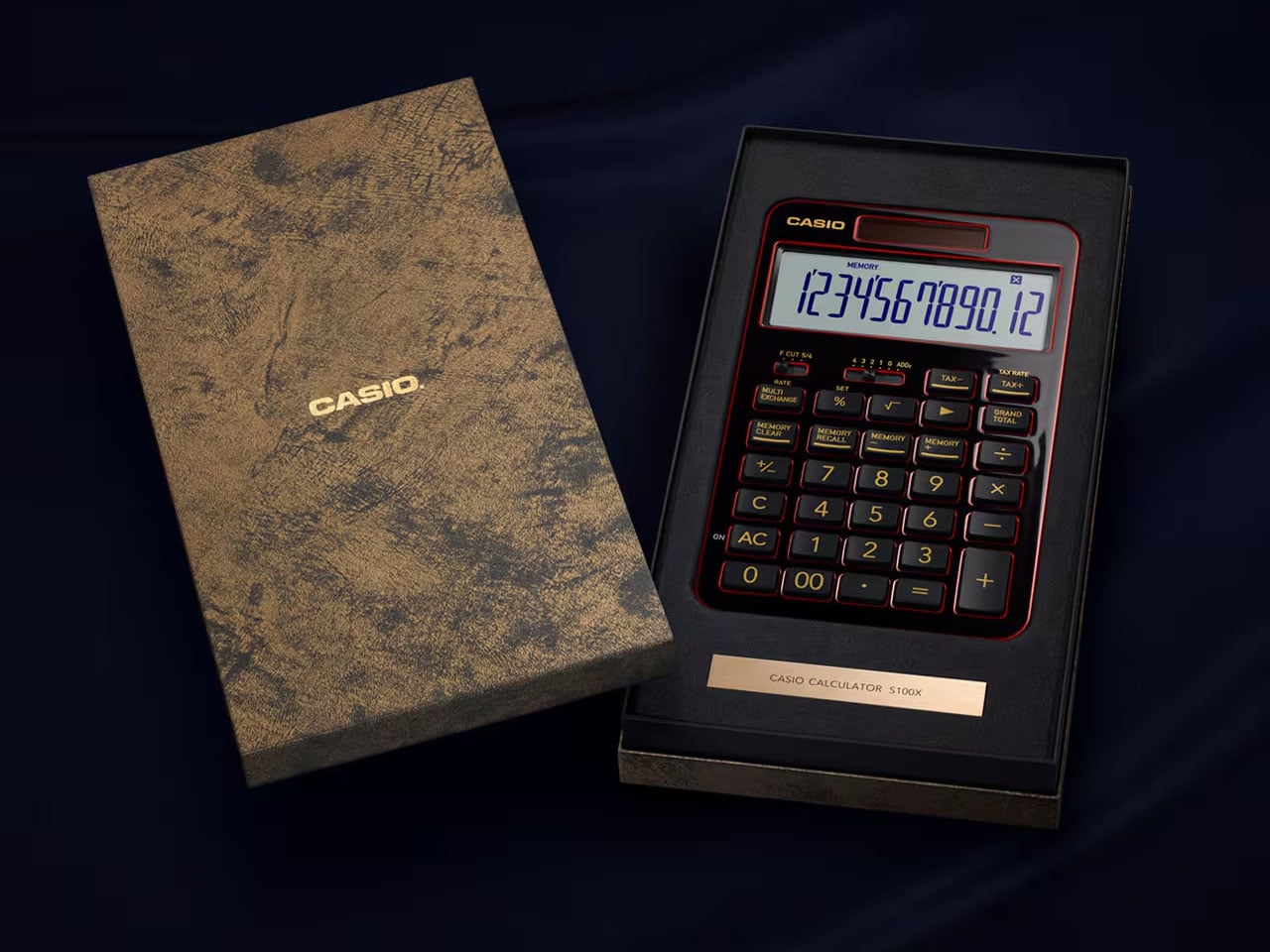
This 12-digit calculator adapts all the functions vital for professionals, including four-law calculation, tax calculation, unit conversion, memory (x2), and grand total. It is powered via solar panels on the front or a CR2025 coin battery, which can last for around seven years. The decimal point selector lever has a spin finish design for a premium shine, and on the back side, there is a geometric pattern molded stopper for assuring stability. Each one of the S100X Urushi Edition calculators has a laser-engraved serial number and comes packaged in a themed black presentation box complete with gold foil stamping.
The S100X Urushi Edition Special One calculator is priced at ¥99,000, which coincidentally equates to around $625. Owning this one is going to be special for collectors.
Spring has a particular gift for making the outdoors look better than it probably is. The light softens, the temperature edges toward reasonable, and suddenly your feed is full of tasteful campsite photos that edit out the bugs, the muddy boots, and the deeply average coffee. Before you know it, you’ve agreed to a trip you’re already half-regretting. The good news is that the gear world has kept pace with your standards.
The camping category has gone through a genuine design evolution. Products are emerging from studios that understand outdoor life not as a survival exercise but as an experience worth designing for, with the same intention brought to a well-made chair or a precision kitchen tool. From Red Dot Award-winning inflatable systems to solar-integrated shelters and Swiss-engineered portable toilets, the gap between what you’d use at home and what you’d bring into the wild has quietly narrowed. Whether you’re a committed skeptic being dragged to a campsite or a design-minded enthusiast who’s been waiting for gear worth owning, this list was made for you. Here are ten camping gadgets that earn their spot before spring makes you leave the house.
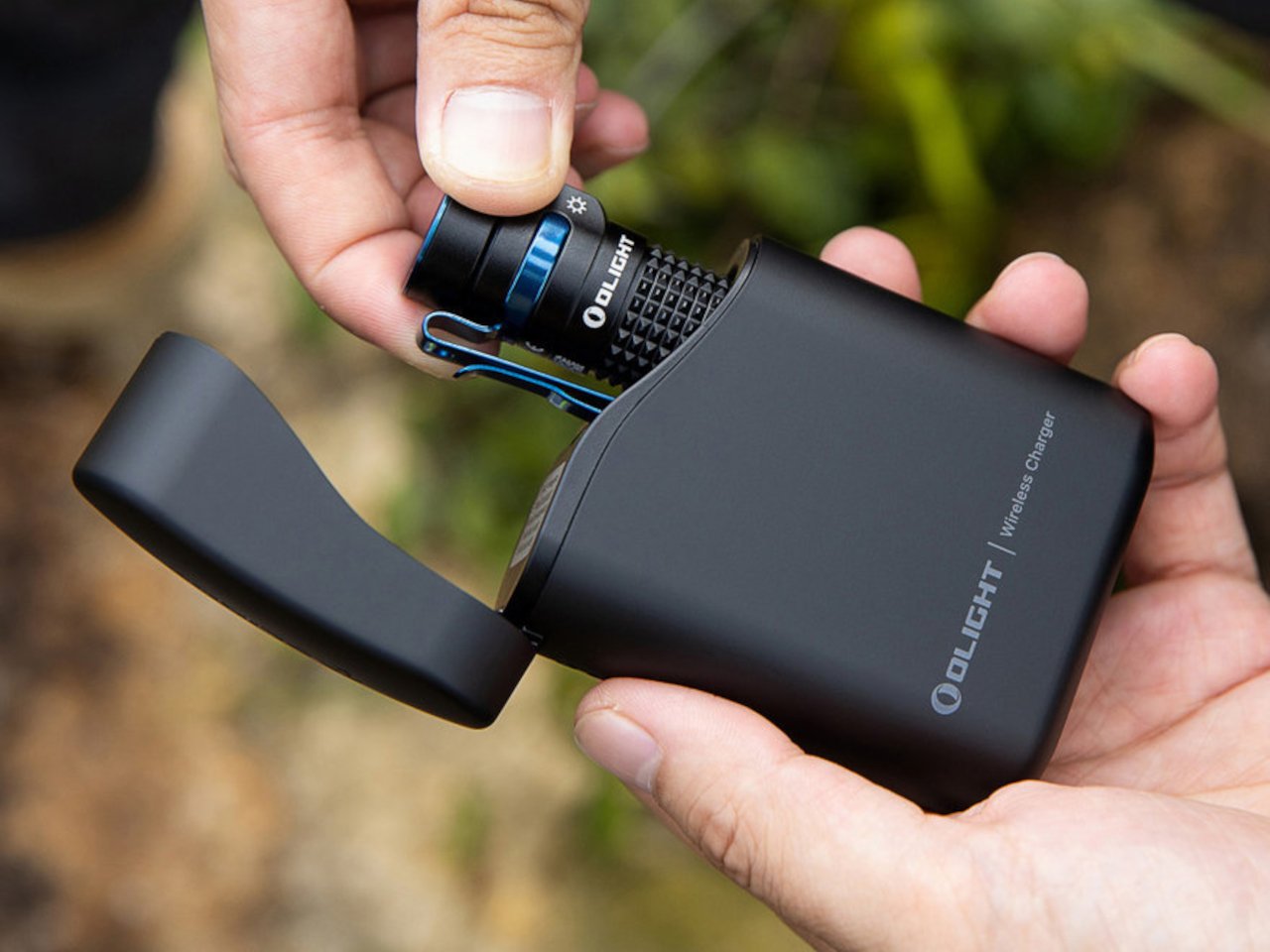
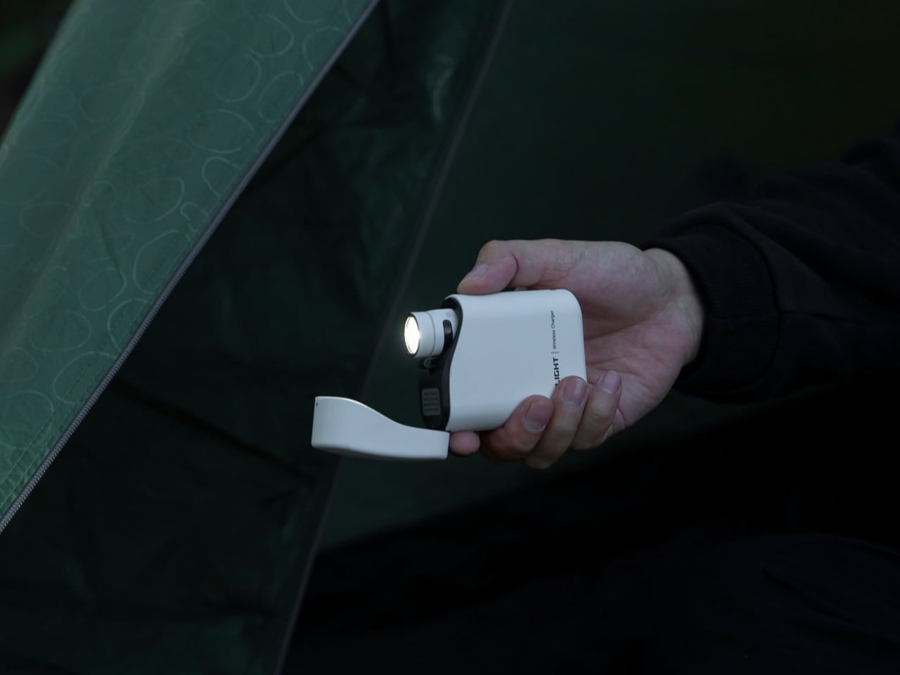
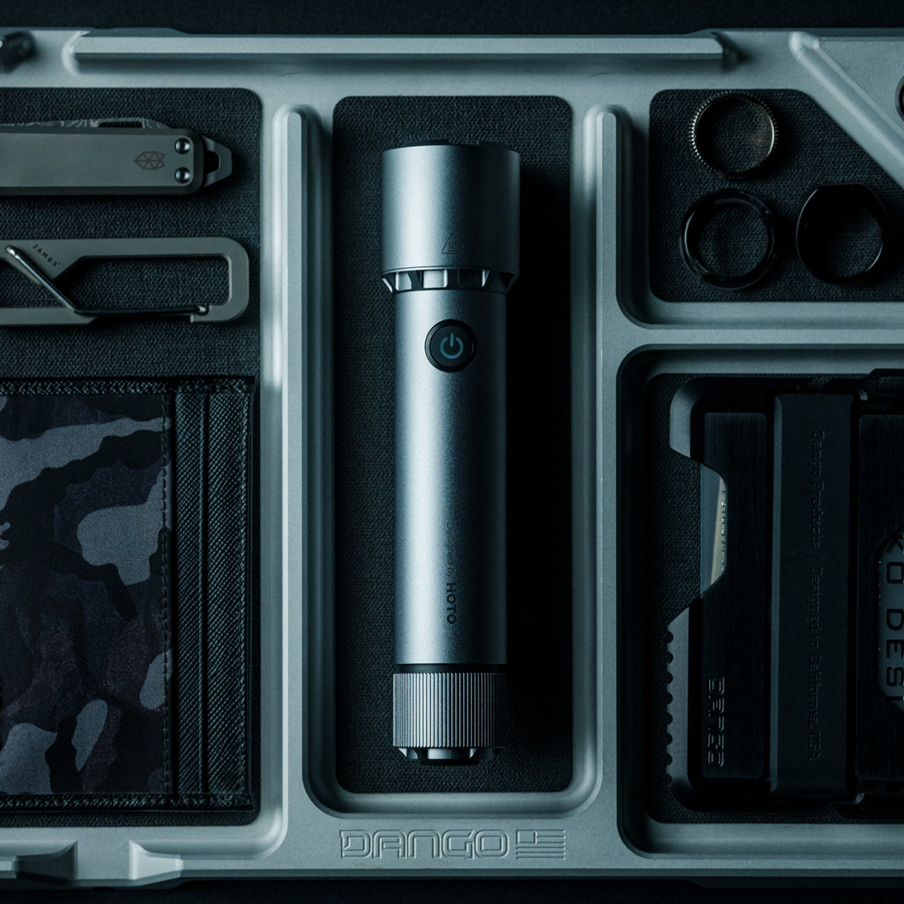
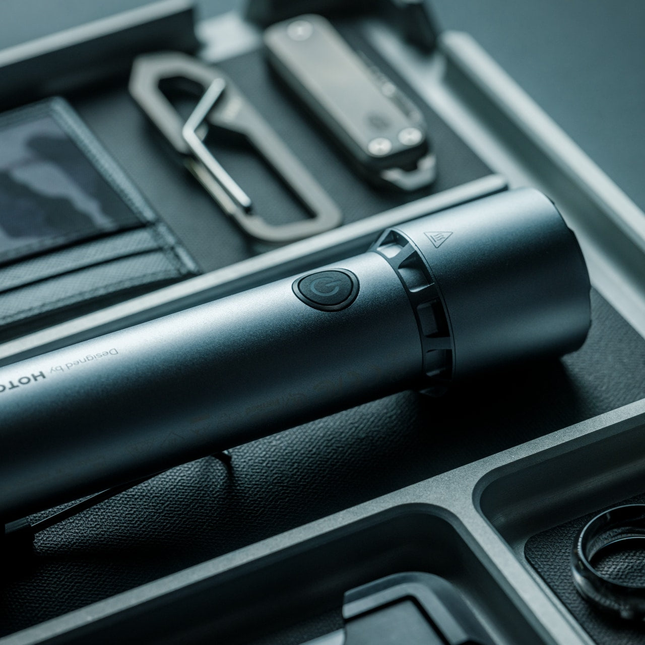
1. Olight Baton 4
On paper, the Olight Baton 4 reads like a standard compact flashlight. The cylindrical body is familiar, the dimensions modest. Then you look closer: 1,300 lumens of output, a 170-meter throw, laser-microperforated LED indicators for brightness level and remaining battery, and a runtime of up to 30 days on a single charge. This is a flashlight that takes up almost no space in your pack and asks almost nothing in return. It is, in the most precise sense, a precision instrument that happens to fit in your palm.
The 5,000 mAh charging case is what turns the Baton 4 from a good EDC flashlight into something worth discussing. The flip-top lid operates with one hand, and the digital display button on the case shows remaining power at a glance. The detail that genuinely impresses is this: press that button and the flashlight activates while still seated in the case. No pulling it out, no fumbling in the dark. The case can fully charge the Baton 4 five times over, delivering a combined maximum runtime of 190 days. That is not a camping flashlight. That is a system.
What We Like:
1,300 lumens and a 170-meter throw in a genuinely pocketable form factor
5,000 mAh charging case activates the flashlight without removing it from the case
What We Dislike:
Proprietary charging system keeps compatibility within Olight’s own flashlight lineup
A custom battery cell cannot be used with standard bay chargers
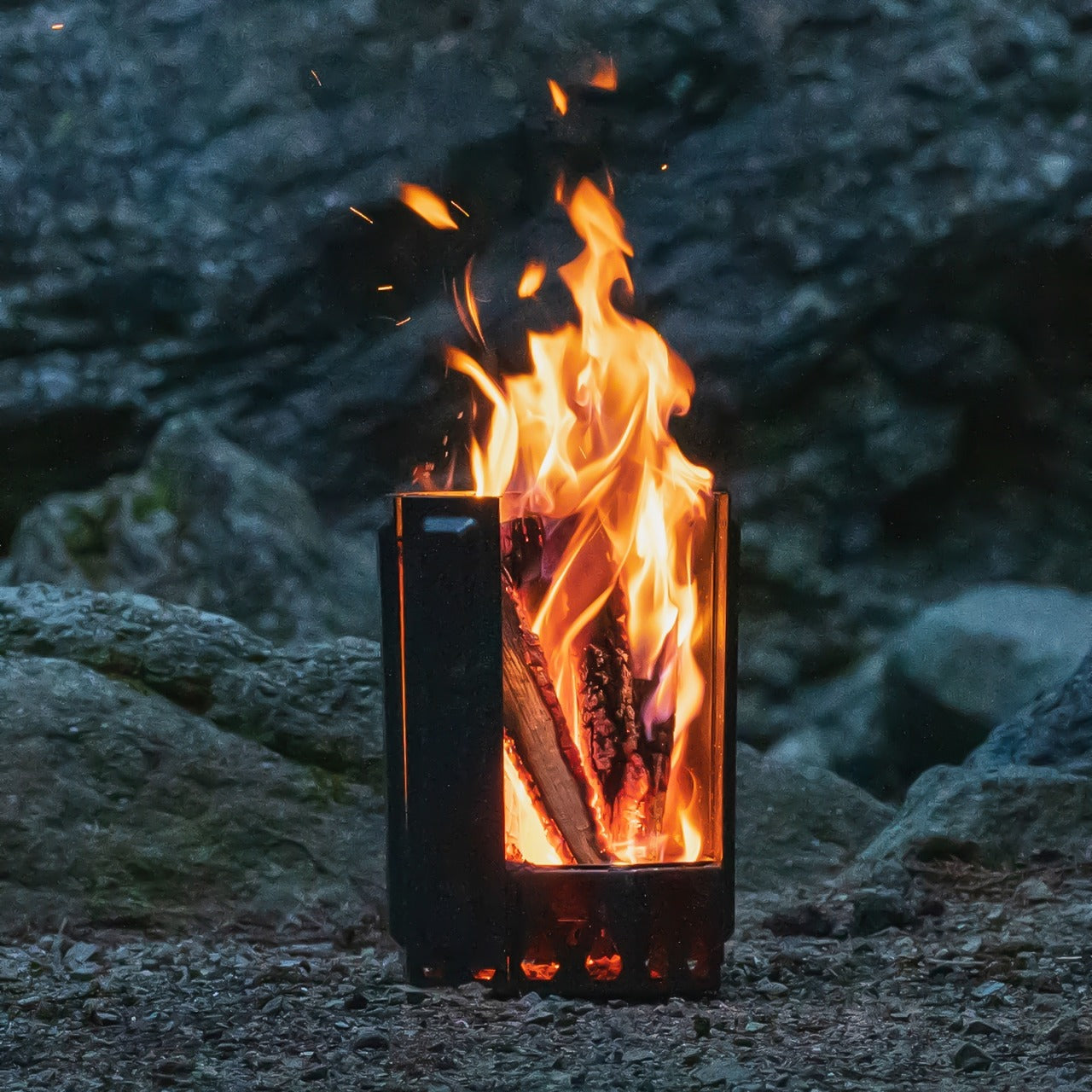
2. Airflow 8-Panel Fire Pit
Most fire pits are passive objects. You build the fire, you manage the fire, you end the evening smelling like the fire. The Airflow Fire Pit operates on a different premise entirely. Built on years of metal processing expertise, it uses an eight-panel removable system to give you active, granular control over what the fire does. Adjust the panels, adjust the burn intensity. It’s a straightforward concept executed with enough precision that it genuinely changes how a campfire evening feels — less chore, more atmosphere.
The engineering behind it rewards a closer look. Each of the eight panels features strategically placed holes at the base that channel fresh air directly to the combustion source. That air heats as it rises through the double-walled panel cavity and exits through the top holes, creating secondary combustion. The result is a cleaner, more efficient burn with minimal smoke. When fully assembled, the panels form an eight-sided cylinder optimized for that combustion cycle. For anyone who has spent an evening squinting and repositioning to avoid the smoke, this fire pit is a considered answer to a genuinely annoying problem.
Eight-panel removable system lets you control fire intensity with precision
Secondary combustion design dramatically reduces smoke output for a cleaner burn
What We Dislike:
Panel assembly adds setup steps compared to a traditional open fire pit
Requires a flat, stable surface for proper panel alignment and stability
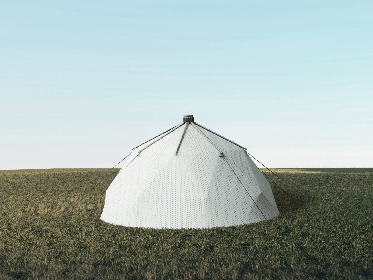
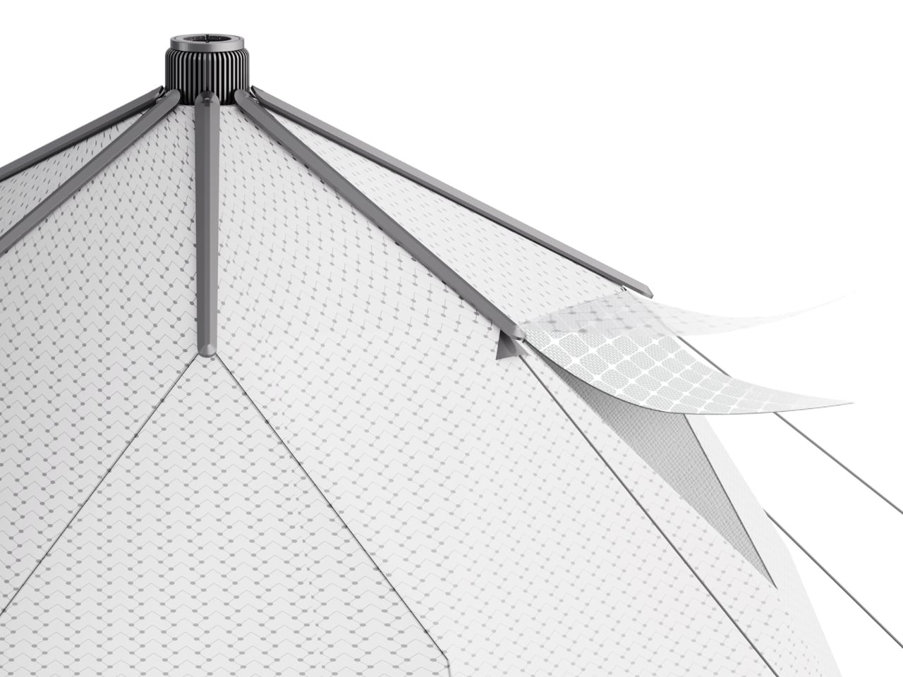
3. Solar-Powered Camping Tent with Integrated Air Conditioning
A tent that powers its own air conditioning sounds like design fiction until you see the Red Dot Award sitting beside it. Created by designers Zhong Xu, Li Baoyu, Pan Yiyuan, and Li Xueyan, this concept reimagines the tent as an active system rather than a passive shelter. The composite tarpaulin fabric functions as a solar energy collector — the very material protecting you from the elements simultaneously harvests energy from them. That integration isn’t bolted on as an afterthought. It is the entire design philosophy, and it is genuinely elegant.
What makes this tent compelling beyond the headline feature is how coherent the whole thing feels. The air conditioning system doesn’t look retrofitted or experimental — it emerges naturally from the tent’s own material logic. For anyone who has abandoned a summer camping trip because a nylon tent becomes an oven by nine in the morning, this represents a meaningful rethink of what outdoor shelter can actually do. The Red Dot recognition confirms the concept holds up under scrutiny. Summer camping just became a more reasonable conversation to have with yourself.
What We Like:
Tent fabric serves as a solar collector, requiring no external panels or power hookups
Red Dot Award recognition validates both its design integrity and conceptual ambition
What We Dislike:
Solar-dependent performance means cloud cover directly limits cooling capacity
Remains a concept design; real-world field performance data is not yet available
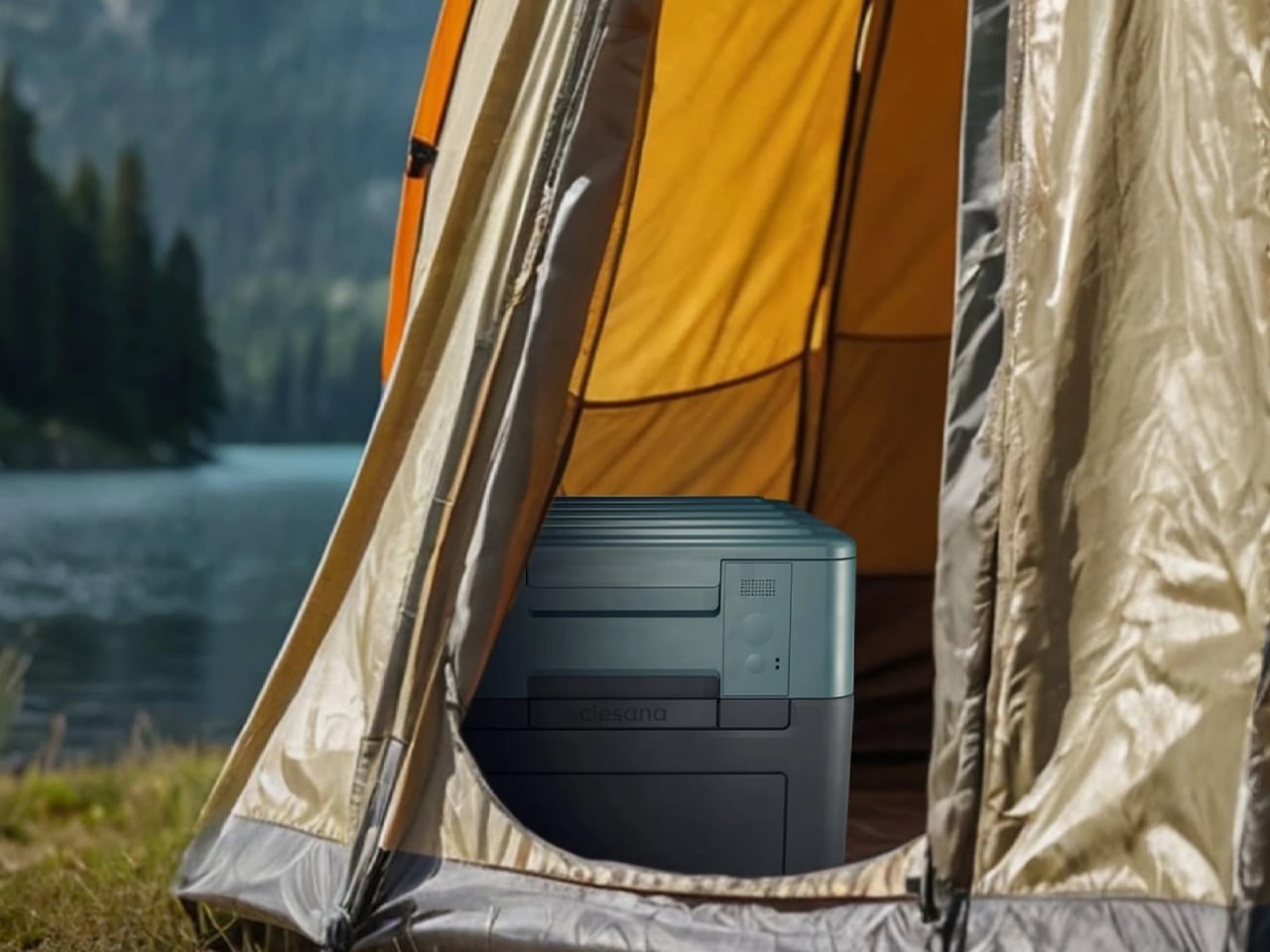
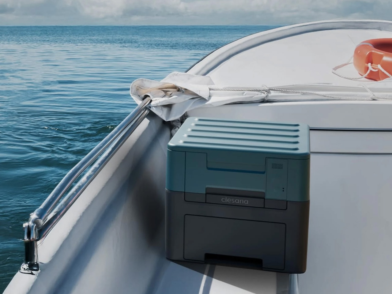
4. X1 Portable Toilet
Swiss company Clesana approached one of the least glamorous problems in outdoor living and solved it with the kind of precision engineering that country has built its reputation on. The X1 is a battery-powered portable toilet that collapses into a compact cube for transport and telescopes to full, household-equivalent height when deployed. It operates without water or chemicals, meaning no hookups, no messy maintenance, and no infrastructure dependencies. At 24 pounds with a built-in handle, one person can move it anywhere without assistance — a more significant achievement for this category than it sounds.
The intelligence of the X1 is in how it resolves the fundamental portable toilet dilemma: comfortable means large, and portable means small. Traditional products force you to choose one and live with the shortfall. The telescoping design refuses to compromise. Packed, it disappears into your vehicle’s cargo area without drama. Deployed, it delivers the same seated height as the toilet you use at home. That transition from cube to fully functional unit is the kind of deceptively simple solution that only appears obvious in hindsight — which is exactly the mark of well-executed design thinking.
What We Like:
Telescoping mechanism delivers full-height seated comfort from a compact, packed footprint
Chemical-free, waterless operation makes it genuinely usable anywhere off-grid
What We Dislike:
Battery dependency requires monitoring charge levels before and during extended trips
The 24-pound weight is manageable for car camping but prohibitive for trail backpacking
5. BlackoutBeam Tactical Flashlight
If the Olight Baton 4 is precision in a small package, the BlackoutBeam Tactical Flashlight is the same premise scaled up for situations where more is simply more. It delivers 2,300 lumens with a 300-meter throw and a 0.2-second response time — which means light appears before your brain has fully registered the need for it. The aluminum body is rated IP68 for water and dust resistance, putting submersion and hard impact well within its operational range. This is a flashlight designed for people who take conditions seriously rather than optimistically.
The industrial design holds up to its spec sheet. The form communicates capability without tipping into aggressive or overwrought territory, which is a line many tactical flashlights fail to walk. For camping specifically, a 300-meter throw transforms how you read a landscape after dark — whether you’re navigating back to a site, scanning a tree line, or assessing a trail ahead. The IP68 rating means you’re not managing this thing delicately when the weather turns. You focus on the situation rather than the tool, which is ultimately what well-designed gear makes possible.
2,300 lumens and 300-meter throw deliver exceptional range for outdoor navigation
IP68-rated aluminum construction handles submersion, rain, and impact without complaint
What We Dislike:
Tactical performance level exceeds the practical needs of casual recreational campers
High-lumen output demands careful battery management on longer or multi-day outings
6. The Conqueror
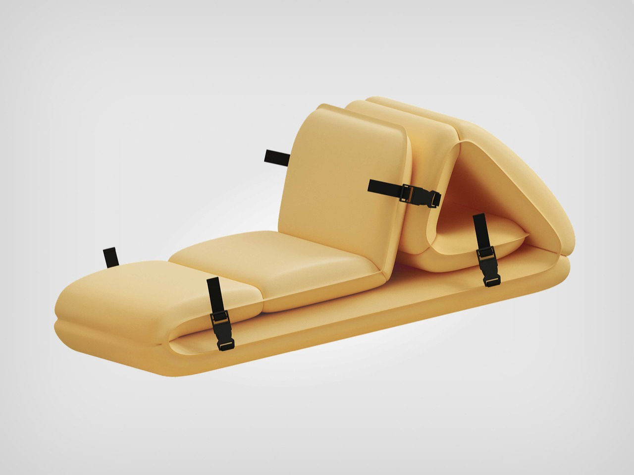
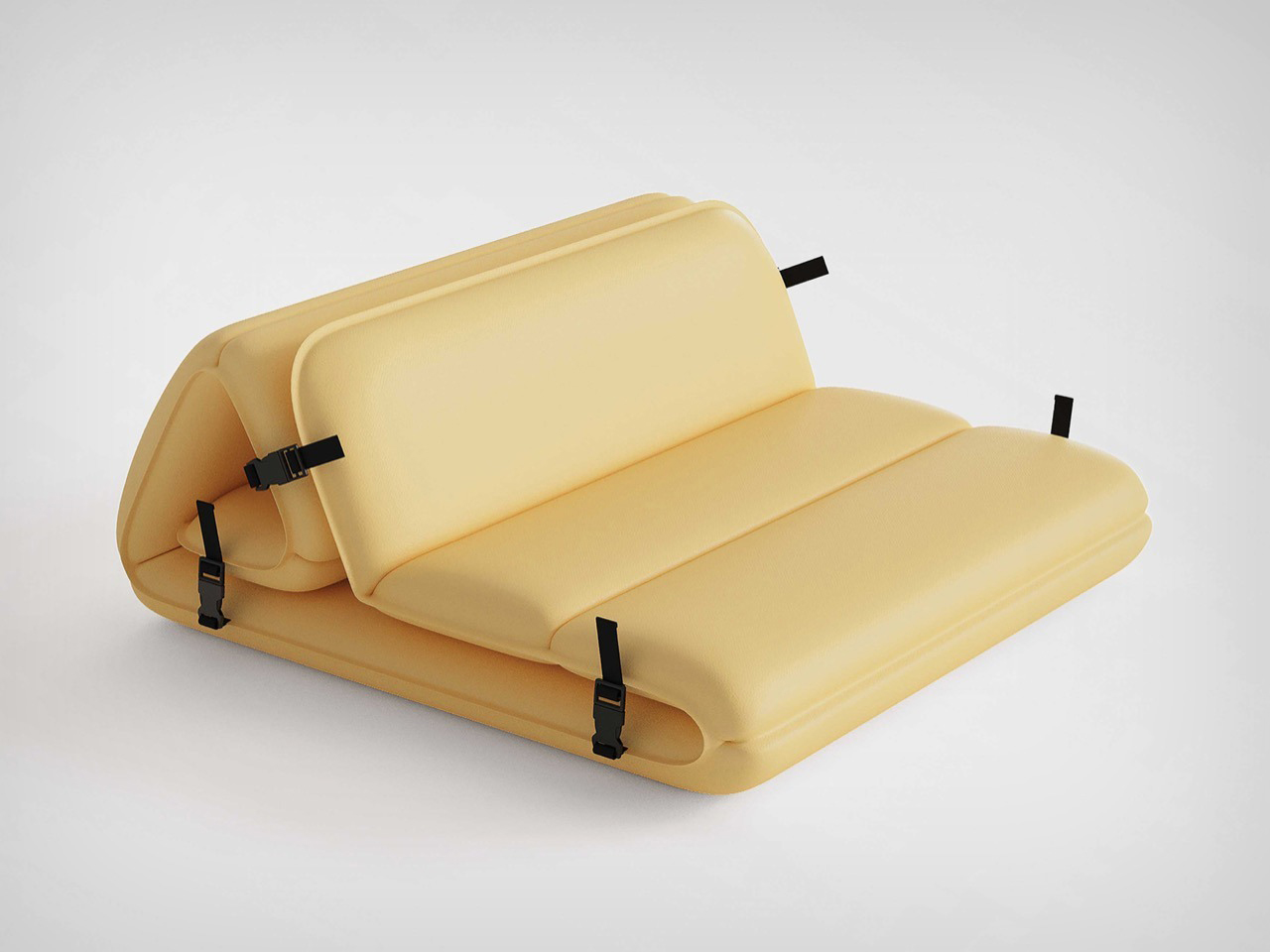
Camping furniture has been stuck in an uncomfortable loop for decades: lightweight means flimsy, comfortable means heavy, and stylish remains an afterthought that nobody bothers with. The Conqueror, a Red Dot Award-winning concept from Ziel Home Furnishing Technology designer Wang Lan, exists in a loop entirely. Modular panels connect via sturdy buckles, inflate automatically, and reconfigure into a lounge, a table, or a seat without tools, without effort, and without the particular frustration of a folding chair that collapses mid-use. It’s outdoor furniture that actually respects the time and energy of the person using it.
What the Conqueror gets right is making comfort configurable rather than fixed. A product that becomes what the moment needs is fundamentally more useful than one that does one thing adequately. For a group camping setup, this translates to an adaptable social space that shifts from midday seating to evening lounge without repacking anything. For a solo camp, it means a single compact module that earns its spot in the vehicle. The buckle-and-inflate mechanism is intuitive enough that nobody needs to read instructions before using it — and that, quietly, is a design achievement in itself.
What We Like:
Modular configuration adapts from seating to table to lounge without repacking
Automatic inflation eliminates the setup frustration of traditional folding camp furniture
What We Dislike:
Inflatable construction carries a real puncture risk in rocky or rough terrain
The auto-inflation mechanism adds mechanical complexity compared to simpler folding options
7. Flextail Tiny Pump 2X
The Flextail Tiny Pump 2X is the kind of product that earns a permanent spot in your kit based purely on how many problems it quietly solves. Powered by AIR VORTECH technology, it reaches up to 4kPa of air pressure and 180 liters per minute of airflow — numbers that translate to fast, fuss-free inflation across a range of products. Five included nozzles cover the valve types you’re realistically going to encounter in the field, and the unit handles both inflation and deflation with equal competence. Small enough to forget about until you need it, useful enough that you’ll always bring it.
The dual-purpose design is what makes the Tiny Pump 2X more interesting than a standard camp inflator. Beyond mattresses and inflatable furniture, it pairs with vacuum storage bags to compress bulky items and reclaim up to 80% of storage space — making it genuinely useful even during the weeks between camping trips. For camp-specific use, inflating a full air mattress in a fraction of the time it takes by lung power is a quality-of-life improvement that is difficult to fully appreciate until you’ve experienced it. That’s the quiet case for tools that do more than their job description.
What We Like:
Five included nozzles provide broad compatibility across mattresses, floats, and furniture
Works with vacuum storage bags at home, extending usefulness well beyond the campsite
What We Dislike:
Peak airflow performance is optimized for Flextail’s own mattress lineup
Battery capacity may require recharging between back-to-back inflation sessions
8. All-in-One Grill
Camp cooking carries an undeserved reputation for mediocrity — burnt protein on a wobbly grate, cleanup that feels like a punishment, and a general sense that eating outdoors is something to tolerate rather than enjoy. The All-in-One Modular Grill was designed to dismantle that reputation directly. It covers six cooking methods — barbecuing, frying, grilling, steaming, smoking, and stewing — in a compact tabletop form that works on any flat surface. There’s even a dedicated module for warming bottles upright, which is the kind of specific, thoughtful feature that camping gear rarely gets right.
The design logic here centers on eliminating the friction that stops people from cooking ambitiously when they’re outside. Each module serves a specific function and slots together without the logistical anxiety of a full camp kitchen setup. Disassembly for cleanup is equally straightforward — no buried grime, no mystery components left in the bag. For anyone who has historically packed mediocre snacks out of sheer dread for the alternative, this grill reframes the camp meal as something worth giving actual attention to. Cooking well outdoors is mostly a gear problem, and this addresses it cleanly.
Six cooking methods in a single compact tabletop unit — genuinely versatile coverage
Modular construction disassembles easily for straightforward cleanup and transport
What We Dislike:
Individual modules require organized packing to prevent losing components in transit
Tabletop scale limits output for larger group cooking sessions
9. FoldiBox
The FoldiBox operates on a premise so simple it’s almost audacious: a completely flat sheet of food-grade silicone rubber that becomes a functional container in under a second. Fold two diagonal corners, let the magnetic attraction bring all four together, and you have a box. No snap-fit mechanisms that accumulate grime in their joints, no assembly steps, no latching drama. The Ag+ antibacterial formula sourced from Japan keeps it hygienic between uses, the heat resistance runs to 300°F, and the whole thing is dishwasher safe. Made in Taiwan with a clean, modern aesthetic — it’s the kind of object that makes you wonder why it took this long to exist.
The flat-to-form transition is the feature that matters most in a camping context. The FoldiBox registers as almost nothing in your pack until you pull it out, at which point it becomes whatever the moment calls for: a snack bowl, a prep surface, a container for small gear, a fruit bowl at the campsite table. The optional clear lid adds spill-proof capability and makes stacking possible. For a product with a near-zero packed footprint, the range of situations it handles with confidence is quietly impressive. That combination of simplicity and range is what good design looks like at its most restrained.
What We Like:
Folds completely flat for minimal pack space, sets up in under a second with no effort
Food-grade, heat-resistant, antibacterial silicone is dishwasher safe and effortless to maintain
What We Dislike:
Magnetic closure alone may not reliably contain liquids without the add-on clear lid
Volume capacity is modest compared to rigid containers of a similar packed dimension
10. BruTek Expedition Coffee Kit
For a particular kind of camper, the quality of the morning coffee isn’t a luxury detail — it’s a non-negotiable prerequisite for the entire trip being worth it. The BruTek Coffee Kit was designed for that person, and it takes the job seriously. Housed in an IGBC-certified bear-resistant aluminum case, it includes a 32-oz BruTrek French press, four mugs, an air-lockout coffee canister, and every accessory needed to brew genuinely good coffee in the field. It’s the rare piece of camp gear that doesn’t ask you to compromise the ritual in exchange for portability.
The military-grade case is the design detail that elevates the whole kit beyond a curated coffee bundle. It protects the contents from weather, impact, and wildlife — a combination of threats that most coffee equipment was never engineered to handle — while its stackable form makes transport efficient and organized. Whether you’re out solo or with three equally discerning companions, the kit scales cleanly. The act of brewing becomes something you actually look forward to rather than rush through in the cold morning air. That’s the quiet power of gear designed with real intention: it changes not just what you do, but how the whole experience feels.
What We Like:
IGBC-certified bear-resistant aluminum case protects against wildlife and the elements in one
Complete system — French press, four mugs, canister, accessories — requires absolutely nothing extra
What We Dislike:
Bulkier and heavier than minimalist pour-over setups built for ultralight packing
Best suited to car camping or base camp use rather than long-distance trail travel
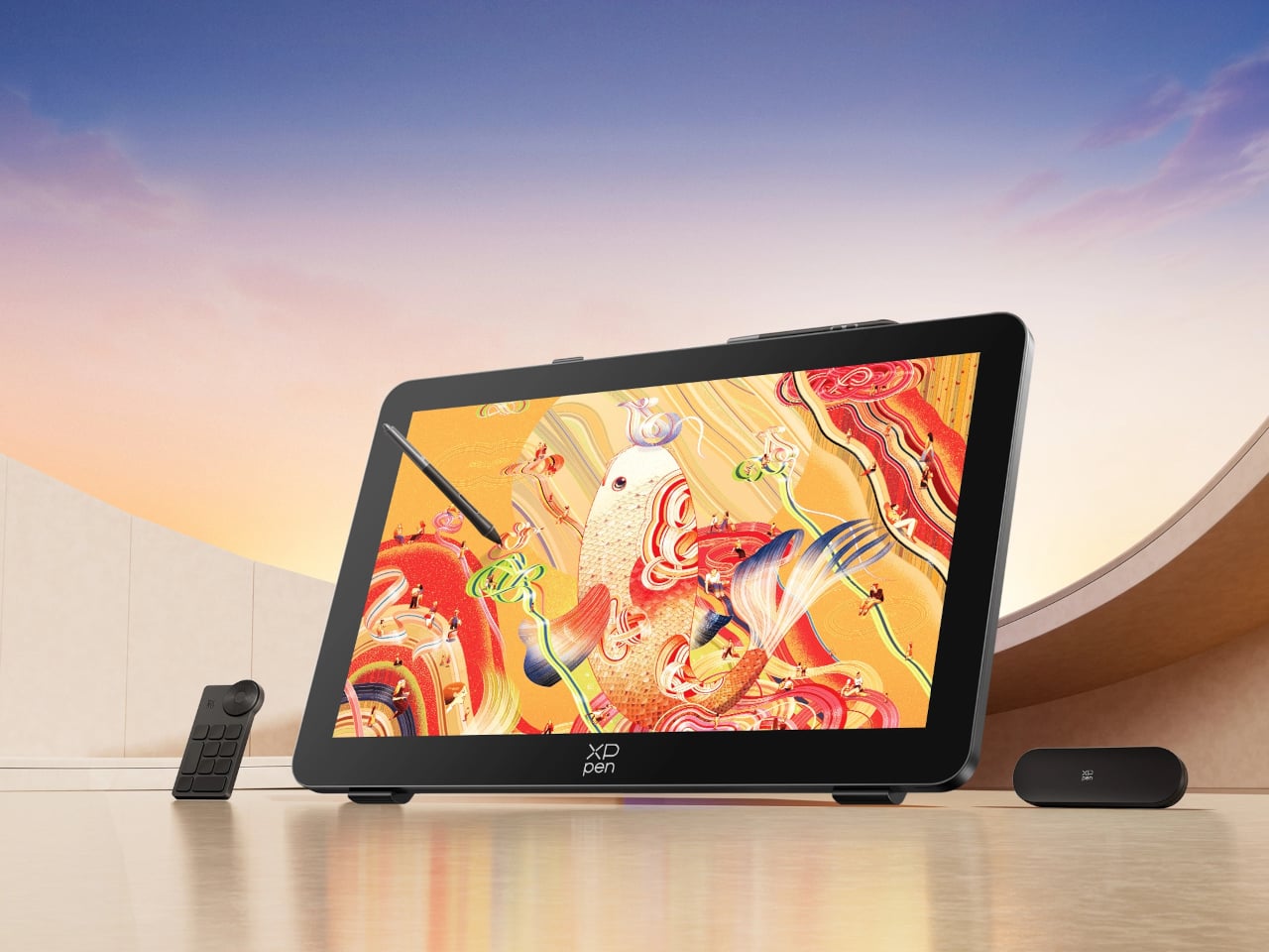
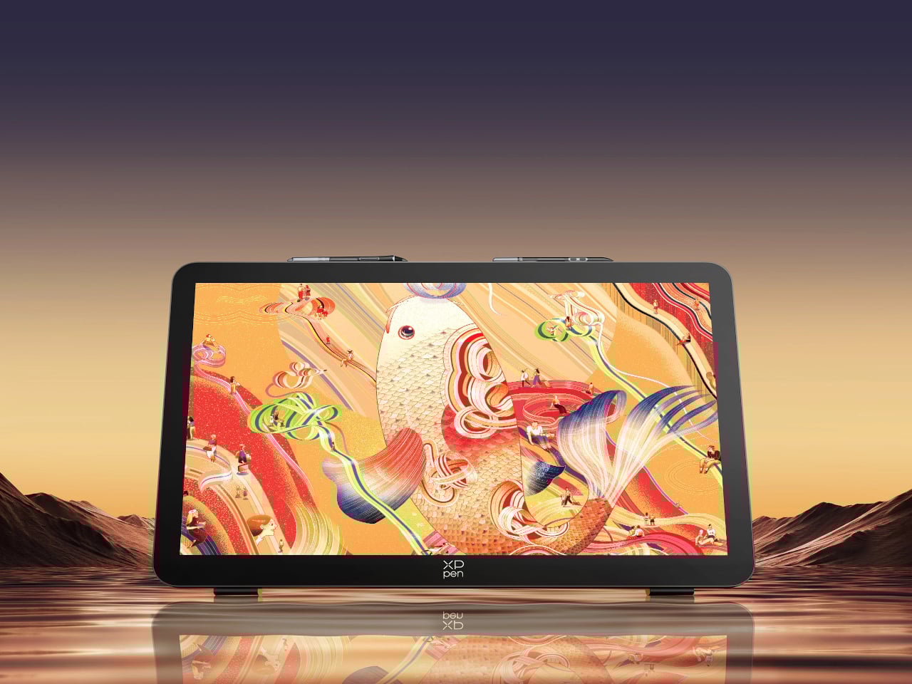
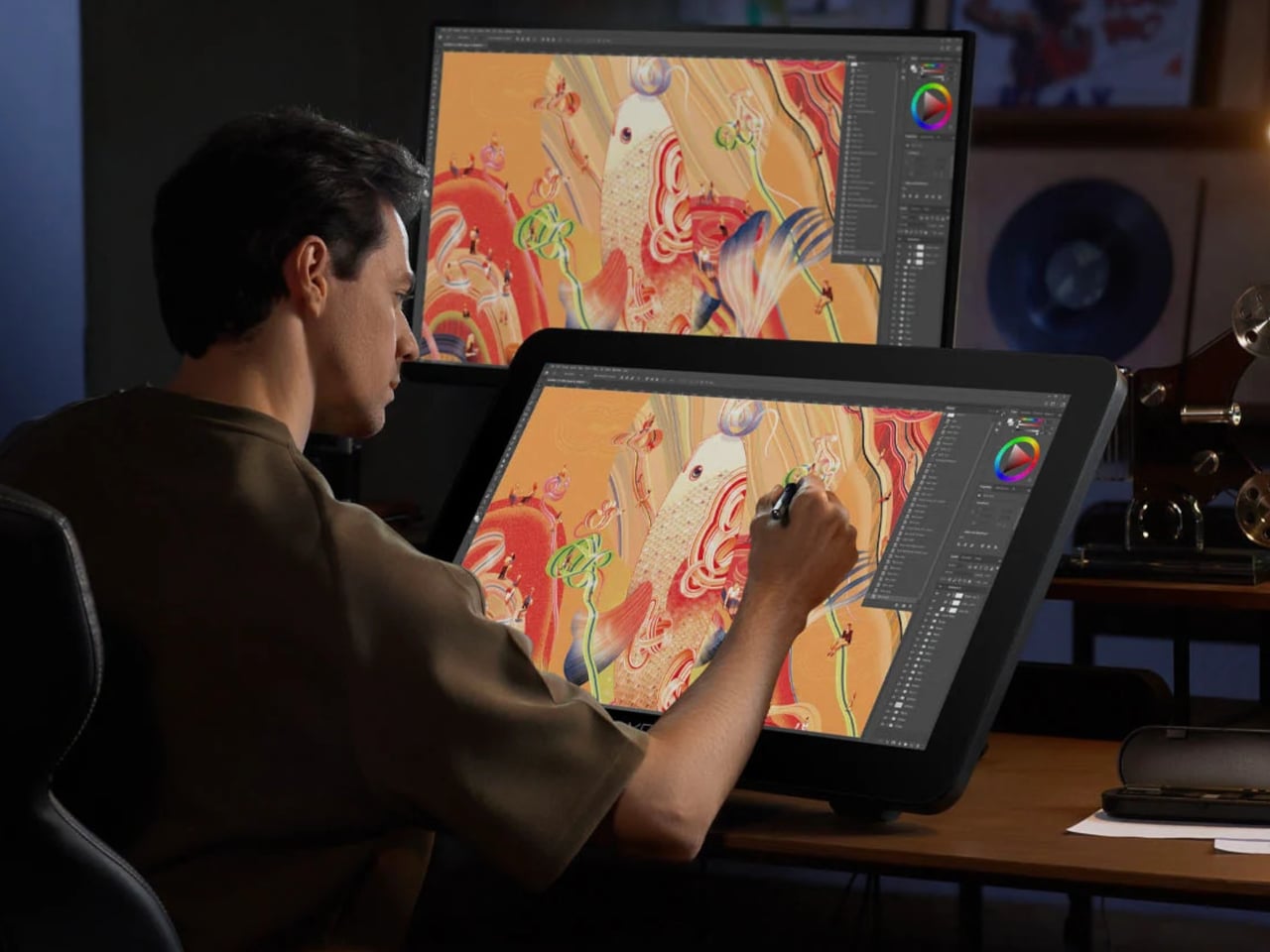
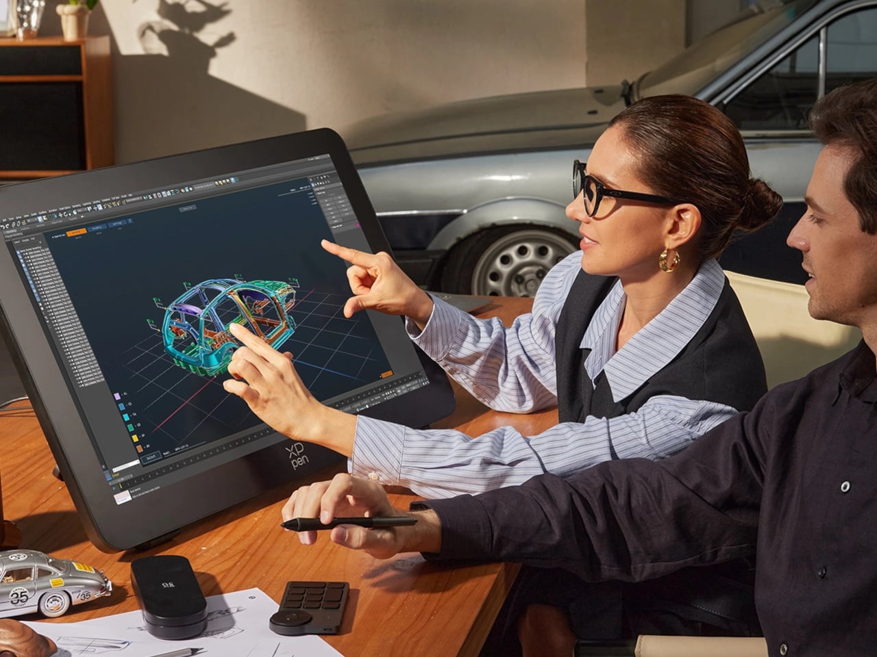
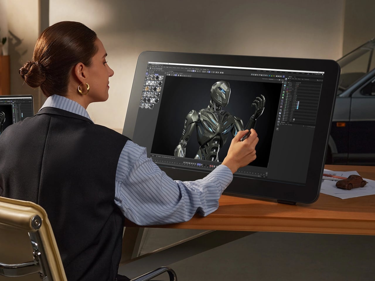
Finishing a piece of digital artwork only to discover that the colors on your client’s monitor look nothing like what you spent hours calibrating is a particular kind of frustration. It’s not dramatic. It just quietly drains trust in your tools and your process. The XPPen Artist Pro 27 (Gen 2) is a drawing display built around the premise that color accuracy, at a professional level, should be the starting point rather than an expensive add-on you negotiate into a purchase.
At 26.9 inches with a 3840×2160 resolution and a 120Hz refresh rate, the display gives designers, artists, and digital content creators sufficient room to work at a scale that feels genuinely close to physical media. That kind of canvas matters when you’re sketching compositions or reviewing color grading frame-by-frame on an animation timeline, where pixel-level decisions compound quickly, and a cramped workspace turns into a liability.
The color story is where XPPen is making the most aggressive claims. The 10-bit panel covers 99% of Adobe RGB and sRGB, and 97% of Display P3, all with a Delta E of less than 1, independently verified through Calman. For designers working across print, digital, and video deliverables simultaneously, that breadth matters more than any single gamut number. One device that holds accurate across three standards removes a class of color-management guesswork from the workflow entirely.
Getting there does require some setup. Activating the full 10-bit depth means going into display settings manually, and advanced color calibration through the bundled XPPen ColorMaster software requires a Calman colorimeter purchased separately. The hardware is capable; the software is ready. What XPPen doesn’t hand you automatically is the calibrated result itself, so buyers expecting out-of-the-box perfection should factor in that extra step and cost.
The display surface uses a new-gen luminous etched glass panel 0.7 mm thick, which XPPen claims offers 30% more light transmittance than its predecessor while keeping the anti-glare, paper-like texture. That texture is what keeps pen-on-glass from feeling clinical, and the thinner glass reduces the gap between pen tip and cursor, a physical detail that sounds minor until you’ve spent a session fighting it. Brightness is 350 nit, which positions this squarely as a studio tool.
Two styli ship with the unit: the X3 Pro Smart Chip Stylus with a standard silicone grip, and the narrower X3 Pro Slim Stylus, tapered at 26° to keep the tip in view during detailed line work. Both operate at 16,384 pressure levels with 3g activation force and 60-degree tilt sensitivity. A wireless shortcut remote with a 10 × 4 grid of programmable keys and a dial is also included, covering most of what keeps artists reaching for the keyboard mid-session.
The X-Touch multitouch system handles ten simultaneous touch points with native gesture support on Windows and macOS, customizable touch zones, and a floating shortcut menu accessible by gesture or button. Pen-priority mode suppresses accidental inputs while drawing. That last feature is the one that separates a touch-enabled display that genuinely fits a drawing workflow from one that just adds friction to it.