MSI Just Made a $7,000 Gaming Laptop You’d Want to Display on a Shelf

Gaming laptops have spent years trying to close the gap with desktop performance, and for the most part, they’ve gotten reasonably close. The better ones can handle demanding titles at high settings, and a handful at the premium tier now approach desktop territory. But most of them still look and feel like what they are: portable tools dressed in aggressive angles and RGB trim. They don’t particularly feel like anything worth keeping once the next generation arrives.

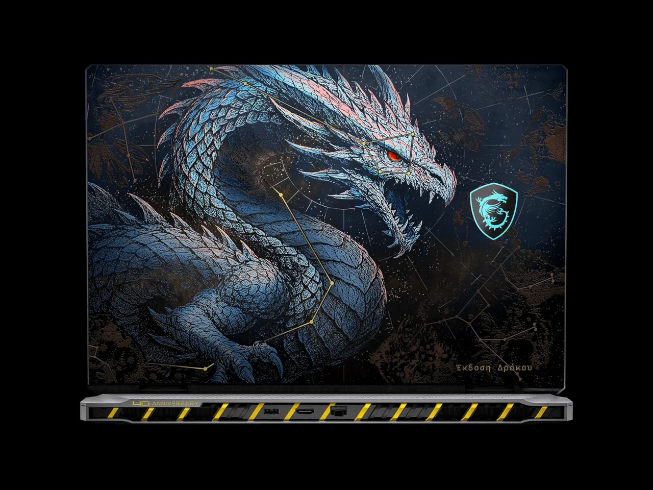
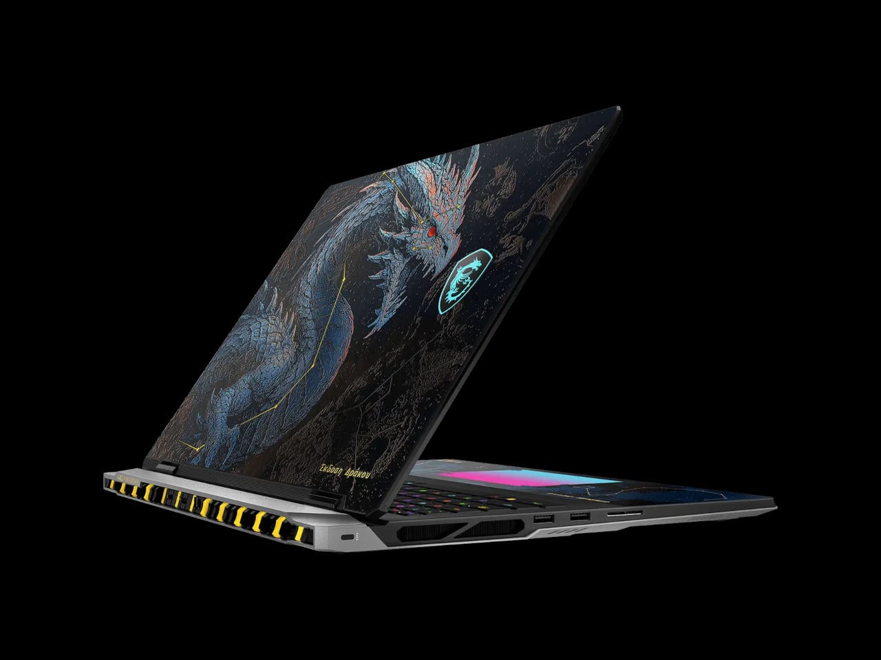
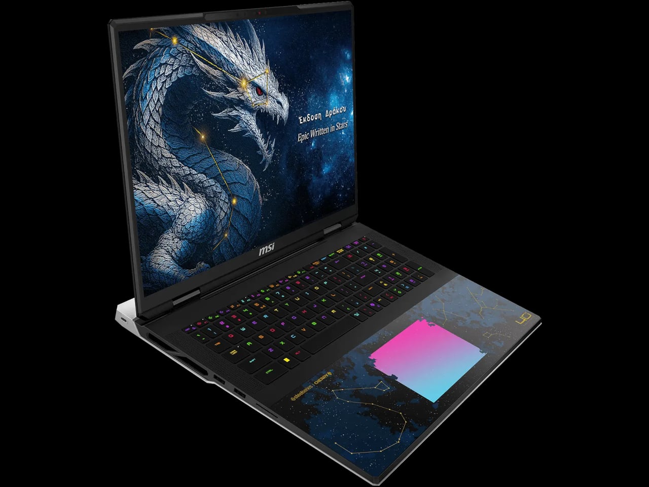
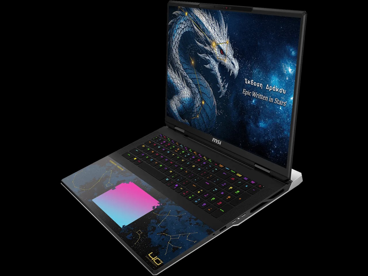
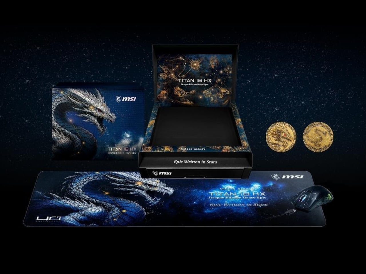
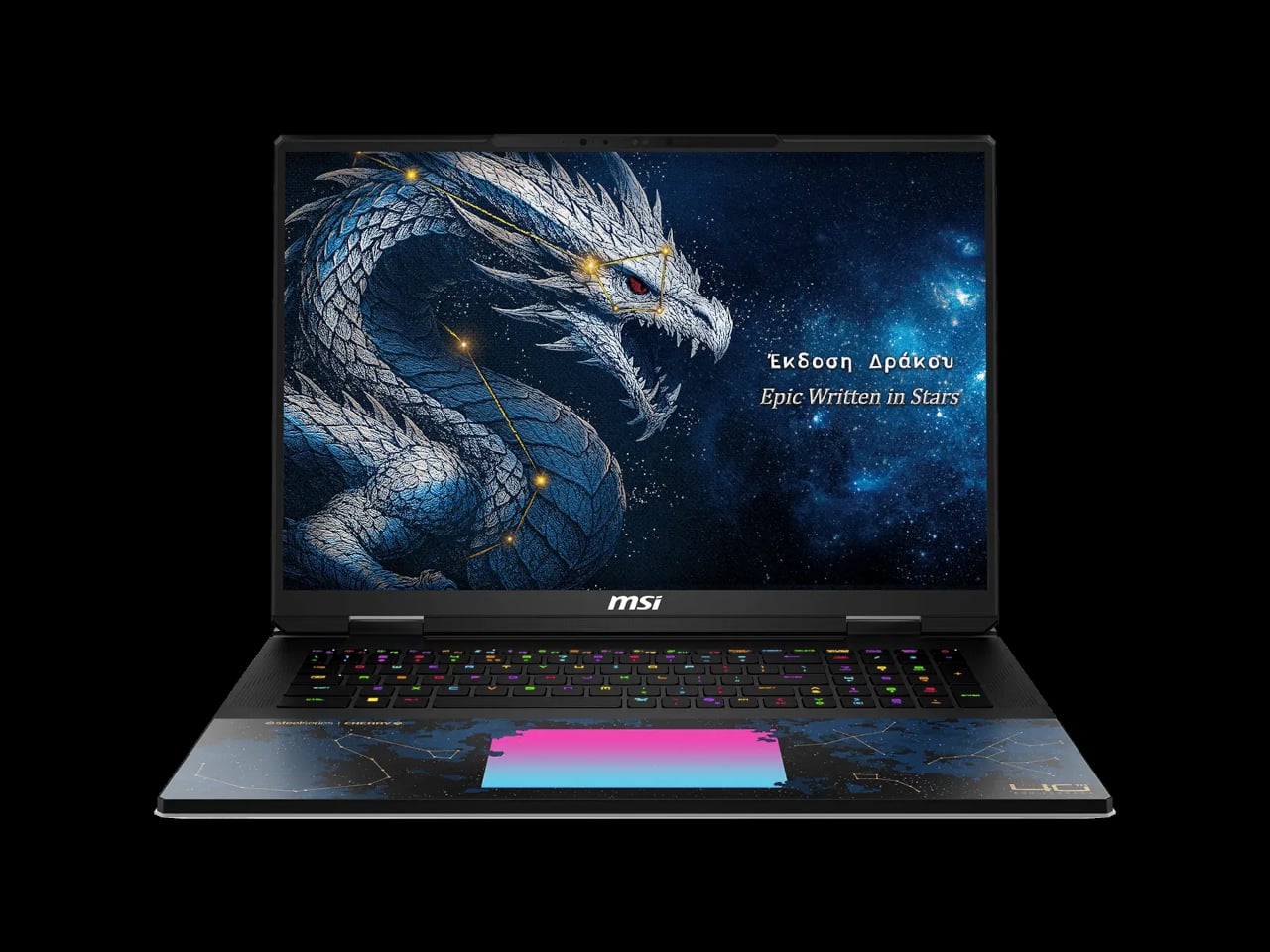
The MSI Titan 18 HX Dragon Edition Draco Epic doesn’t approach the laptop-as-product category the same way. Released as a 40th anniversary special edition, it’s built around the mythic narrative of Draco, the dragon constellation stationed near the North Star, and every element of the design carries that theme deliberately. The lid features five-layer silk screen printing, a Dragon RGB logo, and “Dragon Edition” lettered in Greek, with the 40th anniversary mark worked into the body. It comes with a limited-edition collector’s coin and a numbered Dragon Edition Mousepad and gaming mouse. It’s being positioned as a collector’s item first, and a laptop second.

Designer: MSI

That said, the hardware inside is no joke. The top configuration pairs an Intel Core Ultra 9 290HX Plus processor with an NVIDIA GeForce RTX 5090 laptop GPU carrying 24 GB of GDDR7 memory, running through 270 W of total power via MSI’s OverBoost system. The RAM tops out at 96 GB of DDR5 at 6,400 MT/s across the retail SKU, with four SSD slots supporting SuperRAID 5 at up to 18,000 MB/s sequential read. In practical terms, that’s a machine that can run high-end creative workloads, handle 4K video rendering, and play anything currently available without compromise.

The display matches the hardware ambition. The 18-inch UHD+ Mini LED panel runs at 3840 × 2400 pixels, refreshes at 240 Hz, and hits 1,000 nits with full VESA DisplayHDR 1000 certification. It covers 100% of the DCI-P3 color space and is per-unit calibrated at the factory, which is the kind of detail that matters for anyone doing color-sensitive creative work and not just gaming. The panel also supports G-Sync, making the 240 Hz meaningful in fast-paced games rather than just on paper.

Cooling runs through a vapor chamber design with a dedicated PCIe Gen 5 SSD cooling pipe, keeping the thermal load from the processor, GPU, and storage from competing with each other in a confined space. Connectivity is equally generous: dual Thunderbolt 5 ports offer up to 120 Gbps bandwidth, HDMI 2.1 handles external 4K output, and Wi-Fi 7 with Bluetooth 5.4 rounds out the wireless stack. The keyboard is a Cherry Mechanical unit with per-key RGB across 99 keys, which gives the typing experience a quality that most gaming laptops avoid investing in.

The bundle includes a copy of Lego Batman: Legacy of the Dark Knight, a detail that adds a lighter counterpoint to the otherwise heavy mythology surrounding the machine. The full package, laptop, mouse, mousepad, coin, and game, comes in a premium color box. At $6,999, it’s clearly aimed at a very specific buyer. Practically speaking, it delivers desktop-replacement performance in a form factor that’s also been designed, for once, to sit on a shelf and look like something worth keeping.

The post MSI Just Made a $7,000 Gaming Laptop You’d Want to Display on a Shelf first appeared on Yanko Design.

Raspberry Pi Finally Has the 10-Inch Screen Its Projects Always Needed

The Raspberry Pi has spent over a decade proving that small, affordable computers can do serious things. What has sometimes held those builds back isn’t the processor or the memory; it’s the display. The original 7-inch touch screen, launched alongside the Pi back in 2015, became a reliable staple of maker projects everywhere, but its modest resolution and size kept more ambitious builds looking a little rough around the edges. That gap just got a lot smaller.

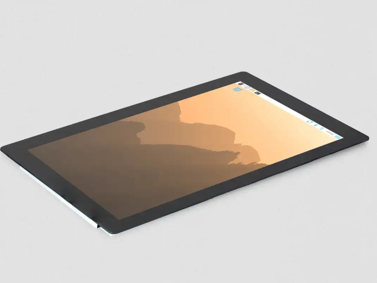
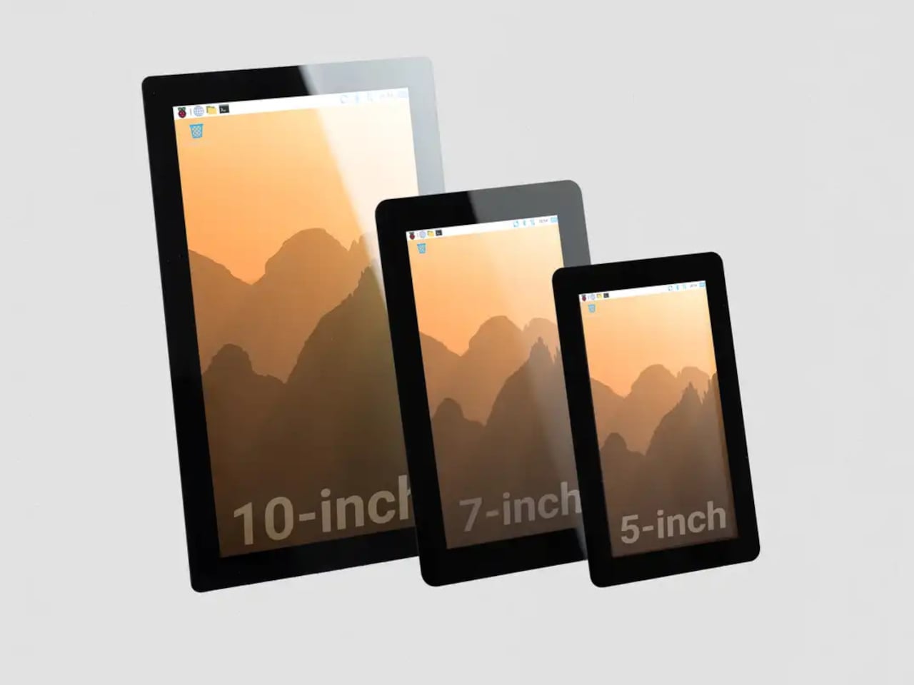
Raspberry Pi has released a 10-inch variant of its Touch Display 2, completing a family that now spans 5-inch, 7-inch, and 10-inch options. At $80, it’s the largest and most capable screen the company has offered as an official first-party accessory, and it arrives with a meaningful set of upgrades beyond simply being bigger. The resolution jumps to 1200×1920 pixels from the 720×1280 available on the smaller models, and touch support doubles to ten-point capacitive from the five-point that the 5-inch and 7-inch variants offer.

Designer: Raspberry Pi

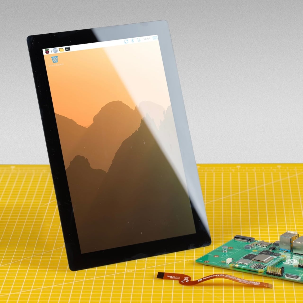
That resolution increase matters more than the raw numbers suggest. On a 10-inch IPS panel with an anti-glare surface and 400 cd/m² brightness, the extra pixel density makes text and UI elements genuinely crisp rather than just adequate. Anyone who’s tried building a home automation dashboard or a workshop control panel with a 7-inch screen knows how quickly the interface can feel cramped. Ten inches gives those layouts room to breathe.

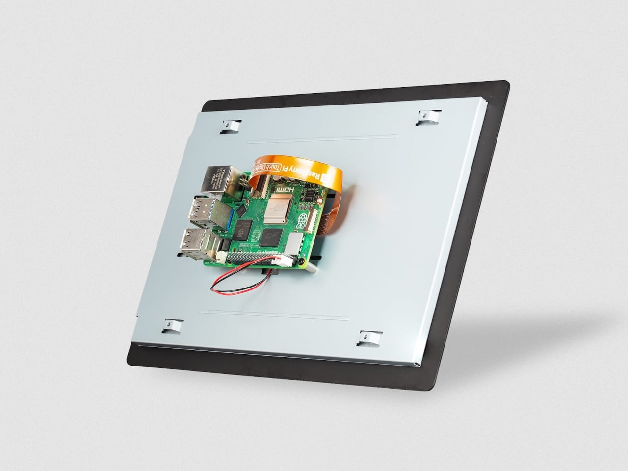
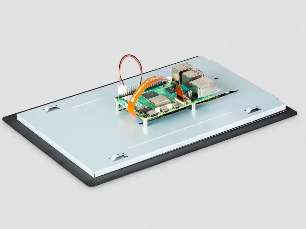
The physical setup follows the same principle the Touch Display 2 family has always used. The display mounts to the rear of a Raspberry Pi 5 using four M2.5 screws, and it draws power directly from the board’s GPIO, so there’s no need for a separate power supply. Raspberry Pi OS detects the screen automatically with full driver support, including the on-screen keyboard. No manual configuration, no hunting for drivers.

The 10-inch model does require a Raspberry Pi 5 or a Compute Module paired with a compatible carrier board. The panel uses four DSI lanes to maintain a stable 60Hz refresh rate, and earlier standard Pi models only support two, so they can’t run this display. For the builders already working with a Pi 5, that’s a natural fit. For those still on older hardware, the 7-inch and 5-inch options remain in production.

A display this size changes what a Pi-based project can realistically look like in a finished state. A kiosk that actually feels like a kiosk. A digital signage panel that doesn’t look like a proof-of-concept. A robotics control interface with enough screen real estate to show sensor data without squinting. Even a portable gaming system that approaches the comfort of a commercial handheld.

The IPS panel supports an 85-degree viewing angle and operates across a temperature range of −20°C to +70°C, which makes it a reasonable fit for environments that aren’t strictly climate-controlled. Both portrait and landscape orientations are supported in software, giving builders flexibility in how they mount the display relative to the rest of the build.

The post Raspberry Pi Finally Has the 10-Inch Screen Its Projects Always Needed first appeared on Yanko Design.

The 3-in-1 Wireless Charger You’d Actually Want to Leave in View

Anyone who’s deep in the Apple ecosystem knows the charging problem all too well. There’s an iPhone that needs its MagSafe puck, an Apple Watch on its magnetic disc, and AirPods waiting for their wireless spot. Before long, the desk or bedside table has turned into a tangle of cables and pads, and that’s without thinking about what happens when you need to travel.

The wireless charging accessory market has responded with a wave of multi-device stands, but most of them tend to pick a lane. Either fast and capable or foldable and portable, premium-looking or compact, but rarely all of the above. ADAM elements is trying to change that with the Mag 3 Ultra, a foldable 3-in-1 charging station designed to cover all those bases without asking you to give something up.

Designer: ADAM elements

Click Here to Buy Now: $81.75 $109 (25% off, use coupon code “25YDMAG3UL”). Hurry, deal ends in 48-hours!

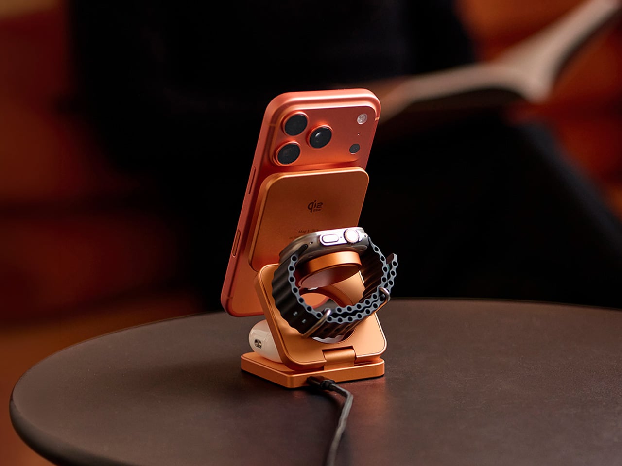
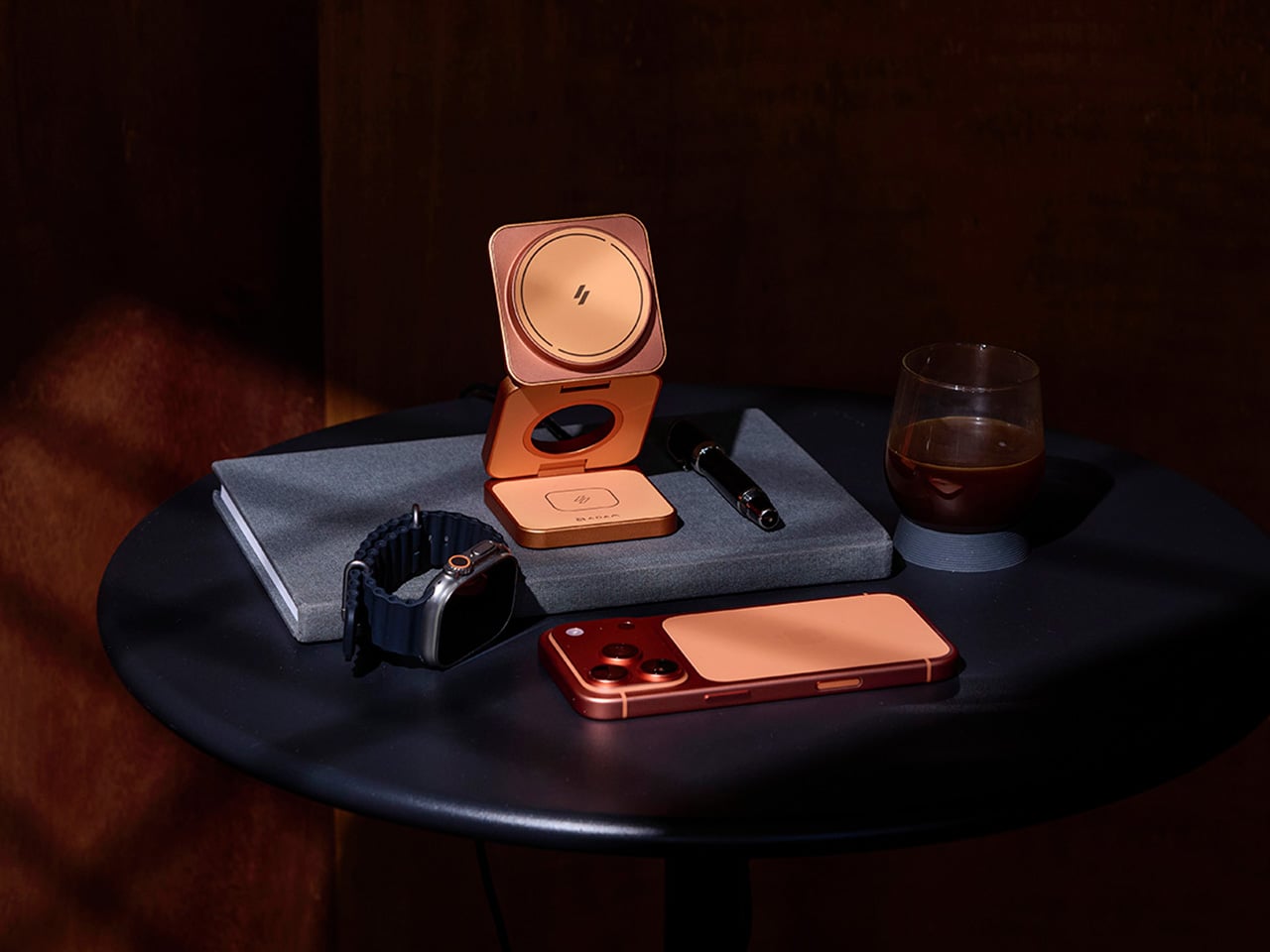
The first thing you notice about the Mag 3 Ultra is that it doesn’t look like most charging accessories. It’s made from precision CNC-machined aluminum alloy with a sandblasted texture and anodized finish, so it sits well alongside the premium devices it’s designed to power. It comes in three colorways: Titanium, Gray, and Orange, with Orange being the most visually striking of the three.

On the performance side, the Mag 3 Ultra’s main phone module is certified under the WPC Qi2 25W standard, which ADAM elements says delivers notably faster charging efficiency than 15W-class Qi2 chargers. The 25W output works best on the iPhone 16 and 17 series, while MagSafe-compatible iPhones from the 12 through 15 series still get Qi2 15W. Either way, it’s well ahead of older wireless charging speeds.

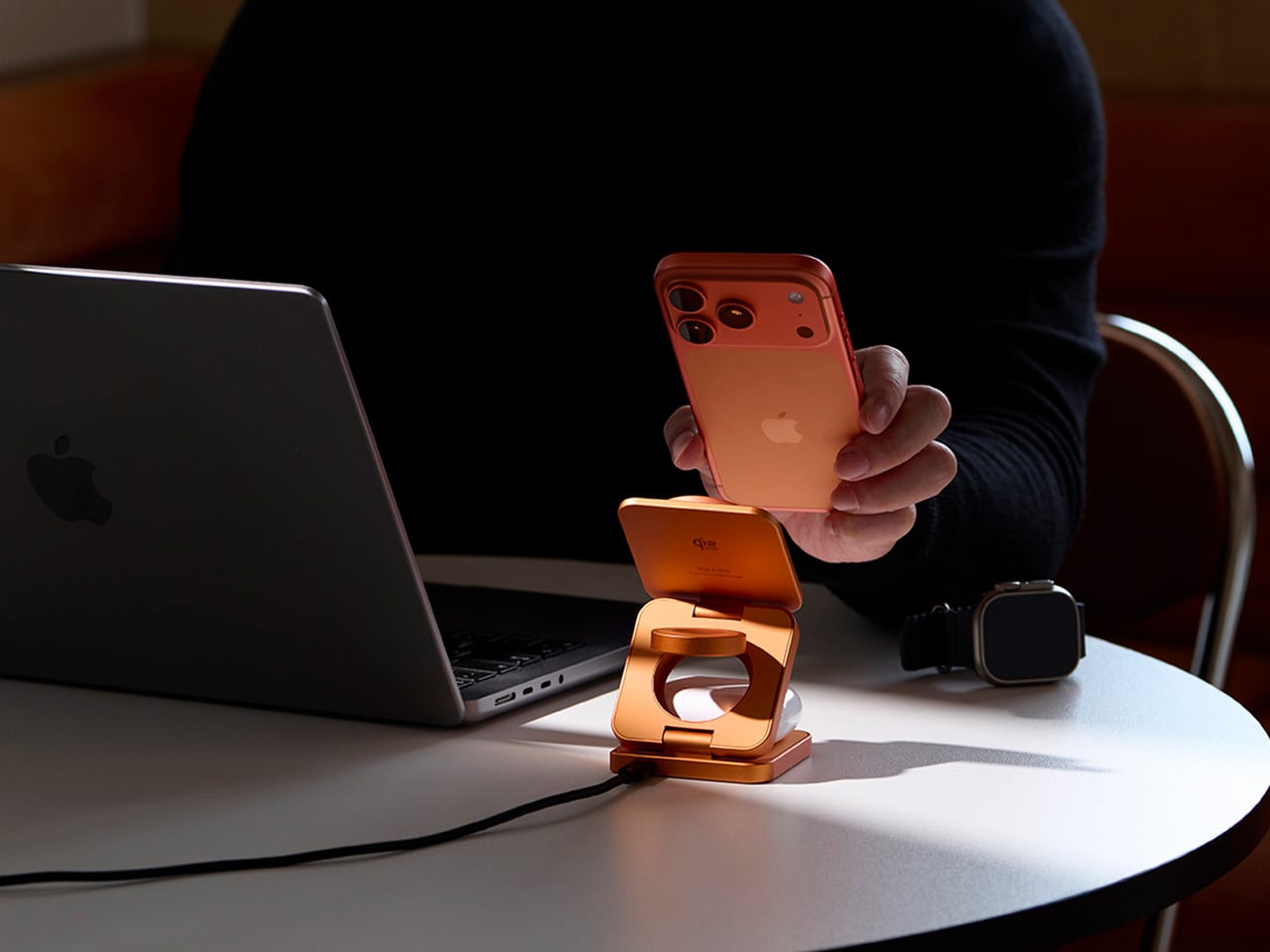
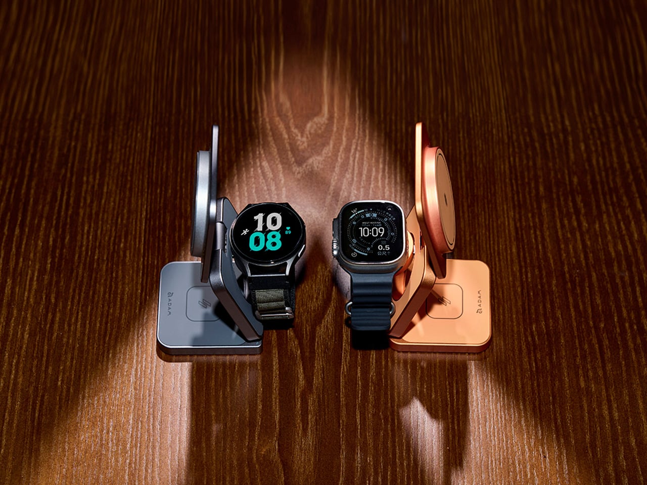
What makes the Mag 3 Ultra genuinely convenient is how it handles all three devices at once. Your phone snaps magnetically onto the main pad, your Apple Watch or Samsung Galaxy Watch sits on the dedicated watch dock, and your AirPods rest on the base charging area. It all happens concurrently, and the whole setup takes up a small footprint with just one USB-C cable.

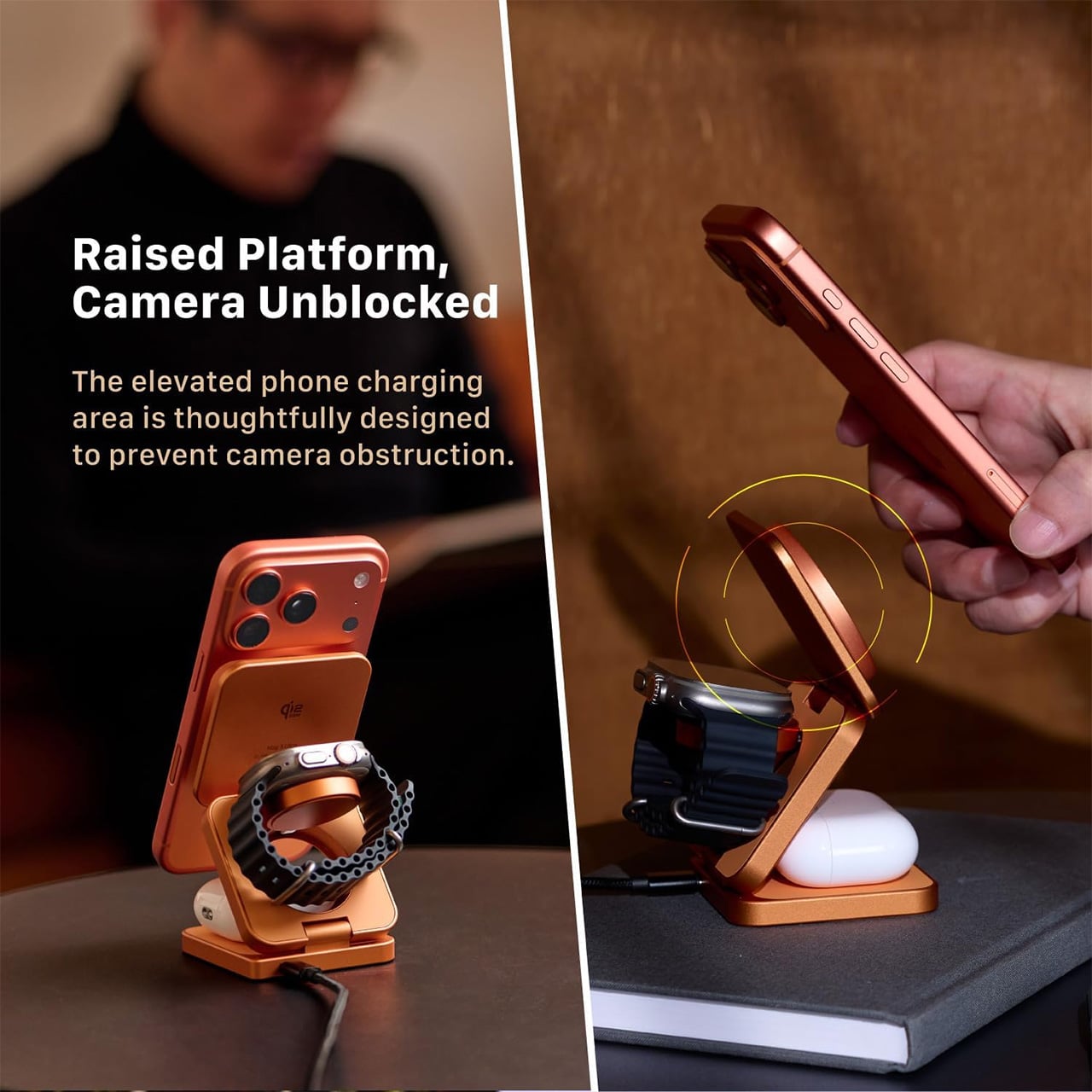
The phone charging pad sits raised above the base, which keeps the camera bump clear and unobstructed. It’s a small but thoughtful design choice that makes the charger genuinely usable while it’s working. The magnetic connection holds the phone in both portrait and landscape orientations, so you can catch up on messages, follow a tutorial, or stream something while your battery climbs.

The watch module is worth noting for its dual-system compatibility. It supports both Apple Watch and Samsung Galaxy Watch via magnetic charging, which makes the Mag 3 Ultra a practical option for households where not everyone is on the same wearable platform. It’s a sensible call that broadens the charger’s appeal well beyond the strictly Apple-only crowd that most competitors in this category target.

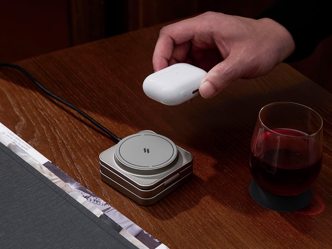
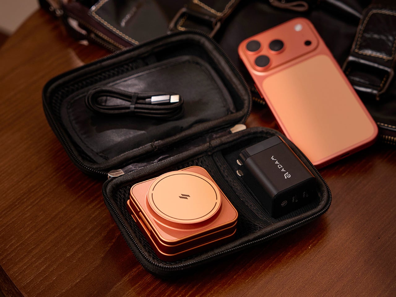
The foldable design is arguably where the Mag 3 Ultra makes its strongest case. It collapses to 66mm x 66mm x 29.5mm and weighs 205.5g, small enough to slip into a bag pocket or carry-on. A 100cm USB-C cable and protective fabric pouch are included, so the same station that lives on your desk can just as easily go on the road.

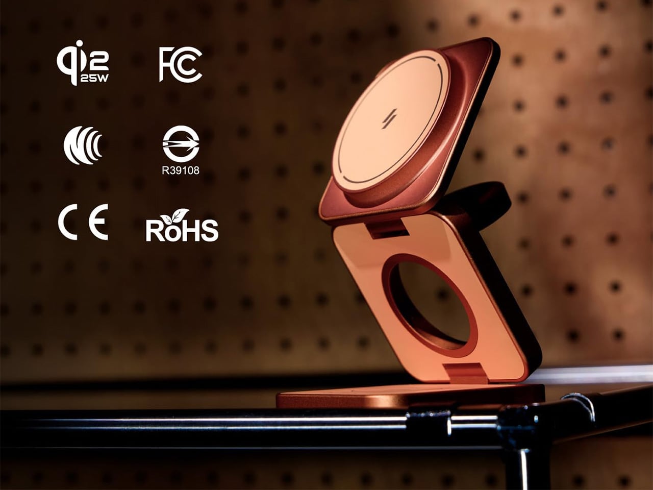
There’s also a solid set of safety protections built in, including Foreign Object Detection to prevent metal interference during charging, along with overcharge, overheat, and short-circuit safeguards. It carries Qi2, CE, FCC, RoHS, BSMI, and NCC certifications. For peak simultaneous three-device performance, ADAM elements recommends pairing it with a 45W or higher USB-C PD adapter, and it comes backed by a three-year limited warranty.

Wireless charging accessories rarely get talked about the same way a well-designed product would, but the Mag 3 Ultra is a good reason to start. The three colorways it comes in, especially that bold Orange, are a clear sign that ADAM elements wants this sitting on your desk where people can actually see it, not tucked behind your laptop where most chargers tend to end up.

Click Here to Buy Now: $81.75 $109 (25% off, use coupon code “25YDMAG3UL”). Hurry, deal ends in 48-hours!

The post The 3-in-1 Wireless Charger You’d Actually Want to Leave in View first appeared on Yanko Design.

Palm-sized drone edges one step closer to disappearing completely in flight behind enemy lines

When we think of invisibility, the idea centers around shielding the form with invisible cloaks or trying to make the object camouflage in the surroundings. Northwestern University in Illinois, however, has a very different approach. Taking advantage of the limitations of the human eye to focus on objects, the team of engineers has come up with a nifty science trick to make a drone that disappears when in flight.

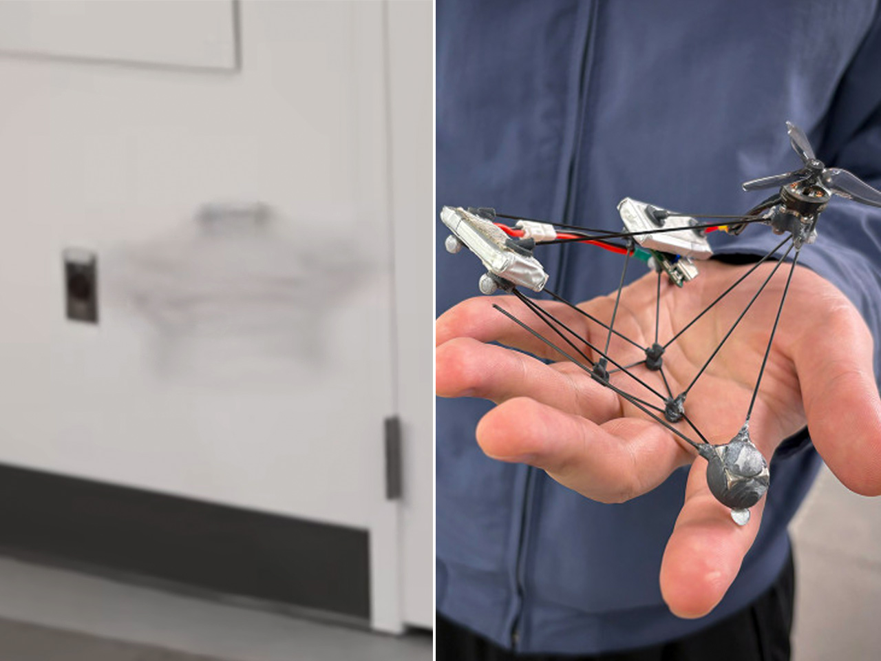
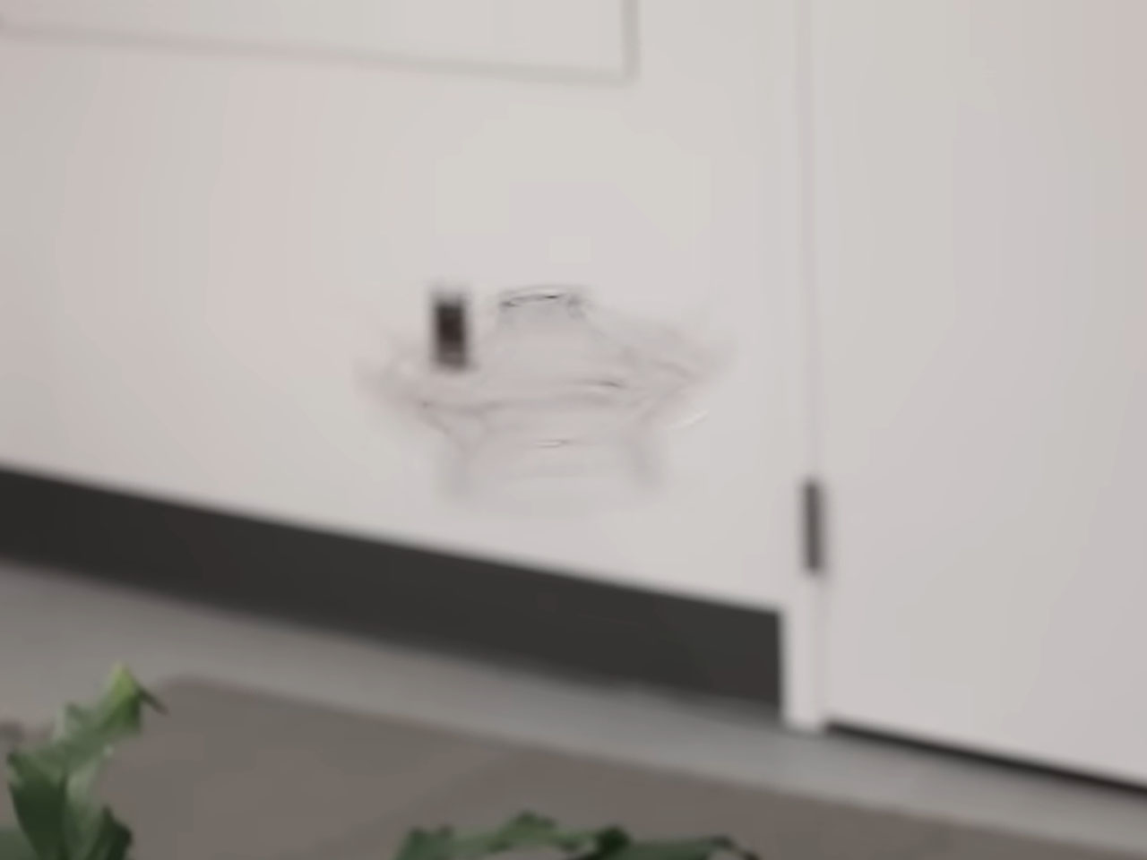
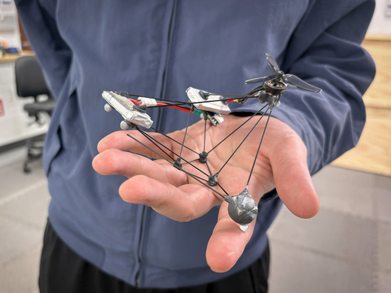
The neat motion is attributed to the drone chassis spinning at 25 RPS, which tricks the human eye into perceiving the flying object as a faint smudge in the air. Dubbed the Phantom Twist, this drone was first demonstrated as a part of a Robotics: Science and Systems 2026 presentation. According to team lead Michael Rubenstein, “the idea of low visibility through persistent motion is something few people have explored.”

Designer: Northwestern University

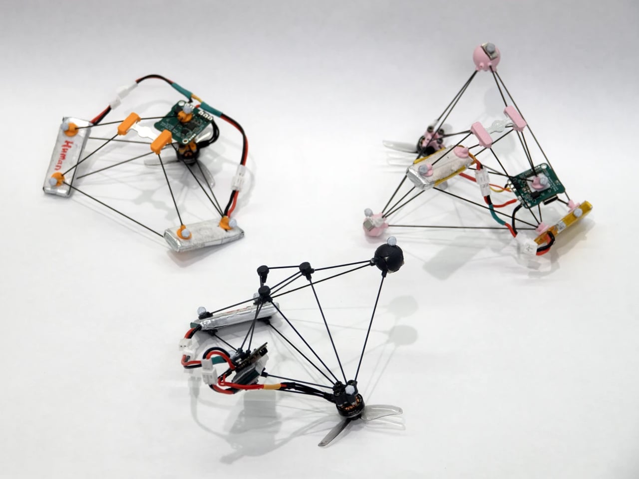
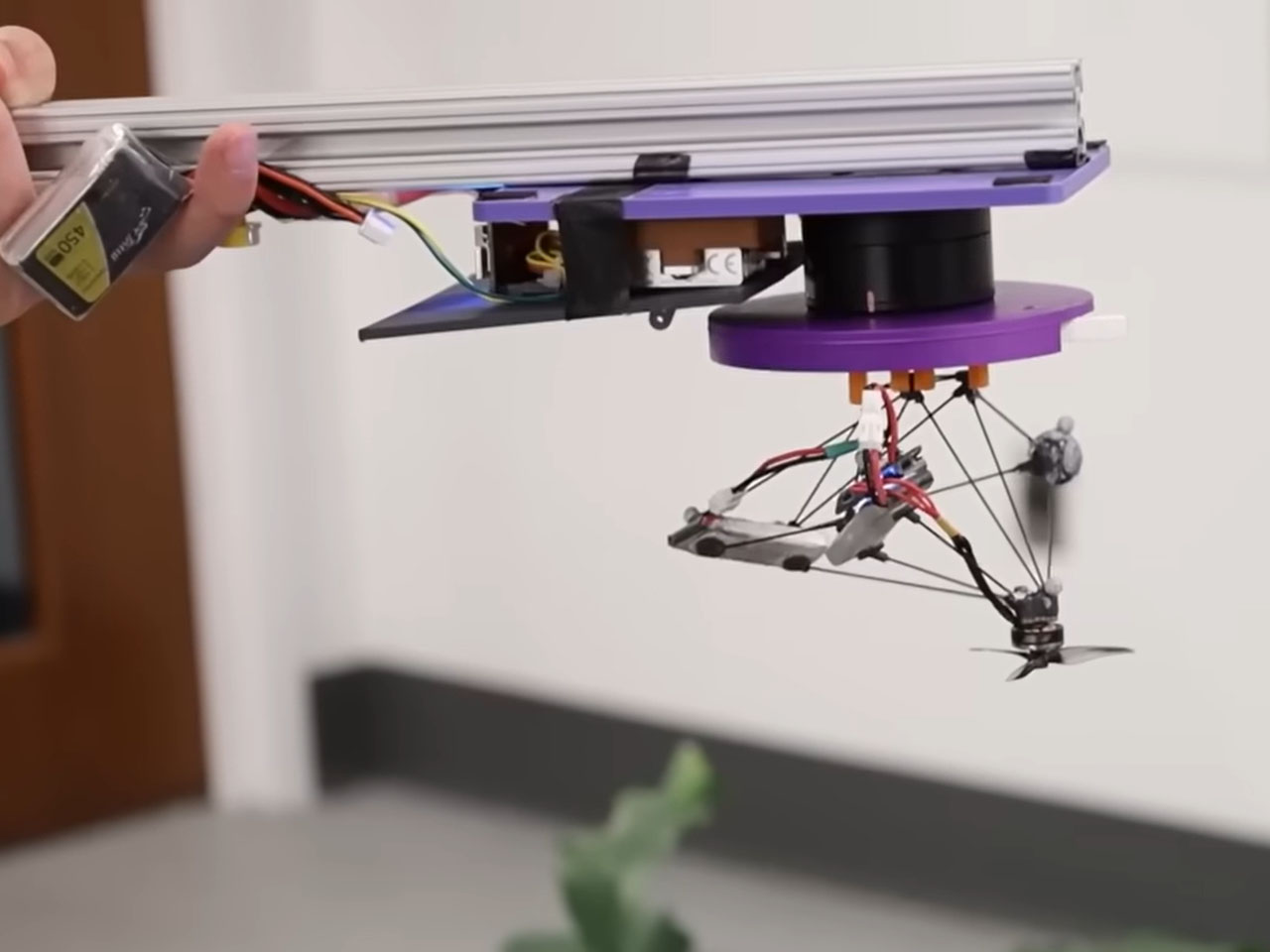
Unlike most quadcopters that have four rotors to generate lift, Phantom Twist has one motor and a propeller. The propeller spins in one direction, forcing the rest of the body to go in the other direction. The team used AI and optimization configurations to generate around 20,000 drone configurations to finally arrive at the stable flight model. Of course, they had to put together the drone’s components like the motor, circuit boards, counterweight and batteries to arrive at this odd form. Over 500 final models were run in the optimizer against the simulated spinning mid-flight and overlaid on the 100 real-world backgrounds to arrive at this final design.

Michael added that “For a typical quadrotor drone, the propellers are spinning, but the robot is stationary. So, you still see its body. For our drone, the whole thing is rotating, so there are no stationary parts.” The human eye takes time to process the information, just like a camera exposure shot. The quick spinning drone therefore goes completely transparent as the partially opaque elements average out against the background, creating a slight haze. This makes the Phantom Twist drone 10 times more difficult to spot than a standard quadcopter.

The only giveaway is the whirring sound the drone makes. Also, the support wires and the rods are partially visible, but still you can’t see this flyer from a distance. Further improvements of this unique design hint at the use of more transparent materials and a quieter propulsion system. So, we can expect to see a drone that is closer to complete invisibility in the future from the Northwestern University team. The applications are endless, including secret military missions behind enemy lines or a world where drones just operate in the background without anyone ever realizing.


The post Palm-sized drone edges one step closer to disappearing completely in flight behind enemy lines first appeared on Yanko Design.

At $230, This Gaming Headset Keeps Playing While You Swap Its Battery

Wireless gaming headsets have carried a quiet contradiction since they first appeared. Cutting the cable was supposed to mean more freedom, but the moment the battery dropped, you were plugging back in anyway, tethered to a wall or a charging dock and waiting. The industry’s answer has been to push battery life further with each generation, but even a 60- or 70-hour headset runs flat eventually, usually in the middle of something.

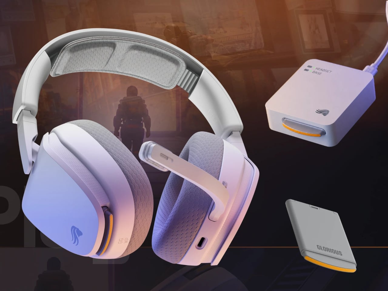
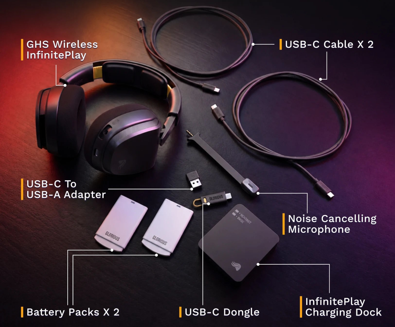
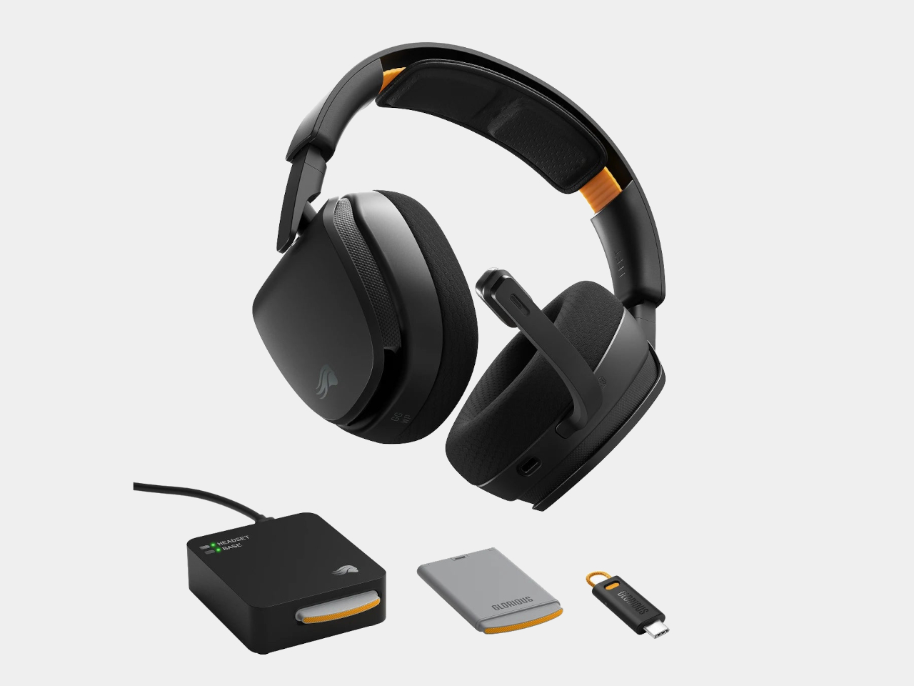
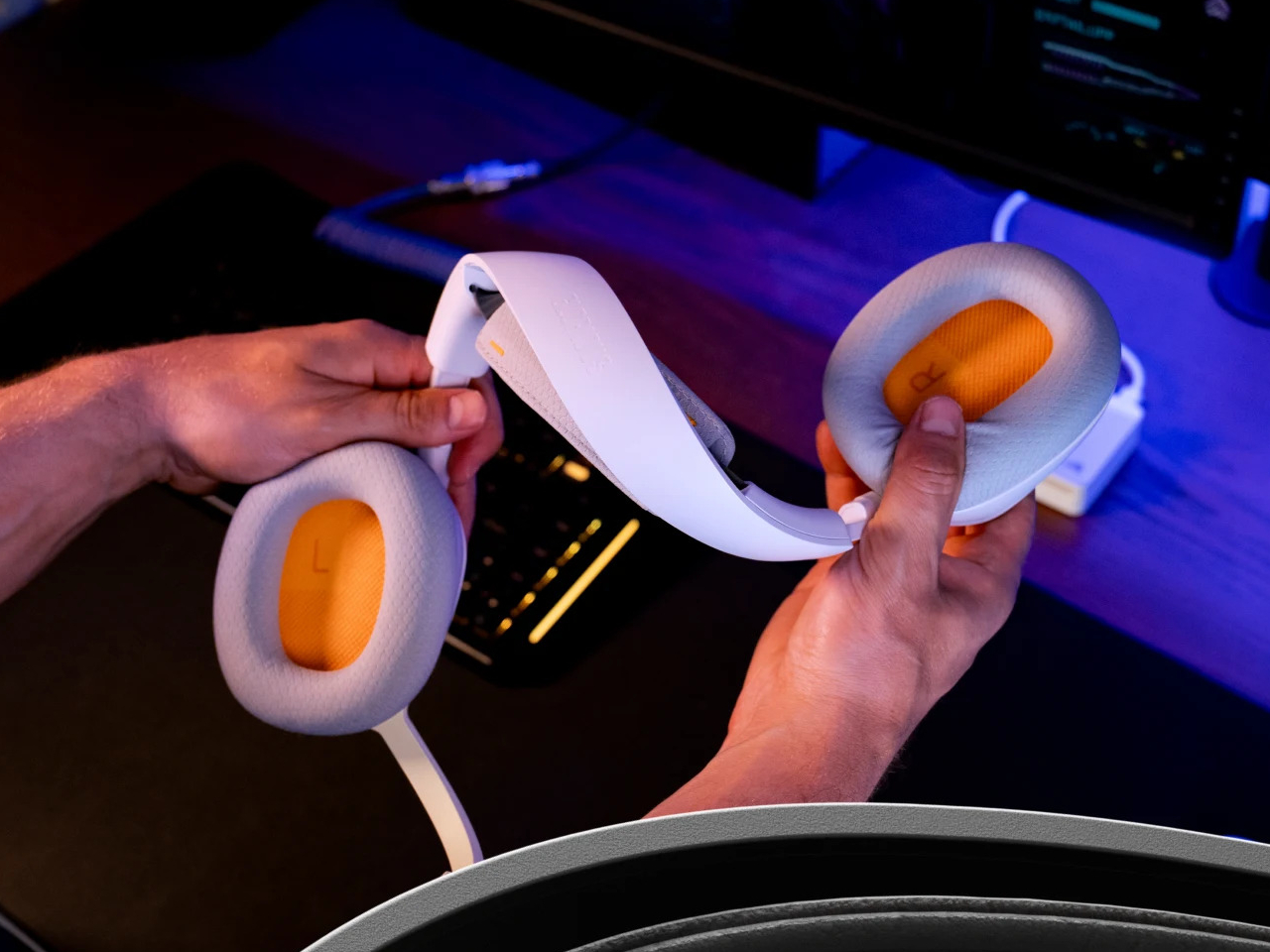
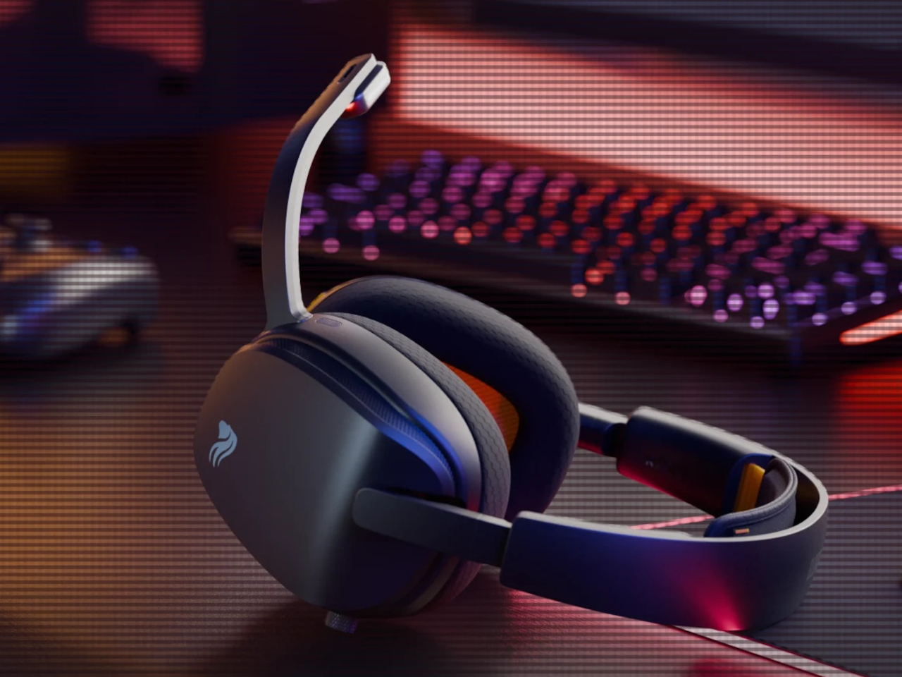
Glorious took a different angle with the GHS Wireless InfinitePlay. Rather than chasing a single larger battery, the headset ships with two hot-swappable 85-hour battery packs and an internal Guardian Battery reserve that bridges the gap during the moment of the swap. The result is a headset that, in practical terms, never actually stops playing, because by the time one pack drains, the other is already charged and ready.

Designer: Glorious

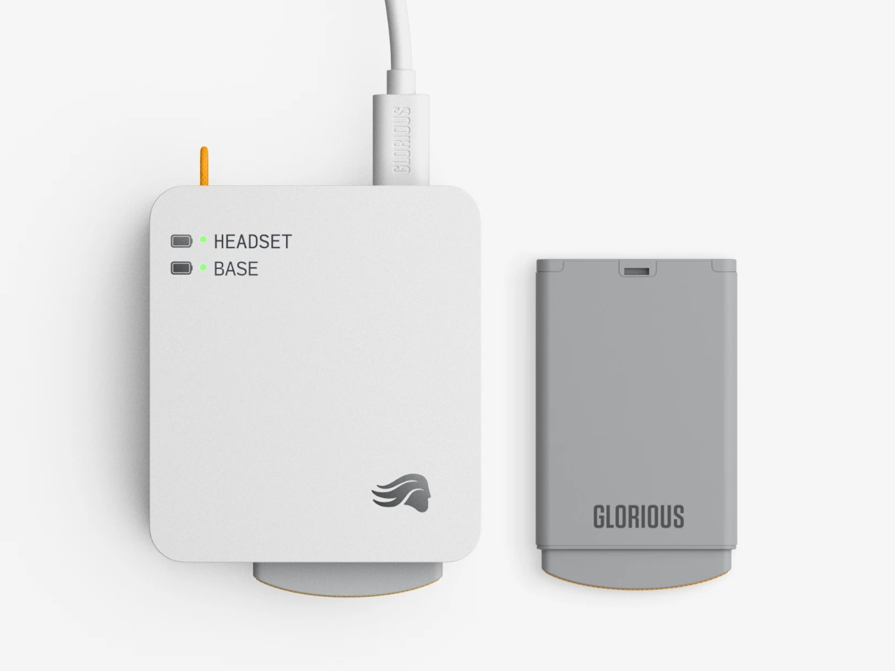
The system works through a dual-purpose charging base that also serves as the 2.4 GHz wireless dongle. One battery sits in the headset while the other charges on the base. When the depleted pack comes out and the charged one slots in, the Guardian Battery, which can run the headset independently for about 3 hours, has already kept audio uninterrupted through the swap. There’s no pause in sound and no drop in connection.

Combined, the two packs add up to more than 170 hours of capacity. For any kind of extended session, a long run at a tournament, a weekend of back-to-back play, or everyday use where charging gets forgotten, the swap-based approach removes the anxiety from the equation entirely. Swap the battery, put the depleted one on the dock, and carry on without another thought about it.

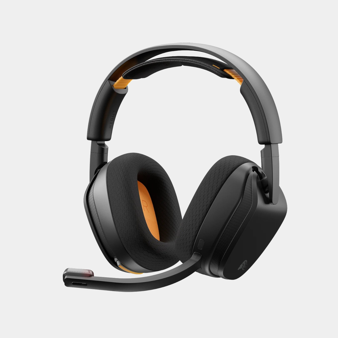
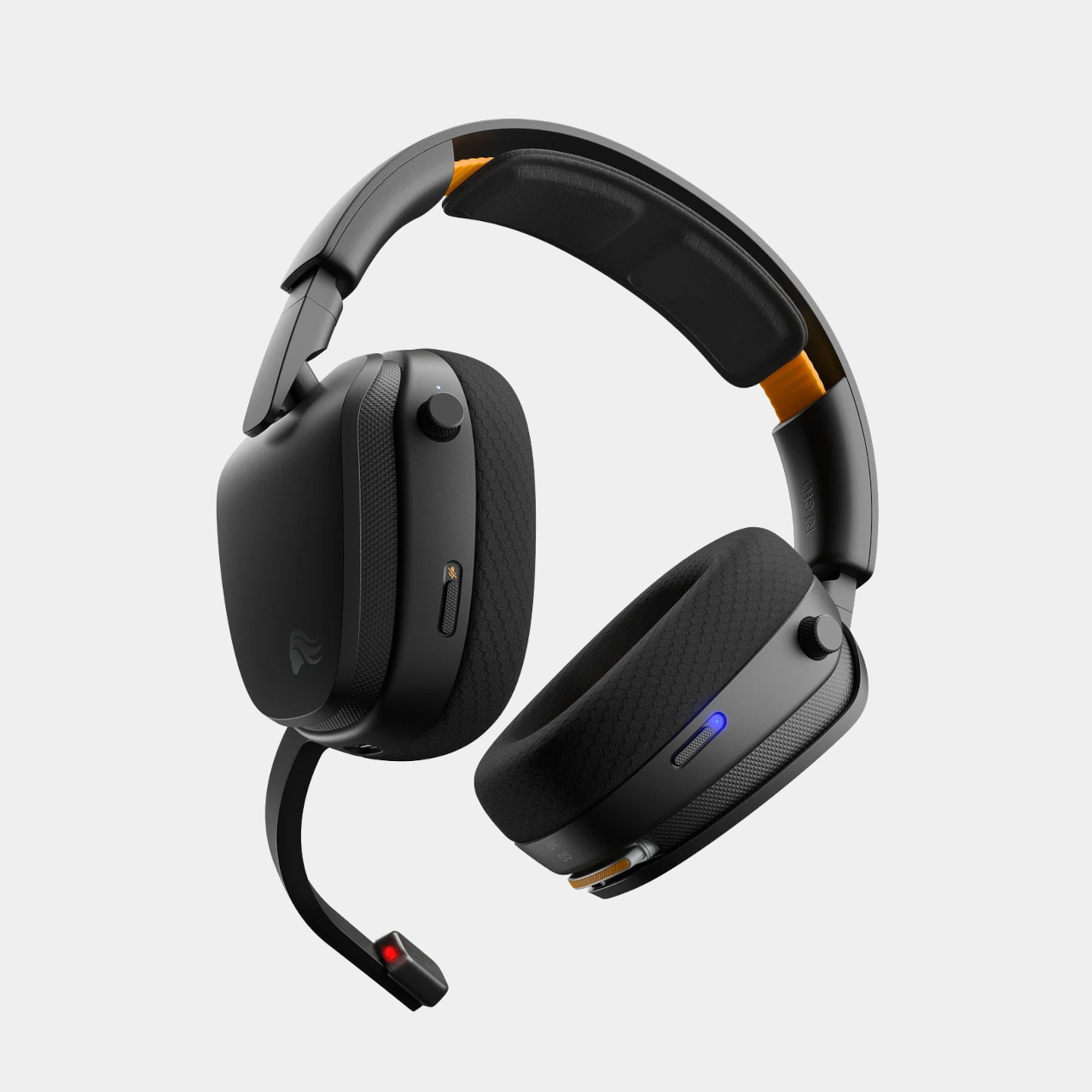
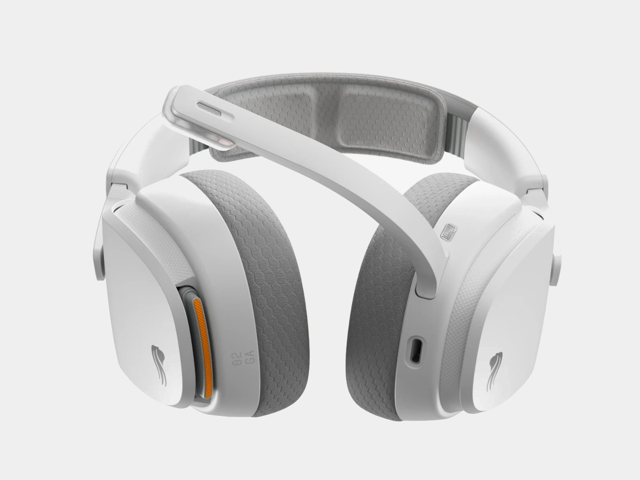
The headset is built around 40mm custom-tuned drivers angled to improve clarity and stereo imaging, covering a frequency response of 20Hz to 20kHz. The detachable boom microphone is noise-cancelling, and the ear cups use memory foam padding over a suspension headband that distributes the 360g weight across the top of the head. Connectivity covers both 2.4 GHz wireless for low-latency gaming and Bluetooth 5.4 for everything else, switchable with one button press.

That Bluetooth mode makes the headset practical outside the gaming setup too. Moving from a PC session to a phone call or a commute doesn’t require switching to a different pair of headphones. The same swap-and-go logic applies to any situation where the headset is living on your head for extended stretches, and the battery system works just as well whether you’re at a desk or out the door.

Most hot-swappable headsets at higher price points make the process awkward or require specific docking sequences. Glorious kept it simple enough to execute mid-session without missing a beat, which is ultimately the only version of this feature that actually matters. The GHS Wireless InfinitePlay is priced at $229.99 and comes in black and white. Both battery packs and the charging base are included in the box, so the whole swappable system is ready to go from day one, not sold separately as an add-on down the line.

The post At $230, This Gaming Headset Keeps Playing While You Swap Its Battery first appeared on Yanko Design.

Garmin Just Built the Whoop Alternative That Needs No Subscription

There’s a growing frustration with fitness wearables that has nothing to do with their accuracy or features. It’s the screen. Even devices that track recovery and stress can contribute to the same screen-checking habit they’re supposed to help reduce, turning what should be a passive health monitor into just another thing demanding attention on your wrist. The smartwatch category has leaned further into displays, notifications, and apps, leaving a gap for something that doesn’t do any of that.

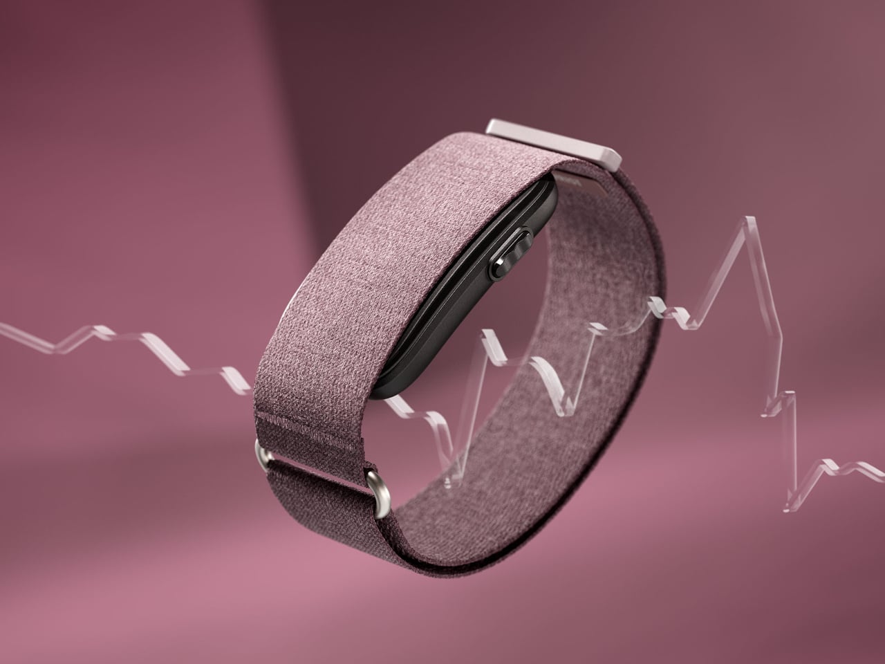
The Garmin CIRQA is Garmin’s first screen-free smart band, and the pitch is straightforward. It tracks everything, shows you nothing on the wrist, and routes all the data to the Garmin Connect app for review when you actually want to look. There’s no display to glance at, no notifications, no interface to interact with during the day. The band does its job in the background, and you check the results on your terms.

Designer: Garmin

Worn on the wrist or moved up to the upper arm for sleeping or specific activities, the CIRQA runs 24 hours a day on a single charge for up to ten days. The sensor stack covers all the metrics Garmin is known for: continuous heart rate, Body Battery energy monitoring, Pulse Ox, stress, skin temperature, HRV status, and comprehensive sleep tracking including sleep stages, a sleep score, and nap detection. Women can also track their menstrual cycle and sync skin temperature data with the FDA-cleared Natural Cycles birth control app.

Fitness tracking doesn’t require picking up the phone either. The band detects and records activities automatically, and the more you review and correct those logs in Garmin Connect, the better it gets at classifying your workouts without prompting. For sessions where you want more control, a single side button lets you manually start any of 80-plus activities. Connected GPS borrows location data from a paired smartphone for accurate outdoor pace and distance, and LiveTrack lets people follow your route in real time.

The monitoring side goes deeper than basic step counting. Training readiness, VO2 Max estimates, and workout recovery time give athletes a fuller picture of whether a day calls for a hard effort or an easy spin. The CIRQA was built to complement Garmin’s watch lineup rather than replace it. Someone who already runs with a Forerunner can use the CIRQA to handle overnight recovery and all-day wellness without wearing the watch to bed or to the office.

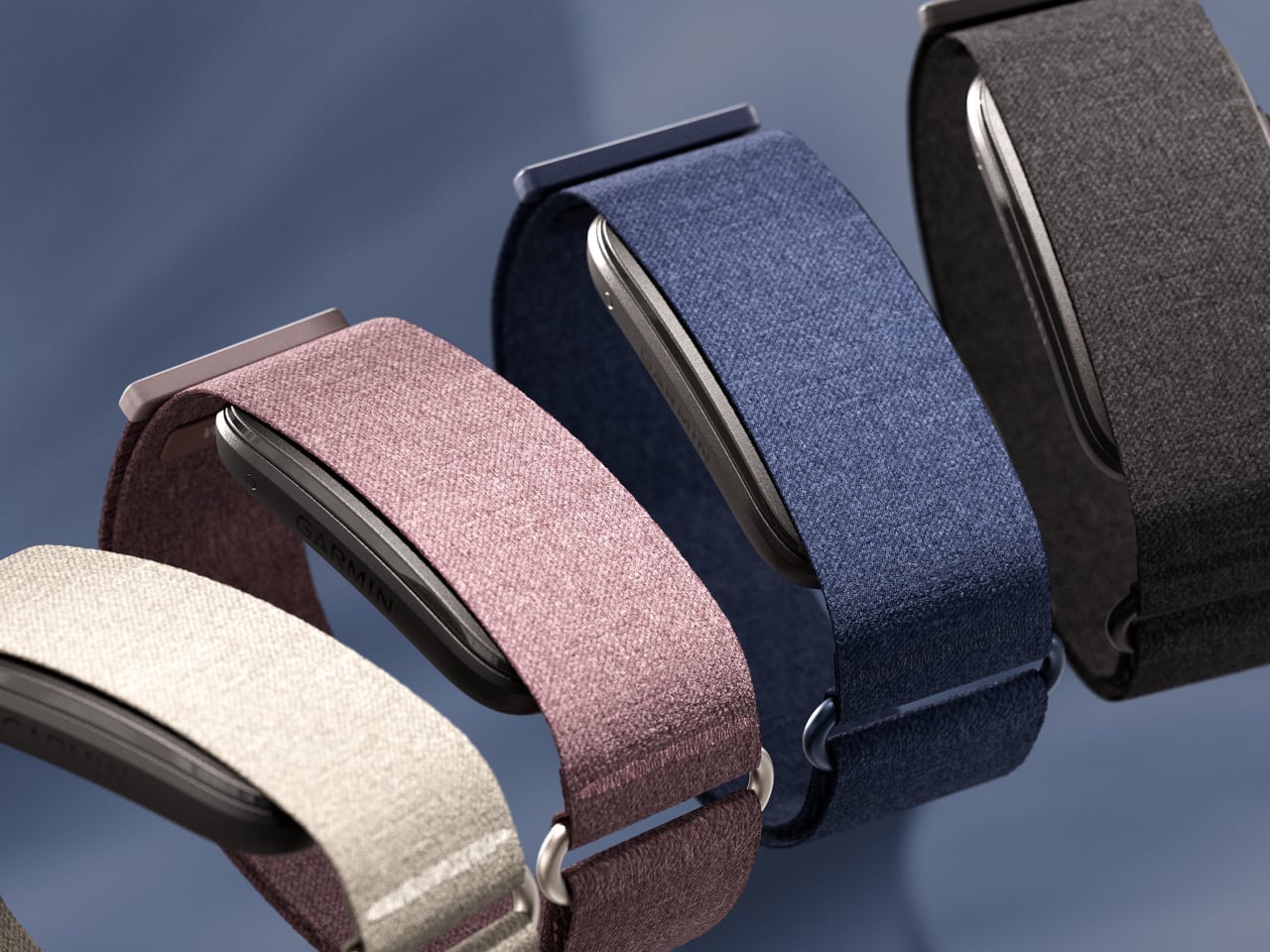
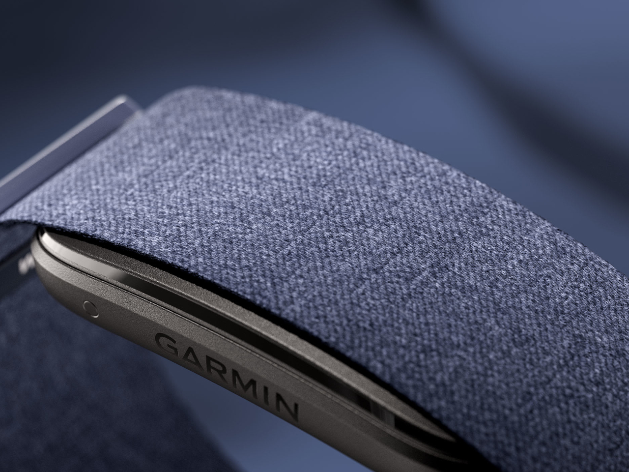
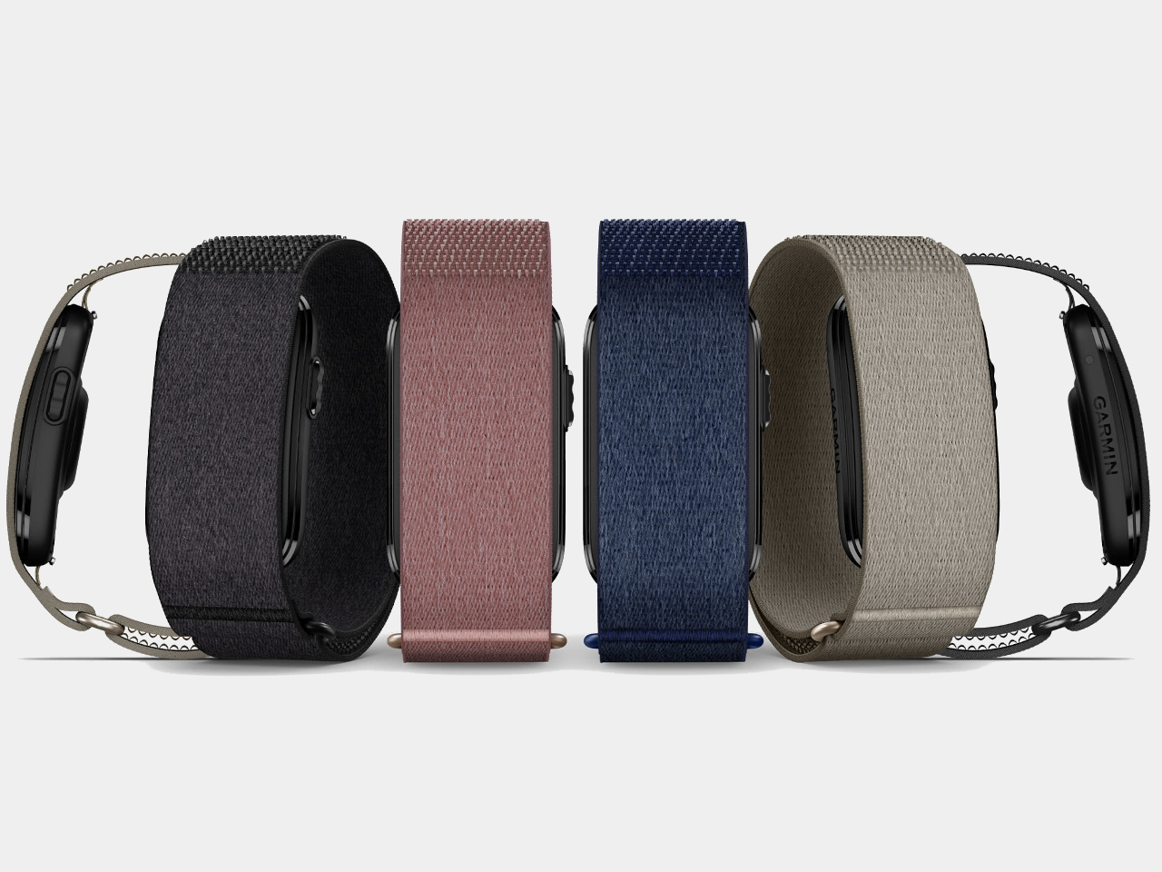
The band comes in a soft ComfortFit fabric strap that Garmin designed to fade into the background and sits in a compact sensor module with a fiber-reinforced polymer housing. Colors include Black, French Gray, Berry, and Navy, with seven additional accessory band options for the wrist. Both wrist and upper-arm sizing are available in two fits.

The CIRQA Smart Band is priced at $199.99, and no subscription is required for the core feature set, which is a pointed difference from Whoop, the most obvious comparison in this category. Garmin does offer optional Connect+ upgrades for coaching and advanced guidance, but the full tracking stack works without it.

The post Garmin Just Built the Whoop Alternative That Needs No Subscription first appeared on Yanko Design.

Nothing Phone (4b): Not Exciting, But Hard to Fault

PROS:


  • Distinctive design that still feels recognizably Nothing

  • Large 120Hz AMOLED display is good for the price

  • Solid all–day battery life

CONS:


  • No telephoto camera

  • Noticeable bezel

RATINGS:

AESTHETICS
ERGONOMICS
PERFORMANCE
SUSTAINABILITY / REPAIRABILITY
VALUE FOR MONEY

EDITOR'S QUOTE:

Not especially thrilling, but thoughtfully balanced, the Nothing Phone (4b) is an affordable phone that knows its priorities.

It’s no secret that rising memory prices have become a major challenge for tech companies of every size. Some brands have responded by simply raising prices. Others have had to rethink their product strategy entirely. You know the situation is serious when a company decides not to release a successor to one of its most popular series because it cannot build a phone that feels good enough for its target audience at the right price.

With no CMF phone upgrade arriving this year, the Nothing Phone (4b) becomes the company’s new affordable entry point. Rather than pushing ahead with a compromised CMF successor in a difficult market, Nothing has brought that mission back under its main label. It is an entry-level phone by positioning, but one that still tries to carry the visual character and brand personality that make a Nothing device feel distinct. Of course, affordability in a market like this never comes without tradeoffs. The question is whether Nothing has chosen the right ones. Has it cut back in ways most users can accept, while still delivering a phone that feels stylish, capable, and true to the brand?

Designer: Nothing

Aesthetics

Nothing has built its reputation on a strong and instantly recognizable design identity. That identity first emerged with the Nothing Ear (1), the company’s debut wireless earbuds, whose transparent look immediately gave the brand a distinct visual signature. When Nothing later expanded into smartphones, it introduced the Glyph design as a new defining element of its phone lineup. Since then, the company’s design language has continued to evolve, sometimes through refinement, sometimes through experimentation, but never by standing still.
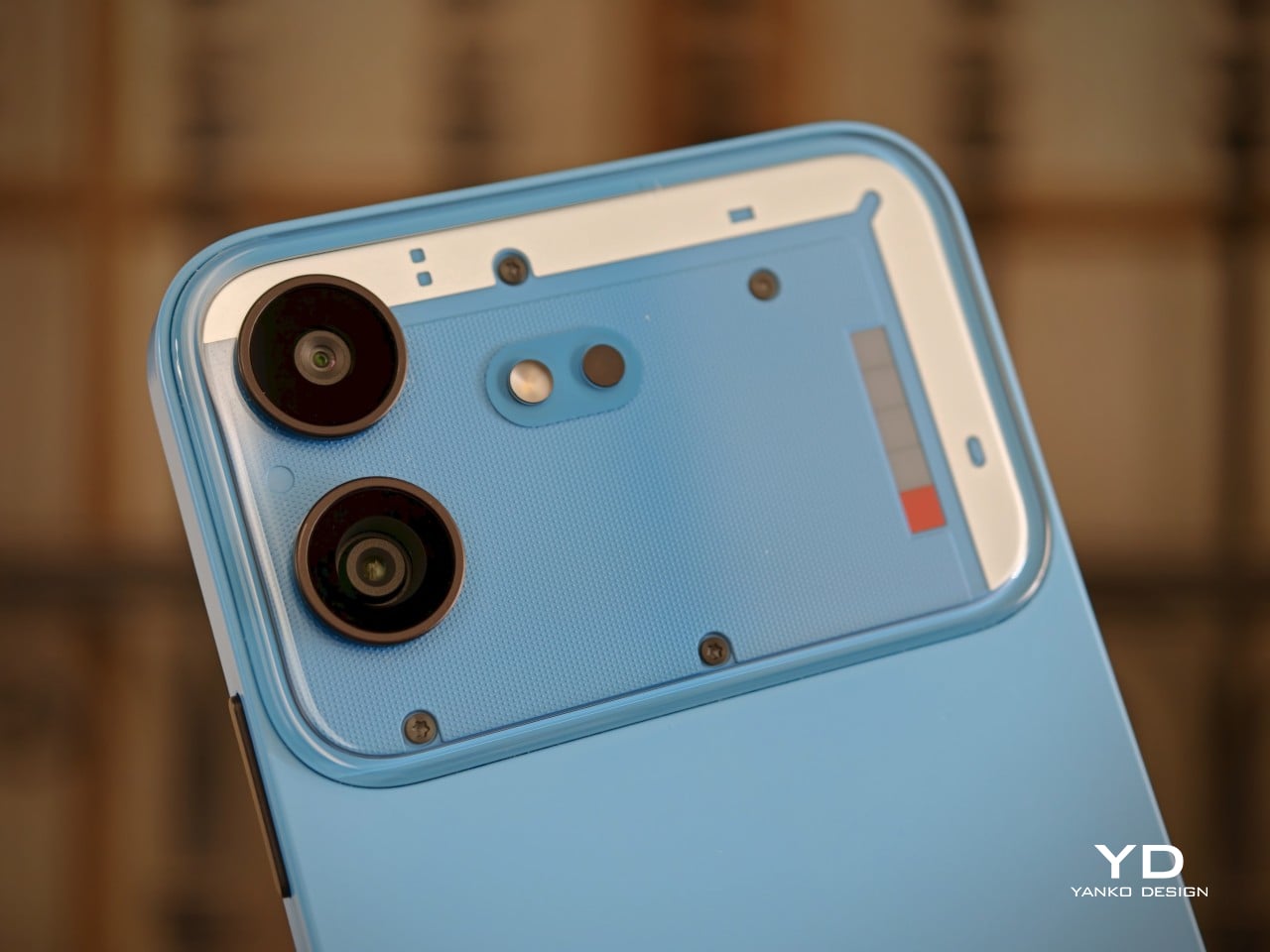
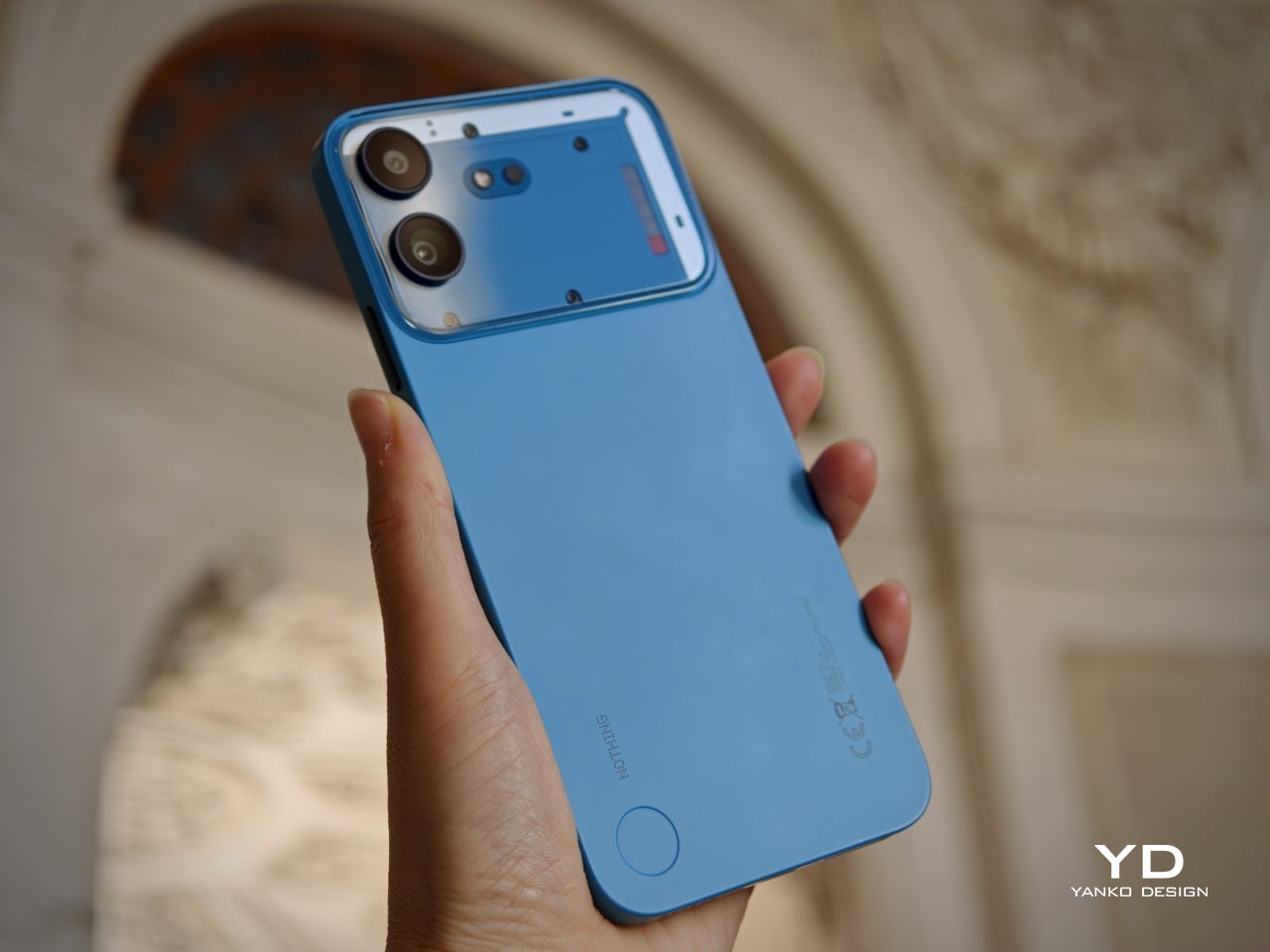
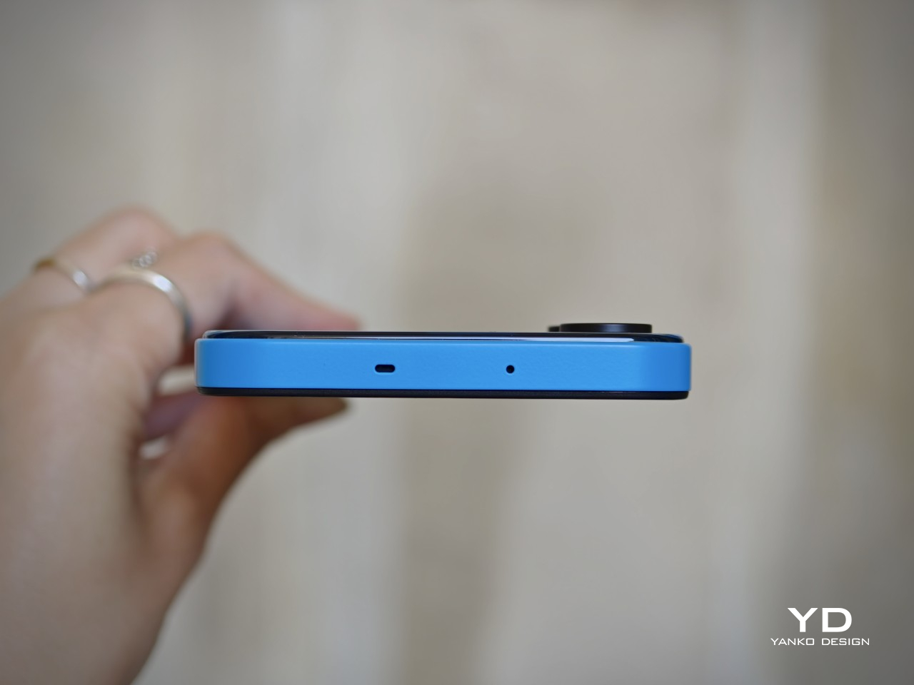
At a glance, the Phone (4b) still feels part of that family. It carries over familiar cues such as exposed screw details, geometric panel treatment, and a transparent-inspired camera bump that gives the rear a sense of structure rather than mere decoration. The phone is offered in White, Black, and Blue, and its unibody design helps the overall form feel more cohesive. All three colorways use black buttons, which create a subtle contrast, especially on the lighter finishes. The rear itself has a dual-tone look, with a more solid lower section and a transparent-inspired camera bump above it. On that bump, two vertically stacked cameras sit alongside the flash and a Glyph Bar that echoes the Phone (4a).

It is not as fun or as visually exciting as some other Nothing phones, especially the earlier ones. The design feels more restrained, with less of the playful boldness that once made the brand’s devices feel genuinely surprising. Even so, for a budget phone, Nothing has balanced design ambition and cost control well, preserving enough character to keep the Phone (4b) from fading into the background.

Ergonomics

Measuring 164.4 x 78.2 x 8.6 mm and weighing 210 g, the Nothing Phone (4b) is very much a modern big-screen budget phone. Its unibody construction helps it feel solid and cohesive in the hand, and the weight distribution is even enough that it does not come across as awkward or top-heavy. The matte texture is a nice touch visually and helps the phone avoid looking overly glossy, though it does not completely translate into a secure grip.
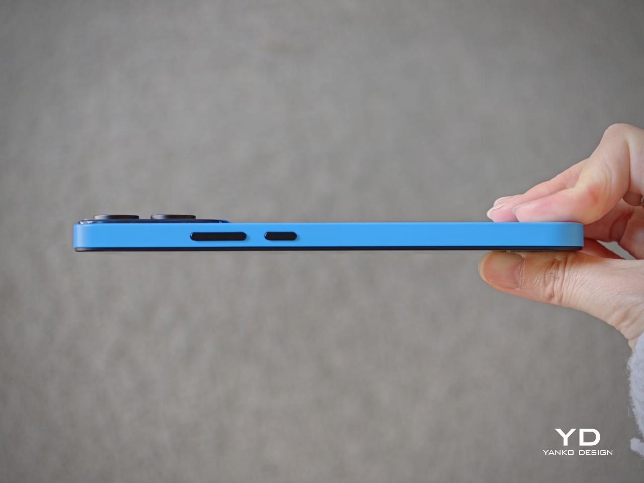
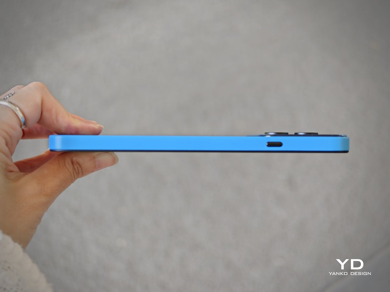
For me, the biggest issue is the width. At 78.2 mm, it is just a bit too wide to handle comfortably with one hand, especially when trying to reach across the display for interface elements or app icons. The handling can also feel a little slippery at times, so simple actions such as pulling down menus or tapping controls near the opposite edge can require a grip adjustment. As a result, the Phone (4b) feels more natural in two-handed use than in quick one-handed moments.

The fingerprint scanner placement does not help much either. It sits near the bottom of the display, which makes the unlock motion feel less seamless than it should. Once the phone is unlocked, your thumb is already positioned too low, so moving directly into navigation feels less natural than it would with a scanner placed slightly higher. It is a small ergonomic detail, but one that becomes easier to notice in everyday use.

Performance

The Nothing Phone (4b) is powered by the Snapdragon 6 Gen 4, paired with 8GB of RAM and either 128GB or 256GB of storage. That places it firmly in the lower mid-range rather than the true bargain-bin tier, and in daily use, that positioning feels about right. This is not a phone that tries to impress with raw speed or benchmark theatrics. Instead, it aims for a level of performance that feels dependable enough for the people most likely to buy it.
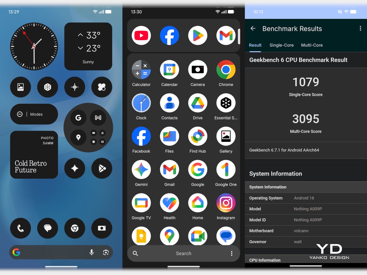
In everyday tasks, the Phone (4b) holds up well. Navigating the interface, switching between common apps, browsing the web, replying to messages, and scrolling through social media all feel smooth enough that the phone rarely calls attention to its limitations. Gaming is where its limits become clearer. Casual titles should run without much trouble, and lighter 3D games are likely to be perfectly playable, but this is not a device built for demanding graphics or long sessions at high settings. Heavier games will almost certainly require reduced visual quality to maintain consistency, and even then, this is not the sort of phone that feels eager to push beyond its class.

The software experience plays a big role in making the Phone (4b) feel more polished than its hardware might otherwise suggest. Nothing’s interface has generally been one of the company’s strengths, and that remains true here. Notably, Nothing has not held back too much on software features, with AI tools and Essential Space both making their way to the Phone (4b). The software is also relatively clean, with only a small amount of pre-installed bloatware, something that remains surprisingly rare at this end of the market.
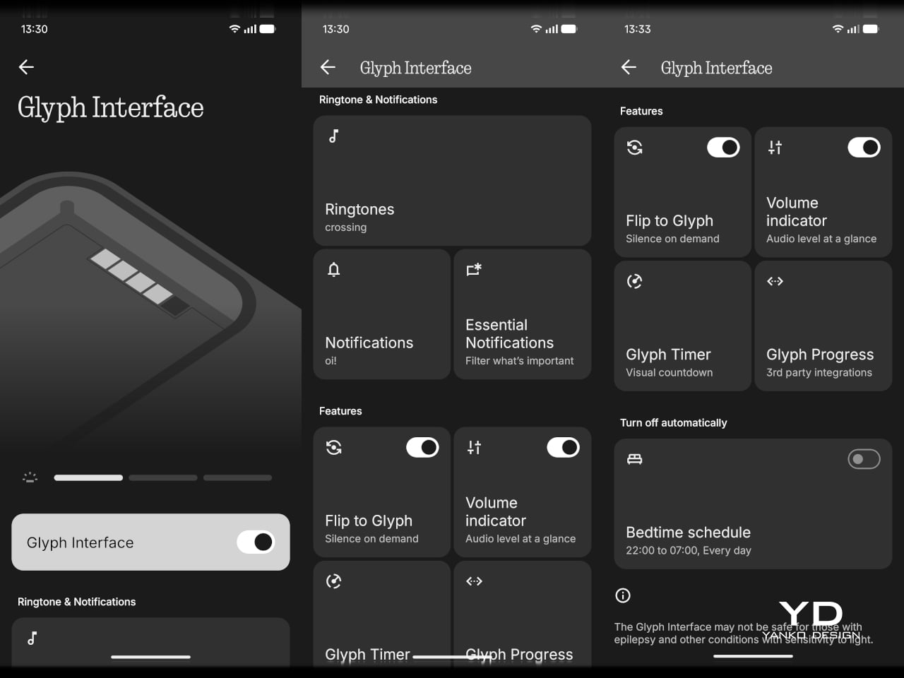
The Glyph interface is still here, though in reduced form as the rear Glyph Bar rather than the fuller system found on more expensive Nothing phones. It supports practical functions such as timers, charging progress, notifications, recording indicators, and one of my personal favorites, the camera countdown, so it is more than just a visual gimmick. Still, this pared-down implementation feels more like a modest nod to Nothing’s identity than a feature that adds much excitement to the experience.

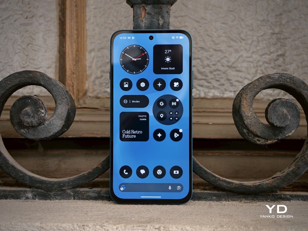
The Phone (4b) features a large 6.77-inch AMOLED display with a 1080 x 2344 resolution, a pixel density of 381ppi, and a 120Hz refresh rate. Nothing also claims a peak brightness of 2,000 nits and 1,300 nits in outdoor brightness mode. It is a solid display package for the segment, offering the kind of size and fluidity that most users will immediately appreciate in daily use.

Visually, the panel does not do much to surprise. The bezels are relatively thick all around, with a more noticeable chin at the bottom, so it lacks the sleek edge-to-edge impression of more expensive phones. Even so, this is still a good screen for the price. The AMOLED panel gives the Phone (4b) the contrast and richness you would hope for, while the 120Hz refresh rate helps the interface feel smoother and more modern.

Main Camera, 2x

Main Camera, 1x

The speaker quality follows a similar pattern. It is still not especially impressive, but it is better than merely acceptable. The stereo speaker setup gives the Phone (4b) a more balanced audio presentation, and the sound avoids becoming muddy. It is not a standout for richness or power, but for everyday listening, the result is solid for the class.

Main Camera 2x (B&W Film Filter), Main Camera 2x (Normal)

Main Camera 2x (Portrait Mode)

The camera system is another area where expectations need to stay grounded. On the back, the Phone (4b) pairs a 50MP main camera, using a 1/2.76-inch sensor with an f/1.8 aperture and OIS, with an 8MP ultra-wide camera that uses a 1/4-inch sensor and an f/2.2 aperture. Up front, there is a 16MP selfie camera. This is a fairly typical camera setup for the segment, with the main sensor doing most of the meaningful work.

Ultra-wide 0.6x

Main Camera 1x

In good daylight, the results are generally solid. The main camera captures decent detail, pleasing contrast, and images that are more than good enough for social sharing. The phone can zoom up to 10x, but image quality starts to fall off noticeably beyond 2x, so that upper range is more there for flexibility than for genuinely reliable output. Low-light performance is also fairly good overall, though white balance can become a little wonky in certain scenes. For video, the main camera can record at up to 4K 30fps, while the ultra-wide and front-facing cameras are limited to 1080p, with the former capped at 30fps and the latter able to reach 60fps.

Main Camera 2x

Main Camera 5x

Main Camera 10x

Battery life should be one of the Phone (4b)’s more dependable strengths. The global version packs a 5,200mAh battery, and when paired with a relatively modest chipset and efficient software, the phone is clearly tuned for endurance rather than excess. In my use, it lasted a full day easily, which is exactly what most buyers in this category will want. Charging is less exciting. Wired charging tops out at 33W, which is not especially fast by current standards, but the inclusion of 5.5W reverse wired charging is still a welcome extra.

Sustainability

Sustainability is rarely a major talking point in the smartphone market, which is why Nothing deserves credit here. The company puts details such as the Phone (4b)’s carbon footprint and packaging composition directly on the product page instead of burying them elsewhere. That kind of transparency is still uncommon, and it makes the sustainability effort feel more concrete.

There is also a practical side to the story. The Phone (4b) has an IP64 rating for dust and splash resistance, while its unibody construction should help with structural strength. Software support is solid, with three years of Android updates and six years of security patches.
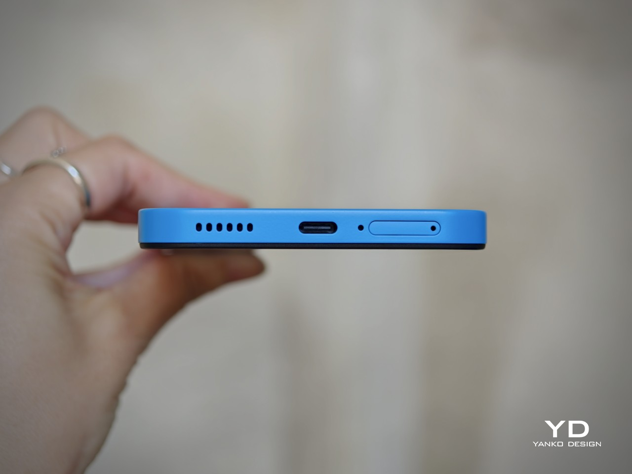
Nothing lists the Phone (4b)’s carbon footprint at 54.7 kg CO₂e, and says more than 99 percent of the packaging is plastic-free, excluding the PET-paper composite label. These are not the kind of details most buyers will focus on first, but they are useful to have. More importantly, this level of disclosure is worth praising and reflects a company that is at least willing to treat environmental responsibility as part of the product conversation.

Value

At £299, or about $400, the Nothing Phone (4b) is not trying to be the absolute cheapest option. Instead, it aims to offer a more polished and distinctive experience than many budget phones at this price. That gives it a slightly different kind of value proposition.

That mostly works in its favor. You get a recognizably Nothing design, a large 120Hz AMOLED display, clean software, stereo speakers, solid battery life, and dependable everyday performance. The phone is not without compromises, especially in its chipset choice and the lack of a telephoto camera.
The Phone (4b) may not be the obvious bargain pick, but it still offers solid value. It feels less like a phone built to win on one headline feature and more like one shaped by careful compromise. For buyers who want an affordable phone with personality and few major weaknesses, it makes a convincing case for itself.
Verdict

The Nothing Phone (4b) is a sensible response to a difficult market. Rather than forcing out a compromised CMF successor, Nothing has created a new affordable entry point under its main brand. The result is a phone that feels carefully judged rather than boldly ambitious.

It is not an especially exciting device, and some compromises are easy to notice. The chin bezel, modest chipset, and limited camera versatility all remind you where costs have been kept in check. Even the Glyph Bar feels more like a restrained nod to Nothing’s identity than a standout feature.

Still, the Phone (4b) gets the fundamentals right. It offers a good display, clean software, solid battery life, stereo speakers, dependable everyday performance, and a design that still feels recognizably Nothing. For buyers who want an affordable phone with personality and few major weaknesses, it makes a convincing case for itself.

The post Nothing Phone (4b): Not Exciting, But Hard to Fault first appeared on Yanko Design.

This $13,130 Samsung Galaxy Z Fold 8 Ultra Has Messi in 24K Gold

The World Cup is officially over and some people are still having a well-documented hangover from the 39-day football tournament. While Argentina failed to win their fourth star, the GOAT Lionel Messi did manage to break several records in the 2026 edition after winning the 2022 crown. What makes this all the more memorable is that it is probably the 39-year-old’s swan song from representing his country after a tumultuous and memorable stint for the national team.

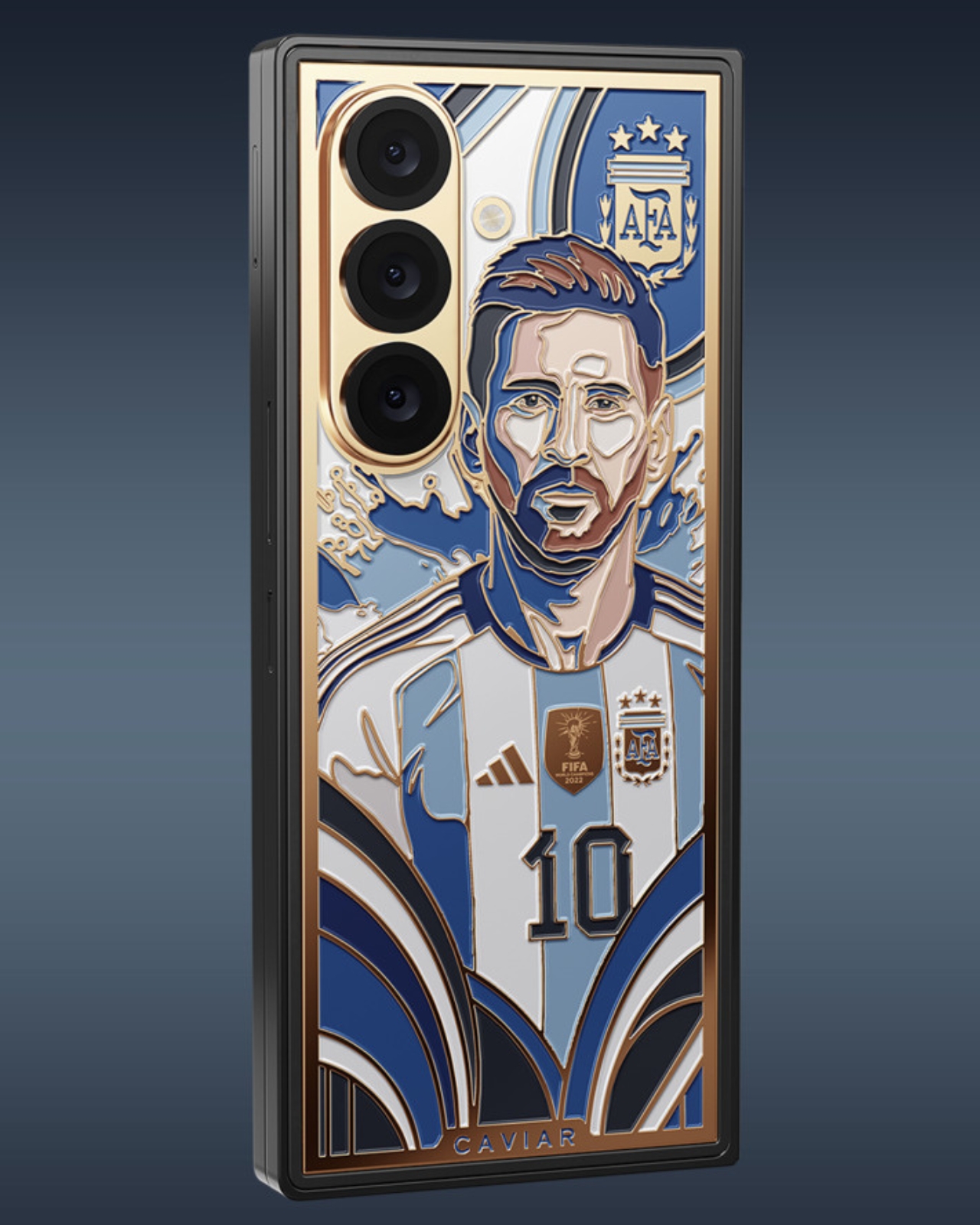
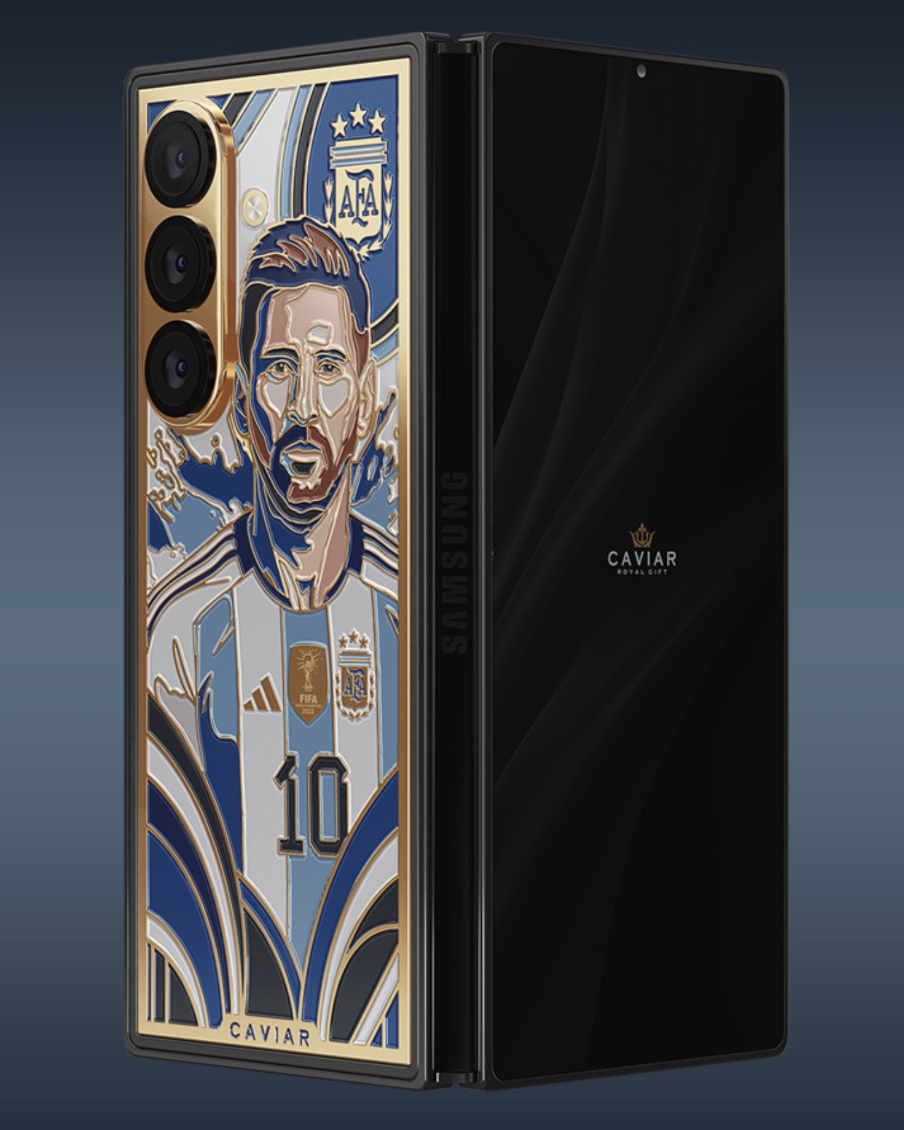
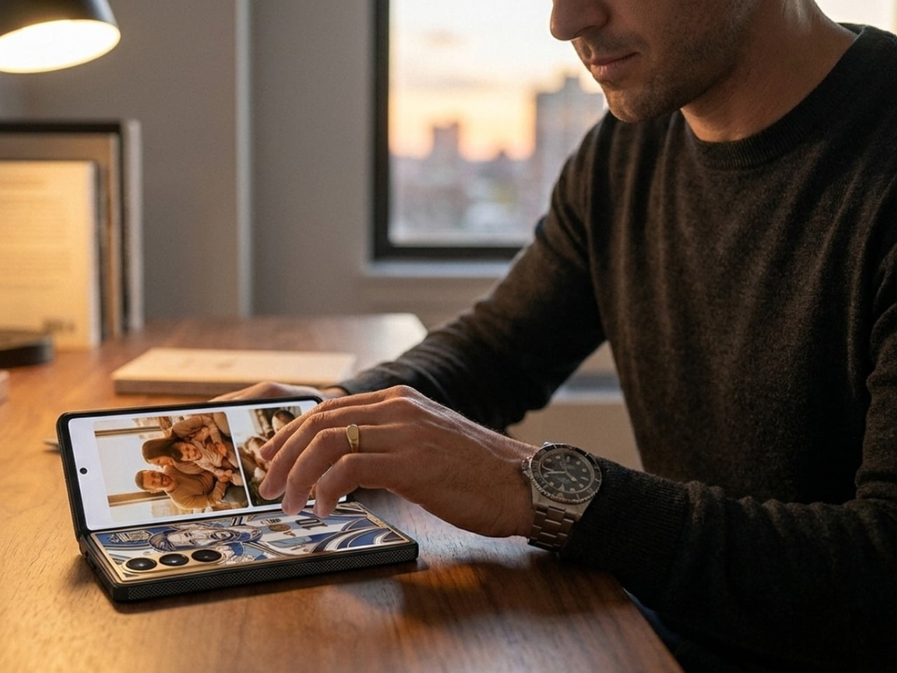
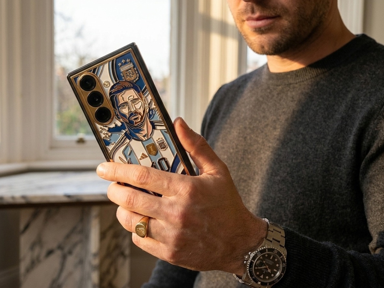
If you want to have something to keep your memories of Messi in an Argentina jersey alive and you have $13k lying around, this special edition Samsung Galaxy Z Fold 8 Ultra from Caviar is something for you. Aside from the exquisite design that comes with the phone, the device was listed and shown on the Caviar website nearly a week before Samsung officially unveiled their new device, so that means some of the features were “accidentally” leaked through the images on the product page.

Designer: Caviar

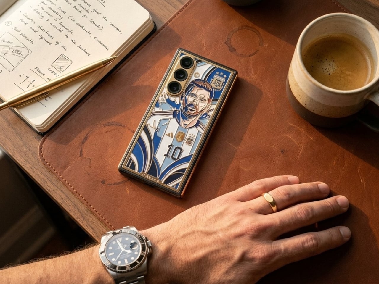
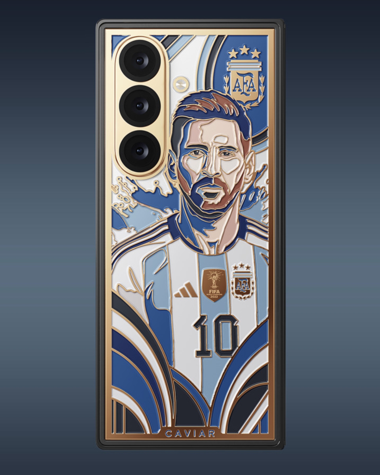
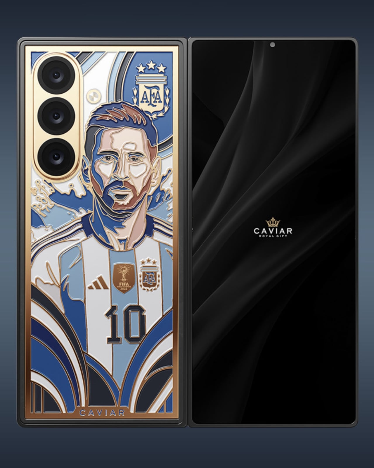
Leaks aside, if you’re a true football and Messi fan, you probably wouldn’t notice that, as you’ll be focused on how beautiful the luxury custom phone looks. Messi’s likeness in an Argentina jersey is handcrafted onto the phone using the intricate, centuries-old technique of cloisonné enamel, rendered in the traditional blue-and-white colors of the Albiceleste. Elements like the frame, key contours, Messi’s iconic number 10 jersey, national symbols, and framing details are highlighted with 24k gold.

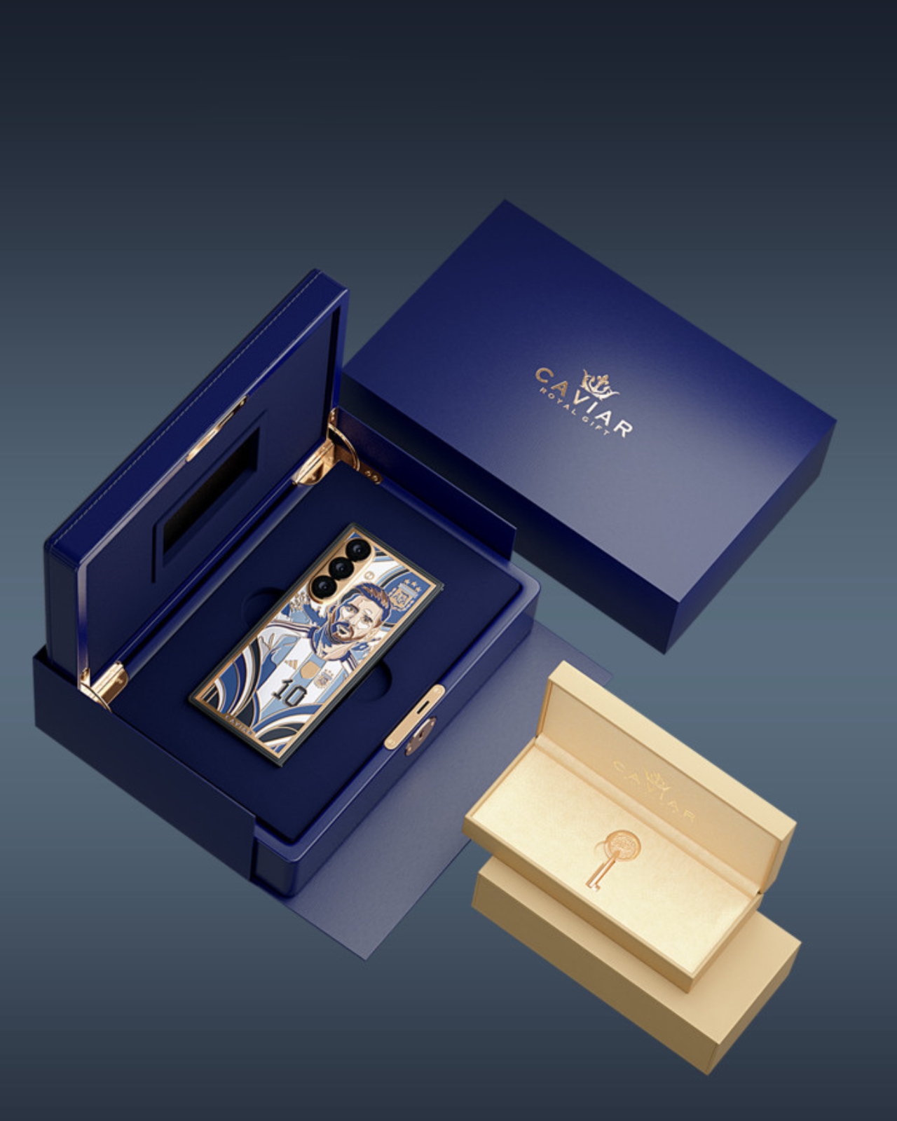
To make it even more official looking, you get official badges like the FIFA badge for Argentina’s 2022 World Cup-winning run, the Adidas logo, and the official national crest. It also comes with custom packaging, as it is encased in a royal blue custom box with 24-karat gold plating and a signature Caviar Key. Of course, with all these details, you can’t expect this to be cheap. The $13,130 price tag is 5x the expected price tag of the yet-to-be-officially-announced Galaxy Z Fold 8 Ultra. And even if you have $13k to spend, there will only be 19 pieces available, so you’ll have to be early to shell out that money.

What’s particularly impressive is that Caviar didn’t just slap Messi’s face on a phone and call it a day. The luxury atelier has built a reputation for transforming high-end devices into genuine works of art, and this piece is no exception. The cloisonné enamel technique used here is the same method found in fine jewelry and ancient decorative arts. It involves painstakingly separating colored enamels using thin metal wires before firing them at high temperatures. The result is a vivid, jewel-like finish that no digital print or laser engraving could ever replicate. Holding this phone feels less like holding a gadget and more like cradling a piece of history in the palm of your hand.

That sense of history is exactly what makes this edition so compelling. Messi’s journey with the Argentine national team has been nothing short of a rollercoaster, from heartbreaking World Cup final losses to the ultimate redemption in Qatar in 2022. Watching him grace the global stage one final time in 2026 was an emotional farewell that millions felt deeply. This phone captures that entire arc: the number 10, the Albiceleste colors, the World Cup crest, all immortalized in gold and enamel.

For collectors, the rarity factor alone is enough to justify the price. Only 19 units will ever be made, which means this phone will likely appreciate in value over time. Think of it less as buying a smartphone and more as acquiring a limited-edition sculpture that also happens to fold in half. And with storage options ranging from 256GB up to 1TB, the Samsung Z Fold 8 Ultra underneath the artistry is still a powerhouse device worth using, if you can bring yourself to take it out of the box.

Whether you’re a die-hard Messi fan, a tech enthusiast with a taste for the extraordinary, or a collector hunting for the next great statement piece, the Caviar Lionel Messi Samsung Z-Fold8 Ultra checks every box. It is, quite literally, 24-karat iconic.

The post This $13,130 Samsung Galaxy Z Fold 8 Ultra Has Messi in 24K Gold first appeared on Yanko Design.
A $299 Flip Phone That Does What Screen Time Apps Never Actually Did

Flip phones never really disappeared. They just got sidelined once smartphones made everything available in a single touchscreen slab. Now they’re back in two very different forms: the foldable flagship, where a large touchscreen folds in half and costs over a thousand dollars, and a growing category of deliberately simpler devices that use the clamshell form to keep things from spiraling into the same habits smartphones enabled.

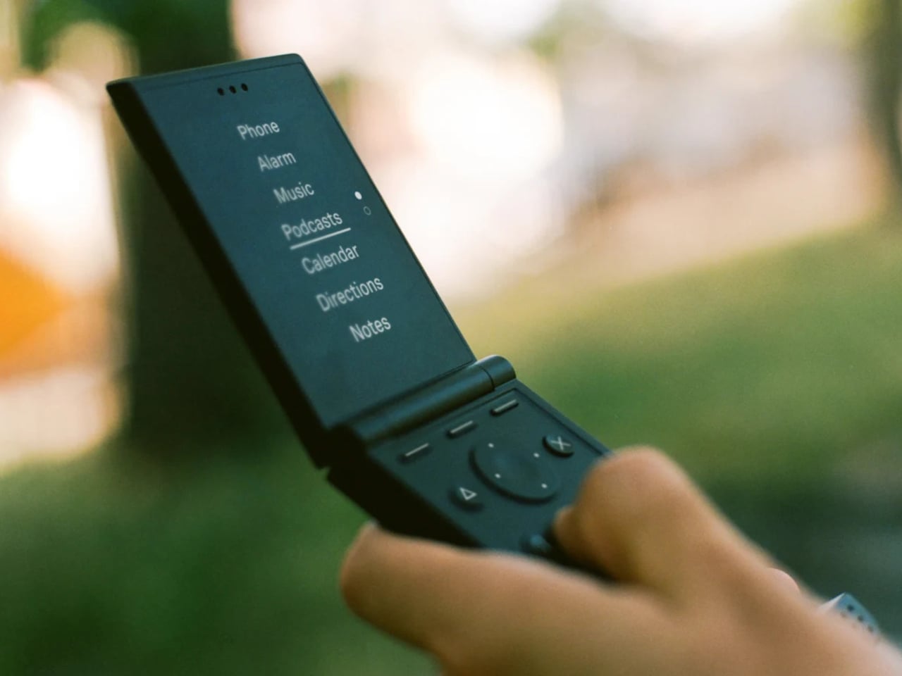
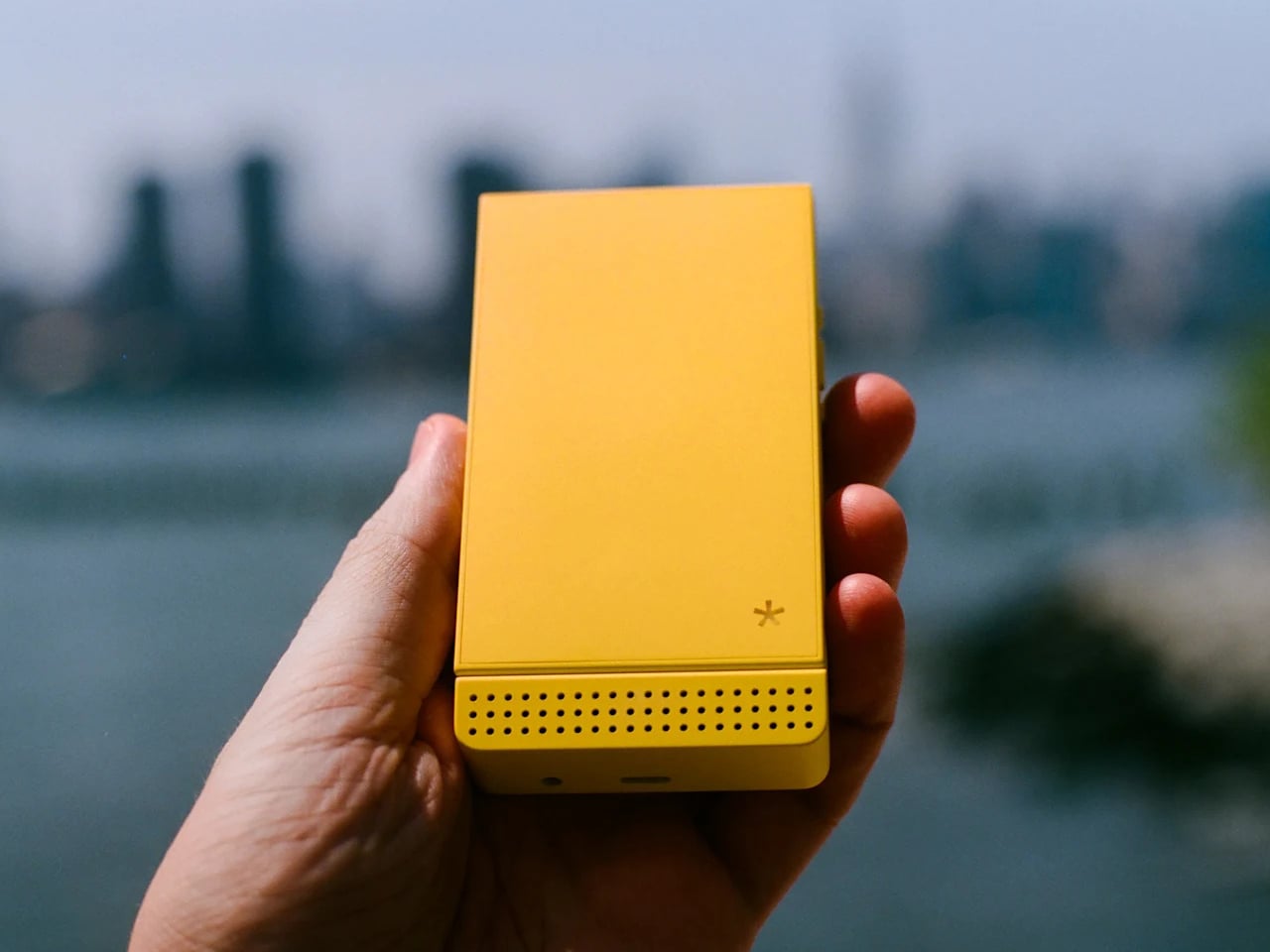
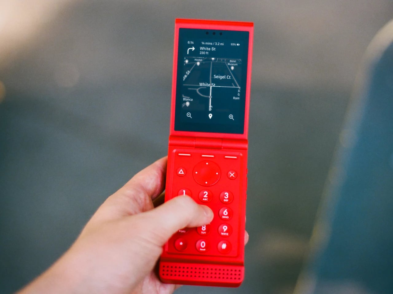
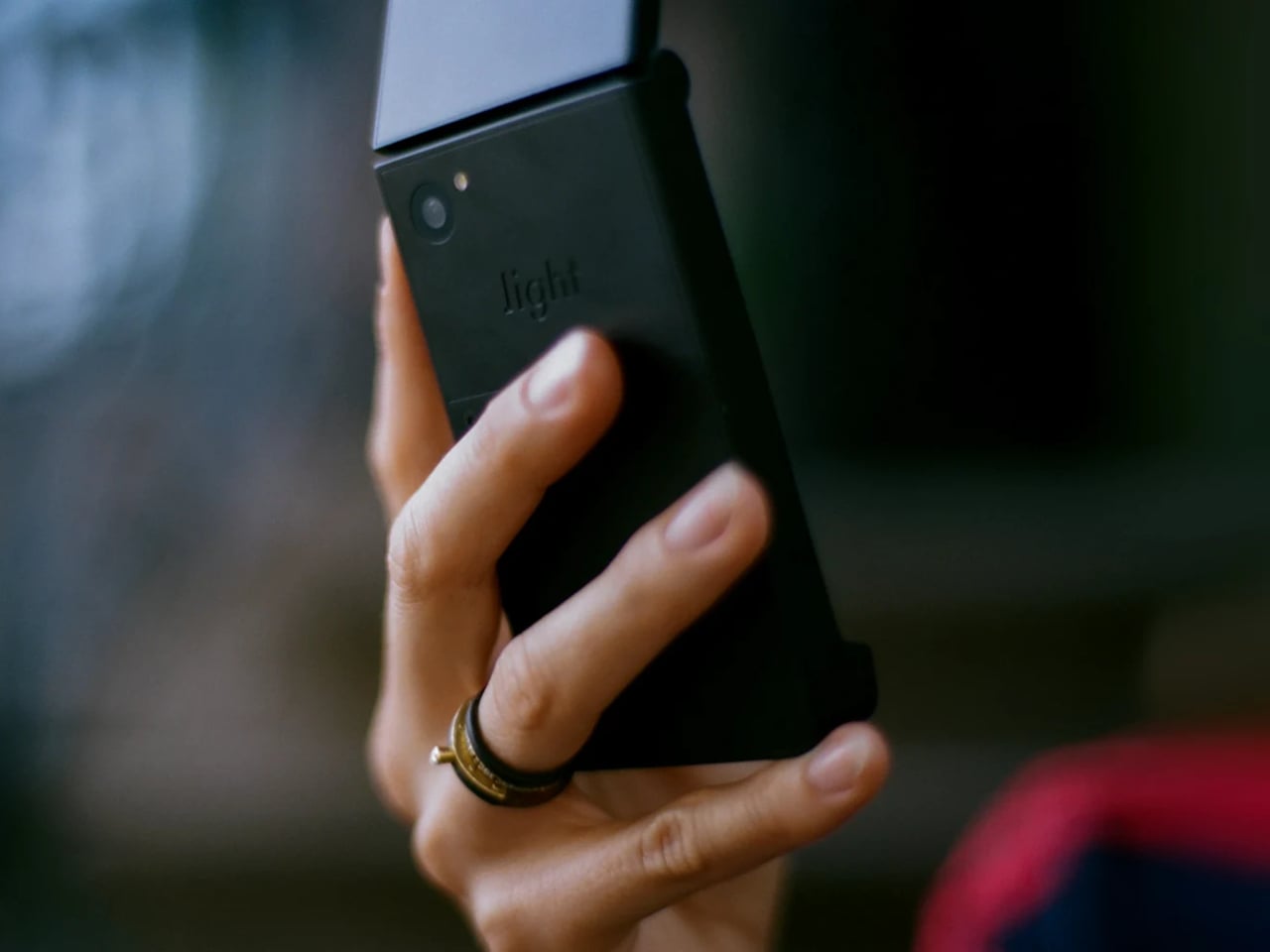
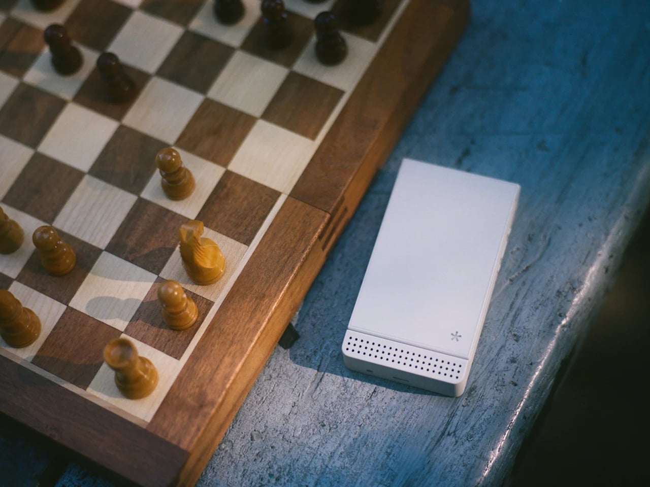
The Light Flip lands firmly in that second camp. It’s a 5G clamshell built around the same philosophy that has driven Light’s earlier devices, giving people the connectivity they need without the features that compete for attention. Fold it open, and you get a 2.8-inch matte OLED display and a physical keypad. Close it, and there’s no outer screen to glance at, no notification count, nothing pulling you back.

Designer: Light Phone

That absence of an outer display is a deliberate one. Most modern flip phones make the external screen a selling point, showing you messages and notifications without opening the phone. The Light Flip skips that entirely, which means the act of opening it is the only way in. It’s a small friction that turns out to make a meaningful difference in how often you reach for the phone by instinct rather than by intention.

Calls, texts, T9 predictive input, voice-to-text, and audio messaging cover the communication basics. Beyond that, LightOS includes a focused set of tools: directions, a music and podcast player, hotspot, calendar, weather, notes, a timer, and an authenticator for two-factor logins. The tools are genuinely useful and show up only when you need them. There’s no app store, no browser, and no social feeds anywhere in the operating system.

The hardware is honest about where the money went. The body is plastic, 160g, and uses a MediaTek MT8873 processor with 128 GB of storage and a 1,800 mAh battery that lands around 1.5 days. The camera uses a 50-megapixel rear sensor to produce 12-megapixel images. There’s no selfie camera, no NFC reader, and no touchscreen, which is how Light kept the price to $299. A 3.5mm headphone jack and a swappable battery are both present, which makes the trade-off feel more deliberate than arbitrary.

Connectivity covers Wi-Fi, Bluetooth 5.0, GPS, and 5G across a wide band range. The phone ships with a nano SIM slot and an eSIM option, and Light offers its own service plan at $39 a month for unlimited calls and texts with 1 GB of data, available in the US on a two-year contract. The unlocked version works on compatible carriers worldwide.

There’s a growing audience for devices that sit somewhere between a dumbphone and a smartphone. The Light Flip fills a specific niche with modern hardware and a considered software layer that adds without overwhelming. For anyone who’s tried screen time apps and focus modes on a smartphone and found them too easy to undo, a phone that simply doesn’t have those functions built in offers a different kind of answer to the same problem.

The post A $299 Flip Phone That Does What Screen Time Apps Never Actually Did first appeared on Yanko Design.
SAM Might Be the Most Human Thing Samsung Has Finally Built

Most conversations about aging and technology eventually circle back to the same frustrating gap: the tools we build for older people rarely feel like they were designed with older people in mind. They’re functional, clinical, and often carry the visual language of a hospital supply catalog. SAM, a concept robotic mobility aid designed by David Webber for Samsung, feels like a direct response to that problem, and it’s the kind of design thinking I genuinely want more of.

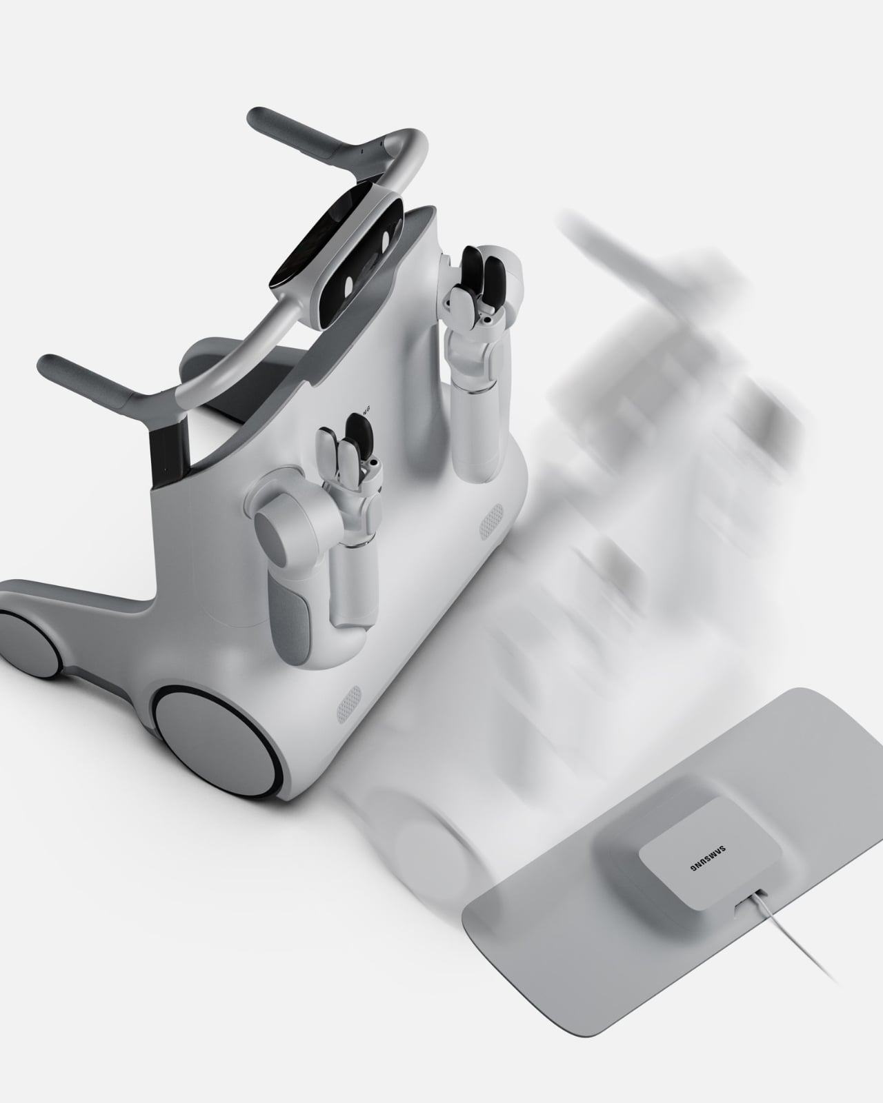
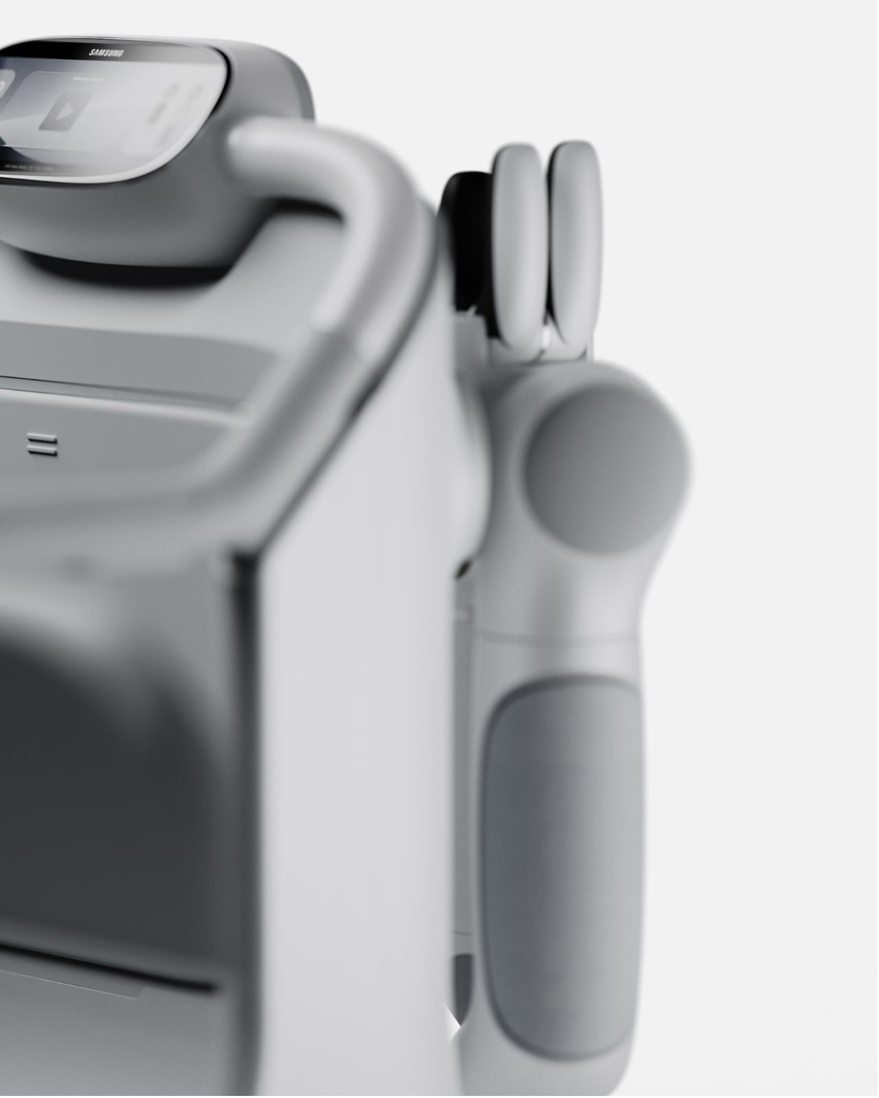
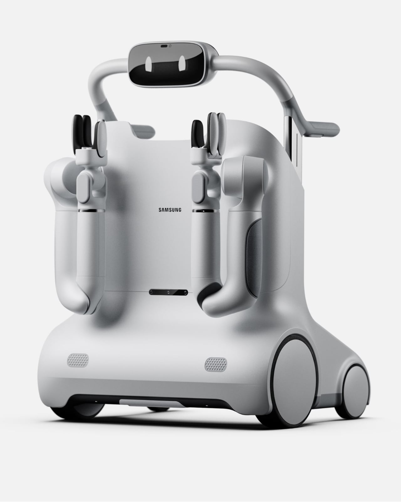
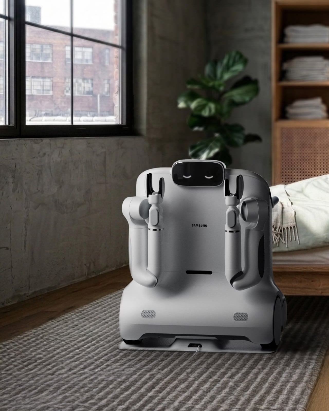
At first glance, SAM looks like it belongs on a near-future film set. The rounded, cloud-white body, the articulating arms, the small expressive face-like display on top. But spend a little more time with it and the aesthetics start to make sense in a very deliberate way. Webber didn’t want SAM to read as medical equipment. He wanted it to feel like a companion, something you’d actually invite into your home and not hide in a corner when company comes over.

Designer: David Webber for Samsung

What SAM does differently from most mobility aids is where the real story lives. A standard walker or rollator solves one problem: moving from point A to point B. SAM looks at the fuller picture of what daily independence actually requires. Picking up a dropped object from the floor. Carrying groceries from the door to the kitchen. Helping someone rise from a chair safely. These are the small, invisible tasks that quietly determine whether an older adult can continue living alone or not, and they are almost entirely absent from the current conversation around mobility technology.

The concept is built around the idea of physical AI, the notion that artificial intelligence should operate in the physical world in a way that supports human capability rather than overriding it. SAM doesn’t take over. It doesn’t assume. The user stays in control, and the technology fills in the gaps, which is a harder design problem than it sounds. Building something that assists without patronizing, that helps without making a person feel like they’ve surrendered something, requires a kind of empathy that most tech doesn’t bother with.

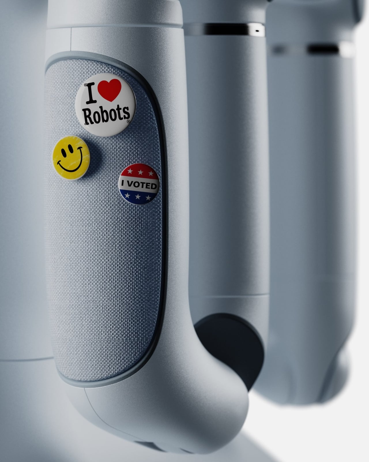
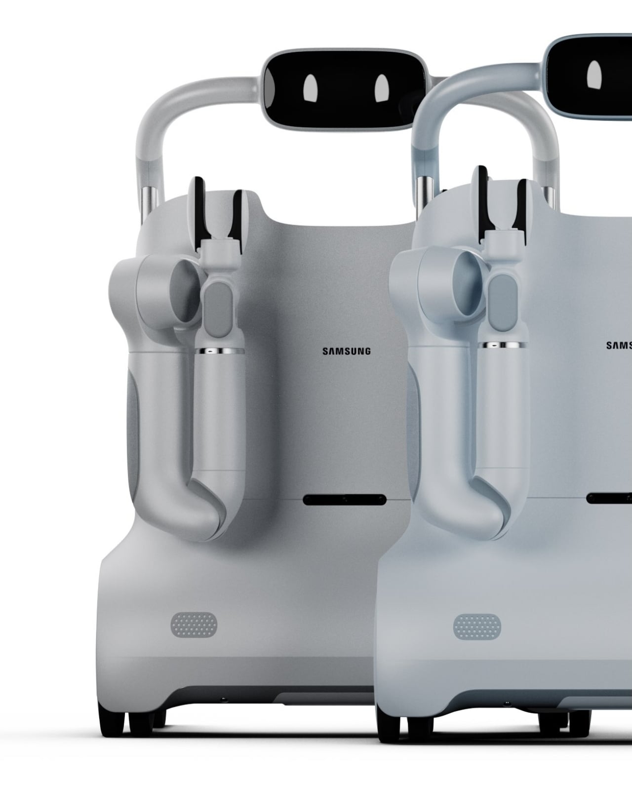
I’ll be direct: the design of SAM is one of the more thoughtful things I’ve seen come out of a Samsung concept in a while. The color options, soft greys and muted sage greens, feel intentional. They’re domestic. They say “living room” rather than “rehab facility,” and that distinction matters enormously for user dignity and adoption. Nobody wants to use a tool that announces their limitations to every visitor who walks through the door. SAM seems to understand that.

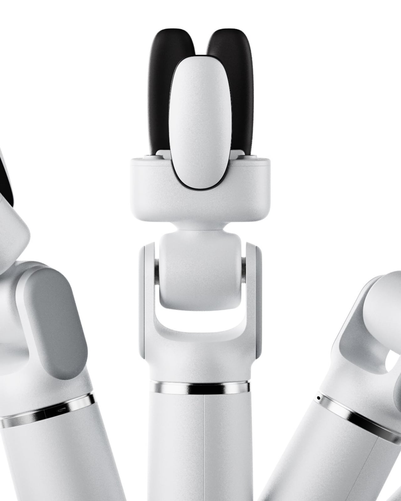
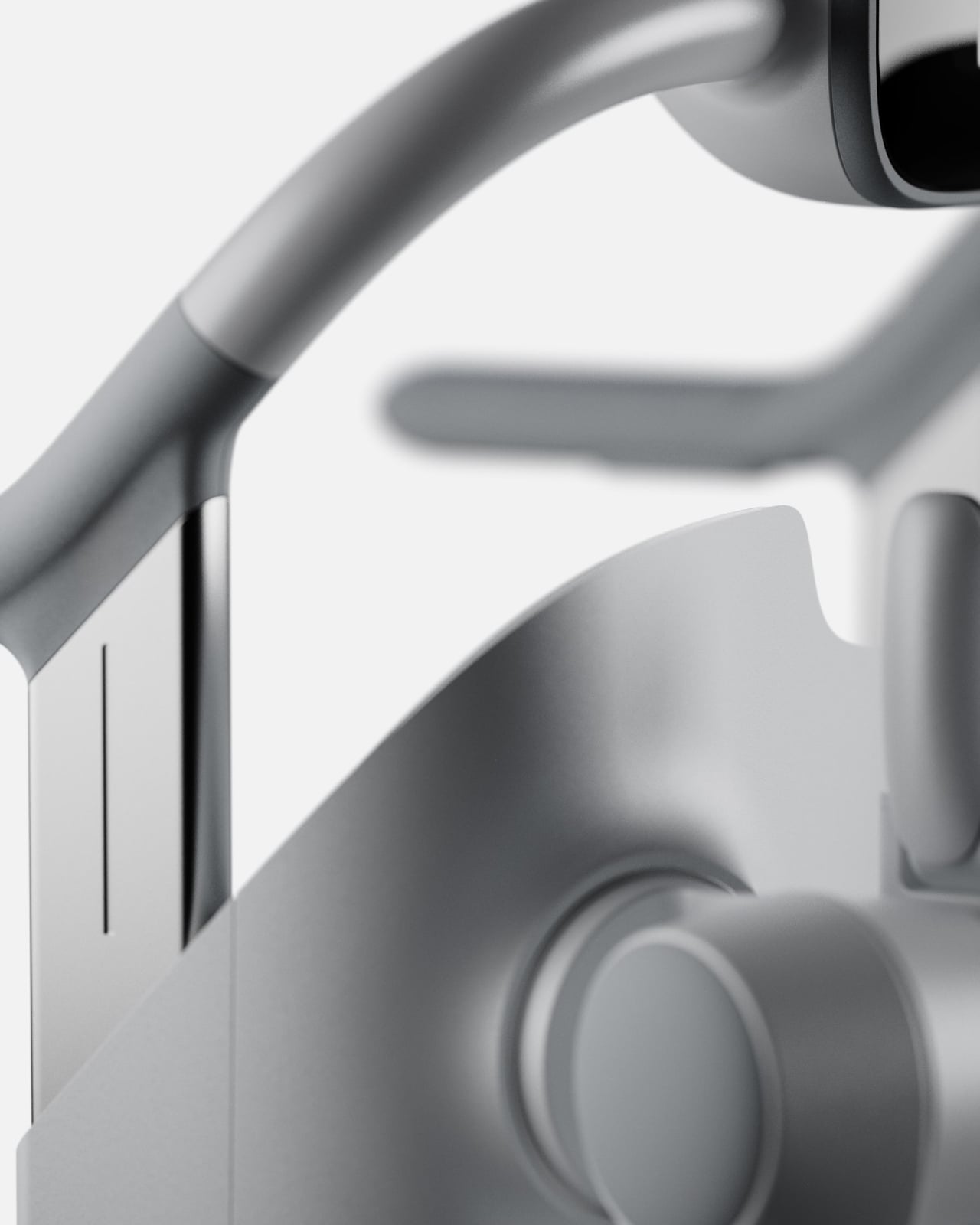
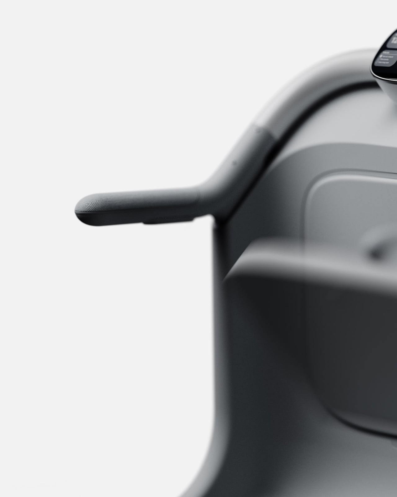
The arms and end-effectors are worth a close look too. The gripper design is specific enough to handle real objects but rounded and soft-looking enough not to feel threatening. The integrated display sits at a natural eye level when someone stands and grips the handles, showing simple information like time, a to-do list, and device status. It’s thoughtful UX layered into an already thoughtful form.

Is SAM a product you can buy right now? No. It’s a concept, a vision piece, and it should be taken as one. But the best concept designs do something important: they shift where the conversation is pointed. Right now, too much of the assistive tech space is focused on reactive solutions, devices that help after a fall, after a diagnosis, after independence has already started to erode. SAM is proposing something more proactive. It’s asking what support looks like before the crisis, and that’s a question the industry desperately needs to sit with.

What I hope designers, healthcare companies, and tech brands take from SAM is not the specific form but the underlying philosophy. That independence isn’t just about mobility. That dignity is a design requirement, not a bonus feature. That the people who need the most thoughtful design often receive the least considered version of it. If SAM pushes even one conversation in that direction, David Webber has done something genuinely worth paying attention to.

The post SAM Might Be the Most Human Thing Samsung Has Finally Built first appeared on Yanko Design.