7-in-1 Titanium Ruler That Draws Perfect Circles, Measures Angles, and Works as a Caliper. Yes, Really.

EDC and stationery have been moving closer together for years. Pens became precision objects. Rulers became desk jewelry. Pocket tools started borrowing the language of industrial design, while analog work tools picked up the portability and finish standards of everyday carry. Somewhere in that overlap, products began chasing a sharper balance between usefulness and desire.

UnioArc feels tailored for that exact overlap. It carries the visual language of titanium EDC, but its purpose lives firmly in the world of measurement, drawing, and layout. That combination gives it an immediate hook. It speaks to the person who keeps a notebook close, notices edge quality, values compact gear, and wants a tool that can move from workbench to sketchbook to shirt pocket without feeling out of place.

Designer: TiBang

Click Here to Buy Now: $55 $95 (42% off). Hurry, only a few left! Raised over $85,000.

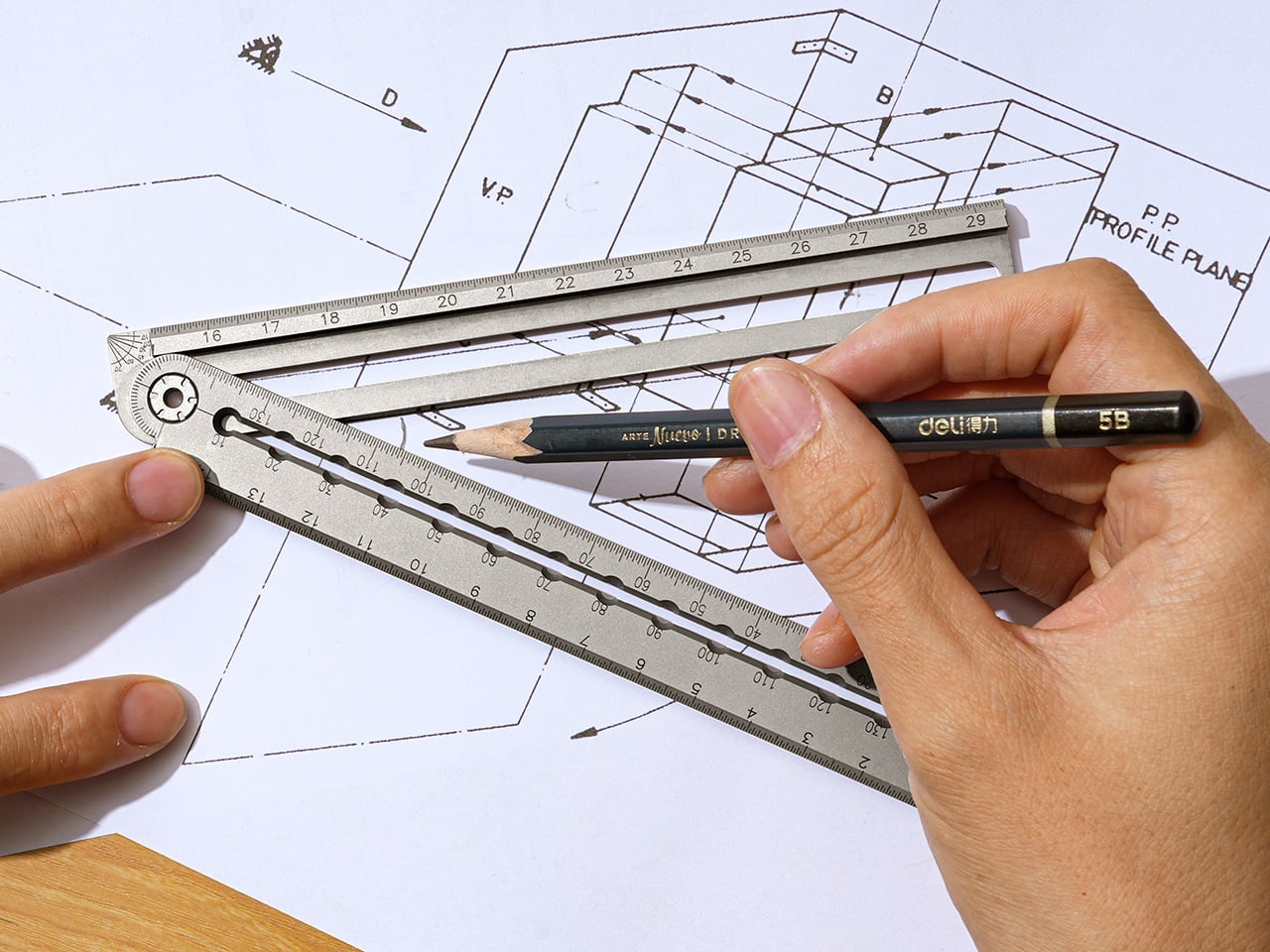
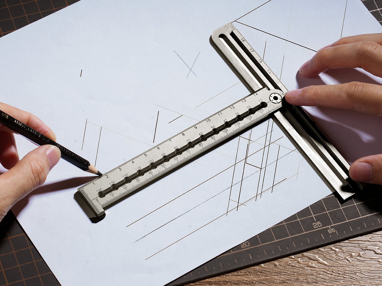
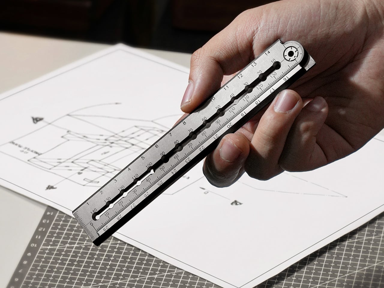
Seven measurement and drawing functions collapse into a single folding titanium ruler. Closed, it measures 145mm, roughly smartphone length. One motion releases the magnetic lock, the sleeve joint clicks straight, and it extends to 295mm for full A4 coverage. No sliding mechanisms. No multi-step deployment. The transformation happens edge to edge, from zero to full length in a single click. Three scales cover metric, imperial, and a dedicated millimeter track. All markings are laser-engraved into the titanium surface, which means they will never fade, peel, or rub off. The zero point starts right at the tip, eliminating offset math when measuring depth or inserting the edge into tight spaces.

A 0.5mm recessed groove runs along the bottom edge. It catches a pen tip, holds it stable, and lets you mark immediately after measuring. That same groove improves grip when you’re holding the ruler at an angle or cutting against it. The flat middle edge guides craft knife blades flush against the surface for clean cuts without wobble. The top edge carries a 25-degree bevel to reduce glare and improve readability under direct light. Three edge profiles, three distinct jobs, one continuous form. This kind of multi-layer thinking shows up throughout the design, where individual features earn their place by doing multiple things well instead of one thing adequately.

Precision compass holes span 140mm in 10mm increments. Insert one pen through a hole near the pivot (the sleeve joint), insert another at the desired radius, and draw smooth circles from 10mm to 140mm diameter. No center puncture. No damaged paper or leather. Swap the stylus pen for a craft knife and you can cut perfect circles in paper, thin materials, or vinyl without leaving a center mark. For woodworkers and leather crafters, this solves a persistent workflow annoyance. A full 180-degree protractor sits engraved at 5-degree increments. Need to mark 35 degrees? 55 degrees? Read it directly, no interpolation required. A 90-degree quick-check corner handles faster right-angle verification. A small arrow indicator simplifies complementary angle reading: subtract the arrow-aligned angle from 180 degrees and you have the answer without rotating the tool or doing mental math.

Fold the ruler to 90 degrees, align the reference line with your scale, and set any spacing you want for parallel lines. The arms lock into a true right angle with no wobble or drift as you move across the page. For architectural sketches, textile patterns, or technical drawings, this turns a multi-tool task into a single-ruler operation. The locking mechanism holds firm enough for consistent spacing across long runs. The same two arms that handle linear measurement also slide apart while staying parallel, clamping around boards, straps, or stock to give direct thickness readings. It functions like a simplified caliper without requiring a separate tool. In workshops or on job sites where you need quick material checks, this compresses another measurement step into the same instrument you’re already holding.

No screws hold the sleeve joint together. No washers. Nothing to tighten or maintain. Resistance comes from precision fit between machined titanium surfaces. The two arms slide into each other and lock at 180 degrees with zero gap, zero step, zero play. That interlocking geometry prevents the common folding ruler problem where pen tips drop into gaps or lines skip at the hinge. The transition from one arm to the next reads as seamless. This is critical because any interruption in the edge breaks the flow when you’re drawing continuous lines or cutting long paths. TiBang solved it by making the joint itself part of the measurement surface instead of treating it as a hinge that happens to sit between two rulers.

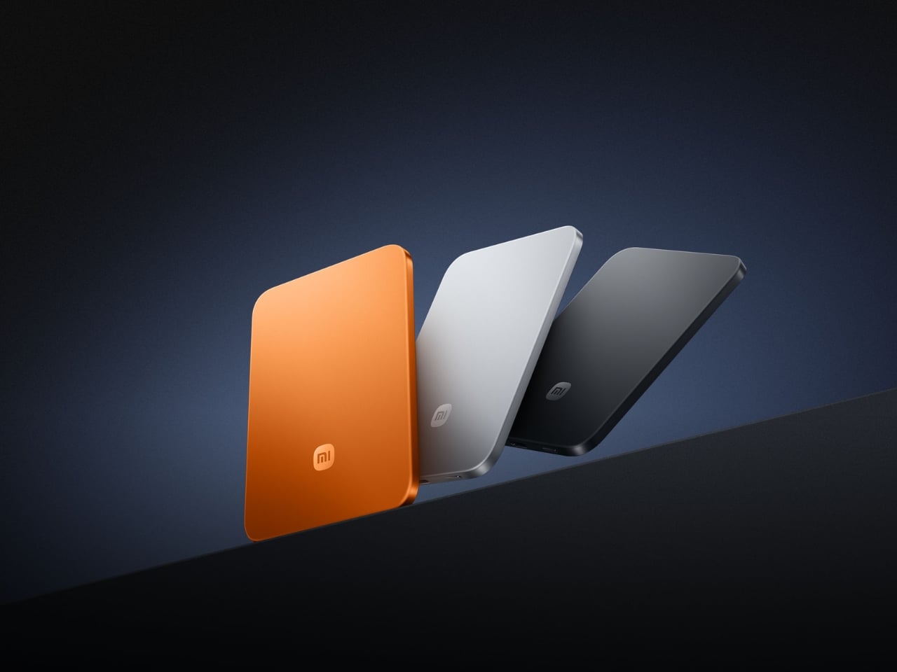
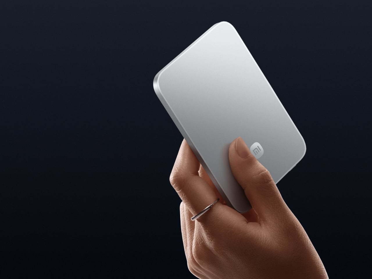
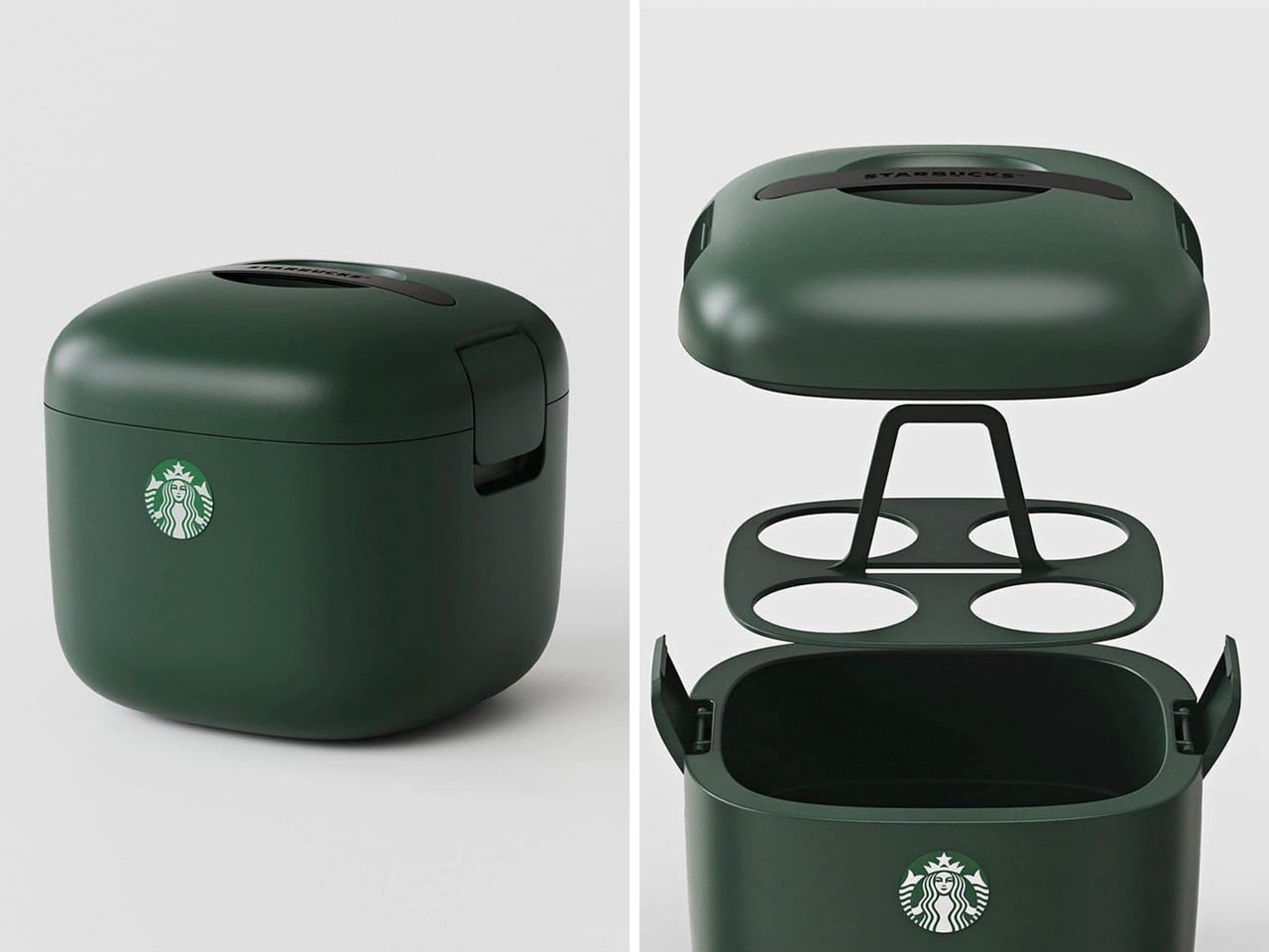
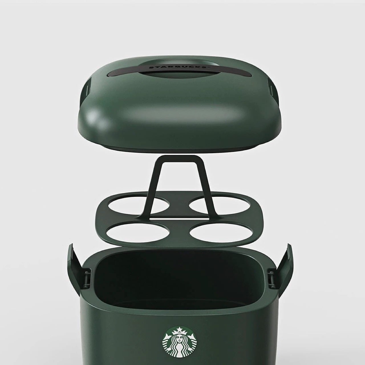
Grade 5 Titanium throughout, CNC-machined from solid stock rather than stamped or cast. That process ensures consistent dimensional accuracy across every unit and allows for fine detail work in the compass holes, protractor markings, and edge profiles. Sandblasted titanium gives a raw, matte appearance that develops micro-patina over time. PVD Black applies a deep black coating with increased surface hardness for a technical, permanent look. Both finishes share identical machining tolerances and functional geometry. Weight sits at 66.5 grams, just over two ounces. Light enough to carry all day without noticing, heavy enough to feel substantial when you pick it up. The 5mm thickness keeps it shirt-pocket slim, fits inside notebook sleeves, slides into small tool rolls. Fold it shut and magnets snap the arms together with a tactile click. No rubber bands. No retention clips. It stays closed in your pocket and opens when you want it to.

Architects, product designers, woodworkers, leather crafters, engineers, and EDC enthusiasts will recognize the workflow this tool targets. Anyone who moves between sketching, prototyping, and layout work carries some version of this measurement kit already. UnioArc compresses that kit into a single pocketable object, which is exactly the kind of consolidation that makes sense for people who work across locations or keep minimal setups. TiBang has two previous Kickstarter campaigns behind them, both shipped with 100% fulfillment and zero missed deliveries. Mass production and backer surveys are scheduled for May and June 2026, with quality inspection and packaging slated for July and August 2026. The timeline accounts for buffer periods around international shipping and customs clearance, which suggests they’ve learned from previous campaigns how to build realistic delivery windows.

Close-up of a hand using a metal scale ruler over architectural sketches on a drafting mat.

UnioArc is live on Kickstarter with a Launch Day pricing of approximately $55 USD (42% off MSRP of $95) and Super Early Bird pricing climbing to $60. The ruler works standalone, but optional add-ons include a leather sheath in two colors for $12, a PVD Black finish upgrade for $15, and a Pocket Titanium Everlasting Mini Pen for $9. Shipping begins in July and August 2026 following quality inspection. All reward tiers include free worldwide shipping with no additional fees. TiBang manufactures, ships globally, and communicates throughout the process.

Click Here to Buy Now: $55 $95 (42% off). Hurry, only a few left! Raised over $85,000.

The post 7-in-1 Titanium Ruler That Draws Perfect Circles, Measures Angles, and Works as a Caliper. Yes, Really. first appeared on Yanko Design.

DIY Raspberry Pi Camera Turns Your Photos into Glitch Art, and the Results Are Incredible

You currently have two options if you want to apply effects and filters to your photos: use an app that will inevitably harvest your data for training their AI model (we’re watching you, Instagram), or actually edit your photos manually, which requires time, software subscriptions, and the patience of a saint. Reddit user sharkbiscuit101 unlocked a third option, and it involves a Raspberry Pi 4, a rotary encoder, a gamepad, and a frankly unreasonable amount of ingenuity. The build produces glitch photography on the pixel level, in real time, through a custom script running entirely offline on hardware you can source yourself. No cloud upload, no terms of service, and crucially, no algorithm deciding what your creative output should look like. This is your camera, running your parameters, answering to nobody.

The camera itself works exactly how you’d want a dedicated glitch tool to work. Hit the shutter button, but before you do, twist the rotary dial to control how aggressively the Pi’s script mangles the RGB channels of whatever you’re pointing at. The result lands somewhere between a corrupted memory card and a fever dream, and the specific character of the glitch is entirely yours to tune through on-screen sliders before you commit to a shot. A small preview screen shows you the live feed so you can watch the image fall apart in real time, which is exactly as satisfying as it sounds. The rotary encoder also handles preset saves, so when you find a combination of settings that produces something genuinely beautiful and broken, you can lock it in and recall it later.

Designer: sharkbiscuit101

The physical design is wonderfully unashamed about what it is. A transparent acrylic chassis sandwich holds the Pi 4 and an Arducam module at the center, with a small HDMI screen on the front face showing the preview, and a Adafruit gamepad breakout board mounted beside it for navigation. A Sharge battery pack, the rectangular kind you’d find at Amazon, clamps to the side and handles power duties. Since the Pi 4 has no dedicated power button, the battery’s own switch becomes the on-off toggle, which is one of those practical workarounds that somehow feels more elegant than a purpose-built solution. Brass standoffs hold the whole sandwich together, giving the build a satisfying mechanical solidity that belies its component-bin origins.

Sharkbiscuit101 hasn’t released the script or component list publicly yet, though the Reddit thread is essentially one long, enthusiastic demand that they do exactly that. The sample images they’ve posted, saturated cascades of cyan and red over a person’s silhouette, a park scene dissolved into chromatic noise, a building rendered in kaleidoscopic symmetry, make a compelling case for why people want to replicate this. When the files do drop, expect a flood of variations, because this is precisely the kind of open-ended hardware that the maker community will run with in seventeen different directions simultaneously.

The post DIY Raspberry Pi Camera Turns Your Photos into Glitch Art, and the Results Are Incredible first appeared on Yanko Design.

The LUMO Grill Cooks With Light, Heats in Seconds, and Brings Charcoal Flavor Without the Smoke

The George Foreman Grill sold more than a hundred million units, which tells you everything about how badly people want to cook without the setup, the smoke, and the outdoor requirement. What that number fails to explain is why, after thirty years of competing products, the fundamental problem remains unsolved. Every electric contact grill since 1994 has operated on the same basic principle: a hot plate pressing food against another hot plate, dripping grease onto a heating element, producing varying degrees of smoke and varying degrees of disappointment. The category has iterated endlessly on that geometry, adding digital timers and non-stick coatings and fold-flat designs, without ever questioning the physics underneath. Hong Kong startup COZYTIME is questioning them with the LUMO, a grill that cooks with focused far-infrared light instead of contact heat, and the approach changes the smoke problem by addressing it at the source.

Four precision reflectors focus infrared energy at food from multiple angles simultaneously, creating 360-degree heat coverage that cooks evenly from edge to center while retaining moisture, unlike hot-air convection heating, which dehydrates food. The side-mounted heating elements keep grease physically separated from any heat source, so drippings fall into a grease tray rather than the heating tube, preventing smoke from forming at the source. No filters, no fans, no workarounds. An AI system called CookPilot uses AI Vision and two built-in sensors to automatically detect food type, thickness, surface area, temperature, and weight, then selects the ideal cooking program from a library covering over 40 food types. A swappable Flavor Module lets you add authentic smoked taste to any cook by loading pellet fuels into the module, inserting it into the LUMO, and switching to Indoor Smoker Mode, where the enclosed chamber traps and circulates smoke around the food while a tight seal keeps the home clean. COZYTIME is pricing the LUMO at $329, against a retail price of $499. This pricing is exclusively available to crowdfunding backers, and the campaign will end on May 23! If you’re interested in LUMO, pledge now before it’s gone!

Designer: COZYTIME

Click Here to Buy Now: $329 $499 (34% off). Hurry, only 159/500 left! Raised over $344,000.

We covered LUMO hands-on at CES 2026 and came away calling it “genuinely novel in a category that’s seen mostly incremental tweaks for decades.” Far-infrared radiation transfers energy directly into food molecules rather than heating surrounding air first, which is how the LUMO reaches cooking temperature in a fraction of a second, using four precision reflectors to deliver full surround heating from multiple angles, cooking up to 4x faster than traditional appliances, without long preheat times or outdoor setups. Traditional contact grills heat the plate and then conduct that energy into the protein surface, a fundamentally different thermal pathway that drives more moisture out of food in the process. COZYTIME claims the infrared approach locks in 76.6 percent of natural food juices compared to conventional methods, a figure that, if it holds in real kitchen conditions, represents an actual cooking outcome improvement rather than a specification exercise. The four-reflector geometry is the physical enabler: each reflector focuses infrared energy at the food surface from a distinct angle, eliminating cold zones and removing any need to flip.

The unit handles thick steaks, skewers, quick snacks, large dinners, and even pizza, thanks to its TriForma StateShift System that allows for three different grill modes. In Indoor Smoker Mode, enclosed heating circulates warmth evenly to a maximum of 230°C (446°F), mimicking a full oven capable of pizza, casseroles, and slow-roasted steaks, and pairs with the Flavor Module for authentic smoked dishes like tender beef brisket. Fast Grill Mode hits a maximum of 270°C (518°F), where the semi-open lid concentrates heat for rapid grilling and juice-locking, delivering steakhouse-quality flavor in minutes, ideal for weeknight meals when time is short but standards aren’t. Flat Grill Mode opens to 180 degrees, creating two independent heating zones, so you can grill steaks on one side at high heat while roasting vegetables on the other, with no batch cooking and no waiting, which makes it particularly suited to dinner parties. Two heat zones running independently in a single countertop footprint is the kind of practical design decision that sounds obvious in retrospect but rarely makes it into a consumer appliance.

LUMO’s most compelling trick may be how seriously it treats flavor, because this is one of the more thoughtful attempts yet at bringing authentic charcoal-style cooking indoors. Plenty of indoor grills promise grill marks, very few deal convincingly with the taste itself. COZYTIME approaches that problem with a dedicated Flavor Module that burns pellets inside the unit’s enclosed chamber, allowing smoke to circulate around the food while the side-heat architecture keeps grease from hitting the heating elements and creating unwanted kitchen smoke. That separation is what makes the idea work. You get the smoky, grilled character people actually associate with charcoal cooking, without turning the room into part of the process. With the Flavor Module attached, the Heat Slider heats wood pellets to release rich smoky flavor during cooking, and when slid out with the griddle plate, it doubles as a high-heat searing surface for deep browning, crisp crusts, and smaller tasks like melting cheese or simmering sauces. LUMO also uses AI Vision to recognize different meats and automatically adjust heat and cooking time to match preferred doneness, from blue rare to well-done. Food-contact surfaces are made exclusively of premium food-grade stainless steel.

The LUMO app adds a layer of control that makes the grill feel more like a connected cooking platform than a standalone appliance. It offers three recipe paths, including curated official recipes from a cloud library, fully custom recipes with adjustable time and temperature for each step, and one-click AI-generated recipes created by CookPilot, with any recipe shareable through a code or posted to the LUMO community. From the app, users can track cooking progress and food status in real time, adjust temperature and timing remotely, and get notified when food is ready. That flexibility extends to the accessory ecosystem too. COZYTIME currently offers nine add-ons in total, including six cooking accessories and three additional accessories designed to broaden what the LUMO can do day to day. On the cooking side, there’s a wireless meat thermometer for real-time core temperature tracking, flavorwood pellets for smoke infusion through the Flavor Module, an extra stainless grill grate for back-to-back cooking, a fine mesh grill grate for smaller foods like shrimp and asparagus, and a Heat Slider griddle plate for intense high-heat searing up to 450°C.

Outside the cooking accessories, COZYTIME also offers a travel bag for transport and storage, plus extended coverage options for added peace of mind. Cleanup remains refreshingly low-friction, with food only touching stainless grill grates and grease trays that lift out for a quick wipe or rinse, while detachable parts are dishwasher-safe and the side-heat architecture keeps grease away from chamber walls, minimizing residue elsewhere in the unit. At 14.3 pounds, the LUMO is still portable enough to move between kitchen counter, balcony, and dining table without feeling like a project.

Retail pricing sits at $499, with the current order price at $329 – that’s a 34% reduction off the MSRP.Every unit ships with the LUMO itself with built-in Heat Slider, a region-appropriate power cord, a user manual, two stainless steel grill grates, the Flavor Module, two detachable grease trays, and a grill grate lifter. Shipping is free across the United States (excluding PR, HI, and AK), Canada, Mexico, Singapore, South Korea, Japan, Hong Kong, Australia, New Zealand, and most of Europe starting July 2026.

Click Here to Buy Now: $329 $499 (34% off). Hurry, only 159/500 left! Raised over $344,000.

The post The LUMO Grill Cooks With Light, Heats in Seconds, and Brings Charcoal Flavor Without the Smoke first appeared on Yanko Design.

Art Deco Furniture Is Back – and Salone 2026 Made It Official

Image credit: Armani Casa

After years dominated by pale oak, soft minimalism, and rounded silhouettes, Salone del Mobile 2026 signaled a clear shift toward richer and more expressive interiors. Held at Milan’s Rho Fiera fairgrounds from April 21 to April 26, 2026, the exhibition integrated Art Deco-inspired details such as chevrons, polished brass, chrome finishes, fan-shaped arches, and jewel-toned velvet upholstery, bringing glamour and structure back into contemporary furniture design.

Across Milan Design Week 2026, designers moved toward layered materials, geometric forms, and statement-making interiors. Instead of feeling nostalgic, the aesthetic appeared refined and updated for modern living. The resurgence also aligns with broader trend forecasts. Pinterest Predicts 2026 identified neo deco as one of the year’s defining interior styles, which is a cleaner, moodier reinterpretation of 1920s luxury.

Throughout Salone del Mobile 2026, recurring Deco-inspired forms and materials across installations and showroom launches pointed to a wider and more intentional design shift, reinforcing the growing influence of Art Deco furniture 2026 trends.

This shift is best understood by tracing how Neo Deco diverges from its historical origin.

What Is the Difference Between Original Art Deco and Neo Deco?

While both styles celebrate glamor and craftsmanship, Neo Deco reinterprets classic Art Deco for a more modern and livable aesthetic.

Characteristics of Original Art Deco

  • Strong geometric symmetry
  • Chevron patterns and fan-shaped arches
  • Heavy ornamentation and layered detailing
  • Glossy lacquer, marble, and polished brass
  • Bold jewel tones and dramatic interiors
  • Structured and formal furniture silhouettes

Characteristics of Neo Deco

  • Softer and more sculptural forms
  • Cleaner layouts with less visual excess
  • Refined brass and chrome accents
  • Selective use of velvet, marble, and glossy finishes
  • Open and contemporary interiors
  • Balanced mix of luxury and minimalism

Seen throughout Salone del Mobile 2026, neo deco keeps the elegance of classic Art Deco furniture but simplifies it for contemporary living. Additionally, Neo Deco keeps the glamour of classic Art Deco furniture while adapting it to modern interiors that prioritize comfort, simplicity, and sculptural design. This theoretical shift becomes most visible when translated into contemporary objects and reissued icons. Take a look at our pick of the top 7 Neo Deco pieces from Salone del Mobile Milan Design Week 2026.

1. Borgonuovo’s games table by Armani Casa

Image credit: Armani Casa

Image credit: Armani Casa

The Borgonuovo’s games table blends understated luxury with meticulous craftsmanship through a refined neo-deco design language. Crafted from ebony wood and topped with taupe leather, the piece conceals a rotating chess-and-checkers surface in ebony and maple wood. Satin-finished brass accents, sculptural triangular legs, discreet pull-out cup holders, and hidden storage drawers introduce geometric elegance and multifunctional sophistication without overwhelming the design.

Image credit: Armani Casa

Named after the Milan street once home to Giorgio Armani, the table reflects the restrained yet luxurious aesthetic of Armani Casa. Its clean forms and rich material palette also reference the timeless influence of Jean-Michel Frank, whose minimalist approach to luxury continues to shape the brand’s furniture and interior collections.

2. Delfi Madia Cabinet by Promemoria

Image Credit: Promemoria

Image Credit: Promemoria

The Delfi Madia Cabinet by Promemoria expresses a refined neo deco aesthetic through its architectural proportions, geometric detailing and restrained use of ornamentation. Unlike traditional Art Deco, which often emphasized dramatic symmetry and lavish decoration, this contemporary interpretation feels quieter and more sculptural. Defined by a solid wood frame and a recessed central groove that creates a strong vertical axis, the cabinet balances precision with softness, while subtle perimeter lighting enhances its sculptural presence with a warm ambient glow.

Image Credit: Promemoria

Image Credit: Promemoria

The cabinet doors become the focal point of the design, featuring layered wood veneers and repetitive patterns in varying tones that create a delicate three-dimensional effect. This interplay of geometry, texture, and craftsmanship recalls classic Deco influences but reworks them in a cleaner and more contemporary way. Functional yet expressive, the piece can shift from kitchen storage to an intimate bar setting.

3. ‘Pigreco’ Chair by Tobia Scarpa, Reissued by Tacchini

Image credit: Tacchini

Image credit: Tacchini

Image credit: Tacchini

The ‘Pigreco’ chair by Tobia Scarpa for Tacchini reinterprets neo deco through a refined balance of gloss, geometry, and sculptural elegance. Echoing the glamour of classic Art Deco furniture, the design pairs soft upholstery with lacquered structural elements that wrap around the chair like a polished architectural frame.

Image credit: Tacchini

Image credit: Tacchini

The reflective surfaces introduce depth and luminosity, transforming lacquer from a simple finish into a defining visual feature. Instead of embracing the excess of traditional Deco interiors, Pigreco adopts a more restrained and contemporary approach. Its silhouette moves fluidly between curves and sharp lines, while the careful balance of solids and voids gives the chair a sense of rhythm and precision.

4. The Elie Saab x Impatia Pool Table

Image Credit: Elie Saab

Image Credit: Elie Saab

Image Credit: Elie Saab

The billiards table by Elie Saab in collaboration with Impatia transforms a traditional game table into a striking expression of neo-deco design. This functional furniture piece interprets the Neo Deco style through sculptural geometry, luxurious materials, and refined detailing. Transparent glass elements lighten the structure visually, while a concealed slate core preserves performance.

Image Credit: Elie Saab

Image Credit: Elie Saab

Its Deco influence appears through layered material contrasts and architectural rhythm. A dark bronze metal frame provides structure, while ribbed glass panels reference geometric repetition. Beige leather edging softens the composition, while Patagonia marble rail tops introduce crystalline textures.

5. Louis Vuitton Omega Table (Reissue)

Image Credit: Louis Vuitton

Image Credit: Louis Vuitton

Louis Vuitton returned to Milan Design Week 2026 with a refined presentation of Objets Nomades, staged as a dialogue between archival design and contemporary craftsmanship. The showcase revisited early Art Deco furniture principles, not as nostalgia, but as a structural language rooted in proportion, geometry, and material clarity.

Image Credit: Louis Vuitton

A key highlight was the reissued Omega Table, originally designed by Pierre Legrain in 1921. Its distinctive curved profile remained intact, maintaining the tension between fluid line and architectural discipline that defined the original composition. Recrafted in lacquered wood and Nomade leather, the surface finish deepens its visual continuity, allowing the form to read as a piece of furniture alongside a sculptural object. The result preserves its historical identity while aligning it with a more contemporary sensibility of refined restraint and material precision.

6. Diamond Chocolate sideboard by Boca Do Lobo

Image Credit: Boca do Lobo

Image Credit: Boca do Lobo

The Diamond sideboard distils neo deco into a precise study of form, where geometry replaces ornament as the primary visual language. The design steps beyond decorative layering and is built around faceted surfaces that break light and shadow into controlled shifts across the object’s volume.

Image Credit: Boca do Lobo

Image Credit: Boca do Lobo

Its high-gloss exterior intensifies this effect, creating a reflective depth that changes with viewing angle and ambient light. The deep chocolate palette anchors the piece, introducing warmth and visual weight against its angular composition. Beneath its sculptural exterior, the craftsmanship remains tightly controlled, positioning the sideboard not as a decorative object, but as a structured, collectible form defined by clarity, precision, and material intensity.

7. Beacon Bar Cabinet by Ralph Lauren

Image Credit: Ralph Lauren Home

Image Credit: Ralph Lauren Home

The Beacon bar cabinet by Ralph Lauren Home operates at the intersection of architectural discipline and decorative refinement, expressed through a grounded yet sculptural oak structure within a Neo Deco sensibility. Its form is defined by strong vertical and horizontal logic, where proportion becomes the primary expressive tool rather than surface detailing.

Image Credit: Ralph Lauren Home

Behind its restrained exterior lies a carefully orchestrated system of concealed storage and engineered joinery, allowing functionality to disappear seamlessly into form. Subtle Deco influence appears through controlled symmetry and measured rhythm in its construction. The warmth of oak introduces a tactile counterbalance to its structural clarity, resulting in a piece that feels substantial and understated, anchored in material honesty and architectural calm.

Beyond individual objects, Neo Deco is also defined through its material language

Decoding Neo Deco Interiors Through Materiality

A return defined by materiality

Fluted wood, lacquer, burl veneer, brushed brass, and velvet have returned together within the neo deco revival. Their resurgence is driven by materiality itself and how surfaces hold light, absorb shadow, and create depth through texture rather than decoration.

Fluted wood creates rhythm through light

Fluted wood introduces quiet repetition and structure. Its grooves shift with light and shadow, giving surfaces a subtle architectural rhythm without visual heaviness.

Lacquer sharpens reflection and clarity

Lacquer brings a smooth, reflective finish that heightens colour and edge definition. It adds precision and a controlled luminosity to otherwise solid forms.

Burl veneer adds natural irregularity

Burl veneer introduces organic movement through its unpredictable grain. It softens geometry with a layered, expressive surface that feels distinctly unique.

Brushed brass introduces warmth and restraint

Brushed brass offers a muted metallic glow that grounds compositions. Its softened sheen balances richer materials without overpowering them.

Velvet brings depth and tactility

Velvet enriches interiors with softness, density, and colour saturation. It absorbs light, adding warmth and a more intimate spatial quality.

Why did they return together

In neo deco, these materials work through contrast via matte and gloss, soft and structured, natural and refined characteristics.

What Pinterest Predicts 2026 Actually Signals About Neo Deco

Pinterest search patterns show Neo Deco as a move toward complete spatial moods and not just isolated décor trends. Users are gravitating toward sculptural silhouettes, arched forms, and layered material compositions, suggesting interiors are now being imagined as unified architectural statements. This directly aligns with Milan Design Week 2026, where geometry, brass, lacquer, and Deco references appeared as part of the structure and not just surface styling.

To understand why this shift is happening now, it must be placed within the wider fatigue of minimalism-led interiors

Why Neo Deco Emerges After a Decade of Minimalism?

The rise of Neo Deco follows clear fatigue with Scandi-led minimalism. After years of soft oak, muted tones, and rounded neutrality, interiors have reached a point of visual saturation. Since 2024, designers have been signaling a shift toward more defined, expressive environments, marking a recalibration toward structure, contrast, and material presence.

Taken together, these signals point to a deeper change in how interiors are being conceived. What many interpretations miss is that Neo Deco is not a surface trend but is structural. The emphasis has moved from finishes and colour palettes to silhouette, proportion, and joinery. Furniture now operates as spatial architecture, shaping rhythm and atmosphere within a room. The logic is simple but decisive: the shift is no longer about what you apply to a space, but how the space is formed.

As a result, Neo Deco is not a revival of ornament but is a return to structure, where form itself becomes the new language of luxury.

The post Art Deco Furniture Is Back – and Salone 2026 Made It Official first appeared on Yanko Design.

Apple’s $599 MacBook is such a massive hit, Tim Cook can’t keep up with the demand

Apple has never been the company you turn to when you need a laptop on a budget. For decades, the entry ticket to macOS meant shelling out at least a thousand dollars, often significantly more, and that premium was non-negotiable. The “Apple Tax” was real, it was expensive, and Apple seemed perfectly content collecting it. Then in March 2026, the company did something it has almost never done: it launched a laptop for $599. The MacBook Neo landed with the kind of price tag that made people do a double-take, and based on how things have played out since, it appears Apple vastly underestimated just how many people were waiting for exactly this moment.

Tim Cook admitted as much during the company’s Q2 2026 earnings call in early May, stating that demand for the MacBook Neo has been “off the charts” and that Apple had fundamentally misjudged how many people wanted in. The company is now supply-constrained, shipping estimates have stretched to two or three weeks across all configurations, and Apple has quietly doubled its production target from an initial forecast of five to six million units to a staggering ten million for 2026 alone. Cook also revealed that the Neo drove the best launch week for first-time Mac buyers in Apple’s history, helping push Mac revenue to $8.4 billion in the second fiscal quarter and exceeding analyst expectations. For a product that was supposed to be a modest gateway device aimed at students and casual users, the MacBook Neo has become something closer to a cultural moment.

Designer: Apple

The MacBook Neo exists because Apple found a way to make a laptop cheaply without making it feel cheap, and the method they used is as clever as it is slightly devious. The device runs on a binned version of the A18 Pro chip from the iPhone 16 Pro, meaning it uses rejected processors with one malfunctioning GPU core that would have been discarded. Apple took those five-core chips, gave them a second life inside the Neo, and avoided spinning up a single new fabrication line. It was a stroke of economic genius that allowed the company to hit $599 without compromising build quality. The design borrows heavily from the MacBook Air with its aluminum unibody and color-matched keyboards, but ditches the notch for uniform iPad-style bezels. At $499 for education buyers, it positions the Neo squarely in Chromebook and budget Windows laptop territory, a market Apple has never seriously competed in before.

The brilliance of this strategy becomes clear when you look at what Apple is actually trying to accomplish. The MacBook Neo is not designed to be a high-margin profit driver. It is designed to be a gateway drug. Get a student hooked on macOS at $499, let them experience the ecosystem integration with their iPhone, introduce them to iCloud and Apple Intelligence and the seamless Handoff features that make working across devices feel like magic, and you have potentially created a lifelong customer. Cook himself framed it exactly this way during the earnings call, stating that Apple is focused on customers new to the Mac and customers who have been holding onto their machines for years. He also highlighted momentum in education, noting that some school systems are switching from Chromebooks and Windows PCs to the MacBook Neo at a systemic level. This is Apple playing the long game, absorbing lower margins today to capture market share and build brand loyalty that will pay dividends for decades.

That strategy, however, has created a problem Apple did not anticipate. The initial supply of binned A18 Pro chips, carefully stockpiled from iPhone 16 Pro production runs, was supposed to last through the first wave of demand. It did not. Apple burned through that inventory faster than anyone projected, and now the company faces a logistical nightmare. To meet the revised production goal of ten million units, Apple needs fresh A18 Pro chips from TSMC, and those chips are not going to be cheap. TSMC is currently running at limited spare capacity on its 3-nanometer process node, with AI-related orders consuming most of its output. The chips Apple orders now will be full six-core versions, not binned five-core rejects, and Apple will have to manually disable one GPU core to keep the specs consistent. This means higher per-unit costs even before accounting for any expedited manufacturing premiums TSMC might charge for rush orders.
Compounding the issue is the global DRAM crisis. Memory prices have been climbing steadily since the Neo launched, and the situation is getting worse. A

TrendForce report revealed that DRAM prices rose 57 percent in April 2026 alone, a staggering jump that has sent shockwaves through the entire tech industry. Samsung, one of the largest memory manufacturers in the world, is reportedly refusing to sell RAM to its own electronics division at competitive prices, prioritizing external contracts and higher-margin deals. Sony bumped PlayStation 5 prices. PC manufacturers across the board are raising prices or discontinuing lower-cost configurations. Apple, meanwhile, is trying to scale production of a $599 laptop at exactly the wrong moment in the supply chain cycle.

The company has already started making moves to protect its margins elsewhere. Apple quietly discontinued the $599 Mac mini with 256GB of storage earlier this month, pushing the starting price to $799 for the 512GB model. Taiwan-based tech columnist and former Bloomberg reporter Tim Culpan has suggested that dropping the $599 256GB MacBook Neo model is among the options Apple is weighing, which would make the $699 512GB configuration the new entry point. Culpan also floated the possibility that Apple might introduce new color options to soften the blow of a price hike, a classic marketing tactic that distracts from the financial sting by giving buyers something shiny to focus on instead.

What makes this entire situation fascinating is that it represents a genuine departure from Apple’s historical playbook. This is a company that has spent the better part of two decades training consumers to expect premium pricing and to accept that Apple products cost more because they are worth more. The MacBook Neo breaks that pattern. It is the first time in recent memory that Apple has positioned a product not as aspirational or premium, but as accessible. The iPhone 17e, Apple’s current budget iPhone, starts at $579, just twenty dollars less than the MacBook Neo, which tells you everything you need to know about how aggressively Apple priced this laptop.

The timing being good or bad depends entirely on your perspective. We are living through an era where affordable computing is becoming harder to access, not easier. Memory prices are spiking. GPU costs remain elevated. PC manufacturers are raising prices or cutting corners to maintain margins. Into this environment, Apple drops a $599 laptop that runs macOS, integrates seamlessly with iPhones, delivers legitimately good performance for everyday tasks, and does not feel like a compromise. Early benchmarks from Digital Trends show the MacBook Neo outperforming the M1 MacBook Air in Geekbench 6 tests. Photographer and video editor Tyler Stalman tested the device with professional workflows and concluded that editing 4K video on the Neo is totally manageable even with multiple apps running. Someone even got Cyberpunk 2077 running at over 30 frames per second on it, which is absurd for a fanless laptop built around a phone chip.

The competitive response has been telling. Asus co-CEO S.Y. Hsu called the MacBook Neo a shock to the entire PC market, admitting that manufacturers did not think Apple would launch something this affordable. He also tried to downplay the device by comparing it to a tablet and calling it a content-consumption machine, which is the kind of defensive posturing you only see when someone is genuinely worried. The reality is that the MacBook Neo threatens Microsoft’s dominance in the sub-$600 laptop market, a segment that has historically been Windows and Chrome OS territory.

Whether Apple can maintain the $599 price remains to be seen. Tim Cook’s comments during the earnings call suggest the company understands what is at stake. He said Apple is very focused on getting the Mac to even more people than it was reaching before, and that the company could not be happier with how things are going at the moment. That optimism feels earned, but it also feels fragile. The MacBook Neo succeeded because Apple found a way to make a genuinely good laptop at a price that defied expectations. If rising component costs force the company to walk that back, the magic dissipates. The $599 MacBook is a statement, a gamble, and a challenge to the entire industry. Apple bet that there was massive untapped demand for accessible computing done right, and the demand proved them correct. Now they just have to figure out how to keep building the thing people actually want to buy.

The post Apple’s $599 MacBook is such a massive hit, Tim Cook can’t keep up with the demand first appeared on Yanko Design.

10 Genuis Gadgets That Turn Any Hotel Desk Into a Proper Workstation in 2026

The hotel desk is a fiction. A flat surface with a lamp, a notepad nobody uses, and an ethernet port from 2009. For the digital nomad, making it functional is entirely a gear problem — solved or compounded by what is in the bag. The right tools collapse the gap between a rented surface in a foreign city and a setup that performs as well as anything permanent back home.

Ten products made this list because each one addresses something specific about the mobile workstation problem. Not the flashy kind of specific that reads well in a press release, but the unglamorous kind — the port you ran out of, the cable you excavated for four minutes, the surface that made everything feel temporary. These are the tools that stop you from tolerating the desk you are given and start letting you build the one you need.

1. OrigamiSwift Mouse

A trackpad handles most things until the work demands precision. Editing photos, building detailed spreadsheets, reviewing design files — these sessions expose the trackpad’s limits inside the first hour. The OrigamiSwift folds completely flat at 4.5mm, weighs 40 grams, and snaps open into a full-sized ergonomic mouse in under half a second via magnetic clips. Bluetooth 5.2 connects without a dongle, the infrared sensor tracks at 4000 DPI, and three months of battery life run on a single USB-C charge.

What makes this a permanent carry item rather than a novelty is the form factor. It slides into a laptop sleeve, drops into a shirt pocket, or sits flat in any corner of a tech pouch without displacing anything else. The fold is not a compromise — the shape is fully ergonomic and properly contoured for extended sessions. For nomads working in applications that reward a real mouse, this removes every excuse for not carrying one.

Click Here to Buy Now: $85.00

What We Like

  • Folds to 4.5mm and weighs 40 grams, pocketable without sacrificing full-size ergonomic comfort
  • Three-month battery life on a single USB-C charge keeps it out of the daily charging rotation entirely

What We Dislike

  • The touch-sensitive scroll area replaces a physical wheel, requiring real adjustment for heavy scrollers
  • Bluetooth-only connectivity means no wired fallback for tasks where minimal latency matters

2. HubKey Gen2

Two USB-C ports on a modern ultrabook sound fine until you are simultaneously charging, running an external display, reading an SD card, and needing ethernet at a co-working desk with unreliable Wi-Fi. HubKey Gen2 resolves the port shortage with 11 connections in one compact cube: dual 4K/60Hz HDMI outputs, USB-A 3.1, USB-C 3.1, SD and TF card readers, 2.5 Gbps ethernet, a 3.5mm audio jack, and 100W USB-C power delivery through a single cable.

The programmable shortcut keys and central control knob on the top panel are what separate this from every other travel hub. Volume, mute, screenshot, and display toggle become physical actions rather than keyboard shortcuts buried in menus. For anyone driving dual monitors from a co-working space or managing video calls across time zones, five tactile keys and a precision knob turn a connectivity device into a proper control surface. At 7 × 7 × 3 centimeters, it fits anywhere without announcing itself.

What We Like

  • Dual 4K/60Hz HDMI outputs let you build a two-monitor workstation from a single compact device
  • Programmable keys and a physical control knob bring hands-on workflow control that no standard hub offers

What We Dislike

  • Tightly packed ports mean thick cables or large drives can crowd each other along the edges
  • The cube form factor, while compact, is less pocketable than flat card-style hub alternatives

3. StillFrame Headphones

Concentration in a café, a co-working lobby, or an airport gate is a skill that requires backup. StillFrame provides it at 103 grams — on-ear headphones with 40mm drivers that produce an open, layered soundstage rather than a compressed signal. Active noise cancellation removes the environment when deep work requires it. Transparency mode pulls it back in with a tap when a gate announcement or colleague’s question needs to land. Both transitions happen cleanly, without drama or lag.

Twenty-four hours of battery life is the figure that justifies carrying these on long international routes. New York to Singapore, including a layover, without reaching for a charging cable. The retro-informed aesthetic references the deliberate listening era of physical media — a design decision that reads quietly and carries well in client-facing environments. For nomads spending serious hours in headphones across work sessions and transit days, the combination of weight, battery life, and sound quality earns the price.

Click Here to Buy Now: $245.00

What We Like

  • 24-hour battery life covers the longest intercontinental travel days without requiring a charge
  • At 103 grams, these stay genuinely comfortable through extended wear across full working days

What We Dislike

  • On-ear design provides less passive isolation than over-ear models in extremely loud transit environments
  • The retro aesthetic is distinctive but polarizing — not everyone wants a conversation piece on their ears

4. ASUS ZenScreen OLED MQ16AH

A second screen changes how you work, and the ZenScreen OLED MQ16AH is the portable monitor worth carrying. The 15.6-inch OLED panel delivers 100% DCI-P3 color coverage, matching studio-grade display accuracy at a fraction of the footprint. At 730 grams, it slides into most laptop sleeves alongside a thin ultrabook without requiring its own bag compartment. USB-C handles both video input and power delivery through a single cable, and the adjustable cover doubles as a multi-angle stand.

What makes OLED relevant specifically for nomadic work is panel behavior in variable light. Café windows, outdoor co-working terraces, hotel rooms with inconsistent artificial lighting — OLED handles contrast and legibility in conditions where LCD panels wash out and lose precision. ASUS includes a fabric sleeve so the screen travels protected. For creative professionals editing in temporary locations, this removes the monitor as a point of compromise in the mobile setup.

What We Like

  • 15.6-inch OLED with 100% DCI-P3 delivers studio-quality color accuracy in a 730-gram form that travels cleanly
  • Single USB-C cable handles both video signal and power delivery, keeping the desk free of extra cables

What We Dislike

  • At roughly $399, it sits at the premium end of portable monitors, with capable IPS alternatives at a lower cost
  • OLED panels carry a higher burn-in risk than IPS alternatives when static interface elements stay on screen long-term

5. Peak Design Tech Pouch

Cable management is the invisible tax on nomadic work. The time spent untangling cords, hunting for the right adapter, and repacking scattered accessories across a year of constant travel accumulates into something genuinely absurd. Peak Design built the Tech Pouch as an accordion-style organizer that opens completely flat, revealing modular loops, elastic pockets, and zippered compartments arranged with the same intentionality the brand applies to its camera gear. Everything has a designated position and stays there across every repacking cycle.

The weatherproof shell handles what transit actually looks like: overhead bins, bag drops, and light rain between a taxi and a terminal. What justifies the premium over a generic cable case is the layout logic. Cables stay separated. Adapters surface when reached for. The daily ritual of setting up at a new desk becomes faster and less irritating. For something touched every single day, the build quality means it survives years of travel without visible wear.

What We Like

  • Accordion design opens fully flat, giving complete visual access to every cable and adapter without excavation
  • Weatherproof construction handles the genuine roughness of daily transit without requiring careful handling

What We Dislike

  • At $59.95, it is a meaningful spend for a cable organizer, though the quality distributes that cost across years of use
  • Structured form takes up more interior bag volume than a soft-sided pouch, even when lightly packed

6. Xiaomi UltraThin Magnetic Power Bank 5000 15W

Power banks have had a design problem since the category was invented. They are essential and clunky in equal measure, reliable and bulky in the same breath. Xiaomi’s UltraThin Magnetic Power Bank 5000 starts with an answer at 6mm — thinner than most smartphones currently shipping. The aluminum alloy shell comes in Glacier Silver, Graphite Black, and Radiant Orange, each finished with a photolithographically etched logo. At 98 grams, it weighs less than two eggs and carries like nothing at all.

The engineering behind that form is silicon-carbon battery chemistry with 16% silicon content, enabling the energy density to fit 5,000mAh into a body this slim. It supports 15W wireless charging for compatible Android devices, 7.5W for iPhone, and 22.5W wired via USB-C, with two devices chargeable simultaneously while being recharged itself. Showcased at MWC 2026 in Barcelona, this is the first power bank in the category that genuinely does not feel like a concession made to the carrying requirement.

What We Like

  • At 6mm and 98 grams, it is the most pocket-friendly 5,000mAh power bank available — effectively weightless in daily carry
  • Silicon-carbon battery chemistry delivers the full 5,000mAh capacity without any dimensional sacrifice

What We Dislike

  • Wireless charging for iPhone is capped at 7.5W, noticeably below dedicated MagSafe speeds
  • 5,000mAh suits phones and earbuds well, but will not meaningfully extend a laptop’s runtime in a pinch

7. Side A Cassette Speaker

Music changes a workspace, even when the workspace is a shared lounge in Chiang Mai or a rented desk in a Lisbon co-working building. The Side A Cassette Speaker earns its bag space through character as much as function. Roughly the size of an actual cassette tape, it runs Bluetooth 5.3 with microSD support for offline playback when the Wi-Fi situation is characteristically unreliable. The clear shell and cassette label make it the kind of object people ask about across café tables.

The protective case doubles as a stand, keeping the speaker elevated and projecting properly on any flat surface. The warm, analog-tuned sound suits morning background music in a temporary apartment and wind-down playlists after a long day of client calls in equal measure. It is light enough to forget it is in the bag and distinctive enough to feel worth carrying. Among the ten products on this list, it is the one most likely to start a conversation at the desk next to yours.

Click Here to Buy Now: $49.00

What We Like

  • Palm-sized form with a case that doubles as a stand makes it the most packable speaker in its class
  • microSD support enables offline playback even when connectivity is completely absent

What We Dislike

  • No built-in microphone means it does not support speakerphone calls or group video conferencing
  • Volume ceiling suits personal and small-room listening, but will not carry in outdoor or open-plan group settings

8. Medispace

The ten-minute gap between back-to-back video calls is rarely used well. Most nomads fill it with email or a phone scroll — the cognitive equivalent of eating fast food between meetings. Medispace is a concept designed by Suosi Design, inspired by Himalayan singing bowls. It simulates more than ten types of bowl sound changes through a metal disc on the top surface, and houses noise-canceling earbuds inside its body, stored in what functions as an integrated case. The whole device fits in a palm.

The gesture of using it — tapping and touching the metal disc to trigger sound — mirrors the physical ritual of the Tibetan instruments it references. For nomads managing cognitive load across multiple time zones, the design makes a case for deliberate ten-minute resets between work blocks as a productivity strategy rather than a distraction. Medispace is currently a concept, and not yet in commercial production, but as an object that understands where sustained focus actually comes from, it belongs in this conversation.

What We Like

  • The singing bowl interaction model turns a between-meeting break into a deliberate reset rather than a passive phone scroll
  • Earbuds nested inside the device create a complete self-contained system that functions as both a case and a meditation prompt

What We Dislike

  • Medispace is a concept and is not currently available as a production product
  • Effectiveness as a focus tool depends on the user’s willingness to actually stop and use it during real work sessions

9. Orbitkey Desk Mat Slim

The working surface in a co-working space or hotel room is rarely clean, rarely the right size, and rarely yours. The Orbitkey Desk Mat Slim claims it anyway. Made from premium vegan leather on top and 100% recycled PET felt underneath, it lies flat, stays planted via an anti-slip backing, and turns whatever surface it lands on into a proper workspace. A magnetic cable holder keeps charging cables from drifting to the edge. A slim document pocket along the front holds papers out of sight.

For nomads who set up and break down a working surface daily, this mat compresses the ritual into a single unrolling action. Everything that belongs on the desk goes on the mat. When it is time to move, it rolls tight and fits inside a laptop sleeve or along the flat edge of a backpack. The vegan leather ages without cracking, the recycled PET felt resists compression over time, and the restrained design works equally well in a client-facing meeting room or a hostel common area.

What We Like

  • The document pocket reduces visible surface clutter without adding bulk or requiring a separate organizer
  • Rolls tightly enough to travel inside most laptop sleeves without claiming dedicated bag space

What We Dislike

  • The slim format may feel narrow for users running wide multi-monitor setups who want full horizontal coverage
  • The magnetic cable holder manages a small cable count cleanly, but becomes less effective in heavily wired configurations

10. Timekettle W4 AI Interpreter Earbuds

Language is the friction point that no amount of productivity hardware addresses. Client calls in Tokyo, supplier negotiations in Milan, co-working introductions in Mexico City — the moment a conversation requires a translation app, the professional register of the interaction collapses entirely. The Timekettle W4 treats this as a design problem worth solving properly: real-time two-way translation across 43 languages and 96 accents, with 98% accuracy and a 0.2-second lag that keeps conversation moving rather than stopping it between sentences.

The Bone-voiceprint sensor picks up speech through vibrations rather than ambient microphone capture, which means background noise from a conference hall or a busy co-working café stops interfering with the translation input. Share an earbud with a counterpart, speak naturally, and the Babel OS engine handles the rest. Four hours of continuous translation per charge extends to ten with the case. For nomads managing international client relationships from a carry-on, this closes the gap between understanding the meeting and merely attending it.

What We Like

  • Bone-voiceprint sensor isolates speech from background noise in loud environments where microphone-based translation fails
  • A 0.2-second translation lag keeps conversation genuinely natural rather than halting it into a sequence of pauses

What We Dislike

  • At $331.55, this is a professional investment rather than a casual travel accessory — positioned and priced accordingly
  • Four hours of continuous translation per charge requires active battery management across a full day of back-to-back meetings

The Desk You Build Is Better Than the One You’re Given

Every product on this list addresses a different layer of the same problem: making a temporary surface in a foreign city perform as well as a setup you designed yourself. The hub covers ports. The monitor covers screen real estate. The mat claims the surface. The translation earbuds cover language. The mouse, headphones, power bank, speaker, and pouch handle the frictions that accumulate quietly across a hundred working days in rooms that were never designed for serious output.

The nomadic workstation is personal by necessity — built piece by piece through the kind of deliberate editing that only comes from actually doing the work on the road. These ten products survive that edit. None of them announces themselves. Each one earns its bag space through what it changes about the day: fewer compromises, faster setups, cleaner surfaces, and the quiet confidence of arriving somewhere new and knowing the work will get done.

The post 10 Genuis Gadgets That Turn Any Hotel Desk Into a Proper Workstation in 2026 first appeared on Yanko Design.

Tesla Left a Glaring Gap in Every Model 3 and Model Y. This $379 HUD Fixes It.

Fighter pilots have had heads-up displays since the 1950s, because asking a human to look down at instruments while traveling at 600 miles per hour and making life-or-death decisions is an engineering failure, not a pilot failure. The technology migrated to production cars in 1988 when GM offered the first automotive HUD in the Oldsmobile Cutlass Supreme, and every generation of premium vehicle design since has treated it as table stakes. Tesla rewrote so many conventions of the automobile that it’s easy to forget it left one important capability behind. For all the innovation packed into the Model 3 and Model Y, their dashboards direct critical driving data to a screen mounted nowhere near where human eyes naturally rest during forward motion. TrantorVision built NeuroHUD to close that gap, and the Kickstarter campaign funded in 30 minutes.

Built alongside a community of over 4,000 Tesla owners from mid-2025 through early 2026, NeuroHUD projects Tesla driving data directly into the driver’s forward sightline rather than leaving it on a screen at center console height. Installation takes about one minute, requires no tools and no disassembly, and leaves the factory wiring completely untouched, keeping the manufacturer’s warranty intact. The compute module clips behind Tesla’s center screen and draws power through a single USB-C cable, with no hardwired connections and no vehicle modifications of any kind. From there, a dual-channel data system reads Tesla’s screen directly through AI cameras and simultaneously pulls deeper vehicle telemetry through the Tesla API, creating a richer information layer than either method could supply alone. The result covers speed, navigation, gear state, battery range, blind-spot alerts, and takeover warnings, all projected directly in the driver’s line of sight.

Designer: TrantorVision

Click Here to Buy Now: $379 $629 (40% off). Hurry, only a few left! Raised over $474,000.

A pair of 150-degree AI fisheye cameras face Tesla’s display and read high-frequency data like speed at 50 Hz, fast enough to keep the HUD readout synchronized with the car’s actual state without perceptible lag at any velocity. Lower-frequency information, covering gear position, battery range, and navigation turns, arrives through the Tesla API on a separate channel, and the system routes each data type through the appropriate pipeline based on how quickly it needs to update. End-to-end latency on the AI vision side sits as low as 20 milliseconds, tighter than many production-fitted HUDs achieve through direct hardware integration. The onboard processor is a 6-core Arm DynamIQ chip paired with an Arm Mali G610 MP4 GPU and 4GB of LPDDR4 RAM, running Ubuntu Core Linux with Wi-Fi 6 and Bluetooth 5.4 connectivity. That compute specification would look comfortable in a mid-range Android tablet, which gives a sense of how much processing headroom TrantorVision has reserved for future OTA feature additions.

At 1,500 nits of peak brightness, NeuroHUD’s 4-inch TFT LCD panel is engineered specifically around the failure mode that sinks most aftermarket HUDs in real-world use: direct sunlight washout. The panel runs at 480×800 resolution with a 140-degree viewing angle, keeping displayed information legible across a wide range of driver head positions without requiring precise alignment to a narrow sweet spot. The modular Light Engine gives drivers a genuine choice of projection method rather than committing them to a single approach. Combiner Mode positions a semi-transparent screen in the driver’s sightline for the sharpest image quality, with projected information appearing to float in the forward visual field at a focal distance that keeps eyes aimed naturally at the road. Windshield Projection Mode throws the image directly onto the glass for a more immersive overlay, and both modes switch without tools or any hardware intervention.

HomeControl is a GPS-triggered garage automation system that learns the driver’s RF remote signal, geolocates the home driveway, and fires the garage door automatically as the car turns in, with a physical button for manual override available at any time. Screen Mirroring turns the HUD into a secondary phone display, meaning Google Maps or Waze can be projected directly onto the combiner or windshield without any dependency on Tesla’s native navigation system. UI customization runs three levels deep: a mobile app for toggling individual elements, a full UI editor for precise sizing and positioning of each data element, and an open API interface for users who want to build a custom renderer entirely from scratch. A community layer lets drivers share layouts or download configurations built by other NeuroHUD owners worldwide, making the display experience as much a living software product as a hardware one. The combination of GPS automation, open API access, and a community-driven layout library gives NeuroHUD a software depth that compounds as its user base grows.

TrantorVision began the project in January 2025 with the goal of building a heads-up display designed around Tesla’s unique display architecture from the ground up. By May 2025 an engineering prototype was assembled and the AI vision system validated through real-world road testing; by July the product was publicly announced with a community already exceeding 4,000 Tesla owners across multiple platforms. Production design locked in December 2025, with the first batch of production samples arriving in January 2026. The device supports Model 3 from 2017 to 2023, Model Y from 2020 to 2025, Model 3 Highland from 2023 onward, Model Y Juniper from 2025 onward, and the Cybertruck from 2023 onward, covering both left-hand-drive and right-hand-drive configurations with Model 3/Y Standard trim included. An OTA Compatibility Upgrade Service is built in, meaning the hardware is designed to receive future software capabilities without requiring a new unit.

The standard NeuroHUD carries an early bird price of $379 against a retail MSRP of $629, covering Tesla data integration, mobile app control, UI community access, the custom UI editor, screen mirroring, and CarPlay and Android Auto support. The NeuroHUD Pro steps to $429 at early bird pricing, down from $729 retail, adding HomeControl, Windshield Projection Mode, deeper Tesla API integration, and enhanced hardware built to grow its feature set through over-the-air updates. Both tiers ship with a windshield film, USB-C power cable, Thunderbolt cable, 12V car adapter, cable clips, and a quick start guide, backed by a one-year warranty. Shipping is free to the continental United States and Canada, with a flat $10 covering the EU, UK, Australia, Hong Kong, and all other worldwide regions, with customs fees covered for most major markets. Global delivery is scheduled to begin between September and October 2026.

Click Here to Buy Now: $379 $629 (40% off). Hurry, only a few left! Raised over $474,000.

The post Tesla Left a Glaring Gap in Every Model 3 and Model Y. This $379 HUD Fixes It. first appeared on Yanko Design.

Starbucks built a Yeti cooler for your Venti Iced Lattes, but you can’t buy one yet

You know what’s ‘vertical integration’? Starbucks building its own cooler box for its own beverages. Meet the Yeti-alternative that’s designed not for your Budweisers, but for your venti iced lattes. It’s called the Starbucks Ice Box, and while it looks perfect from top to bottom, it has one problem: it’s only available in South Korea.

The design is deceptively simple but gets every detail right. Four individual cup slots keep drinks stable and separated, eliminating the float-and-tip chaos that happens when you throw tall cups into a standard cooler. A dedicated ice compartment sits at the bottom, isolated from the drinks themselves so you’re not fishing cups out of melted ice water an hour later. The domed lid has ventilation slots that allow air circulation without sacrificing insulation, and those side latches look substantial enough to actually keep everything secure when you hit a pothole. It’s wrapped in Starbucks’ forest green colorway, compact enough to fit behind a car seat or in a trunk corner, and clearly designed by people who have done the group coffee run enough times to know exactly where the pain points are. The proportions feel right in a way that general-purpose coolers never quite nail when you’re dealing with tall, narrow vessels.

Design: Starbucks Korea

This isn’t Starbucks’ first merch attempt. They’ve consistently pushed out loads of accessories over the years, mostly in eastern markets (like these TWS earbuds in collaboration with Samsung, and these $28 retro cameras that they debuted in China) although this one feels way more purposeful than any of their other launches. It’s something people will buy and use for years, rather than becoming just another collectible, and you know that if someone’s buying a Starbucks cooler, they’re a customer for life. Vertical integration for the win!

The design is as simple as it gets. The insulated walls keep the insides whatever temperature you want. Although built for iced drinks, you can put your hot beverages in too and have them piping even after hours. For iced drinks, you can also add ice packs into the cooler to chill them down further – just be careful they don’t drip or the cups could get soggy. A lift-out tray holds four venti drinks, because if you’re the kind to drink regulars, you probably wouldn’t be keeping them for hours. The clamp-lid ensures everything is locked in tight, and a Starbucks-branded handle sits flush against the top, giving the entire thing a gorgeously monolithic design.

The only place you can grab this right now is on obscure sites online. A Japanese website has it listed for ¥26,530 or $169 USD, not including shipping. If anyone in Starbucks’ global team is reading this, consider it your sign to manufacture this for the American and European audiences too, trust me, your annual turnover will thank you!

The post Starbucks built a Yeti cooler for your Venti Iced Lattes, but you can’t buy one yet first appeared on Yanko Design.

The Hermès Birkin Finally Has a LEGO Version and It Opens to Reveal A Secret Runway Inside

The Hermès Birkin has one of the most theatrical purchasing rituals in luxury retail. You cannot simply walk into a boutique on Rue du Faubourg Saint-Honoré and buy one. Hermès makes you earn it, building a relationship with a sales associate over months, sometimes years, demonstrating cultural fluency with the house before they’ll even have the conversation. The result is an object that carries as much mythology as it does resale value, a handbag that has become shorthand for a particular kind of aspirational excess that the internet finds endlessly fascinating.

LEGO Ideas builders BOI_Design and KittyJW found a rather elegant workaround. Their MOC (My Own Creation) reimagines the Birkin 20 Faubourg, the special edition inspired by Hermès’s flagship Paris store, as approximately 1,400 bricks of deep navy, dark green, and gold. The exterior facade doubles as a miniature rendering of 24 Rue du Faubourg Saint-Honoré itself, complete with arched boutique windows and orange awnings. And it opens.

Designers: BOI_Design and KittyJW

The silhouette is immediately recognizable to anyone who has spent time in the vicinity of luxury retail, or, more realistically, scrolled past one on Instagram. The trapezoidal body is rendered in deep navy blue tiles, layered with a subtle horizontal banding that gives the surface genuine texture and depth. The handles arc overhead in dark green, assembled from linked Technic-adjacent elements that convincingly mimic the soft curve of the real bag’s leather grip. Gold hardware details sit at the clasp, at the side buckles, and along the turnlock assembly, and a tiny linked orange chain drops a red heart charm and a gold minifigure pendant in a detail that reads as both playful and surprisingly precise. Flip the bag around and the back panel is clean and quiet, just navy tiles and a gold Hermès tile sitting on a dark strap, which is exactly how the real thing looks.

The front face depicts three arched windows dressed with crisp white frames and orange awnings are spaced across the lower body, referencing the Haussmannian rhythm of the actual boutique facade at Faubourg Saint-Honoré. It takes a second to fully resolve in your eye, this thing that is simultaneously a handbag and a building, and that slight double-take is very much the point. The builders describe it as merging fashion and architecture into a single object, and looking at it straight on, that framing holds up completely.

My favorite detail, however, is what happens when you open it. The lid swings up to reveal a hidden interior scene that commits fully to the bit. Three pink minifigures, each carrying a tiny handbag, are posed on oversized primary-color bricks in red, yellow, and blue, the kind of bold, joyful color blocking that feels distinctly LEGO while also evoking a fashion week runway setup. Nestled alongside them is a miniature Birkin 20 Faubourg bag rendered at a smaller scale, a self-referential easter egg that will land immediately with anyone paying attention. The interior lining is lined in cream and tan tiles, a genuinely considered touch that mirrors how a real Birkin’s suede interior contrasts against its exterior leather. At 28.5 centimeters wide and 29 centimeters tall, the whole thing has real physical presence on a shelf.

The build is currently gathering votes on LEGO Ideas, the community platform where fan submissions need to reach 10,000 supporters before LEGO’s internal team will formally review them for potential production. It’s early days for this one, but the concept has the kind of crossover appeal, fashion collectors, LEGO enthusiasts, Paris romantics, people who just want the Birkin experience without the two-year waitlist, that could carry it a long way. You can head to the LEGO Ideas page here to cast your vote.

The post The Hermès Birkin Finally Has a LEGO Version and It Opens to Reveal A Secret Runway Inside first appeared on Yanko Design.

300W and 7 Ports: This GaN Charger Makes Every Other Multi-Port Charger Look Embarrassingly Weak

Most GaN chargers on the market right now treat 140W like a finish line. Satechi hit it with their ChargeView hub and added a wattage display, which was genuinely useful. Voltix pushed to 180W with 7 ports and called it a day. Belkin went sideways into docking territory with their 146W 11-in-1 hub, bundling in connectivity features that most people opening a laptop at a coffee shop will never touch. The entire category seems to have collectively decided that anything past 150W requires compromises elsewhere, whether in size, port count, or heat management.

MUITAVY Gen2 delivers 300W across 7 ports without requiring a docking station footprint or a cooling fan that sounds like a jet engine spooling up. The 3-zone distribution system splits power intelligently: Zone 1 covers two USB-C ports at 140W total with 140W max per port, Zone 2 handles two more at 100W total with 65W max per port, and Zone 3 manages the remaining three ports (two USB-C, one USB-A) at 65W total. A switchable LCD display cycles through individual port output, temperature monitoring, and total wattage draw. At 492g and roughly the footprint of two stacked iPhones, it’s heavier than a travel charger but lighter than most docking hubs attempting similar output.

Designer: MUITAVY

Click Here to Buy Now: $119 $200 (40% off). Hurry, only a few left!

The MUITAVY Gen2 splits its power across three distinct zones. Zone 1’s 140W max per port means you can run a MacBook Pro M5 Max at full tilt on C1 while simultaneously fast-charging an iPad Pro through C2 without either device entering slow-charge purgatory. Zone 2’s dual 65W ports handle the middle tier, perfect for a MacBook Air, a Windows ultrabook, or a Steam Deck that needs a proper feed. Zone 3 covers the accessories: AirPods, a Kindle, a smartwatch, a Bluetooth speaker, whatever low-draw gear is cluttering your desk. The zones don’t borrow from each other, so plugging your phone into Zone 3 won’t suddenly throttle the laptop in Zone 1. That allocation is a lot like having a compartmentalized travel case or backpack with dedicated slots for organizing all your stuff, rather than just one big empty space that you chuck things into and pray for the best.

PD 3.1 handles the protocol layer, which is the same standard powering Satechi’s ChargeView and the top-tier Anker and Belkin hubs. The smart management chip inside the Gen2 reallocates power in milliseconds as devices connect or disconnect, so you’re not waiting for a handshake cycle every time you unplug your phone. The chip also handles trickle charge detection, which matters when you’re topping off a device that’s already at 95% and doesn’t need the full 65W anymore. That freed-up wattage gets redistributed across the other active ports without you lifting a finger. It’s the kind of behind-the-scenes efficiency that GaN was supposed to deliver all along but rarely does outside the premium tier.

The LCD display is where MUITAVY takes a page directly from Satechi’s playbook and expands on it. A side-mounted touch button cycles through three display modes: individual port wattage, temperature and performance stats, and total output. The Satechi ChargeView only shows wattage per port, which is helpful but incomplete. Adding temperature monitoring makes sense at 300W, where heat becomes a genuine concern rather than a footnote in the manual. If the hub is running hot because you’ve got seven devices pulling maximum draw simultaneously, you’ll know about it before anything thermal throttles or shuts down. The display itself is clear, bright enough to read in daylight, and updates in real time rather than refreshing every few seconds like cheaper implementations.

Size and weight sit in a reasonable middle ground. At 102.4 x 92.0 x 43.9mm, the Gen2 is larger than a typical travel charger but smaller than most desktop hubs attempting this kind of output. The 492g weight keeps it stable on a desk without needing a separate stand or adhesive pad to stop it from sliding around when you’re plugging cables in and out. For comparison, the Satechi ChargeView weighs 465g and still ships with a dedicated stand to keep it upright. MUITAVY’s footprint is wide enough that it sits flat without tipping, and the cable ports are positioned on opposite ends so you’re not dealing with a tangled mess of USB-C cables all emerging from the same side.

Universal compatibility extends beyond just USB-C and USB-A port selection. MUITAVY offers four input cable options to match regional plug standards: Type B for the US, Canada, Japan, and Mexico; Type I for China, Australia, and New Zealand; Type E for Germany, France, Spain, and Italy; Type G for Brazil, Hong Kong, Singapore, and Malaysia. That’s a detail most charger manufacturers ignore, assuming you’ll just buy a separate adapter if you’re traveling internationally. At 300W, though, plug compatibility becomes critical. You’re pulling serious current from the wall, and using a flimsy third-party adapter with a high-draw hub is how you blow a fuse or start a small fire in a hotel room. MUITAVY handles it at the hardware level, which is the correct approach.

The Gen2 comparison chart against the original MUITAVY is almost comical. Gen1 topped out at 200W total, 100W single-port max, 6 output ports, and a single power distribution zone with no display at all. It weighed 200g and measured 145 x 72 x 72mm, so it was lighter and taller but delivered significantly less power. Gen2 is a complete rebuild rather than an iterative spec bump, which is rare in a category where most “Gen 2” products just swap the exterior color and call it progress. The jump from 200W to 300W, from 1 zone to 3, and from no display to a multi-mode LCD suggests MUITAVY actually listened to feedback and designed around real-world use cases rather than just chasing a higher number for the product page.

The Early Bird pricing sits at $119 against a $200 MSRP, which positions it directly against the Voltix 180W at full retail and well below the Satechi ChargeView when you account for the wattage and port count difference. At $200 MSRP, it’s competing with premium desktop hubs from Belkin and Anker, but those products typically bundle data passthrough, HDMI outputs, and Ethernet jacks that add cost without adding charging capacity. MUITAVY Gen2 is a pure charging hub with no data connectivity, so the entire 300W budget goes toward power delivery rather than being split across multiple functions. Shipping costs are reasonable for hardware of this class: $19 for a single unit to the US, Canada, EU, UK, or Australia; $15 for Asia. The hub ships with the Gen2 unit, an AC input cable matched to your region, and a user manual. Expected delivery is mid-July 2026, with production ramping up in June.

Click Here to Buy Now: $119 $200 (40% off). Hurry, only a few left!

The post 300W and 7 Ports: This GaN Charger Makes Every Other Multi-Port Charger Look Embarrassingly Weak first appeared on Yanko Design.