SwitchBot Lock Vision Series Review: Face ID for Your Front Door


PROS:


  • Fast 3D face unlock that feels truly hands free and effortless.

  • Palm vein and fingerprint biometrics add secure, contactless backup options.

  • Geo-fence auto-unlock arms intelligently and avoids accidental walk-by unlocks.

  • Three-tier battery system reduces lockout risk and long-term power anxiety.

  • Weatherproof IP65 exterior and mmWave radar help sensors last and save power.

CONS:


  • Motor noise is noticeably louder, especially near a bedroom off entryway.

  • Auto-unlock only works for owner or admin, not regular family members.

RATINGS:

AESTHETICS
ERGONOMICS
PERFORMANCE
SUSTAINABILITY / REPAIRABILITY
VALUE FOR MONEY

EDITOR'S QUOTE:

Face unlock finally feels like a deadbolt you forget is even there.

You walk up to your front door with both hands full of groceries. You don’t stop. You don’t shift bags to free a thumb for a fingerprint sensor. You don’t dig for keys. The door unlocks before you reach it. That’s the promise of the SwitchBot Lock Vision Series, and it’s the first deadbolt I’ve seen that actually delivers.

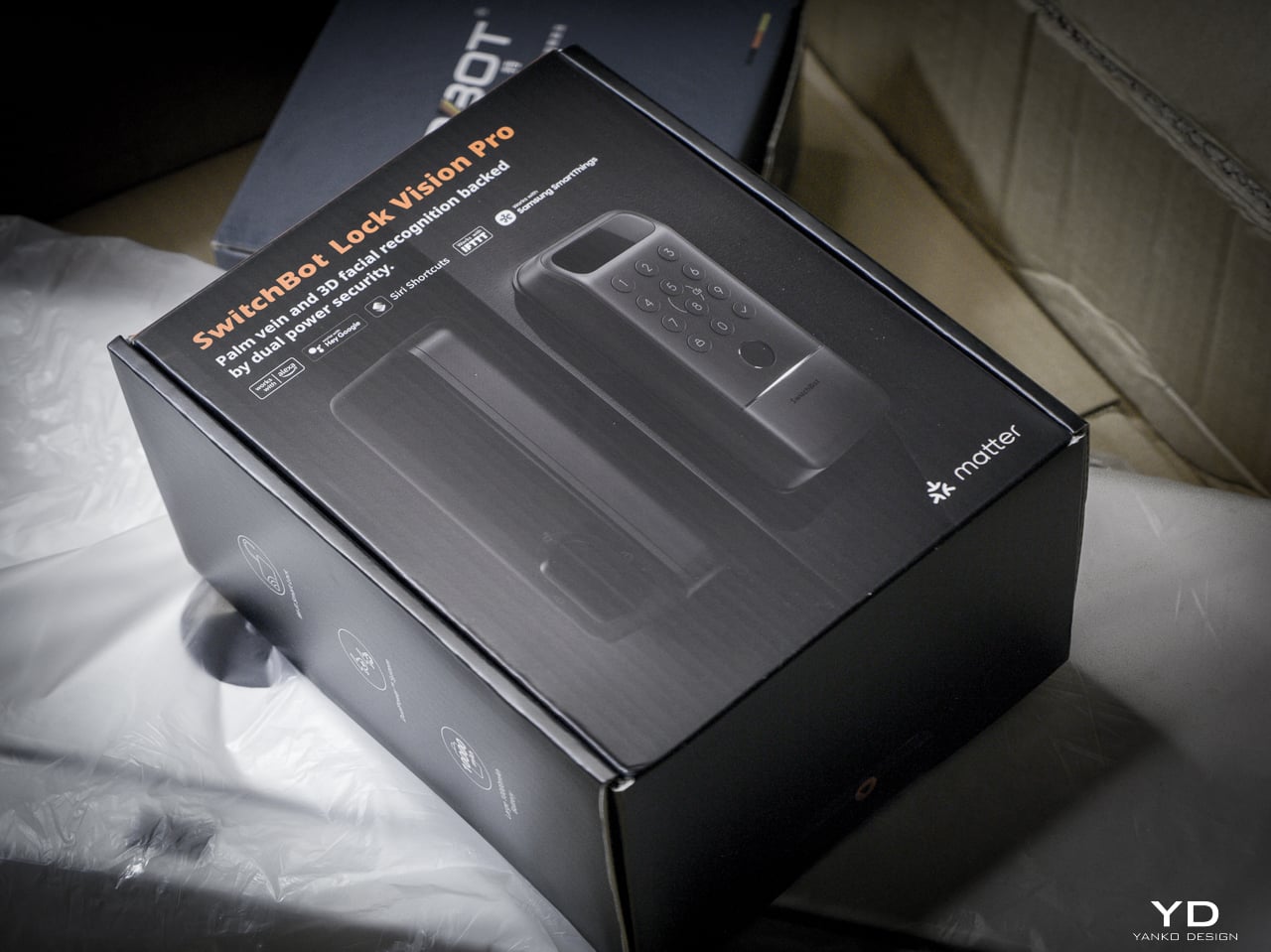
The Lock Vision Series has two models. The Lock Vision at $169.99 (model W9022003) gives you 3D structured-light facial recognition, passwords, NFC, auto-unlock via geo-fence, app control, and voice control. The Lock Vision Pro at $229.99 (model W9022000) adds contactless palm vein recognition and a semiconductor fingerprint sensor. Everything else is identical between them.

Click Here to Buy Now: SwitchBot Lock Vision Pro | SwitchBot Lock Vision
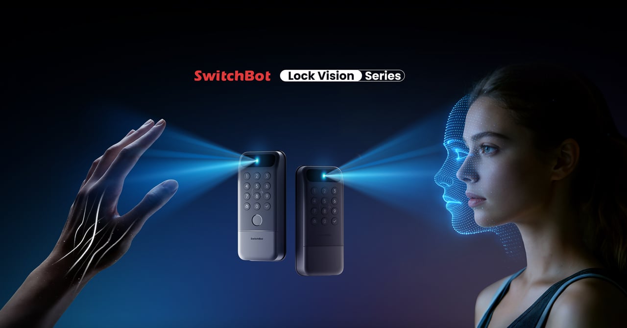
This is the world’s first deadbolt to use 3D structured-light facial recognition. Same core technology as iPhone Face ID. Twenty thousand infrared dots projected across your face, a camera captures the deformed pattern, a 3D map reconstructs and matches in under a second. The false recognition rate is less than 0.0001 percent. It works in total darkness because the IR projector is its own light source. It resists photo and video spoofing. It works with glasses, wigs, and makeup.

The first time it happened, I didn’t believe it. I walked up to the door, heard the bolt snap back, and walked through. Fast. Effortless. I dare say magical. That’s not a word I throw around in reviews, but there it is.

Other smart locks I’ve tested share the same bad habit: the deadbolt motor is too slow, so if you push or pull the door before it finishes retracting, the bolt catches, the lock panics, and you have to unlock it all over again. The Lock Vision doesn’t do that. The motor is quick enough that the bolt clears before you register it moving, and the sound it makes isn’t a whir. It’s a thunk. That’s the difference between a lock you wait for and a lock you forget is there.

Design, Ergonomics, and Aesthetics

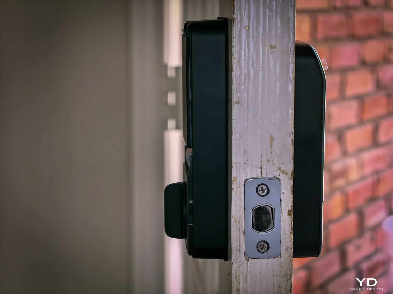
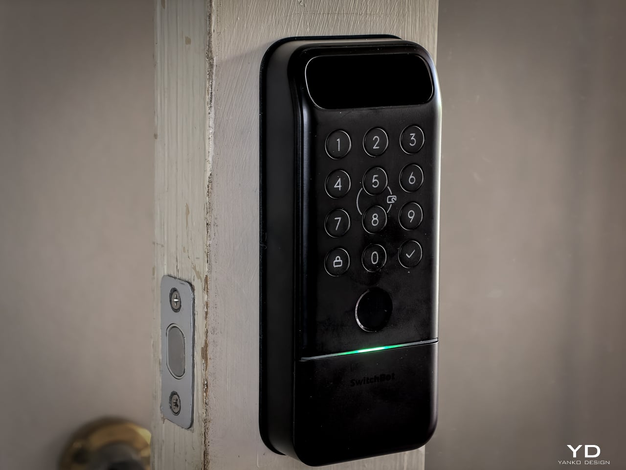
The Lock Vision Series is a rectangular slab in black zinc alloy with a circular keypad integrated into the lower half and a sensor module at the top. The exterior unit measures 6.42 by 2.76 by 1.10 inches and weighs 551 grams (19.4 ounces), with an interior unit at 7.09 by 3.03 by 1.26 inches. It isn’t tiny, but it doesn’t dominate the door the way some camera-heavy smart locks do. The proportions are clean. The branding is restrained. On a dark door, it disappears visually.

SwitchBot built the exterior for weather. IP65 water and dust protection means rain and grime don’t get inside. The operating range spans minus 20 to 55 degrees Celsius, and humidity tolerance runs 10 to 90 percent. Certifications hit BHMA Grade 3, FCC, IC, and ISDS.

The interior unit is where things get interesting. At 218 grams (7.7 ounces), it’s strikingly light. SwitchBot uses a combination of zinc alloy and PC+ABS. On paper you might wonder if it feels cheap. Doesn’t matter. You mount it to the door. You only touch it to lock or unlock from inside, and the knob has a click to it. Clean look, feels fine where it counts. I stopped thinking about the weight after day one.
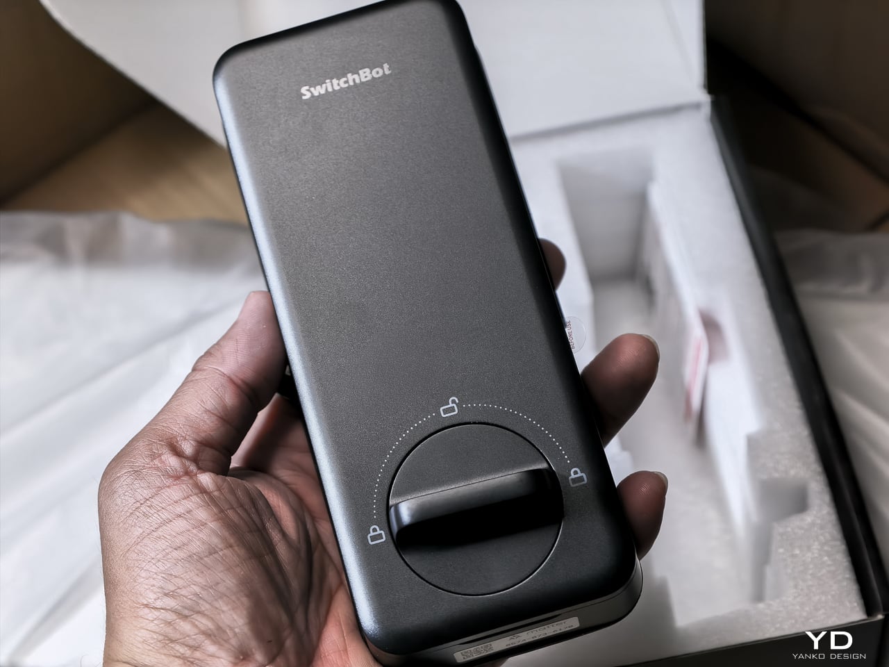
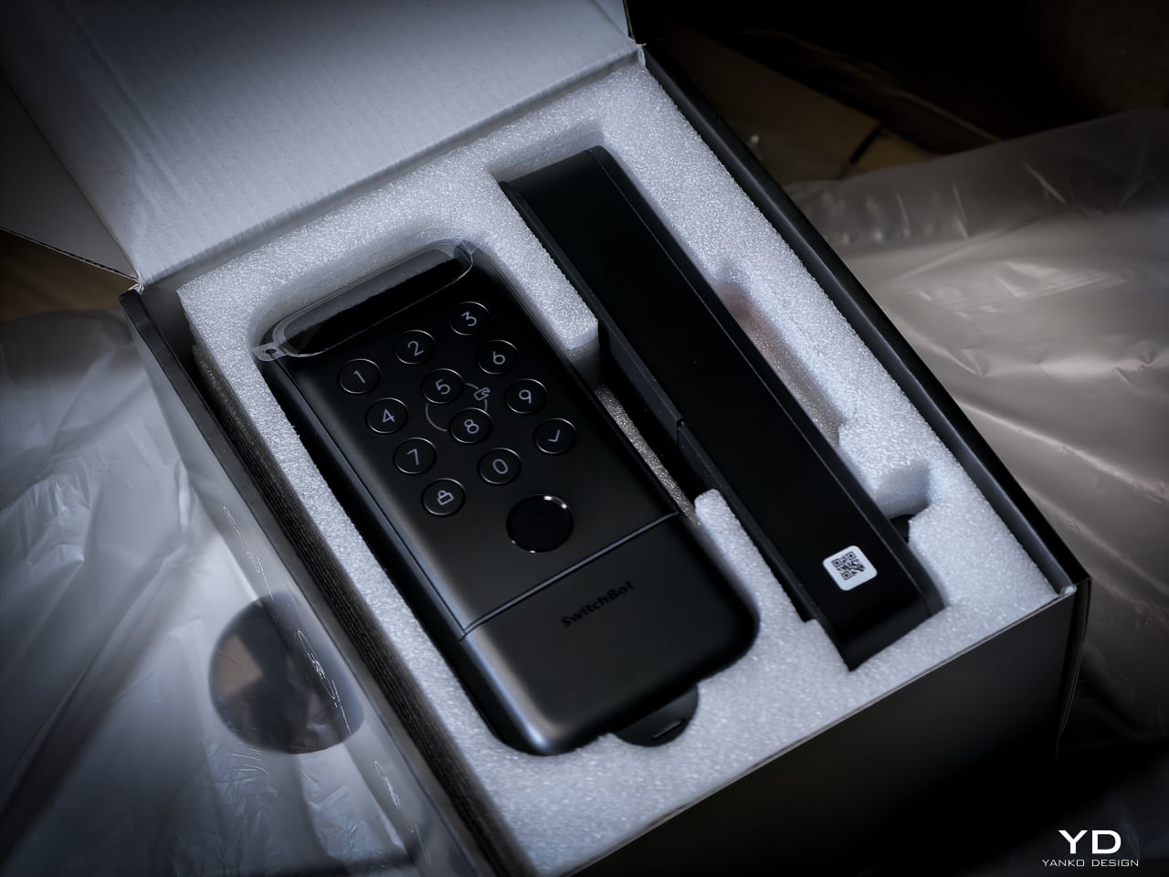
The keypad features tactile mechanical buttons with red, white, and green LED indicators. Press and hold for 2 seconds to pair. Press and hold for 15 seconds for Matter pairing. There’s a knob for manual unlocking from the inside.

The included visual assets tell the story well. The key visual shows both models with a hand reaching for a palm scan and a face profile with a 3D wireframe overlay. Scene images show a woman with groceries (hands-free), a child using palm vein (family-friendly), and a dramatic ice-encased shot (weather resistance). All available in the Drive media kit.

Performance: How It Actually Works

I’ve been living with the Lock Vision Pro long enough to say this: everything works. The facial recognition, the palm vein sensor, the fingerprint reader, and the geo-fence auto-unlock all behave the way the spec sheet says they should. When you test as many smart home devices as I do, that kind of delivery is rare.
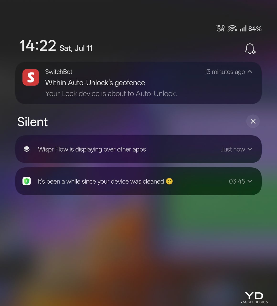
The auto-unlock geo-fence is the killer feature here. SwitchBot labels it beta in the app, which makes its reliability surprising. Here’s how the chain works.

You set a geofence radius around your home. When your phone crosses into that zone from outside, the lock doesn’t open. It arms. The SwitchBot app starts scanning for the lock over Bluetooth. A validity timer starts, default ten minutes. When you close to within Bluetooth range, your phone and the lock establish a connection. The bolt retracts.

No biometric step. No app interaction. You walk through.

That arming step is the design intelligence in a system that could have been a disaster. A dumb geofence that unlocked the door whenever your phone wandered into range would trigger every time you walked past your own house. SwitchBot’s version requires the inbound crossing, starts the timer, and disables itself if you don’t reach the door within that window. Leave and re-enter, a new cycle begins.

No hub required. GPS, Bluetooth, the app running in background, and Wi-Fi enabled on the phone are the only prerequisites.

The limitation worth knowing: auto-unlock only works from the home owner’s phone or an admin account. Family members and shared users with member permissions don’t get the walk-up entrance on their own devices. They authenticate at the door with face, palm vein, or a code instead. For a lock built around passive entry, that’s a real asymmetry, and it’s the first thing I’d ask SwitchBot to fix as the feature graduates from beta.

3D Structured-Light Facial Recognition

Your face becomes the key. Most smart locks with facial recognition at this price use 2D infrared cameras that a printed photo can defeat. The Lock Vision Pro does not.

A laser and IR dot projector embedded around the lens cluster fires more than 20,000 infrared dots across your face in a grid pattern invisible to the naked eye. An IR flood illuminator provides fill light for total darkness operation. An IR camera captures how that dot pattern deforms against the three-dimensional contours of your face and reconstructs a millimeter-accurate depth map. The system matches that map against your enrolled template, the same foundational principle behind iPhone Face ID, and throws the bolt if the geometry matches.

The sub-second unlock speed means you don’t pause at the door. The IR projector works through condensation and surface buildup on the housing exterior, so IP65 weatherproofing doesn’t degrade sensor accuracy over time. It works in total darkness because the IR projector is its own light source. It resists photo spoofing because a flat image can’t reproduce the spatial deformation pattern. It resists video spoofing for the same reason.

Glasses, wigs, and makeup don’t throw it off because the underlying facial geometry the dot grid maps doesn’t change. SwitchBot claims a false recognition rate under 0.0001 percent. Across my testing period I haven’t had a single false positive or false negative in any lighting condition.

Contactless Palm Vein Recognition

Palm vein recognition is what separates the Pro from the standard Lock Vision. The technology reads subcutaneous vein patterns using near-infrared light: the unique geometry of veins inside your palm, entirely internal to your body.

You hover your palm near the sensor without touching anything. The IR emitter penetrates the skin surface and maps the vein network underneath. The lock matches that vascular geometry against your enrolled template.

This matters more than fingerprint in practice. A surface impression doesn’t work because veins aren’t on the surface. A photograph fails. The contactless method sidesteps the hygiene friction of a shared fingerprint pad, and it keeps working when your hands are slightly wet or dirty because the sensor reads through the skin rather than off it. Palm vein readers have been in high-security facilities for years. Finding one in a sub-250-dollar deadbolt is what makes the Pro worth the extra money.

Semiconductor Fingerprint Recognition

The fingerprint sensor is the third biometric layer. It’s positioned for kids and guests not in the face or palm databases, plus it works as a deliberate emergency fallback.
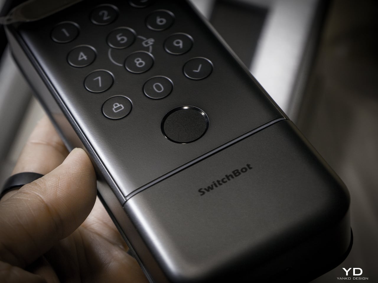
The semiconductor reader captures ridge patterns at the hardware level without storing images. All biometric data stays on the device, never routed to the cloud. It holds up to 90 user fingerprints and reserves 10 more slots for emergency prints.

The sensor reads quickly and reliably in dry and normal conditions. Wet fingers introduce the same challenge every semiconductor reader faces, but the palm vein sensor above it makes that edge case less relevant than it’d be on a lock without another contactless option.

mmWave Radar: The Power Manager

None of these biometric sensors stay active, and the mmWave radar unit handles that. It detects approach and wakes the recognition stack only when someone shows up. Without it, the 10,000mAh battery drains keeping a face camera awake. With it, the lock sleeps until you approach, wakes the sensors, and opens by the time you reach the handle. Across my testing it runs with no phantom triggers from passing cars or pedestrians.

The radar is separate from the auto-unlock GPS and Bluetooth chain. Auto-unlock handles the actual door opening via your phone. The radar handles sensor power management so the biometric readers aren’t burning battery scanning an empty porch all day.

A Note on Motor Noise

I’m not gonna sugarcoat this: the Lock Vision is noticeably louder than most smart deadbolts I’ve tested. The trade-off is speed. It’s the same trade-off you make with a fast garage door opener, more noise, faster movement. I’d rather have a motor that gets out of the way quickly than one that whispers and leaves me standing at the door.
That said, there’s a guest bedroom about five feet from our front door. It doesn’t get a lot of use, so most nights it’s a non-issue. When we do have guests staying over, the lock cycling is a little louder than I’d like. It’s one of the very few genuine downsides to this product, and the only people it will affect are those with a bedroom directly off the entryway.

The Access Hierarchy

The full unlock method count sits at 19, but the design intelligence isn’t in the number. It’s in how SwitchBot organized them by use case rather than technology type.

Passive biometrics, face and palm vein, for residents who should never have to think about unlocking. Fingerprint and NFC cards for recurring guests. Temporary and one-time passwords for deliveries and service visits. Geo-fence auto-unlock for the owner’s daily return. Physical key as the permanent legal fallback that requires no battery, no firmware, and no app update.

That’s a considered access hierarchy, not a feature list.

SwitchBot also built six tiers of security into the lock, and they all run behind the scenes. The alarm system records and notifies door status, ajar alerts, and tamper detection. Geo-fence auto-lock secures the door when you leave. On the unlock side, you get SOS fingerprint recognition, remote unlock confirmation, forced unlock for emergencies, and auto-lockout after repeated failed attempts. Data moves over AES-128 encryption, and every biometric stays local. Three-tier power management keeps the whole thing running with intelligent failover.

DualPower and DualBackup

Battery anxiety keeps people from buying smart locks. SwitchBot built a three-tier system.

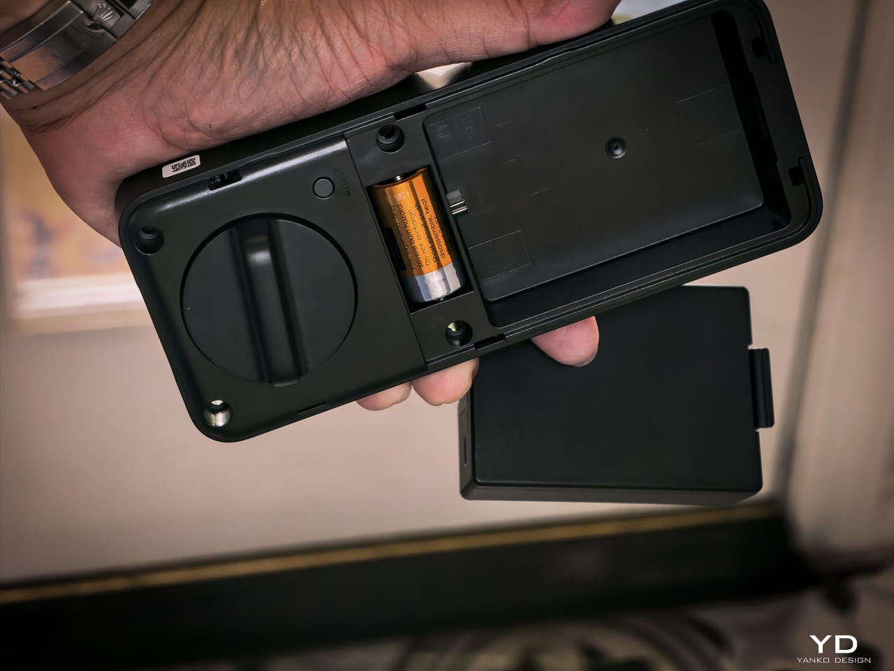
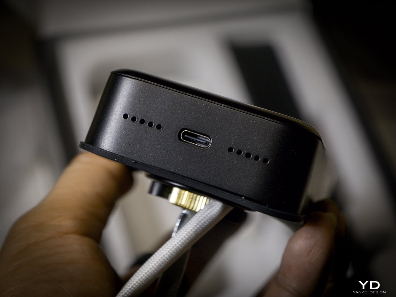
Tier one: 10,000mAh rechargeable Li-Po. SwitchBot rates it for up to 12 months at 10 lock/unlock cycles per day, and the motor handles 50,000 cycles. Tier two: CR123A backup providing up to 500 emergency unlocks with 5-year standby. Auto-activates if main battery dies. Tier three: USB-C port on the keypad surface for emergency power. Connect a power bank, unlock, go find batteries.
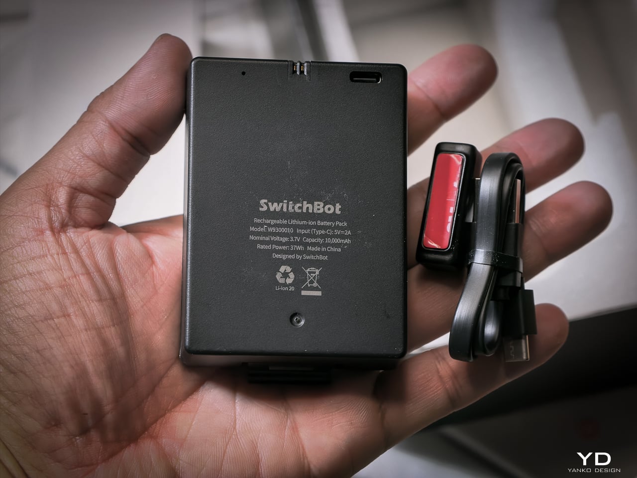
I haven’t had it long enough to need a recharge yet, and that’s the whole idea. SwitchBot says the 10,000mAh battery lasts up to 12 months, and so far it hasn’t dipped enough for me to notice.

When it does run dry, the CR123A backup beats what most locks offer. Some competitors make you tap a battery pack to two contacts outside the lock for one open. This one has a dedicated cell already inside, good for 500 emergency unlocks and five years on standby. Haven’t needed it yet. Glad it’s there.
The mmWave radar handles power management. The lock only activates biometric sensors when someone approaches. The app provides real-time battery monitoring, push notifications at low power, and audio alerts at critical level.

Matter-over-WiFi and Ecosystem

Connects via Matter-over-WiFi. You don’t need a separate hub. Bluetooth holds a stable connection within 16.4 feet outside the door, and WiFi manages the same range through walls. SwitchBot listed Apple Home certification as in progress at launch. I don’t use Apple Home, so I didn’t test it, and that’s not a feature I personally value on a lock. The SwitchBot app handles everything: lock status, battery level, access management, unlock logs going back six months. Voice control works through Alexa, Google Assistant, and Siri if you want it. If Apple Home integration is a dealbreaker for you, verify it’s live before buying. For me, the app does everything I need.

With the Smart Video Doorbell: monitor activity outside, lock/unlock from doorbell, automate entry. With the Wallet Finder Card: tracking card doubles as NFC key. With the Hub 3: doorbell chime plus lock status display. All biometric data stays local on the device.

Installation

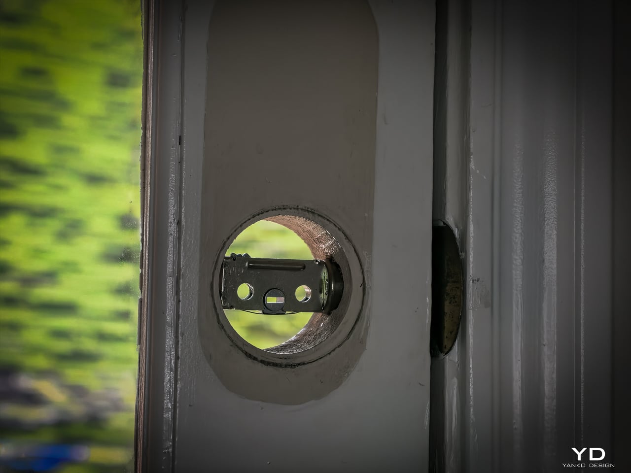
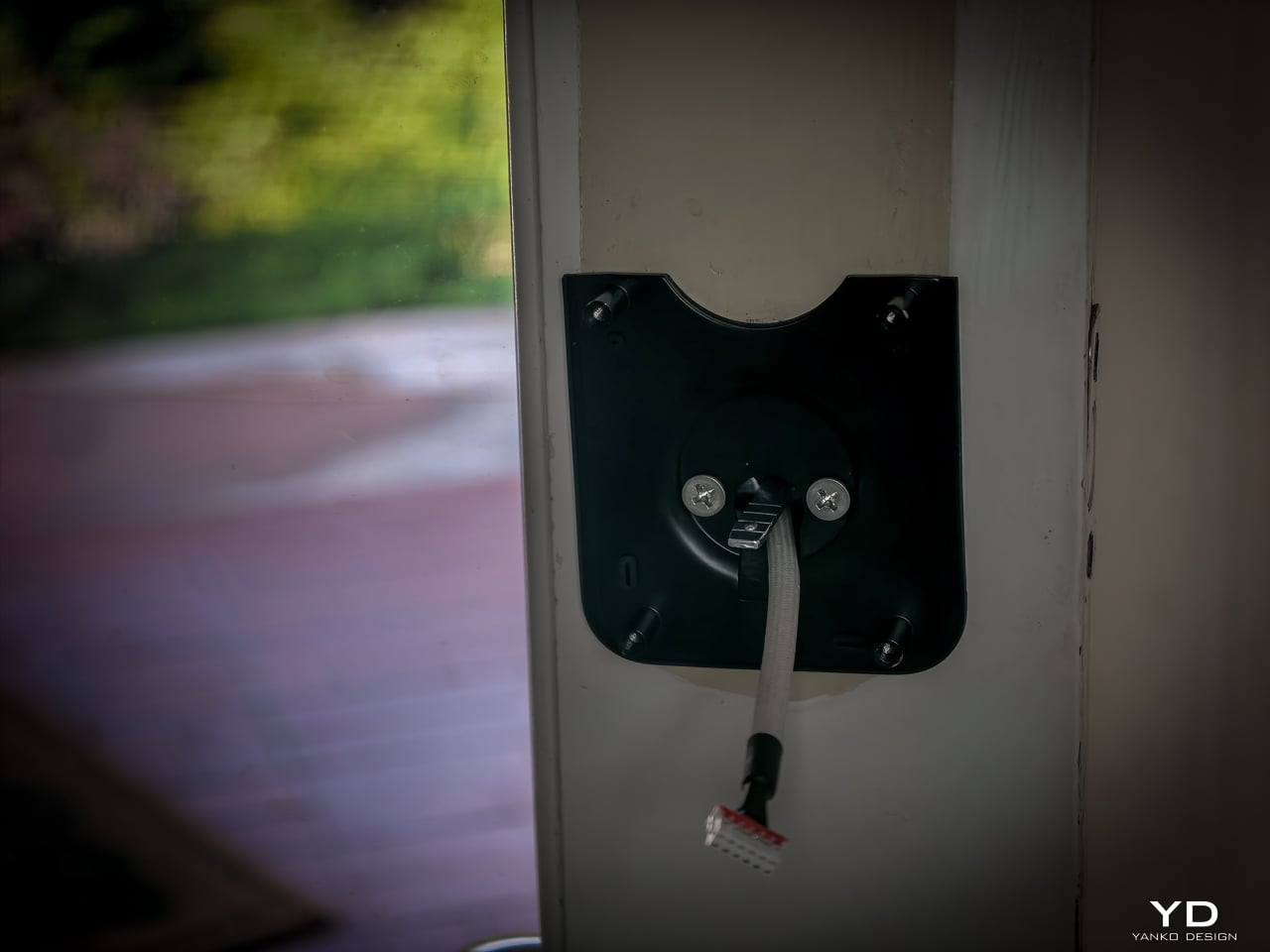
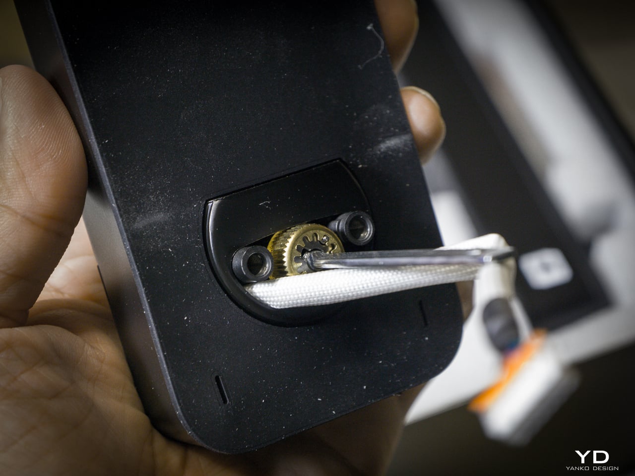
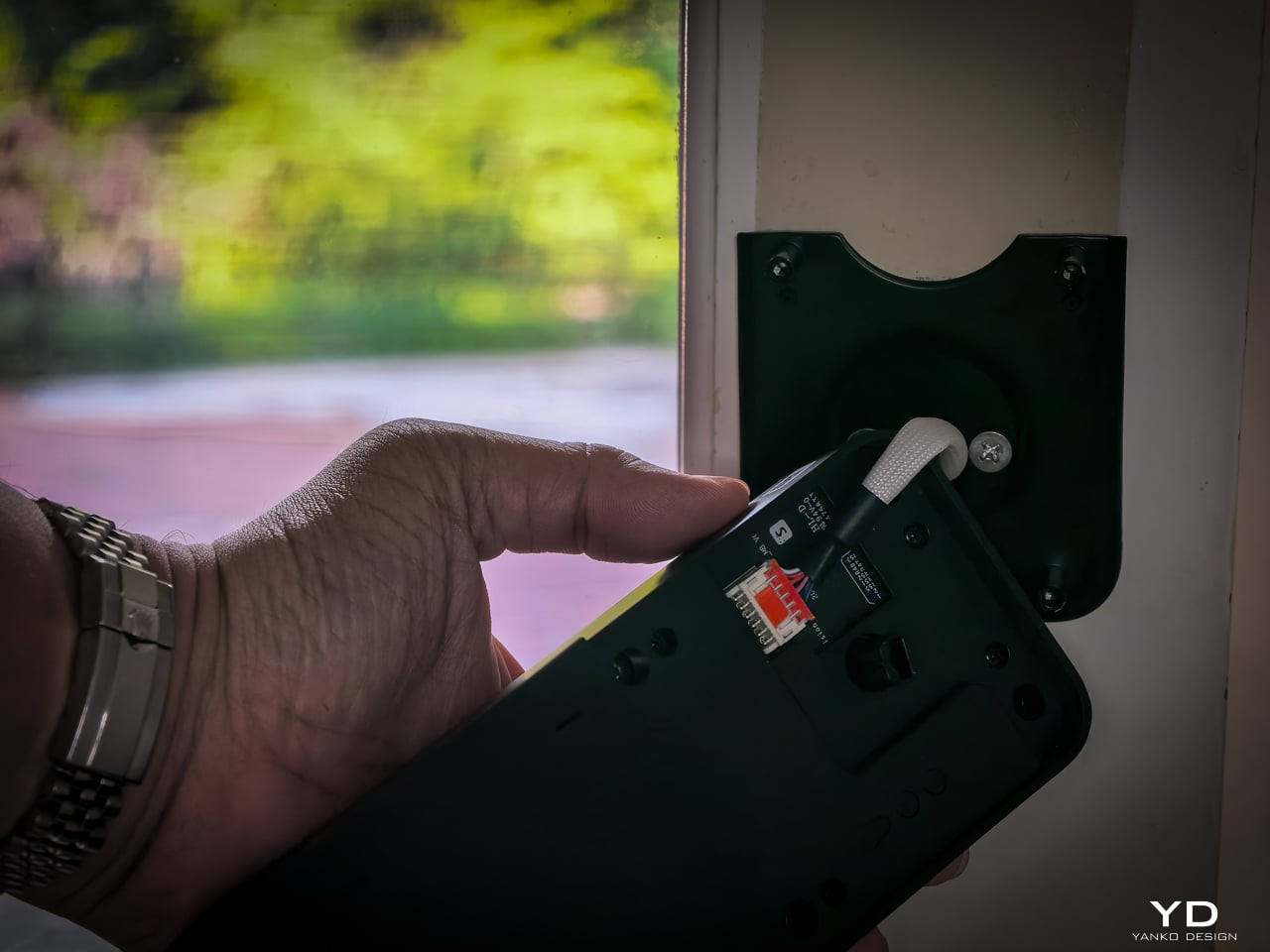
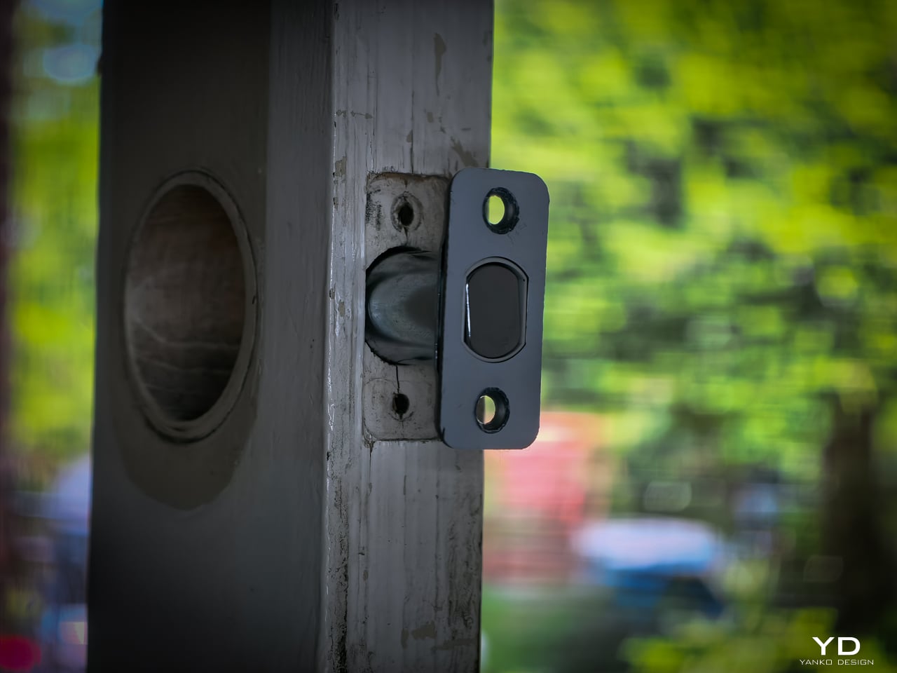
Installation didn’t take long. My previous deadbolt had four screws. The Lock Vision’s bolt has a specific notch that mates with the SwitchBot housing, so I did have to swap out the deadbolt that was already in the door. That added maybe an extra minute to pull the old one and slide the new one in. Everything else lines up cleanly since the dimensions are standard.
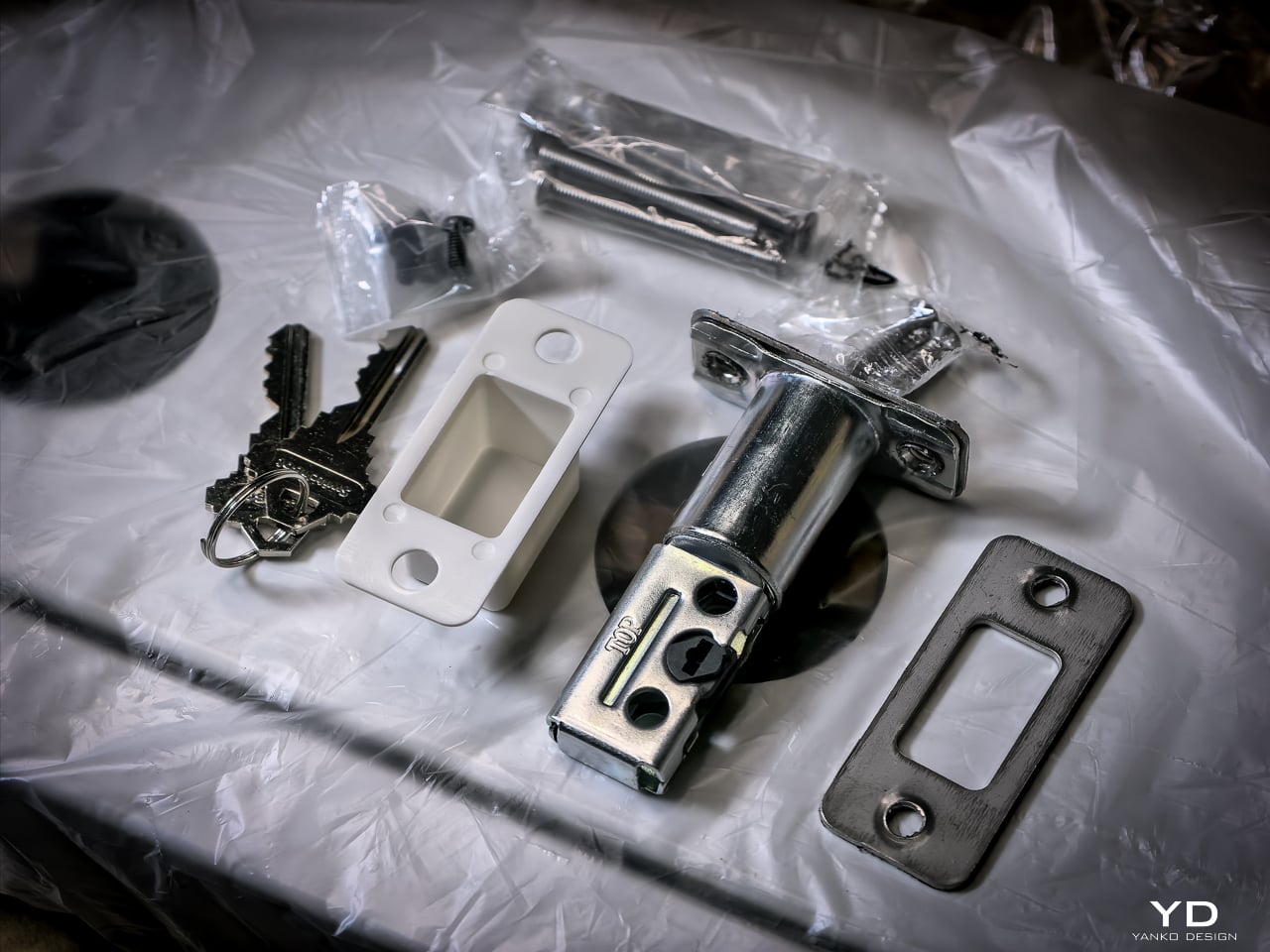
Hardware swap took about 10 to 12 minutes. Setup: pairing the lock, enrolling my face, enrolling a palm, enrolling fingerprints, all of it happened fast. Under 20 minutes total and the new lock was live. If you’ve swapped a deadbolt before, this is the same job. If you haven’t, a single screwdriver and the included instructions will get you there.

Sustainability

The 10,000mAh battery is rechargeable and rated for 12 months per charge. CR123A backup lasts 5 years in standby. USB-C emergency port eliminates lockout. All biometrics stay local with no cloud dependency. SwitchBot rates the motor for 50,000 cycles.
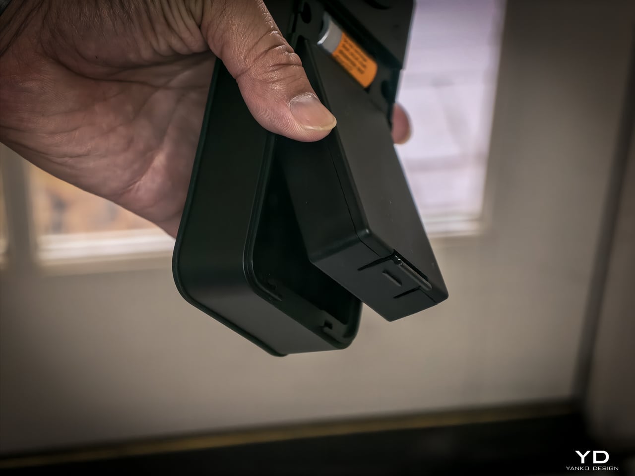
One detail I really like: the battery compartment comes off the top with no screws, no tools. Just lift and the battery slides out. SwitchBot clearly thought about what actually happens when someone needs to swap or charge a battery, and they made it easy. That’s the kind of ergonomic detail you appreciate six months in when you finally need to pull it.
Value

At $169.99 (Lock Vision) and $229.99 (Lock Vision Pro), SwitchBot prices against the August Wi-Fi Smart Lock, Yale Assure Lock 2, and Level Lock Plus. None of those competitors offer 3D structured-light face unlock. The facial recognition alone puts the Lock Vision Series in a different category.

The $60 Pro premium gets you palm vein and fingerprint. I’d pay it. We’ve got a front door, a back door to the garage, and a garage door into the house. If I had to redo all three, I’d spend the extra for the Pro on every single door.

Bundle pricing: Lock Vision + Video Doorbell $259.99, Pro + Video Doorbell $329.99. Canadian buyers pay CAD 229.99 and CAD 299.99 for the locks, CAD 329.99 and CAD 399.99 for the bundles. Both models sell direct from SwitchBot and on Amazon in the US and Canada.
Verdict

The Lock Vision Series is the first smart deadbolt I’d put on my own door. The 3D facial recognition works in the dark. The battery system covers every failure mode. Matter-over-WiFi means no hub on your nightstand. And when the battery dies, there’s a key in your hand. Two of them in the box.

But it isn’t for everyone. Apple Home certification hadn’t gone live as of my testing. Not every home qualifies without power tools on the door compatibility front. And I want to live with the 218g interior unit for a month before I trust the long-term build.

It’s a lock that just works, no matter how you get it open. Face, palm vein, fingerprint, code, phone, NFC, geo-fence, and yes, a physical key. Comes with two. When the tech is optional and the brass key still turns, that’s a lock I trust.

Click Here to Buy Now: SwitchBot Lock Vision Pro | SwitchBot Lock Vision

The post SwitchBot Lock Vision Series Review: Face ID for Your Front Door first appeared on Yanko Design.

Huawei’s $229 FreeClip 2 S Earbuds Pack Spatial Audio In an Open-Ear Design, Case Doubles as a Jewelry Box

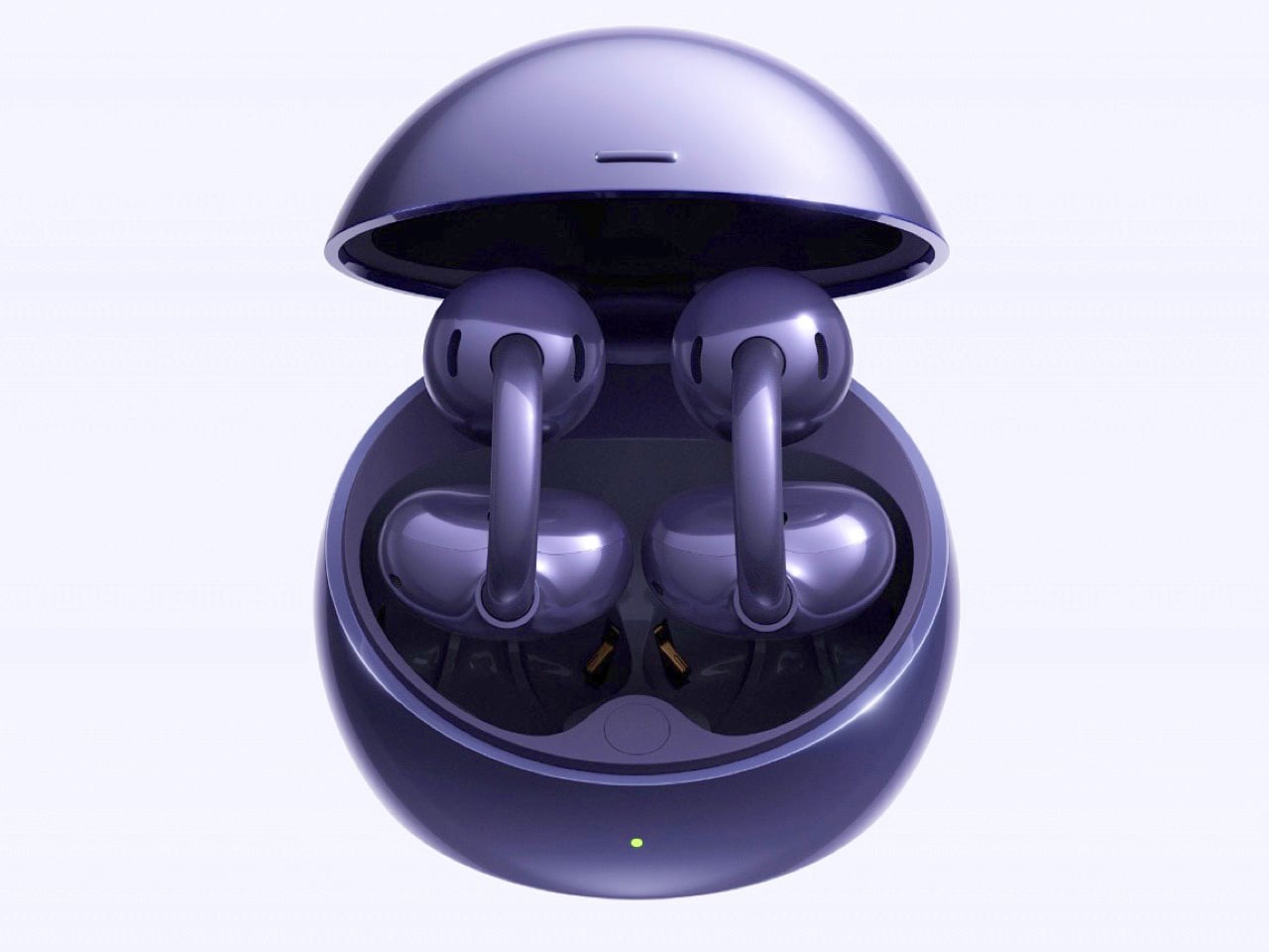
Pop open the case of the FreeClip 2 S and the first thing you notice has nothing to do with earbuds. There is room in there. Real, usable room, enough that Huawei is telling people to drop in a ring or a small pendant alongside the buds themselves. It sounds like a gimmick until you remember how much time people spend fumbling through bags looking for both their earbuds and their jewelry, and how rarely any company bothers to solve two small annoyances with one redesigned object.

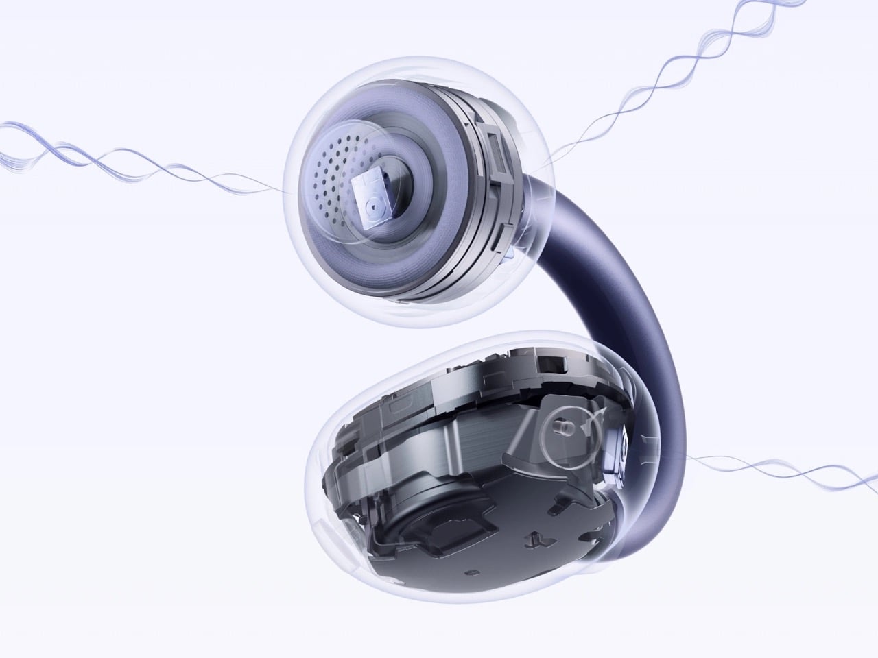
Speaking of space, Huawei found room inside the earbuds too, in the form of spatial audio with dynamic head tracking. It is a feature typically reserved for sealed designs that can isolate sound and rebuild a convincing sense of space around it, and pulling it off on an open-ear bud is a genuinely difficult engineering problem, one most competitors have sidestepped rather than solved. That sits alongside dual 10.8mm drivers, an AI NPU handling adaptive sound, tri-mic call noise cancellation, and IP57 water resistance. Priced around 229 euros globally, with a discounted window running through August 21, 2026, the FreeClip 2 S treats itself as jewelry first and tech second, at least in how Huawei wants you to see it, while quietly pushing open-ear audio further than most of its rivals have dared.

Designer: Huawei

The case redesign alone signals a shift in how Huawei thinks about this product category. Gone is the AirPods style shell that defined the original FreeClip 2, replaced by something almost spherical, larger, and finished in a mirrored metallic coating that photographs like a compact rather than a charging dock. Huawei says the new shape offers 20 percent more internal volume, and rather than leave that space empty, the company built a whole marketing angle around filling it with small accessories. The bundled partnership with French costume jewelry brand Les Néréides makes that pitch explicit, pairing the earbuds with an actual piece of jewelry for buyers who opt into the launch bundle. It is an unusual move for an earbuds case, treating it as a personal object rather than a functional afterthought.

Underneath that redesigned shell, the earbuds themselves got quieter but meaningful updates. Huawei softened the C-bridge by 25 percent and smoothed out the grooves that ran along its surface, chasing a cleaner look and a gentler fit against the ear. The Comfort Bean shape carries over from the original FreeClip 2, still built using data pulled from over 10,000 ear samples worldwide. Each earbud weighs just 5.1 grams, light enough that the open-ear format keeps its core promise of all day wear without the fatigue that sealed buds can cause after a few hours.

Spatial audio remains the headline feature, and for good reason. Dynamic head tracking works best when a sealed fit lets software control exactly what the listener hears, which is why brands like Apple and Sony have largely kept the feature locked to their isolating designs. Huawei pairing it with dual 10.8mm diaphragm drivers and reverse sound wave technology, aimed at cutting down on audio leakage, suggests an attempt to close that gap without sacrificing the open-ear comfort that made the FreeClip line popular in the first place. Whether the tracking feels responsive in real use is something only hands on testing will confirm.

Huawei launched the FreeClip 2 S globally out of Malaysia alongside the Pura 90s series, positioning both as flagship efforts rather than incremental updates. At roughly 221 dollars, the earbuds undercut several open-ear rivals while adding a feature set that reads more like a premium sealed bud’s spec sheet. If the head tracking holds up under real world use, Huawei may have found a way to make open-ear audio feel a lot less like a compromise.

The post Huawei’s $229 FreeClip 2 S Earbuds Pack Spatial Audio In an Open-Ear Design, Case Doubles as a Jewelry Box first appeared on Yanko Design.

The Amica Collection Finds Poetry in Paper, Clay, and Glow

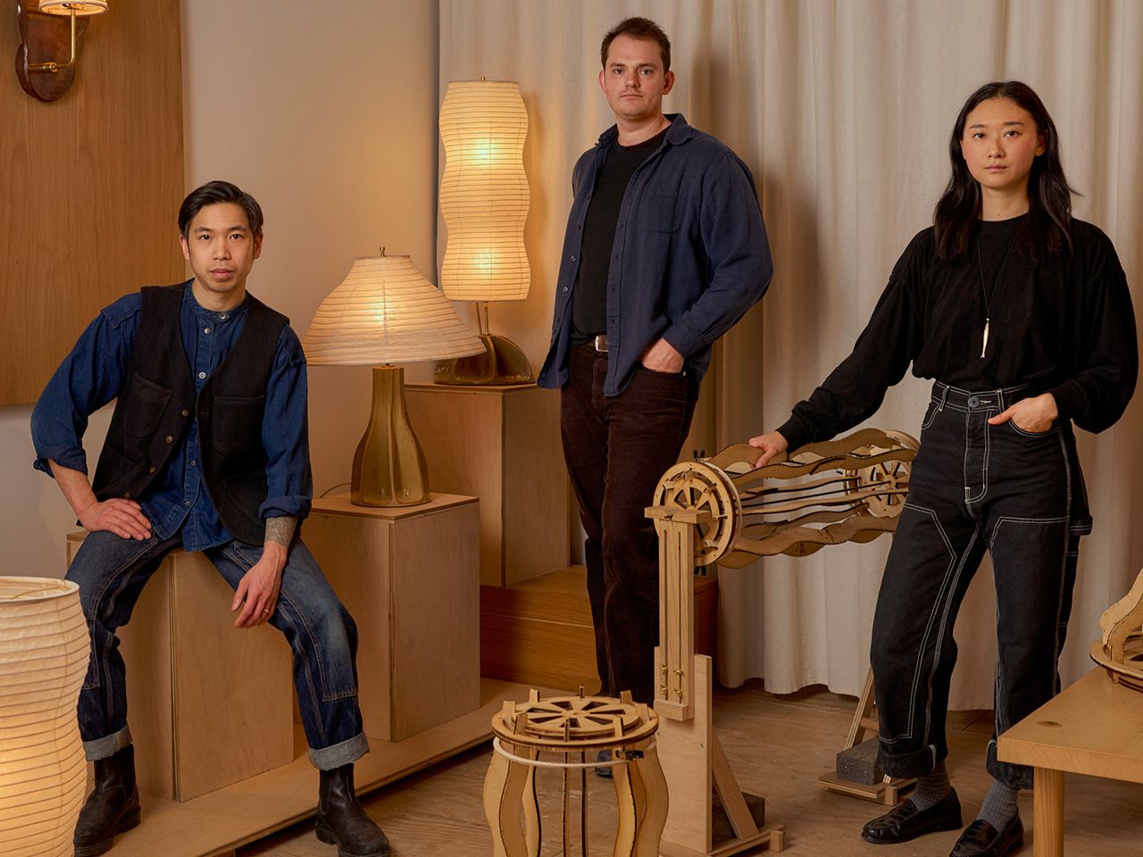
The Amica lighting collection brings together organic form, traditional craft, and sculptural illumination in a way that feels quiet, warm, and carefully considered. Made up of pendant, table, and wall-mounted lights, the collection treats lighting as more than a practical object. Each piece has a sculptural presence, shaping the mood of a room through material, texture, shadow, and glow.

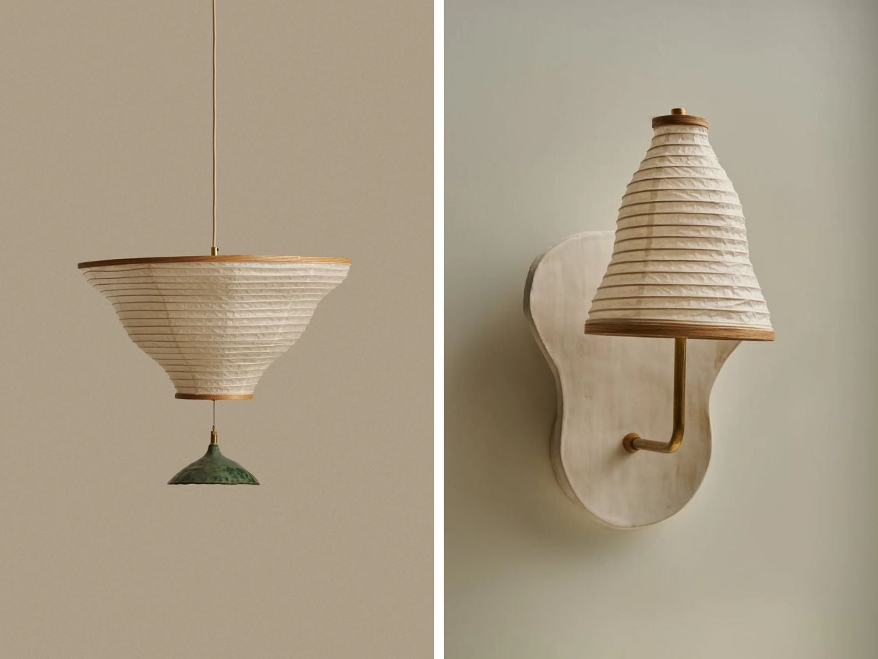
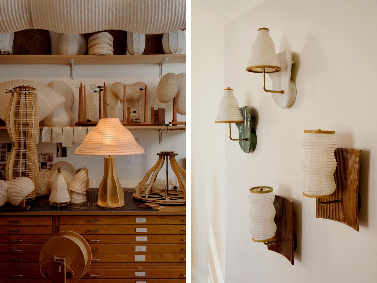
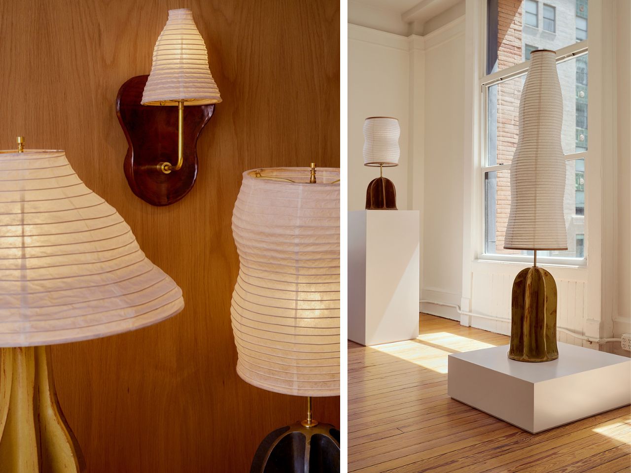
Much of Amica’s character comes from the contrast between its materials. Earth-toned ceramic bases give the pieces weight and grounding, while the paper forms bring softness, translucency, and movement. The ceramic surfaces are ridged, irregular, and slightly imperfect, giving them a handmade quality. Set against them, the paper elements feel light and delicate, glowing gently when illuminated and revealing the craft behind every fold, wrap, and curve.

Designer: Christopher Merchant and Kawabi

The collection takes inspiration from natural and familiar forms rather than strict geometry. Pods, fans, lanterns, vessels, and ceremonial objects seem to echo through the work. These references make the lights feel approachable, almost recognizable, but still unusual enough to hold attention. They sit somewhere between functional objects and quiet domestic sculptures.

A few pieces from the larger collection show this language especially clearly. The Standing Legume Lamp is one of the more playful examples. Inspired by the curves of leguminous pods, it stacks two illuminated modules vertically above an offering tray. The form feels like a small gesture toward food, harvest, and ritual. It has a simple presence, but the reference gives it warmth and personality. Rather than reading as a conventional lamp, it feels closer to a small domestic monument.

The Relic I Lamp moves in a more poetic direction. It reimagines the folding fan as a light sculpture, with pleated paper opening out in sweeping arcs. Held upright by a totem-like wood base and anchored by a cast concrete block, the piece captures the feeling of motion paused mid-gesture. There is a sense of air, shadow, and light moving through it, even while the object remains completely still.

The Legume Pendant Horizontal, Double continues the collection’s organic vocabulary. Inspired by strung beans, it turns pod-like curves into a suspended paper illumination system. Its modular structure gives the form flexibility, while the handmade details keep it grounded in craft. Regionally sourced Japanese kozo paper, Shaker-style bentwood caps, and hand-hammered nails bring a sense of material honesty to the piece.

The Souvenir Sconce offers a quieter but equally expressive moment. Mounted to the wall, it shows the undulating paper form from one of its most graceful angles. The construction is minimal, but the silhouette is soft and full of movement. It celebrates pleated lantern craftsmanship with restraint, making a bold statement in a gentle voice.

These works are only a portion of the broader Amica collection. Across its many forms, the collection continues to explore the same relationships between ceramic weight, paper softness, organic silhouettes, and careful detailing. The pieces feel connected, but not repetitive. Each one has its own proportion, gesture, and mood.

What makes Amica compelling is the way it balances opposites: heavy and light, earthy and translucent, structured and organic. The pieces do more than brighten a space. They change how the space feels. Even when unlit, they hold their own as objects with texture, rhythm, and presence.

Amica feels contemporary without losing its connection to older craft traditions. Paper, ceramic, wood, and concrete are used in a way that feels both familiar and fresh. The collection invites slower looking, asking the viewer to notice the ridges, folds, shadows, and small handmade details that give each piece its character.

At its core, Amica is a collection about softness with structure. It turns natural references and crafted processes into luminous objects that feel intimate, expressive, and quietly theatrical.

The post The Amica Collection Finds Poetry in Paper, Clay, and Glow first appeared on Yanko Design.

This LEGO Godzilla Skeleton Set Has Movable Limbs and Jaw, Built From LEGO’s Dinosaur Fossils Kit

Godzilla has spent seven decades stomping through movie theaters, but only recently has he stomped his way into an actual LEGO box. Builder Matthew Esposito’s Monsterverse-inspired Godzilla cleared the 10,000 vote threshold on LEGO Ideas and got the official nod from LEGO’s review team in 2025, meaning a real retail set is somewhere on the horizon. It is, by any measure, a long overdue arrival for one of pop culture’s most enduring monsters.

Across 35 plus film appearances, Godzilla has been a metaphor for nuclear anxiety, a wrestling opponent for King Kong, and an occasional force for good against even worse monsters. What he has rarely been is dead long enough to leave a skeleton behind. That oversight has now been corrected, and fittingly, it happened not through an official LEGO release but through the kind of scrappy fan ingenuity that keeps this hobby interesting, a build that arrives just as his living, roaring counterpart prepares for brick immortality of his own.

Designer: LaurensPosthuma

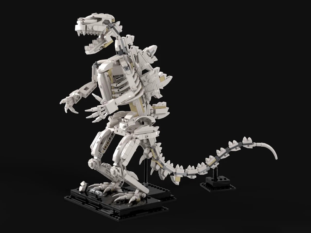
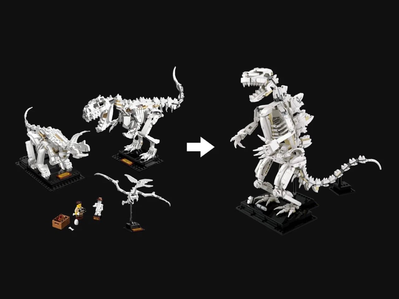
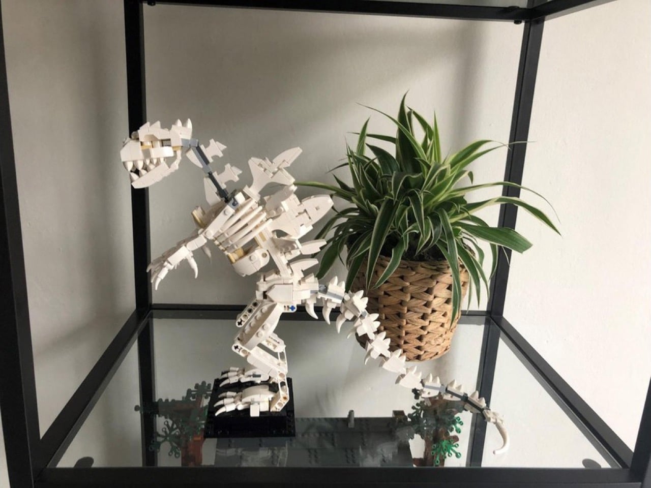
Unlike our usual LEGO Ideas coverage that proposes completely new bricksets, this one actually repurposes an existing set. It’s an alternate build for LEGO’s own Dinosaur Fossils set (21320), meaning every one of its 477 pieces comes straight out of a box most AFOLs already have on a shelf. Swap the T-Rex, Triceratops, and Pteranodon skeletons for this hunched, roaring Godzilla, and suddenly a paleontology playset becomes a kaiju shrine. No new molds, no rare parts hunt, just clever reassignment of an existing inventory into something the original designers never imagined.

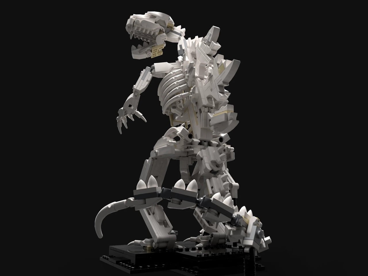
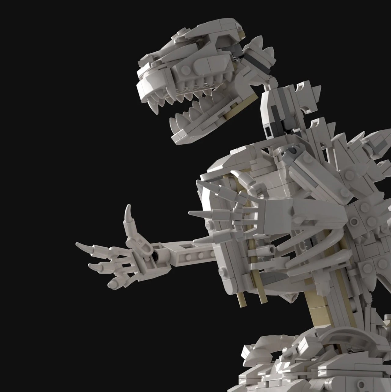
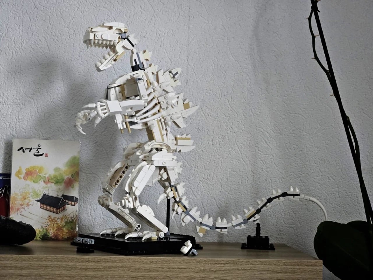
Godzilla stands roughly 37 centimeters long, 12 centimeters wide, and 27 centimeters tall, anchored to a stable 10 by 12 stud base that keeps his hunched, forward-leaning stance from tipping over under the weight of that long, curling tail (a tail that, fittingly, needs its own separate support post, exactly like the fossil kit’s original dinosaurs). The head, arms, and tail are all fully articulated, letting you pose him mid-roar, mid-swipe, or crouched and ready to pounce. My favorite detail, though, is the jaw. It actually opens and closes, and paired with that jagged double row of teeth, it turns a static display piece into something you want to keep fidgeting with long after the build is done.

LaurensPosthuma built the instructions using Stud.io, LEGO’s official digital design software, and packaged them as a downloadable PDF rather than a physical retail kit, which is how most fossil-kit alt-builds make their way to fellow builders. “The feedback has been amazing and I love doing more skeletons,” the designer notes, a line that suggests this won’t be the last monster to get the bare-bones treatment.

There is something genuinely satisfying about a build like this landing in the same year Esposito’s fleshed-out Godzilla is being greenlit for retail shelves. One version gives you the King of Monsters in full menacing color, the other gives you what’s presumably left of him after a rough night in Tokyo Bay. Together they would make an absurdly good display duo, assuming LEGO ever decides an official skeleton variant is worth the tooling. Until then, this one is available now as PDF instructions for €6.50, buildable entirely from parts you already own if Dinosaur Fossils is sitting in your collection.

The post This LEGO Godzilla Skeleton Set Has Movable Limbs and Jaw, Built From LEGO’s Dinosaur Fossils Kit first appeared on Yanko Design.
Ever wondered how gearboxes and torque work? MetMo’s latest EDC turns the physics into fidget fun

There is a piece by kinetic artist Arthur Ganson called Beholding the Big Bang, a gear train stretching over a meter long, where the final gear is embedded in solid concrete. With a motor running at one end, the reduction is geared down so severely that even with the first gear spinning at speed, it would take 13.7 billion years for the last gear to turn. Ganson built it as an art piece, a meditation on cosmic time. But buried inside that sculpture is an engineering principle so tactile and immediate that it feels almost criminal to lock it in a gallery. Gear reduction, in its raw form, is one of the most satisfying mechanical phenomena a person can interact with.

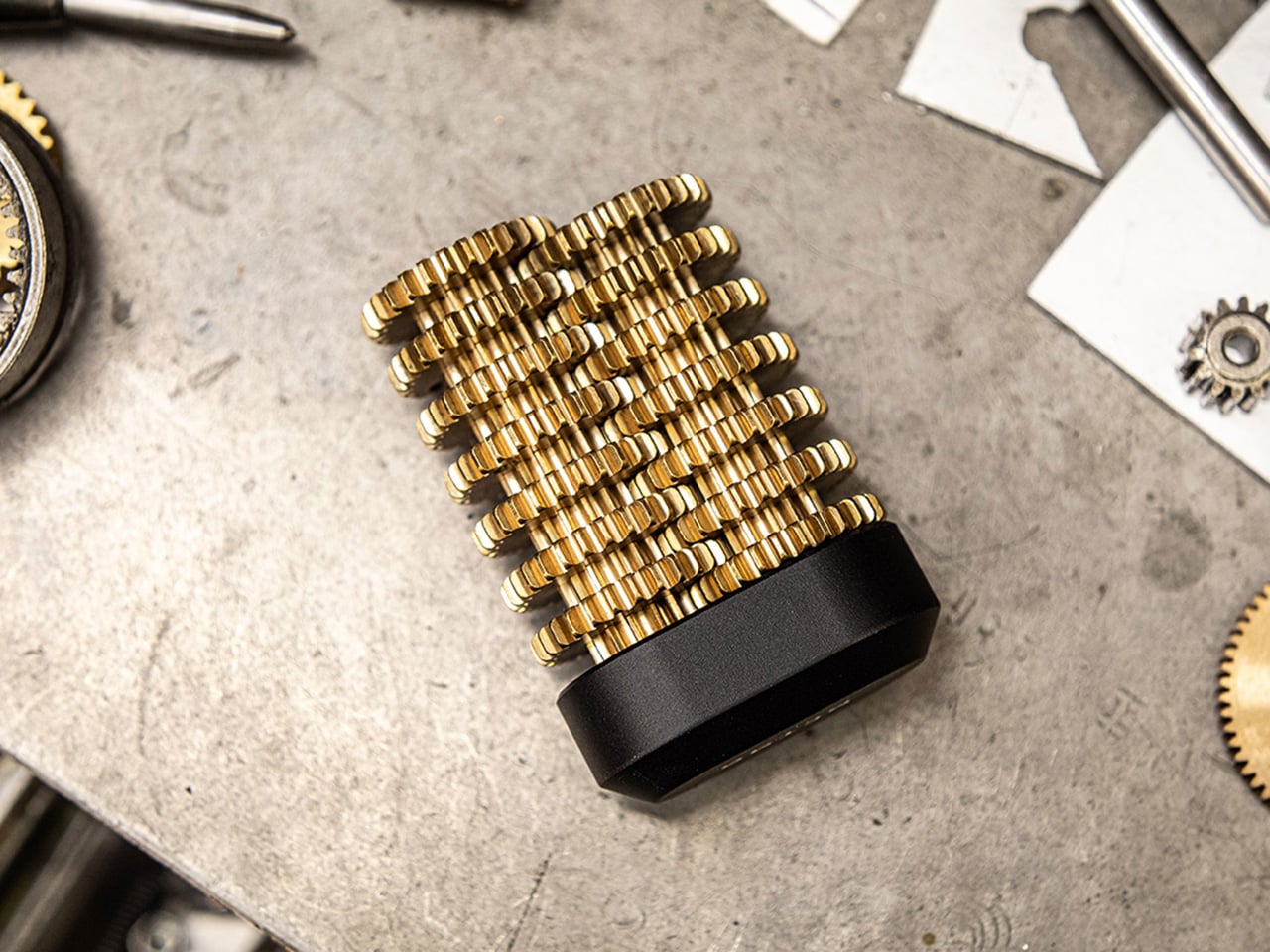
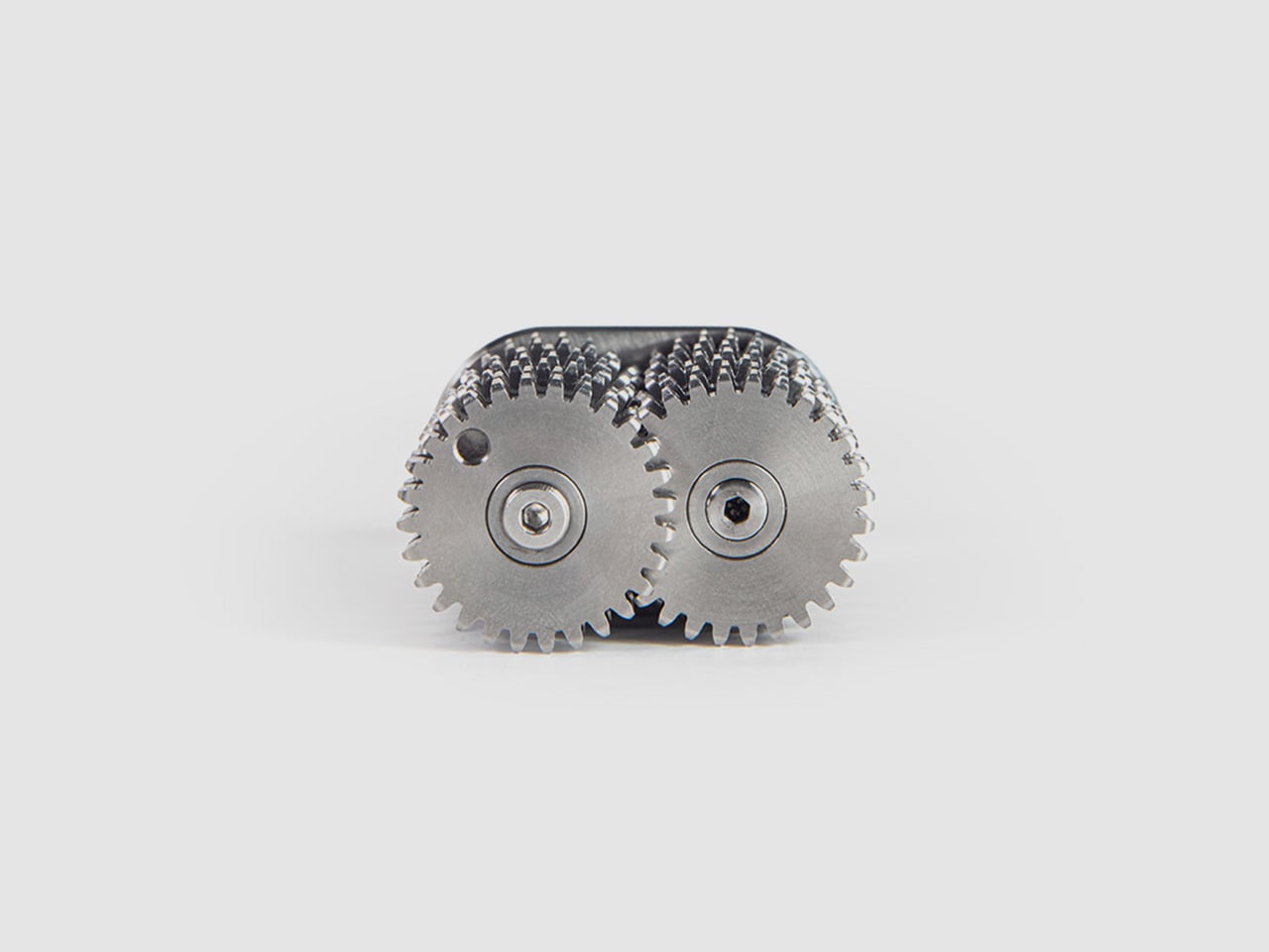
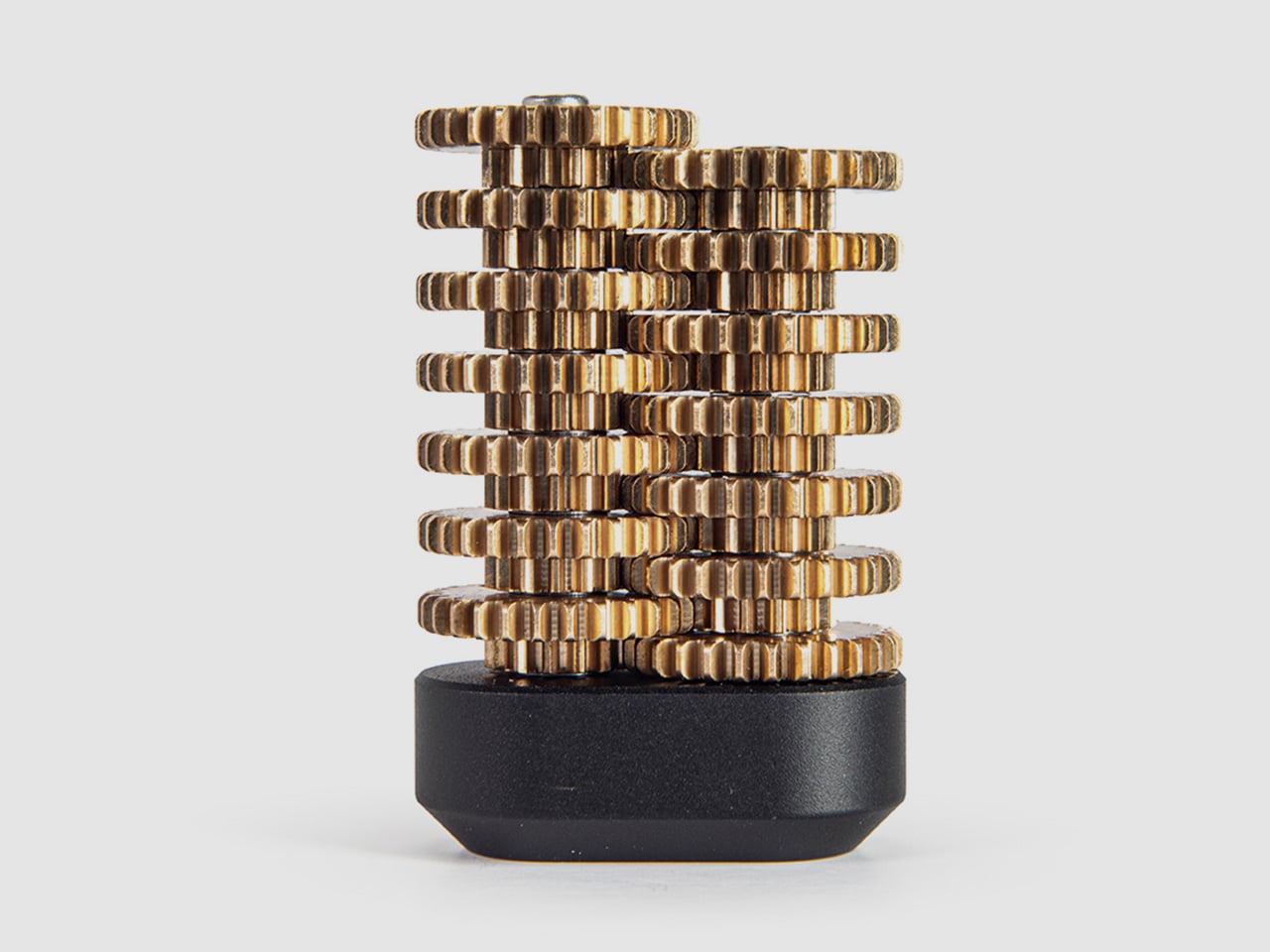
MetMo appears to have agreed with that assessment. The Brass Gear Train takes the same physics and compresses it into a palm-sized, hand-assembled object machined to aerospace tolerances in a UK workshop. The reduction ratio is 16,384:1, which means the top gear and the bottom gear are functionally living in different time zones. Every gear in the stack doubles the torque of the previous one. What reads on paper as an engineering spec feels, in practice, like a magic trick that happens to be fully explainable… and a treat for the eyes and hands.

Designers: Sean Sykes & James Whitfield (MetMo)

Click Here to Buy Now: $148.58.

The trick plays out immediately the moment you start turning the gears. Spin the topmost gear at a comfortable pace, and the lowest gears in the stack appear frozen, barely registering motion. The visual disconnect is mesmerizing because your brain knows they should be moving, but the reduction is so steep that a full rotation at the top translates to near-invisibility at the bottom. You can reverse the operation too, gripping the lower gears and turning them while the top spins wildly out of control, the torque climbing exponentially as you work your way down the train. The interaction is simple enough for anyone to understand within seconds, but satisfying enough that most people who pick it up will keep spinning it for several minutes straight. If you are someone who thinks while touching things, who solves problems by turning objects over in your hands, or who just appreciates when engineering reveals itself rather than hiding behind a housing, this is built for exactly that impulse.

Each gear in the stack doubles the torque input from the gear above it, which means by the time you reach the bottom of the train, your effort has been multiplied 16,384 times over. Turning the first gear feels effortless, barely any resistance. Move down one level and there is a slight increase in drag. By the third or fourth gear, you start feeling real resistance. By the sixth gear, most people will struggle to turn it with just their fingers. The lower you go, the more mechanical advantage you are fighting against, and the feedback is immediate, visceral, and surprisingly addictive. It turns an abstract engineering principle into a tangible workout for your hand, and the challenge of working your way down the entire gear stack becomes a desk-toy dare that most visitors cannot resist attempting.

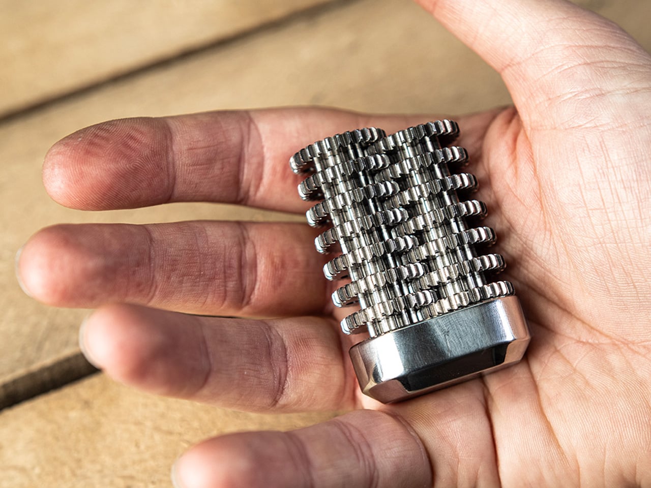
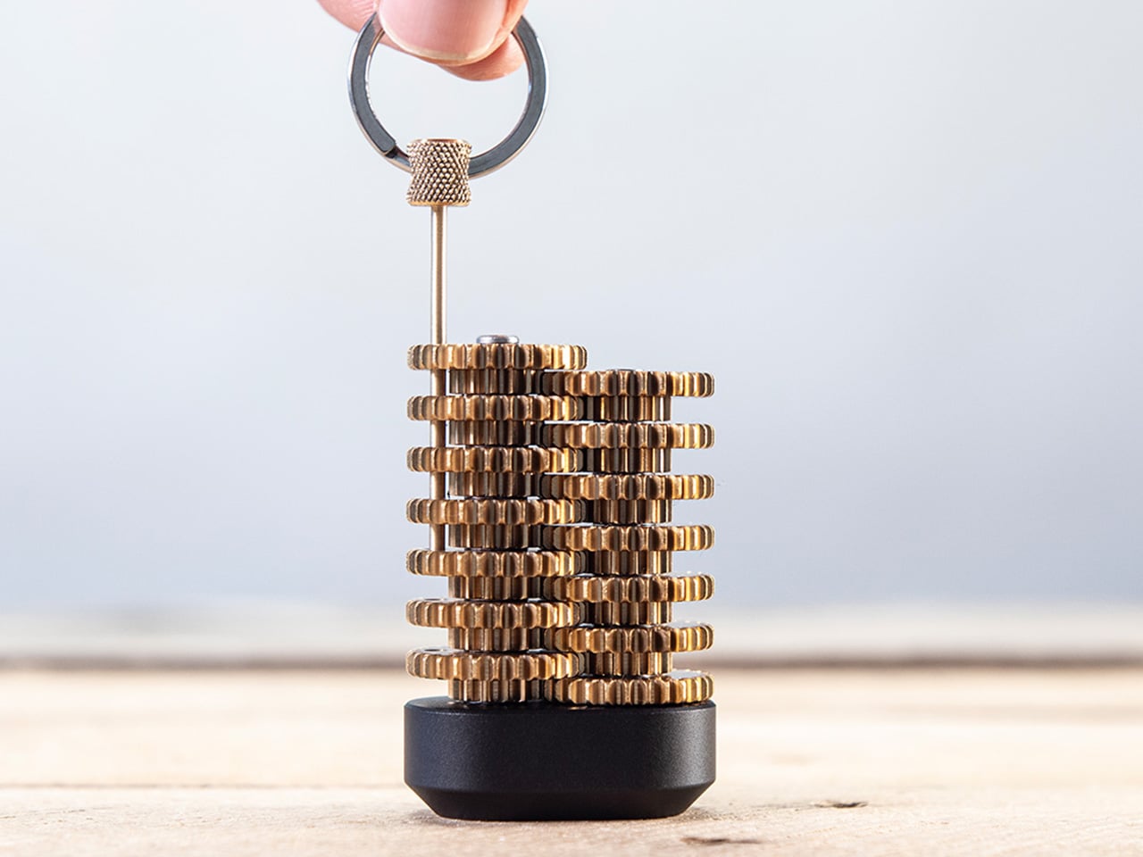
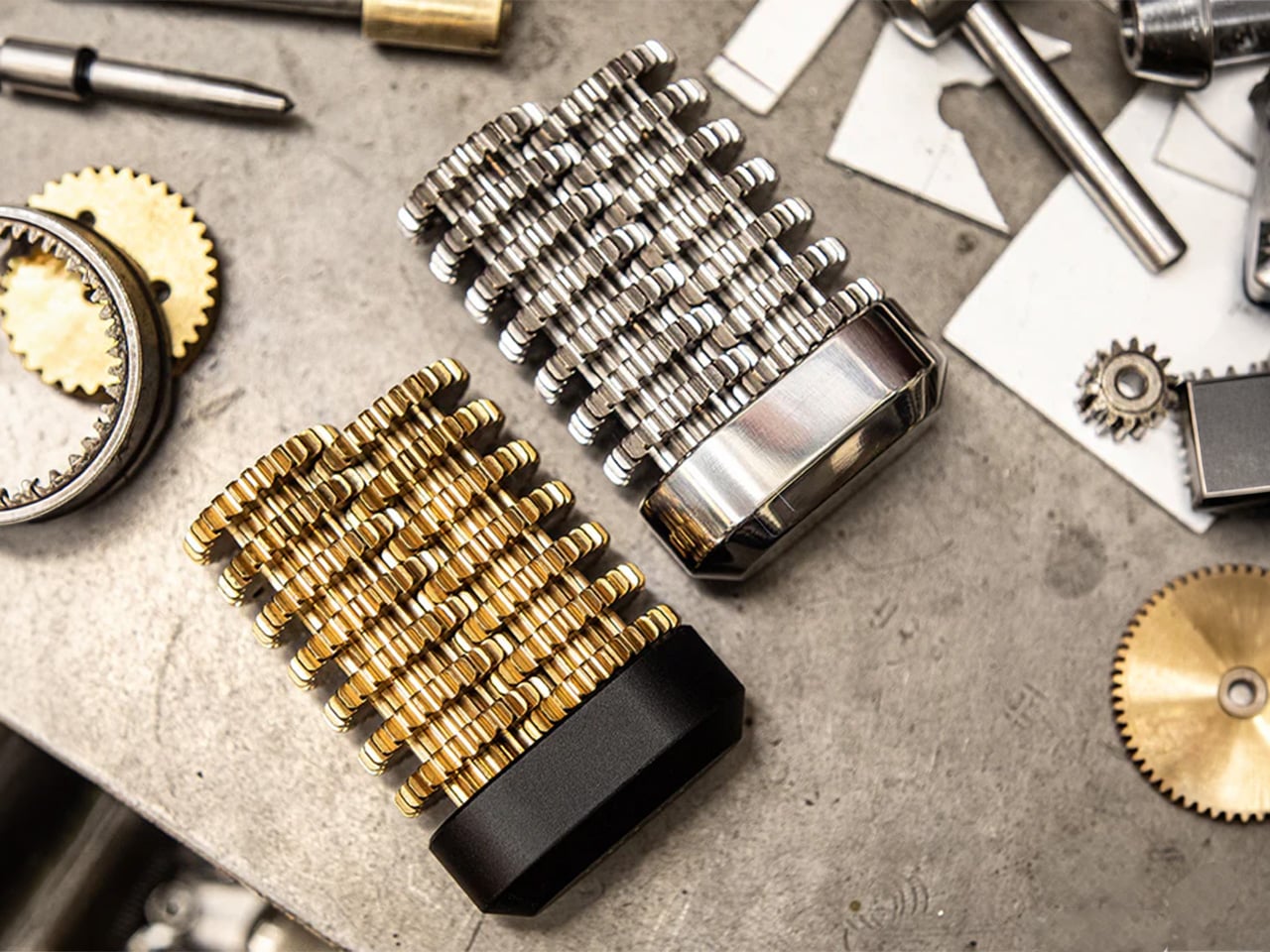
The gears are precision CNC-machined from solid brass, chosen specifically to echo the clockwork mechanisms of old. The warm metallic tone, the weight distribution, and the smooth meshing of teeth all call back to antique engineering, when gears were visible, celebrated, and built to outlast their makers. The gears sit on a hard anodized aluminum base, which serves a dual purpose: it provides a low center of gravity that makes the object comfortable to hold, and the hard anodizing prevents corrosion, ensuring the base stays flawless even after years of desk duty. The Gear Train comes with a pin that holds everything in place – taking the pin out lets you fidget with the gear’s movement. When you’re done testing the laws of physics, you can slide a pin back through the gears, locking them in place so they don’t shift around in your pocket and accidentally snag your earphone cable.

The only way to reinsert the pin is to rotate the gears back into perfect alignment, a 16,384-revolution journey where all the holes must line up simultaneously. It is planetary alignment in miniature, a needle threading that requires patience, memory, or just a willingness to turn the stack slowly until everything clicks into place. Some users will treat this as a one-time puzzle, solving it once and leaving the pin in. Others will pull it out deliberately, turning the Gear Train into an ongoing fidget challenge that resets itself every time.

Every component is machined by Metmo in their UK workshop, running solid metal stock through CNC mills to the same tolerances used in aerospace engineering. There are no mass-manufactured parts anywhere in the assembly. Each gear is hand-finished, with edges smoothed to perfection so there are no sharp bits, no rough patches, nothing that interrupts the tactile pleasure of turning the stack over in your hands. The gears mesh perfectly, tight enough to eliminate backlash but smooth enough that the motion feels like silk. When the product page says the gears fit together like a Swiss watch, that is not marketing poetry, it is an accurate description of what you feel when you spin them.

MetMo built this object to live on a desk, and the visual presence reflects that intent. The stacked brass gears catch light beautifully, the gear-tooth profiles creating a repeating pattern that reads as both mechanical and decorative. The weight feels substantial without being cumbersome, and the passivated brass doesn’t patina like regular brass does, ensuring your gear-train looks shiny and precise even after years. People walking past will stop and ask what it is, which gives you the opportunity to demonstrate the reduction ratio in real time, and most onlookers will immediately want to try it themselves. It functions as a conversation piece, an engineering demo, and a desk sculpture simultaneously, occupying the same category as premium perpetual motion toys or kinetic sand timers, objects that justify their presence through sheer fascination rather than utility. For designers, engineers, makers, or anyone whose workspace doubles as a place to think, this belongs within arm’s reach.

The Brass Gear Train is available in two material configurations. The brass version featured here uses solid brass gears with a hard anodized aluminum base, delivering that warm, vintage-clockwork aesthetic MetMo designed it around. There is also a stainless steel variant, which trades the brass warmth for a more industrial, corrosion-resistant finish with a heavier feel in hand. Both versions are hand-assembled, both carry the same 16,384:1 reduction ratio, and both come with the removable alignment pin for puzzle play. MetMo backs both configurations with a 200-year guarantee, the same confident warranty they extend across their entire product line, a statement that this object was built to outlast you, your desk, and probably your great-grandchildren.

The MetMo Brass Gear Train is priced at £99 GBP (approx $149 USD) and ships directly from MetMo’s UK workshop. For those interested in the stainless steel version, pricing and availability can be found on the MetMo website. Both versions qualify for free shipping on orders over £200.

Click Here to Buy Now: $148.58.

The post Ever wondered how gearboxes and torque work? MetMo’s latest EDC turns the physics into fidget fun first appeared on Yanko Design.
How A Simple Angle Makes Outdoor Seating Feel More Social

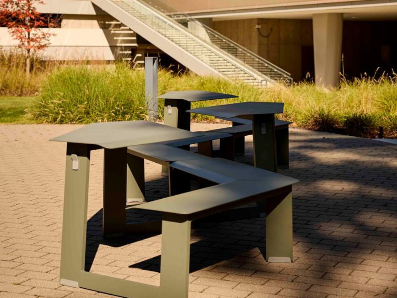
Public furniture has a quiet way of shaping how people move through the day. A bench can make someone pause. A table can turn an empty courtyard into a lunch spot. A slight angle in a seat can change whether people feel separate, side by side, or gently invited into conversation. Take-Out Wedge, part of Landscape Forms’ Take-Out collection designed by Rodrigo Torres, works within that subtle space between object and behavior.

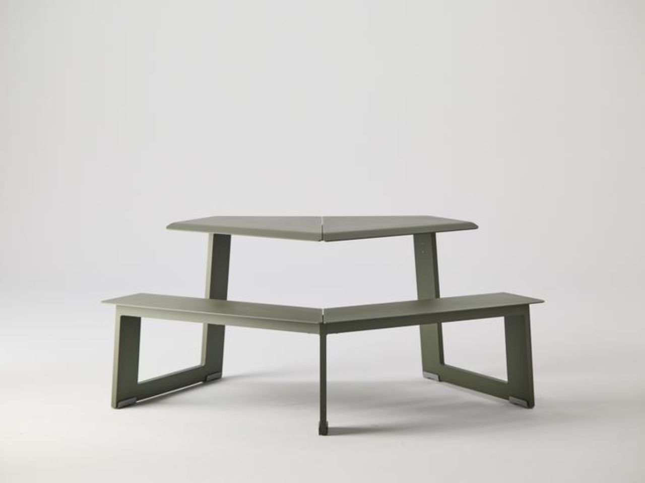
The Take-Out collection expands Landscape Forms’ connected seating and dining table category through a system that feels clean, adaptable, and easy to reconfigure. The family includes singles, doubles, triples, wheelchair-accessible triples, tall versions, wedge units, and mini pieces for younger users. Each piece can stand on its own or come together with others, allowing outdoor spaces to shift throughout the day as people gather, separate, work, eat, wait, or simply linger.

Designer: Rodrigo Torres

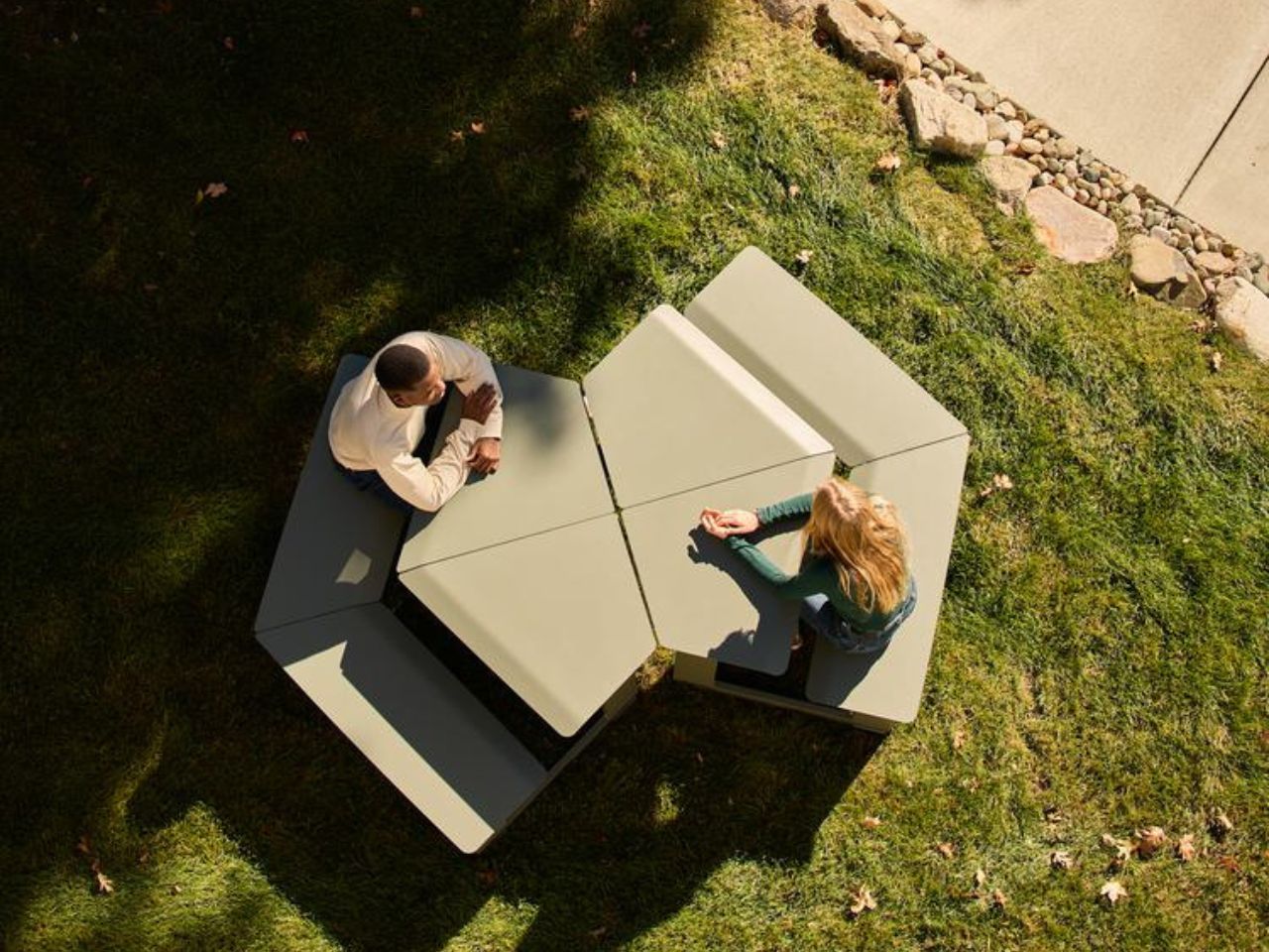
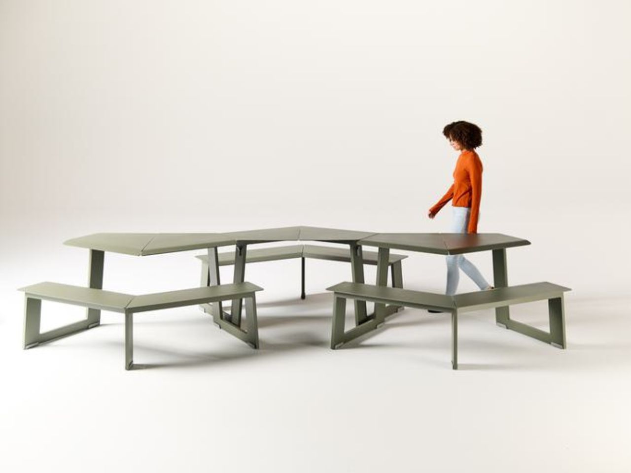
The Wedge is especially compelling because its form is doing more than creating a distinctive silhouette. Its angle changes the relationship between people. Traditional seating often places us in familiar social positions. Side by side feels relaxed and effortless, with both people sharing the same outward view. Face to face feels more direct, suited to conversation, focus, or collaboration. The Wedge creates something softer between the two: a posture where people can look outward together while still feeling naturally turned toward one another.

That middle ground is what gives the design its social intelligence. It does not push people into interaction, but it makes interaction easier. It allows connection to happen casually, without the intensity of a formal setup. In a campus courtyard, public plaza, hotel terrace, office garden, retail district, or civic space, that kind of nuance matters. People often need places that support informal moments: a quick chat, a shared break, a quiet lunch, a spontaneous meeting, or a pause between destinations.

The beauty of Take-Out Wedge lies in how much spatial variety comes from such a simple geometric move. The wedge form allows designers and users to create soft arcs, faceted curves, radial clusters, and enclosed hexagonal hubs. A few units can support a small conversation. More pieces can shape a larger social zone. Arranged differently, the same system can feel open, intimate, directional, playful, or communal.

This is where Take-Out begins to feel less like standalone furniture and more like a framework for outdoor life. It does not need walls to define space. It can frame a pause point, activate an overlooked corner, shape a gathering area, or bring rhythm to an open setting. Placed side by side, the pieces can create long runs of seating for meals, meetings, or collaborative work. In a grid, they can give an outdoor area the energy of a café. Face to face, they become an expandable communal table.

The system also understands that flexibility has to work in real life. Color-matched connector brackets can secure adjoining units when a more permanent arrangement is needed. One-sided tables help make better use of edges, walls, or tighter spaces. An umbrella-hole tabletop option brings shade into the setup, with semi-circular cutouts that align when two units are placed across from each other. These details make the collection feel practical without taking away from its visual simplicity.

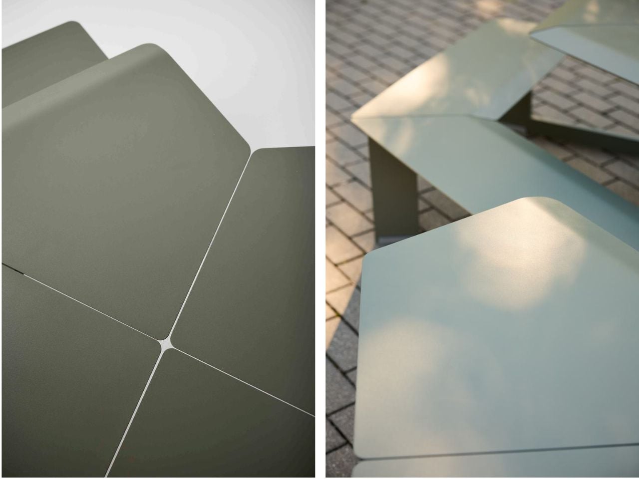
Comfort is handled with the same restraint. The form is minimal, but not cold. Gently curved edges soften the points where elbows and knees meet the furniture. Users can enter from either side or from behind, avoiding the awkwardness that often comes with shared outdoor tables. Sheet metal tops, extruded aluminum verticals, powdercoated finishes, and durable nylon glides support the realities of public use, where furniture has to withstand weather, movement, cleaning, and constant rearrangement.

Take-Out also feels relevant because public and commercial spaces are being asked to do more. A campus lawn may need to support outdoor study in the morning, lunch in the afternoon, and casual hangouts by evening. A workplace terrace might shift between focused solitude and team conversation. A commercial plaza may need to feel active without becoming crowded. Take-Out responds to these changing needs by keeping the space open-ended.

The mini version brings the same thinking into children’s environments, from schoolyards and outdoor classrooms to family-friendly public spaces. It recognizes that younger users also need furniture that encourages gathering, movement, play, and shared experience. Good public furniture should work across ages, settings, and rhythms of use.

What makes the Wedge memorable is that it treats connection as something spatial. The way people sit in relation to one another carries emotional meaning. A small angle can make a space feel more open, more welcoming, or more alive. Public furniture has always had this potential, especially in urban commons where small moments of social life happen between larger routines. A good seating system can make people stay a little longer, notice each other more, and feel more at ease in shared space.

The same value carries into commercial environments. Offices, mixed-use developments, hospitality spaces, and retail campuses often bring people into proximity without really helping them connect. A system like Take-Out Wedge softens that distance. It creates casual opportunities for people to gather without making the moment feel staged. It helps shared spaces feel warmer, more active, and less siloed.

Take-Out Wedge is versatile because it understands that connection does not happen in one fixed format. Sometimes people want to sit beside each other and look out at the world. Sometimes they want to face each other and talk. Sometimes they need something in between. The Wedge gives form to that in-between moment, turning a simple angle into an invitation to share space more naturally.

The post How A Simple Angle Makes Outdoor Seating Feel More Social first appeared on Yanko Design.
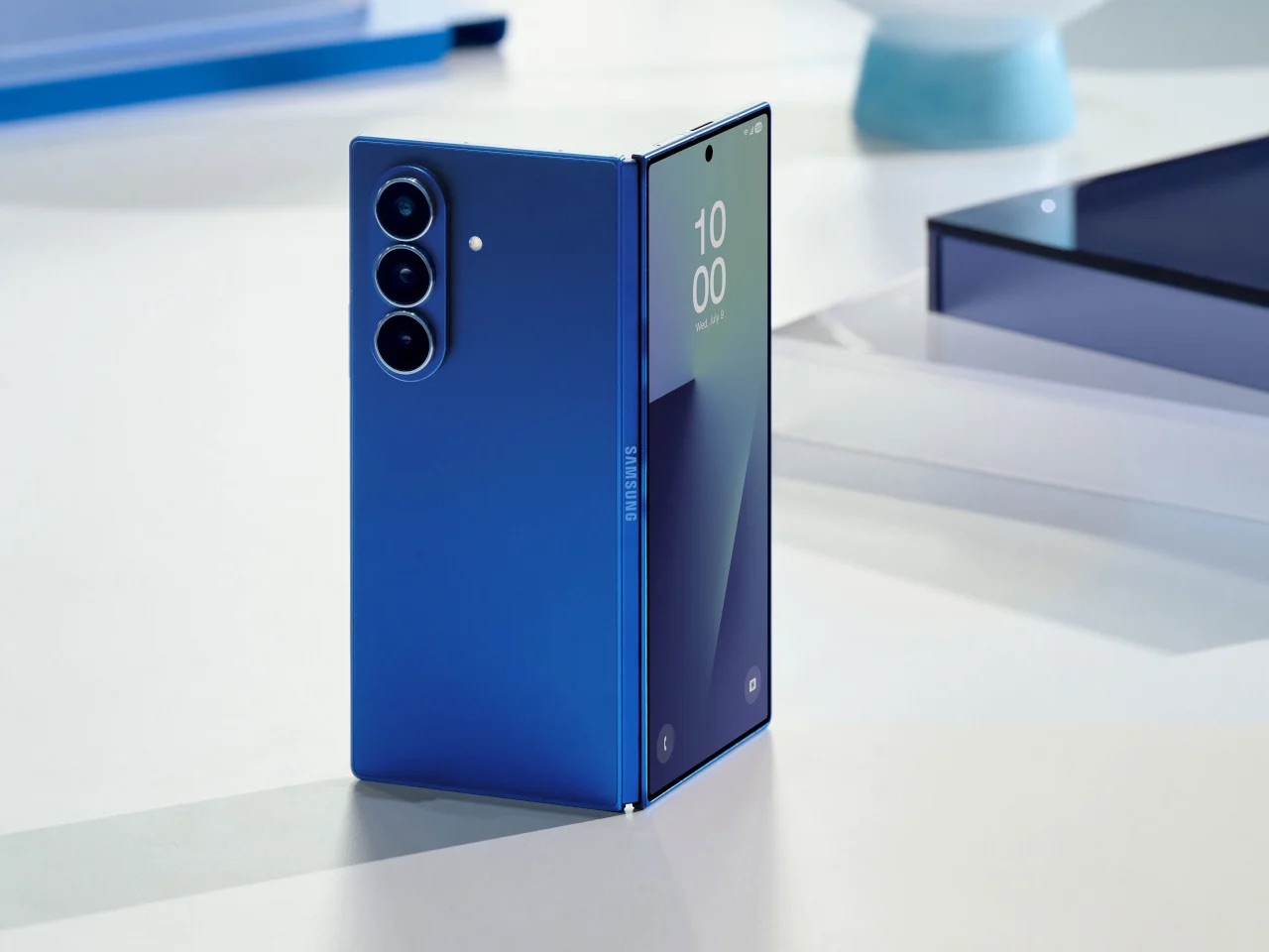
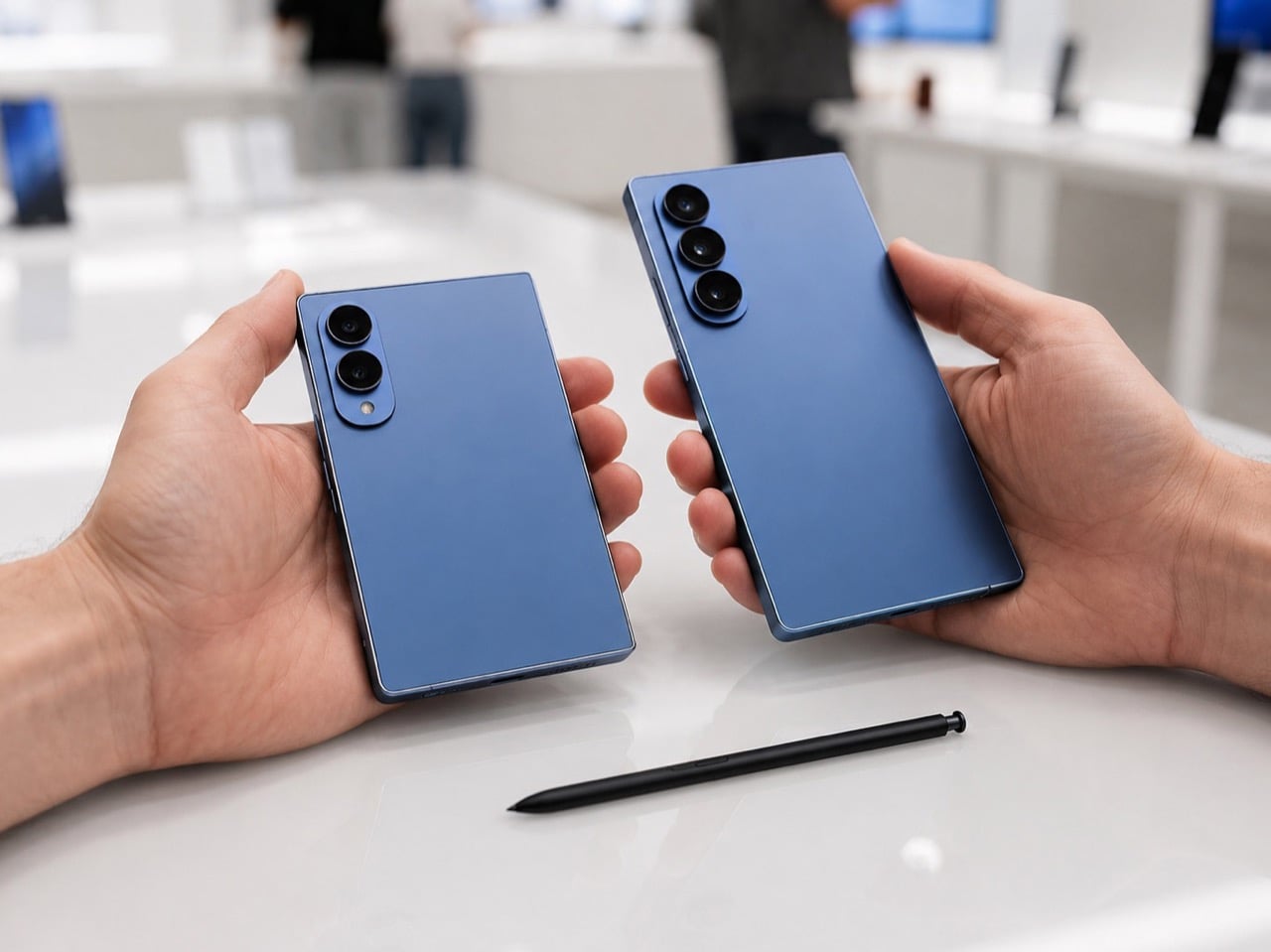
Galaxy Z Fold 8: July 22 date confirmed, S Pen returns

Samsung has spent years pushing the Galaxy Z Fold toward a cleaner, slimmer silhouette, treating thinness like the ultimate expression of foldable progress. That approach gave the Fold 7 a sharper visual identity, but it also stripped away one of the features that helped define the device as a serious productivity tool. Now, with the Galaxy Z Fold 8 expected to bring back S Pen support, Samsung seems ready to revisit the balance between elegance and utility.

That shift could make the Fold 8 one of the most revealing foldables the company has made yet. A fractionally thicker body may sound minor on paper, yet in design terms it signals a broader change in priorities. The next Fold may show that maturity in foldable design comes from restoring capability, refining ergonomics, and building a device people want to live with every day.

Designer: Samsung

The Fold 7 was a genuinely impressive piece of engineering, arriving at 4.2mm when unfolded and claiming the title of the thinnest book-style foldable on the market at the time. That number made headlines and performed well in comparison videos. What it cost, though, was the S Pen digitizer layer, a piece of hardware Samsung had to physically remove to achieve that profile. For users who bought into the Fold precisely because of its large-screen, stylus-ready workflow, that tradeoff landed hard.

The S Pen on earlier Galaxy Z Fold devices was never a casual accessory. It turned the inner display into a note-taking canvas, a sketching board, and a precision annotation tool, especially useful for professionals bouncing between documents and apps on the go. Removing it reduced the Fold 7 to a premium hardware story without the software depth to back it up for power users. Thinner, yes. More complete, arguably not.

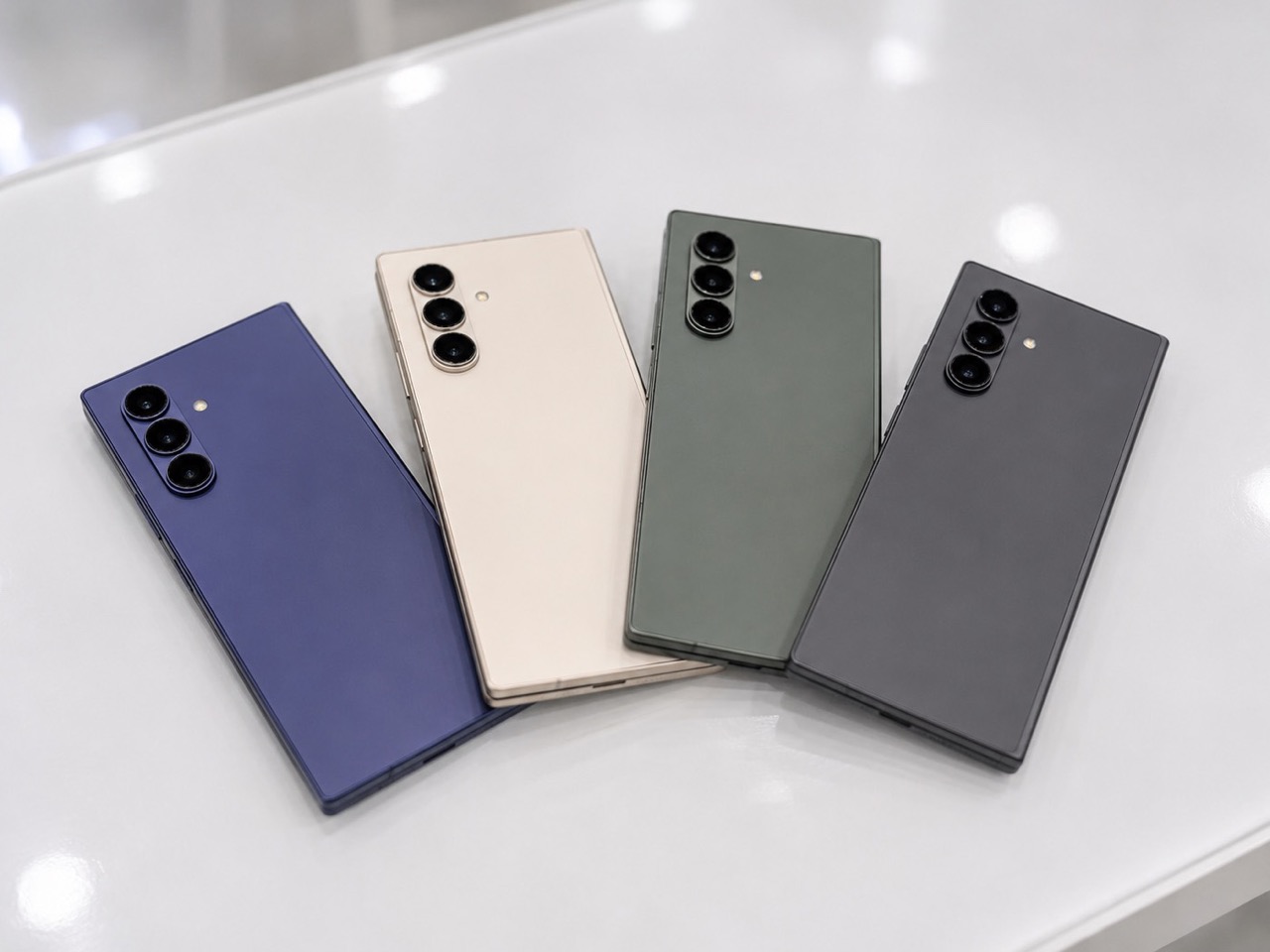
What makes the lead-up to July 22 particularly interesting is how complicated the S Pen picture has become. According to multiple leaked spec sheets and tipster reports, the standard Galaxy Z Fold 8 and the new Fold 8 Wide variant may both launch without S Pen support, with Samsung reportedly continuing its thinness-first approach for those models. The standard Fold 8 could come in at 4.1mm unfolded, the Wide at an even leaner 3.9mm (pre-empting Apple’s own wide iPhone Ultra), numbers that suggest Samsung has no intention of walking back the Fold 7 philosophy across the board. The S Pen story, if it holds, belongs to a third model entirely. A Fold 8 Ultra appears to be where Samsung is routing the stylus comeback, alongside a wider display orientation and a 5,000mAh battery that would represent the first meaningful capacity upgrade for the Fold line since the Fold 3.

The Fold 7 used a titanium backplate, a strong and lightweight choice that also happens to be poorly suited to the digitizer layer S Pen functionality requires. Reports have suggested Samsung may shift the Fold 8 Ultra to a combination of titanium and carbon fiber reinforced plastic, a material used in earlier Fold models that works far more naturally with stylus hardware. The material choice, in other words, may be less about aesthetics and more about what the device is structurally allowed to do.

Samsung is also reportedly researching a digitizer-free stylus solution that would remove the hardware dependency altogether, potentially allowing S Pen-style input on ultra-thin builds in future generations. That research, if it eventually ships in a product, would be one of the more significant industrial design developments in the foldable category, because it decouples a core productivity feature from physical bulk entirely.

What Samsung appears to be attempting with the Fold 8 lineup is something more architecturally ambitious than a single model update. A tiered approach, with the standard Fold chasing thinness, the Wide offering a tablet-like aspect ratio, and the Ultra absorbing the S Pen and flagship camera system, is a bet that different foldable buyers want fundamentally different things from the same category. Whether that structure serves users better than one well-resolved device is a question worth raising, because fragmentation across three models can dilute the identity of each one. Ask Apple how they felt about launching 3 iPhone SKUs in the same September launch. Rumor has it Ternus is changing that, and only announcing the Pro iPhones this September.

Still, the design direction Samsung is pointing toward with the Ultra is the more honest one. A foldable that accepts a few extra millimeters in exchange for a stylus, a bigger battery, and a wider display is a device making peace with what the form factor actually needs to be useful. Thinness is a compelling engineering goal. Usability is a more durable design ambition, and the Fold 8 Ultra, if the leaks hold, may finally be the version of this phone that stops apologizing for being a productivity tool.

The July 22 Unpacked event in London will confirm how much of this actually ships. But the shape of what Samsung is building already says something worth paying attention to.

The post Galaxy Z Fold 8: July 22 date confirmed, S Pen returns first appeared on Yanko Design.

A LEGO Fan Recreated Gustav Klimt’s Iconic Artwork ‘The Kiss,’ Gold Studs and All

At the start of the twentieth century, a group of Austrian artists got tired of the stuffy academic painting establishment in Vienna and broke away to form their own movement. They called it the Secession, and their unofficial leader was Gustav Klimt, a man with a gold fixation and a habit of scandalizing polite society with erotically charged, symbol-heavy paintings. The Kiss, finished in 1908, became the movement’s defining image, a couple locked in an embrace inside a cocoon of gold ornament.

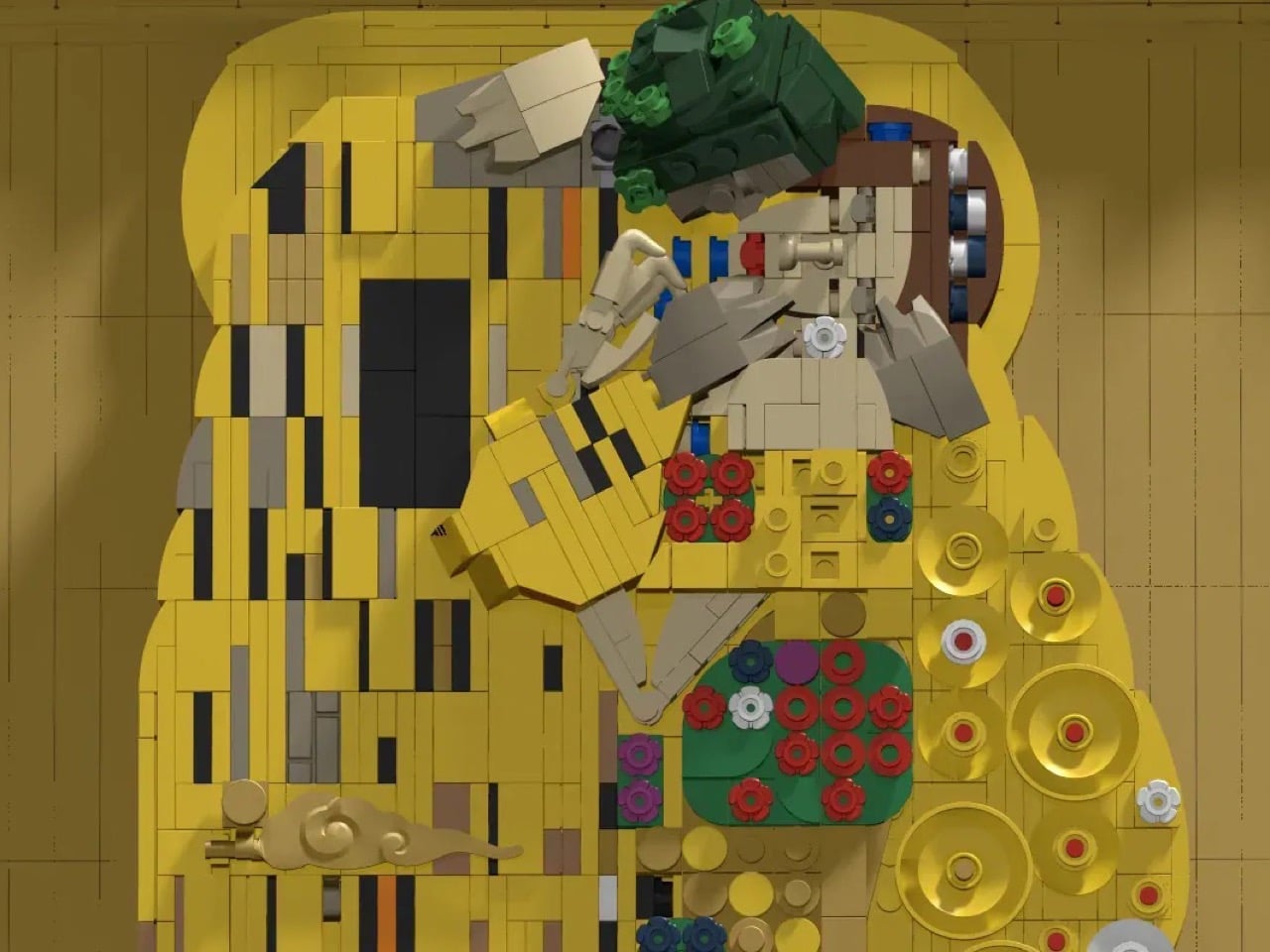
More than a century later, that same image has found an unlikely new medium. Builder CYM-Create_Your_Mind has translated Klimt’s masterpiece into a LEGO mosaic spanning 44 by 44 stud compartments, deliberately built as a perfect square to honor the artist’s own preference for square canvases, right down to a detachable minifigure of Klimt himself sitting in a chair beside the piece.

Designer: CYM-Create_Your_Mind

Klimt painted most of his major works on square canvases, a stubborn formal choice that gave his compositions a strange, almost claustrophobic intimacy. The original Kiss measures 180 by 180 centimeters, and CYM-Create_Your_Mind has mirrored that exact ratio in brick form, using pearl gold pieces across the entire background to chase the effect of real gold leaf, since Klimt was known widely enough as the Painter of Gold that his contemporaries used the nickname as a compliment and an accusation in equal measure. Getting that shimmer right in LEGO, a material with all the metallic subtlety of a cereal box, is a genuinely tricky bit of engineering, and the built up layers of gold tiles and plates manage to catch light in a way flat mosaics usually cannot.

The figures share an uncanny similarity, which is rare considering LEGO tends to abstract details – here the details really aren’t lost as much as they’ve been caricatured in brick. The man’s robe is rendered in a strict, angular pattern of black rectangles, while the woman’s dress dissolves into circles and floral bursts, a distinction Klimt used deliberately to separate masculine and feminine visual language within the same golden shroud. Around 2,850 pieces went into achieving that contrast, and the level of facial detail, from the woman’s tilted head to the man’s mostly hidden profile, holds up remarkably well at mosaic resolution, which is where most brick portraits tend to fall apart into mush. My favorite touch is the tiny tile bearing a copy of Klimt’s actual signature, tucked quietly beside the figures the way it appears in the original painting, a small detail that turns a tribute into something closer to a facsimile.

CYM-Create_Your_Mind added a separate, removable minifigure of Klimt himself, seated in a chair beside his own creation. The reasoning, as the designer explains it, comes from an image of the painter sitting quietly in his studio, a symbolic gesture toward an artist who was famously private and rarely photographed working. It is a small addition that adds a layer of narrative to what could have otherwise been a straightforward wall piece.

The project is currently sitting at 759 supporters on LEGO Ideas, with 527 days left on the clock to reach the 5,000 needed to trigger an official review. Klimt fans, art history nerds, and anyone who has ever walked past a poster print of this painting in a dorm room hallway without really looking at it now have a good excuse to look twice. You can head to the LEGO Ideas page and cast your vote.

The post A LEGO Fan Recreated Gustav Klimt’s Iconic Artwork ‘The Kiss,’ Gold Studs and All first appeared on Yanko Design.

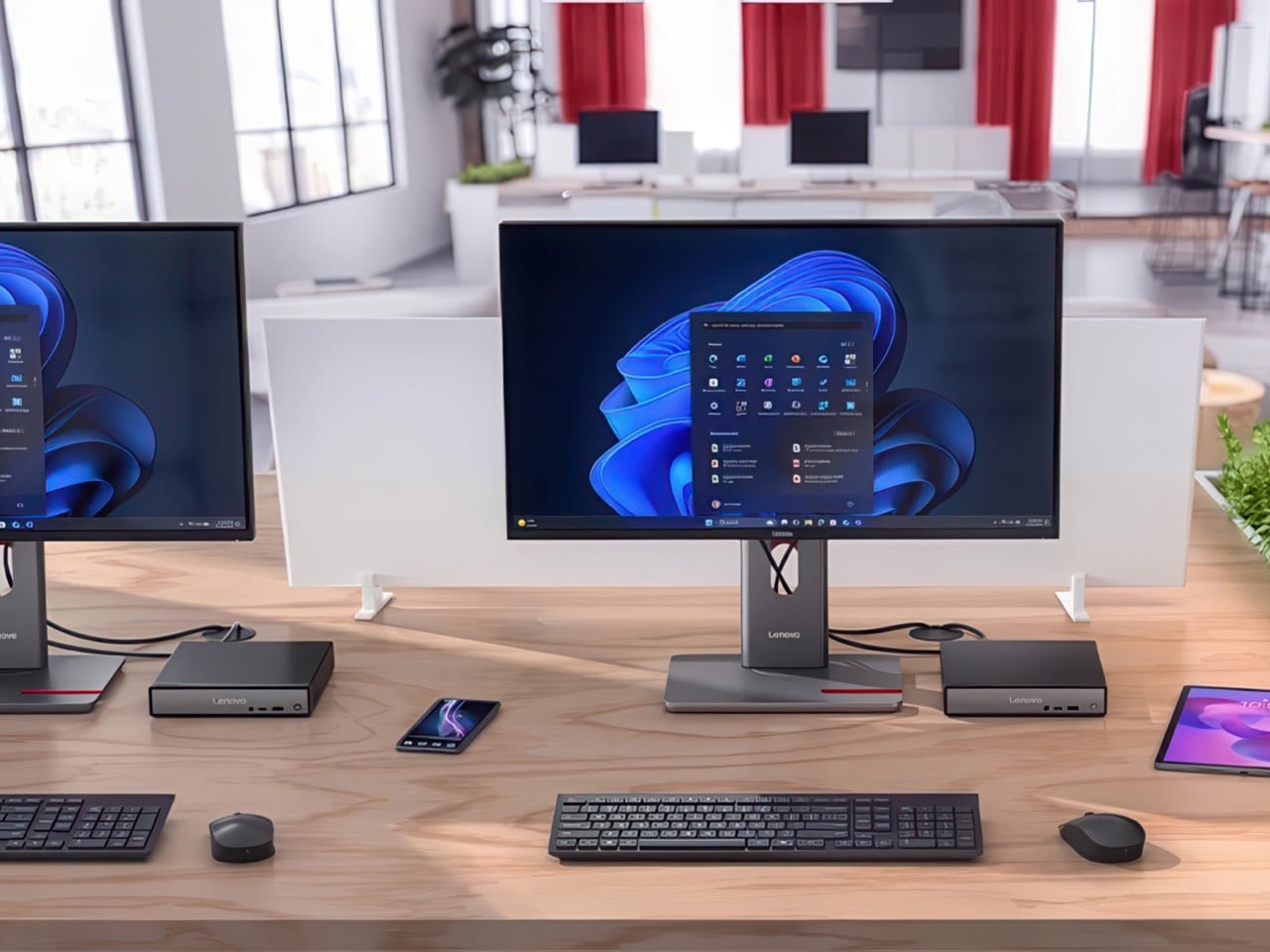
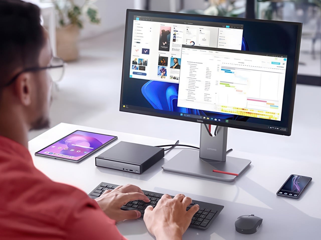
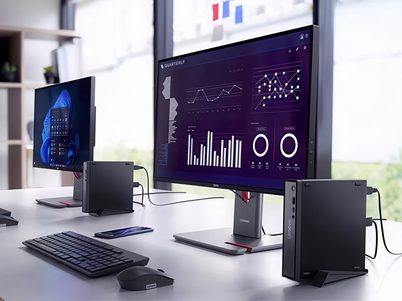
Lenovo Fit a 16GB Intel Lunar Lake PC Into the Size of a Coffee Table Book

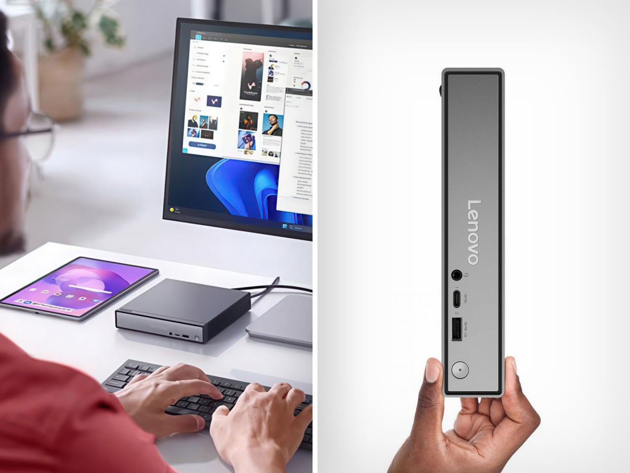
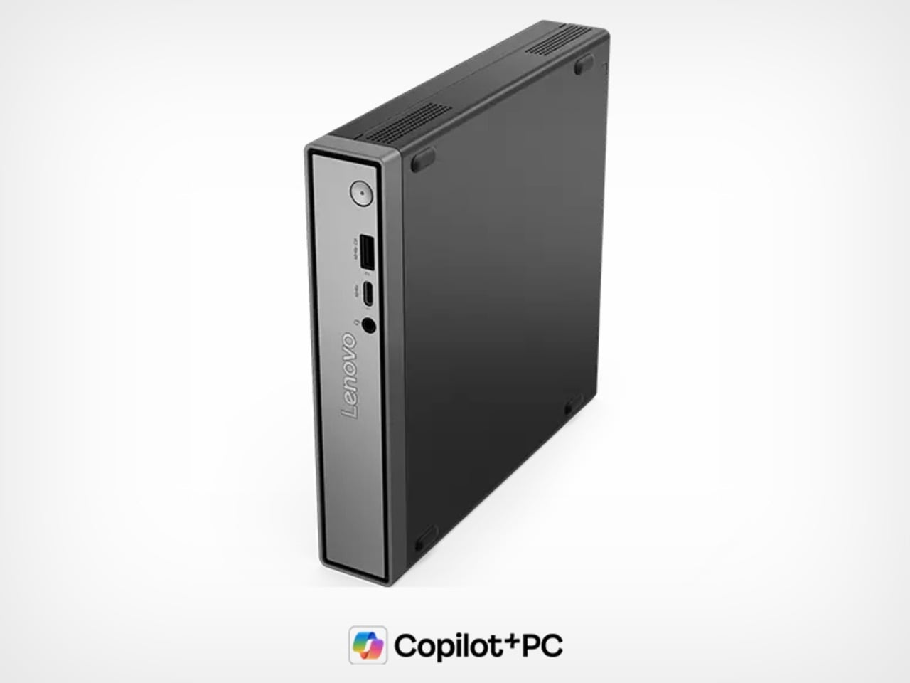
Here’s a business plan Lenovo isn’t charging me for. Take the ThinkCentre Neo 50q Gen 6, wrap it in a fake hardcover dust jacket, maybe something moody like a Wes Anderson film still or a Rothko print, and suddenly you’ve got a Windows PC that looks like Design Within Reach decor instead of IT department surplus. The dimensions practically beg for it already, a 7 by 7 inch footprint with the thickness of an actual coffee table book sitting on your shelf. Nobody’s ever accused a mini PC of being aspirational furniture before, but this one has the bone structure for it. Every competitor in this category is still shipping matte black rectangles that scream “asset tag pending,” while Lenovo accidentally built something you’d want visible on a shelf. All that’s missing is the marketing team connecting the dots.

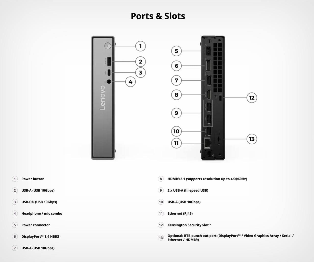
Underneath the cosplay, the Neo 50q Gen 6 (Intel) starts at $1,179 with a Core Ultra 5 226V, 16GB of soldered LPDDR5X-8533 RAM, and a 512GB SSD, replacing the Snapdragon X1-26-100 that powered the previous version of this exact chassis. That base chip brings 8 cores, clock speeds up to 4.5 GHz, a 40 TOPS NPU for local AI tasks, and Intel Arc 130V graphics, which is a lot of silicon to hide behind a fake book cover. Stepping up to the Core Ultra 7 256V for $1,619 doubles storage to 1TB and adds a faster NPU with Arc 140V graphics. Ports hold steady across both configurations, including a 10Gbps USB-C port, Wi-Fi 6, Bluetooth 5.1, HDMI 2.1, DisplayPort 1.4, and Gigabit Ethernet. At 5.27 lbs, this thing has actual heft to it, further selling the illusion that you’ve got a hardback sitting there instead of a full Windows desktop.

Designer: Lenovo

Swapping Snapdragon for Lunar Lake says something about how the ARM-on-Windows experiment is actually going. Qualcomm’s chip inside the original Neo 50q promised efficiency and always-on connectivity, the same pitch Microsoft has been making since Windows on ARM first launched. Lenovo clearly wanted an Intel option sitting right next to it on the shelf rather than retiring the ARM version outright, which suggests demand for x86 compatibility hasn’t disappeared just because Copilot+ PCs got a marketing push. Lunar Lake specifically brings a 40 TOPS NPU into a category that rarely got AI acceleration until recently, putting a genuinely modern chip inside a chassis that hasn’t changed its footprint at all. That’s the quiet story buried under the spec sheet, a company hedging its bets on which architecture actually wins the office desktop in 2026.

Positioned against the rest of the mini PC market, the pricing lands in a strange middle ground. Intel NUC successors and Beelink boxes routinely undercut this by a few hundred dollars while offering comparable specs, though usually without Lenovo’s enterprise support and warranty backing. Mac mini buyers get more raw performance per dollar from Apple silicon, but obviously lose Windows compatibility entirely, which matters for any office still running legacy software. The ThinkCentre badge itself carries weight here too, since IT departments buying in bulk care more about fleet management and driver support than they do about a machine’s coffee table book cosplay. Lenovo isn’t trying to win on raw value against the Beelinks of the world. It’s selling reliability with a side of, apparently, unintentional interior design cred.

Whether Lenovo ever leans into the aesthetic angle on purpose remains the real open question here. Right now the ThinkCentre Neo 50q Gen 6 is being sold purely on specs and price, with nobody at Lenovo seemingly aware that they’ve built something small and handsome enough to just leave out in the open. Somebody in an office is going to genuinely mistake this for a book at some point, and honestly, that’s a better problem to have than another beige box nobody wants to look at. Until Lenovo catches on, you’ll just have to buy the sleeve yourself.

The post Lenovo Fit a 16GB Intel Lunar Lake PC Into the Size of a Coffee Table Book first appeared on Yanko Design.

7 Best Gadgets & Gear for Digital Nomads in 2026 That Turn Any Café Into a Proper Studio

The bag you carry into every shared space tells a story before the laptop opens. For years that story was functional at best, a charger shaped like a building block, a mouse borrowed from the budget shelf, a phone that looked underdressed next to the work it was doing. Something has shifted. The tools nomads carry in 2026 are beginning to look as considered as the work they produce. The standards have moved, and the products have followed.

What separates a setup that earns the table from one that simply occupies it is rarely one product. It is the accumulation of small, deliberate choices made across everything you reach for during a session. Each of the seven products here earns its slot not by being the loudest option in its category, but by being the most resolved. The café table becomes a studio when every object placed on it was designed to be there.
1. Nothing Phone (4a)

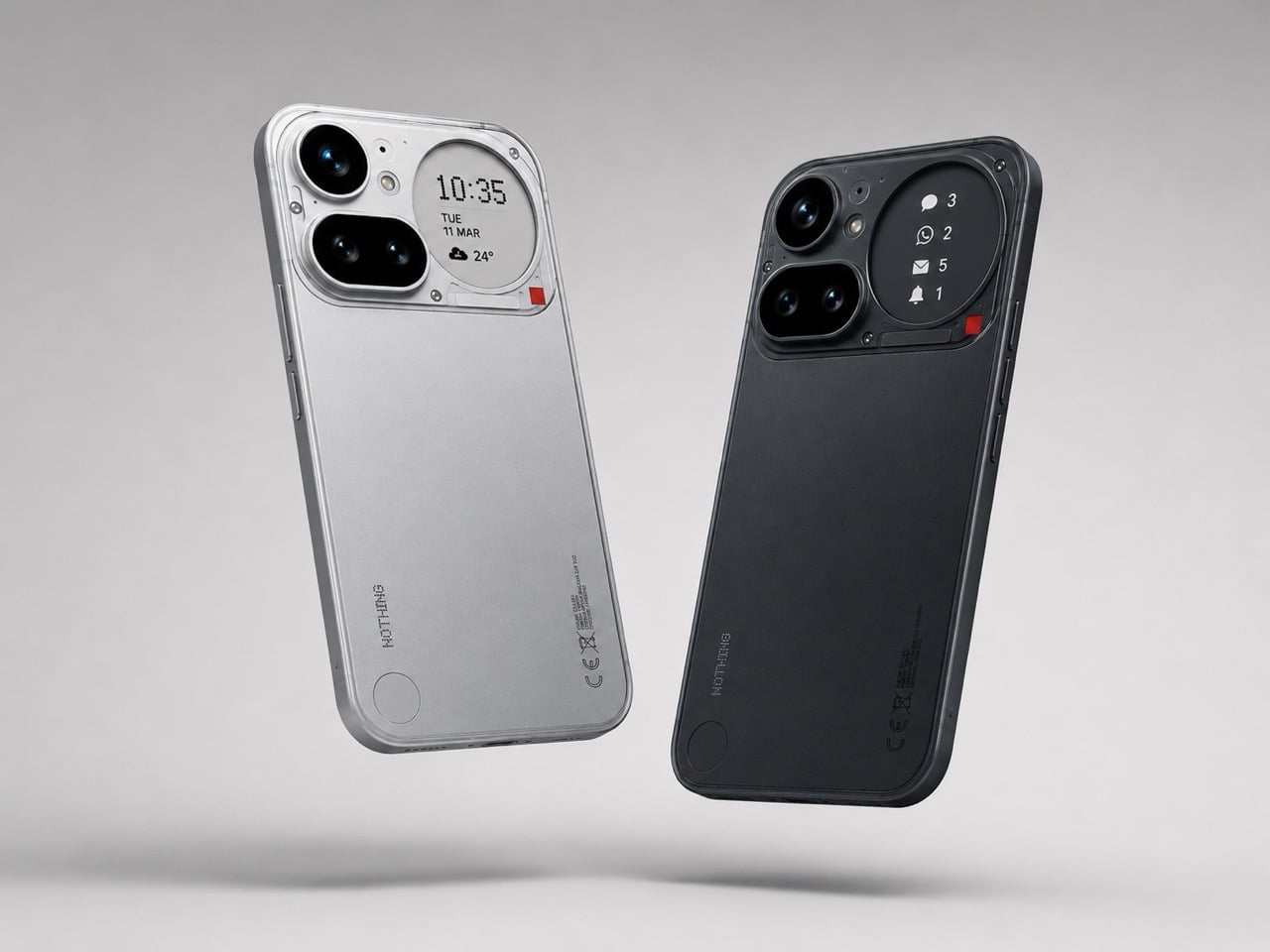
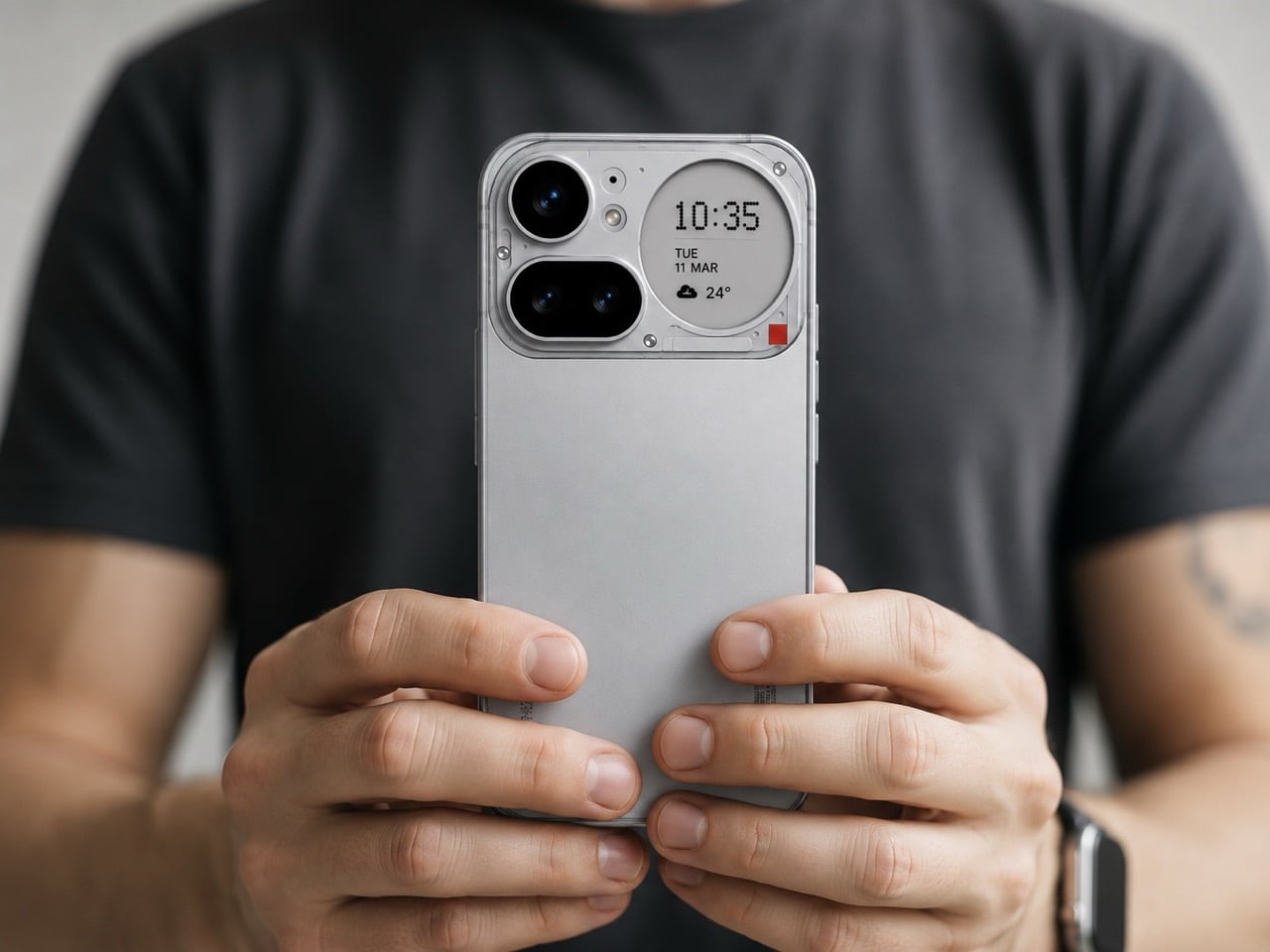
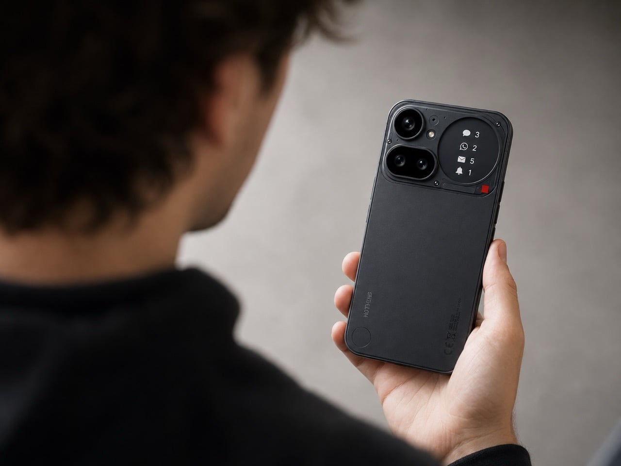
Most work phones carry a quiet contradiction: chosen for a camera or a price point rather than anything that makes them genuinely pleasant to hold for eight hours. The Nothing 4a disrupts that at the industrial design level. A transparent rear that reveals its internal architecture rather than concealing it, a Glyph interface that surfaces notifications without demanding the screen, and a material language borrowed from industrial design more than consumer electronics. It is the phone that actually earns its place on a considered desk.

For you, the benefit is a device that reads as intentional in every environment it enters. Boardrooms, airport lounges, café counters: the Nothing 4a does not look borrowed or accidental. The Glyph system means you can leave the phone face-up and receive the information you need without performing a full screen unlock, keeping your attention where the work is. A phone that manages your attention rather than capturing it is a different category of tool entirely, and that distinction compounds across a full working day.

What we like:

  • The transparent rear turns the phone into a design object without adding a single gram or millimeter of unnecessary material
  • The Glyph interface filters information at a glance, reducing the number of times you unlock the screen during a focused session

What we dislike:

  • The aesthetic confidence that makes the Nothing 4a distinctive will read as a deliberate signal in environments where understated hardware is the professional norm
  • Transparent backs accumulate fingerprints more visibly than opaque finishes, which means the phone looks its best roughly twenty seconds after you set it down

2. OrigamiSwift Mouse

Travel mice have been solved in the wrong direction for decades. The industry shrank them, which created smaller cramps rather than better tools. The OrigamiSwift is built around a different premise: transformation rather than compression. It collapses to card-sized flatness via magnetic clips, then opens into a fully contoured ergonomic mouse that fills a palm the way a stationary mouse does. At 40 grams, it disappears into a jacket pocket. Its polygonal geometry earns its grip through structure rather than rubber texture.

For you, the value is arriving at any surface with precision input that a trackpad cannot replicate without penalty. Extended editing sessions, dense spreadsheets, precise layout work: the OrigamiSwift removes every excuse for not carrying a proper mouse. Bluetooth 5.2 connects without a dongle. A three-month battery life on a single USB-C charge takes it out of the daily rotation of things to remember to charge.

Click Here to Buy Now: $85.00

What we like:

  • Card-flat in the bag, full ergonomic profile on the desk, with no intermediate configuration that compromises either state
  • Three months of battery life on USB-C removes it from the daily charging conversation entirely

What we dislike:

  • The hinge is the most structurally complex component, and daily fold cycles over years could introduce wear that a solid-body mouse accumulates more slowly
  • Scroll feedback is softer than premium stationary alternatives, something certain users register immediately, and others never notice

3. ASUS ZenScreen OLED MQ16FC

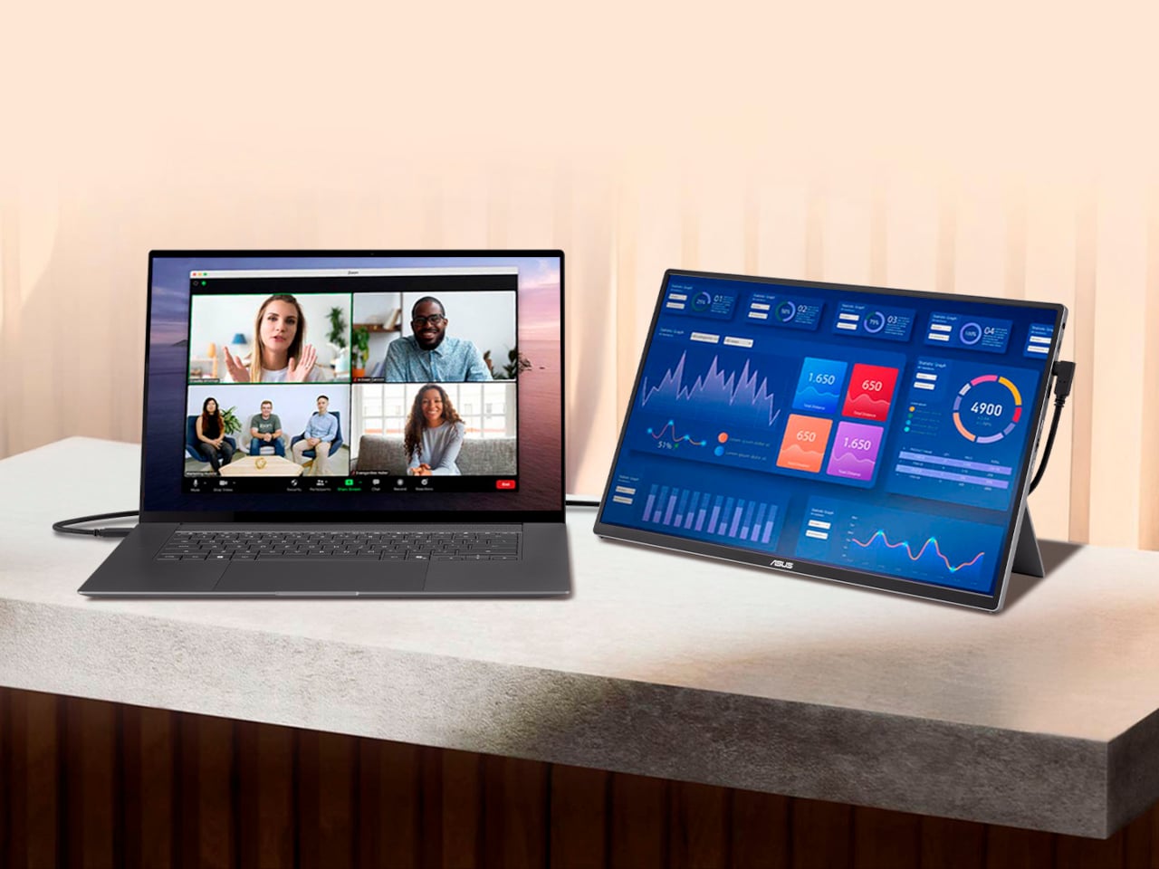
Portable monitors have become standard nomad equipment. The trade-off nobody advertises is the power drain: every secondary screen draws from the laptop it is connected to, shortening the session it was brought along to extend. The ASUS ZenScreen OLED MQ16FC addresses that at the port level. Two USB-C connections that send power in either direction mean plugging a wall charger into the monitor and running a single cable to the laptop charges the notebook while the display runs. One cable, one outlet, both devices fed.

For you, this changes the arithmetic of a café setup. One power outlet handles everything; the laptop charges through the monitor while the session continues uninterrupted. A 16-inch OLED panel at 9mm thin and 0.68 kilograms weighs less than most hardcover books you would carry alongside it. The 16:10 aspect ratio returns the vertical screen space that widescreen layouts consistently remove.

What we like:

  • Bidirectional USB-C power routing means one wall adapter charges both the monitor and the laptop through a single cable, a simplification the portable monitor category should have standardized years ago
  • A 16:10 OLED panel at 9mm thin makes this genuinely portable without the visual compromise that IPS alternatives at the same size still carry

What we dislike:

  • The glossy OLED surface is not your ally on café terraces or near windows, where reflections compete with the content the screen is trying to show you
  • The kickstand-only stand is limiting on uneven or narrow surfaces, and without a wall charger in the loop the bidirectional power advantage disappears entirely

4. Stillframe Headphones

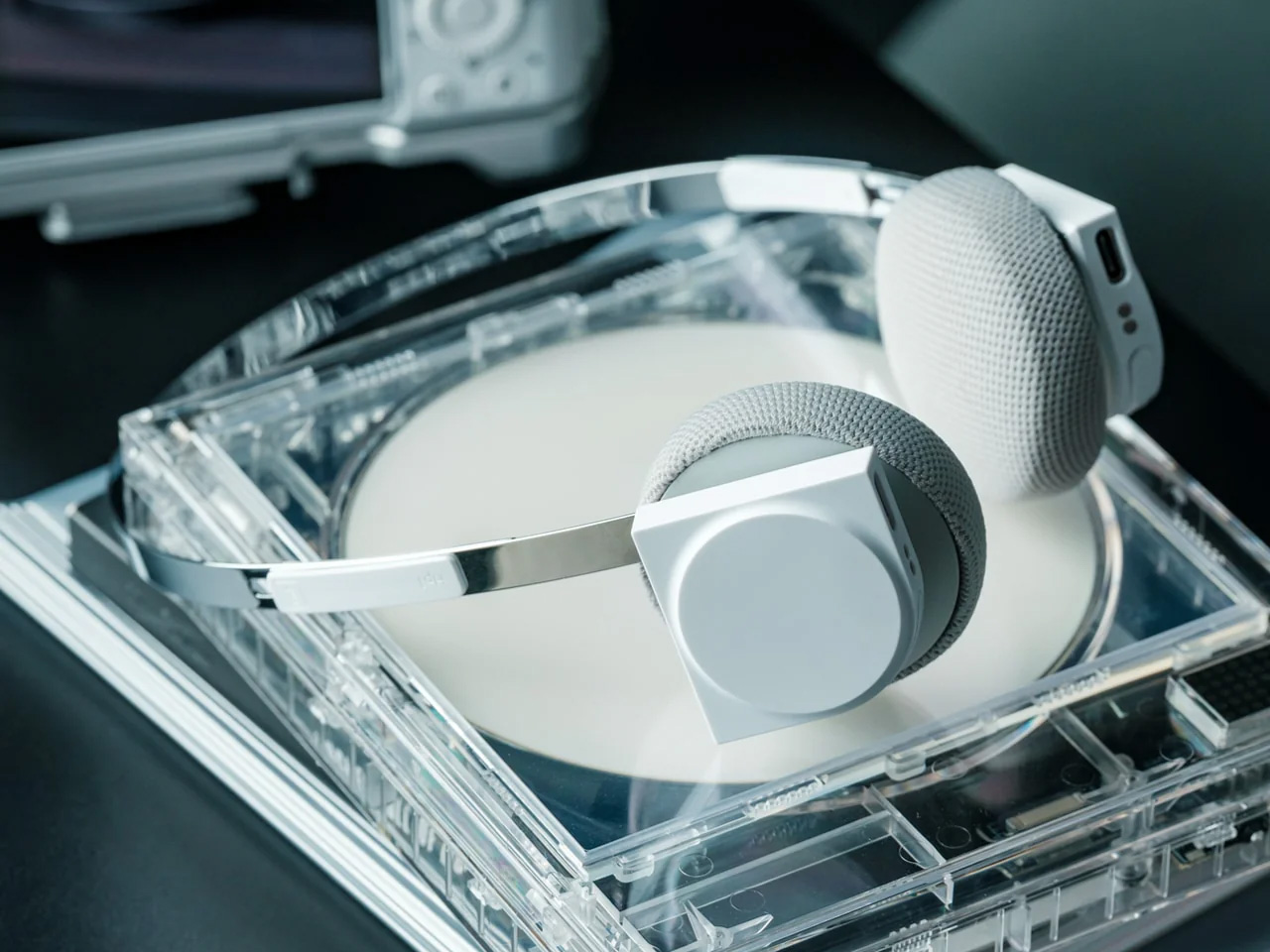
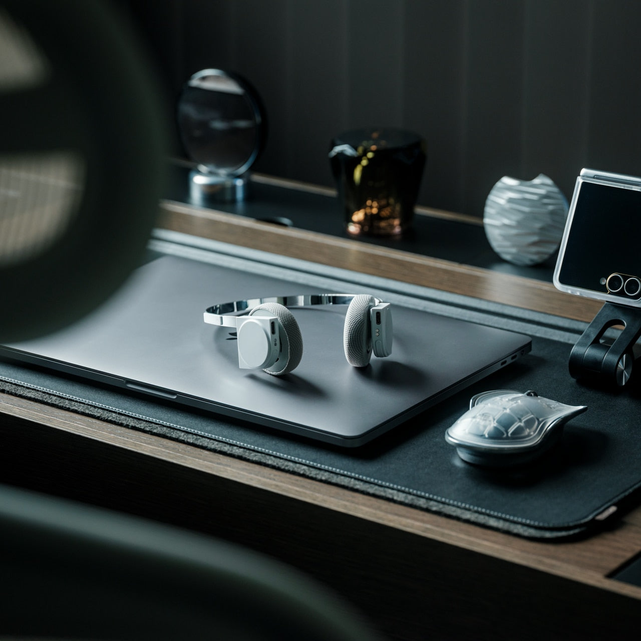
The over-ear headphone has become standard café furniture, which means the design bar is simply to not look like every other pair at the adjacent table. Stillframe takes a quieter approach than most: a minimal frame with a material story that holds up to extended handling, and passive isolation that removes the ambient noise layer without requiring battery charge as an entry fee to concentration. The headphones do what the category promises and rarely delivers: they get out of the way, and they look considered while doing it.

For you, the argument for Stillframe in a nomad kit is as much about weight and packability as it is about sound. Headphones that collapse flat and travel without a dedicated case free up bag volume that protective cases have been quietly borrowing for years. Paired with a phone that manages notifications intelligently, the combination removes the two most consistent interruptions to a working session: ambient noise and screen pulls. The setup earns back the attention that open environments routinely take without asking.

Click Here to Buy Now: $245.00

What we like:

  • Passive isolation that works without battery dependency means the headphones perform equally on a plane, in a café, and in a dead-battery situation
  • A minimal design language holds up across every professional environment without announcing the brand or the price

What we dislike:

  • Over-ear passive designs sacrifice some of the seal that active noise cancellation provides in genuinely loud environments like airport terminals or open-plan offices
  • Without a dedicated case, the finish accumulates contact wear more quickly, which is a real consideration over years of daily travel use

5. Satechi OntheGo Foldable Stand Hub

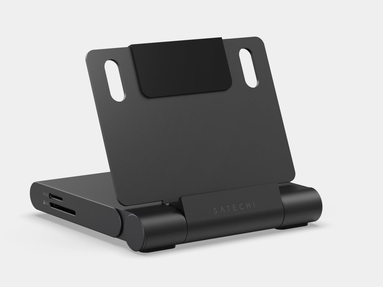
The laptop stand problem has never been about ergonomics alone. It is the deal that comes with raising the screen: a separate keyboard, a separate dock, and a surface cluttered enough to look like you moved in for the week. The Satechi OntheGo Foldable Stand Hub collapses that negotiation into a single 187.5-gram unit. Folded flat at under 20mm, it carries a laptop stand, USB-C dock, SD card reader, and HDMI output, with a 17cm integrated cable that connects everything in one motion.

For you, the value is what it removes from the bag rather than what it adds. Three accessories become one object that fits flat in a laptop sleeve pocket at $79.99, adding no dedicated volume to the packing equation. Deploy it at a table, and the laptop rises to eye level, the dock connects, the screen real estate doubles without a second cable appearing from somewhere. The borrowed surface stops feeling improvised. That shift, from occupying a table to owning one, is what a kit built around intention produces every time.

What we like:

  • Four accessories in one 187.5-gram flat unit means the stand-dock combination adds virtually no bag weight over carrying the laptop alone
  • The 17cm integrated USB-C cable removes the cable that would otherwise need locating from the bottom of the bag before the setup is usable

What we dislike:

  • Stand height is fixed, which suits most working postures but offers none of the angle adjustability that dedicated stands designed for extended sessions provide
  • The port selection is minimal enough that a heavier workflow with multiple peripherals will still need a second hub alongside it

6. MagSafe Power Bank (Qi2.2)

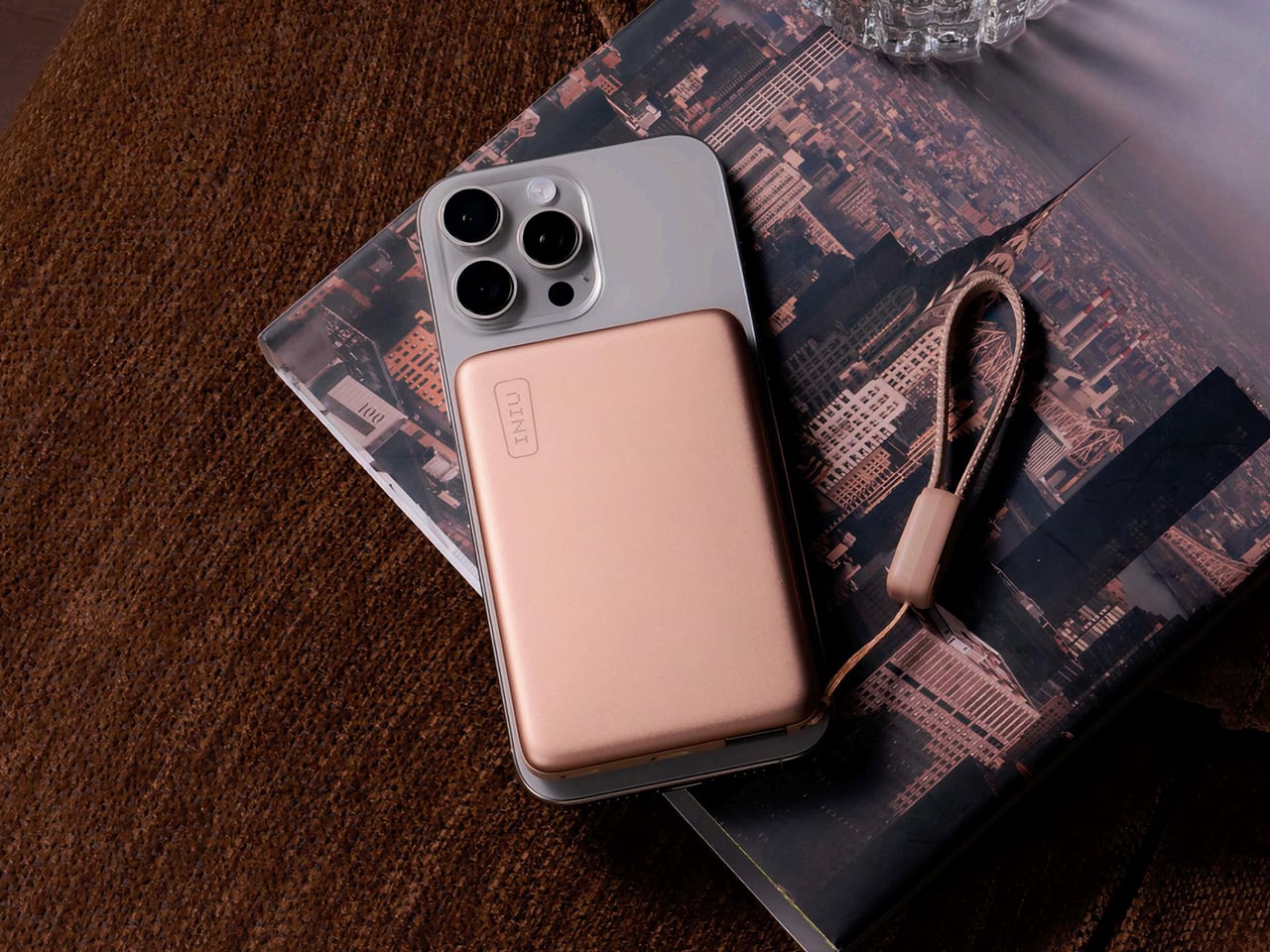
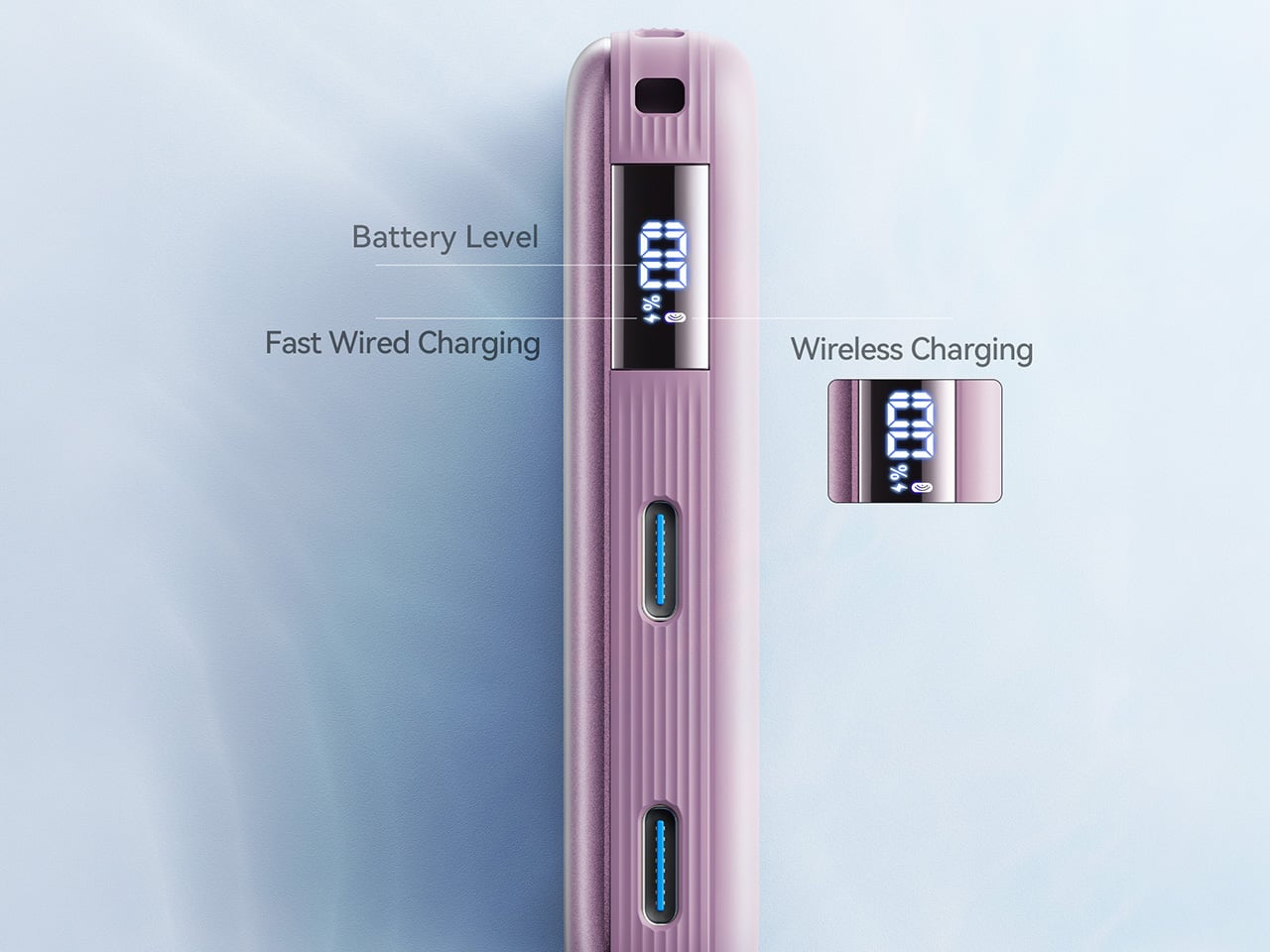
The power bank category has been solving the same problem the same way for a decade: more capacity, same shape, same ritual of fishing a cable from the bottom of a bag before anything charges. The Qi2.2-compatible version changes the interaction at the surface level. At 10,000mAh with 25W wireless output through the Qi2.2 standard and 45W wired through its integrated port, it delivers wall-adapter-speed charging from a device that weighs less than a paperback. Magnetic attachment means placing the phone on it is the complete action.

For you, the practical gain is charging speed that works on a deadline. Previous wireless standards topped out at 15W, useful for overnight top-ups but not for the forty minutes before a meeting starts. At 25W wireless, this bank changes that calculation. At $54.99, it sits at the price where the convenience case is easy to make without the qualifier that it barely charges faster than waiting. The 45W wired port covers everything the wireless standard does not yet reach, including laptops under lighter loads.

What we like:

  • Qi2.2 at 25W is the first wireless standard fast enough to substitute for a wired connection in time-sensitive situations, not just overnight sessions
  • Magnetic attachment removes the cable-to-phone connection from the charging workflow entirely, a small interaction change that compounds across every session

What we dislike:

  • 10,000mAh handles phones and earbuds cleanly but offers only marginal support for laptop charging under any real workload
  • Full Qi2.2 speeds require a compatible recent device; older phones receive standard Qi output that brings the $54.99 proposition back to ground level

7. Inseparable Notebook Pen

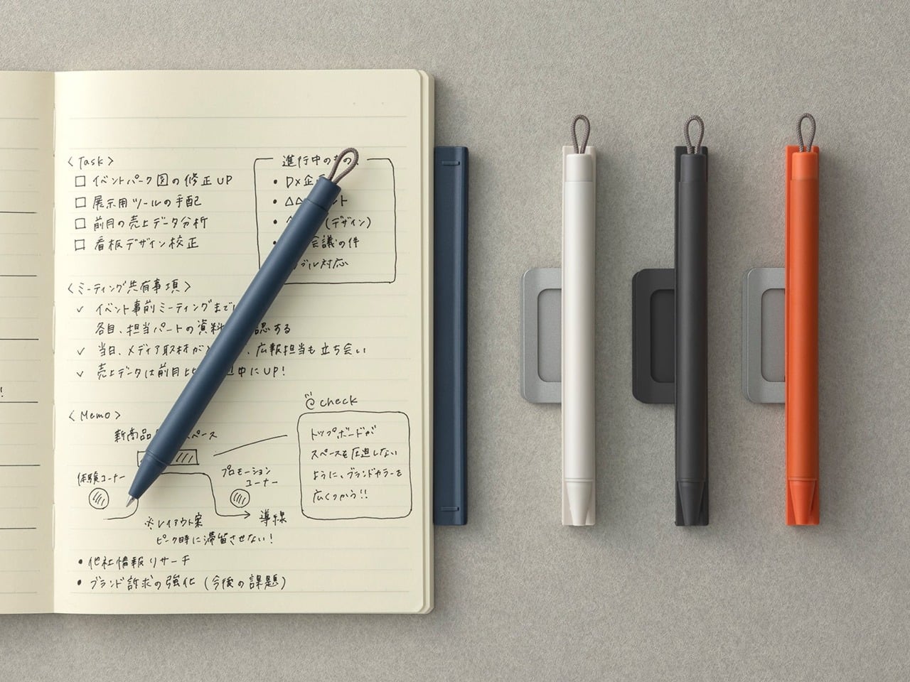
Digital tools handle the work that scales: files that duplicate without cost, edits that undo freely, documents that update across every device at once. None of them handle the moment when the idea arrives faster than the interface. The Inseparable is built for that gap: a pen and notebook designed as a single object, each incomplete without the other. The pen stores magnetically against the notebook’s spine, removes in one gesture, and returns the same way. No cap to misplace. No drawer to search before the thought is gone.

For you, the benefit is analog capture that travels without the compromise of a pen that ends up loose in the lining of a bag. The Inseparable stays together because it was designed to: the magnetic bond holds across the movement a bag accumulates through a full day of travel without releasing unless you intend it to. On a desk built around precision and intention, a notebook and pen that belong together without effort carry exactly the same design logic as everything else placed on the surface. The last object in the kit earns its place the same way the first one did.

Click Here to Buy Now: $19.95

What we like:

  • Magnetic attachment between pen and notebook keeps the analog layer of the kit complete without a separate sleeve, clip, or loop to manage
  • The combined object makes a quiet argument about paired tools that every other notebook and pen combination treats as an afterthought

What we dislike:

  • The magnetic bond strength that holds the pen through a day of travel is the same resistance you pull against when you reach for it quickly: a tension the design resolves in most situations but not all
  • As a paired product, replacing one half when the other wears out means sourcing within the same ecosystem rather than reaching for any compatible alternative

The Studio Is the Kit You Carry Into It

The setup that makes a borrowed table feel chosen does not require ten accessories and a cable management plan. It requires seven products that each solved a specific problem in a way that leaves nothing clumsy behind. A phone that manages your attention. A mouse that folds to a card. A monitor that charges the laptop while it runs. An analog layer that stays together because it was designed to. The whole is more than the parts, but the parts have to earn it first.

Nomad work in 2026 is no longer defined by what you can endure on a borrowed surface. The tools exist to make the temporary feel permanent, the accidental feel deliberate, the afternoon productive without apology. Every object here was designed with that intention, and the desk they build together reflects the same judgment you bring to everything else the work asks you to care about. The studio is not a place. It is the kit you carry into it.

The post 7 Best Gadgets & Gear for Digital Nomads in 2026 That Turn Any Café Into a Proper Studio first appeared on Yanko Design.