Sometimes sons have to learn, usually the hard way, that flowers are a placeholder. They wilt. They sit in a vase she’ll move twice and quietly toss out by Thursday. What your mom actually wants is something she’d never buy for herself — something with real thought behind it, personality baked in, and a story worth telling when a friend stops to ask where she got it.
These five gifts check all of those boxes. They’re objects designed with the kind of intention that lingers well past the occasion — each one worth keeping long after the wrapping is gone. None of them needs a card that says “Hope your day is blooming.” Each one arrives with a distinct personality, a function, and the quiet confidence of someone who actually stopped to think it all the way through.
1. Side A Cassette Speaker
For the mom who made you mixtapes before Spotify existed

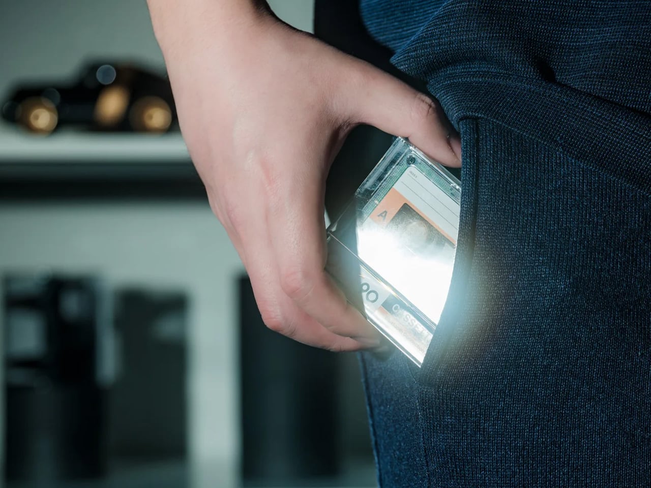
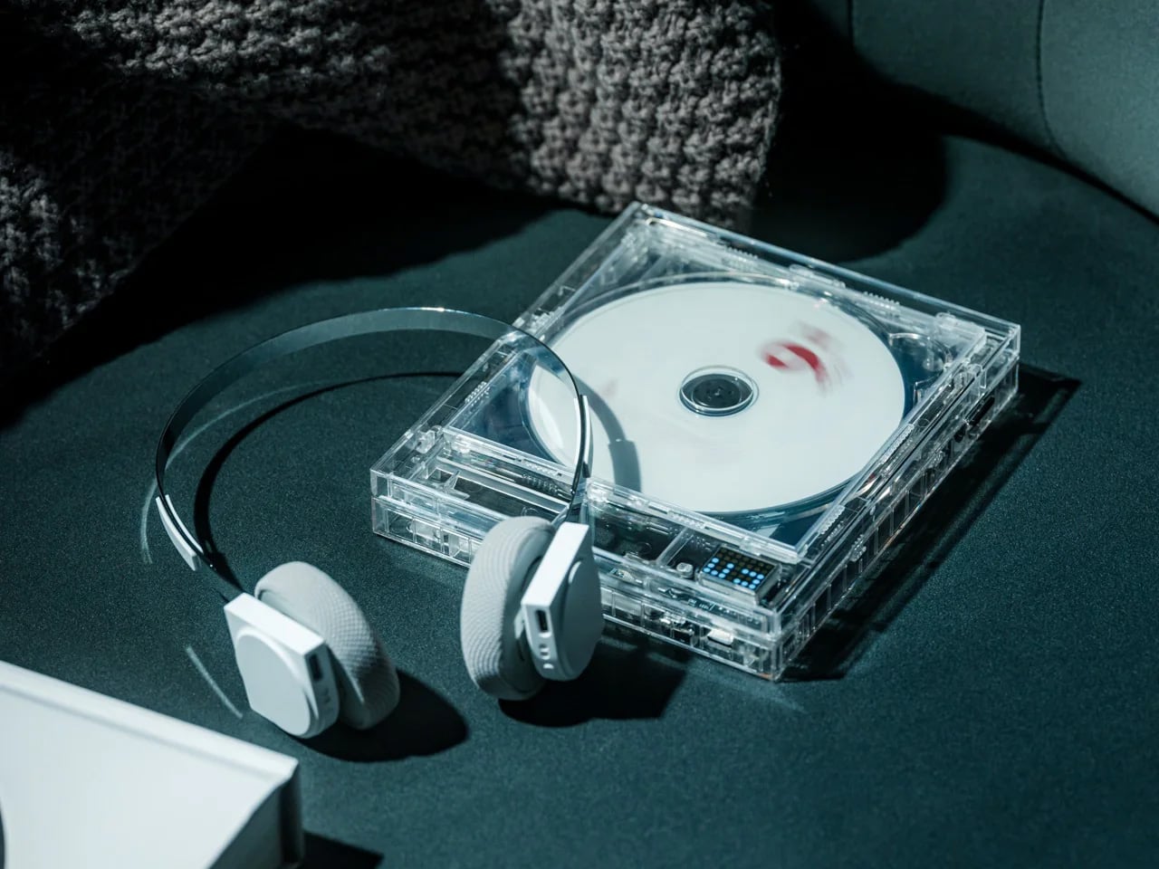
There’s something quietly emotional about a gift that references a time before streaming, before algorithms, before a machine decided what she should listen to next. The Side A Cassette Speaker is built to look, feel, and nearly sound like a real mixtape — transparent shell, side A label, and that satisfying analog weight in your hand. It’s a faithful recreation that doubles as a Bluetooth 5.3 speaker with microSD playback. At under $50, it earns a permanent spot on the shelf rather than a junk drawer.
What makes it work as a gift isn’t just the nostalgia — it’s the warmth. The audio is tuned to echo tape playback: soft, rich, and surprisingly full for its compact size. It runs six hours at max volume and recharges in two, with a clear case that doubles as a display stand. Whether she keeps it on a desk, a kitchen counter, or a bedside table, the Side A sits somewhere between speaker and shelf object. That combination is genuinely rare at this price point.
Click Here to Buy Now: $49.00
What We Like
- Cassette-accurate design makes it display-worthy on any shelf, functioning as both a working speaker and a nostalgic art object that earns its footprint
- The sub-$50 price punches well above its weight in character, making it one of the most considered value plays on this entire list
What We Dislike
- Six-hour battery life means it won’t carry an all-day outdoor gathering without a recharge somewhere in the middle
- microSD playback supports MP3 only, which may frustrate anyone working from a library of lossless or alternative audio formats
2. Lumio Lito Classic Book Lamp
For the mom whose bedside table deserves something worth looking at

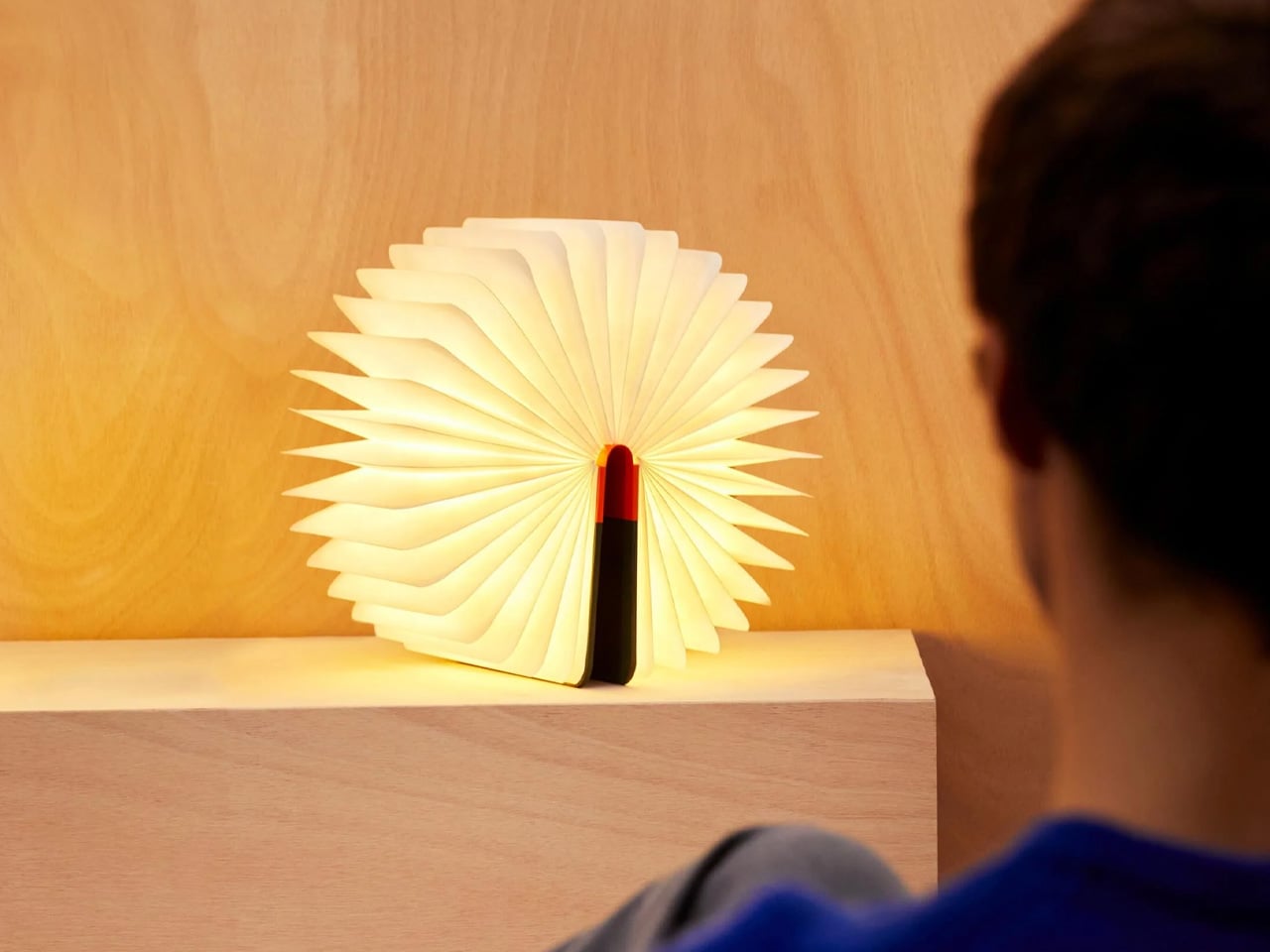
At first glance, it’s a hardcover book. Open it, and it becomes a lamp — warm, sculptural, and quietly brilliant. The Lito Classic by Lumio earned its Red Dot and Good Design awards not through a spec sheet, but through the kind of elegant problem-solving that makes you wonder why all lamps don’t work this way. It’s portable, runs eight hours on a single charge, and now comes in British Racing Green, Navy Blue, and Vibrant Red. Each colorway is finished to let the natural wood grain breathe through in a way that photographs simply don’t fully capture.
The New York Times called it “a gift that amazes,” and for once, the blurb earns its space. For any mom who hosts dinners, reads late, or simply has an eye for objects that justify their presence, the Lito is the kind of lamp she’ll reach for constantly without quite being able to explain why. It works on a dining table as naturally as a nightstand, indoors as naturally as a patio. It’s the rare gift that doesn’t just land well on the day — it earns its place over months of use.
What We Like
- Holds genuine design credentials: the Red Dot and Good Design awards reflect real craft and thoughtfulness, not just clever marketing
- Eight-hour battery life and full portability make it equally at home on a nightstand, a dinner table, or a porch on a warm evening
What We Dislike
- The price puts it firmly in the intentional-gift category, so it works best when chosen deliberately rather than grabbed as a last-minute solution
- The book disguise, while clever, may confuse first-time guests until they reach for it, which is either a feature or a flaw, depending entirely on your mom
3. Miniature Bonfire Wood Diffuser Set
For the mom who calls the outdoors her reset button
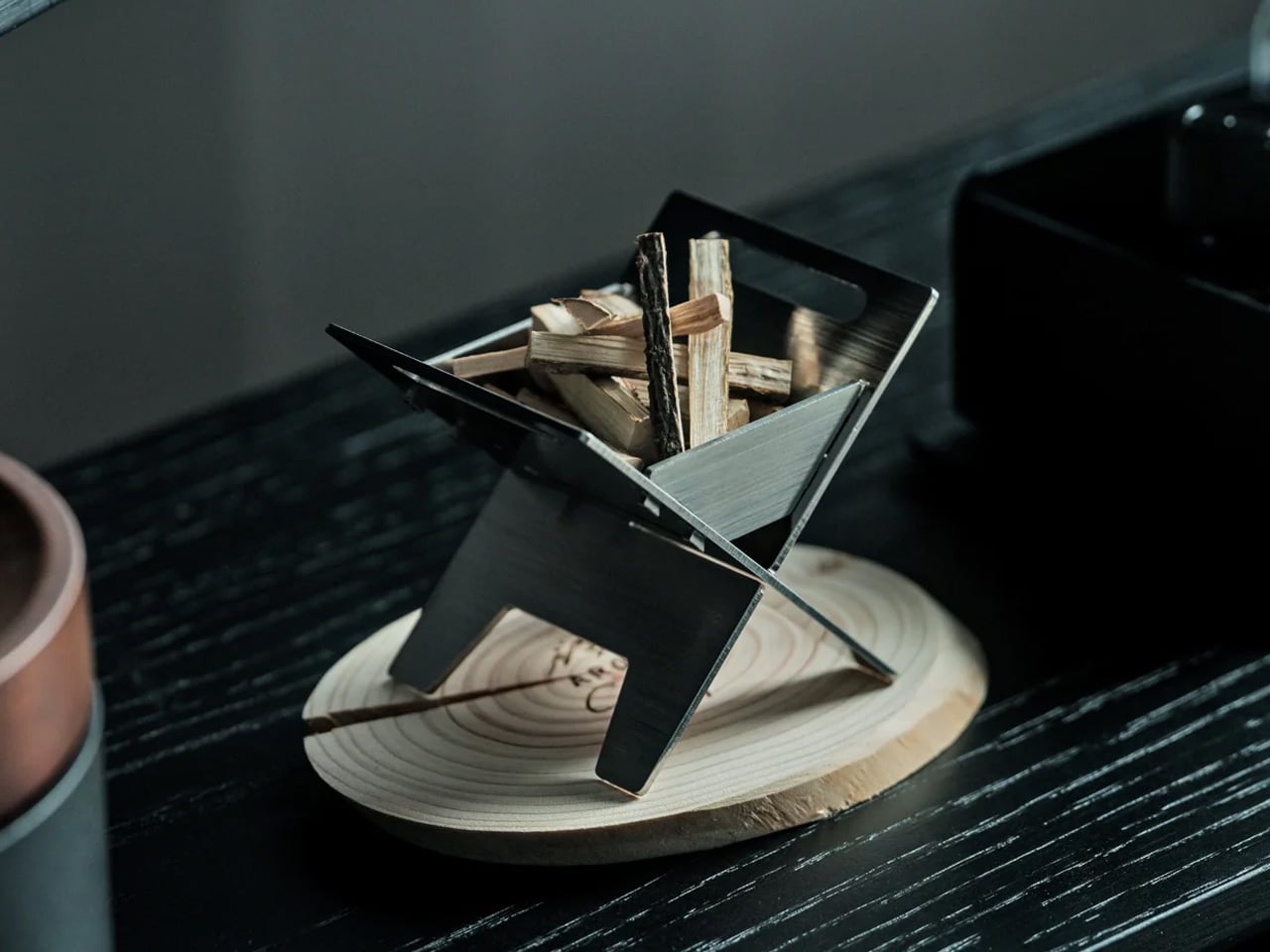
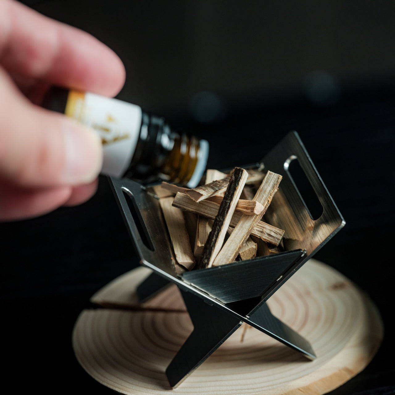
This is the gift that earns confused looks at first and genuine smiles thirty seconds later. The Miniature Bonfire Wood Diffuser Set is a scaled-down campfire — built from rust-resistant stainless steel, bundled with miniature firewood tied with a knot, and paired with an essential oil that captures the scent of Mt. Hakusan. It works as a desk object, a shelf centerpiece, and a calming aromatherapy piece all at once. It’s the kind of gift that’s nearly impossible to describe without showing it to someone in person.
What pushes it past novelty is the trivet function. Those small supports transform the diffuser into a pocket stove, meaning she can actually warm something small over it — an unexpectedly practical feature that gives it a second life beyond fragrance. For the mom who loves the outdoors but doesn’t always have the bandwidth to get there, this delivers a small, precise version of that feeling on demand. The combination of scent, handcrafted miniature detail, and real utility makes it one of the more quietly special things on this list.
Click Here to Buy Now: $99.00
What We Like
- Rust-resistant stainless steel construction gives it the durability to become a permanent fixture on her desk or shelf for years rather than seasons
- The trivet conversion adds genuine utility, transforming a beautiful scent object into a working pocket stove with no additional tools or effort
What We Dislike
- The Mt. Hakusan essential oil scent is specific enough that it may not resonate with every nose, particularly for those who prefer lighter or floral fragrance profiles
- Its miniature scale works beautifully as an accent diffuser, but won’t meaningfully fill a larger room with fragrance on its own
4. Tetra Puzzle
For the mom who says she doesn’t need anything but secretly loves a real challenge
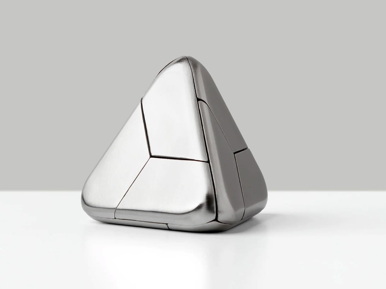
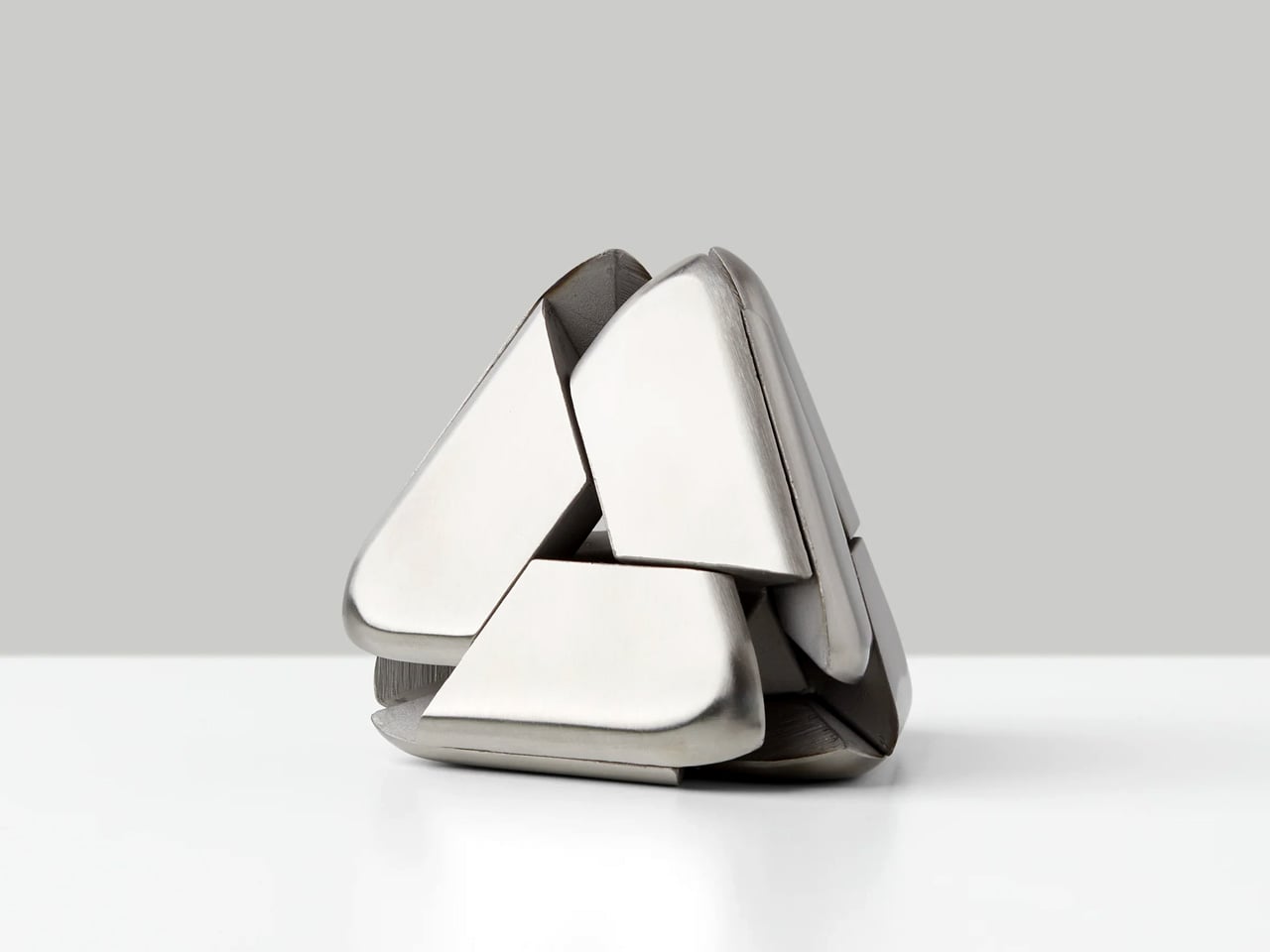
Four identical stainless steel pieces. One puzzle. Deceptively simple from across the room and completely absorbing the moment it’s in your hands. The Tetra Puzzle from Craig Hill is the kind of object that sits quietly on a desk and demands attention without asking for it — activating spatial reasoning and manual dexterity in a way that feels less like a game and more like a slow, meditative practice. It looks effortless. It isn’t, and that gap between what it appears to be and what it actually demands is precisely what makes it compelling.
What makes it a strong Mother’s Day gift is how well it plays socially. She can work through it alone as a personal challenge, or bring it out when people come over and watch a room collectively lose twenty minutes to four pieces of metal. The Tetra earns its place long after the day itself — not through sentiment, but through persistence. It remains genuinely, stubbornly interesting every single time it gets picked up. That kind of lasting relevance is a harder quality to find in a gift than most people realize.
What We Like
- Stainless steel construction gives it a premium weight and tactile quality that communicates real value the moment it’s handled for the first time
- Scales naturally from a solitary meditative challenge to a shared social object that pulls everyone in a room into the same conversation
What We Dislike
- The intentional absence of instructions is a deliberate design choice, but it may push frustration ahead of satisfaction for those who prefer a structured path to solving
- The difficulty curve skews steep, which may make it feel more like a test than a relaxing gift, depending entirely on the recipient’s temperament
5. Oku Knife
For the mom who sets a beautiful table and believes every object on it should earn its place
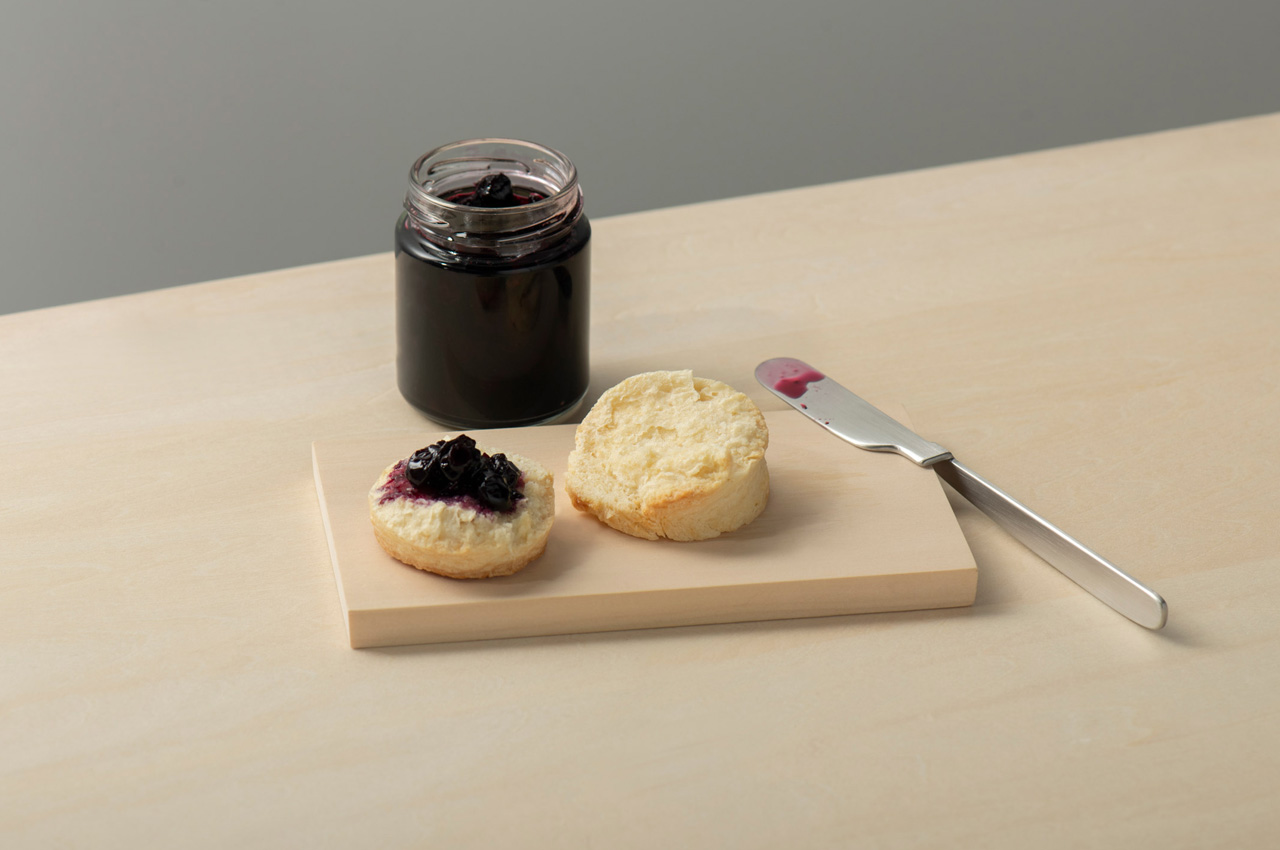
Most table knives spend the meal lying flat, blade pressed against the surface, waiting to be picked up. The Oku Knife by Scottish artist and metalworker Kathleen Reilly doesn’t do that. Its handle is folded 90 degrees from the blade — drawn from the Japanese practice of chopstick rests, which lift chopstick tips off surfaces to prevent contamination. The result is a knife that rests on its folded handle with the blade sitting cleanly perpendicular, never touching the table at all.
Named after the Japanese word for “to place,” Oku was designed by Reilly — shaped by a western upbringing and years spent living in Japan — to rethink the table knife without sacrificing function. It hooks onto a plate rim, rests along the edge of a cutting board, or simply sits with its blade elevated off the surface. For a mom who cares how a table looks and feels, this is the most intentional piece of cutlery she’s never thought to buy.
What We Like
- The 90-degree folded handle is a genuine design innovation — borrowing from Japanese dining culture to solve a hygiene problem that western cutlery has never bothered to address
- Its ability to hook onto a plate rim or rest along a cutting board edge makes it interactive with tableware in a way no conventional knife comes close to replicating
What We Dislike
- The unconventional shape takes a brief adjustment period before it feels natural in the hand, particularly for anyone accustomed to a traditional straight-handled knife
- As a concept-forward design piece, it works best in a considered table setting — everyday casual use may not fully honor what makes it so special
The Bar Is Higher Than a Bouquet
The flowers conversation isn’t going anywhere, but the standard for what counts as a truly thoughtful gift has quietly shifted. These five designs — a cassette speaker, a book lamp, a bonfire diffuser, a metal puzzle, and a knife that rethinks where a blade rests— share something that goes well beyond just their function. Each one was designed with care, built to last, and chosen for someone whose daily life actually gets better because it’s there.
Mother’s Day lands on one day, but the best gifts never really know that. They show up on a Wednesday morning when she needs the lamp, or on a Sunday afternoon when the puzzle comes out again. The point isn’t the occasion — it’s the quality of the decision. Pick one of these, and she’ll know immediately that you didn’t just get her something. You got her exactly the right thing.
The post 5 Brilliant Mother’s Day Gifts From Sons Who Know Better Than to Bring Flowers Again first appeared on Yanko Design.