Steam surprised gamers with the announcement of three new products back in November 2025. Those were the Steam Machine gaming console, the Steam Frame wireless VR headset, and the brand new Steam Controller, marking the first-ever update in a decade. While the first two don’t yet have a clear release window, the Steam controller is almost here.
Priced at $99, the controller is scheduled to launch on May 4, putting it within immediate reach for gamers invested in the platform. However, details around pre-orders remain unclear, leaving some uncertainty about how quickly users will be able to secure one, subject to the RAM availability crisis. Regardless, the update represents a significant step forward from the original Steam Controller, which debuted in 2015 with a bold but divisive design that relied heavily on dual trackpads instead of traditional analog sticks.
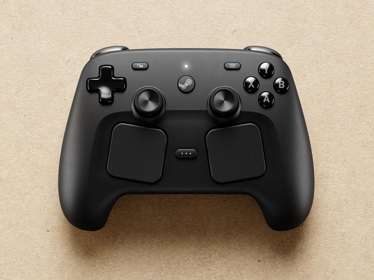
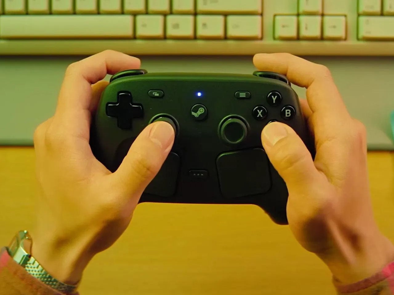
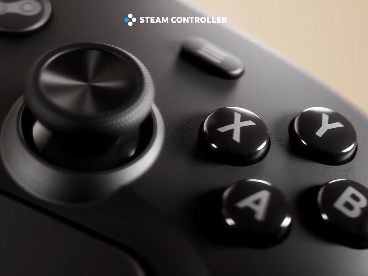
This new iteration reflects a more balanced approach as Valve appears to have taken feedback from years of community use and criticism, integrating more familiar elements while retaining some of its experimental DNA. The repositioned trackpads remain part of the experience but are no longer the dominant input method. Instead, the inclusion of a standard D-pad and a second thumbstick brings the controller closer to conventional gamepads, making it more intuitive for a wider audience. The overall layout bears a strong resemblance to the Steam Deck, suggesting tighter integration with Valve’s existing ecosystem and improved compatibility with modern game design.
That shift in design is not just cosmetic; it addresses one of the biggest barriers of the original controller: accessibility. Earlier, the reliance on trackpads required a learning curve that many players found difficult to overcome. By contrast, this updated model blends precision controls with familiarity, making it more suitable for a broader range of genres, including fast-paced AAA titles that demand responsiveness and accuracy.
Image Credit: The Verge
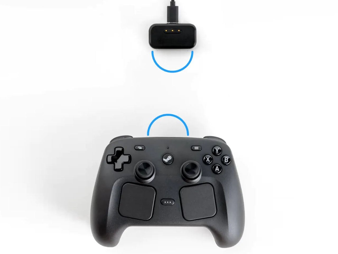
Connectivity has also been modernized. The controller supports both wired and wireless play, offering flexibility depending on user preference. A USB-C port ensures faster and more reliable wired connections, while built-in Bluetooth expands compatibility across devices. A notable addition is the magnetic charging puck, which simplifies the wireless charging process and reduces the friction typically associated with battery management. These upgrades align the controller with current hardware standards, ensuring it feels contemporary rather than experimental.
However, there is a limitation that may affect its appeal beyond dedicated users. The controller is designed primarily for the Steam ecosystem, meaning its full functionality is likely restricted to Valve-supported platforms. While this ensures deep integration and optimized performance within Steam, it could limit adoption among gamers who prefer a more universal controller that works seamlessly across consoles and third-party platforms. Despite this, the new Steam Controller represents a thoughtful evolution rather than a radical reinvention.
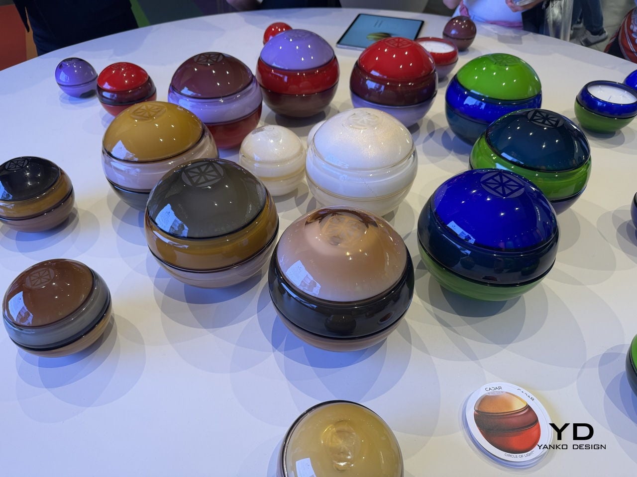
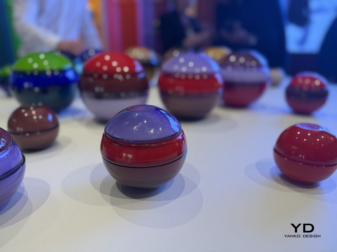
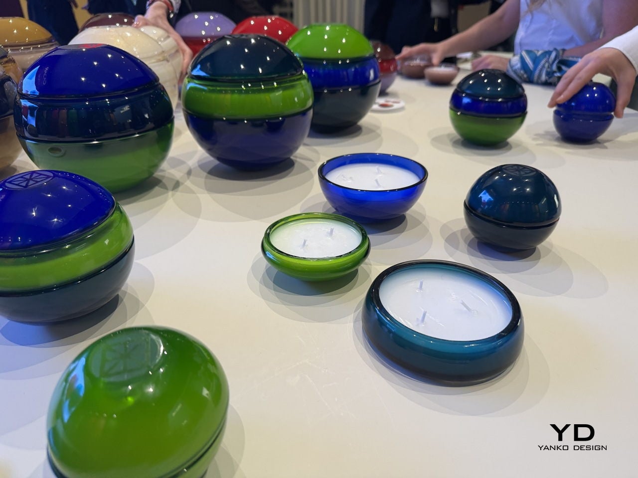
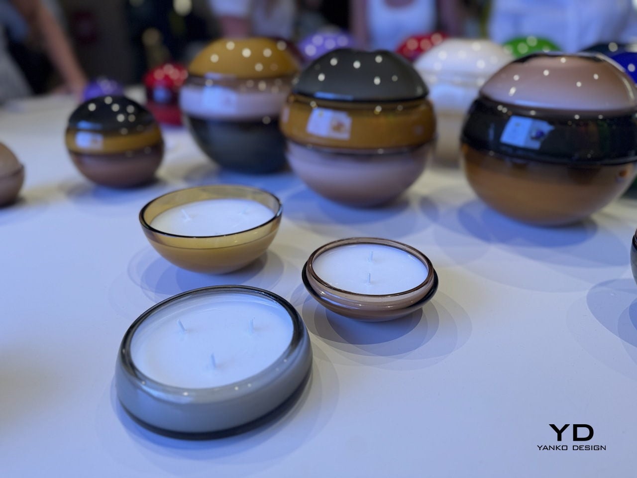
When Cadar showed up at Salone del Mobile this April, it did not bring jewelry. It brought candles. And not the kind you grab in a gift shop because they smell nice. These are hand-blown Murano glass spheres in colors so saturated and glossy they look less like home objects and more like something you might find in a collector’s vitrine. The moment you see them on a table, you want to pick one up. That instinct tells you everything about how well this design is working.
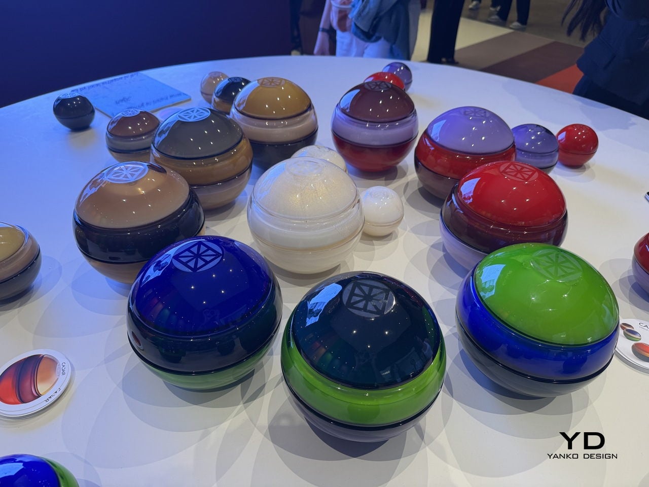
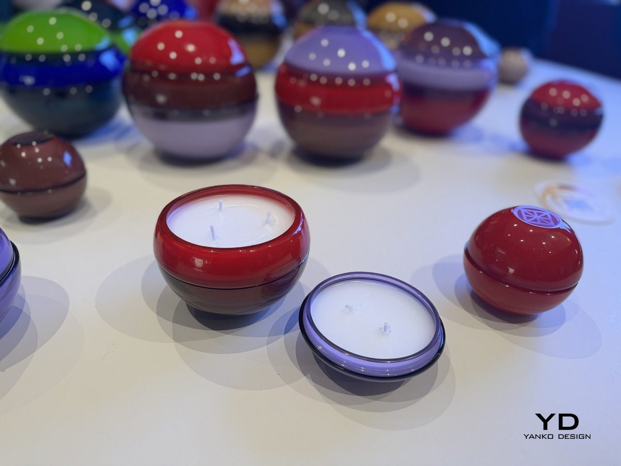
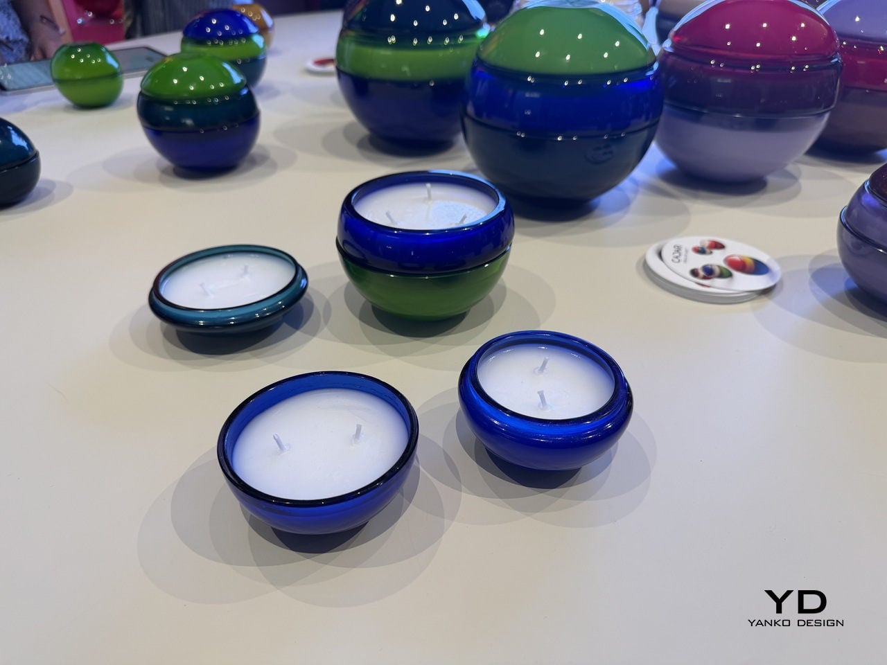
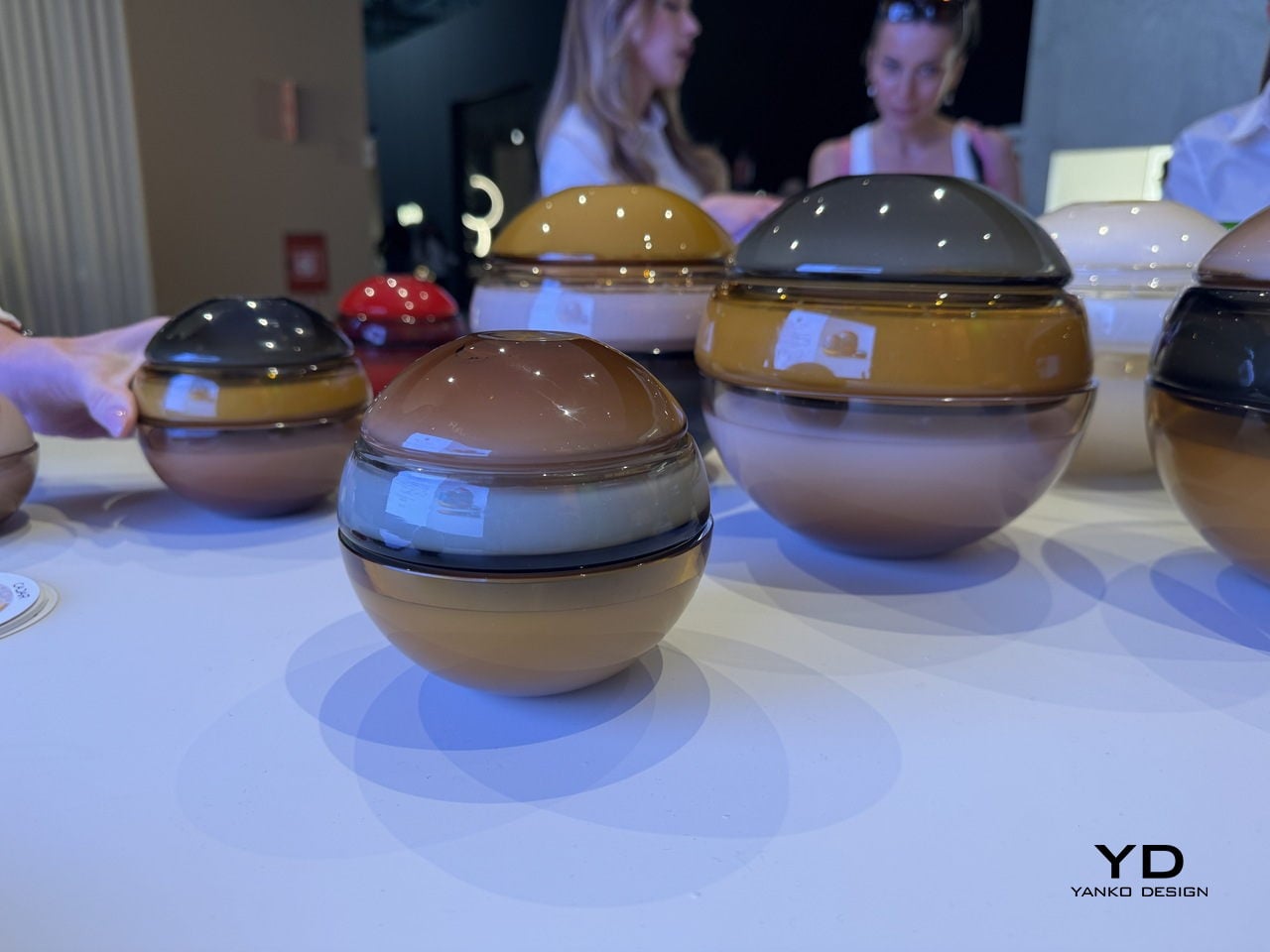
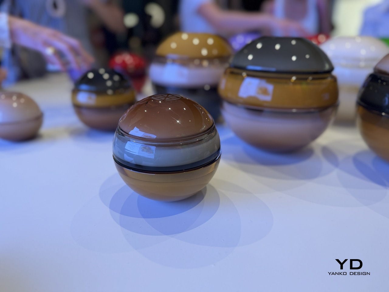
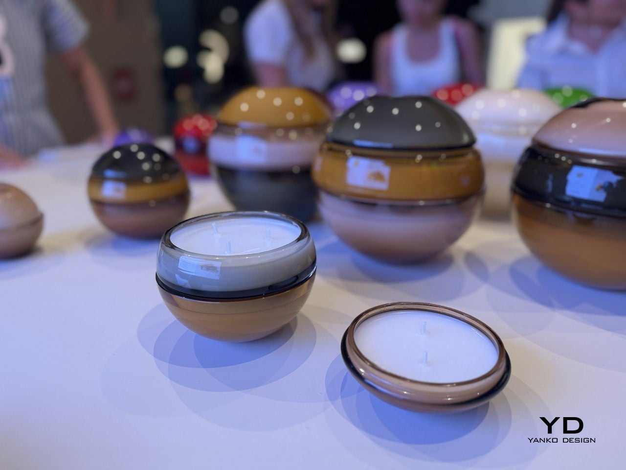
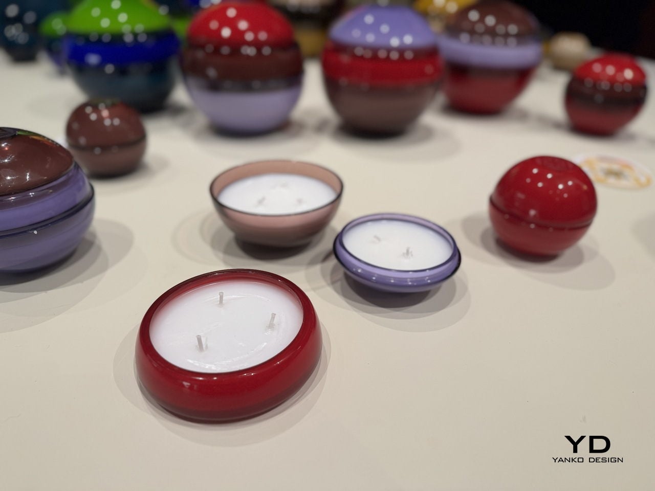
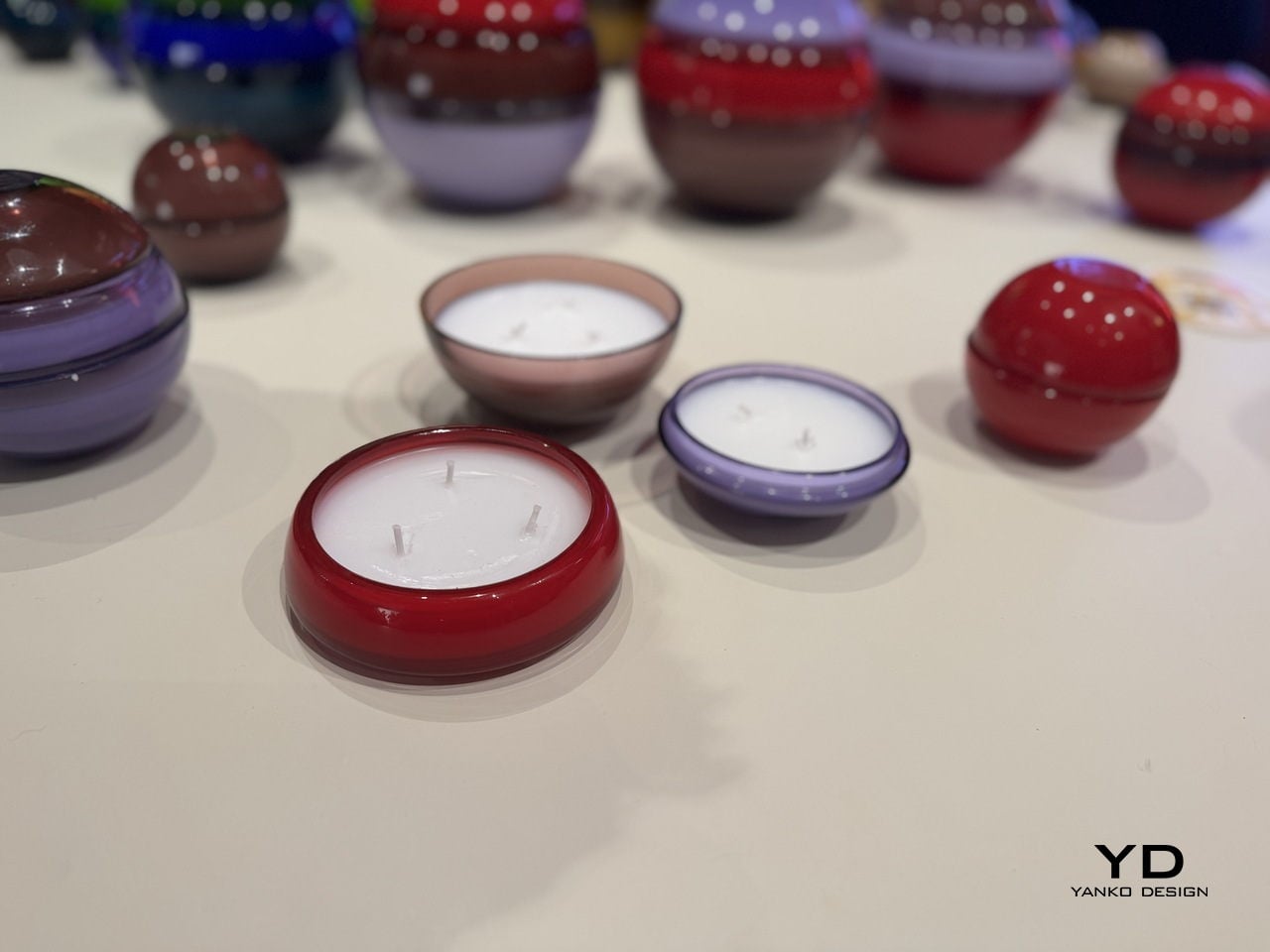
The form is deceptively simple. Each Circle of Light vessel is a sphere, composed of two to three separate hand-blown glass parts that stack and lock together into one seamless orb. The bottom is a wide, bowl-shaped candle vessel. A middle section can be added for a taller configuration, and the top is a smooth dome that caps the whole thing off. When assembled, the seam between pieces is visible but refined, almost like a deliberate detail rather than a structural necessity. When pulled apart, each piece becomes its own open candle vessel, low and round, sitting flat on a surface with quiet confidence.
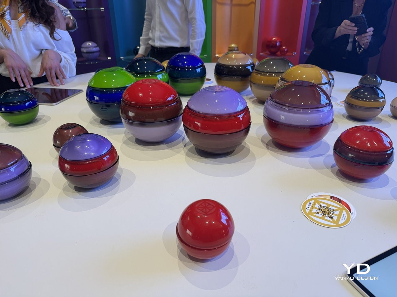
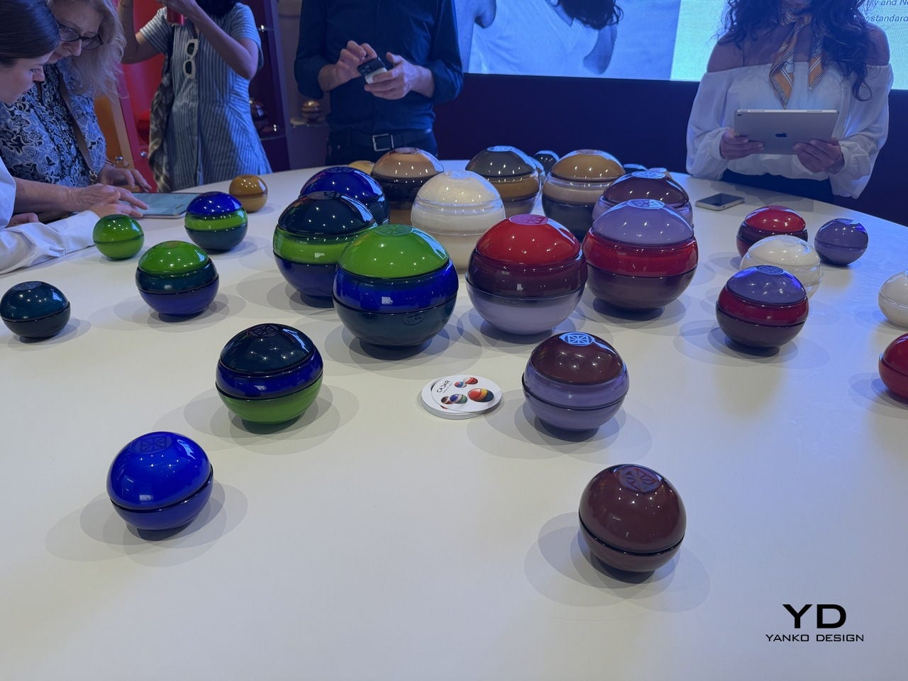
The colors are where this collection makes its boldest statement. Cadar and Venini did not play it safe. There is a deep cobalt blue paired with emerald green. A ruby red domed over a rich burgundy base. A warm amber sitting beneath a charcoal gray cap. A dusty lavender paired with a smoky brown. The combinations read like color theory exercises carried out by someone with very good instincts and zero fear. Looking at a table full of them, the effect is almost planetary. Each sphere feels like its own small world, and together they create something closer to a color installation than a product display.
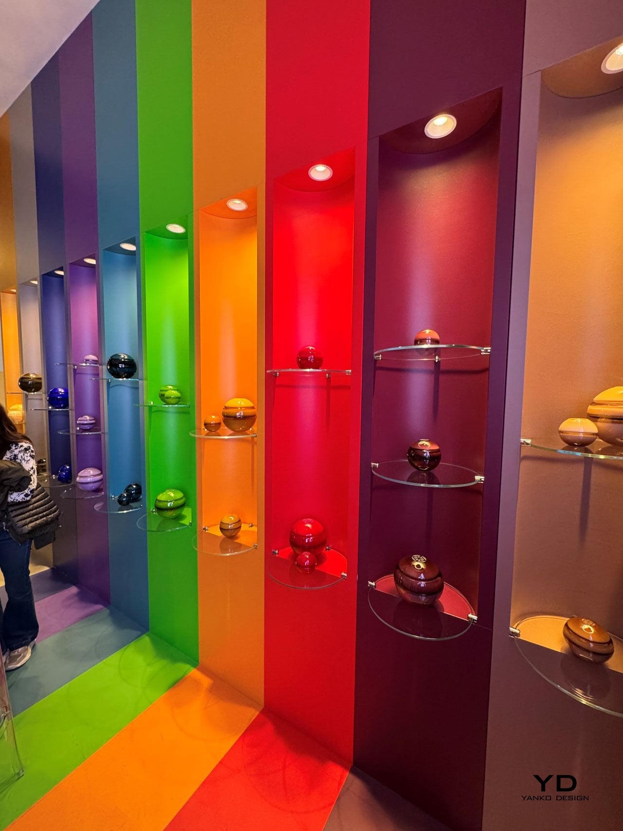
That display at the Venini booth reinforced the point. The booth itself was organized as a full-spectrum rainbow wall, with each color column housing its corresponding spheres on glass shelves. It was theatrical in the best way, the kind of presentation that makes you understand what a product is about before anyone explains it to you. The candles did not need signage. The visual language was that clear.
The glass itself deserves attention. Venini has been making Murano glass for 105 years, and you feel that history in the material. The surface has a depth to it that paint or glaze simply cannot replicate. Some of the dome tops carry a subtle engraved motif, a geometric pattern consistent with Cadar’s jewelry aesthetic, which grounds the collection in the brand’s visual identity without announcing itself loudly. The finish across all pieces is high-gloss and lacquered-looking, which amplifies the color and gives each sphere an almost liquid quality in certain light. Picked up and turned in your hands, the glass has real weight.
Cadar, founded in 2015 by designer Michal Kadar, built its reputation on 18k gold jewelry defined by bold minimalism and fluid movement. Michal’s background is in fashion, and it shows in the way her pieces are conceived with the body in mind, with proportion and balance as non-negotiable starting points. That same sensibility applies here. The sphere is not an arbitrary choice. It is a form Cadar has returned to repeatedly, and in translating it from fine metal to hand-blown glass, the design team found a material that responds to light in an entirely different, arguably more democratic way. Gold catches light and keeps it. Glass catches light and gives it back.
The fragrances, composed by master perfumer Alberto Morillas, are tied to Cadar’s existing jewelry collections: Light, Water, and Bloom. The idea that a scent corresponds to a visual collection is not new, but it works here because the objects themselves feel like they carry a mood. You would choose your sphere the way you choose what to wear, based on color, on scale, on what kind of atmosphere you are trying to create.
The collection is available for pre-order at the Cadar flagship boutique in New York’s Meatpacking District and online at cadar.com. It is the kind of thing you put on a shelf and look at before you even light it. And that, ultimately, is the whole point.
The line between outdoor gear and everyday carry has never been blurrier. More people are treating their camping setups with the same discernment they’d bring to a wardrobe or a home office, hunting for things that work hard but also look intentional. The market has responded, and the range of portable gear sitting somewhere between rugged utility and refined object design has never been broader.
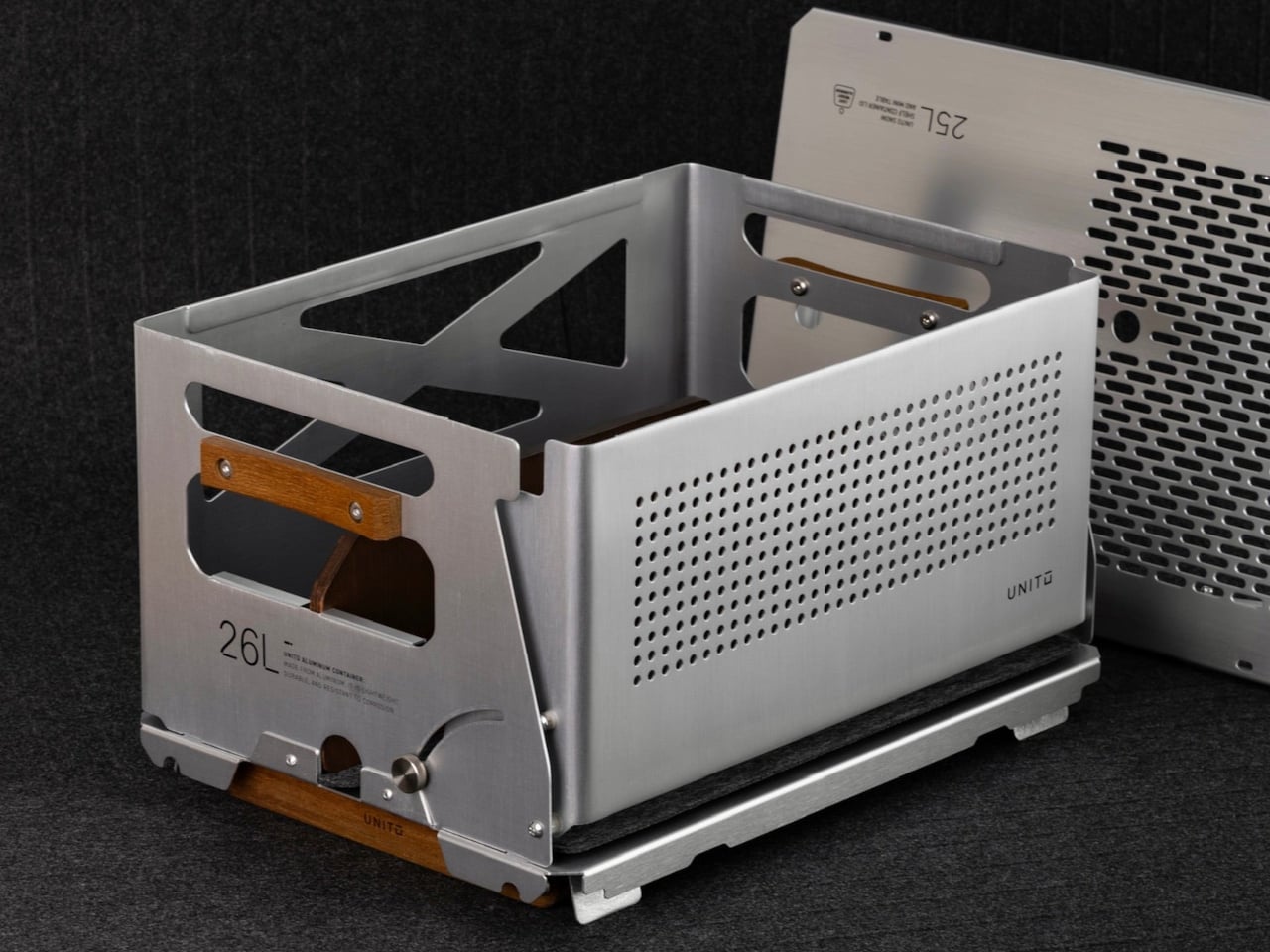
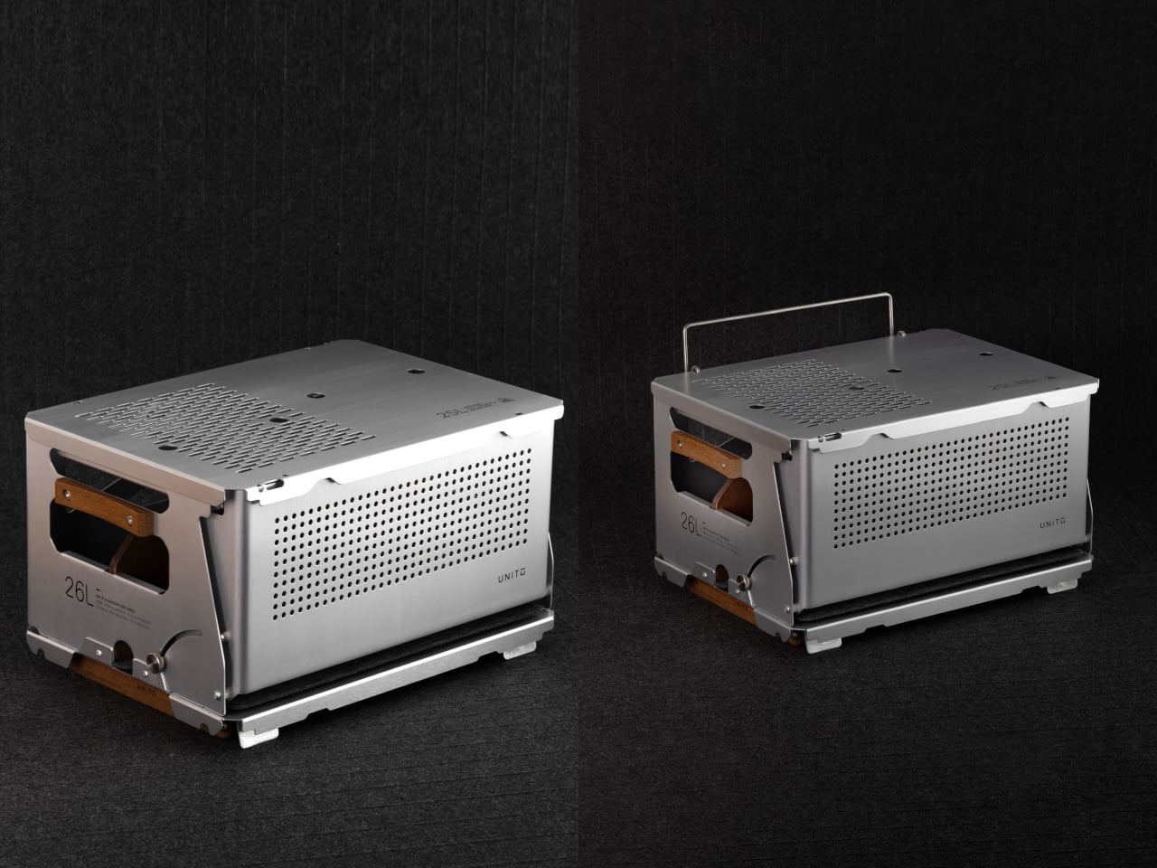
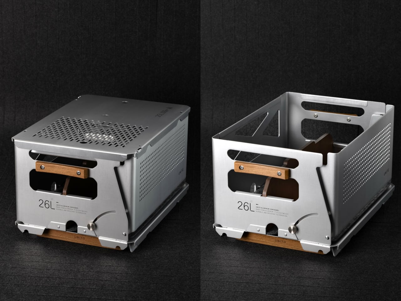
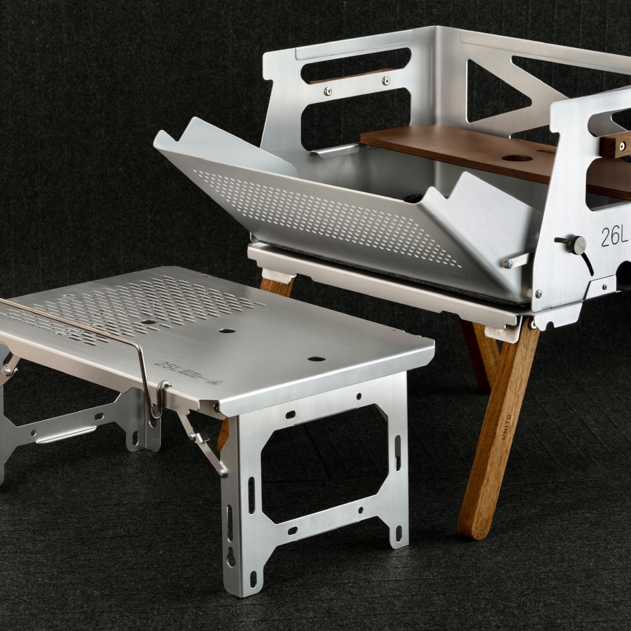
Unito, a Thailand-based brand, has positioned its Container 26L squarely in that territory. The box holds 26 liters of storage and comes loaded with teak wood accents, a foldable table lid, flip-out extension legs, a divider, and a soft pad, all in a full set that retails for $290. It’s built to adapt across environments rather than anchor itself to just one.
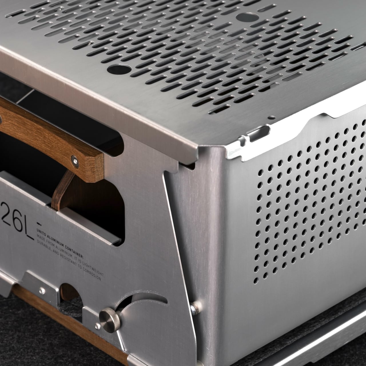
The choice of anodized aluminum for the body does a lot of the heavy lifting. The finish is more corrosion-resistant than bare metal and tougher than paint, which makes it well-suited for the kind of regular outdoor exposure that would start to wear down lesser materials. The silver anodized variant, in particular, has a clean industrial look that doesn’t try too hard and ages without embarrassing itself.
Teak handles sit on either side of the box, giving you a comfortable grip that reads differently against the metallic finish. The flip-out teak extension legs raise the container off the ground into a standing station. Unito supposedly sources the wood from managed plantation forests in Thailand, where the brand is made, addressing concerns about the choice of material.
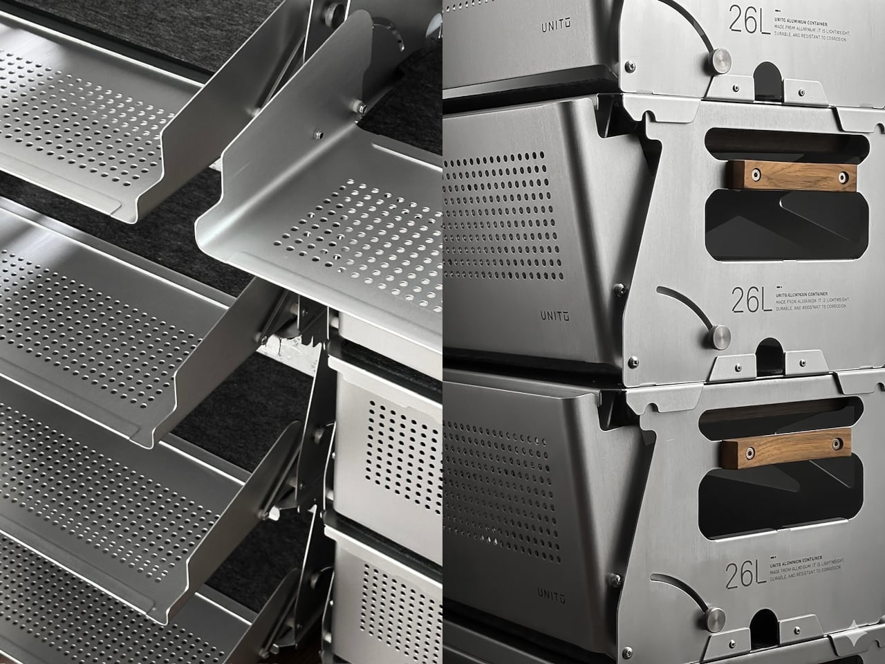
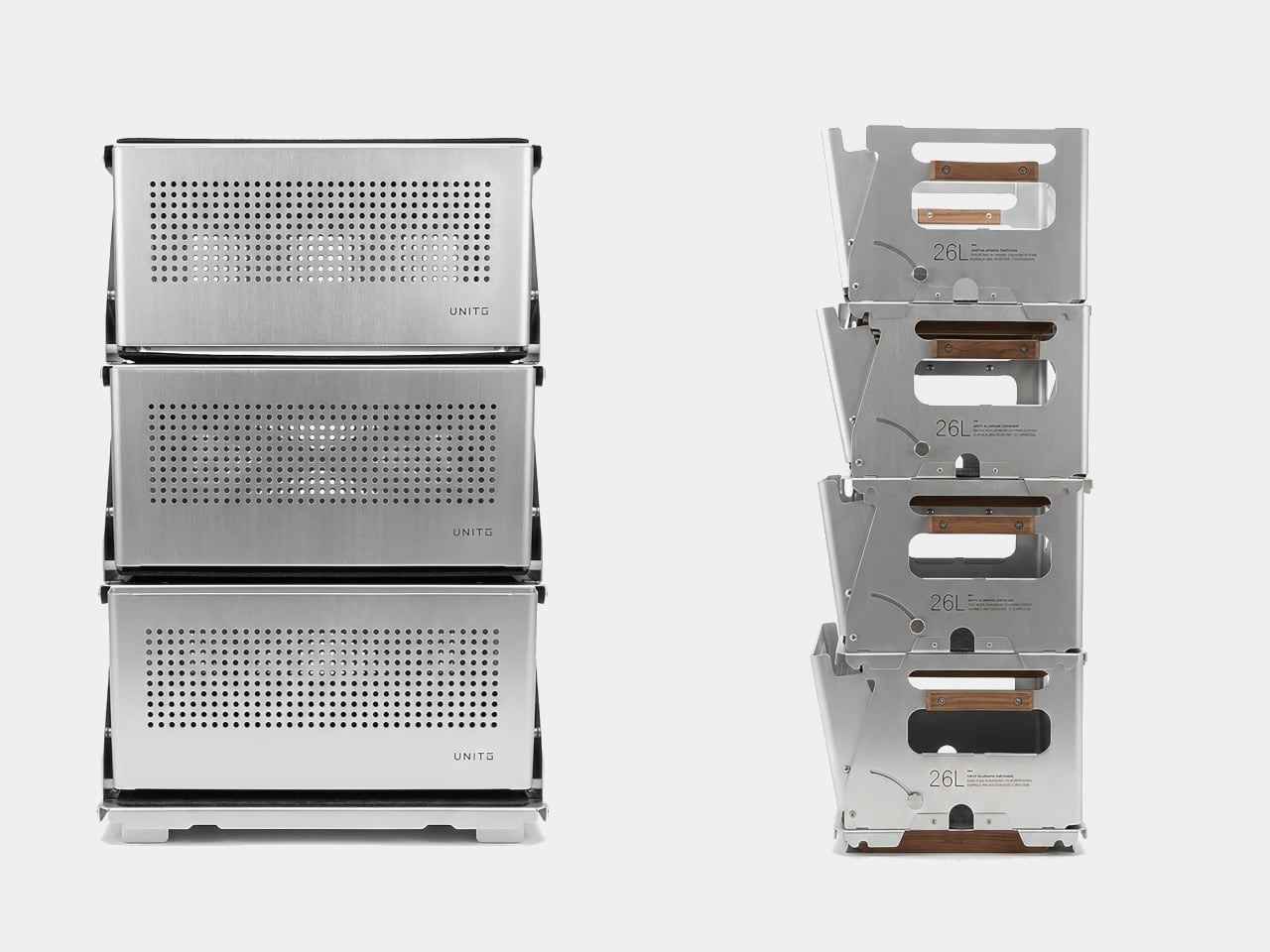
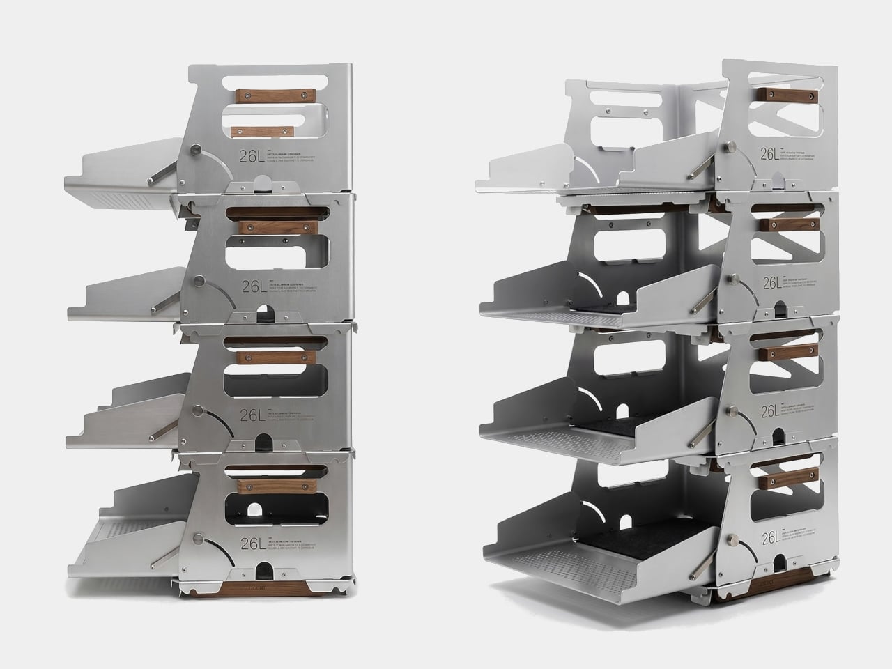
The Snow 25L is the lid that ships with the box, but calling it just a lid undersells what it does. It’s a foldable aluminum table weighing 950 grams, and it’s also compatible with Snow Peak’s 25L crate, which broadens the system’s appeal considerably. Stack two containers, and each lid still opens independently, so access isn’t sacrificed in the name of keeping the stack looking neat.
On a campsite, the legs deploy, and the box becomes a prep station for gear, food, or brew equipment. The perforated aluminum body lets air circulate, which matters when you’re storing anything prone to trapping heat or moisture. The included divider helps section off the interior, and a built-in carry handle means you’re not scrambling for a grip when it’s time to pack up.
Back in the studio or at home, the same container holds art supplies, camera gear, or electronics with enough structure to keep things sorted rather than thrown together. The modular system lets you pair containers, add accessories, or use just the box and lid without the legs. It’s the kind of setup that rewards people who’ve thought carefully about their gear.
The line between outdoor gear and everyday carry has never been blurrier. More people are treating their camping setups with the same discernment they’d bring to a wardrobe or a home office, hunting for things that work hard but also look intentional. The market has responded, and the range of portable gear sitting somewhere between rugged utility and refined object design has never been broader.
Unito, a Thailand-based brand, has positioned its Container 26L squarely in that territory. The box holds 26 liters of storage and comes loaded with teak wood accents, a foldable table lid, flip-out extension legs, a divider, and a soft pad, all in a full set that retails for $290. It’s built to adapt across environments rather than anchor itself to just one.
The choice of anodized aluminum for the body does a lot of the heavy lifting. The finish is more corrosion-resistant than bare metal and tougher than paint, which makes it well-suited for the kind of regular outdoor exposure that would start to wear down lesser materials. The silver anodized variant, in particular, has a clean industrial look that doesn’t try too hard and ages without embarrassing itself.
Teak handles sit on either side of the box, giving you a comfortable grip that reads differently against the metallic finish. The flip-out teak extension legs raise the container off the ground into a standing station. Unito supposedly sources the wood from managed plantation forests in Thailand, where the brand is made, addressing concerns about the choice of material.
The Snow 25L is the lid that ships with the box, but calling it just a lid undersells what it does. It’s a foldable aluminum table weighing 950 grams, and it’s also compatible with Snow Peak’s 25L crate, which broadens the system’s appeal considerably. Stack two containers, and each lid still opens independently, so access isn’t sacrificed in the name of keeping the stack looking neat.
On a campsite, the legs deploy, and the box becomes a prep station for gear, food, or brew equipment. The perforated aluminum body lets air circulate, which matters when you’re storing anything prone to trapping heat or moisture. The included divider helps section off the interior, and a built-in carry handle means you’re not scrambling for a grip when it’s time to pack up.
Back in the studio or at home, the same container holds art supplies, camera gear, or electronics with enough structure to keep things sorted rather than thrown together. The modular system lets you pair containers, add accessories, or use just the box and lid without the legs. It’s the kind of setup that rewards people who’ve thought carefully about their gear.
Sometimes sons have to learn, usually the hard way, that flowers are a placeholder. They wilt. They sit in a vase she’ll move twice and quietly toss out by Thursday. What your mom actually wants is something she’d never buy for herself — something with real thought behind it, personality baked in, and a story worth telling when a friend stops to ask where she got it.
These five gifts check all of those boxes. They’re objects designed with the kind of intention that lingers well past the occasion — each one worth keeping long after the wrapping is gone. None of them needs a card that says “Hope your day is blooming.” Each one arrives with a distinct personality, a function, and the quiet confidence of someone who actually stopped to think it all the way through.
1. Side A Cassette Speaker
For the mom who made you mixtapes before Spotify existed
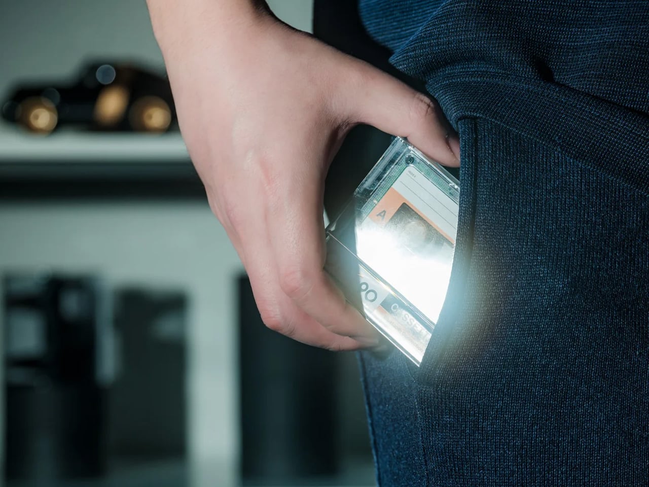
There’s something quietly emotional about a gift that references a time before streaming, before algorithms, before a machine decided what she should listen to next. The Side A Cassette Speaker is built to look, feel, and nearly sound like a real mixtape — transparent shell, side A label, and that satisfying analog weight in your hand. It’s a faithful recreation that doubles as a Bluetooth 5.3 speaker with microSD playback. At under $50, it earns a permanent spot on the shelf rather than a junk drawer.
What makes it work as a gift isn’t just the nostalgia — it’s the warmth. The audio is tuned to echo tape playback: soft, rich, and surprisingly full for its compact size. It runs six hours at max volume and recharges in two, with a clear case that doubles as a display stand. Whether she keeps it on a desk, a kitchen counter, or a bedside table, the Side A sits somewhere between speaker and shelf object. That combination is genuinely rare at this price point.
Cassette-accurate design makes it display-worthy on any shelf, functioning as both a working speaker and a nostalgic art object that earns its footprint
The sub-$50 price punches well above its weight in character, making it one of the most considered value plays on this entire list
What We Dislike
Six-hour battery life means it won’t carry an all-day outdoor gathering without a recharge somewhere in the middle
microSD playback supports MP3 only, which may frustrate anyone working from a library of lossless or alternative audio formats
2. Lumio Lito Classic Book Lamp
For the mom whose bedside table deserves something worth looking at
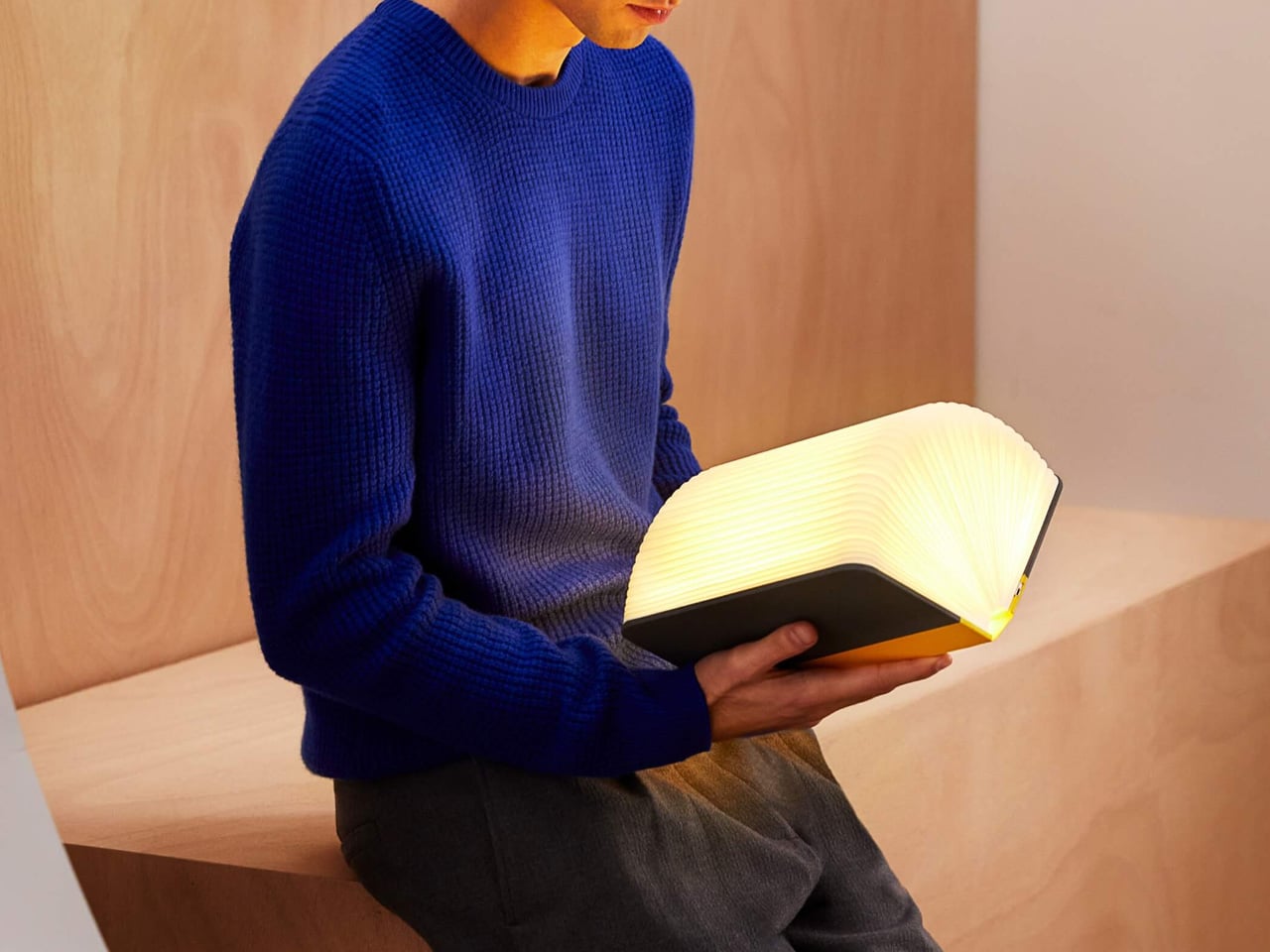
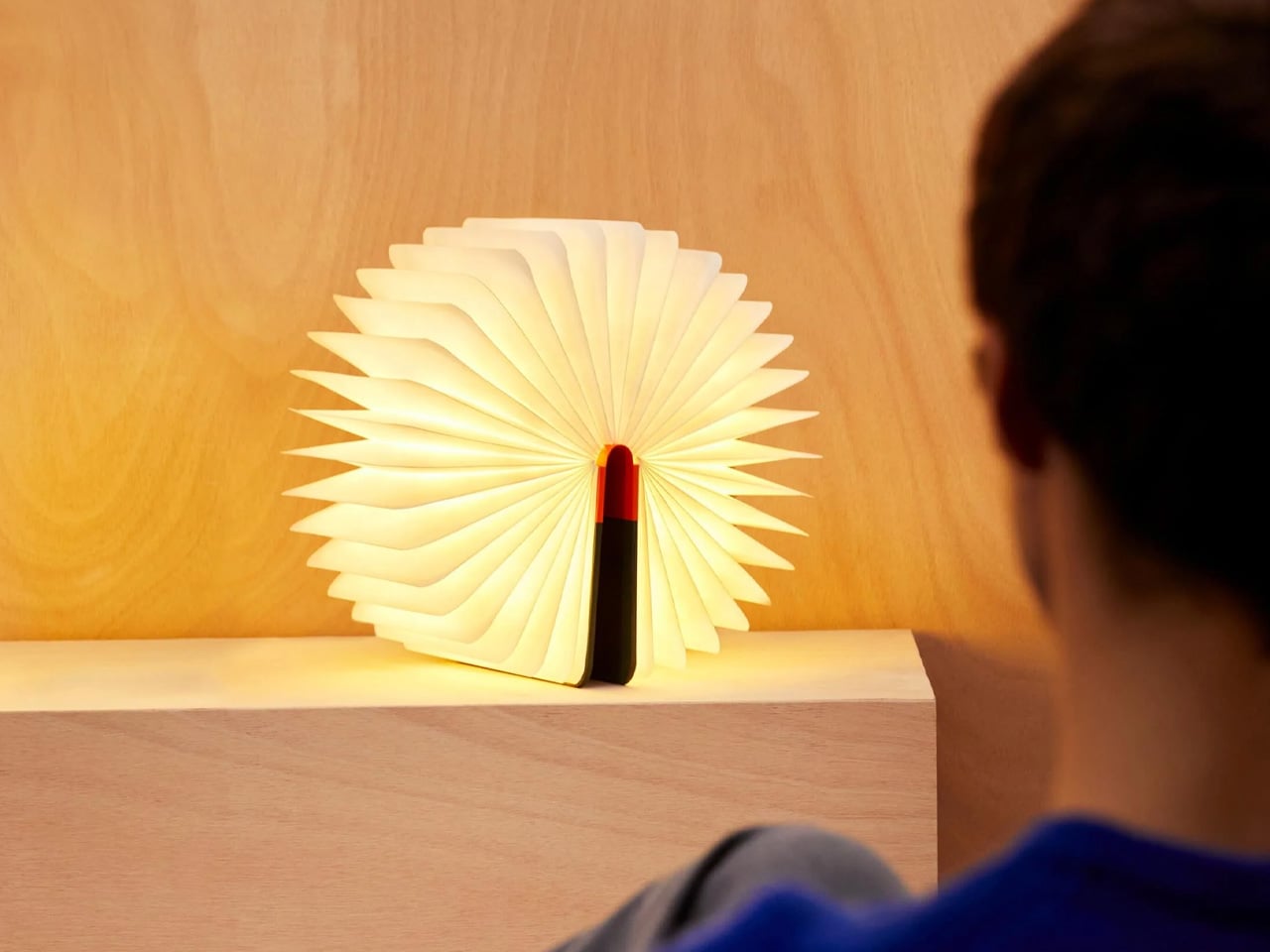
At first glance, it’s a hardcover book. Open it, and it becomes a lamp — warm, sculptural, and quietly brilliant. The Lito Classic by Lumio earned its Red Dot and Good Design awards not through a spec sheet, but through the kind of elegant problem-solving that makes you wonder why all lamps don’t work this way. It’s portable, runs eight hours on a single charge, and now comes in British Racing Green, Navy Blue, and Vibrant Red. Each colorway is finished to let the natural wood grain breathe through in a way that photographs simply don’t fully capture.
The New York Times called it “a gift that amazes,” and for once, the blurb earns its space. For any mom who hosts dinners, reads late, or simply has an eye for objects that justify their presence, the Lito is the kind of lamp she’ll reach for constantly without quite being able to explain why. It works on a dining table as naturally as a nightstand, indoors as naturally as a patio. It’s the rare gift that doesn’t just land well on the day — it earns its place over months of use.
What We Like
Holds genuine design credentials: the Red Dot and Good Design awards reflect real craft and thoughtfulness, not just clever marketing
Eight-hour battery life and full portability make it equally at home on a nightstand, a dinner table, or a porch on a warm evening
What We Dislike
The price puts it firmly in the intentional-gift category, so it works best when chosen deliberately rather than grabbed as a last-minute solution
The book disguise, while clever, may confuse first-time guests until they reach for it, which is either a feature or a flaw, depending entirely on your mom
3. Miniature Bonfire Wood Diffuser Set
For the mom who calls the outdoors her reset button
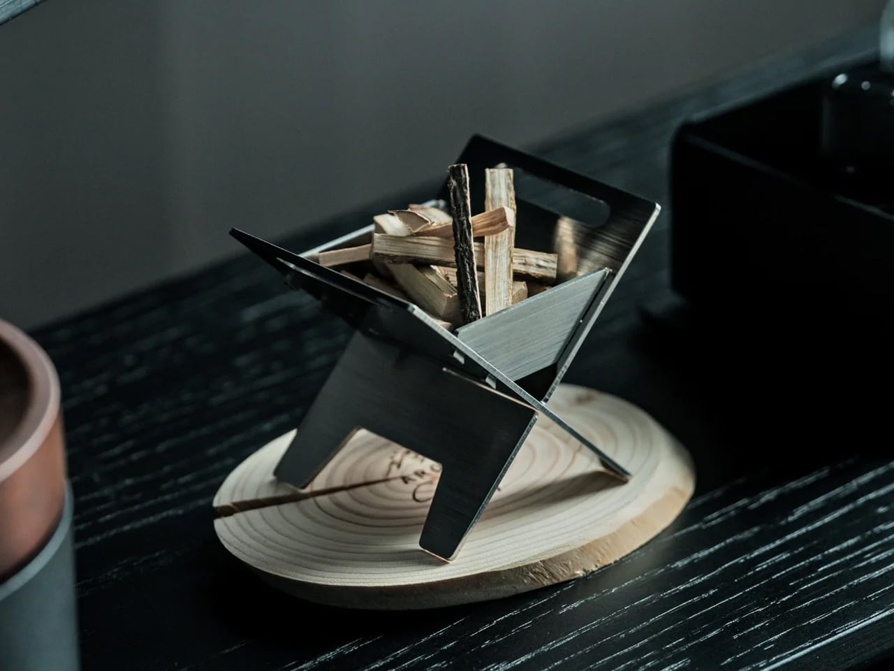
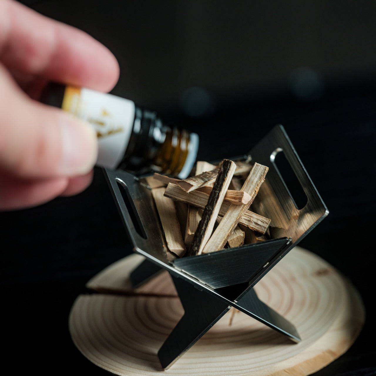
This is the gift that earns confused looks at first and genuine smiles thirty seconds later. The Miniature Bonfire Wood Diffuser Set is a scaled-down campfire — built from rust-resistant stainless steel, bundled with miniature firewood tied with a knot, and paired with an essential oil that captures the scent of Mt. Hakusan. It works as a desk object, a shelf centerpiece, and a calming aromatherapy piece all at once. It’s the kind of gift that’s nearly impossible to describe without showing it to someone in person.
What pushes it past novelty is the trivet function. Those small supports transform the diffuser into a pocket stove, meaning she can actually warm something small over it — an unexpectedly practical feature that gives it a second life beyond fragrance. For the mom who loves the outdoors but doesn’t always have the bandwidth to get there, this delivers a small, precise version of that feeling on demand. The combination of scent, handcrafted miniature detail, and real utility makes it one of the more quietly special things on this list.
Rust-resistant stainless steel construction gives it the durability to become a permanent fixture on her desk or shelf for years rather than seasons
The trivet conversion adds genuine utility, transforming a beautiful scent object into a working pocket stove with no additional tools or effort
What We Dislike
The Mt. Hakusan essential oil scent is specific enough that it may not resonate with every nose, particularly for those who prefer lighter or floral fragrance profiles
Its miniature scale works beautifully as an accent diffuser, but won’t meaningfully fill a larger room with fragrance on its own
4. Tetra Puzzle
For the mom who says she doesn’t need anything but secretly loves a real challenge
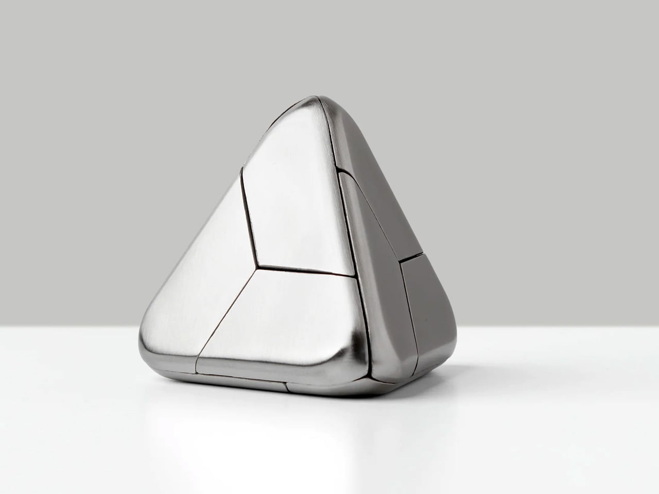
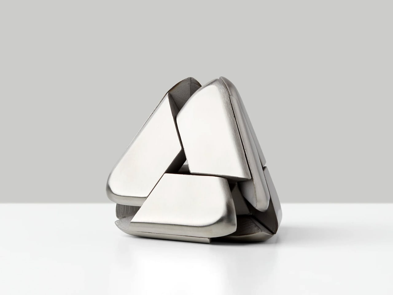
Four identical stainless steel pieces. One puzzle. Deceptively simple from across the room and completely absorbing the moment it’s in your hands. The Tetra Puzzle from Craig Hill is the kind of object that sits quietly on a desk and demands attention without asking for it — activating spatial reasoning and manual dexterity in a way that feels less like a game and more like a slow, meditative practice. It looks effortless. It isn’t, and that gap between what it appears to be and what it actually demands is precisely what makes it compelling.
What makes it a strong Mother’s Day gift is how well it plays socially. She can work through it alone as a personal challenge, or bring it out when people come over and watch a room collectively lose twenty minutes to four pieces of metal. The Tetra earns its place long after the day itself — not through sentiment, but through persistence. It remains genuinely, stubbornly interesting every single time it gets picked up. That kind of lasting relevance is a harder quality to find in a gift than most people realize.
What We Like
Stainless steel construction gives it a premium weight and tactile quality that communicates real value the moment it’s handled for the first time
Scales naturally from a solitary meditative challenge to a shared social object that pulls everyone in a room into the same conversation
What We Dislike
The intentional absence of instructions is a deliberate design choice, but it may push frustration ahead of satisfaction for those who prefer a structured path to solving
The difficulty curve skews steep, which may make it feel more like a test than a relaxing gift, depending entirely on the recipient’s temperament
5. Oku Knife
For the mom who sets a beautiful table and believes every object on it should earn its place
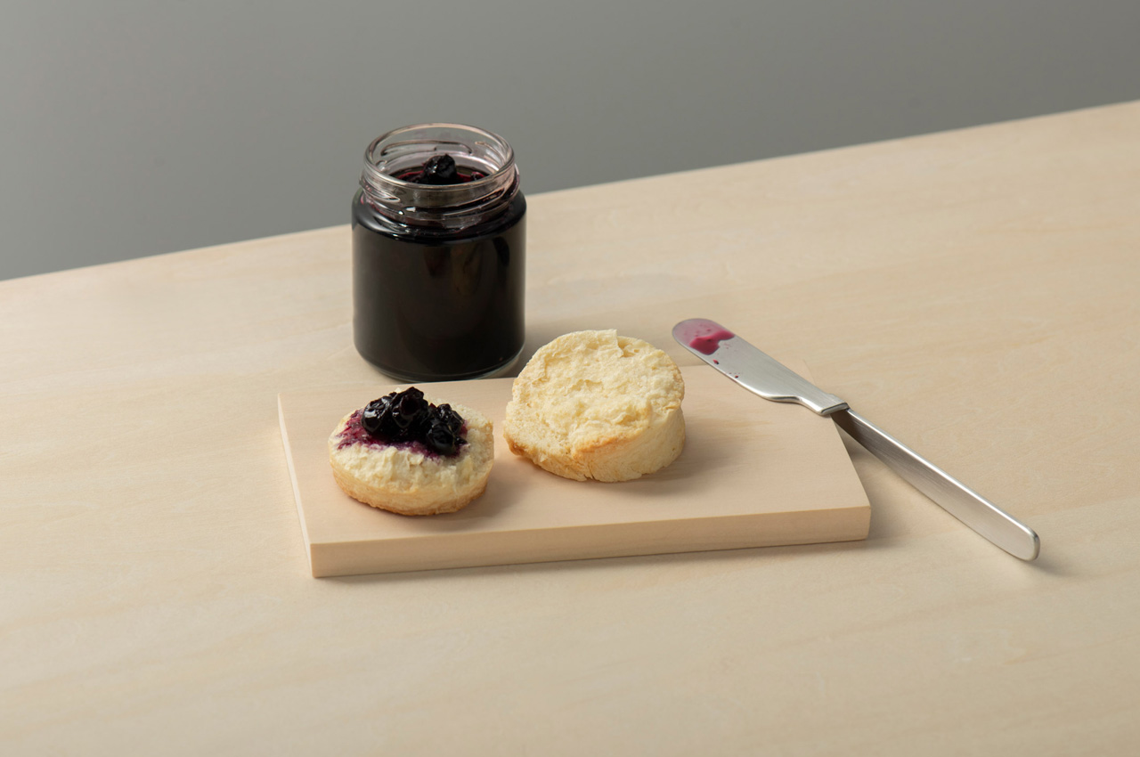
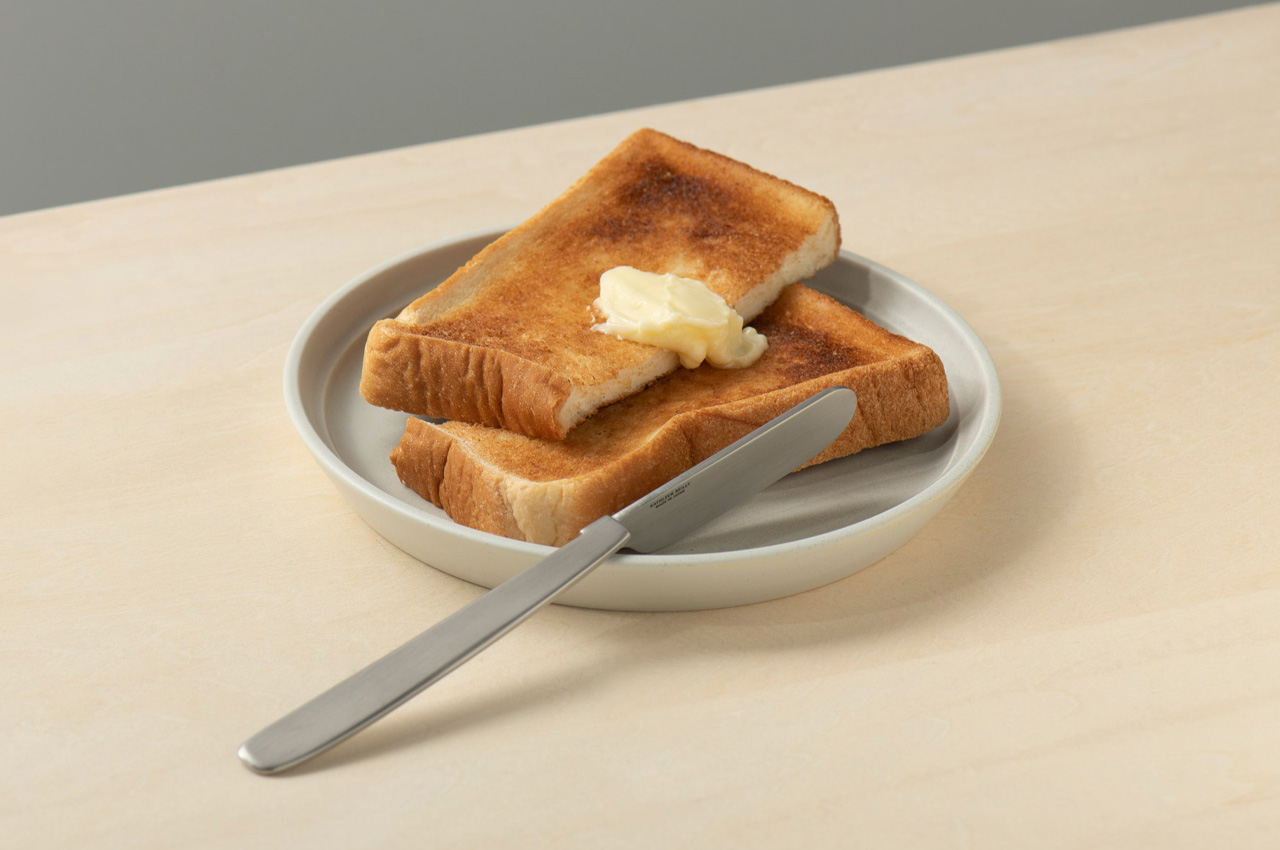
Most table knives spend the meal lying flat, blade pressed against the surface, waiting to be picked up. The Oku Knife by Scottish artist and metalworker Kathleen Reilly doesn’t do that. Its handle is folded 90 degrees from the blade — drawn from the Japanese practice of chopstick rests, which lift chopstick tips off surfaces to prevent contamination. The result is a knife that rests on its folded handle with the blade sitting cleanly perpendicular, never touching the table at all.
Named after the Japanese word for “to place,” Oku was designed by Reilly — shaped by a western upbringing and years spent living in Japan — to rethink the table knife without sacrificing function. It hooks onto a plate rim, rests along the edge of a cutting board, or simply sits with its blade elevated off the surface. For a mom who cares how a table looks and feels, this is the most intentional piece of cutlery she’s never thought to buy.
What We Like
The 90-degree folded handle is a genuine design innovation — borrowing from Japanese dining culture to solve a hygiene problem that western cutlery has never bothered to address
Its ability to hook onto a plate rim or rest along a cutting board edge makes it interactive with tableware in a way no conventional knife comes close to replicating
What We Dislike
The unconventional shape takes a brief adjustment period before it feels natural in the hand, particularly for anyone accustomed to a traditional straight-handled knife
As a concept-forward design piece, it works best in a considered table setting — everyday casual use may not fully honor what makes it so special
The Bar Is Higher Than a Bouquet
The flowers conversation isn’t going anywhere, but the standard for what counts as a truly thoughtful gift has quietly shifted. These five designs — a cassette speaker, a book lamp, a bonfire diffuser, a metal puzzle, and a knife that rethinks where a blade rests— share something that goes well beyond just their function. Each one was designed with care, built to last, and chosen for someone whose daily life actually gets better because it’s there.
Mother’s Day lands on one day, but the best gifts never really know that. They show up on a Wednesday morning when she needs the lamp, or on a Sunday afternoon when the puzzle comes out again. The point isn’t the occasion — it’s the quality of the decision. Pick one of these, and she’ll know immediately that you didn’t just get her something. You got her exactly the right thing.
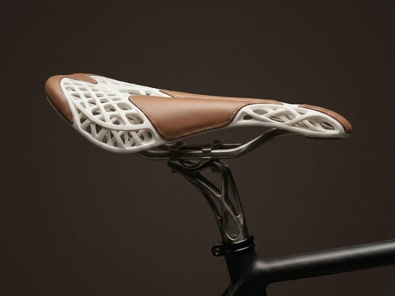
Most conversations about technology and craft follow the same script. Technology is fast, scalable, cold. Craft is slow, precious, warm. The two might share a showroom floor or a mood board, but they rarely share a philosophy. Mahdi Naïm’s AERIS bicycle saddle disagrees with that entire premise, and the disagreement is worth paying attention to.
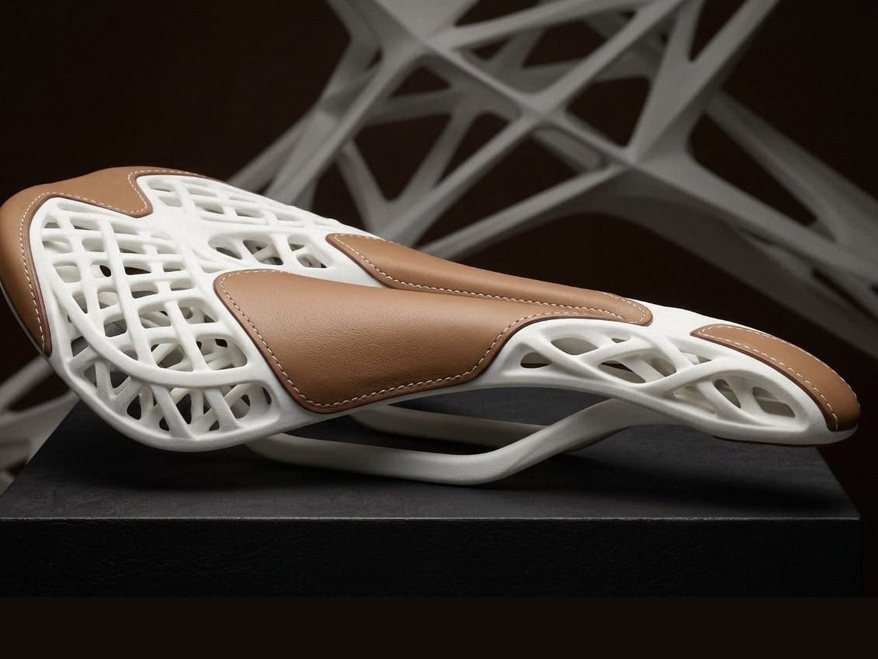
AERIS is not a bicycle saddle that happens to look interesting. It is a bicycle saddle built around a single, demanding question: what if 3D printing and traditional craft weren’t layered on top of each other, but designed together from the very first sketch? That shift in thinking, from assembly to co-authorship, is what separates AERIS from the dozen other “tech meets heritage” products that surface at design fairs every season.
Designer: Mahdi Naim
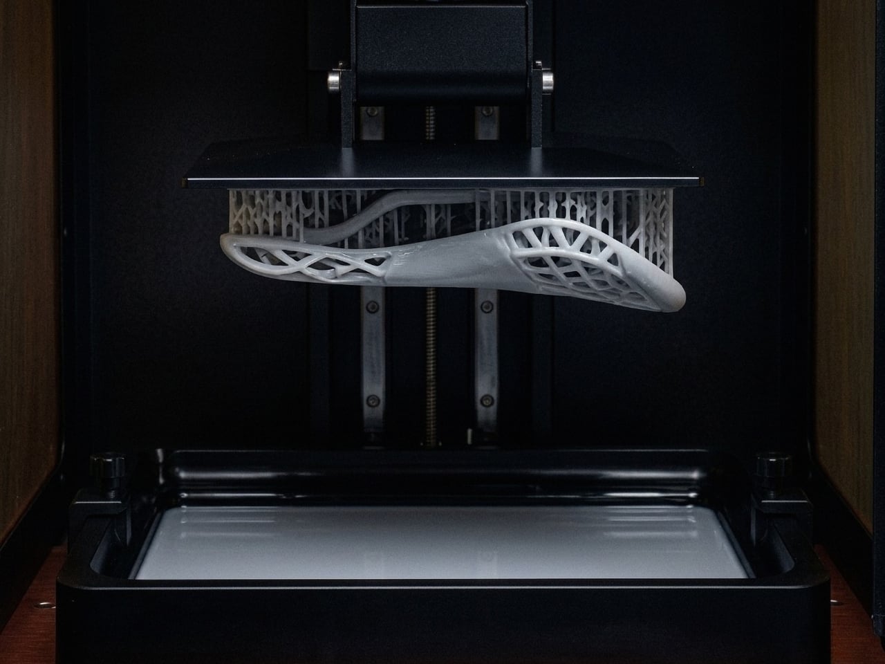
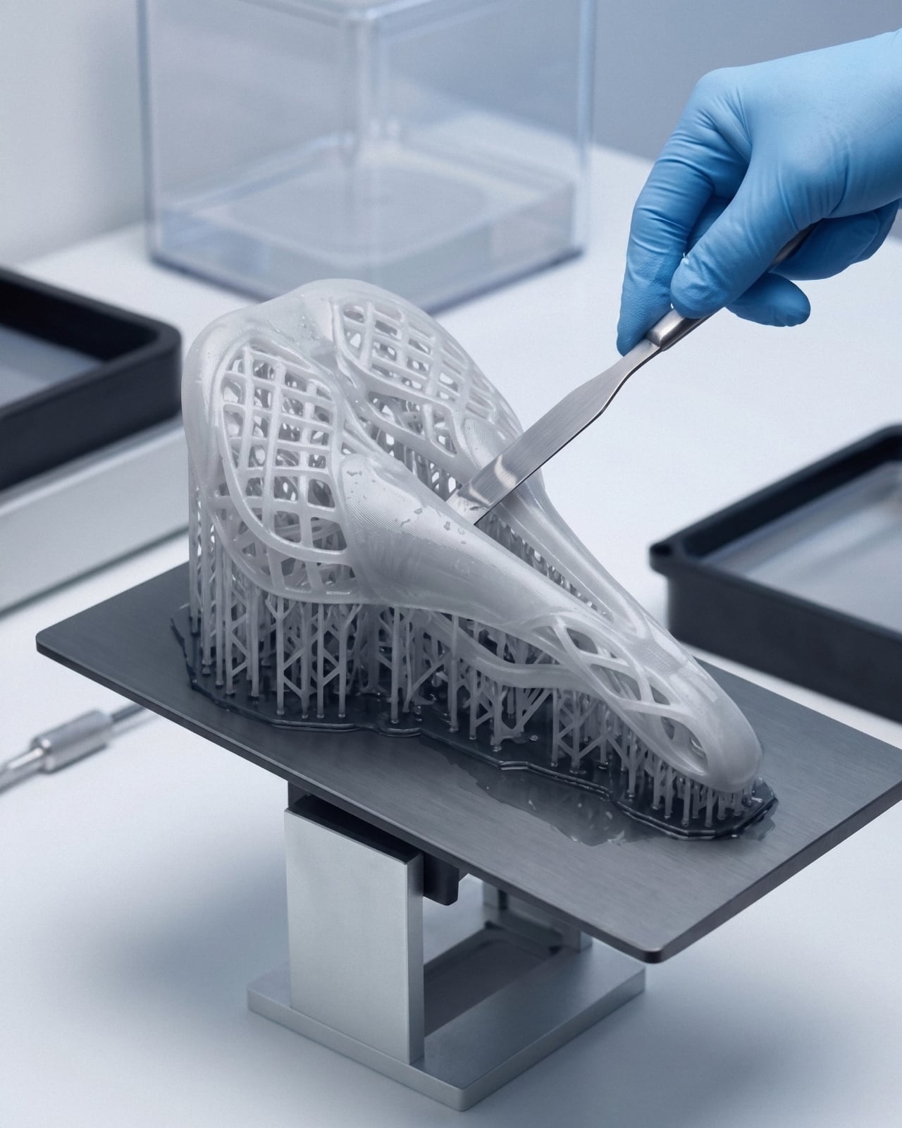
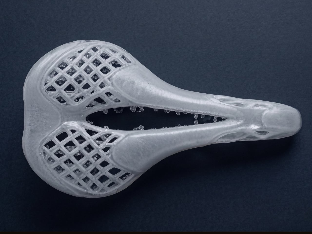
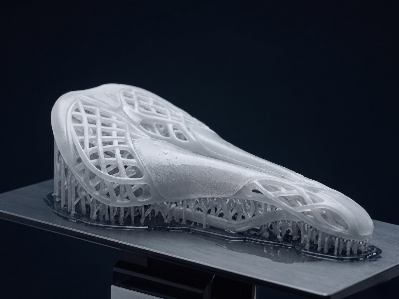
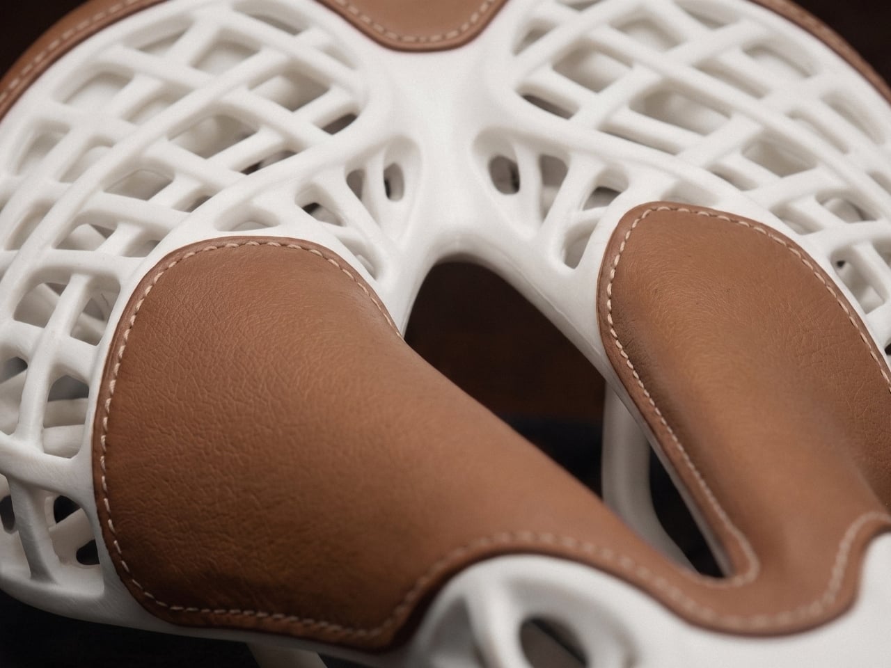
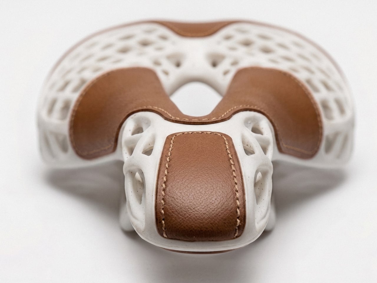
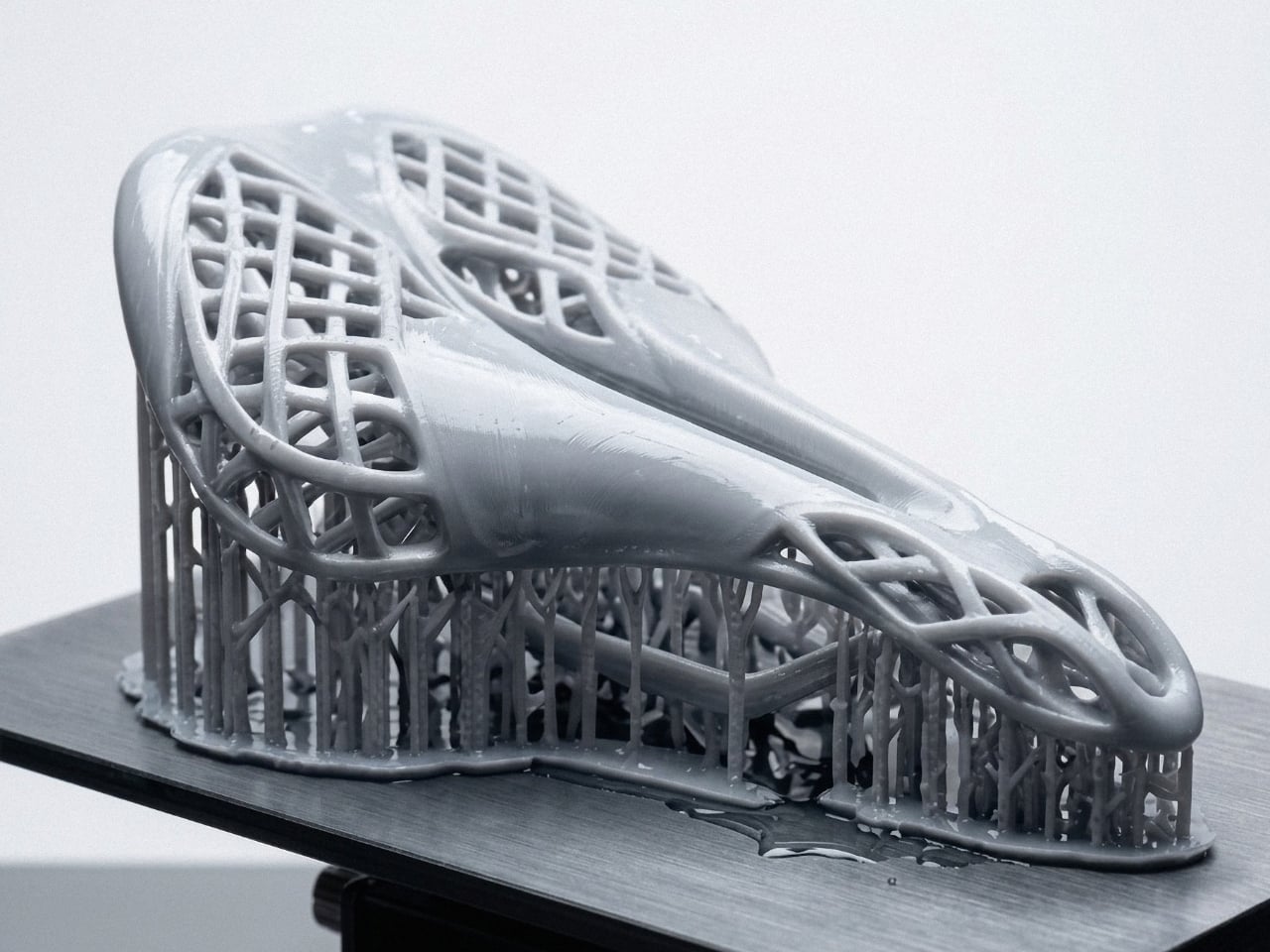
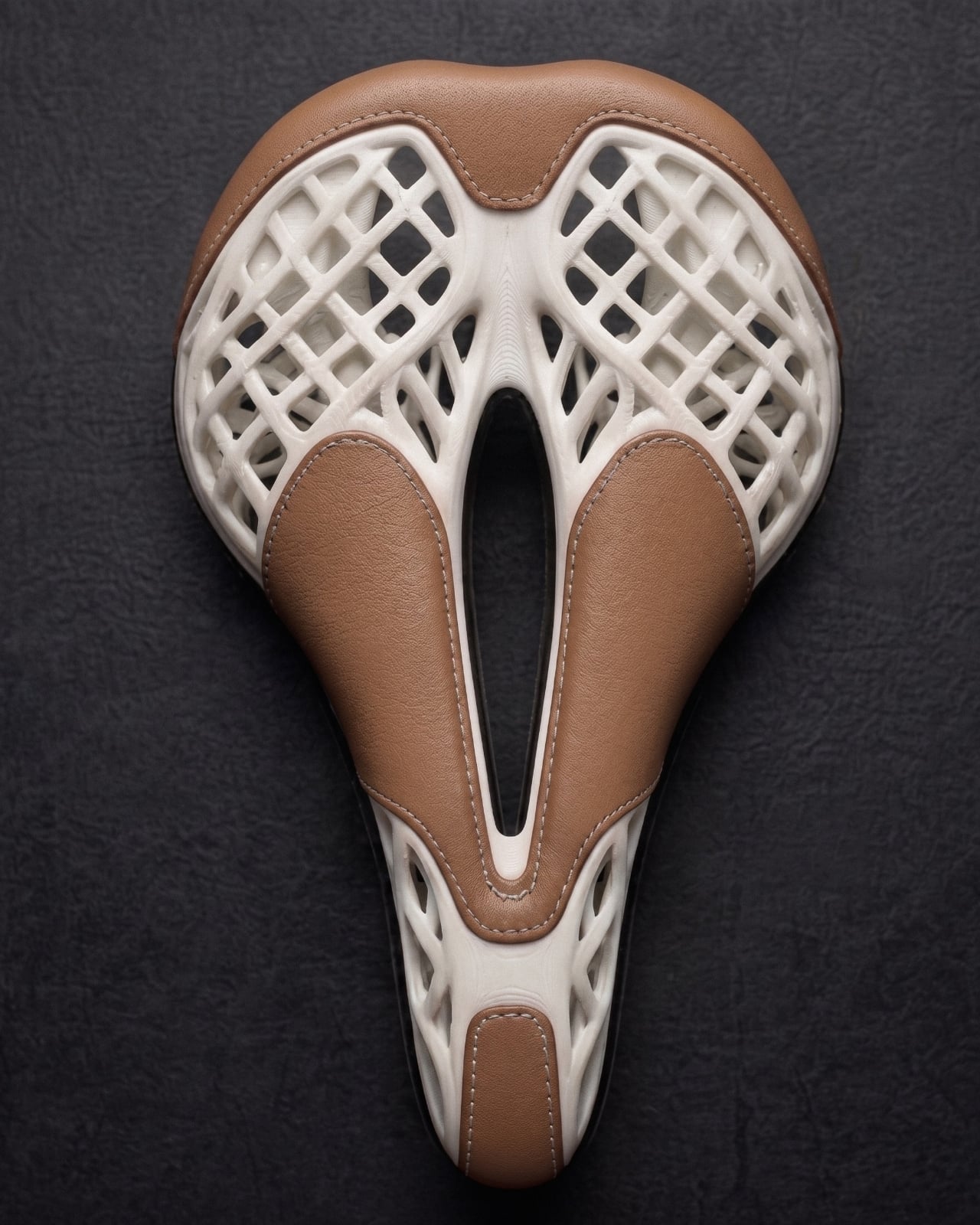
The structure is built on a lattice produced through high-precision photopolymerization, specifically SLA and DLP printing, in high-performance elastomer resin. The geometry is not decorative. It is functional in the most literal sense: the lattice density changes across three zones of the saddle, denser where firm support is needed under an aerodynamic riding position, progressively softer through the transition zone, and open at the perineal relief zone to minimize pressure. No foam. No padding added to compensate for poor design thinking. The structure itself is the comfort system.
That kind of discipline is rare, and I say that as someone who has watched a lot of product design lean on material additions to solve problems that should have been solved earlier. Foam is easy. Getting the geometry right from the start is not. It takes conviction to design without a fallback.
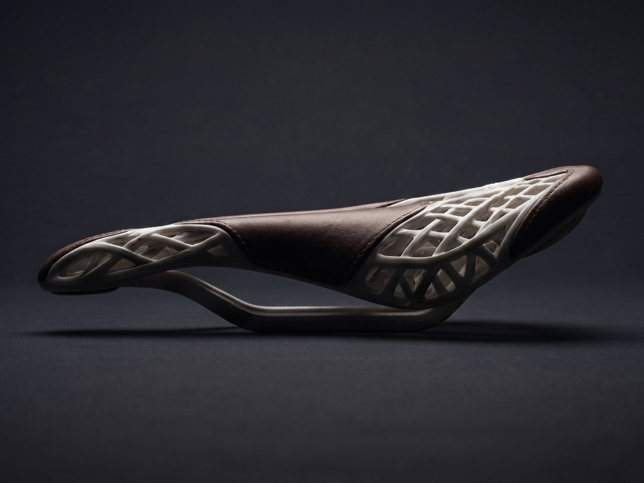
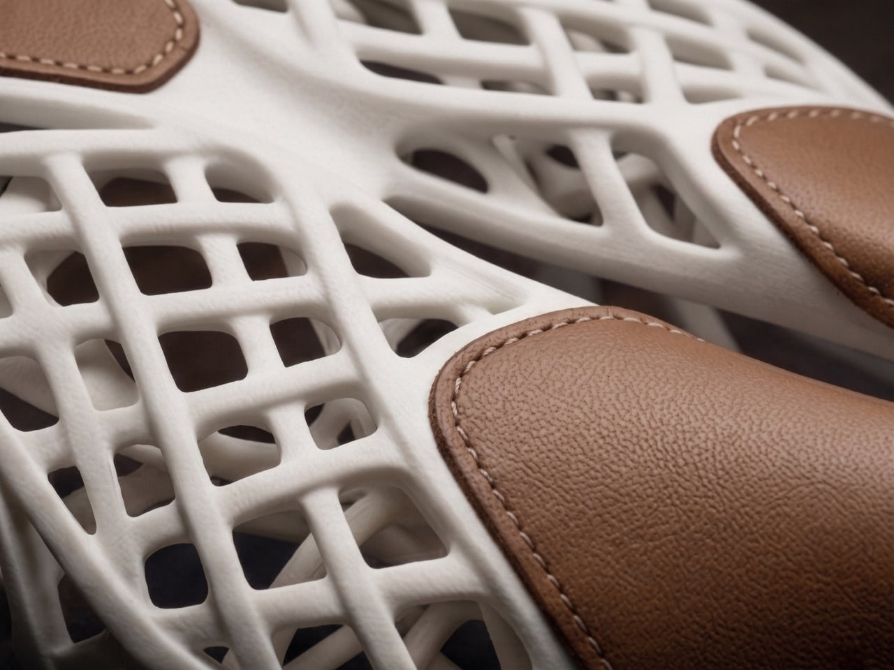
The second layer, and I do mean the second design logic rather than a second material slapped on afterward, is where a French master saddler comes in. Full-grain vegetable-tanned leather, hand-stitched. The studio is clear that this is not an aesthetic decision. The leather works mechanically with the resin, distributing pressure and shear forces in ways that neither foam nor synthetic materials can match at equivalent weight. The interface between the two materials was designed during the modelling phase, not decided once the print came out of the machine.
This is the part I keep coming back to. The leather isn’t a finish. It isn’t branding. It is the second structural argument in the same conversation, and the conversation started before any material was touched. That level of intentionality is genuinely unusual, even among products that wear the word “craft” proudly on their labels.
Mahdi Naïm himself is worth knowing, if you don’t already. He is an industrial designer, a Grand Maître Artisan, and a German Design Award laureate who runs his studio between Lyon and Casablanca. His practice sits at the intersection of French engineering and Moroccan craftsmanship, and AERIS reads like a project that could only come from someone fluent in both languages. The saddle doesn’t feel like a technology demonstration with craft applied on top, or a heritage object with a 3D-printed frame underneath. It feels like one object, made by two disciplines that had to agree on every decision before anything was built.
AERIS is still in active development and moving toward small-series production. The studio is in conversation with industrial partners in additive manufacturing and premium cycling. That means this isn’t a concept in the gallery-piece sense, displayed under glass and admired from a distance. It is a product that intends to be ridden.
Whether you cycle or not, whether you follow product design closely or just occasionally land on something that makes you stop scrolling, AERIS is the kind of object that rewards a second look. Not because it is visually striking, though it is, but because the thinking behind it is genuinely coherent. The lattice, the leather, the hand-stitching, the parametric modelling: none of it is decoration. All of it is argument. That is harder to pull off than it looks, and considerably rarer than the design world likes to admit.
Most public sculptures ask you to stand in front of them and feel something, usually reverence, awe, or a vague sense of civic pride. They represent people, events, or abstract ideals, but they rarely suggest function. A figure cast in bronze doesn’t appear to be doing anything, and that’s largely the point. The statue commemorates; it doesn’t operate. The relationship between viewer and object is, by design, entirely passive.
Michael Jantzen had a different idea. The Santa Fe-based designer set out to create public sculptures that look like they’re built to do something, even if no one, including Jantzen himself, can say what that something is. The result is the Monumental Engines of Creation, a concept series drawing from the visual language of high-technology hardware, assembled into objects that feel purposeful, alien, and oddly believable all at once.
The design process is telling. Jantzen didn’t start with a function and work backward to a form, as industrial designers typically do. He built the pieces intuitively, combining various components into composites that simply suggest some kind of high-level intelligence at work. The question of what they might actually be for was deliberately left unanswered, and that open-endedness is precisely what gives the series its strange pull.
Standing near one of these sculptures, you’d spend a while trying to decode it. Jantzen’s hope is that viewers engage with the objects and find themselves genuinely wondering about their origin, their creators, and their purpose. That kind of sustained curiosity is harder to provoke than it sounds. Most public sculptures deliver their meaning almost immediately; these deliberately withhold it, rewarding prolonged attention with more questions rather than answers.
Part of why that works is scale. Each piece in the series is intentionally gigantic, dwarfing any person nearby to the point of near insignificance. That proportion isn’t accidental; Jantzen designed the scale to convey the symbolic weight of each object relative to its imagined function. A machine built to scatter the seeds of creativity throughout the universe, the thinking goes, should probably look the part.
There’s something worth sitting with in the idea that creativity itself deserves monuments. Most of what we commemorate in public space is history, politics, or governance. Jantzen’s machines point somewhere else, toward imagination, invention, and the strange optimism embedded in building. They don’t ask to be understood. They ask to be wondered at, which turns out to be a different, and arguably more honest, kind of public art.
Gaming peripherals have come a long way in terms of specialization, from mechanical keyboards tuned for competitive play to mice with adjustable DPI profiles and ergonomic grips. What hasn’t kept pace is hardware designed for players who can only use one hand. Existing options like gaming keypads only get so far, and none of them truly replace the keyboard and mouse combination that PC gaming has relied on for decades.
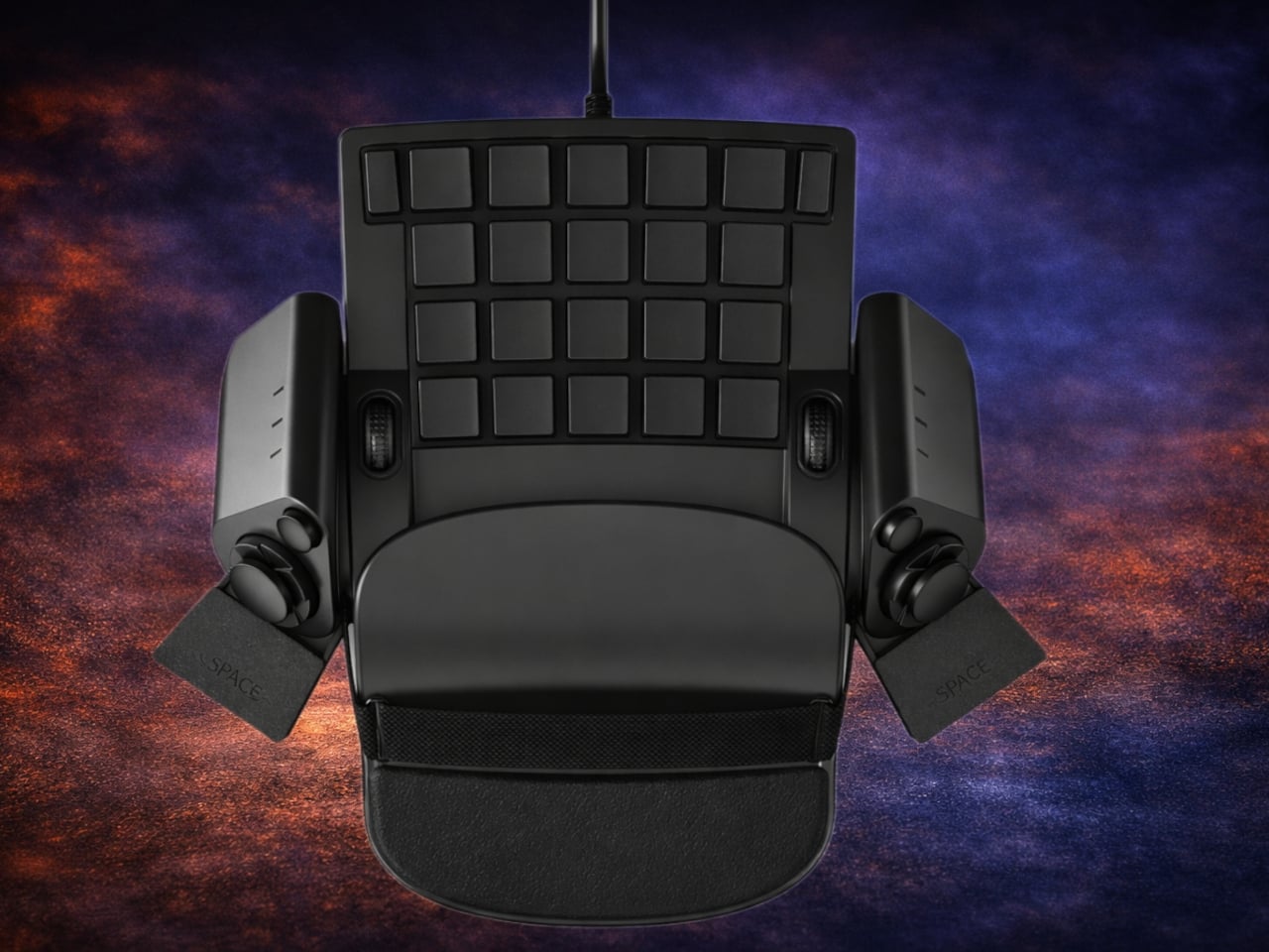
Joe Tomasulo found that out the hard way. After losing his right arm in a motorcycle accident, he’d tried everything to get back to PC gaming as he knew it. He adapted a Razer Tartarus, strapped a wireless mouse to it, and tweaked the software bindings endlessly, but nothing ever felt right. Rather than keep settling for workarounds, he eventually built something purpose-made, and the result is the Ercham MK1.
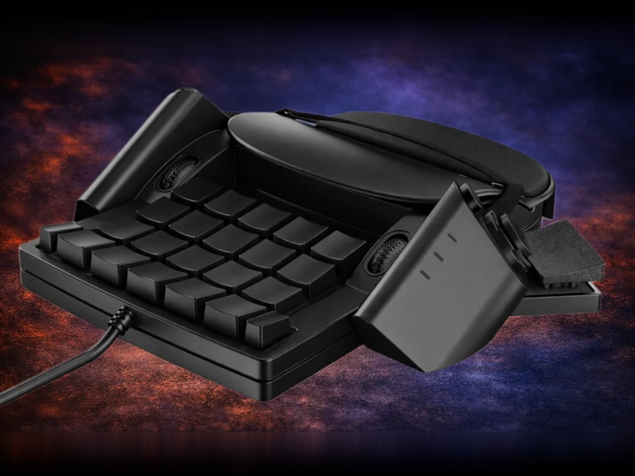
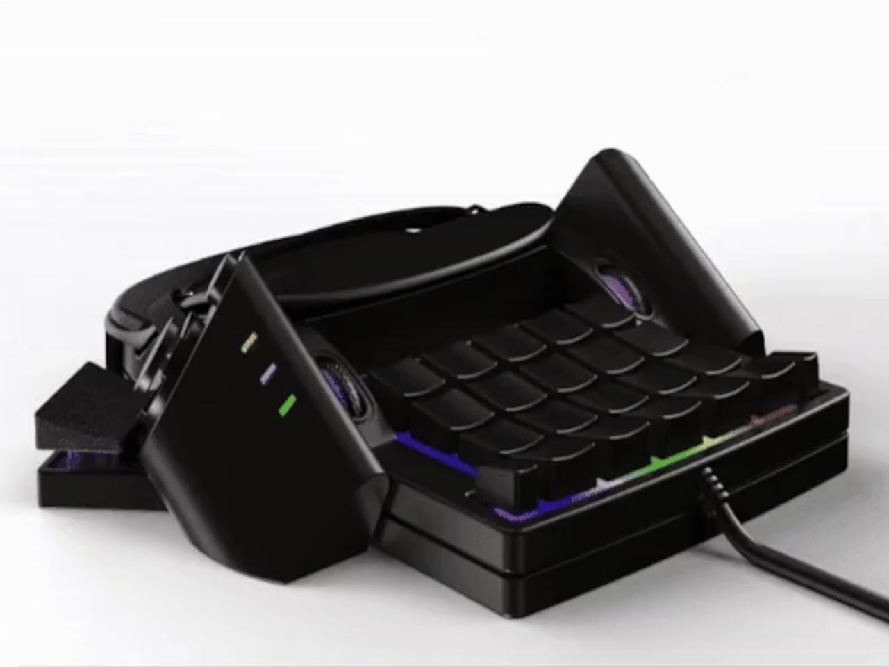
The core idea is to put the keyboard and the mouse into the same device so that one hand handles everything at once. The Ercham MK1 sits flat on a surface, and an optical sensor on its underside lets the entire unit glide like a conventional mouse. The hand resting on top can simultaneously press keys, scroll, and execute game commands without ever having to reach for a second peripheral.
The key section features more than 30 programmable inputs arranged in a compact grid within natural finger reach. A strap system runs across the top of the device, keeping the hand firmly in place during longer sessions without requiring a tight grip. That matters for players with limited hand strength or residual limb use, where maintaining position on a mouse-like surface for extended periods would otherwise be exhausting and imprecise.
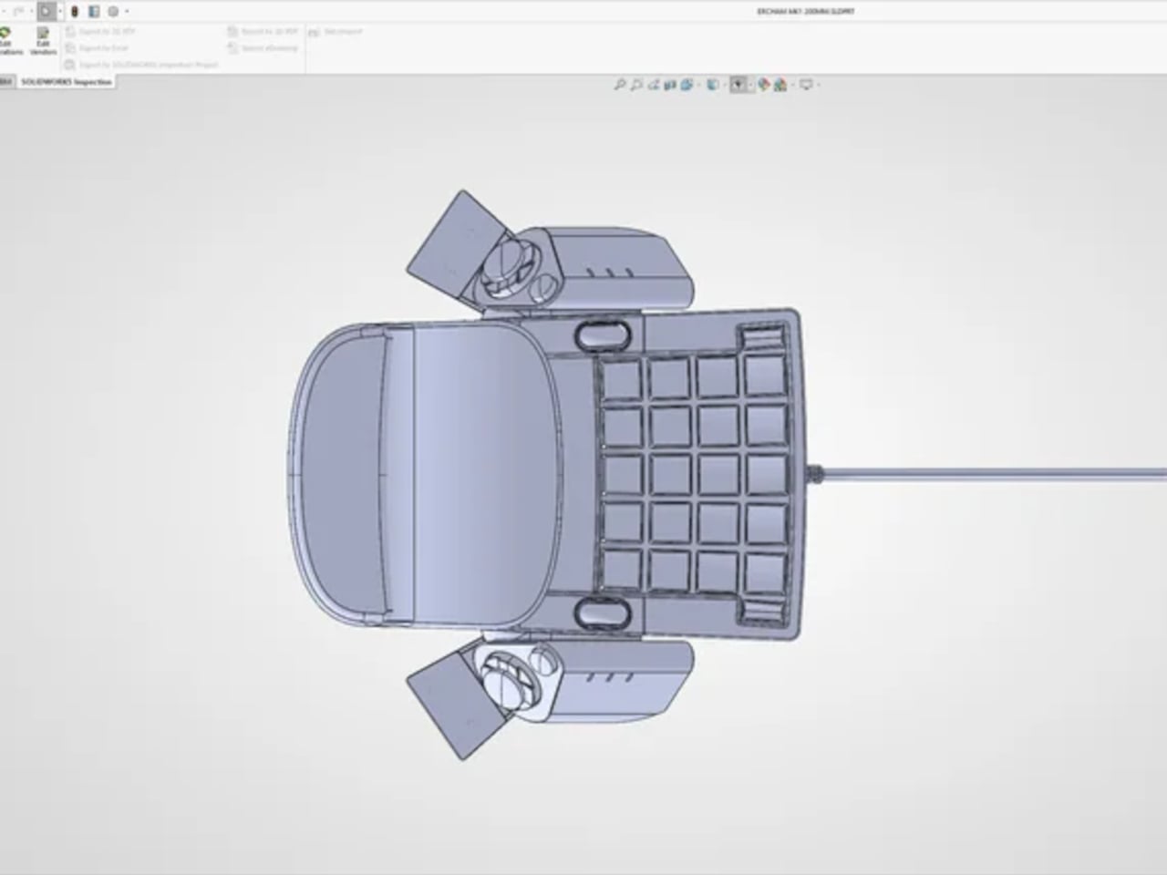
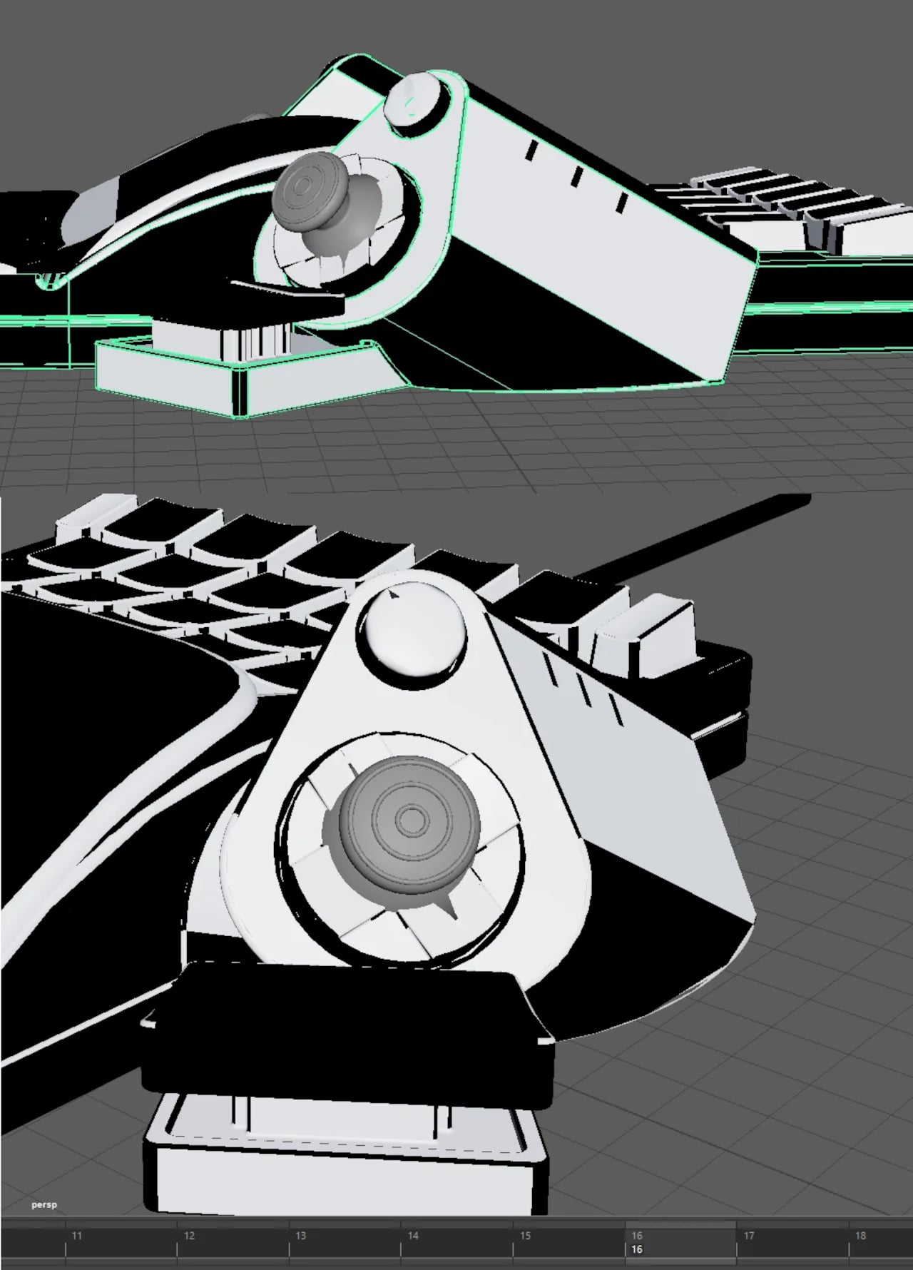
One of the more considered design decisions is that the Ercham MK1 works for either hand. Most gaming keypads aren’t built for both; they default almost universally to left-hand use, leaving right-handed amputees and players with right-side impairments without a natural fit. The fully ambidextrous layout, combined with angled control modules on both sides of the device, means the setup adapts to the user rather than the other way around.
Joe built the Ercham MK1 with amputees and stroke survivors specifically in mind, but its potential reach extends well beyond those two groups. Players dealing with RSI, brachial plexus injuries, and chronic pain face the same frustrations with two-device setups that don’t accommodate them, and so do power users and content creators. The programmable layout and macro support make it a genuinely useful tool for productivity work, not just gaming.
It’s come a long way from the hacked-together prototype he started with, and that origin gives it a kind of credibility that polished gaming accessories rarely have. It wasn’t designed in a studio; it was built by someone who genuinely needed it and couldn’t wait for anyone else to.
The keyboard market often feels split into two very different camps. Mechanical boards have long been the preferred choice for people who care about typing feel, delivering consistent keystrokes and a tactile quality that makes long sessions more enjoyable. Magnetic keyboards, meanwhile, have become the go-to for gamers needing precise, adjustable input and rapid trigger performance. Both are capable, but each comes with its own trade-offs.
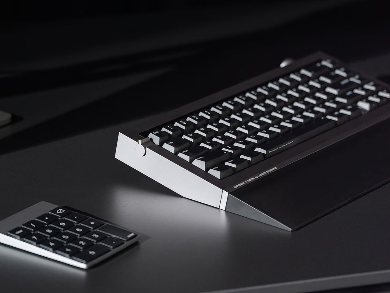
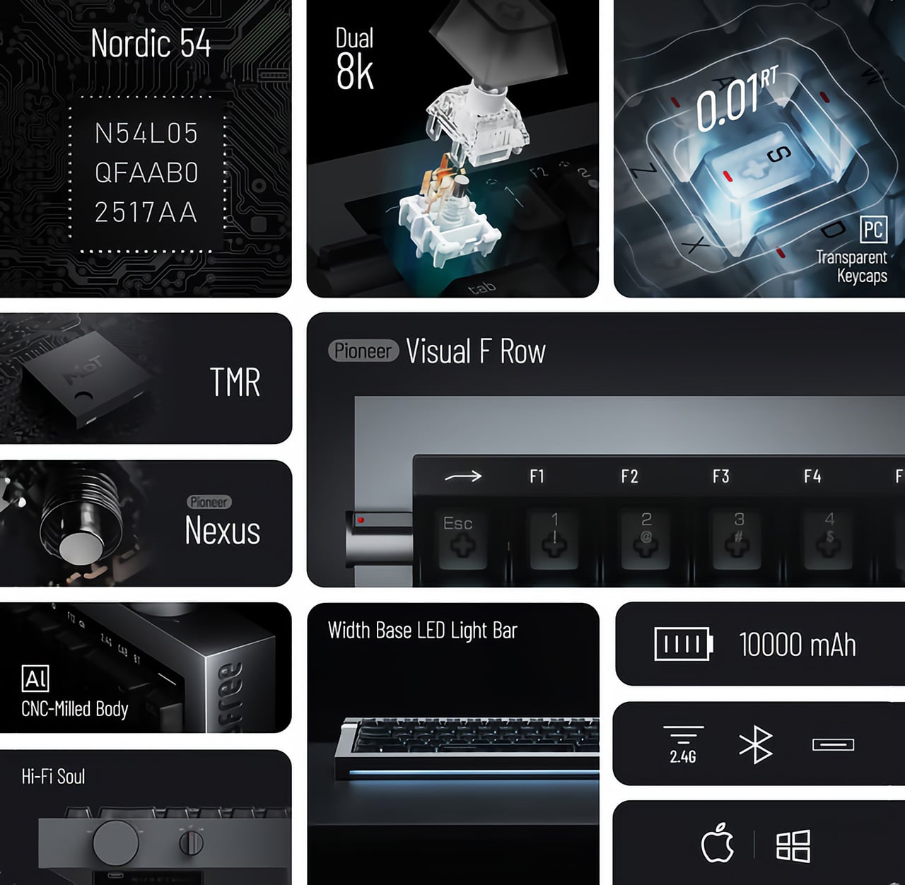
That split is exactly what Lofree is trying to bridge with the Hyzen, a compact 67-key keyboard that approaches the category with a slightly different proposition. Working with Kailh, Lofree developed the Nexus switch, combining a mechanical structure with magnetic sensing in a single unit. The idea, of course, is that you shouldn’t have to choose between how a keyboard feels and how quickly it responds.
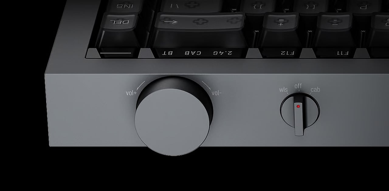
Beyond the technology inside, the Hyzen is clearly built to belong on a thoughtfully put-together desk. The CNC-machined aluminum body, clean geometry, and balanced proportions give it a composed presence that doesn’t lean into the visual language typical of gaming hardware. Available in Space Gray and Silver, it carries far more of the character of a premium desk accessory than a performance peripheral.
The lighting follows the same restrained approach. Rather than making RGB the main event, Hyzen uses subtle front ambient lighting and a light strip along its front edge that adds atmosphere without taking over. High-transparency PC keycaps with a matte UV coating and front-printed legends keep the visual detail quiet. It’s the kind of setup that works best in calmer, low-light arrangements where you want mood without the theatrics.
The Nexus switch is where the Hyzen’s concept actually becomes tangible. A single shortcut toggles between mechanical mode, which uses traditional contact-based actuation, and magnetic mode, which unlocks the performance features. According to Lofree, the physical typing feel stays consistent across both. What changes is how the input gets detected, which is Lofree’s answer to a problem many users know well.
On the productivity side, Hyzen carries a 10,000 mAh battery for solid wireless runtime, whether you’re writing documents or hopping between devices. Connectivity covers wired USB, 2.4 GHz, and Bluetooth, so switching between a work machine and a personal setup doesn’t take much effort. The PCB gasket construction and FR4 fiberglass plate also contribute to a more considered typing feel that holds up well over longer sessions.
Switch to gaming, though, and things get considerably more interesting. Magnetic mode unlocks adjustable actuation with 0.01 mm precision, rapid trigger with 0.01 mm accuracy, and a dual 8K polling rate at 8,000 Hz on both keyboard and receiver. Wired latency sits at 0.36 ms, with 2.4 GHz at 0.65 ms. Those are numbers competitive setups look for, in hardware that, for once, doesn’t look aggressive doing it.
There’s also a multi-function key window that lets you toggle between the F-row and number row, with a visual indicator showing the active mode at a glance. It’s a small detail, but a genuinely useful one on a compact layout where function layers can get confusing fast. Hot-swap support, macro functionality, and web-based key mapping round out a package that covers more ground than you might expect.
Keyboards that try to balance aesthetics and performance this explicitly still feel relatively uncommon. Most still ask you to pick a lane, whether that means living with something that looks aggressive on a clean desk or one that feels clinical when you’d prefer more character. Hyzen is trying to sit in between, which is either the smartest place to be or the most difficult one, depending on who you ask.
There is a particular kind of Tuesday that gets you. Not Monday, which at least carries the clean energy of a fresh start. Tuesday is when the week begins to feel long before it has any right to, when the desk stops feeling like a chosen space and starts feeling like a place you were assigned. The objects surrounding you have more influence over that feeling than most people acknowledge.
Wabi-sabi, the appreciation of imperfection and transience. Ma, the intentional use of space. Ikigai, the reason to get up. These are not aesthetic trends or interior design keywords. They are deeply considered frameworks for how the material world supports a good life. The five accessories here carry those values in practical, beautiful, desk-ready form — not to impress anyone walking by, but to make every Tuesday worth being present for.
1. ZenFlow Personal Aroma Diffuser
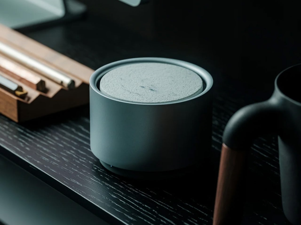
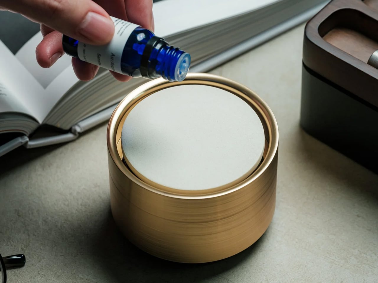
The ZenFlow Personal Aroma Diffuser earns its place on your desk through all your senses at once. It looks sculptural — a handcrafted porcelain filter sitting atop an anodized metal base in Silver, Gold, or Black — but the experience it creates is what makes it genuinely useful. The diffuser combines heat and airflow technology to evenly disperse essential oils through the air without water or mist, keeping your workspace clean and calm. It is aromatherapy without the clutter, without the fuss, and without the puddle on your desk.
For you, this means a desk environment that actively supports focus rather than merely existing around it. Switch between Normal Mode for stronger scent presence during deep work, Airflow Mode when you want subtlety, or ECO Mode for energy-efficient background relaxation throughout the day. The handcrafted porcelain filters are a product of Shibukusa Ryuzo Porcelain’s 180-year legacy, adding a layer of cultural weight to a device that already justifies itself on practicality alone. When the air around you smells intentional, the entire morning shifts slightly in your favor.
Water-free technology keeps your desk surface completely clean and mess-free
Three adjustable modes let you match the diffuser to your energy level throughout the day
What We Dislike
Essential oil refills add an ongoing cost over time
The handcrafted porcelain filter requires careful handling to avoid breakage
2. Magboard Clipboard
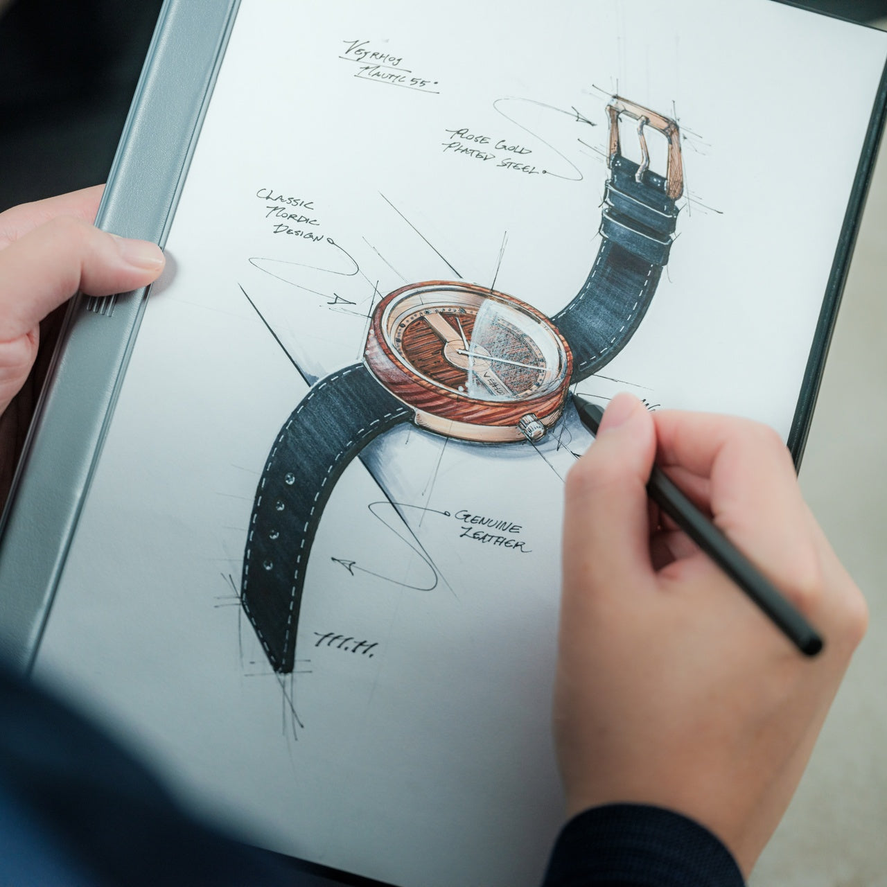
Paper notebooks are personal things. They carry the texture of actual thinking — the crossed-out lines, the sketches in the margins, the half-finished sentences that eventually turn into something better. The Magboard Clipboard understands this in a way that most stationery products do not. Its magnet and lever mechanism lets you bind up to 30 loose sheets without any predefined layout, order, or margin, giving your note-taking the same flexibility as your actual thought process. The hardcover construction is rigid enough to write on while standing.
What it gives you is freedom from the structure that most notebooks quietly impose. Pull out a page, reorder your notes, add a fresh sheet mid-thought, and put everything back in whatever sequence makes sense for how your brain works that day. The water-resistant surface means the board travels without hesitation — into a client meeting, a coffee shop, or a commute in unpredictable weather. For anyone who thinks with a pen in hand, Magboard removes every practical reason not to write, and in doing so, makes the act of capturing ideas feel genuinely frictionless.
Loose-sheet format lets you reorganize, remove, and add pages freely without tearing
Hardcover design supports writing without needing a flat surface underneath
What We Dislike
Loose pages can be easy to misplace if not managed with some care
The magnet and lever mechanism may feel unfamiliar to those used to traditional bound notebooks
3. Madco Table Lamp
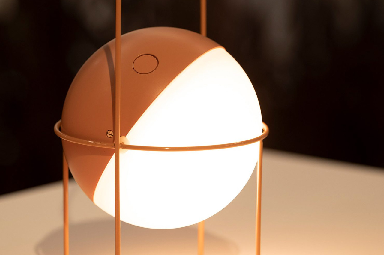
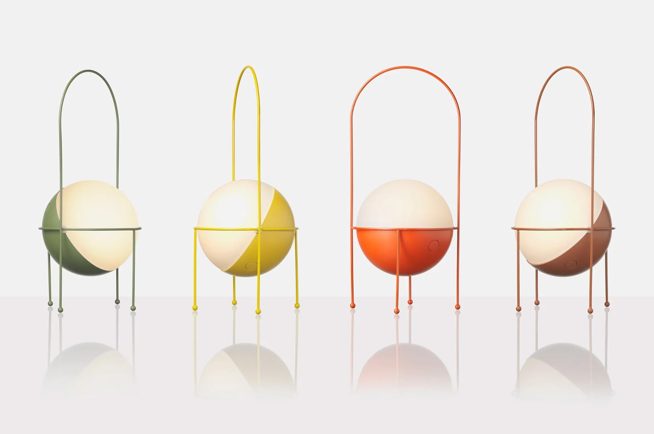
Designed by Italian designer Elisa Ossino for Japanese brand Ambientec, the Madco Table Lamp takes the warmth of a festive Japanese lantern and distills it into something small, quiet, and considered. A sphere-shaped diffuser sits suspended within a sleek metal frame, available in five colors chosen to add playful elegance without overwhelming a space. It marks the first time Ambientec introduced color into its design language, and the restraint with which they did it says everything — there is nothing loud here, only warmth and a kind of confident understatement.
For you, the Madco is the kind of light source that changes the felt quality of your desk at the start or close of a working day. It is rechargeable via USB-C, fully portable, and waterproof, meaning it moves with you from desk to balcony to garden without complaint, creating soft visual conversations with plants and outdoor textures along the way. The 360-degree rotating light source lets you direct warmth exactly where you need it. It is less a lamp and more a mood rendered in physical form — the sort of object that makes the transition into work feel like a deliberate choice.
What We Like
USB-C rechargeable and waterproof, making it genuinely portable for indoor and outdoor use
The 360-degree rotating diffuser lets you customize and redirect light output precisely
What We Dislike
Battery life will limit continuous use, particularly at higher brightness settings
Available in five fixed colors only, which may not suit every interior palette
4. Aya & Sfera Desk Organizers
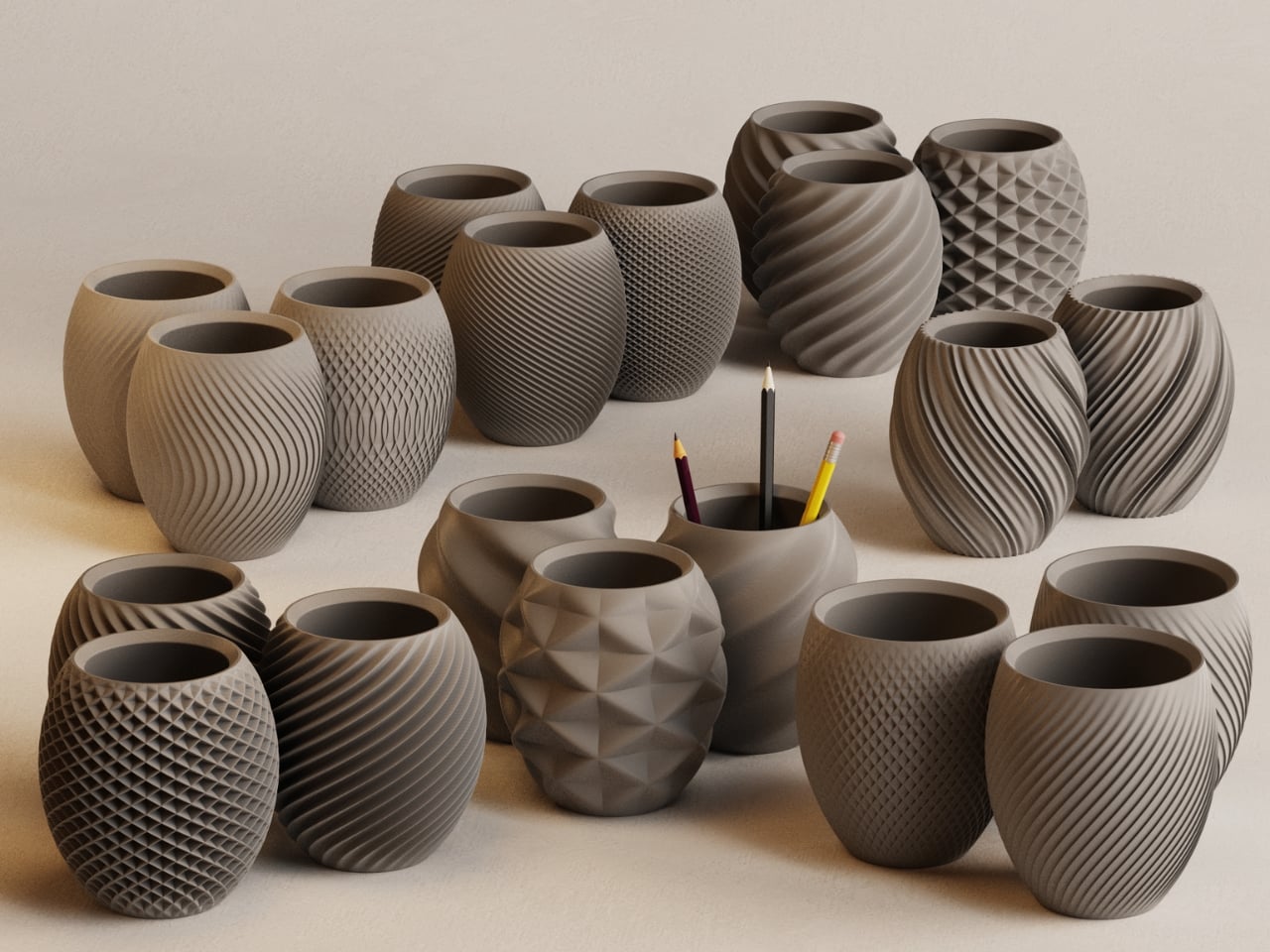
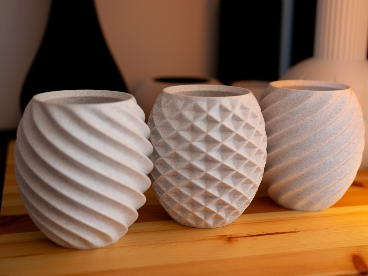
Ikigaiform describes their practice as Japanese minimalism meeting parametric design, a combination that produces objects feeling simultaneously ancient and quietly futuristic. Aya and Sfera began as full-size self-watering planters before being scaled down into desk-sized cups, carrying the same organic forms and intricate surface patterns into a far smaller footprint. The result is a pen holder — or catch-all, or shelf object — that shares design DNA with a living planter, blurring the line between the functional and the living in a way that feels entirely natural on a working desk.
What makes these organizers genuinely useful for you is the way they bring considered calm to whatever surface they occupy. Wabi-sabi aesthetics and Japandi sensibility run through every curve and surface pattern, making each piece feel deliberate rather than merely decorative. Whether you use them to hold pens, cables, a small succulent, or simply as a visual anchor on an otherwise noisy desk surface, they carry an almost-living quality that rewards closer attention. On a Tuesday morning when everything feels like an obligation, these small objects quietly remind you that your environment is something you actually designed.
What We Like
Organic forms and intricate surface textures make these genuinely rewarding to study up close
Compact size fits naturally on desks and shelves without claiming excessive space
What We Dislike
As a niche studio product, availability and restocking may be limited
The soft, organic form may not align with stark industrial or heavily geometric desk setups
5. Heritage Craft Unboxing Knife
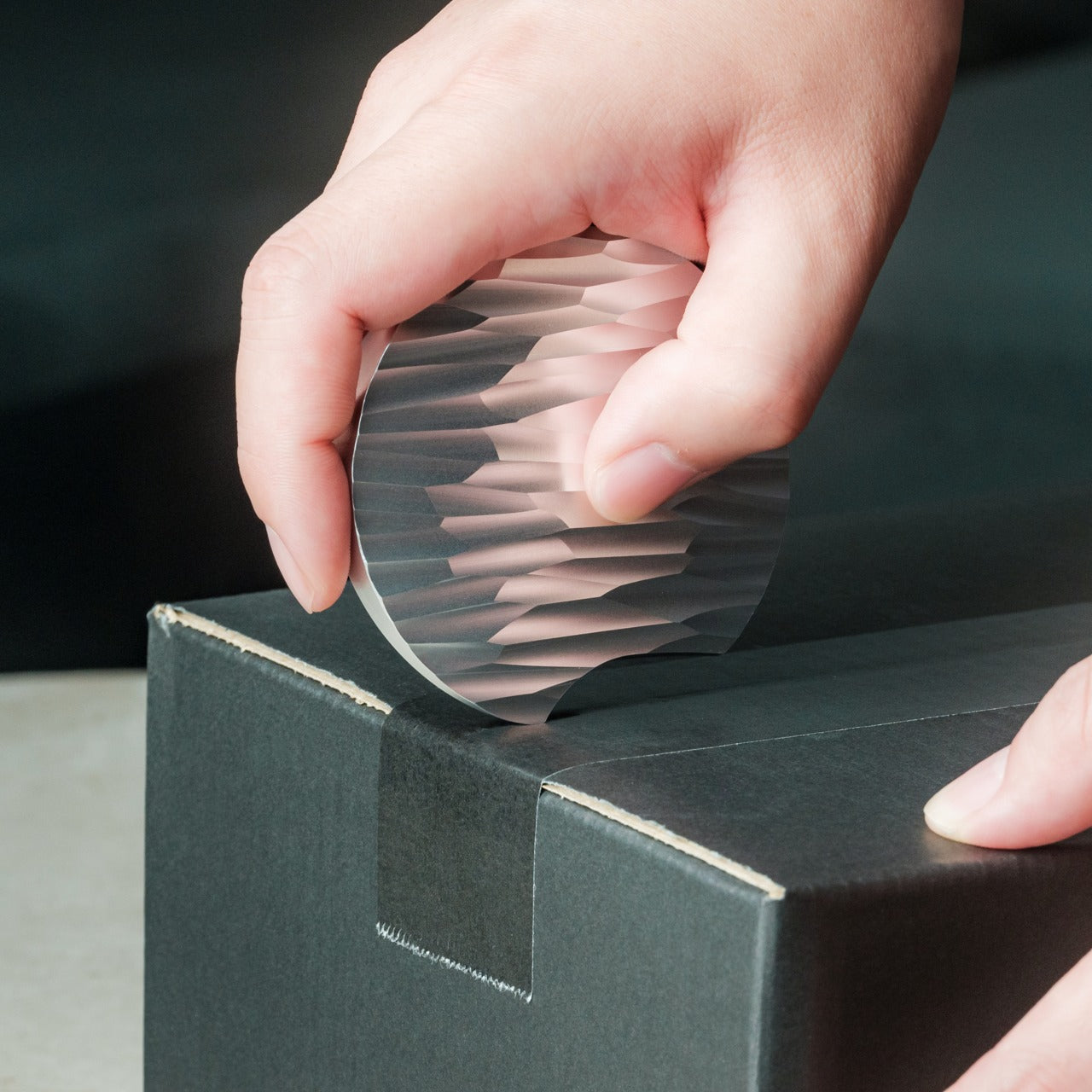
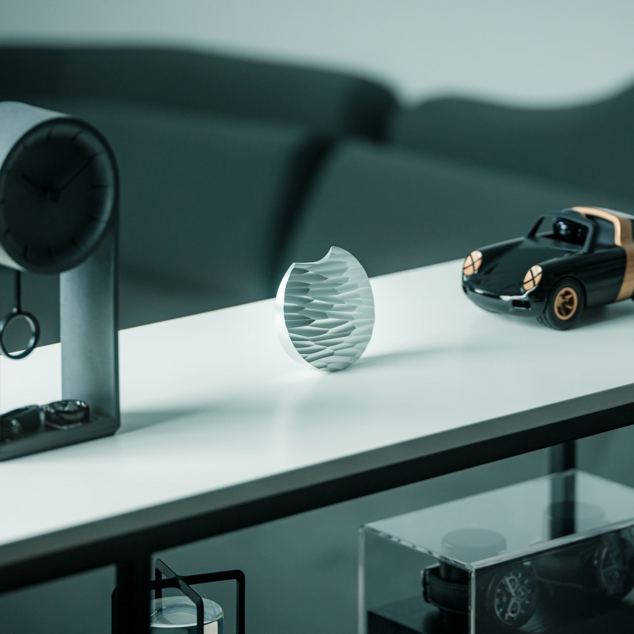
Most box cutters are purely transactional. You use them, drop them into a drawer, forget them completely. The Heritage Craft Unboxing Knife refuses that fate entirely. Carved from a block of aluminum, its circular form directly references Paleolithic hand axes, a shape carrying the entire arc of human tool-making history within it. The wave-like patterns left by precision machining are not purely decorative — they give the object grip, texture, and a visual richness that makes you want to pick it up. It is the rare tool that actively asks to be handled.
For you, this is the object that stays on top of the desk rather than inside it. It is effective — genuinely sharp for slicing tape and opening packages — but it holds its position through presence as much as through function. The tapered form sits confidently on any surface, operating simultaneously as a tool and a quiet sculpture. Japanese design philosophy holds that objects should be worthy of the attention we give them, that usefulness and beauty are not separate qualities. The Heritage Craft Unboxing Knife takes that idea seriously, and in doing so, makes even the small ritual of opening a package feel like something worth noticing.
Sculptural aluminum form means it stays visible on the desk rather than disappearing into a drawer
Wave-patterned machining provides both a secure grip and a distinctly artisanal visual quality
What We Dislike
The circular form may require a short adjustment period for those used to standard box cutters
Aluminum construction may accumulate visible surface scratches with regular daily use
The Desk Is the One Space You Actually Get to Choose
The desk is one of the few environments you actually control. Most of what shapes a Tuesday is decided before you sit down — the calendar, the emails, the inbox count. The objects you choose to keep in your immediate space are one of the last genuinely personal decisions left. These five accessories share a quality that goes beyond mere aesthetics: they each slow the eye down, just for a moment.
And in that pause, the morning becomes slightly less automatic. That is exactly what Japanese design has always understood — that objects worthy of attention gradually change the quality of attention you bring to everything else. You cannot redesign your calendar, your inbox, or your Tuesday. But you can redesign the surface in front of you. Fill it with objects that ask something of you. That, quietly, is more than enough.