PROS:
- Stylus with pressure and tilt sensitivity
- Beautiful, minimalist design
- Bright and vibrant screen
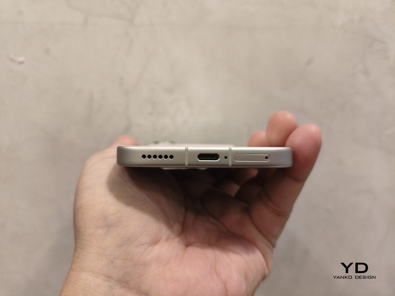
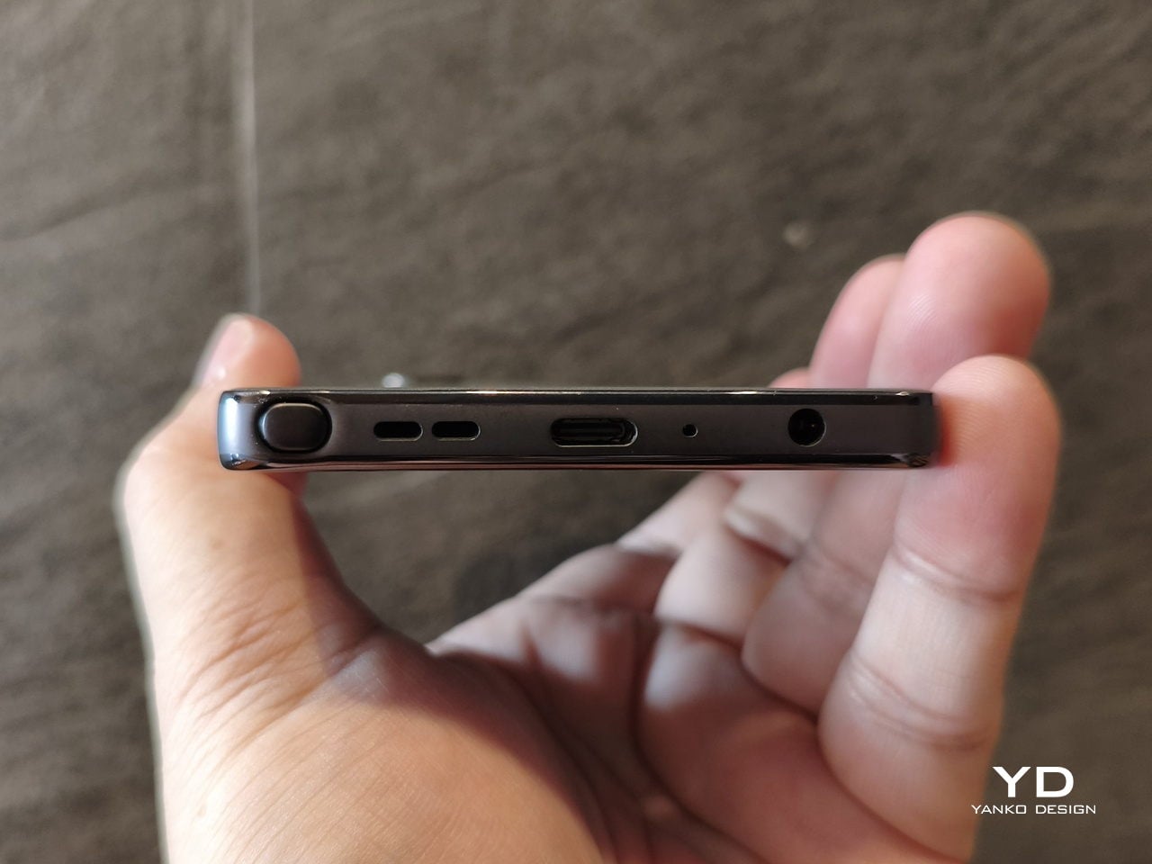
- Headphone jack and microSD card slot
CONS:
- Short software support period
- Relatively higher price compared to peers
- Not much hardware upgrades from last-gen
RATINGS:
SUSTAINABILITY / REPAIRABILITY
EDITOR'S QUOTE:
The moto g stylus - 2026 analog handwriting and digital freedom in a striking minimalist design that you can finally afford.
Despite and in spite of the growing number of screens and disembodied artificial voices around us, there remains a strong culture and argument for handwritten words. But while there might be plenty of benefits to putting ink to paper, there’s no denying that paper doesn’t provide the benefits of digital artifacts such as files, photos, and videos. For years, the stylus has been trying to bridge the best of both worlds, but it has so far been only within the reach of those who can afford it.
Since 2020, Motorola has been working to provide that kind of experience to more people through its Moto G Stylus line, but there have always been compromises. Ironically, most of those revolved around the very feature that gave the product line its name. With the moto g stylus – 2026, however, the brand is making its most daring leap forward yet, aiming for a title held only by the most luxurious of Samsung’s (non-foldable) handsets. So does it fly or does it fall? Read on to find out.
Designer: Motorola
Aesthetics
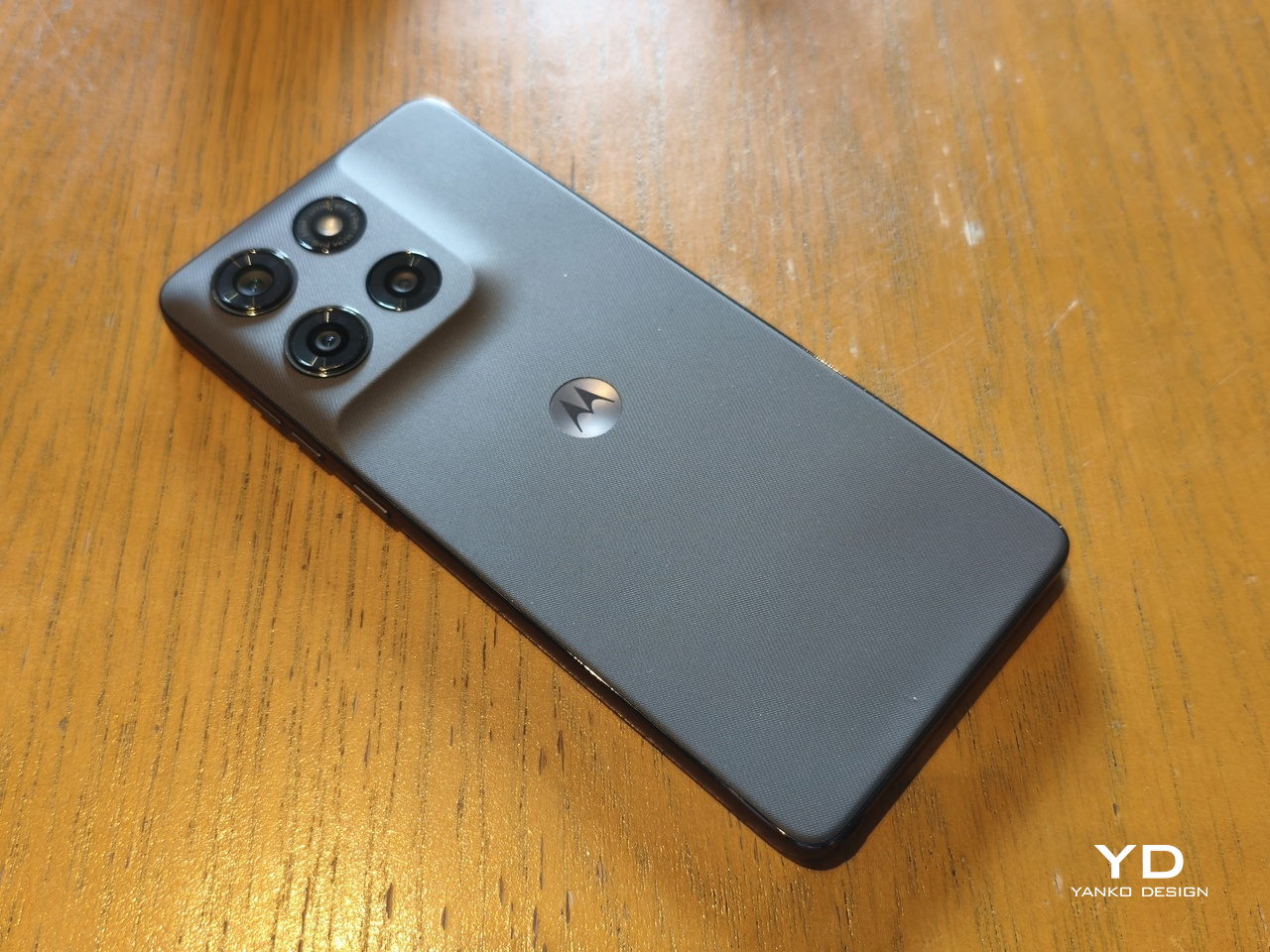
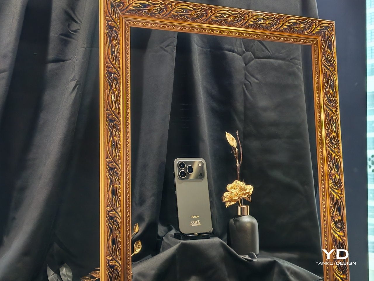
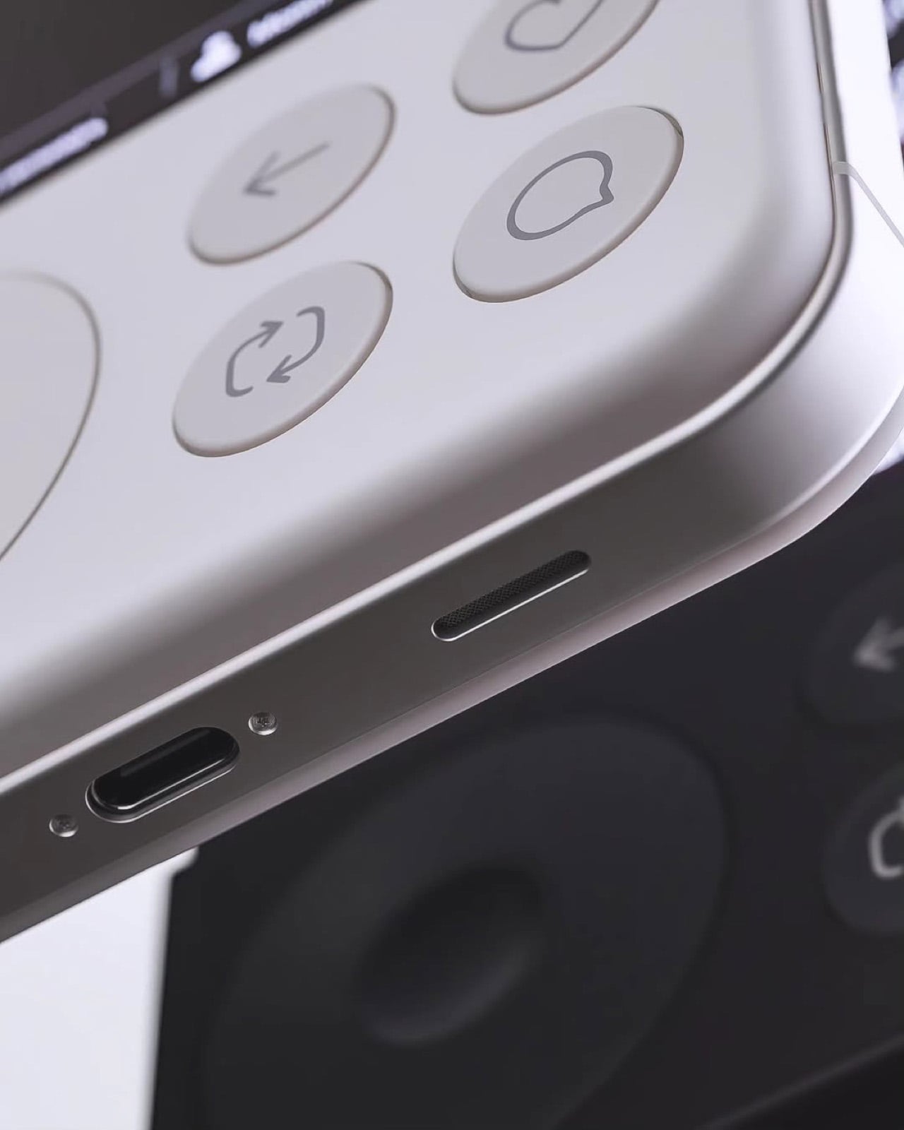
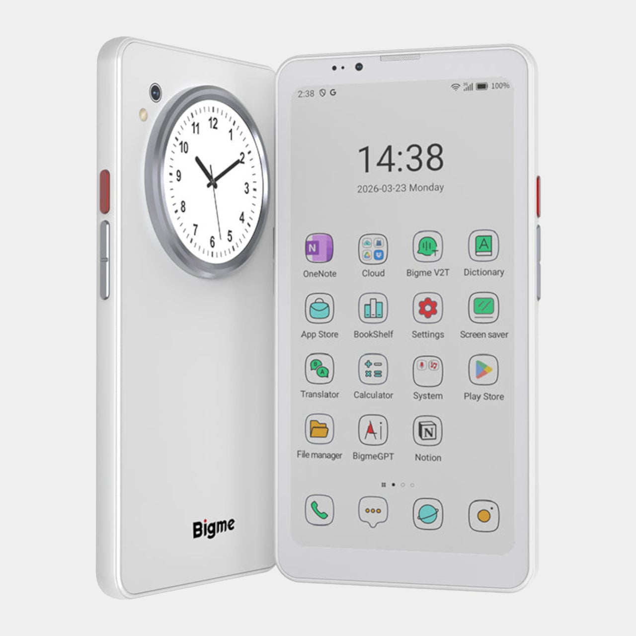
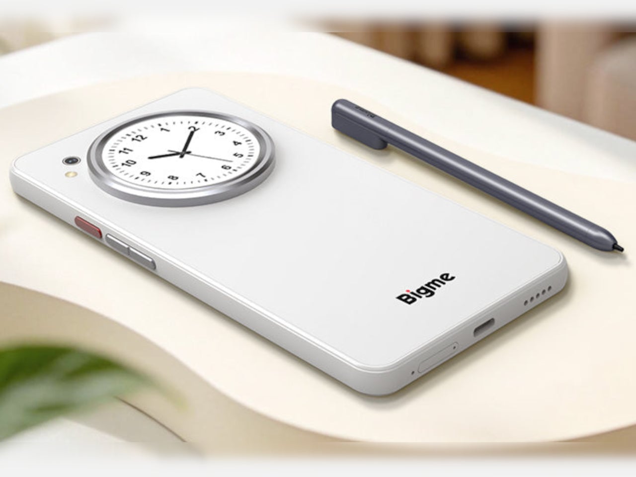
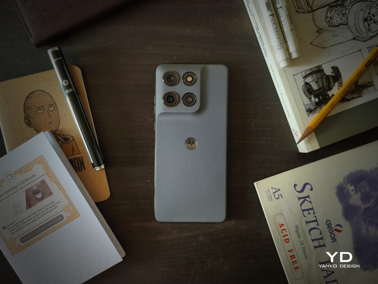
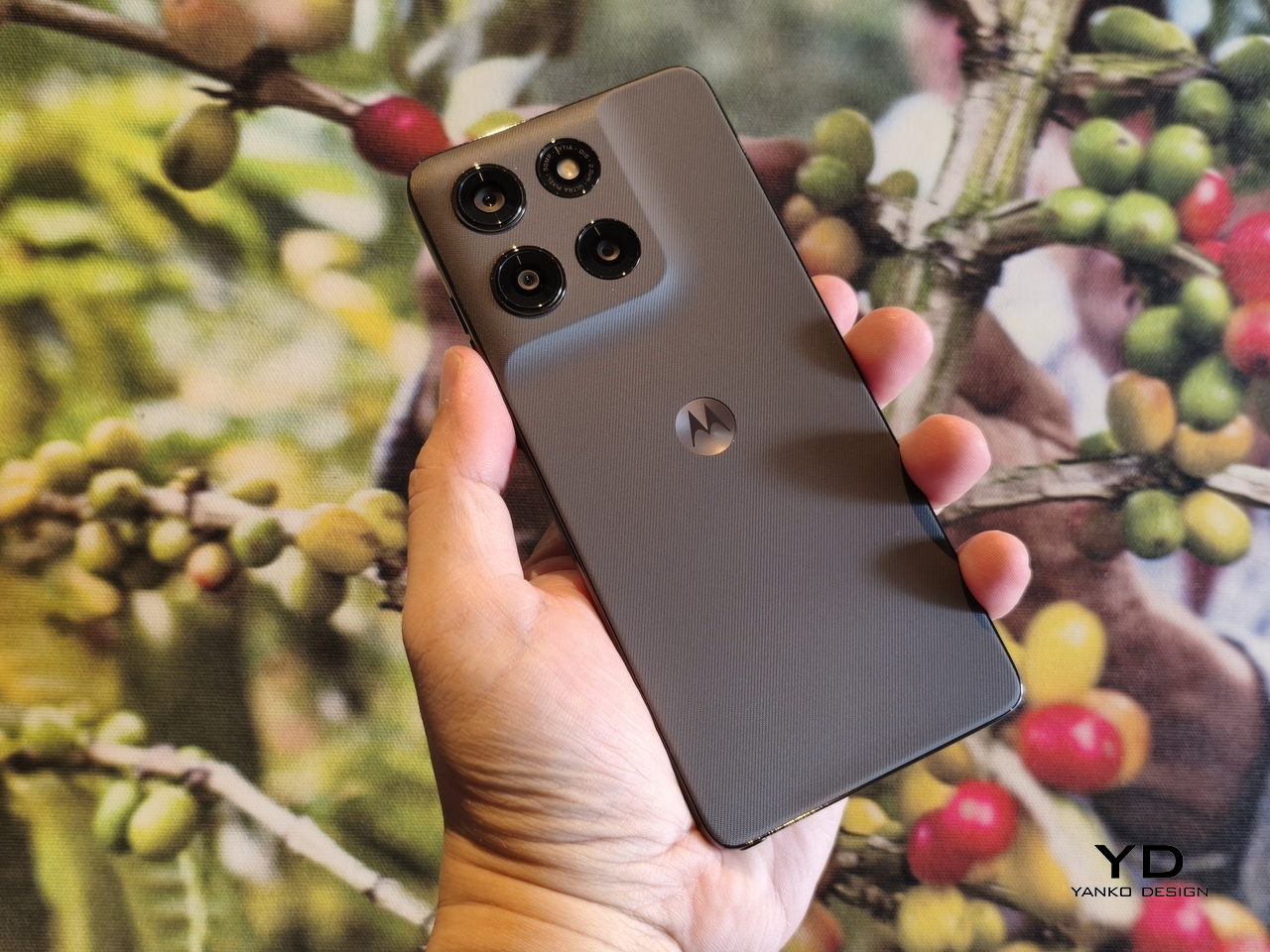
The moment you pull the moto g stylus – 2026 out of the box, you are immediately struck by how different it is from most phones of this generation. It doesn’t scream for attention with a ridiculously large camera module, nor does it attempt to dazzle your eyes with tricks of color and light. It is, in a nutshell, a minimalist lover’s dream.
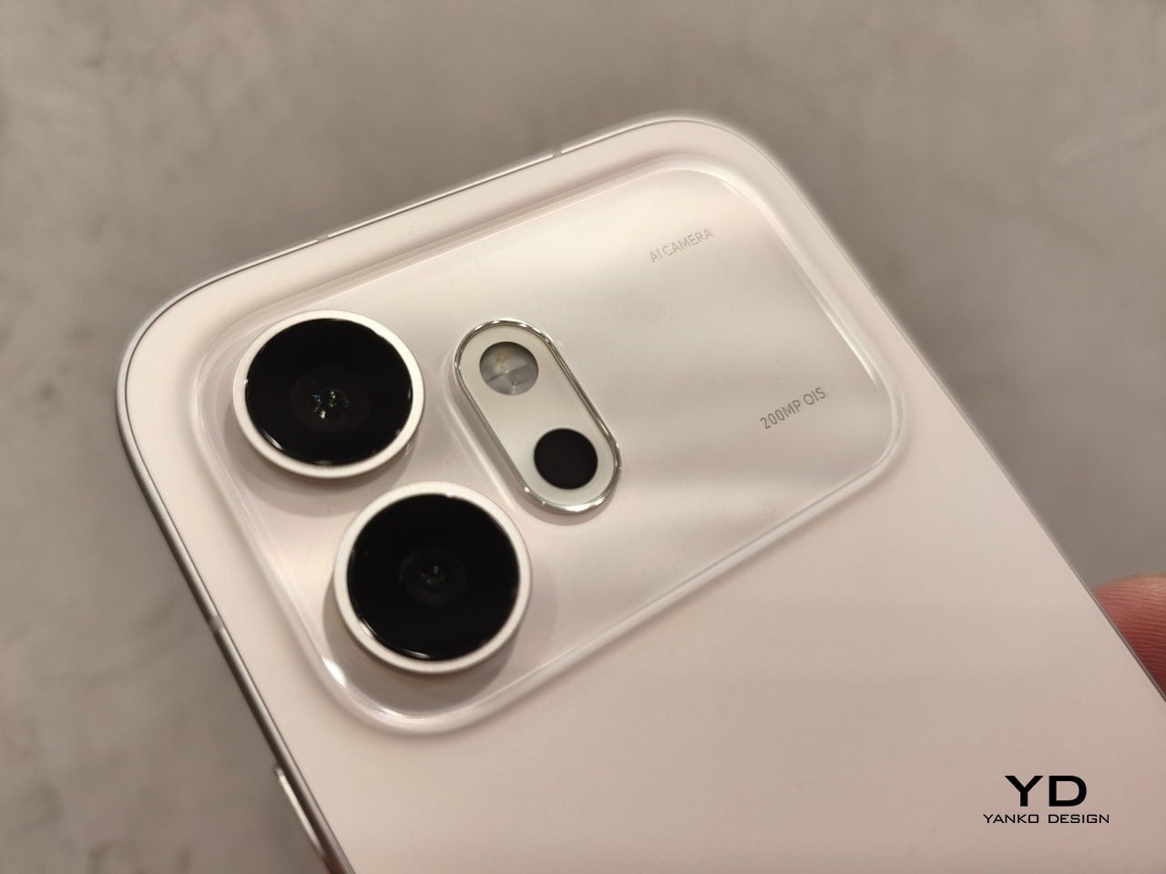
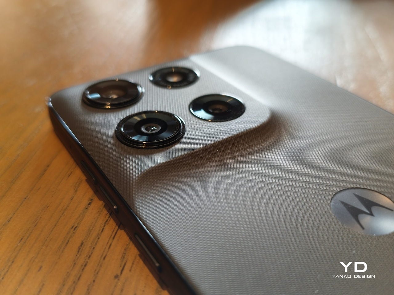
The back of the phone, which is always the most expressive side of the design, is covered with a vegan leather-inspired material that gives the phone both visual and tactile texture. Continuing its partnership with PANTONE, those covers are available in subtle Coal Smoke (our review unit) and Lavender Mist colors, with the flat edges matching the hue. Other than the iconic “Batwing” logo and minuscule markings around the LED flash, the design is bare and plain, a refreshing change from the active and noisy rears of most smartphones these days.
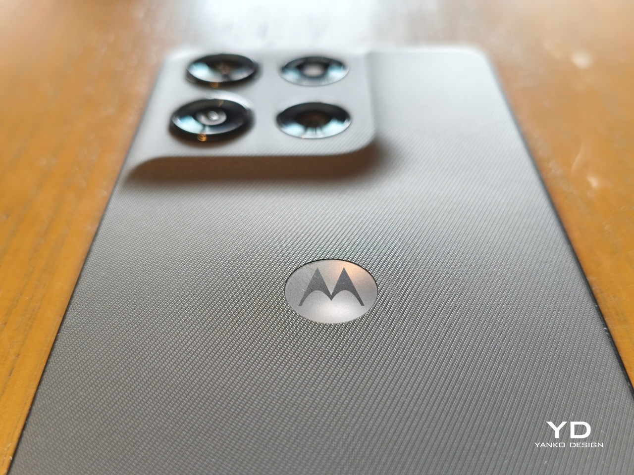
The camera bump follows that same pattern, rising from the back plate with a gentle slope. There’s no separate structure caging the lenses, creating a seamless and unbroken surface that almost has a calming effect, especially when your finger starts to glide over the textured surface. There’s almost a sense of Zen, so to speak, which is almost how many pen and paper lovers describe their favorite notebooks.
Of course, the front is the polar opposite, but only because of its bright and vibrant screen. The thin and almost symmetrical bezels and the flat glass, however, serve to provide balance that keeps that liveliness in check. All in all, the moto g stylus – 2026 is both simple and sublime. It doesn’t call attention to itself with some fancy visual or material gimmick, but you can’t help but pay close attention to its minimalism just the same.
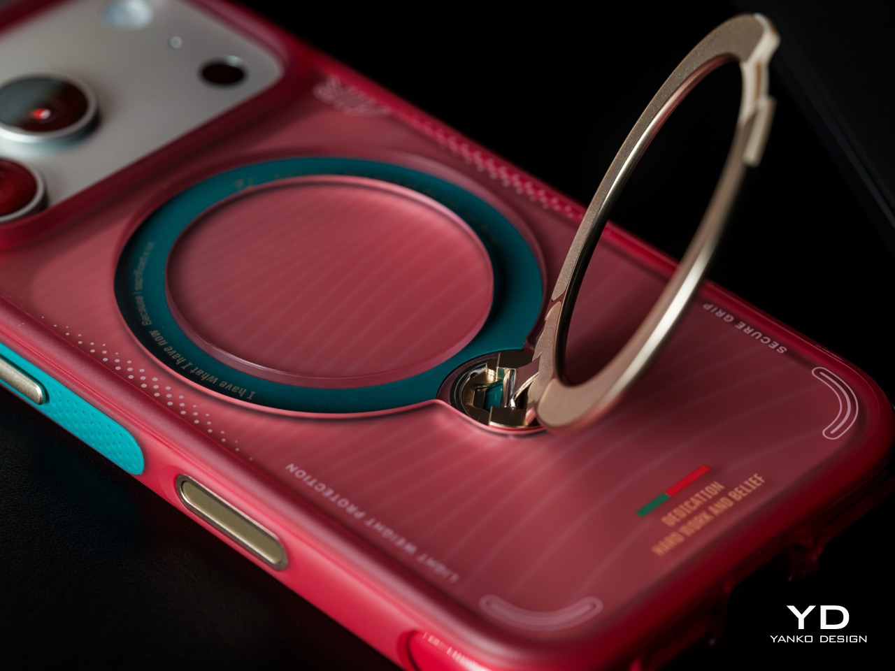
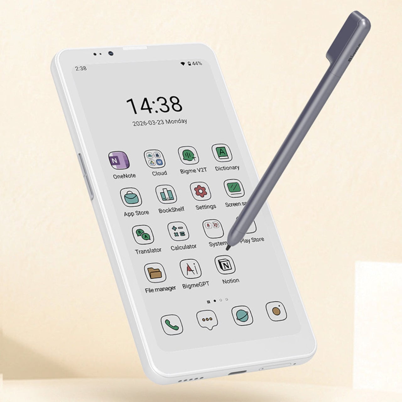
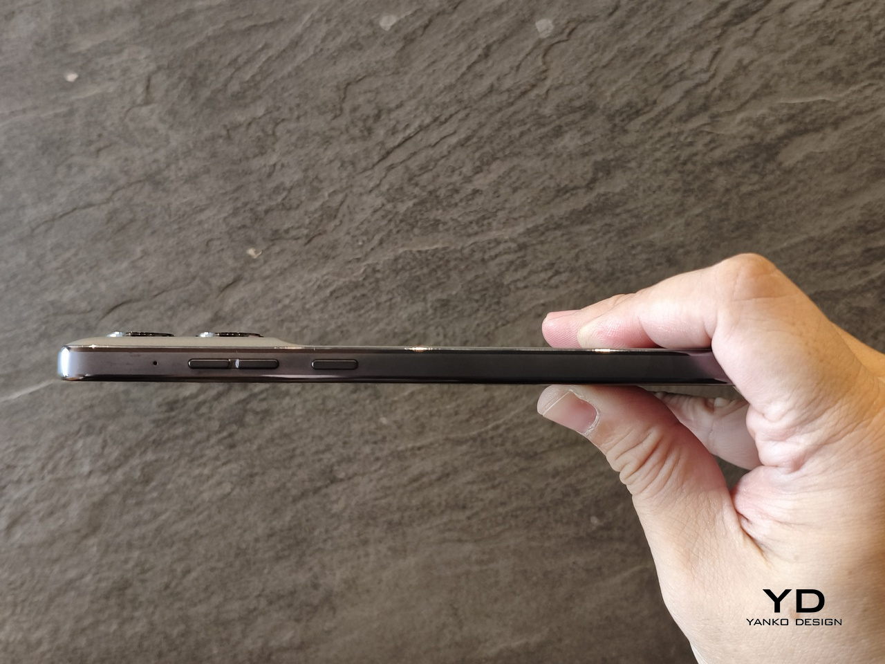
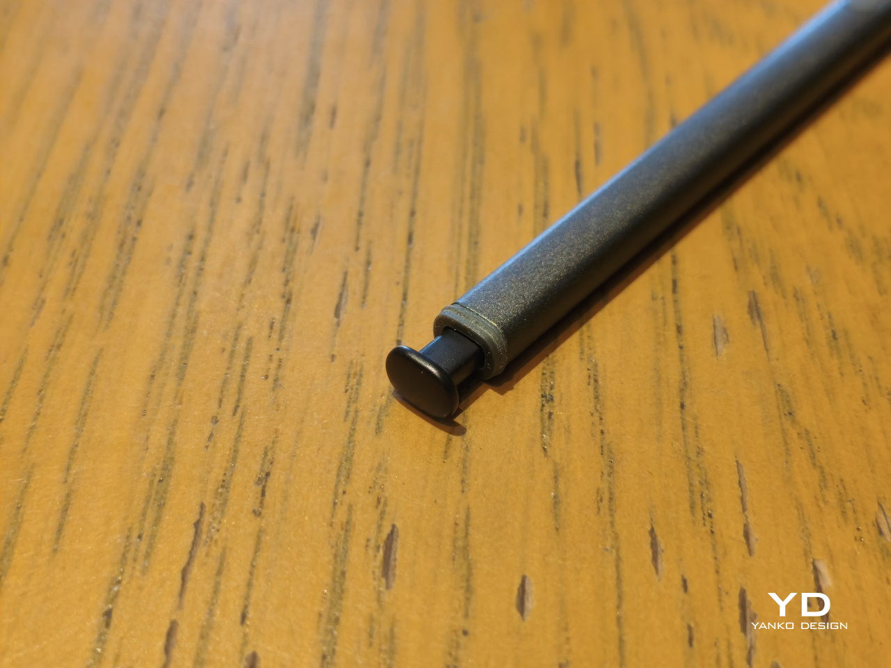
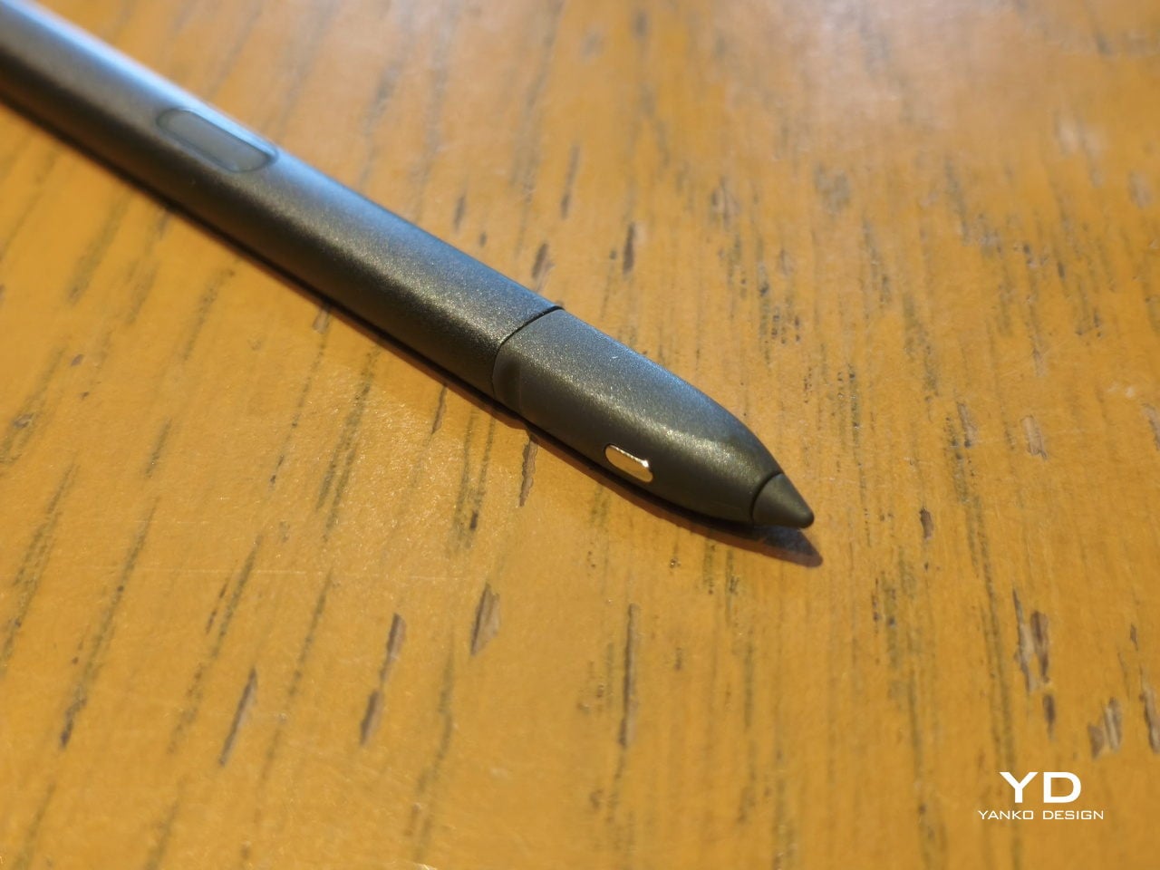
The stylus is cut from the same cloth, with a design that might be familiar to those who have held a Samsung “Ultra” flagship. It’s basically a somewhat flat stick, with a spring-loaded rear that easily resembles the (addictive) clicky ends of retractable pens. But unlike the small but stubby nibs of its predecessors, there is now a proper tapered, conical tip. Of course, it’s not just an aesthetic change, as we’ll get to in a bit.
Ergonomics
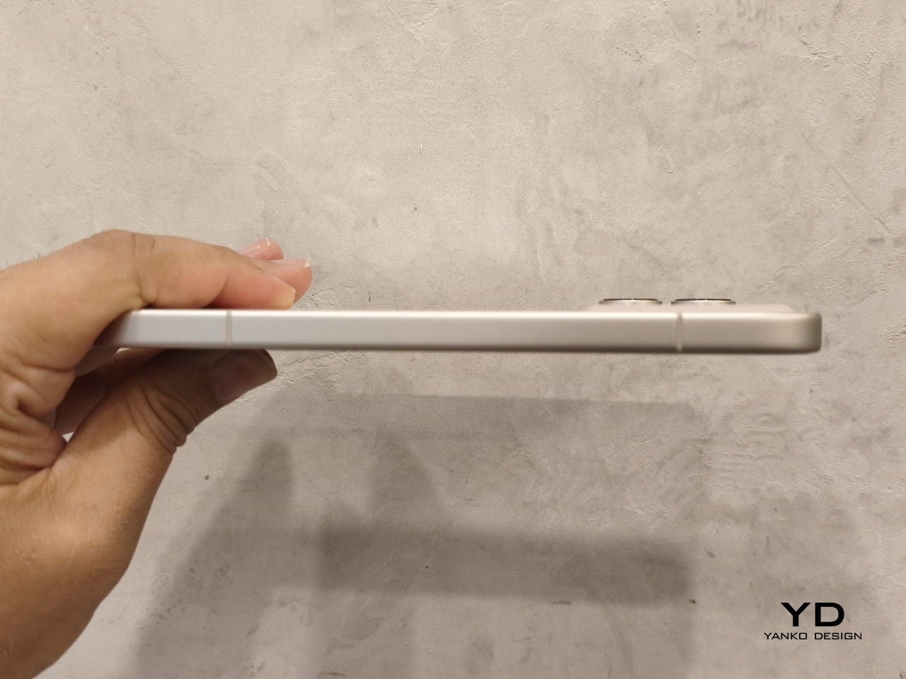
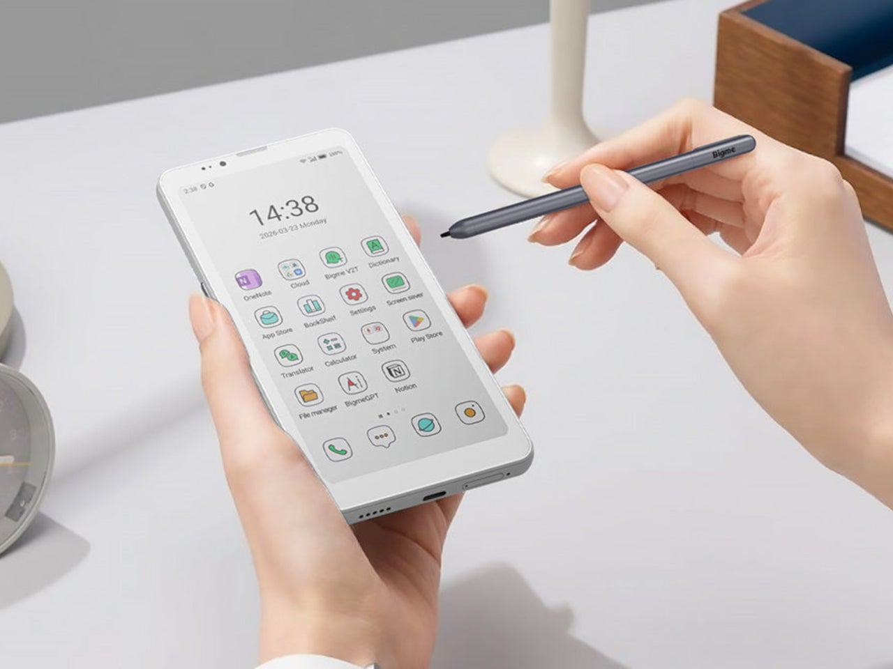
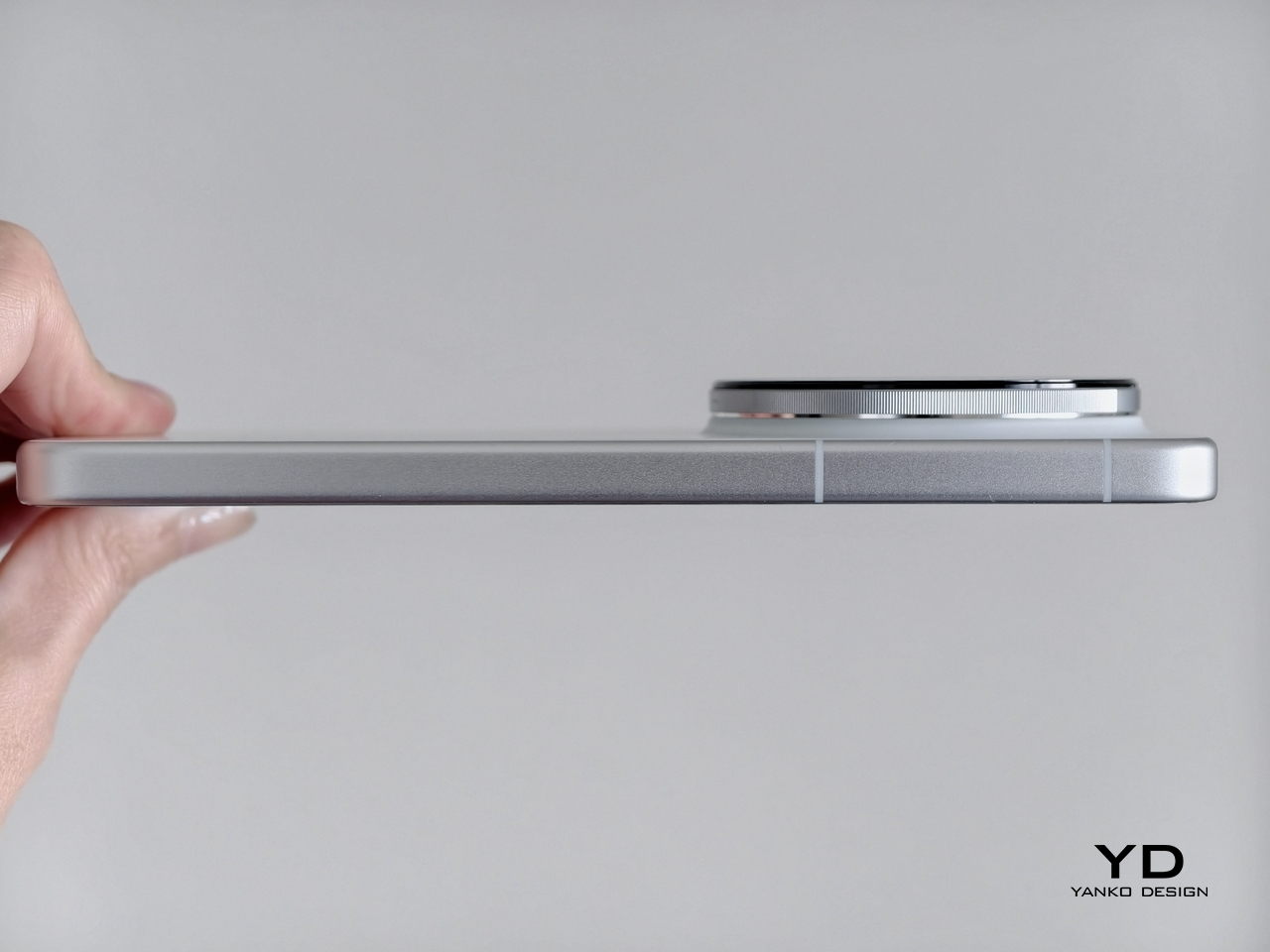
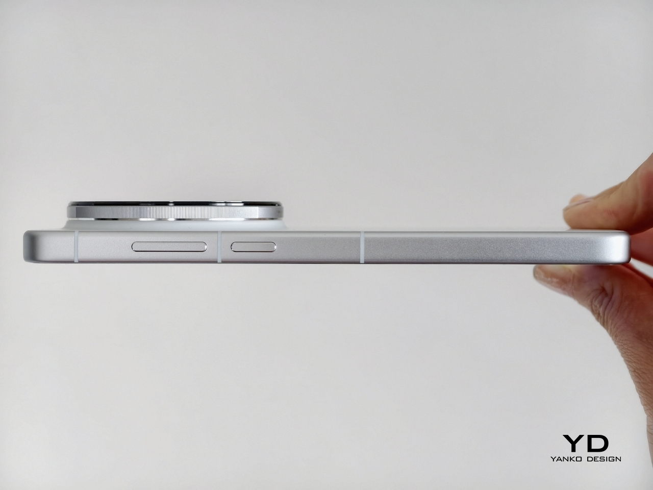
Another thing you’ll notice the moment you lift the moto g stylus – 2026 out of the box is how light it is. At only 192.3g, even with the 4.7g stylus inside, it’s easily one of the lightest phones in the market today. Given that it has a 6.7-inch screen and a large 5,200mAh battery, that’s even more surprising.
That lightness, however, is a double-edged blade. On the one hand, it might make the phone feel a little flimsy, almost like it could easily fly out of your hand. It almost makes the vibration haptics feel hollow, as if there’s not enough substance in there.
On the other hand, it strains your hand less when holding it for a long time, especially as you might find yourself constantly scribbling or doodling on it. The phone’s textured back and flat edges also help deliver a more confident hold. It just won’t accidentally slip from your hand that easily. A protective case almost feels redundant if grip is your only reason for putting one on.
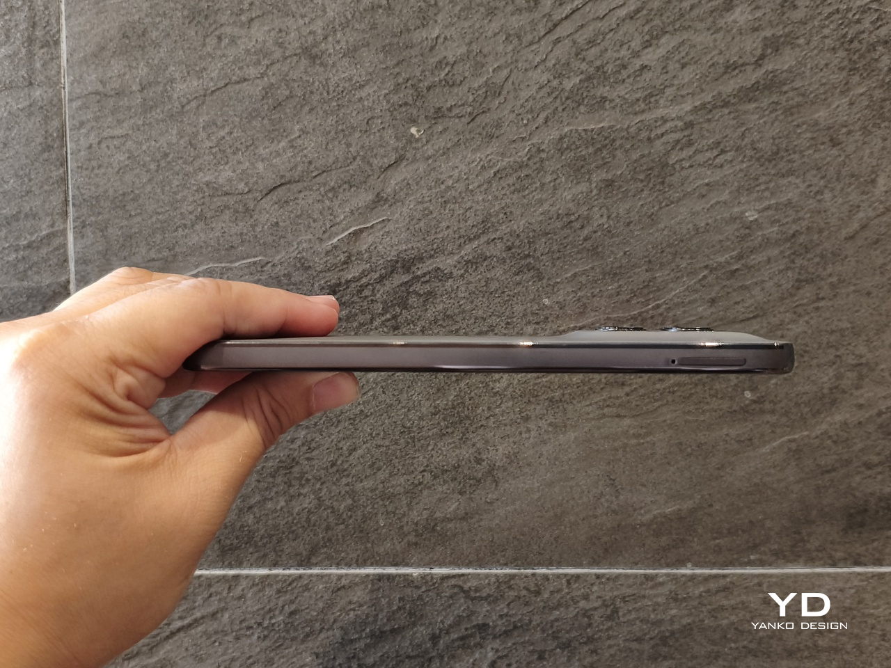
One thing to note about the camera module is that although it is thin and subtle, it still lifts a single corner of the phone when you put it on a flat surface. That means it will wobble, which can be pretty annoying when you’re writing with a stylus. Funnily enough, that might actually be a more pressing reason to put a case on, just to create a balance. Unfortunately, you do lose out on feeling the phone’s textured surface.
Performance
The Specs
The moto g stylus – 2026 makes no qualms about its specs, clearly marking it for the mid-range smartphone market. There’s only 8GB of RAM, which can be expanded up to 24GB with RAM Boost, which basically eats up some of the already modest 128GB or 256GB of storage. Thankfully, you can also expand that storage with a microSD card of up to 1TB capacity, definitely a rare sight these days, even among phones on the same tier.
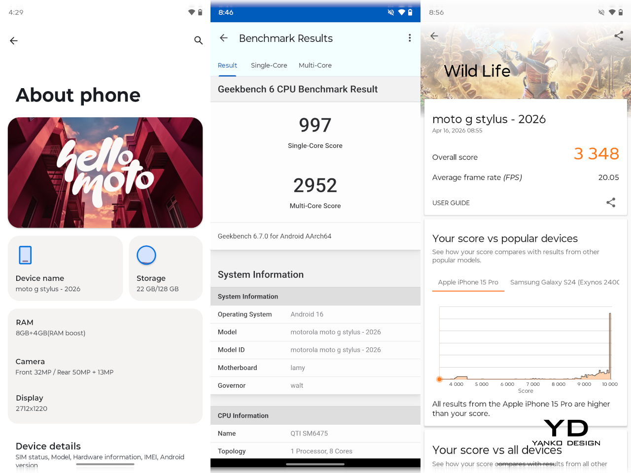
The biggest disappointment is the Qualcomm Snapdragon 6 Gen 3 processor, which is a holdover from last year’s moto g stylus. In fact, if you look closer, you’ll see plenty of similarities between the 2025 and 2026 models, from processor to cameras. It’s not always a bad thing, but given the price hike, you’d be forgiven for expecting a bit more.
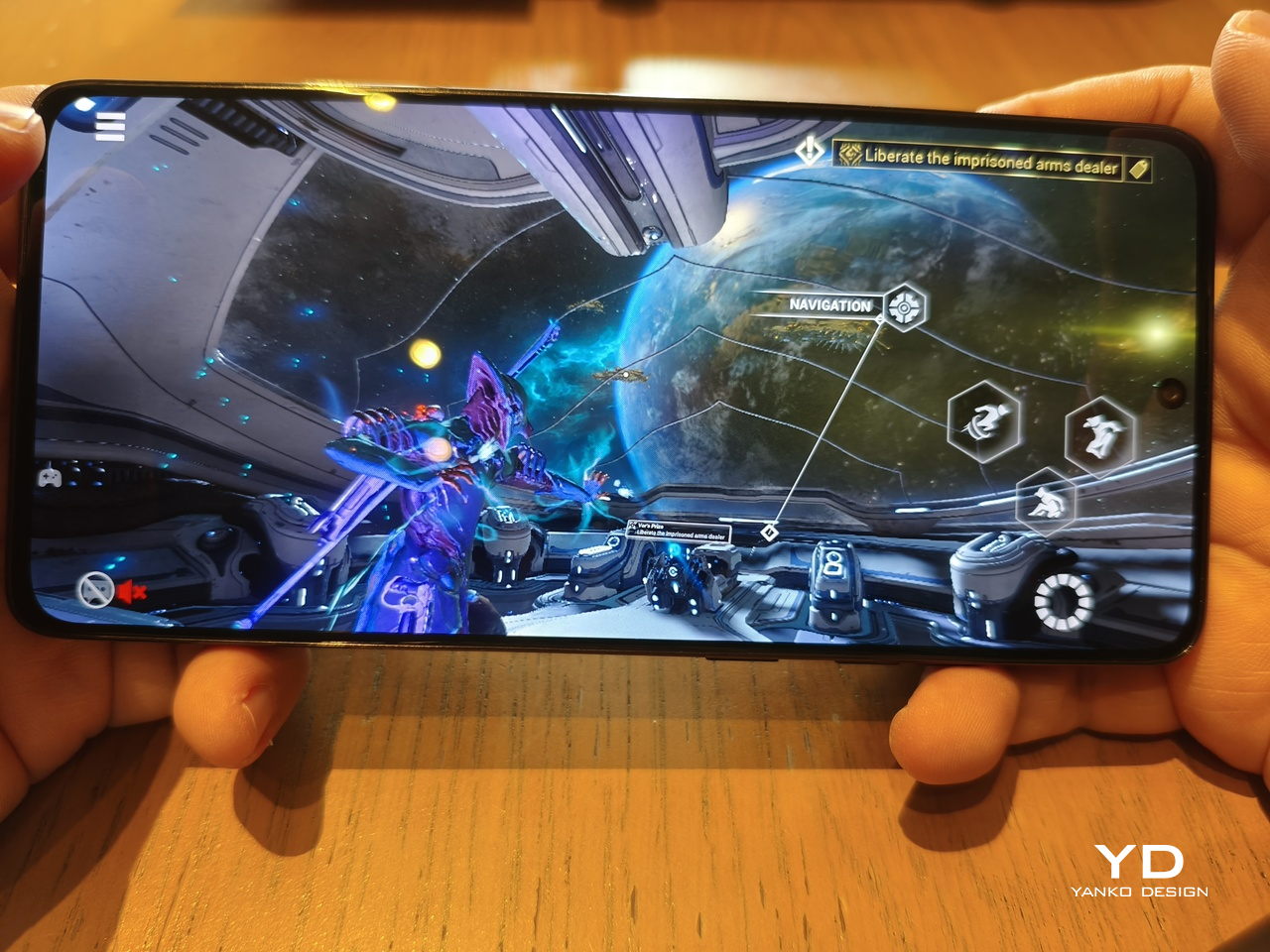
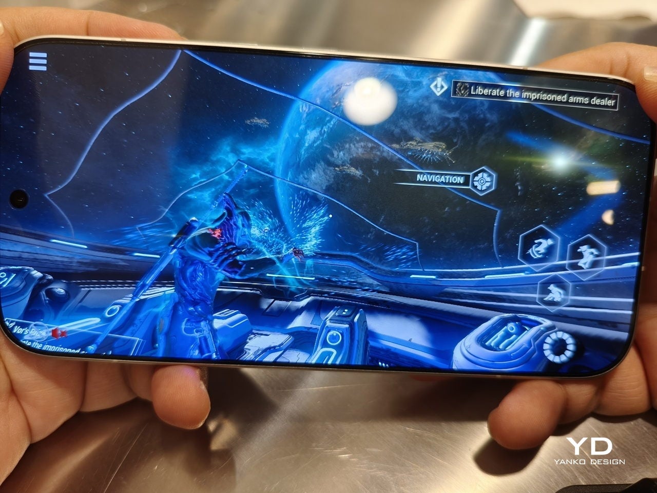
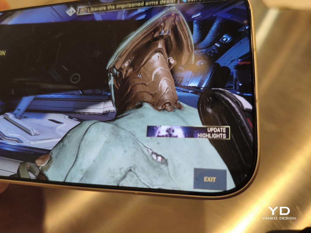
Make no mistake, though, the moto g stylus – 2026 is plenty capable. It won’t win trophies on benchmarks, but it does get the job done without breaking too much of a sweat. It’s even surprising how it can handle a game like Warframe on high settings. It doesn’t get too warm, either, and the vegan leather material probably helps make it feel a little less warm as well.

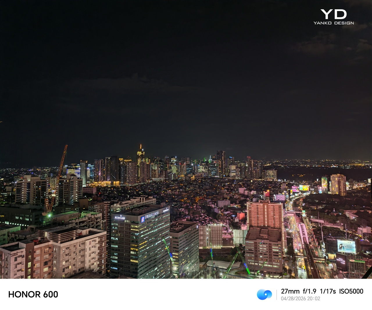
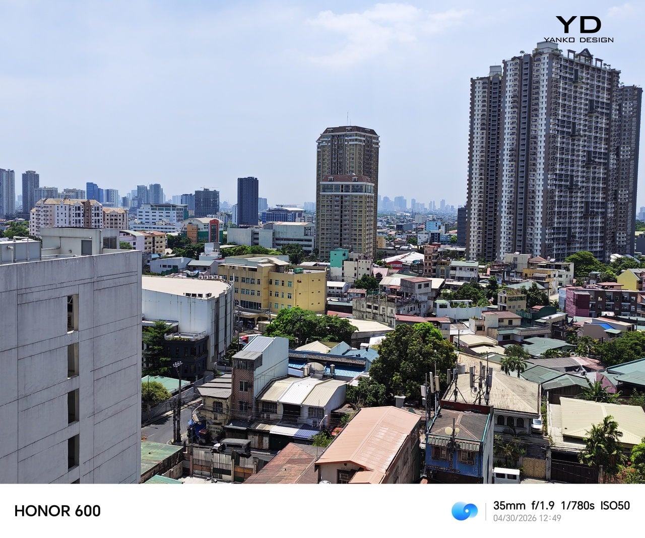
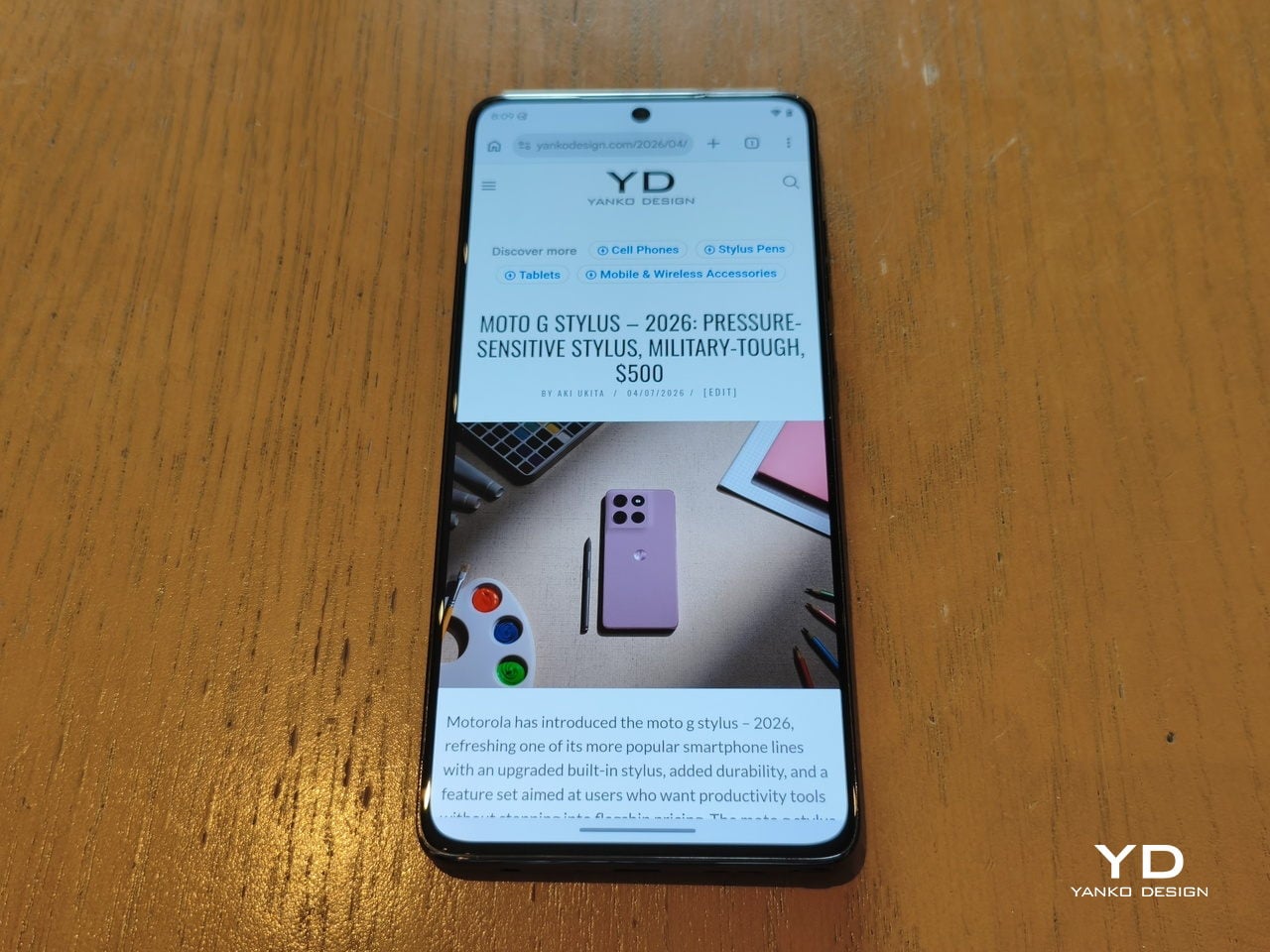
And that’s perfect because the moto g stylus – 2026 has such a gorgeous screen to play and watch on. The 6.7-inch 2712 x 1220 AMOLED display boasts a peak brightness of 5000 nits, definitely one of the brightest in the market, making it easily usable under sunlight. The rounded corners are also less curved, so UI elements are not obstructed, especially in games. Plus, the 3.5mm headphone jack, another rare sighting, can perfectly complement the visuals with hi-def wired audio.
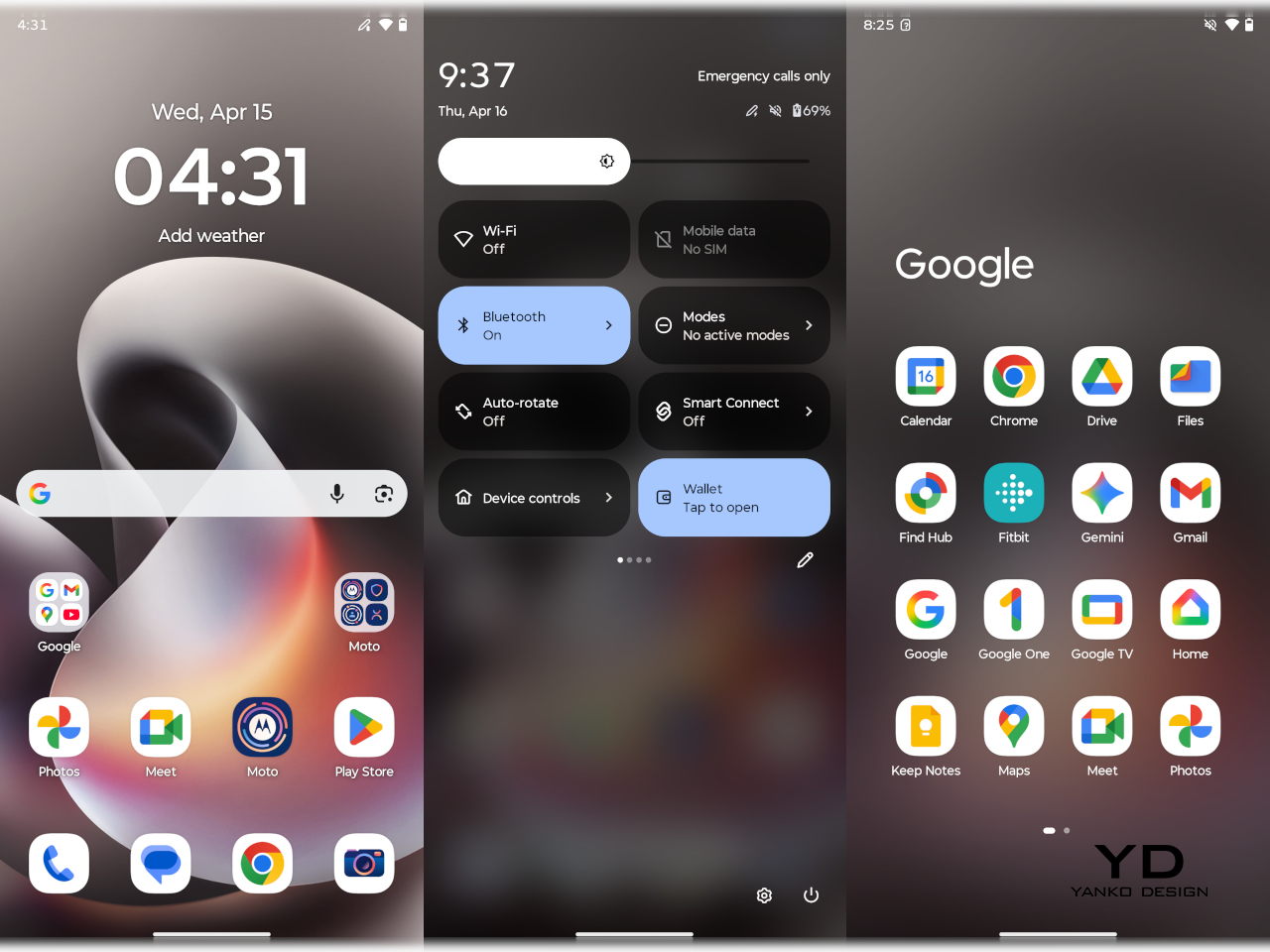
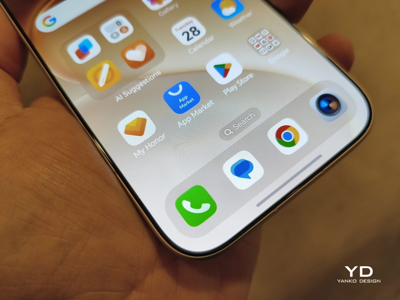
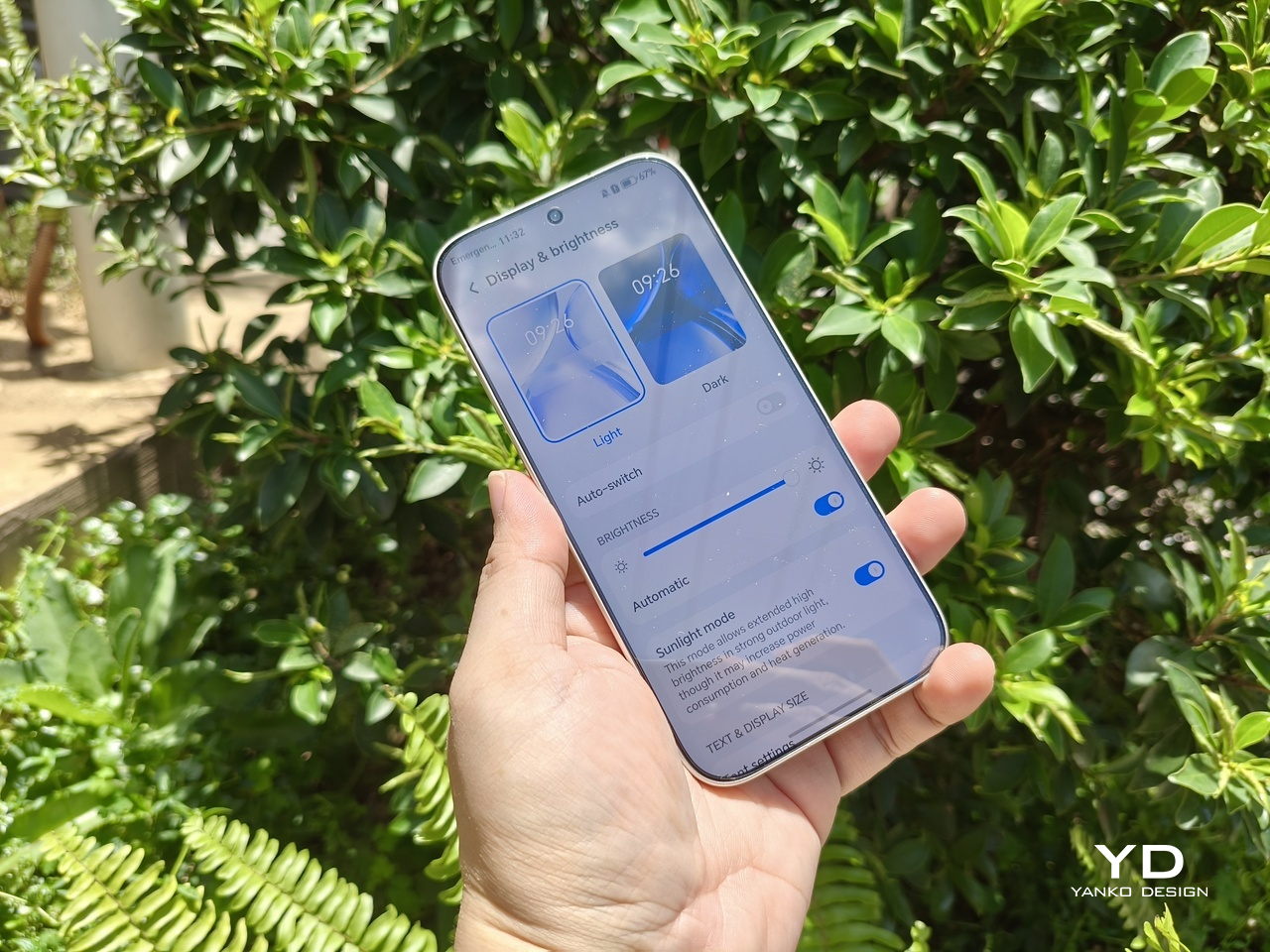
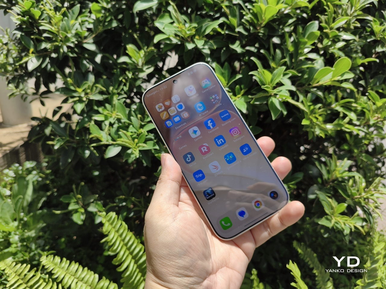
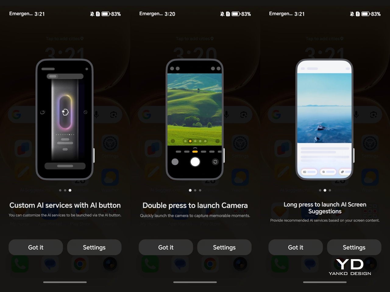
The moto g stylus – 2026 runs the latest Android 16, and given Motorola’s history, the skin is pretty minimal and non-invasive. It’s probably the closest you can get to a Pixel experience outside of Google Pixel phones, which is light, fast, and probably barebones if you’re coming from other brands like Samsung and Xiaomi. There’s almost no bloatware, unless you count the dozen or so pre-installed Google apps, which would be the same situation on a Google Pixel phone anyway.
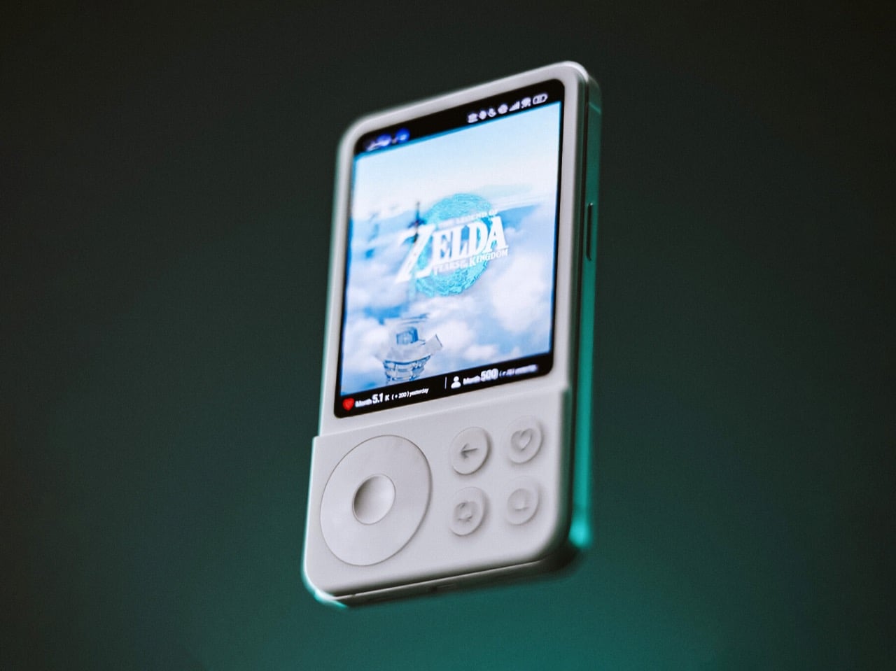
The Pen
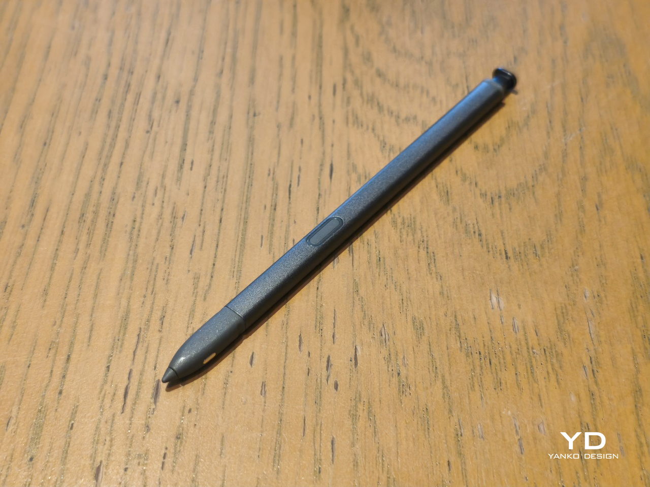
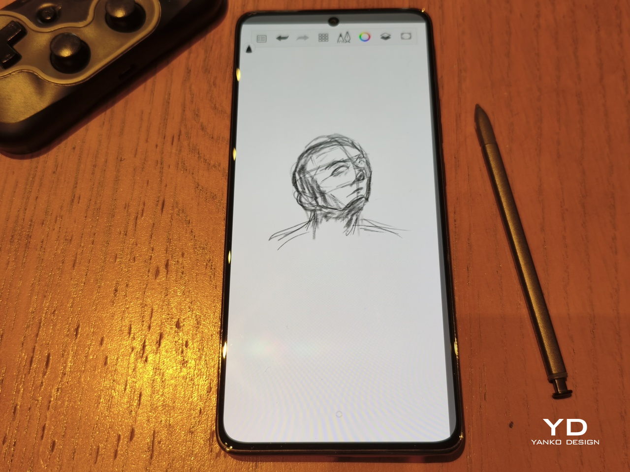
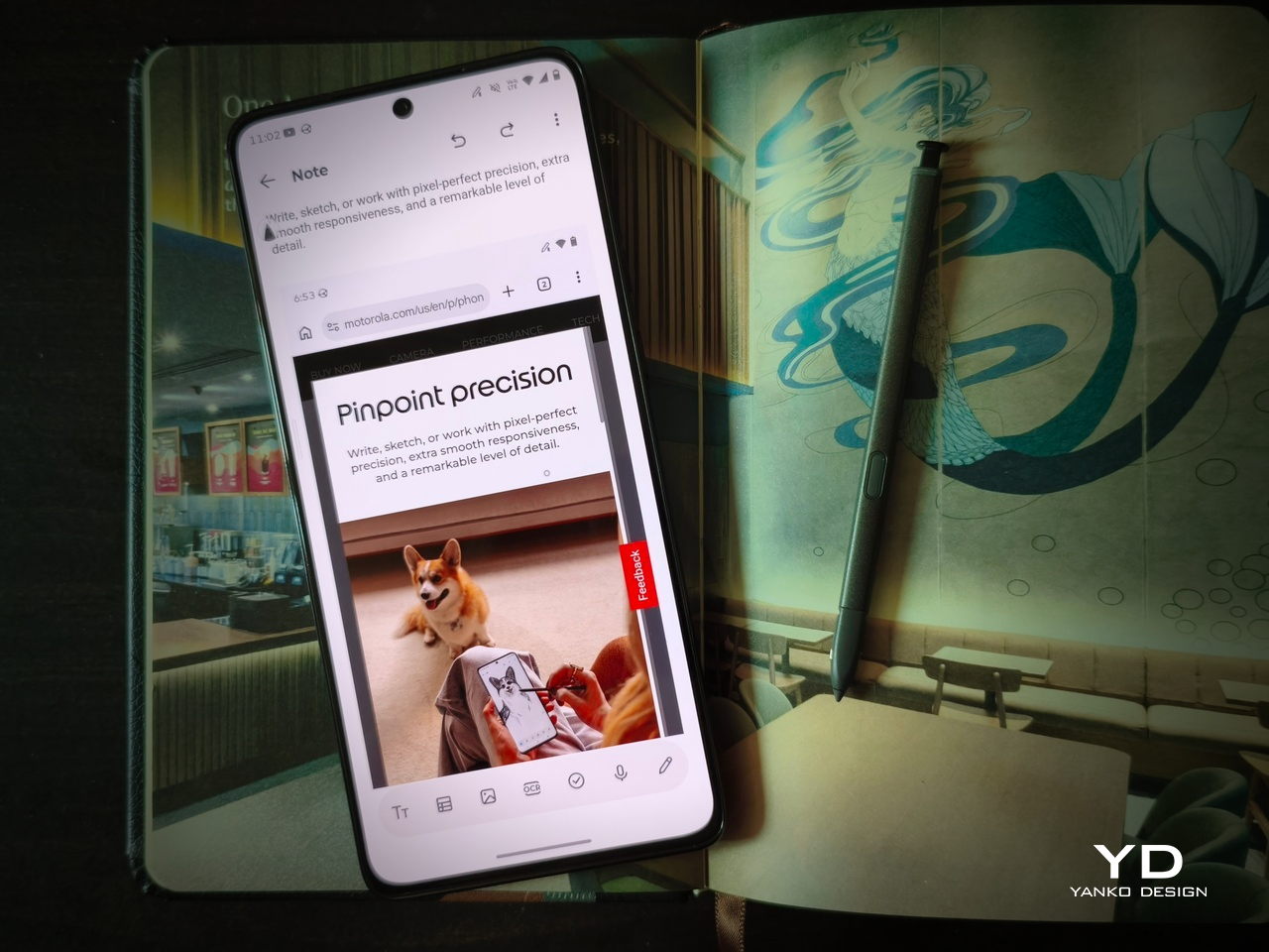
There’s no beating around the bush: the only reason you’d even give the moto g stylus – 2026 is because of its stylus. For the first time, that stylus is no longer just a very thin stub standing in for your finger tip. For the first time, it is supporting pressure and tilt sensitivity, features that only Samsung offers at nearly three times the price.
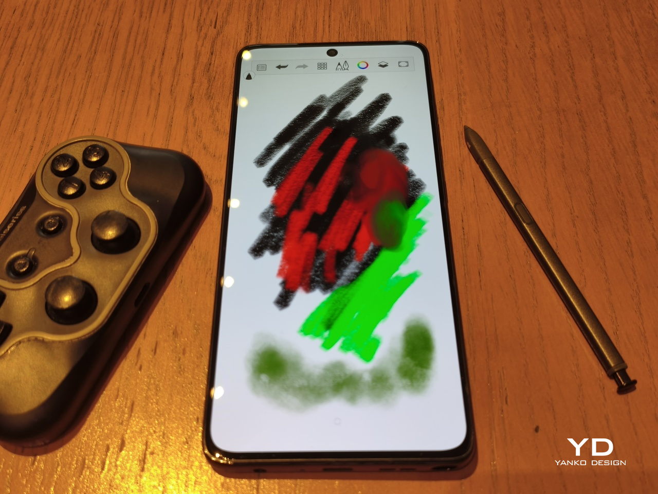
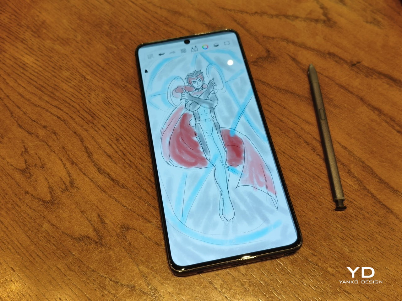
The older stylus designs were practical and usable, but this new pen opens the door to even more possibilities, especially when it comes to creative activities like drawing, designing, and editing photos. It gives you much better control and precision, while also offering more styles in terms of pen width, brushes, and the like.
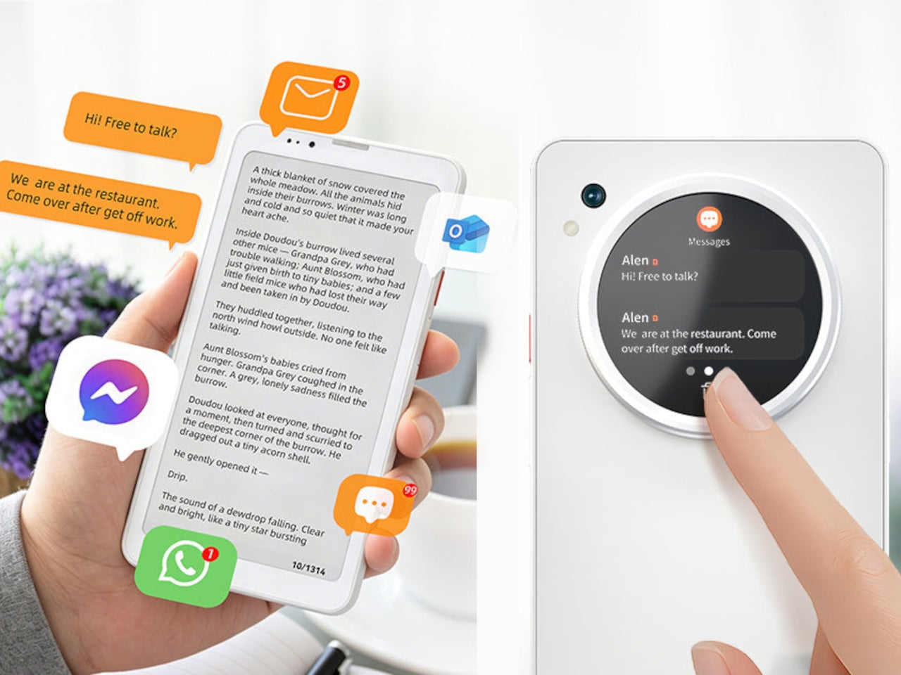
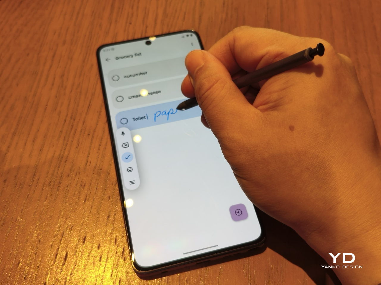
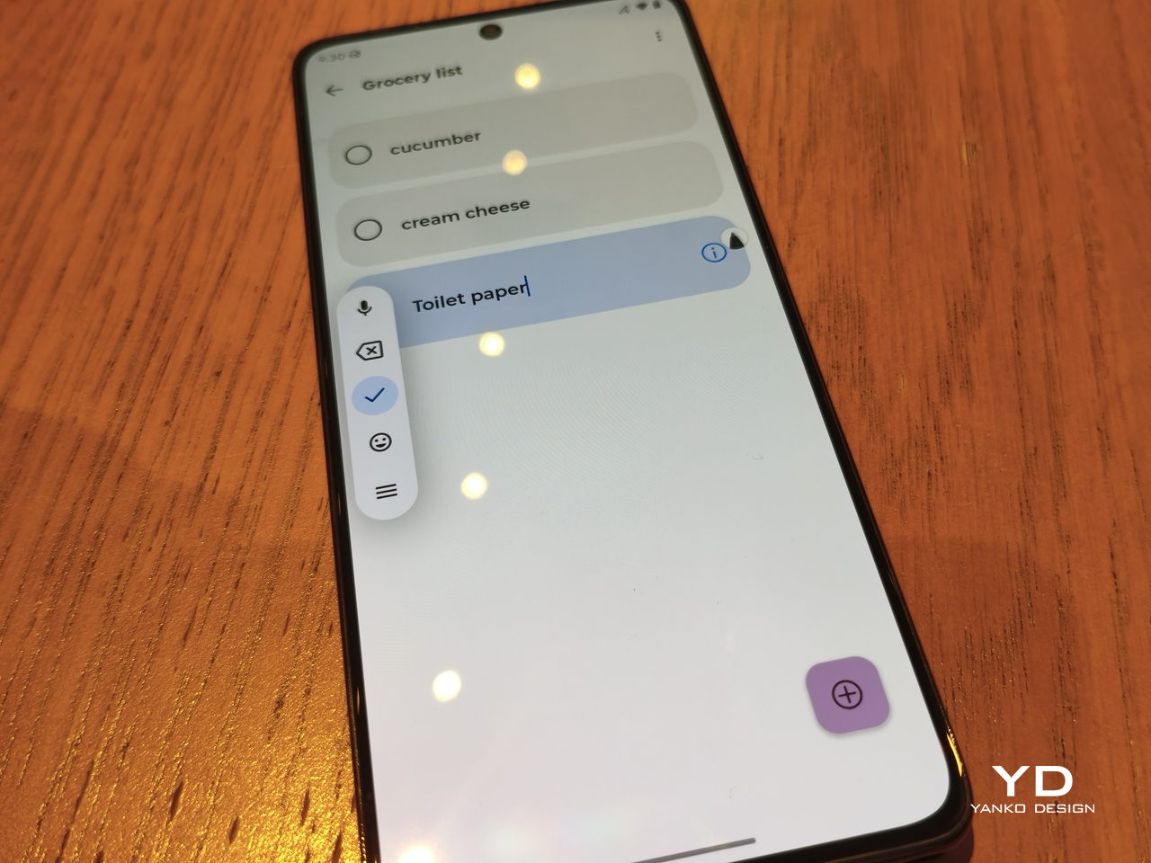
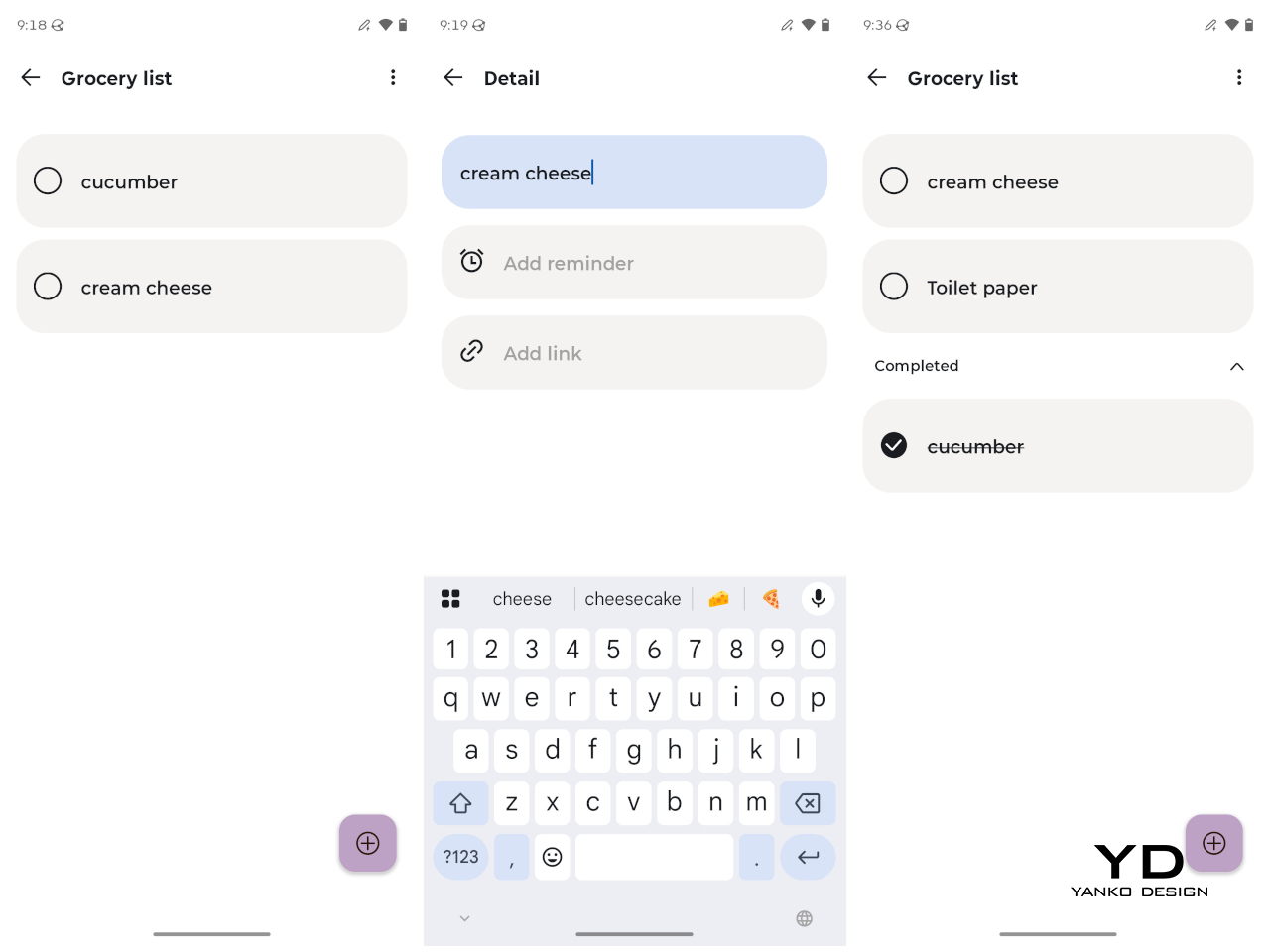
The stylus is also crucial in some productivity workflows, like when dragging images to a note in split-screen mode, highlighting and copying text to a note, or for sketching a crude representation of a cat and using AI to turn it into a photorealistic masterpiece. Part of this upgraded experience is made possible with the Moto Notes app, which supports drawing on an infinite canvas that can then be embedded into notes.

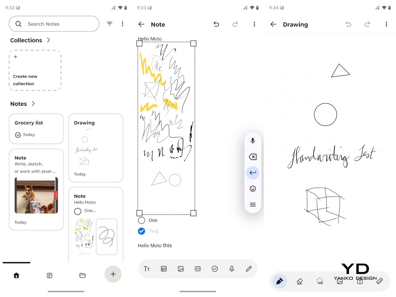
The new stylus also has a button that can be mapped to some actions depending on whether you press or long-press it, though the actions are not that varied. The pen now also has to be charged, which is how it’s able to pull off that pressure sensitivity stunt, and you can only charge it when it’s inside its silo.
The Cameras
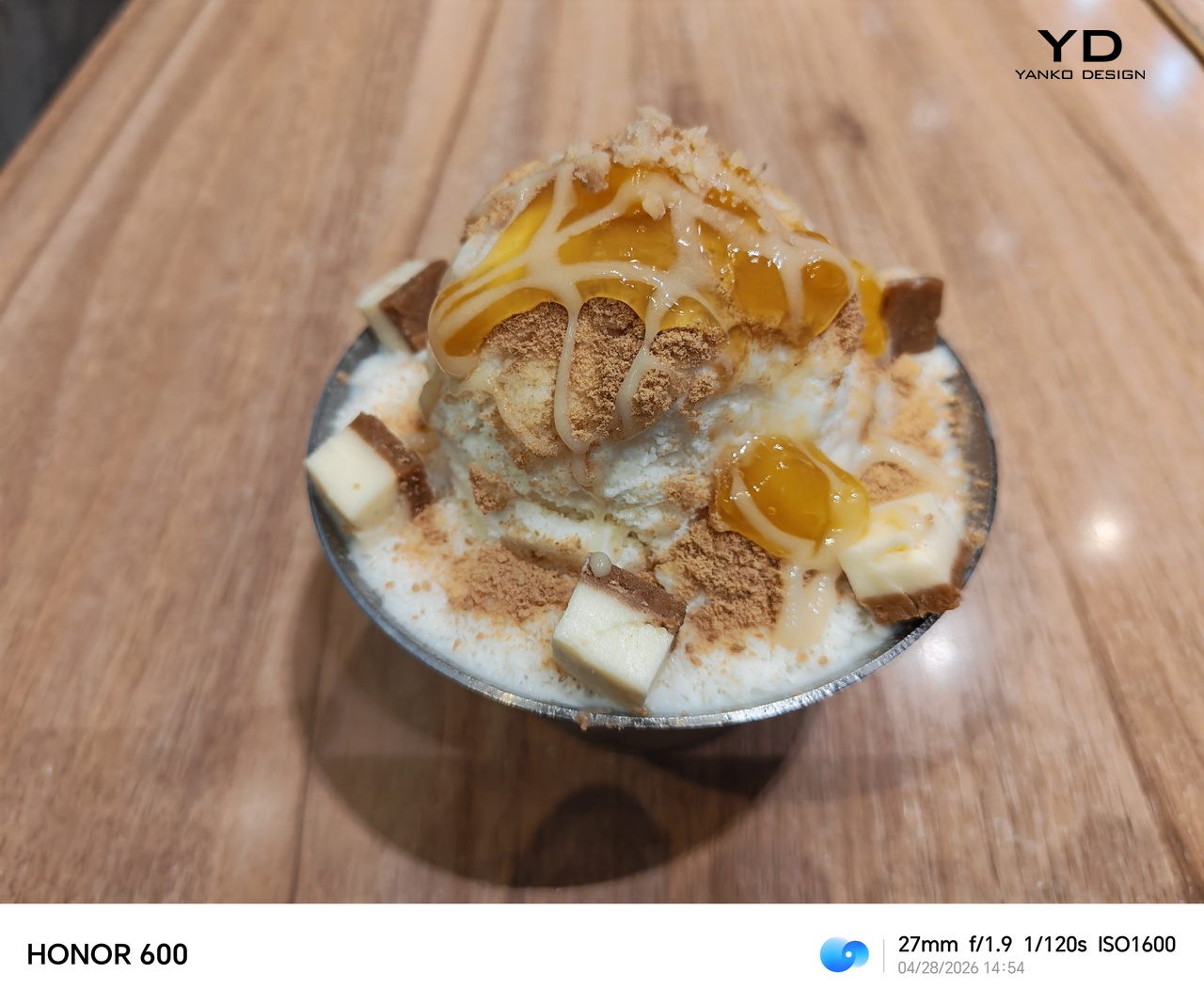
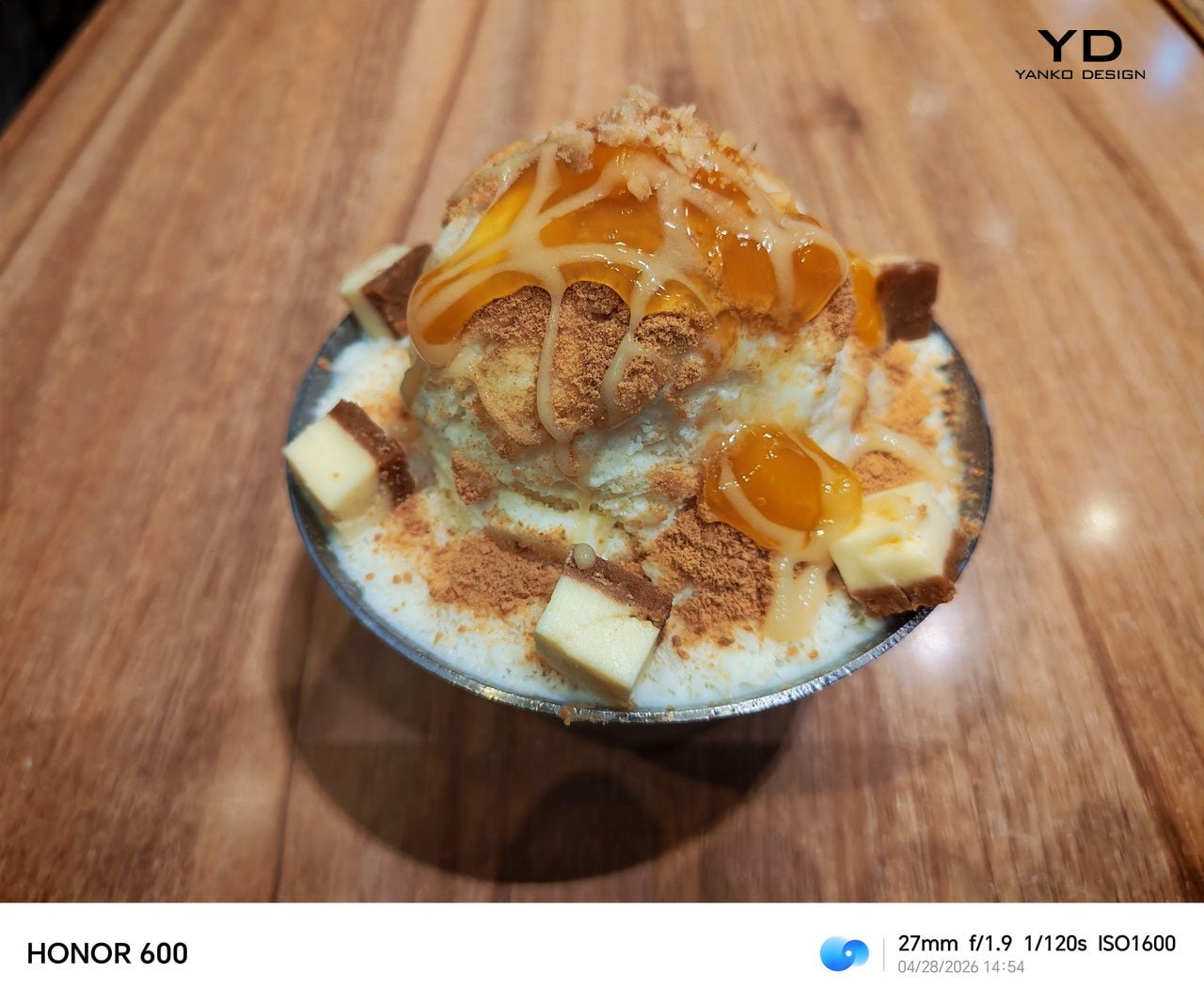
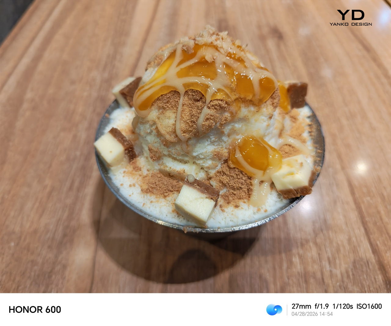
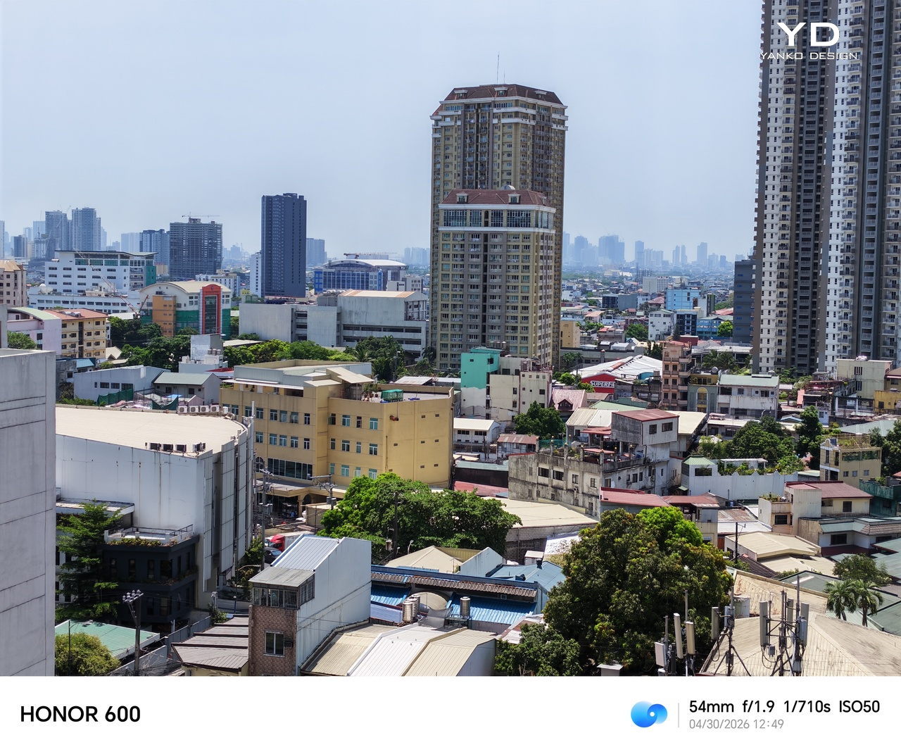
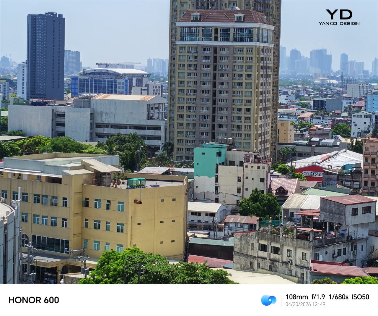
The moto g stylus – 2026’s camera story is rather underwhelming. On the hardware side, it doesn’t exactly differ from last year’s cameras, which include a 50MP Sony LYTIA 700C sensor and a 13MP Ultra-wide shooter that doubles as the Macro camera. In a nutshell, these are serviceable and decent, but they wouldn’t be something you’d want to rely on if you were planning on being a professional shutter bug.


The main shooter does a pretty good job of capturing detail, but its dynamic range seems to be on the narrower side, making subjects look a little flat. The AI-enhanced Signature Style can try to compensate, but it also oversaturates the output.

Normal

Signature Style
Normal
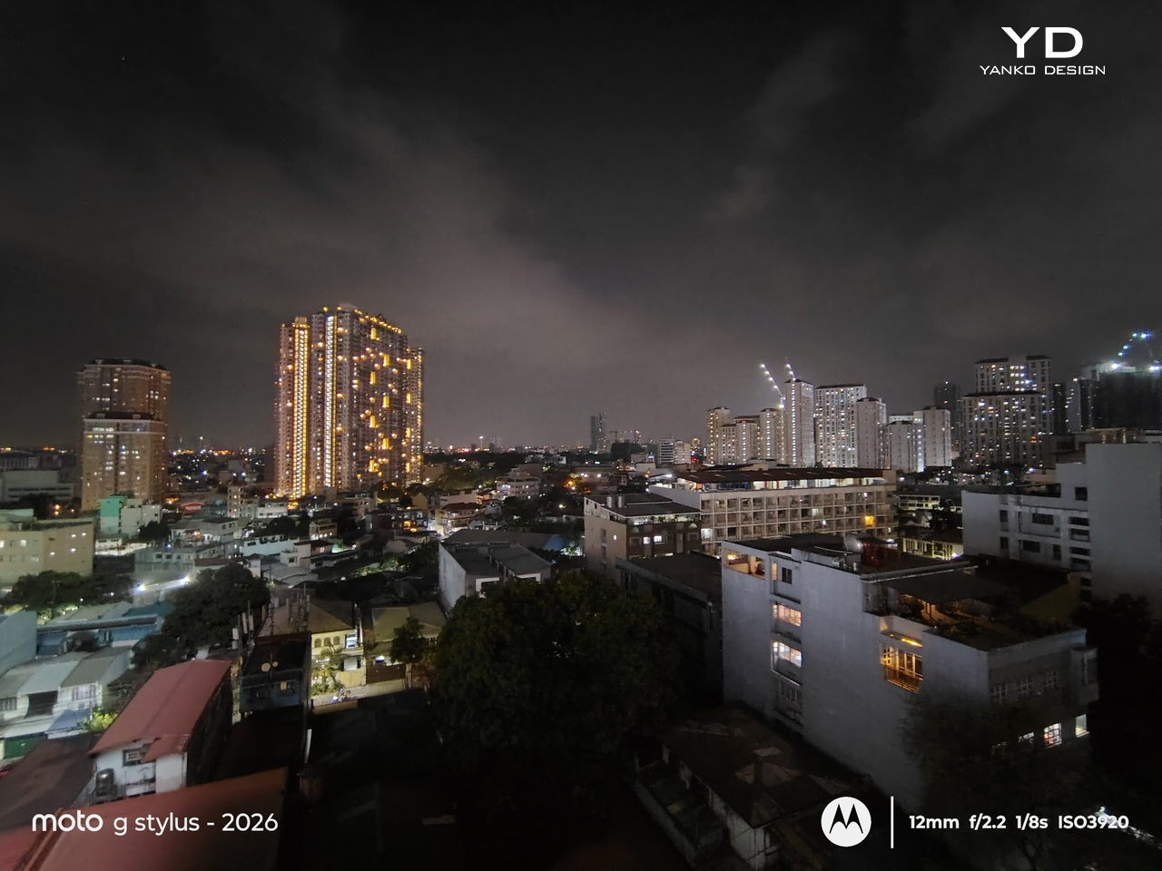
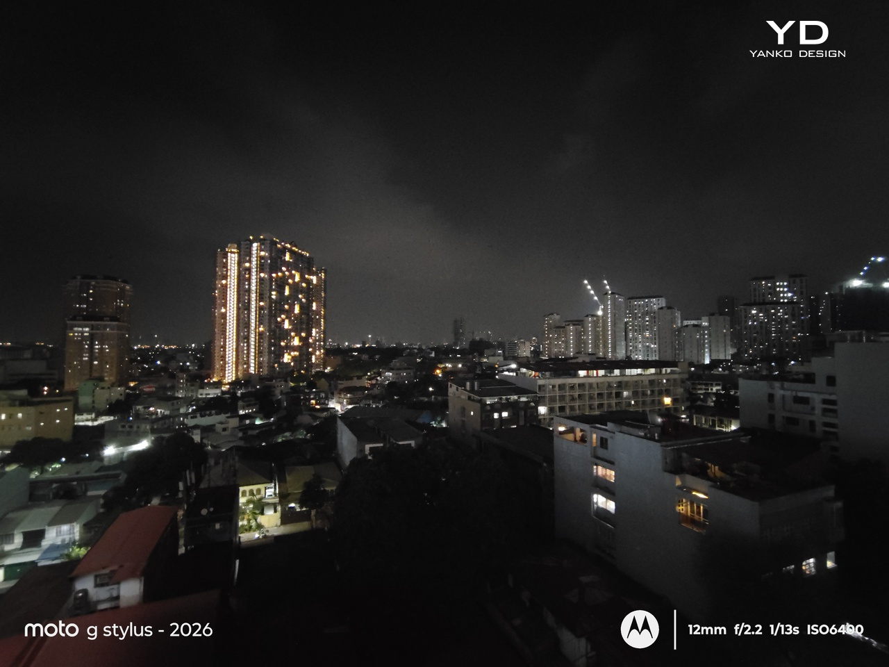
Night Vision
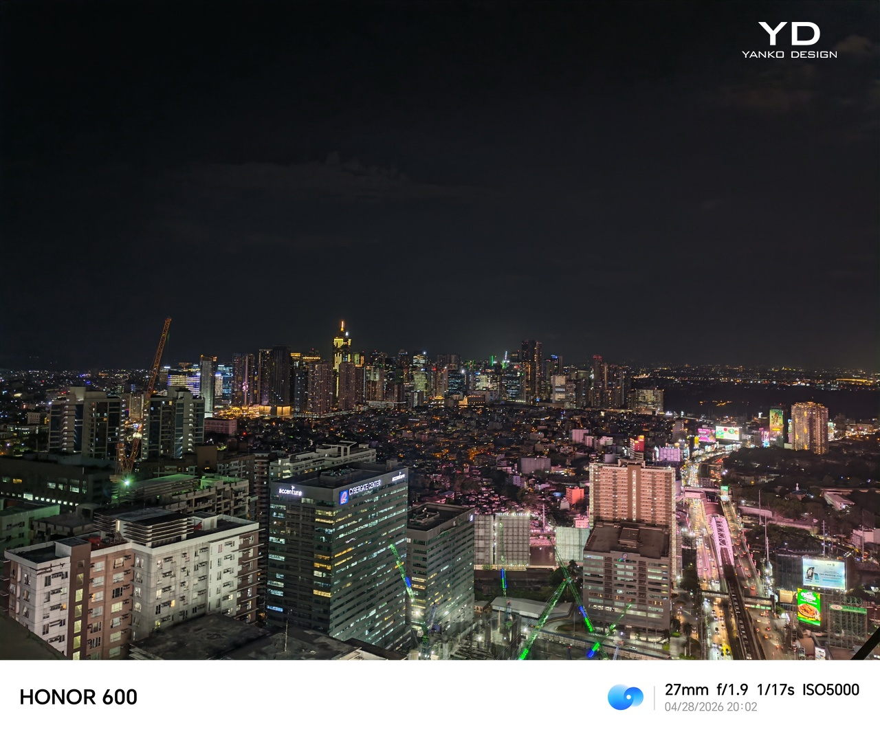
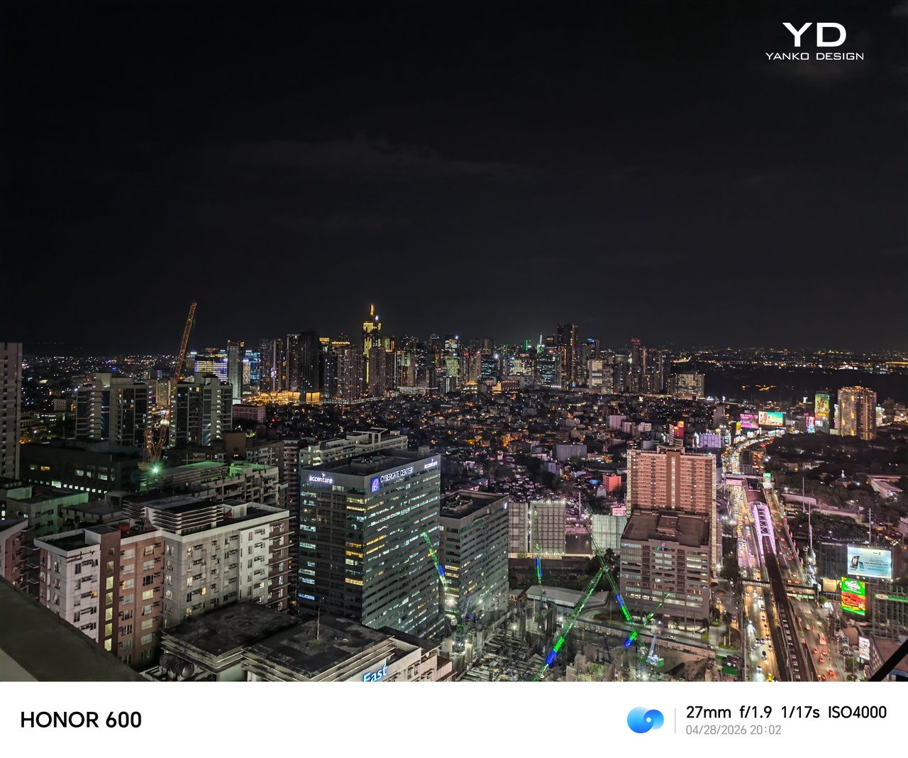
Nighttime photography is what you’d expect, as there wouldn’t be enough light information to work with. Night Vision Mode definitely kicks things up a notch, brightening things up enough to make out the details. This is one of those moments where the difference is, pardon the pun, night and day.


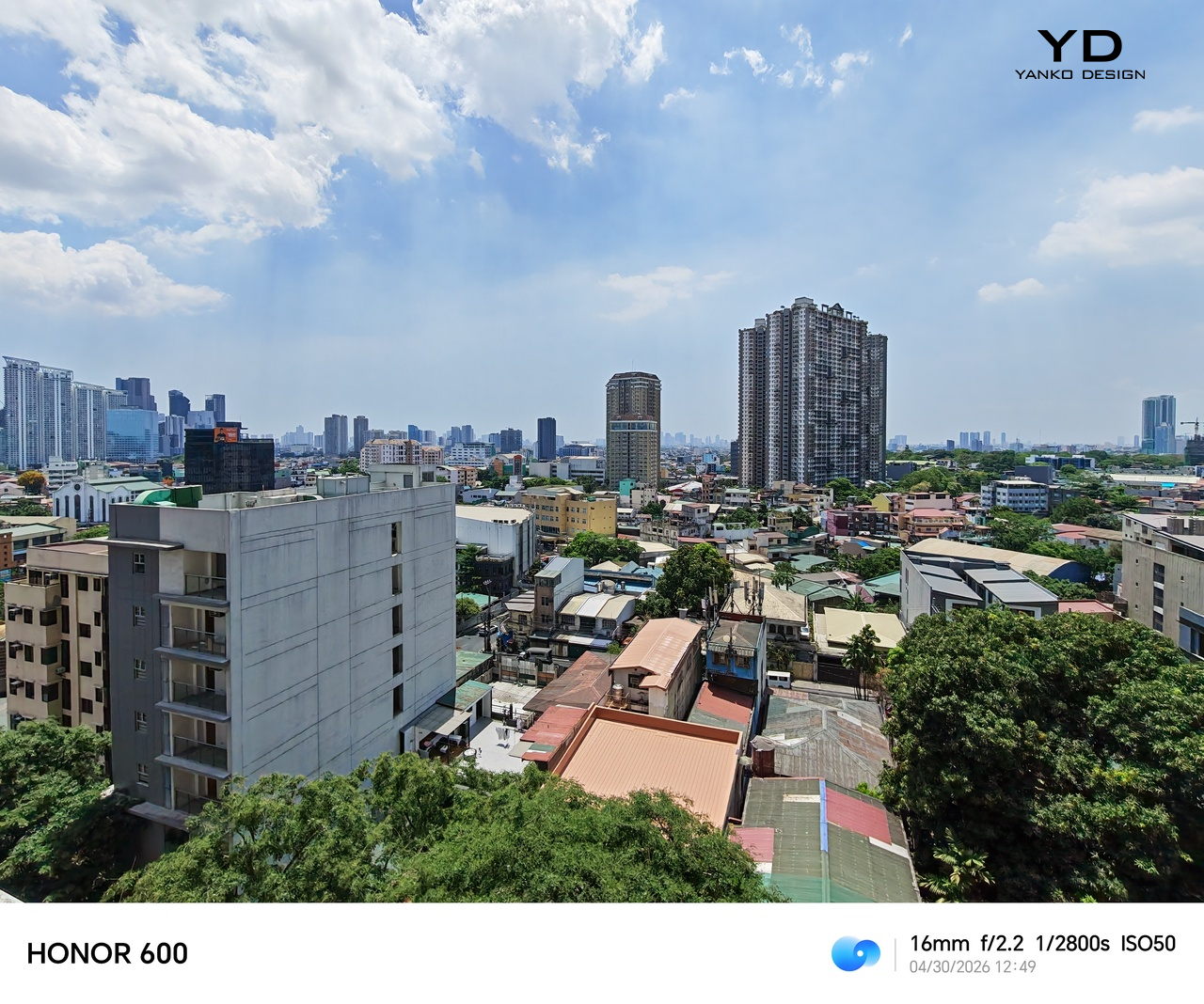
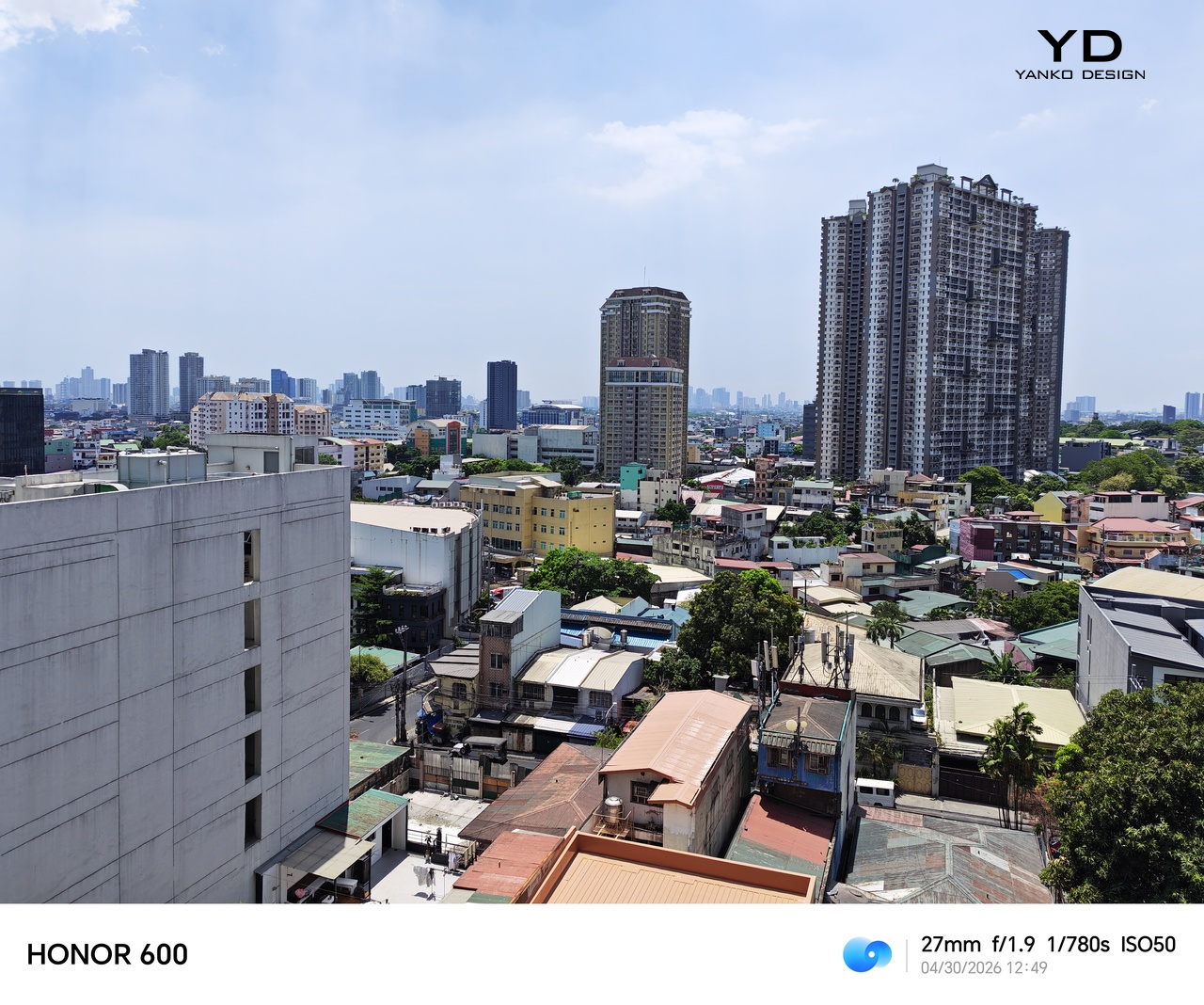
Given the hardware, ultra-wide shots are naturally less impressive but still get the job done for a quick panoramic picture. There’s no dedicated telephoto lens, so it does double duty as the macro camera. Unfortunately, it doesn’t make much of a difference. Portrait shots are pleasant and accurate, though, and you can select from 24mm, 35mm, and 50mm focal lengths.
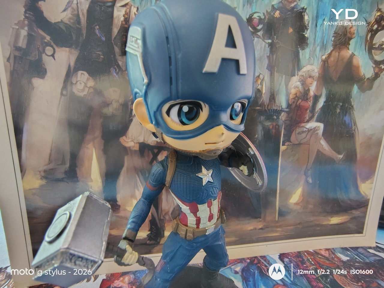
Macro

Macro
The Battery
One of the few upgrades this year is the moto g stylus – 2026’s larger 5200mAh battery. It still supports 68W wire Turbo Charging and 15W wireless charging, the latter with no magnetic tricks. With the right power brick, you’re promised a full charge in just 44 minutes, but even a 65W charger managed to top the phone off in just a little over an hour.
That charging won’t happen frequently though, as the phone can last more than a day with normal use, including browsing the web, social media, and even watching videos on that bright, large screen. With less frequent use, it can actually extend to two days, though you’ll want to be on Wi-Fi rather than cellular to pull that off. Needless to say, it’s a reliable daily partner that won’t have you scrambling for a charger before you head home.
Sustainability
Motorola has been pretty vocal about its sustainability efforts, but the moto g stylus – 2026 is a bit of a hit and a little miss. The compact, plastic-free packaging is superb in that regard, ditching the redundant charging brick as well. Motorola also boasts about longevity, given the IP68, IP69, and MIL-STD-810H certifications.
Where the story takes a sad turn, however, is in the software upgrades. Only two years of Android upgrades and three years of security updates, figures that would have sounded generous almost a decade ago. This lags way behind the likes of Xiaomi, notorious for its short software support cycles, and is quite disappointing for an Android user experience that is almost as pure and unencumbered as the Google Pixel.
Value
There’s no going around the fact that the moto g stylus – 2026 has a price tag that’s a little difficult to swallow. It’s more than a $100 jump from last year’s model, and at $500 or $600, for 128GB and 256GB storage, respectively, other brands might give you better specs for the same price. Granted, Motorola often throws in bundles and discounts to sweeten the deal, but the initial price shock is unavoidable.
That said, that price could be a bit justifiable, especially if you factor in how electronics prices are going up these days anyway. For that amount, you get a solid, reliable, and beautiful phone that is almost literally a digital Field Notes notebook in your pocket. Considering that the closest competition is actually a $1,300 Samsung Galaxy S26 Ultra, then there’s almost no contest. Sure, it doesn’t have the glamorous bells and whistles, but neither would a trusty notebook.
Verdict
More than any mainstream smartphone in the market today, the moto g stylus – 2026 is clearly aimed at a particular audience: people who don’t want their productivity and creativity to be hampered by not having their notebook or their computer around. They say the best tool is the one that you have with you, and almost everyone has their smartphone in their pocket. And what better way to capture fleeting inspiration or sketch inspiring vistas than by whipping out your phone and pulling out the stylus?
By no means is the moto g stylus – 2026 perfect. In fact, you might even call it dated if you judged it by its specs alone. But with a talented stylus, a gorgeous screen, a reliable battery, and a beautiful minimalist design, it is definitely worth every penny. There is no perfect productivity tool or notebook, but the moto g stylus – 2026 comes pretty darn close.
The post moto g stylus 2026 Review: Accessible Pocket Productivity and Creativity first appeared on Yanko Design.