Bubble-inspired pendant lamp can hang horizontally or vertically as desired

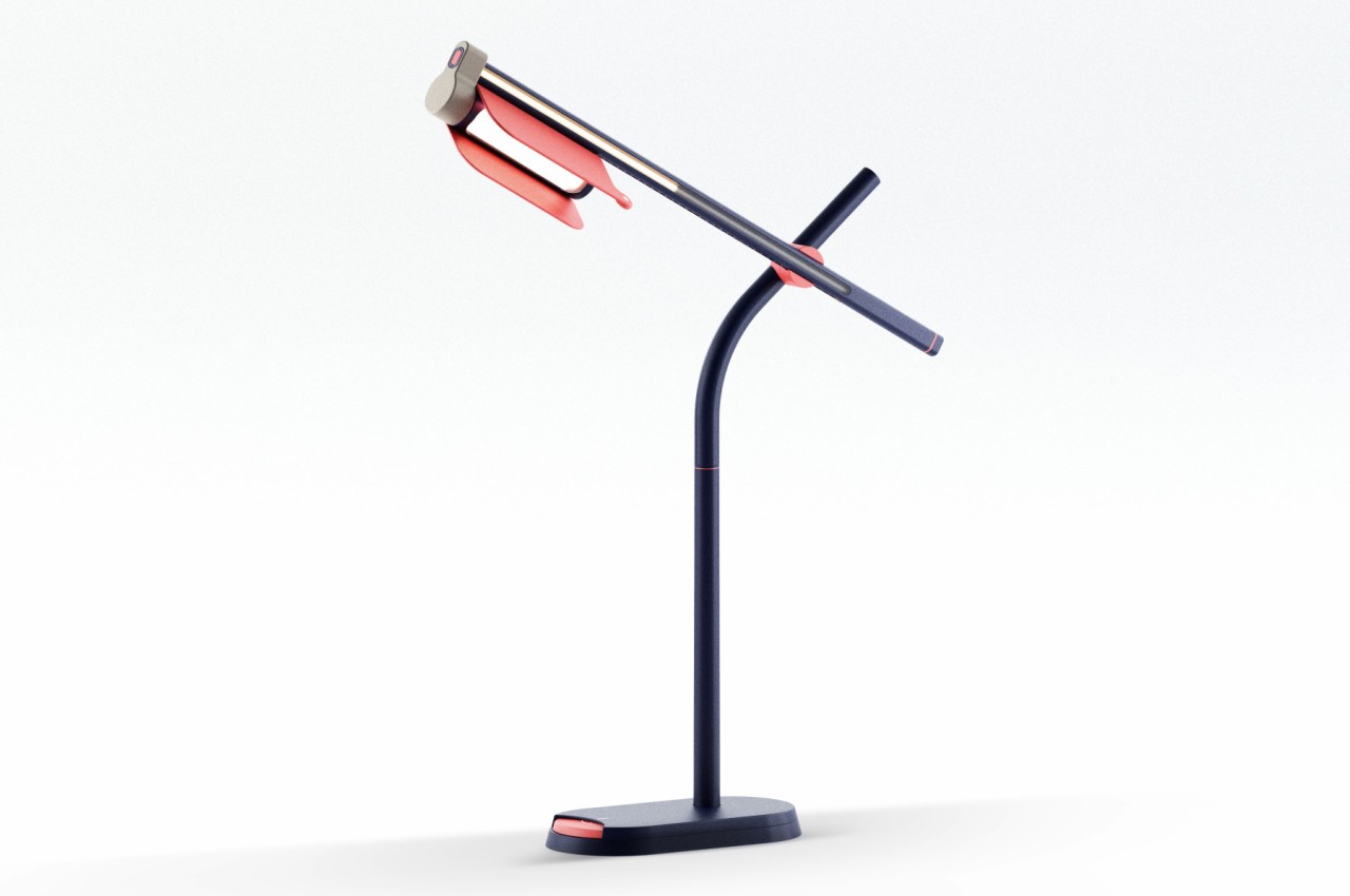
Lamps these days come in all shapes and sizes, especially ones that are designed to elicit certain positive responses through their aesthetic. That said, most of these lamps are also designed to be used in a single manner only, especially if they’re mounted on walls or hung from ceilings. That’s why it’s interesting to come across lamp designs that offer a bit more flexibility, even if it’s just in the way they’re made to hang from ceilings. This concept, for example, tries to add a bit of whimsical fun to a room’s atmosphere by calling to mind the ethereal beauty and joy that floating bubbles bring to the air.

Designer: Begüm Kılınç

There are lamps that try to literally imitate the appearance of bubbles, and while they might be things of beauty, these chandeliers aren’t always the most practical lighting solutions. Just as bubbles convey characteristics of fragility, this kind of lamp is, more often than not, used for more delicate and posh settings. They are beautiful, yes, but they also don’t bring the kind of flexibility and fun that this lamp concept proposes.

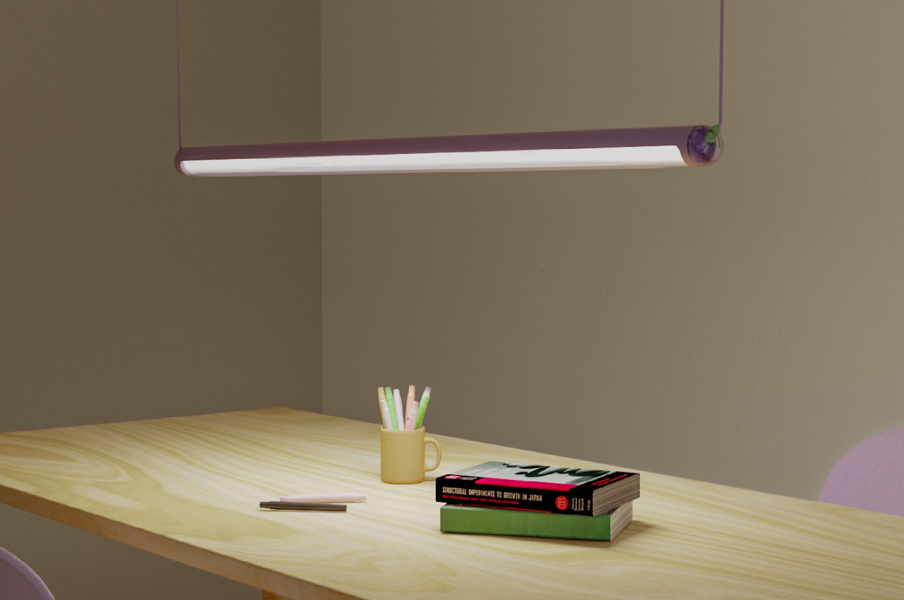
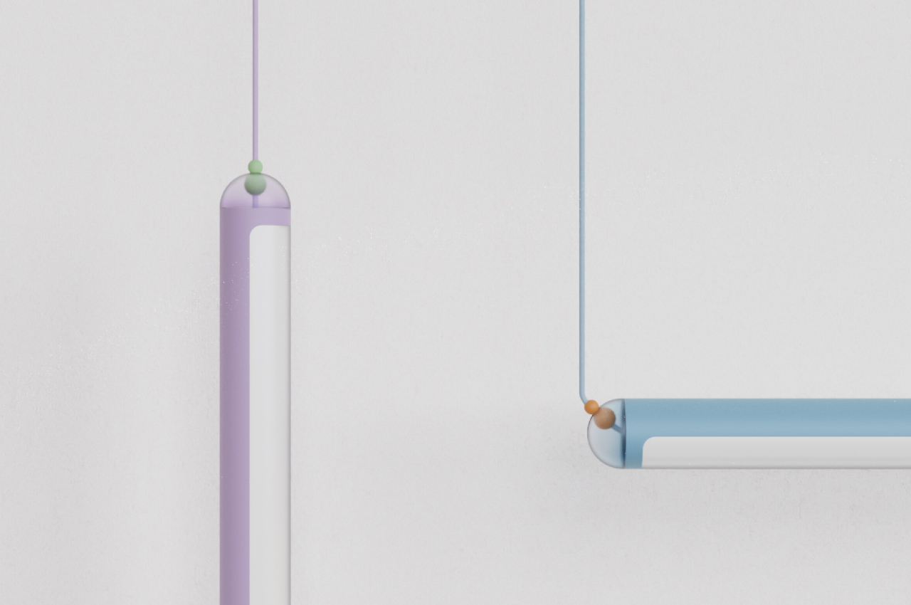
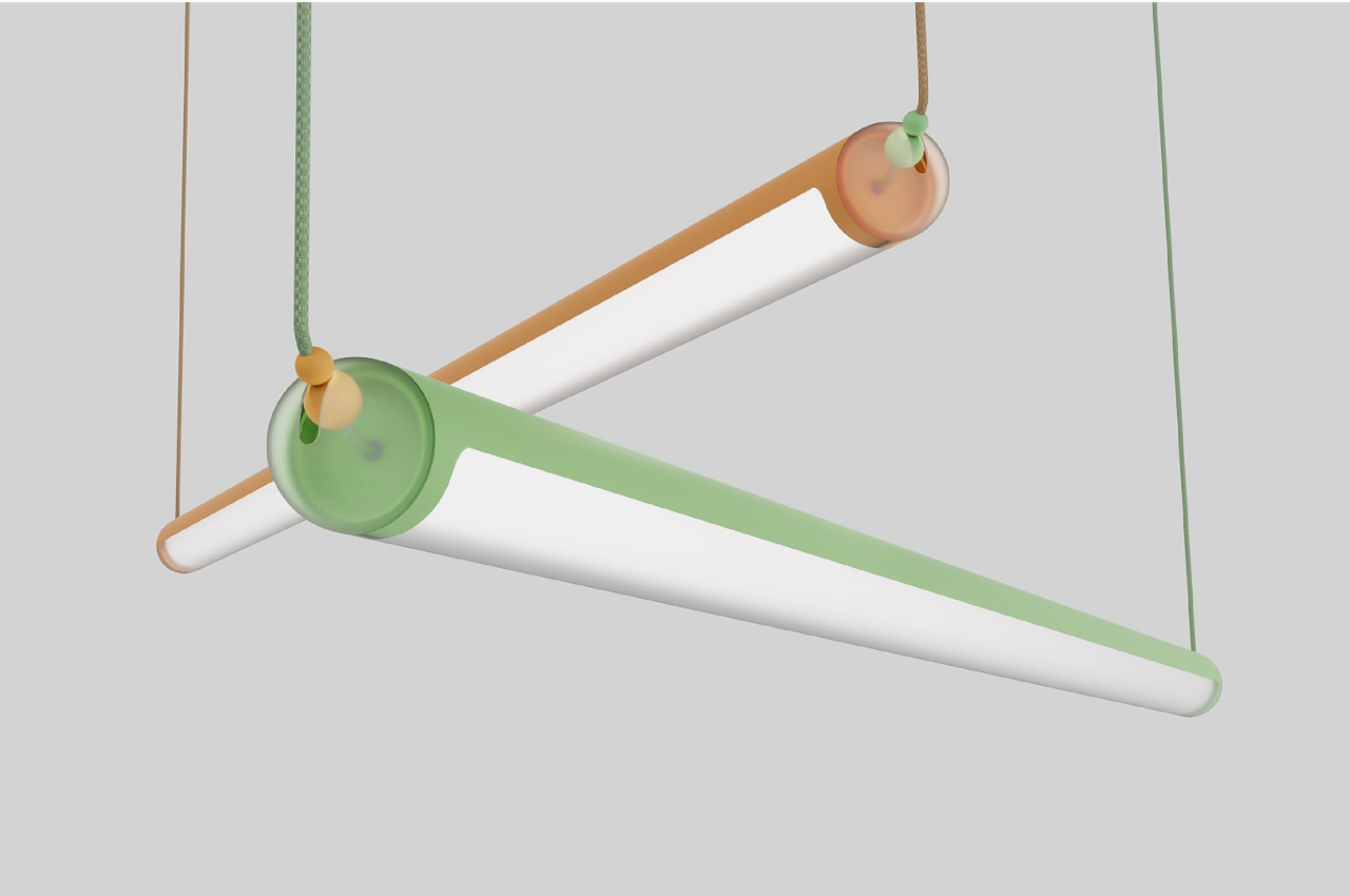
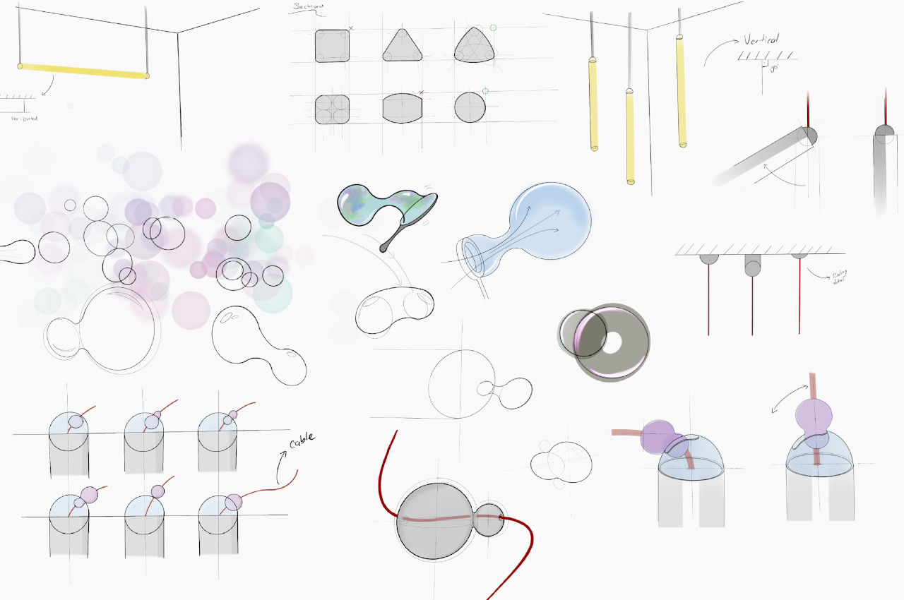
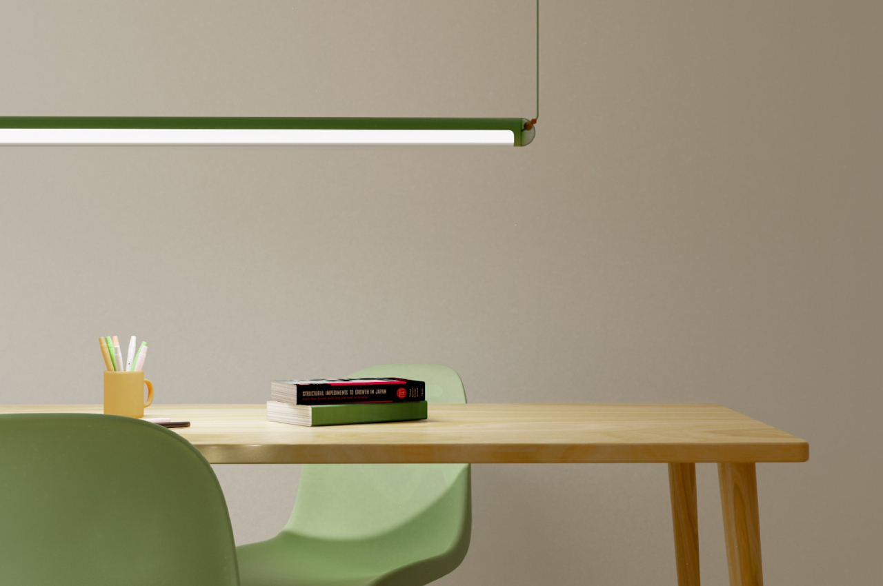
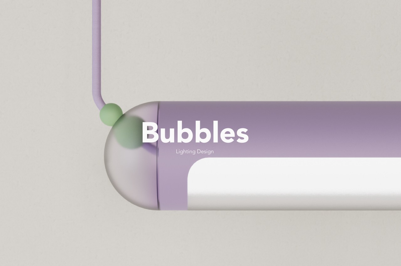
The Bubbles pendant lamp design looks more like a toy than a luxurious crystal-clear chandelier. Bubbles, after all, tend to bring out the inner child of anyone who sees or plays around with them. The pastel colors represent some of the hues reflected off the surfaces of bubbles, though toned down a bit to be a bit more discreet with some interior designs. The cylindrical body and rounded ends are akin to bubbles that, despite normally spherical, would sometimes join with other bubbles to form a longer mass.

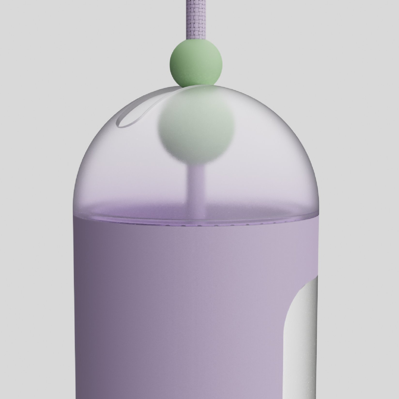
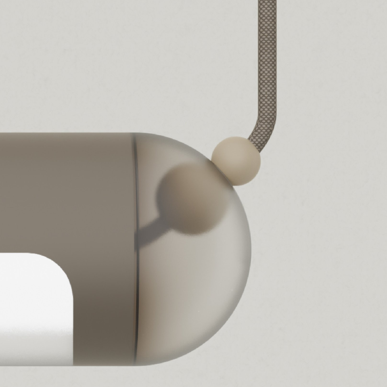
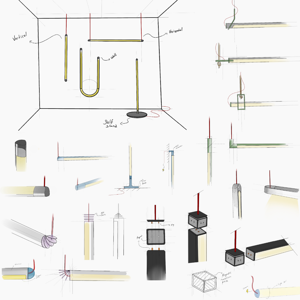
And just like how bubbles can float vertically or horizontally depending on how the wind blows, these lamps can hang either way as well. When it is held up by two cords, it can hang horizontally as you would expect from such a long lamp. However, it can also hang from a single cord to hang vertically, giving it a more striking presence, especially if the lamp is now at eye level. Interestingly, the clear ends of the lamp have spherical “stoppers” that let you adjust how those cords behave.

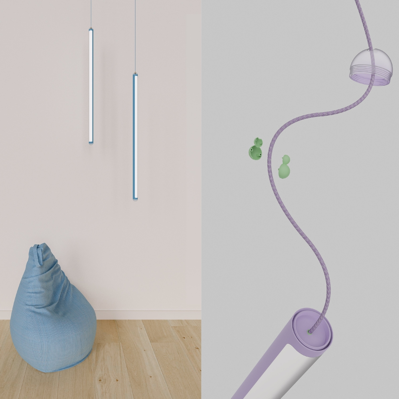
Such a simple difference can have a profound effect on the ambiance of a room. Imagine multiple Bubble lamps hanging vertically, creating an almost magical atmosphere with their collective lighting. It’s definitely not a ground-breaking feature, and there might be practical and safety issues with such a design. It’s still an interesting experiment that tries to take inspiration from the ordinary things in life that bring us joy and translate that into a product design that does the same.

The post Bubble-inspired pendant lamp can hang horizontally or vertically as desired first appeared on Yanko Design.

Deskterior accessory collection helps keep late-night workers productive

We all know it’s bad for our physical and mental health, but there will always be times when we have to go through the late-night crunch at home. That’s not even considering how some actually have work hours that begin only after the sun has set. Working long hours into the night in the solitude of your home or room can be physically taxing and emotionally draining, which is why there’s now a trend to bring some joy into workspaces through accessories and decorations. This “deskterior” movement tries to energize and even help people remain productive even in the dead of night, and this collection of dark-themed product design concepts injects a little ingenuity and even some attitude to your nighttime quests.

Designers: Jiye Lee, Seoyeong Jang, Junhong Yang, Taeyoon Kim, Jeongeun Kim

There’s no shortage of desk accessories and gadgets that try to boost your productivity at work, but most of them make the presumption that you’re on a regular 8 to 5 clock. Of course, those products would work any time of the day, but there’s something to be said for products designed for a specific purpose or around a certain theme. YAZAK, which is a play on the Korean word for midnight snacks, is a collection of these “deskterior” accessories that help keep you company and stay productive during those late-night shifts, and not just because they have a dark color scheme that better fits that time of the day.

1

TEMPO, for example, is both a desk lamp and a timer. In addition to the main overhead light, its arm also has a trail of light that decreases as time passes until it’s completely empty, at which point the lamp itself turns off. It’s meant to tell you to take a break and visually inform you of the passing of time.

TEMPO probably works well with DODULE, a modular scheduler that’s made up of a stack of discs. Each disc represents a project and the deadline for that project. A tiny ball that sits on top marks the passage of time, letting you know how long it will take to finish the project that the disc represents.

Still somewhat related to the notion of time, PLOP is a cup coaster that has a simpler mechanism. You simply push the ball down to its lowest point to start the timer. The sphere will slowly rise and give you a signal when it reaches the top. That’s time for another break, this time to reach for a glass of water to keep you hydrated.

BITLE is a bit more sophisticated and abstract, a device that’s meant to let you know if you’re not sitting properly. It uses sensors to detect your body’s posture and move the top plate to symbolize the lack of balance. The concept doesn’t indicate if the ball will fall off unless you sit with the correct posture, though that’s more likely to increase your stress rather than relieve it.

Last but definitely not least, SWIBLE is a side table with a swiveling top, offering extra space to place other things without messing up your desk, including those “Yasik” snacks you might need to keep yourself awake. It also has a hidden compartment under the lid for even more storage, though you probably need to remember to take things off it before opening it up. And when you’re work is finally done, the underside of the table can actually hold a tablet so you can sit back and relax with your favorite shows.

The post Deskterior accessory collection helps keep late-night workers productive first appeared on Yanko Design.

Retro laptop concept takes the mechanical keyboard trend to the next level

The retro craze shows no sign of slowing down as more people discover the wonderful quirks of designs from the past. It has even reached a point where designs are being applied to things that are somewhat unrelated to the original. We’re seeing computers that look like gaming consoles from the 90s, for example, or media players that would make you think they could play cassette tapes. This laptop has the same feel, although it barely looks like the workstations of Eld. Instead, it takes its cue from the design trend that’s gripping the computer accessories industry, applying not just the aesthetics but even the materials of retro mechanical keyboards to envision a workstation that, while powerful, isn’t made for gamers but especially for developers.

Designer: Wonjae Kim

Mechanical keyboards have always had an old-school ring to them, literally and figuratively. Their chunky keycaps and metallic sounds feel like just a few steps away from typewriters, especially with the prevalence of “chiclet” keyboards with soft sounds and short travel. Some accessory makers have taken that association even further by embracing the designs of keyboards from decades ago, and that same gray and literally edgy aesthetic is being applied to a laptop aimed at people who code more than those who play games.

Inspired by Lofree’s line of PBT (Polybutylene terephthalate) retro mechanical keyboards, this workstation concept has the same shapes, colors, and even materials that would remind one of those old-school keyboards, particularly with the use of blocky forms and a limited number of shades of gray with a single orange accent to break the monotony. The design isn’t apologetic about being a little bit thicker than most laptops that are aiming to grab the “slimmest” title at the expense of performance or flexibility.

That said, the laptop only looks retro but the concept is actually quite forward-looking. The bezels around the screen, for example, are thin, something that would have been inconceivable in older laptops. The most notable feature, however, is the touch display on the right side of the keyboard that can be used for different purposes, depending on the situation. It can be a numeric keypad, a to-do list, or even a game to give your brain time to breathe after a long and intense coding marathon.

Despite trying to evoke retro aesthetics, this Lofree-inspired workstation is quite clean and minimalist so you won’t stand out from the crowd in a negative manner. Using the same PBT material for the keyboard would make the emulation more authentic, but it wouldn’t be practical for a laptop chassis that needs to be a bit more durable. It’s definitely an interesting design and one that will easily rise from a sea of black and white laptops that have flooded the market today.

The post Retro laptop concept takes the mechanical keyboard trend to the next level first appeared on Yanko Design.

Wireless charger concepts imagine a world free from power cables

Although wireless charging has been around for years, it was only until Apple finally joined the fray that the technology really became popular. Of course, it was Apple’s MagSafe spin on wireless charging that really caught on, but it still sparked interest in a future where wires and cables are a thing of the past. We’re still a long way from that future considering how wireless charging works today, but that’s not to say that there is no progress to improve the situation. These wireless charging product designs, for example, are based on such ongoing development and prepare us for a world where desks can be completely devoid of cables, especially those for charging your multitude of devices.

Designer: Sprout Studios

As convenient as wireless charging might be, especially magnetic wireless charging, the requirement to have the device and the charger touching is still quite restricting. Not only that, you still have to make sure that the charging coils are aligned properly, which is what made it necessary for Apple to implement MagSafe in this way. But what if you could get rid of that restriction? Then every surface or anything on your desk can become a wireless charger.

That’s exactly what these designs are proposing, based on technology being developed by startup DeepCharge. Even a laptop mat, for example, can become a wireless charger that can accommodate phones, earbuds, and other devices as well. This Laptop Pad also has extra features like an antimicrobial frantic top and LED lighting to indicate charging status. You don’t have to ensure that devices are in the right area. Simply place them on the mat and watch the LED indicator light up. Another design involves a charging pad that also acts as a landing pad for drones, though that requires attaching some feet to the quadcopter.

A more ambitious design, however, is based on “transmutation” and “energy hopping” technologies that are still being developed. In a nutshell, it could turn any surface, like a desk or a shelf, into a wireless charging area. Then you have small wireless charging stations that can transfer power from a central hub and distribute it even in areas out of reach of your desk. Pretty much like how mesh routers work today, except spreading electrical power instead of data.

Although the concepts in this collection still look like your conventional technical products, the technology it relies on opens the door to even more flexible designs. Anything on your desk or shelf, be it an accessory or even a piece of decoration, can become one of those satellite charging hubs. With wireless computer peripherals and data connections, such a design could lead to cleaner and tidier workspaces, unless of course, you start cluttering your table with even more devices to charge.

The post Wireless charger concepts imagine a world free from power cables first appeared on Yanko Design.

Ultra-minimalist digital clock is actually a pill dispenser in disguise

Sooner or later, we will all need to take some pills regularly, whether it’s for medication or even just daily supplements. But unless you live a very disciplined life or have a sharp mind all the time, there will be times that you miss taking the proper dosage at the right time. Pillboxes try to save us time by splitting pills and tablets into their appropriate days, while smartphone apps give us the timely nudges to take them. The distance between these two objects, however, can lead some people to actually forget to drink those pills, especially if they’re stored in a less accessible place to avoid exposure to sunlight. Smart pill dispensers are becoming more common these days, but this twist on that concept proposes a design that is simpler, more aesthetic, and possibly more accessible since it lets you conveniently place the clock exactly where you need to take those pills.

Designer: Chanho Ju

Yes, the design looks like a huge clock, albeit an extremely minimalist one that doesn’t show the conventional numbers around its face. That face is actually an LCD screen that only displays the clock hands as glowing lines, along with the actual number they’re pointing at for a bit of readability. The display does change its contents when it’s time to take those pills, showing the current alarm time and other necessary information.

1

While it might sound a little underwhelming when it comes to constantly telling the time, its real worth shines when it comes to dispensing medicine. Simply twist the front to detach the clock, revealing 28 compartments for 28 days’ worth of medication. There are four buttons that let you set how many tablets you take per day, anywhere from one to four pieces. There’s also a special compartment for silica gel to make sure the interior of the clock remains dry and prevent pills from spoiling in humidity.

1

Combining a clock and a pill dispenser isn’t just some random design decision. Unlike a typical pill box, you can place this +CLOCK concept design anywhere it makes sense, whether it’s near the table, a kitchen counter, or a shelf. Its minimalist aesthetic makes it double as a decorative piece so it won’t exactly stick out like a sore thumb, especially since it also minimally tells the time anyway.

More importantly, however, when it does call your attention, you will be in the right place and at the right time to actually receive the pills that drop from the dispenser. There’s no physical gap between the two actions, so you’re less likely to forget to actually take the pills after you’ve automatically turned off the alarm by habit. It’s a simple yet elegant design that addresses the core problem of forgetting to take medication without having to use sophisticated and ultimately more expensive solutions.

The post Ultra-minimalist digital clock is actually a pill dispenser in disguise first appeared on Yanko Design.

Pebble-shaped camera concept blends object and subject in a lenticular image

Smartphone cameras have become the primary way people record memories, whether it’s a dramatic view of a travel destination, an unforgettable snapshot of a once-in-a-lifetime stunt, or viral selfies to announce to the whole world that you are here. Given how smartphones are designed, you can only take a shot either from the rear camera or the front selfie cam, never both at the same time. There are apps that do attempt that but those are rare and they only insert a small square frame of your face like a sticker on a photo. There are, however, more artistic ways to combine opposite views of the same scene, and this camera design concept applies a particular “holographic” effect that makes each photo taken even more memorable and special.

Designers: JiHoon Park, Eojin Jeon, Jagyeong Baek, Jeseok Poong, Dongheun Kang

We often use cameras to record memories, but those memories always come with an unseen element: the person taking the picture. In many cases, it is definitely better not to see the person behind the lens if the focus is on the scene or object. There are times, however, when such moments are best remembered with your presence, but perhaps in a way that makes it more unique and distinctive, without simply slapping your face or name on the photo.

Ditto is a camera concept that takes a photo both forward and backward, capturing both the object of the photo as well as the person taking it. In some aspects, it’s almost like those 360-degree action cameras, but the focus isn’t on an all-encompassing view of the world around the camera. It isn’t even something that you wear or have powered on all the time. You have to slide its top portion up to reveal the forward-facing camera as well as the viewfinder on the back that lets you frame the shot perfectly.

In truth, it’s not the camera itself that’s actually the most magical part of the design. It’s the conical printer that serves as the base of the camera that produces the biggest impact. It prints out the photo with a lenticular effect, so that you see either the target or yourself on the same sheet, depending on the angle you’re viewing it from. It is a less obnoxious yet also more dramatic way of embedding yourself in a scene, ensuring that your presence will be in each and every photo.

Truth be told, the same experience can probably be achieved using a specialized smartphone app and a special printer. Having a dedicated camera, however, adds a certain flavor to that moment as you slide open the camera and take a shot, either by yourself or with your friends behind you. The design of the camera itself is quite interesting to look at, removing the awkwardness that usually comes when taking photos and especially selfies with a phone. Practical or not, Ditto sparks the imagination and raises the question of what role the photographer’s presence plays in every shot, expressing the answer in an artistic and beautiful way.

The post Pebble-shaped camera concept blends object and subject in a lenticular image first appeared on Yanko Design.

Smartphone upcycling concept helps give your old companion a new lease on life

Mobile devices, both smartphones and tablets, have become an inescapable fact of modern life to the point that almost everyone has one. While they do empower people with their smart features, they unfortunately also inflict damage on the environment, whether it’s through their manufacturing or, more often than not, their improper disposal. Not all smartphone manufacturers have a well-established or easy process for owners to send back unused or broken devices for handling and responsible disposal, which means many of these end up in landfills where they eventually poison the soil and water. Some of these aren’t even totally broken just outdated or unused for one reason or another. Finding a different use for them delays their untimely demise, which is exactly what this upcycling concept tries to do, offering smartphones a better life after death.

Designer: Think Tank Team

There could be a variety of reasons for ditching an old but still functional smartphone. Some parts, like the screen, battery, or charging port might no longer be in tip-top shape, or the owner simply upgraded to a newer model that will last them another two years or so. Whatever the reason may be, it might not actually be enough to warrant simply throwing the phone in the waste bin, or even just keeping it in a drawer until it’s forgotten forever or, worse, becomes a safety hazard.

Project Afterlife tries to remedy that situation by upcycling rather than recycling the phone. This means it puts the device to a different use without actually modifying it or taking it apart, thereby using less energy, less resources, and less effort. This increases the likelihood that people will adopt this product because it is accessible and easy to use.

The product concept pretty much comes in a taco-like crescent shape made of recycled plastic and given a frosted finish. You simply slide in the phone from the opening and set it on a flat surface with its curved edge at the bottom. The shape is balanced in such a way that it will stay still unless you intentionally rock it, and that rocking motion actually affects its functions. Just like a game controller with motion sensors, tilting the phone lets you cycle through its different modes without having to touch the screen. Rocking also makes the “Endless Clock” change the clock face at every movement, while both the “Timeline” photo stream and the “Moment” abstract art display also react to such movement.

Admittedly, you can simply take that same old smartphone, put it on a stand, and use it in the same way as a clock or small photo frame. Project Afterlife, however, also transforms the phone into a kinetic art object that will enhance the ambiance of your desk or shelf. It’s a simple yet impressive example of how upcycling not only helps save the environment but even adds value to your experience.

The post Smartphone upcycling concept helps give your old companion a new lease on life first appeared on Yanko Design.

Modular gaming console concept embraces all types of playing styles

Handheld gaming devices are becoming more popular these days, though due to their portable and handheld nature, most of them cater to only one style of playing. These devices pretty much have game controllers split into two halves that flank a big display. Not all games are best played that way, though, but it’s almost impossible to support all kinds of input methods in a single device. That’s what made the modular design of the Nintendo Switch quite popular, but it still revolved around the same controller design. This concept for a modular gaming handheld tries to push the envelope a bit further, allowing different input methods and playing styles by simply swapping out buttons, joysticks, and knobs.

Designer: Bukvity Lorisz

There once were only two ways to play video games, one with a keyboard and mouse and another with gamepads. With the arrival of smartphones, a third, gesture-based style was added to the mix. It’s almost impossible for a single device to support all those, at least not without attaching external peripherals, but some designs try their best to do so. GPD and AYA, for example, have a few designs that add a mini keyboard to the device, but that’s more for sending brief messages rather than playing with a keyboard and mouse.

The LUMI DREAMSTATION-02 concept puts a different spin on the idea of a flexible gaming device that can embrace different playing styles instead of sticking to a single one. Yes, it doesn’t have a QWERTY keyboard, but it’s not impossible to add something like it after the fact. That’s because the biggest pull of this design is a flexible modular system that lets you mix and match different controls as the need arises.

The LUMI DS-02 is admittedly a weird-looking device compared to any gaming handheld. It has a large square screen, which means it won’t match any existing game aspect ratio, and right below it sits the controller section with two square areas for the modular controls. One side looks like a D-Pad with four separate buttons arranged in a cross while the other side has buttons and knobs. It’s not hard to imagine that many games aren’t going to be easily controlled with a knob or dial, but you can swap those out with a joystick, a regular D-Pad, another set of buttons, and more. The idea is that you can change the controls to suit the game, not the other way around.

1

The controller section itself can be detached and the screen propped up on a table, similar to the design of Nintendo Switch. This opens the console to even more use cases, like two players using the same console with different controllers. As interesting as this design might seem, it will still depend on how comfortable those controls will be and how easy it will be to swap them around. Regardless, it’s definitely a notable idea, one that tries to be more inclusive, especially if you can substitute more accessible controls for those with physical disabilities.

The post Modular gaming console concept embraces all types of playing styles first appeared on Yanko Design.

Food compost bin concept turns food waste and cardboard into fertilizer

Our eating habits have changed drastically over the past years, especially after the recent boom in food delivery services. Unfortunately, this isn’t always for the best as it has encouraged unhealthy lifestyles and increased the amount of waste we produce. Of course, there are services that try to remedy that with healthy food options and more sustainable packaging, but those don’t always result in a reduction of how much we throw out at the end of the day, or even after each meal. Human food doesn’t have to go to waste, especially if it can be converted into food for other living creatures like plants. That’s the idea behind this compositing device that transforms not just your meal but also its packaging into something to keep your plants just as healthy as you.

Designer: Byeonkyu Park

That salad you didn’t finish might come in cardboard packaging, but the moment you throw it in the bin, it stops being healthy for the planet. Sure, both materials will decompose eventually, but not only will that take time, it also misses out on the opportunity to use those for something more beneficial in the long run. After all, they can turn into fertilizer, but only if they’re actually treated in a proper manner, which usually involves taking them to recycling or composting centers.

Toggle is a device concept that lets you cut off the middleman and do all of that at home, and it works by using both edible and inedible parts of your meal delivery. It utilizes “green” materials like food waste mixed with “brown” materials like paper and cardboard or even wood, pretty much the things that your food came in. In other words, nothing is wasted, unless your meal is wrapped in plastic instead.

The device doesn’t simply mix these two groups into some disgusting slosh. One part of the machine has a shredder to reduce cardboard and wood into tiny bits, while another is a grinder that cuts up the food waste. The components are heated to reduce the volume of the waste and turn the mixture into something almost similar to the soil you will dump it on. The result is homemade fertilizer that you can use for the plants you’re growing both indoors and in your backyard.

While the process of handling waste might sound and look icky, Toggle is designed to hide those details as much as possible. In fact, it’s made to look more like a stylish and sophisticated can, just one that deftly handles the food you would have thrown out indiscriminately. In addition to safety mechanisms to protect kids in the house, the concept device is made to look discreet, attractive, and easy to use. It’s meant to encourage a more responsible lifestyle that goes beyond just eating properly, making sure that your plants and the planet can also benefit from your healthier lifestyle.

The post Food compost bin concept turns food waste and cardboard into fertilizer first appeared on Yanko Design.

Compal gaming 2-in-1 laptop concept has controls hidden on its back

Handheld gaming PCs are becoming a bit more popular these days, especially with major brands getting in on the game, pun intended. But while these small computers seem impressive for packing that much power inside, their designs make them less useful for anything else unless you connect an external monitor, keyboard, and mouse. Not only do gaming laptops offer more power, they can also be used for other purposes. Conversely, you need to connect a game controller and put the laptop down on a table, which loses the appeal of being able to play anytime, anywhere. Compal has an idea that attempts to bridge the best of both worlds, though its 2-in-1 gaming laptop design does raise just as many questions as it answers.

Designer: Compal

2-in-1 laptops and tablets that have touchscreens do offer a compromise when it comes to gaming with a controller. Just like with smartphones, it’s theoretically possible to put virtual joysticks and buttons, but those are actually awkward and more cumbersome to use on such a large screen. And just like on smartphones, it also means covering up part of the screen with their thumbs, and most PC games don’t take that into account.

The Compal Rover Play concept solves that by putting the controls on the back of the tablet half of the 2-in-1 laptop, almost like those paddles on the back of modern controllers. These aren’t simple buttons, though, as they would make the laptop look rather odd and unusable when not used to play games. Instead, there are panels on the back of the laptop that slide and fold slightly outward, creating an angled structure that’s like grips on a controller.

These FlexiRear Controllers have ultrasonic sensors that don’t use physical buttons to register presses and gestures. The idea is that instead of using the touchscreen on the front, you use those sensors on the back to control the game. The concept doesn’t exactly explain how those gestures would map to standard controller input, but it’s not difficult to imagine some specialized software making that conversion.

The biggest hurdle for this rather intriguing design is how such controls would feel alien to gamers. Not only would it require a considerable amount of learning effort, switching between this non-standard input method and a conventional controller could also prove to be confusing. Still, Rover Play is an interesting design that aims to bring the best of both worlds, but it’s still a little bit raw for any PC maker to implement in an actual product.

The post Compal gaming 2-in-1 laptop concept has controls hidden on its back first appeared on Yanko Design.