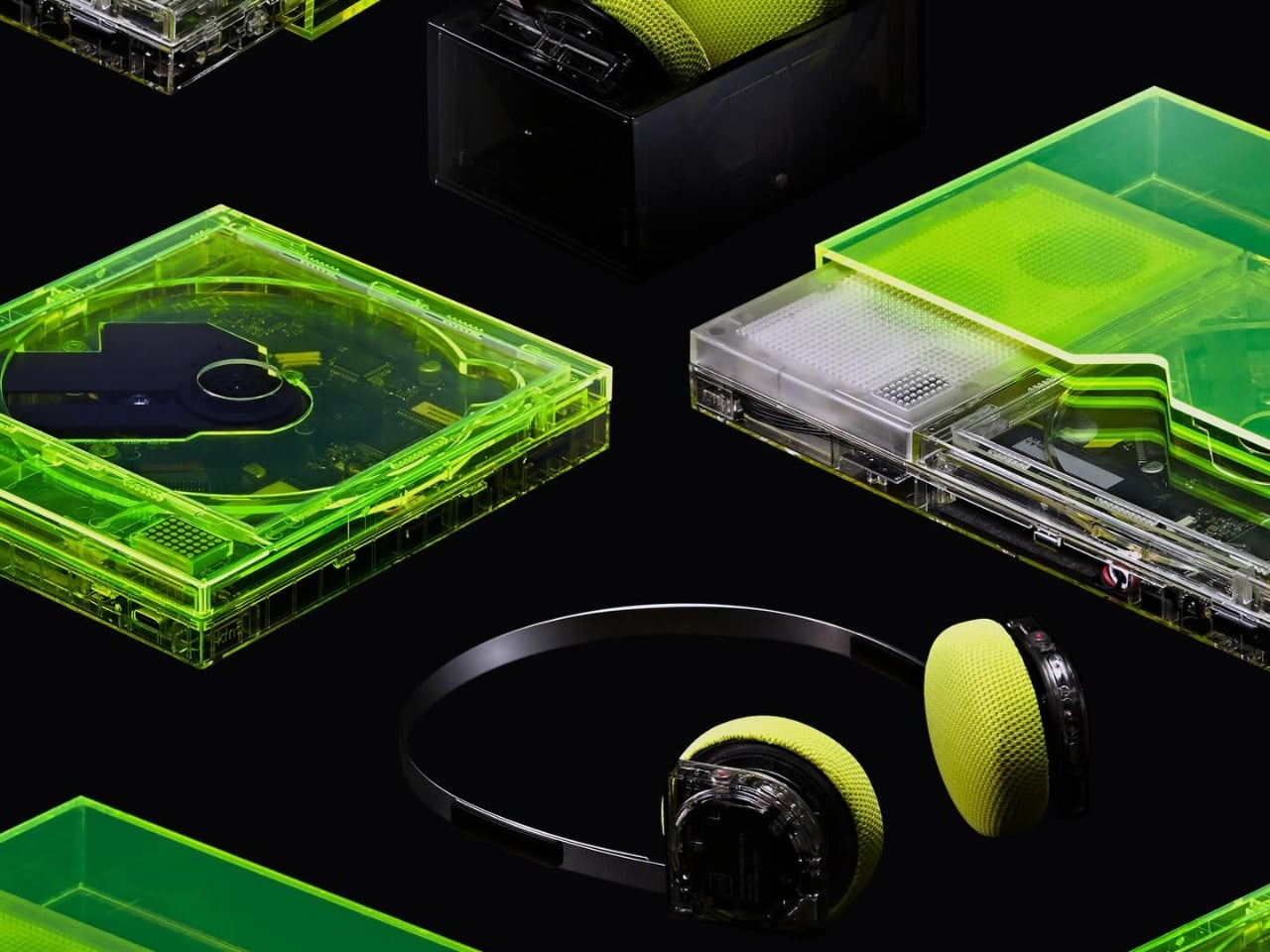
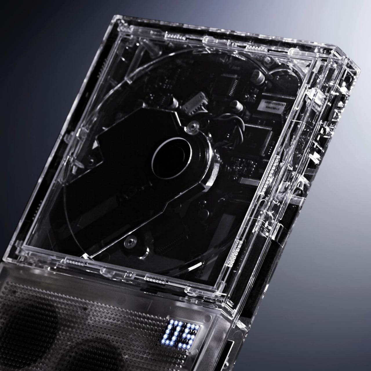
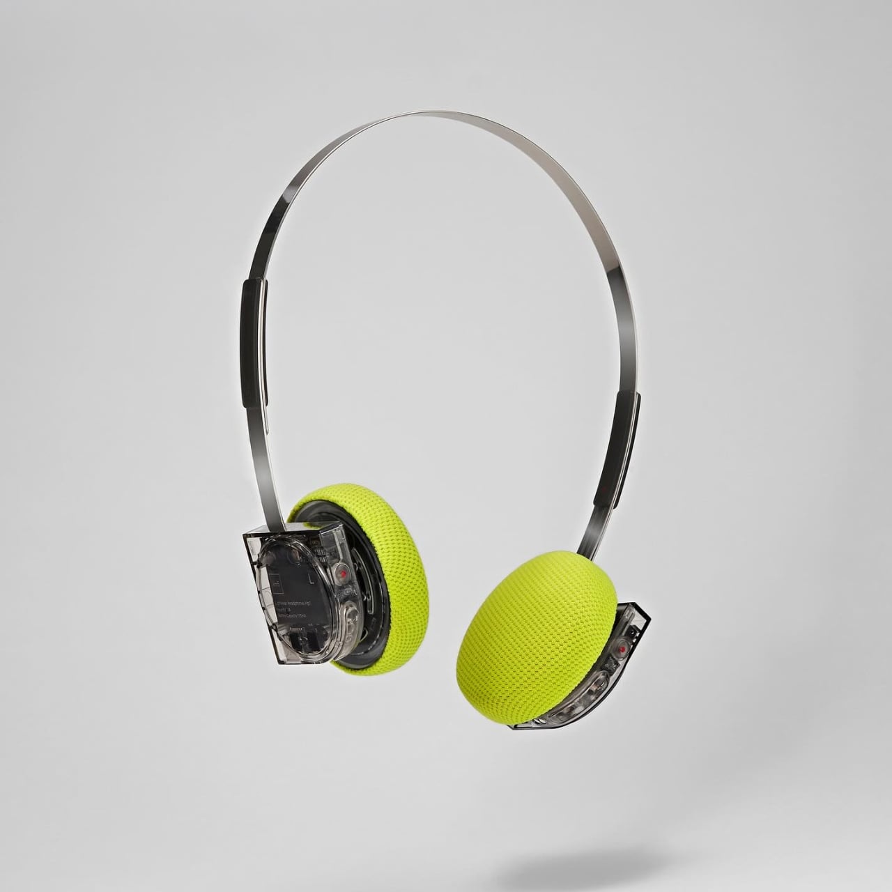
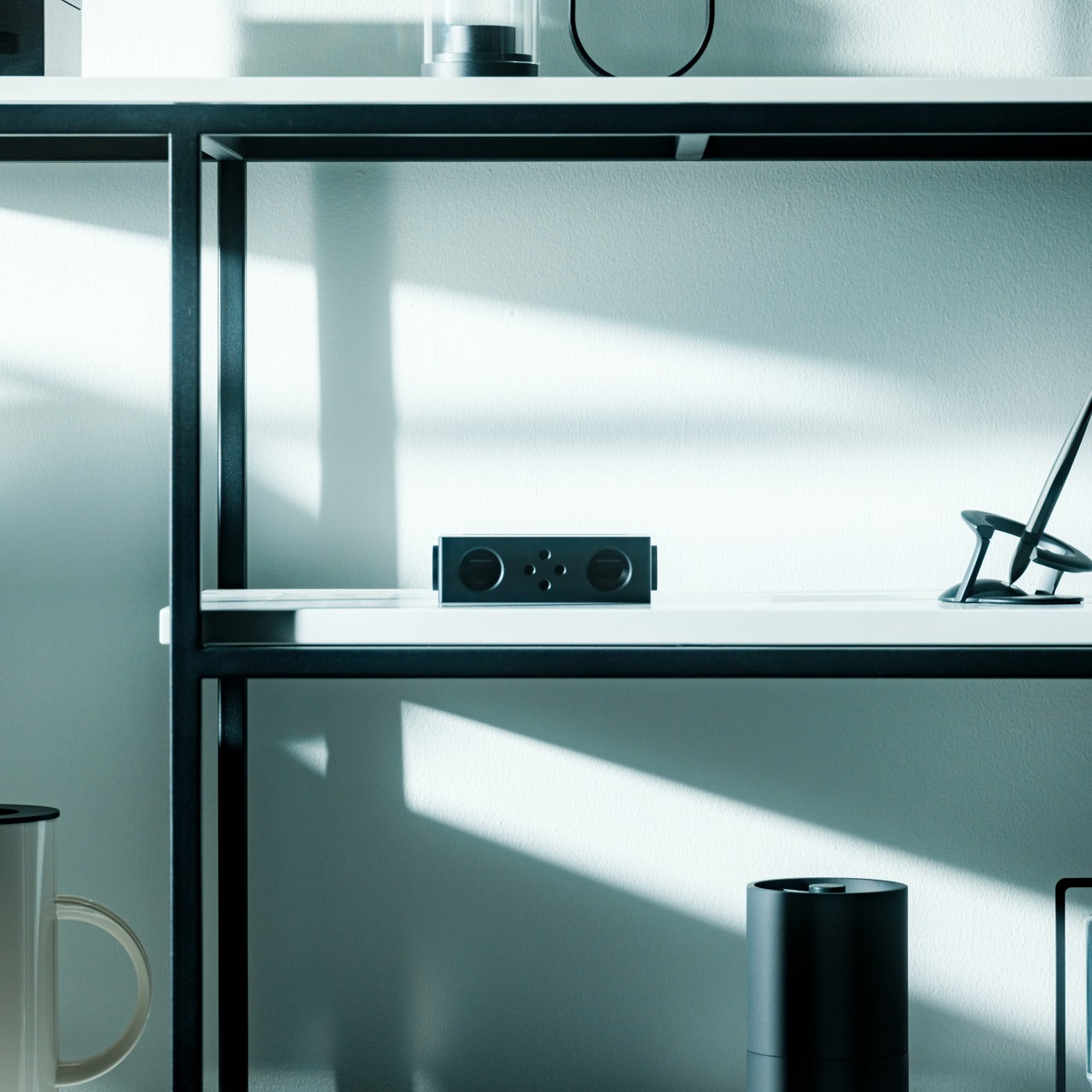
Most brands spend their entire design budget hiding what’s inside a product. km5, the Tokyo audio label that’s been quietly rewriting how people think about CD players, just did the opposite. Their latest drop, released through bPr BEAMS, puts the circuit boards, the laser mechanism, the wiring, all of it, front and center. And it looks extraordinary.
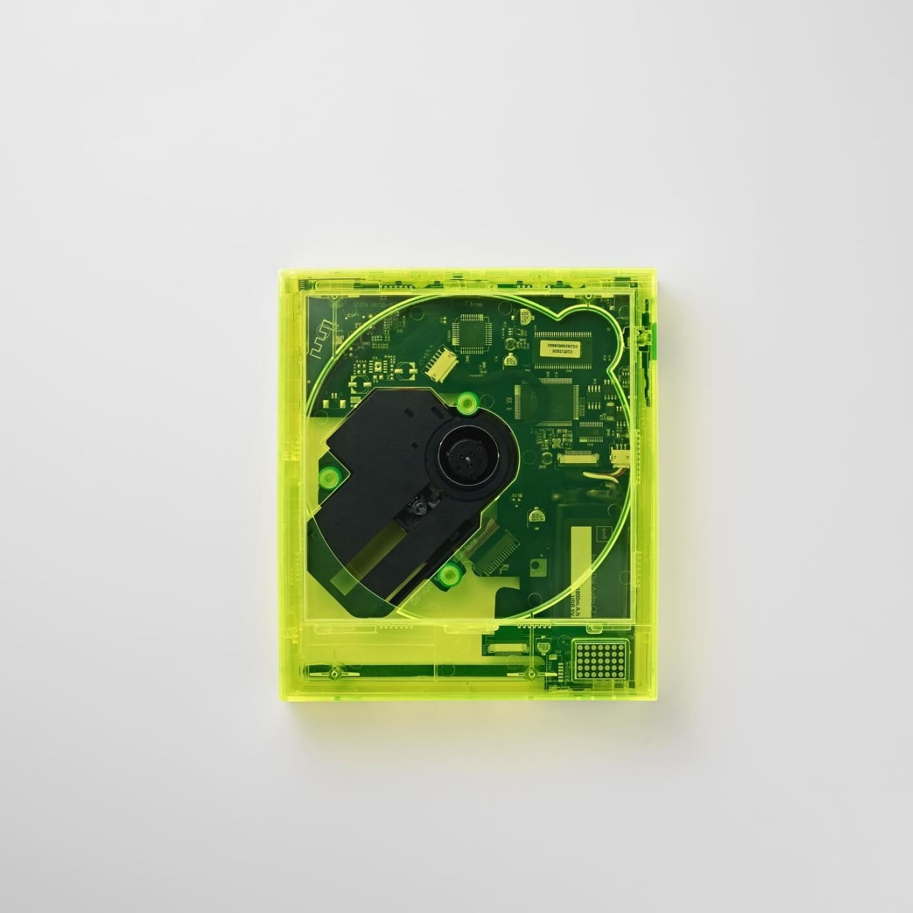
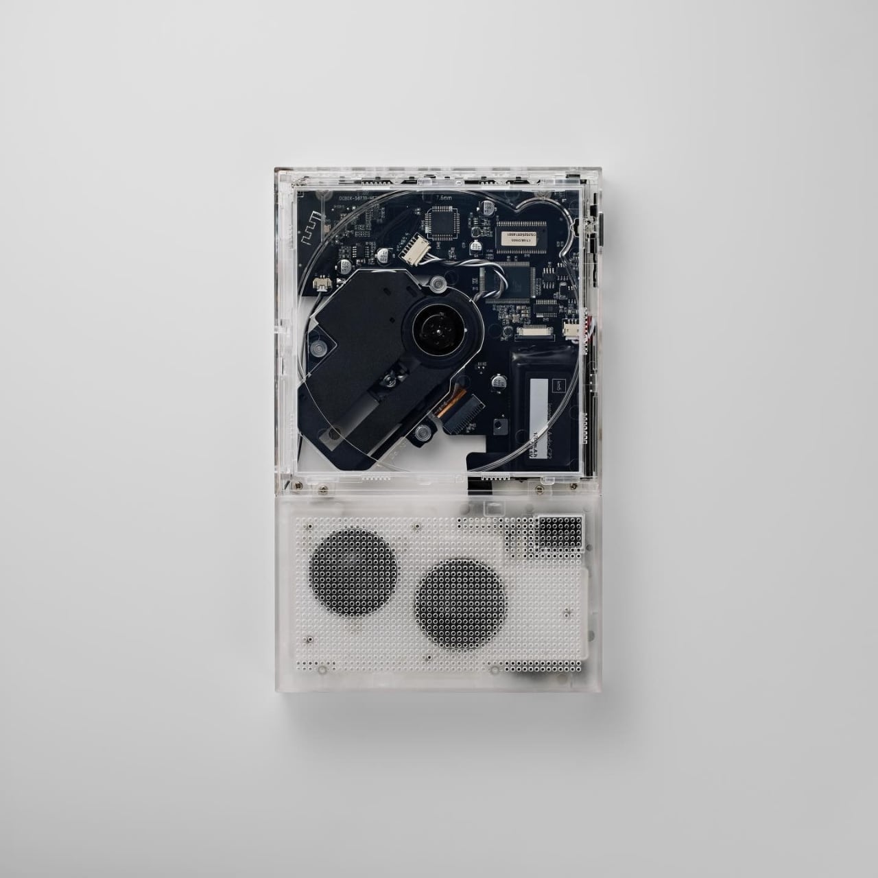
The collection introduces three new color variations: the Cp1 in Neon Yellow, the Cp2 in Clear, and the Hp1 headphones in Clear. Available starting April 1st as an exclusive pre-sale at select bPr BEAMS stores and the km5 online shop, these aren’t just color refreshes. They’re a statement about what audio design can actually look like when a brand commits to a philosophy all the way through.
km5’s original aesthetic has always been rooted in rigorous minimalism, the idea that a CD player should be as easy to look at as anything else in a considered space. Their Cp1 was designed like an instant photo frame, built to display the album jacket as art. Their Cp2 had the silhouette of a slim hardback, something you’d be comfortable leaving on a shelf. The Hp1 headphones weighed just 103 grams and arrived with a polished stainless steel band that belonged in a gallery as much as on a commute. The design language has always been controlled, quiet, deliberate.
This new drop takes that same discipline and applies it to a completely different tension. The concept km5 describes as pursuing a contrast between “transparent” and “neon,” a play between the mechanical cool of visible engineering and the almost aggressive energy of neon light. It’s a bold shift in mood that somehow still feels entirely on-brand.
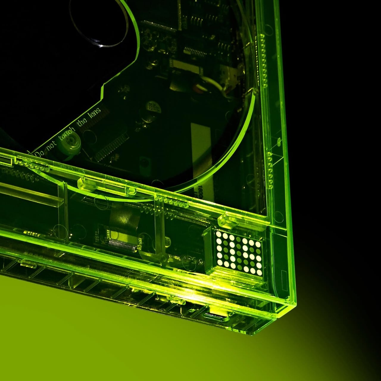
The Cp1 in Neon Yellow is the most immediately striking. The entire frame is cast in that charged, electric green-yellow, and when you look at it, you can see every component underneath lit by the color of the shell itself. It doesn’t look like a product. It looks like something you’d find in a design museum sandwiched between an Olivetti typewriter and an early Apple prototype. The edges illuminate in a way that makes it feel alive, like it’s doing something even when it’s sitting still.
The Cp2 Clear is the one I keep coming back to, though. It’s been a long time coming, because fans of the CP series have been wanting a transparent version of the speaker-equipped Cp2 since the model launched. Now that it exists, it earns every bit of the wait. The internal structure, the laser mechanism, the circuit boards, the speaker grille, all of it sits behind the clear shell in a way that reads more like an exploded technical drawing than a consumer product. It’s serious, it’s cool, and it’s genuinely beautiful in a way that no amount of matte white plastic could replicate.
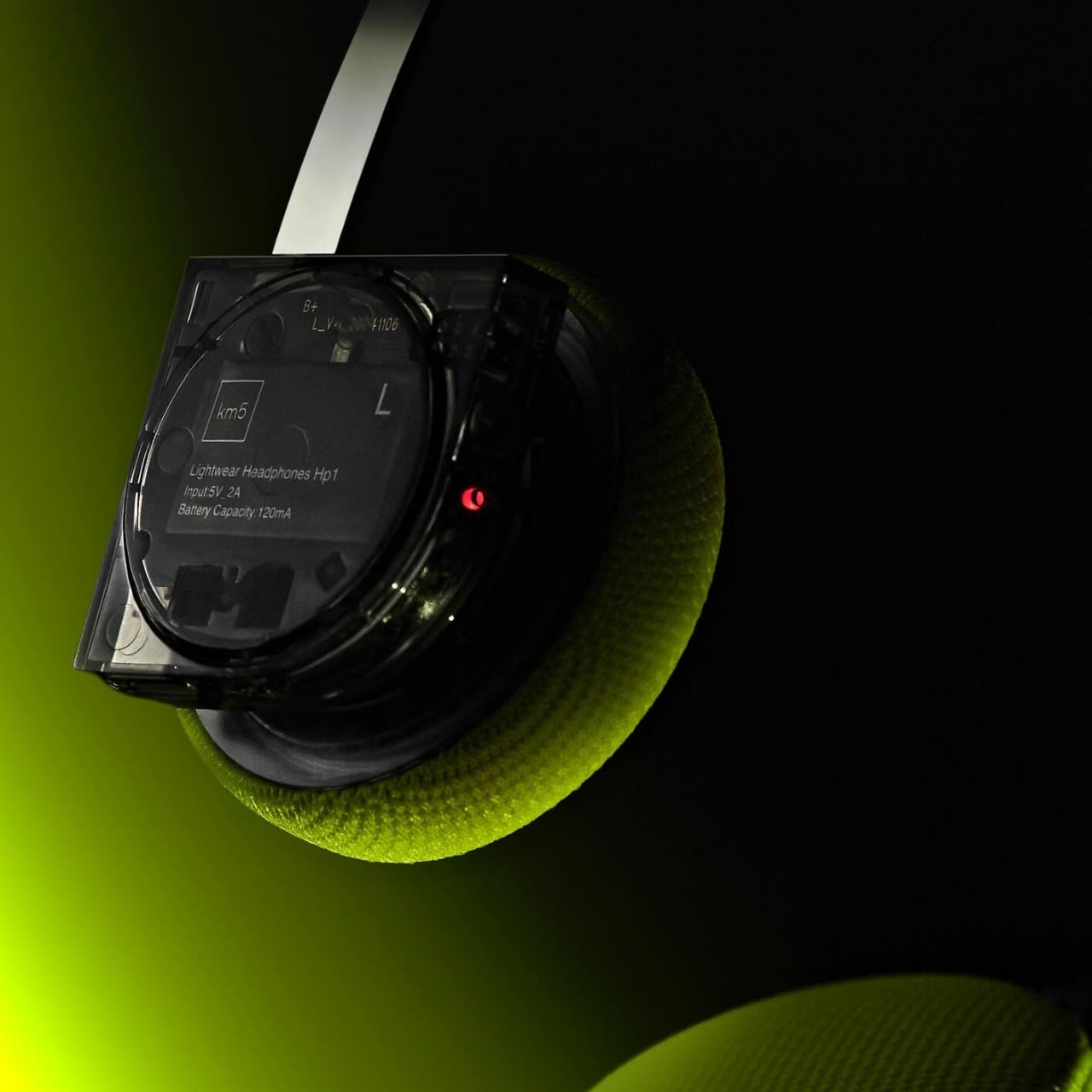
The Hp1 Clear follows the same logic. The housing is stripped back to transparent, the internals are exposed, and then the lime yellow ear pads arrive as the whole color story’s punctuation mark. It’s a contrast that shouldn’t work as well as it does. The clear mechanical housing next to those soft, textured yellow cushions is the kind of pairing that reads as both street-ready and gallery-worthy at the same time. Techwear people are going to love this. Interior people are going to love this. That’s a rare overlap.
The thing km5 keeps getting right, and this drop confirms it again, is that they understand what the people who buy beautiful objects are actually buying. It’s not just function. It’s not even just aesthetics. It’s the feeling that the people who made the thing cared. That they thought about it all the way down to the part you’d normally never see. Making the inside visible is, in some ways, the ultimate expression of that care. You have nothing to hide when everything you make is worth looking at.
Gen Z isn’t chasing spec sheets or benchmark scores. They’re chasing objects that fit the way they actually live: portable, intentional, and quietly smart. April 2026 delivered a lineup that genuinely gets that energy. From satellite-connected wearables to battery-free speakers, these ten gadgets are doing something harder than simply being powerful. They’re being useful, and in a market saturated with noise and empty promise, that distinction is becoming genuinely rare.
The gadgets on this list aren’t competing for attention. They’re designed around how people actually behave: working from cafés, traveling between cities, tuning out distractions, or surviving in places where infrastructure doesn’t reach. Some rethink materials, some rethink interfaces, and some rethink habits entirely. What they share is a design sensibility that respects the user’s time and intelligence. That’s the standard Gen Z holds, and this month, these ten deliver.
1. O-Boy Satellite Smartwatch
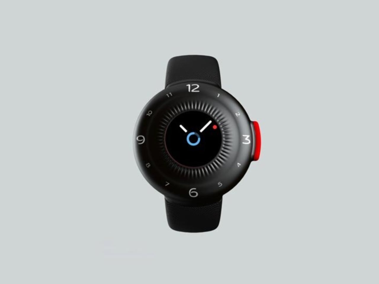
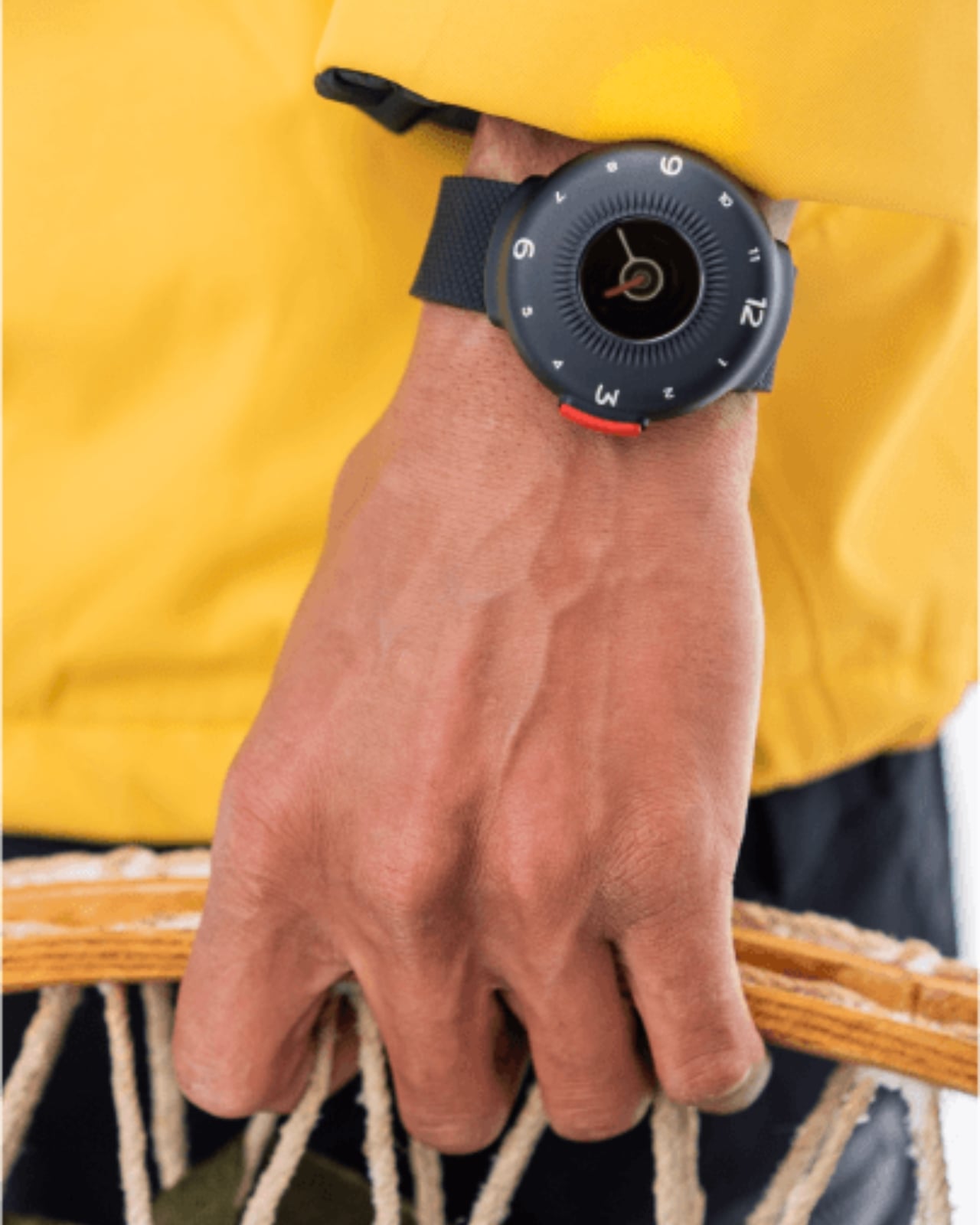
The O-Boy is built for the places where your phone gives up. Brussels-based studio Futurewave designed this satellite-connected smartwatch for emergencies in environments where mobile networks simply don’t exist: open ocean, mountain terrain, remote job sites. No bars, no Wi-Fi, no backup signal required. The watch transmits an emergency alert directly via satellite, making it one of the few wearables that actually keeps its promise when conditions are worst.
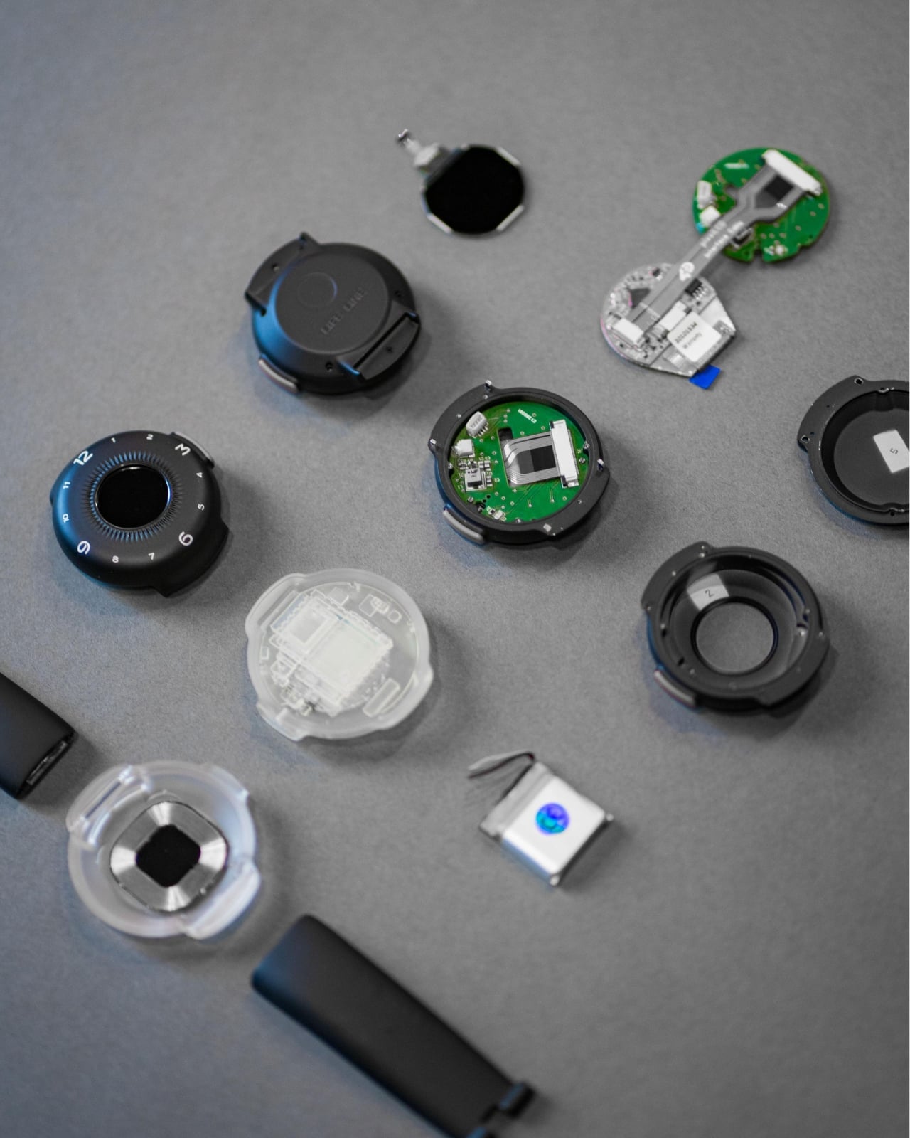
What makes the O-Boy genuinely impressive isn’t just the satellite capability; it’s how it was achieved. Futurewave pulled together product designers, electronics engineers, and antenna specialists and rethought the assembly process from the ground up. Getting satellite hardware into a compact, wearable form factor is not a small engineering feat. The result is a device that pushes the category forward rather than iterating on what already exists, and that distinction matters.
What We Like
Satellite communication works completely off the grid
Cross-disciplinary engineering produced a genuinely compact wearable form factor
What We Dislike
Designed primarily for emergencies, limiting everyday lifestyle appeal
Satellite connectivity may come with additional subscription costs
2. Minimal Laptop UI Concept
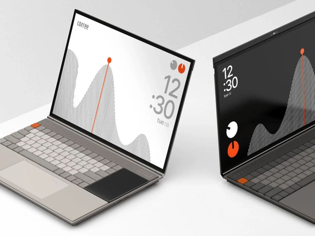
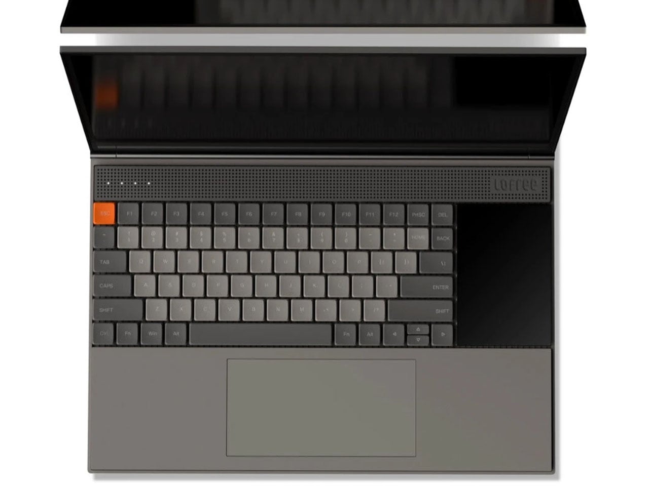
Inspired by the design philosophy of Teenage Engineering, the Minimal Laptop UI concept imagines what a laptop would look like if hardware and software were built around the same principle: less friction, more focus. The interface relies on strong visual hierarchy, generous spacing, and elements that appear only when necessary. Toolbars, panels, and persistent notifications are stripped away entirely, leaving a workspace that feels calm rather than cluttered.
For a generation that grew up multitasking across four open tabs and a split screen, this concept offers something surprisingly radical: a single surface to think on. Typography is clean and deliberate, icons are reduced to their most recognizable forms, and content stays at the center. It’s not about doing less. It’s about designing a machine that doesn’t compete with the work you’re trying to do on it, and that’s a harder problem than it sounds.
What We Like
Interface is designed around focus rather than feature density
Aesthetic language is distinctive and quietly confident
What We Dislike
Remains a concept with no confirmed production timeline
Minimal UI may not suit users who rely on multi-panel workflows
3. Battery-Free Amplifying iSpeakers
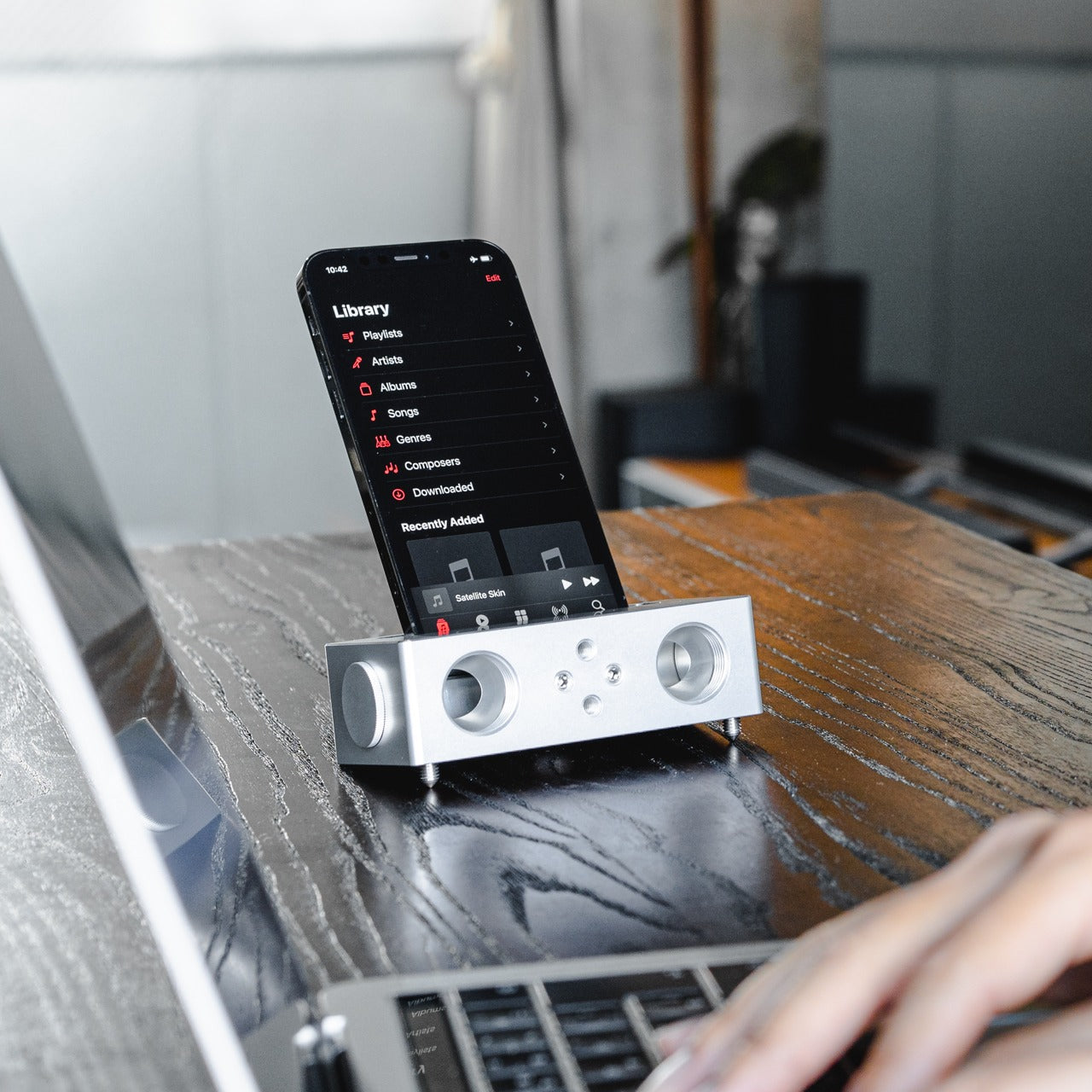
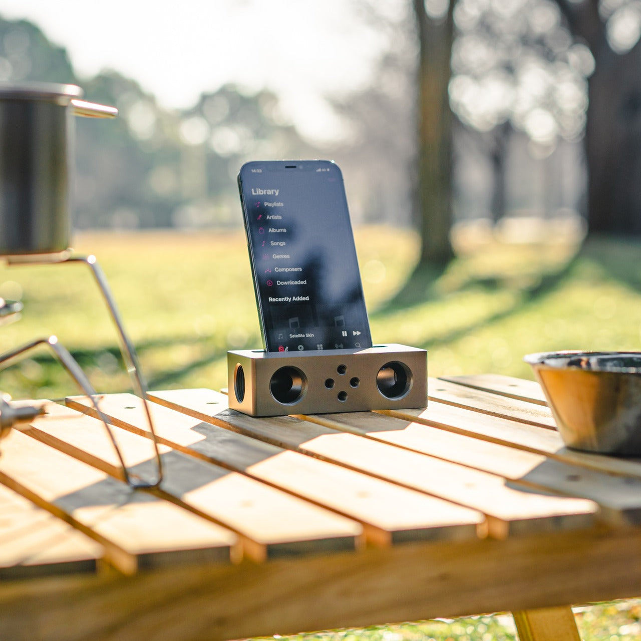
No power outlet, no battery, no Bluetooth pairing. Place your phone in the iSpeakers, and the sound amplifies. Built from Duralumin, the aluminum alloy used in aircraft construction, this passive speaker uses the golden ratio in its geometry to enhance resonance naturally. The result is an amplifier that genuinely improves your phone’s audio without asking anything of your power strip or your patience, which is a more elegant solution than most audio hardware manages.
The iSpeakers work anywhere, which makes them useful in a way that over-engineered audio gear often isn’t. A desk speaker that never needs charging is always ready. The aesthetic is understated and precise, the kind of object that improves a space by being in it rather than demanding attention. For anyone tired of hunting for cables and waiting for Bluetooth to pair, this is a refreshingly simple alternative that earns its place on any desk.
Zero power requirement means zero limitations on where it works
Duralumin construction gives it both durability and a premium, clean look
What We Dislike
Audio output depends entirely on the quality of the phone’s built-in speaker
Sound-directing mods are sold separately, adding to the total cost
4. Xiaomi UltraThin Magnetic Power Bank 5000 15W
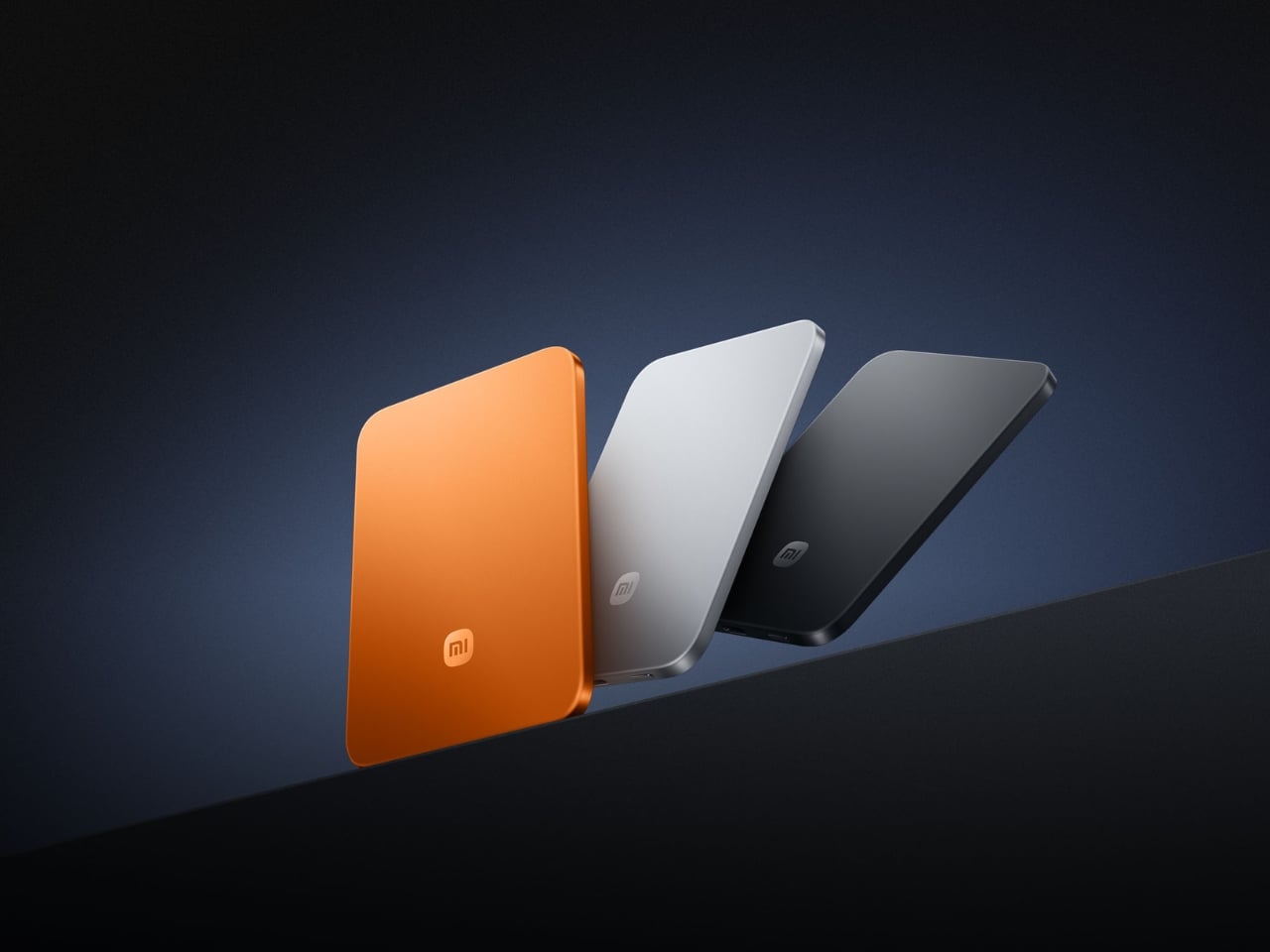
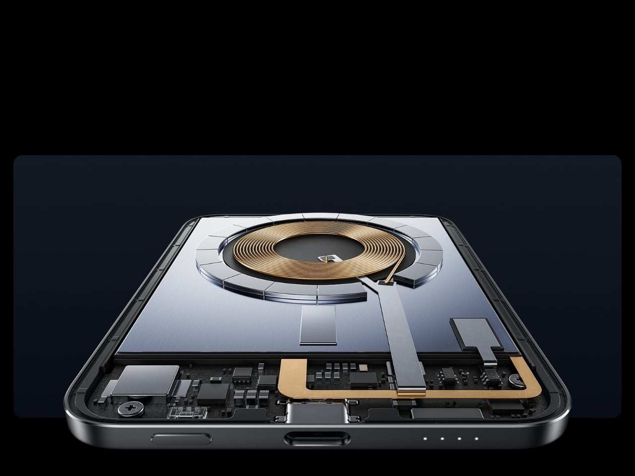
At 6mm thick, the Xiaomi UltraThin Magnetic Power Bank is thinner than any smartphone currently on the market. Using silicon-carbon battery chemistry with 16% silicon content, Xiaomi managed to pack 5,000mAh into something that looks and feels like a metal business card. The aluminum alloy shell has a smooth, understated finish, and a photolithographically etched logo on the back signals a product designed with care rather than simply manufactured to a spec sheet.
Available in Glacier Silver, Graphite Black, and Radiant Orange, this power bank debuted in Japan, expanded across Australia, Singapore, South Korea, and Europe, and made its global appearance at MWC 2026 in Barcelona. European pricing sits around €60, which is reasonable for what it delivers. The phone-facing surface uses fire-resistant fiberglass with an excimer coating for heat management, a detail that matters when you’re charging magnetically and want the hardware to stay cool.
What We Like
Silicon-carbon battery achieves 5,000mAh in a 6mm profile
Premium materials and finish at an accessible price point
What We Dislike
15W wireless charging is modest compared to faster wired alternatives
The ultra-slim design means no additional ports or USB-A pass-through
5. tinyBook Flip
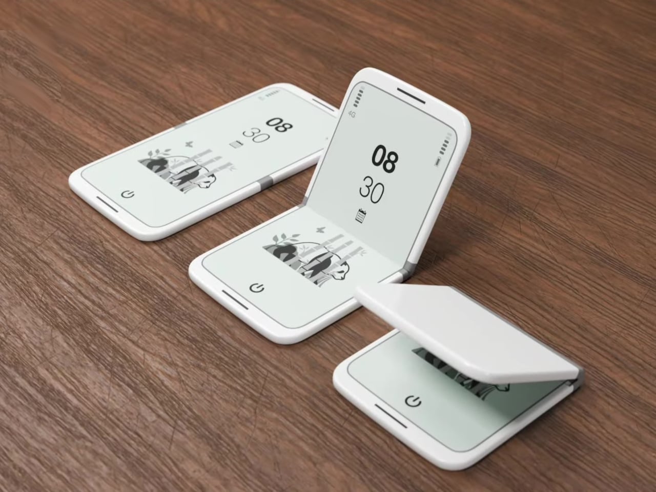
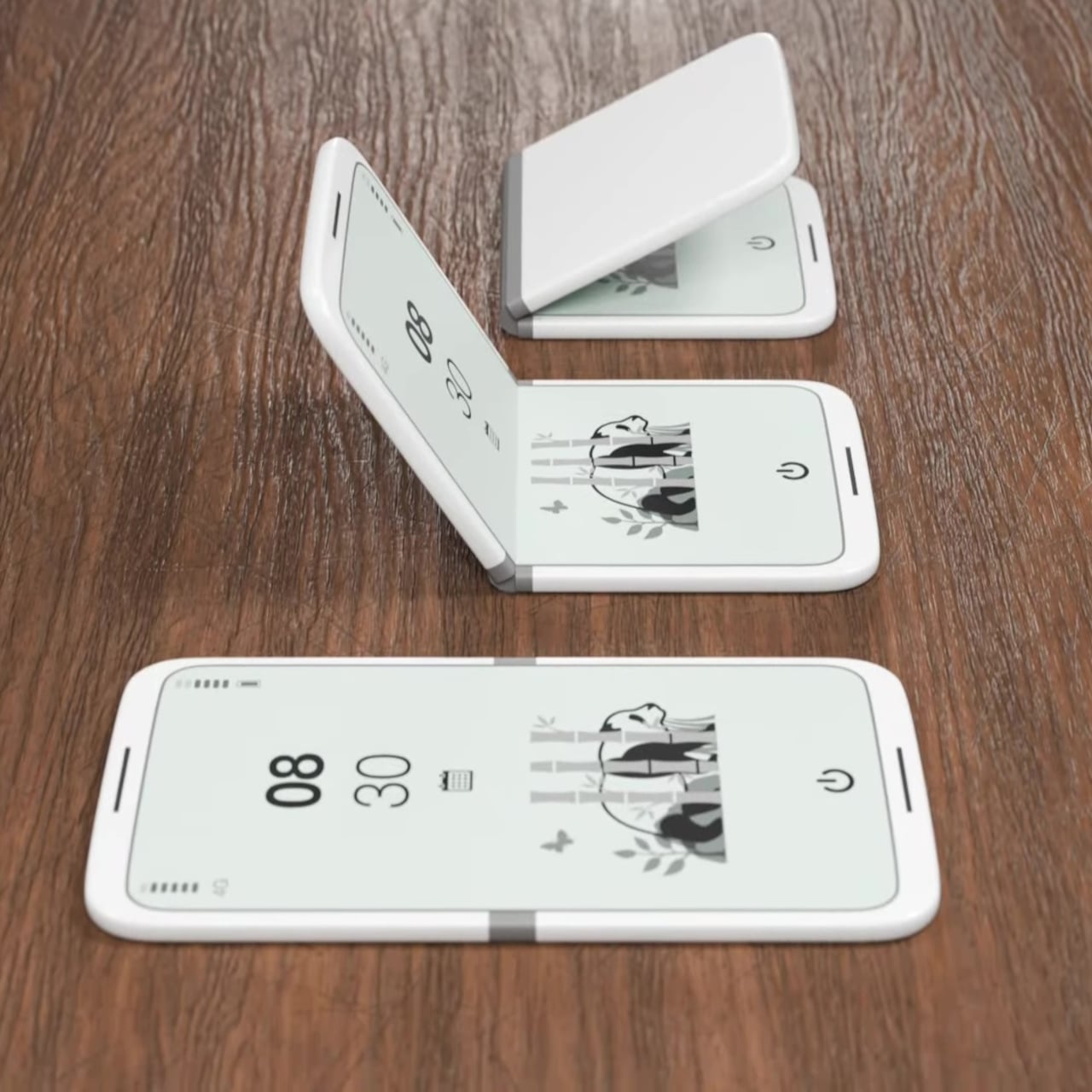
The tinyBook Flip is a foldable phone concept built around a 6.1-inch E Ink display. Closed, it collapses into a near-square form with a matte white finish and rounded corners, closer in proportion to a folded notecard than a smartphone. When shut, the screen disappears entirely. No glowing rectangle sitting face-up on the desk, no ambient reminder that there are things to check. Just a small, quiet object doing nothing at all.
That quietness is the design feature. Opening the phone requires a deliberate physical action, and that two-second pause changes the behavioral math around screen time. A reflexive grab becomes a conscious decision. The concept treats this friction as intentional, a design choice rather than an inconvenience. For anyone who has tried every screen time app and still reaches for their phone without thinking, the tinyBook Flip proposes something more honest: a phone that makes you choose to open it.
What We Like
Foldable form adds physical friction that genuinely interrupts mindless scrolling
Matte E Ink display avoids unnecessary glow and is easy on the eyes
What We Dislike
E Ink refresh rates remain too slow for video or fast-moving content
Currently a concept with no confirmed production or pricing information
6. OrigamiSwift Folding Mouse
The OrigamiSwift is a Bluetooth mouse that folds flat for travel and springs back to full size in under 0.5 seconds. Weighing 40 grams, it’s light enough to forget it’s in your bag until you need it. Inspired by origami, the foldable structure doesn’t sacrifice ergonomics for portability. It’s shaped to fit naturally in the hand during long work sessions, whether at a co-working space, a café, or an airport gate somewhere between time zones.
For digital nomads and students tired of trackpads and bulky peripherals, the OrigamiSwift makes a compelling case for carrying a full-sized experience in a pocket-sized package. The slim profile keeps it flat and unobtrusive in any bag, and the Bluetooth connection removes the need for a dongle. It’s the kind of product that solves a problem you’ve quietly accepted as unsolvable, and does it with a detail-first design sensibility that genuinely earns the attention it’s getting.
Folds flat without compromising ergonomic performance when open
The 40-gram weight makes it genuinely unnoticeable in a bag
What We Dislike
No published DPI range or click precision specifications available
May not satisfy users who prefer a heavier, more substantial mouse feel
7. DuRobo Krono
The DuRobo Krono puts a 6.13-inch E Ink Carta 1200 display in a form factor that fits a jacket pocket. At 300 PPI with an 18:9 aspect ratio and a weight of 173 grams, it reads more like a physical book than most dedicated e-readers manage. Eight subtle breathing lights run across the back panel, a quiet visual indicator during focused sessions that adds character without becoming a distraction. The matte finish and geometric build keep it composed in any setting.
The Krono’s standout feature is the smart dial on its left side. Press and hold to record voice notes, and the onboard AI transcribes your words into searchable text, generating summaries of longer recordings automatically. For readers who take notes in the margins or thinkers who process ideas out loud, that combination of reading tool and voice capture is genuinely useful. It positions the Krono somewhere between a dedicated e-reader and a thinking device, which is a more interesting category entirely.
What We Like
AI voice recording and transcription work directly on the device
300 PPI display and pocket-friendly form factor rival premium reading devices
What We Dislike
The 18:9 aspect ratio may feel narrow for reading PDFs or documents
Breathing lights, while subtle, may distract in dark reading environments
8. StillFrame Headphones
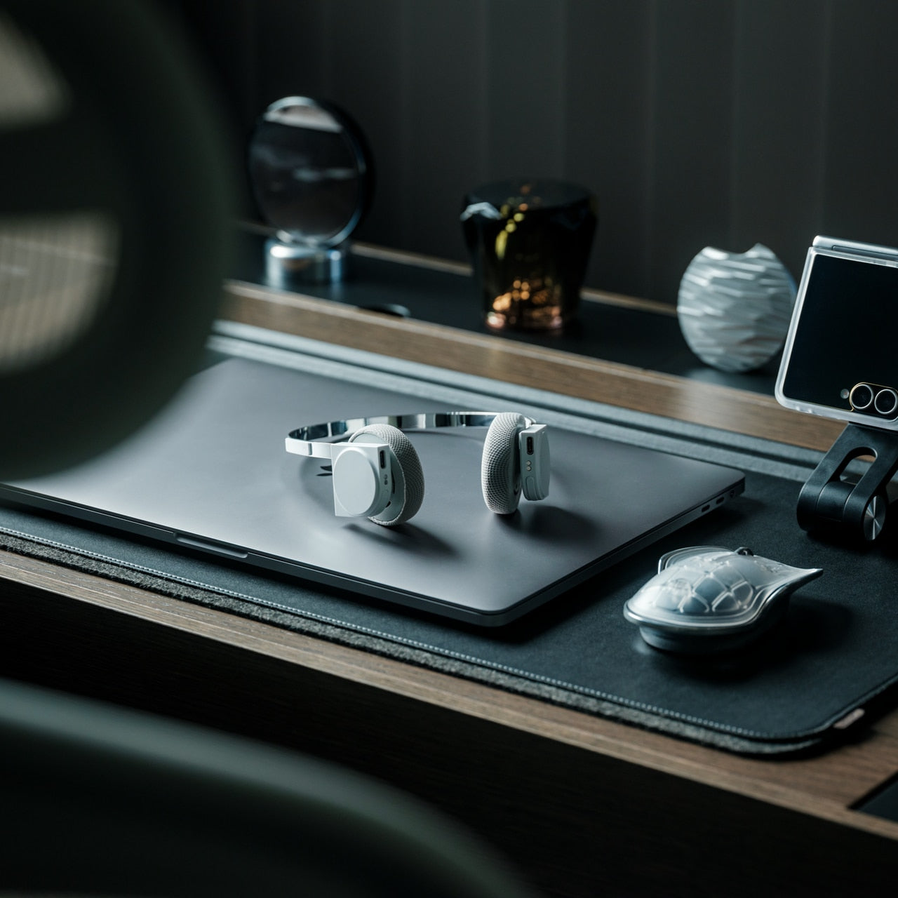
StillFrame headphones are built around a quieter philosophy: slow listening, deliberate sound, the kind that rewards attention. The 40mm drivers deliver a wide, open soundstage that turns quiet tracks into something textured and spatial. The form references the geometry of ’80s and ’90s CDs and sits in quiet visual dialogue with the ClearFrame CD Player, a nod to an era when music had physical weight, and the act of listening was its own ritual worth showing up for.
The StillFrame sits between in-ears and over-ears in both feel and philosophy: more open than the former, more relaxed than the latter. Noise-cancelling and transparency mode let you shift between solitude and awareness with a single tap, making them genuinely adaptable across environments. They’re featherlight without feeling hollow, and the overall build is measured and considered. For a generation rediscovering vinyl and physical media, StillFrame offers that same intentional energy in a wireless headphone.
Wide soundstage from 40mm drivers gives music genuine spatial depth
Noise-cancelling and transparency modes make it adaptable across daily environments
What We Dislike
An on-ear fit may cause discomfort during extended listening sessions
Retro aesthetic is distinctive but may not appeal to all personal tastes
9. HubKey Gen2
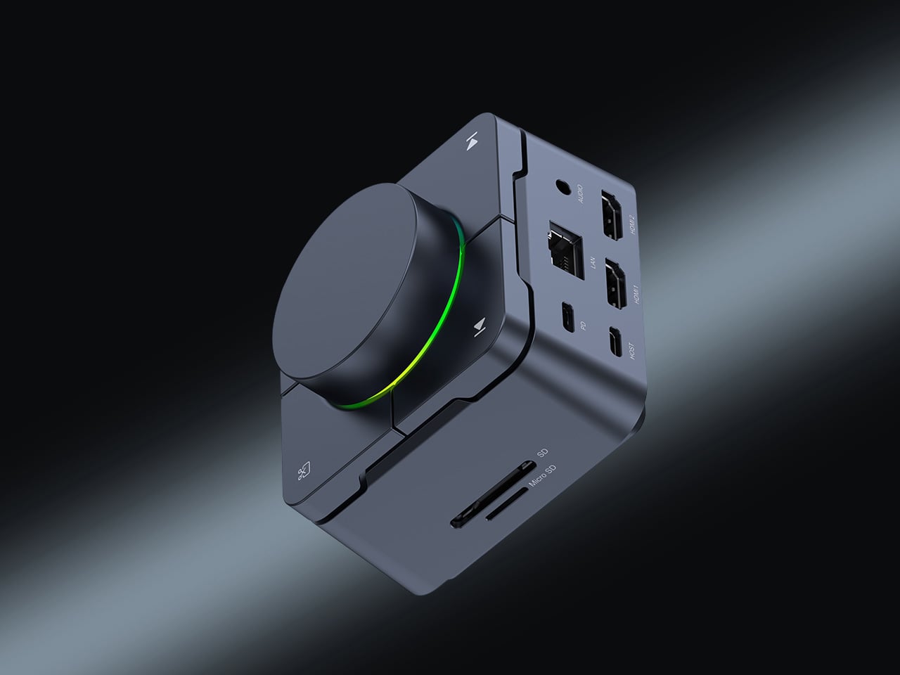
The HubKey Gen2 solves the dongle problem that every ultrabook user has quietly accepted as part of working life. Eleven connections are consolidated into a palm-sized cube: dual 4K display support, Ethernet, USB-A and USB-C, and power pass-through included. For anyone working across monitors and peripherals from a laptop with two USB-C ports, this is the kind of product that makes the workspace actually functional without turning the desk into a cable graveyard piled with adapters.
Four programmable keys and a central control knob are what separate the HubKey Gen2 from a standard hub. Muting a microphone, adjusting volume, toggling camera privacy: these are actions that get buried in menus and keyboard shortcuts during live calls. The Gen2 makes them physical, tactile, and immediate. For remote workers, creators, and students who live on video calls, having media controls within arm’s reach rather than three clicks deep is a quality-of-life upgrade that’s hard to give back.
What We Like
Eleven connections in one compact cube eliminate dongle accumulation entirely
Programmable keys and control knob bring commonly buried actions to the surface
What We Dislike
Cables from all eleven ports could still create desk clutter around the hub
Programmable keys may require setup time and dedicated software to configure properly
10. Razer Raiju V3 Pro
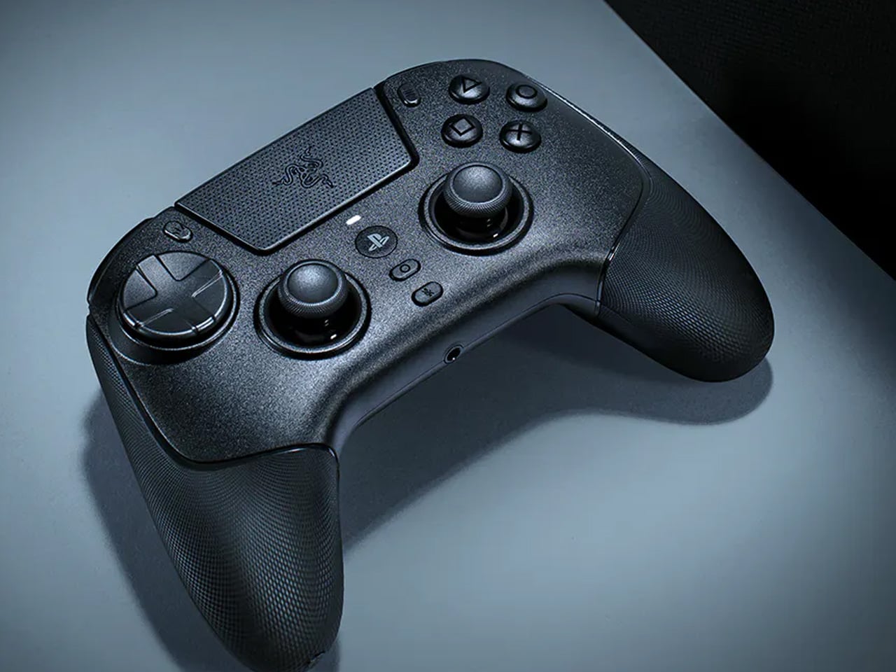
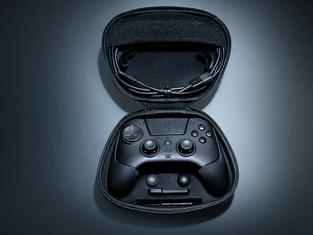
The Razer Raiju V3 Pro takes the sensor thinking behind high-performance gaming mice and applies it to a PlayStation-compatible controller. Tunnel Magnetoresistance thumbsticks use weak electromagnetic waves to detect movement with higher resolution than standard Hall Effect sensors. Drift is addressed at the hardware level, not patched in software. Hall Effect triggers cover the remaining high-wear inputs. At 258 grams, it sits lighter than the DualSense Edge without feeling insubstantial in the hand.
Six additional inputs are distributed across the frame: four removable back buttons in the rubberized handles and two claw-grip bumpers flanking the triggers, all fully remappable. Razer’s HyperSpeed 2.4GHz wireless reaches a 2,000Hz polling rate on PC. Battery life is rated at 36 hours, nearly triple the DualSense standard. Officially licensed for PlayStation 5, it requires no adapters and connects as a native peripheral. For competitive players who want every hardware advantage in one place, the Raiju V3 Pro sets the current ceiling.
What We Like
TMR thumbsticks offer finer movement resolution with hardware-level drift prevention
36-hour battery life and 2,000Hz polling rate on PC are best-in-class figures
What We Dislike
At 258 grams, it may feel heavy for players accustomed to lighter controllers
Six extra inputs and full remapping may overwhelm casual or new users
The Gadgets That Actually Deserve the Hype
April 2026’s best gadgets share a common thread: they were designed around how people actually behave, not how manufacturers hope they will. Whether it’s a satellite smartwatch that works when nothing else does or a foldable phone that makes you pause before opening it, the most interesting tech this month isn’t louder or flashier. It’s more considered, and that’s a harder thing to consistently get right.
Gen Z has always been quick to call out products that look useful but don’t deliver. This list holds up to that standard. From a power bank thinner than any phone to an AI e-reader that captures your thoughts out loud, these are gadgets that earn their place on a desk or in a bag, and that’s a harder standard to meet than it might seem to anyone designing in this space.
Minimalism in product design has gotten boring. We’re swimming in smooth white rectangles, touch controls that offer zero feedback, and devices designed to vanish. Apple spent two decades training the industry to sand away every visible seam, and now we live in a world where a Bluetooth speaker looks like a cylinder because a cylinder offends nobody. Bang & Olufsen understood early that audio equipment could occupy space like sculpture, could earn its place in a room through presence instead of absence. Teenage Engineering proved that mechanical honesty and playful geometry could coexist with premium materials. Both approaches work because they have a point of view.
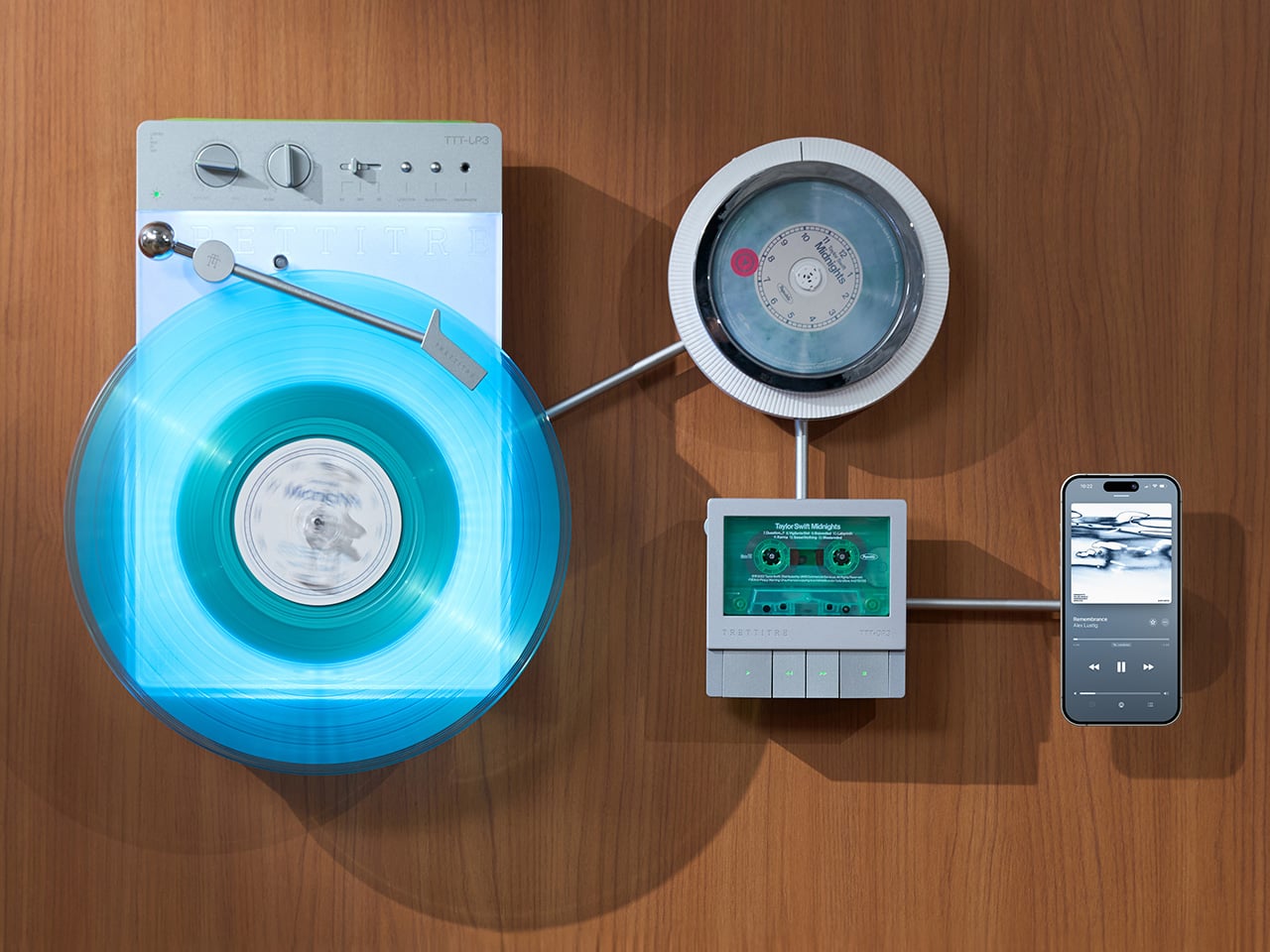
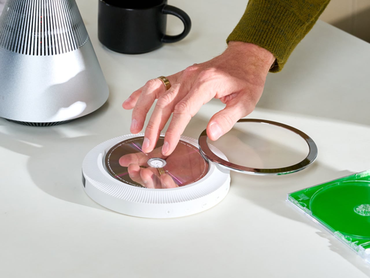
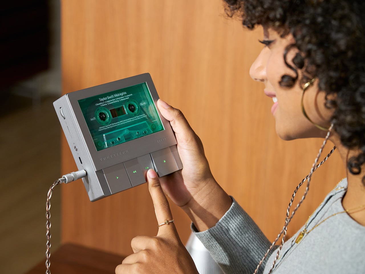
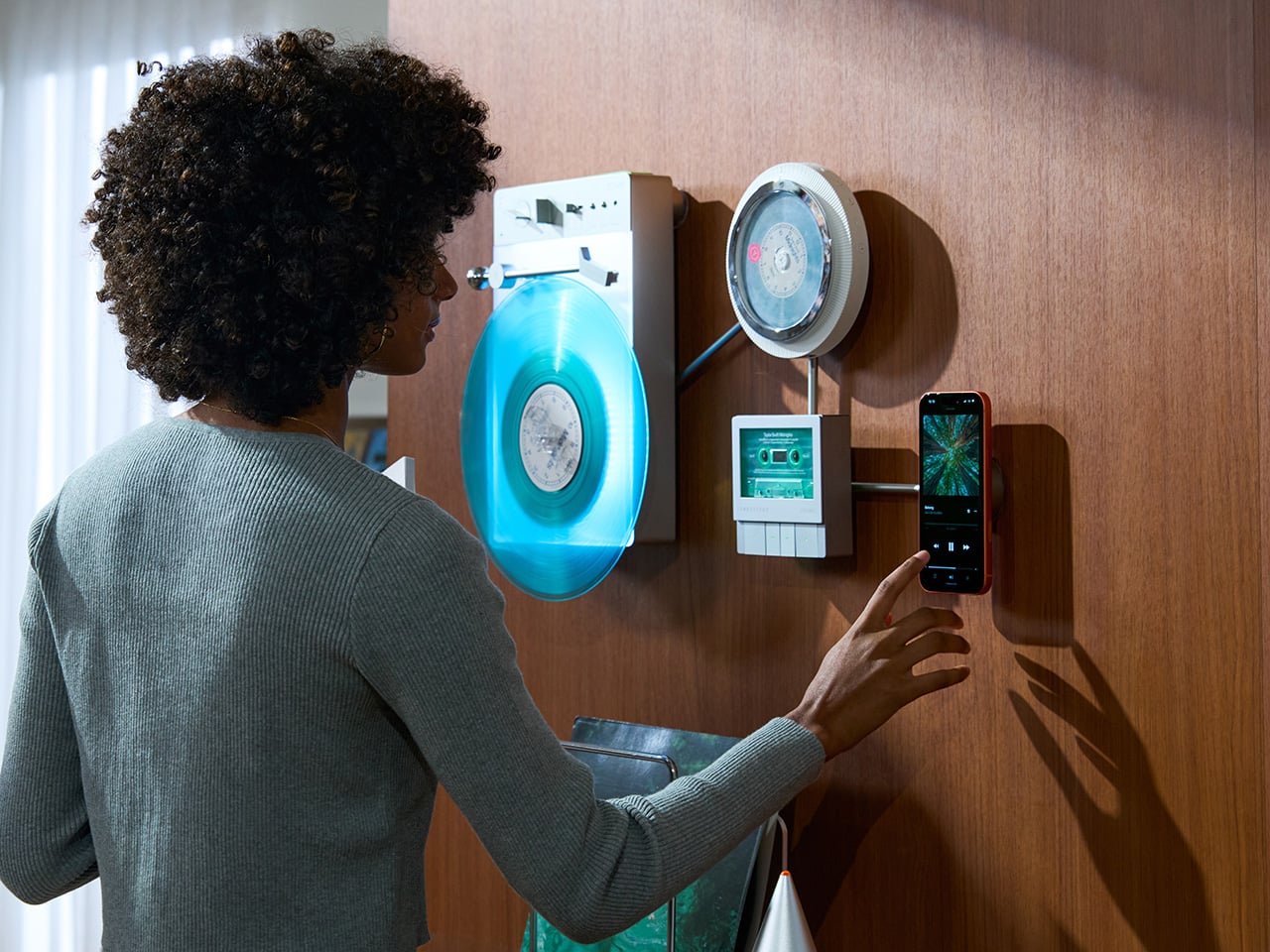
TRETTITRE’s TTT series combines those instincts into something harder to categorize. The TTT-LP3 wireless vinyl player uses CNC-machined aluminum for the main frame and features a diffused lighting panel that spreads light evenly across the surface when music plays. The TTT-DP3 Bluetooth CD player takes inspiration from a UFO-like form with a transparent magnetic cover that rotates open to reveal the spinning disc. The TTT-CP3 cassette player uses a metal housing with sharp geometric lines and mechanical transport keys that deliver clear physical response. All three mount on the TTT-W magnetic modular wall rack, turning physical media playback into a visible, functional part of interior design.
TTT-LP3: A Vinyl Player That Doubles as Ambient Light
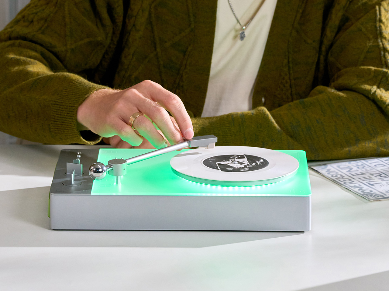
The back of the LP3 includes a hidden mounting structure that allows it to hang directly on a wall. You can mount it vertically so the record becomes part of the visual display, or go for the classic horizontal layout. When you want to move it, you lift the silicone leather handle at the top and take it down. The player detaches easily and gives you the freedom to listen wherever you choose. Traditional turntables usually stay exactly where you put them, limiting your options for when and where you listen. The LP3 works a little differently because of the battery and the wall mount’s wireless charging system, which keeps it powered without a visible cable.
Behind the LP3 sits a diffused lighting panel that spreads light evenly across the surface of the unit. When it’s on, the entire body of the player glows softly, designed to feel closer to ambient lighting than decorative lighting. You can change the lighting effects with the touch of a button. When a record spins, the moving shadows create a quiet visual effect. You can also leave the player mounted on the wall as a soft light source even when no music is playing. That ambient quality pushes the LP3 from well-designed product into something more considered: a slow, breathing light fixture that happens to play records.
The LP3 uses a self-balancing tonearm system that automatically sets the correct pressure when the player powers on. You place the record on the platter and lower the needle, and the system handles the rest. Many turntables require careful calibration before they can be used properly, with tonearm balance, tracking pressure, and counterweight adjustment all part of the process. For experienced collectors that process can be enjoyable, but for beginners it often feels complicated. The LP3 removes that barrier entirely while preserving the tactile experience people enjoy. The player supports both 33 RPM and 45 RPM records, and includes a manual control dial that allows small adjustments to playback speed (roughly ±0.5%), useful for older records that may not spin perfectly at their original speed anymore.
Wireless audio is handled through Qualcomm Bluetooth v5.3 with SBC, aptX, aptX HD, and aptX Adaptive, which allows higher-quality and lower-latency wireless audio than basic Bluetooth streaming. For wired setups, the player also includes a 3.5mm audio output. The built-in battery provides up to 6 hours of vinyl playback or up to 3 hours when used purely as an ambient light source. Full specs: dimensions 342×233×87mm, weight 1430g, Audio-Technica AT3600L moving magnet stereo cartridge, CNC-machined aluminum frame with silicone leather carrying strap. The LP3 arrives in June 2026 for Early Bird backers, May 2026 for Fast Delivery backers.
TTT-DP3: Giving the Compact Disc Its Aura Back
The DP3 keeps the reliability of CDs but gives the player a different visual presence. The design takes inspiration from a UFO-like form with a transparent magnetic cover. When the cover rotates open, the disc is partially visible as it spins, turning something simple into a small visual moment. A CD player shaped like a flying saucer with a rotating transparent lid is an audacious idea, and it works because it doesn’t try to evoke nostalgia. It reframes a CD player as a mechanical object of curiosity, something you watch as much as use.
The control buttons include raised tactile dots combined with a gold-embossed finish, making it easy to identify the buttons by touch alone. You can pause or skip tracks without needing to look down at the player. A small OLED display on the player shows track numbers, playback status, and battery level. The interface is intentionally simple so the information you need is visible immediately. A built-in battery allows the DP3 to run for several hours on its own, so you can move it from room to room, bring it to a small gathering, or take it while traveling. Full specs: Ø170×27mm, 324g, supports CD-DA and HDCD formats, Bluetooth 5.4, SNR >70dB, THD <3%, ABS+PC+Metal construction. The DP3 ships in May 2026.
TTT-CP3: Cassette Hardware for Modern Audio Setups
The CP3 keeps the tactile mechanical elements people associate with tapes while updating the electronics inside. The player uses a metal housing with sharp geometric lines that give it a distinctly industrial appearance. Instead of trying to imitate retro plastic designs, the CP3 leans into a more modern interpretation of cassette hardware. The playback controls use independent mechanical keys similar to piano keys. Each press has a clear physical response. Play, rewind, and stop feel deliberate instead of soft or mushy.
Inside the CP3 sits a Bluetooth module that allows cassette audio to stream wirelessly to speakers or headphones. The player decodes analog audio signals with high precision, helping reduce background noise and preserve more detail from the original recording. The result still sounds like cassette tape, but with greater clarity. Full specs: 122×120×32mm, 360g, supports Type I-IV cassette cartridges, Bluetooth 5.4, SNR ≥55dB, THD <3.5%, Metal+PC+ABS construction. The CP3 ships in May 2026.
When Storage Becomes Part of the Spectacle
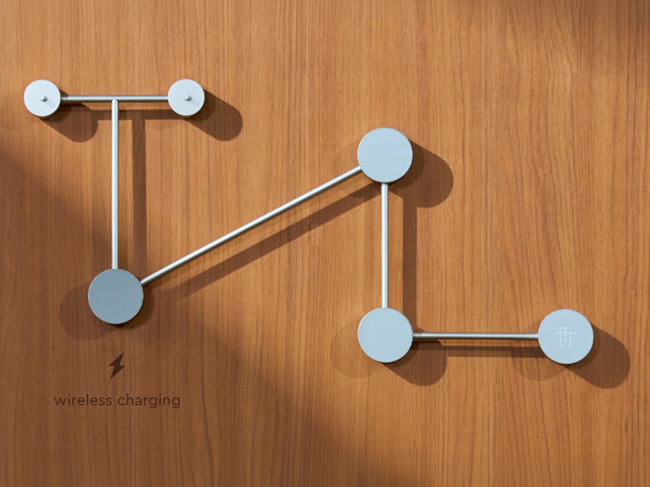
The TTT-W Magnetic Modular Wall Rack uses an all-metal geometric structure that allows multiple TTT players to be arranged into a clean wall display while keeping them organized and ready to use. The rack integrates magnetic alignment and wireless charging for the vinyl player, so the LP3 can stay powered without visible cables while being part of the room’s design. Two configurations are available: a T-shaped rack (263×196×27mm, 300g) and a magnetic modular wall rack (612×302×27mm, 775g, combined style T+3). Both support wireless charging at 5-10W and use USB-C 5V 2A input.
The Supporting Cast, from Sculptural Speakers to Planar IEMs
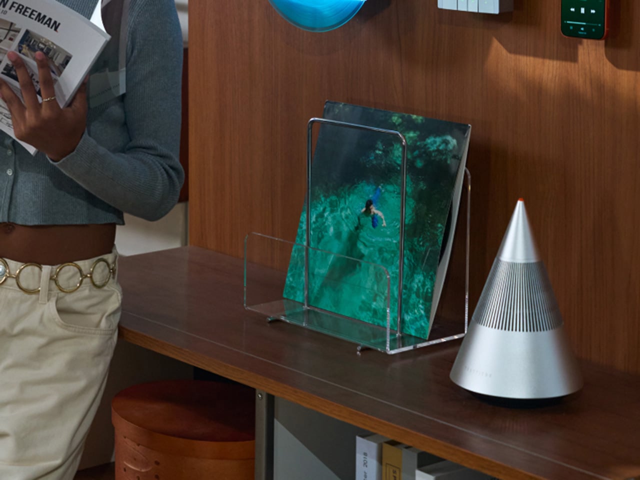
TRETTITRE offers a range of add-ons designed to complement the TTT system. The TreSound1 Speaker arrives in concrete and wooden editions, delivering 2×30W + 1×60W output power with a 1″ tweeter, 2.75″ mid-range, and 5.25″ subwoofer for 30Hz-25KHz frequency response. The conical speaker features 360° surround sound, Bluetooth 5.2 with Qualcomm aptX HD, and a sculptural form that occupies space like a piece of furniture. The TreSound Mini is a portable Bluetooth speaker with a 5200mAh battery, 30W RMS output, and 360° surround sound. The TTT-E3 in-ear headphones use a 13mm planar magnetic driver with a 4-strand silver-copper hybrid conductor, available in 3.5mm and 4.4mm configurations. An aluminum alloy side table (300×300×750mm, 1.75kg, max load 50kg) rounds out the ecosystem.
What It Costs to Build the Setup, and When It Ships
The TTT-LP3 wireless vinyl player is available at $229 for Early Bird backers (June 2026 delivery), down from a planned $449 MSRP. The TTT-DP3 Bluetooth CD player is priced at $79 standalone ($179 MSRP), while the TTT-CP3 cassette player is also $79 standalone ($199 MSRP). If you’re a bonafide audiophile, a $399 bundle gets you all three devices. Optional add-ons include the TreSound Mini Bluetooth Speaker at $169 ($299 MSRP), TreSound1 Wooden Edition at $449 ($659 MSRP), TreSound1 Concrete Edition at $499 ($799 MSRP), TTT-E3 planar IEMs at $139 ($239 MSRP), and the TTT Side Table at $89 ($199 MSRP). The campaign runs through April 9, 2026, with worldwide delivery beginning May 15, 2026.
Every time you type a prompt into ChatGPT, something happens somewhere far away. Servers spin up. Electricity moves. Carbon gets generated. The whole transaction is so clean and invisible on your end that it might as well not be happening. That’s by design, and it’s worth thinking about. Although with the way we use technology these days, we seldom think about the consequences on our environment.
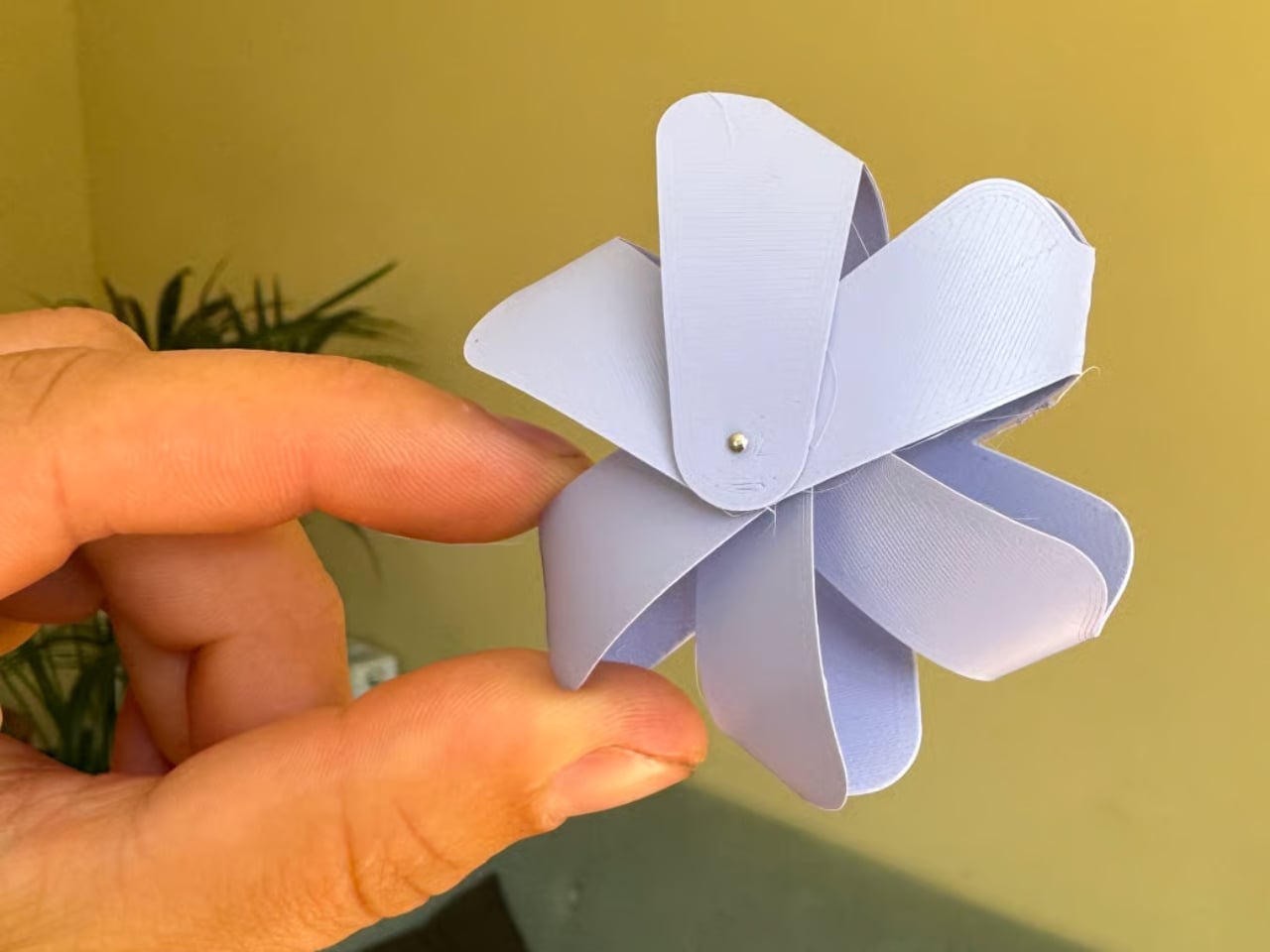
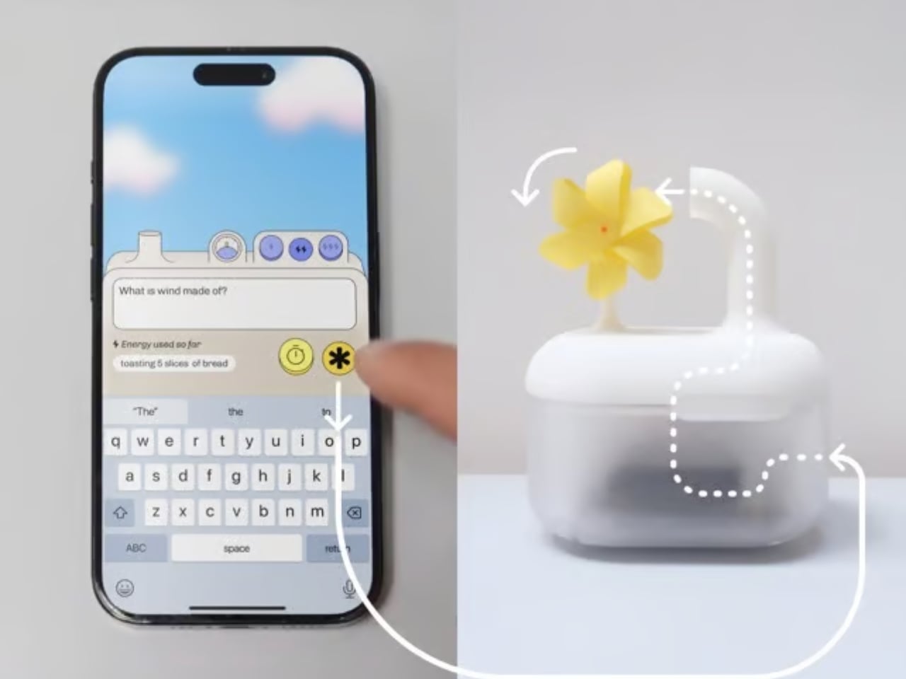
London-based creative studio Oio wants to change that, starting with a small 3D-printed box and a bright yellow pinwheel. Their project, the Hot Air Factory, is a domestic AI device that processes your questions and requests locally, without connecting to the cloud, and every time it thinks, it physically exhales. Hot air pushes out of the top of the device and spins that cheerful little pinwheel. The harder it thinks, the faster it spins. You’re watching computation happen in real time, which turns out to be a surprisingly powerful thing.
The concept is simple: make the invisible visible. We know AI uses energy. We’ve read the headlines. But knowing abstractly that data centers are energy-hungry is different from watching a pinwheel turn every time you ask your AI assistant to summarize something. One is a statistic. The other is a moment of honest accountability.
What makes the Hot Air Factory smart, beyond its obvious design appeal, is how it translates cost into human-readable terms. It doesn’t give you kilowatt-hours because most people have no idea what that means. Instead, it tells you something like “that prompt cost the equivalent of brewing a cup of tea” or “watching Netflix for five minutes.” Suddenly the math becomes personal. Suddenly you start wondering whether you really needed a 500-word AI response to a question you could have Googled.
Oio co-founder Matteo Loglio describes it as “a small, domestic AI that reveals the hidden energy cost behind every prompt.” The factory also lets you dial up or down the level of intelligence it uses. Want a quick answer? Use a lighter model, spend less energy. Need something more complex? Crank it up, and watch that pinwheel work for it. You can even schedule your heavier prompts for the night shift, when energy is cleaner and the grid is quieter. These are design decisions that carry real ethical weight, and they’re baked in with zero condescension.
The playfulness and the seriousness aren’t in conflict here. They’re exactly the point. The Hot Air Factory is built in a Frutiger Aero visual language, all soft curves and clean optimism, the kind of aesthetic that makes you want to put it on a shelf next to your plants. But underneath that approachable exterior is a genuinely complicated machine running open-source large language models on a local GPU. It looks like something a friendly robot would carry. It functions like a small act of protest.
AI companies have very little incentive to make their energy costs legible to users. Invisibility is convenient. It keeps things frictionless. It keeps you prompting without thinking about the bill. A report from the US Department of Energy projected that by 2028, data centers could account for 12% of total electricity consumed in the US. That’s not a small number, and it keeps growing every time we treat AI like it runs on good intentions and cloud magic.
The Hot Air Factory isn’t saying AI is bad. It isn’t demanding you stop using it. What it’s doing is quieter and more persuasive than that. It’s asking you to look. To see. To feel, just a little, what your digital habits cost in the physical world. That’s the argument made not through a lecture or a campaign, but through a yellow pinwheel spinning in your living room.
Design can do that. Sometimes a small, well-made object says more than a policy paper ever could. The Hot Air Factory is currently looking for collaborators to help bring it to a wider audience, still working its way from experiment to something anyone can own. If the goal is conscious computing, the first step might just be this: a tiny box, a spinning fan, and the quiet discomfort of watching a machine breathe.
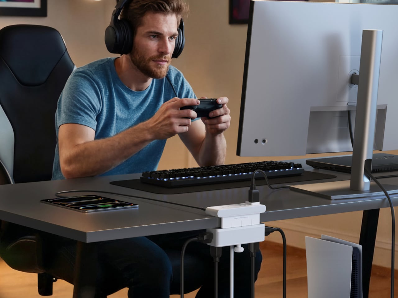
Desks have gotten more crowded. Between the laptop, the monitor, the phone, and whatever Bluetooth peripherals have accumulated over the past few years, keeping everything charged without making a mess has become its own challenge. Power strips have always been the go-to solution, but most still end up on the floor or behind furniture, at the end of a cable that creates the very clutter it was supposed to fix.
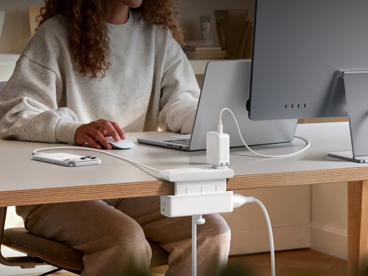
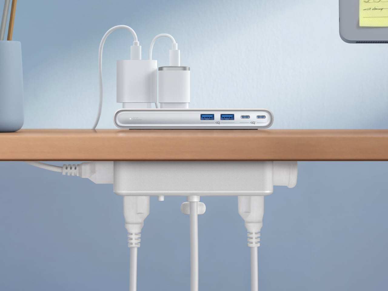
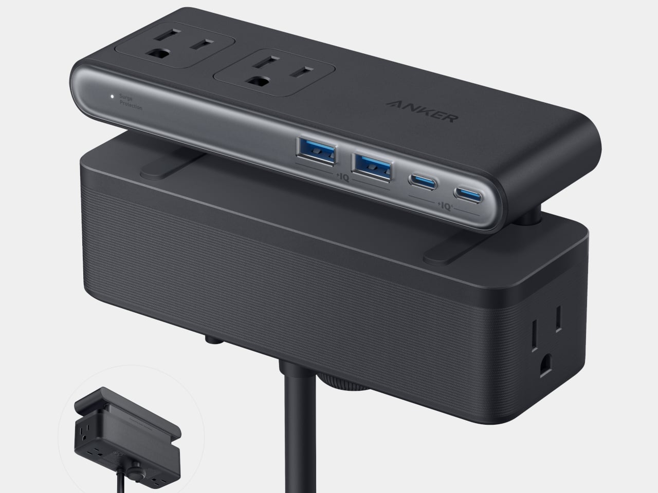
Anker’s Nano Power Strip (10-in-1, 70W, Clamp) approaches that problem from a different angle, quite literally. Instead of sitting on a surface or hiding under a desk, it clamps onto the desk edge, putting 10 ports right where they’re actually useful. First unveiled at CES 2026 and now available in the US for $69.99, it aims to reduce the mess that most power strips quietly make worse.
The clamp structure sits on either side of the desk edge, with ports distributed across its upper and lower sections. Six AC outlets handle the larger plugs, while two USB-A and two USB-C ports take care of smaller devices. Splitting the ports between two zones keeps things from crowding on one side, a small but practical detail that makes the strip feel properly considered rather than just generously stocked.
The USB-C charging capability is where the performance stands out. A single USB-C port can deliver up to 70W, enough to run a MacBook or most other laptops without needing a separate wall adapter. That output relies on GaN technology, which keeps the strip slim at just 0.75 inches thick despite the power output, and avoids the extra heat and bulk that older charging components tend to generate.
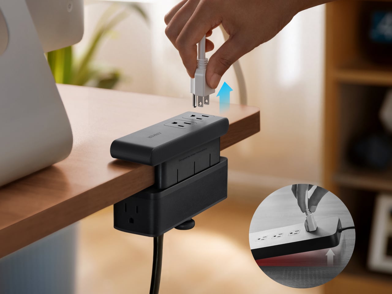
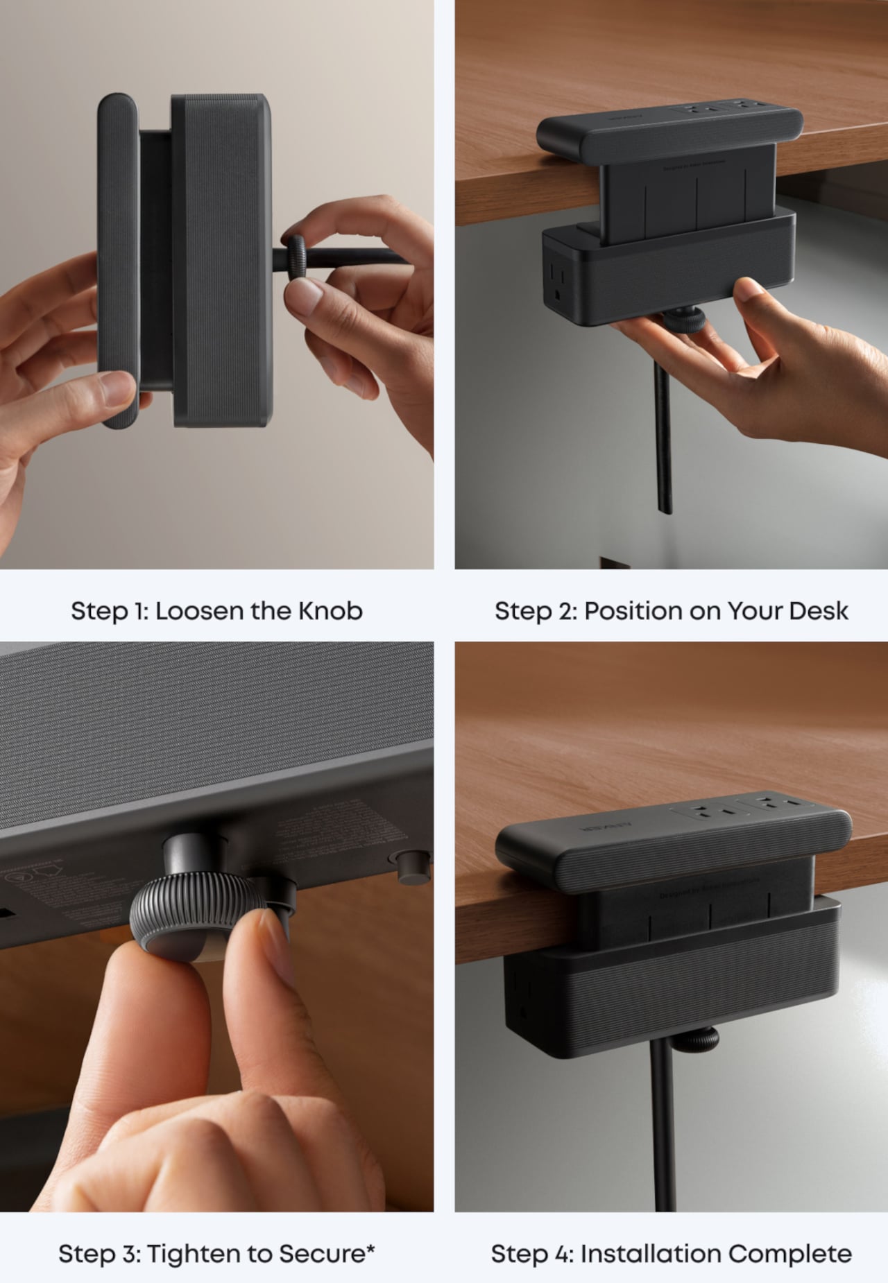
Installing it takes seconds. The adjustable clamp fits desk edges between 0.6 and 1.8 inches thick, covering most standard desks, and locks in firmly enough for one-hand use. That might sound like a minor detail, but plugging in a cable while the strip shifts around is exactly the kind of daily irritation that compounds. A stable mount means you’re not bracing the strip with your other hand every single time.
Anker also built in 1,500J of surge protection, along with a smart overload mechanism that includes a reset button. When it trips, the button pops out to cut power instantly. Press it again, and it’s back to normal. It’s a simple failsafe, but a useful one on a strip mounted at desk height, where a sudden power surge or overloaded circuit could easily go unnoticed until something stops working.
Anker markets it for gaming and office setups alike, and it’s easy to see why. Gaming desks accumulate powered accessories faster than most, from peripherals to controllers to headset chargers. The dual-zone layout helps spread those cables rather than pile them in one corner, and the 0.75-inch profile doesn’t take up surface space or interfere with the kind of clean, organized desk that people actually put effort into building.
Cable clutter isn’t going anywhere, but it can at least be contained. The Nano Power Strip doesn’t reinvent the power strip so much as it rethinks where one should live. At $69.99, it’s a reasonable ask for 10 ports, 70W of GaN-powered fast charging, and a desk-mounted solution that keeps the tangle off the floor and closer to where it actually gets used.
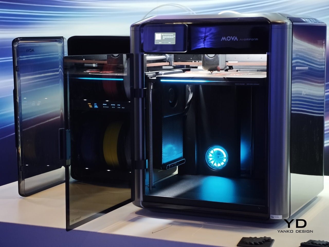
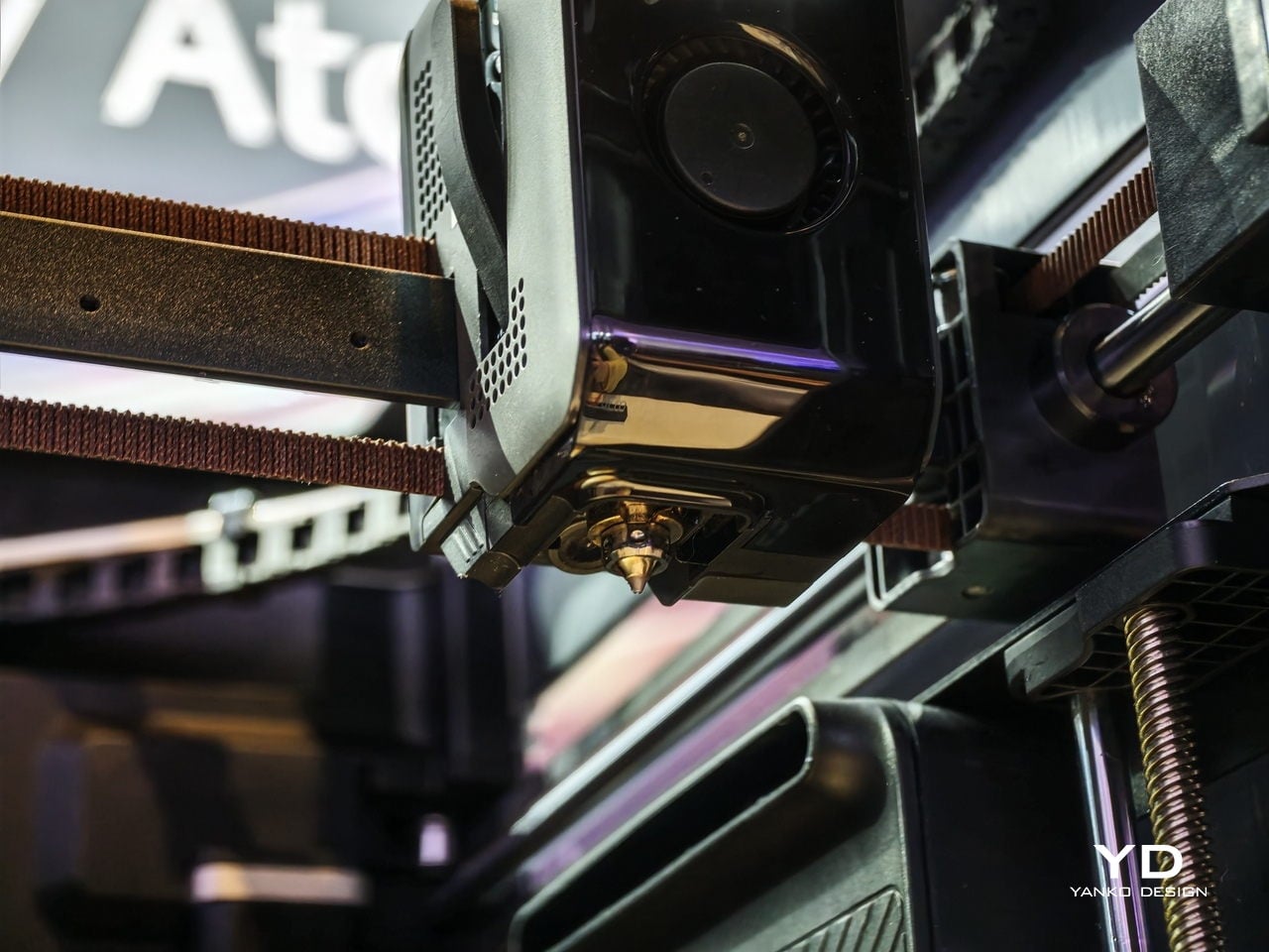
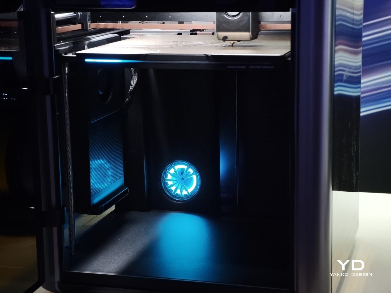
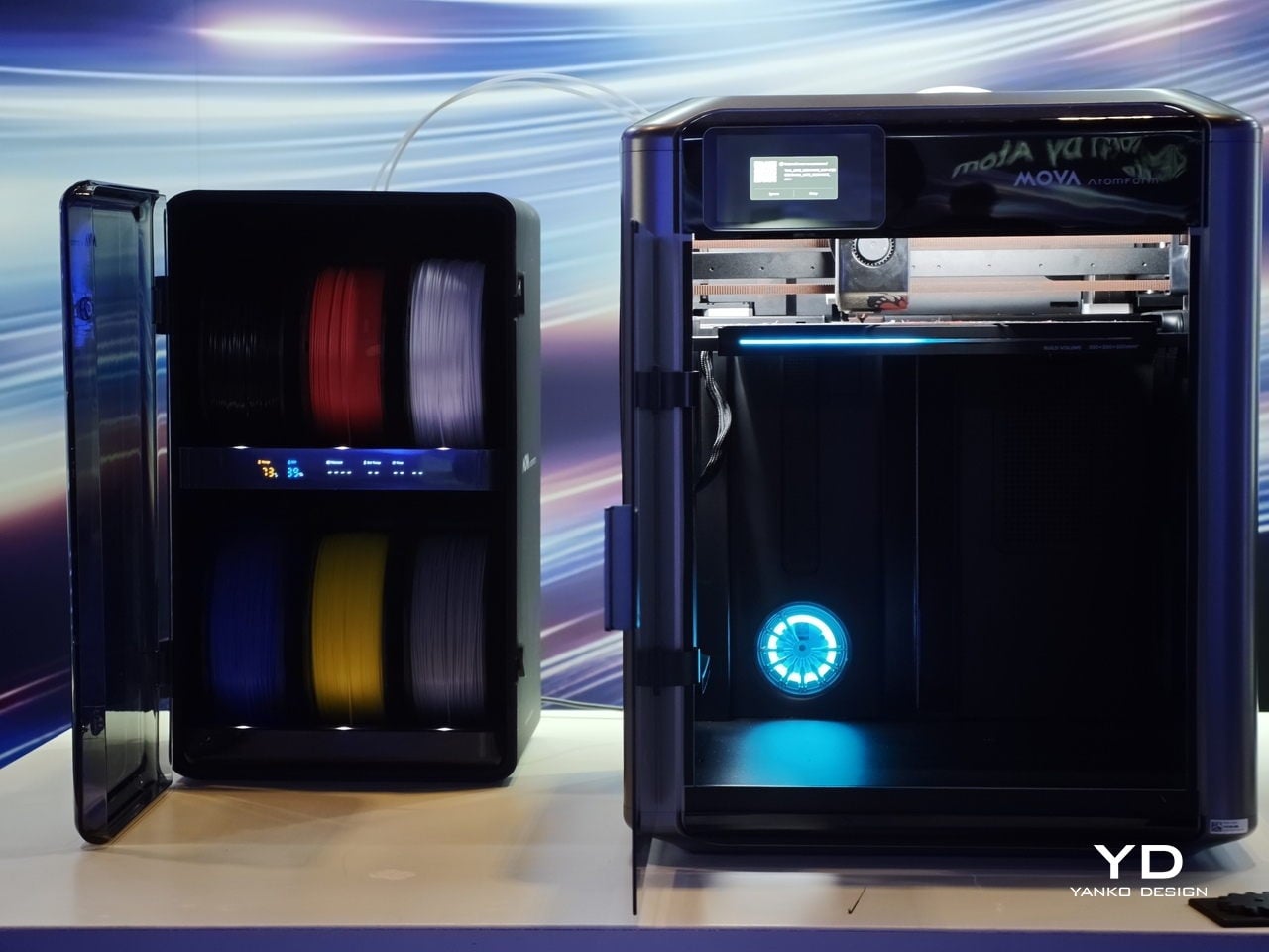
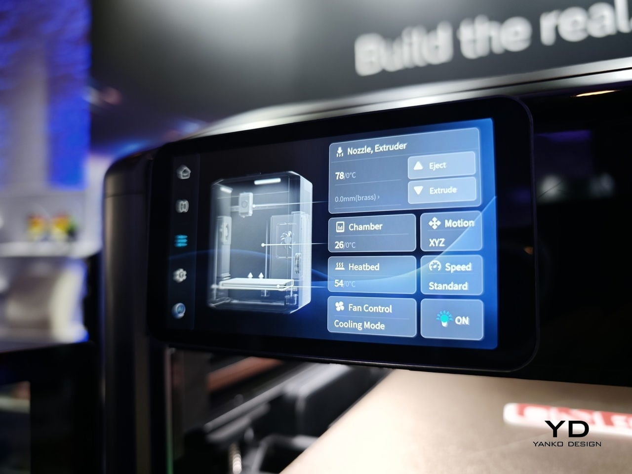
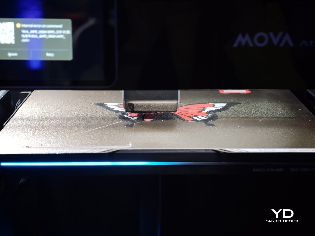
We first saw the Mova AtomForm Palette 300 at CES earlier this year, where its unusual approach to multicolor 3D printing immediately stood out. Seeing it again at AtomForm’s San Jose demo event left an even stronger impression, especially in a category where most launches tend to focus on speed, build volume, or software polish rather than rethinking the workflow itself.
That is what makes the Palette 300 so interesting. Instead of treating multicolor printing as a feature layered onto a conventional FDM machine, Mova seems to have built this printer around one of the biggest frustrations in the category. For anyone who has spent time with multicolor 3D printers, that pain point will feel very familiar.
Switching between colors or materials usually means purging filament over and over again before printing can continue. It is messy, wasteful, and often slow, with purge towers piling up next to the final print. The end result can still look impressive, but the process behind it rarely feels elegant.
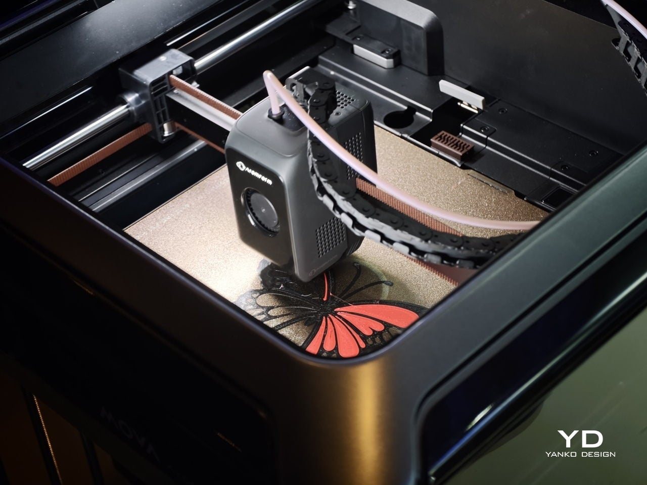
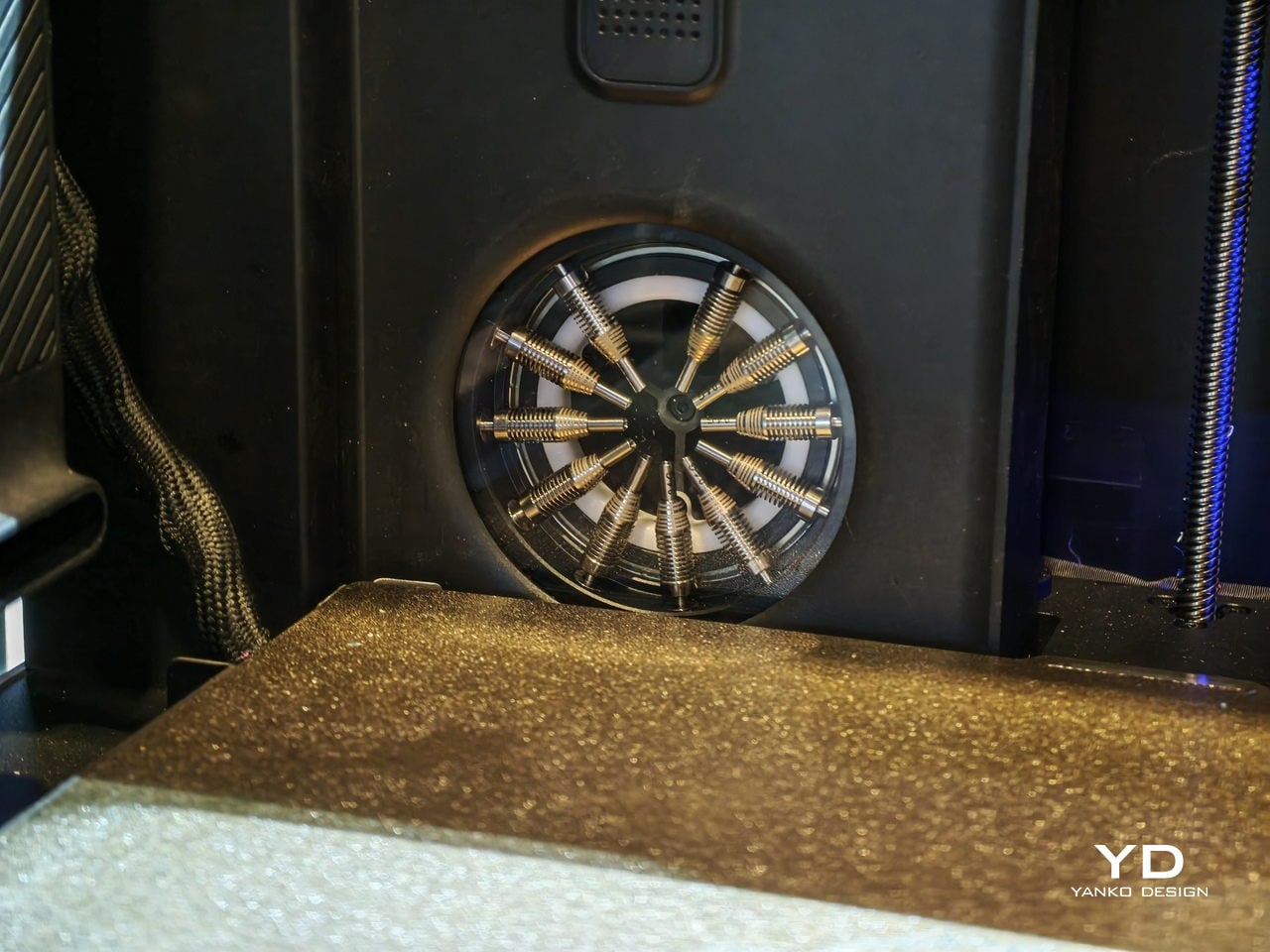
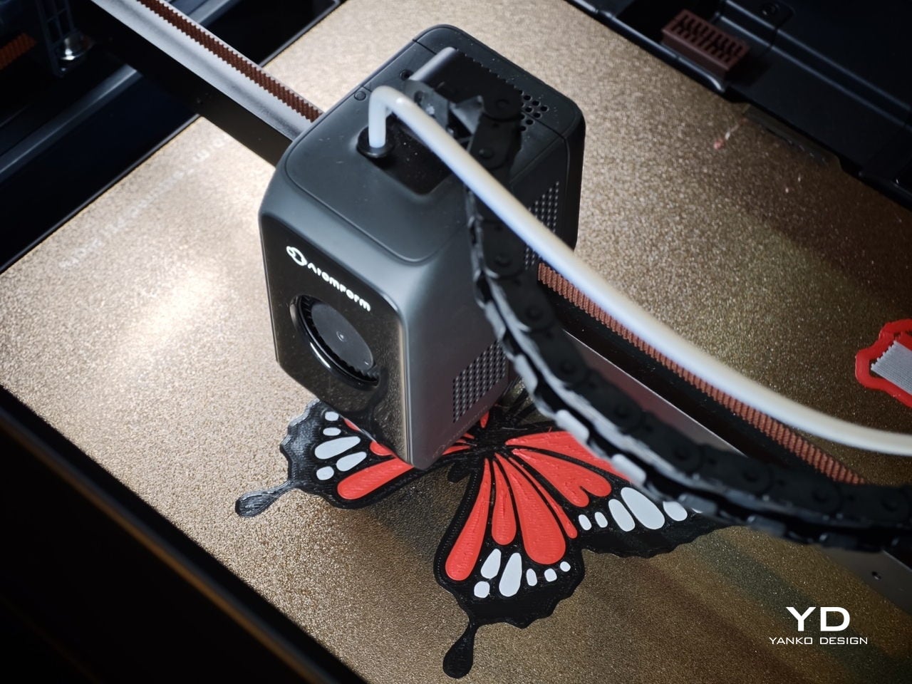
The Palette 300 is designed to tackle that problem in a more inventive way. Its headline feature is what Mova describes as the world’s first automatic 12-nozzle swapping system. Rather than constantly purging filament every time a color or material change is needed, the printer swaps to another nozzle that is already loaded. In theory, that means cleaner transitions, less wasted material, and a much smoother path to complex multicolor prints.
At the San Jose demo, that concept felt like the real story behind the machine. Plenty of 3D printers promise better quality or faster output, but the Palette 300 seems more focused on improving the actual experience of multicolor printing. That gives it a different kind of appeal. It is not just trying to be faster or bigger. It is trying to make a frustrating process feel smarter.
The rest of the hardware helps support that pitch. AtomForm says the system can support up to 12 materials and up to 36 colors in one print setup, which is far beyond what most consumer-level multicolor machines currently offer. The company also says nozzle swaps can be up to 50 percent faster and filament waste can be reduced by up to 90 percent compared with traditional purge-based systems. If those claims hold up in broader real-world use, the Palette 300 could become a very compelling option for makers, designers, and small creative studios that want more ambitious color work without the usual trade-offs.
There is also a serious performance story here. The Palette 300 is equipped with FOC step-servo motors and is rated for speeds up to 800 mm/s, with acceleration up to 25,000 mm/s². That puts it firmly in the high-speed conversation, but the machine is not just about raw pace. AtomForm is also emphasizing precision, thanks to a smart positioning system that identifies nozzle attributes and compensates for microscopic alignment variations in milliseconds. On paper, that should help maintain consistency even in more demanding prints.
Another detail that stands out is the RFD-6 filament management system, which combines drying, storage, and feeding in one setup. Its dual-zone design allows one section to dry filament while another feeds material into the printer. That may sound like a smaller feature compared with the nozzle-swapping system, but it speaks to the broader thinking behind the machine. The goal seems to be reducing friction across the entire printing workflow, not just solving one isolated issue.
So, is this the best multicolor 3D printer? Right now, it is probably more accurate to say it is one of the most intriguing. The Palette 300 brings a genuinely fresh idea to a space that can often feel iterative, and that alone makes it worth paying attention to. Its approach to nozzle swapping could prove to be a meaningful step forward for multicolor FDM printing, especially if it delivers on waste reduction and speed in everyday use.
After seeing it first at CES and then again in San Jose, my takeaway is that the MOVA AtomForm Palette 300 has the potential to be a standout machine for anyone who cares about multicolor printing. It is ambitious, technically interesting, and clearly designed around a real user pain point. Whether it becomes the best multicolor 3D printer will depend on long-term testing, software reliability, and how well the full system performs outside the demo environment. Even so, it already feels like one of the most promising new entries in the category.
On April 1st, 2026, Apple turns 50. For a company that has spent half a century rewriting the rules of consumer technology, the milestone deserves something genuinely transformative. The Macintosh redefined personal computing. The iPod gave an entire generation a new relationship with music. The original iPhone, unveiled in 2007, combined a phone, a music player, and the internet into a single glass rectangle and made every competitor look outdated overnight. The iPhone Fold is real, and it’s coming.
Leaks from early 2026 paint a detailed picture: a book-style foldable powered by the A20 Pro chip on a 2nm process, backed by a 5,500mAh battery, with a 7.8-inch creaseless OLED inner display and a 5.5-inch outer screen. Pricing is expected to start around $2,400, and while a September announcement seems likely, most analysts believe shipments may not begin until December. Designers, modders, and concept artists have spent years filling the void with their own visions of a folding iPhone, each carrying a distinct theory about what Apple should prioritize. These five concepts map the full range of that imagination and capture exactly how much is riding on the real thing.
1. iPhone iFold by Michal Dufka — The Clamshell That Makes Sense
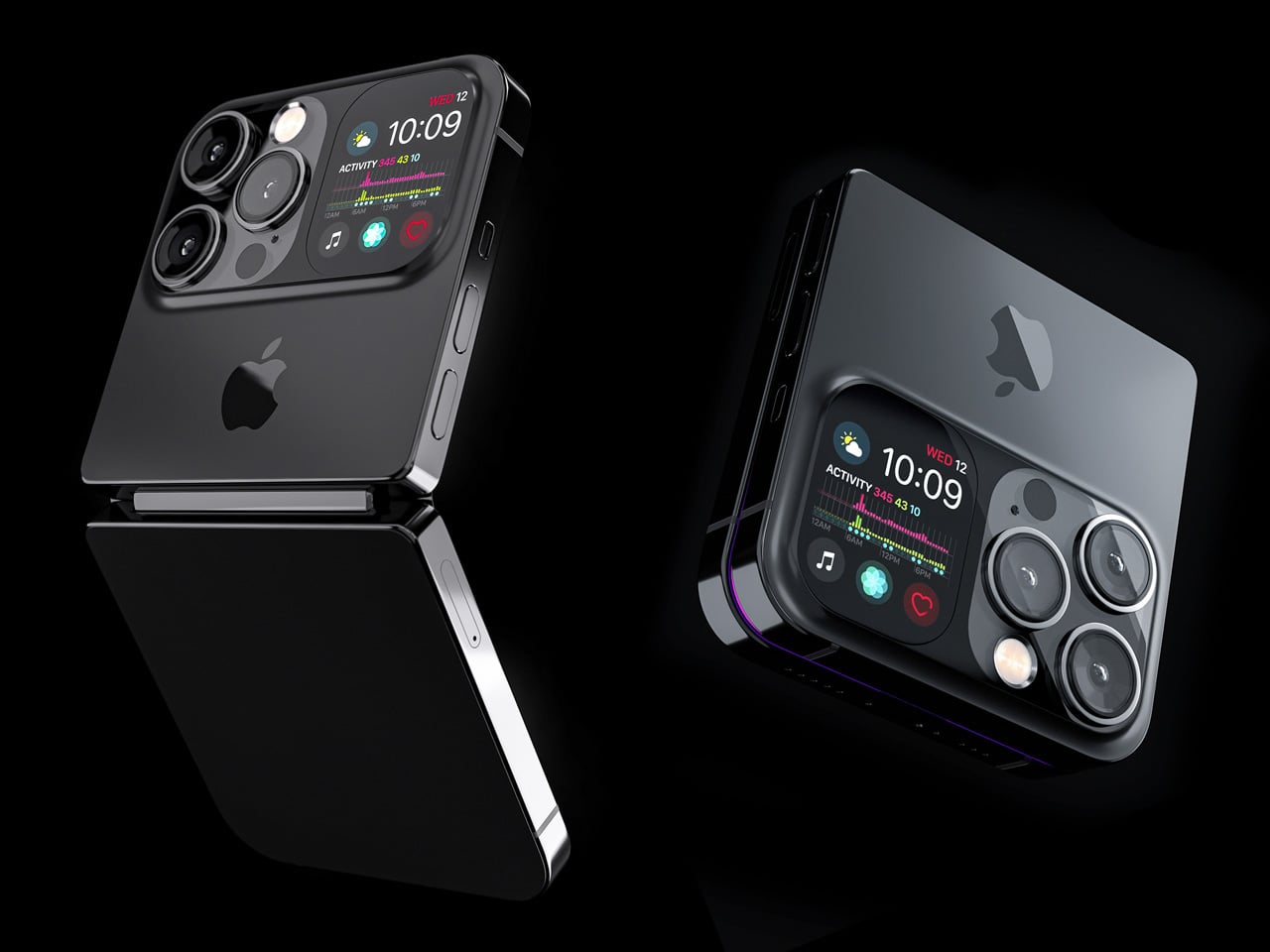
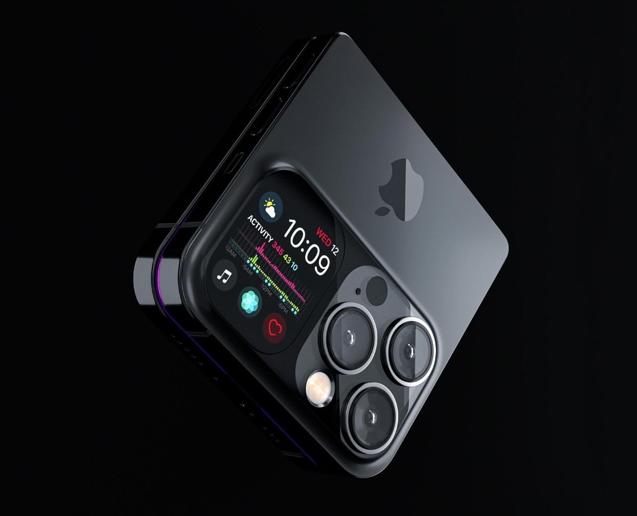
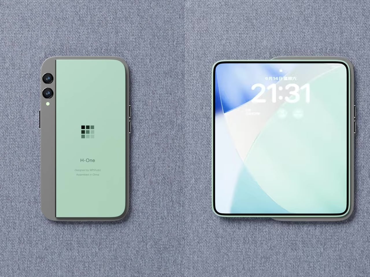
Designer Michal Dufka’s iPhone iFold is built on restraint. Rather than reinventing the iPhone’s entire identity, it applies a clamshell fold to the form factor people already love, drawing direct inspiration from the MotoRAZR and Samsung Galaxy Z Flip. The phone closes into a compact, pocketable square and opens into a full iPhone experience with a generously large display. For anyone who has quietly missed a phone that actually fits in a jeans pocket, this concept speaks to that feeling.
What sets the iFold apart is the secondary display placed beside the camera bump. When the phone is closed, that smaller screen surfaces notifications, time, and essential stats without requiring you to open the device at all. It functions almost like an Apple Watch built into the back of the phone. With Apple’s always-on display technology mature enough for this kind of ambient use, the dual-display setup feels less like speculation and more like a logical next step.
What We Like
The secondary display mirrors Apple Watch notification behavior, making glanceable information genuinely useful without ever opening the phone
The clamshell format makes the iPhone pocket-friendly for the first time in years without sacrificing screen size when it matters
What We Dislike
The clamshell form limits overall screen real estate compared to the expanded tablet surface that a book-style foldable provides
Hinge durability over sustained daily use is entirely unexplored here, and it remains the most critical engineering question for any clamshell design
2. iPhone Fold Ultra by 4RMD — When the Specs Match the Ambition
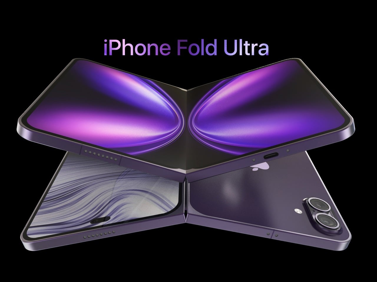
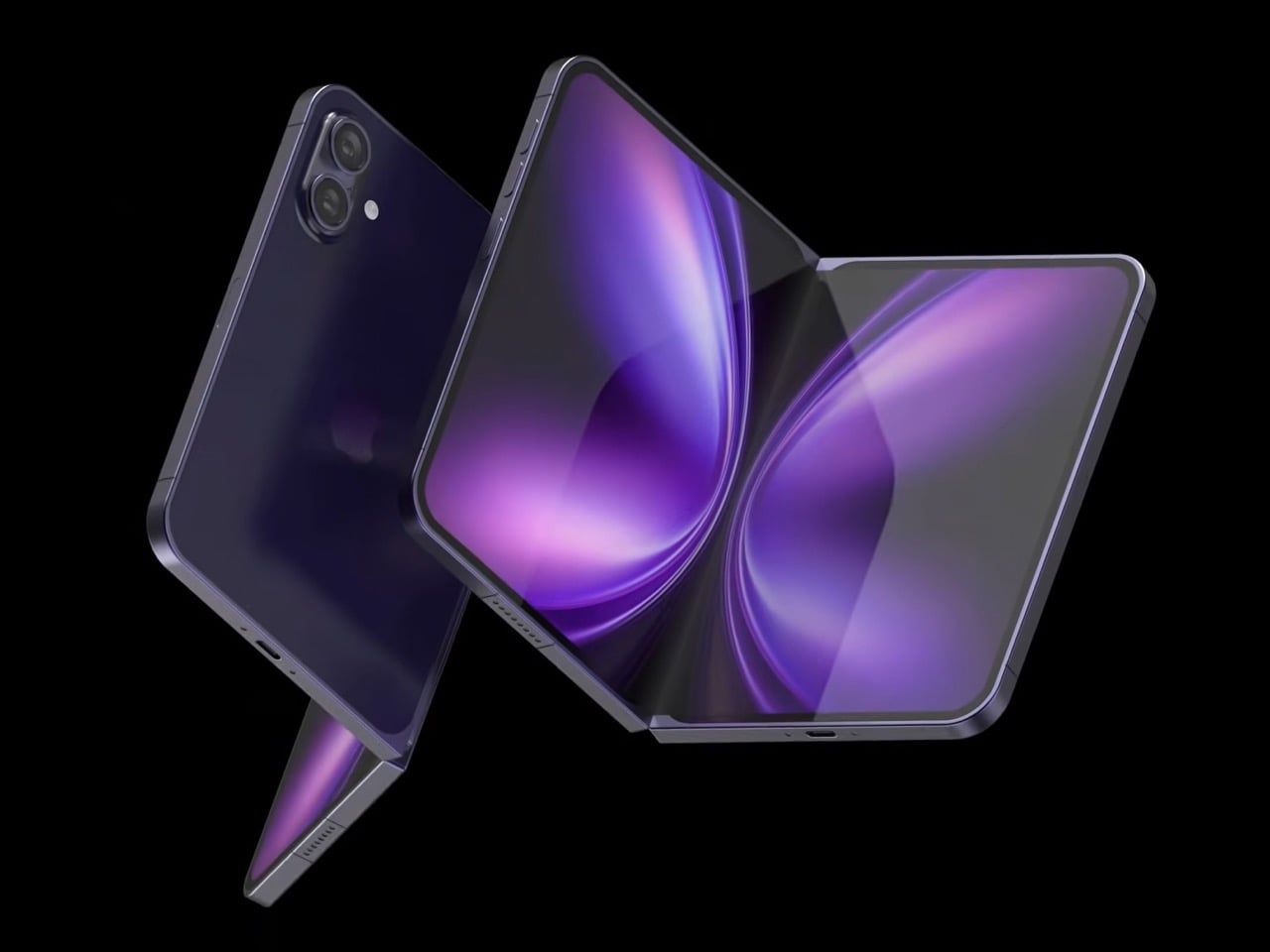
Design studio 4RMD’s iPhone Fold Ultra is grounded in credibility. Built directly from reported leaks rather than pure creative license, the concept presents a book-style foldable with dual 48MP rear cameras, a 24MP ultra-wide front camera, and the A20 Pro chip running on a 2nm process. Three color options appear across the renders: White, Black, and Deep Purple. At an estimated $2,299, this concept sits at the very top of Apple’s lineup with total conviction.
That Deep Purple colorway deserves its own moment. It is a deliberate callback to the iPhone 14 Pro’s most celebrated finish, and it lands differently on a book-style foldable. Something about that color on a device this ambitious reads as genuinely luxurious, the kind of finish that reframes a $2,299 price tag from a shock into a statement. 4RMD clearly understands Apple’s visual grammar, and this concept shows what happens when research and aesthetics share the same design space.
What We Like
Specs pulled from verified leaks give this concept real credibility, making it feel like a preview of what is actually coming rather than pure speculation
The Deep Purple colorway is a smart, crowd-pleasing callback to one of Apple’s most recognized and beloved finishes
What We Dislike
The “Ultra” label sets an expectation that demands exceptional build quality, and no concept can fully address whether the real device will deliver on that promise
Crease visibility across the inner display remains unaddressed, which continues to be the most persistent criticism of every book-style foldable on the market
3. iPhone Fold by Svyatoslav Alexandrov — The One That Replaces Two Devices
Svyatoslav Alexandrov’s iPhone Fold concept, created for the YouTube channel ConceptsiPhone, thinks in bigger terms than anything else on this list. Starting as a standard smartphone with a 6.3-inch outer display, it unfolds into a squarish 8-inch tablet that sits clearly in iPad Mini territory. This is not a phone with a bonus screen bolted on. It is a device designed to make carrying both an iPhone and an iPad feel genuinely redundant.
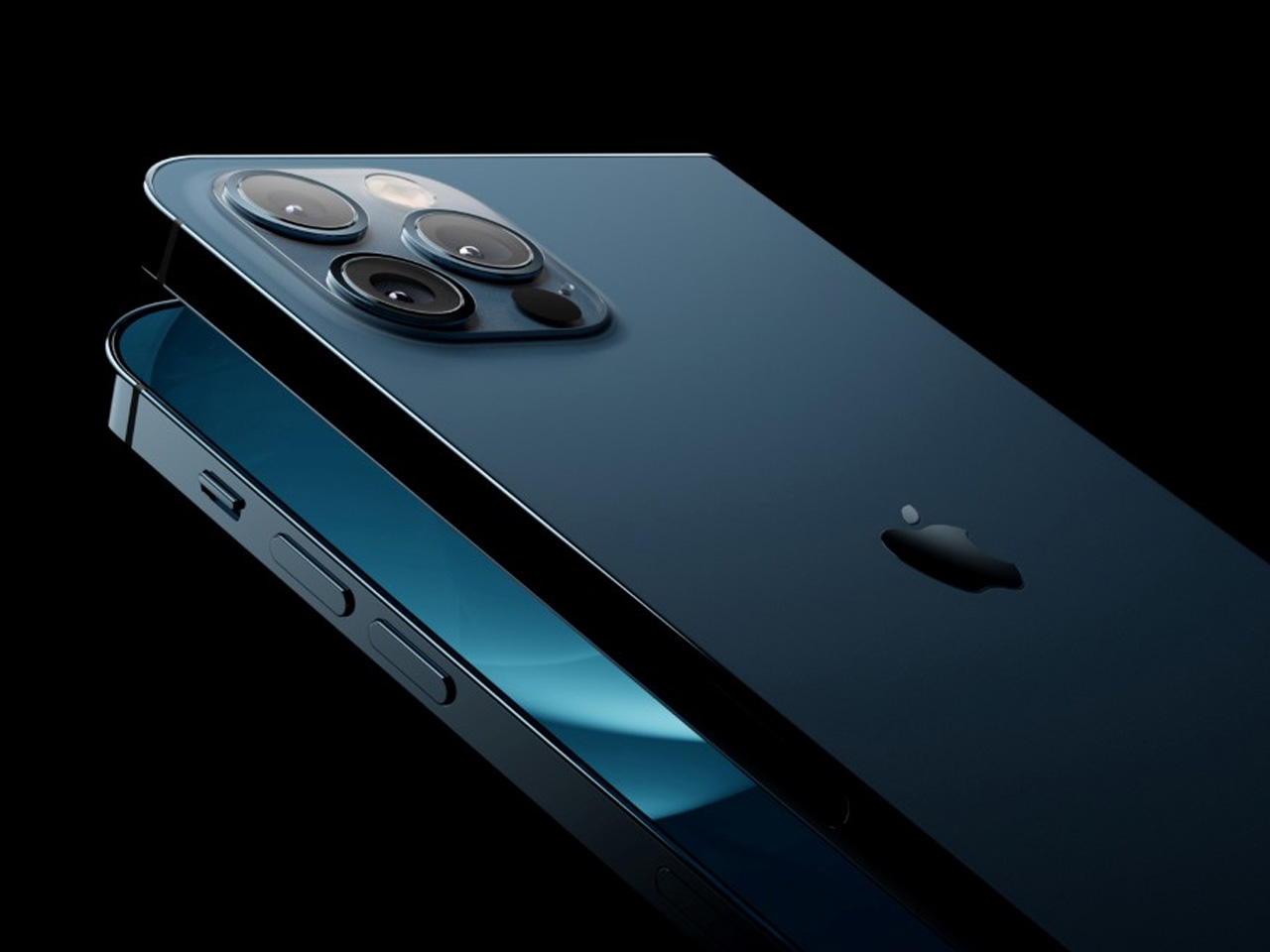
Alexandrov replaces Face ID with a full-display Touch ID fingerprint sensor, keeping the front notch minimal and clean. The rear carries the iPhone 12 Pro’s complete camera array: wide, ultra-wide, telephoto lenses, a LiDAR scanner, and flash. MagSafe compatibility and 5G readiness are already confirmed in the concept, adding meaningful weight to its productivity pitch. Whether the device supports the Apple Pencil is left open, but given an 8-inch inner display, its absence would feel like a missed opportunity.
What We Like
The full-display Touch ID is a clean and creative solution that keeps the front uncluttered while solving Face ID’s known complications on foldable form factors
The iPad Mini-sized inner screen makes a practical, real-world case for consolidating two devices into one without any meaningful compromise
What We Dislike
Removing Face ID eliminates one of the iPhone’s most seamless and trusted authentication features, which most users rely on dozens of times every day
Leaving Apple Pencil support unconfirmed weakens what should naturally be this concept’s strongest argument for productivity
4. iPhone Fold by Mechanical Pixel — The Foldable That Doesn’t Actually Fold
Mechanical Pixel’s concept takes the most unconventional approach on this list, and the reasoning is worth understanding. Rather than bending the iPhone itself, the design keeps the main body completely rigid and attaches a separate foldable display to the rear panel instead. The core phone experience remains exactly as people know it, maintaining the familiar dimensions and feel that iPhone users already rely on. That additional screen only enters the picture when a larger surface is specifically needed.
That rear foldable panel sits raised on a platform above the phone’s back, unfolding outward into a larger, squarish tablet surface when required. The layered profile is clearly visible from the side, giving the device a deliberately experimental and modular quality. The camera module remains in its standard position, completely unaffected by the additional display layer. The logic is unconventional, but the core argument of preserving the primary iPhone experience from any foldable compromise is genuinely hard to dismiss.
What We Like
Keeping the main body rigid entirely sidesteps the crease and long-term hinge durability problems that define every conventional foldable on the market today
The modular approach means the everyday iPhone experience is never degraded or compromised by the mechanics of the foldable element
What We Dislike
The raised rear platform creates an unrefined, layered side profile that sits well outside anything Apple’s design language has ever produced or endorsed
The prototype-like aesthetic makes it very difficult to imagine this direction surviving Apple’s notoriously demanding and detail-oriented product design process
5. iPhone V — The One Someone Actually Built
Every concept on this list exists as a digital render. The iPhone V is different. A YouTuber modder physically dismantled an iPhone X, extracted its internal components, and rebuilt the entire device inside a Motorola Razr chassis. The result is a working, folding iPhone that runs real iOS, carries a Retina-quality display, and folds in half like a classic flip phone. As a proof of concept, it is extraordinary. As a finished product, every question comes flooding in.
What makes the iPhone V genuinely compelling is not fit, finish, or polish, because it has none in any conventional sense. It is the straightforward fact that someone cared enough to prove the idea could actually work using parts that already exist. The folding mechanism and device thickness still need serious refinement. A working clamshell iPhone running authentic iOS is, in the end, a more persuasive argument for this form factor than any polished render has managed to be.
What We Like
The iPhone V is the only entry on this list that is fully functional, running real iOS inside an actual working clamshell device
Its physical existence proves the clamshell iPhone concept is viable using genuine Apple hardware, well beyond anything a render can demonstrate
What We Dislike
The repurposed Motorola Razr chassis produces a build that falls far short of consumer-grade fit, finish, and structural refinement
Hinge mechanism quality and overall device thickness remain significant engineering challenges that the mod cannot resolve, and they are exactly what Apple needs to solve
The Concepts That Made the Wait Worthwhile
Fifty years in, Apple is still the company that makes you wait. The iPhone Fold concepts here are not just exercises in creative imagination — they are a record of what designers and makers have been asking for, year after year. Some nailed the form factor. Others got the specs exactly right. A few did both. Together, they have shaped the entire conversation around a device that already feels utterly inevitable.
When the real iPhone Fold arrives, it will be measured against each of these visions. That is the power of concept design — it sets the bar before the product ships. Apple turning 50 while holding back its most ambitious device is pure theater. The design community has been writing this script for years. The only question is whether the real thing can live up to what the imagination has already built.
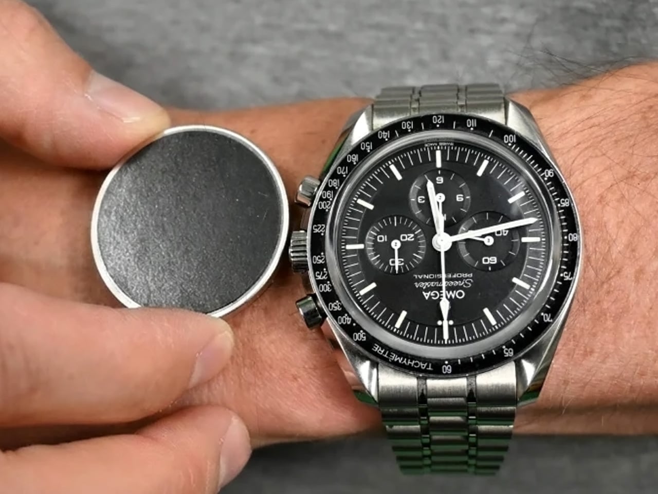
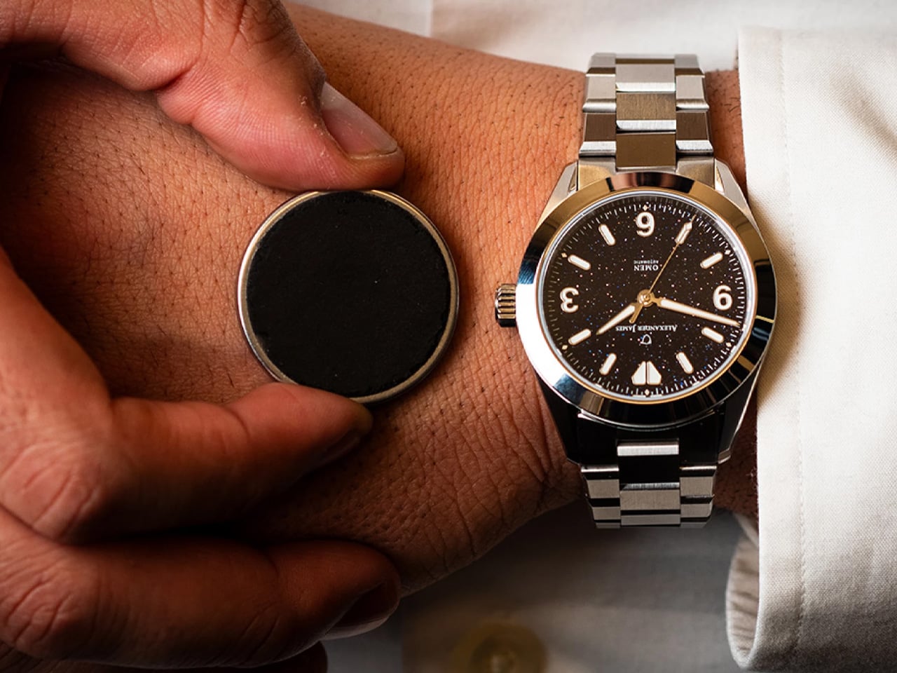
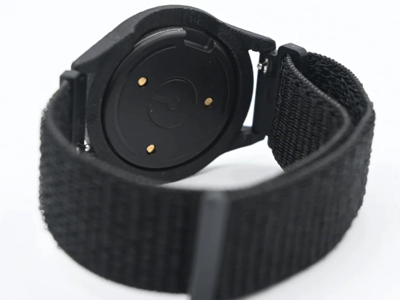
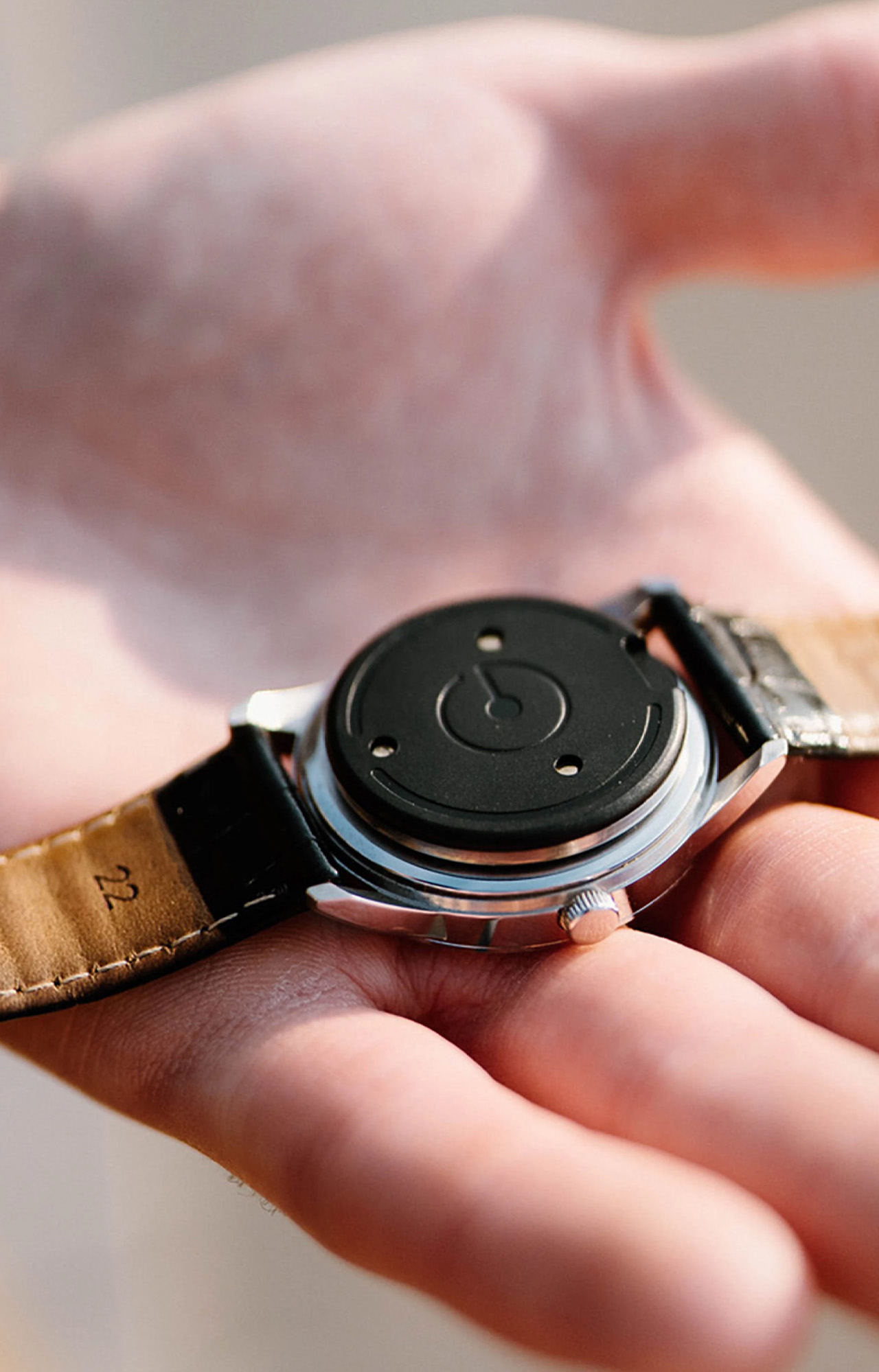
There is always a persistent tension in the watch world. Smartwatches do a lot, but they rarely look good doing it. Analog watches look exceptional, but they’ll never ping you when you’ve hit 10,000 steps. The Ganance Heir is a small, coin-sized sensor that quietly sits on the caseback of your watch and bridges that gap… no screen, no subscription, no compromise.
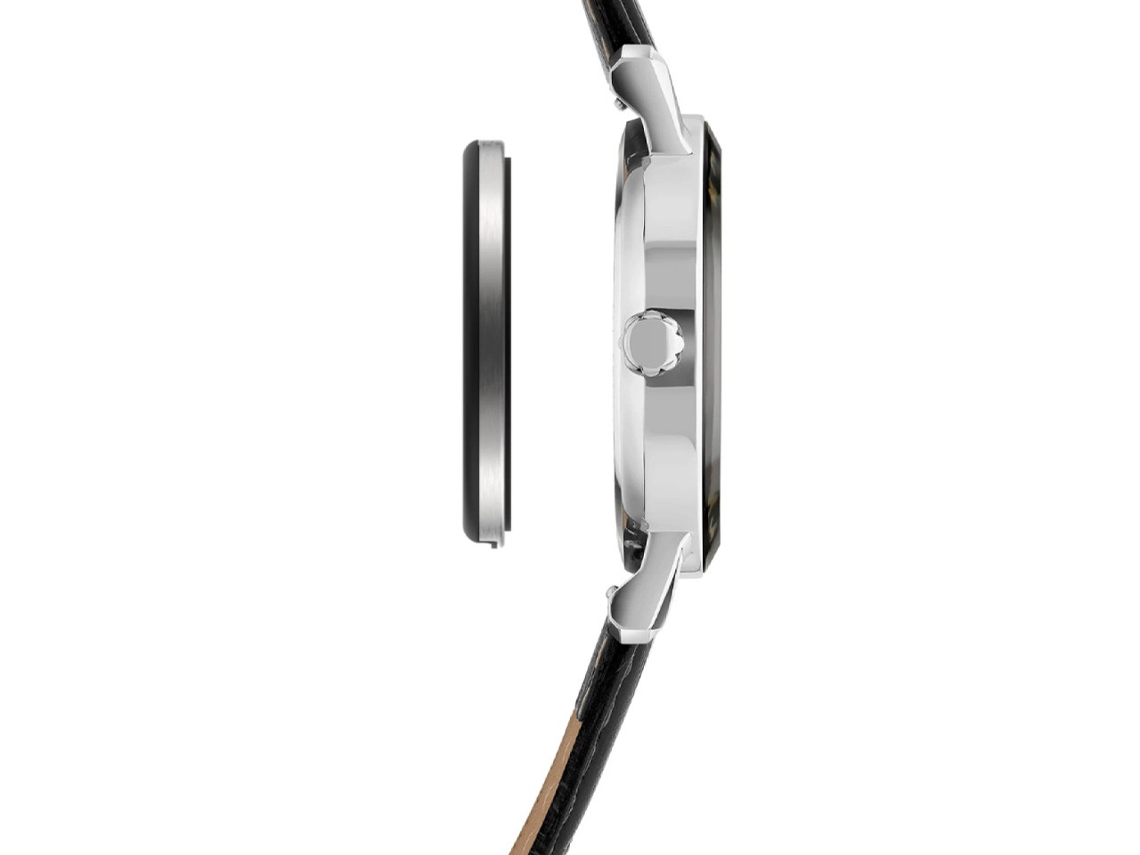
Developed by a Chicago-based startup with a focus on intentional technology, the Heir attaches to the caseback of most watches using a micro suction disc. At 30 mm in diameter and just 3 mm thick, it weighs a feather-light 5 grams. You’d barely know it’s there. Swap it between watches in seconds, slot it into the HeirBand for gym days when you’d rather not ruin a leather strap with sweat, and carry on.
The feature set is deliberately restrained. The Heir tracks steps, distance, and calories, pushing that data to the Ganance iPhone app and Apple Health. It vibrates to alert you to incoming calls and texts, and a single or double tap controls media playback. Three levels of vibration strength give you a degree of personalization, and tap input can be disabled entirely through the app. No heart rate sensor, no always-on display, no noise.
An Android app is currently in development, expected around late June alongside the next batch of shipments. At that point, the device will also sync with Google’s Health Connect, opening it up to a wider ecosystem of fitness apps. Future updates already on the roadmap include activity type splitting, sedentary time tracking, adaptive goals, a silent alarm, WhatsApp and Slack vibration alerts, task reminders, and weather-based activity recommendations.
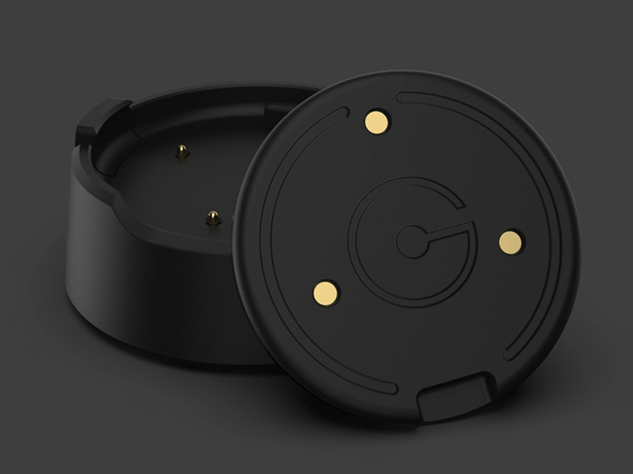
The Heir isn’t without its limitations. Battery life sits at 42 hours, meaning a daily top-up via the proprietary dock is essentially non-negotiable. Early adopter reviews have flagged some inconsistencies with step tracking and connectivity, though Ganance says those issues are actively being addressed.
Ganance isn’t the first to explore this concept — the Chronos and Germany’s Trivoly tried similar approaches without gaining lasting traction. Whether the Heir has the staying power its predecessors lacked remains to be seen. The Heir is available to pre-order at $149, with the HeirBand priced at $39 or bundled together for $169. Shipping is expected this spring across the US, Canada, the UK, and select European countries.
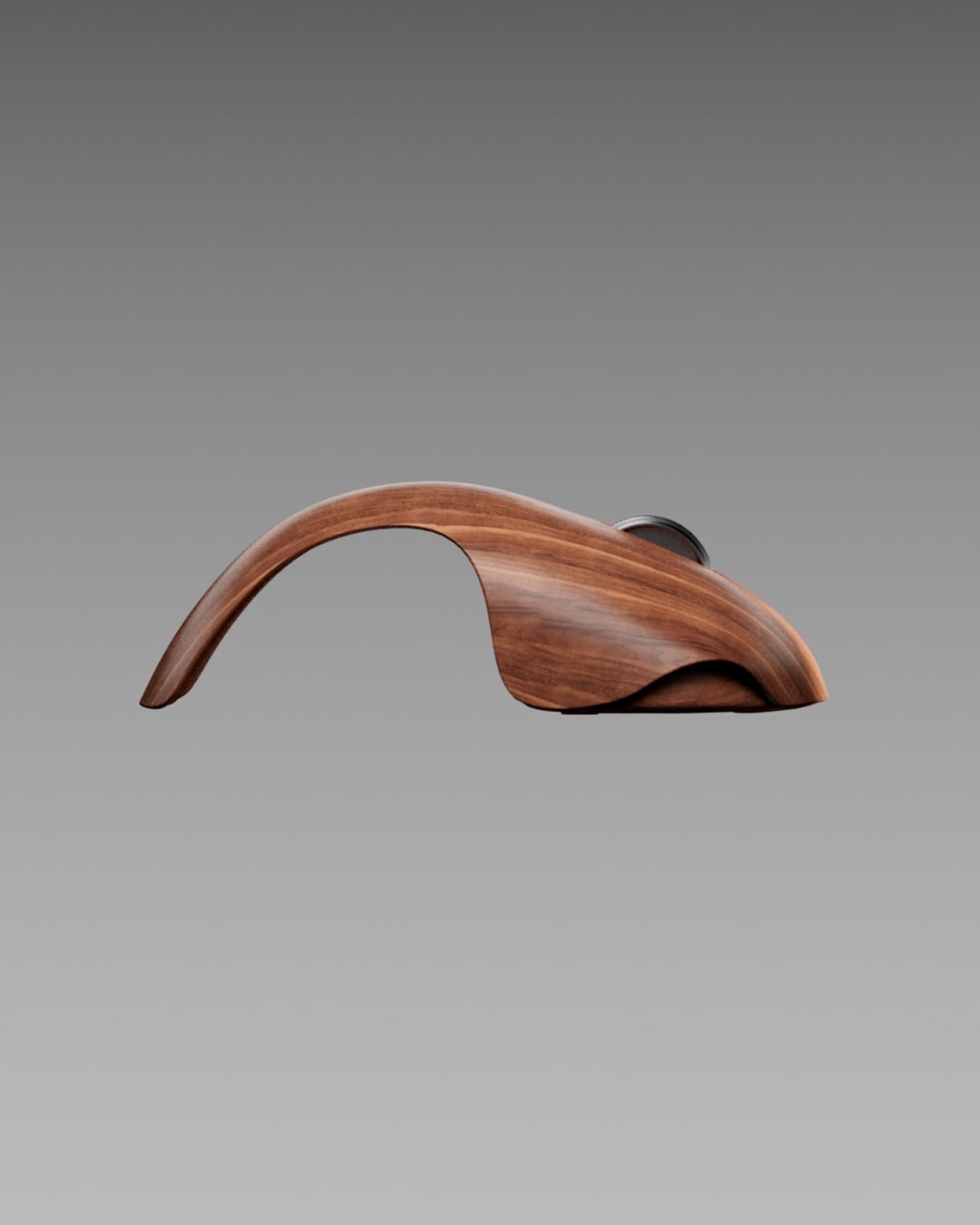
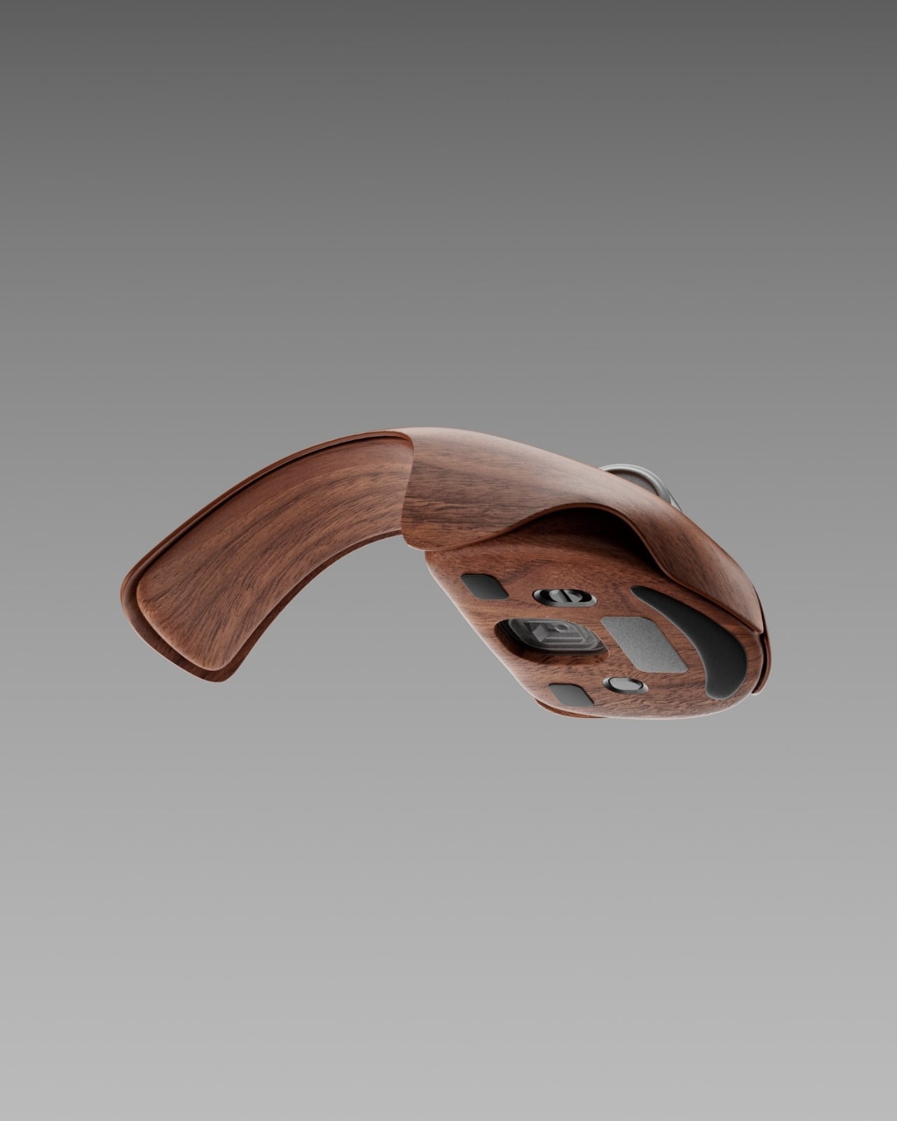
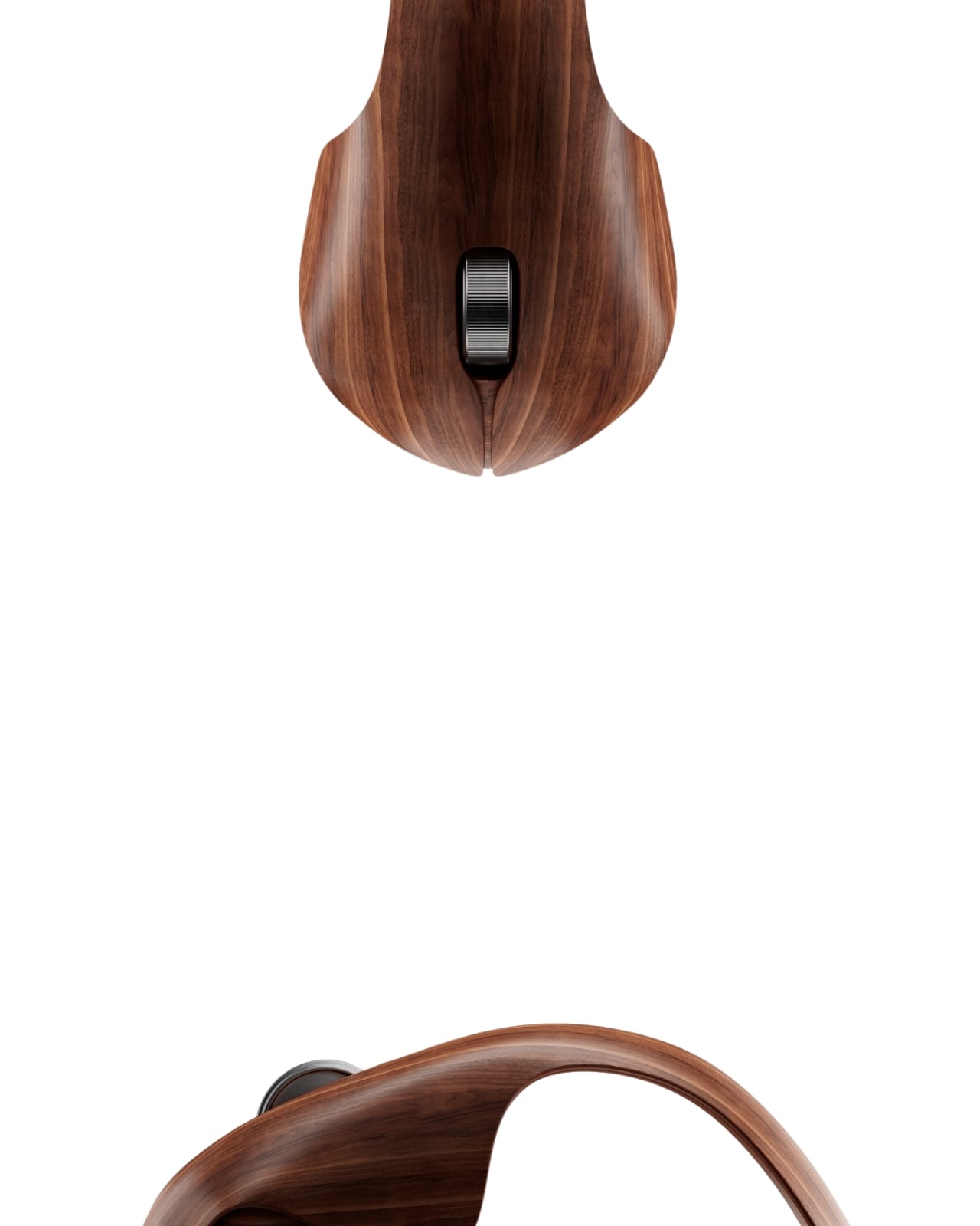
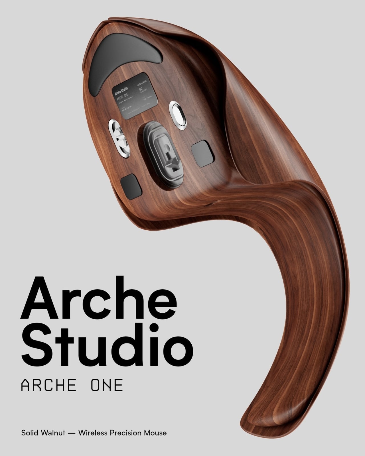
The concept is simple enough to say out loud: a computer mouse wrapped in walnut veneer. But when you actually see what designer Eslam Mohammed has put together with the Arche One, the simplicity of that sentence falls apart quickly. This is not a novelty item with a wood sticker slapped on top. It is a full rethinking of what a peripheral can be, and it is entirely a concept, which somehow makes it more compelling, not less.
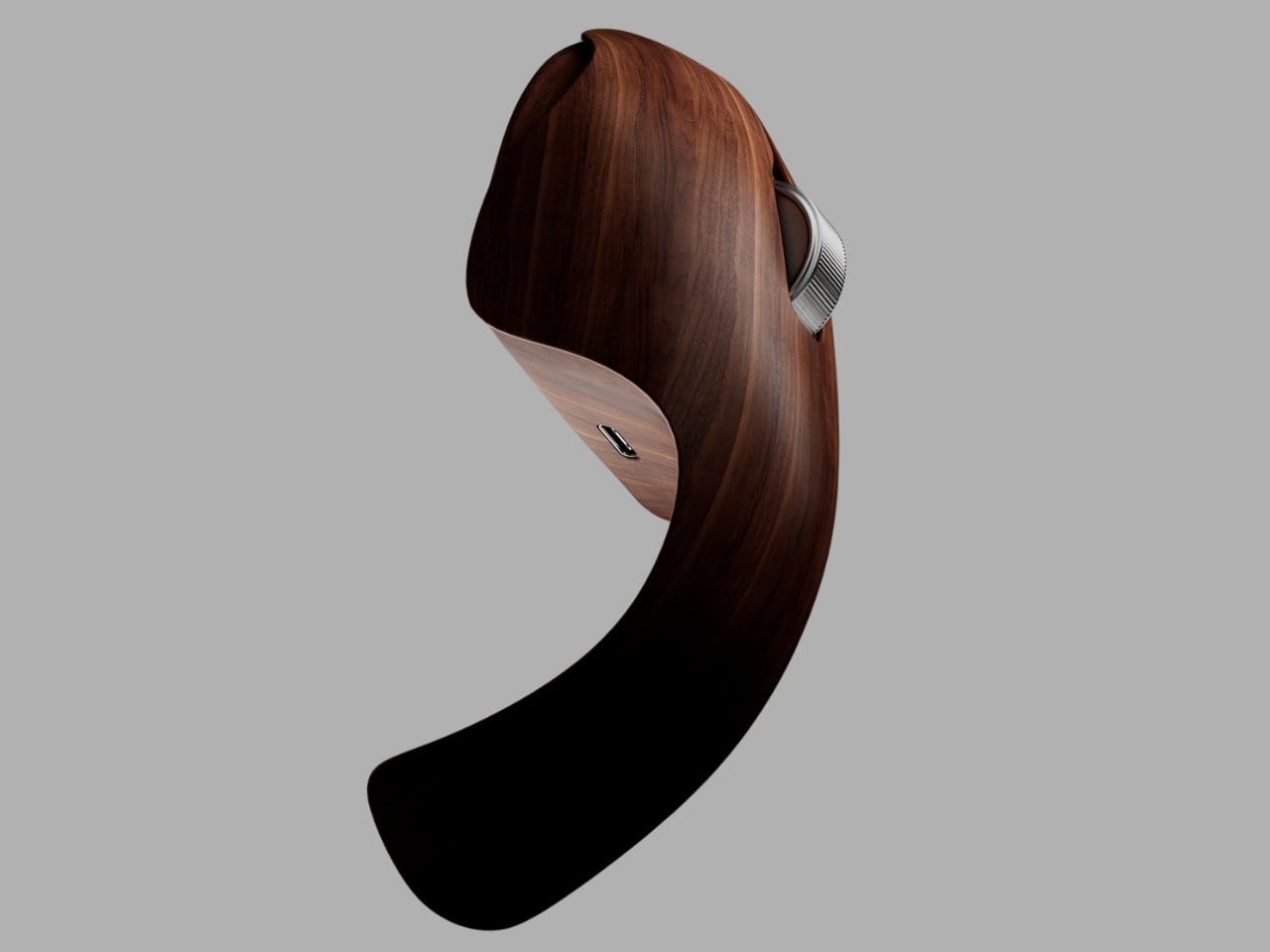
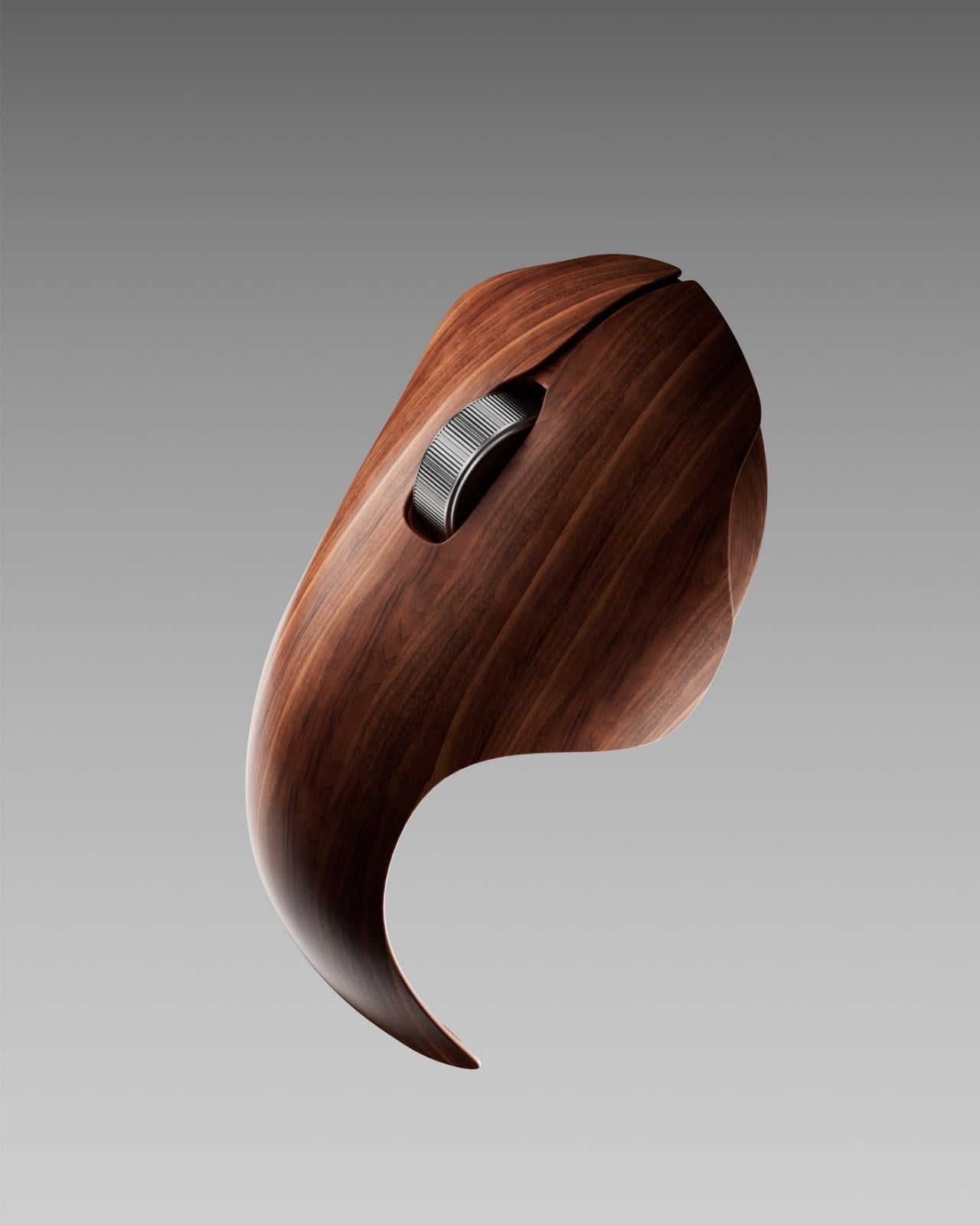
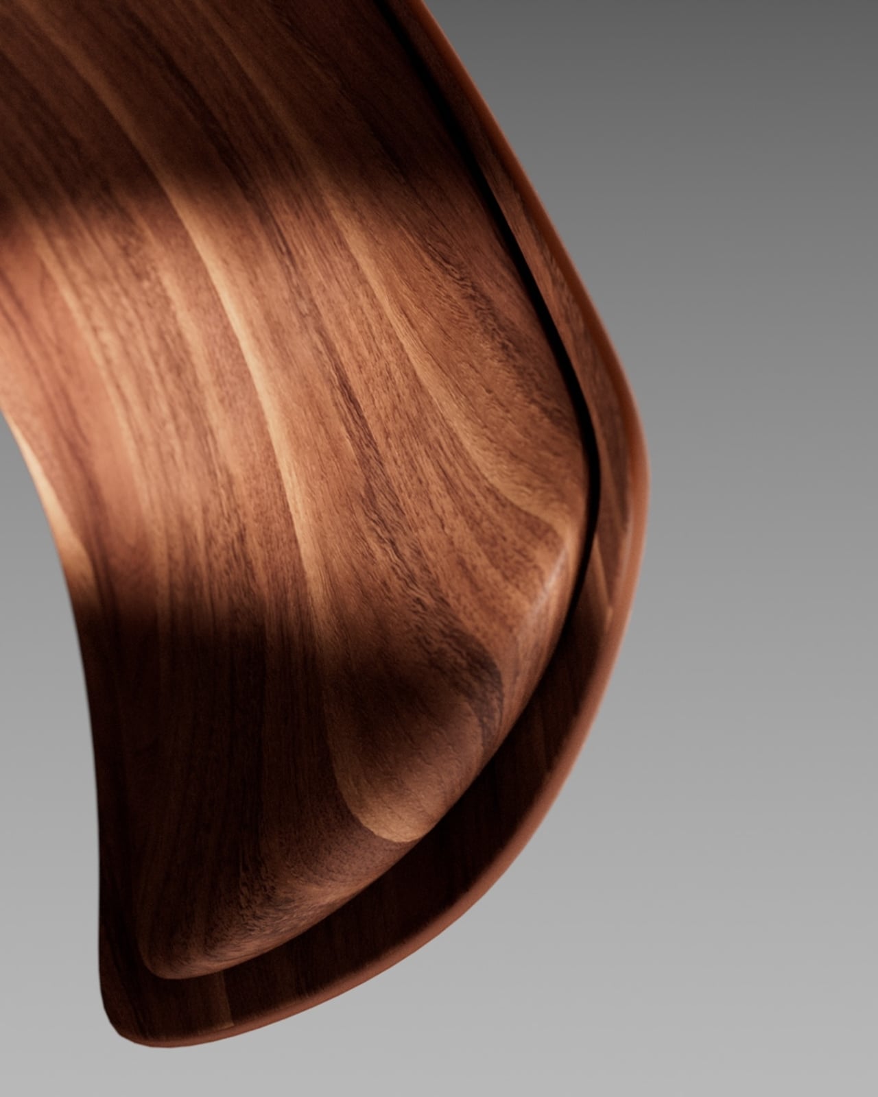
Mohammed built the Arche One as an exploration, not a product pitch. He wanted to strip out the plastic aggression that defines most tech hardware and replace it with something that feels genuinely crafted. The result is a mouse with a long arching tail, a low organic body, and walnut veneer wrapped around every curve without shortcuts. It sits somewhere between a sculptural object and a piece of furniture, and I keep going back to look at it because it makes me realize how low the bar has been set for peripheral design for decades.
The gaming mouse world in particular has turned aggressive posturing into an aesthetic. Angular bodies, RGB lighting, the visual vocabulary of speed and dominance. Even the more restrained productivity mice from major brands feel like they were designed to be forgotten, not noticed. What Mohammed is proposing, even if only on a screen, is a different brief entirely: make it feel like an object worth keeping.
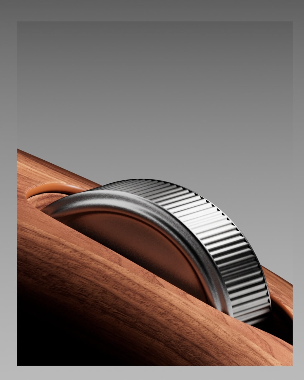
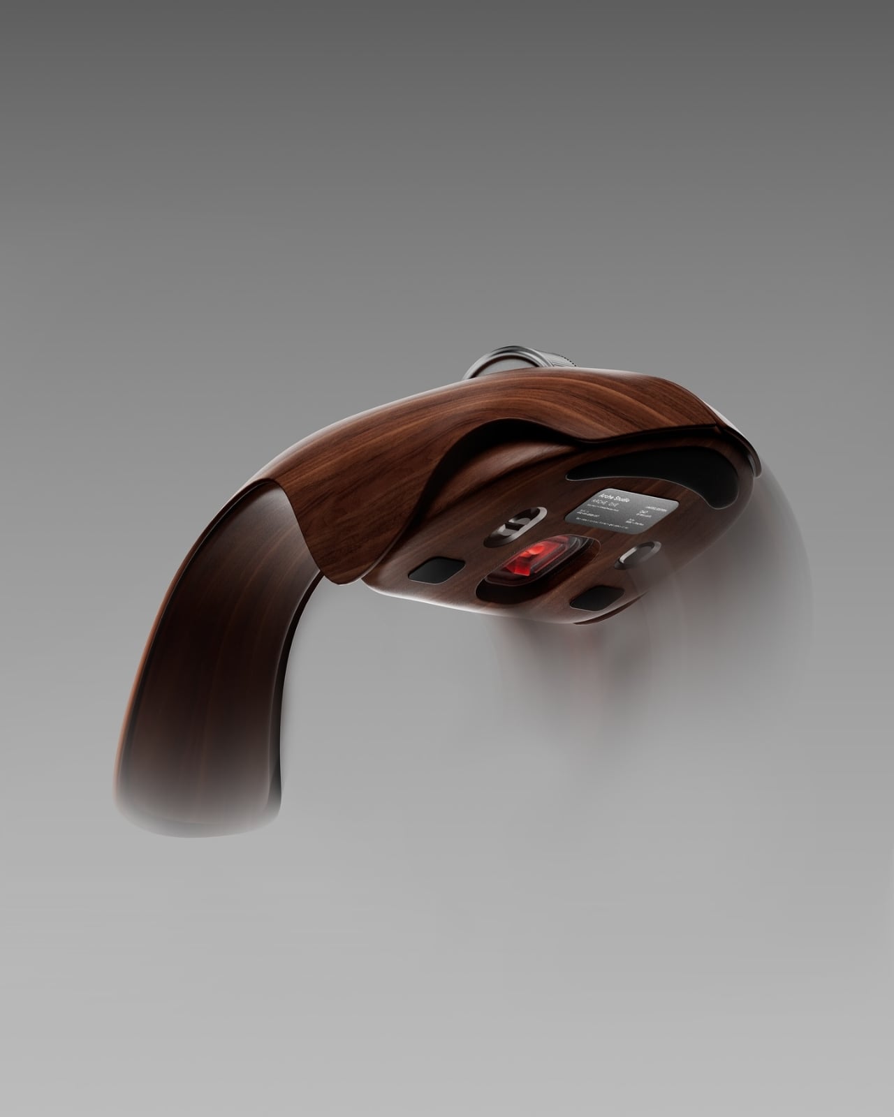
Form came first in his process. The silhouette reads almost like a comma, or an outstretched hand resting on fine wood. The scroll wheel is machined metal, knurled and precise, sitting flush against warm grain. The underside carries a 26,000 DPI optical sensor, Bluetooth 5.3, USB-C connectivity, and a lithium-polymer battery rated at six months. The specs are serious. The material is not a gimmick dressed up as design. It is the design, or at least inseparable from it.
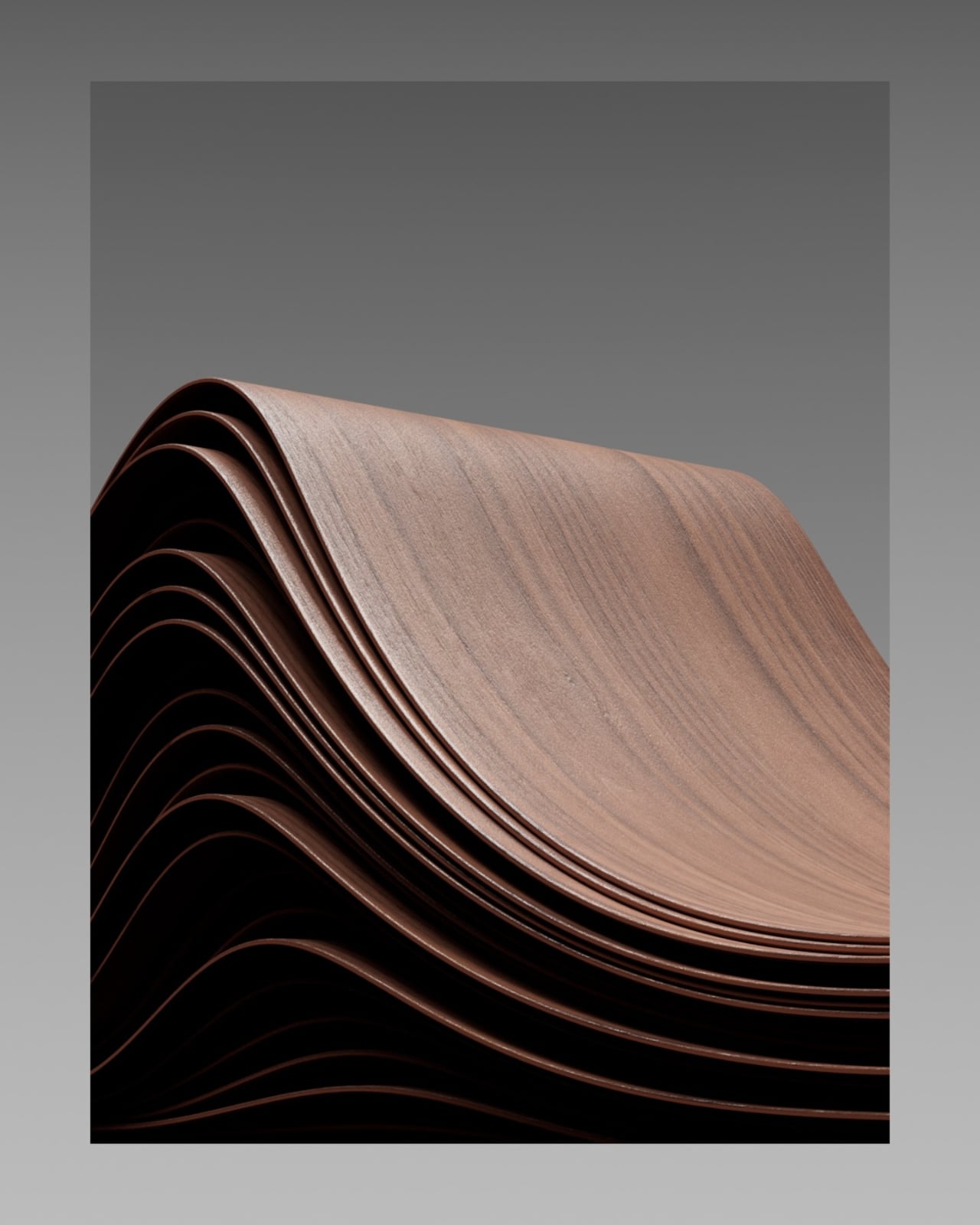
The production approach is worth pausing on because it says something about how contemporary 3D design is evolving. Mohammed used three separate software programs simultaneously rather than forcing a single tool to carry everything. Houdini handled the cutting simulation. Cinema 4D managed the flow of the veneer layers. Blender took care of modeling and animation, and everything went through Octane for rendering. Each tool doing exactly what it was built for, nothing more, nothing less. The result is cleaner, and the renders have a photographic weight that makes you forget you are looking at a concept. The grain catches light the way real wood does. The curves feel like they have mass.
The Arche One is imagined as a limited run of 300 units, each individually finished in hand-applied satin oil, with the note that grain pattern will vary from piece to piece. That last detail is the one that gets me. In a peripheral market built on identical units rolling off assembly lines, the idea of a mouse where no two pieces look exactly the same is almost radical. It borrows the language of craft objects and heirlooms, the kind of things people keep, pass on, and genuinely care about. That is a different conversation than the one tech hardware usually wants to have.
I think about my own desk, and I think most people have at some point looked down at their mouse and felt nothing. It is a tool, purely functional, there to be used and eventually discarded. The Arche One is a question about whether that has to be true. Whether the relationship between a person and the objects they touch every day for hours at a time could carry some weight, some intention, some warmth. That is not a trivial thing to ask.
Maybe this mouse never gets made. That is fine. Concepts do not need to ship to matter. What Mohammed has done here is demonstrate, convincingly and beautifully, that someone asked the right question. The answer is still being worked out. But the asking is more than enough.
April 1st, 2026, marks fifty years since Steve Jobs, Steve Wozniak, and Ronald Wayne signed the papers that would quietly reshape everything: how we listen to music, how we communicate, how we take photographs, and how we think about the relationship between technology and beauty. Apple was founded on April 1, 1976, and fifty years later, it stands as one of the most influential companies in human history. That kind of milestone deserves more than a software update or a casual scroll through the App Store. It deserves a proper celebration, one that reflects the same values Apple has championed since the beginning: precision, intentionality, and the conviction that design is never just decoration.
For true Apple fans, the way you celebrate is in the details. Owning an iPhone, a MacBook, or an Apple Watch is the baseline — everyone has one. The real devotees are the ones who care about how their setup looks, what story it tells, and whether the accessories surrounding their devices feel worthy of the ecosystem. With Apple turning 50 this April, there’s never been a better time to take stock of your setup and fill in the gaps. From a retro watch case that pays tribute to the device that put a thousand songs in your pocket, to a Leica-built camera grip that transforms your iPhone into something you’d actually want to carry into the field, these seven accessories are the ones worth owning.
1. Pod Case
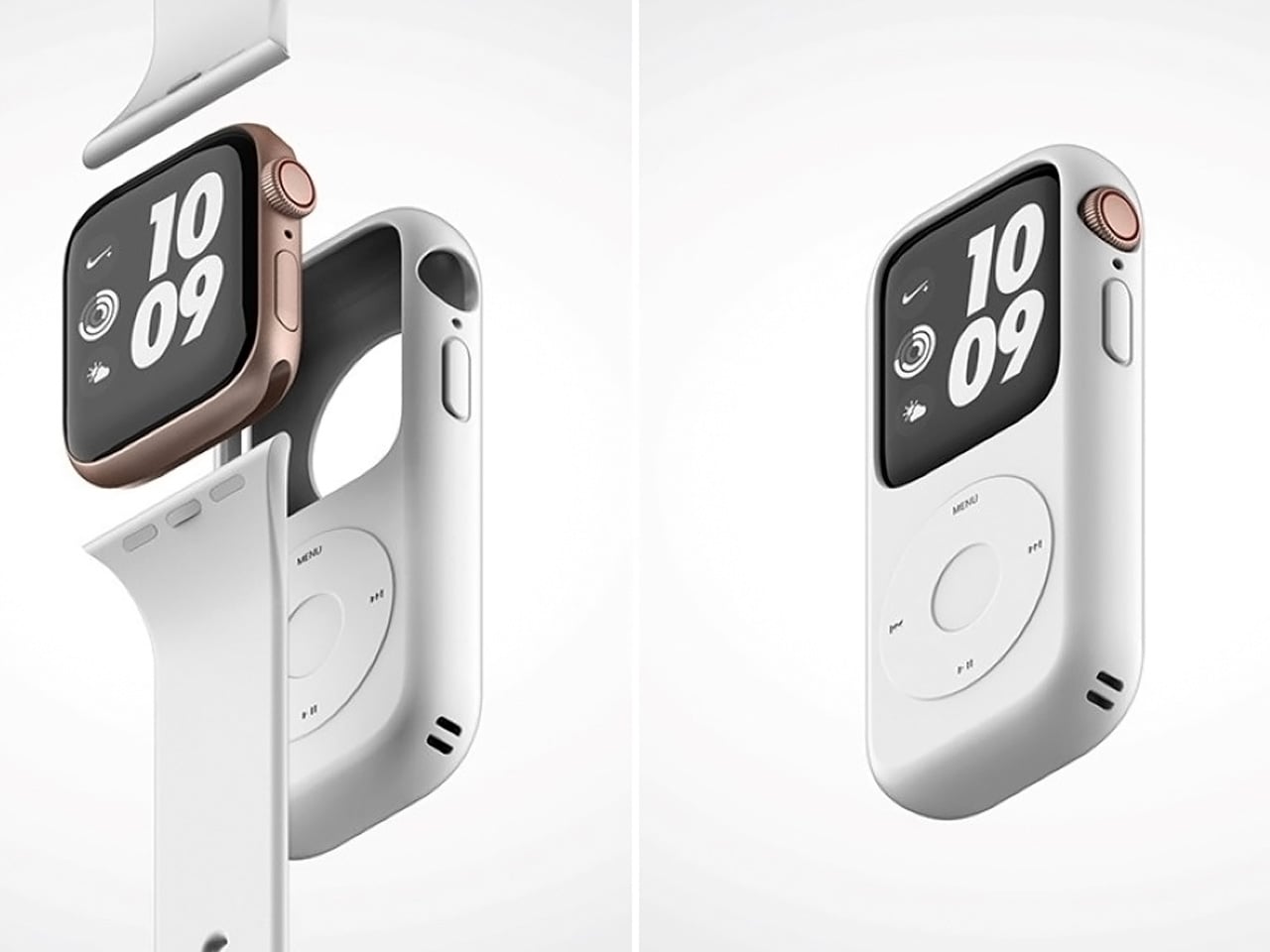
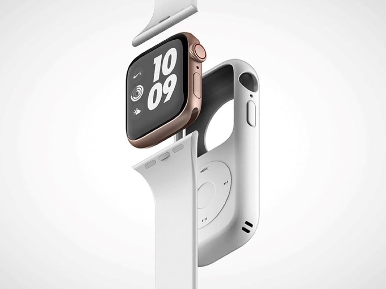
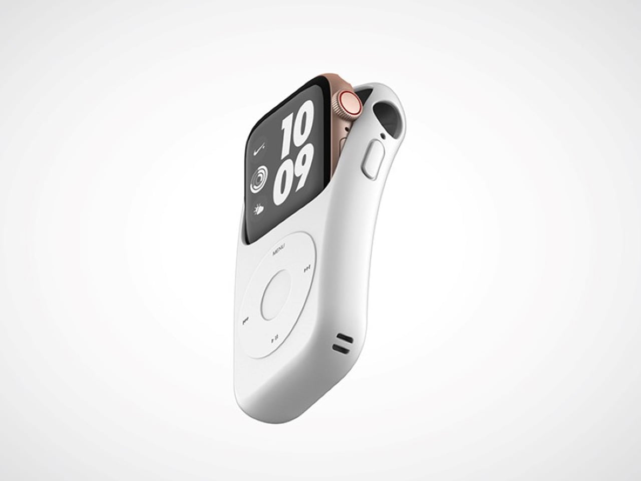
When a design can make you feel genuinely nostalgic the first time you see it, it’s doing something right. The Pod Case wraps your Apple Watch in the silhouette of a classic iPod Nano, arguably one of the most emotionally resonant gadgets Apple ever made. Crafted from silicone, it slides directly over the watch body without obstructing any of its core functions, giving your wrist a retro identity that’s unique and, honestly, a little bit joyful every time you glance down.
What makes the Pod Case especially clever is how it honors Apple’s past without making your watch feel dated. The dummy jog wheel on the front is a warm nod to the scroll wheel that once defined a generation of music listeners, while the watch’s touchscreen remains fully accessible underneath the case. The watch’s screen roughly matches the display size found in classic iPod Nanos, making the illusion feel remarkably convincing. With Apple’s 50th birthday just around the corner, there’s no more fitting way to wear that history on your wrist.
What we like:
The silicone build slides on and off cleanly, so you can commit to the retro look when the moment calls for it without any permanence
It taps into Apple’s most beloved design legacy in a way that feels celebratory rather than costume-y
What we dislike:
The jog wheel is non-functional, which feels like a genuinely missed opportunity for Bluetooth-enabled scroll control
The added thickness may feel noticeable against Apple Watch’s characteristically slim and precise silhouette
2. NightWatch
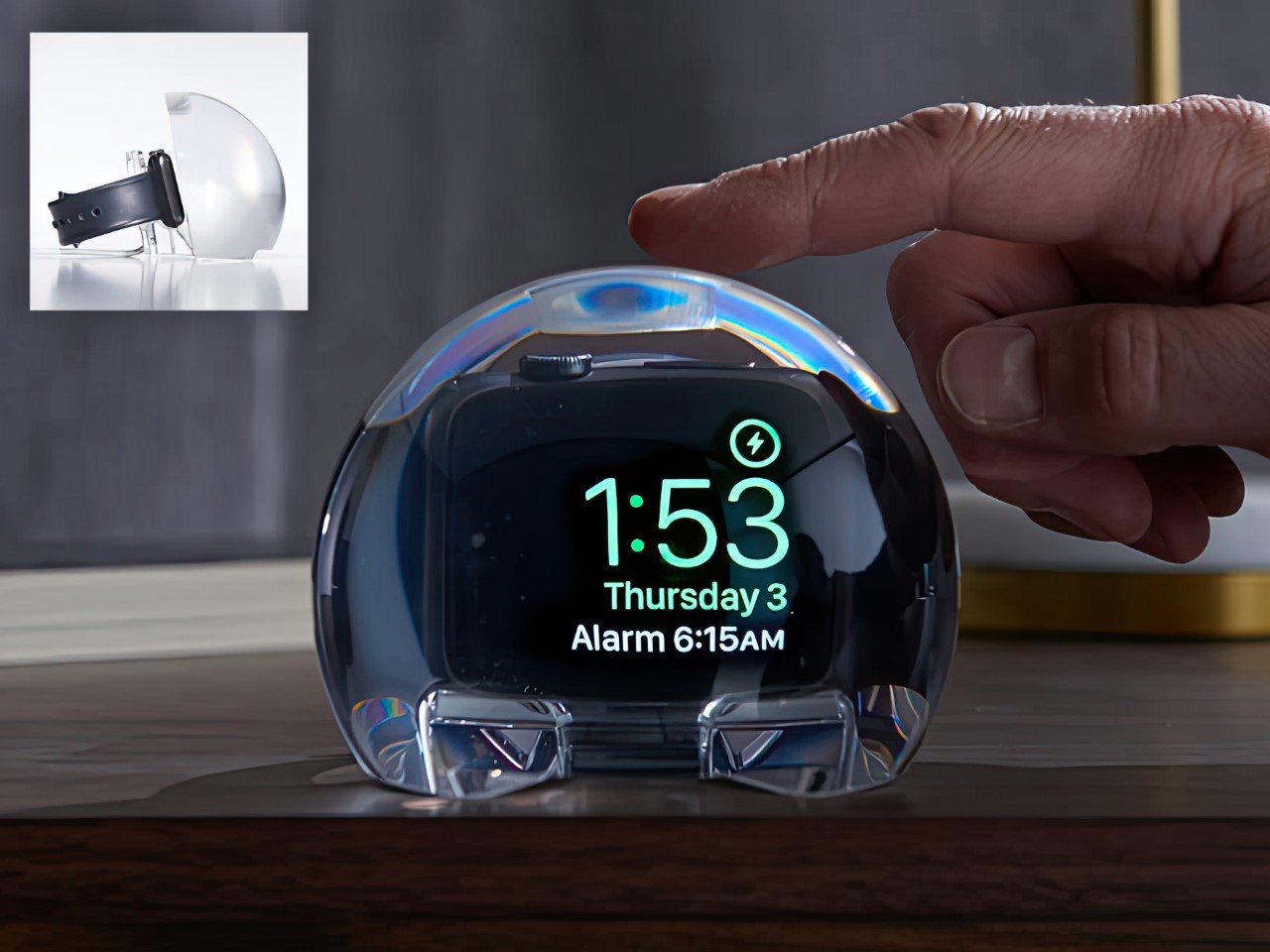
Some accessories solve problems you didn’t know you had until they’re solved, and the NightWatch is exactly that product. Shaped like a generous, luminous orb made entirely from lucite, this dock does three things beautifully: it charges your Apple Watch, magnifies the watch face into a clearly legible bedside display, and amplifies the watch’s alarm through acoustically engineered channels routed beneath the speaker. There are no hidden electronics, no batteries, no inner mechanisms. Just thoughtful geometry working in complete silence.
The NightWatch’s touch-sensitive surface is its most quietly brilliant detail. A single tap on the lucite orb wakes your Apple Watch screen instantly, meaning no fumbling in the dark and no squinting across a dim room at a tiny display. For anyone using their Watch as a sleep tracker and morning alarm, this dock transforms the entire overnight routine. It’s the kind of product that earns its space on your nightstand not through novelty but through genuine, repeatable usefulness that compounds every single morning.
What we like:
The all-lucite, zero-electronics construction is beautifully minimal and requires no power source of its own
The touch-to-wake surface interaction is intuitive and immediately feels like something Apple itself should have shipped
What we dislike:
The orb’s sculptural shape is confident and bold, which may not suit more minimal or tightly curated bedside setups
Passive sound amplification through acoustic channels means volume results will vary slightly depending on which Apple Watch model you’re using
3. AirTag Carabiner
The AirTag Carabiner might be the most practical Apple accessory on this list, and that practicality is housed inside a build quality that punches well above its category. Machined from Duralumin composite alloy, the same material used in aircraft, spacecraft, and high-performance watercraft, it’s designed to handle the kind of daily wear and environmental abuse that standard carabiners can’t sustain. Snap one onto your bag, bike frame, or umbrella, and Apple’s Find My network handles everything else without any additional configuration on your end.
What separates this from the flood of plastic AirTag holders on the market is the craft behind it. Each carabiner is individually hand-finished, and the Duralumin composite holds up equally well in water and at altitude, making it genuinely suited to real-world conditions. It’s available in untreated brass and stainless steel as well, for users who prefer warmer or more industrial finishes. For an Apple fan who wants every piece of their setup to feel considered and intentional, this is the kind of detail that quietly elevates the whole picture. The AirTag itself is sold separately.
Duralumin composite construction brings authentic aerospace-grade durability to a carry item most people treat as disposable
The choice of brass, stainless steel, and treated alloy finishes makes personalization genuinely easy and meaningful
What we dislike:
The AirTag is sold separately, which adds a layer of additional cost for users who are new to Apple’s tracking ecosystem
The premium build quality may feel like overkill when attached to lower-stakes items like an umbrella or a gym bag
4. Magic Bar
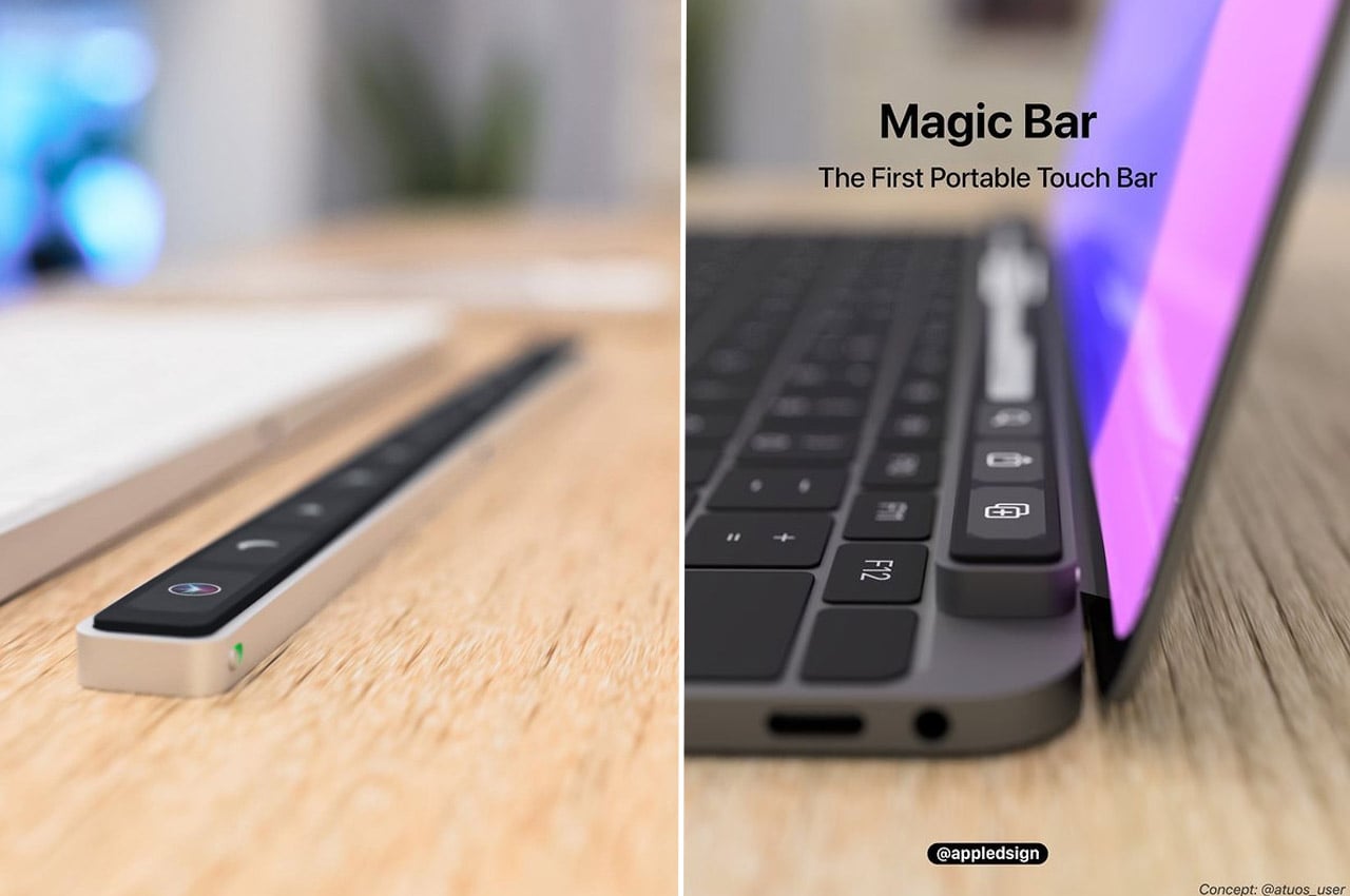
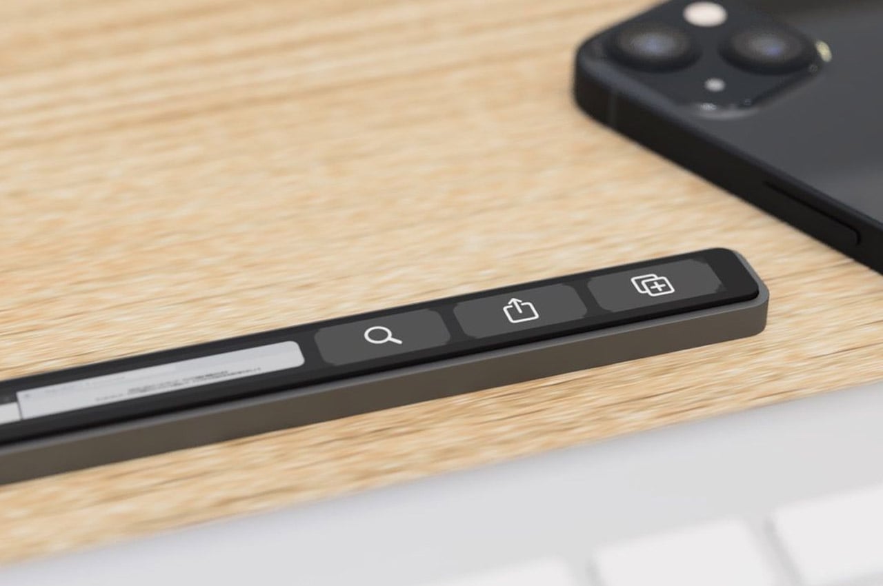
Apple’s Touch Bar had a short and controversial run, but the idea underneath it, a programmable, context-aware strip that adapts to whatever you’re working on, was always more interesting than its execution. The Magic Bar takes that concept and frees it from the MacBook Pro entirely, reimagining it as a standalone, portable accessory that pairs with any Apple peripheral. Built from aluminum to match the existing Magic Keyboard and trackpad lineup, it sits in the setup as naturally as if Apple had always intended it to ship this way.
The proposition is clean and direct: a plug-and-play toolbar that clips horizontally alongside the Magic Keyboard and keeps your most-used shortcuts, smart home automations, and app-specific functions at constant reach. Combined with the iPhone, the use case expands meaningfully, with media controls, quick-launch tools, and home shortcuts all living in a single strip without requiring any window switching. For the Apple power user who lives inside their setup all day, the Magic Bar is the kind of accessory that changes the way you work once you’ve had even a single session with it.
What we like:
The aluminum construction and horizontal layout integrate seamlessly into Apple’s existing peripheral design language without any visual friction
Plug-and-play setup eliminates configuration headaches, making it immediately useful from the moment it lands on your desk
What we dislike:
As a concept design, the final feature set and commercial availability are yet to be officially confirmed by any manufacturer
Compatibility appears optimized for Apple peripherals specifically, which limits the appeal for anyone running a mixed operating system setup
5. Spigen Classic LS AirPods Pro 3 Case
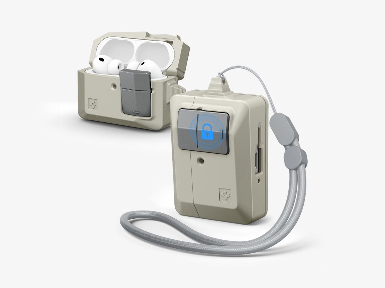
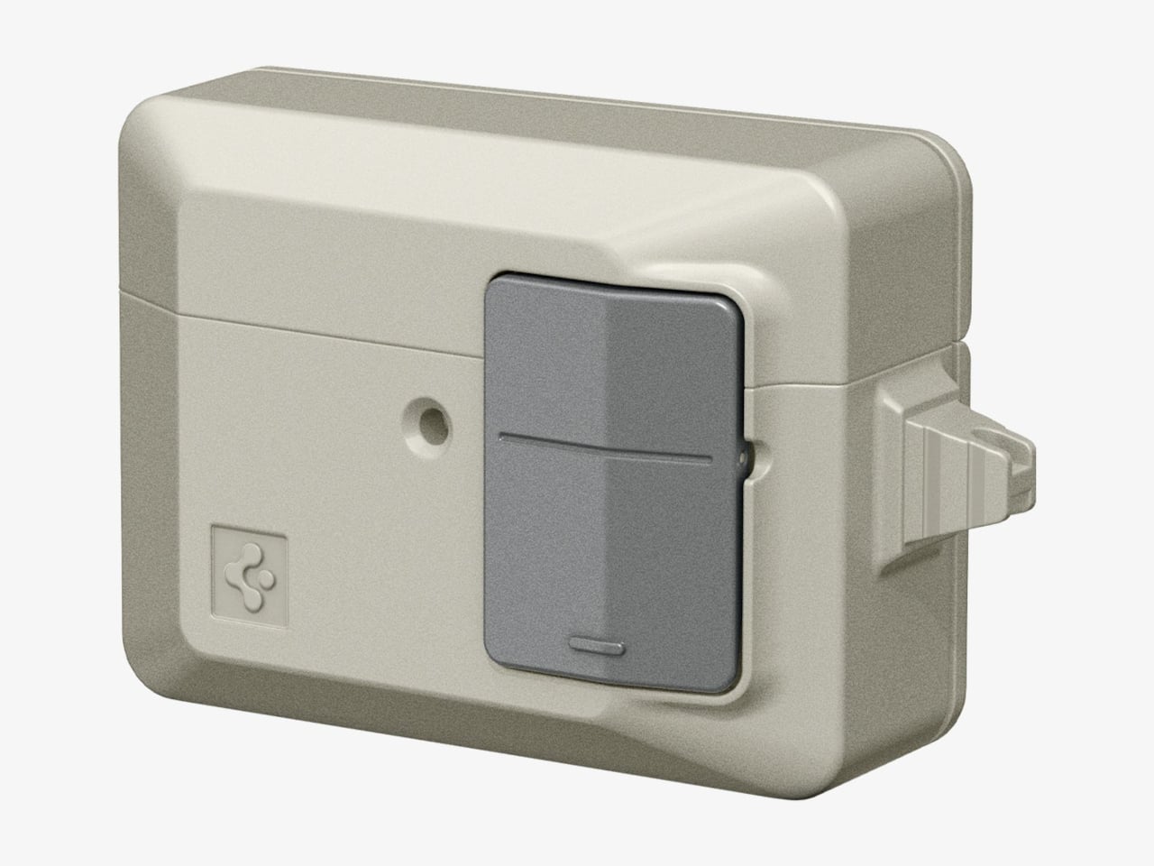
Spigen’s retro-Mac collection is one of the more quietly delightful things to emerge from the Apple accessory market in recent years, and the Classic LS AirPods Pro 3 case is its most charming entry yet. Modeled directly after the original Apple mouse, the flat, single-button input device that debuted with the first Macintosh, it borrows the mouse’s warm, stone-colored plastic, its compact proportions, and most importantly, its most satisfying tactile feature. It’s the kind of object that makes you want to pull it out and show someone immediately.
The “Push to Unlock” mechanism built into the front is the detail that takes this from novelty to genuinely considered product design. Placed exactly where the original mouse button sat, pressing it releases the hinged lid with a deliberate, mechanical click that makes the gesture feel purposeful rather than accidental. It joins a phone strap and a MagFit floppy disk wallet in a cohesive four-piece retro set. With Apple celebrating fifty years this April, carrying this case is one of the most eloquent tributes any fan can make to the design language that started everything.
What we like:
The “Push to Unlock” button is a genuinely tactile, mechanically satisfying feature that pays direct homage to the original mouse button in the most intuitive way possible
Being part of a four-piece retro collection means fans can build a fully coordinated Apple heritage accessory set that tells a coherent visual story
What we dislike:
The warm beige colorway, while historically faithful and correct, may feel too vintage for users who prefer accessories that match Apple’s current aesthetic language
The case is specific to AirPods Pro 3, meaning it offers no crossover value outside that particular model
6. Battery-Free Amplifying iSpeaker
There’s something deeply satisfying about a product that works entirely without power, and the iSpeaker earns that satisfaction honestly. Made from Duralumin metal, the same aerospace-grade alloy that appears throughout the best entries on this list, it uses pure acoustic physics to amplify your iPhone’s audio without drawing a single watt of electricity. Designed using the golden ratio, it doubles as a piece of desk sculpture that holds its own even when your phone isn’t sitting inside it. Function and form, neither compromising the other.
This is the kind of accessory built for a very specific Apple user: one who values craft over convenience, and objects that reward close attention over ones that simply check a box. The Duralumin construction resonates with your music rather than dampening it, producing a warmer, more enveloping sound than plastic or silicone alternatives can manage. It’s also portable enough to take to a hotel room, a client’s office, or a weekend away without any packing anxiety. No cables, no setup, no charging required. Just place your phone inside and let the material do its work.
Zero power required makes it genuinely portable and one of the more eco-conscious accessories in any Apple setup
The Duralumin body produces a noticeably richer, warmer acoustic resonance than plastic and silicone competitors at this price tier
What we dislike:
Output, while impressively improved for a passive speaker, will never match the volume or bass of a powered Bluetooth speaker in the same price range
The +Bloom and +Jet directional sound mods that extend its capabilities are sold separately, meaning full functionality requires an additional purchase
7. Leica Lux Grip
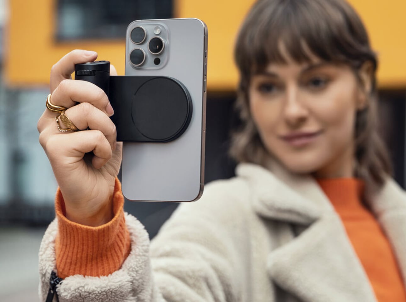
Leica doesn’t make many mistakes when it comes to product design, and the Lux Grip is a strong argument for that reputation. Built for iPhone photographers who want DSLR-level ergonomics without abandoning the convenience of a smartphone, it attaches via MagSafe and works with every iPhone from the 12 onward. Machined from high-grade aluminum with a matte black finish, it adds a reassuring heft to the setup that transforms how the whole device sits and moves in your hands: purposeful, balanced, and undeniably premium.
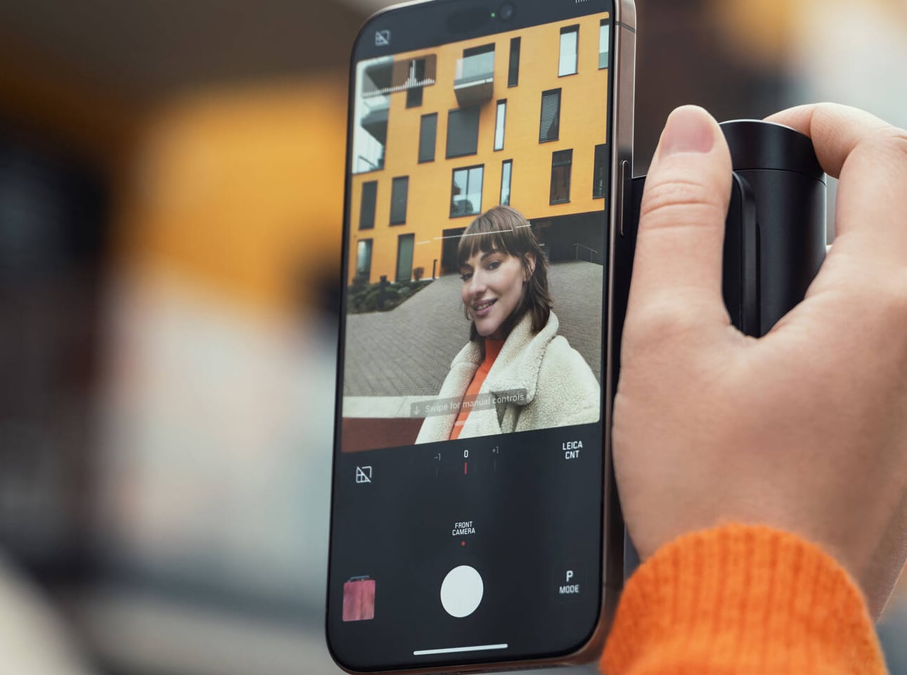
The cylindrical grip along the left side creates a natural resting point for the fingers that you only realize you’ve been missing once you’ve shot without it. Paired with the Leica Lux app, the mechanical controls provide genuine shutter, aperture, and zoom inputs that touchscreen photography will never replicate in feel or reliability. For the Apple fan who takes mobile photography seriously, the Lux Grip doesn’t just improve how you shoot. It changes how you think about the iPhone as a camera, and that’s the kind of shift that earns its place in any serious setup.
What we like:
MagSafe attachment is secure and broadly compatible, working cleanly across multiple iPhone generations without any adapters or compromises
The mechanical shutter and physical controls provide tactile shooting feedback that touchscreen photography categorically lacks, making sessions feel more considered
What we dislike:
The premium aluminum build and Leica branding command a price point that will be a genuine barrier for casual iPhone photographers on a tighter budget
The added weight and bulk, while ergonomically intentional, may not appeal to users who prioritize a slim, pocketable iPhone profile above all else
Fifty Years In, the Details Still Matter
Apple turning 50 on April 1st is the kind of milestone that asks you to pause, look around your setup, and ask whether the things surrounding your devices actually reflect the standard Apple itself has set. The best anniversary gift you can give yourself isn’t necessarily the newest device on the shelf. It’s the accessories that turn what you already own into something that feels curated, intentional, and worth coming back to every day. That’s always been the Apple promise.
These seven picks honor that promise in different ways: some through heritage, some through clever engineering, and some through the kind of craft that simply makes an ordinary moment feel better. Whether you’re celebrating five decades of Apple with a retro-inspired AirPods case or finally shooting iPhone photos with a grip worthy of the camera you’re already carrying, each one earns its place. Here’s to fifty more years of thinking differently, and the accessories that help you live up to it.