Gustav Friebel’s Red Lamp and the Art of Breaking Light Apart

The first time you look at Gustav Friebel’s Hands On Light, you might do a double-take. Is it a lamp? A science experiment? An art installation that somehow found its way onto a side table? The answer, satisfyingly, is all three, and that is exactly the point.

Hands On Light is Friebel’s contribution to the exhibition of the same name, a master’s cooperation between ERCO, one of Germany’s most storied lighting manufacturers, and UDK Berlin (Universität der Künste). Fifteen prototypes were shown at Berlin Design Week 2026, each one exploring what the project called the “Alchemy of Light.” Friebel’s piece stood out immediately, not just for its color (that urgent, almost aggressive red) but for what it asks you to think about when you look at it.

Designer: Gustav Friebel
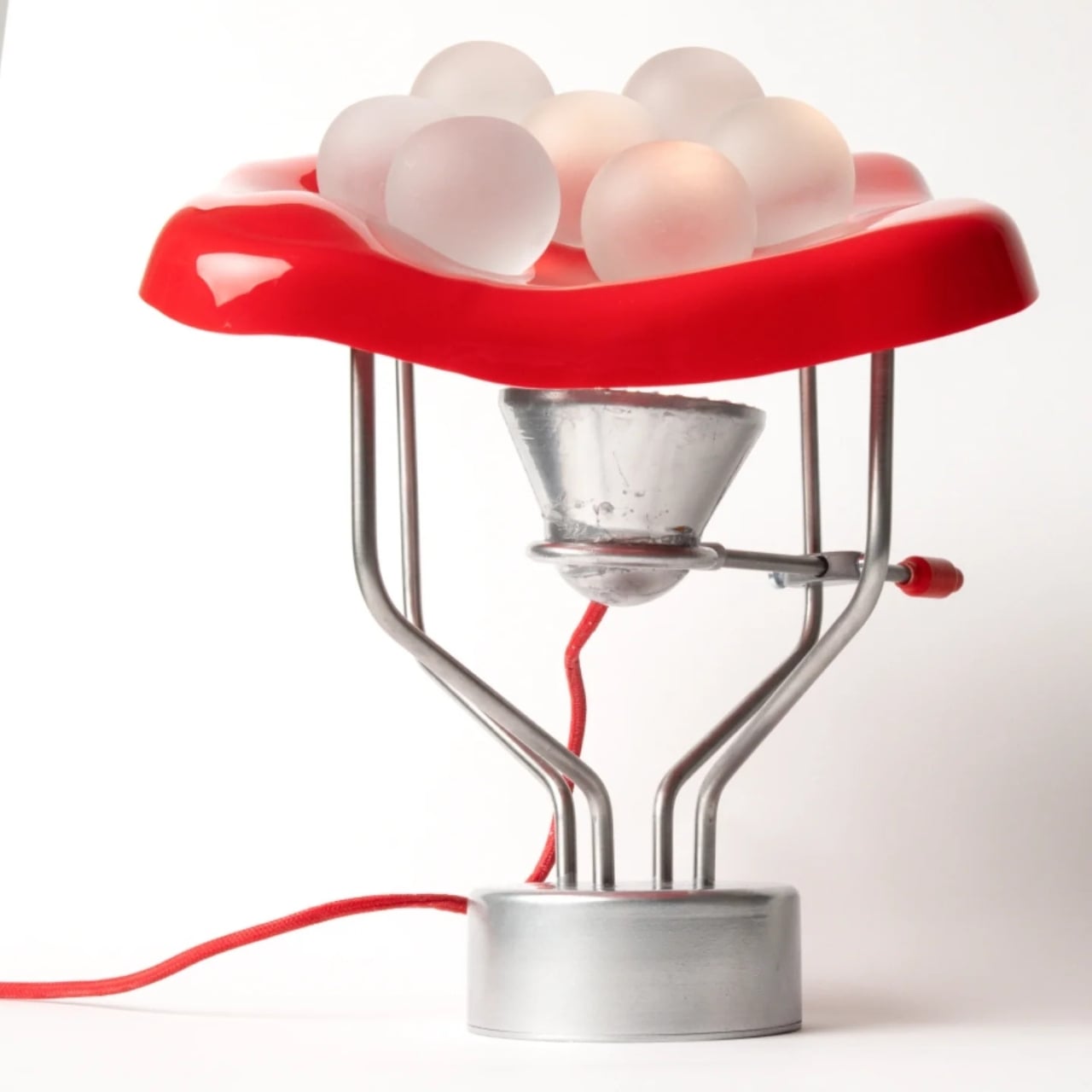
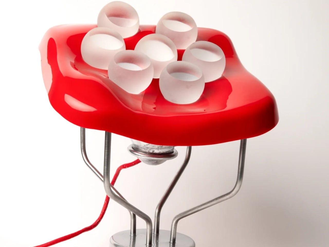
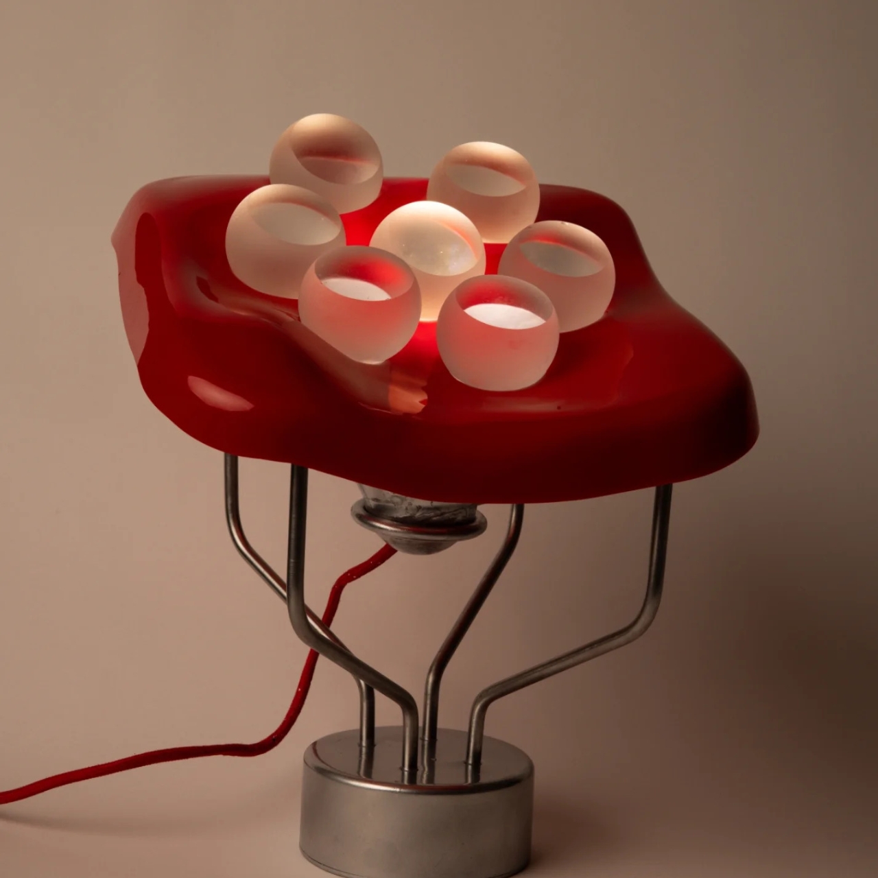
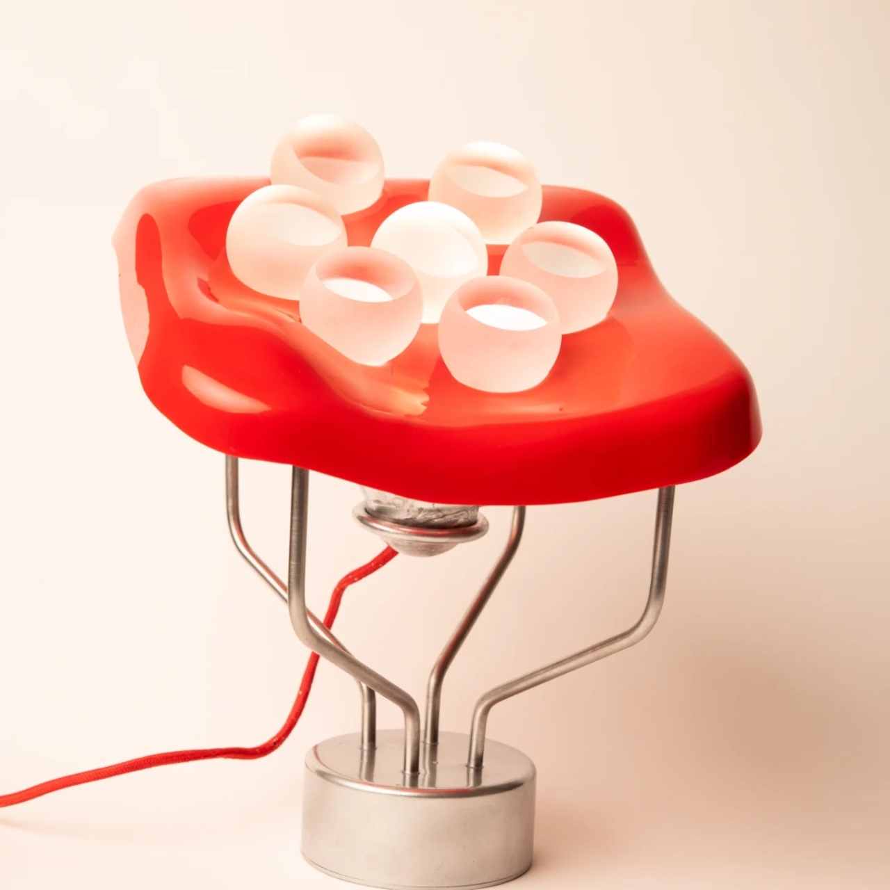
The concept is grounded in natural light segmentation. Think of the way sunlight hits a cluster of bubbles on water, or how dappled light falls through a canopy of leaves. Each point of light is distinct, separated, alive. Friebel took that idea and made it structural. Seven frosted glass spheres, each with polished sides, sit inside the holes of a deep-drawn PMMA sheet. That sheet, the red one that catches your eye first, is not a simple tray. It is a sculptural form in itself, its organic rounded edges suggesting something molten, like a material caught mid-transformation.
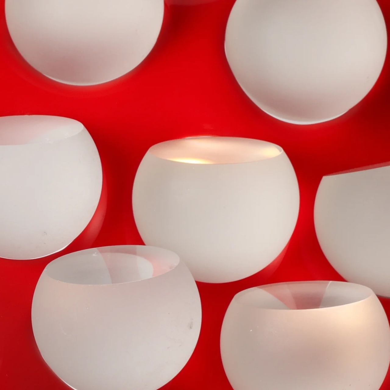
The glass spheres do something genuinely clever. The frosting diffuses the light, softening it into a gentle glow, but the polished sides of each sphere allow light and color to interact in a way that feels less like engineering and more like physics made beautiful. When the lamp is on, the red of the PMMA bleeds into the milky glass, and the whole thing pulses with warmth. Lit or unlit, it reads differently. That duality is not an accident.
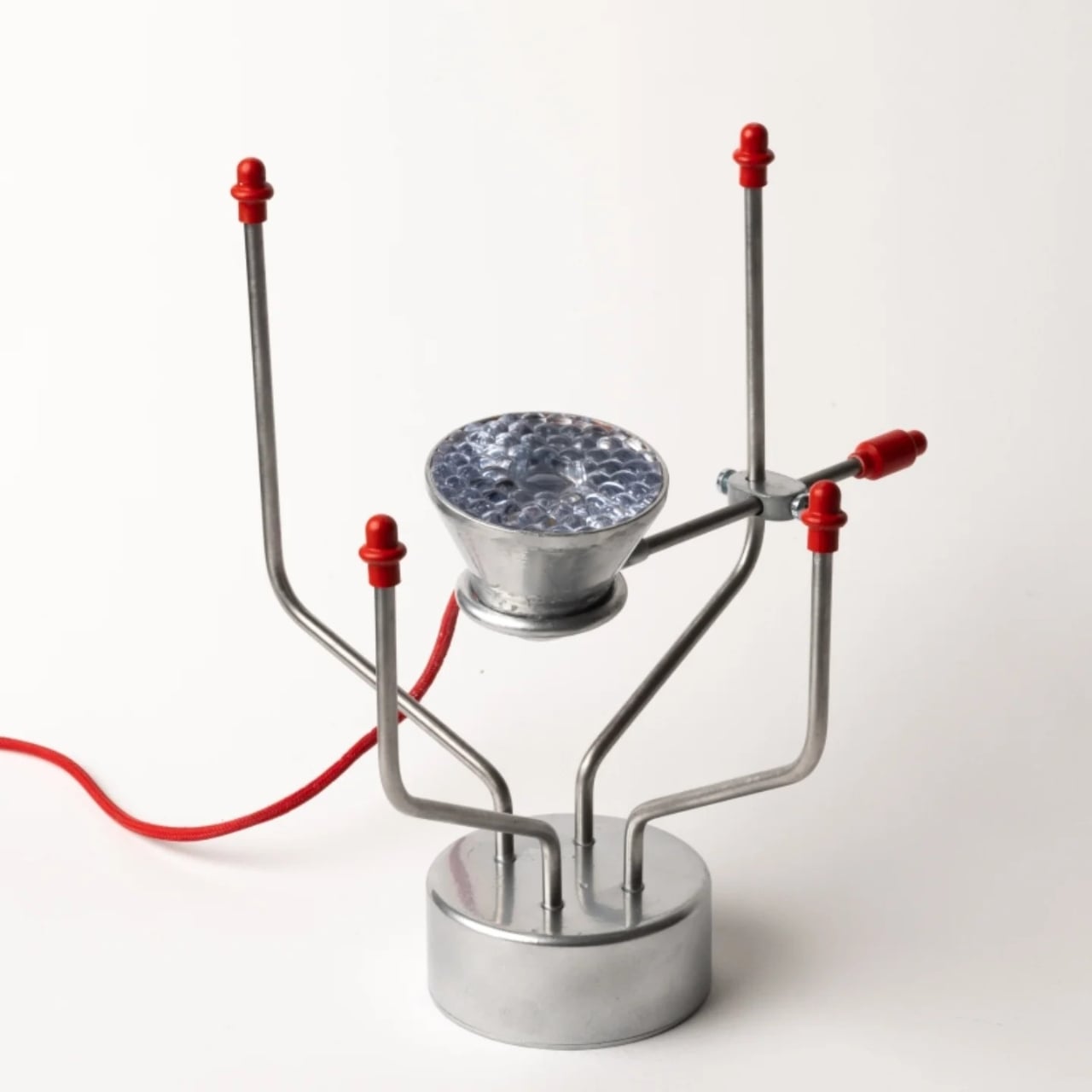
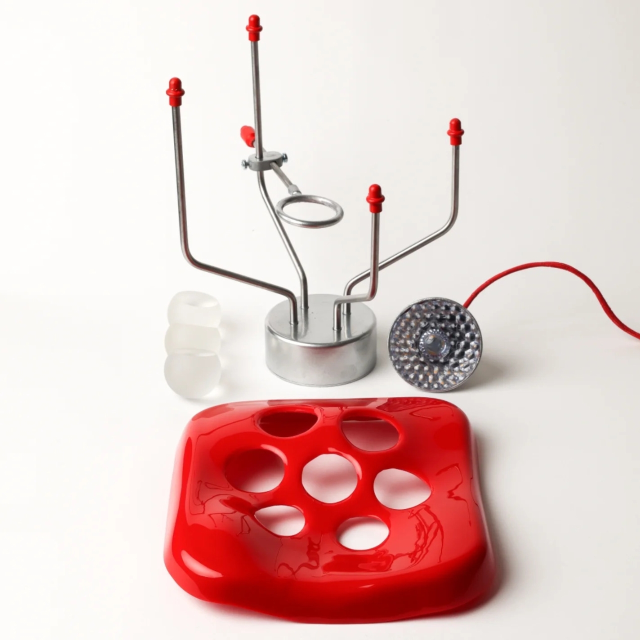
What sits beneath all of this is also worth paying attention to. The base is a chrome metal armature with a sculptural quality of its own. The supports branch out from a cylindrical foot, holding the whole assembly with a kind of studied asymmetry, like a model of an atom or something lifted from a lab. A red braided cord runs through it all, tying the color story together from bottom to top. Disassembled and laid out flat, as the photographs show, the components look like they belong to three different design languages. Assembled, they resolve into something surprisingly unified.
The collaboration context matters here. ERCO brings with it a serious design heritage. Otl Aicher, one of the most influential visual designers of the 20th century, is among those connected to the company’s tradition. That background gives the brief real weight, and you can feel it in the work the students produced. This was not a decorative exercise. The project pushed students to engage with light as a raw material, not a byproduct. Friebel clearly took that seriously.

My honest read on this is that Hands On Light sits in a genuinely interesting space between functional object and conceptual statement. The lamp works. It lights a room. But it also asks you to reconsider what a lamp is supposed to do, and whether utility and spectacle have to be in tension with each other. I do not think they do, and this piece makes a strong case for that position.
Lamps tend to be the most overlooked objects in interior design, bought last and thought about least. Friebel’s piece argues, quietly and colorfully, that they deserve better than that. Light is not just a utility. It is a mood, a texture, a quality of space. When a designer approaches it that way from the very start of the process, you end up with something that earns a second glance, a third, and eventually a permanent spot on your wishlist.
The post Gustav Friebel’s Red Lamp and the Art of Breaking Light Apart first appeared on Yanko Design.
At $214, This Lamp Is a Real Dandelion Built One Seed at a Time

Most decorative lighting doesn’t ask much of you. It sits on a shelf, does its job, and eventually gets replaced when something newer or cheaper comes along. The design industry produces objects by the millions, and very few of them carry any real sense of craft or intention. Even those marketed as artisanal tend to follow predictable patterns, rarely drawing from the natural world in any genuinely meaningful way.

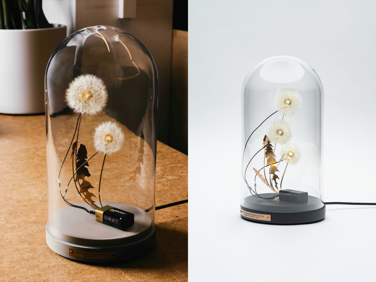
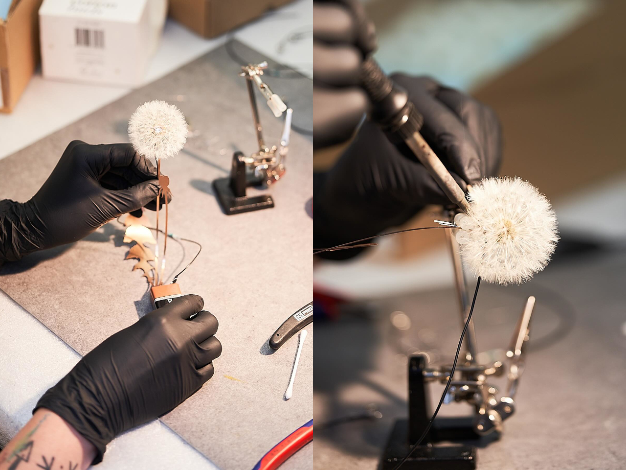
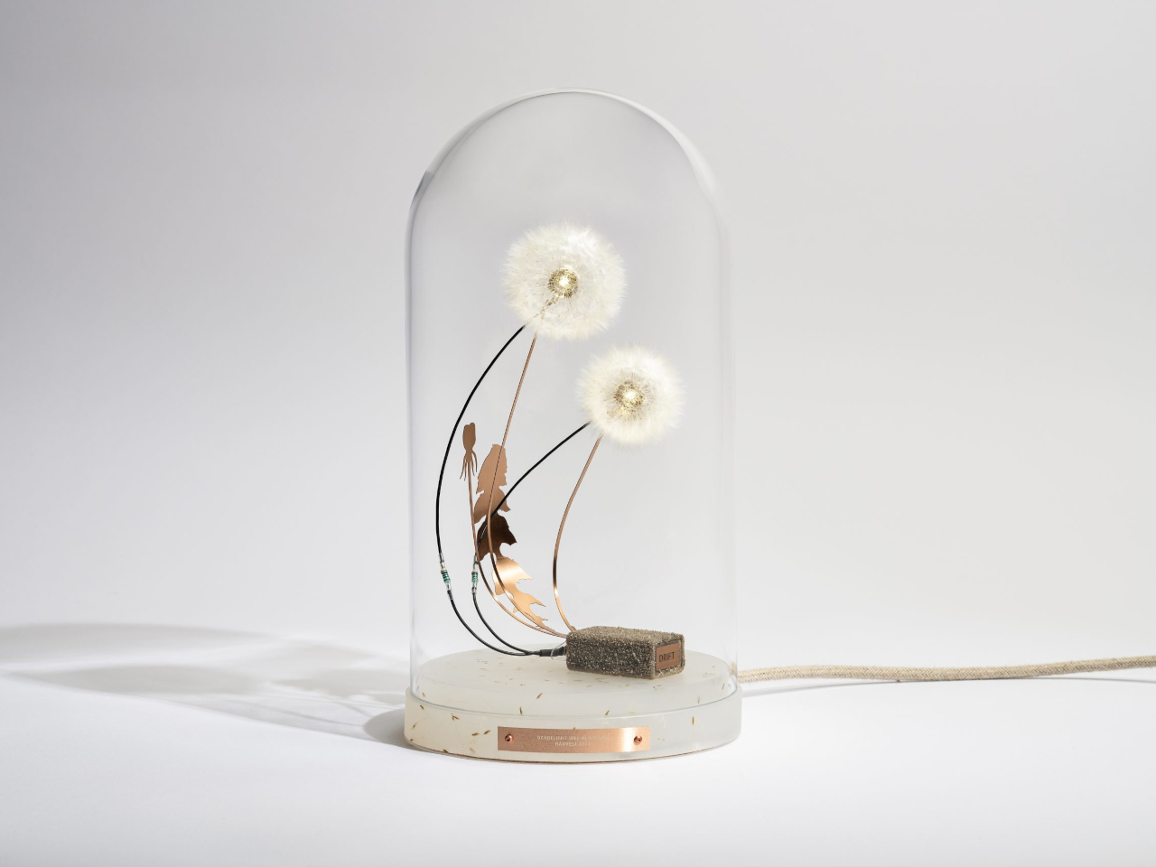
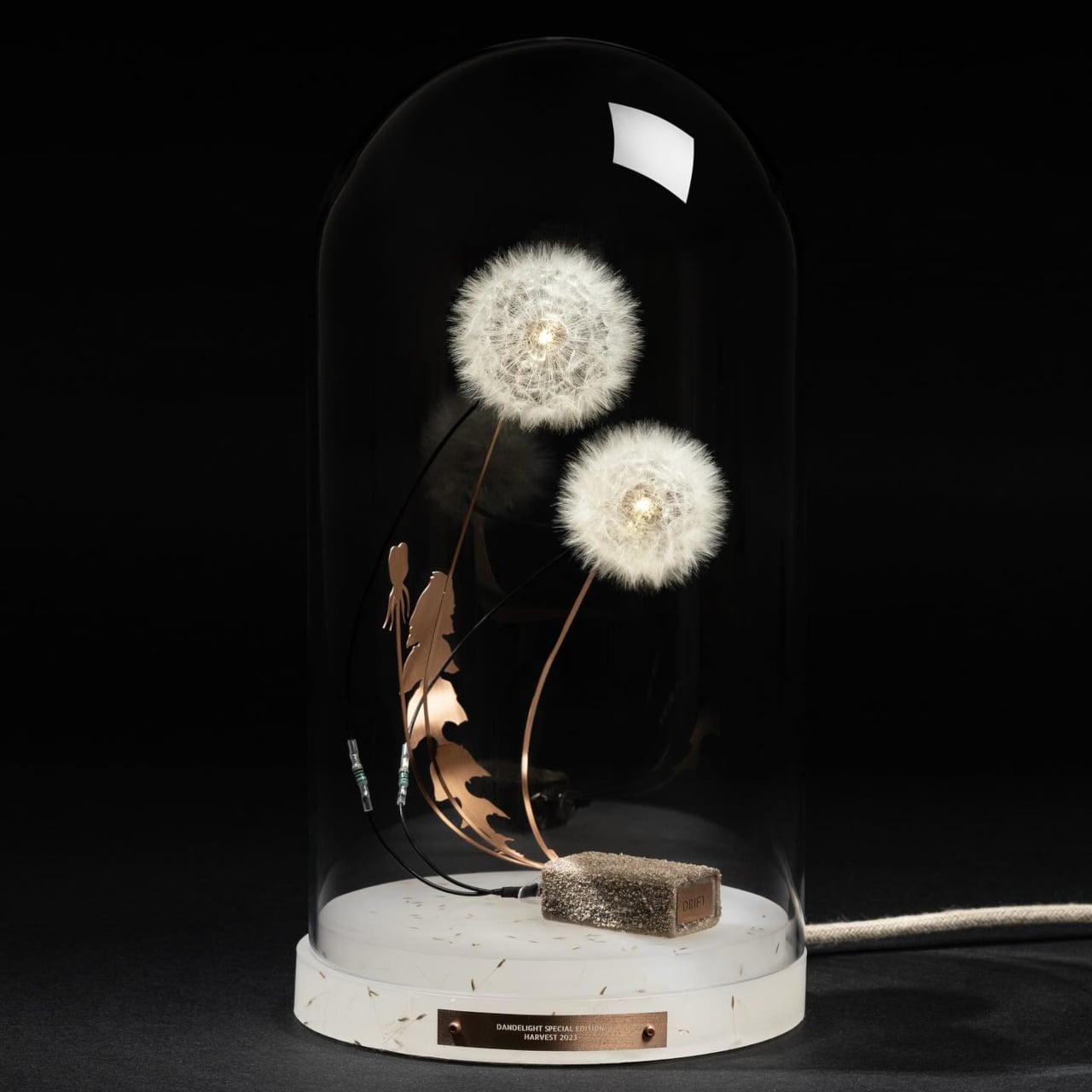
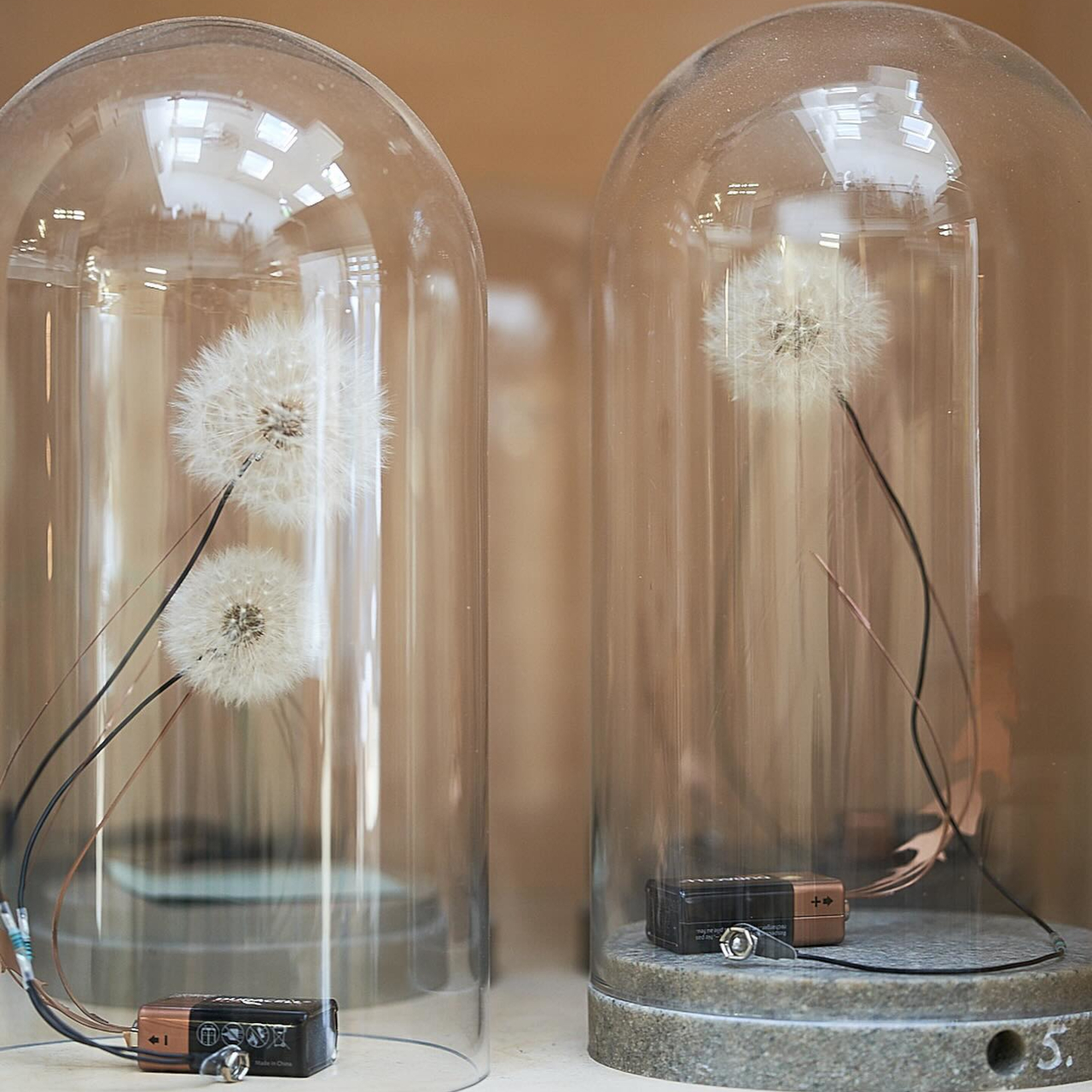
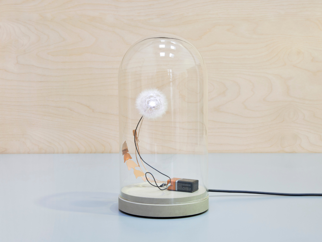
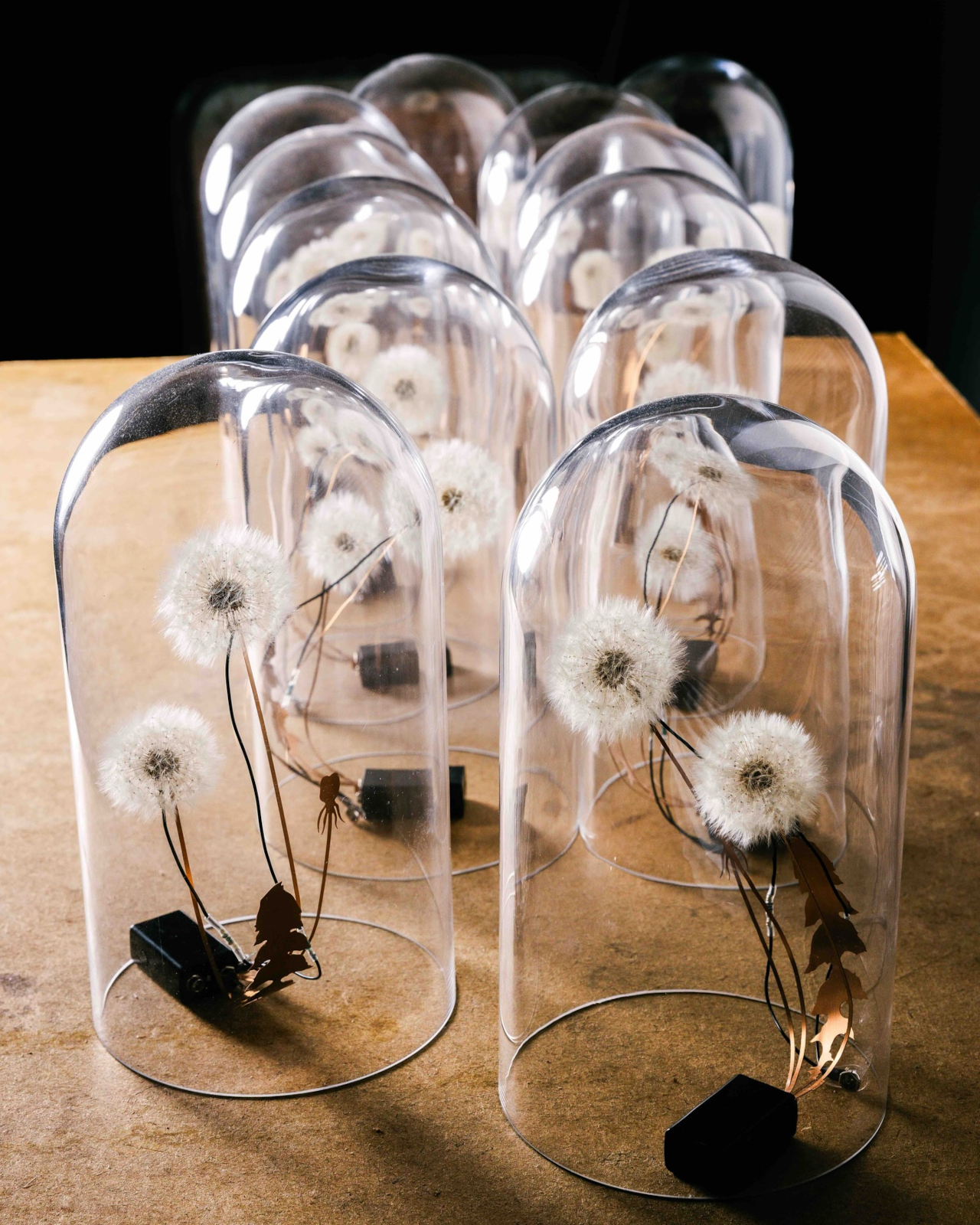
That’s what makes the Dandelight from Studio Drift so quietly disarming. It’s a small table lamp, but its material isn’t glass or ceramic or carved wood. It’s a real dandelion, handpicked during spring in the Netherlands, its seeds attached one by one to a tiny LED. Designers Lonneke Gordijn and Ralph Nauta first conceived it in 2007 as a statement against mass production and throwaway habits in design.

Designers: Lonneke Gordijn and Ralph Nauta (Studio DRIFT)

Dandelions grow practically everywhere, from pristine meadows to the edges of busy highways, yet most adults barely register them. They’re generally dismissed as weeds, which makes it easy to overlook that they’re historically prized for their medicinal value and that their seed heads are among nature’s most precisely engineered structures. Studio Drift’s interest in them isn’t sentimental; it comes from a genuine curiosity about what nature quietly constructs and what that construction might illuminate.

Put it on a bedside table or a windowsill, and the glow that filters through those fragile seeds isn’t harsh or bright. It’s soft and diffused, the kind of light that tells a room to settle down for the evening. The dandelion isn’t decorating the lamp; the dandelion is the lamp, and that distinction changes everything about how you experience it and, perhaps, the plant itself.

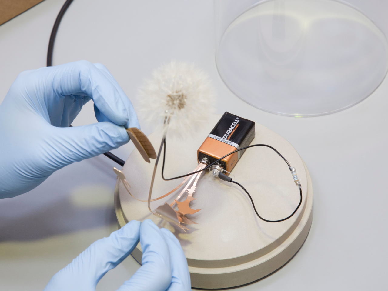
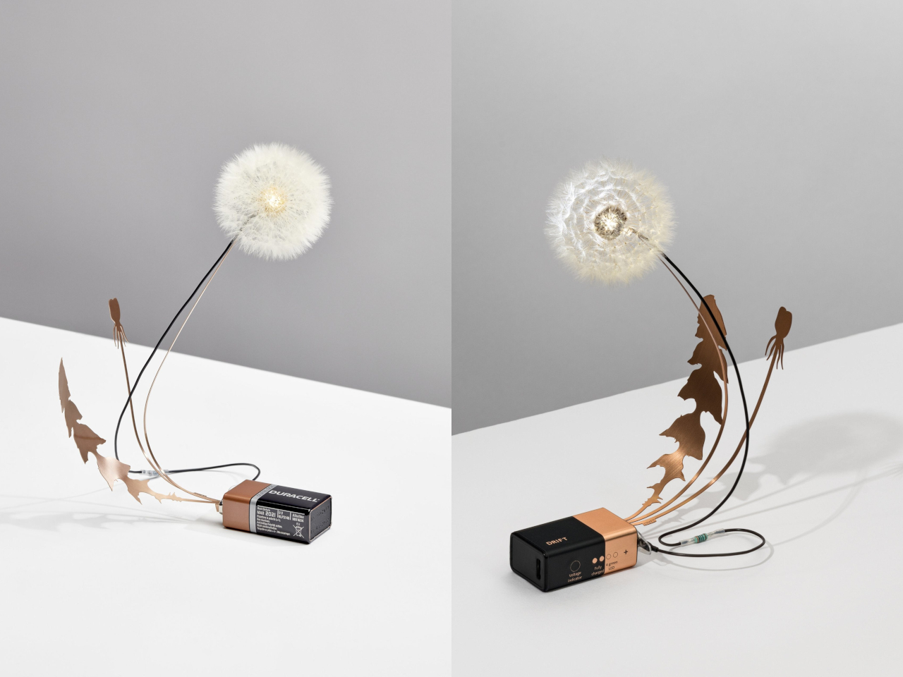
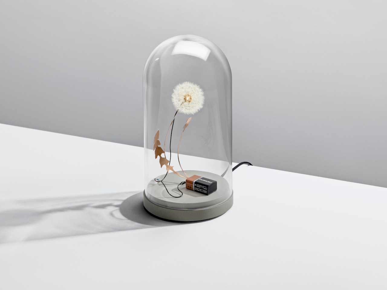
The making is as deliberate as the idea. During spring, the studio handpicks dandelions and attaches each seed to an LED, one at a time. A slender phosphorus bronze stem carries the current to a battery, which sits in plain view rather than tucked out of sight. That visible battery isn’t an oversight; it’s a reminder that the object owes nothing to any pretense of effortless production.

Two versions are available. The standard Dandelight, priced at $214, stands 18 cm tall and leaves the dandelion open to the room. The dome version, at $437, encloses everything inside a handblown glass shell on a concrete and polymer base, measuring 28 cm tall. The dome turns the seeds into something closer to a preserved specimen, which makes it feel like a collector’s object as much as a light source.

The Dandelight also invites you to look at the dandelion as a built form, a radial structure shaped by repetition, lightness, and balance that few people ever slow down to notice. Each piece comes out slightly different since no two dandelions are identical, and the hands doing the placing aren’t machines. That variability isn’t a flaw; it’s exactly what the object has that no mass-produced lamp can replicate.

The post At $214, This Lamp Is a Real Dandelion Built One Seed at a Time first appeared on Yanko Design.
Award-Winning Modular Lamp Turns Discarded Eggshells Into Sculptural Lighting

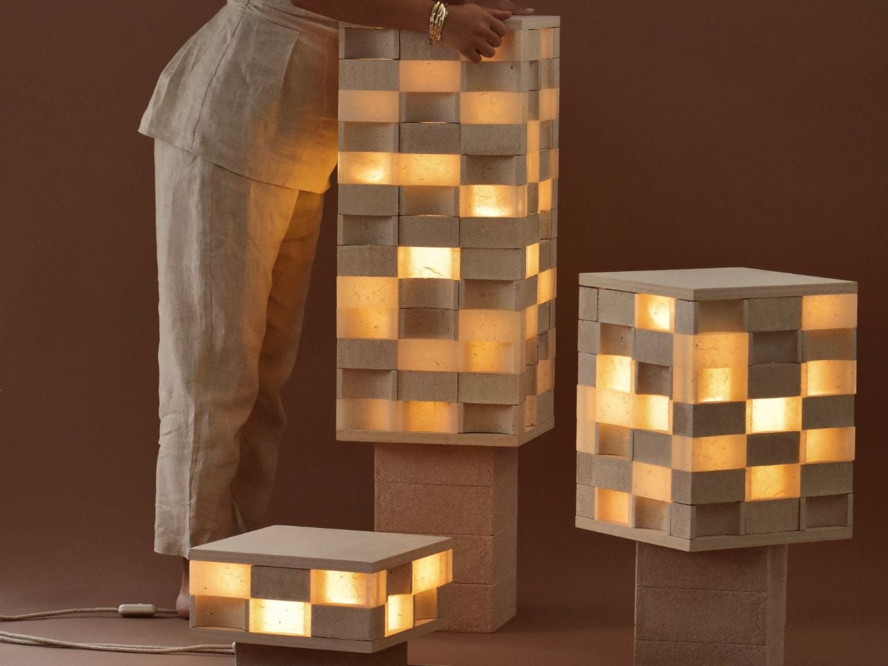
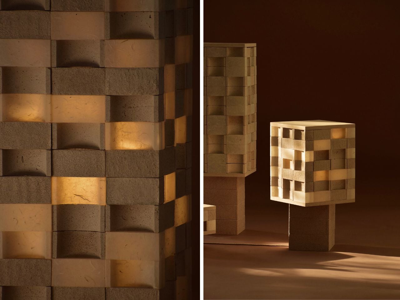
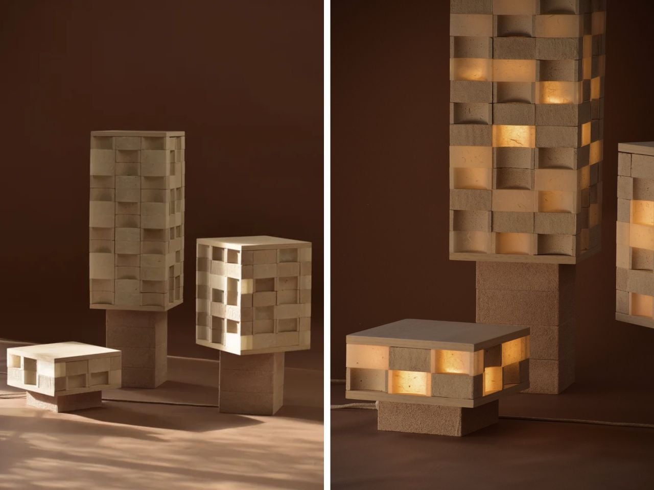
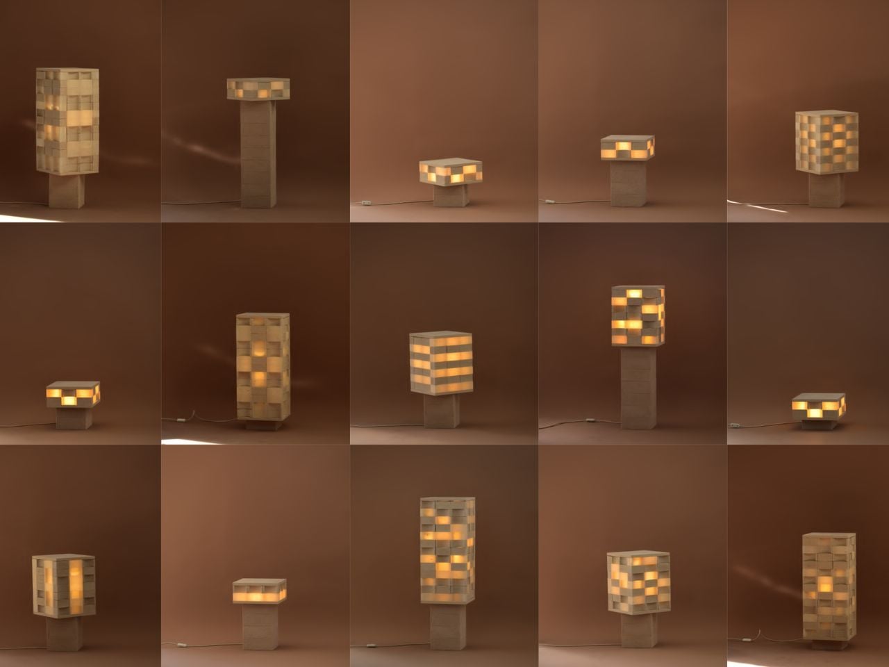
Joanne Odisho’s Mod-u lamp feels like the kind of object you want to touch before you fully understand what it is. Made from modular, Jenga-like blocks, the lamp sits somewhere between lighting, furniture, and sculpture. The surprise is its material. The Melbourne-based designer has created the piece using thousands of discarded eggshells collected from local cafes, turning a fragile everyday waste material into a durable, tactile, award-winning design.

The process starts in a very ordinary place: cafe kitchens. Odisho collects used eggshells, sterilises them, dries them, and crushes them into a fine powder using a Nutribullet. The powdered shells are then mixed with a biodegradable biopolymer to form a wet, sand-like composite. This mixture is poured into moulds and left to dry naturally for about a week. There is no firing process, no synthetic dye, and no complex industrial setup. Once cured, the material becomes hard and rock-like, while still holding onto the soft, natural tones of the eggshells themselves.

Designer: Joanne Odisho

The idea began in 2022 while Odisho was studying furniture design at RMIT. For a school assignment, she was asked to create a product using food waste. Her first experiments with coffee grounds did not work because they developed mould. Eggshells, however, offered something more promising. With inspiration from Materiom, an organisation focused on nature-based material innovation, she began testing how this overlooked kitchen scrap could become a strong, compostable design material.

That material eventually became Mod-u, a collection of configurable lighting pieces made from dozens of individual eggshell-composite blocks. Each block can be moved, rotated, stacked, and rearranged, allowing the lamp to shift between a table lamp, a floor lamp, or a sculptural feature piece. This makes the design especially relevant for smaller homes, where objects often need to adapt to different spaces and uses.

The lamp recently won the Australian Furniture Design Award, one of the country’s most respected design prizes. The award, led by Stylecraft and presented with the National Gallery of Victoria during Melbourne Design Week, challenged designers to respond to the theme “living well, living small.” Odisho’s lamp answered that brief with a balance of function, material experimentation, and emotional appeal.

What impressed the judges was not just the use of eggshells, but the way the object invites interaction. Mod-u is not a lamp that simply sits in the corner and performs one fixed role. Its modular structure gives the user control over its form. It can be built up, pulled apart, shifted, and reimagined depending on the room, the mood, or the need. That sense of play gives the piece a rare warmth. It feels practical, but still personal.

There is also something quietly powerful about the way the lamp treats waste. The eggshells are not disguised or hidden under a polished finish. Their natural colour remains visible, giving each piece a soft, earthy palette that feels honest to the material. It makes the object feel less manufactured and more grown, even though it is carefully designed.

For Odisho, the project opens up a much bigger conversation about what sustainable furniture can look and feel like. It does not rely on guilt or overly technical language to make its point. Instead, it offers a simple idea: the materials we throw away every day might still have value, beauty, and strength left in them.

Mod-u succeeds because it feels experimental without being inaccessible. It is clever, but not cold. Sustainable, but not preachy. By turning something as delicate as an eggshell into a strong and adaptable object for the home, Joanne Odisho shows how thoughtful design can begin with the most ordinary leftovers.

The post Award-Winning Modular Lamp Turns Discarded Eggshells Into Sculptural Lighting first appeared on Yanko Design.
A Thunderstorm, Frozen in Marble and Gold Leaf

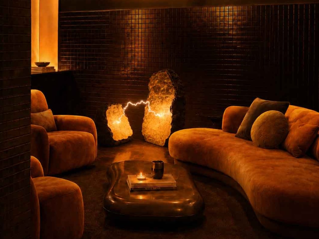
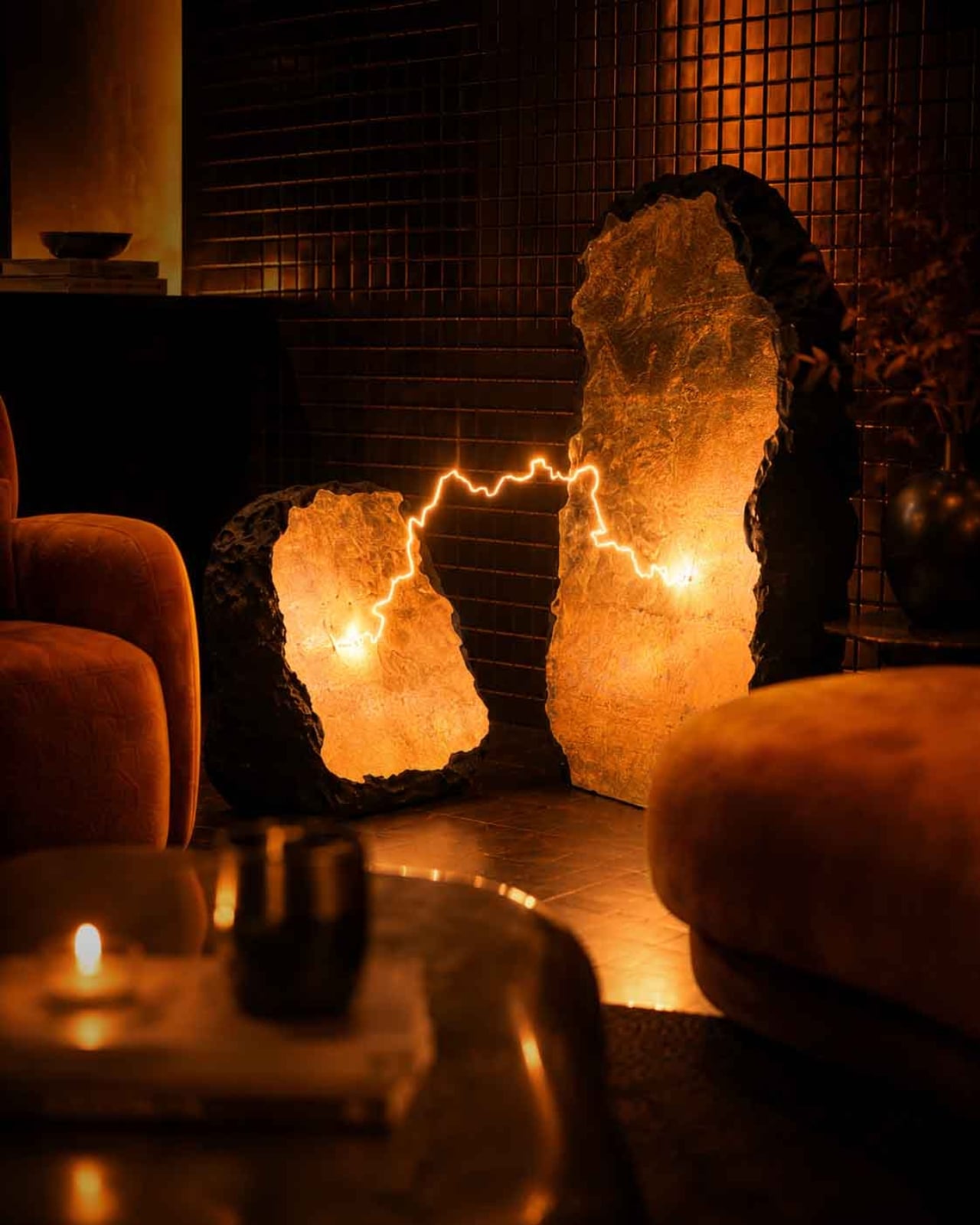
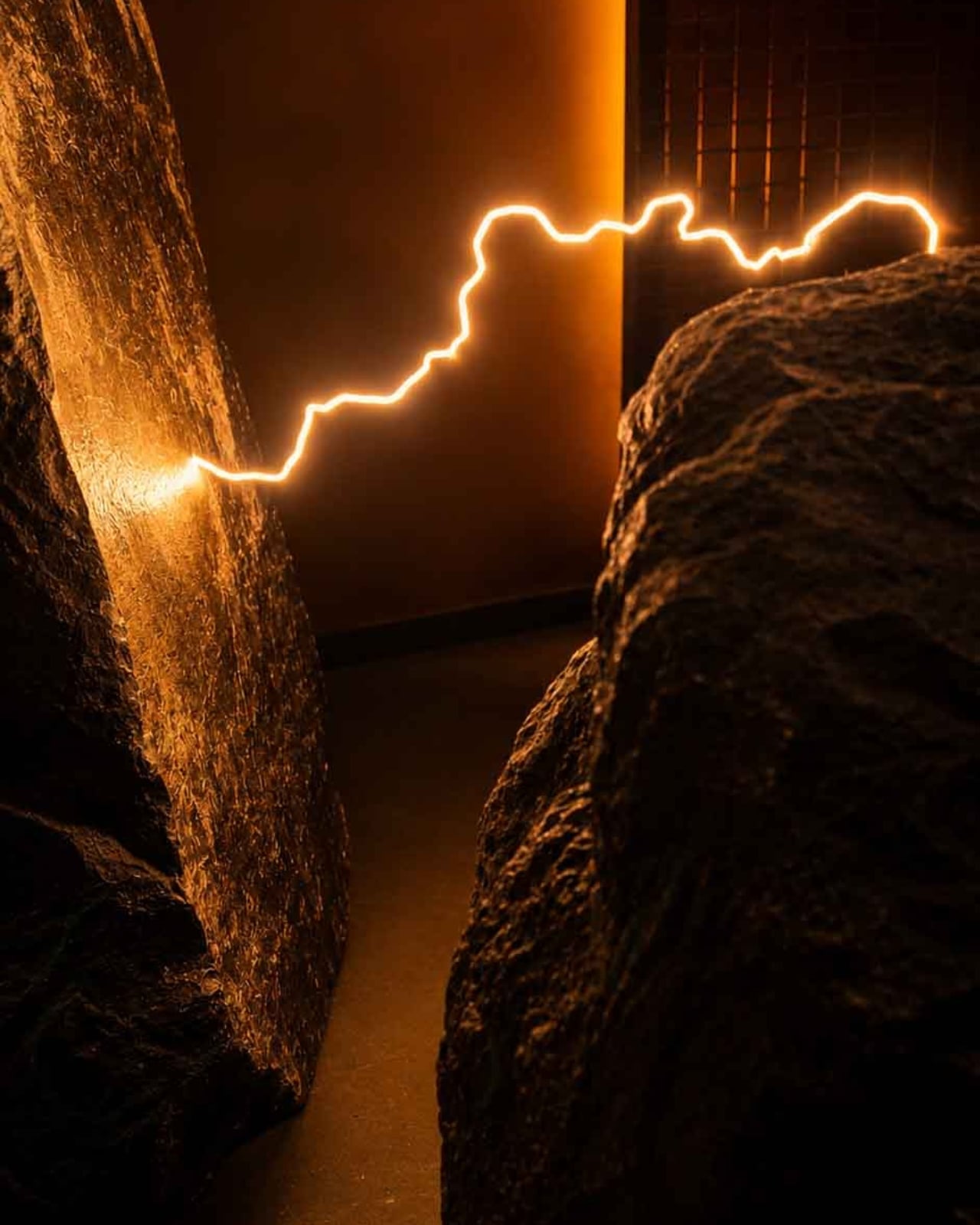
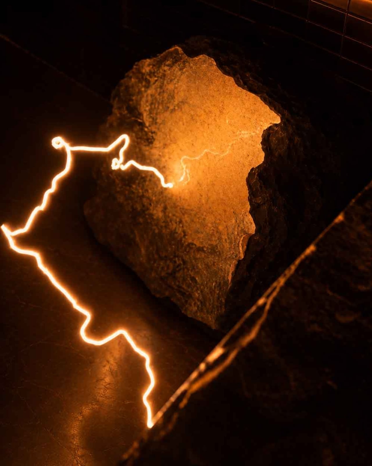
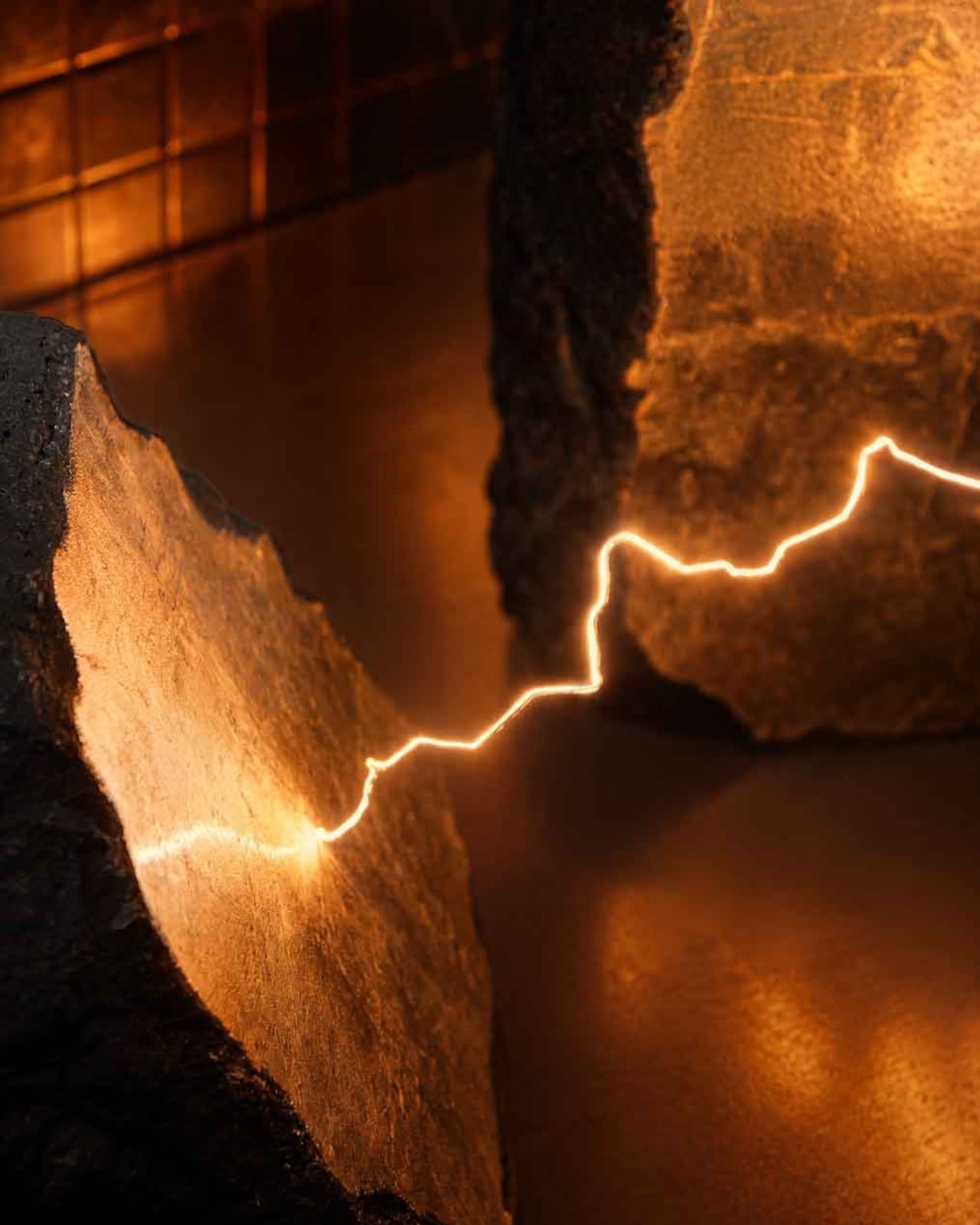
Most lamps ask very little of you. They sit in corners, cast light, get switched off. Electric Rocks, a new collectible luminaire by British designer Mark Mitchell for Italian marble company Serafini, refuses to be ignored. It is two blocks of marble split open by a bolt of lightning, and the lightning is still there, frozen between them, glowing warm and low like the aftermath of something ancient and violent.

The concept is straightforward in theory and staggering in execution. Mitchell wanted to capture lightning at the exact moment of impact, not as decoration, but as event. “The electric arc appears to hang in the air, frozen at its most powerful point,” he says. “The bolt feels dangerous, but controlled. It is power held in stone.” That line does a lot of work, and it earns it.

Designer: Mark Mitchell for Serafini

What makes this piece land so hard is the contradiction it holds together. Lightning is the definition of fleeting, over in milliseconds, gone before you can fully process it. Marble is the opposite: dense, ancient, built to outlast everything we make. Placing one inside the other shouldn’t work, and yet it does, completely. The tension between those two materials is precisely what gives Electric Rocks its emotional weight. You’re standing in front of something that feels simultaneously permanent and urgent.

The craftsmanship behind it is genuinely serious. The stones are polished Italian marble, coated in gold leaf to intensify the presence of the bolt. The lightning element is entirely handcrafted from 2200K LEDs and stainless steel, engineered to replicate the jagged, irregular quality of a real electric arc. The warm amber glow reads less like interior lighting and more like geological heat, like light escaping from somewhere deep underground. At 96 x 56 x 97 cm, it’s a significant physical presence, not a table lamp you’d tuck beside a sofa but a sculptural object that changes the atmosphere of an entire room.

Mitchell, based in Cheshire, England, has built his practice around exactly this kind of poetic restraint. His work draws consistently on natural phenomena: the way light moves, the way materials age, the space between objects rather than the objects themselves. His design language is minimalist but never cold. Electric Rocks is perhaps his most dramatic statement to date, but it still carries that quality of stillness his work is known for. He describes it as “a space where power and calm coexist,” and that reads less like a press line and more like a genuine philosophy.

The historical dimension of the piece adds another layer worth sitting with. Across cultures and centuries, stones struck by lightning were considered sacred objects, permanently altered by extreme celestial force and sought after for the mythological weight they carried. Electric Rocks draws a quiet line from that ancient reverence to a contemporary luxury object without being heavy-handed about it. The mythology is embedded, not announced, which is how the best design references tend to work.

If I’m being honest about why this piece interests me beyond the aesthetics, it’s because it asks a real question about what luxury objects should do. The best ones don’t just signal taste or cost. They change the energy of a space. They make you feel something you weren’t expecting. Electric Rocks does that. Sitting in a dark room with those two glowing marble slabs and a thin thread of light stretching between them, you’re not thinking about function or finish. You’re thinking about storms, about deep time, about the strange quiet that follows something overwhelming.

For Serafini, commissioning this piece is a smart move creatively. The Italian marble industry has long understood that stone is not just a material but a story, millions of years compressed into surface and weight. Electric Rocks extends that story into something wilder and more elemental. It turns a lamp into a conversation about nature’s force and human craft working in the same breath. It is, without question, one of the most compelling collectible objects to emerge this year. And it casts a very beautiful light.

The post A Thunderstorm, Frozen in Marble and Gold Leaf first appeared on Yanko Design.
Motorola Just Made the Baby Soother That’s Actually Worth Displaying

Nursery products have generally been designed around the assumption that function is the only thing that matters. A baby monitor that broadcasts clearly, a sound machine that blocks noise, a nightlight that stays on through the small hours without overheating. These things work, and most of them look exactly like what they are: appliances with a secondary mission, built from a brief that never included the word “beautiful.” The emotional dimension of the room they live in is almost never part of the specification.

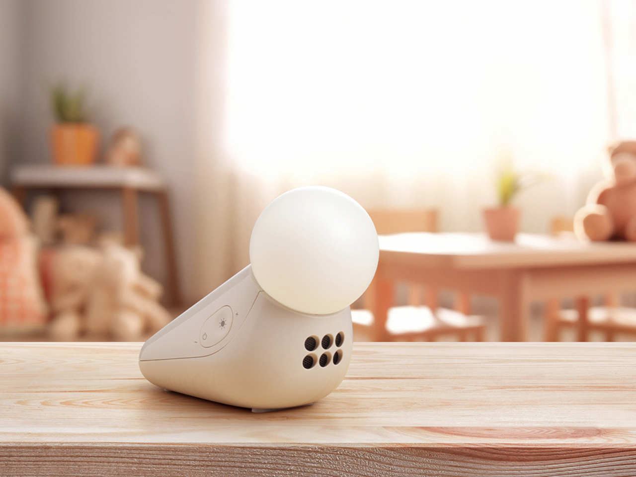
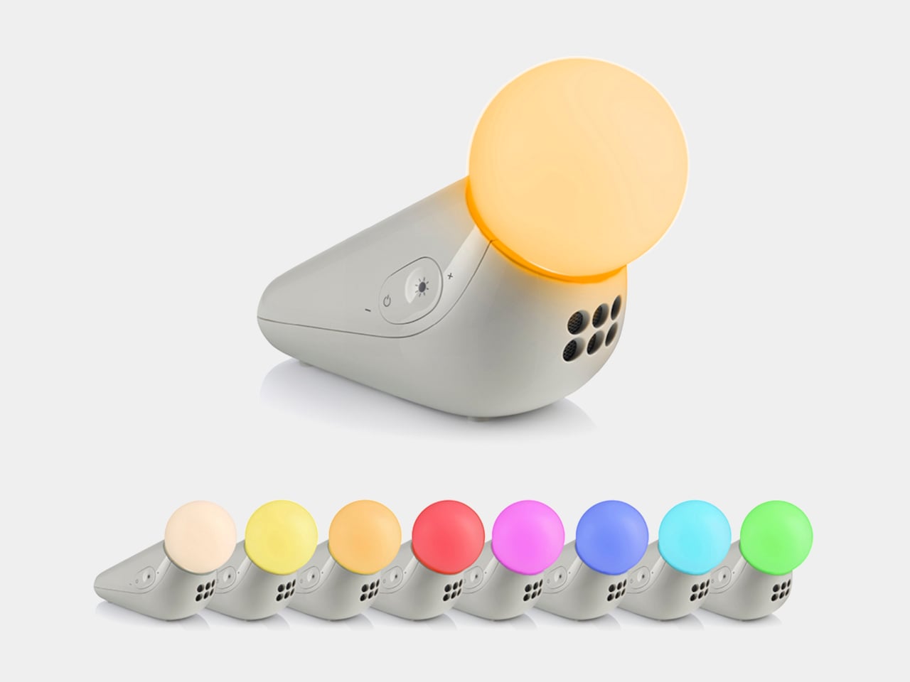
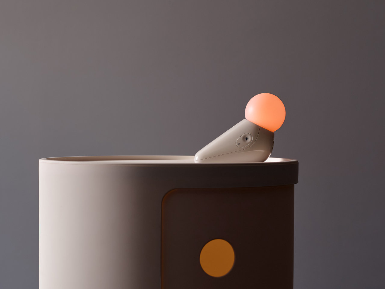
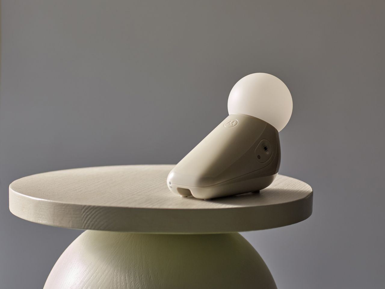
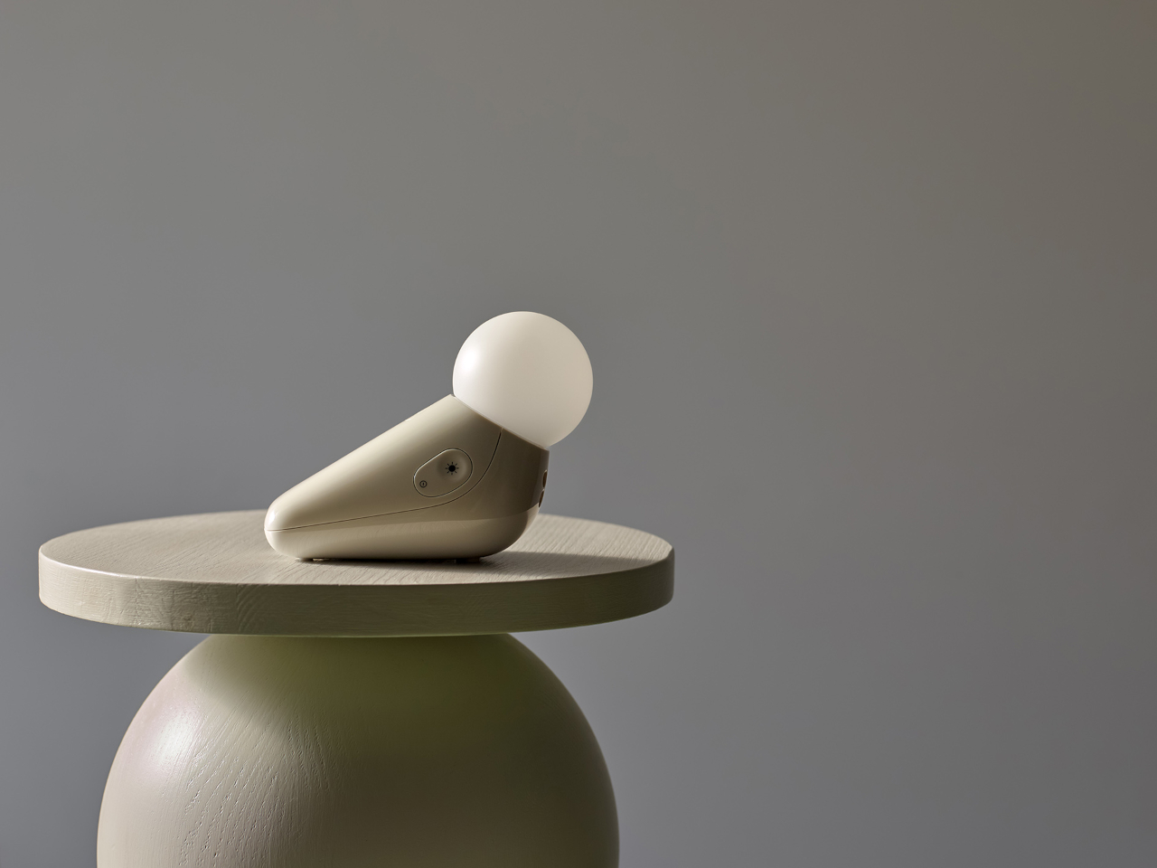
Industrial designer Tej Chauhan rethought that assumption through Motorola Nursery’s PIP collection, and the S1 Soother is the latest product from it. It begins with a sketch of a little seal, a soft, neotenic form drawing on the same mechanism that makes baby animals universally disarming. The rounded shape isn’t decorative padding over a functional core. It’s part of the reason the device works as well as it does.

Designer: Tej Chauhan for Motorola Nursery

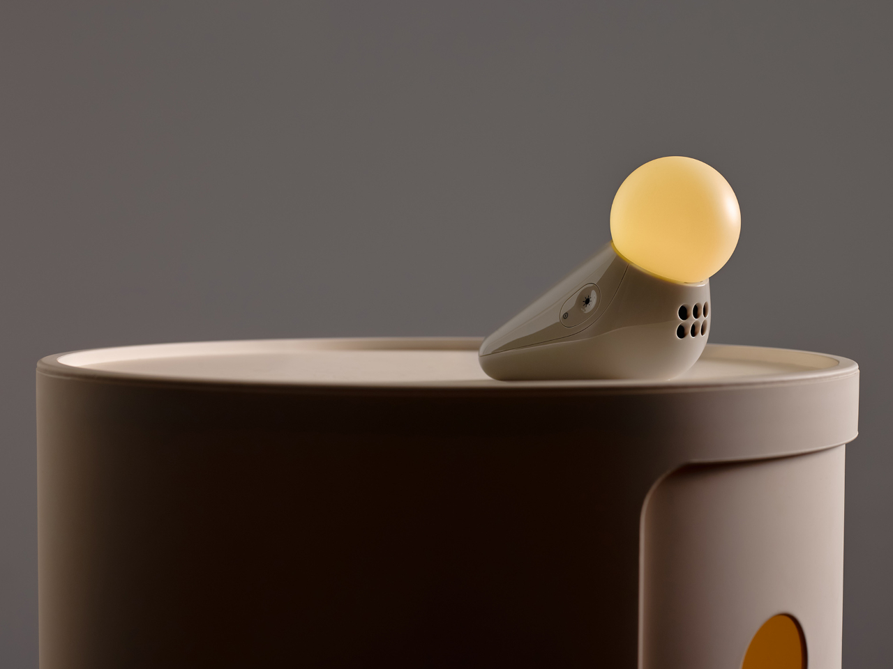
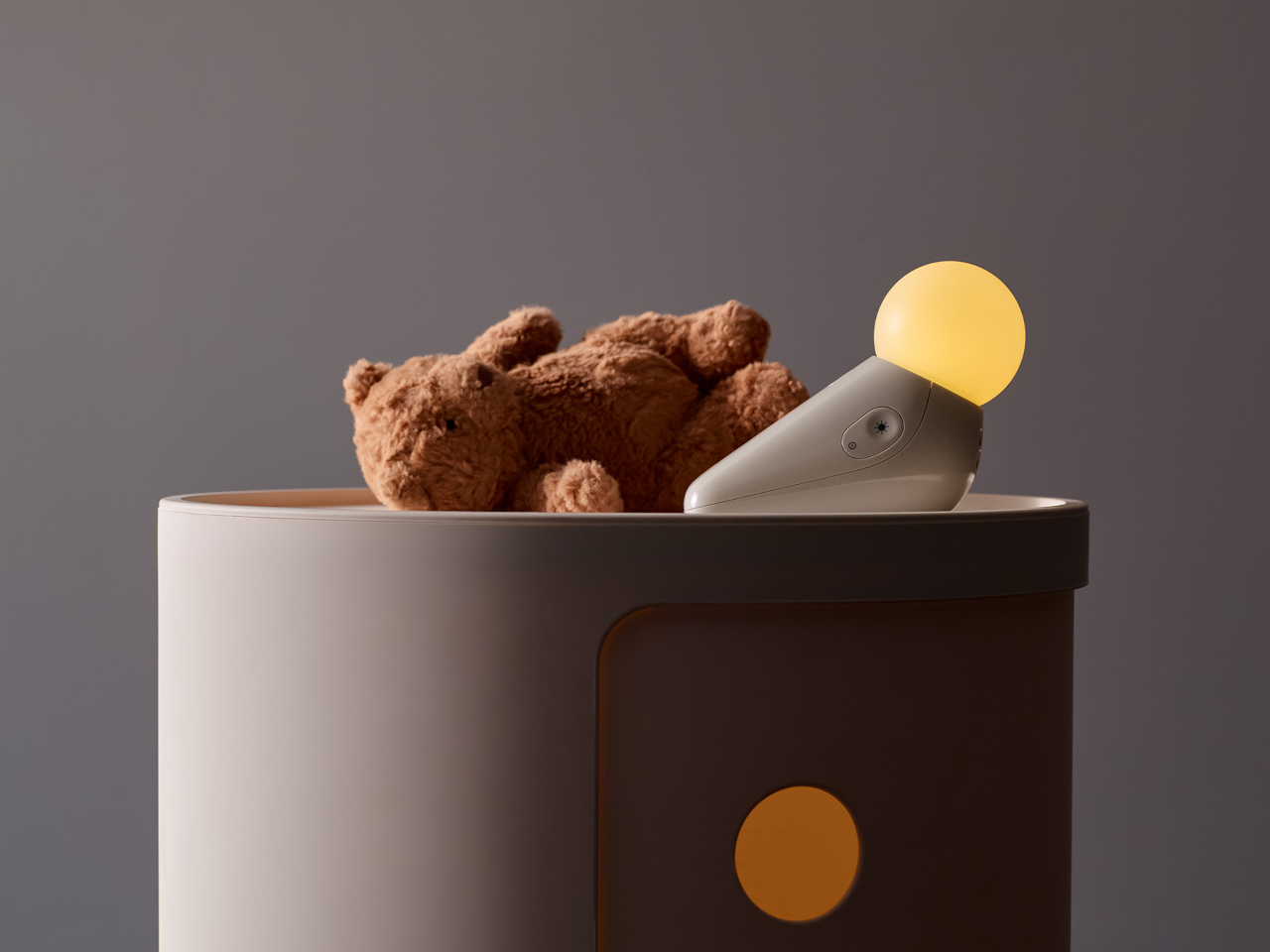
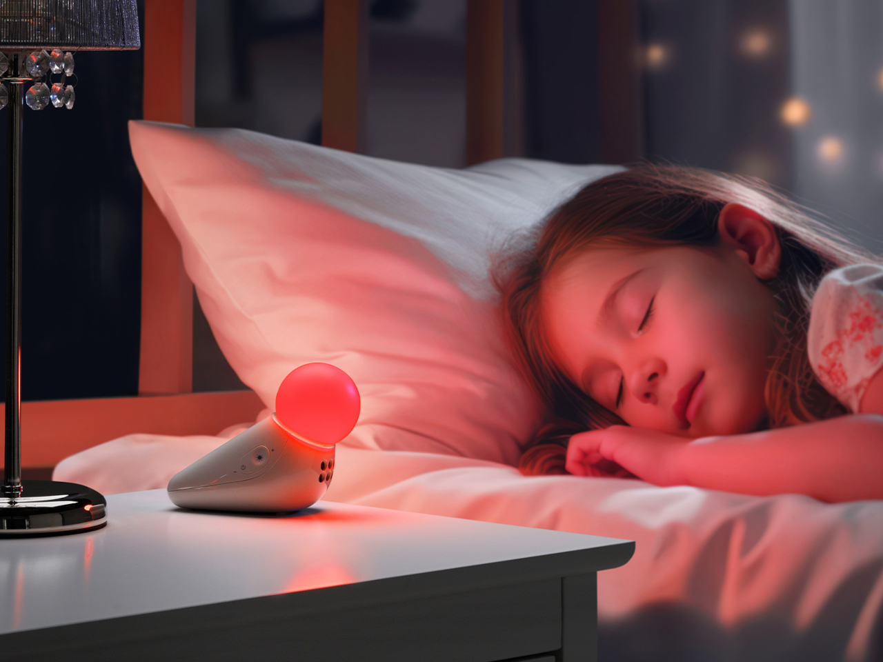
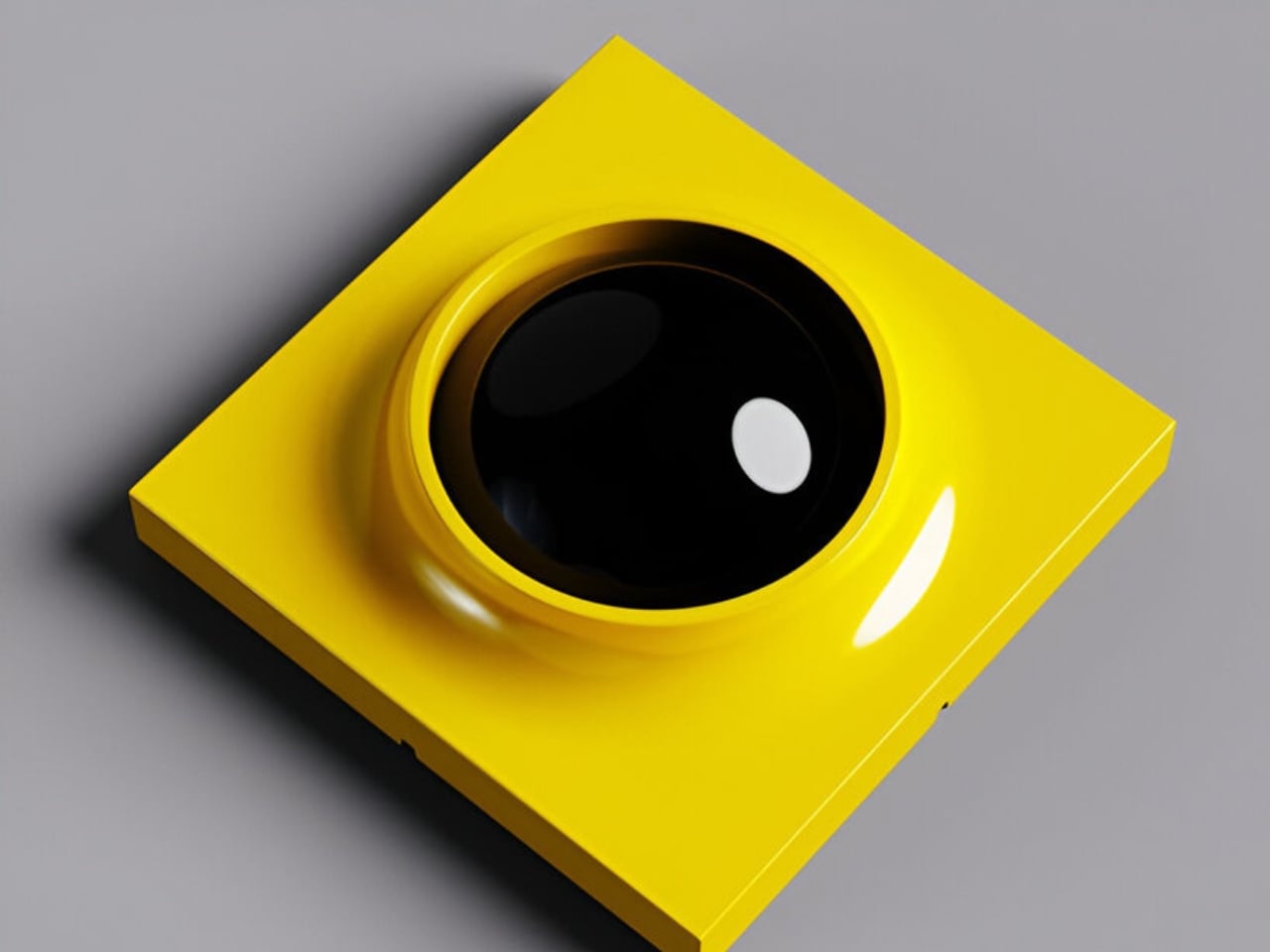
The form achieves something most nursery devices don’t: it looks considered even when it’s not on. Switched off, the S1 reads as a small sculptural object that a parent with a carefully arranged room wouldn’t feel compelled to hide. Switched on, the round tip glows in one of seven colors: yellow, orange, red, pink, blue, cyan, and green, adjustable across five brightness levels. The light is calm and diffuse by design.

The sound side offers ten options: three lullabies, three nature sounds, white noise, brown noise, a fan loop, and a womb sound, covering the range that different babies respond to. Parents who’ve cycled through multiple sound machines will appreciate that breadth in a single device. Volume adjusts across five levels, and USB-C charging sustains up to 50 hours of use per charge, covering weeks of nap times before the next top-up.

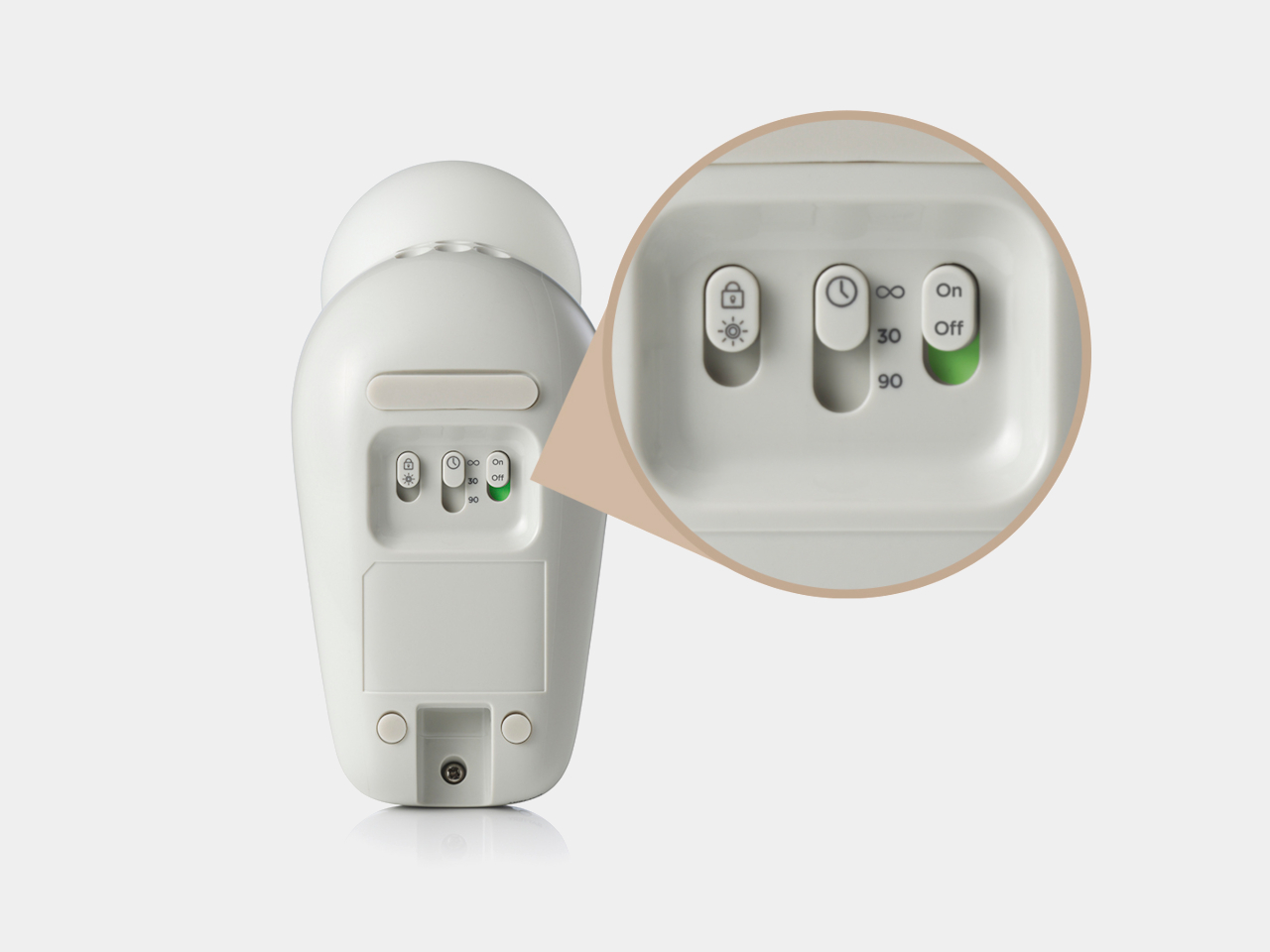
Portability isn’t incidental. The S1 travels in a bag without cables, without a base that won’t fit a hotel nightstand, and without the visual clash of a device that clearly belongs somewhere it isn’t. Non-toxic materials and rounded edges address the physical dimension of baby safety that gets less marketing attention than certification ratings but matters considerably more at close quarters with a curious infant.

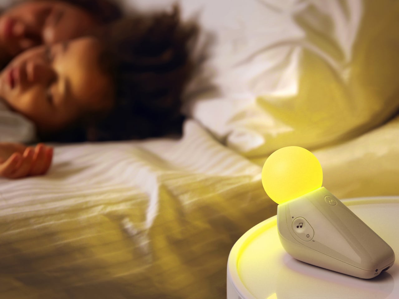
Chauhan has described the goal as inviting warmth into an everyday routine while making something beautiful enough to live anywhere in the home, goals that usually don’t apply to baby gear. The neotenic seal shape suggests calm before it does anything else, which is the point. A device that parents genuinely want in the room works harder than one they merely tolerate because it does the job.

The objects that occupy a nursery carry more emotional weight than the ones in any other room. Chauhan’s goal, inviting warmth into an everyday routine while making something beautiful enough to keep, sounds loftier than a $29.99 nightlight deserves. But the design argument is sincere, and so is the result. Parents who’ve spent months chasing the right combination of light and sound will recognize what they’re getting.

The post Motorola Just Made the Baby Soother That’s Actually Worth Displaying first appeared on Yanko Design.
One Revolution Per Minute: How THE MIROR Makes Time Visible

Most lamps exist to solve a problem: you need light, so you buy a lamp. THE MIROR Collection, by design studio MIRORlab, starts from a completely different premise. Rather than asking how to illuminate a room, it asks what light could be if it were designed to make you feel the passage of time. The answer is a kinetic lighting system that is part optical instrument, part ambient installation, and one of the more quietly radical design concepts I’ve come across in recent memory.

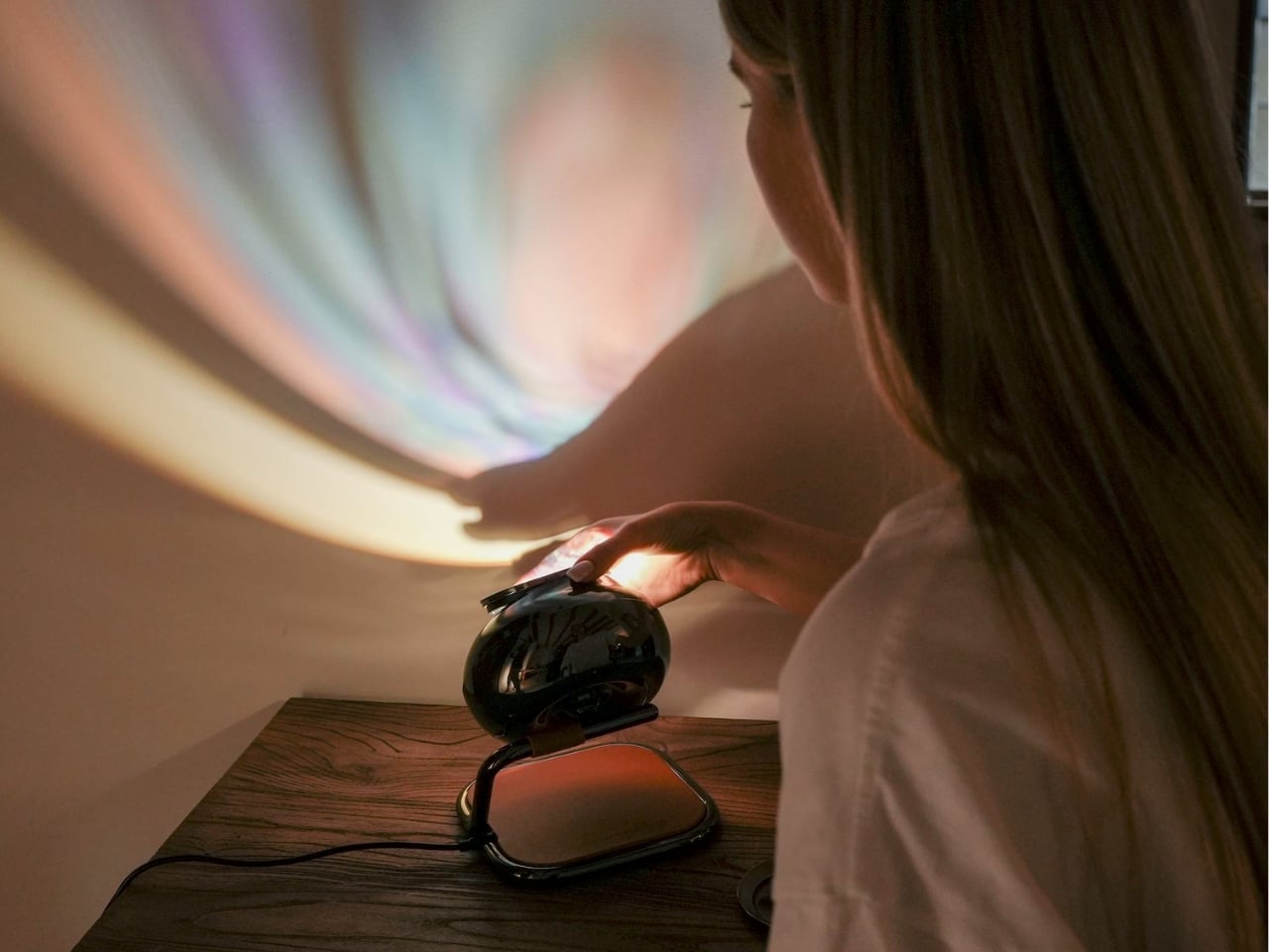
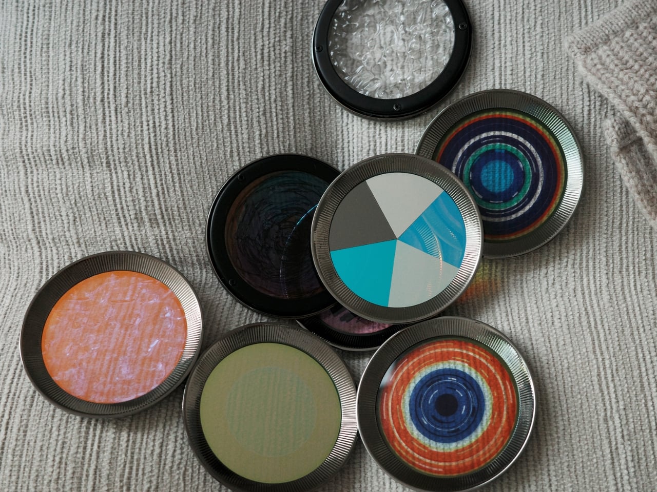
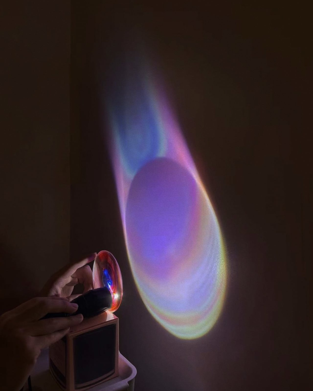
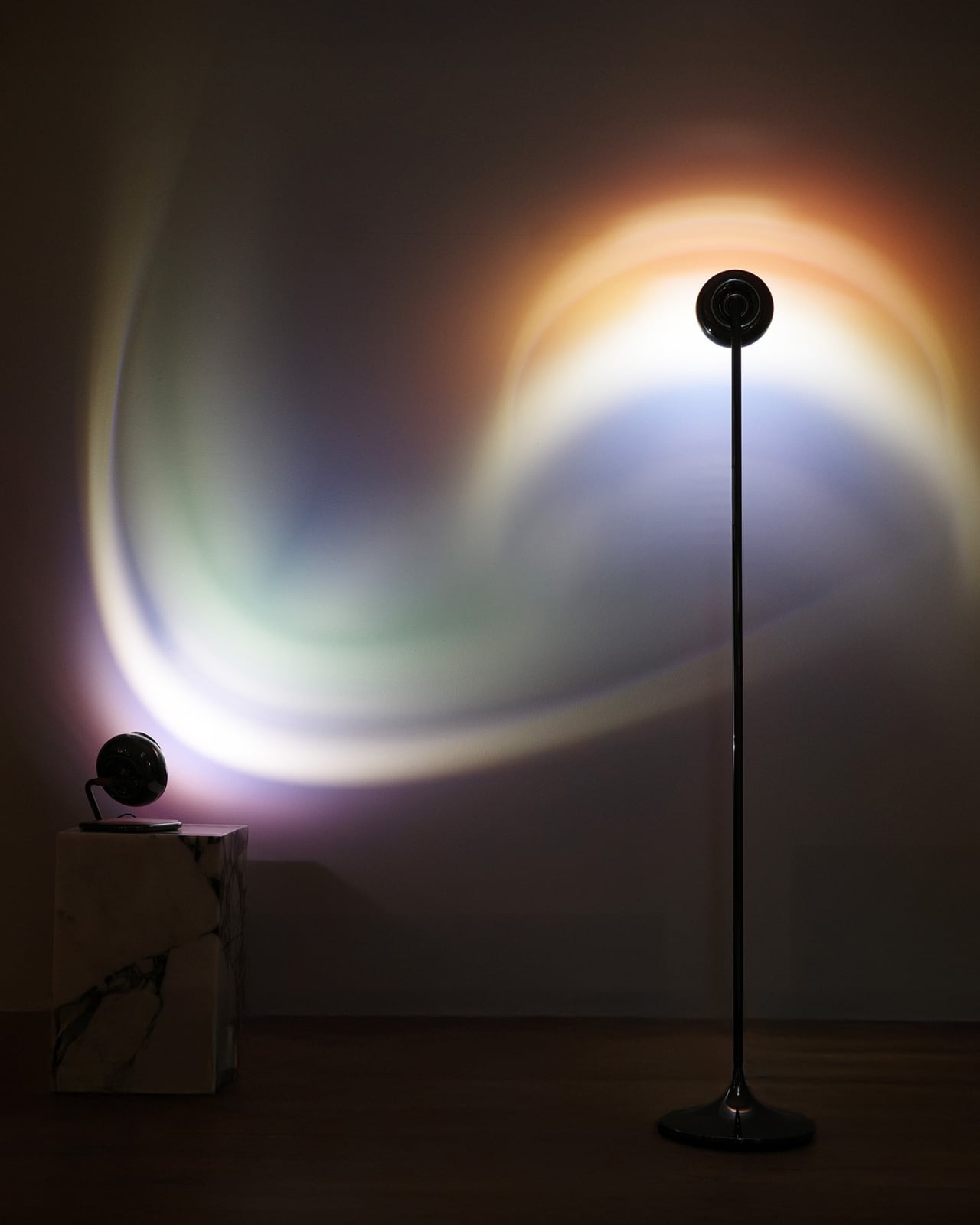
At its heart, THE MIROR is built around a slowly rotating light source paired with a set of six interchangeable magnetic glass lenses. Each lens contains embedded micro-patterns and textures that refract and fragment light into shifting projections across walls, ceilings, and floors. Nothing in the room physically changes. Yet from one minute to the next, the space looks and feels entirely different. The effect is genuinely mesmerizing, the kind of thing you notice out of the corner of your eye and then can’t stop watching.

Designer: MIRORlab

The detail worth dwelling on is the rotation speed: exactly one revolution per minute. That’s not an arbitrary number. It’s calibrated to align with a natural perceptual rhythm, slow enough to feel meditative rather than dizzying, but active enough that you remain aware of it at all times. The light is always doing something. It’s the design equivalent of a really good ambient soundtrack, present without being intrusive, affecting the room without demanding your full attention.

What MIRORlab is essentially arguing is that most lighting design treats time as irrelevant. You flip a switch, the room is lit, and that’s the end of the relationship. THE MIROR reframes light as a time-based medium, something that unfolds, rotates, and transforms continuously. No two projected moments are ever identical, even with the same lens. In that sense, it has less in common with conventional lighting and more in common with kinetic sculpture or generative art. The lamp isn’t just a tool for visibility. It’s a system for experiencing duration.

The six lenses, named Earth, Nebula, Dune, Bloom, Warmwhite, and Metropolis, were each developed through research into atmospheric perception and environmental light conditions. The reference points are genuinely cinematic: sunset diffusion across open landscapes, deep-space nebula imagery, solar eclipse transitions, water reflections under shifting cloud cover, and city lights seen from altitude at night. Most product designers think in finishes and colorways. MIRORlab thought in atmospheres. Swapping a lens doesn’t just adjust the quality of the light; it changes the entire emotional register of the room, and that’s a remarkable thing to get out of a piece of magnetized glass.

I think the broader cultural moment makes THE MIROR feel especially timely. We spend more time than ever in rooms that don’t change, and the relationship between a person and their living space has become both more intimate and more psychologically loaded. Design has started responding to that shift with a growing category of objects that prioritize atmosphere over function: white noise machines, scent diffusers, smart lighting systems, biophilic elements. All of them are answers to the same underlying question about how space should make us feel. THE MIROR fits cleanly into that conversation, but with a level of optical and conceptual depth that most of its peers simply don’t reach. It doesn’t just set a mood. It gives the room a sense of time passing, which is a genuinely different thing.

The more I sit with THE MIROR Collection, the less it feels like a lighting product and the more it feels like a quiet philosophical statement. It suggests that a room should move with you rather than simply surround you, that ambient experience doesn’t have to be passive, and that something as unassuming as a lamp can carry a real point of view about how we inhabit space. That’s a significant ask of a rotating glass lens. But if the projections look anything like the concept promises, it’s a completely fair one.

The post One Revolution Per Minute: How THE MIROR Makes Time Visible first appeared on Yanko Design.
The Space Age Never Left, RETROCORE Just Made It Official

Every few years, design circles get swept up in nostalgia for a very specific era: the 1960s vision of the future. The curved furniture, the orbital shapes, the warm glow of a lamp that feels both alien and oddly cozy. We keep returning to it because, as futures go, it was a beautiful one to imagine, full of optimism and clean lines and a belief that living beautifully was something everyone deserved.

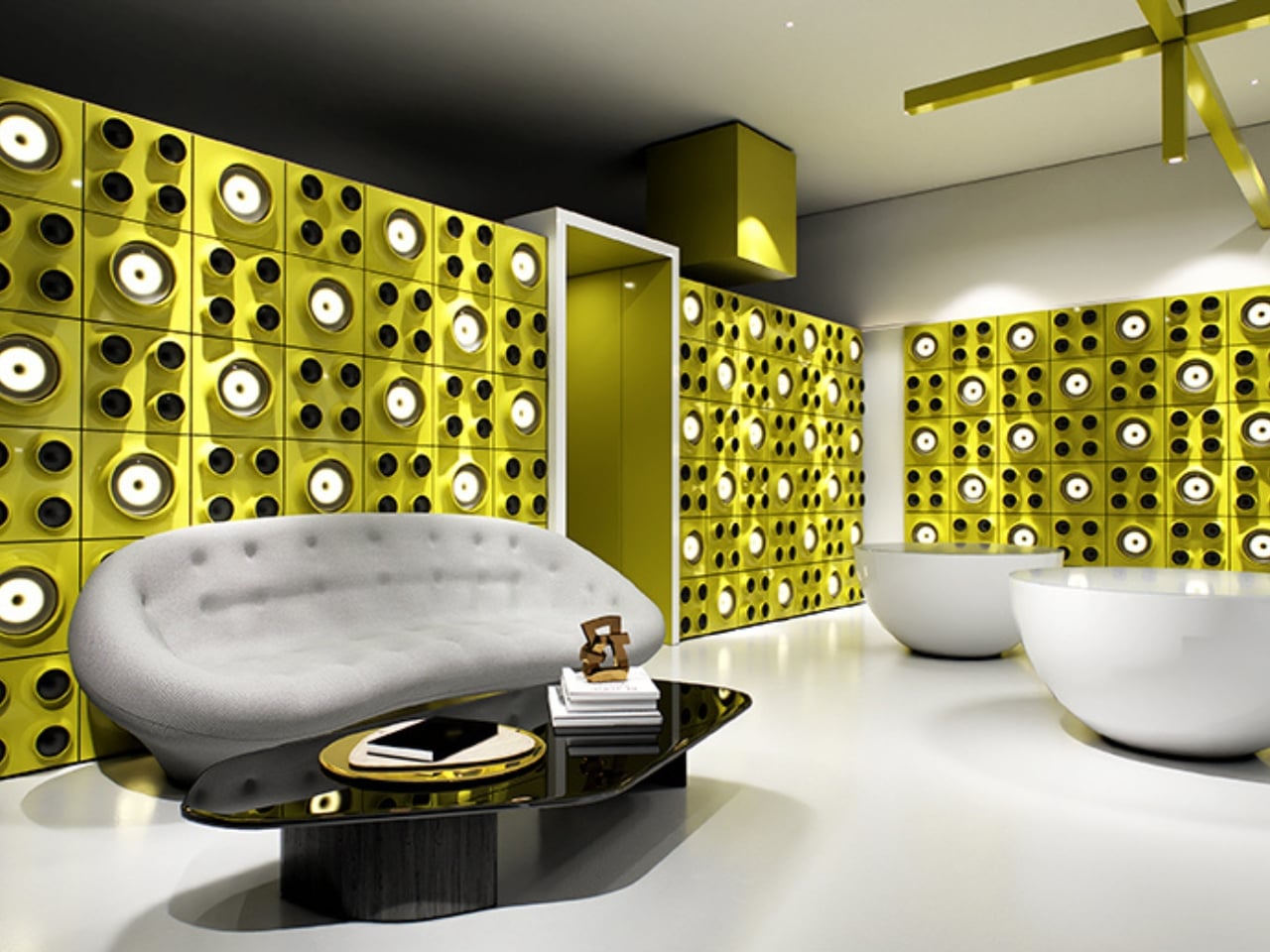
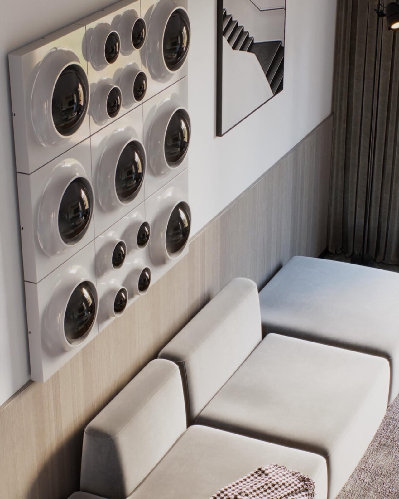
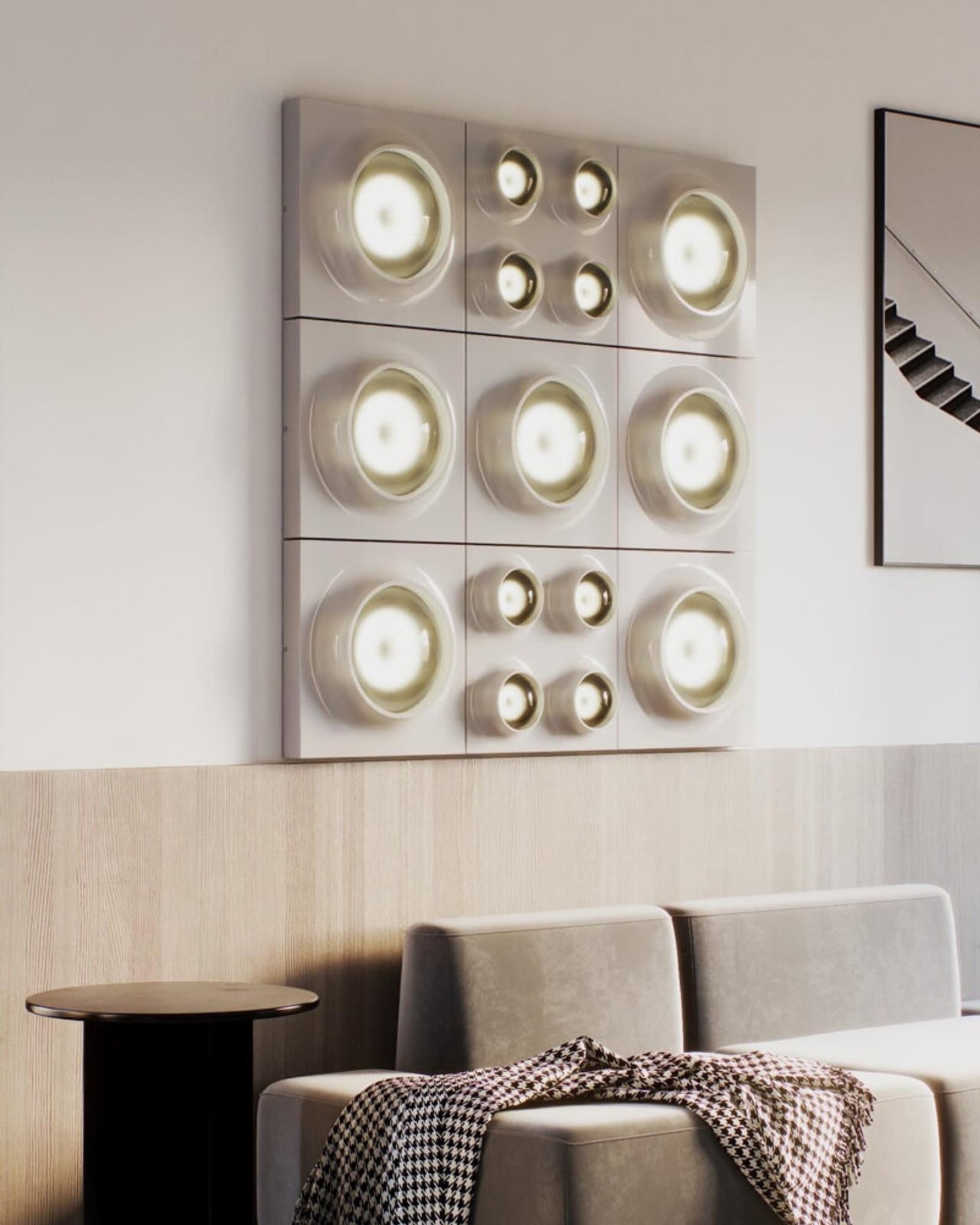
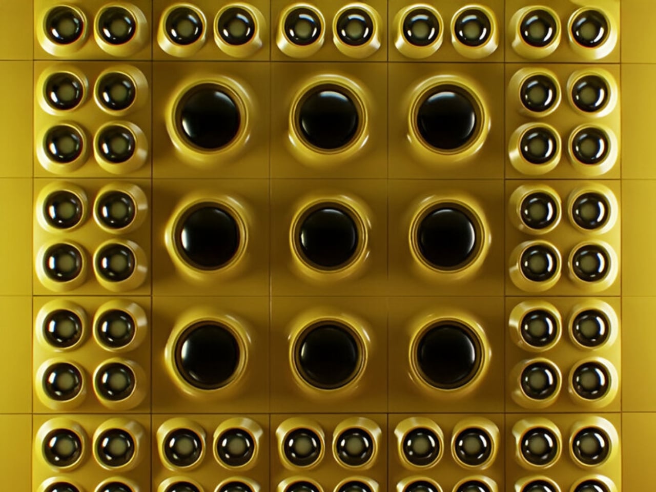
RETROCORE, the latest project from the team behind WOLOLOW, understands that pull completely. Designed by Arthur Koshatahyan and Kostya Trunov, it’s a modular wall and ceiling lighting system that borrows the visual language of Space Age design and reframes it as something you can actually build into your home, your studio, or anywhere light and personality intersect.

Designers: Arthur Koshatahyan and Kostya Trunov

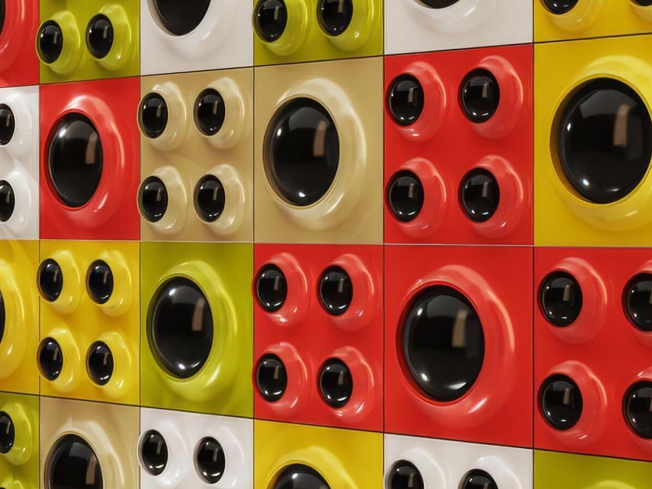
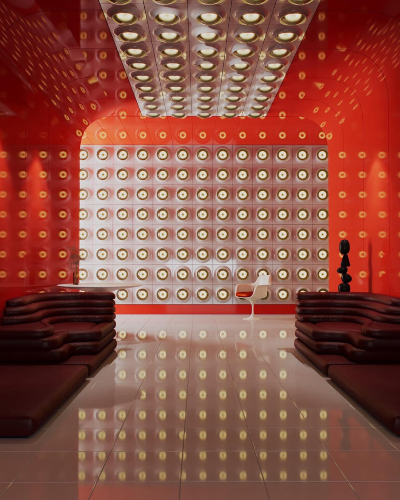
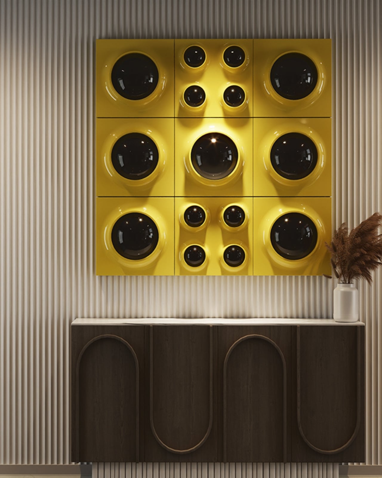
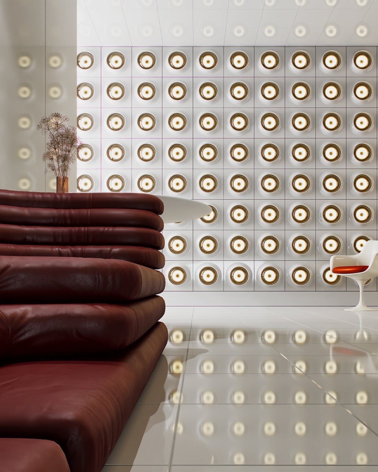
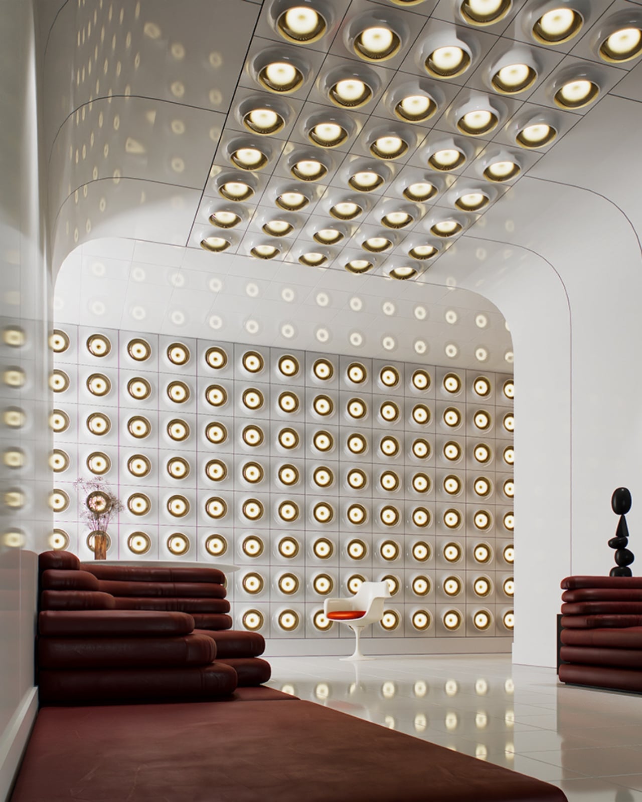
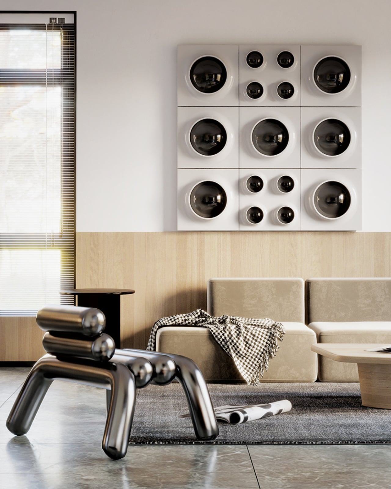
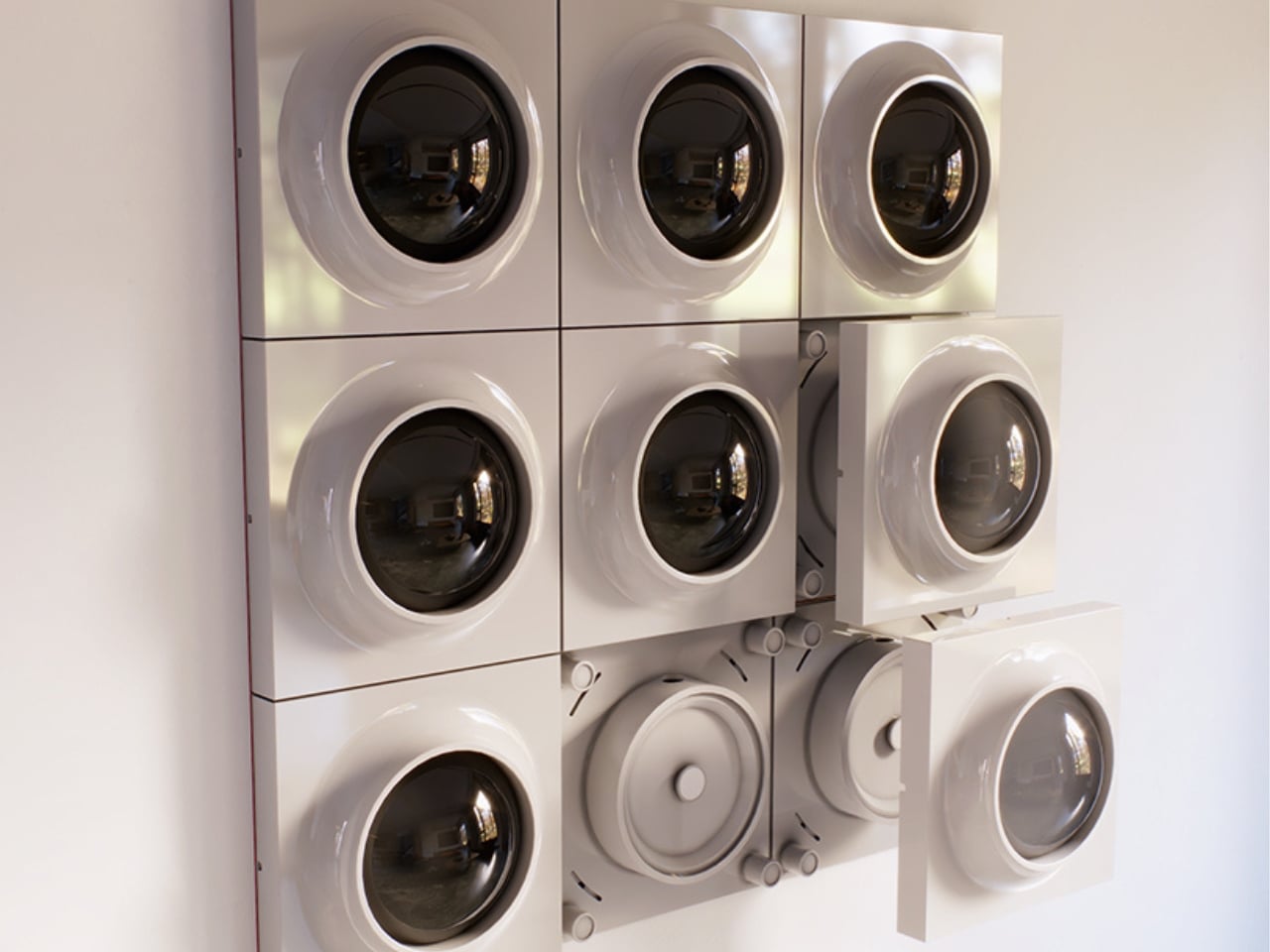
The concept is deceptively simple. At its core, RETROCORE is made up of individual light panels that combine into custom configurations, scaling up from a single accent piece to a full architectural installation. Two panel types do the heavy lifting: MONO, which features a single illuminated aperture, and QUATRO, which carries four within the same square format. Snap them together in different arrangements and you’re essentially composing with light, the way someone might arrange art on a wall or tiles across a floor. The configurations can stay small and subtle or grow into something that commands the room entirely.

That modularity is the whole point, and it’s where RETROCORE separates itself from the usual retro-inspired lighting piece that looks great in a showroom and then sits stubbornly in one corner forever. Koshatahyan and Trunov describe it as “a new way to bring Space Age design into modern interiors, not only as a lamp, but as a modular building block of light.” And that framing matters. It positions RETROCORE not as decor, but as infrastructure, something that can grow, change, and adapt alongside the spaces it inhabits.

The backstory is worth knowing. WOLOLOW began as a UFO-shaped night light, a miniature riff on the iconic Futuro House, that tiny flying-saucer dwelling designed by Finnish architect Matti Suuronen in the late 1960s. That first product found an audience, went through the full crowdfunding process, and the lessons from building, manufacturing, and shipping a physical design object directly shaped what came next. RETROCORE isn’t a pivot so much as an evolution, a deeper commitment to the same aesthetic universe but with far more ambition built in.

One quietly clever detail: the white version of the panels can be repainted after installation. That means the lighting can blend seamlessly into a surface, disappearing into the ceiling or wall and leaving only the glowing apertures visible, or it can be deliberately contrasted against a painted background. It’s a small thing, but it shows the kind of considered thinking that separates a product designed to be sold from one designed to be lived with over time.

Retro-futurism as an aesthetic tends to get treated as a costume. You slap some Jetsons curves on a lamp, call it Space Age, and move on. RETROCORE doesn’t quite fall into that trap. The modular logic behind it feels genuinely contemporary, even as the visual references are firmly rooted in mid-century optimism. It’s the difference between wearing a vintage look and actually understanding why it worked in the first place, and why it still does.

Whether you install one panel as a quiet nod to the era or map out an entire ceiling composition, RETROCORE offers what a lot of statement lighting simply can’t: the ability to keep editing. Your room changes, your taste shifts, your wall gets repainted, and the system accommodates all of it without you having to start over.

For a design moment that often prizes the singular, precious object, there’s real appeal in something built to be rearranged. RETROCORE is currently on Kickstarter, and if it delivers on what the images promise, it could work just as well in a minimalist apartment as it does in a maximalist creative studio. That flexibility, more than the retro aesthetics, is the actual sell.

The post The Space Age Never Left, RETROCORE Just Made It Official first appeared on Yanko Design.
Frankfurt’s Solar Lights That Look Better Than Your Living Room Lamp

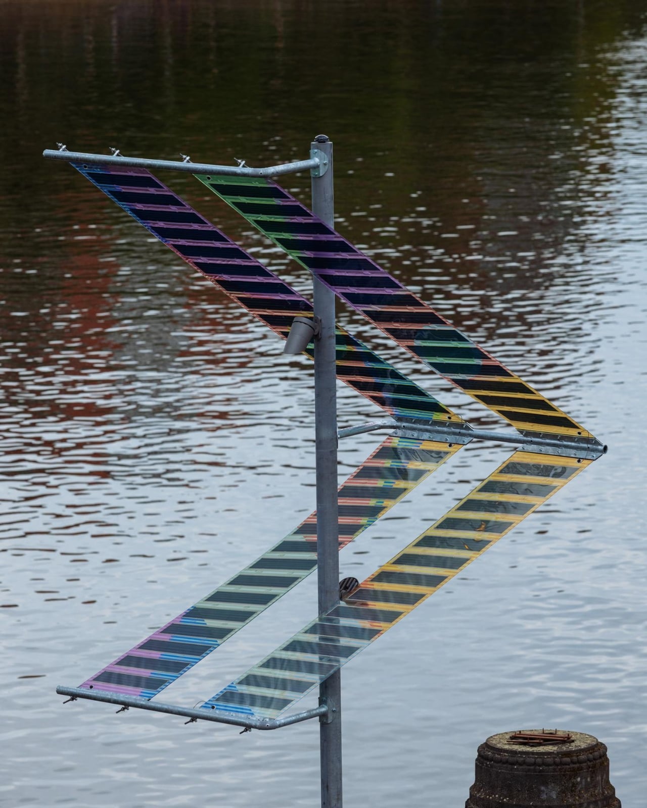
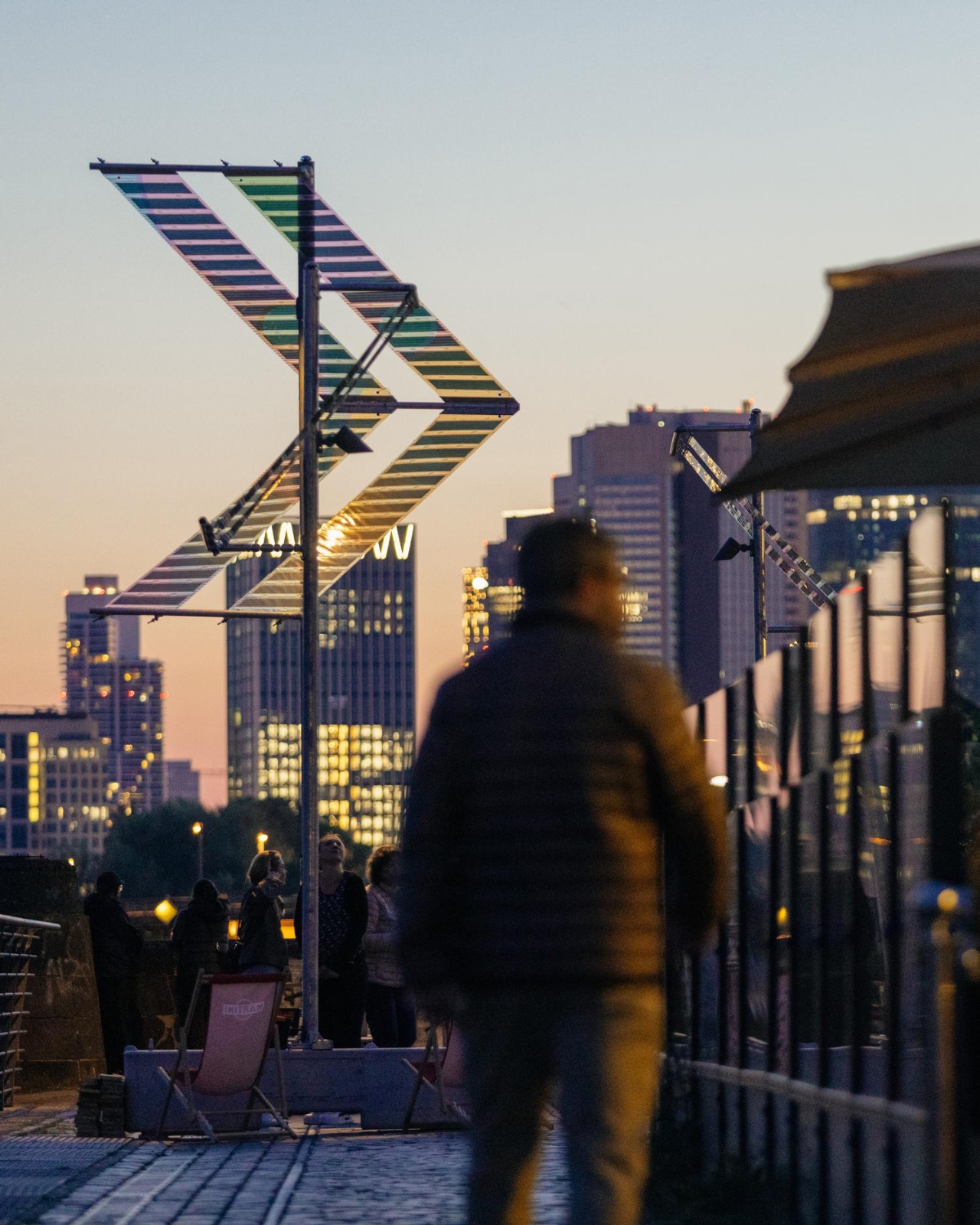
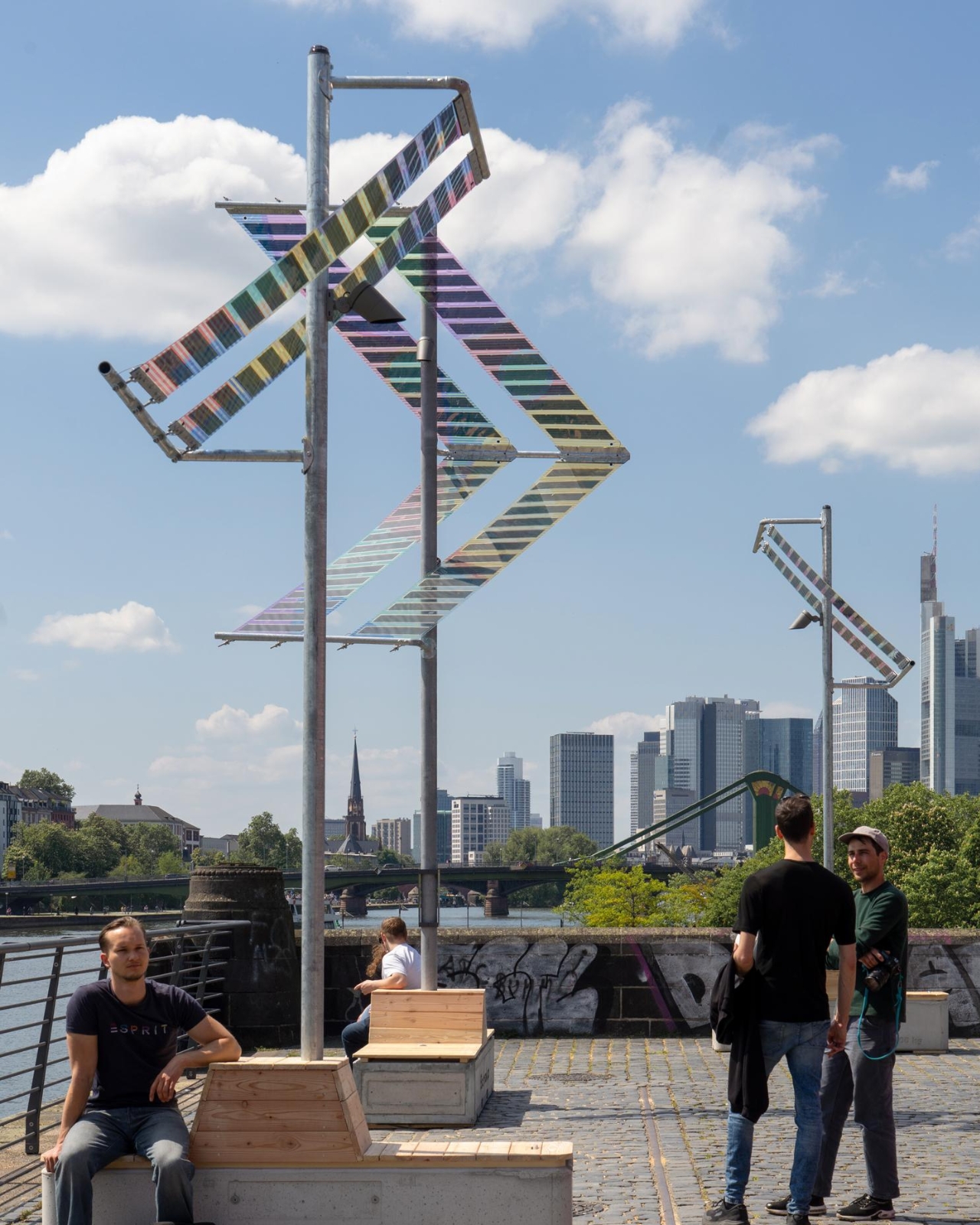
If you’ve ever walked along a riverbank at night and squinted up at a buzzing fluorescent streetlamp wondering who designed that thing and why, Munich-based duo ttal just made that question feel very urgent. Their installation Main Light, currently glowing along Frankfurt’s Weseler Werft as part of the World Design Capital Frankfurt RheinMain 2026 programme, is one of those rare projects that makes you rethink infrastructure entirely.

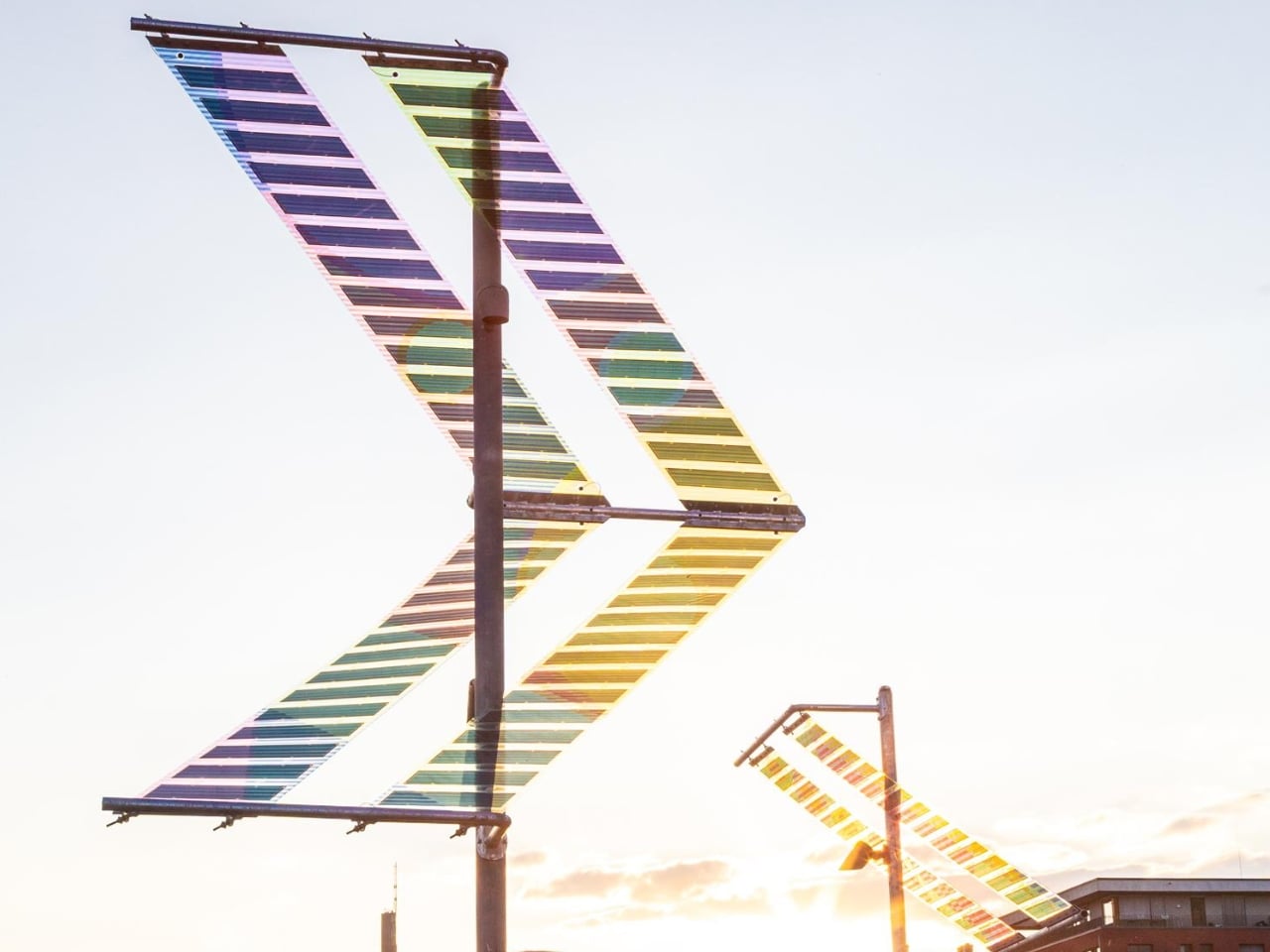
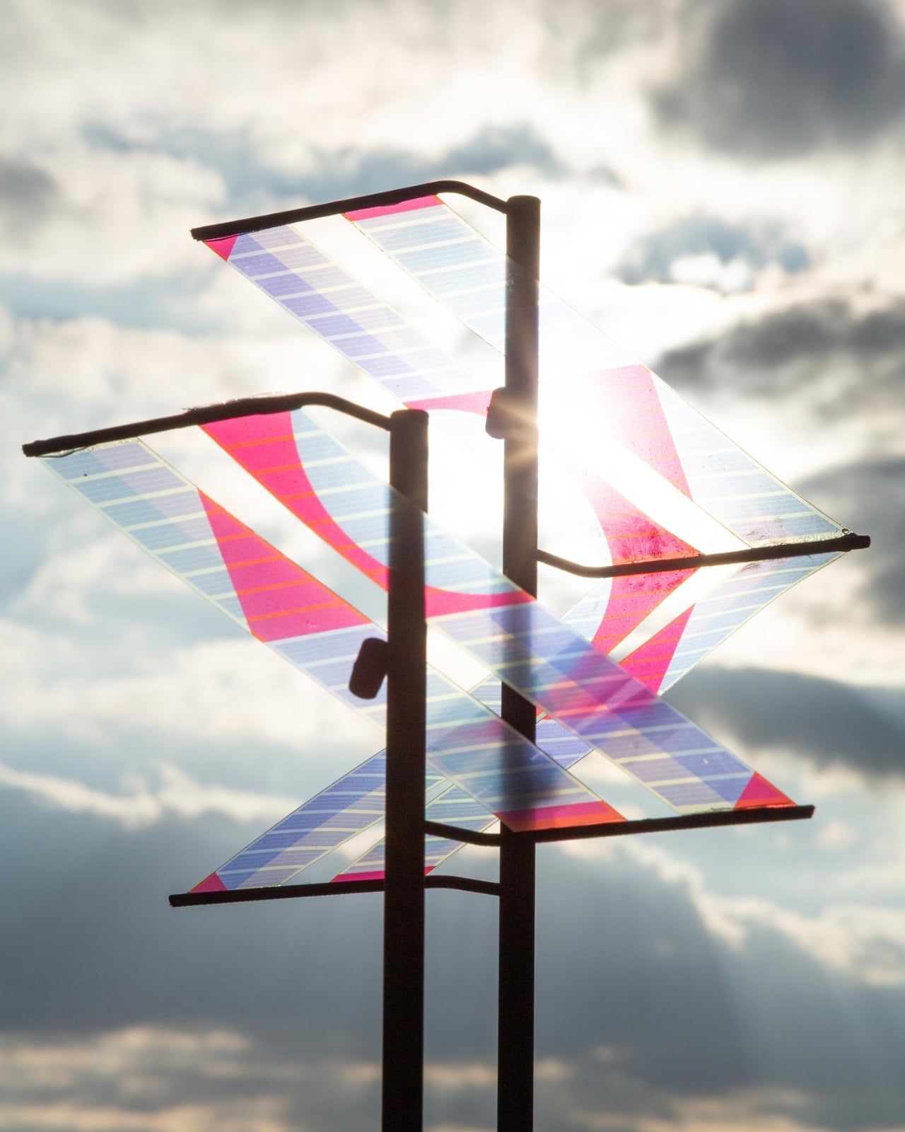
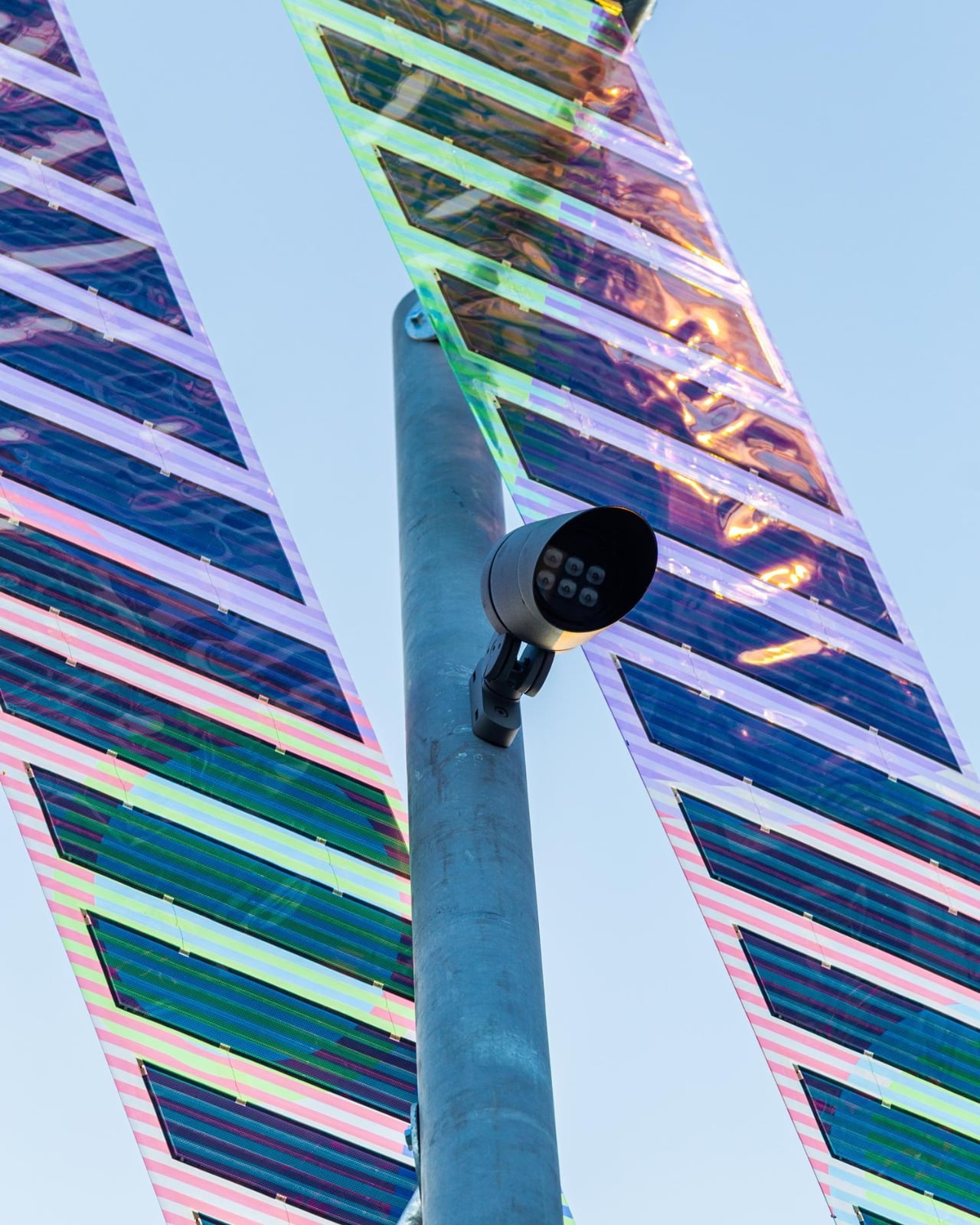
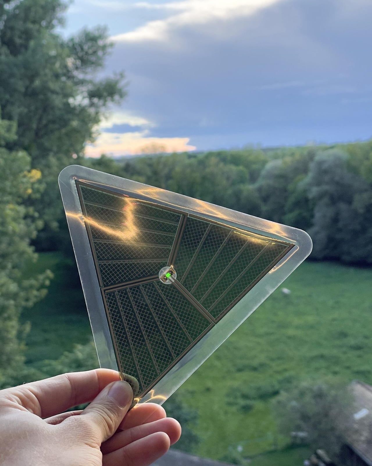
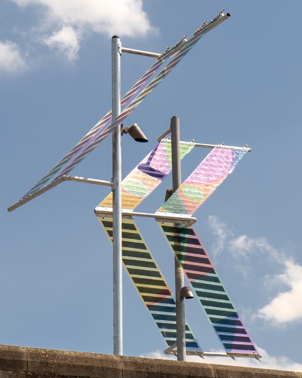
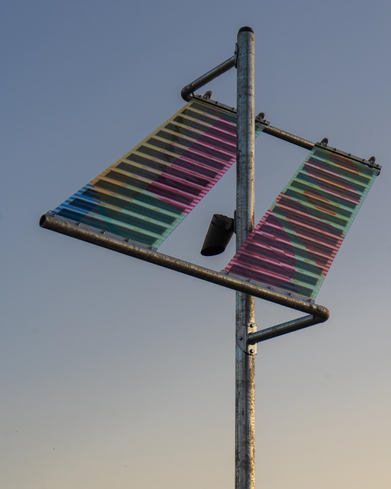
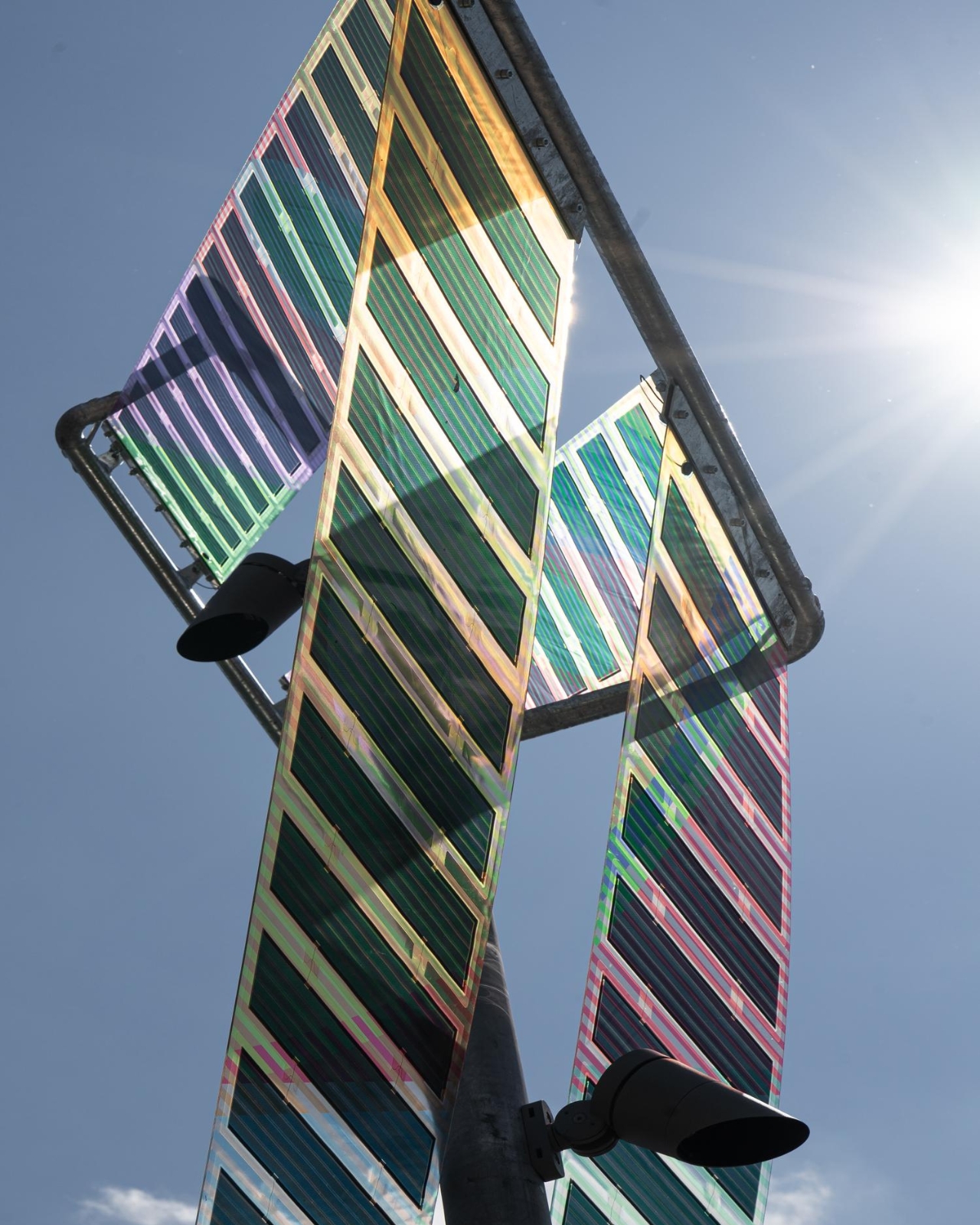
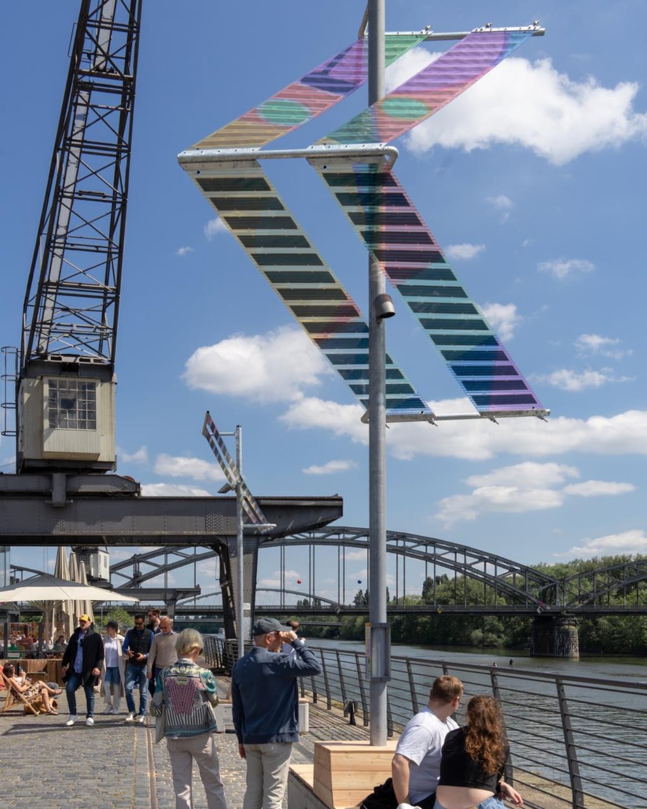
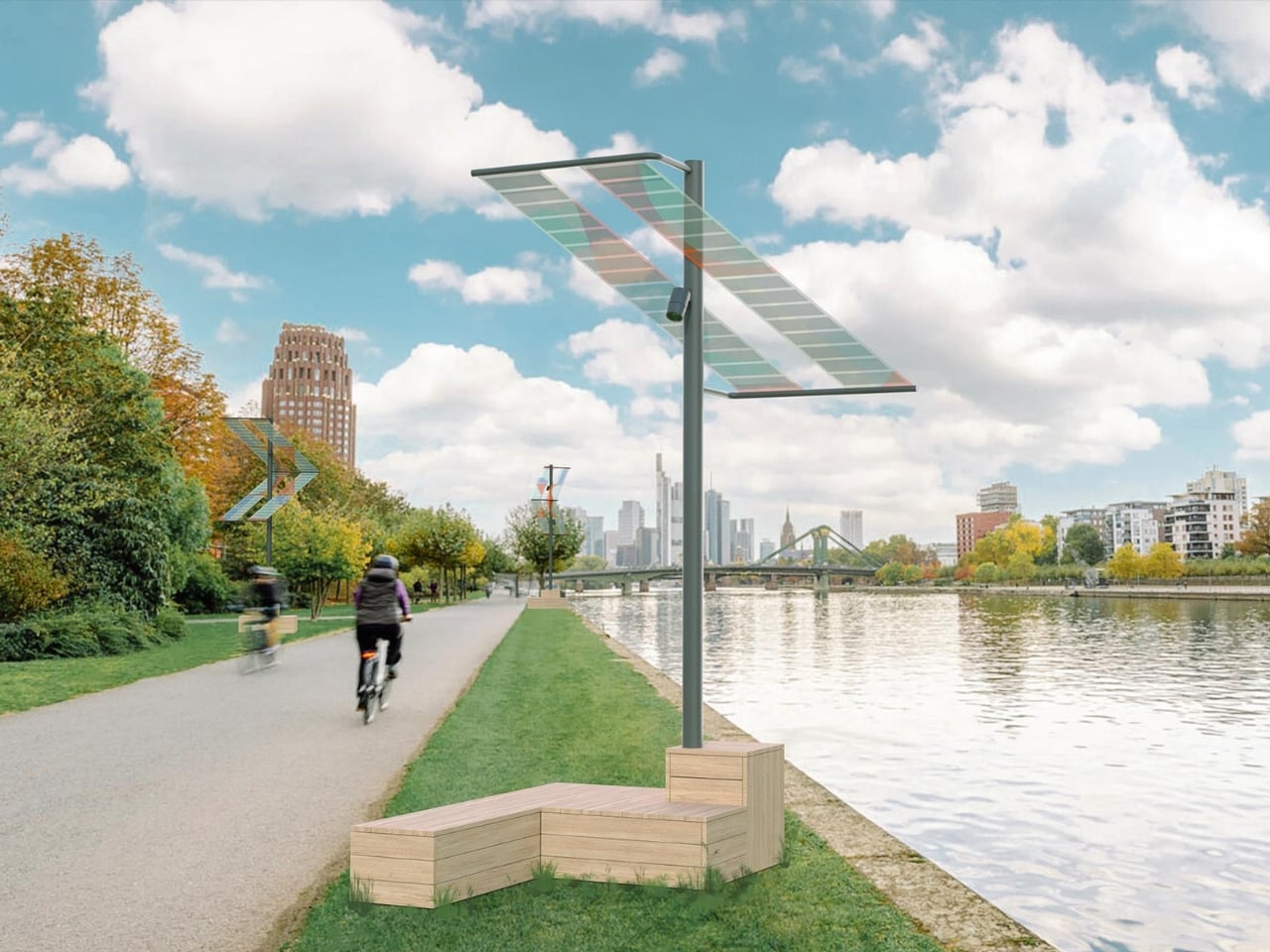
ttal, the design studio formed by Tobias Trübenbacher and Andreas Lang, built Main Light around a deceptively simple premise: public lighting doesn’t have to be ugly, energy-hungry, or ecologically reckless. The result is a self-sufficient solar installation that runs completely off-grid, no power lines buried underground, no permanent excavation, and no connection to the city grid whatsoever. It generates its own electricity through organic photovoltaic (OPV) solar films, those wonderfully colorful translucent panels that make the whole structure look like it belongs in a design museum rather than on a bike path. And that’s exactly the point.

Designer: Tobias Trübenbacher (ttal)

During the day, the solar surfaces catch the light and cast shifting, multicolored patterns across the riverbank. The horizontal stripes of the laminated solar cells aren’t hidden away or treated as a necessary evil. They’re the main visual event. The design essentially says: clean energy can be beautiful, and we should stop pretending otherwise. Trübenbacher, who was named Newcomer of the Year by the German Design Council at the German Design Award in 2023, has described design as a tool for social change, and Main Light reads exactly like that philosophy made physical.

The ecological thinking goes deeper than solar panels, too. Main Light only switches on when a motion sensor detects a person nearby, meaning it doesn’t flood the riverbank with unnecessary light through the night. More quietly significant is its light spectrum. The installation deliberately avoids the blue-heavy frequencies common in most modern LED street lighting, opting instead for an insect-friendly spectrum that’s gentler on nocturnal ecosystems. Light pollution is one of those invisible crises we rarely talk about loudly enough, and seeing it addressed this thoughtfully in a public installation feels quietly radical.

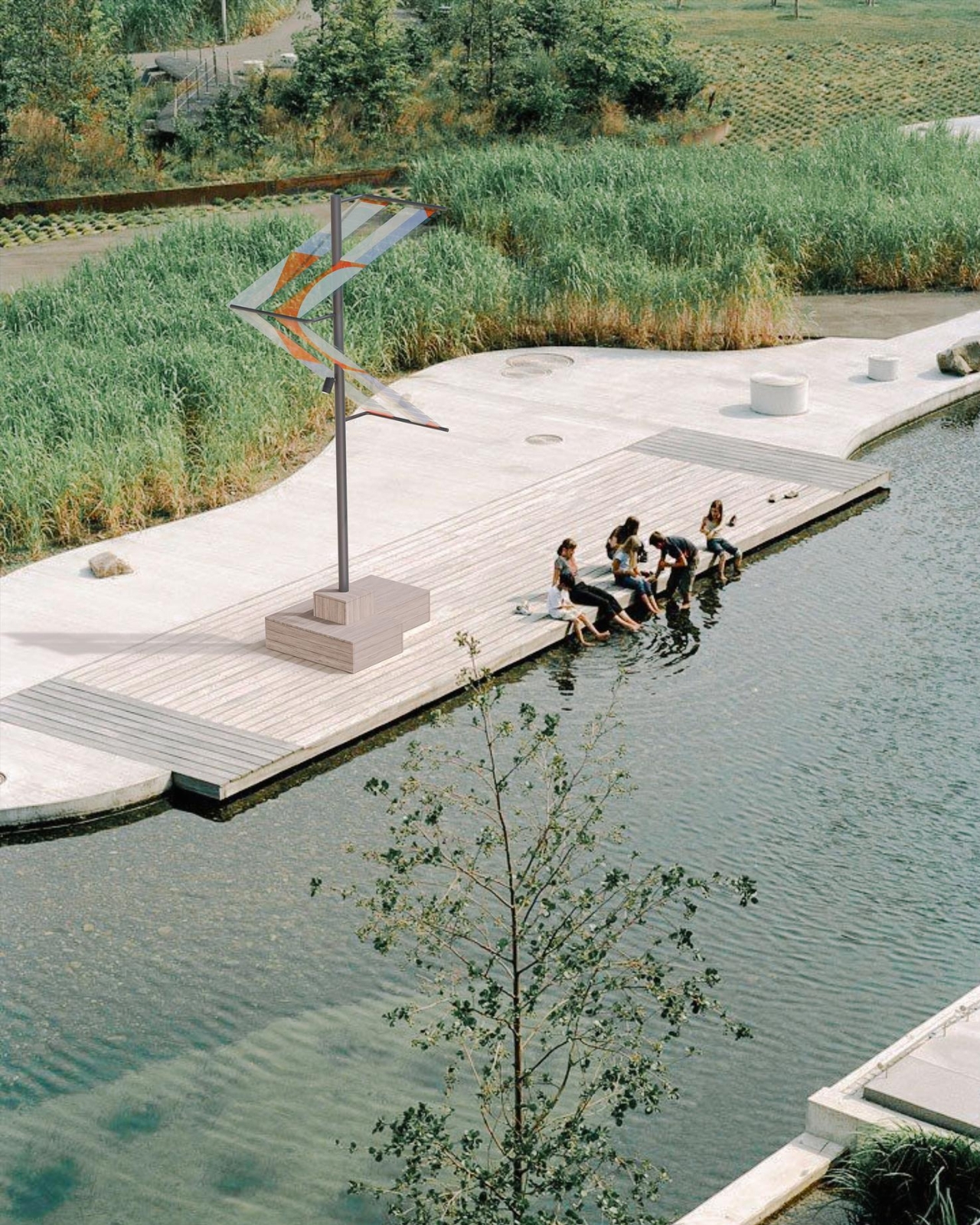
The structural decisions are just as considered. The foundations are reversible concrete bases that also function as urban furniture, places to sit, to pause, to look at the river. Trübenbacher and Lang worked with ewo GmbH on lighting and control technology, ASCA GmbH on the organic photovoltaic systems, and Schake GmbH on the steel construction. Four structures in total were installed near the Oosten restaurant, one large and three smaller units, running from May to November 2026.

The installation sits within a broader conversation about what public infrastructure is allowed to look like. For too long, sustainability has been sold with a kind of visual apologetics, the clunky panel, the utilitarian form, the implicit suggestion that doing the right thing means sacrificing aesthetics. Main Light refuses that trade-off. The colored OPV panels turn the energy-generation process into something visible, even celebratory, a reminder that the transition away from fossil fuels doesn’t need to be grey and joyless.

The duo is also running workshops and public events alongside the installation through the summer months, which matters. A beautiful object without discourse risks becoming wallpaper. The conversations ttal wants to start are about energy, public space, and who gets to decide what our streets look like. These aren’t niche design industry questions. They affect how livable, how safe, and how ecologically responsible our cities actually become.

Cities across Europe and beyond are already reaching out about scaling the project, and it’s easy to see why. Main Light doesn’t require the ground to be torn up. It doesn’t need a power grid. It works, it glows, and it looks genuinely gorgeous against the Frankfurt skyline. The bike paths and riverbanks of the world deserve better than what they usually get. Trübenbacher and Lang have proven, at least along one stretch of the River Main, that we’re already capable of delivering it.

The post Frankfurt’s Solar Lights That Look Better Than Your Living Room Lamp first appeared on Yanko Design.
This Streaming Light Concept Is Its Own Carrying Case

Streaming lights have quietly become a staple of the modern content creator’s travel kit. The compact ones clip onto a laptop screen and add professional-grade lighting without adding much bulk. That portability comes with a real catch, though. Without built-in protection, the light panel is vulnerable once it’s packed alongside cables, drives, and adapters. Few of these devices ship with any kind of case, and creators often have to improvise.

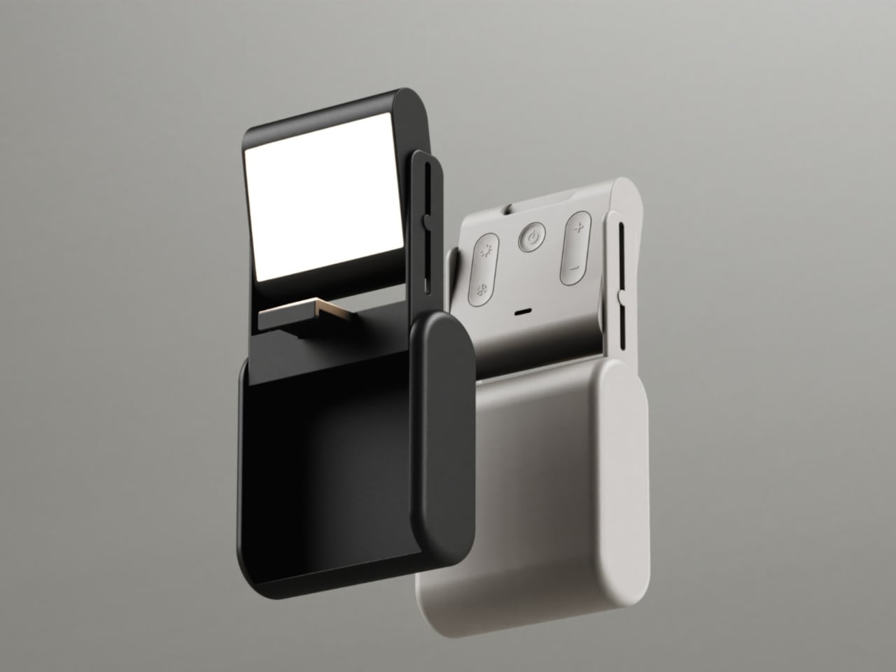
Litra Lumen is an unofficial concept, not affiliated with or made by Logitech, that takes the Litra Glow as its starting point and rethinks it for creators constantly on the move. The central idea is straightforward: instead of needing a case, what if the device simply became one? That single premise shaped almost every decision that followed, from the overall form factor down to how the light opens and deploys.

Designer: Koushik Viragani

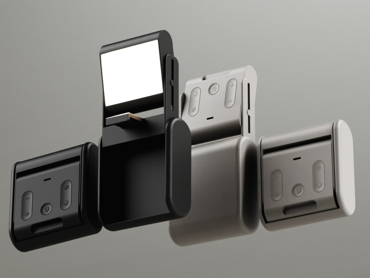
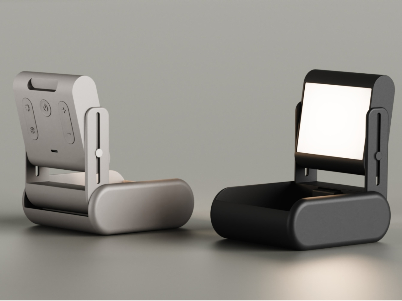
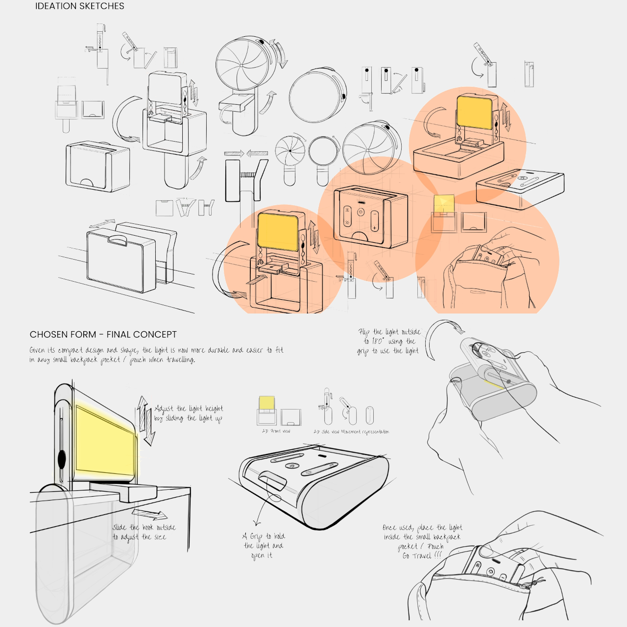
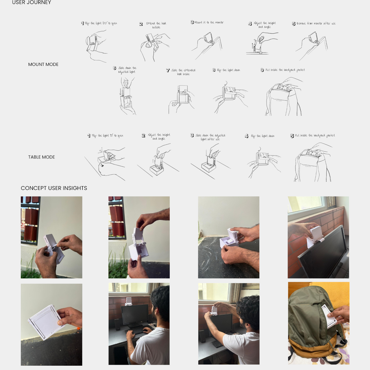
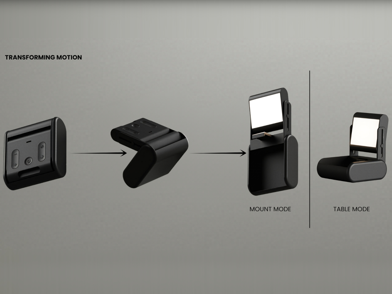
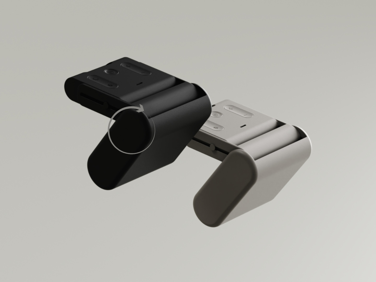
The mechanism at the heart of the concept is a rotation. The light panel pivots inward, nestling into a hollow protective body that shields it completely during transport. The result is a compact rectangular block with a pill-shaped base, small enough to slip into a backpack side pocket without a second thought. Nothing protrudes, nothing needs wrapping, and there’s no dedicated pouch to hunt for before heading out.

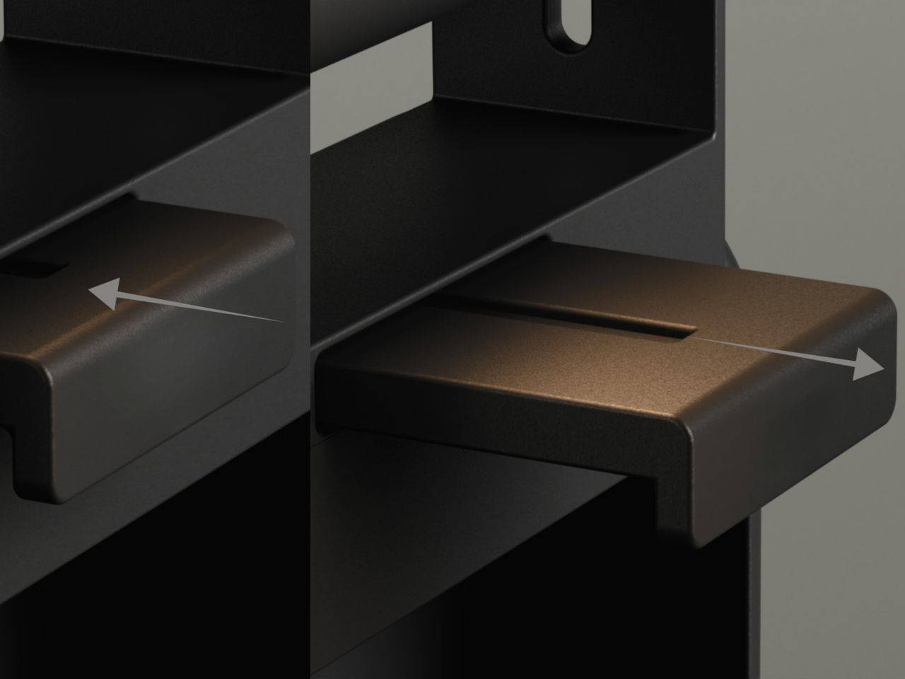
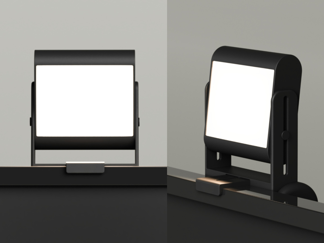
Flipping the light panel 90 degrees is all it takes to go from travel mode to working mode. In mount mode, an extendable hook slides out from the base and clips onto the top edge of a monitor or laptop screen. The light can then be slid up or down the arm to find the ideal height, the same way you’d adjust any conventional monitor-mounted key light.

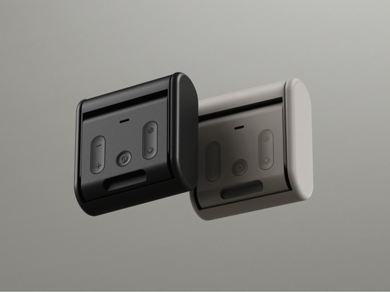
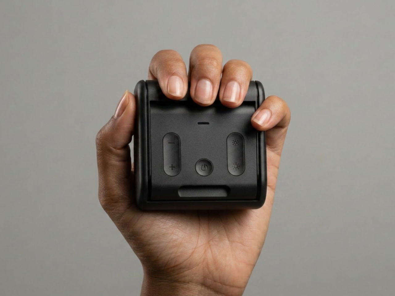
For setups without a screen to clip onto, a table mode turns the base into a freestanding stand. The light panel rotates up and angles toward the subject, making it just as capable on a café table or a hotel desk as it would be in a full home studio. Physical buttons on the back panel control brightness and color temperature, keeping essential adjustments simple and tactile.

The design draws from Logitech’s existing visual language, with matte surfaces, rounded proportions, and a restrained control layout that feels familiar without being derivative. Two colorways, a dark charcoal and a light off-white gray, give the concept a quiet, product-ready confidence. A complementary visual identity was also developed alongside the hardware, imagining how this kind of device might communicate its purpose as a distinct product line.

What makes Litra Lumen compelling isn’t any single feature but the discipline behind all of them. The rotational mechanism, the extendable hook, and the base that doubles as a stand, each answers the same question in a different context. For a creator moving between a studio, a café, and an overnight bag in the same week, a streaming light that packs without thought is one that actually comes along.

The post This Streaming Light Concept Is Its Own Carrying Case first appeared on Yanko Design.
Oberhauserer’s Balloon Lamp Makes Concrete Feel Surprisingly Weightless

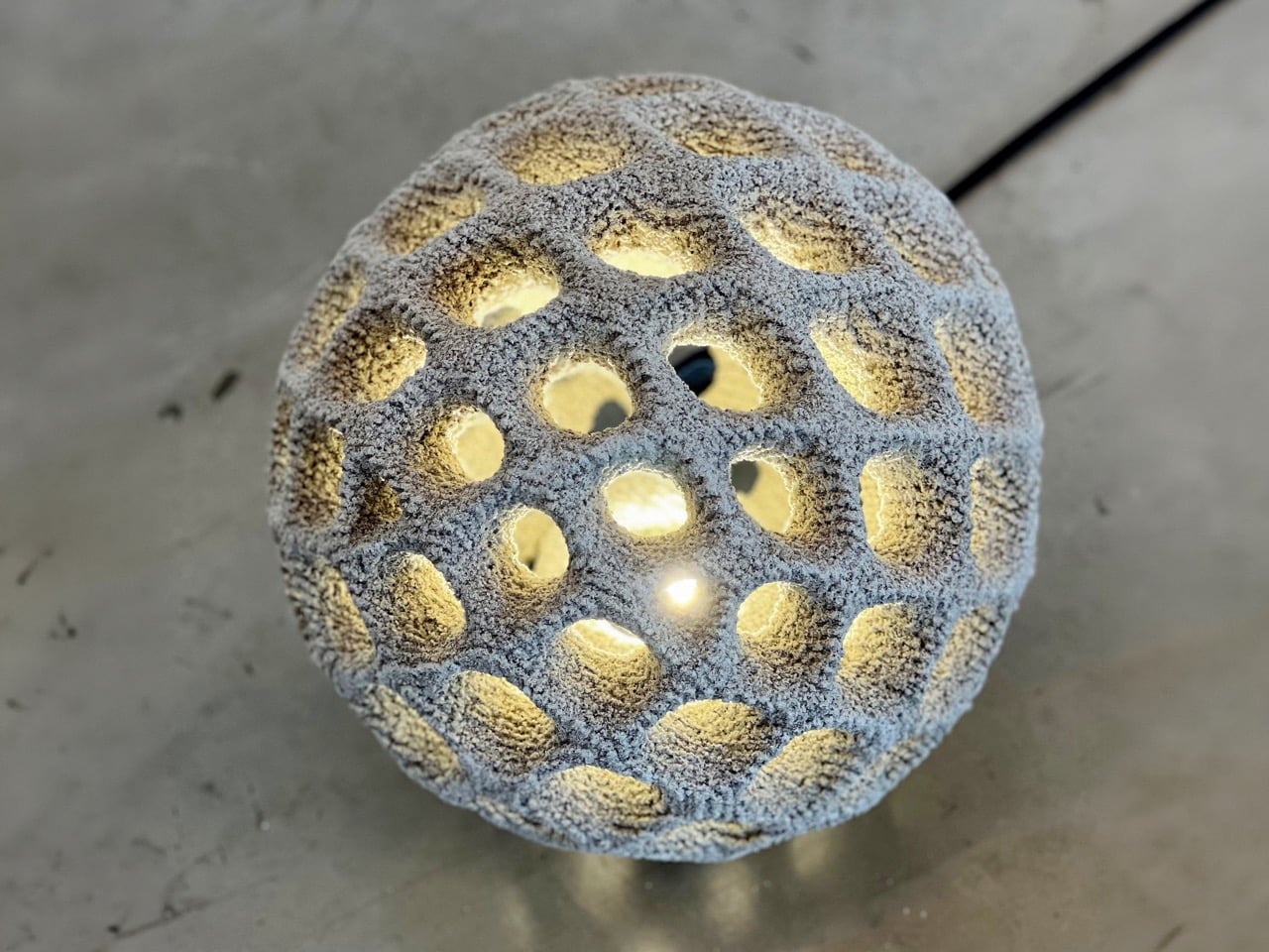
Outdoor lighting is usually seen as something practical. It lights up a pathway, softens a garden, marks an entrance, or creates a mood after dark. Oberhauserer’s Balloon takes that familiar idea and pushes it into a more experimental space. Designed by Martin Oberhauser, the lamp brings together concrete, light, and digital manufacturing in a way that feels surprisingly poetic. It has the presence of a sculptural object, but it still belongs naturally in outdoor spaces.

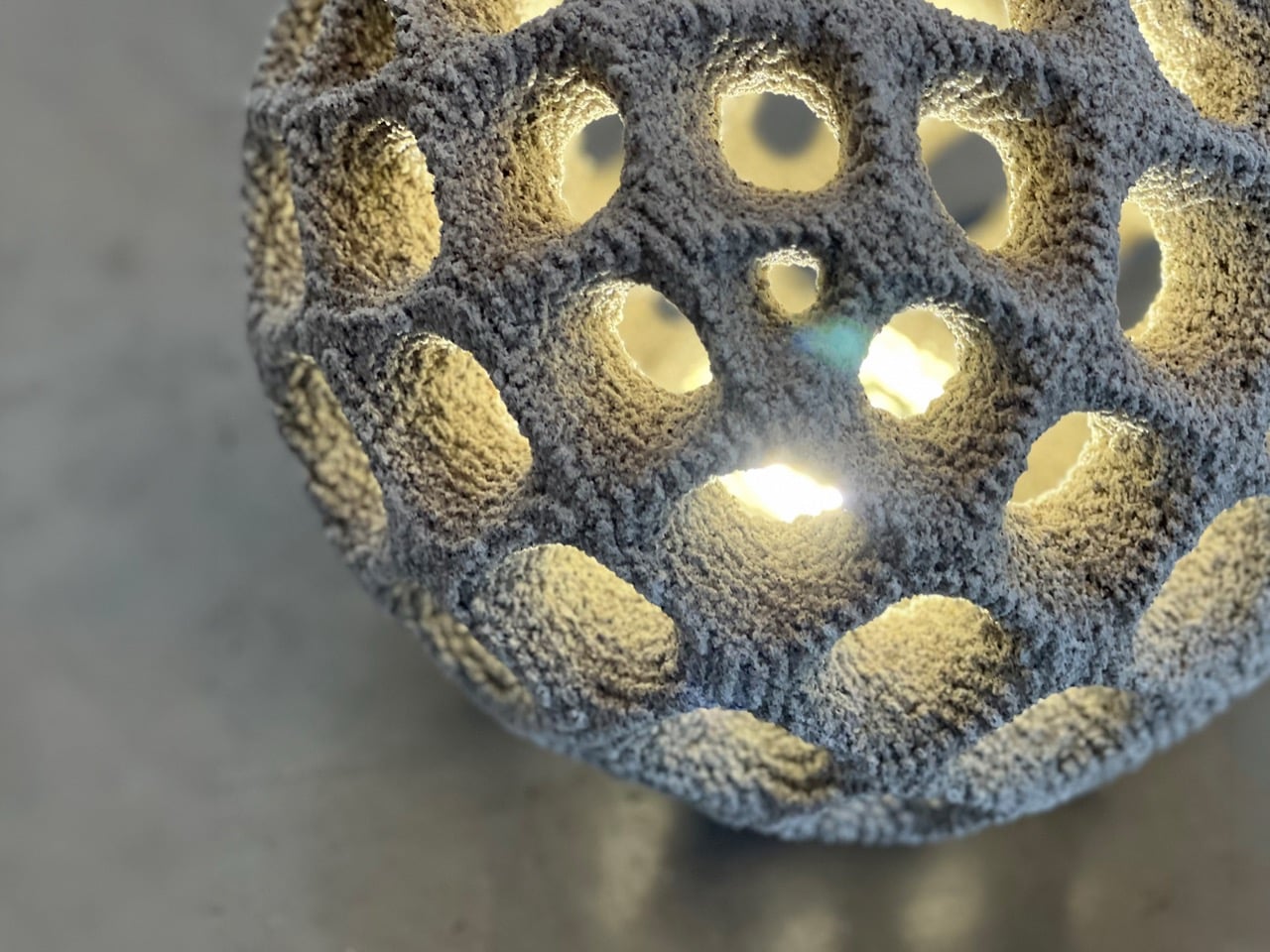
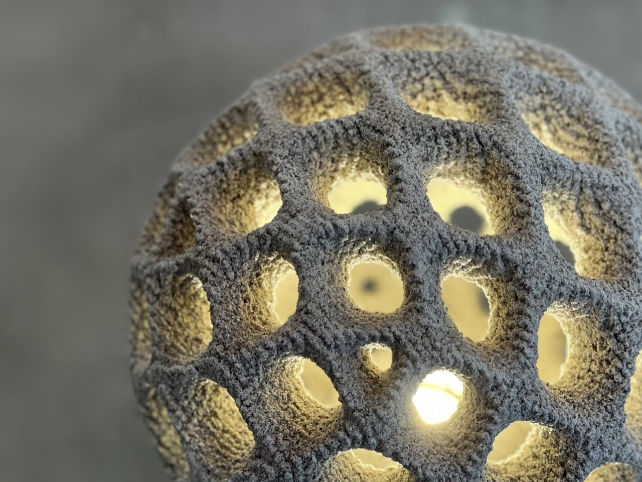
The most interesting part of the lamp begins with its production method. Oberhauserer’s Balloon is made using powder bed concrete 3D printing, also known as Selective Paste Intrusion, or SPI. In this process, cement paste is injected into a powder bed only where the structure needs to form. The lamp is built gradually, layer by layer, allowing the final shape to emerge with a level of detail and complexity that would be difficult to achieve through traditional concrete casting.

Designer: Oberhauser’s Ballon

This process removes the need for conventional formwork, which is one of the biggest limitations in concrete design. Traditional molds can restrict the shape of an object, especially when the geometry becomes more detailed or organic. SPI gives the designer more freedom to explore curved forms, softer surfaces, and intricate details without being limited by the mold-making process. This freedom is what gives Oberhauserer’s Balloon its distinctive character.
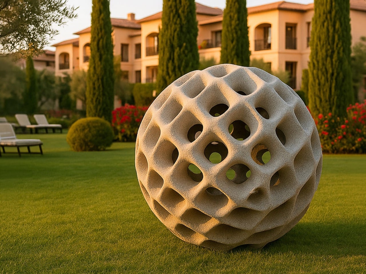
The lamp plays with a beautiful contradiction. Concrete is usually associated with heaviness, buildings, and permanence. A balloon suggests lightness, air, and softness. Bringing those two ideas together makes the object feel unexpected. The form looks rounded and almost inflated, even though it is made from cement. That contrast gives the lamp a quiet charm. It does not try to disguise the material. Instead, it shows how concrete can feel softer, more atmospheric, and more expressive than we usually expect.
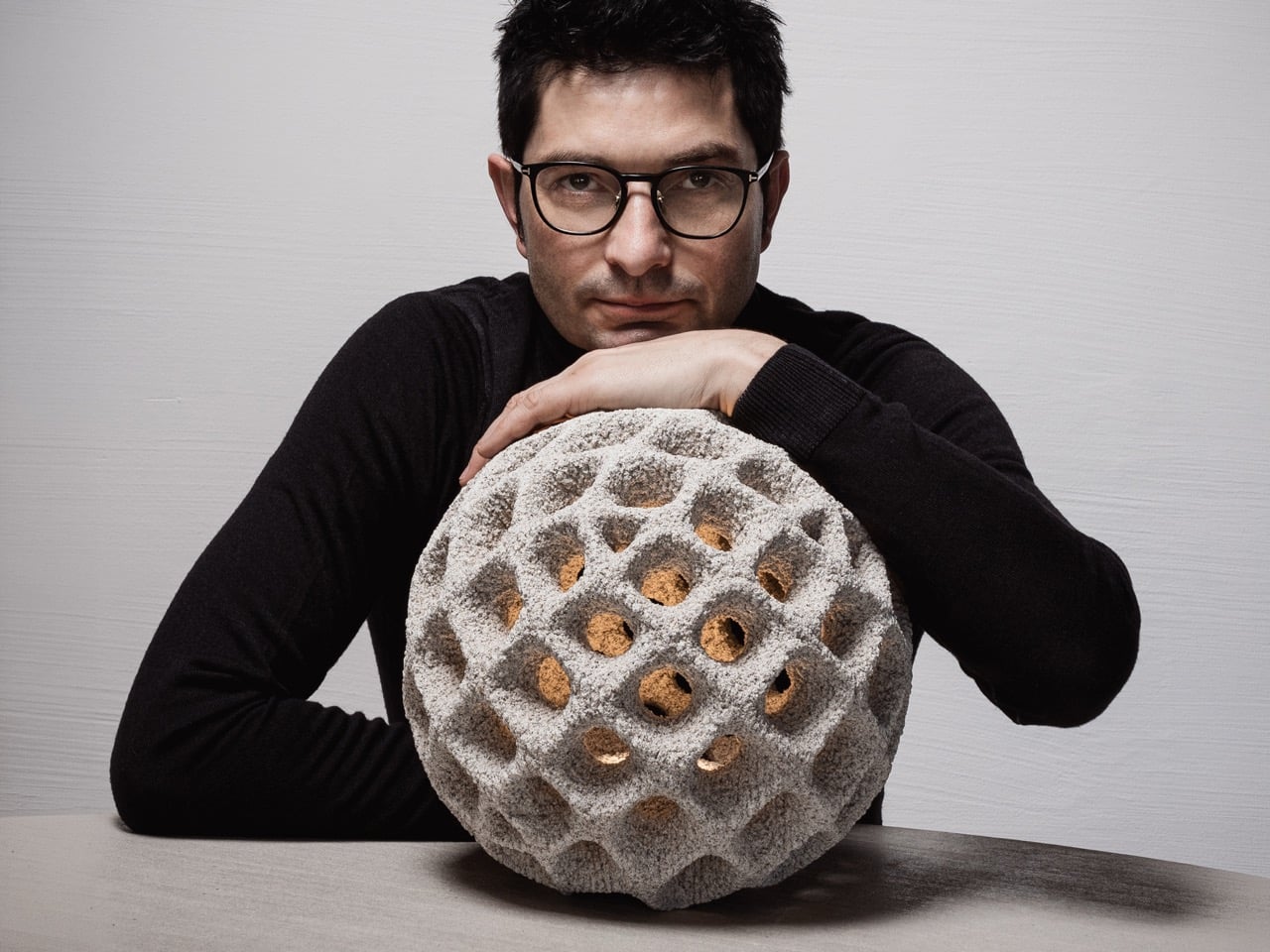
Oberhauserer’s Balloon is available in three sizes: 30 cm, 70 cm, and 100 cm in diameter. Each size changes how the lamp interacts with a space. The 30 cm version can work as a small accent in a garden, terrace, or along a walkway. The 70 cm version has a stronger visual presence and can suit courtyards, hospitality spaces, and residential landscapes. The 100 cm version becomes a bold installation piece, shaping the atmosphere around it while still functioning as a source of light.

The largest version is especially impressive. With a diameter of 100 cm, it is described as the largest known 3D-printed lamp made from cement. This makes the project more than a beautiful outdoor luminaire. It becomes an example of how far 3D concrete printing can be pushed. What could have remained a small material experiment has been developed into a durable, full-scale lighting product.

The material itself is designed for outdoor use, with high weather resistance that allows the lamp to withstand changing environmental conditions. This durability makes Oberhauserer’s Balloon suitable for gardens, terraces, public landscapes, and architectural outdoor settings. Its strength does not take away from its visual softness. Instead, the lamp balances permanence with atmosphere, making it feel grounded during the day and quietly luminous at night.

The production method also supports a more sustainable approach to manufacturing. Since 3D concrete printing places material only where it is needed, it helps reduce waste and makes material use more efficient. The absence of traditional formwork also cuts down on excess production materials. This gives the lamp a smaller ecological footprint while still allowing for a high level of design detail.

Oberhauserer’s Balloon feels like a glimpse into where lighting design is heading. It shows how technology can create forms that feel warmer, more expressive, and more human when handled with sensitivity. The lamp carries the strength of concrete, the precision of digital fabrication, and the softness of glowing light. In outdoor spaces, it becomes less like an object placed in the landscape and more like a calm presence within it.

The post Oberhauserer’s Balloon Lamp Makes Concrete Feel Surprisingly Weightless first appeared on Yanko Design.