5 Best Stationery Pieces That Turn Any Desk Into a Minimalist’s Dream Workspace

A good desk doesn’t happen by accident. Not one loaded with gadgets or overrun with branded accessories, but a workspace where every object earns its place. The stationery you choose sets the tone for how you think, write, and create. When a pen, tray, or ruler is designed with real intention, it stops being background noise and starts becoming an active part of the process itself.

The five pieces collected here share a common thread: they solve real problems without announcing themselves. Each one sits at the intersection of craft, function, and restraint. Whether you’re sketching, drafting, or writing longhand, these objects won’t compete for your attention. They’ll quietly make you better at whatever you’re doing. That’s the standard every great piece of stationery should meet, and these five clear it with ease.

1. Inseparable Notebook Pen

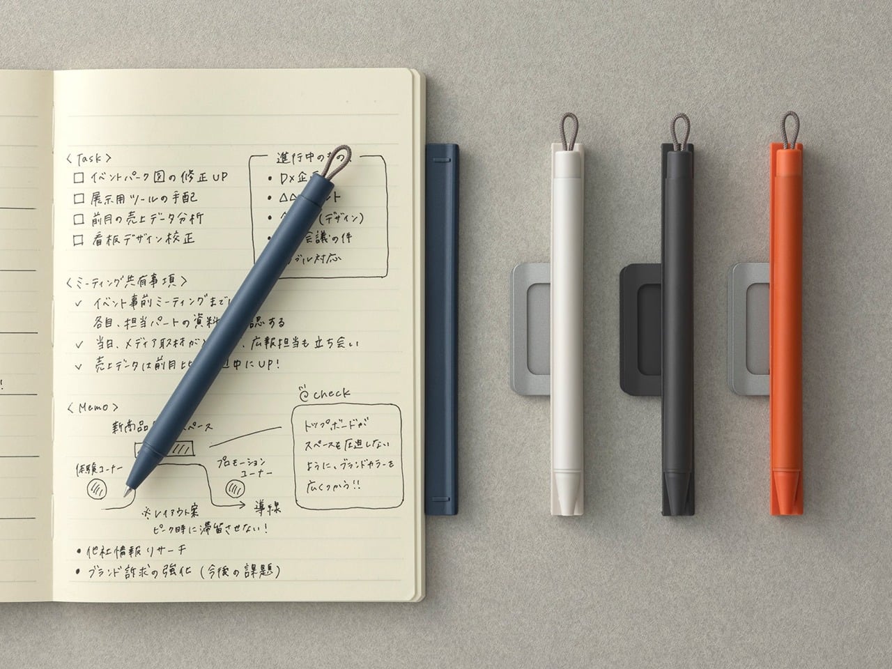
A pen that stays with its notebook sounds like a small idea, but the execution here is anything but minor. Built around a magnetic clip that secures directly to the cover, this piece eliminates the quiet, persistent frustration of reaching for a pen that isn’t there. The minimalist form is unobtrusive, the grip comfortable, and the ink flow smooth enough that writing feels less like a task and more like a reflex you’ve always had.

What makes this pen genuinely useful for daily writing is the built-in silencer, a detail that turns something mechanical into something refined. When you attach or detach it from the notebook, there’s no sharp click, just a quiet, satisfying motion. For anyone who writes regularly, that kind of sensory attention matters more than it should. The pen becomes an extension of the notebook rather than a companion to it, which means your ideas and the tool to capture them are always in the same place.

Click Here to Buy Now: $19.95

What We Like

  • The magnetic clip keeps the pen fixed to the notebook cover at all times, so losing your writing tool mid-session is no longer a possibility
  • The built-in silencer makes attaching and detaching feel considered and refined rather than mechanical

What We Dislike

  • The design works best when paired with its intended notebook, which limits its versatility as a standalone pen
  • The minimalist form may reduce compatibility with notebooks of varying cover thickness or material

2. Solid Copper & Brass EDC Clutch Pencils
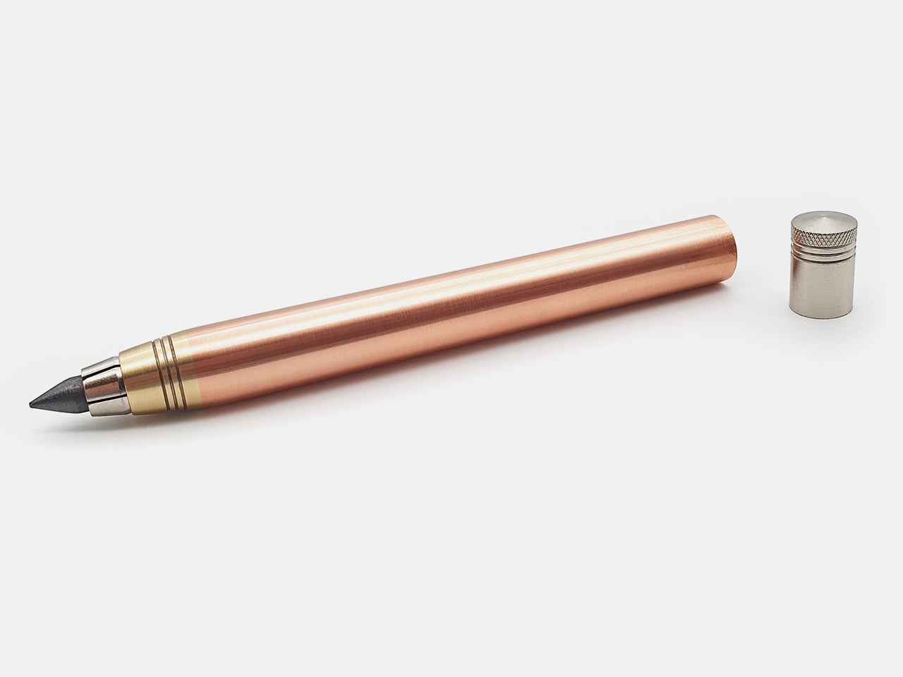
Nicholas Hemingway’s clutch pencils are machined from solid metal bar stock, not hollow tubes or plastic wrapped in metallic finishes, and that distinction matters from the first time you hold one. Copper weighs 8.96 grams per cubic centimeter, and brass sits at around 8.5. Hemingway has built his entire design philosophy around those densities. The mass of the metal body reduces the pressure you need to apply to the page, a concept he calls gravity-feed, making longer creative sessions far less fatiguing on the hand.
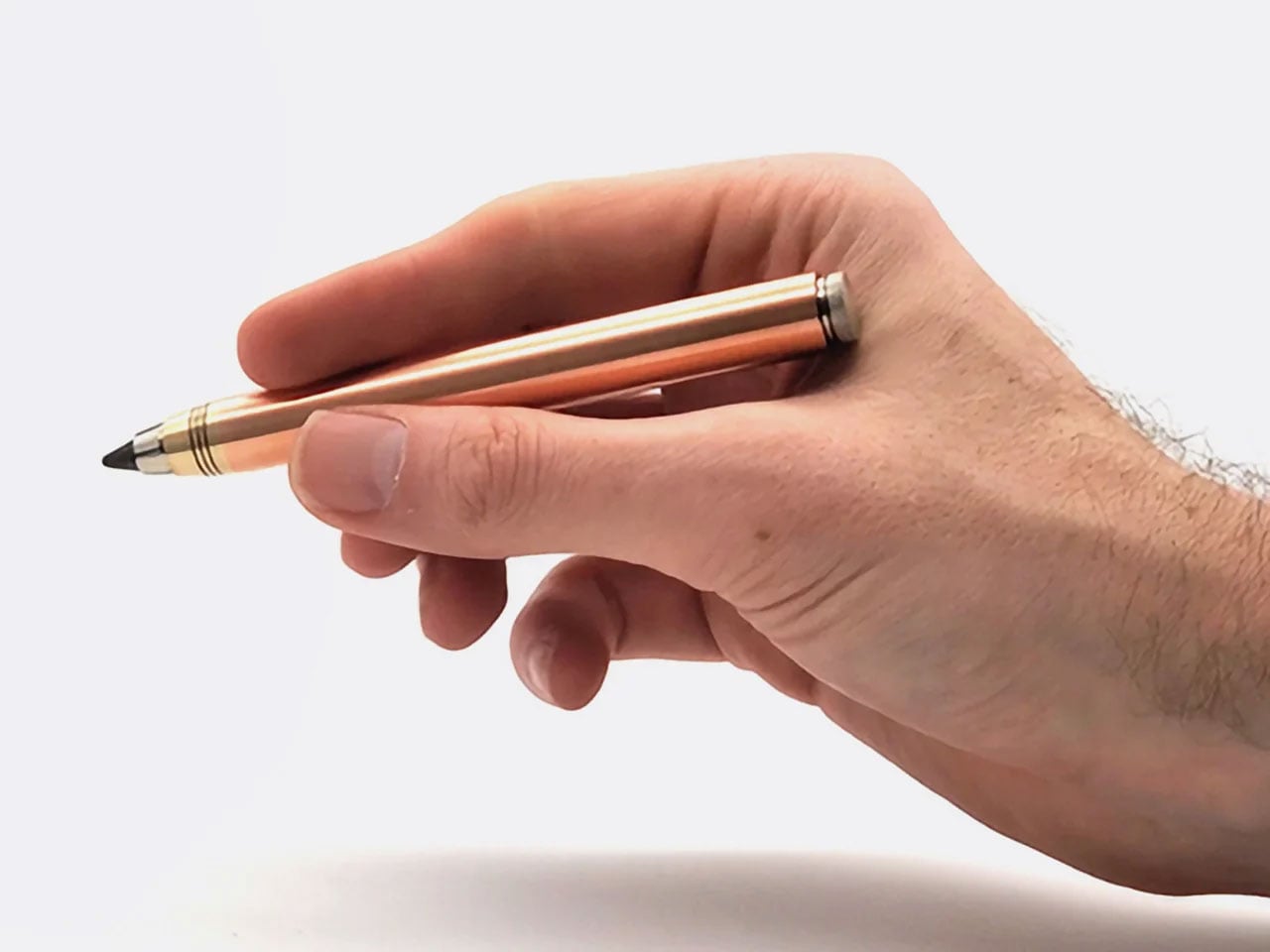
The 10th anniversary collection includes three pencils: the 5.6mm Copper and Brass Hybrid at 58 grams for shading and life drawing, with a built-in lead sharpener in the push button, and the 2mm Precision series in both brass and copper at around 30 grams each for technical drafting and fine-line illustration. Hemingway ships each version with a specific lead grade matched to its intended use, so you’re never mid-workflow having to swap. Both formats are fully compatible with any lead brand, making them as practical as they are beautifully crafted.

Click Here to Buy Now: $79 $115 (31% off). Hurry, only 26/50 left!

What We Like

  • The gravity-feed approach uses the weight of the metal body to reduce hand fatigue across long drawing or writing sessions
  • Each pencil ships with a lead grade selected to match its intended use, removing the guesswork entirely from setup

What We Dislike

  • The solid metal construction makes these significantly heavier than standard options, which won’t suit every hand or working style
  • The price point of hand-machined tools will be a barrier for casual or occasional users

3. KNOB. Pen Tray
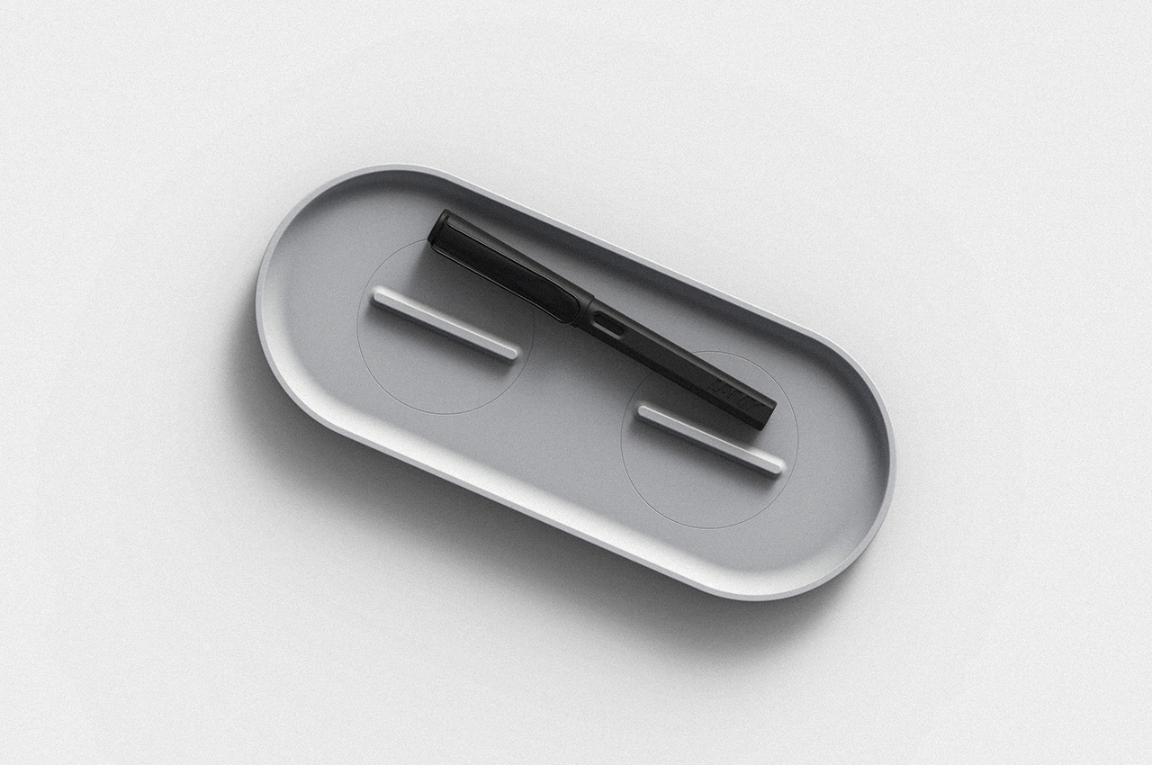
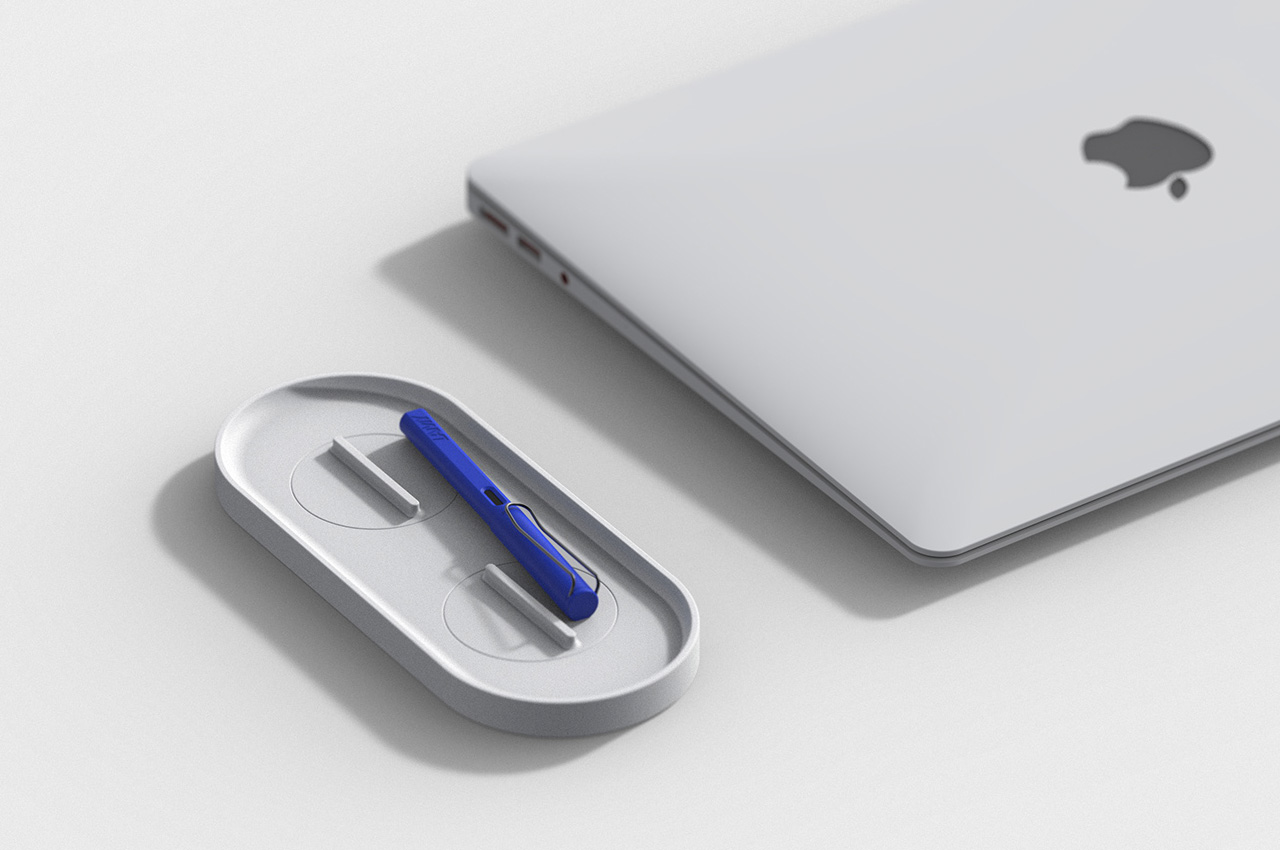
Changho Lee’s KNOB. Pen tray is one of those rare desk accessories that rewards both looking at and actually using. The form is clean and minimal with rounded edges, but the real story lives in the knobs, borrowed from the design language of gas burner controls and reimagined as adjustable dividers inside the tray. Those knobs let you reconfigure the interior space in any direction, depending on what you’re organizing and how you want to arrange it on a given day.

For anyone who cycles between different tools, the KNOB. tray removes the need for multiple organizers competing for desk space. One tray handles everything because you can reshape its interior for whatever you need at any given moment. That kind of adaptable functionality is genuinely rare in desk accessories, which tend to be fixed in their layouts and unforgiving when your needs shift. The visual result is a tray that always looks intentional, regardless of what’s inside it or how the internal dividers have been reconfigured.

What We Like

  • The adjustable knobs let you customize the internal layout in any direction without tools, additional parts, or a second organizer
  • The minimal aesthetic keeps the tray from visually cluttering the desk, no matter how it’s currently configured

What We Dislike

  • The knob-based adjustment mechanism may feel fiddly for users who reorganize their setup frequently throughout the day
  • The compact footprint may not comfortably accommodate larger or unusually shaped stationery items

4. Eco-Friendly Pencil Sharpener
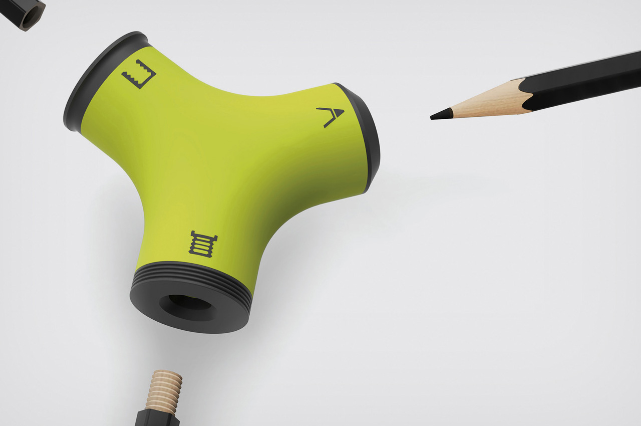
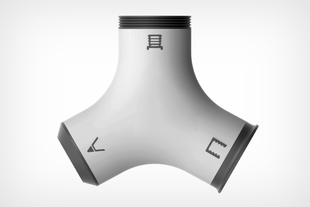
Wang Cheng’s Eco-Friendly Pencil Sharpener is a Red Dot Design Concept Award winner built around one precise and clever observation: pencil stubs don’t need to be discarded. With three sharpening zones, the sharpener handles conventional sharpening but also threads and taps pencils, turning them into wooden screws that connect end to end. A stub that would otherwise be thrown away becomes usable again the moment you screw it into a larger pencil, extending its life without any additional materials or waste.

That mechanism is genuinely satisfying to use, and it shifts how you think about pencils entirely. Threading one end and screwing two together feels intuitive after the first attempt, and the result is a longer, more comfortable writing instrument that has a second act built in from the start. For anyone who goes through pencils regularly, whether sketching, drafting, or writing by hand, this sharpener reframes the stub not as the end of something useful but as the beginning of another productive session.

What We Like

  • The threading and tapping mechanism extends the life of pencil stubs meaningfully, reducing material waste without requiring anything extra
  • Winning the Red Dot Design Concept Award confirms that the idea is executed as well as it is inventive

What We Dislike

  • The three-zone sharpening system introduces more complexity than most casual users will need or ever explore
  • Screw-together pencils may feel slightly uneven in the hand compared to a single, uniform pencil body

5. Quiver Ruler
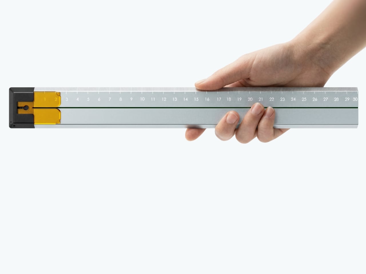
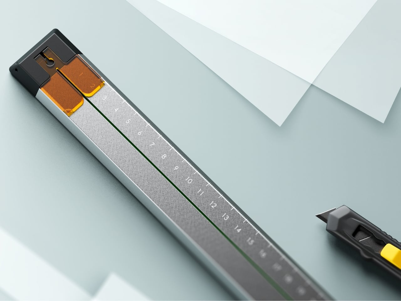
Tunir Maity’s Quiver is an anodized aluminum ruler built for people who actually cut with one, not just measure. It has a clip mechanism that holds paper in place, a blade slit that guides your cut in a straight line, and a weight distribution that favors the cutting end so you don’t have to press down as hard. Made for over 300 cuts with recyclable plastic components, Quiver doesn’t treat shaky hands or imprecise cuts as user failures. It treats them as design problems worth solving properly.

Beyond its cutting functionality, Quiver includes a carabiner attachment for clipping to a bag, which makes it genuinely portable rather than just theoretically so. The anodized aluminum finish gives it a premium presence on any desk, and the minimal profile means it stores flat without consuming unnecessary space. For designers, architects, or anyone who works regularly with physical materials, Quiver is the kind of tool that makes you quietly wonder why rulers weren’t designed this way from the very beginning.

What We Like

  • The blade channel and clip mechanism make precise, straight cuts achievable without pressing hard or manually holding paper in place
  • The carabiner attachment makes it easy to carry wherever the work actually happens, rather than leaving it behind on the desk

What We Dislike

  • Quiver is currently a concept, so availability for purchase has not been confirmed
  • The emphasis on cutting functionality may feel overbuilt for users who only need a ruler for basic measuring

The Desk You Actually Want

Minimalism isn’t about owning less. It’s about owning better. Each piece on this list earns its place not through novelty or surface-level aesthetics alone, but through how well it understands the person using it. A pen that stays with your notebook, a ruler that guides your blade, a tray that reorganizes itself around your tools. These are objects designed around behavior, not the other way around.

The best stationery doesn’t ask for your attention. It earns your trust slowly, through repeated use, through a grip that feels right after the third session, through a cut that lands exactly where you planned it. The five pieces here share that quality. They’re not trying to be beautiful. They are beautiful because they work, and that’s a distinction worth remembering the next time you’re building a workspace from scratch.

The post 5 Best Stationery Pieces That Turn Any Desk Into a Minimalist’s Dream Workspace first appeared on Yanko Design.

5 Best Tiny Homes of April 2026 Prove You Don’t Need More Space to Live Better

The tiny home is having a genuine design moment. Not the kind driven by social media aesthetics or minimalism as a lifestyle brand, but the kind where builders are solving real problems, and the results are getting sharper each season. What once felt like a compromise category has grown into a serious architectural conversation, one where craft, livability, and genuine spatial intelligence are setting the standard. The homes arriving this April reflect that maturity clearly.

Each home on this list approaches compact living from a distinctly different angle. One eliminates the loft bed that most tiny houses treat as structural law. Another was designed from the ground up around a growing family’s daily rhythms. A third draws from Japanese craft traditions to build something that feels purposeful at every scale. These are not the tiny homes of five years ago. They are fully realized dwellings that simply happen to take up less space, and the best five of April 2026 make a case worth hearing in full.

1. Betty — The Towable That Finally Gets the Bedroom Right

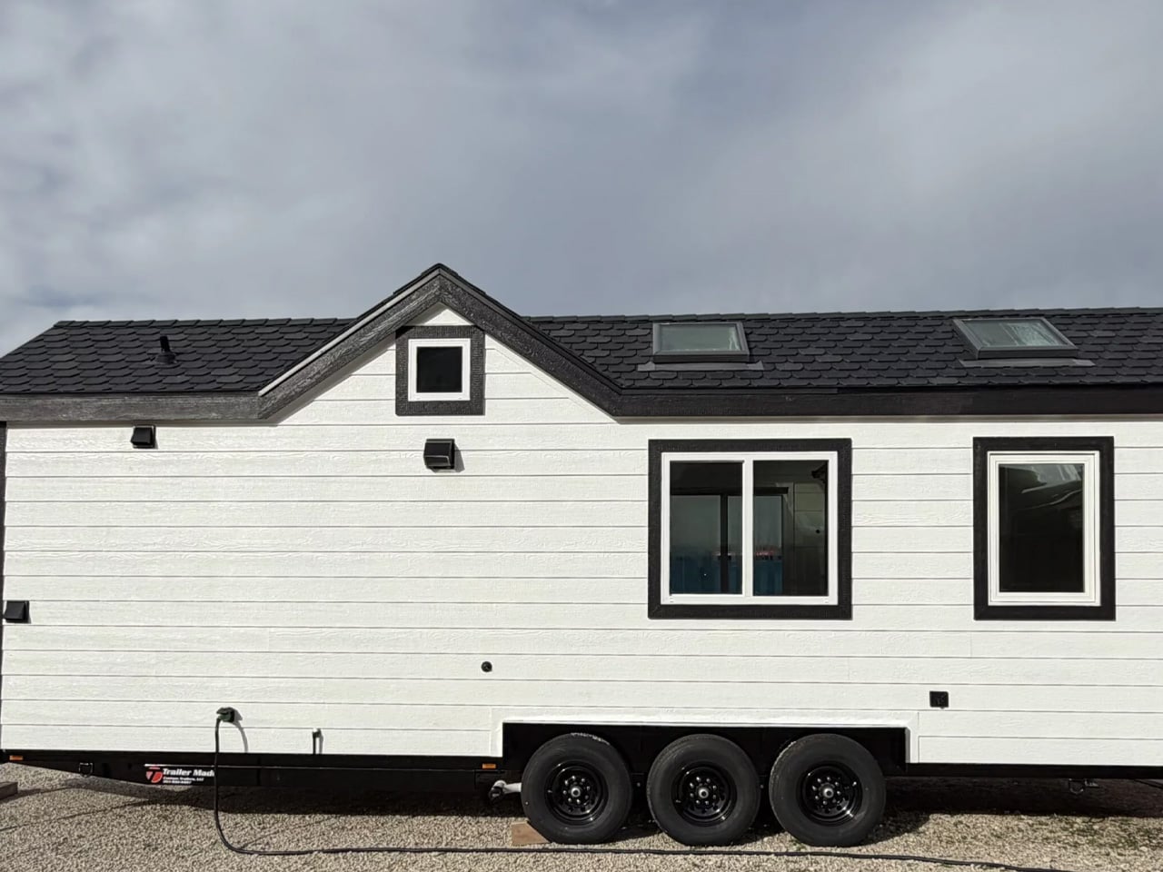
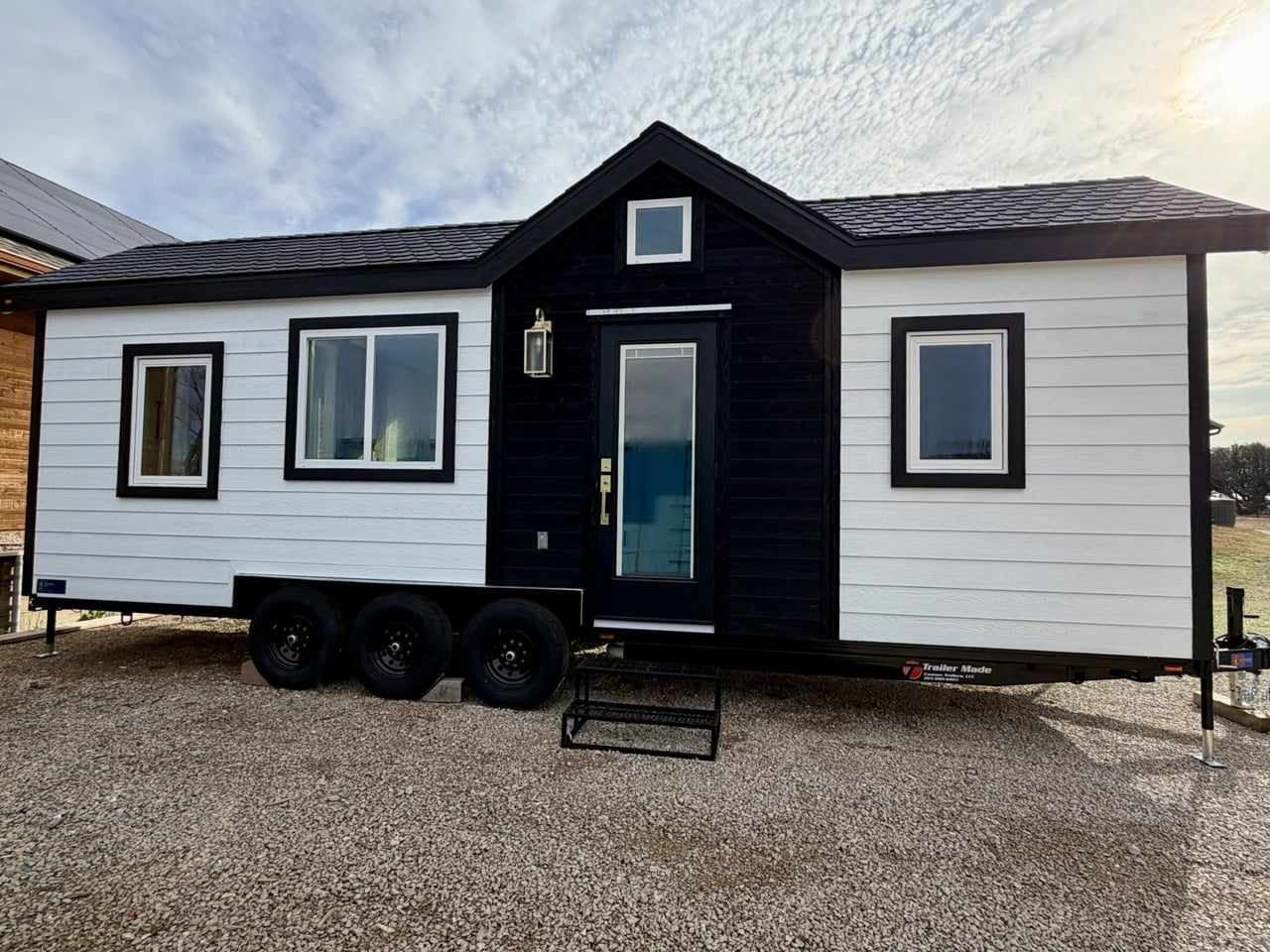
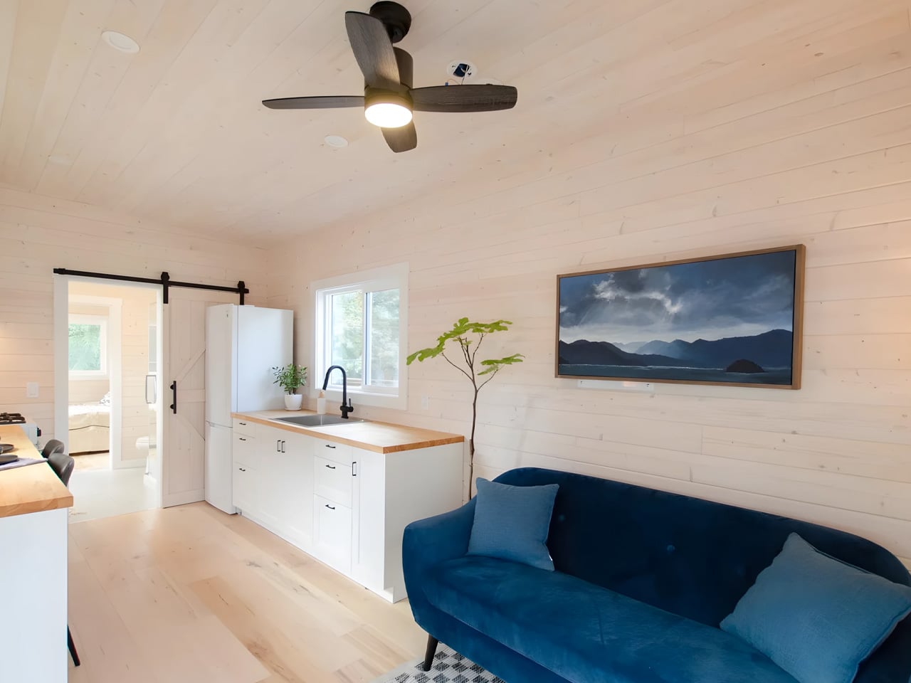
Tiny house living often demands tough trade-offs between mobility and livability, but the Betty by Decathlon Tiny Homes aims to strike a balance that most towable homes fail to find. At 28 feet long on a triple-axle trailer, it sits comfortably in the mid-size category without feeling cramped. The exterior clad in engineered wood with composite roof shingles keeps things durable and low-maintenance, a practical foundation for a home designed to spend much of its life on the road with two occupants.

The ground-floor bedroom is what separates the Betty from most of its competition. Where loft beds dominate tiny home layouts, this room offers full standing headroom, a queen bed platform with two large integrated storage drawers, a built-in wardrobe, and a skylight that floods the space with natural light. A wall-mounted TV, a mini-split AC unit in the living area, and a sliding barn-style door complete a setup that never quite asks you to feel like you are settling for something.

What we like:

  • The ground-floor bedroom with full standing headroom is a rare feature in this size category, making the space feel genuinely livable rather than something you climb into at the end of the day.
  • Engineered wood cladding and composite roof shingles offer real long-term durability without demanding intensive upkeep, a sensible material choice for a home that moves regularly.

What we dislike:

  • The living room footprint is modest enough that two people spending extended stretches at home may find it limiting over longer periods together.
  • There is no dedicated workspace mentioned in the layout, which matters increasingly for buyers who plan to work remotely as their primary daily routine.

2. Mizuho — Japanese Craft Meets Intentional Living

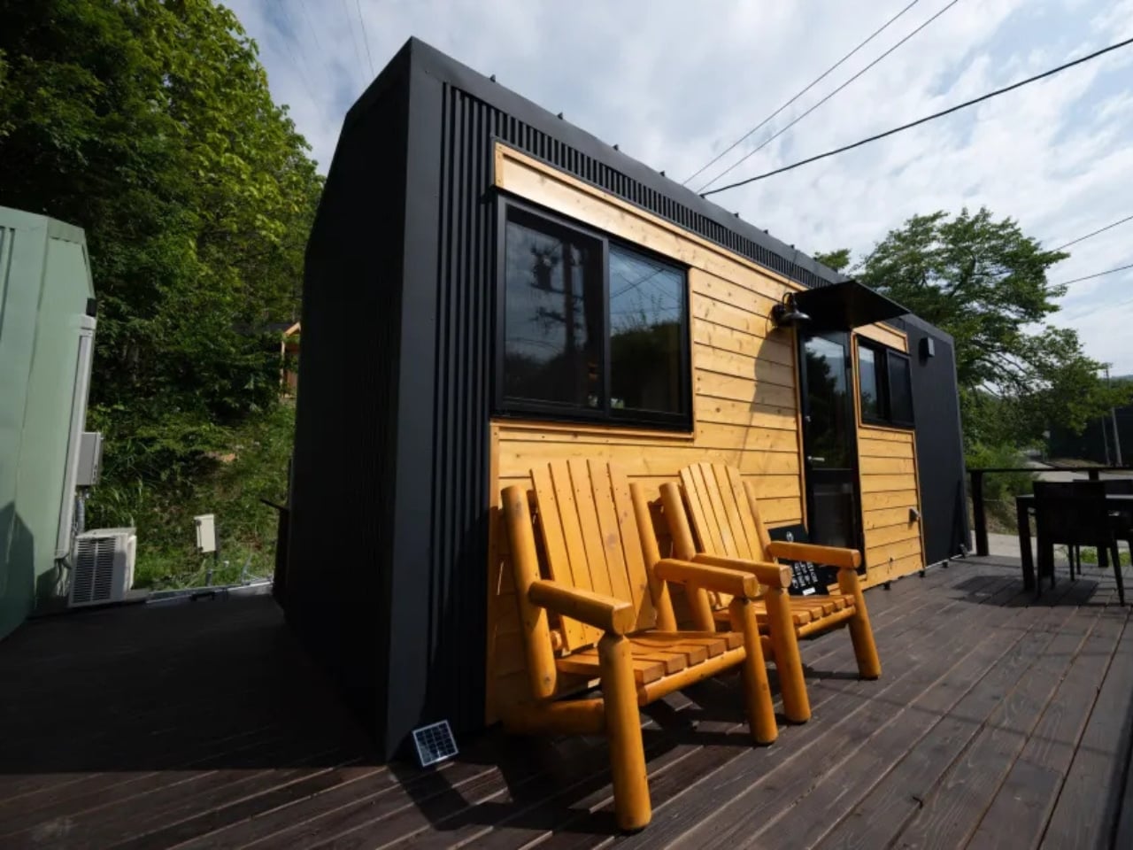
The Mizuho does not try to look like every other tiny home on the market, and that restraint is its first strength. Designed by Ikigai Collective and named after the Japanese philosophy of purposeful living, this home measures 6.6 meters long, 2.4 meters wide, and 3.8 meters tall. It is built for one person or a couple who genuinely want to live with less, combining traditional Japanese aesthetics with modern building technology in a way that feels coherent rather than borrowed.

What makes the Mizuho stand apart is its commitment to authenticity. Ikigai Collective works directly with local partners in Nozawaonsen, Japan, to craft each home to strict quality standards. Every material choice and spatial decision reflects a coherent set of values rooted in simplicity, mindful living, and environmental care. For those drawn to the Ikigai philosophy of finding meaning in everyday life, this home does not reference that tradition from the outside. It builds it into every wall and surface.

What we like:

  • Authentic Japanese craftsmanship sourced through local partners in Nozawaonsen gives the Mizuho a material integrity that most tiny homes, regardless of their aesthetic direction, simply cannot replicate.
  • The eco-friendly design philosophy extends beyond surface-level choices, reflecting a genuine commitment to sustainable and intentional living that runs through every aspect of the build.

What we dislike:

  • At 6.6 meters long and 2.4 meters wide, the dimensions are compact even by tiny home standards, making it a tight fit for couples who value clearly defined personal space.
  • The deeply specific aesthetic may feel limiting for buyers who appreciate the minimalist philosophy but prefer more visual flexibility in how their space looks from day to day.

3. Sora 20′ — More Room for the Way People Actually Work Now

The Sora 20′ arrived as a direct response to what Dragon Tiny Homes customers were asking for: more space, without losing the clarity that made the original Sora worth buying in the first place. Expanded from the popular 16-foot model, this version offers increased square footage while maintaining the bright, practical design philosophy its predecessor established. The layout flows from one area to the next in a way that makes daily routines feel effortless rather than choreographed around a tight and unforgiving floor plan.

At $61,000, the Sora 20′ puts full-time tiny living within reach for a broader range of buyers, particularly remote workers who need a home that functions just as well as a workspace. Large windows keep the interior naturally bright throughout the day, and every element earns its place through purpose rather than habit. Dragon Tiny Homes has built something that does not feel like a clever workaround. It feels like a home that simply chose to be more efficient than the ones built around it.

What we like:

  • The $61,000 price point is one of the most accessible in the full-featured tiny home category, making the Sora 20′ a genuinely attainable starting point for first-time buyers entering the market.
  • Large windows and a well-considered floor plan create a sense of openness that consistently exceeds what the square footage would suggest when you look at the numbers alone.

What we dislike:

  • Expanded from a 16-foot base, the layout density may still feel tight for two full-time residents with distinct work schedules and separate daily routines running simultaneously.
  • Published details on built-in storage solutions are limited compared to competing homes in this roundup, which is a meaningful gap for buyers planning a permanent and fully committed move-in.

4. Starling — The Family Tiny Home That Doesn’t Ask You to Lower the Bar

The Starling quietly dismantles the assumption that tiny living means fewer people. Built by Rewild Homes in Nanaimo, British Columbia, this 33-foot gooseneck tiny house was designed with a growing family at the center of every decision. The raised gooseneck section creates genuine spatial separation between living zones, something most tiny homes attempt to achieve with curtains or partitions rather than actual architecture. Natural wood cladding under a metal roof grounds the exterior against the Pacific Northwest landscape it was clearly built for.

Inside, the details compound quickly. A convertible dining banquette folds flat into a third sleeping space, with hidden storage built beneath every seat. The U-shaped kitchen anchors daily life with dark wood countertops, a breakfast bar, a four-burner propane range, a high-efficiency fridge with a bottom freezer, a double sink, and pull-out cabinetry. None of it feels like a workaround. It feels like a kitchen that simply chose to exist somewhere smaller, designed by people who understand that a family’s daily rhythm doesn’t shrink just because the footprint does.

What we like:

  • The gooseneck configuration creates real architectural separation between living and sleeping areas, a level of spatial privacy that is genuinely rare in tiny homes at this scale and price range.
  • The convertible dining banquette adds a functional third sleeping space with integrated storage beneath, making the Starling meaningfully more capable for families without adding a single foot to the overall length.

What we dislike:

  • At 33 feet on a triple-axle gooseneck trailer, the Starling sits at the larger end of the towable category, which may complicate towing logistics and limit suitable placement options for some buyers.
  • The family-forward layout and three-sleeping-zone configuration may feel over-engineered for solo occupants or couples without children who won’t make use of the additional sleeping flexibility.

5. Barred Owl — Single-Level Living That Removes the One Thing Nobody Wanted

At $119,000, the Barred Owl makes one clear argument: sometimes the most intelligent upgrade in tiny home design is the one that removes something entirely. Rewild Homes built this 34-foot home on a single-level plan, eliminating the loft bed that most tiny houses treat as a structural inevitability. Mounted on a triple-axle trailer and measuring 10 feet wide, 1.5 feet wider than the North American standard, the Barred Owl transforms how the interior functions at every point of the day, from the moment you walk in.

The layout moves in railroad apartment fashion, with rooms connecting directly to one another. Entry opens into a bright living room finished in whitewashed pine tongue-and-groove. The galley kitchen features butcherblock counters wrapping into an eating bar that doubles as a dedicated workspace, alongside a full-size refrigerator, a four-burner propane cooktop, and an oven. A dining area seats two comfortably, and the bedroom sits at the far end, private, accessible, and at floor level. It is a home that takes the inconveniences of tiny living seriously and removes them methodically, one by one.

What we like:

  • The single-level layout eliminates the loft bed, delivering a bedroom that functions like an actual room rather than a sleeping platform accessed by a ladder at two in the morning.
  • At 10 feet wide, the Barred Owl offers noticeably more floor space than the standard North American tiny home, and that extra room is felt immediately in how naturally the interior breathes.

What we dislike:

  • At $119,000, the Barred Owl sits at the premium end of the tiny home market, which narrows its accessibility significantly compared to several other strong options featured in this roundup.
  • The railroad-style floor plan, while highly functional, offers limited visual or acoustic separation between the living and dining zones for buyers who prefer more distinctly defined spaces within the home.

The Tiny Home Has Arrived

The five homes on this list represent the clearest thinking in compact residential design right now. They don’t ask you to lower your expectations. They ask you to redirect them toward what actually matters: light, function, thoughtful proportion, and craft that earns its keep over the years rather than simply photographs well on first look. From the Mizuho’s Japanese authenticity to the Barred Owl’s single-level conviction, each one makes a case that is genuinely hard to dismiss.

What is becoming clear is that the tiny home is no longer a reaction to excess. It is a legitimate design category with its own standards, ambitions, and evolving vocabulary. Builders like Rewild Homes, Ikigai Collective, and Dragon Tiny Homes are pushing that vocabulary forward, season by season. If April 2026 is any indication, the most compelling residential design thinking isn’t happening in expansive floor plans. It’s happening in 20 to 34 feet of very carefully considered space.

The post 5 Best Tiny Homes of April 2026 Prove You Don’t Need More Space to Live Better first appeared on Yanko Design.

5 Best Japanese Designs of April 2026 That Make Everything Else Look Like It’s Trying Too Hard

The Japanese Grand Prix is underway this weekend at Suzuka, and it has done what it always does: pulled attention back toward Japan with a kind of quiet, inevitable force. There’s something about watching a sport built on engineering precision staged in a country that has made precision its cultural identity that makes you want to look beyond the circuit. Japan’s design culture runs on the same engine as its racing teams. Nothing is wasted. Nothing is performed. Every decision earns its place, and every object that comes out of that sensibility carries a particular weight.

Japanese design has always understood something the rest of the world is still working out. Restraint is not a lack of ambition. It is the hardest expression of it. The five objects below range from a razor to a kitchen knife to a bath towel, but they all speak the same language. They each solve one problem completely, and they look like nothing else needs to be added. That is the thing about great Japanese design. It doesn’t just make a good product. It makes everything else in the room look like it’s trying too hard.

1. The Paper Razor

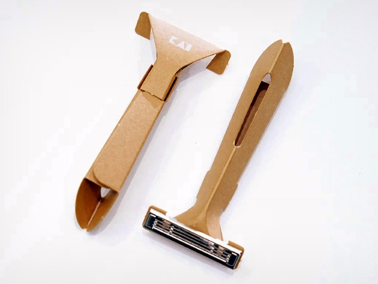
There’s something almost provocative about the Paper Razor. Designed by Japan’s Kai Group, it is a single-use disposable razor built almost entirely from paper, reducing plastic use by 98% without compromising function. The origami-inspired body folds completely flat for shipping, then snaps into a rigid, ergonomic handle in seconds. At just 4 grams and 5mm thick when flat-packed, it ships across five colorways: ocean blue, botanical red, jade green, sunny yellow, and sand beige.

The obvious question is water, and the Kai Group answered it practically. The paper body is made from a water-resistant grade similar to milk carton stock, holding up to temperatures of 104°F. The metal blade head features a notched channel on top for easy rinsing between strokes. Designed primarily for travelers, the Paper Razor is the kind of product that feels less like a shaving tool and more like a position statement on what disposable objects are capable of being when someone takes the design seriously.

What We Like:

  • The origami-fold construction assembles in seconds and ships as a 5mm flat-pack, making it one of the most logistically elegant disposables ever designed
  • Reduces plastic use by 98% while maintaining the ergonomics and shave quality of a standard disposable

What We Dislike:

  • Single-use by design, which limits its appeal for anyone building a more sustainable long-term shaving routine
  • Water resistance caps at 104°F, meaning it isn’t suited for anyone who prefers very hot water while shaving

2. Levitating Pen 2.0: Cosmic Meteorite Edition

The Levitating Pen 2.0 Cosmic Meteorite Edition is the kind of desk object that stops a conversation the moment someone notices it. It suspends at a precise 23.5-degree angle, creating a floating illusion that is genuinely difficult to look away from. The design draws its visual language from spacecraft aesthetics, referencing silhouettes like the USS Enterprise, bringing a sci-fi sensibility to something as familiar and grounded as a ballpoint pen sitting on a work surface.

The detail that separates this edition from the standard series is the meteorite tip. The pen incorporates a genuine Muonionalusta meteorite, a fragment older than Earth by 20 million years, shifting this object from clever desk accessory to something rare and worth owning on its own terms. A simple twist sets it spinning for up to 20 seconds. It is a fidget-worthy, collector-grade piece that makes a compelling case that good design doesn’t always need to justify its existence through usefulness alone.

Click Here to Buy Now: $399.00

What We Like:

  • The genuine Muonionalusta meteorite tip gives this pen a provenance no other writing instrument on any desk can match
  • The floating 23.5-degree angle creates an immediate visual anchor on a desk surface without taking up meaningful real estate

What We Dislike:

  • The limited edition nature makes availability unpredictable, and the pricing reflects exclusivity as much as it does materials
  • The spacecraft-inspired aesthetic is deliberate and specific, meaning it will feel out of place on a desk that skews quieter or more minimal

3. Kuroi Hana Knife Collection

The Kuroi Hana knives begin with Japanese AUS-10 steel sourced from Aichi Steel Corporation, rated between 58 and 60 HRC for hardness and chosen specifically for its combination of toughness, sharpness, and corrosion resistance. Each blade is built from 67 layers of high-carbon steel, producing the Damascus layered structure that defines the collection’s character. Kuroi Hana translates to “black flower,” and the dark floral pattern that emerges across each blade makes that name feel entirely earned rather than marketed.

The pattern isn’t applied to the surface. It is drawn out from within. Skilled artisans manually submerge each blade into an etching solution that penetrates the steel layers and reveals the Damascus patterning in a deep, dark floral form. Because the process is done by hand and each blade’s steel structure is unique, no two knives carry the same pattern. This is a kitchen tool that respects the cook enough to make the knife itself a considered, genuinely beautiful object worth picking up before you even start cooking.

What We Like:

  • Every blade carries a unique dark floral pattern drawn from the steel itself, making each knife a one-of-a-kind object rather than a manufactured product
  • AUS-10 steel at 58–60 HRC delivers professional-grade sharpness and toughness that performs as well as it looks, sitting on a magnetic strip

What We Dislike:

  • The artisanal Damascus etching process makes these a premium investment that sits well outside casual kitchen knife territory in terms of price
  • The distinctive dark floral aesthetic is polarizing for cooks who prefer clean, unmarked blades in a working kitchen environment

4. The Invisible Shoehorn

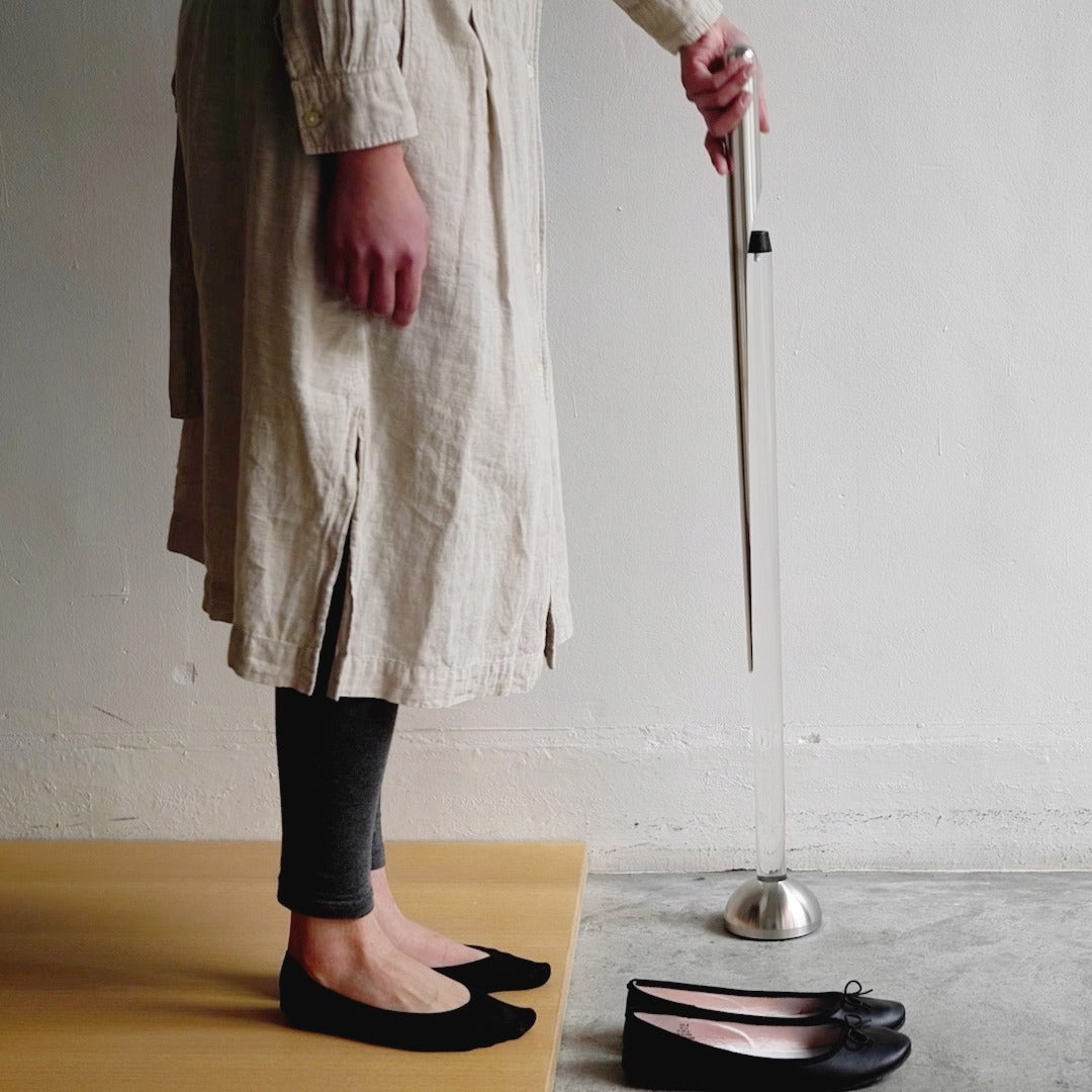
The Invisible Shoehorn is the kind of product that earns its place by solving something so specific and so quietly that you find yourself wondering why every shoehorn hasn’t been designed this way. The long stainless steel body eliminates the need to hunch over, protecting your lower back from the kind of daily accumulated strain that nobody tracks until it’s a problem. The smooth, polished surface slides cleanly against socks and stockings without snagging. It performs one job with a material confidence that feels entirely Japanese.

The transparent stand is the decision that lifts this from a functional object to something worth displaying. Mounted in its clear acrylic holder, the shoehorn practically disappears into its surroundings, reading less like a bathroom utility and more like a considered piece of interior design. In a category full of objects people hide at the back of a closet, this one earns a place on the shelf. That shift from something concealed to something displayed is precisely what separates a good tool from a genuinely designed one.

Click Here to Buy Now: $299.00

What We Like:

  • The transparent acrylic stand transforms a purely utilitarian object into something display-worthy that holds its own in a well-designed home
  • The long stainless steel handle removes real daily lower back strain without requiring any change in how you put your shoes on

What We Dislike:

  • Polished stainless steel and a transparent stand both attract fingerprints readily, requiring consistent upkeep to maintain the invisible aesthetic the design promises
  • The extreme restraint of the form may feel underwhelming to people who expect more visual personality from their home accessories

5. Sento 2 Towel

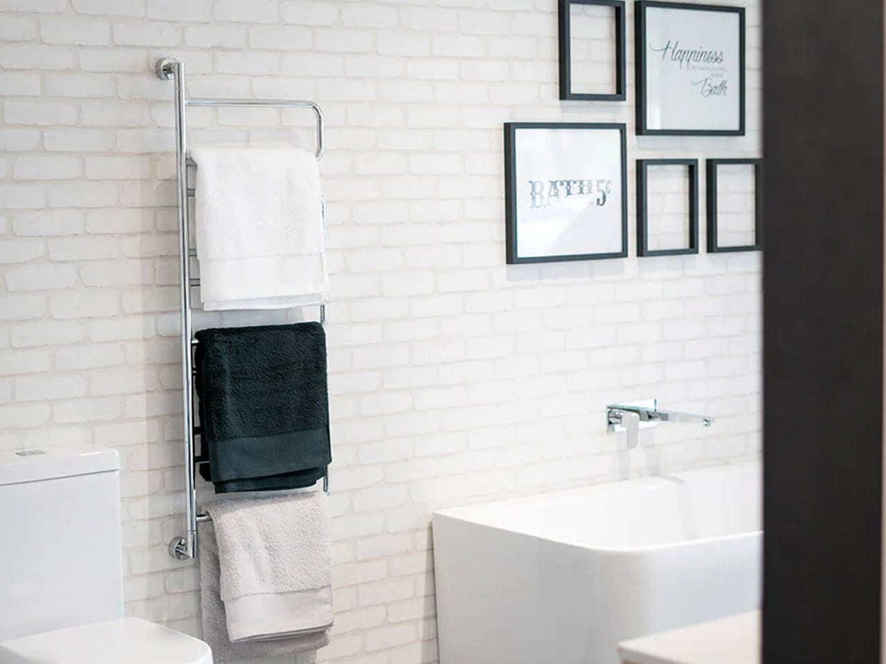
Most towels are made by twisting cotton fibers into dense, rope-like loops, a production method that prioritizes speed and cost over softness or absorbency. The Sento 2 goes the other way entirely. Using a zero-twist design developed through specialized manufacturing techniques refined in Japan, the natural cotton fibers are left loose and uncompressed, producing a towel that is softer, more absorbent, and faster-drying than standard terry cloth. The process is slower, more demanding, and the finished result communicates every bit of that effort on first contact.

The zero-twist construction leaves natural cotton in a state that feels fundamentally different from anything mass-produced. The towel is light enough to feel like almost nothing in your hands, and absorbent enough that the job is done before you’ve consciously started it. There is an effortless quality to the whole experience that is harder to explain than it is to feel. It is a towel. It is also a quiet argument for buying fewer things, buying them properly, and understanding that the best version of an everyday object is worth far more than the cheapest one.

What We Like:

  • Zero-twist construction produces a softness and absorbency level that standard terry cloth towels genuinely cannot replicate, and the difference is apparent immediately
  • The quick-drying design makes it practical enough for daily rotation, not just a display-shelf luxury that performs better as a photograph

What We Dislike:

  • Zero-twist fibers are more delicate than standard loops and require careful laundering to preserve their structure and softness over repeated washing
  • The premium construction comes at a price that becomes harder to justify when buying multiples to fully outfit a bathroom

Japan Has Been Designing This Way Forever. The Rest of the World Is Still Catching Up.

What these five objects share is not a visual style. It is a philosophy. Japanese design has always understood that the most powerful thing a product can do is remove everything that shouldn’t be there. The Paper Razor removes plastic. The Invisible Shoehorn removes visual noise. The Sento 2 removes the compromise built into every standard terry loop. What remains in each case is an object that works so cleanly it feels inevitable, as though no other version was ever possible.

The Japanese Grand Prix reminds us every year that Japan operates at a level of precision most cultures aim for and fall short of. Its design culture runs on the same engine. These five products are proof that restraint is not a limitation. It is the hardest discipline to master and the most rewarding thing to live with. Every one of them earns its place, whether on a shelf, in a kitchen drawer, mounted by the door, on a desk at a 23.5-degree angle, or wrapped around you right after a shower.

The post 5 Best Japanese Designs of April 2026 That Make Everything Else Look Like It’s Trying Too Hard first appeared on Yanko Design.

5 Cool Desk Clocks That Actually Deserve a Spot on Your Desk in 2026

Your desk says a lot about the way you think. The objects you deliberately choose for it, rather than the ones that simply accumulate, reflect your values, your taste, and the kind of environment you want to work in. A great desk clock earns its place twice over: as a functional tool and as something genuinely worth looking at every day. The market is full of forgettable options, but the most interesting clocks right now are rethinking what a clock even needs to be, questioning material, interaction, and presence in equal measure.

Whether you work from a home studio, a shared office, or somewhere between the two, the right clock changes the feeling of an entire space. These five designs prove that telling time is still a conversation worth having, and that choosing a clock carefully is an act worth taking seriously.

1. Rolling World Clock

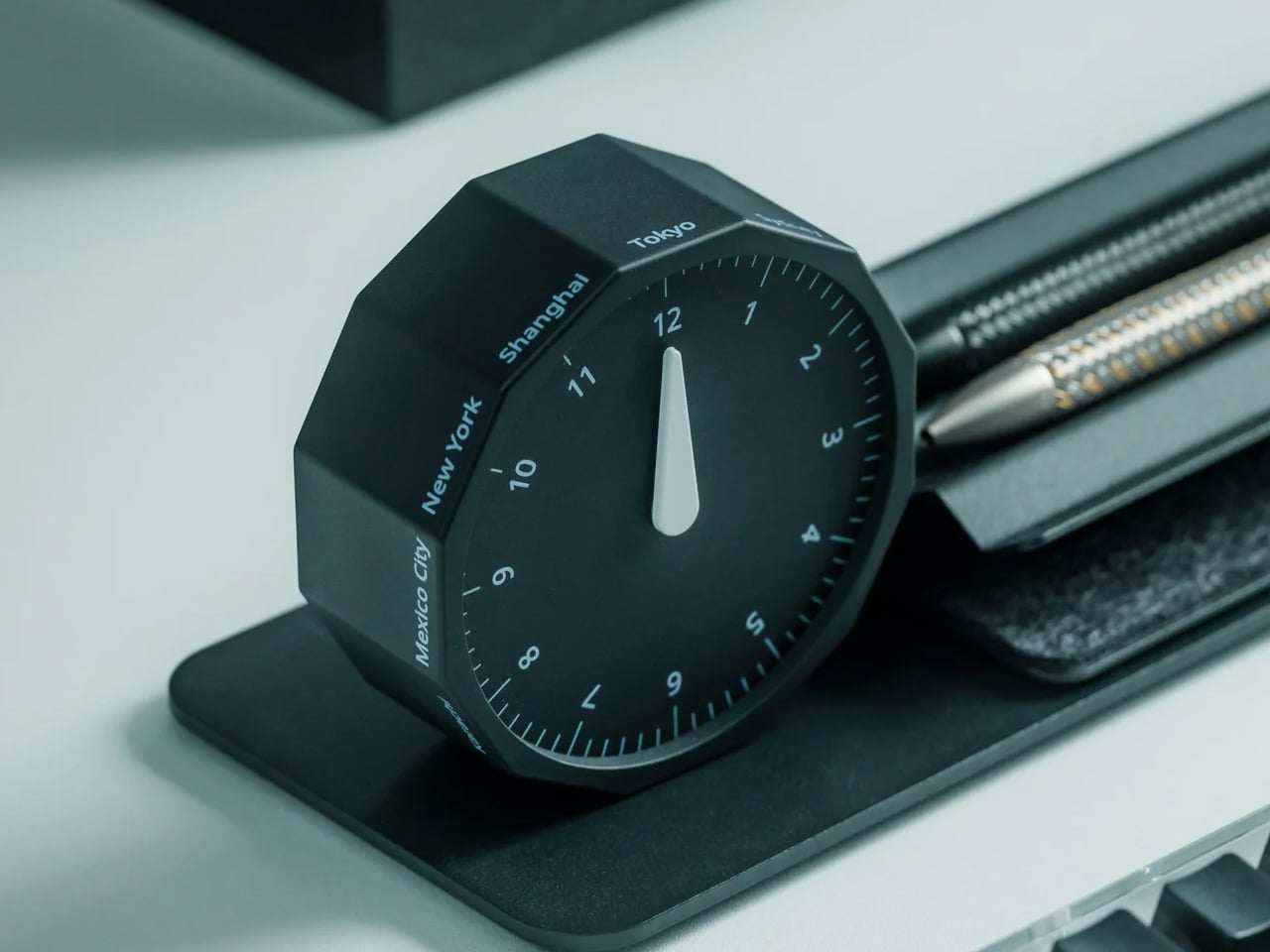
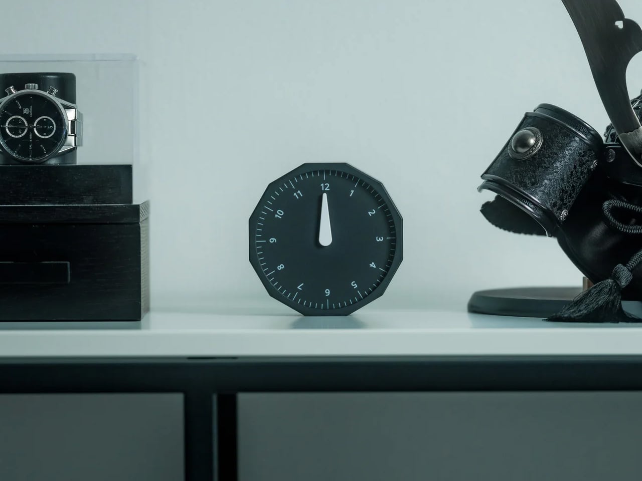
For anyone who regularly works across time zones, converting time in your head is a small but persistent irritation. The Rolling World Clock removes that friction with an approach so intuitive it almost feels obvious: a 12-sided form with a major city on each face, from London and Paris to Tokyo, Sydney, and New York, read by a single hand. Roll the clock until your desired city faces upward and the hand tells you exactly where things stand. No screen, no calculation, no second device needed.

What keeps this clock compelling beyond its core function is the physicality of using it. Rolling a 12-sided object to check the time in Cape Town or Karachi is a tactile experience that no phone interface can replicate; it turns a routine check into something deliberate and satisfying. The minimalist form, available in both black and white, sits cleanly on any desk without visual competition, and the single hand keeps everything honest and uncluttered. It is a rare thing: a genuine conversation piece with a practical reason to exist.

Click Here to Buy Now: $49.00

What We Like

  • The rolling interaction gives checking global time a tactile quality that feels intentional rather than reflexive, adding a small moment of satisfaction to an everyday action.
  • The minimal form in black or white works across almost any desk aesthetic, functioning equally well as a decorative object and a practical timekeeping tool.

What We Dislike

  • Only 12 cities are represented, which means time zones outside those locations will still require some mental conversion on your part.
  • As an analog clock, precision is limited to the nearest quarter-hour, which may not suit those who need exact time readings at a glance.

2. Minimalist Desk Clock

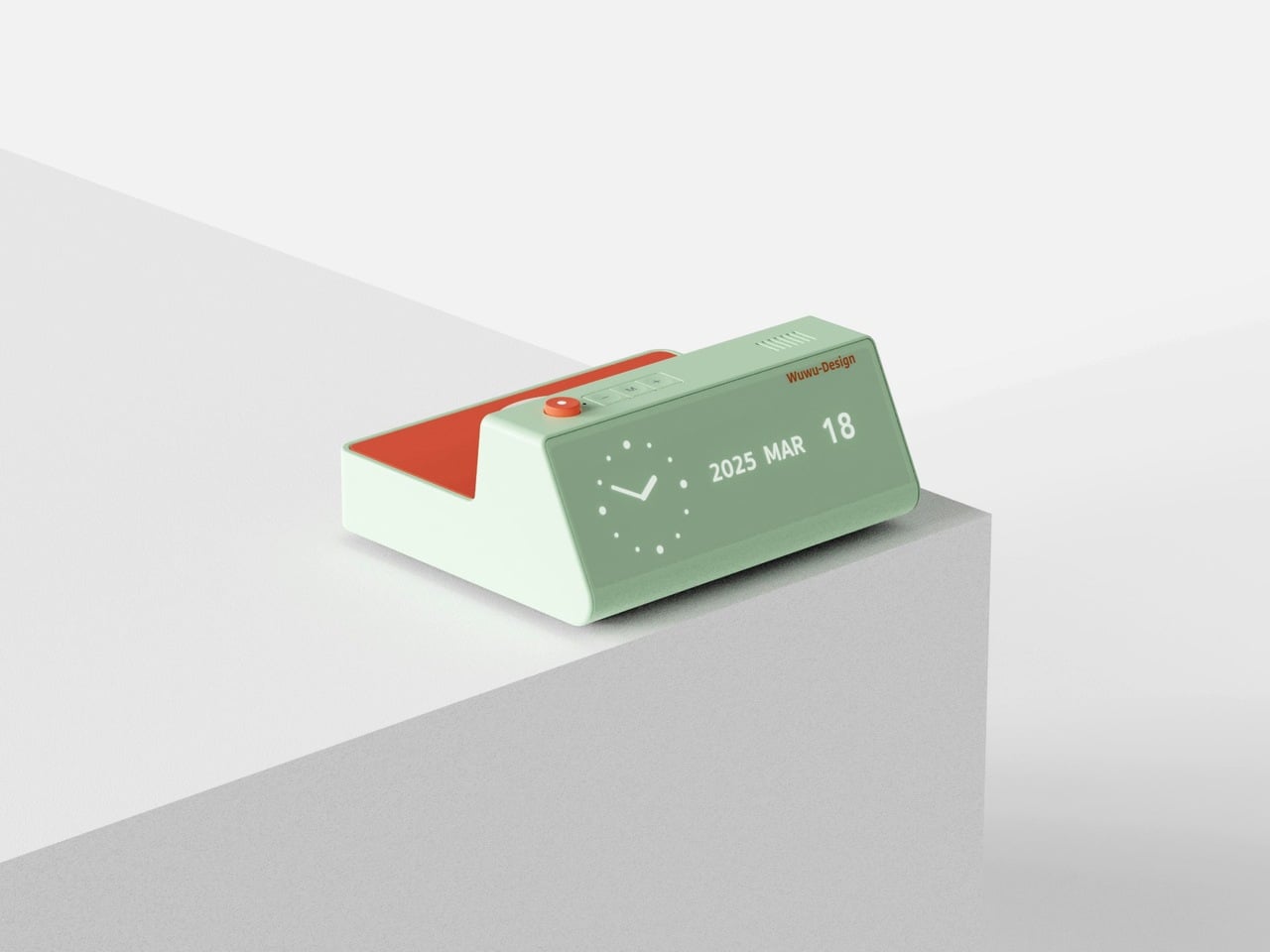
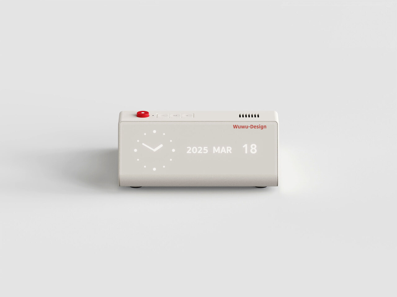
Products that combine two functions usually compromise on both. This desk clock concept draws inspiration from Dieter Rams’ legendary Braun DN40, channeling the same visual restraint while placing a wireless charging pad on the top surface in a way that actually makes sense for daily use. The digital time display sits off to one side of the matte face, balanced by a date readout on the opposite end. Both are embedded flush into the surface, creating a presence that is visible when needed but never demanding your attention when you do not.

The placement of the wireless charger on top is obvious in the best possible way: your phone charges exactly where you can still see it, and the clock keeps doing its job without either function disrupting the other. The asymmetrical display layout reflects genuine compositional thinking, creating deliberate visual balance rather than defaulting to center alignment. For a desk already holding a notebook, a coffee cup, and a tangle of cables, this clock earns its spot by doing double duty without making a scene about it.

What We Like

  • The wireless charging surface sits intuitively on top, keeping your phone visible and accessible while it charges, without requiring a separate pad taking up additional desk space.
  • The asymmetrical display arrangement shows real compositional intention, making the object feel considered and specific rather than generically functional.

What We Dislike

  • This is currently a concept design and is not available to purchase, which limits it to an aspirational reference rather than a practical recommendation right now.
  • The matte embedded displays may lose legibility in dim environments without a backlight or ambient brightness adjustment, which the concept does not appear to address.

3. CAST

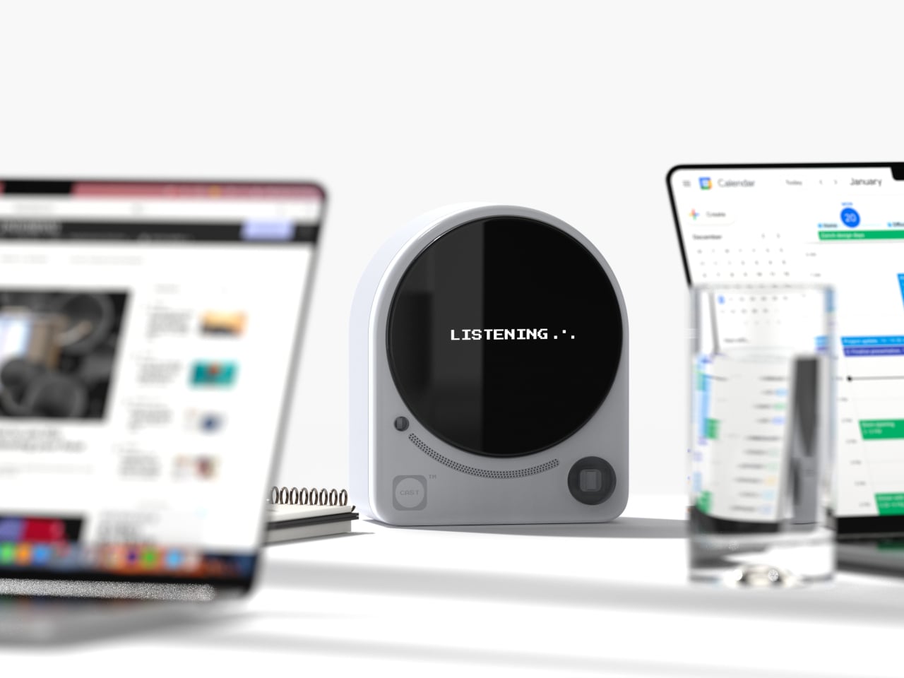
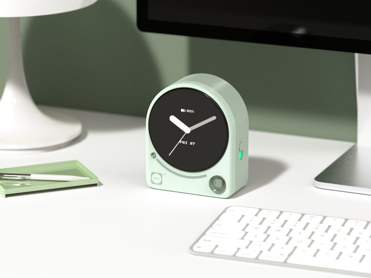
Meetings lose things. Good ideas get spoken into the room and never make it to a document, and most tools designed to fix that problem are more intrusive than the problem itself. CAST, a concept by designer Minseo Lee, takes a different approach entirely. Drawing its form from the Braun BC22, the device arrives as an arch-shaped tabletop companion with a circular display, tactile buttons, and a neutral finish that reads as a clock before it reads as anything else. It sits on the conference table and quietly gets to work.

During a meeting, CAST listens, identifies key points, and generates a concise summary when the session ends. A QR code appears on the display, and participants scan it to access their notes instantly, with no app download or login required. Outside of meetings, it functions as a standard clock, maintaining its understated presence without demanding attention. The dotted graphic details and calm proportions mean it suits an open-plan office as naturally as a private home studio. The best AI tools do not announce themselves; they simply make the room function a little more smoothly, and CAST embodies that idea completely.

What We Like

  • The QR code summary system is a genuinely clever solution, distributing meeting notes to every participant instantly without requiring anyone to install a specific app or create an account.
  • The Braun-inspired design ensures CAST reads as a clock first, which meaningfully reduces the psychological discomfort of having a recording device present during a conversation.

What We Dislike

  • As a concept, CAST is not yet available for purchase, meaning its real-world performance in noisy or complex meeting environments remains completely untested.
  • The quality of the AI-generated summaries will depend on microphone sensitivity and processing power, which are factors the industrial design itself ultimately cannot control.

4. Wooden Desk Clock

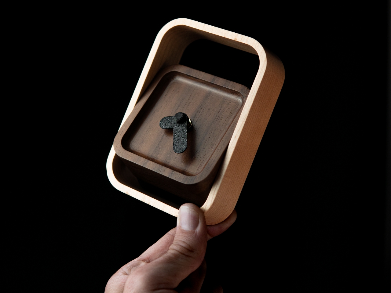
There is something quietly refreshing about a clock that does not try to do anything beyond telling the time beautifully. This wooden desk clock, developed in collaboration with Shapr3D, is exactly that kind of object. CNC-machined from walnut, cherry, or maple, each version uses the natural contrast of warm wood tones and smooth curved surfaces to create something that belongs on a desk the way a well-chosen book or a ceramic cup does. The analog face reads the hour in the most satisfying way possible, without apology.

The clock comprises two parts: a clock head that displays the time and a supportive frame that serves as both a base and a functional handle for adjusting the vertical viewing angle. It is a small detail, but one that shows genuine thought about how the object actually gets used on a real desk by a real person. In an era dominated by aluminum, glass, and screens, a clock machined from actual wood makes a quiet but firm statement about material honesty and the pleasure of things that simply do what they are supposed to do.

What We Like

  • Three wood type options, walnut, cherry, and maple, give the clock a material warmth and versatility that suits a genuinely wide range of desk setups and personal aesthetics.
  • The adjustable vertical viewing angle through the supportive frame reflects thoughtful, user-centered design that considers how the object will actually be used day to day.

What We Dislike

  • Natural wood requires more care than synthetic materials and may be susceptible to scratches or moisture damage over time without proper surface treatment or regular maintenance.
  • The purely analog format offers no smart features, which will not appeal to anyone who expects additional functionality beyond time-telling from a desk object in this category.

5. Moon Rocket Clock

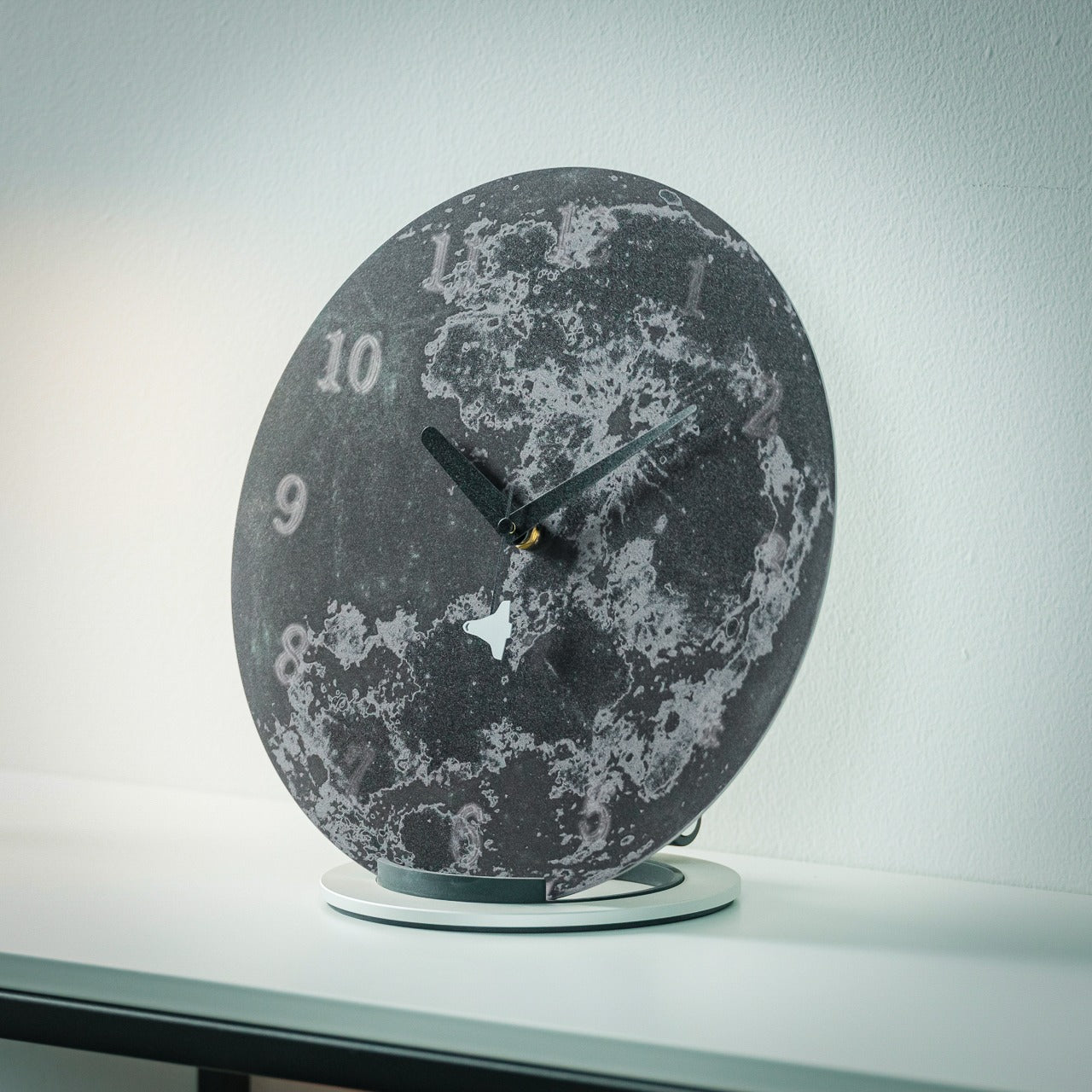
A note upfront: this is not a typical desk clock. It is larger than everything else on this list, more visually assertive, and designed to occupy space rather than disappear into it. Made from specially polished stainless steel, the Moon Rocket Clock is a circular timepiece where printed numbers appear to float and gradually fade around the edges of the face, echoing the visual rhythm of the moon’s phases. The second hand carries a small rocket ship on its tip, which sounds ornamental until you watch it move and recognize the emotional charge the detail actually carries.

This clock works best where it has room to be itself, on a wide desk, a generous shelf, or a statement surface in a home studio. The polished stainless steel construction is durable and catches light in ways that cheaper materials simply do not, giving it a presence that reads as genuinely considered rather than simply bold. More than any other clock on this list, this one carries emotional meaning: a daily reminder to take your ambitions seriously, framed through the imagery of space travel and lunar exploration. It is bigger than usual, demands more visual real estate than a standard timepiece, and earns every bit of space it claims.

Click Here to Buy Now: $325.00

What We Like

  • The specially polished stainless steel construction gives the clock a premium material quality that holds up to daily visual scrutiny and looks better the more closely you examine it.
  • The rocket ship, second-hand, transforms an ordinary glance at the time into a small, recurring moment of inspiration that does not wear out with repetition.

What We Dislike

  • The larger footprint demands more desk space than a standard clock and may feel visually overwhelming on smaller or more tightly curated setups.
  • The bold, distinctive aesthetic is strong enough to require a specific kind of environment to land well, meaning it will not suit every desk or room it is placed in.

The Best Desk Objects Ask Nothing Back

A desk clock was never supposed to disappear. It got displaced gradually by phones and computers, and the slow collapse of single-purpose objects into multipurpose screens. But these five designs are a reminder of what that displacement costs. A clock sitting on your desk is a fundamentally different presence than a clock on your phone. It exists only to mark time, without asking you to respond to anything, check a message, or make a decision. That kind of quiet object has a value that is easy to underestimate and harder to replace.

Good design does not need to solve every problem at once. Sometimes it is about doing one thing well and doing it in a way that earns a permanent place in a room. Whether it is a rolling 12-sided clock that translates time zones through touch or a stainless steel moon keeping a rocket on its seconds hand, each of these clocks has earned its spot. The best desk objects are the ones that make you glad they are there each morning, and every single one of these is exactly that kind of thing.

The post 5 Cool Desk Clocks That Actually Deserve a Spot on Your Desk in 2026 first appeared on Yanko Design.

Apple Turns 50, and Its Most Ambitious Phone Hasn’t Even Launched Yet — 5 iPhone Fold Concepts

On April 1st, 2026, Apple turns 50. For a company that has spent half a century rewriting the rules of consumer technology, the milestone deserves something genuinely transformative. The Macintosh redefined personal computing. The iPod gave an entire generation a new relationship with music. The original iPhone, unveiled in 2007, combined a phone, a music player, and the internet into a single glass rectangle and made every competitor look outdated overnight. The iPhone Fold is real, and it’s coming.

Leaks from early 2026 paint a detailed picture: a book-style foldable powered by the A20 Pro chip on a 2nm process, backed by a 5,500mAh battery, with a 7.8-inch creaseless OLED inner display and a 5.5-inch outer screen. Pricing is expected to start around $2,400, and while a September announcement seems likely, most analysts believe shipments may not begin until December. Designers, modders, and concept artists have spent years filling the void with their own visions of a folding iPhone, each carrying a distinct theory about what Apple should prioritize. These five concepts map the full range of that imagination and capture exactly how much is riding on the real thing.

1. iPhone iFold by Michal Dufka — The Clamshell That Makes Sense

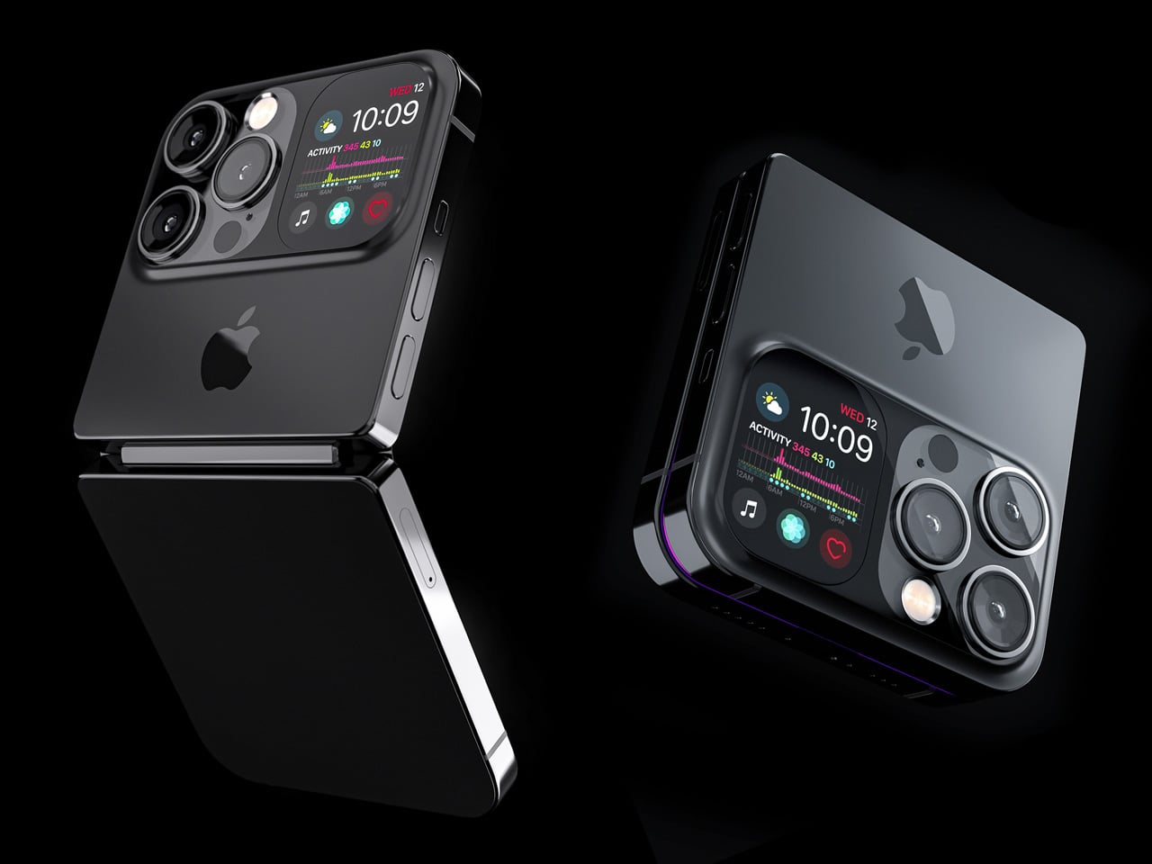
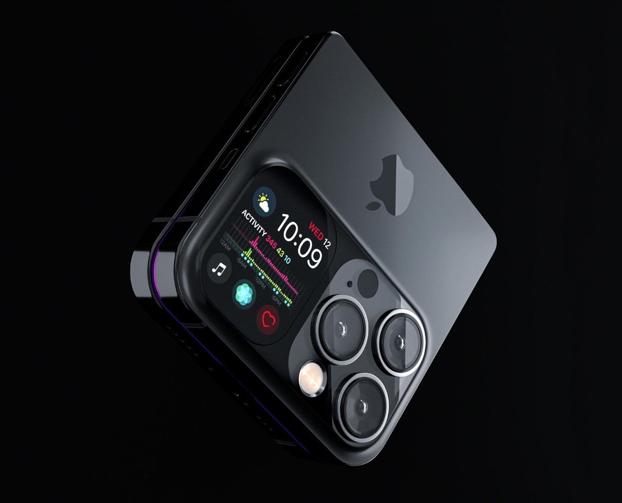
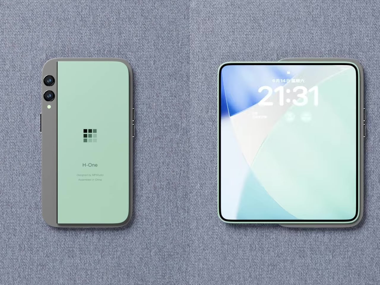
Designer Michal Dufka’s iPhone iFold is built on restraint. Rather than reinventing the iPhone’s entire identity, it applies a clamshell fold to the form factor people already love, drawing direct inspiration from the MotoRAZR and Samsung Galaxy Z Flip. The phone closes into a compact, pocketable square and opens into a full iPhone experience with a generously large display. For anyone who has quietly missed a phone that actually fits in a jeans pocket, this concept speaks to that feeling.

What sets the iFold apart is the secondary display placed beside the camera bump. When the phone is closed, that smaller screen surfaces notifications, time, and essential stats without requiring you to open the device at all. It functions almost like an Apple Watch built into the back of the phone. With Apple’s always-on display technology mature enough for this kind of ambient use, the dual-display setup feels less like speculation and more like a logical next step.

What We Like

  • The secondary display mirrors Apple Watch notification behavior, making glanceable information genuinely useful without ever opening the phone
  • The clamshell format makes the iPhone pocket-friendly for the first time in years without sacrificing screen size when it matters

What We Dislike

  • The clamshell form limits overall screen real estate compared to the expanded tablet surface that a book-style foldable provides
  • Hinge durability over sustained daily use is entirely unexplored here, and it remains the most critical engineering question for any clamshell design

2. iPhone Fold Ultra by 4RMD — When the Specs Match the Ambition

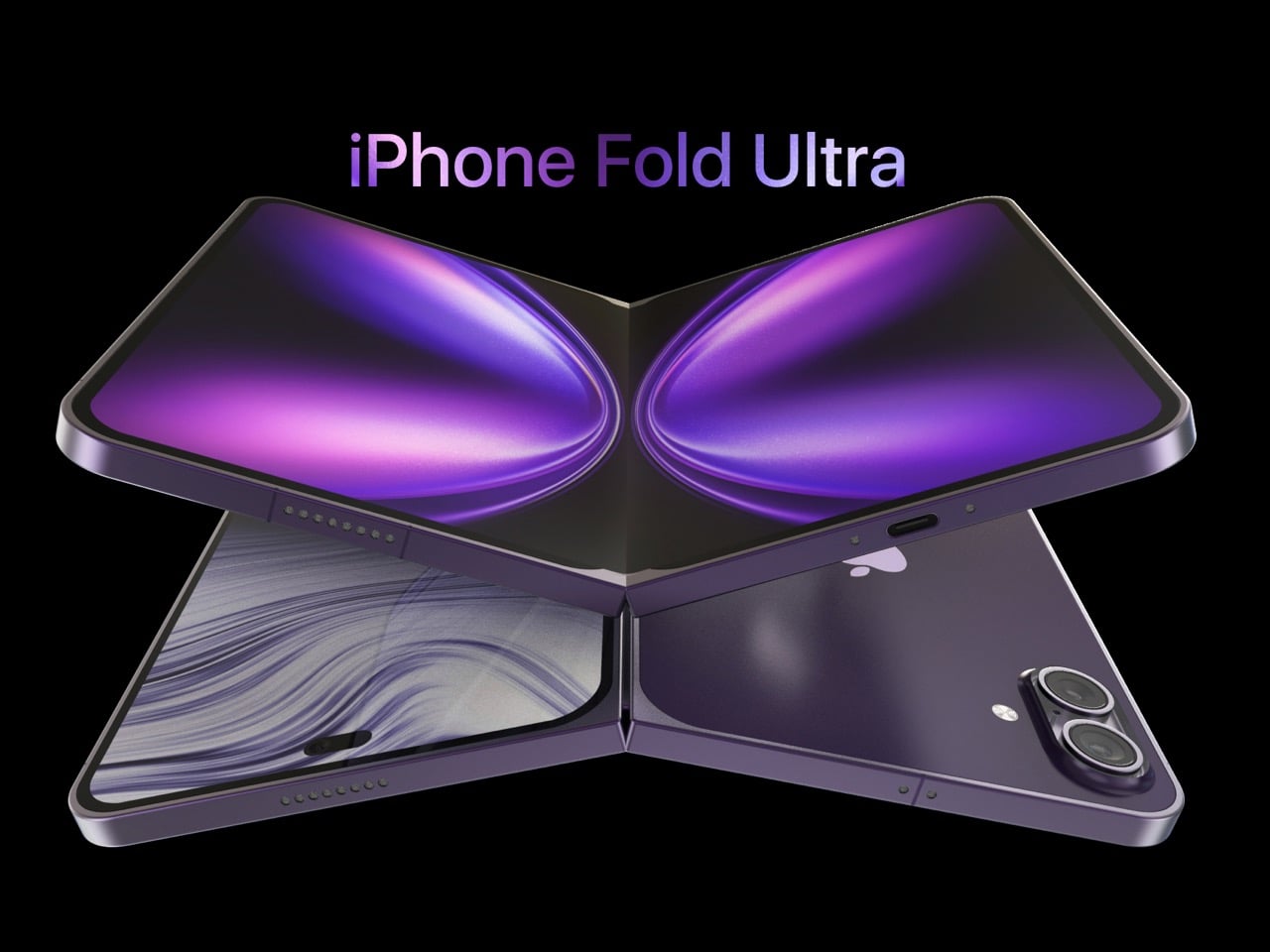
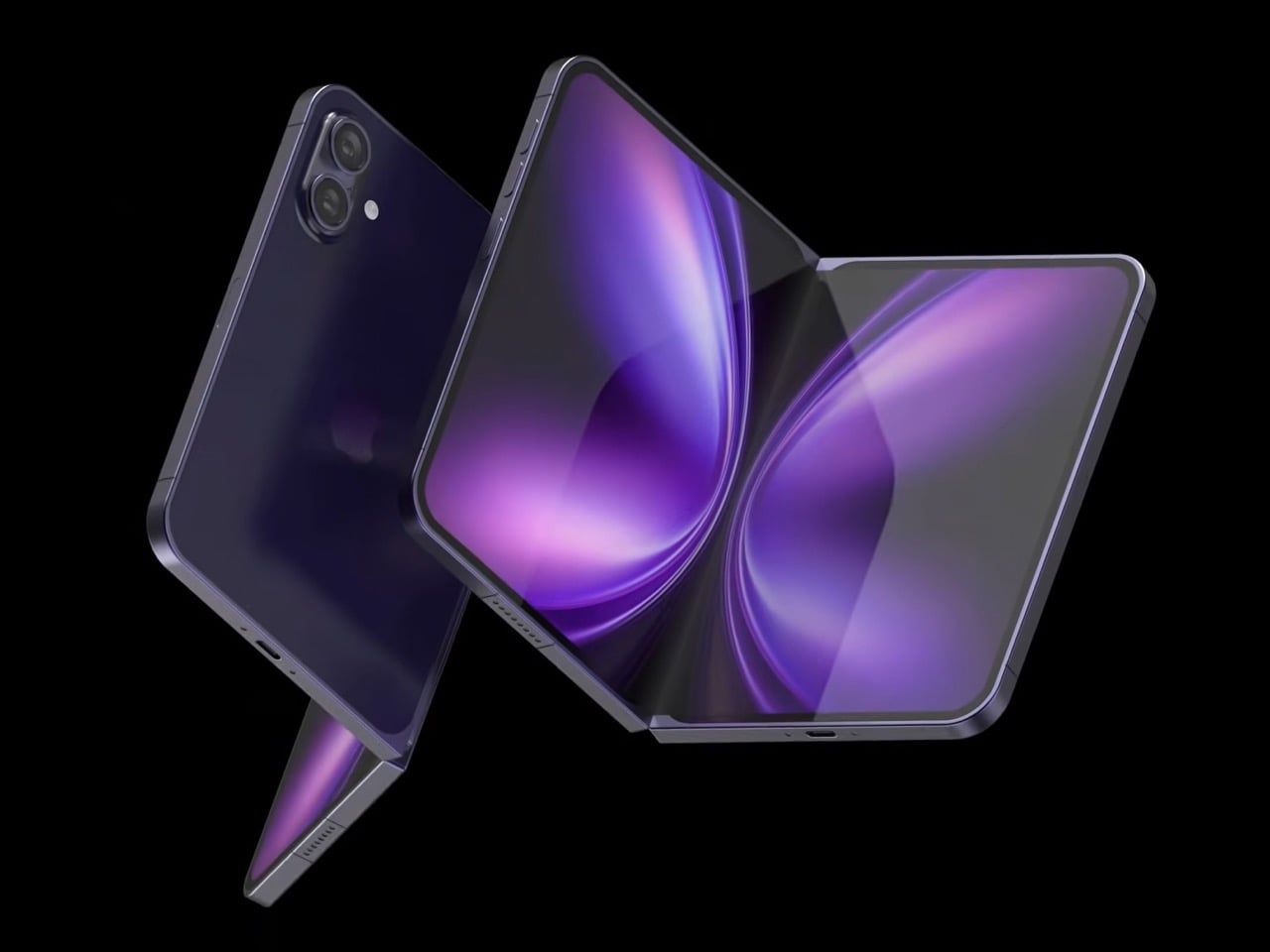
Design studio 4RMD’s iPhone Fold Ultra is grounded in credibility. Built directly from reported leaks rather than pure creative license, the concept presents a book-style foldable with dual 48MP rear cameras, a 24MP ultra-wide front camera, and the A20 Pro chip running on a 2nm process. Three color options appear across the renders: White, Black, and Deep Purple. At an estimated $2,299, this concept sits at the very top of Apple’s lineup with total conviction.

That Deep Purple colorway deserves its own moment. It is a deliberate callback to the iPhone 14 Pro’s most celebrated finish, and it lands differently on a book-style foldable. Something about that color on a device this ambitious reads as genuinely luxurious, the kind of finish that reframes a $2,299 price tag from a shock into a statement. 4RMD clearly understands Apple’s visual grammar, and this concept shows what happens when research and aesthetics share the same design space.

What We Like

  • Specs pulled from verified leaks give this concept real credibility, making it feel like a preview of what is actually coming rather than pure speculation
  • The Deep Purple colorway is a smart, crowd-pleasing callback to one of Apple’s most recognized and beloved finishes

What We Dislike

  • The “Ultra” label sets an expectation that demands exceptional build quality, and no concept can fully address whether the real device will deliver on that promise
  • Crease visibility across the inner display remains unaddressed, which continues to be the most persistent criticism of every book-style foldable on the market

3. iPhone Fold by Svyatoslav Alexandrov — The One That Replaces Two Devices

Svyatoslav Alexandrov’s iPhone Fold concept, created for the YouTube channel ConceptsiPhone, thinks in bigger terms than anything else on this list. Starting as a standard smartphone with a 6.3-inch outer display, it unfolds into a squarish 8-inch tablet that sits clearly in iPad Mini territory. This is not a phone with a bonus screen bolted on. It is a device designed to make carrying both an iPhone and an iPad feel genuinely redundant.

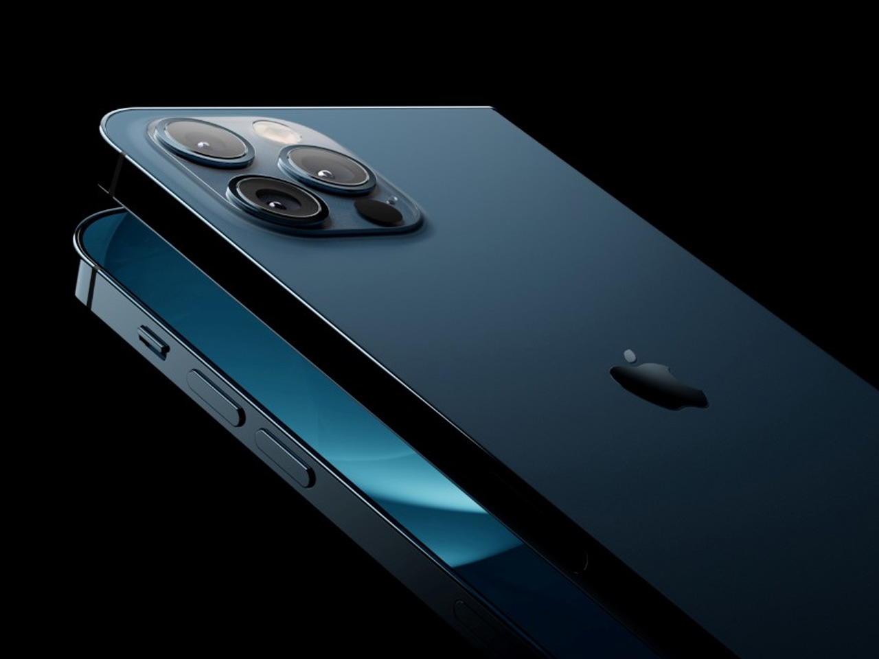
Alexandrov replaces Face ID with a full-display Touch ID fingerprint sensor, keeping the front notch minimal and clean. The rear carries the iPhone 12 Pro’s complete camera array: wide, ultra-wide, telephoto lenses, a LiDAR scanner, and flash. MagSafe compatibility and 5G readiness are already confirmed in the concept, adding meaningful weight to its productivity pitch. Whether the device supports the Apple Pencil is left open, but given an 8-inch inner display, its absence would feel like a missed opportunity.

What We Like

  • The full-display Touch ID is a clean and creative solution that keeps the front uncluttered while solving Face ID’s known complications on foldable form factors
  • The iPad Mini-sized inner screen makes a practical, real-world case for consolidating two devices into one without any meaningful compromise

What We Dislike

  • Removing Face ID eliminates one of the iPhone’s most seamless and trusted authentication features, which most users rely on dozens of times every day
  • Leaving Apple Pencil support unconfirmed weakens what should naturally be this concept’s strongest argument for productivity

4. iPhone Fold by Mechanical Pixel — The Foldable That Doesn’t Actually Fold

Mechanical Pixel’s concept takes the most unconventional approach on this list, and the reasoning is worth understanding. Rather than bending the iPhone itself, the design keeps the main body completely rigid and attaches a separate foldable display to the rear panel instead. The core phone experience remains exactly as people know it, maintaining the familiar dimensions and feel that iPhone users already rely on. That additional screen only enters the picture when a larger surface is specifically needed.

That rear foldable panel sits raised on a platform above the phone’s back, unfolding outward into a larger, squarish tablet surface when required. The layered profile is clearly visible from the side, giving the device a deliberately experimental and modular quality. The camera module remains in its standard position, completely unaffected by the additional display layer. The logic is unconventional, but the core argument of preserving the primary iPhone experience from any foldable compromise is genuinely hard to dismiss.

What We Like

  • Keeping the main body rigid entirely sidesteps the crease and long-term hinge durability problems that define every conventional foldable on the market today
  • The modular approach means the everyday iPhone experience is never degraded or compromised by the mechanics of the foldable element

What We Dislike

  • The raised rear platform creates an unrefined, layered side profile that sits well outside anything Apple’s design language has ever produced or endorsed
  • The prototype-like aesthetic makes it very difficult to imagine this direction surviving Apple’s notoriously demanding and detail-oriented product design process

5. iPhone V — The One Someone Actually Built

Every concept on this list exists as a digital render. The iPhone V is different. A YouTuber modder physically dismantled an iPhone X, extracted its internal components, and rebuilt the entire device inside a Motorola Razr chassis. The result is a working, folding iPhone that runs real iOS, carries a Retina-quality display, and folds in half like a classic flip phone. As a proof of concept, it is extraordinary. As a finished product, every question comes flooding in.

What makes the iPhone V genuinely compelling is not fit, finish, or polish, because it has none in any conventional sense. It is the straightforward fact that someone cared enough to prove the idea could actually work using parts that already exist. The folding mechanism and device thickness still need serious refinement. A working clamshell iPhone running authentic iOS is, in the end, a more persuasive argument for this form factor than any polished render has managed to be.

What We Like

  • The iPhone V is the only entry on this list that is fully functional, running real iOS inside an actual working clamshell device
  • Its physical existence proves the clamshell iPhone concept is viable using genuine Apple hardware, well beyond anything a render can demonstrate

What We Dislike

  • The repurposed Motorola Razr chassis produces a build that falls far short of consumer-grade fit, finish, and structural refinement
  • Hinge mechanism quality and overall device thickness remain significant engineering challenges that the mod cannot resolve, and they are exactly what Apple needs to solve

The Concepts That Made the Wait Worthwhile

Fifty years in, Apple is still the company that makes you wait. The iPhone Fold concepts here are not just exercises in creative imagination — they are a record of what designers and makers have been asking for, year after year. Some nailed the form factor. Others got the specs exactly right. A few did both. Together, they have shaped the entire conversation around a device that already feels utterly inevitable.

When the real iPhone Fold arrives, it will be measured against each of these visions. That is the power of concept design — it sets the bar before the product ships. Apple turning 50 while holding back its most ambitious device is pure theater. The design community has been writing this script for years. The only question is whether the real thing can live up to what the imagination has already built.

The post Apple Turns 50, and Its Most Ambitious Phone Hasn’t Even Launched Yet — 5 iPhone Fold Concepts first appeared on Yanko Design.
5 Best Spring Gadgets That Are Taking Over Every Tech-Savvy Student’s Wishlist

Spring changes the way students think about their tools. The semester finds its stride, the days stretch longer, and the quiet audit of what is actually working versus what has simply been tolerated becomes impossible to defer. For tech-savvy students, this impulse is never casual. It turns into a deliberate reckoning with every device in the bag, every cable on the desk, and every piece of hardware that earns or fails to earn its place in a schedule already running at capacity.

Most gadget guides aim too low. They recycle the same categories, suggest the predictable safe picks, and miss the specific texture of what a tech-savvy student’s day actually looks like in spring. Tools that genuinely serve that day are portable without sacrifice, precisely designed, and specific enough in their purpose to feel built for the exact problem they solve. The wishlists circulating among students who think carefully about design land on exactly that — and every product here was chosen to reflect it.

1. OrigamiSwift Folding Mouse

The mouse is the peripheral that students consistently overlook until a trackpad fails them mid-session. The OrigamiSwift changes that calculation. Drawing on origami’s structural logic, this Bluetooth 5.2 mouse collapses flat and springs into a full-sized ergonomic device in under 0.5 seconds. At 40 grams and 0.18 inches thin when folded, it disappears into a jacket pocket without adding noticeable weight. Soft-click buttons suit shared study spaces, and a USB-C battery sustains three months on a single charge.

For students moving between a library desk, a café table, and a campus bench in one afternoon, this is the mouse that travels without being noticed until needed. Compatible across Mac, Windows, Android, and iPadOS, it works equally on a personal laptop and a shared lab machine with no additional setup. The ergonomic form handles extended sessions without fatiguing the wrist, turning a recurring compromise into a peripheral that finally earns its place.

Click Here to Buy Now: $85.00

What We Like:

  • Folds to 0.18 inches and 40 grams, fitting into a jacket pocket without adding meaningful bulk to the daily carry
  • Three-month USB-C battery life removes it entirely from the weekly charging routine, so one less thing to think about

What We Dislike:

  • Bluetooth-only connectivity limits use on older shared desktops or lab machines that lack wireless support
  • The folding mechanism takes a brief adjustment period for students accustomed to the immediate grip of a conventional fixed-body mouse

2. Xiaomi UltraThin Magnetic Power Bank 5000 15W

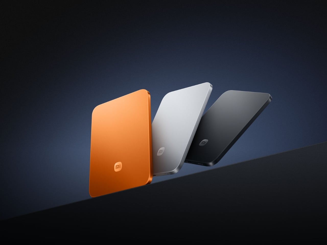
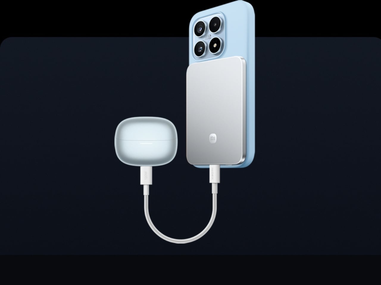
Power banks occupy a strange design dead zone. Most work as promised and are forgotten the moment they enter a bag. The Xiaomi UltraThin Magnetic Power Bank 5000 15W reframes the category. At 6mm thin — slimmer than any current smartphone — it holds 5,000mAh inside an aluminum alloy shell. Silicon-carbon battery chemistry with 16% silicon content enables higher energy density without expanding the footprint, and a fire-resistant fiberglass rear surface manages heat during wireless charging.

This solves the persistent problem of the charging backup that stays home because it feels too heavy to justify. At 6mm, it sits magnetically against a compatible phone and delivers 15W wirelessly while moving between buildings, sitting through a lecture, or waiting at a transit platform. No cable between bank and phone, no rummaging for the right end. It sits in a pocket as an extension of the device rather than a separate burden to manage throughout the day.

What We Like:

  • Silicon-carbon chemistry achieves 5,000mAh within a 6mm profile, making it the thinnest power bank available at this capacity tier
  • Magnetic cable-free attachment delivers 15W wirelessly while the phone stays pocketed between classes, with zero management required

What We Dislike:

  • 5,000mAh covers roughly one full smartphone charge, which falls short on heavy-use days involving continuous navigation, recording, and streaming
  • Magnetic wireless charging is limited to compatible phone models, restricting the cable-free feature for students outside that ecosystem

3. HubKey Gen2

The average student laptop setup involves a quiet accumulation of compromises: a dongle for the display, a separate hub for ports, a cable for audio, and none of it cohering. The HubKey Gen2 addresses this from a single USB-C connection. An 11-in-1 hub in a compact cube, it adds two HDMI ports, each capable of driving a 4K display at 60Hz, four fully customizable physical shortcut keys, and a central control knob that handles everyday actions without navigating software menus.

Spreading a research document across two 4K panels changes the quality of a work session in ways only understood from the inside. Reference material stays open while the draft stays active. Code and documentation share the same eyeline. The shortcut keys reduce the cognitive overhead of memorizing keyboard combinations, and the central knob delivers volume control with tactile immediacy that no software slider replicates. For students working across design, development, or video, this cube earns its place on day one.

What We Like:

  • Dual 4K HDMI outputs at 60Hz each simultaneously expand a laptop into a proper two-monitor workstation from a single connection
  • Physical shortcut keys and a central control knob bring immediate, tactile control to routine tasks that software menus handle more slowly

What We Dislike:

  • Cube form factor suits a stationary desk, but does not pack into a travel bag as cleanly as a flat or cable-style hub alternative
  • Full 11-in-1 performance depends on the connected laptop’s USB-C port supporting the required power delivery and data bandwidth specifications

4. BraX open_slate

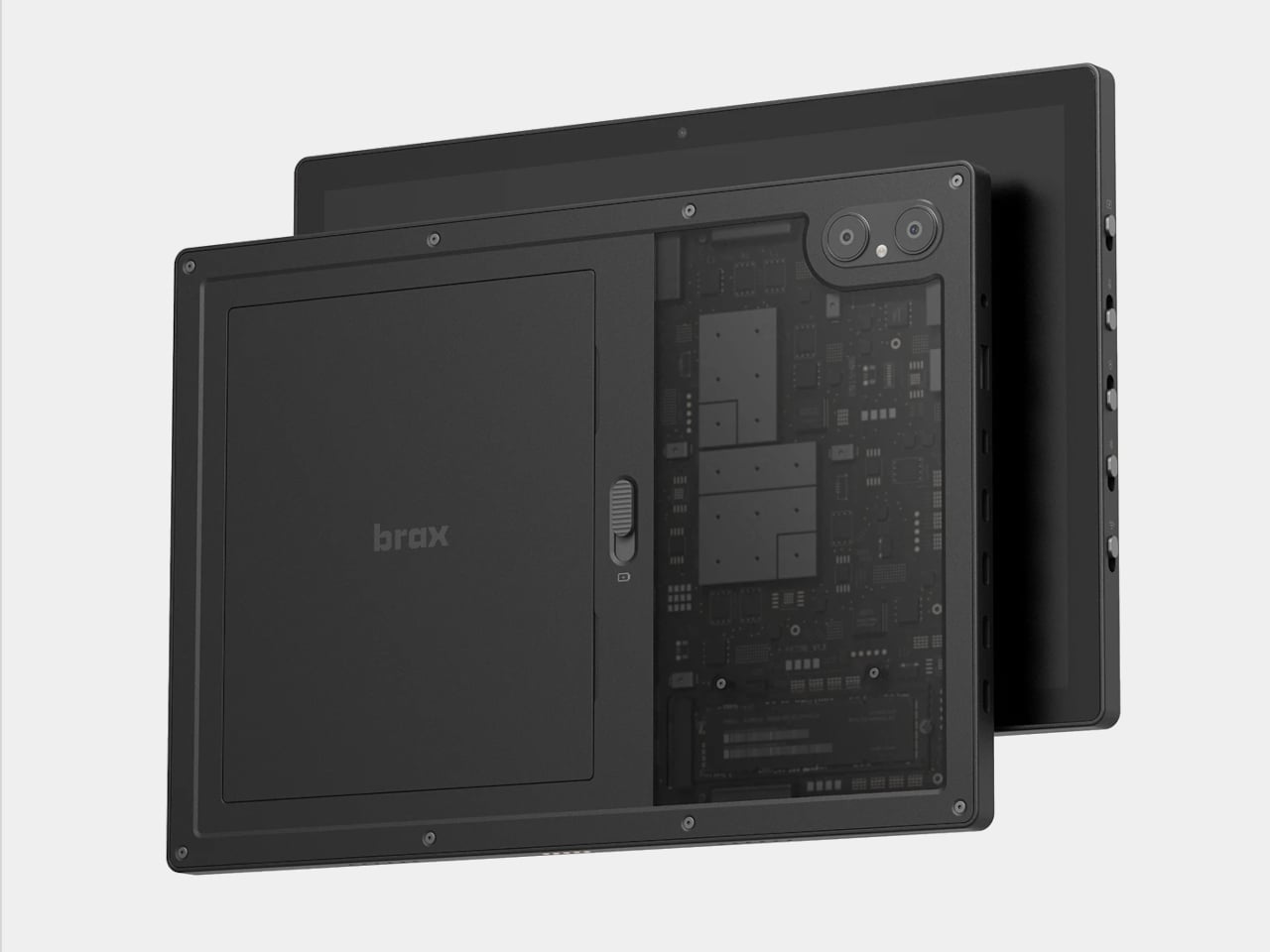
Almost every tablet arrives sealed, with decisions already made inside the chassis: fixed storage, an inaccessible battery, a software support window that closes on the manufacturer’s schedule. The BraX open_slate rejects that model. This 12-inch 2-in-1 includes an M.2 2280 slot for user-swappable storage, a replaceable 8,000mAh battery rated at 20 hours of runtime, and a 120Hz display driven by a MediaTek Genio 720 chip paired with either 8GB or 16GB of RAM.

The open_slate removes the most predictable frustration of the tablet ownership cycle: the moment a device slows enough to become an obstacle, and the only available response is full replacement. Swappable storage means a capacity upgrade takes an afternoon. A user-replaceable battery means two years of student use does not write off the entire device. For students making a deliberate, multi-year investment in one tablet, this is currently the only option making that argument with hardware to back it.

What We Like:

  • User-replaceable M.2 storage and battery extend the device’s usable lifespan well beyond the typical two-to-three year sealed-tablet replacement cycle
  • A 20-hour claimed battery runtime on a 120Hz display covers a full academic day without requiring a charge mid-session

What We Dislike:

  • MediaTek Genio 720 is a capable mid-range chip, but it is not suited for students with intensive video rendering or compute-heavy creative workloads
  • The open modular hardware requires a degree of technical confidence that students coming from fully managed, sealed device ecosystems may need time to build

5. Battery-Free Amplifying iSpeakers

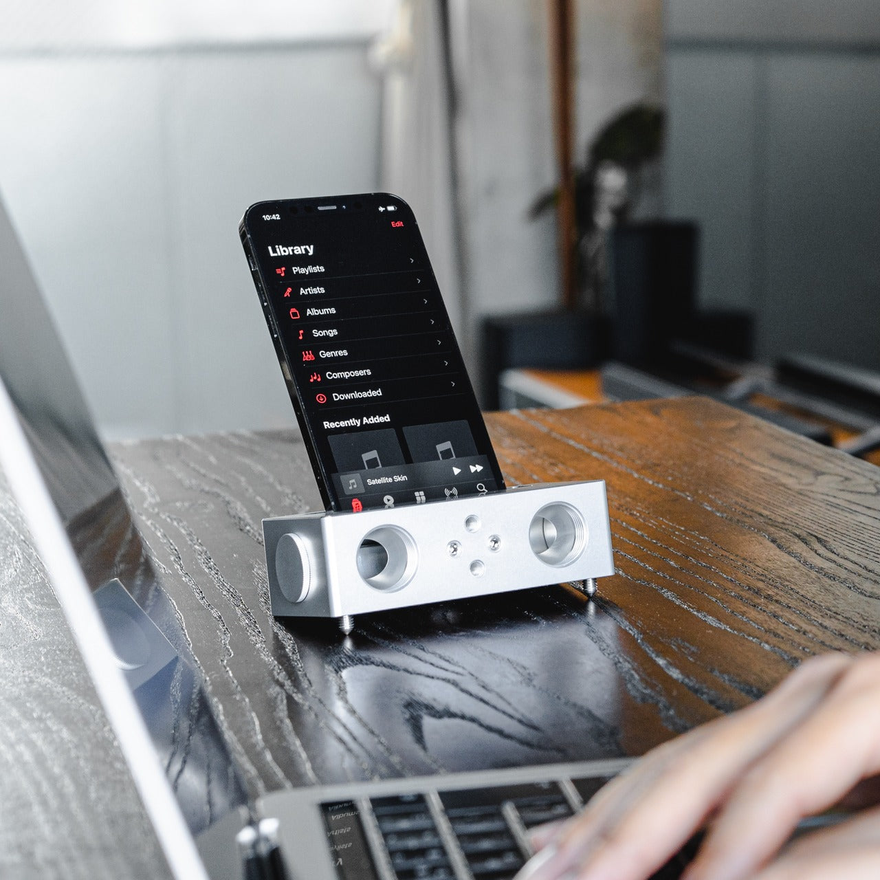
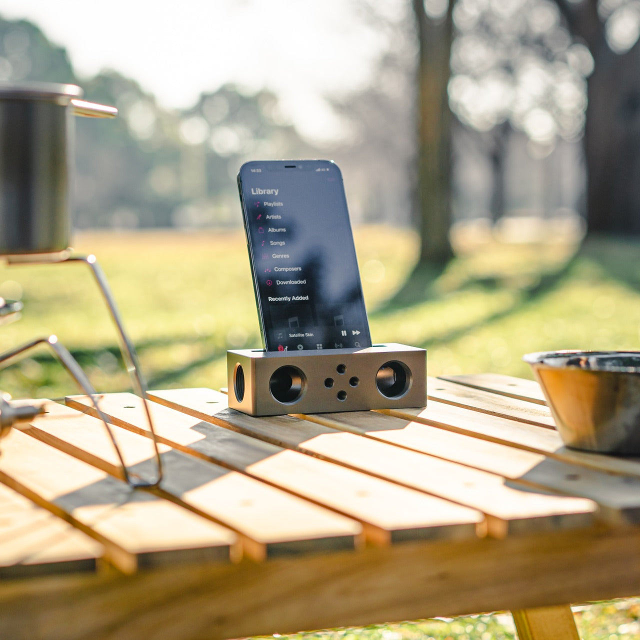
The Battery-Free Amplifying iSpeakers operate on a principle that is easy to underestimate until the sound fills the room. A smartphone sits in the machined Duralumin cradle, and sound waves are directed and amplified through the chamber without any electrical input. The body is the same aluminum alloy used in aircraft construction, chosen for its vibration resistance and acoustic properties. Chamber proportions were developed using the golden ratio, a structural decision that shapes the internal acoustic geometry deliberately.

No charging reminder, no Bluetooth pairing, no firmware update mid-session. A phone in the cradle and the room shifts immediately, audio gaining presence and warmth that a phone speaker lying flat on a desk cannot approach. For study sessions running on focus music, ambient sound, or a lecture replay, the difference registers in seconds. Duralumin handles daily movement without showing wear, and because it operates entirely outside the electrical ecosystem, it performs identically in ten years as it does today.

Click Here to Buy Now: $179.00

What We Like:

  • Zero power requirement means no charging, no battery degradation, and no dependency on any cable or power source at any point
  • Aircraft-grade Duralumin construction delivers acoustic quality and physical durability that holds across years of regular daily use without deterioration

What We Dislike:

  • Passive acoustic amplification improves meaningfully on bare phone speaker output, but cannot match the volume or bass depth of even entry-level powered speakers
  • Cradle sizing is optimized for specific smartphone dimensions, and compatibility may vary with larger phones or thick protective cases

The Setup That Actually Works for You

The five products here do not share a category, price point, or use case. What they share is design precision that addresses real daily friction rather than just performing a feature list. A wishlist built on that standard holds up across the full stretch of any semester. These are tools chosen because someone thought carefully about the problem first, and that clarity comes through every time you reach for one.

Spring is short. It moves quickly from the first warm afternoon to the last exam, and the tools you work with shape how much of that time goes toward actual output. The difference between owning something well-considered and tolerating what came with freshman year becomes obvious around week ten. Choosing now means spending the rest of the semester working with something that performs exactly the way a well-chosen tool should.

The post 5 Best Spring Gadgets That Are Taking Over Every Tech-Savvy Student’s Wishlist first appeared on Yanko Design.
The 5 Best Furniture Designs of March 2026

March brought the kind of furniture that doesn’t need to announce itself. A student chair that shifts between sitting and lounging through physics alone. A coffee table whose legs look like they’re caught mid-step toward the door. A stool that opens from flat with a single press and no tools required. An office system built to reconfigure whenever the day asks for something different. A footstool that handles posture quietly, without making it your problem to manage.

What connects these five pieces isn’t a shared material or a shared aesthetic. What connects them is the absence of excess. Each one solves something real, and each one does it without layering on complexity to get there. That kind of restraint is harder to land than it looks. Most furniture design in 2026 is reaching for the new, for the bold, for the statement piece. These five reach for the right answer instead, and find it.

1. Tilt Chair

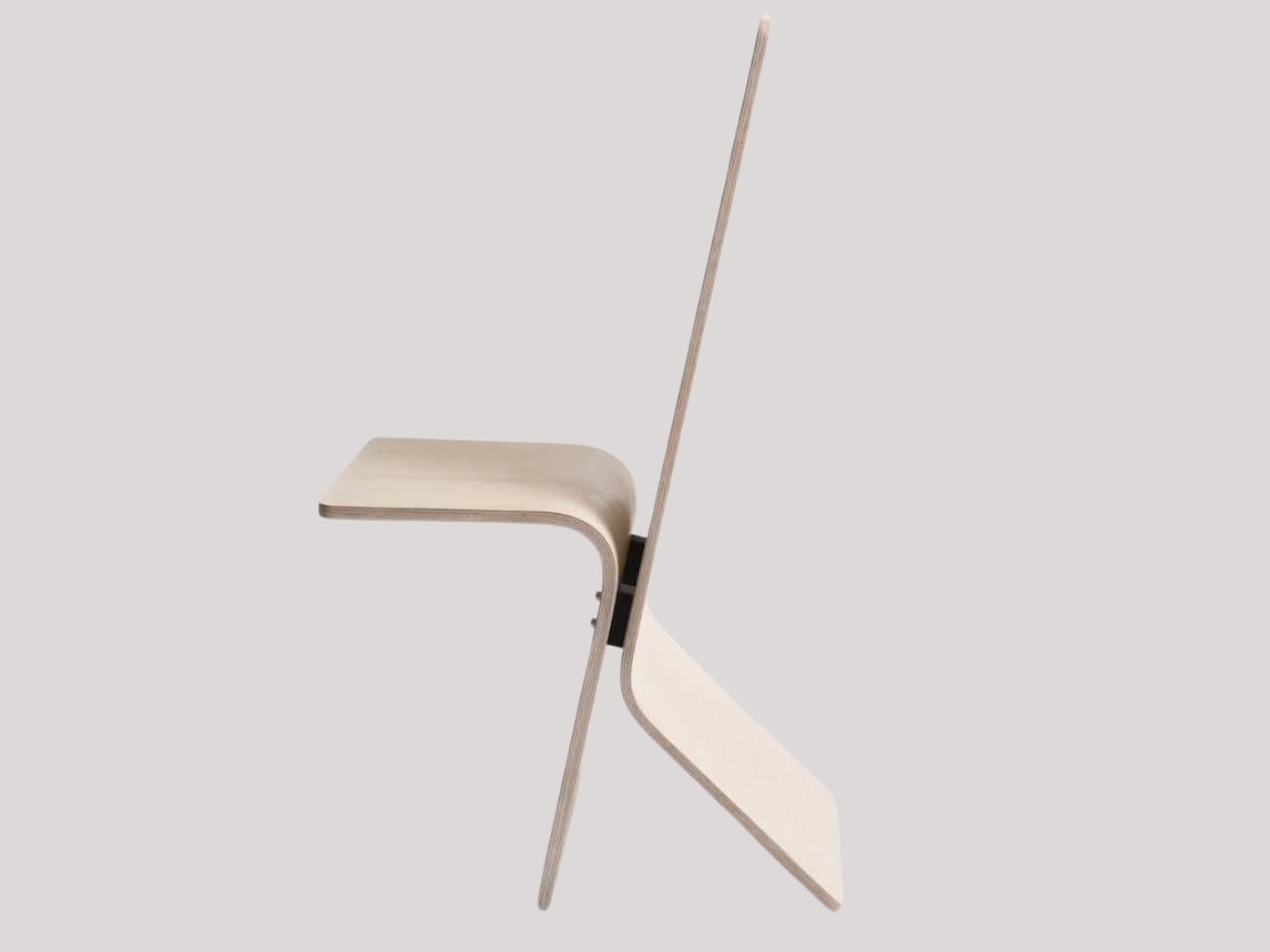
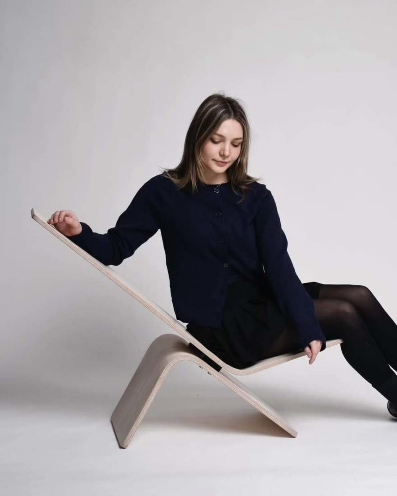
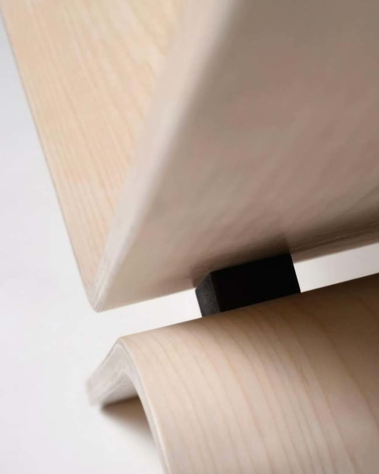
Manuela Hirschfeld is an industrial design student at Germany’s Hochschule Pforzheim, and her Tilt chair does exactly what the name suggests. Built from bent plywood, it shifts between upright and reclined with a single forward tilt. No levers, no hardware, just physics and balance. The restraint here is rare for student work. Most student designs reach for the complex or the speculative. Tilt strips everything back until the idea stands entirely on its own.

What makes it genuinely useful is how naturally it handles the shift between focused work and winding down. Most chairs make you choose one mode and stay there. Tilt lets your body make that call instead. Lean it forward, and the geometry changes. The bent plywood keeps it light and easy to move, so it works as well in a small apartment as it does in a studio or home office.

What We Like

  • No mechanical parts means nothing to replace or service over time
  • Dual function in a single lightweight form, no extra hardware needed

What We Dislike

  • The minimal plywood aesthetic may feel too sparse for warmer, more layered interiors
  • May not offer enough firm back support for users who need a fixed, stable position

2. Barefoot Collection

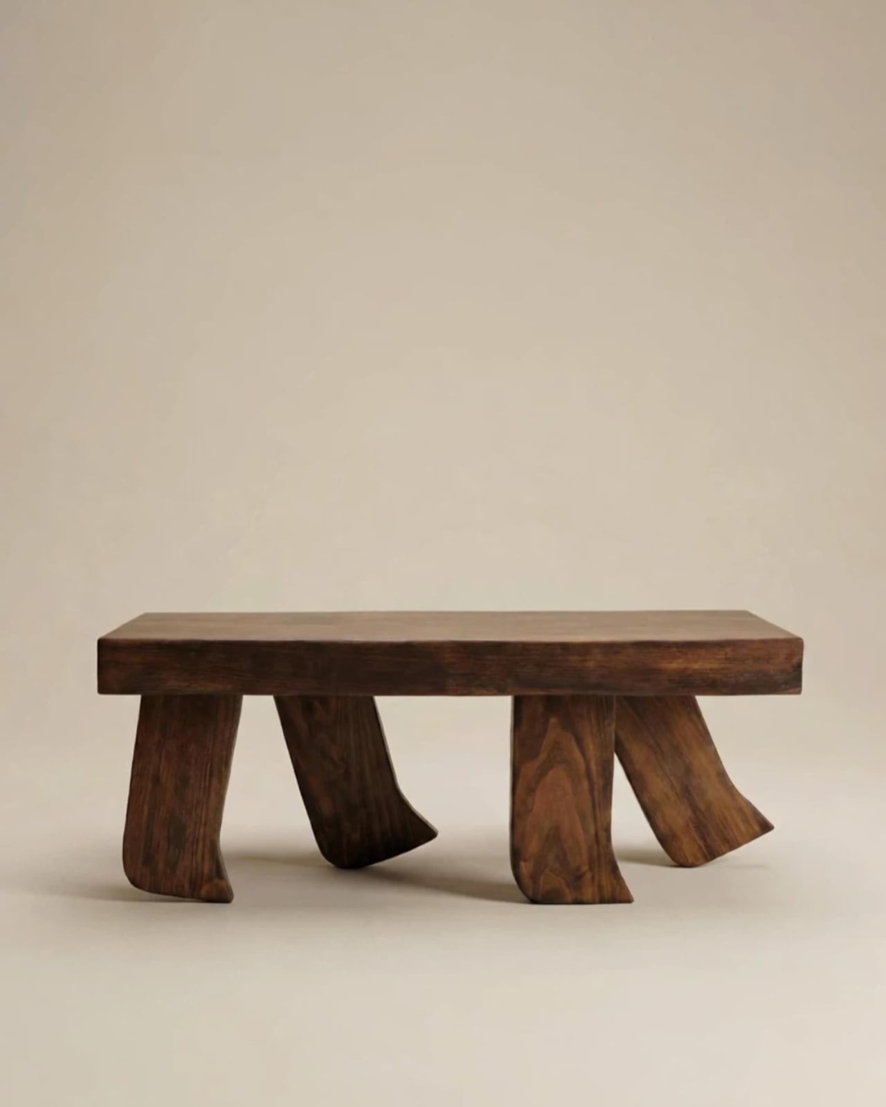
The Barefoot Collection started with a single image: a coffee table that looks like it’s walking away. The legs are carved from solid wood to simulate the arc and flex of a bare foot mid-step, while the tabletop stays completely flat and rectilinear. Stillness above, motion below. That contrast is the whole point, and it works better than it has any right to. The piece reads as coherent long before it reads as clever.

What you actually get is a coffee table that functions without apology and sparks a real conversation without ever trying to. Set a cup on it and forget the concept entirely. Then a guest walks in, does a double-take, and suddenly the room is talking. Most concept-led furniture exhausts you after a few weeks. Barefoot earns its place by being genuinely useful first and genuinely interesting second. That’s always the right order.

What We Like

  • Solid wood construction gives it real longevity, well beyond its visual appeal
  • Works as a fully functional surface while quietly holding a strong point of view

What We Dislike

  • The sculpted legs make it difficult to pair with more conventional, straight-lined furniture
  • The level of craft involved likely puts it at a higher price point

3. Press Stool

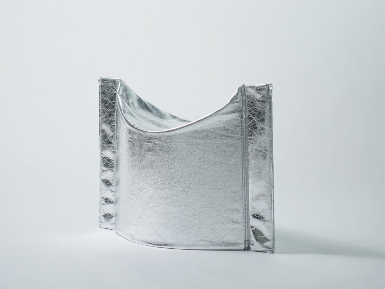
The Press Stool borrows its structural logic from folded paper. A flat sheet has no load-bearing strength, but fold it, and the forces redistribute across the geometry. Crease it further, and the form resists compression. That principle does all the work here. In its flat state, it collapses into a wide oval with a crinkled metallic silver surface that lands somewhere between industrial foil and fabric. One press and it opens. No legs, no bolts, no tools.

For anyone in a small apartment, it solves a storage problem while putting something worth looking at in the room. It ships flat, weighs little, and can slide under a bed or lean against a wall when it isn’t needed. Most fold-flat furniture looks like a compromise. The Press Stool looks intentional. The crinkled surface and gathered folded ends give it a presence that holds up even when it’s closed.

What We Like

  • Ships and stores completely flat, ideal for smaller homes and tight living spaces
  • No assembly required, the folded form does all the structural work

What We Dislike

  • The metallic silver finish is a strong statement that won’t suit every interior palette
  • Load capacity may be more limited compared to stools with conventional structural frames

4. Kylinc Modular Office System

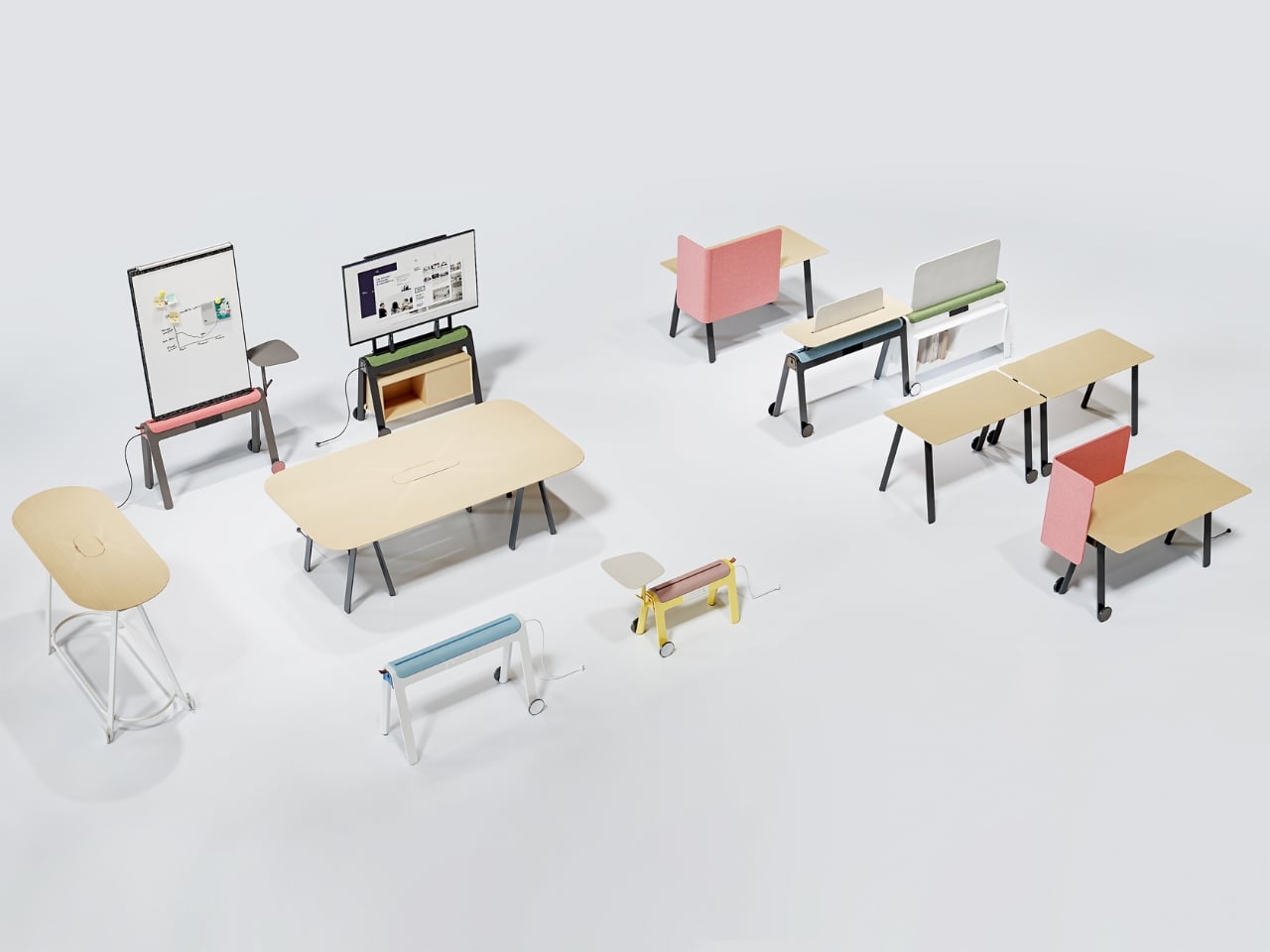
Kylinc treats the workspace like something that should change whenever the day asks it to. Each piece rolls on oversized wheels, which makes reconfiguring your office feel genuinely effortless rather than theoretically possible. Push pieces apart for a collaboration zone, pull them together for focused work. Power management is built directly into the furniture, with smart cable organization that keeps surfaces clean without any additional accessories to track down or manage.

The benefit shows up most for people working from home across a day that never asks the same thing twice. A static configuration works well some of the time and poorly the rest. Kylinc changes that without requiring much effort, which is the real difference between a system that actually gets used and one that stays fixed out of habit. The built-in cables move with the furniture. Your layout becomes something you actually control.

What We Like

  • Oversized wheels make real reconfiguration effortless, not just possible on paper
  • Integrated power and cable management keep the workspace clean without extra accessories

What We Dislike

  • Rolling furniture may feel less stable than fixed pieces for users who prefer an anchored setup
  • A full modular system likely carries a significantly higher upfront cost than standard office furniture

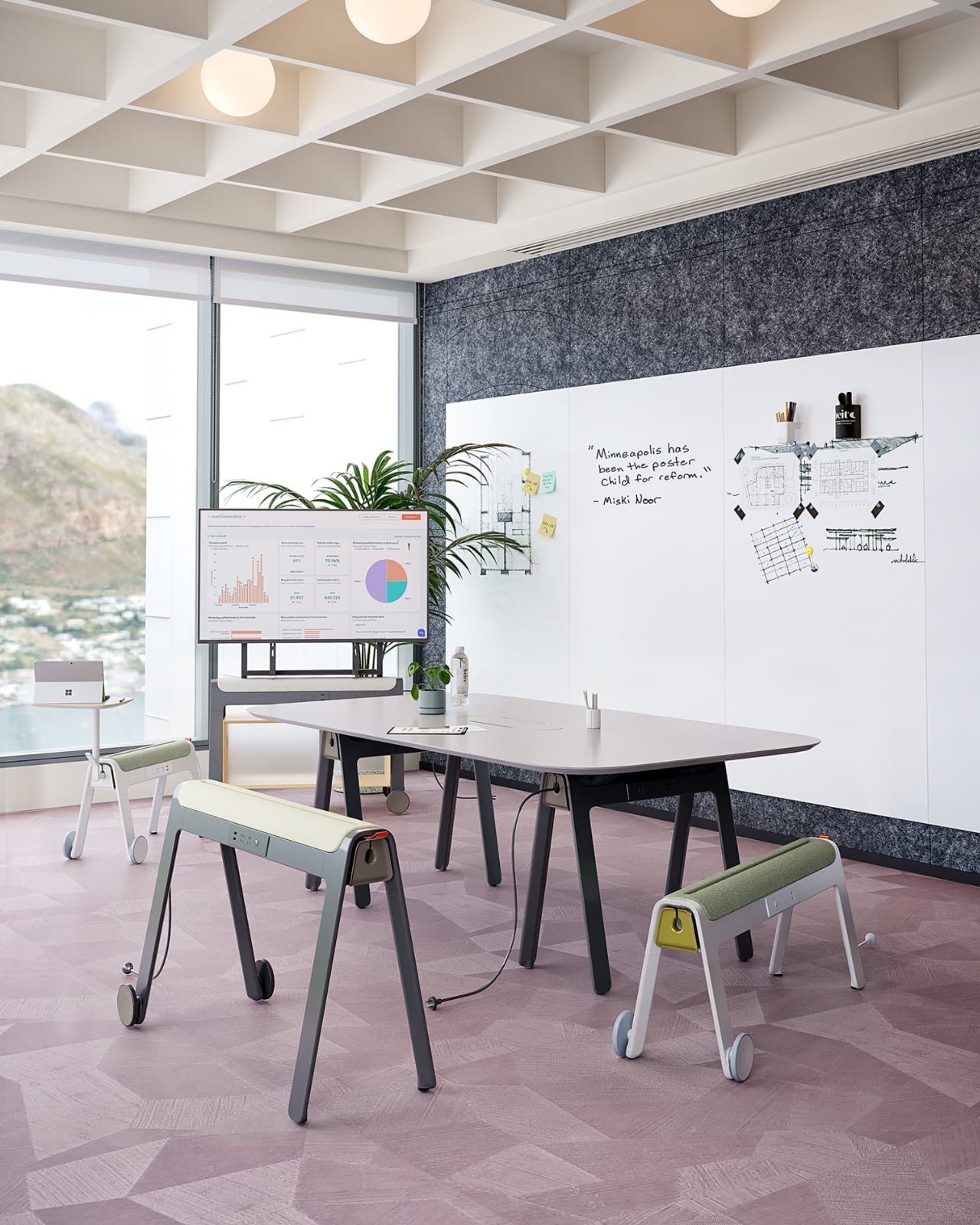
5. OTTO Footstool

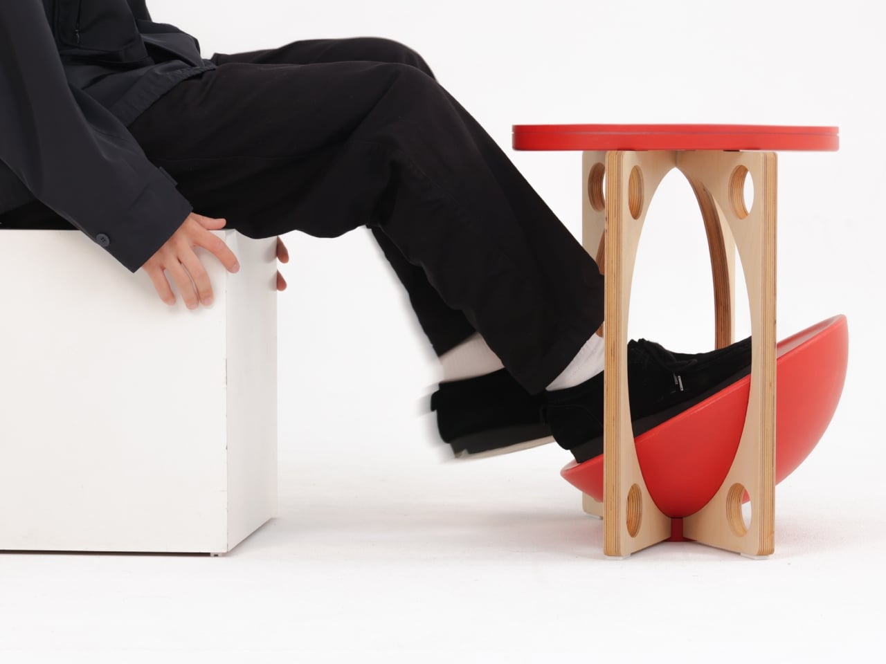
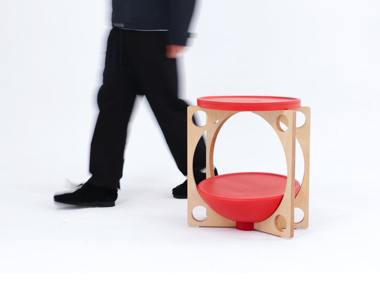
OTTO takes its name from the Korean roly-poly toy Ottogi, a round-bottomed figure that always rights itself because of its convex base. Designer Woonghee Ma applied that same logic to a footstool. The convex base means it rocks and shifts as your body moves throughout a long sitting session. No adjustment needed, no settings to configure. You shift weight, the stool moves with you, and that’s the whole mechanism.

For a home office that needs to support you without making a production of it, OTTO is exactly right. Most ergonomic products demand your attention to work. OTTO doesn’t. The passive rocking base handles posture support quietly while you stay focused on everything else. It also looks good, which matters more than it might seem for something you’ll look at every working day. Clean, compact, and entirely unpretentious about what it is.

What We Like

  • Passive rocking base provides ergonomic support through natural weight shifts, no settings required
  • Compact and well-proportioned, it works equally well in home and professional office settings

What We Dislike

  • The rocking motion may feel unfamiliar at first for users accustomed to fixed support
  • May not suit very low seating arrangements where foot elevation isn’t part of the setup

March Didn’t Make a Noise. It Made a Point.

What connects these five pieces isn’t an aesthetic or a material. It’s restraint. A chair that changes mode with one gesture. A table that earns its concept by being useful first. A stool that ships flat and opens in a second. A workspace that adapts without asking for your help. A footstool that supports you without ever drawing your attention to the fact that it’s doing so. That quiet confidence is what good design actually looks like in practice.

Most design coverage this month was busy chasing the big swing. The sculptural statement, the unexpected material, the idea that needs a paragraph of explanation before it lands. What these five pieces share is something quieter. They ask less of you. They make their case by fitting into your life rather than reshaping it around themselves. March didn’t produce the loudest furniture of the year. It produced some of the most considered. That’s always the better result.

The post The 5 Best Furniture Designs of March 2026 first appeared on Yanko Design.

Gen Z Is Obsessed With These 5 Cassette-Era Gadgets & They Just Got a Full Design Upgrade for 2026

Something shifted in how people want to listen to music. Streaming gave everyone access to everything, and somewhere in that abundance, the experience got thinner. You stopped owning albums. You stopped reading liner notes or staring at cover art while the opening track played. The playlist just kept moving forward. That isn’t nostalgia talking. It’s a design problem, and one the cassette era solved without knowing it was solving anything.

The products worth paying attention to in 2026 absorbed the analog era’s lessons and built something genuinely new from them — better components, better battery life, cleaner construction. Cassette-era warmth, fully reengineered for a world that also has Bluetooth and USB-C. From a $49 speaker shaped exactly like a real mixtape to a 104-watt boombox covered by WIRED and Forbes at launch, each one makes a specific case for listening differently.

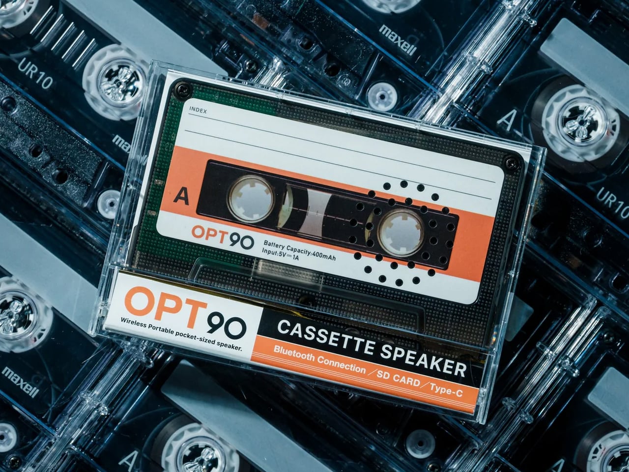
1. Side A Cassette Speaker

The cassette tape was always more than a format. It was an object you labeled by hand, kept in a glove compartment, or assembled specifically for someone who needed to hear certain songs in a certain order. The Side A Cassette Speaker takes that intimacy and wraps it around a Bluetooth speaker that earns a second look before it plays a note. Shaped faithfully like a real mixtape, transparent shell and Side A label intact, it sits in its clear case-turned-stand like a relic that also connects to your phone. At $49, it is the most honest nostalgia product in this category right now, because it commits to the premise completely rather than gesturing at it from a polite distance.

What keeps it practical day to day is how little it demands from you. Bluetooth 5.3 handles pairing, a microSD slot covers offline listening, and at 80 grams, it disappears into a jacket pocket without thought. Battery life runs six hours at maximum volume, and a full recharge takes two, which means it soundtracks a full workday and refuels overnight. The sound is tuned warm, which suits the object better than raw precision ever could. For anyone who spent time making mixtapes, or anyone who didn’t but understands why people did, this is the version of that feeling you can carry and actually hear in 2026 rather than only remember.

Click Here to Buy Now: $49.00

What We Like

  • Cassette-faithful design works as a display piece when it isn’t playing
  • Bluetooth 5.3 and a microSD slot give you two reliable ways to listen

What We Dislike

  • A single-driver setup won’t satisfy anyone looking for real volume or full-range sound
  • Only three units available at the time of writing

2. RetroWave 7-in-1 Radio

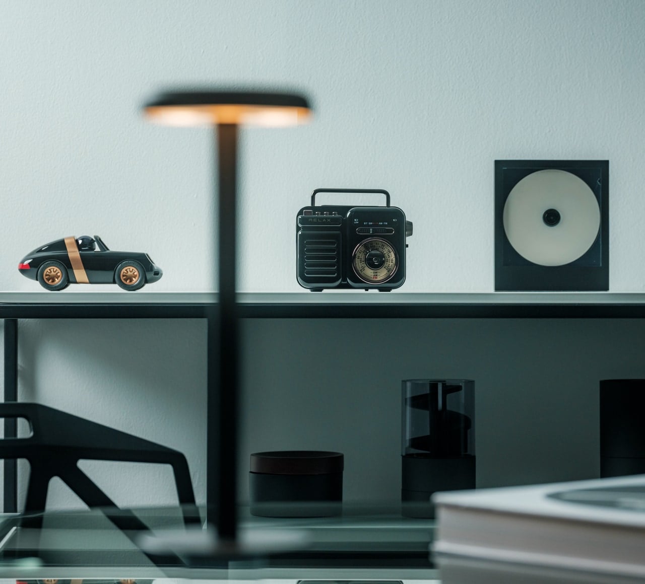
The boombox era was about more than cassette decks. It was about radios you could carry anywhere, tuning dials you could feel through your fingers, and sound that filled a room without asking permission first. The RetroWave 7-in-1 Radio captures that in a compact, Japanese-inspired frame. The tactile tuning dial, the warm retro casing, and AM/FM/shortwave reception give it the presence of something lifted from a 1984 shelf. It also streams Bluetooth, plays MP3s from USB or microSD, runs an LED flashlight, an SOS alarm, a hand-crank and solar charging, and a 2000mAh power bank that charges other devices when yours runs low. Seven functions in one object, packaged inside something that earns its place on a shelf every single day.

The seven functions working together are where the RetroWave earns its position in a 2026 home rather than a nostalgia market. Daily desk companion and off-grid emergency tool are roles that typically live in completely separate product categories, and the RetroWave collapses them into one object without obvious compromise on either side. The battery delivers up to 20 hours of radio time on a single charge. Solar and hand-crank inputs keep it running when the grid fails or the trail goes deeper than expected. At $89, it solves problems you haven’t had yet while looking precisely right sitting on a counter, a shelf, or inside a go-bag. That specific combination is considerably harder to design than it appears.

Click Here to Buy Now: $89.00

What We Like

  • Seven functions cover daily listening, emergency power, and off-grid communication in one device
  • AM/FM/shortwave reception works without any internet connection

What We Dislike

  • 8W speaker output is modest for anyone expecting outdoor or large-space sound
  • Solar charging acts as backup only and cannot fully recharge the battery independently

3. FiiO Echo Mini (Snowsky)

The Walkman moment was never really about audio quality. It was about having your music with you, completely yours, untouched by anyone else’s programming or curation. The FiiO Echo Mini, released under the Snowsky imprint, brings that feeling back in a form that looks exactly like a vintage cassette player from the outside and performs like a current hi-res audio device from the inside. Dual CS43131 DAC chips from Cirrus Logic handle the audio processing, earning it Hi-Res certification from the Japan Audio Society. The retro interface and cassette-player proportions are a direct reference to early Sony and Aiwa portables, down to the tactile controls and the way it sits in the palm of your hand.

Where the Echo Mini separates itself from the nostalgia-only tier is in what it can actually do for your listening. It supports FLAC, DSD, WAV, OGG, and other lossless formats, and accepts microSD cards up to 256GB, which means a library that would have filled an entire shelf of cassette cases in 1988 now fits in a slot smaller than your thumbnail. Dual headphone outputs and Bluetooth connectivity cover both wired and wireless listening from the same device. An independent power supply keeps the audio circuitry isolated from interference, which is the kind of engineering detail that doesn’t show up in the design but surfaces immediately in how it sounds. This is what a Walkman would have become if the engineers had forty more years to keep working on it.

What We Like

  • Dual DAC chips and Hi-Res certification deliver audio quality that the original Walkman never came close to
  • 256GB microSD support with multi-format lossless playback builds a serious portable library

What We Dislike

  • Playback-only with no recording function, which rules it out for anyone who wants to make tapes
  • The deliberate retro cassette aesthetic won’t suit every listener or every room

4. Retrospekt CP-81 Portable Cassette Player

The CP-81 is the cassette player that stopped trying to be a hi-fi device and leaned fully into being a cultural artifact, and somehow that turned out to be exactly right. The clear plastic body shows the mechanism in full, the controls are exactly where you expect them, and the included RFH-01 headphones with their orange foam cushions make the whole package feel like something pulled from a very specific and beloved corner of 1983. Sold at MoMA Design Store, Nordstrom, and Urban Outfitters, it has collaboration editions with Miffy, Peanuts, and Hello Kitty that treat the cassette player as a canvas rather than just a device. It has 4.8 stars across 174 reviews, which is noteworthy.

What grounds it is that it actually works as a cassette player, not just as a shelf piece. The CP-81 plays, fast-forwards, rewinds, and records, with a line-in microphone jack that most modern cassette players quietly dropped from the spec sheet. Power comes from two AA batteries or a USB-C input, so it runs on whatever you have available. The people who buy it tend to keep it out on a desk rather than in a drawer. That’s partly the design doing its job, and partly because a cassette player that looks this considered, at this price, with this many ways to use it, is genuinely hard to put away.

What We Like

  • Records as well as plays, with a microphone jack that makes line-in recording straightforward
  • USB-C and AA battery power options mean it works wherever you need it to

What We Dislike

  • The clear plastic body shows every fingerprint, which matters more than it should for something this tactile
  • Collaboration editions sell out quickly, and availability varies across retailers

5. We Are Rewind Curtis Boombox GB-001

The boombox never fully disappeared. It got quieter, more compact, and less certain of what it was trying to be. The We Are Rewind Curtis GB-001 has none of that uncertainty. At 19 inches wide and 15 pounds, it is a proper boombox in the original meaning of the word: something you carry by its full-width folding handle and set down in a room that then belongs to the music. Four hi-fi speakers, two Class D woofer amplifiers, and two tweeters, push 104 watts across a frequency response of 40 to 20,000Hz. The cassette deck plays and records. The guitar amp input takes a real guitar. These are functional commitments, not marketing features, and they give the GB-001 the same confidence the original boombox had before the category forgot what it was for.

What lifts the GB-001 beyond a premium nostalgia product is how fully it commits to every part of the premise. Bluetooth 5.4 covers streaming when the tapes run out. The backlit VU meters — the detail WIRED noted immediately in its January 2026 review and the first thing every Gen X person in the room points out without being asked — are deliberately and gloriously analog. Forbes covered the North American launch the same week. Techmoan put it on camera in December 2025. The coverage it has earned reflects what the product actually is. At $579, this is the most serious purchase on this list, and also the most direct one: if you want a boombox that means it, this is the only new boombox in 2026 that does.

What We Like

  • 104 watts across four hi-fi speakers produces real, room-filling sound rather than novelty volume
  • Cassette recorder and guitar amp input make it a functional, creative instrument, not only a playback device

What We Dislike

  • At $579, the full value rewards buyers who use the cassette deck regularly, not just Bluetooth
  • Battery life has been flagged across multiple reviews as shorter than expected for a unit of this size and price

The Cassette Era Didn’t Come Back. It Came Back Better.

None of these products asks you to give up modern life for a feeling. The Side A speaker pairs over Bluetooth. The RetroWave runs 20 hours without a socket. The Echo Mini carries a full lossless library on a card smaller than a thumbnail. The CD Cover Player hangs on a wall. The Curtis boombox records. The best version of the cassette era is the one being made right now.

What makes each worth the attention isn’t nostalgia as a pitch. It’s the specific design decision behind each object. A speaker shaped like a tape because that was the only honest form. A radio that belongs in a go-bag as much as on a shelf. A CD player that brings the artwork along. These are for people who want music to feel like something. That instinct is now being answered.

The post Gen Z Is Obsessed With These 5 Cassette-Era Gadgets & They Just Got a Full Design Upgrade for 2026 first appeared on Yanko Design.
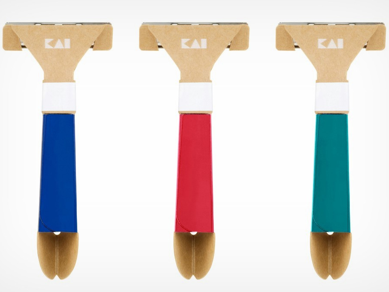
5 Best Surreal Bookstores That Make You Forget You’re Inside a Building

A bookstore should do more than sell books. At its best, it alters how you perceive the act of reading, the space around you, and the relationship between the two. The five bookstores in this list abandon conventional retail interiors entirely. They borrow from astronomy, geology, wetland ecology, and mountain landscapes to create spaces where the architecture becomes as absorbing as anything on the shelves. These are rooms that make you forget walls exist.

What connects them is a shared refusal to treat books as products needing display. Instead, each project treats the book as a spatial protagonist, something that informs the shape of ceilings, the curve of shelves, and the way light enters a room. From a portal to deep space in Jiangsu to a mountaintop perch above a river canyon, these bookstores prove that the most effective retail design does not sell to visitors. It transports them.

1. X+Living Bookstore

Located in Jiangsu Province and completed in 2023, this bookstore by Li Xiang of X+Living studio is the furthest thing from a cozy reading nook. The space is built around massive three-dimensional structures that resemble astronomical instruments, concentric rings, and geometric forms inspired by celestial mechanics, reimagined as bookshelves and display zones. Books sit on these structures in positions that seem to defy gravity, creating the sensation of browsing a library adrift somewhere in deep space. The project won the 2025 Platinum A’ Design Award in Interior Space and Exhibition Design, which signals how far the concept pushes beyond conventional bookstore interiors.

The spatial ambition is the story here. Most bookstore designers work with shelving grids and lighting schemes. X+Living built a set piece. The concentric ring structures occupy the room not as furniture but as architecture within architecture, turning navigation into an experience of orbiting through layers of books arranged on curving, tilted surfaces. The scale of the installation relative to the room makes it impossible to separate the act of browsing from the act of inhabiting the space. Visitors are not walking through a store. They are moving through a constructed universe that happens to contain books.

What we like

  • The astronomical instrument forms function as both structural shelving and immersive scenography, collapsing the boundary between retail and installation art.
  • The Platinum A’ Design Award validates a level of spatial ambition that most bookstore designs never attempt, let alone execute at this scale.

What we dislike

  • The dramatic structures may prioritize visual spectacle over browsing comfort, making it difficult to linger and read in a space designed to overwhelm.
  • Wayfinding through concentric, gravity-defying shelving is disorienting by design, which can frustrate visitors looking for specific titles rather than an experience.

2. Toyou Bookstore

Wutopia Lab designed Toyou bookstore inside a red-brick building by Jean Nouvel in Shanghai’s Huangpu district, using traditional Chinese garden techniques as spatial logic rather than decoration. The interior is organized around two abstract mountains, “Big You” and “Little You,” which form interlocking cave-like spaces out of burgundy perforated aluminum panels and white artificial stone. The “Little You” mountain greets visitors at the entrance as a glowing white bookshelf, while the larger “Big You” mountain houses the main reading and living areas behind layers of bookshelves that create new views at every turn.

The garden-design principle at work here is “a view at every step,” and the architects execute it with the kind of precision that makes each transition between spaces feel composed rather than accidental. A circular “secret place” sits between the two mountains as a private reading zone, while hidden metaphors (a well, a dripping spring) reference classical Chinese poetry. Lead architect Yu Ting has described the bookstore as a tool for understanding Shanghai itself, a miniature cultural complex that accepts readers and non-readers alike. The result is a space that feels ancient and contemporary at once, where cave walls are made of perforated aluminum and mountain peaks are bookshelves.

What we like

  • The garden-design approach creates a sequence of spatial discoveries that rewards slow movement and repeated visits rather than efficient browsing.
  • Wutopia Lab’s decision to house the bookstore inside a Jean Nouvel building creates a layered dialogue between two architectural languages.

What we dislike

  • The cave-like enclosures and perforated panels limit natural light penetration, which could make extended reading sessions uncomfortable without careful artificial lighting.
  • The density of metaphor (mountains, wells, springs, caves) risks reading as overwrought to visitors unfamiliar with Chinese garden-design traditions.

3. Xixi Goldmye Bookstore

What started as a forgotten 20-year-old office building in Hangzhou’s wetlands is now one of the most compelling adaptive-reuse bookstores in China. Atelier Wen’Arch stripped the structure to its bare concrete columns, dismantled the existing roof and wall systems completely, and rebuilt an 880-square-meter space that opens generously to the surrounding Xixi National Wetland Park. The U-shaped building, once closed off and disconnected from its natural setting, was completed in April 2025 as a structure that treats the wetland landscape as its primary interior surface.

The defining feature is a system of laminated pine timber “book beams” that intersect with the original concrete columns and extend outward in measured cantilevers. These double-beam elements integrate lighting and air conditioning return channels between each timber pair, turning mechanical infrastructure into an architectural rhythm that runs through the entire interior. The beams frame views of the wetland, so the surrounding nature becomes a living artwork visible from every reading position. The structural intervention aligns with the original building grid while introducing warmth and human scale to what was once sterile office space. It is renovation as reinterpretation, where the old bones inform a new spatial logic.

What we like

  • The “book beam” system transforms structural engineering into the primary design language, making infrastructure legible and beautiful rather than hidden.
  • Opening the formerly closed U-shaped plan to the wetland park turns the surrounding landscape into the bookstore’s most powerful design element.

What we dislike

  • Wetland-adjacent construction faces ongoing humidity and moisture challenges that will test the longevity of the laminated pine timber beams.
  • The remote wetland location, while scenic, limits foot traffic compared to urban bookstores, raising questions about long-term commercial viability.

4. Xinglong Lake Citic Bookstore

MUDA Architects designed this waterfront bookstore around a single image: a book falling from the sky. The rectangular structure sits at the edge of Xinglong Lake in south Chengdu, and its swooping roof extends for 3 meters with both ends elevated at different heights (16 meters at the southwest, 7.5 meters at the northeast). The curve mimics a nearby grass slope, creating a continuous visual line between the built form and the landscape. Massive windows extend below the waterline, merging the reading interior with the surface of the lake.

The roof is the architectural argument. Its curved surface reinterprets the pitched roof of traditional Chengdu vernacular architecture while functioning as a structural analog for the pages of an open book. The asymmetric elevation creates interior volumes that shift dramatically from one end to the other, high and cathedral-like at the southwest, compressed and intimate at the northeast. That gradient gives each section of the bookstore a different spatial character without partition walls. The underwater windows are the most disorienting detail: readers seated near the water level see the lake from inside it rather than above, which dissolves the expected boundary between interior and landscape in a way that no amount of floor-to-ceiling glazing can replicate.

What we like

  • The asymmetric roof creates a gradient of spatial experiences within a single open interior, from expansive to intimate, without any walls.
  • Below-waterline windows dissolve the boundary between the reading space and the lake, producing a perspective that no conventional glazing strategy can achieve.

What we dislike

  • The roof’s dramatic curvature dominates the structure so completely that the bookstore’s identity is inseparable from a single architectural gesture, leaving little room for the interior to develop its own language.
  • Waterfront and below-waterline glazing demand constant maintenance and waterproofing attention that will compound as the building ages.

5. Nujiang Grand Canyon Bookstore

Perched on top of the Gaoligong Mountains in Yangpo Village, the Nujiang Grand Canyon Bookstore is built to feel like it belongs to the terrain rather than sitting on it. The structure extends outward from the mountainside like a sharp arrow, a form that references the Lisu people’s historical connection to crossbows. Reinforced concrete and locally sourced materials anchor the building to the slope while keeping its environmental impact low, and wall openings frame specific views of the Nujiang River and surrounding peaks.

The architectural intelligence is in how the building negotiates the slope. Rather than flattening the site or building a conventional foundation, the structure adapts its footprint to the mountain’s gradient, creating a subtle sense of elevation that rises with the terrain. The framed canyon views through the wall openings function as curated compositions rather than generic panoramas, each one selecting a specific relationship between river, peak, and sky. The combination of contemporary concrete construction and local material traditions creates an object that reads as both modern and rooted, a building that could not exist anywhere else. For a bookstore, that site-specificity is the rarest quality of all: a space where the location is not a backdrop but the reason the architecture exists.

What we like

  • The arrow-like form references Lisu cultural heritage in a structural gesture rather than a decorative motif, embedding local identity into the building’s shape.
  • Framed wall openings curate specific canyon views as compositions, turning the landscape into a series of deliberate artworks rather than a passive backdrop.

What we dislike

  • The remote mountaintop location, while spectacular, creates significant accessibility challenges for visitors without private transport.
  • Reinforced concrete construction on a steep mountain slope carries long-term structural monitoring requirements that increase maintenance complexity.

When The Room Is The Story

These five bookstores share one conviction: that the space around a book matters as much as the words inside it. A celestial instrument in Jiangsu, a pair of abstract mountains in Shanghai, timber beams framing a wetland in Hangzhou, a roof shaped like a falling book in Chengdu, and an arrow launched from a mountaintop above the Nujiang River. None of these projects treats architecture as a container. Each one treats it as content.

The best bookstores have always understood that reading is a spatial act. Where the body sits, what the eyes see between paragraphs, how light changes across an afternoon, these conditions shape the experience of a book as much as the typography on the page. These five take that understanding and build entire worlds around it. Walk into any of them, and the building becomes the first chapter.

The post 5 Best Surreal Bookstores That Make You Forget You’re Inside a Building first appeared on Yanko Design.

5 Best Tech Gadgets of March 2026

March has a habit of delivering the products that January only promised. CES demos become preorders, concept renders start circulating with real specs attached, and the gadgets worth paying attention to separate themselves from the ones that were only ever meant to look good on a stage. This month’s picks share a common thread: each one challenges an assumption about how a familiar product category should behave, look, or fit into daily life.

What makes these five stand out from the usual parade of iterative upgrades is their willingness to subtract. Less screen time, less bulk, less noise, less compromise between form and function. They are not chasing specs for the sake of benchmarks or piling on features to pad a marketing sheet. From a handheld PC that refuses to apologize for its ambition to a concept camera that wants nothing more than for its user to look up from a screen, these gadgets are worth your time and attention this month.
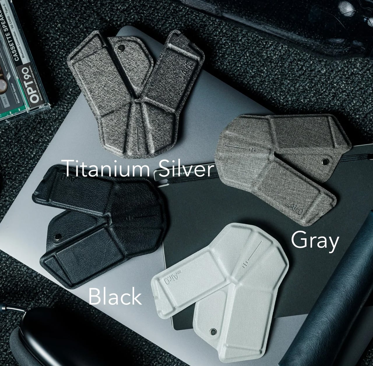
1. GPD Win 5

The PSP’s body plan endures, and the GPD Win 5 is its most ambitious descendant yet. Packed with an AMD Ryzen AI Max+ 395 processor, up to 4TB SSD storage, and 32GB of LPDDR5X RAM, this handheld runs a 7-inch 1080p display at 120Hz with Radeon 8060S integrated graphics. Starting at $1,400, this is not a portable console pretending to be a PC. It is a full PC compressed into two hands.

GPD removed the internal battery entirely, replacing it with a detachable 80 Wh pack that clips to the back. A quad heat pipe cooling system handles thermal loads across a TDP range from 28W to 85W on mains power. Hall effect triggers and capacitive joysticks eliminate drift and deadzone, while a proprietary Mini SSD slot pushes transfer speeds beyond microSD limits. Every design choice solves a problem created by one stubborn, central ambition: desktop-class performance in a handheld shell.

What we like

  • The external battery swaps in seconds, and plugging into the 180W adapter unlocks full 85W TDP performance that rivals many desktop setups.
  • Hall effect triggers and capacitive joysticks eliminate the drift issues that plague most handheld PCs after months of heavy use.

What we dislike

  • The external battery makes the device awkward to hold when attached, and the proprietary charger adds bulk to an already heavy travel kit.
  • Pricing starts at $1,400 and climbs past $2,000 for the top configuration, placing it deep into enthusiast-only territory.

2. NanoPhone Pro

Smartphones have spent a decade getting bigger. The NanoPhone Pro walks in the opposite direction with a credit-card-sized body measuring 0.4 x 3.8 x 1.8 inches and weighing just 2.8 ounces. Running Android 12 with Google Play certification, this 4G device handles calls, messages, navigation, and basic apps without demanding pocket real estate. At $99, it is built for minimalists, travelers, and anyone tired of their phone being the loudest object in the room.

The spec sheet is an exercise in deliberate restraint. A 4-inch edge-to-edge IPS touchscreen, dual SIM support, 2MP front and 5MP rear cameras, a 2000mAh battery, and expandable storage via microSD. Face ID handles unlocking. The NanoPhone Pro does not pretend to compete with flagships, and that restraint is the entire point. It is a quiet, pocketable alternative that runs WhatsApp, Google Maps, and everything else that matters without the attention-hungry weight of a modern slab phone.

What we like

  • The credit-card form factor disappears into wallets and running shorts, making it ideal for situations where a full-sized phone feels like overkill.
  • Google Play certification means the app ecosystem works without sideloading, so daily essentials like navigation and messaging run without friction.

What we dislike

  • The 5MP rear camera produces images that are functional at best, making this a poor choice for anyone who photographs anything beyond the occasional note or receipt.
  • Android 12 on a 4-inch screen feels cramped, and typing requires patience and smaller-than-average fingers.

3. Camera (1)

Photography migrated into phones and got buried under notifications. Camera (1), a concept posted on the Nothing Community forum by designer Rishikesh Puthukudy, imagines shooting as a tactile act again. The compact metal body fits a pocket but fills a hand, with all controls on a single edge: a shutter, a circular mode dial with a glyph display, and a D-pad reachable without shifting grip. The design draws from Nothing’s hardware-forward language with circuit-like relief and bead-blasted metal.

A curved light strip around the lens pulses for self-timers, confirms focus, or signals active recording. The engraved lens ring invites twisting rather than pinching. A rear display exists but stays deliberately out of the way, letting physical controls carry most of the interaction. Camera (1) is a student concept, not an official Nothing product, but the question it asks is worth sitting with: in a world where every screen demands something, what would a camera look like if it just wanted its user to notice what was in front of them?

What we like

  • The single-edge control layout keeps eyes on the scene rather than buried in menus, restoring a tactile shooting workflow that phone cameras abandoned years ago.
  • Nothing’s glyph design language translates well to a camera body, delivering mode feedback through simple icons rather than nested software screens.

What we dislike

  • As a concept, Camera (1) exists only as rendered images and community discussion, with no confirmed path to production or a working prototype.
  • The absence of a sensor, lens, and video specs makes it impossible to judge whether it could compete with even entry-level dedicated cameras.

4. Samsung Slac

Earbuds have looked like earbuds for too long. Samsung’s Slac concept, developed within the company’s design incubation programs, reimagines wearable audio as jewelry. Three components make up the system: an open ear ring for audio output, a wrist-worn ring that tracks listening data and doubles as a magnetic dock, and a home charging station. The circular form wraps around the ear without entering the canal, maintaining awareness of surrounding sound while layering music on top.

When listening ends, the ear ring snaps magnetically onto the wrist component, transforming into something that reads as a chunky bracelet rather than stowed tech. AI tracks a full 24-hour audio cycle, building preference profiles from sound intensity, pitch variation, and tonal characteristics. The design team behind Slak understands that Gen Z treats audio devices as expressions of taste, not utilitarian tools. Whether Slac reaches production is an open question, but the proposition that wearable tech should earn its place on the body through aesthetics feels like a direction the entire industry needs to follow.

What we like

  • The open-ear design preserves environmental awareness while delivering audio, solving the isolation problem that makes traditional earbuds socially awkward in many settings.
  • Magnetic docking between ear ring and the wrist component eliminates the pocket-case fumble and turns storage into a wearable moment.

What we dislike

  • Concept status means no confirmed specs on audio quality, battery life, or connectivity, making it impossible to evaluate whether the sound matches the visual ambition.
  • Open-ear audio struggles in noisy environments, and without active noise cancellation, Slac may underwhelm on busy streets or public transit.

5. DAP-1

Vinyl got its comeback, and dedicated digital audio players have been staging a quieter return. The DAP-1 concept by Frankfurt-based 3D artist Florent Porta is one of the most compelling arguments for why that return matters. The device carries a slim rectangular body with an OLED touchscreen, a perforated front-facing speaker grille, and an aesthetic sitting between Teenage Engineering and Nothing’s CMF line. It looks like it arrived from a timeline where iPods evolved into something more considered.

The standout decision is the built-in speaker, a feature most high-end DAPs skip entirely. Porta’s inclusion acknowledges that music is sometimes shared, not just private. The DAP-1 is built around FLAC playback, preserving audio quality without streaming compression artifacts. A USB-C port, 3.5mm AUX output, and illuminated power switch line the top edge, while rubberized feet and torx screws on the rear give the device a repairable, tool-like quality. As a concept, it exists only in renders, but the conversation it starts outweighs most finished products on the market.

What we like

  • The built-in speaker turns a solitary listening device into something social, removing the need for external hardware to share a track with someone next to you.
  • FLAC-first design philosophy treats audio fidelity as the primary feature rather than an afterthought buried in a settings menu.

What we dislike

  • Concept-only status means no production timeline, no pricing, and no way to evaluate real-world audio performance beyond what renders suggest.
  • Dedicated music players occupy a narrow niche, and carrying a separate device for audio requires commitment most listeners will not make.

Where March leaves us

Three of this month’s five picks are concepts. That ratio says something about where consumer tech sits in early 2026: the most exciting ideas are still in render engines, while the products that actually ship tend to iterate rather than invent. The GPD Win 5 and NanoPhone Pro prove that real, purchasable hardware can still surprise, but Camera (1), Slac, and DAP-1 suggest the most interesting design thinking is happening outside production timelines and quarterly earnings calls.

What connects all five is a shared instinct to push back against the default. Against bigger screens, against feature bloat, against the assumption that technology should demand attention rather than earn it. March’s best gadgets respect the space they occupy, whether that space is a pocket, an ear, or the palm of a hand. If even a fraction of these concepts make the jump to production, the rest of 2026 could be far more interesting than the usual upgrade cycle suggests.

The post 5 Best Tech Gadgets of March 2026 first appeared on Yanko Design.