
Everything announced during Nintendo Direct
Here's a quick rundown of what Nintendo has going on.
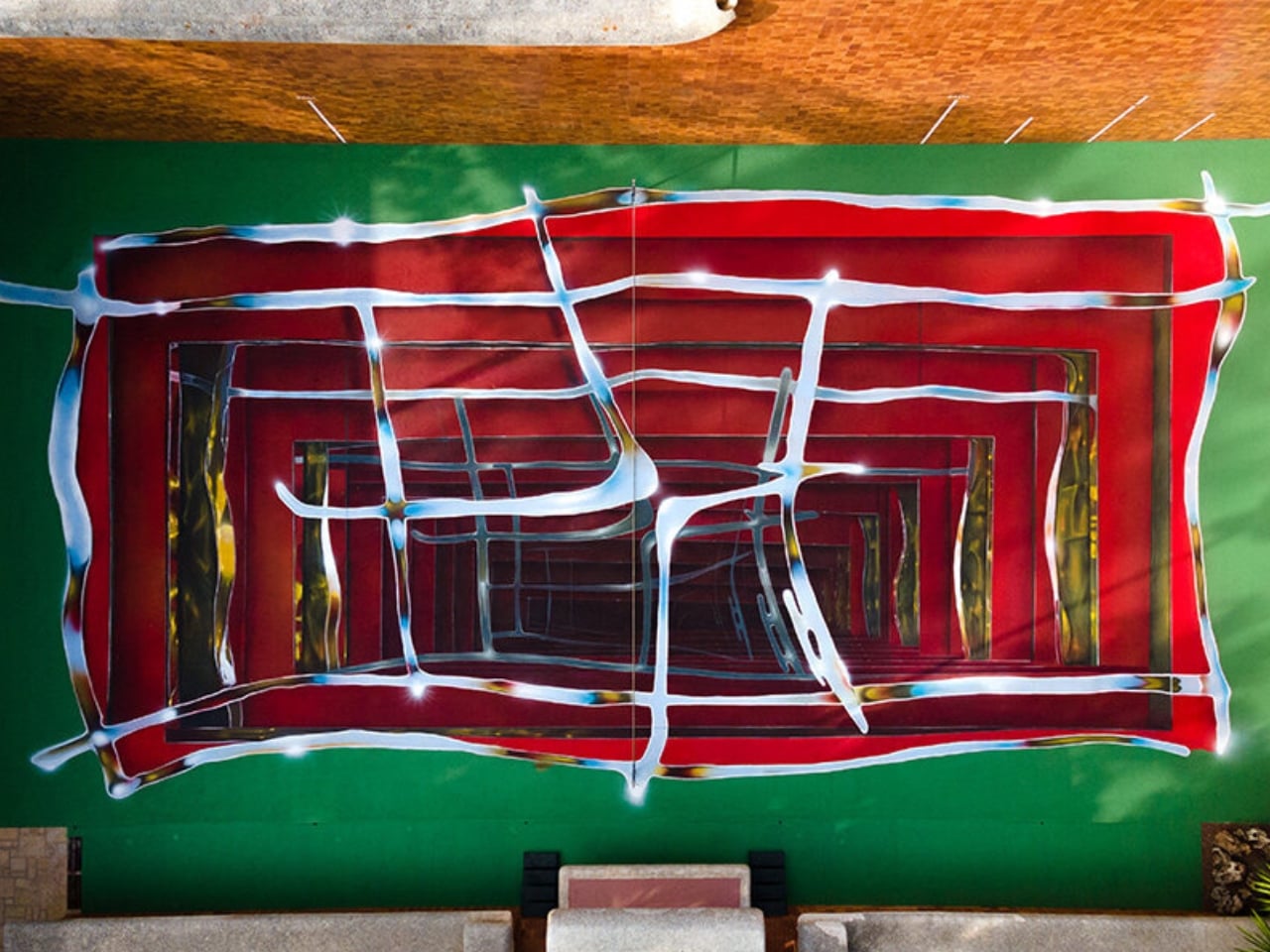
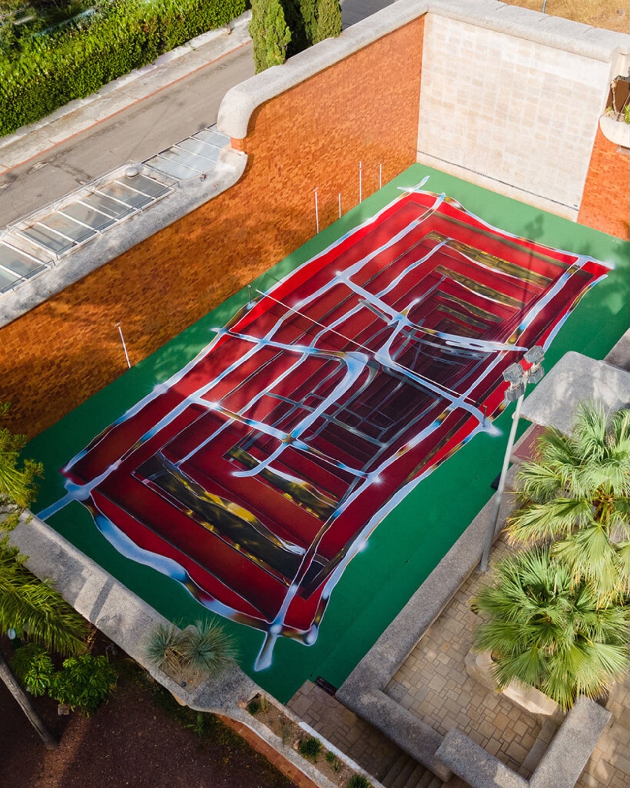
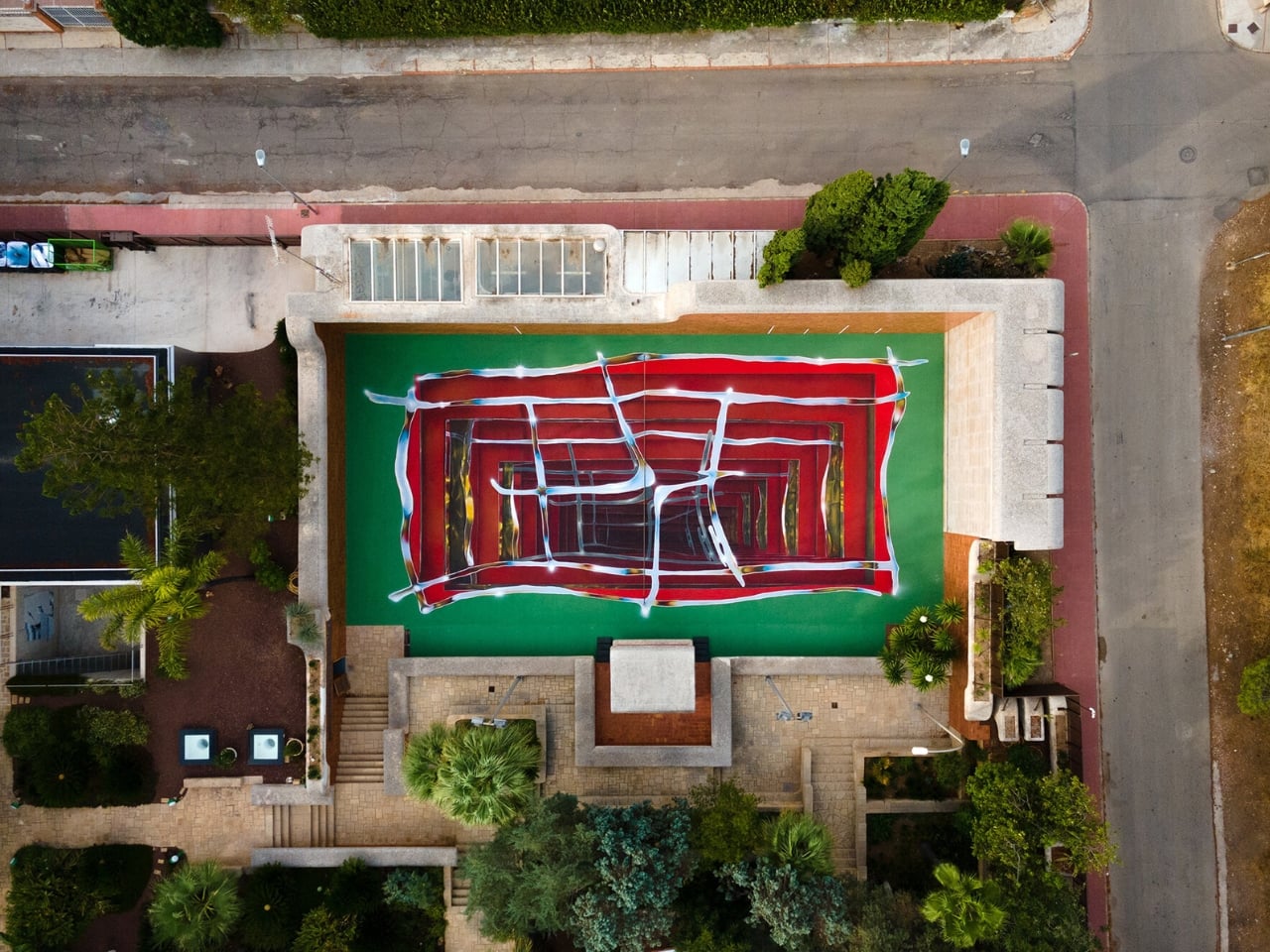
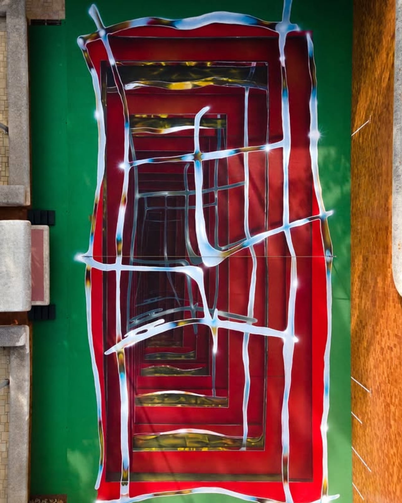
A tennis court in Valencia currently looks like it’s sinking into the ground. Walk up to the edge of the one at Casa Axis and the white lines that normally just mark boundaries start pulling inward, stacking through fake layers of chrome and burgundy until the whole surface reads like a hallway you could fall down. It’s called Hard Court 2, painted by Spanish artist Spok Brillor, and it treats a sports court like a living canvas instead of a slab of asphalt everyone stops noticing the week after the ribbon gets cut.
That’s usually the fate of most site-specific art. A muralist gets a wall, a brand throws a launch party, and within a year the piece turns into background noise nobody actually looks at anymore. Sports facilities have it worse. A court gets painted once, and it stays that exact shade of green or blue for a decade, because nobody budgets for touch-ups, let alone reinvention. Casa Axis, the art and design space Felipe Pantone runs out of a 1975 house outside Valencia, didn’t fix that with a bigger maintenance budget. It fixed it with a rule: the court has to change, every single year, by design.
Designer: Spok Brillor
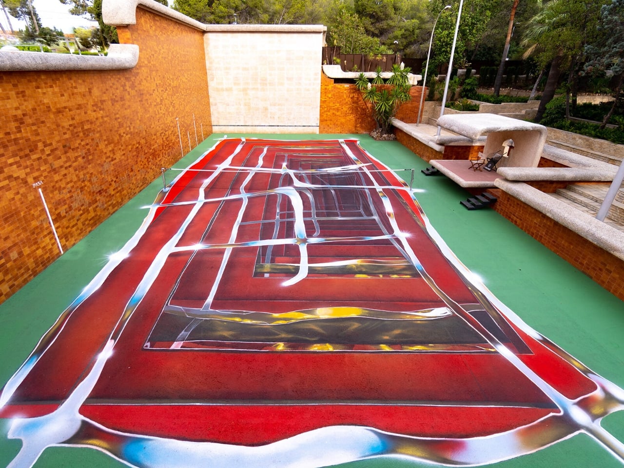
The rule lives inside C.A.I.O., the Casa Axis International Open, a scrappy little tennis tournament for artists that launched in June 2026. No rankings, no categories, no portfolios required. Just instinct, apparently, and a healthy amount of frustration. The twist is what the winner actually takes home. Instead of a trophy, they get handed the responsibility of repainting the court before the next tournament. Win the match, inherit the canvas.
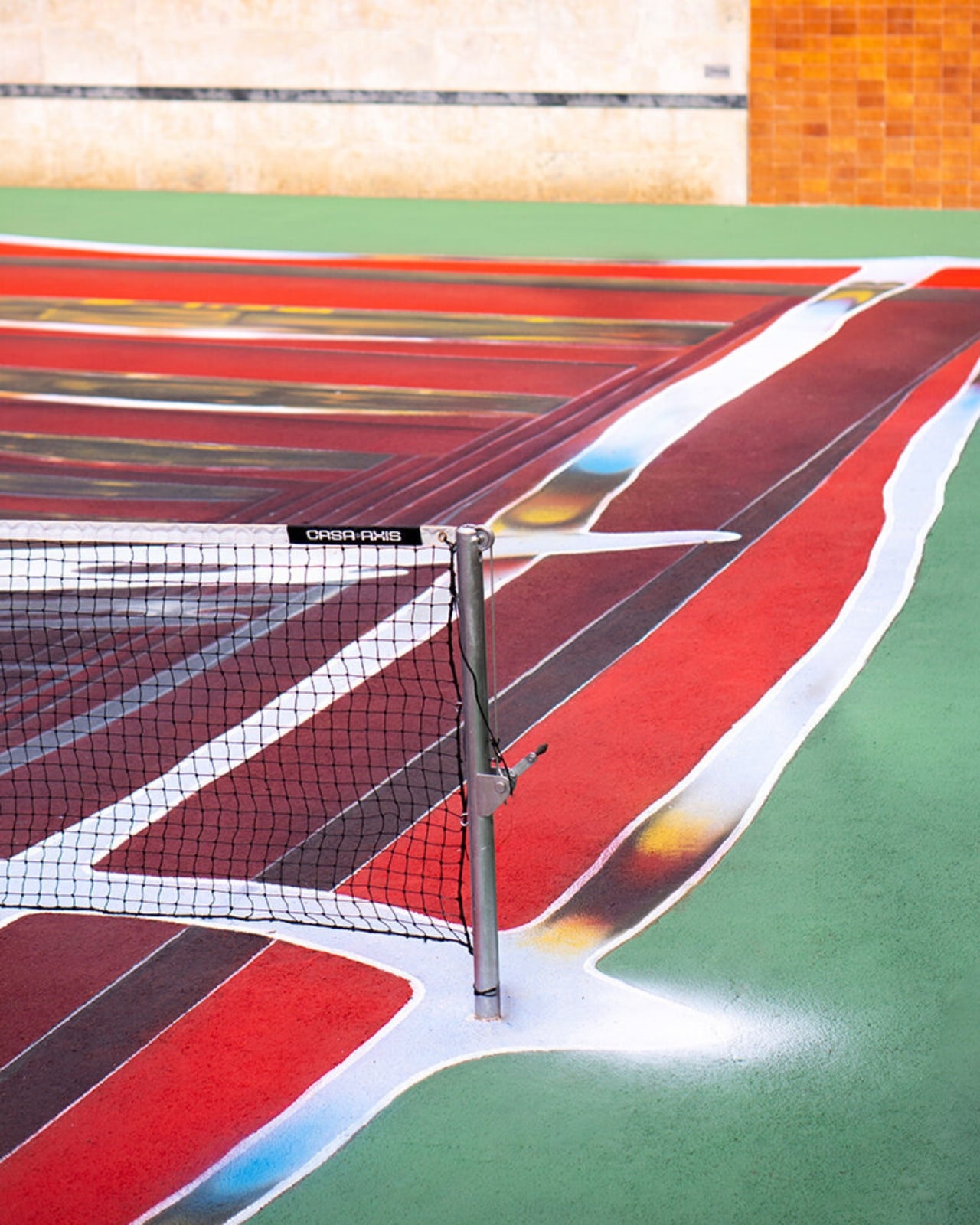
Lucas Benarroch, known as MRKA, painted the first version in 2025, loosening the court’s regulation markings into loose, hand-drawn lines that felt more like a sketch than a sports surface. He then went on to win the inaugural C.A.I.O., which technically put him back in charge of the next transformation. He passed the job to Spok Brillor instead, who had competed against him in the same tournament. That handoff is the part I find genuinely clever. The competition doesn’t just crown a winner, it forces the winner to make a choice about who gets to shape the space next, which quietly turns a tennis match into a succession plan for an ongoing art piece.
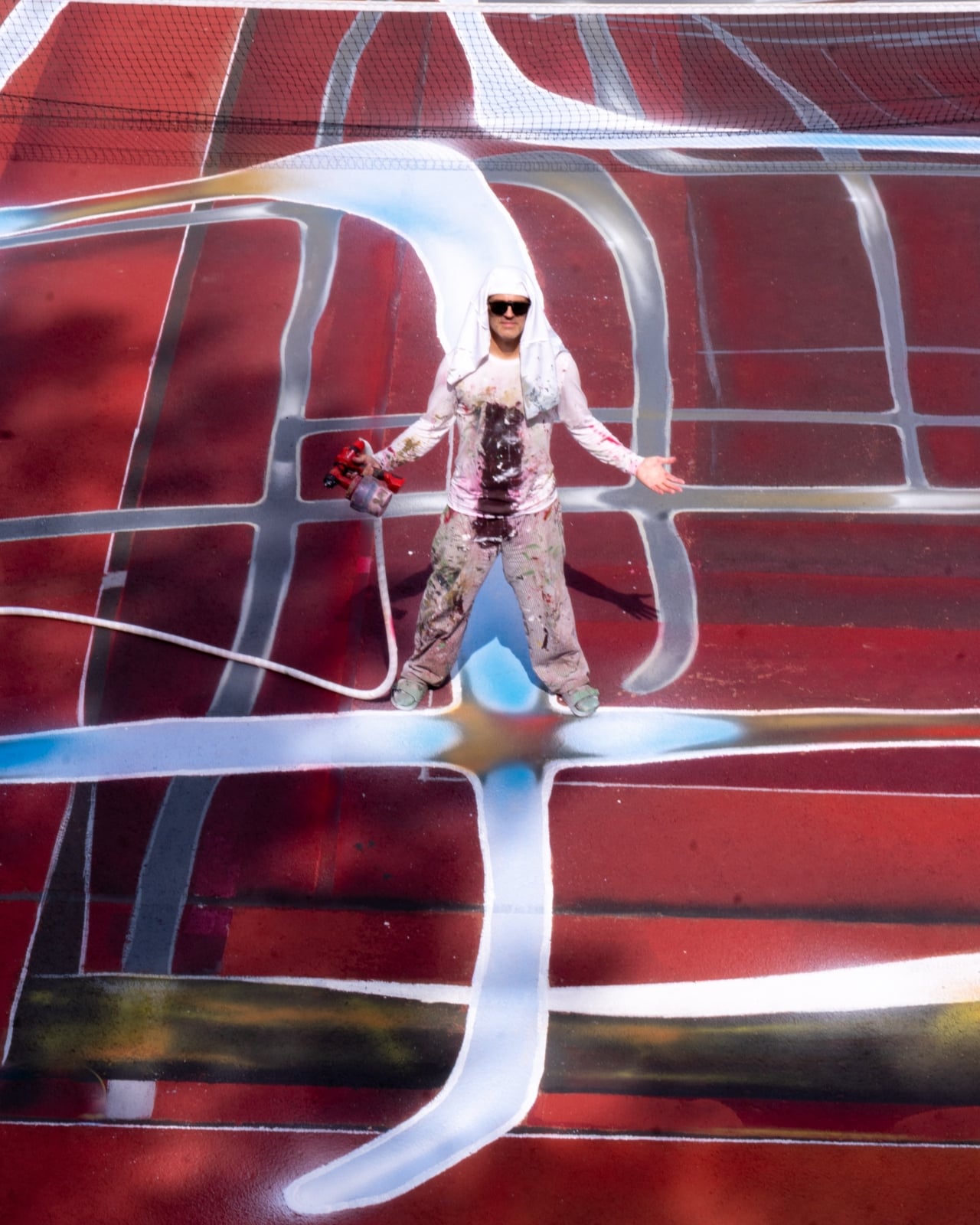

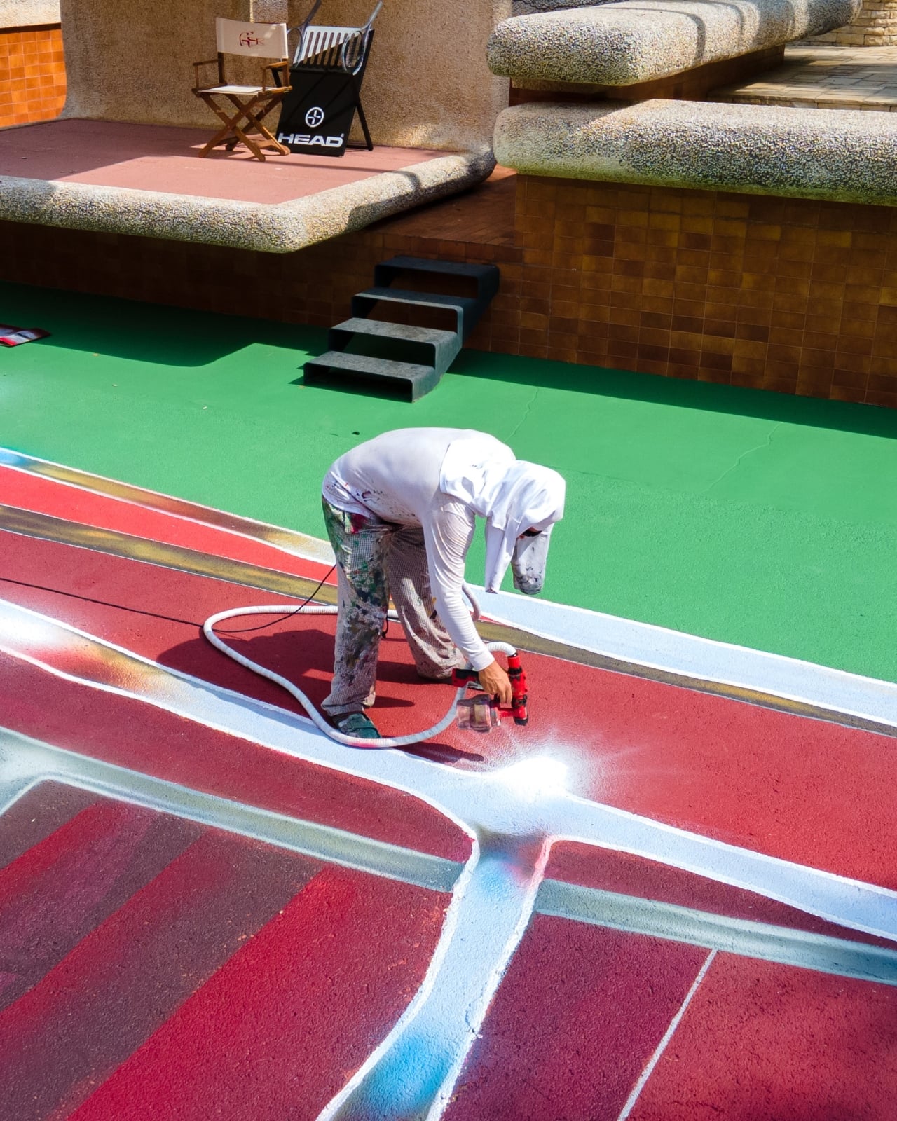
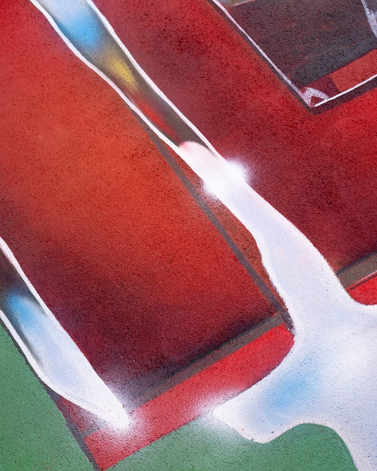
Spok took the opposite approach from MRKA. Where MRKA loosened the geometry, Spok tightened it, repeating the court’s own markings inward through metallic gradients until the actual boundaries get harder to read. Deep reds and burgundies contract through rectangular planes, pale blue and yellow lines cross the surface like reflected metal, and the whole thing sits somewhere between an architectural shaft and a painted portal. It took twelve days to finish, and it’s already scheduled to disappear under whoever wins next year.
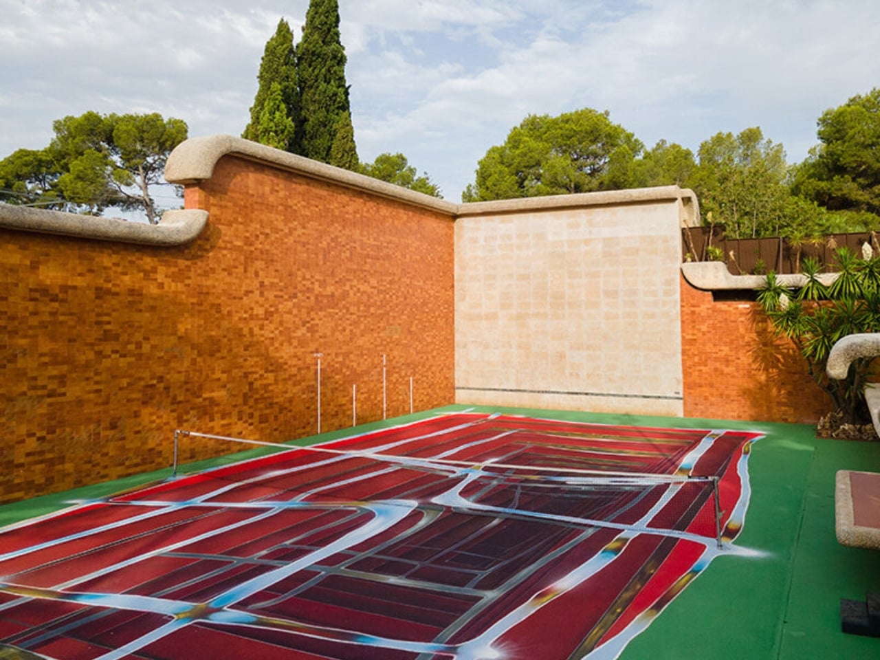
I like that this thing is built to be temporary on purpose. Most design work chases permanence, a piece that survives, a brand that lasts forever, a finish that never fades. Hard Court 2 does the opposite. It’s designed to be beaten, literally, by the next person good enough to win a tennis match on top of it. That’s a genuinely strange model for how art gets commissioned, and it works specifically because nobody involved is trying to make something that outlives its usefulness.
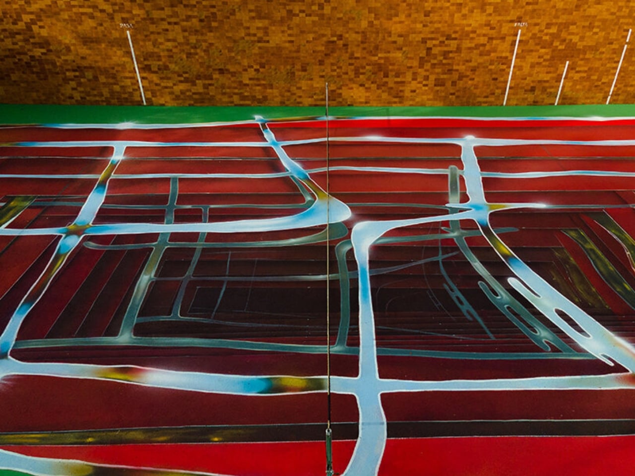
There’s also something honest about tying the transformation to actual competition rather than a curator’s calendar. Nobody at Casa Axis decided in advance that the court needed a refresh this September. It changed because someone won a match and had to make good on the assignment. That’s a small distinction, but it changes how the whole project feels. It’s less a rotating gallery and more a living structure that happens to have paint on it.
Whether this idea scales beyond one backyard court in L’Eliana is a fair question, and probably a “no” for most places. But the instinct behind it, building change into the rules instead of hoping someone remembers to update things later, feels like it’s worth stealing for a lot more than tennis courts.
The post Felipe Pantone’s Tennis Court Refuses to Look the Same Twice first appeared on Yanko Design.

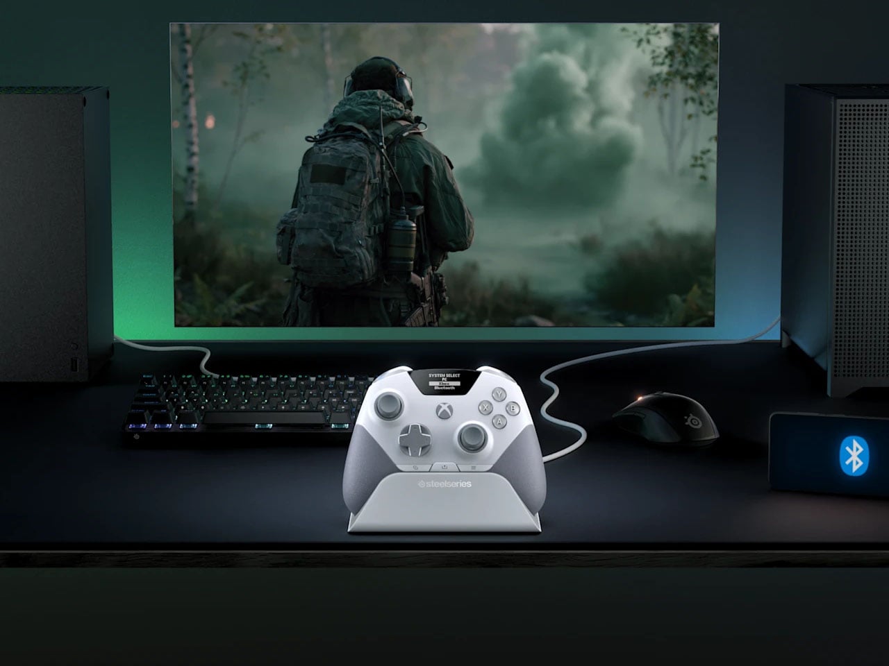
There is something slightly ridiculous about having a PC and an Xbox sitting on the same desk, then needing to re-pair a gaming controller every time you move from one to the other. SteelSeries thinks the controller should simply know where it needs to go. That is the idea behind the Aeon Pro.
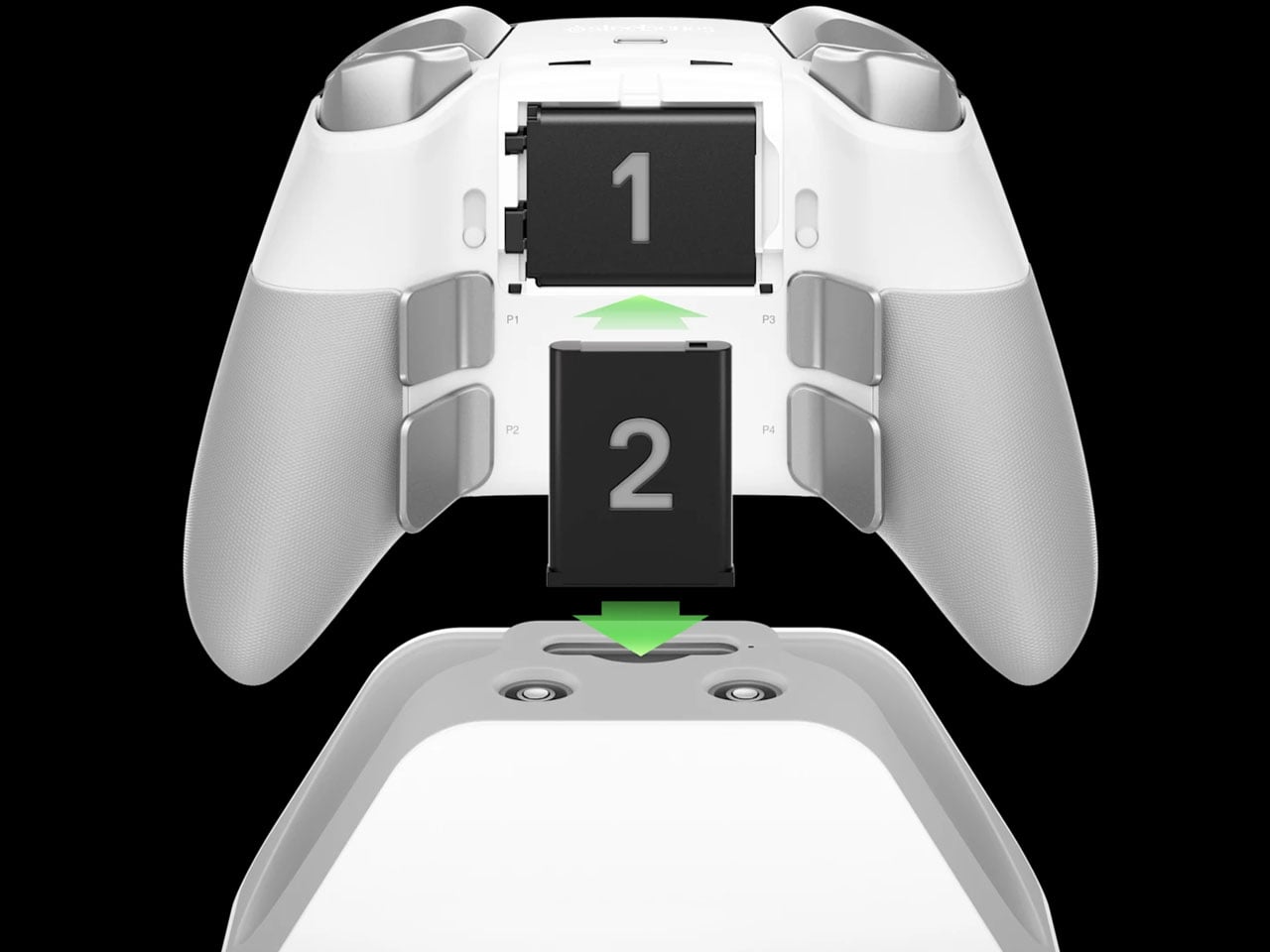
The new wireless gamepad is built around a QuickSwitch Dock that can stay connected to both a PC and an Xbox. Instead of disconnecting one system, pairing with the other, and repeating the process later, the controller can switch between them from the dock. SteelSeries says the system is patent-pending and describes it as the first of its kind for Xbox and PC.
Designer: SteelSeries
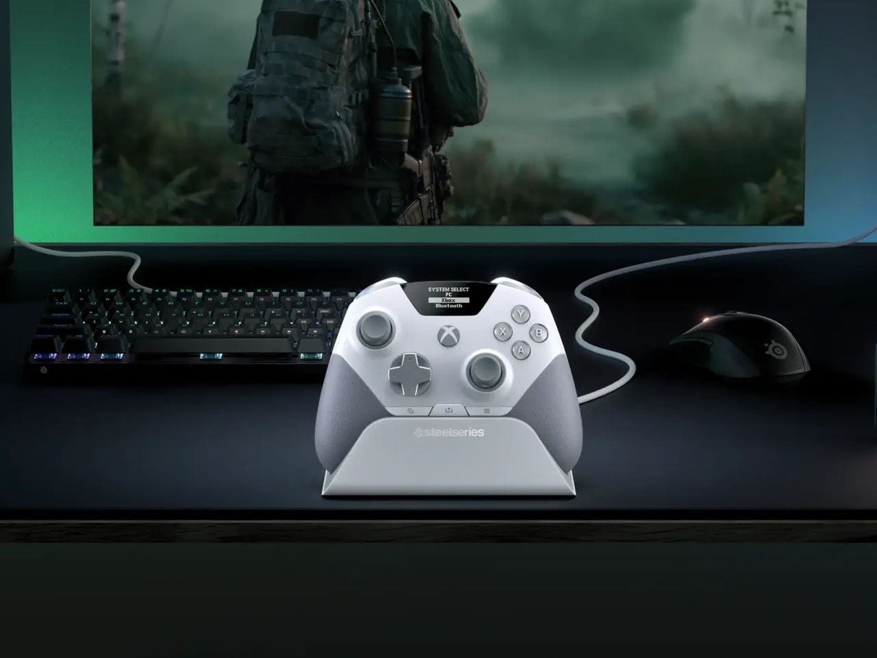
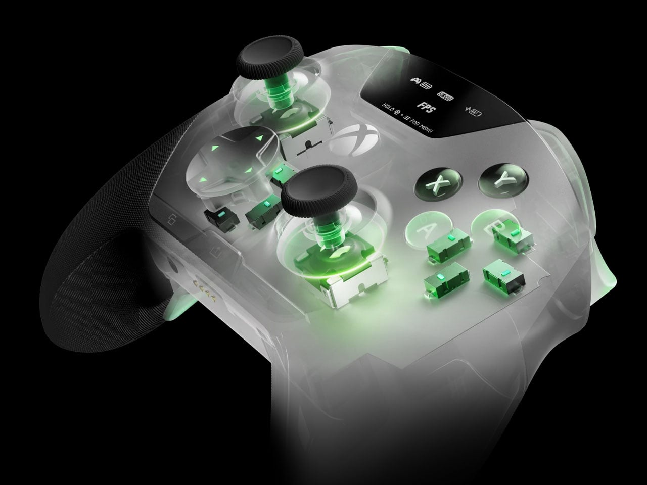
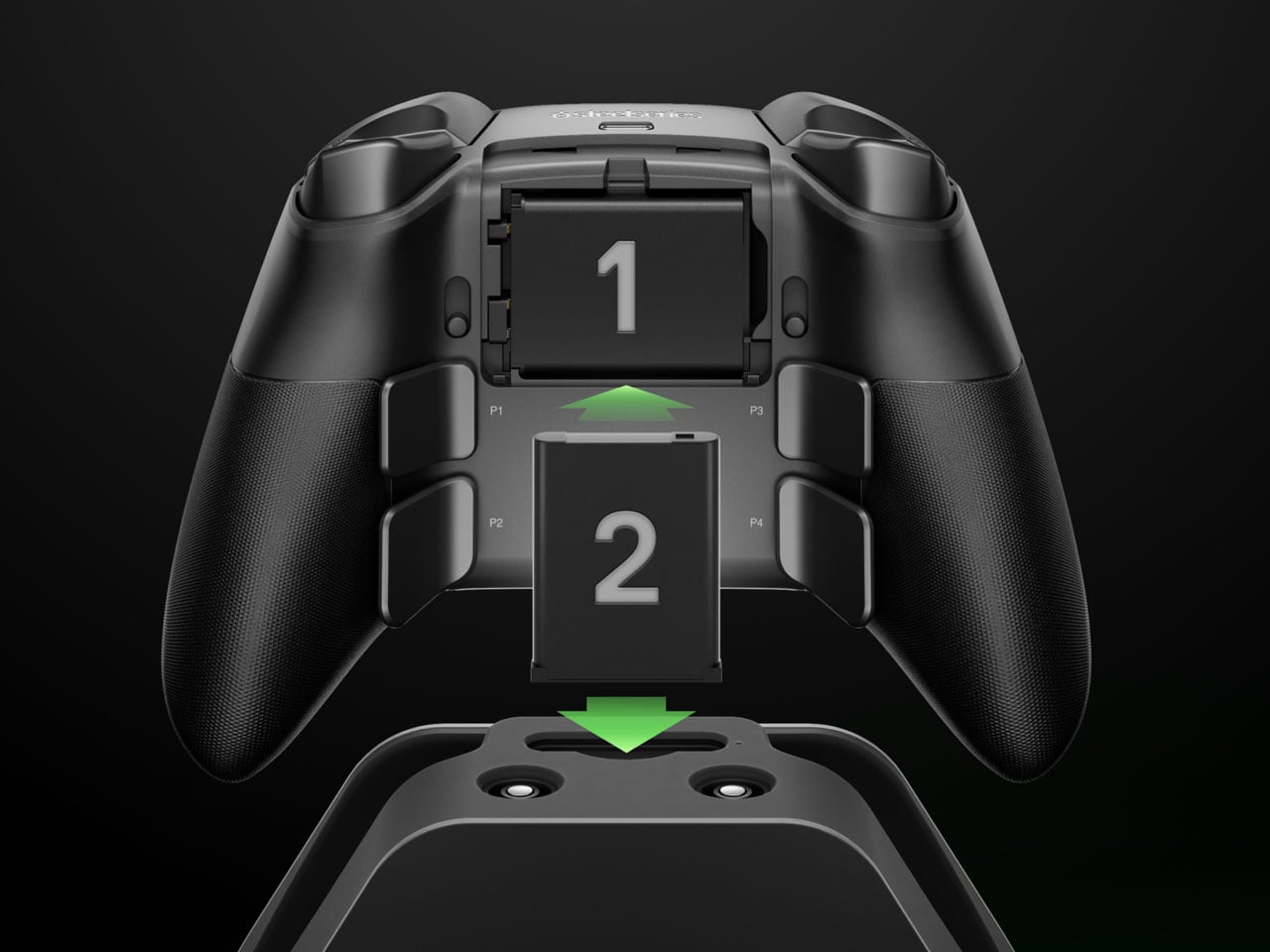
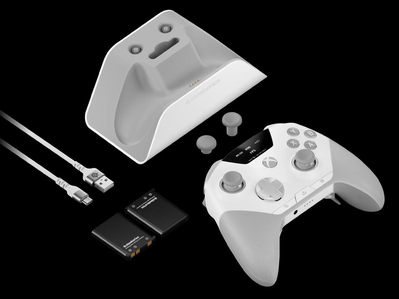
The dock is also where the Aeon Pro gets its other unusual trick. It holds a second battery while the first one is being used in the controller. When that battery runs low, it can be swapped for the charged one rather than plugging the controller into a cable and waiting. The batteries are the same type used in SteelSeries’ Arctis Nova Pro headsets, which makes the system particularly interesting for anyone already invested in that ecosystem. SteelSeries calls this its Infinite Power System. The numbers are up to 25 hours over 2.4GHz wireless or 28 hours over Bluetooth, although those figures account for the combined use of the two batteries rather than one battery lasting that long on its own. The Aeon Pro can also connect through USB-C and Bluetooth, and supports mobile devices alongside Xbox and PC.
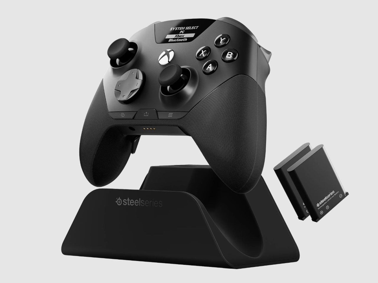
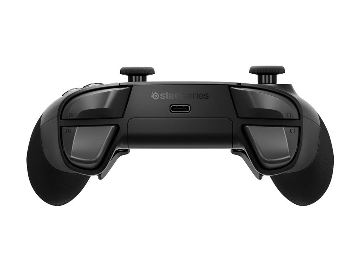
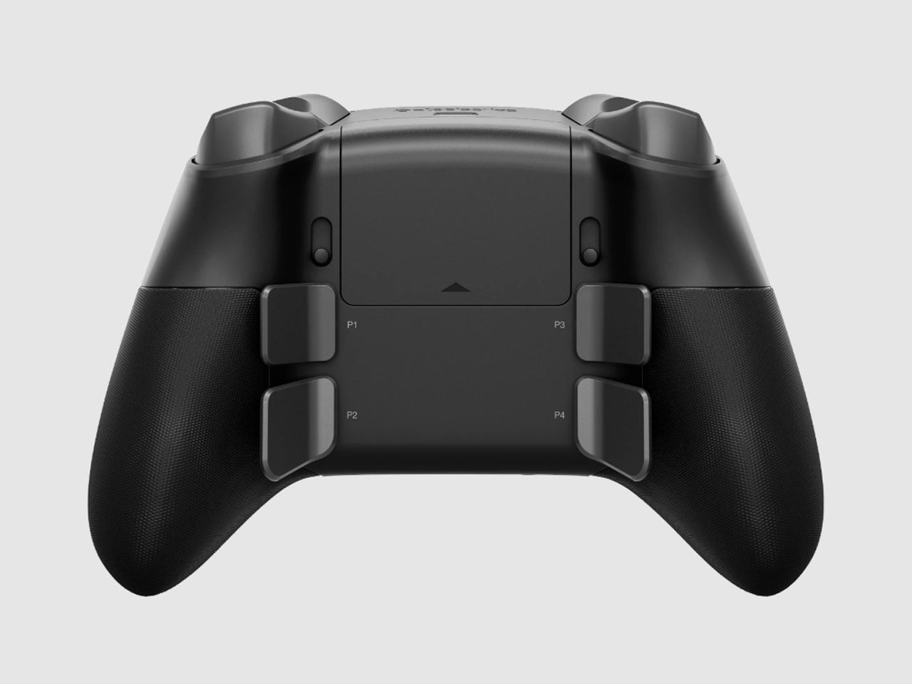
The controller itself follows the now-familiar premium gamepad formula, but pushes it fairly far. Its thumbsticks use Hall-effect sensors, while the triggers can switch between full travel and a shorter hair-trigger setting. There are 18 mechanical switches across the controller and four programmable rear paddles, giving players plenty of ways to alter how they interact with a game. SteelSeries has also avoided burying every adjustment inside an app. A small OLED display built into the controller can show the active device, battery status, and profiles, while letting users remap controls and change settings directly.
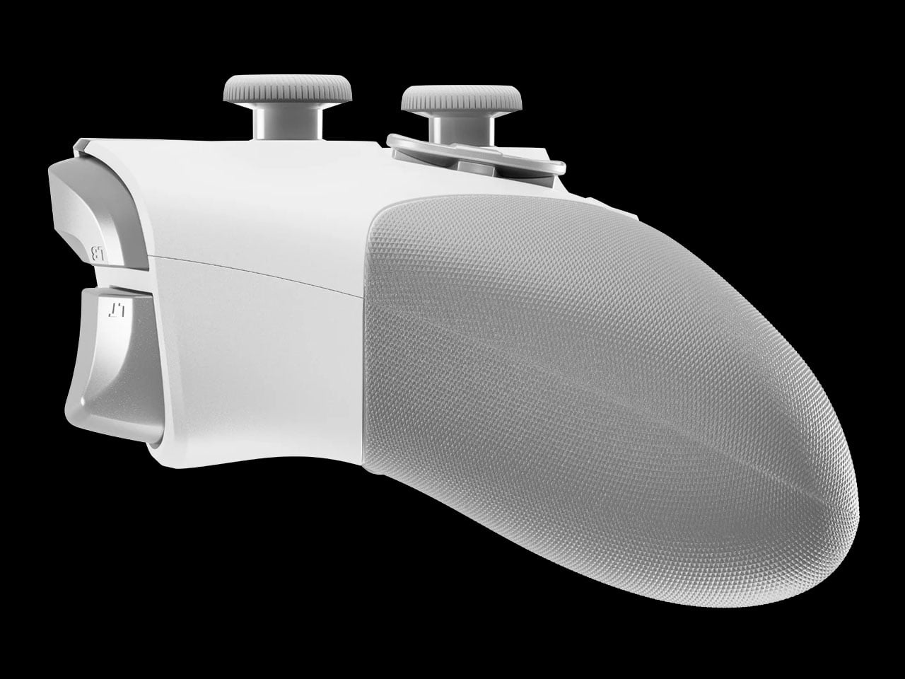
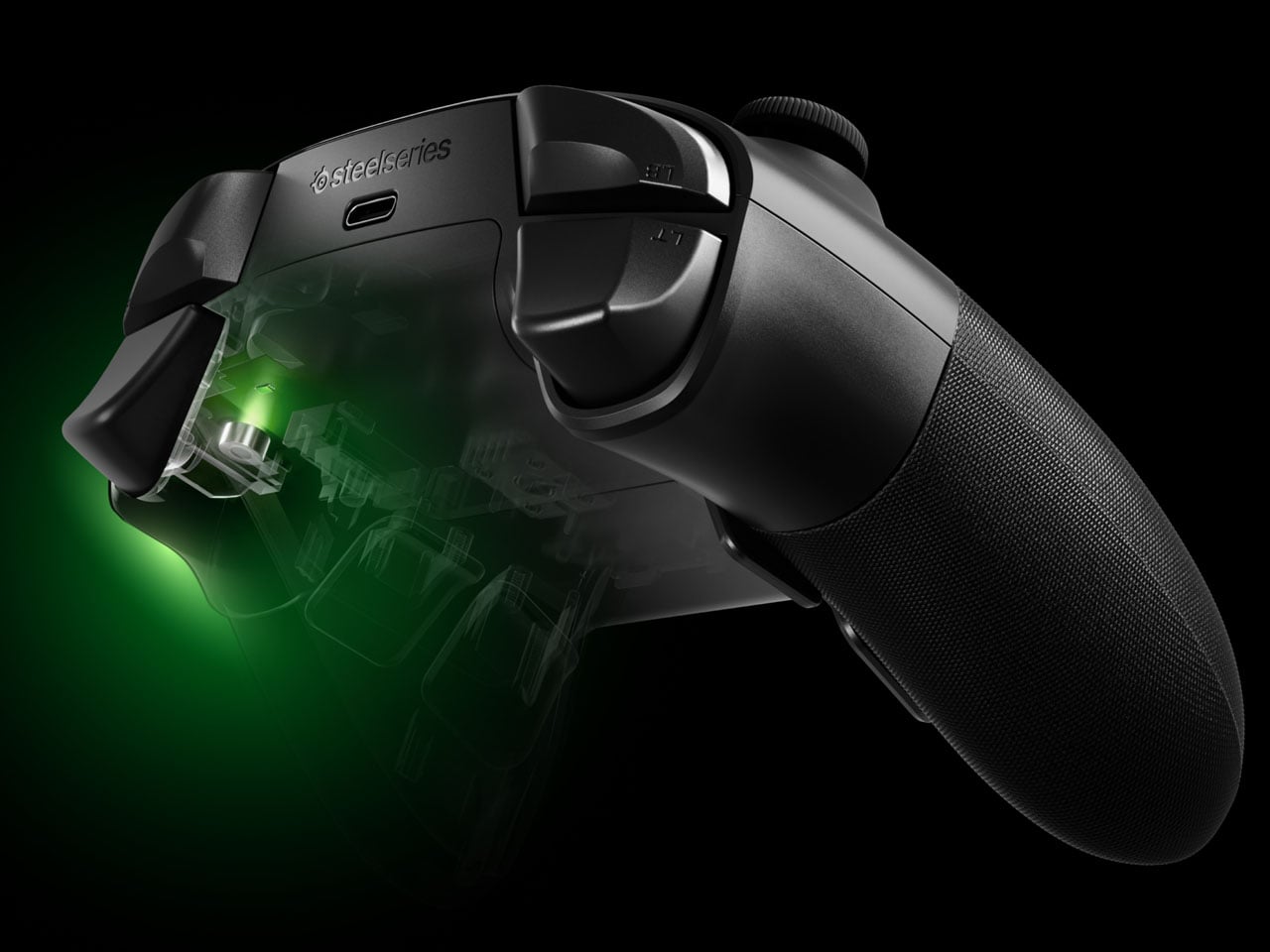
PC players can go deeper through SteelSeries GG, including trigger and button configuration, rumble adjustments, and software profiles. Then there are the smaller touches. The thumbsticks are interchangeable, with different shapes and heights supplied in the box, and the spare pieces can be stored in the dock. A textured grip runs around the controller, while its 310-gram weight makes it considerably heavier than a standard Xbox controller, though still lighter than Microsoft’s Elite model.
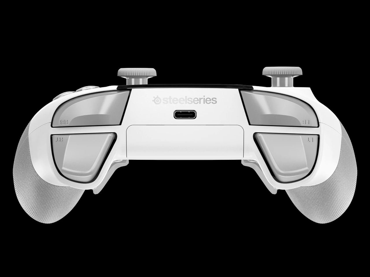
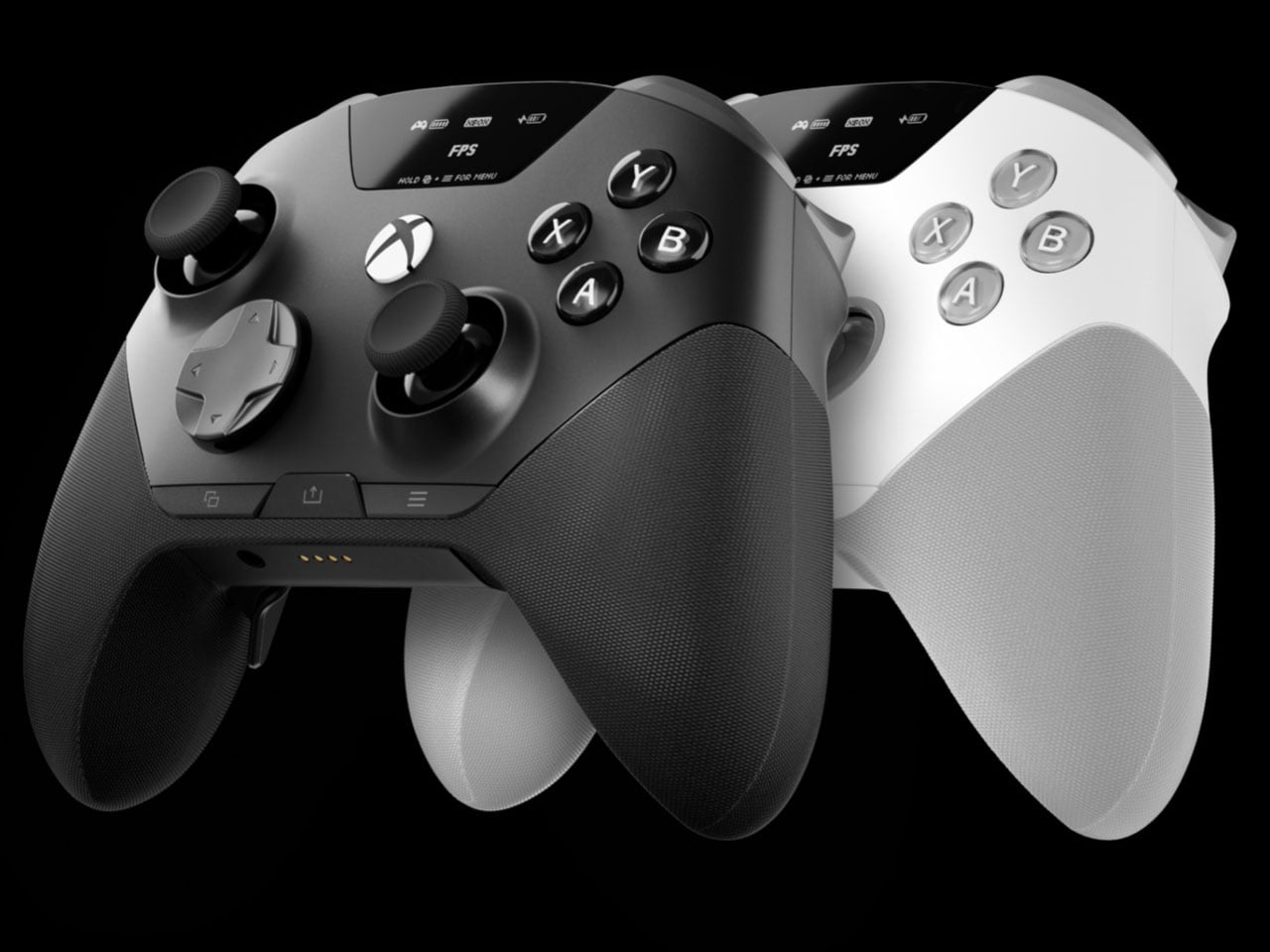
The catch is the $259.99 price tag. The Aeon Pro costs more than most premium gamepads, including Microsoft’s own Elite-class controller in many markets. That makes the QuickSwitch dock and battery system more than clever conveniences. They are the features that need to justify why this particular controller deserves a permanent spot on a gaming desk.
The post SteelSeries Aeon Pro switches between PC and console without re-pairing first appeared on Yanko Design.


Gone are the days when you have to stay inside a cubicle the entire day just to get your work done. A lot of jobs now give people the freedom to work wherever they want, setting up a mini mobile office at a café, in the park, or in the middle of the airport. The challenge for those lucky enough to have that kind of job is lugging around all their so-called tools of the trade.
U Space is one of those things you can use to set up a temporary office wherever you need to work. It’s a Swiss-designed laptop bag also inspired by the Japanese art of origami. It doesn’t just serve as storage while you’re walking around; it transforms into a mini workspace the moment you unfold it.
Designer: UJUAL
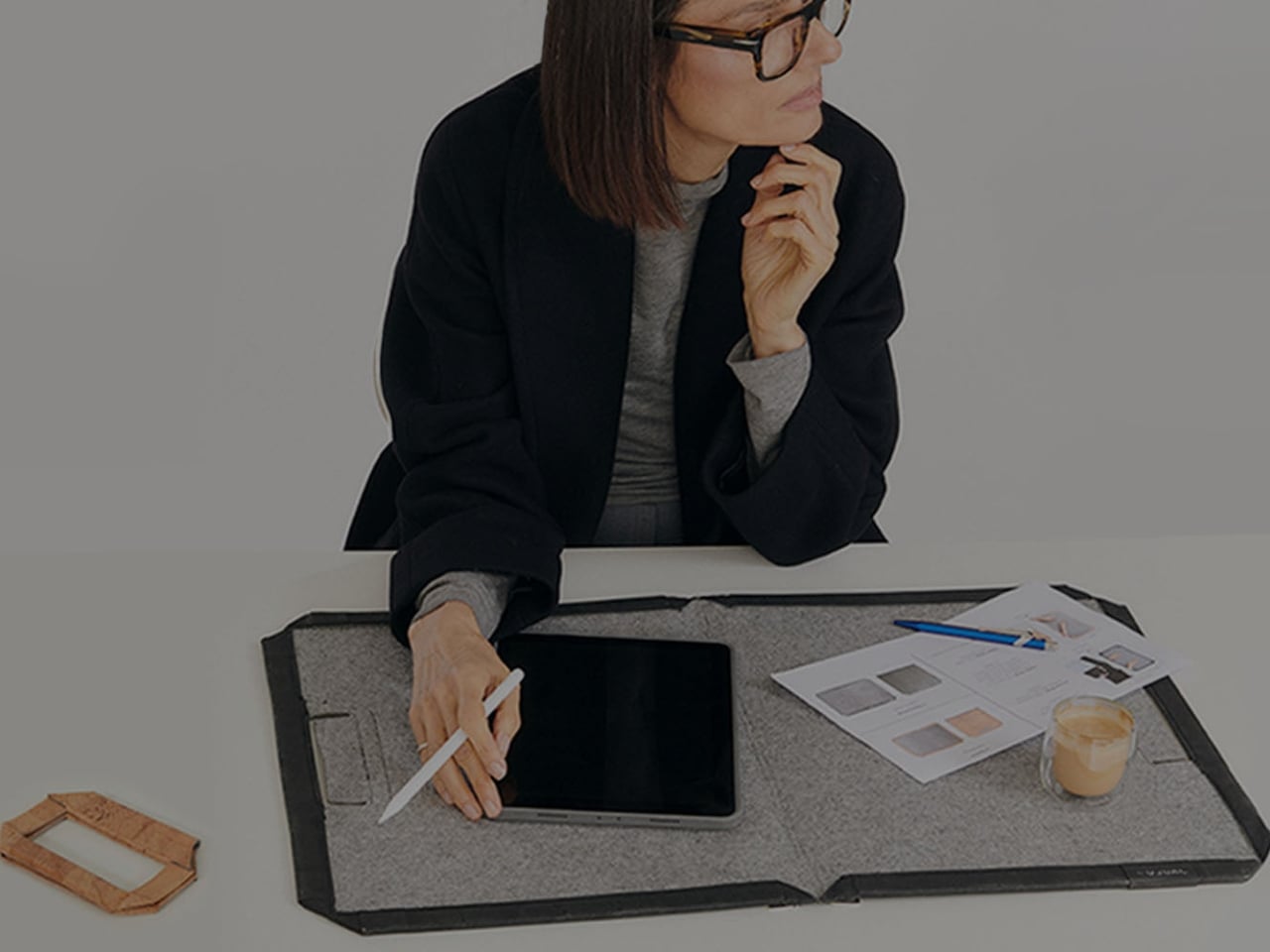
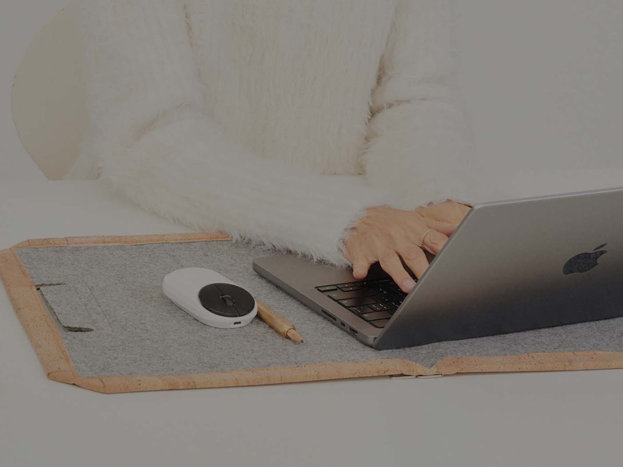
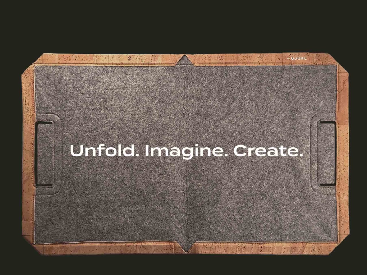
U Space is a “bag that becomes a desk,” and it lets you work in places where it can otherwise be hard to set up office. Even though it’s inspired by origami, it isn’t nearly as complicated as the Japanese art can be. In just one flip-and-fold motion, it unfolds into a flat working surface, making it far more convenient to work on your laptop or notebook while sitting on a chair, at a café table, on a park bench, or even on your lap if there’s nowhere else to work.
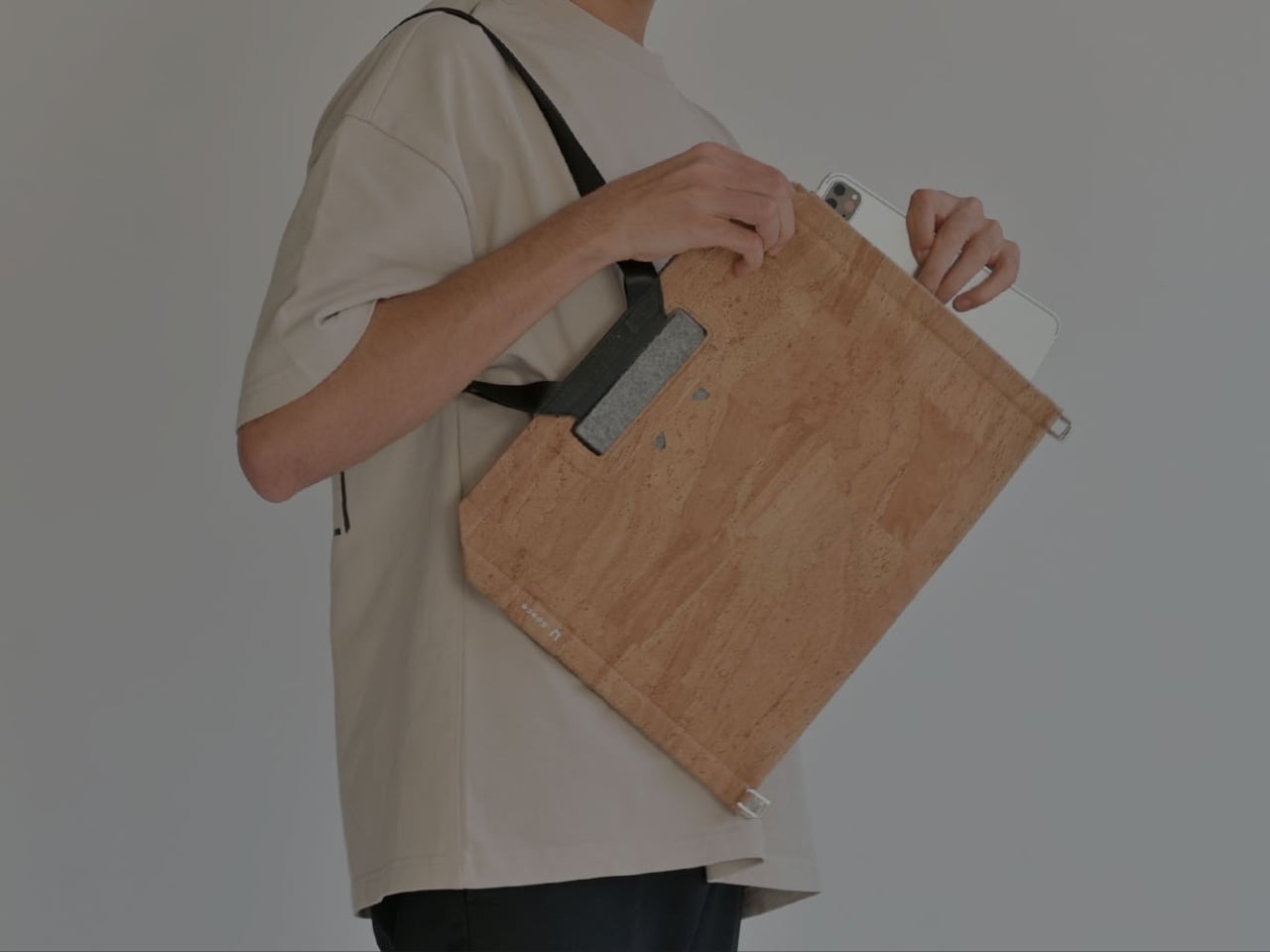
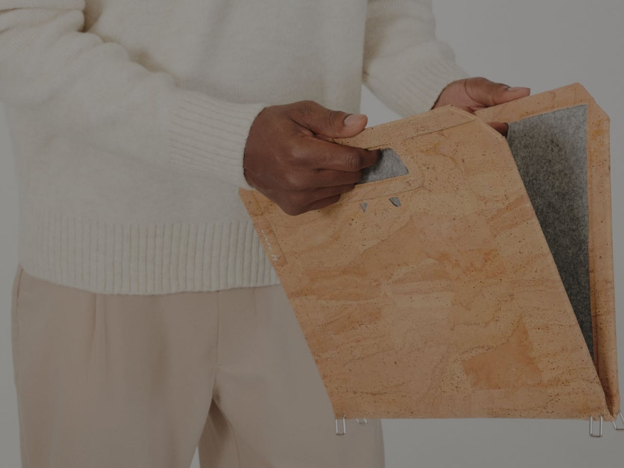
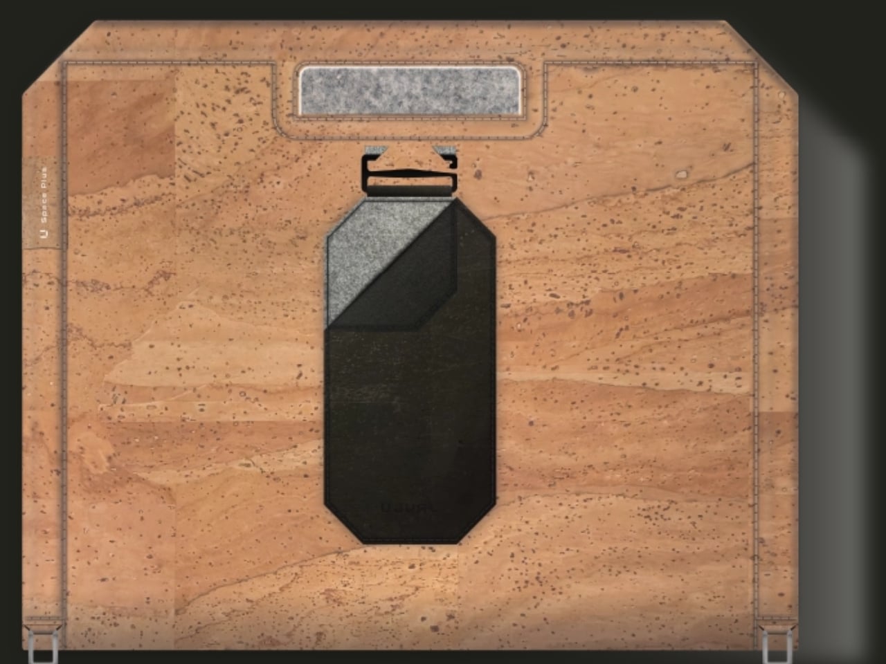
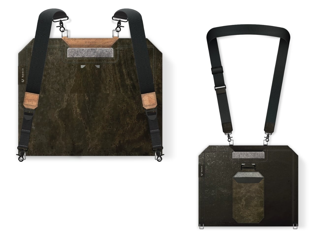
When it’s not doubling as your mobile desk, U Space is a multi-mode bag you can wear as a briefcase, messenger bag, or backpack. It’s versatile enough to carry with you whether you’re commuting, walking, or getting around any other way. It also has a three-layer magnet system, so you can quickly grab items like your phone, cables, or pens without digging through the whole bag or even unzipping it.
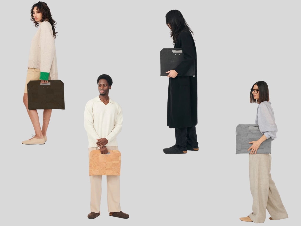

The bag can carry around 44 pounds (20 kilograms) of gear securely and is built using sustainable, durable materials. It’s available in finishes like Oak Beige, Ebony Black, Sumac Kaki, and Beech Grey, but it can also be customized with different colors and artwork. U Space also comes in a few different sizes, so there’s a version to fit whatever device you’re carrying, whether that’s a compact tablet or a full-size 16-inch laptop.
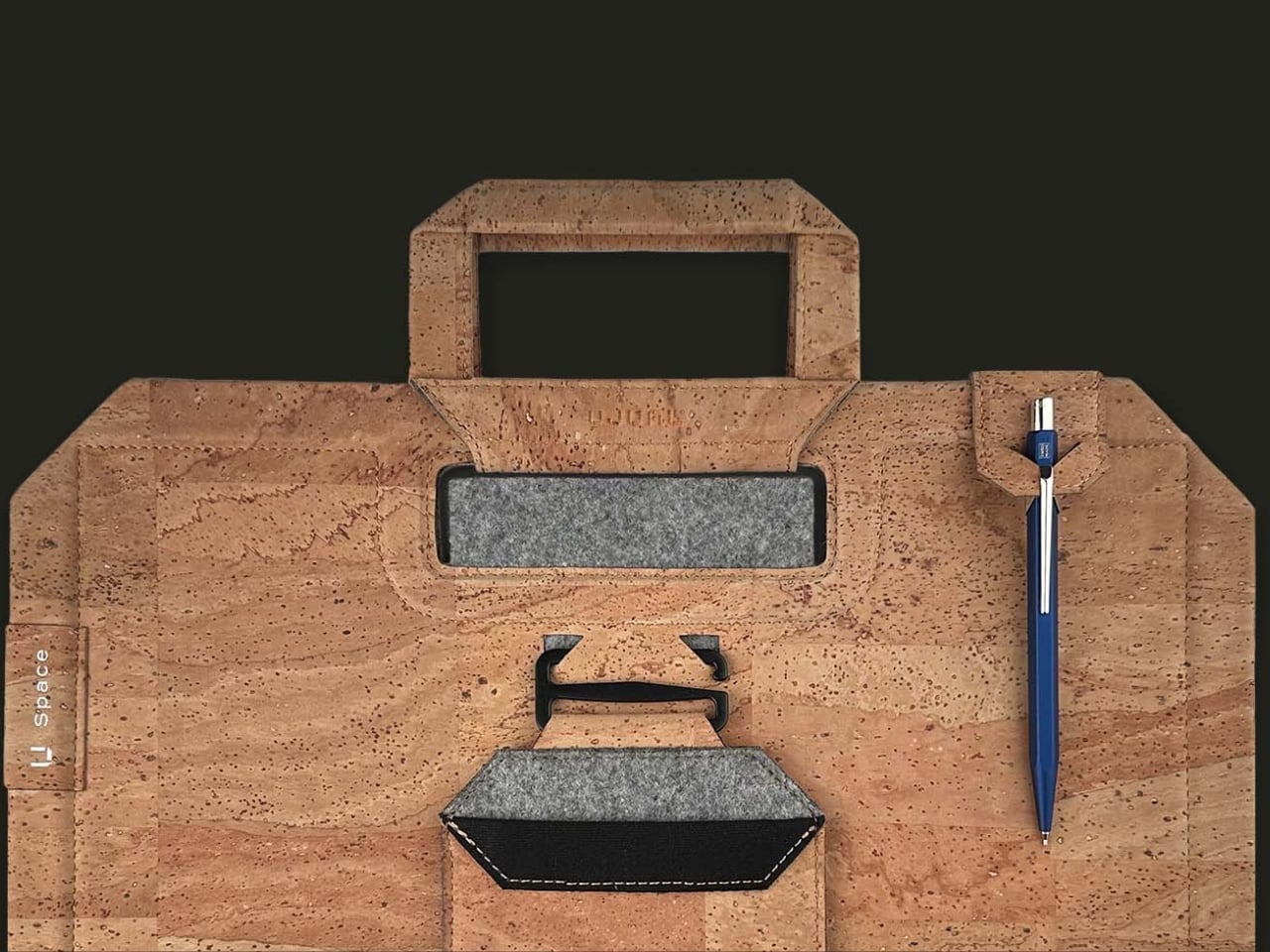
How does U Space measure up against the competition? Compared to established names like Peak Design, known for its modular Everyday Backpack lineup and its own magnetic accessory system, U Space is playing in a similar space of minimalist design and thoughtful organization. Peak Design has built a loyal following among photographers and digital nomads for how well-organized its bags are, but at the end of the day, even its most versatile bags are still just really good bags. U Space, on the other hand, pushes the idea further by literally changing what a bag can be. Rather than just holding your gear more efficiently, it unfolds into a physical work surface, something you won’t find in mainstream backpack brands. That single feature is what sets U Space apart in a crowded market of laptop bags competing mostly on pockets, zippers, and padding.
At a time when more people are trading their desks for whatever surface is available, U Space offers a genuinely useful solution instead of just another bag with a fresh coat of paint. It’s the kind of product that quietly earns its price by solving a problem you didn’t realize had such a simple fix: not having anywhere to actually put your laptop down. Whether you’re a freelancer bouncing between coffee shops, a student who needs a stable surface between classes, or a frequent traveler tired of balancing a laptop on your knees at the gate, U Space is built with that lifestyle in mind. It’s proof that good design isn’t always about adding more features; sometimes it’s about rethinking the object itself. For anyone whose “office” changes location every day, U Space might be the one accessory that finally keeps up.
The post The Laptop Bag That Finally Doubles as Your Desk first appeared on Yanko Design.

Apple is expected to unveil its new iPhone Ultra at the press conference later today. This device could signify a major evolution in Apple’s product lineup, offering a larger foldable display, a custom-designed Apple Pencil, and functionality that bridges the gap between smartphones and tablets. These features promise to introduce new possibilities for mobile technology, […]
The post Apple’s Foldable iPhone Ultra: Final Leaks Reveal a $2,000+ Price appeared first on Geeky Gadgets.