This Bio-mimicking Safari Deck Is Designed to Look Exactly Like a Rhino

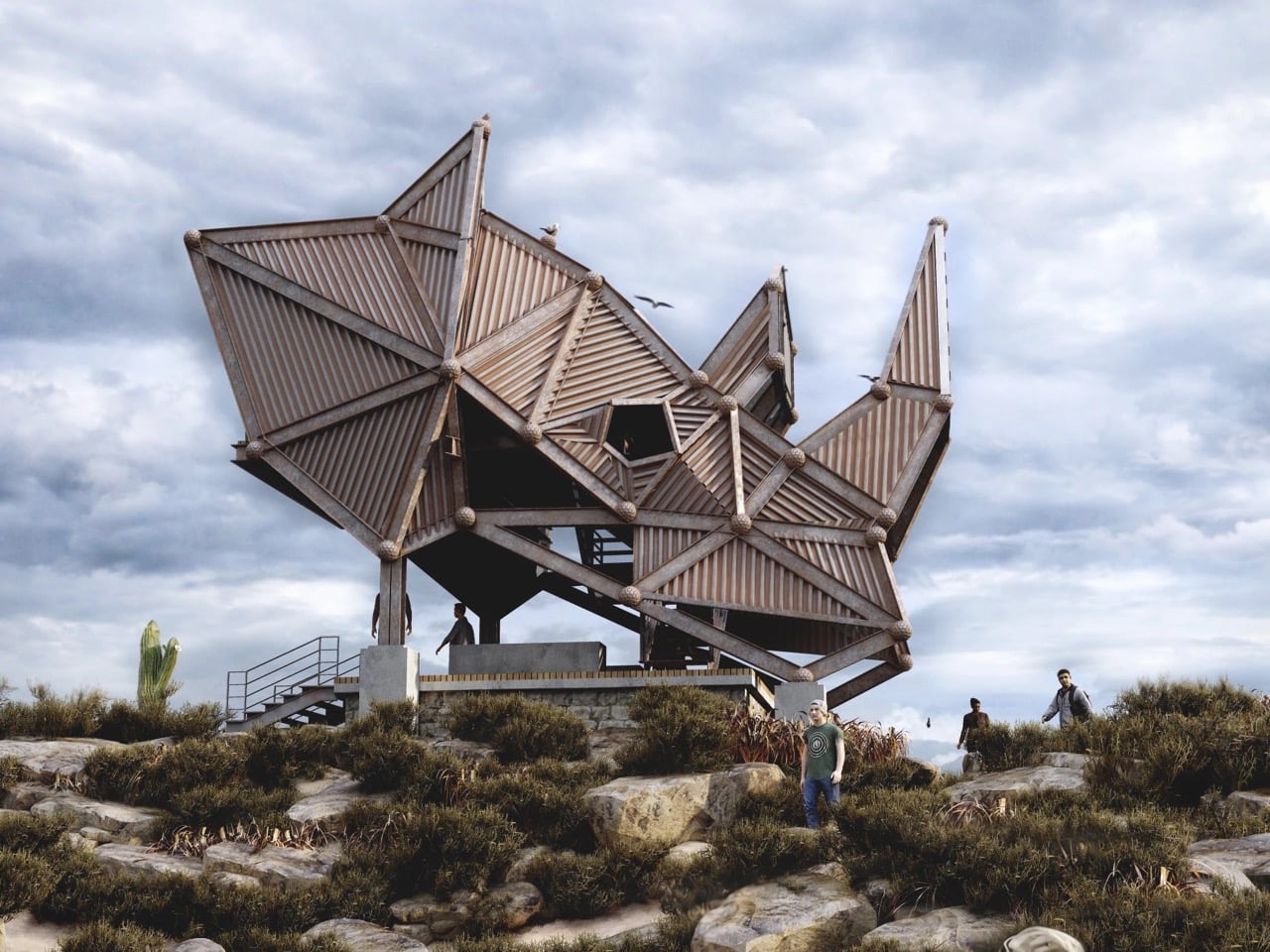
Sri Lankan designer Thilina Liyanage has built a recognizable portfolio around one core idea: that architecture in wild spaces should speak the language of those spaces. His previous concepts have drawn from bird forms, insect geometries, and the angular logic of animal skeletons, earning him a following among readers who track biomimetic architecture with the same enthusiasm others reserve for gadgets. His latest, the Rhino Safari Deck, takes that approach to one of its most literal and structurally ambitious expressions yet. Rendered under overcast skies above a scrubby, semi-arid landscape scattered with cacti and boulders, the structure earns its name in full. From a distance, you are looking at a rhino. The silhouette is unmistakable: a squat, armored mass with a pronounced horn erupting from the roofline, flanked by secondary angular spires that read as ears, the whole thing hunched forward on its platform like the animal mid-charge.

Liyanage named the project “Kifaru Point,” using the Swahili word for rhino, which sets the geographic and tonal intention clearly. The structure is conceived as a wildlife observation deck, elevated above the terrain on a concrete plinth with a timber-decked lower platform that wraps around the base. A set of steel-railed stairs leads visitors up from the rocky ground level, and the shaded gathering area beneath the main structure provides a transition space before the ascent continues to the upper observation level. The interior views glimpsed in the renders show open, framed apertures that funnel sightlines out across the flat scrubland below, the kind of panoramic sweep that makes the elevated position feel earned rather than arbitrary. As a piece of safari infrastructure, Kifaru Point is doing something most viewing platforms do not bother attempting: it turns the act of looking at animals into an architectural experience that is itself worth looking at.

Designer: Thilina Liyanage

The entire form is built from triangulated steel frames, with each panel clad in ribbed, corrugated steel slats that create a warm, striated texture across the facets. Spherical steel nodes connect the struts at every junction, giving the whole skeleton a Meccano-meets-brutalism quality that suits the rugged setting perfectly. There is no smooth surface anywhere on this building. Every plane is either angled, folded, or interrupted, and the aggregate effect genuinely reads as armored hide from the outside while remaining open and structurally legible from within. The corrugated steel and timber combination ages well in outdoor conditions, which matters for a structure intended to sit in a landscape indefinitely rather than perform at an exhibition and disappear.


What Liyanage is clearly working through in this series is the question of how a building earns its place in a landscape. The typical eco-lodge answer involves receding into the environment through natural materials and muted palettes, becoming invisible by design. Kifaru Point goes the opposite direction: it announces itself as a landmark, a destination, something you orient toward from across the plain. The rhino reference gives it a totemic presence that goes beyond novelty. Rhinos are ancient, armored, and critically endangered, and a safari deck that reads visually as one of those animals is making an argument about the relationship between the people who come to observe wildlife and the wildlife itself. Biomimetic architecture has a long tradition of borrowing animal logic for structural efficiency, but borrowing it for symbolic weight, for the purpose of rhino conservation awareness built into a building’s silhouette, is a less common move and a more interesting one.
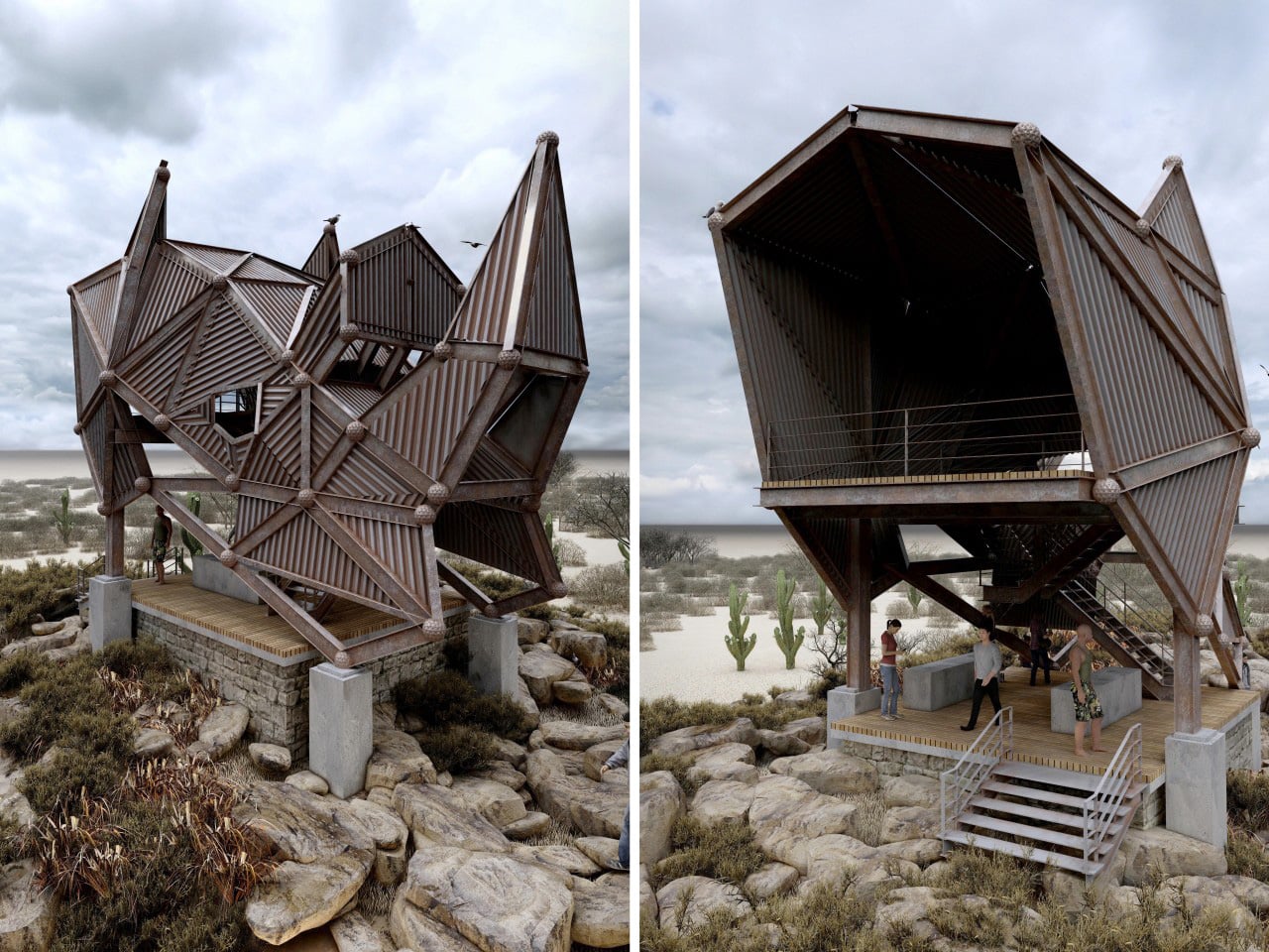

The rendered setting positions Kifaru Point among desert shrubs and saguaro-like cacti, suggesting a location somewhere in southern or eastern Africa, though the landscape has a looseness that keeps the concept legible across multiple possible sites. The palette of weathered steel and warm timber sits comfortably against the muted greens and grays of the terrain, and the overcast sky in most of Thilina Liyanage’s renders gives the structure a moody weight that a blue-sky backdrop would have undercut entirely. He knows how to light his visualizations for atmosphere, and that skill is doing real work here, making a conceptual project feel like a building that already exists and is already waiting for visitors to climb its stairs and look out across the plain at whatever is moving in the distance.

The post This Bio-mimicking Safari Deck Is Designed to Look Exactly Like a Rhino first appeared on Yanko Design.
Bethesda Made a Real Pip-Boy Wearable for $299 and It Even Has a Radiation Detector

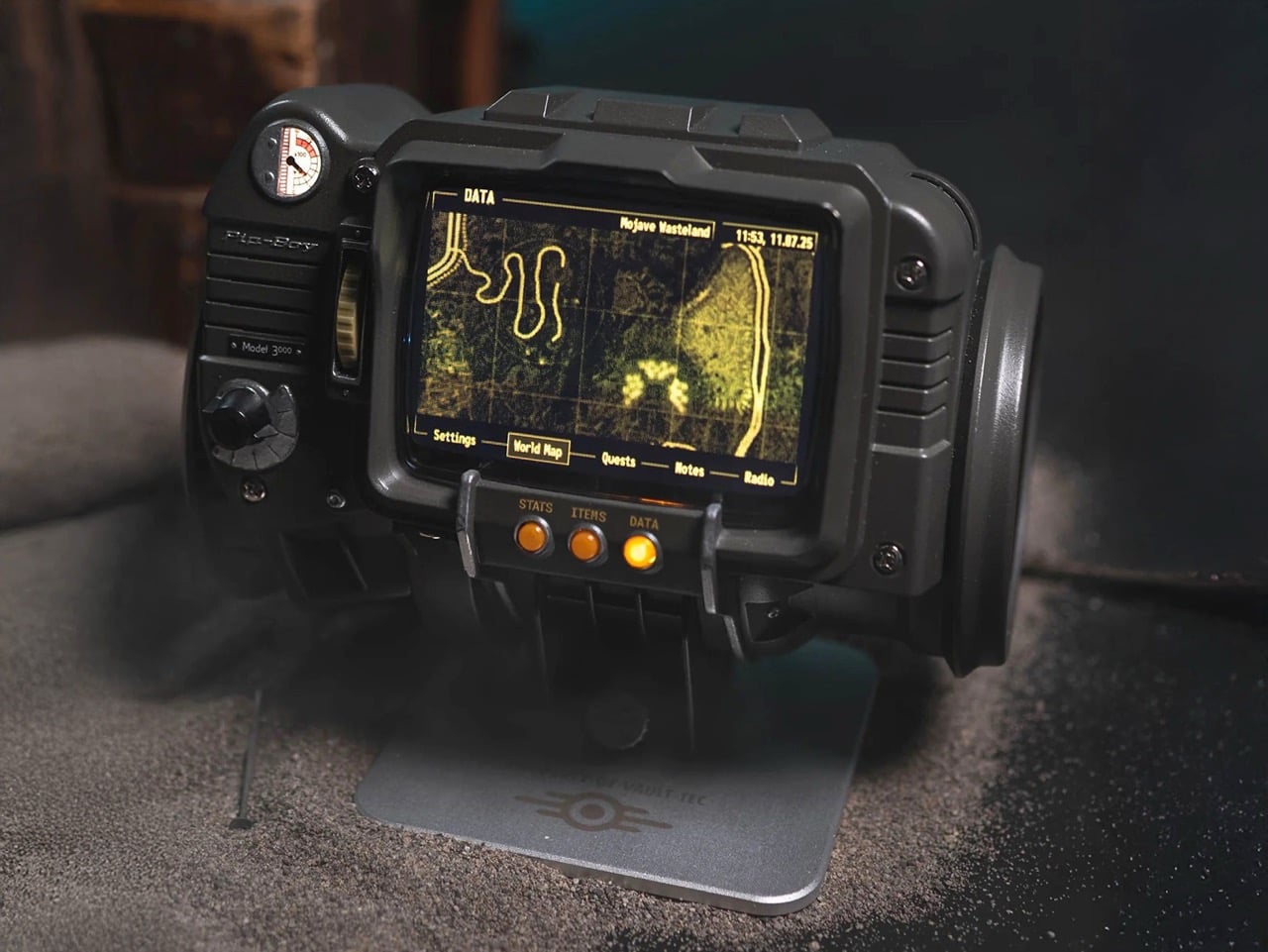
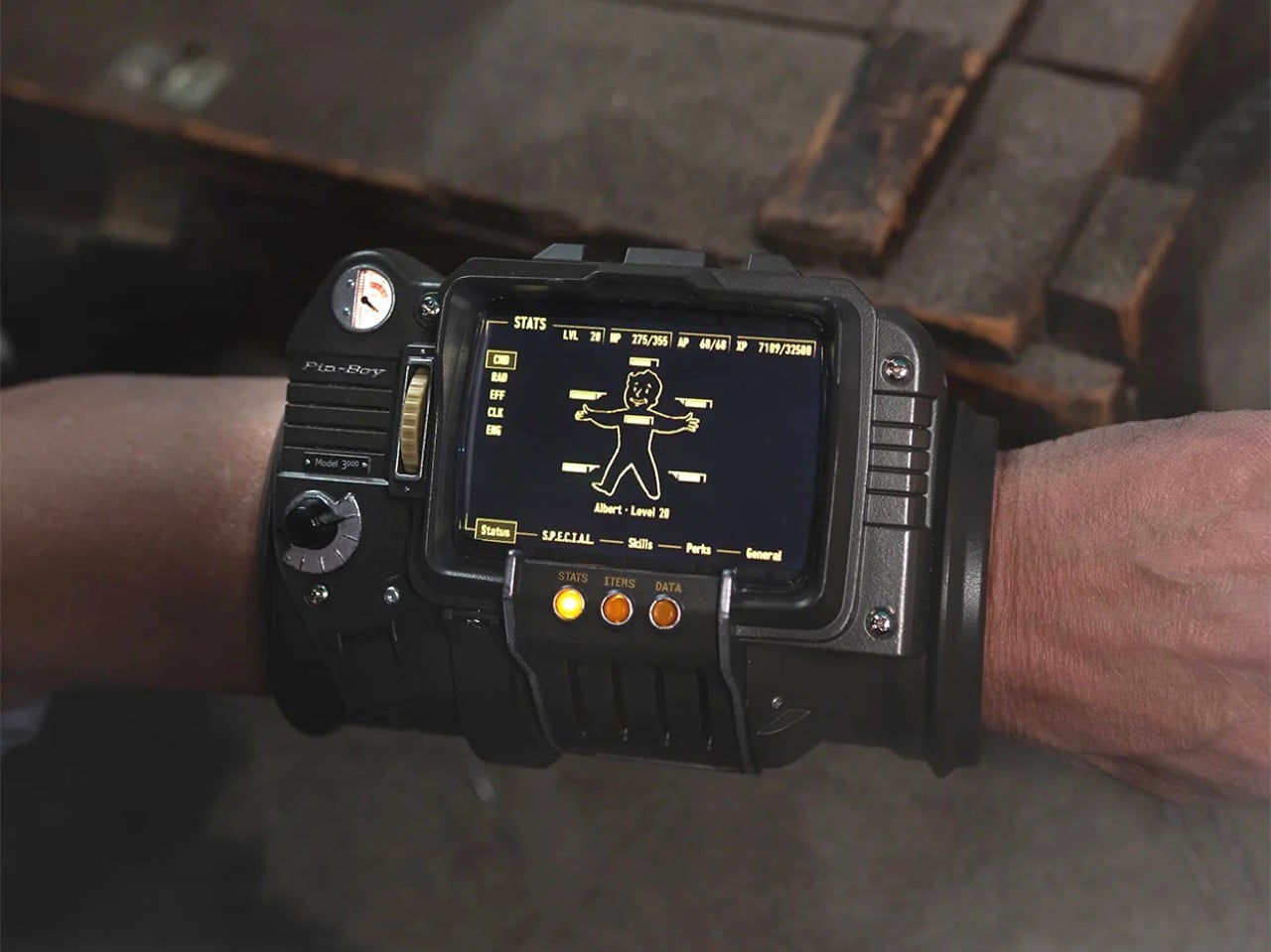
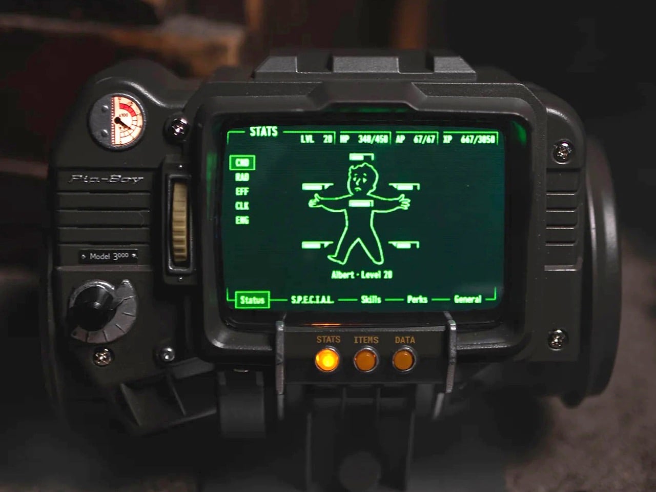
Seventeen years of Fallout fans walking around with a fictional computer strapped to their arm in their heads, and The Wand Company has finally made the thing real. This is the Pip-Boy 3000 replica, built from the original in-game 3D geometry of the wrist-worn personal information processor from Fallout 3 and Fallout: New Vegas, and it is a fully functional, wearable, 724-gram argument that some obsessions are worth indulging. The Wand Company has form here, having already produced the Pip-Boy 3000 Mk V replica based on the Amazon TV series prop, but this is the one Fallout 3 and New Vegas players have actually been waiting for since 2008.

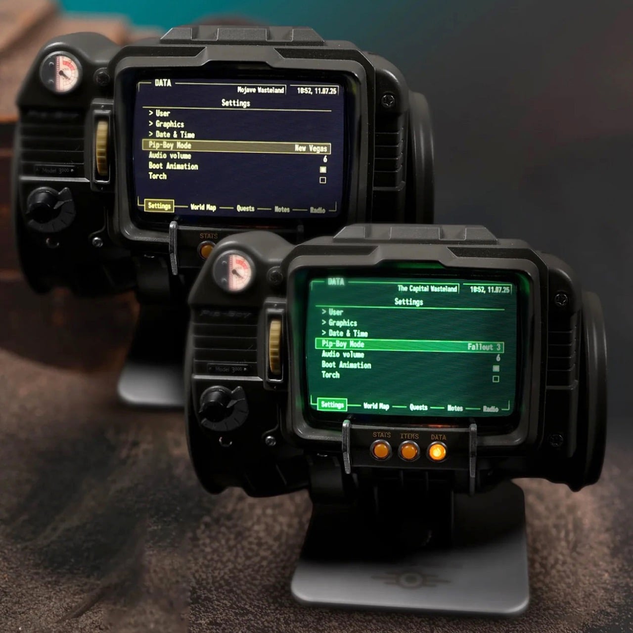
The front casing is die-cast metal, the body is injection-moulded ABS, and the cuff is memory foam with an included spacer bar that adds 22mm of circumference for larger arms. The 4-inch IPS LCD screen displays nearly all of the in-game content from both titles, and you can toggle between the classic green UI from Fallout 3 and the amber one from New Vegas. Hundreds of menus are navigable using the scroll wheels and dials on the body, the screen mimics a vintage CRT display with glitch effects and scanlines baked in, and you can temporarily fix those glitches by smacking the device because there is, naturally, an accelerometer inside. The whole package weighs about as much as a large can of soup, which will become noticeable roughly forty-five minutes into wearing it at a convention.

Designer: The Wand Company

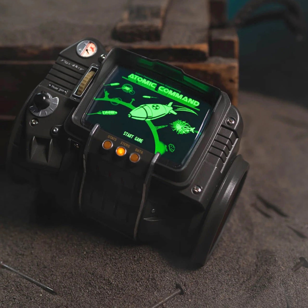
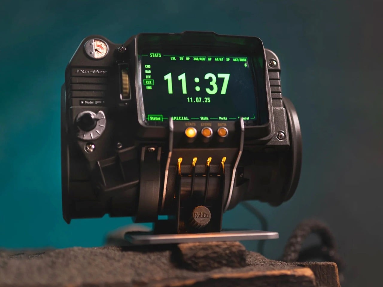
There is also a playable version of Atomic Command, the in-game holotape minigame, marking the first time anyone has defended fictional American landmarks from nuclear missiles on their actual wrist. The flashlight at the rear, headphone jack, and alarm clock mode are all present and accounted for. The radiation detector deserves a special mention: rather than measuring the ionizing kind that would actually matter in a wasteland scenario, it picks up radiation from FM radio broadcasts, displaying readings on the Geiger counter screen with full sound effects. The replica can also function as a working FM radio, which makes it possibly the most elaborately housed FM tuner ever manufactured. This is either a charming bit of in-universe worldbuilding or a tremendous cop-out, depending entirely on how generous you are feeling about the whole thing.

When you are not wearing it, the replica sits on a solid machined aluminum display stand that locks into four slots on the lower front of the device. The stand is also where the alarm clock function comes into its own, with the Pip-Boy propped upright on a desk or nightstand doing its best impression of the world’s most expensive bedside clock. The Wand Company says Bethesda staff saw the prototype and were left speechless, which tracks, because the level of content depth here, over 2,200 menu entries pulled directly from both games, goes considerably further than anyone needed to go for a collectible.

Preorders are live now at the Bethesda Gear Store for $299.99, with shipping expected as early as June 2026. Bethesda is restricting it to one item per order. International buyers can order through the Bethesda Gear Store International. It is rated for ages 14 and up, which seems optimistic.

The post Bethesda Made a Real Pip-Boy Wearable for $299 and It Even Has a Radiation Detector first appeared on Yanko Design.
BYD Could Become Formula 1’s First Ever Chinese Team By 2027

BYD sold 4.6 million new energy vehicles last year. It operates in over 100 countries. It builds its own batteries, motors, semiconductors, and power electronics from the ground up. And yet, in the parts of the world where it most desperately wants to grow, a significant chunk of car buyers still see it as the affordable Chinese option. That perception gap between what BYD actually is and what consumers in Europe and North America think it is has become the company’s single biggest strategic problem. Formula 1, according to a Bloomberg report published this week, might be BYD’s proposed solution. The company is reportedly exploring an entry into the world championship, either by acquiring an existing team or by building its own from scratch.

It would not be the first automaker to use motorsport as a brand perception lever. Hyundai was a budget car punchline before its WRC campaigns rewired how people thought about its engineering. Honda’s F1 run in the late 80s and 90s turned sensible commuters into a byword for high revving precision. BYD has the technical chops to tell a similar story, and F1’s 2026 regulations actually play to its strengths. Roughly half the power unit’s output now comes from an electric motor, a huge jump from previous seasons. FIA president Mohammed Ben Sulayem has been openly courting a Chinese entry, confirming that talks with manufacturers have already happened. The financial hurdle is real, with annual costs pushing $500 million and Cadillac’s grid entry fee alone hitting $450 million, but BYD pulled in $86 billion in revenue last year. The money exists. The motive exists. And the regulatory window has never been more aligned.

Image Credits: @grandprix

The 2026 power unit regulations are what make BYD’s potential entry genuinely fascinating from an engineering standpoint. The MGU K now pumps out 350 kW, nearly triple the previous 120 kW figure, meaning the electric motor is responsible for roughly half of total power delivery to the rear wheels. The sport has also mandated advanced sustainable fuels and significantly increased battery capacity requirements. For context, most current F1 engine manufacturers outsource chunks of their electrical componentry or partner with specialist suppliers for battery cells and power electronics. BYD does none of that. It designs its own lithium iron phosphate battery chemistry, manufactures its own electric motor architectures, and fabricates its own semiconductor chips in house. That vertical integration, the same thing that lets BYD undercut competitors on price in the road car market, could translate into a fundamentally different approach to building an F1 power unit.

Think about what that means in practice. Ferrari, Mercedes, and Red Bull Powertrains all develop their electrical systems with relatively traditional motorsport supplier chains. BYD would show up with an entirely self contained pipeline, from raw cell chemistry to finished power electronics, informed by producing millions of electric drivetrains a year at scale. Nobody in F1 has that kind of manufacturing feedback loop. Whether that actually produces a faster car is anyone’s guess, because high volume production efficiency and single lap bespoke performance are very different disciplines. But the potential for BYD to bring a novel engineering philosophy to the grid, one shaped by mass market EV development rather than wind tunnel obsession, is the kind of wildcard that makes the sport interesting. The last time someone brought a genuinely alien approach to F1 engine design was probably Honda’s split turbo concept in 2015, and that eventually won championships.

BYD also has something else that most F1 newcomers lack: a premium performance sub brand with an actual hypercar. The Yangwang U9 is a quad motor electric supercar that clocked a sub 7 minute Nurburgring Nordschleife lap, making it one of the fastest production cars to ever circle that track. It produces over 1,300 horsepower, uses BYD’s proprietary e4 platform with independent torque vectoring on all four wheels, and was reportedly tested at speeds north of 300 km/h. If BYD enters F1, Yangwang becomes the obvious brand to attach to the racing program, the same way Toyota runs its Le Mans effort under Gazoo Racing or Hyundai channels its WRC work through its N performance division. A Yangwang branded F1 entry would give BYD a clean separation between its mass market identity and its motorsport ambitions, while feeding technology back into its flagship performance car.

China’s track record in international single seater racing is worth acknowledging here, because it adds useful context to how hard this actually is. The team originally called China Racing joined Formula E in 2013 as the second team on the grid, won the inaugural Drivers’ Championship under the NIO banner with Nelson Piquet Jr. in 2015, and then proceeded to spend years stuck at the very back of the field. It got rebranded from NIO 333 to ERT, and was eventually sold to an American investment group that now runs it as Kiro Race Co. under a U.S. license. The one Chinese flagged team in electric motorsport lost its Chinese identity entirely. BYD entering F1 would carry the weight of that unfinished story, and the engineering credibility it brings to the table through its road car dominance would need to survive the brutal reality of competing against teams that have been doing this for decades.

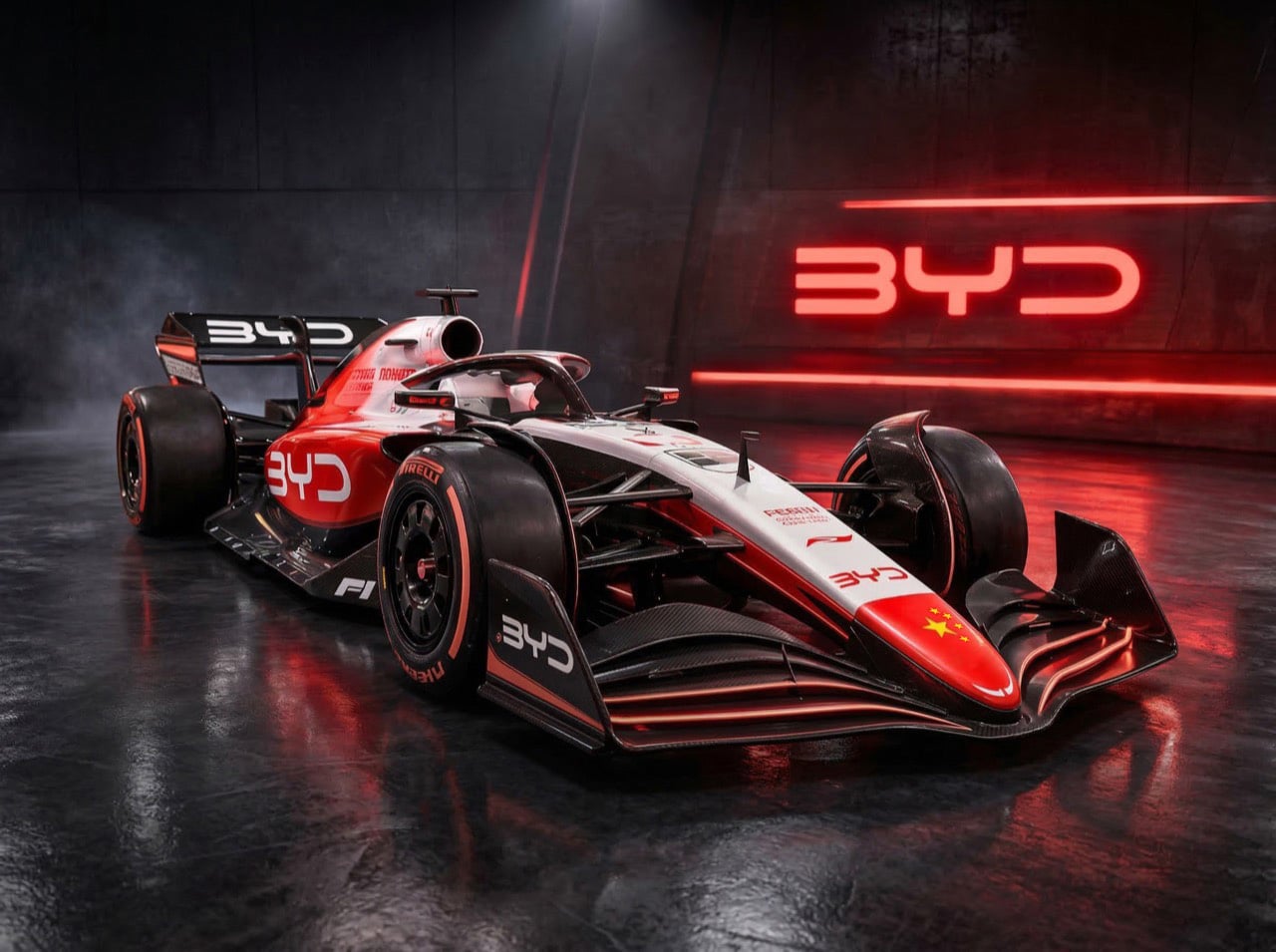
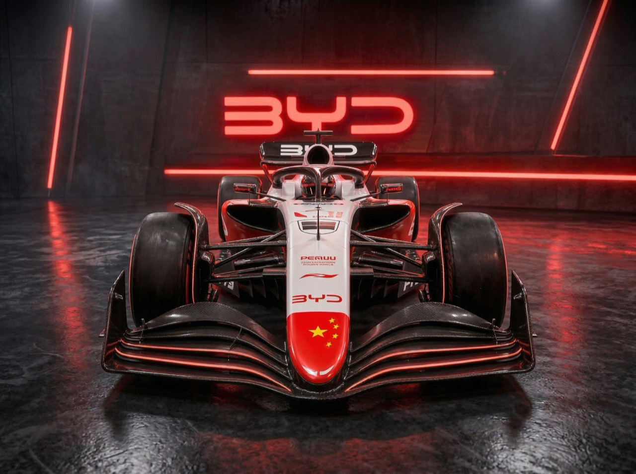
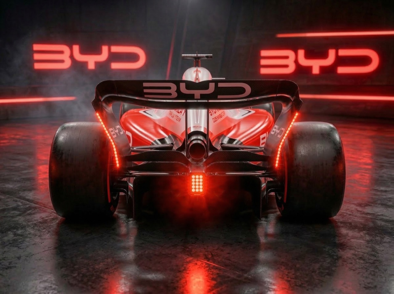
Some AI generated concept renders have been making the rounds online, imagining a BYD liveried F1 car in a black, red, and white color scheme with the company’s angular logo across the sidepods. The renders are speculative, but one detail stands out: the Chinese flag painted onto the nose cone. That is a loaded visual choice, and a historically significant one in F1 terms. Alpine carries the French tricolore on its cars. Force India wore the Indian flag throughout its time on the grid. A BYD car flying the five starred red flag on its nose would frame this as a national arrival, a declaration that China’s biggest automaker is ready to compete at the highest level of global motorsport. BYD’s road car design language has been trending toward clean, sharp minimalism lately, so a livery built around deep red panels, exposed carbon weave, and restrained branding could actually cut through the visual clutter of an increasingly sponsor heavy grid. It would certainly look different from anything else out there.

The post BYD Could Become Formula 1’s First Ever Chinese Team By 2027 first appeared on Yanko Design.

Meet the Electronic Dolphin, the Mini Robot That Cleans Oil Spills With Urchin-inspired Filters

A sneaker-sized robot developed at RMIT University in Australia is making a compelling case for rethinking how humanity responds to one of the ocean’s most persistent threats. The “Electronic Dolphin” is a Wi-Fi-controlled minibot built to skim oil slicks from contaminated marine surfaces without deploying any chemical dispersants, and without putting human responders anywhere near the hazard. Detailed in the journal Small, the device is compact, remote-operated, and draws on one of nature’s more underrated structural templates to do its job. It is not the first machine built to address marine oil contamination, but it may be the first to approach the problem with this particular combination of biomimicry, material science, and autonomous ambition.

The secret is in the filter. Rather than relying on PFAS-based absorbents, which are toxic, persistent in the environment, and increasingly regulated worldwide, the RMIT team engineered a composite coating from specialized carbon layers and modified barium carbonate. The resulting material mimics the microscopic spine geometry found on sea urchins, forming tiny protrusions that trap air pockets in a precise architectural arrangement. That structure makes the surface simultaneously superhydrophobic and oleophilic, a combination that causes water to roll straight off while oil latches on and gets drawn in. The chemistry here is elegant in the way good materials science often is: solving a messy physical problem through surface geometry rather than reactive chemistry.

Designers: RMIT University

The filter sits at the robot’s nose, paired with a small onboard pump that actively draws the oil slick inward. In controlled laboratory tests, the prototype processed oil at roughly two milliliters per minute, achieving over 95% purity in the recovered material. The coating also demonstrated strong corrosion resistance when exposed to saltwater, and held up across multiple reuse cycles without meaningful degradation. Those numbers matter because reusability is one of the practical bottlenecks that has historically limited oil spill response hardware. A filter that survives repeated deployment in a corrosive marine environment is a filter worth scaling.

The current battery life runs to about 15 minutes, which is honest enough for a research prototype operating at this scale. The RMIT team is candid about the limitations, and equally clear about the trajectory. Future iterations are envisioned at dolphin scale, fully autonomous, and capable of operating in a continuous loop: skim the surface, return to a base station, drain the collected oil, recharge, and head back out. That remediation model borrows from how robotic vacuum cleaners normalized autonomous domestic cleaning, and it translates surprisingly well to open-water spill response, where the geography is hostile, the timeline is open-ended, and human supervision is expensive.

Marine oil spills remain one of the more intractable environmental disasters, not because the problem is poorly understood but because the cleanup tools available have lagged behind the scale of the damage. Dispersants break oil into smaller particles that sink rather than surface, which looks like cleanup but often relocates the harm. Booms and skimmers are manual, slow, and weather-dependent. The Electronic Dolphin does not solve all of that at once, but it represents a shift in the design logic: autonomous, chemical-free, biomimetically informed, and built from the start with continuous deployment in mind. That is the kind of thinking the problem has always deserved.

The post Meet the Electronic Dolphin, the Mini Robot That Cleans Oil Spills With Urchin-inspired Filters first appeared on Yanko Design.
Someone Built a True-Scale LEGO Velociraptor Skeleton and I Can’t Wait To Buy One

Jurassic Park lied to you. The velociraptors that terrorized a kitchen full of children and hunted Jeff Goldblum through tall grass were modeled after Deinonychus, a considerably larger North American cousin, because the filmmakers thought the real animal’s name sounded cooler than its actual dimensions warranted. The real Velociraptor mongoliensis stood about 1.6 feet at the hip and weighed roughly as much as a medium-sized dog. Formidable, certainly, but built to the scale of a farmyard bird rather than an apex predator capable of coordinated ambushes.

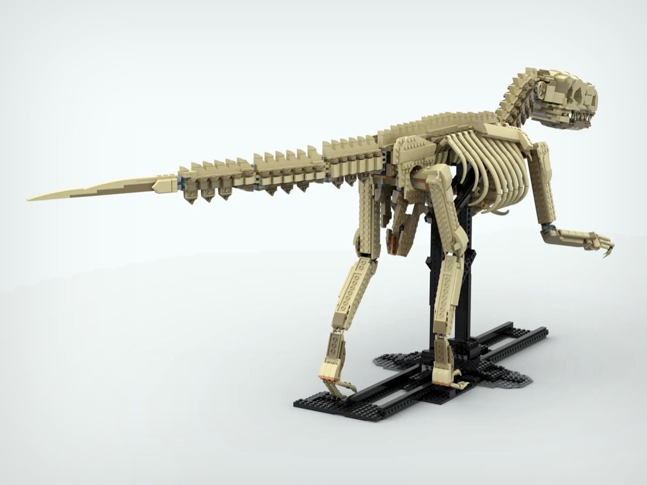
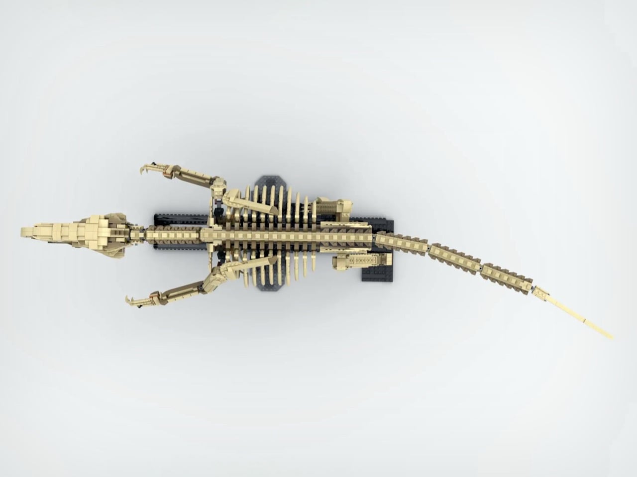
Which is exactly what makes this LEGO Ideas submission by creator Terraxz so interesting. Built to true scale from paleontological measurements of a juvenile V. mongoliensis specimen, the model sits at approximately 120 cm long and 40 cm tall on a museum-style display stand. It has the ribcage, the vertebrae, the sickle claw, the whole skeleton rendered in tan brick. LEGO has been on a fossil skeleton tear lately, but nobody has attempted one at actual 1:1 scale until now.

Designer: Terraxz

LEGO’s Dinosaur Fossils line began as a fan submission that became the 910-piece Ideas set 21320, featuring T. rex, Triceratops, and Pteranodon skeletons at 1:32 scale. LEGO then escalated with the Jurassic World set 76968, a 3,145-piece T. rex skeleton stretching over 105 cm at 1:12 scale, which launched in March 2025 and immediately became the largest Jurassic World set the company had ever produced. Every iteration in this lineage has been a scaled-down representation, a display piece calibrated for shelf real estate rather than scientific fidelity. Terraxz is doing something structurally different: the model matches the actual size of the animal it depicts, which reframes the whole exercise from decorative object to physical argument about what the creature actually was.

Look at the skull closeup and you can see individual tooth rows built from stacked brick elements, fenestrae represented as open negative space through clever plate offsetting, and a jawline that actually captures the elongated low-profile snout that distinguishes V. mongoliensis from the broader-headed Hollywood version. The spine runs in a proper S-curve, the tail extends horizontally as it should for a bipedal theropod using it as a counterbalance, and the legs are proportioned correctly for an animal that stood 0.5 meters at the hip rather than eye level. The black display armature borrows the same museum-mount language as LEGO’s official sets, with cross-braced vertical supports that would look at home in any natural history gallery.

A fully adult V. mongoliensis reaches around 1.8 to 2 meters in length, which would push this build into genuinely unwieldy display territory. Choosing a juvenile specimen is a calibrated decision that keeps the model physically manageable while maintaining the true-scale claim, and it maps to real fossil record data: a complete juvenile skeleton described from the Djadochta Formation gives the builder a legitimate scientific reference point rather than an averaged extrapolation. Terraxz has a catalog of related MOCs on Rebrickable, including a true-scale V. mongoliensis skull, so this submission is the culmination of an ongoing paleontology project rather than a standalone pitch.

LEGO Ideas requires 10,000 supporter votes within the submission window for a design to enter official review, and Terraxz currently sits at just over 1,000 with 605 days remaining. That’s enough time to accrue the votes needed to turn this into a retail set. I’m pretty sure that a whole bunch of people beyond
paleontologists would like a to-scale velociraptor skeleton adorning their bedroom or hallway. The submission is live on the LEGO Ideas website, and it takes about thirty seconds to cast your vote, so what exactly are you waiting for?

The post Someone Built a True-Scale LEGO Velociraptor Skeleton and I Can’t Wait To Buy One first appeared on Yanko Design.

Nintendo Patented a Dual-Screen Switch and Never Made It. Here’s What It Looked Like.

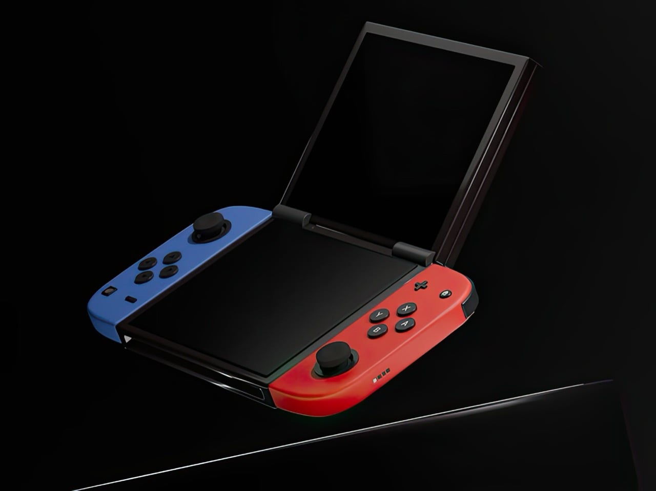
Nintendo had a choice when designing the Switch 2. They could iterate on the formula that made the original a cultural phenomenon, refining the single-screen hybrid into a faster, sharper, better version of itself. Or they could reach back into their own history, pull out the design philosophy that once made the DS family the best-selling handheld hardware line of all time, and merge two eras of thinking into something genuinely new. They picked the first path. Designer Juan Manuel Guerrero just sketched out the second.

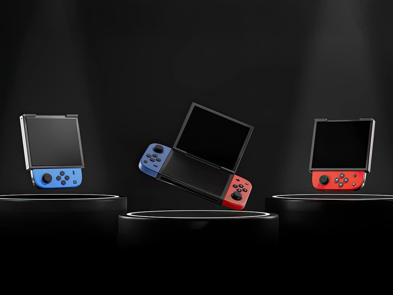
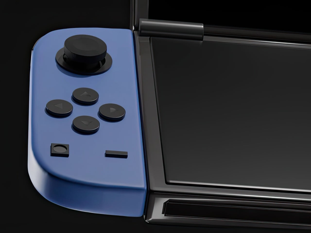
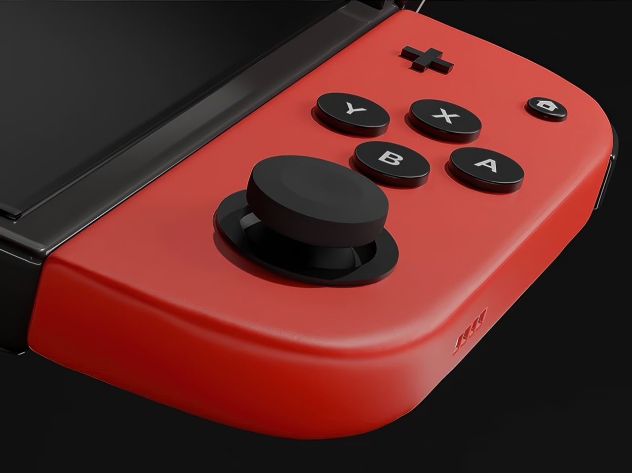
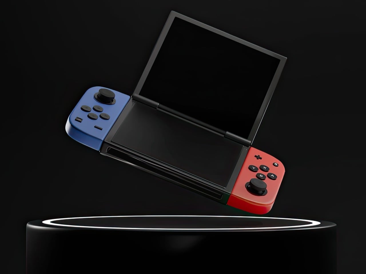
The concept arrives as a series of beautifully lit 3D renders: a folding Nintendo Switch with dual screens, a hinge running through the center of the body, and Joy-Cons in the familiar blue-red split attached to either end. The renders carry the finish of product photography, which makes it genuinely easy to forget this never shipped. Closed, it looks like a sleek, pocket-ready device with a tighter footprint than the original Switch. Open, it recalls something older and warmer, the quiet satisfaction of flipping a DS open on a long car ride, except now the screens are large, the controllers are proper, and the whole thing feels built for today. The proportions are deliberate, the design choices are considered, and the whole thing wears its Nintendo identity without apology.

Designer: Juan Manuel Guerrero

The Nintendo DS sat at 154.02 million lifetime units for years, the gold standard for Nintendo hardware, until the Switch finally crept past it in early 2026 with 155.37 million. Two hardware generations, both cultural touchstones, separated by fewer than two million units across a combined history of roughly three decades. The closeness of that race matters. The DS built those numbers on a genuine design idea, a spatial logic where two screens gave developers room for two distinct kinds of information at once, and players responded to that for fifteen years. Guerrero’s concept asks whether the Switch era ever had to leave that behind.

Phantom Hourglass let you draw on the bottom screen to annotate your own maps and solve puzzles, an idea original enough to win awards at the time. Pokemon Diamond and Pearl split the party menu from the battlefield, giving battles a spatial clarity the GBA never had room for. GTA: Chinatown Wars ran the full city map on the lower display and handed the top panel entirely to the action. These were designs built entirely around the format, dependent on the split in a way that made them fall apart on a single screen. That vocabulary has been sitting idle for the better part of a decade.

Samsung’s Galaxy Z Fold 6 runs a 7.6-inch interior display and represents the sixth generation of the company working foldable hardware into something genuinely reliable. Motorola, OnePlus, Google, and Huawei all have competitive entries in the space. Display durability and hinge reliability have been largely solved through successive product generations and real commercial pressure. A dual-screen Switch in 2025 wouldn’t be asking anyone to invent something new; the foldable category has already done the hard engineering work. Guerrero’s concept asks someone to point that already-mature technology at a gaming audience.

The DS touchscreen read as a toy gimmick in 2004. The Wii’s motion controls got laughed at before that console sold 101 million units. The Switch itself looked like a confused category play until it climbed past 155 million units and became Nintendo’s best-selling platform ever. That history of moves that look sideways before they land is the context Guerrero’s concept actually lives in. The foldable technology exists, the Joy-Con design language holds across both halves of the fold, and the IP is coherent. Someone drew it. Now it’s genuinely difficult to look at the Switch 2 without wondering what the other path could have looked like.

The post Nintendo Patented a Dual-Screen Switch and Never Made It. Here’s What It Looked Like. first appeared on Yanko Design.

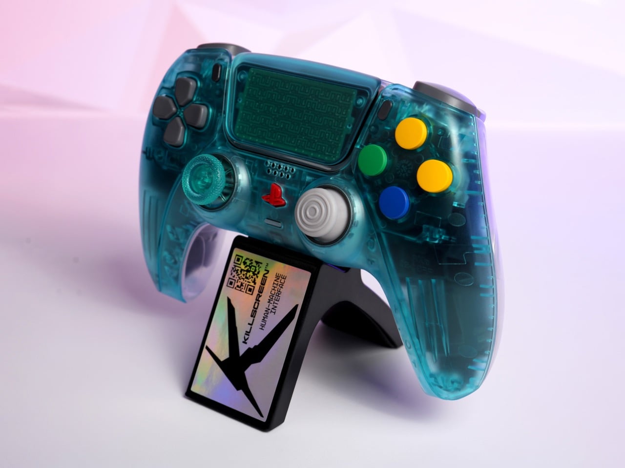
Killscreen’s N64 Funtastic-inspired Translucent Blue PS5 Controller Is Pure 1999 Nostalgia

The N64 Funtastic series was Nintendo’s most chaotic design decision, and that’s a compliment. Launched in 1999, the translucent controllers and consoles arrived at the tail end of a broader cultural moment: Apple had just cracked open the iMac G3’s candy-colored shell and shown the world that visible circuitry could be beautiful, and the consumer electronics industry was scrambling to catch up. Nintendo’s version came in six flavors, including Ice Blue, a saturated cyan-teal that looked like it had been poured directly from a Jolly Rancher mold. The controllers were transparent all the way through, which meant you could see every lever, spring, and pivot point in the mechanism. That was the whole point. Showing the guts was the product.

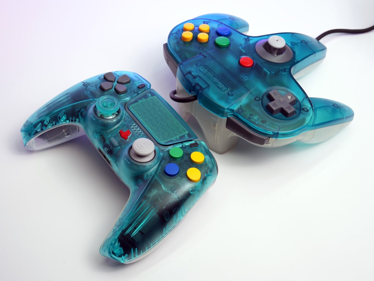
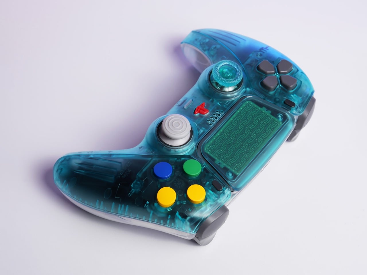
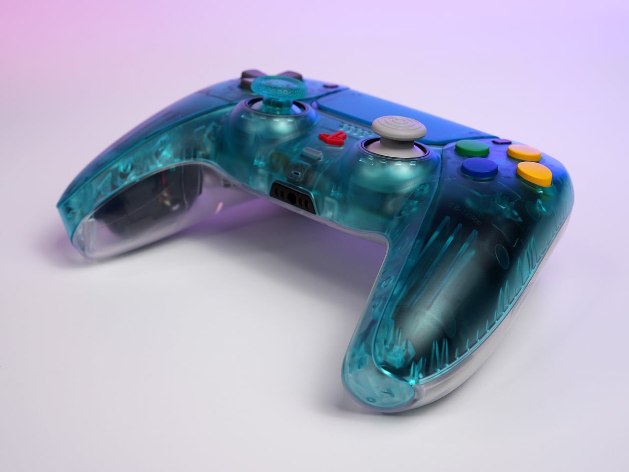
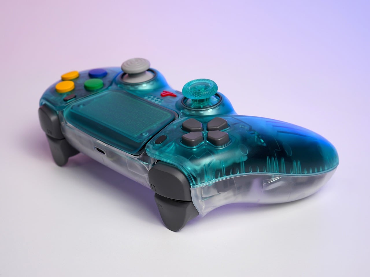
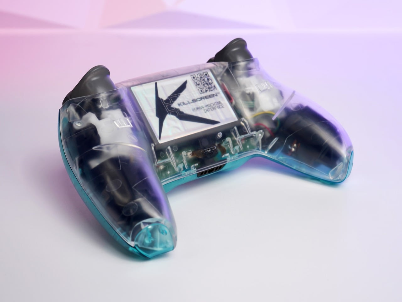
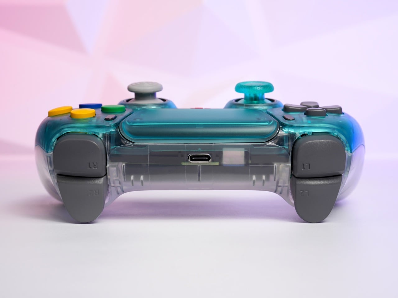
Killscreen, the Florida-based controller studio that has built its entire catalog on surgical retro revisionism, has now transplanted that exact aesthetic onto a PS5 DualSense. The Funtastic Ice Blue/Clear is a limited-edition PS5 controller with an Ice Blue translucent front shell and a crystal-clear back exposing the circuit board, wiring, and battery assembly beneath. It is native PS5 hardware, with wireless connectivity, haptic feedback, and adaptive triggers all intact. The base price is $139, with optional Omron hair triggers, mechanical face buttons, and GuliKit TMR thumbsticks available as upgrades.

Designer: Killscreen

Killscreen co-founder Erik Consorsha is upfront about the fundamental absurdity here: “There’s something slightly wrong about putting a Funtastic-style translucent controller on modern hardware. That’s exactly why we did it.” That instinct for productive wrongness is the throughline in everything Killscreen has released. The CubeSense put GameCube colorways and C-stick nubs on a DualSense. The 1080-R matched, with forensic precision, the exact gray of a factory-sealed 1995 PS1 controller, cracking one open just to get the color right. Each release is a deliberate category violation: taking an aesthetic that belonged to one console, one era, one design culture, and suturing it onto hardware from a completely different lineage. The Funtastic Ice Blue/Clear does the same thing, except the donor and recipient have never shared a design language in their lives.

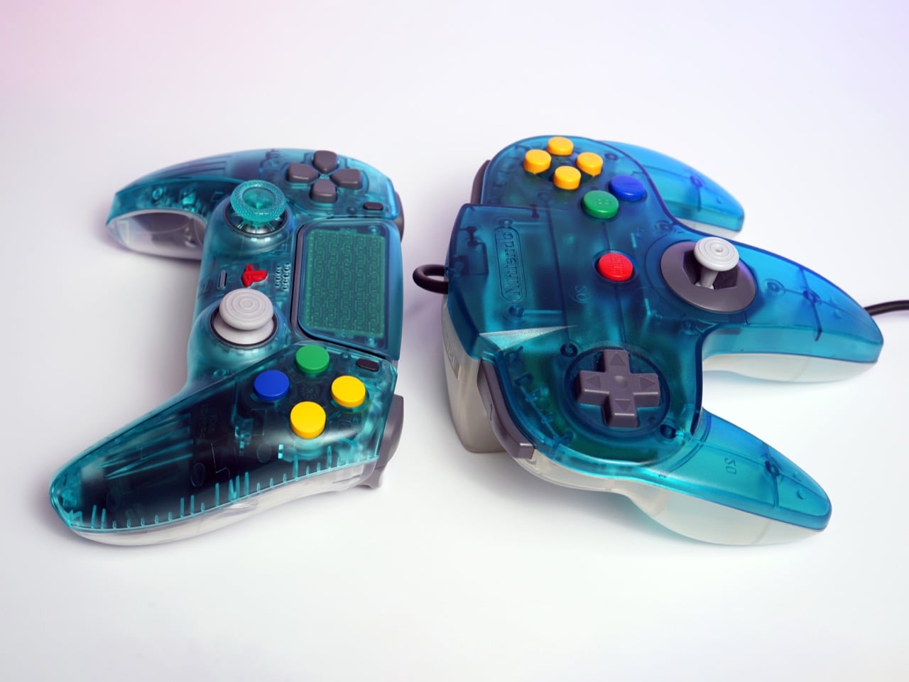
The original Ice Blue N64 Funtastic controller sits next to the Killscreen version in the press photos, and the color match is uncomfortably close. What the image also captures is 25 years of ergonomic progress in a single frame: the N64’s trident silhouette, one of the most geometrically baffling controllers ever mass-produced, against the DualSense’s precisely contoured twin-grip body. Same shade, completely different idea of what a human hand needs. The face buttons on the Killscreen controller are bright primary yellow, blue, and green, pulled from the N64’s own candy palette rather than PlayStation’s iconic shape symbols, and on a Sony controller body they read as genuinely disorienting in the best possible way.

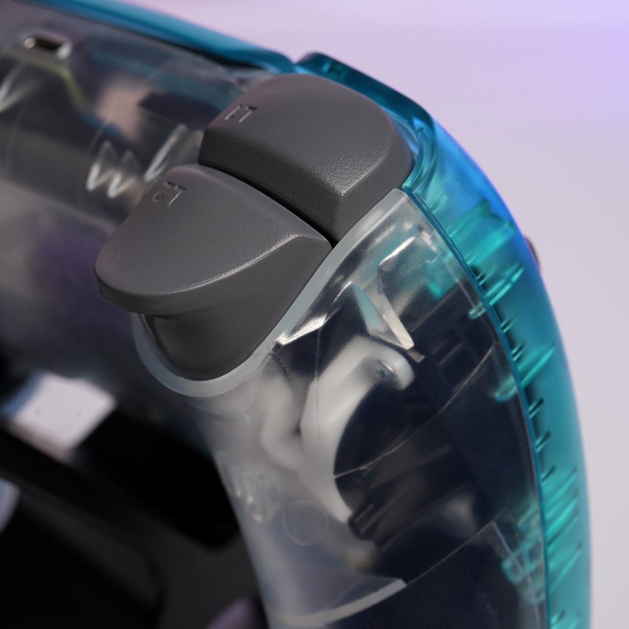
The 1999 Nintendo controllers were a single homogeneous translucent color all the way through: same Ice Blue from the front plate to the grip tips to every molded ridge. Killscreen splits the register three ways: Ice Blue translucent on the front half, crystal-clear on the rear panel, and matte gray on the trigger caps, thumbstick tops, and d-pad. That tripartite material logic is more visually considered than anything Nintendo attempted in 1999. The clear back is where the real design confidence lives: you can see the circuit board, the wiring harness in yellow and red, the USB-C port, and a Killscreen “Human Machine Interface” label on the main board. The internals are the display object.

The upgrade options change the character of the controller considerably. The base $139 configuration retains the stock DualSense trigger mechanism with adaptive resistance. Adding Omron hair triggers for $20 converts those into short-travel tactile clicks at around 2mm of travel, eliminating progressive resistance entirely in favor of on/off precision. Mechanical face buttons at another $20 swap the rubber membrane pads for microswitches, producing crisp tactile feedback more commonly associated with high-end mechanical keyboards. The GuliKit TMR thumbsticks at $39 use tunnel magnetoresistance sensors instead of traditional potentiometers, which means no contact wear and no drift. Fully specced, the controller lands at $208.

Killscreen assembles and tests every unit in-house in Florida, and the run is genuinely limited, consistent with how every prior drop has gone. The Funtastic Ice Blue/Clear is compatible with PS5 and PC. If the CubeSense and 1080-R are any indication, this one will be gone before most people finish debating whether they need it.

The post Killscreen’s N64 Funtastic-inspired Translucent Blue PS5 Controller Is Pure 1999 Nostalgia first appeared on Yanko Design.

This $37.5 Clip-On EDC Flashlight Does Something a $200 Olight Still Cannot… Measure Distances

The humble flashlight is older than you probably think. The first handheld electric torch was patented in 1899, and for the better part of 127 years, the core concept barely changed: battery, bulb, switch, done. LED technology gave it a serious brightness upgrade. Rechargeable cells made it more practical. But the fundamental experience of using a flashlight, including that moment of blind faith when you click it on and hope the battery cooperated, stayed remarkably unchanged. Until now, apparently.

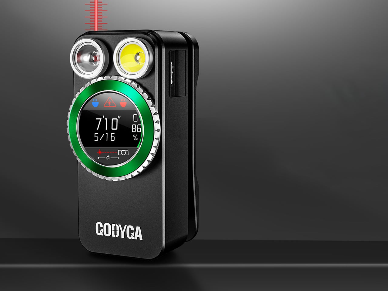
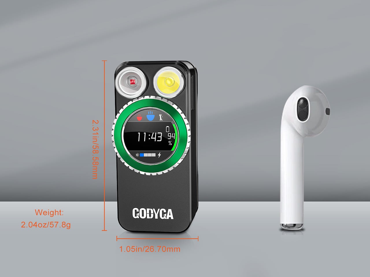
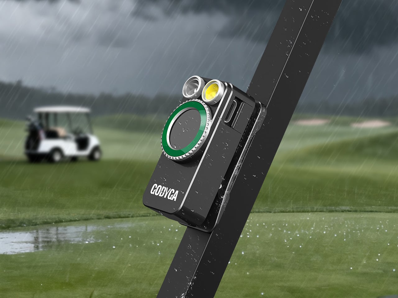
GODYGA (pronounced Go-dee-ga) has taken the flashlight’s first real swing at becoming a smart device with the TorchEye X1, a clip-on EDC light that combines a full-color smart display, precise battery management, and a laser distance measurement tool in a package that fits on a jacket lapel. It looks like something a concept designer dreamed up after spending too long staring at luxury dive watches. It also genuinely works.

Designer: GODYGA

Click Here to Buy Now: TorchEye X1 – $39.99 $49.99 ($10 off, use coupon code “YANKOGDX1”) | TorchEye X0 – $30.59 $35.99 ($5.40 off, use coupon code “YANKOGDX0”). Hurry, deal ends in 48-hours!

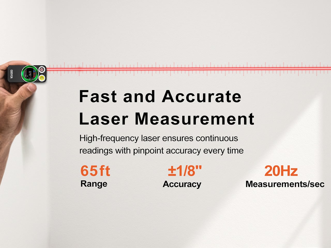
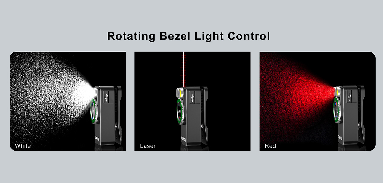
The laser distance measurement is where the TorchEye X1 separates itself from your average EDC flashlight. It fires a red beam that measures distances up to 20 meters with ±1/8 inch accuracy at 20 readings per second. That’s 20 measurements in a single second. For context, a standard tape measure requires two hands, an extra person ideally, and at least one moment of mild frustration. The TorchEye? You point, you press, and the number appears on the display before you’ve had time to question your life choices. Whether you’re figuring out if that new sectional sofa will actually fit in your living room, hanging a gallery wall without eyeballing it for the fifth time, or sizing up a workspace, this is the kind of tool that quietly earns its place in your pocket. It works best indoors on lighter surfaces, a white wall reads brilliantly, while darker or highly textured surfaces outdoors will give it a harder time, so keep expectations calibrated accordingly. There’s also a front and rear reference point mode, useful depending on whether you want to measure from the tip of the device or the back.

TorchEye X1 laser version

Flashlights have never told you anything. You click one on, it works or it doesn’t, and the only feedback is the slow dimming that tells you the battery gave up three days ago. The TorchEye’s full circular smart screen changes that entirely, displaying exact battery percentage, real-time runtime estimates per brightness mode, and a charging countdown when it’s plugged in. The screen wraps around the front face of the body and it’s genuinely striking to look at, drawing obvious visual inspiration from the dial of a luxury watch. That rotating green bezel isn’t decorative either. It clicks through brightness modes with satisfying haptic feedback, the kind of tactile interaction that makes cheap flashlight buttons feel embarrassing by comparison.

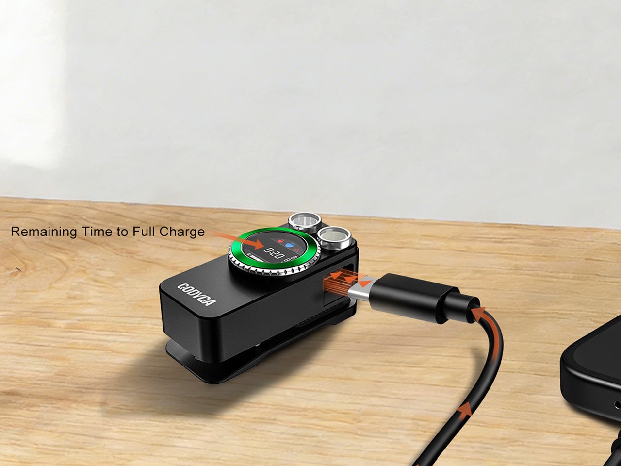
Charging is via USB-C, and you can run it straight from your phone using the included USB-C to USB-C cable. The more interesting detail is what happens when you plug it in. Most high-lumen flashlights require anywhere from 10 to 20 minutes of charging before they’ll unlock turbo mode. The TorchEye hits its full 500 lumens the instant power is connected, zero delay, which is actually meaningful in an emergency rather than just a spec sheet flex. The battery system also lets you run the light while it charges, so a dead battery doesn’t strand you in the dark while you wait.

TorchEye X0 Non-laser version

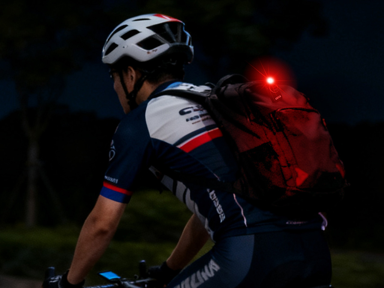
The design philosophy borrows heavily from luxury watchmaking. The rotating green bezel gives satisfying haptic click feedback as you cycle through light modes, making the whole interaction feel considered and premium rather than plasticky. The front-facing button placement is intentional too. Because the TorchEye is designed primarily to be clipped onto a jacket, backpack strap, or cap brim for hands-free use, putting the controls on the front face means they’re always reachable with a single thumb, no awkward side-button fishing required. It’s one of those small ergonomic decisions that only becomes obvious once you’ve used a light that got it wrong.

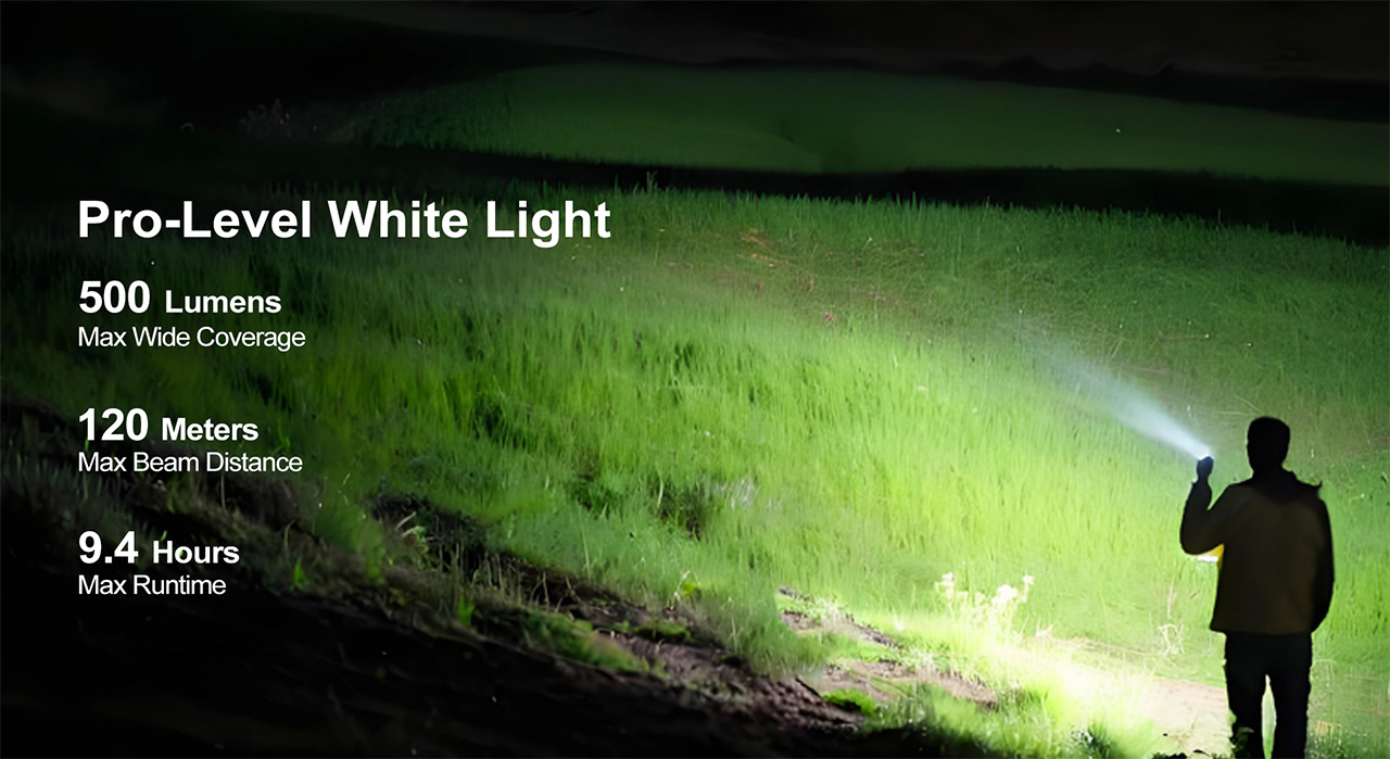
Seven brightness modes on the white LED, running from Moonlight all the way up to 500 lumens with a 120-meter throw, cover essentially every situation you’d reach for a pocket light. The red LED adds a low-impact visibility option for night walks, map reading, or any context where torching someone’s retinas with 500 lumens would be socially unacceptable. The built-in 18-hole golf stroke counter lives quietly inside the interface, accessible with a short press to count strokes and a long press to advance holes, with bezel rotation letting you review the front or back nine. If golf means nothing to you, it switches off and disappears entirely.

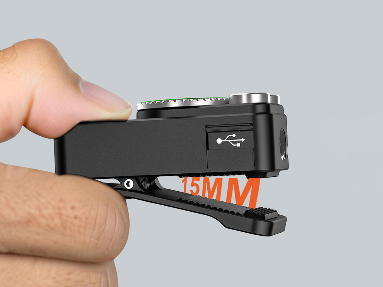
For carrying options, GODYGA gives you three: the clip for clothing and bags, a magnetic base for sticking it to any metal surface, and a lanyard loop for wrist or bag attachment. And tucked inside the interface, almost as a delightful easter egg, is a built-in 18-hole golf stroke counter. Short press counts strokes, long press advances holes, bezel rotation lets you review front and back nine. Golfers will love it. Everyone else can turn it off and forget it exists.

The TorchEye X1, the version with laser distance measurement, is priced at $39.99 on Amazon. If the distance tool isn’t something you’ll reach for regularly, the TorchEye X0 carries all the same smart screen and lighting features for $30.59. Both are worth every dollar for what they pack in. GODYGA has built something that makes the humble pocket flashlight feel genuinely exciting again, which brings us full circle to that 1899 patent, and the very long time it took for someone to finally do this.

Click Here to Buy Now: TorchEye X1 – $39.99 $49.99 ($10 off, use coupon code “YANKOGDX1”) | TorchEye X0 – $30.59 $35.99 ($5.40 off, use coupon code “YANKOGDX0”). Hurry, deal ends in 48-hours!

The post This $37.5 Clip-On EDC Flashlight Does Something a $200 Olight Still Cannot… Measure Distances first appeared on Yanko Design.

Google Pixel 11 Pro Fold Leaks Early With a Familiar Design and One Noticeable Change

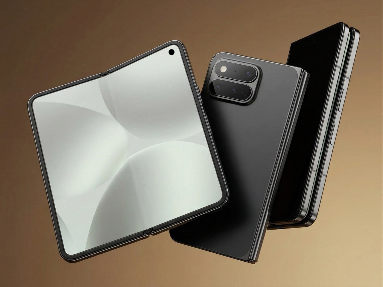
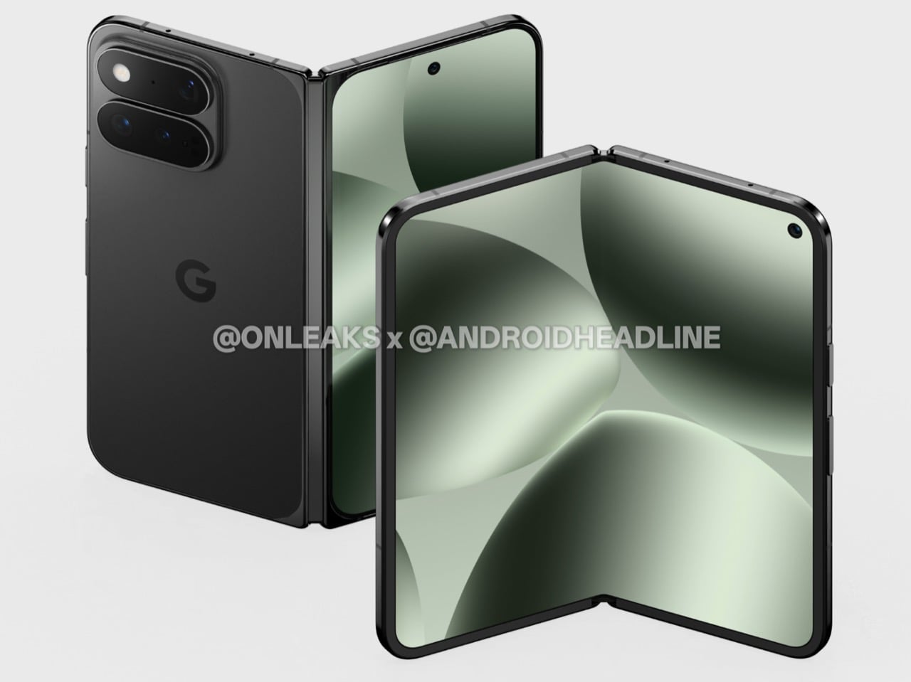
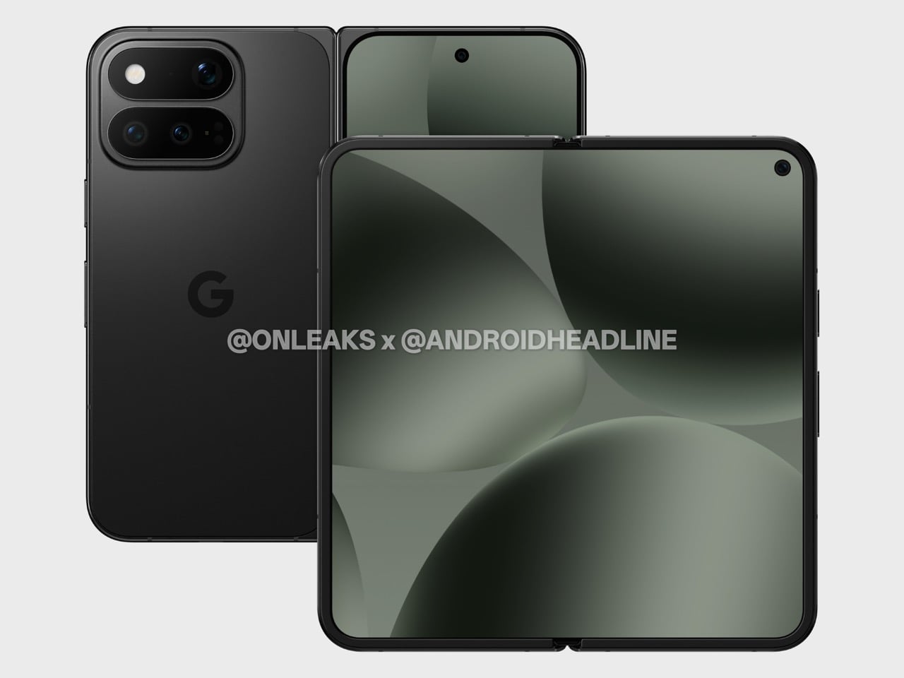
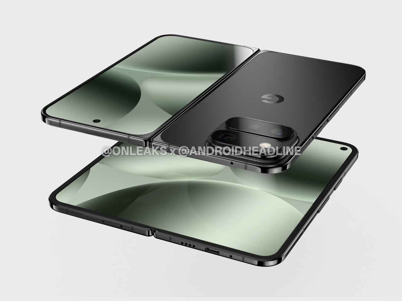
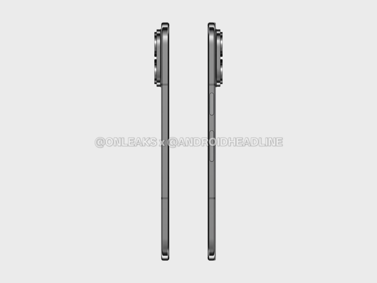
The Google Pixel 11 Pro Fold is shaping up to be exactly the phone you already know, made marginally better in the ways that are easiest to improve. CAD-based renders obtained by Android Headlines in partnership with OnLeaks offer what appears to be the first real look at the device, and they suggest Google’s foldable trajectory for 2026 is exactly what the last two years implied: the formula is set, and the job now is refinement. The front reportedly looks functionally identical to the Pixel 10 Pro Fold, same corner curvature, same hole-punch placement in the top-right of the cover display, same uniform raised bezels that double as protection for the inner screen. From the outside, you could be forgiven for not noticing the difference at all.

Flip it over and you’ll notice one fairly minor design change that differentiates this Fold from its predecessor. The camera island appears to have been reworked so the LED flash and microphone share the upper pill-shaped cutout with one of the rear lenses, rather than sitting awkwardly adjacent to everything else. The result looks like a cleaner, more coherent module, one designed with intent rather than assembled around constraints. Camera bumps are the first thing people actually see on a folded phone sitting on a table, so even a subtle improvement registers. Google reportedly kept the flat backplate, centered logo, and aluminum frame, which means the overall silhouette reads as a modest update rather than a rethink.

Designer: OnLeaks for AndroidHeadline

Based on CAD measurements, the Pixel 11 Pro Fold would drop from 10.8mm to 10.1mm folded, and from 5.2mm to 4.8mm unfolded, while height and unfolded width stay exactly the same at 155.2 x 150.4mm. Several Android foldables are already sitting below 9mm folded, so even if these numbers hold, the Pixel would still have ground to make up against its direct competition. That said, 0.7mm less in your pocket is 0.7mm less, and the projected unfolded profile at 4.8mm would be genuinely slim for a device with this much glass in it. The thinning happens entirely in depth, which means the familiar footprint would stay intact for existing Pixel Fold users considering an upgrade.

The Tensor G6 is expected as the headline spec upgrade, reportedly manufactured by TSMC on a 3nm process and possibly running a 7-core configuration, though that last detail is particularly unverified. The more interesting rumored hardware story is the cameras. The Pixel 10 Pro Fold shipped with a setup that sat below the Pixel 10 Pro in several respects, including an inferior ultrawide, which was a strange position for a $1,799 device. Google is rumored to be course-correcting here, possibly borrowing hardware from the Pixel 10 Pro lineup, though no confirmed specs have surfaced. The pressure is real regardless, given where Samsung and others have pushed foldable camera systems over the last cycle.

Google’s internal roadmap had reportedly targeted $1,500 for the Pixel 11 Pro Fold, but tariffs and rising memory costs have apparently complicated that figure considerably. The Pixel 10 Pro Fold launched at $1,799, and if current market conditions hold, the new model could land at or above that number. The Galaxy Z Fold 7 sits at $1,999 and the new Motorola Razr Fold is at EUR 1,999, so premium foldables have settled into a price tier that treats four figures as a floor. Battery, display sizes, IP68 resistance, Pixelsnap and Qi2 wireless charging are all expected to carry over, meaning there are no obvious additions to justify a steep price increase, just refinements. August 2026 is the rumored launch window, consistent with Google’s last two announcement cycles.

The Pixel 10a reportedly followed the Pixel 9a playbook with minor tweaks, and the Galaxy S26 Ultra’s biggest change was its display. Incremental releases have become the dominant mode across flagship Android, and if these leaks are accurate, the Pixel 11 Pro Fold fits that rhythm without apology. Whether that reads as frustrating or reassuring probably depends on how you felt about the Pixel 10 Pro Fold, because this device looks built squarely for people who wanted that phone to be slightly thinner with a better camera story.

The post Google Pixel 11 Pro Fold Leaks Early With a Familiar Design and One Noticeable Change first appeared on Yanko Design.

This Ergonomic Mouse Tracks Your Heart Rate, Telling You To Take A Break Before You Experience Burnout

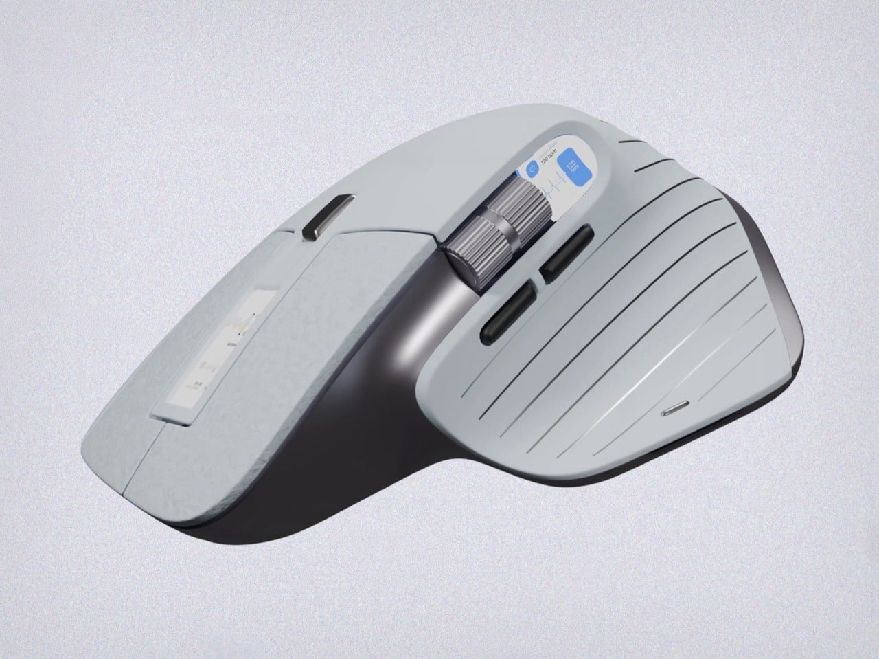
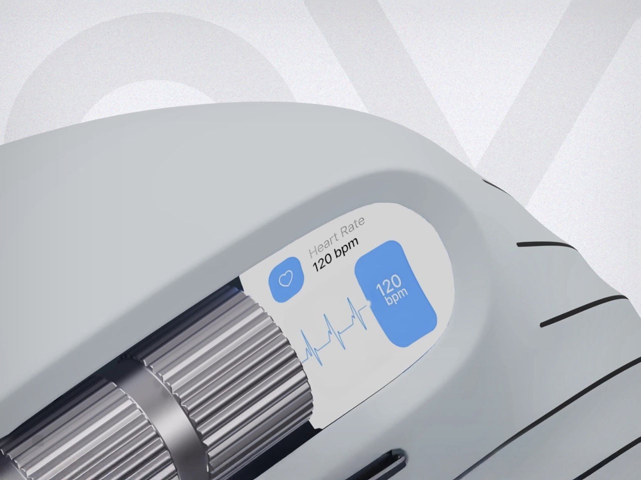
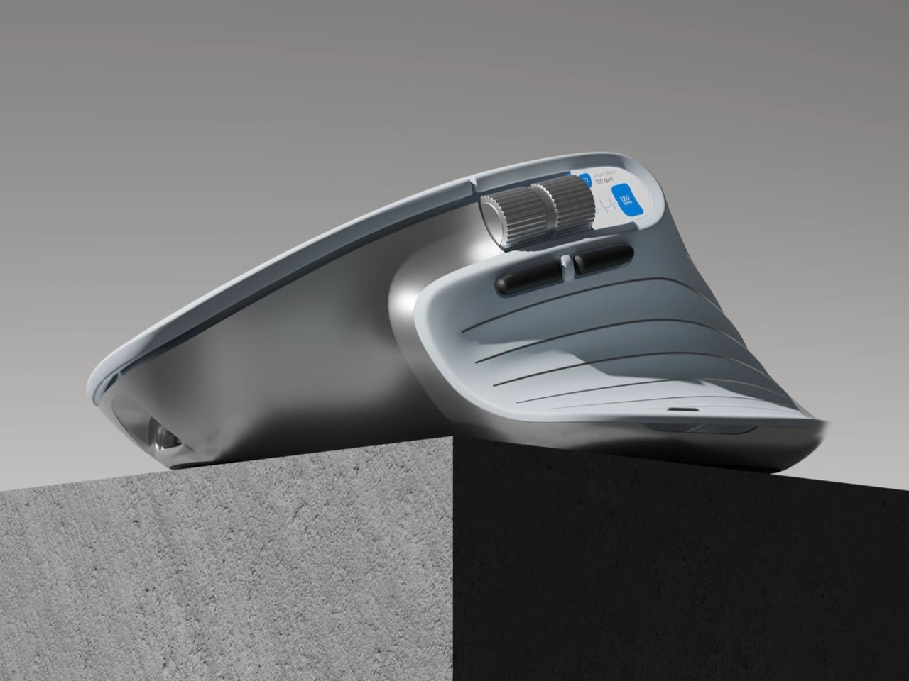
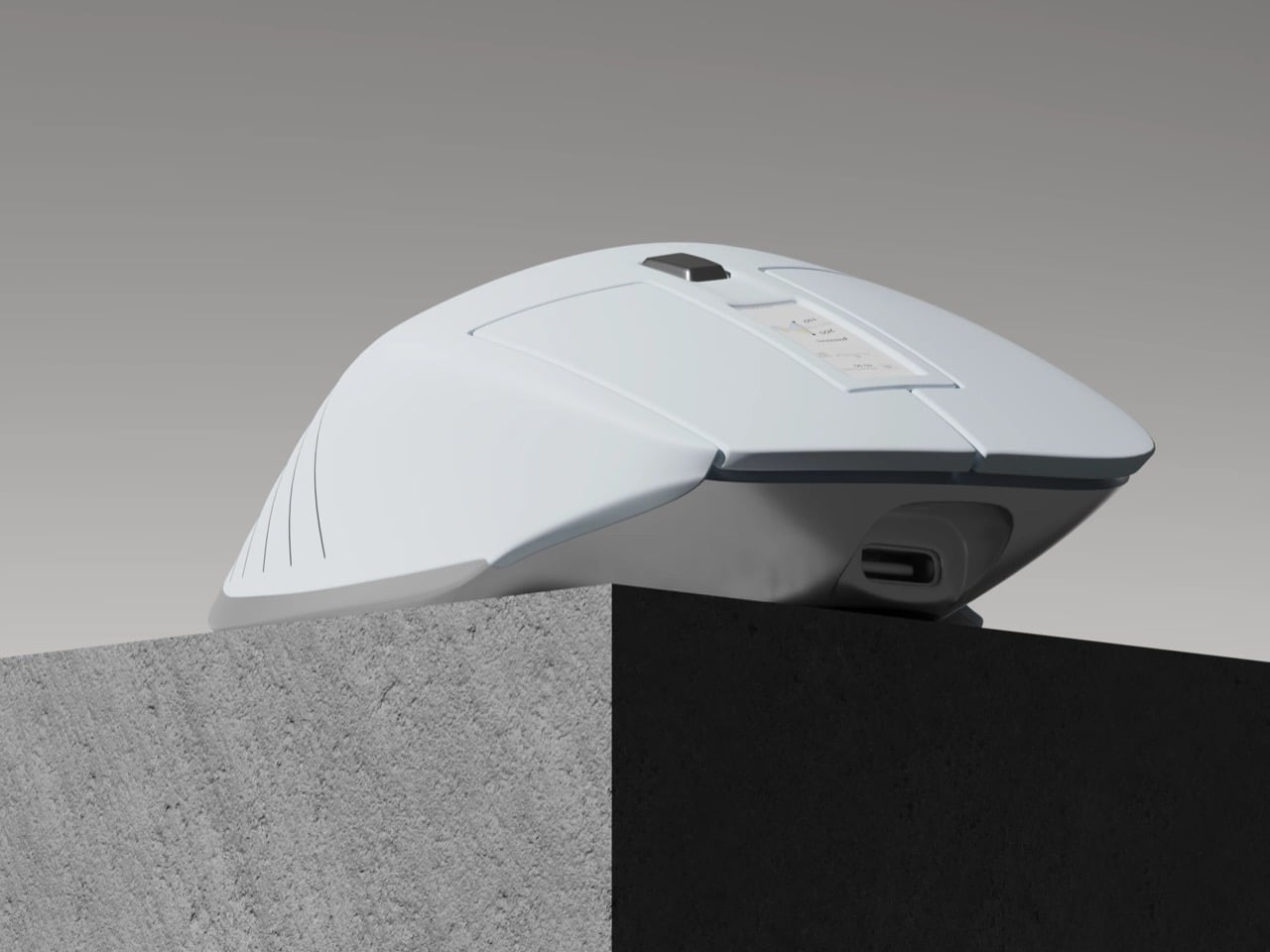
Imagine if your mouse was also your stress ball. Okay, not exactly, but while a stress ball helps you calm your nerves after a rather cortisol-filled day, the CalmiX mouse helps you keep track of your stress levels by packing a heart rate monitor right inside the mouse. Designed with sensors along the mouse’s ergonomic body, this part-peripheral-part-health-device keeps track of your heart rate, displaying it on a tiny screen on the side.

Would such a device be even remotely useful? Well, designer Julius Münzenmaier notes that 41% of employees worldwide feel some sort of stress. Even in the EU, with their worker-friendly office setups, around 27% of people say they feel some sort of stress while working. That’s where something like the CalmiX comes in. Designed as an entry for the RIMOWA Design Prize, Calmix is an ergonomic mouse that also doubles as a fitness wearable. I use the term wearable extremely loosely here, because you don’t really wear a mouse, but your hands rest on it for such long sessions it might as well just be as good as one.
Designer: Julius Münzenmaier

The CalmiX’s design looks a lot like Logitech’s MX Master 3s, complete with the form factor, buttons on the side, and the scroll wheel just above the thumb-rest. The two notable differences are that this one lacks a main scroll wheel, replacing it with a haptic scroll surface on the top, and packs a tiny display on the side, right beside the lateral wheel. Equipped with high-precision sensors and a low-energy processor crunching data from said sensors, the CalmiX tries to be a productivity device that also keeps you in the loop regarding your stress levels at work.

The mouse lets you know your heart rate in real-time, allowing you to sense spikes in tension or stress while work. While the mouse won’t do anything to calm you down, it does let you know when to step back and maybe take a break from work. Stress is a silent killer and there’s really no shortage of it at work, what with AI taking over and layoffs just being the new norm. If you’re going to spend 10 hours in front of a screen, CalmiX makes sure that most of those hours aren’t spent in pangs of anxiety.

It wouldn’t really be a smart device without an app to go with it. There’s a CalmiX app envisioned to work alongside the mouse, capturing historical data on your heart rate throughout the day, presenting it on a dashboard for you to look at how your body reacts to stress. You can use the dashboard to “Track real-time stress, spot daily patterns, get personalized micro-breaks and breathing exercises, receive smart pause reminders, and view summary reports to optimize your workflow,” Julius mentions.

The post This Ergonomic Mouse Tracks Your Heart Rate, Telling You To Take A Break Before You Experience Burnout first appeared on Yanko Design.