HOVERAir: World’s First 8K Flying Action Camera fits in your pocket and operates without a remote

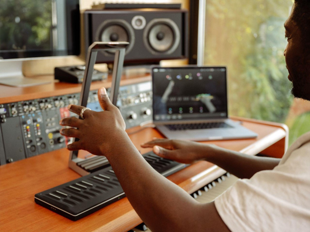
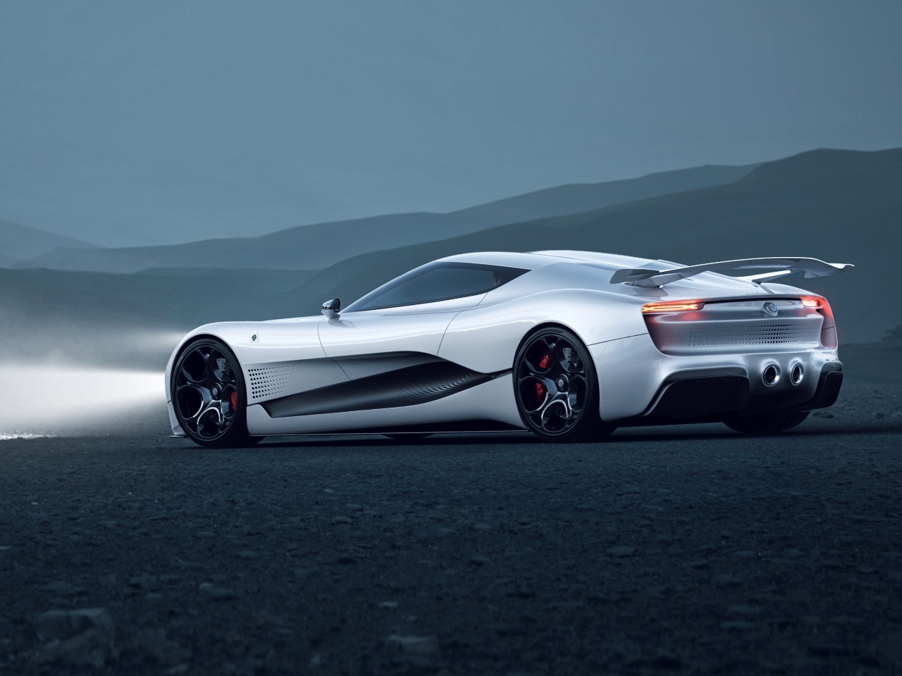
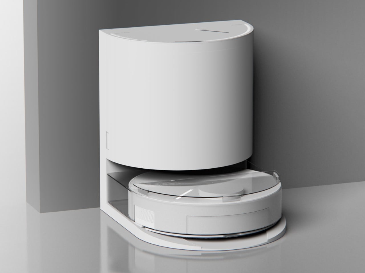
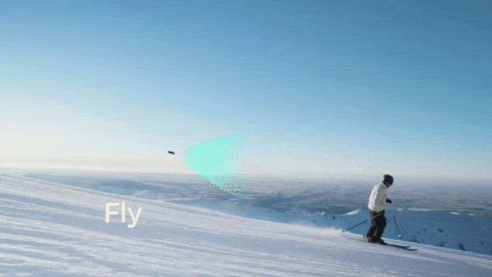
Your phone has a pretty phenomenal camera, but unless it’s an absolute flagship device, it probably won’t record 8K video. And it for sure won’t fly around in the air taking dramatic shots of you while you pose on the top of a mountain or dirt bike on a rocky trail or dive into a lake. You’ll probably need a selfie drone for that, but before you go spending hundreds of dollars on a drone that’s fragile, expensive, and comes with a massive learning curve involving controllers and joysticks, the folks at HOVERAir might have built the perfect consumer-grade pro drone, or as they call it – a flying action camera. Designed to be foldable, small enough to fit in your pocket, and durable enough to withstand any rookie accidents The HOVERAir X1 PROMAX still packs a state-of-the-art flying system and an 8K camera capable of outshining any other drone its size. It works on voice commands (but also comes with an optional Wi-Fi 6-enabled Beacon), takes off from your palm, reaches speeds of up to 60 km/h (37.2 mph), can capture slow-motion videos at 120fps, and even works in sub-zero temperatures just in case you want to film yourself skiing or snowboarding. The best part, the X1 PRO’s $499 starting price, along with its compact size which makes it compliant with FAA guidelines so anyone can use one.

Designer: HOVERAir

Click Here to Buy Now: $499. Hurry, only 30 left! Raised over $4.6 million.

You may remember HOVERAir from years ago when they first debuted their folding selfie-drone cameras. More than 8 years later, the company’s still sticking to its wildly popular and innovative folding drone template, but has managed to outfit its device with some very impressive tech. Available in two variants – the X1 PRO and the X1 PROMAX, these flying action cameras are capable of recording at 4K and 8K respectively. Both devices weigh under the FAA-regulated 250-gram limit, hit speeds of 42 km/h (26mph) with bursts of up to 60 km/h (37.2mph), shoot slow-mo, take photos, and also capture vertical videos for social media. The X1 PROMAX just packs a slightly better camera system that has a marginally higher FoV at 107° (compared to the X1 PRO’s 104° FoV), and uses vision-based sensors for rear active collision detection. Think of the X1 PRO as the perfect hands-free drone for filming sports, landscapes, and your dance reels, while the X1 PROMAX just being a notch higher for serious professionals and content creators who also want great photography capabilities in their drone. No controllers, no learning curve, no fuss.

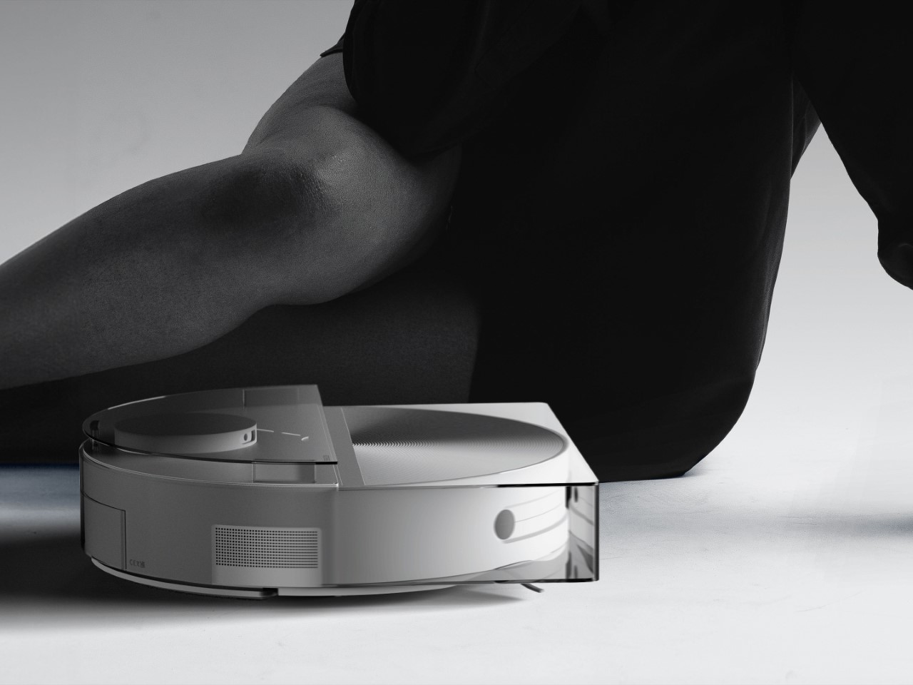
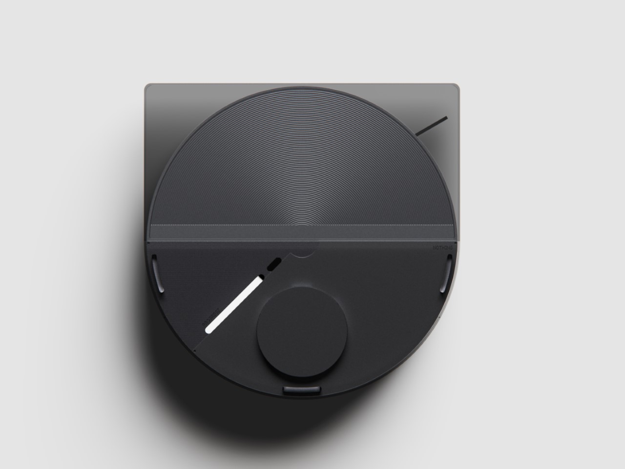
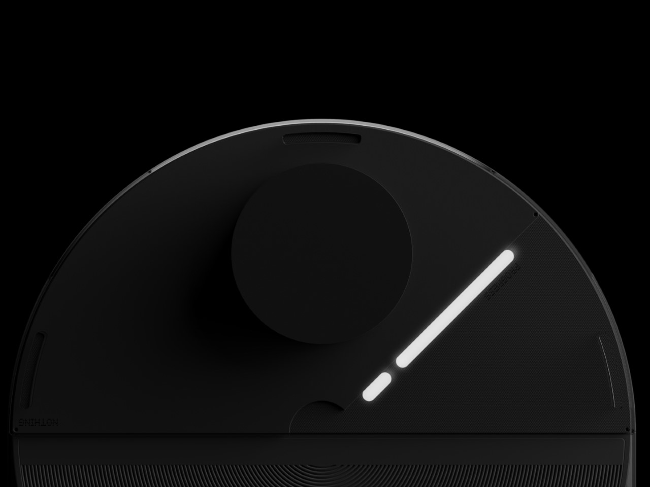
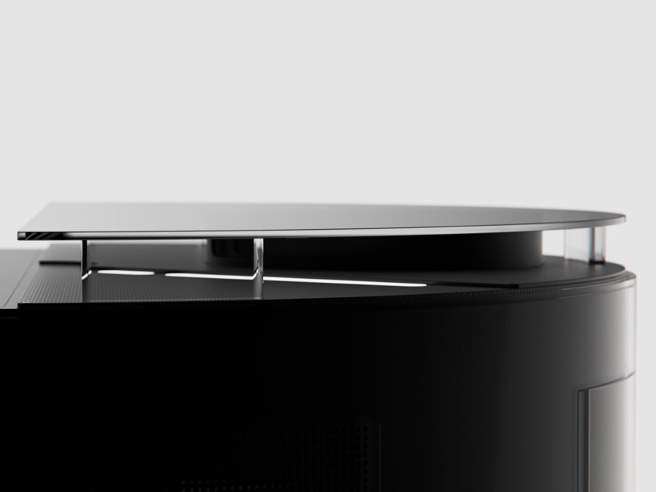
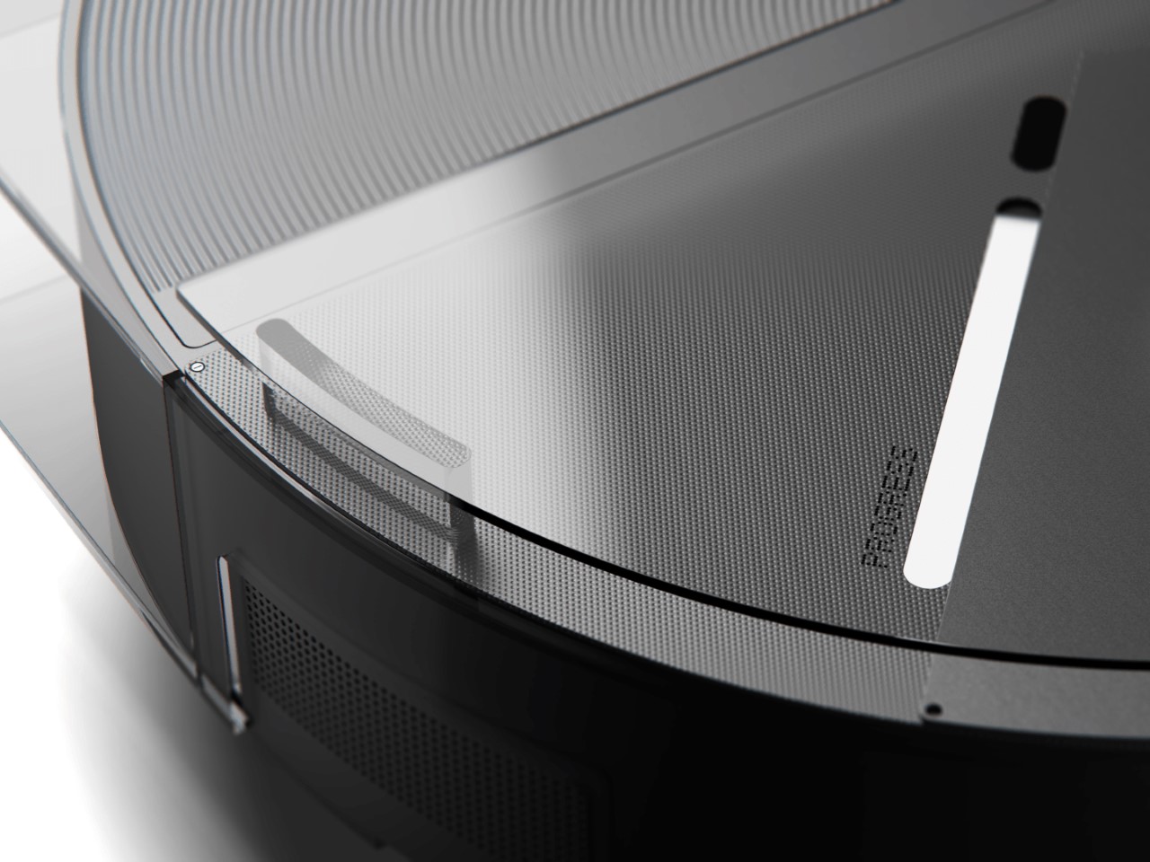
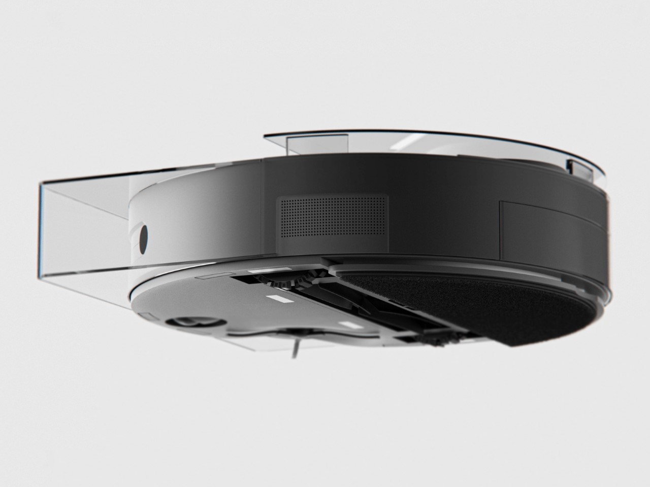
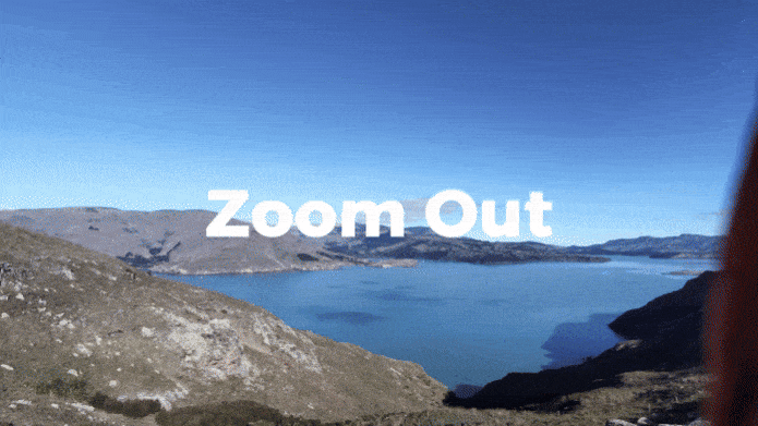
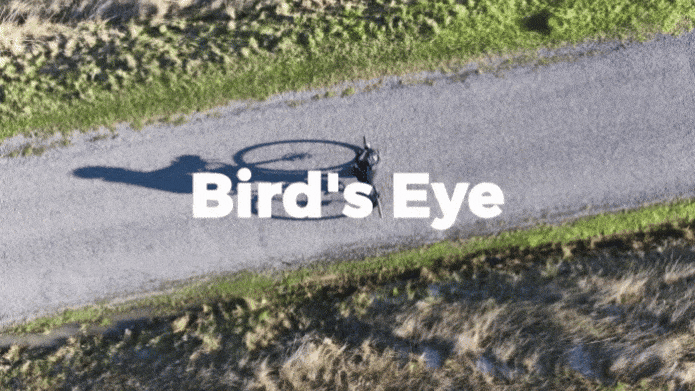
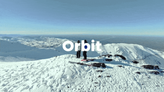
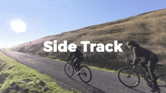
The X1 PRO and PROMAX’s design remains their strongest selling point. The flying action camera opens and closes like a book, with a camera and battery system in the ‘spine’, while the four propellers sit on either side, enclosed within a flexible, durable cage-like structure made from cutting-edge HEM materials to protect them from damage during transit or flight. To use the selfie drone, open it up and you’re ready to hit the skies. The X1 PRO and PROMAX operate on voice commands, but for more expert and intuitive tracking, HOVERAir designed a hardware Beacon that packs controls, tracking sensors, and a screen for viewing your flying action camera’s PoV. There’s no traditional remote, although the Beacon transforms into one using a series of modules like a Joystick for motion control and haptic feedback, or even the ability to snap on your smartphone to give you a true RC experience with a drone’s PoV preview. In short, the drone will fly on its own and play cinematographer to all your stunts, but if you want to get behind the ‘wheel’, it’s more than happy to relinquish control. However, if you’re looking to have your flying action camera perform a set of standard flight paths, the X1 PRO and PROMAX’s automated flight modes let you choose from in-built settings like Hover, Zoom Out, Bird’s Eye, and Orbit that capture dynamic cinematic moments, or Follow, Side Follow, and Dolly Track which are better suited for action shots. HOVERAir also plans to add more modes through OTA updates.

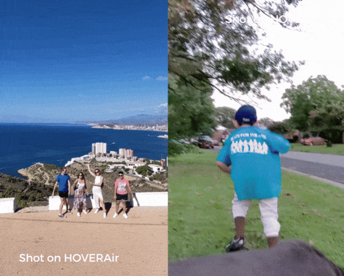
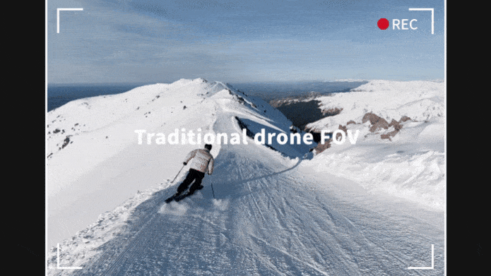
Of course, all of this ease of use wouldn’t matter much without an impressive camera. Fortunately, the HOVERAir X1 PRO delivers on that front too. Its 17mm wide-angle lens offers a generous 104° field of view, letting you capture expansive vistas and unique angles that would be impossible from the ground. The X1 PRO can shoot in 1080p at 120 frames per second, making it perfect for those stunning slow-motion shots. Want to take things even further? Enter the X1 PROMAX, which ups the ante with 8K resolution, 4K@120fps slow-motion, and a 107° FoV, giving you the tools to create breathtaking cinematic footage. The PROMAX model also introduces an extra vision-based sensor for rear active collision detection, adding an additional layer of protection when you’re flying in tight or unpredictable spaces – ideal for those moments when you’re pushing boundaries (and maybe your luck).

The PRO and PROMAX both have a two-axis gimbal with EIS (electronic image stabilization) and HL (horizon leveling), so your footage will be rock steady even when the adventure is rough.

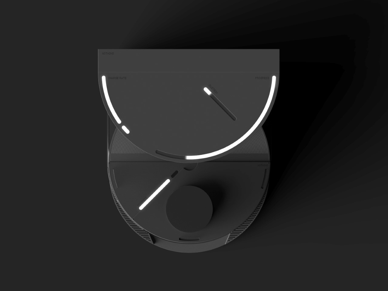
When it comes to camera drones, stability is everything. No one wants shaky footage from a breezy afternoon at the beach or during a fast-paced tracking shot through a forest trail. The HOVERAir X1 PRO and PROMAX rise to the challenge with built-in video stabilization that they call SmoothCapture 2.0. A two-axis gimbal with EIS (electronic image stabilization) and HL (horizon leveling) kicks in while the drone’s in flight, allowing you to focus on capturing the scene rather than compensating for jitters. For more accurate honing in on your subject, you’ve got the HoverAir Beacon, a nifty add-on that clips onto your handlebar while you’re riding, allowing you to quickly see the flying action camera’s PoV while also giving it a target it can track. This companion device unlocks live previews and expanded control options, transforming your flying experience into something closer to autonomous filmmaking. The Beacon uses HoverLink™ Technology for ultra-precise tracking, so you can leave the steering to the X1 PRO or PROMAX and focus on getting the shot.

Once you’ve filmed your shot, Wi-Fi 6 integration ensures your aerial masterpiece doesn’t stay stuck in the device’s memory. Quick file transfers mean you can start editing almost immediately after landing. Plus, the selfie drone’s long-range video transmission of up to 1 km (with the Beacon) lets you explore and shoot from afar, capturing wide-open landscapes or large events without sacrificing video quality. It’s the kind of feature that makes you feel like the director of your own blockbuster.

Beyond the camera and flight smarts, the Hover X1 PRO is built to be a winning combination of portable and durable. The foldable design doesn’t affect the drone’s ability to fly with great dexterity, and even with those collision-prevention mechanisms in place, the X1 PRO and PROMAX can dust off mild bumps and accidents thanks to a flexible, shock-absorbing propeller cage. And then there’s the thrill of taking this thing off-road—literally. The X1 Pro’s Omni terrain capability makes it versatile enough to fly over lakes, through snowy forests, or along cliff edges with ease. It adds a whole new layer of adventure to your flights. The control system adapts right along with it, allowing you to turn the Hover Beacon into a one-handed joystick or opt for the more traditional two-handed smartphone setup. Either way, it adjusts to how you want to fly and where you’re flying.

You can either fold the device and carry it around in your pocket when not in use, but HOVERAir also makes a slick leather carrying case to haul your compact aerial camera around wherever you go. However, if you’re looking for an upgrade, HOVERAir’s even designed a PowerCase, which both houses your flying action camera and even supplements it with up to two additional battery charges. Designed specifically for use in extreme cold weather, the PowerCase works at temperatures even as low as -4°F (-20°C) to keep your device charged and ready for flight. Of course, flying your drone in sub-zero temperatures is yet another challenge, which is why HOVERAir even sells a special ‘Thermo Battery’ that you can fit into either the X1 PRO or X1 PROMAX, giving it an operating temperature range of -4°F to 113°F.

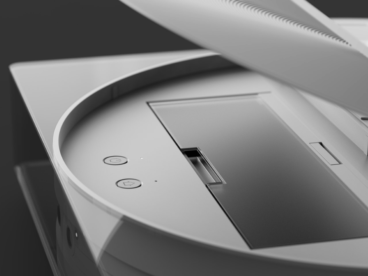
Both the HOVERAir X1 PRO and PROMAX come with built-in 64GB storage, upgradable up to 1TB thanks to an SD card slot located on the flying action camera’s body. The X1 PRO and PROMAX run in conjunction with the HOVERAir X1 app, which allows you to configure flight modes, download and share content, launch manual control, and even install firmware updates on your flying action camera. The app offers a transmission range of 500m, while the Beacon bumps it up to an entire kilometer. You can grab the X1 PRO and PROMAX either as standalone devices, or opt for cycling or skiing combos that include the leather carrying case, PowerCase, Thermo Battery, the Beacon, or the modular accessories that turn the Beacon into a joystick. The X1 PRO and PROMAX have already begun shipping as of end-September with a 12-month warranty, and the batteries get a 12-month warranty too (applicable up to 100 cycles).

Click Here to Buy Now: $499. Hurry, only 30 left! Raised over $4.6 million.

The post HOVERAir: World’s First 8K Flying Action Camera fits in your pocket and operates without a remote first appeared on Yanko Design.

Waterdrop ED01’s Portable Electric Filter Pitcher gives you Pure Drinking Water in Under 1 Second

You fill a glass from the tap, the water looks clear enough, and you take a sip without thinking twice. But do you really know what’s in that water? Hidden beneath its transparency are impurities you can’t always see—chemicals, metals, microorganisms, etc. We assume the tap is fine because it’s what we’ve always done. But why settle for “good enough” when you could have water that’s visibly, undeniably clean? That’s the idea behind Waterdrop’s ED01 Electric Water Filter Pitcher. It’s not just about filtration; it’s about transparency—literally. The water-purifying pitcher itself is crystal clear, so you see exactly what you’re pouring into your glass. No more guessing, no more second thoughts. And the best part? Being able to carry your ED01 around from room to room instead of having to walk to the kitchen or your wall-mounted purifier every single time you need a glass of water. Whether you’re working at your desk, lounging on the couch, or prepping a meal, this sleek pitcher follows you, offering fresh, purified water wherever you need it. Clean water, on your terms.

Designer: Waterdrop

Click Here to Buy Now: $37.23 $57.19 (31% off on Amazon). Get an extra 5% off with coupon code ‘YDreader’. Hurry, deal ends in 24 hours!

The Waterdrop ED01 is a remarkably portable water filter pitcher, designed to give you clear water wherever you go. The pitcher itself holds 3.5 liters (or 15 glasses worth) of water in it at any given point in time, with a one-touch dispenser that automatically filters and dispenses water directly into your bottle or glass. At 10.2 inches in height, it’s compact enough to even slide right into your fridge, giving you the added advantage of crisp, chilled drinking water at the push of a button.

Even though its transparent design is arguably its most eye-catching feature, the real beauty of the Waterdrop ED01 is what you don’t see—the advanced filtration happening behind the scenes. Sure, we all want clean water, but most of us don’t give a second thought to what’s actually in that water. With a single-button dispensing system, this pitcher does the heavy lifting of purifying for you on demand, removing bacteria, heavy metals, chemicals, and other contaminants you don’t want in your body. And it does so instantly, meaning you’re not just getting water that’s filtered—you’re getting water that’s as fresh as it can possibly be. Compare that to traditional gravity-fed systems, where the water can sit around for hours, potentially growing germs or losing its crisp taste.

Waterdrop’s electric filter pitchers provide instant filtration too, at a stunning 0.8 liters a minute compared to gravity water filters that take nearly 4x as long. All you do is hit the water drop icon on top and the ED01 gets to work. Water passes through a 5-micrometer filter that traps and removes over 30 harmful contaminants like chlorine, PFOA/PFOS, lead, benzene, mercury, while even trapping molecules that give some types of water a bad odor or taste. It doesn’t reduce the water’s TDS count, which you may want to take care of if you’ve got high-TDS tap water in your neighborhood – that’s where RO filtration systems are required, although RO systems are traditionally a lot bigger and bulkier than the ED01’s sleek water filter design.

The cartridge-based filters are easy to install and even swap out. Sort of like installing a big battery, the cylindrical filter cartridges slide in and slide out, making replacement a breeze. Each cartridge is good for up to 200 gallons of water or 1600 bottles, lasting anywhere between 4-6 months based on your water consumption. The ED01’s built-in battery has a 30-day life too, so you only ever need to recharge the thing once a month.

The ED01’s portable design and built-in handle mean you can carry your water purifier around with you – reducing your dependency on single-use water bottles. Whether you’re at home, at work, or out in nature, the ED01 has your drinking water needs sorted. Going on a camping trip? No need to haul around a bunch of bottled water when you can just bring the ED01 along and get fresh, filtered water from any available source. Living in a small apartment? The compact size won’t take up much counter space, and the clean, minimalist design ensures it won’t clash with your décor. The minimal, all-clear design adapts to your decor, and the compact form factor to your lifestyle, offering you the flexibility and freedom to get clean water wherever you are. You don’t realize how much you rely on something as simple as good, clean water until you have a product that makes it this easy to access.

Click Here to Buy Now: $37.23 $57.19 (31% off on Amazon). Get an extra 5% off with coupon code ‘YDreader’. Hurry, deal ends in 24 hours!

The post Waterdrop ED01’s Portable Electric Filter Pitcher gives you Pure Drinking Water in Under 1 Second first appeared on Yanko Design.

ROLI Airwave Uses AI and Gesture Control to Transform Music Learning and Production

Think of if a Piano, a Theremin, and ChatGPT had a baby.

I distinctly remember seeing the music video for Greyhound by the Swedish House Mafia (and if you haven’t seen it I recommend you do). The video has the three members of the EDM group standing in an empty space, wearing headsets and controlling virtual objects that help them play music while also racing robotic greyhounds on salt flats. The music video released 12 years ago, but painted a very different picture of how people would make music in the future – not with instruments, but rather with gestures. Today, the folks at ROLI unveiled the first step to that future in the form of Airwave – an AI-powered device that uses advanced image recognition to not only help you learn to play music, but perform music intuitively using unique gestures.

Known for its revolutionary Seaboard, ROLI broke away from traditional keyboards by enabling musicians to explore the microtonal spaces between notes, opening up a vast universe of expressive possibilities. Now, with the Airwave, ROLI is set to disrupt the industry again—this time, by using AI to transform how people learn to play music.

For decades, aspiring musicians have been limited to traditional learning methods like in-person lessons, online courses, or YouTube tutorials. While each of these has its strengths, they often lack real-time, personalized feedback that adapts to the learner’s unique progress. ROLI’s Airwave, powered by its Music Intelligence (MI) platform, changes this dynamic by acting as a bridge between instrument and instructor. It introduces a new era of “intelligent pianos” that use cutting-edge AI, vision, and voice technologies to offer a truly immersive learning experience.

Designer: ROLI

“Music learning and playing have been far too difficult for too long: intimidating, expensive, and one-size-fits-all,” said Roland Lamb, CEO of ROLI. “With recent advances in computer vision and AI, we are finally able to innovate beyond the keys and bring this human-centric technology to music learners and creators alike.”

The Airwave works by utilizing 3D infrared cameras that, together with ROLI’s new Vision technology, can “see” your hands as they move across the keyboard, capturing intricate finger movements and gestures. This allows the system to offer highly personalized feedback based on precise tracking of your playing technique. Whether you’re a beginner struggling with finger positioning or an advanced player fine-tuning your dynamics, Airwave adjusts its guidance to match your skill level.

At the heart of this breakthrough is ROLI’s MI platform, which incorporates five key sensory technologies—sound, sight, touch, vision, and voice. These allow Airwave to not only track your hand movements but also respond to voice commands. Ask it to show you a chord, suggest a new piece to learn, or even guide you through tricky sections of a song. This transforms the learning process into an interactive, conversational experience that feels less like traditional lessons and more like having a personal music coach at your side.

The magic really comes alive when Airwave is paired with ROLI’s Piano M (formerly known as LUMI Keys). The Piano M’s light-up keys combined with Airwave’s real-time feedback make for a compelling, intuitive learning environment. Players can practice essential elements of piano technique such as posture, hand positioning, rhythm, and harmony, all while getting immediate, adaptive feedback. This system effectively builds better habits and speeds up the learning curve without the need for constant human instruction.

On the creative front, Airwave doesn’t stop at teaching—it’s also a powerful tool for composers and performers. Its gesture-based controls allow musicians to manipulate sound in novel ways. With a simple hand raise or wrist tilt, you can shift from a piano to a symphonic ensemble, blending different tones and effects in real-time. Marco Parisi, a renowned musician and producer, emphasized the revolutionary potential of Airwave: “Every movement and gesture creates a new sound unique to the musician. It will make music much more expressive and could even lead to new genres of music”.

Airwave is now available for pre-order, setting the stage for a new AI-powered era in human-led music technology. Whether you’re a budding musician looking for a smarter way to learn or a seasoned creator in search of fresh expressive possibilities, ROLI’s latest innovation promises to redefine what’s possible with music.

The post ROLI Airwave Uses AI and Gesture Control to Transform Music Learning and Production first appeared on Yanko Design.

Alfa Romeo Ascension GT Concept: A Bold Fusion of Heritage and Future-Driven Design

The Alfa Romeo Ascension GT concept by Ugur Sahin Design doesn’t just sit on four wheels—it prowls, waiting for the moment it can spring to life. There’s a presence about this car, a sense that it’s constantly in motion even when it’s at a standstill. With a form that seems to defy the rules of traditional automotive design, it’s a machine sculpted to evoke speed, aggression, and elegance all in one glance. From the sleekness of its low-slung silhouette to the carefully crafted lines that sweep over its body like a gust of wind, the Ascension GT is not merely designed; it’s engineered to make a statement. This car isn’t about following trends or catering to mainstream tastes. It’s about pushing the boundaries of what’s possible when innovation and heritage collide, creating a machine that commands attention as much as it commands the road.

Designer: Ugur Sahin Design

The first thing that grabs your attention is the way the Ascension GT’s profile hugs the pavement, with a stance so aggressive it feels like the car is ready to leap forward. Alfa Romeo’s iconic V-shaped grille is unmistakable, but here, it’s been reimagined, framed by headlights so sleek and predatory they look like they’re about to cut through the night. These aren’t mere design flourishes; every element of the car’s front end is built with purpose. The broad air intakes aren’t just for show—they’re functional, feeding air to the engine while reducing drag and cooling critical components. And then there’s the front splitter, bold and assertive, visually lowering the car to enhance its aerodynamics, making sure it hugs the road with precision even at breakneck speeds. The Ascension GT isn’t just a design statement—it’s a masterclass in balancing form and function.

As you move around the car, the attention to detail becomes even more striking. The hood, for instance, isn’t just a smooth, unbroken surface; it’s punctuated by subtle, well-placed vents that speak to the power lying beneath. These aren’t just aesthetic choices—they’re carefully engineered features designed to optimize airflow, cooling the high-performance engine while adding an aggressive edge to the car’s persona. The large, black, multi-spoke wheels take inspiration from Alfa Romeo’s rich racing history, providing a visual connection to the brand’s legacy of high-speed thrills. But they’re not just a nostalgic nod—they’re designed to amplify the car’s performance, giving it the stability and control needed when pushing the car to its limits. At the rear, the wide spoiler and integrated diffuser ensure that this car doesn’t just look fast; it delivers. Every feature, from the sweeping lines to the aerodynamic components, works in harmony to create a machine that’s both visually stunning and mechanically superior.

Underneath its sculpted exterior, the Ascension GT is a machine engineered for enthusiasts who demand more than just speed. It’s about the experience — from the roar of the engine to the way the car grips the asphalt at high speeds. This is a vehicle designed to stir emotions, one that captures the essence of driving at its purest form. The large wheels, aerodynamic features, and attention to weight distribution all work together to create a car that is as thrilling to drive as it is to behold.

The name Ascension GT perfectly encapsulates its design philosophy. “Ascension” signifies a leap forward, an elevation in design, performance, and driving experience. It speaks to Alfa Romeo’s vision for the future, where every new model reaches new heights, not just in terms of performance but in the entire driving experience. The “GT” badge, traditionally associated with grand touring cars, assures comfort and luxury without sacrificing the blistering speed and precision that Alfa Romeo enthusiasts expect. This car is about moving forward, taking Alfa Romeo’s legacy to the next level without ever losing sight of its roots.

The post Alfa Romeo Ascension GT Concept: A Bold Fusion of Heritage and Future-Driven Design first appeared on Yanko Design.

Taylor Swift gets a LEGO version of her Eras Tour poster with 10 Dedicated Eras and Minifigures

Now the richest woman in the music business (and the second richest musician lagging only behind Jay-Z), Taylor Swift deserves everything she’s attained. Sure, you might not love her music, you might not care for her entirely – but Taylor’s built an entire empire solely on her music skills. While other artists have diverged into building streaming platforms and record labels like Jay-Z, starting cosmetics businesses like Rihanna and Selena Gomez, or even working for fashion brands like Pharrell and Kanye West, Taylor’s net worth is SOLELY tied to her music. With her successful Eras Tour coming to a grand conclusion this year after 2 full years of back-to-back touring, it’s only fitting that she gets her own LEGO kit – even if it’s only fan-made. Designed by the folks at Minibrick Productions, the LEGO Ideas Eras Tour Poster is a seemingly flat piece of LEGO artwork modeled on the Eras Tour poster… but remove each individual thumbnail from the artwork and you’re greeted by a minifigure of Taylor dressed for that era! The poster contains 10 eras with 10 dedicated Taylor Swift minifigures.

Designer: Minibrick Productions

The entire LEGO Ideas set comes made from 1,410 bricks, featuring a minimalist yet instantly recognizable depiction of the Eras poster. You’ve got all the eras on it, from Taylor’s debut album ‘Taylor Swift’ to the last album to debut before her tour, ‘Midnights’. It’s a fairly simple build, to be honest, with quite a few bricks going towards the artwork, as well as the frame. The result, however, is both intricate AND interactive, as pulling apart the thumbnail for any of the given eras reveals a tiny diorama featuring mama Swift herself.

The dioramas are all ‘taylor’-made to fit each era. It starts with her in her Teal dress for her debut album and era, moving onto icons like the casual outfit for Red, a black-donned Taylor with a snake for Reputation, Taylor in her iconic bodysuit for the Lover era, and the ‘bejeweled’ suit for Midnights. All the dioramas have tiny icons of the eras too, from clocks to guitars, snakes, and even the plaid pattern seen in the Evermore era.

“This brick-built poster will earn its rightful place on any LEGO lover and Swiftie’s wall!” says Minibrick Productions, who’s also responsible for other iconic LEGO sets like the LEGO Polaroid One-Step SX-70 camera, and even the LEGO Interstellar Miller’s Planet scene. Minibrick Productions’ current submission is gathering votes on the LEGO Ideas forum, where enthusiasts can vote for their favorite fan-made creations. With nearly 6,000 votes as of writing this, the LEGO Ideas Taylor Swift Eras Poster is well on its way to hitting the 10,000 vote mark, following which it’ll be reviewed by LEGO’s internal team and hopefully turned into an official box-set! If you’d like to see that happen, cast your vote on the LEGO Ideas website now!

The post Taylor Swift gets a LEGO version of her Eras Tour poster with 10 Dedicated Eras and Minifigures first appeared on Yanko Design.

Meet ComfortPure™: The Ultimate 3-in-1 Air Purifier, Heater, and Cooler

We don’t give air purifiers enough credit, and it’s probably because “seeing is believing” is so ingrained into our belief system and unless you can see the impurities in the air you breathe, you just assume the air is clean… but here’s the truth – According to the Environmental Protection Agency (EPA), indoor air can be two to five times more polluted than outdoor air. Imagine breathing in a cocktail of pollutants every time you take a breath indoors—sounds alarming, right? Well, before you go rushing to buy just any air purifier, the folks at Blueair (a leader in air care solutions) have something that does the job of an air purifier but also doubles as a heater in the winters and an AC in the summers. Meet the ComfortPure™, the most powerful 3-in-1 air purifier that heats and cools while simultaneously cleansing your air up to 4x* better than the leading competitor.

Designer: Blueair

Click Here to Buy Now: $399.99 $499 (20% off using Coupon Code “Yanko”) Hurry, deal ends in 48 hours!

Designed in Stockholm, with a sleek silhouette that blends into any home decor, the ComfortPure™ cleverly packs three appliances in the space of one, giving you a device you can use all year round to keep your living environment clean and clutter-free. Sure, you can’t personally see ‘bad air’, but what the ComfortPure™ does is it keeps your habitat cozy and comfortable while turning bad or good air into an afterthought. It cleans the air for you, but also allows you to feel physically comfortable in a temperate room. Your body feels relaxed, your lungs get clean air, and your mind feels at peace as a direct result. Neat, no?

The so-called secret behind the ComfortPure’s 3-in-1 ability is Blueair’s TripleFlow technology, which ensures purified air is delivered no matter the mode—whether you’re simply using it to purify the air, purify and cool, or purify and heat. The heating element can output a maximum of 1500 watts, up to 100°F, ensuring that even during the coldest days, your space is both warm and clean. Equally, on those hotter days, the cooling fan operates at impressive air speeds of up to 1.7 m/s, ensuring a refreshing breeze while keeping your environment pollutant-free. 350-degree oscillation allows the ComfortPure™ to cover nearly a full spin on its vertical axis, allowing it to face everywhere for consistent heating or cooling. That’s significantly better than most coolers and heaters, which only throw air in one direction.

Given that we live in 2024, the ComfortPure™ is Wi-Fi connected and can be controlled and configured through the Blueair app – where users can monitor both indoor and outdoor air quality, schedule operation times, and even adjust display settings for the screen’s brightness. The integration with voice assistants such as Amazon Alexa and Google Assistant adds an extra layer of convenience, allowing users to adjust settings through simple voice commands. If you want to ditch the app, there’s also the option of operating the ComfortPure™ via a remote control, as well as directly using its on-device control panel.

The ComfortPure™ will be available in two models, catering to different room sizes and requirements. The smaller model T10i, available now, covers spaces from 175 to 840 square feet, while the larger T20i (available later this year) handles areas from 351 to 1,688 square feet. Both models boast a Clean Air Delivery Rate (CADR) of 113 CFM and 227 CFM respectively, indicating how efficiently the unit can filter the air. Built-in handles make the device easier to move from room to room. Additionally, the replaceable filter is easy to swap out when needed, and the filter lasts up to nine months before needing a replacement. For those conscious of both sound and energy use, there are even built-in energy-efficient modes that keep consumption at 25-35 watts even in Boosted Purification mode, ensuring that your power bill won’t skyrocket. A Night Mode also reduces the purifier’s sound to a steady, soft hum, while dimming the display so you can sleep with the purifier running all night long.

When it comes to actually using the appliance, the ComfortPure™ takes the guesswork out of the equation thanks to its advanced built-in sensors. The ComfortPure™ can intuitively adjust its settings based on your air quality and automatically adjusts its capabilities, intensifying when it detects an uptick in air pollution, and stabilizing when it achieves optimal air purity. It can also auto-adjust to reach a target temperature in the heating setting.

The ComfortPure™ is perfect for homes, rented apartments, or even small commercial spaces. After all, why buy separate purifiers, heaters, and fans when you can combine them all into one streamlined device? Smart connectivity means the ComfortPure™ can be easily controlled via an app or your phone’s assistant, while a fairly elegant and portable design means you can carry the ComfortPure™ around without having to worry about hiding the appliance (like you would with most HVACs)… and given that it purifies, cools, AND warms, I guess that’s a win-win-win!

Click Here to Buy Now: $399.99 $499 (20% off using Coupon Code “Yanko”) Hurry, deal ends in 48 hours!

The post Meet ComfortPure™: The Ultimate 3-in-1 Air Purifier, Heater, and Cooler first appeared on Yanko Design.

This Retro iPhone Case turns it into a Makeshift Old Windows PC with Clippy and Internet Explorer

Quite literally the opposite of Back to the Future, this iPhone 16 Pro case is more like “Forward to the Past”.

When you buy a phone, chances are you spring for a case immediately for one of two reasons – to either protect your phone, or to personalize it. However, Printables user Retron Print may have invented a new reason to add a case to your phone. Meet the iPhone Retro Case – a case that takes your cutting-edge smartphone and transforms it into a marvel of old-school technology. The two-part case sandwiches your phone in between, turning it into an old-timey CRT monitor (albeit with a functional main camera and dynamic island). To complement the case’s old-school design, Retron Print also equipped the phone with a retro home screen and custom icons and widgets. Although I’d personally love to have the iPhone stick to a Macintosh-based system, this one is unabashedly Windows, with a non-functional Clippy icon on the screen. Quite a downgrade from Siri and Apple Intelligence, no?

Designer: Retron Print

The beauty of the case is that it justifies every aspect of its retro design without compromise. Look at monitors from times of yore and they often had thick, chunky bezels. While most monitors came with a ‘chin’ which would either house a floppy disk reader or just control buttons, this retro case shifts the asymmetric chin to the side, with front-facing buttons that actually work. Built cleverly into the case’s mechanism are buttons that face forwards, but trigger the action and volume buttons on the side of the iPhone. The detailing’s prebuilt into the case’s design, and all you need to really do is 3D print and then assemble.

On the front, the case features an oval frame reminiscent of old CRT monitors, although it doesn’t obstruct the screen in any way. It’s a small but meaningful detail that gives the case a distinctly vintage vibe. Around the back, long, deep grooves evoke the look of classic desktop computers and also provide better grip. These thoughtful design elements ensure that while the case embraces nostalgia, it still offers the user a modern experience with improved functionality and tactile appeal. Meanwhile, speaker systems are accounted for too, with slots on the top and bottom that let you listen to audio from your iPhone.

When it comes to color options, Retron Print suggests using filament in shades like sandy beige, gray, or light brown to fully capture the retro essence. These muted tones are reminiscent of the classic electronics from decades past, enhancing the nostalgic appeal. This attention to detail extends to the print process itself. The case’s front and back panels are best printed on a textured print plate, adding an extra dimension to the overall look and feel, while the buttons should be printed on a smooth plate to maintain their tactile nature.

For those eager to bring a bit of retro flair to their iPhone, the case is available for iPhone 14 and iPhone 15 models. You can purchase the STL files for just $10 on Printables.com and print the case yourself, although this just includes the retro case’s 3D files and not the wallpaper and app icons. When it comes to color options, Retron Print suggests using filament in shades like sandy beige, gray, or light brown to fully capture the retro essence. These muted tones are reminiscent of the classic electronics from decades past, enhancing the nostalgic appeal.

However, commercial use of this model is restricted. To sell prints of this design, users must become a member of the Retron Print Commercial Club, ensuring that the creator, AndrzejG, receives credit and support for their work. This stipulation ensures that while the model is available for personal use, it remains protected against unauthorized distribution.

The post This Retro iPhone Case turns it into a Makeshift Old Windows PC with Clippy and Internet Explorer first appeared on Yanko Design.

The Nothing Robot Vacuum (1) brings transparent tech to Smart Homes, along with a Glyph Interface

If you think just about the Nothing.tech company ethos of bringing fun back to tech while still being design-driven and meaningful, that ethos can apply to pretty much any category of product. Sure, Nothing’s best known for their earbuds, phones, and even other accessories like the CMF Watch Pro… so here’s a proposition – what if we took Nothing’s ethos and brought it to other products that are a bit of a visual afterthought? The robot vacuum, for instance, is a fairly ‘boring’ looking product. Its job is literally to scuttle around the house cleaning up after your mess, so for the most part, its design is driven by function rather than expression. However, by bringing the robot vacuum under the Nothing design umbrella, Soo Hyun Lim and PDF HAUS have uplifted an otherwise dull-looking appliance into something that inherently feels more modern – because it borrows its design cues directly from Nothing’s modern-looking smartphones.

Designers: Soo Hyun Lim & PDF HAUS

Meet the Nothing Robot Vacuum (1), a tongue-in-cheek fan-made concept that ports Nothing’s DNA onto a familiar product template. Most robot vacuums are the same shape and size, so how could you possibly make things interesting? Well, LEDs and transparent covers, of course! The Robot Vacuum (1) has a circular profile that’s then outfitted with a transparent D-shaped outer shell, giving it an almost ‘preserved in glass’ kind of look. Sensors are where they belong (on the front as well as on the top), and although you can’t entirely make a robot vacuum transparent, what with all the dust and dirt, Hyun Lim does something clever by bringing the Glyph Interface to the product. What does the interface do? Well, it acts as a progress bar that lets you know how much cleaning’s left. Similarly, Glyph lights on the vacuum’s docking station light up to indicate charging process as well as letting you know the fill-status on the station’s dustbin, so you know when to throw the trash out every week or so.

With the aesthetic appeal of a fancy turntable, the Nothing Robot Vacuum (1) highlights a kind of Bauhaus-meets-Scandinavian minimalism that companies like Bang&Olufsen have come to showcase so well with their products. The vacuum looks classy, not appliance-y, which is quite a win because of how menial its task actually is. I mean, sure some appliances have boring jobs, like thermostats and dehumidifiers, but that’s no reason they should look ‘boring’, right? Well, the Nothing Robot Vacuum (1) rejects that stereotype.

As far as the design goes, the vacuum comes in 3 colors – black, white, and grey. Just from a top view, you instantly recognize the Nothing design template. The Glyph Interface at the 7 o’clock position, the transparent elements along the body, and a radial pattern on the upper half of the circular top that sort of resembles the coils in the wireless charging zone on the smartphones. It’s simple, yet cleverly executed.

Just like with the phones, you’ve got microtextures galore, along with text screen-printed onto the transparent elements like the upper guard (that prevents the sensors on top from being damaged), and the front transparent bumper that helps the robot vacuum easily maneuver into corners. Moreover, Hyun Lim mentions that the vacuum is constructed from recycled plastic and aluminum, which seems like a nice sustainability touch that goes well with the ‘clean’ image of the vacuum cleaner.

Although conceptual, Hyun Lim does give the robot vacuum a fair bit of detail. You’ve got a rotary broom on the front, along with a vibrating wet mop that helps get grease, grime, and other stains off your floor. The simple design is complemented by a simple UX – you can lift the lid to access the robot’s power button or open its water reservoir to replenish it between cleaning sessions. The sensors on the front and top help the vacuum navigate through the house, while an app on the phone gives you all the controls you need to set schedules, paths, no-go zones, and charging times. Plus, when the robot vacuum runs low on juice, it automatically goes and docks in its station, where the battery gets charged and the dust-tank gets cleaned.

The docking station is just as minimal as the vacuum itself, and serves as a place where your appliance goes to take a pit-stop. Once docked, the Robot Vacuum (1) charges its batteries, while performing a self-clean operation so it’s good to go for round 2. This means the mop head gets cleaned with water, and the dust/dirt tank gets disposed into the docking station’s larger ‘dustbin’. When the dustbin gets filled (after a couple of days of cleaning), all you need to do is empty the trash bag inside and replace it with a new one. That’s where the docking station’s Glyph lights come handy, letting you know your vacuum’s charging rate, along with the dustbin’s current capacity.

Although the Robot Vacuum (1) is purely conceptual at this point, it does prove that Nothing’s approach to redefining technology as ‘accessible fun’ is quite a winning and versatile one. The Robot Vacuum (1) doesn’t exist but there’s no reason it shouldn’t. Carl, you listening?

The post The Nothing Robot Vacuum (1) brings transparent tech to Smart Homes, along with a Glyph Interface first appeared on Yanko Design.

Tactical and Practical: This 6-in-1 Titanium EDC Multitool Packs Versatility in a Compact Form

Remember those thick pens back in the ’90s and early 2000s with three-four refills that could individually be deployed? The same pen could write in red, blue, black, or even green, and truth be told, that’s about as versatile as pens got back in the day, but not today. Something as slim as a pen today can write, measure, cut, carve, assemble/disassemble, and even break windows. Meet the Ti-ONE, a 6-in-1 pen-shaped EDC multitool that doesn’t pack a punch, it packs an entire 6-step melee combo. The tool, no bigger than a pencil measuring less than 4 inches tall, packs a Cutting Blade, a Craft Blade, a multi-bit Screwdriver, an Eternal Pen, A Window-breaker, and even a multi-unit Ruler or Scale. Crafted from either titanium or stainless steel depending on the variant you choose, this tool is both lightweight and remarkably durable, making it a perfect companion whether you’re camping outdoors or just tackling everyday tasks at home. At just 90mm (3.5 inches) in length and 10mm in width, it’s sleek, sophisticated, and engineered to perform.

Designer: Clean One

Click Here to Buy Now: $59 $99 (40% off) Hurry! Only 11 days left. Raised over $79,000.

The Ti-ONE’s six tools exist within a modular form factor no larger than the average index finger. The body features a multi-point swiveling design that either reveals the Ti-ONE’s cutting blade, or a hex-bit docking zone that lets you attach a variety of modules from screwdriver bits to stationery. The swiveling design has a unique fidget-like quality to it, but it also gives the Ti-ONE the ability to shapeshift between tools and even transform into a high-torque driver just in case you’re working with tough screws and bolts.

The first tool is the Ti-ONE’s Cutting Knife, a built-in drop-point blade. Made from steel, the blade offers the ability to achieve quite a few indoor or outdoor tasks, from opening mail to cutting/whittling branches outdoors. It’s fairly durable and lends itself rather well to intense tasks, but the best part is its ability to un-dock from the knife, letting you detach it when you want to carry your EDC on flights.

While the Cutting Knife has its specific skill-set, for other kinds of cutting, you’ve got a Craft Knife mount that accepts scalpel blades. The cutting knife isn’t replaceable, but the Craft Knife’s blades are. They’re ridiculously sharp, making them perfect for working with precision, whether it’s slicing paper, working with materials like leather or cardboard, or even carving/scraping hard materials like plastic or soft wood. Scalpel blades, made from surgical-grade steel, are a little more fragile than the Ti-ONE’s own knife, which is why they’re designed to be replaceable. They come in a variety of styles too, so you can alter the shape of the blade too – something that makes them a tad more versatile than the included Cutting Knife.

Moving beyond blades, the Ti-ONE comes with an ‘Eternal Pen’ module that lets you almost literally write forever. Designed to write up to 10,000 meters, it becomes an indispensable companion for anyone on the go. The pen fits effortlessly into the compact frame, always ready for those moments of inspiration or necessity. Whether you’re sketching out a design, jotting down field notes, or signing documents, the Eternity Pen delivers smooth, reliable performance. Moreover, built with a standard threaded design, the Eternal Pen’s nib can be replaced for traditional graphite or even any color-pencil nibs, giving you a veritable stationery set in your palms.

When it comes to functionality, the Ti-ONE’s screwdriver is a standout feature. But this isn’t your average screwdriver—it’s engineered for versatility and strength. Dock the bit in and you’ve got yourself a standard screwdriver that’s fairly elementary… but swing the Ti-ONE’s outer arm down and you now have an L-shaped screwdriver, allowing for high-torque use that makes it ideal for both small, precise adjustments and heavier jobs. Whether you’re fixing something at home or tackling a repair on the go, the tool’s design ensures that you have the leverage you need without the bulk of a full-sized driver. The clever, external extension port means it can reach deep, narrow spaces that traditional screwdrivers struggle to access, so no screw is too far out of reach.

The L-shaped Screwdriver in action

What sets the Ti-ONE apart is its compatibility with standard hex bits, giving you the freedom to use the bits from your existing screwdriver set. It comes equipped with a single Phillips head bit, which covers most everyday tasks. But for those situations where you need a flathead, Torx, or specialized bit, you can simply swap in any standard hex bit of your choosing. This flexibility is a game-changer, transforming the Ti-ONE from a simple EDC tool into an essential part of your toolkit. You no longer need to carry multiple screwdrivers or worry about the right bit for the job—Ti-ONE adapts to your needs, effortlessly.

The square cross-section lends a few advantages to the Ti-ONE. For starters, it prevents the tool from rolling around the way a pencil or pen would, while also offering a better grip thanks to the squarish design that’s perfect for when you’re working with screws and such. However, the flat surfaces of the sides of the Ti-ONE also double as a tiny makeshift scale, allowing you to measure in both imperial and metric units. Sure, at just 3.5 inches in length, there isn’t much you can measure… but it’s still a neat add-on.

Lastly (and by no measure the least) is the Ti-ONE’s emergency window-breaker tip, which sits at the end of the device. Designed to instantly shatter reinforced or laminated glass, this glass-breaker might look small, but is quite literally the difference between life and death. The inclusion of this tool really makes the Ti-ONE a must-have EDC, allowing you to make quick exits from buildings and vehicles in an emergency. Pair it with the scalpel blade’s ability to cut through a seatbelt like a knife through butter and you’ve really got yourself a life-saver on your hands. Quite a hefty reputation for something the size of a pencil, no?!

The Ti-ONE comes in two variants, with the stainless steel version starting at $59, and the titanium at $79. Both have the exact same design and features (including even tritium slots in the body for adding glow vials), except the titanium variant has the added advantage of being stronger, lighter, rust-proof, and just being nearly 4x stronger than stainless steel, giving you an EDC that could – for all intents and purposes – last multiple lifetimes. Grab yours now and the Ti-ONE begins shipping globally in December.

Click Here to Buy Now: $59 $99 (40% off) Hurry! Only 11 days left. Raised over $79,000.

The post Tactical and Practical: This 6-in-1 Titanium EDC Multitool Packs Versatility in a Compact Form first appeared on Yanko Design.

A User Interface Designer redesigned MKBHD’s Panels app and made it 10x better

Juxtopposed’s redesign of the Panels app is a literal chef’s kiss if you love a good review. Just like MKBHD politely dismantles bad design, Juxtopposed brings the same calm demeanor to her review of the Panels app, while simultaneously redesigning literally every page to make the app MUCH better. Not only does the new app have a better UI, it’s more feature-packed, less buggy, more visually efficient, and even proposes a new way to monetize the app that makes it, well… less offensive.

MKBHD announced his first ever product last week – an app that gives you access to a wallpaper marketplace featuring wonderfully curated artist-made wallpapers that come personally approved by YouTuber and tech-culture icon Marques Brownlee. The problem, however, was that the app was a fraction of what we expected from tech’s greatest reviewer. It was buggy, had ad-ware, tracked personal data (which a wallpaper app definitely shouldn’t do), and tried to monetize jpegs by asking for $12 a month or $50 a year… something that was simply outrageous for essentially a bunch of wallpapers. The internet revolted in massive swathes, raking MKBHD’s credibility over fire for what seemed like a very obvious cash-grab. Moreover, people somehow managed to reverse-engineer the app and extract the wallpapers for free as a form of protest. Paying $12 a month for wallpapers isn’t something that makes a lot of sense to most people, considering Netflix, Spotify, hell even MKBHD’s own YouTube Premium cost the same amount. However, this isn’t about the app’s launch or its pricing model – it’s the fact that the app itself could be better designed. Taking things to task, YouTuber and UI designer Juxtopposed decided to quickly critique and redesign the Panels app. For UI/UX designers, this video is an absolute masterclass in great design, as she breaks down her entire process, providing constructive criticism of the existing app and fixing every flaw with simple design tweaks. If you’re a UI/UX designer or just an enthusiast, grab a coffee, sit down, and enjoy the next 5 and a half minutes of the video above… or scroll through to quickly read how Juxtopposed took the most polarizing phone app of last week and turned it into a well-designed experience that any tech YouTuber would recommend.

First off, the website—a brand’s first handshake with its audience—felt like a bit of a fumble. Given MKBHD’s production quality for his videos, you’d imagine expecting precision, but instead you’ve got a layout that feels like a rushed draft. There’s an odd flatness to the design, where headings blend into paragraphs and links lead you down rabbit holes of nowhere (it’s also incredibly heavy and doesn’t scroll smoothly on weak internet connections). It’s strange, considering MKBHD’s professional video production setup. But to be fair, this is just the website, not the app itself. And if there’s anything we know about the tech world, first impressions on paper (or screen) don’t always define the real experience.

Once you install the app, you’re greeted with a setup process – and here’s where things feel, well, clunky. To create a personalized home feed, users are asked to select five artists from a list of fourteen. Sounds simple enough—except there’s a catch. You can’t actually explore these artists’ work before choosing. No profiles, no descriptions, just a gallery of unfamiliar names, leaving you to essentially take a shot in the dark. Wouldn’t it be easier to offer some style or mood-based suggestions? Especially for an app built around personalization, this initial friction feels like a missed opportunity to connect with users from the get-go.

The three core sections of the Panels app

Navigating through Panels, you’re introduced to its three core sections: Home, Explore, and Account. It’s a simple enough structure, but it doesn’t quite land. The Home page, intended to show personalized suggestions, feels more like a placeholder, with user favorites and purchases awkwardly scattered. Meanwhile, the Explore section, where discovery should thrive, suffers from design missteps. A small, nearly invisible search button? In 2024? Come on. Even the icons seem to have skipped the quality check, with mismatched styles and inconsistent border thicknesses. It’s hard not to feel like this is still a work in progress—one that launched too soon.

Inconsistent icon styles

But here’s where the real frustration sets in – pricing. For an app that delivers digital art, the monetization strategy feels surprisingly tone-deaf. Want standard wallpapers? Watch an ad. Want premium ones? That’ll be $50 a year or $12 a month (this is AFTER Marques reduced the prices following a blowback). Compared to other apps in this space, many of which offer free ad-supported options with lower subscription rates, Panels’ pricing feels excessive. It’s not that the app shouldn’t charge, but the balance between free and paid features needs rethinking. Locking everything behind a hefty subscription might scare off users before they even have the chance to engage with what could be a fantastic product. Remember, nobody buys NFTs anymore because of how inherently people feel JPEGs shouldn’t cost so much money. For $12 a month, you can either have a premium wallpaper app subscription or pay $2 extra for YouTube Premium. The math isn’t mathing, as people on the internet say nowadays.

Technically, Panels offers some good ideas, but they’re overshadowed by awkward execution. There’s no flexibility in how wallpapers are applied—no option to choose between home screen or lock screen. The search functionality is limited, forcing you to abandon filters if you want to type a new term. And for a wallpaper app, isn’t search everything? Refining the search experience and adding sorting options like relevance or popularity could make a huge difference in how users interact with the app.

In fact, Juxtopposed even proposed turning the Panels app into a de-facto social network where people can build out a proper profile and create and share their own wallpaper designs (sort of like how OnePlus did with their community). It’s a clever idea that offers the ability to strengthen MKBHD’s own 19.5 million-strong follower base, effectively also becoming a place where Marques can share exclusive content with Panels+ members. But alas, the app currently is a victim of Marques’ success as a YouTuber who puts quality above all. It’s a shame the app didn’t reflect that.

Ultimately, Panels is a solid idea that just needs time to mature. It’s not there yet—the design is inconsistent, the pricing feels off, and the user experience needs a serious overhaul. But as with most things Marques touches, there’s potential. Feedback from the community could steer the app in the right direction. For now, though, Panels feels like a promising beta rather than a polished product… but hey, the redesign feels like a major improvement, doesn’t it?

Images via Juxtopposed

The post A User Interface Designer redesigned MKBHD’s Panels app and made it 10x better first appeared on Yanko Design.