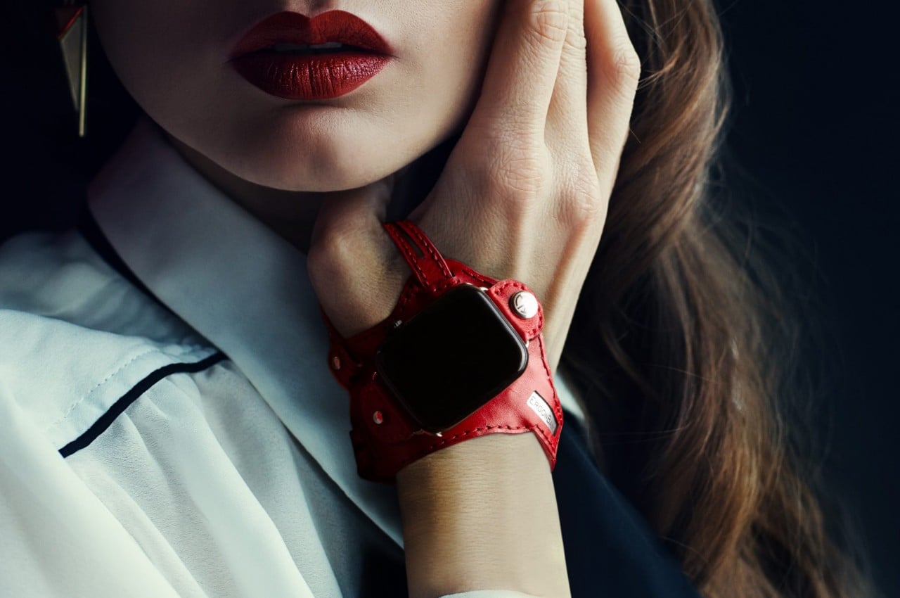
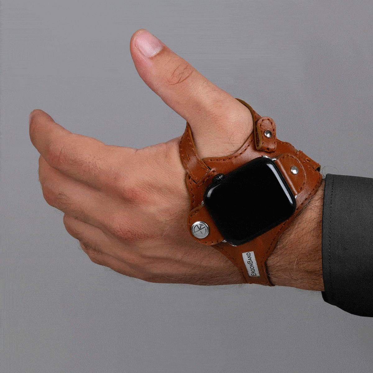
We wear watches on our wrists because that’s been the standard design of wristwatches, hence the name, for decades or even centuries. It’s a more convenient design compared to the classy yet antiquated pocket watches, but that doesn’t exactly mean they’re the best design available. For some people, that design can actually cause some pain in the wrist whenever you have to lift your hand and turn it so that you can see that time. That action is perhaps even worse with smartwatches, considering how often you have to do that to see not just the time but other information and notifications as well. That’s the kind of design flaw that this odd-looking Apple Watch “band” tries to address by simply moving the smartwatch from the back of your wrist to the back of your hand.
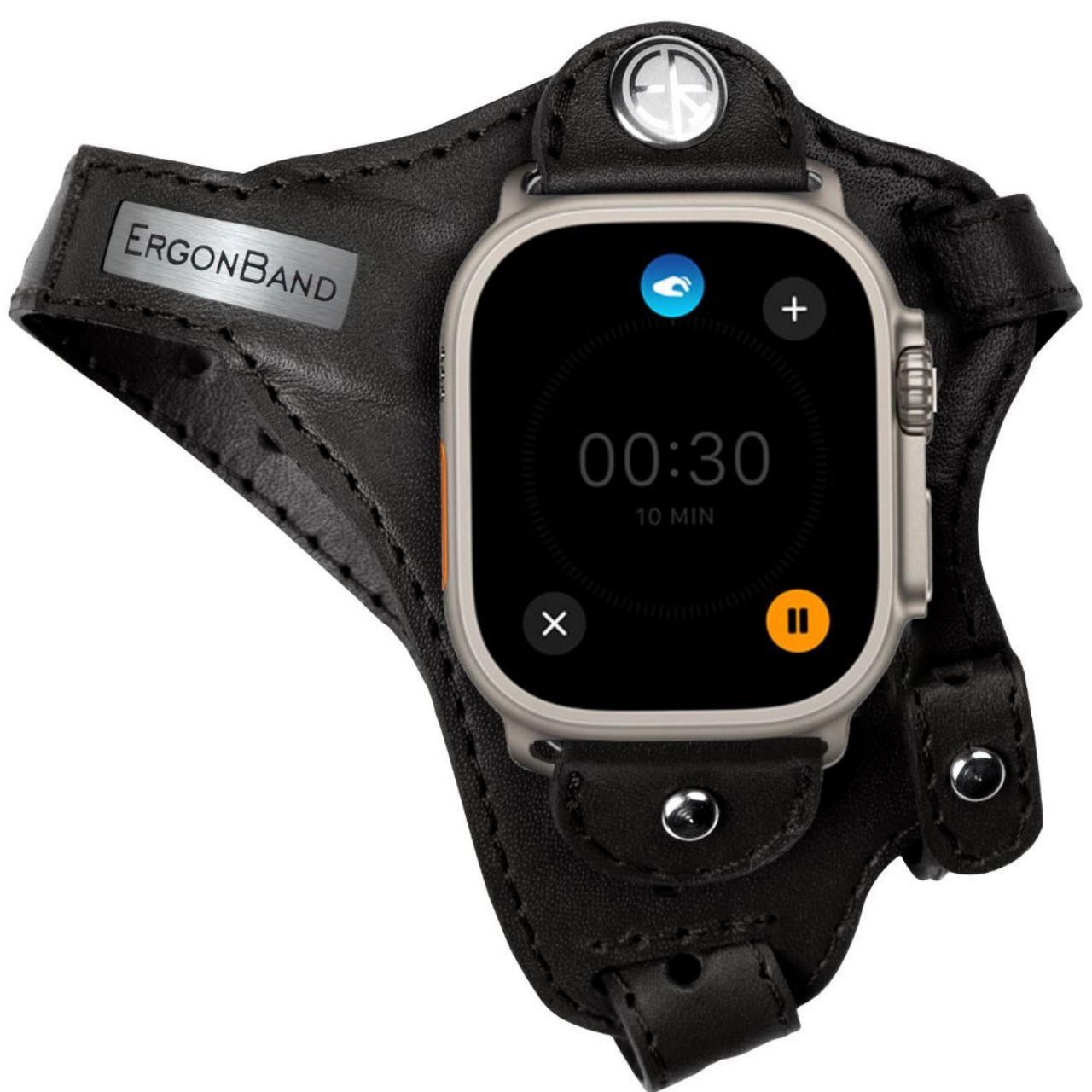
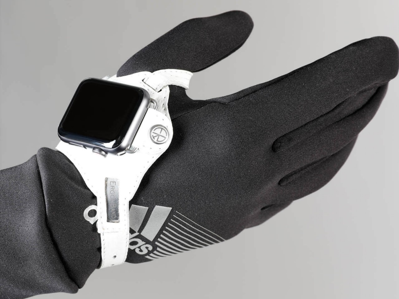
The appearance of this Apple Watch accessory looks a little ridiculous, at least until you hear the reasonable explanation behind its design. The band, which is actually more like a strap, looks like one of those thumb or hand braces that athletes use for protection. The Apple Watch, sans the straps, is locked in place using clips that utilize the standard lugs and is placed below the joint of your thumb.
This location isn’t based on a whim but on how it makes the screen almost always visible without having to twist your wrist. At least that will be the case for people who need to see the watch face while holding something or with their hands swinging in front of them, like athletes doing training or people exercising. In fact, this kind of ergonomic design was made exactly for sports uses, though that doesn’t stop it from being used by anyone interested in a different way to wear a smartwatch.
While the theory might does sound plausible, there might be a few practical hurdles to such an ergonomic design. For one, waking up the Apple Watch is often done using that twisting gesture, so you’ll have to resort to actually touching the screen or pressing a button to turn on the screen. That defeats the purpose of not requiring your other hand just to glance at information quickly, which ironically makes it a bit less ergonomic in the process.
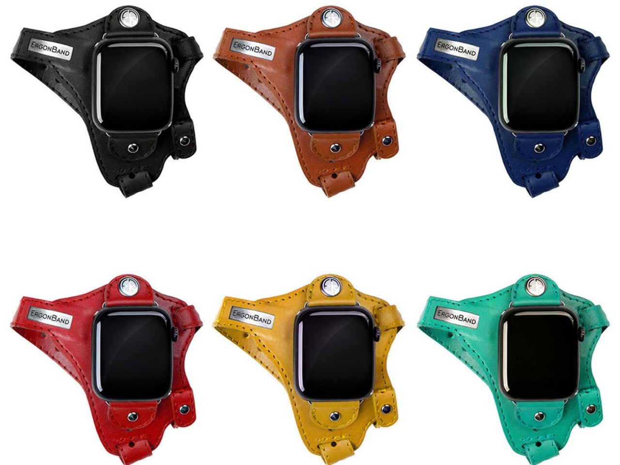
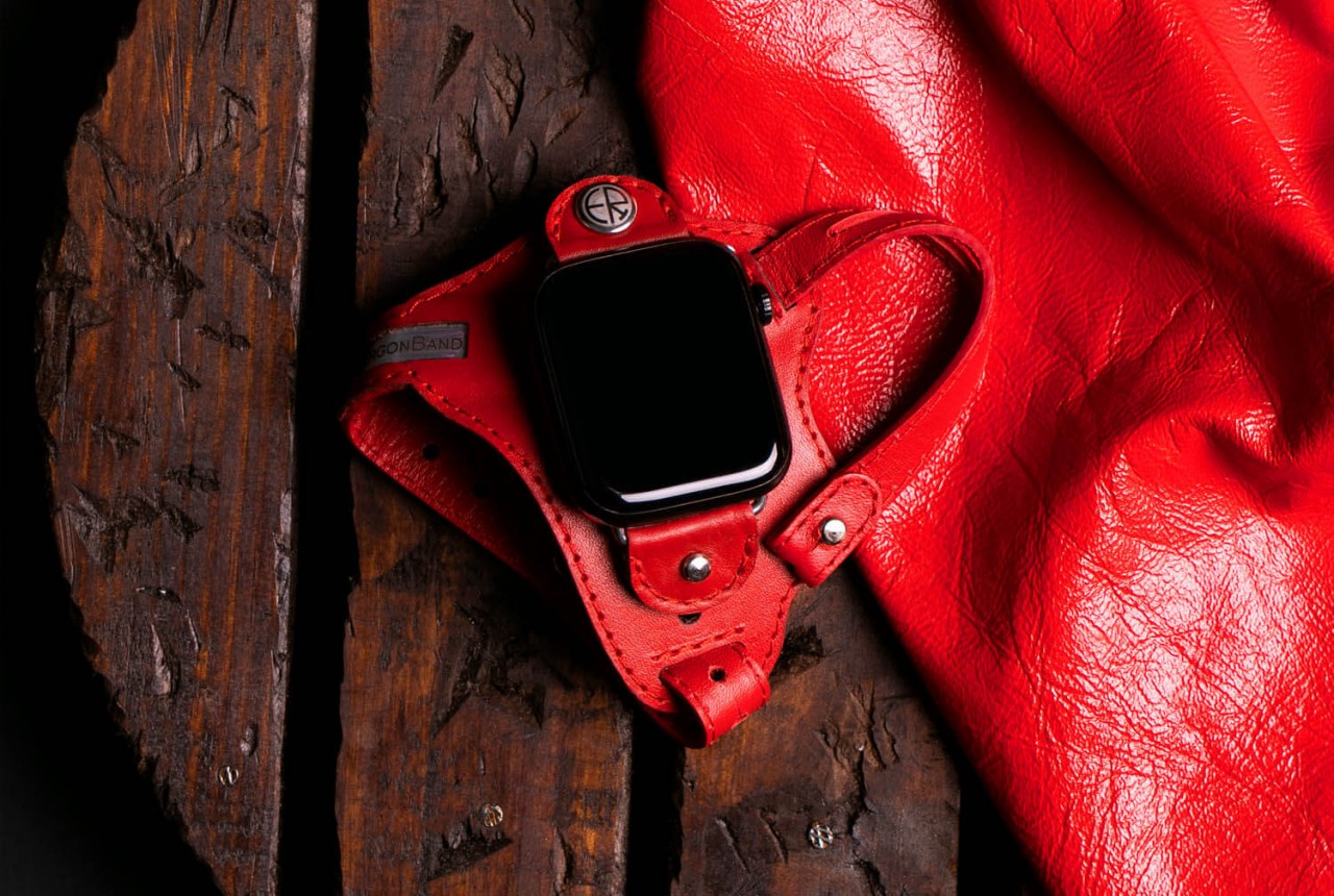
The other issue is that this kind of band might get in the way of using your hand for other things, especially ones that could make the strap dirty. Most of us are probably unused to wearing such a strap, so there will be some awkwardness and discomfort at the start. The hand-stitched leather material does try to make it a little bit comfortable and stylish, but that might also raise concerns about using it for intense workouts and sports activities. The ErgonBand is admittedly a curious attempt at solving this ergonomic problem, but it might remain just a curiosity rather than a solution that Apple Watch owners can rely on.
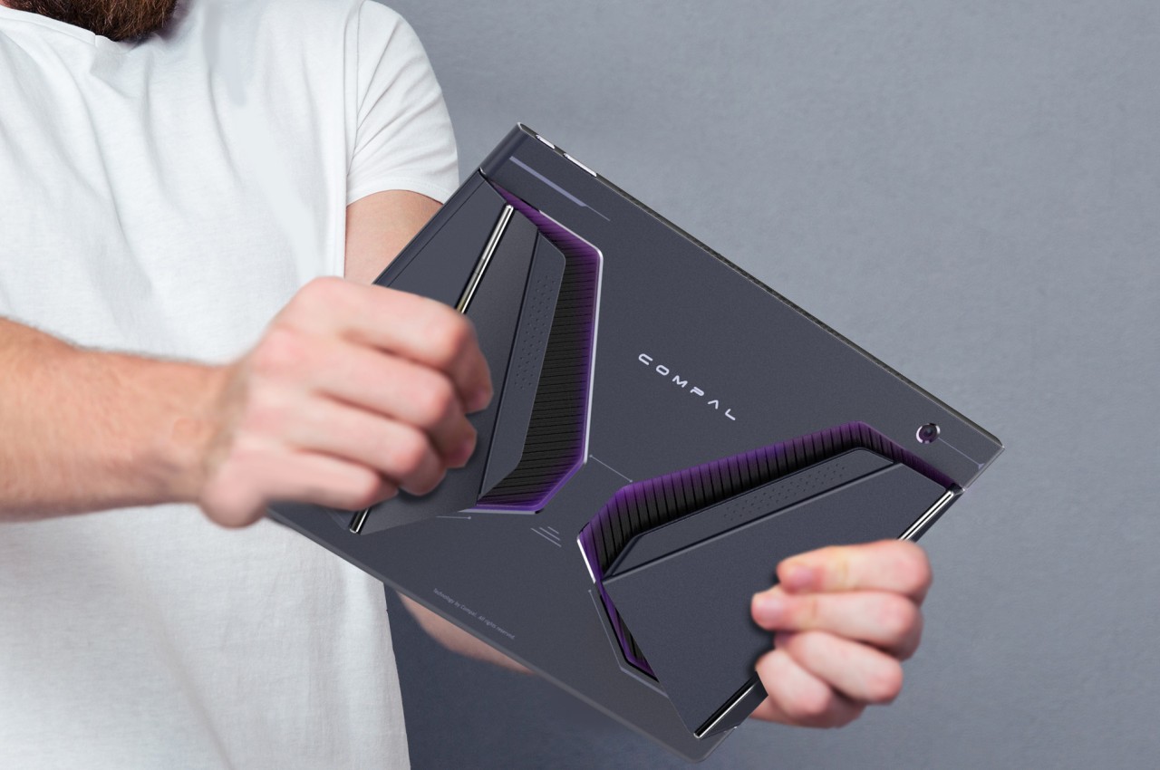
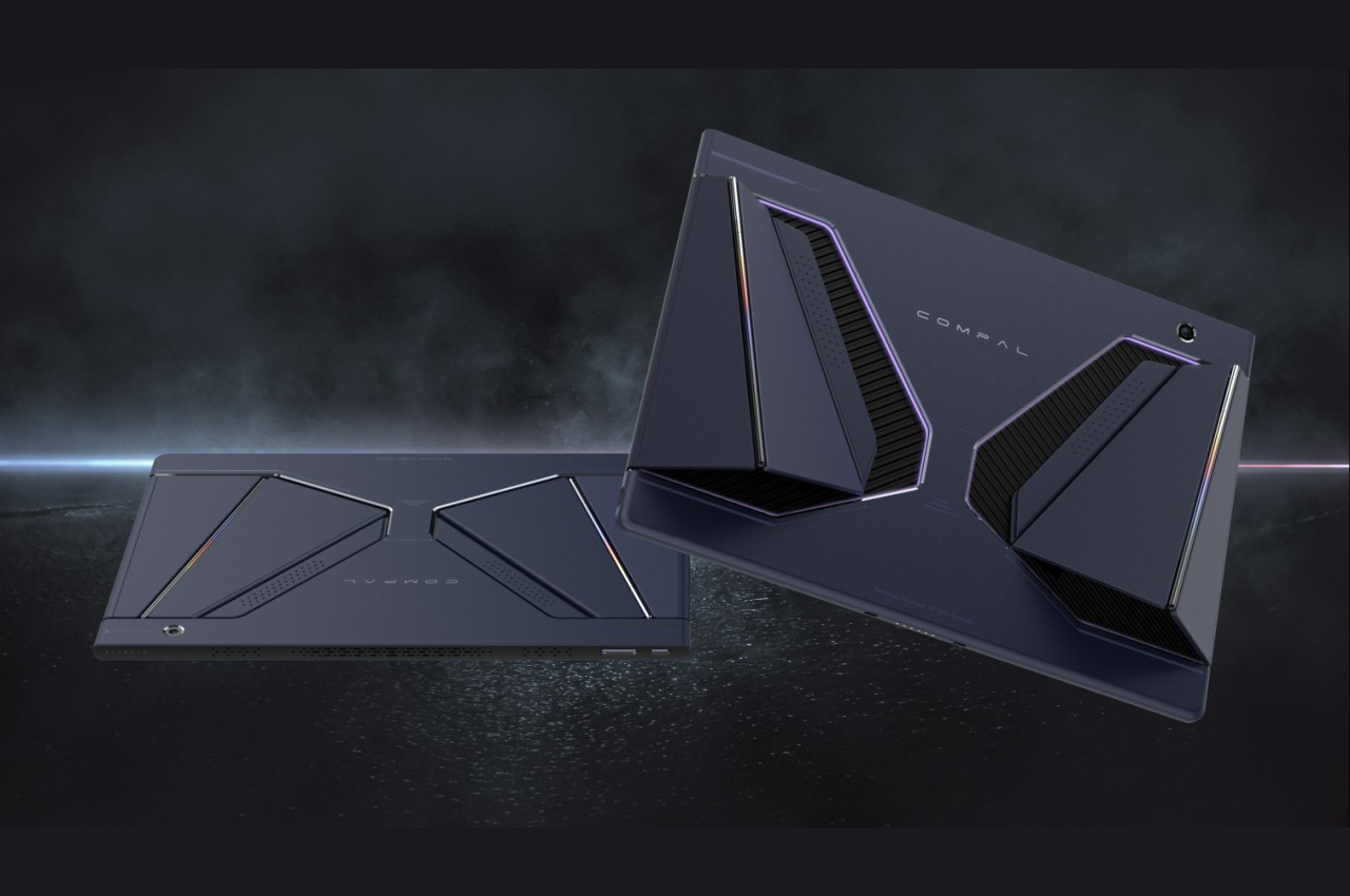
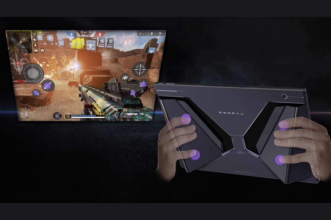
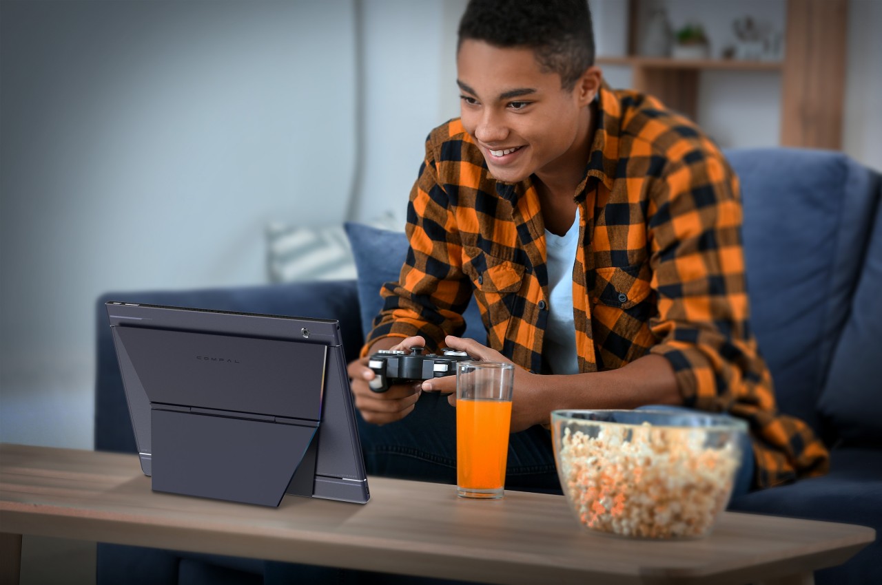
Handheld gaming PCs are becoming a bit more popular these days, especially with major brands getting in on the game, pun intended. But while these small computers seem impressive for packing that much power inside, their designs make them less useful for anything else unless you connect an external monitor, keyboard, and mouse. Not only do gaming laptops offer more power, they can also be used for other purposes. Conversely, you need to connect a game controller and put the laptop down on a table, which loses the appeal of being able to play anytime, anywhere. Compal has an idea that attempts to bridge the best of both worlds, though its 2-in-1 gaming laptop design does raise just as many questions as it answers.
2-in-1 laptops and tablets that have touchscreens do offer a compromise when it comes to gaming with a controller. Just like with smartphones, it’s theoretically possible to put virtual joysticks and buttons, but those are actually awkward and more cumbersome to use on such a large screen. And just like on smartphones, it also means covering up part of the screen with their thumbs, and most PC games don’t take that into account.
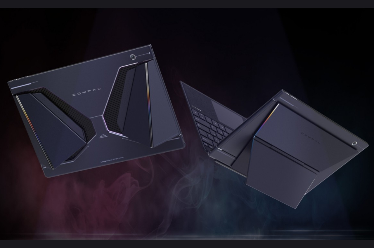
The Compal Rover Play concept solves that by putting the controls on the back of the tablet half of the 2-in-1 laptop, almost like those paddles on the back of modern controllers. These aren’t simple buttons, though, as they would make the laptop look rather odd and unusable when not used to play games. Instead, there are panels on the back of the laptop that slide and fold slightly outward, creating an angled structure that’s like grips on a controller.
These FlexiRear Controllers have ultrasonic sensors that don’t use physical buttons to register presses and gestures. The idea is that instead of using the touchscreen on the front, you use those sensors on the back to control the game. The concept doesn’t exactly explain how those gestures would map to standard controller input, but it’s not difficult to imagine some specialized software making that conversion.
The biggest hurdle for this rather intriguing design is how such controls would feel alien to gamers. Not only would it require a considerable amount of learning effort, switching between this non-standard input method and a conventional controller could also prove to be confusing. Still, Rover Play is an interesting design that aims to bring the best of both worlds, but it’s still a little bit raw for any PC maker to implement in an actual product.
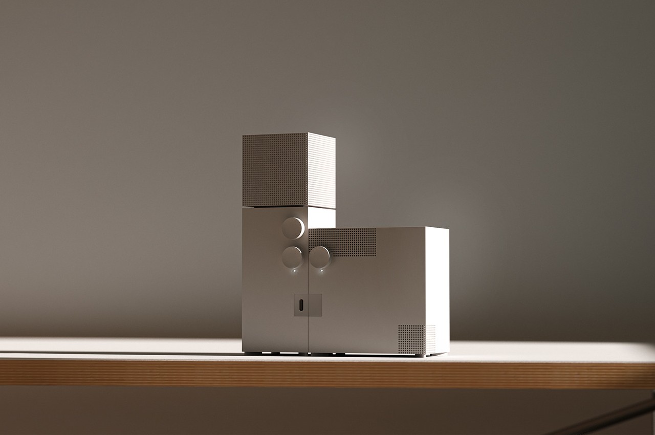
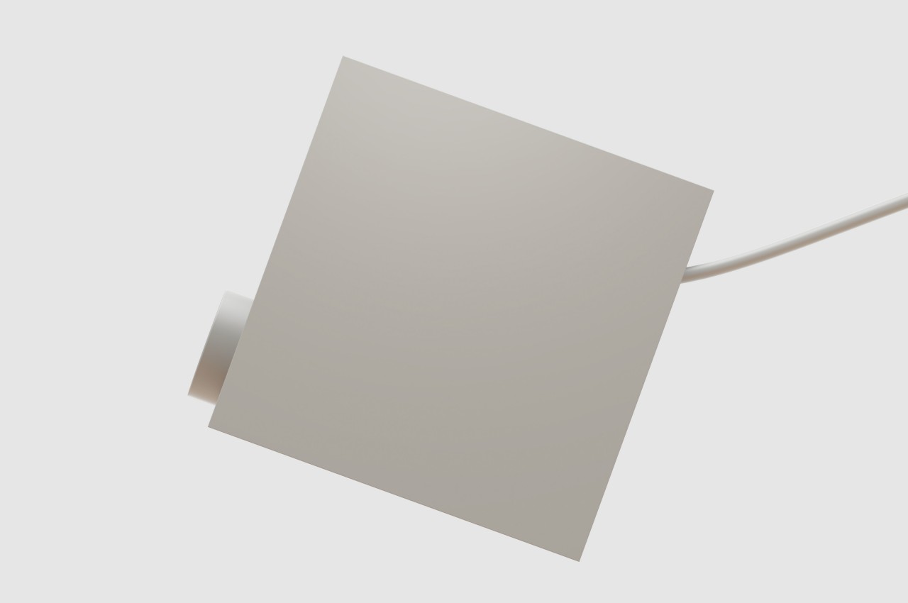
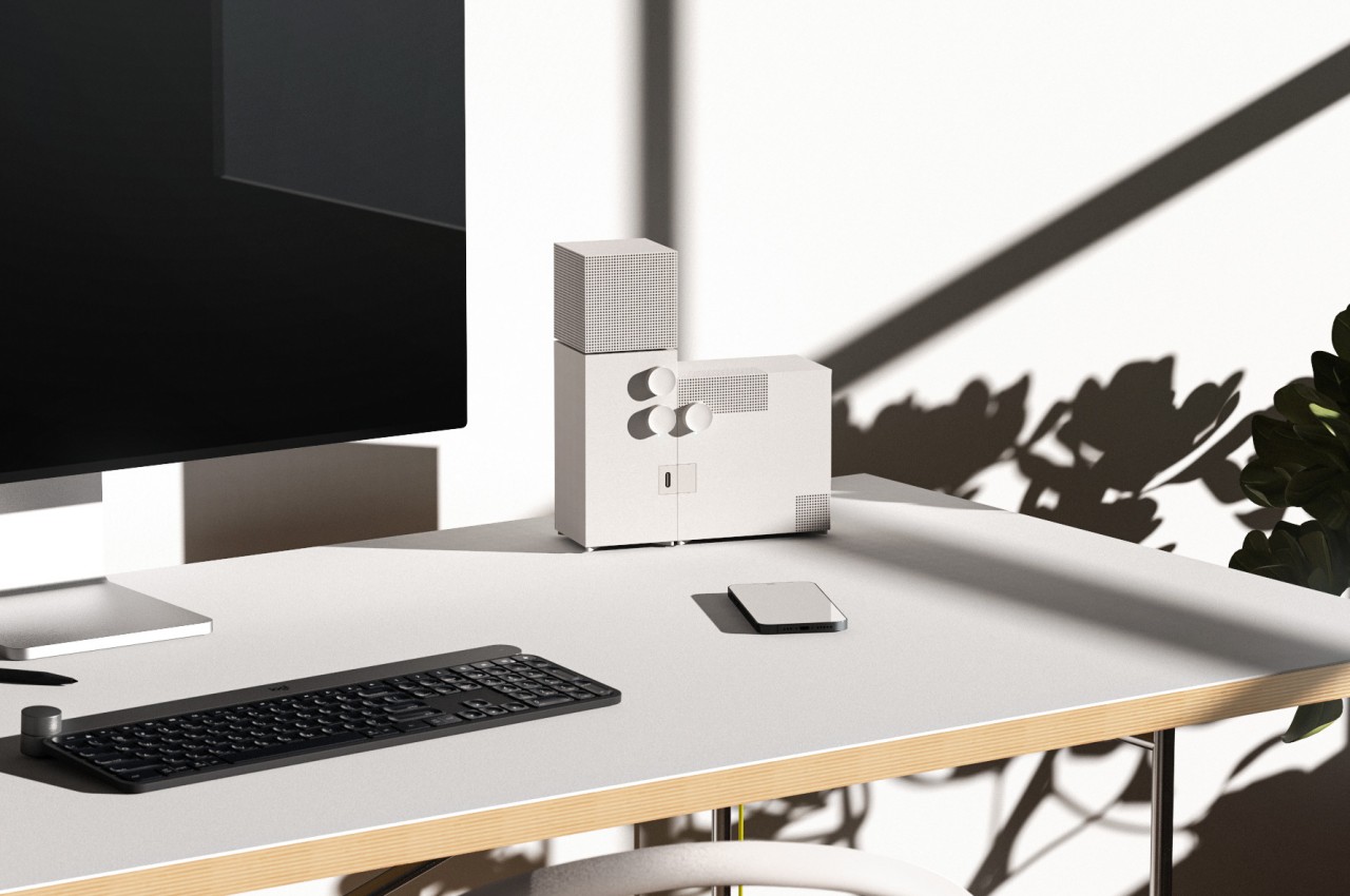
Regardless of religious inclination or lack thereof, the word “church” would often conjure up images of lofty buildings designed to inspire awe or command respect. Of course, church architecture often reflects the trends and styles of their times, and there are indeed churches today that wouldn’t look out of place beside commercial buildings and structures. Of these, the former Church of Saint Agnes in Berlin, now home to the Konig gallery, is perhaps one of the most striking examples of the modern brutalist movement applied to such a structure, and its imposing character happens to be the almost literal inspiration for a desk speaker concept that similarly embraces that spirit of extreme austerity in a beautiful and memorable way.
Designed by architect Werner Duttmann and finished in 1967, the former Church of St. Agnes, now the Gallery of Konig, stands almost in opposition to common church architectures of that period and the ages before it. Its unadorned, boxy shapes don’t stand out among the rows of concrete buildings that line up most cities, making it feel like just another part of the community. At the same time, however, its austere appearance still cuts an imposing figure that gives the impression of something that is meant to exist on a completely different and higher level.
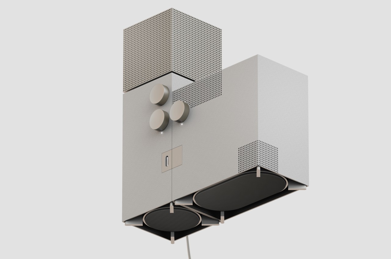
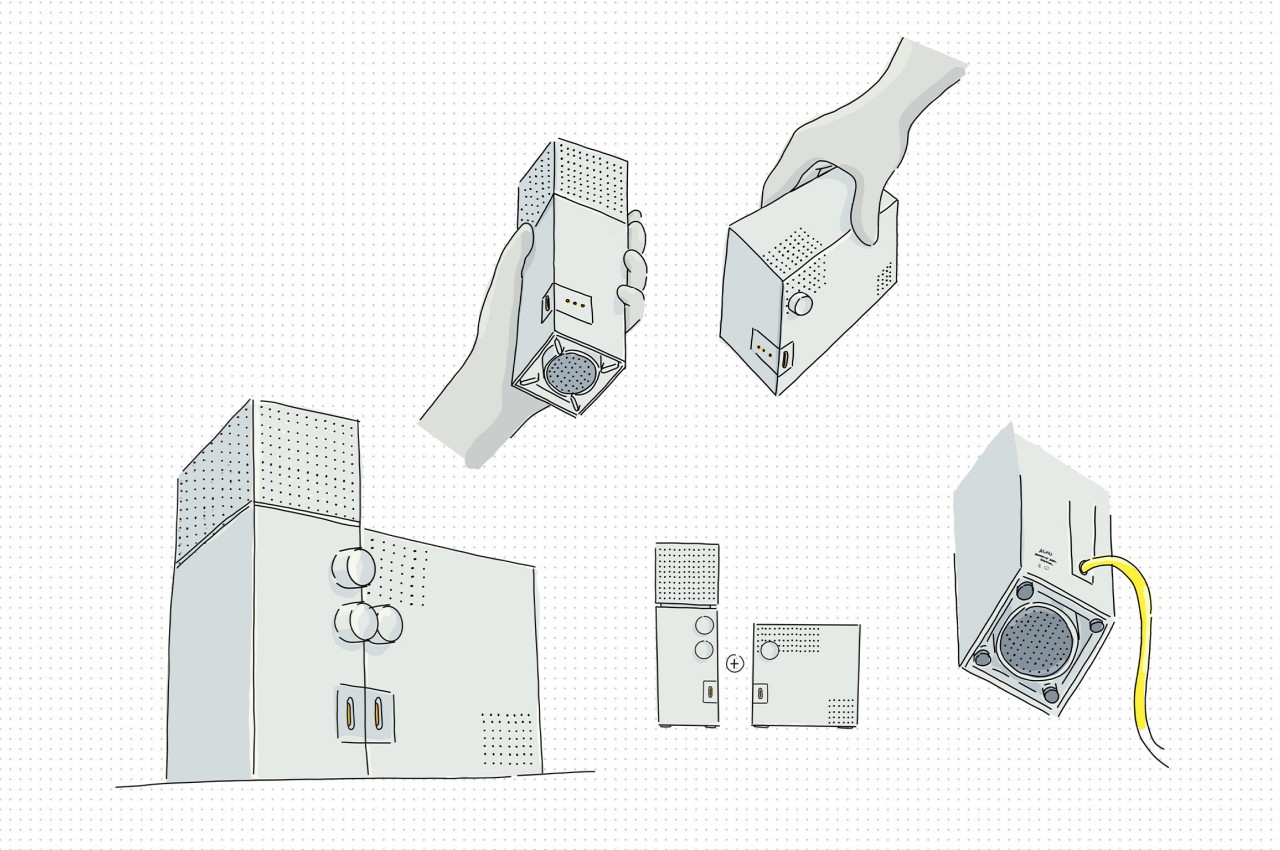
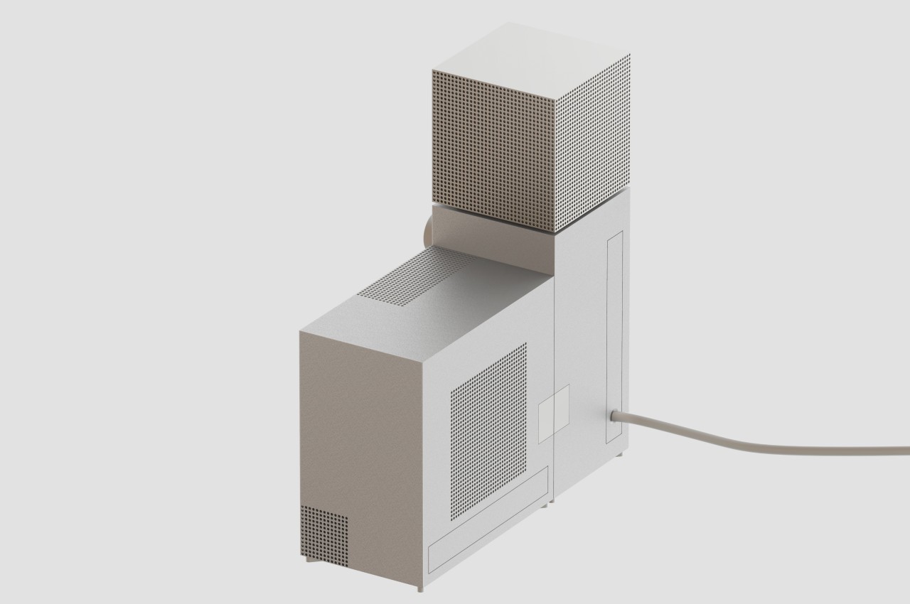
It’s that same stunning characteristic that the Agnes desk speaker concept tries to convey on a smaller scale. Like the church it takes both its shape and name from, the design is made from two plain rectangular pieces, though the roles are switched. The vertical “bell tower” is actually the main speaker, with the top box providing 360-degree output, while the larger detachable box provides bass on demand.
Like any brutalist design, the speakers express rawness, expressed through metal instead of concrete and accentuated by the use of the simplest geometrical shape and sharp edges. In terms of functionality, however, there is nothing unrefined about the Agnes speaker concept, and it even imagines a feature not found in any 360-degree speaker today. While the lower knob controls the speaker volume, the one above it determines where sound is directed, whether it’s only from the front, from the front and the sides, or from all four sides.
Smart speakers today are trying their best to blend into their surroundings, namely your interior decor, and just like its inspiration, the Agnes desk speaker concept presents a duality in that regard. It definitely mixes well with minimalist designs, but its raw appearance and imposing stature also make it stand out easily, turning what would normally be just a functional appliance into a unique work of art that looks almost out of place and out of time.
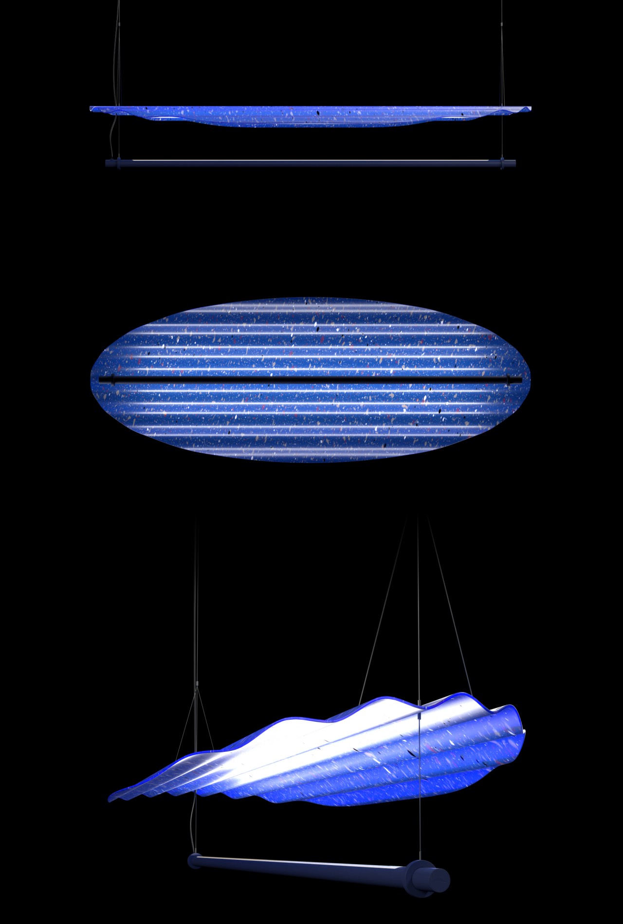
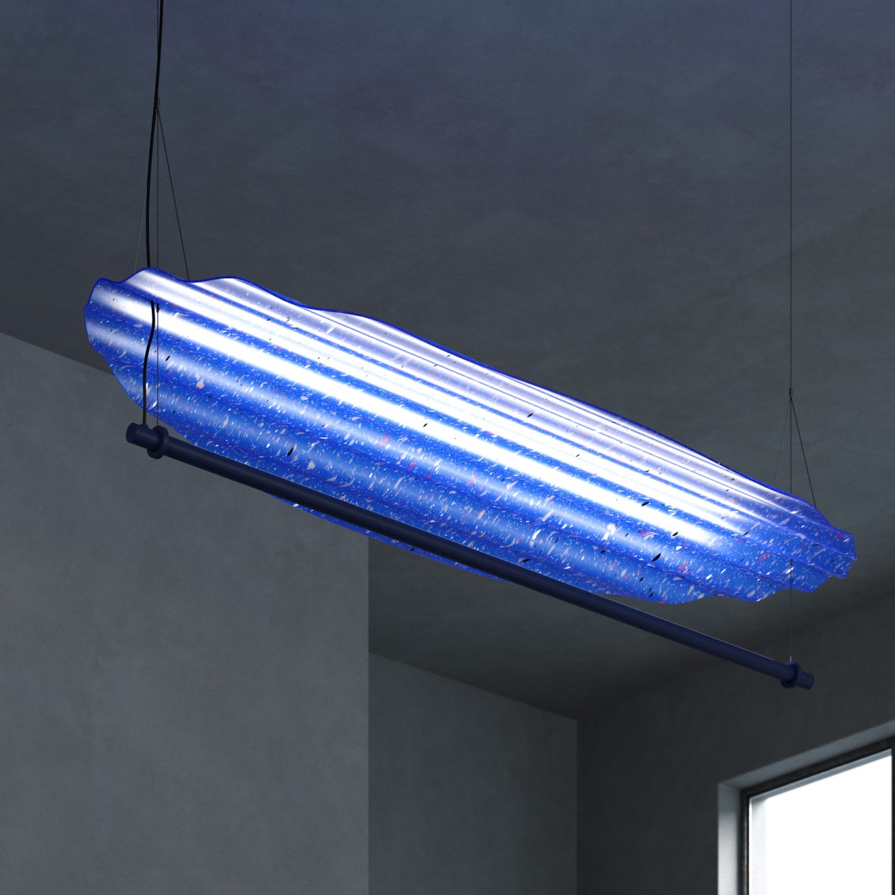
We all look to lamps and other lighting fixtures not just to illuminate but also to set an atmosphere, but most of the time it isn’t the light itself that creates this effect. More often than not, it’s the lampshade, shield, or any other material that reflects, refracts, and diffuses the light in interesting and sometimes mesmerizing ways that can dazzle and even affect our moods. Most of the time, those lamp shields are made of glass, metal, or plastic, but there are other, more interesting alternatives available. This particular design, for example, not only uses a sustainable material, it also gives it a distinctive spin that makes not only the shade but also the light it throws a sight to behold.
Designer: Fuhua Wang, Weichih Chen
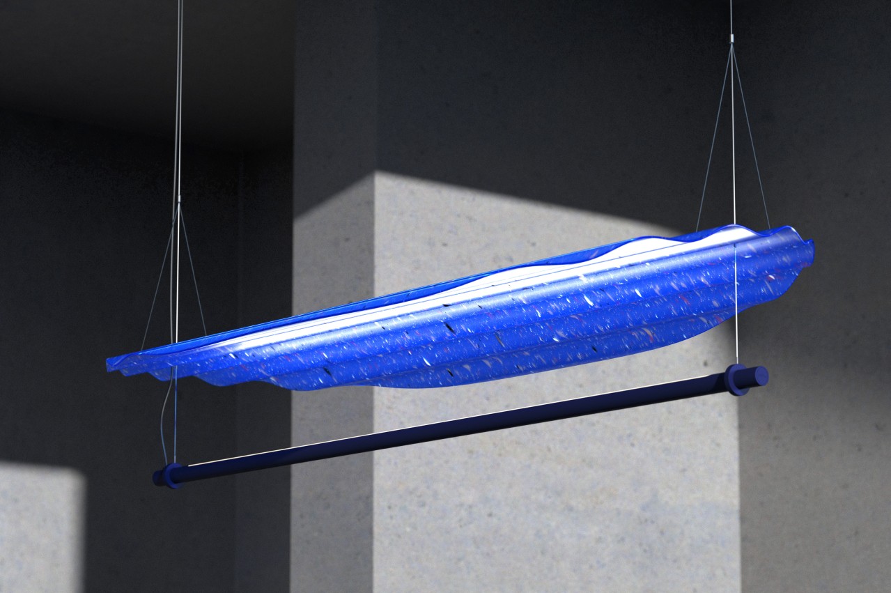
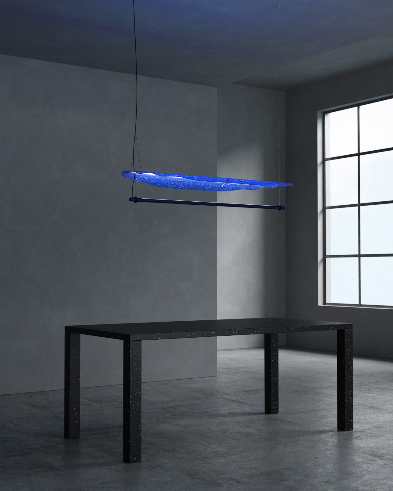
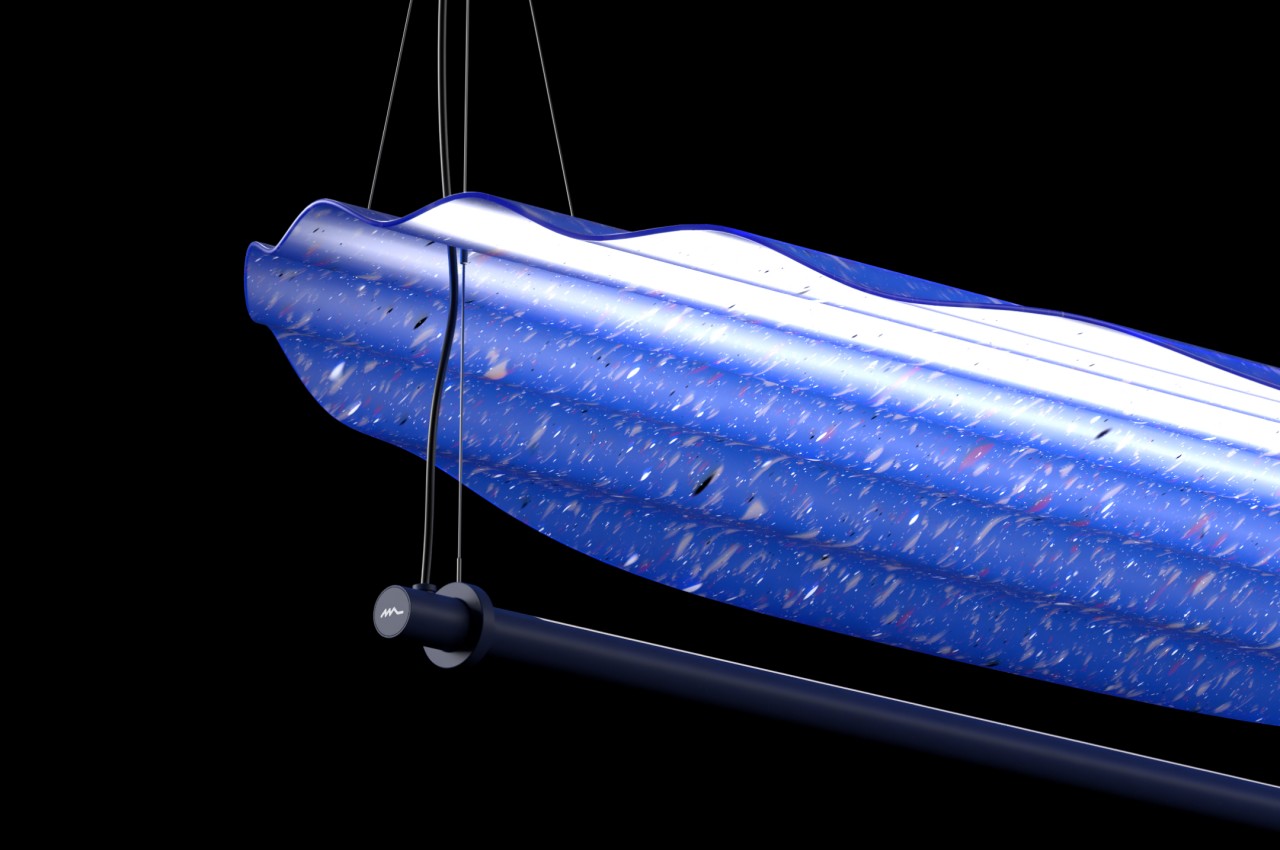
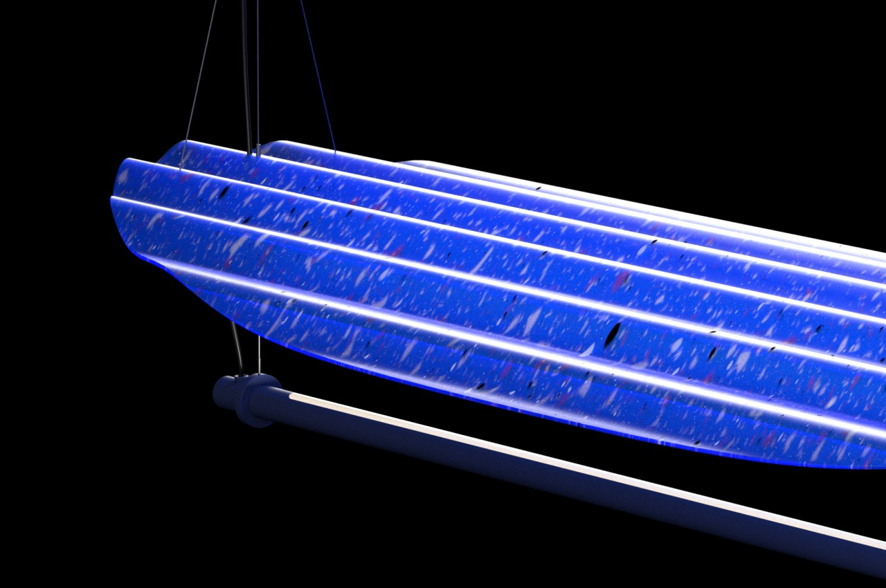
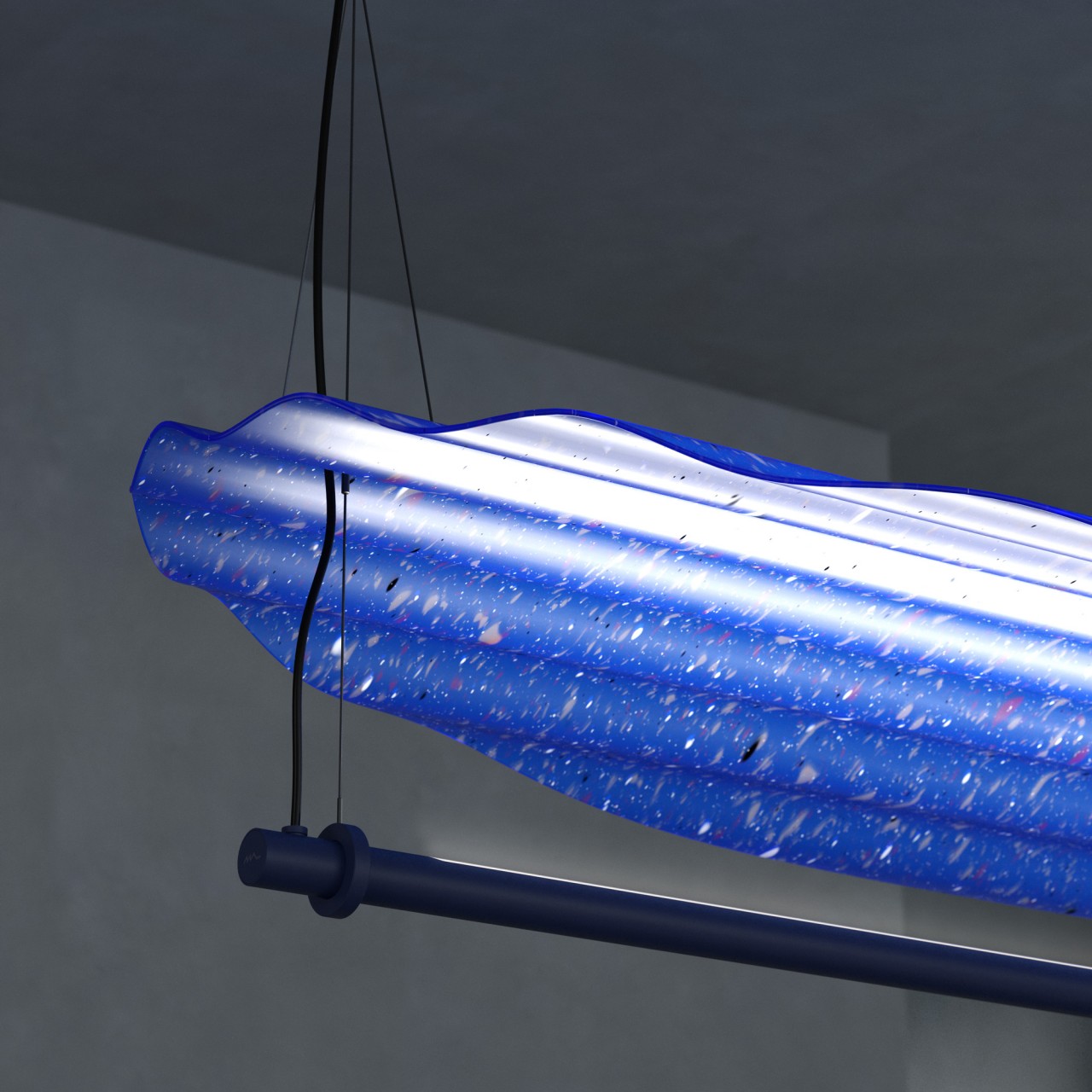
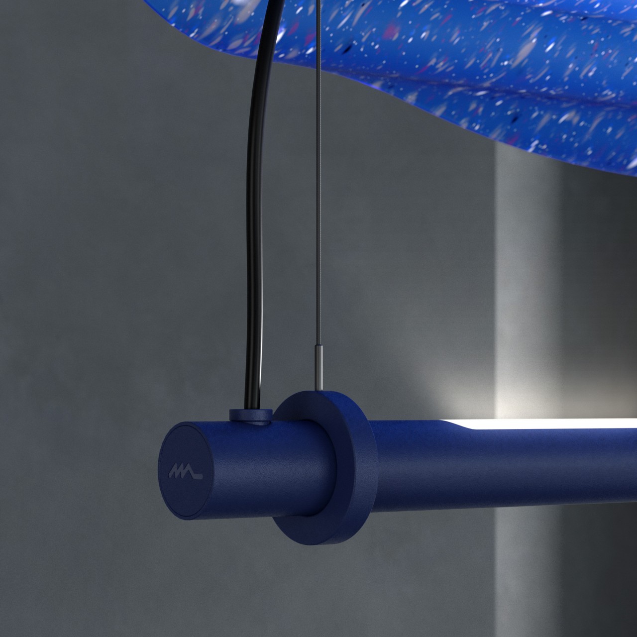
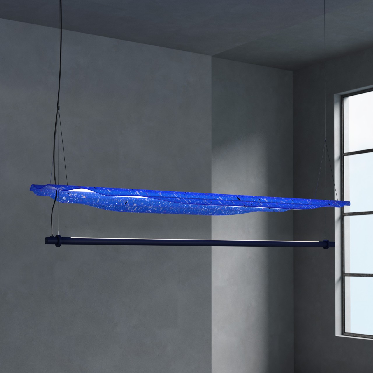
It’s not uncommon these days to see recycled plastics being used for design, and a particularly big source is ocean-bound plastic, including PET bottles, bags, and more. Most of the time, the pellets produced from breaking down plastic material are colored to match the requirements of a specific design, but the Ondina sustainable pendant lighting preserves some of the properties of the properties of plastic materials to create a more interesting appearance.
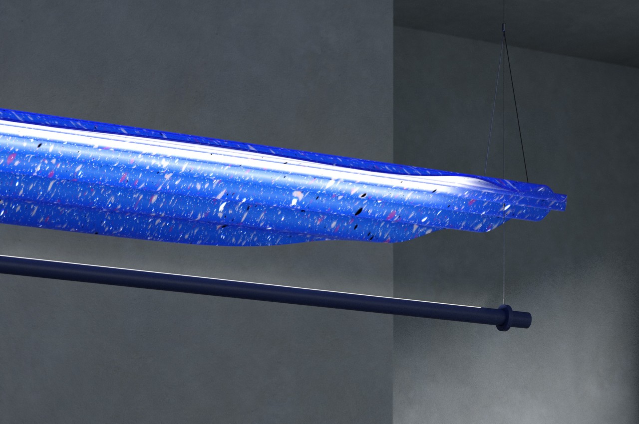
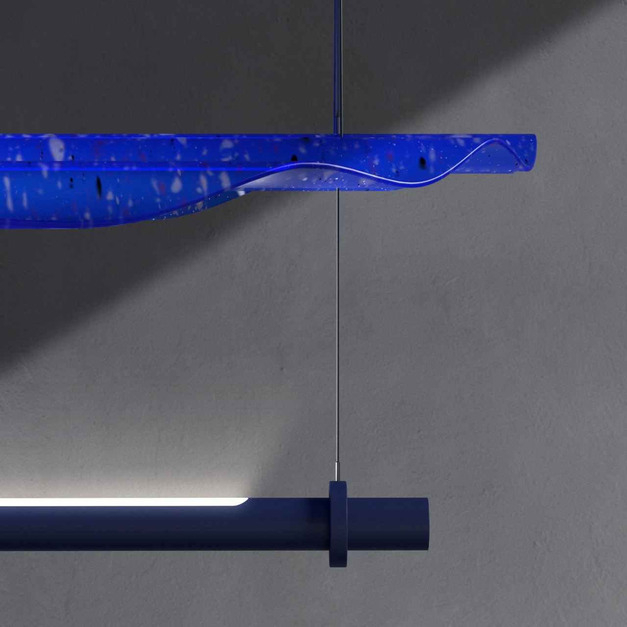
The result is a material that looks similar to terrazzo that is often used in tiles for flooring and walls. The small bits and pieces of color give the translucent blue layer some vibrancy, though it could also be a representation of the pollution that litters the oceans. Coincidentally, or perhaps intentionally, the lamp shield actually has a wavy shape, not unlike the waves of bodies of water.
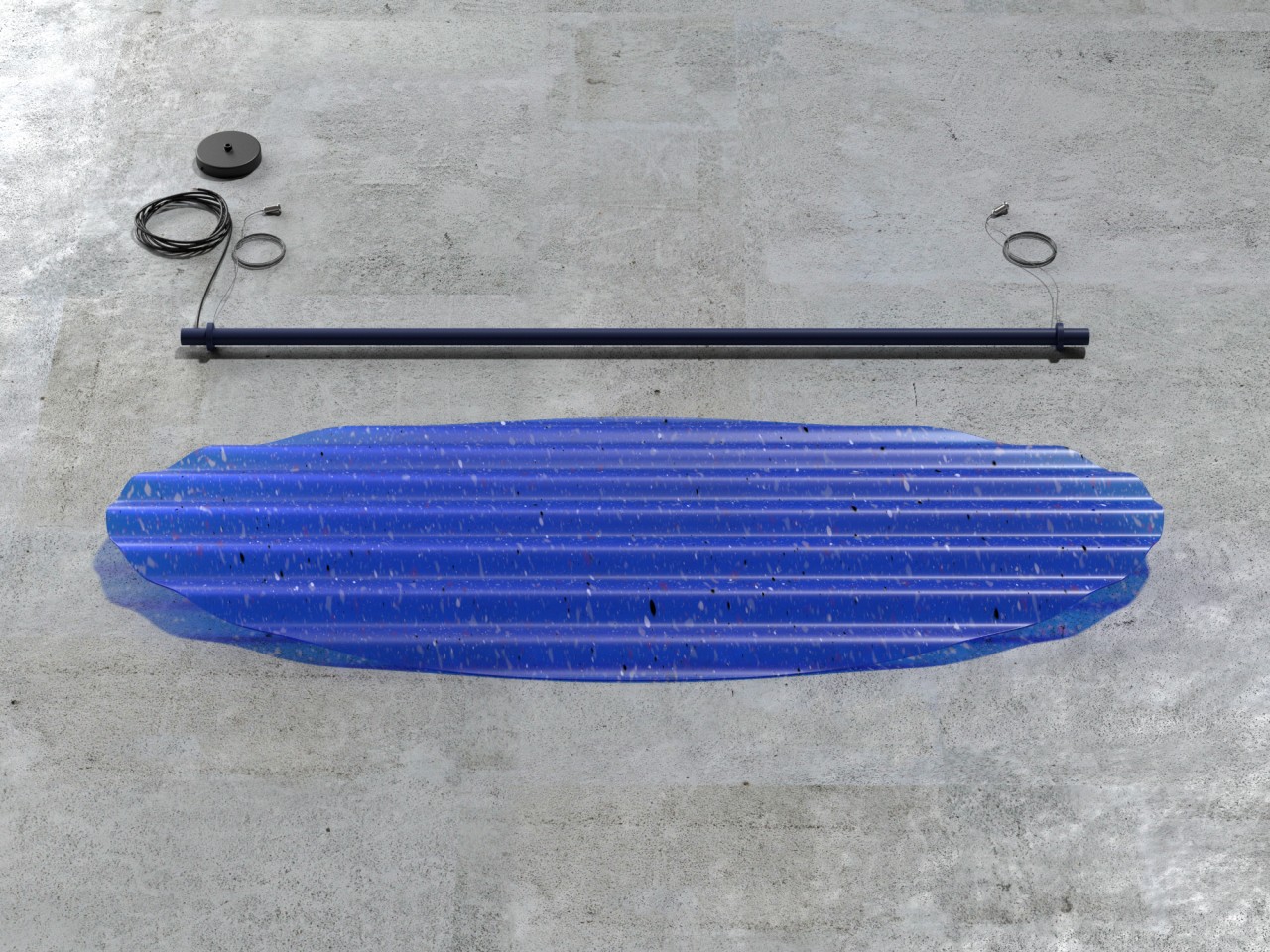
The pendant lamp itself is actually pretty simple, just an LED aluminum tube hanging from a ceiling by its two ends. The lamp shade is placed some distance above the tube, giving ample space for the light to diffuse and spread rather than being reflected directly by the material. This creates a bluish glow not only around the lamp but also on the ceiling as it passes through the translucent shield. The color is soft and calming, even with a pure white LED, but it also still reflects enough of that bright light so that the lamp functions as more than just a mood lamp, sufficiently illuminating the space around it.
Every part of Ondina is designed to be sustainable and extensible, applying the lamp shade to more than just a pendant lamp. It can be used for wall or floor lamps as well, just with some modification of the design. More importantly, the simple components make it trivial to replace parts that are broken, prolonging the life of the product and preventing it from adding to the waste already swimming in our waters.
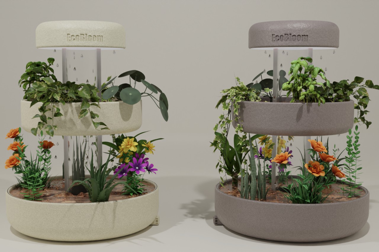
There has been a new kind of hobby that gripped the world in the past few years, especially when people were forced to stay home for a few months. “Home gardening” was no longer limited to having a small plot of soil outdoors, especially if you can just grow them in pots indoors. That said, it’s a process that still requires a bit of work and effort, especially if you want to keep your plants alive long enough to enjoy the fruits (or leaves) of your labors. Unsurprisingly, a rather niche market of indoor planter appliances has popped up, some including pretty smart functions to boot. This concept tries to offer the same conveniences in a more aesthetic presentation, providing a painless experience of growing plants in an automated environment that looks great as a piece of home decoration as well.
Designer: Saiyami Jhaveri
Just like with plants grown outdoors, indoor plants need regular maintenance from watering, sunlight, and even protection from pests. You can do all of those manually, of course, and some people do enjoy the satisfying feeling of getting down and dirty with such tasks. Others, however, find the process too time-consuming and burdensome, especially if all they want is regular access to fresh herbs or beautiful green plants to liven up a space.
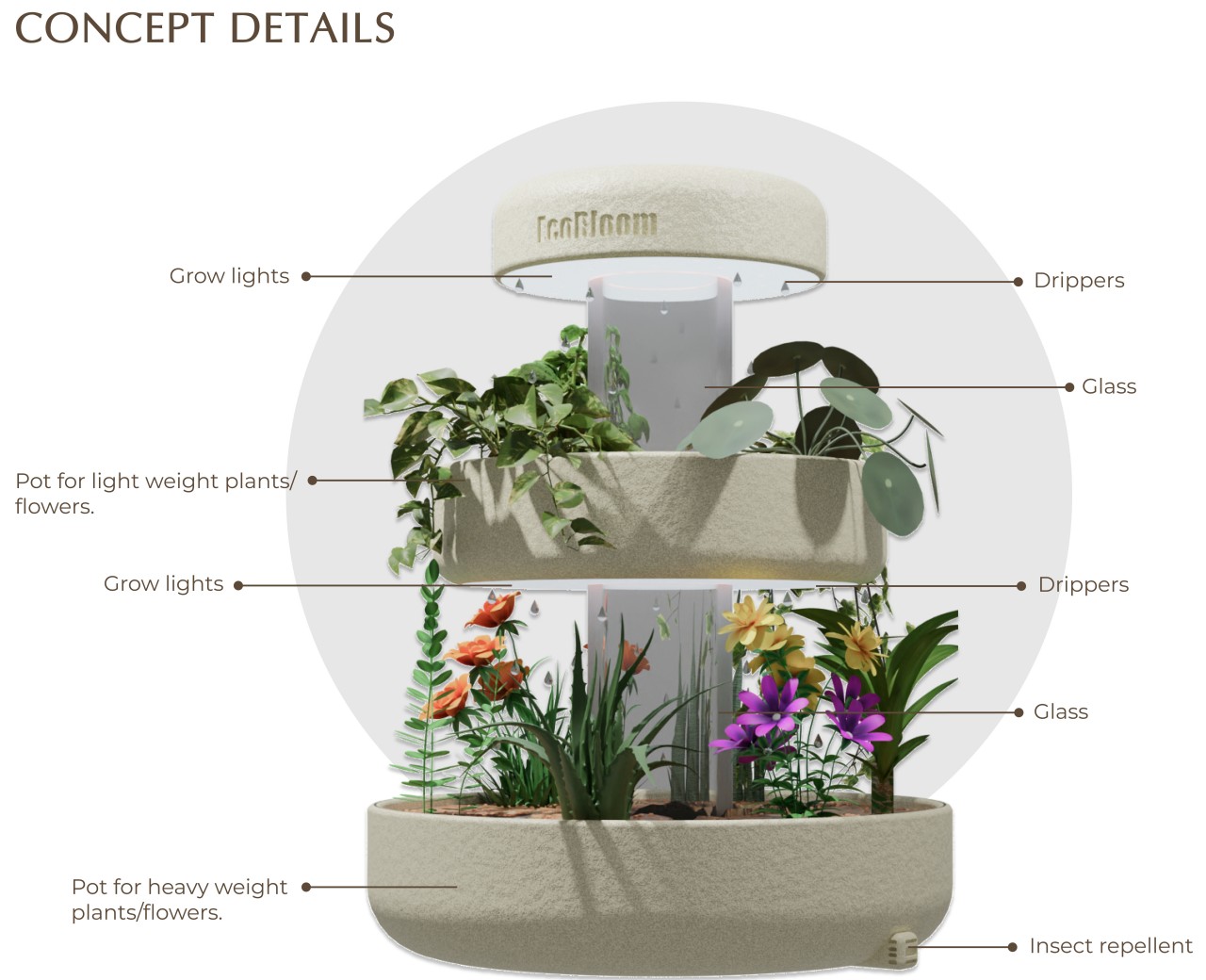
Ecobloom is a concept device that tries to take the drudgery out of this painstaking and laborious process. Almost all parts of that process are automated; all you really need to do is plant the greens and make sure the water tank at the top is filled. You don’t have to do guesswork on when it’s the right time to water the plants thanks to soil moisture sensors that determine the perfect moment for you. Drippers also make sure the plants don’t suddenly get drowned by dispensing the right amount of water as needed. And, of course, there are artificial “grow lights” that save you the trouble of having to put the pot out under the sun.
The smart gardening pot has an interesting function that you won’t always see in actual appliances. It is noted to have a built-in insect repellent to keep those pests away and protect your plants. The concept doesn’t exactly detail how this function works, but one can presume it will be using safe and scientifically tested methods that won’t harm humans and pets in the process.
What makes Ecobloom really interesting is the form it comes in. It uses three concentric circles at different heights, with the topmost acting as the water tank. This gives the appliance a more pleasing appearance compared to just boxes or compartments. Ecobloom can thus be also used to decorate a space, giving as much enjoyment to the planting process as simply watching the plants grow.
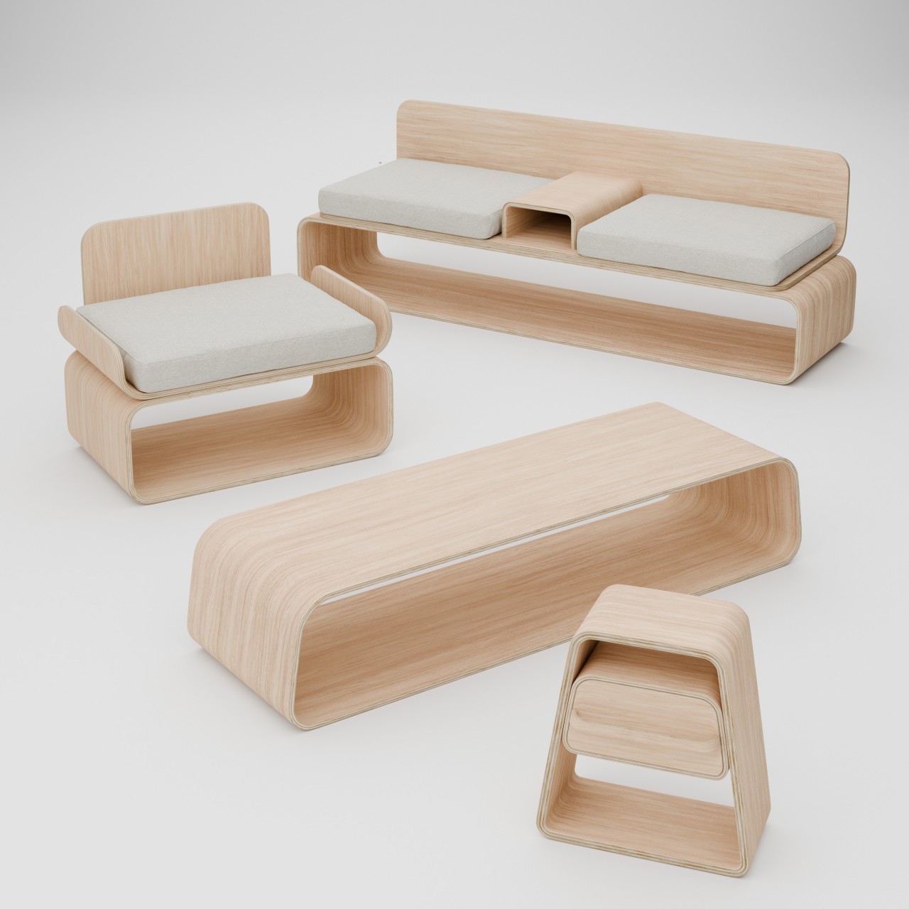
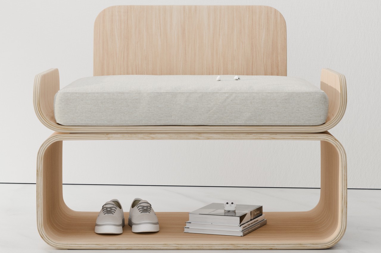
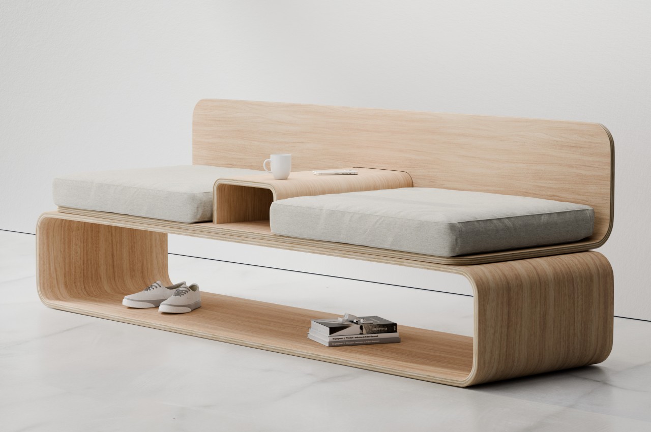
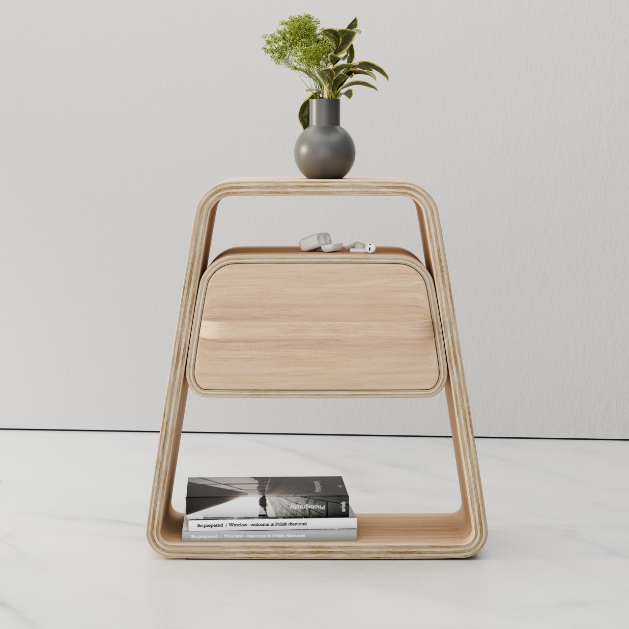
Furniture takes up space, there’s really no getting around that. Of course, you need that space to actually use the furniture, but the furniture themselves aren’t always in use. You might not sit on those chairs or couches all day, and tables might be empty at certain points in time. During those moments, they might just be wasting space, so it sometimes pays to have them perform some other purpose, even if it means just looking pretty. That’s not to say you have to stop at looks, especially if such aesthetic furniture can also function as storage spaces, like what this collection of design concepts tries to achieve using nothing but simple curved layers of plywood.
Designer: Julian Topor
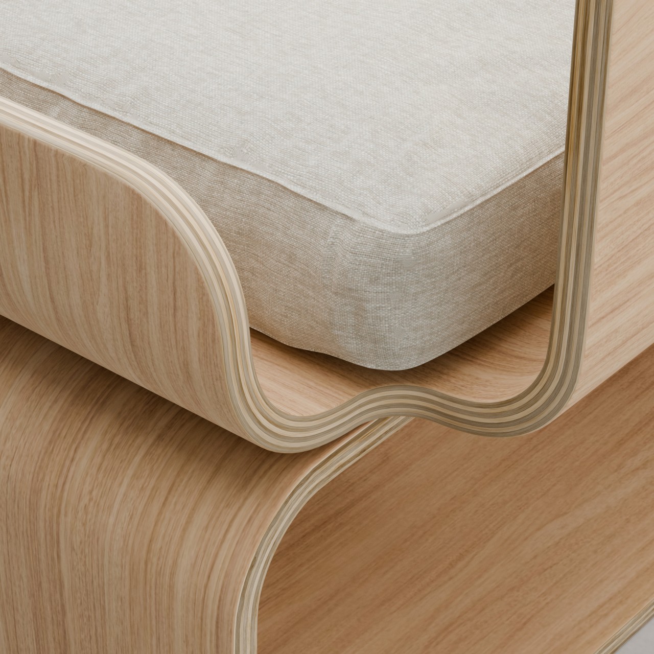
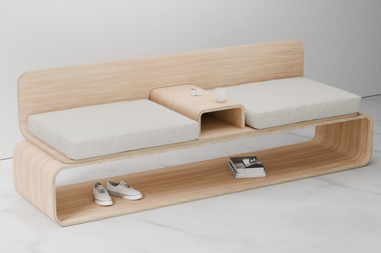
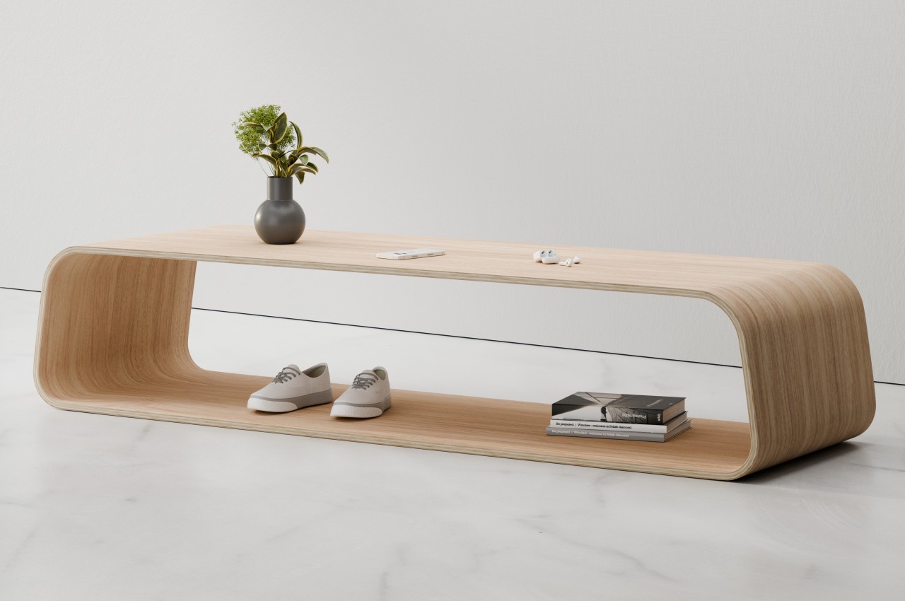
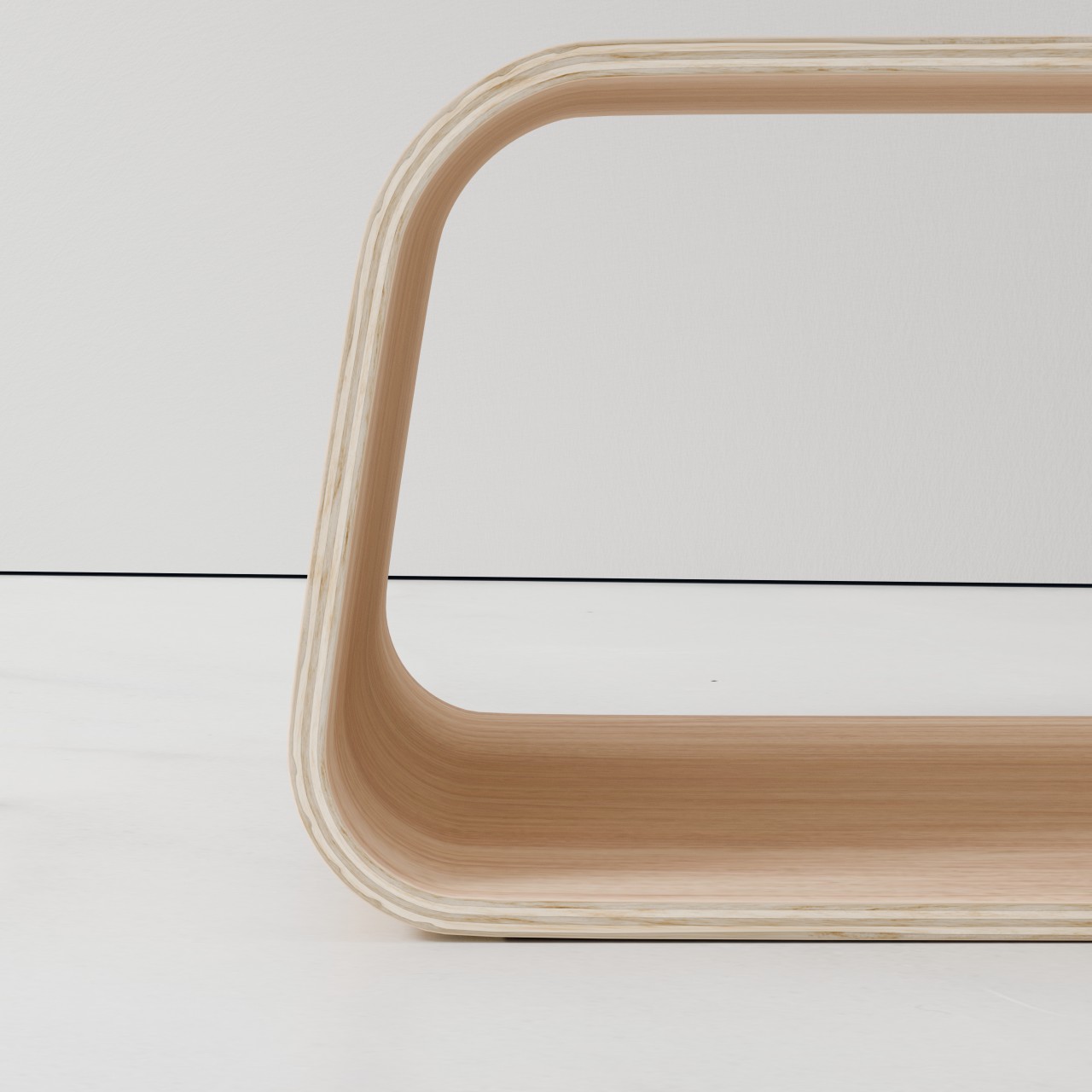
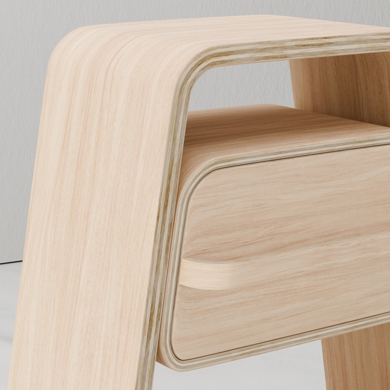
Partly thanks to the popularity of flat-packed products from the likes of IKEA, minimalist wooden furniture has become a popular choice in households. Their simple designs save space not only in packaging but sometimes also on the floor. Furniture, however, can also become a space to place some of your things, from books to accessories to even shoes. The KURVE furniture collection accomplishes this without having to resort to complicated construction or mechanisms, using only curves that wrap around an empty space to create a hollow nook for your stuff.
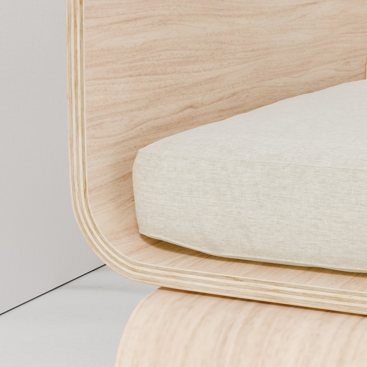
The throne-like KURVE chair, for example, has no legs but instead has a curved backless box for its bottom half. What makes its design particularly interesting is that the seat, backrest, and arms are all made from the same single sheet of layered plywood, just bent on the back and sides to create those support structures.
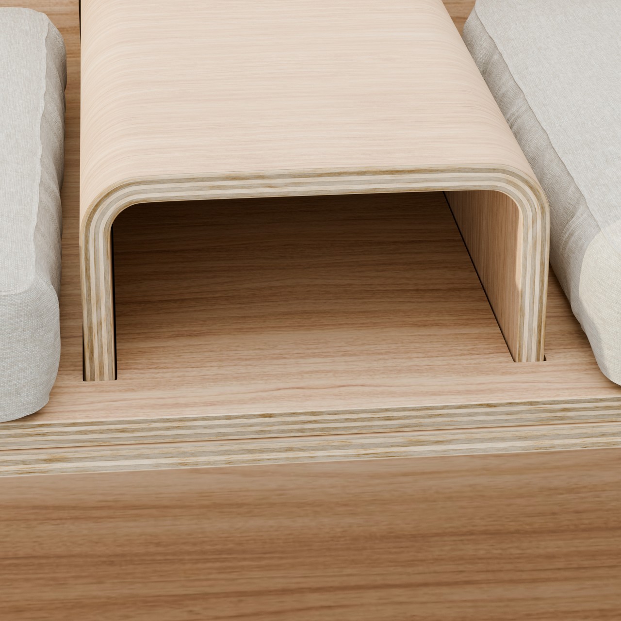
The KURVE Couch stretches out this concept, quite literally, to provide sitting for two. A central console splits the couch in half and provides a small area to place cups and phones, as well as a compartment below for things like the TV remote. The bottom of the couch is an even wider space for more things, whether or not they have business being there.
The table is admittedly the simplest of them all, nothing more than a wooden trapezoid to hold things above and below it. Its lengthy shape makes it more suited to be placed against walls rather than being a center table, perhaps somewhere near the front door so your shoes and keys can easily find a home for easy access next time you step out.
Last but not least, the KURVE Night Stand is also a trapezoid, just taller and narrower. Like other nightstands, it has a drawer, but this compartment is oddly located a little below the top. This creates yet another space for your things, maybe for a phone that you don’t want to tempt you while you’re resting.
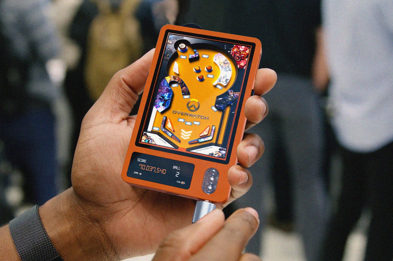
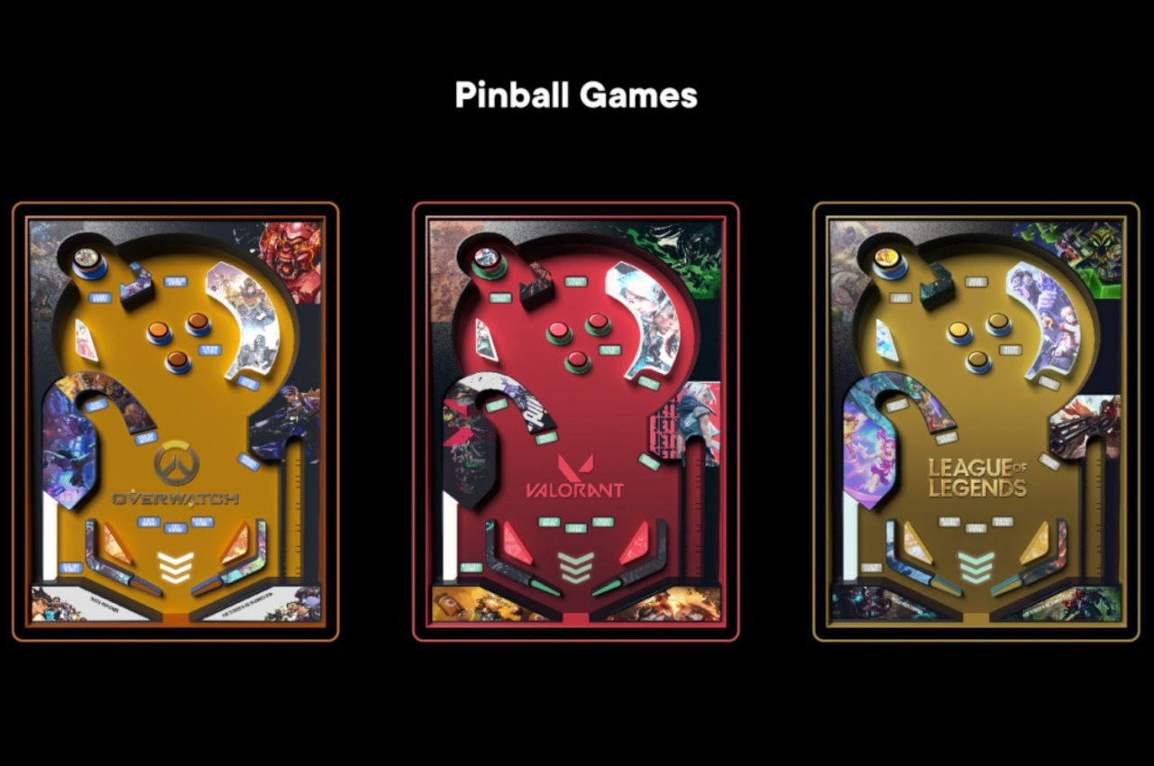
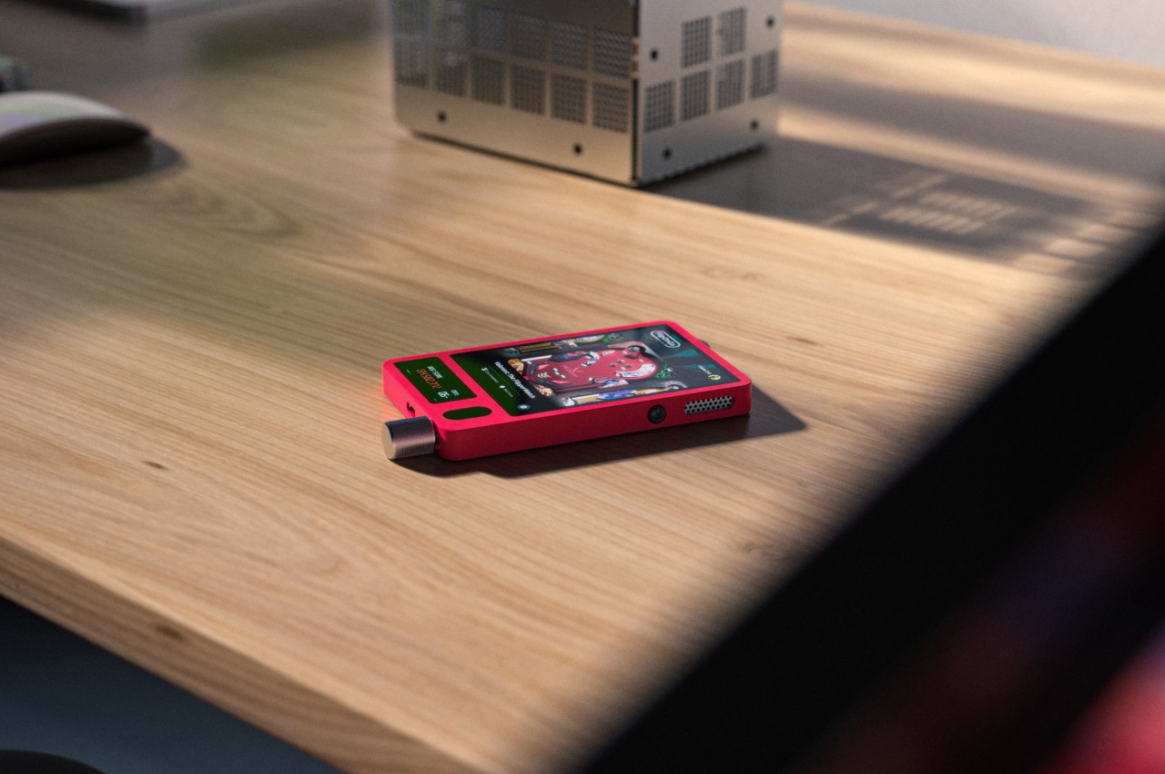
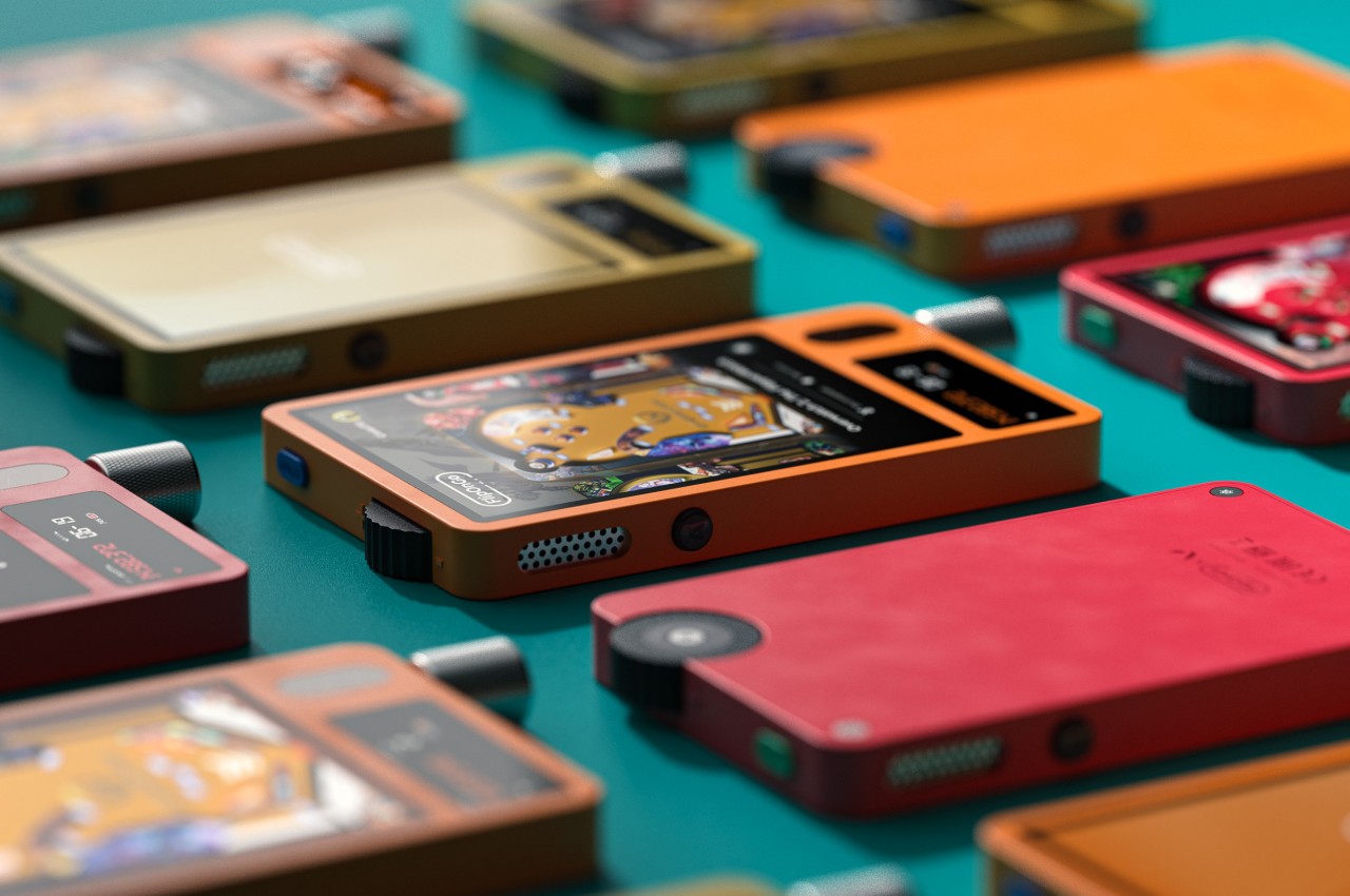
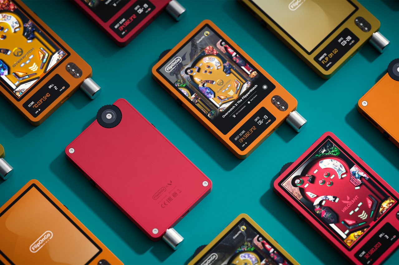
Gaming handhelds are quite the hot item in tech these days, with the likes of the Nintendo Switch still selling strong and handheld PCs becoming more common. Of course, gaming devices you can hold in your hands are nothing new, even discounting how smartphones or even old “dumb” phones have been offering such an experience for years now. During the age of the “Game & Watch,” each handheld offered a single game and only a single game, making each one a collectible item as well as a toy. That might sound wasteful and impractical today, but such a dedicated device can spark a bit of nostalgia, especially if it’s a classic game that everyone knows and perhaps loves. Even better if it plays almost exactly like the original pinball, complete with a physical lever.
Designer: Giacomo Carlini
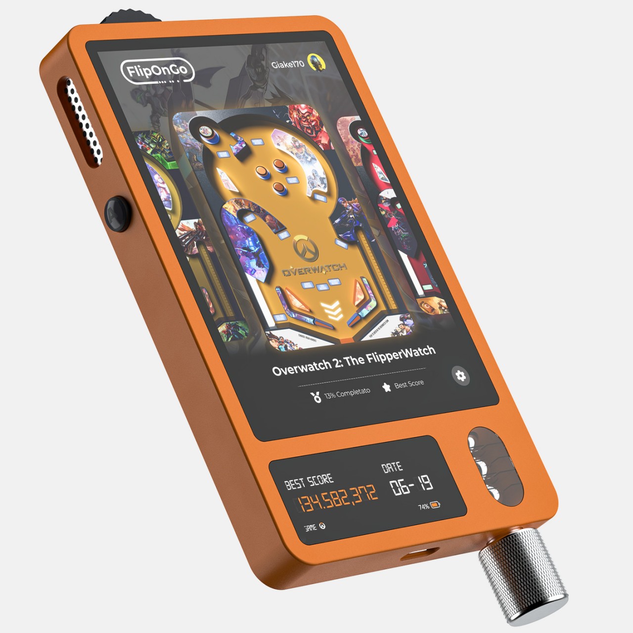
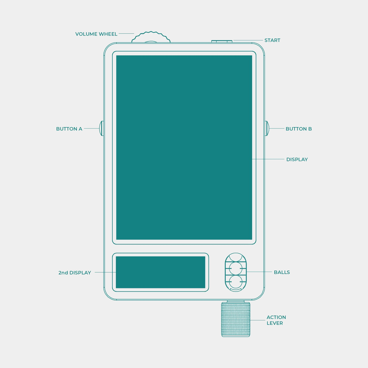
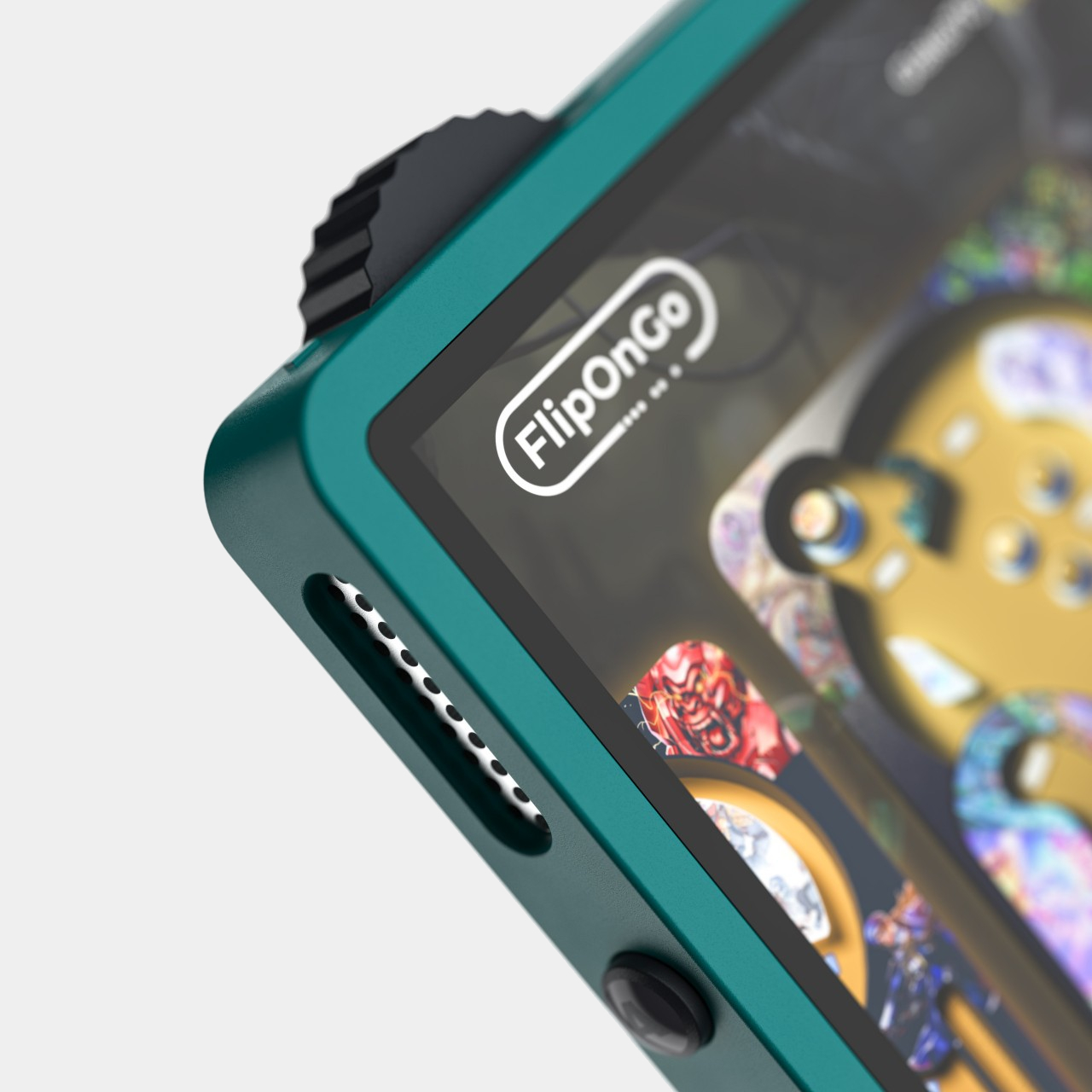
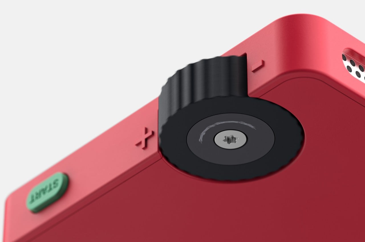
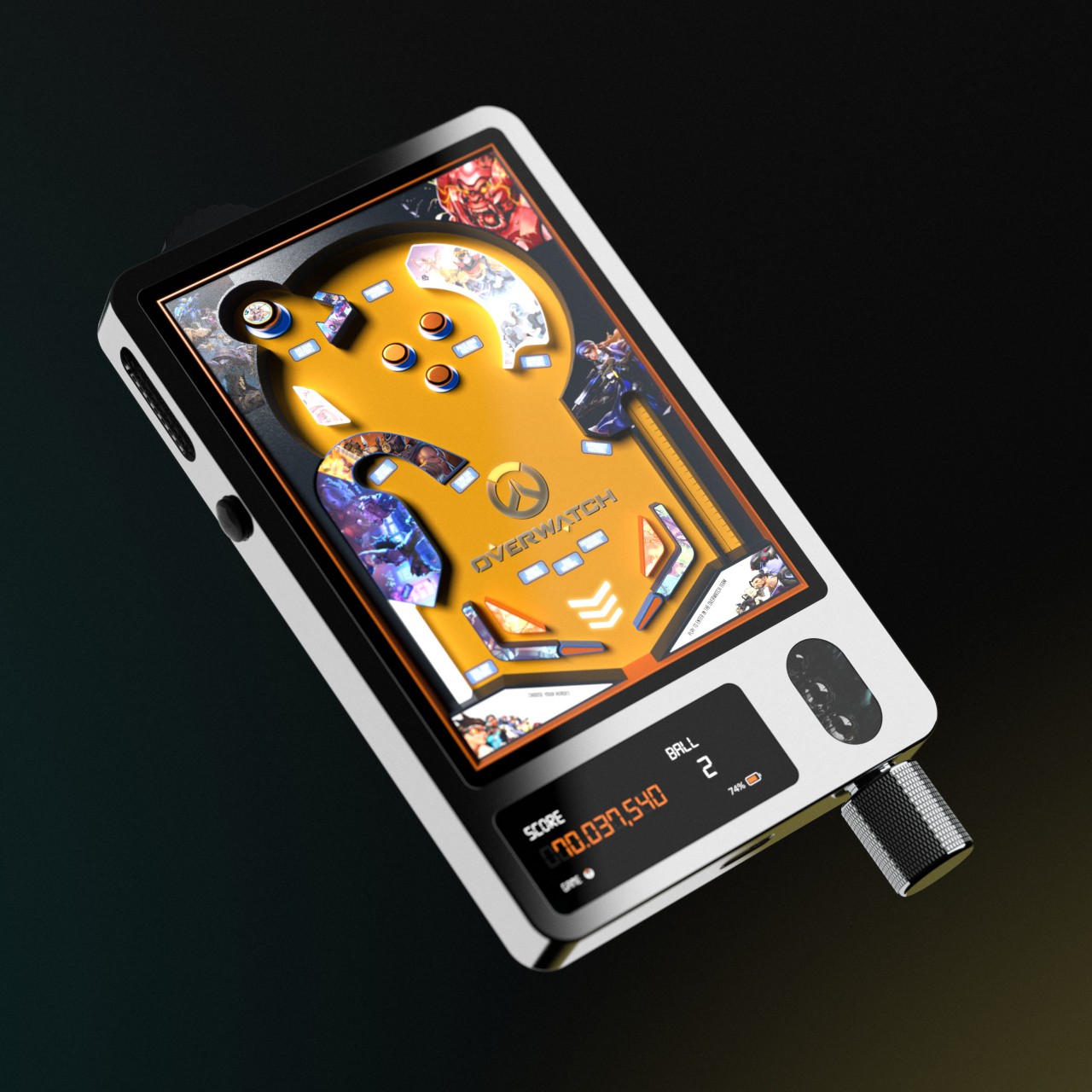
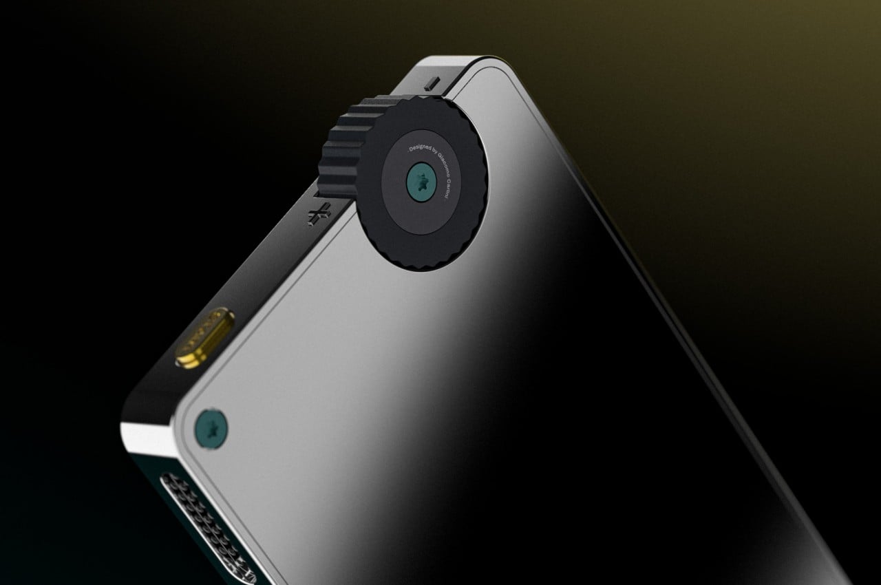
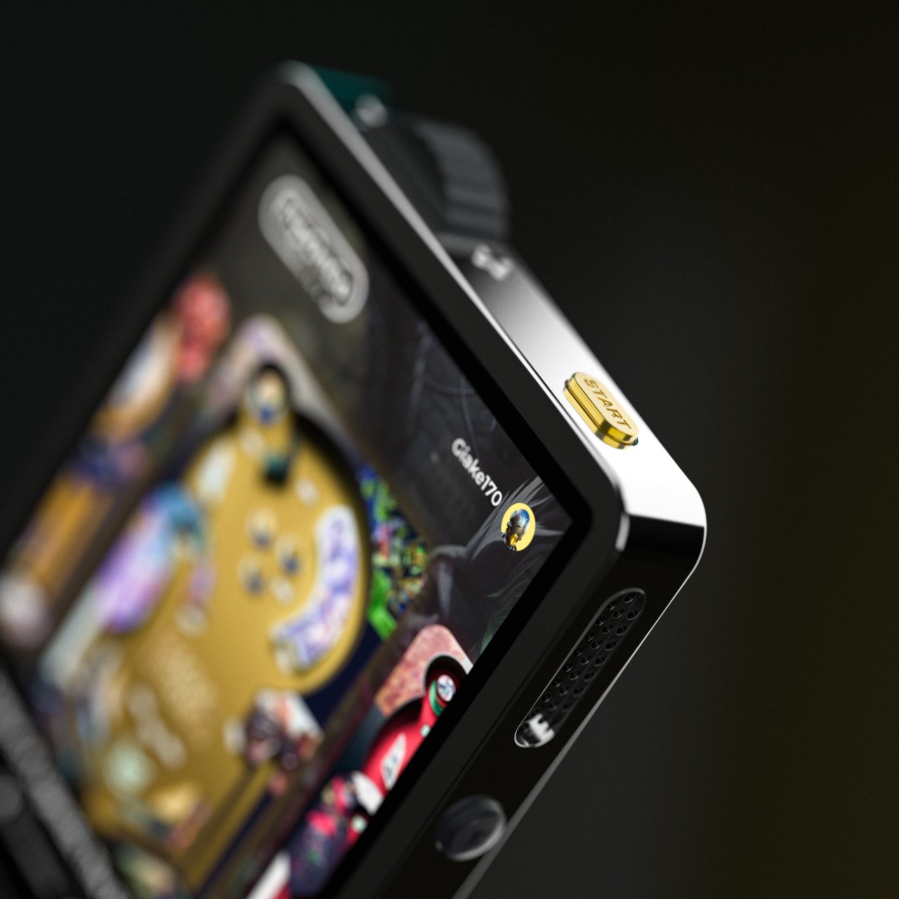
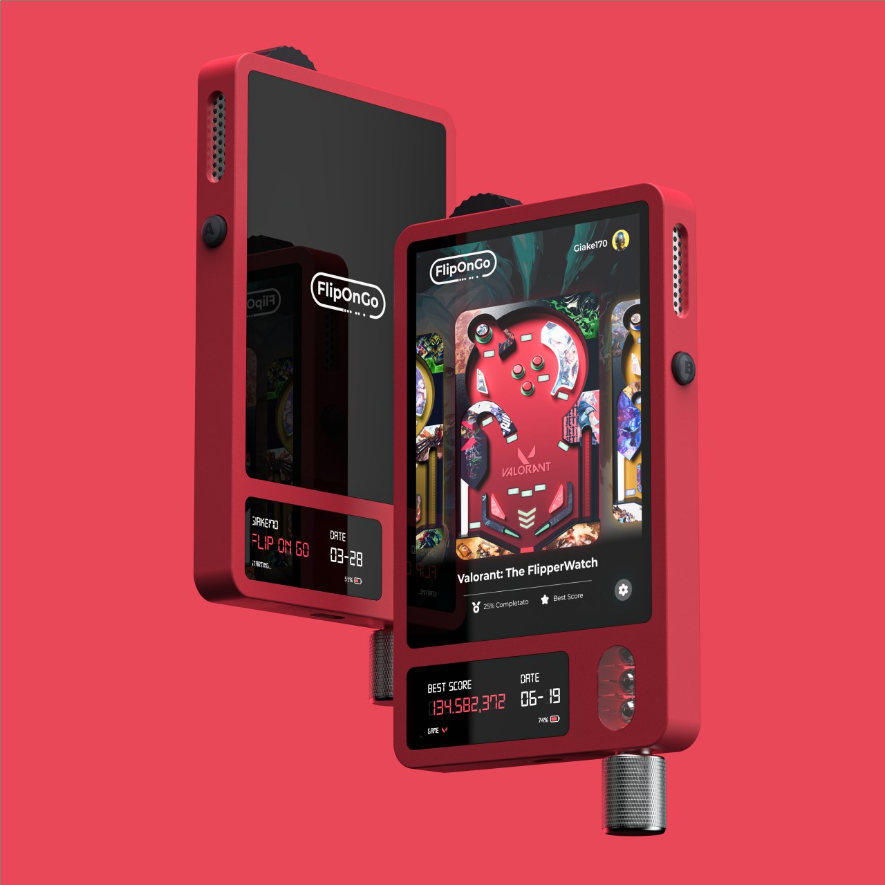
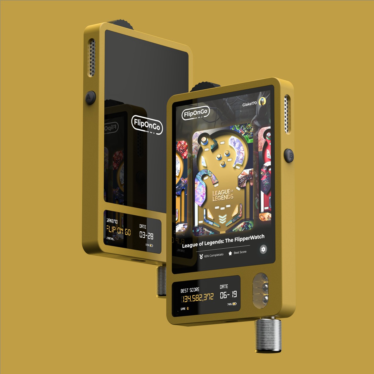
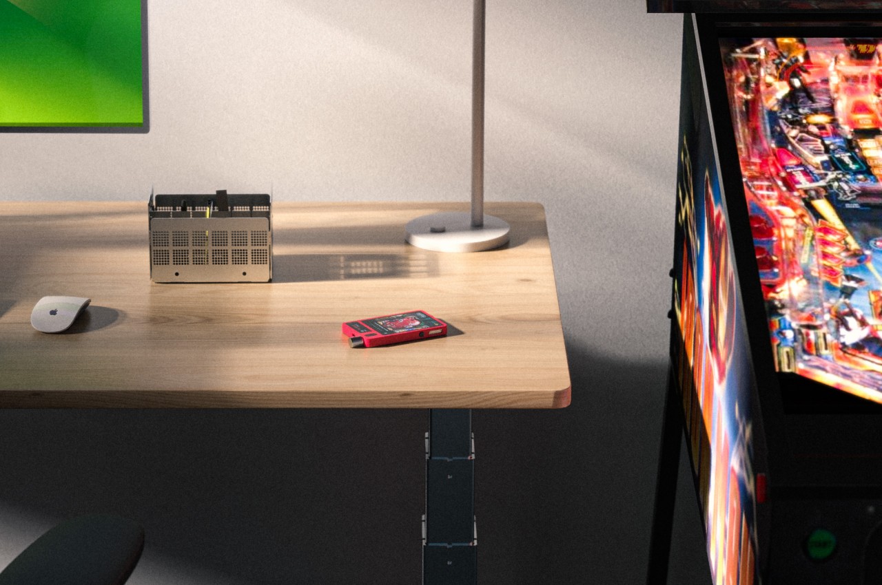
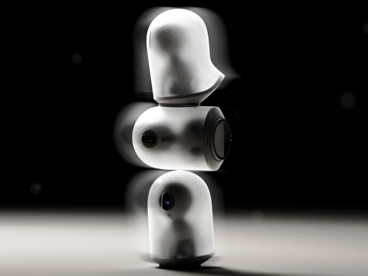
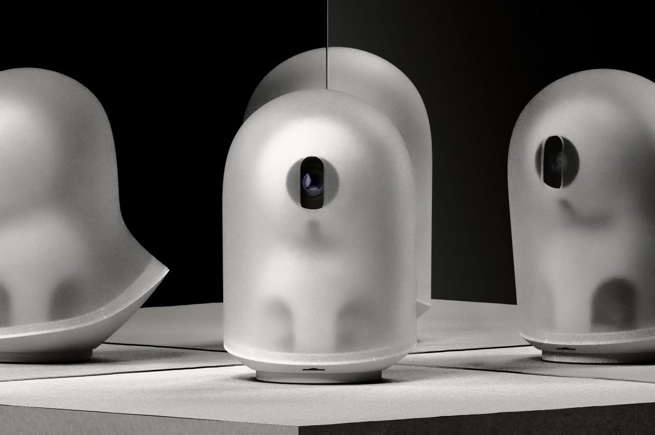
Almost everyone is familiar with pinball, even if only in concept or through movies. Just like arcades, the game is like a relic of the past, which makes it even better suited for a retro makeover. FlipOnGo is a concept that capitalizes on the nostalgia potential of the game but puts in a design that mixes the old and the new in interesting and unconventional ways. Yes, it’s a digital gaming handheld, and yes, you still need to pull that lever to start playing.
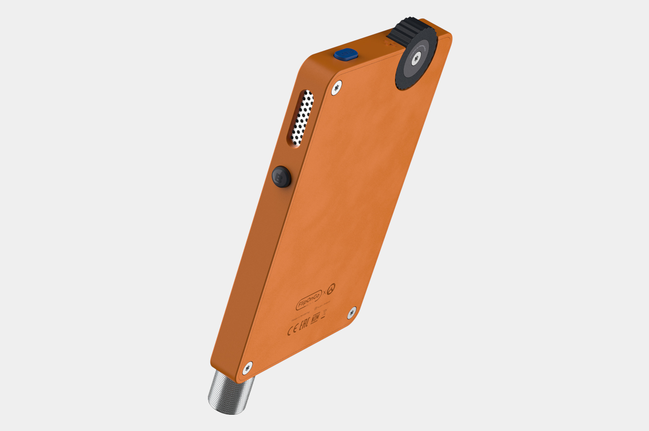
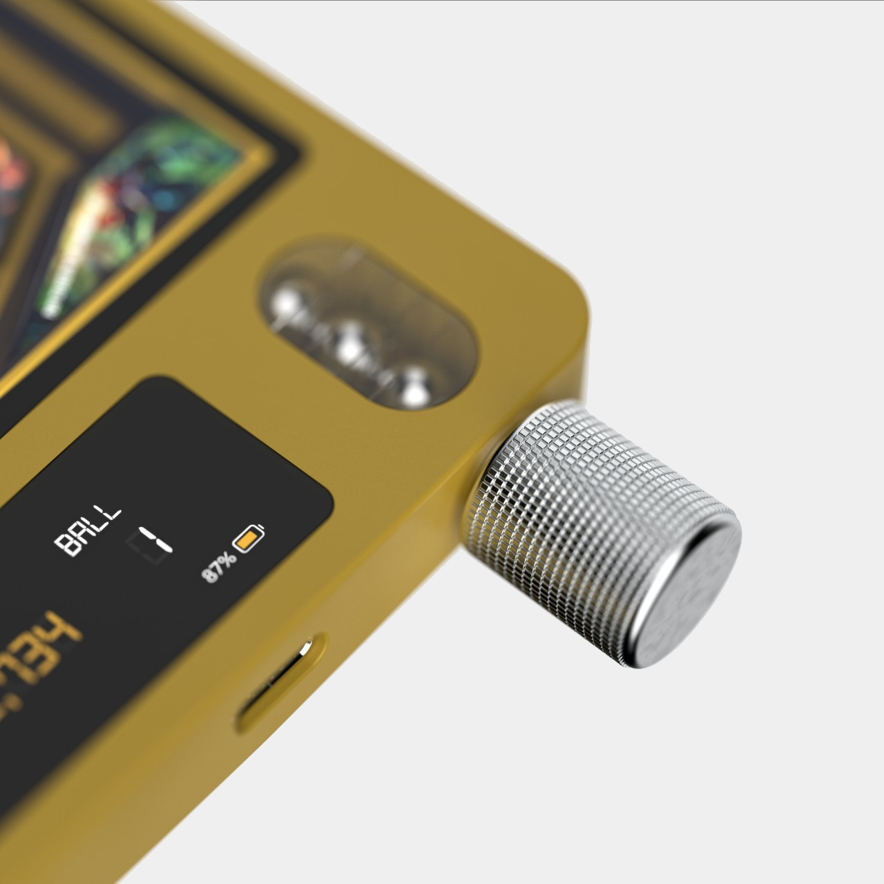
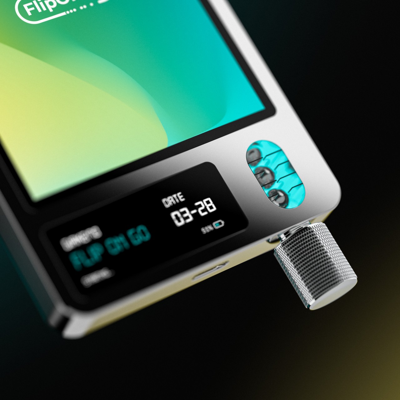
The device, which is only a little larger than a deck of cards, offers a classic game of pinball with the bells and whistles of a digital version. There are no real balls involved, and no mechanical paddles to flip. It has a large display, which shows a playing field and digital versions of flippers and bumpers. It also has a smaller display that shows the score, how many balls you have left, and the remaining battery.
To play the game, however, you will have to really give your fingers and hand an exercise. There’s a real lever hanging down the bottom of the console, and you have to pull the spring-loaded mechanism to “launch” the ball into play. Buttons near the top on each side of the device act as your paddle controls, though it’s uncertain how comfortable it will be to play the game this way.
The design of FlipOnGo is definitely intriguing, though it won’t be able to shake off doubts about the feasibility of such a device, especially with a lever that could become a source of mechanical failure after some time. It does, however, bring back a little of that joy and excitement when playing a classic pinball game, complete with that iconic lever, just miniaturized for portability.
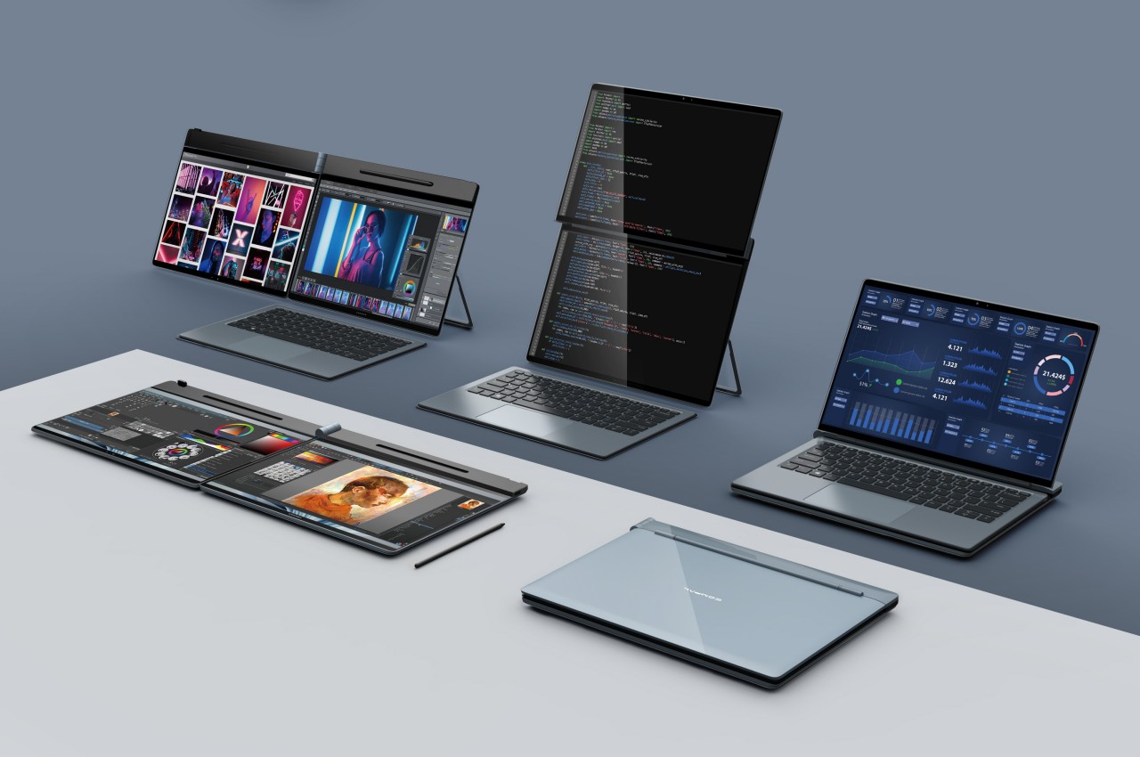
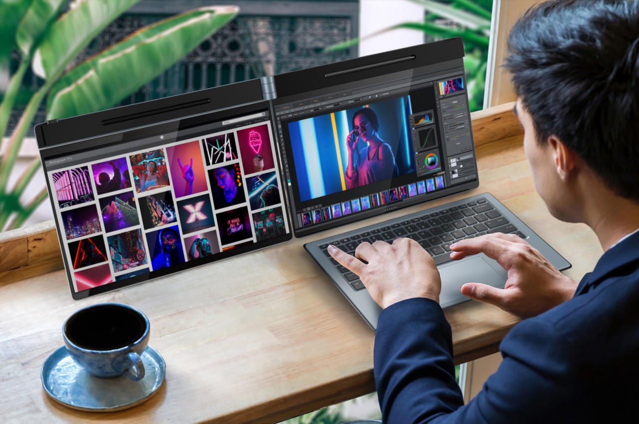
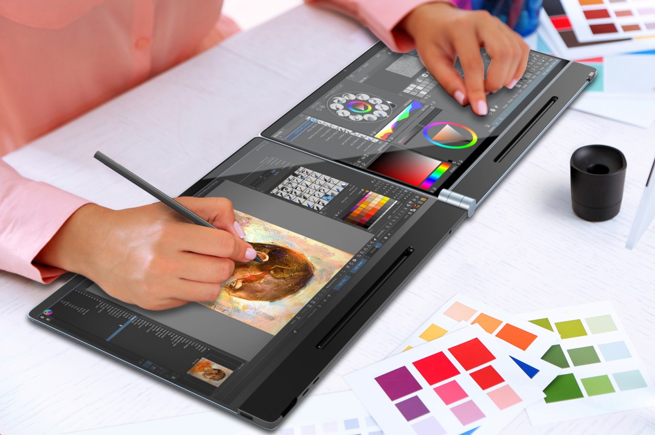
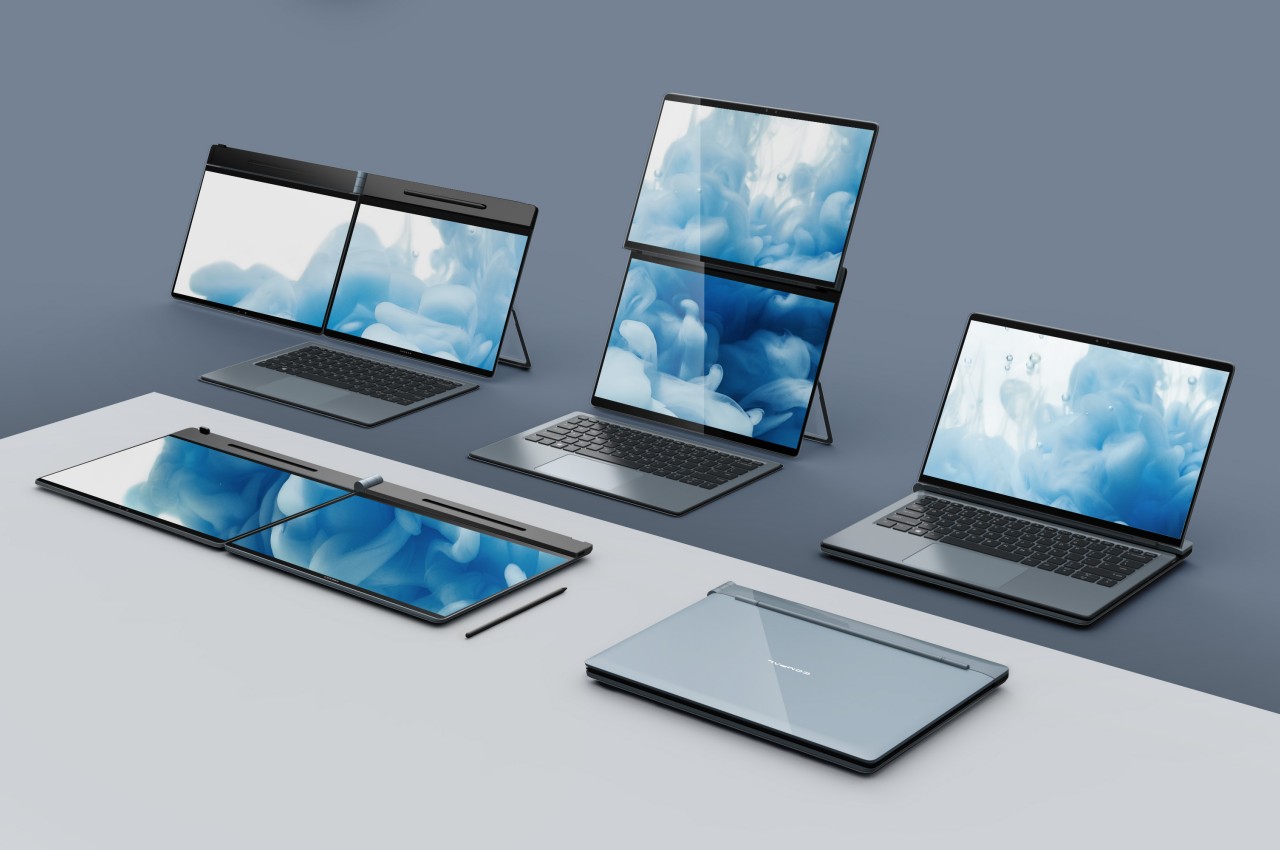
It’s still a very niche design, but it seems that dual-screen laptops are being adopted by major PC makers. Unlike a foldable laptop that mimics a foldable phone, a dual-screen laptop simply offers two separate displays joined by a hinge, sort of like offering a second monitor that’s permanently attached to the laptop. Given this design, however, the only available design was a book-type foldable like the aborted Microsoft Surface Duo, the ASUS ZenBook Pro Duo, and the Lenovo Yoga Book 9i. That, however, only covers about half of the use cases you might have for a dual-screen configuration and lacks the flexibility you’d enjoy with a detached second screen. That’s the kind of design problem that Compal’s concept is trying to solve and it does so in a very intriguing way.
The way dual-screen laptops are designed today is pretty much a product of familiarity rather than innovation. It’s the closest that resembles a regular laptop and is the easiest to implement. Ironically, it’s actually not the way people with two monitors arrange their screens in normal circumstances. Most have two horizontal monitors side by side or one stacked on top of the other. While current dual-screen laptops do support the latter use case, putting the monitors side by side requires having them standing vertically, opened like a book.
The Compal DualFlip concept flips that design on its head, pardon the pun, by giving the user the freedom to choose the configuration they need or want. They can have it stacked or side-by-side or even in the conventional book style. Or they can have only one screen active with the wireless keyboard sitting on top of the other, turning it into a regular laptop. The key point is that they dictate how they want to use the product rather than the other way around.
This opens the device to even more applications and users who have different needs and working conditions. Those monitoring data will probably appreciate having the monitor on top while those coding and writing might put the screen to the side. The latter is also the configuration that most will use for making digital art. Interestingly, having the screens stacked on top of each other also solves one of the biggest problems with dual-screen laptops and manages to “hide” the hinge and the gap that it creates between the two displays.
The key to this flexible design is the hinge that can fold or flip the screen as needed, hence the name. Of course, it’s still a concept and it’s uncertain if Compal already has working prototypes for this, but it definitely looks doable. If Compal manages to pull it off, it will definitely raise the brand’s profile and put it back on the map. That is unless its bigger rivals figure out another design that also solves that problem and actually puts it into production first.
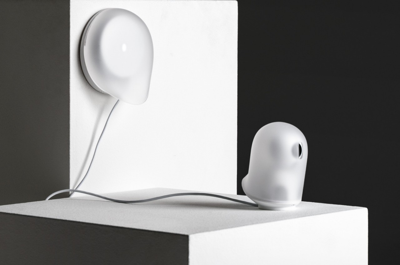
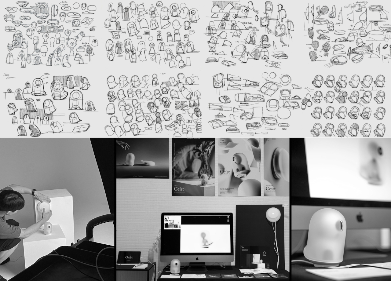
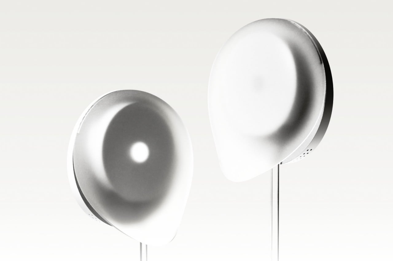
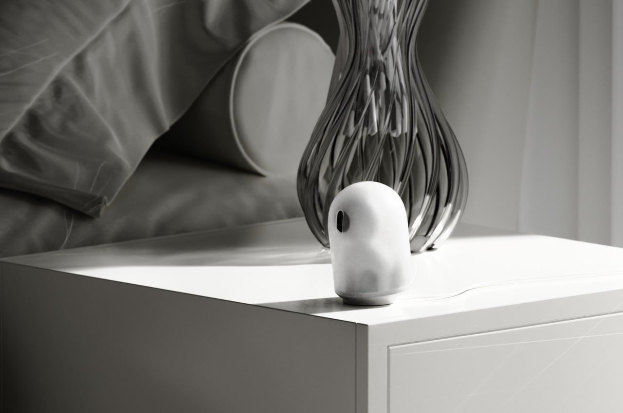
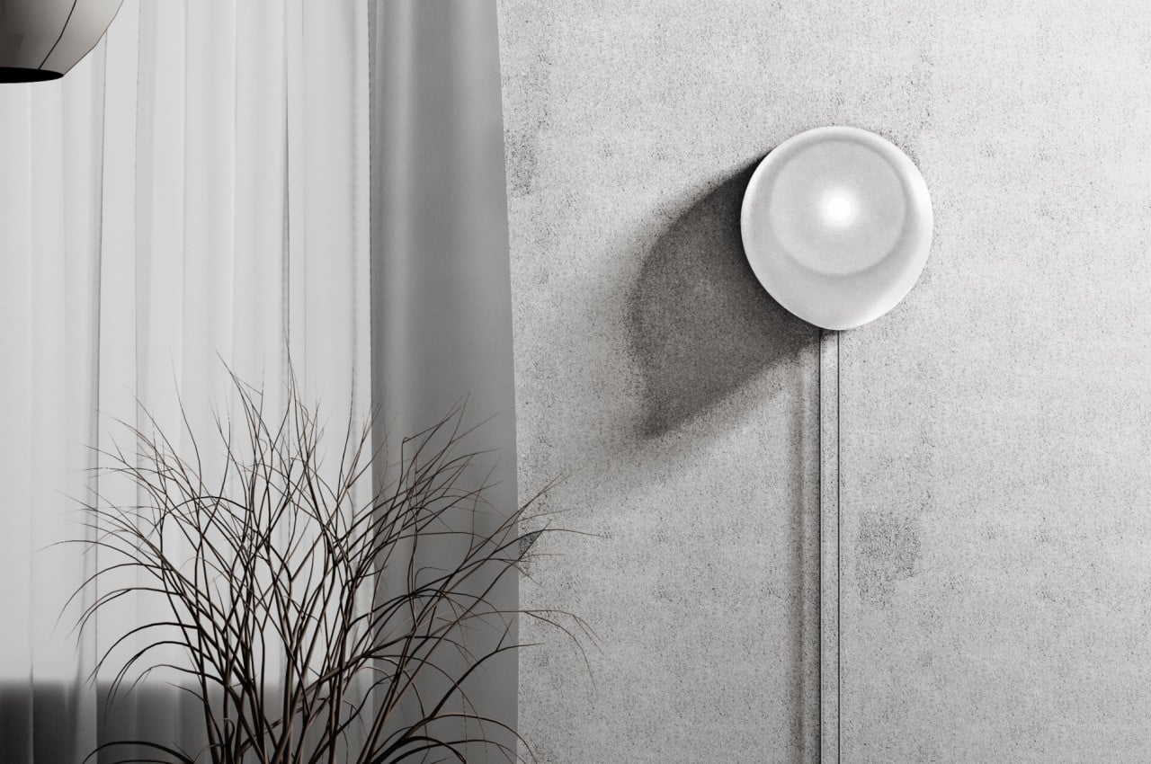
Our homes are starting to get filled with smart gadgets, and not just the usual culprits like smartphones and tablets. From smart lamps to smart refrigerators, a lot of devices in our houses are now connecting to the Internet. While some of these try to blend in with the rest of your decor as much as they can, others just stand out like a sore thumb. Devices like home security cameras and routers still carry the aesthetics of their predecessors, which is impersonal, technical, and at times even disconcerting. While these products might be important in modern smart homes, they don’t need to be seen in order to function, which is why this concept design tries to make them almost literally fade into the background as if they were ghosts.
Designers: Seokhyun Ahn, Yejee Park, Cho Yumi, Yumin Shin, Myeongryun Kim, Dohyun Park, Lee Dahye, Kim Geonhee, Yang Yurim
We easily take for granted how things that look out of place can affect our minds and moods. Whether it’s a messy desk, a less-than-appealing piece of decoration, or clashing designs, the visual discomfort and confusion can actually bleed into your physical and mental state. They say that the best interfaces and designs are the ones that you barely notice, and what is the least noticeable thing if not a ghost?
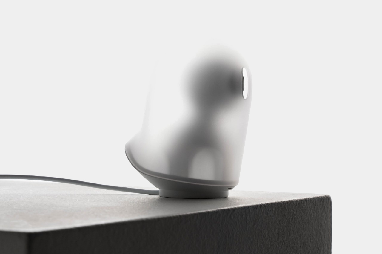
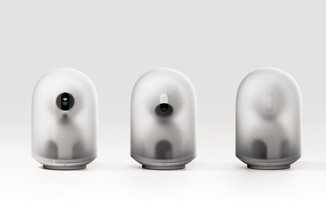
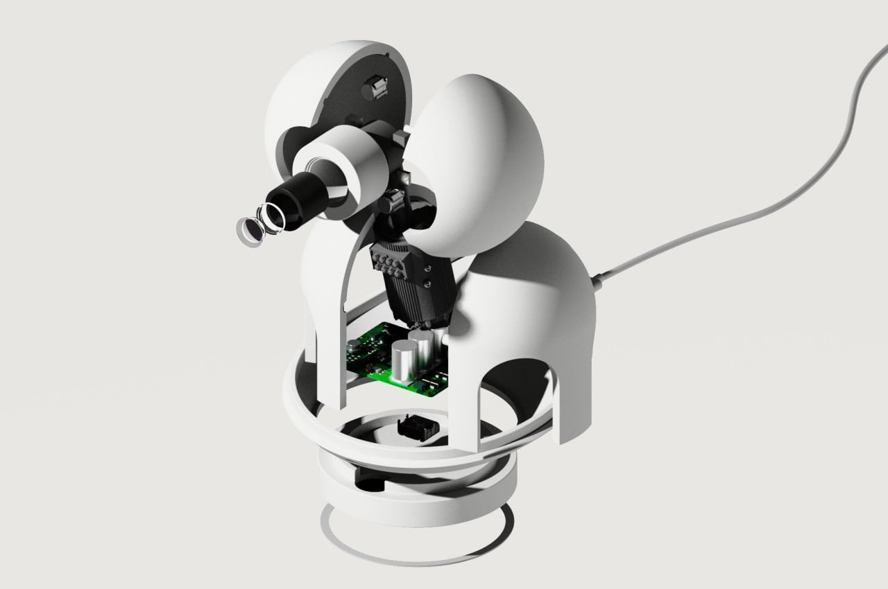
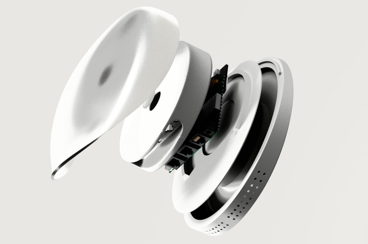
Geist, which literally means “spirit” or “ghost,” is a concept design that tries to make those smart home devices less noticeable. Rather than having a black sphere or rectangle that feels like it’s spying on you, the John Doe ghost camera has a translucent body that almost looks like a piece of cloth flying in the wind, just like your stereotypical ghost from cartoons. It is even slanted at an angle to give the impression that it’s levitating and floating as it moves forward. It does have an “eye” for the camera, but it can turn it down to protect your privacy, indicating that it isn’t recording at the moment.
The Wi-Fi router Jane Doe takes on the shape of a gentle wisp of smoke or cloud. With an asymmetrical shape that is mounted vertically on a wall, it almost looks like a ghost passing through a solid surface. It’s impossible to completely hide some of the cables, particularly the power cable, but it at least forces these wires to go in a straight vertical line rather than ending up in a tangled mess.
Although the Geist concept design is actually meant to be less conspicuous and reduce visual discomfort, they can actually also have the opposite effect, depending on the person. Some might not be keen on seeing any representation of the paranormal, so anything that might remind them of ghosts might be even more uncomfortable. That said, the designs are aesthetically pleasing on their own, if you leave out the ghost association, so they still present a more pleasing aesthetic compared to the typical designs of these devices.
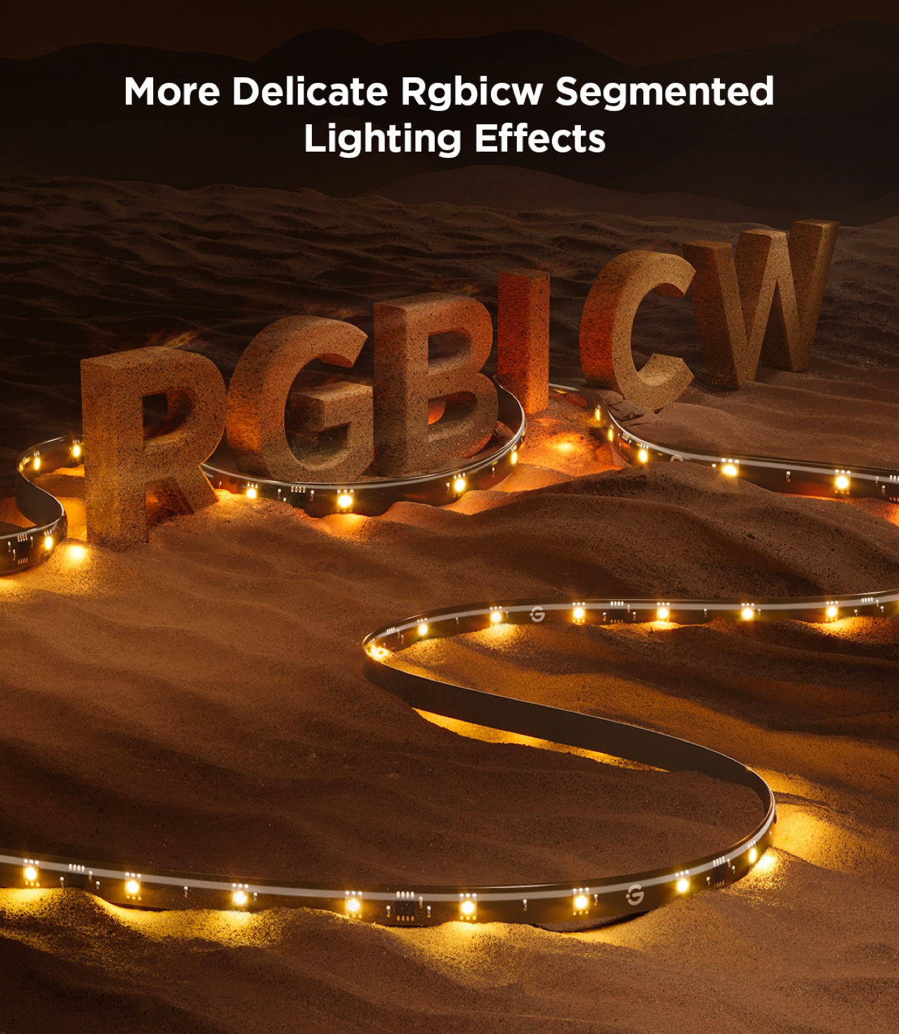
Bright and vibrant colors thanks to RGBICW LED technology
Superb color-matching using a future-proof camera system
Incredible value for its price
CONS:
Camera design is a bit awkward and might not fit thicker TVs
Wi-Fi connectivity is compatible with 2.4GHz networks only
RATINGS:
AESTHETICS
ERGONOMICS
PERFORMANCE
SUSTAINABILITY / REPAIRABILITY
VALUE FOR MONEY
EDITOR'S QUOTE:
With rich colors, fast color-matching, and unbeatable price value, the Govee TV Backlight 3 Lite with Dune-themed packaging helps fully immerse viewers in the content they're watching.
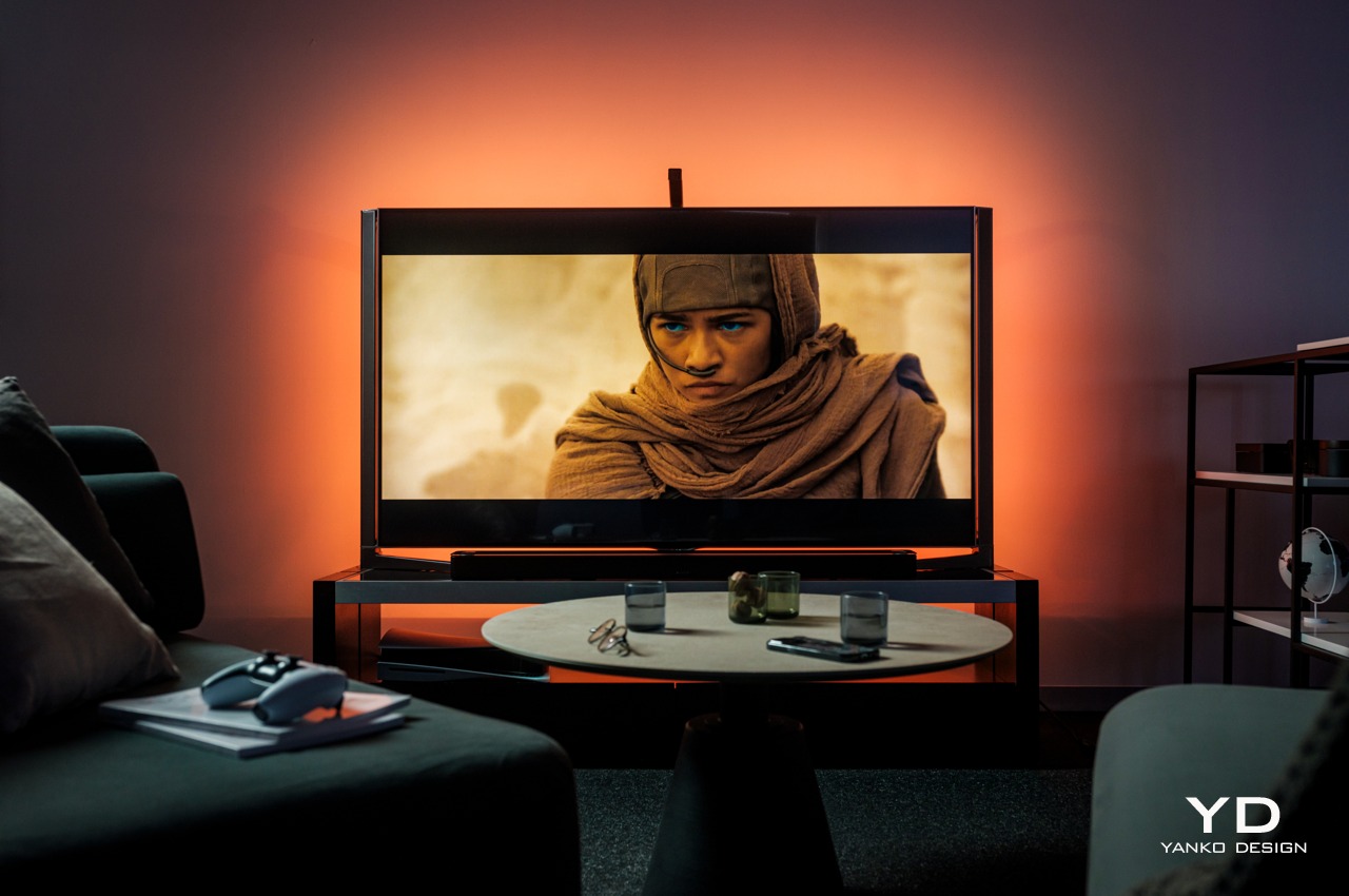
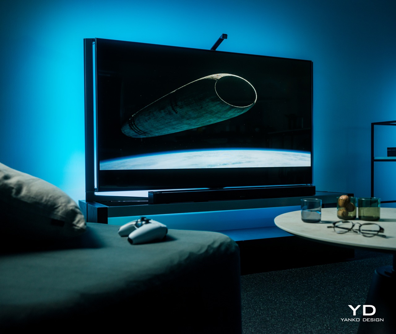
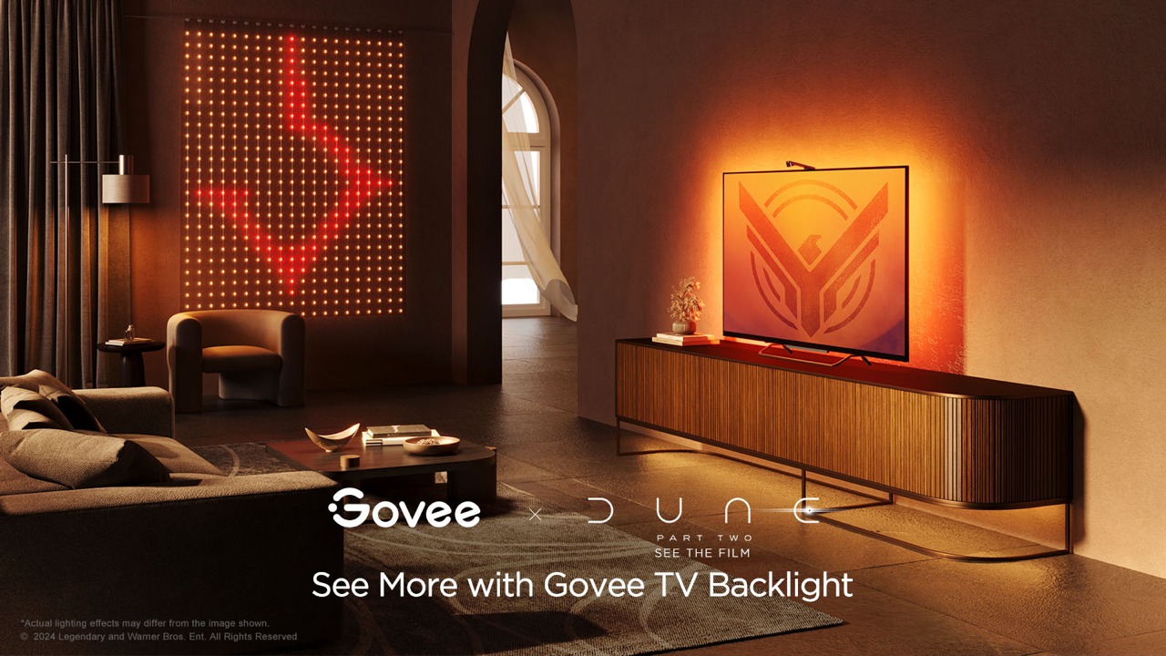
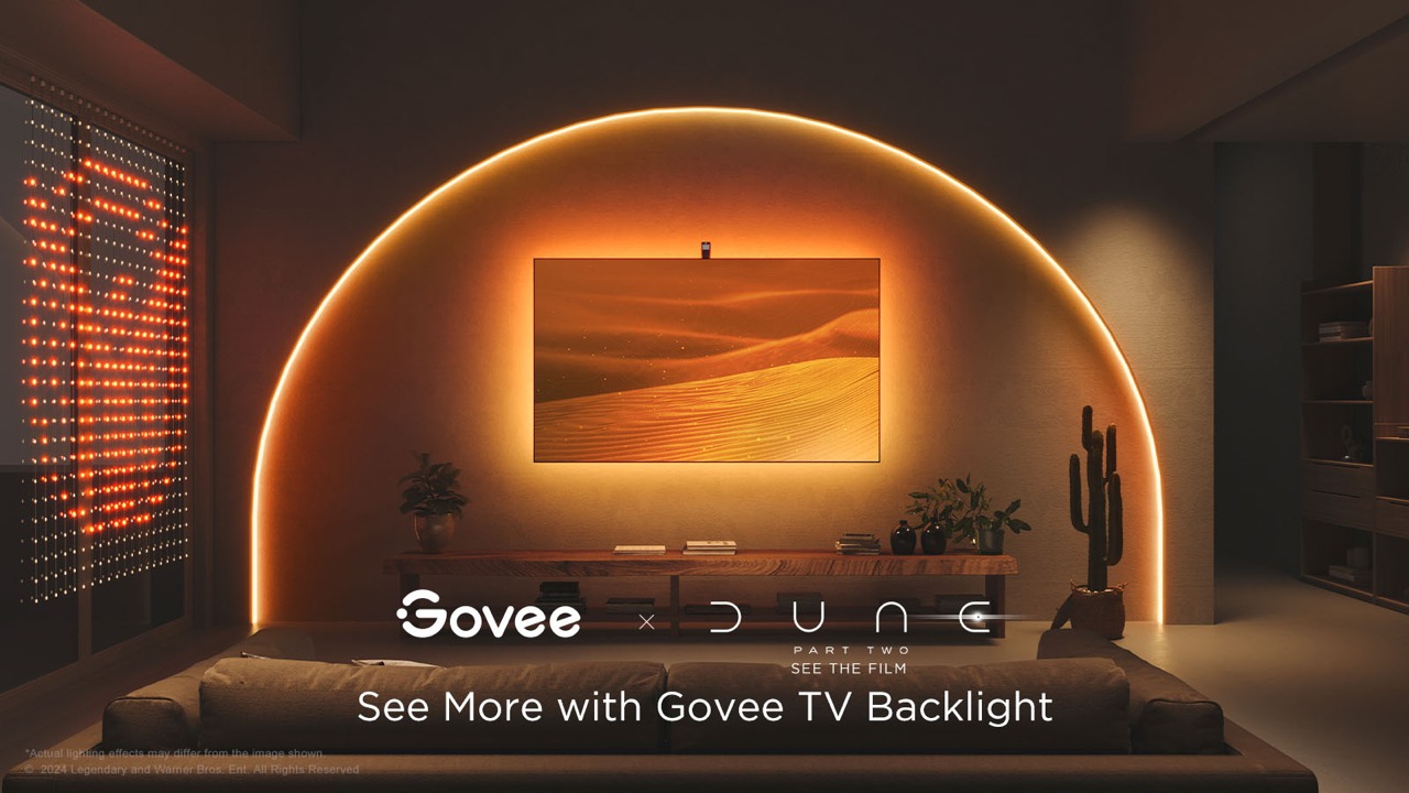
TVs today are more than just large boxes that show moving pictures. They have also become pieces of decoration that add to the ambiance of a space, whether they’re turned on or not. The lush and vibrant colors that a TV can display can definitely light up a dark room, but that glow stops at the TV’s frame. Yes, the TV’s light can bounce off nearby walls, depending on where it’s placed, but you have absolutely no control over what happens. TV backlights were made to help better immerse you in the show or movie you’re watching by making sure that the light behind and around your TV reflects the content that’s on screen. Smart lighting expert Govee recently launched its latest contender in that category and even partnered with Warner Bros to tie in with the studio’s latest new science fiction film, Dune: Part Two. It’s the perfect time, then, to take a close look at the Govee TV Backlight 3 Lite, particularly with this Dune-themed packaging, to see what value it adds to your viewing experience and if it’s tempting price tag sounds too good to be true.
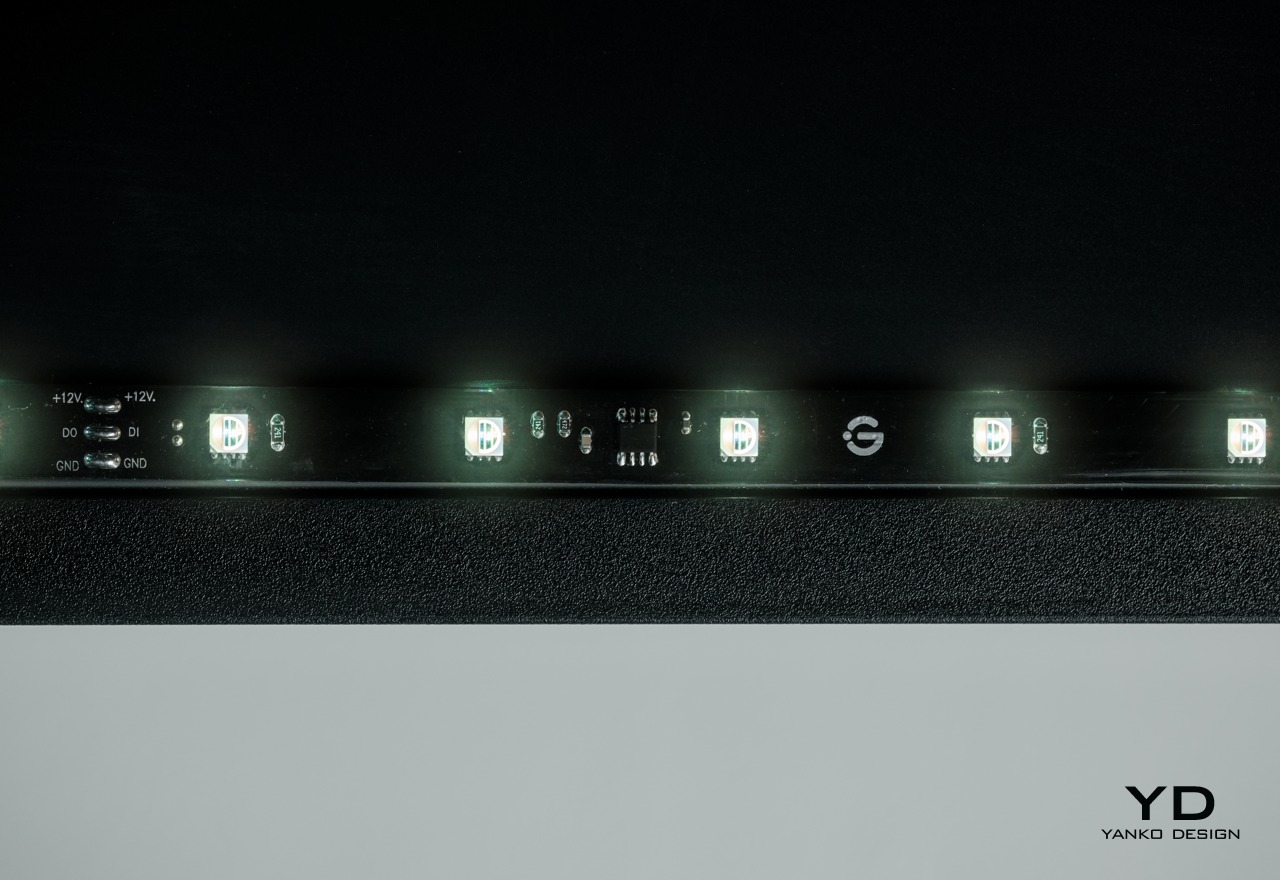
For something you will never see again after you’ve installed it, the Govee TV Backlight 3 Lite has quite an interesting appearance. Of course, it’s just a flat strip of LEDS grouped into four segments that need to go around your large TV, but the transparent material that covers the LEDs and some of the circuitry that controls allows you to see some of the secrets behind the magic. It’s not unlike that trend in consumer electronics where transparent cases showed off the parts that actually made the product work. It’s not as sophisticated as those, but it still adds a bit of flavor to the design.
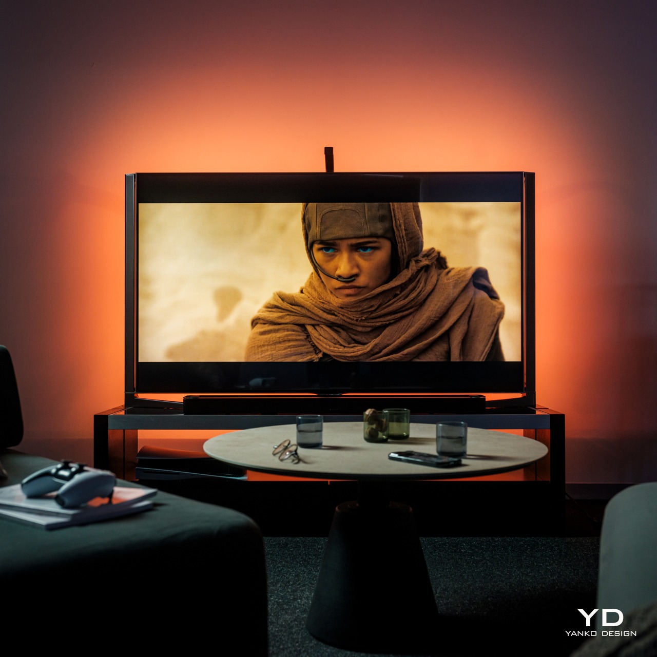
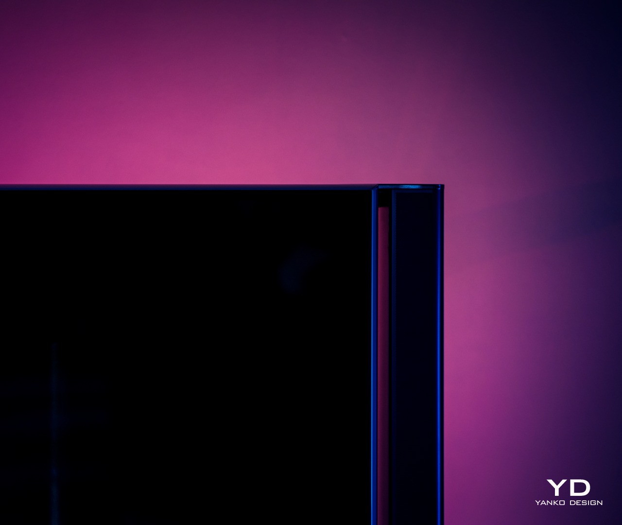
Of course, the Govee TV Backlight 3 Lite’s beauty really shines, literally, it has been installed and enabled, and boy does it shine! The light the strips produce is quite bright, especially in a dim room, and the colors are rich and vibrant. The way those colors shift almost instantly to match what’s on the screen is also magical, making it look like the TV actually goes beyond its frame. We’ll get to the technical details that make that possible in a bit, but suffice it to say, the backlight definitely delivers an enriching experience when watching any kind of content on TV.
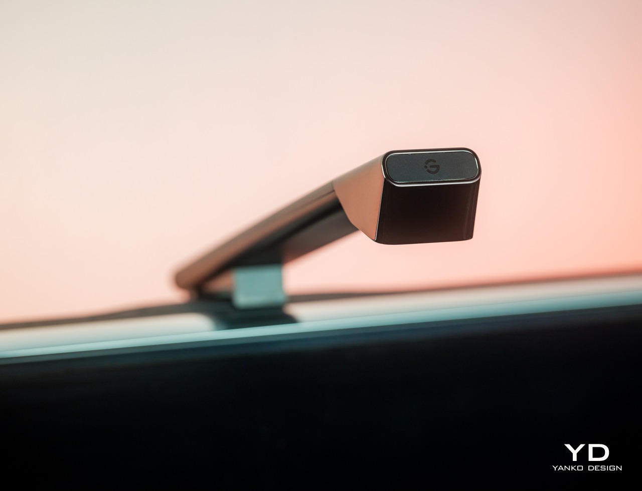
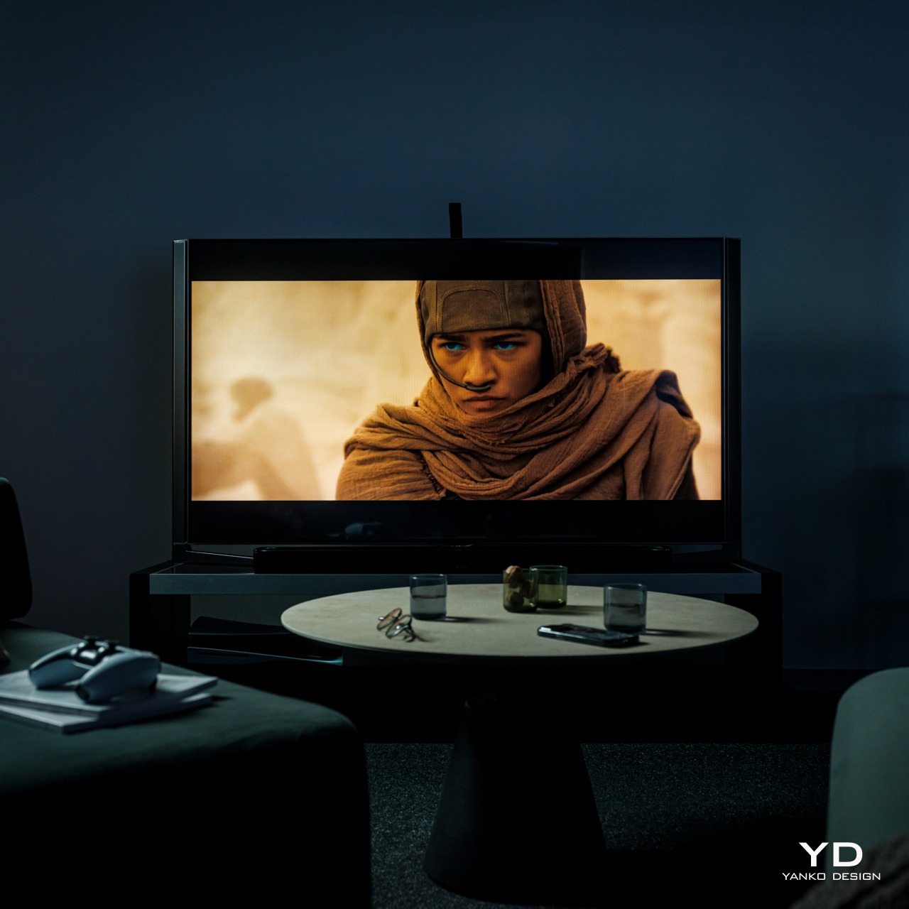
While the backlight itself is something you won’t see, there is one part of the system that is actually always visible and, depending on your setup, always in your face. Given how the Govee TV Backlight 3 Lite works, it’s necessary to have that camera hanging from the top of the TV, extending a bit forward from the frame. Depending on the design of the TV itself, this black cantilever-like part may or may not easily stand out, and it will definitely add a little blemish to more artful TV designs. Unfortunately, there is no other way to implement this kind of dynamic color-matching system, so it’s a cost that owners will have to live with. Fortunately, it might actually be the biggest cost after all.
Ergonomics
Since the Govee TV Backlight 3 Lite is not something you’ll be using in your hand every time, its ergonomics mostly apply to the installation process as well as the hands-free control of the lights. In that regard, Govee’s light strip is not really unlike others in this market, which isn’t completely a good thing either. Installing the lights on the TV is a very involved process, which will be even more difficult if your TV is mounted on a wall.
In a nutshell, you attach the four segments of the strip on the four edges of the TV’s back. The exact placement of the strips will depend on the shape of that rear, with curved ones being the trickiest. The strips are attached using 3M adhesive, which will worry some owners about the permanence of the installation and the marks it will leave behind when removed. Special care must also be taken to hide the loose cables at the corners so that they don’t peek out of the frame or cast shadows when the lights are turned on.
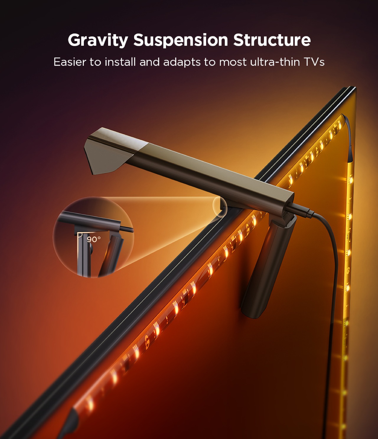
Compared to its previous two TV backlights, Govee changed the design of the camera bracket significantly. It no longer uses an adhesive and instead relies on gravity and the weighted bracket to attach the camera to the top of the TV without sticking it with an adhesive. In theory, it works and won’t wobble too much (unless you’re constantly moving the TV), but some might worry enough to actually use the included adhesive anyway. The bigger problem, however, is that this design also limits the bracket to certain TVs, particularly thinner ones. It’s certainly possible to attach it to other TVs, but not without putting in a lot more effort as well.
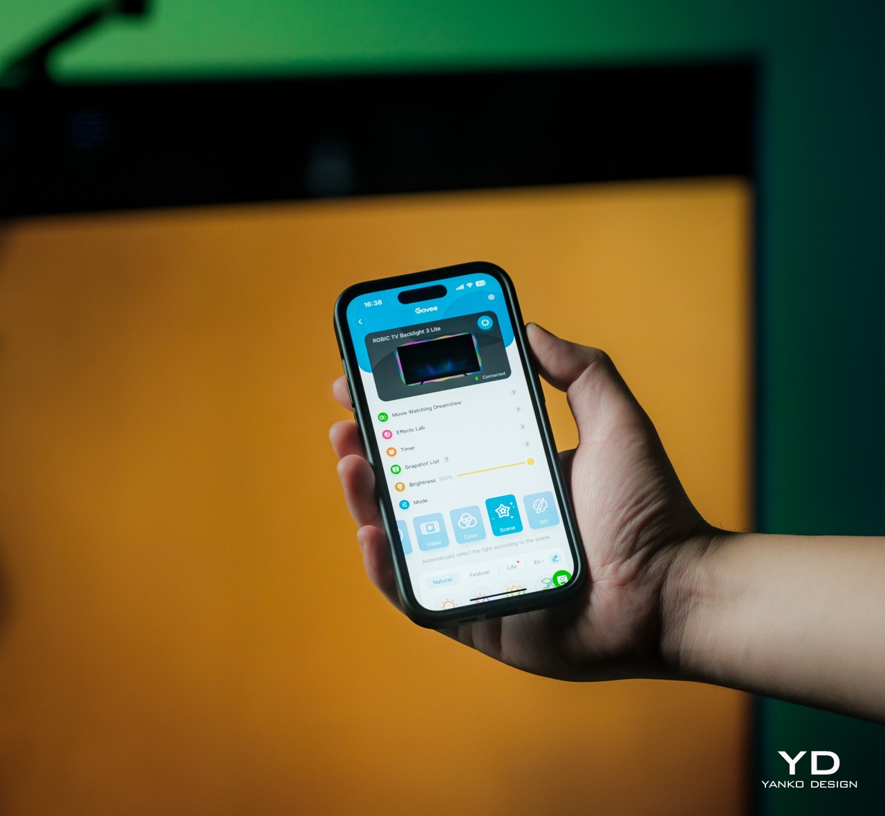
Once that hard work is done, however, the rest of the setup is easy as pie. You only need to turn the control box on, connect it to the Govee app on your phone, and go through the initialization process. That will include calibrating the camera by placing removable orange markers on the front edges of the TV, and that’s pretty much it. The mobile app has tons of settings and modes you can play with, but even leaving it at the default color-matching mode is more than enough to enhance your watching experience. You don’t even need that app if you connect it to your Wi-Fi so that you can control it by voice using smart home platforms, though like any Govee product, it requires 2.4GHz Wi-Fi, so 5GHz-only routers will be incompatible.
Performance
Without the Govee TV Backlight 3 Lite
Although TV backlights are not uncommon, dynamic color-matching ones are still hard to come by, especially at the price point that the Govee TV Backlight 3 Lite with Dune-themed packaging comes with. It’s even harder to find one that works so well, which is why this Govee product is actually impressive and a dream come true for TV owners who want to take their cinematic experience to the next level.
With the Govee TV Backlight 3 Lite
Govee upgrades the backlight from its usual RGBIC LEDs to a new RGBICW tech which adds a fourth color to the combination. With a dedicated white LED, the lights can cover even more colors as well as different white temperatures. The lights become more expressive and more vibrant, able to better match the colors being displayed on the screen in front.
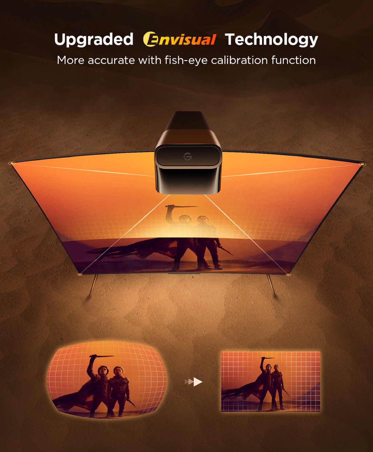
Of course, that color-matching doesn’t happen by magic, which is where that odd protruding comes in. With improved Envisual technology and upgraded processors, the Govee TV Backlight 3 Lite is able to identify colors on the screen faster and adjust the lights accordingly. The new fish-eye correction also makes sure that the 180-degree field of view camera sees the edges correctly as well. Admittedly, there’s still about a split-second delay between what happens on the screen and the backlight changing, but it’s almost negligible, to say the least. An HDMI control box would have made things faster but that would only work for content coming through HDMI sources and might not support future versions of the HDMI standard. This camera-based system is, therefore, more flexible and more future-proof, making that milliseconds delay a small price to pay.
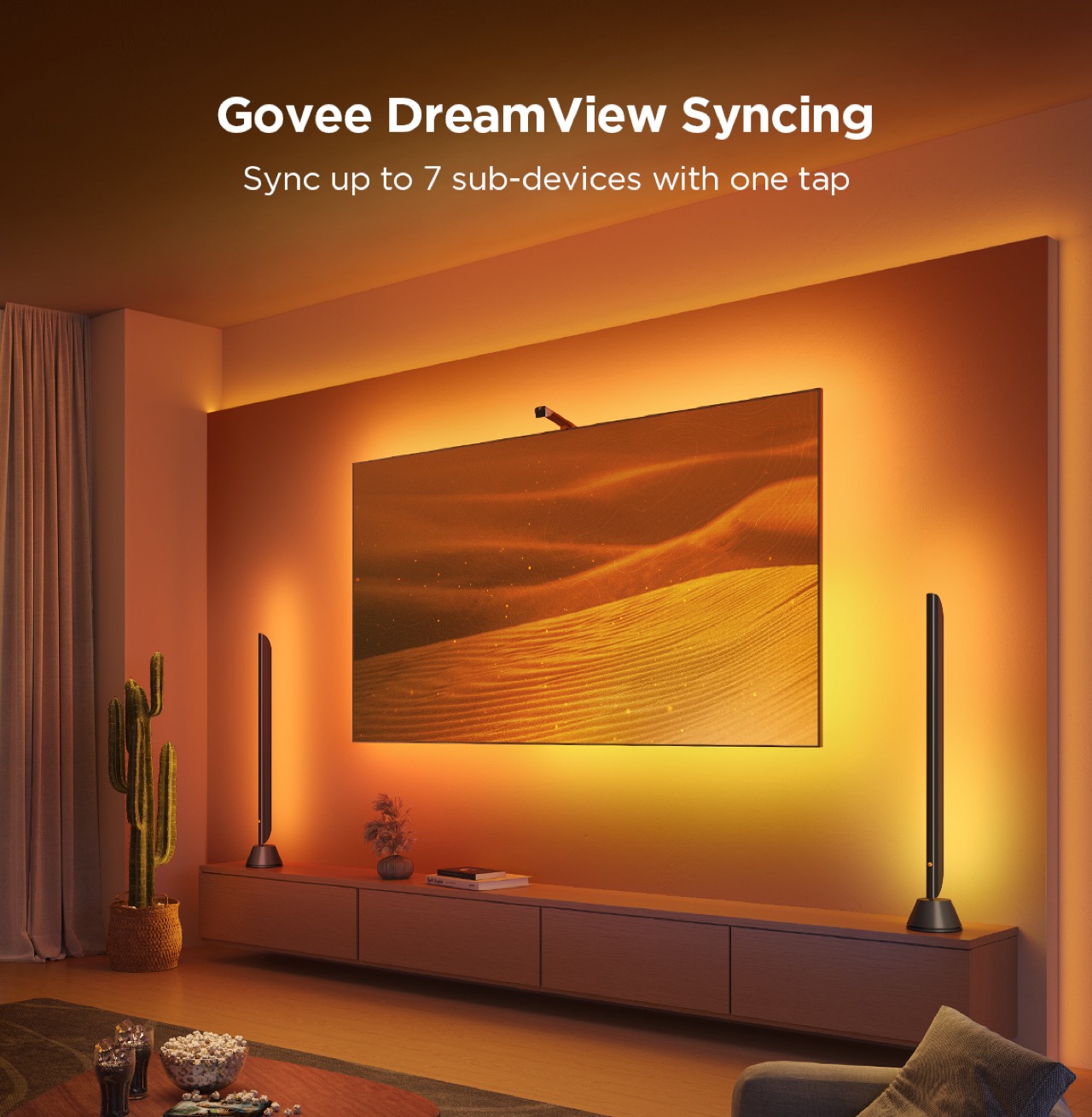
Although the color-matching feature is already incredible, the Govee app still has a lot in store for those who want to customize every detail. That includes different modes for what lights to play, even if that means not matching what goes on screen. This is where the collaboration with Warner Bros. comes in, turning the Govee TV Backlight 3 Lite into a portal into the world of Dune: Part Two. There are two new lighting effects, namely Arrakis and Spice, that will make you feel like you’re actually in that fictional world. Even the app itself gets a Dune theme to match. But if you really want to be transported to Arrakis, Govee’s DreamView technology allows you to sync with other Govee lights in the room, bathing you in the warm orange glow of the planet’s environment.
From its fast responsive color-matching to its bright, vibrant colors, the Govee TV Backlight 3 Lite definitely delivers on its promises. It’s not a perfect solution, of course, at least not yet, but the company seems to be heading in the right direction. And with tons of customizable options, including those from the Dune: Part Two collab, the design definitely has a lot to offer, especially if you have other Govee lights in the room.
Sustainability
Sustainability in lighting can be a difficult goal to chase after. Many of the materials needed to make such electronics work are sadly not sustainable by nature. One can only do so much to offset their negative effects, like using recycled materials for packaging or using more power-efficient lights like LEDs, but those can only go so far. Making matters worse is that the Govee TV Backlight 3 Lite, like any other TV backlight, isn’t exactly repairable by design. Once an LED gets busted or a part of the strip stops working, there’s no recourse possible. The whole thing becomes unusable and you either have to replace it or ship the whole thing for repairs. Either way, that means you have to pull it off the TV’s back, which will be tricky with that much adhesive used, and then go through the installation process again with the new strip.
Value
Compared to other TV backlights, the Govee TV Backlight 3 Lite with Dune-themed packaging is quite a steal at $74.99 for 55-65 inches with this sweet deal for Yanko Design readers, especially when considering all you’re getting for that price. You have bright and vibrant RGBICW LEDs that can display almost any hue and color-matching capabilities that can quickly follow the action on the screen. You also have plenty of customization options for modes and effects, including immersing yourself in the desert world of Arrakis if you want to.
The camera will probably be the most contentious part of its design, but it’s a flexible solution that is guaranteed to work regardless of TV and display technologies of the future. Hopefully, Govee will be able to create a better design for the camera in future iterations, but TV owners will just have to live with something hanging at the top of their TV in exchange for a more cinematic viewing experience.
Verdict
It’s actually astounding how a little change of light can affect the atmosphere in a room, even more so when you have a dazzling burst of color to match a mood. TV backlights are one of those things you never knew you needed until you actually try it out and realize how “dead” even the most colorful TV can be without colorful lights shining behind and around it. Some TVs these days come with their own ambient backlighting system, but those come at added cost and no upgrade path for the future.
The Govee TV Backlight 3 Lite with Dune-themed packaging brings that flood of light and color in a package that almost anyone can afford. Its upgraded Envisual color-matching technology is simply mind-blowing in its ability to keep up with the fast-paced action on the screen, and the gamut of colors provided by new RGBICW LEDs helps make the content pop out even more. The variety of customization options, including Arrakis and Spice lighting effects inspired by the Dune: Part Two makes sure that no viewing experience will be plain and boring ever again.