Longer ePrint Replaces UV, DTF, and Rotary Printers with One Box

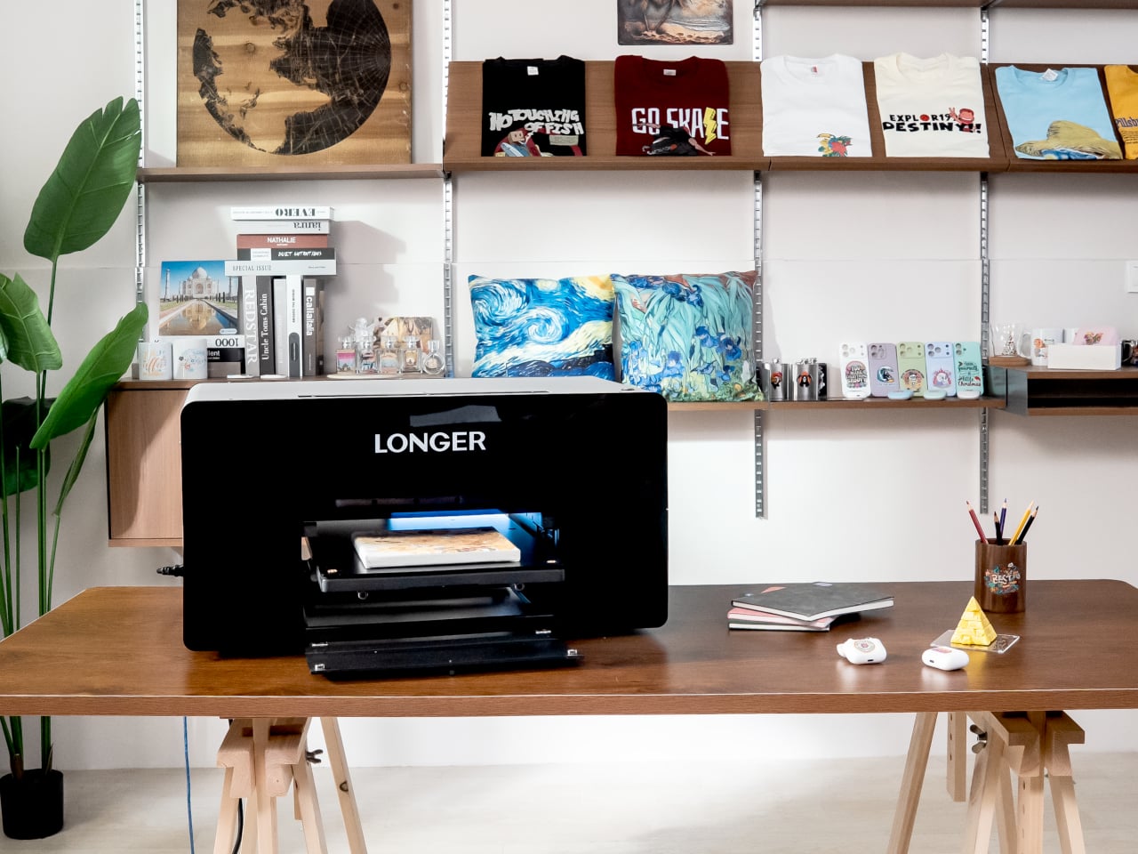
A typical small studio or serious hobbyist handles printing across multiple devices and vendors. One machine for paper, maybe another for vinyl, a separate UV printer if you are lucky, and outsourcing for anything textured, cylindrical, or fabric-based. The friction adds up quickly, juggling vendors, minimum orders, and formats that do not quite align. Longer ePrint tries to pull those scattered workflows back into a single, desk-sized footprint, treating printing as something you do in-house across materials and processes instead of planning around what your gear can handle.

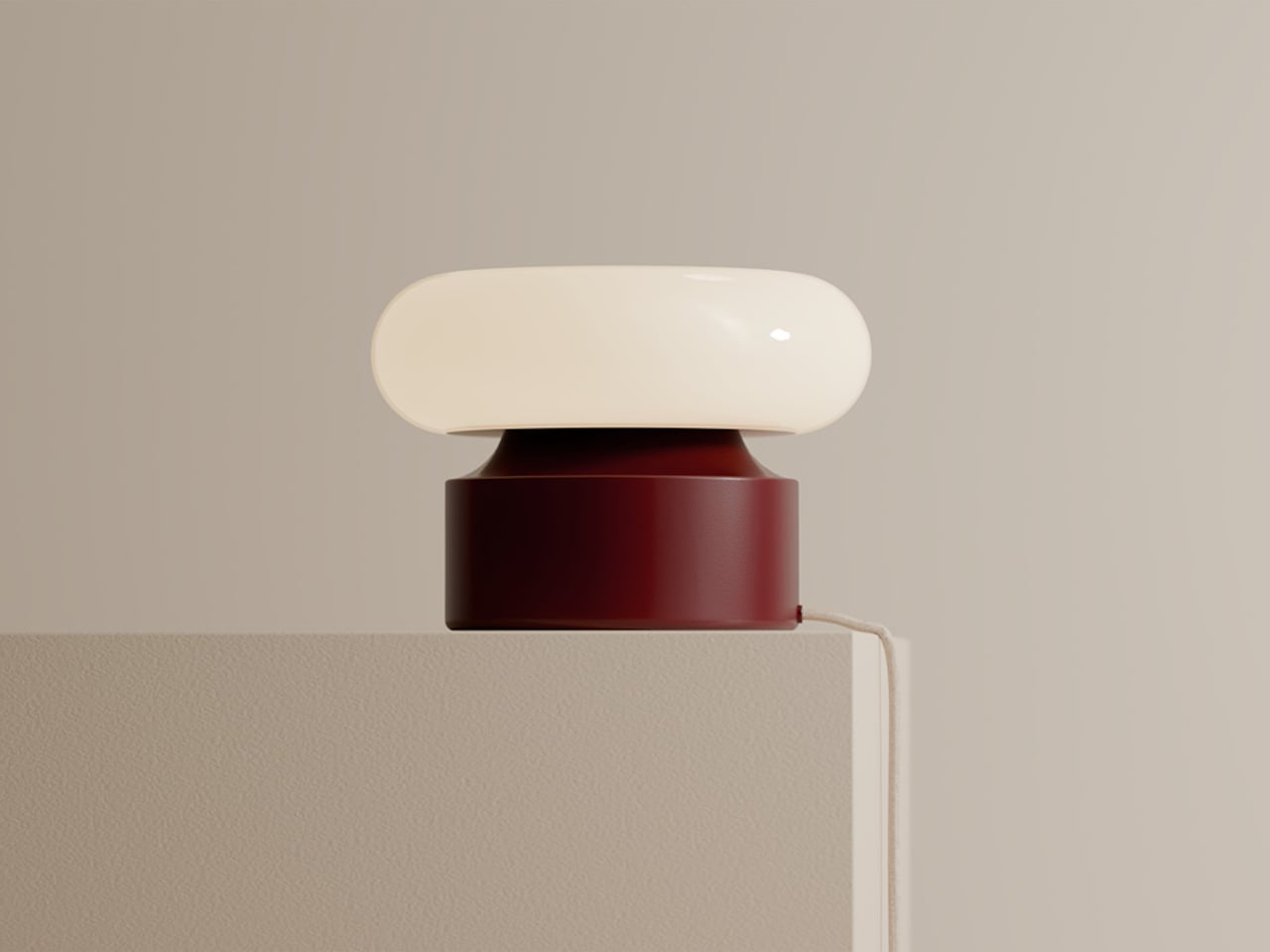
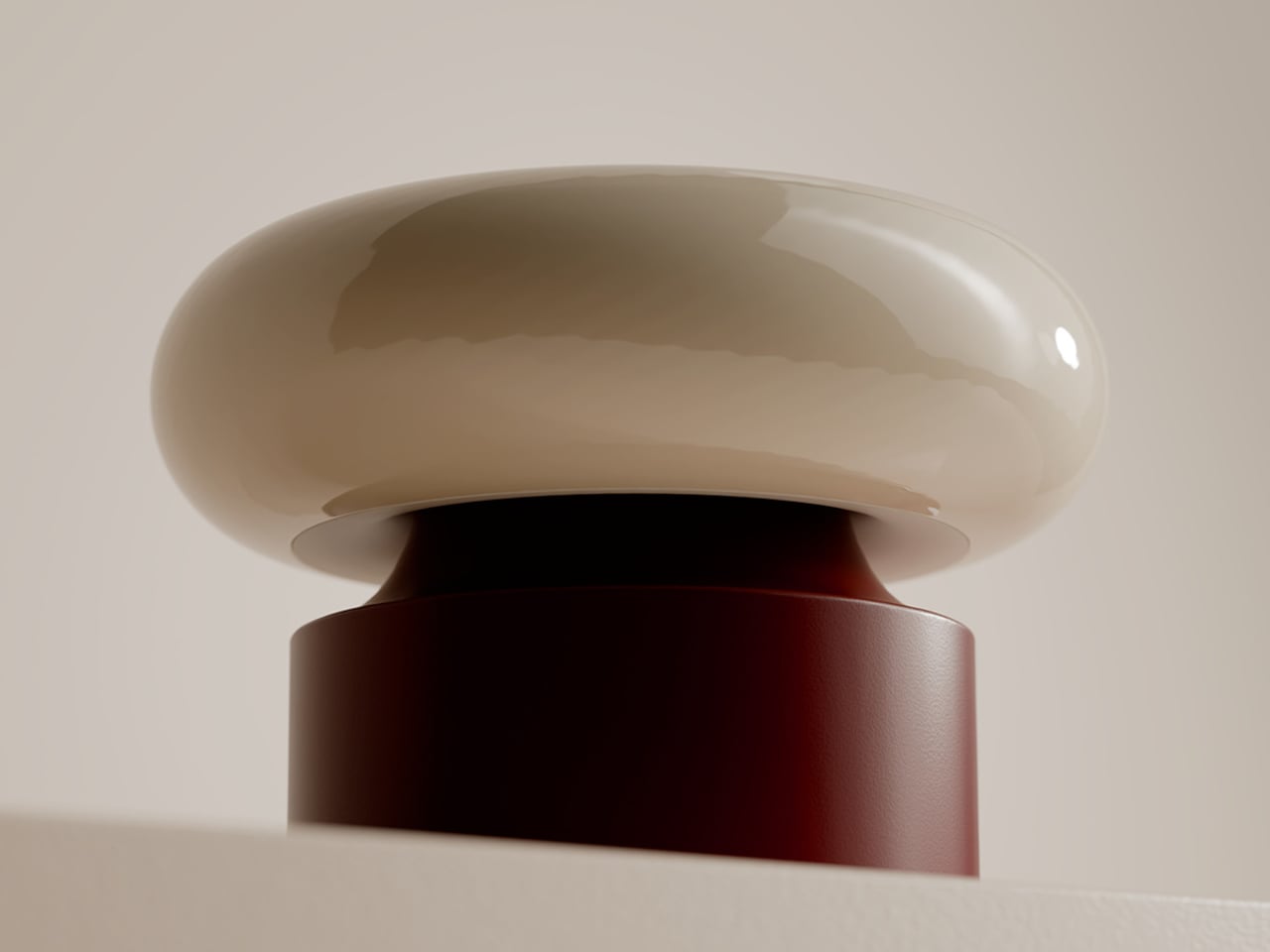
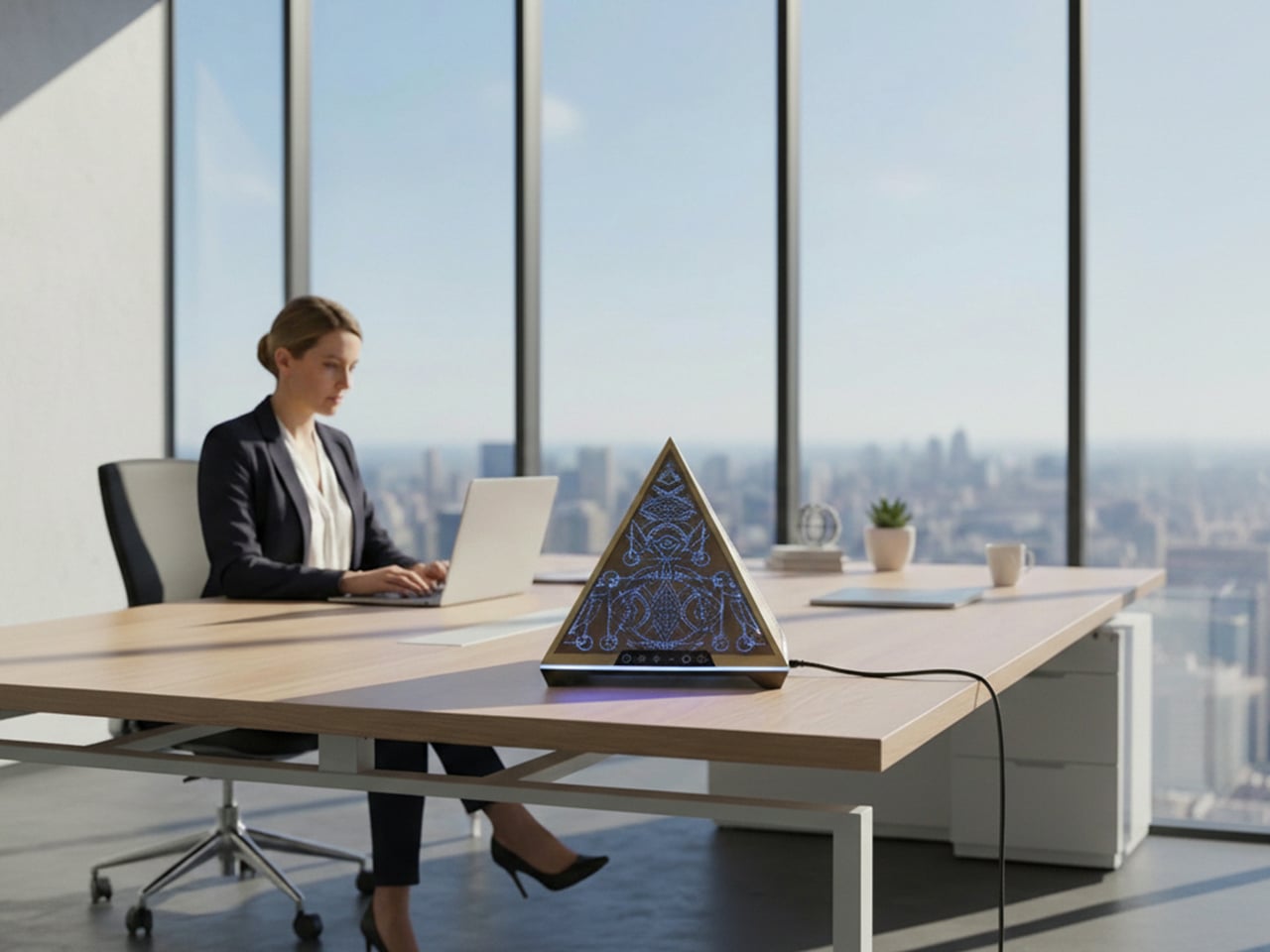
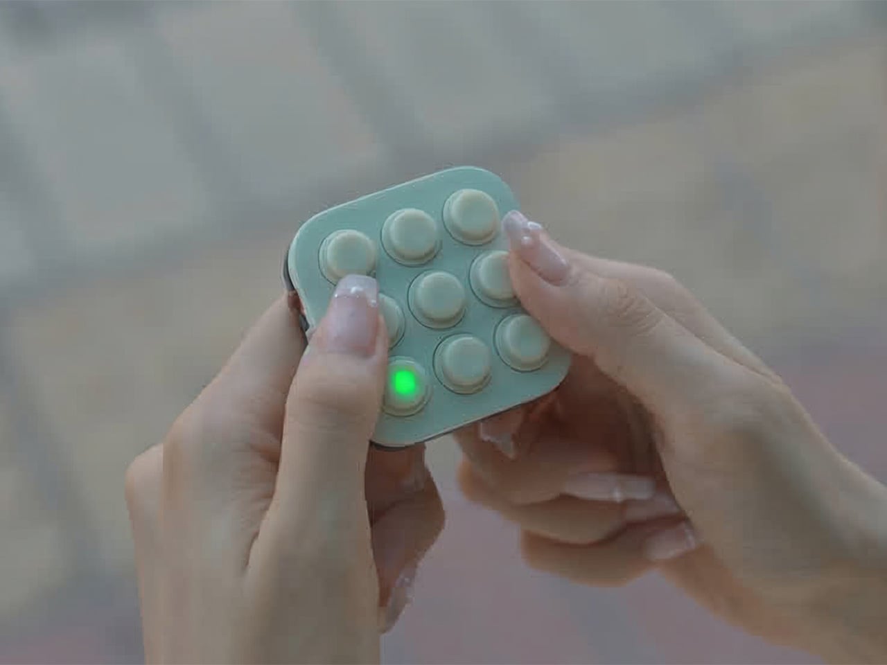
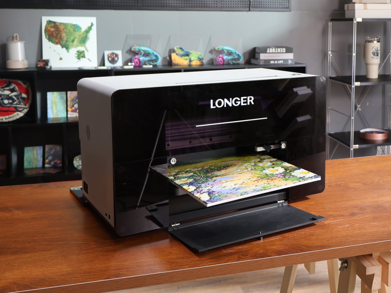
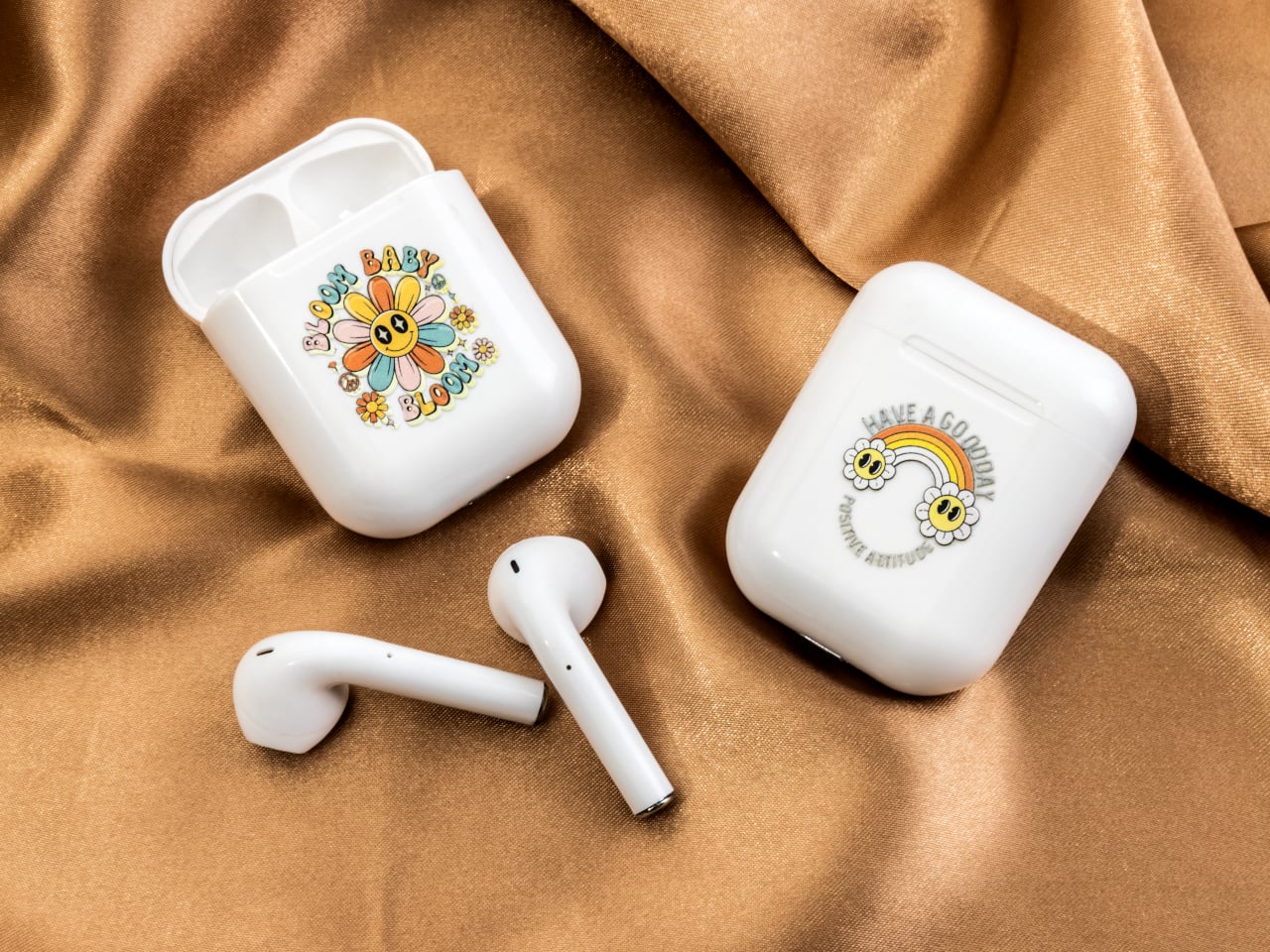
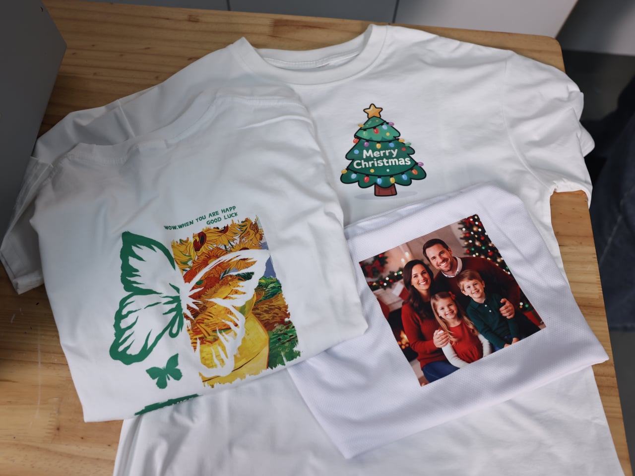
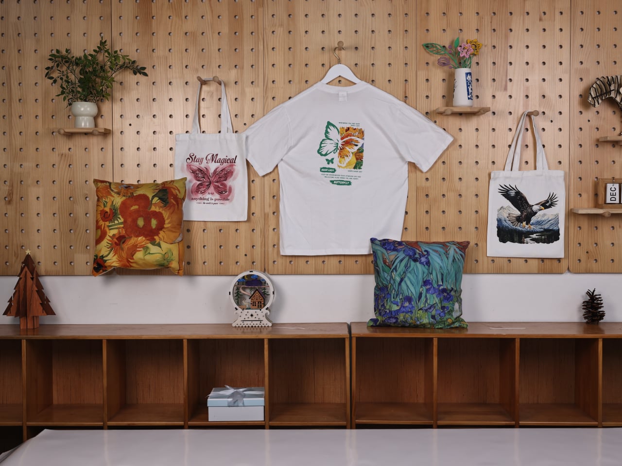
Longer ePrint is a dual-head, 3D-texture personal UV printer that behaves more like a tiny print lab than a single-purpose machine. One printhead is dedicated to UV inks for direct printing onto hard goods, while the other can be configured with a dedicated printhead for DTF inks to handle fabric transfers. The same box can print phone cases, embossed wood panels, and heat-press designs for tote bags without swapping hardware, which changes the kinds of projects you can start and finish in an afternoon.

Designer: LONGER

Click Here to Buy Now: $1499 $2199 ($700 off). Hurry, only 106/250 left! Raised over $3.9 million.

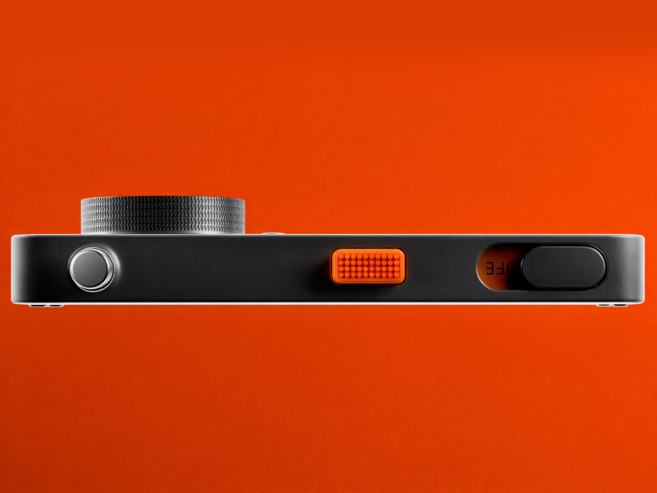
ePrint runs 12 ink channels across two printheads, CMYK color plus six white channels and two varnish channels in the full model. For textured work, all six white channels stack ink simultaneously, building height up to six times faster than a single channel. For flat prints, the dual-head setup can cut time roughly in half while still holding 1,440 DPI resolution. The point is being able to run more experiments and finish more pieces in the same time block without waiting hours between iterations.

1

1

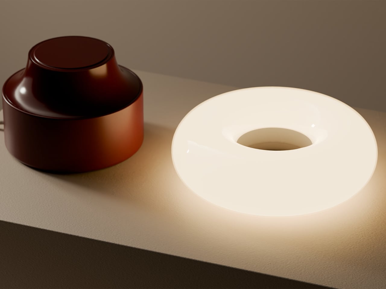
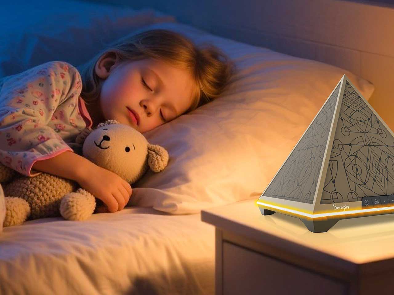
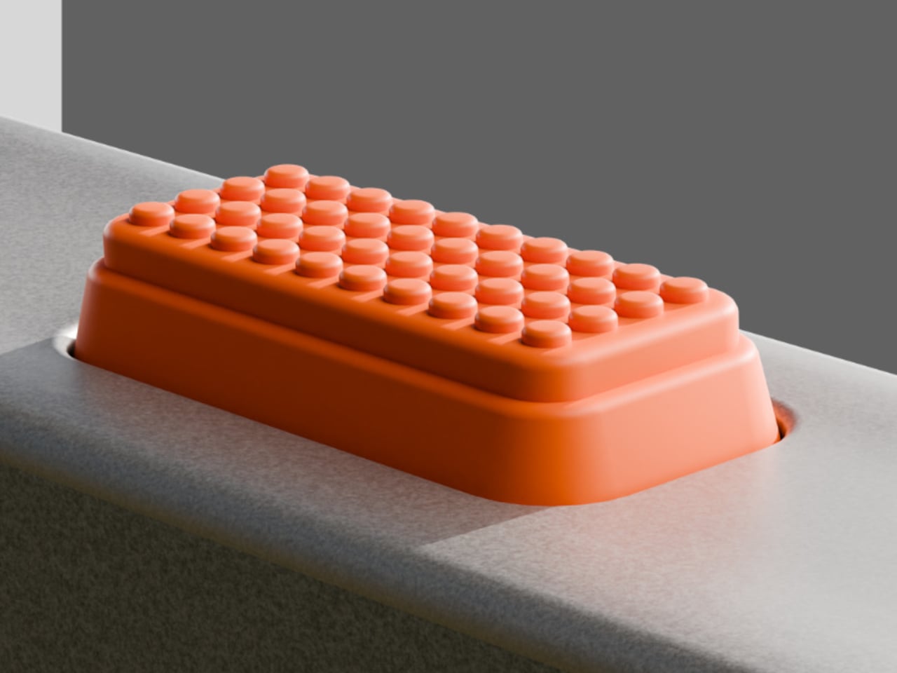
The 60mm embossing height pushes ePrint beyond flat graphics into tactile territory. That build-up lets you create braille signage with real raised dots, relief art that catches light and shadow, dimensional logos on cases and plaques, and prototypes that feel like finished products instead of flat mockups. It turns a UV printer into a way to explore form and tactility, not just color and layout, which is a shift for designers used to thinking flat and outsourcing anything that needs actual depth.

ePrint holds twelve 200ml cartridges and runs an open-ink system, so you can use Longer’s inks or third-party options, including DTF inks, low-migration ink formulations, and fluorescent colors. Combined with support for more than 300 materials and a 10mm high-gap printing capability, it can handle wood, acrylic, glass, metal, leather, stone, curved objects, and textured surfaces without the printhead scraping. That flexibility matters when you are testing new products or saying yes to unusual requests beyond the usual phone case rotation.

1

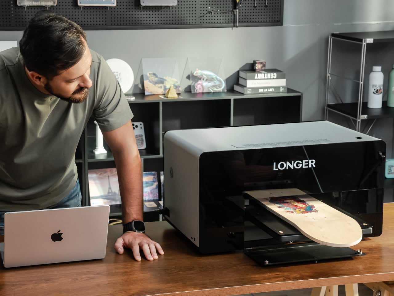
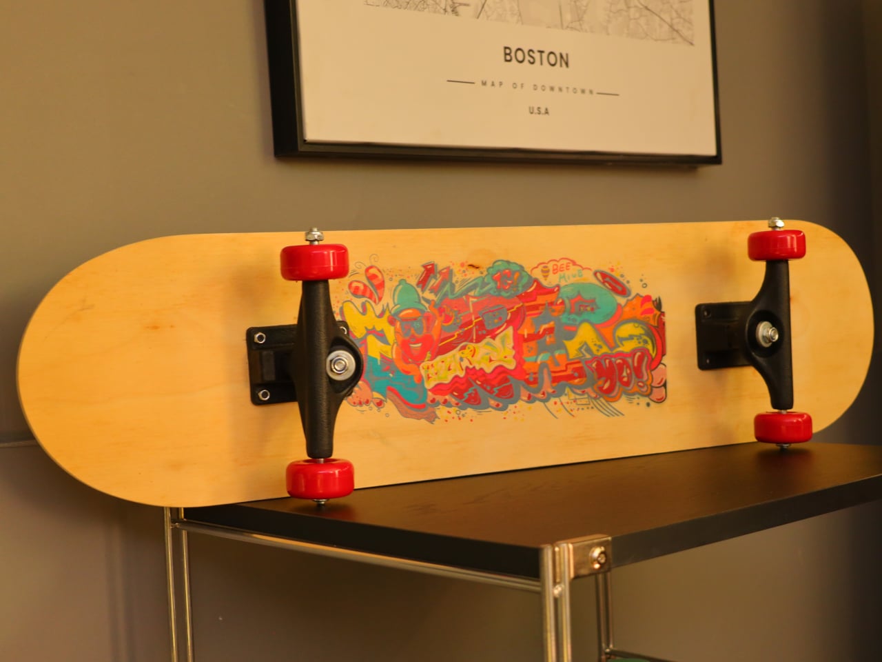
The machine supports four mechanical modes that each unlock different outputs. Flatbed mode handles panels, cases, and signs up to 310mm x 420mm. Rotary mode spins bottles, tumblers, and cylindrical objects while the heads print, wrapping designs around curves. Transfer film mode prints onto a special substrate first, then lets you laminate or heat-press onto fabric. Conveyor belt printing automates small-batch runs of rigid items like phone cases without repositioning each piece by hand.

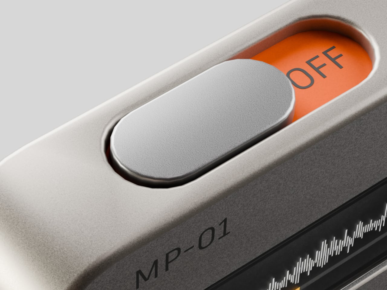
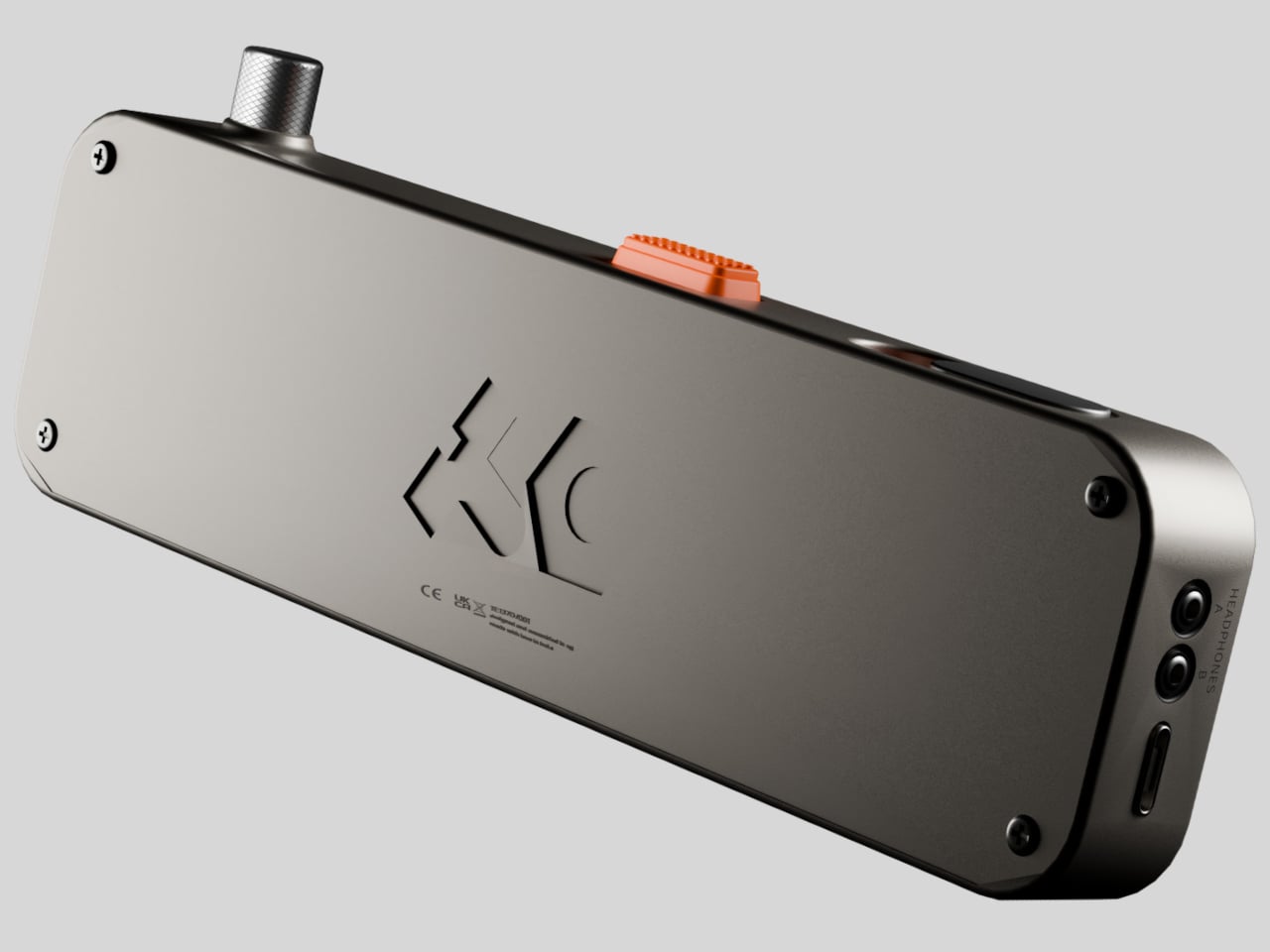
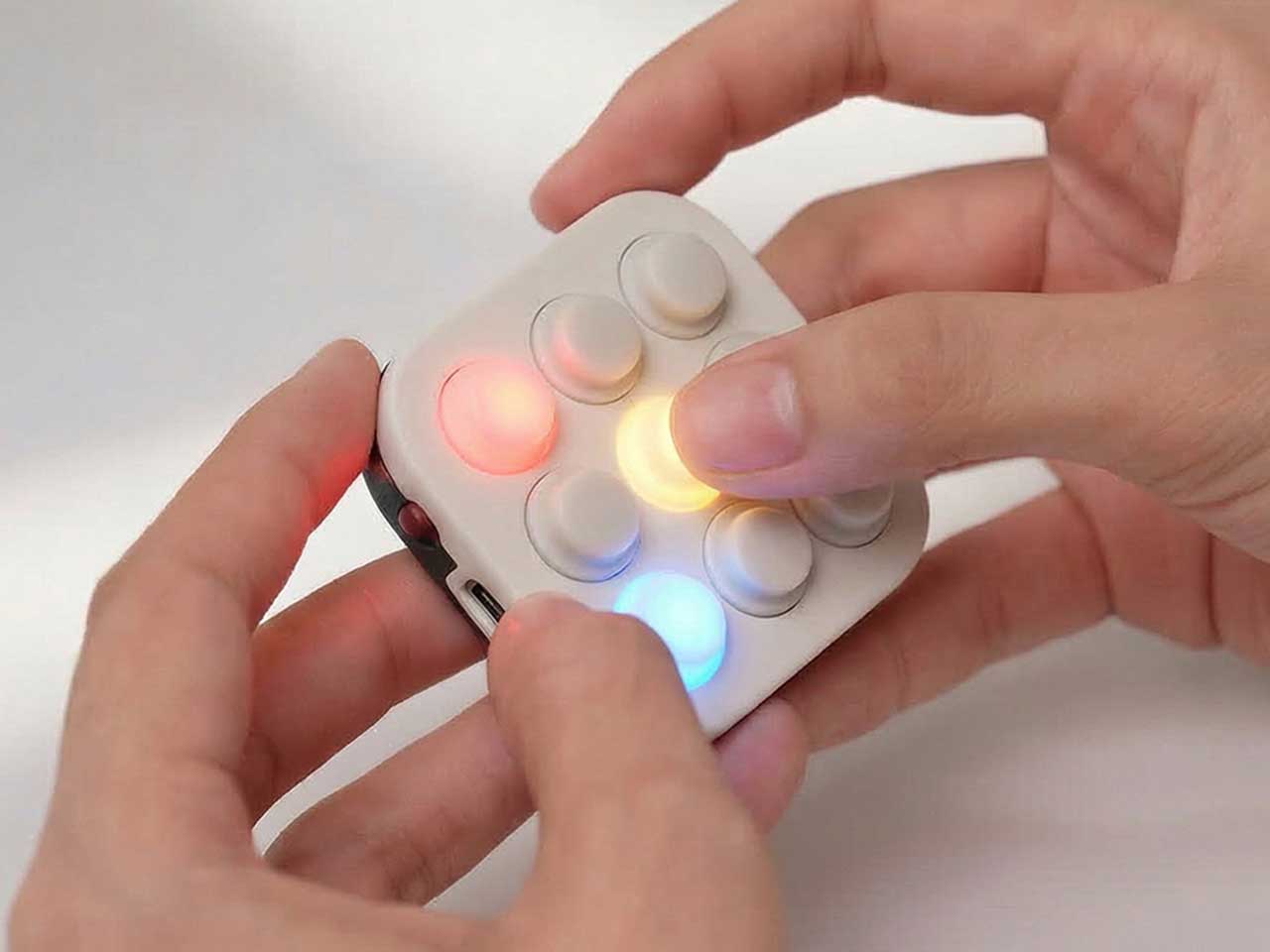
The AI-powered studio offers tools like pattern generation, text-to-image, background removal, and product series generation, helping you respond to ideas or client briefs quickly without outsourcing design work. White-ink circulation and auto-cleaning routines keep the heads from clogging, which is usually a pain point with UV printers, while built-in air purification and sub-60dB operation make it more comfortable to run in a small studio as long as you still keep proper ventilation going.

1

A machine like this changes how you approach printing. Instead of sending work out for anything unusual or saying no to projects that need specific inks, materials, or texture, you can test ideas in-house, move from a sketch to a raised, textured object in a day, and run small batches without committing to huge minimums or buying another specialized tool. For designers, DIY enthusiasts, and small businesses, Longer ePrint feels less like a printer and more like a compact production partner that happens to live on a desk, letting you expand what you make without expanding the square footage or vendor list you need to manage.

Click Here to Buy Now: $1499 $2199 ($700 off). Hurry, only 106/250 left! Raised over $3.9 million.

The post Longer ePrint Replaces UV, DTF, and Rotary Printers with One Box first appeared on Yanko Design.

NAK Studio Imagines a Hi-Fi Stack You Would Actually Want on Display

Most Hi-Fi gear still looks like anonymous black rectangles, even in carefully designed living rooms. Serious listeners often hide their amps and speakers in cabinets because the hardware rarely matches the rest of the furniture, even when the sound is great. The default assumption is that audio equipment belongs out of sight, tolerated for its performance but not celebrated for its presence.

Antoine Brieux of NAK Studio designed a complete stack he would personally want at home, treating it as a thought experiment about what happens when an integrated amplifier, speakers, and turntable are drawn as one family from the start. Color, tactility, and proportions are treated as seriously as the signal path, so the system could earn a spot in the open rather than behind doors or under furniture.

Designer: Antoine Brieux (NAK Studio)

The integrated amplifier is a low, solid block with a ribbed cylinder grafted onto one corner, turning the usual volume knob into a full control column. That cylinder suggests precise, satisfying adjustments for volume, inputs, and tone, giving your hand a clear place to land instead of hunting for tiny knobs or touch buttons scattered across a cluttered front panel.

The tall monochrome display beside the cylinder shows track info, a big dB scale, and twin bar-graph meters dancing with the music. The list of inputs covers phono and TV to Bluetooth and USB, and a warm-to-cold tonal slider sits below, so the front of the amp feels like a calm, legible dashboard rather than a technical interface that demands constant attention or an instruction manual.

The compact speakers are each a rounded rectangle with a single driver and tweeter, but finished in mixable Pantone colors, letting you treat them as color accents in a room. You could pair teal with orange, or match a pair to a shelf or wall, so they become part of the space’s palette instead of something you try to hide or apologize for when guests visit.

The matching turntable sits on the same footprint as the amp, with exposed suspension pillars and a straight arm that echoes the cylinder theme. The three components stack visually into a tidy tower, making the whole listening setup feel intentional, almost like a piece of modular furniture for records and streaming alike, cohesive enough to anchor a sideboard or desk.

NAK Studio’s concept is not about chasing specs, but about imagining a Hi-Fi system that earns its place in the open. The controls invite touch, the colors play with the room, and the stack looks as considered as the music it is built to play. It starts to feel less like a fantasy and more like how audio gear should have evolved all along.

The post NAK Studio Imagines a Hi-Fi Stack You Would Actually Want on Display first appeared on Yanko Design.

ILO Lamp Lets Soft Light Wander Between Rooms

Evenings drift from kitchen to dining table to balcony and back, while the nicest lamp stays tethered to a single socket. The small but persistent annoyance of cords, extension leads, and the feeling that lighting never quite follows where people actually end up sitting becomes background noise. Beautiful lamps are static, and that friction quietly shapes how and where you use light, even when it should not.

Arieto Studio’s ILO Lamp is a response to that pattern. The designers started by watching their own routines, noticing how often they moved while the light did not. ILO is an attempt to let light move as naturally as people do, without turning into a tech gadget or a camping lantern, treating the portable lamp as a piece of furniture that happens to be untethered when you need it.

Designer: Hanna Billqvist (Arieto Studio)

The lamp is two elements that live together, a luminous donut that holds the light and a weighted base that stays plugged in. When the donut rests on the base, it behaves like a sculptural table lamp. When lifted, it becomes a compact, cordless light that can travel to the terrace, coffee table, or hallway without trailing cables behind it or requiring a new outlet.

The base is both a stand and an induction charger. When the donut is dropped back onto it, charging starts automatically, no ports or cables to find in the dark. This turns recharging into a background ritual, the same motion you would make when tidying a table at the end of the night, and the lamp is ready again by morning without thinking about it.

The soft, diffused glow from the ring throws gentle light across a table rather than a harsh spotlight. It is meant for calm, ambient illumination, the kind that makes late conversations feel unhurried and lets food or books sit in a pool of warm light without glare. The donut radiates evenly in all directions, so it never casts hard shadows or creates bright spots.

The donut on a balcony rail during a late drink, on a low shelf beside a sofa, or in a hallway where there is no convenient outlet shows how the same object moves between roles without looking like camping gear. It stays firmly in the language of interior objects, simple forms, rich colors, and a glow that feels like it belongs rather than borrowed from a utility drawer.

The contrast between the glossy, cream-colored ring and the solid, colored base makes the lamp read almost like a small sculpture when assembled. The base comes in several tones, burgundy, green, and blue, so it can either disappear into furniture or act as a quiet accent in a neutral room. The proportions are calm and grounded, not trying to impress with complexity.

ILO is less about showing off wireless charging and more about removing the tiny compromises that come with static lamps. It treats light as something that can follow dinners, conversations, and quiet moments, while still looking like a considered object when it comes home to its base. For people who move through their homes rather than settling in one spot all evening, a lamp that can keep up without cables or outlets starts to feel less like a luxury and more like how lighting should have worked all along.

The post ILO Lamp Lets Soft Light Wander Between Rooms first appeared on Yanko Design.

iKKO MindOne Snap-In Case Turns a Card-Sized Phone into a Pocket Writer

Typing long messages on glass feels clumsy, juggling Bluetooth earbuds means pairing headaches and dead batteries, and using wired headphones now requires a tiny USB-C dongle you will lose three times before accepting defeat. Phones have become powerful but strangely less tactile, and that clashes with people who write a lot, listen a lot, and still like the certainty of a cable and the click of a real key under their thumb.

The card-sized iKKO is a small AI-centric smartphone built for always-on connectivity and lightweight productivity. The MindOne Snap-In Case is where it changes character, a snap-on expansion shell that adds a physical QWERTY keyboard, a proper 3.5 mm headphone jack, a dedicated DAC, and a small backup battery in one compact piece, turning the minimal phone into a tiny writing and listening machine.

Designer: iKKo

The QWERTY keyboard changes the way MindOne is used. Raised, separated keys and a slightly sloped surface make thumb typing feel more deliberate than tapping on glass. It is something you reach for when drafting emails, capturing ideas, or editing text while AI handles summarizing and organizing in the background, treating the phone as a tool for active writing rather than just passive messaging and scrolling through feeds.

The case adds a 3.5 mm headphone jack backed by a Cirrus Logic CS43198 DAC, the kind of chip usually found in dedicated portable players. It supports Hi-Res audio with 32-bit/384 kHz PCM and DSD256, low-noise playback, and enough dynamic range to make lossless playlists and long podcasts feel crisp and detailed without worrying about pairing or battery levels in wireless earbuds that will die halfway through the flight.

The built-in 500 mAh battery is a quiet safety net rather than a second fuel tank. It tops up MindOne during long typing or listening sessions and helps offset the extra draw from the DAC and keyboard, extending comfortable use without turning the phone into a brick of battery cells. The point is not doubling battery life, but making intensive sessions feel smoother and less anxious.

MindOne stays slim and card-like on its own, then becomes a different kind of device when it snaps into the case. You might carry the phone bare for quick AI tasks and navigation, then drop it into the case on a flight, in a café, or at a desk when you know you will be writing and listening for a while, using the same object in two distinctly different modes.

Customizable keycap stickers and a range of colors that match or complement the phone are not just fashion accessories; they are small ways to make a very compact device feel personal. The case is tuned to MindOne’s proportions and personality, not a generic keyboard sled trying to fit every phone, which makes the combo feel considered rather than cobbled together from unrelated parts.

The iKKO MindOne Snap-In Case is less about nostalgia and more about choice, letting a tiny AI phone become a pocketable notebook and Hi-Fi player when needed. Most phones today are sealed slabs, which makes this case feel like a quiet reminder that hardware can still click, plug in, and feel like something you work and listen with, rather than just stare at until the next notification arrives.

The post iKKO MindOne Snap-In Case Turns a Card-Sized Phone into a Pocket Writer first appeared on Yanko Design.

Pyramid-Shaped Sleep Aid Needs No App, Just Sound, Light, and Pattern

Sleepless nights do not all look the same. Sometimes it is a racing mind, sometimes it is waking at 3 a.m. and staring at the ceiling, sometimes it is jet lag or a room that never gets fully dark or quiet. The market has responded with a pile of separate gadgets, white-noise machines, sunrise lamps, breathing apps, meditation videos, each adding another thing to manage, charge, or remember to open before bed.

Serapis is an all-in-one sleep-aid system built into a pyramid-shaped bedside object. It combines layered white noise, breathing light, Somnofractal visuals, Schumann Resonance, and calming geometry into one device that sits by the bed and works without an app. The idea is to help the brain settle using sound, light, rhythm, and pattern, working quietly together instead of juggling multiple tools or staring at another glowing screen right before trying to sleep.

Designer: Zhang Wenjie

Click Here to Buy Now: $144 $239 (40% off). Hurry, only 189/300 left! Raised over $52,000.

Gif 1

Not all sleepless nights have the same root, so Serapis uses a short, 2-minute sleep-type test to map people to patterns like overthinking, jet lag, sensitivity to noise or light, physical discomfort, emotional heaviness, or trouble falling asleep. The device offers modes tuned to those patterns, so an overthinker might get more visual guidance and gentle noise, while a light-sensitive sleeper leans more on sound and subtle breathing light that does not brighten the room.

Gif 3

The five-part tech stack works in sync. Schumann Resonance at 7.83Hz runs as a low-frequency backbone that quietly syncs with alpha waves. Layered white noise blends deep delta tones with soft pink noise to mask distractions. Breathing light pulses in 8 to 12 second cycles and seven color temperatures to nudge your own breathing slower. Somnofractal visuals give your eyes a predictable pattern to follow for a minute or two, and the pyramid geometry diffuses sound while acting as a visual anchor.

Gif 6

Gif 5

The nightly ritual is simple. You place Serapis on a bedside table, press a touch control to power on, choose between a preset duration of 30 or 60 minutes, and let the combination of sound, light, and pattern run while you lie down. There is no need to unlock a phone, open an app, or stare at a bright screen. The device is meant to be a quiet, science-inspired presence rather than another source of stimulation.

Gif 4

Serapis measures roughly 200 × 200 × 205 mm and has a net weight of around 1.2kg, giving it enough heft to feel like a real object. The pyramid form, etched with Somnofractal patterns, is designed to look intentional on a nightstand, and the internal hardware, speakers, and light modules are housed in metal and plastic with a 12 V input. The emphasis is on a minimalist, all-in-one experience that feels like part of the room instead of another gadget.

gif 2

Serapis suggests a shift away from managing sleep problems piecemeal and toward letting a single object handle the transition from busy mind to rest. Instead of piecing together white noise from one place, breathing exercises from another, and a visualization from a third, you press a button and let a coordinated system of sound, light, rhythm, and pattern do its work. For people who want their bedroom to feel calmer rather than more connected, that kind of integrated, screen-free ritual is where a device like this quietly makes sense.

Click Here to Buy Now: $144 $239 (40% off). Hurry, only 189/300 left! Raised over $52,000.

The post Pyramid-Shaped Sleep Aid Needs No App, Just Sound, Light, and Pattern first appeared on Yanko Design.

Anker SOLIX E10 Brings Hybrid Whole-Home Backup to the Modern House

Modern homes depend on electricity for everything, from fridges and routers to medical devices and central A/C. Storms, rolling blackouts, and grid hiccups trigger a familiar scramble for flashlights and ice bags. Food spoils, devices die, and working from home becomes impossible. Most backup options either feel like camping gear with a couple of outlets or like a renovation project with permits and opaque pricing.

Anker SOLIX E10 is a smart hybrid whole-home backup system that blends batteries, green solar power, and a smart generator into one coordinated setup. It is designed to keep an entire house running, not just a few circuits, and is rated for whole-home backup with a 200-amp connection when paired with its Power Dock, matching a typical US main panel.

Designer: Anker

On a normal day, the SOLIX E10 quietly charges from solar and the grid, storing energy in modular 6 kWh battery packs that can scale to around 90 kWh with multiple stacks. When the power drops, the system steps in, deciding when to draw from batteries, when to add fuel through a DC link to its tri-fuel smart generator, and when to resume solar charging once the storm clears.

SOLIX E10 Power Module Inverter

Anker SOLIX B6000 Battery Module

With the Power Dock or Smart Inlet Box, the SOLIX E10 can back up every circuit in a typical house, so you are not choosing between the fridge and the router. It is engineered to start and run a full-size 5-ton central A/C by handling the high inrush current that usually trips smaller systems, which matters when a summer outage hits during a heatwave.

Anker SOLIX Power Dock

Anker SOLIX Smart Inlet

When the grid fails, the lights stay on without flickering, the Wi-Fi does not reboot, and the A/C keeps humming. The system switches over in under 20 milliseconds, fast enough that most electronics never even notice. The feeling is less about the exact speed and more about the house simply not going dark anymore, even when the neighborhood does and trees are still down.

The SOLIX E10 can watch the weather and charge itself ahead of a predicted storm through its Storm Guard feature, so you are not caught with half-full batteries when the first tree hits a line. The modular packs give enough headroom for multi-day outages, while the forecasting takes backup power from a reactive scramble to a quiet ritual where the system prepares itself before you think to check.

Anker SOLIX Smart Generator 5500

The optional smart generator stretches backup power through long outages without running nonstop. Instead of charging through AC conversion, it feeds the batteries directly over DC, which Anker claims is up to five times more fuel-efficient than a traditional setup. It runs when needed, rests at night, and feels more like part of a system than a last-resort accessory.

The SOLIX E10 is not only for rare blackouts. On normal days, it can store cheap off-peak energy or excess solar and run the house when rates spike, trimming bills. Each unit accepts up to about 9 kW of solar input, so a rooftop array keeps the batteries topped up, and the system prioritizes important circuits to keep essentials alive longer during outages.

The hardware is a family of clean, stackable modules, with batteries that can be wall-mounted or floor-standing as the setup grows. The core units use an all-metal NEMA 4 enclosure and are certified to UL 9540 and UL 9540A, signaling they are built to live outdoors, handle bad weather, and meet the toughest residential safety standards.

Power anxiety is real, the feeling that one bad storm could wipe out food, work, and comfort for days. An outage where the house stays lit, the air stays cool, and the fridge keeps humming while the street outside goes dark is the payoff Anker SOLIX E10 is built around, making blackouts feel like minor blips instead of household emergencies.

The post Anker SOLIX E10 Brings Hybrid Whole-Home Backup to the Modern House first appeared on Yanko Design.

MP-1 Reimagines a Modern Walkman Through a Teenage Engineering Lens

Listening to music has mostly collapsed into phones and streaming apps, buried between notifications and multitasking. Some people still crave a single-purpose device that treats listening as the main event, not background noise. The MP-1 is an independent concept study that asks what a modern Walkman could look like if it borrowed Teenage Engineering’s design language, without being affiliated with the company or trying to become an official product at all.

The project set out as a brand-led design study, not a fan mash-up or a wild render. The brief was to study Teenage Engineering’s approach to minimalism, playful restraint, tactile controls, and clear functional expression, then translate those principles into a believable handheld music player. The goal was manufacturable intent and intuitive interaction, not speculative tech or exaggerated shapes, treating it as a disciplined exercise in understanding how strong brand identities shape form.

Designer: Prithvi Manoj Bhaskaran

The study pulled four keywords from Teenage Engineering’s portfolio, playful, tactile, curious, purposeful complexity. Those traits show up in devices like the OP-1 and TP-7, where dense functionality is expressed through simple forms, color accents, and satisfying controls. A focused music player fits naturally into that philosophy, turning listening into an intentional, distraction-free ritual that foregrounds sound as a primary experience rather than something competing with notifications while you commute.

The MP-1’s basic layout is a slim rectangular body with softened corners, a large circular dial as the main control, and a narrow horizontal display that handles track info and waveform visualization. This mirrors Teenage Engineering’s habit of giving one control visual priority, then letting everything else recede, so your hand and eye always know where to go first, with the orange accent adding personality without overwhelming the minimalism.

The tactile controls embody the playful side of the brief. An orange textured rocker invites your thumb, its grid of soft nubs making it feel like a toy in the best sense. A slider reveals “OFF” in orange when pulled back, hiding the label when pushed forward. These details use motion and color to communicate state without cluttering the surface with text, making every interaction feel more deliberate and satisfying.

Practical touches include a USB-C port for charging and data, realistic thickness that suggests room for a battery and mechanical parts, and restrained use of materials. The backplate carries a subtle logo and regulatory text, the kind of thing you would expect on a real product, reinforcing that this is not just a styling exercise but a thought-out object that could plausibly be manufactured and carried in a pocket or bag.

The MP-1 shows the power of a strong design language, recognizing Teenage Engineering’s influence without logos or official ties. Most listening today happens on general-purpose slabs, which makes a small, tactile player appealing, even as a concept. For people who miss dedicated devices and the ritual of choosing to listen rather than letting a playlist run in the background, MP-1 feels like a quiet argument that sometimes less is exactly what you need.

The post MP-1 Reimagines a Modern Walkman Through a Teenage Engineering Lens first appeared on Yanko Design.

Observation Pavilion Sends a Camera Up While You Stay on the Ground

Climbing an observation tower involves a lot of steel and concrete just to stand a few dozen meters higher and take in a view. The ritual is familiar, the ascent, the vertigo, the panorama, but the infrastructure demands are massive for what amounts to a few minutes of elevated looking. Michael Jantzen’s Telepresence Observation Pavilion asks whether we always need to build big vertical structures to get that feeling, especially when most distant experiences already come through screens and networks.

Instead of lifting people into the air, the pavilion lifts a 360-degree camera on a tall telescoping mast, then brings the view down to ground level. Inside a circular room, a ring of high-definition screens shows a live panoramic feed from the camera, synced with sound, so visitors see and hear exactly what they would if they were standing at the top of a traditional tower, without leaving the ground or climbing a long staircase.

Designer: Michael Jantzen

Walking into a round, open space where the walls behave like windows wraps you in a continuous horizon of forest, water, or city. A circular bench sits around the central mast, the floor stays open, and a guardrail keeps you a step back from the screens, so you are aware you are in a room, but your eyes are convinced you are somewhere higher and more exposed.

The camera sits on top of a tall series of telescoping pipes anchored to the pavilion floor, rising far above the roof. The module captures real-time sights and sounds in every direction, then sends that data down to the screens. The only tower you need to build is this slender mast, not a full structure sized for people, which drastically cuts material and engineering demands.

Eight solar panels ring the central skylight on the pavilion roof, feeding the camera, screens, and lighting. This connects to Jantzen’s goal of using information technology to replace or reduce physical building materials. The pavilion becomes an environmental argument, suggesting that if we can satisfy the desire for elevated views with data and light, we might not need to pour as much concrete into the sky.

Jantzen imagines many camera modules installed on existing structures, communication towers, mountain lodges, and skyscrapers. Those feeds could be sent over the internet to any pavilion, letting visitors switch channels between live elevated views from around the world. You could stand in a field and look out over Tokyo, then switch to a mountain ridge in Patagonia or a coastal city, turning a local building into a global observatory.

This changes the idea of an observation tower. You still make a trip to a specific place and share a room with other people, but the view is no longer tied to that exact spot. It can be curated, rotated, or scheduled, and multiple pavilions can share the same remote vantage point without crowding fragile sites. The architecture becomes as much about routing information as it is about shaping space.

The Telepresence Observation Pavilion will not replace every lookout or mountain hike, and there is still value in feeling the wind and height directly. But as a thought experiment, it points toward a future where we build less mass to get more experience, using cameras, networks, and solar-powered rooms to give people elevated perspectives without the environmental and structural cost of traditional towers, or the bottlenecks that come when everyone wants to see the same sunset from the same narrow platform at once.

The post Observation Pavilion Sends a Camera Up While You Stay on the Ground first appeared on Yanko Design.

BrainBlink Fixes Doom Scrolling With 60-Second Brain Games

Tiny breaks in the day, waiting for a kettle, standing in a hallway, sitting on the toilet, tend to collapse into the same pattern. Unlock phone, scroll, refresh, repeat. It is not about being distracted so much as not having anything better that fits into sixty seconds. A small, self-contained game console can live in that gap without dragging you into an endless feed, offering something that feels finished instead of endless.

BrainBlink is a pocket-sized brain-training arcade, a nine-button handheld with 60-second games, real tactile switches, and an optional global ladder. It is built around the idea of mental fitness, not in a heavy way, but as a quick hit of focus and challenge that feels satisfying to start and finish. It is designed for those tiny windows of time when a full game or deep work session is unrealistic, but doing nothing leaves you restless.

Designer: Nicolas Aagaard (LastObject) and Joshua Fairbairn (Morpho)

Click Here to Buy Now: $59 $69 (15% off). Hurry, only 4/967 left! Raised over $124,000.

BrainBlink ships with eight on-device games, each a 60-second challenge that targets different skills, working memory, reaction time, pattern recognition, focus, and speed. The games are quick to learn but hard to master, and the device is offline-first, storing scores locally so you can play anywhere without a phone or network. The fixed session length makes it easy to dip in and out without losing track of time or getting sucked into another hour of screen glowing.

1

1

The competitive layer kicks in when you sync to the global ladder and tournaments. When you hit 3-2-1-GO in those modes, you are matched against another human brain somewhere else, both of you trying to out-tap and out-focus each other in the same sixty-second window. The appeal is not just the score, but the sense that someone in Chicago, Berlin, or Tokyo is wide awake and locked in with you for that minute, feeling the same pressure.

The companion app for iOS and Android adds stats, streaks, profiles, leaderboards, and performance charts as an optional layer. It handles Bluetooth Low Energy 5.0 sync, over-the-air firmware updates, and ghost races, but you do not need it to enjoy the core games. This keeps the device from becoming another notification source while still letting people who love data and progression dig deeper when they want, without forcing that on everyone who just wants to play.

1

The hardware is a 55 × 55 × 17.6 mm square with nine mechanical-style buttons, an RGB LED array, and a rechargeable lithium battery over USB-C. The tactile switch matrix is rated for more than 100,000 presses, the durable ABS housing is wrapped with soft-touch silicone buttons, and the water-resistant shell is built for bags and pockets. An adaptive difficulty engine in the onboard MCU models your performance and adjusts challenge levels to keep sessions engaging as you improve.

BrainBlink is offline-first, storing every score locally until you decide to sync, which makes it usable on planes, in elevators, or anywhere signals are flaky. Over-the-air firmware updates mean new modes and refinements arrive over time, so the device does not feel frozen on day one. That combination of physical durability and evolving software makes it feel more like a tiny console than a novelty gadget that stops being interesting after a week.

The device might live next to a laptop, in a hoodie pocket, or clipped to a bag. Instead of reflexively reaching for a phone during a spare minute, you pick up a small square, press a button, and give your brain a short, focused sprint. For people who like the idea of training attention without turning it into a chore, that kind of playful, sixty-second ritual is where a device like this quietly earns its place, offering something deliberately finite in a world of infinite feeds and tabs that never close.

Click Here to Buy Now: $59 $69 (15% off). Hurry, only 4/967 left! Raised over $124,000.

The post BrainBlink Fixes Doom Scrolling With 60-Second Brain Games first appeared on Yanko Design.