DIY Coffee Sand Table Turns a Living Room Surface Into Moving Art

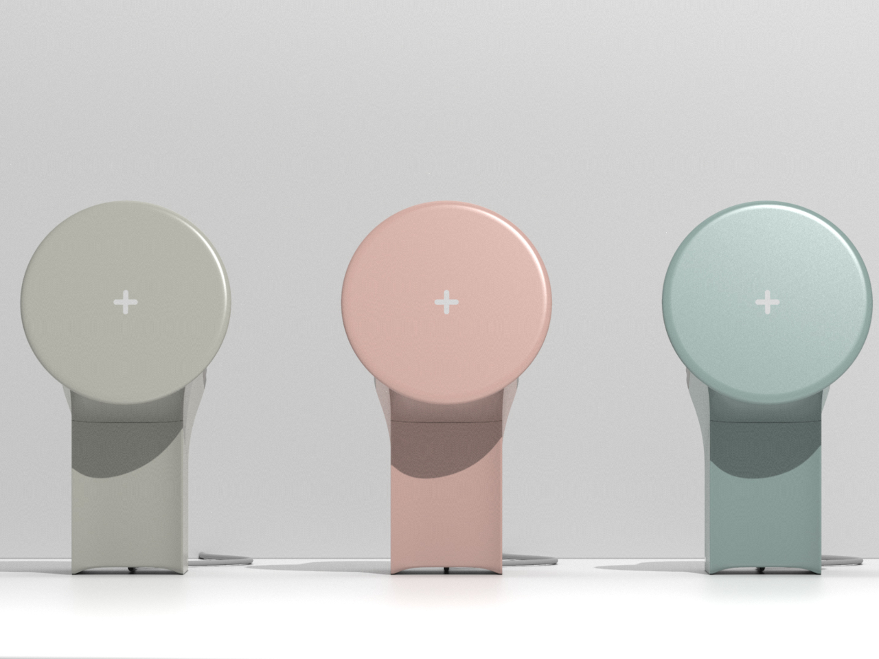
Most coffee tables are static slabs of wood, glass, or stone, maybe with a stack of books on top that never gets read. There’s a growing fascination with kinetic sand tables that draw patterns under glass, turning a surface into something alive. Arrakis 3.0 is a DIY coffee table that brings that idea into a more compact, furniture-friendly form you can actually live with in a normal apartment instead of a gallery.

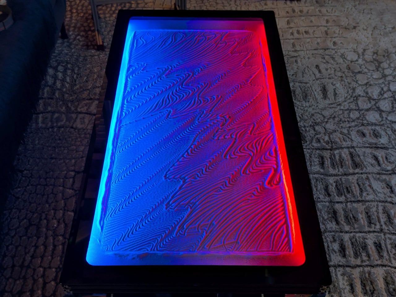
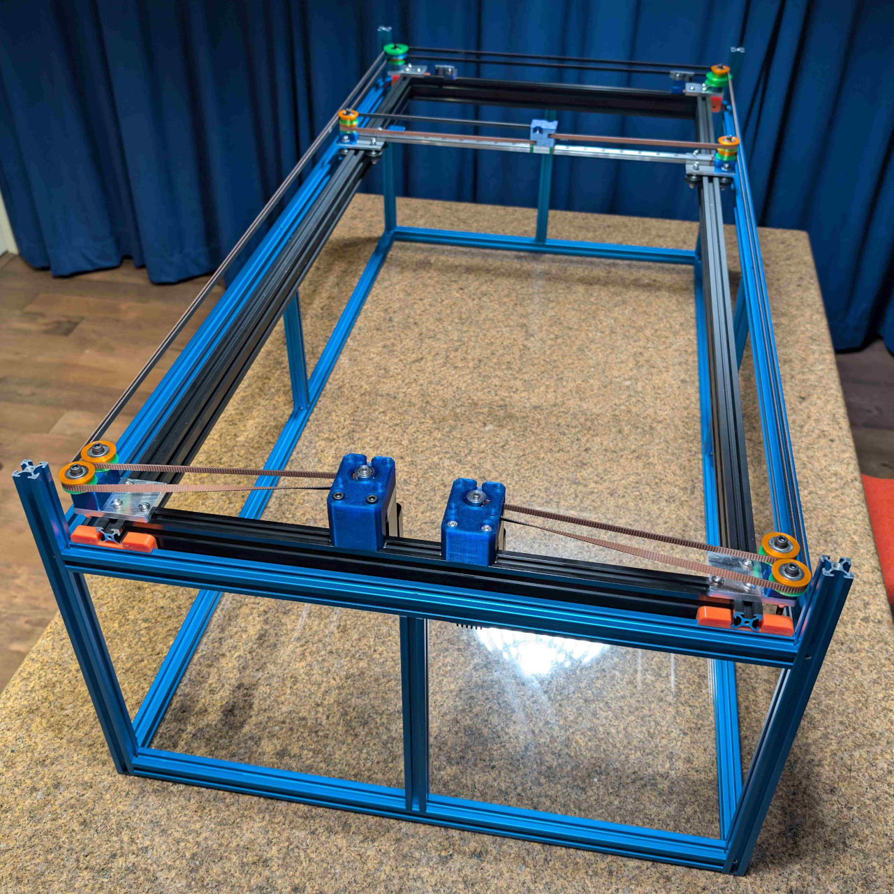
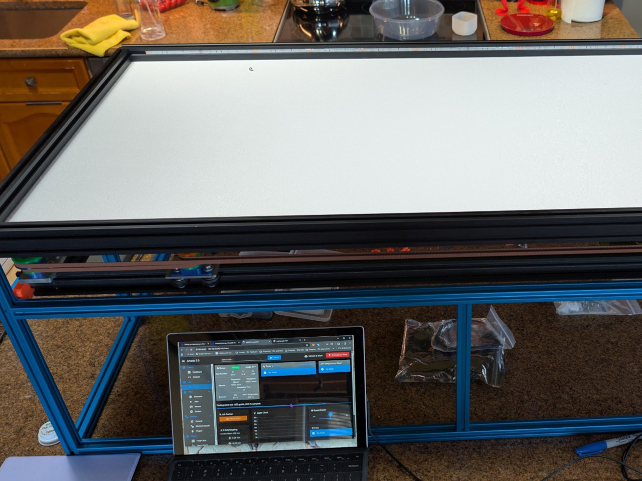
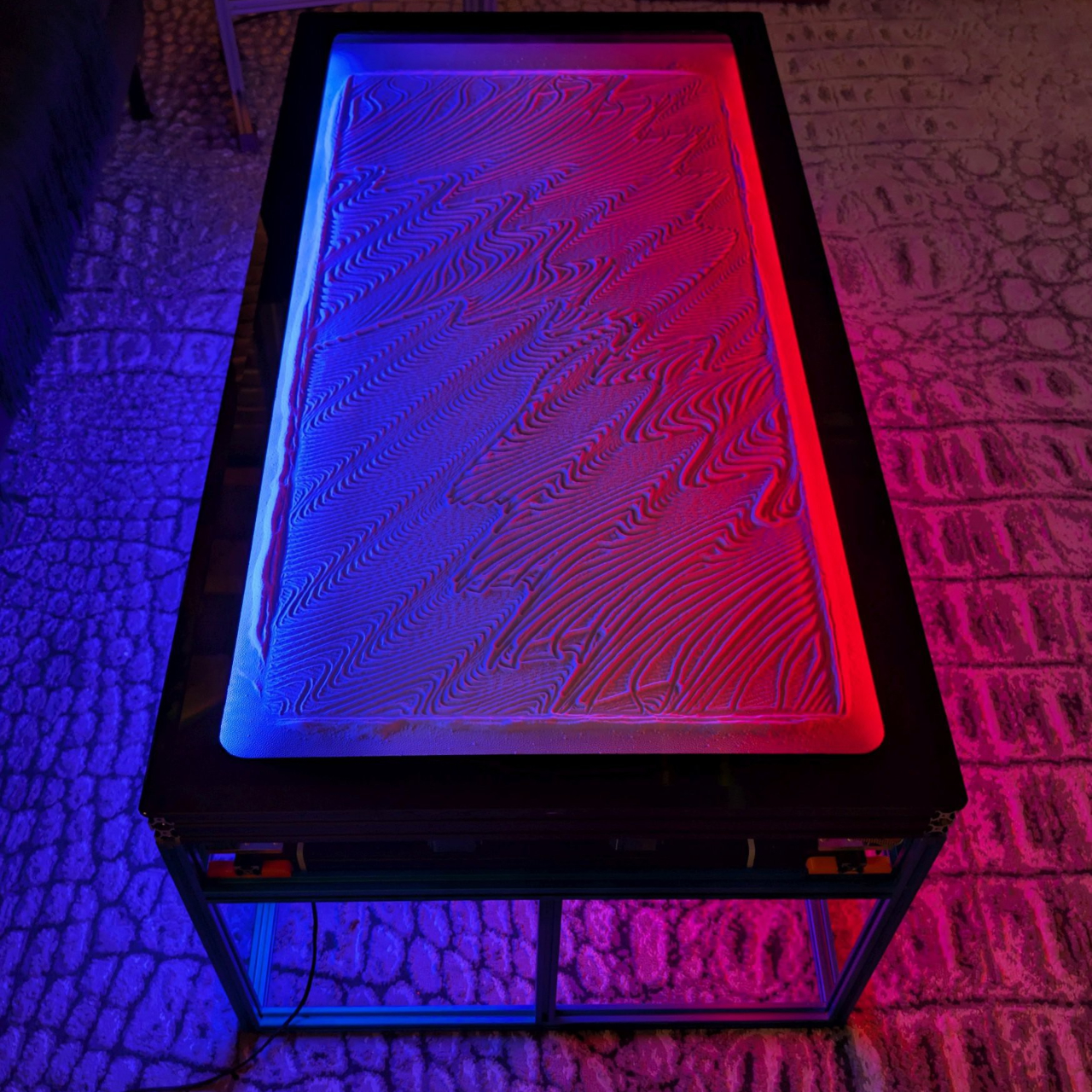
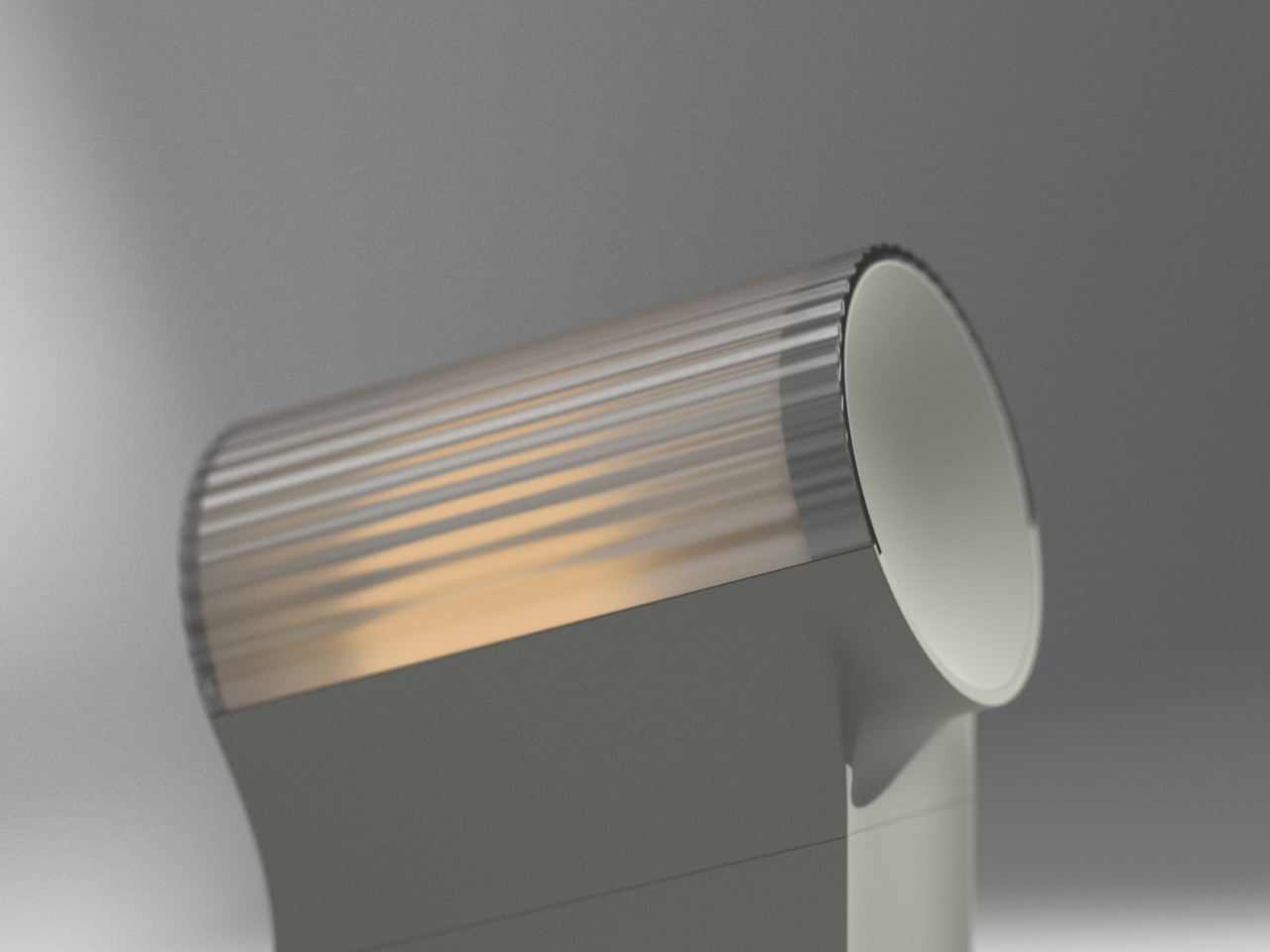
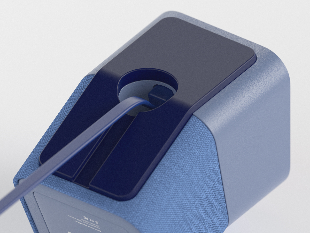
Arrakis 3.0 is the latest iteration of Mark Rehorst’s sand table experiments, this time designed from the start as a practical coffee table. Under a standard 24-by-48-inch glass top, a steel ball slowly traces patterns in a bed of white sand, guided by a hidden mechanism. From above, all you see is a glowing sandbox under glass, constantly redrawing itself while your coffee sits on top.

Designer: Mark Rehorst

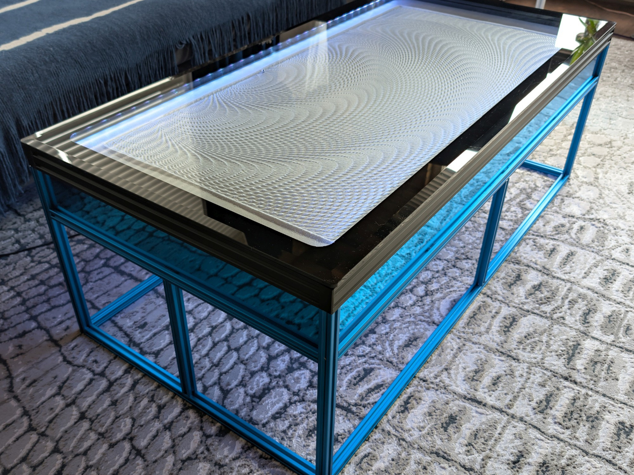
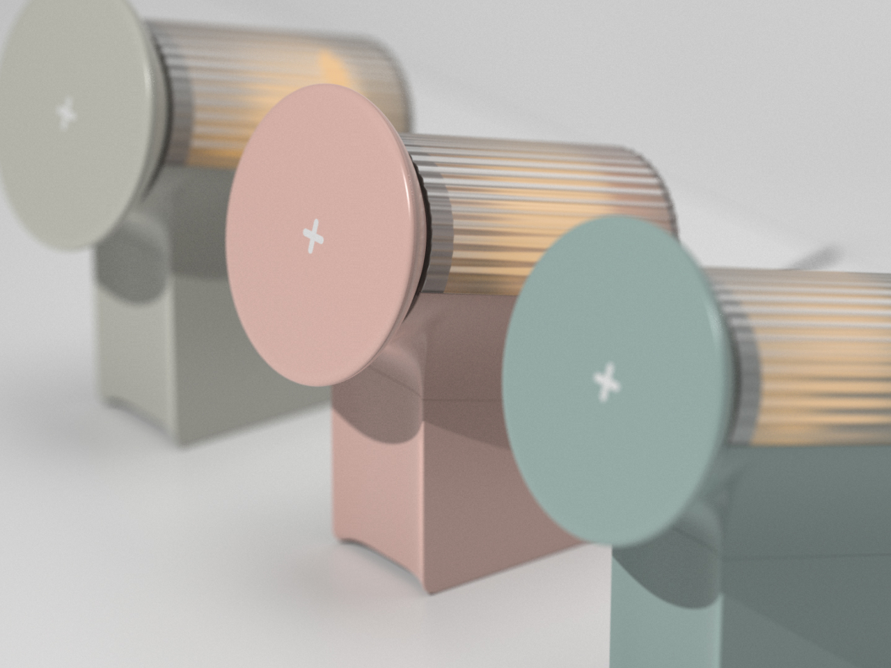
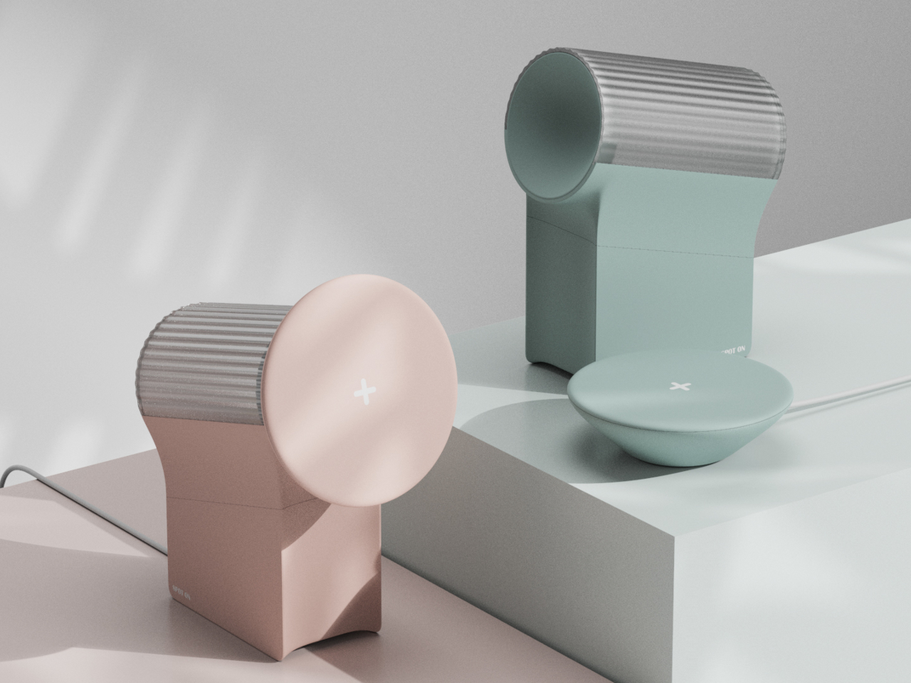
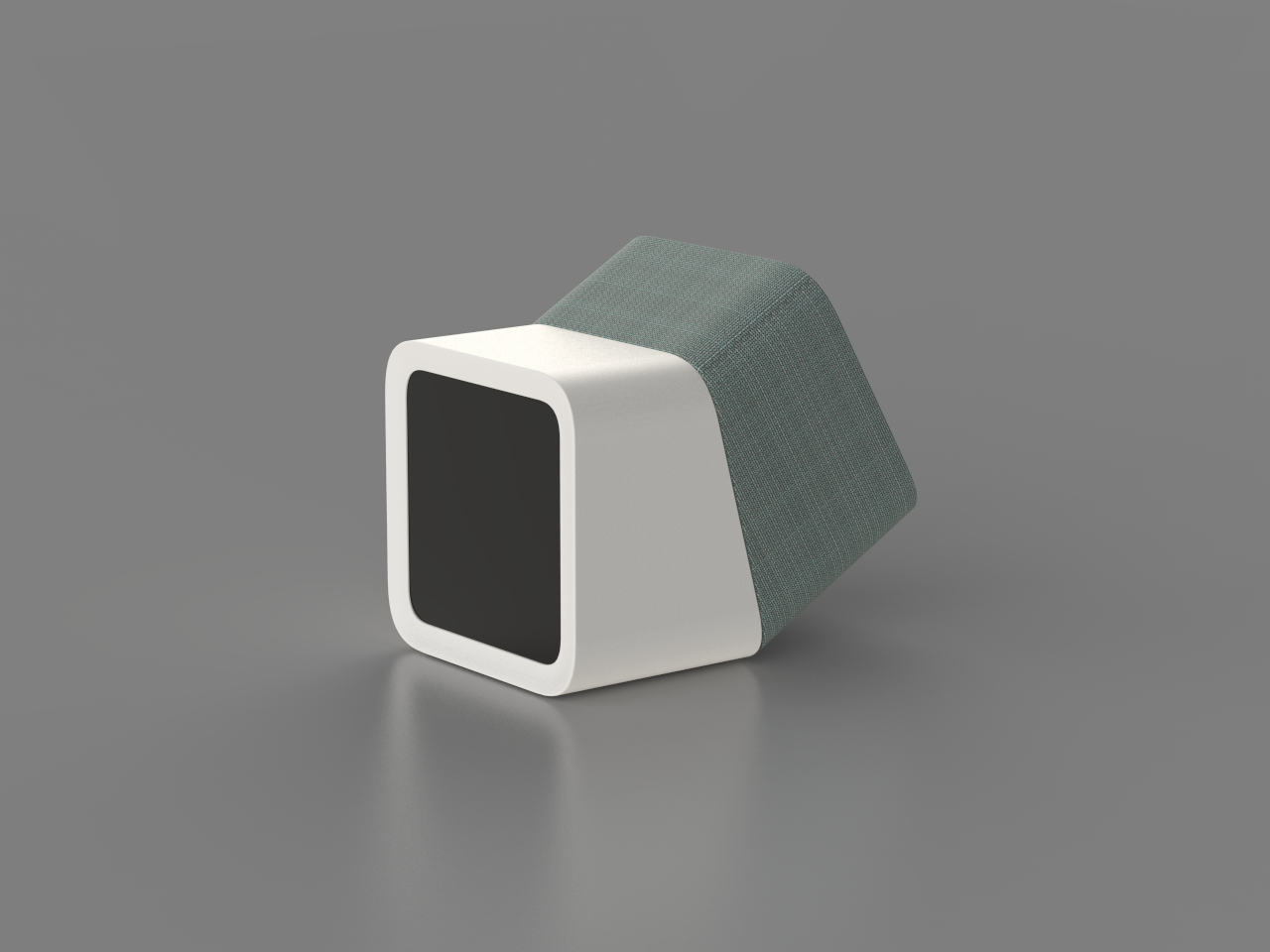
A blue anodized aluminum frame forms the table’s skeleton, supporting a black anodized sandbox that sits neatly inside it. The sand rests on a white base, so the patterns read clearly through the glass. A beveled glass top with a black border floats above, hiding the LEDs from direct view and making the whole thing read as a finished piece of furniture rather than a lab rig you’re still tweaking.

RGB LED strips tucked into the sandbox edges wash the sandbed in color, while additional strips under the frame cast a soft glow onto the floor. In a darkened room, the table becomes a low, luminous object, with the ball’s path slowly emerging and fading. The combination of blue frame, black sandbox, white sand, and colored light gives it a clear visual identity without feeling loud or desperate for attention.

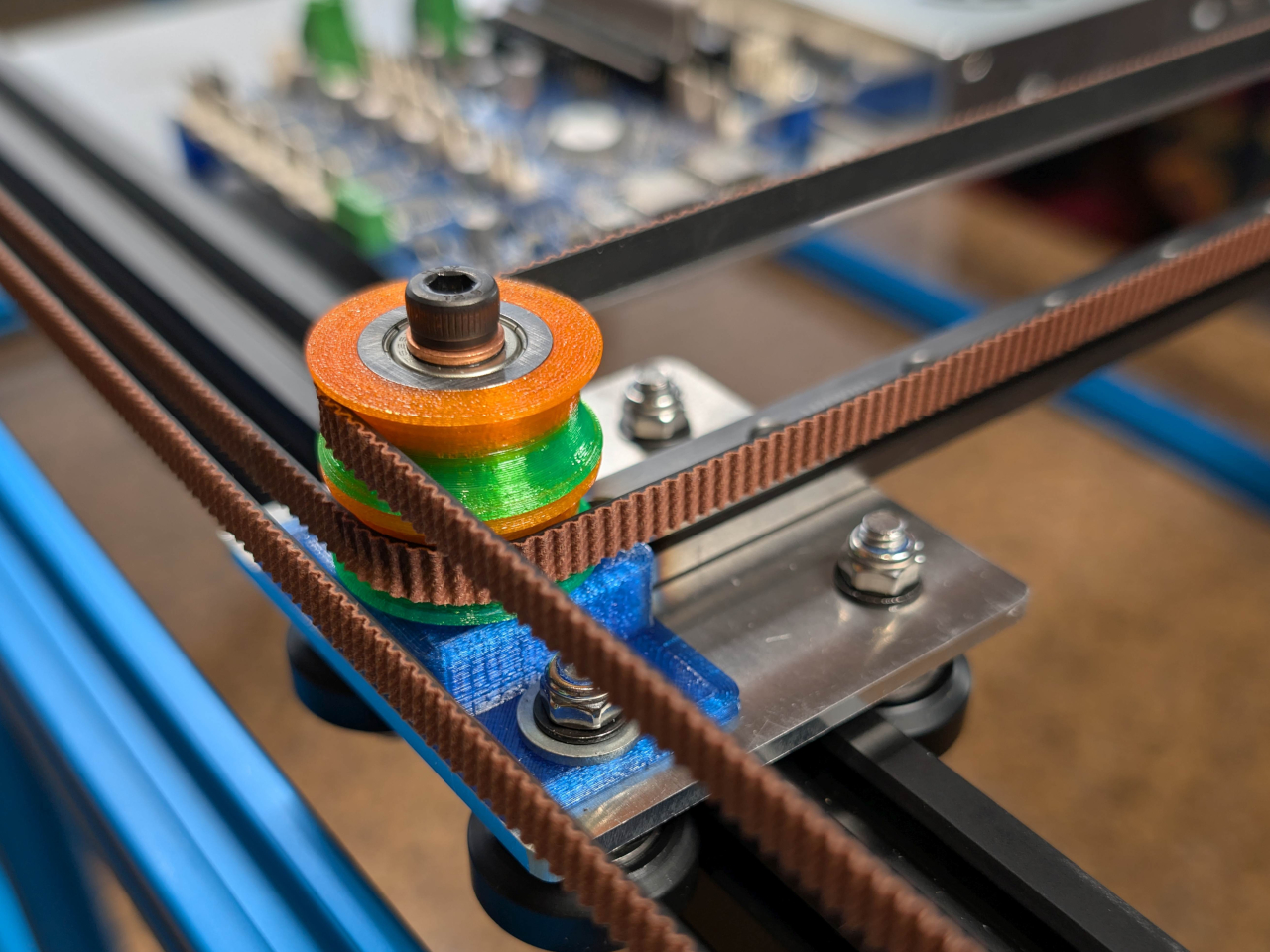
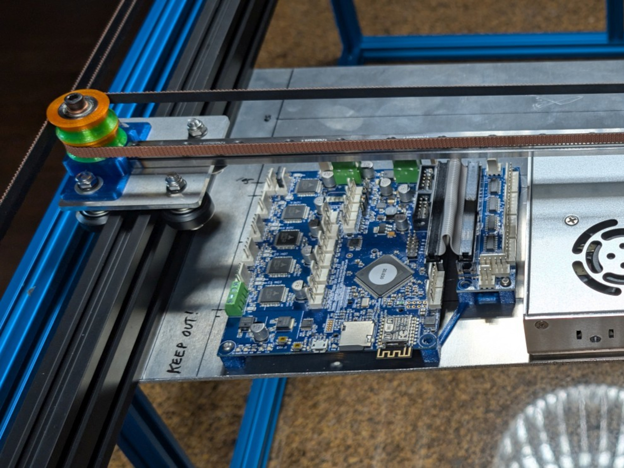
Light blue mirrored acrylic panels fill the gaps in the frame, reflecting the LEDs and sandbed while hiding the mechanical guts. They’re centered in the slots with clear silicone edging, so they sit cleanly and don’t rattle. From the side, you see a band of soft reflection rather than belts and pulleys, which helps the table feel more like intentional furniture and less like an exposed machine.

The ball moves slowly enough that you don’t watch it like a screen, but you notice that the pattern is always changing when you glance down. Over the course of an evening, lines accumulate, overlap, and get erased as new designs start. It’s closer to having a mechanical fireplace or aquarium than a gadget, something that quietly animates the room without demanding attention every five seconds.

Arrakis 3.0 shows how DIY can cross into design territory. By tightening the footprint, standardizing the glass, and wrapping the mechanism in a coherent color and light story, this version feels less like a project and more like a piece you’d actually want to put your coffee on. The moving patterns and soft glow give it a presence that changes the room without overwhelming it.

The post DIY Coffee Sand Table Turns a Living Room Surface Into Moving Art first appeared on Yanko Design.

Nuvolino Incense Burner Looks Like a Character Exhaling Smoke

Incense has moved from hippie corners and temples into more design-conscious homes, but most burners are either purely functional trays or ornate figurines that look like souvenir shop castoffs. Nuvolino sits in the middle, a small white ceramic object that looks like a character and a sculpture at the same time. It’s less about holding incense and more about staging a tiny scene of scented smoke.

Nuvolino is a ceramic incense burner designed by Giulio Iacchetti and made in Italy. Iacchetti describes it as a gentle alien that lands on shelves and sideboards to bring a breath of scented air. It’s the first in a planned collection of home fragrance objects, starting in pure white but with the possibility of future artist-decorated versions that turn each burner into a small canvas or signed piece.

Designer: Giulio Iacchetti

The form is a smooth, elongated body with a slight waist, sitting on a low disc base and topped by a rounded head with a single circular opening on one side. That opening acts as a mouth or eye, depending on how you see it, and it’s where the smoke escapes. The proportions are simple and almost toy-like, but the lack of facial features keeps it from feeling kitschy or overly cute.

You lift the ceramic figure off its base to reveal a small cone of incense, light it, let it smoulder, and then place the figure back over it. As the cone burns, a thin veil of smoke begins to drift out of the side opening, making it look like the little character is gently exhaling. The room slowly fills with a soft aroma, and the object feels briefly alive in a way that flat trays never manage.

Nuvolino is inspired by the German Räuchermann, the turned wooden incense man that often depicts miners, forest rangers, or chimney sweeps with smoke coming from their mouths. Nuvolino rewrites that story in minimal white ceramic, stripping away costume and narrative while keeping the core gesture. The result is an ironic, evocative update that fits contemporary interiors without losing the charm of the original folk tradition.

Nuvolino is crafted from white ceramic by Italian artisans, with a finish that emphasizes form and shadow over decoration. The packaging is simple brown cardboard with a black silhouette of the character blowing smoke, more like a design object than a luxury perfume. Together, they frame the burner as something quiet and honest, ready to pick up patina and personal meaning over time.

Nuvolino turns the act of lighting incense into a tiny performance, where a silent figure seems to breathe out fragrance and change the mood of a room. For anyone who likes their home objects to have a bit of personality without shouting, this little ceramic alien feels like a gentle way to let scent and sculpture come together on a shelf.

The post Nuvolino Incense Burner Looks Like a Character Exhaling Smoke first appeared on Yanko Design.

SPOT ON Charger Makes Wireless Charging Feel Like a Bullseye

Wireless chargers have become common, but most are anonymous black discs that disappear into the desk. They do the job, but rarely feel personal or satisfying to use beyond the first week you own them. SPOT ON is a concept that tries to make charging feel more deliberate and expressive, combining a magnetic pad with a small lamp so the whole interaction has a bit more presence on your nightstand or desk.

SPOT ON is a wireless charger and ambient lamp concept designed around a bow-and-target motif. The charging pad is a circular target that snaps magnetically to the front of a tilted cylindrical lamp body. You can dock the pad to use it as a stand charger, or pull it off and lay it flat as a separate wireless pad while the lamp continues to glow in the background.

Designer: SEUNG-A-LEE

Inside the pad is a magnet that aligns the phone with the charging coil, so when you bring your device close, it snaps into place with a satisfying click. The designer explicitly likens this to hitting the target, turning the usual hunt for the right charging spot into a more playful, bullseye moment. The subtle cross mark on the pad reinforces that visual cue every time you place your phone.

The lamp body is a tilted cylinder with vertical grooves, mounted on a simple rectangular base. When lit, the ribbed surface diffuses a warm, gentle glow, more mood light than task lamp. It’s the kind of object that can sit on a bedside table or shelf without screaming tech, giving you a bit of atmosphere while your phone charges upright in front of it.

Because the pad attaches magnetically, it can be pulled off in one motion and used as a flat wireless charger anywhere on the desk or nightstand. The lamp stays behind as a standalone light. That separation lets users adapt SPOT ON to different environments and habits, whether they prefer a stand for video calls or a low pad for casual overnight charging without the upright position.

SPOT ON comes in soft, desaturated tones like warm beige, blush pink, and muted teal, each with a matching pad. The palette leans more toward interior decor than gadgetry, making it easier to blend into different rooms. The combination of simple geometry, gentle colors, and the bow-and-target metaphor gives the charger a character that feels more like a small object you chose than a piece of infrastructure you tolerate.

SPOT ON is a reminder that even something as mundane as charging a phone can be turned into a small ritual. By adding a magnetic snap, a bit of ambient light, and a form that shifts between stand and pad, it nudges the interaction from purely functional to quietly satisfying. For anyone tired of generic charging pucks, this kind of concept hints at a more thoughtful future for everyday tech.

The post SPOT ON Charger Makes Wireless Charging Feel Like a Bullseye first appeared on Yanko Design.

MINISFORUM AtomMan G1 Pro Packs Desktop RTX 5060 in a White Tower

Most mini PCs fall into two visual camps: anonymous black boxes meant to hide behind a monitor, or aggressive RGB bricks that look like shrunken gaming rigs. Neither category thinks much about how the machine actually sits in a room. The MINISFORUM AtomMan G1 Pro takes a different route, leaning into a slim white tower form that looks more like a scaled-down desktop than a puck, designed to live on the desk as part of the composition.

The AtomMan G1 Pro is a compact gaming and creator PC that pairs an AMD Ryzen 9 8945HX with a desktop-class NVIDIA RTX 5060. It’s powerful enough for AAA gaming and 3D work, but what makes it interesting from a design perspective is how it packages that hardware into a minimalist vertical tower with a wave-textured side panel and a single, controlled strip of lighting in front.

Designer: MINISFORUM

The G1 Pro stands upright on a small base, with a tall, slim body finished in white rather than the usual black. One side panel is a continuous wave texture that catches light softly instead of shouting with vents and logos. That vertical stance frees up desk space and makes it feel more like a small speaker or piece of audio gear than a traditional mini PC, which changes how you might place it in a living room or studio.

A vertical light strip runs along the front, adding a subtle cyan accent without turning the whole case into an RGB billboard. The MINISFORUM logo is printed vertically, aligning with the tower posture. Front I/O is tucked into that same edge, with a power button, USB-A, USB-C, and audio jack easily reachable but visually quiet, so the wave-textured face stays clean and uninterrupted.

Inside, a full-length RTX 5060 desktop GPU sits vertically alongside the Ryzen 9 CPU, fed by a 350W internal PSU and a third-generation Glacier cooling system. Wide-diameter fans, copper heat pipes, and a two-sided exhaust layout push air through the tall chassis. The tower form is not just aesthetic; it gives the airflow a clear path and lets the machine dissipate up to 300W without looking like a heat sink on legs.

On the back, multiple DisplayPort and HDMI ports support up to four 4K displays, along with plenty of USB and a 5GbE LAN port. That means it can anchor a serious multi-monitor setup for gaming, editing, or coding while still looking tidy from the front. The white shell and vertical stance help it blend into both studio and living room setups without dominating the visual field.

The AtomMan G1 Pro shows what happens when a performance-focused mini PC gets a bit more design attention. It doesn’t abandon specs, but it wraps them in a form that feels more considered than another black brick. For anyone who wants desktop-class power in a machine that can actually sit on the desk without spoiling the view, this little white tower is worth watching when it ships early next year.

The post MINISFORUM AtomMan G1 Pro Packs Desktop RTX 5060 in a White Tower first appeared on Yanko Design.

Parsel EVA Tote: Rigid Shell and Soft Liner You Can Reconfigure

Most bags are single-purpose objects. A tote for groceries, a weekender for travel, a backpack for everything else. Parsel’s EVA East West Tote System treats a bag more like a modular platform, where a rigid shell, soft liner, and strap can be reconfigured for different uses. It’s less about one perfect tote and more about a carry architecture you can tune as your day changes.

The EVA East West Tote System is a high-density EVA tote available in small and extra-large sizes. Each Unit is an injection-molded shell with integrated handles, paired with a removable roll-top nylon liner and an engineered knit strap. All the hardware is machined from aircraft-grade aluminum, giving the whole thing a gear-like feel rather than a fashion accessory vibe that falls apart after a season.

Designer: Nur Abbas (PARSEL)

The Unit is a monolithic box with soft radii and an oval handle cutout, rigid enough to protect contents but flexible enough to absorb impact. In its small size, it reads like a compact utility caddy. In the extra large, it becomes a trunk-like tote that can swallow groceries, tools, or sports gear. The clean surfaces and embossed Parsel logo keep it visually quiet and precise.

The removable nylon liner has a roll-top with a magnetic closure and can live inside the Unit or be used on its own. The adjustable knit strap stretches slightly for comfort and threads through Parsel’s signature Button, a ribbed aluminum connector that links everything together. That Button is the universal joint of the system, letting the strap move between the shell and liner without extra clips or buckles cluttering the sides.

In classic tote mode, the strap attaches to the EVA Unit with the liner inside. For a lighter carry, the liner can be used alone with the strap as a soft shoulder bag. In the extra-large size, the liner can even be worn as a backpack by rethreading the strap through the Buttons. Parsel literally labels this “Play with the system,” inviting users to treat carry as something adjustable.

The aluminum handle insert is etched with Parsel Systems Intl around its oval perimeter, while the Button hardware carries the brand name in clean engraving. These details feel more like precision components from outdoor gear than fashion hardware. Colorways like Optic white, Deep black, and Priority orange let the bags shift toward either minimal or high-visibility use, comfortably filled with screws, firewood, fish, or flowers in both workshop and city.

The EVA East West Tote System is a thoughtful attempt to make one bag work across many lives. By separating structure, volume, and carry into distinct parts, Parsel lets you tune how rigid, soft, or hands-free the bag needs to be on a given day. For anyone who likes their everyday carry to feel more like a system than a single fixed object, this EVA tote is worth considering.

The post Parsel EVA Tote: Rigid Shell and Soft Liner You Can Reconfigure first appeared on Yanko Design.

Dinoosh Dispenses Dino Paw Print Soap, Changes Color When Done

Kids explore everything with their hands, but rarely wash them long enough, even when adults remind them. The recommended 20 seconds feels like forever to a child staring at a sink, which is why so many just rinse and run. Dinoosh is a concept that tries to solve this not with more nagging or countdown posters, but with a small dinosaur-themed object that makes the whole routine feel like a game.

Dinoosh is a palm-sized, dinosaur-inspired handwashing tool that combines a soap dispenser, scrubber, and color-changing timer. It looks like a soft, rounded dino paw with three spikes on top and a loop so kids can clip it to backpacks or bathroom hooks. The idea is to give children a friendly companion that turns washing away germs into something they actually want to do on their own.

Designers: Aarya Ghule, Tejas Vashishtha

Kids flip open a small lid at the bottom and squeeze Dinoosh, which dispenses thick soap gel in the shape of tiny dinosaur paw prints onto their hands. That simple detail turns soap into a character moment, giving a clear visual dose and an instant reason to look and laugh. It invites kids to start rubbing and playing instead of rushing straight to the rinse and calling it done.

Dinoosh stays involved once the soap is out. The back of the device has soft ridges that act like a gentle scrubber when kids rub their hands over it. The spikes on top help get between fingers, and the rounded body is easy to grip with wet hands. Instead of just lathering and standing there, children are encouraged to keep moving, squeezing, and scrubbing as part of the play.

The body is made from thermochromic plastic that slowly shifts color with warmth and friction. As kids scrub their hands and run warm water, they see the dinosaur paw gradually change hue. That becomes a built-in timer: they know they’re done when Dinoosh has fully changed color, which roughly matches the recommended 20 seconds without needing to count or sing a whole song.

A small loop at the top lets Dinoosh hang from backpacks, bathroom hooks, or stroller handles, keeping it in sight and within reach. Bright colorways like Sweet Sprout green, Coral Pop, and Soft Comet lavender make it feel collectible and personal. By living in kids’ everyday environments, it nudges them toward washing not just at home but at school and on the go.

Dinoosh shows how product design can tackle hygiene through play rather than guilt. By combining characterful form, tactile engagement, and a built-in color timer, it turns a forgettable chore into a small daily ritual kids can own. Whether or not this exact concept hits the market, the idea of a dinosaur paw that tells you when your hands are clean feels like a story most kids would happily wash along with.

The post Dinoosh Dispenses Dino Paw Print Soap, Changes Color When Done first appeared on Yanko Design.

Tilt This Smart Clock, and It Triggers Your Entire Bedtime Routine

Most smart home routines now live inside apps and voice menus, which is powerful but often feels abstract and fiddly. Controlling physical things through layers of screens can feel backwards, especially for simple daily transitions like going to bed or waking up. This smart alarm clock concept treats day and night as a single, physical gesture instead, asking what would happen if your entire bedtime routine followed one tilt of a solid object.

The concept is a smart alarm clock that doubles as an IoT scene switcher. It’s a small wedge-shaped object with a square display on one face and fabric wrapping the rest of the body. Instead of tapping through modes, you literally tilt the clock like a seesaw to flip between day and night. The display follows, showing a bright sun or a dim moon depending on which way it rests.

Designer: Hojung Cha

In day orientation, the clock faces you with a bright UI, lights and music on, and your phone fully awake. Tilt it the other way into night mode, and the screen darkens, lights fade, music winds down, and your phone can automatically switch to Do Not Disturb while setting an alarm for the morning. One physical move triggers a whole bedtime routine without touching a single app or menu.

The form is a soft rectangular block with one angled face for the display, wrapped in fabric so it feels more like a piece of furniture than a gadget. The angled front makes it easy to read from bed, and the two stable resting positions are obvious at a glance. It looks comfortable on a nightstand next to a lamp and a book, not like a piece of lab equipment waiting to blink at you.

The clock inverts the typical IoT relationship. Instead of your phone being the remote for everything else, the clock becomes a physical remote for the phone. It can tell your smartphone when to be quiet, when to wake you, and when to leave you alone. At the same time, it coordinates with lights and speakers, acting as a simple, dedicated interface for the most common daily transition in the home.

The design borrows the familiar bedside clock silhouette but adds the tilt mechanic and a clean, modern display. The goal is technology that can be seen, touched, and held, making its function legible without an instruction manual. The two orientations and matching UIs turn a behavior we already do, such as getting up or going to bed, into something the object naturally understands and responds to.

The smart alarm clock concept is a small argument for more tangible IoT. It doesn’t try to solve every scenario with an app; it focuses on one moment and makes it physical, glanceable, and easy to understand. The idea of flipping a solid object to tell your home and your phone “day” or “night” feels like the kind of interaction our sleepy brains can actually live with.

The post Tilt This Smart Clock, and It Triggers Your Entire Bedtime Routine first appeared on Yanko Design.

Shantivale Incense: 5 Plant-Based Blends Mapped to Times of Day

Home scent has spent the last decade in candles and diffusers, often leaning on synthetic fragrance oils and heavy perfume notes that fill a room fast and fade faster. There’s a quiet shift back toward incense now, especially the kind made from ingredients rather than lab blends. Shantivale is a botanical incense brand from Shangri-La, Yunnan, that treats incense as a small architectural gesture instead of a perfumed cloud you spray and forget about.

Shantivale’s core idea is plant-born smoke, not perfume. Each stick is made from ground woods, herbs, and resins, held together with a traditional plant-based binder made from glutinous rice root and Debregeasia orientalis bark. Because even the binder is plant fibre and starch rather than chemical adhesive, the ember burns at a lower, steadier temperature, producing a fine, soft plume instead of thick smoke with sharp edges.

Designer: Shantivale

The sustainability side is straightforward. There are no synthetic fragrance oils or dyes, which means less petrochemical load and less residue floating in the air. The plant-based binder is locally crafted, supporting regional knowledge and reducing reliance on industrial adhesives. The burn is low-smoke, even, and gentle, where the air reads as plants rather than lab-bright perfume. It’s less about masking a space and more about restoring its tone, letting a room feel more like itself.

The blends are informed by classical Chinese herb pairing logic, treated as heritage and craft rather than medicine. Cinnamon twig, dryopteris, artemisia, sandalwood, agarwood, poria, ziziphus seed, and polygala root are culturally associated with warmth, clarity, inward calm, and rest. These references explain why the blends behave like distinct states, such as clarity, focus, warmth, and rest, rather than the usual top-heart-base perfume pyramids you get from synthetic candles trying to smell like fifteen different things at once.

The Tranquil Fivefold kit maps five blends to different moments of the day. Purity Veil behaves like a herbal reset after cooking or between tasks. Dharma Rain is a cooler, contemplative blend for study and focused work. Zen Flow leans warm and inward for meditation or gentle yoga. Cliff Glow is a single-wood cypress stick for rainy windows and unhurried afternoons. Sereni Sleep marks the evening’s descent with grain-warm hush, close and non-intrusive.

The packaging follows the same restraint. The sticks come in slim boxes wrapped in Xuan paper, echoing Chinese calligraphy and the contemplative flow of ink. Each blend has a bilingual name and a short scent verse, more field guide than vanity jar. The kit includes a carved stone holder inspired by mani stone mounds in the Tibetan highlands, a smooth river stone with a drilled hole that quietly marks faith, time, and the path of smoke.

One stick burns for about forty minutes, long enough to bracket a work sprint, a chapter, or an evening wind-down. You light it, fan out the flame, and let it smoulder. The stick ends itself, and the after-feel lingers. In days that blur together, that small ceremony gives minutes a border and offers a natural signal that re-tunes the room’s field to something more breathable and human.

Shantivale is a simple argument: plant-born smoke, cultural pairing, and a small ritual that turns ordinary transitions into moments that feel distinct. For anyone building a signature mood at home or looking for something thoughtful to gift this season, the Tranquil Fivefold kit is worth picking up. Whether for yourself or someone who could use a quieter kind of scent, it’s an object that lingers long after any wrapping paper.

The post Shantivale Incense: 5 Plant-Based Blends Mapped to Times of Day first appeared on Yanko Design.

Cosi Laptop Table Brings a Fully Adjustable Work Surface to Any Chair

Laptops have escaped the desk and now show up on sofas, lounge chairs, and every in-between space, often with terrible posture as a side effect. Balancing a laptop on your knees or hunching over a coffee table is fine for checking email but not for real work. The Cosi laptop table is a small, adjustable surface designed to follow those habits and make them more ergonomic.

Cosi is a fully adjustable laptop table developed by Pearson Lloyd for Teknion’s portfolio. It’s a compact side table with a height-adjustable column and a slim top, meant to support typing, writing, or video calls whether you’re in a task chair or a deep lounge. Despite its simple silhouette, it’s the result of a careful review of how people actually work across different seating types and informal spaces.

Designer: Pearson Lloyd for Teknion

The basic form is a thin rectangular top with softly rounded corners sitting on a single round column, which rises from a flat, low-profile base. The base is slim enough to slide under chair legs or lounge frames, while the offset column lets the top cantilever over your lap. The proportions keep it visually light, so it reads as a quiet companion rather than a shrunken desk taking up floor space.

The column allows the top to move from standard typing height when you’re upright in a task chair to a higher position when you’re reclined in a lounge. That means your wrists and shoulders can stay in a more neutral position instead of hunching over a laptop balanced on your knees. Cosi turns casual seating into a place where you can actually work comfortably for more than ten minutes.

Paired with Teknion’s Aarea lounge chairs, the base tucks under the sled frame while the top hovers over the seat. In more traditional offices, it can park next to task chairs as a personal work island. Because it’s small and visually quiet, multiple tables can live in a lounge or focus area without making the space feel cluttered or over-furnished like a forest of full-size desks.

The detailing makes it feel more like furniture than equipment. The tabletop edge is thin and refined, the column-to-base junction is clean, and the finishes align with Teknion’s broader palette, from neutral paints to wood-look tops. There are no exposed mechanisms or clunky levers, just a smooth, minimal form that hides the engineering and lets you focus on the surface itself.

Cosi is one of those small tools that quietly make hybrid work more sustainable. It doesn’t try to replace a full desk, but it gives laptops a proper landing spot wherever you choose to sit. By combining adjustability, a slim footprint, and a restrained aesthetic, it turns the improvised habit of working from any chair into something your body and your workspace can live with a little better.

The post Cosi Laptop Table Brings a Fully Adjustable Work Surface to Any Chair first appeared on Yanko Design.

Midea Flexify French Door Air Fryer: 10-in-1 Oven, 1 Black Friday Deal

Small kitchen counters have a way of accumulating appliances. You start with a toaster, then add an air fryer for crispy fries without the oil. A countertop pizza oven shows up because takeout is expensive, and before you know it, there’s a slow cooker tucked in the corner. Pretty soon, you’re playing appliance Tetris just to clear enough space to chop vegetables, and half the devices spend most of their time unplugged and shoved into cabinets.

The Midea Flexify™ French Door Air Fryer Oven tries to solve this by replacing that entire lineup with one countertop oven. It’s a BEST OF KBIS 2024 winner built around a simple idea: combine ten cooking modes into one appliance without making it too complicated or too big. The oven handles air frying, baking, broiling, roasting, toasting, pizza, reheating, slow cooking, dehydrating, and warming. Midea is running a Black Friday and Cyber Monday promotion on it, which makes it worth considering if you’ve been thinking about clearing out your countertop.

Designer: Midea

Click Here to Buy Now: $139.87 $169.99 (17% off). Hurry, deal ends in 48-hours!

The first thing you notice is the French doors. Instead of a single drop-down door that forces you to lean over a hot cavity, the Flexify uses dual doors that swing open with one pull. They’re made from stainless steel with wide glass windows, so you can check on your food without letting heat escape. There’s an anti-scald handle to keep your fingers safe, and the doors save space in front of the oven.

Inside sits a 26.4-quart cavity with generous vertical space. You can fit a whole chicken or turkey breast on one rack and vegetables on another, or stack a multi-layer lasagna without worrying about clearance. The oven also handles a twelve-inch pizza, six slices of toast, or fourteen chicken wings comfortably. Four rack positions let you adjust the height depending on what you’re cooking.

The Cyclone Air Fry system is what lets the Flexify work as both an air fryer and a conventional oven. It uses a convection fan and six heating tubes to circulate air quickly and evenly, cooking up to 25 percent faster than traditional frying while using up to 90 percent less oil. The oven heats up fast enough that you can skip preheating when air frying, so you just toss frozen food into the basket and start.

What sets the Flexify apart from most countertop ovens is the VDE-certified evenness. That certification means the oven’s heat distribution has been independently tested and proven consistent, so your toast browns evenly and cookies on different racks bake at the same rate. It’s the kind of reliability that matters when you’re making dinner for a family or hosting a gathering and can’t afford uneven results.

The oven settles into daily routines naturally. In the morning, it toasts bread and reheats pastries. At lunch, it warms leftovers without drying them out. In the afternoon, it dehydrates fruit snacks or slow-cooks a stew that finishes by dinnertime. At night, it air-fries vegetables or broils salmon. The digital LED display makes it easy to adjust temperature and time precisely without navigating complicated menus.

What makes the Flexify feel like a smart upgrade is how it cleans up both the physical and mental clutter of a crowded kitchen. Instead of remembering which appliance does what and where you stored it, you just open the French doors and pick a mode. The stainless body and clean lines also look better than a collection of mismatched plastic gadgets.

The Midea Flexify™ French Door Air Fryer Oven fits the category of appliances that earn their counter space by doing more than one job well. For anyone tired of juggling multiple devices, it consolidates without sacrificing functionality. The Black Friday and Cyber Monday window brings it down 18 percent from November 20 to December 1, which is worth considering if you’ve been eyeing a countertop upgrade.

Click Here to Buy Now: $139.87 $169.99 (17% off). Hurry, deal ends in 48-hours!

The post Midea Flexify French Door Air Fryer: 10-in-1 Oven, 1 Black Friday Deal first appeared on Yanko Design.