Your $1,200 Phone Looks Boring Next to These 5 Concepts

Look at the phones announced this year, like those revealed at MWC 2026 last week, and you will notice something. They are all faster, thinner, and shinier than last year’s models, and yet none of them feel particularly surprising. Cameras gained another sensor. Bezels shrank another millimeter. Battery life improved by an amount that is technically measurable but practically indistinguishable from the model before. The industry has gotten so good at making phones incrementally better that it has almost forgotten to ask whether they could be genuinely different.

That is where concept phones come in. Not all of them are practical, and not all of them will ship. But the five designs here do something that the latest Galaxy or iPhone cannot: they make you pause and reconsider what a phone actually is, and what it could be if the people designing it were not also worrying about carrier approvals, supply chains, and quarterly earnings. Some are functional prototypes shown on actual show floors. Others exist purely as design arguments. All of them are worth thinking about.

TECNO Magnetic Modular System
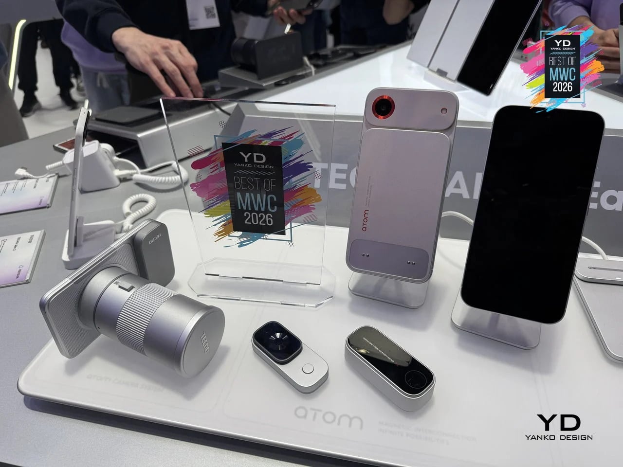
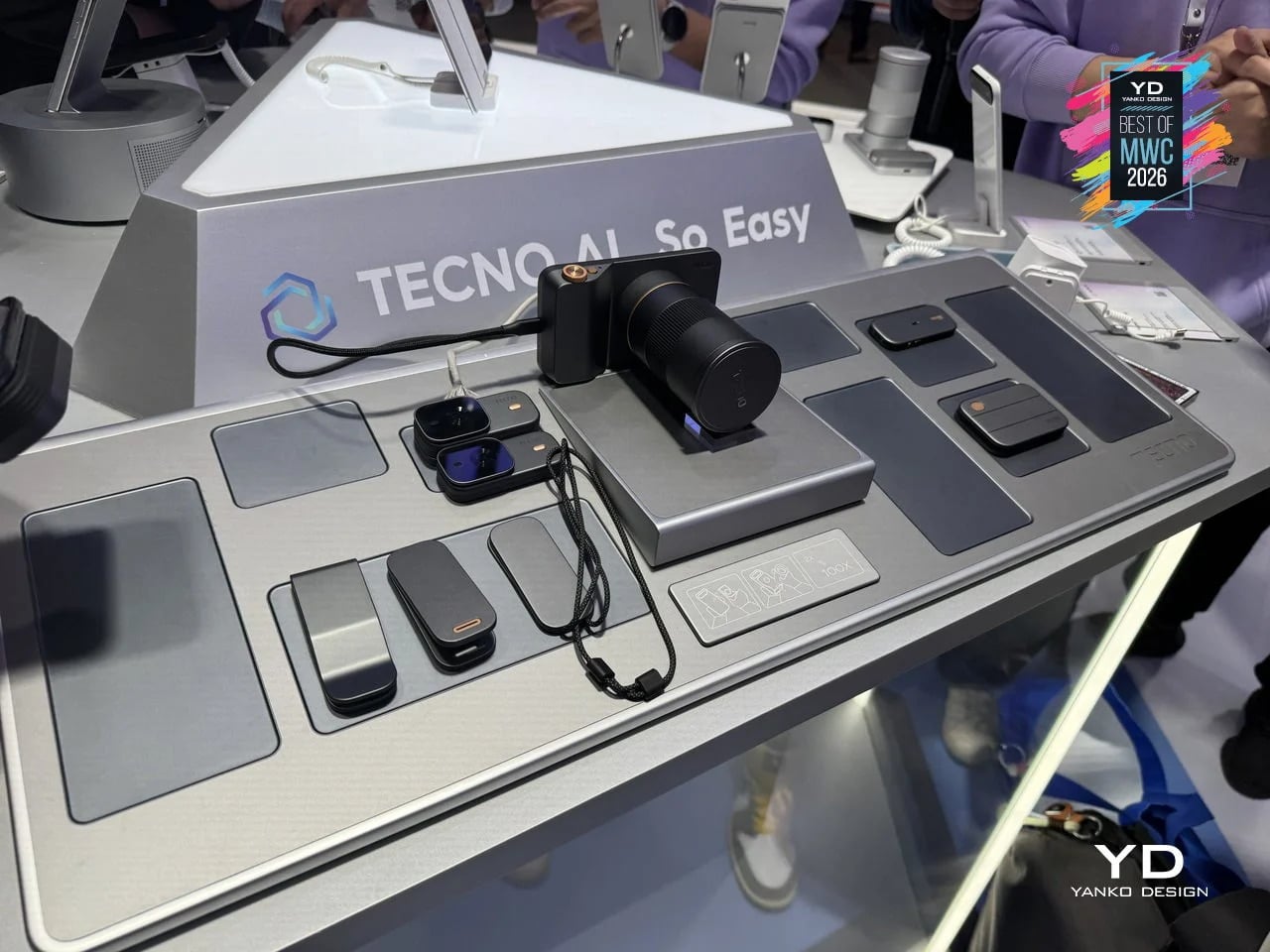
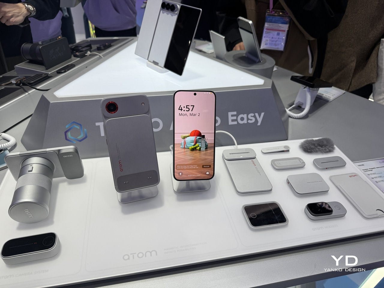
Phones have been getting thinner for years, which sounds like progress until you think about what got traded away in the process. Removable batteries went first, then expandable storage, then headphone jacks. Every feature that required physical complexity was quietly dropped in the name of a slimmer profile. TECNO’s Magnetic Modular System, shown at MWC 2026, challenges that logic directly. Rather than cramming every possible capability into a single fixed body, it keeps the phone lean by design and lets you snap on what you need, when you actually need it.

Designer: TECNO

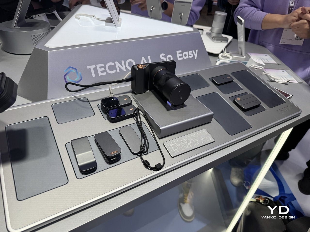
The system works through a magnetic interconnection technology that attaches hardware modules directly to the phone. Telephoto lenses, action cameras, additional battery packs, and over a dozen other components can be added or removed in seconds. The core argument is straightforward: a phone that tries to do everything is permanently weighed down by everything it carries. A phone that adapts to the moment is only as heavy as today demands. Whether TECNO can pull off what Google’s Project Ara could not is another matter, but the design thinking here is at least pointed at the right problem.

What we liked

  • The base phone stays slim and fully usable on its own, so you’re not carrying the bulk of a photography rig on days when all you really need is a phone.
  • The modular suite covers a wide enough range of options to be genuinely practical, from camera upgrades to battery expansion, rather than limiting you to a couple of cosmetic add-ons.

What we disliked

  • Using the system to its full potential requires thinking ahead. If you leave the telephoto module at home, the hiking trail is not going to wait for you to go back and get it.
  • The smaller modules seem like prime candidates for disappearing to the bottom of a bag, while the larger ones can add considerable bulk when stacked, which rather defeats the point of keeping the base phone slim.

HONOR Alpha Robot Phone
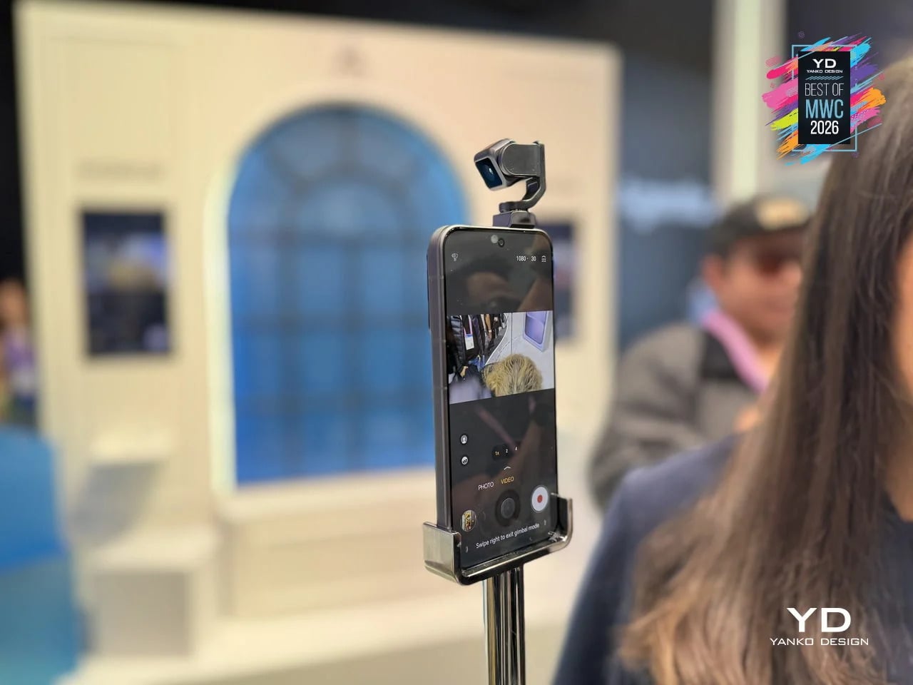
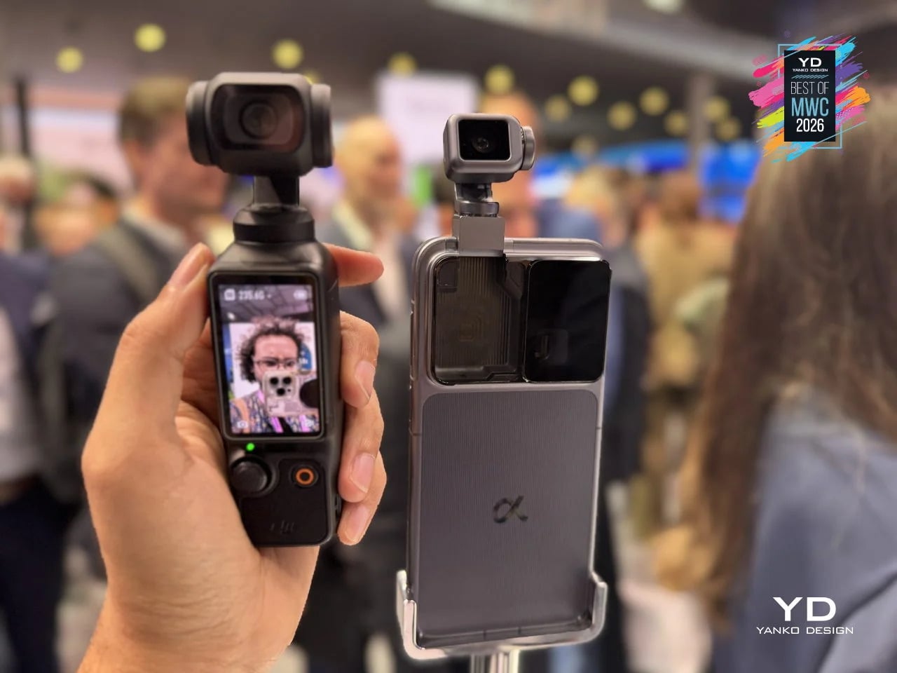
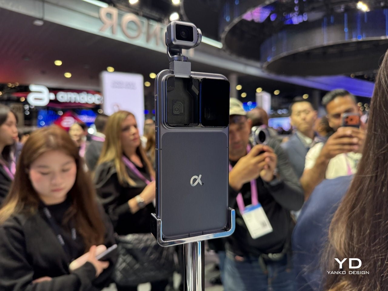
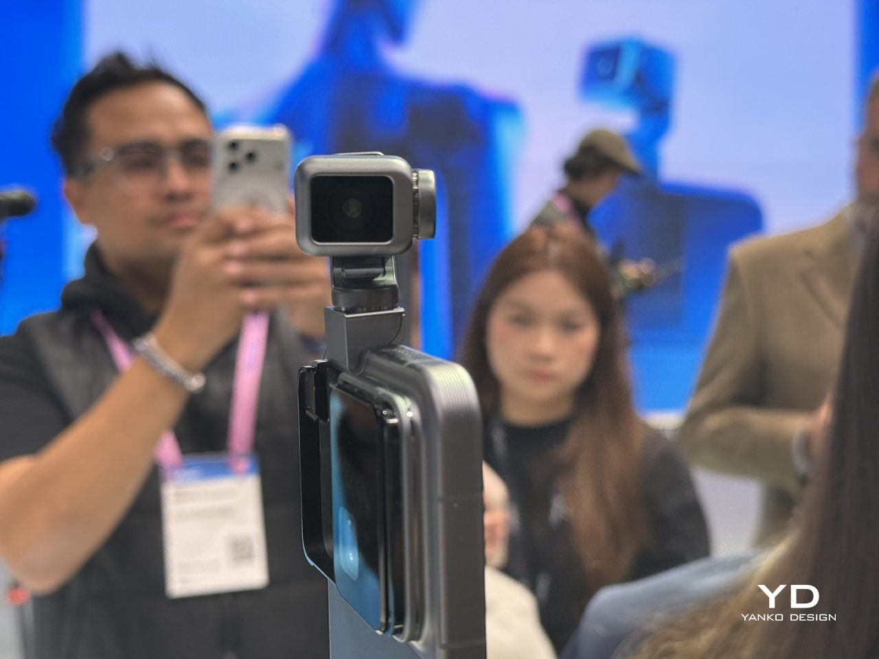
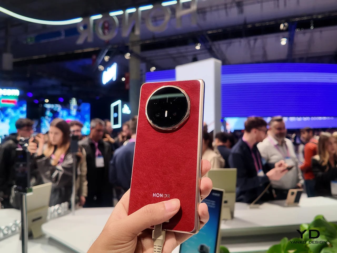
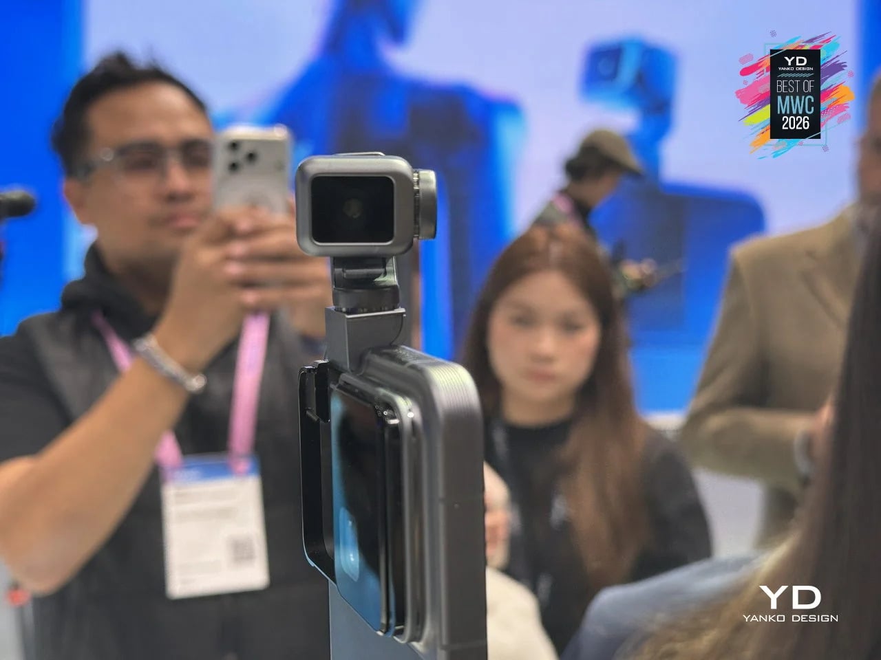
Most phones sit on a desk and wait. The HONOR Alpha does not. Demonstrated as a functional prototype at MWC 2026, this is a phone with a 4DoF gimbal system inside the camera bump, built around what HONOR describes as the industry’s smallest micro motor. Three-axis mechanical stabilization runs alongside an AI tracking engine, and a double-tap locks onto any subject, following it through movement, obstructions, and sudden changes in direction. The person who used to carry a separate DJI Osmo just to get steady footage now has a reasonable question to ask.

Designer: HONOR

The gimbal also does something harder to categorize. HONOR designed it to express what they call embodied AI interaction, meaning the phone physically responds to its environment. It nods during video calls. It reframes itself to keep you centered without being asked. It moves when music plays through its speakers. Phones have had personalities before, mostly through notification lights and ringtones. The Alpha just happens to have something closer to a neck.

What we liked

  • Giving AI a physical presence, rather than just a voice or a chat window, makes the technology feel more tangible and less like a background service you forgot was running.
  • The built-in gimbal meaningfully expands what the main camera can do without requiring any extra gear, turning a stationary device into something closer to an autonomous one-person film crew.

What we disliked

  • Motorized components inside a device that gets dropped, sat on, and shoved into pockets will eventually wear down. A gimbal mechanism that fails out of warranty is a discouraging prospect.
  • The behavioral features, nodding, swaying, tracking your face, are the kind of thing that feels charming in a demo and potentially exhausting at 7 AM when all you want to do is check your messages.

iFROG RS1
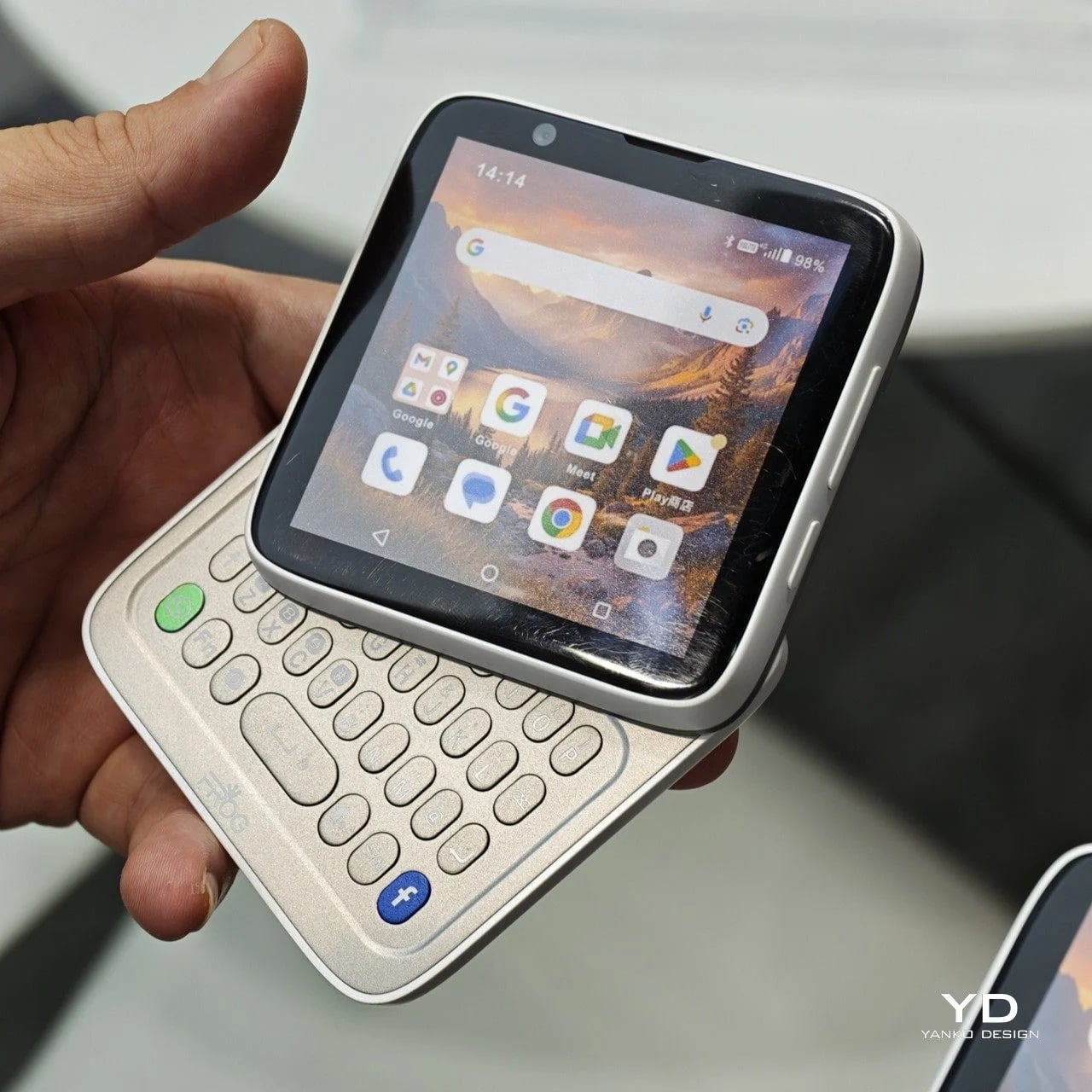
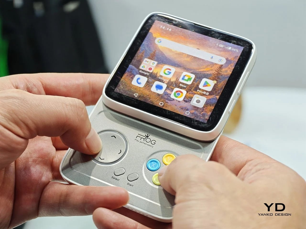
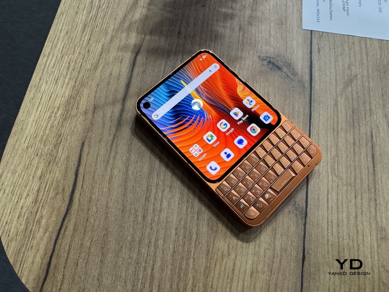
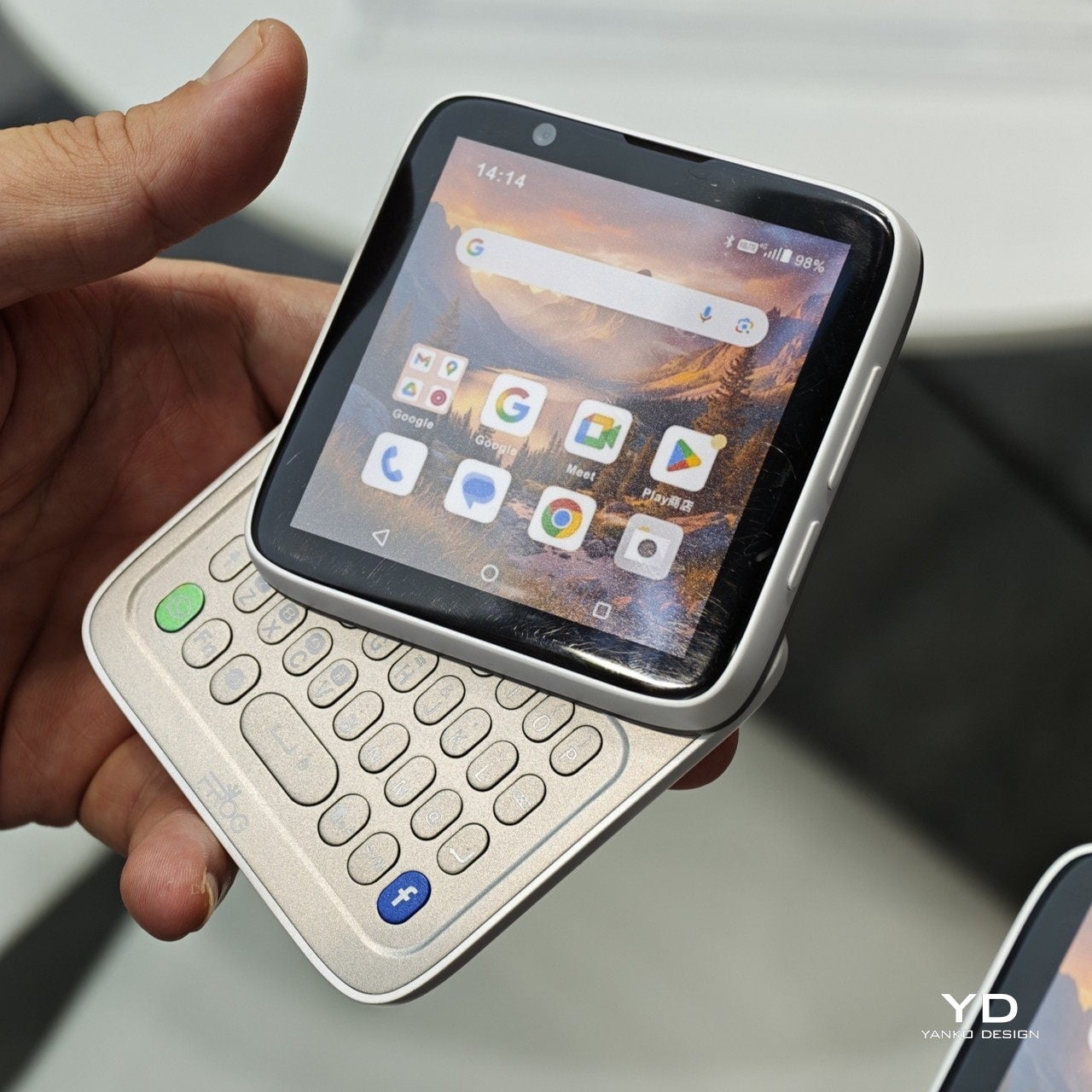
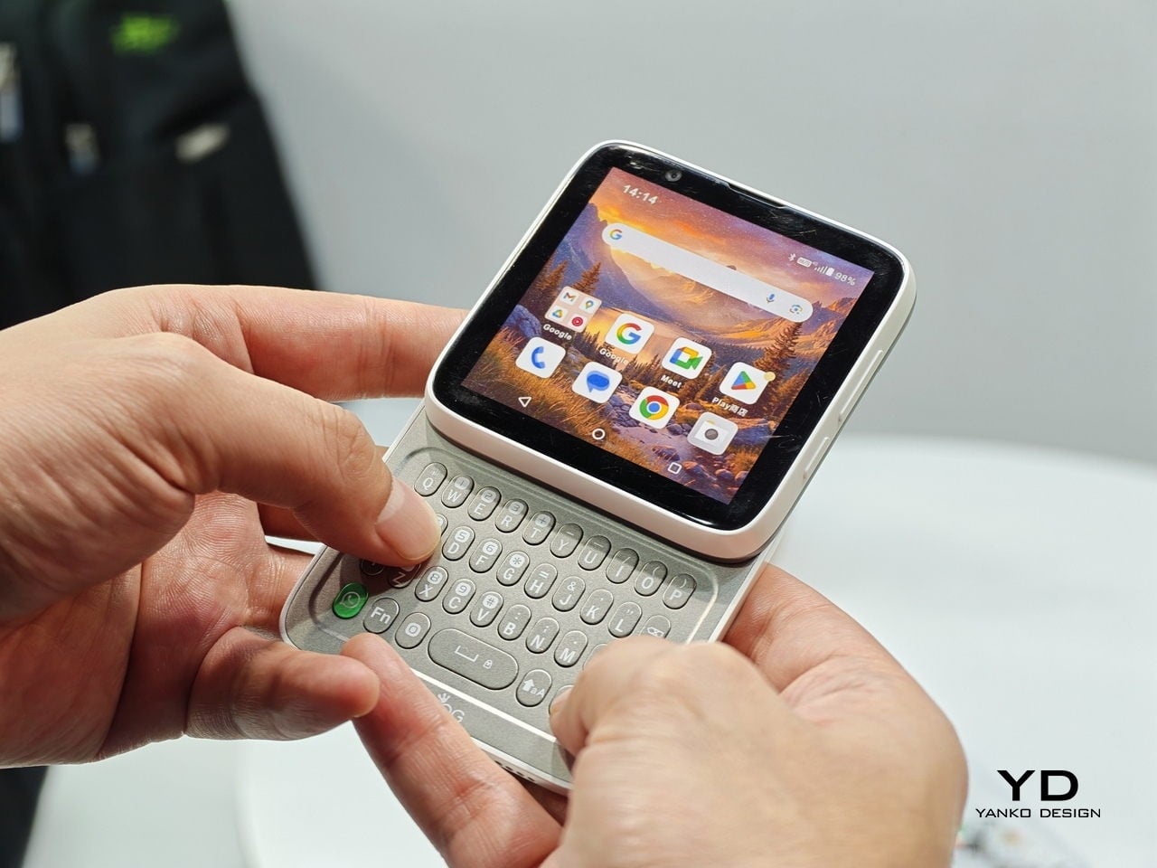
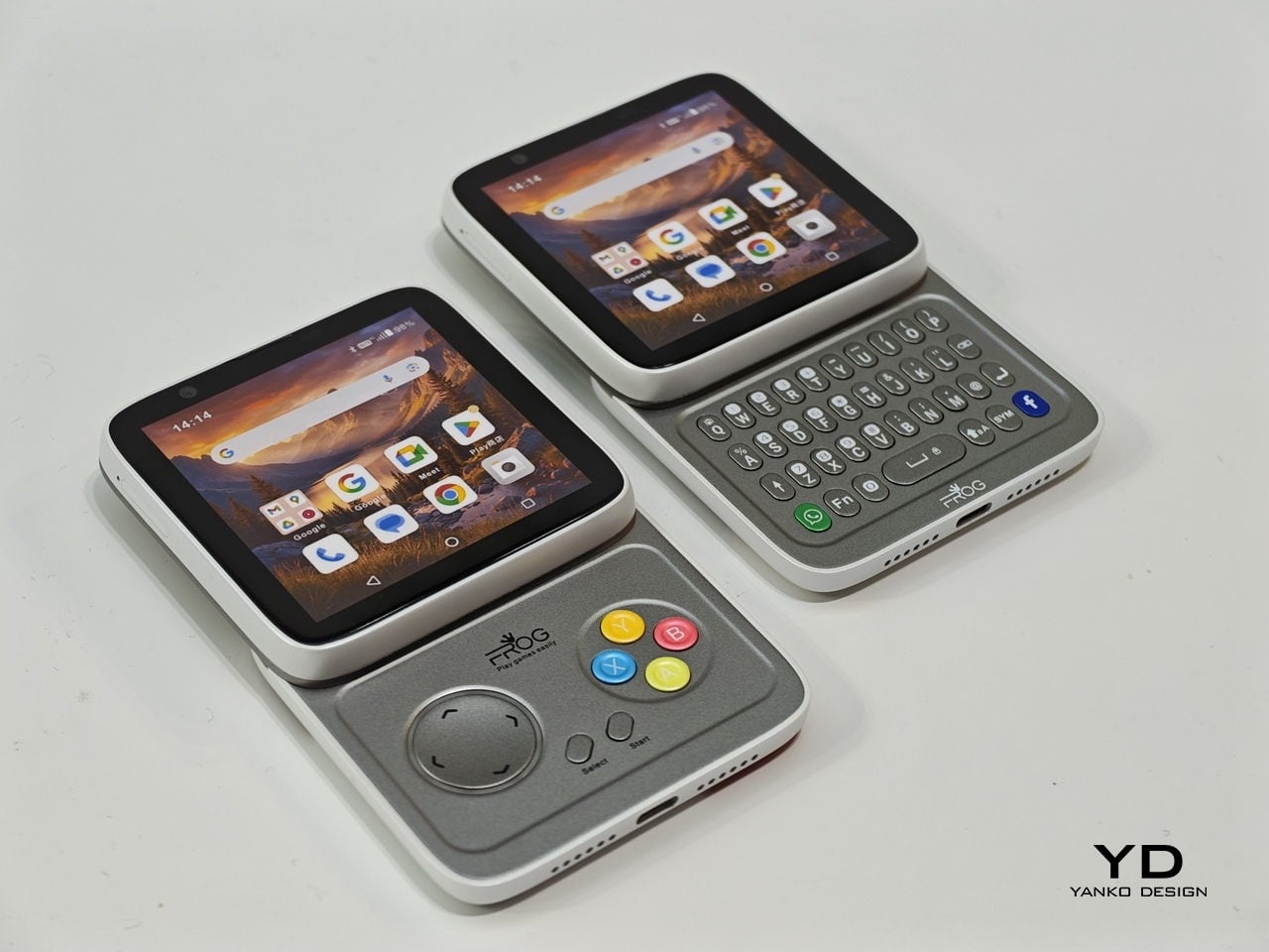
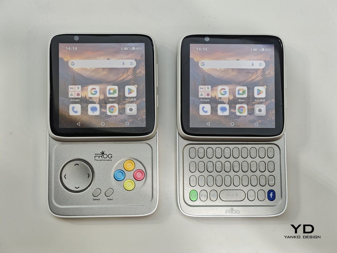
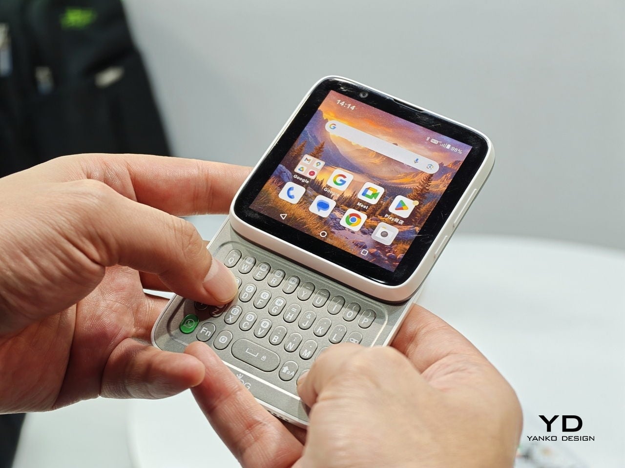
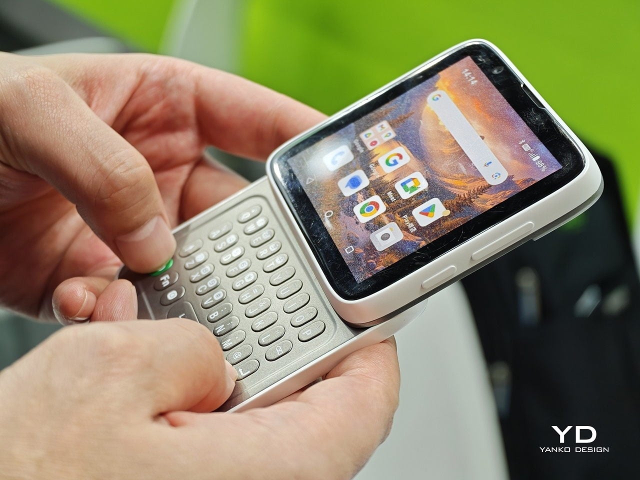
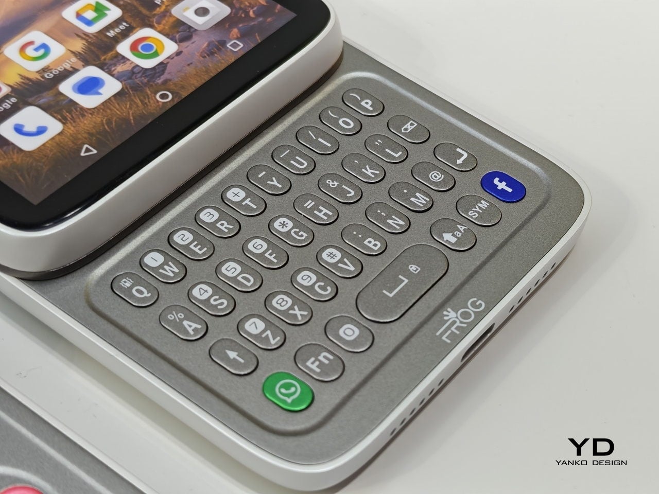
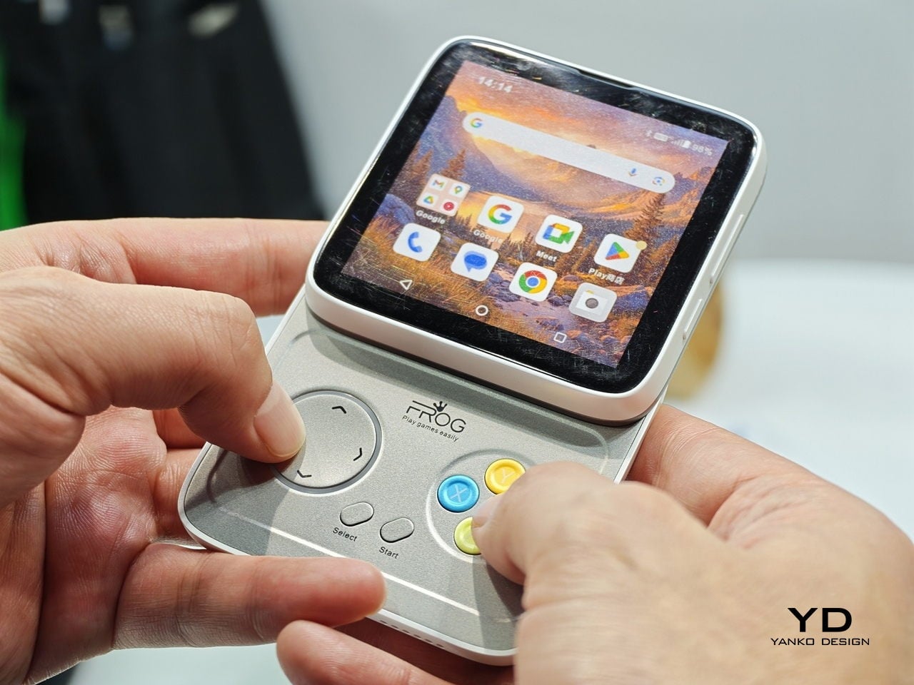
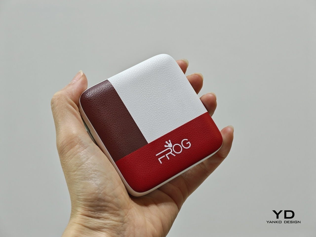
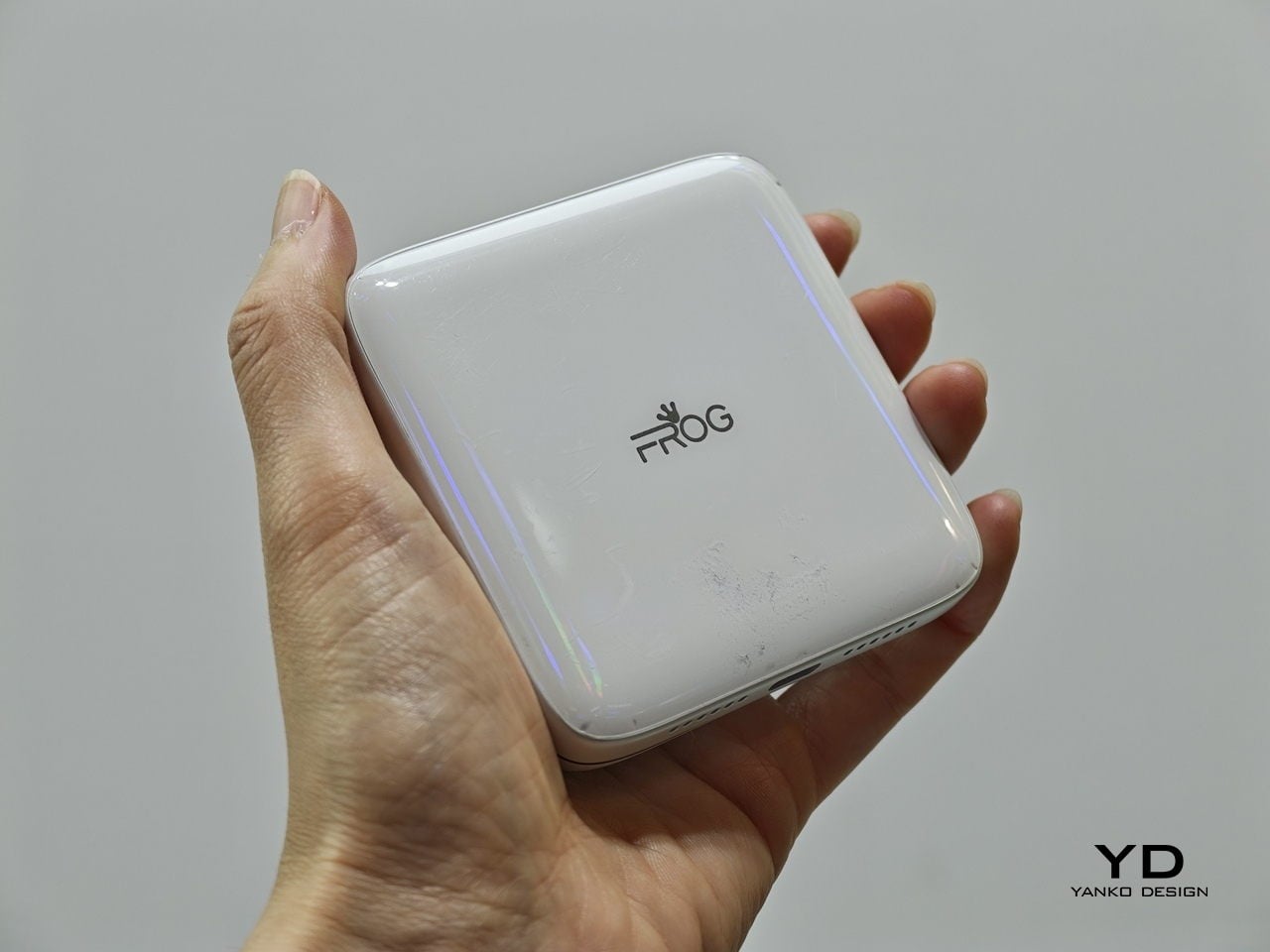
Every phone released this year is a tall rectangle, some taller than others. The iFROG RS1, shown at MWC 2026, is a square, which already makes it unusual before you get to the part where it twists open. Built around a 3.4-inch square display, the RS1 has a rotating lower section that reveals one of two things depending on the variant you’re looking at: a full QWERTY keyboard with raised, tactile keycaps, or a gamepad with a D-pad, a four-button cluster, and Select and Start. No price and no release date were announced at MWC, because the hardware itself is the pitch.

Designer: iFROG

The keyboard variant has a clear and underserved audience. The people who have quietly resented touchscreen typing for fifteen years are not a small group, and the Unihertz Titan has been proving that niche quietly for a while. The gamepad version is a stranger and arguably more interesting proposition. Running Android with physical controls in a square body draws instant comparisons to the Motorola Flipout, a 2010 Android phone that did something structurally similar and was adored by a small crowd before being largely ignored by everyone else.

What we liked

  • The rotating mechanism keeps the phone genuinely compact in normal use, so the keyboard or game controls are there when you want them and completely invisible when you don’t.
  • Adding physical input without making the phone permanently thicker or wider is a trade-off very few devices have come close to solving, and the RS1 at least makes a credible attempt.

What we disliked

  • Modern software is built almost entirely around tall, vertical screens, so the square format creates real friction with apps, video, and content that all assume a rectangular display.
  • Choosing between the keyboard and gamepad variants at the point of purchase is a long-term commitment. If your priorities shift, or you simply want both, you are looking at two separate phones.

TECNO POVA Neon
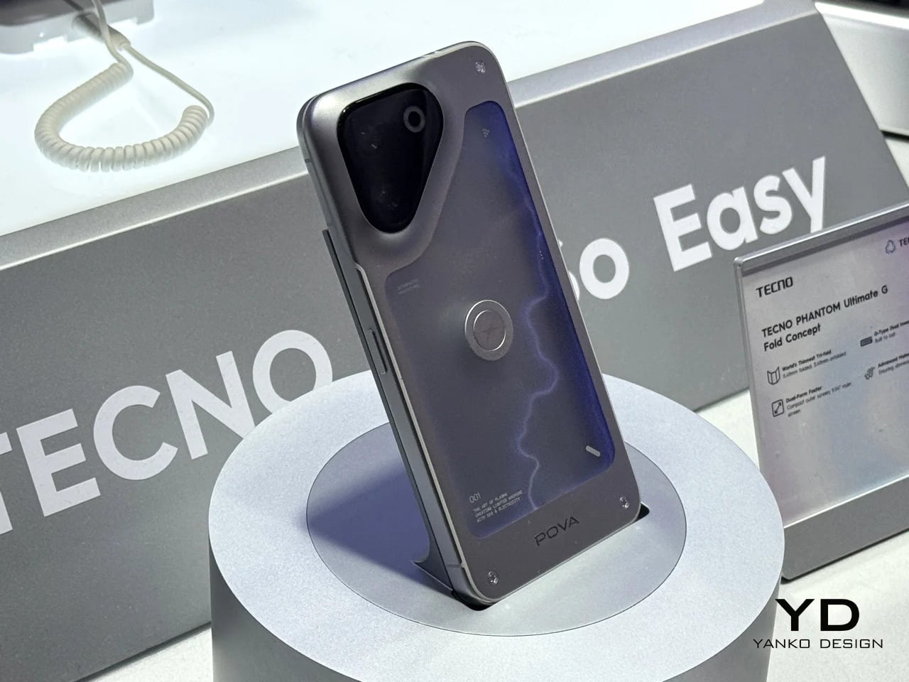
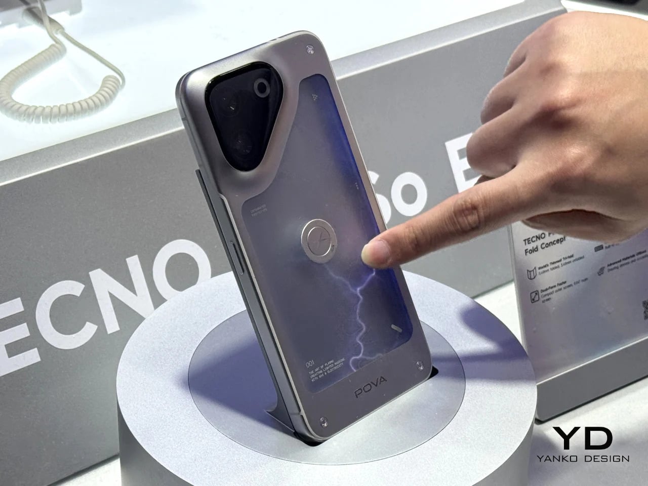
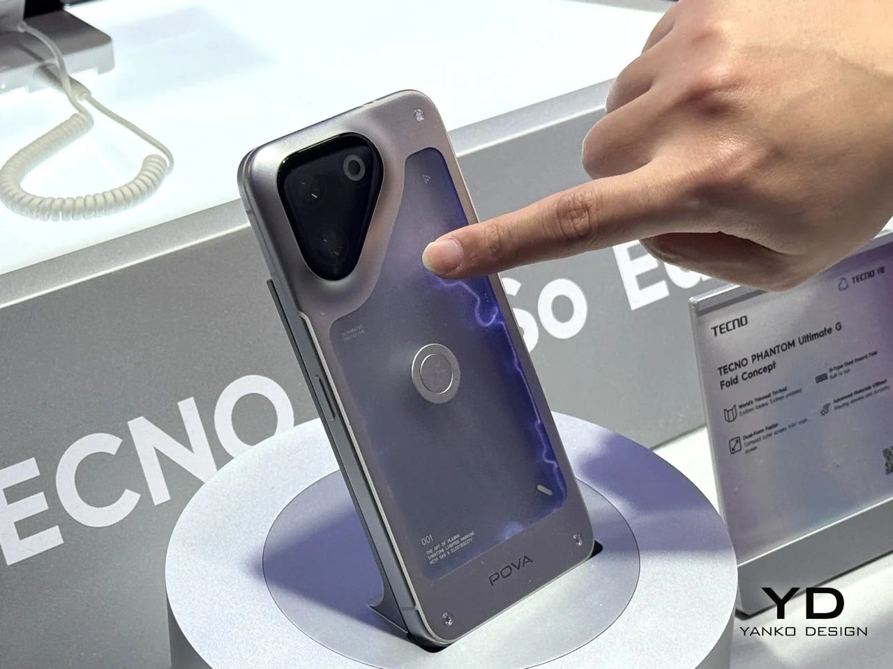
Some phones try to solve a problem, but the POVA Neon honestly isn’t that kind of phone. TECNO’s other MWC 2026 concept uses ionized inert gas lighting, the same technology that gives neon signs their glow, to create a branching luminescent effect on the back panel that sits somewhere between a lightning bolt and a circuit trace. TECNO is not claiming this makes the phone faster or the camera better. The claim is simpler and more honest: a phone’s back doesn’t have to be an inert sheet of glass waiting to collect fingerprints.

Designer: TECNO

As design statements go, that one is actually worth taking seriously. Most phone backs are the most visible surface on a device that billions of people carry every day, and they’re almost universally empty. The POVA Neon asks what happens when that surface does something. The answer here is that it glows, which is not practical and doesn’t need to be. Concept work isn’t obligated to be practical. It’s obligated to make you look at a familiar object differently, and a phone that pulses with light like a neon sign in a diner window at least does that.

What we liked

  • Treating the back panel as a dynamic surface rather than a passive sheet of glass is a genuinely fresh direction, and using ionized gas to do it is unlike anything else currently on the market.
  • As a concept, it opens up real questions about how materials and lighting could make phone design more expressive without requiring any changes to the screen whatsoever.

What we disliked

  • Ionized gas channels in a device that flexes under grip pressure, absorbs impacts, and hits the floor on a semi-regular basis seem like they would not survive the lifespan of the phone itself.
  • A protective case, which most people use, would cover the entire back panel and make the concept completely invisible. It is a design that fundamentally cannot coexist with the most basic act of protecting your phone.

Pixel Dynamics iPhone Fold Concept

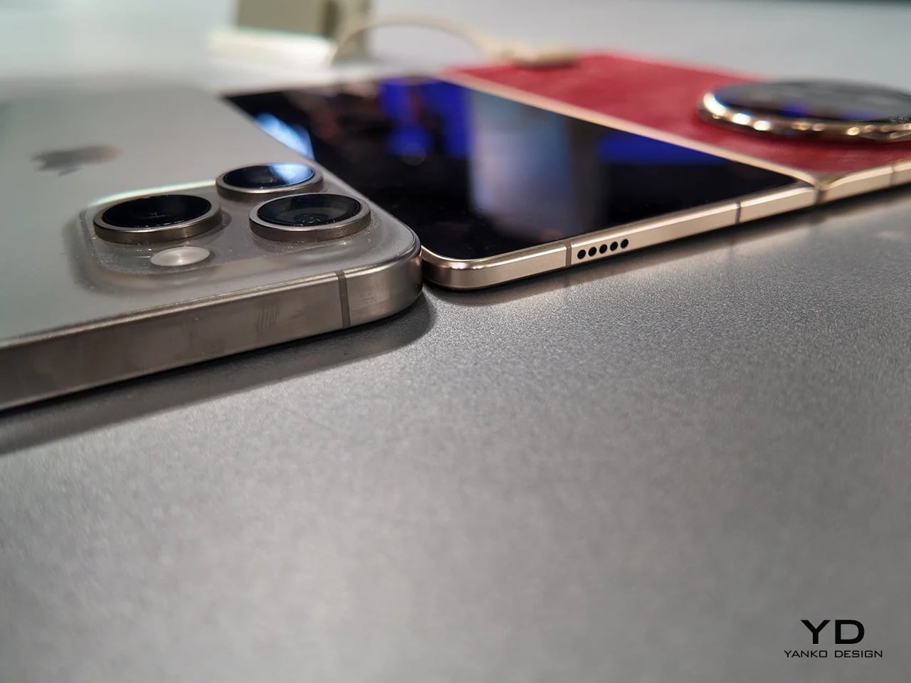
Foldable phones keep running into the same set of problems. The phone has to fold, which means the screen has to fold, which means the screen eventually creases at the hinge line, the hinge develops resistance over time, and the finished device ends up thicker than either of the two things it’s trying to be. Pixel Dynamic’s iPhone Fold concept approaches the whole premise from a different direction. Keep the iPhone exactly as it is. Add a separate foldable screen to the back.
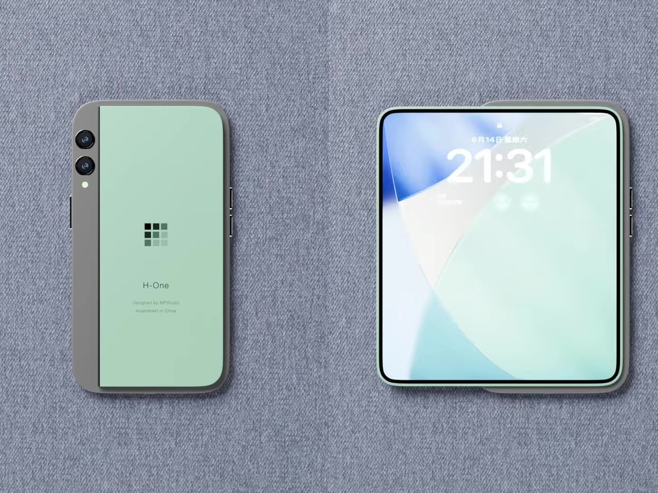
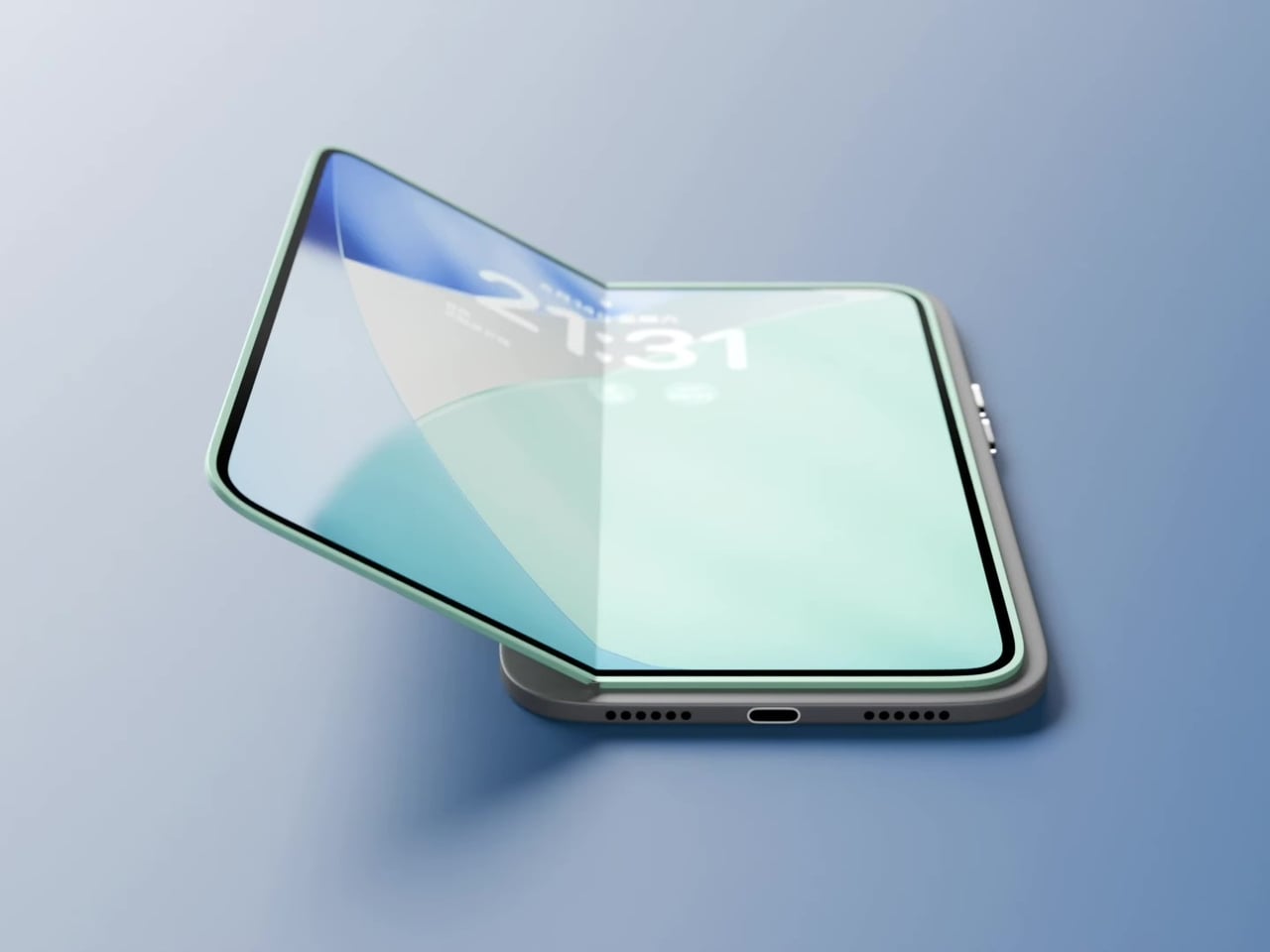
The main iPhone body stays rigid and conventional. A thin, flexible secondary display sits raised on a platform above the rear panel, and when needed, it unfolds outward to create a larger, roughly square tablet surface. The phone itself does not flex, leaving the primary display completely untouched. In daily use, it feels and functions like a normal iPhone, because it essentially is one. That said, the raised platform adds thickness, wireless charging is probably absent, and using the camera while the secondary screen is unfolded becomes nearly impossible since it sits directly over the lenses. Apple almost certainly will never endorse the design, but as a thought experiment about whether a foldable screen and a foldable phone actually need to be the same thing, it’s one of the more original answers anyone has put forward.

What we liked

  • Treating the foldable display as a separate, discrete component rather than the phone’s primary structural element is unconventional thinking, and it raises genuinely interesting questions about repairability and modular design.
  • The concept challenges the assumption that a foldable phone has to mean a folding device, which is exactly the kind of first-principles questioning that occasionally turns into something the industry actually builds five years later.

What we disliked

  • Getting a raised foldable display to sit flush, function reliably through daily use, and survive the realities of a pocket likely puts this well outside what current manufacturing can deliver.
  • Apple’s tendency to design through subtraction rather than addition makes this particular execution, with its visible raised platform and external folding mechanism, almost impossible to imagine coming from Cupertino in any recognizable form.

The post Your $1,200 Phone Looks Boring Next to These 5 Concepts first appeared on Yanko Design.

Someone Finally Made a Nail Holder That Won’t Smash Your Fingers

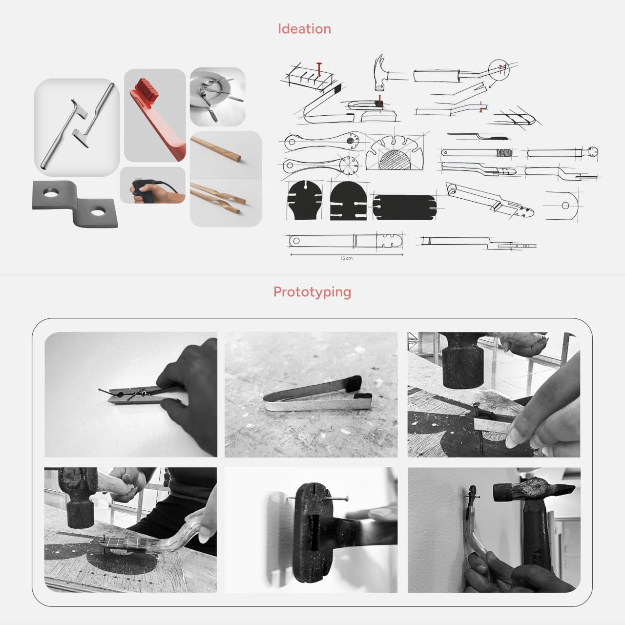
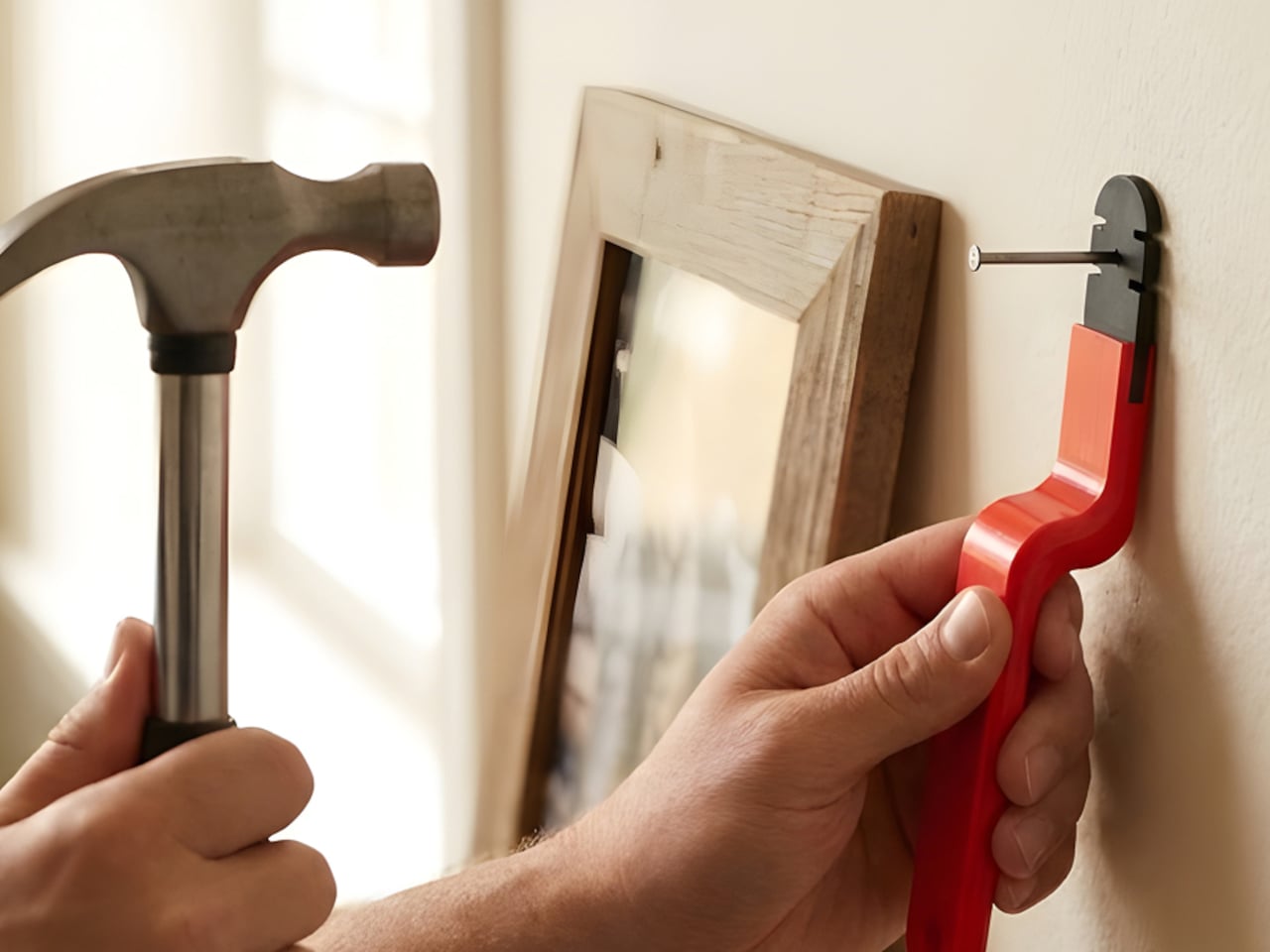
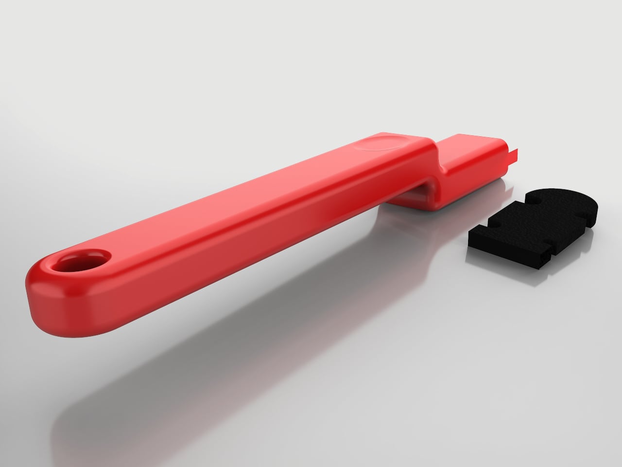
Hammering a nail is one of those tasks that sounds simple until you miss. The strike lands on a knuckle instead of the nail head, and a two-minute hanging job becomes a few minutes of genuine regret. It happens to beginners more than seasoned carpenters, but experience only reduces the odds rather than removing them entirely. That gap between “simple enough” and “actually safe” is what the Nailmate concept is set out to bridge.

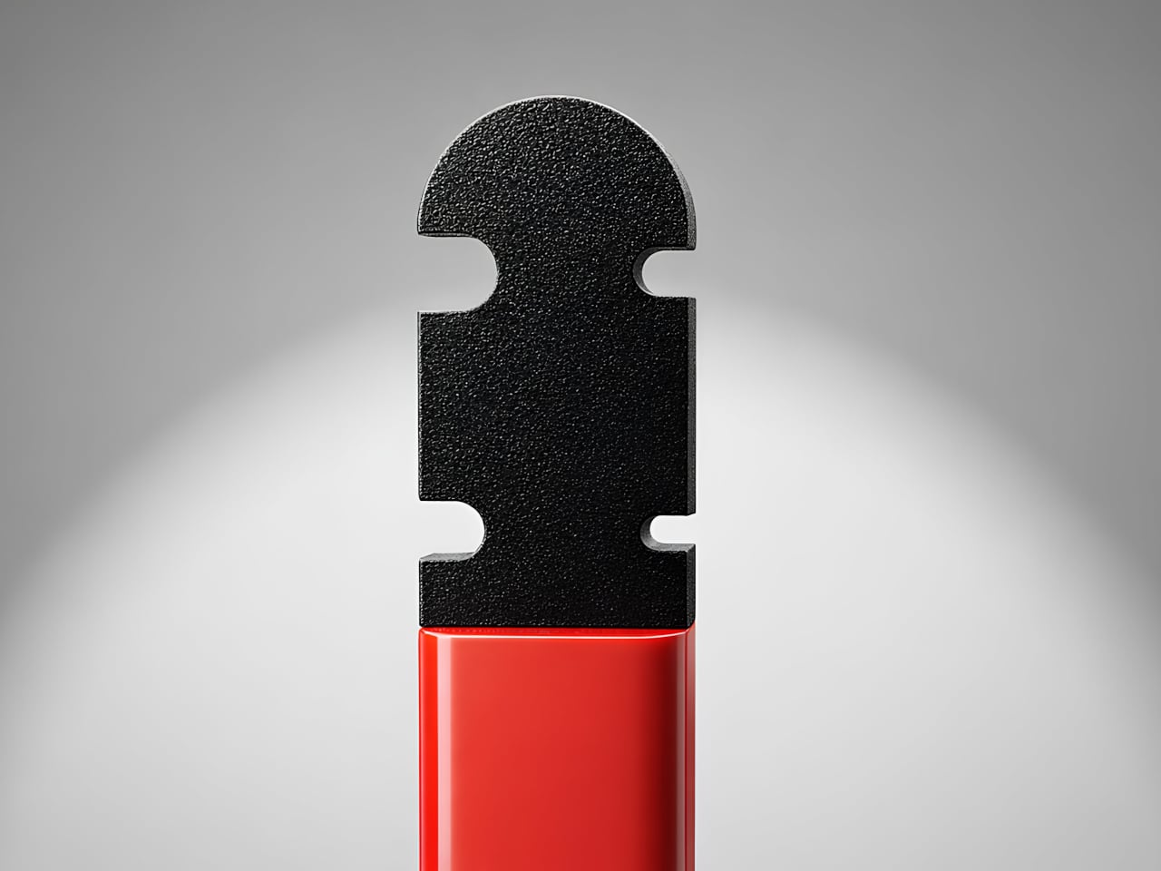
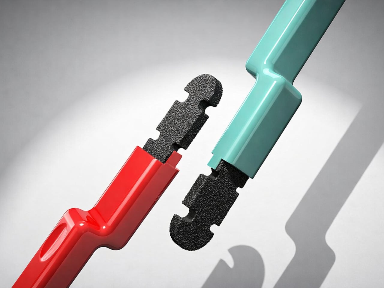
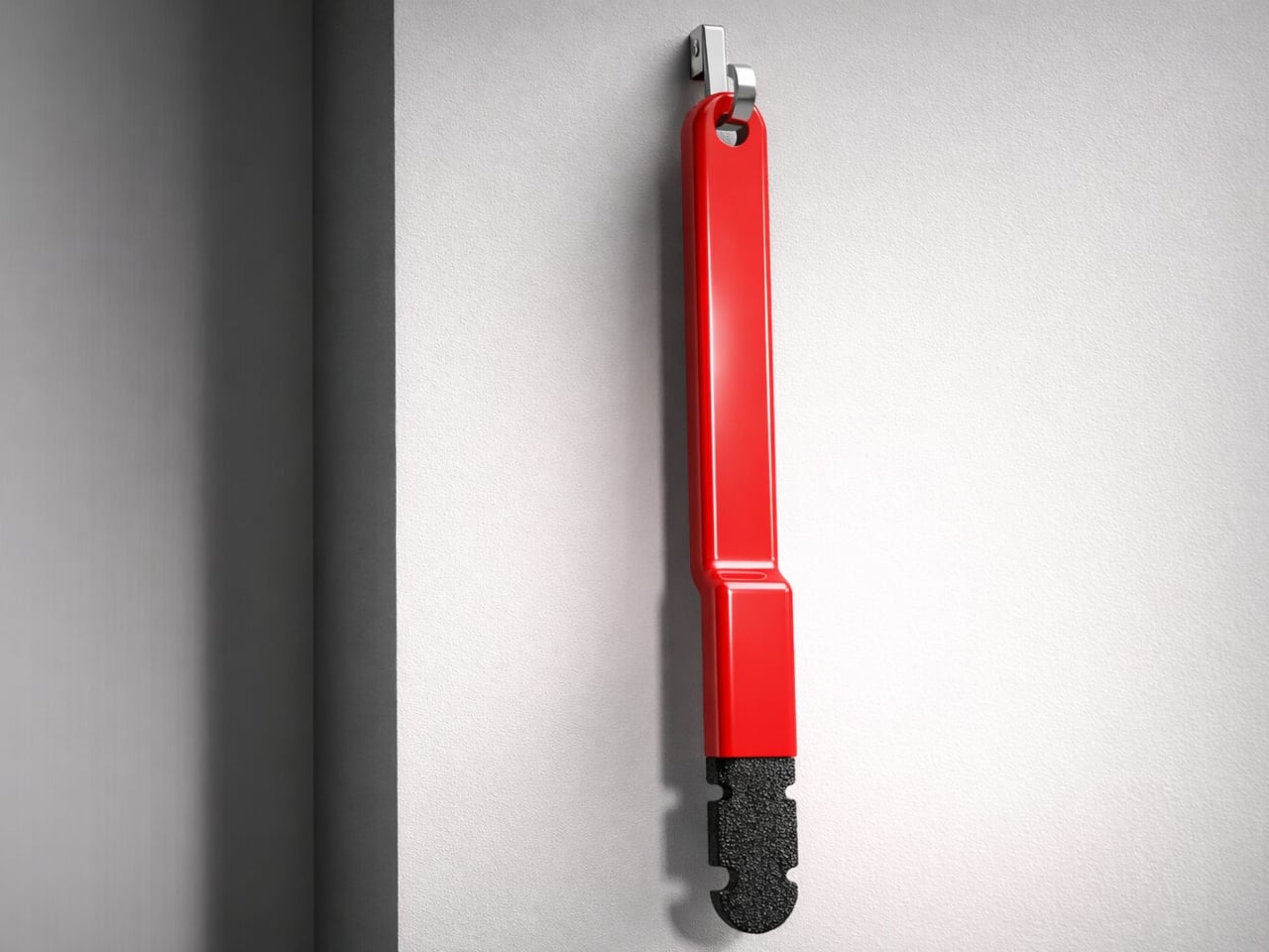
The premise is quite simple, really. Nailmate is a hand-held positioning tool made from ABS plastic with a TPU rubber gripping head. It holds a nail upright while keeping the user’s fingers well below the impact zone, with no springs, clamps, or adjustable parts to configure before the first swing. The elongated form puts meaningful distance between the hand and where the hammer lands.

Designer: Hargun Kaur

Existing nail-holding solutions have real shortcomings worth naming. Small plastic holders keep fingers close enough to still be at risk. Plier-style holders work but are bulky enough that most people leave them in a drawer. Magnetic holders struggle with heavier nails and offer no guarantee against slipping. Nailmate addresses all three failure modes by doing less mechanically and more through considered geometry.

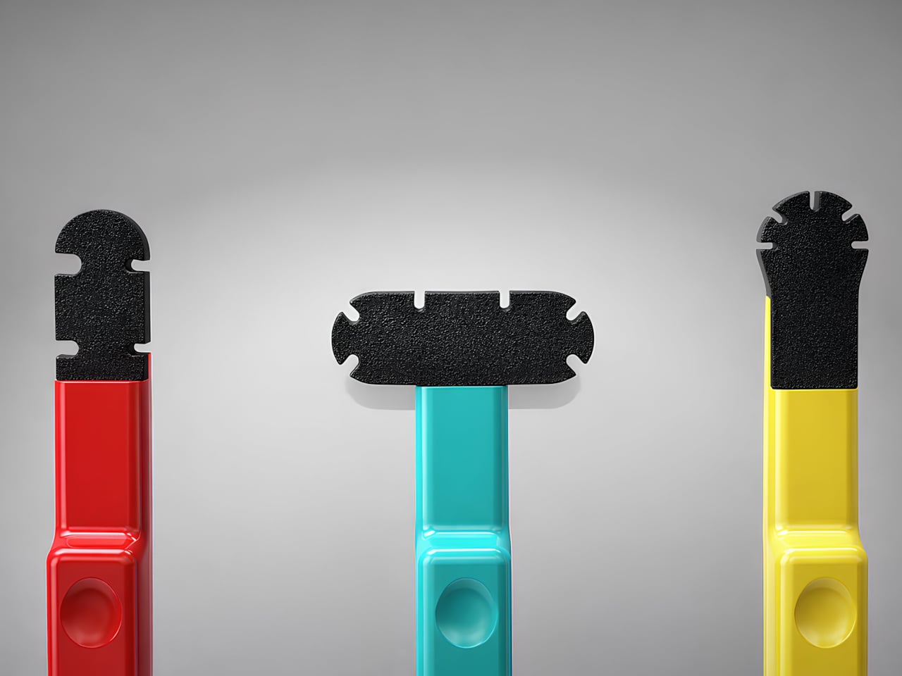
The tool comes in three variants, each color-coded for different working conditions. The red Stable version is built for flat, open surfaces like wooden boards or wall panels, where the hammer has a full vertical swing. The teal Expanded version has a wider horizontal head that supports a nail from multiple contact points, for situations where a perfectly vertical swing is not possible. The yellow Precise version handles curved, rounded, or edge-based surfaces where standard positioning gets awkward.

The color distinction is practical rather than decorative. On a cluttered workbench, making each variant visually distinct reduces the small but real friction of grabbing the wrong tool. The TPU head grips the nail shaft without scratching it, and the angled body sits naturally in the hand while maintaining a clear line of sight to the nail tip. A hanging hole at the base keeps it on a hook near the toolbox rather than lost in a drawer.

Where the design raises questions is around the TPU head’s durability after repeated use. It sits close enough to the nail that a slightly off-center hammer strike would occasionally land on it, and how the material holds up over months of regular work is something only extended testing would confirm.

The post Someone Finally Made a Nail Holder That Won’t Smash Your Fingers first appeared on Yanko Design.

This 4-in-1 Dispenser Ends the Sticky Sauce Bottle Chaos

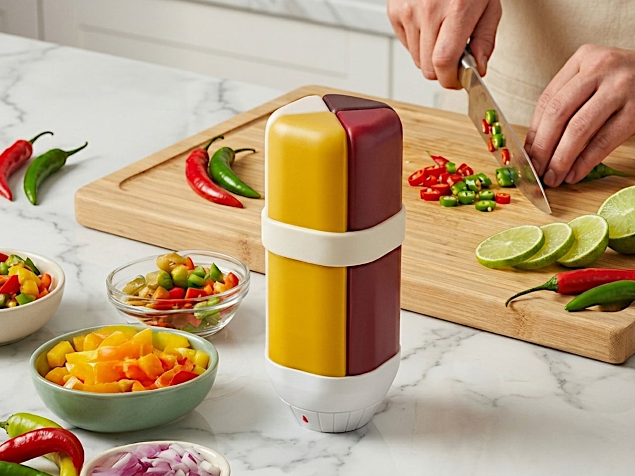
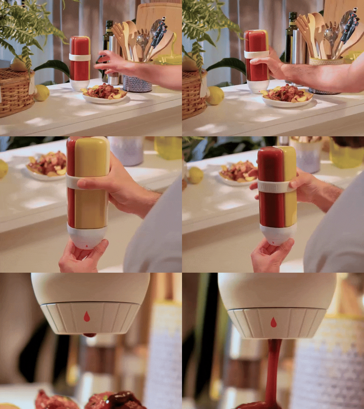
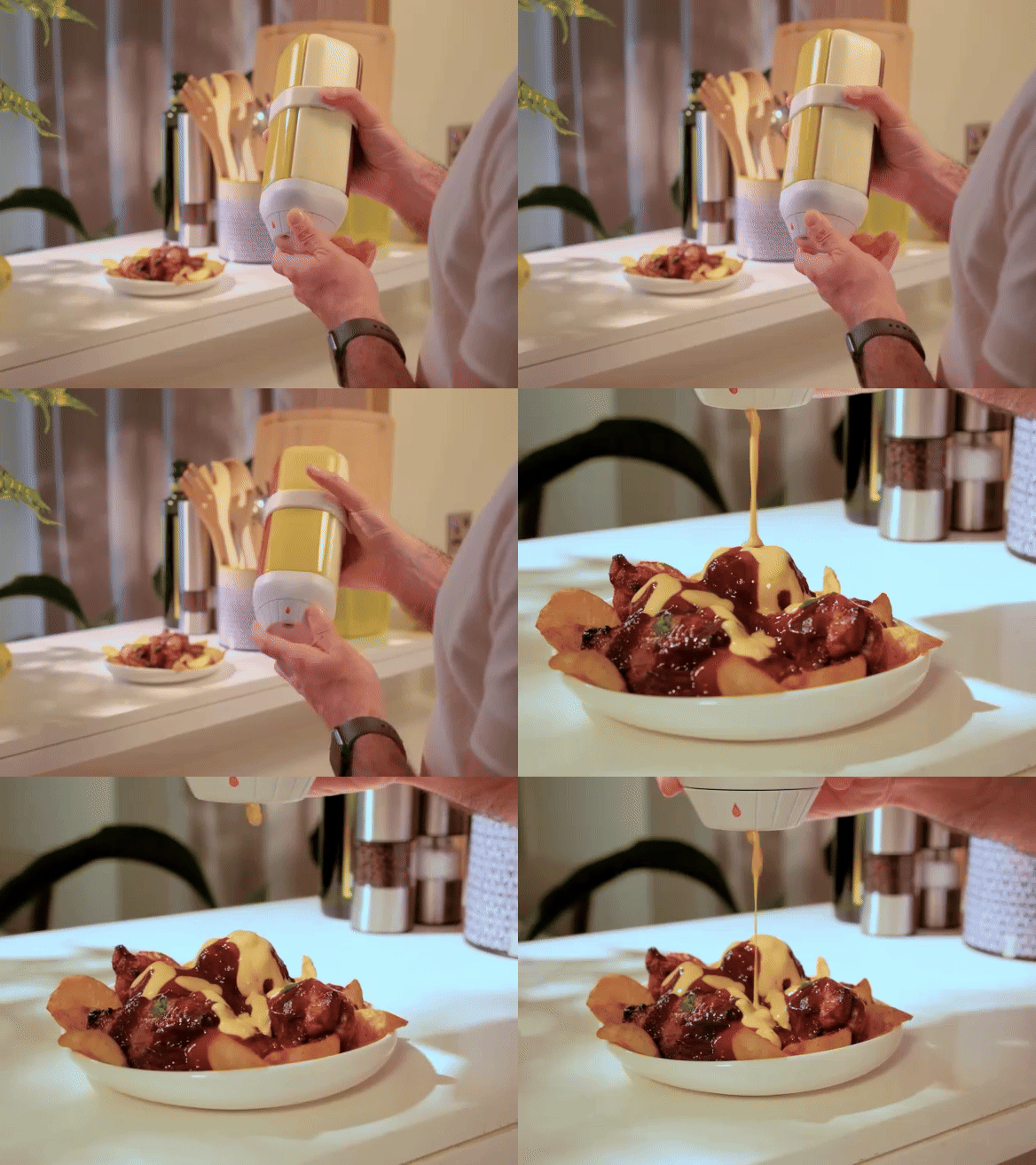
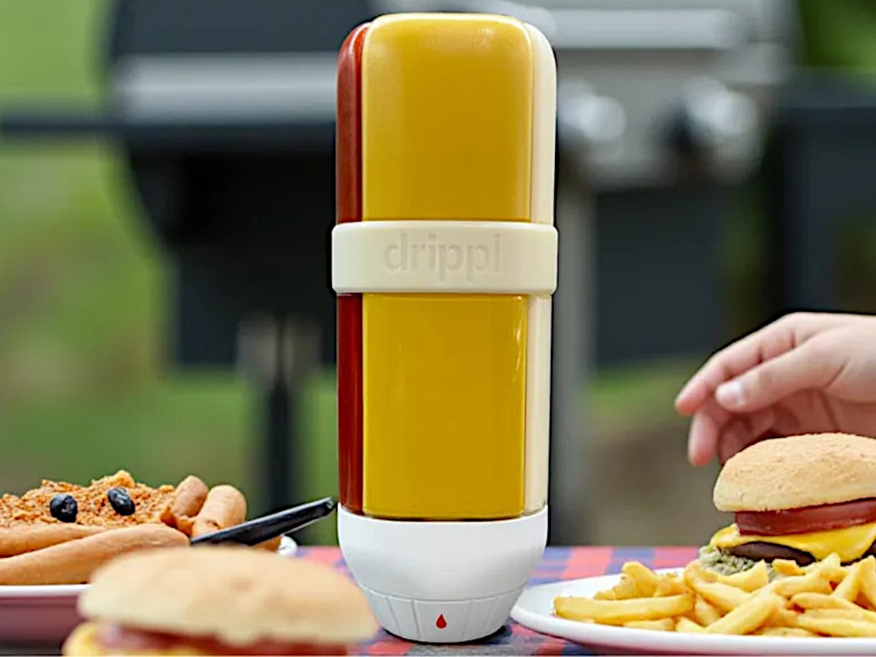
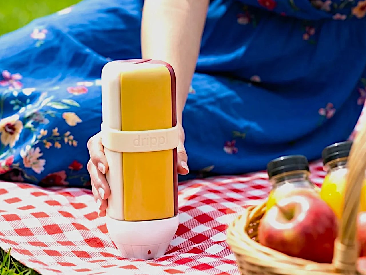
There is a particular kind of table chaos that happens at a backyard barbecue or a casual dinner. Four or five sauce bottles crowd around the food, each one sticky at the cap, half of them tipped on their side. It is a small problem but a persistent one, and it is the exact friction that the Drippl is designed to remove. The device consolidates four condiments into a single, upright dispenser.

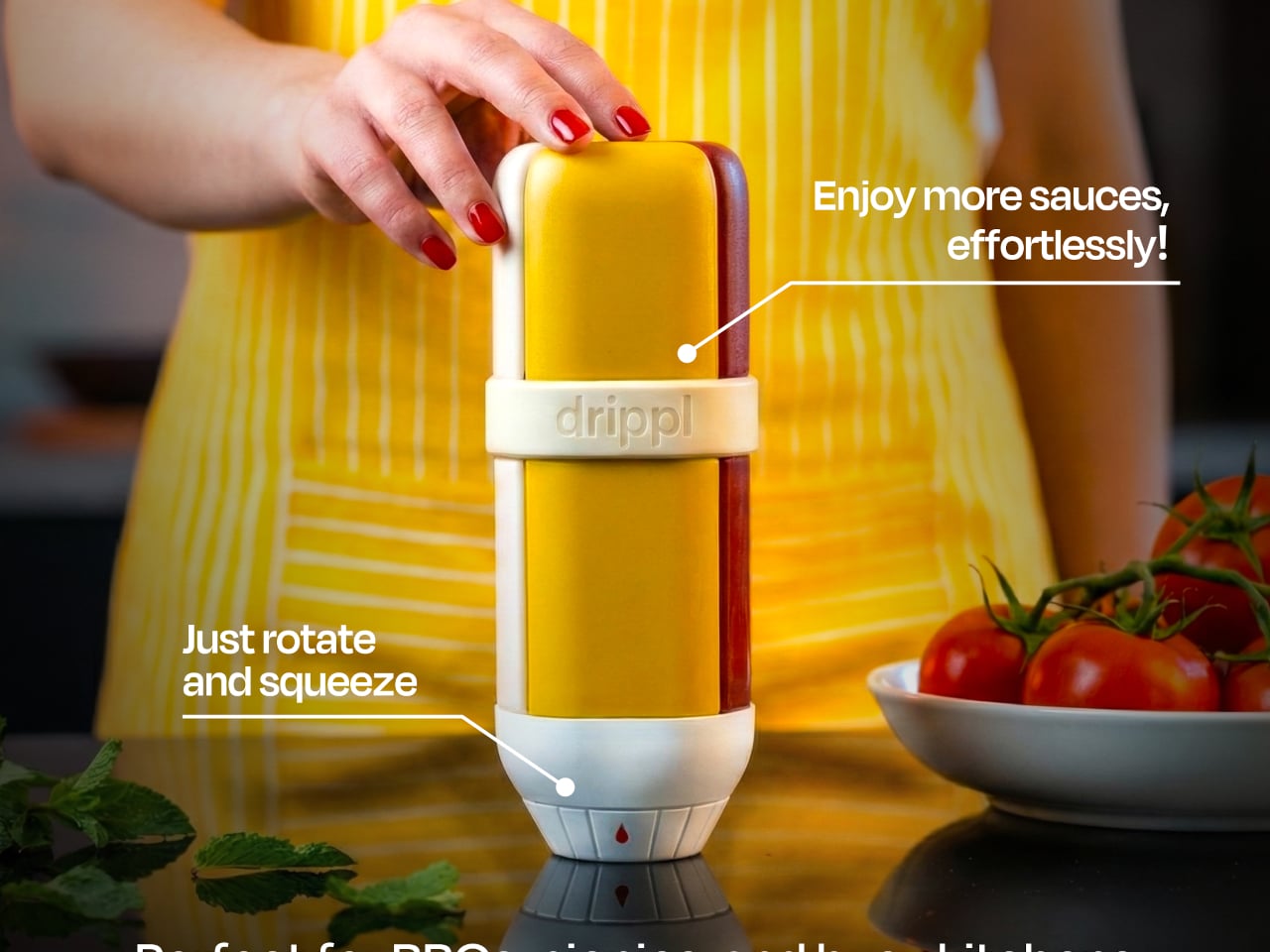
The Drippl stands 20cm tall and 7cm wide, sized to sit comfortably in one hand. Its four wedge-shaped compartments each hold 150ml of sauce for a combined capacity of 600ml. The form is composed: a white base with frosted, semi-transparent chambers that let you see the sauce inside without fully exposing it, keeping the table looking calm rather than congested with mismatched packaging.

Designer: Drippl

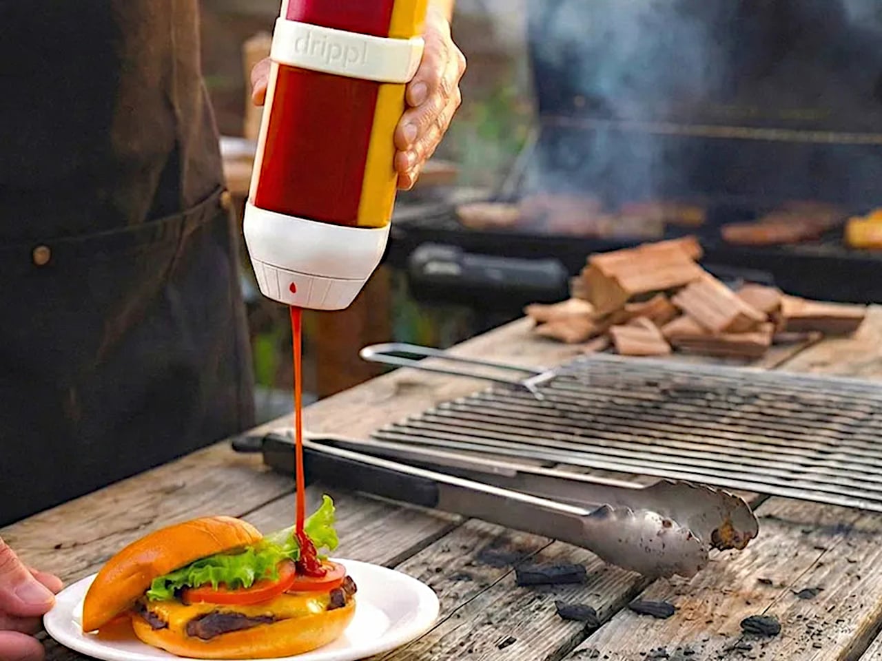
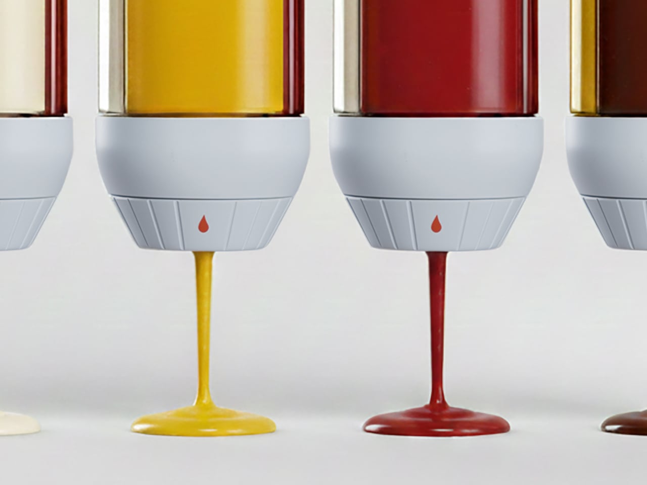
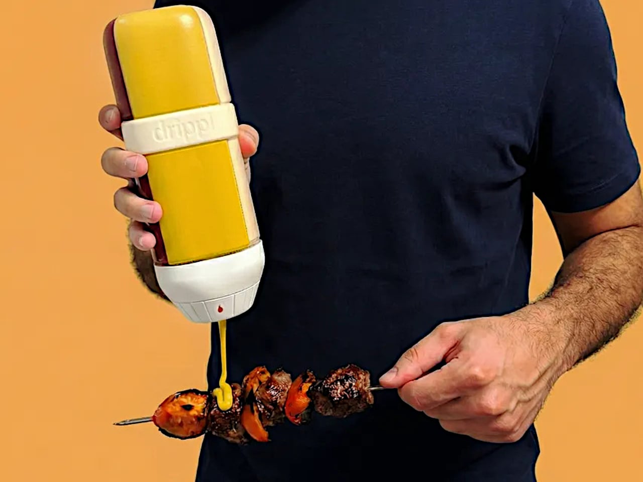
The interaction is straightforward. Rotate the selector dial at the base to the sauce you want, feel a tactile click when it locks in, and squeeze. Only the selected chamber opens; the remaining three stay fully sealed. Turn to the fully closed position, and all outlets are blocked, which matters when the unit is in a bag on the way to a picnic or packed into a cooler for an outdoor cookout.

1

1

The valve system treats sauce viscosity as a variable worth solving for, rather than applying a single nozzle to everything. A large valve handles creamy, thick sauces like mayo; a medium valve suits ketchup and mustard; a small valve controls thinner pours like soy sauce or hot sauce. The valves are interchangeable, so the configuration adapts to whatever combination you fill it with on a given day.

Cleanup is just as stress-free thanks to a fully detachable design. Every compartment, spout, and the selector base separates for hand washing or the dishwasher. The materials are food-grade and BPA-free, with compartments designed to resist staining and odor absorption. The unit also handles sauces up to 70°C (158°F), covering warm applications like heated barbecue sauce, though anything beyond that temperature falls outside its range.

What the Drippl addresses, beyond pure consolidation, is the presentation problem that standard sauce bottles ignore entirely. Most condiment packaging is designed for storage and retail shelf presence, not for the experience of using it at a table. The frosted compartments and white base give it the visual grammar of a considered object, rather than a row of utilitarian squeeze bottles.

That said, the design raises practical questions worth sitting with. At roughly 800 to 850g when fully filled, it is not a lightweight carry. Consolidating four sauces works smoothly when your preferences stay consistent, but swapping out one sauce mid-rotation requires cleaning that compartment first, reintroducing some of the same friction the product is trying to eliminate.

The Drippl is currently in prelaunch, so there are no answers yet on how the sealed valve system holds up across repeated use with thicker sauces, or whether the tactile selector stays reliable after months of daily rotation. Those are fair questions for any mechanism-dependent kitchen product. The concept is well-reasoned, but durability at the valve level will ultimately determine whether this stays on the table or gets retired to a shelf.

The post This 4-in-1 Dispenser Ends the Sticky Sauce Bottle Chaos first appeared on Yanko Design.

Stop Hunting for 4 Tools: This Designer’s Multitool Does It All

Model-making has a rhythm, and it is surprisingly easy to break out of the zone. You pull out the tape measure, get your reading, set it down, hunt for the caliper, check a dimension, reach for the cutter, and by the time you’ve touched four separate objects, you’ve lost track of where you were in the build. It’s a minor friction, but it compounds quickly across a studio session into something genuinely disruptive.

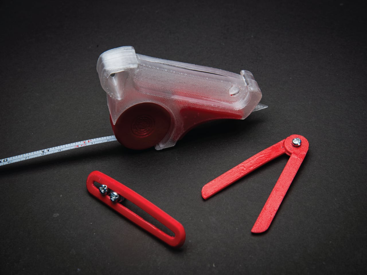
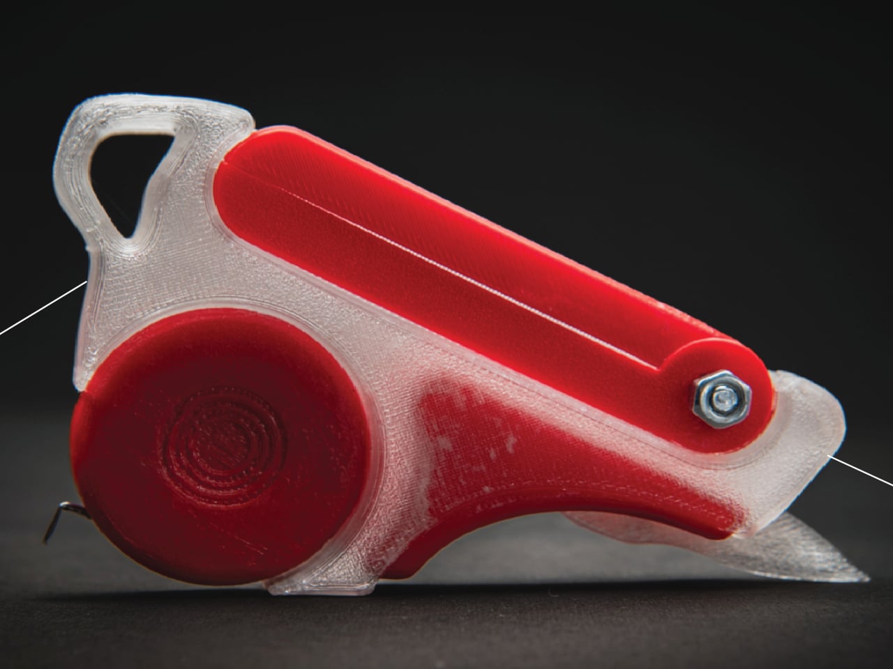
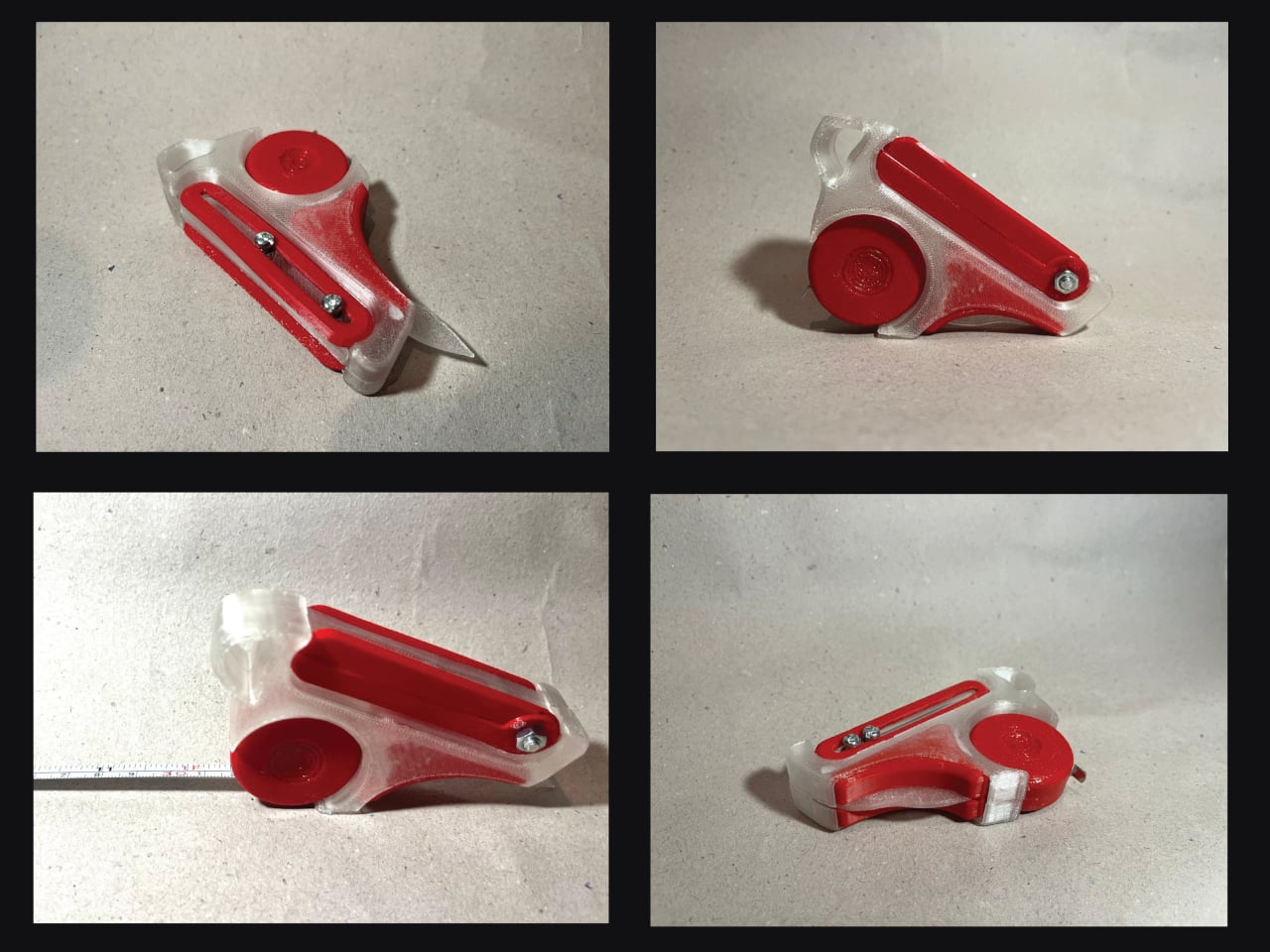
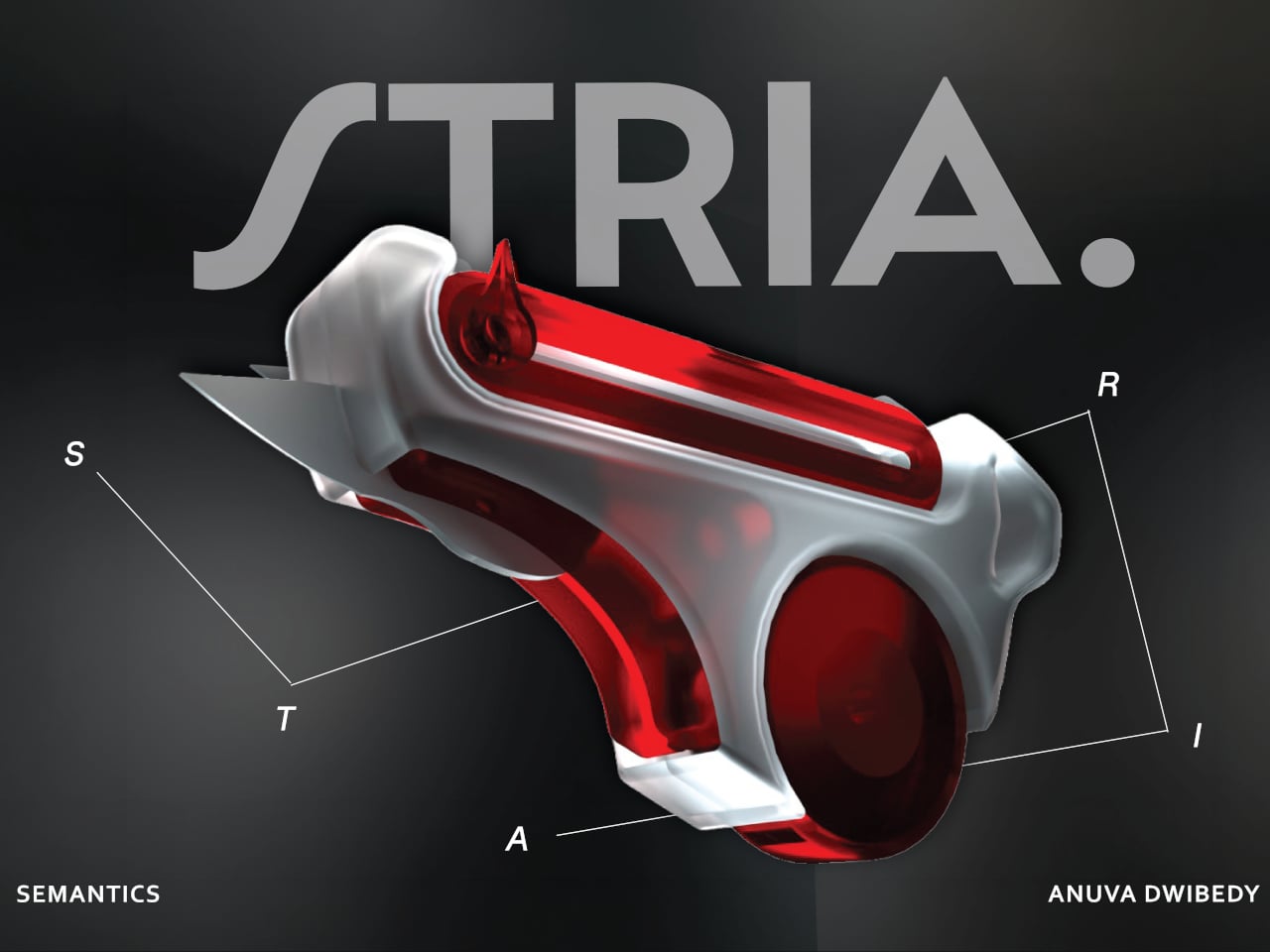
That friction is the exact problem STRIA was designed to address. The concept starts from a straightforward observation: the actions that make up physical prototyping, measuring, checking dimensions, and cutting materials, are tightly connected in practice but spread across a handful of unrelated objects. It combines four of the most essential tools that designers and architects reach for, creating a Swiss Army knife for any kind of physical creative work.

Designer: Anuva Dwibedy

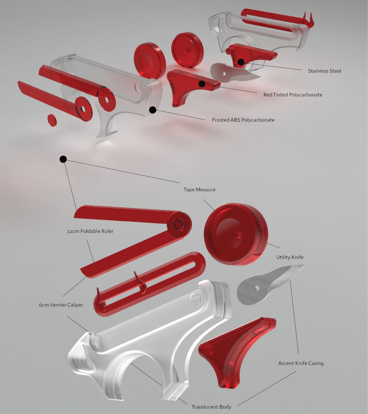
Those four are a tape measure, a 12 cm foldable ruler, a 6 cm vernier caliper, and a utility knife, all integrated into a single handheld device. The body is frosted ABS polycarbonate, with red-tinted polycarbonate accents and stainless steel for the blade and hardware. The translucent construction lets you see the internal components at a glance, which feels appropriate for a tool aimed at designers who spend a lot of time thinking about how things fit together.

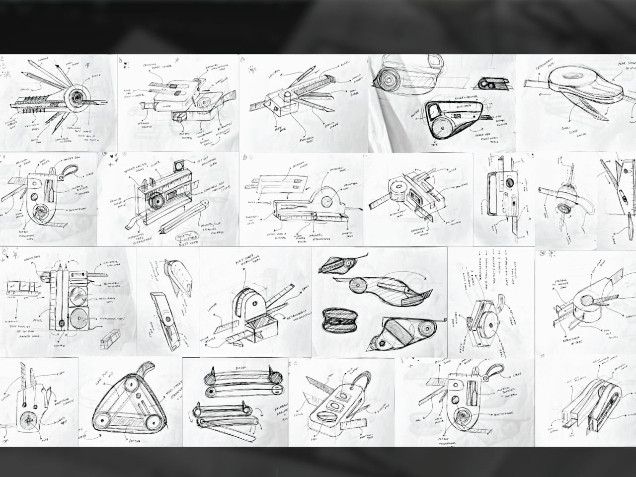
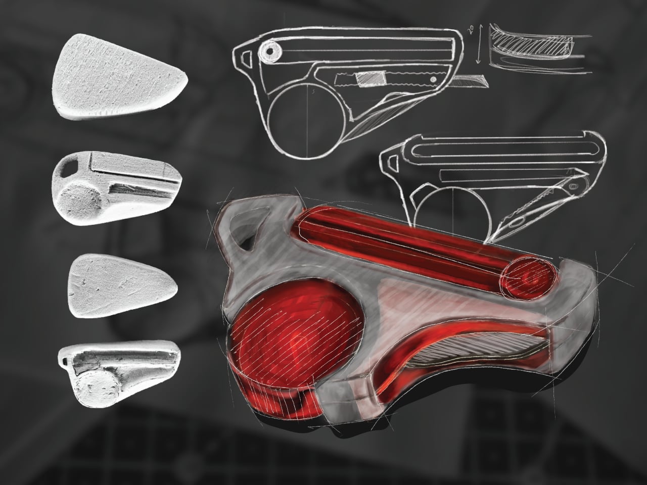
The form went through extensive iteration, with dozens of sketched directions and physical grip studies preceding the final shape. That process matters because fitting four tools into something pocket-sized is a mechanical problem as much as a visual one. Each function needs a deployment mechanism that doesn’t compromise the others, and the grip has to stay comfortable when you’re switching between them repeatedly during a long session.

What STRIA gets right in concept is treating workflow continuity as a design constraint rather than an afterthought. Its five stated goals, compact, precise, durable, ergonomic, and integrated, read less like marketing language and more like a checklist for something that needs to survive a studio environment. A 3D printed prototype has already been produced, so the integration challenges aren’t purely theoretical at this stage.

Whether every mechanism holds up to the repetitive, sometimes rough handling that model-making actually demands is what a finished version would need to prove. And there’s a subtler question underneath that: consolidating tools changes how you reach for them, and it’s worth asking whether that’s always an improvement or occasionally a trade-off.

The post Stop Hunting for 4 Tools: This Designer’s Multitool Does It All first appeared on Yanko Design.

This $959 Mini PC Looks Like an NES But Runs 70B AI Models

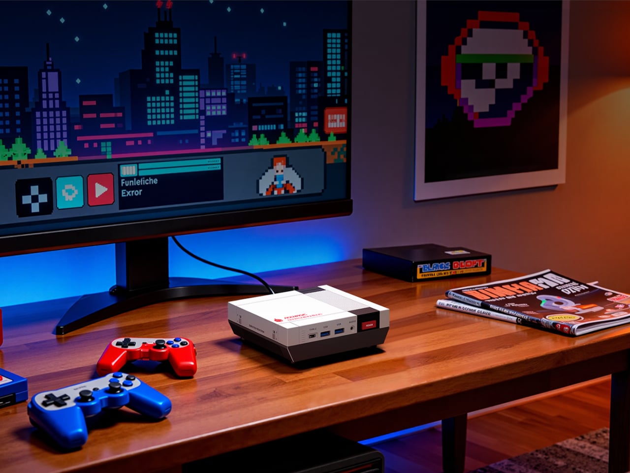
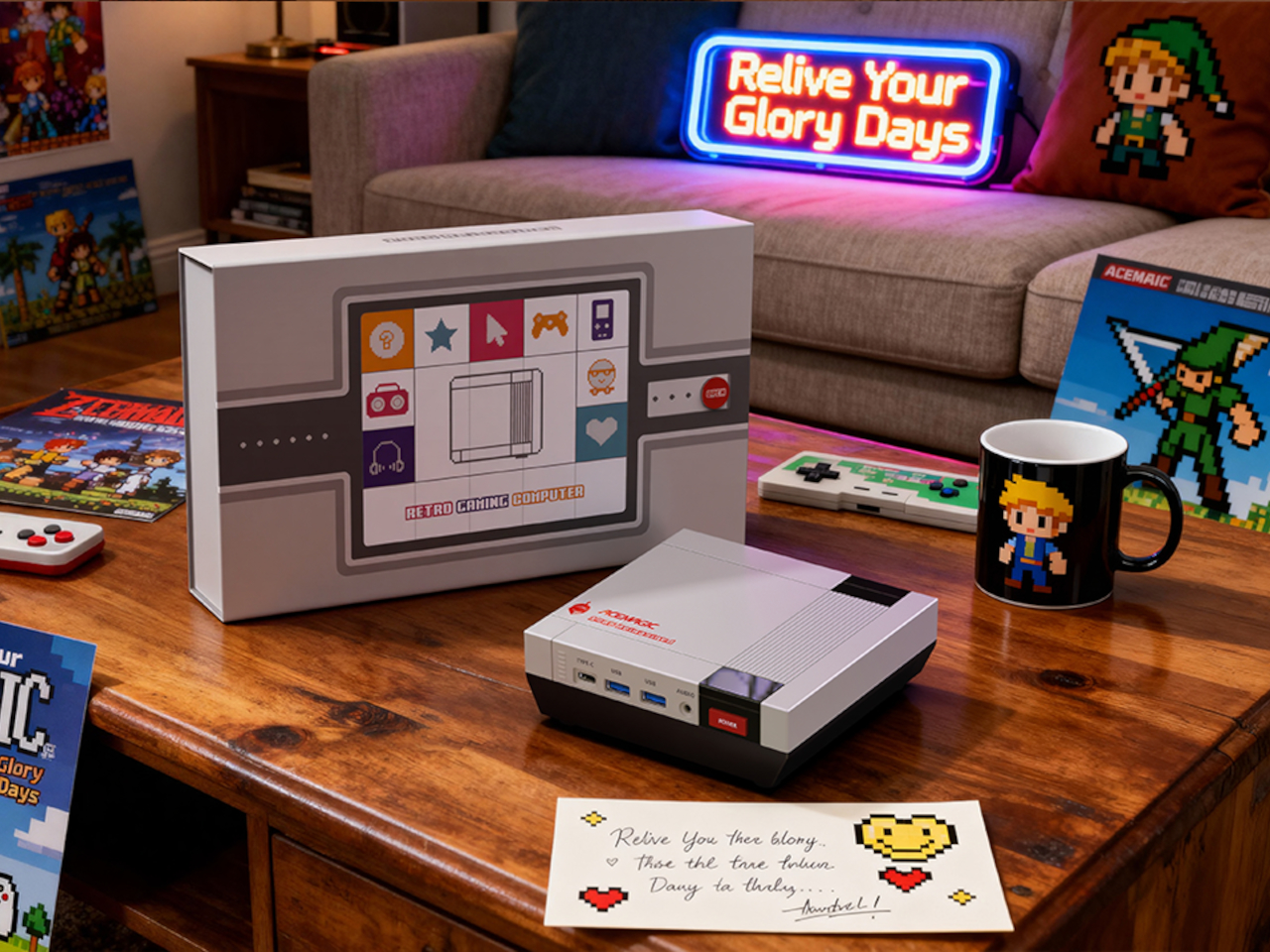
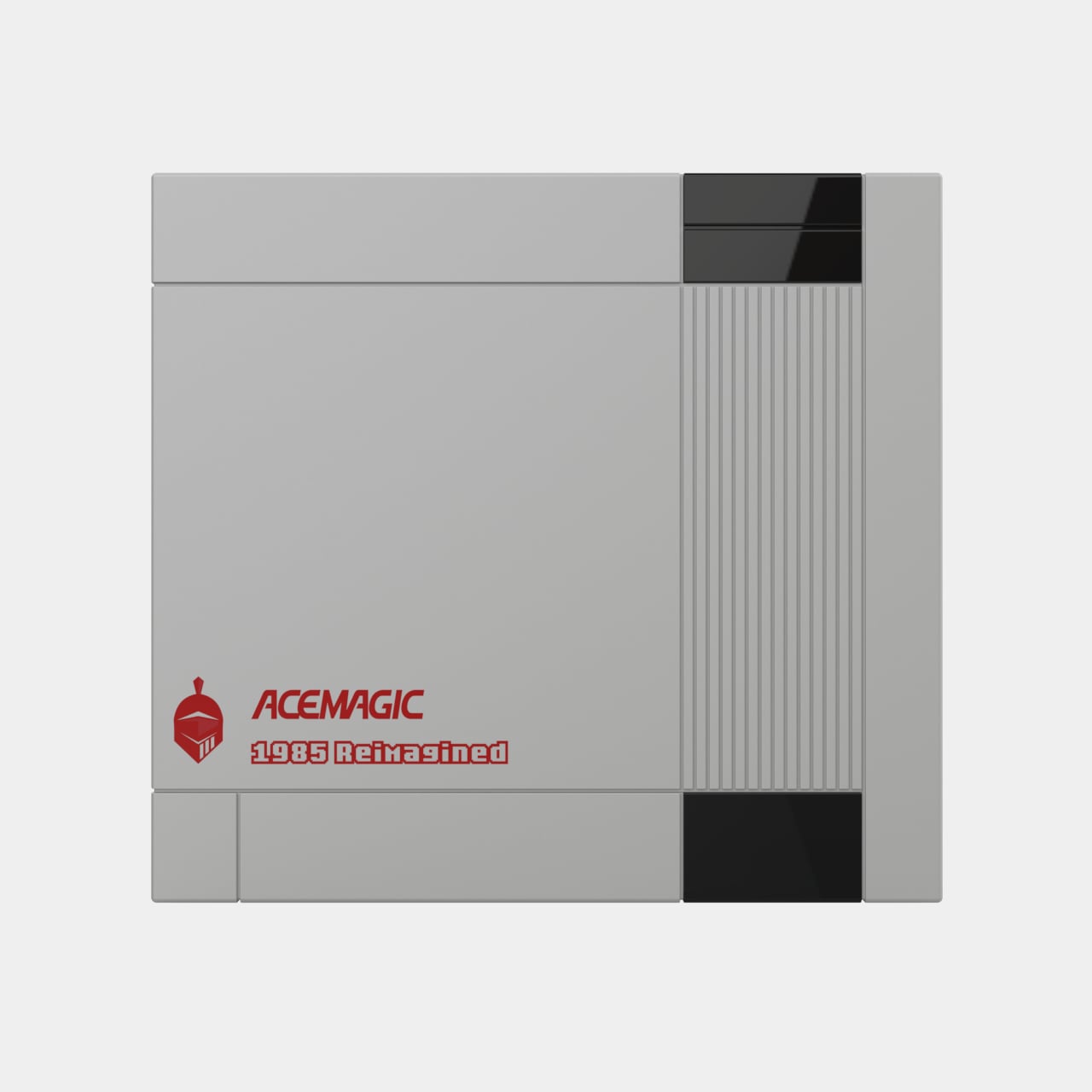
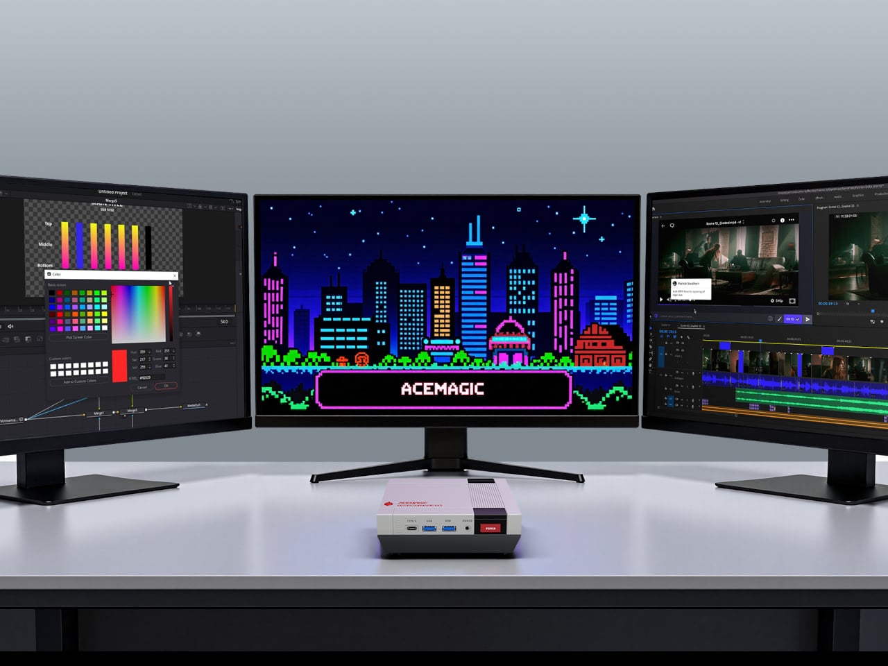
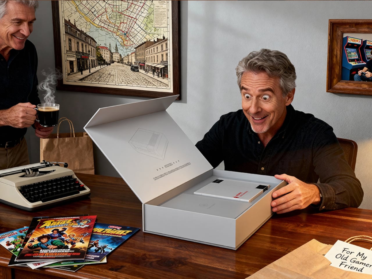
There is something quietly absurd about building a serious PC in the shape of a 1980s game console. Not absurd in a dismissive way, but more in the way that a very good idea sometimes sounds ridiculous until you see it sitting on a desk. The ACEMAGIC Retro X5 is exactly that kind of object: a compact Windows 11 Pro machine dressed in the rectangular geometry of classic cartridge-loading hardware, with a red power button where the reset button probably lived in your memory.

At 138mm x 128mm x 45 mm, the Retro X5 occupies roughly the footprint of a thick paperback. The body follows a black, white, and gray palette, with mechanical-style grilles cut into the cooling vents. A removable snap-fit panel lets you access the internals without tools, which signals something deliberate about the design: the whole thing is meant to be touched, handled, and opened rather than just admired from across a shelf.

Designer: ACEMAGIC

Inside that nostalgic shell sits AMD’s Ryzen AI 9 HX 370, a 12-core, 24-thread processor paired with the Radeon 890M GPU running at 2,900 MHz. The base configuration ships with 32 GB of DDR5 5,600 MT/s memory and a 1 TB PCIe 4.0 NVMe SSD. For anyone who has watched mini PCs ship with soldered RAM and single storage slots for years, the two M.2 2280 slots, expandable to 4TB total, are a more practical detail than the retro styling gets credit for.

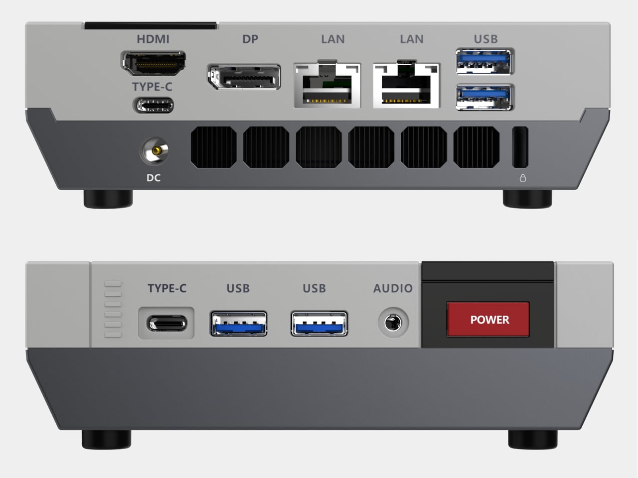
The port selection makes the Retro X5 less of a novelty and more of a credible desk workhorse. The front has two USB 3.2 Gen 2 Type-A ports, a USB4 Type-C, and a 3.5 mm audio jack. The rear adds two more Type-A ports, a second Type-C, dual 2.5 GbE Ethernet, HDMI 2.1, and DisplayPort 2.0; altogether, the machine supports up to four screens at once, with both HDMI and DP capable of 8K at 60 Hz.

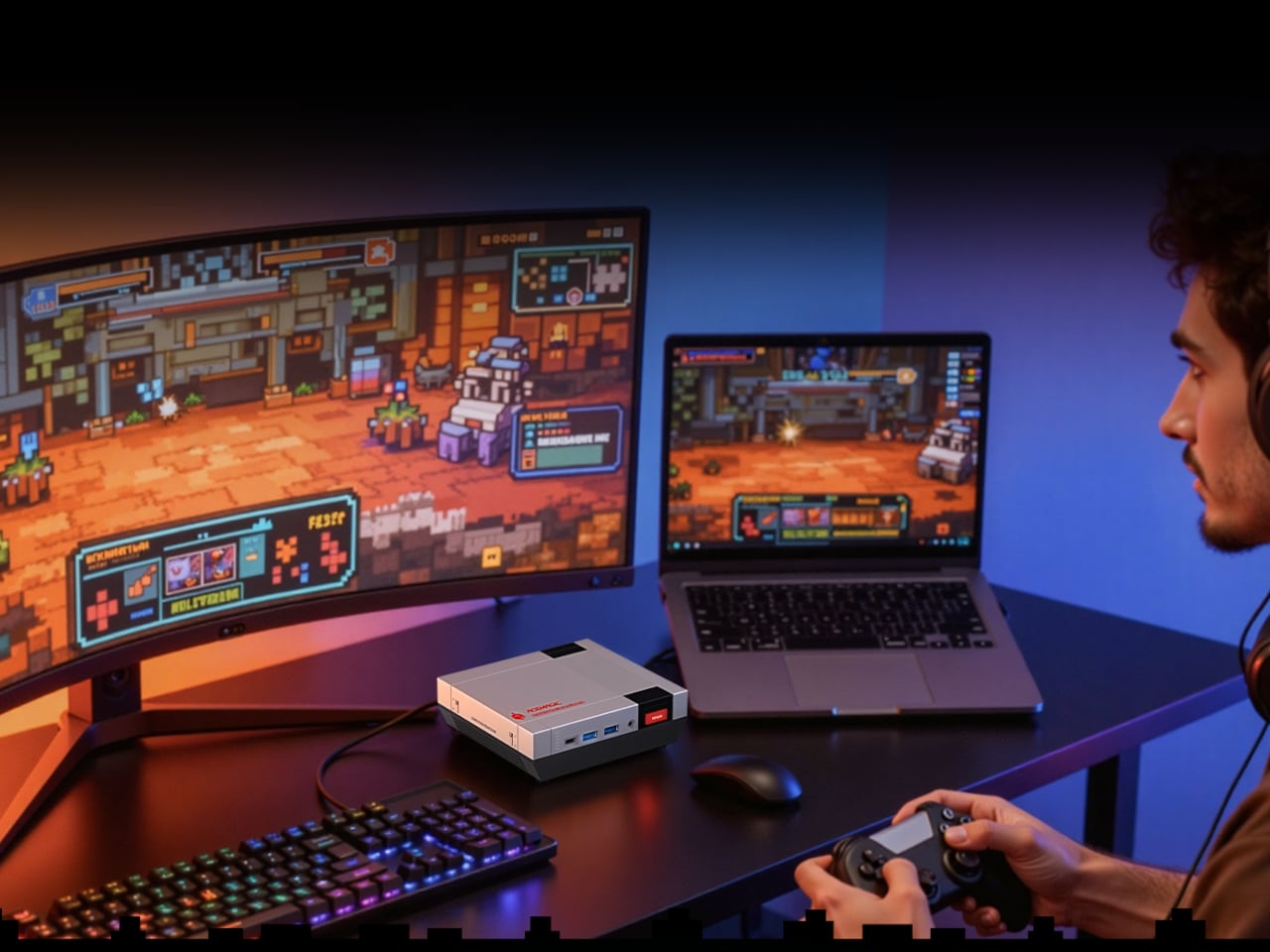
ACEMAGIC also positions the Retro X5 around local AI workloads, citing support for models like DeepSeek R1 70B and LLaMA. The HX 370’s neural processing unit makes that plausible on paper, but running a 70B-parameter model on 32 GB of shared memory depends heavily on quantization levels. That distance between the spec sheet and actual large-model performance is the part that the product page, understandably, does not get into.

At $959 for the 32 GB and 1 TB pre-order configuration, the Retro X5 sits at the upper end of the mini PC category, where other AMD Strix Point machines without the retro treatment tend to start closer to $600 or even $700. The premium covers partly the HX 370’s stronger GPU tier and partly the design itself. Whether that casing reads as a charming object worth the difference, or just a clever coat of paint on familiar hardware, is probably the right question to ponder before hitting that Checkout button.

The post This $959 Mini PC Looks Like an NES But Runs 70B AI Models first appeared on Yanko Design.

This Wall Speaker Lets You Decorate Your Room with Music and Art

The must-have for your home used to be a choice: a speaker or a digital frame. Good audio gear fills a room with sound but rarely does anything worth looking at. Digital frames look considered and calm on a wall but go completely silent the moment you need them to do something else. It seems obvious, in hindsight, that someone would eventually stop treating these as separate problems.

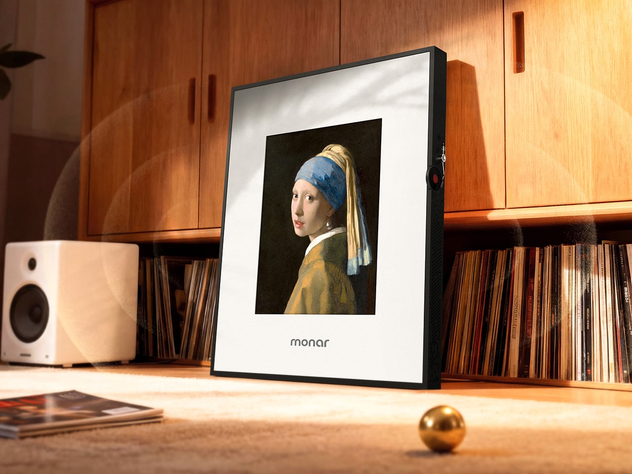
Monar is that someone. The Monar Canvas Speaker brings both together in a single framed wall piece that plays Hi-Fi audio while displaying art on a built-in screen, and the two functions are genuinely connected. When music plays, the display responds in real time, generating visuals that shift and react to the track. It fills your home with sound. It decorates your wall with art. It does both at once.

Designer: Monar

Click Here to Buy Now: $799 $1299 ($500 off). Hurry, only 122/150 left! Raised over $55,000.

The design draws its visual logic from classical oil painting. Traditional canvas proportions, the kind that have framed masterworks for centuries, informed the 4:5 portrait ratio of the panel, a deliberate departure from the widescreen format most screens default to. That historical reference is not decorative. It is the reason the Monar reads like framed art on a wall rather than a screen that someone forgot to put away.

The outer frame is interchangeable across eight options: premium ABS plastics, natural linen, and brushed aluminium, with one ABS option styled after Mondrian’s primary color geometry. Swapping the frame is a practical feature rather than a gimmick, since the object is permanent décor. If your interior changes, the frame can too.

The audio side makes bold claims for an enclosure that is only 4.9cm deep. Six drivers handle the load: 2 titanium tweeters, 2 midranges using a golden ratio cone geometry, and full-size subwoofers running through a 2.2-channel amplifier. The 20Hz to 20kHz frequency response is ambitious for a chassis this thin, and one definitely worth hearing.

Where the product earns genuine interest is in the everyday texture of using it. Put on an album, and one of 12 lyric display themes animates the words in sync with the music. Switch to the World Gallery and the screen cycles through more than 50,000 digitized artworks, from Van Gogh to Hokusai. Activate Meditation Mode and the visuals shift to ambient scenes timed to calming audio. When no music is playing, it displays personal photos or videos, so it never really goes blank or dormant.

The generative AI tools go further still. Monar’s AI Studio lets you create original artwork through text prompts, uploaded images, or even a musical concept. The result displays on screen, making it possible to have genuinely new wall art on demand without touching a single frame nail. These features run on a points system, with a free tier offering 100 points per month. The World Gallery and Meditation Mode cost nothing extra, regardless.

Paid AI tiers range from $9.90 to $39.90 per month for heavier creative use, and the free allocation covers casual experimentation comfortably. What makes the pricing structure interesting is what it says about the product underneath it: even without touching a single AI feature, the Monar already delivers a fully functional Hi-Fi speaker system and a complete digital frame in one object. That combination alone is something no single product category had managed to pull off before it came along.

A speaker that becomes a painting, a gallery that plays music, a frame that reacts to sound: the Monar pulls off a combination that no single product category has figured out before it. The real question worth sitting with is not whether it works, but how much your walls have been missing something like it.

Click Here to Buy Now: $799 $1299 ($500 off). Hurry, only 122/150 left! Raised over $55,000.

The post This Wall Speaker Lets You Decorate Your Room with Music and Art first appeared on Yanko Design.

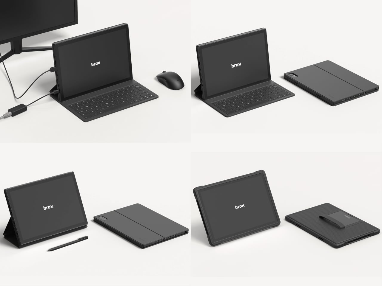
The Brax open_slate is a modular tablet that lets you actually own what you buy

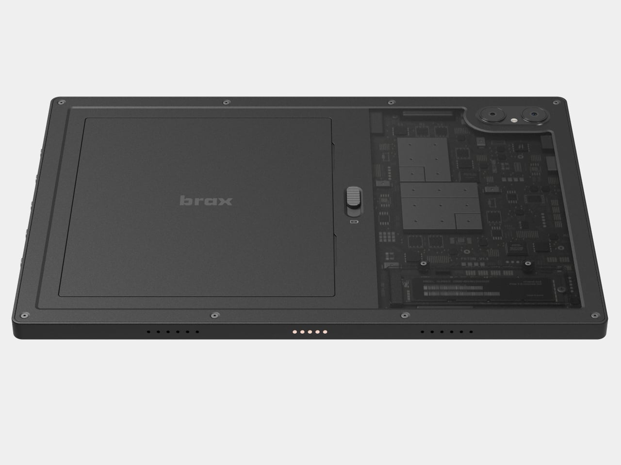
Most tablets arrive as sealed objects with decisions already made for you: storage is fixed, the battery is buried somewhere inaccessible, and the operating system is whatever the manufacturer chose. You use the device on those terms until it slows down or falls out of software support, and then you replace it. Brax Technologies, the company behind the BraX3 privacy smartphone, is betting there’s a different way to do this.

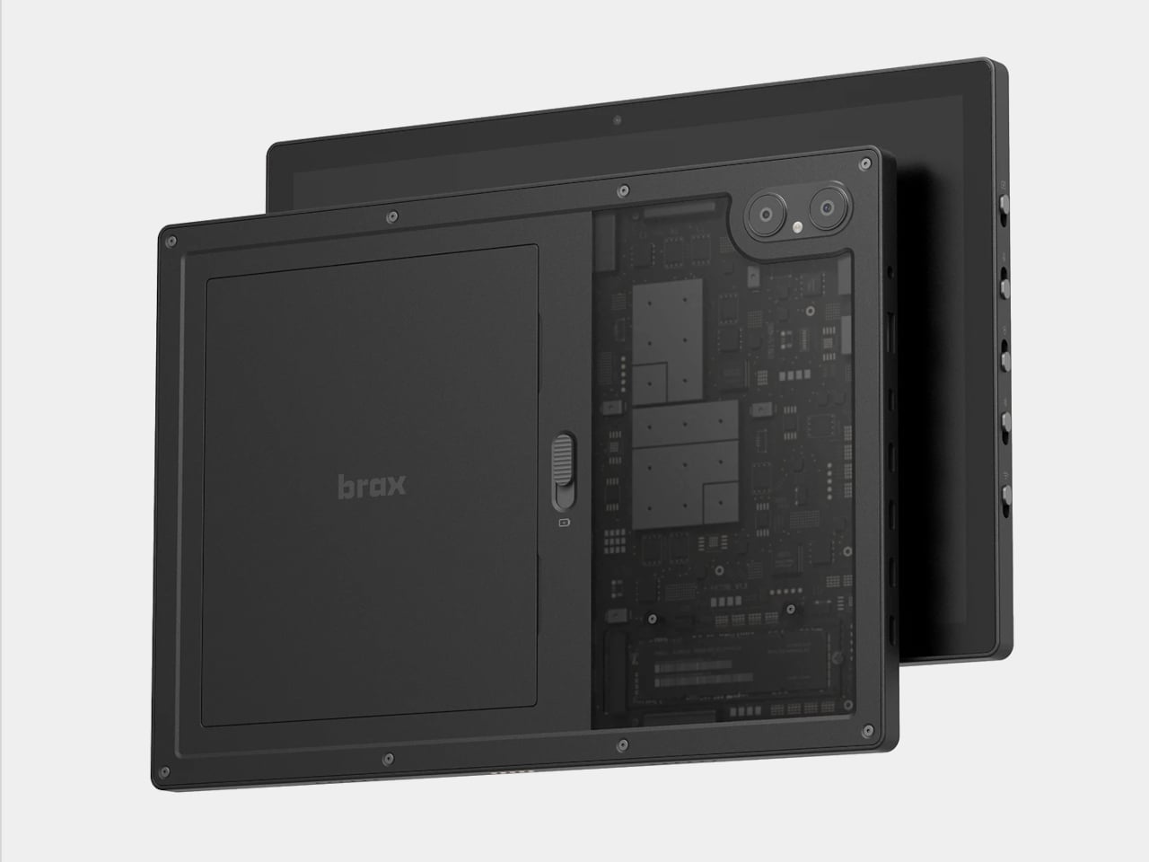
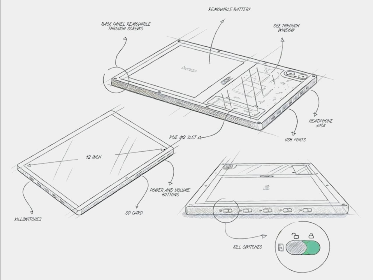
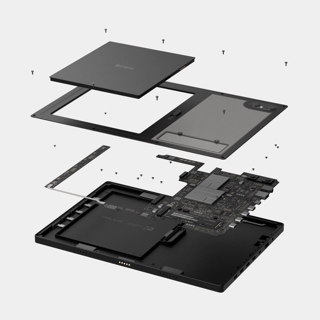
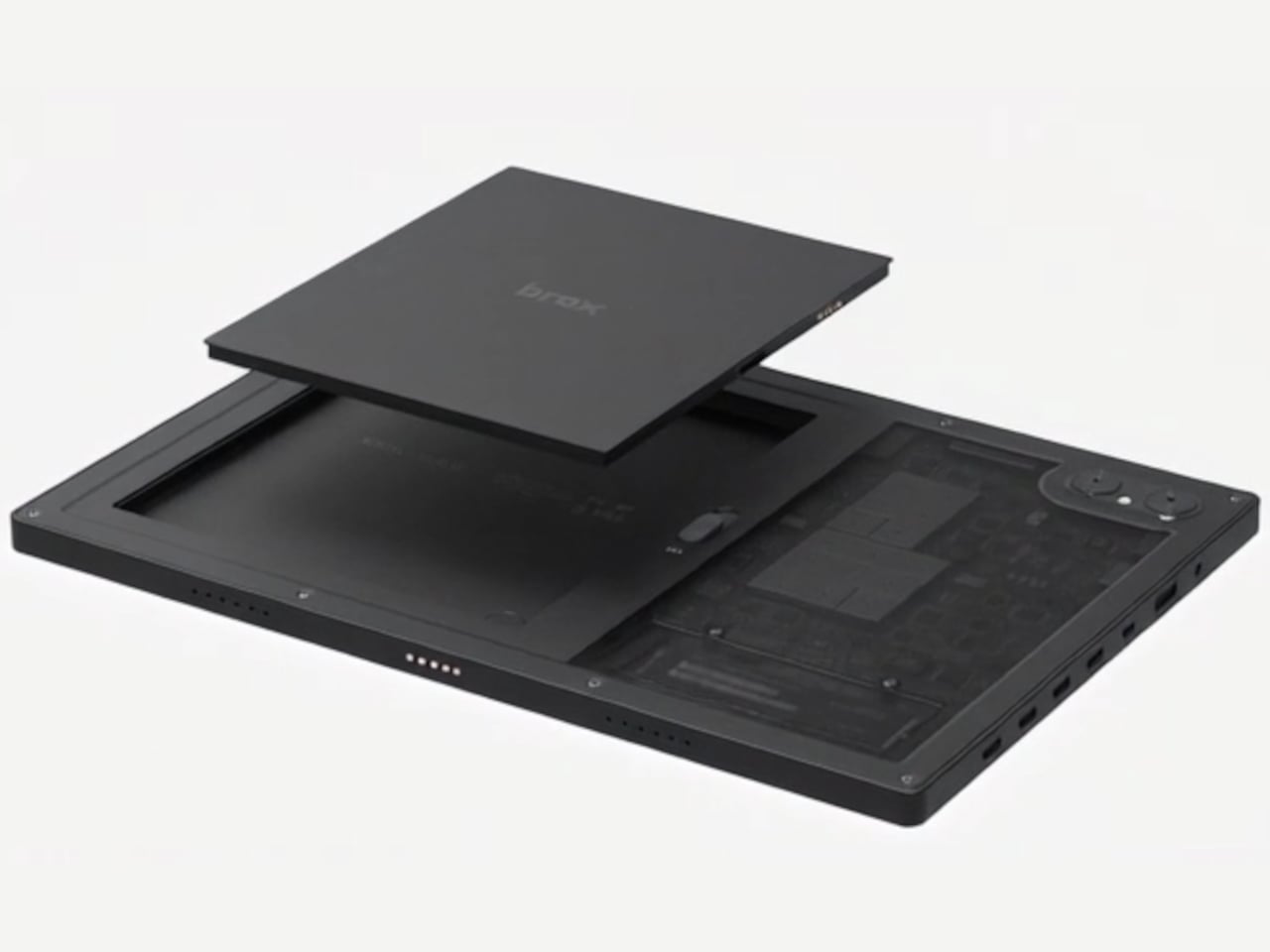
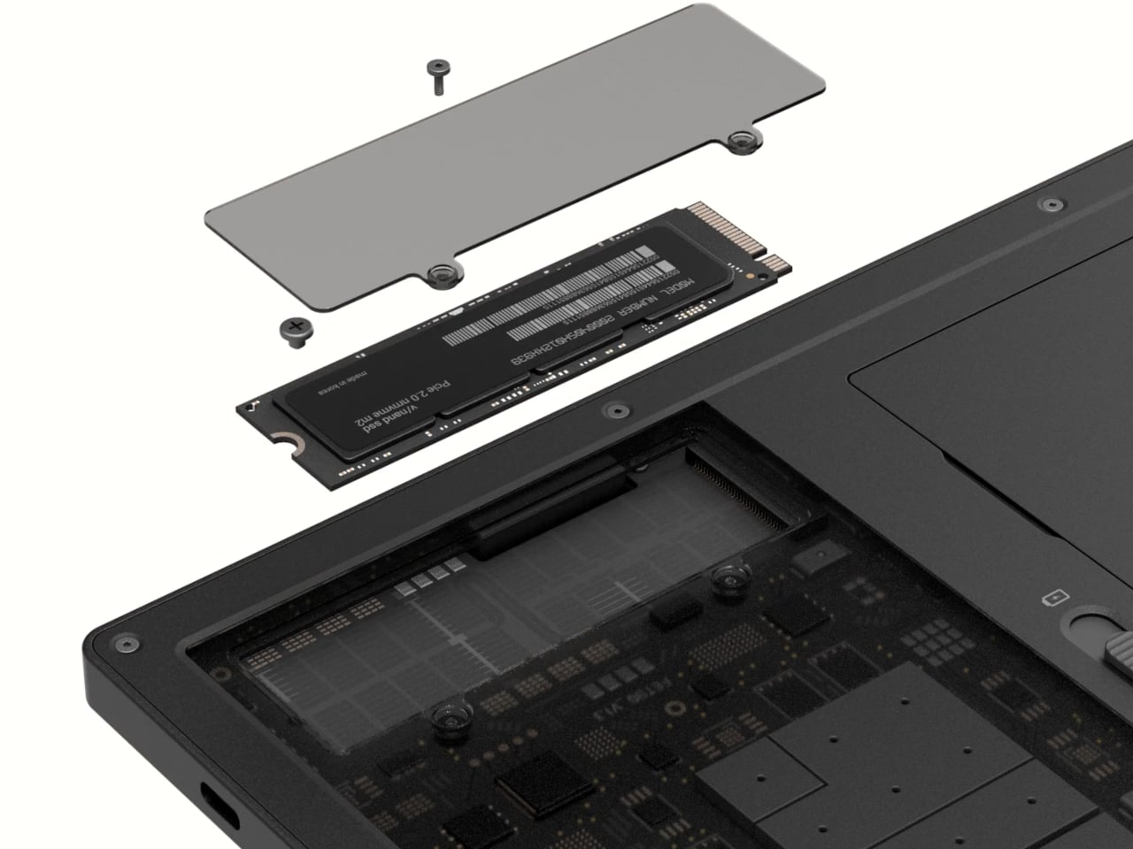
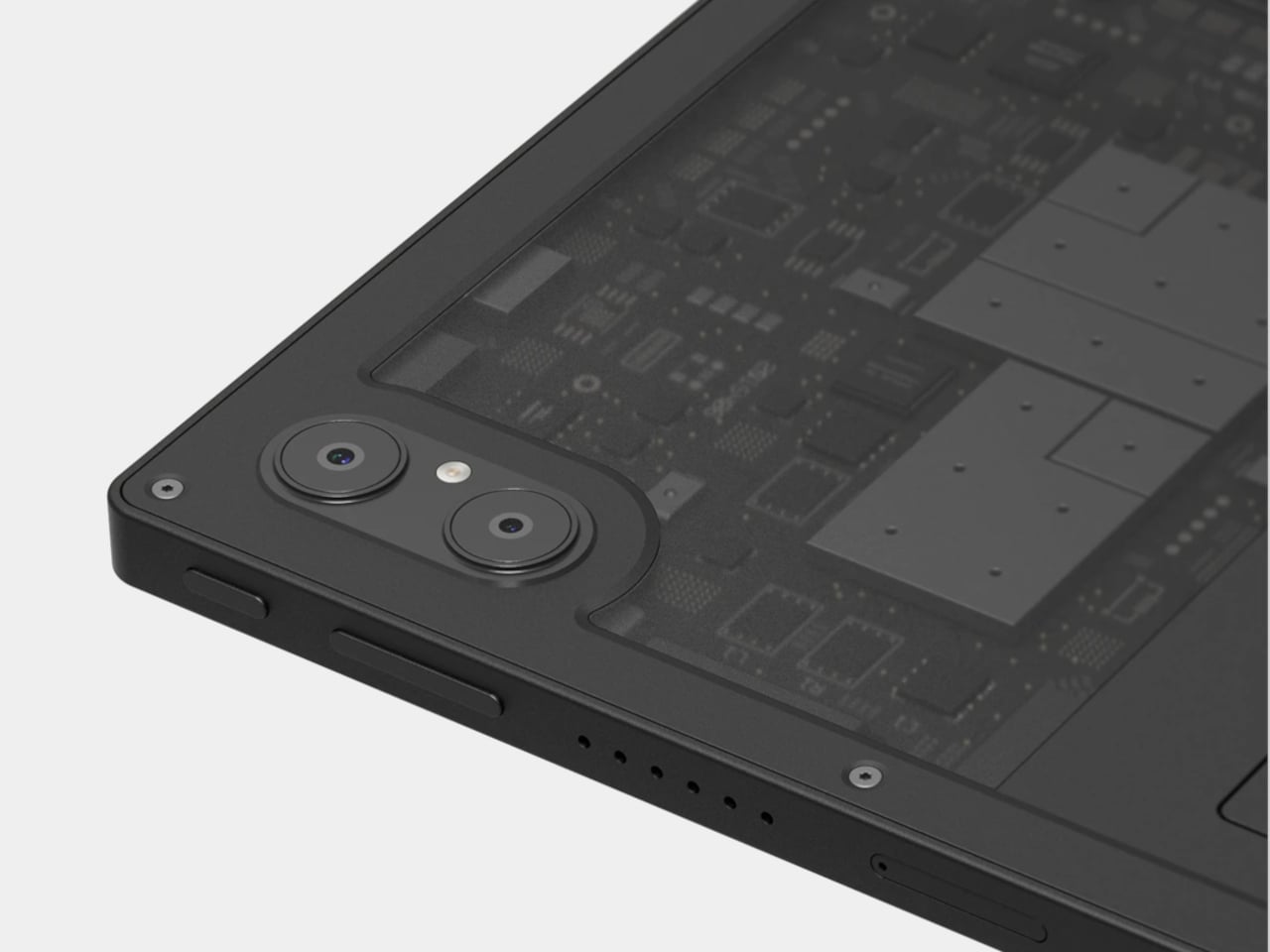
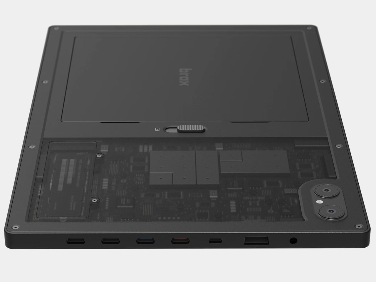
The open_slate is a 12-inch 2-in-1 tablet that treats its hardware as a starting point rather than a finished product. Inside the chassis sits an M.2 2280 slot, a standard used in laptops and desktops, allowing owners to swap in faster storage, add capacity, or eventually slot in a network card. There’s also a user-replaceable battery, which sounds mundane until you consider how few tablet makers have bothered to include one in years.

Designer: Brax Technologies

That battery holds 8,000mAh and carries a claimed 20-hour runtime, a figure that tracks given how efficiently ARM processors handle light workloads. The MediaTek Genio 720 chip pairs two Cortex-A78 performance cores with six Cortex-A55 efficiency cores. It’s a capable mid-range processor, not a desktop replacement, but paired with either 8GB or 16GB of RAM and a 120Hz display, daily use should feel smooth for the tasks the device is designed for.

That 12-inch IPS screen runs at 1600 x 2400 resolution with Gorilla Glass protection and supports a stylus at 4,096 levels of pressure sensitivity. Connectivity covers Wi-Fi 6E, Bluetooth 5.3, GPS, and two USB-C ports, one supporting DisplayPort 1.4 output. Someone writing on the go, sketching ideas, or running a Linux terminal while connected to an external monitor could reasonably treat this as a primary machine, provided the software cooperates.

On that note: the open_slate ships with BraxOS, a de-Googled Android build, and targets Ubuntu support through MediaTek’s Genio developer platform. Brax acknowledges that some Linux features may not be complete at launch, which is an honest position for a small team working outside the mainstream supply chain. ARM Linux has improved considerably, but it still surprises you at inconvenient moments.

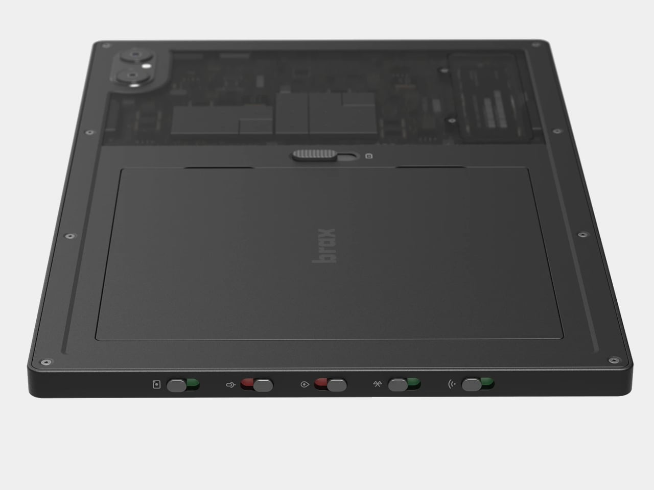
The physical kill switches are the most distinctive feature on paper. Dedicated toggles cut power to the cameras, microphone, Wi-Fi, Bluetooth, and GPS at the hardware level, not through a software setting that an app might quietly bypass. This design logic comes from the secure laptop world, and applying it to a consumer tablet is unusual enough to notice. For anyone who’s thought seriously about what their devices transmit and to whom, the appeal is immediate.

The post The Brax open_slate is a modular tablet that lets you actually own what you buy first appeared on Yanko Design.

5 Wildest Design Trends at MWC 2026: Nodding Phones and Tiny Robots

Every year, MWC arrives with the promise of seeing the future of mobile technology, or at least a very expensive approximation of it. The 2026 edition in Barcelona was the event’s 20th anniversary in the city, and while nearly 105,000 people showed up, there was a noticeable shift in what filled the booths. Fewer headline-grabbing product launches, more working concepts and proofs of concept across every category imaginable.

That’s not necessarily a bad thing. When manufacturers stop competing on a single spec and start showing what they’re thinking about next, the underlying patterns get easier to read. Five trends cut across product categories at MWC 2026, crossing from smartphones to laptops to robotic companions. None of them belongs to one company, and none of them is going away anytime soon.

Robots got a size reduction

For the past couple of years, humanoid robots have been stealing the show at tech events. They walk, they wave, they occasionally fall over, and everyone takes a video. The problem is that a bipedal robot that can fetch a package from across the room is not something most people actually need sitting in their office. MWC 2026 suggested the industry might be starting to figure that out.

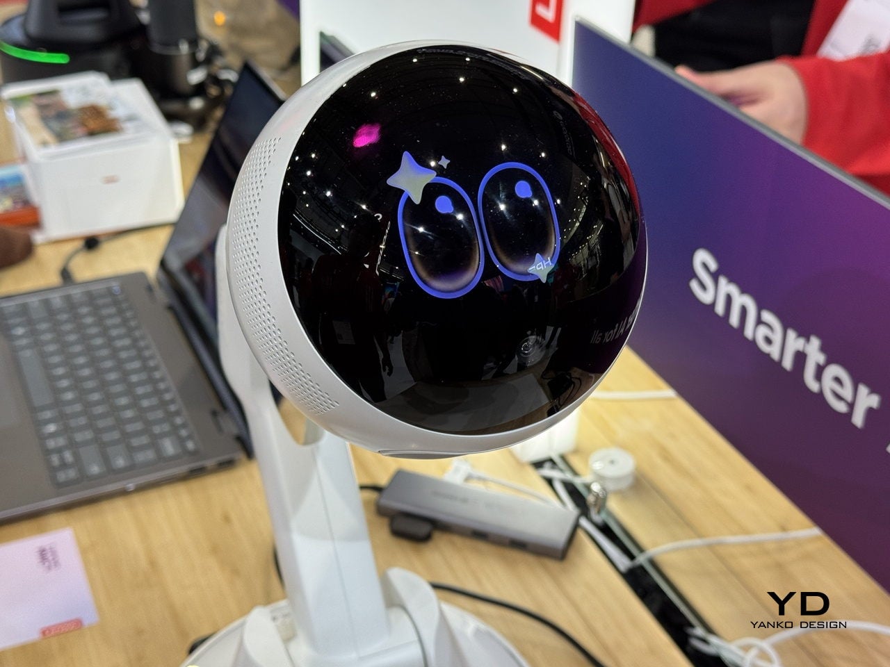
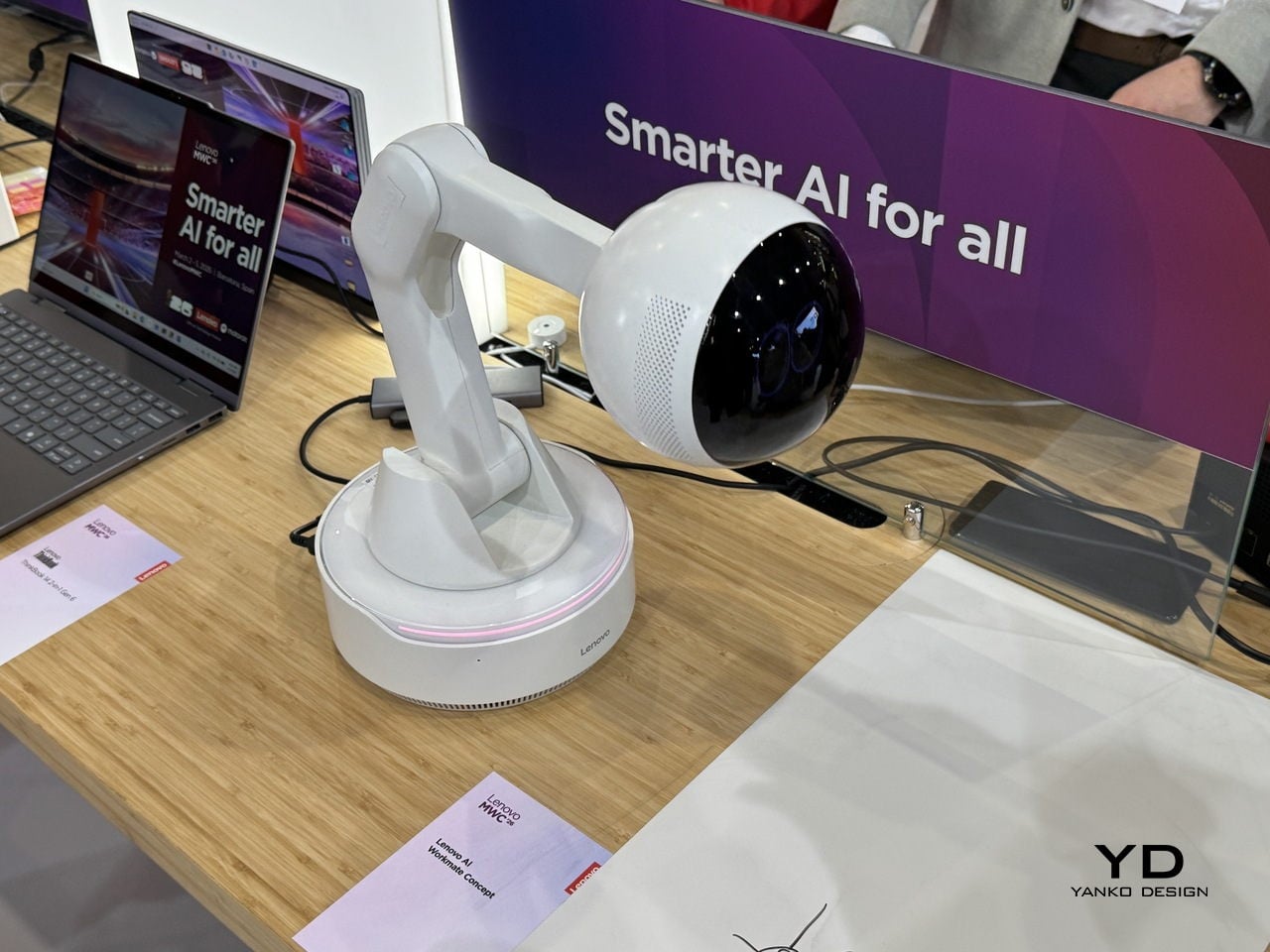
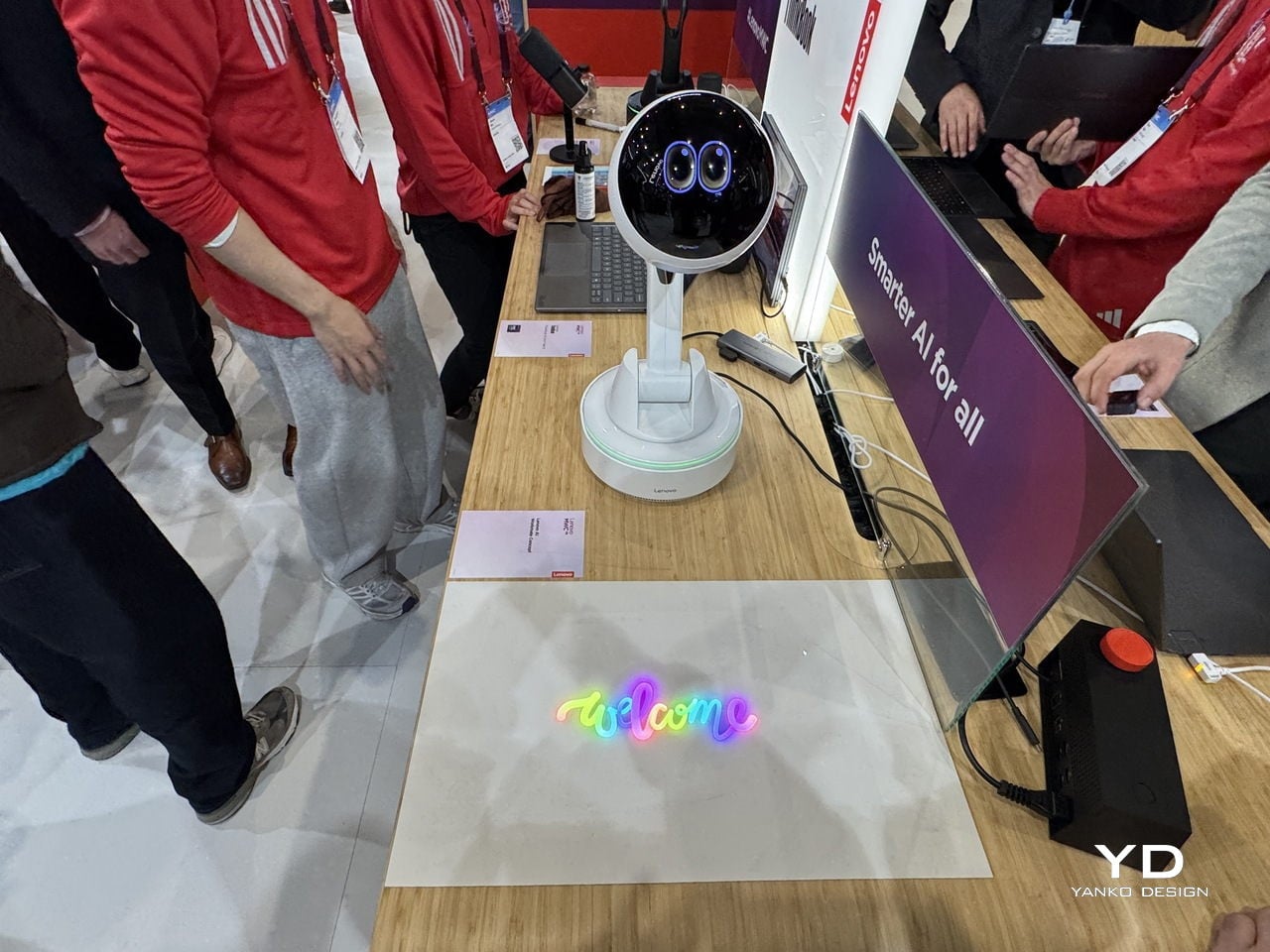
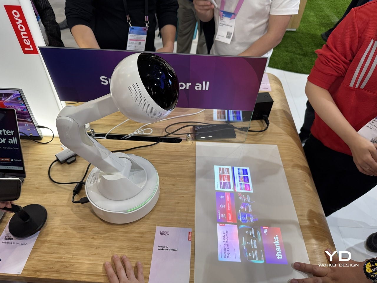
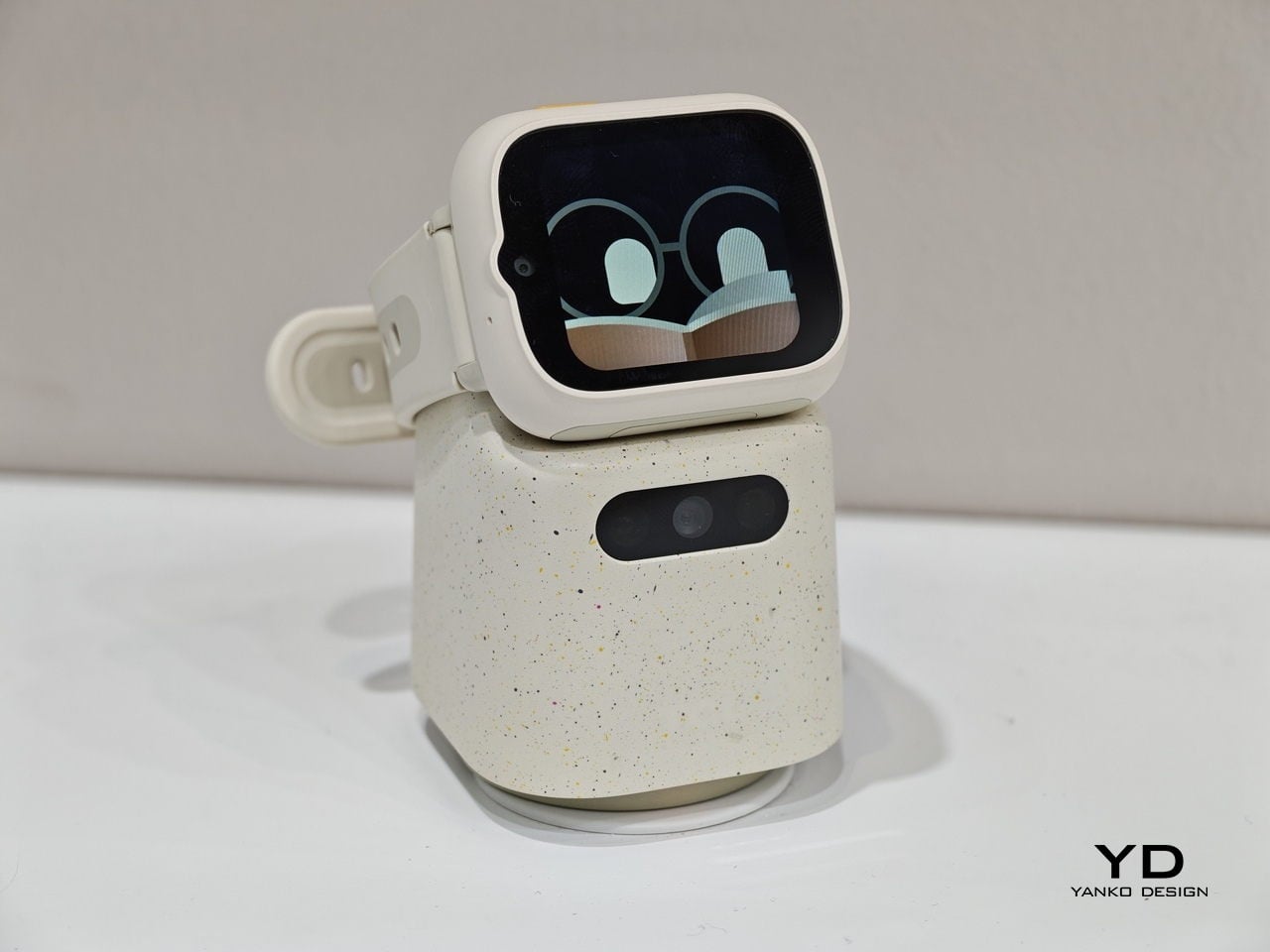
The robots worth talking about this year were small, desk-bound, and refreshingly honest about what they could do. Lenovo’s AI Workmate Concept is a desk-mounted unit that handles document scanning, note organization, and presentation help through voice, gesture, and spatial interaction, processing everything on-device. It can even project content onto your desk or a nearby wall, which sounds gimmicky until you think about how useful a hands-free reference surface actually is during a meeting.

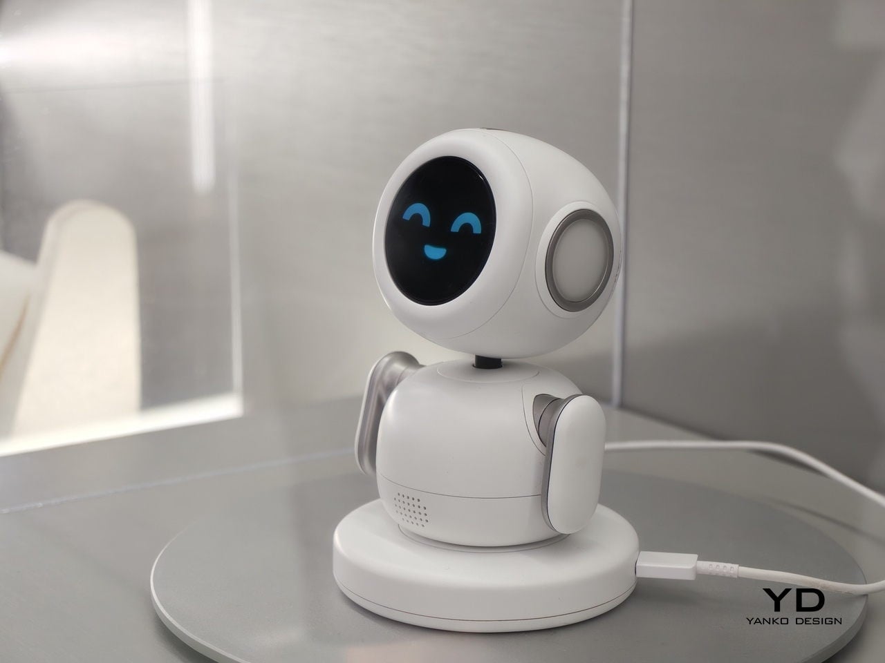
Samsung Display’s OLED AI Mini PetBot takes the idea in a more playful direction. It is a pocket-sized robot with a 1.34-inch circular OLED screen for a face, reacting to voice and touch with animated expressions. It comes from Samsung’s display division rather than its product team, so this is less a product announcement and more a demonstration of where the panel technology can go.

AI is learning to show its feelings

Most people’s experience of AI right now involves typing into a box and getting text back, or asking a question into empty air and hearing a voice that sounds like it was recorded in a server room. It works, but it does not feel particularly warm. A cluster of products at MWC 2026 was specifically trying to fix that, not by making AI smarter, but by making it more expressive.

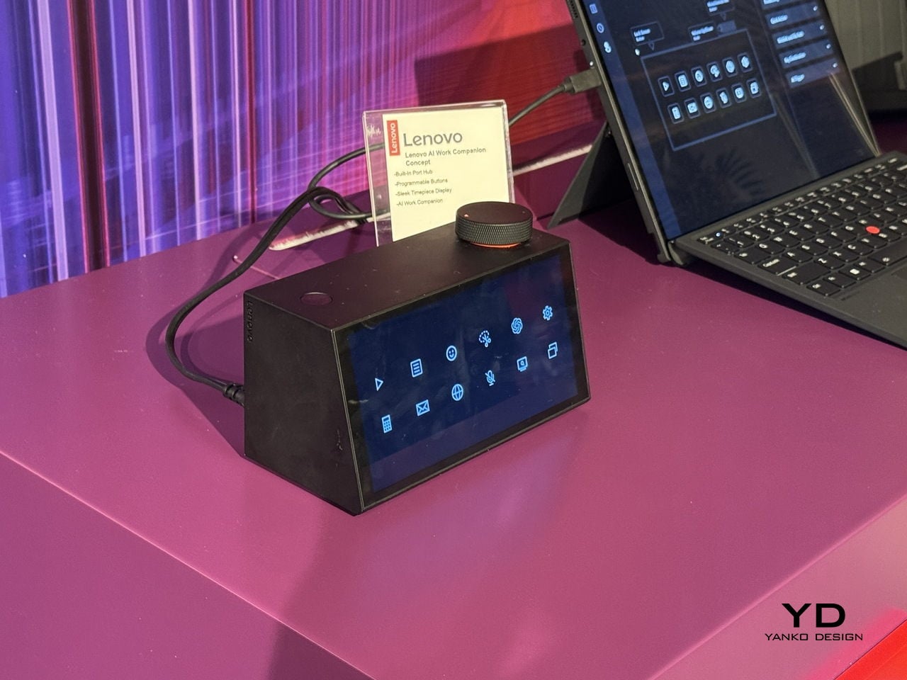
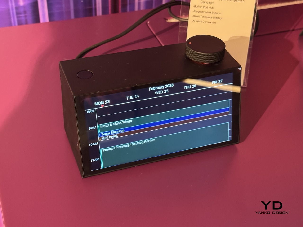
Lenovo’s AI Work Companion Concept looks like a desk clock, which is either a clever disguise or a statement about how unobtrusive AI should be. Its AI planning system, called Thought Bubble, syncs tasks and schedules from across your devices to build a daily plan, monitors screen time, nudges you to take breaks, and delivers an end-of-week summary of what you actually got done. The behavioral framing is deliberately light. The goal is to build a rhythm rather than manage a list, and the device is designed to feel like a presence in your workspace rather than another notification surface.

TCL’s Tbot takes a similar approach for a younger audience. It pairs with the company’s MOVETIME kids smartwatch, so when a child gets home and drops the watch onto Tbot’s magnetic dock, the robot comes to life as a study companion and bedtime storyteller. The physical handoff is a considered design decision, a tangible trigger rather than an app to open.

Honor’s Robot Phone extends the idea into the phone itself. A motorized titanium alloy gimbal arm holds a 200-megapixel camera that nods when it agrees, shakes when it doesn’t, and tracks you across the room. Honor plans to sell it in the second half of 2026, which means it will be the first of this particular batch of emotionally expressive AI devices to actually land in someone’s hands.

Modular design, this time as a practical argument

Modular phones have been promised before: Project Ara, LG G5, and Fairphone at various stages of their evolution. The pitch is always appealing: buy a base device, then upgrade the camera, swap the battery, add what you need. The reality has usually involved awkward connectors, software that doesn’t quite work, and products that disappear within two years. MWC 2026 had a notable cluster of modular devices, and what made them interesting is that each was solving a different version of the problem.

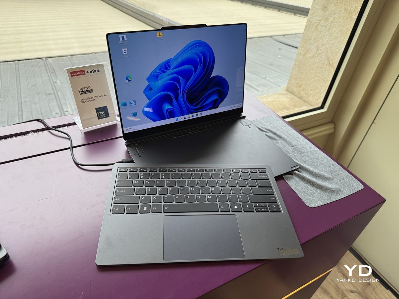
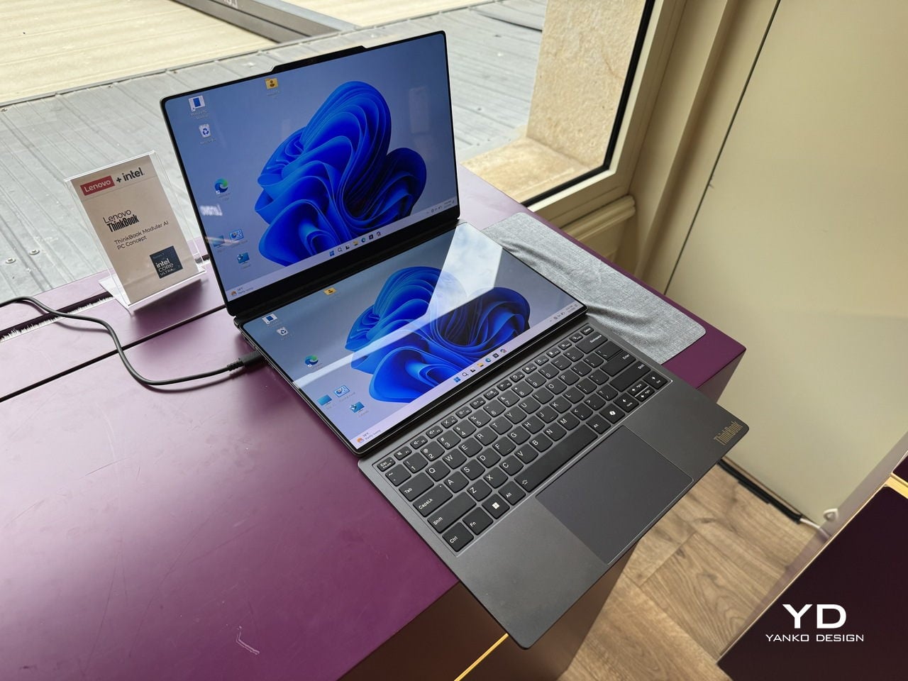
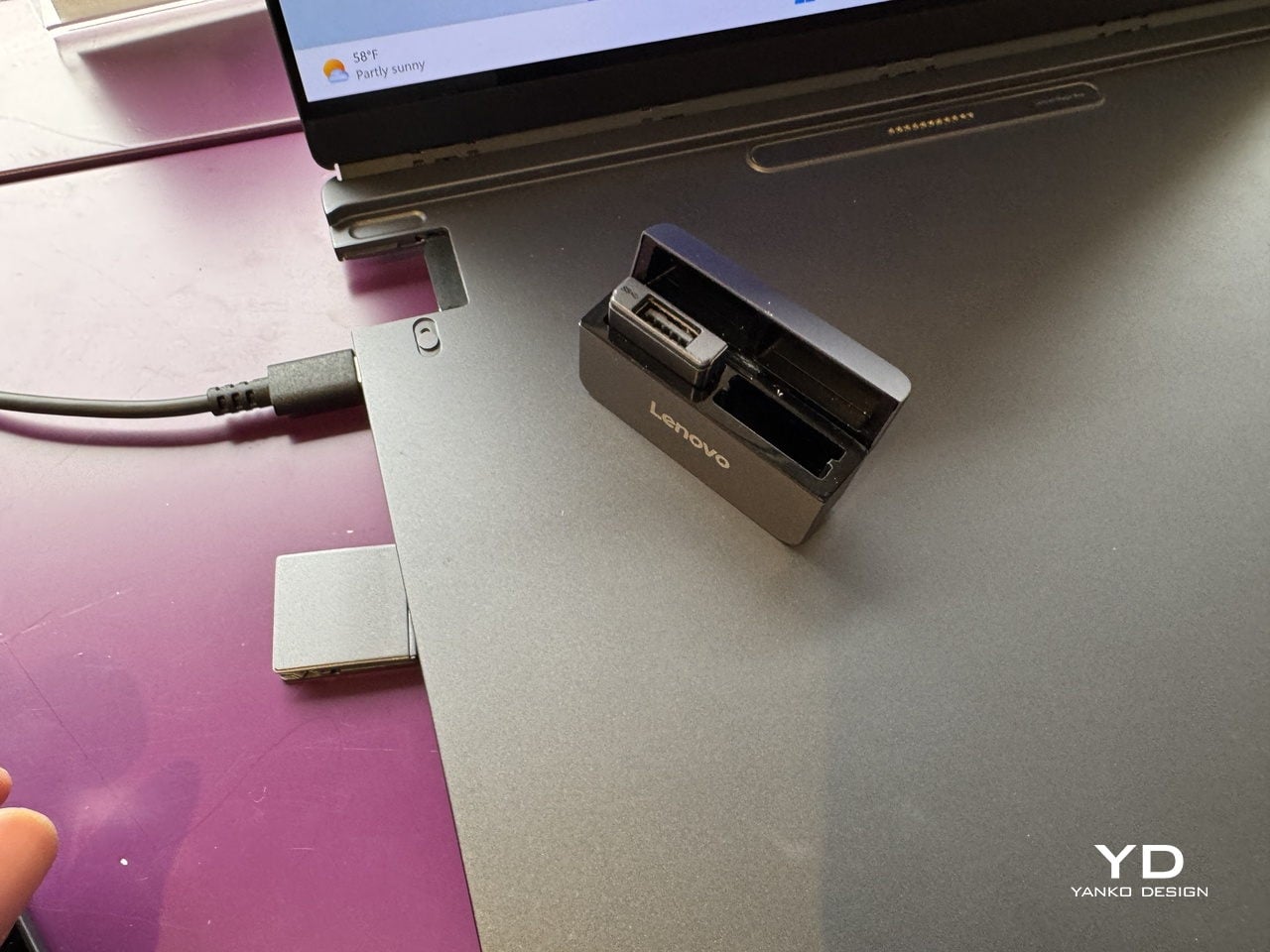
Lenovo’s ThinkBook Modular AI PC Concept approaches it from the laptop side. The 14-inch base connects to a secondary screen via pogo pins, and that screen can sit alongside the base as a travel monitor, mount on the lid for face-to-face sharing, or replace the keyboard to create a dual-display setup. Interchangeable I/O ports, covering USB Type-A, USB Type-C, and HDMI, mean the connection layout changes with the workflow. It’s a concept aimed at professionals who spend their day switching between contexts, and the argument is about longevity and flexibility rather than upgradeability for its own sake.

TECNO’s Modular Magnetic Interconnection Technology works from the phone outward. The base device is 4.9mm thick, which is thinner than anything Apple or Samsung currently sells, and that extreme thinness turns out to be the point. Modules, including telephoto lenses, battery packs, microphones, wallets, and speakers, attach magnetically to the rear without making the phone ungainly.

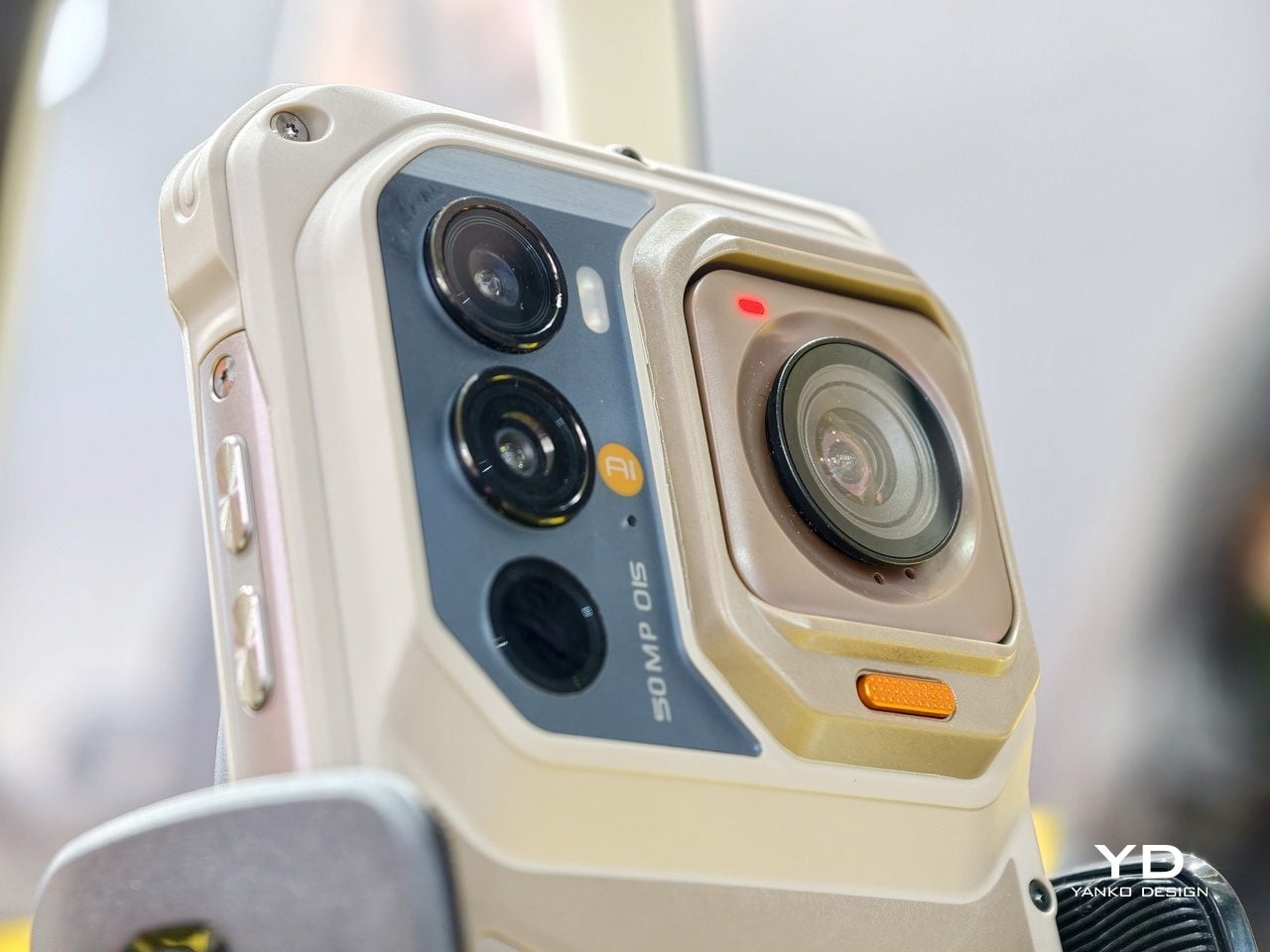
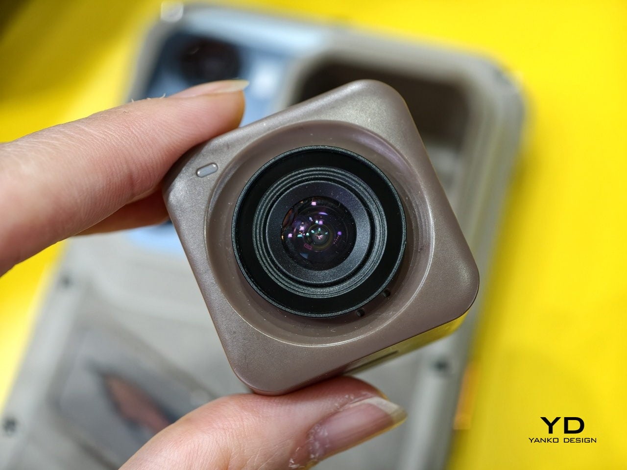
Ulefone’s RugOne Xsnap 7 Pro is less elegant but arguably more practical: a rugged phone whose rear camera detaches and operates independently as a wearable action camera. Three very different products, three different price tiers, and the same underlying idea. A device you can reconfigure is a device you keep longer.

The keyboard is making a serious case for itself

BlackBerry’s demise was supposed to be the end of physical keyboards on phones. Touch screens were better, the argument went, because they could be anything. And they were right, mostly. But they were also cold, imprecise for fast typing, and they ate half your screen every time you needed to type more than a sentence. A small but persistent group of users never fully made peace with that trade-off, and in 2026, they suddenly had options.

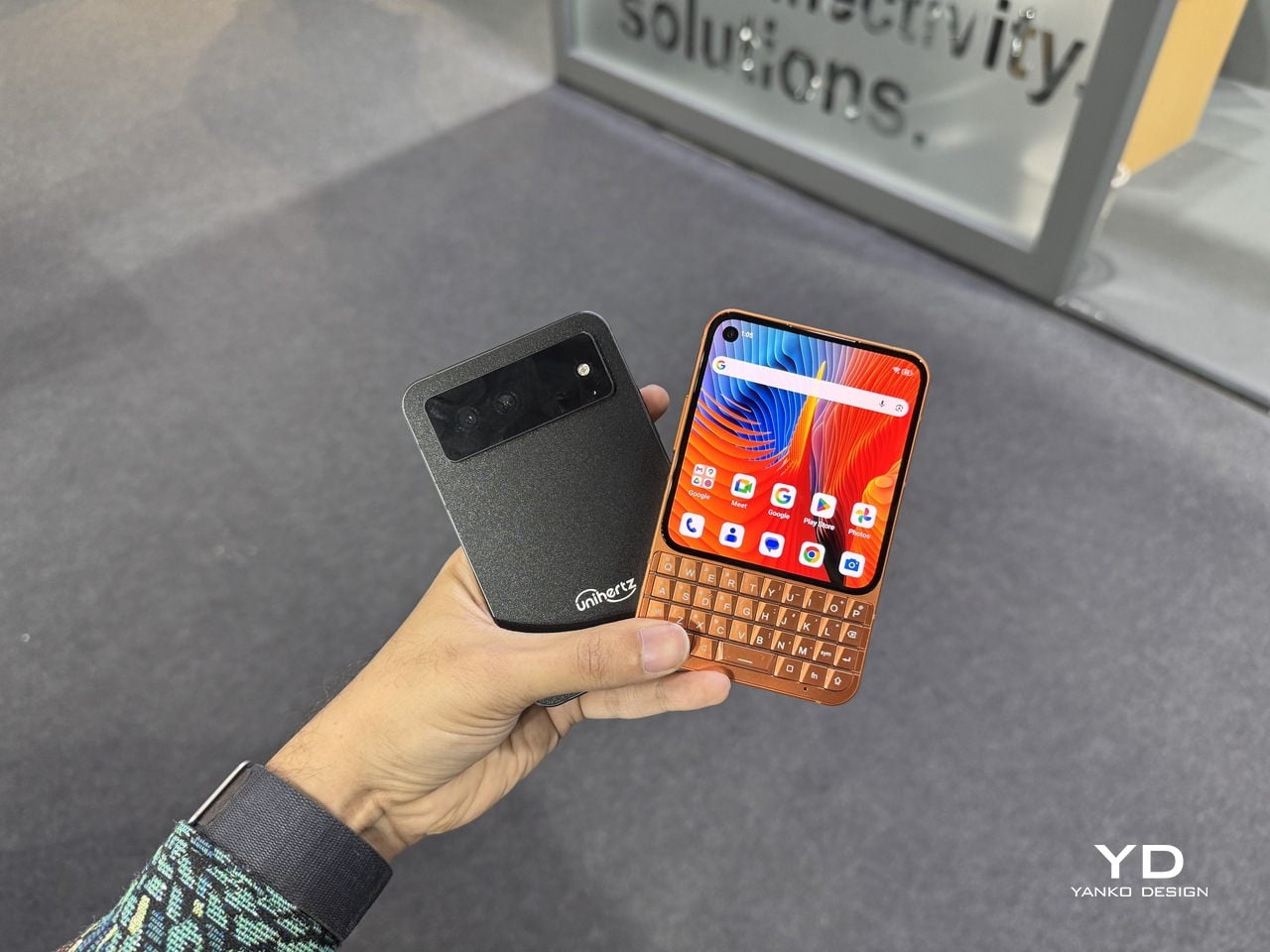
The Unihertz Titan 2 Elite was at MWC with a 4.3-inch AMOLED display at 120Hz above a physical QWERTY keyboard with touch-sensitive keys that also function as a trackpad. The aluminum body and slimmed-down proportions mark a clear departure from the chunky, ruggedized aesthetic of earlier Titan phones. This one is trying to look like something you would actually carry every day.

The Clicks Communicator comes from the opposite direction: Clicks already makes keyboard cases for iPhones, and the Communicator is a logical next step, a standalone Android phone built around the companion philosophy for people who want physical keys without abandoning modern smartphone basics.

The iFROG RS1 is the strangest and most interesting of the three. It is a square phone with a 3.4-inch display that sits on top of a rotating lower section. Twist it one way, and you get a full QWERTY keyboard with tactile keycaps. Twist it the other way, and you get a gamepad with a D-pad and face buttons, which unavoidably recalls the Game Boy and the Motorola Flipout in equal measure. What all three of these share is a belief that tactile input has genuine ergonomic value that glass surfaces haven’t replaced, just obscured. Whether that belief translates into mainstream sales is a different question.

Design became the headline spec

Phones have always been designed objects. But for most of the last decade, the design conversation at launch events came after the camera specs, after the processor benchmark, after the battery capacity. At MWC 2026, a handful of manufacturers flipped that order. The design was the lead, and everything else followed.

Honor’s Magic V6 is the most straightforward example. At 8.75mm closed, it is one of the thinnest foldables on the market, and Honor announced that measurement with the same emphasis as a performance figure might receive. The engineering behind it is genuinely impressive: IP68 and IP69 water resistance on a foldable, combined with a 6,660mAh silicon-carbon battery, means thinness was not achieved by sacrificing durability or endurance. It’s a difficult combination, and the design is doing real work to make it possible rather than just looking good on a spec sheet.

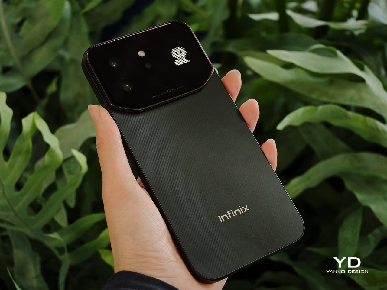
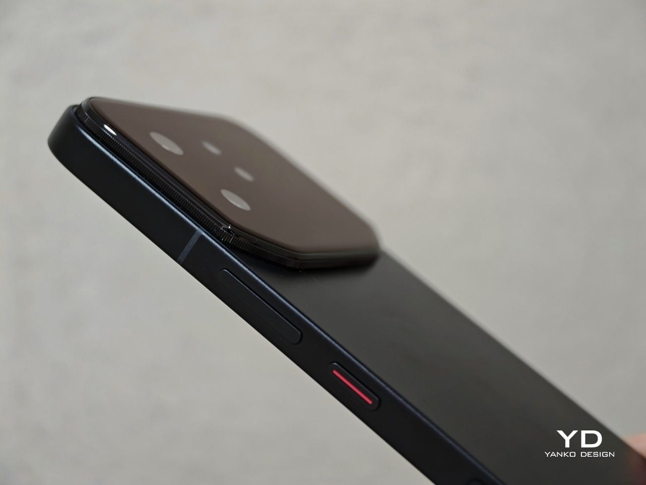
The CMF collaborations told a different story about design as positioning. Infinix’s NOTE 60 Ultra, developed with Pininfarina, applied the Italian studio’s automotive logic to the phone’s rear panel. The result is a single continuous sheet of Gorilla Glass Victus covering the triple camera array, a thin floating taillight strip, and a hidden active matrix notification display, all completely flush. No bump. The colorways, Torino Black, Monza Red, Amalfi Blue, and Roma Silver, are not accidental.

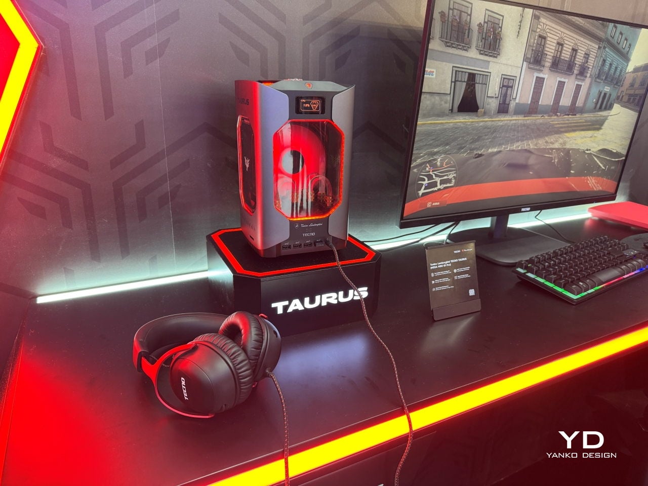
TECNO’s partnership with Tonino Lamborghini produced the TAURUS gaming PC, a water-cooled mini system with a 10,000mm² copper cold plate, and the POVA Metal phone, whose 241-pixel rear LED dot matrix turns the notification surface into a deliberate design feature. At the concept end, TECNO’s POVA Neon filled its rear panel with ionized inert gas to produce plasma patterns that chase your fingertip across the glass, which is either the most impractical phone feature ever conceived or a fascinating question about what a phone’s surface is actually for.

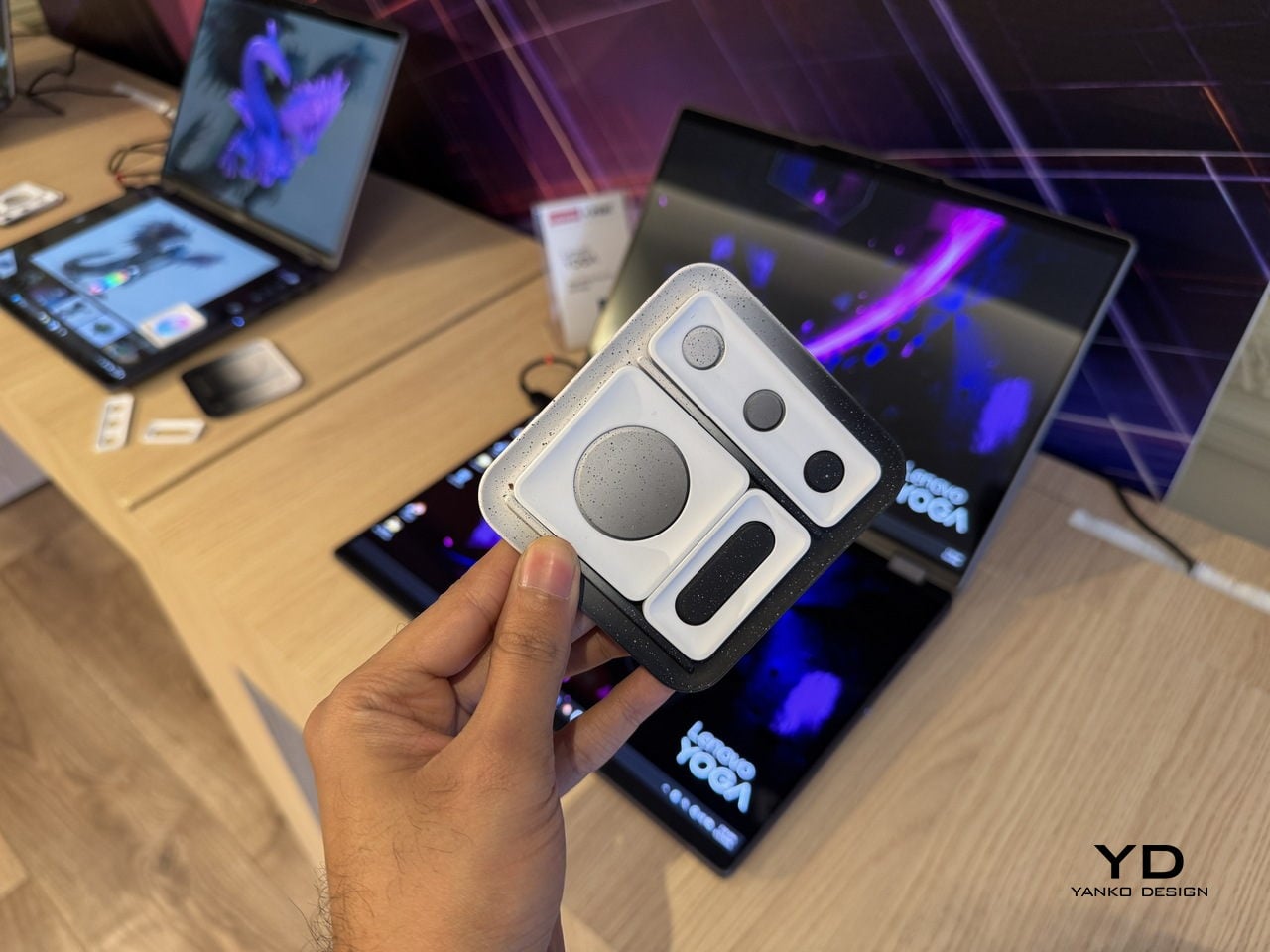
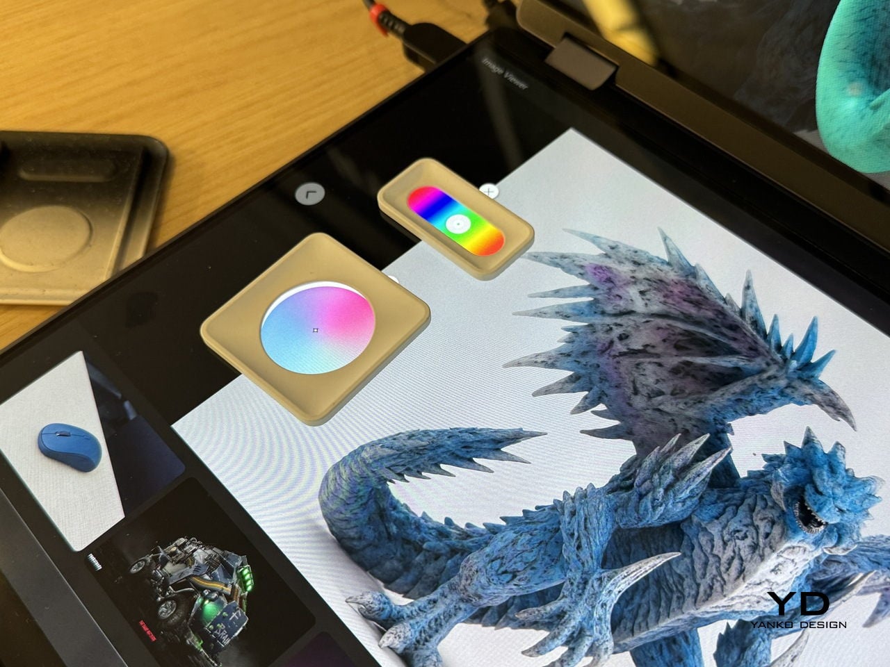
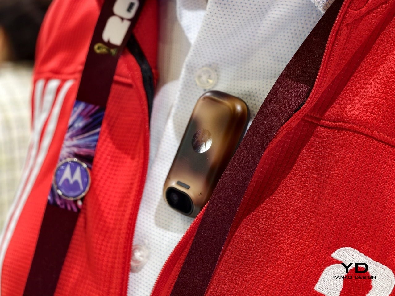
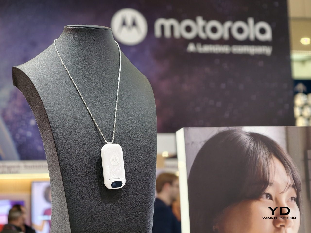
The Lenovo Yoga Book Pro 3D lets 3D creators sculpt directly on a dual-screen laptop without additional hardware. The Motorola Maxwell AI pendant turned conference transcription into something you wear around your neck. None of these are shipping products. At MWC 2026, that seemed less like a limitation and more like the whole point: showing what you think design can do, before you have to prove it.

The post 5 Wildest Design Trends at MWC 2026: Nodding Phones and Tiny Robots first appeared on Yanko Design.
This Tiny Rugged Phone Has a 152° Action Camera and GoPro Mounts

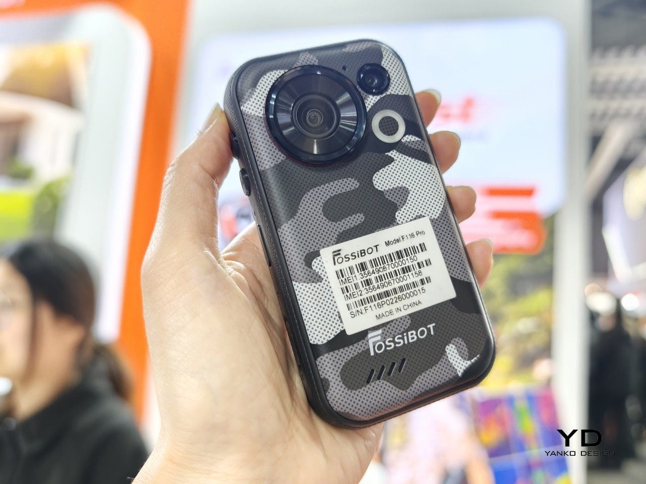
Action cameras are great until you realize you’ve left yours at home. Phones are always with you, but most of them are too big, too fragile, or too awkward to mount anywhere useful. The FOSSiBOT F116 Pro is a compact, rugged phone that tries to solve both problems at once, and the approach is specific enough to be interesting.

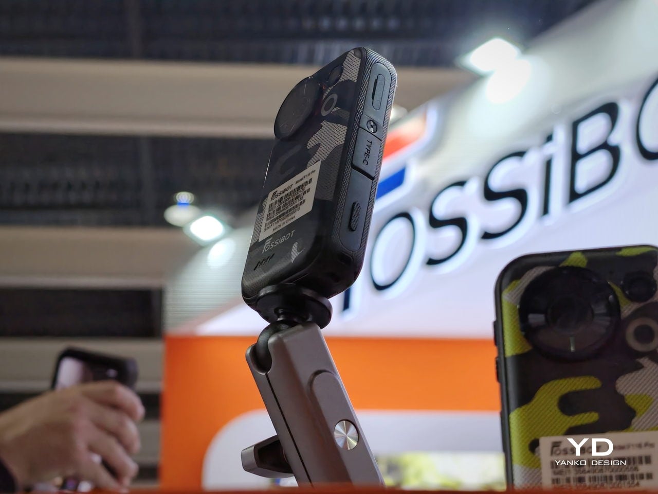
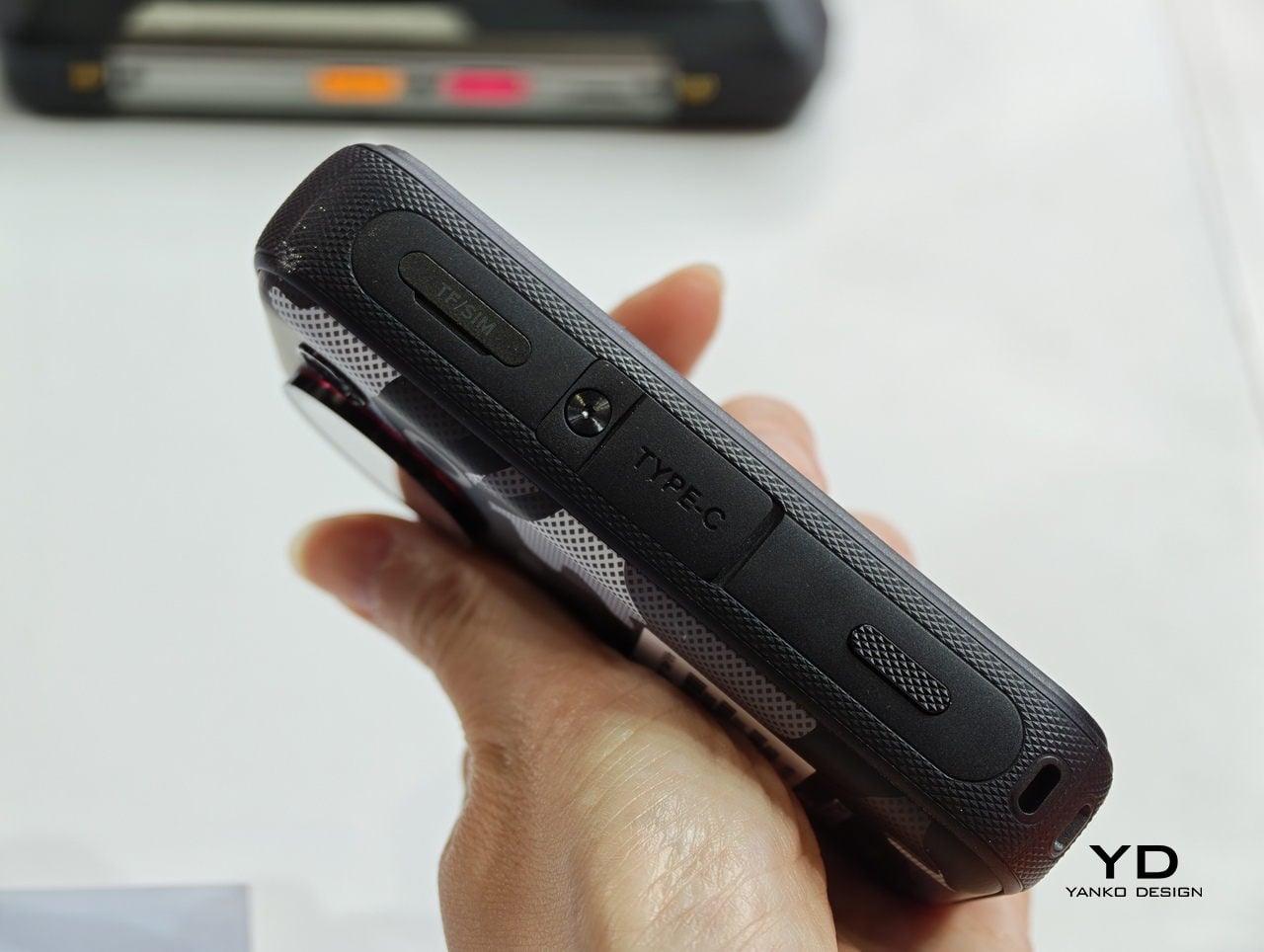
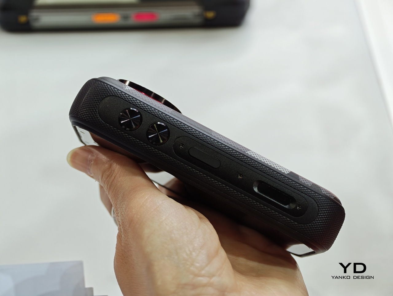
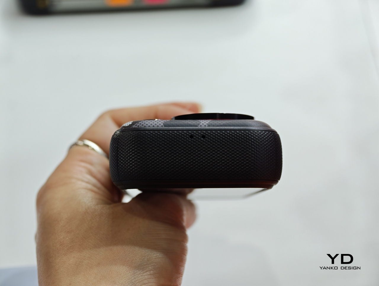
The F116 Pro is built around a 4.05-inch display and has a standard 1/4-inch screw socket at the bottom, the same thread you’d find on a tripod or a GoPro accessory. That means it works with the same ecosystem of mounts that action cameras already use: chest straps, suction cups, handheld grips, and neck mounts. The phone goes where the camera goes, instead of staying in your pocket while you film.

Designer: FOSSiBOT

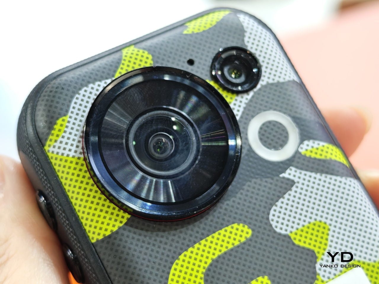
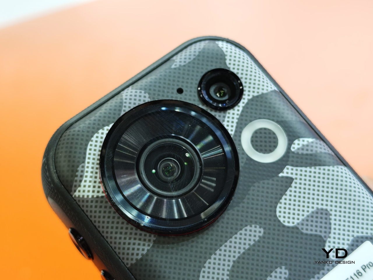
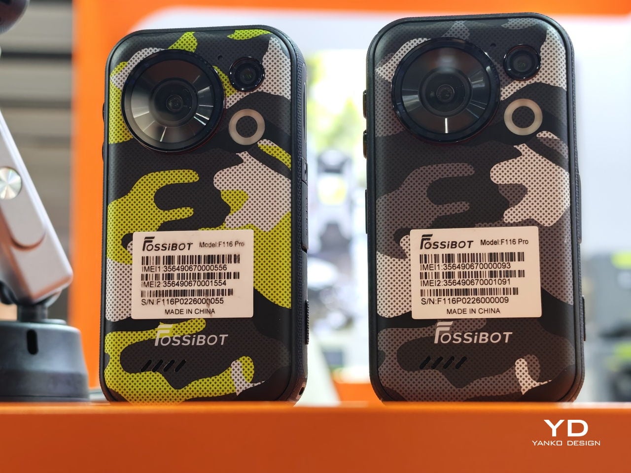
The camera is a 48 MP wide-angle unit with a 152.6-degree field of view, which is genuinely wide. Most smartphone ultrawide lenses sit somewhere between 70 and 90 degrees for comparison. Built-in stabilization smooths out footage on bumpy terrain, and a dedicated physical camera button on the body launches the camera instantly without unlocking the phone first, which matters more than it sounds when you’re actually moving.

Inside, the phone runs on a MediaTek Dimensity 7300 chipset built on a 4nm process, paired with 12GB of RAM and 256GB of storage, expandable up to 1TB with a now-rare microSD card slot. The display refreshes at 120Hz, 5G connectivity means footage can leave the device without hunting for Wi-Fi, and a 3,700 mAh battery with 33W charging keeps things moving. Modest numbers, but proportionate to a 4-inch screen and mid-range specs.

There’s also a rear circular LED that FOSSiBOT calls a “Light Signal Tower,” which cycles through colors and can be set to show notifications. It reads as a feature designed more for personality than practicality, but on a device this small, glancing at the back for alerts without waking the screen has some logic to it.

The compact body is the most interesting design choice here, and also the one that will define the experience. At 4.05 inches, the screen is smaller than almost anything else currently on the market. That’s a genuine advantage for one-handed operation and pocket carry, and a real limitation for anything that benefits from screen size: reading, navigation, video playback. The F116 Pro is betting its users want something small enough to forget they’re carrying it.

FOSSiBOT has been around since 2022 and claims more than 1.5 million users across its lineup. The F116 Pro showed up at CES earlier this year, and again at MWC 2026, which suggests the company is serious about getting it in front of people. The more honest question is whether a mountable, rugged, mini-format phone lands in a gap the market actually has, or one the market has already decided it doesn’t need.

The post This Tiny Rugged Phone Has a 152° Action Camera and GoPro Mounts first appeared on Yanko Design.
This Square Phone Rotates Open to a BlackBerry or Game Boy Setup

Smartphones have gotten pretty good at being the same thing. Every year, they get a little taller, a little thinner, and a little more difficult to tell apart in a lineup. That’s fine for most people, but it does make MWC 2026 feel like a bit of a slog, until you spot something genuinely weird on the show floor, like a square phone that rotates open to reveal either a physical keyboard or a game controller underneath.

The iFrog RS1 is about the size of a closed fist, built around a 3.4-inch square display that sits on top of a rotating lower section. Twist it open, and you get one of two things depending on which variant you’re holding: a full QWERTY keyboard with raised, tactile keycaps, or a gamepad with a D-pad, a four-color face button cluster, and Select/Start buttons. Both run Android on a MediaTek Helio G18 chipset, with storage and RAM left open for whoever configures the platform.

Designer: FROG

That last part matters. iFrog is an ODM, or original design manufacturer, which means the RS1 is less a finished retail product and more a concept that carriers or brands can take and build on. The hardware is the pitch. Everything else is a conversation, which also explains why no pricing or release date was announced at MWC.
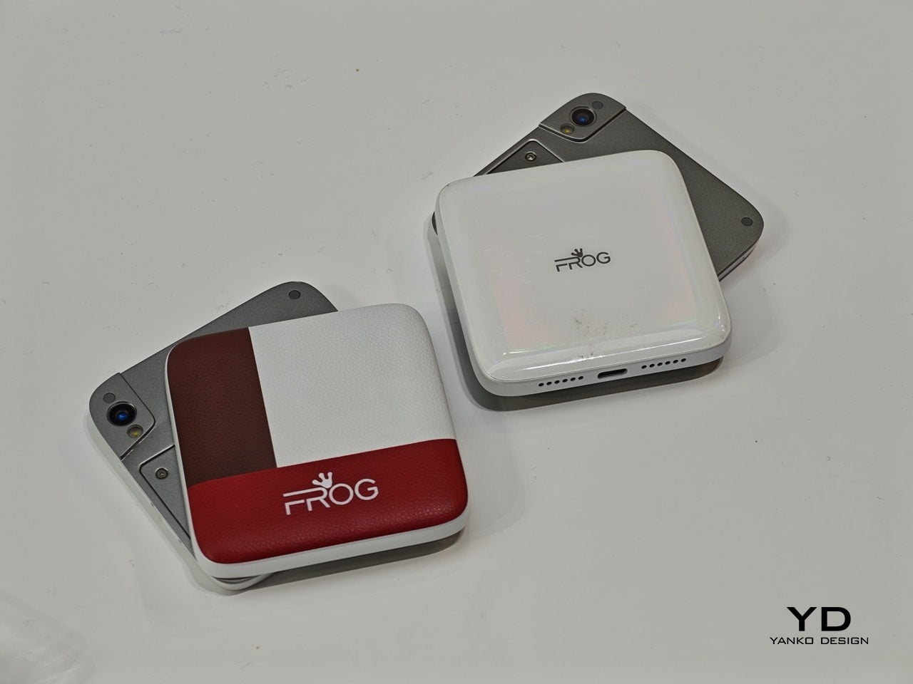
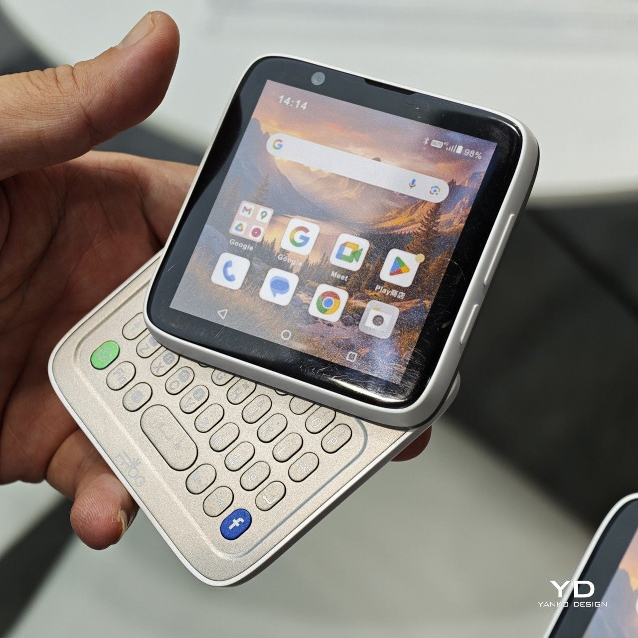
Of the two variants, the keyboard is the more predictable crowd-pleaser. There’s a genuinely underserved group of Android users who never stopped wanting physical keys. The BlackBerry crowd never fully disbanded, and phones like the Unihertz Titan have quietly built followings on exactly that. If you’ve ever tried composing a long email on a touchscreen while standing on a moving train, the appeal needs no further explanation.

The gamepad version is a stranger proposition, and honestly, the more interesting one. Running Android means emulation is an obvious draw, and the handheld gaming community noticed immediately. The visual comparison that kept surfacing online was the Motorola Flipout, a 2010 Android phone with a square body and rotating keyboard. There’s something both flattering and sobering in that parallel, since the Flipout was beloved by a small group and largely ignored by everyone else.

There are some caveats, though. No shoulder buttons on the gamepad variant rules out a lot of titles that need them. The swivel hinge is the structural heart of the design and also the part most likely to wear down. iFrog is new enough that questions about long-term software support are fair ones to ask, and the 3.4-inch screen is a genuine trade-off, not a quirk.

Still, the RS1 is a good reminder that the design space for phones is wider than what’s on shelves. It fits in a pocket and in the palm of a hand. It has buttons. It does a trick. What nobody knows yet is whether any of that adds up to something people actually want to live with.

The post This Square Phone Rotates Open to a BlackBerry or Game Boy Setup first appeared on Yanko Design.