A 4D-Printed Cast You Can Actually Shower In

Most medical devices evolve quietly over decades. Surgical tools get sharper, imaging machines get faster, drug delivery systems get smarter. But the orthopedic cast has remained stubbornly unchanged for most of its existence. Plaster, fiberglass, a messy application process, and six to eight weeks of itching, sweating, and avoiding puddles. For something that millions of people wear every year, it has always felt like a design problem nobody wanted to solve.

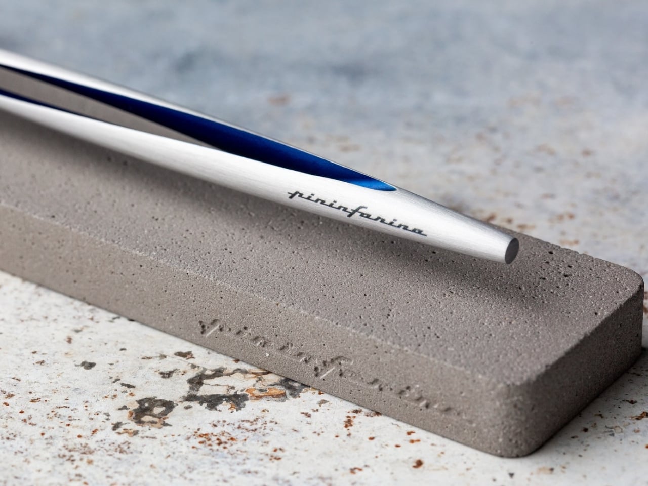
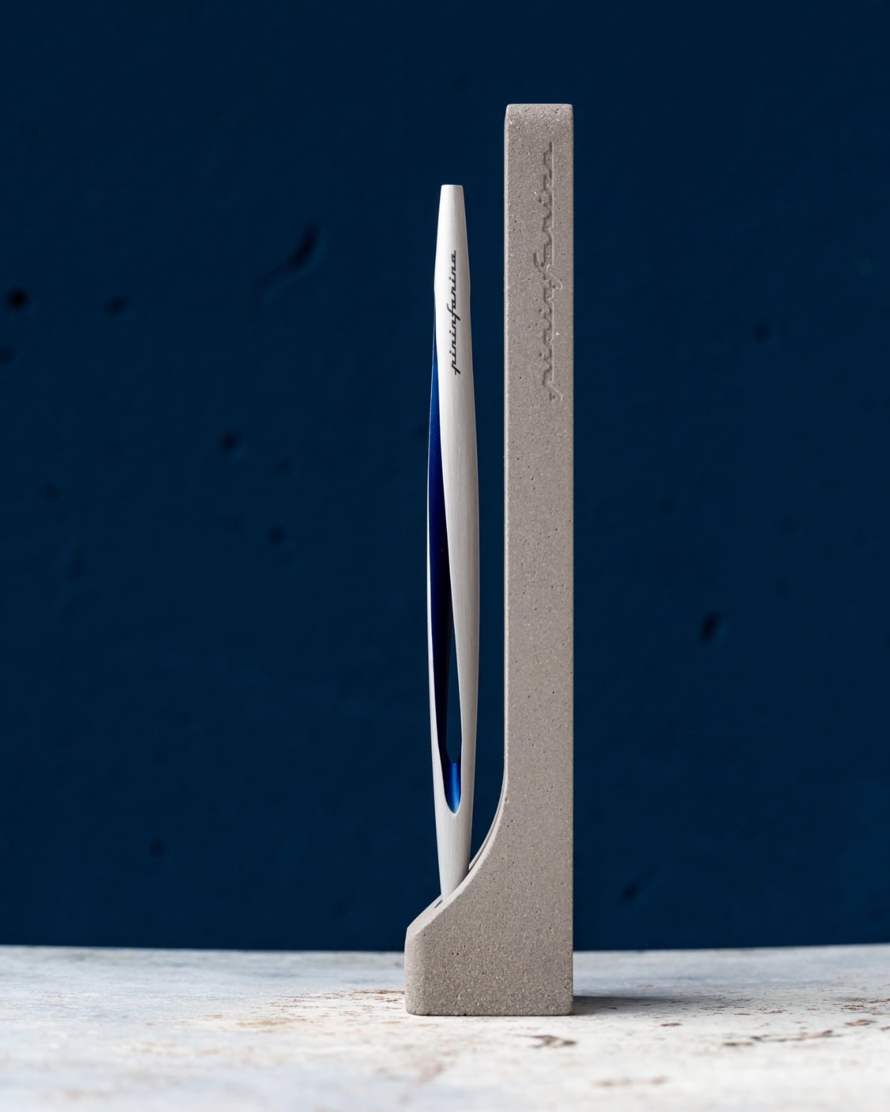
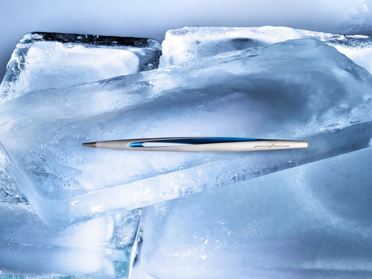
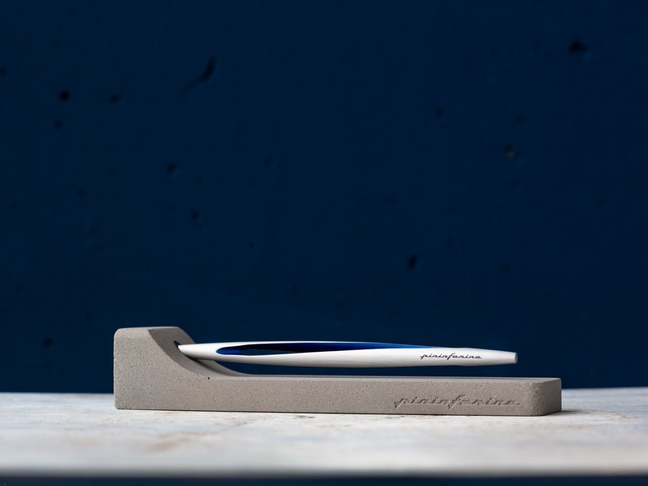
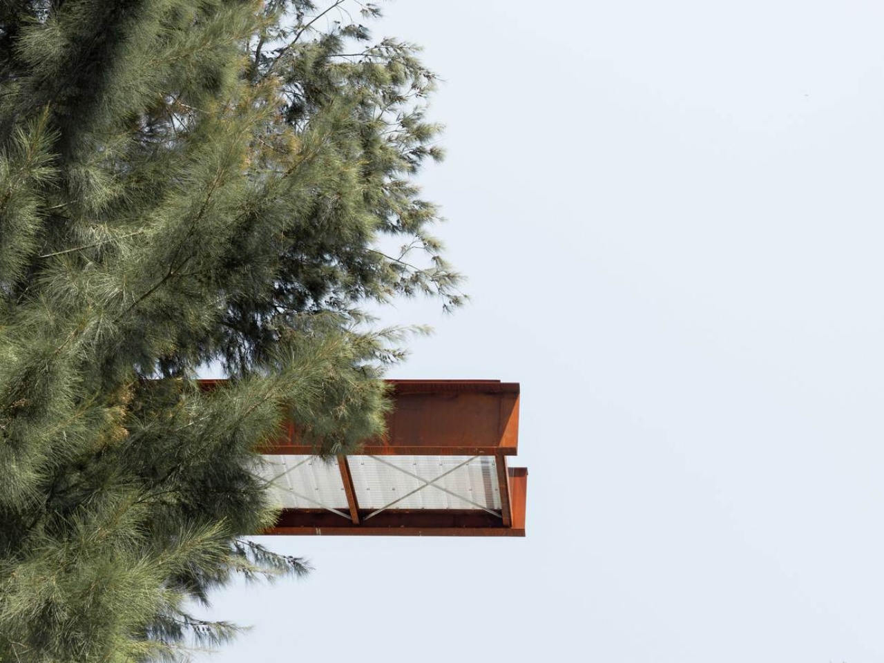
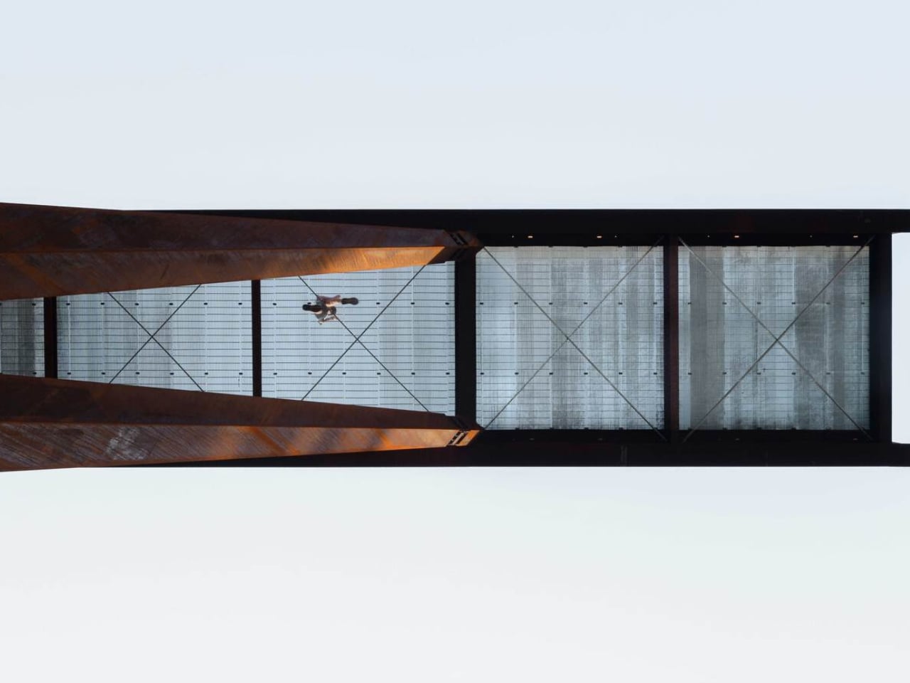
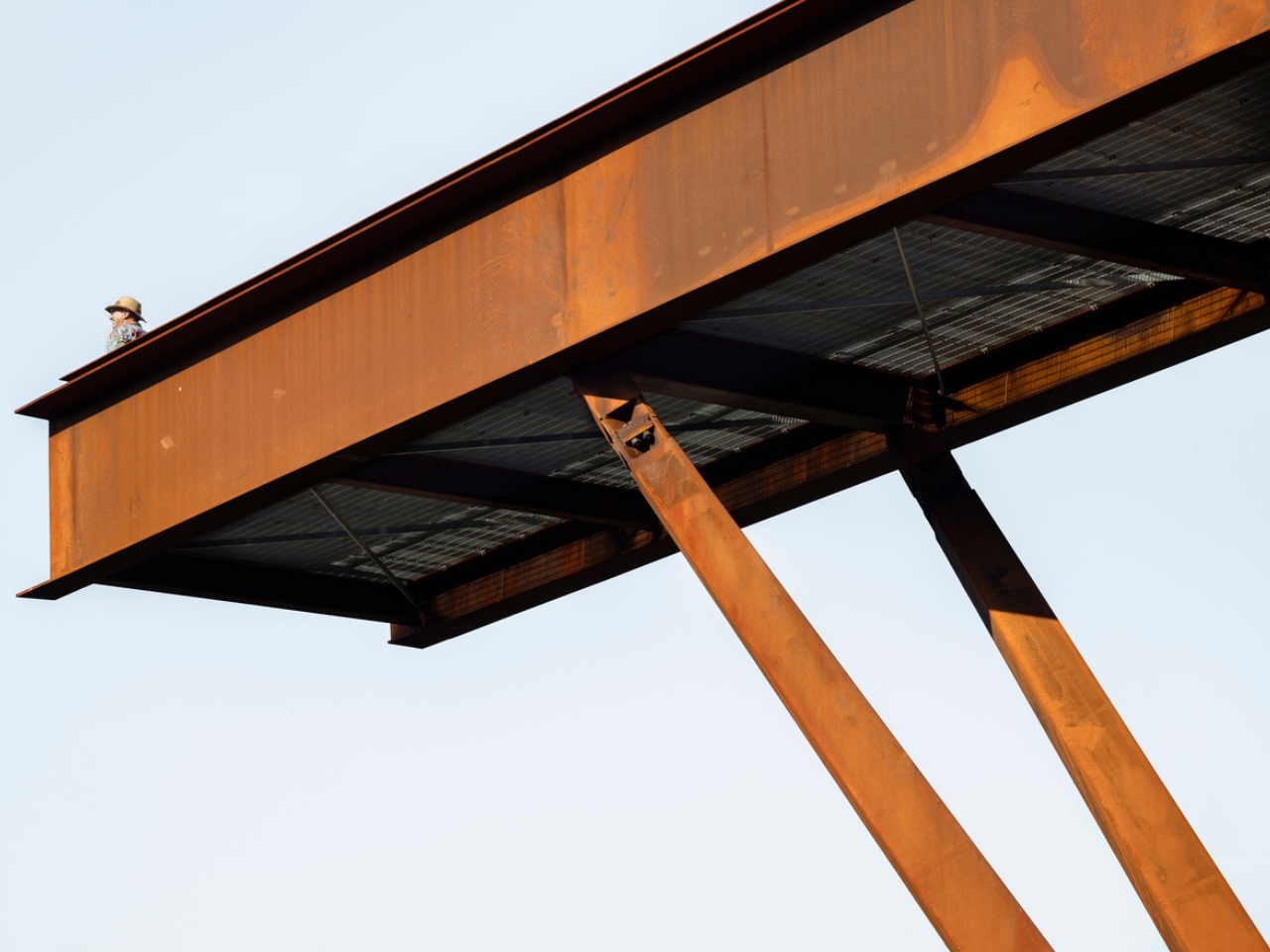
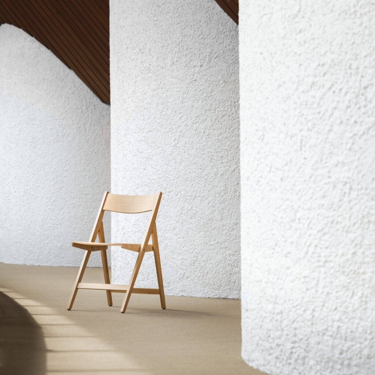
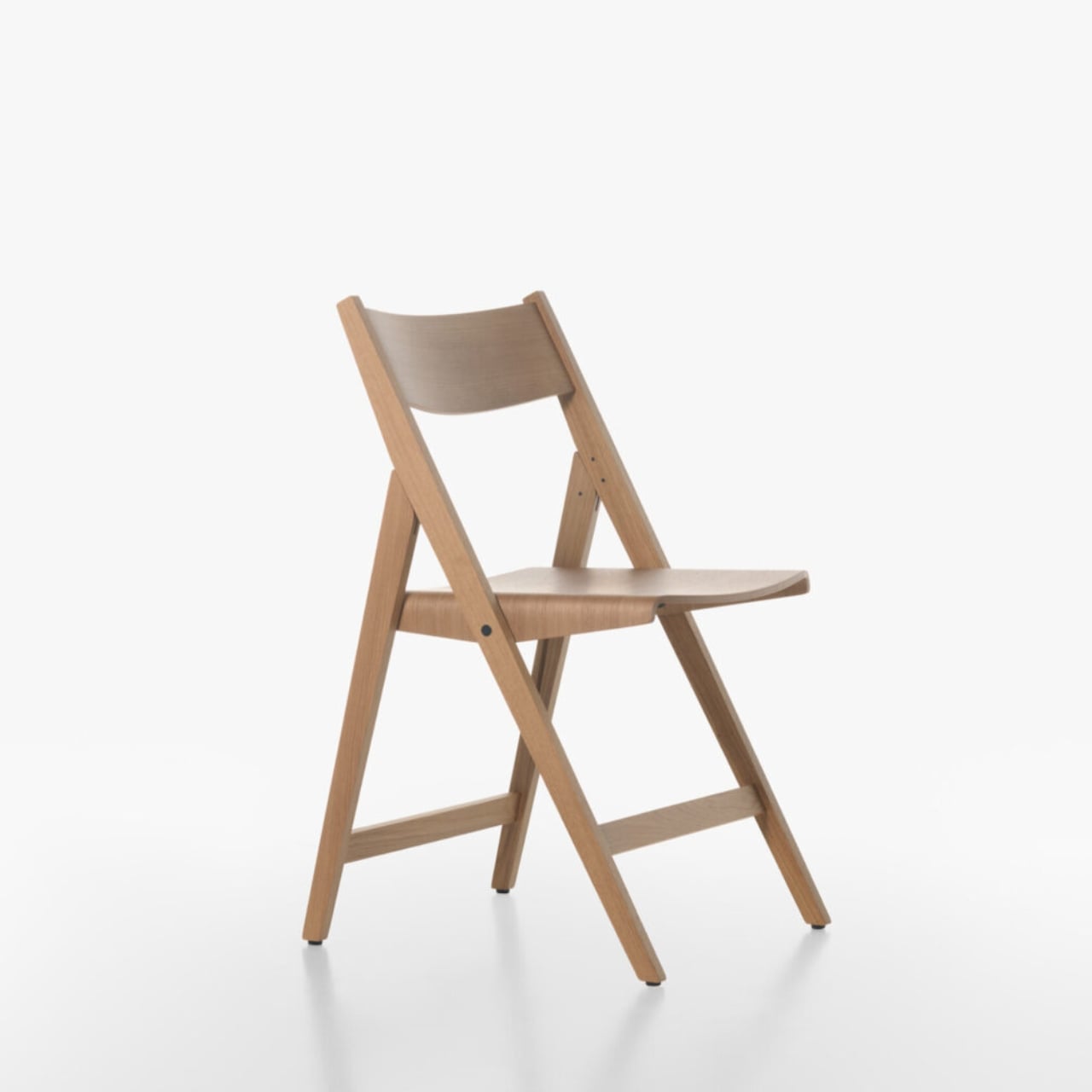
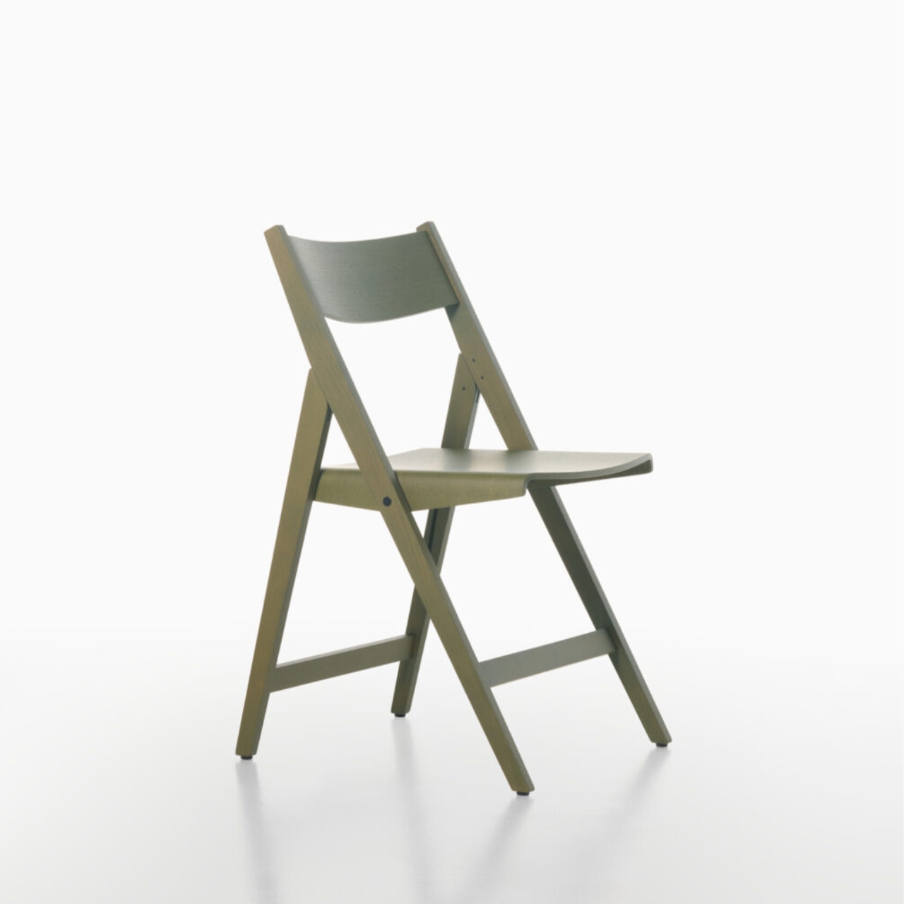
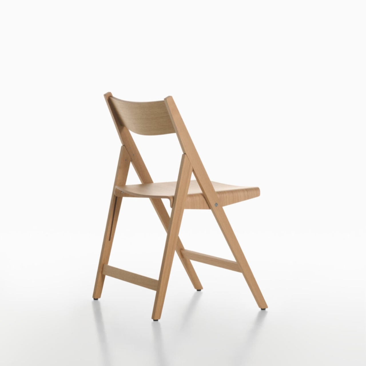
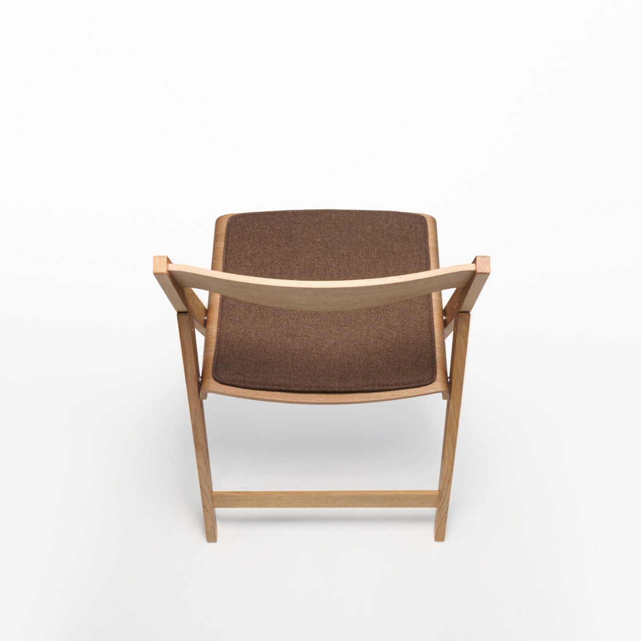
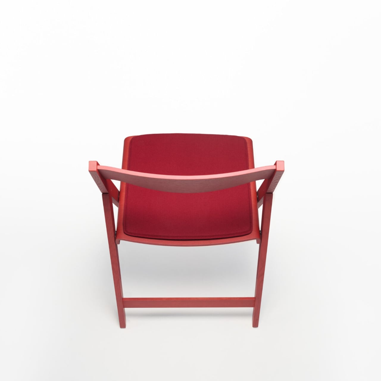
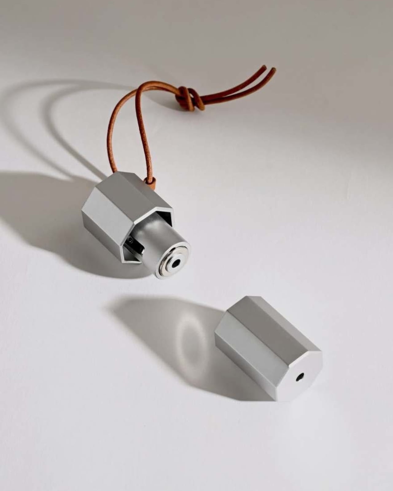
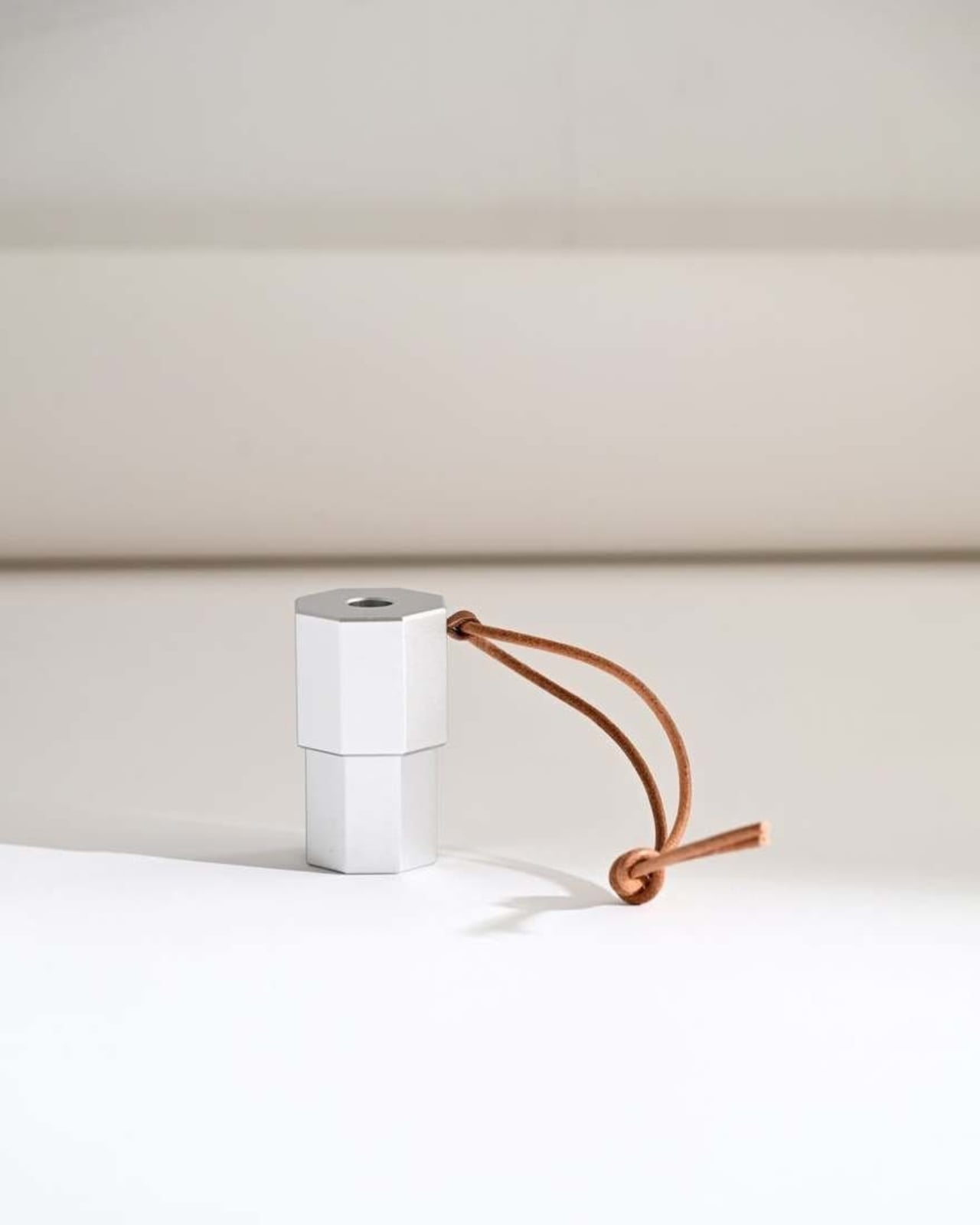
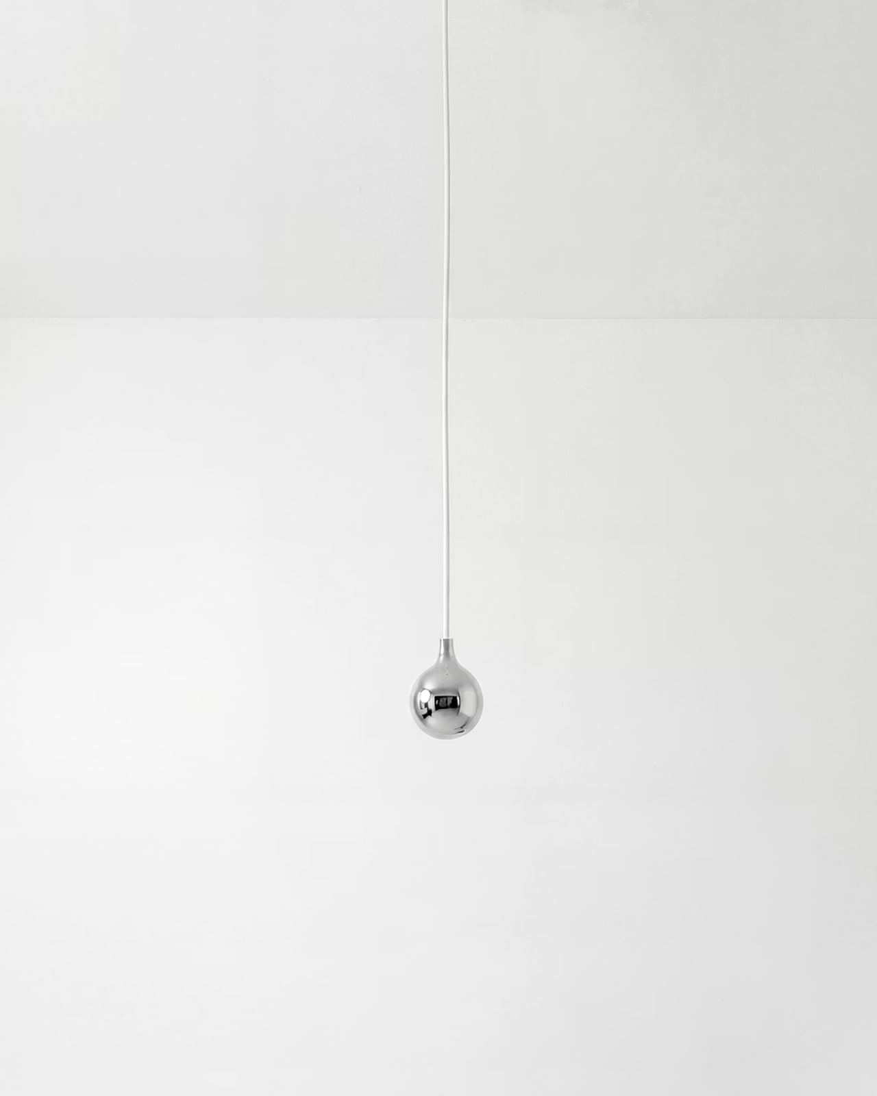
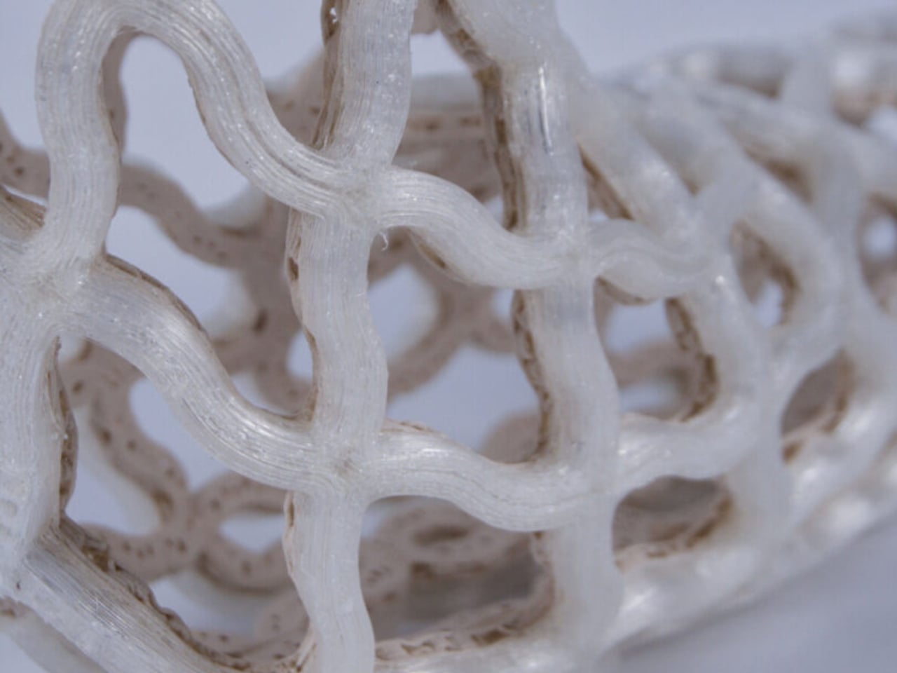
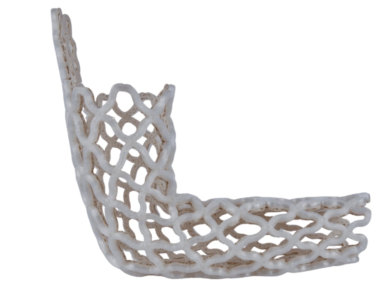
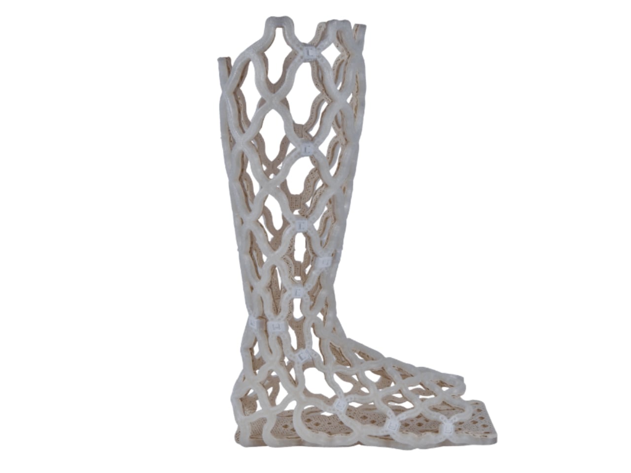
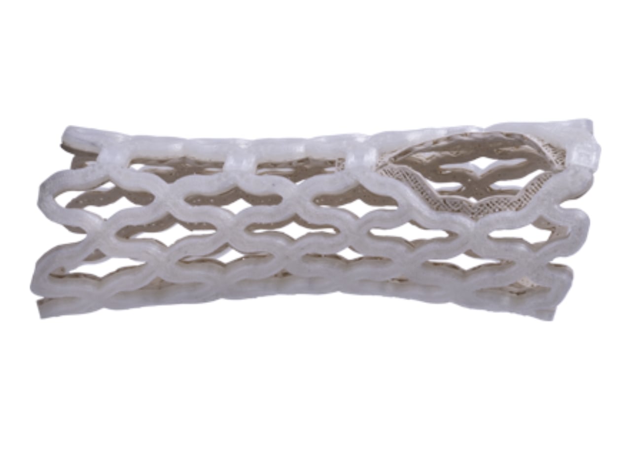
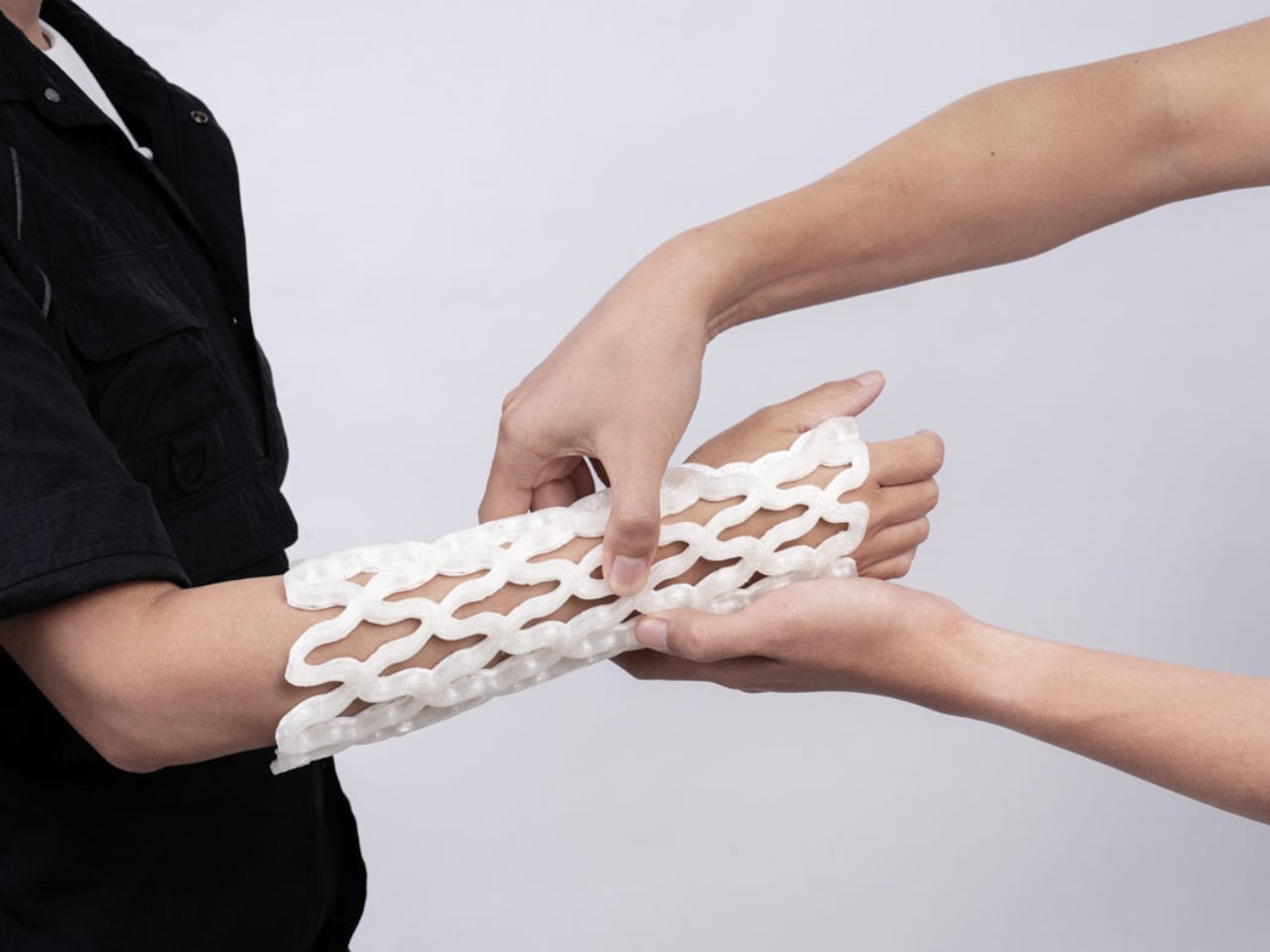
Castomize, a startup out of Singapore, decided to solve it. Their cast, TessaCast, uses what the company calls 4D printing. The terminology is worth pausing on, because it’s easy to assume it’s just marketing language. It isn’t. The fourth dimension here is time. The cast is 3D printed in advance from smart thermoplastic materials, but the real transformation happens at the clinic, when heat is applied. Once warmed, the rigid lattice shell becomes pliable. A clinician wraps it around the patient’s wrist, forearm, elbow, or ankle, clips it into position, and lets it cool. As it hardens, it conforms to the exact shape of that particular limb.

Designer: Castomize

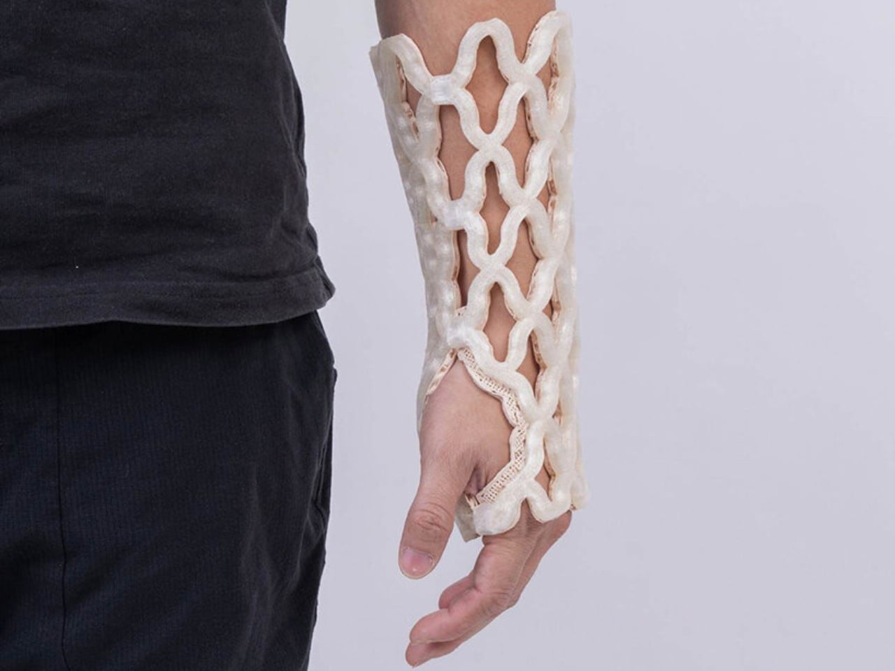
No 3D scan. No casting tape. No plaster dust. The removal process is just as elegant. A simple pin releases the buckles, and the cast slides off. No cast saw, which anyone who has had one used near their skin can tell you is not a small thing. The anxiety of that vibrating blade hovering millimeters from your arm is its own minor trauma, even when you know it won’t cut skin.

Castomize’s design brief reads almost deceptively simple: a cast should hold the body securely while allowing skin to breathe, water to pass through, and clinicians to make adjustments without destroying the device. That sounds obvious when you read it out loud. And yet, until now, no cast on the market had actually delivered on all three at once.

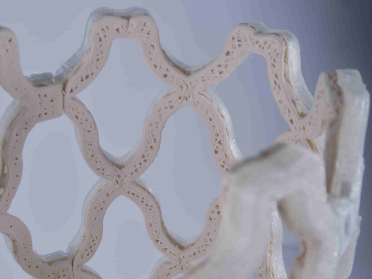
The open lattice structure of TessaCast allows air to circulate continuously against the skin, addressing the itching and sweating that make the traditional cast experience so miserable for patients. It is also fully waterproof. Not water-resistant, waterproof. The team at Castomize notes that it can even be worn while swimming, though they sensibly leave specific medical guidance to clinicians. For anyone who has wrapped a limb in a plastic bag before a shower for weeks on end, this is not a minor feature.

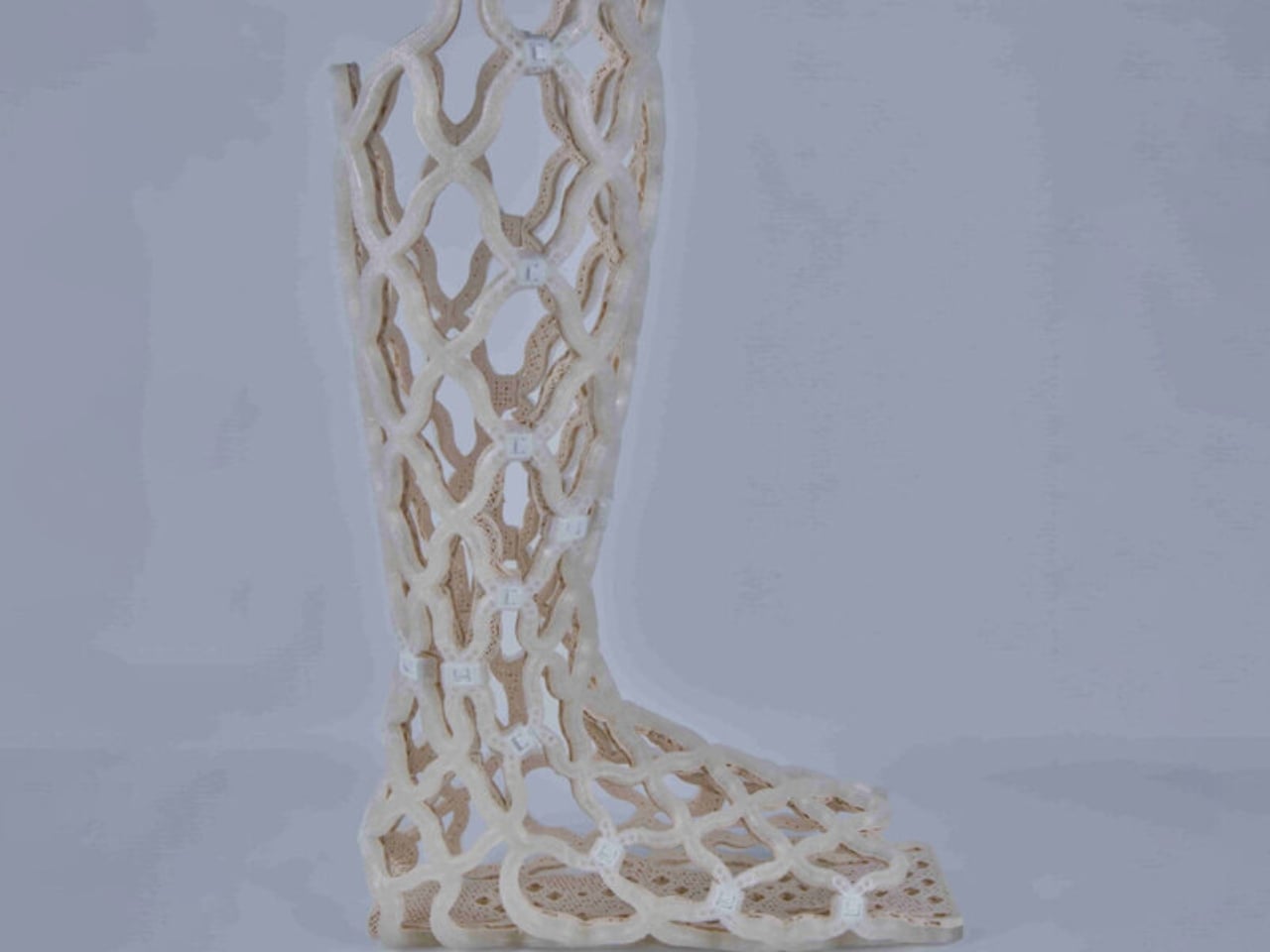
One detail I keep returning to is how this design manages to skip the expensive, time-consuming step of individual 3D scanning. Competitors in the printed cast space often require a custom scan per patient, which raises both cost and complexity. Castomize uses pre-made standard sizes for adults and children that become personalized through the heating and molding process. It’s a smarter workflow, one that clinics can adopt without rebuilding their entire process from scratch.

The startup originated as a student project at the Singapore University of Technology and Design in 2017, which makes its trajectory fairly remarkable. Eleora Teo, Abel Teo, and Johannes Sunarko launched it as a proper company in 2022, and TessaCast reached the market in 2025. It currently holds regulatory approval in Singapore, Australia, South Korea, and Taiwan, with FDA and CE mark applications in progress.

The cost picture is nuanced. TessaCast costs about 30 to 50 percent more to manufacture than a traditional fiberglass cast. But one hospital trial in Singapore recorded average savings of 25 percent overall, because the cast can be reheated and adjusted as the patient heals rather than replaced. Fewer return visits, less material waste, and fewer complications from casts applied too tightly or too loosely all contribute.

The traditional casting process involves ten separate steps and multiple materials, and errors during application can lead to pressure injuries. That’s a significant design failure dressed up as standard practice for a very long time. Castomize has looked at all of it and built something better. The orthopedic cast has been waiting for this moment for a very long time.

The post A 4D-Printed Cast You Can Actually Shower In first appeared on Yanko Design.

Pininfarina’s Forever Pen Needs No Ink, Ever

I’ve spent a lot of time thinking about what makes an object truly worth keeping. Not just useful, but worth keeping. The kind of thing you’d take with you when you move, that earns its place on whatever desk you end up at next, without ever needing to explain itself. The Pininfarina Aero Ethergraf is one of those objects, and the reason it works so well has everything to do with how quietly it dismantles what we think a pen is supposed to be.

Let’s start with the most obvious thing: it has no ink. No cartridges, no refills, no cap to inevitably lose behind a couch cushion. The Aero Ethergraf writes through an Ethergraf® metal alloy tip that works via oxidation, leaving a graphite-like mark on paper through an ancient technique of letting metal trace itself across a surface. The result is a line that is light, precise, and smudge-proof. It doesn’t bleed through paper. It doesn’t dry out when left uncapped. And it never runs out, which is either deeply satisfying or slightly unnerving, depending on how much you’ve spent on fountain pen ink over the years.

Designer: Pininfarina

Pininfarina, for the uninitiated, is the Italian design house responsible for some of the most iconic automotive silhouettes ever made, including decades of Ferrari and Maserati bodies. Their design language has always been about the line: a single, confident stroke that communicates both speed and restraint at once. You can see that same philosophy in the Aero. The body is aerodynamic in a way that feels earned rather than decorative. Crafted from aerospace-grade aluminum, it weighs 17 grams and measures 160mm in length, and it sits in the hand with a kind of quiet, intentional presence.

The pairing with the raw concrete stand is where the design story gets genuinely interesting to me. Concrete is heavy, permanent, and entirely unpretentious. It doesn’t try to impress you. Placed beside the precision-machined aluminum of the pen body, the contrast is deliberate and considered. One material is ancient and rough. The other is modern and precise. Together, they say something about the object’s relationship with time, and that feels like a very intentional editorial choice on Pininfarina’s part.

Most writing tools are built around the assumption of disposability. You use them, you lose them, you replace them. The Aero Ethergraf operates from an entirely different premise. It assumes you want to keep it. It assumes that the act of writing is not just a task to check off but a gesture with some weight behind it. Whether you’re signing something important, sketching an idea before it disappears, or just making a note to yourself at the end of a long day, the pen makes you feel like the action matters. That shift in expectation is subtle, but once you notice it, it’s hard to go back.

I’ll be honest about who this is for: there is a specific kind of person this appeals to, and I’m perfectly comfortable being that person. If you are deliberate about the objects around you, if the pen on your desk says something about how you approach your work, if you believe that design is never purely aesthetic but always also philosophical, then the Aero Ethergraf was made with you in mind.

It is also, genuinely, a beautiful thing to look at. The blue accent running along the aluminum body catches light the way a car door does at the right angle, which makes sense given the studio behind it. Sitting in its concrete cradle on a desk, it reads less like an office supply and more like a considered piece of sculpture.

Made in Italy, handcrafted, built to last without maintenance, and rooted in a technique far older than the ballpoint pen as we know it, the Pininfarina Aero Ethergraf is a quiet argument for choosing objects with intention. Not because they’re expensive or rare, but because some things genuinely deserve to stay.

The post Pininfarina’s Forever Pen Needs No Ink, Ever first appeared on Yanko Design.

MAD Just Opened a 46,000 sqm Silver Cloud Museum in China

When we covered the Hainan Science Museum back in 2024, it was still a promise on renderings. The images showed a billowing silver form rising above a tropical wetland, and the honest reaction was: is this actually going to get built? It looked too cinematic, too untethered from the logic of real construction. It’s open now. And it looks almost exactly like the renders promised.

The museum sits on the edge of Wuyuan River National Wetland Park on the west coast of Haikou, in China’s Hainan Province, designed by Ma Yansong and MAD Architects. The shimmering silver exterior is made up of 843 individual pieces of fiberglass-reinforced plastic, fitted together to create a form that ripples and spirals upward like a thermal updraft. That is quite literally the design reference: the movement of warm air rising from the earth’s surface. From a distance, the structure reads as a cloud that materialized above the jungle. Up close, the seams and surface geometry become visible, but it doesn’t break the spell. It deepens it. The material choice matters too. The reflective quality of the panels shifts depending on light and weather, which means the building never quite looks the same twice.

Designer: MAD Architects

The interior is where things get genuinely impressive. The main structure is column-free, which is a structural achievement worth acknowledging on its own. The total building area is approximately 46,528 square meters. Visitors move through the museum via a spiraling ramp that ascends from the central hall across five floors, with the exhibition experience beginning at the top level on a 360-degree viewing platform with open views of both the sea and the city below. A skylight dome floods the central atrium with natural light, and the whole space feels deliberately open and unhurried. That matches MAD’s stated philosophy around what a science museum should actually feel like. As Ma Yansong put it: “A science museum is about education and imagining the future; we want nature to be part of that vision as well.”

That quote is worth sitting with. Science institutions have historically been designed to feel authoritative. Imposing facades, grand columns, marble lobbies. The architecture announces itself as serious and expects visitors to match. MAD is proposing something different: that curiosity and wonder are better triggered by a space that already inspires both. The science content doesn’t need to be communicated through the building itself; the building just needs to make you feel open to receiving it. Whether you fully buy into that idea philosophically, you can’t argue that the Hainan Science Museum fails to create a mood before you’ve even stepped inside.

The building is also elevated off the ground, which allows the wetland landscape to continue flowing underneath it. That relationship between the structure and the site feels considered rather than incidental. It prevents the building from swallowing its environment whole, which matters here given that the natural setting is precisely what the whole project is in conversation with. Standing underneath it, the ground remains soft, green, and alive. For a structure this visually assertive, it sits lightly in a way that isn’t easy to pull off.

This is MAD’s second major public project in Hainan, following the Cloudscape of Haikou, which opened back in 2021. Together, they’re beginning to form a kind of visual language along the Haikou coastline, a series of dreamlike structures that feel more like environmental installations than civic buildings. For a city actively building its identity within China’s free-trade port framework, having work like this on the waterfront is a deliberate cultural statement about where Haikou wants to stand on the global stage.

Design began in 2020. Groundbreaking was in 2021. The main structure wrapped in 2023. Five years from concept to opening doors is a reasonable arc for a project of this ambition and scale. Seeing it finally receive visitors closes a loop that many who followed its construction had been waiting for. Sometimes the renders really do deliver. This is one of those times.

The post MAD Just Opened a 46,000 sqm Silver Cloud Museum in China first appeared on Yanko Design.

Sydney Just Opened a 42-Metre Steel Lookout Over a Former Quarry

If you told me a 42-metre platform made of weathering steel, suspended over a former rock quarry, would be one of the most compelling pieces of public architecture right now, I’d say I believe you completely. The Southern Lookout at Hornsby Park in Sydney is exactly that. And it is worth every bit of attention it’s getting.

Designed by AJC Architects in collaboration with Clouston Associates, the structure sits on the northern edge of Sydney, overlooking the dramatic topography of Hornsby Quarry. The site itself has a remarkable backstory. For over a century, the quarry was completely inaccessible to the public. A place that had been carved out and worked, left to become something between ruin and wilderness, invisible to the city that had grown up around it. The Southern Lookout is the first completed architectural piece of a much larger 60-hectare landscape masterplan. It is, in the most literal sense, an opening.

Designer: AJC Architects

The choice of weathering steel is the first thing that makes you stop and think. Cor-Ten, as it’s commonly known, is a material that rusts deliberately. It forms a stable oxidized layer on its surface that protects the steel beneath while giving it that signature warm, amber-brown tone. It is a material that ages visibly and honestly, and for a project like this one, placed on the edge of a quarry whose story is entirely about time and transformation, it feels less like a design decision and more like a point of view.

The platform runs 42 metres through the forest canopy, anchored into the embankment and balanced on four angled columns that converge on a single central footing below. That minimalism is intentional. The architects worked specifically to keep ground disturbance on the sensitive slope to a minimum. The result is a structure that feels both bold and careful, which is a hard balance to get right, and one AJC Architects manages convincingly.

Walking it is designed to be as much of an experience as looking at it. The rhythmic sound of footsteps on the metal, the glimpses of the falling topography beneath one’s feet, the steady build of height as you move further along the platform create a physical connection to the sheer scale of the man-made canyon. Every design choice is oriented toward making you feel exactly where you are. That kind of sensory engagement is something the best public infrastructure delivers and so rarely does. Most walkways just take you somewhere. This one makes you reckon with the place itself.

The entrance is framed by steel portals and gabion stone walls, the kind of raw structural language that references the quarry’s industrial character without cosplaying it. It doesn’t try to look cute or approachable. It looks like something that belongs to the site. That restraint is refreshing at a time when so many public design projects err on the side of spectacle for its own sake.

The broader context matters here too. The Southern Lookout is the inaugural phase of an ambitious plan to open Hornsby Quarry up as a 60-hectare public park. That kind of urban regeneration project usually moves at a pace that frustrates everyone involved, so the fact that this lookout is already open, already drawing visitors, already giving people a reason to show up, feels like a meaningful start rather than a placeholder.

AJC Architects, working in collaboration with Hornsby Shire Council, has delivered something that respects the complexity of the site without over-explaining it. The architecture doesn’t lecture you about the quarry’s history. It simply places you inside it. It gives you the height, the steel, the sound, the view, and leaves you to do the thinking.

Public architecture at its best creates a relationship between a person and a place they might not have noticed otherwise. The Southern Lookout does exactly that. Sydney has always had dramatic natural geography. Now, at the edge of a former quarry, it has something that finally lets you see it.

The post Sydney Just Opened a 42-Metre Steel Lookout Over a Former Quarry first appeared on Yanko Design.

Japan Just Built a Pokémon Footbath and It’s Genuinely Moving

When you hear “Pokémon footbath,” your brain probably goes one of two places: either immediate delight or mild confusion. Both reactions are fair. But when you actually see what just opened in the small coastal town of Wakura Onsen in Nanao City, Japan, the response tends to land somewhere more unexpected than either. It lands in quiet, genuine warmth.

The Wakura Pokémon Footbath officially opened on May 12 inside Yuttari Park in Ishikawa Prefecture, and it is exactly what it sounds like: a public footbath surrounded by beloved Water-type Pokémon. Gyarados towers over the soaking pool, appearing to blast water in with its Hydro Pump. Psyduck perches nearby, looking stressed as always. Vaporeon, Pikachu, Poliwag, Poliwhirl, and Quaxly are scattered throughout the wooden structure, each one in character, each one impossibly charming. The facility is free to use and open daily from 7 AM to 7 PM, though it may close depending on weather conditions.

Designer: Wakura Onsen

From a pure design standpoint, it works. The Pokémon figures feel integrated into the space rather than slapped onto it as an afterthought. The Gyarados placement especially is clever: positioning a creature historically associated with destruction as the one filling a community wellness space with warm water is a quietly subversive design choice. It takes a familiar icon and gives it a new job, and the whole thing is better for it. Good character-led design usually does this. It finds the emotional logic of the IP and builds something genuinely functional around it, instead of just stamping a logo on a wall and calling it a day. The wooden structure keeping everything together also helps ground the Pokémon elements in something tactile and traditionally Japanese, which keeps it from reading as pure merchandise and more as a genuine place to be.

But the design story here is only part of the picture. What elevates the Wakura Pokémon Footbath beyond a cute novelty is the context surrounding it. Wakura Onsen is still recovering from the 2024 Noto Peninsula earthquake, which caused major damage to local tourism infrastructure. The footbath was renovated and developed through a collaboration between Nanao City and the Pokémon With You Foundation, an organization that has long used Pokémon’s reach to support communities facing hardship. Local officials are hoping the new attraction will draw visitors back to a region that urgently needs them. On opening day, a dedication ceremony was held, and children from a local nursery school were among the first to try it out.

That detail matters. It reframes the entire project. A giant Gyarados shooting water into a hot spring pool is fun in isolation. A giant Gyarados shooting water into a hot spring pool in a community rebuilding after a disaster, inaugurated by children experiencing something joyful, is a different kind of story. It is design as care. It is pop culture as infrastructure.

I think we underestimate how much deliberate playfulness can do for a place in recovery. A footbath is not a hospital. It is not a new road or a rebuilt building. But public spaces designed to give people a reason to show up, to sit down, to stay a while, do real work. They signal that a place is worth visiting again. That it has something to offer. That life, in some form, is continuing. And sometimes the difference between a place that comes back and one that does not comes down to whether people believe it is worth returning to.

The footbath also ties into the newly installed Pokémon manhole covers placed around Nanao City, part of Japan’s Pokéfuta initiative, which uses collectible Pokémon-themed covers to encourage visitors to explore lesser-known regions. It is a broader ecosystem of soft infrastructure pointing in the same direction: come here, look around, stay awhile.

Wakura Onsen may not be the first destination that comes to mind for a travel itinerary. But a free footbath where a reformed Gyarados keeps your feet warm while Psyduck quietly spirals next to you? That is a genuinely compelling reason to make the trip. And right now, Nanao City could use a few more of those.

The post Japan Just Built a Pokémon Footbath and It’s Genuinely Moving first appeared on Yanko Design.

The Biggest Lord of the Rings LEGO Set Ever Just Dropped

I’ve been a LEGO adult fan long enough to know that the announcement of a new flagship set usually lands with a mix of excitement and skepticism. Is it actually as good as it looks? Is the price justified? Will it sit beautifully on a shelf or just collect dust after a frustrating build? With the newly revealed LEGO Icons 11377, The Lord of the Rings: Minas Tirith, I think most of those questions answer themselves. And as a big Lord of the Rings fan, this has got me over the moon.

Let me set the scene. LEGO has been revisiting Middle-earth for a few years now, giving us stunning sets like Rivendell and Bag End. But Gondor, the seat of kings, the White City with its seven tiered levels built into the slopes of Mount Mindolluin, has been conspicuously absent. Fans noticed. They talked about it constantly. And now, LEGO has delivered not just a Gondor set, but the biggest Lord of the Rings set ever made, clocking in at 8,278 pieces.

Designer: LEGO

That number matters, but not just as a flex. It represents the sheer architectural complexity that Minas Tirith demands. The city isn’t a simple castle or a cozy hobbit hole. It’s a vertical metropolis layered with history and cinematic weight. To do it justice in brick form requires ambition, and LEGO clearly brought it.

The design approach is where this set separates itself from anything in the LEGO LOTR lineup before it. It’s a hybrid-scale model, meaning the exterior reads as a gorgeous microscale city with all seven rings of the White City rendered in sweeping, detailed stonework, while the interior opens up to minifigure scale, complete with the grand throne room of the citadel. That’s not a gimmick. That’s genuinely clever design thinking that solves a real creative problem: how do you capture both the epic scale of the city and the human drama that happens inside it? Apparently, you do both at once.

The minifigure lineup is also worth talking about. LEGO fans have had Frodo, Gandalf, and assorted Fellowship members for years. But characters tied specifically to Gondor, like Denethor, Faramir, and the Soldiers of Gondor, are appearing in LEGO form for the very first time. For collectors, that alone justifies serious attention. Aragorn as King Elessar, Arwen, Pippin, and even Shadowfax round out a roster that feels like a genuine celebration of the films’ later chapters rather than a rehash of the same familiar faces.

The no-sticker policy is a small detail that makes a big difference. Every decorated element on this set is printed. If you’ve ever wrestled with a sticker sheet at the end of a long build only to apply it slightly crooked and spend the next three years quietly furious about it, you’ll understand why this matters. It signals that LEGO treated this as a premium release, not just another box on the shelf.

At $649.99, this is clearly not an impulse buy. It’s a considered purchase, the kind you plan for and look forward to. But when you break it down to roughly 7.8 cents per piece for a set of this complexity and cultural weight, the value argument holds up better than you’d expect. It’s also the sort of build that rewards patience, with the LEGO Builder app offering 3D rotation, zoom, and step-by-step digital instructions to make the process feel guided rather than overwhelming.

LEGO Insiders get early access on June 1, 2026, with general availability following on June 4. Early buyers will also receive the exclusive Grond GWP, the massive battering ram from the Battle of Pelennor Fields, while supplies last. That’s a thoughtful bonus that adds real narrative context to the display.

Minas Tirith has always been one of cinema’s most iconic pieces of production design. The fact that you can now own a version of it, built brick by brick with your own hands and displayed at nearly 24 inches tall, feels like the kind of thing that would have seemed impossible not long ago. LEGO made it real, and it looks like they did it right.

The post The Biggest Lord of the Rings LEGO Set Ever Just Dropped first appeared on Yanko Design.

PLANK Made a Folding Chair You’d Never Want to Put Away

Folding chairs have a reputation problem. For most of us, they conjure up images of bare banquet halls, plastic legs scraping across gymnasium floors, or that wobbly stack in the back of a relative’s garage. They are furniture by necessity, not by choice. So when a design studio manages to make one that you’d genuinely want to keep out in your living room, it’s worth paying attention.

That’s exactly what PLANK and designers Matteo Thun and Benedetto Fasciana have done with the Theo folding chair, quietly one of the most interesting pieces to come out of Salone del Mobile Milano 2026 this past April. Not because it does something shocking or avant-garde, but because it does something much harder: it makes the utilitarian feel considered.

Designers: Matteo Thun and Benedetto Fasciana for PLANK

PLANK has been at this since 1953, and that legacy shows in how Theo is built. The frame is solid oak, which already puts it in a different category from the folding chairs most of us know. The seat and backrest are made from molded plywood, shaped with a gentle curve that reads as both ergonomic and graceful. The folding mechanism uses natural or black oxidized stainless steel, and it integrates into the structure so cleanly that you almost forget it’s a functional joint and not just a detail. The chair opens and closes without any of the awkward fuss you’d expect. It simply works, and it looks good doing it.

I’ve always believed that the real test of a design isn’t how it performs in ideal conditions but how well it disappears into a life that isn’t perfectly curated. Most furniture is designed with a room in mind. Theo was designed with reality in mind. It’s built for contract spaces, meaning restaurants, event venues, conference rooms, places where chairs get used hard and stored constantly. But the visual language doesn’t give that away. If you didn’t know, you’d assume it was a permanent resident of whatever room it happened to be in.

The finish options only add to that versatility. You can get Theo in natural or stained oak veneer, or in a matte open-pore lacquer in Walnut, Brown Red, Olive Green, or Black. Each feels deliberate rather than decorative. The seat cushion options go even further: a 100% wool Moessmer Dolo Loden fabric in four colors, or Dani Florida leather in 96 colors. That last number sounds excessive until you realize it’s actually kind of brilliant. It’s the difference between a chair that fits into a space and one that was made for it.

There’s also a companion Transport Trolley that was developed alongside Theo, designed to stack and move up to eight chairs at once. It’s a practical addition that rounds out the system nicely, especially for the hospitality and event sectors where Theo will likely see the most use. But even outside those contexts, the Trolley signals something important about how PLANK approaches design: everything has to work together, not just look good in isolation.

Matteo Thun is no stranger to pieces that carry a quiet authority. He’s had a long career built on the idea that good design should be sustainable, functional, and beautiful in equal measure, and Theo reflects all three. The fact that PLANK uses solid wood and always-recyclable materials isn’t incidental. It’s the whole point. Longevity is designed in from the start, not marketed as an afterthought.

What makes Theo genuinely compelling is how little it asks of you. It doesn’t demand a particular aesthetic or a specially styled room. It doesn’t need to be the centerpiece. It can be stacked in a closet and brought out for dinner parties, or it can live at the head of a table year-round, and it holds up either way. That’s a rare quality in furniture, and it’s even rarer in a folding chair.

The best designs tend to solve problems you didn’t realize had elegant solutions. Theo is a folding chair that looks like it was never trying to be anything else, and that, more than any other detail, is the thing that makes it worth talking about.

The post PLANK Made a Folding Chair You’d Never Want to Put Away first appeared on Yanko Design.

A Pencil Sharpener Inspired This Brilliant Camping Cutlery Tool

There are probably times when you’re in desperate need of chopsticks when you’re camping out or somewhere where you don’t have access to it. Well apparently now you’ll be able to make your own, as long as there are pieces of wood around you. I’ve seen a lot of clever camping gear over the years, but the Chopsticks Maker by Mario Tsai stopped me mid-scroll in a way most design objects don’t. It’s such a simple idea that you almost feel embarrassed for not thinking of it yourself.

The concept is exactly what it sounds like. The Chopsticks Maker is a miniature portable tool that lets you carve chopsticks out of twigs found at a campsite. You feed a stick into the device, turn it, and out comes a pair of chopsticks, shaped and ready to use. You eat your meal, leave the utensils on the ground, and they biodegrade. No waste, no washing up, no plastic rattling around at the bottom of your pack. Just a tiny tool, the forest floor, and dinner.

Designer: Mario Tsai

What makes the design particularly satisfying is where Tsai found his inspiration. The Chopsticks Maker is a direct reinterpretation of the humble pencil sharpener. That’s a beautiful design move. The pencil sharpener is one of those objects so ordinary it’s practically invisible, and yet its mechanics are perfectly suited to transforming a raw stick into something shaped and functional. Tsai took that overlooked tool and asked what else it could do. The answer turned out to be surprisingly elegant.

Tsai is a Shanghai-based industrial designer known for work that tends to be thoughtful rather than flashy. The Chopsticks Maker was presented at Milan Design Week 2026, where it appeared as part of a broader project exploring chopsticks as cultural objects. The project borrowed its guiding philosophy from the old proverb: give a man a fish and you feed him for a day, teach a man to fish and you feed him for a lifetime. The Chopsticks Maker reframes that idea around something as basic as cutlery. You don’t need to pack utensils. You just need to know how to make them.

That principle, self-reliance through tools rather than stuff, is quietly radical in a market flooded with gear that promises to solve every outdoor problem by adding more weight to your bag. The best camping products I’ve come across are the ones that give you a skill or a method, not just a gadget. The Chopsticks Maker fits that description well. It’s lightweight, it requires nothing except whatever the ground around you offers, and the byproduct, the wood shavings, can even double as kindling for starting a fire. Someone spotted that in the comments when the project was shared online, and it’s the kind of observation that makes a well-considered object feel even more complete.

I’ll admit there’s a practical question hanging over it. Not every campsite offers the right kind of wood. Hardwood twigs will produce sturdier chopsticks; softer, pithy stems might not hold up mid-meal. And chopsticks do require some coordination. I can imagine plenty of people trying this out for the first time around a campfire and spending more time chasing noodles than eating them. But that’s also kind of the point, isn’t it? Part of what makes outdoor cooking memorable is the improvisation, the slight inconvenience, the small triumph of a meal made with whatever you had on hand.

The Chopsticks Maker doesn’t pretend to replace your fork. It offers a different relationship with the tools you eat with, one that’s rooted in resourcefulness rather than convenience. And at a moment when the outdoor industry keeps defaulting to titanium and synthetic and ultra-engineered everything, a device that points you back toward a tree branch feels like a genuine statement.

It also says something interesting about design itself. The best ideas don’t always come from inventing something new. Sometimes they come from looking at an object that’s been sitting on your desk since primary school and asking what it might become. Mario Tsai looked at a pencil sharpener and saw cutlery. That’s the kind of thinking that tends to produce work worth paying attention to.

The post A Pencil Sharpener Inspired This Brilliant Camping Cutlery Tool first appeared on Yanko Design.

MIT Turned 12 Labubu Heads Into a Robot and It’s Watching You

Nobody told MIT grad students to build a rolling sphere covered in twelve Labubu faces. They did it anyway, and now the rest of us have to sit with that. The project is called Labububot, and it comes from three graduate students at the MIT Media Lab: Miranda Li from the Personal Robots group, and Jake Read and Dimitar Dimitrov from the What’s Taking Form group. Together, they took the internet’s favorite ugly-cute collectible, multiplied it by twelve, and fused everything into a single spherical body that rolls around following people through hallways. The official description calls it “one of the rarest monsters on Earth,” and that phrasing alone tells you everything about the tone the team was going for.

The design is not subtle. Twelve identical Labubu faces stare outward from every angle simultaneously. When the thing moves, it does so with that particular brand of slow, deliberate motion that robots somehow always use when they want to feel unsettling. The MIT team leans into every bit of that discomfort, which is exactly what separates Labububot from most social robotics research you’ll come across.

Design: MIT Media Lab

Social robots usually chase approachability. They get rounded edges, pastel palettes, and soft digital expressions designed to lower your guard on contact. The whole field runs on the logic that comfort builds connection, and most research in this space reinforces that assumption without questioning it much. Labububot rejects that premise entirely. It is meant to provoke a reaction before it earns one, and the reaction it tends to get first is somewhere between amusement and mild dread. That’s a deliberately chosen emotional space, and it works.

The Labubu connection makes this sharper than it might otherwise be. The original toy built its following on a very specific kind of ugly-cute tension. It’s not conventionally adorable. It has sharp teeth, wide eyes, and a design that sits right at the border of charming and unsettling. That’s precisely why it resonated. The blind-box format added a layer of collector obsession on top, and after BLACKPINK’s Lisa was seen collecting them, the whole thing escalated into cultural phenomenon territory fast. The fact that it already carried that complicated emotional charge before MIT ever touched it makes the robot version feel like the natural next step, even if nobody saw it coming.

Scaling that same energy up to twelve faces on a rolling robot body is not an accident. The MIT team is clearly aware of what they’re working with. The official framing pitches Labububot as a “playful critique of social robots” and poses a question worth taking seriously: what do the monsters we make reveal about the monsters we are? For a project built around a pop culture collectible, that’s a surprisingly direct line of inquiry. It doesn’t answer the question so much as roll it directly toward you and wait.

The timing adds another dimension. Labubu started as a toy, became a fashion accessory, turned into a resale market, and has now arrived at experimental robotics research inside one of the most prestigious institutions on the planet. That arc is completely absurd and also perfectly logical if you’ve been watching how internet culture compresses timelines. Trends don’t climb ladders sequentially anymore. They collide with things that have no business intersecting, and occasionally the collision produces something genuinely interesting. The path from blind-box collectible to MIT thesis statement is ridiculous, and also makes complete sense.

Labububot will make its public debut this summer as a Grand Challenge finalist at the 2026 International Conference on Social Robotics in London. Moving from the controlled environment of an MIT hallway to a public conference floor is a meaningful shift. Real audiences bring expectations about what robots should look and feel like, and a twelve-faced Labubu sphere is going to challenge most of those expectations immediately.

Some people will read it as satire. Some will find it genuinely unnerving. A few will want to know if they can buy one. I’m not entirely outside that last group, which tells me the project landed exactly where it was supposed to. Labububot doesn’t ask you to like it. It just follows you down the hall until you decide how you feel.

The post MIT Turned 12 Labubu Heads Into a Robot and It’s Watching You first appeared on Yanko Design.

Alberto Essesi Just Designed the Lamp That Celebrates Mistakes

If you’ve ever assembled furniture, built a shelf, or wired anything with your own two hands, you know the feeling. You step back, you look at your work, and then you see it. That one thing. The screw facing the wrong way. The panel installed backwards. The “how did I miss that?” moment that you either have to fix or quietly learn to live with. Alberto Essesi, an L.A.-based industrial designer, decided to immortalize exactly that feeling, and then turned it into a lamp.

The Oops lamp is precisely what it sounds like. A hanging fixture that, at first glance, looks like something went sideways during installation. The design inverts the expected, which is Essesi’s own phrasing, and it delivers on that premise with clean, understated confidence. It doesn’t shout. It doesn’t over-explain itself. It just makes you look twice, register the joke, and then probably smile.

Designer: Alberto Essesi

Look at it long enough and the concept becomes delightfully clear. A slender, glowing rod descends from a ceiling mount, warm light running its full length like a lit fuse. At the very bottom sits a polished chrome globe, round and reflective, the universal shape of a light bulb. Except the globe isn’t glowing. The rod is. The light is coming from exactly where you wouldn’t expect it, and the bulb, the part that’s supposed to be the whole point, is just sitting there at the bottom looking beautiful and slightly confused. That’s the joke. That’s also, somehow, the most elegant part of the entire object.

The chrome finish on the globe isn’t incidental. It picks up the amber warmth of the glowing rod above it and bounces it softly into the room, so the globe contributes light without technically being a light source. It’s a small design decision that could have easily been an afterthought, but it ends up being one of the most considered details in the whole piece. The lamp works as a room object even before you process the humor in it.

Essesi has said this idea has been rattling around in his head for years. “This has been an idea I’ve had for a few years and always laugh when I think about it,” he shared when unveiling the design. That kind of creative patience is rare, and it shows in the final execution. The Oops lamp doesn’t feel rushed or gimmicky. It feels like exactly the right amount of thought went into it, no more, no less. Sometimes a concept just needs time to ripen before it’s ready to exist in the world.

Design humor is genuinely hard to pull off. Most attempts either try too hard or land too soft. The joke gets buried under layers of irony, or it gets explained to death until any charm it originally had is long gone. The Oops lamp sidesteps all of that. The humor is baked into the form itself. You don’t need a placard or a press release to get it. You just get it. That’s the mark of a strong design concept: the idea communicates itself without any assistance.

Essesi didn’t reach for something ornate or architecturally complex to subvert. He took the most ordinary object and made one small, deliberate deviation from it. That restraint is what makes the whole thing work. The joke only lands because the rest of the design plays it completely straight. The rod is precise. The globe is perfectly spherical. The ceiling mount is minimal and clean. Every element is serious, which makes the absurdity of the overall form land even harder.

A large version has also been added to the mix, which tells me Essesi is taking this seriously as a product concept and not just a portfolio piece. No production plans have been officially confirmed yet, but that feels like a matter of when rather than if. A design this instantly readable and this universally relatable has a built-in audience. People are genuinely tired of objects that require context. They want things that communicate the moment they enter a room.

That’s the real conversation the Oops lamp is opening. It’s a small but clear reminder that good design doesn’t have to be earnest all the time. It can have a point of view. It can be a little funny. A lamp named Oops, made by a designer who let the idea sit for years until it was truly ready, might be the most quietly optimistic object to come out of this year.

The post Alberto Essesi Just Designed the Lamp That Celebrates Mistakes first appeared on Yanko Design.