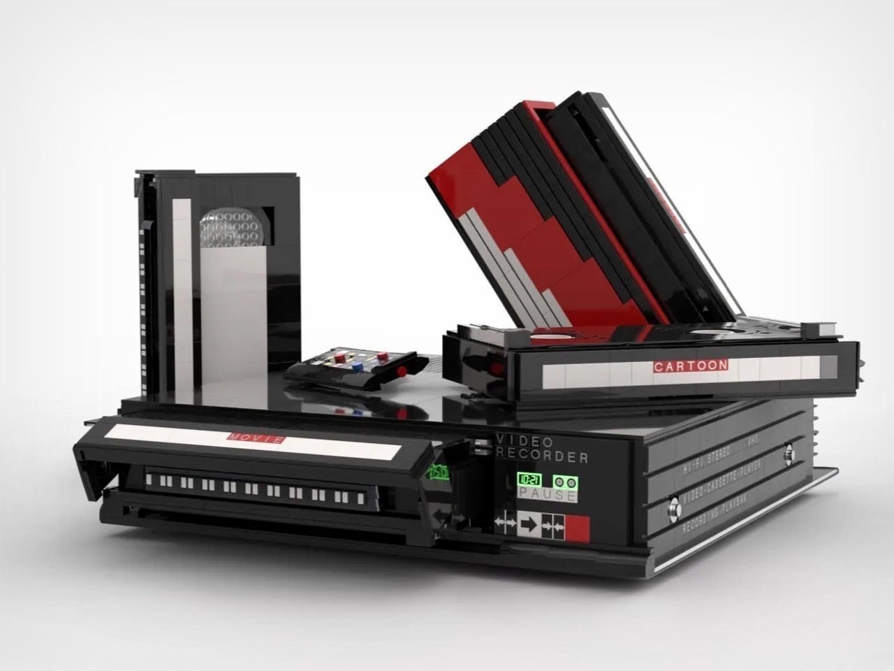
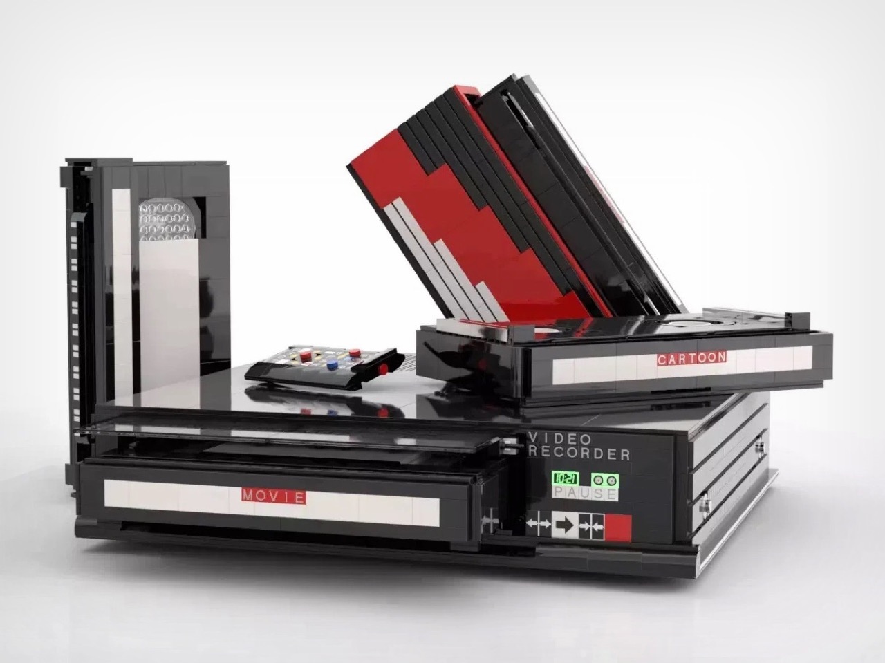
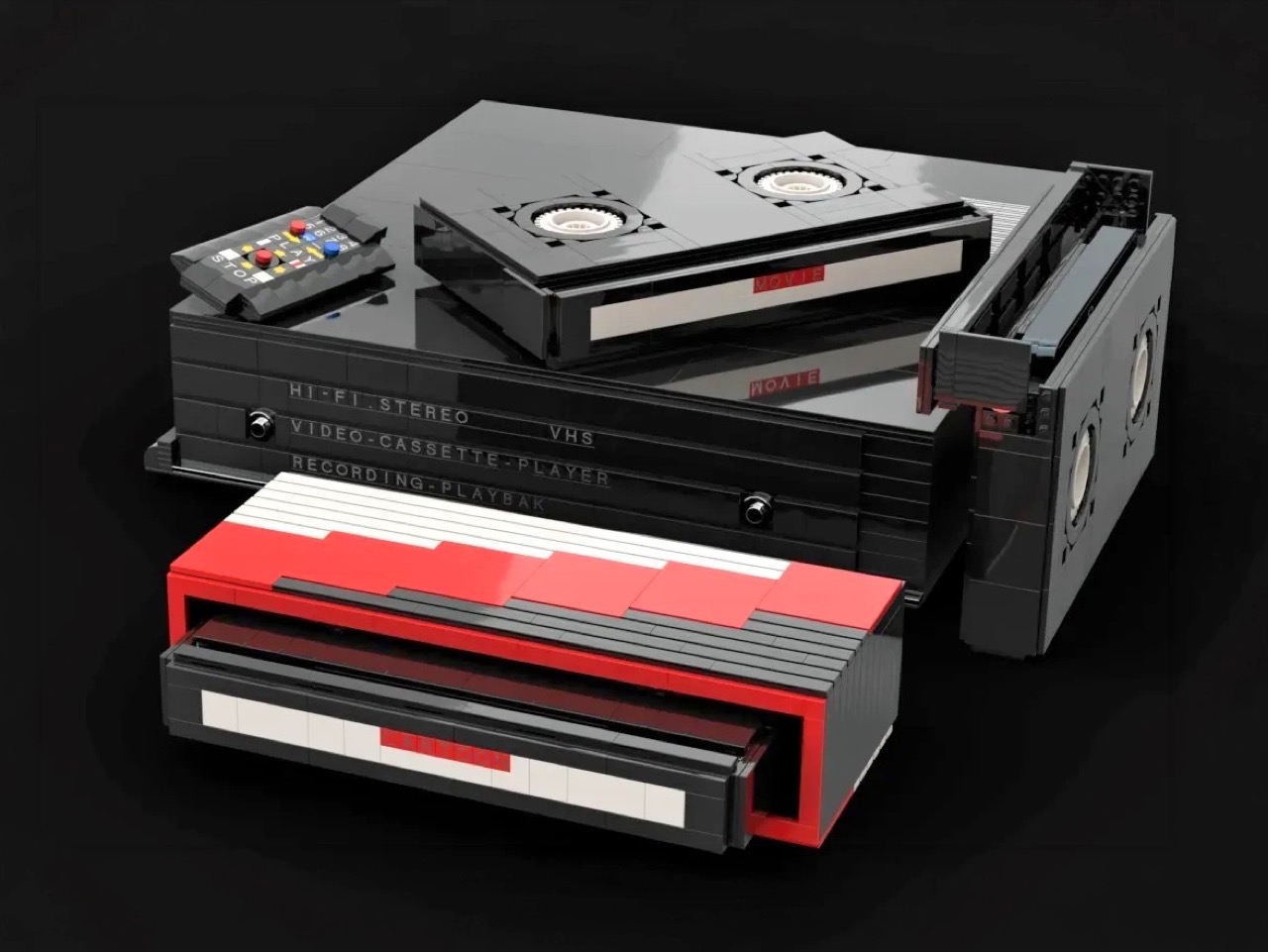
Before streaming queues and binge-watching algorithms rewired how we consume film and television, there was a ritual. You drove to the video store, walked the aisles, made your pick, and came home to slide that chunky black cassette into a slot that swallowed it with a satisfying mechanical thunk. The VCR wasn’t just a piece of consumer electronics. It was the centerpiece of a whole cultural ceremony, the thing that turned an ordinary Tuesday night into a genuine event. Polar-Angel_UA, a LEGO builder and 10K Club Member from Ukraine, has captured exactly that feeling in brick form with the Video Home System.
The build recreates a classic VHS setup with the kind of specificity that only someone who actually lived through the era could pull off. The main unit nails the flat, utilitarian slab aesthetic of a proper 80s or 90s VCR deck, complete with a cassette slot, a row of playback controls, and a PAUSE indicator rendered in green. A top-loading lid flips open to reveal the tape mechanism inside, and the real delight here is in that interaction. The tapes go in. The tapes come out. For a build that’s ostensibly a static display piece, that single interactive element transforms the whole experience.
Designer: Polar-Angel_UA
Four items accompany the main unit: a movie cassette, a cartoon cassette, a remote control, and a VHS case. The distinction between the movie tape and the cartoon tape is a quietly brilliant design decision because if you grew up in that era, you absolutely had a dedicated shelf section for each. Saturday morning cartoons lived in their own plastic sleeve, carefully rewound and stacked away from the movie collection. Polar-Angel_UA understands the taxonomy of the VHS-era household intimately, and it shows.
The MOC’s inherently block-ish nature (thanks to the LEGO bricks) works well for this product. VCRs were not delicate objects. They were heavy, deliberately black, and looked like they meant business sitting under your television set, blinking 12:00 in perpetuity because nobody ever set the clock. This LEGO version carries that same hulking, I-mean-business energy, with the cassettes propped against it like they’re already queued up for a double feature. The remote control sitting casually beside the deck is a small touch that completes the tableau perfectly. You can almost feel the carpet under your feet and smell the takeaway boxes.
The Video Home System is currently gathering votes on the LEGO Ideas platform, where fan-created builds compete for the chance to become official retail sets. Cross the 10,000 vote threshold and LEGO’s internal team reviews the submission for potential production. With 688 supporters on the board right now and 422 days left on the clock, there is plenty of runway here. Head to the LEGO Ideas page and cast your vote!
Memorial Day weekend is when the campsite gets its first real test of the year. The gear you pack either earns its place or takes up space. This year, a handful of outdoor gadgets are shifting the conversation, designs so considered, so precise in their logic, they feel lifted straight from a Tokyo design studio. Each one solves a familiar outdoor problem in a way you didn’t see coming.
What unites these five objects is a shared commitment to intentionality, the Japanese idea that a well-made thing should do its job beautifully, without fanfare or waste. Whether it’s a lantern that turns like a toy or a fire pit engineered around combustion science, these gadgets carry a point of view. Not here to impress on a spec sheet. Just here to make the long weekend feel properly planned.
1. RetroWave 7-in-1 Radio
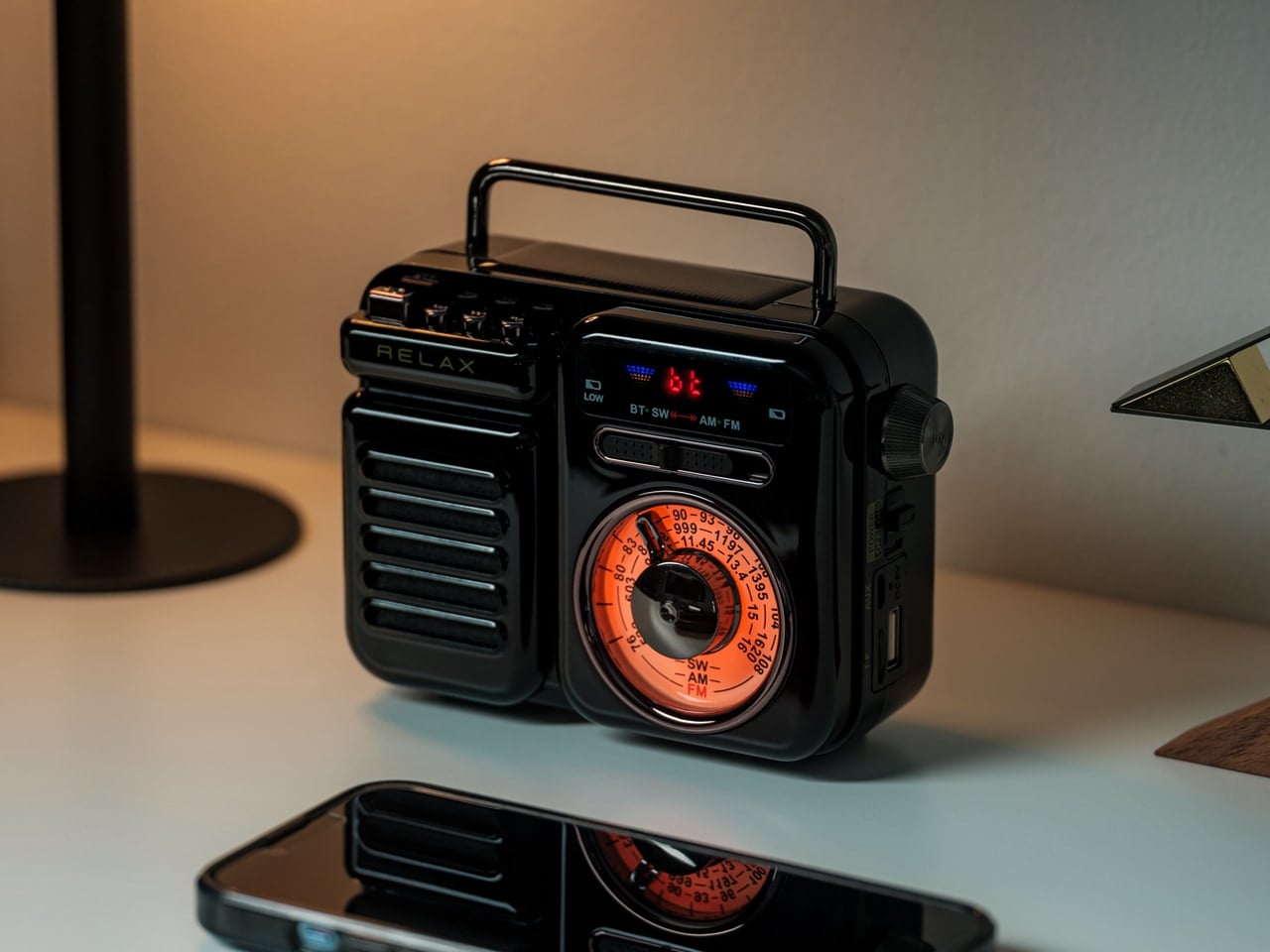
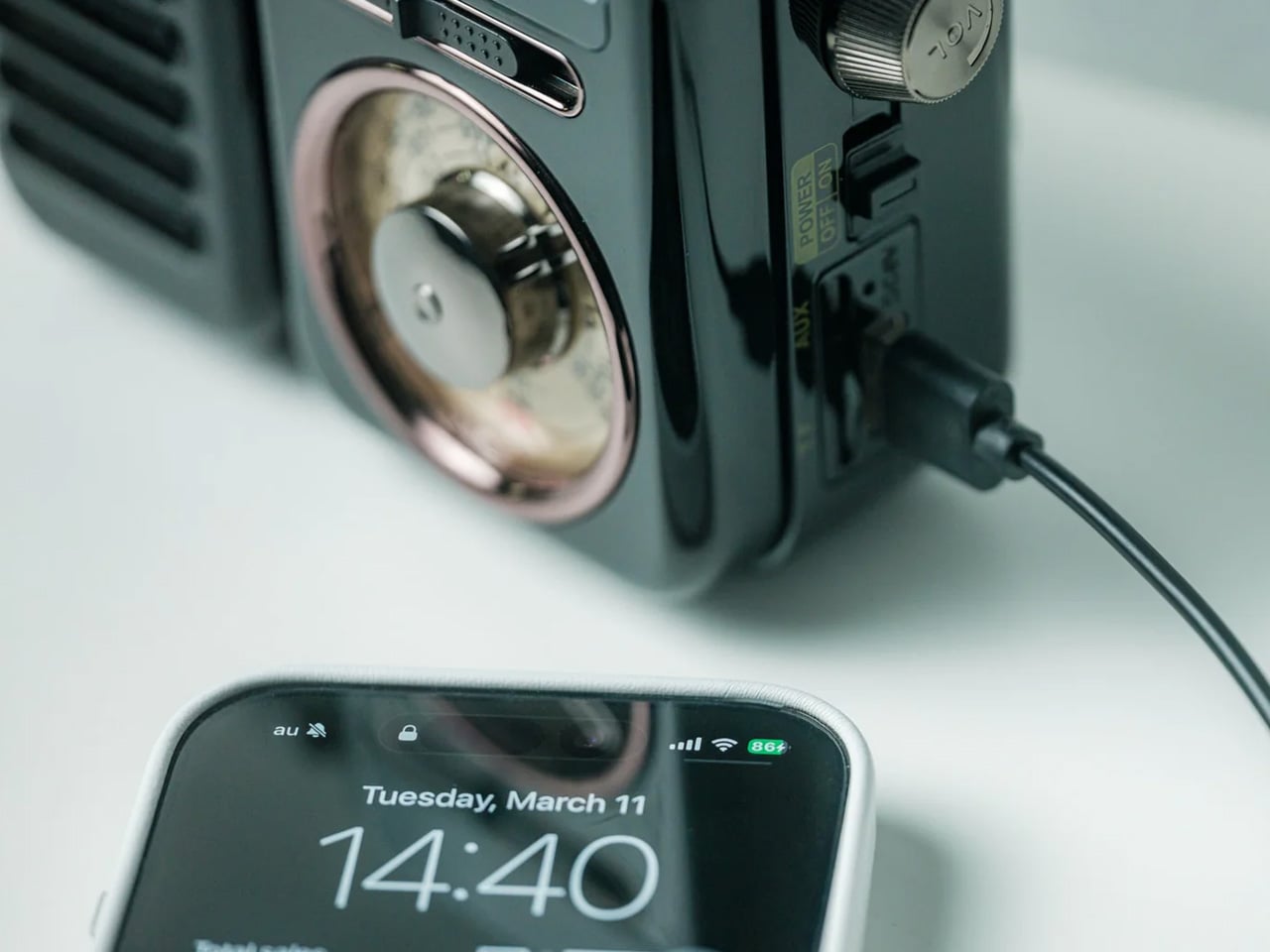
There’s a radio sitting somewhere in Japanese design history that directly inspired this one. The RetroWave 7-in-1 Radio arrives with a tactile tuning dial, a warm housing drawn from mid-20th century aesthetics, and the kind of visual restraint that makes a thing look inevitable. Behind the retro face is a 7-in-1 device handling AM, FM, and shortwave reception, Bluetooth streaming, a built-in flashlight, SOS alarm, power bank charging, and a 2000mAh battery that tops up via hand-crank or solar panel.
The 8W speaker punches with enough warmth to soundtrack a campfire properly, and the 20-hour radio battery life means it runs through a full weekend without reaching for a cable. Two colorways — black and warm gray — make it look as good on a picnic blanket as it sounds in the open air. It’s the rare object that solves the problems you forgot to plan for: music, emergency signaling, phone power, and light, all from one compact, beautiful thing.
The 7-in-1 function set means it replaces multiple items in your pack — flashlight, emergency radio, portable charger, and speaker all collapse into a single carry-anywhere device with one well-resolved retro form that earns its weight every time.
The retro Japanese design with a tactile tuning dial doesn’t look like survival gear. It looks like a piece you’d buy for the living room, which means it earns a permanent spot in the gear bag rather than getting quietly left behind on the shelf.
What We Dislike
Bluetooth battery life tops out at approximately 5 hours at 75% volume, meaning a full camp day of wireless streaming will require a recharge — the solar panel helps, but cloud cover changes that math quickly.
The compact body keeps it packable, but the speaker volume has a ceiling that wide-open outdoor settings can expose, especially once the campfire gets going and conversation picks up.
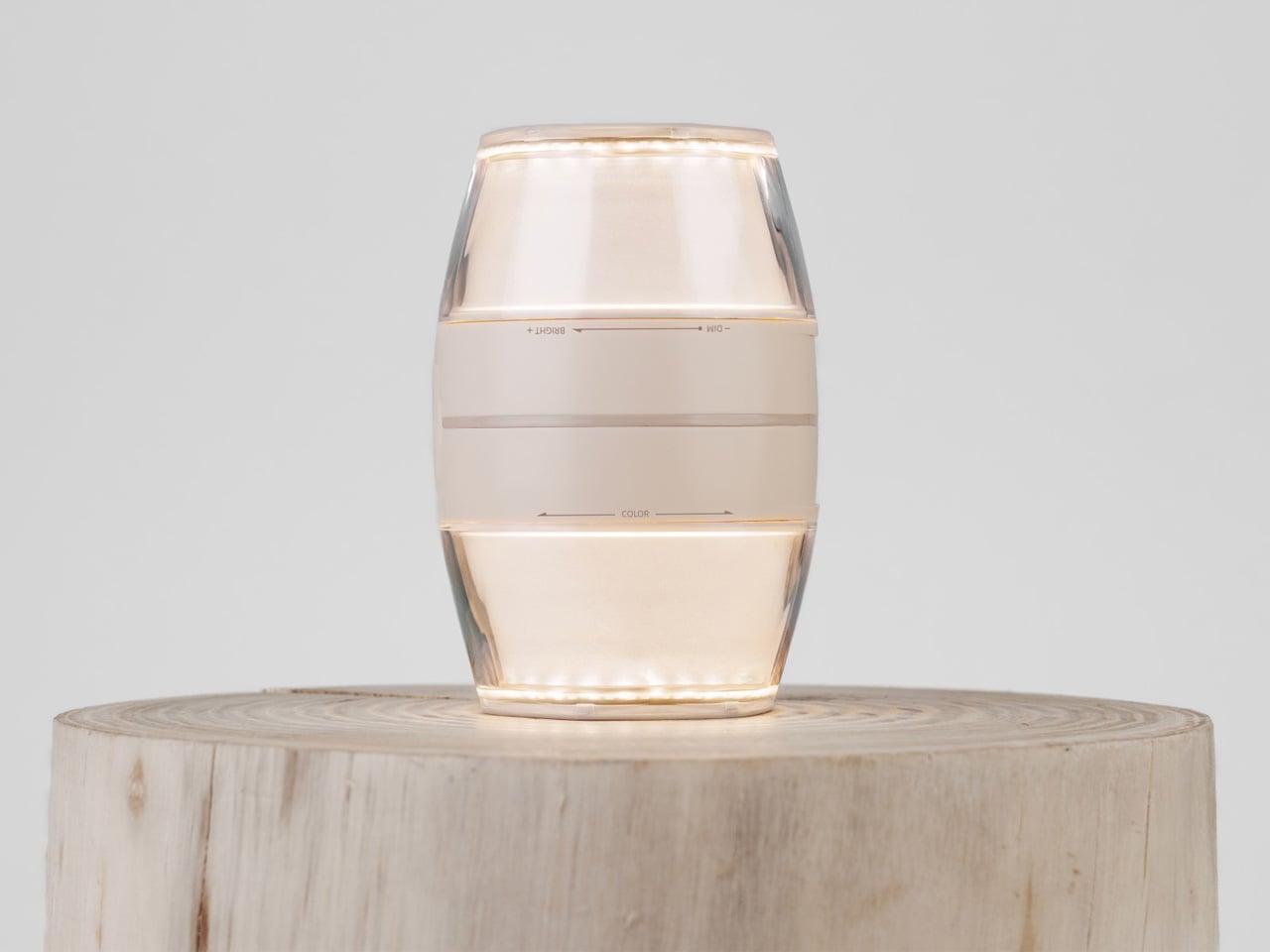
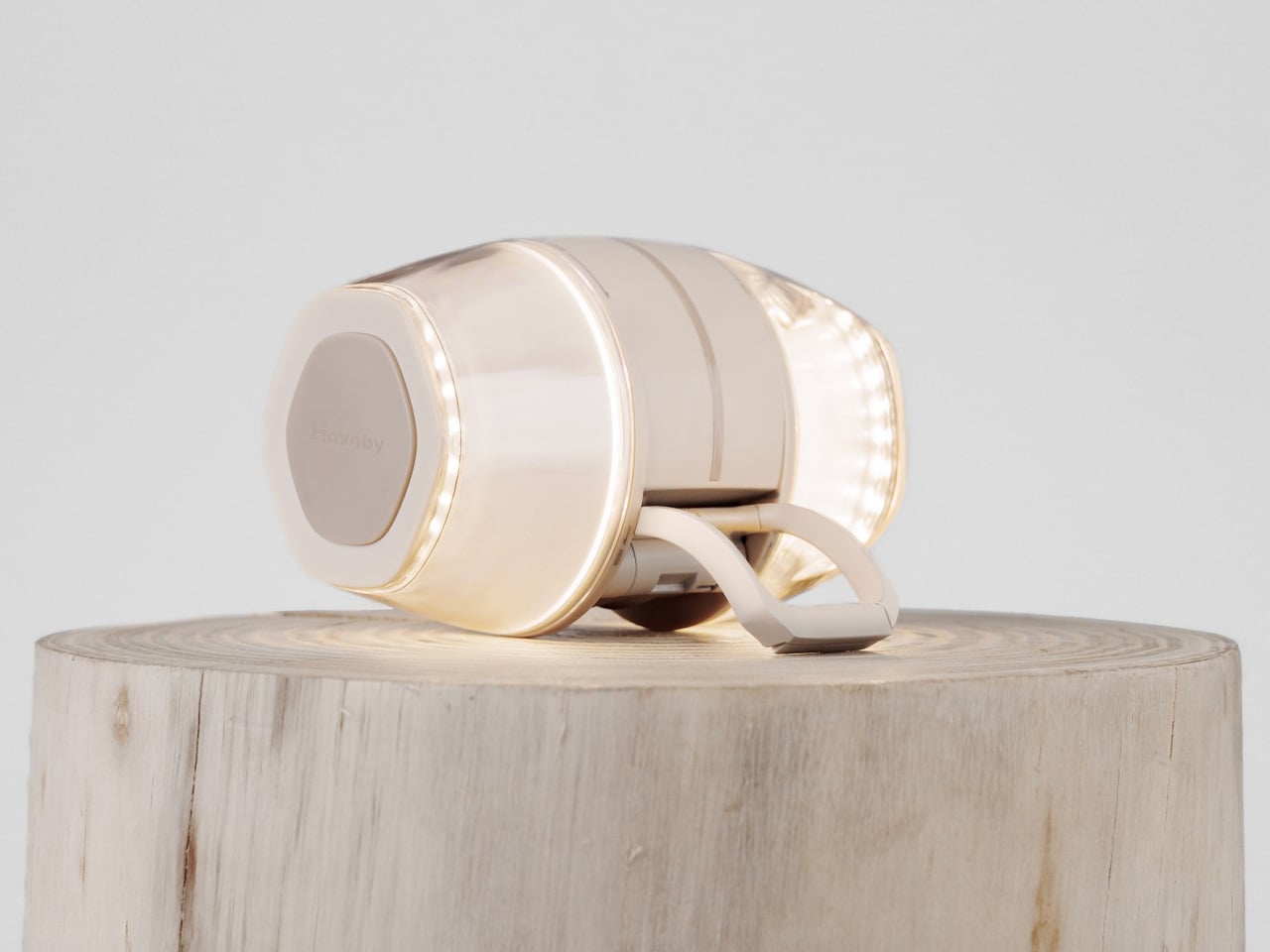
2. Twist Camping Lantern
When designer iu Llong looked to Japanese gashapon vending machines for inspiration — those capsule toy dispensers that make cracking open a prize feel like a small ceremony — the result was a camping lantern that turns on exactly the way a gashapon opens: with a satisfying twist. Built for Havnby as two cones joined at the base, the single twist mechanism adjusts both brightness and color temperature, dialing from cool white all the way down to a warm red.
The Twist Lantern packs a 10,000mAh rechargeable lithium battery into a compact form that weighs around 410 grams and charges fully in under three hours via USB-C. Its runtime stretches from 3.8 hours at full brightness to an impressive 70 hours on its lowest setting — enough for an extended weekend. The waterproofing and built-in magnetic mount mean it handles rain and hangs wherever you need it. For a lantern, it’s remarkably thoughtful. For a design object, it’s immediately recognizable.
What We Like
The gashapon-inspired twist interaction makes operating this lantern something you’ll actually look forward to — the kind of satisfying physical gesture that cheap pushbutton camp lights have never managed to replicate across years of trying.
A 70-hour runtime on its lowest setting is exceptional for any rechargeable camping lantern, meaning you can leave home without calculating whether the battery will outlast the trip or quietly die at hour three.
What We Dislike
At 520 lumens, the Twist Lantern is optimized for ambiance and intimate spaces — it sets a tent mood beautifully but won’t flood a large group campsite the way a high-output utility lantern would.
The twin-cone form factor, while visually striking, is less stackable in a tightly packed gear bag than a more conventional cylindrical lantern design, which may require some creative packing on longer trips.
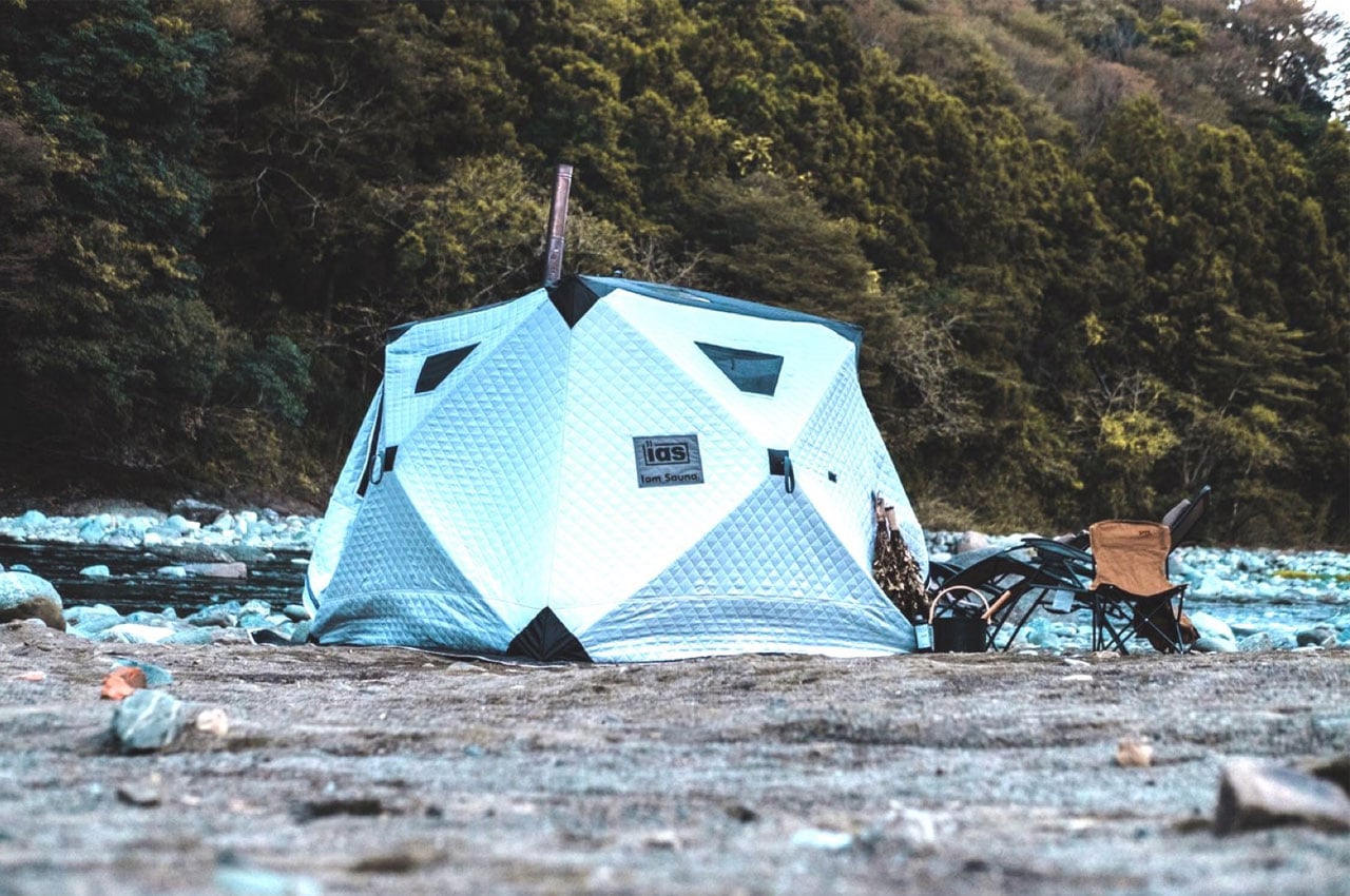
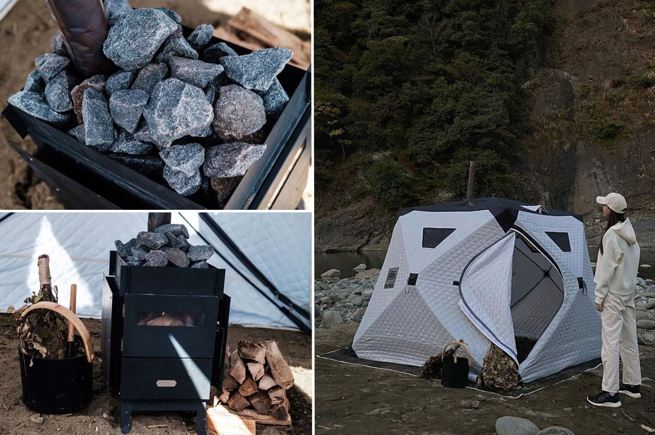
3. Iam Sauna
Iam Sauna is a portable sauna, genuinely made portable. The tent-style unit measures 220cm x 220cm x 185cm, accommodates up to six people, and is built from heat-insulating cotton material designed to trap steam and hold warmth in cold outdoor conditions. The included Tanzawa wood-burning stove is iron-built with folding legs, a heat-resistant glass window, and a removable guard plate where sauna stones stack neatly on top. Setup takes under a minute — one person, four pull tabs.
The panoramic windows along the upper section of the tent are a quiet design decision that separates this from any other portable sauna concept. Heat the stove, settle in, and you can watch stars or the tree canopy while your body does exactly what it came outdoors to do. Whether recovering after a full day of hiking or committing to a Saturday evening ritual by the lake, Iam Sauna delivers the restorative experience that used to require a fixed structure.
What We Like
A single person can collapse and set up the full tent structure in under 60 seconds, which means the sauna arrives at the campsite as a realistic option rather than a logistical project that gets quietly abandoned at the trailhead.
Panoramic windows at the top of the structure keep you visually connected to the outdoor environment while you’re inside — a design detail that makes the experience feel like it genuinely belongs in the wilderness, not in a hotel spa.
What We Dislike
The Tanzawa iron stove weighs approximately 18kg on its own, which adds meaningful carry weight to an otherwise packable system, effectively making Iam Sauna more of a car-camping or van-camping solution than a true backpacking option.
The wood-burning heat source requires sourcing fuel on-site or carrying it in, which introduces a variable that a gas or electric alternative would eliminate for weekend campers who prefer to pack light and plan less.
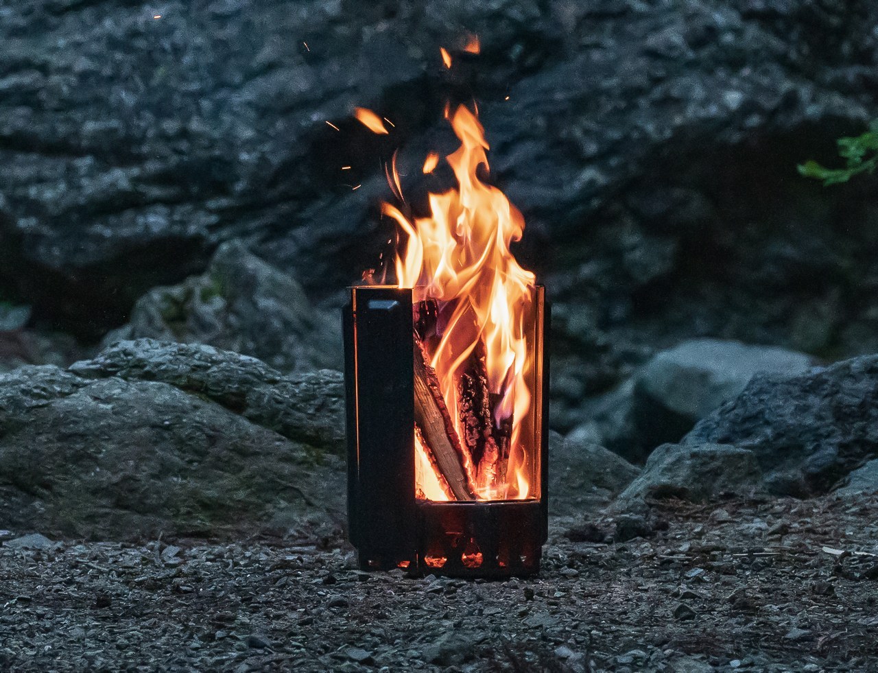
4. Airflow 8-Panel Fire Pit
Japanese company UM spent decades in metal processing before arriving at the Airflow 8-Panel Fire Pit, and that deep material knowledge shows clearly. Eight removable panels form an octagonal cylinder optimized for secondary combustion. Holes at the base of each panel channel fresh air directly to the wood for primary combustion. As that air heats up, it rises through the double-walled cavity and exits at the top, creating secondary combustion that burns wood more completely and produces significantly less smoke.
The exterior panels are removable, meaning fire intensity is adjustable — pull one or two off and the fire breathes differently. The interior uses corrosion-resistant stainless steel designed to age into a natural patina, while exterior panels take the punishment a campsite delivers. A grill grate attachment turns it into a cooking platform without altering the fire pit’s core logic. Ash falls and collects at the base. Cleanup is minimal. It’s a piece of engineering that makes fire feel considered.
The secondary combustion system is a genuine engineering achievement at this size — the smoke reduction is physics, not a marketing claim, and it makes extended campfire evenings significantly more comfortable for everyone sitting around it without constantly shifting to dodge the drift.
The modular panel system means the fire pit packs down smaller than its assembled footprint suggests, making it more portable than traditional bowl-style designs that share its output and heat radius.
What We Dislike
Assembling eight individual panels before the fire can be lit adds more steps to the startup process than a campfire usually demands — a minor friction, but one that registers in the dark or in rain when fumbling with separate components feels less intuitive.
The cooking grill grate is sold as an optional add-on rather than included in the base package, which feels like a missed opportunity given that cooking over fire is the most obvious secondary use case for every campsite fire pit.
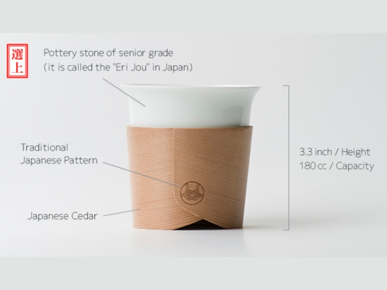
5. Haori Cup
When designer Tomoya Nasuda set out to revive Hakata Magemono — the 400-year-old Japanese craft of hand-bending thin cedar into curved forms — he built the Haori Cup from a single piece of Japanese cedar. The result is a vessel that holds warmth from the inside and transfers almost none to your hands, because cedar insulates naturally. Available in several colorways, including the “Sakura” edition, every cup is handmade and shaped by grain patterns unique to that piece of wood.
The cedar lends a whisper of fragrance to each sip — a clean, forest quality that doesn’t compete with the coffee, just frames it. Bring the Haori Cup camping, and something specific happens. Holding warm coffee in a vessel bent from a single piece of Japanese cedar, sitting among trees not unlike the ones that made it, that’s the kind of moment you came outside for. It’s lightweight, it carries centuries of craft, and it makes the morning feel intentional.
What We Like
Reviving the 400-year-old Hakata Magemono craft means every Haori Cup is genuinely one of a kind — no two grain patterns are the same, and that individuality gives it a value that mass-produced camping vessels with identical stamped forms simply cannot offer.
Cedar’s natural thermal insulation keeps drinks warm without heating the exterior surface of the cup, meaning you can hold a freshly poured coffee comfortably without burning your hands — a straightforward material advantage with quietly elegant results in practice.
What We Dislike
Cedar is not dishwasher-safe and requires careful hand cleaning followed by thorough drying, which is a manageable routine at home but adds genuine friction when you’re washing up at a campsite with limited water and fading daylight.
As a handcrafted artisan object rooted in centuries-old technique, the Haori Cup carries a premium price that may be difficult to justify for a purpose as unpredictable as outdoor camping, where the risk of a dropped cup on river rock is never zero.
The Best Camping Gear Doesn’t Add More — It Gets Everything Right
Five products, five different problems, each solved with a rigor that feels less like product design and more like pure philosophy. That’s what Japanese design does at its best: it doesn’t add features to justify a price. It removes everything unnecessary, then makes whatever’s left feel like the only possible answer. That’s the standard these objects hold, and it makes everything else at the campsite feel slightly underdressed by comparison.
The best gear for Memorial Day isn’t the most technical. It’s the most considered. A radio that earns its campfire seat. A lantern that makes switching on a light feel like an occasion. A fire pit engineered so you don’t think about combustion. A sauna you carry in and a cup that turns coffee into a ceremony. Pack these five, and the weekend will be more than just a long one.
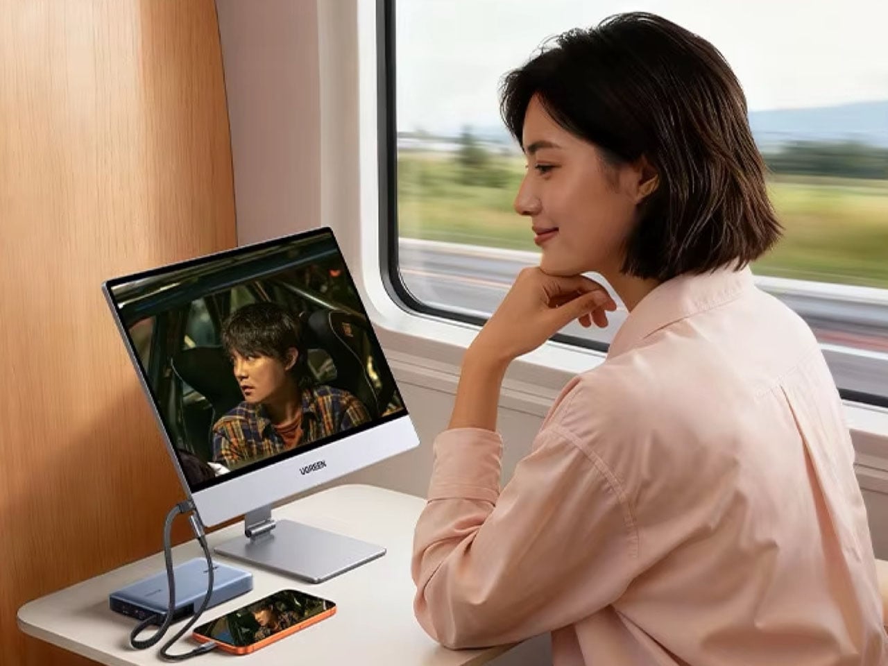
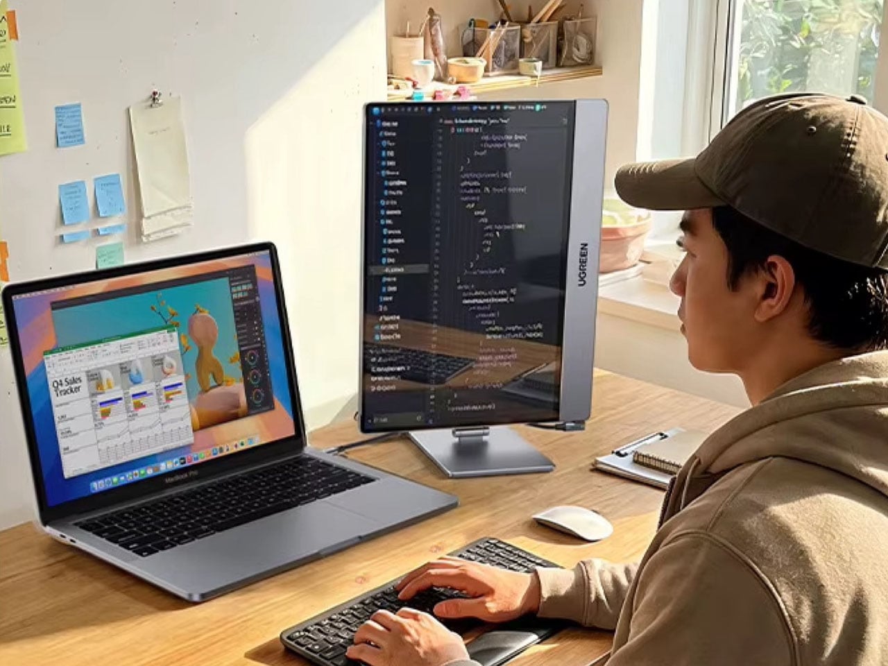
External monitors have evolved far beyond the basic plug-and-play secondary screens they once were. Over the years, we’ve seen brands experiment with more flexible and lifestyle-focused approaches to portable displays. Lenovo Yoga Pad Pro blurred the line between tablet and external monitor by integrating a built-in kickstand and HDMI input, and more recently, an ultra-premium foldable portable monitor challenged the traditional “rigid slab” design by introducing a folding form factor aimed at improving portability and multitasking.
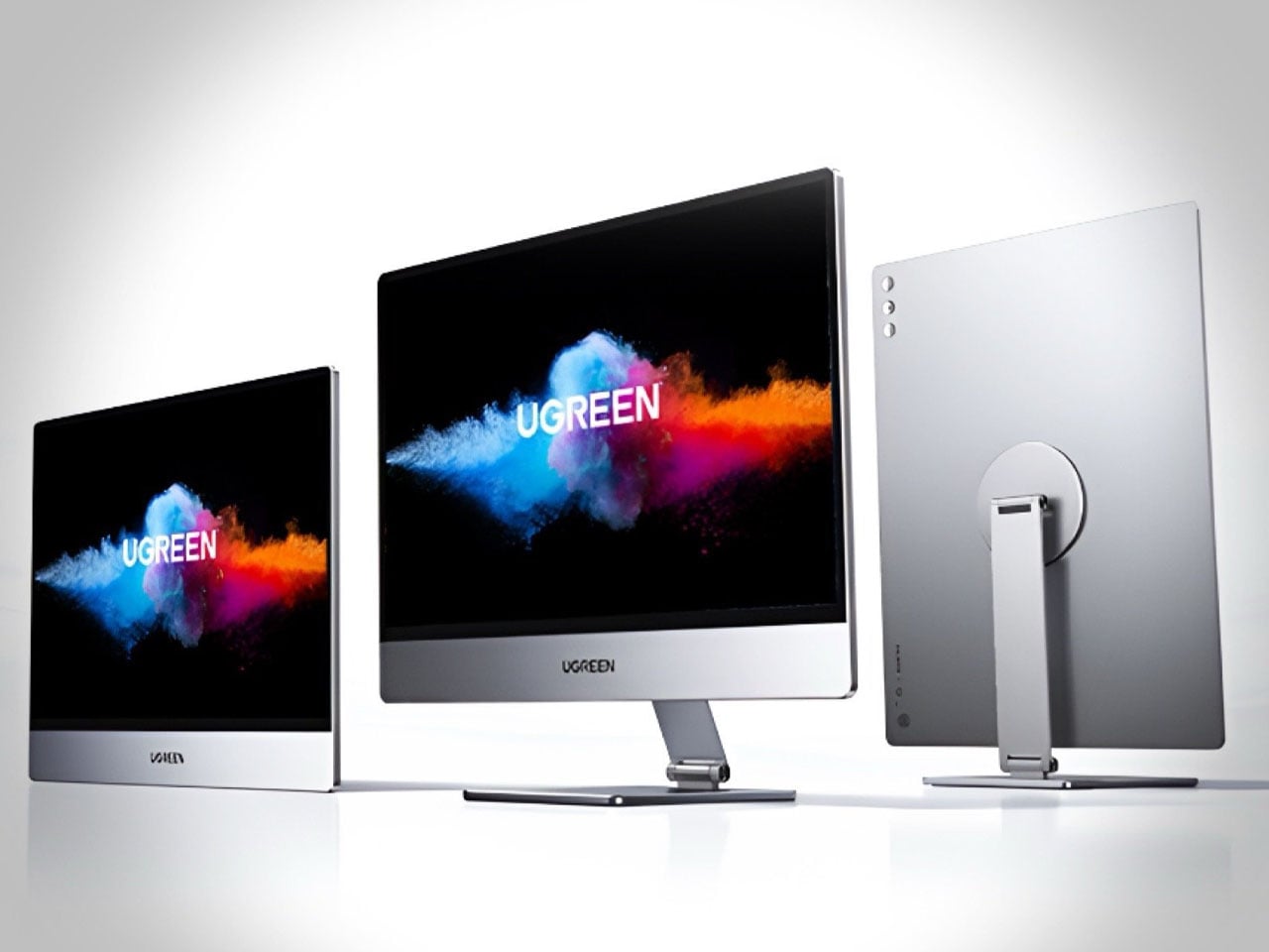
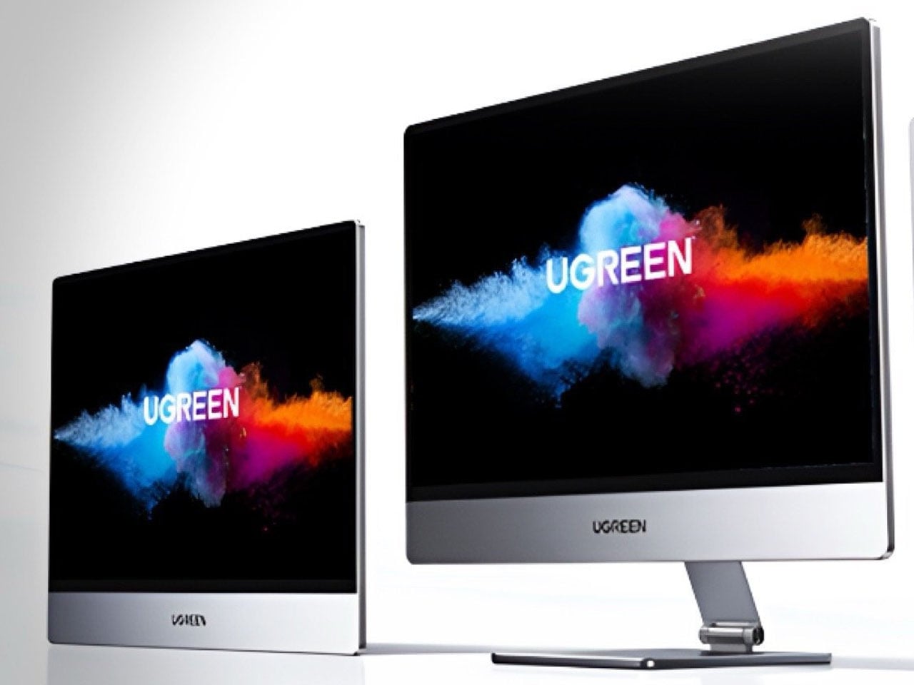
Against this backdrop of innovation, Ugreen’s AP16 portable monitor debuts with the promise of delivering flagship-level display specs in a slim and travel-friendly package. It is designed for users who need a compact secondary screen for work, gaming, and entertainment on the go. The new model combines a high-resolution display, fast refresh rate, and slim construction, making it suited for power users.
The portable monitor features a 16-inch IPS panel manufactured by BOE with a 2560 x 1600 resolution and a 16:10 aspect ratio. Compared to traditional 16:9 portable monitors, the taller aspect ratio provides additional vertical workspace, which can be useful for productivity tasks such as document editing, coding, or web browsing. Ugreen has also equipped the monitor with a 165Hz refresh rate, making motion appear smoother during gaming sessions or while navigating through fast-moving content.
Brightness reaches up to 500 nits, a notable figure for a portable monitor and significantly higher than many mainstream models that typically stay around the 250-300 nit range. The screen also offers a 1200:1 contrast ratio and supports 100 percent of the sRGB color gamut, allowing it to deliver more vibrant and accurate colors. Ugreen says the panel supports 10-bit color through 8-bit plus FRC technology and comes factory calibrated with a Delta E value below 2, indicating improved color precision for creative workloads such as photo editing and content creation. TÜV Rheinland’s low blue light certification is also included to help reduce eye strain during extended use.
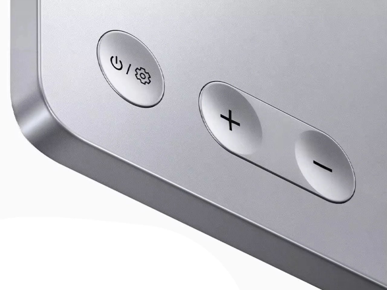
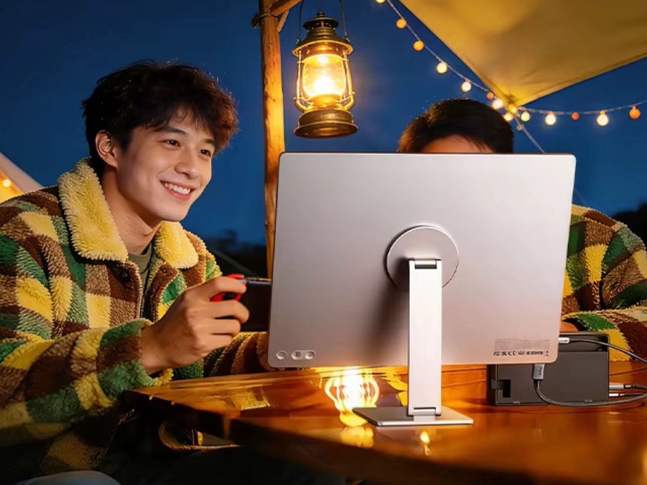
The monitor adopts a metal unibody construction with a thickness of just 6.5 mm and a weight of 928 grams. Its slim profile makes it easy to carry alongside a laptop in a backpack or travel bag. Rather than integrating a standard folding kickstand into the chassis, Ugreen bundles the AP16 with a magnetic stand that supports both landscape and portrait orientations while offering flexible tilt adjustments. This setup gives the monitor a more desktop-like appearance and improves ergonomics compared to many portable displays that rely on basic folio covers.
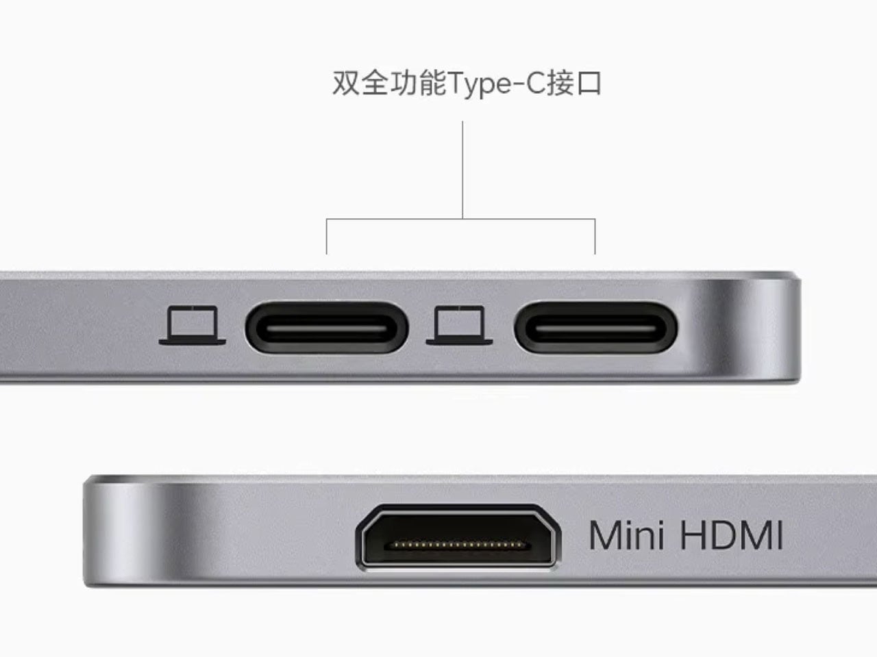
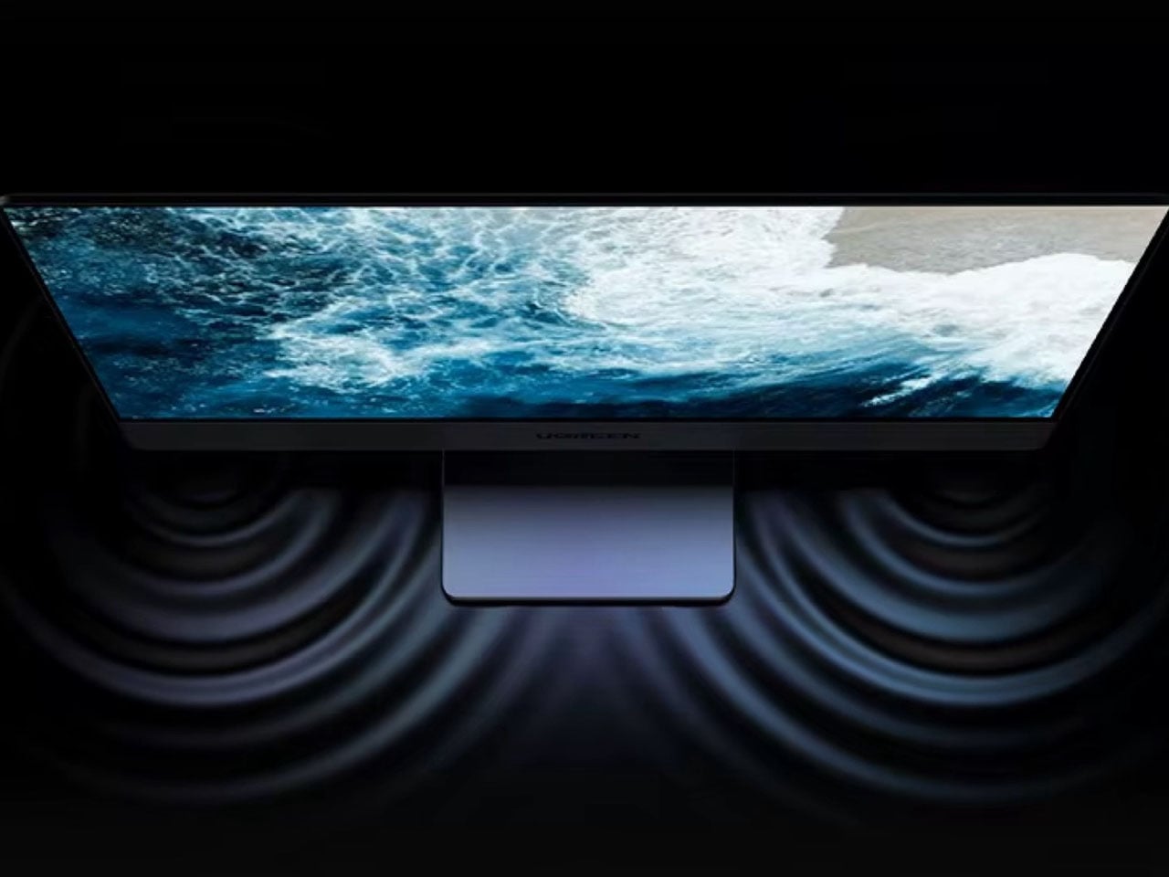
Connectivity options include two full-function USB-C ports and a Mini HDMI port. The USB-C inputs support pass-through charging, allowing connected devices to receive power while using the display. The monitor can charge connected laptops with up to 60W when connected to an external charger. The AP16 is compatible with a wide range of devices, including MacBooks, Windows laptops, iPads, recent iPhones, Nintendo Switch consoles, PlayStation systems, and handheld gaming devices from brands such as Asus and Lenovo. Ugreen has also included dual stereo speakers for basic multimedia playback.
The Ugreen AP16 portable monitor will debut in China with a retail price of 1,799 CNY (around $270). It is already listed on AliExpress for international buyers, though the imported price is significantly higher at approximately $490.
Portable monitors have become a legitimate part of the modern mobile workspace, with countless options available across every price range. But almost all of them share one fundamental constraint: they’re flat, rigid panels in protective cases, indistinguishable from each other in form even when they vary in quality. The screen that travels in your bag looks exactly the same as it did before you packed it.
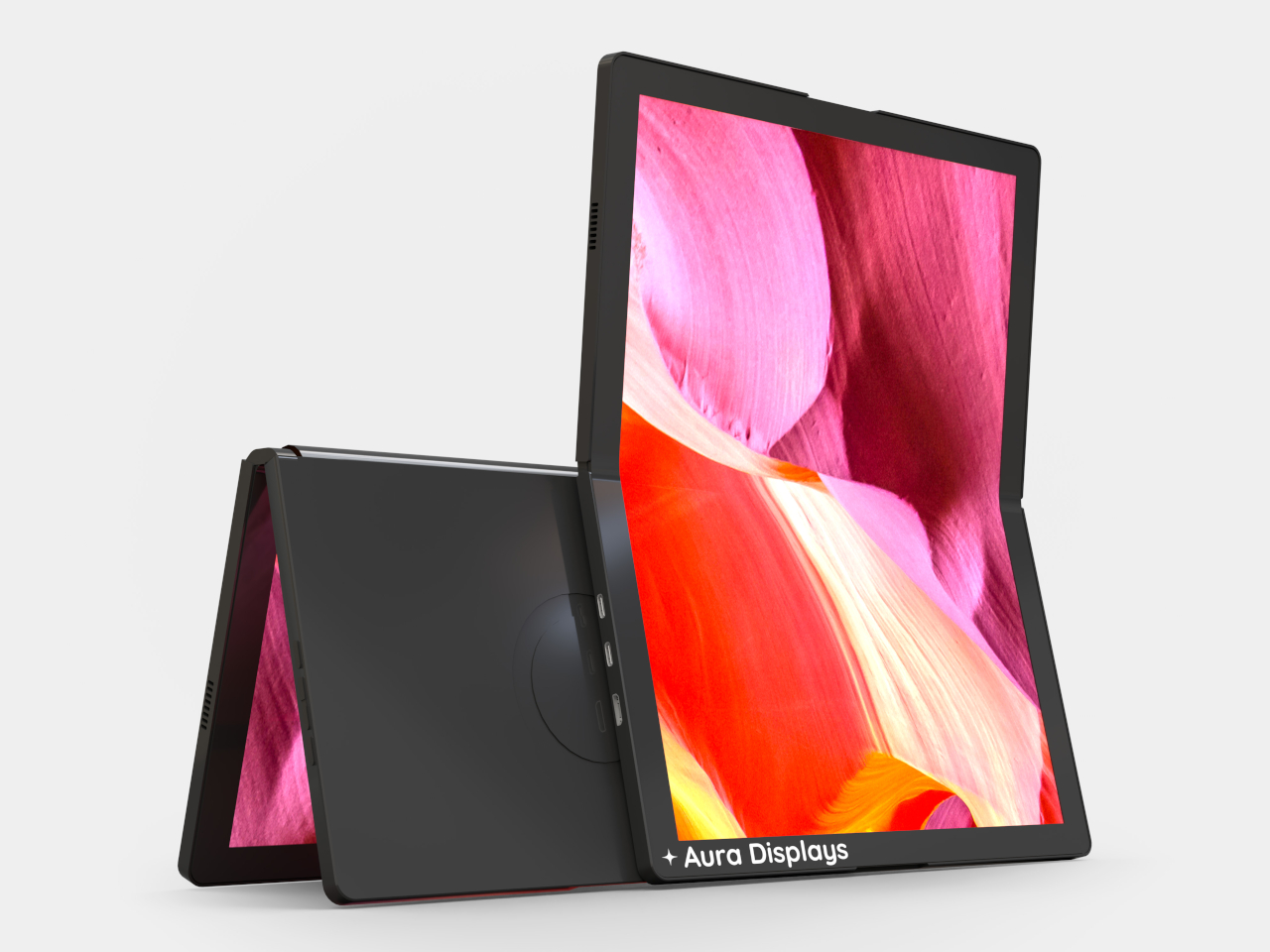
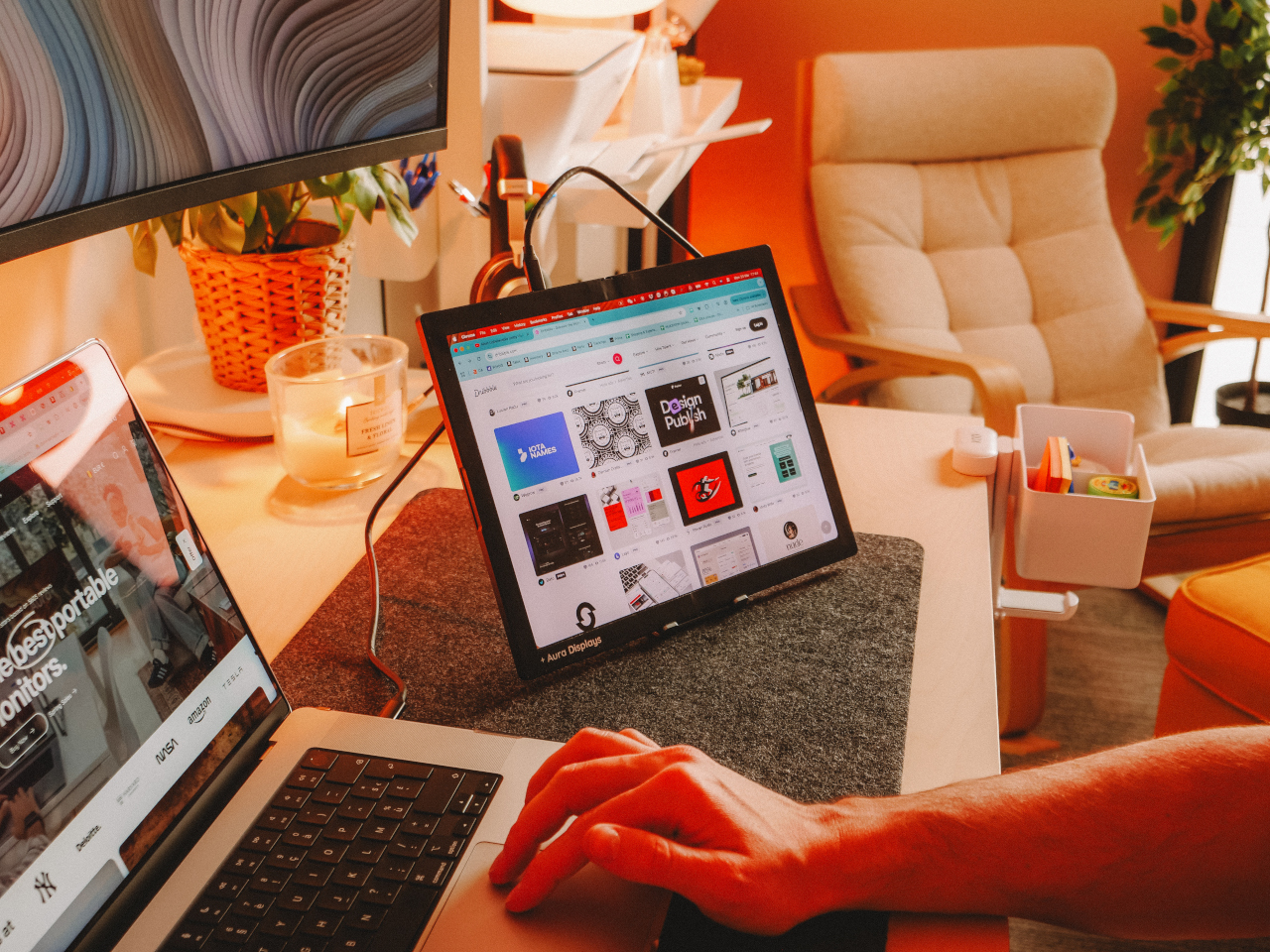
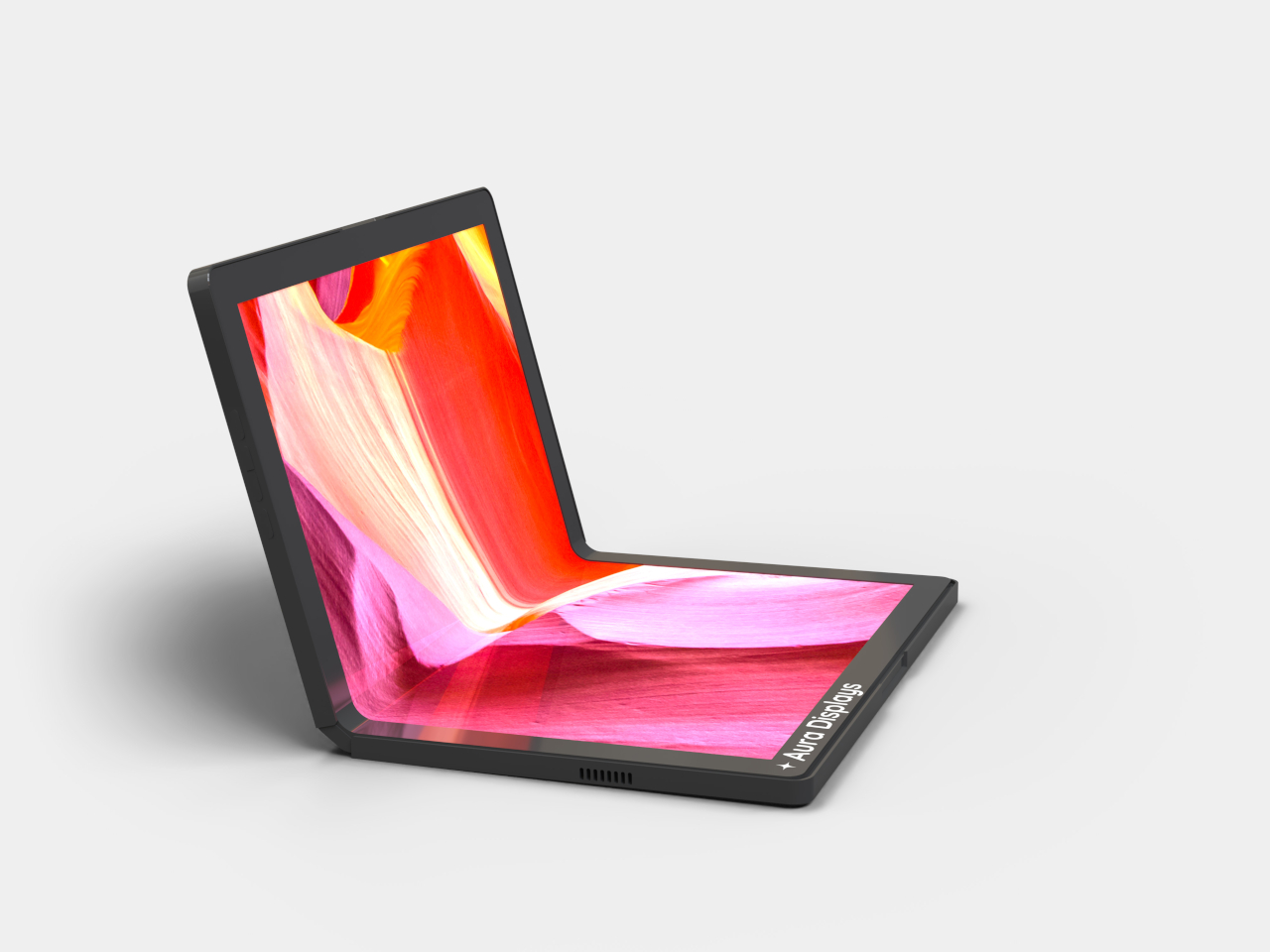
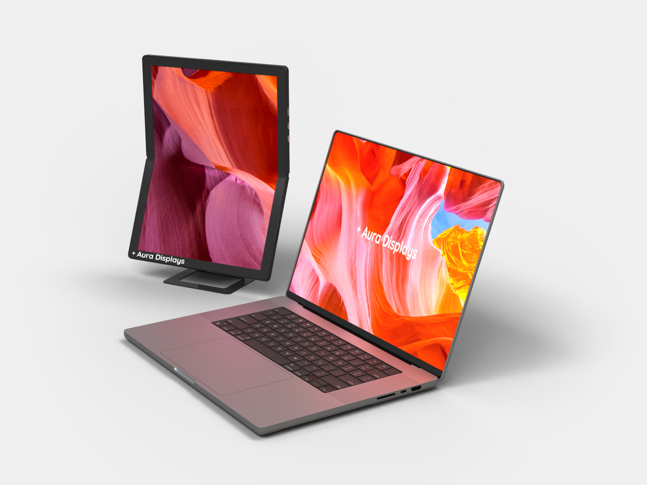
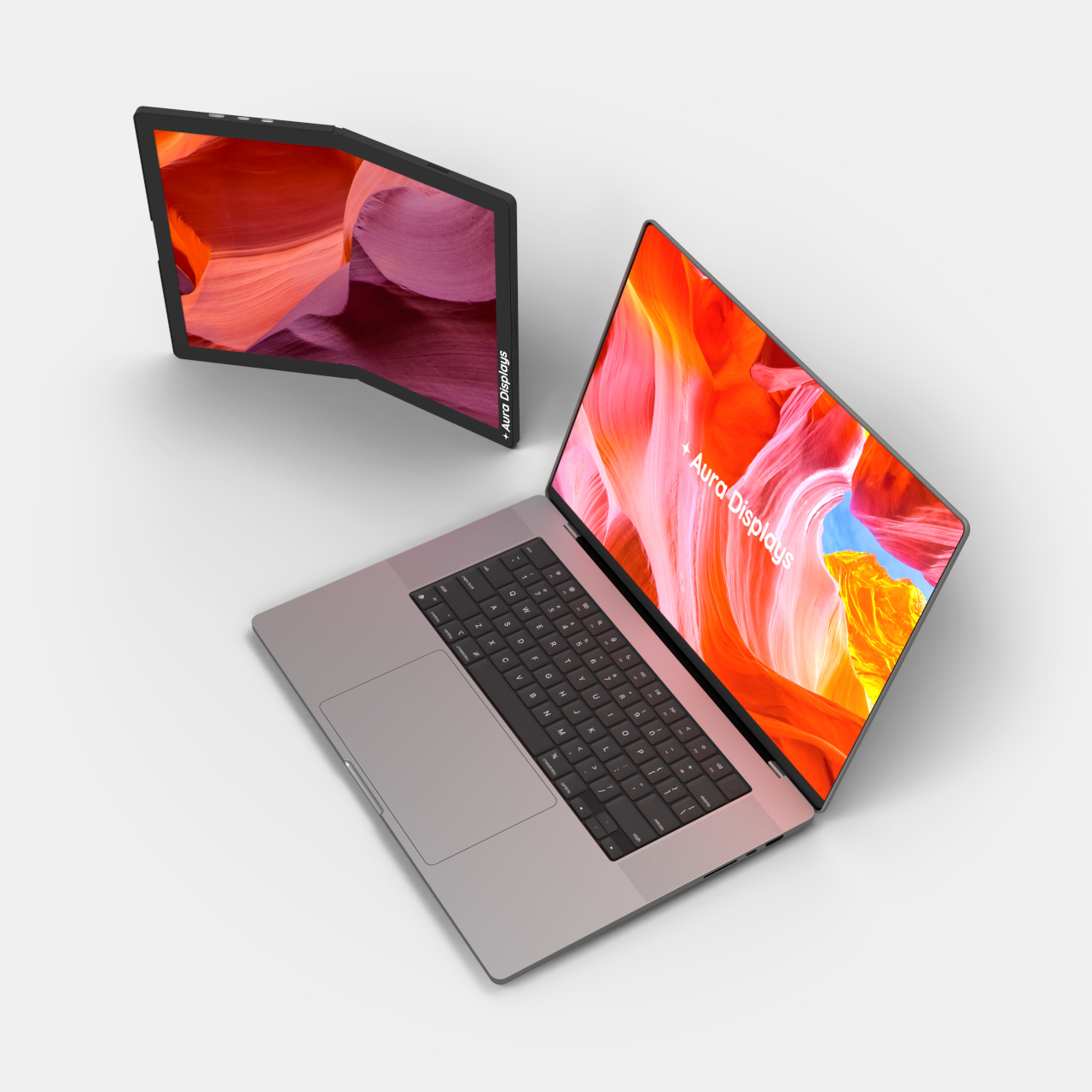
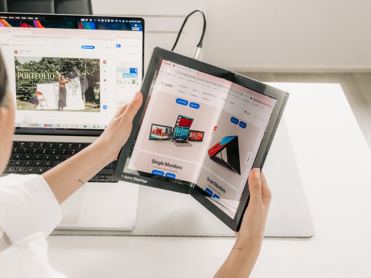
Foldable display technology has been reshaping the smartphone market for years, but making it work meaningfully for laptop accessories has proven far more complicated. Aura Displays’ Single Flex Pro Gen 1 is a portable monitor that does exactly that, introducing FlexMatrix technology that lets the screen bend, fold, and adapt to angles and surfaces that no rigid display can match.
Consider what it actually means to carry a second screen around all day. With conventional portable monitors, you’re always working with the same fixed rectangle, propped up at the same angle, regardless of the surface. A display that folds to just 6.1 by 9.3 inches and opens flat in seconds turns that into a fundamentally different proposition: the form factor adapts to the space, not the other way around.
The actual display is a 13.3-inch AMOLED panel with a 1536×2048 resolution at a 3:4 aspect ratio, meaning it’s portrait-oriented rather than the standard widescreen format. That’s a deliberate choice for someone editing a document, annotating a PDF, or reviewing design layouts in a vertical workflow. The screen covers 117% of the NTSC color gamut, with a 2ms response time and touch input support built in.
AMOLED as a panel technology brings practical advantages worth noting. Contrast is technically infinite since each pixel generates its own light and can switch off entirely, so blacks are genuinely black rather than a deep gray approximation. For anyone reviewing color-critical artwork or working on dark-themed interfaces for long stretches, those aren’t trivial differences; they affect how accurately you read what’s on screen throughout the day.
The physical construction is built around pro-grade hinges and a premium aluminum chassis, keeping the whole unit to 1.54lb despite the structural complexity of a panel that needs to flex repeatedly without degrading. Folded, the monitor is just about 0.63 inches thick; unfolded, it drops to 0.31 inches. Connectivity runs entirely through USB-C, plug-and-play, with no drivers or software installations needed before you can start using it.
There’s also a 17-inch version in the works, currently in pre-production and expected to arrive in June 2026. That suggests Aura isn’t treating this as a one-off experiment but as the beginning of a product line built around this flexible form factor. The Gen 1 name further implies future revisions, which is a reasonable expectation for a product type that genuinely hasn’t existed before now.
The Single Flex Pro Gen 1 is on sale at $1,299, down from its regular $1,499 price, available in Midnight Black. It ships with a USB-C to USB-C cable and a USB-C to USB-A adapter, backed by a one-year warranty. For something claiming a genuine category first, that price reflects both the novelty of the technology inside and the engineering required to keep a flexible AMOLED panel reliable through daily use.
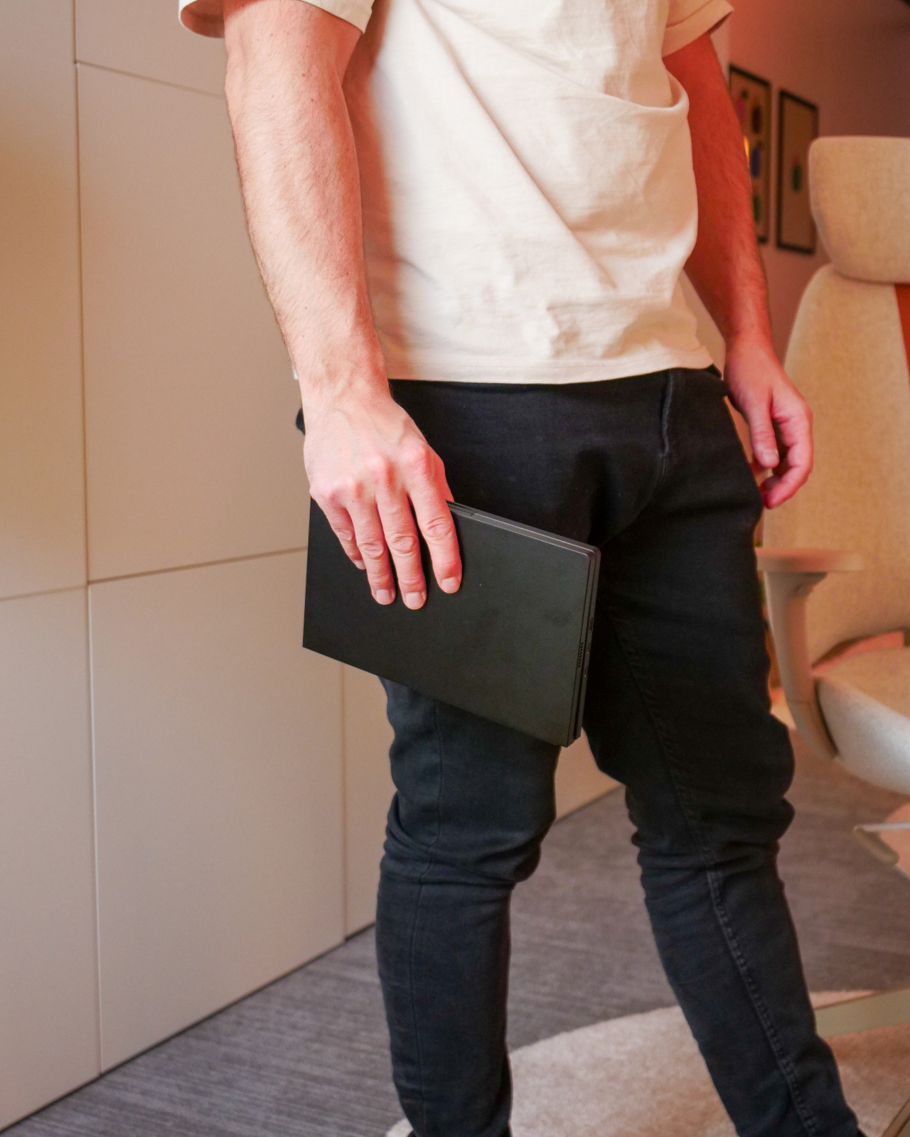
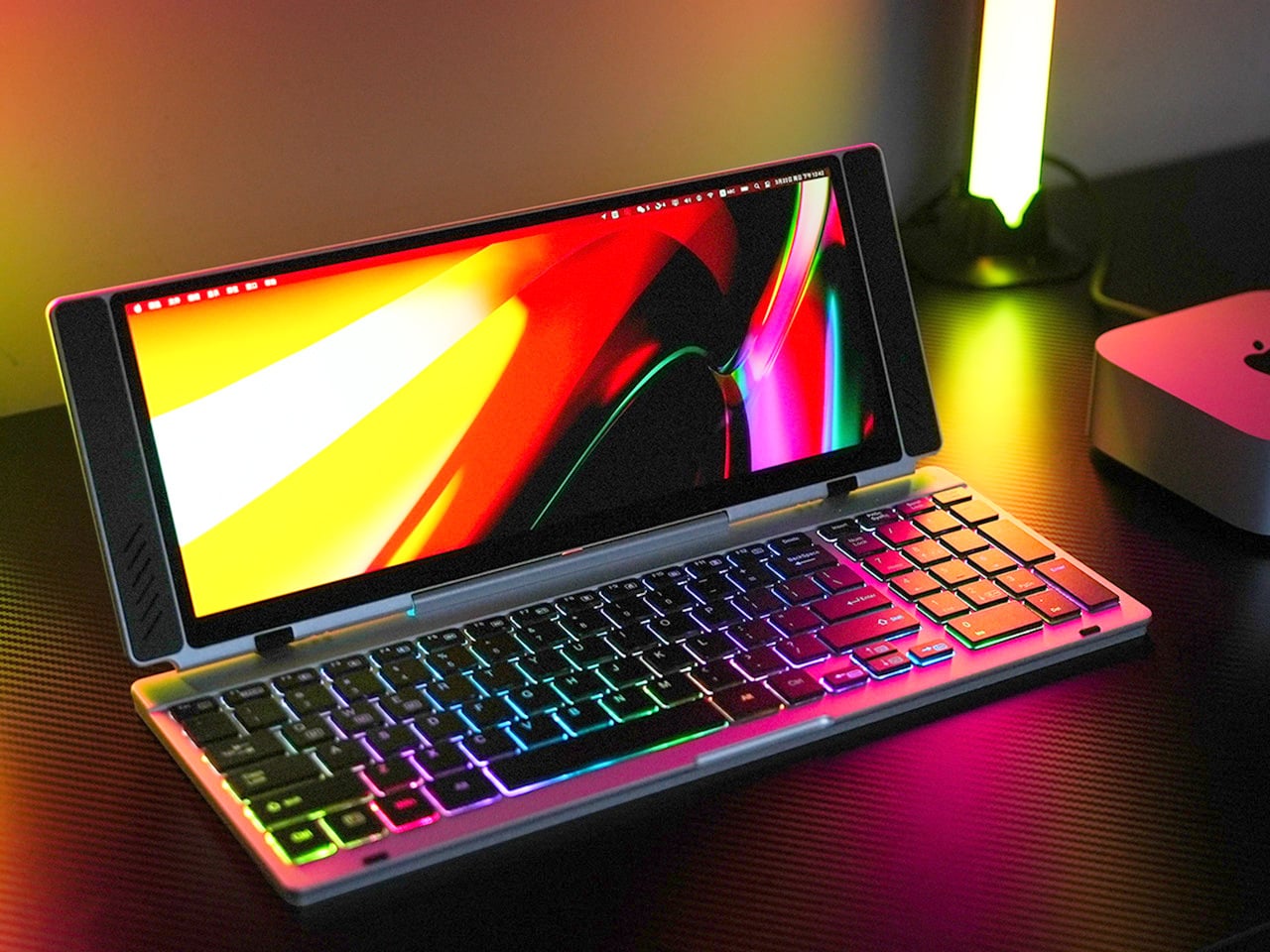
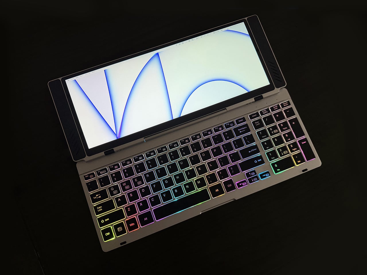
Closed, the VitaLink looks like a very flat book, silver, about the footprint of a large paperback, with nothing to suggest it carries a 4K display inside. At 20mm thick with a CNC-machined aluminum shell, it weighs 1200 grams and travels the way a slim notebook does; it fits in a laptop sleeve, takes up a predictable corner of a bag, and requires no dedicated case beyond what you already carry. Then it unfolds at 180 degrees. The screen lifts above the keyboard, the whole unit settles into a 34 by 15 centimeter footprint, and what you have is a self-contained dual-screen workspace that happened to be a thin slab a moment ago.
The keyboard is the part that usually betrays products like this. Portable keyboards compress key spacing to save millimeters, shorten travel to save thickness, and leave you typing on something that feels like a shallow membrane rather than actual keys. VitaLink went in the opposite direction, widening key spacing to 3.27mm and setting travel at 0.8mm, with scissor switches tuned for speed and quiet actuation. The display above it runs at 3840×1600 with a 2.4:1 aspect ratio, a cinematic proportion that gives the screen an unusually wide horizontal span, well-suited to keeping a reference panel open alongside a working document without feeling like you’re squinting at either side.
The resolution translates to 298 pixels per inch, which puts it in the same territory as Apple’s Retina displays and well above the pixel density of most portable monitors in this category. Text holds sharp at native scaling, fine details in images stay crisp, and the 60Hz refresh rate keeps touch input feeling immediate. Ten-point multitouch means gestures respond the way they do on a tablet, with swipes, pinches, and drags registering without lag. The screen covers 100 percent of the sRGB color gamut, which makes it viable for color-sensitive work where you need confidence that what you see on the display matches what the final output will deliver. That 2.4:1 ratio keeps showing up as the design’s defining decision; it gives you enough horizontal real estate to run a code editor with a console window beside it, or a timeline with a preview panel, without either side feeling like it’s been compressed into a narrow strip.
Typing on the VitaLink is designed to feel deliberate in a way that most travel keyboards do not. The 0.8mm of key travel sits in a range where the keys actuate fast but still give tactile confirmation that you pressed them, a balance that makes a difference during long writing sessions where you need speed without sacrificing accuracy. The 3.27mm key spacing is wider than what most compact keyboards offer, eliminating that cramped sensation where your fingers feel like they’re hunting for keys in tight quarters. RGB backlighting runs through three modes, activated with function key shortcuts: a breathing gradient, a solid single-color backlight, and a rainbow wave that ripples across the keys as you type. The backlighting does actual work in low-light environments, but the rainbow mode leans more toward visual flair than strict utility.
CNC machining means the aluminum body starts as a solid block and gets precision-carved, producing the kind of structural rigidity that protects the screen during transit and prevents flex when you’re typing hard. The 180-degree hinge lets the unit lay completely flat, which matters both for stability on uneven surfaces and for low-angle use when you’re working on a cramped airplane tray table or a café counter. Dual USB-C ports handle video, data, and power delivery up to 65W, so a single cable from your laptop, tablet, or phone brings the display to life with no drivers to install. Compatibility spans Windows, macOS, Linux, and Android, with plug-and-play recognition across all of them. Connect a Steam Deck or a Nintendo Switch via USB-C, and the VitaLink becomes a 13-inch 4K external display for handheld gaming, turning a small console screen into something considerably more immersive.
VitaLink offers eight keyboard layout options, covering US Windows (the default), US Mac, German QWERTZ, Japanese JIS, UK, French AZERTY, Nordic, Italian, and Spanish. The standard US Windows layout ships at no extra cost; upgrading to US Mac adds ten dollars, German or Japanese layouts add twenty, and UK, French, Nordic, Italian, or Spanish layouts add thirty. The layouts require specific laser engraving and dedicated production runs, so they’re available as optional add-ons rather than default configurations. You select your preferred layout during checkout or in a post-campaign survey if you miss it the first time.
VitaLink is currently available on Kickstarter starting at $299, down from a retail price of $658. The package includes the VitaLink keyboard and display unit plus two USB-C cables. Eight keyboard layout options are available as add-ons, including US Mac, German QWERTZ, Japanese JIS, UK, French AZERTY, Nordic, Italian, and Spanish, with upgrade fees ranging from $10 to $30 depending on the layout. Shipping is scheduled for September 2026, with delivery fees ranging from approximately $18 to $33 depending on region. VitaLink covers all taxes and customs duties, so the listed shipping fee is the only additional cost beyond the pledge amount.
Staying comfortable outdoors during a heatwave has always been a matter of seeking shade, chasing air-conditioned spaces, or resigning yourself to a slow, sweaty defeat. Portable fans help somewhat, but they cool the air around you rather than you directly. As wearable technology continues to push into everyday life, the idea of a personal climate device that goes wherever you go no longer feels like science fiction.
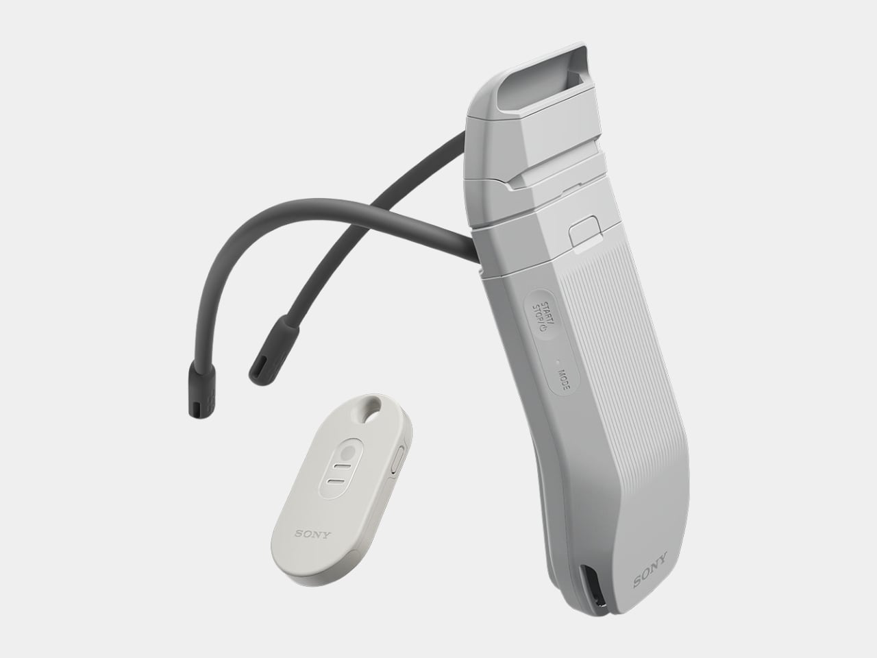
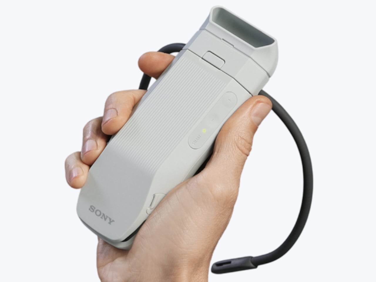
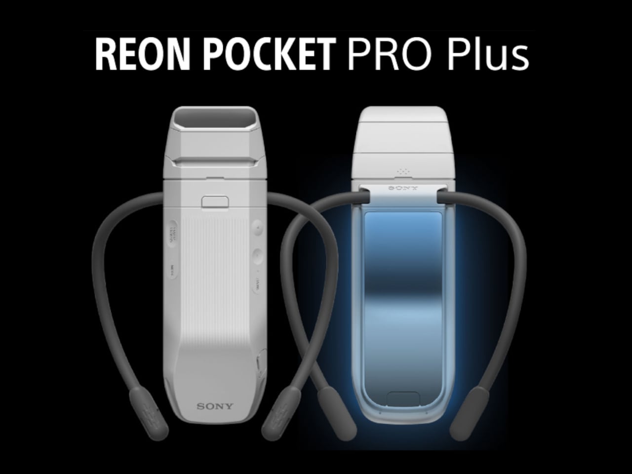
Sony has been quietly building exactly that kind of device since 2017, and the REON Pocket Pro Plus is its latest and most capable version. Rather than blowing cold air, it absorbs heat from the base of your neck using the Peltier effect to chill a metal plate against your skin at precisely the spot where blood vessels run closest to the surface.
The headline upgrade this generation is a pair of independent thermo-modules that alternate in intensity rather than running together at a fixed output. One ramps up as the other scales back, sustaining cooling without burning out quickly. The result is an advertised 20% improvement over the previous model, amounting to about a two-degree Celsius reduction at the point of contact, a modest number that feels surprisingly significant in practice.
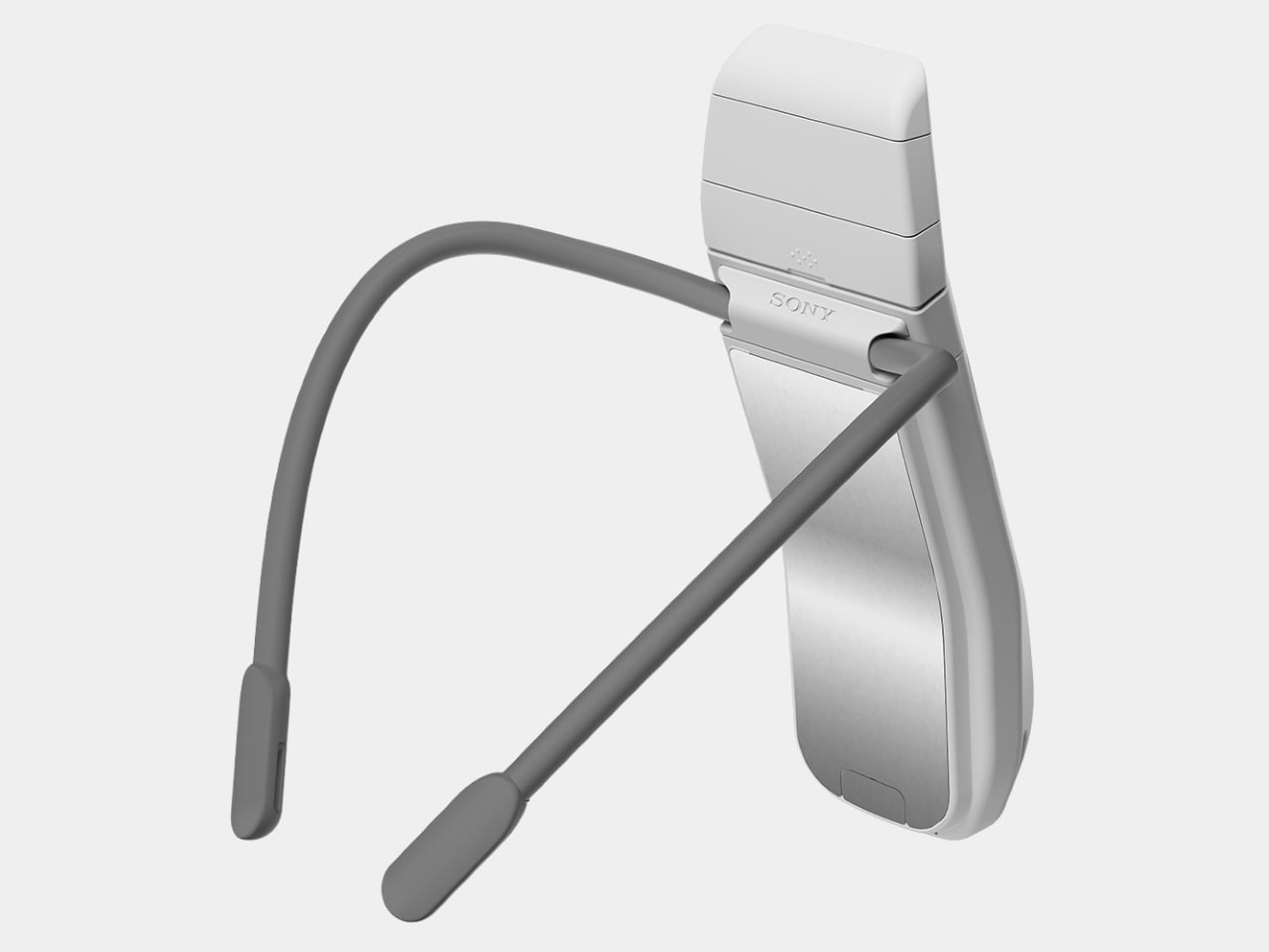
Supporting that is an updated algorithm that reads both skin temperature and environmental conditions in real time. In Smart Cool mode, the REON Pocket Pro Plus reacts on its own as you step from an air-conditioned office into the afternoon sun, or vice versa. A quiet internal fan keeps heat dissipating efficiently, and an automatic shutoff steps in before the device gets too warm.
Fit has also been rethought. Sony’s Adaptive Hold Design uses new neckband fins to press the cooling surface consistently against your skin even as you walk or shift position, reducing the contact interruptions that were a known weak point of earlier models. The air vent that pokes above your shirt collar is now tiltable too, so it doesn’t snag on tighter or thicker fabrics.
The kit includes a second-generation Pocket Tag, a compact sensor clip that monitors ambient temperature and humidity separately from the main unit. That extra layer of environmental data helps the device make smarter adjustments than it could by reading the skin alone. A companion app lets you dial in personal preferences manually, though the REON Pocket Pro Plus doesn’t depend on your phone to function.
It isn’t strictly a hot-weather gadget. Smart Warm mode provides four adjustable heating levels, making the device a reasonable companion tucked under a winter coat as well. Battery life holds up to 10 hours on the second-highest cooling setting, which comfortably covers a full day of outdoor commitments. For longer stretches, the lower cooling levels push that figure considerably further.
The REON Pocket Pro Plus retails for £199 in the UK and around €220 across Europe, with a US launch expected in summer 2026 through Sony’s online store. It’s the sort of gadget that sounds impractical until you’re stuck on a packed commute in July with no airflow. At that point, a small metal plate on the back of your neck starts to sound rather genius.
Somewhere in your home, there’s likely a camera that used to mean something. A Nikon FM2 inherited from a parent, a Canon AE-1 found at a flea market, a Pentax K1000 that still smells faintly of old leather. These bodies were built with a precision and intention that most modern cameras rarely replicate. The feel of a metal shutter, the resistance of a manual aperture ring, the satisfying click of the film advance lever. None of that ever became obsolete. What became obsolete was the film inside.
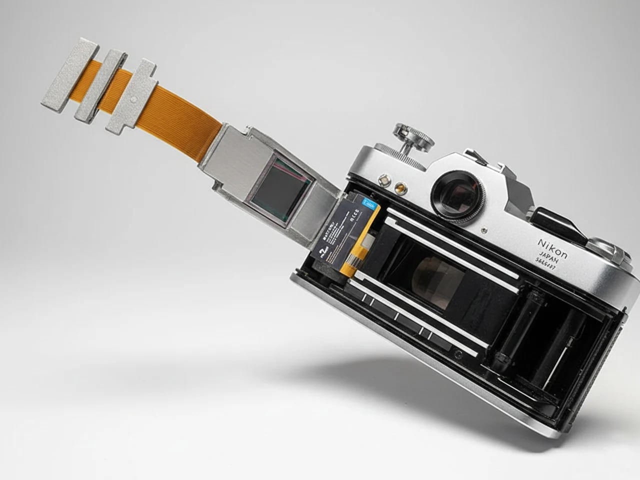
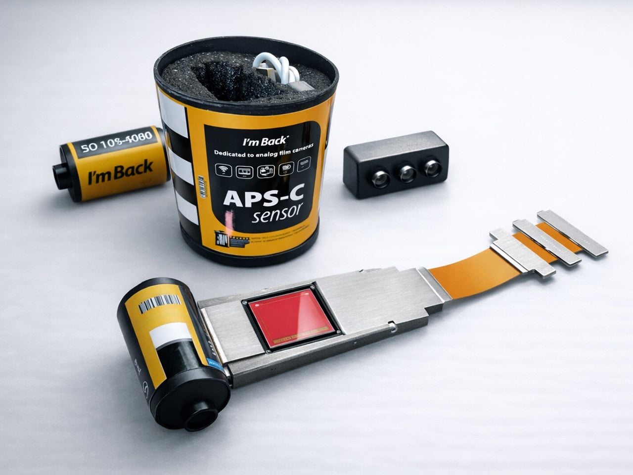
Samuel Mello Medeiros decided to use that space where the film cartridge would go, and create a retrofittable module that turns any analog camera into a digital one. Medeiros’ module slides into the film chamber of any compatible 35mm film camera, and packs a Sony IMX571, a 26.1-megapixel back-illuminated APS-C sensor along with up to 256FB of internal storage, Wi-Fi, Bluetooth, and a rechargeable battery. Dubbed the “I’m Back Roll APS-C”, it’s designed to be compatible with cameras from Canon, Nikon, Leica, Pentax, Olympus, Minolta, and dozens of others. Just put the module into the film canister and you’re ready to shoot. The camera goes untouched. The shutter fires the same way it always did. Images accumulate on internal storage and transfer wirelessly once the shoot wraps. Nothing hangs off the body. Nothing changes on the outside. Future-proofing at its finest.
At the heart of I’m Back Roll is the Sony IMX571, a professional APS-C sensor used in astronomy cameras, where image quality is pushed to its absolute limits. Astrophotography demands sensors that extract clean signal from vanishingly faint sources, which requires exactly the qualities that make a sensor excellent for general photography: low noise, wide dynamic range, and clean performance at elevated ISO. The IMX571 is a back-illuminated design, meaning the photodiodes are exposed to light before the wiring layer rather than behind it, collecting more photons per pixel and delivering measurably better high-ISO output than front-illuminated sensors of equivalent resolution. At 26.1 megapixels, it is designed to preserve the optical character of classic cameras. The APS-C plane measures 23.4 x 15.6mm, producing a 1.5x crop factor, so a 50mm Nikkor on an F3 behaves as a 75mm equivalent, worth accounting for if your collection runs heavy on wide primes.
There is no rear display, making for pure, distraction-free photography. You use the camera as you normally would, setting focus, aperture, and shutter speed just like with film. When ready to shoot, you press the remote control button to activate the digital sensor, then immediately press the camera shutter release. You have roughly one to two seconds after activating the sensor to trigger the shutter. After a few shots, this movement becomes natural and intuitive. For those who prefer a cleaner approach, the new sync button lets you take photos with a single click, just like a normal analog camera, screwing onto the shutter if available, or fixing on top of the button. One press activates the system and triggers the camera instantly. No remote. No extra step. Think of it as just you retrofitting an electric motor on your existing analog bicycle – everything stays the same, but you get a remarkable performance bump.
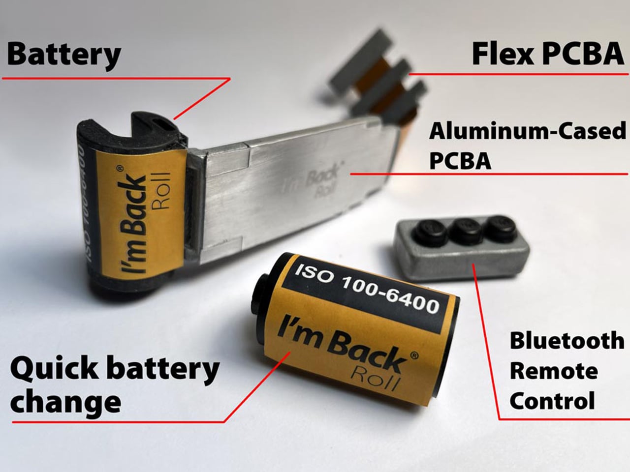
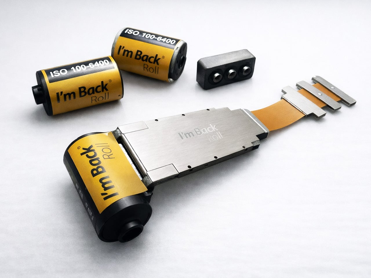
The structure is CNC-machined aluminum, built for durability, heat dissipation, and full internal integration. Running a 26-megapixel sensor inside a sealed metal body with no active airflow is a genuine thermal engineering problem, and aluminum’s conductivity is doing real work here. The battery is compact, stable in power delivery, safe, and easy to replace, enclosed in a protective housing and connecting to the PCBA through a sliding rail system that allows easy and secure replacement. The battery itself takes the exact form factor of a 35mm film canister, sitting in the chamber exactly where your Kodak Ultramax would load, swapping out the same way. The module works like a film roll, approximately 4mm thick. I find the replaceable battery design to be the most quietly clever decision in the entire product. It asks nothing new of the photographer.
The I’m Back Roll is compatible with most 35mm film cameras, including Nikon (F, F2, F3, F4, F5, FM, FM2, FE, FE2), Canon (AE-1, A-1, AT-1, F-1, EOS series), Minolta (X-700, X-500, XG series), Pentax (K1000, LX, ME Super, Spotmatic), Olympus (OM-1, OM-2, OM-3, OM-4), Contax (139, RTS, G1, G2), Yashica, Leica M and R series, Fujica, Konica, Ricoh, Chinon, and Praktica. A dedicated solution was designed for Leica M cameras specifically, featuring a custom back with integrated sensor, no change to camera feel, and the full mechanical experience preserved. Your Leica stays analog, but becomes digital. A semi-transparent frame overlay shows the exact sensor area, using a very light adhesive that is non-permanent and easily removable, placed directly on the viewfinder window so you always know what is inside the final image. Cameras with vertically opening backs, including the Nikon F, Contax II, and Alpa, may require a dedicated back cover produced via 3D printing, though based on previous experience, only three models out of hundreds tested required this.
The I’m Back Roll captures RAW and JPEG, 4K video, and film-inspired color profiles. The fact that it captures 4K video is impressive, since shooting video on a Contax RTS through a Zeiss Planar T* 50mm f/1.4 is a creative proposition nobody had access to when that camera was in production. The unlocked stretch goal brings extra color profiles and film-inspired looks, plus a clean digital mode. The profile lineup covers Kodacolor, Kodak Portra, Tri-X 400, Fujifilm, Ilford HP5, Agfa Vista 200, Cinestill 800T, and Kodak Ektachrome E100, each tuned to the color science and tonal character of its namesake stock. Cinestill 800T carries its signature tungsten-halation glow, Tri-X delivers the high-contrast grain that defined a generation of photojournalism, and Portra’s skin-tone-saturated warmth translates faithfully. The optional external touchscreen display runs 2.5 inches at 400 x 712 pixels on an OLED panel, with up to 1000 nits of peak brightness, connected to the I’m Back Roll via a flexible flat cable.
Storage tiers run 64GB for everyday use, 128GB for creators who shoot more, and 256GB for maximum freedom, with Leica M versions for dedicated rangefinder users. Every reward includes the I’m Back Roll APS-C, remote control, USB-C cable, and a 2-year warranty. The $499 Discovery Kit saves 29% off the MSRP of $699 (with 64GB storage). Concretely, that puts the the Creator Kit with 128GB between $499 and $549 (for the Leica M edition), and the Master Kit with 256GB at $599. All backers also receive a 3-year warranty, with global shipping starting August 2027.
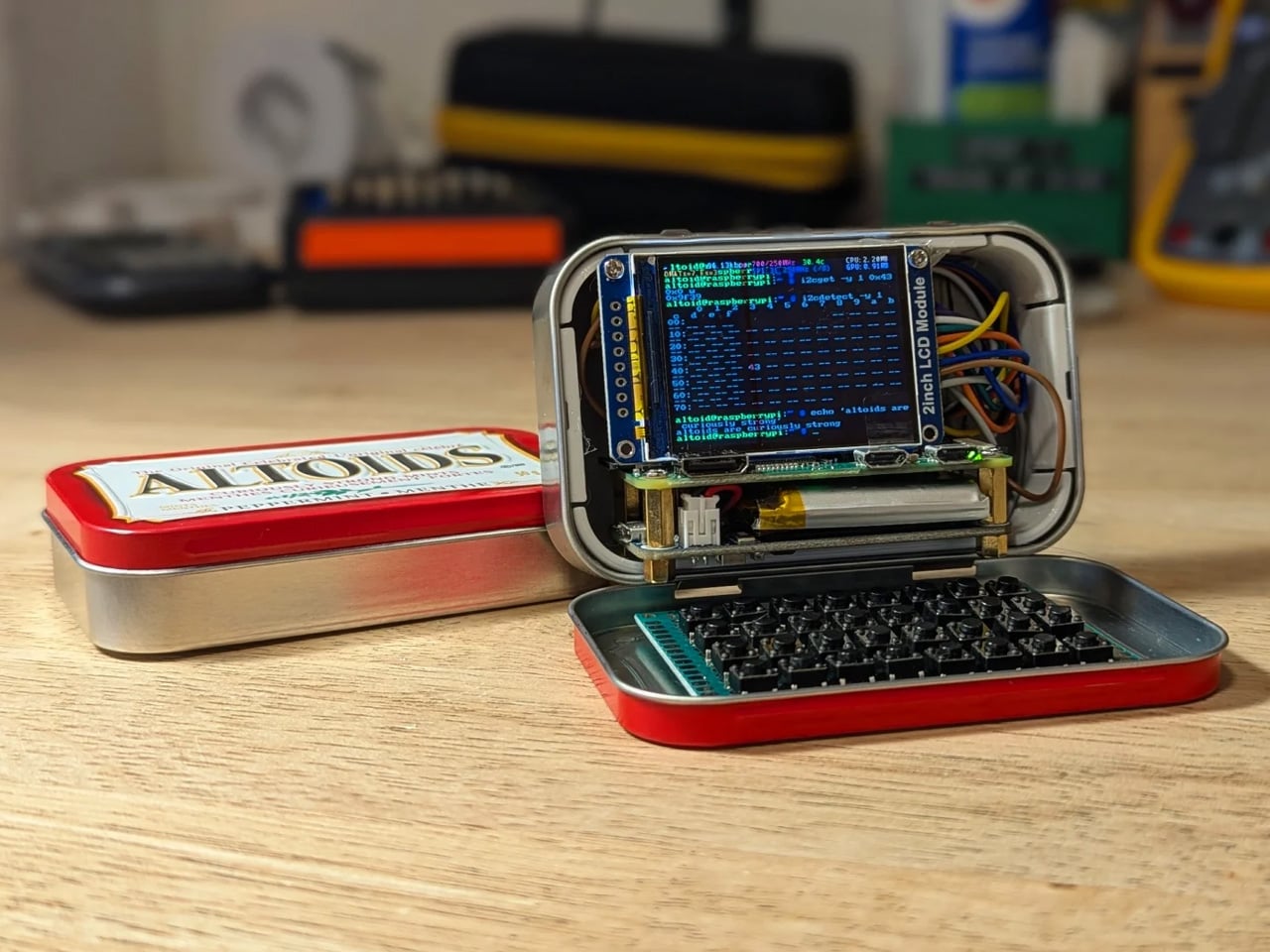
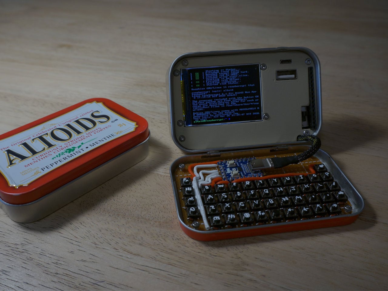
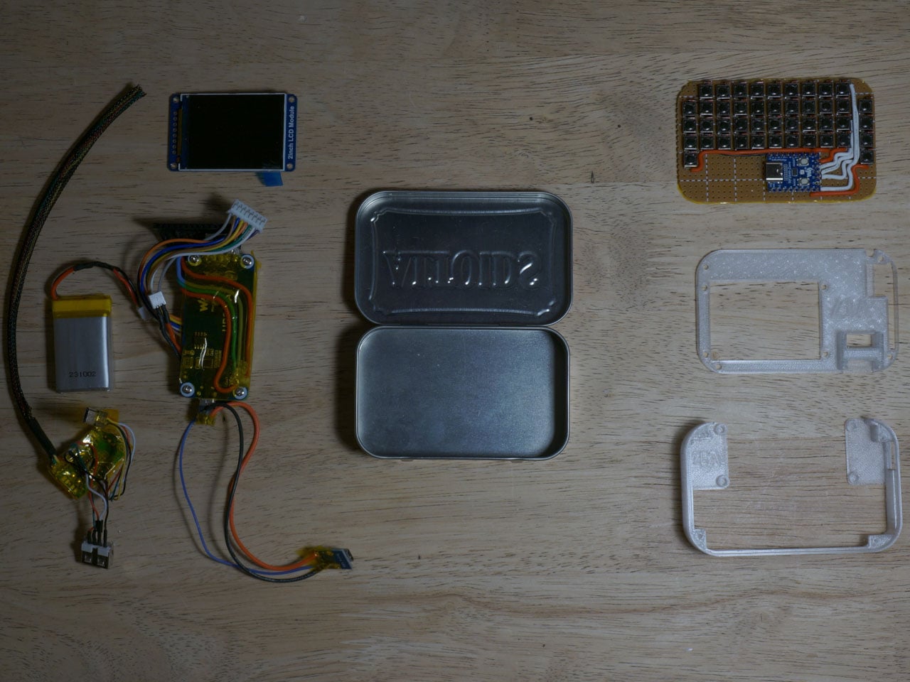
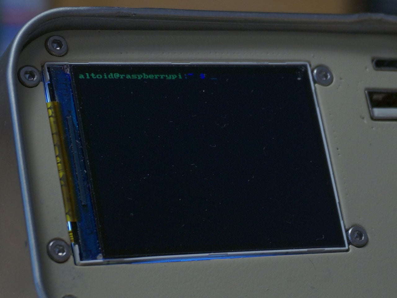
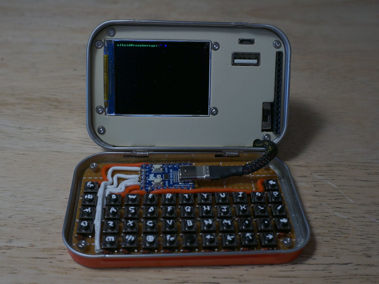
What do you do with your Altoids tins after devouring the mints? Maybe for keeping your coins, hand it over to your mom for storing the sewing accessories, for keeping handy a first aid, or perhaps keep the watercolor paint for your little niece. DIYer “Exercising Ingenuity,” however, has a very unique use for the aluminium container.
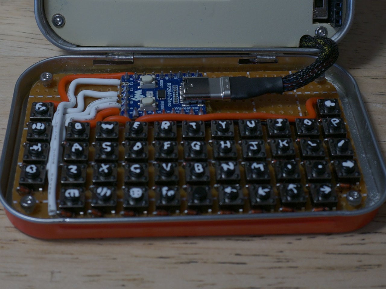
The inventive YouTuber wanted to build a fully functional Cyberdesk inside of the Altoids tin. Sounds bizarre? Surely it is, given the size of the thing. In his video, he asked himself, “That looks like a tiny computer?” It was clear from the outset that the assembly would require the utmost level of detail and sourcing all the hardware inside the tiny housing. While it might not be the most powerful machine you can own, it surely is ultra-portable and quite nice nonetheless.
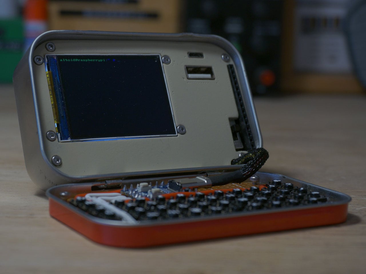
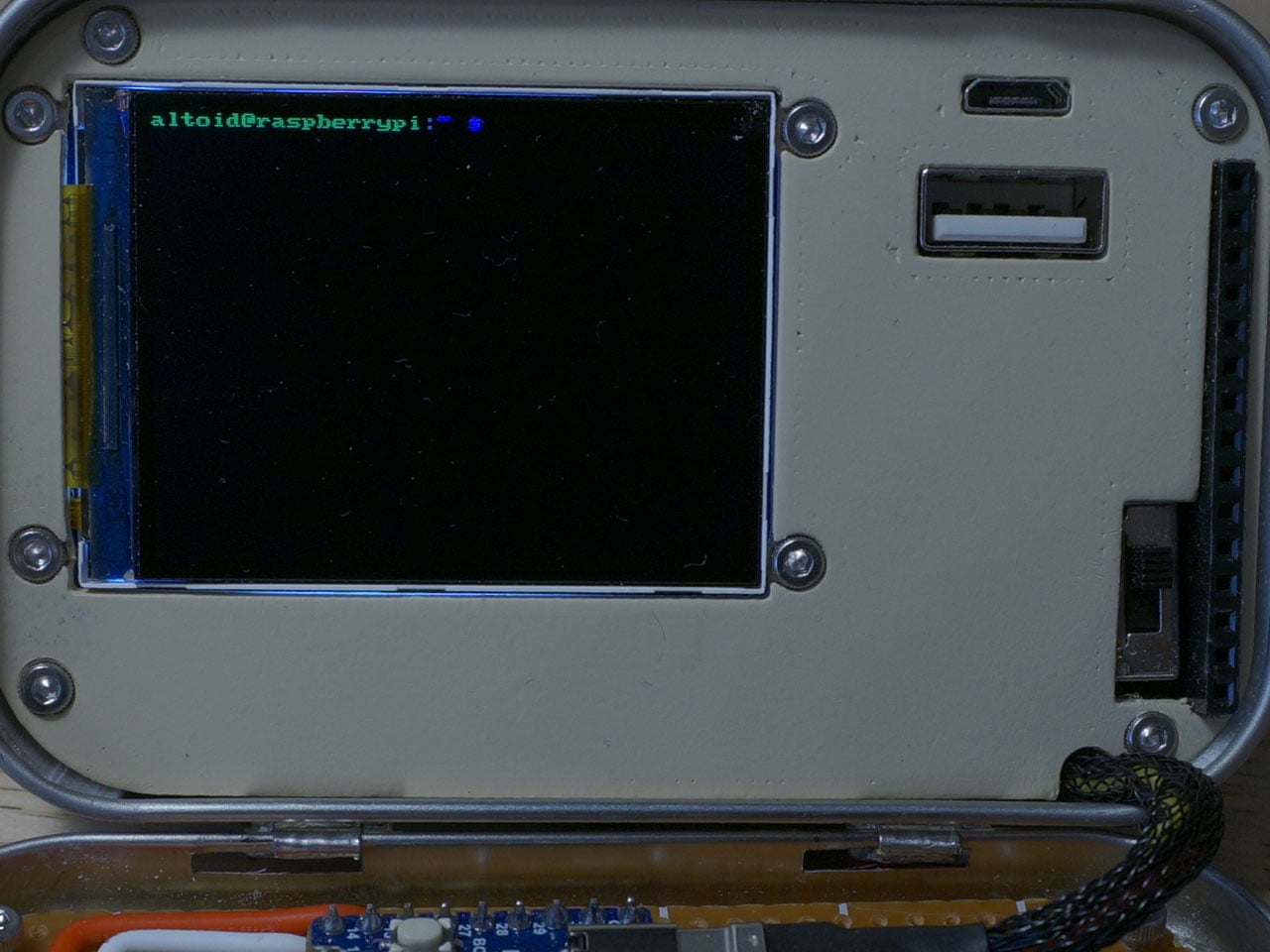
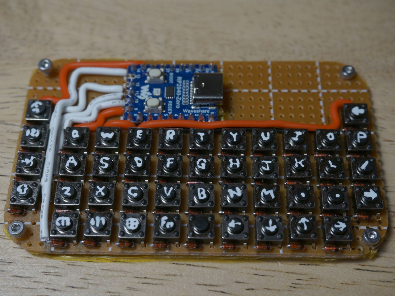
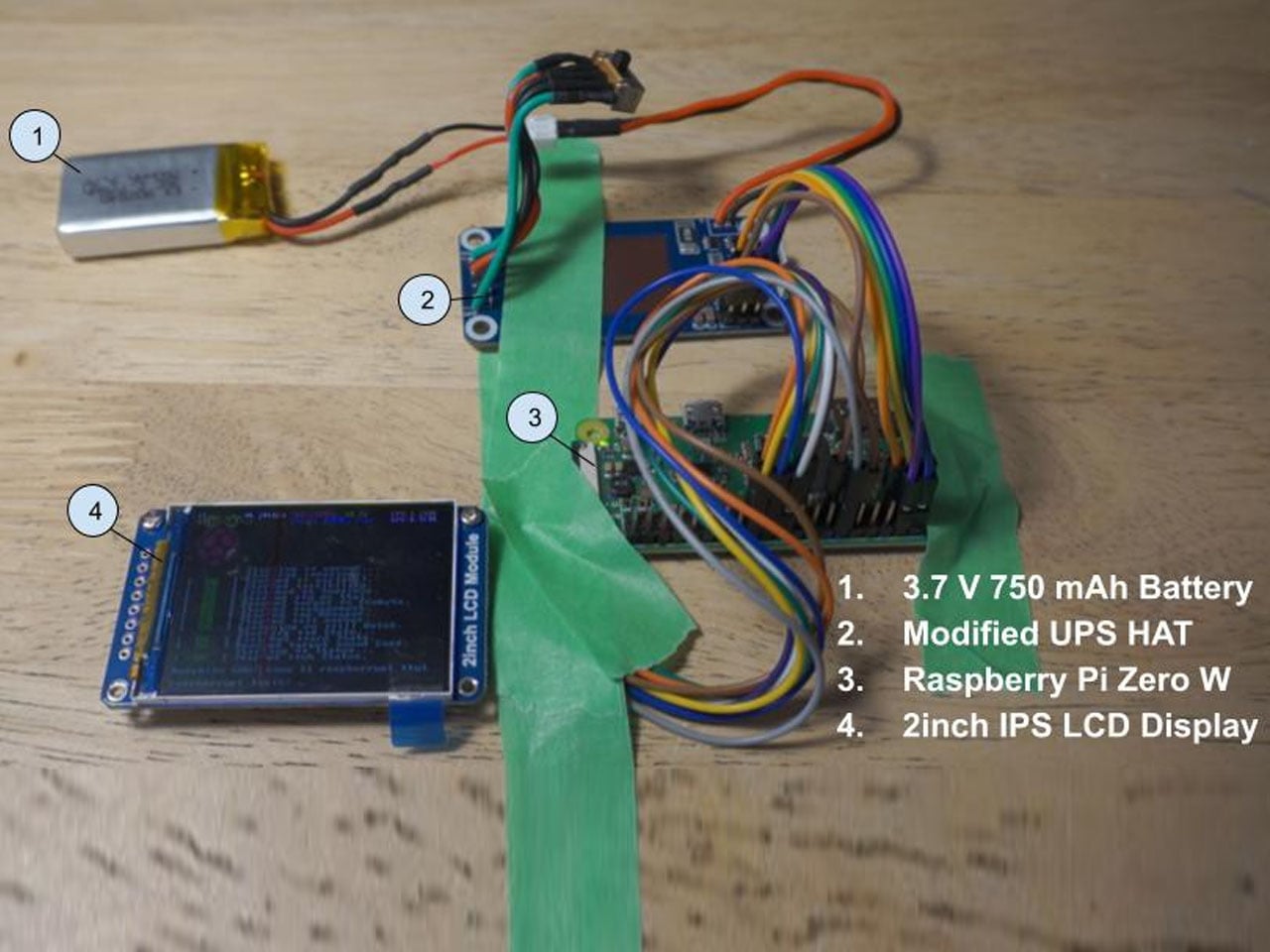
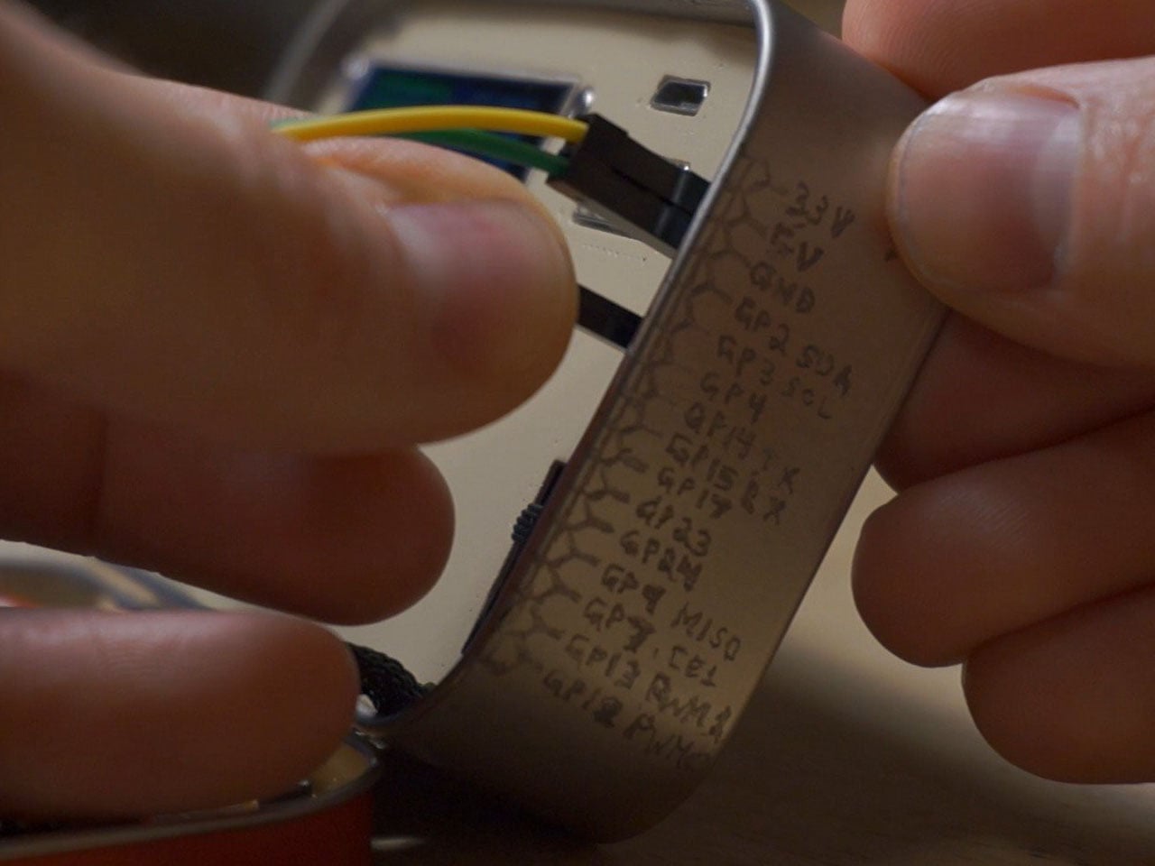
Normally, Cyberdesks are built inside ammo cans, rugged Pelican cases, or anything that has a boxy form factor. The machines piqued in popularity during the 1980s after the science fiction novel Neuromancer. Altoid tins have all these attributes, just the smaller size makes them a very odd proposition in the Cyberdesk world. That said, he set out anyway on putting together the hardware. For the CPU, he used the Raspberry Pi Zero W he had lying around, and a 2-inch LCD from another unfinished project. The power comes from a 750mAh lithium-ion polymer battery.
The real challenge was to find the tiny mechanical keyboard and fit it inside the small space. According to him, this was the most enjoyable part of the project, even though the video suggests it was a difficult one. It required learning how to construct the diode matrix for configuring the input, along with the assembling and soldering methodology of each of the keys. The final step here involved painting the keys with a white ink pen. Once this bit was taken care of, the DIY headed into the moderate level difficulty (at least for us). The next step was to create a 3D-printed frame to keep all the components inside the tin in place.
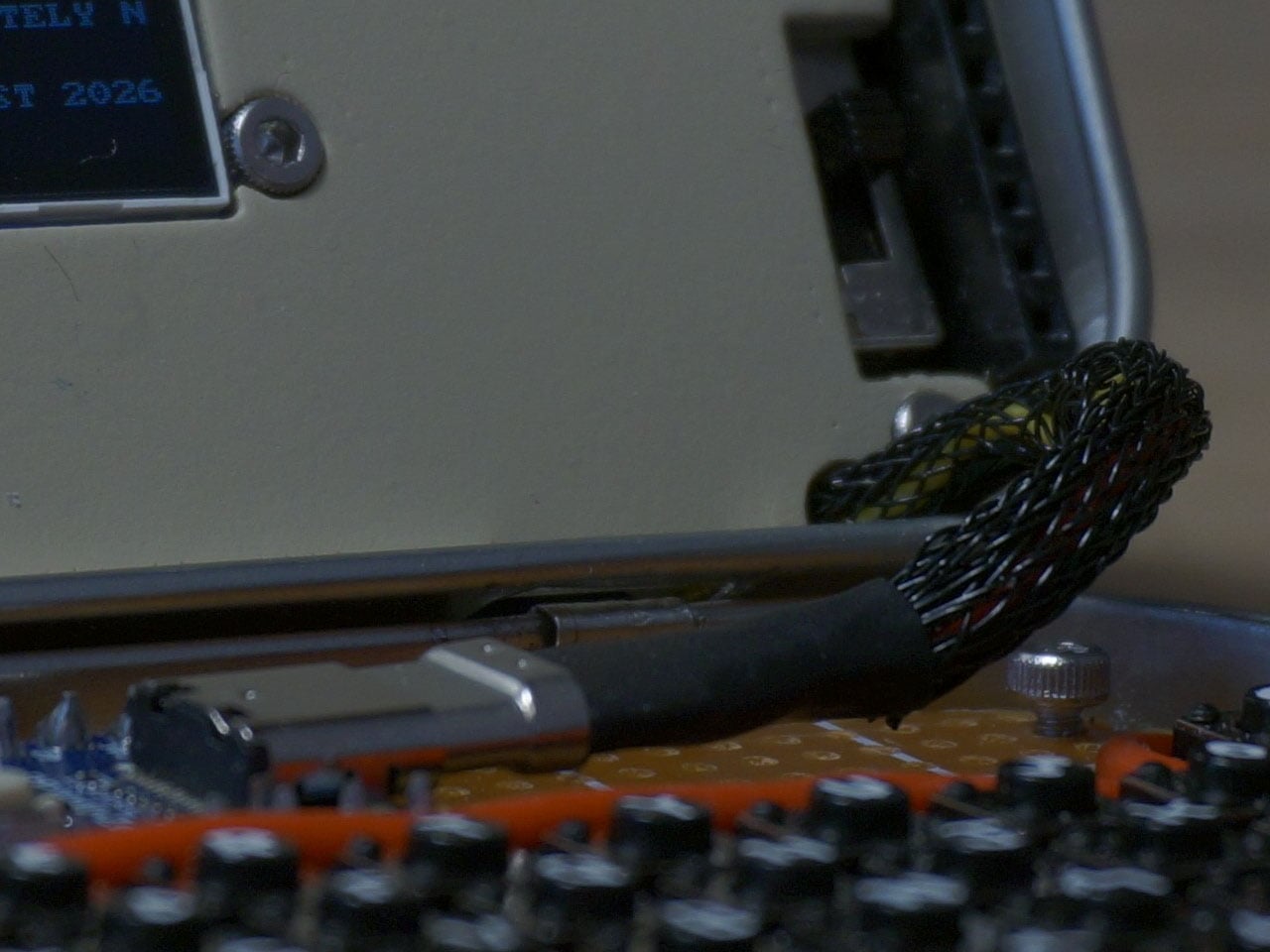
Wiring had to be kept to a minimum, and soldering of other components had to be done efficiently, as space was a premium. As a last step to make more room for components like the UPS HAT board and the display, the original hinge was extended with another Altoids tin hinge for a makeshift, slightly bigger replacement. Once all the hardware components were secured properly inside the tin, it was just a matter of running the system using the software. To make the thing look and feel like a vintage desktop computer, the DIYer painted the front panel beige.
May 2026 is a good time to be paying attention. Gadgets aren’t just getting faster or thinner; the best ones this month are getting more intentional. There’s a shared thread running through every standout: each was built around a real constraint, a real behavior, or a real cultural moment, rather than a spec sheet searching for an audience. Five products rose above the rest, and each earns its spot for a distinctly different reason.
From a foldable phone that demolishes the category’s $800 price floor to a Nintendo Switch add-on that turns a gaming console into a live production rig, the range here is unusually wide. What connects them is the quality of thinking underneath. These aren’t renders looking for investment. They’re real objects designed to change how you work, listen, create, and move through a day. That’s the only brief that actually matters.
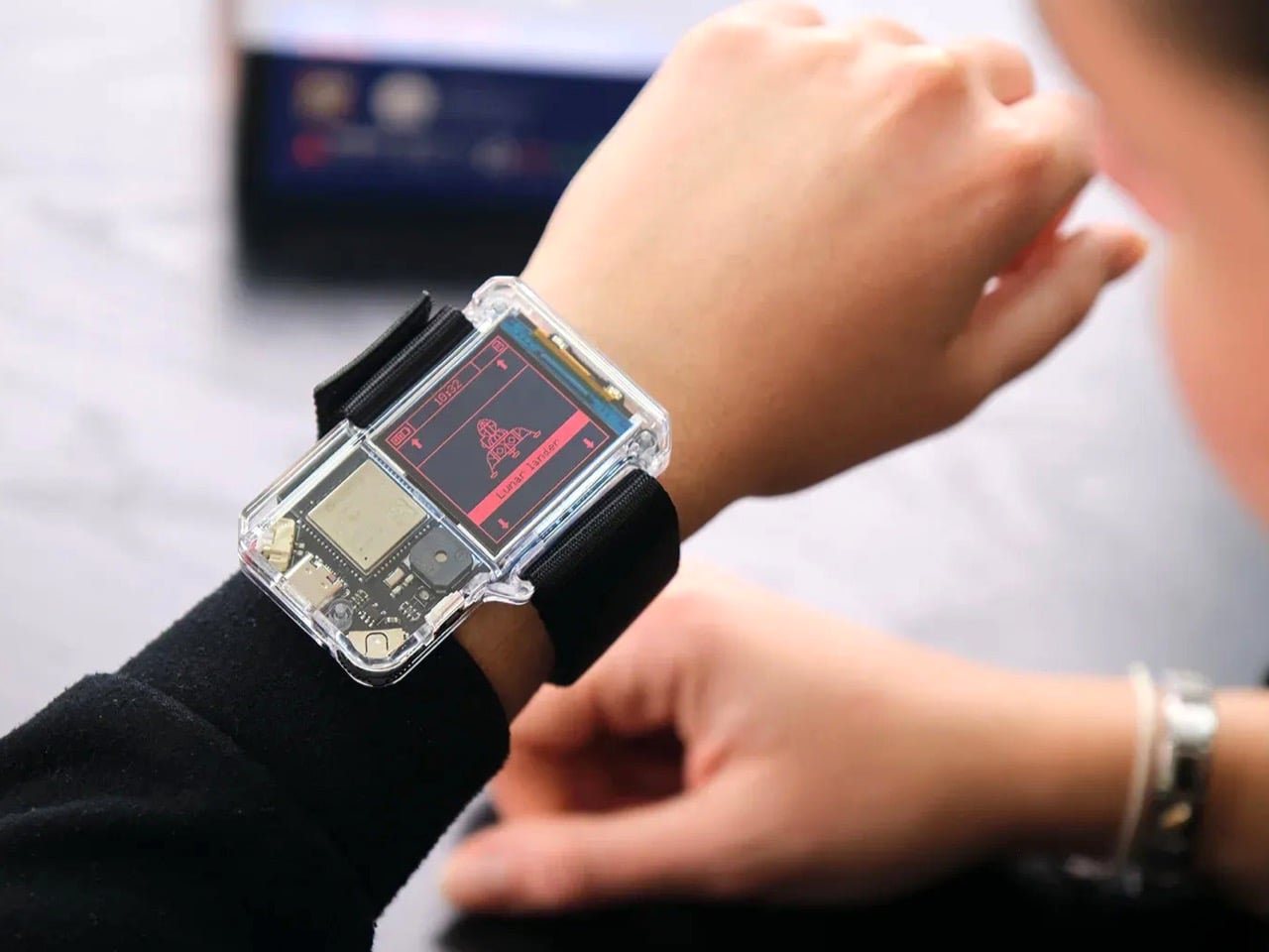
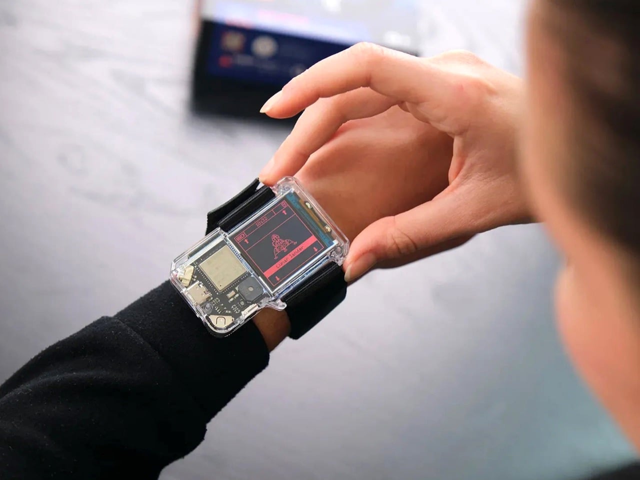
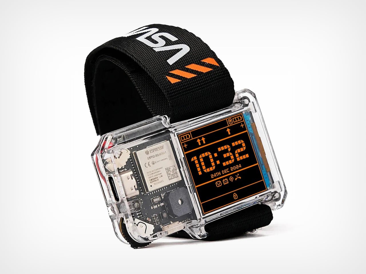
1. NASA Artemis Watch 2.0
NASA’s Artemis II lifted off from Kennedy Space Center on April 1, 2026, carrying four astronauts on humanity’s first crewed lunar journey in over 50 years. CircuitMess timed the NASA Artemis Watch 2.0 directly into that cultural gravity. At $129, it’s a fully assembled, ready-to-use programmable smartwatch built around a dual-core ESP32 microcontroller, with a full-color LCD screen, accelerometer, gyroscope, compass, and temperature sensor packed into a wristband designed for anyone aged nine and up who wants more than a fitness tracker strapped to their wrist.
What makes it worth your attention is the depth it offers without demanding anything upfront. Out of the box, it pairs with iOS and Android over Bluetooth for activity tracking and notifications. When curiosity takes over, the firmware is fully open-source and reprogrammable in Python, CircuitBlocks, or the Arduino IDE. Build custom watch faces, write your own apps, and modify sensor behavior as far down as you want to go. The Artemis Watch 2.0 is one of the rarer gadgets at this price: it genuinely grows with the person wearing it.
What we like
Fully open-source firmware supports Python, CircuitBlocks, and Arduino, giving both beginners and experienced coders meaningful room to explore and build
Ships fully assembled and ready to use straight out of the box, lowering the barrier to entry without removing any of the technical depth underneath
What we dislike
At $129, it asks for more commitment than most impulse purchases in the kids’ tech category allow for
Screen performance in direct sunlight hasn’t been addressed in any available documentation
2. OrigamiSwift Mouse
Every frequent traveler has made the same quiet compromise: leave the proper mouse at home or carry something too small to work with comfortably for more than an hour. OrigamiSwift was built precisely around that problem. It’s a Bluetooth mouse that folds flat when not in use, weighs just 40 grams, and opens into full working position in under half a second. The origami-inspired form isn’t a styling exercise. It’s a structural answer to the oldest tension in portable peripherals: comfort has always cost you size.
The ergonomic shaping holds up across extended work sessions, which matters more than most product pages acknowledge. Whether you’re finalizing a presentation at an airport gate or editing documents in a co-working space, OrigamiSwift stays comfortable in your hand and disappears into a bag when you’re done. The ultra-thin profile and minimal build weight mean it never adds anything meaningful to your load. For anyone who genuinely works from wherever they happen to be, this is the mouse that finally makes sense to own.
40-gram weight and flat-fold profile make it practically invisible in any bag, disappearing entirely until you actually need it
Sub-0.5-second activation means there’s no friction at all between being packed and being productive
What we dislike
Available listings don’t confirm DPI range or scroll wheel responsiveness for anyone doing precision work
Bluetooth-only connectivity may create compatibility friction with older desktop setups that lack wireless support
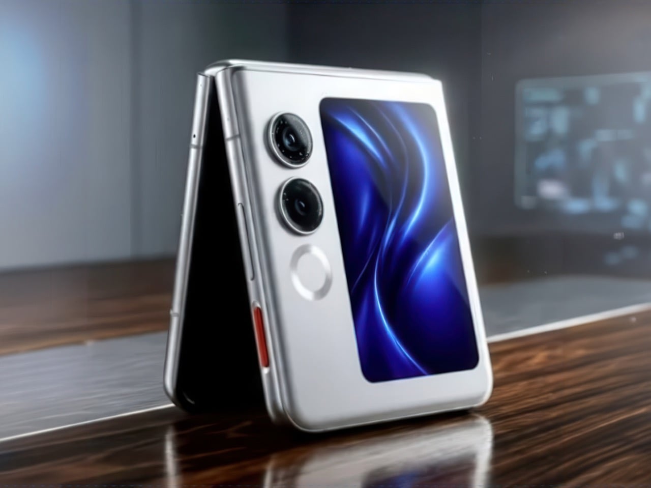
3. Ai+ Nova Flip
The foldable phone category has spent five years convincing itself that the flip experience carries a natural premium of $800 or more. Ai+ is testing that assumption head-on with the Nova Flip, launched in India at Rs 29,999, roughly $320, making it the most accessible foldable phone on the market. The inner display is a 6.9-inch AMOLED panel resolving at 2790 x 1188 pixels, complemented by a 3.1-inch AMOLED cover screen. MediaTek’s Dimensity 7300 handles processing, paired with 8GB of LPDDR4X RAM and 256GB of internal storage.
The spec list doesn’t read like a budget compromise. A 50-megapixel primary camera, a 32-megapixel front shooter, and a 4325mAh battery with 33W wired charging all hold credibly against devices at double the price. 5G, NFC, and an IP64 dust and splash rating close out a package that would feel serious in any category. The Nova Flip doesn’t just undercut the competition on price. It quietly forces a harder conversation about what the flip form factor has genuinely been worth at $1,000 all along.
What we like
$320 pricing opens the foldable phone experience to an entirely new audience that the category has ignored since its beginning
The 4325mAh battery is a genuinely surprising capacity for the flip form factor at any price point, let alone this one
What we dislike
The 2-megapixel depth lens reads as the weakest component in an otherwise strong and well-considered camera array
Long-term hinge durability at this price tier is unproven and worth tracking carefully over time
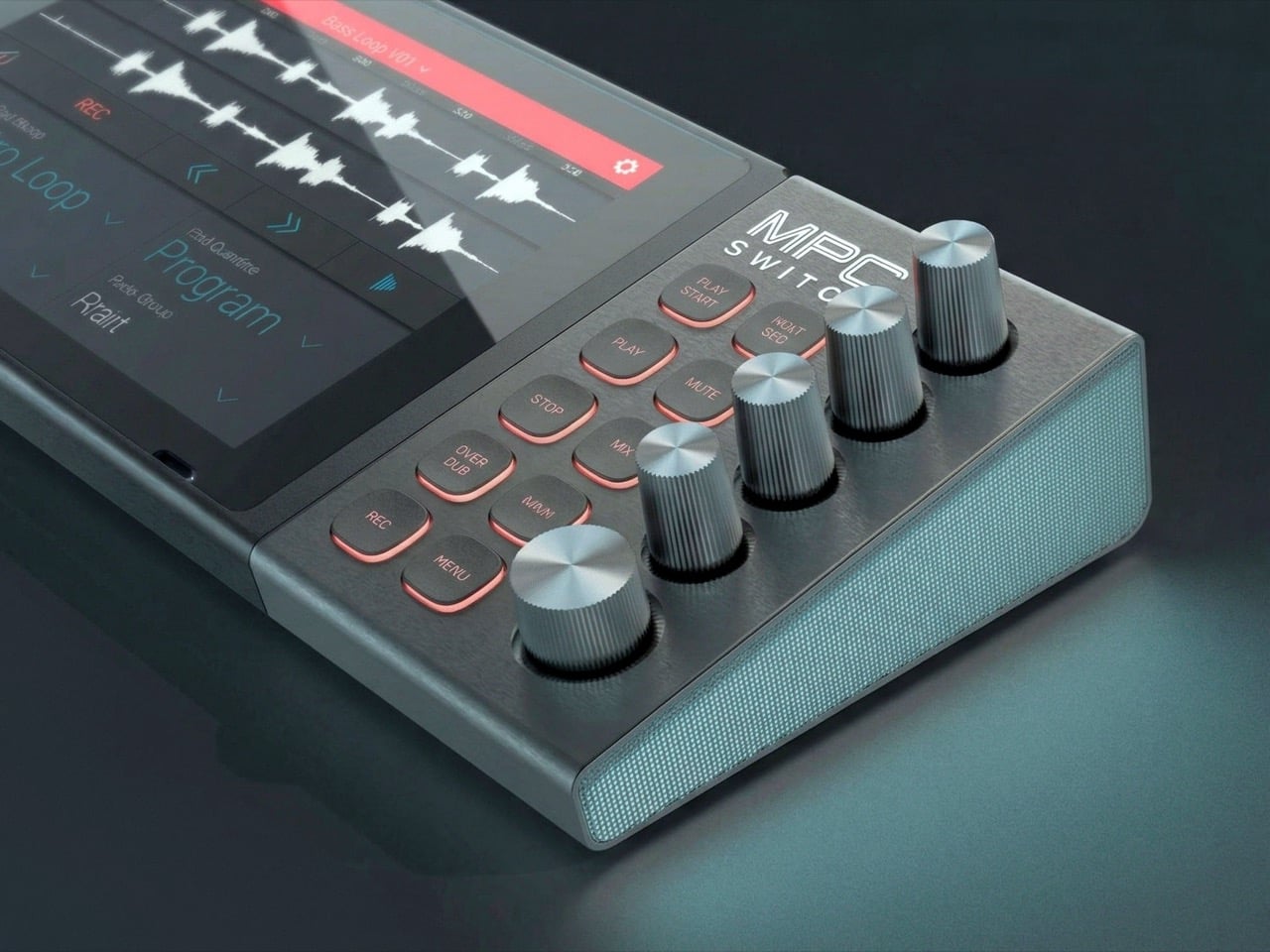
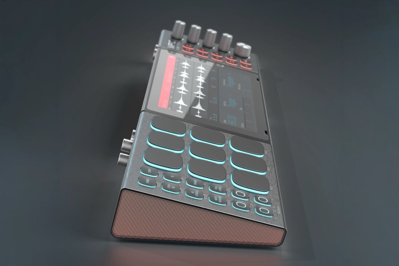
4. Akai MPC Switch
Alquemy’s Akai MPC Switch concept asks a question that feels obvious the moment someone finally puts it to you: if laptop-grade software can run on portable hardware, why can’t a capable gaming console handle serious music production? The MPC Switch is a pair of controller units designed to snap directly onto the sides of a Nintendo Switch, replacing the Joy-Cons with MIDI inputs, outputs, and a full DAW running on the console’s own screen. The control layout reflects real production workflows rather than a stylized render built for social media.
The appeal runs deeper than the novelty of the form. The concept treats the Switch as a legitimate interface surface: something you game on when you need to and produce or perform on when the moment calls for it. Swap the Joy-Cons for the MIDI setup, and you’re there. Whether Nintendo or Akai ever moves this into production is a separate question entirely, but Alquemy has made a persuasive case that the idea deserves a real answer. The best concepts don’t just look good. They make you wonder why nobody shipped it first.
What we like
MIDI integration and a credible DAW interface position the Switch as a serious production platform rather than a novelty peripheral
The Joy-Con snap mechanism makes the transition between gaming and music production genuinely seamless in concept
What we dislike
No confirmed production timeline means this remains aspirational, with no clear path in your hands
The Switch’s processing ceiling may be a real constraint for complex, multi-layer production sessions
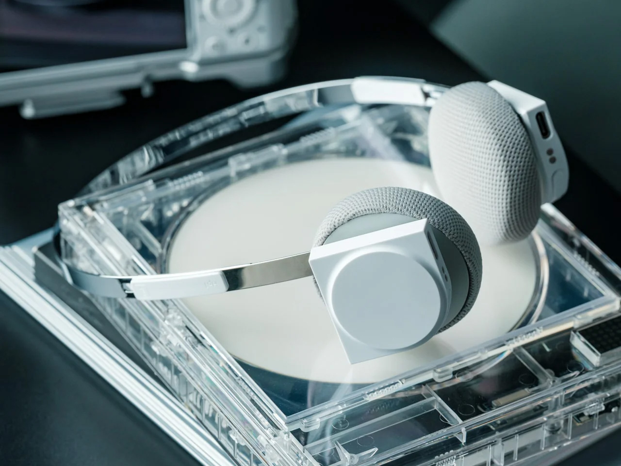
5. StillFrame Headphones
Most headphone designs land at one of two poles: the over-ear build that announces itself before you even put it on, and the in-ear solution that disappears but gives nothing back in soundstage. StillFrame lands somewhere more considered than either. At 103 grams, it sits closer to weightless than wearable. The 40mm drivers are tuned for a wide, open soundstage that pulls spatial detail and melodic texture out of tracks that most headphones flatten into undifferentiated background noise.
Active noise cancellation closes you off when focus demands it. Transparency mode reconnects you to the room when the world around you matters more. Battery holds at 24 hours, covering a full workday, an overnight flight, and the morning after with no cable required. Switching between modes takes a single tap. StillFrame was designed around the premise that how you listen should adapt to where you are, not the other way around. That’s a harder brief to execute cleanly than it sounds, and the weight alone suggests it’s been taken seriously.
103 grams is a genuinely rare achievement for an over-ear headphone carrying both ANC and full-size 40mm drivers
24-hour battery life covers the kind of all-day, real-world use that most headphones in this category only claim to handle
What we dislike
No published information on codec support, like LDAC or aptX, for listeners who prioritize wireless audio fidelity
Colorway and finish options appear limited in current listings, which may be a sticking point for buyers who care about visual identity
The Only Standard That Matters Is the One You Can Feel
May 2026’s strongest gadgets share something harder to write into a spec sheet than battery life or pixel count. Each was designed around a specific friction point and resolved it with a precision that feels purposeful rather than accidental. The Artemis Watch converts a cultural moment into a learning platform. The Nova Flip resets the floor of an entire category. The OrigamiSwift solves a portability problem that dozens of mice before it never genuinely addressed.
StillFrame and the Akai MPC Switch represent opposite ends of the development spectrum, one shipping and one conceptual, but both make the same underlying argument: that considered design changes the terms of what a product is allowed to be. Whether you’re optimizing a travel bag or rethinking a music studio from a gaming console, the standard these five set is worth taking seriously. The best gadgets this month aren’t the loudest ones in the room. They’re the most resolved.
Tabletop roleplaying games have an accessory problem. The dice alone can take over a corner of any gaming table, each one representing a different die type that the rules will inevitably call for at the least convenient moment. Tracking down the right d10 mid-session, or explaining to a new player why there are two different ten-sided dice in the bag, is just one of those small but reliable annoyances that experienced players have long since stopped questioning.
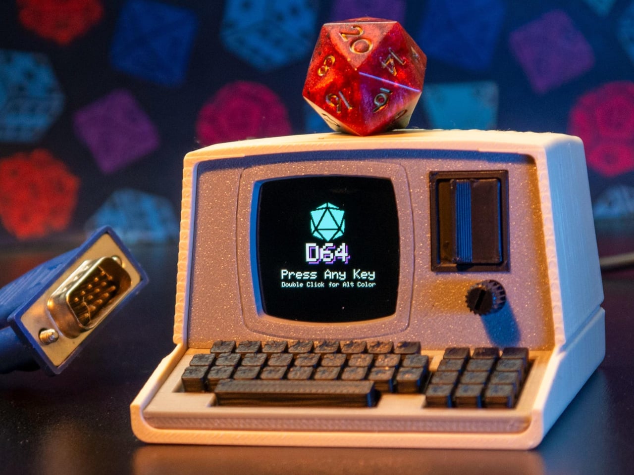
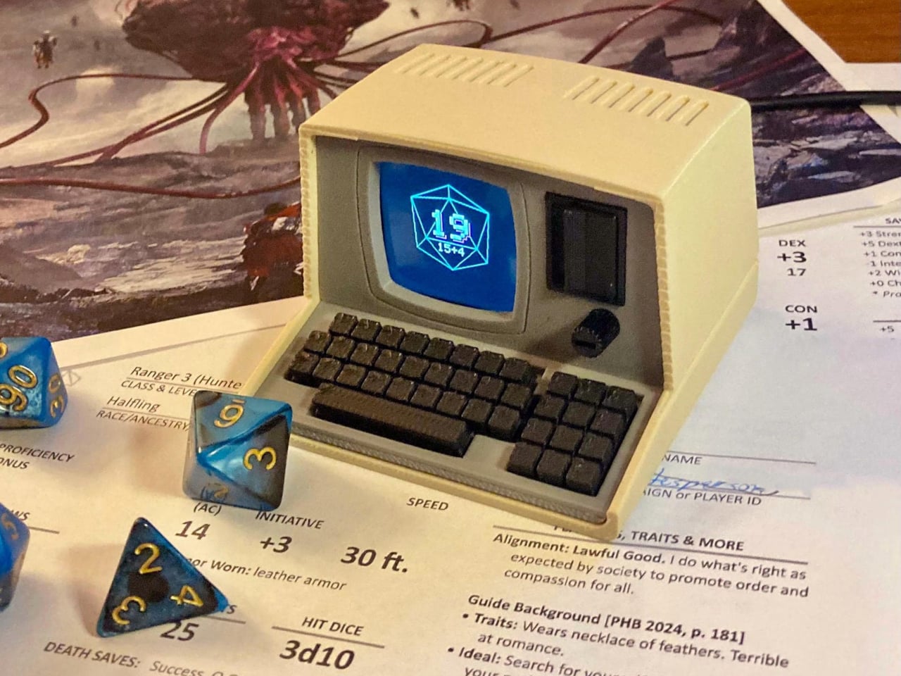
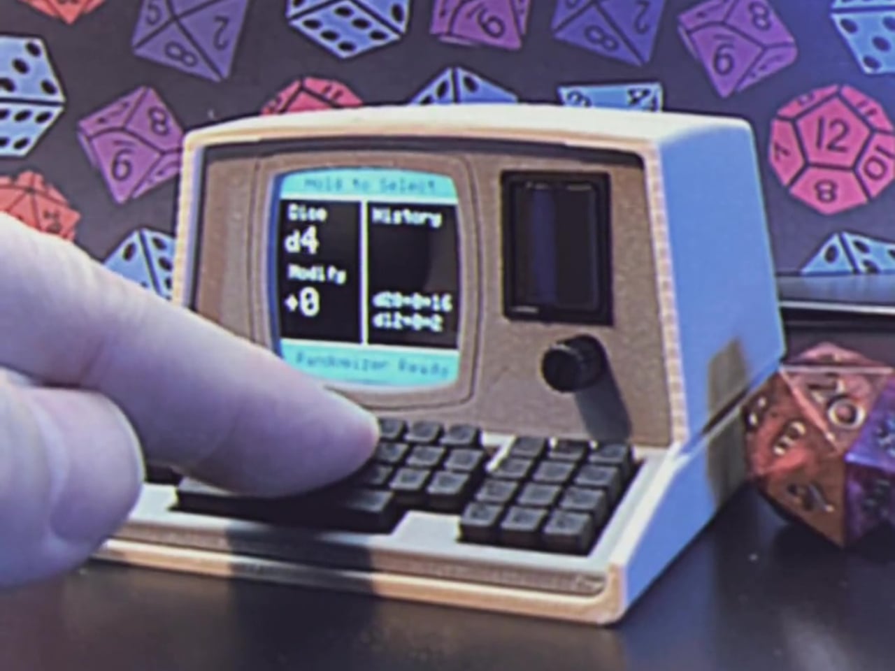
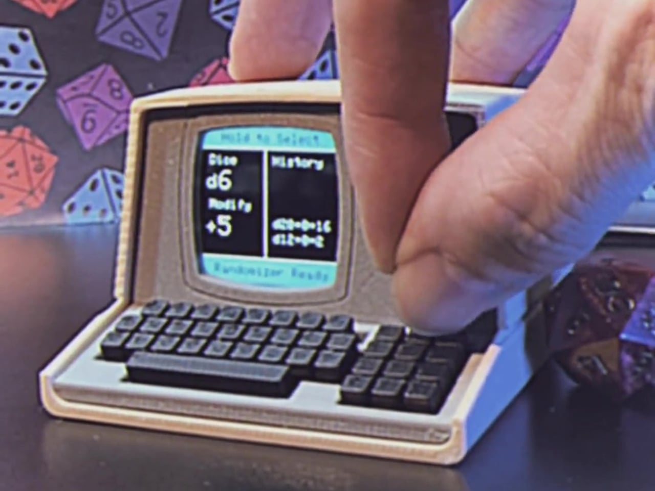
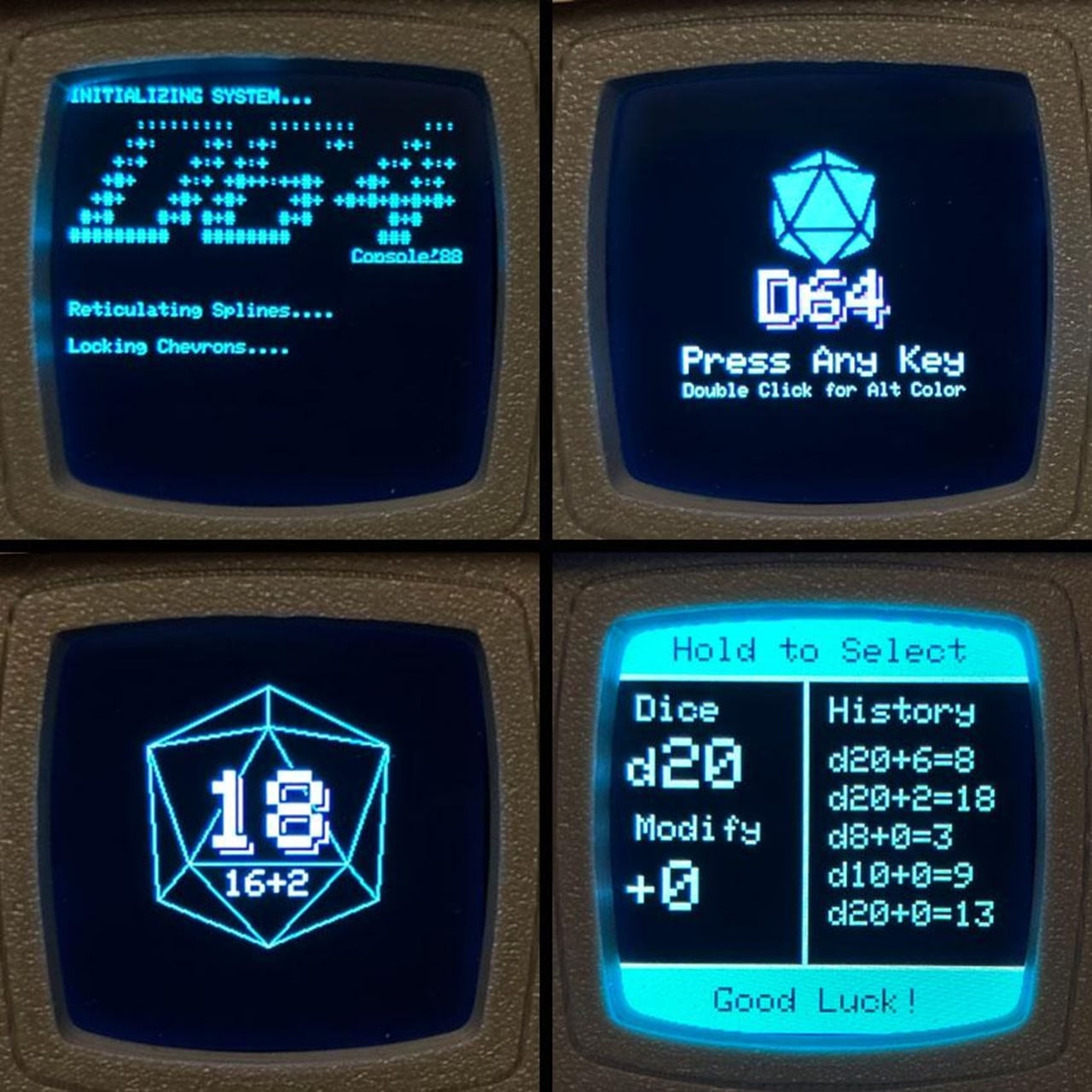
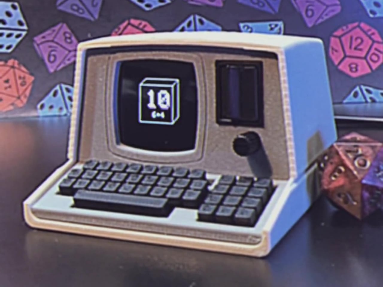
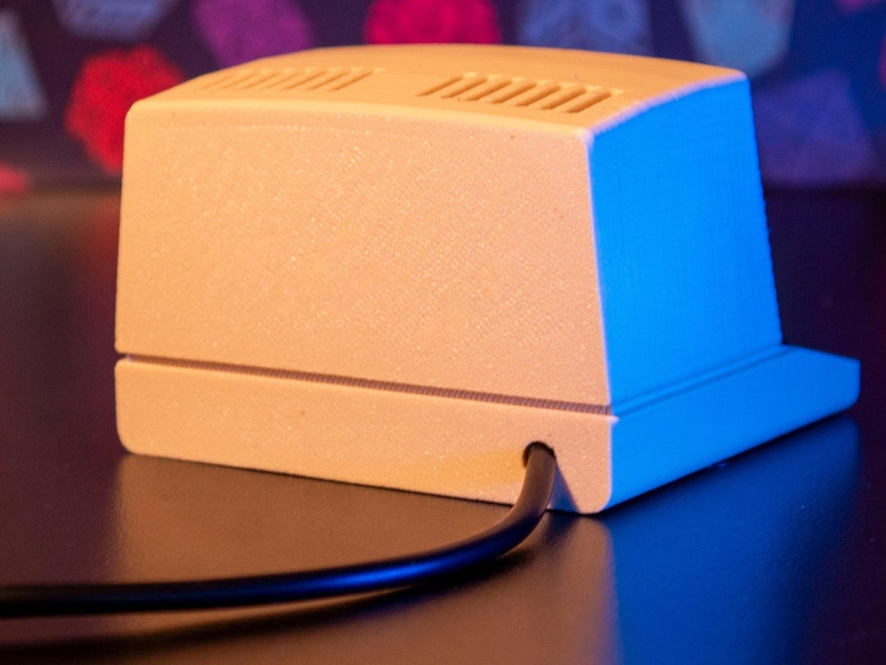
The Console’88 from d64Computing is a compact digital dice roller that handles the entire set from d4 through d100 in a single device, the size of a pocket calculator. What makes it genuinely interesting, though, isn’t just the function; it’s that the designer chose to dress it up as a miniature 1980s computer, complete with a CGA color display, vector graphics, boot-screen text, and the kind of visual language that looks like it was pulled straight out of a 1984 computer catalog.
Selecting a die type is done through a rotary dial and a button underneath the faux keyboard, which fits the era aesthetically and keeps the interaction simple. Spin it to the die you want, and get your result. The randomness runs at microsecond precision, so the results are genuinely unpredictable rather than cycling through a predictable sequence. For anyone who’s ever side-eyed an app-based roller and wondered about its actual randomness, that’s a meaningful detail.
The sounds are what push it over from clever gadget into something with real personality. The Console’88 plays 1980s video game audio when you roll, and it apparently has dedicated sound effects for critical successes and critical failures, which is the kind of contextually appropriate design decision that’s easy to appreciate at an actual gaming table. A crit that’s announced by a triumphant eight-bit jingle lands differently than a number quietly appearing on a phone screen.
There’s an argument to be made for physical dice that has nothing to do with practicality. Rolling actual dice is tactile, dramatic, and central to the experience for a lot of players. But for anyone who travels frequently to gaming sessions, runs games for beginners without their own dice, or simply wants something that takes up less space on an already crowded table, a single device covering every die type is a reasonable swap to make.
The design commitment here is what separates the Console’88 from a generic electronic dice app. This thing looks like it belongs on a desk next to a Commodore 64, and reviews consistently call out the visual quality of the vector graphics and the charm of the retro computer case. It’s a product that clearly started from an aesthetic vision rather than pure function, and the function turned out to be genuinely good on top of it.


 technology that lets the screen bend, fold, and adapt to angles and surfaces that no rigid display can match.