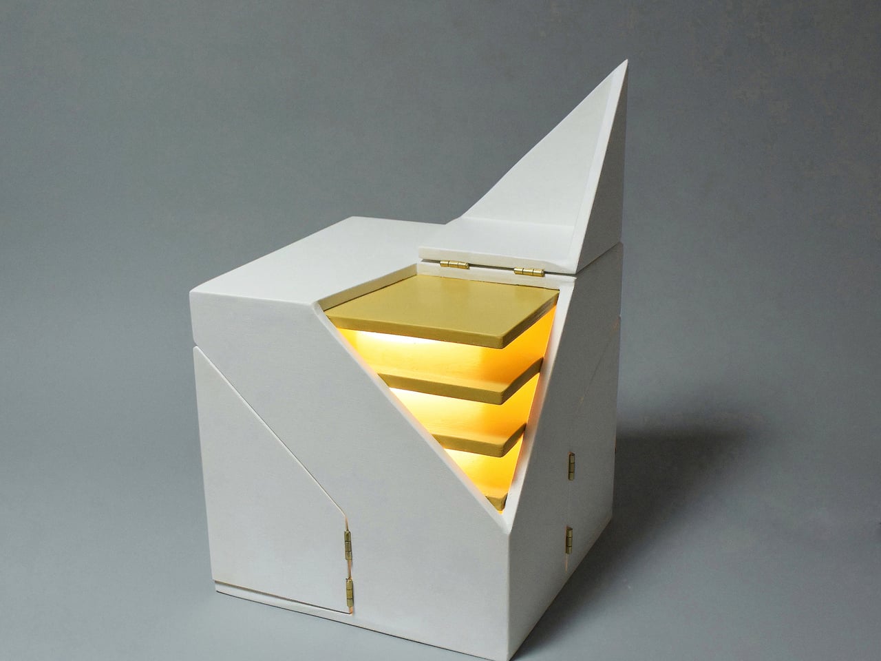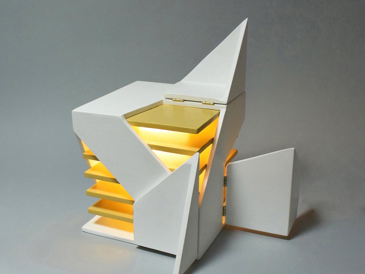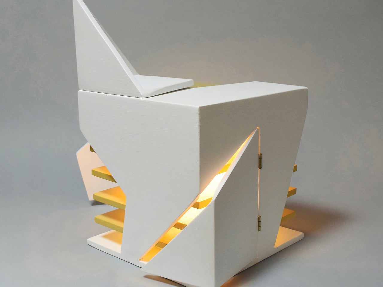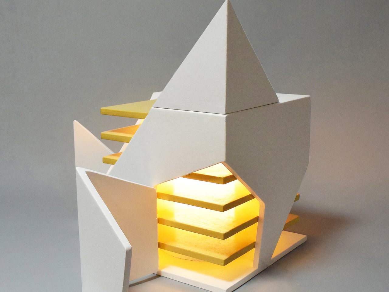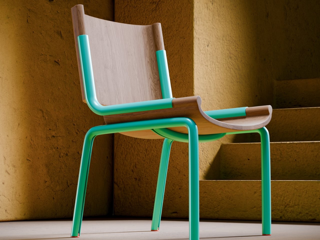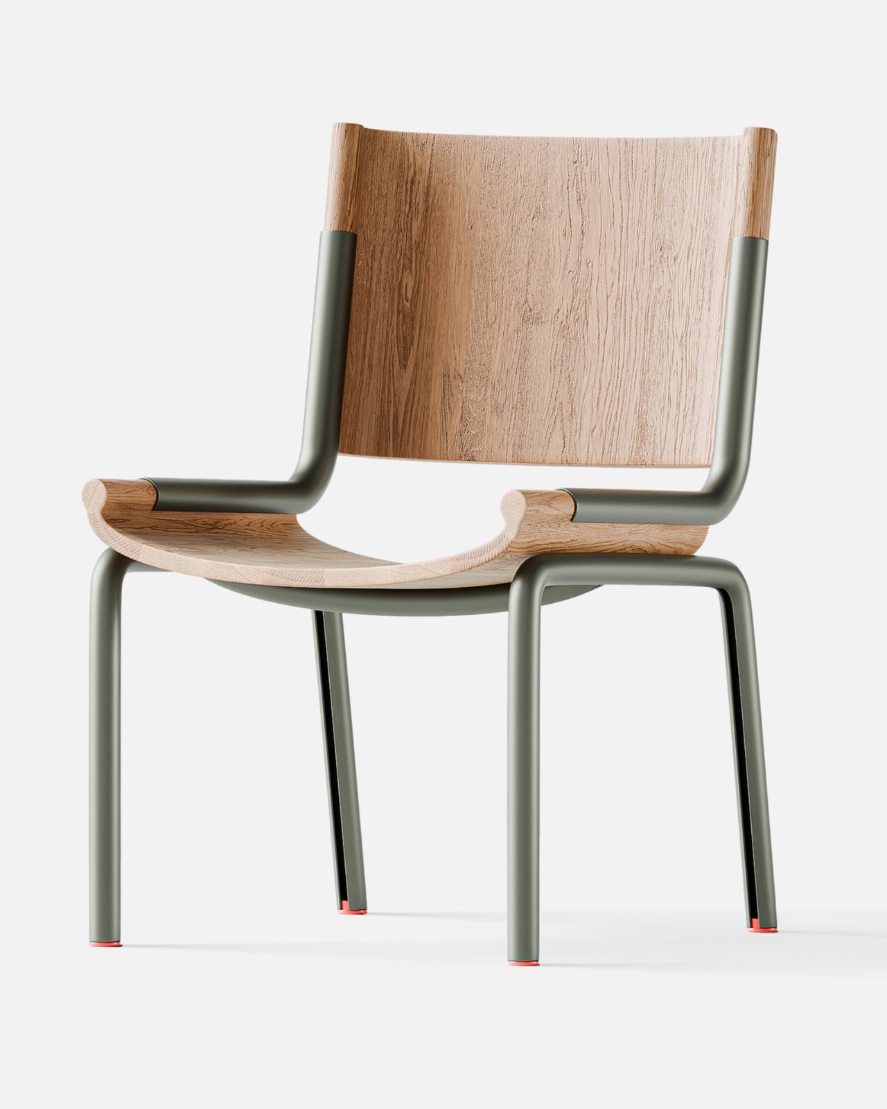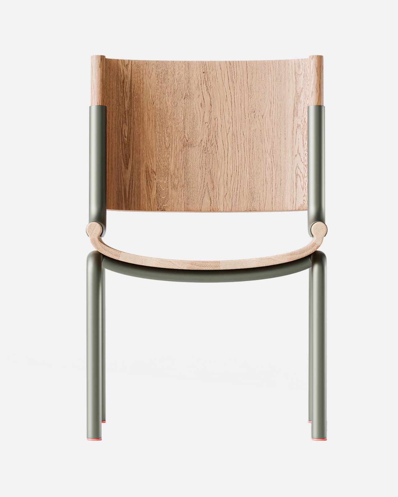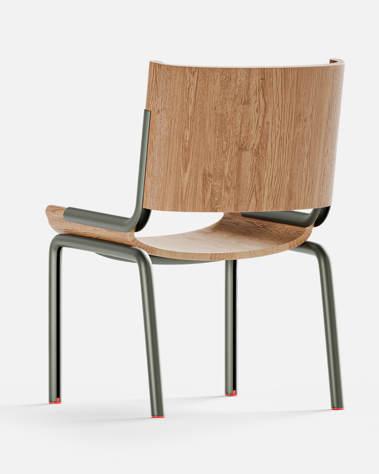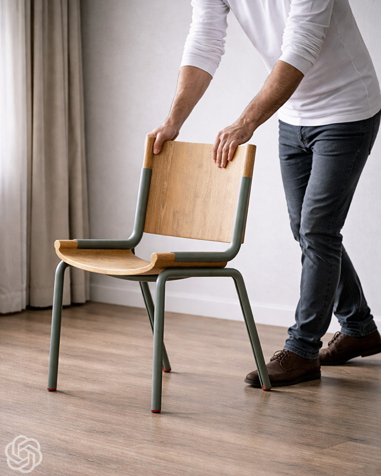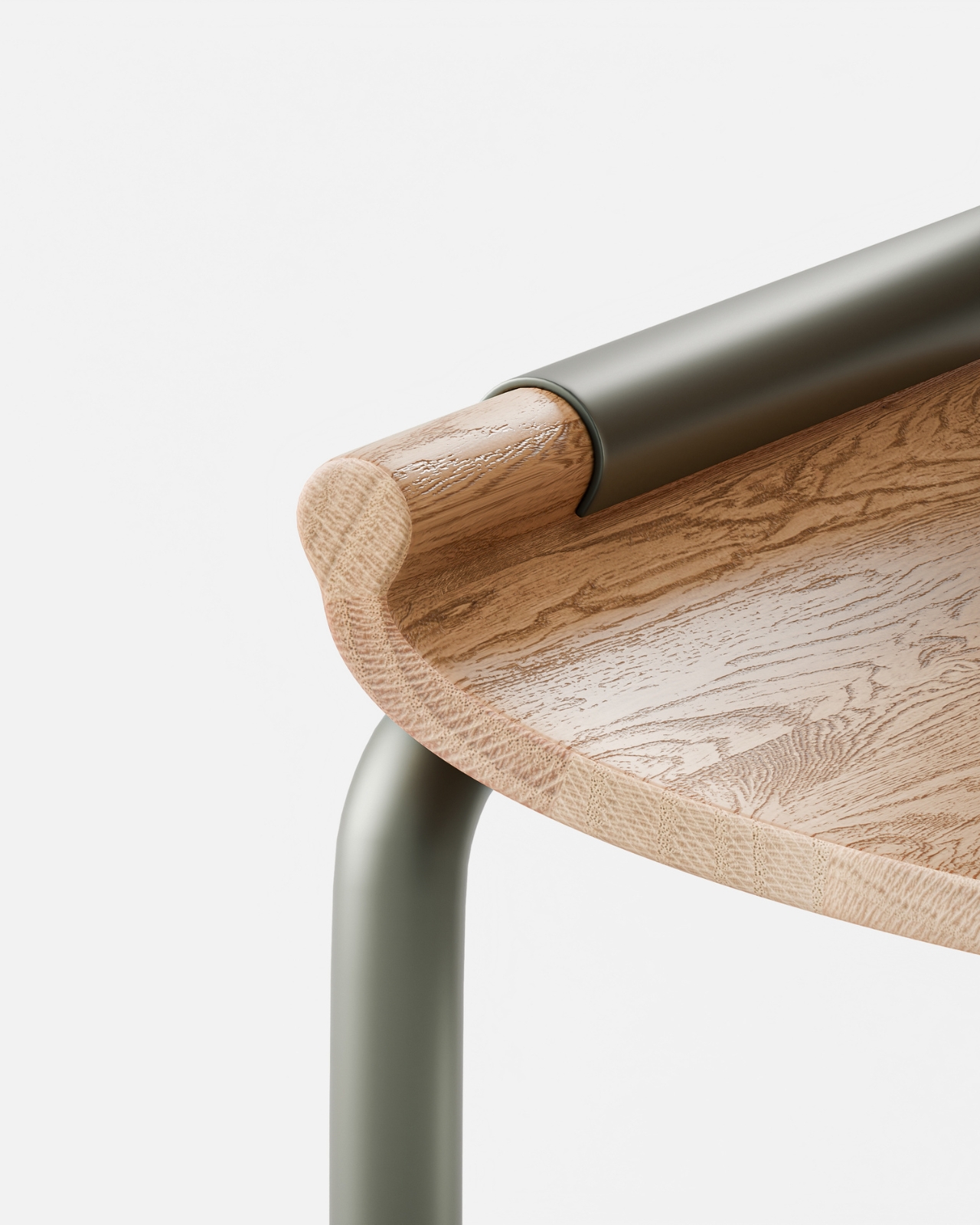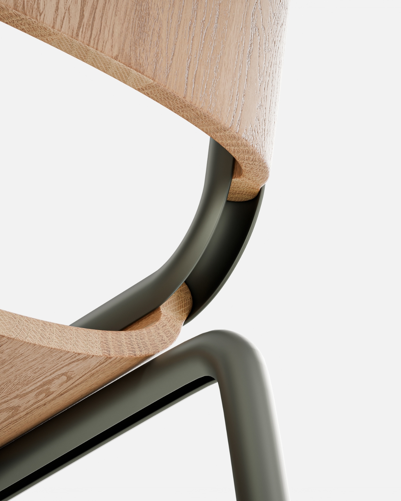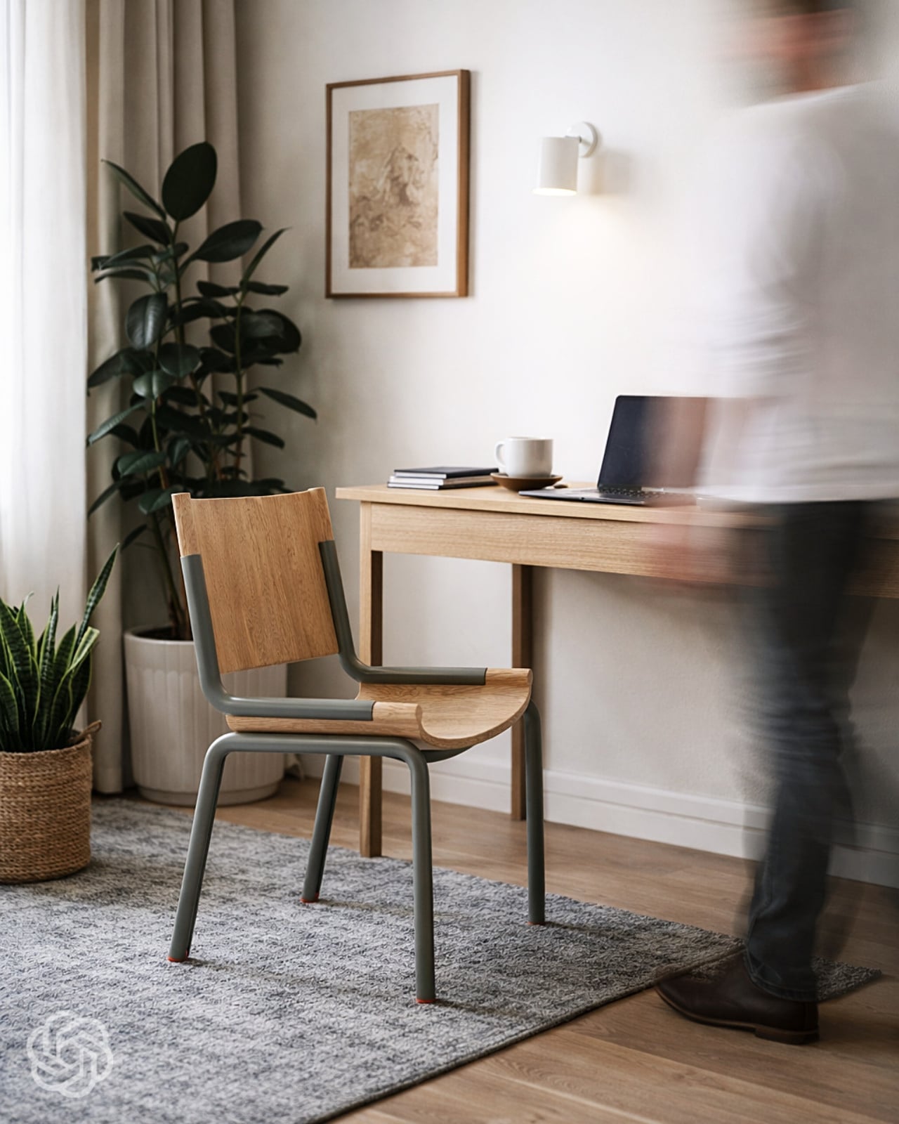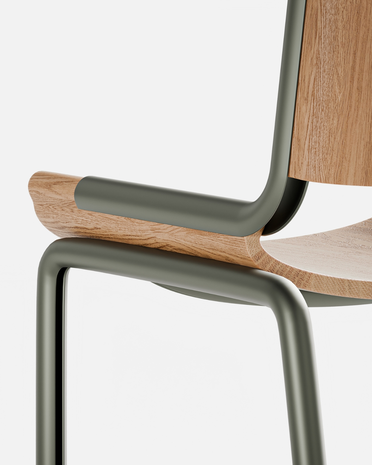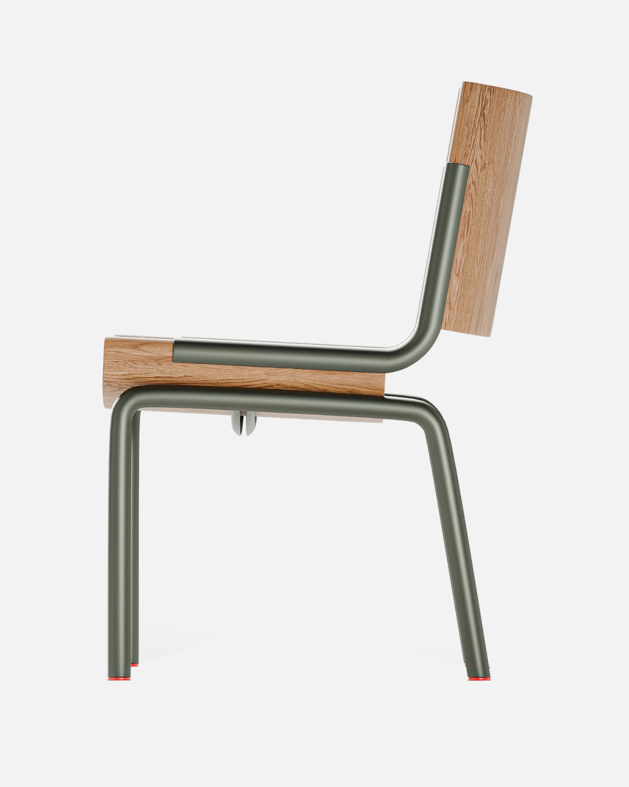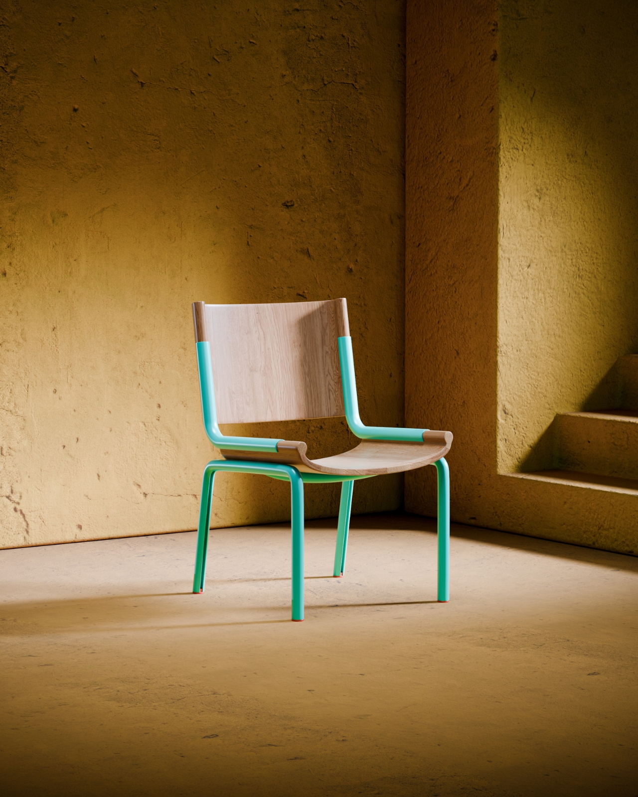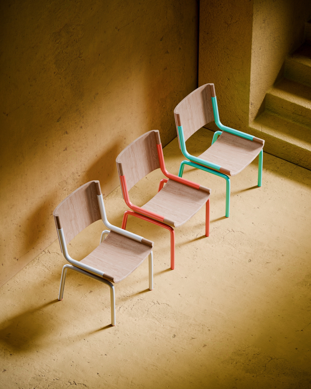
Polycarbonate plastic chair can be turned into side table

People have different tastes when it comes to furniture, even something as functional as chairs. There are those that look for comfort while there are those that just want something they can sit on when working. There are people who look for highly aesthetic chairs that can fit into their space while there are those that like to look for more experimental kind of chairs.

Designer Name: Liam de la Beyodere

If you’re the last kind of person, this chair concept might be right up your alley. The Push Fit Chair uses frosted injection-moulded polycarbonate plastic for its parts. When you push them together and assemble it, you get a chair that sports a crystal-clear aesthetic. The idea is for light and colors to flow through the chair and lets it cast different patterns and shapes on nearby surfaces.

You can also remove the backrest part of the chair if you want to just have a stool type of furniture. You can also put the backrest on the side so you get a side table along with your chair. There is also space under where you can store items like books and knick knacks. If you put the full chair with the chair/side table together, then you have a more complete set.

Chairs made from polycarbonate plastic may not seem the most comfortable but based on the renders, you get something really pleasing to the eyes. And of course, we love multi-functional and modular things here, so that’s another bonus fro the Push Fit Chair.

The post Polycarbonate plastic chair can be turned into side table first appeared on Yanko Design.

Smartphone enclosure concept helps develop good relaxation habits

As powerful and as useful as our smartphones might be, they can also be stumbling blocks not only for productivity but also for mental health. Incessant notifications and the fear of missing out (FOMO) add to the stress and anxiety of the modern world. Of course, ditching your smartphone is no longer an option these days, which is why several designs try to meet the problem halfway, many utilizing minimalist interfaces or drab gray screens to limit our smartphone interaction. Those, however, only solve one part of the problem, leaving many people still unused to taking breaks or relaxing. This concept design for a smartphone accessory tries to do exactly that, keeping your phone safely away from your reach while also helping you get into the habit of taking good breaks from time to time.

Designer: Jeongmin Ham

The most basic strategy people use to avoid distractions from their phones is to put it away, either at a distance or inside a drawer, creating some friction or obstacle to getting the phone instantly. While it can be an effective strategy for some, it’s also a missed opportunity for the smartphone to do something, well, smart. Short of using it as a timer, which can also lead to temptations, it can perhaps be utilized for some other function while keeping its normal distracting features at bay.

FIKA is a concept design for an accessory that does exactly that, keeping your smartphone from distracting you but also putting it to good use in training you to take breaks and use those breaks wisely. It is pretty much a cage or enclosure where you put the phone in, blocking complete use of the device except for a small circular window to a part of the screen. This is the only place where you’ll be able to see the phone’s guidance on how to take a break properly, somewhat like guided meditation apps that have become quite popular these days.

The idea for FIKA is to not just simply put your phone away to avoid distractions but also to develop good habits of taking breaks. And while different people take breaks differently, not everyone has an idea of how to do so properly, so FIKA can suggest certain actions like breathing exercises. Over time, the reminders and the case might not even be needed anymore, as you would have developed the habit and willpower to do it on your own.

The concept design sadly leaves a lot of questions unanswered, like how one will be prevented from just fishing out the phone without some locking mechanism. It also doesn’t mention how the circular window actually works, whether it is just a hole that leaves a part of the phone’s screen exposed or if it’s a touch-sensitive surface that “passes” touches through to the phone inside. Still, the core idea is interesting enough to warrant further thought, especially in an age where people’s mental and physical health has been in decline due to smartphones and overworking.

The post Smartphone enclosure concept helps develop good relaxation habits first appeared on Yanko Design.

Vertical car concept is designed for narrow lanes and cramped spaces

The majority of concept designs that we see for future automobiles seem to revolve around self-driving vehicles cruising along wide and nearly empty highways. Given our present reality, however, the future might not be as idyllic as those images try to conjure up, at least in terms of traffic volume. There is a higher probability that there will be even more cars in the future, self-driving or otherwise, and people will be competing for even less space on roads. This concept, in contrast, bucks the trend and imagines a car that not only has to be driven manually, it is also tall and narrow enough that clearance doesn’t become a problem, allowing it to deftly navigate through traffic and tight spaces, today and tomorrow.

Designer: Rishav Kumar

The Project OVAL concept is actually made of two parts, both embracing the idea of a more vertically oriented design. On the one hand, there is a vertical oval for the steering wheel which, along with matching the general shape of the vehicle itself, also saves space inside the cabin. The steering mechanism is attached to the side of the car, almost as if it’s floating, since the vehicle practically has no front, let alone a dashboard for the steering wheel to connect to.

The car, on the other hand, is a rather unique spin on a two-person vehicle that prioritizes the economy of space over anything else. There is practically nothing in front of the driver and side passenger save for that oval steering wheel and two pedals. There is space behind the seats for baggage and, presumably everything else that makes the car run. Save for the pillars, the sides and roof of the vehicle are transparent, as is the front, giving passengers a panoramic view of the world around them.

This ultra-minimalist car is designed to easily navigate narrow city roads which will presumably be even more packed in the future. The slim and narrow body is also a boon for parking spaces which are already a rare commodity today. By also removing everything in front of the passengers, the car also gives more freedom of movement and comfort, even though it might feel a bit cramped as far as the width goes.

Project OVAL doesn’t preclude some self-driving mechanism, especially given how there’s no instrumentation panel to inform drivers of the car’s current state. It is entirely possible that the front glass will have a transparent display that makes all that visible as well, creating a rather dramatic futuristic visual. An autonomous system will definitely help save even more space if you remove the steering wheel and pedals, but such manual controls might be even more necessary if highways become even more congested in the future.

The post Vertical car concept is designed for narrow lanes and cramped spaces first appeared on Yanko Design.
Remote control redesign lets you use the device without even looking

Even with the advent of smart TVs and streaming, remote controls are still an indispensable part of that user experience, imperfect as it may be. The basic design of remote controls has changed very little, save for the extra minimalist variants that, in exchange for simplicity, sometimes make you crawl through menus and options just to get to the function you need. More importantly, however, the complexity of these electronic accessories has made them too stressful to use, and their tendency to get stuck in the corners of couches was a meme even before there were memes. This concept tries to revolutionize the remote control design to deliver a more tactile experience that lets you operate or even pick it up without looking at it at all.

Designer: Gisung Han

The traditional remote control design has always been one of practical convenience rather than comfort or enjoyment. It’s meant to let you quickly change channels or the volume, but the irony is that it often takes more time to look for the right button or, worse, look for the remote itself. Even with more minimal designs that reduce the buttons to half a dozen or so, the rectangular shape of the device itself lends it to being lost too easily.

The Sightless Remote Control proposes a rather drastic change to the standard design in order to address these issues. Instead of a flat rectangle, the remote has a T-shaped form that ensures it won’t slip through the gaps in couches and chairs. It also makes it easy to pick up the remote, whether from those corners or from the top of a table, all without even looking at the remote and just using our sense of touch instead.

The same is true for the buttons themselves, which are no longer distinct circles or ovals. Instead, there’s a single column in the middle of the remote’s top surface with wedge-like shapes rising on opposite sides almost like waves in the ocean. Instead of using printed icons, text representing the functions are instead embossed, again allowing for “blind” use by letting your fingers do the seeing. It will still require a bit of muscle memory to help place that finger in the right area, but it won’t be as tedious as on a typical remote with very smooth buttons.

More than just enabling sightless use of the device, this design tries to bring back the joy of using an analog device in an age of smartphones and touchscreens. It makes entertainment not just a pleasure for our eyes and ears but also for our sense of touch, all while helping reduce the cognitive overload that multi-functional screens and phone apps bring to our brains.

The post Remote control redesign lets you use the device without even looking first appeared on Yanko Design.
Lightweight stroller concept transforms into a backpack when not in use

When I go to amusement parks, this single woman sometimes feels pity seeing parents lugging around heavy duty strollers for their kids who decided they prefer running around the area then later on deciding they’re too tired to walk. Most of the strollers are bulky and heavy, adding to back problems and joint problems for the parents (aside from the back pain from carrying the child around). This new concept says that it’s the most compact and lightest baby stroller even as the mechanism is still patent pending.

Designers: Mick Beliaev and David Popkov

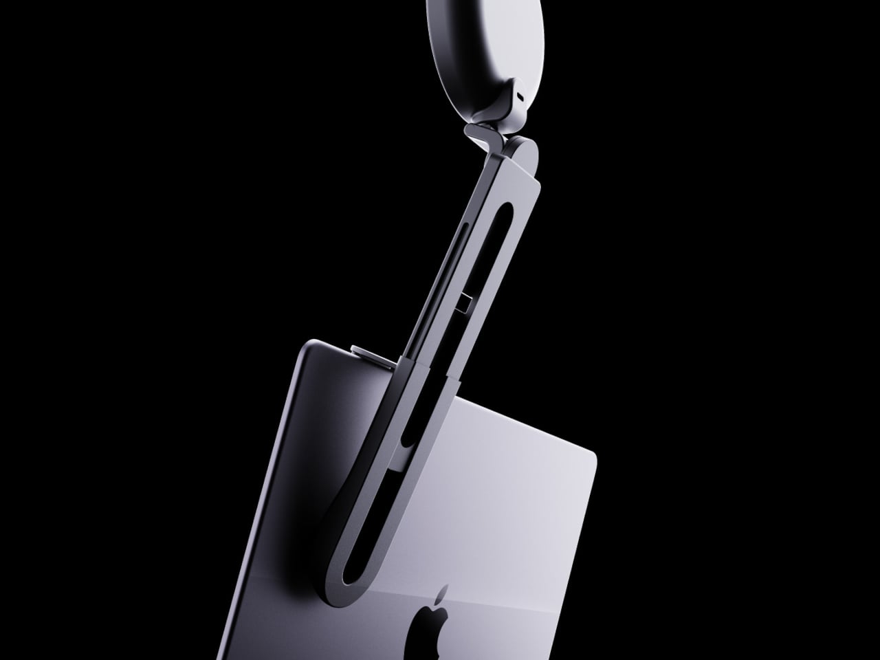
Iva is a stroller that can be stored into a backpack when not in use. It is 1.6 inches slim and 4.4 lbs light, which apparently is lighter than the 16-inch Macbook Pro. It is also pretty easy to assemble and pack, once you get the hang of the mechanism which seems a bit complicated at first. But once you’ve mastered it, it should only take around 60 seconds for you to fold and unfold.

The stroller itself has an Aviation Aluminum 7075 frame-enclosure and includes four pipe-shaped legs with soft rubber wheels. It is designed according to the US Safety Standard F833 for carriages and strollers. You can also detach the backpack so if you want to get a new color or design, you can just buy a new backpack part. The video showing the designer’s 7-year old kid riding the stroller seems to show that it’s pretty durable and as comfortable as a stroller can get.

The Iva stroller isn’t as cushy or enclosed as most of the strollers we see in the market but those are probably some of the things you have to give up to create what is supposedly the lightest one. They said they are selling the project to a larger brand or it may also go on Kickstarter in the summer.

The post Lightweight stroller concept transforms into a backpack when not in use first appeared on Yanko Design.
Music analysis device lets you learn songs by ear more conveniently

Those who are trying to learn how to play their favorite songs on their musical instruments have it a little easier now. They can just search for chords and arrangements or if they’re lucky, there might even be YouTube tutorials out there. But there are still those who prefer to play it by ear while playing the piano, guitar, or other instruments but playing the song from their phone or computer while learning is a bit of a hassle.

Designer: Hélène Bert

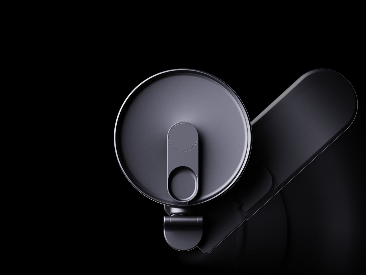
Analist is a tool that can be used by those trying to learn songs by playing it by ear. Unlike phones and computers where controls and precision are a bit hard, this gadget allows you to optimize your workflow when trying to play your instrument as you listen to the song you’re trying to learn. You will be able to control things pause and play, speed, repetition, and other things you may need to adjust while you’re playing it by ear.

Based on the product renders, this is how it works. You add a song onto the device, edit the parts that you need to learn if needed, and then save it. You can adjust it according to your preference (speed, pitch, equalizer, volume, etc). You hold it in one hand while playing the song on it and playing your instrument on the other. The device has easy to access controls that lets you pause and play, speed up or slow down, volume up and down, etc. You also get to play it in loop so you can master the song.

You can even do more if you connect it to the app, although what this “more” is wasn’t really specified. You might be forgiven for mistaking the Analist for your aircon’s remote control but on paper, the functionality of the device will be pretty helpful for those who are learning to play songs.

The post Music analysis device lets you learn songs by ear more conveniently first appeared on Yanko Design.
Beeper-inspired power bank concept mixes vintage design with modern tech

You can easily determine the historical setting of a TV show or piece of fiction by the technologies used in it. The presence of beepers, for example, puts the timeline in the 90s, though some modern hospitals still use this limited and straightforward communication gadget because of their simplicity. Of course, today’s messaging culture leaves very little room for a pager and some younger people might not even know what it is. To keep that nostalgic design alive and give it a more contemporary function, this concept design wraps a power bank in a beeper aesthetic while also giving it one fun feature reminiscent of its original purpose.

Designer: PTPC

The beeper or pager was a small black box that would show a message as a single line of scrolling text. The very first cell phones capable of SMS inherited this trait until they got screens capable of displaying multiple lines at once. It might seem archaic by today’s standards, but it also enforced a certain simplicity and terseness to the messages sent. You only sent important messages and got straight to the point without dropping vowels or letters.

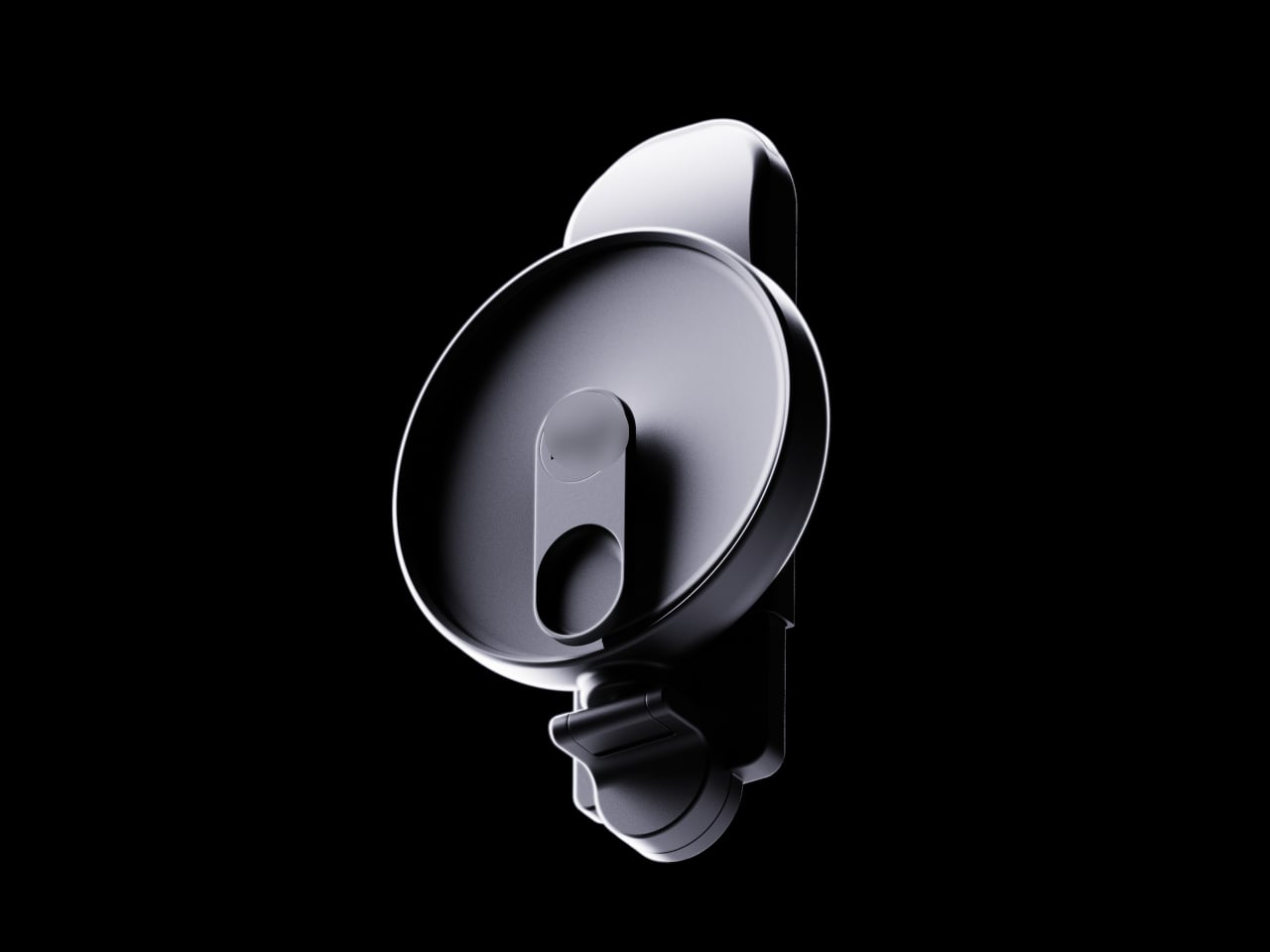
This portable battery concept embraces the retro aesthetic of a beeper but also puts a few modern twists, like using a translucent shell or adopting colors other than black and gray. It still inherits the simplistic interface of a pager, however, with very few buttons and ports. Despite the minimalism, the concept boasts of a 10,000 mAh battery that’s more than enough power to juice up phones or even tablets.

The beeper power bank does have a two-line monochrome display with a font similar to that of those old-school gadgets. While it does show battery information as you might expect, it does also have a secondary function. It can show messages sent from phones via Bluetooth, mimicking the duty of the original device. You still have a limited viewing space, but you can at least now use emojis and special characters more easily, allowing you to express your message more effectively with fewer letters.

That messaging feature is, of course, just a whimsical add-on that isn’t critical to the product’s charging function. It is, however, also a fun addition, one that would make such a design more memorable and appealing, especially to a younger generation who might not even know what a beeper is.

The post Beeper-inspired power bank concept mixes vintage design with modern tech first appeared on Yanko Design.
Zen-like music player concept is inspired by vinyl design and ancient Chinese poetry

Vinyl players are having a resurgence as the younger generation has discovered the joys of listening to analog music. There are also some music players and even gadgets that have adapted the vinyl player aesthetic even though they don’t actually play LPs. It’s all about the nostalgic vibes that come with it since it seems we’re all about reliving the “classic” days even for those who were not even alive at that time.
Designers: Ziqiang He, Hao Zhang, Yunan Lin, Sihong Chen, and Yue Gao

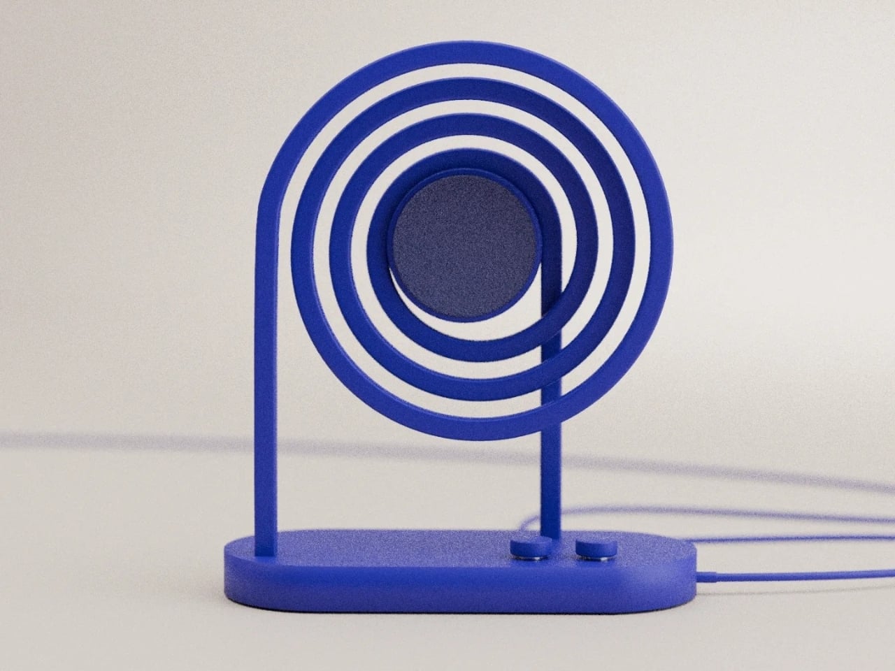
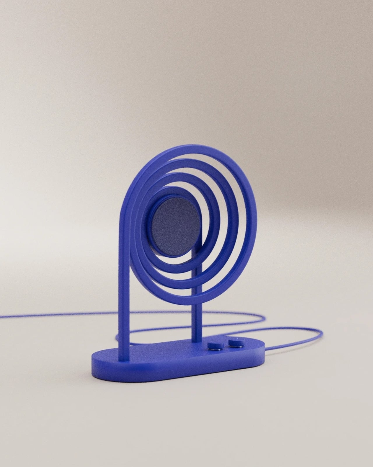
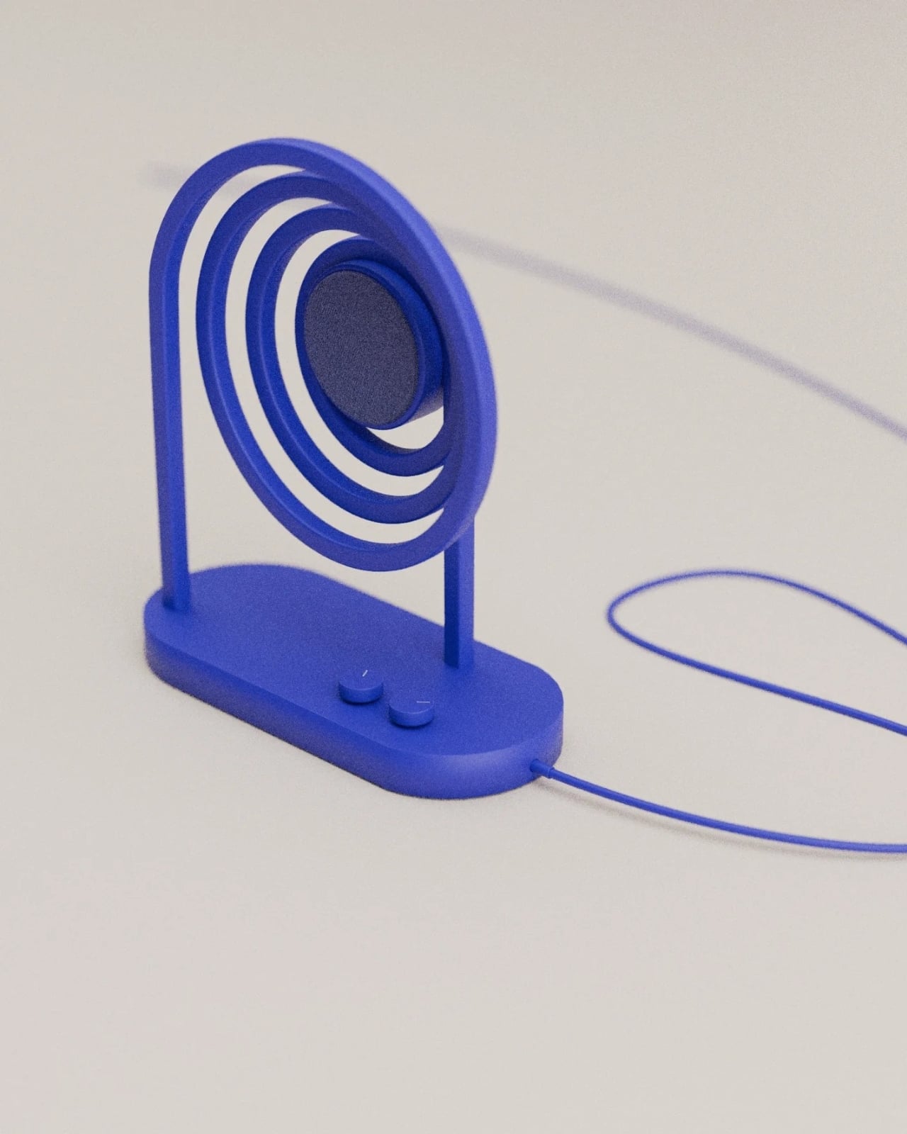
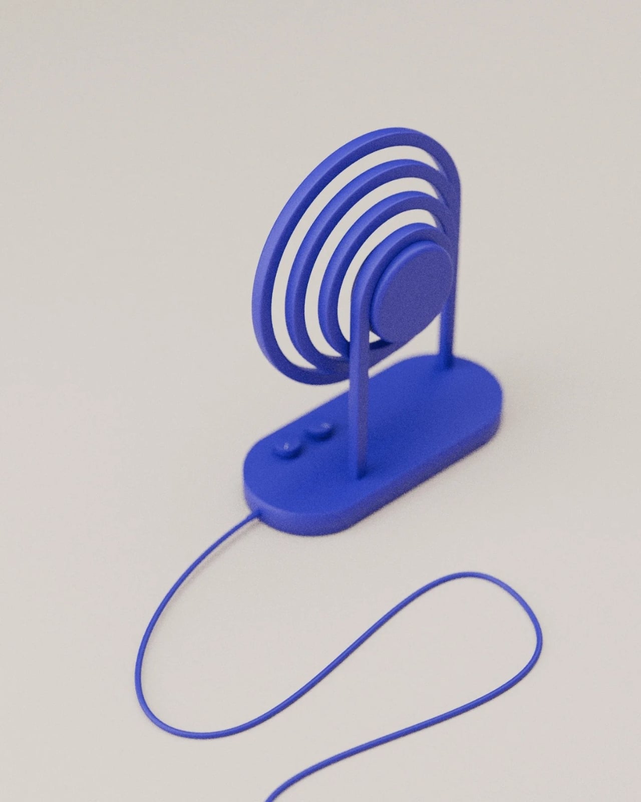
The Musipple music player is one such device but it adds another dimension to its design: ancient Chinese poetry. Its inspiration is from a poem written by Wei Yingwu during the Tang Dynasty. Basically the idea is that trees create ripples when they touch the water and the birds on these trees are singing. So adapting both the idea of the poem and the vinyl player aesthetic, we get a unique looking Bluetooth music player that brings together Chinese culture and modern technology.

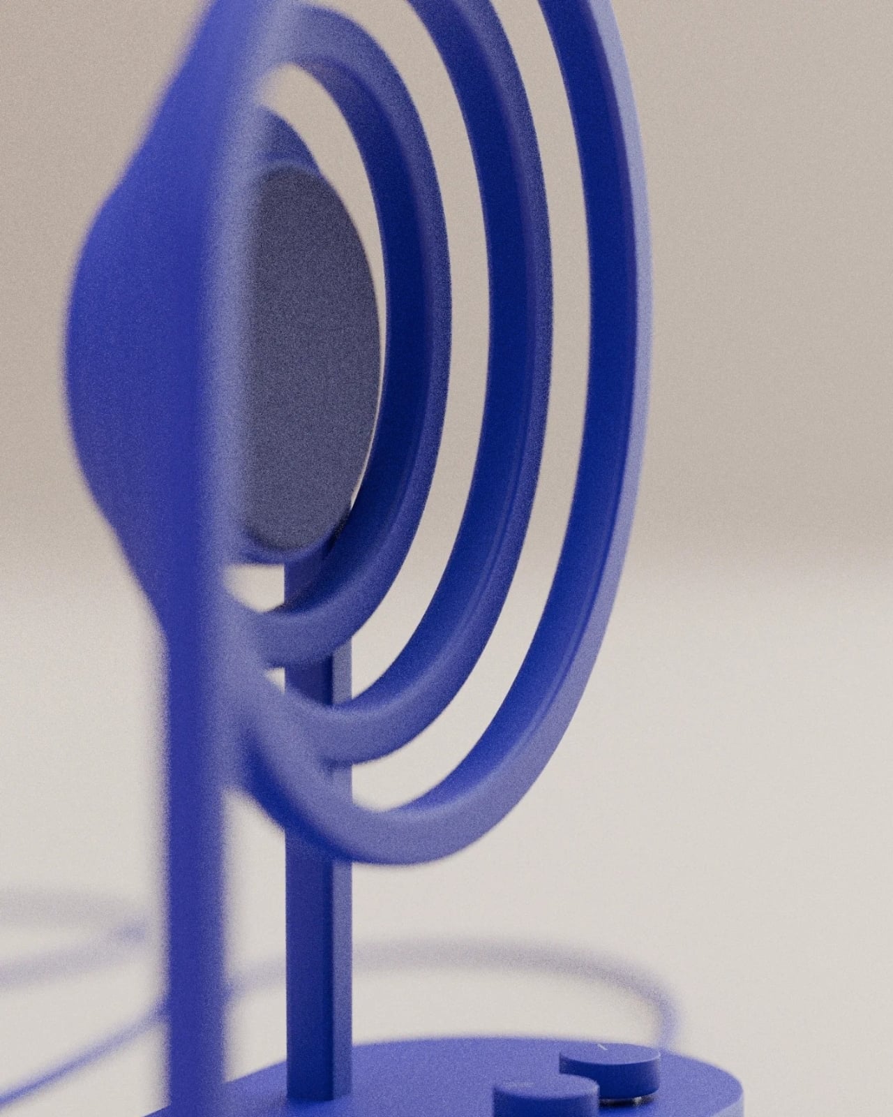
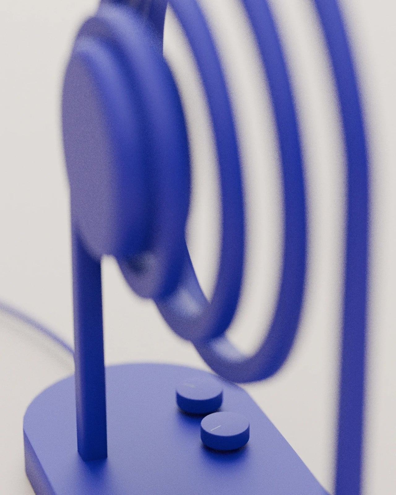
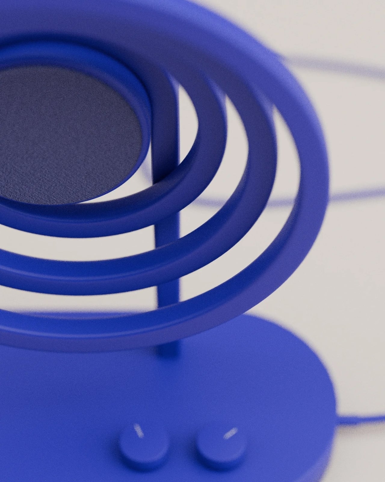
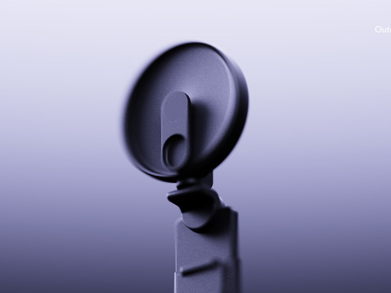
The music player has ripples in the center with a pole on the side. To turn on the player, you need to place the pole into the center of the ripples just like you would a vinyl player. In this case however, it’s a Bluetooth music player rather than an actual vinyl. There are controls for volume and bass on the side which lets you turn a dial to adjust, adding to the analog aspect of this digital player.

It would have been nicer if it was an actual vinyl player though, rather than just a music player since as mentioned, this kind of nostalgic devices are making a comeback. If it becomes a commercial product, it would be interesting to see if there’s a market for such faux vinyl players.

The post Zen-like music player concept is inspired by vinyl design and ancient Chinese poetry first appeared on Yanko Design.