Charging wearables has become muscle memory for many of us, and most people have accepted that their smartwatch requires almost nightly charging. But the best health tracking is done while we sleep. First, good sleep is foundational to our health. But it’s also where heart rate signals are stable and constant, making for insightful analysis. But many people don’t wear their smartwatches to sleep, partly due to comfort, but also because their watch won’t make it through the next day. Ultrahuman’s Ring Pro doesn’t ask you to accept that compromise anymore – and is designed for truly continuous health insights, with battery life so long, the biggest challenge will be remembering where you put your charger.
The Ring Pro delivers up to 15 days of battery life on a single charge, and holds 250 days of on-device data without needing a phone connection, making it fairly independent as a wearable, rather than a phone-bound tech accessory. Add a dual-core processor with on-chip machine learning, a redesigned PPG sensor, and a real-time biointelligence AI called Jade, and you’re looking at the most technically coherent argument the smart ring category has put forward.
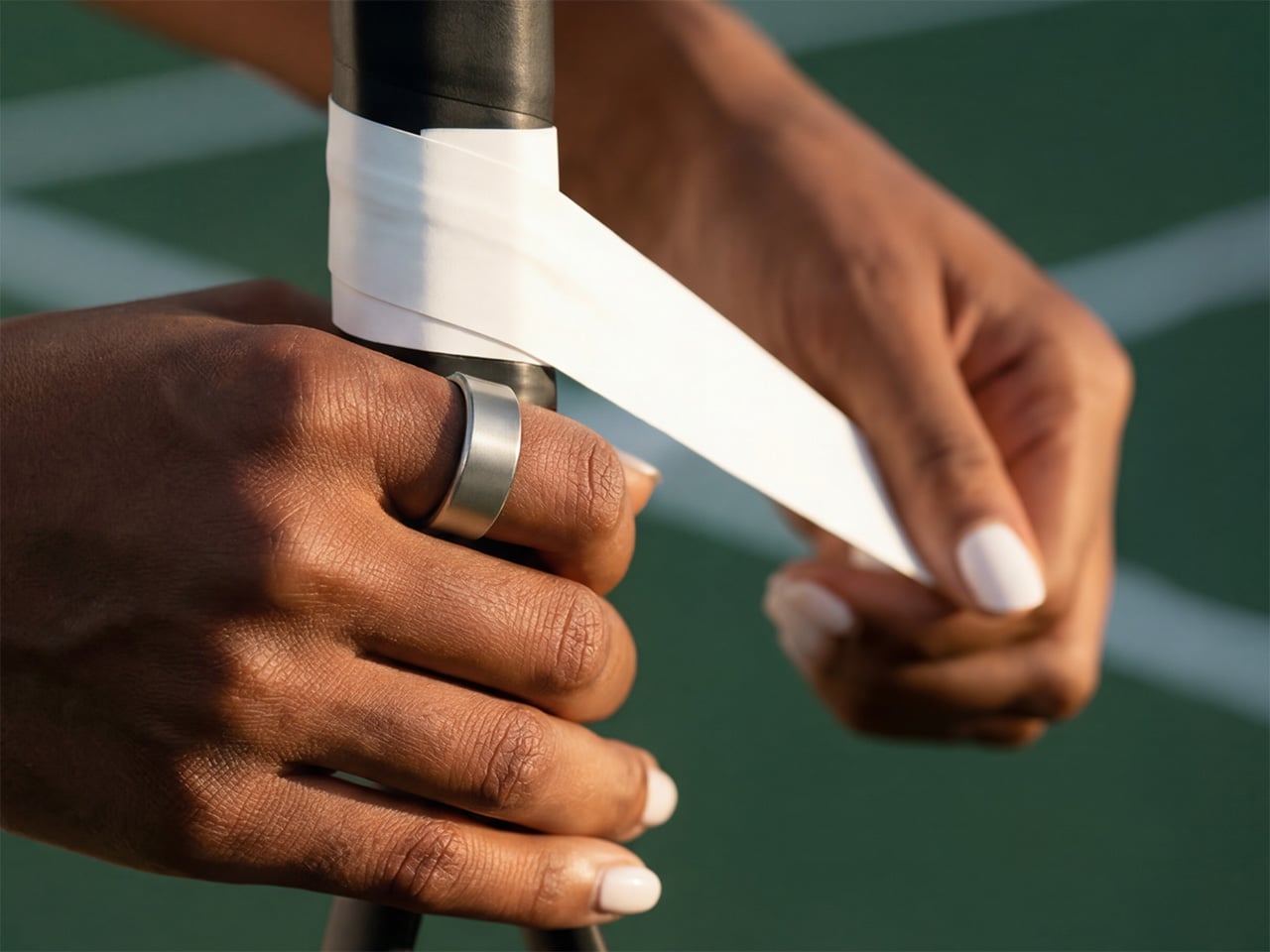
The Ring Pro is built on a unibody titanium architecture, with the same fighter jet-grade material that has defined the Ultrahuman Ring from the beginning. It is crafted to be worn 24/7 through every condition life throws at you. It comes in four finishes: Raw Titanium, Aster Black, Bionic Gold, and Space Silver, all of which lean into a restrained, utilitarian premium rather than flashy lifestyle aesthetics.
Ring PRO is built for it all. Sizes range from 5 to 14, with a free sizing kit dispatched before your Ring PRO ships. ProRelease Technology enables Ring PRO to be cut apart in the event of swelling or injury to the finger, a safety feature that reflects thoughtful long-term wearability engineering. Water resistance holds at 100 meters, from swimming to surfing to showers.
The battery architecture operates in two modes: Turbo Mode delivers approximately 12 days, and Chill Mode offers up to 15 days. Ultrahuman CEO Mohit Kumar called the battery performance “3 to 4 times that of the competition,” framing it as a fundamental breakthrough rather than an incremental spec bump.
The Ring Pro achieves this without trimming features. The sensor array includes a redesigned PPG for heart rate, HRV, and blood oxygen; a non-contact skin temperature sensor; and a 6-axis IMU for motion tracking, all rebuilt specifically for improved signal quality during sleep and recovery.
A dual-core processor with on-chip machine learning replaces the single-core processor from the Ring AIR, with on-chip ML enabling complex health algorithms to run directly on the ring, delivering faster results with greater precision.
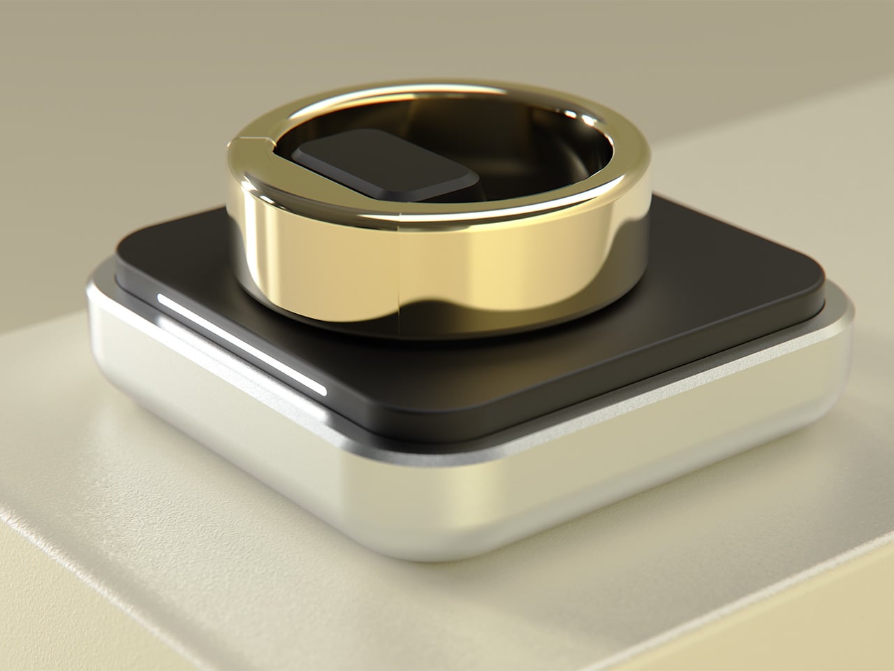
For everyday use, the Mini Charger is all you need. The Mini-Charger is Ring PRO’s compact everyday charging companion. Lightweight and pocket-friendly, it is designed to go wherever you go, your gym bag, your carry-on, your desk, without taking up space or adding weight. Simply plug it in via the Type-C cable included in the box, place your Ring PRO on the dock, and you’re charging. No fuss, no complexity.
The Ring Pro comes with Jade, Ultrahuman’s biointelligence AI platform, described as the world’s first real-time health AI .Jade pulls live biomarker data from the ring and acts on it (like triggering breathwork sessions based on current HRV readings).
Jade connects ring data across Ultrahuman’s broad health ecosystem, blending lifestyle data with 120+ Blood Vision biomarkers, M1 CGM glucose trends, and even Ultrahuman Home environmental data..
Use Standard mode for quick answers on your data, such as how long you slept or recent trends,, or flip to Research mode for comprehensive analysis that connects the dots across complex health data.
Jade’s capabilities extend through PowerPlugs, a platform for individual apps and plugins built on top of Ultrahuman’s health and wellness data stack, designed for highly personalized health insights. You can tailor health tracking to your unique needs and goals, supercharging your Ring PRO experience with a library of micro-tools.
The Ring Pro is available in multiple configurations, starting at $299 for the Super Early Bird tier and ranging up to $699 for the Couples Pack (which includes two rings and three Powerplugs each). Each package includes the Ring PRO itself, a charging case, and three Powerplugs (worth $150, free for one year): Respiratory Health (detects snoring, coughing, and irregular breathing via smartphone audio), Cycle & Ovulation Pro (advanced fertility tracking with 90%+ ovulation accuracy), and Cardio Adaptability (analyzes overnight heart rate variability using tachograms and Lorenz plots).
A lifetime subscription to all Ultrahuman Ring PRO features and content is included with no hidden fees or recurring charges. Shipping is free worldwide, with estimated delivery beginning in June 2026 for early configurations and July 2026 for later tiers. A sizing kit ships before the ring itself to ensure the right fit, and the Ring Pro is available in Raw Titanium, Aster Black, Bionic Gold, and Space Silver finishes.
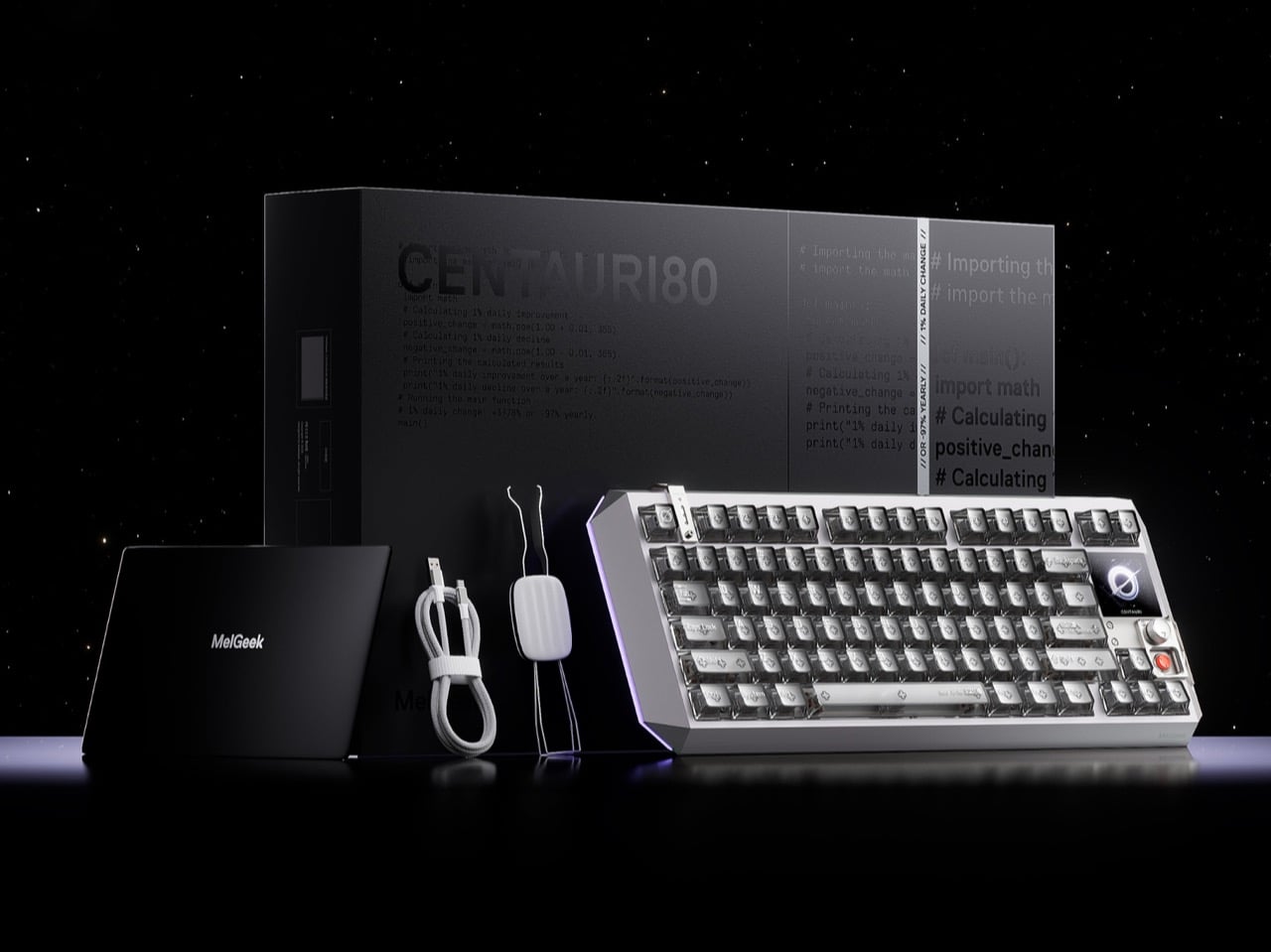
Fifty years of keyboard design, and the basic contract never changed: switches under keycaps, keycaps under fingers, fingers making typos. The mechanical keyboard revival of the 2010s gave us better switches, heavier brass plates, and an entire hobbyist economy built around sound profiles and spring weights, but the object itself remained stubbornly analog in its ambitions. What’s shifted in 2025 and 2026 is the ambition. Boutique builders and hardware engineers are converging on a new idea: the keyboard as a control surface, a designed object with its own interface, its own visual language, its own intelligence. MelGeek, a Beijing-based custom keyboard brand with a decade of crowdfunded hardware behind it, just made that idea concrete with the Centauri80.
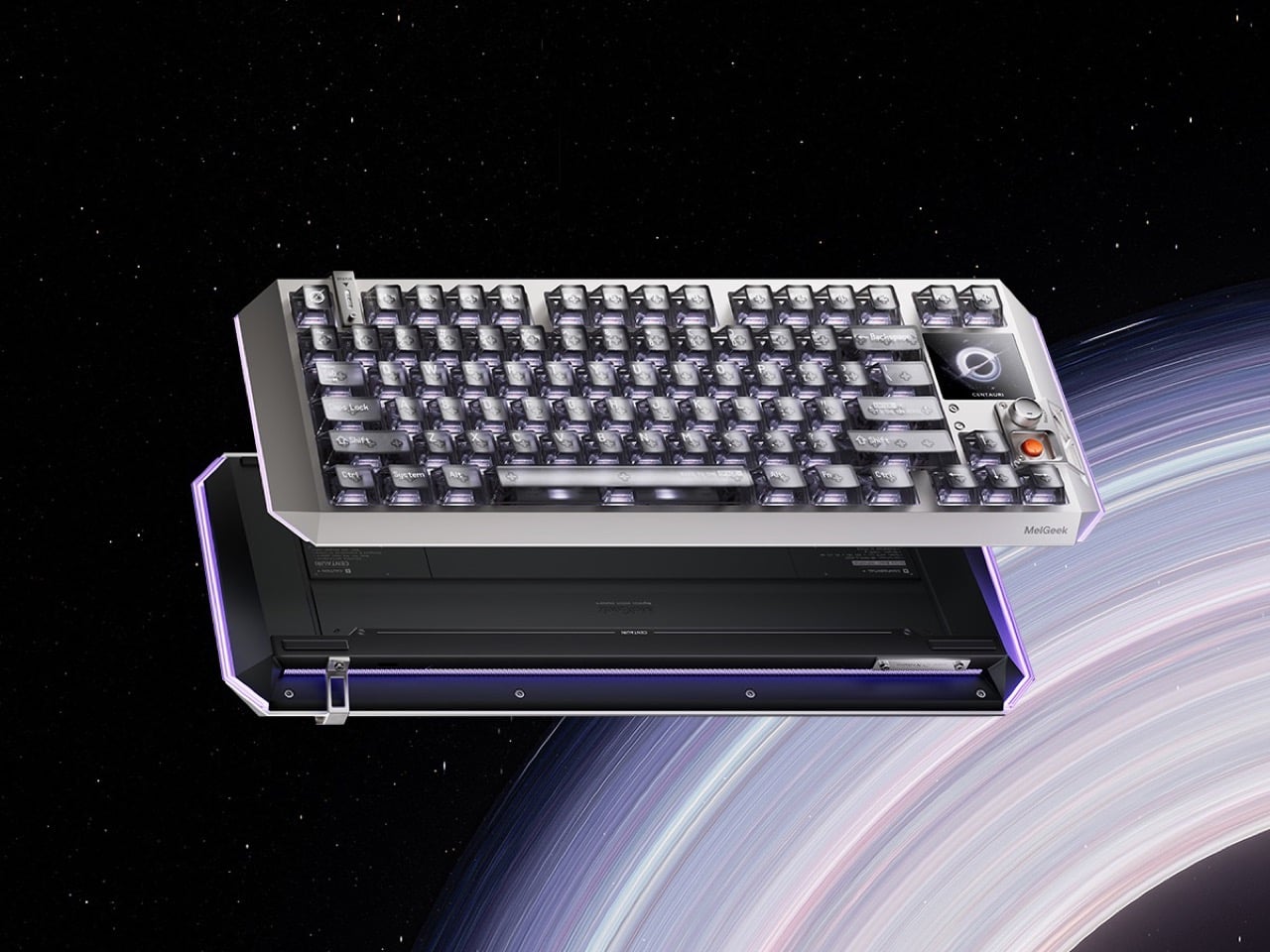
The Centauri80 is an 80% Hall Effect keyboard with a 1.78-inch OLED touchscreen embedded directly into the board, running at 325 PPI, which is the same pixel density as an Apple Watch face. A physical rotary encoder called the Super Dock sits beside it, letting you swap live wallpapers, toggle macros, and dial in lighting without alt-tabbing out of whatever you’re working in. Under the aluminum unibody, a distributed architecture of six microcontroller chips drives TTC Flip King magnetic switches to a 0.125ms latency at an 8000Hz polling rate. The whole thing retails at $299 from MelGeek’s own store, which puts it in a genuinely interesting position against the Wooting 60HE and the rest of the Hall Effect field.
Designer: MelGeek
MelGeek opted for a suspended aluminum alloy unibody, which means the internal structure floats within the outer frame rather than bolting directly to it, reducing vibration transfer and keeping the sound profile controlled and intentional. The five-layer gasket-mounted acoustic structure underneath reinforces that choice: every keystroke travels through dampening foam, a silicone layer, and a carefully tuned plate before it reaches your ears as that deep, focused thud that keyboard people spend years and hundreds of dollars chasing. The design language draws openly from cyberpunk aesthetics, with MelGeek describing the Centauri80 internally as “a reimagined starship,” which sounds like marketing until you see the raking lines and deconstructed geometry and realize they actually earn that description. Transparent keycaps ship as default, showing the per-key RGB illumination through the caps themselves rather than just around them, and the three-sided 16 million color lighting system wraps the board in a glow that reads more like a designed accent than a gaming peripheral throwing up on itself.
Traditional mechanical switches use metal contacts: two pieces of metal touch, the circuit closes, the keystroke registers. The problem is that metal contacts wear down, develop inconsistency over time, and can only register a keypress at one fixed point in the key’s travel. Hall Effect switches replace those metal contacts with magnets and sensors, reading the magnet’s position continuously as the key moves, which means the board can register a keypress at any point in the travel down to 0.1mm. That’s what rapid trigger means in practice: the keyboard resets and re-registers with every tiny movement rather than waiting for the key to physically return to a set reset point. For competitive gaming, where re-pressing a movement key a fraction of a second faster translates to a measurable advantage, this is the difference between winning and watching a killcam. MelGeek’s third-generation magnetic switch system adds a distributed architecture of one master chip and five processing chips, delivering what the company claims is 150% faster response than its previous generation, with an EMI shield engineered to cut cross-key interference by 60%.
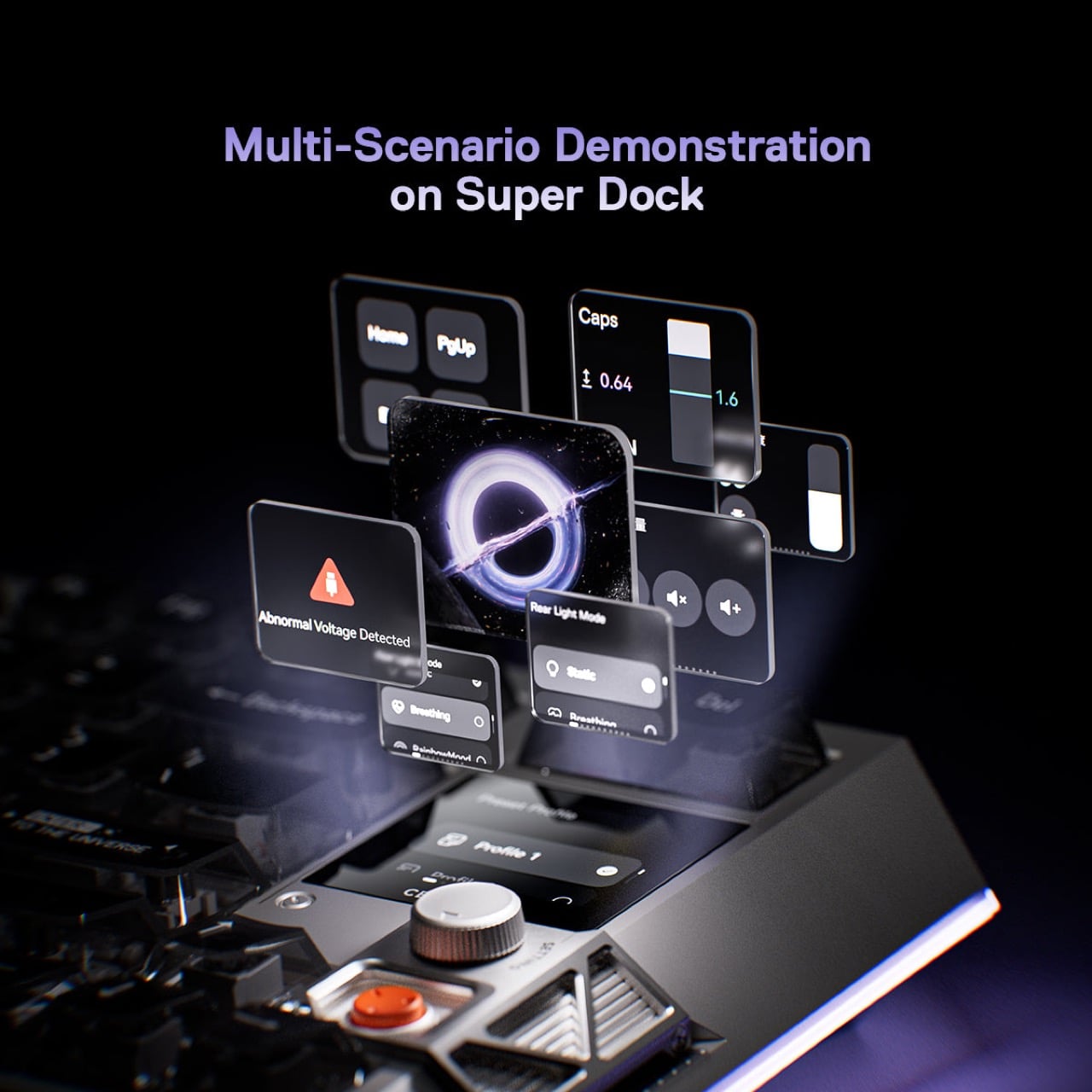
Embedded into the upper right corner of the 80% layout, the 1.78-inch OLED runs at 325 PPI and 60Hz, handled entirely through the Super Dock rotary encoder beside it. Rotate to cycle through settings pages, press to confirm, keep typing. Live wallpapers, macro profiles, per-key lighting configurations, polling rate adjustments, all accessible on the keyboard itself without opening MelGeek’s Hive software. For someone running multiple macro profiles across different applications, having that switching surface physically on the board rather than buried in a system tray is a real quality-of-life improvement. For someone who sets their keyboard up once and forgets about it, the screen will display a wallpaper and nothing else, which is still a spectacular piece of hardware to stare at while pretending to work.
The Wooting 60HE, which more or less popularized Hall Effect keyboards for a mainstream gaming audience, sits at around $175 and offers rapid trigger without any display hardware. The Centauri80’s $299 asks for a $124 premium, and what you’re buying with that gap is the OLED screen, the rotary encoder, the unibody aluminum chassis, and the aesthetic ambition. The keyboard sits alongside the Wooting the way a beautifully machined mechanical watch sits alongside a Casio: both tell time accurately, one of them is also a statement about what objects are allowed to be. MelGeek has spent a decade building its reputation through crowdfunded custom boards and a community of gamers, coders, and creators who treat keyboards the way audiophiles treat headphones, and the Centauri80 is the clearest articulation yet of what that philosophy looks like at flagship scale.
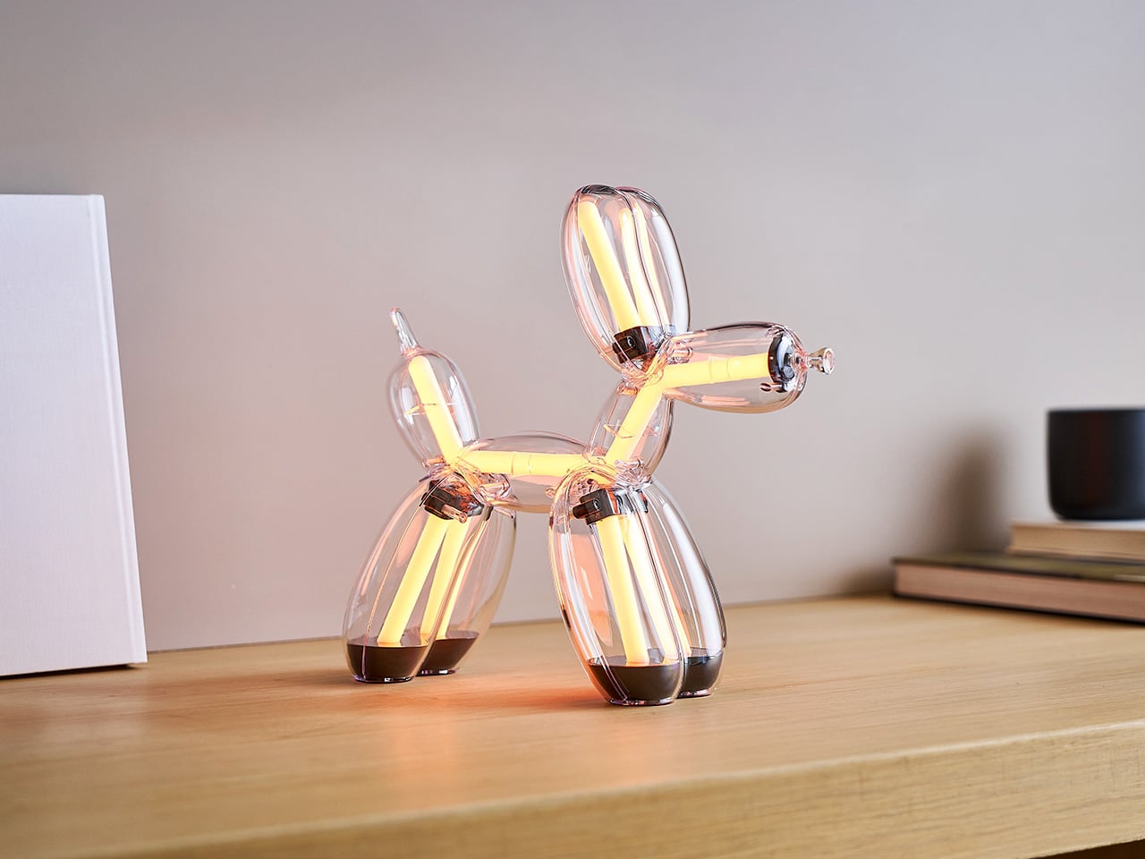
Lexon has always operated in that precise zone where design meets desire, making objects that earn their place on a shelf by being genuinely useful and genuinely beautiful at the same time. Its speakers, lamps, and accessories carry a recognizable visual language: clean geometry, thoughtful materiality, the feeling that someone spent serious time thinking about how the thing would live in a room. The French brand has built that reputation over decades, and its collection reads like a masterclass in giving everyday objects enough personality to be noticed without screaming for attention. A collaboration with Jeff Koons, one of the most significant artists of our time, reads as a logical extension of everything Lexon had already been building toward. The purpose here is accessible art through design and technology, bringing high-concept sculpture into everyday functional objects.
Jeff Koons’ Balloon Dog sits at the heart of contemporary art discourse. The sculpture, which lives permanently at The Broad in Los Angeles and has circled the globe through exhibitions and record-setting auction appearances, carries a cultural electricity that very few artworks can claim. Lexon and Jeff Koons have reimagined that masterpiece into two functional objects: the Balloon Dog Lamp and the Balloon Dog Speaker. The Chromatic Collection, introduced in 2026 as a time-limited edition available only this calendar year, expands the original collaboration with eight distinct models. The Lamp arrives in Platinum, Gold, Blue, and Red, while the Speaker comes in Gold, Blue, Red, and White. Each piece is crafted from optical-grade polycarbonate and carries Koons’ signature engraved on the front feet. Pre-orders are available on lexon-design.com at $800 per piece, with monthly shipping slots.
Designer: Lexon x Jeff Koons
Click Here to Buy Now: $800. Hurry, limited edition! Pre-orders capped at two pieces per color, per product, per collector
The collaboration was developed with The Broad, the Los Angeles museum that permanently houses Koons’ original Balloon Dog sculpture, and the first edition of this Lexon x Jeff Koons partnership proved that appetite is global: those pieces sold into collector hands across more than 90 countries. The Chromatic Collection expands that first chapter with eight new models in a broader color range, keeping the Balloon Dog form fixed while giving collectors fresh reasons to acquire. Every unit carries a certificate of authenticity with a hologram that matches one on the packaging box, creating a dual provenance trail designed to hold value over time. At $800 per piece, the Balloon Dog Lamp & Balloon Dog Speaker Chromatic Collection represents an entry point into owning a time-limited edition whose value stands to increase as the collection completes its run and moves to secondary markets.
Balloon Dog Lamp
Transparent optical-grade polycarbonate forms the entire Balloon Dog Lamp, and the material connects directly to the logic of Koons’ original sculpture: the pristine surface quality, and the way the form catches and refracts light. The lamp packs 400 individual LEDs capable of producing nine distinct colors and nine animation modes, all controlled through intuitive gestures on the nose. Brightness adjusts seamlessly from ambient glow to full 200-lumen output, and the battery delivers five hours of runtime at 75% brightness. USB-C charging keeps the lamp self-contained on any surface. The four physical colorways of the lamp itself, Platinum, Gold, Blue, and Red, each shift character dramatically depending on which LED color state is running, giving a single object dozens of distinct visual configurations. Lexon’s proprietary Easy Sync Bluetooth technology allows unlimited Balloon Dog Lamps to synchronize their lighting effects in real time, which makes a full four-color set a genuinely compelling proposition for collectors building installations.
Switch the lamp on and the polycarbonate body stops being transparent and becomes a vessel for pure color. The LED system pushes light through every balloon-twisted segment from the inside, separating the sculptural form into glowing chambers of shifting hue. The animation modes cycle through gradients and pulses that travel the length of the sculpture, creating the impression of movement within a static form. The four physical editions of the lamp, Platinum, Gold, Blue, and Red, each interact differently with the nine programmable LED colors. Platinum and Gold warm the output, while Blue and Red push it vivid, and all four configurations produce enough visual presence to anchor a room in near-darkness.
Balloon Dog Speaker
Ten speakers are packed into the same 29 x 11 x 28 centimeter form as the Lamp, six active drivers and four acoustic boosters, with the transparent polycarbonate shell putting all of that hardware fully on display. The drivers are distributed across the Balloon Dog’s body in a way that uses the sculpture’s geometry to push sound outward in every direction, achieving genuine 360-degree coverage rather than approximating it. Bluetooth 5.3 handles wireless connectivity, TWS technology enables stereo pairing between two units, and built-in microphones support hands-free calls and AI assistant interaction with a connected smartphone. The Speaker arrives in Gold, Blue, Red, and White, a distinct palette from the Lamp that keeps both product lines coherent as a collected set. At $800 with Koons’ signature engraved at the base, it prices like a collectible and performs like a serious speaker.
The drivers and acoustic boosters sit visibly across the interior of the Speaker, their circular grille faces pressing against the clear polycarbonate from the inside, turning the engineering into part of the object’s visual identity. The hardware maps to the Balloon Dog’s body segments, making the internal architecture visible from every angle. Two Speakers paired in TWS stereo, positioned facing each other on a surface, form a symmetrical sculptural arrangement that sits somewhere between a listening setup and an installation.
Purchases are capped at two pieces per color, per product, per customer, and orders move through monthly shipping slots on a first-come, first-served basis starting June 2026. The purchase limit maintains the integrity of this as a limited edition rather than a mass-market release, ensuring the collection reaches a broad international collector base while holding its exclusivity. Both the Lamp and Speaker colorways are locked to 2026 and will not be reissued, establishing clear boundaries for the edition and creating real scarcity in a category where reissues can undermine collector confidence. Pre-orders are live now at lexon-design.com, and given how the first edition performed across more than 90 countries, the window on these eight colorways is genuinely finite.
Click Here to Buy Now: $800. Hurry, limited edition! Pre-orders capped at two pieces per color, per product, per collector.
Personalization has quietly moved from craft rooms and design studios into everyday life. Whether it’s decorating a travel case or adding something unique to a tote bag, people want their things to feel distinctly theirs, and they want to do it on the spot. The tools to make that happen, though, have largely stayed the same: bulky, single-purpose machines that aren’t built for spontaneity.
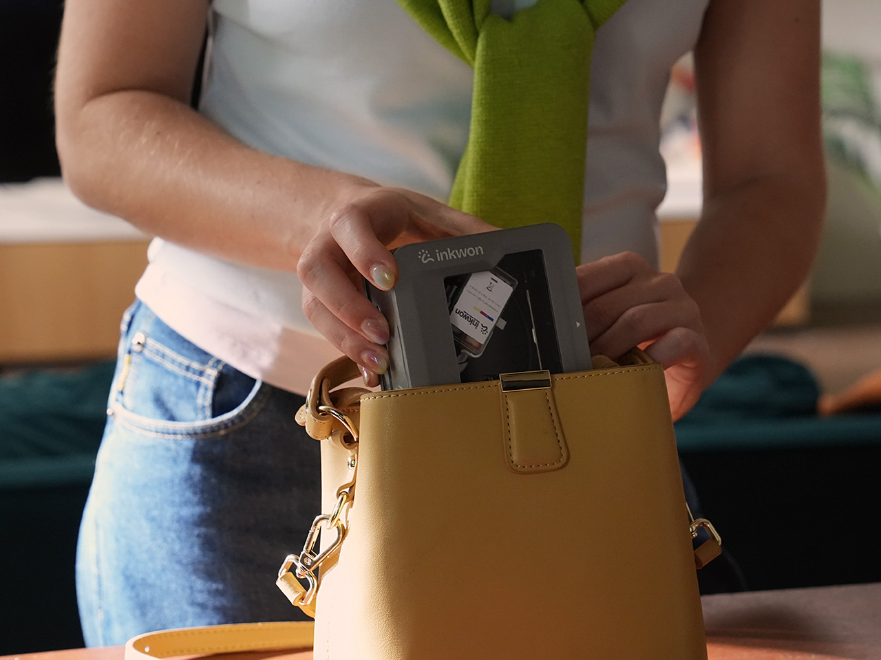
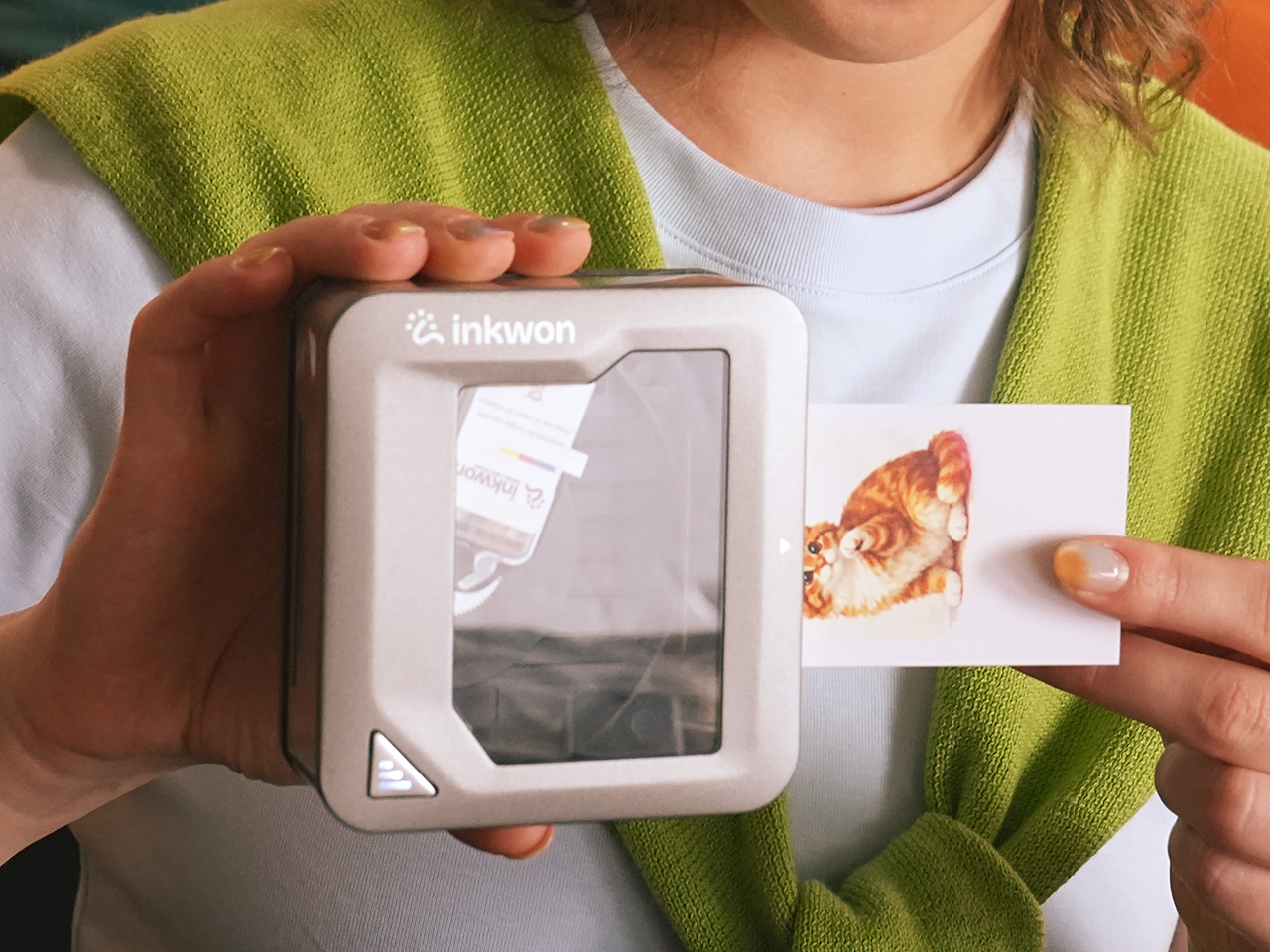
That’s the gap INKWON Tag 4-in-1 Pocket Printer is designed to fill. It’s a pocket-sized color inkjet printer that handles four creative tasks in one go: sticker printing, photo printing, temporary tattoo sticker printing, and fabric heat transfer. Rather than juggling separate devices for each, this single compact unit does all of that, and it fits right in the palm of your hand.
The device itself doesn’t feel like a printer in the conventional sense. It’s roughly the size of a small tin, weighs just 0.52 lbs, and its self-suction paper feed pulls media in automatically to keep things aligned. The ink cartridge snaps in magnetically, so there’s no fumbling with loading trays or making a mess every time you need to swap one out.
Of the four modes, sticker printing is probably the easiest to get excited about. You can print custom graphics on adhesive photo paper and stick them on practically anything: laptops, travel cases, journals, and planners. The output reaches 600 dpi, so detailed artwork holds up well even at a small format. It’s the kind of thing that takes about a minute from idea to finished sticker.
The temporary tattoo sticker mode spices things up even further. INKWON Tag prints onto tattoo sticker paper that you apply to skin just like a classic transfer tattoo, full color and all. It’s a surprisingly handy way to test a design before committing to real ink, or to add intricate graphics to a costume without needing a makeup artist anywhere near you. Plus, the ink is 100% skin-safe, even for the little ones, as proven by EN71-3 and REACH certification.
Heat transfer brings a surprising practical application you wouldn’t expect from a portable printer. INKWON Tag prints onto light-colored heat transfer paper that you then iron onto fabric, and the small form factor means you can work on precision spots that bigger machines simply can’t, like collar tips, pocket corners, or even socks. It’s genuinely handy for personalizing gifts or refreshing something plain.
Last but definitely not least, photo printing rounds out the four modes, and it’s probably the one most people reach for first. INKWON Tag turns phone snapshots into actual prints you can hold, making them easy to tuck into travel journals, scrapbooks, or stick onto memory pages. They don’t end up buried in a camera roll. They’re physical now, and that alone makes them feel worth keeping.
INKWON Tag connects to your phone via Bluetooth 5.4, and the companion app takes care of everything from image uploads to editing and sending the print. It works on both Android and iOS and supports 18 languages, so you’re covered regardless of where you are or what phone you carry. A full charge handles up to 60 prints, which happens to match exactly one ink cartridge.
Portable creative tools have been getting smarter for years, but most still stick to one trick and leave you hunting for everything else separately. INKWON Tag bundles stickers, temporary tattoo stickers, heat transfers, and photo prints into one device that easily fits in a jacket pocket, and it doesn’t need a desk, a software driver, or a dedicated power outlet to make any of that happen.
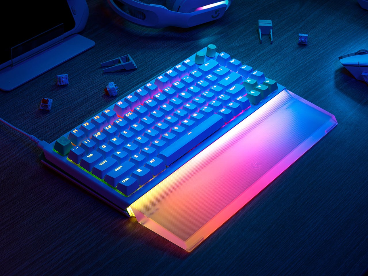
Hardcore gamers always love accessories that give them granular control over the device’s hardware and functionality. This micro-level tuning can mean the difference between a closely fought loss and a glorious victory. Logitech wants to give serious gamers every little bit of advantage from the gear they own, and that’s where their new G512 X hybrid gaming keyboard excels.
The flagship keyboard features all the latest tech on offer, combined with the highly configurable quality that adapts to the gamer’s preferred style of play rather than the other way around. As per Robin Piispanen, Vice President and General Manager of Logitech G, the brand sees the player’s setup as “something that grows with them as they improve.” To this, M. Lahti, Global Product Marketing Manager at Logitech G, added that the “G512 X is our love letter to the gamers who mod their gear as much as they mod their games.”
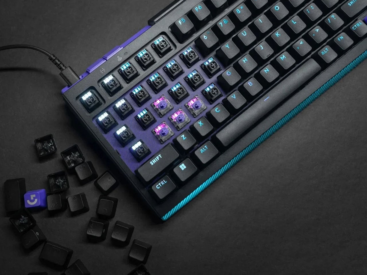
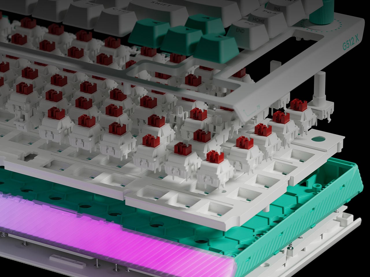
Although Logitech already has magnetic keyboards in its lineup, this hybrid option is the first by the brand to feature TMR switches. The granular hardware control comes courtesy of the 39 “Dual Swap” beds across its chassis, allowing players to create a mix of mechanical and analog switches on a single board. You could, for instance, assign analog input to movement-heavy WASD keys while keeping the rest of the layout equipped with mechanical switches for a more traditional typing feel. Based on usage data, these hybrid zones are intelligently clustered toward the left-hand side, where most in-game actions are concentrated.
This hybrid setup is further enhanced by TMR (Tunnel Magnetoresistance) sensing technology, which improves upon Hall-effect designs with greater precision and consistency. The result is a true 8,000Hz polling rate paired with an ultra-fast 0.125ms response time, effectively eliminating perceptible input lag. In fast-paced FPS scenarios, this level of responsiveness can make a measurable difference, ensuring that every command is executed exactly when intended.
What sets the G512 X apart is its ability to merge analog control with mechanical feedback in a meaningful way. Analog switches allow for variable input depending on how deeply a key is pressed, enabling more nuanced control typically associated with controllers. This becomes particularly valuable in racing and flight simulation games, where gradual acceleration or directional adjustments benefit from pressure-sensitive input. At the same time, mechanical switches retain their crisp, tactile response for standard commands, ensuring familiarity is not sacrificed for innovation.
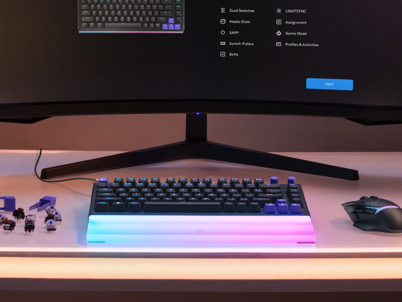
Logitech extends this flexibility into software through G Hub, where users can fine-tune actuation points and assign multiple functions to a single key based on press depth. This effectively adds another layer of input without increasing the physical footprint of the keyboard. For competitive players and enthusiasts alike, it means more control, faster access to commands, and a setup that can be tailored down to the smallest detail.
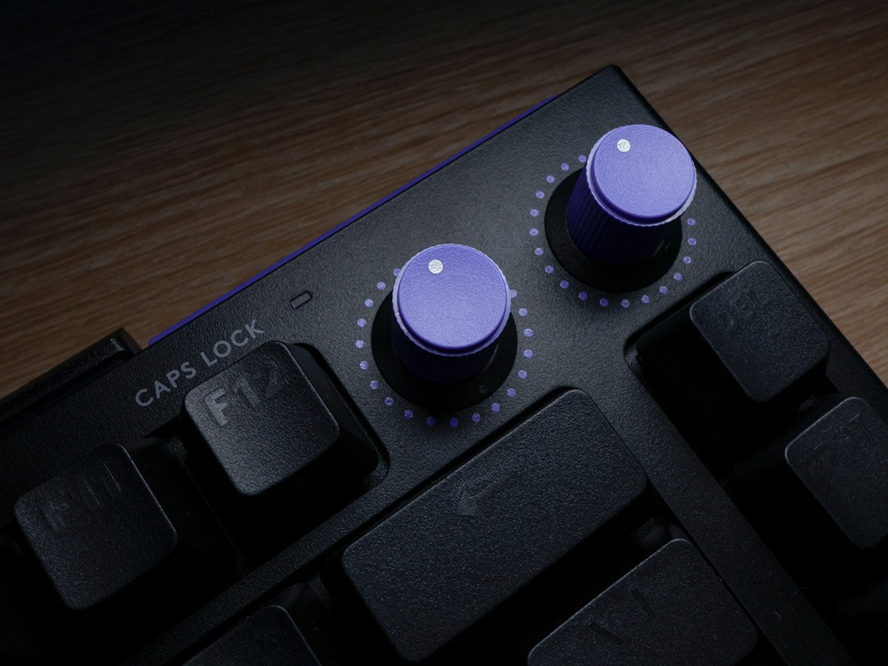
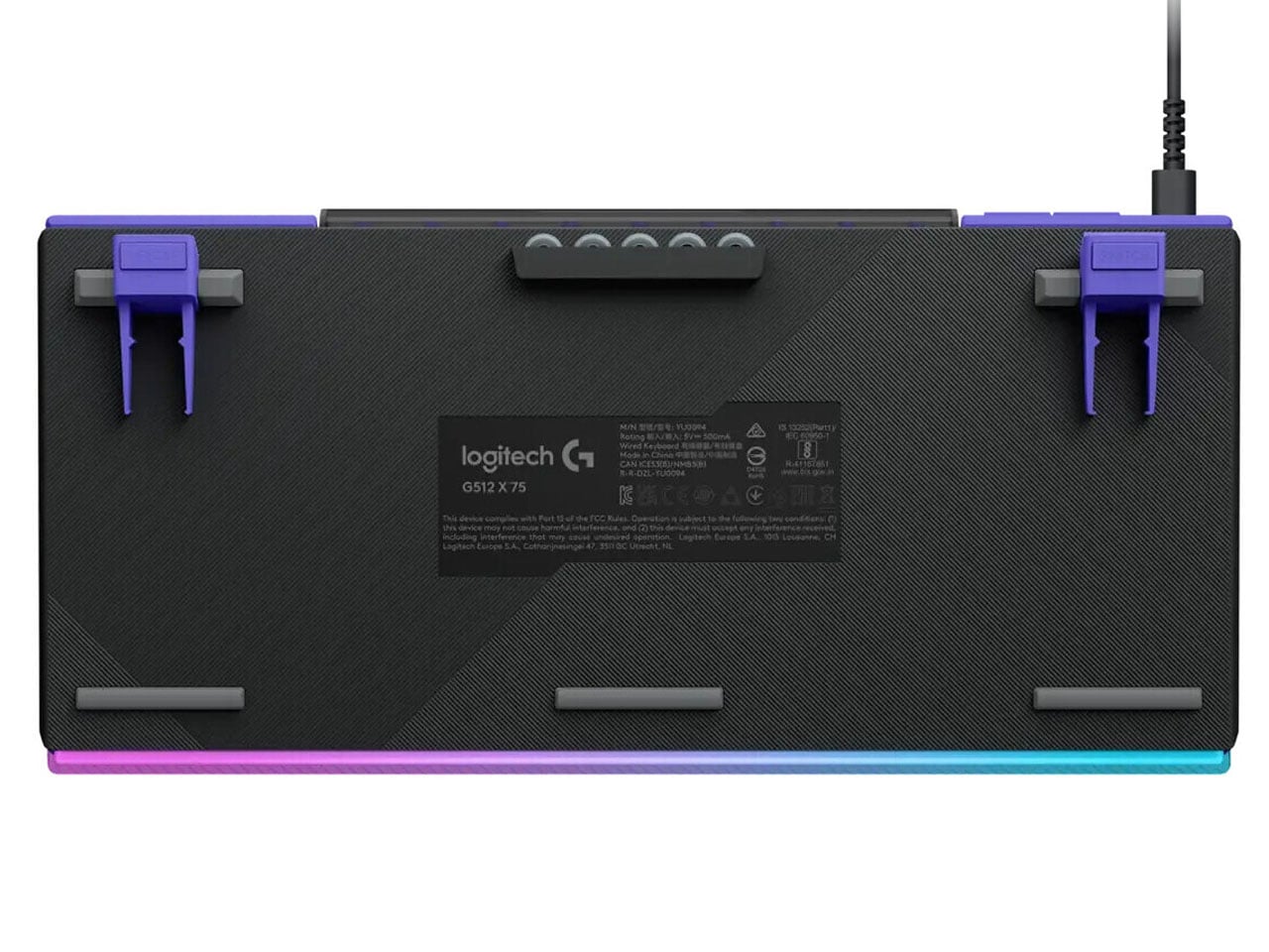
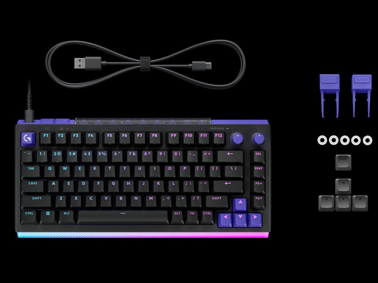
The keyboard’s construction features a durable aluminum top plate that enhances rigidity while maintaining a clean, understated design. Per-key RGB lighting remains fully customizable, allowing users to create personalized lighting profiles or sync effects with gameplay. The keycap pullers, switches, and SAPP rings are housed inside the storage space at the rear, avoiding visual clutter, focusing instead on performance and usability.
Available in both 75 percent and 98 percent layouts, the keyboard caters to different desk setups and user preferences. Whether opting for a compact footprint or a near full-size configuration, users still benefit from the same core features and strategically placed Dual Swap zones. Logitech G512 X keyboard is currently available in both black and white color options on the official website, while retailers will have it on 2 May. The 75-key layout is priced at $179.99, and the 98-key layout costs $199.99. Gamers can also go for the optional acrylic palm rest (sold separately starting at $40) that reflects the RGB lights of the keyboard lightbar and promises better comfort during long gaming sessions.
There was a time when keyboards kept growing, trading compactness for more keys, more modes, and more customization. Then came a different kind of thinking. Stream Decks, macro pads, and dedicated shortcut controllers have earned real estate on desks alongside full-sized keyboards, proving that one well-placed action sometimes matters more than access to everything at once. The appetite for specialized, single-purpose input hardware hasn’t let up.
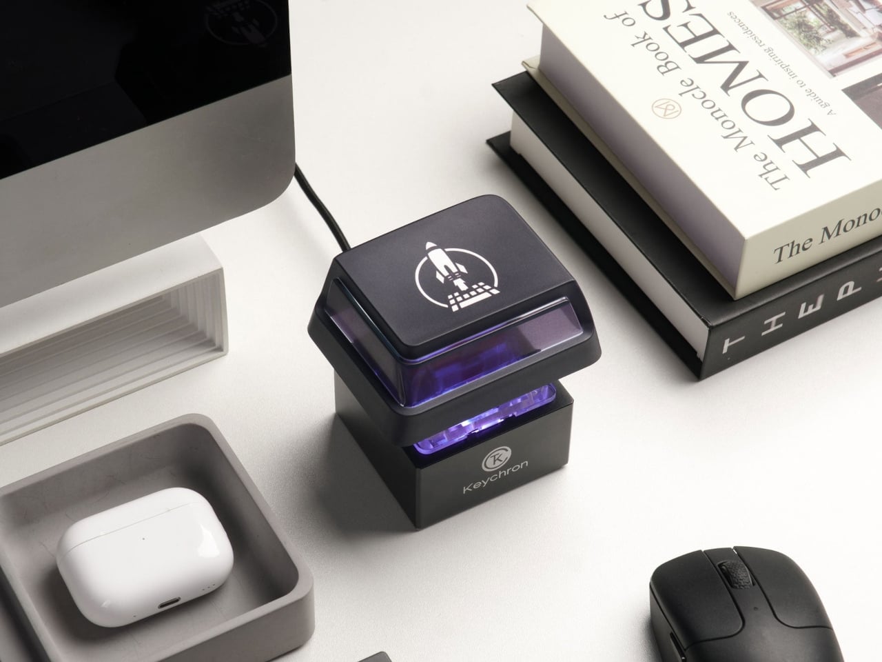
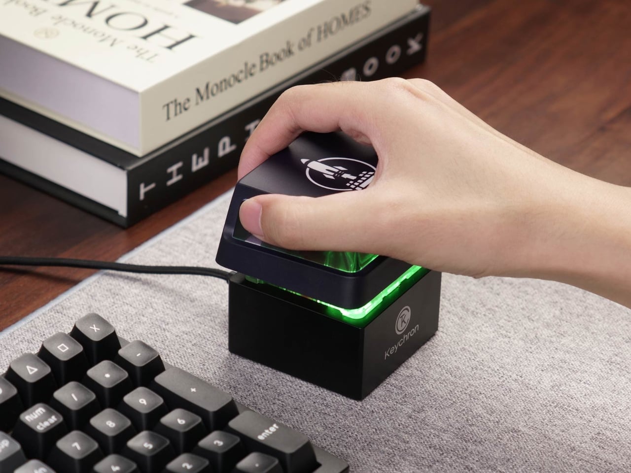
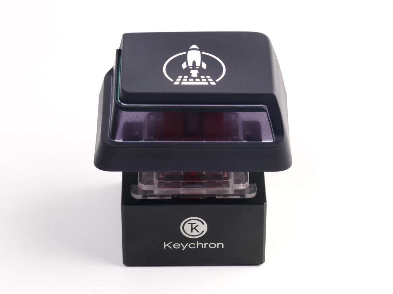
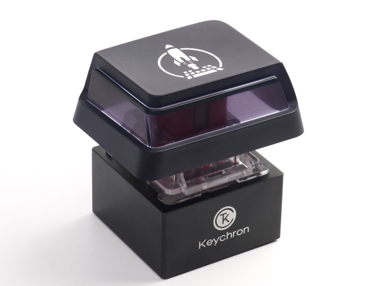
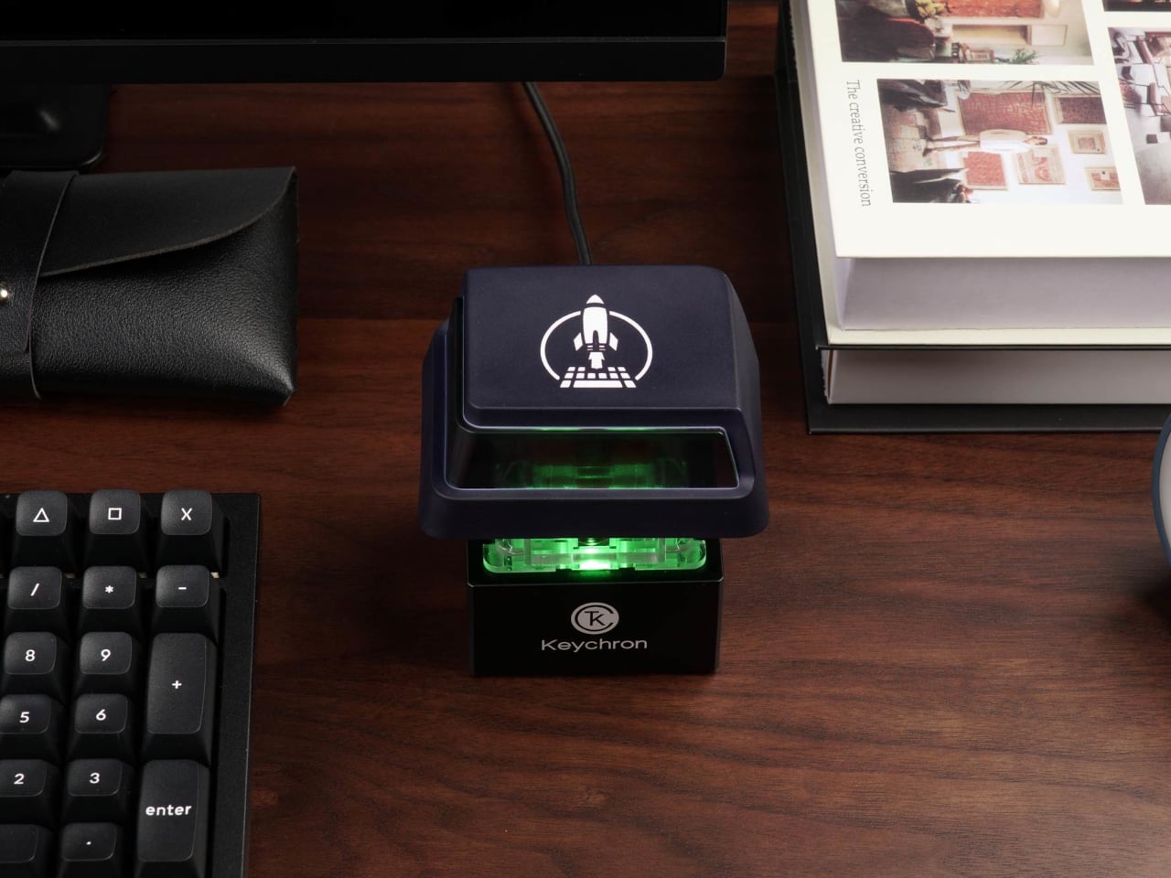
It’s into that space that the Keychron Q0 Mini 8K Action Key quietly lands. Rather than adding keys to a board, Keychron stripped the whole idea down to a single key and built around it seriously. For $64.99, what you’re getting isn’t a gimmick or a belated April Fools joke. It’s a full-metal, programmable, mechanical-switch device that happens to have a single, enormous key, and it commits to that idea entirely.
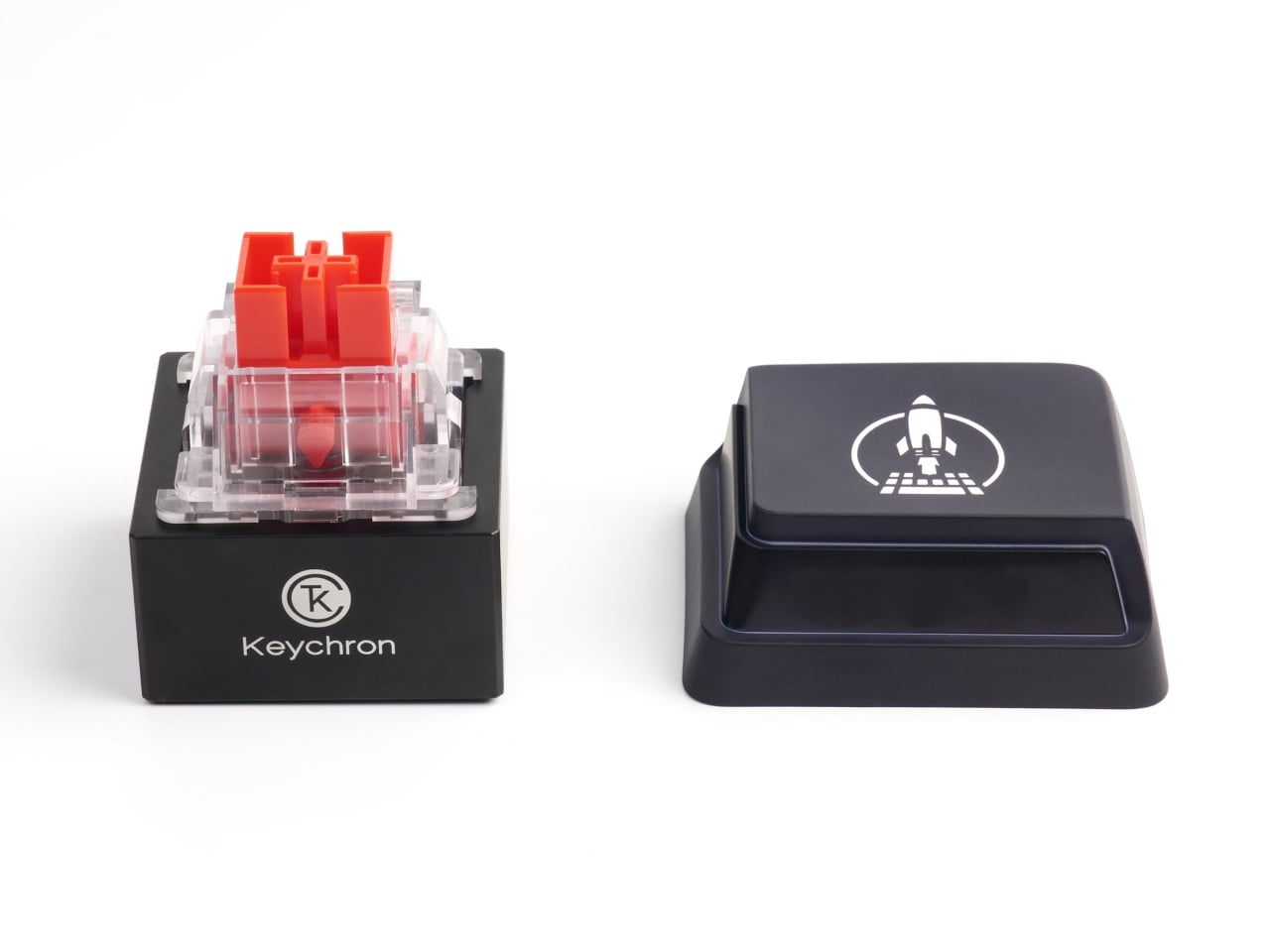
The switch’s engineering story is quite interesting. Keychron scaled it to four times the length, four times the width, and four times the height of a standard mechanical switch, adding up to nearly 64 times the total volume. The result is a key wide enough to take a full palm, and the click it produces feels appropriately satisfying for something this absurdly well-engineered.
Think about the moments in a workday when a single shortcut would have changed everything. Muting yourself in a meeting with one decisive smack, triggering a scene change during a live stream, launching a frequently needed app, or finally getting to slam something that won’t close. Having a dedicated, impossible-to-miss button for any of those moments removes the friction that a hunt across a full keyboard creates.
The performance side takes things just as seriously, almost to the point of ridiculousness. The Q0 Mini 8K supports a polling rate of up to 8,000 Hz, putting it in the same tier as high-end gaming peripherals built to minimize input latency. For something mapped to a time-sensitive action in a game or a live broadcast setup, that level of responsiveness is what separates a purpose-built tool from a desk novelty.
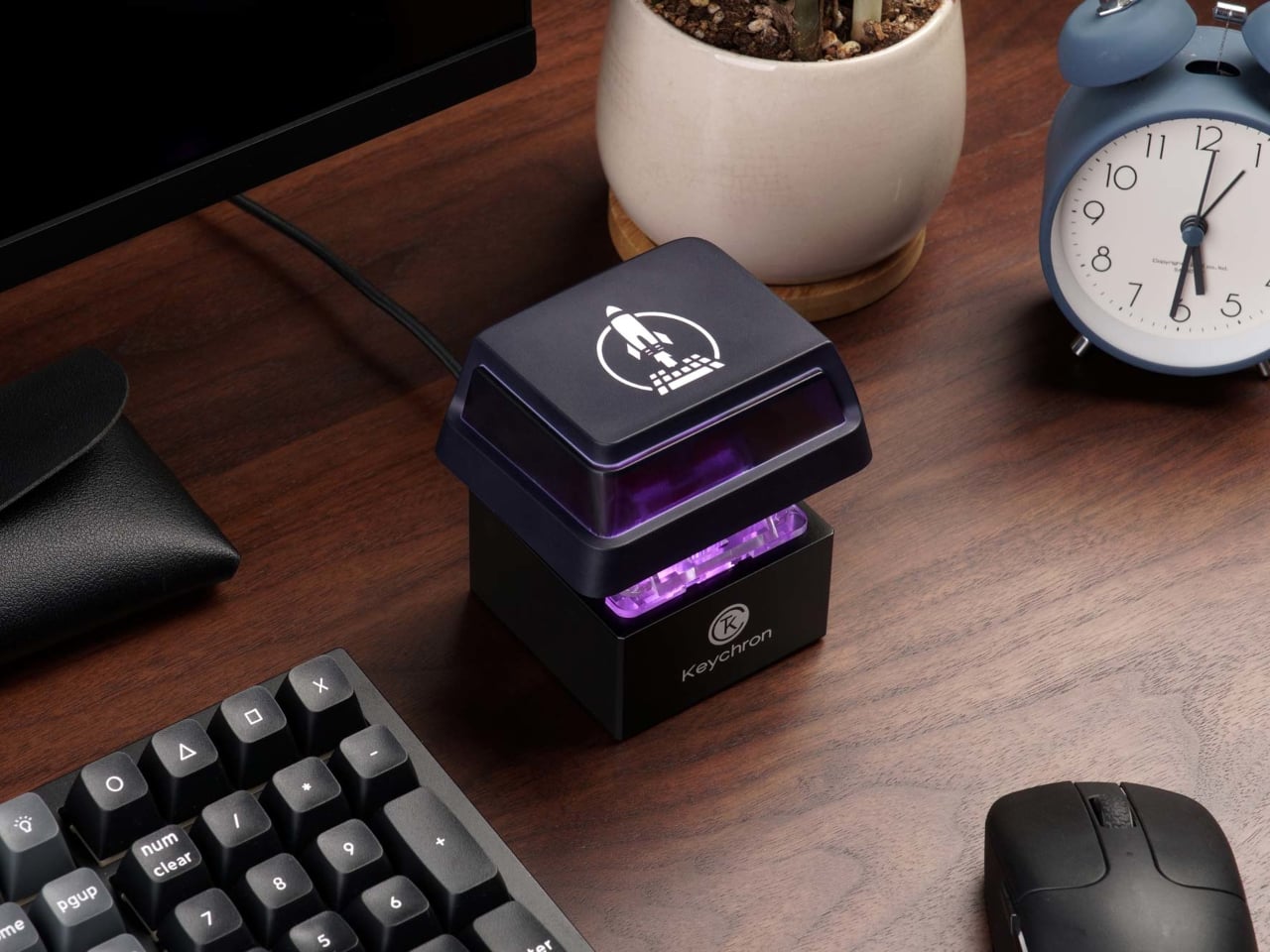
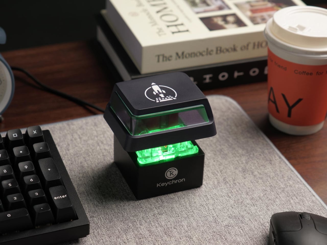
The construction is no joking matter, though. The chassis is CNC-machined from 6063 aluminum, finished with a polished and sandblasted surface that gives it a refined, premium look. The keycap pairs a double-shot PBT outer shell with a translucent polycarbonate insert that lets the RGB lighting through cleanly. With the keycap attached, it weighs approximately 386 grams and sits with real authority on a desk.
Remapping is handled through QMK firmware and the Keychron Launcher, a browser-based tool that requires no software installation. Changing what the key does takes only a few clicks, and compatibility with macOS, Windows, and Linux means it fits just about any setup. The adjustable RGB lighting is tunable in hue, saturation, and brightness, so it can match whatever aesthetic is already living on the desk.
For $64.99, the Q0 Mini 8K isn’t going to make sense to everyone, and that’s fine. It’s a deeply specific product for people who already know which action they’d want at their fingertips. The materials are real, the engineering is considered, and the performance specs are no afterthought. Keychron built a button that genuinely takes itself seriously, and somehow that’s the most fun thing about it.
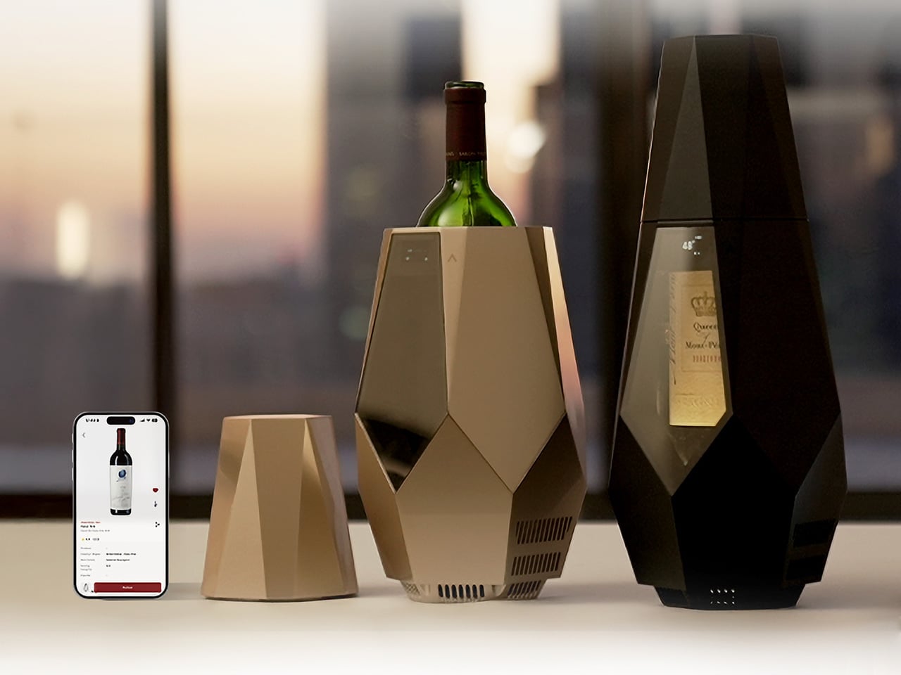
Wine culture has never been more accessible, with good bottles showing up at rooftop dinners, backyard gatherings, and weekend trips just as often as they do at restaurant tables. What hasn’t quite kept up, though, is how we actually serve them once we’re there. Temperature is the detail that most people overlook, and it’s arguably one of the most important variables in how a wine actually tastes.
That’s the gap that Porta is designed to fill. It’s a smart, portable wine cooler that keeps a bottle at the right serving temperature without ice, without a power outlet, and without any of the fuss that usually comes with trying to manage these things outside of a dedicated wine space. It’s compact, rechargeable, and built for the kind of drinking occasions that happen well beyond the kitchen.
A bottle can come from a great producer, be stored perfectly, and still taste flat if it’s poured too warm or too cold. Serve a red too warm, and the alcohol starts to overwhelm everything else. Too cold, and the aromas shut down. There’s a narrow window where the flavors actually show up the way they were intended, and that window closes faster than most people realize.
Cellars and wine fridges solve the storage part just fine. But once the bottle comes out and ends up on the dinner table, or worse, goes into an ice bucket, the situation changes pretty quickly. An ice bucket drops the temperature too far and strips the wine of the very character you chose it for. Porta addresses that moment specifically, which is where it actually matters.
The companion app is where Porta’s smarter side comes in. Pair it with your phone, point the camera at the label, and the app identifies the grape variety and sets the chiller to an appropriate temperature automatically. You can also adjust manually, log wines, add tasting notes, and build a personal wine list, making it quite useful for something that just sits quietly on your table.
There’s also a decanting timer built into the workflow, a small detail that makes a real difference. Once you open the bottle and let it breathe, Porta tracks the time and lets you know when it’s ready to pour. It removes the guesswork from a process that casual drinkers tend to skip entirely, adding a bit of structure to the ritual without making it feel like homework.
What makes Porta genuinely interesting as a design object, though, is how cordless it actually is. It runs on an internal 10,000 mAh battery good for up to eight hours of sustained cooling, and charges via USB in about three and a half hours. That makes it as useful on a terrace or a picnic blanket as it is at a formal dinner table.
The cooling itself is handled by a thermoelectric system that operates without any mechanical movement, which keeps things quiet and vibration-free. The interior circulates chilled air around the bottle while a cork-filled insulating frame holds the temperature steady, even when the ambient conditions outside change. It can bring wine down to 46°F and sustain those conditions throughout a meal without needing you to fuss over it.
The design itself is worth noting separately. Porta comes in Champagne Gold and Matte Black, with a faceted, geometric silhouette that tends to draw attention at the table. That’s intentional. The front window keeps the label visible while the bottle chills, turning it into part of the setting rather than something to be tucked away. It’s the kind of object that actually belongs where the drinking happens.
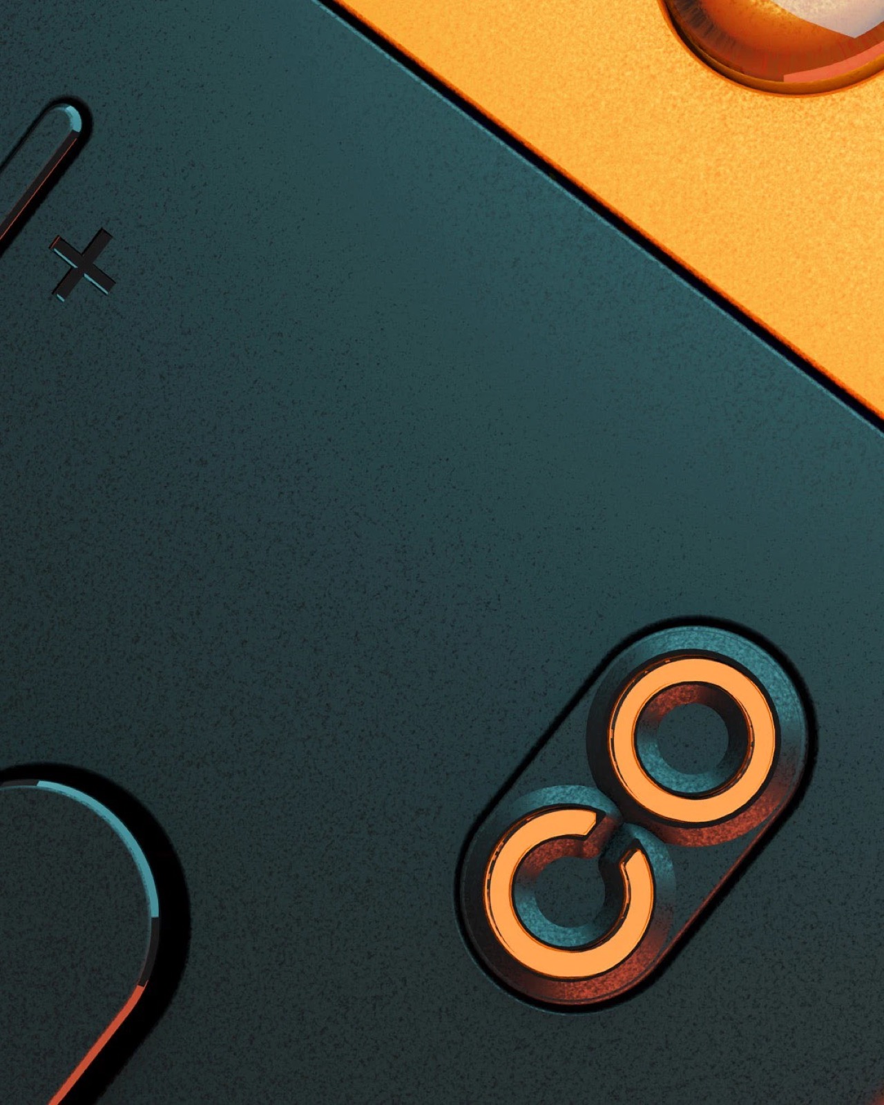
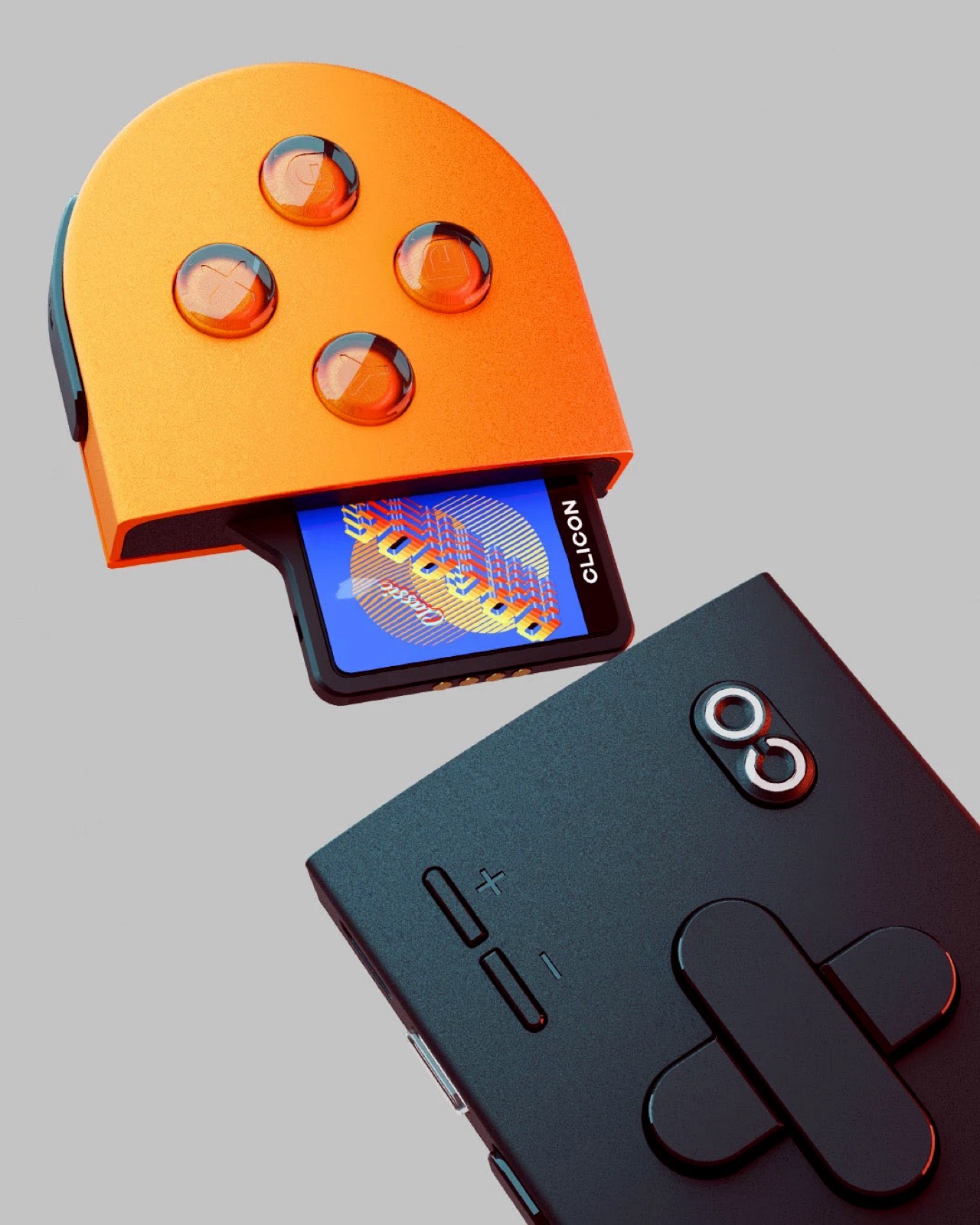
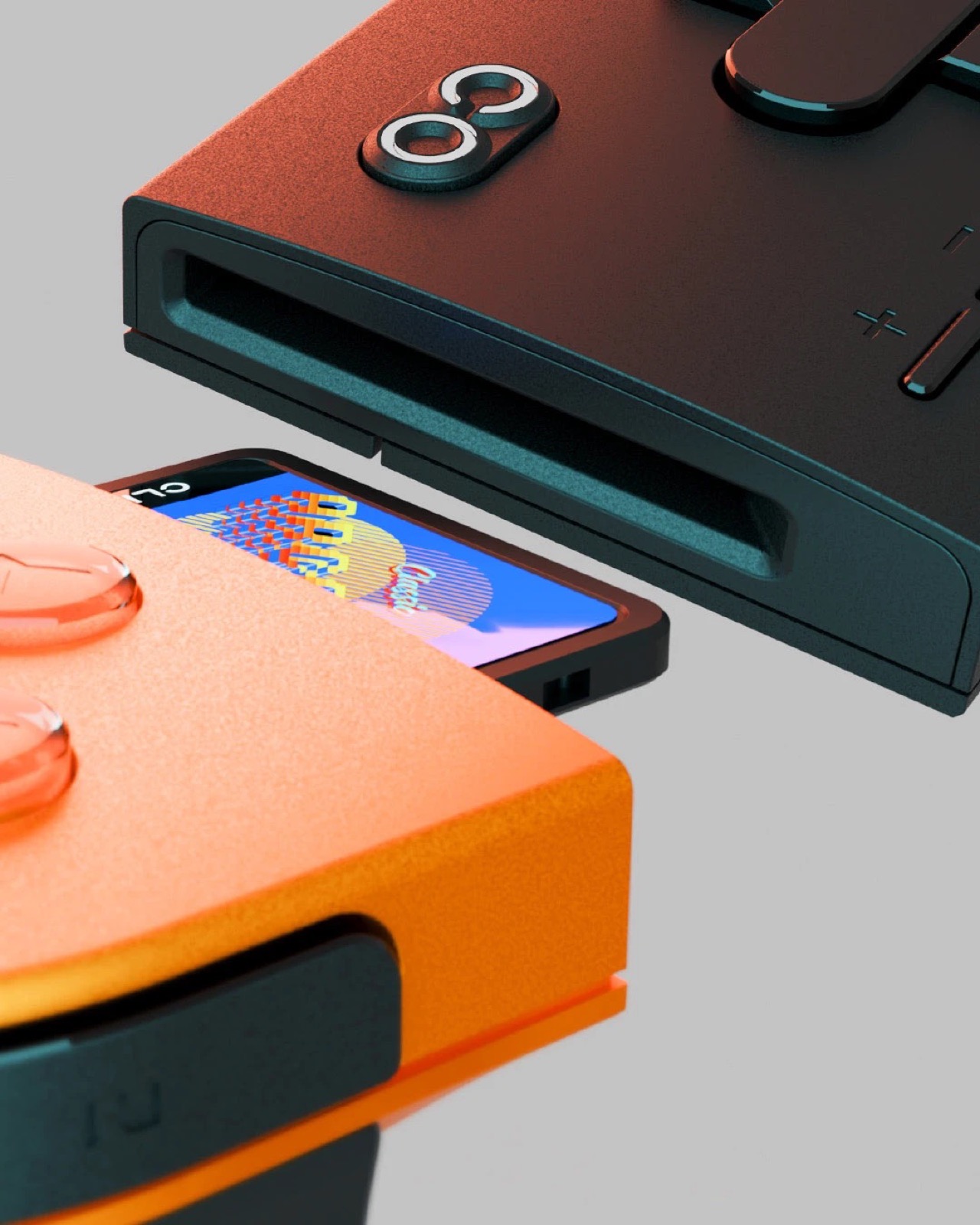
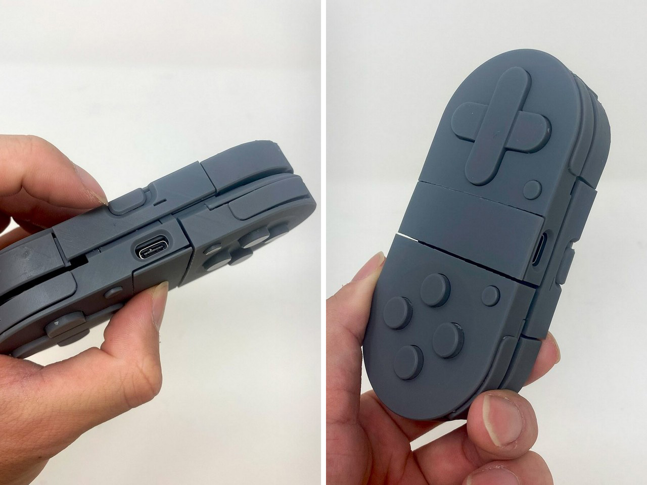
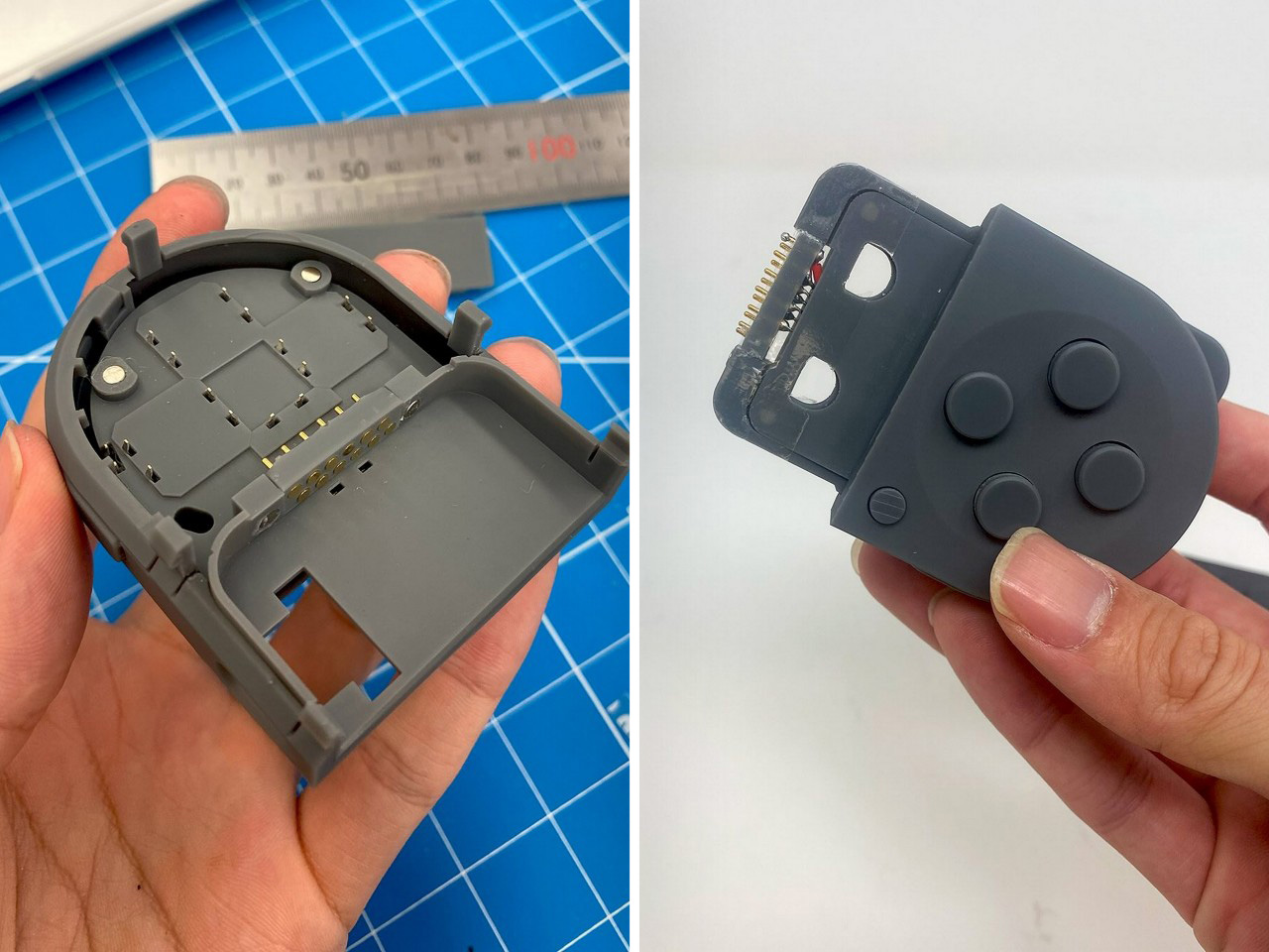
Imagine a Nintendo Switch without a screen. Just two Joy-Cons that click together for wireless gaming. Now imagine that was it. That was the product. That’s what the Clicon gaming controller/console is pitching itself has. Handheld wireless gaming with anything you want as the screen. Split the controller apart and a cartridge fits into it, sandwiched between the two halves. Click the halves shut and you’ve effectively ‘loaded’ a game. Now pick a screen and game on it.
Spiritually, it feels exactly like what I’d expect from an indie company trying to be the next Nintendo. Out-lite the Switch Lite by ditching the screen altogether. The 2-part controller looks gorgeous, is portable, and ends up acting as a cartridge holder just by virtue of its design. Plus, the Duracell colorway definitely gives it a funky touch that’s hard to ignore!
Designers: Yasuaki Iijima & Jason Chen
This format is easily the first in the handheld gaming segment and that’s perhaps the one thing that excites me the most. Seeing a design so fairly radical it grabs your attention for a second, making you question how it works, and whether it would work, plausibly. The Clicon is still conceptual, obviously, but the designers are apparently working on a prototype.
The renders show a basic arcade-style cartridge that is housed inside the controllers, sitting just within their parting line and jutting out the middle the way your AirPods jut out when you flip the lid. This means no mano-a-mano gaming the way you would on a Switch. This entire thing is just one console, and doesn’t work when split apart. Lock it together and you’ve got something akin to the SNES controller with a pill-shaped design that feels decent enough to hold for hours at a stretch.
Meanwhile, as controls go, the Clicon packs them all, action buttons, arrow keys, two sets of shoulder buttons, the works. A home button and +/- buttons on the front, another transparent button on the top, and a USB-C port to charge the device as well as potentially stream content via cable. It would also make sense to assume that wireless streaming is a possibility.
Designers Yasuaki Iijima & Jason Chen are apparently working on a prototype. Their instagrams show 3D prints of mock-ups, even with bare-basics circuitry. It’s way too early to even ask for things like a timeline, specs, pricing, etc. but what we can do is judge the design for what it is. And hope that a feasibility run doesn’t result in too much of the design changing in the process! Heck, is it possible we see a ‘Nintendo Switch Lite Lite’ before GTA 6?
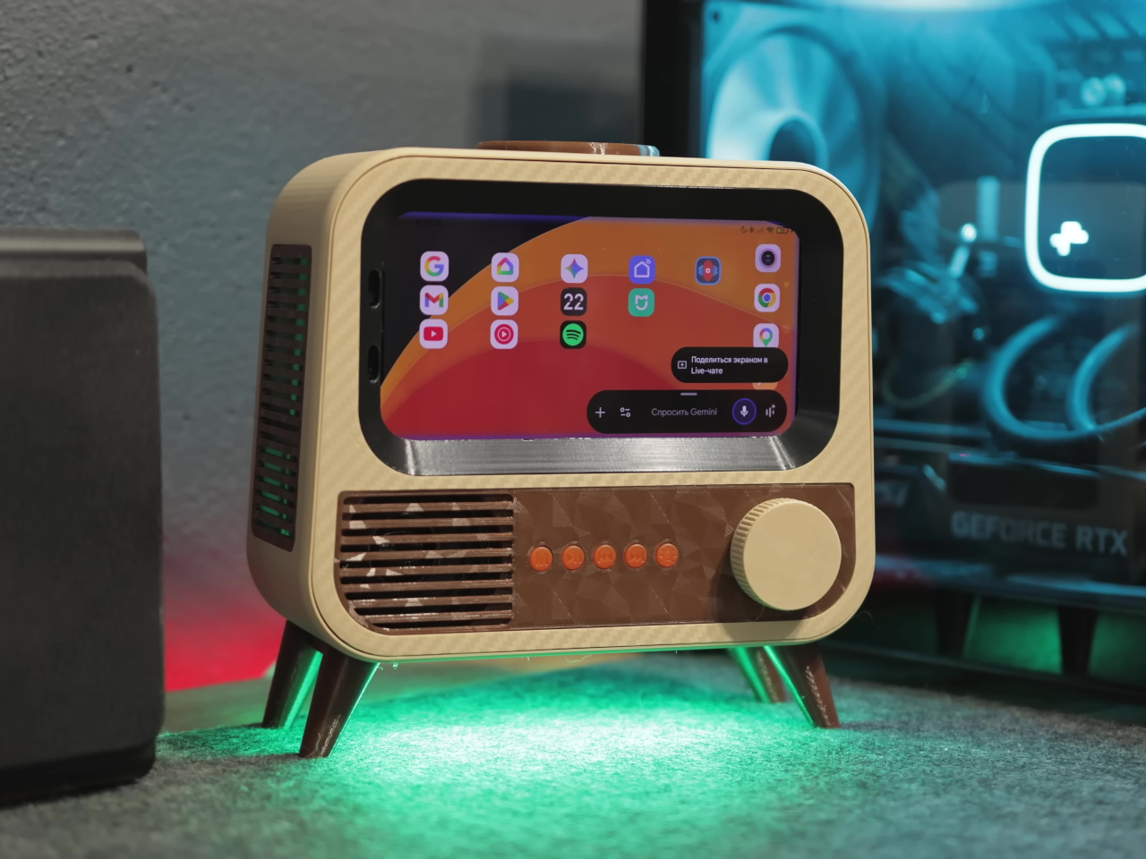
The smart home speaker market has settled into a familiar aesthetic. Smooth cylinders, matte finishes, and understated designs meant to disappear into a room are the default for most voice assistants. It’s a reasonable approach, but it also means most of them look exactly the same, and the hardware driving them tends to get replaced every couple of years, whether it actually needs to be or not.
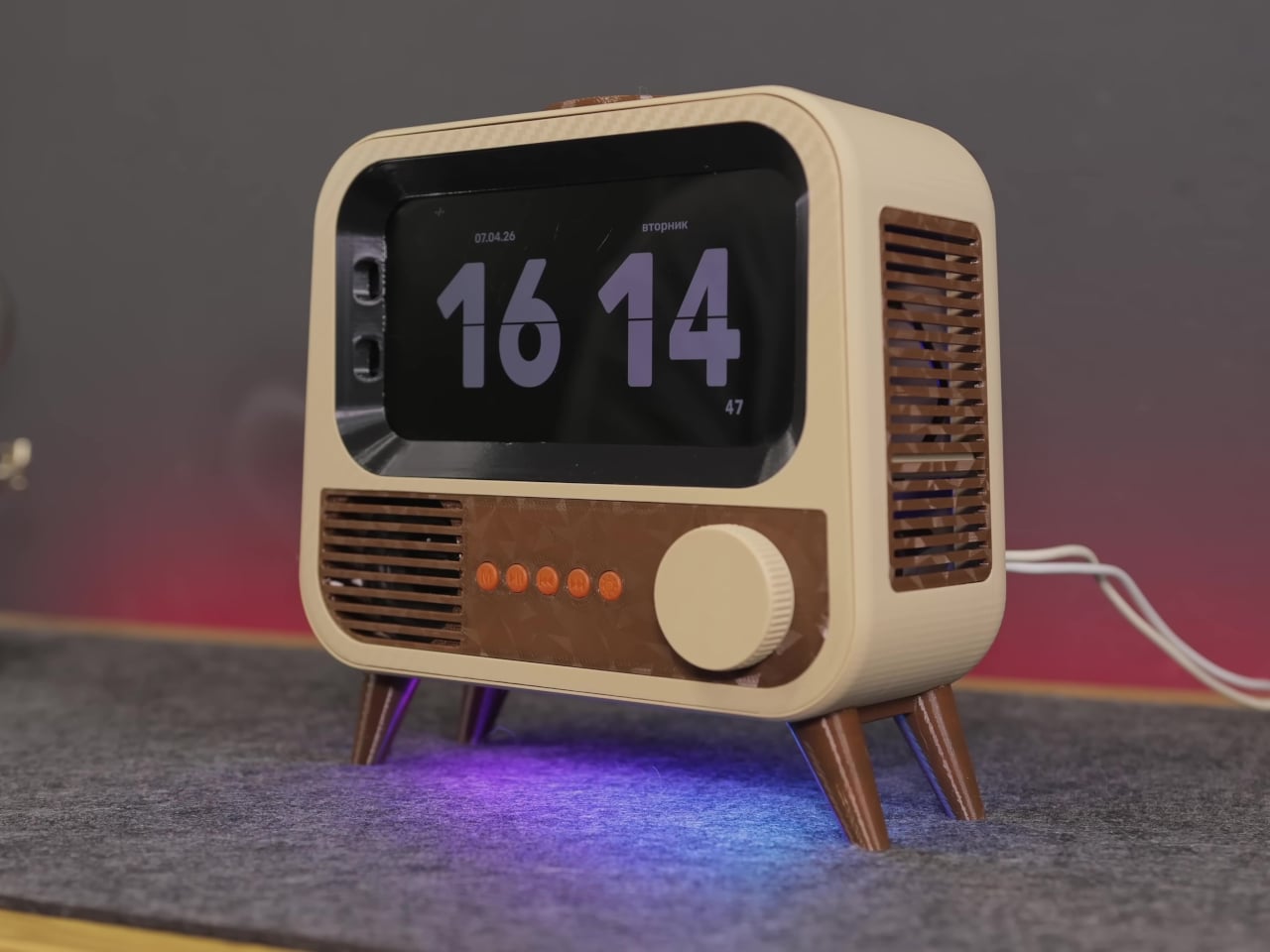
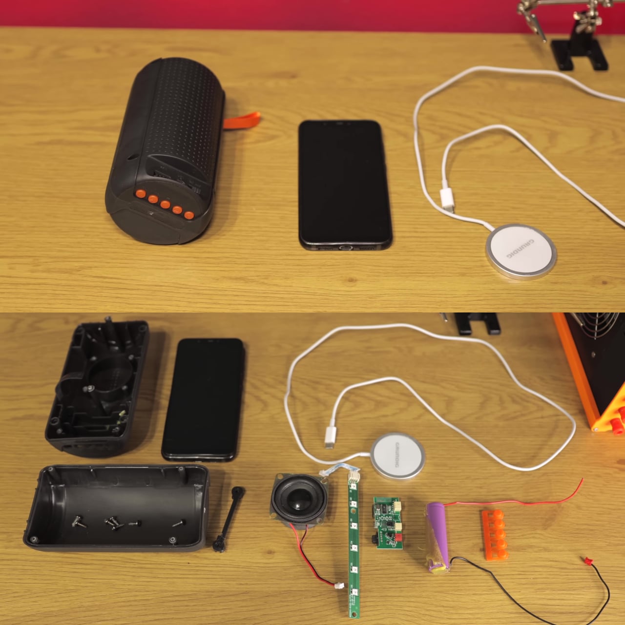
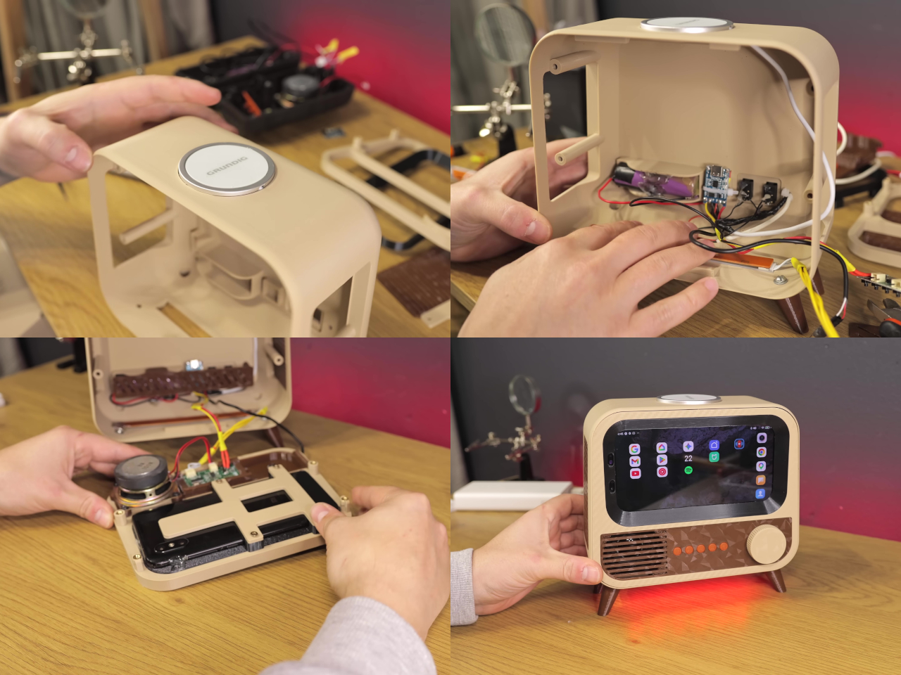
HANDMAX Workshop took a different approach entirely. Rather than buying new hardware, the build starts with a Xiaomi Mi 8 already well past its prime, complete with a burned-in display, degraded speakers, and a failing battery. The processor and software capabilities were still perfectly usable, though, and that turned out to be all this kind of project actually needs.
Designer: HANDMAX Workshop
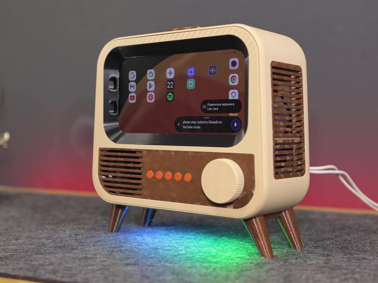
The case is where things get interesting. Instead of a sleek enclosure meant to blend in, the HANDMAX design goes full retro television, with a front grille, physical control buttons, and decorative legs completing the picture. Carefully modeled 3D-printed parts handle the practical side of things, accommodating the phone’s sensors and camera while keeping the vintage illusion intact from every angle you look at it.
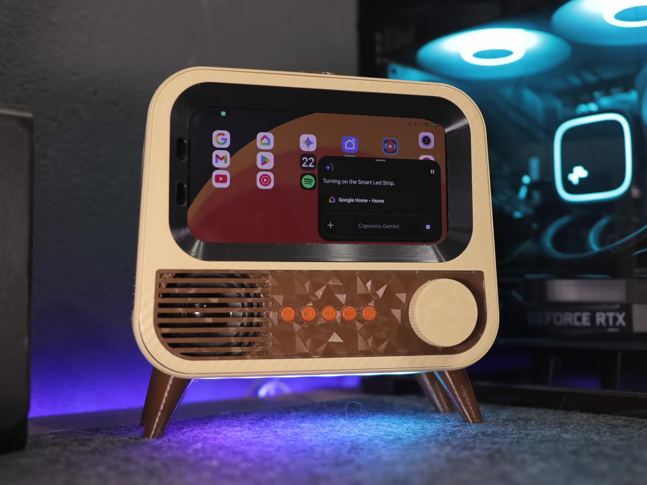
Put it on a desk, and you have a smart speaker that looks like something rescued from a garage sale, in the best possible way. Ask it a question, and Google Gemini handles the conversational side, pulling in responses without needing a dedicated microprocessor or a new development board. It’s the same AI model powering higher-end commercial devices, running on hardware that would otherwise be sitting in a drawer.
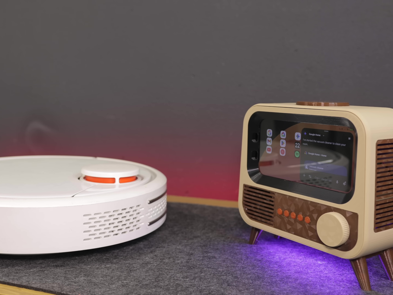
The smart home integration is what makes it genuinely useful beyond being a conversation piece. Through Google Home, the device can control smart home accessories directly, and custom routines let voice commands trigger specific actions around the house. Turning lights on, adjusting a thermostat, or running a sequence of automations becomes a spoken instruction directed at what looks like a miniature television set.
Getting there wasn’t entirely straightforward. The phone’s Bluetooth module had a habit of shutting itself down after 20 minutes of silence, which would quietly cripple the whole setup. The fix was characteristically clever, though; an inaudible 6 Hz tone runs constantly in the background, imperceptible to human ears but enough to convince the firmware that the system is still in use and shouldn’t shut down.
Beyond voice interaction, the finished device also functions as a wireless charger and a desktop display, which means it earns its counter space even when no one is talking to it. The final hardware list doesn’t include a single new component, just old parts that most people would have discarded without a second thought. That’s the more interesting design challenge of the two.
There’s an argument to be made that the best AI hardware isn’t always the most expensive, and this project makes it quietly. Commercial smart speakers are bought, used for a few years, and eventually replaced. A device built from broken hardware doesn’t follow that lifecycle, and the retro TV case that holds it together makes sure it doesn’t look like it’s trying to.
There’s a version of going off-grid that means giving things up — signal, comfort, hot coffee, reliable light. Then there’s the version a new wave of purposeful gear is quietly making possible, where disconnecting from the grid doesn’t mean downgrading your experience at all. These ten tools are built for that second scenario. Each one solves a real problem the outdoors creates, with enough design intelligence that you’d carry them anywhere.
What’s changed isn’t just the technology; it’s the design thinking behind it. Gear for the outdoors used to mean sacrificing aesthetics for function. Now the best of it does both, blending rugged performance with a considered design that makes you want to own it before you need it. The ten picks ahead span communication, power, navigation, hygiene, and comfort — a full stack of upgrades for life beyond the last cell tower.
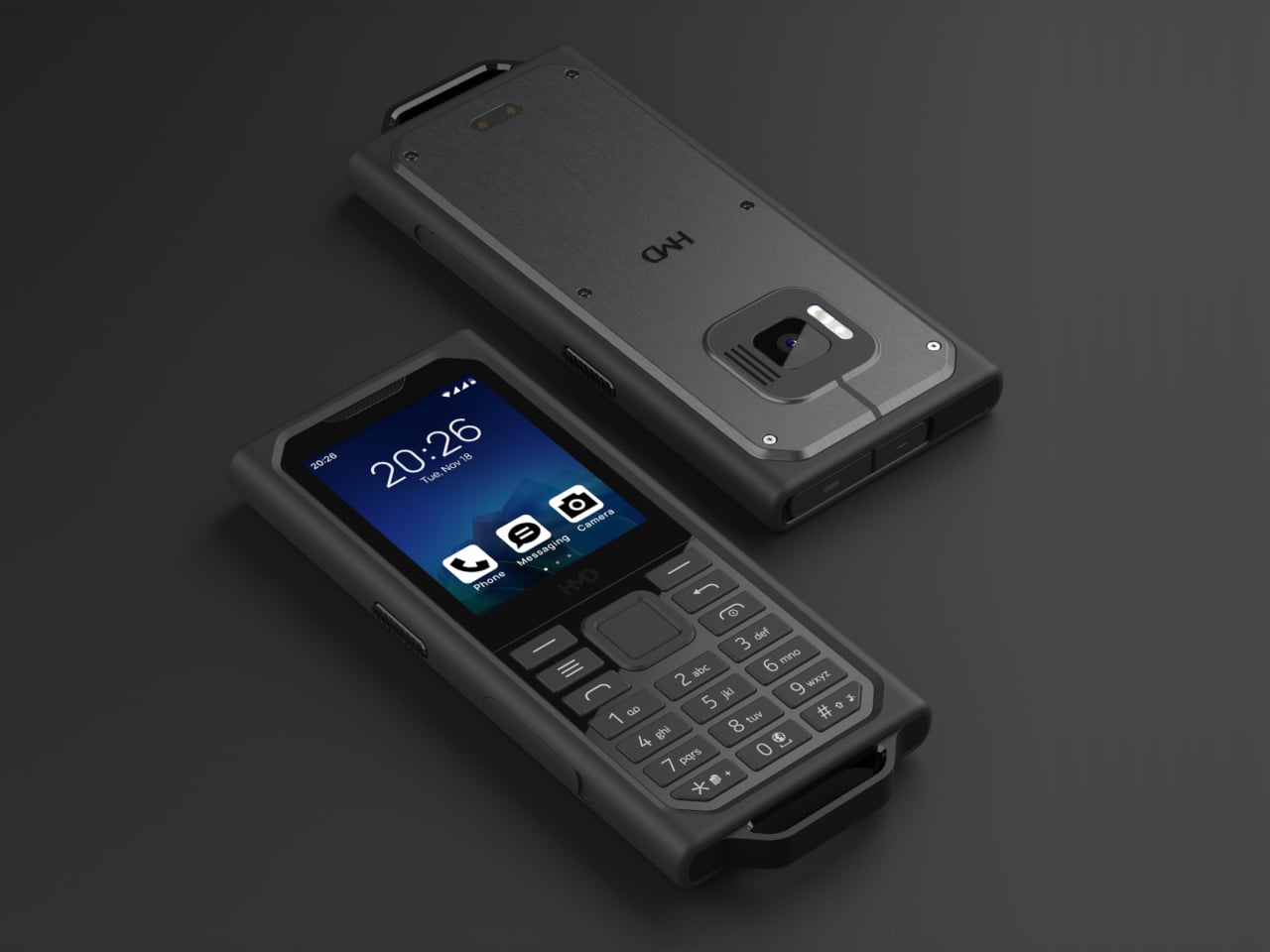
1. HMD Terra M
Most rugged phones solve the wrong problem. They add armor, lose usability, and end up too bulky to carry comfortably. The HMD Terra M takes a different approach. It’s compact and purpose-built for field conditions, carrying both IP68 and IP69K ratings, MIL-STD-810H military certification, and resistance to drops from 1.8 meters. It handles submersion, high-pressure water jets at 100 bar and 80°C, and exposure to gasoline, industrial solvents, and medical-grade sanitizers. That’s a resume most flagship phones would quietly fail.
What makes the Terra M genuinely useful outdoors is how it handles the small things. Large physical keys respond to gloved hands, a non-slip textured grip reduces fumbling, and a 2.8-inch display hits 550 nits behind Corning Gorilla Glass 3. These are the details that matter when you’re mid-job and can’t afford to stop and baby your device. The Terra M keeps you reachable and functional in places where most phones simply quit.
What We Like:
IP68, IP69K, and MIL-STD-810H rated for serious field conditions
Glove-compatible keys and a high-brightness display designed for outdoor use
What We Dislike:
The 2.8-inch screen limits any media or app-heavy use
The feature phone format won’t suit users dependent on smartphone functionality
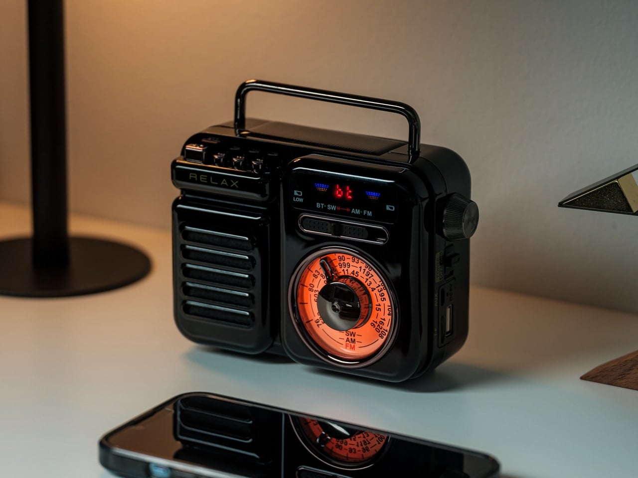
2. RetroWave 7-in-1 Radio
A single device covering seven roles sounds like marketing language until you’re three days into a camping trip with a dead phone and no signal. The RetroWave handles AM, FM, and shortwave reception, Bluetooth streaming, MP3 playback via USB or microSD, a built-in flashlight, an SOS alarm, hand-crank charging, a solar panel, and a power bank function. Its retro Japanese design and tactile tuning dial make it something you’d want on a shelf, not buried in a go-bag.
Off-grid, it earns its place immediately. You stop carrying a flashlight, a radio, a speaker, and a backup charger as separate items. The RetroWave collapses all of that into one object you can grab and go. Whether riding out a storm at home or deep in a campsite with no hookups in sight, the hand-crank and solar panel mean you’re never entirely powerless. That reliability, in the right situation, is the difference between anxious and settled.
Seven functions in one device significantly reduce what you need to pack
Hand-crank and solar charging operate without any external power source
What We Dislike:
Multi-function design means no single feature is best-in-class
Retro aesthetic won’t suit every minimalist gear setup
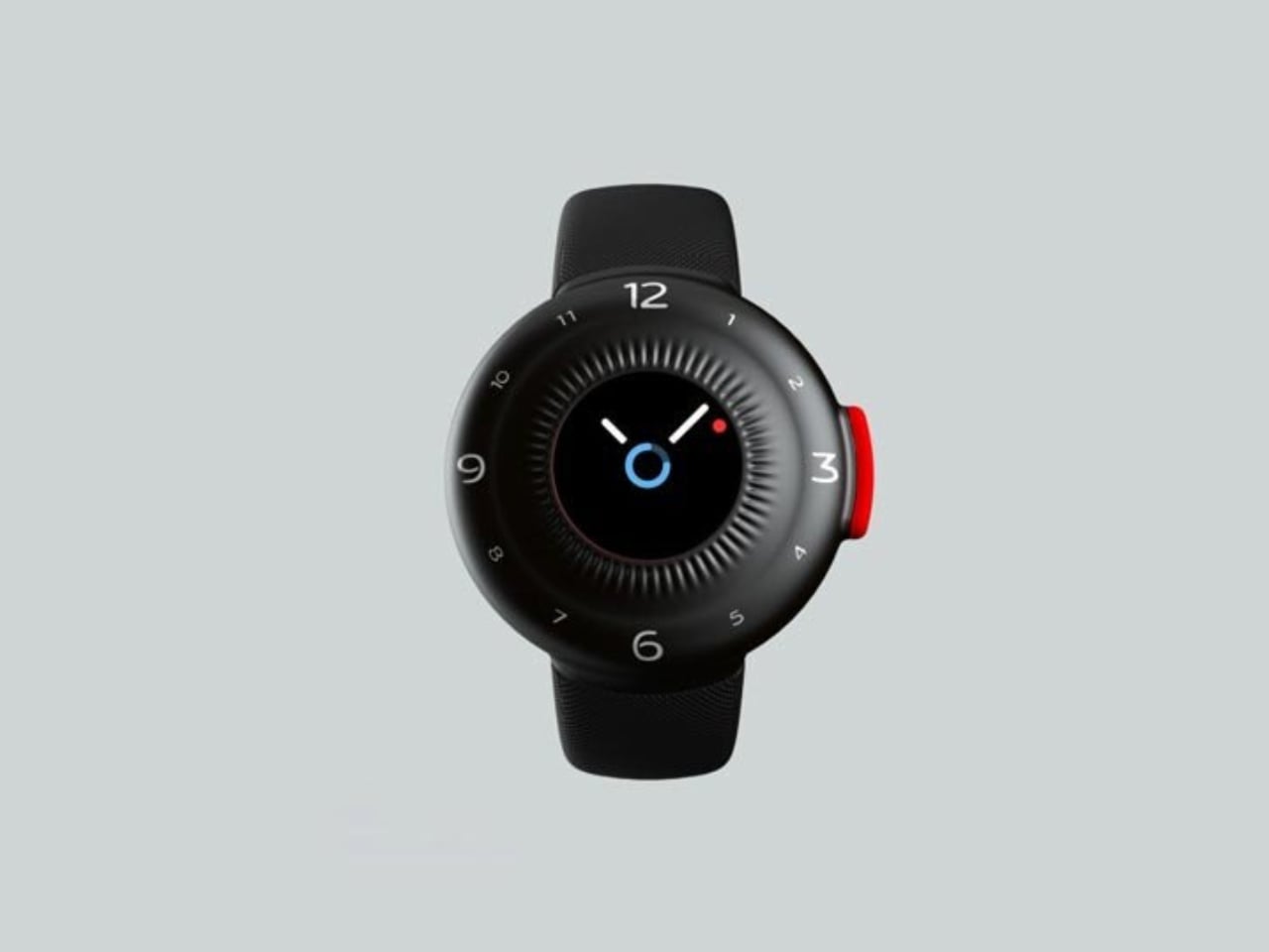
3. O-Boy Satellite Smartwatch
There’s a version of emergency preparedness that stops at downloading an offline map. Then there’s O-Boy. Developed by Brussels-based studio Futurewave, it’s a satellite-connected smartwatch built for environments where mobile networks simply don’t reach — mountains, open ocean, remote job sites. In those places, it functions as a direct satellite communication link, letting you transmit an emergency alert regardless of what infrastructure exists beneath your feet.
What Futurewave got right, beyond the technology, is the design brief. O-Boy doesn’t read as overtly tactical or survival-coded. It looks like something a person who spends time in remote environments would actually wear — utilitarian without being aggressive. That broader visual appeal matters because people who need a backup safety layer the most aren’t always those who identify as outdoor athletes. O-Boy is designed for anyone who ventures where their phone simply cannot save them.
What We Like:
Satellite connectivity works in locations with zero mobile network coverage
Design is wearable beyond strictly tactical or adventure-specific contexts
What We Dislike:
Satellite communication typically requires an ongoing subscription service
Smartwatch form factor means battery management becomes a daily consideration
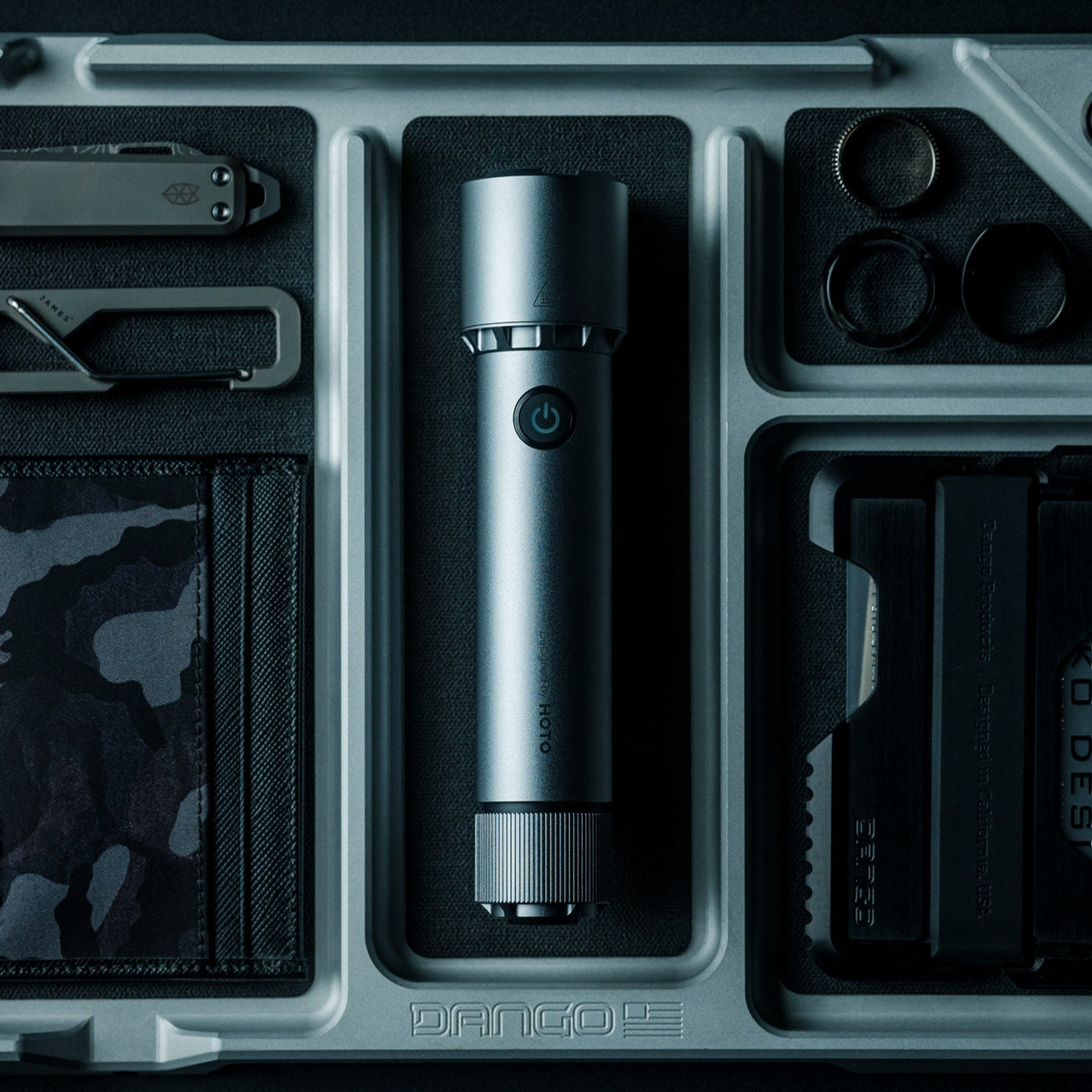
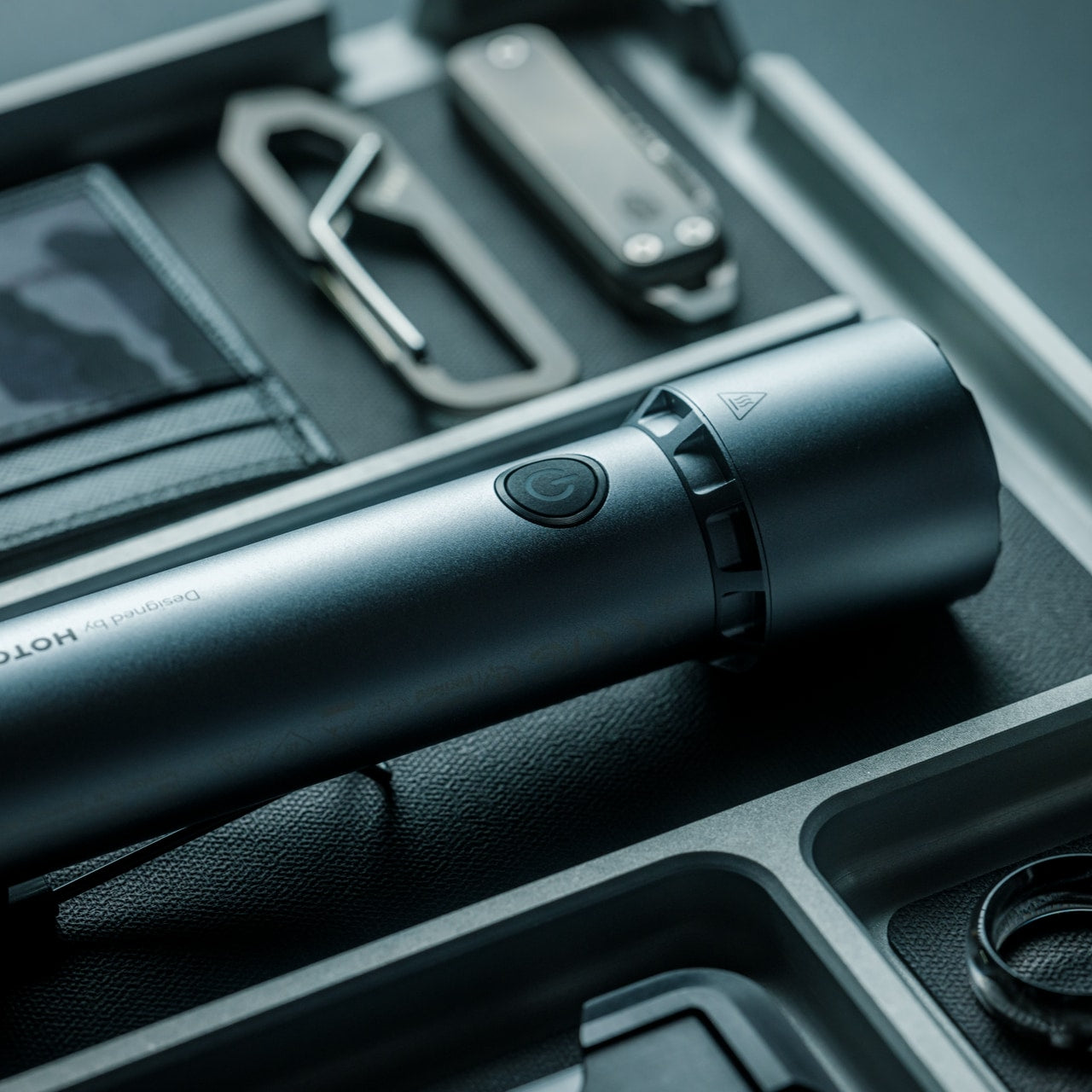
4. BlackoutBeam Tactical Flashlight
Most flashlights ask you to choose between power and portability. The BlackoutBeam doesn’t treat that as a meaningful trade-off. With 2,300 lumens of output, a 300-meter beam throw, and a 0.2-second response time, it delivers instant illumination exactly when you need it. The aluminum body carries an IP68 rating for water and dust resistance, built to handle rain, impact, and submersion without missing a beat.
What separates it from the drawer flashlight you forgot to charge is the combination of instant-on response and structural durability. In a blackout, a wildlife encounter, or a roadside situation at night, the difference between light and no light is rarely about brightness — it’s about how fast you get there. The BlackoutBeam gets there before you’ve finished reaching for it. Its industrial design keeps it from looking out of place in any context, which means it actually gets carried.
2,300-lumen output with 300-meter beam reach handles serious low-light scenarios
IP68 waterproof rating and 0.2-second response built for real-world emergencies
What We Dislike:
Maximum lumen output draws battery faster during extended use
Tactical aesthetic doesn’t integrate seamlessly into every EDC setup
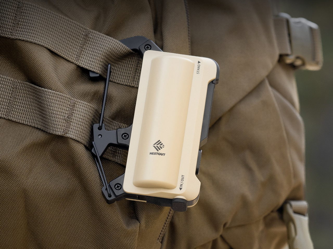
5. Carabiner Power Bank
Most power banks are an afterthought in terms of how you carry them. They go loose in a pocket or rattle around at the bottom of a bag until the cable is buried somewhere unhelpful. This carabiner-shaped power bank removes that friction by making attachment the actual design concept. Clip it onto a bag strap, a jacket loop, or a belt, and your backup charge goes wherever you go without adding any mental overhead.
The real value is how it removes a common hesitation: people don’t carry a power bank until they’ve already needed one. A carabiner you clip on once and forget solves the carry problem entirely. Off-grid, that passive availability becomes genuinely important. It’s the kind of accessory that works not because it’s technically impressive, but because it respects how people actually behave and quietly builds itself into the routine.
What We Like:
Carabiner form clips directly to gear without consuming bag space
Rugged, compact design is suited to outdoor and trail use
What We Dislike:
Capacity is limited compared to a dedicated, full-size power bank
Not sufficient as a sole charging source for multi-day trips
6. X1 Portable Toilet
The outdoor bathroom situation is the least discussed but most universally felt problem with going off-grid. Clesana’s X1 addresses it without compromise. The battery-powered portable toilet looks like a compact cube at rest, then telescopes to full, home-equivalent height when needed. At 24 pounds with an integrated handle, one person can move it easily, and the ergonomics when deployed match what you’d expect at home, not in a festival field.
The real design achievement is what happens after use. Clesana’s patented thermoelectric sealing system wraps waste in individual sealed packages with no odor, no chemicals, and no water hookup required. Sealed waste collects in a lower chamber for clean, convenient disposal when the time comes. For van lifers, remote workers, and long-haul campers, the X1 elevates one of the most basic human needs to something approaching actual dignity. It’s a quiet but significant piece of off-grid infrastructure.
What We Like:
Telescopic design delivers home-height comfort in a fully portable format
Patented sealing system eliminates odor without chemicals or water connections
What We Dislike:
Battery dependency adds another device that needs to be monitored and charged
Sealed waste packages create an ongoing consumable cost over time
7. Loki-Nav 3-in-1 Compass
The Loki-Nav makes the case that the best survival tool is the one that actually gets packed. A standalone compass rarely does. But a compass that also works as a magnifying glass for map reading, an emergency signal mirror, and a fire-starting wood chip maker earns a permanent spot on any kit. Four tools in one object change the calculus on what’s worth carrying.
Its IPX8-rated compass is filled with premium white oil and delivers precise navigation in conditions that render most electronics useless — extreme cold, downpours, and complete darkness with the optional Luminous Compass Core upgrade. Smartphones are useful navigation tools right up until they aren’t, and coverage drop-outs and battery deaths are common enough that analog backup should be standard practice. The Loki-Nav doesn’t ask you to compromise on aesthetics to carry it, with three design options available. It’s a tool that respects the intelligence of the person using it.
What We Like:
Four survival functions in one design reduces what needs to be packed separately
IPX8-rated, oil-filled compass operates reliably in extreme temperatures
What We Dislike:
Wood chip fire-starting function is supplementary, not a primary fire tool
Each capability requires practice before relying on it in a real situation
8. Airflow 8-Panel Fire Pit
A campfire that tends itself is the dream. The Airflow 8-Panel fire pit doesn’t go that far, but its 8-panel removable design gets closer than most. Built around secondary combustion science, holes at the base of each panel channel primary airflow upward through double-walled cavities, producing a secondary burn that makes the fire significantly cleaner and more efficient. The result is minimal smoke and a fire that does more with less wood.
The adjustable panel system lets you control how open or enclosed the combustion chamber is, dialing the fire’s intensity up or down without constant prodding. Off-grid evenings deserve a real focal point, and a fire that performs well without drama is a quality-of-life upgrade that’s easy to underestimate until you’ve experienced it. Sanyo Works brings deep metal processing expertise to this design, and that background shows in how precisely the airflow mechanics are considered. Less compromise, more outdoor living.
The secondary combustion system produces minimal smoke for a noticeably cleaner burn
Adjustable 8-panel design allows real control over fire intensity
What We Dislike:
Eight individual panels mean more parts to pack and more potential for loss
Wood-only fuel system with no gas compatibility
9. COFFEEJACK V2
There’s something worth preserving in the process of making coffee, and the COFFEEJACK V2 understands that completely. It’s a fully manual, hand-crank espresso maker that builds up to 10 bars of pressure through rotation alone. No electricity, no battery, no automation. The crank forces hot water through a portafilter packed with a coffee puck, producing a proper espresso shot complete with crema, wherever you happen to be sitting.
The design is compact enough to pack without rethinking your kit, and the purely analog mechanism means nothing to charge and nothing to break electronically. For off-grid mornings, a proper hand-brewed espresso is a ritual worth keeping. It’s also arguably the clearest signal that going off-grid doesn’t require giving anything meaningful up. The COFFEEJACK V2 is the kind of object that makes a campsite feel intentional rather than improvised, which is the whole point.
What We Like:
Fully manual design requires zero power source or battery
Builds up to 10 bars of pressure for genuine espresso with full crema
What We Dislike:
A consistent technique is required to get the best extraction results
Hot water still needs to be sourced and heated separately before brewing
10. Giga Pump 4.0
Inflating gear by mouth or with a bulky hand pump has always been the slowest, most tedious part of setting up camp. The Giga Pump 4.0 eliminates that problem. Despite its compact size, it achieves 4.2 kPa pressure and a 220L per minute flow rate, representing a 90% efficiency improvement over its predecessor. A simple toggle switches between 4 kPa for firm inflation and 2 kPa for softer fill, handling mattresses, paddle boards, and tents with equal ease.
Deflation is handled just as efficiently. The reverse suction mode pulls air out as quickly as it pushes it in, compressing gear down for storage in a fraction of the usual time. Off-grid setups live and die by how much friction each task creates. A pump that does its job quickly and quietly, without requiring you to think about it, means more time spent doing the things you actually came out there for. That’s the right kind of upgrade.
What We Like:
90% efficiency improvement delivers 220L per minute from a compact body
Forward inflation and reverse deflation are handled by one device
What We Dislike:
Battery-powered design requires charging before each outing
Compact size means slightly less sustained pressure than full-size pump alternatives
The Grid Was Always Optional
Going off-grid used to require an acceptance of compromise. You’d lose convenience, comfort, and connectivity in exchange for space and silence. These ten tools quietly dismantle that trade-off. From satellite communication on your wrist to espresso brewed by hand at a campsite, the gap between outdoor living and the standards you hold at home has never been narrower. The gear has caught up. The question now is whether you have.
None of these products asks you to rough it. That’s the point. The best off-grid gear doesn’t celebrate deprivation — it removes the friction that made leaving the grid feel like a real sacrifice to begin with. Whether you’re building a go-bag, outfitting a van, or just spending more time outdoors, this kind of kit makes the case that beyond the last signal bar is exactly where you want to be.