This 5-Inch “Video Business Card” Wants To Replace Your Stack Of Paper Cards

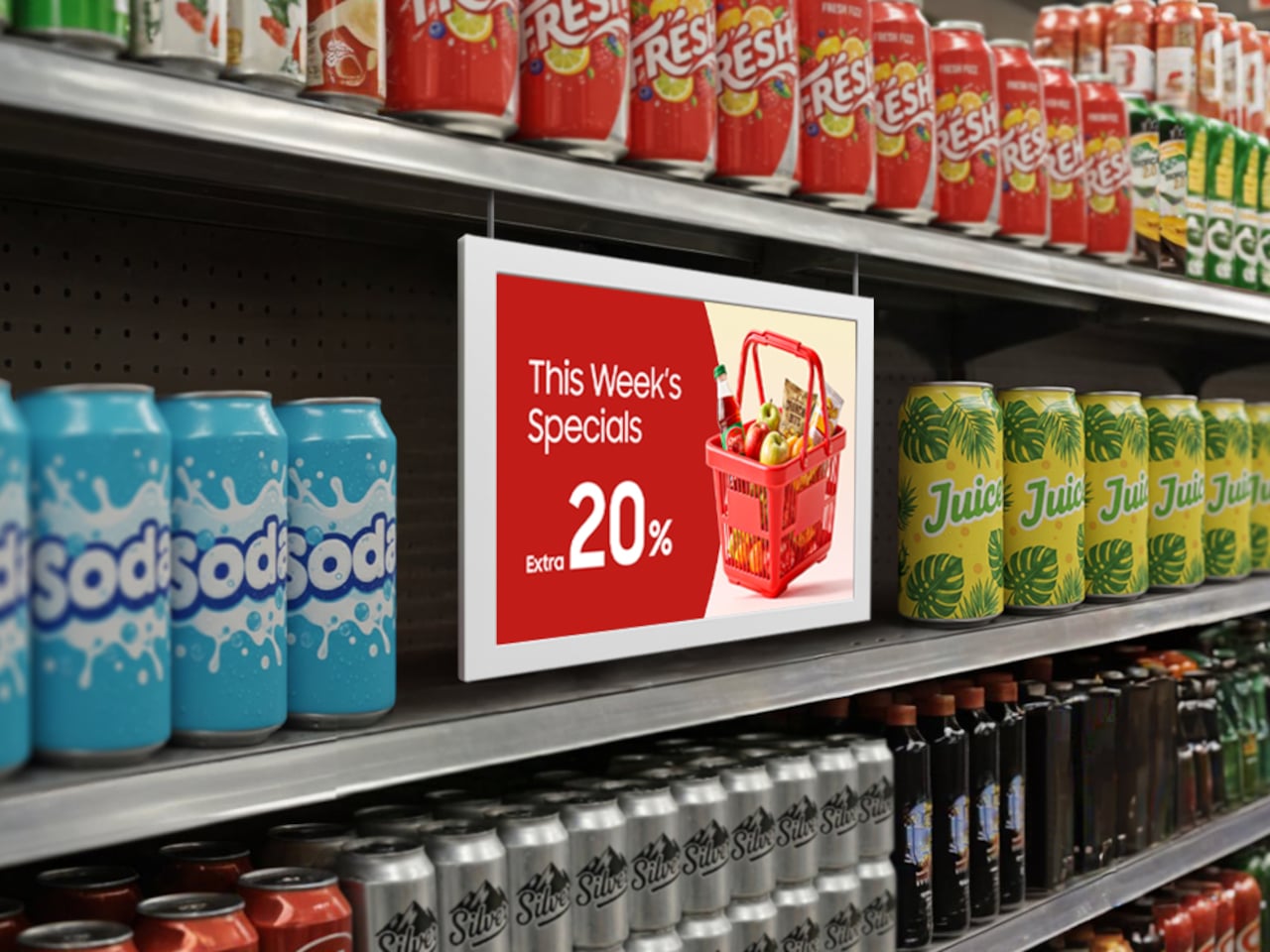
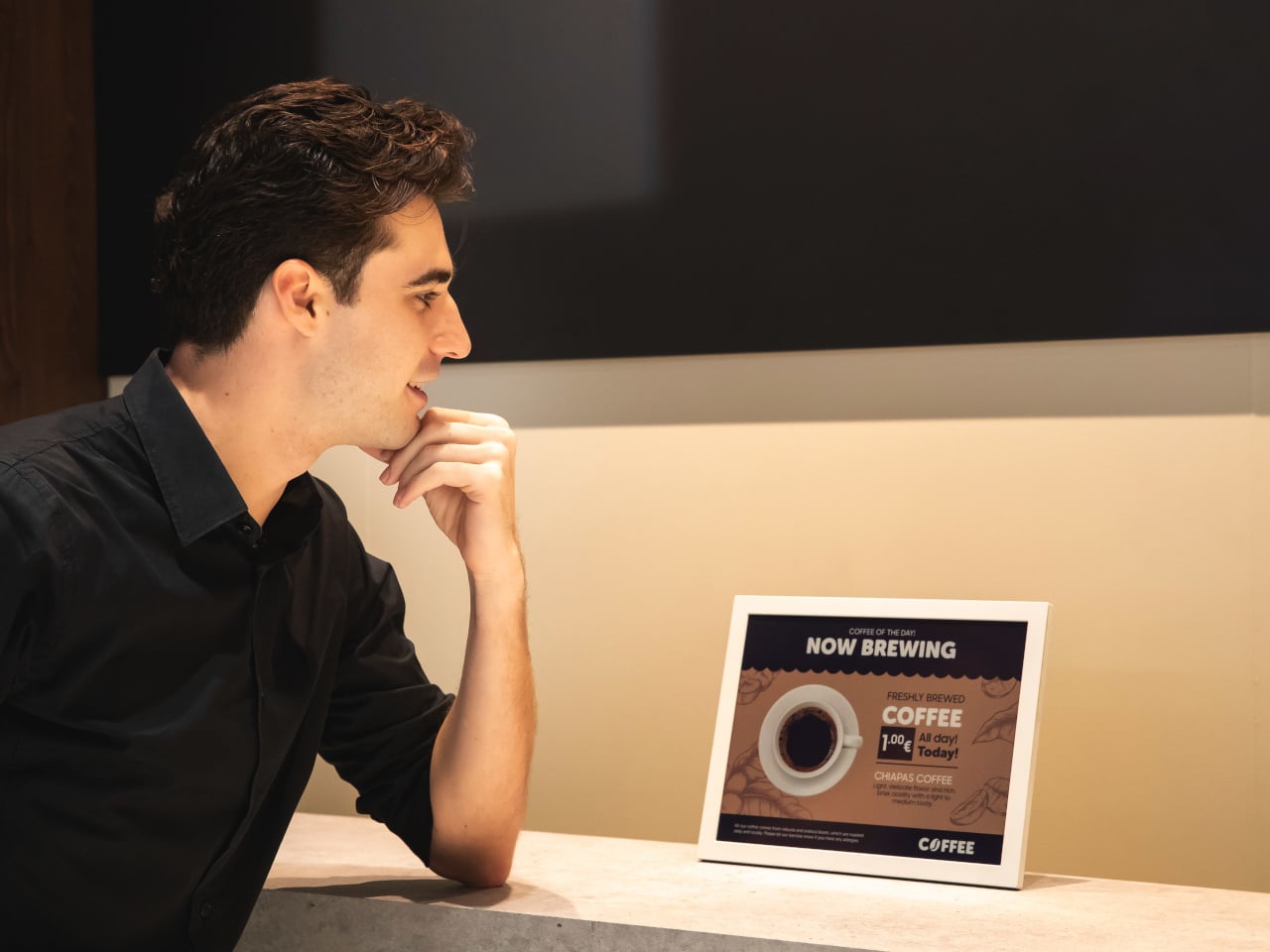
Televisions used to be heavy boxes that dominated a room. Now, the latest LG and Samsung prototypes at CES 2026 look more like posters than TVs, with panels so slim they almost blend into the wall and bezels that seem to disappear when the screen lights up. These displays are no longer just appliances in the corner of a living room. They are becoming design elements that can live almost anywhere you might put a sheet of paper.

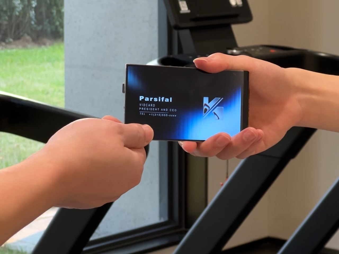
That shift makes it feel natural to ask a simple question: if screens can be this thin, why not put them where we have always relied on print? Business cards are a perfect example. They carry introductions, identity, and a first impression in a tiny rectangle. VidCard takes that same footprint and turns it into a living surface, transforming the familiar business card into a personal video introduction that plays in the palm of your hand.

Designer: Parsifal

Click Here to Buy Now: $59 $99 (40% off). Hurry, only a few left! Raised over $66,000.

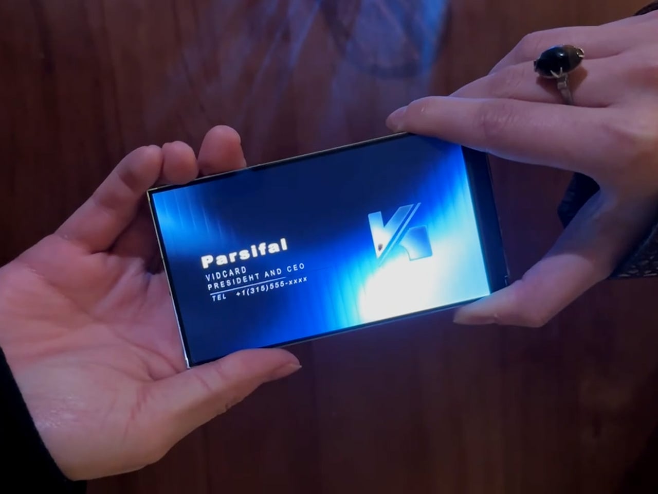
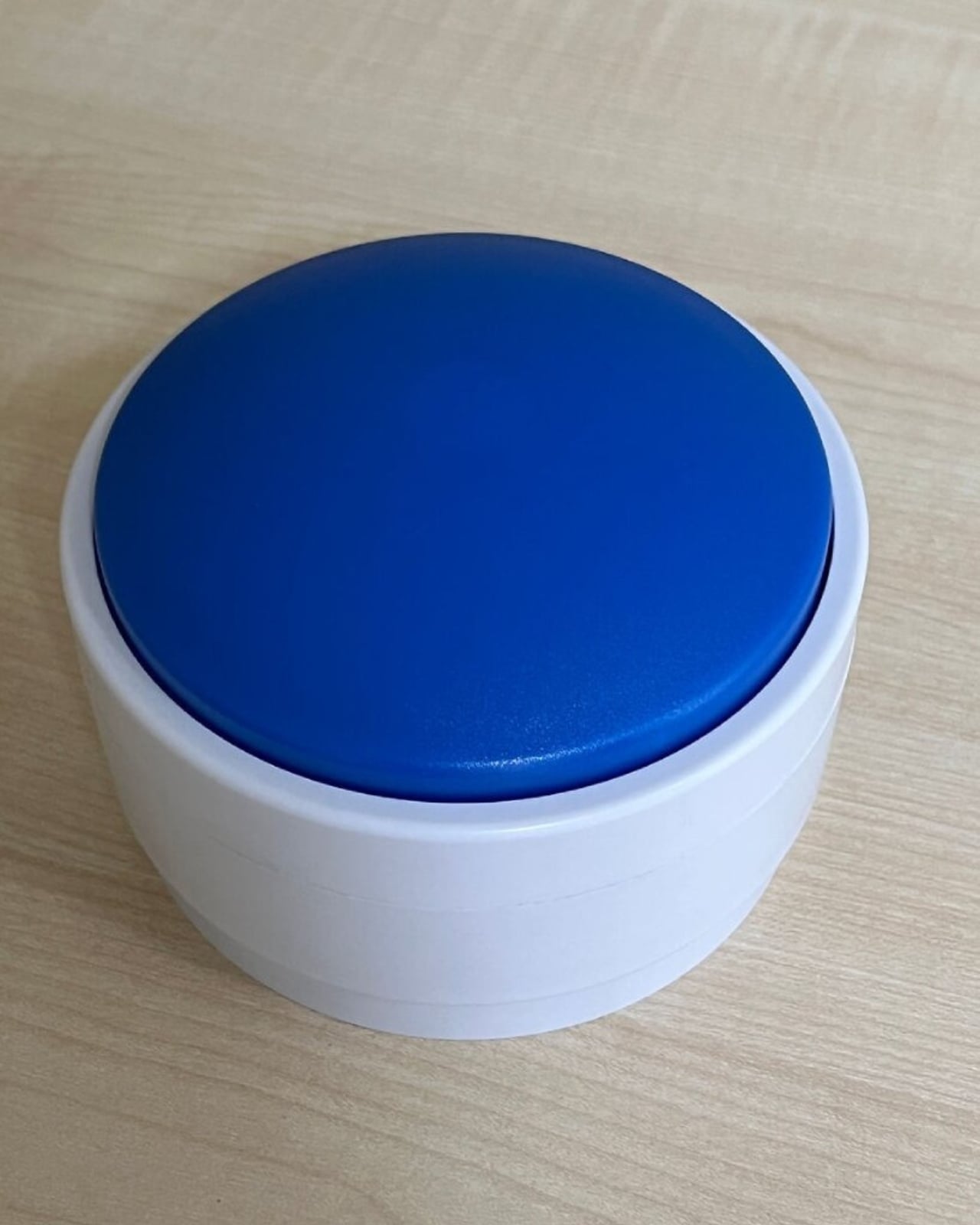
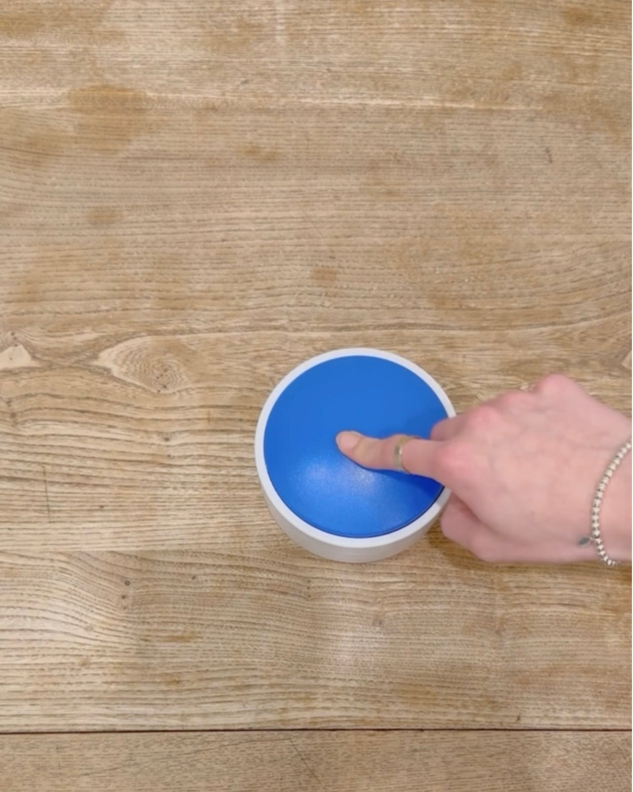
VidCard is basically what it sounds like: a rigid card with a 5 inch, 1280×720 IPS LCD screen built in, playing a looping video of you introducing yourself or your brand motion graphic. The whole thing measures 120.05mm by 86.4mm, which puts it somewhere between a credit card and a small phone, and it’s under 5mm thick. That’s genuinely impressive when you remember there’s a battery, NFC chip, display controller, and 256MB of onboard storage packed inside. The card charges via contact pins, lasts about an hour of continuous playback (roughly 120 to 240 interactions per charge), and syncs content through a companion app on iOS or Android. You upload your intro video, it pushes to the card, and you’re set. The screen itself looks clean in the campaign photos and bright enough for indoor use.

The NFC feature sidesteps the whole “how do I actually save your contact info” problem. You tap the card against someone’s phone, and it pulls up your mobile optimized landing page with your video, company profile, documents, and whatever else you want to link. No app download required on their end, which makes sense because nobody wants to install something just to see your business card. Real time analytics track who viewed your profile, when they watched, how long they engaged, and if they came back for a second look. There’s a slightly dystopian charm to getting a notification at 11pm that someone just rewatched your intro for 87 seconds, but it does give you actual data to inform follow ups instead of wondering if your card got tossed in a drawer.

Here’s the thing, though. You know what else has a high resolution screen, NFC, internet connectivity, and can play video? The phone in your pocket. You could theoretically just show someone your intro video on your phone, tap for NFC sharing, and achieve most of the same result for zero additional hardware. VidCard’s counter to that is the physical artifact itself. Handing someone a glowing screen feels different than showing them your phone (besides, unlocking a phone, opening your gallery, and finding the right video can take painful minutes), and if you leave the card behind with a high value contact, it becomes a keepsake that lives on their desk instead of disappearing into a contacts list. That’s either brilliant or unnecessary depending on how much you value the showmanship in networking, although I genuinely can’t decide which camp I’m in.

The founders claim inspiration from Call of Duty: Advanced Warfare, where a character hands over a video business card inviting you to join a fictional military contractor. That’s a deeply nerdy origin story, and I respect it. VidCard works best in situations where you need to stand out in a sea of forgettable interactions: trade shows, high stakes sales meetings, investor pitches, creative industry networking where showing your work matters more than listing credentials. It’s overkill for casual meetups or industries where a LinkedIn connection does the job, but if you’re trying to leave an impression on someone who sees 50 people a day, a card that talks and moves will get you remembered. The real test is whether that memory translates to actual follow through, which the analytics dashboard is designed to help with by showing you who’s genuinely interested versus who just thought the card was neat.

VidCard is live on Kickstarter through February 5, 2026, with early bird pricing starting at $59 USD for a single unit, $162 USD for a three pack, and scaling up to $599 USD for a 10 unit business pack with bulk branding options. Estimated delivery is June 2026 for early backers, with standard shipments following through June 20. The campaign has already cleared its funding goal by a wide margin, which suggests the concept resonates with enough people that we may just end up seeing video or even holographic business cards in the not-so-distant future.

Click Here to Buy Now: $59 $99 (40% off). Hurry, only a few left! Raised over $66,000.

The post This 5-Inch “Video Business Card” Wants To Replace Your Stack Of Paper Cards first appeared on Yanko Design.

Your Dog Can Now Turn On the Lights (No, Really)

We’re living through a strange moment where our refrigerators are smarter than ever, our thermostats learn our habits, and now, apparently, dogs can control household appliances. The Dogosophy Button, developed by researchers at The Open University’s Animal-Computer Interaction Laboratory, is a wireless switch designed specifically for canine use. Think of it as a smart home device, but instead of asking Alexa, you’re teaching your golden retriever.

This isn’t some novelty gadget cooked up to go viral on TikTok. The button is the result of years of serious research led by Professor Clara Mancini, who runs the ACI Lab. Initially created for assistance dogs who need to help their owners turn on lights, fans, or kettles, the button has now been launched to the public for any dog owner who wants to give their pet a bit more agency. The philosophy behind it, called “Dogosophy,” centers on designing technology around how dogs actually experience the world, rather than forcing them to adapt to our human habits.

Designer: The Open University’s Animal-Computer Interaction Laboratory

So what makes this button dog-friendly? Start with color. Dogs see the world differently than we do, and blue happens to be one of the colors they can recognize most clearly. The button’s push pad is a bright blue, set against a white casing that creates high contrast, making it easier to spot against floors, walls, or furniture. The slightly curved, raised shape means dogs can press it from various angles without needing pinpoint accuracy, which anyone who’s watched a dog enthusiastically miss their water bowl can appreciate.

The button itself is built to handle the reality of being used by an animal. The outer casing is sturdy plastic designed to withstand repeated nose-booping and paw-whacking. The push pad has a textured surface that helps dogs grip without slipping, whether they’re using their snout or paw. Inside, a small light flashes when the button is pressed, soft enough not to hurt their eyes but clear enough to confirm the action worked. It’s the kind of thoughtful design that comes from actually studying how dogs interact with objects, not just shrinking human tech down to pet size.

The system is refreshingly simple. Each set includes the button, a receiver, and basic mounting hardware. The receiver plugs into whatever appliance you want your dog to control, from a lamp to a fan to a kettle. The button connects wirelessly up to 40 meters away, giving you flexibility in where you place it. Press the button once, the appliance turns on. Press it again, it turns off. No app required, no monthly subscription, no “please update your firmware” notifications.

For assistance dogs, this kind of tool is genuinely useful. A dog trained to help someone with mobility issues could turn on a light when their owner enters a dark room or switch on a fan during hot weather. But the public release opens up more playful possibilities. Your dog could theoretically learn to turn on a fan when they’re overheated, activate a toy dispenser when they’re bored, or signal when they want attention by flipping a lamp on and off like a furry poltergeist.

Of course, training matters. Professor Mancini tested the button with her own husky, Kara, noting that huskies are notoriously stubborn compared to more biddable breeds like Labradors. The button works if your dog is motivated and you’re patient. This isn’t plug-and-play; it’s more like plug-and-train-with-treats-and-repetition.

The Dogosophy Button is priced at £96 (including VAT) and is currently available through retailers like Story & Sons. Whether it becomes a legitimate tool for pet owners or just an interesting experiment in animal-computer interaction remains to be seen. But there’s something appealing about the idea of designing technology that considers more than just human needs. Professor Mancini puts it plainly: humans have built a world measured for ourselves, often pushing other species out. A button that meets dogs on their terms feels like a small step toward sharing space more thoughtfully.

The post Your Dog Can Now Turn On the Lights (No, Really) first appeared on Yanko Design.

World’s first MW-class S2000 airborne wind turbine just powered the grid in China

An object shaped like an inflatable airship was seen floating over Yibin, Sichuan Province in Southwest China earlier this month. Turns out, it wasn’t some unidentified object. In fact, it was an airborne wind turbine completing its maiden in-flight grid-connected power generation test. The airborne wind energy system comprises an airship platform and wind turbines integrated in a single unit resembling a fantasy airship.

Dubbed the world’s first MW-class S2000 Stratosphere Airborne Wind Energy System (SAWES), it is developed by Beijing Linyi Yunchuan Energy Technology and designed for use near urban areas. Its successful testing marks a demonstration of how an airborne wind power system can generate and transmit electricity down for real-world usage.

Designer: Beijing Linyi Yunchuan Energy Technology

Wind turbines on the ground require a massive land area, tend to have low efficiency, and end up spoiling the landscape. The company behind the S2000 says that their Stratosphere Airborne Wind Energy System could be a difference, which definitely is not cost-effective, but is actually viable and an environmentally-friendly choice. During its testing, the floating power platform was able to rise up to about 2,000 meters, successfully delivering 385 kilowatt-hours of electricity to the local grid. The S2000 SAWES has a volume of about 20,000 cubic meters and, according to press information, has a maximum rated power capacity of 3 megawatts.

The system measures 60 meters long, is 40 meters high, and also 40 meters wide. The big thing took almost 30 minutes to ascend to 2,000 meters in the Yibin test. When at that altitude, it was able to maintain a stable hover, while generating power and delivering it back to the grid. The system basically uses a helium-filled balloon to get the power generation unit high into the atmosphere, where winds are generally stronger and more consistent than those near the ground. This means a power generating unit in the higher altitudes can generate and transmit several times more power compared to ground-based turbines, that with a lower carbon footprint.

When airborne the system, tethered by cable to the ground, uses it to send the power back to the ground, and also helps keep the power-generating unit stable mid-air during operation. Even though the S2000 is chiefly tested and developed for urban areas, it should be able to work just fine in remote areas, such as over a barren desert. The system, therefore, has manifold applications: while it can be used in off-grid settings offering relatively stable alternative energy, or it can function as a backup, complementing traditional ground-based wind power stations. Whatever may be the use case, S2000 is already going into production in small batches, and we could see the wind power generating airships in the stratosphere sooner than we can think.

The post World’s first MW-class S2000 airborne wind turbine just powered the grid in China first appeared on Yanko Design.

Samsung’s 13-Inch E-Paper Housing Is Made from Phytoplankton Plastic

Printed signs get reprinted every week, while full LCD signage burns power all day just to show a static promo. E-ink has quietly solved this in e-readers by holding text without sipping battery, but it has not shown up in everyday public spaces where signs still get taped to shelves. Samsung’s new 13-inch Color E-Paper is a panel that tries to live in that middle ground, digital enough to update remotely, quiet enough to blend in.

Samsung’s 13-inch Color E-Paper is roughly the size of an A4 sheet, 1,600 x 1,200 pixels in a 4:3 aspect ratio, built to sit on shelves, counters, tables, and doors where paper signs still dominate. It uses digital ink and an embedded rechargeable battery to hold static images at zero watts, sipping power only when content changes.

Designer: Samsung

A grocery aisle, cosmetics shelf, or bookstore with weekly specials could run these panels instead of printed posters. Staff update prices and layouts from their phones using the Samsung E-Paper app, or centrally through Samsung’s VXT cloud platform, without ladders, tape, or stacks of paper. The signs look like printed cards but can flip to a new campaign in seconds.

The housing is the first commercial display enclosure to use bio-resin derived from phytoplankton, independently verified by UL to contain 45% recycled plastic and 10% phytoplankton-based resin. Samsung says this can cut carbon emissions in manufacturing by more than 40% compared to conventional petroleum-based plastics, and the packaging is made entirely from paper.

The panel maintains static content at zero watts and uses far less energy than conventional digital signage when it refreshes. An advanced color imaging algorithm smooths gradations and refines contours so posters, book covers, and product shots look closer to print than to a backlit screen. A 13-inch, 4:3 color e-ink panel with this power profile sounds suspiciously like the hardware you would want in a large-format e-reader or note-taking tablet.

Samsung is clear that this is a business display, part of a lineup that already includes 32-inch and upcoming 20-inch models aimed at replacing printed signage. Still, it is hard not to imagine what would happen if a future device borrowed this panel, pairing it with touch and pen input for textbooks, comics, sheet music, or ambient dashboards that can sit on a desk for days without a charge.

Some of the most interesting future-facing ideas show up first in places like retail signage. A 13-inch color e-paper display built with phytoplankton-based resin is, on paper, just a smarter sign for cafes and cosmetics counters. It is also a reminder that the ingredients for calmer, more sustainable reading and information devices already exist; they are just waiting for someone to assemble them into something you would want to curl up with on the sofa.

The post Samsung’s 13-Inch E-Paper Housing Is Made from Phytoplankton Plastic first appeared on Yanko Design.

This 3-in-1 Cleaning Robot Fits in a Backpack

There’s something quietly revolutionary happening in the world of workplace maintenance, and it comes in a surprisingly sleek package. Meet Pulito, a cleaning system designed by Yilmaz Salman that’s challenging everything we thought we knew about keeping shared spaces spotless.

Most cleaning robots feel like expensive toys that promise the moon and deliver, well, a slightly cleaner floor. Pulito takes a completely different approach. Instead of being just another gadget you buy and forget about, it’s designed as a subscription-based service that actually makes sense for how modern workplaces function. Think of it less as a product and more as a cleaning partner that shows up ready to work.

Designer: Yilmaz Salman

What makes Pulito different is its three-pronged strategy for tackling workplace hygiene. The main unit houses a continuous air filtration system that quietly works away at improving indoor air quality while everything else happens around it. This isn’t just about appearances. We spend so much time indoors now, and air quality has become one of those invisible factors that affects how we feel and work without us even realizing it.

Then there’s the autonomous floor cleaning component, a detachable unit that handles the vacuuming and wiping without anyone needing to babysit it. It’s the kind of set-it-and-forget-it functionality that actually lives up to the promise. The robot navigates work areas independently, freeing up cleaning staff to focus on tasks that genuinely need a human touch.

And that’s where the third element comes in. Pulito includes an integrated storage drawer filled with specialized window cleaning tools designed for staff to use. Rather than trying to automate absolutely everything (because let’s be real, robot window washers still have a ways to go), it embraces a hybrid model where technology and human expertise work together. It’s a refreshingly honest approach to design that acknowledges the limitations of automation while maximizing its strengths.

The business model behind Pulito is just as thoughtful as the design itself. The rental service approach taps into the growing circular economy movement, where ownership matters less than access and sustainability. Recent projections suggest the service robot sector could hit $175 billion by 2030, and rental models are proving to increase operational convenience by 83% and sustainability by 76%. Those aren’t just impressive numbers. They represent a fundamental shift in how businesses think about equipment and resources.

For facility managers and business owners, the subscription model solves one of the biggest headaches with commercial cleaning equipment: the massive upfront cost and the inevitable maintenance nightmares. With Pulito, you’re essentially renting a service that includes the hardware, updates, and support. When something breaks or needs upgrading, it’s not your problem to solve. That’s a game changer for smaller businesses or startups that need professional-grade cleaning solutions without the capital investment.

The portability factor deserves attention too. Pulito’s main body features an ergonomic strap system that lets cleaning personnel carry it like a high-tech backpack between different zones. Look at those product shots of someone wearing it while navigating between buildings. It’s almost futuristic, transforming cleaning staff into something that feels more like tech-equipped professionals than traditional janitorial workers. There’s dignity in that design choice.

Aesthetically, Pulito doesn’t look like your typical cleaning equipment. The textured grey finish with those lime green accents feels contemporary without trying too hard. The perforated details on the air filtration unit give it an industrial-chic vibe that wouldn’t look out of place in a design-forward coworking space or a tech startup’s headquarters. It’s the kind of object you wouldn’t feel embarrassed to have sitting in your office lobby.

What Salman has created with Pulito is bigger than just another cleaning robot. It’s a complete rethinking of workplace hygiene infrastructure for the modern era. By combining autonomous technology, human collaboration, accessible pricing through subscriptions, and genuinely thoughtful industrial design, Pulito represents where facility management might actually be headed. Not a future where robots do everything, but one where smart design makes both human workers and automated systems more effective together.

The post This 3-in-1 Cleaning Robot Fits in a Backpack first appeared on Yanko Design.

Canyon’s Hexagon Charger Makes Wireless Charging Actually Cool

When you think about wireless chargers, your mind probably goes straight to flat discs or boring black rectangles scattered across your desk. But VLND Studio just flipped that script with their Wireless Charging Station for Canyon, and the design world took notice. This isn’t just another tech accessory pretending to be minimal. It’s a genuine rethinking of how charging stations can look and function.

The Hexagon 310, as it’s officially called, is part of Canyon’s newly introduced Hexagon series. What makes it stand out? That distinctive hexagonal smartphone charging pad that gives the whole station its name and personality. While most charging stations try to disappear into your space, this one demands to be seen, but in the best possible way. It’s sculptural without being pretentious, technical without feeling cold.

Designer: VLND Studio

VLND Studio’s approach here is refreshingly practical. The 3-in-1 station delivers 15 watts of rapid charging power, which means your devices actually charge quickly instead of just sitting there looking pretty. The hexagonal shape isn’t just about aesthetics either. It creates structured storage areas that guide where you place your devices, reducing that annoying fumbling around trying to find the sweet spot for wireless charging. The geometry actually helps with alignment and optimizes the limited real estate on your desk or nightstand.

Let’s talk about what you’re getting functionally. The station charges three devices simultaneously using a Qi magnetic connection that’s compatible with Apple devices. Canyon includes a 20W adapter with changeable EU and UK plugs, so you’re covered whether you’re in London or Lisbon. There are LED indicators and backlighting, plus four types of protection (over-current, over-voltage, over-temperature, and foreign object detection) built in, because nobody wants their phone turning into a hand warmer.

The Red Dot jury was particularly impressed by how the symmetrical geometry unites functional organization with what they called “distinctly futuristic aesthetics.” That’s design-speak for saying it looks like it belongs in a tech enthusiast’s setup without trying too hard. The compact design ensures stability on any surface, and those rounded edges and soft curves give it an approachable, almost friendly presence.

What’s interesting about this collaboration is that Canyon, typically known for more budget-conscious tech accessories, partnered with VLND Studio to create something that punches way above its weight class design-wise. The in-house team at Canyon (including designers Vladlens Zabelskis, Elena Alekseeva, Dmitry Romanenko, Ilya Koloskov, Vladislav Olinov, and Igor Volkov) brought their engineering expertise, while VLND Studio clearly pushed the aesthetic boundaries.

The color options show restraint in the best way. You can choose from light grey with an orange accent, cool grey with blue, or an all-black version with green. That pop of color in the vertical support column adds just enough visual interest without overwhelming the minimalist vibe. It’s the kind of detail that makes you smile when you notice it but doesn’t scream for attention.

Canyon describes the Hexagon 310 as exemplifying their core vision: designing tech products that are as intelligent as they are visually compelling. That might sound like marketing fluff, but when you look at the actual product, it tracks. This charging station does more than organize your devices. It brings a little bit of joy to the mundane task of keeping your gadgets powered up.

For design enthusiasts and tech lovers alike, the Hexagon 310 represents something we don’t see enough of: everyday objects that work brilliantly while also being genuinely interesting to look at. VLND Studio and Canyon proved that wireless chargers don’t have to be afterthoughts in your space. Sometimes, they can be conversation starters.

The post Canyon’s Hexagon Charger Makes Wireless Charging Actually Cool first appeared on Yanko Design.

These 95g AR Glasses Replace VR Headsets with a 300-Inch Screen

Portable entertainment has split into two unsatisfying extremes. AR glasses feel like oversized phone screens floating in front of your face, and VR headsets are immersive but too heavy, bulky, and isolating for everyday use. There is a desire for something that feels like a real cinema experience but can be used on a couch, in bed, on a plane, or in a café without suiting up or strapping a helmet to your face.

Xynavo is a pair of lightweight AR glasses built around lightweight immersion, private audio, and expandable functionality. It offers a 70-degree field of view and dual 4K micro-OLED displays, creating a virtual screen equivalent to more than 300 inches, yet weighs only 95g. The goal is to turn whatever you already own into a cinema-scale display you can wear, without the weight and noise of a full headset.

Designer: Xynavo

Click Here to Buy Now: $299 $499 ($200 off). Hurry, only a few units left! Raised over $199,200.

Xynavo fits into evenings at home, where couples can use a multi-device adapter to connect two pairs and share the same screen, playing on a Nintendo Switch or Steam Deck together or watching films and series side by side. Parents and children can share animated movies and family comedies, or connect a game console for interactive play, with private audio and a huge virtual screen.

Late nights or quiet weekends alone, you put on Xynavo and relax on the couch or in bed watching NBA, NFL, or UEFA Champions League games, or diving into action movies and sci-fi series. The dual 4K clarity and private audio turn it into a theater experience made just for you, without needing to dedicate a room or disturb anyone else in the house.

1

On planes, high-speed trains, or in hotel rooms, you connect a laptop via USB-C or the included HDMI adapter, pair a wireless keyboard, and handle email or browsing. Then you switch seamlessly to movies or games, all while the glasses stay light enough to wear for full episodes or matches without headband fatigue. The 95 g weight makes hours-long sessions feel manageable instead of exhausting.

Most AR glasses offer a narrow field of view that feels like a big phone, while Xynavo’s 70-degree FOV and dual 4K panels fill your vision with a cinema-scale scene. The high pixel density keeps text crisp and motion smooth, avoiding screen-door effects. A +2D to -6D diopter adjustment range lets many users dial in crystal-clear focus without wearing prescription glasses underneath, making the fit more comfortable.

1

Open-ear AR audio often leaks sound and struggles in noisy or very quiet spaces. Xynavo uses magnetic in-ear modules designed for noise isolation and zero sound leakage, keeping audio clear on trains and planes and private next to someone sleeping. That makes shared spaces and late-night use realistic, without headphones or disturbing people nearby.

Two built-in 3D split-screen modes, 3840×1080 and 1920×1080, let you watch a wider range of 3D content. A long press switches formats, while the dual 4K panels maintain depth and clarity across both modes. This flexibility means more 3D videos, apps, and playback sources work without workarounds or format hunting.

Xynavo connects to smartphones, handheld consoles, tablets, laptops, gaming systems, and PCs via its Type-C cable and included HDMI adapter, working as a plug-and-play external display without special apps or pairing. It is designed as an expandable Type-C vision platform, with support planned for external modules like cameras, night vision, and thermal imaging. That hints at a future where the same lightweight frame can grow with whatever you want to see next.

Click Here to Buy Now: $299 $499 ($200 off). Hurry, only a few units left! Raised over $199,200.

The post These 95g AR Glasses Replace VR Headsets with a 300-Inch Screen first appeared on Yanko Design.

5 Best Transparent Tech Of January 2026 That Just Beat Nothing at Its Own Game

Transparent technology has moved far beyond its novelty phase to become a legitimate design movement reshaping how we interact with our devices. What started as a nostalgia trip courtesy of Nothing’s transparent phones has evolved into a full-blown aesthetic revolution where seeing the guts of your gadgets is no longer just acceptable but desirable. The best transparent designs do more than simply expose circuitry; they create visual narratives about how technology works while delivering genuine functional benefits that justify their existence beyond mere eye candy.

January 2026 has given us a particularly strong lineup of transparent tech that ranges from retro-futuristic audio devices to gaming powerhouses wrapped in see-through shells. These designs prove that transparency works across every category of consumer electronics when executed with intention and intelligence. The following five products represent the pinnacle of this movement, each bringing something unique to the table while celebrating the beauty of visible mechanics and electronic components in ways that feel fresh rather than gimmicky.

1. Transparent Sony Walkman Concept

This transparent cassette recorder concept represents everything compelling about retro-futurism executed with modern design sensibilities. The device combines the tactile satisfaction of analog media with visual transparency that transforms mechanical components into the main attraction. Those exposed gears and rollers work their magic through crystal-clear housing that makes the entire mechanism visible during operation, creating a mesmerizing display of analog technology in motion. The top-mounted mechanical elements evoke luxury watch movements where visible complexity becomes the primary selling point rather than something to hide behind opaque shells.

The design succeeds because it creates genuine tension between old and new technologies rather than simply copying vintage aesthetics. A digital display nestles among analog components, suggesting computational intelligence working alongside mechanical systems. Those pixel-perfect UI elements visible through transparent housing indicate this isn’t merely a playback device but something with smart capabilities. The tiny control buttons along the top edge deliberately reference 80s Sony recorders while embracing modern miniaturization techniques. This Walkman concept could easily exist in Blade Runner’s world or on a contemporary design enthusiast’s shelf with equal credibility.

What We Like

  • The visible gear systems create a hypnotic viewing experience during tape playback.
  • The combination of analog mechanics and digital intelligence feels genuinely innovative.
  • The transparent housing transforms mechanical movement into visual entertainment.
  • The design language successfully bridges multiple decades of technology evolution.

What We Dislike

  • Physical media dependence limits practicality for streaming-era consumers.
  • The concept status means you cannot actually purchase this beautiful object.

2. Pomera DM250 Crystal Neon Yellow

The limited-edition Pomera DM250 in Crystal Neon Yellow ditches conventional white or black finishes for a vivid, almost glowing green shell that channels cyberpunk aesthetics straight out of futuristic cinema. The transparent design feels deliberately pulled from a William Gibson novel, mixing nostalgia for vintage computing with an ultra-modern sensibility that makes the device feel both retro and cutting-edge simultaneously. This isn’t just a writing tool but a statement piece that announces your commitment to focused creativity before you type a single word.

The core philosophy here centers on unwavering dedication to one task: getting words onto the screen without distractions. The DM250 sports a compact yet full-size 80-key keyboard paired with a crisp monochrome LCD that strips away every possible distraction. The software is deliberately minimal, offering everything a writer needs for text creation while providing nothing that might derail focus or waste precious writing time. That transparent shell showcasing the device’s internal components serves as a visual reminder of its pure functionality, where every element exists to support the writing process rather than tempt you toward multitasking.

What We Like

  • The monochrome display eliminates distractions that kill writing productivity.
  • The full-size keyboard delivers proper typing ergonomics in a compact form.
  • The Crystal Neon Yellow finish makes a bold visual statement.
  • The single-purpose design philosophy respects writers’ focus needs.

What We Dislike

  • The monochrome display feels dated compared to modern screen technology.
  • Limited functionality beyond text editing restricts versatility for mixed workflows.

3. RedMagic Astra Gaming Tablet

Nothing spent years teasing transparent design language, while RedMagic simply dropped the Astra with a full transparent strip down its back panel, complete with faux circuit board details that scream technological prowess. The visual trickery taps into tech enthusiast psychology that made transparent Game Boys and iMacs cultural phenomena decades ago. Those faux components create an impression of hardware sophistication perfectly aligned with gaming tablet expectations. RedMagic effectively claimed transparent tablet territory before Nothing could plant their flag, proving that execution speed sometimes matters more than brand heritage in emerging design categories.

The transparent strip serves as eye candy on what might be the most compelling compact gaming tablet available. RedMagic packed the Astra with the Snapdragon 8 Elite processor and hardware that puts most full-sized tablets to shame. The 9.06-inch form factor feels genuinely manageable for handheld gaming while maintaining enough screen real estate for immersive experiences. Aggressive pricing makes the iPad Mini look overpriced and underpowered by comparison. The Astra knows exactly what it wants to be: a gaming powerhouse that happens to work as a tablet, rather than a tablet that sorta plays games. This focused approach pays dividends across every aspect, from display technology to thermal management systems.

What We Like

  • The Snapdragon 8 Elite processor delivers flagship performance in a compact package.
  • The transparent design differentiates it from generic black rectangles flooding the market.
  • The 9.06-inch size balances portability with usable screen space for gaming.
  • Aggressive pricing undercuts competitors while delivering superior hardware specifications.

What We Dislike

  • Faux circuit board details might feel inauthentic to purists wanting real component exposure.
  • Gaming focus means it might not excel at productivity tasks that some users expect from tablets.

4. Nothing-Inspired Transparent Robot Vacuum

Designer Taeyeon Kim took the transparent tech aesthetic and applied it to one of the most mundane household appliances imaginable, creating an independent concept that reimagines how cleaning technology could integrate into daily life. The transparent philosophy celebrates inner workings rather than hiding them behind opaque plastic shells that make appliances invisible and forgettable. This vacuum features a completely clear shell exposing all internal components from the motor and sensors to the circuitry, making it function, transforming utilitarian hardware into something worth displaying prominently.

Most robot vacuums are designed for invisibility, tucked away in corners where they won’t interfere with carefully curated interior design schemes. Kim’s concept takes the opposite approach entirely, embracing transparency and modularity to create a cleaning system that actually wants to be seen and interacted with regularly. The exposed components serve educational purposes, helping users understand how their cleaning technology actually works while making maintenance and troubleshooting more intuitive. The modular design philosophy means components can be swapped or upgraded without replacing the entire unit, extending product lifespan while reducing electronic waste that plagues the appliance industry.

What We Like

  • The transparent shell transforms a mundane appliance into an interesting design object.
  • Exposed components make maintenance and troubleshooting more intuitive for users.
  • The modular philosophy extends product lifespan through component upgrades.
  • The design challenges the appliance industry norms around hiding technology from view.

What We Dislike

  • Visible dirt accumulation in transparent components might require more frequent cleaning.
  • The concept status means this innovative design isn’t available for purchase yet.

5. Sony WF-C710N Glass Blue Earbuds

The Glass Blue variant of Sony’s WF-C710N earbuds challenges the industry’s tendency toward either clinical white or anonymous black with a design choice that celebrates rather than conceals technological sophistication. The transparent housing goes beyond mere novelty to create a visual narrative about the engineering packed into these tiny devices. Sony offers four color options, but the Glass Blue stands out by making the internal components part of the aesthetic rather than something requiring concealment. The naturally elegant, compact form factor prioritizes both aesthetics and functionality in ways that prove transparent design works even at this miniature scale.

Sound quality remains Sony’s primary focus despite attention-grabbing aesthetics that could easily overshadow performance. The unique 5mm drivers deliver powerful bass and crystal-clear vocals across all music genres, while Digital Sound Enhancement Engine processing restores high-frequency elements often lost in compressed digital audio files. This technical prowess ensures the WF-C710N earbuds sound as impressive as they look, delivering an audio experience satisfying even discerning listeners who prioritize performance over style. The noise-canceling capabilities work seamlessly with the compact design, proving that transparent housings don’t require compromises in acoustic performance or active noise management systems.

What We Like

  • The Glass Blue finish makes a bold statement against boring black or white alternatives.
  • The 5mm drivers deliver impressive audio quality from compact components.
  • Digital Sound Enhancement Engine processing restores lost audio details effectively.
  • Active noise canceling proves transparent design doesn’t compromise acoustic performance.

What We Dislike

  • The transparent design might show dirt and debris accumulation more visibly than opaque alternatives.
  • The 5mm drivers might not satisfy audiophiles seeking maximum bass response depth.

The Transparent Future

Transparent technology has matured from gimmick to genuine design movement with staying power. The five products showcased here demonstrate how exposure of internal components can serve both aesthetic and functional purposes when executed thoughtfully. Designers are moving beyond simply slapping clear cases on existing products to creating devices where transparency informs every aspect of the user experience, from interaction patterns to maintenance accessibility. The visual honesty of exposed mechanics and circuitry creates connections between users and their technology that opaque housings cannot replicate.

What makes January 2026’s transparent offerings particularly compelling is their diversity across product categories and price points. From retro-futuristic Walkman concepts to pragmatic writing tools and gaming tablets, transparent design proves its versatility. These products suggest we’re entering an era where seeing how our devices work isn’t just acceptable but expected by consumers who want deeper relationships with their technology. The transparent revolution is just beginning, and these five designs point toward a future where every electronic device might celebrate rather than hide its technological sophistication.

The post 5 Best Transparent Tech Of January 2026 That Just Beat Nothing at Its Own Game first appeared on Yanko Design.

This 6‑in‑1 wireless HDMI hub with 100W PD will practically replace every dongle in your bag

Your laptop gets thinner every year and your tablet ditches another port with each refresh. Meanwhile, the actual work you do requires more connectivity than ever. Photographers need fast SD card access during client reviews. Presenters need a clicker and a thumb drive while streaming to the big screen. Educators move between rooms with different projectors and zero time to fumble with settings. The gap between sleek hardware and messy reality keeps widening.

4URPC built the Gen 3 to close that gap entirely. The system pairs a plug-and-play wireless HDMI link with a genuinely useful hub, all in a single piece of kit. Plug the USB-C transmitter into your device and the HDMI receiver into any display. You get wireless 1080p 60Hz video in 0.02 seconds, plus immediate access to SD/TF cards, three high-speed USB ports, and 100W power delivery. No apps, no network dependency, no compromise. Just the screen and the tools you actually need, working together the way they should.

Designer: 4URPC

Click Here to Buy Now: $99 $198 (50% off). Hurry, only 132/500 left! Raised $50,000.

You can see the direct line from user feedback to this design. Their Gen 2 was a solid wireless 4K transmitter, but it was a single-purpose tool. People clearly pointed out that the moment they went wireless, their other ports were still occupied by hubs for storage, peripherals, and power. 4URPC took that to heart, building the new SP06 model around a complete workflow. They collapsed the entire dongle ecosystem into the transmitter itself, which is a far more practical solution for anyone working outside of a fixed desk setup.

The integrated hub is built with professional-grade specs. We are looking at two 10Gbps USB-A ports and a 10Gbps USB-C data port, which provides plenty of speed for fast external SSDs or multi-channel audio interfaces. The SD and TF card slots run at a respectable 5Gbps, fast enough for offloading photos and video without a huge bottleneck. Critically, the 100W USB-C power delivery input means you can run all of this connectivity and still keep a MacBook Pro or a powerful Windows laptop fully charged through a single connection.

All that local I/O becomes even more useful in a collaborative setting. A single HDMI receiver can pair with up to eight different transmitter hubs, completely changing the dynamic in a meeting room. Instead of passing a cable around or fighting with clunky software casting, each person can switch to become the active presenter with a button press. The 0.02-second switching time they claim makes the handoff nearly instant. This hardware-based approach sidesteps the need for everyone to be on the same Wi-Fi network or have specific apps installed, which is a constant headache in corporate or guest environments.

Packing a dual-band Wi-Fi module, a high-speed USB controller, and a PD circuit into one chassis generates serious heat, so the move to an aluminum alloy casing is a practical necessity. The metal body functions as a heat-sink, which should lead to more stable performance during long sessions where you are pushing 1080p video and transferring data simultaneously.

Super early backers can snag the complete system for $99, which includes the wireless transmitter/hub unit, the HDMI receiver, and the necessary cables. That is a 50% discount off the planned $198 retail price, limited to the first 500 backers. After that, early bird pricing sits at $109, and there are multi-pack options if you want to outfit an entire team or multiple rooms. The 4URPC G3 ships globally, starting April 2026.

Click Here to Buy Now: $99 $198 (50% off). Hurry, only 132/500 left! Raised $50,000.

The post This 6‑in‑1 wireless HDMI hub with 100W PD will practically replace every dongle in your bag first appeared on Yanko Design.

World’s first hydrogen-powered surveillance drone enters combat duty with Ukrainian Defense Forces

Hydrogen-powered unmanned aerial vehicles are not a new concept. Drones running on hydrogen fuel have been in experimental forms for over a decade, but this is for the first time, a drone has been fully designed and deployed on full-scale combat duty in an active war zone.

The drone is a hybrid version of the Raybird USA developed by Skyeton and is deployed with the Ukrainian Defense Forces. It is designed for long-endurance and perhaps is, Ukraine’s first attempt at sending a hybrid hydrogen-powered drone into an active battlefield. It has been in the war zone “since December 2025, as part of interagency testing,” Skyeton informs.

Designer: Skyeton

As a hybrid version of the Raybird, the drone is powered by an electric motor running on electricity generated by hydrogen fuel. The UAV has been reengineered to adequately distribute the space and weight of the hydrogen tank system onboard. Being hybrid, the drone is quieter in comparison to other combustion engine options, thus it makes a great surveillance aircraft.

“We have converted two years of laboratory testing into a new aircraft concept: it is the same class and weight, but a completely redesigned concept based on electric propulsion,” Roman Knyazhenko, CEO of Skyeton said. “Hydrogen fuel is a solution that allows us to combine all the advantages of an electric motor… with the long-duration continuous flight that is a hallmark of our UAV, he added.

According to Skyeton, the hydrogen-based Raybird is not armed, it instead has radar and sensors in its payload for its identified long-range reconnaissance missions. The drone is created with a wingspan of up to 15 feet, and it has a total payload capacity of 23 kgs. Being a Raybird, the hybrid drone can cruise at over 110 km/h top speed, and the UAV can function in temperatures ranging between -35°C to +55°C. It has a flight endurance of 12 hours for now, which the Skyeton engineers are determined to increase to 20 hours.

According to the company, the hydrogen-powered Raybird on war duty can fly at an altitude of up to 18,000 feet to carry out its surveillance duties. Of course, for now, the drone running on a hydrogen-electric propulsion is being used for long-range reconnaissance missions by Ukraine, but its operational efficiency and environmental benefits suggest it can be useful in a range of other applications: both civilian and defense.

For its usability in different scenarios, Skyeton says it will provide the hydrogen-powered Raybird in two variants. A drone with pre-filled tanks that can be swapped like cartridges. Or paired with a compact mobile unit capable of generating hydrogen on site as required.

The post World’s first hydrogen-powered surveillance drone enters combat duty with Ukrainian Defense Forces first appeared on Yanko Design.