Lenovo Built a Laptop Whose Keyboard, Screen, and Ports Come Apart

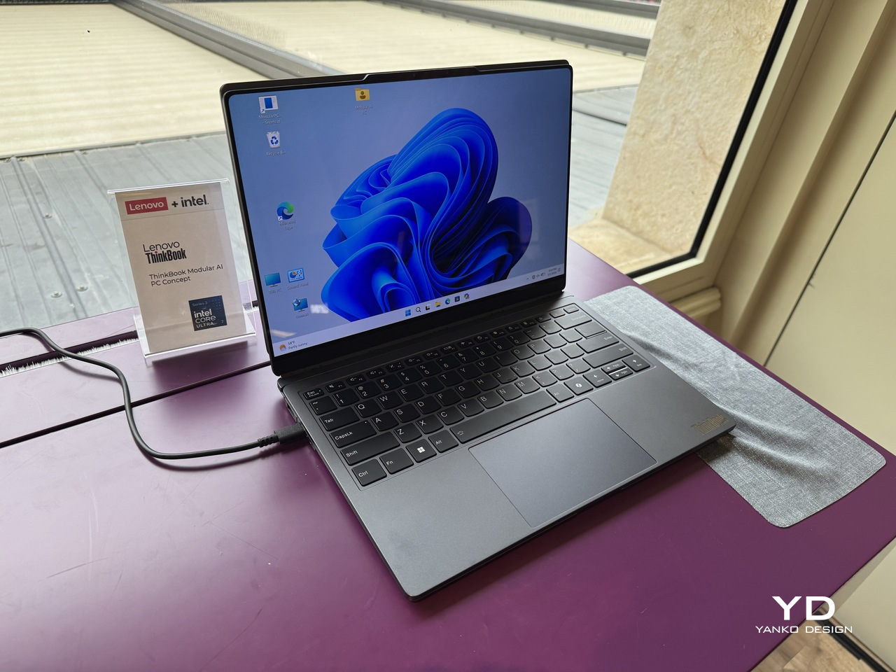
Business laptops have spent years getting thinner without getting more useful. The result is a category of machines that travel well and perform adequately, but ask them to flex beyond their fixed configuration, and they politely refuse. A second screen means a separate bag. Different ports mean a separate adapter. Lenovo’s ThinkBook Modular AI PC Concept, announced at MWC 2026, starts from the premise that the laptop’s form factor itself is the problem worth solving.

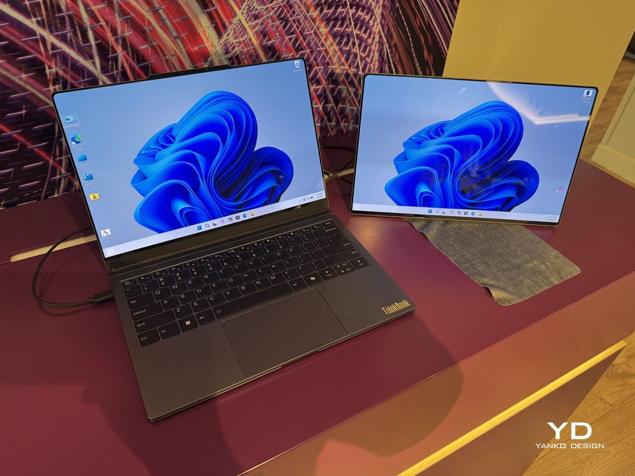
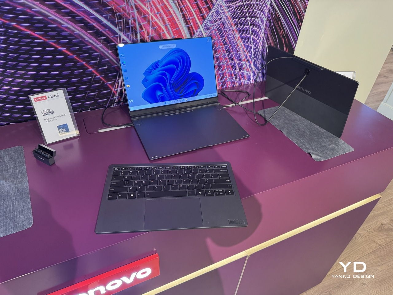
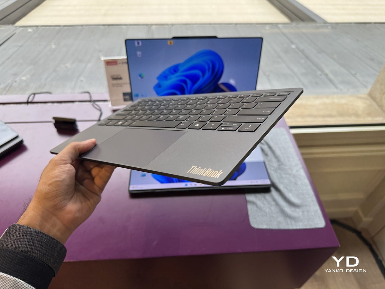
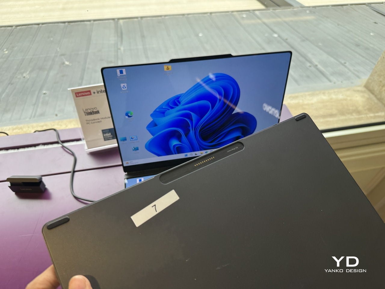
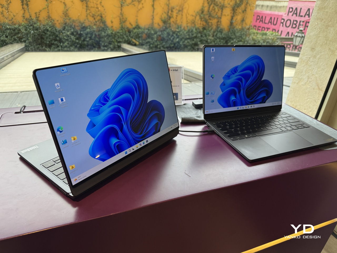
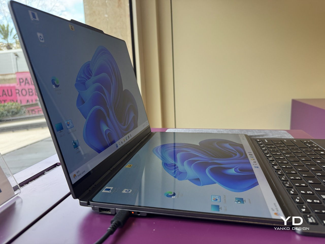
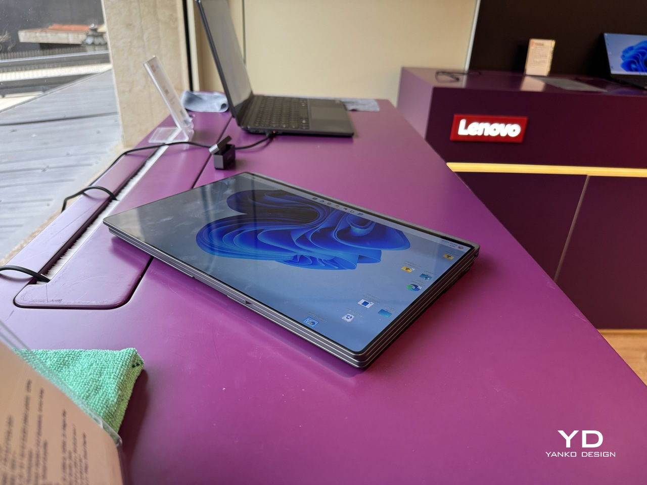
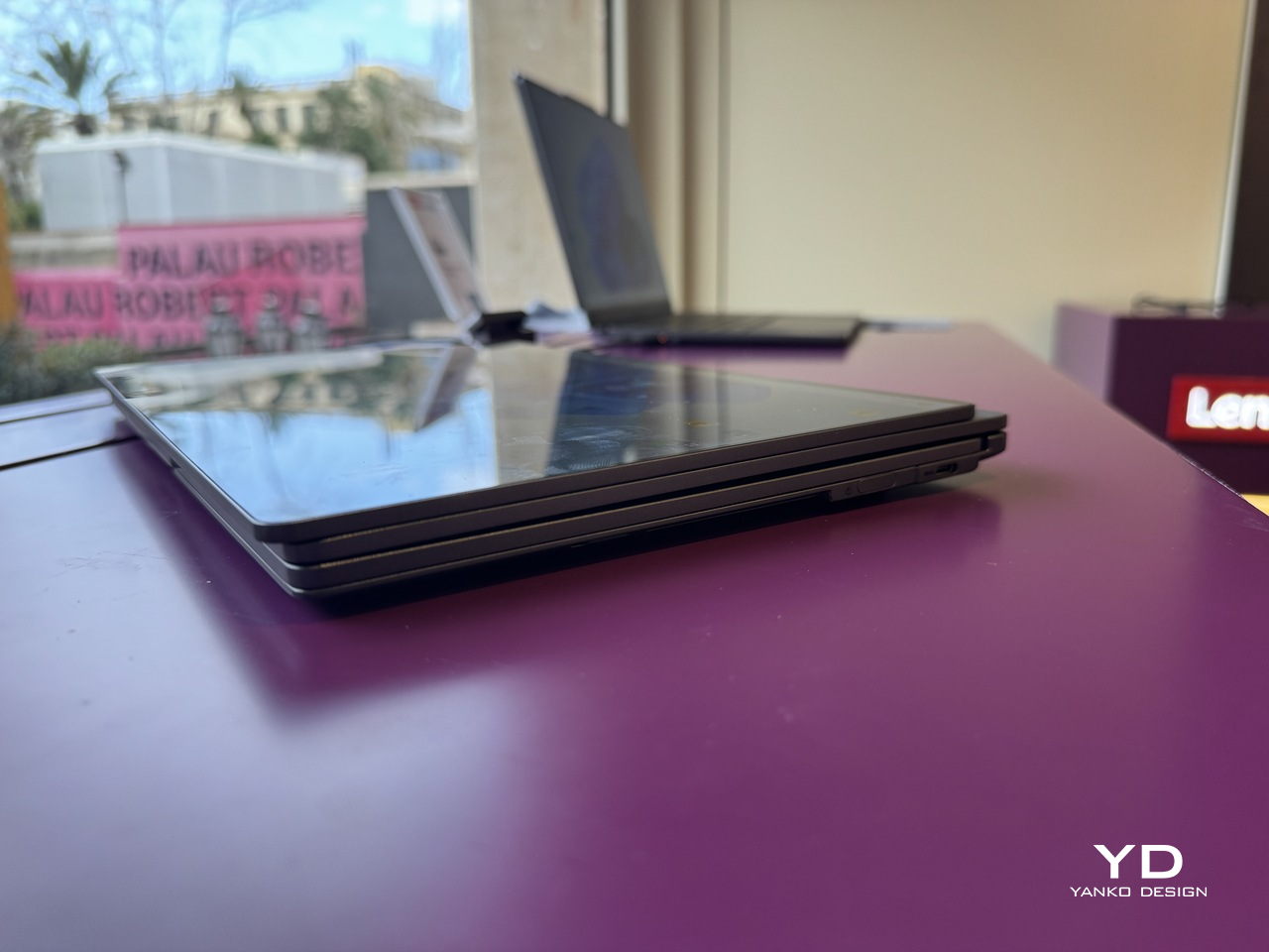
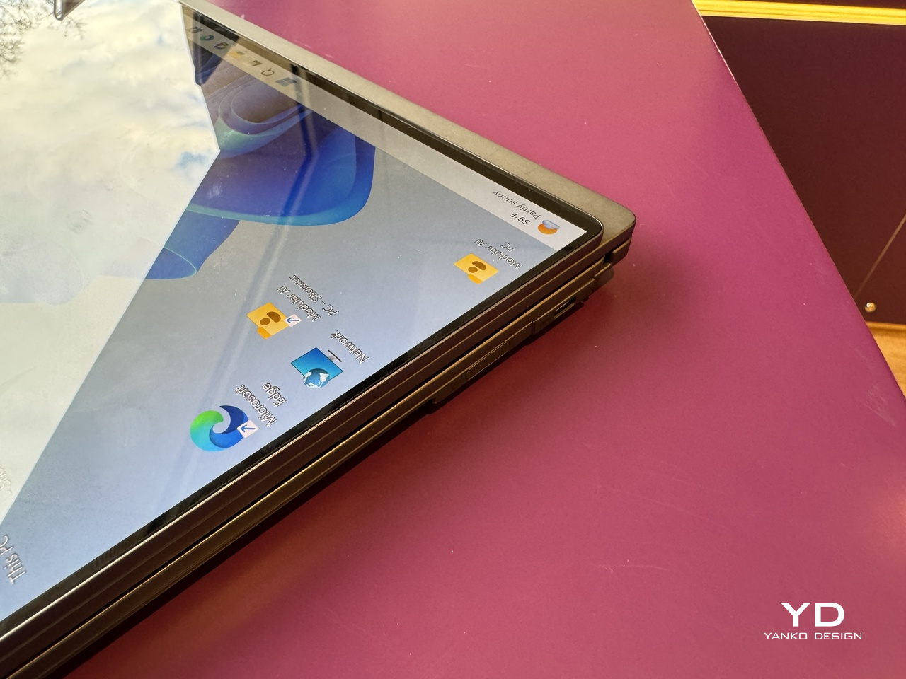
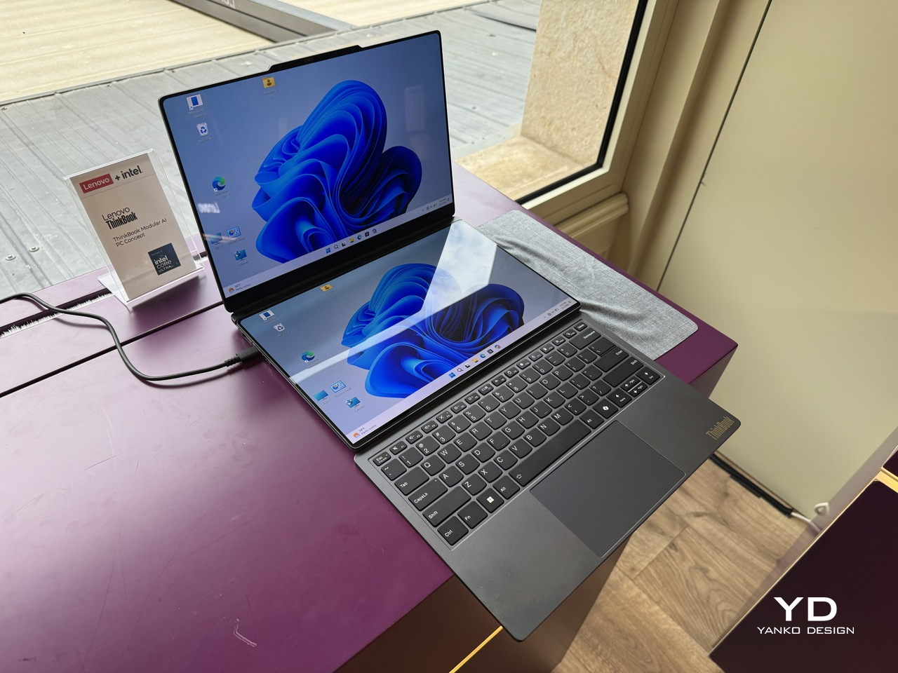
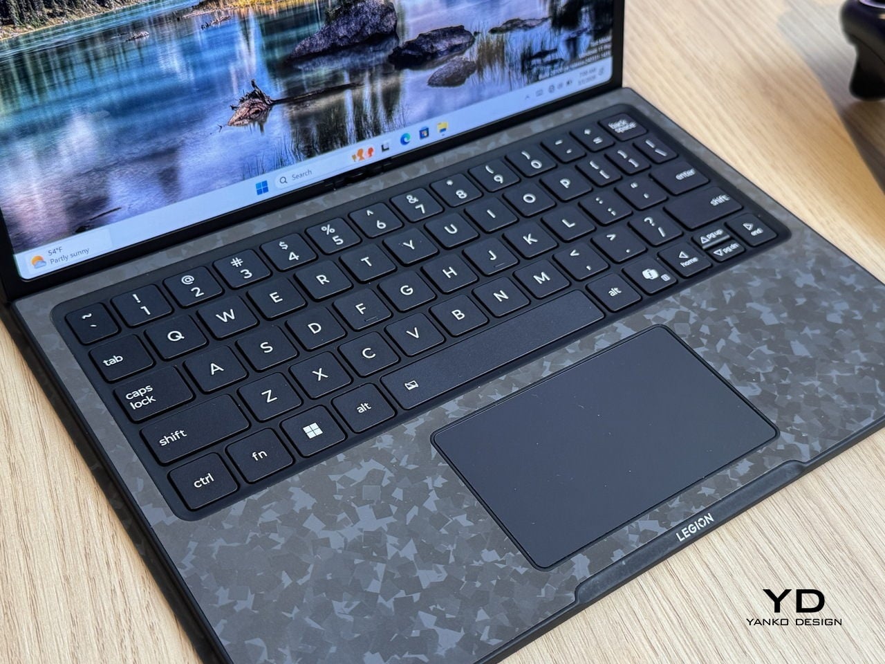
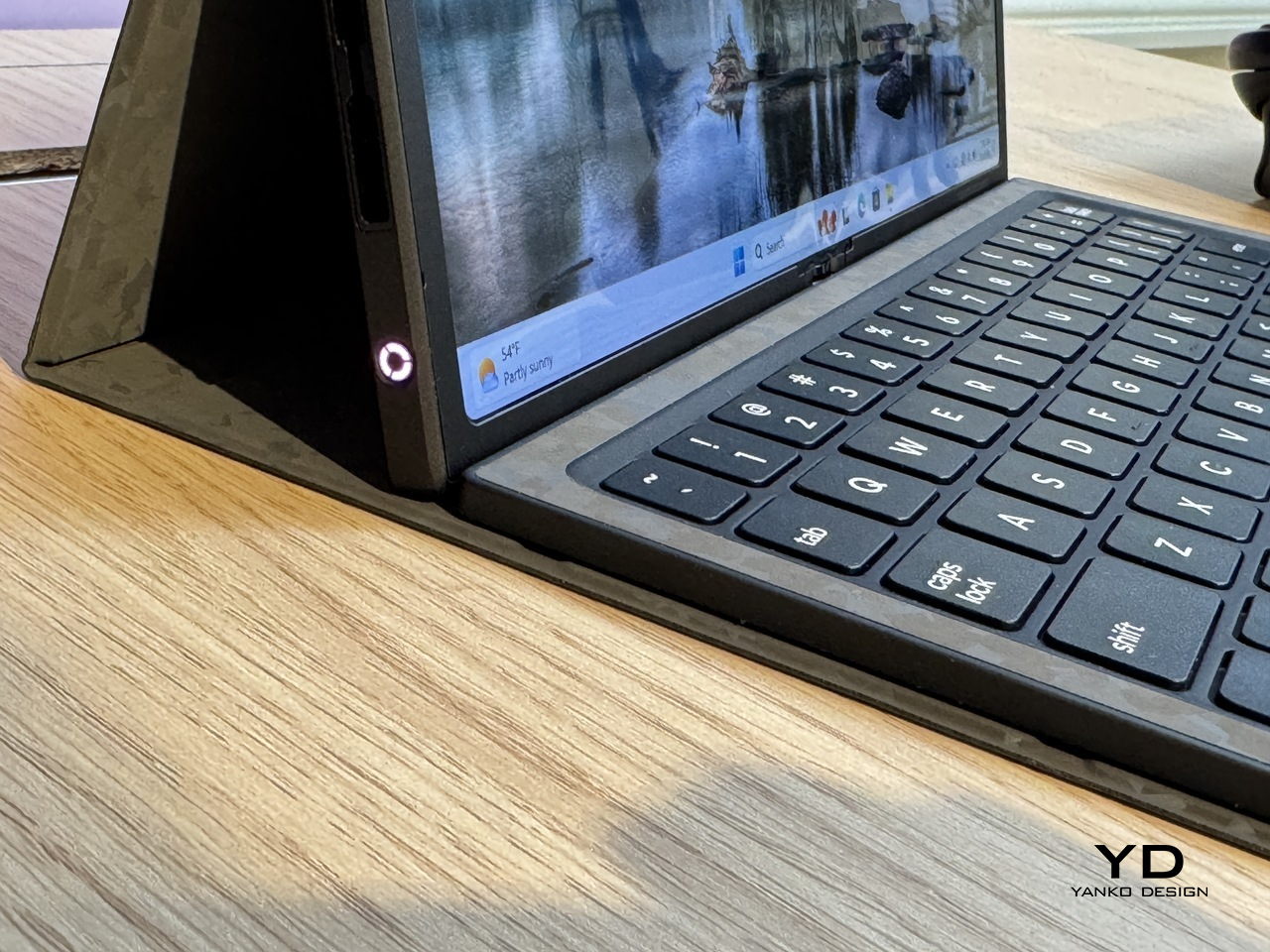
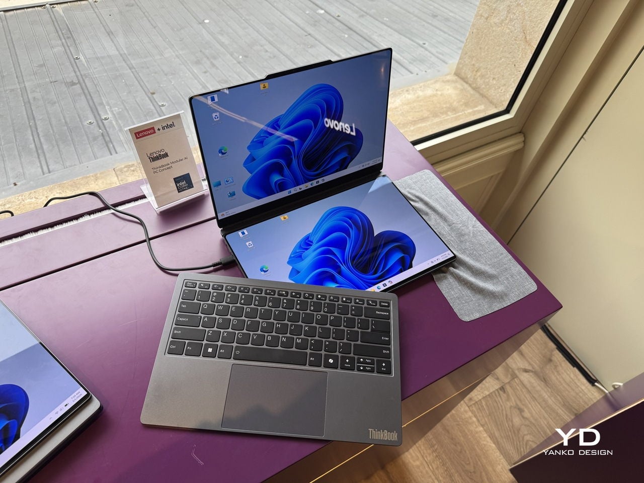
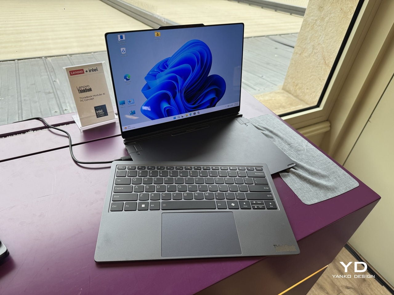
The concept is built around a 14-inch base unit in dark navy aluminum, conventional enough in isolation. The keyboard detaches completely over Bluetooth, and a secondary display module connects via pogo pins, the same spring-contact system that keeps the pieces in reliable communication without cables between them. That secondary display is the part that does the most work.

Designer: Lenovo

Positioned alongside the base on its own kickstand, it functions as a portable travel monitor in portrait or landscape orientation. Swapped with the keyboard instead, it turns the system into a dual horizontal screen setup with a combined viewing area of roughly 19 inches. Mounted on the top cover, it faces outward, which makes sharing content across a table a matter of flipping a panel rather than rotating an entire laptop.

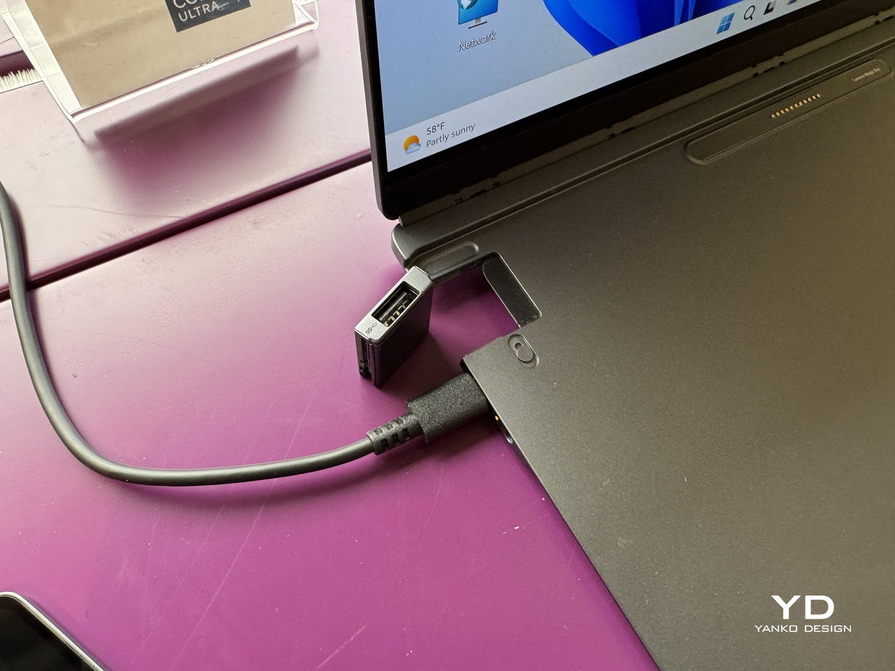
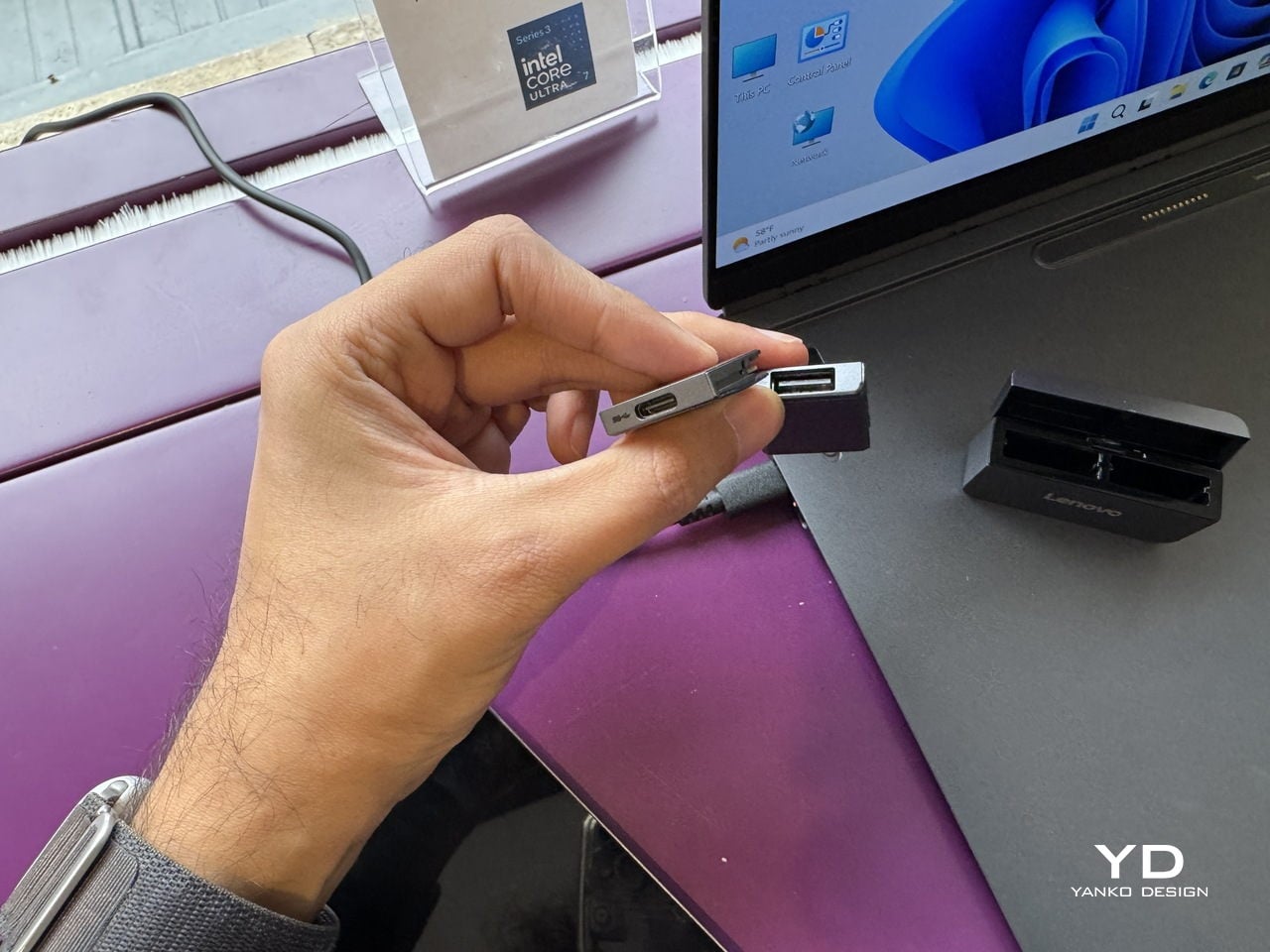
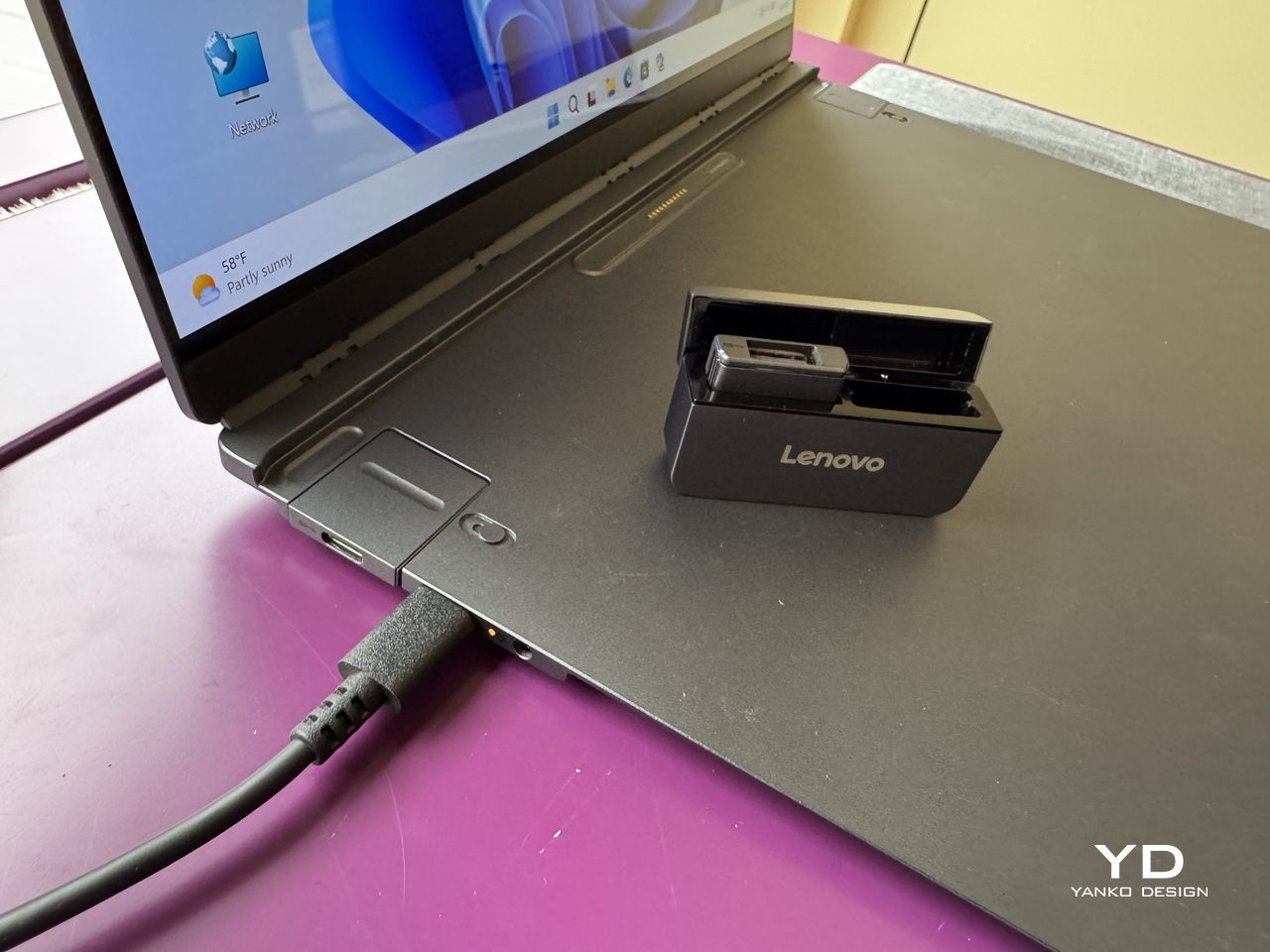
The IO port modules are a smaller but equally considered detail. Each is a compact cube carrying a single connector, USB-A, USB-C, or HDMI, that slots into a shared housing on the base. Rather than committing to a fixed port arrangement, the base accepts whichever combination a given situation calls for, swapped out as needed, and stored in a small clamshell case that travels with the system.

The honest tension in all of this is that modularity trades one kind of inconvenience for another. A fixed laptop is limiting but uncomplicated. A modular one is flexible but requires keeping track of several small components that each have their own way of going missing. The pogo-pin connection is a good answer to the cable problem, and the accessories shown are compact enough to fit in a jacket pocket, but the system only works as promised if all its pieces arrive together.

What the concept gets right is identifying that most professionals don’t use their laptops the same way twice in a single day. The morning commute, the desk setup, the client meeting, and the hotel room at the end of it all make different demands, and a device that can reconfigure itself for each of them without requiring a separate piece of hardware for every scenario is a reasonable thing to want.

Whether the modularity holds up to daily handling, with real wear on the pogo pins and real risk of leaving the keyboard module in a conference room, is a question that only a shipping product could answer. For now, the ThinkBook Modular AI PC Concept is an argument that the laptop doesn’t have to be a fixed object, but one that can adapt to your needs and lifestyle.

The post Lenovo Built a Laptop Whose Keyboard, Screen, and Ports Come Apart first appeared on Yanko Design.

Lenovo Just Turned the Ugly Desk Hub Into an AI Assistant

Most desks already have too much on them. A laptop, an external monitor, a charging cable snaking toward a phone, maybe a cold cup of coffee that started the morning with good intentions. And somewhere behind all of it is a hub that ties all of it together, which is usually a graceless plastic brick shoved behind something else, forgotten until a port stops working. It’s the least glamorous object in the room, and it knows it.

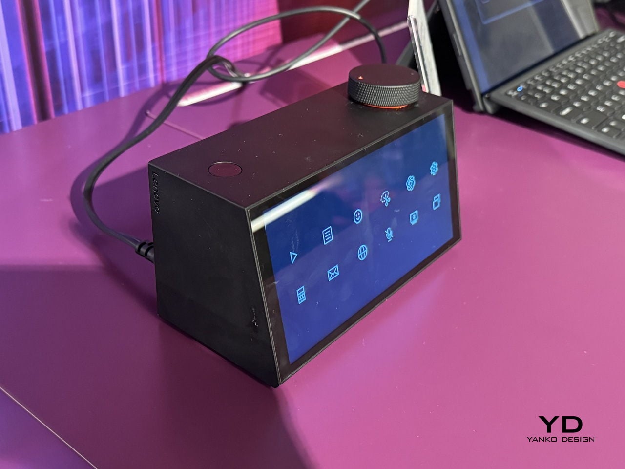
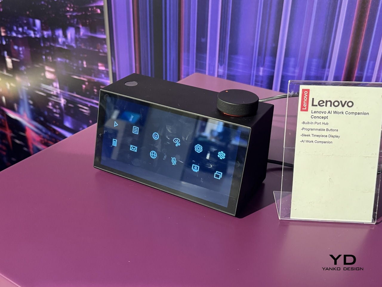
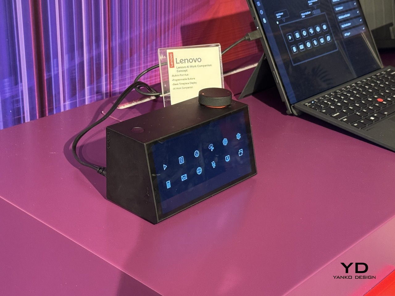
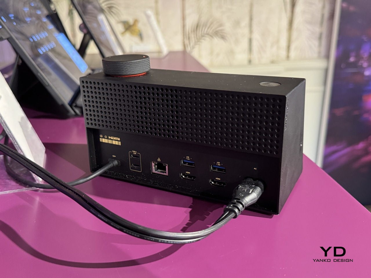
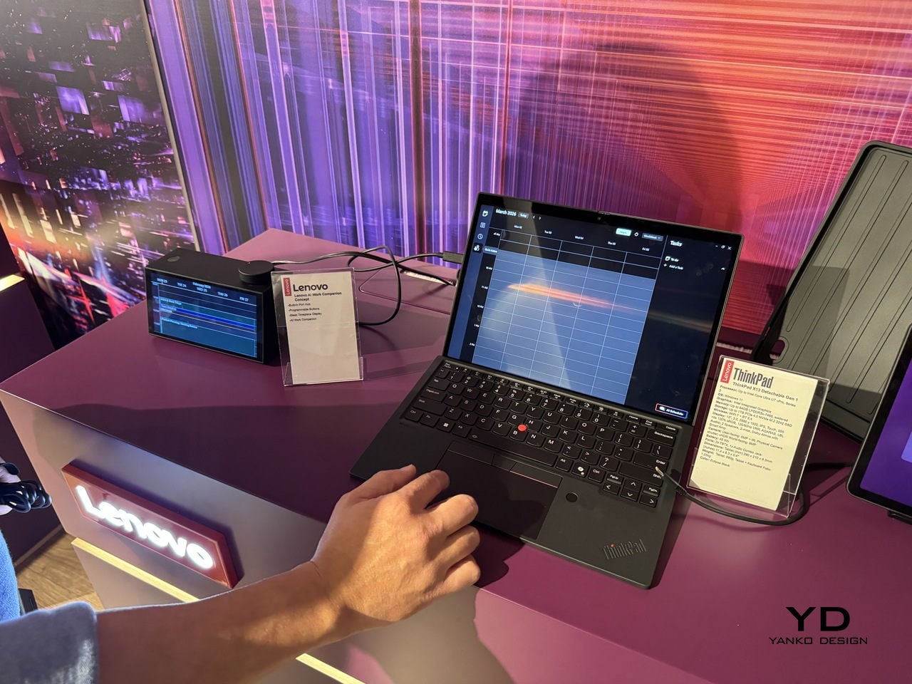
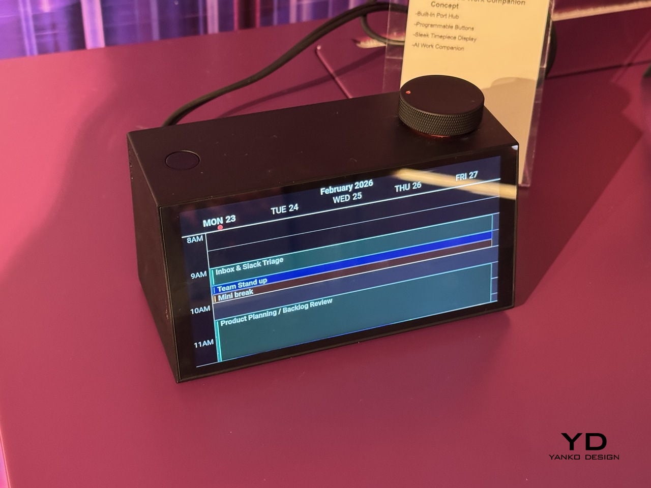
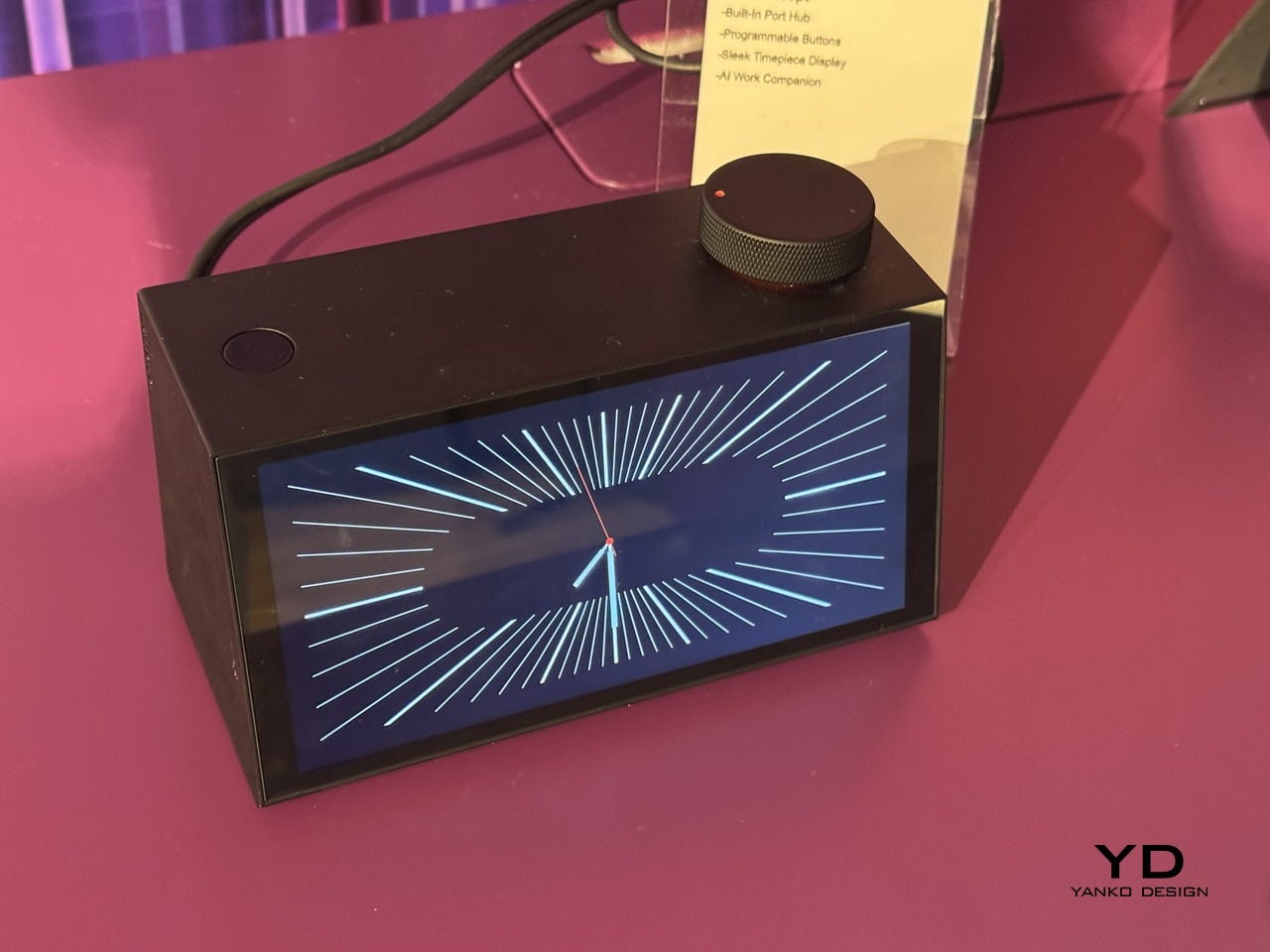
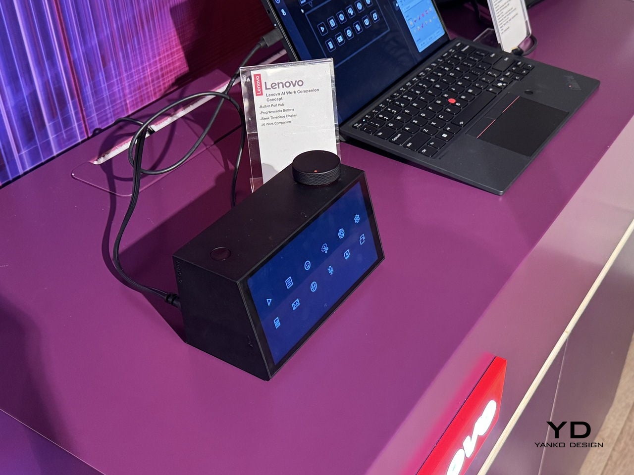
Lenovo’s AI Work Companion Concept, announced at MWC 2026, makes a case that the hub doesn’t have to apologize for existing. It sits at the front of the desk as a matte black wedge, display angled toward the person working, looking more like a clock than a piece of connectivity hardware. It takes a different position on that problem, literally and figuratively.

Designer: Lenovo

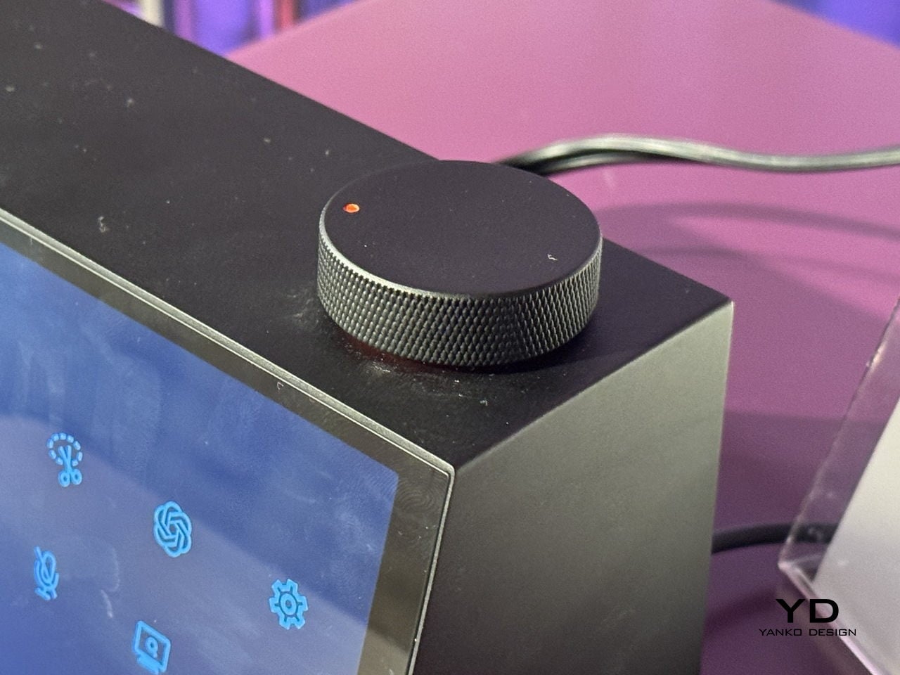
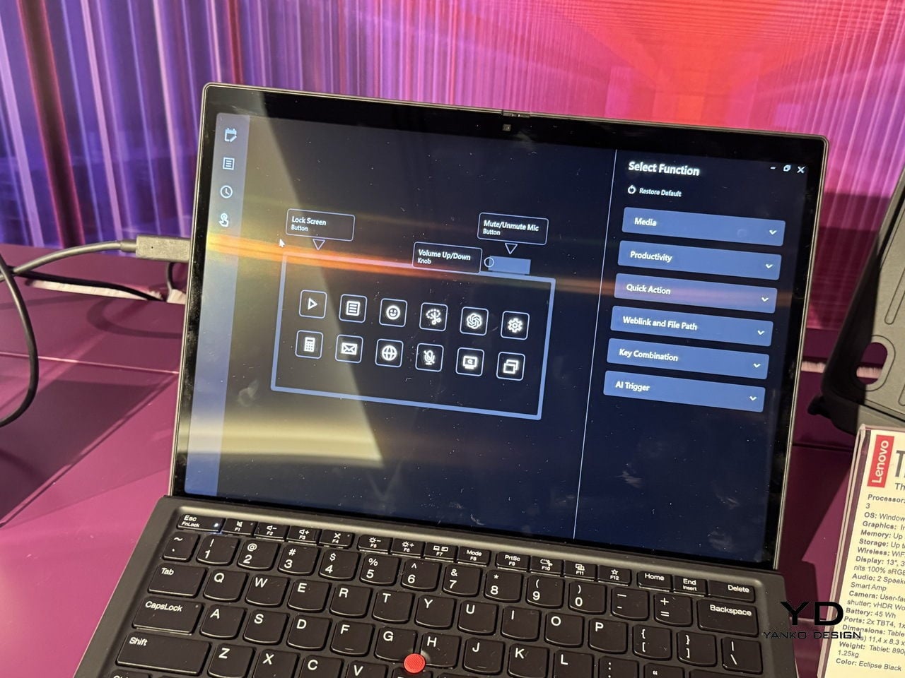
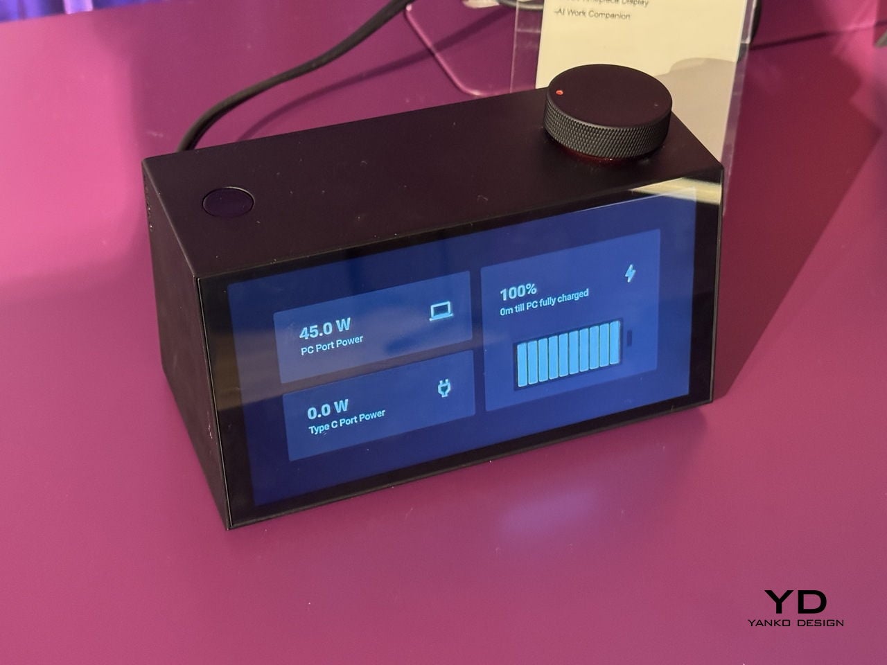
The front display cycles through six clockface styles, from a clean flip-clock layout to an abstract trio of pie-shaped circles, each one designed to read comfortably at a glance without demanding attention. Alongside the time, it surfaces calendar events, port charging status, and a grid of quick-action shortcuts from a single compact footprint.

The hardware underneath that display is a full docking station. One USB-C port delivers 100W to a laptop, another handles 20W phone charging, and two HDMI outputs drive a pair of 4K displays at 60Hz simultaneously. For anyone running a multi-monitor setup, that covers the entire back of the desk without a separate hub involved.

The more unusual part is a cartoon mascot Lenovo calls the Thought Bubble, a bespectacled cloud that lives on the display and manages the AI layer. Tap the large red knob on top, and it pulls tasks and calendar events from across connected devices, then proposes a structured daily plan. It also schedules breaks and monitors screen time, with a weekly “celebration report” summarizing what got done.

The obvious tension is that a device designed to reduce screen fatigue adds another screen to the desk. Whether offloading schedule decisions to a cartoon cloud actually clears mental space, or just relocates the same decisions to a different surface, is a question the concept doesn’t fully answer yet. That’s not a criticism so much as an observation that the idea is still at the stage where it sounds better than it can be proven to work.

What’s harder to argue with is the physical logic. A docking station that also tells the time, tracks the day, and has a programmable knob for whatever shortcut matters most is a more considered object than the plastic brick it replaces. Whether the AI earns its place on the desk is something only daily use can settle.

The post Lenovo Just Turned the Ugly Desk Hub Into an AI Assistant first appeared on Yanko Design.

Lenovo’s AI Desk Robot Has Eyes, Moves, and Watches You Work

There’s a specific kind of loneliness that comes with working alone all day. Not the dramatic kind, just the low-grade awareness that every question you have goes into a chat window, every instruction gets typed into a box, and the thing supposedly helping you has no idea where you’re sitting or what’s on your desk.

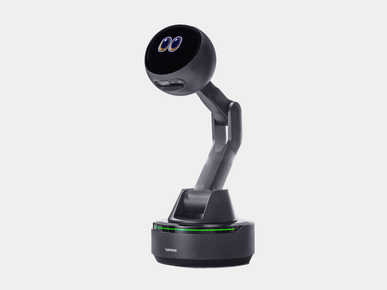
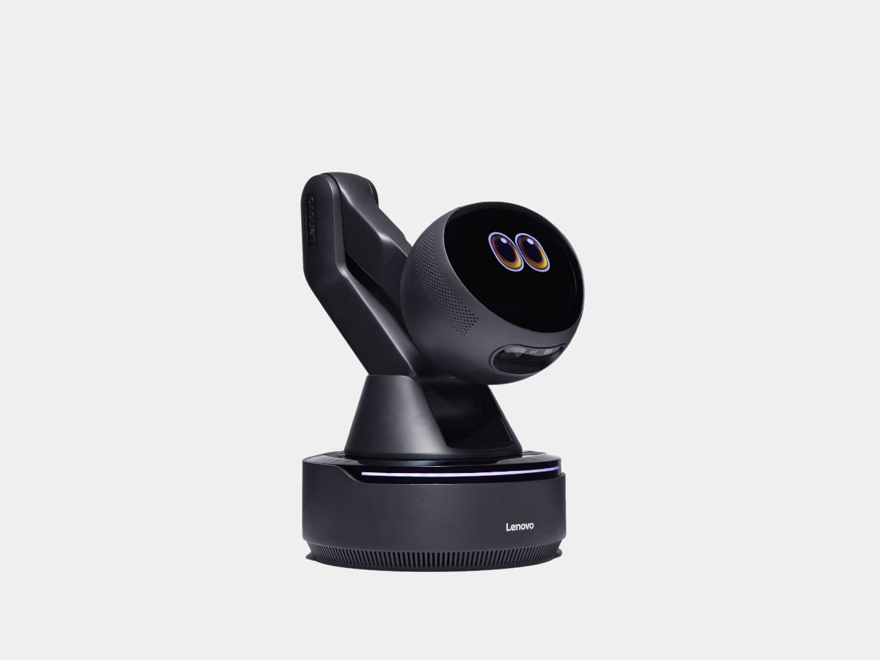
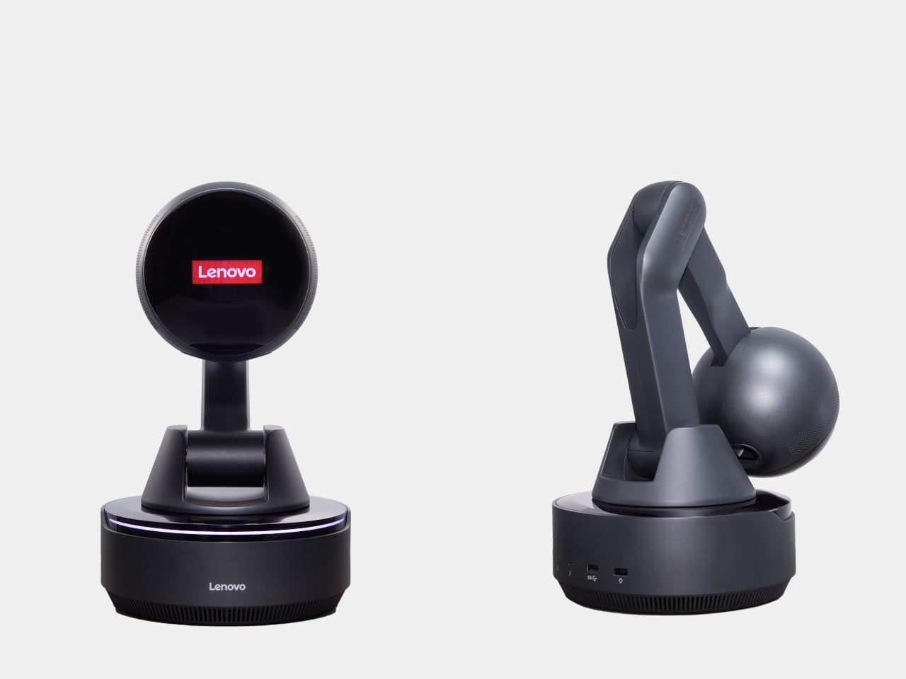
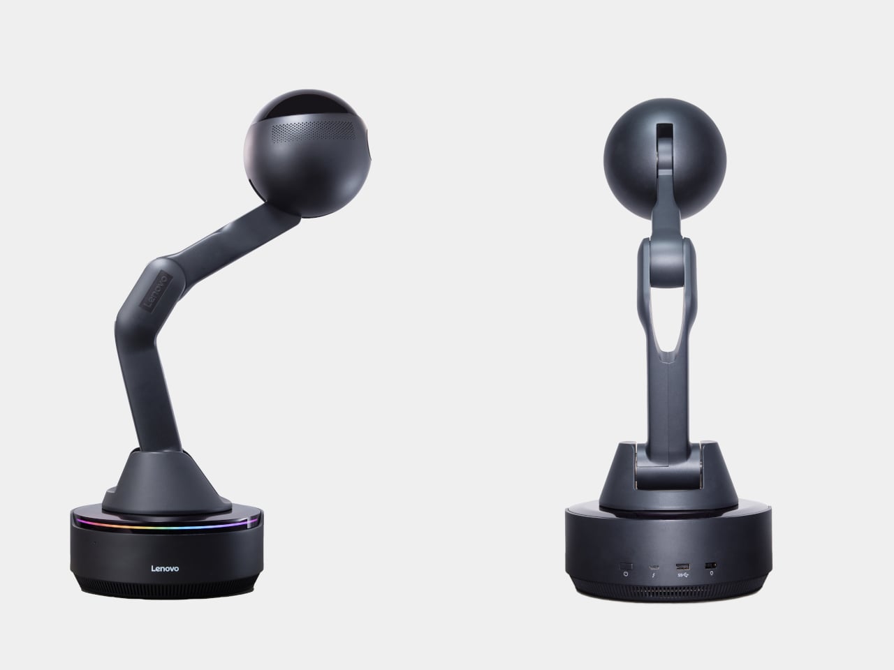
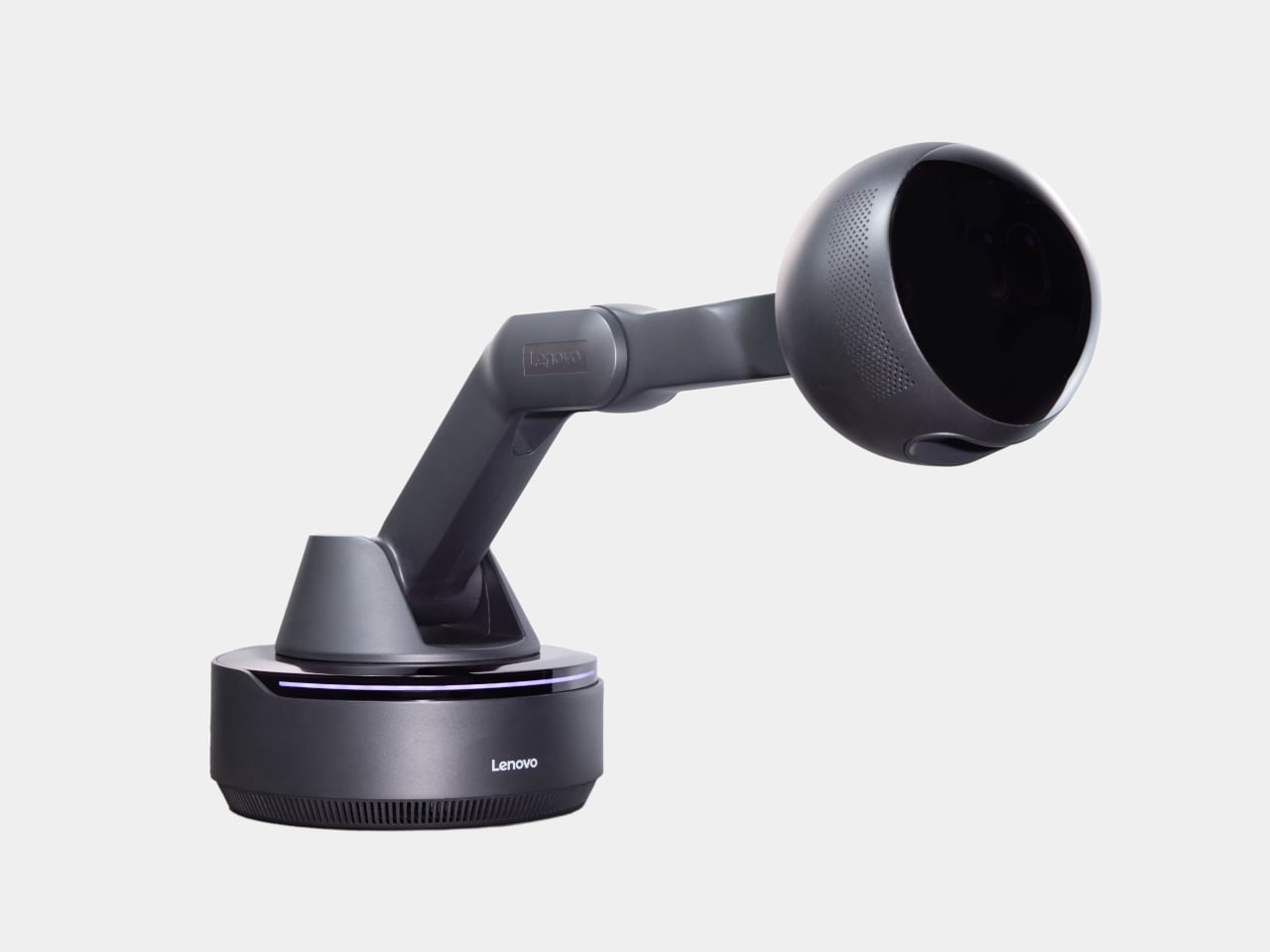
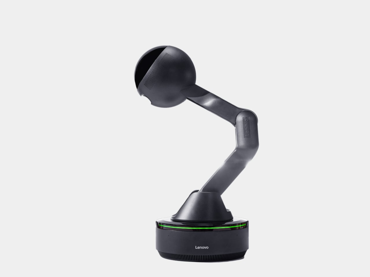
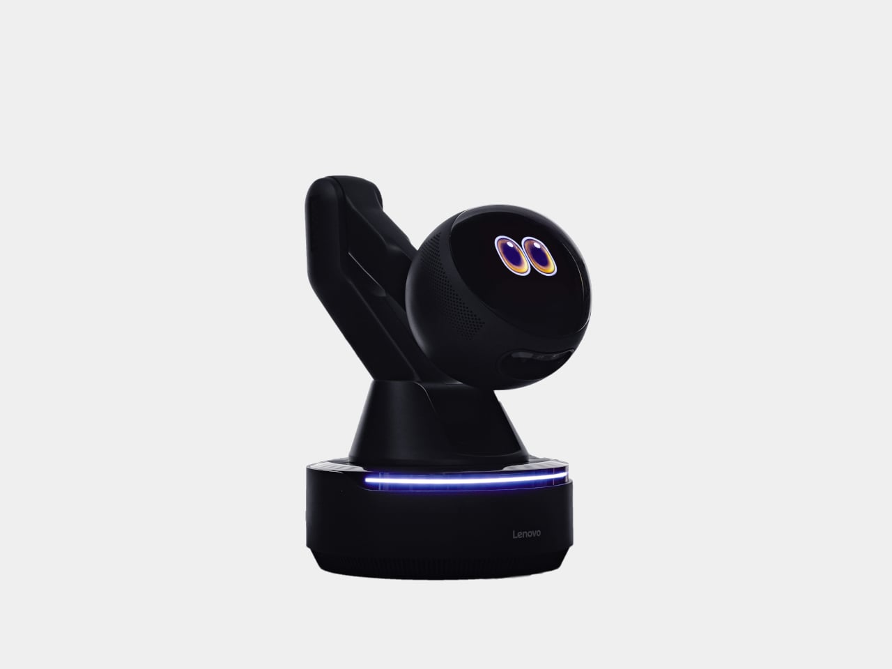
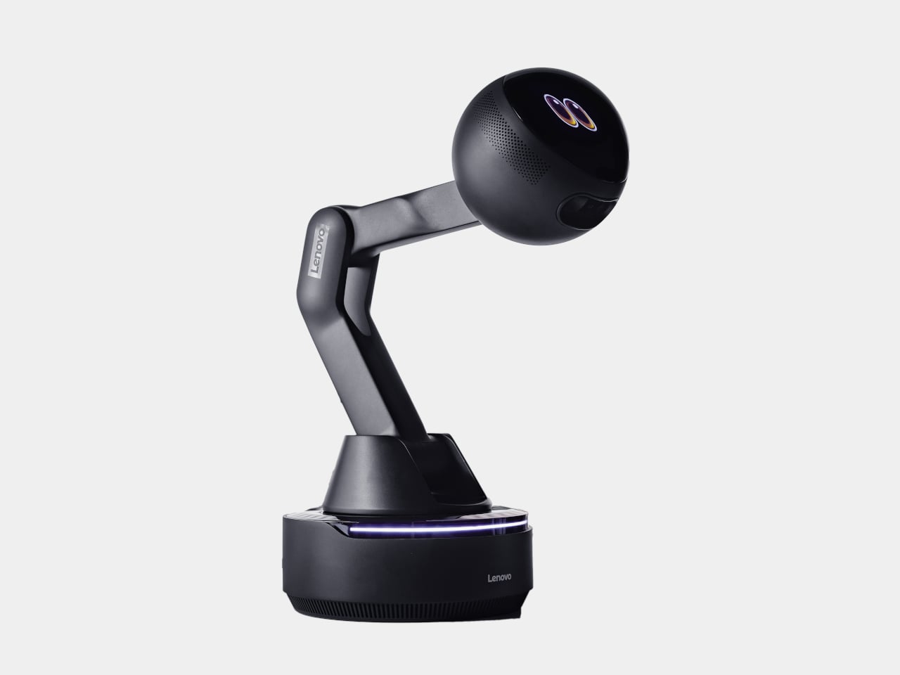
Lenovo’s AI Workmate Concept, shown at MWC 2026, takes that gap seriously enough to build a physical object around it. The device is a desk companion in the most literal sense, a spherical head on an articulated arm, rising from a circular base, with animated eyes on its front display that shift and orient as it responds.

Designer: Lenovo

The arm is the most telling design decision, though it isn’t just decorative. Because it moves, the Workmate can orient itself toward whatever is in front of it, a document laid flat, a person leaning back, a wall nearby. That range of motion is what separates it from a smart speaker with a face. It has spatial awareness built into its posture, not just its software.

On the practical side, it handles the kind of work that accumulates quietly throughout a day. Place a document in front of it, and it can scan and summarize the contents. Talk through a rough set of notes, and it can help organize them into something usable. Working on a presentation means the Workmate can assist in structuring the content, pulling from what it already knows about the task at hand through on-device AI processing rather than a cloud connection.

The projection feature is the most speculative part of the concept. Rather than keeping information on a screen, the Workmate can cast content onto a desk surface or wall, which, on paper, turns any flat surface nearby into a secondary display. Whether that’s genuinely more useful than glancing at a monitor, or just a more theatrical way to display the same information, is a fair question that a proof of concept can’t fully answer.

What’s harder to dismiss is the physical language the design uses. The animated eyes aren’t a gimmick in the way that most product “personalities” are. They borrow from the same visual shorthand that makes robots in film immediately readable as attentive or distracted, curious or idle. A status light ring on the base shifts color depending on what the device is doing, adding a peripheral layer of feedback that doesn’t require looking directly at the display. Together, those two elements mean the Workmate communicates state without demanding attention, which is actually a more considered interaction model than most desktop AI tools currently offer.

The deeper question isn’t whether the Workmate works. It’s whether having a robot with eyes watching from the corner of the desk makes the day feel more manageable, or just more observed. That’s not a problem Lenovo can solve with a better arm joint. It’s the kind of thing that only becomes clear once the novelty of the eyes wears off.

The post Lenovo’s AI Desk Robot Has Eyes, Moves, and Watches You Work first appeared on Yanko Design.

Lenovo Unveils a Foldable Gaming Handheld That Replaces Your Laptop

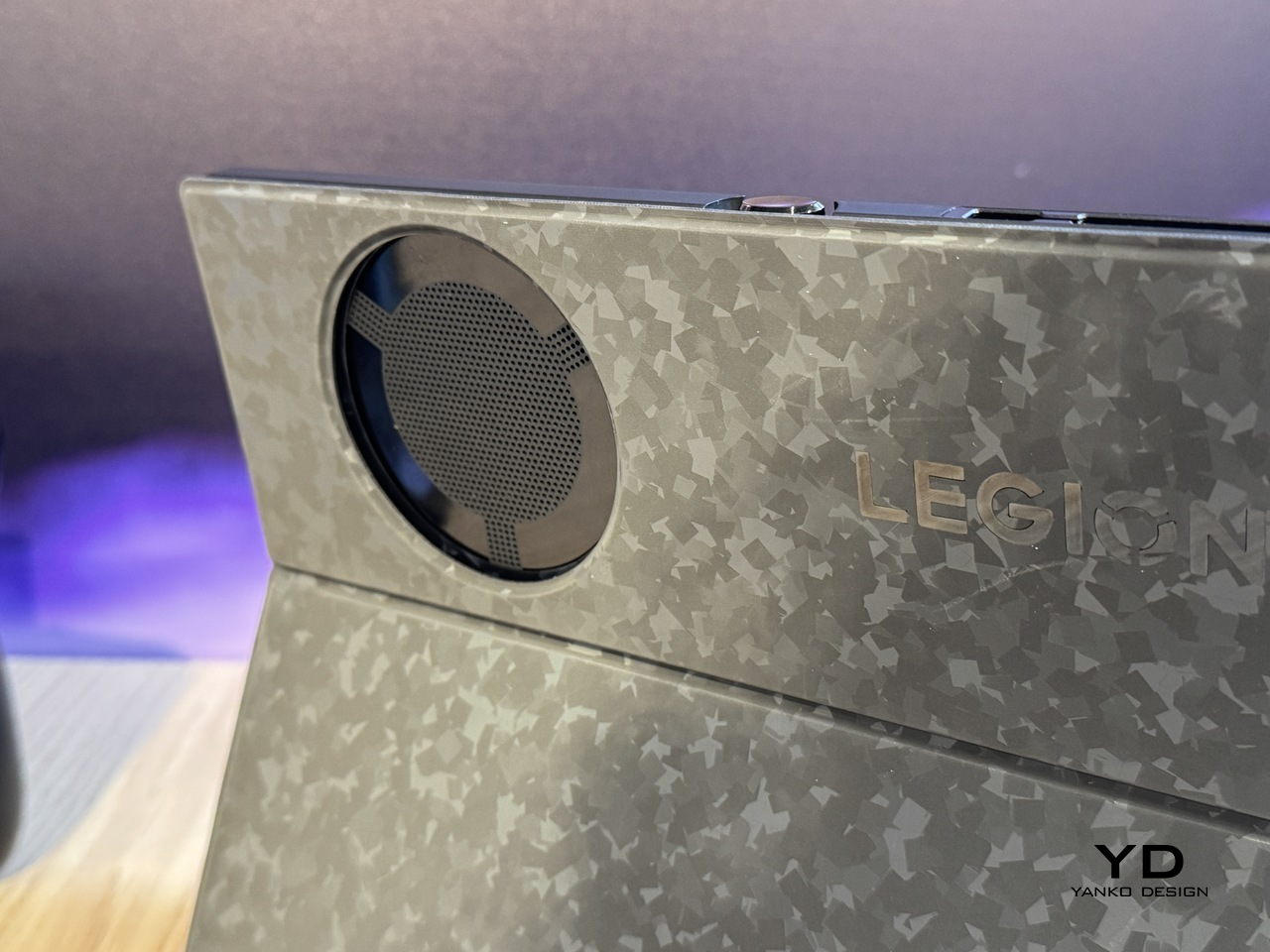
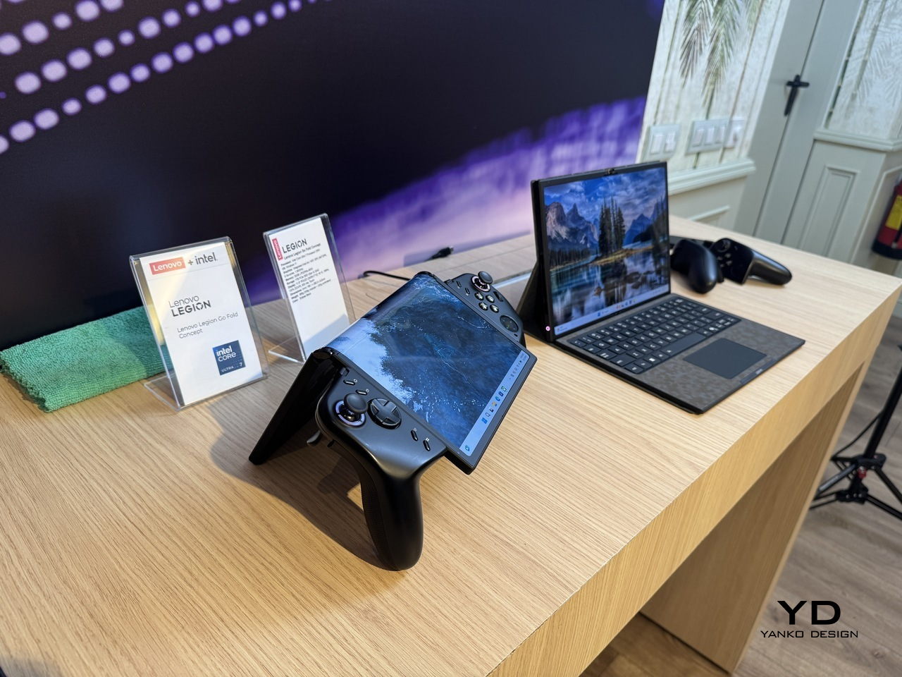
Gaming handhelds have quietly become the most interesting category in consumer electronics, and also the most awkward one to travel with. They’re too big to ignore in a bag and too small to replace a laptop, which means plenty of people end up carrying both anyway, one for the flight, one for the hotel desk, each doing half a job. The Legion Go Fold Concept, unveiled by Lenovo at MWC 2026, is a direct argument against that arrangement.

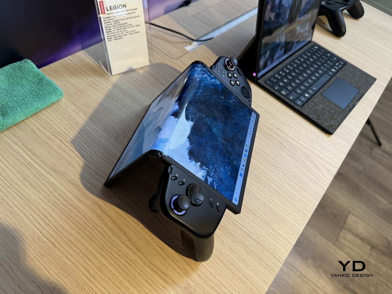
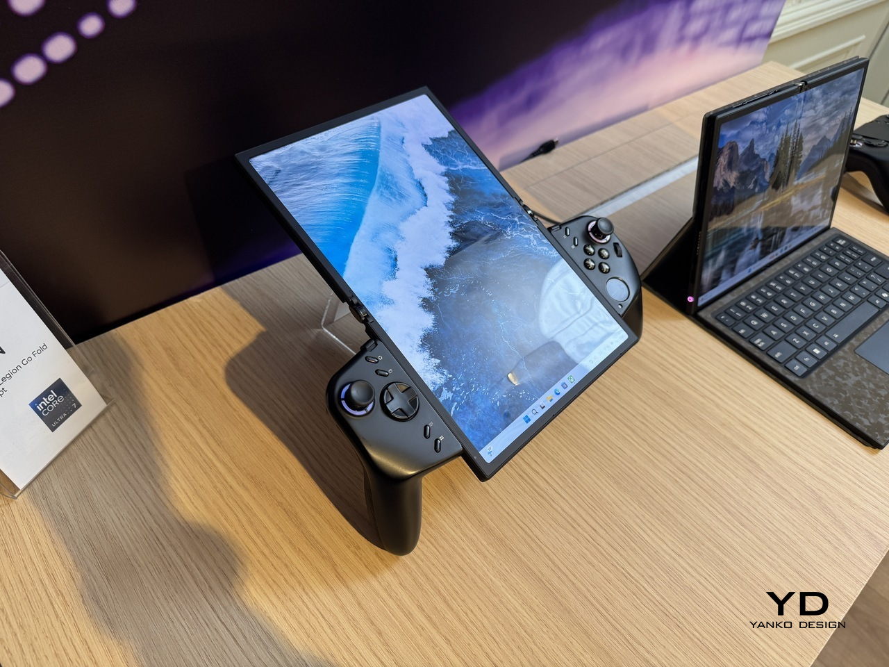
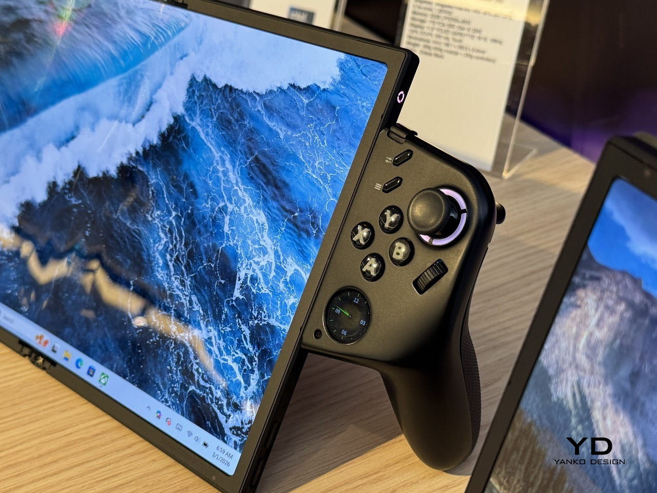
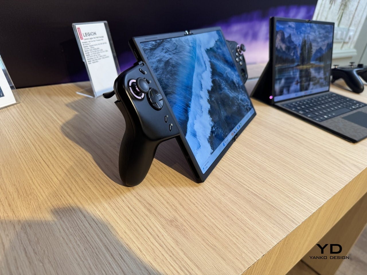
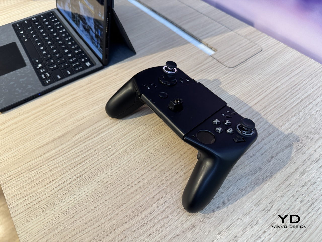
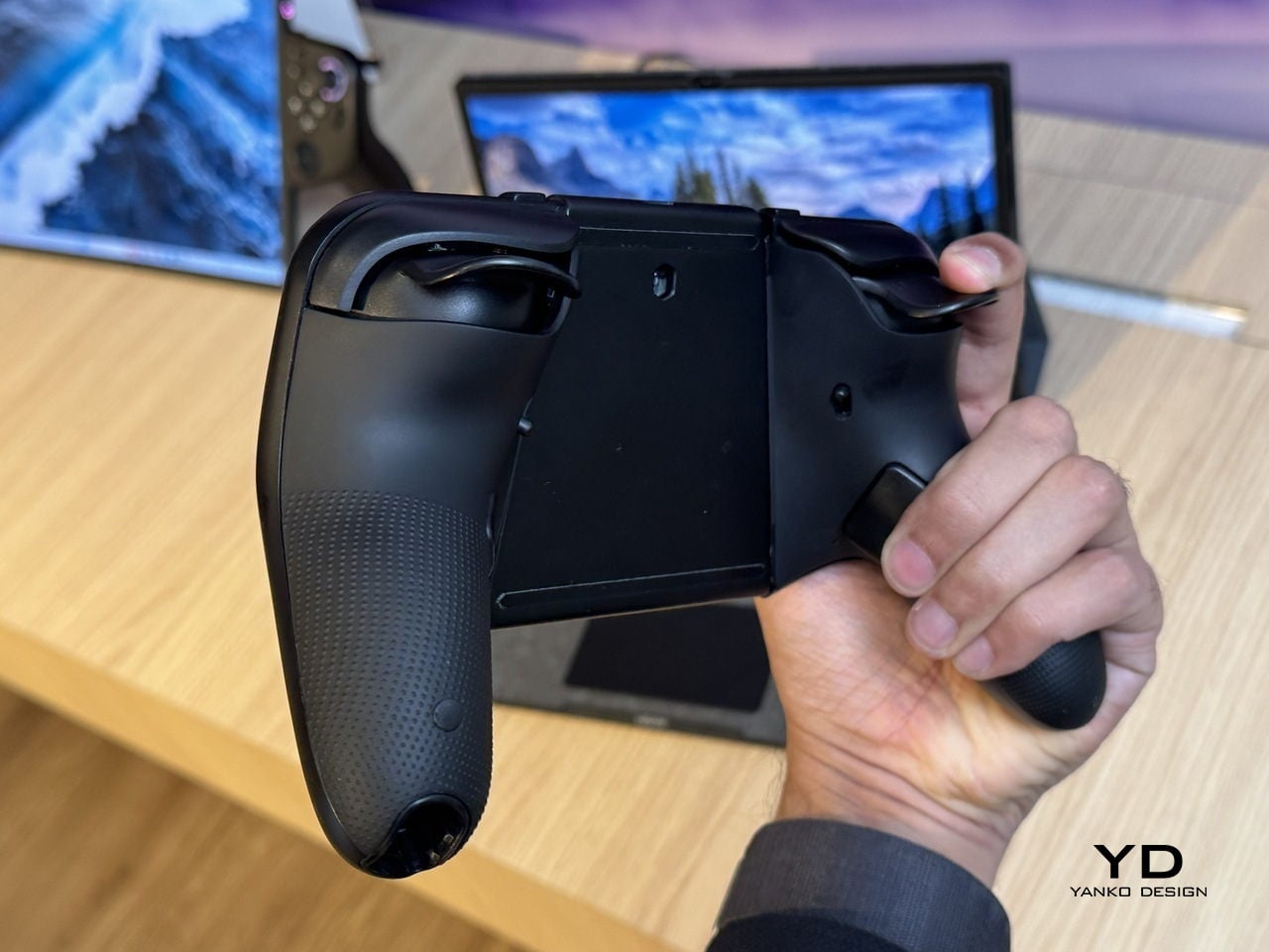
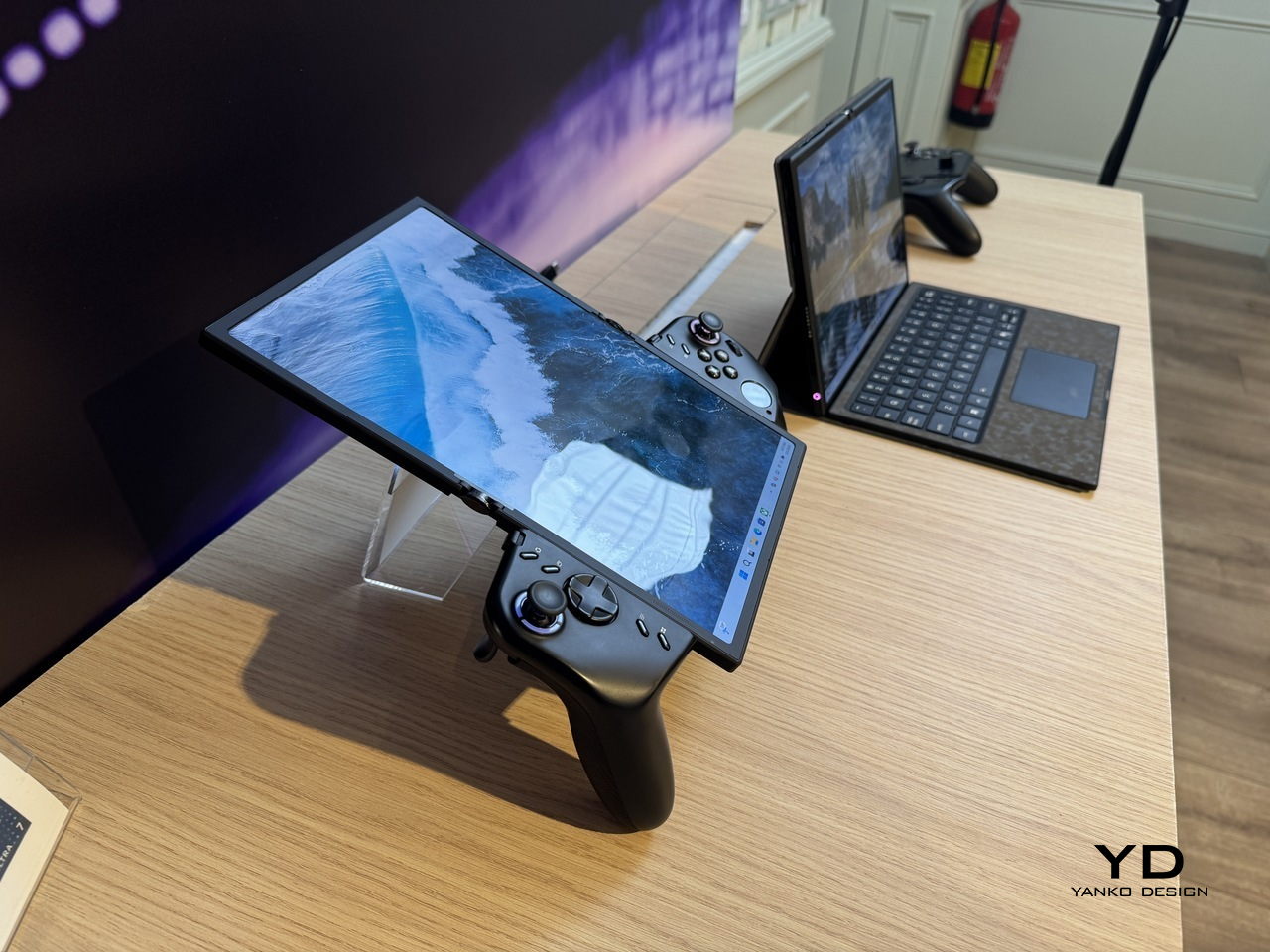
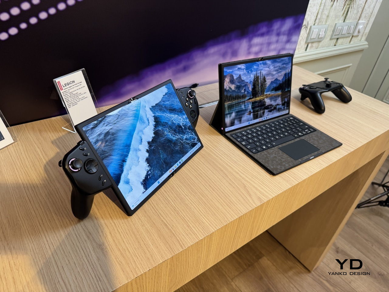
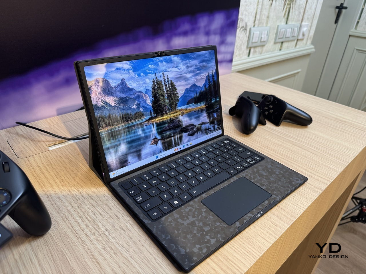
The device is a foldable handheld with a POLED display that opens from 7.7 inches to 11.6 inches, with detachable controllers that clip onto either side via a rail system. Folded with the controllers on, it functions as a conventional handheld for tighter spaces. Open it flat, reattach the controllers in landscape orientation, and the full screen takes over for a more immersive session.

Designer: Lenovo

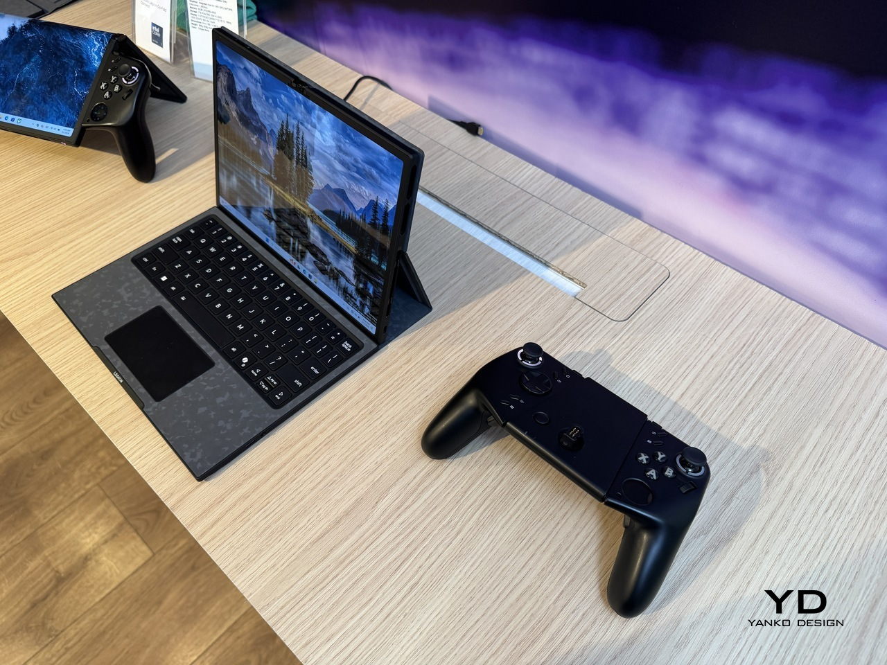
For longer stints that call for a keyboard, the included wireless accessory with an integrated touchpad turns the whole system into something closer to a compact laptop. The right controller doubles as a vertical mouse for FPS games, carrying over a feature from the Legion Go Gen 2. That same controller has a small circular secondary display on its face, handling performance metrics, touchpad input, and customizable hotkeys without requiring a trip into any menu.

An Intel Core Ultra 7 258V processor and 32GB of RAM handle the performance side, paired with a 48Whr battery. For a device expected to run demanding titles across multiple screen configurations, that battery figure is the one that will matter most in practice, and it’s also the one hardest to evaluate from a spec sheet alone.

The fold crease is the honest question the concept doesn’t answer. Running horizontally through the center of the display, it’s a non-issue in split configurations where the fold becomes a natural border. In full 11.6-inch mode, with a single uninterrupted game filling both panels, its visibility depends entirely on how well Lenovo has managed the panel gap and hinge tension, two things that vary considerably between announcement renders and finished hardware.

What the Legion Go Fold Concept gets right is identifying that the handheld’s biggest limitation isn’t processing power or battery: it’s the fixed screen. A device that can be a pocket-sized handheld on a commute and a proper gaming surface at a desk is genuinely more useful than two separate devices doing those jobs independently. Whether the folding display holds up to the kind of use that makes it worthwhile is the part that a concept can only promise, not prove.

The post Lenovo Unveils a Foldable Gaming Handheld That Replaces Your Laptop first appeared on Yanko Design.

Lenovo’s Yoga Book Concept Makes 3D Models Float Above the Screen

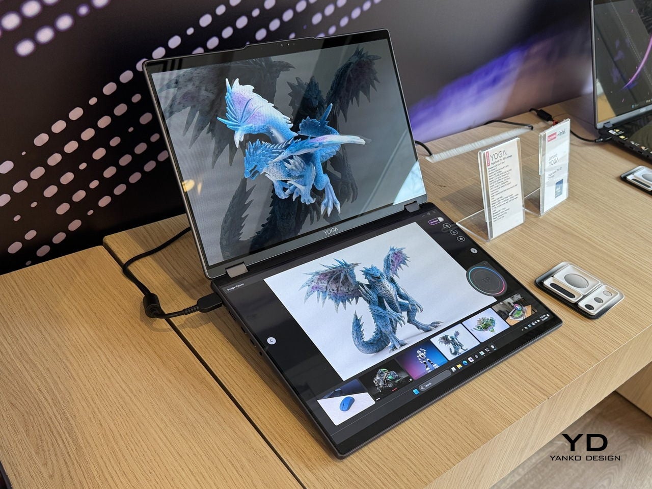
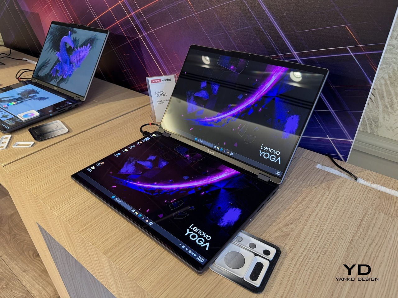
Working in 3D on a flat screen requires a specific kind of mental gymnastics. The model on the monitor is technically three-dimensional, but the screen keeps insisting it’s not, and somewhere between rotating the viewport and second-guessing the depth, the actual creative work slows to a halt. Lenovo’s Yoga Book Pro 3D Concept, revealed at MWC 2026, takes a direct position on that friction.

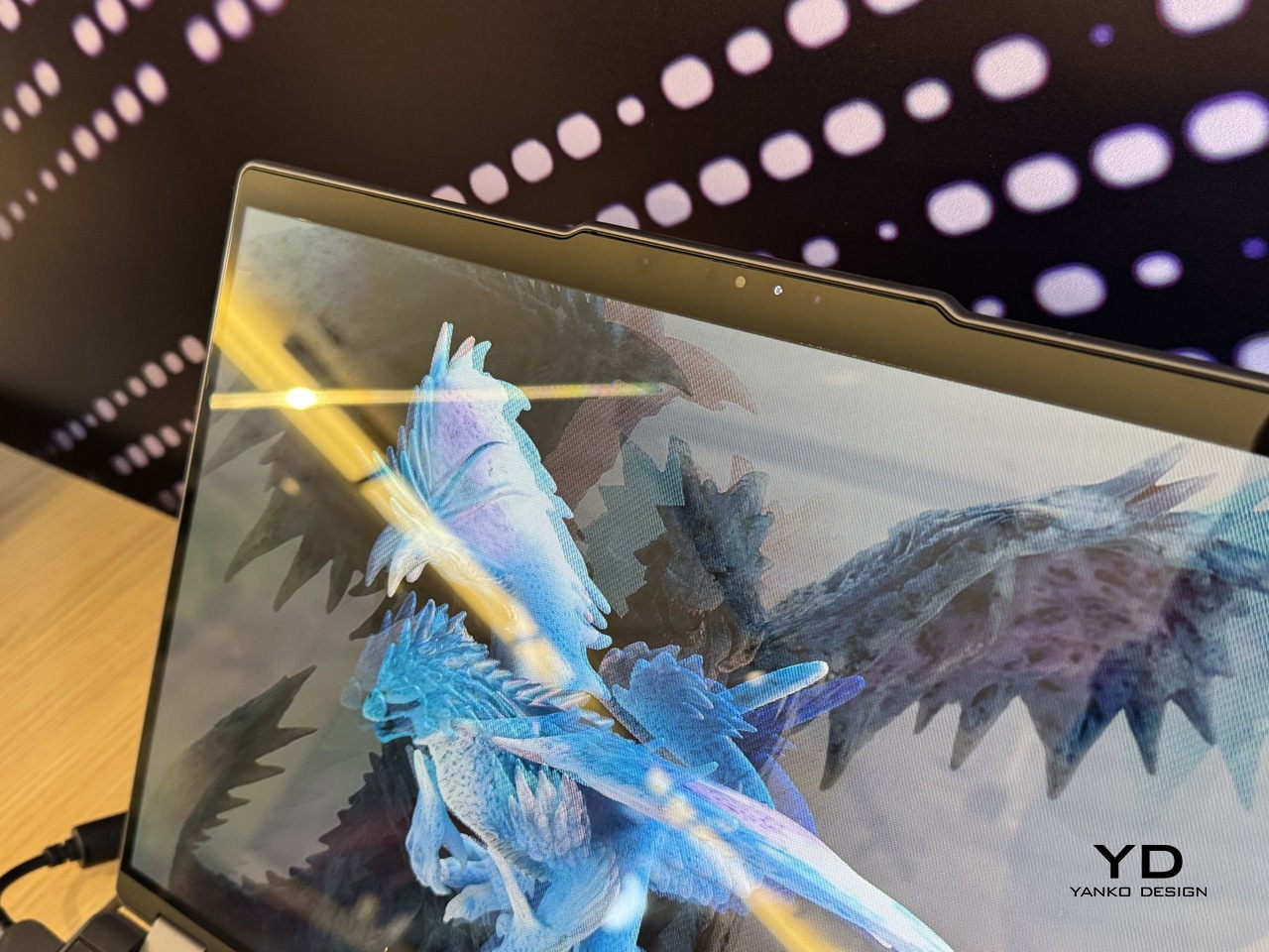
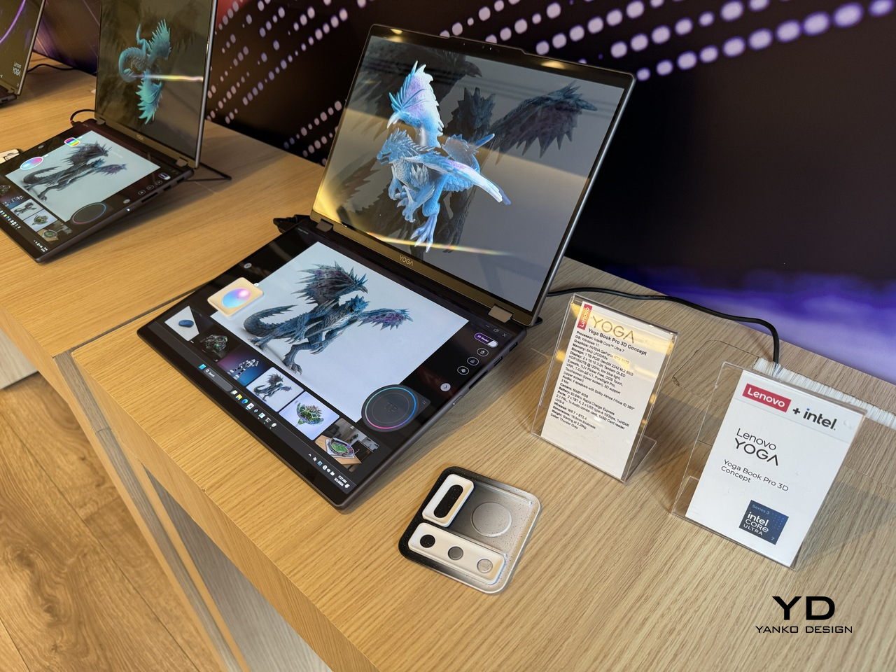
The upper display renders 3D content without glasses, using Lenovo’s PureSight Pro Tandem OLED technology to show depth and spatial volume directly on screen. A spacecraft that’s been modeled in three dimensions appears to float, with genuine perceived distance between its front and rear planes, rather than sitting flat behind glass.

Designer: Lenovo

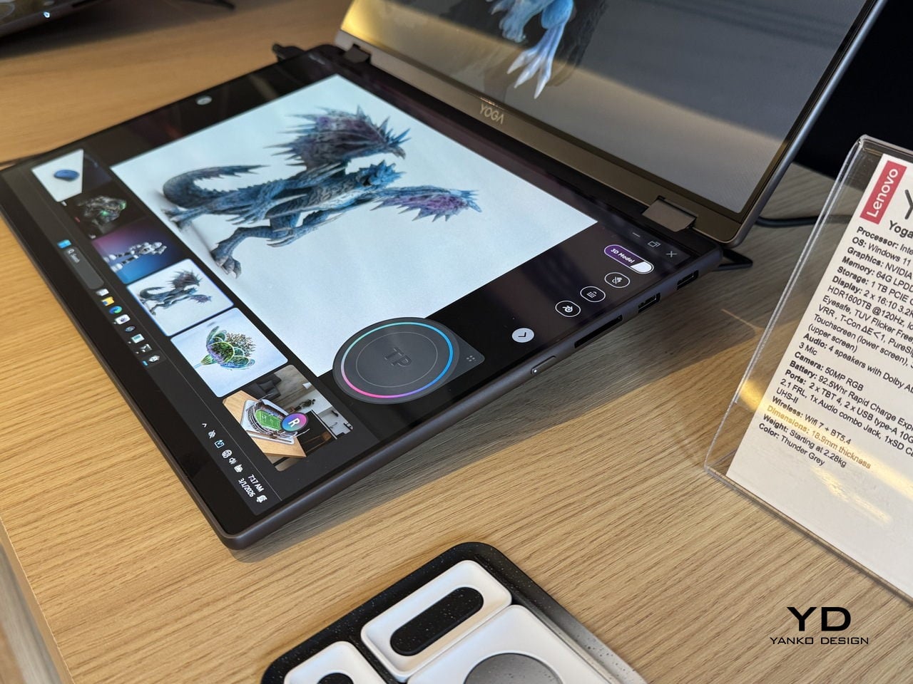
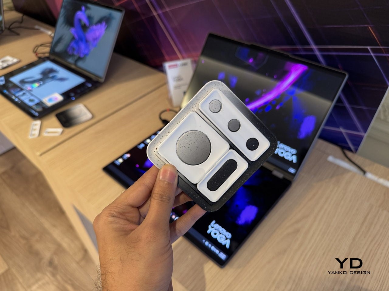
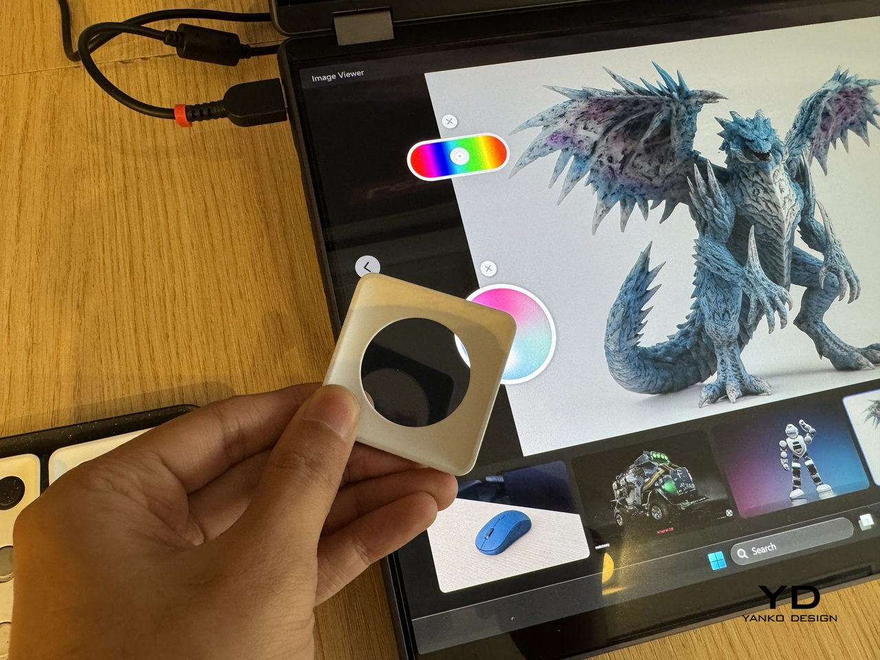
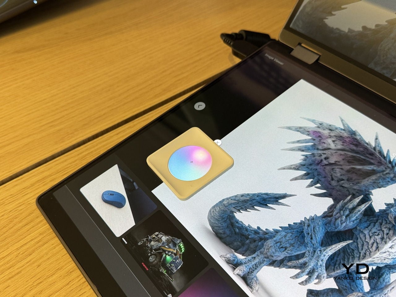
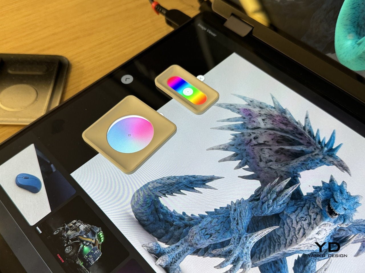
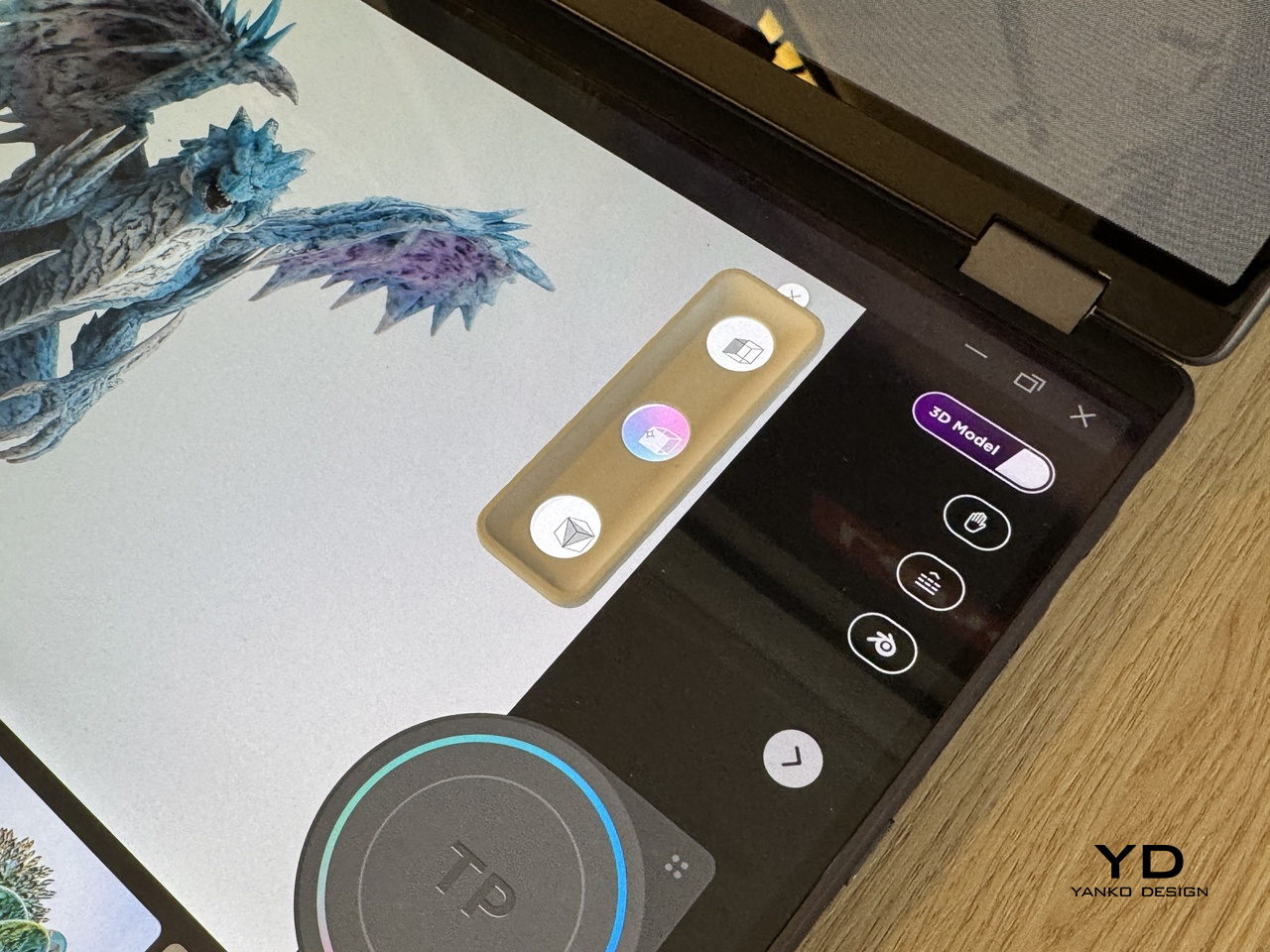
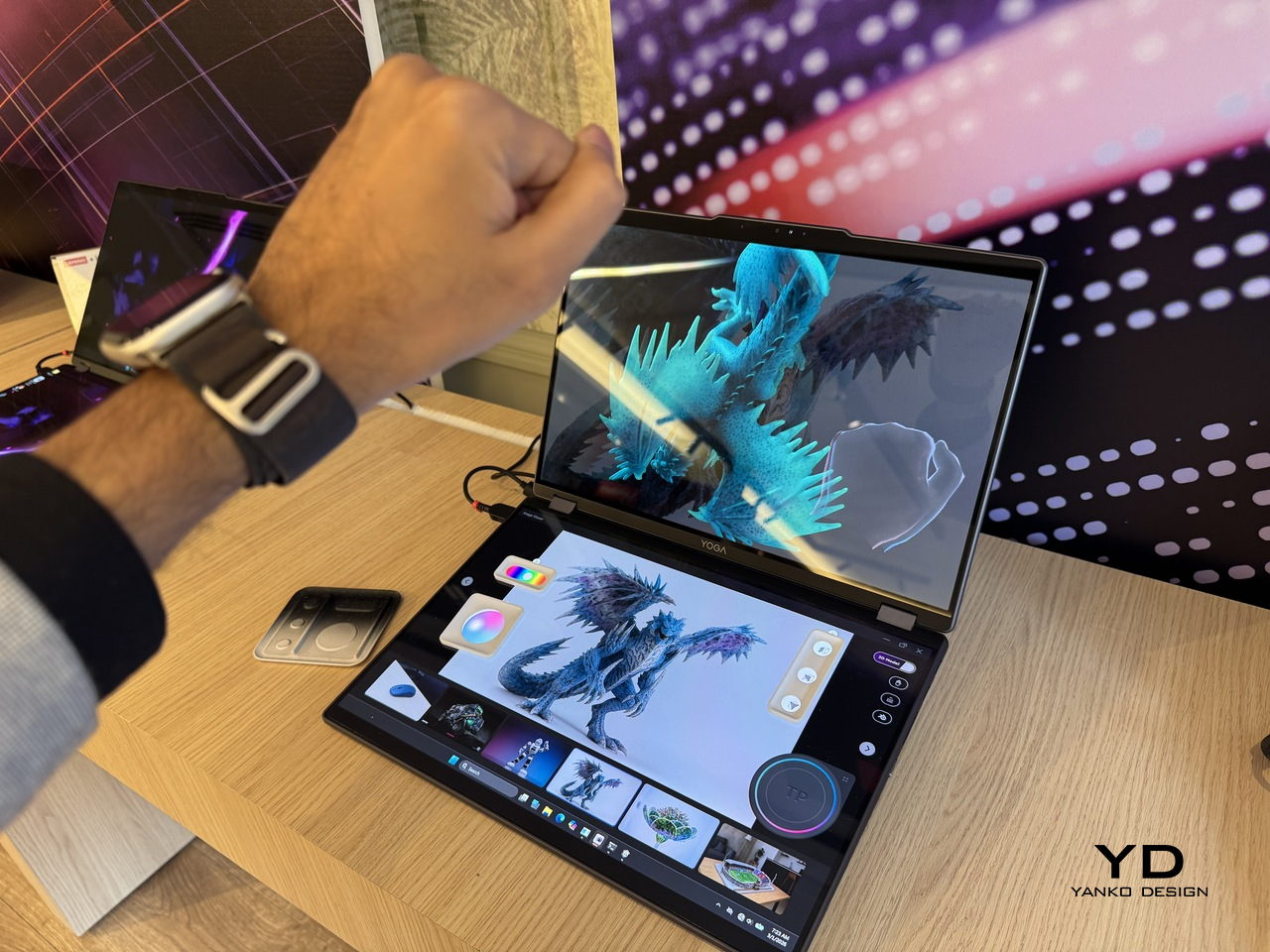
The lower half of the device is a full touch display running the editing environment, with the traditional keyboard removed entirely. Snap-on physical accessories sit on that lower surface: a circular dial and a slider for adjusting lighting, tone, and viewing angle without diving into menus. The idea is that the physical controls stay contextual, appearing wherever they’re placed on the touch surface rather than in a fixed location.

An RGB camera above the upper display handles gesture recognition. Pinching, rotating, and zooming a 3D object happens in the air in front of the screen, which removes at least some of the back-and-forth between input device and viewport that slows down spatial editing. An Intel Core Ultra 7 paired with an NVIDIA GeForce RTX 5070 handles the rendering load underneath all of this.

The AI layer converts 2D reference images into editable 3D assets and can generate a surrounding environment for the converted object on prompt. For a creator pulling reference photography into a modeling workflow, that shortens a step that currently involves a separate pipeline or a lot of manual reconstruction.

What the Yoga Book Pro 3D does differently from other glasses-free 3D solutions is how it treats the display as the primary tool rather than the output. Most 3D workstation design stops at raw performance and screen size. This one asks whether the screen itself can close the gap between what the creator imagines and what the software shows them.

The post Lenovo’s Yoga Book Concept Makes 3D Models Float Above the Screen first appeared on Yanko Design.

Lenovo and AngryMiao Built a Keyboard With a Studio-Grade Knob

Most keyboards disappear into the desk. That’s by design, usually, since the keyboard’s job is to get out of the way and let the work happen. The trouble is that creative workflows don’t always work that way. Editing a podcast or cutting a video involves a lot of scrubbing, a lot of precise back-and-forth through a timeline that a mouse handles clumsily and a keyboard typically doesn’t handle at all.

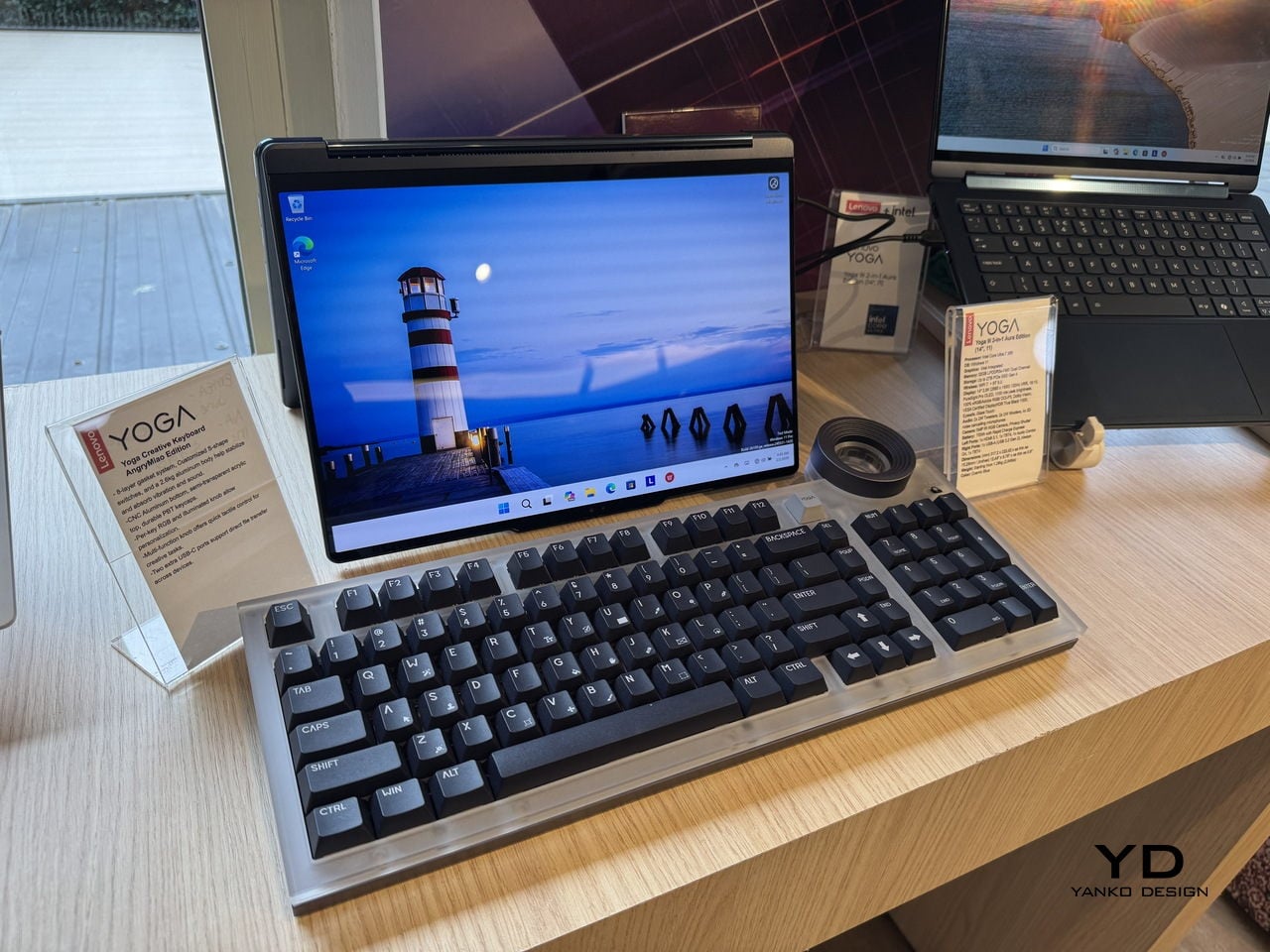
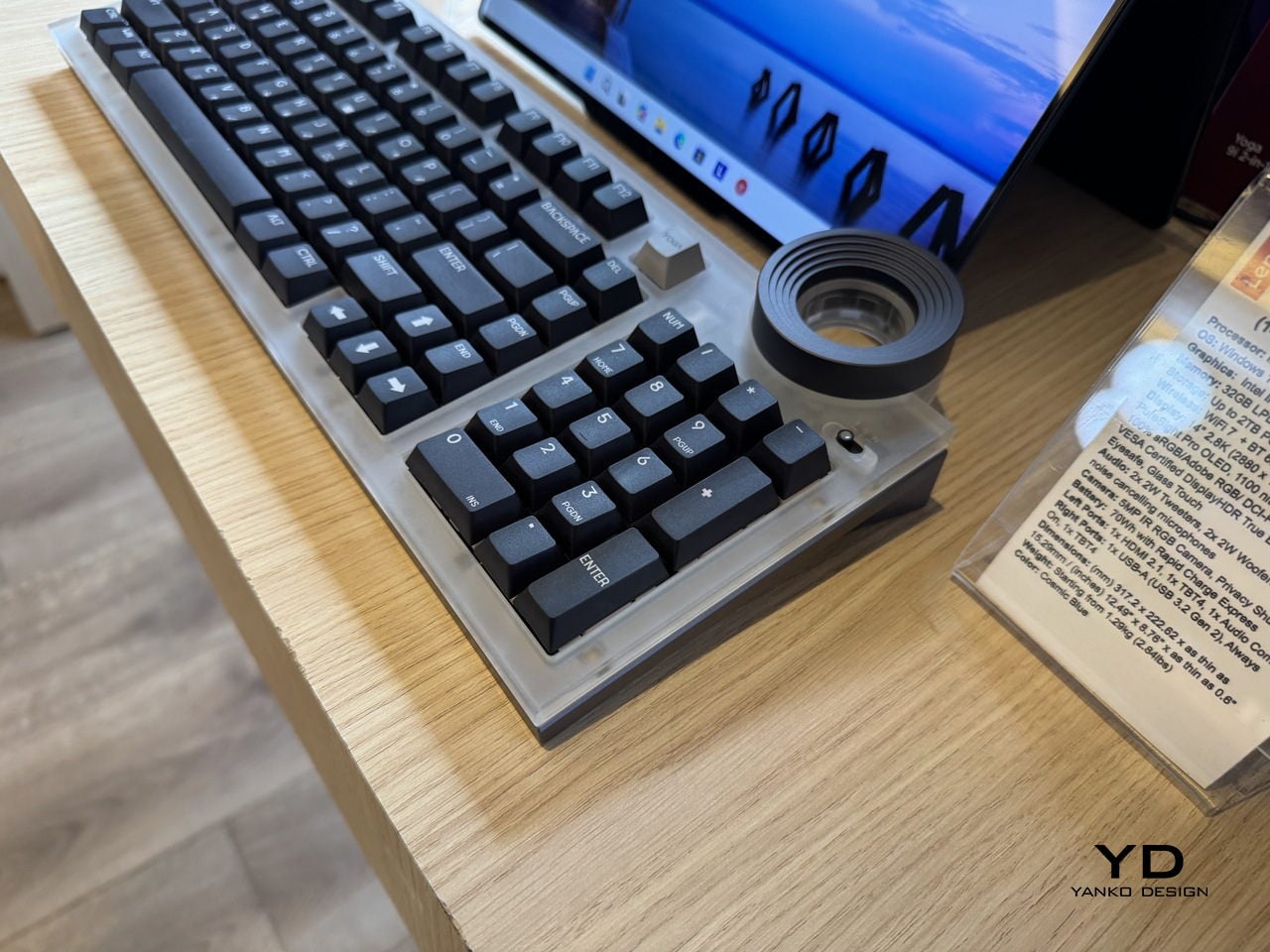
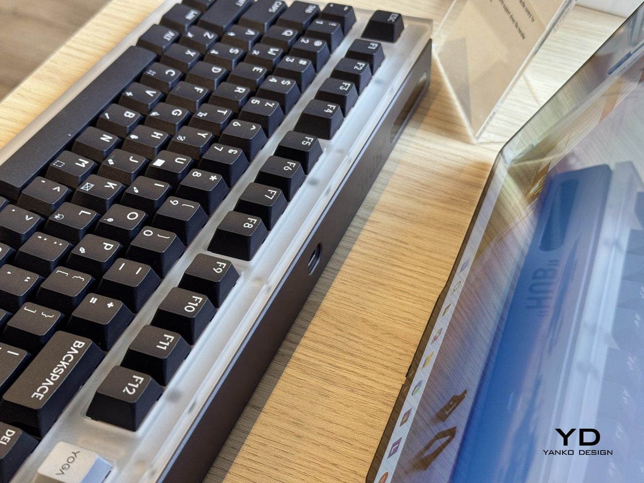
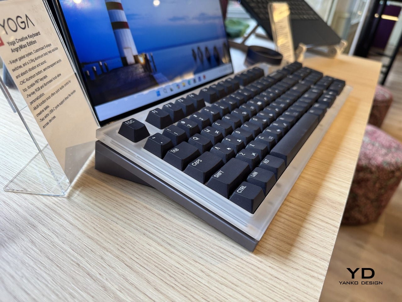
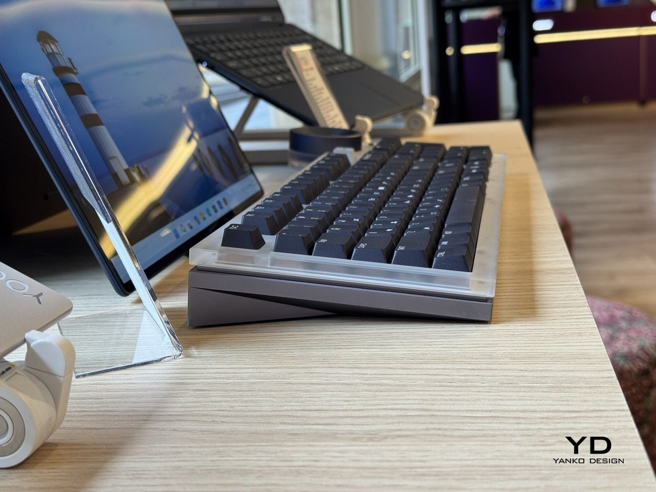
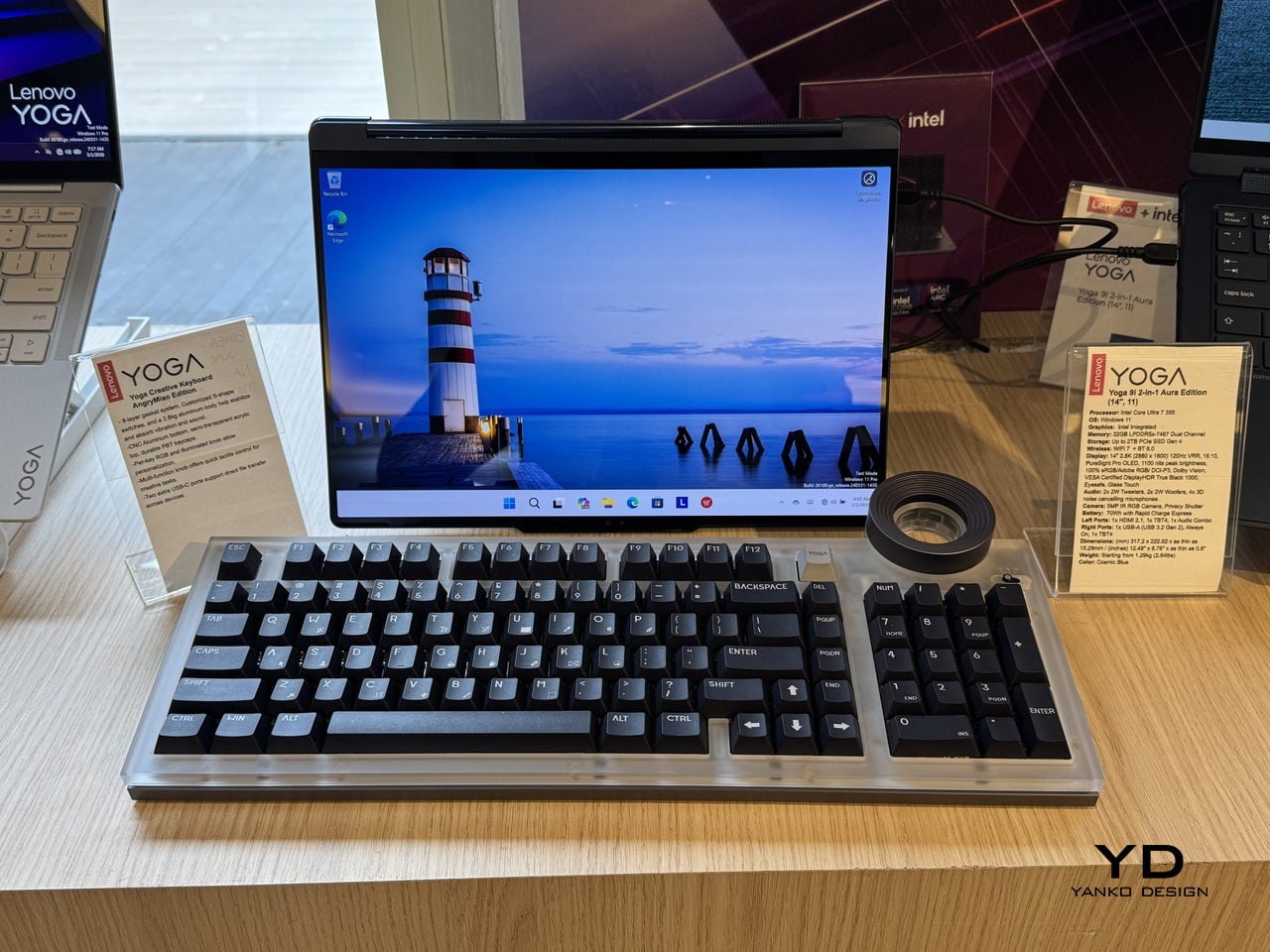
The Lenovo Yoga Creative Keyboard AngryMiao Edition, announced at MWC 2026, takes a position on that gap. Developed with peripheral maker AngryMiao, it’s a full 98-key mechanical keyboard with a numpad, built around a 2.6kg aluminum base under a frosted polycarbonate top plate. The weight isn’t incidental. It keeps the board planted during longer sessions and damps the vibration that makes cheaper keyboards sound hollow, which matters more than it sounds when you’re spending hours at a stretch on a project.

Designer: Lenovo x AngryMiao

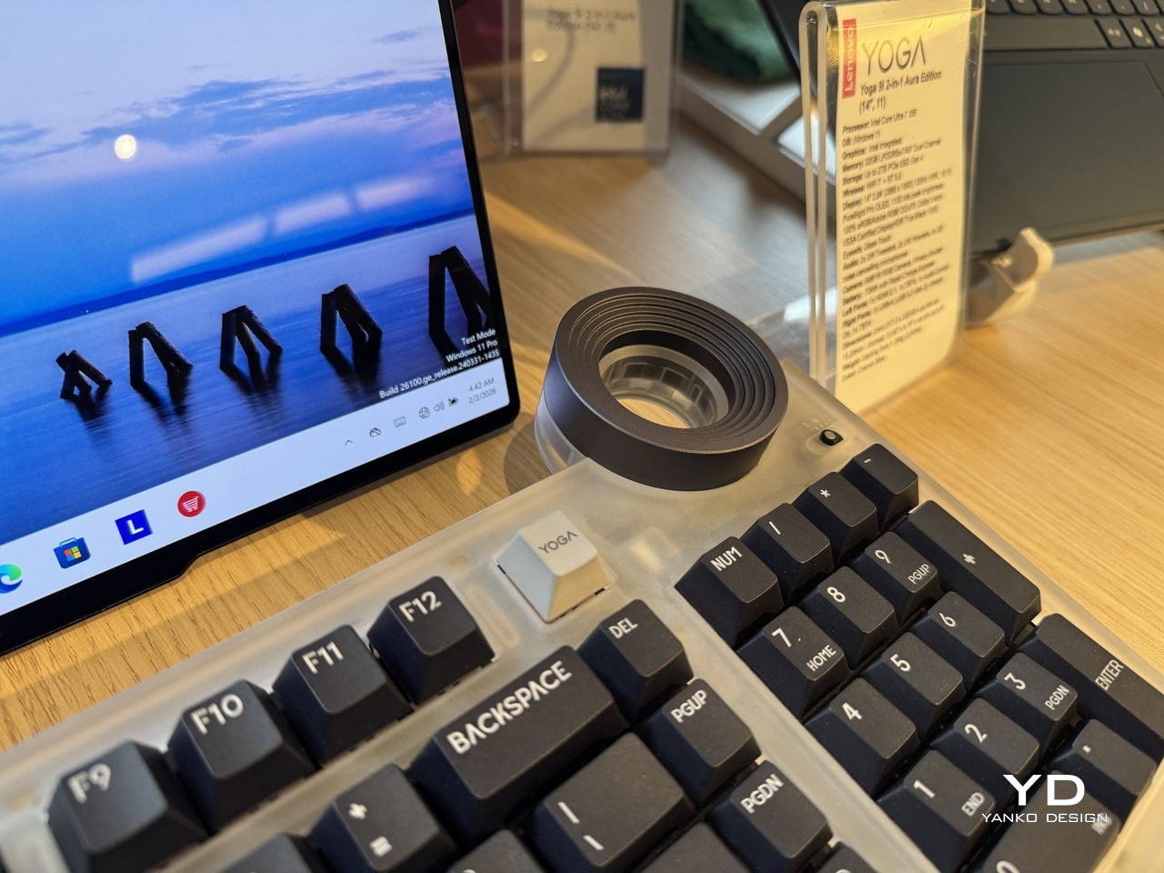
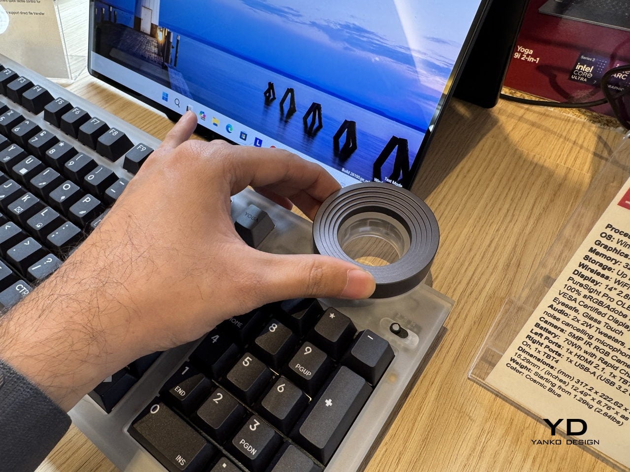
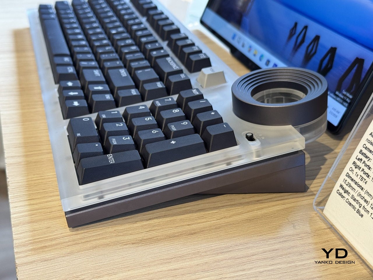
The knob is the detail that does the most explaining. Sitting at the top right of the chassis, it’s an oversized machined cylinder with concentric ridging and a recessed lens cap on top, sized and weighted to feel like something from a piece of studio equipment rather than a computer peripheral. For video editors, it controls the playhead directly, letting a thumb roll through footage frame by frame with tactile feedback that a mouse scroll wheel doesn’t come close to matching. It’s a simple addition that addresses a specific friction point, which is usually the best kind.

For users running the full Yoga setup with a Yoga Pro 9i Aura Edition laptop and a Yoga Pro 27UD-10 Monitor, there’s a dedicated YOGA key that cycles audio between the laptop’s speakers, the monitor’s speakers, or all twelve across both devices combined. That last option, spreading audio across the full speaker array, is a genuinely useful thing for anyone mixing or reviewing audio without headphones and wanting to hear how it sounds in a room rather than a pair of earbuds.

Per-key RGB lights diffuse through the translucent top plate rather than projecting harshly upward, giving the board a softer ambient glow that doesn’t compete with the screen. Two USB-C ports on the rear spine expand connectivity without requiring a separate hub on the desk. The pricing sits at $299 when it goes on sale in May 2026.

The AngryMiao collaboration brings credibility that the keyboard market takes seriously. AngryMiao’s builds are known in enthusiast circles for their material quality and acoustic tuning, and the ATM 98 platform this borrows from has a track record that Lenovo’s branding alone wouldn’t have provided. With the right setup, it ties everything together, pairing a well-built mechanical keyboard with a very good knob.

The post Lenovo and AngryMiao Built a Keyboard With a Studio-Grade Knob first appeared on Yanko Design.

7 Best Tiny Home Accessories That Make Small-Space Living Feel Like a Design Choice, Not a Compromise

Living small has a perception problem. Most people associate compact spaces with sacrifice, with the slow creep of clutter and the resignation that comes from owning less. But the best tiny home accessories flip that narrative entirely, turning constraints into opportunities for deliberate, considered living. The products on this list do not just fit into small spaces; they make small spaces feel intentional.

What separates a well-designed tiny home from a cramped apartment is not square footage. It is the objects inside it. Every item earns its place, or it does not belong. That principle drove our selection here: seven accessories that pull double duty, look better than they have any right to, and solve problems that only people who live in tight quarters truly understand.

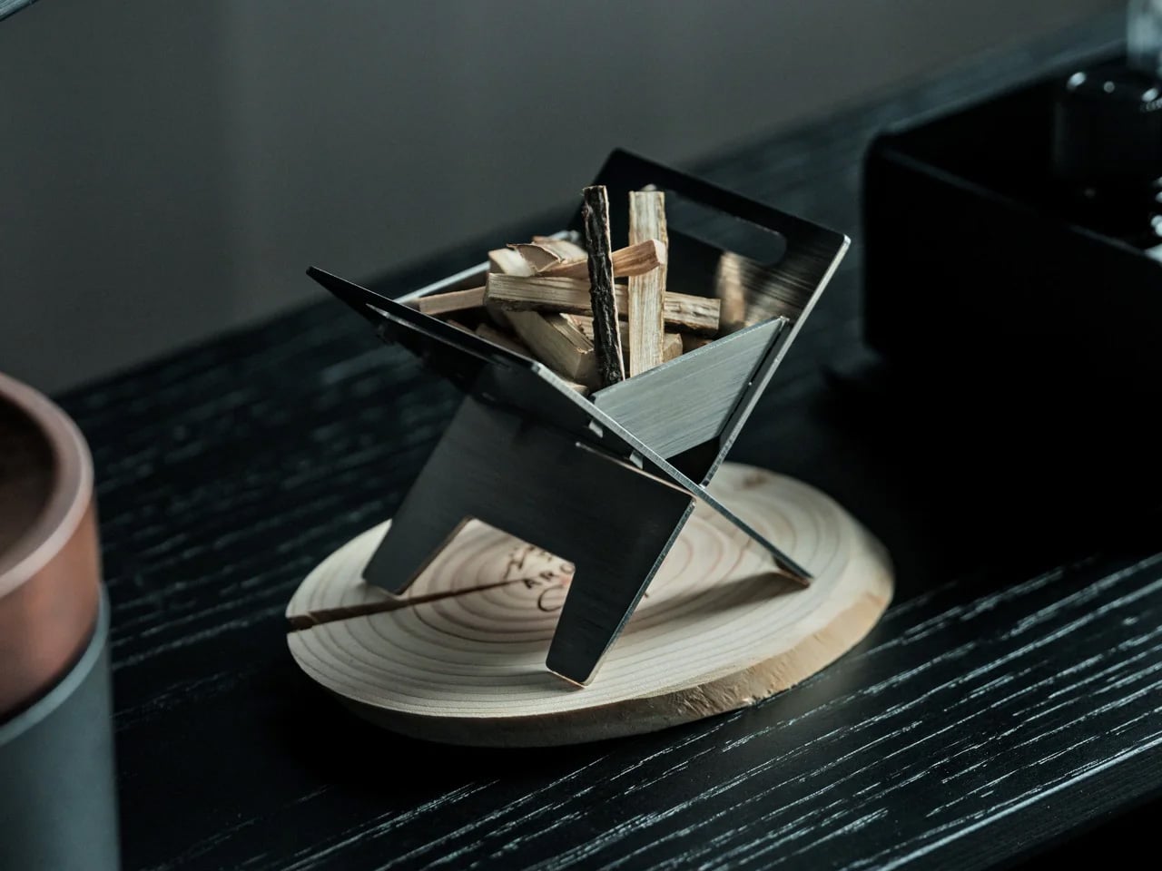
1. Miniature Bonfire Wood Diffuser- A tiny bonfire that never burns out.

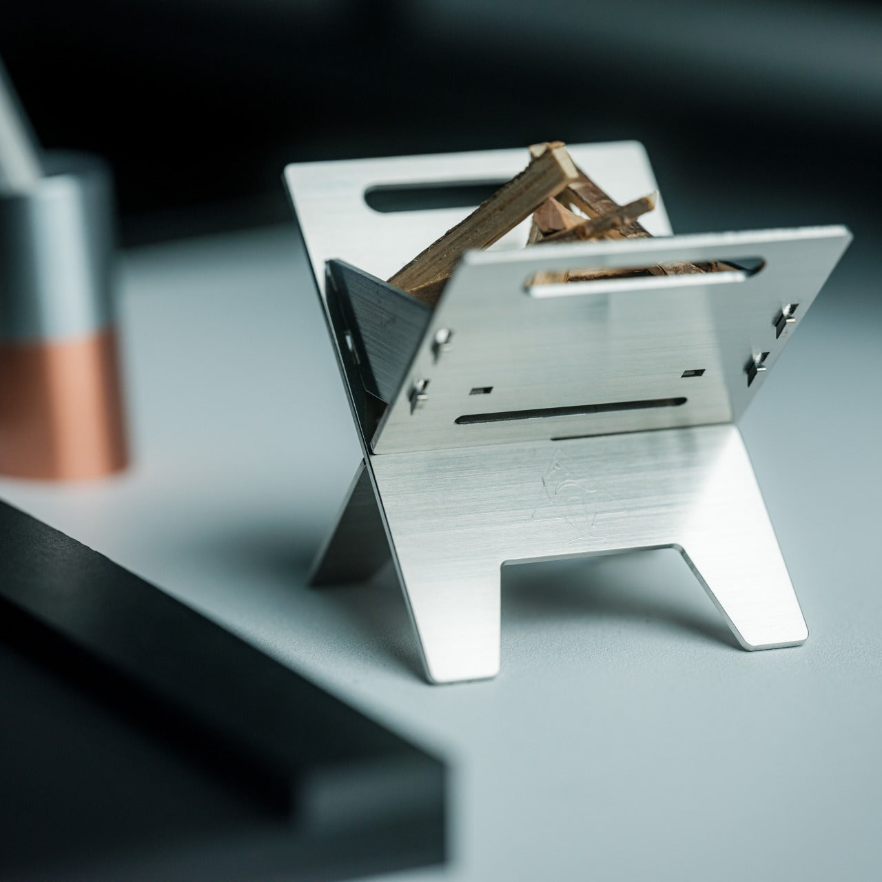
The miniature bonfire wood diffuser set does something rare for a home fragrance product: it gives you a reason to stare at it. Built from rust-resistant stainless steel, the set recreates a campfire scene at desktop scale, complete with miniature firewood bundled with a tying knot. The essential oil captures the scent of Mt. Hakusan, a Japanese mountain known for its dense cedar forests, and the firewood pieces distribute that fragrance with a slow, even release that synthetic plug-in diffusers cannot match.

In a tiny home, scent fills a room faster and lingers longer than it would in a larger space. That concentration works in this diffuser’s favor, but the real reason it belongs on this list is the trivets. Remove them from the base, and the diffuser transforms into a pocket stove capable of warming small portions of food. For anyone living in a space where every object needs to justify its existence, a centerpiece that doubles as a cooking surface is the kind of thinking that makes compact living feel clever rather than constrained.

Click Here to Buy Now: $99.00 Hurry! Only a few left.

What we like

  • Rust-resistant stainless steel construction means it ages well in humid or kitchen-adjacent environments
  • Trivets convert the decorative diffuser into a functional pocket stove, adding genuine utility to an ornamental object

What we dislike

  • The essential oil scent is specific to Mt. Hakusan, which limits fragrance variety without purchasing additional oils separately
  • The miniature scale, while charming, means the heat output of the stove is minimal to reheating rather than actual cooking

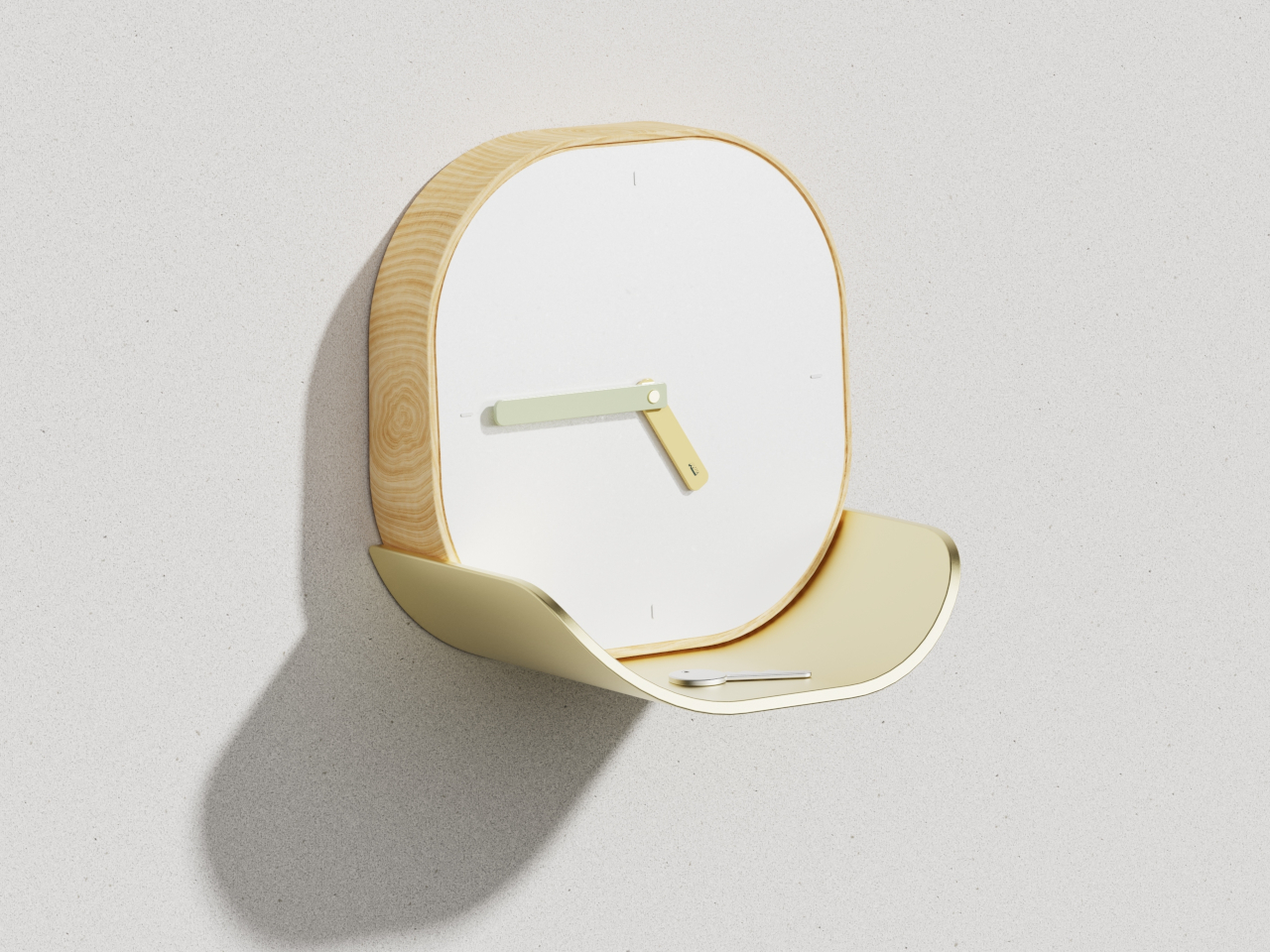
2. Lotus Clock – A wall clock that catches your keys.

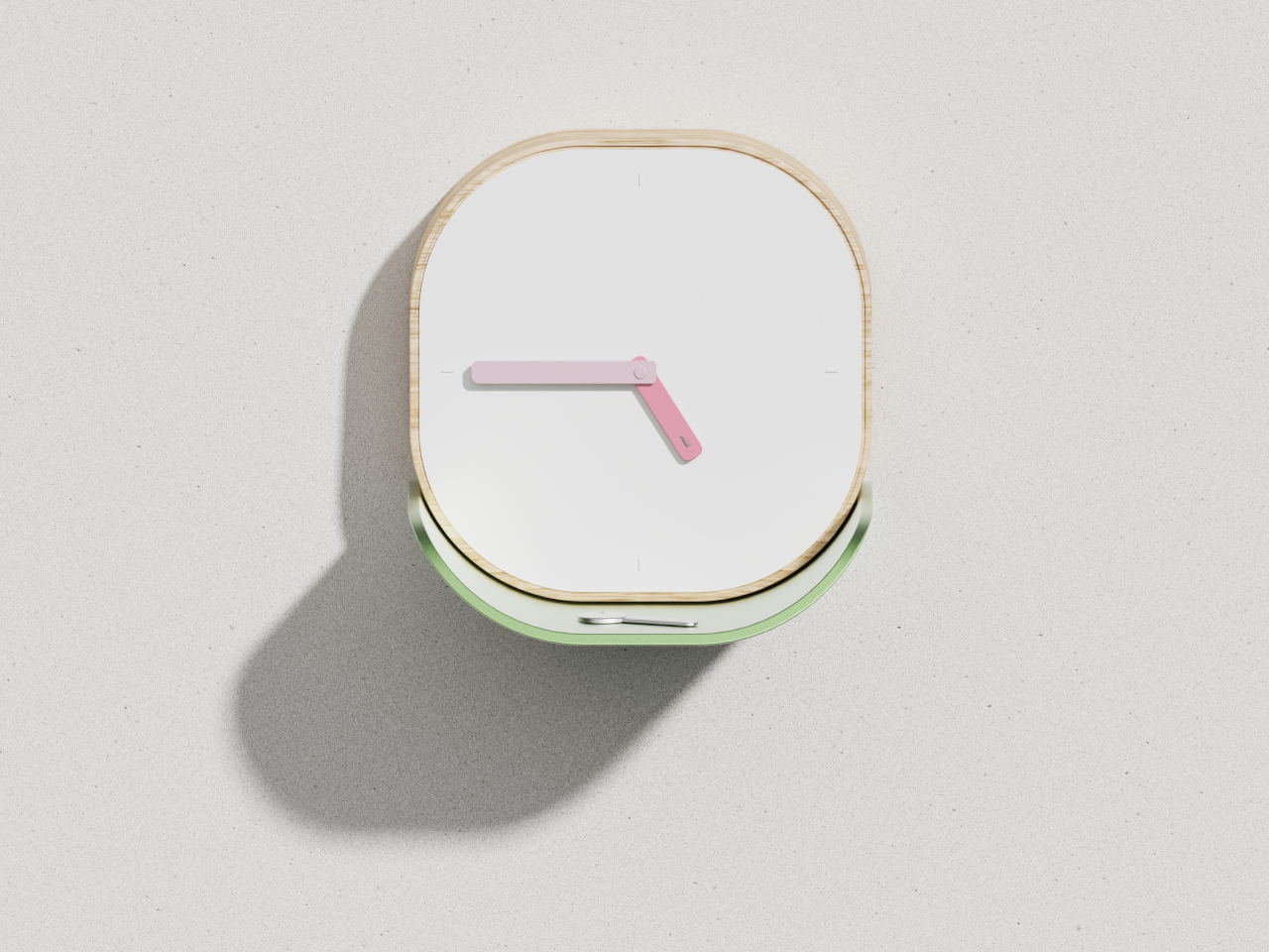
The Lotus clock takes its cues from nature in a way that feels functional rather than decorative. Inspired by the way lotus leaves gather water in their gentle curves, the clock integrates a curved metal tray directly beneath its face, sized to hold keys, loose change, or other daily carry items. The wooden frame has soft, rounded corners, and the clean white face keeps time-reading effortless. Broad, flat hands coordinate with the tray’s finish, tying the clock’s two functions into a single visual statement.

Tiny homes struggle with the small-object problem: keys, coins, earbuds, and pens that scatter across every available surface and create visual noise. The Lotus clock solves this by assigning those objects a permanent home on the wall, freeing up counter and table space that compact kitchens and entryways cannot afford to lose. Available in soft gold or gentle green colorways, the piece complements different interior styles without competing for attention. The concept is a wall clock, but the execution is a storage solution disguised as one.

What we like

  • The biomimetic tray design turns a single-purpose wall object into a genuine organizational tool for daily carry items
  • Soft colorway options (gold, green) let it blend into varied interior palettes without adding visual clutter

What we dislike

  • As a concept design, availability and final production specs remain unconfirmed
  • The tray’s capacity is limited to lightweight, small items, so it will not replace a proper entryway organizer for larger households

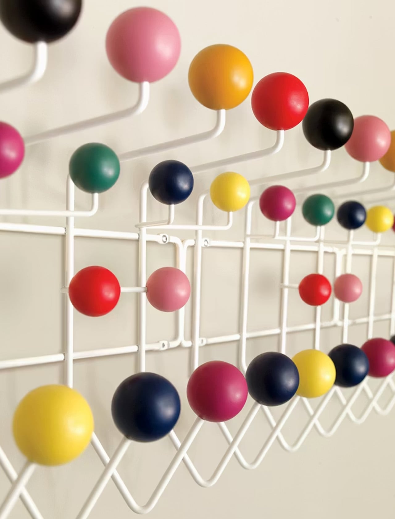
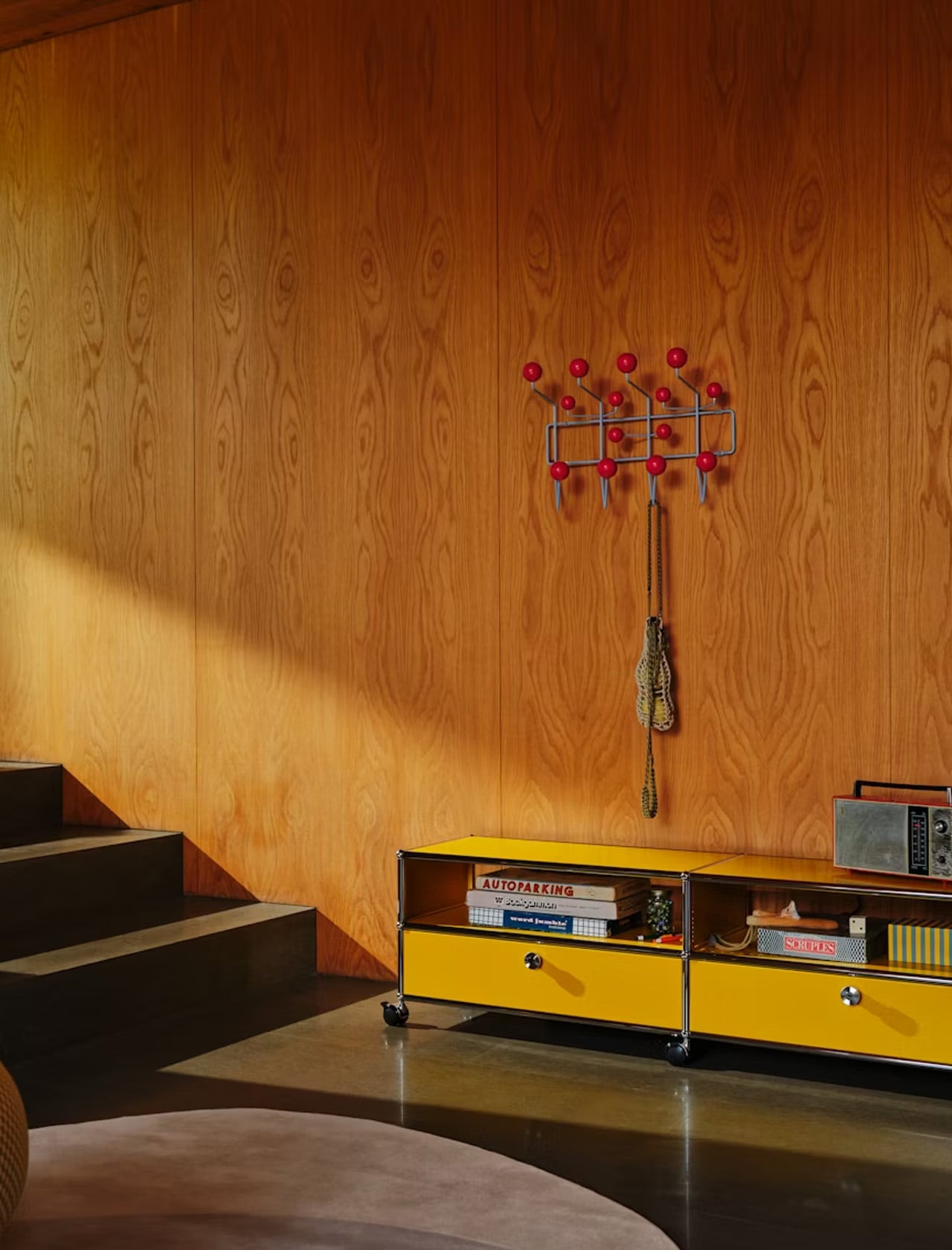
3. Eames Hang-It-All – Fourteen hooks wrapped in wooden spheres and wire.

The Eames Hang-It-All, designed by Charles and Ray Eames, is one of those rare objects that has remained in continuous production since 1953 for a reason no one can argue with: it works. The design uses a welded steel wire frame with fourteen lacquered wooden balls in various colors, each one with a hook. The structure mounts flat against the wall and occupies almost no depth, which makes it ideal for narrow hallways and entryways where a traditional coat rack would block the path.

In a tiny home, vertical storage is everything, and the Hang-It-All exploits wall space that would otherwise sit empty. The colored spheres turn utilitarian storage into something worth looking at, which matters in a space where every object is visible at all times. Originally designed to encourage children to hang up their belongings, the playful form has aged into an adult staple that brings warmth to minimalist interiors without the heaviness of a wooden coat rack or the coldness of bare metal hooks.

What we like

  • The welded wire frame sits almost flush against the wall, consuming minimal hallway depth in tight entryways
  • Multiple color combinations available, allowing the piece to function as both storage and wall art simultaneously

What we dislike

  • The price point through Design Within Reach positions it as a premium purchase for what is, functionally, a coat hook
  • Fourteen hooks sounds generous, but the spacing means heavy coats can crowd each other and obscure the design

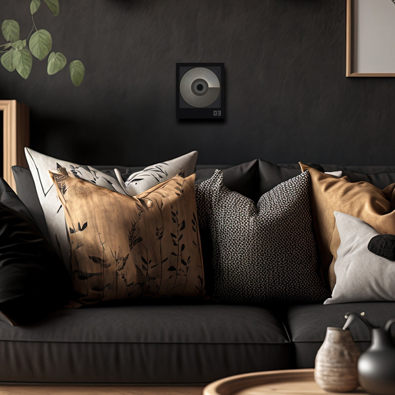
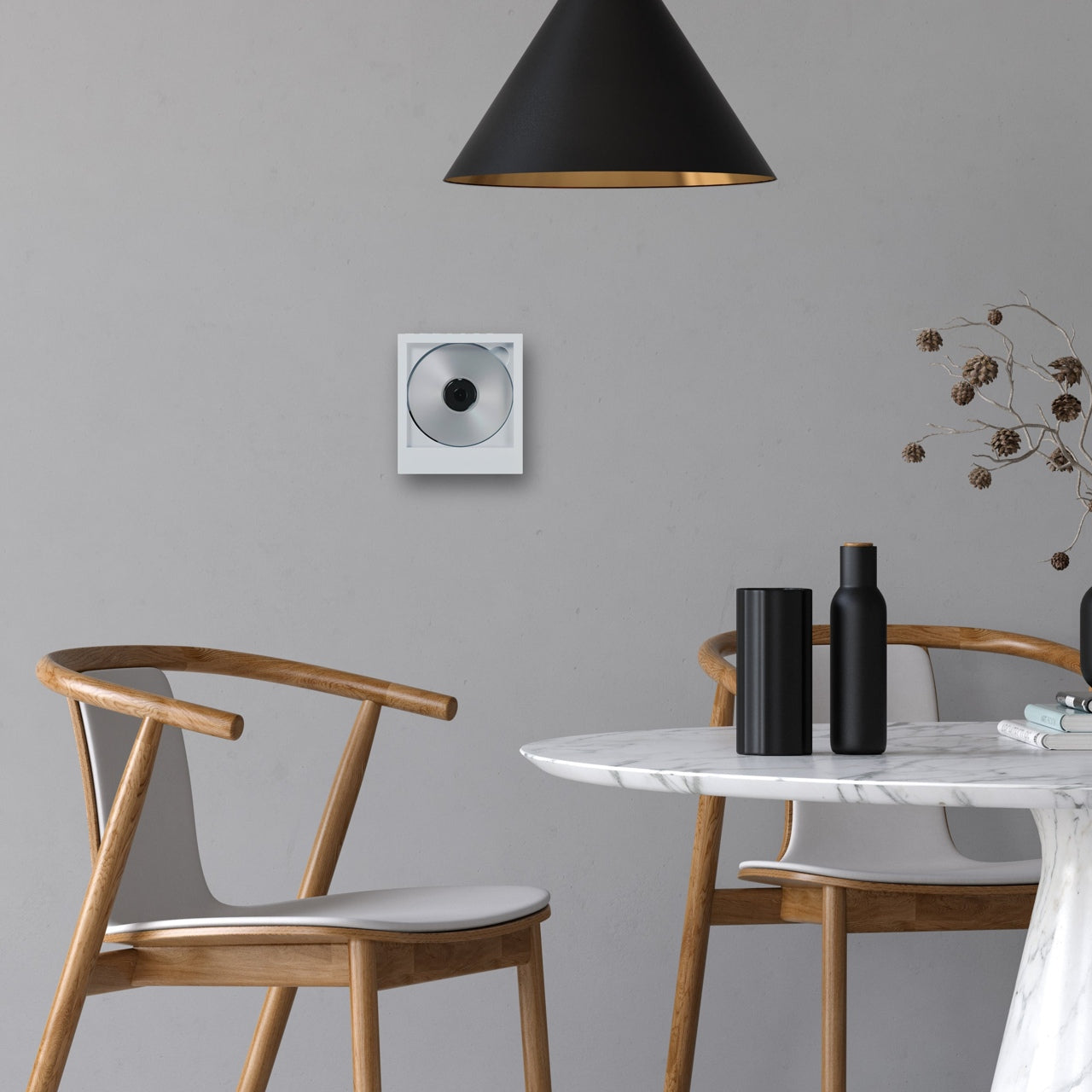
4. CD Jacket Player – Physical media turned into wall-mounted decor.

The CD jacket player does not pretend that CDs are making a comeback in any mainstream sense. Instead, it treats them as objects worth displaying, building a player around the album jacket rather than hiding it inside a drawer. The minimalist frame holds the CD’s cover art front and center, and a wall mount bracket lets the entire unit hang like a small piece of art. A built-in battery means it works on the go, and Bluetooth 5.0 connectivity lets it pair with wireless speakers and earphones.

Tiny homes demand that objects do more than one thing, and a music player that doubles as wall art earns its square footage in a way a Bluetooth speaker sitting on a shelf never could. The design acknowledges that people who still own CDs are emotionally attached to the physical format, to the artwork, and the ritual of selecting a disc. Mounting the player on the wall removes it from the counter, the nightstand, or whatever other surface it would otherwise claim. In a 400-square-foot space, that kind of reclaimed real estate adds up.

Click Here to Buy Now: $169.00 Hurry! Only a few left.

What we like

  • Wall-mount capability turns the player into displayable art, removing it from limited counter and shelf space
  • Bluetooth 5.0 means wireless pairing with existing speakers, so it does not demand its own audio setup

What we dislike

  • The audience for a physical CD player in 2026 is narrow, making this a niche purchase even among design-conscious buyers
  • Built-in battery life for portable use remains unspecified, and running both a motor and Bluetooth drains cells quickly

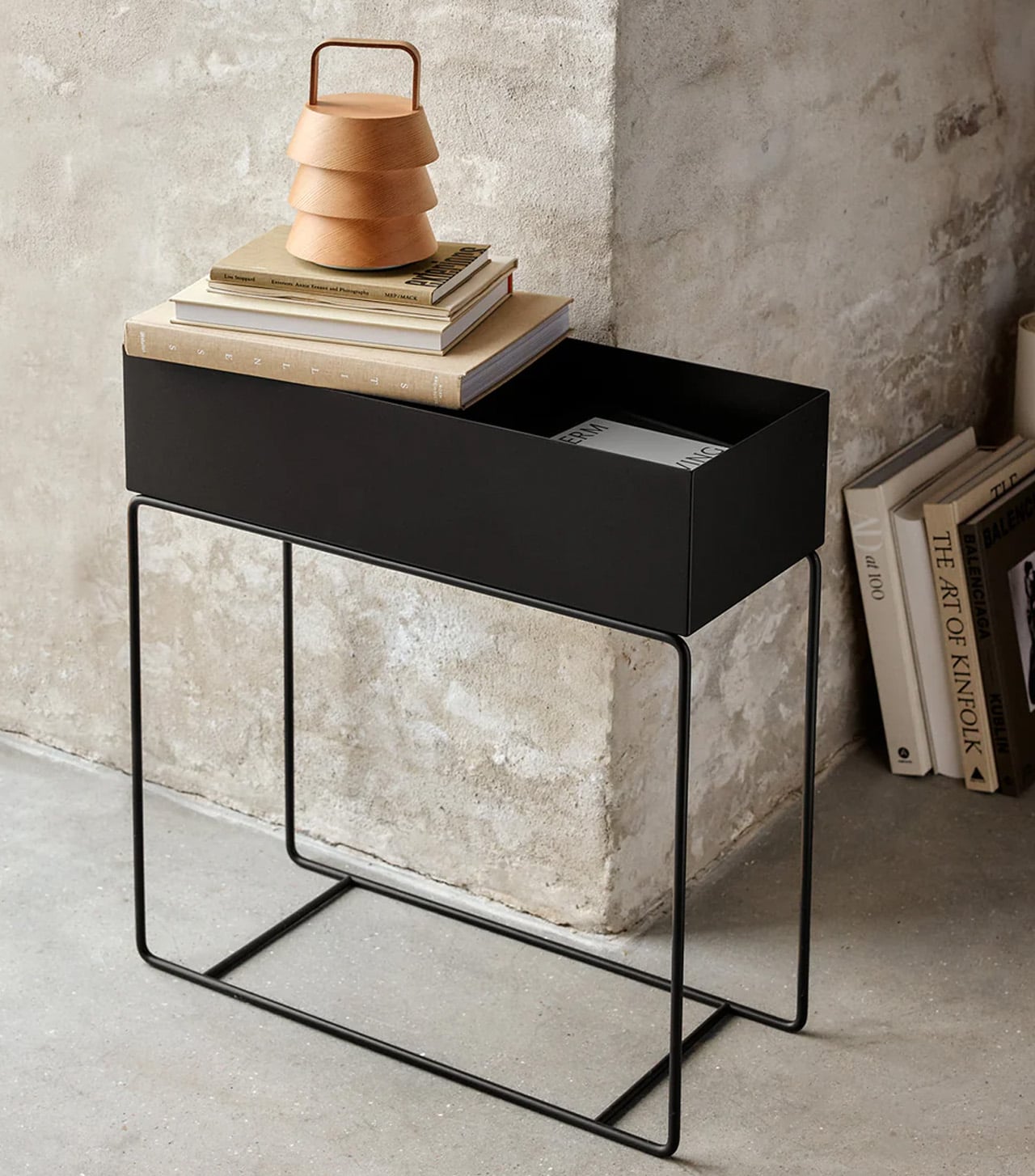
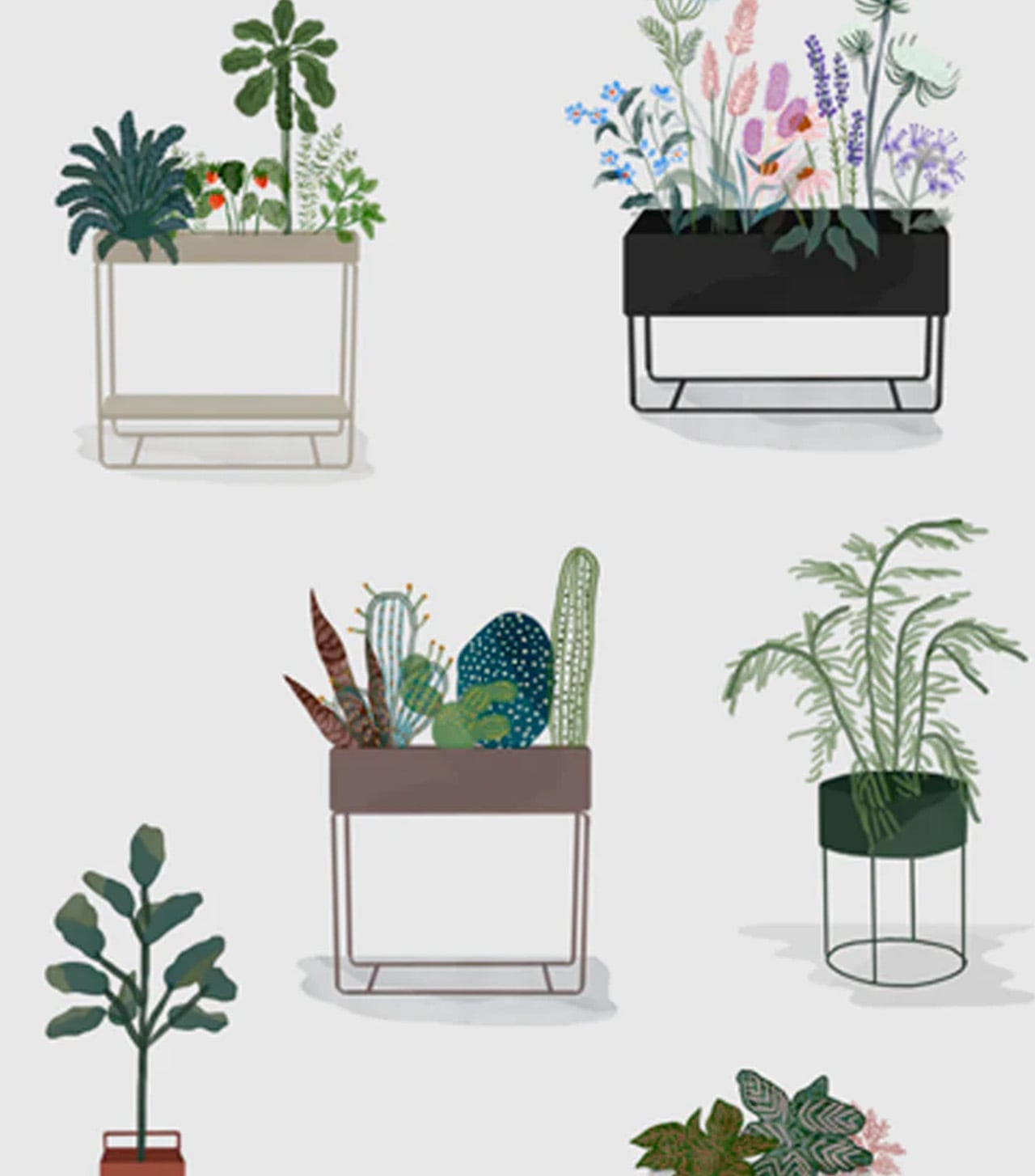
5. Ferm Living Plant Box – A planter that reorganizes your entire floor plan.

The Ferm Living plant box is, at its simplest, a rectangular metal box on thin legs with a powder-coated finish. But its real value in a tiny home has nothing to do with plants. The box’s proportions and height make it a room divider, a bookshelf, a toy bin, or a display surface that creates the illusion of separate zones within an open floor plan. The slim legs keep sightlines open at floor level, which is a small detail that makes a big difference in preventing a small room from feeling boxed in.

Studio apartments and single-room tiny homes rarely have the luxury of walls. The plant box fills that gap by creating what designers call “islands,” small zones of activity defined by furniture rather than architecture. Place it between a sleeping area and a desk, fill it with trailing plants or stacked books, and the eye reads two separate spaces where only one exists. The powder-coated metal is easy to wipe down, resistant to moisture, and available in black, a color that recedes visually and lets the objects inside take focus.

What we like

  • Thin legs preserve floor-level sightlines, preventing the visual weight that closed-base furniture adds to compact rooms
  • Multipurpose use as a planter, divider, bookshelf, or toy storage gives it a role in every room without redundancy

What we dislike

  • The open-top design means dust collects on whatever is stored inside, requiring regular maintenance in exposed layouts
  • Weight capacity is limited by the thin leg construction, so heavier items like large potted plants or dense book collections need caution

6. Key Holder Wakka – Neodymium magnet meets Japanese woodcraft.

The Key Holder Wakka turns the act of putting down your keys into something you look forward to. The system pairs a stainless steel, iron, and brass keyring with an elegant wooden base (available in maple or walnut). A neodymium magnet holds the ring securely in place, and separating the two produces a distinct, brisk tapping sound. That sound is the entire point. In a tiny home, where every habit compounds in visibility, a designated key spot eliminates the daily search-and-panic cycle.

The design logic here is behavioral rather than decorative. By making the act of placing keys enjoyable, the Wakka trains a habit through positive reinforcement rather than guilt. The wooden base is small enough to sit on a windowsill, a narrow shelf, or beside a door frame without claiming space that other items need. The material combination of warm wood and cool metal reads as considered rather than cluttered, which matters when every object on a surface contributes to the visual temperature of the entire room. Losing your keys in 300 square feet should be impossible, but anyone who has lived small knows it happens constantly.

Click Here to Buy Now: $45.00

What we like

  • The neodymium magnet holds the keyring firmly in place, preventing the drift that happens with open trays and bowls
  • Audible feedback when placing or removing keys creates a sensory ritual that reinforces the habit of using the holder

What we dislike

  • The system requires using the specific Wakka keyring, so existing keychains or fobs need to be transferred or replaced
  • At its core, this is a single-purpose object: it holds one set of keys, which limits utility for multi-person households

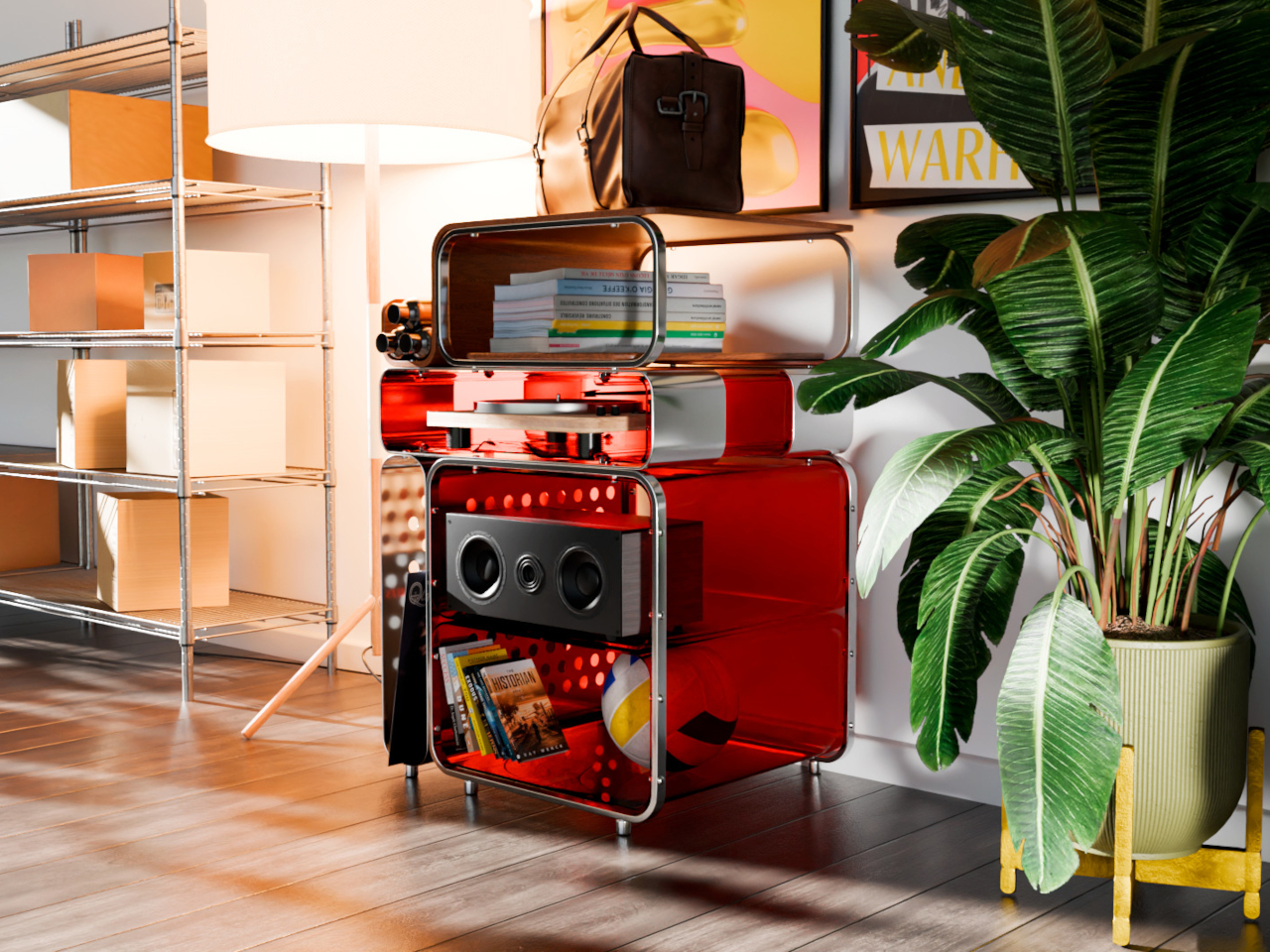
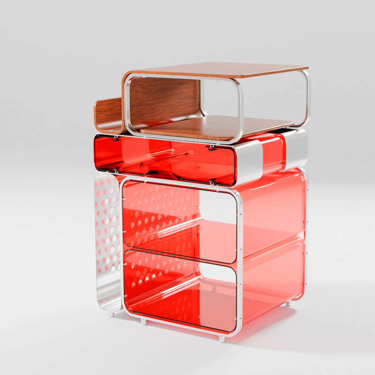
7. TUMBA Modular Shelf System – Lego logic applied to storage furniture.

The TUMBA modular shelf system addresses the single biggest frustration with flat-pack furniture: fixed dimensions. Where conventional shelving forces rooms to conform to predetermined sizes, TUMBA offers stackable modules made from recycled polymer that lock together without tools. High-strength plexiglass provides structural transparency, stainless steel connections snap securely into place, and the swirled textures in each panel carry visible traces of the material’s previous life. The bold colors and playful forms make the storage itself worth looking at.

Tiny homes change. A shelf configuration that works in January stops making sense after a furniture rearrangement in March, and traditional shelving punishes that flexibility with disassembly headaches and leftover hardware. TUMBA’s tool-free construction means reconfiguring takes minutes, and the modular format lets it grow vertically in tight corners or stretch horizontally along narrow walls. For renters in compact spaces who move frequently, a shelf system that breaks down and rebuilds without damage is less of a convenience and more of a necessity. The recycled material story is a bonus, but the real selling point is permission to change your mind.

What we like

  • Tool-free assembly and reconfiguration mean the shelf adapts to layout changes without the frustration of traditional flat-pack rebuilds
  • Recycled polymer construction gives each panel a unique swirled texture that standard particle board or MDF cannot replicate

What we dislike

  • Bold colors and playful forms may clash with more subdued or neutral interior palettes common in compact living spaces
  • Plexiglass panels, while visually light, are more prone to surface scratching than solid wood or metal shelving alternatives

Where Small Living Gets Interesting

The common thread across these seven products is not size. It is intent. Each one was designed with the understanding that small spaces do not need small thinking. They need objects that work harder, look better, and respect the reality that in a tiny home, there is no junk drawer to hide mistakes in. Every surface is a display, every object is a statement, and every purchase is a commitment.

What makes compact living feel like a design choice rather than a compromise has less to do with architecture and more to do with curation. The right diffuser, the right clock, the right shelf system: these are the decisions that turn 300 square feet into a space that feels chosen rather than settled for. And in a world that keeps building bigger, there is something satisfying about proving that less, when it is the right less, is more than enough.

The post 7 Best Tiny Home Accessories That Make Small-Space Living Feel Like a Design Choice, Not a Compromise first appeared on Yanko Design.

Honor MagicPad4 Review: The World’s Thinnest Tablet Nails Portability and Performance

PROS:


  • Excellent portability

  • Immersive content-consuming experience

  • Great battery life

  • Powerful performance

CONS:


  • No microSD card slot

  • No IP rating

  • Underwhelming software support period

RATINGS:

AESTHETICS
ERGONOMICS
PERFORMANCE
SUSTAINABILITY / REPAIRABILITY
VALUE FOR MONEY

EDITOR'S QUOTE:

The Honor MagicPad4 nails extreme portability with a gorgeous OLED screen, strong performance, and a surprisingly complete productivity toolkit that makes it feel like a real work-capable tablet.

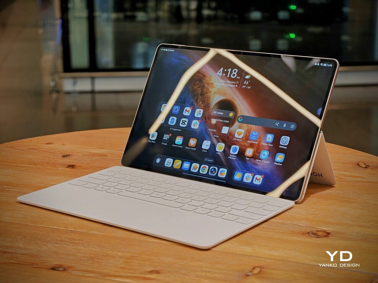
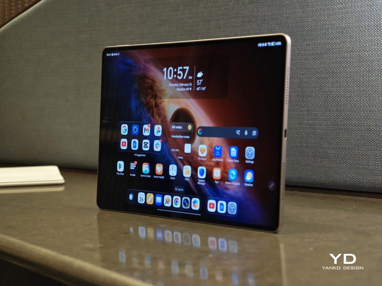
Honor is pitching the MagicPad4 as a tablet that can travel like a notebook and work like a small laptop, without dragging you into the usual compromises. The headline numbers are bold. 4.8mm thin and about 450g, paired with a 12.3-inch OLED panel that runs up to 165Hz and hits a claimed 2400 nits peak brightness in HDR. 

Under that sleek shell, HONOR is also treating this as a proper flagship. You get Snapdragon 8 Gen 5, Wi-Fi 7, a 10,100mAh typical battery with 66W wired charging, and a cooling system designed to keep performance consistent under load. With the headline specs out of the way, let’s get into what the MagicPad4 is actually like to live with.

Designer: Honor

Aesthetics

The MagicPad 4 looks like it was designed with a single obsession. Make the body feel impossibly slim, then let the display do the talking. Its design language is clean, modern, and very display-forward, and it feels intentionally restrained in the best way. Instead of chasing flashy accents, the tablet leans into a minimalist, yet elegant look that quietly simmers.
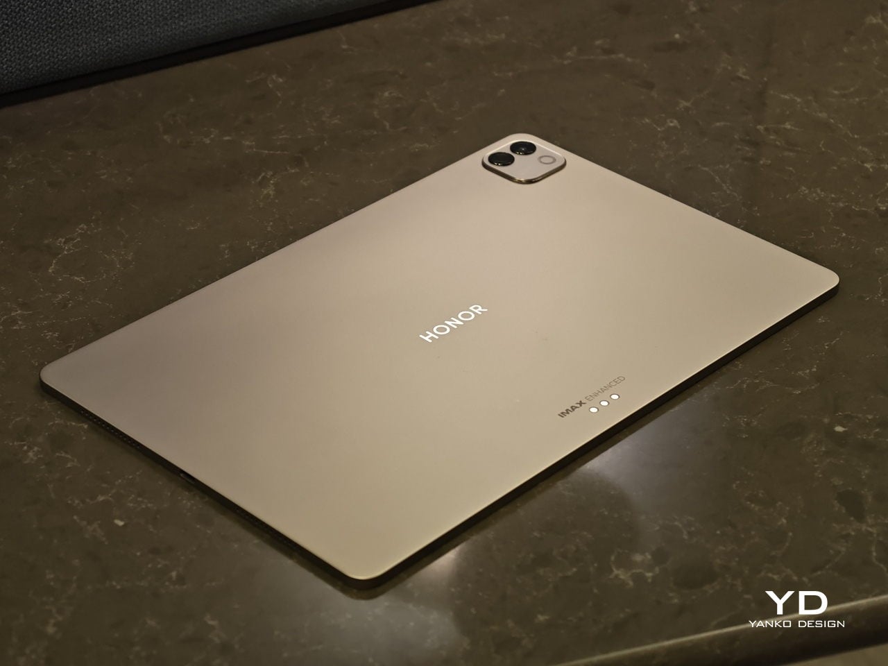
Flip it over, and the styling stays just as composed. On the back, the MagicPad 4 features a square camera bump in the upper left corner, while the HONOR logo sits centered for a balanced, gallery-like finish. Color options are simple and confident, with Gray and White both pairing naturally with the tablet’s understated aesthetic.

Ergonomics

In hand, the MagicPad4’s defining ergonomic feature is slimness and weight, or the lack of it. The MagicPad 3 was already ahead of the pack on portability, listed at 5.79mm and about 595g, but the MagicPad4 still makes a meaningful leap at just 4.8mm thin and about 450g. The screen is slightly smaller this time around, dropping from 13.3 inches on the MagicPad 3 to 12.3 inches here, yet the reduction in thickness and weight is still impressive, even with that display size change in mind.
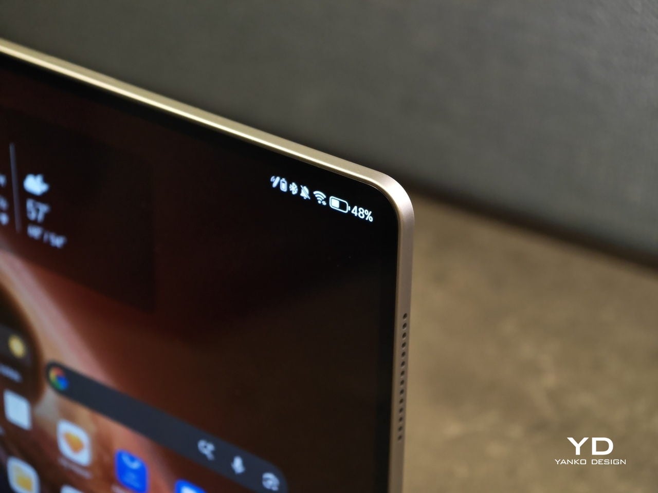
On paper, those numbers can sound like a modest revision. In use, they show up as less hand fatigue and less hesitation to pick it up for quick reading, quick edits, or a short sketching session. To underline how light it is for its size, HONOR even notes that the 12.3-inch MagicPad4 is lighter than an 11-inch iPad Air at around 462g, which is a helpful reality check for just how portable it feels.

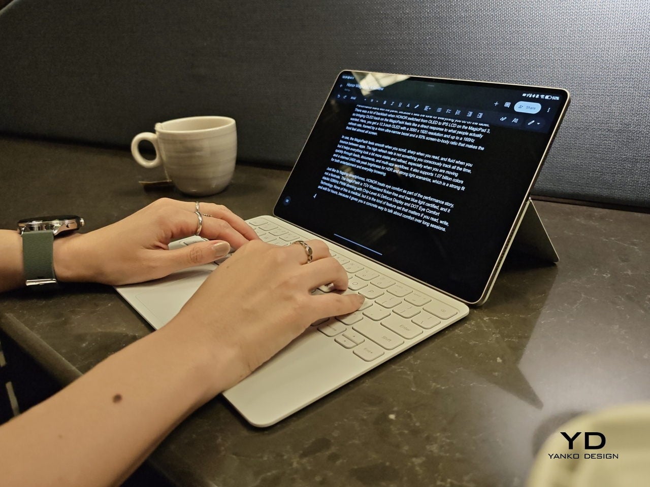
Attach the optional keyboard, and that light, sheet-like feeling largely stays intact. That is when it becomes obvious the MagicPad4 is meant to be used as a full kit. HONOR’s three-piece mobile office set, meaning tablet plus keyboard plus stylus, comes in at about 852g, which is still easy to treat as a grab-and-go setup.
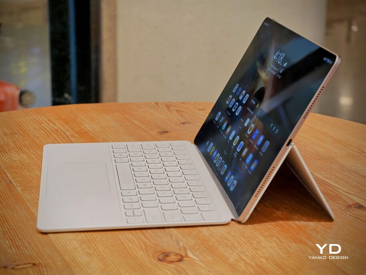
Typing feels surprisingly firm, but the slim keyboard has shallower key travel, so long sessions are a bit less comfortable than on a thicker, more laptop-like keyboard. Still, it is a tradeoff I am willing to take for how portable the whole setup is. Typing on your lap is doable, but the keyboard does not feel as planted as a laptop or a more rigid keyboard setup, so it can wobble a bit when you shift around.

Where the keyboard design really helps is flexibility. You fold the top half of the back cover to prop the tablet up, and it gives you a wide range of display tilt angles. It is the kind of flexibility you end up using constantly, especially on the go, when you are stuck working with whatever table and chair height you find.

Performance

Performance starts with the panel, because it sets the tone for everything you do on the tablet. There was a lot of backlash when HONOR switched from OLED to IPS LCD on the MagicPad 3, so bringing OLED back on the MagicPad4 feels like a direct response to what people actually wanted. Here, you get a 12.3-inch OLED with a 3000 x 1920 resolution and up to a 165Hz refresh rate, framed by a 4mm ultra-narrow bezel and a 93% screen-to-body ratio that makes the front feel almost all screen.
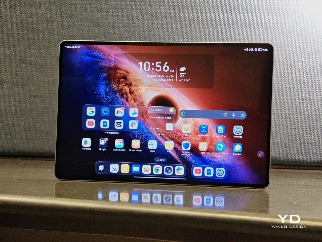
In use, the MagicPad4 feels smooth when you scroll, sharp when you read, and fluid when you bounce between apps. The high refresh rate is not something you consciously track all the time, but it helps everything look a bit more stable and refined, especially when you are moving quickly through feeds, documents, and multi-app workflows. It also supports 1.07 billion colors and a claimed 2400 nits peak brightness for HDR and strong light scenarios, which is a strong fit for both entertainment and everyday browsing.

Just like its flagship smartphones, HONOR treats eye comfort as part of the performance story, not a footnote. The MagicPad4 is TÜV Rheinland flicker-free and low blue light certified, and it stacks 5280Hz PWM dimming with Chip-Level AI Defocus Display and DOT Eye Comfort Technology. None of this is medical, but it is the kind of feature set that matters if you read, write, and edit for hours, because it gives you a concrete way to talk about comfort over long sessions.
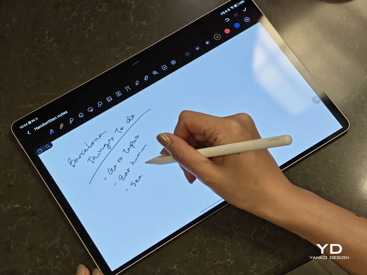
The display performance also matters for pen input, and the MagicPad4 is compatible with the HONOR Magic-Pencil 3. For note-taking and sketching, it makes the tablet feel more like a digital notebook than just a consumption screen, and it is the accessory that turns that big OLED into something you can actually work on, not just look at.

HONOR pairs the display with an eight-speaker setup featuring HONOR Spatial Audio. It sounds excellent overall, with a wide soundstage and solid clarity. Dialogue comes through cleanly, and music has enough separation that it does not blur into a flat wall of sound, though bass is a bit limited, as you would expect from a tablet this slim.

Combined with the 93% screen-to-body ratio and those slim bezels, the MagicPad4 can feel genuinely immersive for movies and video. It is the kind of tablet that makes you want to watch one more episode, because the screen and speakers work together in a way that feels closer to a tiny home theater than a typical mobile device.
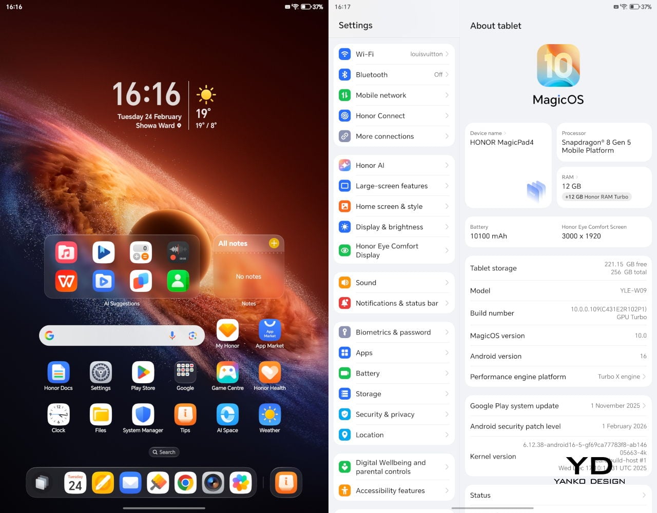
Under the hood, it runs on Snapdragon 8 Gen 5, which gives it the headroom to stay responsive when you start stacking tasks, juggling multiple apps, or pushing more demanding games and creative workloads. Configurations include 12GB RAM with 256GB storage, or 16GB RAM with 512GB storage.

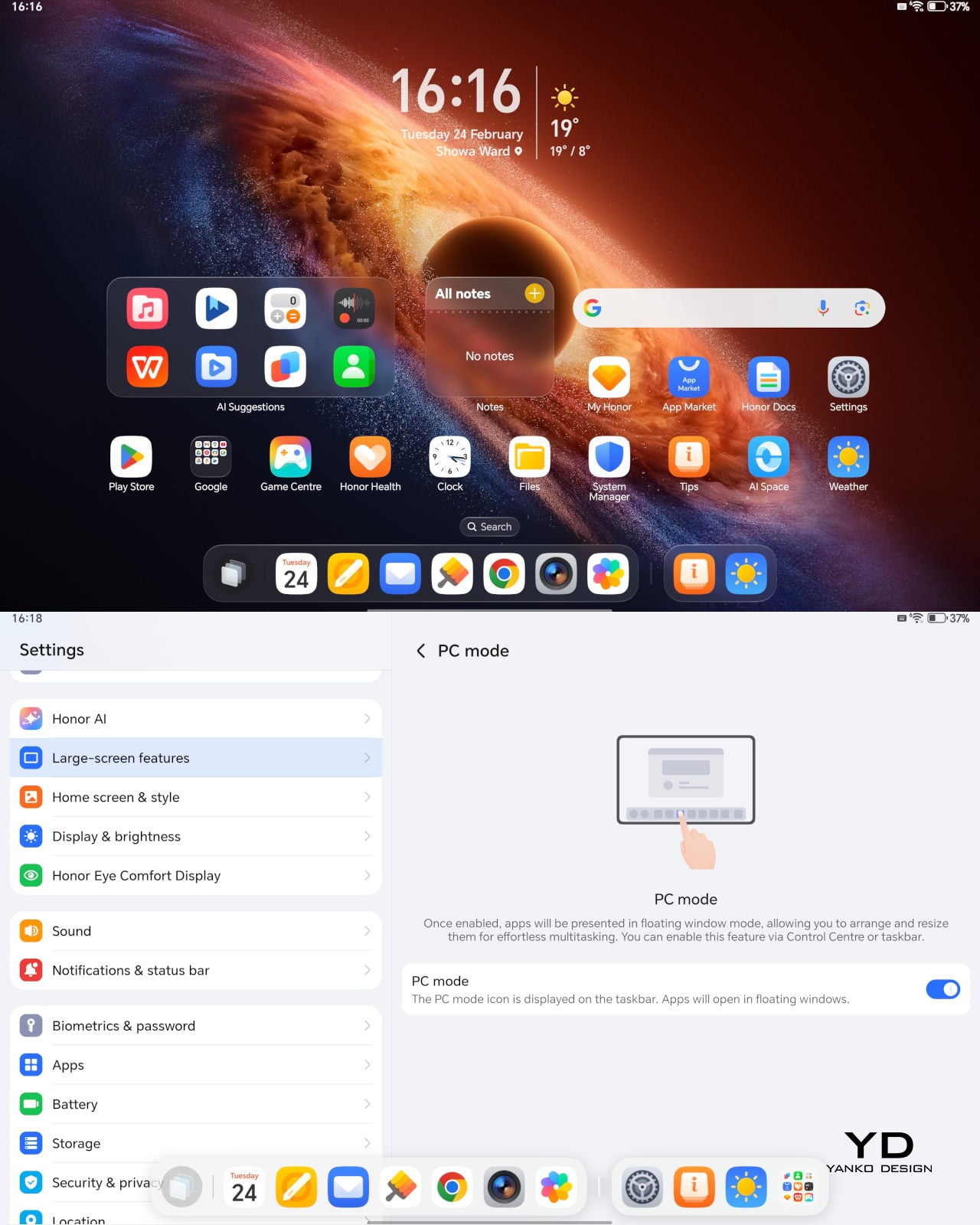
The MagicPad4 runs MagicOS 10 based on Android 16, and a lot of its performance feel comes from the PC-style features and multitasking tools built into the software. For instance, the moment you attach the keyboard, the system prompts you to switch into PC Mode, which immediately reframes the tablet as more of a small desktop than a giant phone.

With PC Mode on, you can open up to four floating windows at once. You can resize them, move them around freely, and set up your own layout depending on what you are doing, like notes on one side, a browser on the other, and a couple of smaller apps layered in. It is a simple feature, but it makes multitasking feel natural on a 12.3-inch screen. On top of that, HONOR bundles a full suite of AI features, so the tablet is not just fast, it is clearly designed to help you get through work faster too.
The cameras are not the reason you buy the MagicPad 4, but they are perfectly fine for what a tablet usually gets used for. You get a 13MP autofocus rear camera for quick document scans and occasional shots, plus a 9MP fixed-focus front camera that is mainly for video calls, and both are serviceable without being a main selling point.

Sustainability

HONOR does not lean heavily on sustainability messaging for the MagicPad4. What it emphasizes instead is structural durability. The MagicPad4 uses aerospace-grade special fiber as part of its body, which HONOR says reduces weight while increasing stiffness by 30%.

There is also a practical durability caveat. There is no IP rating mentioned, so I would be careful around water and treat it like a device that is not meant to handle spills. Software support matters for longevity, too, and HONOR’s promise of three years of major OS updates and three years of security updates is far from class-leading, so it is worth factoring in if you plan to keep the tablet for the long haul.
Value

Value is where the MagicPad4 starts to make a lot of sense, because HONOR is not pricing it like a niche luxury tablet. In the U.K., the 12GB plus 256GB model is £599.99 (about $760 USD), and the 16GB plus 512GB version is £699.99 (about $890 USD). Accessories are priced separately, with the HONOR MagicPad4 Smart Keyboard listed at £140.98 and the Magic-Pencil 3 at £30, which is worth factoring in if you plan to use it as more than a media tablet.

What makes this feel like great value is the overall hardware and feature mix. You are getting a flagship Snapdragon chip, a 12.3-inch 165Hz OLED, a sleek form factor, and a software experience that leans into PC-style multitasking. At these prices, the MagicPad4 makes the most sense for people who will actually use that work-capable tablet angle, not just the big-screen entertainment side.

Verdict

The HONOR MagicPad4 nails the parts of tablet life that actually matter day to day. It is exceptionally portable, the 12.3-inch 165Hz OLED is excellent for reading and media, and the eight-speaker setup helps it feel more immersive than most thin tablets. With the keyboard attached, PC Mode and floating windows make it feel closer to a small laptop than a typical Android tablet.
The compromises are more about the physical keyboard experience and long-term ownership than the software itself. The keyboard is convenient and flexible, but the shallow key travel and slightly wobbly lap use remind you that it is still a tablet-first setup. Honor also does not say much about sustainability, and the promised two major OS updates and four years of security patches are not class-leading, so it is worth weighing if you plan to keep the tablet for many years.

The post Honor MagicPad4 Review: The World’s Thinnest Tablet Nails Portability and Performance first appeared on Yanko Design.
5 Reasons Modern Treehouses Just Became the Ultimate Luxury Escape

Treehouses have re-emerged not as nostalgic artifacts, but as serious architectural propositions. Within contemporary practice, they are understood as a distilled form of biophilic thinking – where structure, ecology, and human occupation are inseparable. Rather than imposing form on landscape, treetop architecture allows the built environment to coexist, adapt, and respond to living systems.

Occupying a treehouse establishes a rare spatial contract with nature. The tree is not a backdrop but a collaborator, shaping load, movement, and experience. This vertical inhabitation reframes ideas of shelter and elevation, offering a quiet yet powerful redefinition of how architecture can belong within the canopy.

1. Safe and Elevated Spaces

The charm of a treehouse comes from the idea of prospect and refuge – our natural need to see without being seen. Being up high gives a clear view of the surroundings, while the leaves and branches around provide shelter and privacy. This combination makes us feel safe and calm instinctively.

Raising the floor above the ground keeps us away from noise and distractions below. The treehouse becomes a peaceful, natural cocoon. Height isn’t just about the view as it gives a sense of security and comfort, letting us enjoy both openness and protection in one space.

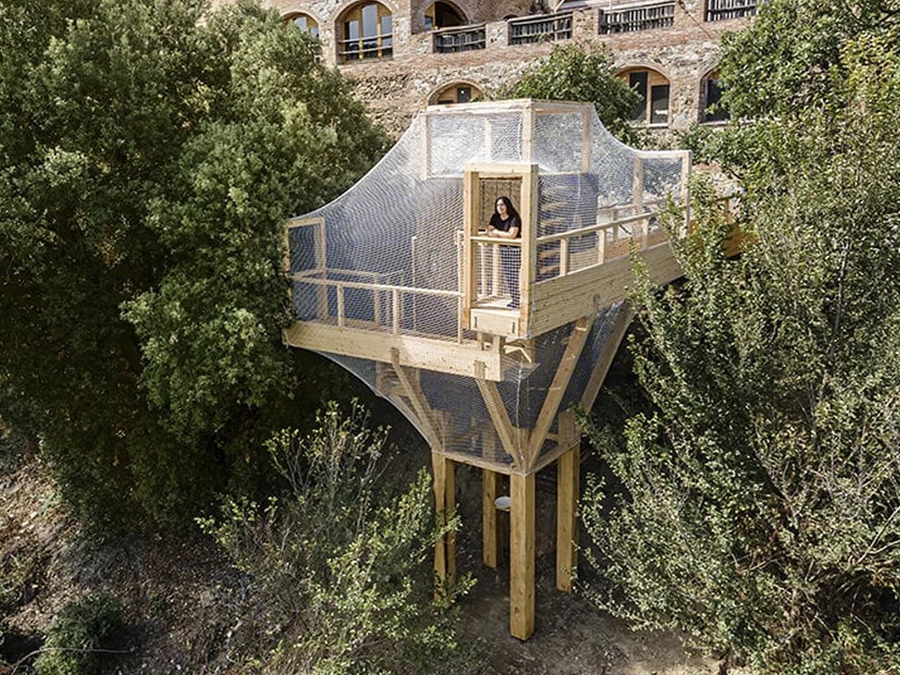
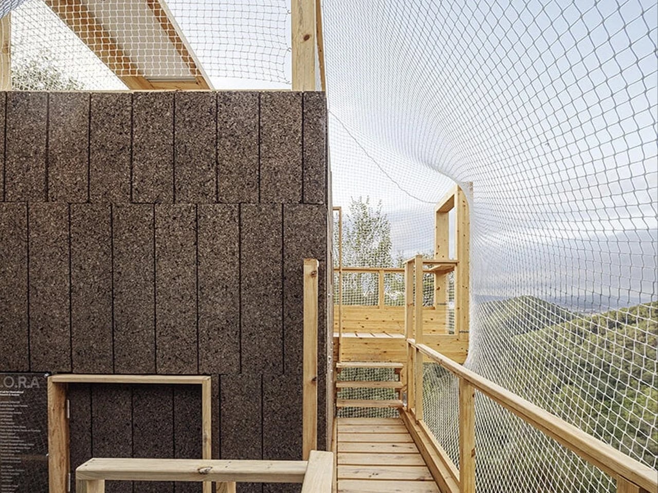
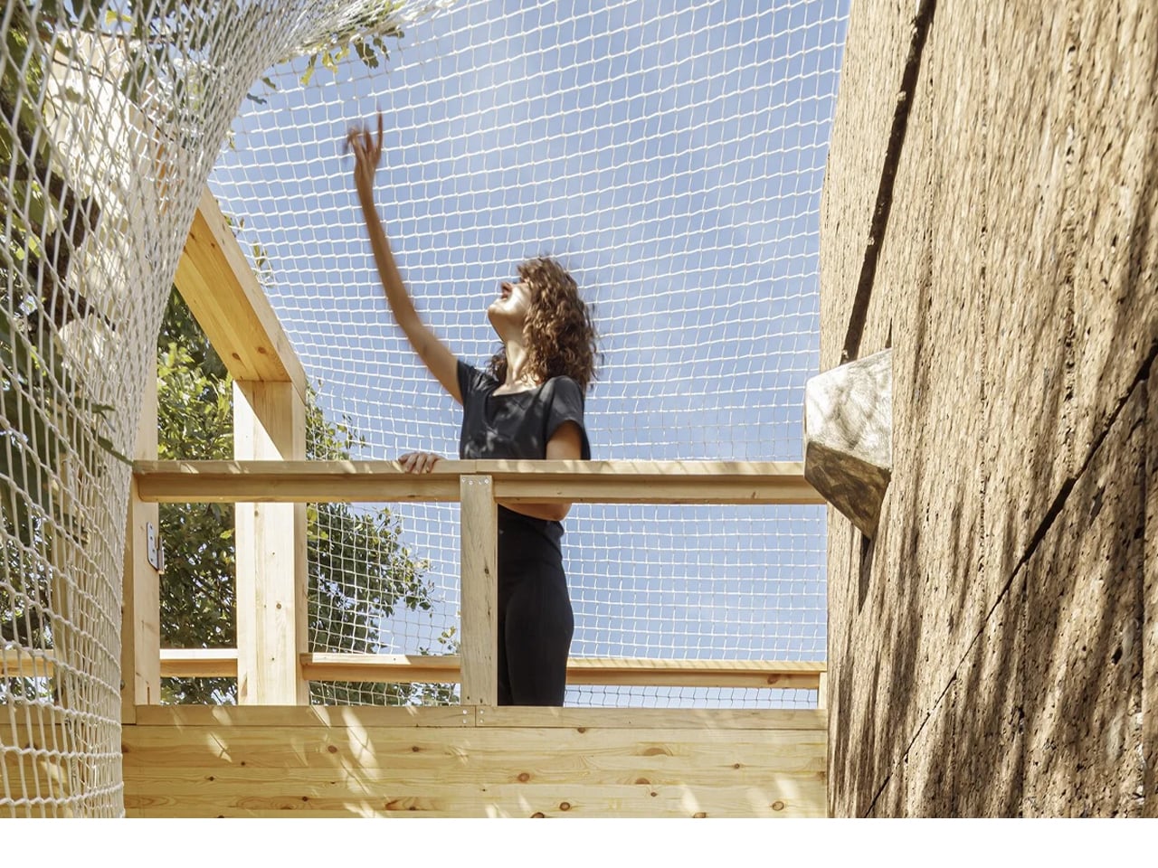
Called the Forest Lab for Observational Research and Analysis (FLORA), this treetop observatory sits within Barcelona’s Collserola Natural Park at the Institute for Advanced Architecture of Catalonia (IAAC). Suspended within the forest canopy, the compact structure serves as a living and working space for researchers studying local biodiversity. Rising about 28 feet high, FLORA is designed as an immersive platform that allows direct access to the upper layers of the forest, making scientific observation possible without disturbing the ground below.

What makes FLORA especially notable is its material strategy. The entire mass-timber structure was built using invasive pine trees sourced from within the park through carefully managed forestry practices. These trees were processed into cross-laminated timber panels, laminated beams, and solid wood components, following a zero-kilometer approach to construction. Inside, the observatory includes work areas, projection space, and bird-monitoring features, turning the building into a functional research prototype that demonstrates how sustainable materials and sensitive design can support long-term ecological study.

2. Use of Honest Natural Materials

A treehouse’s beauty comes from using materials that feel natural and honest. High-quality timber, like cedar or reclaimed teak, allows the house to grow and age alongside the tree. This isn’t just for looks, as it supports the strength and health of both the tree and the structure.

Special hardware, such as Treehouse Attachment Bolts (TABs), lets the tree move and grow naturally without damage. By avoiding heavy concrete foundations, this method protects the tree and reduces environmental impact. The result is a sustainable, long-lasting design where architecture and nature coexist in balance.

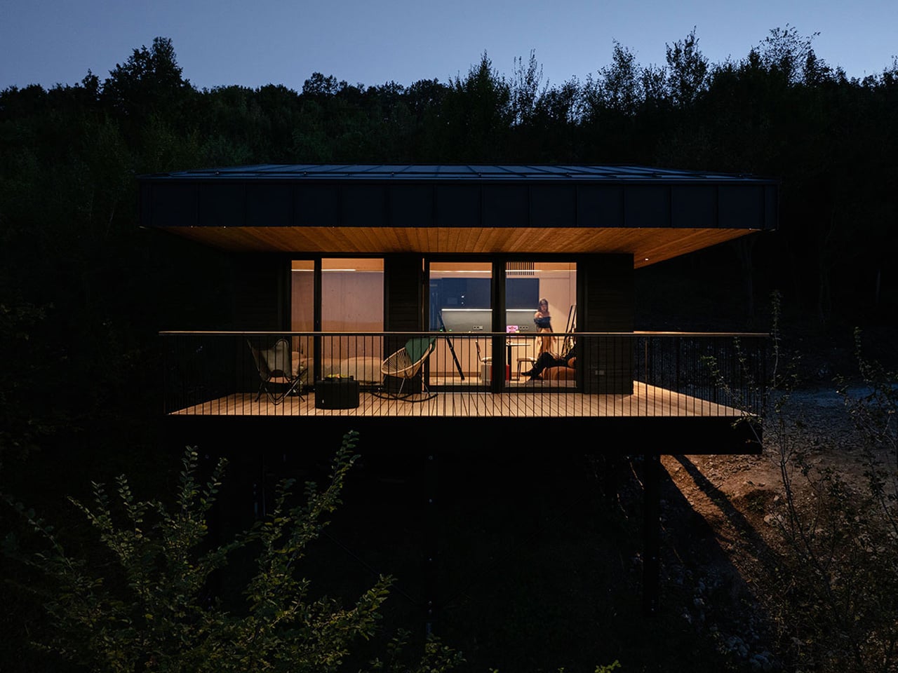
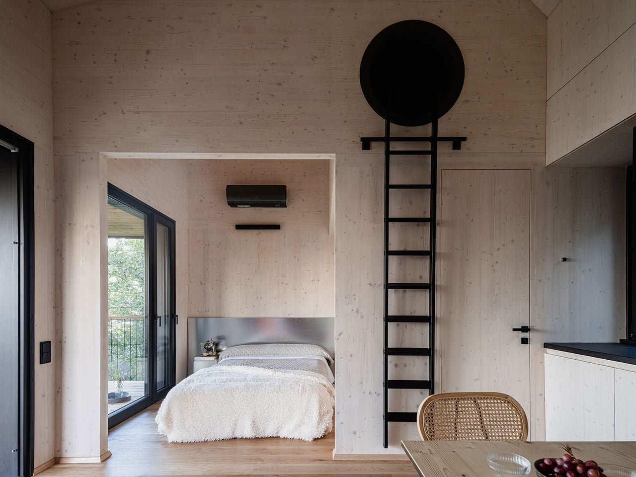
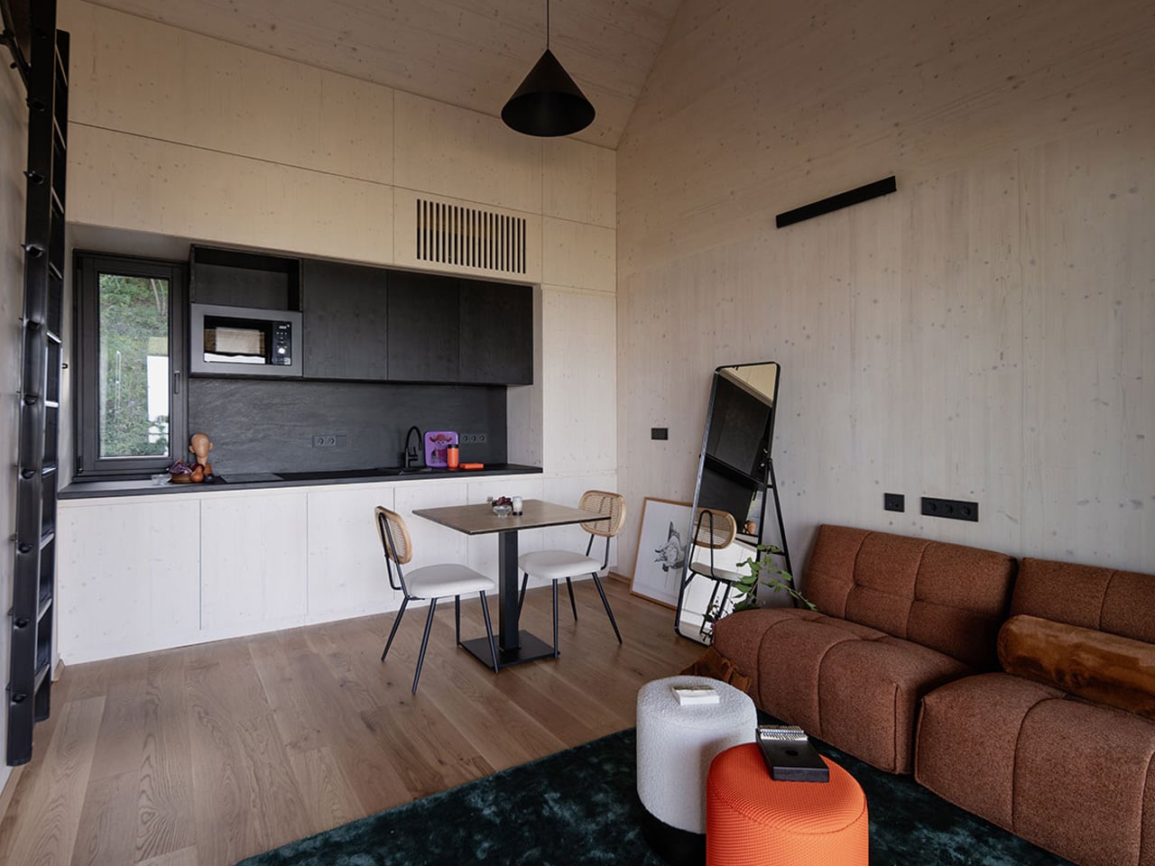
Set within the wooded hills of Dunabogdány, Hungary, Console House by Hello Wood is a quiet retreat overlooking the Danube Bend. Designed to sit lightly within the landscape, the minimalist home follows a calm, nature-first approach, allowing the forest to remain the main visual focus. Raised on slender stilts, the structure appears to float above the ground, preserving natural water flow and wildlife movement beneath. Large glass openings frame peaceful valley views while filling the interiors with soft daylight.

A defining feature of the home is its long cantilevered roof, which creates a generous terrace that extends the living space outdoors. Built using cross-laminated timber and laminated beams, the structure balances strength with environmental sensitivity, while screw pile foundations minimize site disruption. The exterior is finished in charred wood using the shou sugi ban technique, giving the house a dark, textured surface that blends into the trees. Together, these choices create a refined, modern hideaway rooted in its surroundings.

3. The Climbing Experience

The magic of a treehouse starts long before you step inside, as it begins with the climb. Whether it’s a spiral staircase or a suspension bridge, moving upward slowly lifts you away from the ground. This gradual ascent helps the mind shift into a calm, reflective state.

Rising from solid earth into the airy canopy feels like a sensory reset. In many cultures, this vertical journey reflects a spiritual path, taking you from the everyday world below to the quiet, elevated sanctuary among the branches. The climb itself becomes an essential part of the treehouse experience.

Treehouses may feel like childhood nostalgia, but the O2 Treehouse by Treewalkers brings that sense of wonder firmly into adult living. You step into a lightweight, elevated home that blends playful design with thoughtful sustainability, creating a retreat that feels both imaginative and grounded in nature. Inspired by geodesic structures and forest ecosystems, these tree-supported homes appear to float among the canopy, offering a quiet escape that reconnects you with your surroundings while keeping the natural landscape largely undisturbed.

What makes these homes especially compelling is their modular, lattice-based construction, which allows multiple units to connect and evolve into small, customisable clusters. You can adapt layouts, shapes, and interior details to suit how you live, work, or unwind, while enjoying warm, wood-toned interiors, generous natural light, and breathable canvas roofing. From iconic A-frame forms to dome-like shelters, each structure balances architectural innovation with the simple comfort of being tucked into the trees.

4. Natural Climate Control

A treehouse isn’t just beautiful, but it naturally stays comfortable throughout the seasons. Leaves provide shade and cooling in summer, while letting sunlight through in winter. This passive system keeps the space pleasant without relying on air conditioning.

The tree itself helps regulate the microclimate through its natural transpiration. Thoughtful placement of windows and openings captures changing light and shadow, softening the interior and creating a calm, diffused atmosphere. By working with the tree and its environment, the treehouse achieves energy efficiency and comfort, showing how design can harmonize with nature rather than fight it.

You might remember turning a treehouse into a make-believe classroom, complete with a tiny chalkboard and a big imagination. Designer Valentino Gareri brings that playful idea into real-world architecture with the Tree-House School, a modular learning building set directly within nature. Raised among the trees, the structure eases pressure on dense cities while creating outdoor-focused spaces where education blends with exploration. It becomes a shared hub that reconnects learning with landscape, movement, and everyday discovery, all while using design strategies that support comfortable indoor conditions.

At the core of the design are two large, interconnected rings that organize classrooms from kindergarten through secondary levels, each accommodating up to 25 students and opening toward the surrounding greenery. The circular layout forms sheltered courtyards and a usable rooftop for group activities, while faceted façades alternate timber panels and glass to manage sun exposure, encourage cross-ventilation, and maintain stable interior temperatures. These passive climate-control features reduce reliance on mechanical systems, keeping classrooms bright, airy, and naturally regulated throughout the day.

5. Suspended Sanctuary

Luxury today is found in the ability to disconnect, and a treehouse offers just that. As a “hovering hearth,” it lifts you above the noise and weight of daily life. Being suspended creates a quiet, focused space where creativity, reflection, and rest come naturally.

For those who appreciate design, the treehouse is more than shelter—it’s a statement. It balances perfectly with the forces of nature, respecting both gravity and the life of the tree. This equilibrium transforms the simple act of being into a luxurious experience of calm, presence, and connection with the natural world.

Designed by architectural designer Antony Gibbon, the Burl Treehouse is a concept series of rounded pods that reinterpret forest living through a sculptural, nature-inspired lens. Shaped after tree burls—the textured growths found on trunks, the pods blend organic form with a restrained, minimalist aesthetic. Suspended above the forest floor, each structure appears to float among the trees, creating an immersive experience that feels both futuristic and deeply connected to its surroundings.

The pods are supported by slim vertical struts and suspension cables anchored directly to the trees, minimizing ground disturbance and preserving the forest below. Accessed by timber suspension bridges, the interiors are lined with light-toned cedar and ash, creating a warm, cocoon-like atmosphere. Each unit includes a bedroom with built-in storage, a compact bathroom, and custom furnishings that maximize space. A central circular window brings in natural light and frames wide forest views, while charred wood shingles on the exterior add texture and durability through traditional shou sugi ban treatment.

Treehouses captivate because they embody our longing to connect with nature. Merging honest materials, smart engineering, and poetic spatial design, they offer more than a room—they create an experience. Building among the trees honors humanity’s timeless bond with the forest, uplifting both spirit and structure in perfect harmony.

The post 5 Reasons Modern Treehouses Just Became the Ultimate Luxury Escape first appeared on Yanko Design.
A 113-Year-Old Patent Just Became the Most Creative EDC Pocket Multi-Tool of 2026

MetMo has a very particular way of working. The Leeds-based engineering team finds a mechanical concept from history that was ahead of its time, studies it carefully, then rebuilds it with the materials and precision manufacturing the original inventor could never have accessed. The MetMo Pen went back to an 1892 dual-thread screw. The Fractal Vise revived a gripping technology too complex for most workshops. Both became substantial hits, and if you follow our work, you know we covered them. Their next one follows the same formula, and it might be the most satisfying yet.

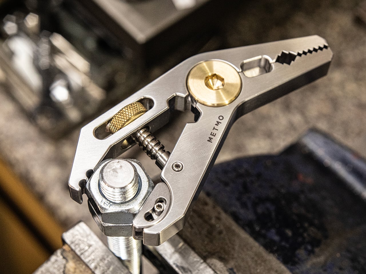
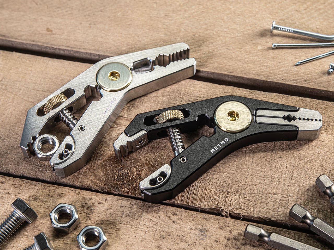
Patent no. 1,070,656, filed by J. Anderson in 1912 and granted in 1913, described a double-ended parallel wrench that never quite found its moment. MetMo took that silhouette and used it as a chassis, assigning a specific function to every surface: a hex drive zone at the centre, adaptive parallel jaws drawing directly from their Fractal Vise technology, plier teeth, a V-groove for square drive tools, and an edge nipping point. It’s five tools in one slim body, after a 113-year wait for the right team to come along and finally build it properly.

Designers: Sean Sykes & James Whitfield

Click Here to Buy Now: $134 $167 (20% off). Hurry, only 4/600 left! Raised over $438,000.

The original Anderson patent was a ghost, a clever idea that lacked the context to thrive. You can picture it being made from rough-cast metal with loose tolerances, a tool that worked in theory but was probably clunky in practice. What MetMo does is take that core mechanical logic and run it through a modern filter of CNC machining and advanced metallurgy. The result is a tool that fulfills the original’s promise in a way Anderson himself likely couldn’t have imagined. It’s the same double-ended, central-pivot concept, but executed with a precision that makes it feel entirely new. Coupled with tiny tools and details stuffed into every empty spot MetMo could find.

What’s really clever is how they packed in so much function without making it a brick. A typical multi-tool suffers from compromise, with each function feeling a bit clumsy to accommodate the others. The Pocket Grip avoids this by making existing geometry do double duty. The central pivot, a structural necessity in the 1913 design, is now a perfectly machined 1/4-inch hex drive for standard bits. The jaws aren’t just serrated; they’re divided into a ‘chomping zone’ for aggressive grip, dedicated points for round or flat objects, and even an edge nipping point. Every surface has a purpose, a level of design efficiency that makes the final object feel intentional and integrated.

That’s especially true of the adaptive parallel jaw, which is a direct technological inheritance from their own Fractal Vise. We wrote about that vise when it came out, admiring how its interlocking jaws could conform to almost any irregular shape. MetMo has miniaturized that same logic and engineered it into the Pocket Grip. One jaw remains fixed while the other adjusts, staying perfectly parallel up to a 20mm opening distance. This gives you a clamping stability that a simple pair of pliers could never match. It’s proof that MetMo isn’t just reviving old ideas; they’re building a cohesive design language and iterating on their own innovations.

All of this engineering is packed into a form that is genuinely pocket-friendly. The tool measures just 95.5mm long by 45.5mm wide, and a remarkably slim 10mm thick. The aerospace-grade aluminum version weighs a scant 83.6 grams. These numbers are key to its success as an everyday carry item. But the specs only tell half the story. The other half is the tactile experience, the so-called ‘desk toy’ factor. The smooth action of the TR6x2 drive screw, the satisfying resistance of the knurled brass adjuster, and the balanced weight in your hand make it something you instinctively want to pick up and fiddle with.

The jaws on all versions are machined from 17-4 PH hardened stainless steel, heat-treated to a Rockwell C hardness of 45, with an ultimate tensile strength of 1448 MPa. In simple terms, they are incredibly tough and designed to retain their edge. The body itself comes in three flavors: hard-anodized 7075-T651 aluminum for lightweight durability, Grade 5 titanium for the ultimate strength-to-weight ratio, or a solid stainless steel build for those who prefer a bit of heft. This isn’t a disposable product; the jaws are removable and serviceable, a direct counter-statement to the throwaway culture common in tool manufacturing.

In practice, the Pocket Grip finds its place everywhere. For a model maker or miniatures painter, it’s a precise third hand, clamping onto a base to hold a project steady. For a cyclist, it’s a compact wrench and driver for quick adjustments on the go. Around the house, it’s the tool you grab for that one awkward fitting that nothing else can quite get a handle on. The V-groove is a subtle but brilliant touch, perfect for holding 3-6mm square drive tools like taps and drill bits, adding another layer of utility for detailed work. With the ability to apply over 21kg of clamping force with just finger pressure, it has more than enough power for most daily tasks.

The Pocket Grip is available in three primary configurations based on the body material. The lightweight choice is the hard-anodized aluminum at 83.6g. For those wanting a balance of weight and extreme durability, the titanium version comes in at 103.6g. Finally, the stainless steel model offers the most substantial feel at 141g and includes an upgraded ‘Snip Grip’ with hardened cutting jaws. Pricing starts at £99, positioning it as a premium, investment-grade tool. And MetMo backs that up with what they call a 200-year guarantee, a confident statement that this is a tool built not just for you, but for the person who finds it in your workshop generations from now.

Click Here to Buy Now: $134 $167 (20% off). Hurry, only 4/600 left! Raised over $438,000.

The post A 113-Year-Old Patent Just Became the Most Creative EDC Pocket Multi-Tool of 2026 first appeared on Yanko Design.