Samsung’s Galaxy A Phones Now Get IP68 and 6-Year Updates From $449

Mid-range smartphones have been getting very good, very quickly. Most now check the boxes for performance, camera quality, and even design, but the compromises tend to show up later. Software support runs out too soon, water resistance gets downgraded to save costs, or the storage fills up faster than expected. It’s a category where the spec sheet looks promising right up until the parts that actually matter start falling short.

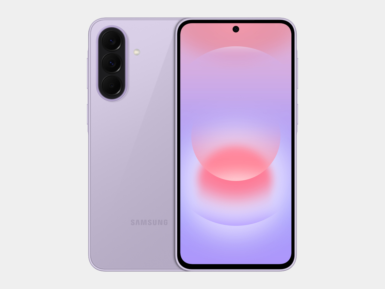
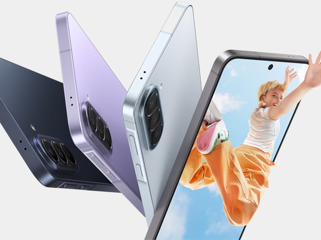
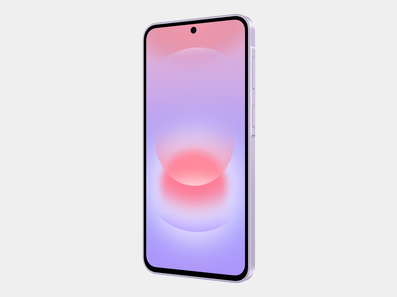
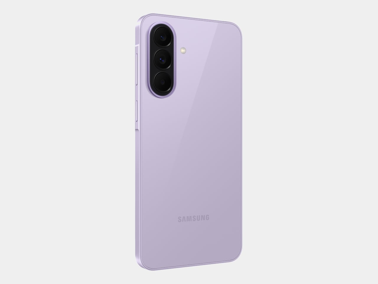
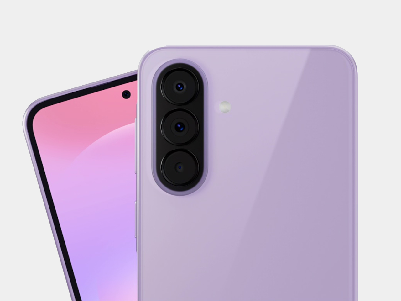
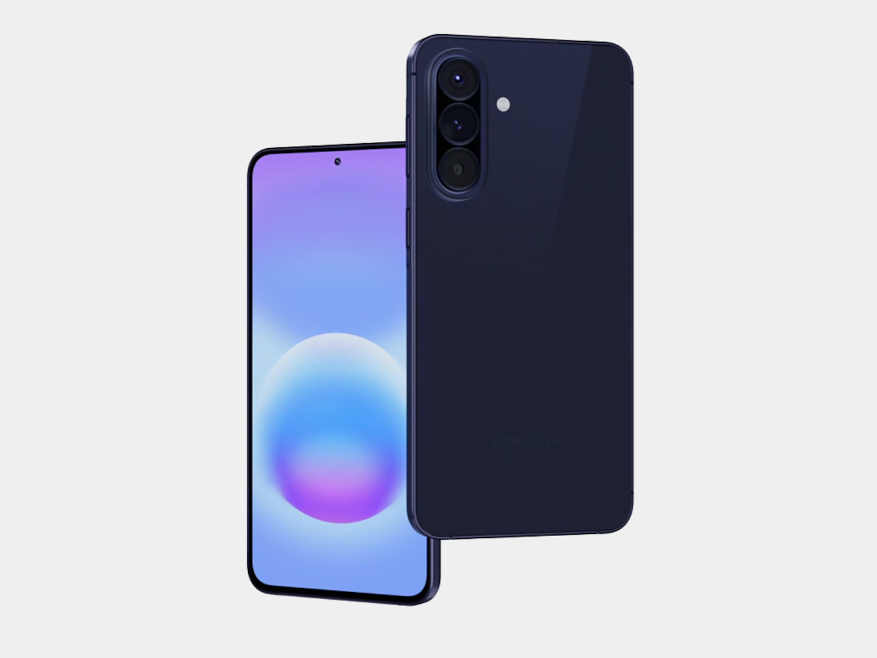
Samsung’s Galaxy A57 5G and Galaxy A37 5G tackle those exact issues. Rather than simply refreshing the hardware, these two phones address the pain points that tend to sour long-term ownership, from shorter software cycles to inadequate protection from the elements. Samsung describes both as the most capable Galaxy A devices yet, and for once, that kind of claim holds up when you look at what’s actually new.

Designer: Samsung

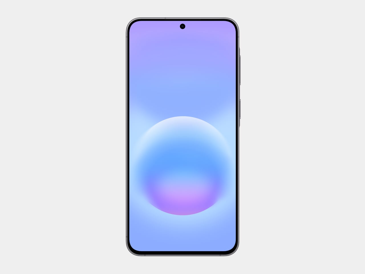
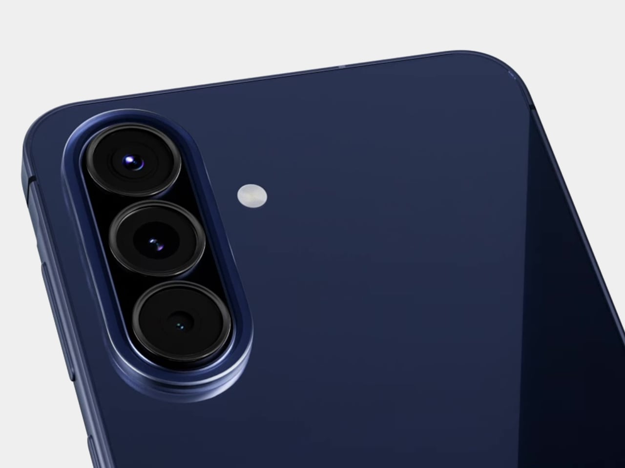
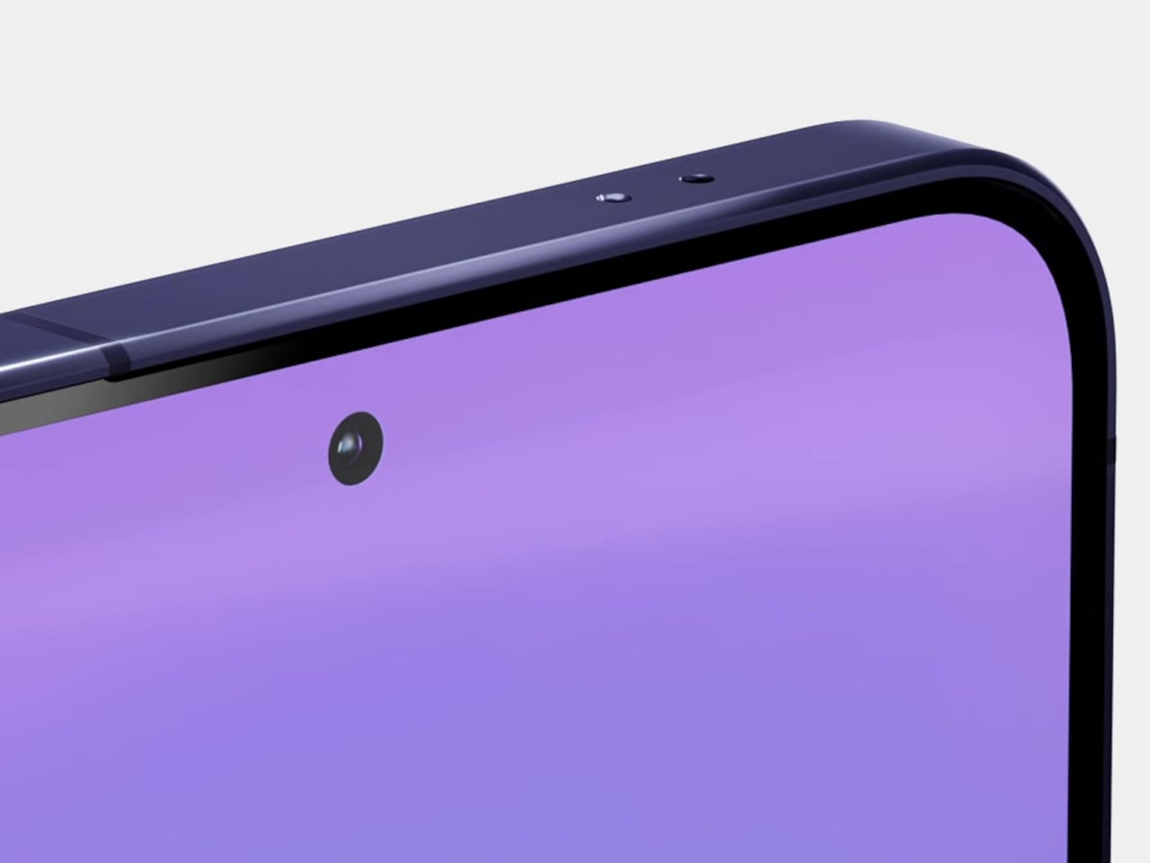
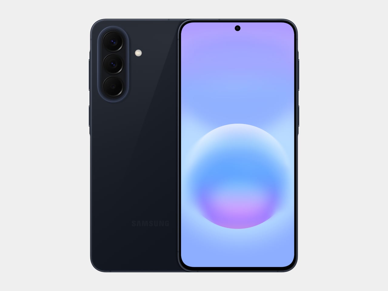
The Galaxy A57 5G leads with a noticeably slimmer build, now at just 6.9mm and 179 grams. A 13% larger vapor chamber helps keep the new Exynos 1680 processor running cool through long gaming sessions or extended recordings. The display also gets slimmer bezels and a bright Super AMOLED+ panel with Vision Booster, so the screen stays readable whether you’re inside at your desk or standing in direct sunlight.

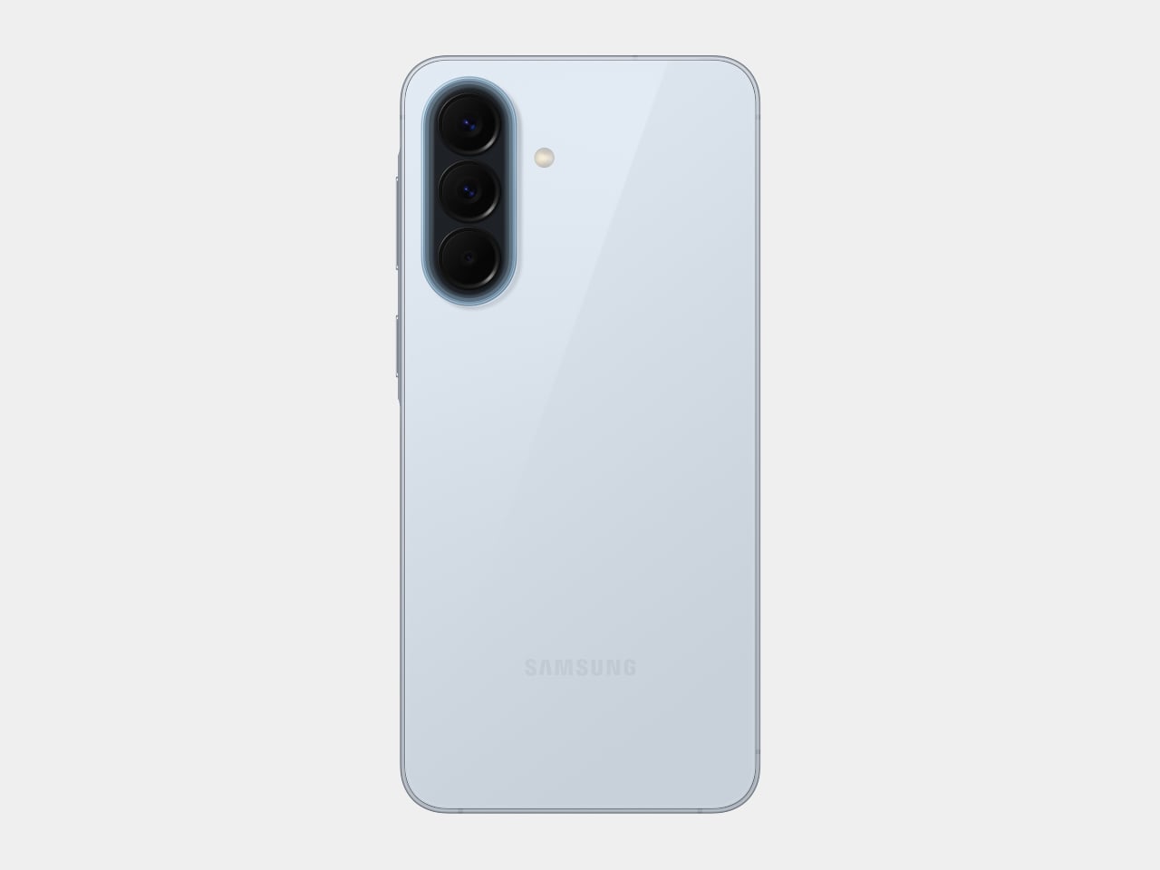
Storage is where the A57 5G makes history for the Galaxy A line. It’s the first A-series phone to offer a 512 GB option, a welcome change for anyone managing a large photo library or shooting high-resolution video regularly. The triple-camera setup, led by a 50 MP main sensor with a 12 MP ultrawide and a 5 MP macro, handles everything from wide-angle landscapes to fine close-up detail.

The Galaxy A37 5G takes a different route to earn its upgrade. Its primary camera now uses a larger 50 MP sensor with support for 10-bit HDR video recording, improving low-light performance and color depth over its predecessor. More significantly, the durability rating jumped from IP67 to IP68, and it now ships with Gorilla Glass Victus+ on both the front and back, which is a notable step up at this price.

Both phones run One UI 8.5 with a broader set of Awesome Intelligence (get it? “AI”?) features. The camera uses AI-based subject and scene recognition to balance skin tones and create cleaner background separation automatically. Circle to Search has also been updated with multi-object recognition, so you can search an outfit, its accessories, and the surrounding backdrop all at once, rather than hunting for each element separately or toggling between searches.

What gives both phones long-term value is Samsung’s commitment to six generations of Android OS updates and six years of security support. Add to that 5,000 mAh batteries and IP68-rated protection across both models, and these are phones clearly meant to outlast the typical mid-range upgrade cycle. The Galaxy A57 5G starts at $549.99 and the Galaxy A37 5G at $449.99 in the US, with availability beginning April 9, 2026.

The post Samsung’s Galaxy A Phones Now Get IP68 and 6-Year Updates From $449 first appeared on Yanko Design.

Galaxy Z Fold 8 Renders: Same Look, Bigger Battery, and S Pen Is Back

Foldable phones have reached a point where the form factor itself is no longer the talking point it once was. The big, dramatic “look how it folds” moment has settled into a quieter rhythm of iterative refinement, with each generation tweaking dimensions and chasing thinner profiles. Most buyers know what a modern book-style foldable looks like, and the language of change has shifted from shape to substance.

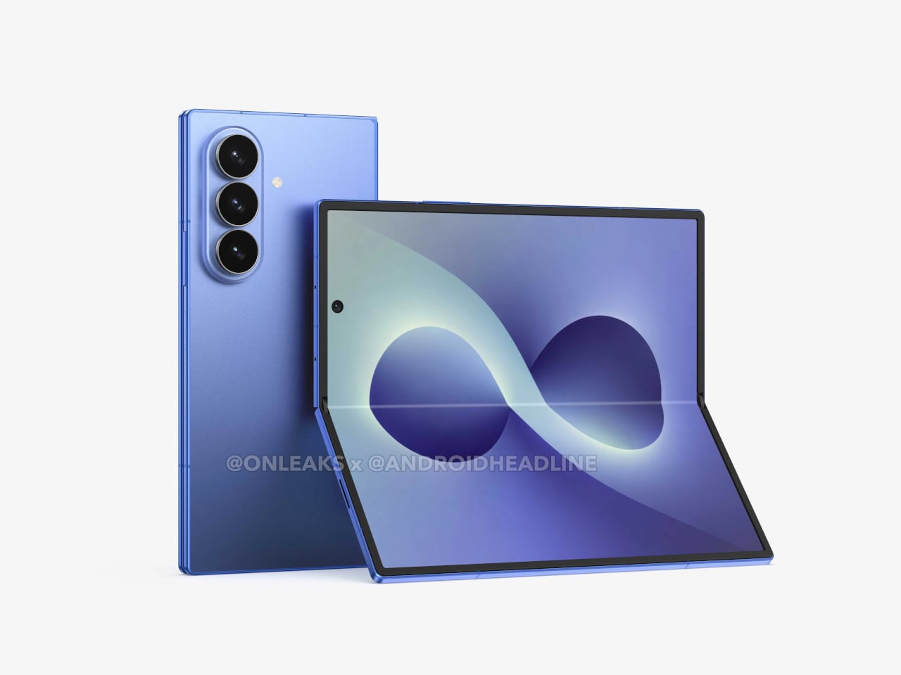
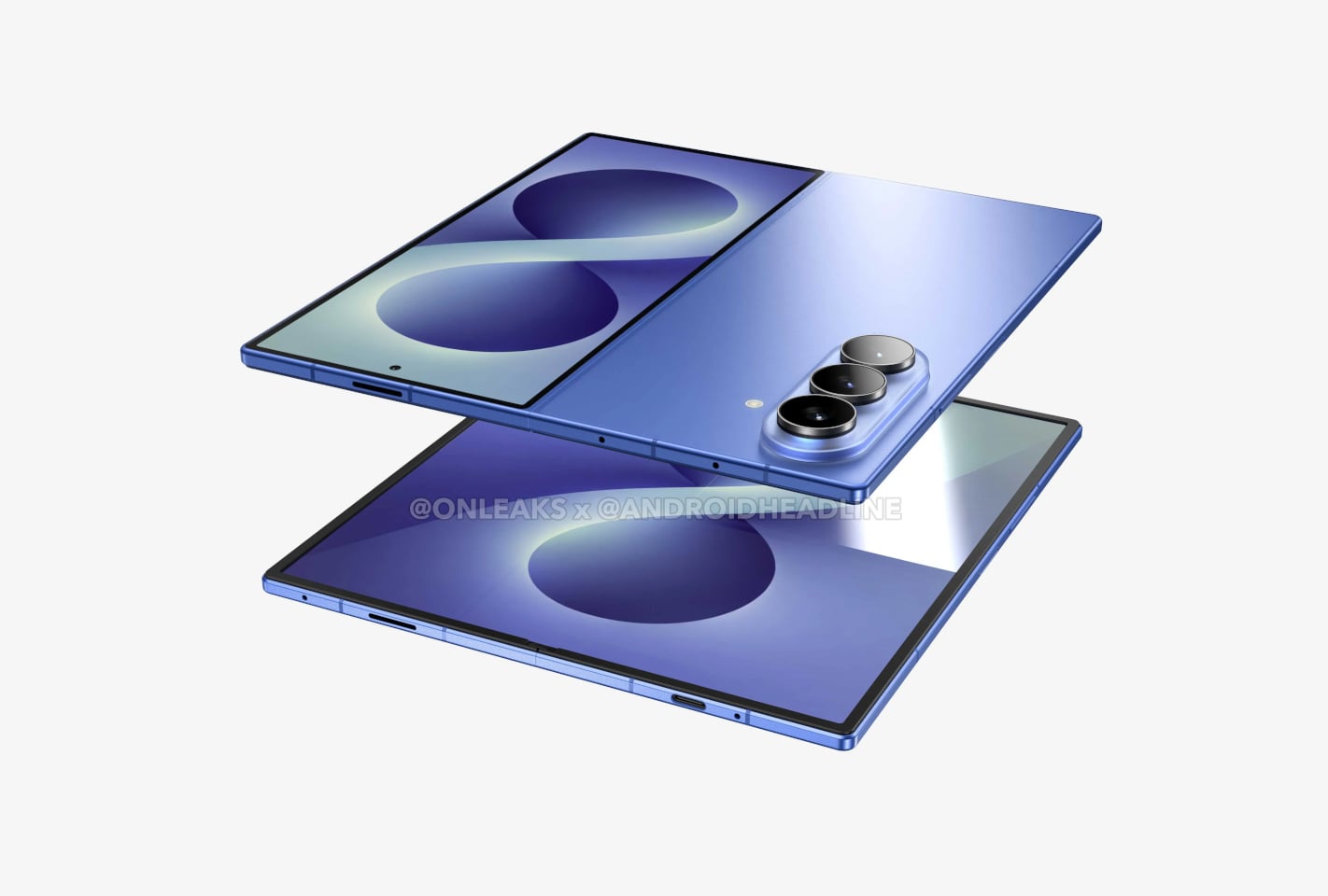
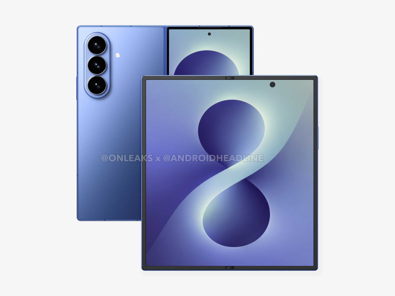
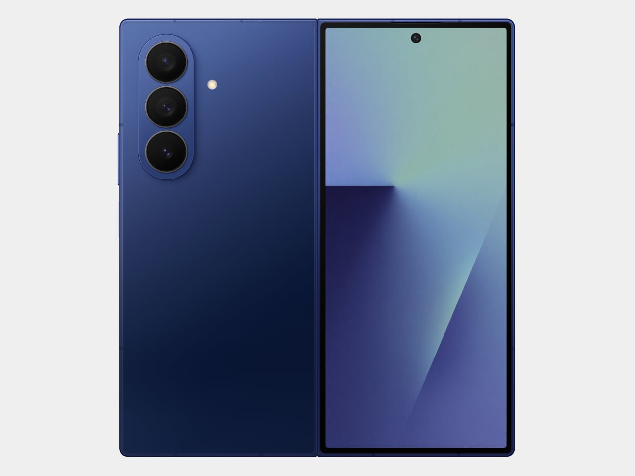
That’s the situation shaping the Samsung Galaxy Z Fold 8 conversation right now. Leaked CAD-based renders show a design that’s nearly indistinguishable from the Z Fold 7 pictured above: same flat sides, same sharp corners, same camera layout. The cover screen sits at 6.5 inches and the inner display at 8 inches, both unchanged. If you handed someone these renders without context, they’d probably just guess it was another angle of last year’s model.

Designer: Steve Hemmerstoffer/OnLeaks (Renders) via AndroidHeadlines

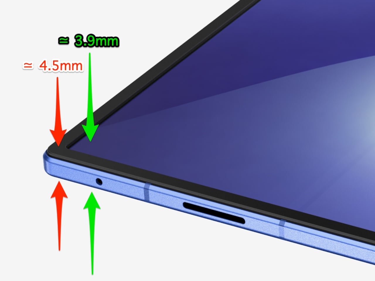
There’s one notable external difference, though, and it actually goes in the wrong direction. The leaked dimensions put the Z Fold 8 at 4.5mm thick when open and 9mm folded, compared to the Fold 7’s 4.2mm and 8.9mm. That’s a slight regression for a phone that went to considerable lengths to slim down the year prior. It’s not dramatic, but for a device that made a point of its thinness, it’s worth flagging. That said, the 4.5mm figure includes the protruding bezels around the display; it’s actually just 3.9mm thin.

The likely reason for that extra thickness is one of the better leaks so far: the possible return of S Pen support. Samsung dropped the stylus from the Fold 7, and that’s been a consistent complaint from the people who actually used it for note-taking or sketching on that wide inner canvas. If the S Pen does come back, a fraction of a millimeter is a fair trade for most of those users.

The battery theory, however, is probably more probable. A jump from 4,400 mAh to a rumored 5,000 mAh would mark the first capacity upgrade since the Galaxy Z Fold 3, and pairing that with 45W wired charging, up from 25W, addresses one of the more persistent frustrations with this lineup. Spending less time near an outlet matters more on a device you’re likely using across more tasks throughout the day.

The camera is also in line for a significant upgrade, according to the same leak. The main sensor is rumored to still be 200MP, and the ultrawide jumps from 12MP to 50MP. That ultrawide improvement in particular has been a long time coming. The gap between the Fold’s main and ultrawide cameras has been noticeable enough that it’s affected how people use the phone outdoors.

All of this is still leak territory, of course, pulled from CAD renders and a specs tipster ahead of what’s expected to be a July 2026 Unpacked announcement. Samsung hasn’t confirmed any of it, and final specs frequently shift between early renders and launch day. The Z Fold 8 is shaping up to be a phone that looks familiar and updates what actually needs updating, but none of that is official yet.

Galaxy Z Fold7

The post Galaxy Z Fold 8 Renders: Same Look, Bigger Battery, and S Pen Is Back first appeared on Yanko Design.

This E Ink Foldable Phone Concept Punishes Doomscrolling by Design

Most smartphones are designed to be impossible to put down. The screen faces up on every table, the display lights up for every notification, and the cost of checking it one more time is exactly zero. That’s not an accident. The hardware removes friction from compulsive use because removing friction is what makes these devices feel indispensable. The tinyBook Flip concept asks a different question entirely: what if the phone were designed to get out of the way?

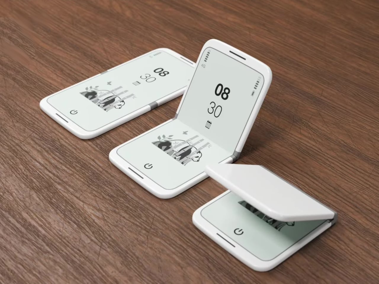
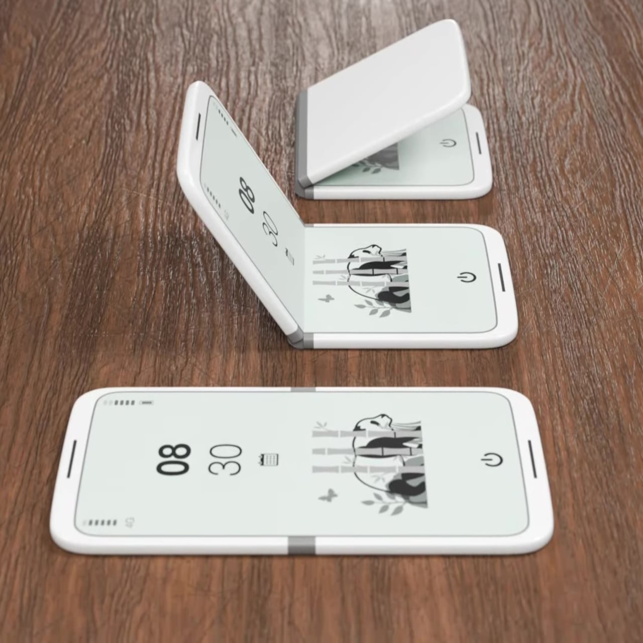
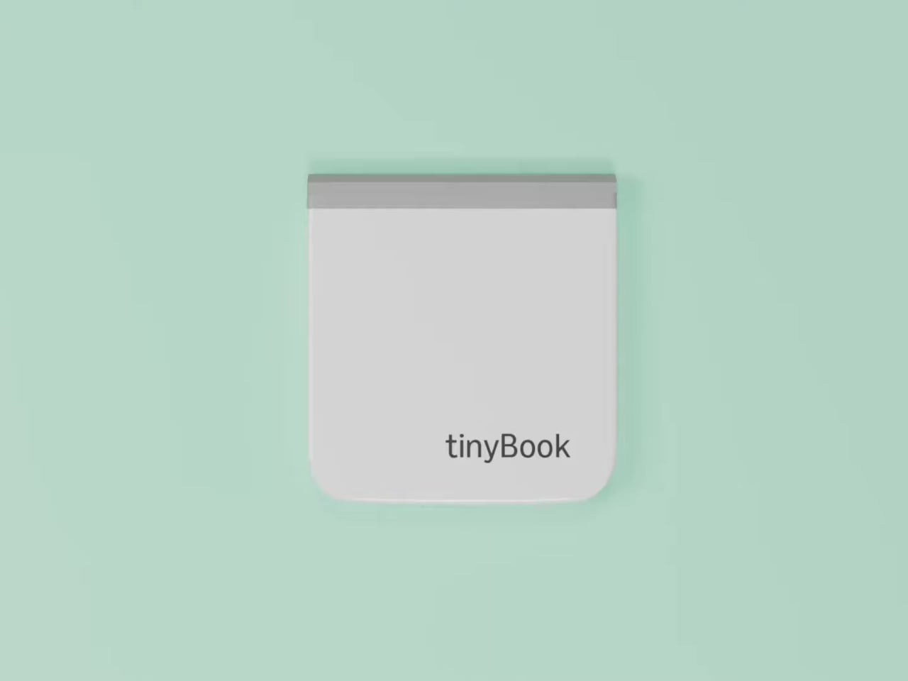
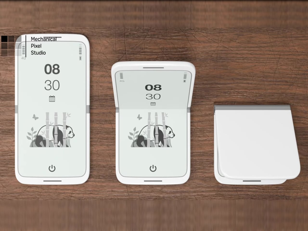
The tinyBook Flip is a vertical foldable phone concept built around a 6.1-inch E Ink display. Closed, it collapses into a compact, near-square form with rounded corners and a matte white finish, something closer in proportion to a folded notecard than a smartphone. The screen disappears entirely when the device is closed shut. No glowing rectangle sitting face-up on the desk, no ambient reminder that there are things to check. Just a small, quiet object.

Designer: Pixel Dynamics

That folded form is doing more work than it might seem. Opening the phone requires a deliberate physical action, and that small added step changes the behavioral math. A reflexive grab becomes a conscious decision. The friction is minimal in absolute terms, maybe two seconds, but two seconds of resistance is often enough to interrupt the loop. The concept treats that interruption as a design feature, which puts it in genuinely different territory from most phones.

The E Ink display adds a second layer of resistance, and this one is less subtle. E ink refreshes slowly, renders in grayscale or muted colors, and handles fast-moving content poorly. Social media feeds become tedious. Short-form video becomes unwatchable. Anything built around color, motion, and rapid visual feedback stops working the way it was designed to. This is precisely the point. The screen’s limitations aren’t engineering compromises left over from an earlier era of display technology; they’re structural properties that make certain behaviors genuinely unpleasant to sustain.

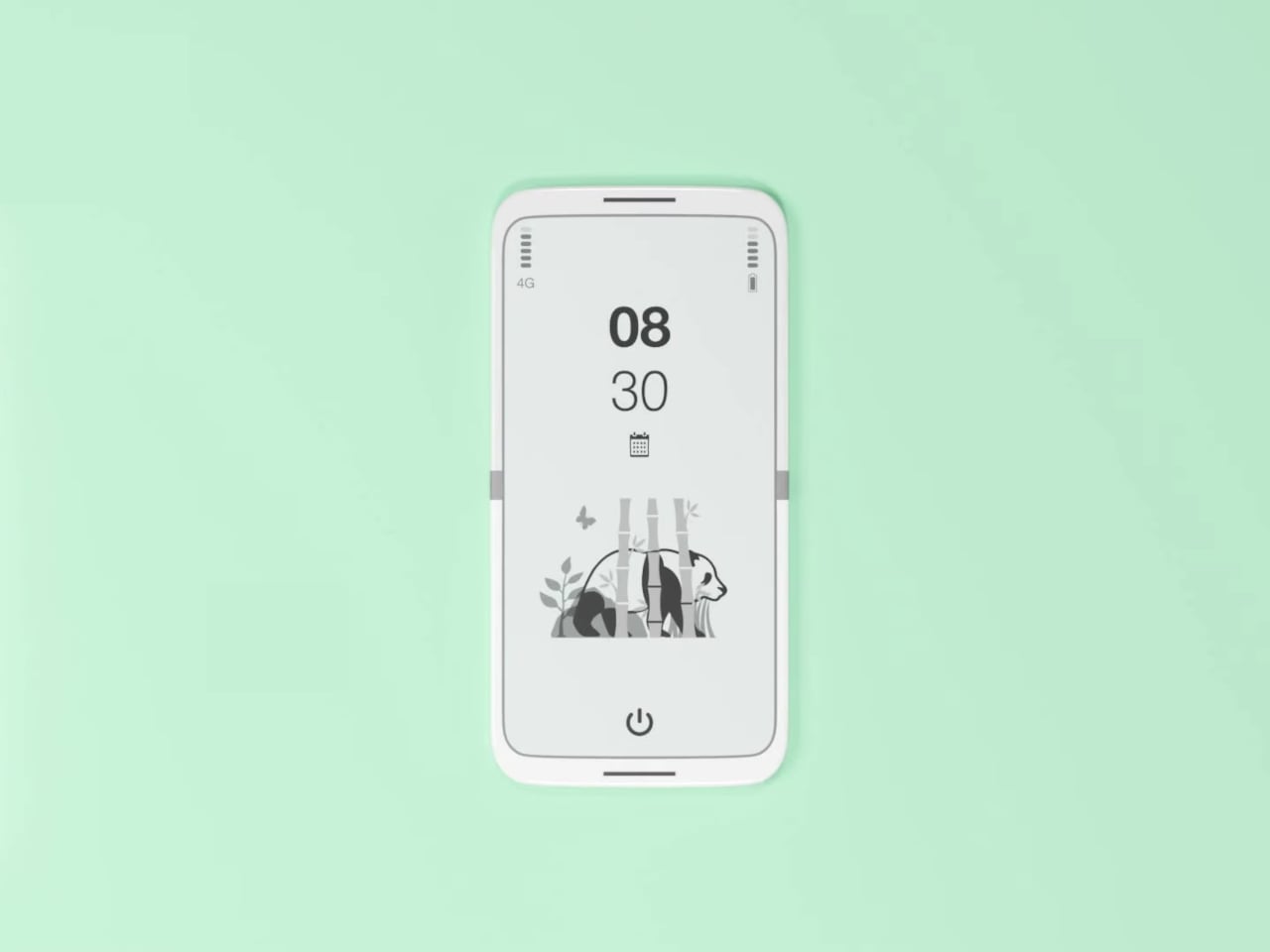
What E Ink handles well is a shorter list, but a coherent one. Text reading, messaging, calendars, and static interfaces are all comfortable at E Ink’s native pace. The renders of the tinyBook Flip show a UI built around exactly these strengths: a large clock face, a calendar widget, and a grayscale illustrated wallpaper. The interface doesn’t reach for capabilities the display can’t support. The phone isn’t trying to do everything; it’s trying to do a narrower set of things without apology.

Foldable E Ink panels aren’t a speculative technology. The hardware exists at the component level and has already appeared in experimental e-readers, though no consumer phone has shipped with one in any meaningful volume. The tinyBook Flip isn’t imagining impossible components; it’s proposing a form factor that manufacturers haven’t yet committed to producing. The distance between those two things is largely commercial, not technical.

There’s also something worth noticing about how the device reads as a physical object in social space. Closed, the tinyBook Flip looks like almost nothing. No visible screen, no status indicators, no glow. A phone that carries no visual weight when it’s not in use sends a different signal than one that’s always broadcasting its presence. Putting it down means it actually disappears from the environment, not just from your hand.

That said, the concept leaves some real friction points unaddressed, and not the intentional kind. E Ink handles camera use, live navigation, video calls, and authentication apps poorly. A foldable hinge adds mechanical complexity and thickness that clean renders tend to obscure. The tinyBook Flip looks resolved in this form, but a production version would have to make tradeoffs that these images don’t show and the concept doesn’t acknowledge.

Still, the more interesting question isn’t whether this specific device could ship. It’s whether a phone that makes itself harder to misuse is a reasonable design goal at all, or whether that’s just a way of describing a phone that most people wouldn’t actually want. The tinyBook Flip lands firmly on one side of that question. Whether the market agrees is a different problem entirely.

The post This E Ink Foldable Phone Concept Punishes Doomscrolling by Design first appeared on Yanko Design.

iPhone 20 in 2027: All-Glass, Buttonless, and Highly Unlikely

The iPhone turns 20 in 2027, and Apple apparently wants to throw a party that people will remember. Sources believe that the company is targeting a radical redesign for what will likely be called the iPhone 20, skipping “iPhone 19” the same way it jumped directly to the iPhone X back in 2017. More than just a naming trick, it came with the full-screen OLED design, Face ID, and the removal of the home button, a move that felt genuinely shocking at the time. The expectation building around the iPhone 20 is that history is supposed to repeat itself, only bigger.

The appetite is clearly there. Interest in bold Apple hardware has been riding high on the back of iPhone Fold rumors, and the search interest in “iPhone 20 design” has shot up by over 3,100% year-over-year. People are hungry for a leap, not an incremental shuffle. What Apple is reportedly planning, an all-glass unibody with no physical buttons and no visible cutouts anywhere on the device, is exactly the kind of leap that generates excitement. Whether it generates anything more than that is a genuinely open question.

Images courtesy of: AppleTrack
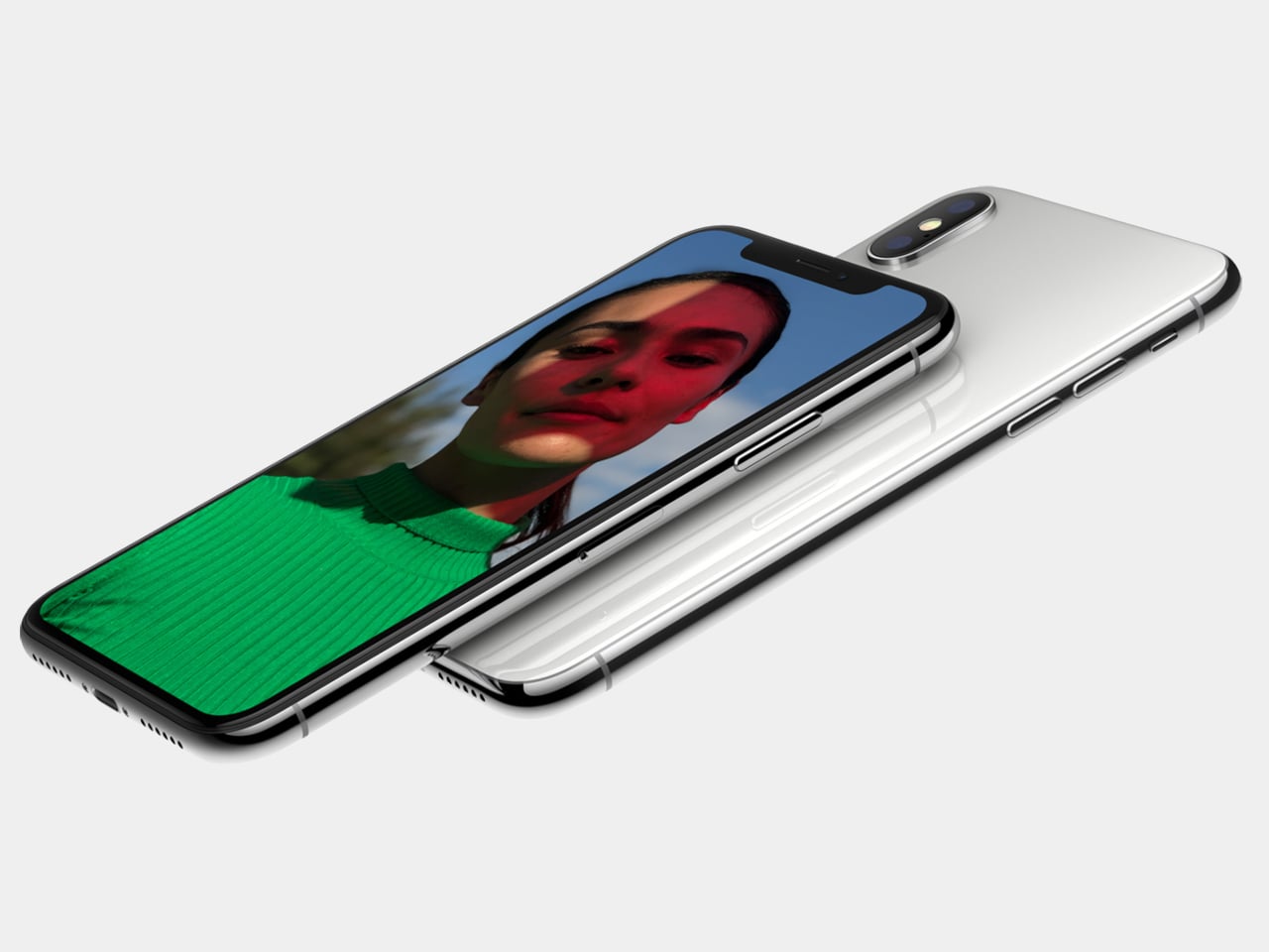
iPhone X (2017)

What it isn’t: an all-screen phone

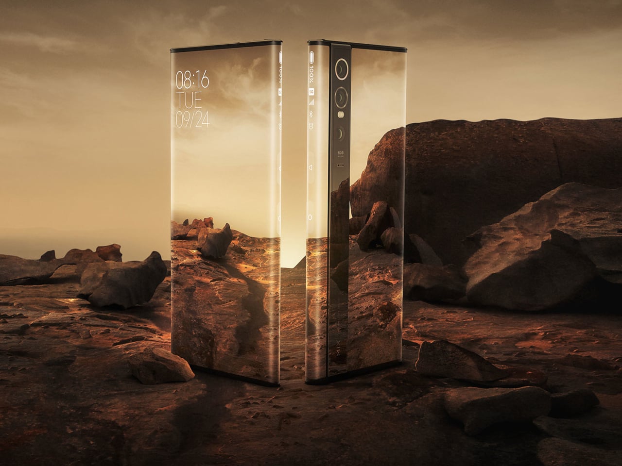
Before the imagination runs completely wild, it helps to be specific about what “all-glass” is not. This is not a Xiaomi Mi Mix Alpha situation, where the display wraps entirely around the phone like a very expensive, very fragile bracelet. That concept, for all its visual drama, would introduce a cascade of problems: iOS and most apps are built on the assumption that the back of a phone is inert. Making the entire surface interactive requires a fundamental rethinking of how software handles accidental input, palm rejection, and basic navigation, none of which Apple appears to be pursuing here.
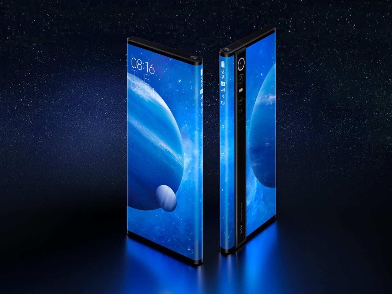
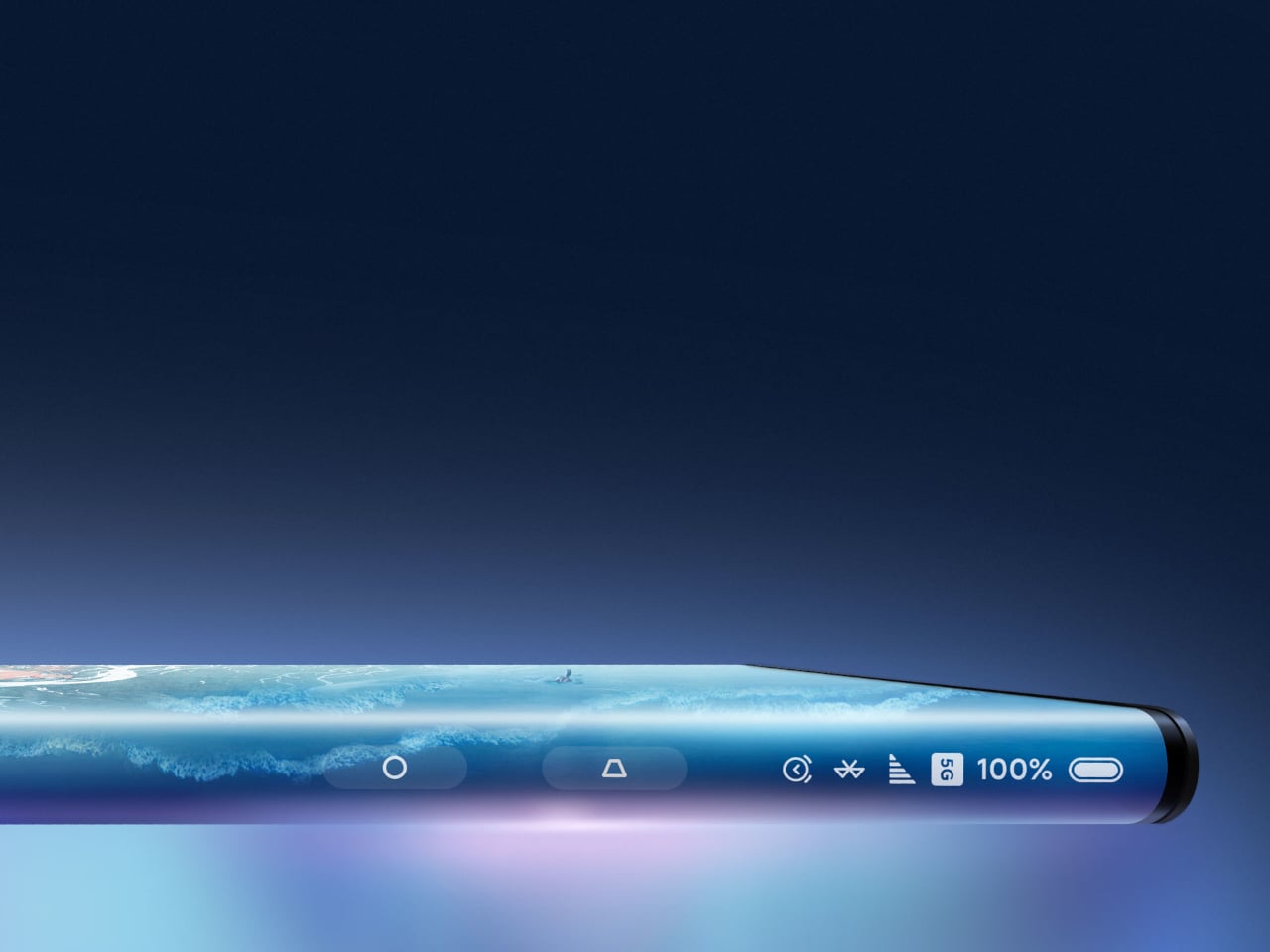
Designer: Xiaomi

The more useful comparison is the Vivo APEX from 2019, a concept phone that was genuinely all-glass and buttonless without wrapping the display around the chassis. The APEX had no physical buttons, no headphone jack, no visible ports, and shockingly, no front camera. It was definitely a striking object. It also never made it to retail, because striking objects and reliable everyday devices are not always the same thing.
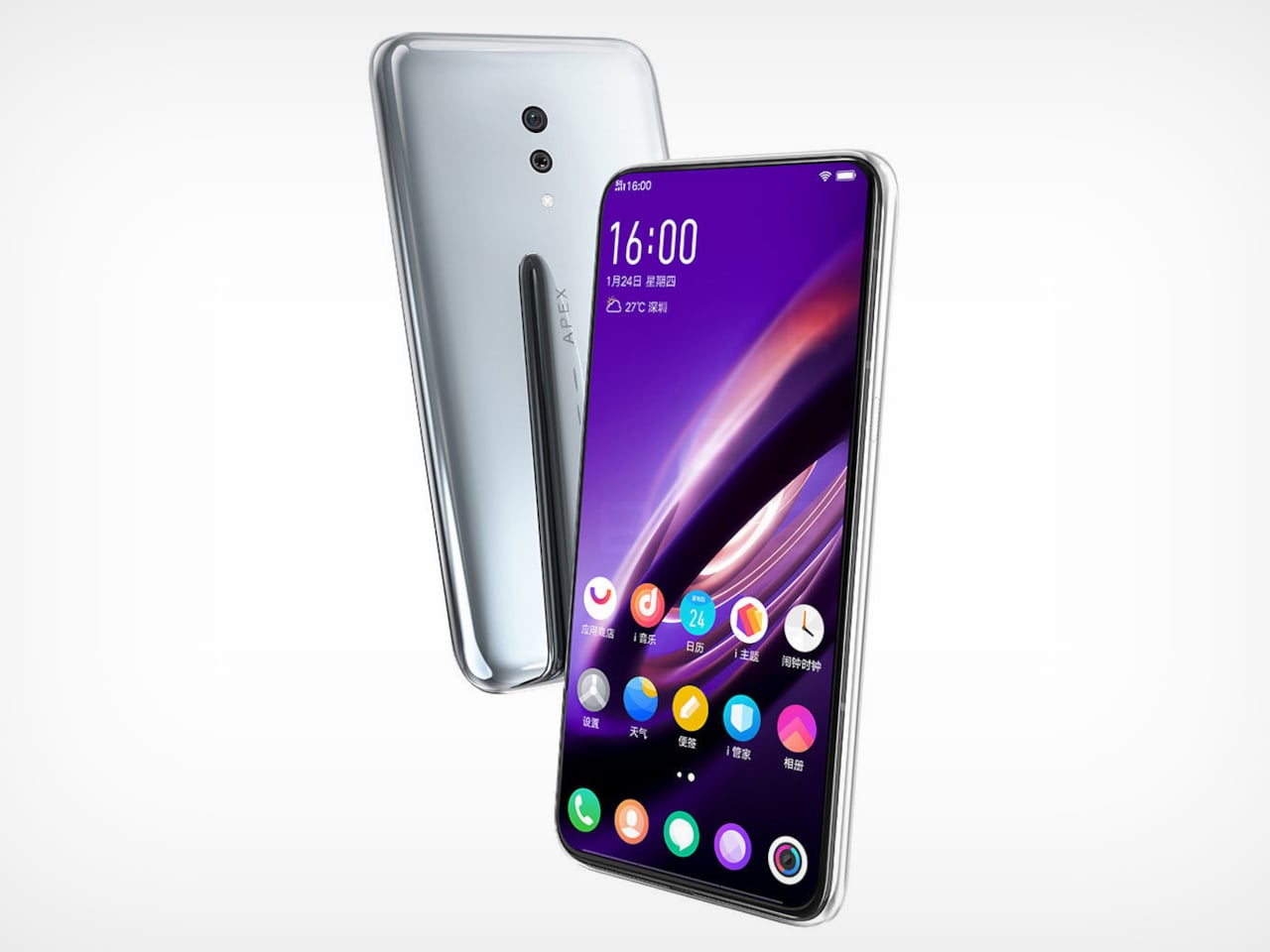
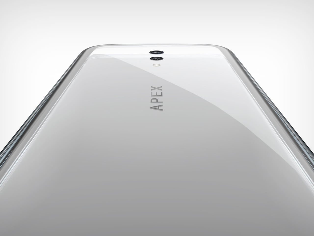
Designer: vivo

What the rumors are actually saying

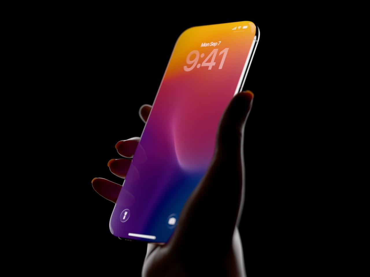
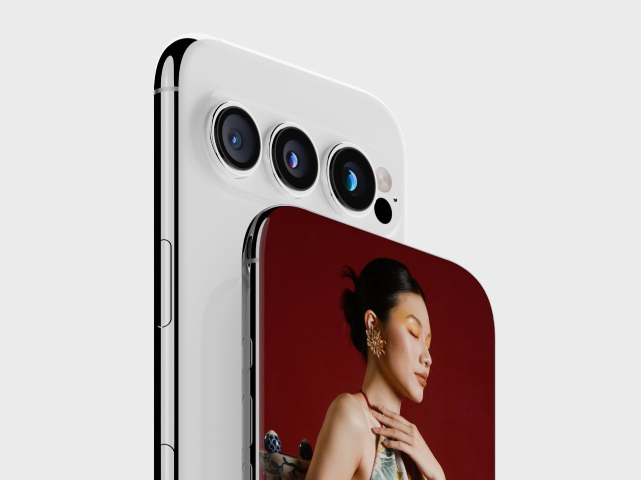
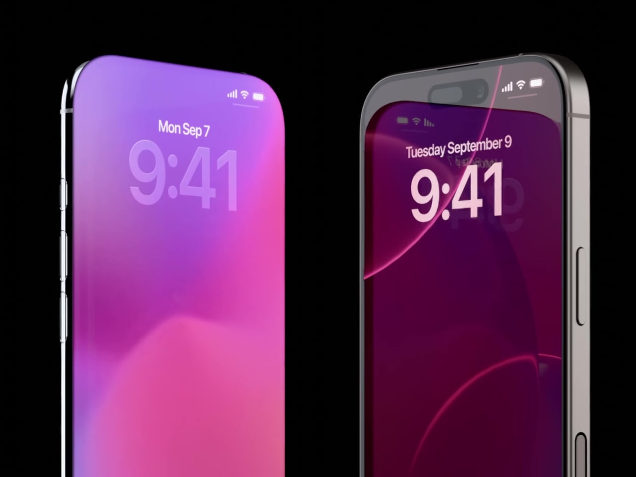
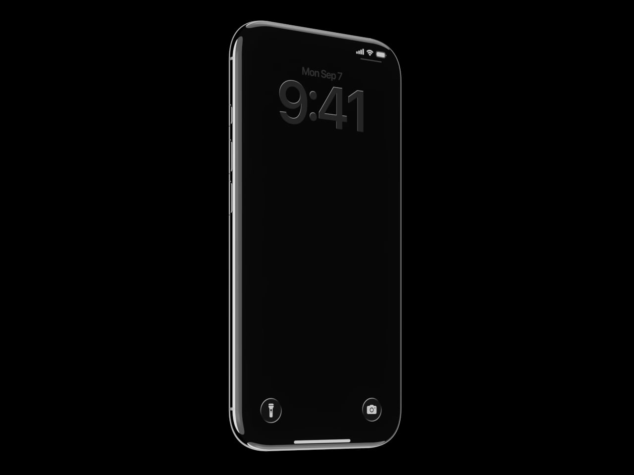
The picture assembled from various sources is fairly consistent in its broad strokes. The iPhone 20 is expected to arrive with a four-sided bending OLED display that curves around all edges, a fully glass chassis with no metal frame visible from the outside, camera lenses flush against the glass back with no raised rings or seams, and an under-display front camera with Face ID sensors also moved beneath the glass. Physical buttons disappear entirely, replaced by what Apple has internally codenamed “Project Bongo,” localized haptic zones that simulate a press through piezoelectric ceramics rather than a mechanical click.
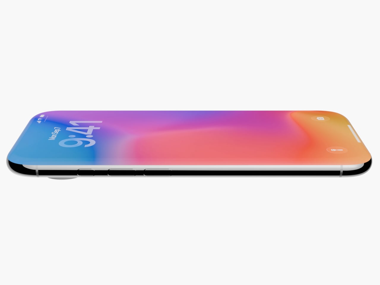
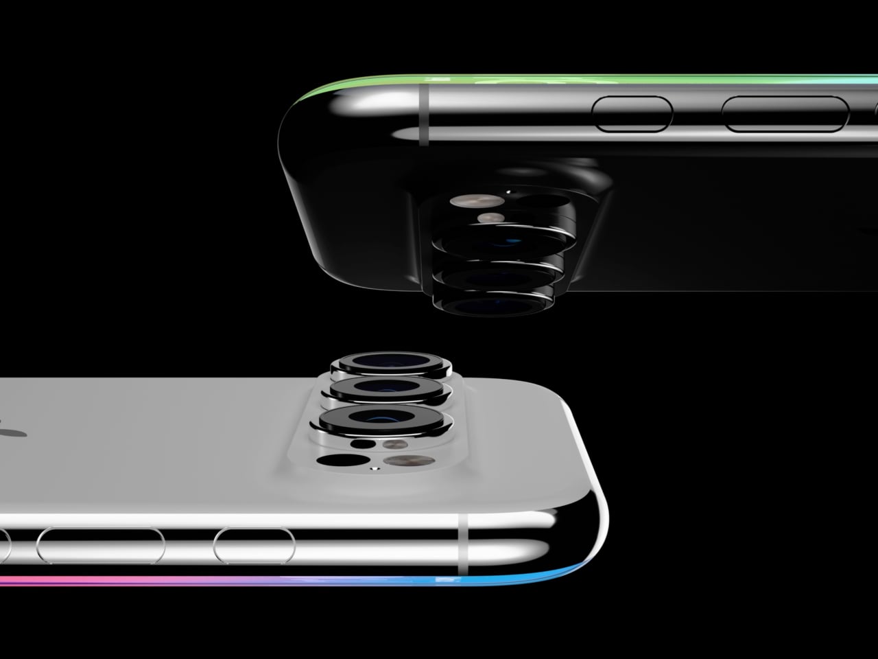
Images courtesy of: AppleTrack

Apple has been laying this groundwork for years, whether deliberately or not. MagSafe removed the last port most people used regularly. The solid-state home button on the iPhone 7 trained a generation of users to accept a simulated click as the real thing. Touch ID lived in that fake button for years before Face ID made it irrelevant. Project Bongo itself has been in development since 2021, with the haptic button solution reportedly completing functional verification for the iPhone 20 last October. The staged rollout has already begun: under-display Face ID is expected to debut on the iPhone 18 Pro in 2026, a year before the full transformation arrives.

Why Apple might actually want this

The engineering case for an all-glass, buttonless phone is stronger than it might first appear, and it goes well beyond aesthetics. Glass transmits radio frequencies with far less attenuation than metal, which means that a fully glass chassis removes the need for antenna break lines, those small plastic interruptions visible on metal-framed iPhones. For 5G mmWave frequencies, which are particularly vulnerable to obstruction, that is a meaningful structural advantage, not a cosmetic one.

Physical buttons are also apertures, meaning every button cutout is a potential entry point for water, dust, and debris, not to mention a structural point of weakness. Solid-state haptic zones flush with a continuous glass surface create a fully sealed perimeter by default. And without springs, electrical contacts, or moving parts, the mechanical failure modes that eventually wear out every physical button simply do not apply. There is also a software dimension: a haptic surface can be reprogrammed. The same zone that acts as a volume button in one context can behave differently in a camera app, or respond to a half-press the way a DSLR shutter does. That interaction vocabulary does not exist on a physical button.
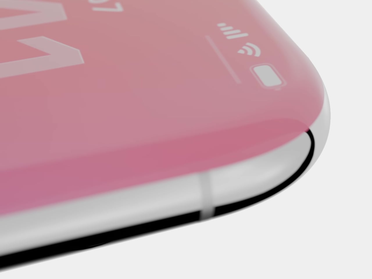
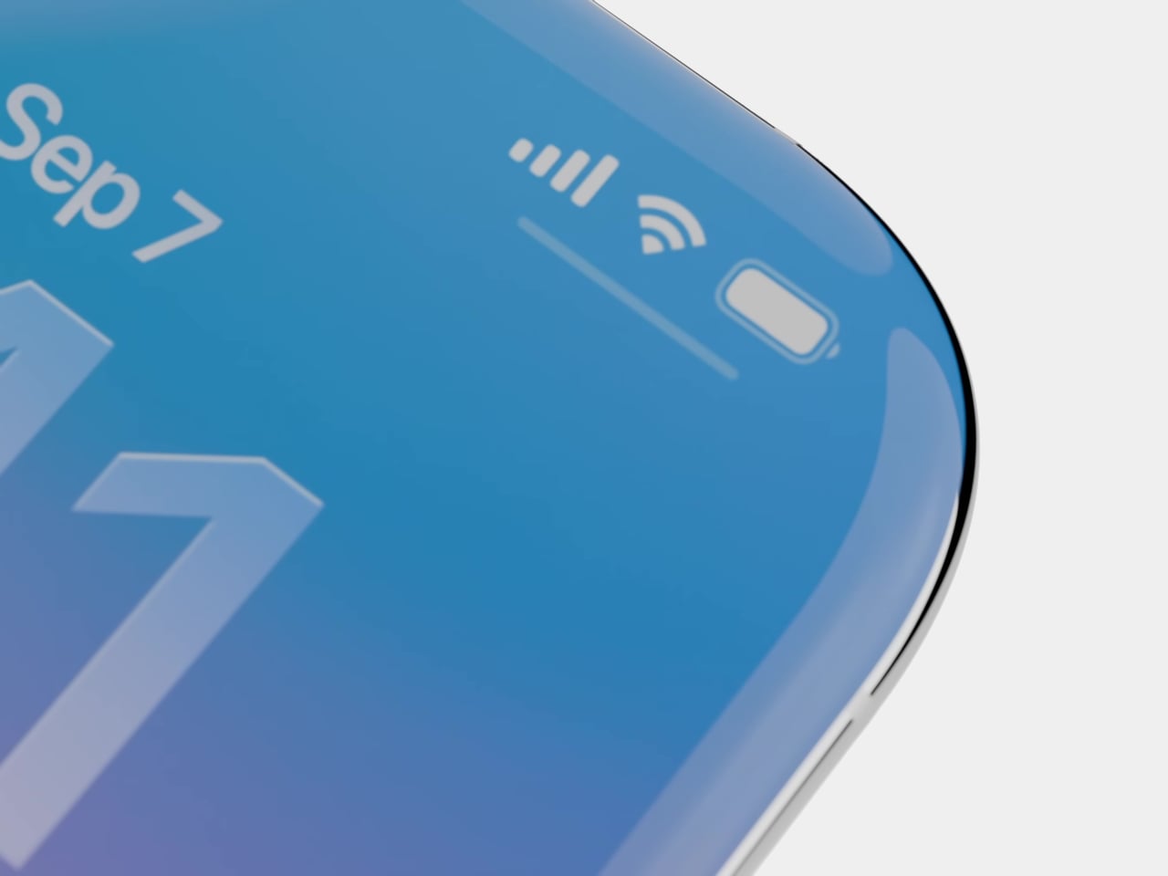
Images courtesy of: AppleTrack

The design coherence argument is worth taking seriously, too. iOS 26 introduced the Liquid Glass UI at WWDC 2025, with translucent menus, frosted panes, and depth-layered interfaces that read as software built to live inside a glass object. If the hardware catches up, the iPhone 20 would be the first Apple device where the material logic of the shell and the interface are genuinely continuous, rather than one imitating the other.

Why Apple will definitely not do it, at least not yet

The skepticism case is longer and, in several places, harder to argue around. Start with the glass itself. No glass smartphone has survived all kinds of real-world accidents unscathed, including the iPhone 16 Pro Max with Ceramic Shield 2. The current metal frame does real structural work; it absorbs and distributes impact energy in ways that glass cannot. A four-sided curved display that wraps around what used to be the frame zone eliminates that crumple zone entirely.
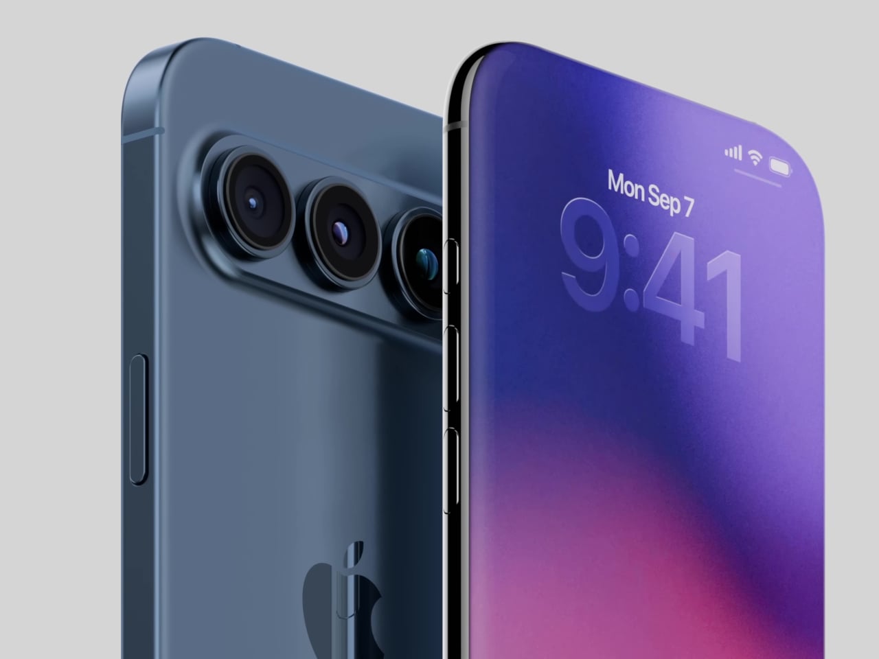
Thermal management is a less visible but equally serious issue. Aluminum conducts heat significantly better than glass. The metal frame in current iPhones is part of the thermal pathway, moving heat from the logic board outward. Glass is a poor conductor and a poor radiator, and with Apple Intelligence pushing sustained on-device AI inference, the thermal load is growing, not shrinking. Apple would need expanded vapor chambers or novel heat-bridge materials to compensate, none of which have been confirmed.
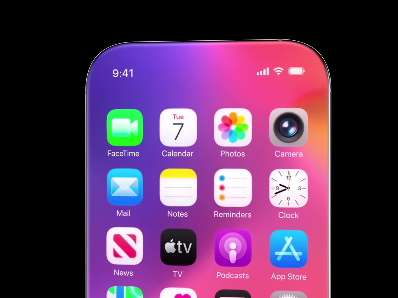
Then there is the under-display camera. Samsung introduced UDC technology with the Galaxy Z Fold3 in 2021 and used it through the Fold6. Image quality was consistently criticized across all four generations, and Samsung is now reportedly abandoning it for future foldables due to persistent optical and cost challenges. Apple is reportedly moving in the opposite direction, but with a twist. It might use the under-display camera primarily for Face ID’s infrared sensors rather than the selfie camera, which sidesteps the worst degradation but does not resolve long-term selfie quality under glass.
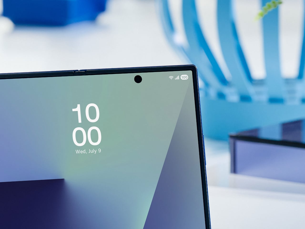

Designer: Samsung

Accessibility is a concern that gets less coverage than drop tests, but it definitely deserves more. Blind and visually impaired users rely on physically locatable controls as navigational anchors, such as the raised profile of a button. Flush haptic zones remove that landmark. There is also the “dead device” recovery problem: a bricked iPhone requires holding a specific physical button combination to enter recovery mode. Whether solid-state haptic buttons can operate at the firmware level, before iOS loads, has not been confirmed. Case and accessory compatibility adds another layer; a wraparound display that curves into what is currently the frame zone fundamentally changes how a protective case grips the device, since the element that used to grip the frame now grips the screen.
The human factor is harder to engineer than the glass

The technology story surrounding the iPhone 20 is genuinely fascinating, and some of it will almost certainly happen. Under-display Face ID on the iPhone 18 Pro is close enough to be treated as confirmed. The full vision, no buttons, no cutouts, glass everywhere, is a different question. Manufacturing challenge is described as “extraordinarily complex,” component manufacturers are on the fence, and the expected price point will likely exceed the current Pro Max tier. Those are not the conditions under which Apple tends to ship a complete reimagining all at once.

But the technical hurdles might not be the hardest part. People have strong, specific feelings about physical buttons in ways they do not always articulate until the buttons are gone. The haptic home button on the iPhone 7 worked well enough that most users stopped noticing it within weeks. Extending that same illusion across every tactile control point on the device, in cold weather, through a case, while the phone is vibrating with an incoming call, and across several years of daily use, is a different challenge than a single button in a fixed location. Whether that feels like liberation or a slow-building frustration might depend less on the engineering and more on the person holding it.
Images courtesy of: AppleTrack

The post iPhone 20 in 2027: All-Glass, Buttonless, and Highly Unlikely first appeared on Yanko Design.
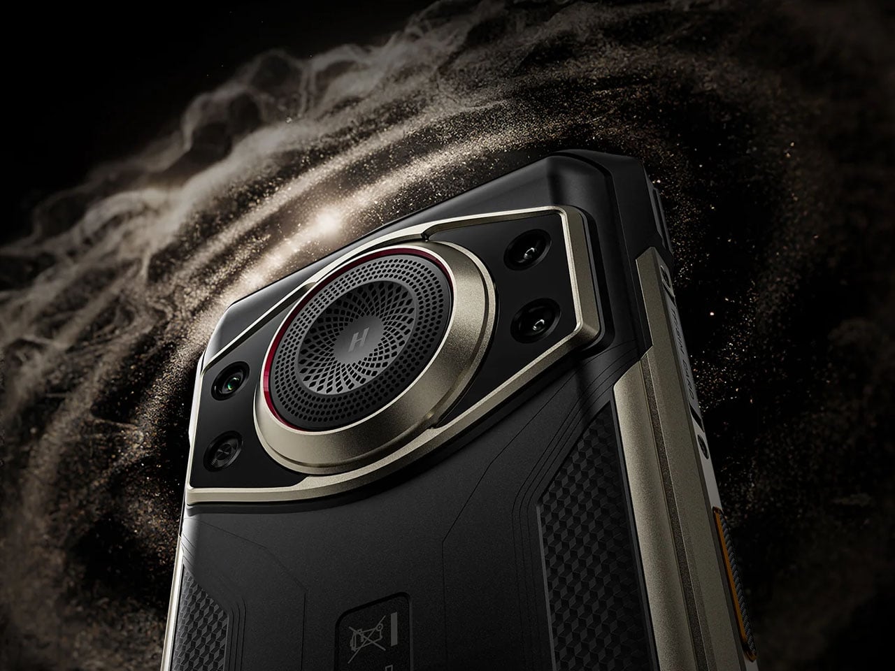
DOOGEE Fire 7 Ultra rugged smartphone doubles as a push-to-talk radio for instant team communication

Rugged smartphones have long been DOOGEE’s playground, as the brand frequently experiments with bold ideas that blur the line between utility gadget and everyday smartphone. Past releases have showcased this experimental streak successfully. The DOOGEE S200 embraced a mech-inspired aesthetic with a design that looked more like a piece of futuristic equipment than a typical handset, while the DOOGEE S98 leaned into spy-gadget territory with a secondary rear display and an unmistakably tactical vibe. Even more unusual was the DOOGEE S119, a device that literally mounted a smartwatch-like display on its back.

The newly introduced DOOGEE Fire 7 Ultra continues that spirit of experimentation but shifts the focus toward communication rather than design theatrics. Instead of simply building a phone that survives harsh environments, DOOGEE is positioning the Fire 7 Ultra as a hybrid device that combines smartphone functionality with the instant communication capabilities of a professional two-way radio system.

Designer: DOOGEE

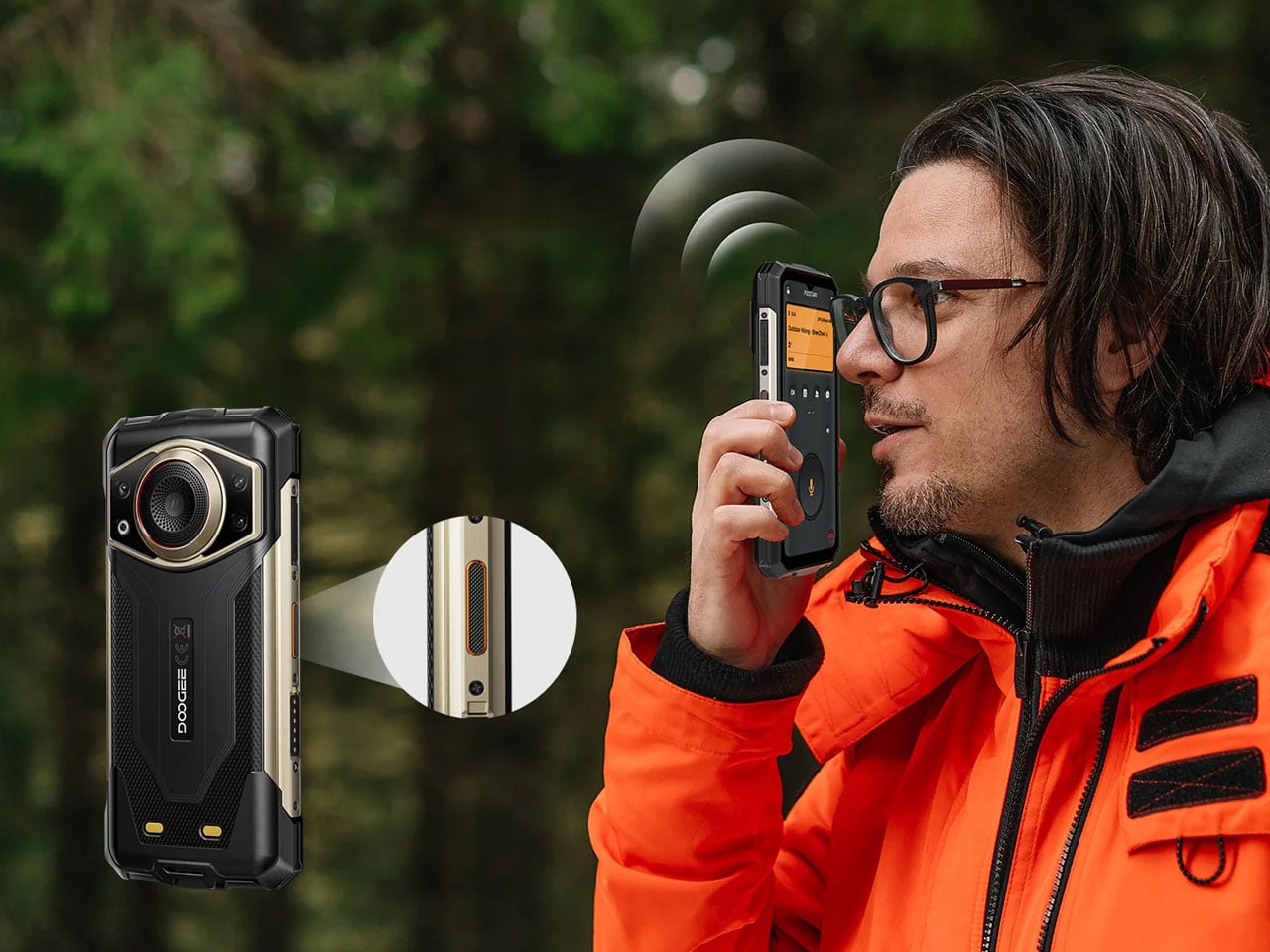
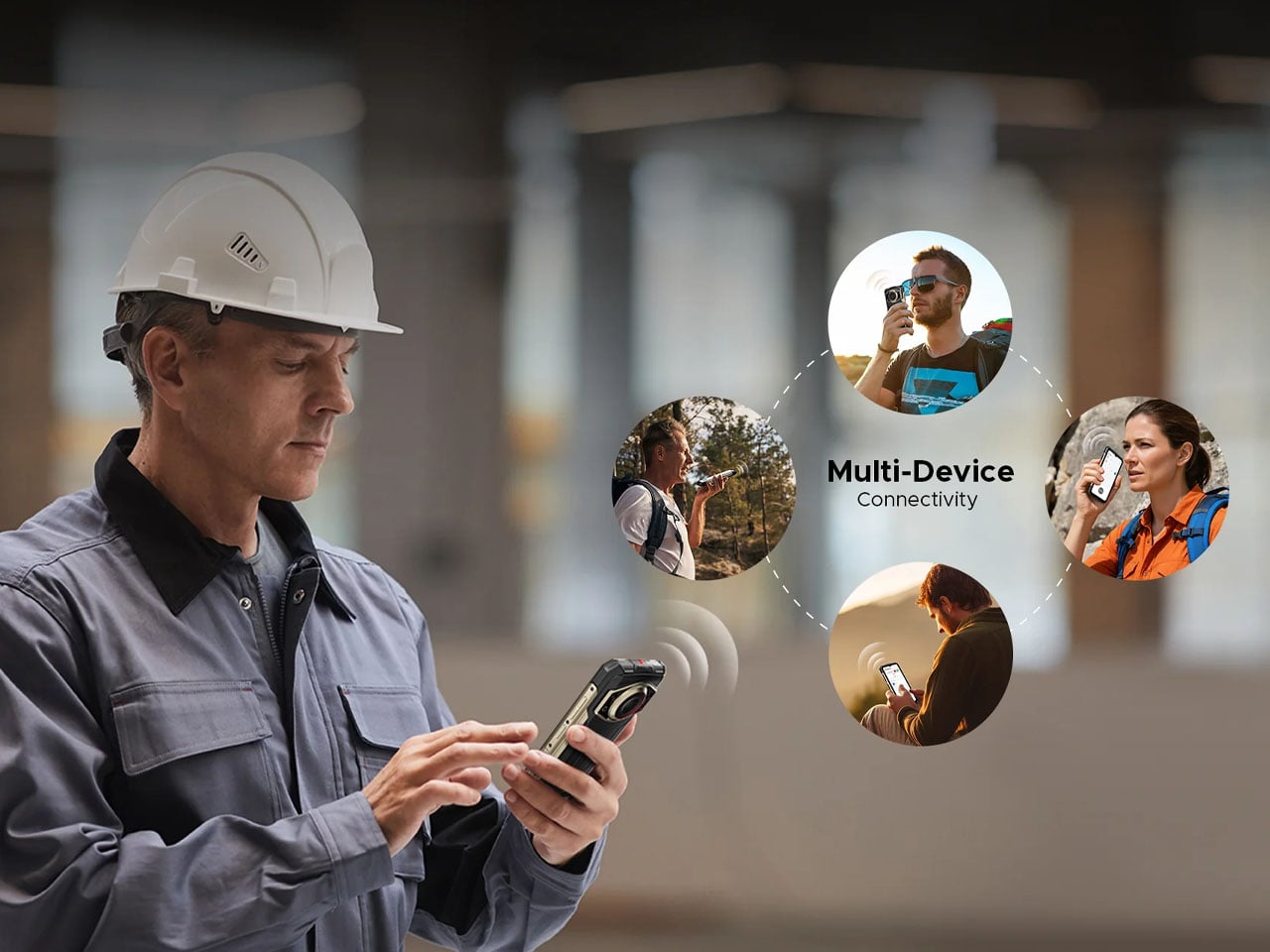
At the heart of the Fire 7 Ultra is its Push-to-Talk Over Cellular (PoC) system, a feature designed to transform the phone into a real-time communication hub for teams. Using cellular or Wi-Fi connectivity, the device allows users to initiate instant voice communication with a single press of a dedicated PTT button on the side. This setup enables one-to-one or group communication similar to traditional walkie-talkies but without the range limitations typically associated with radio hardware. As long as there is network connectivity, the communication range is essentially unlimited, making it suitable for field teams, logistics crews, event staff, and emergency responders.

The device also incorporates a short-range Bluetooth intercom mode for situations where cellular coverage is unavailable. This feature allows nearby users to communicate directly with each other without relying on network infrastructure, which can be particularly useful in environments such as tunnels, forests, or construction zones. Supporting these communication features is a powerful 125-decibel speaker powered by a 34mm, 3.5W driver, ensuring that voice transmissions remain clear even in noisy outdoor environments.

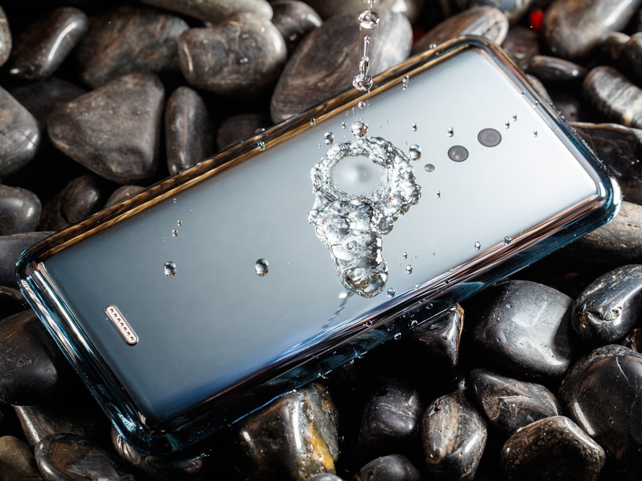
Durability remains a USP of the Fire 7 Ultra’s design philosophy. The phone carries IP68 and IP69K water and dust resistance ratings and meets MIL-STD-810H durability standards, allowing it to withstand water immersion, dust exposure, and accidental drops from around 1.5 meters. The rugged construction is paired with a large 6.6-inch IPS display featuring a 90Hz refresh rate and HD+ resolution, protected with reinforced glass designed to handle demanding outdoor conditions. Powering the device is MediaTek’s Dimensity 6300 chipset, a 6nm processor that supports 5G connectivity while delivering efficient performance for everyday tasks and communication-heavy workloads. The phone ships with 8GB of RAM, which can be virtually expanded up to 32GB, alongside 256GB of internal storage and a microSD slot for further expansion.

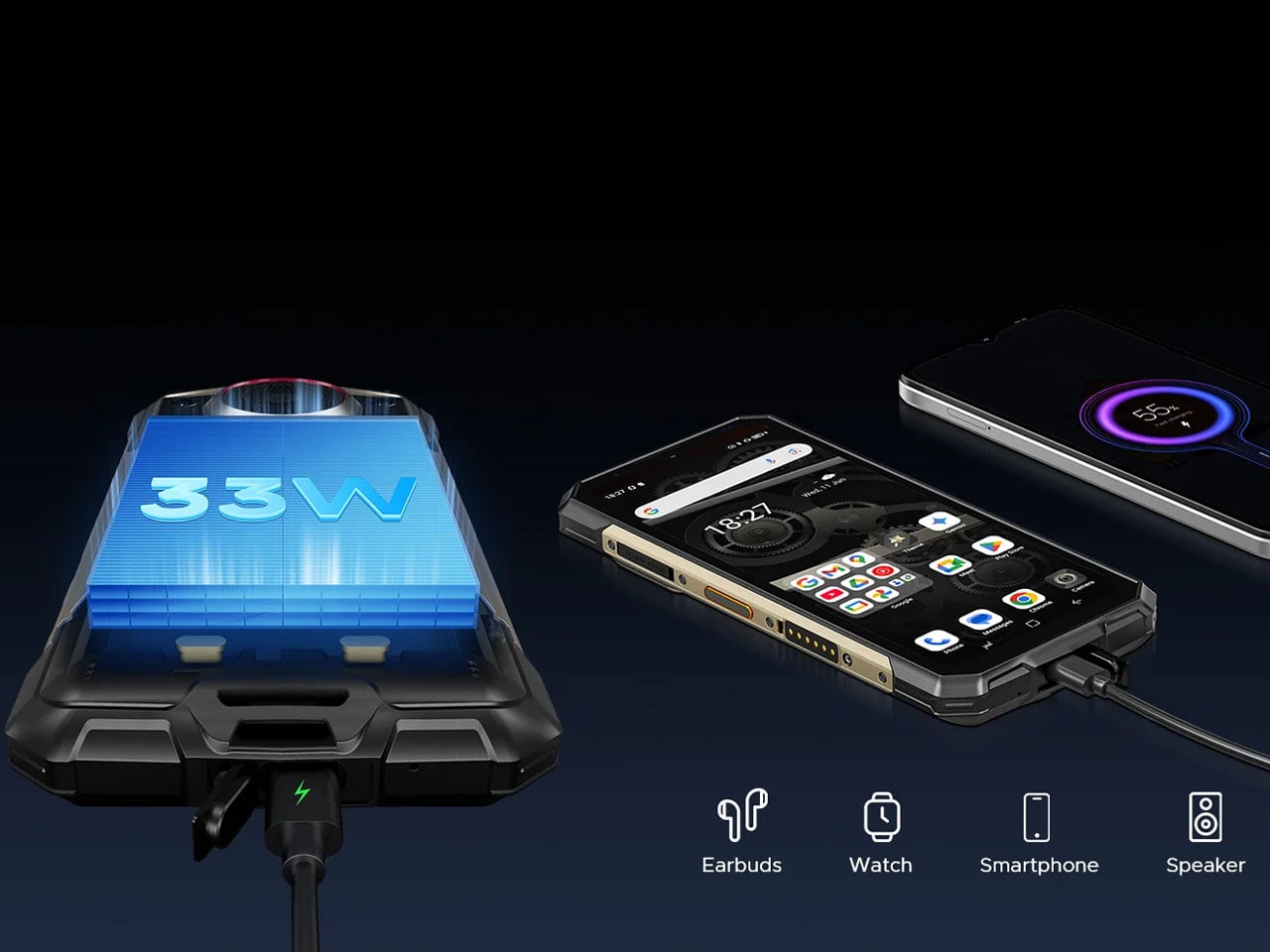
A massive 13,000mAh battery keeps the device operational for extended field use, reducing the need for frequent charging during long shifts or outdoor expeditions. The phone supports 33W fast charging and even includes reverse charging capabilities, allowing it to power smaller devices such as earbuds or smartwatches when needed. The camera setup is straightforward but capable, featuring a 64-megapixel main camera paired with a 2-megapixel macro lens and a 16-megapixel front-facing camera. Running on Android 15, the phone also supports features such as NFC for contactless payments, side-mounted fingerprint recognition, facial unlock, and a triple card slot that accommodates two SIM cards and a microSD card simultaneously.

The DOOGEE Fire 7 Ultra phone is currently available at official stores and select online retailers, with pricing around $360 for the 8GB RAM and 256GB storage variant.

The post DOOGEE Fire 7 Ultra rugged smartphone doubles as a push-to-talk radio for instant team communication first appeared on Yanko Design.
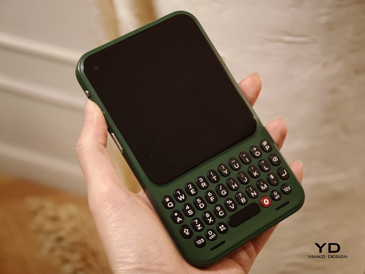
Carriers Want This BlackBerry-Style Phone – I Tried It at MWC

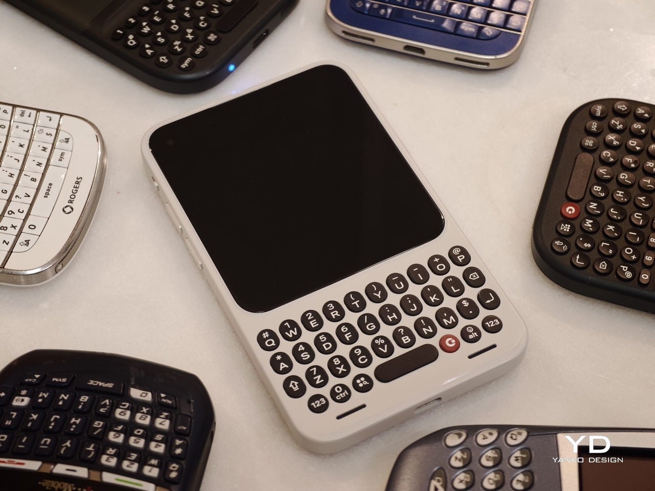
When Clicks unveiled the Clicks Communicator at CES 2026, the device immediately stood out in a sea of look-alike smartphones. It pairs a physical QWERTY keyboard with a communication-first philosophy that feels intentionally different from the current slab phone crowd. Clicks also shared several specifications at the time, yet it did not confirm exactly when the phone would launch.

At a Mobile World Congress (MWC) off-site event in Barcelona, Clicks offered a clearer update on where the Communicator stands today. The company used the event to signal that the project is progressing beyond the early reveal phase. It positioned the Communicator as moving steadily toward launch.

Designer: Clicks

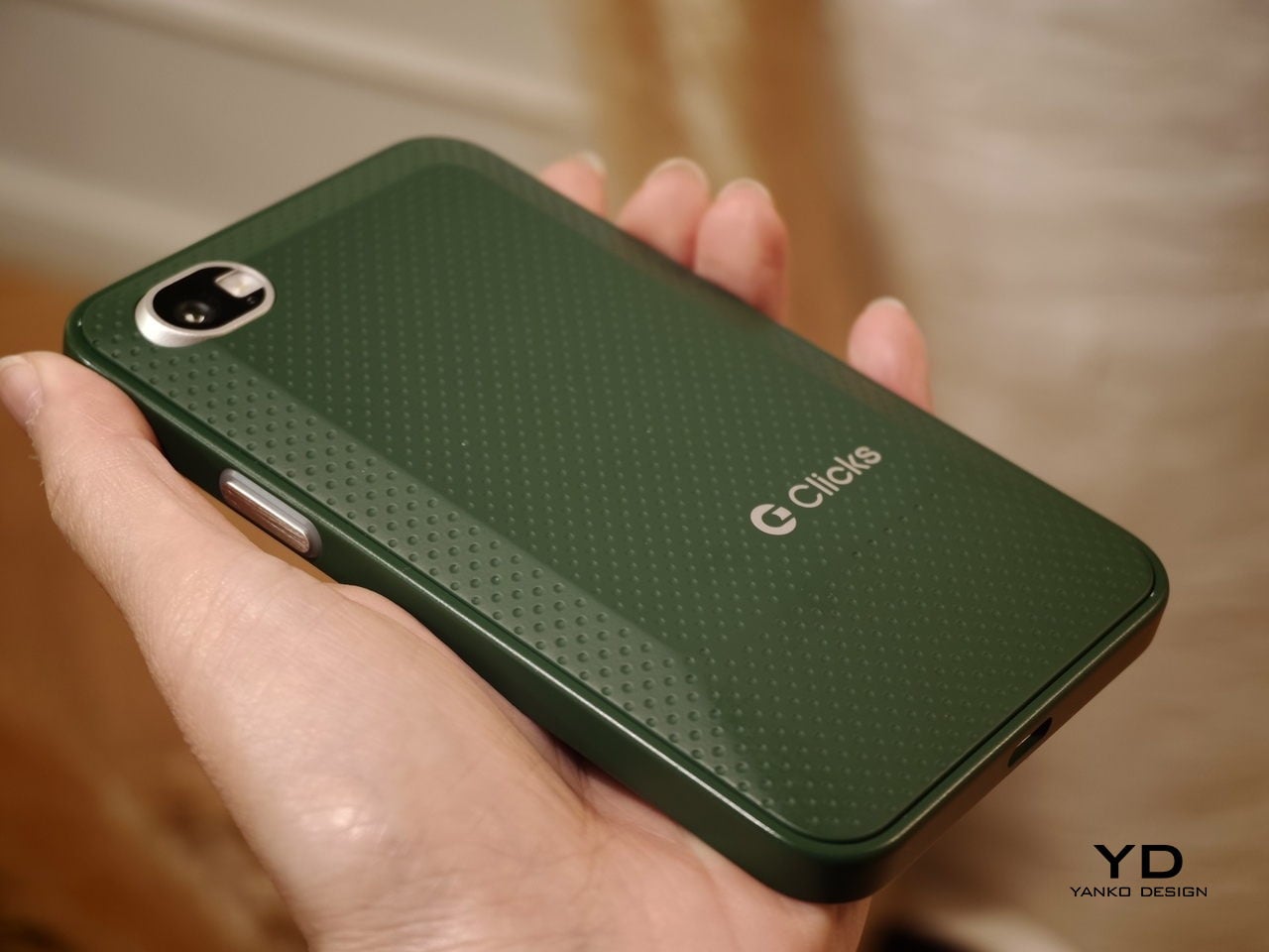
Clicks showcased the Communicator to media and potential partners, and I had the opportunity to briefly go hands-on with the device. The unit on display was still a mockup rather than a final production model. Even so, it offered a useful glimpse at how the hardware direction is taking shape.

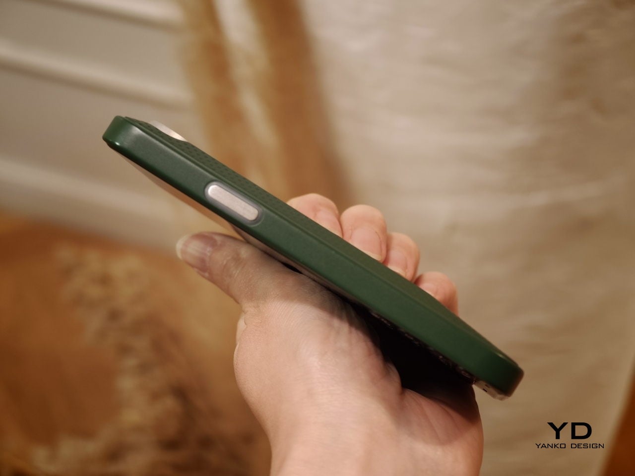
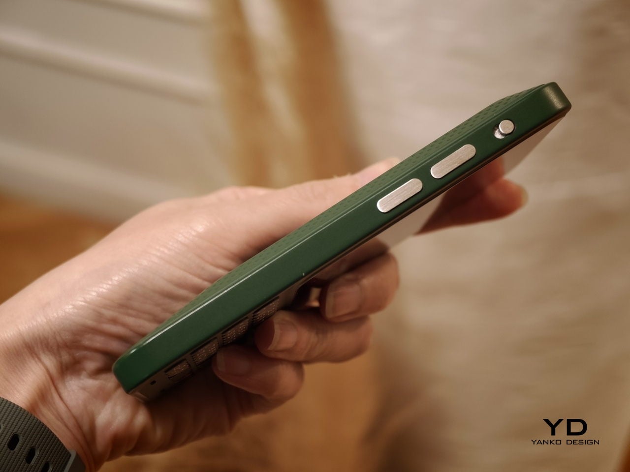
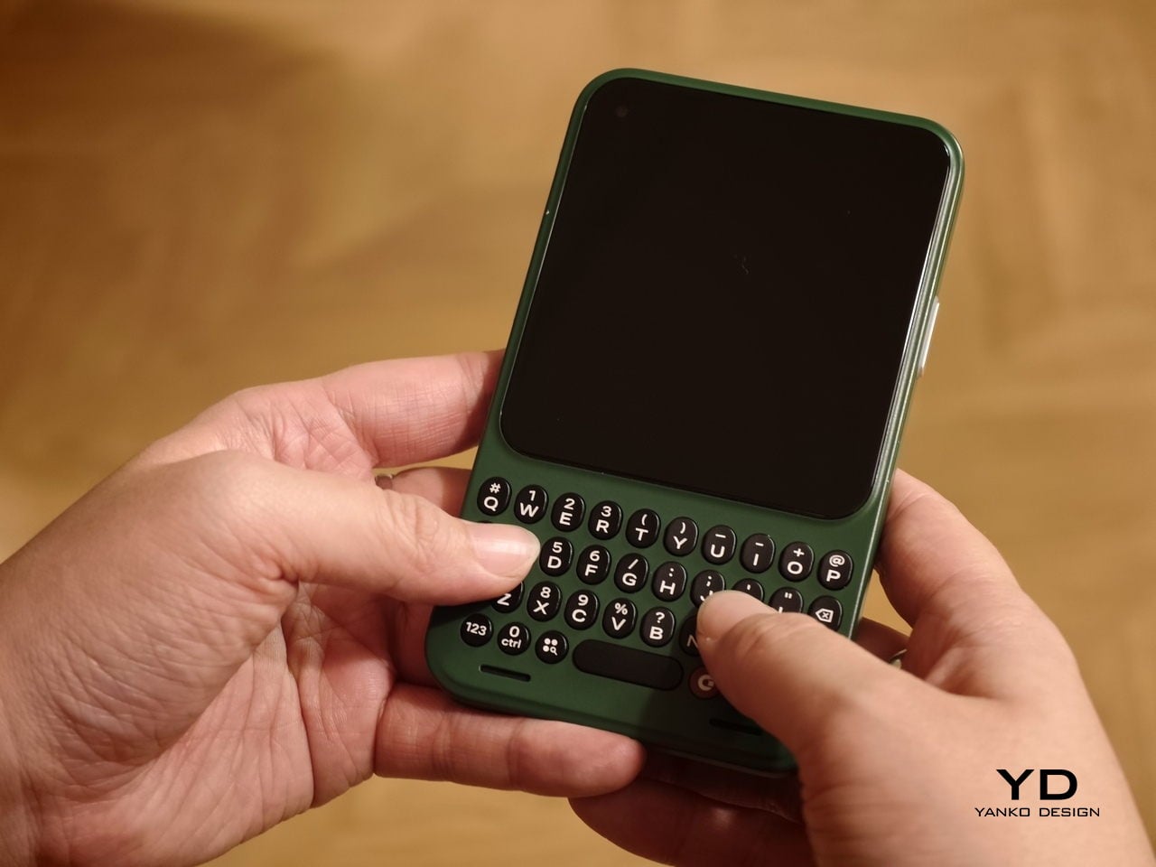
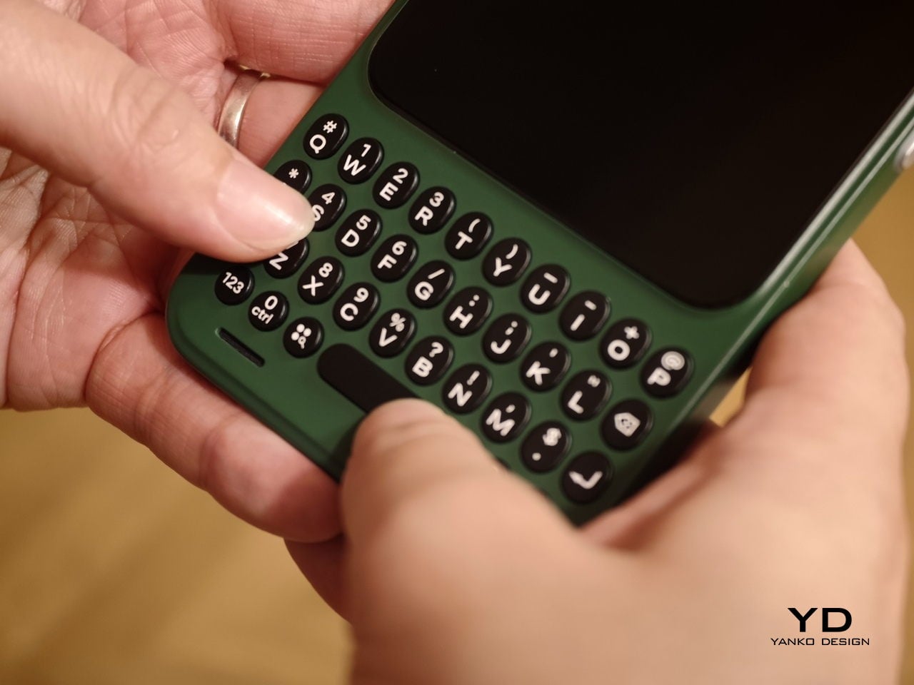
In hand, the Communicator feels nice and compact, and it sits comfortably in the palm. The balance feels considered, and the overall shape makes it easy to grip without feeling slippery or awkward. Typing also felt comfortable during my short time with it, which is the “make or break” moment for any keyboard phone.

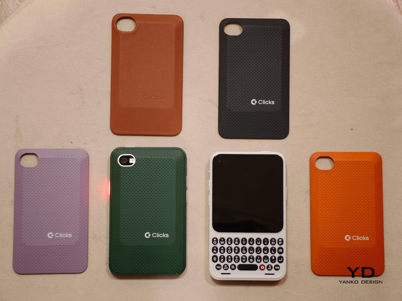
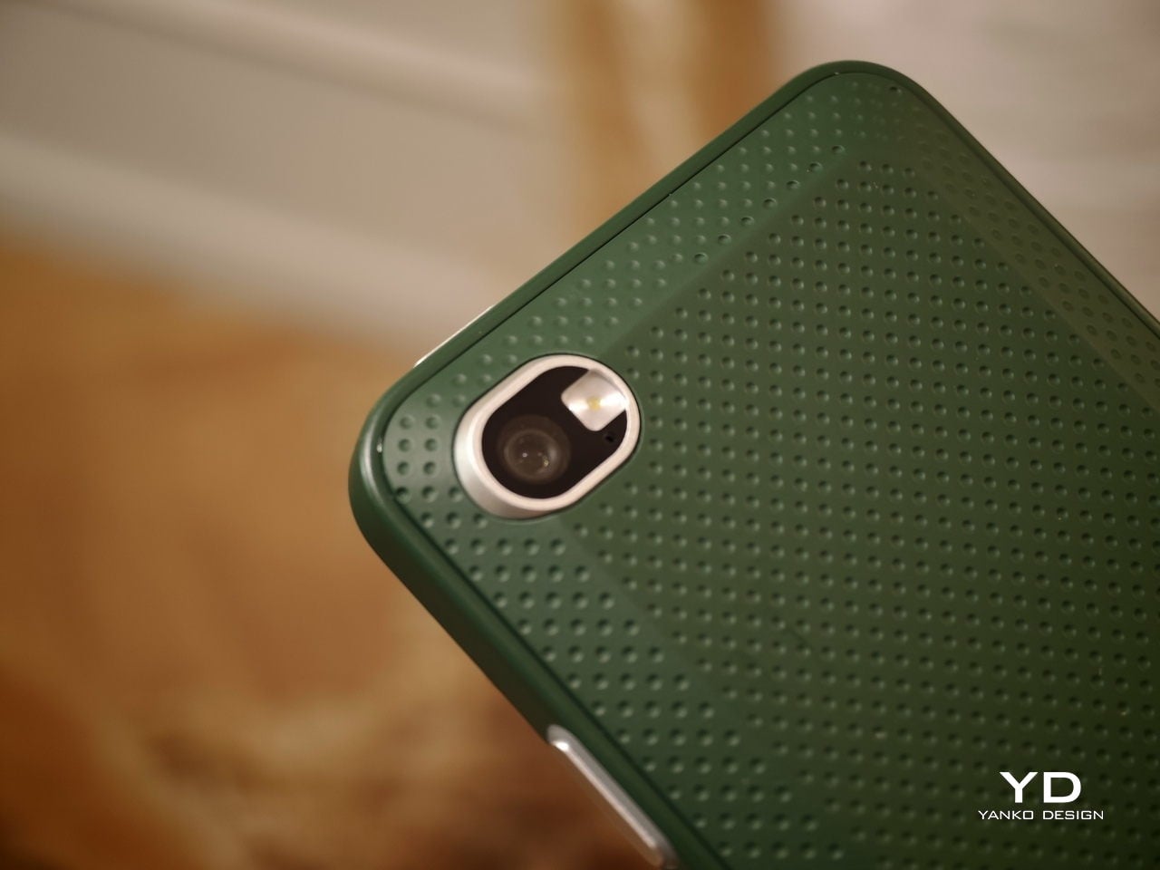
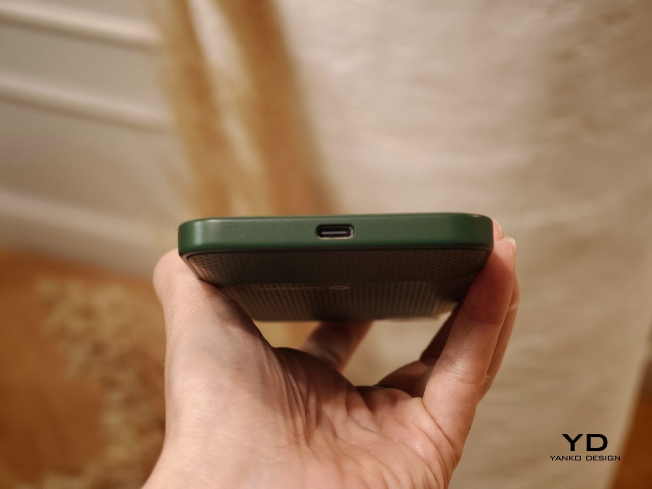
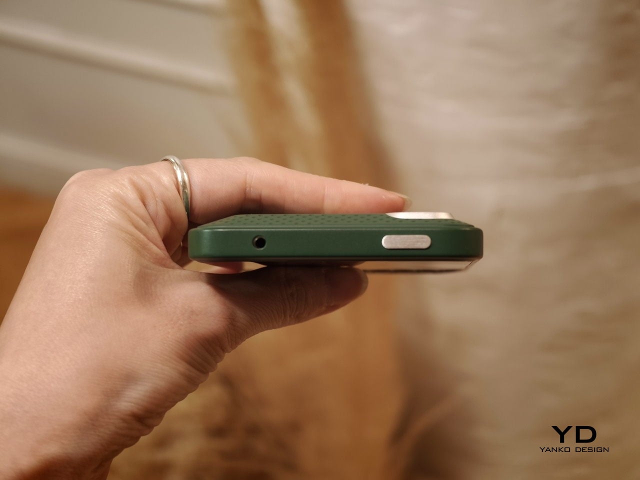
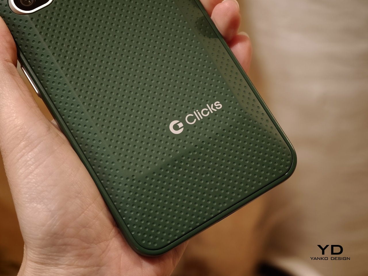
The build felt solid, even in mockup form. One of the most interesting design touches is a magnetic, swappable back panel that snaps on with a confident fit. That modular detail gives the phone a more personal, tool-like vibe, and it suggests Clicks is thinking about long-term ownership rather than quick upgrades.

According to Adrian Li, founder and CEO of Clicks, the Communicator has generated significant interest from the industry over the past few months. Li said the company has been approached by several mobile carriers as well as major retailers that are interested in bringing the device to market. For a young hardware company entering the competitive smartphone space, that attention could be critical.

Carrier partnerships in particular could play a decisive role in the Communicator’s success. While some niche smartphones rely primarily on direct online sales, carrier support can expand a device’s reach through retail stores and bundled service plans. Li noted that Clicks is currently in discussions with potential carrier partners as it explores different distribution strategies for the phone.

Although the prototype shown at MWC was not yet fully functional, the hardware design already reflects the Communicator’s core idea of efficient communication. The device features a compact 4-inch class AMOLED display positioned above a physical backlit QWERTY keyboard. The keyboard is designed to deliver tactile feedback for fast, accurate typing, and it also supports gesture controls for scrolling and navigation.

Under the hood, the Communicator is powered by MediaTek’s Dimensity 8300 processor and runs Android 16. That combination should provide access to the full Android app ecosystem while keeping the experience centered on messaging and productivity. The phone is expected to ship with 256GB of internal storage and support microSD expansion of up to 2TB, which is increasingly rare in modern smartphones.

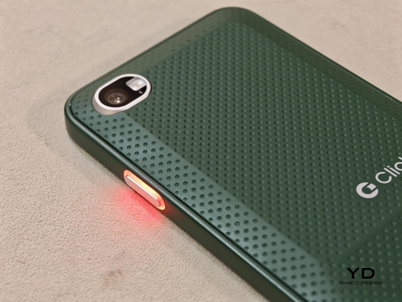
The rest of the hardware stays firmly in modern smartphone territory. The Communicator includes a 50 MP rear camera with optical image stabilization, plus a 24 MP front camera for video calls and selfies. A 4,000 mAh silicon carbon battery powers the device, with support for USB-C charging and Qi2 wireless charging.

Connectivity options include 5G, Wi Fi 6, Bluetooth, and NFC. A combination of nano SIM and eSIM support gives users flexibility when choosing carriers. The Communicator also retains a 3.5mm headphone jack, which will matter to power users and anyone who still prefers wired audio.

Clicks is building several software features around the phone’s communication first pitch. The device includes a Message Hub that aggregates conversations from multiple messaging platforms into a single interface, which should reduce app hopping. A customizable notification light known as the Signal LED can display different colors depending on which contact or app is reaching out.

Despite its productivity focus, the Communicator is not meant to be a limited-function device. Clicks positions it as either a primary smartphone for users who prioritize messaging or a secondary device that complements a larger entertainment-focused phone. That flexibility could be a key part of its appeal, especially for people who want a more focused tool without giving up modern apps.

As for when the Communicator will reach consumers, Clicks says more information is coming soon. According to the company, the official launch date will be revealed in roughly two months. Until then, the Communicator remains in the promising middle ground between concept and product.

For now, the Communicator blends nostalgia with modern smartphone capabilities in a way that feels deliberate rather than gimmicky. The compact in-hand feel, comfortable typing, and sturdy build are encouraging signs, even if this was not yet a final unit. If carrier and retail interest continues to build, Clicks may be on track to ship a device that serves people who still value fast typing and focused communication in an increasingly distraction-heavy mobile world.

The post Carriers Want This BlackBerry-Style Phone – I Tried It at MWC first appeared on Yanko Design.
Your $1,200 Phone Looks Boring Next to These 5 Concepts

Look at the phones announced this year, like those revealed at MWC 2026 last week, and you will notice something. They are all faster, thinner, and shinier than last year’s models, and yet none of them feel particularly surprising. Cameras gained another sensor. Bezels shrank another millimeter. Battery life improved by an amount that is technically measurable but practically indistinguishable from the model before. The industry has gotten so good at making phones incrementally better that it has almost forgotten to ask whether they could be genuinely different.

That is where concept phones come in. Not all of them are practical, and not all of them will ship. But the five designs here do something that the latest Galaxy or iPhone cannot: they make you pause and reconsider what a phone actually is, and what it could be if the people designing it were not also worrying about carrier approvals, supply chains, and quarterly earnings. Some are functional prototypes shown on actual show floors. Others exist purely as design arguments. All of them are worth thinking about.

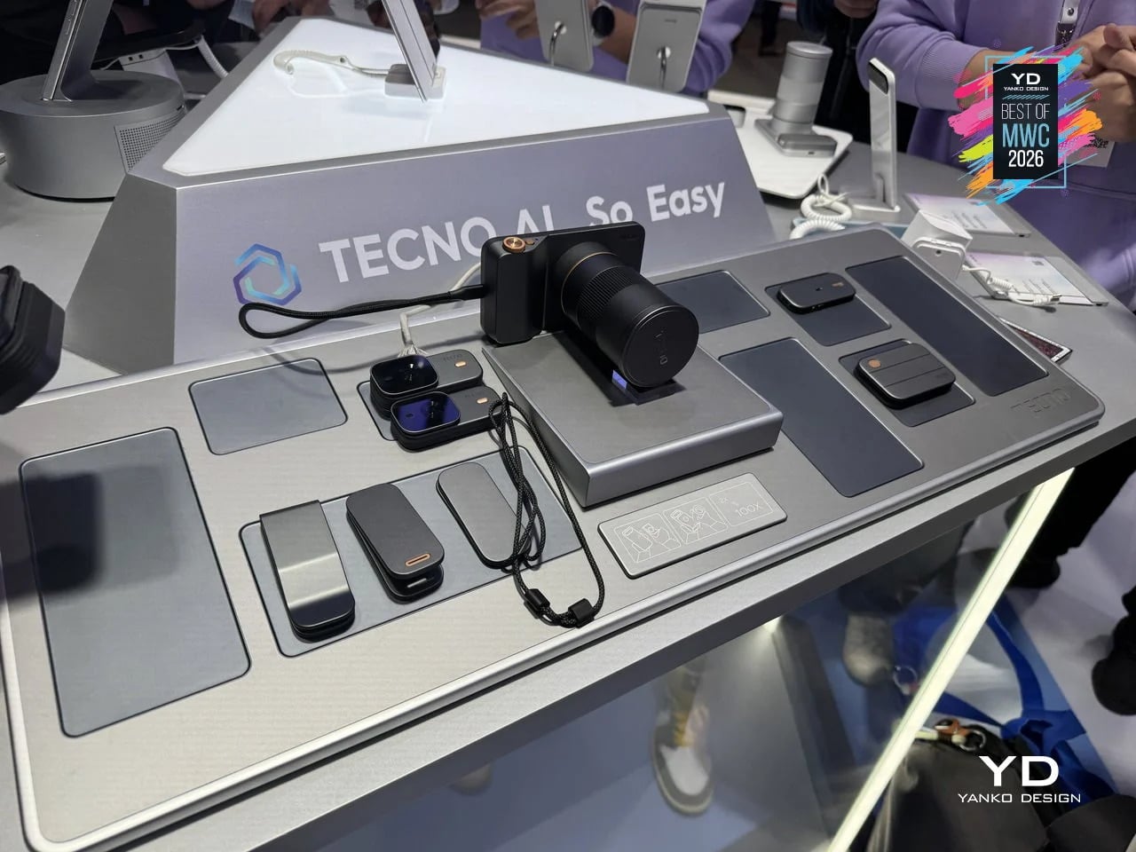
TECNO Magnetic Modular System

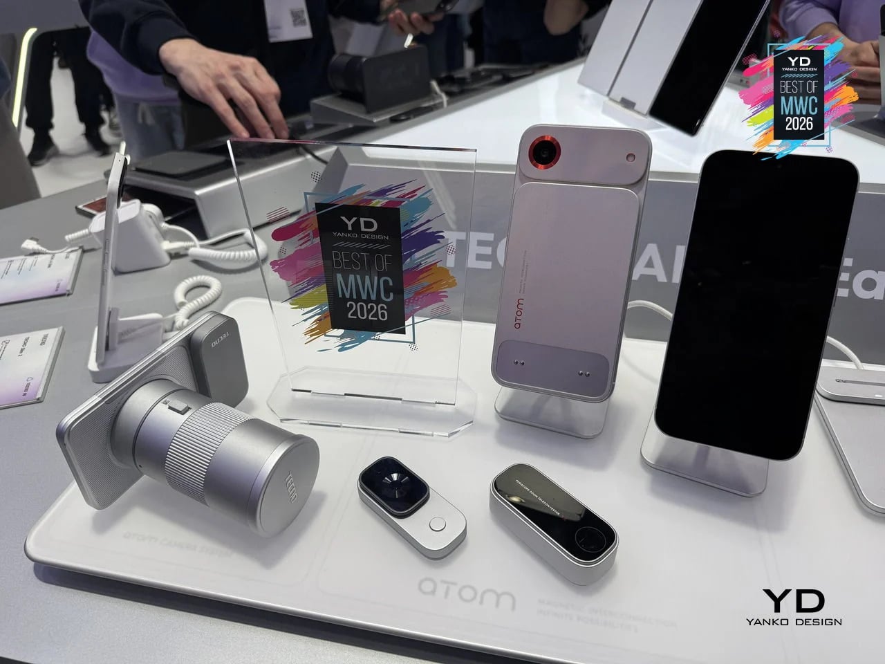
Phones have been getting thinner for years, which sounds like progress until you think about what got traded away in the process. Removable batteries went first, then expandable storage, then headphone jacks. Every feature that required physical complexity was quietly dropped in the name of a slimmer profile. TECNO’s Magnetic Modular System, shown at MWC 2026, challenges that logic directly. Rather than cramming every possible capability into a single fixed body, it keeps the phone lean by design and lets you snap on what you need, when you actually need it.

Designer: TECNO

The system works through a magnetic interconnection technology that attaches hardware modules directly to the phone. Telephoto lenses, action cameras, additional battery packs, and over a dozen other components can be added or removed in seconds. The core argument is straightforward: a phone that tries to do everything is permanently weighed down by everything it carries. A phone that adapts to the moment is only as heavy as today demands. Whether TECNO can pull off what Google’s Project Ara could not is another matter, but the design thinking here is at least pointed at the right problem.

What we liked

  • The base phone stays slim and fully usable on its own, so you’re not carrying the bulk of a photography rig on days when all you really need is a phone.
  • The modular suite covers a wide enough range of options to be genuinely practical, from camera upgrades to battery expansion, rather than limiting you to a couple of cosmetic add-ons.

What we disliked

  • Using the system to its full potential requires thinking ahead. If you leave the telephoto module at home, the hiking trail is not going to wait for you to go back and get it.
  • The smaller modules seem like prime candidates for disappearing to the bottom of a bag, while the larger ones can add considerable bulk when stacked, which rather defeats the point of keeping the base phone slim.

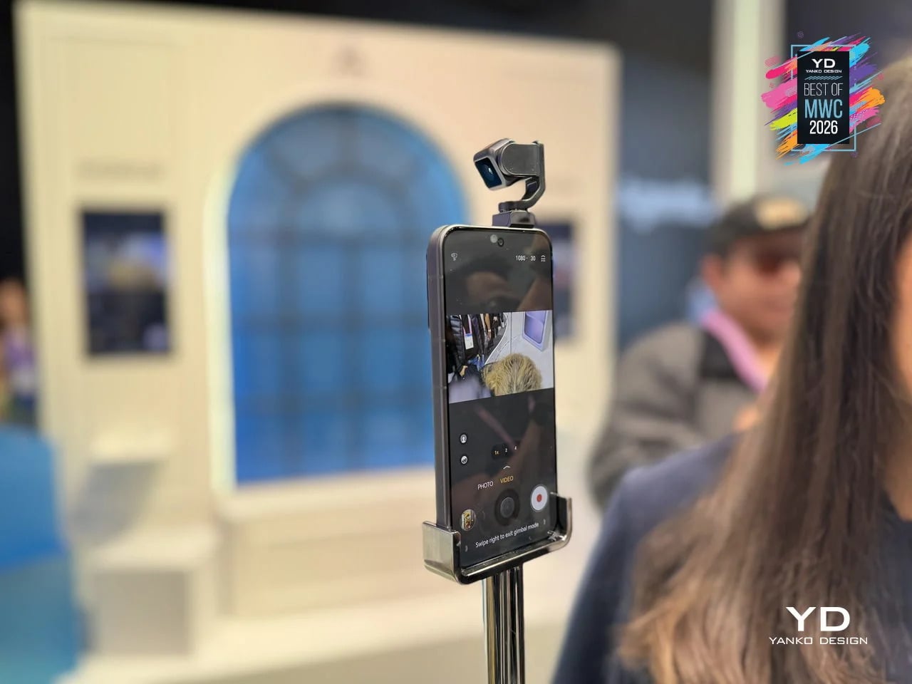
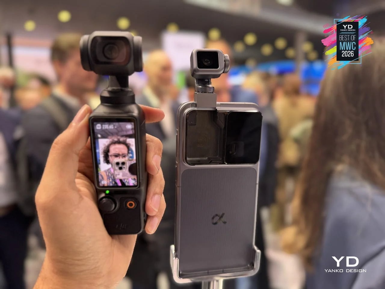
HONOR Alpha Robot Phone

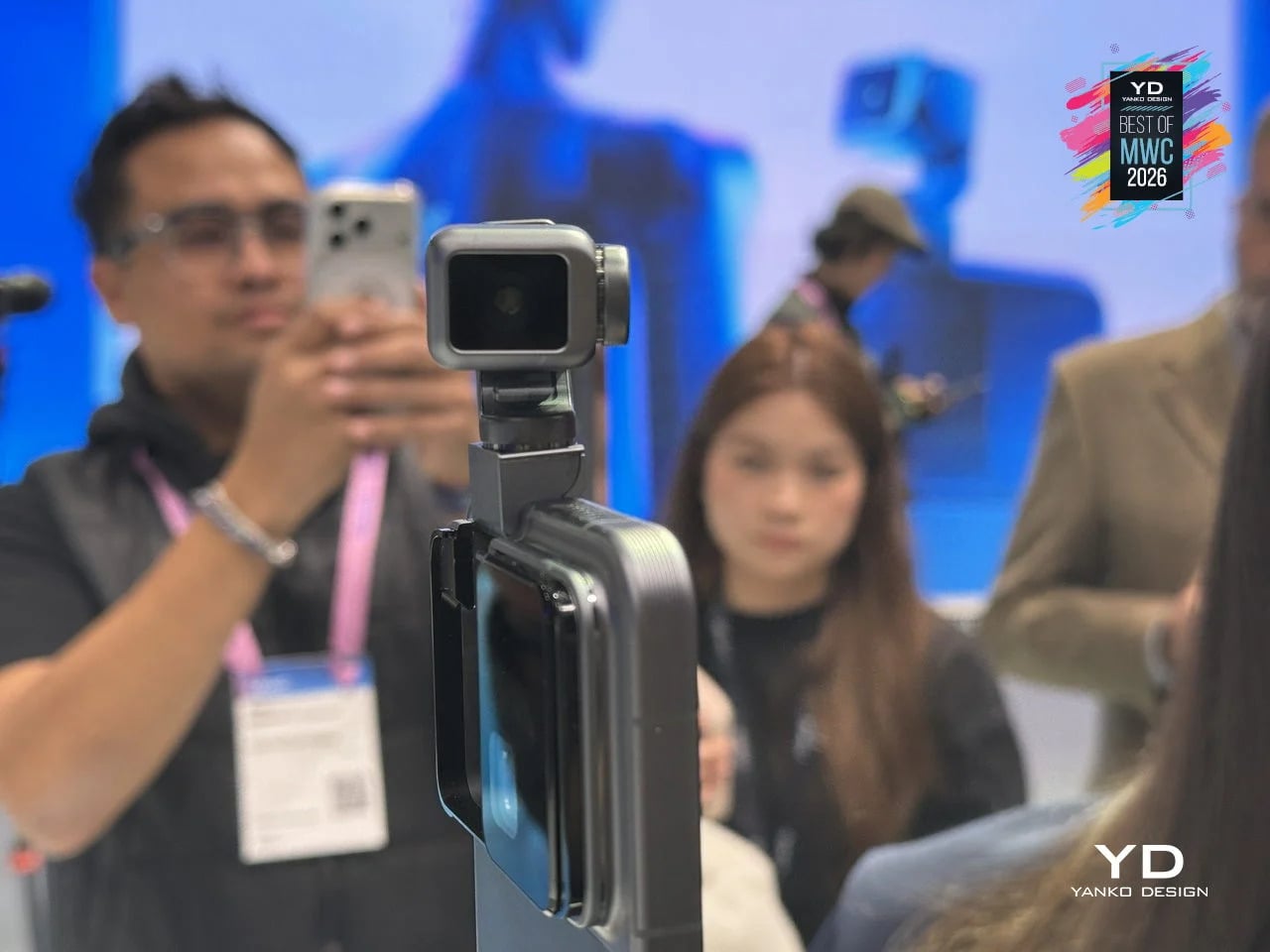
Most phones sit on a desk and wait. The HONOR Alpha does not. Demonstrated as a functional prototype at MWC 2026, this is a phone with a 4DoF gimbal system inside the camera bump, built around what HONOR describes as the industry’s smallest micro motor. Three-axis mechanical stabilization runs alongside an AI tracking engine, and a double-tap locks onto any subject, following it through movement, obstructions, and sudden changes in direction. The person who used to carry a separate DJI Osmo just to get steady footage now has a reasonable question to ask.

Designer: HONOR

The gimbal also does something harder to categorize. HONOR designed it to express what they call embodied AI interaction, meaning the phone physically responds to its environment. It nods during video calls. It reframes itself to keep you centered without being asked. It moves when music plays through its speakers. Phones have had personalities before, mostly through notification lights and ringtones. The Alpha just happens to have something closer to a neck.

What we liked

  • Giving AI a physical presence, rather than just a voice or a chat window, makes the technology feel more tangible and less like a background service you forgot was running.
  • The built-in gimbal meaningfully expands what the main camera can do without requiring any extra gear, turning a stationary device into something closer to an autonomous one-person film crew.

What we disliked

  • Motorized components inside a device that gets dropped, sat on, and shoved into pockets will eventually wear down. A gimbal mechanism that fails out of warranty is a discouraging prospect.
  • The behavioral features, nodding, swaying, tracking your face, are the kind of thing that feels charming in a demo and potentially exhausting at 7 AM when all you want to do is check your messages.

iFROG RS1

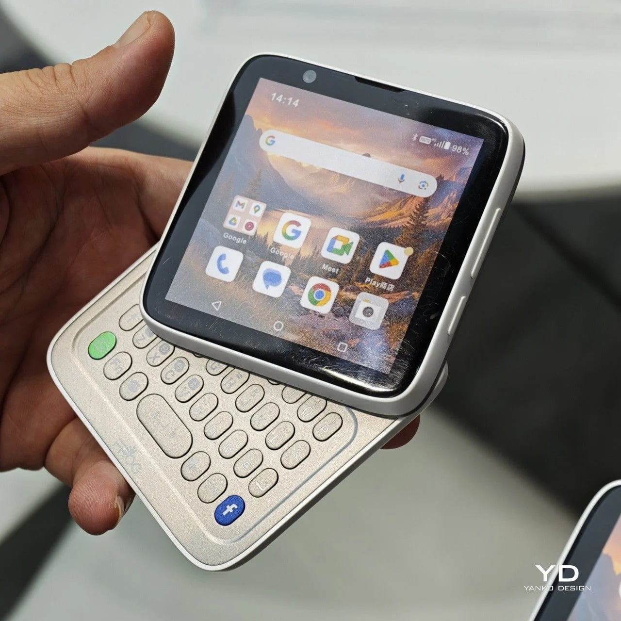
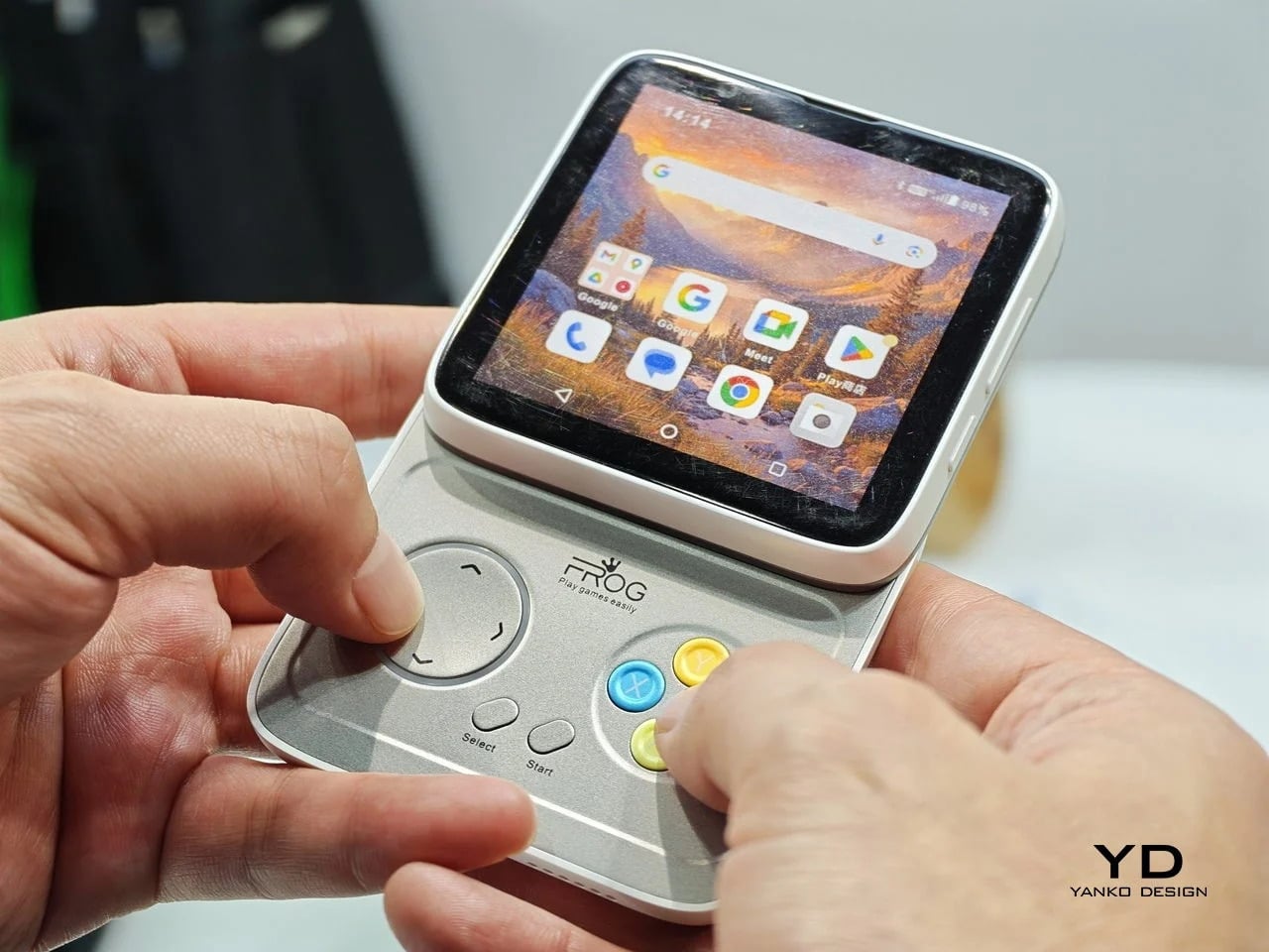
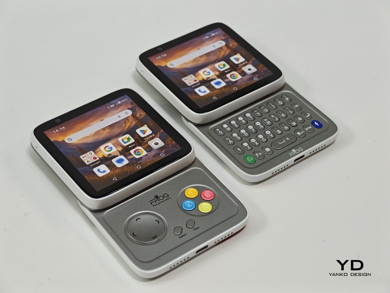
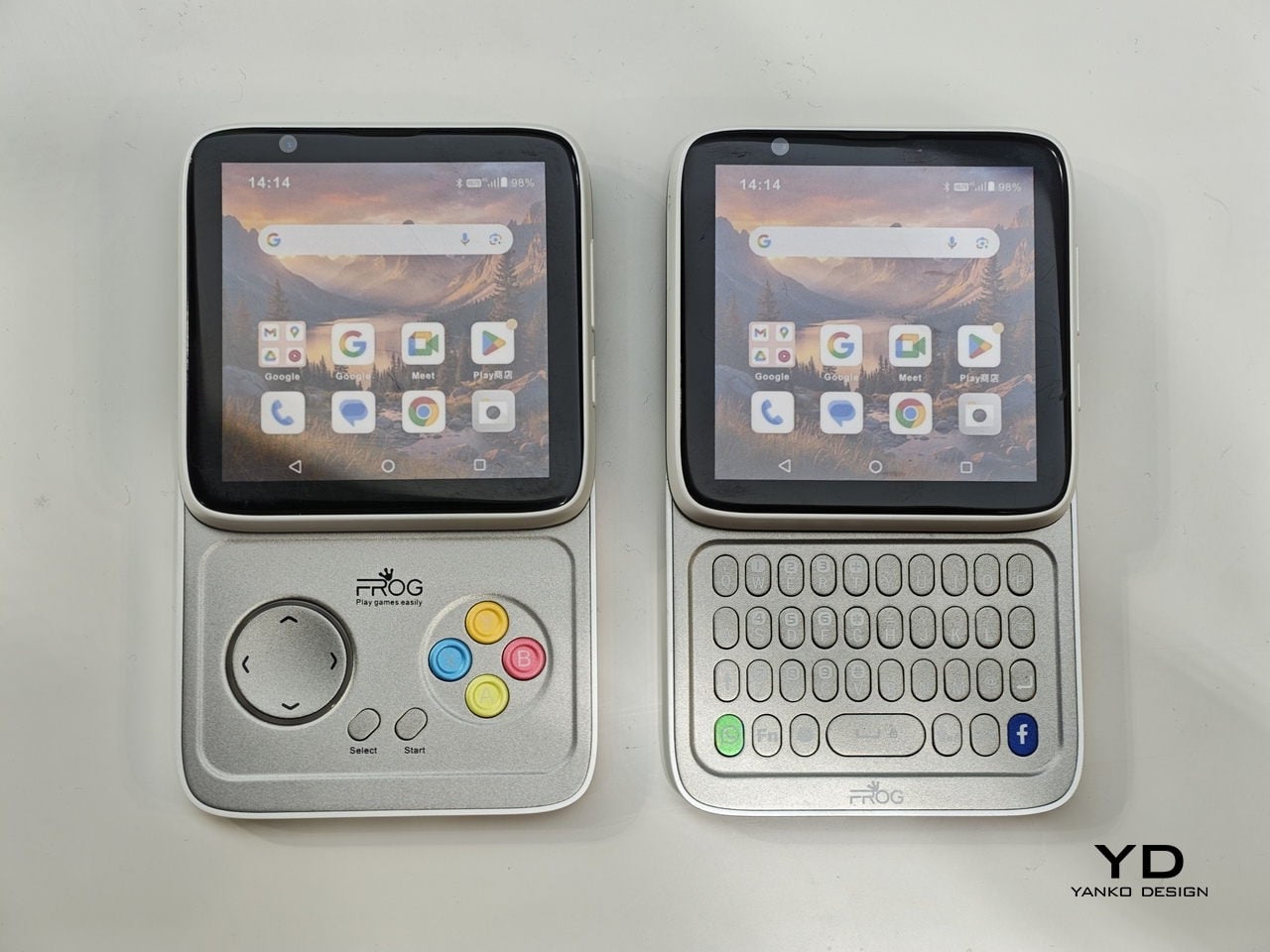
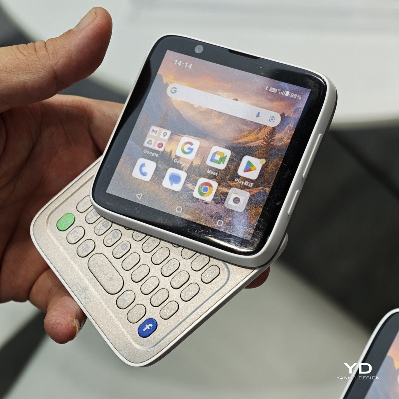
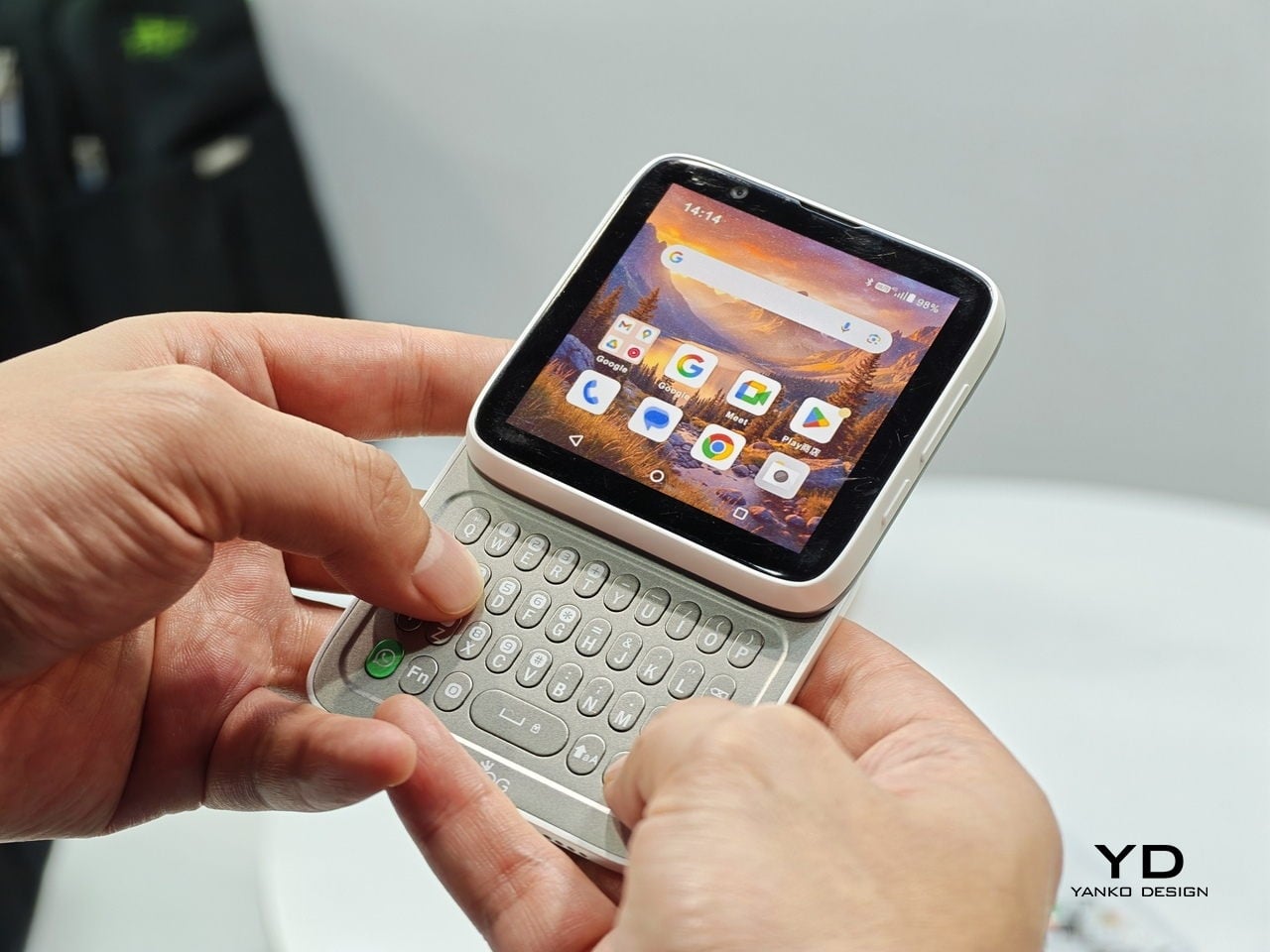
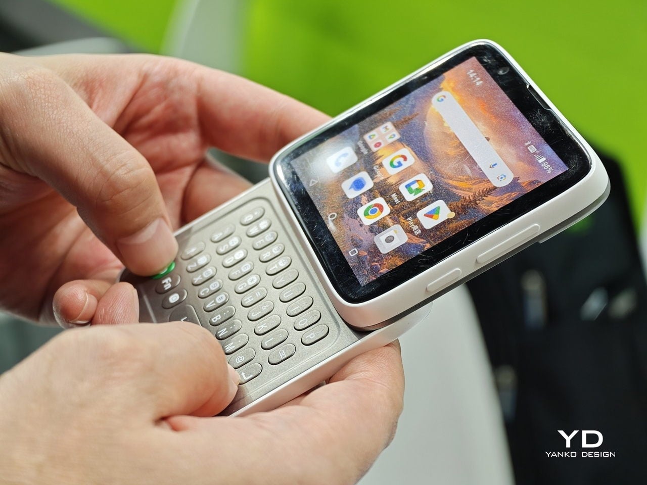
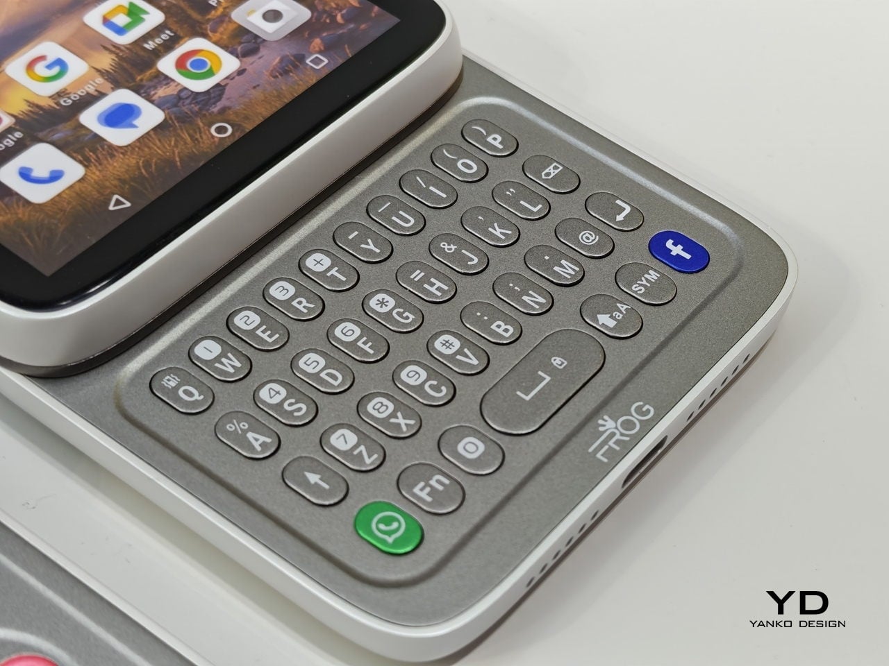
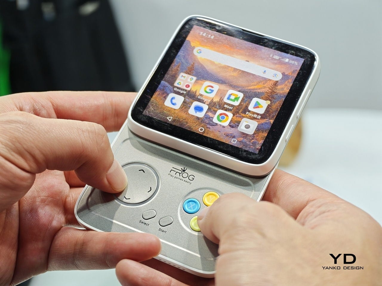
Every phone released this year is a tall rectangle, some taller than others. The iFROG RS1, shown at MWC 2026, is a square, which already makes it unusual before you get to the part where it twists open. Built around a 3.4-inch square display, the RS1 has a rotating lower section that reveals one of two things depending on the variant you’re looking at: a full QWERTY keyboard with raised, tactile keycaps, or a gamepad with a D-pad, a four-button cluster, and Select and Start. No price and no release date were announced at MWC, because the hardware itself is the pitch.

Designer: iFROG

The keyboard variant has a clear and underserved audience. The people who have quietly resented touchscreen typing for fifteen years are not a small group, and the Unihertz Titan has been proving that niche quietly for a while. The gamepad version is a stranger and arguably more interesting proposition. Running Android with physical controls in a square body draws instant comparisons to the Motorola Flipout, a 2010 Android phone that did something structurally similar and was adored by a small crowd before being largely ignored by everyone else.

What we liked

  • The rotating mechanism keeps the phone genuinely compact in normal use, so the keyboard or game controls are there when you want them and completely invisible when you don’t.
  • Adding physical input without making the phone permanently thicker or wider is a trade-off very few devices have come close to solving, and the RS1 at least makes a credible attempt.

What we disliked

  • Modern software is built almost entirely around tall, vertical screens, so the square format creates real friction with apps, video, and content that all assume a rectangular display.
  • Choosing between the keyboard and gamepad variants at the point of purchase is a long-term commitment. If your priorities shift, or you simply want both, you are looking at two separate phones.

TECNO POVA Neon

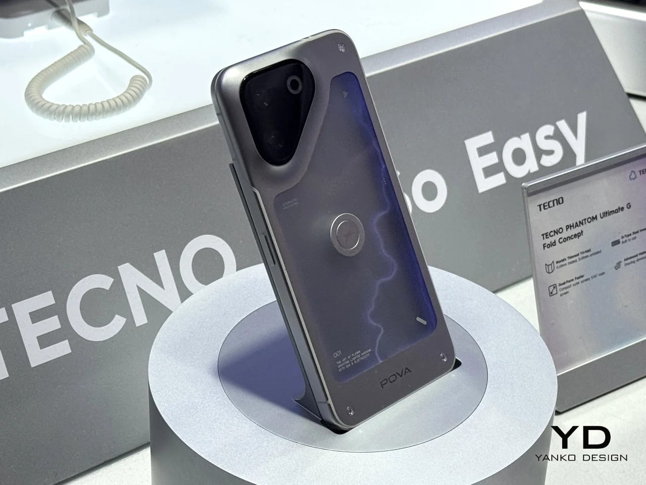
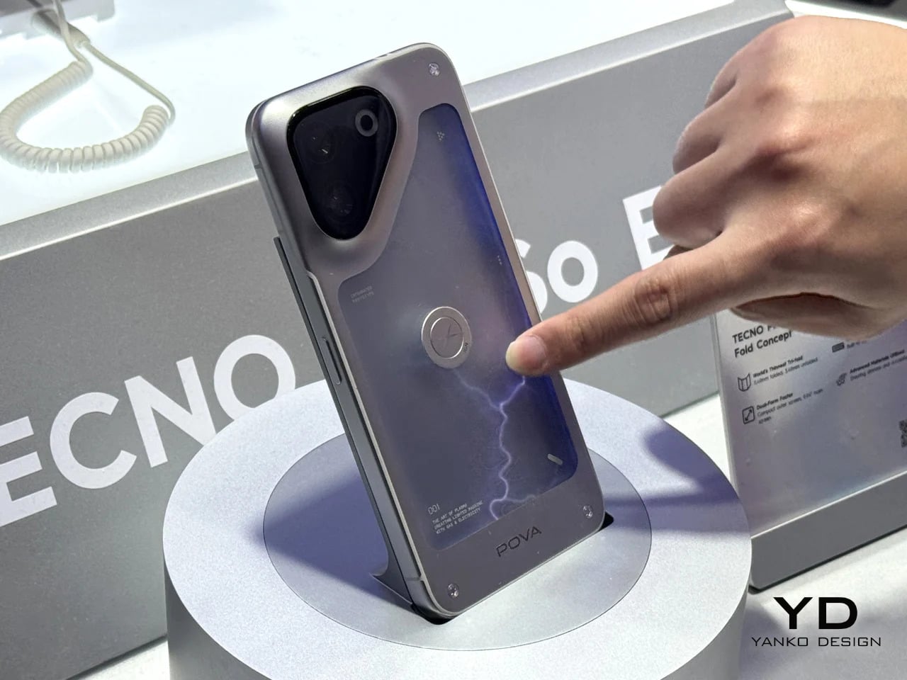
Some phones try to solve a problem, but the POVA Neon honestly isn’t that kind of phone. TECNO’s other MWC 2026 concept uses ionized inert gas lighting, the same technology that gives neon signs their glow, to create a branching luminescent effect on the back panel that sits somewhere between a lightning bolt and a circuit trace. TECNO is not claiming this makes the phone faster or the camera better. The claim is simpler and more honest: a phone’s back doesn’t have to be an inert sheet of glass waiting to collect fingerprints.

Designer: TECNO

As design statements go, that one is actually worth taking seriously. Most phone backs are the most visible surface on a device that billions of people carry every day, and they’re almost universally empty. The POVA Neon asks what happens when that surface does something. The answer here is that it glows, which is not practical and doesn’t need to be. Concept work isn’t obligated to be practical. It’s obligated to make you look at a familiar object differently, and a phone that pulses with light like a neon sign in a diner window at least does that.

What we liked

  • Treating the back panel as a dynamic surface rather than a passive sheet of glass is a genuinely fresh direction, and using ionized gas to do it is unlike anything else currently on the market.
  • As a concept, it opens up real questions about how materials and lighting could make phone design more expressive without requiring any changes to the screen whatsoever.

What we disliked

  • Ionized gas channels in a device that flexes under grip pressure, absorbs impacts, and hits the floor on a semi-regular basis seem like they would not survive the lifespan of the phone itself.
  • A protective case, which most people use, would cover the entire back panel and make the concept completely invisible. It is a design that fundamentally cannot coexist with the most basic act of protecting your phone.

Pixel Dynamics iPhone Fold Concept

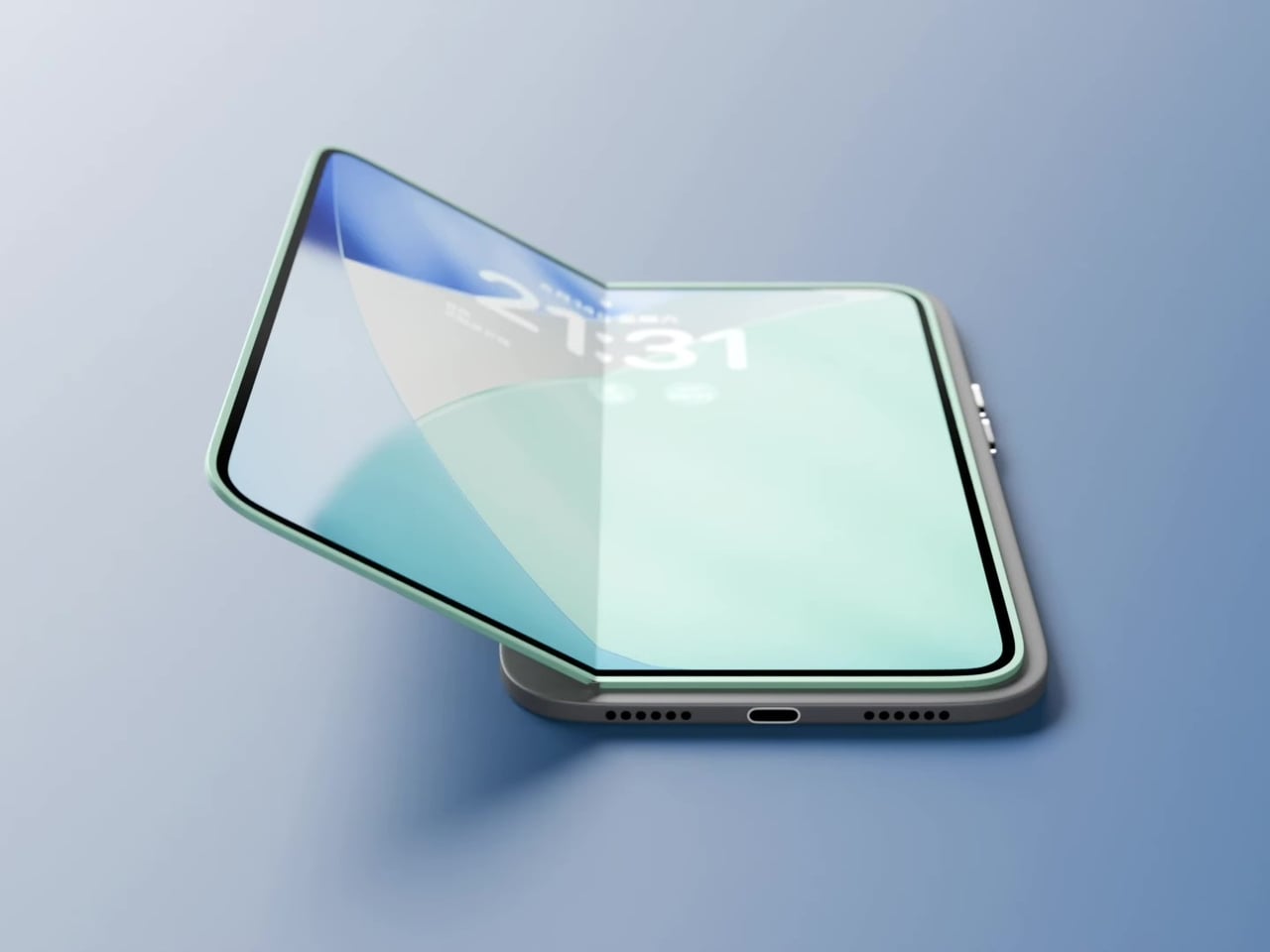
Foldable phones keep running into the same set of problems. The phone has to fold, which means the screen has to fold, which means the screen eventually creases at the hinge line, the hinge develops resistance over time, and the finished device ends up thicker than either of the two things it’s trying to be. Pixel Dynamic’s iPhone Fold concept approaches the whole premise from a different direction. Keep the iPhone exactly as it is. Add a separate foldable screen to the back.

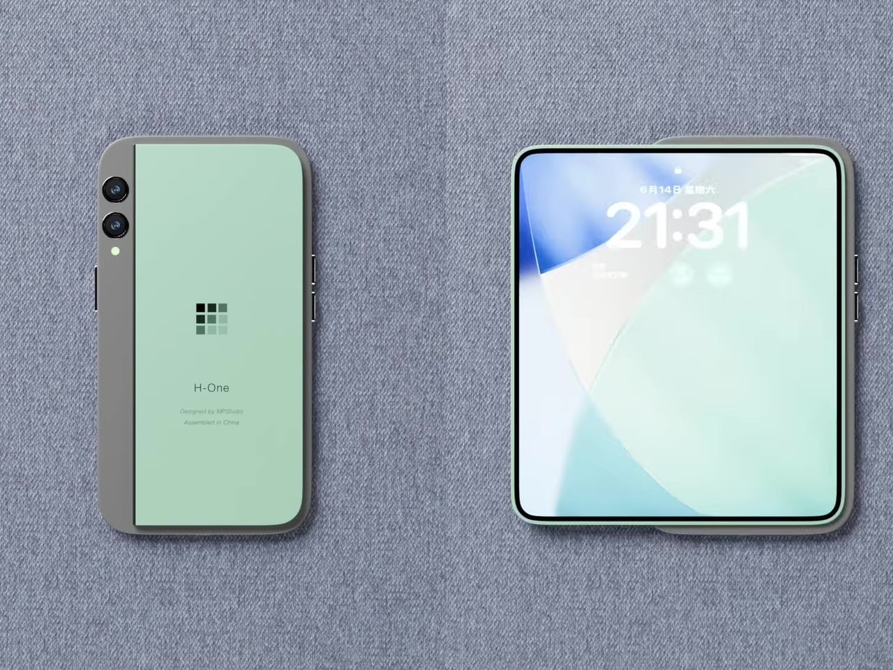
The main iPhone body stays rigid and conventional. A thin, flexible secondary display sits raised on a platform above the rear panel, and when needed, it unfolds outward to create a larger, roughly square tablet surface. The phone itself does not flex, leaving the primary display completely untouched. In daily use, it feels and functions like a normal iPhone, because it essentially is one. That said, the raised platform adds thickness, wireless charging is probably absent, and using the camera while the secondary screen is unfolded becomes nearly impossible since it sits directly over the lenses. Apple almost certainly will never endorse the design, but as a thought experiment about whether a foldable screen and a foldable phone actually need to be the same thing, it’s one of the more original answers anyone has put forward.

What we liked

  • Treating the foldable display as a separate, discrete component rather than the phone’s primary structural element is unconventional thinking, and it raises genuinely interesting questions about repairability and modular design.
  • The concept challenges the assumption that a foldable phone has to mean a folding device, which is exactly the kind of first-principles questioning that occasionally turns into something the industry actually builds five years later.

What we disliked

  • Getting a raised foldable display to sit flush, function reliably through daily use, and survive the realities of a pocket likely puts this well outside what current manufacturing can deliver.
  • Apple’s tendency to design through subtraction rather than addition makes this particular execution, with its visible raised platform and external folding mechanism, almost impossible to imagine coming from Cupertino in any recognizable form.

The post Your $1,200 Phone Looks Boring Next to These 5 Concepts first appeared on Yanko Design.
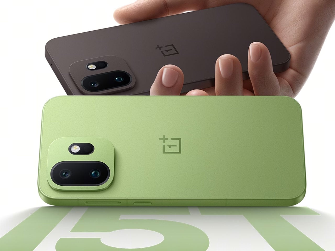
First look of new OnePlus 15T revealed, hints two new colors and high-end features

OnePlus has recently redefined what it means to “never settle” with its OnePlus 13 and 13T smartphones. Now, the company is back in the spotlight amid rumors of another device that appears similar in design but is expected to come with a more capable approach.

Over the past week, the OEM has faced growing speculation and anticipation surrounding the possible launch of this new smartphone. And now it seems OnePlus is openly teasing the device, sharing its images that reveal two new colorways along with details about the phone’s design and the layout of its camera array.

Designer: OnePlus

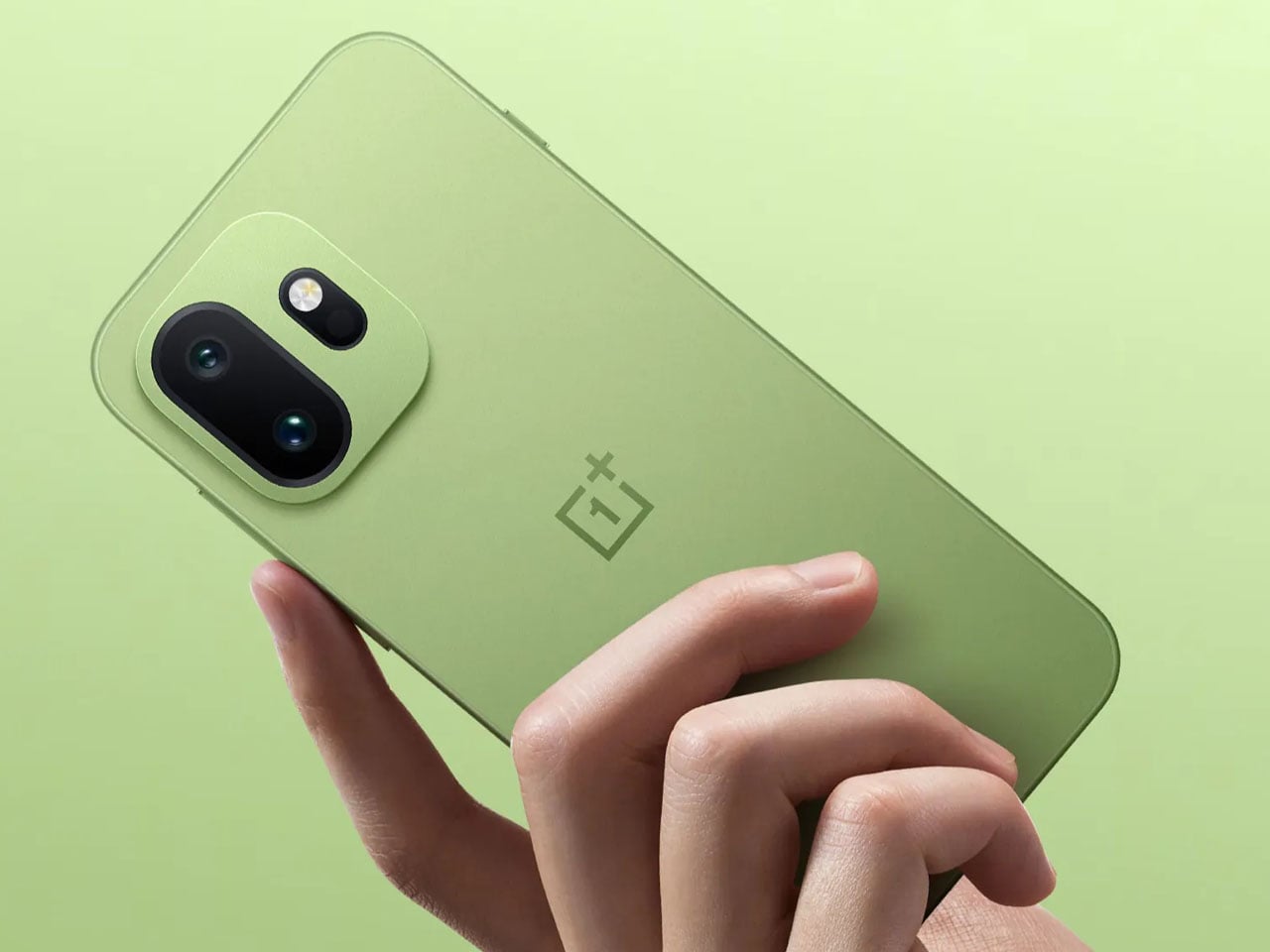
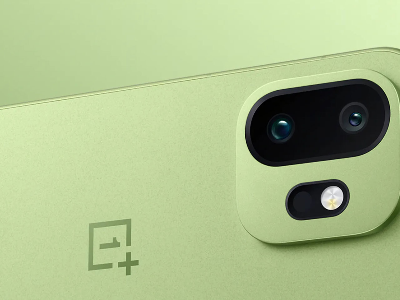
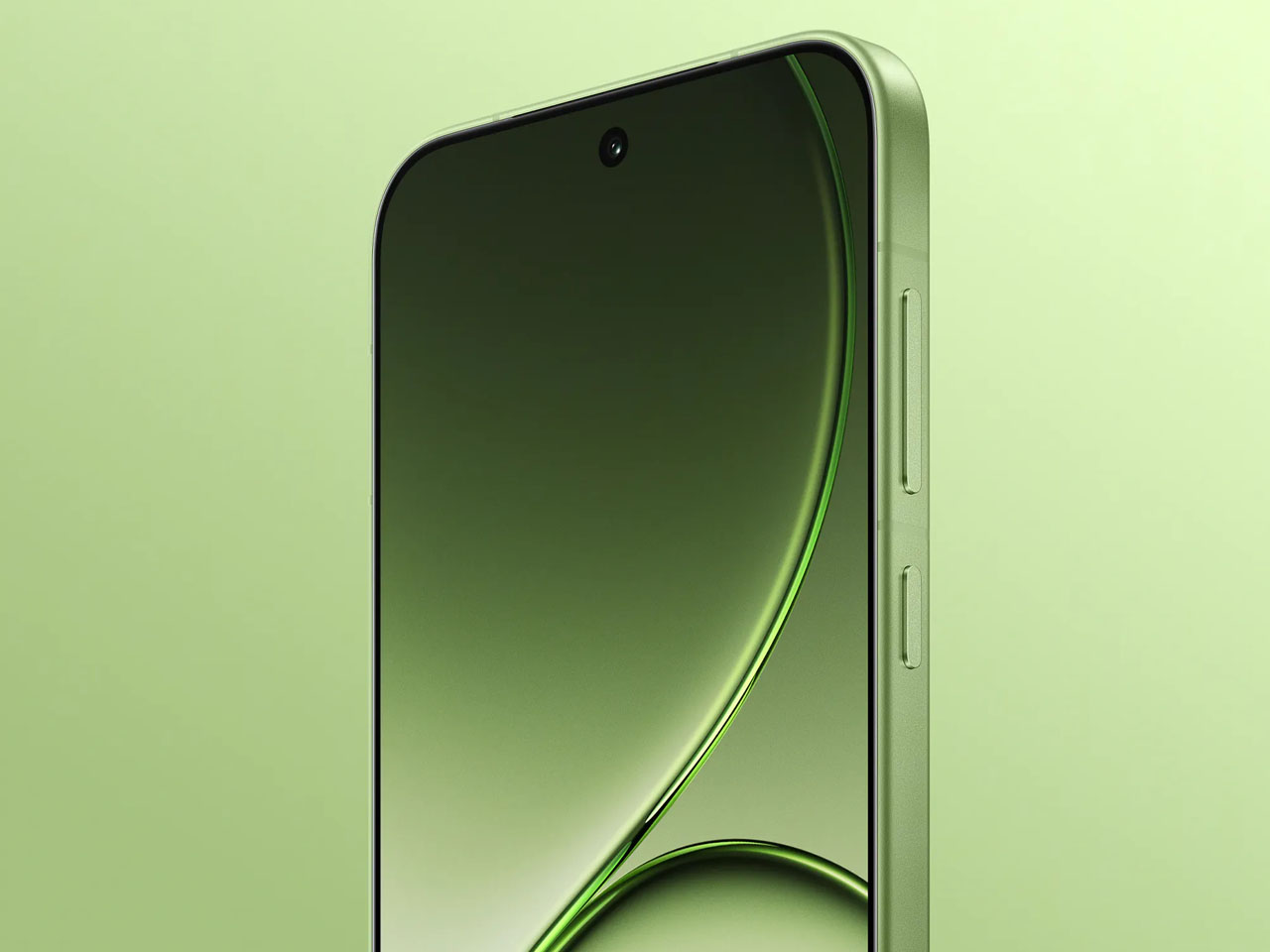
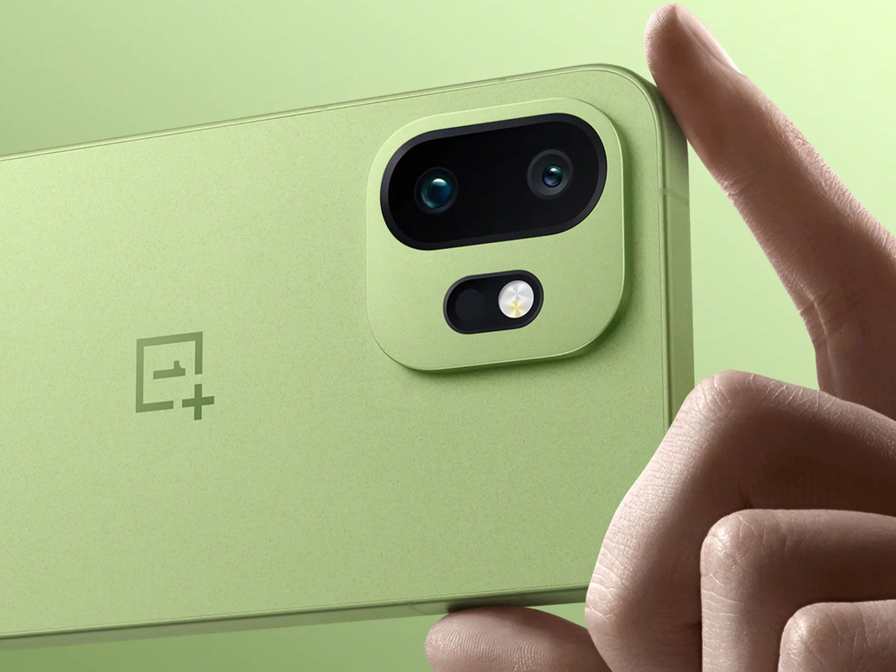
In the images that were shared on Weibo, a Chinese microblogging website, the upcoming phone is revealed in green and brown colors, but with a design that seems very much inspired by the 13T. The phone in question is the OnePlus 15T, which is showing up in its real self – ahead of a launch – for the first time. Most of what we have been able to know about the handset in the recent past has been by way of speculations and hearsay only.

Now, for the first time, we are getting an official update about how the OnePlus 15T will look and the color options you should be able to get. When it comes to looks, from the available pictures, the 15T appears very similar to the 13T. Phone could have a similar 6.32-inch AMOLED display and a rounded off design with a slim bezel, and as seen, would come in new green and brown colorways.

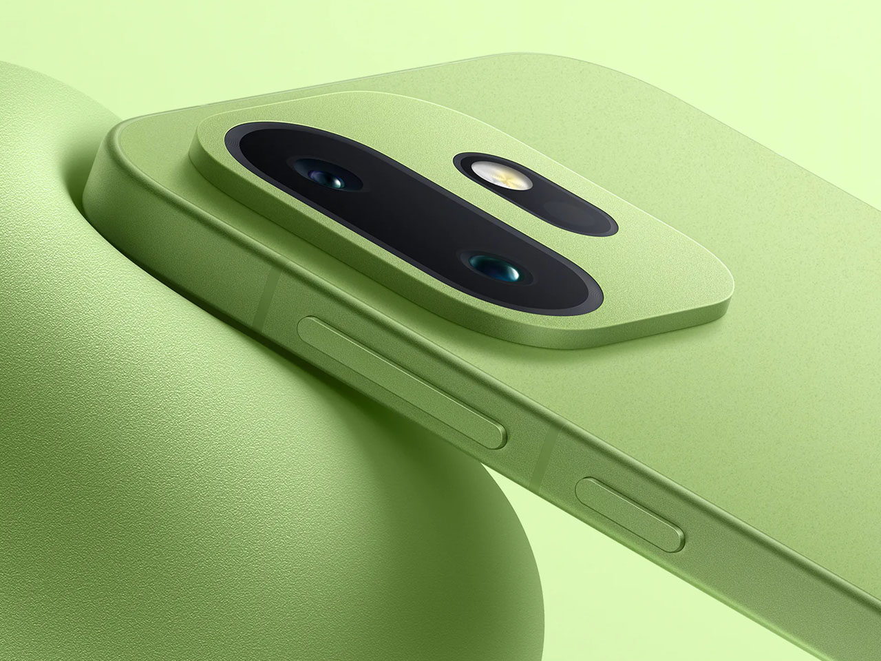
On the reverse side, the phone reveals a dual rear camera housed within a rounded square module toward the top left corner of the phone. Inside the camera housing are the two rear sensors and an LED flash. A setup which – like the design – is similar to that of the predecessor in the same size segment. With the design and new colors, the revealed images also show that the new phone will get a matte finish on the rear panel.

According to the other details already confirmed, the OnePlus 15T will feature a slim bezel and rounded corners for a comfortable grip and usage. Arriving with an AMOLED display only 6.32 inches in size and an upgraded periscope telephoto camera alongside the 3.5x optical zoom, the OnePlus 15T, despite its compact size, gets some high-end features. The phone is likely to draw power from a Snapdragon 8 Elite Gen 5 SoC with 16GB of RAM. It will feature up to an IP69K rating, making the handset capable of handling dust, water dips, and high-pressure water sprays with equal confidence.

Before you consider size and durability as top facets of the OnePlus 15T, just spare a thought for its 7,500mAh battery, rumored to support 100W wired and 50W wireless fast-charging. OnePlus 15T is likely to launch in China later this month, and that’s really when we will have the definite details about the phone. Before that, most of it was only rumors!

The post First look of new OnePlus 15T revealed, hints two new colors and high-end features first appeared on Yanko Design.
This Square Phone Rotates Open to a BlackBerry or Game Boy Setup

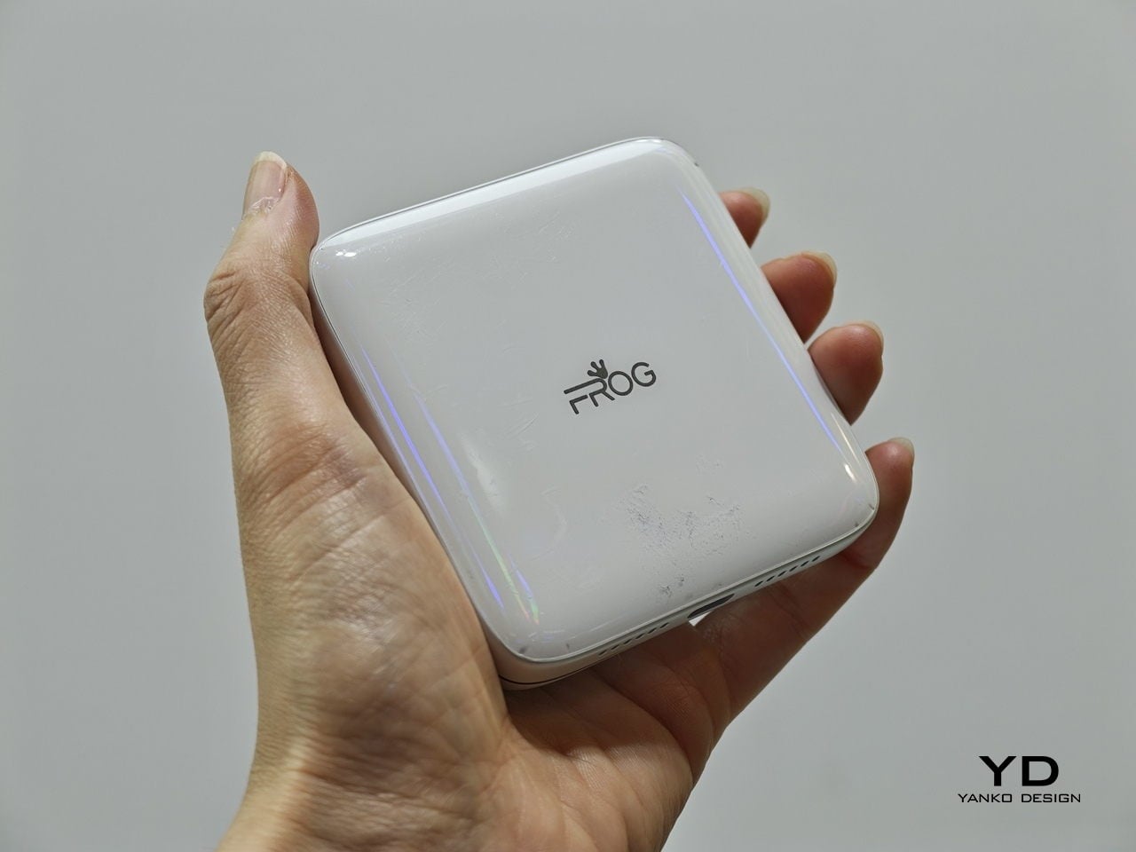
Smartphones have gotten pretty good at being the same thing. Every year, they get a little taller, a little thinner, and a little more difficult to tell apart in a lineup. That’s fine for most people, but it does make MWC 2026 feel like a bit of a slog, until you spot something genuinely weird on the show floor, like a square phone that rotates open to reveal either a physical keyboard or a game controller underneath.

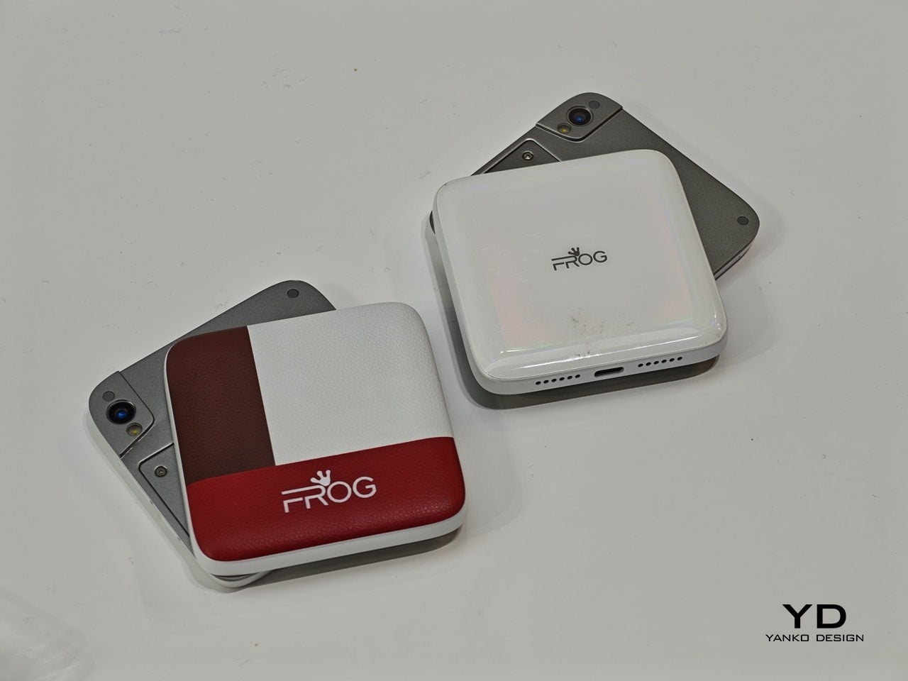
The iFrog RS1 is about the size of a closed fist, built around a 3.4-inch square display that sits on top of a rotating lower section. Twist it open, and you get one of two things depending on which variant you’re holding: a full QWERTY keyboard with raised, tactile keycaps, or a gamepad with a D-pad, a four-color face button cluster, and Select/Start buttons. Both run Android on a MediaTek Helio G18 chipset, with storage and RAM left open for whoever configures the platform.

Designer: FROG

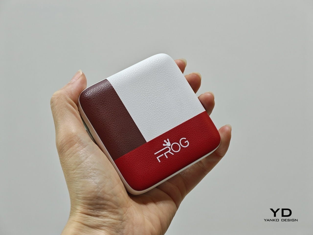
That last part matters. iFrog is an ODM, or original design manufacturer, which means the RS1 is less a finished retail product and more a concept that carriers or brands can take and build on. The hardware is the pitch. Everything else is a conversation, which also explains why no pricing or release date was announced at MWC.

Of the two variants, the keyboard is the more predictable crowd-pleaser. There’s a genuinely underserved group of Android users who never stopped wanting physical keys. The BlackBerry crowd never fully disbanded, and phones like the Unihertz Titan have quietly built followings on exactly that. If you’ve ever tried composing a long email on a touchscreen while standing on a moving train, the appeal needs no further explanation.

The gamepad version is a stranger proposition, and honestly, the more interesting one. Running Android means emulation is an obvious draw, and the handheld gaming community noticed immediately. The visual comparison that kept surfacing online was the Motorola Flipout, a 2010 Android phone with a square body and rotating keyboard. There’s something both flattering and sobering in that parallel, since the Flipout was beloved by a small group and largely ignored by everyone else.

There are some caveats, though. No shoulder buttons on the gamepad variant rules out a lot of titles that need them. The swivel hinge is the structural heart of the design and also the part most likely to wear down. iFrog is new enough that questions about long-term software support are fair ones to ask, and the 3.4-inch screen is a genuine trade-off, not a quirk.

Still, the RS1 is a good reminder that the design space for phones is wider than what’s on shelves. It fits in a pocket and in the palm of a hand. It has buttons. It does a trick. What nobody knows yet is whether any of that adds up to something people actually want to live with.

The post This Square Phone Rotates Open to a BlackBerry or Game Boy Setup first appeared on Yanko Design.
This Rugged Phone Ships With 2 Batteries You Can Hot-Swap

Dead battery anxiety is real, and for most people, the solution is either a power bank they forgot to charge or a desperate search for an outlet. Flagship phones have been getting faster at charging for years, but none of them have gone back to the one fix that actually solves the problem: a battery you can take out and replace with a fresh one, right there on the trail.

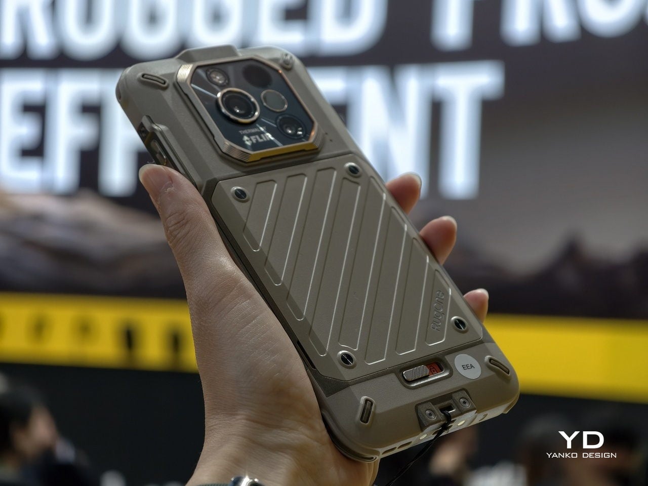
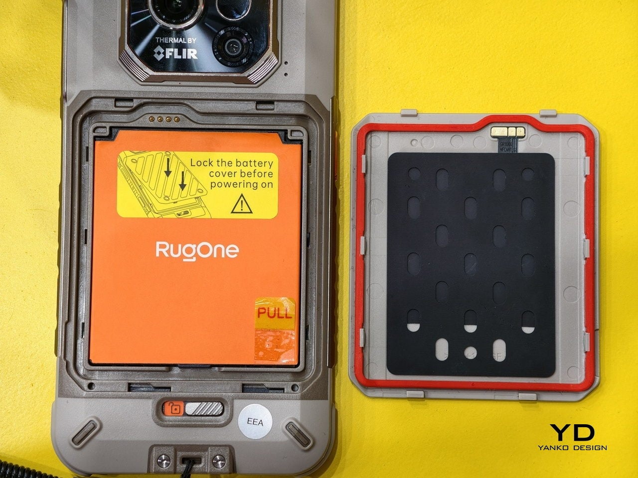
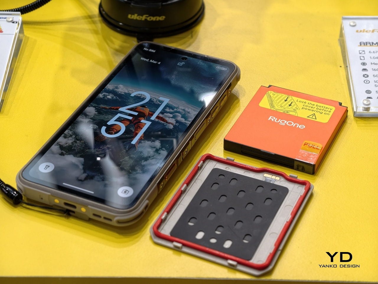
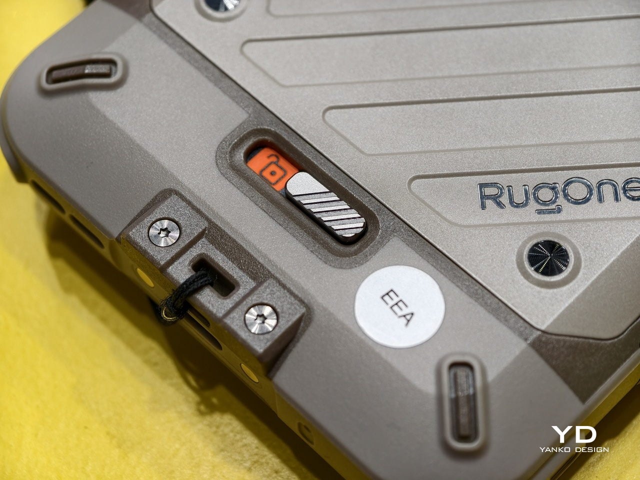
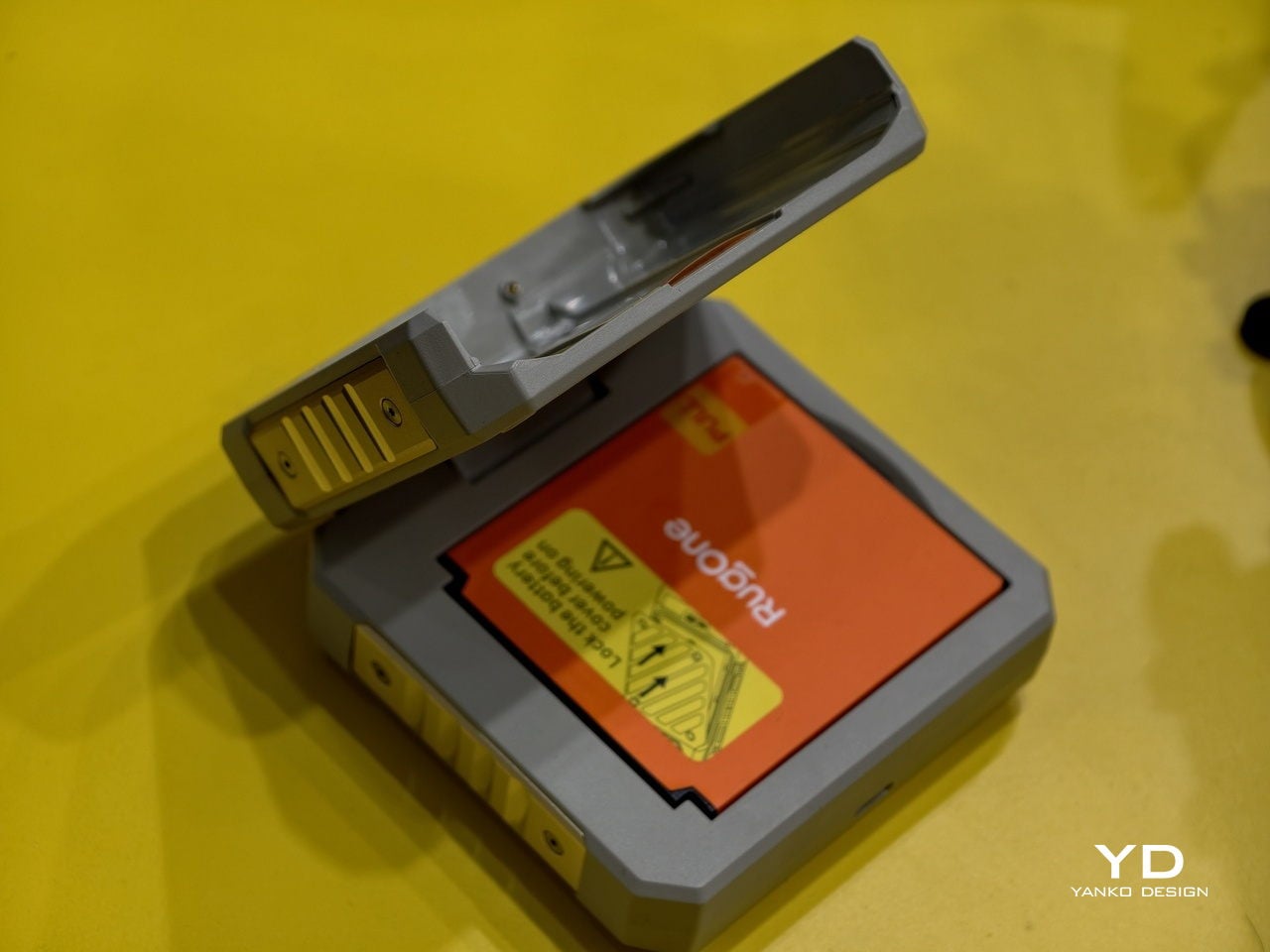
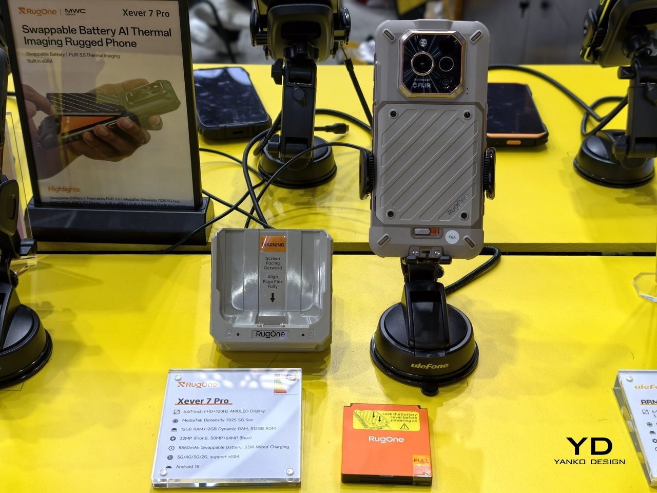
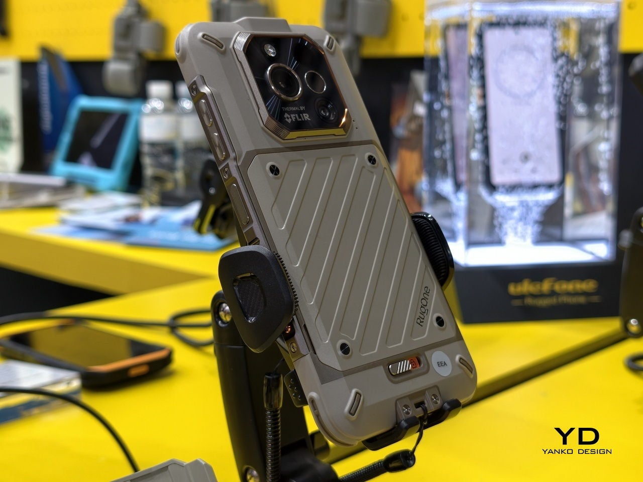
That is exactly what the RugOne Xever 7 does. It ships with two 5,550 mAh batteries and a built-in buffer cell that keeps the phone alive during the swap, so you never have to restart. The whole process takes under 180 seconds. There is no hunting for a socket, no waiting out a charging cycle, and no watching the percentage tick up while your plans sit on hold.

Designer: Ulefone

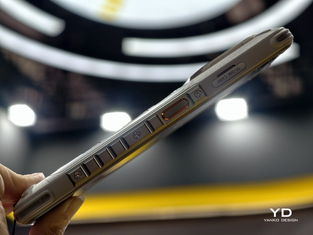
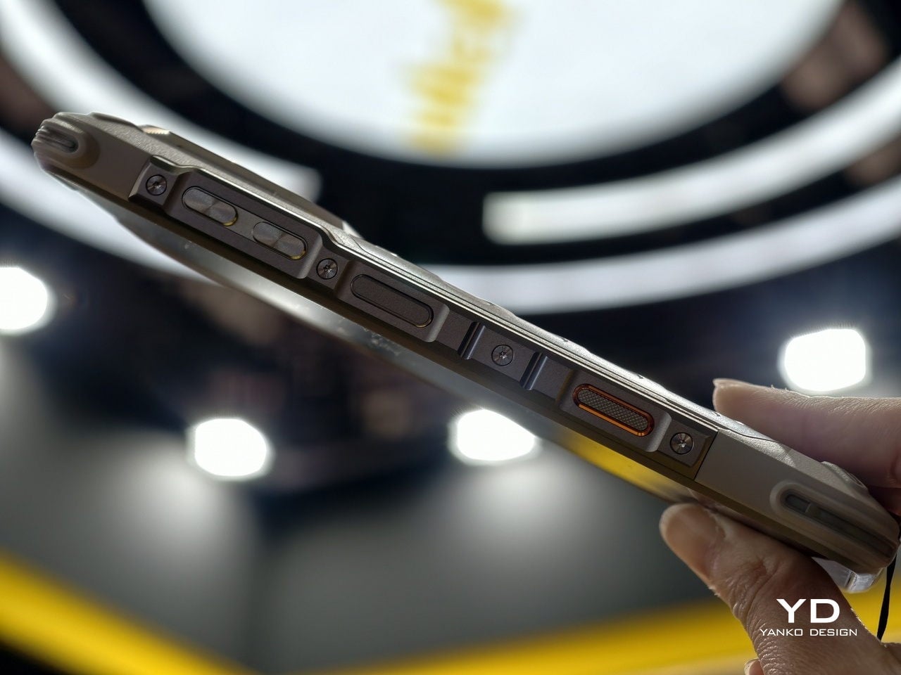
The phone is IP69K and IP68 rated, survives drops per MIL-STD-810H certification, and weighs 325 g, which is heavy but not unusual for a rugged device with this much packed inside. The 64 MP night vision camera uses four built-in infrared lights to shoot in complete darkness, which is genuinely useful if you have ever tried to photograph a campsite at 2 a.m. with a regular phone and gotten nothing.

There is also a 50 MP main camera with optical image stabilization, a 50 MP ultra-wide with a 117.3-degree field of view, and a 32 MP front camera. The phone supports underwater photography as well, with controls you can operate while submerged. Video tops out at 2K at 30 fps, which is fine for most outdoor documentation but a step behind phones at similar price points that record at 4K.

The display is a 6.67-inch AMOLED panel running at 120 Hz with a 2,200-nit peak brightness, which holds up well in direct sunlight. Inside is a MediaTek Dimensity 7025 chipset paired with 12 GB of RAM and 512 GB of storage, expandable to 2 TB via microSD. That chipset is mid-range by current standards, so this is not a performance-first phone, but it handles everyday tasks without friction.
Charging runs at 33W over USB-C or 18W through the Pogo Pin dock that comes in the box. The dock charges the spare battery simultaneously, so by the time your current battery runs low, the backup is already full and ready. That closed loop is the smartest part of the whole system, and the detail that makes the swappable battery feel like a considered design decision rather than a novelty.
Android 15 runs clean here, with Google Gemini built in, a 230-lumen flashlight, an X-axis linear vibration motor, and a 3.5 mm headphone jack that has no business still being this satisfying to find on a phone. The Xever 7 does not try to reinvent what a rugged phone is. It just fixes the one thing that frustrates people most, and lets everything else do its job quietly.

The post This Rugged Phone Ships With 2 Batteries You Can Hot-Swap first appeared on Yanko Design.