Modern furniture design has been quietly shifting priorities. Smaller homes and more deliberate interiors have created real demand for pieces that do more without taking up more space or sacrificing how they look. Stools and side tables are easy targets for this kind of dual-purpose thinking, but most of them still feel like a workaround, a compromise dressed up as a solution, rather than a genuinely well-considered object.
The Ishi stool from Japanese studio Mililab isn’t that kind of compromise. It came out of a separate project entirely, one that had nothing to do with stools, and it ended up as something that’s equal parts furniture object and quiet design statement. That accidental origin is actually central to understanding why it looks the way it does, and why it works as well as it does.
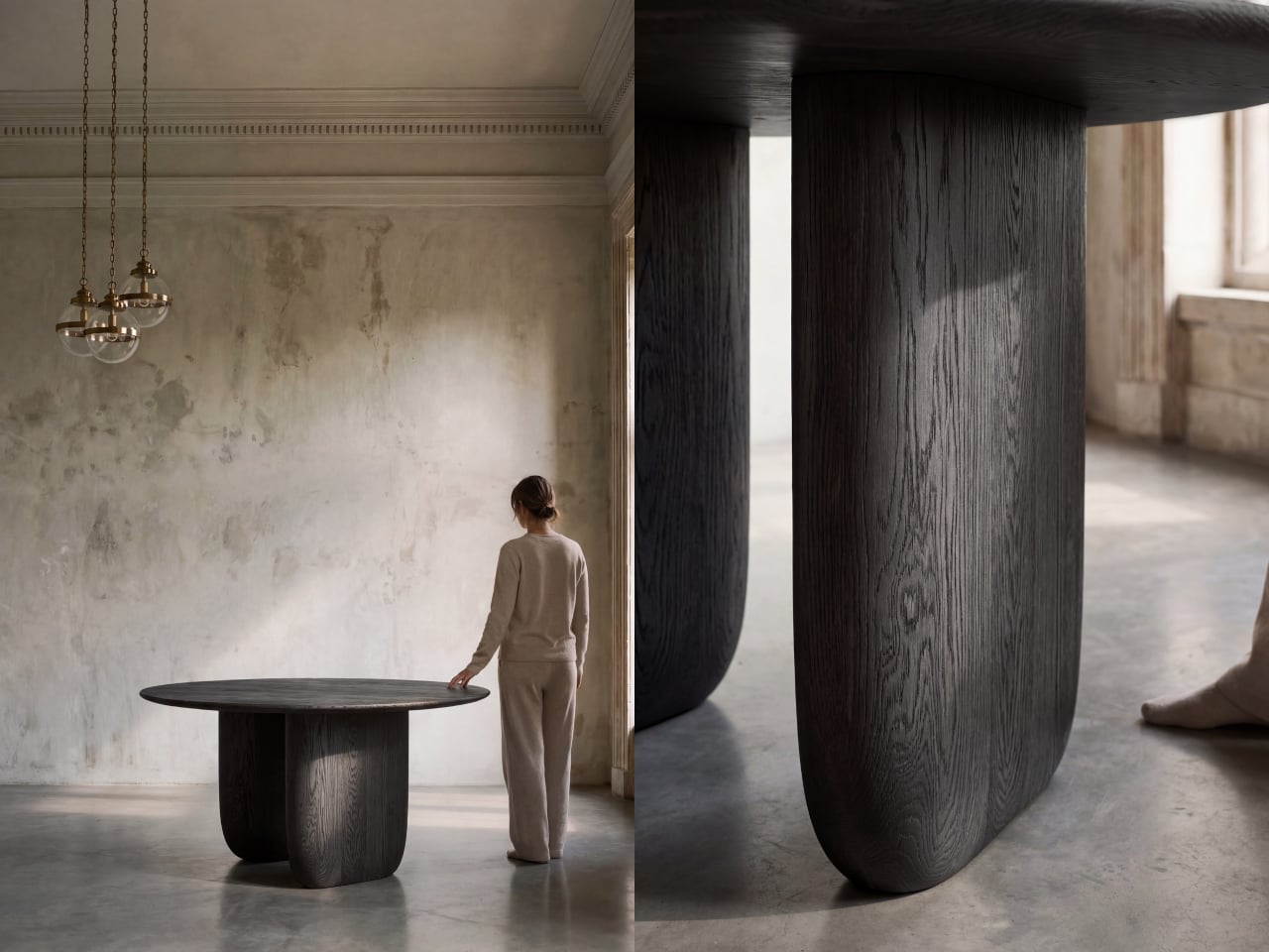
The story starts with the studio’s own Maru dining table. While developing it, founders Livert Lim and Mengfei Wu kept drifting back to the legs, almost despite themselves. Those legs tapered inward along one unbroken curve, giving them a presence that had little to do with the tabletop above. As Mililab described it: “A shape that didn’t need the table above it.” So they separated it and let it stand alone.
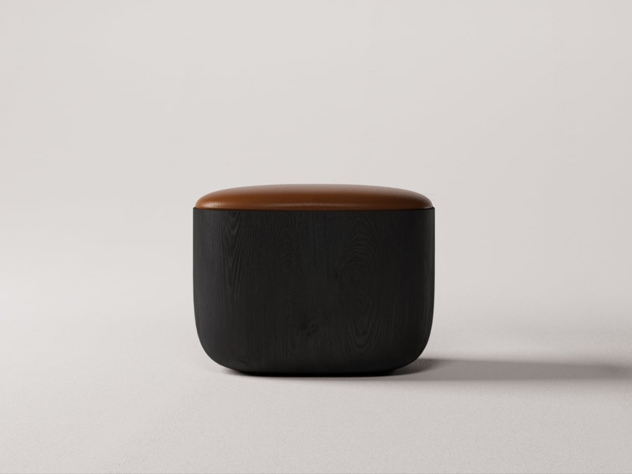
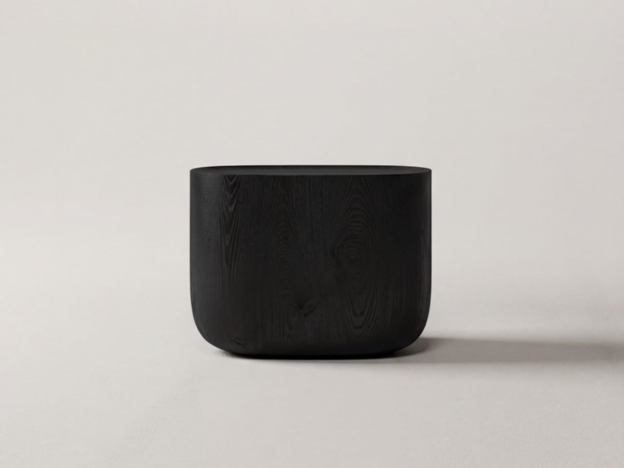
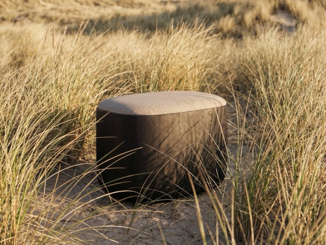
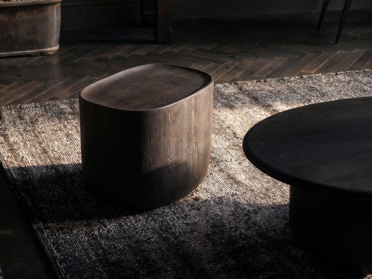
Working with collaborator Djordje Cebic, they developed Ishi into a form that’s both monolithic and unexpectedly soft, something like a river-worn pebble given volume. From across the room, it appears impossibly thin; up close and under your hand, it’s substantial. That tension between visual lightness and physical solidity isn’t accidental. It’s the result of curves computed in Tokyo and then realized by hand in the workshop.
The material process behind that solidity gets genuinely obsessive. The stool is made from North American white oak, selected for grain consistency, kiln-dried, hand-shaped, then kiln-dried again, because the glue introduced during assembly brings moisture back into the wood. Most workshops skip that second drying. Mililab doesn’t. It’s sealed immediately after, locking in a 10% moisture content, the exact point at which white oak is most dimensionally stable.
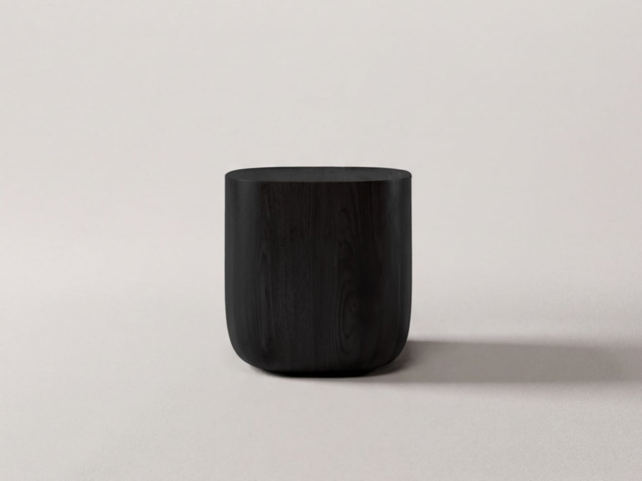
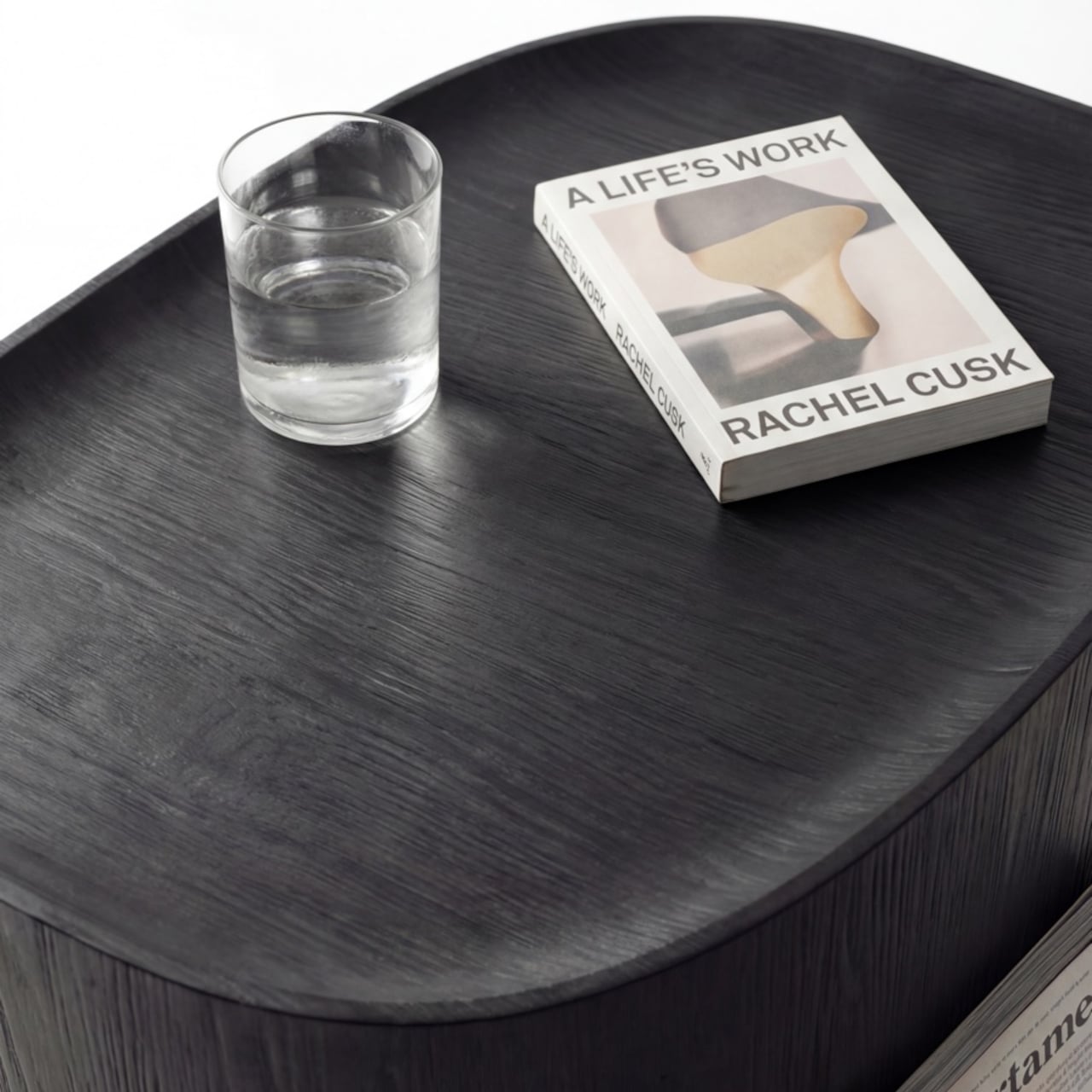
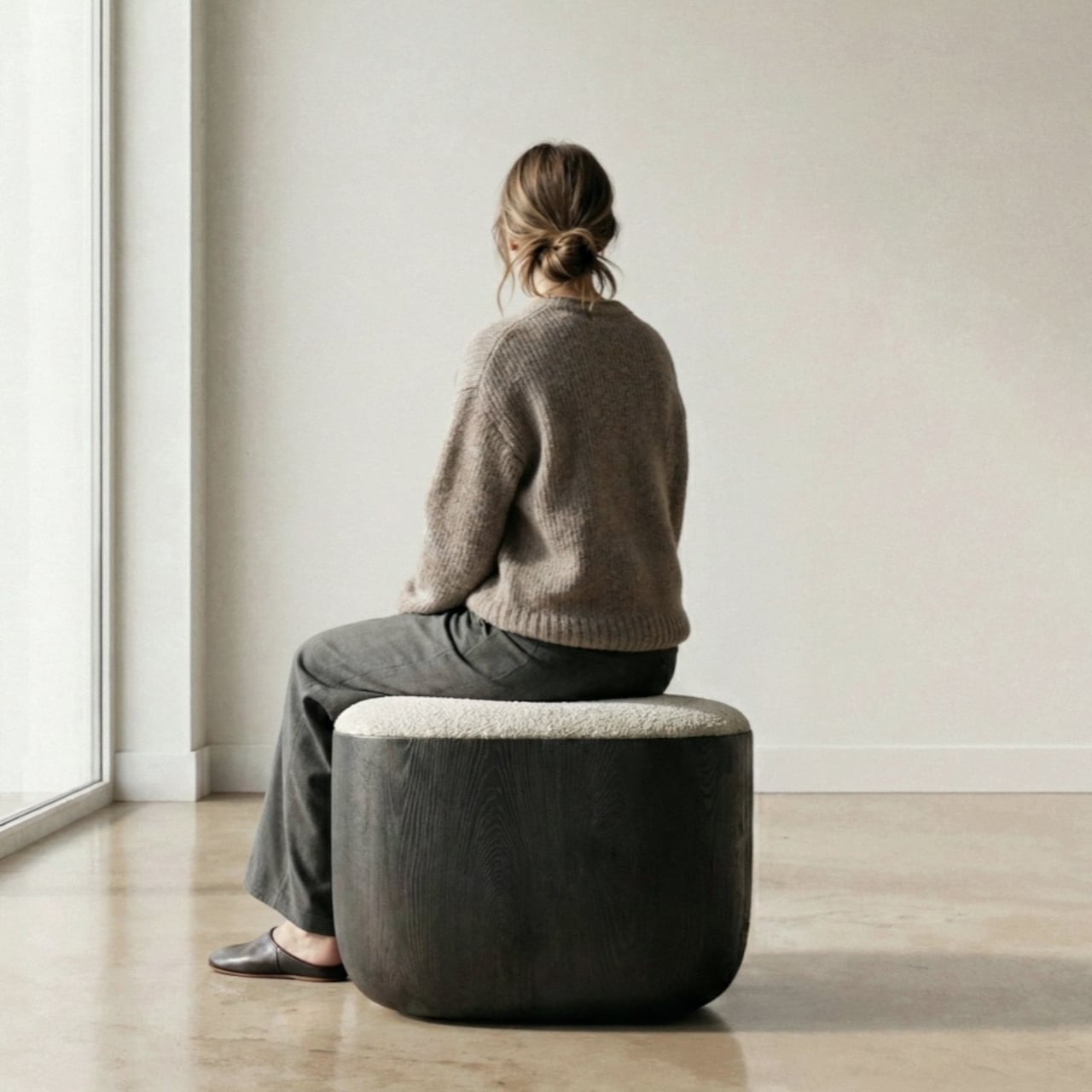
The cushion on top, available in Kvadrat Savanna, Dedar fabric, or Italian leather, looks fully integrated with the oak base. It isn’t, of course, which is the point. Pull it off, flip it over, and the flat underside becomes a surface, turning the stool into a side table. It works just as well beside a sofa at home as it does in a hotel lobby or a studio apartment. At 430mm, the height was chosen deliberately. It’s low enough to pair with a lounge chair, yet also tall enough to sit beside a dining table or vanity desk.
There’s something refreshing about a piece of furniture that arrived this way, not from a brief or a market gap, but from genuine distraction. Lim and Wu were supposed to be designing a dining table and kept staring at the legs instead. It’s not a narrative most furniture studios would lead with, but it does explain why the Ishi stool feels like something they simply couldn’t help making.
A good desk doesn’t happen by accident. Not one loaded with gadgets or overrun with branded accessories, but a workspace where every object earns its place. The stationery you choose sets the tone for how you think, write, and create. When a pen, tray, or ruler is designed with real intention, it stops being background noise and starts becoming an active part of the process itself.
The five pieces collected here share a common thread: they solve real problems without announcing themselves. Each one sits at the intersection of craft, function, and restraint. Whether you’re sketching, drafting, or writing longhand, these objects won’t compete for your attention. They’ll quietly make you better at whatever you’re doing. That’s the standard every great piece of stationery should meet, and these five clear it with ease.
1. Inseparable Notebook Pen
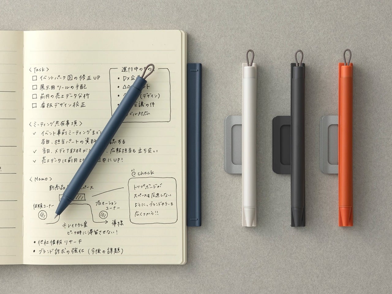
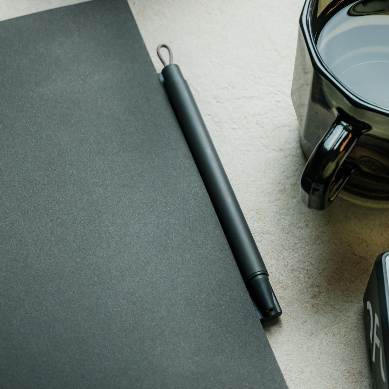
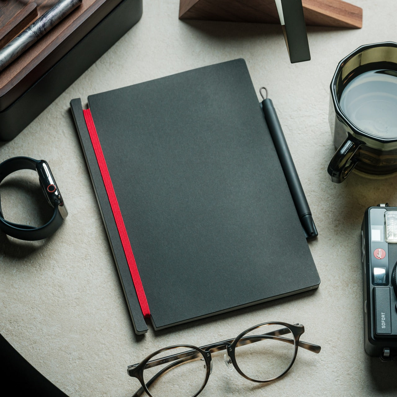
A pen that stays with its notebook sounds like a small idea, but the execution here is anything but minor. Built around a magnetic clip that secures directly to the cover, this piece eliminates the quiet, persistent frustration of reaching for a pen that isn’t there. The minimalist form is unobtrusive, the grip comfortable, and the ink flow smooth enough that writing feels less like a task and more like a reflex you’ve always had.
What makes this pen genuinely useful for daily writing is the built-in silencer, a detail that turns something mechanical into something refined. When you attach or detach it from the notebook, there’s no sharp click, just a quiet, satisfying motion. For anyone who writes regularly, that kind of sensory attention matters more than it should. The pen becomes an extension of the notebook rather than a companion to it, which means your ideas and the tool to capture them are always in the same place.
The magnetic clip keeps the pen fixed to the notebook cover at all times, so losing your writing tool mid-session is no longer a possibility
The built-in silencer makes attaching and detaching feel considered and refined rather than mechanical
What We Dislike
The design works best when paired with its intended notebook, which limits its versatility as a standalone pen
The minimalist form may reduce compatibility with notebooks of varying cover thickness or material
2. Solid Copper & Brass EDC Clutch Pencils
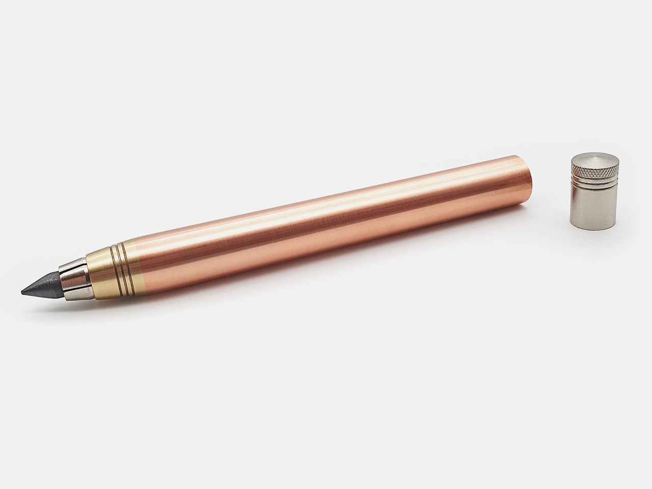
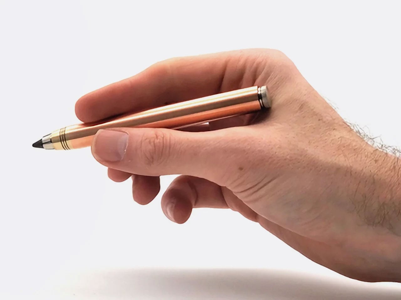
Nicholas Hemingway’s clutch pencils are machined from solid metal bar stock, not hollow tubes or plastic wrapped in metallic finishes, and that distinction matters from the first time you hold one. Copper weighs 8.96 grams per cubic centimeter, and brass sits at around 8.5. Hemingway has built his entire design philosophy around those densities. The mass of the metal body reduces the pressure you need to apply to the page, a concept he calls gravity-feed, making longer creative sessions far less fatiguing on the hand.
The 10th anniversary collection includes three pencils: the 5.6mm Copper and Brass Hybrid at 58 grams for shading and life drawing, with a built-in lead sharpener in the push button, and the 2mm Precision series in both brass and copper at around 30 grams each for technical drafting and fine-line illustration. Hemingway ships each version with a specific lead grade matched to its intended use, so you’re never mid-workflow having to swap. Both formats are fully compatible with any lead brand, making them as practical as they are beautifully crafted.
The gravity-feed approach uses the weight of the metal body to reduce hand fatigue across long drawing or writing sessions
Each pencil ships with a lead grade selected to match its intended use, removing the guesswork entirely from setup
What We Dislike
The solid metal construction makes these significantly heavier than standard options, which won’t suit every hand or working style
The price point of hand-machined tools will be a barrier for casual or occasional users
3. KNOB. Pen Tray
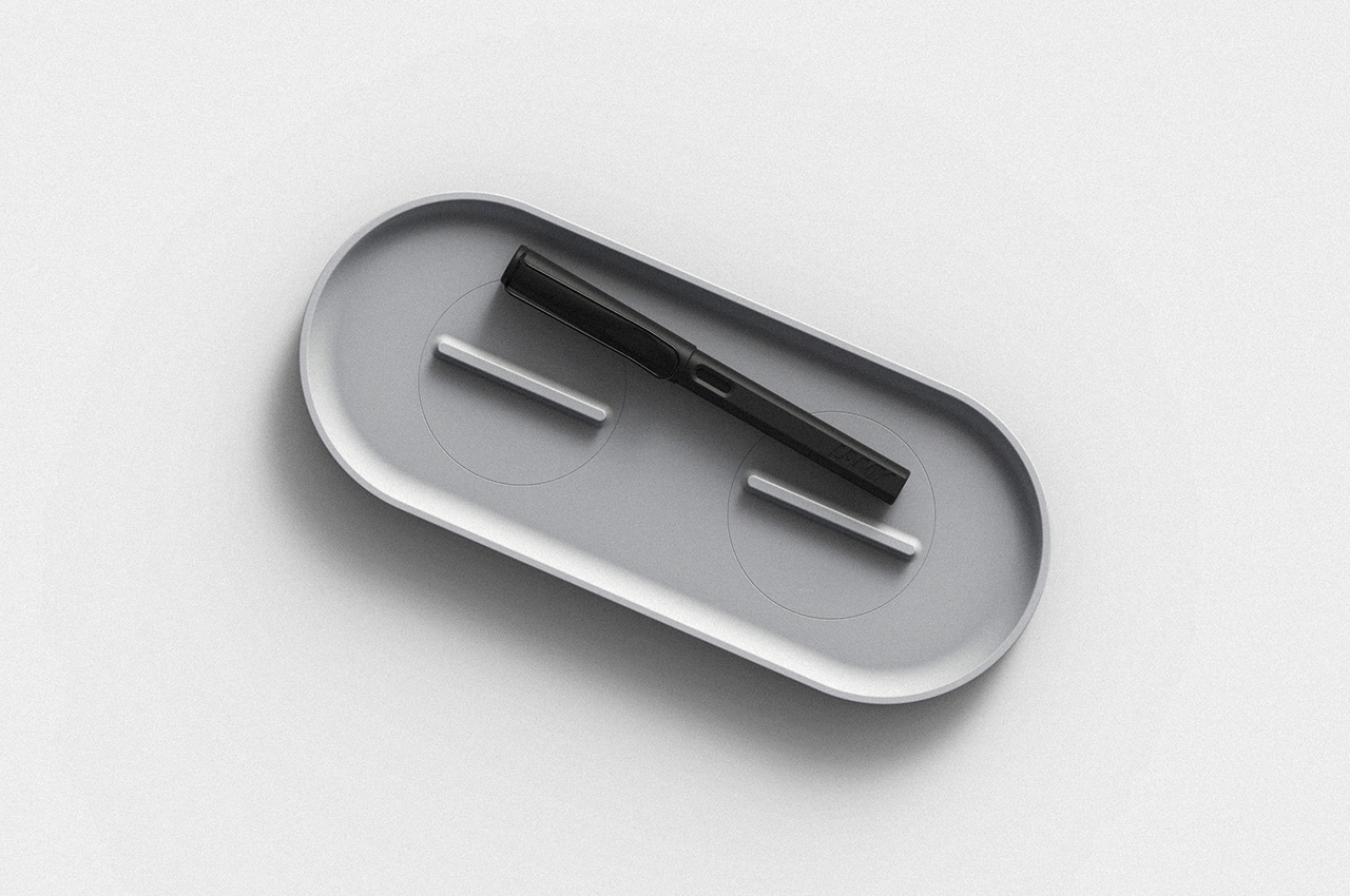
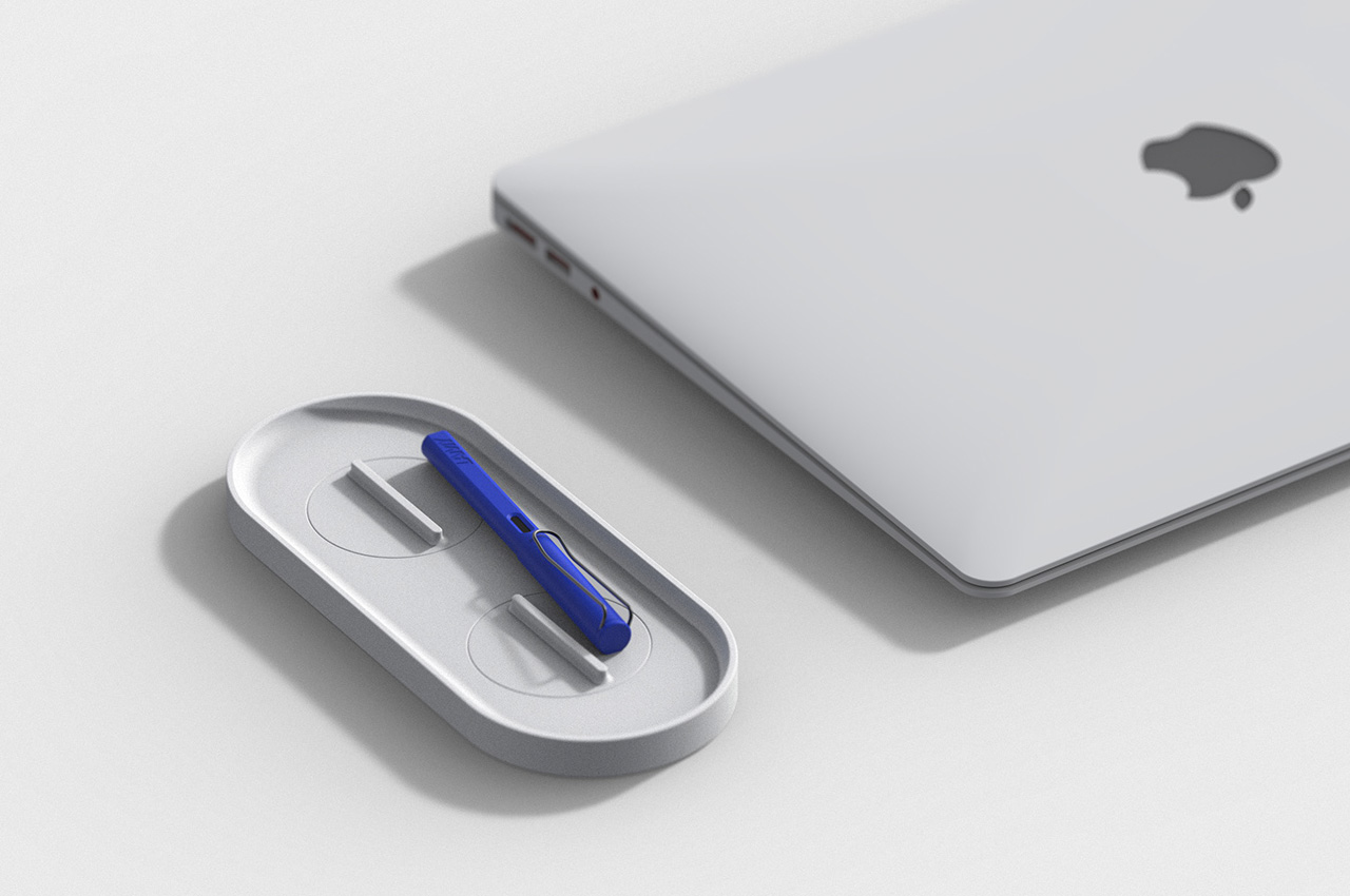
Changho Lee’s KNOB. Pen tray is one of those rare desk accessories that rewards both looking at and actually using. The form is clean and minimal with rounded edges, but the real story lives in the knobs, borrowed from the design language of gas burner controls and reimagined as adjustable dividers inside the tray. Those knobs let you reconfigure the interior space in any direction, depending on what you’re organizing and how you want to arrange it on a given day.
For anyone who cycles between different tools, the KNOB. tray removes the need for multiple organizers competing for desk space. One tray handles everything because you can reshape its interior for whatever you need at any given moment. That kind of adaptable functionality is genuinely rare in desk accessories, which tend to be fixed in their layouts and unforgiving when your needs shift. The visual result is a tray that always looks intentional, regardless of what’s inside it or how the internal dividers have been reconfigured.
What We Like
The adjustable knobs let you customize the internal layout in any direction without tools, additional parts, or a second organizer
The minimal aesthetic keeps the tray from visually cluttering the desk, no matter how it’s currently configured
What We Dislike
The knob-based adjustment mechanism may feel fiddly for users who reorganize their setup frequently throughout the day
The compact footprint may not comfortably accommodate larger or unusually shaped stationery items
4. Eco-Friendly Pencil Sharpener
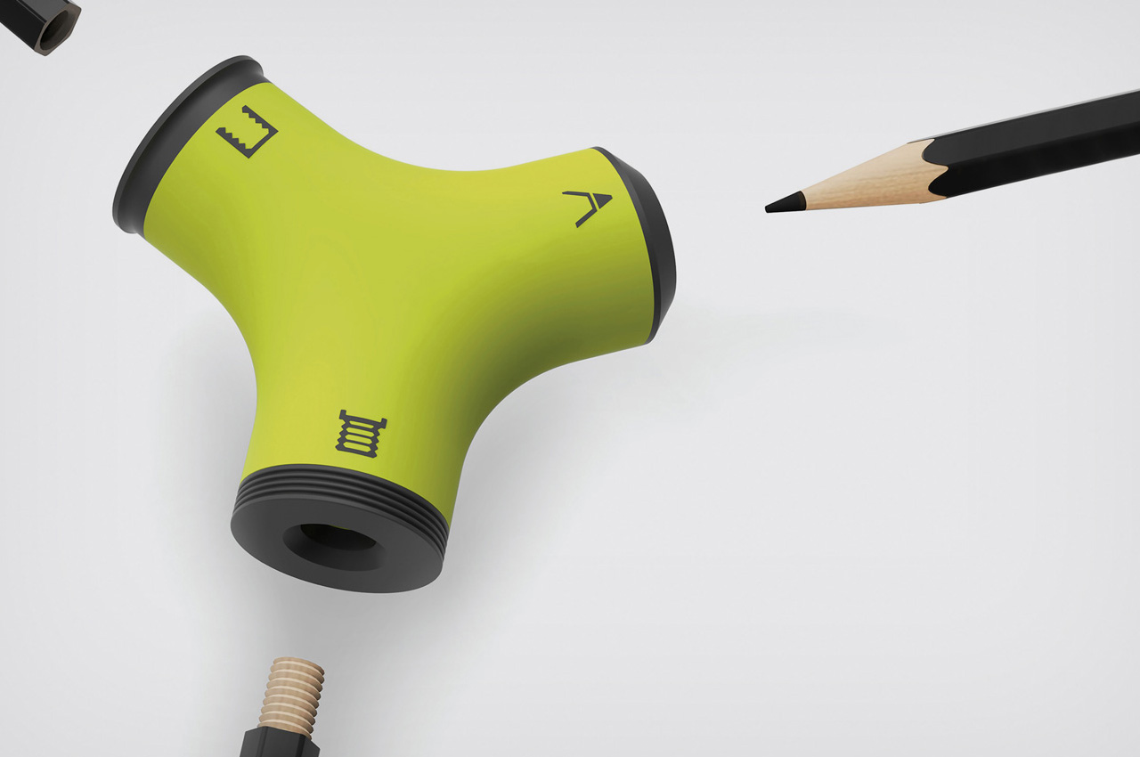
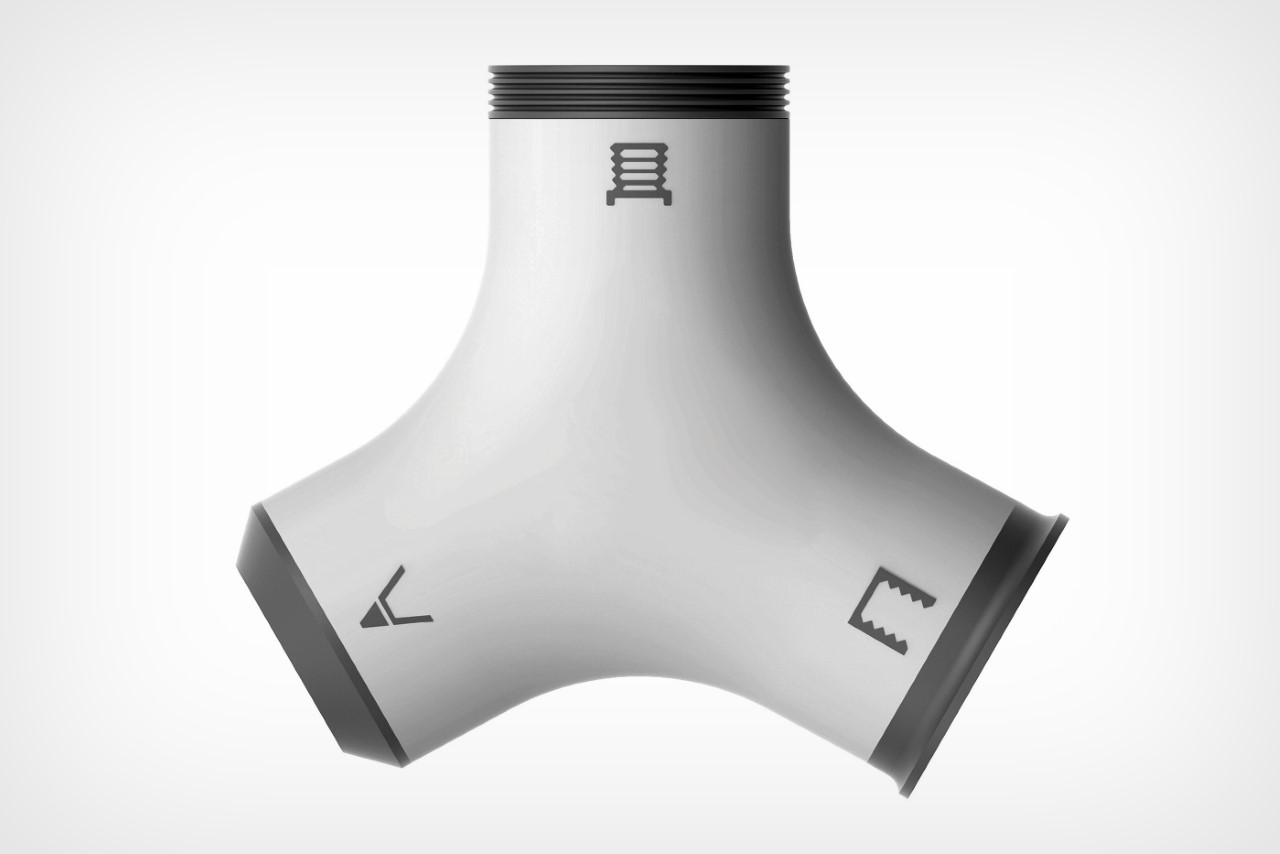
Wang Cheng’s Eco-Friendly Pencil Sharpener is a Red Dot Design Concept Award winner built around one precise and clever observation: pencil stubs don’t need to be discarded. With three sharpening zones, the sharpener handles conventional sharpening but also threads and taps pencils, turning them into wooden screws that connect end to end. A stub that would otherwise be thrown away becomes usable again the moment you screw it into a larger pencil, extending its life without any additional materials or waste.
That mechanism is genuinely satisfying to use, and it shifts how you think about pencils entirely. Threading one end and screwing two together feels intuitive after the first attempt, and the result is a longer, more comfortable writing instrument that has a second act built in from the start. For anyone who goes through pencils regularly, whether sketching, drafting, or writing by hand, this sharpener reframes the stub not as the end of something useful but as the beginning of another productive session.
What We Like
The threading and tapping mechanism extends the life of pencil stubs meaningfully, reducing material waste without requiring anything extra
Winning the Red Dot Design Concept Award confirms that the idea is executed as well as it is inventive
What We Dislike
The three-zone sharpening system introduces more complexity than most casual users will need or ever explore
Screw-together pencils may feel slightly uneven in the hand compared to a single, uniform pencil body
5. Quiver Ruler
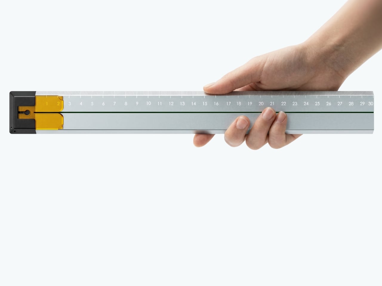
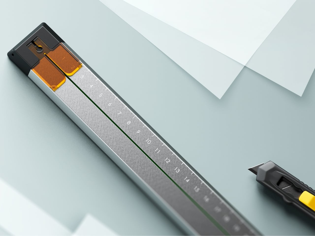
Tunir Maity’s Quiver is an anodized aluminum ruler built for people who actually cut with one, not just measure. It has a clip mechanism that holds paper in place, a blade slit that guides your cut in a straight line, and a weight distribution that favors the cutting end so you don’t have to press down as hard. Made for over 300 cuts with recyclable plastic components, Quiver doesn’t treat shaky hands or imprecise cuts as user failures. It treats them as design problems worth solving properly.
Beyond its cutting functionality, Quiver includes a carabiner attachment for clipping to a bag, which makes it genuinely portable rather than just theoretically so. The anodized aluminum finish gives it a premium presence on any desk, and the minimal profile means it stores flat without consuming unnecessary space. For designers, architects, or anyone who works regularly with physical materials, Quiver is the kind of tool that makes you quietly wonder why rulers weren’t designed this way from the very beginning.
What We Like
The blade channel and clip mechanism make precise, straight cuts achievable without pressing hard or manually holding paper in place
The carabiner attachment makes it easy to carry wherever the work actually happens, rather than leaving it behind on the desk
What We Dislike
Quiver is currently a concept, so availability for purchase has not been confirmed
The emphasis on cutting functionality may feel overbuilt for users who only need a ruler for basic measuring
The Desk You Actually Want
Minimalism isn’t about owning less. It’s about owning better. Each piece on this list earns its place not through novelty or surface-level aesthetics alone, but through how well it understands the person using it. A pen that stays with your notebook, a ruler that guides your blade, a tray that reorganizes itself around your tools. These are objects designed around behavior, not the other way around.
The best stationery doesn’t ask for your attention. It earns your trust slowly, through repeated use, through a grip that feels right after the third session, through a cut that lands exactly where you planned it. The five pieces here share that quality. They’re not trying to be beautiful. They are beautiful because they work, and that’s a distinction worth remembering the next time you’re building a workspace from scratch.
In a world of mass production, Scandinavian design stands out for its clean lines, practical elegance, and thoughtful functionality. Rooted in simplicity and clarity, it emphasizes natural materials, durable construction, and timeless aesthetics. Every product strikes a balance between form and purpose, delivering visual appeal and lasting performance.
Integrating Scandinavian design into your space encourages mindful living and attention to detail. From the sleek contours of a chair to the understated functionality of storage solutions, each piece enhances everyday life while maintaining a sense of harmony and refinement. By choosing products that combine practicality, sustainability, and thoughtful design, you create an environment where style meets purpose.
1. Use of Wood & Nature in Scandinavian Design
Scandinavian craftsmanship is rooted in a deep respect for nature, with wood at its core. Imagine the warm grain of a hand-carved birch bowl or the smooth finish of a pine stool. Artisans don’t just shape wood; they honor its textures and natural quirks, creating pieces that feel alive and bring the outdoors into your home.
This approach isn’t about rare or expensive timber. Local woods, such as beech, ash, and oak, take center stage, with simple lines and treatments that highlight their unique character.
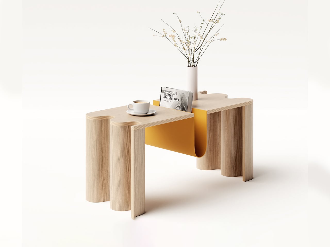
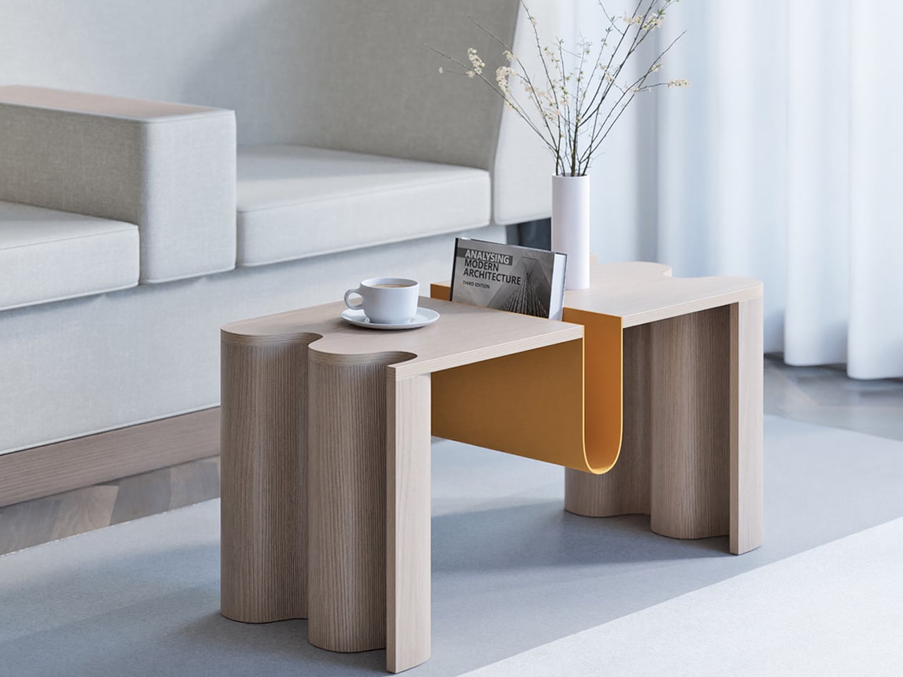
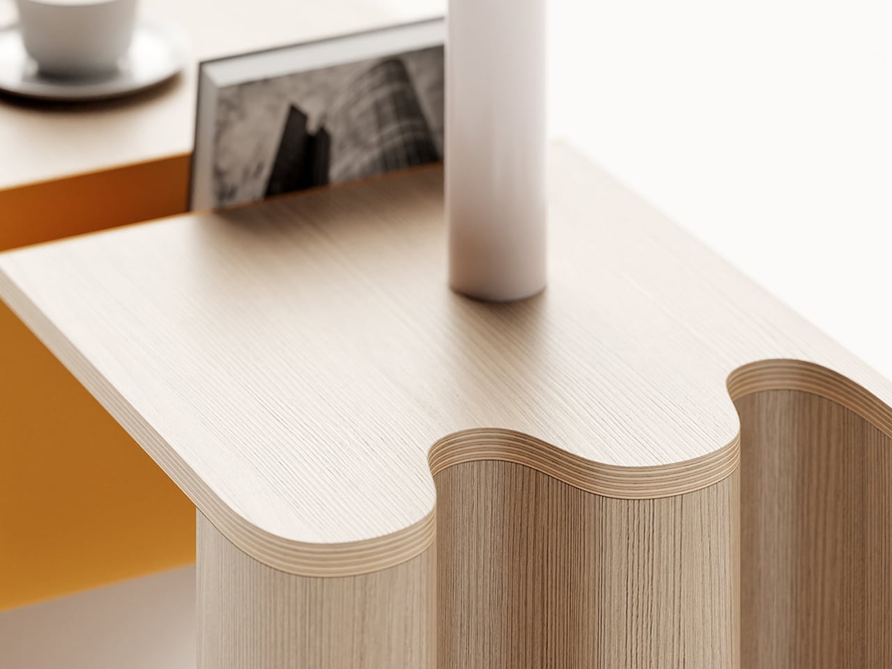
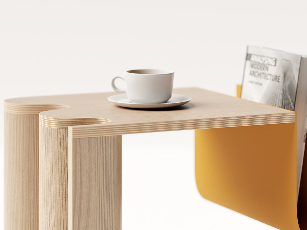
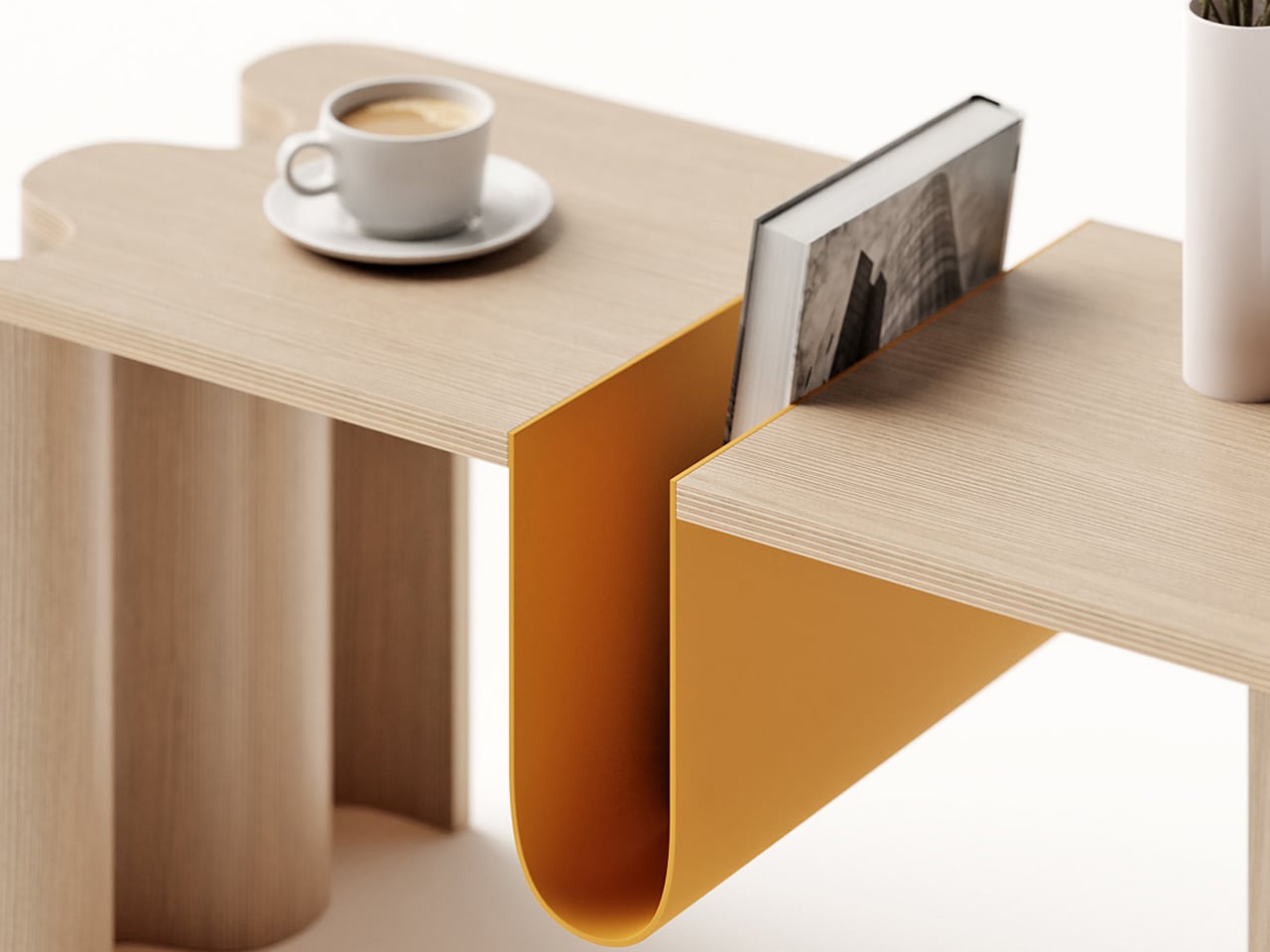
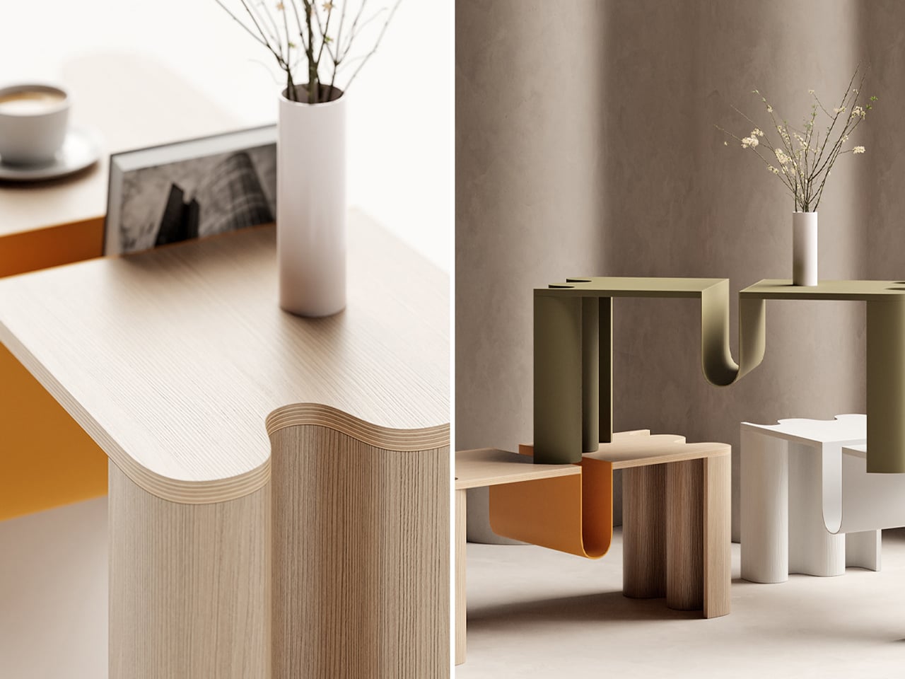
Cloth is a coffee table by João Teixeira that blends Scandinavian functionality with Japanese minimalism, capturing the Japandi spirit of calm, balance, and warmth. Designed to ground a living space without overwhelming it, the table embraces a balance of boldness and elegance from every angle. Its defining feature is a curved bookstand at the center, a sculptural element that anchors the design while leaving ample tabletop space. Subtle details, such as the softly undulating edge reminiscent of a live edge, add a sense of movement to its otherwise minimal profile.
Teixeira’s approach emphasizes simplicity paired with durability. By concealing hardware through techniques like press-bending plywood and CNC-milling the tabletop, the design maintains an uninterrupted look. The result is a dynamic yet understated piece that complements modern interiors with ease. Cloth is more than just a coffee table—it’s a functional statement that elevates a room through its quiet sophistication.
2. Scandinavian Textiles Infuse Warmth
Textiles are the heart of Scandinavian design, adding texture, warmth, and comfort to minimalist interiors. Generations of weaving, knitting, and embroidery have created pieces that are functional and beautiful. From chunky wool throws that invite you to curl up to linen curtains that gently soften light, these items bring a sense of coziness, known as hygge.
The focus is on natural fibers like wool, linen, and cotton, inspired by the Scandinavian landscape in muted earth tones, soft grays, and hints of wildflower or northern-light colors. Draping a hand-woven or machine-made blanket or adding embroidered cushions instantly gives your space a personal, handmade feel.
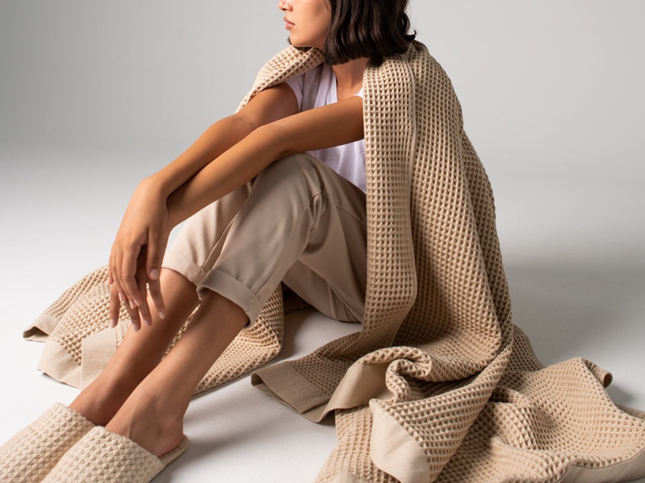
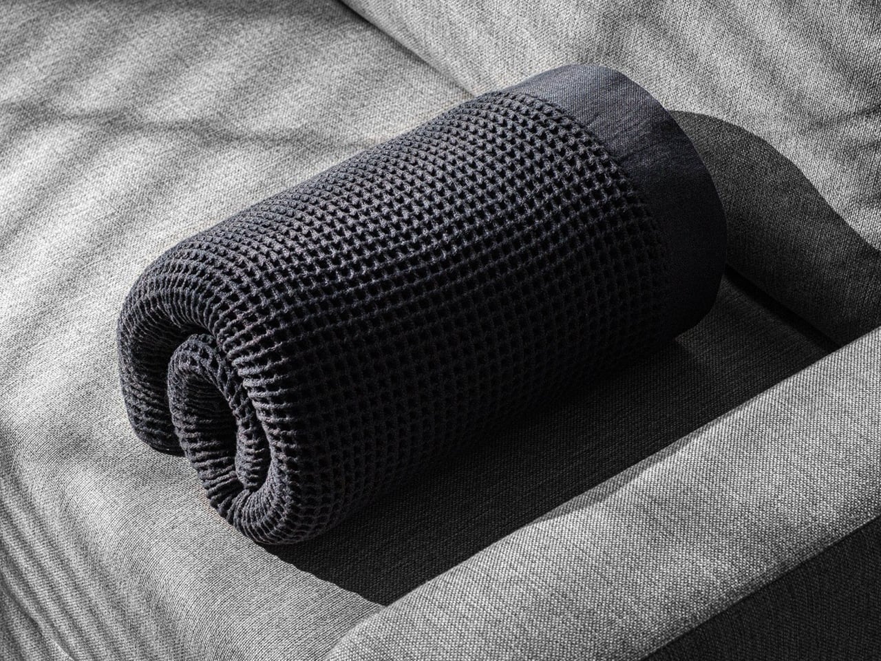
Casamera’s One Blanket, inspired by Scandinavian design, redefines coziness with an innovative open waffle-weave fabric that is breathable, thermoregulating, and soft, providing year-round comfort. Lightweight yet perfectly weighted, it delivers the familiar feeling of security without overheating and can be easily rolled or folded for travel. Whether sleeping in bed or relaxing on the couch, it adapts seamlessly to your needs.
Completing the comfort experience are Casamera’s Slippers, crafted from the same breathable, plush fabric with suede soles for gentle bounce. Both products combine functionality, durability, and eco-friendly materials, reflecting Scandinavian values of simplicity, sustainability, and thoughtful living.
3. Ceramics with Character
Scandinavian ceramics strike a perfect balance of form and function. Moving away from ornate designs, they focus on clean lines, simple shapes, and a tactile feel. A handcrafted ceramic mug carries weight, slight unevenness, and unique character, reflecting the maker’s hand. Designed for daily use, these pieces bring moments of beauty to your morning coffee or family dinner.
Colors and glazes mirror the natural environment like earthy tones, deep blues of the sea, and snowy whites. For example, choosing handmade bowls, plates, or vases is more than stocking your kitchen. It is curating functional art that elevates everyday rituals and makes life more mindful.
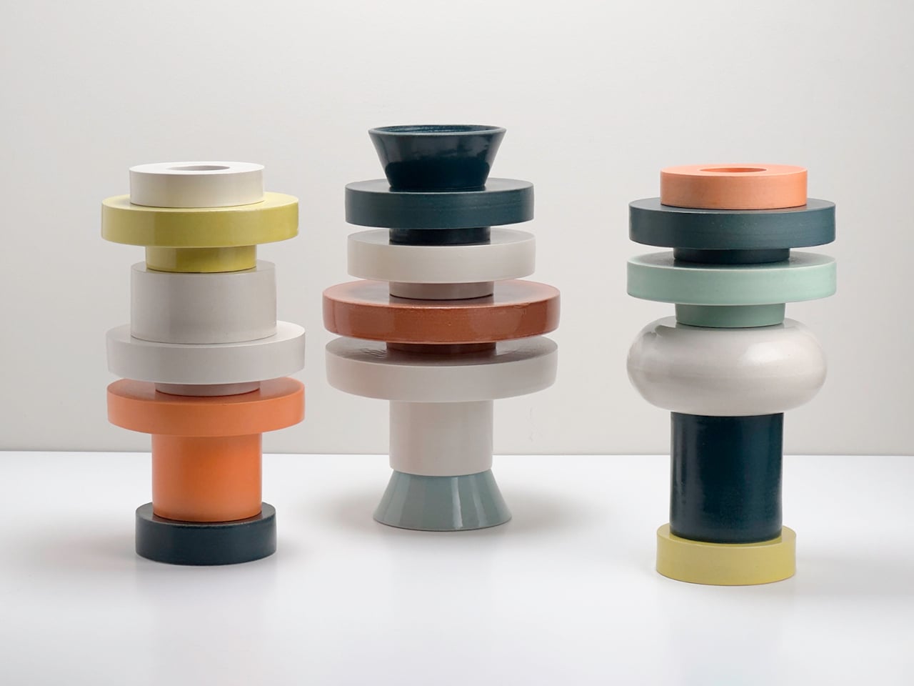
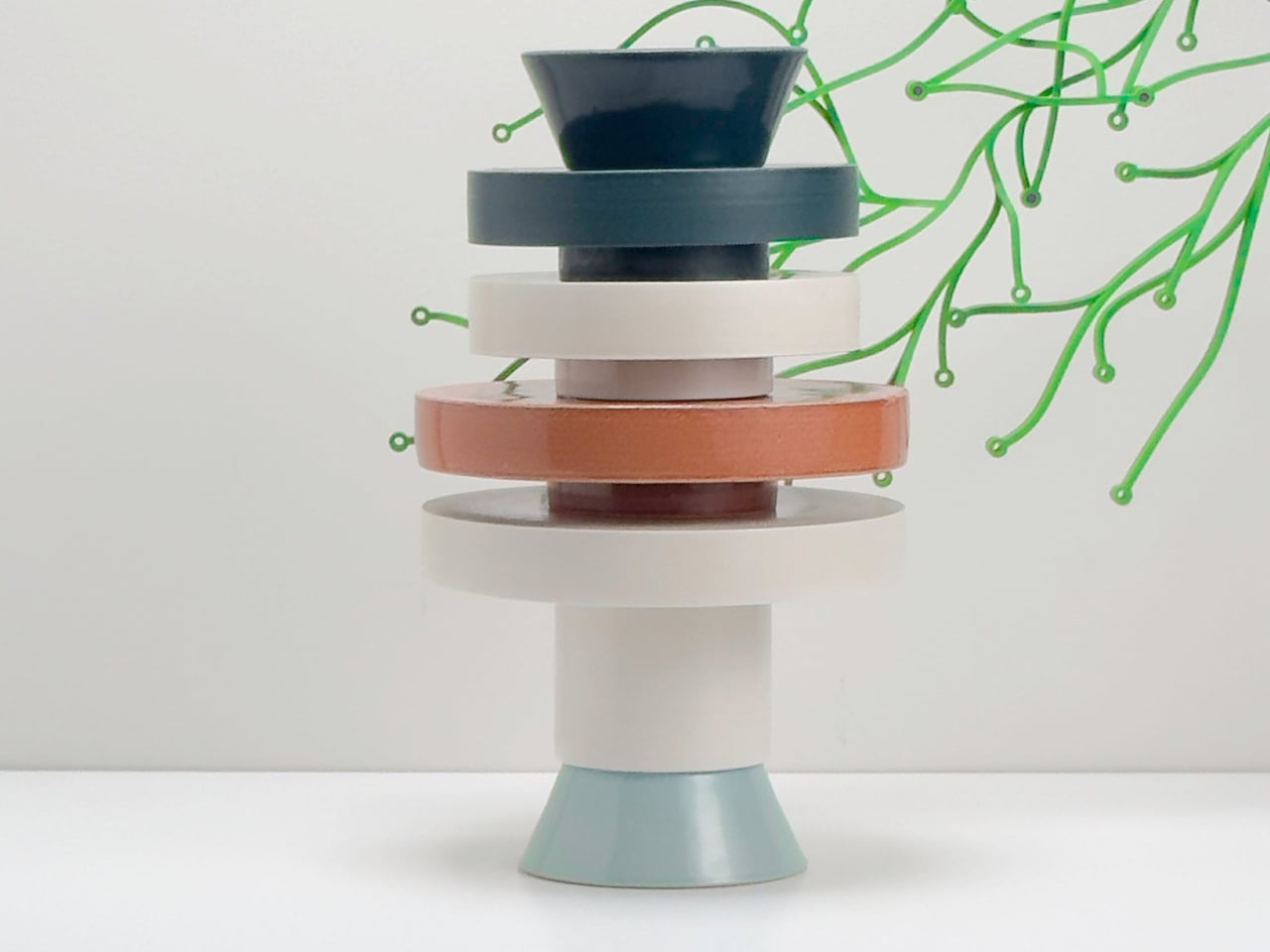
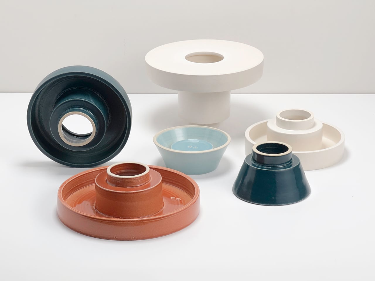
The Torre modular vase series by Scott Newlin for Dudd Haus, Scandinavian-inspired in its clean lines and functional elegance, transforms the traditional vase into a playful, customizable experience. Each vase arrives as a stackable ceramic module that users can arrange and combine to create sculptural, architectural forms. Named “torre” (tower in Italian and Spanish), the series encourages vertical stacking and creative exploration, turning everyday arrangement into a mindful, hands-on ritual.
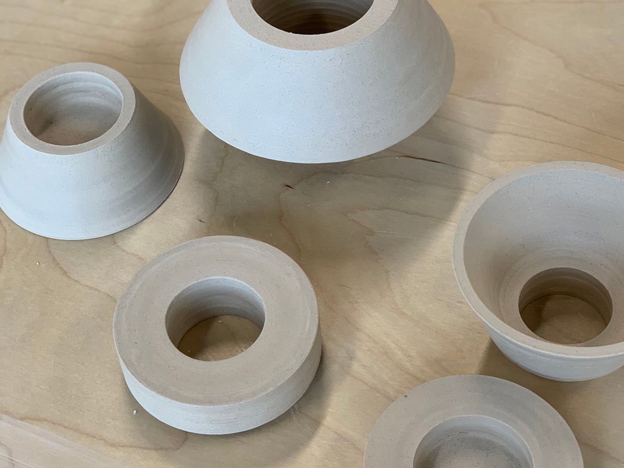
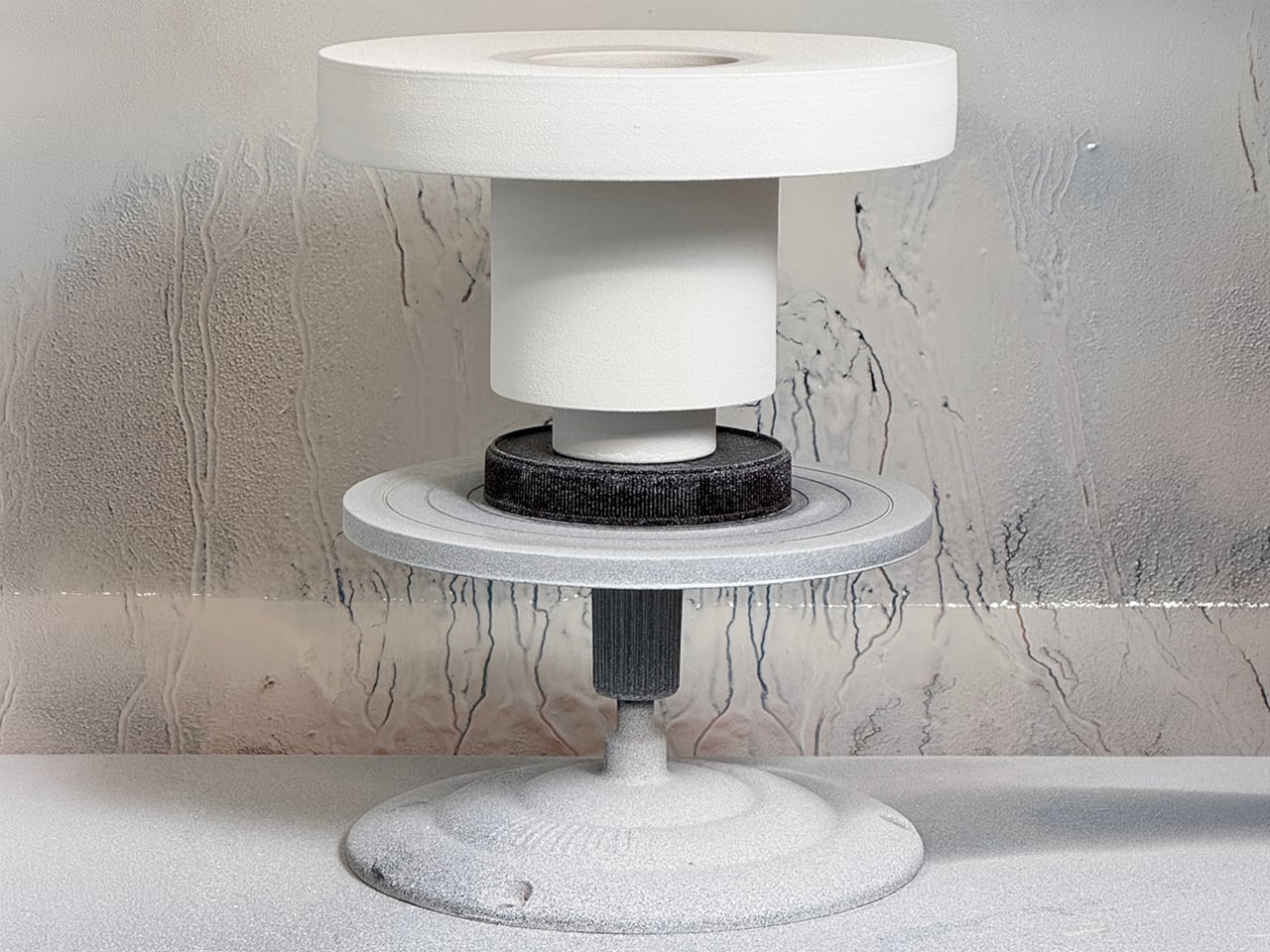
The Torre collection comes in three configurations, each featuring consistent diameters and interlocking lips for stable stacking. Wheel-thrown and spray-glazed, the modules show subtle variations that celebrate craftsmanship while maintaining a sleek, modern finish. Muted tones like off-white, sand, and stone complement diverse interiors, while the versatile design works equally well as a vessel for flowers or as a standalone sculpture.
4. Warmth Through Sculptural Lights
Light plays a vital role in Scandinavian design, especially during long, dark winters. Handcrafted or machine-made lamps and candle holders are more than illumination as they are sculptural pieces that create a warm, inviting atmosphere. Materials like wood, glass, and metal are shaped to diffuse light softly, while a simple paper pendant or carved wooden lamp can transform a room’s mood.
This approach emphasizes well-being through light, known as “mys” in Swedish. Choosing a handmade lamp brings this philosophy into your home, creating warmth, intimacy, and calm. Small, thoughtful details like these profoundly enhance emotional comfort and the feel of a space.
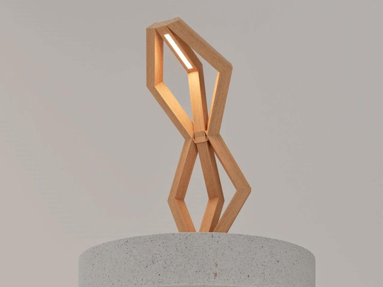
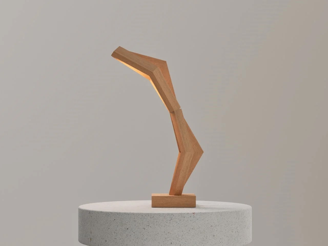
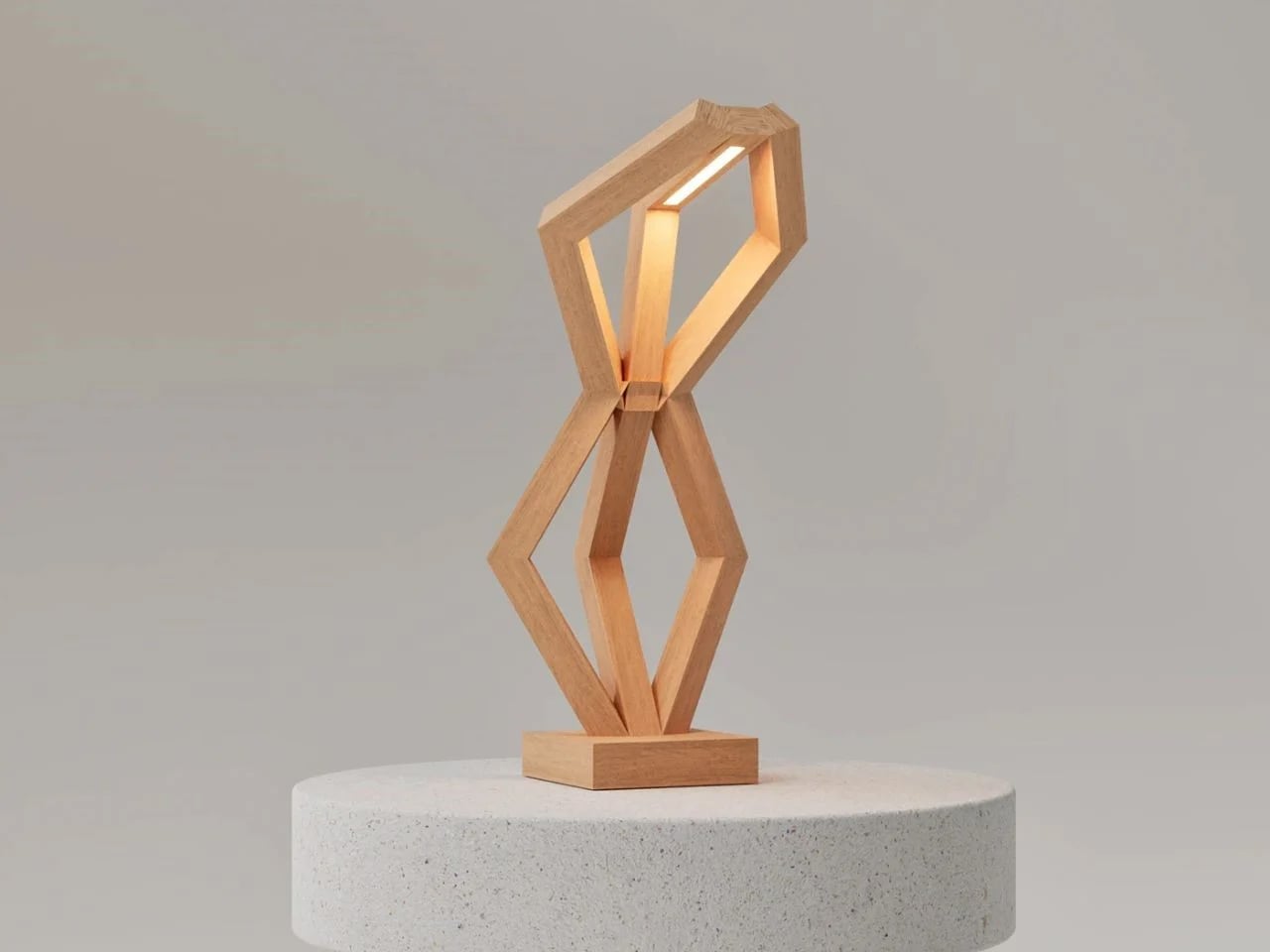
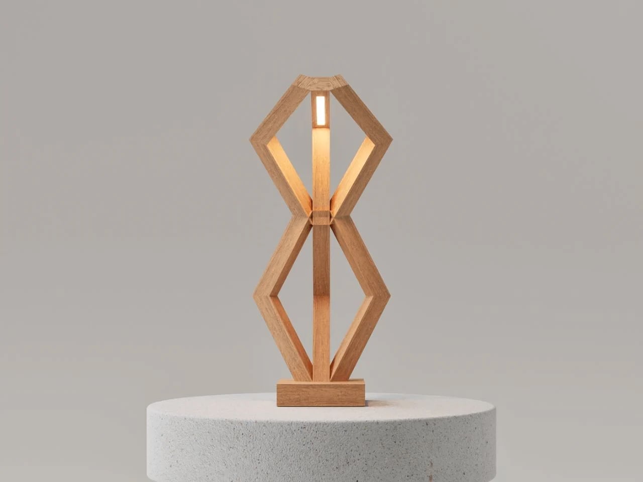
The BERSERK lamp merges Nordic mythology with modern design, creating a sculptural light object that embodies both strength and serenity. Inspired by the Valknut, a symbol associated with Odin and themes of protection and transcendence, the design avoids literal representation in favor of abstraction. Intersecting hexagonal frames meet at a central wooden joint, forming a balanced geometry that feels both grounded and ethereal. The verticality of its structure recalls ancient monoliths, which are stoic and immovable, yet its refined minimalism softens the form, achieving a presence that is bold but understated.
Crafted from warm-toned natural wood, BERSERK emphasizes material honesty through invisible joinery that highlights the grain and preserves the purity of form. A seamless LED light source rests atop the structure, casting a soft, ambient glow that enhances interiors without overpowering them.
5. Functional Craft as Art
In Scandinavian craft, tools are more than instruments as they are objects of beauty. From hand-forged knives to woven baskets and detailed leatherwork, functional items are treated with the same care as decorative pieces. This philosophy reflects a belief that daily objects should be durable, well-made, and visually pleasing.
Using a handcrafted spoon or basket transforms ordinary tasks into interactions with art. This approach encourages finding beauty in the everyday and investing in items built to last. Choosing pieces that are both functional and beautiful helps create a home that honors craftsmanship and intentional, purposeful living.
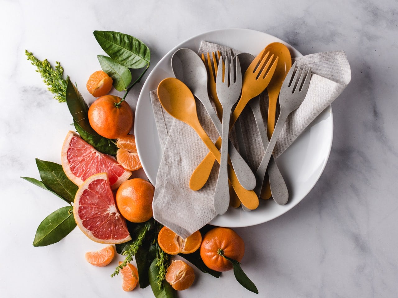
Sustainable entertaining meets Scandinavian-inspired design with the KNORK Eco Party Plate, where simplicity, functionality, and elegance converge. Building on the KNORK Eco cutlery line, this plate makes eco-conscious living effortless. Its clean, minimalist form ensures every detail serves a purpose, reflecting the Scandinavian ethos of thoughtful, practical design. Reusable and compostable, it demonstrates that sustainable choices, no matter how small, can enhance everyday life while reducing environmental impact.
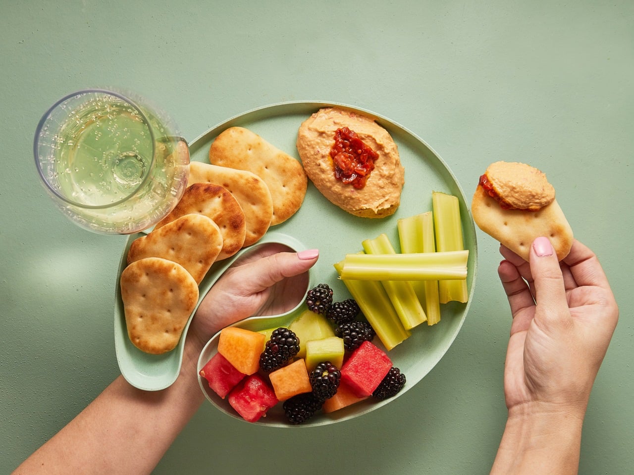
Crafted from bamboo and sugarcane offcuts sourced from furniture factories, the plate supports a zero-waste approach. Its artist’s palette shape allows you to hold a wine glass and utensil simultaneously, ideal for standing parties or casual gatherings. Made with Astrik resin, a biodegradable, glossy polymer, it is dishwasher- and food-safe, heat- and moisture-resistant, and durable for repeated use. Combining minimalist elegance, smart functionality, and eco-friendly materials, the KNORK Eco Party Plate embodies Scandinavian-inspired design while making sustainable entertaining stylish and practical.
Embracing Scandinavian design and craftsmanship goes beyond style as it celebrates authenticity, durability, and a close bond with nature. Each item tells a story, inviting you to slow down, notice the details, and make thoughtful choices that transform your space into a personal, soulful sanctuary.
The bathroom is probably the last space in the home where smart technology has made any real dent. AI assistants have crept into living rooms, connected appliances have taken over kitchens, and yet the bathtub, one of the few places people genuinely go to decompress, has been left largely untouched. For anyone who’s had to get up and adjust the water temperature mid-soak, that feels like a missed opportunity.
That’s the gap that AquaIntelli is trying to close, a smart bathtub concept that doesn’t just run hot water and wait for you to climb in. Instead, it’s built around an AI-powered system that learns your bathing habits over time and then quietly handles everything on your behalf.
The core idea is personalization through repetition. Each time you use the AquaIntelli, its AI builds a more precise picture of your preferences, directing the jet massage toward the zones where you carry the most tension. If your lower back is always the problem, the system figures that out without you having to press anything. The more you use it, the better it gets at its job.
That same intelligence applies to the basics. The AquaIntelli can handle water temperature, depth, and massage strength entirely on its own, so by the time you actually step in, everything is already dialed in to your preferences. There’s no hovering over the tub as it fills, or dipping your hand in every few minutes to check whether it’s run too hot or too cool.
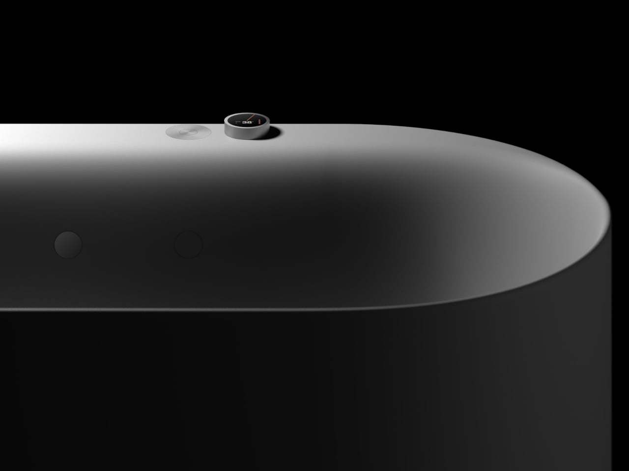
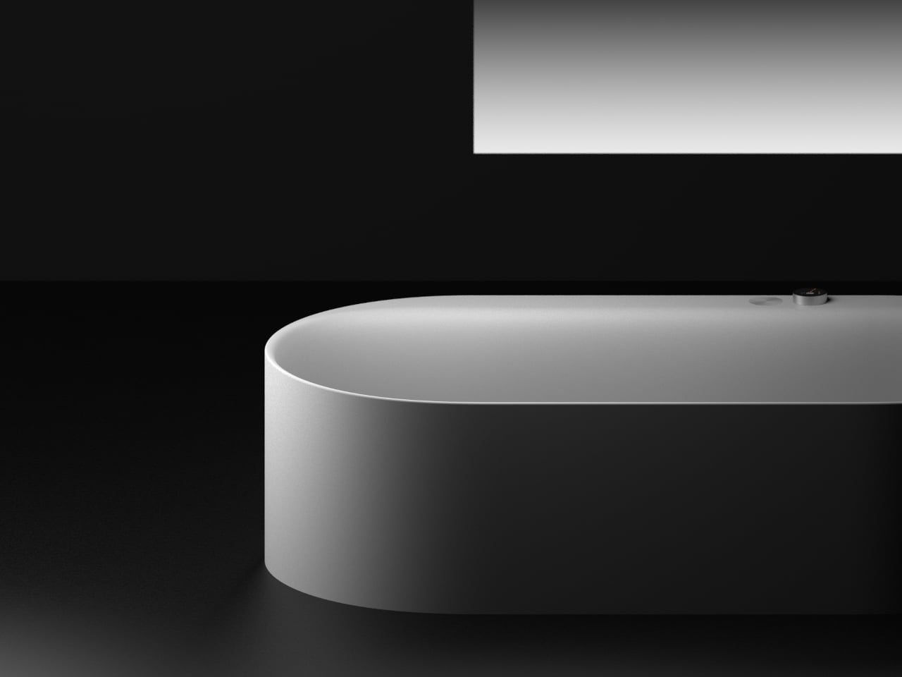
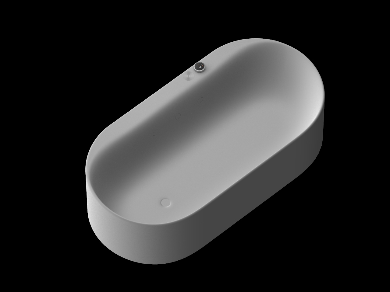
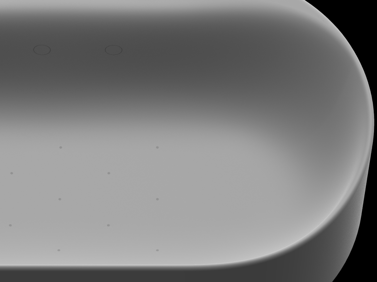
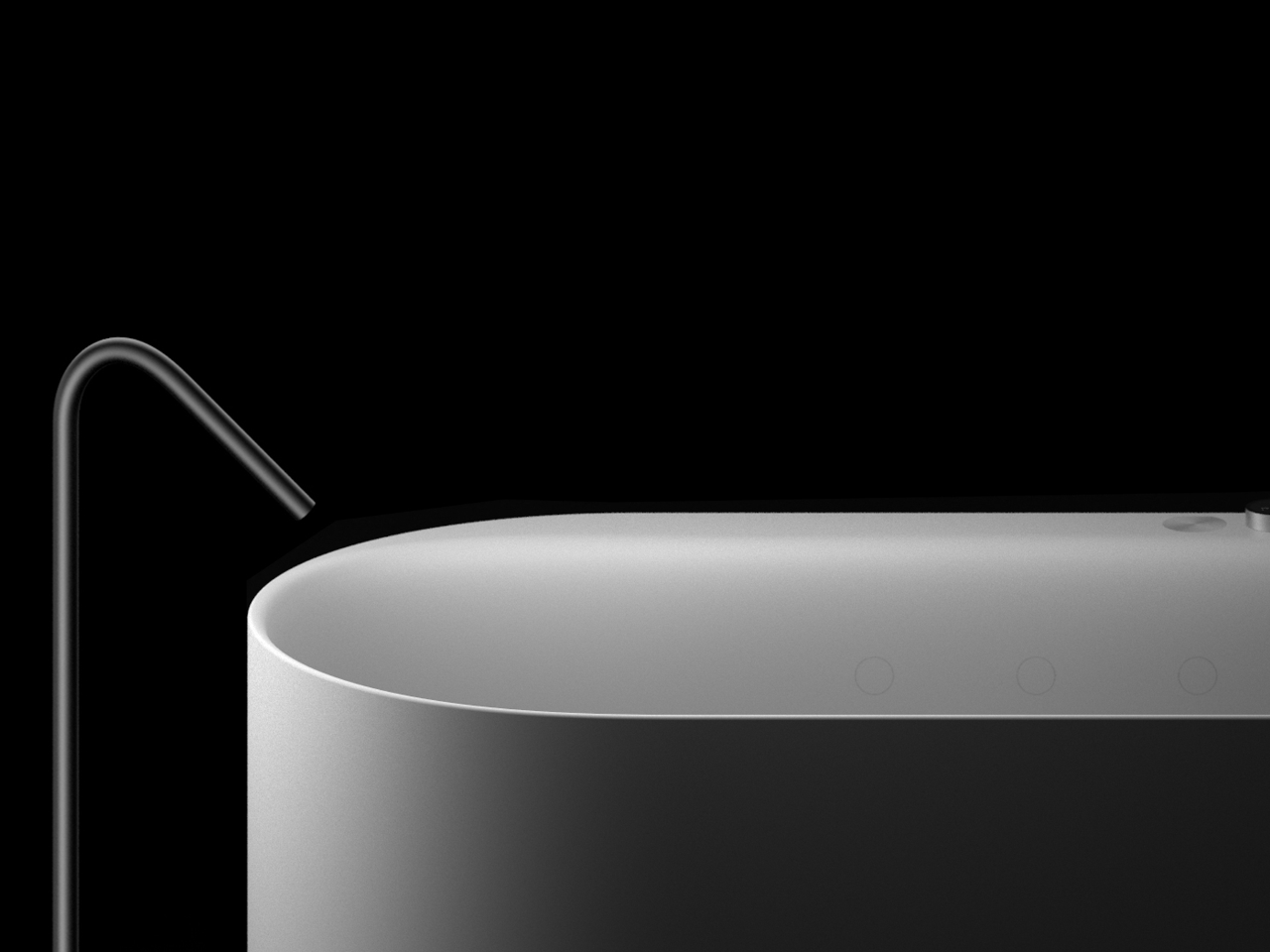
The designers clearly didn’t want the technology to clash with the form. The AquaIntelli takes the shape of a softly rounded, freestanding tub with no visible jets or hardware cluttering the surface. The air jets are hidden within the tub itself, keeping the interior clean and uninterrupted. It’s the kind of design where the functional details only reveal themselves once you’re already in the water.
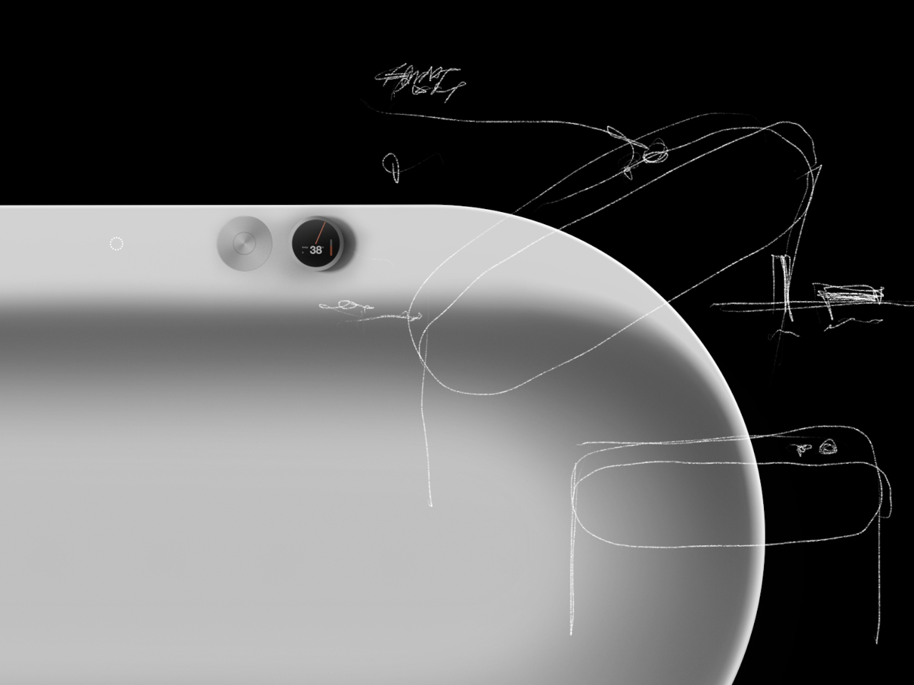
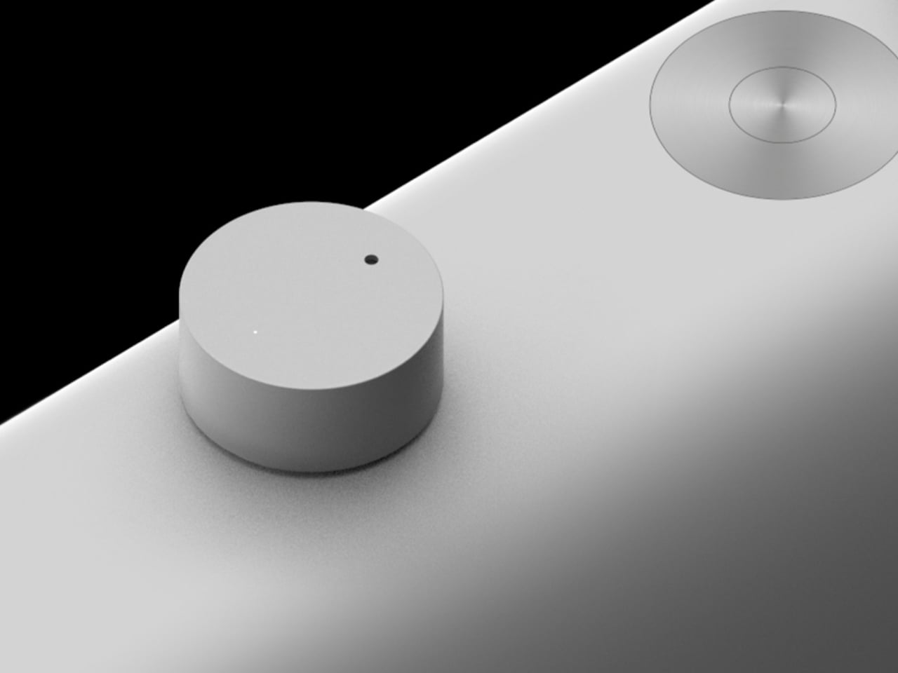
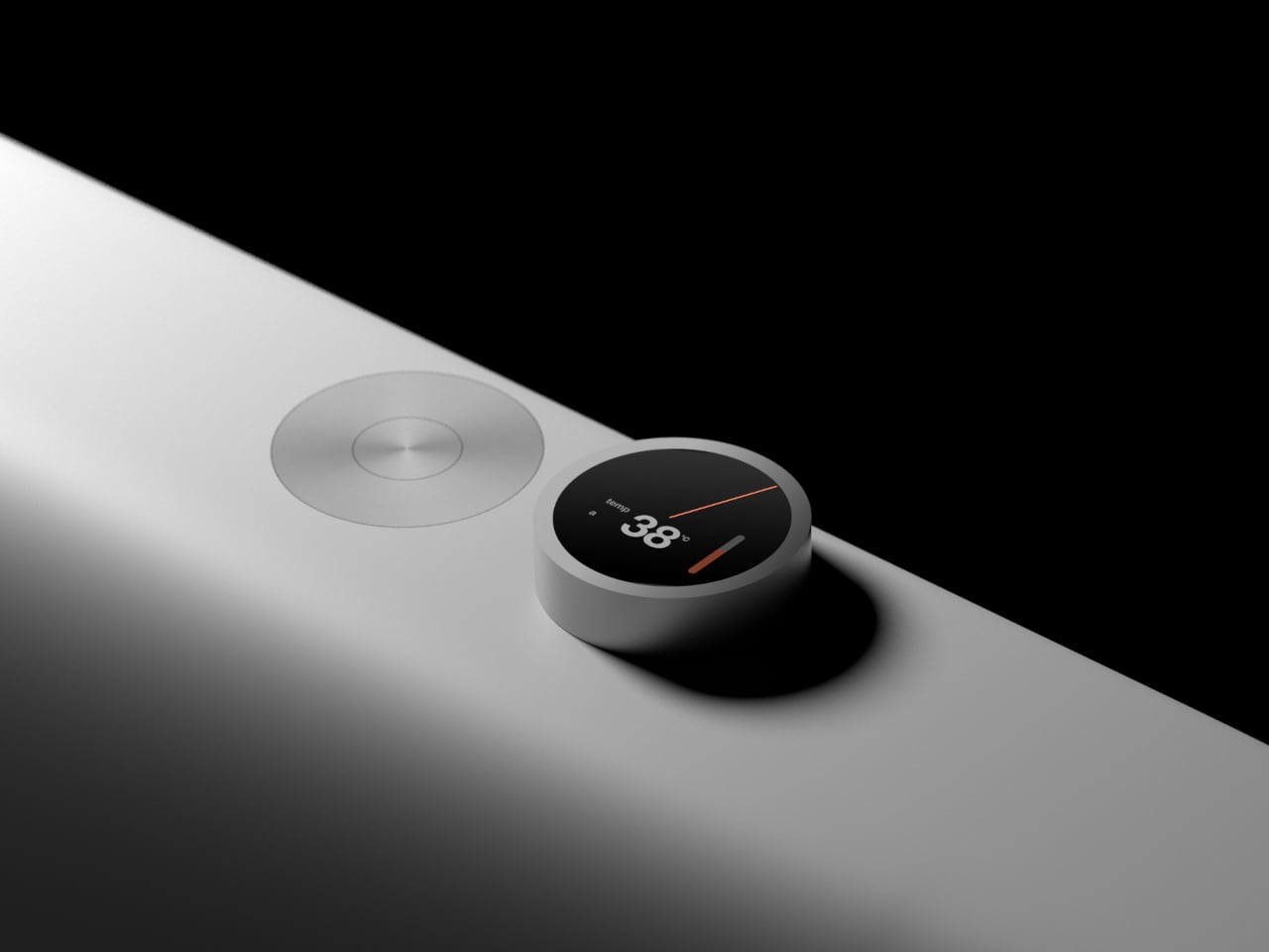
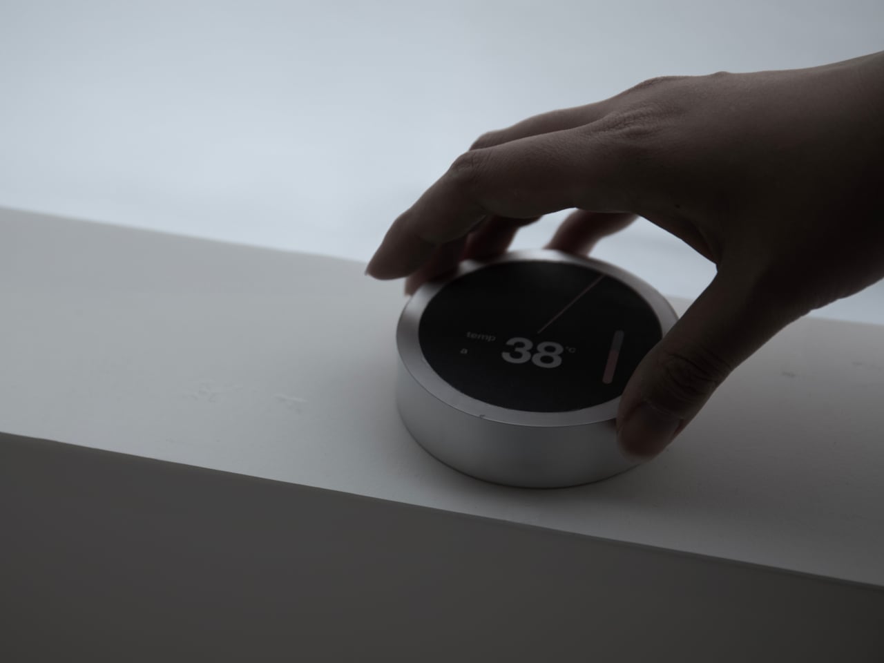
The controls follow the same logic. A touch dial sits on the tub’s rim, its face displaying the current water temperature in large, easy-to-read digits, with a flush-mounted push button beside it for toggling the spa functions on or off. For those who’d rather not wait until they’re in the bathroom, a companion app lets you set the temperature and run the tub remotely from your phone.
The AquaIntelli is still a concept, which means it could be a while before anything like it shows up in an actual bathroom. But the ideas behind it are genuinely compelling. A bathtub that takes care of the tedious setup, remembers what you need after a rough day, and gets more useful the longer you own it is a surprisingly straightforward pitch for something the category has never really had.
Smartphones have become something of a paradox. The more capable they get, the less in control we feel. Notifications pull us in every direction, social feeds demand constant attention, and app stores offer thousands of things we never asked for. For all the technology packed into these slim glass rectangles, they’ve stopped being tools we use and started being systems we manage.
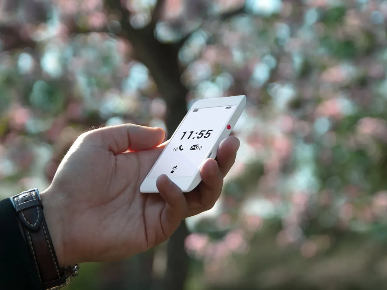
That tension is exactly what Berlin-based architect Marko Lazić sat with one afternoon in 2016, waiting for a friend at a coffee shop with his phone battery nearly dead. He sketched an idea, one that took years to develop but eventually became Offone, a 3D-printed phone with an E Ink display that he calls a “wisephone.” Not a dumbphone, and certainly not a smartphone, but something deliberately in between.
Designer: Marko Lazic
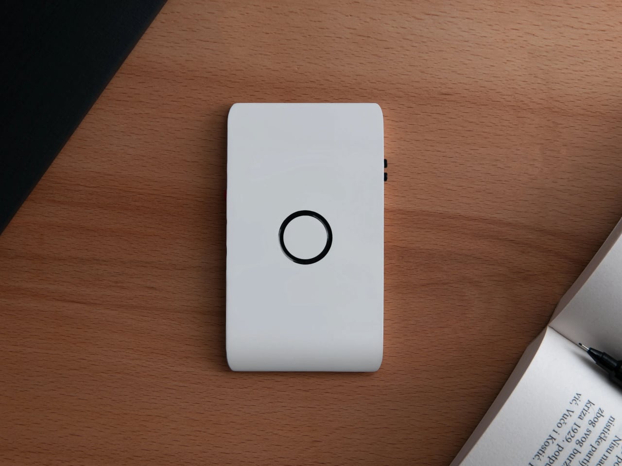
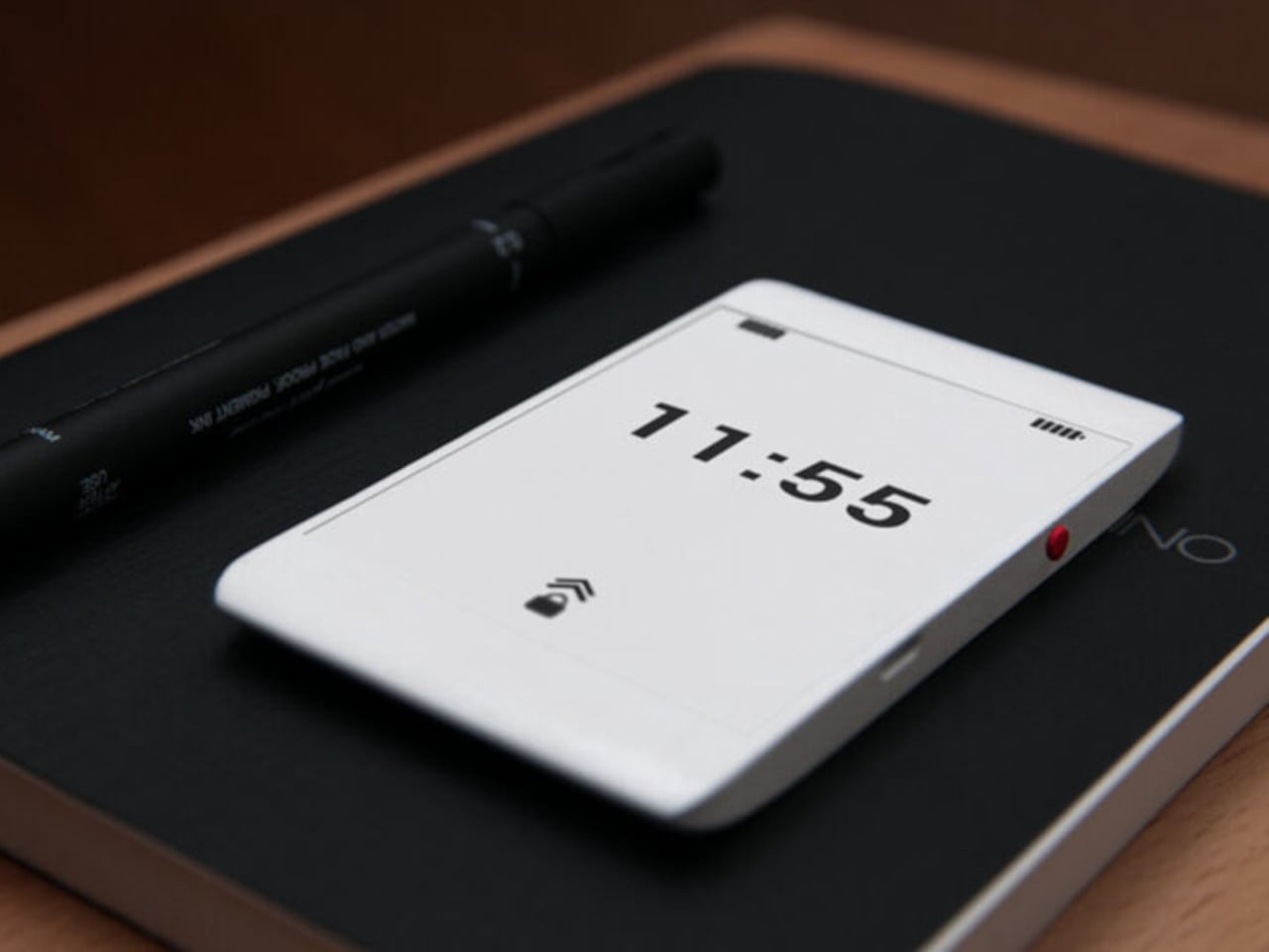
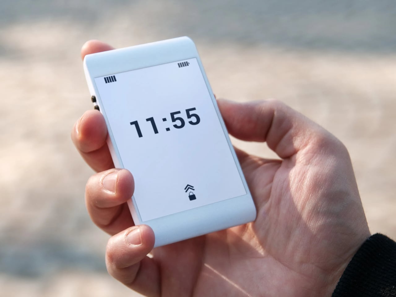
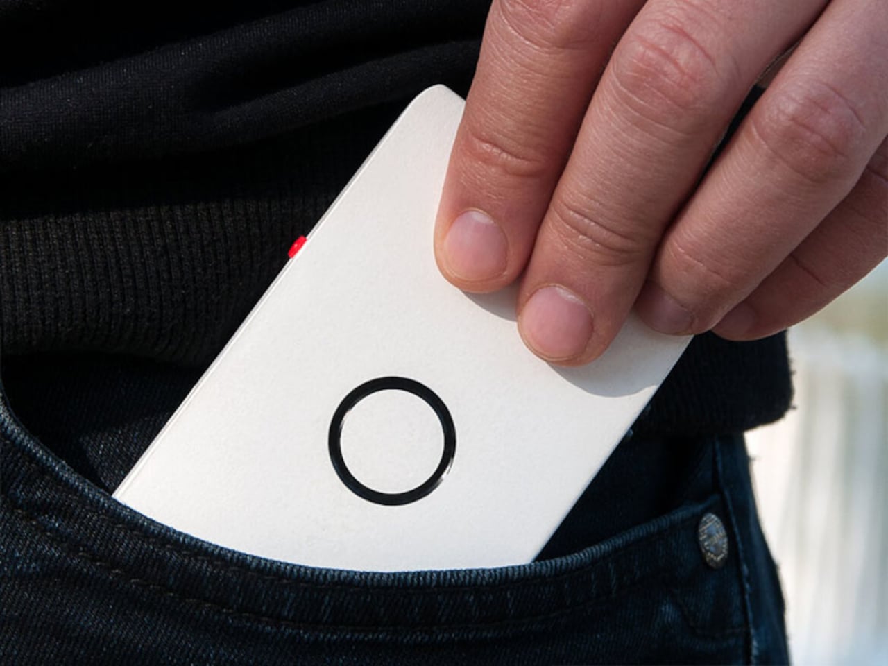
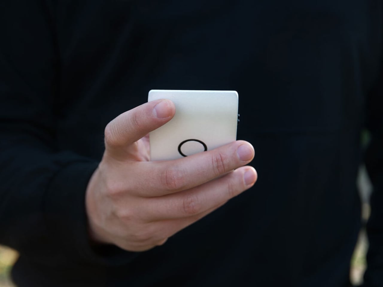
The first thing that catches your attention is how unassuming Offone is. Its 3D-printed body is slim enough to slip into a wallet alongside your cards and fits in the palm without effort. White, monochrome, and clean, the E Ink touchscreen looks more like paper than a display. The side bezels are practically nonexistent, while the top and bottom house the usual earpiece and microphone.
The E Ink display is a practical choice as much as an aesthetic one. It means no screen glare, no blue light, and no eye strain from prolonged use. Reading a text or checking a contact feels like glancing at a printed page. Lazić also considered night use, suggesting optional backlighting so the phone remains usable in the dark without disrupting sleep the way most backlit screens tend to do.
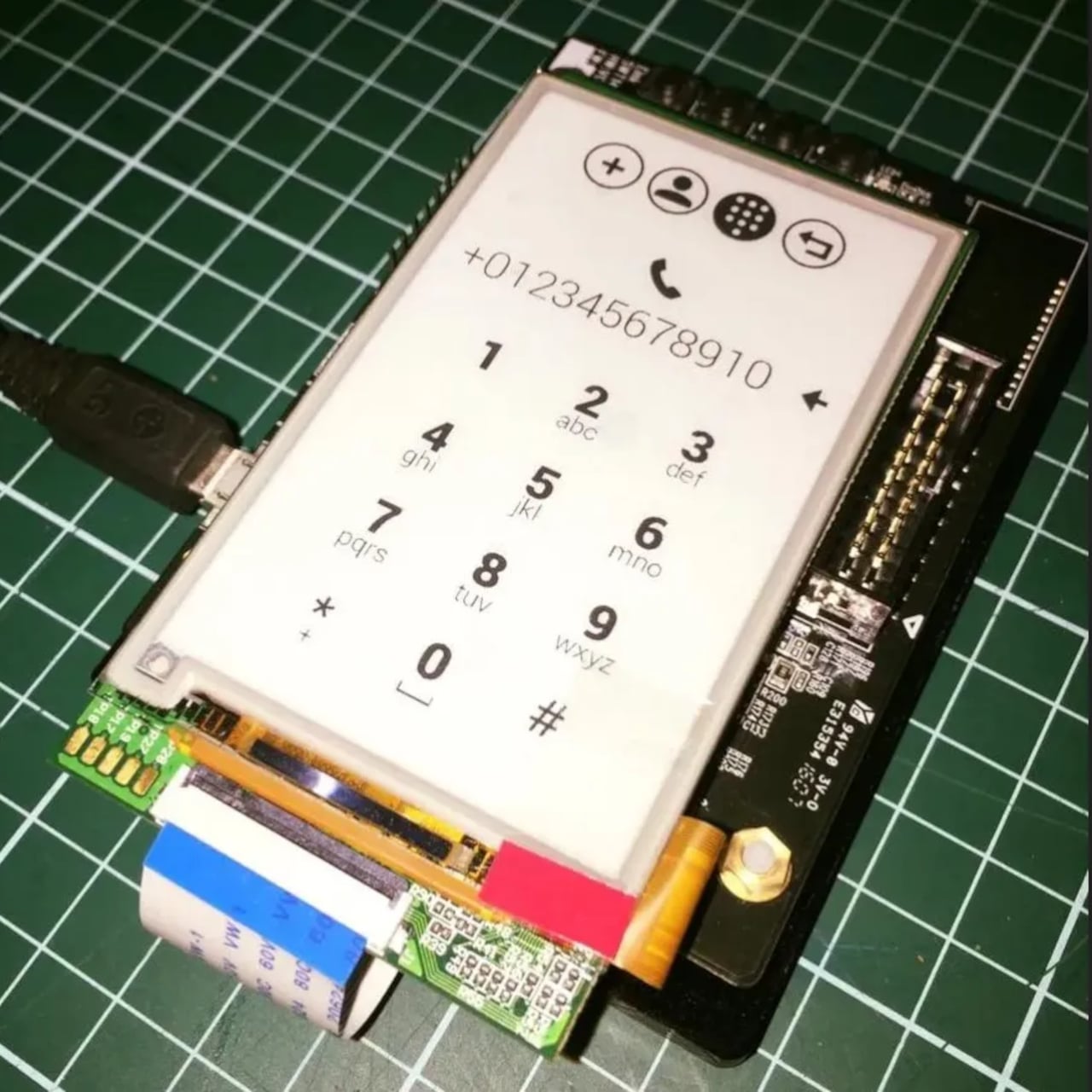
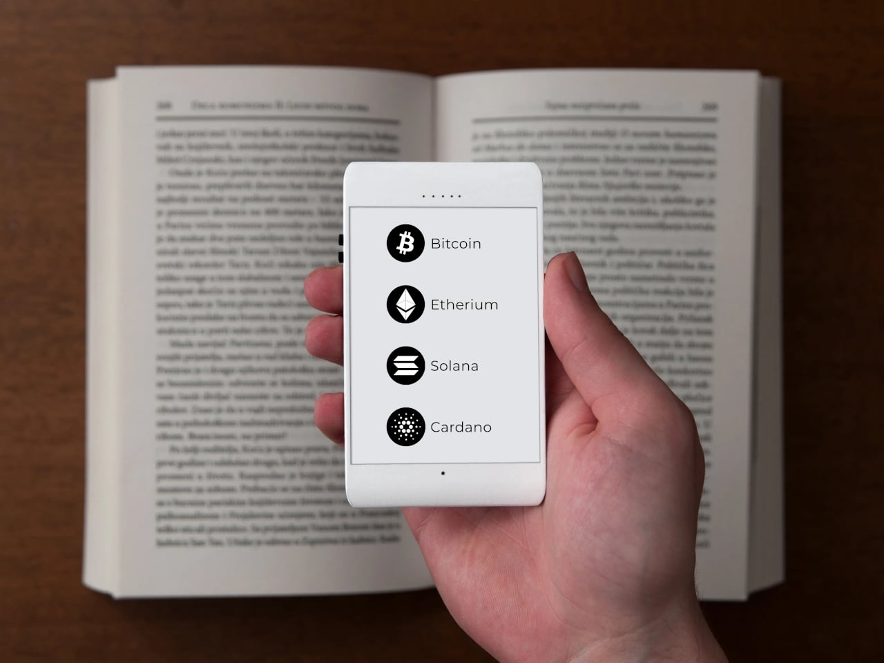
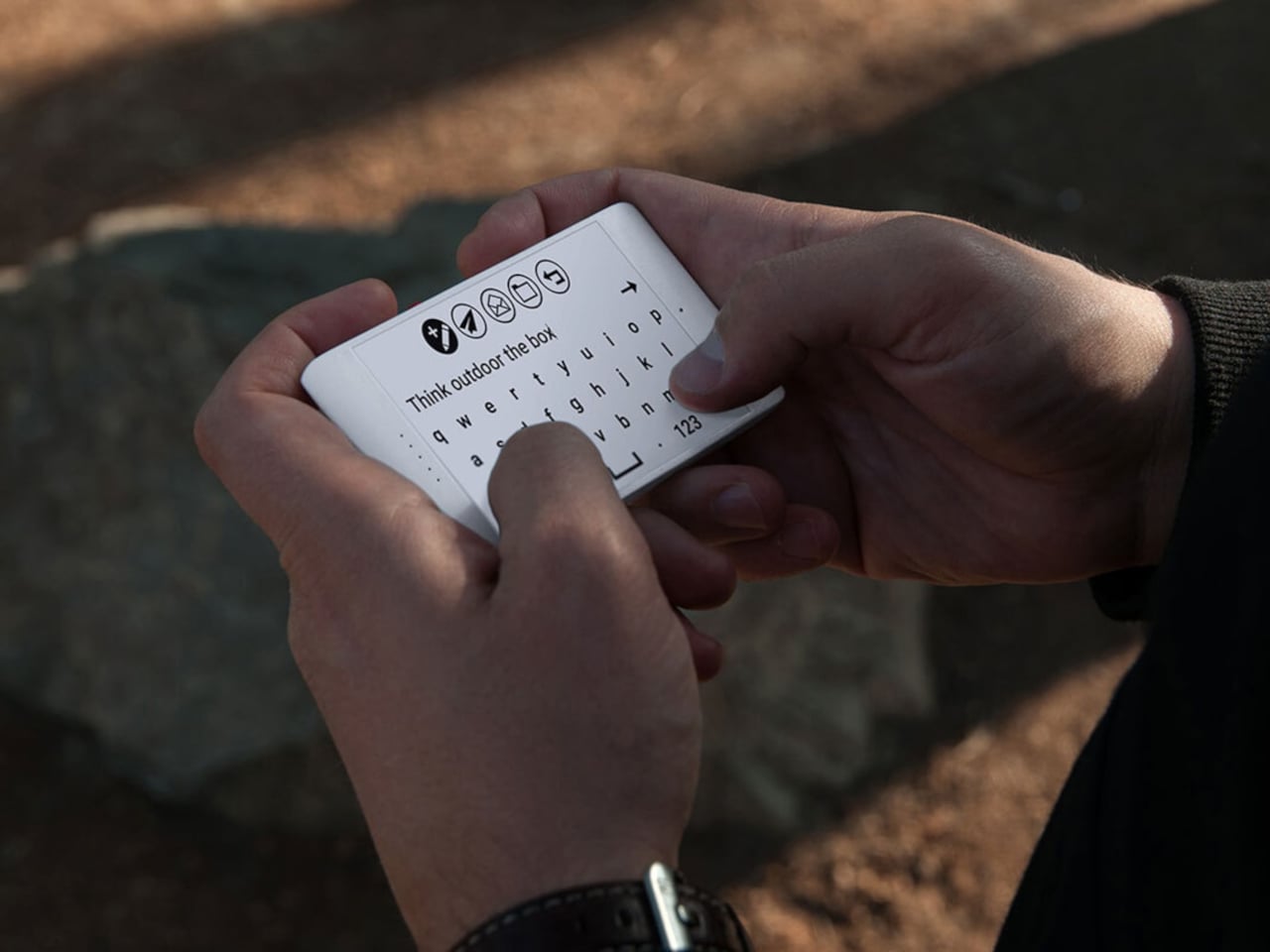
Lazić’s approach to the interface is as intentional as the hardware. Instead of text labels, Offone uses universal symbols to represent its apps, meaning navigating the phone doesn’t require knowing any particular language. It’s a small detail but a telling one, reflecting a philosophy where clarity and accessibility come before convention. The only time you type letters is when writing a message or searching for a contact.
The app selection is just as deliberate. You get calls, SMS, Google Maps, Waze, Uber, and messaging platforms like WhatsApp, but nothing else. No camera, no app store, no social feeds. Imagine getting through a travel day, navigating an unfamiliar city, calling ahead to a hotel, and ordering a ride, all without once falling into the scroll. For frequent travelers and the easily distracted, that’s a meaningful trade-off.
Even the hardware choices are guided by this spirit of restraint. At least one prototype shows no ports at all, meaning charging would be wireless and headphone connectivity handled over Bluetooth. It’s a cleaner device in every sense, free from the usual tangle of cables. The E Ink display also dramatically reduces power consumption, pushing battery life well past what most smartphones manage in a day.
Offone never reached production. Lazić wrote about the startup’s collapse in a 2022 Medium post, pointing to a mix of ambition, poor team choices, and a lack of funding as the reasons it fell apart. Development halted that same year after the team disbanded, leaving it an intriguing concept that was perhaps just a few years ahead of the minimalist phone movement it helped inspire.
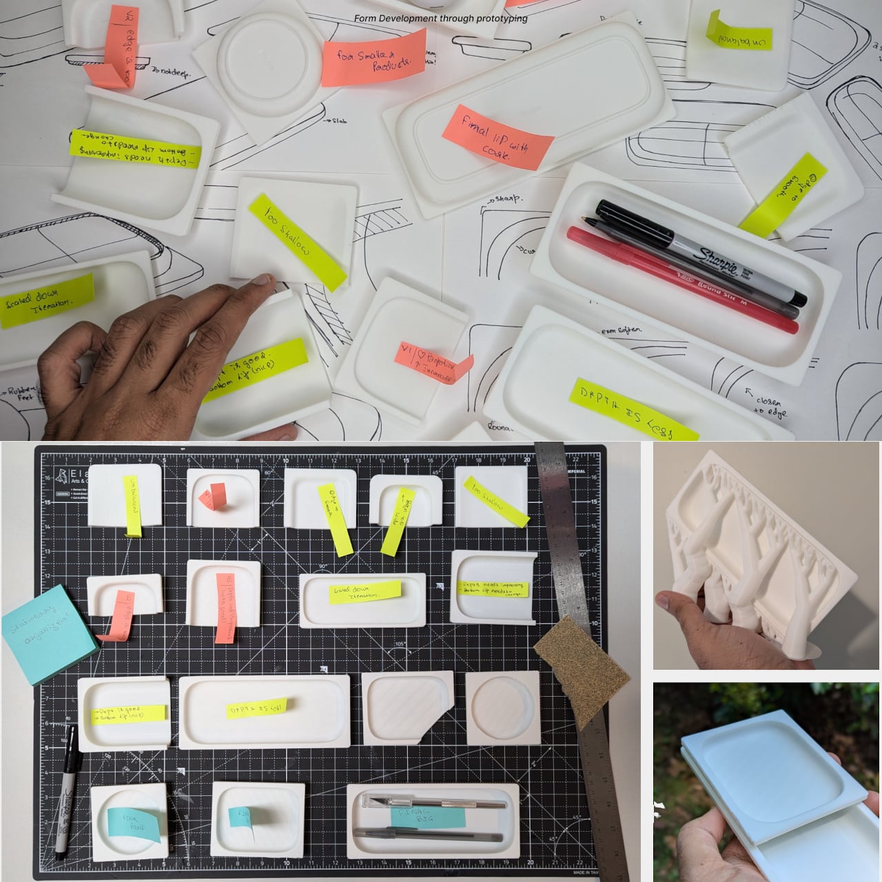
A messy desk is one of those problems that feels minor right up until it isn’t. You reach for a pen, knock over a cup, lose a paperclip into some void between your keyboard and monitor, and suddenly, five minutes are gone. Most organizers solve this with dividers and compartments, which is fine, but they tend to sit on your desk like afterthoughts, plastic trays that slide around and rarely match anything else in the room.
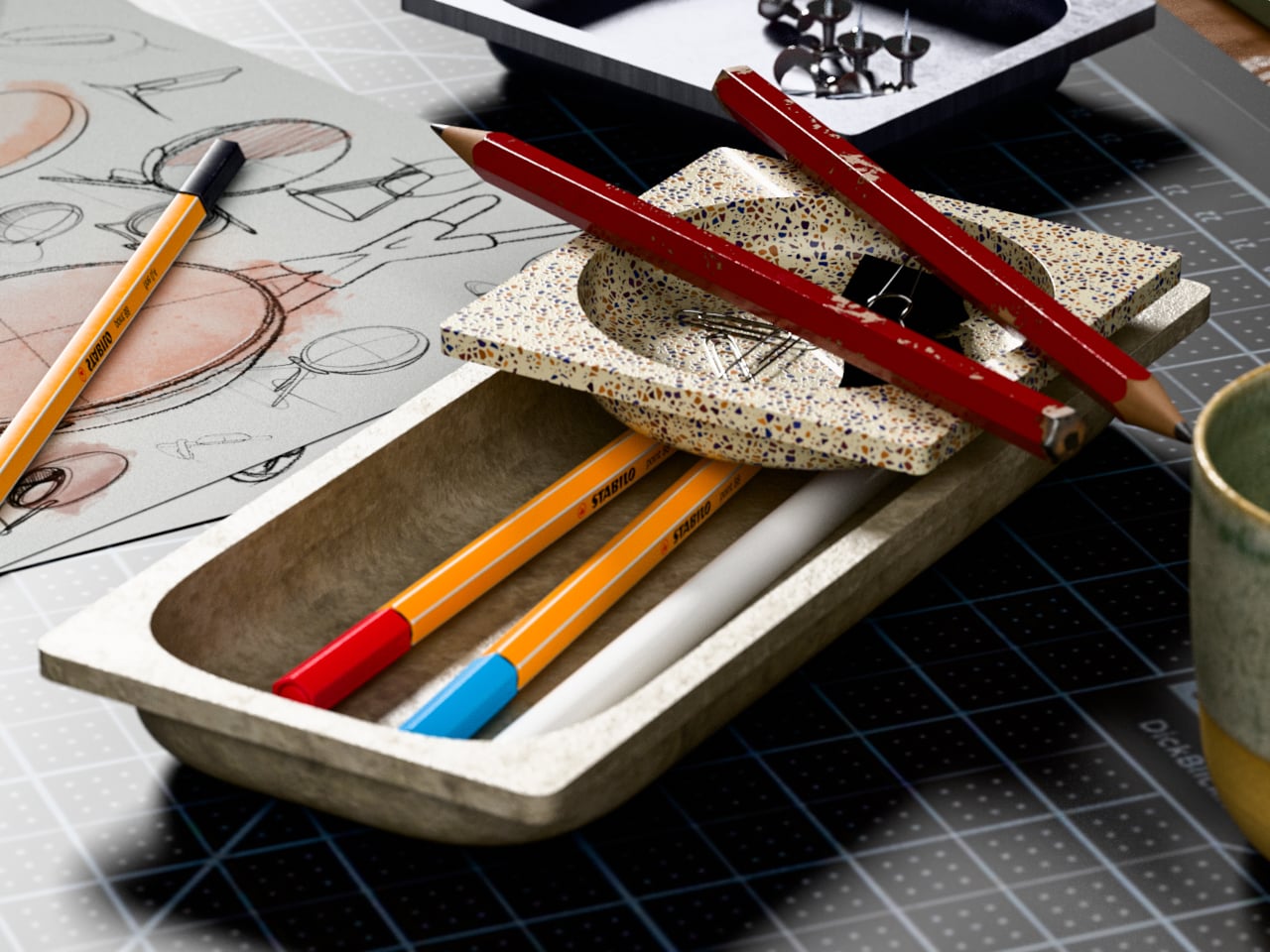
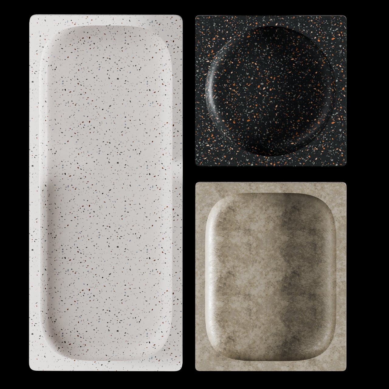
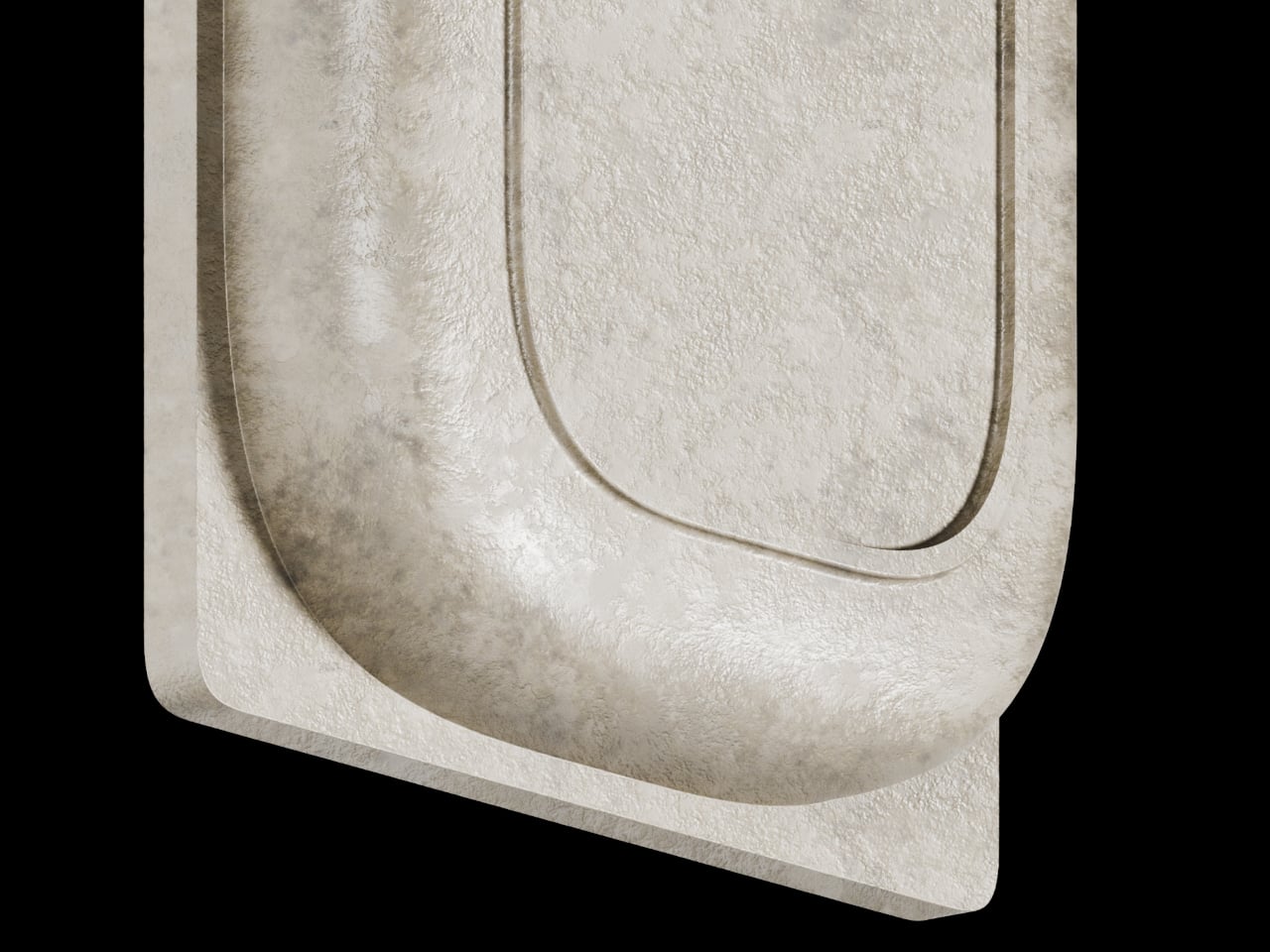
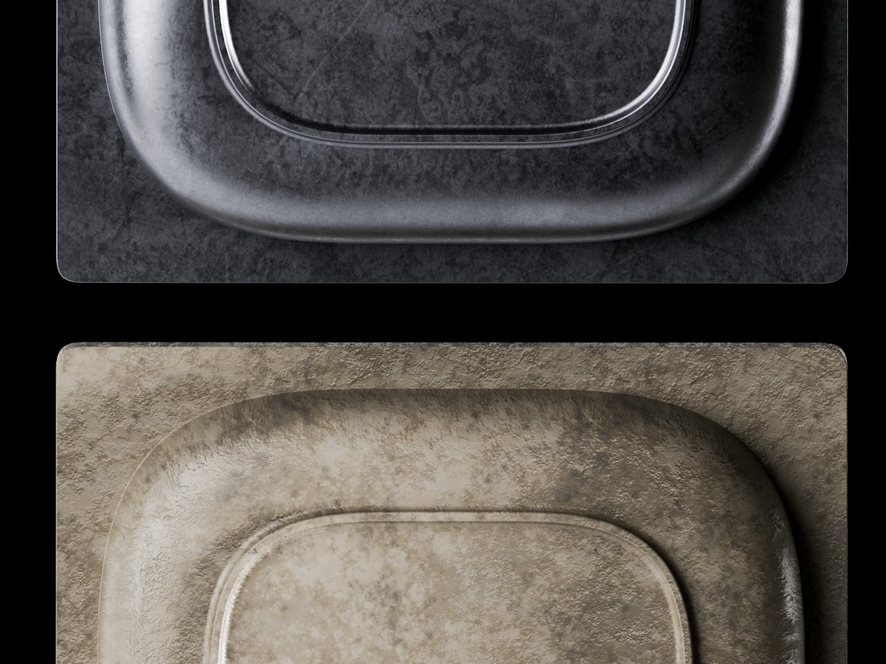
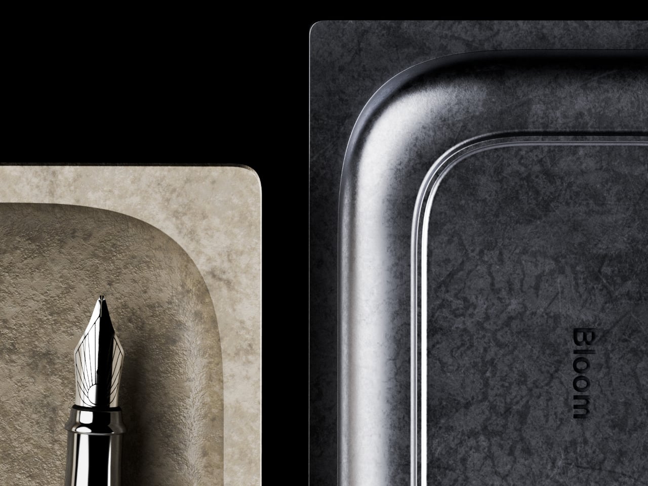
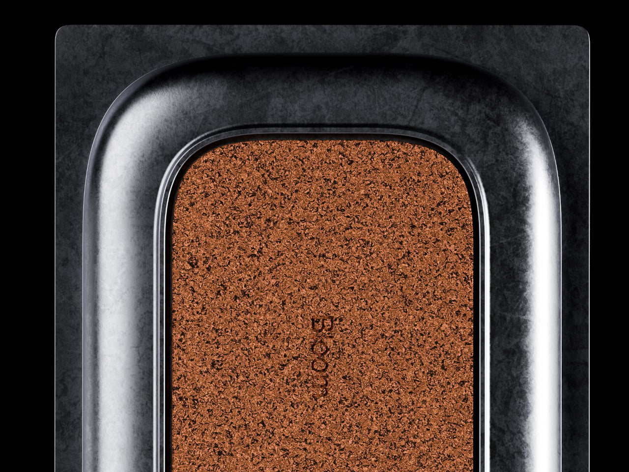
BloomCase approaches the problem from a different angle. Made from concrete, metal, and stone, it is heavy enough to stay put without any grip pads or rubber feet, and that weight is load-bearing in a more literal sense, too. The concrete body gives it a raw, architectural presence that feels deliberate rather than decorative, the kind of object that reads as intentional rather than incidental on a desk that already has some thought behind it.
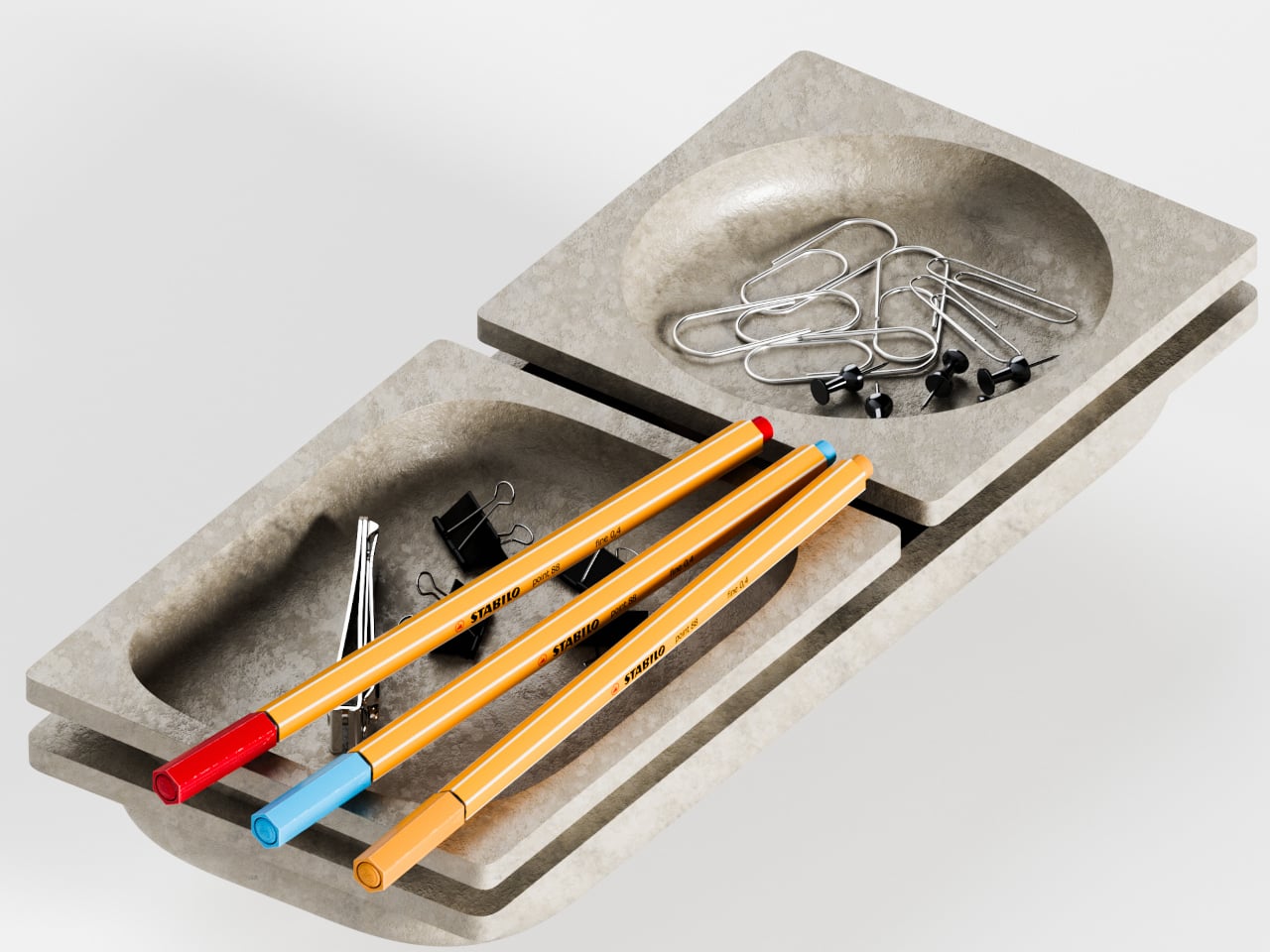
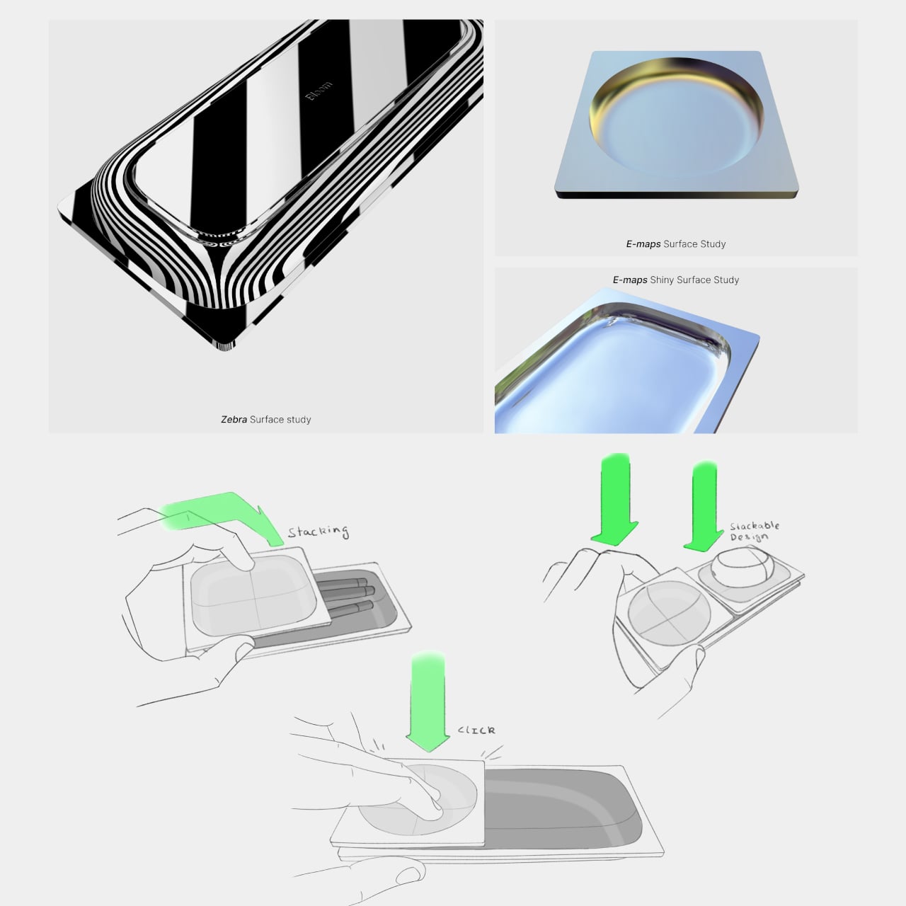
The form itself is where things get interesting. Circular basins sit alongside parallel rectangular bays, each with a specific job. The basins are contoured to cradle small loose items, thumbtacks, paperclips, and the miscellaneous hardware that scatters across every flat surface it touches. The bays run parallel and are angled to hold pens and pencils upright and accessible, so what you reach for most is what you find fastest. There is a satisfying logic to that division, one that needs no instructions to grasp.
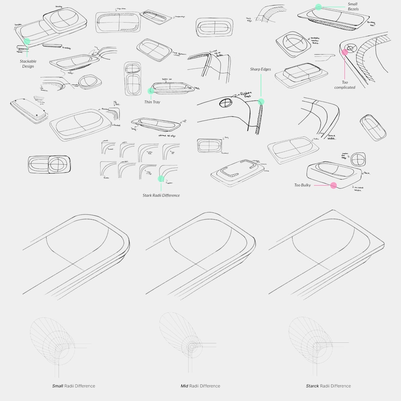
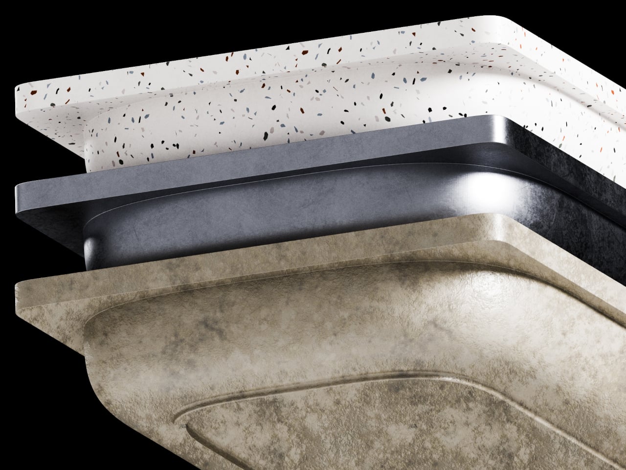
What separates BloomCase from a standard tray is the interlocking system. Two or more units snap together so that separate pieces merge into a single continuous footprint. The connection is designed to feel secure and repositionable, which matters when your desk layout shifts with a project, or when you realize three months in that you needed more pen space all along. The name comes from this behavior, units blooming outward across the workspace as organizational needs grow.
The aesthetic sits at an interesting intersection. Concrete and geometric curves do not usually share a design brief, but the combination here avoids the coldness that brutalist objects can carry in domestic or office settings. The raw material quality of the concrete against the softer basin profiles creates enough contrast to hold visual interest without tipping into decorative territory. It looks like a tool that was designed carefully, which is a harder thing to pull off than it sounds.
The modular logic is a genuinely smart idea, but it only makes practical sense if you actually need more than one unit. A desk covered in connected concrete trays starts to raise honest questions about how much surface you are willing to trade for organization. There is also the matter of audience: heavy raw materials appeal most to designers and architects who already have a taste for that kind of object on their desks, which is a narrower group than the broader market for desk tidiness.
The lamp has gotten interesting again. What was once a fixture relegated to task lighting and matching living room sets has turned into something more intentional, especially among people who care about how their spaces feel at different times of day. Cordless, portable table lamps have become a genuine category of their own, offering the kind of flexibility that hard-wired fixtures simply can’t.
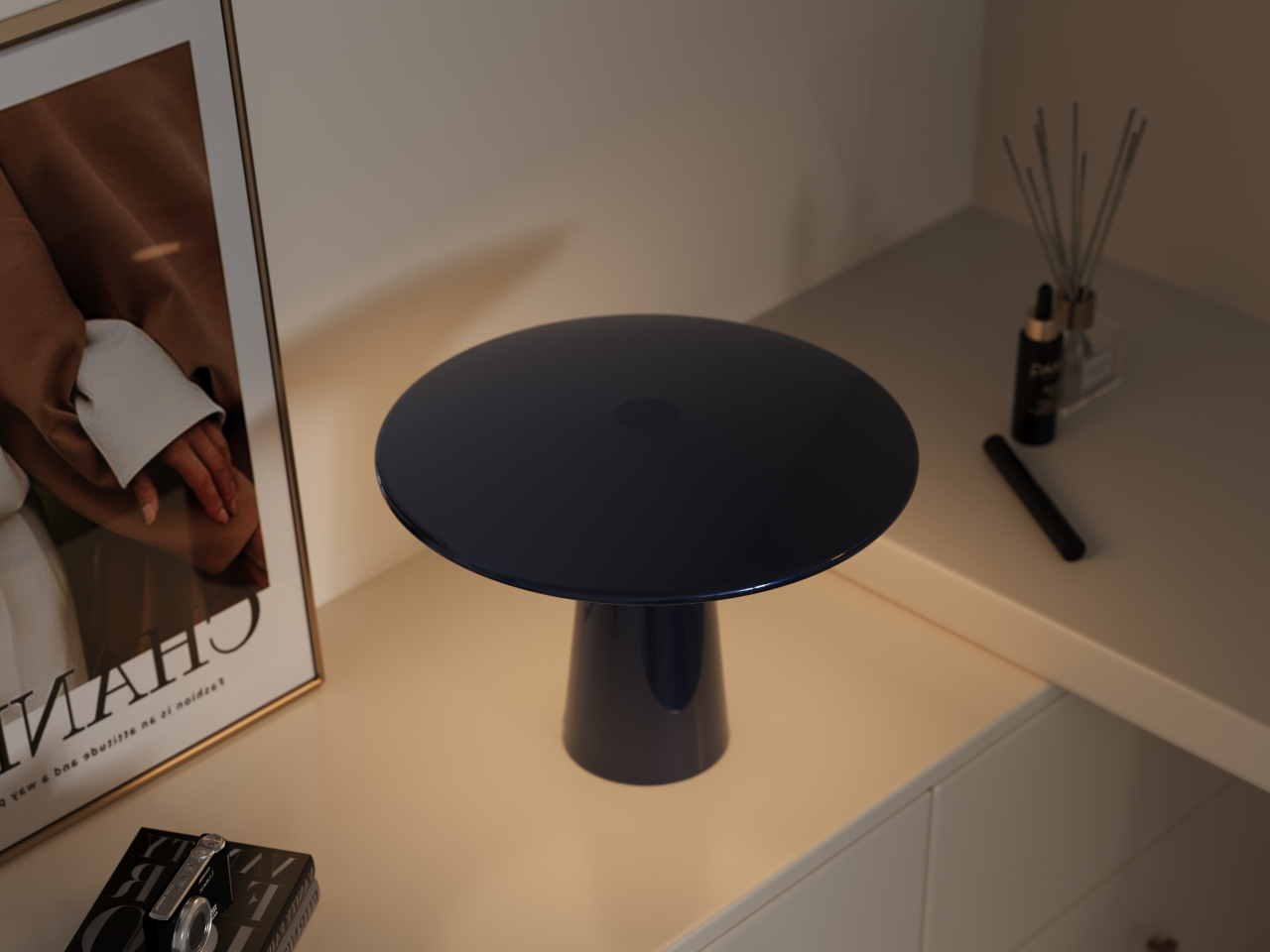
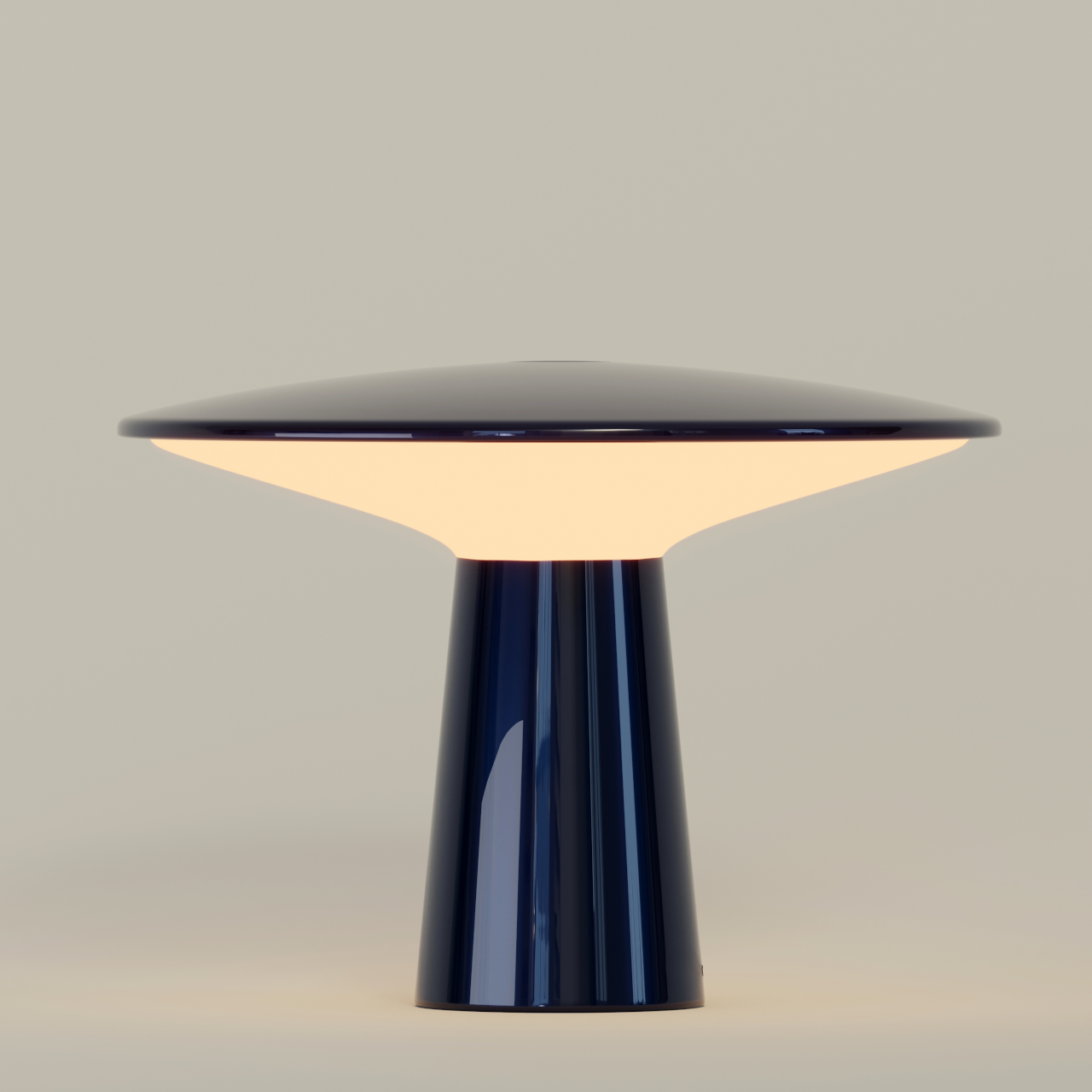
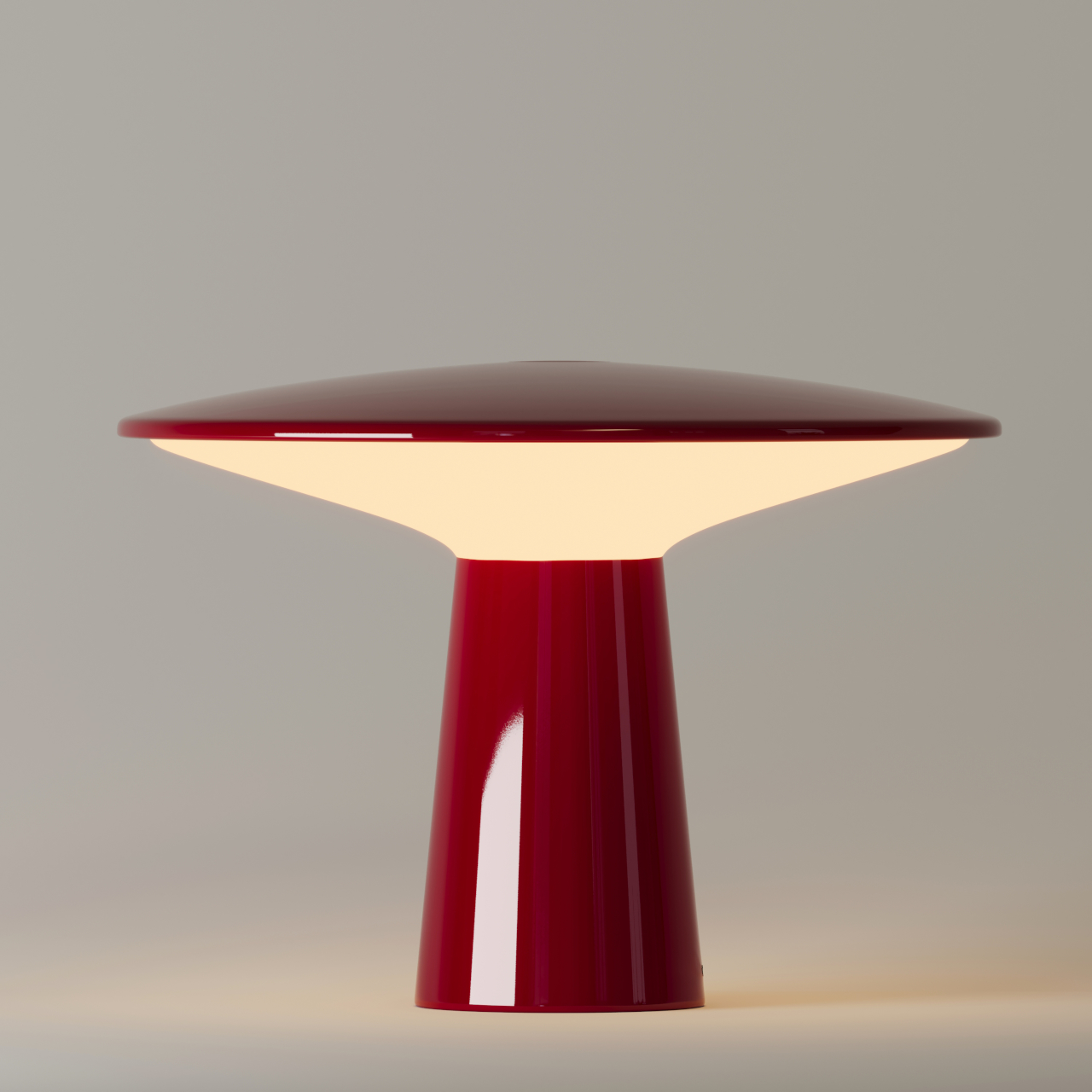
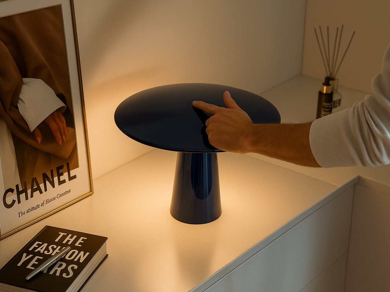
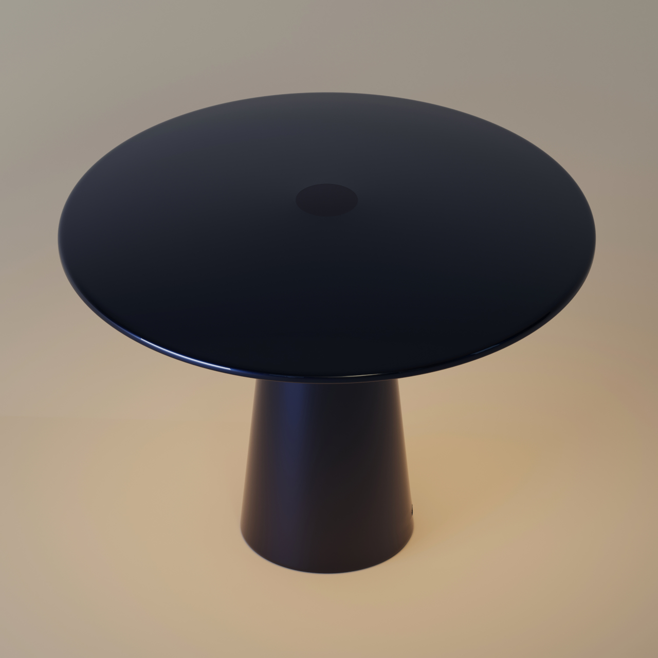
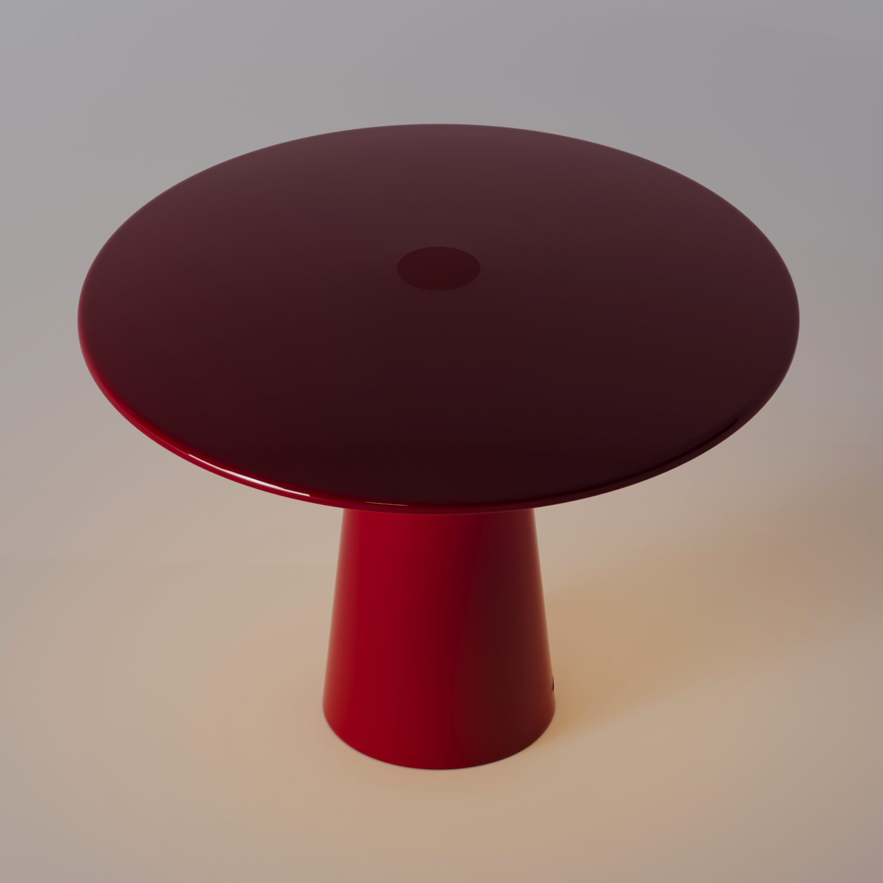
Designer Rahi Seyedi’s Monir, developed for Rey Studio, slots right into that world while carrying a concept that goes a bit further than most. The 29cm cordless lamp is inspired by the way moonlight sits between the sky and the earth, and that idea drives every decision in the design, from the shape of its dome to the materials holding it all together.
Designer: Rahi Seyedi
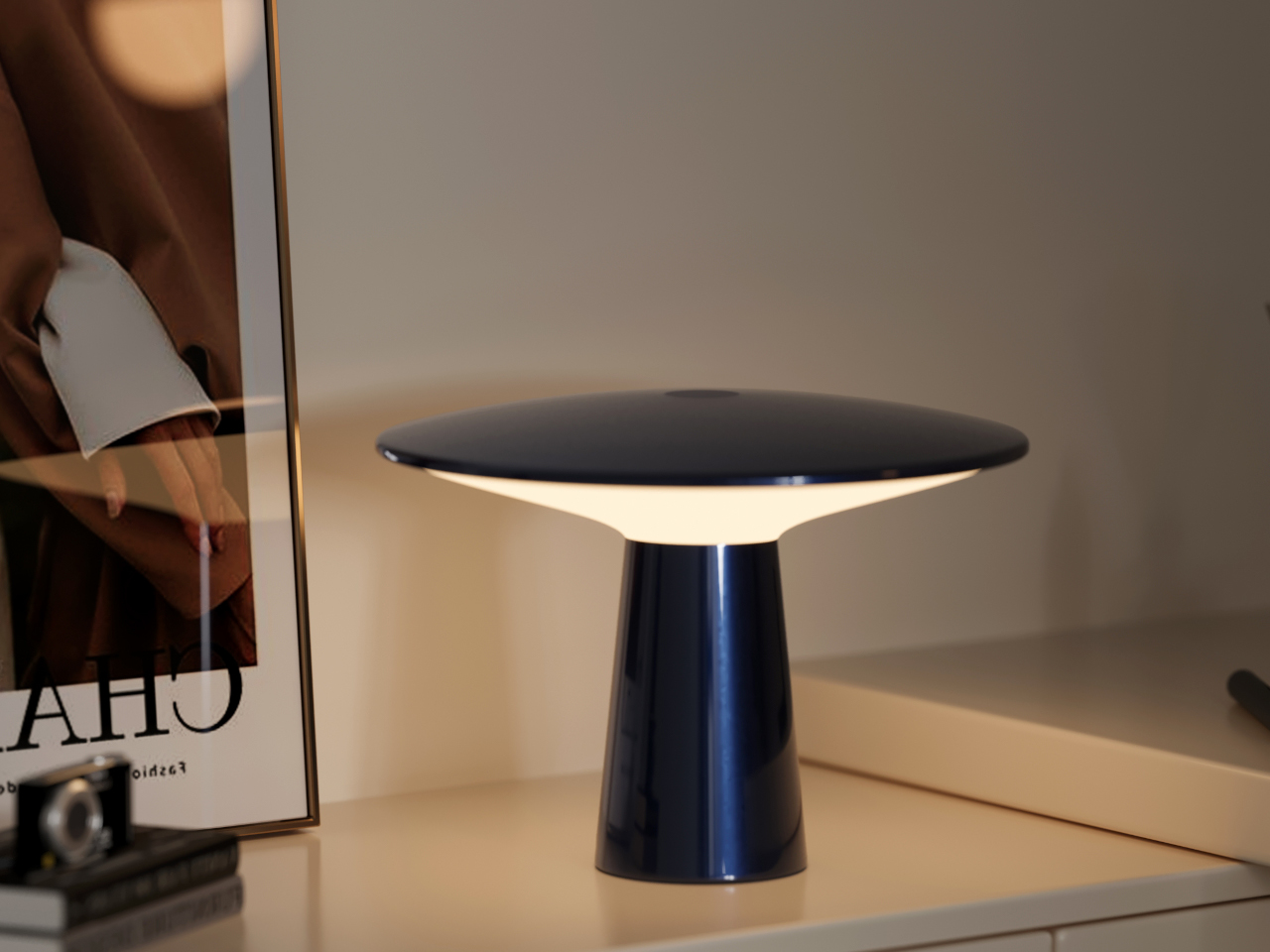
The form reads pretty clearly once you know what it’s referencing. A dark, grounded base anchors the lamp below, standing in for the weight of the earth, while the translucent dome above lets the LED ring scatter light in a way that mimics the gentle diffusion of moonlight. Nothing about the design is there for decoration alone. Every detail serves the concept, and you can tell.
Using it is about as frictionless as a lamp can get. A tap switches it on, and gently rotating the upper section moves through three brightness levels. That’s it. There’s no app, no remote, and nothing to configure before you can actually use it. You just pick it up, place it where you want it, and adjust the brightness until the light feels right.
On a desk, Monir keeps things steady without being intrusive. The diffused glow is warm enough to take the edge off the contrast between a bright screen and a dark room, which is exactly what you want during a long stretch of work or reading. It doesn’t replace proper task lighting, of course, but it makes the hours you spend at a desk noticeably more comfortable.
Move it to a side table when the day winds down, and the lamp takes on a different role entirely. At its lowest settings, the warmth it puts out is the kind that encourages you to put your phone down and actually be in the room. Overhead lights off, Monir on, and the space feels genuinely different in a way that’s hard to explain but pretty easy to appreciate.
Sustainability was factored into Monir well before the final form was settled, and it shows. The base and dome are both made from 100% recycled aluminum, while the diffuser uses bio-based polycarbonate, a plant-derived material that doesn’t end up in a landfill. For something that asks so little of you visually and physically, that’s not a small thing, and as lighting objects go, Monir keeps its intentions quiet and its results remarkably clear.
The bag you carry is a design decision. Every object inside it is a small vote for how you move through the world, what you value, what you’re willing to lug, and what deserves a slot in your pocket or your pack. For too long, tech accessories defaulted to bulk. More power meant more weight. More connectivity meant more dongles. Better audio meant a bigger case. The implicit trade was always the same: capability costs space.
That trade is becoming optional. A new generation of everyday carry tech is rethinking its own geometry, collapsing into pockets, shedding grams, and using smarter materials and tighter engineering to pack more utility into less volume. These are not spec-sheet products assembled to fill a gap. They are designed to disappear into your day and show up exactly when you need them. From a power bank thinner than any phone to a keyboard built for a jacket pocket, these seven picks redefine what it means to carry less and own more.
1. Xiaomi UltraThin Magnetic Power Bank 5000 15W
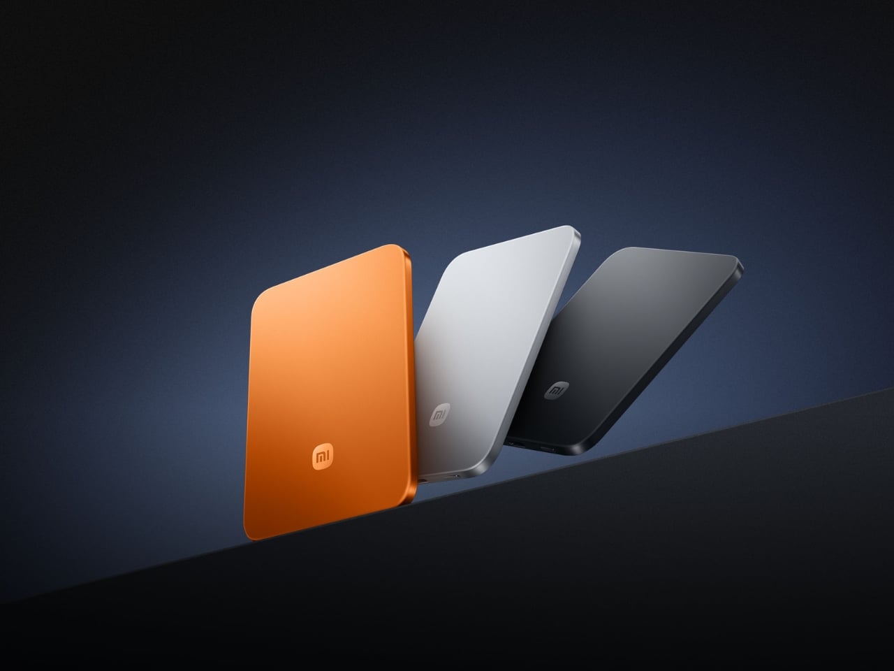
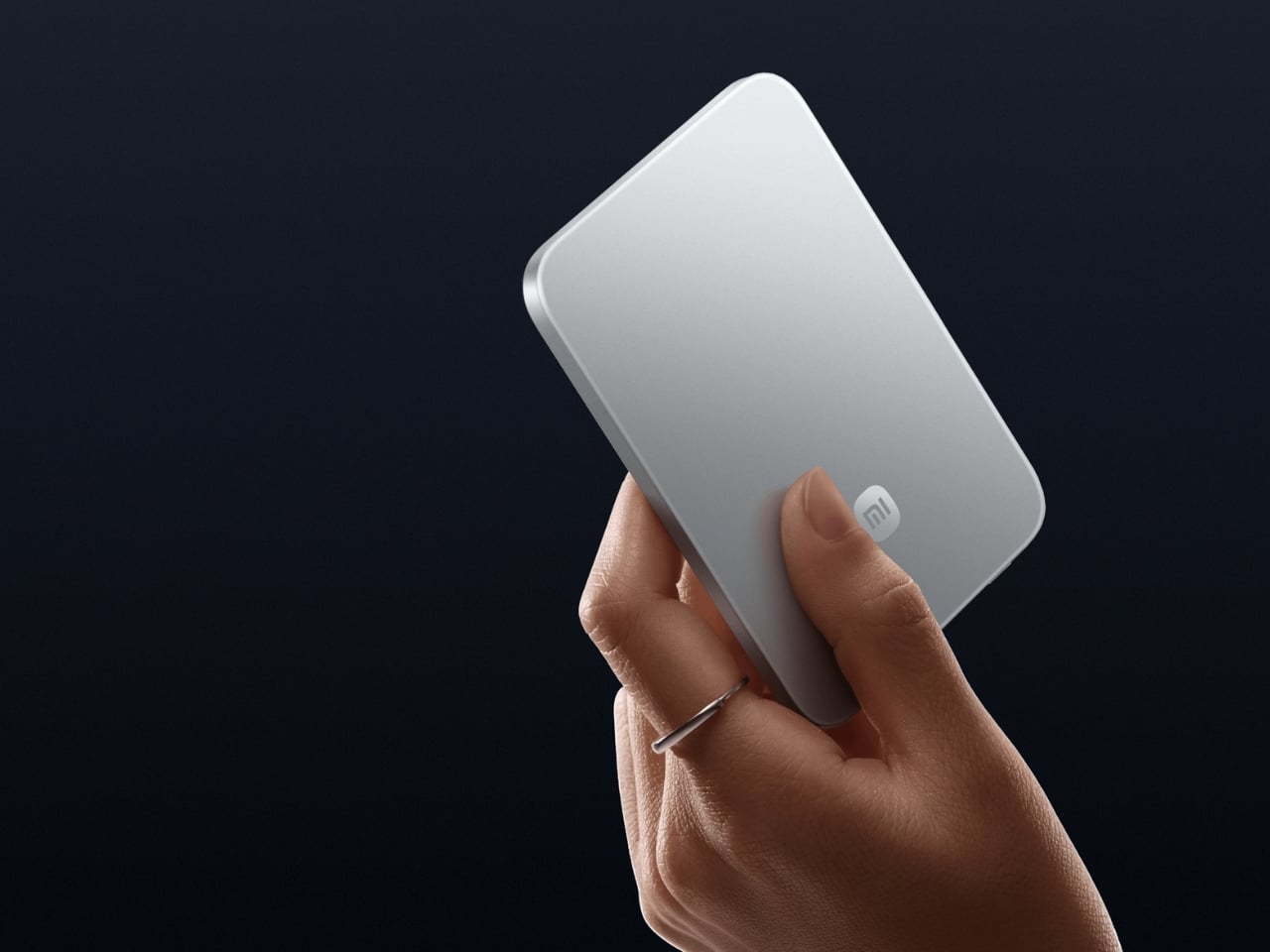
Power banks have always had a design problem. They’re essential and clunky, reliable and bulky, always appreciated but never comfortable to carry. Xiaomi’s UltraThin Magnetic Power Bank 5000 addresses that problem by starting where no other power bank has dared: at 6mm. That is thinner than most smartphones currently shipping. The aluminum alloy shell comes in Glacier Silver, Graphite Black, and Radiant Orange, each finished with a photolithographically etched logo that signals careful intention rather than assembly-line output. The fire-resistant fiberglass phone-facing surface handles heat management invisibly, keeping the exterior clean of vents or grilles. At 98 grams, it weighs less than two eggs, and carrying it feels like carrying nothing at all.
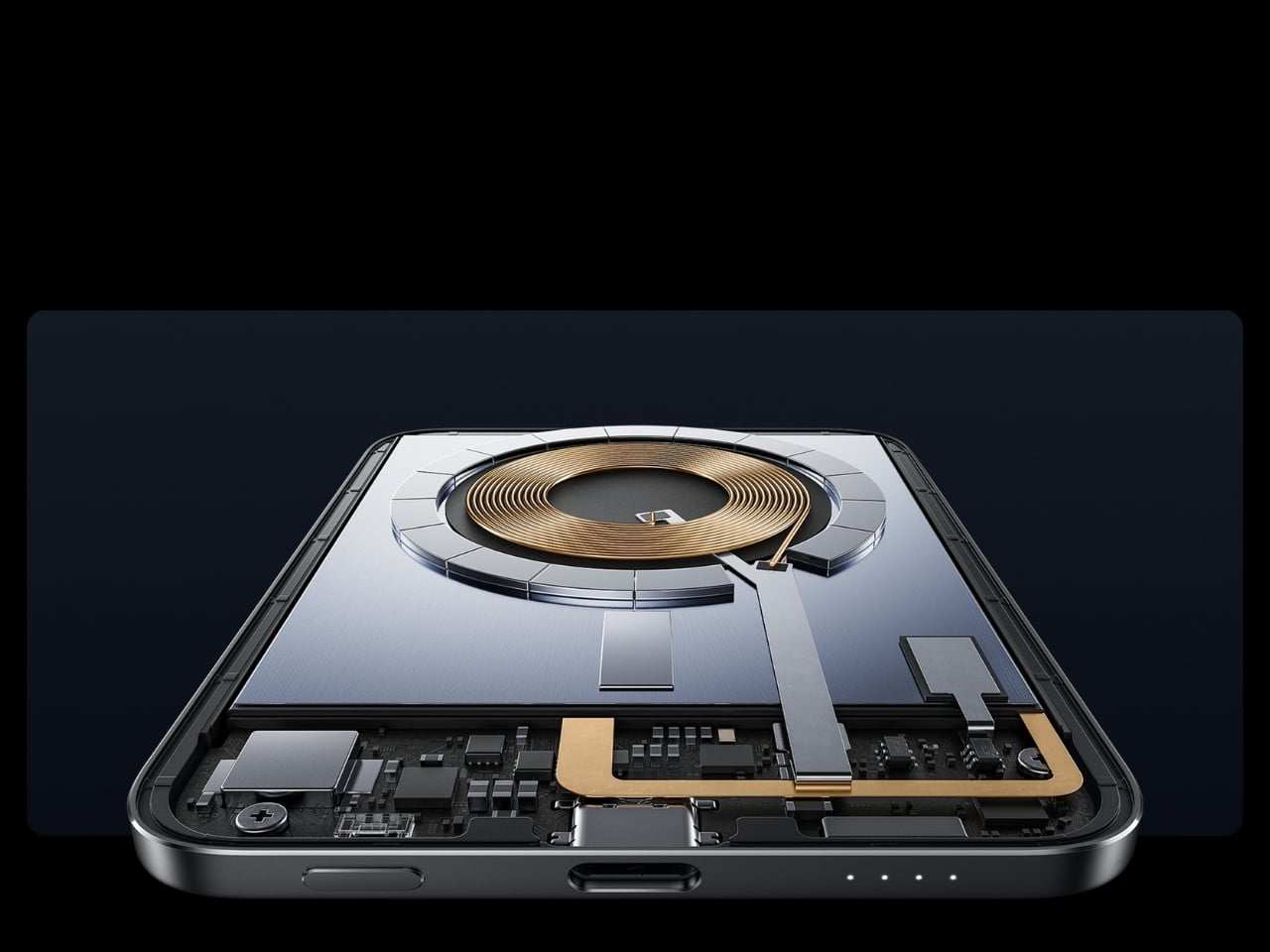
The engineering behind that form is silicon-carbon battery chemistry with 16% silicon content, enabling the energy density required to fit 5,000mAh into a body this slim. It supports 15W wireless charging for compatible Android devices, 7.5W for iPhone, and 22.5W wired via USB-C, with the practical addition of charging two devices simultaneously while being recharged itself. Showcased at MWC 2026 in Barcelona and priced at €59.99 in Europe for the Silver and Black versions, this is a power bank that earns its place by eliminating the bulk compromise the category has always required. For anyone committed to carrying less, this is the first power bank that doesn’t feel like a concession.
What We Like:
6mm profile and 98g weight make it the most pocket-friendly 5,000mAh power bank available
Silicon-carbon battery chemistry delivers a full 5,000mAh capacity without dimensional sacrifice
What We Dislike:
Wireless charging for iPhone is capped at 7.5W maximum
Rated capacity sits at 3,000mAh at 5V/2A, lower than the typical 5,000mAh figure
2. OrigamiSwift Mouse
A mouse seems immovable in form. Wide, arched, and desk-bound. The OrigamiSwift dismantles that assumption by doing exactly what the name implies: it folds. Inspired by the precision of origami, it compresses into a flat, slim profile that slips into a bag or jacket pocket without protest, then springs open in under 0.5 seconds into a full-sized, ergonomically shaped Bluetooth mouse that feels nothing like a compromise. It weighs 40 grams. That figure deserves a moment. Most full-sized mice weigh three to four times as much. The OrigamiSwift delivers all the comfort and tracking precision of a conventional mouse while occupying the footprint of a notepad when packed.
For the digital nomad setting up at a café, or the professional moving between meetings with a laptop under one arm, this is the kind of tool that quietly changes the texture of the day. The ergonomic form is shaped to fit naturally in the hand during extended work sessions, reducing the fatigue that accumulates from hours spent on a trackpad. The Bluetooth connection keeps the desk or surface clean. The ultra-thin folded profile sits flat in any bag compartment without creating bulk or claiming space disproportionate to its value. Minimalist carry is about tools that show up without announcing themselves, and the OrigamiSwift does exactly that: invisible when packed, essential when open.
Folds flat for pocket carry and opens into a full ergonomic mouse in under 0.5 seconds
At just 40 grams, it is one of the lightest full-form productivity mice available
What We Dislike:
The folding mechanism may require adjustment time for users accustomed to traditional mice
A 40-gram build may feel less substantial to users who prefer a weighted mouse
3. HubKey Gen2
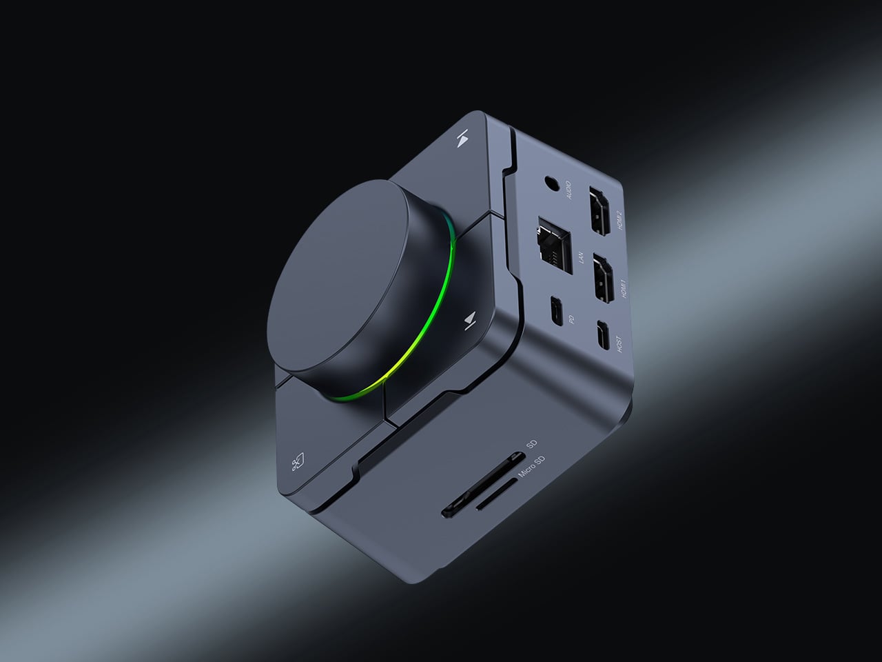
The modern desk accumulates workarounds. Two USB-C ports become four, then six, spread across a tangle of adapters that creep outward from the laptop until the workspace feels less like a setup and more like a wiring diagram. HubKey Gen2 is built to end that creep. It is an 11-in-1 USB-C hub inside a compact cube, and the more interesting detail is what lives on top: four physical shortcut keys and a central control knob that handle media playback, privacy shortcuts, and daily actions without a software menu or a keyboard combination you can never quite remember. One object consolidates what used to require a cluster of small fixes, turning a patchwork of compromises into something coherent.
Dual 4K display support makes it relevant for anyone running an expanded screen setup, while the physical controls restore a directness that software interfaces have quietly taken away. Volume knobs, mute buttons, and display toggles should not require a three-key shortcut or a settings dive. HubKey Gen2 puts that control back within arm’s reach. It handles power, storage, network, and displays from a single USB-C connection, and transforms a desk covered in small adaptations into something intentional and calm. The headline is carry less, own more, and at the desk, that translates directly: one compact cube where eleven separate solutions used to live.
What We Like:
Consolidates 11 connections and physical shortcut controls into a single compact cube
Dual 4K display support covers multi-monitor setups without additional adapters
What We Dislike:
Desk-bound design means it is a workspace consolidation tool rather than a pocketable carry item
Physical shortcut keys offer fewer customization options compared to software-based control surfaces
4. Battery-Free Amplifying iSpeakers
The charging cable is the one obligation that minimalist carry never fully escapes. Every wireless device is a deferred maintenance task, a battery you will have to tend to eventually. The Duralumin battery-free iSpeakers sidestep that dependency entirely. No power source, no cable, no charging ritual. You place your smartphone inside the enclosure, and the geometric cavity amplifies sound through acoustic engineering alone, using the golden ratio in its design to optimize resonance and distribute the audio across the room. It is the kind of object that looks precisely like it belongs on a desk and sounds as considered as it looks.
The material choice deepens the story. Duralumin is the same aluminum alloy used in aircraft construction, a combination of lightness and structural rigidity that allows the speaker to resonate without distorting. The result is a passive amplifier that genuinely improves your phone’s audio while functioning as a deliberate desktop object. Modular compatibility with the sold-separately +Bloom and +Jet sound-directing additions means it can adapt to different spatial setups without ever adding an electronic dependency. For carry with intention, this is what owning more looks like: an object that does its job through physics, needs nothing from a wall outlet, and occupies any surface as though it was designed specifically for it.
Requires no battery or electricity, making it zero-maintenance and usable anywhere
Aircraft-grade Duralumin construction delivers structural integrity alongside a refined aesthetic
What We Dislike:
Audio output is entirely dependent on the quality of the phone’s built-in speaker
Directional sound control requires purchasing the +Bloom or +Jet mods separately
5. NanoPhone Pro
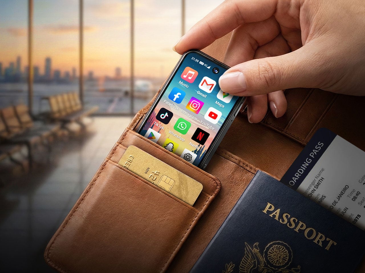
There is a version of the smartphone that has been lost in the pursuit of bigger screens and faster processors. It is the phone that fits in a coin pocket, asks nothing of your attention beyond the call and the navigation prompt, and treats connectivity as a utility rather than an experience. The NanoPhone Pro returns to that idea with a credit-card-sized 4G device running Android 12 and certified for Google Play apps. It browses, calls, navigates, plays music, and handles real-time navigation. It does not demand to be the center of your day, and that restraint is the entire point.
A 5MP rear camera and 2MP front shooter cover quick captures and video calls without positioning this as a photography device. That deliberate limitation is the product’s philosophy: it does everything a smartphone needs to do and none of what a smartphone has quietly drifted into doing over the last decade. As a secondary phone for travel, for screen-time reduction, or for users who simply want connectivity without the gravitational pull of a large-format device, the NanoPhone Pro is a precise instrument. Minimalist carry is often defined by what you leave behind, and this phone argues convincingly that you can leave behind the bulk of a modern device without surrendering any of its real utility.
What We Like:
Credit-card footprint eliminates smartphone bulk while retaining 4G connectivity and Google Play
Android 12 certification ensures a complete app ecosystem without compatibility compromises
What We Dislike:
The 5MP rear camera is not a substitute for a primary smartphone’s imaging system
Small screen dimensions limit usability for media consumption or extended reading
6. Keychron B11 Pro
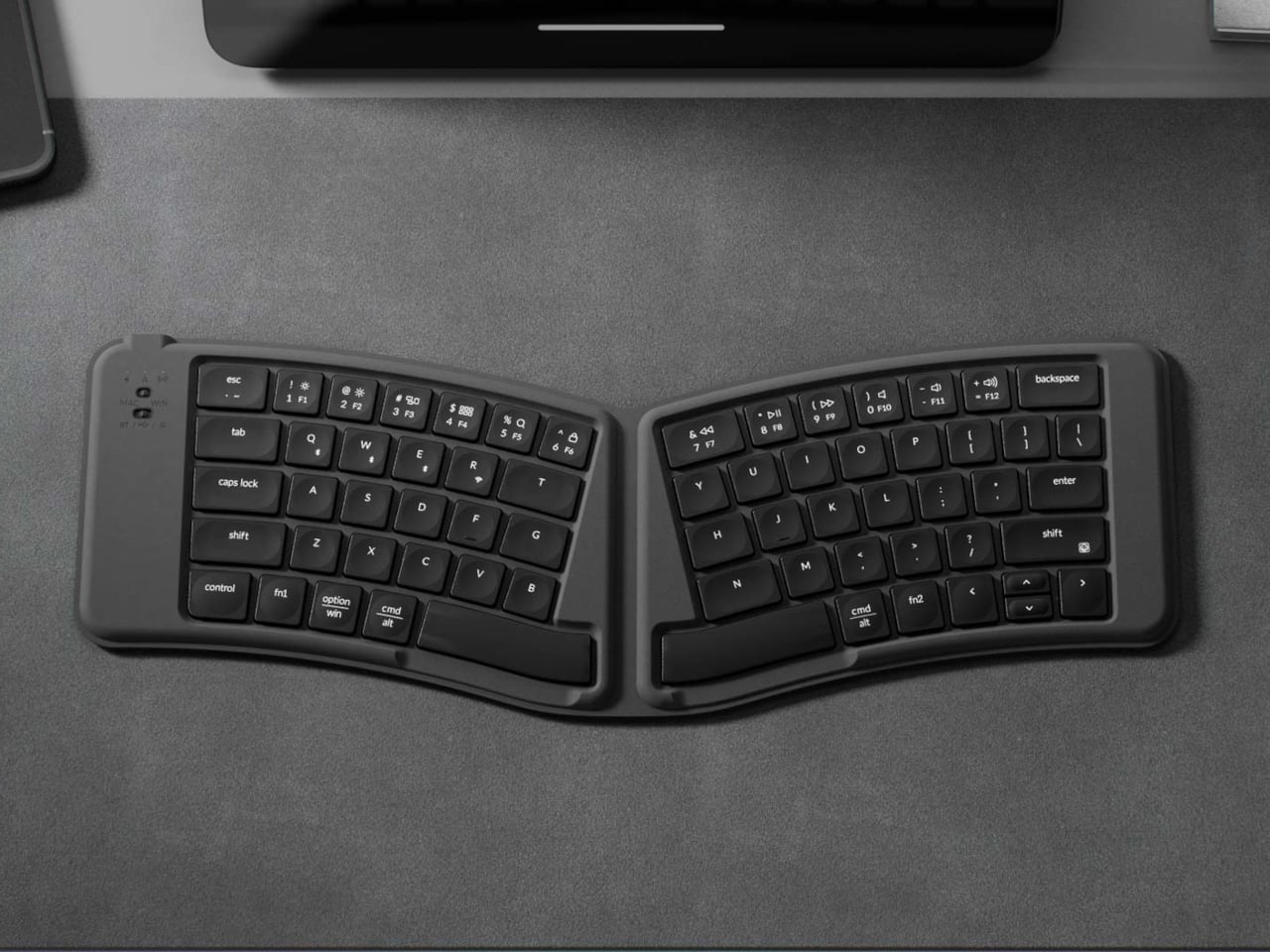
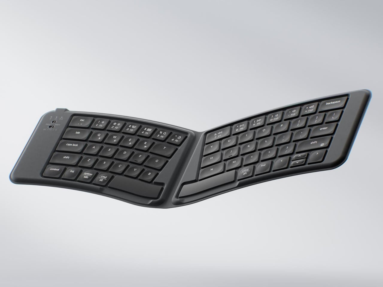
Most portable keyboards solve one problem while ignoring another. They compress the footprint but flatten the key geometry, leaving your wrists to negotiate a straight layout through a full working day in a hotel room or an airport lounge. The Keychron B11 Pro approaches the problem differently. It uses a 65% Alice layout, splitting and angling the two key clusters slightly inward for a more natural wrist position, and then folds in half when not in use. Folded, it measures 196.3 × 143mm and weighs 258 grams, closer in footprint to a paperback book than a keyboard, adding almost nothing to a bag already loaded with a laptop and a water bottle.
The Alice geometry is the more considered design decision here. Angling both hands naturally inward reduces the lateral wrist strain that builds over a long typing session away from a dedicated desk. Keychron already applies this same geometry to the desk-bound K11 Max, but putting it into a foldable form at $64.99 is an entirely different proposition. Most foldable keyboards treat compactness as the only ergonomic consideration on the road. The B11 Pro argues that wrist health doesn’t stop mattering when you leave the office. For writers, remote workers, and anyone who types seriously while traveling, this is the keyboard that proves you don’t have to choose between ergonomic design and fitting your gear into a jacket pocket.
What We Like:
The Alice split geometry reduces lateral wrist strain during long typing sessions away from a desk
Folds to 196.3 × 143mm and 258g, small enough for a jacket pocket or bag side compartment
What We Dislike:
65% layout omits the function row and numpad, which may limit certain professional workflows
The angled Alice geometry requires adjustment time for users moving from a standard keyboard layout
7. TWS Earbuds with Built-in Cameras
Every company building AI hardware is betting on a form factor. Smartglasses, pins, pocket companions: each one asks you to wear a new device, adopt a new habit, and accept a new object into your daily carry. This concept asks a quieter question. What if the best AI hardware is something you already wear? These conceptual TWS earbuds add a single modification to a familiar form: each bud carries a built-in camera positioned along an extra stem, close to your natural line of sight. Paired with ChatGPT, those lenses become a live visual feed for an assistant that lives in your ears, reading menus, interpreting signage, and guiding you through an unfamiliar city without a screen in sight.
The carry implications are significant. A case the size of a lip balm replaces a phone query, a smartwatch notification, and a spoken search. The familiarity of the earbud form is the concept’s strongest argument: people already carry these, already charge them, and already wear them for hours at a stretch. Layering AI visual capability onto that without adding bulk or asking you to change how you move through the world is exactly what makes this vision compelling. Carry less, own more: this concept takes that headline literally. If the goal is capability without compromise, an assistant that can see, hear, and understand the world from inside a pair of earbuds is the most minimal possible version of that idea.
What We Like:
AI visual and audio capability in an earbud form factor requires no new carry habits or added bulk
Familiar TWS design eliminates the adoption friction that has limited other AI hardware categories
What We Dislike:
Currently a concept product with no confirmed release date or commercial availability
Built-in cameras positioned near the face raise valid and ongoing concerns about privacy in everyday use
The Best Tech Is the Tech You Actually Carry
Minimalism in everyday carry is not about owning less for its own sake. It is about refusing to let the objects you depend on become a burden. The best gear earns its place by doing more with less, compressing capability into a form that fits your life without requiring your life to reorganize around it. Every product on this list represents that thinking: a power bank that weighs less than two eggs, a keyboard that folds into a jacket pocket, a speaker that needs no power at all, and earbuds that could soon carry an AI capable of reading the world for you.
The shift is real, and it is accelerating. Engineering is finally catching up to the design ambition that minimalist carry has always implied. You no longer have to choose between a fully equipped setup and a light bag. These seven accessories make that argument in the most convincing way possible: not with a manifesto, but with their dimensions.
Most smartphones are designed to be impossible to put down. The screen faces up on every table, the display lights up for every notification, and the cost of checking it one more time is exactly zero. That’s not an accident. The hardware removes friction from compulsive use because removing friction is what makes these devices feel indispensable. The tinyBook Flip concept asks a different question entirely: what if the phone were designed to get out of the way?
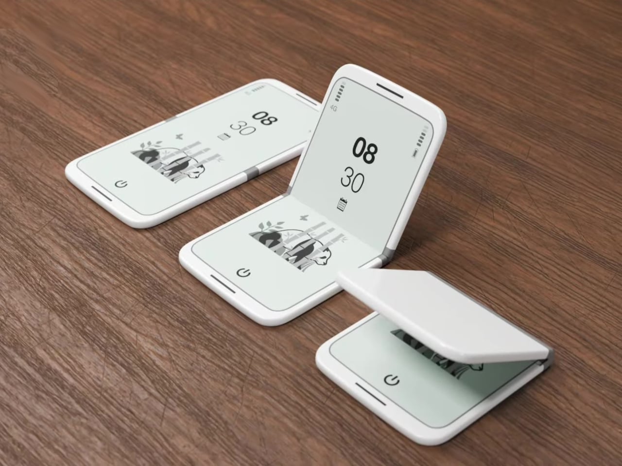
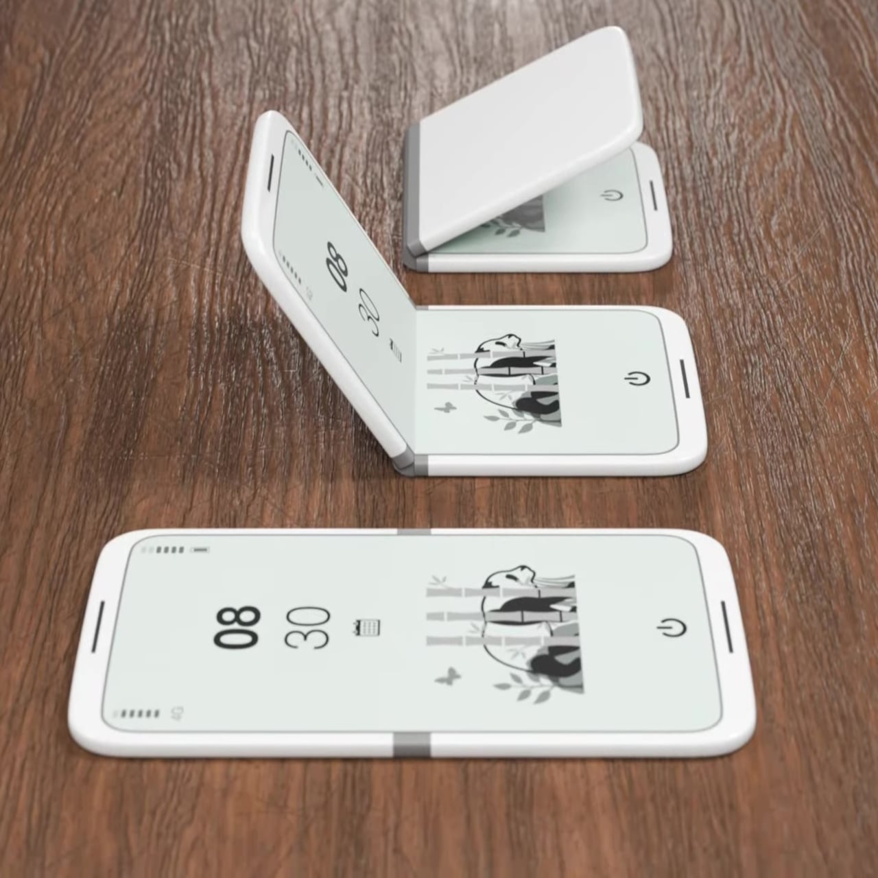
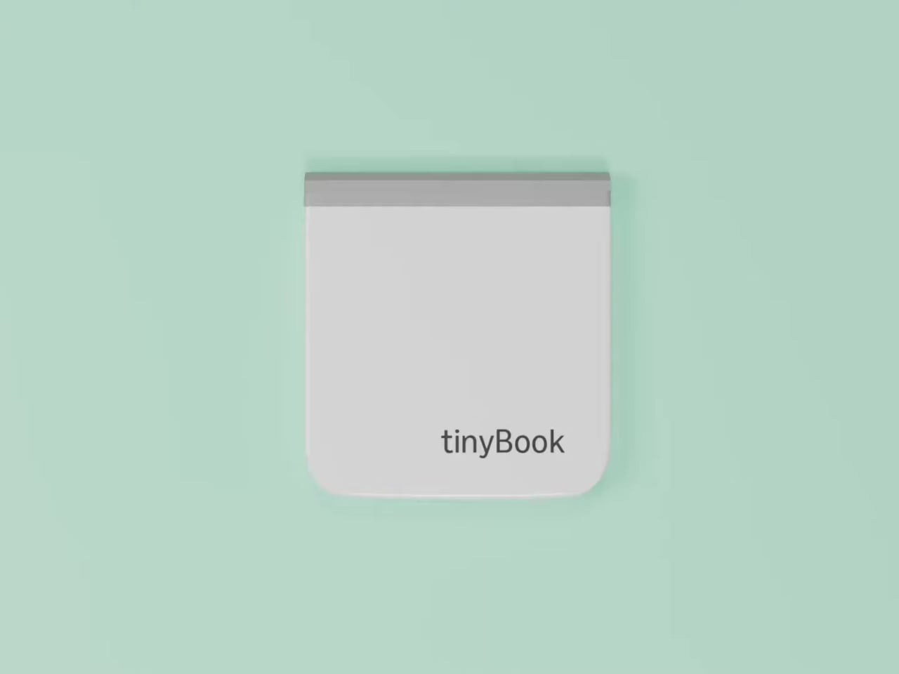
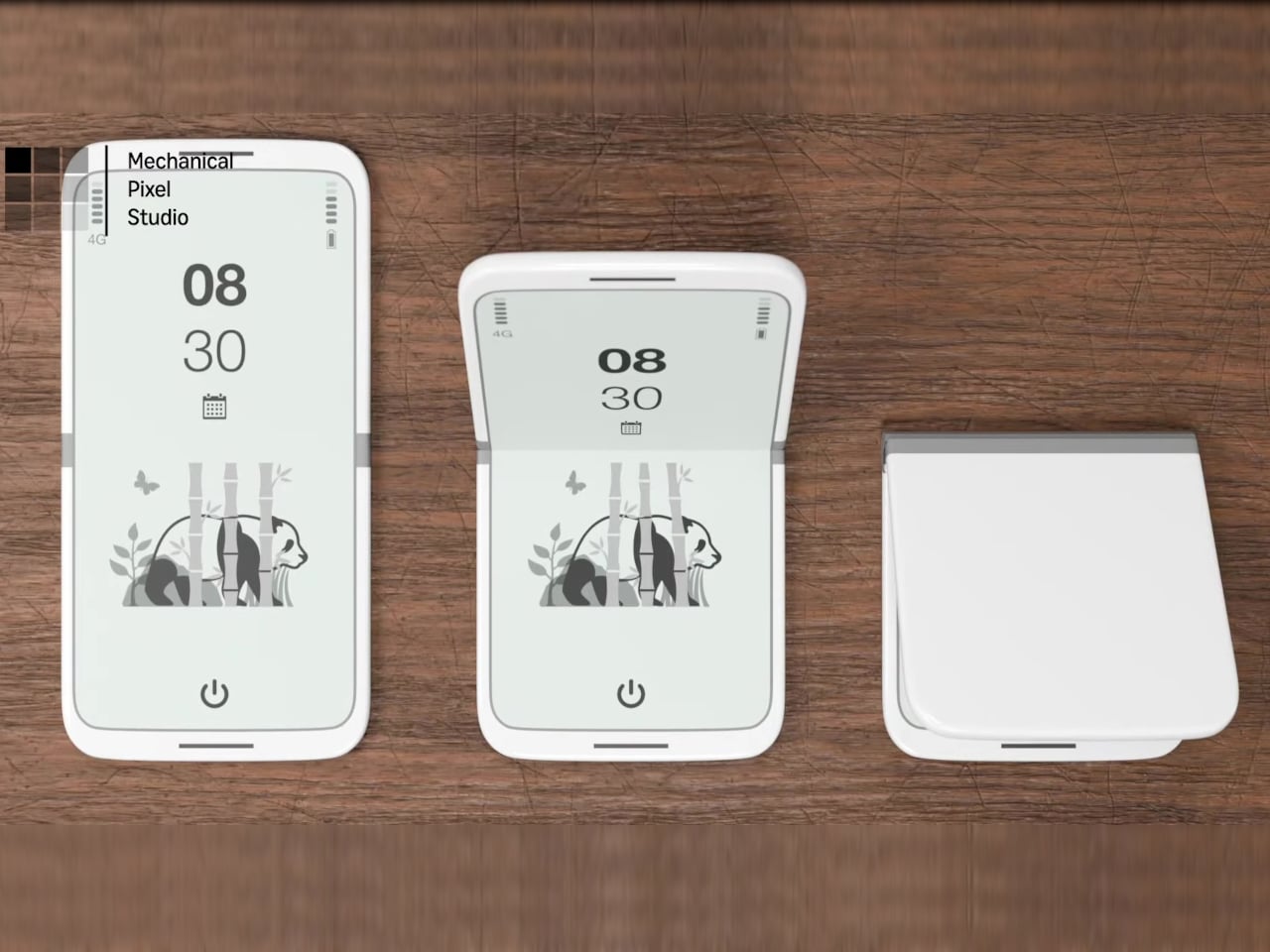
The tinyBook Flip is a vertical foldable phone concept built around a 6.1-inch E Ink display. Closed, it collapses into a compact, near-square form with rounded corners and a matte white finish, something closer in proportion to a folded notecard than a smartphone. The screen disappears entirely when the device is closed shut. No glowing rectangle sitting face-up on the desk, no ambient reminder that there are things to check. Just a small, quiet object.
Designer: Pixel Dynamics
That folded form is doing more work than it might seem. Opening the phone requires a deliberate physical action, and that small added step changes the behavioral math. A reflexive grab becomes a conscious decision. The friction is minimal in absolute terms, maybe two seconds, but two seconds of resistance is often enough to interrupt the loop. The concept treats that interruption as a design feature, which puts it in genuinely different territory from most phones.
The E Ink display adds a second layer of resistance, and this one is less subtle. E ink refreshes slowly, renders in grayscale or muted colors, and handles fast-moving content poorly. Social media feeds become tedious. Short-form video becomes unwatchable. Anything built around color, motion, and rapid visual feedback stops working the way it was designed to. This is precisely the point. The screen’s limitations aren’t engineering compromises left over from an earlier era of display technology; they’re structural properties that make certain behaviors genuinely unpleasant to sustain.
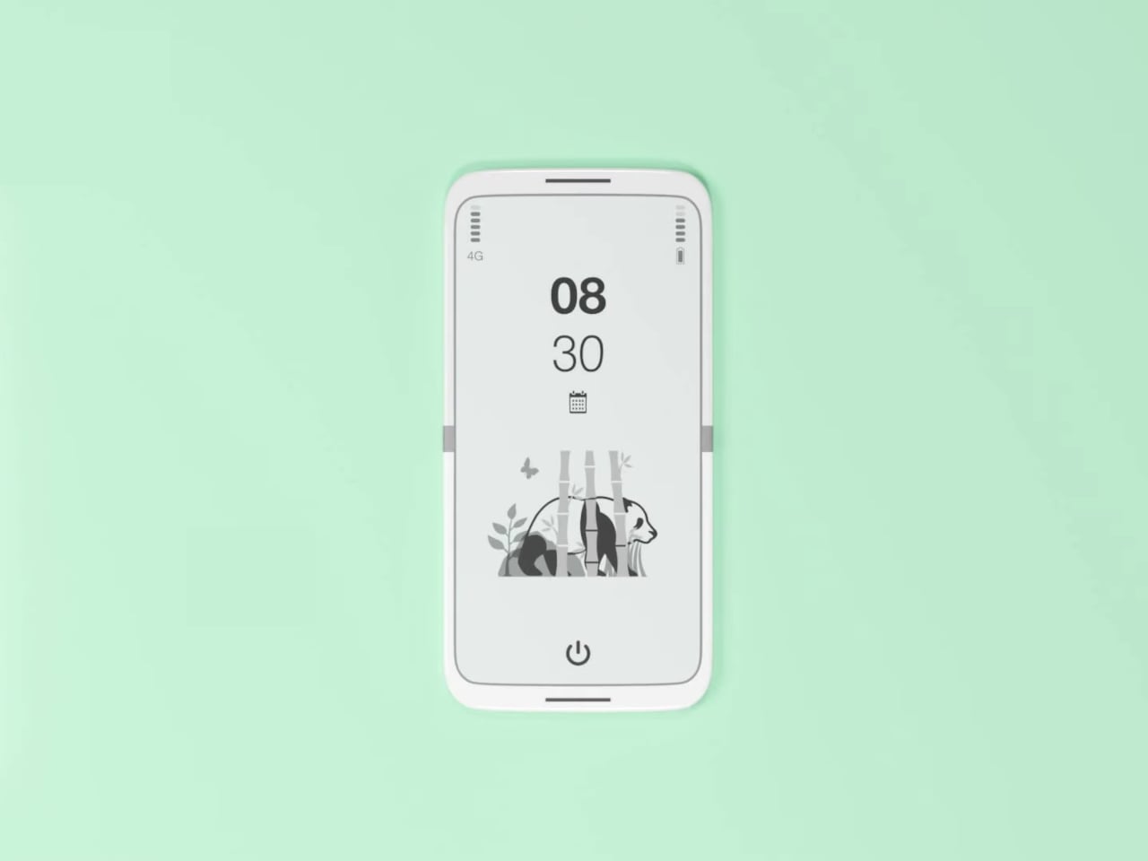
What E Ink handles well is a shorter list, but a coherent one. Text reading, messaging, calendars, and static interfaces are all comfortable at E Ink’s native pace. The renders of the tinyBook Flip show a UI built around exactly these strengths: a large clock face, a calendar widget, and a grayscale illustrated wallpaper. The interface doesn’t reach for capabilities the display can’t support. The phone isn’t trying to do everything; it’s trying to do a narrower set of things without apology.
Foldable E Ink panels aren’t a speculative technology. The hardware exists at the component level and has already appeared in experimental e-readers, though no consumer phone has shipped with one in any meaningful volume. The tinyBook Flip isn’t imagining impossible components; it’s proposing a form factor that manufacturers haven’t yet committed to producing. The distance between those two things is largely commercial, not technical.
There’s also something worth noticing about how the device reads as a physical object in social space. Closed, the tinyBook Flip looks like almost nothing. No visible screen, no status indicators, no glow. A phone that carries no visual weight when it’s not in use sends a different signal than one that’s always broadcasting its presence. Putting it down means it actually disappears from the environment, not just from your hand.
That said, the concept leaves some real friction points unaddressed, and not the intentional kind. E Ink handles camera use, live navigation, video calls, and authentication apps poorly. A foldable hinge adds mechanical complexity and thickness that clean renders tend to obscure. The tinyBook Flip looks resolved in this form, but a production version would have to make tradeoffs that these images don’t show and the concept doesn’t acknowledge.
Still, the more interesting question isn’t whether this specific device could ship. It’s whether a phone that makes itself harder to misuse is a reasonable design goal at all, or whether that’s just a way of describing a phone that most people wouldn’t actually want. The tinyBook Flip lands firmly on one side of that question. Whether the market agrees is a different problem entirely.
Furniture storage is one of those problems that design has mostly surrendered to square footage. You either have room for a stool, or you don’t, and folding alternatives have historically resolved that with compromise: wobbly joints, hard edges, the kind of utilitarian resignation that makes it obvious the piece exists to disappear rather than be used. The Press Stool starts from a different premise, borrowing its structural logic not from joinery or hardware but from the physics of folded paper.
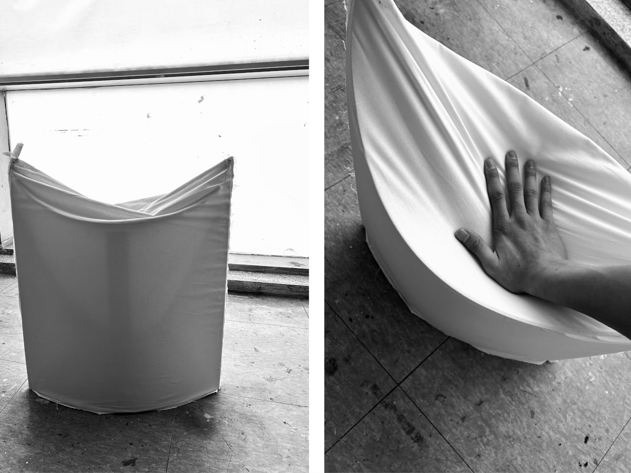
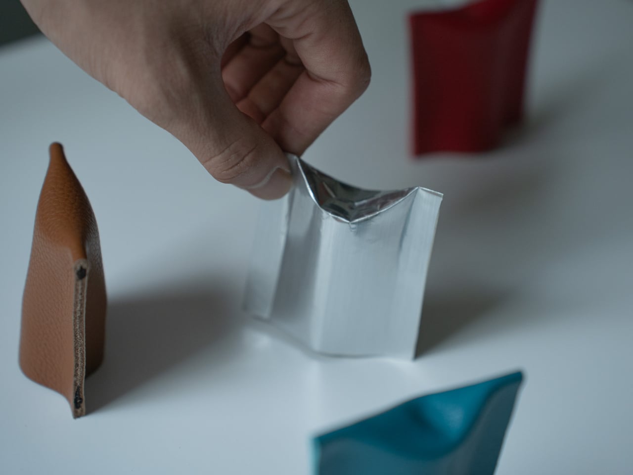
The concept begins with a simple observation: a flat sheet of paper has no load-bearing strength on its own, but folding it generates rigidity. Crease a sheet, and the forces redistribute across the form. Press the folds, and the geometry resists compression. This is the same principle behind accordion-style bellows folding in classic cameras, where pressing the structure generates mechanical force. Here, that same force is redirected toward something you can sit on.
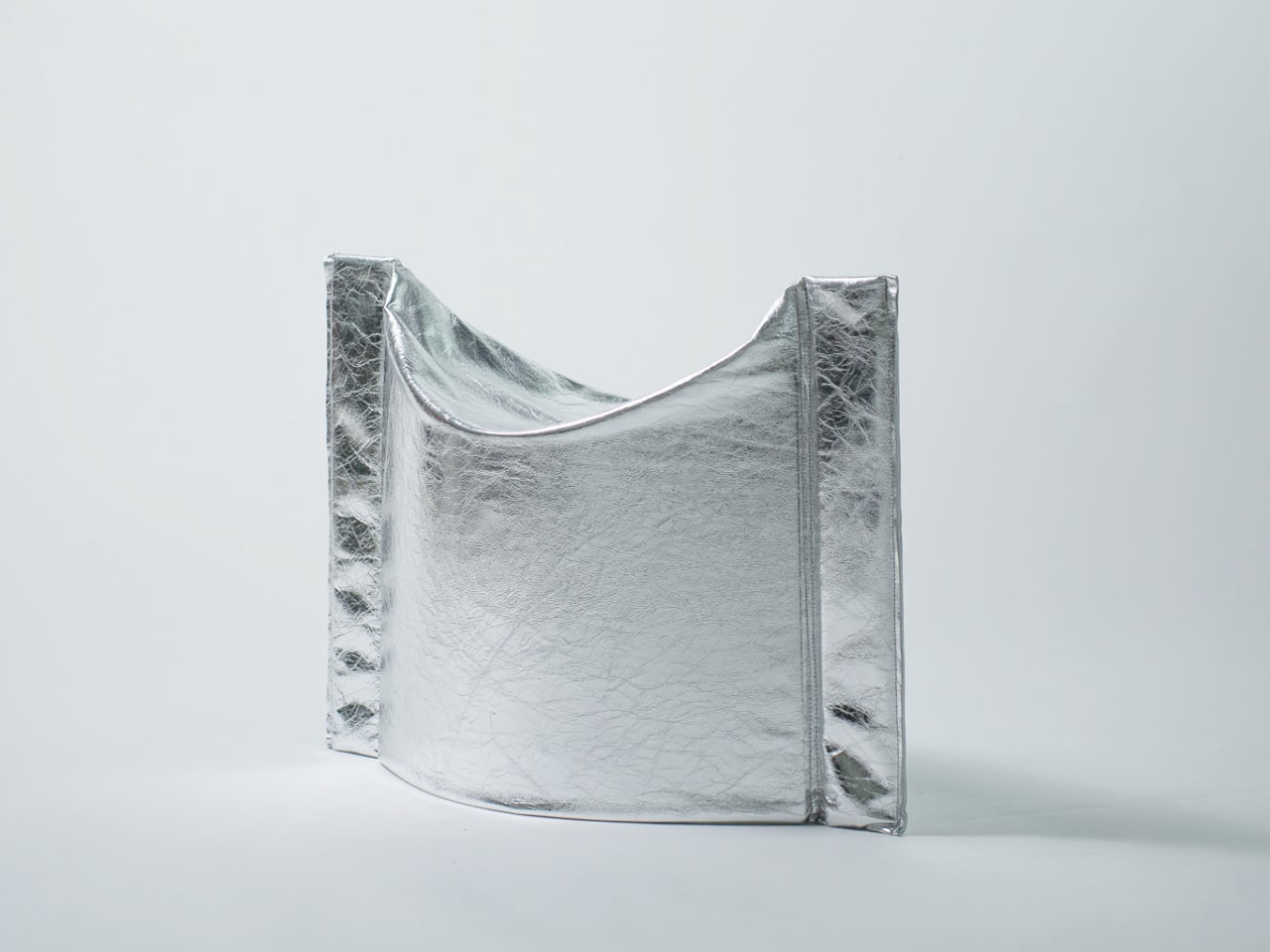
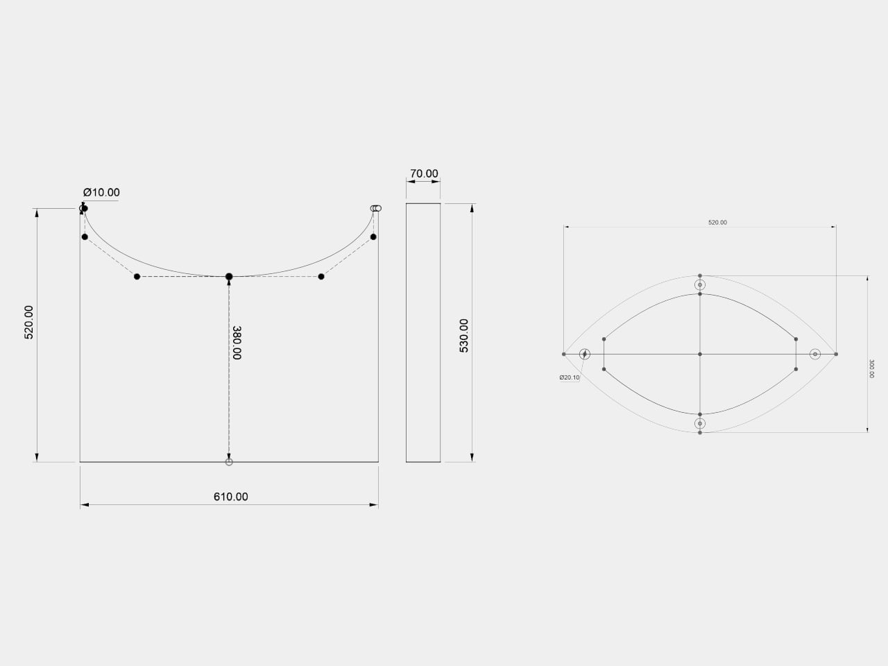
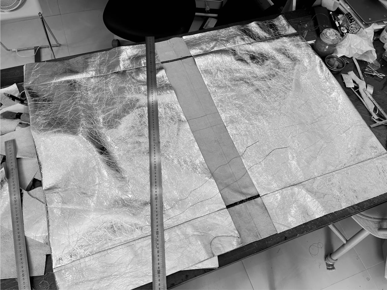
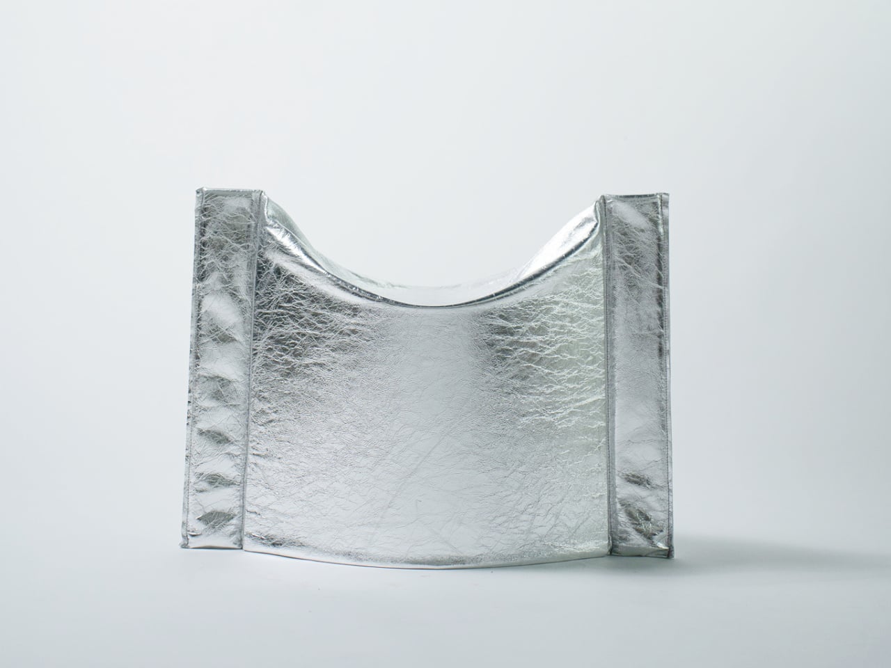
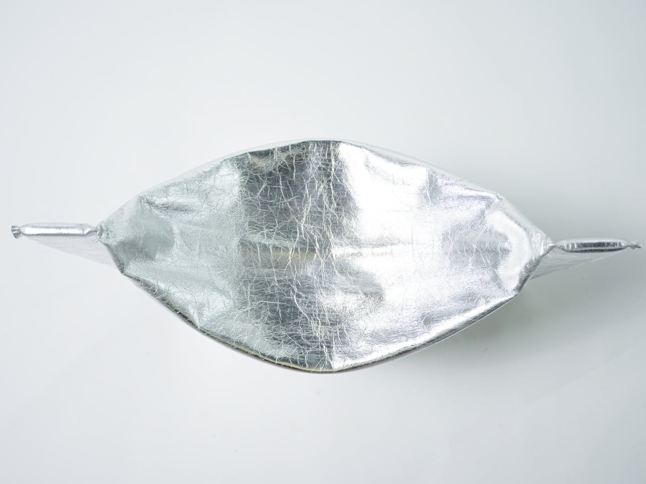
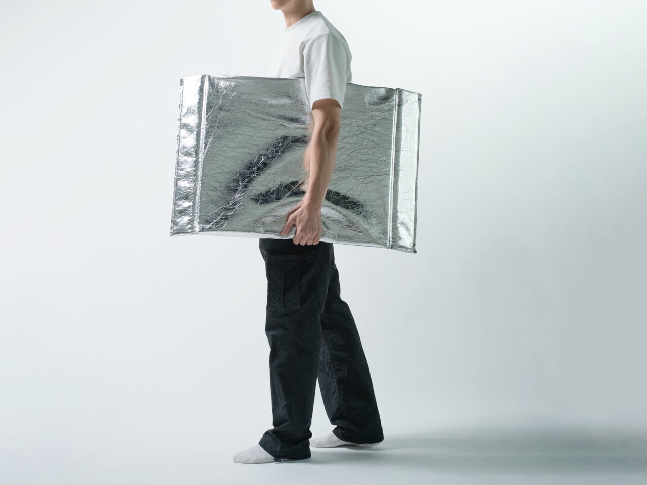
In its flat state, the stool collapses into a wide, deflated oval roughly 610 mm wide and 520 mm deep, with gently curved sides and pinched, gathered ends where the material compresses to a narrow tip. The metallic silver material has a pronounced crinkled texture that lands somewhere between industrial foil and fabric. It ships flat. It weighs little.
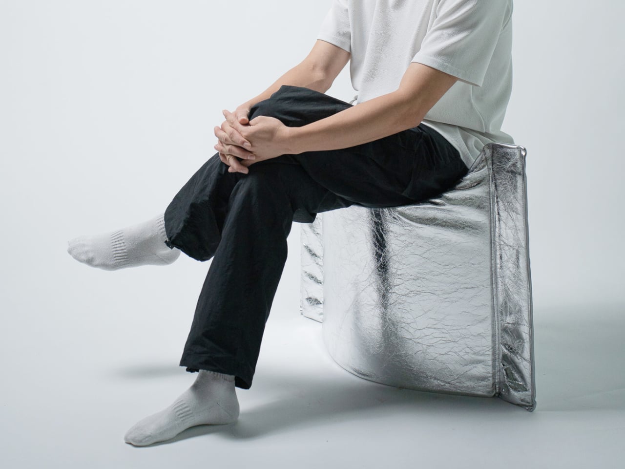
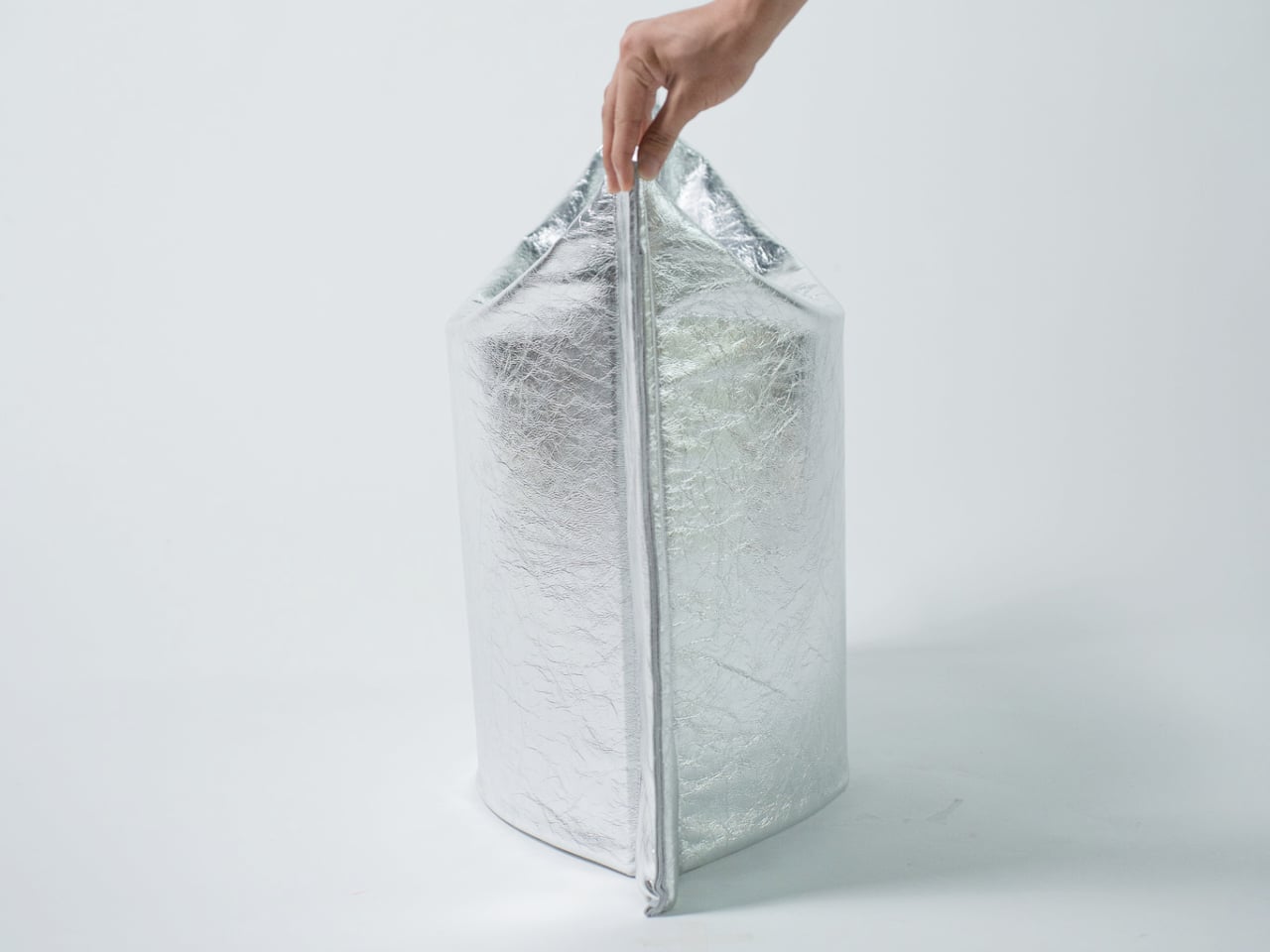
Pressing the form open deploys it into a three-dimensional stool standing 530 mm tall, with two flanking vertical panels and a concave seat formed by the inward curve at the top. No latches, no assembly. The structural resistance comes entirely from the geometry of the fold itself, the way a creased sheet can bear more than expected when compressed along its axis. The fold-generated tension does the structural work that legs and frames usually handle.
That argument holds up as a concept, though the prototype leaves practical questions open. Material identity isn’t explicitly documented, load capacity is unspecified, and the crinkle finish that gives the piece its visual identity is also the surface most exposed to wear. A stool takes more daily abuse than most objects that look like they belong in a gallery, and the long-term resilience of the material composite is untested in any published form.
What’s clear is the conceptual economy. Form follows mechanism follows idea, without detour. Flat objects that become structural through pressing rather than assembly represent a genuinely interesting class of design problem, and the Press Stool makes that problem visible and tangible. How far the logic scales beyond a prototype is the question that follows it out of the studio.