Most garden structures ask one thing of you: sit still and enjoy the shade. A pergola is a pergola, a gazebo is a gazebo, and neither one particularly cares what the afternoon light is doing. Michael Jantzen’s Interactive Garden Pavilion operates on a different premise entirely, one where the occupant has as much say over the structure as the designer did.
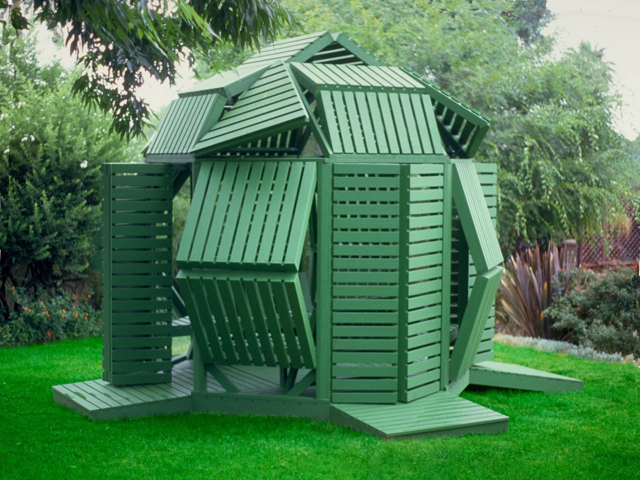
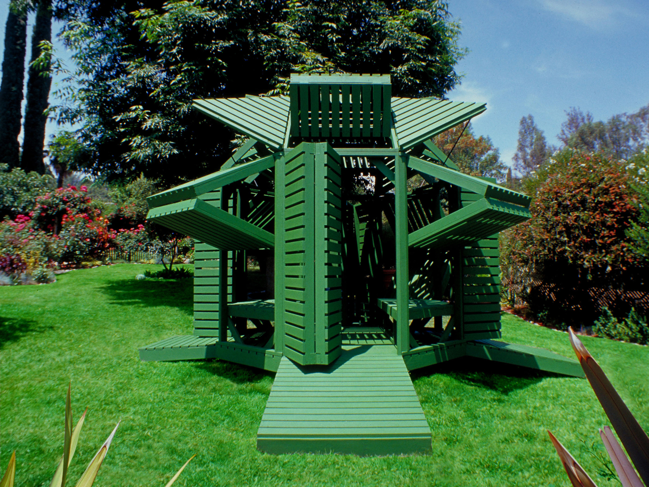
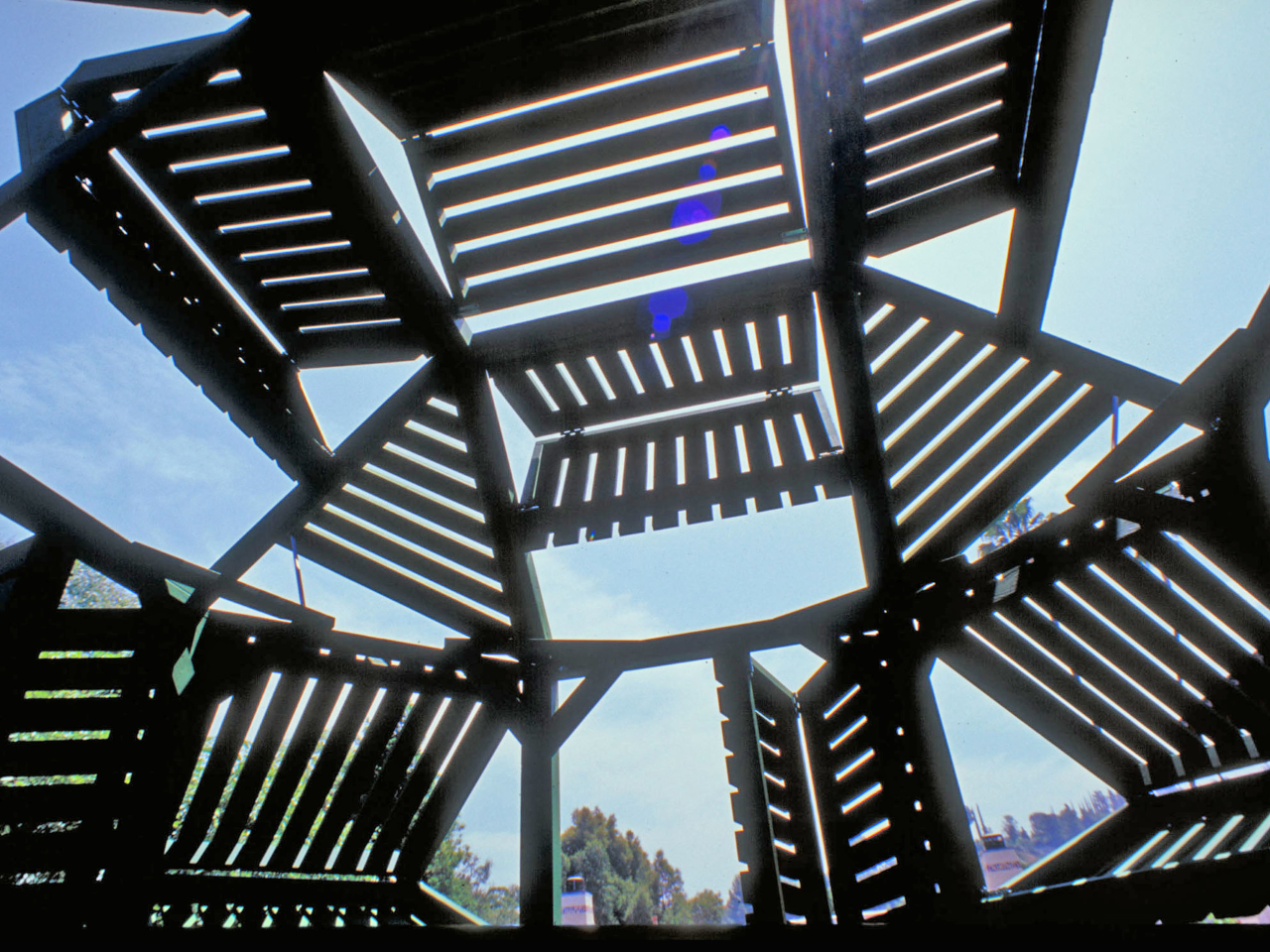
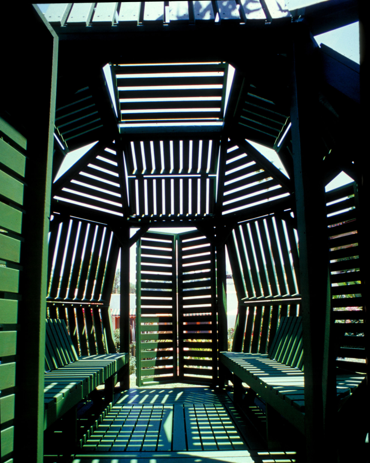
Built from sustainably grown stained wood and painted a uniform forest green, the pavilion sits on an octagonal support frame fitted with 30 slatted hinged panels across its walls and roof. Each panel pivots independently, sliding and rotating along the frame before locking into position. Open them wide on a hot afternoon, and the interior breathes. Angle them down against the glare, and the space dims considerably.
Designer: Jantzen
That last point is where the design earns its name. Most adjustable outdoor structures offer a single variable, usually an awning or a retractable canopy, within an otherwise fixed form. Here, the entire skin of the building is the variable. The wall panels, roof panels, and ground-level platform extensions can all be repositioned, which means the pavilion can look substantially different from one afternoon to the next.
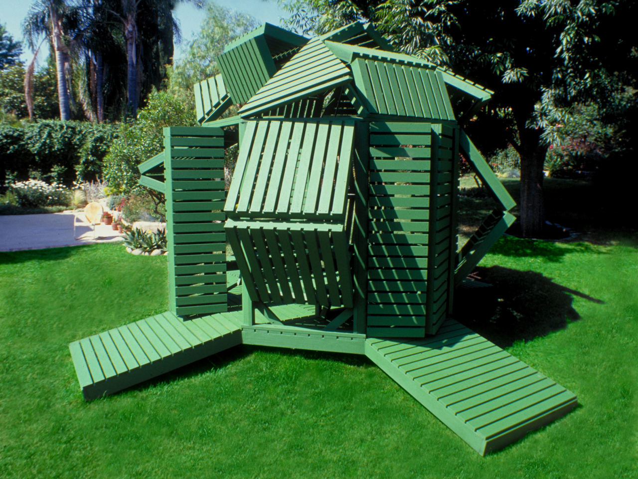
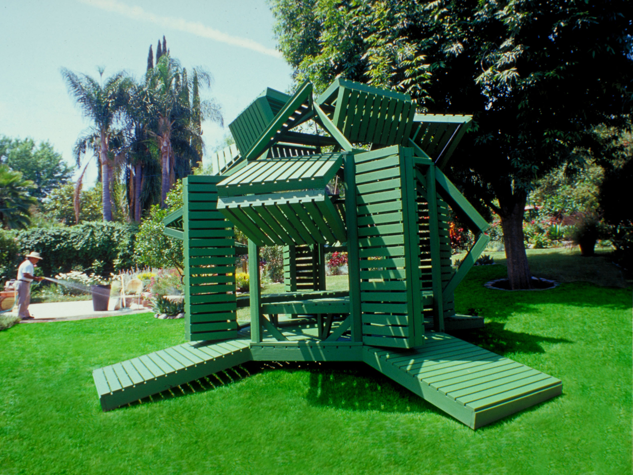
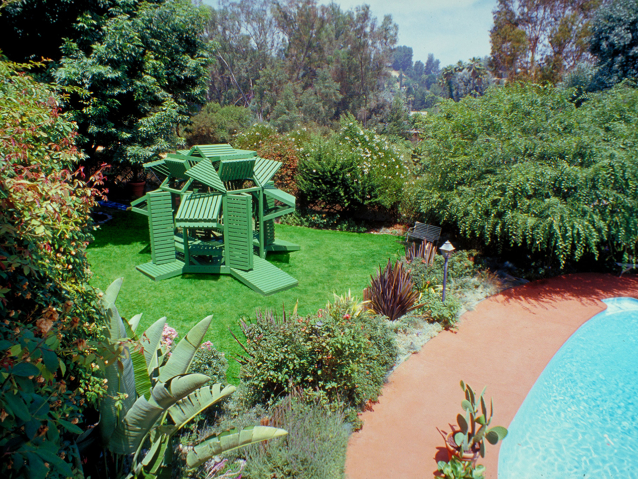
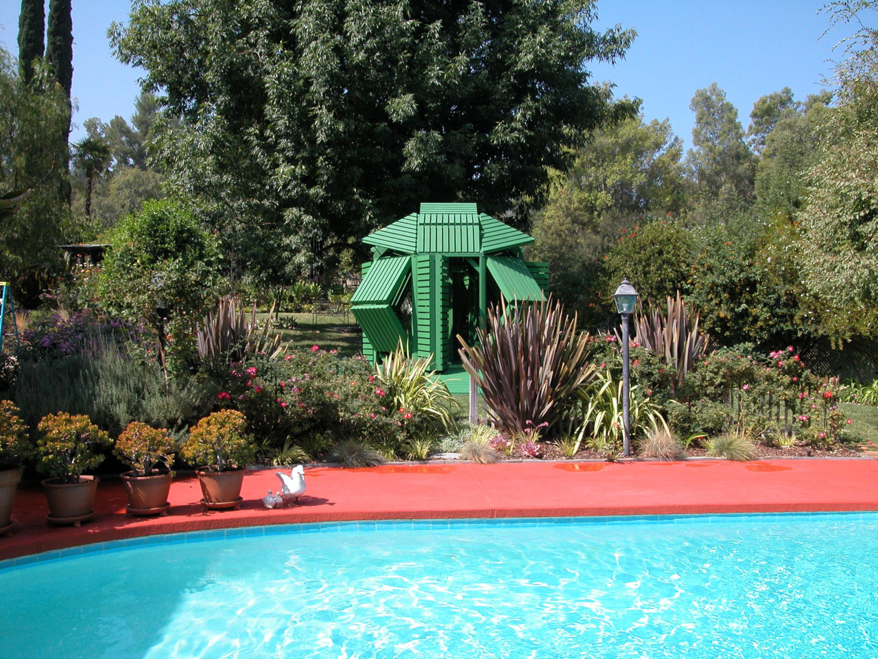
Pull the panels shut on three sides, and the structure becomes a genuinely private enclosure. Splay them open, and the interior connects fully to the garden around it. In one arrangement, it reads as a dense closed form. In another, the structure opens up entirely, and the slatted framework becomes almost sculptural against the lawn.
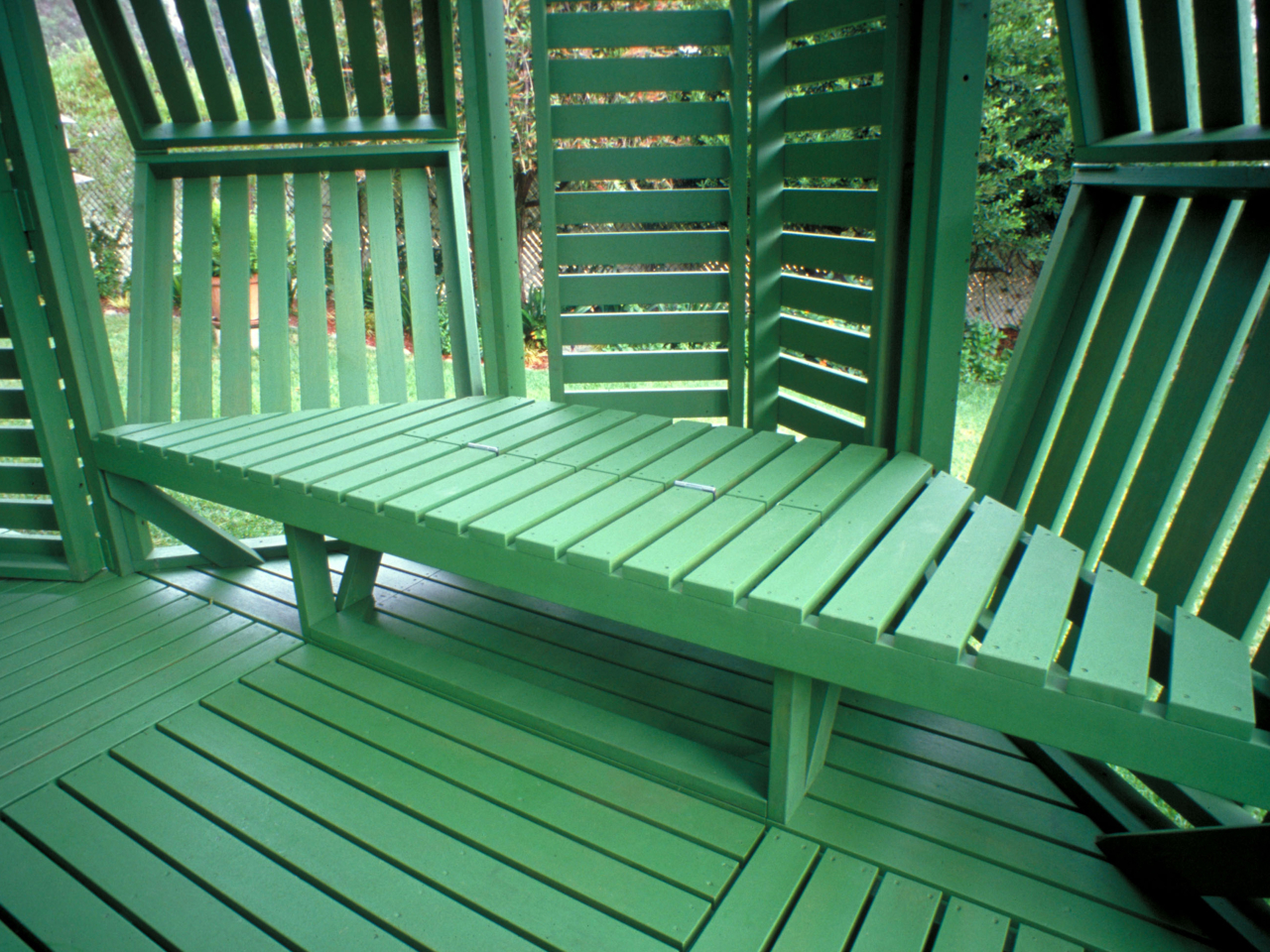
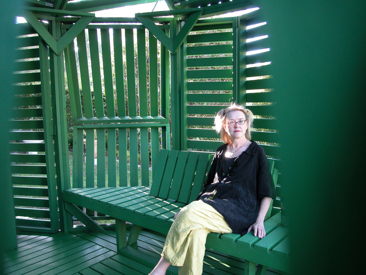
Inside, two benches with adjustable backrests run the length of the interior, facing each other. The seating is built into the frame, which keeps the floor plan clean and leaves room to recline fully. When the overhead panels are partially open, sunlight enters in sharp parallel bands that shift across the benches as the day moves, a quality that is either meditative or distracting depending on what you came in for.
The construction logic is also notably practical. The pavilion is a prefabricated modular system, so the components can be scaled before assembly or joined with additional units to form a larger cluster. No foundation is required in most configurations. Given its size and type, a building permit is unlikely to be needed in many jurisdictions, which removes one of the more tedious barriers between an interesting design and an actual garden.
Jantzen has spent decades proposing architecture that responds dynamically to its occupants, much of it remaining on paper. This pavilion is one of the cases where the idea got built, and the result holds up at close range. The slatted wood is honest about what it is, the green paint ties the structure to the garden without trying to disappear into it, and the hinge mechanism does exactly what it promises.
The post Michael Jantzen’s Garden Retreat Has 30 Panels to Rearrange by Hand first appeared on Yanko Design.