Argus Just Showed Up With 20 Eyes, 20 Legs, and No Rules

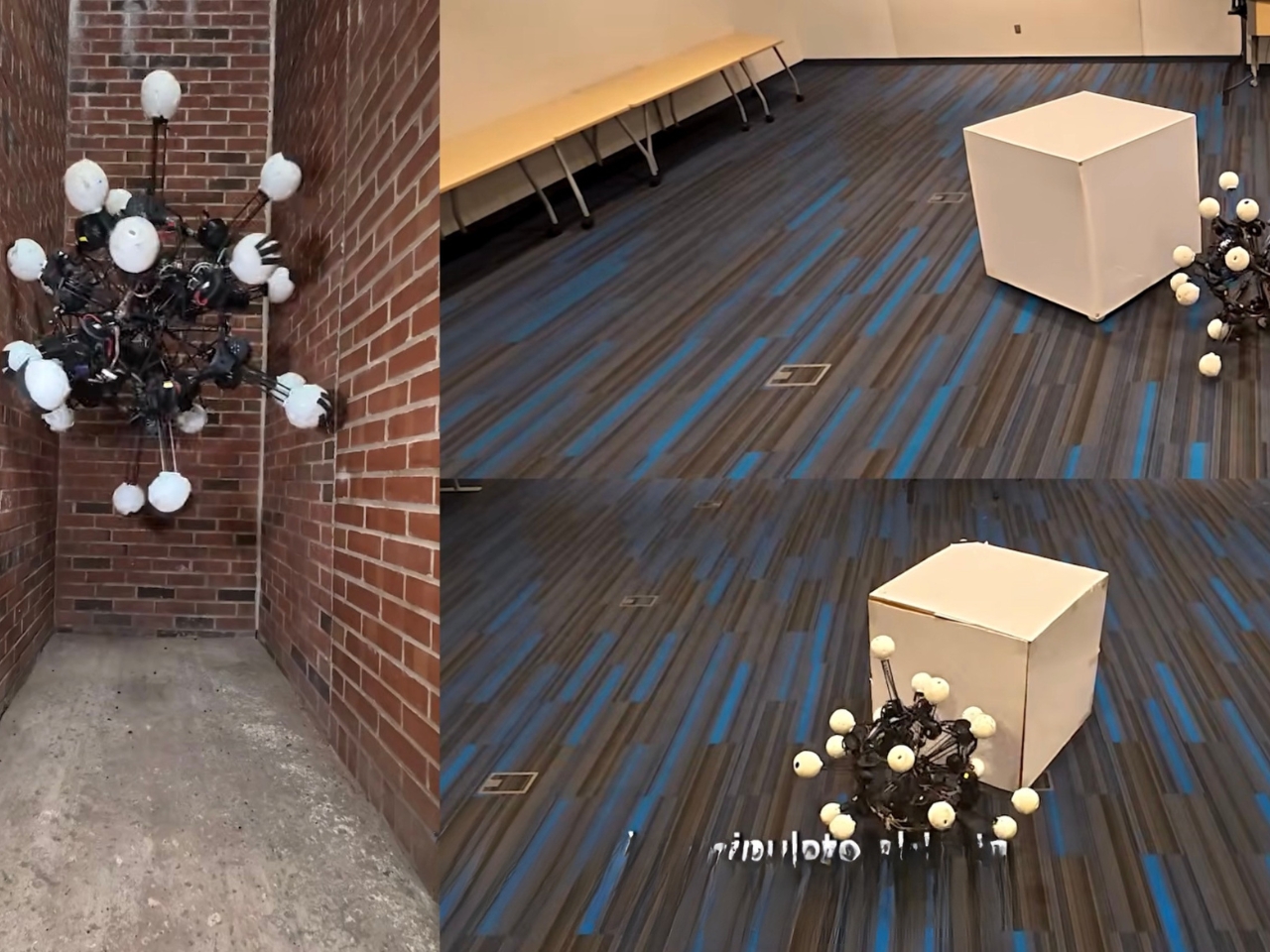
The moment you see Argus rolling across a college lawn, you feel a kind of awe that’s equal parts scientific admiration and mild existential discomfort. It doesn’t look like a robot. It doesn’t look like anything you’ve seen before, actually. It looks like a sea urchin crossed with a fever dream, or if you’ve spent any time on the internet in the last few years, it looks exactly like what happens when someone renders a biblically accurate angel and sends it out to navigate uneven terrain.

That’s not an exaggeration. The internet made the comparison almost immediately after Duke University’s General Robotics Lab unveiled Argus, and the parallel holds up. In the Book of Ezekiel, the ophanim, a type of divine being, are described as wheels covered in eyes, seeing in all directions simultaneously. Argus, named after the Greek mythological giant with a hundred eyes, does essentially the same thing, minus the divine mandate. It has 20 legs, each one telescoping and tipped with a camera, arranged at the vertices of a regular dodecahedron. No blind spots. No preferred orientation. No front or back.

Designer: Duke University General Robotics Lab
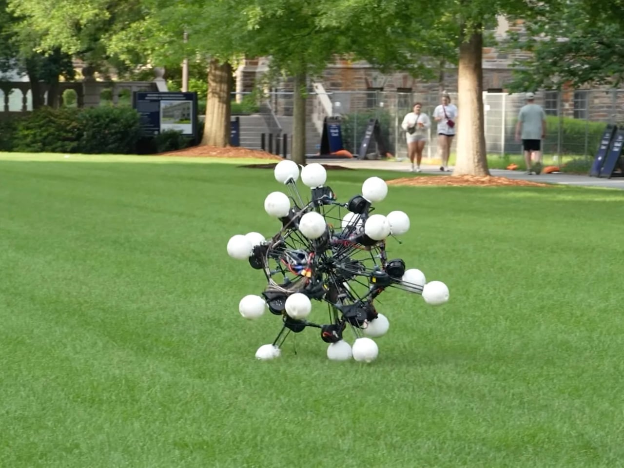
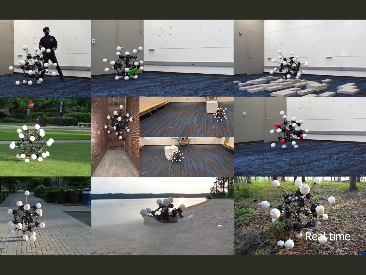
That last part is what keeps pulling me in, design-wise. We’ve spent decades building robots that mirror the logic of our own bodies: two legs, bilateral symmetry, a definitive forward direction. It made intuitive sense. We move front-to-back, so we assumed machines should too. Argus rejects that assumption entirely. The team at Duke built it around a principle they’re calling dynamic symmetry, which refers to how uniformly a robot can accelerate in any direction. Most robots are strongest and most efficient when moving the way they were designed to move. Argus has no such preference. It moves sideways, backward, forward, and diagonally with the same ease, which sounds like a minor technical distinction until you watch it roll through rough terrain, navigate around trees, and absorb collisions without losing its course. That’s when you realize how significant the gap is.
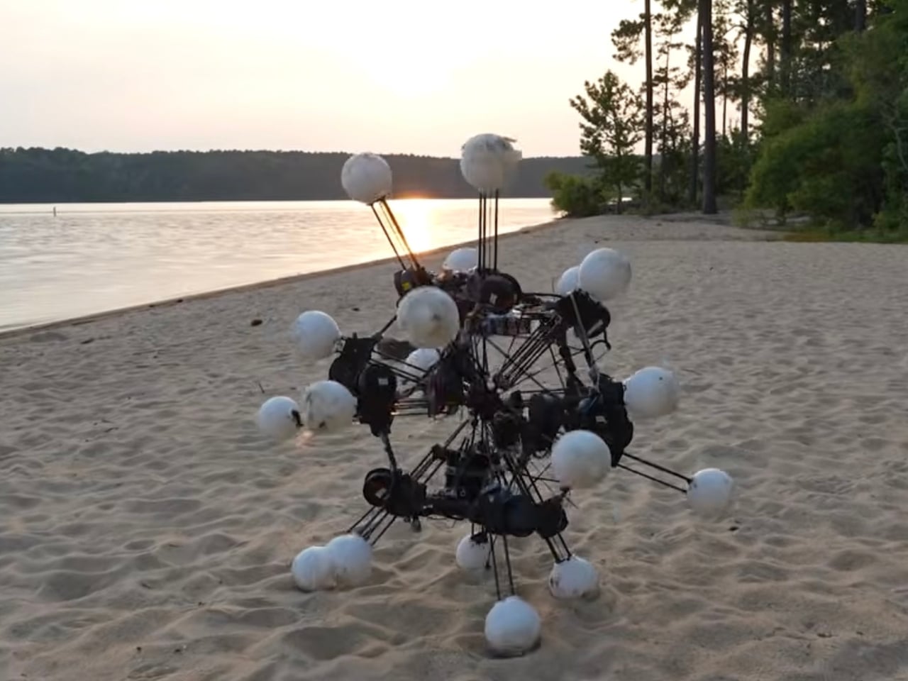
The design precedent here matters more than it might seem. Robotics has long borrowed from nature by mimicking the shapes that evolution produced: bipedal forms for humanoids, quadruped frames for terrain bots, insect geometries for swarm machines. But Argus is borrowing something different from nature. It’s borrowing from the radial logic of starfish and sea urchins, creatures that don’t have a front because every direction is equally valid. The Duke researchers describe Argus as an “existence proof,” a demonstration that a robot built for dynamic symmetry isn’t just theoretically interesting but practically deployable. Postdoctoral researcher Boxi Xia put it directly: “It produces a robot you can deploy in the wild, on uneven ground and in clutter, even in low-gravity settings.”

Low-gravity settings. That detail is doing a lot of quiet work in this conversation. The practical applications being discussed range from disaster response and search-and-rescue operations to planetary exploration, environments where the rules of conventional locomotion break down fast and all-directional agility becomes the difference between success and failure. A humanoid robot in a collapsed building still has to worry about which way it’s facing. Argus doesn’t.

I’ll admit the design is deeply strange to look at. It is not sleek. It is not elegant in any conventional sense. It doesn’t have the clean industrial confidence of Boston Dynamics’ machines or the deliberate anthropomorphism of recent humanoid models. It looks a little chaotic, frankly, like it was assembled by someone working from a very different set of aesthetic values, someone less interested in how the thing looks than in what the thing can do. And maybe that’s the point. Beauty in engineering doesn’t always wear the shape we expect. Sometimes it rolls across a lawn on 20 legs, sees absolutely everything, and changes the conversation entirely.
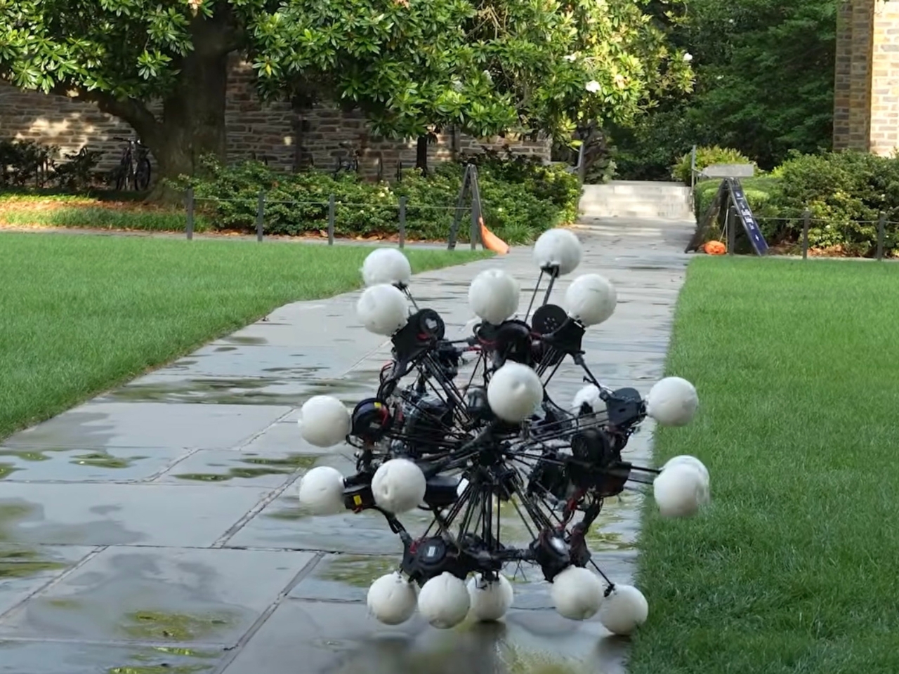
Argus is the kind of design that reminds you why robotics is still worth watching. Not because of what it looks like, but because of what it means for how we think about movement, perception, and the assumptions we’ve been quietly building into machines all along.

The post Argus Just Showed Up With 20 Eyes, 20 Legs, and No Rules first appeared on Yanko Design.
Motorola Just Made the Baby Soother That’s Actually Worth Displaying

Nursery products have generally been designed around the assumption that function is the only thing that matters. A baby monitor that broadcasts clearly, a sound machine that blocks noise, a nightlight that stays on through the small hours without overheating. These things work, and most of them look exactly like what they are: appliances with a secondary mission, built from a brief that never included the word “beautiful.” The emotional dimension of the room they live in is almost never part of the specification.

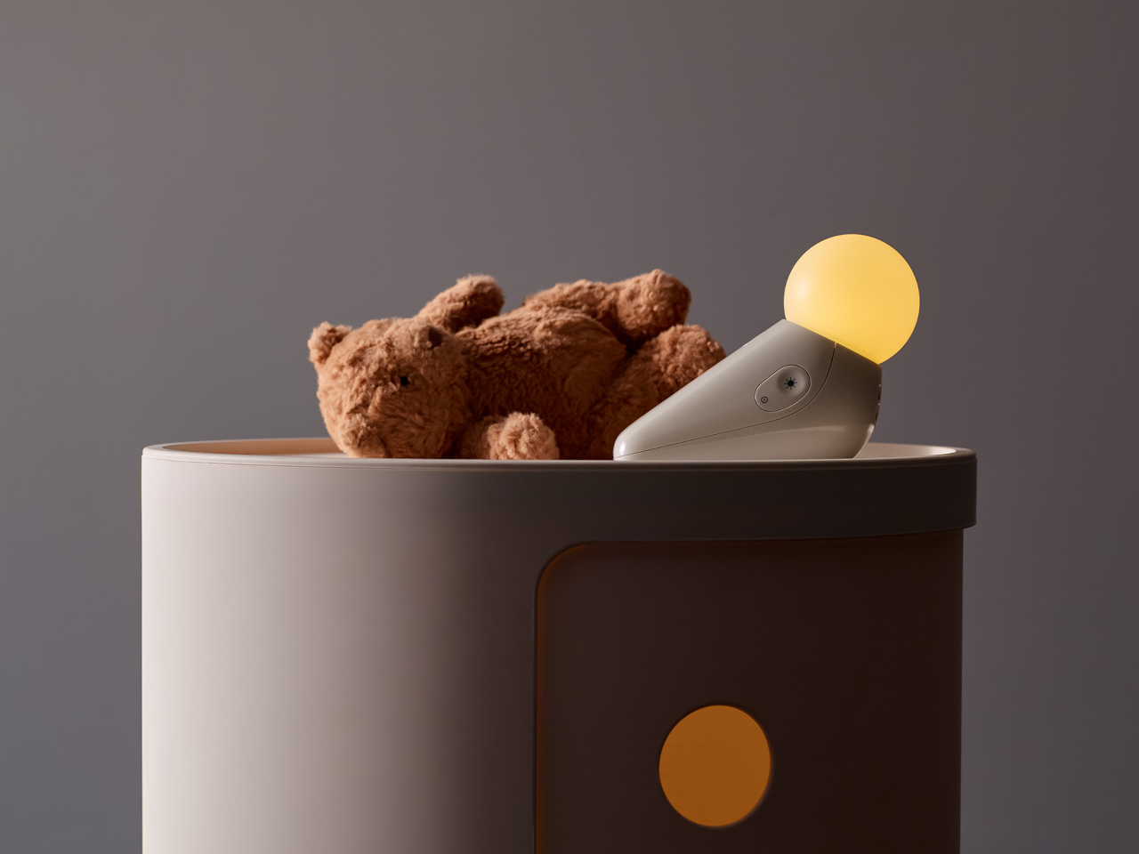
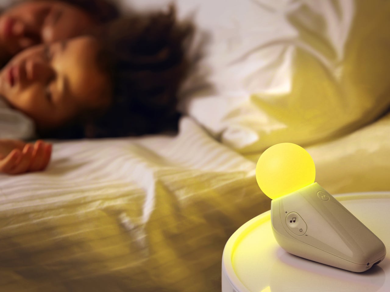
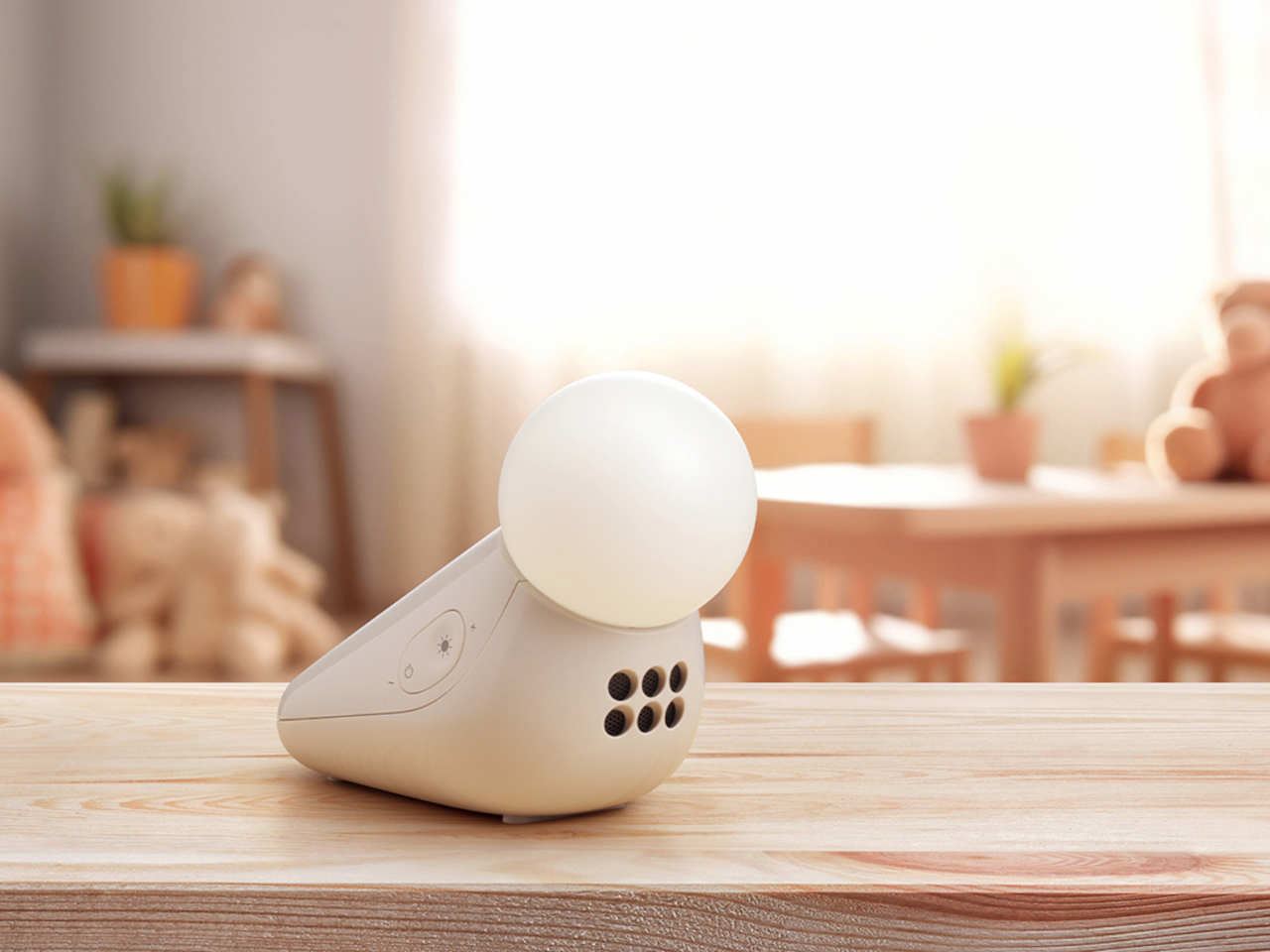
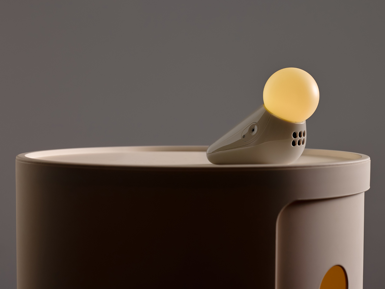
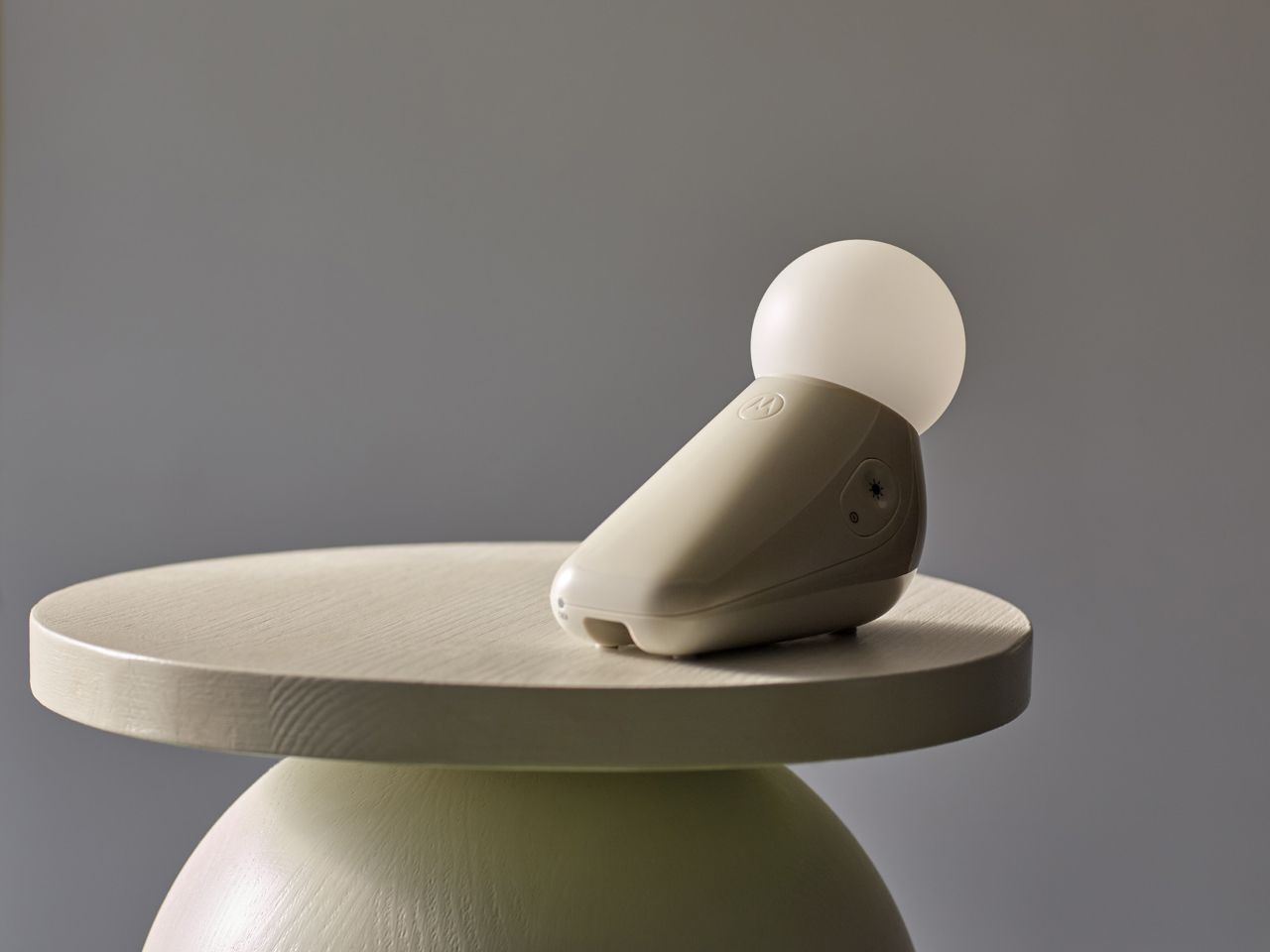
Industrial designer Tej Chauhan rethought that assumption through Motorola Nursery’s PIP collection, and the S1 Soother is the latest product from it. It begins with a sketch of a little seal, a soft, neotenic form drawing on the same mechanism that makes baby animals universally disarming. The rounded shape isn’t decorative padding over a functional core. It’s part of the reason the device works as well as it does.

Designer: Tej Chauhan for Motorola Nursery

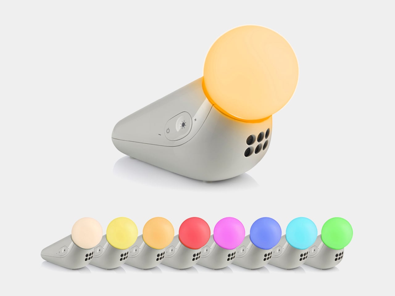
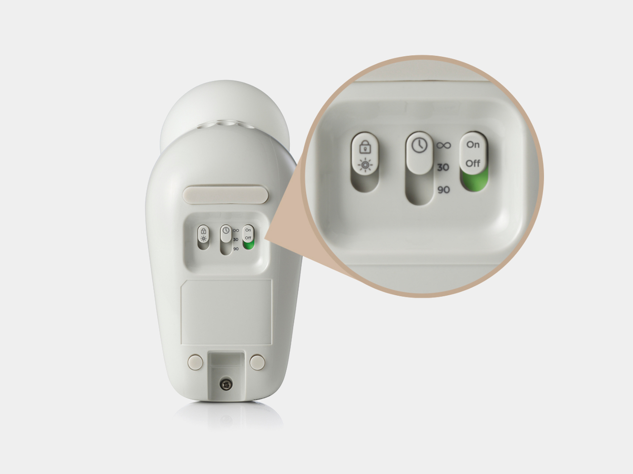
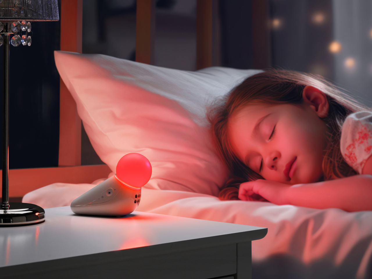
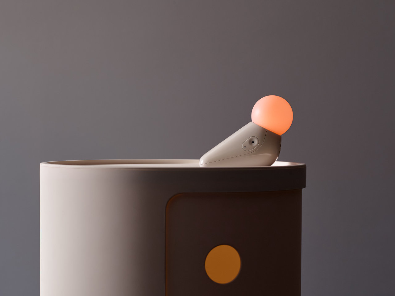
The form achieves something most nursery devices don’t: it looks considered even when it’s not on. Switched off, the S1 reads as a small sculptural object that a parent with a carefully arranged room wouldn’t feel compelled to hide. Switched on, the round tip glows in one of seven colors: yellow, orange, red, pink, blue, cyan, and green, adjustable across five brightness levels. The light is calm and diffuse by design.

The sound side offers ten options: three lullabies, three nature sounds, white noise, brown noise, a fan loop, and a womb sound, covering the range that different babies respond to. Parents who’ve cycled through multiple sound machines will appreciate that breadth in a single device. Volume adjusts across five levels, and USB-C charging sustains up to 50 hours of use per charge, covering weeks of nap times before the next top-up.

Portability isn’t incidental. The S1 travels in a bag without cables, without a base that won’t fit a hotel nightstand, and without the visual clash of a device that clearly belongs somewhere it isn’t. Non-toxic materials and rounded edges address the physical dimension of baby safety that gets less marketing attention than certification ratings but matters considerably more at close quarters with a curious infant.

Chauhan has described the goal as inviting warmth into an everyday routine while making something beautiful enough to live anywhere in the home, goals that usually don’t apply to baby gear. The neotenic seal shape suggests calm before it does anything else, which is the point. A device that parents genuinely want in the room works harder than one they merely tolerate because it does the job.

The objects that occupy a nursery carry more emotional weight than the ones in any other room. Chauhan’s goal, inviting warmth into an everyday routine while making something beautiful enough to keep, sounds loftier than a $29.99 nightlight deserves. But the design argument is sincere, and so is the result. Parents who’ve spent months chasing the right combination of light and sound will recognize what they’re getting.

The post Motorola Just Made the Baby Soother That’s Actually Worth Displaying first appeared on Yanko Design.
PixVerse Just Made Product Videos as Easy as Writing a Brief

Product design has always been part craft, part communication. Getting a concept from sketch to client approval demands a level of visual storytelling that most designers simply haven’t had the budget or tools to manage on their own. Video production, in particular, has long been the step that gets quietly skipped, not because the ideas aren’t there, but because the process is expensive, slow, and complicated.

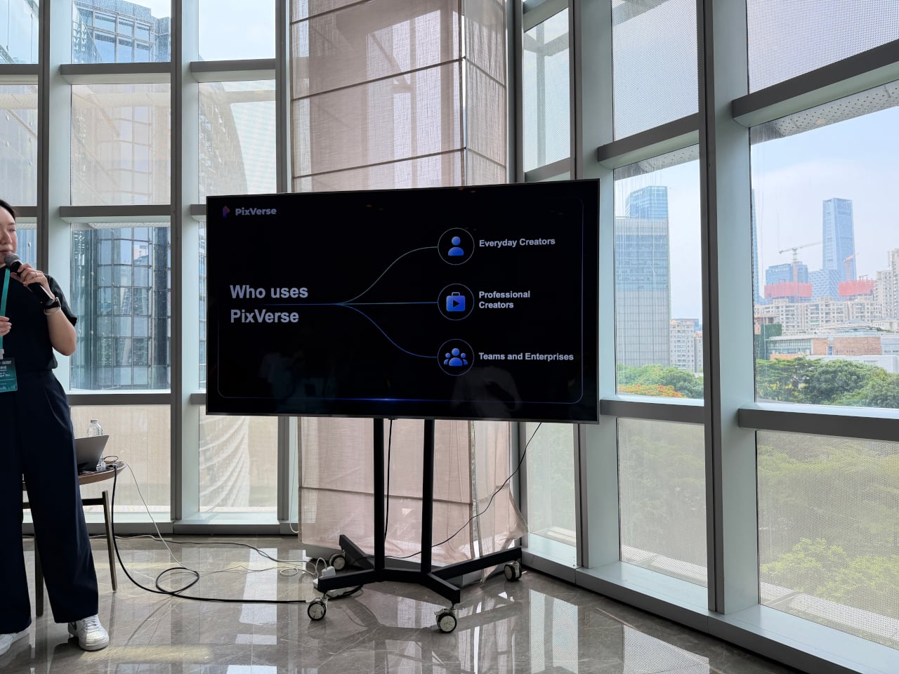
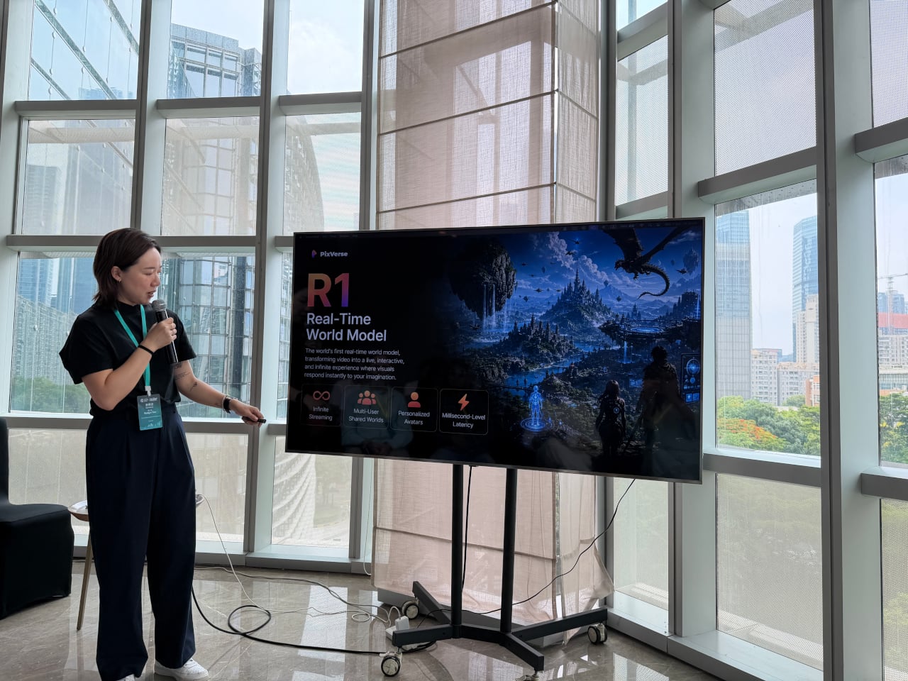
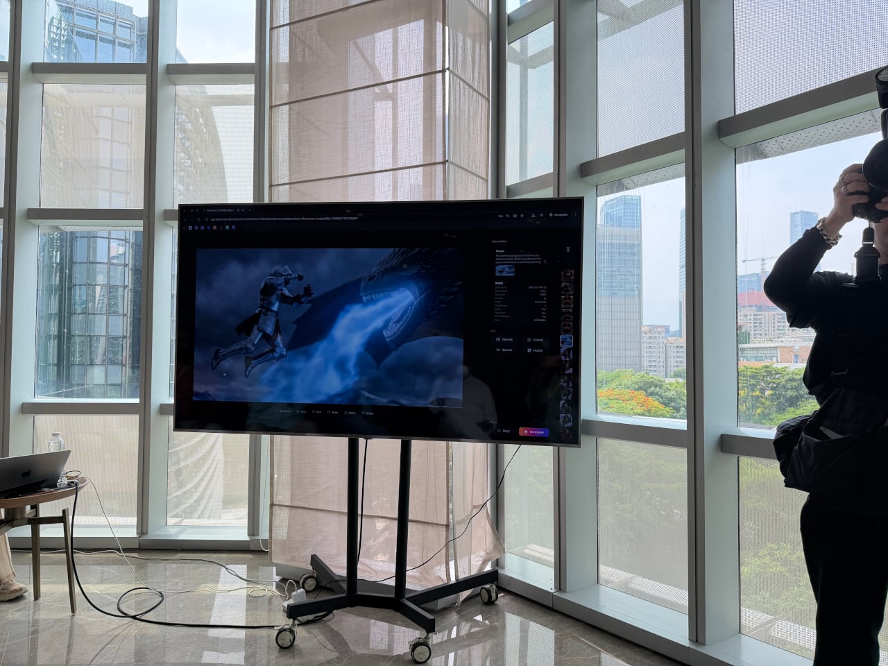
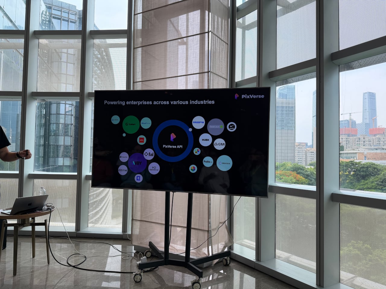
That’s a gap PixVerse has been working to close. Founded in 2023, the platform has grown to over 100 million users across 177 countries, powered entirely by proprietary models it builds in-house. At the iMpact Global Connect Show 2026, the company’s team walked through three distinct products that together make a compelling case for AI-generated video as a practical part of the design process.

Designer: PixVerse

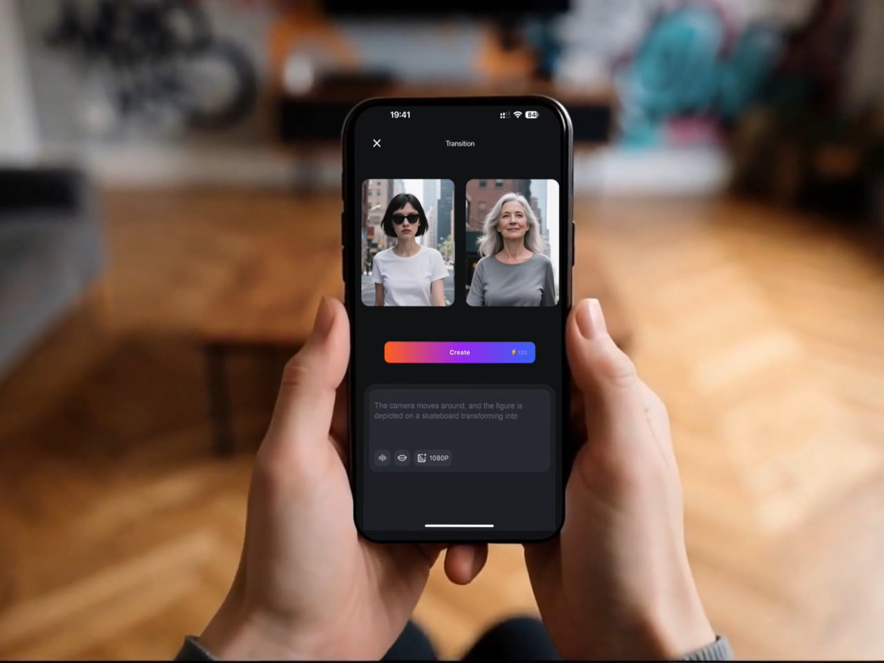
The most immediately useful of the three, at least for most designers, is V6. It’s the platform’s flagship model, and the latest update improves camera movement, character performance across scenes, and physical object interaction in noticeable ways. More significantly, V6 can now generate a complete multi-shot short film with native audio from a single prompt, without any separate editing or sound production steps involved.

Think about what that actually means for a product designer. A 30-second product video typically means writing a brief, hiring a videographer, sourcing music, shooting, and editing over several days or weeks. With V6, a designer who can clearly articulate how a product should look, move, and feel in context can produce that same result from a prompt and a reference image in considerably less time.

That kind of speed has obvious advantages for solo designers and small studios. A freelancer can arrive at a pitch with three distinct video directions instead of three mood boards. A startup preparing a crowdfunding campaign doesn’t need a separate production budget for a launch video. An in-house team can test how a product reads in a real context before committing to a full-scale shoot.

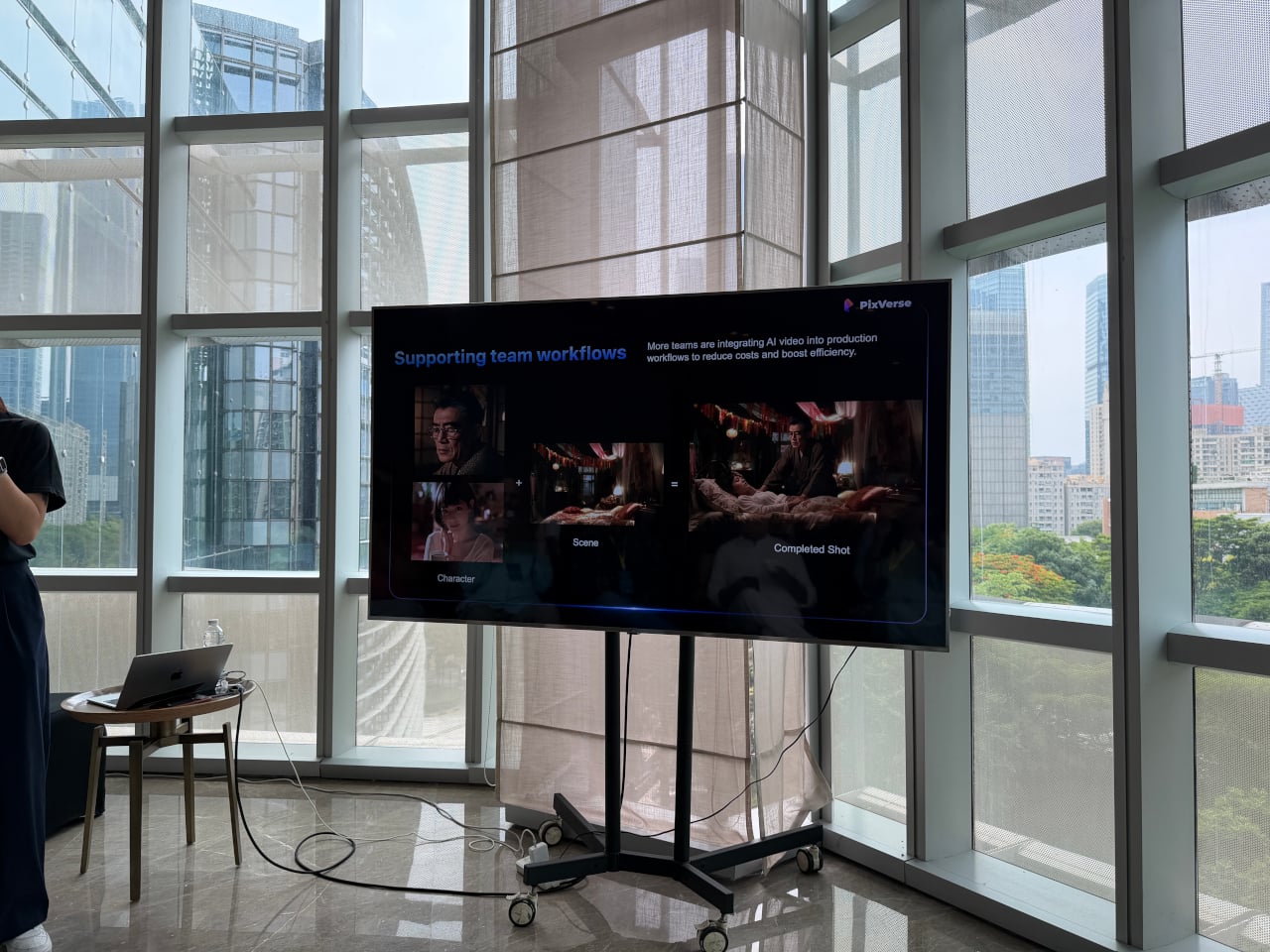
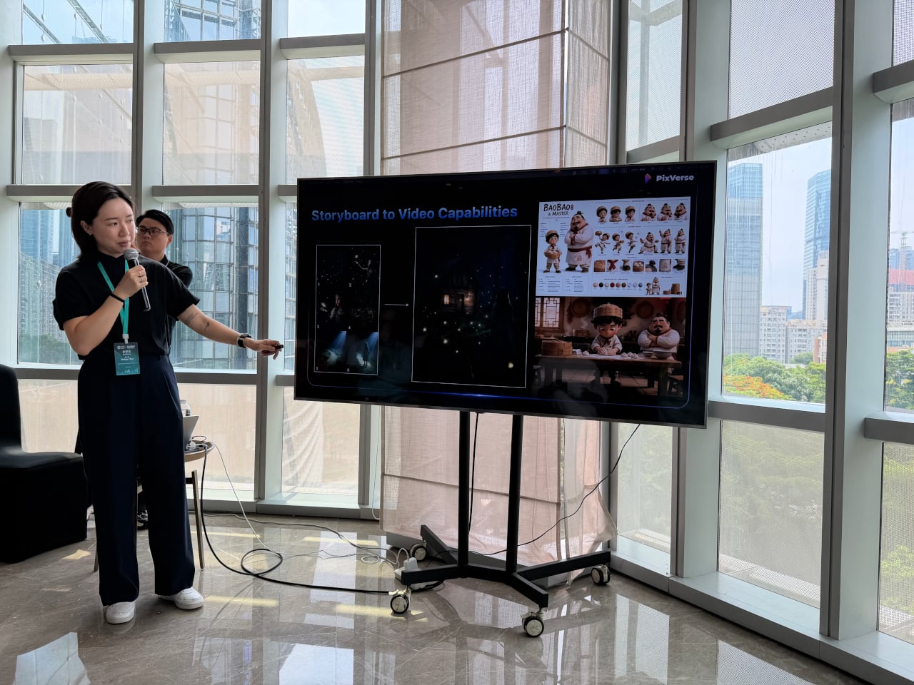
The second product, C1, goes further by targeting actual film production pipelines. It combines a cinematic visual effects system, an industrial-grade action engine, and a storyboard-to-video feature in a single workflow, letting production teams convert static panel layouts directly into continuous video sequences. Reference-guided generation also keeps characters and scenes consistent across shots, which has historically been one of the harder problems for AI video to solve.

For designers, that matters most when a concept already lives as a sequence of moments rather than a single frame. A transportation designer communicating a user journey, a consumer electronics team mapping how a device gets picked up, handled, and put down, or a lifestyle brand building a product narrative around daily routines, all of them are telling stories that C1 is built to handle.

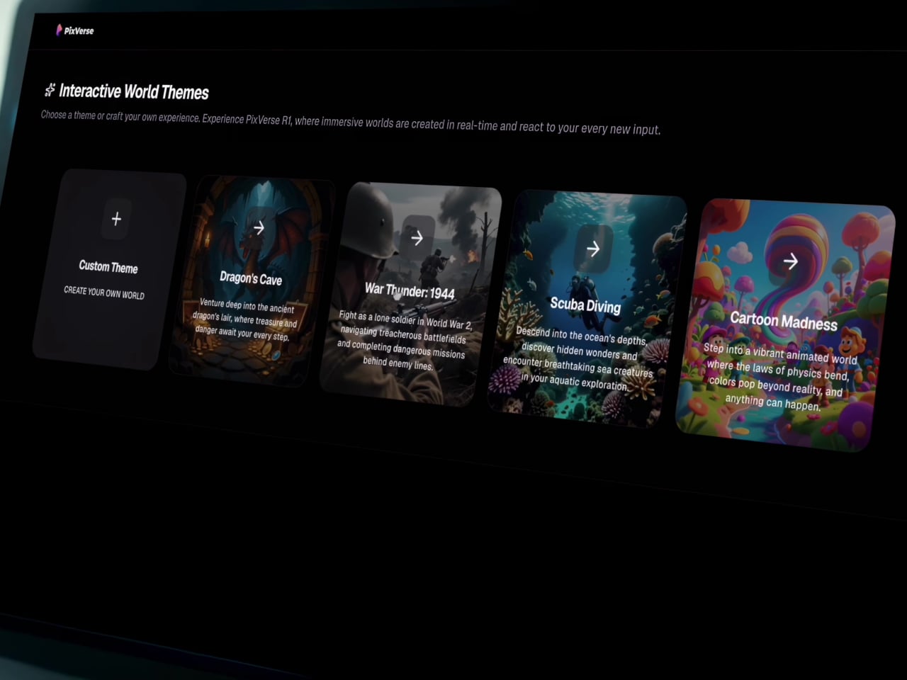
Then there’s R1, which doesn’t behave quite like any other AI video tool currently available. Rather than producing a fixed clip with a clear beginning and end, R1 generates a continuous, interactive visual environment that responds to user input as it runs. It’s less like watching a video and more like navigating a space that exists, evolves, and reacts, one that you can steer and share.

Users can build a personalized digital avatar from photos and enter these generated worlds alongside others in real time. During the demo, a shared environment called “Cat Takes Charge” had 118 users inside it at the same time, running continuously for over nine hours. Each participant could submit prompts into a live feed, with the AI realizing them as video within the shared space as they appeared.

For product designers, R1 opens up possibilities that a rendered video simply can’t replicate. Imagine walking a client through a simulated retail environment built around a new appliance, or letting a stakeholder explore a furniture concept in a living, reactive interior before a prototype even exists. It’s the kind of tool that starts to make spatial storytelling feel accessible at the concept stage, not just post-production.

What all three tools share is that they reward the same skill designers already rely on: clarity of intent. A well-constructed prompt isn’t a technical exercise; it’s a creative direction, not unlike a solid design brief. Companies integrating PixVerse into their workflows reportedly cut costs by 68% and finish work 57% faster than conventional production methods, a significant gain for teams of any size.

None of that requires a production background, and it doesn’t even require familiarity with video editing software. What it does require is the ability to describe a vision precisely, which is something designers do every single day across briefs, sketches, and presentations. PixVerse just moved video closer to the beginning of that process, somewhere between the first concept and the final approval, rather than as an afterthought at the very end.

The post PixVerse Just Made Product Videos as Easy as Writing a Brief first appeared on Yanko Design.
This 3D-Printed Macintosh Replica Is Actually a Voice AI Assistant

Smart speakers have become some of the most visually forgettable objects in modern homes. A cylinder, a puck, a fabric-wrapped drum, placed wherever the Wi-Fi is strong and largely invisible once the novelty wears off. They do their jobs well enough, but none of them look like they belong in a collection or on a desk that someone cares about. The hardware has always been purely functional, and the design has always shown it.

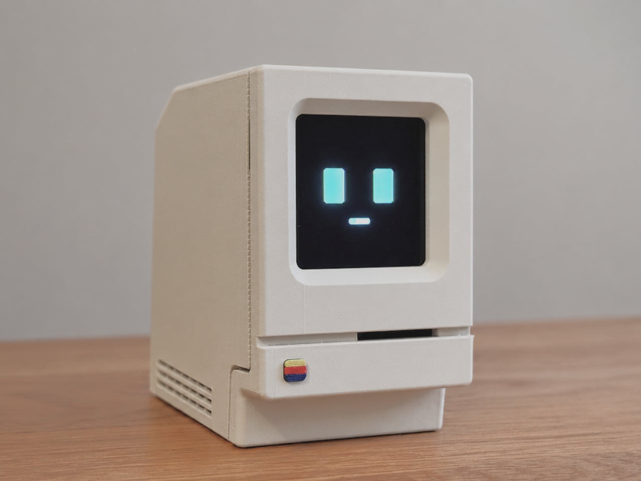
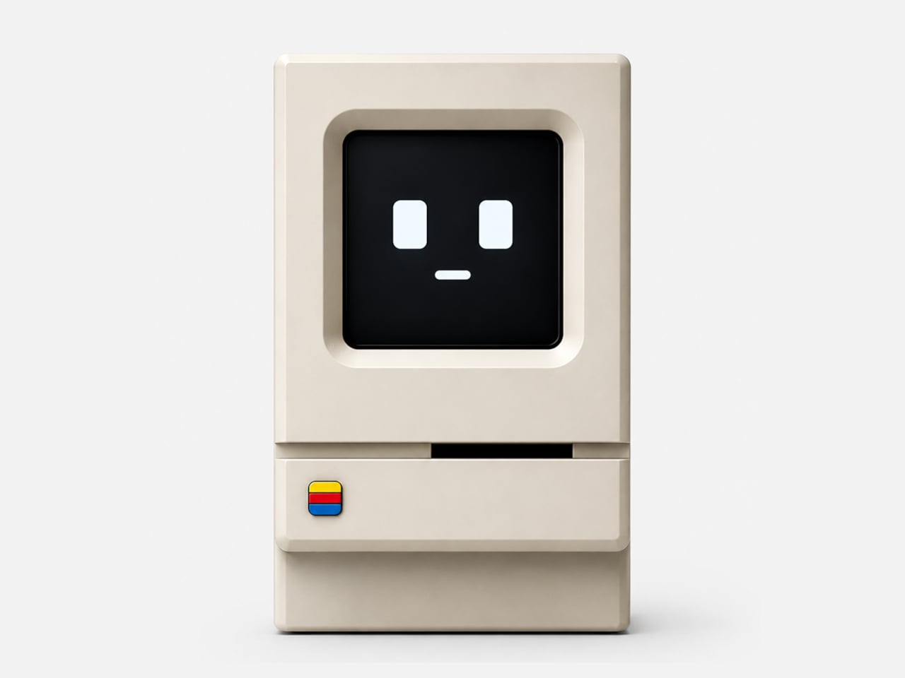
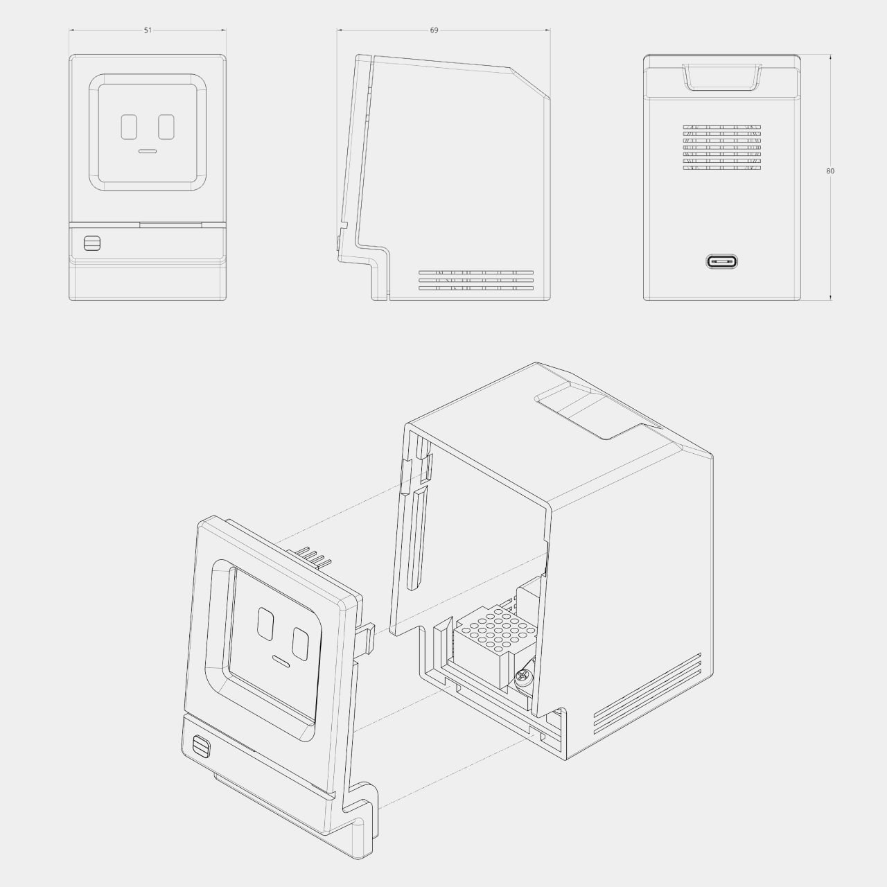
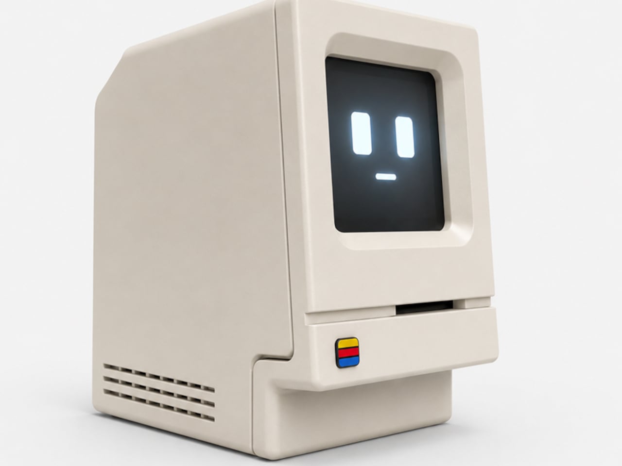
Alisher Ashimov approached the idea of a desk-based AI assistant from a completely different direction. Kira, his open-source project, takes its visual cues directly from the original 1984 Macintosh, a machine whose beige monolith silhouette is arguably the most iconic in personal computing history. The result is a voice-activated AI companion that looks more like a cherished collectible than a utility device.

Designer: Alisher Ashimov

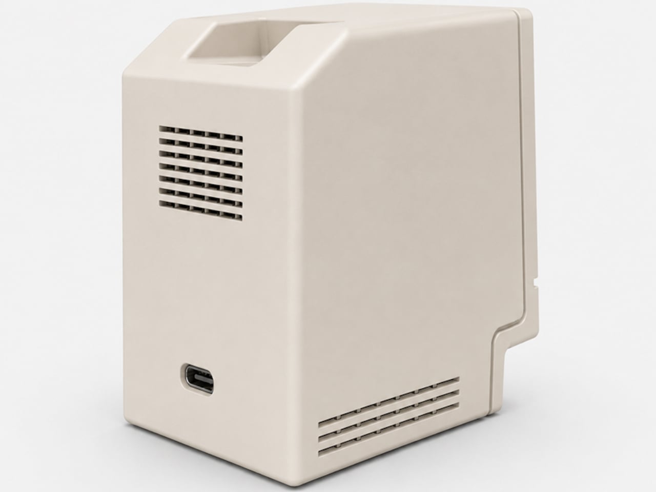
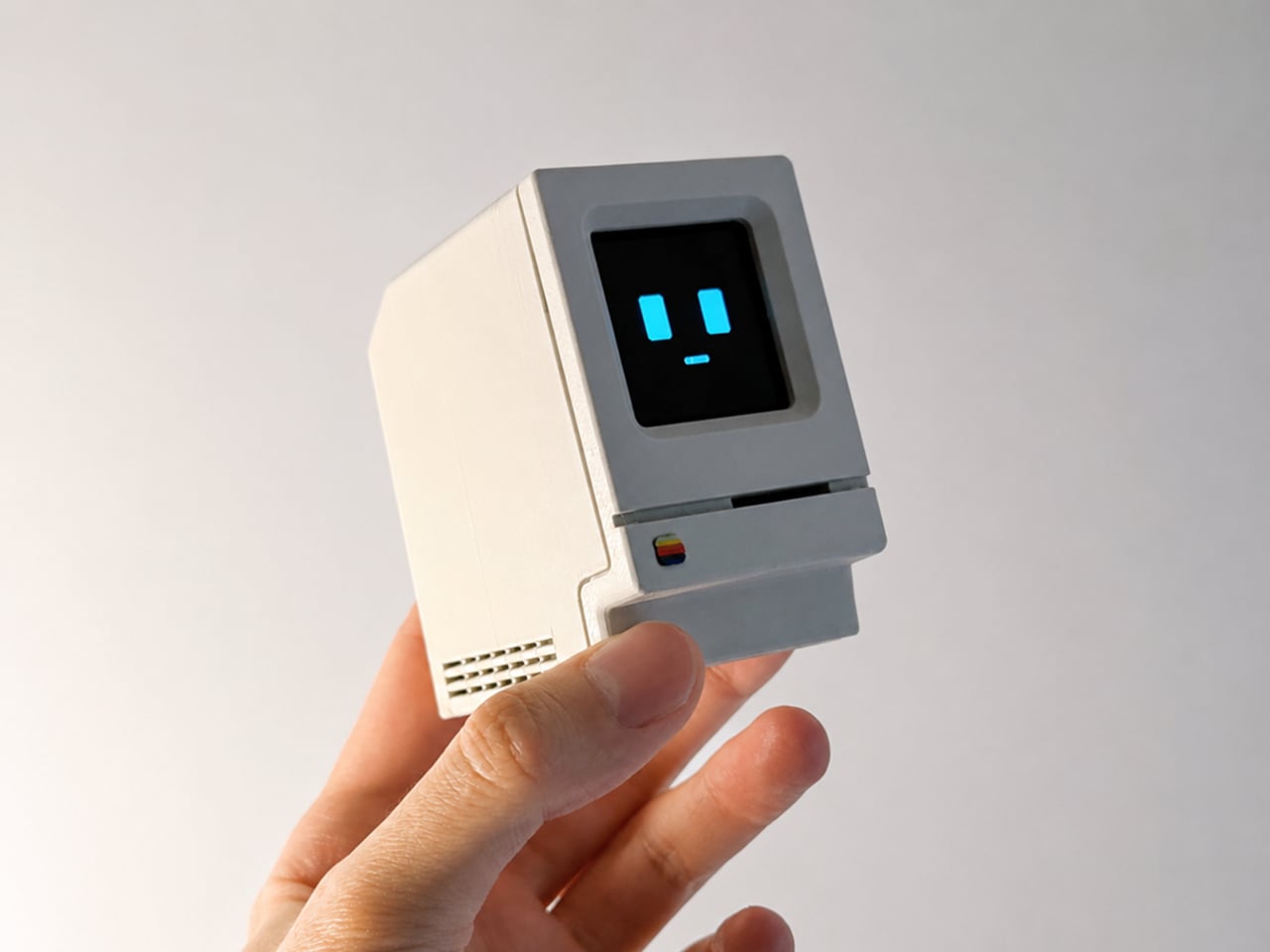
The enclosure is 3D printed in a single recommended filament color: Light Khaki matte PLA, the closest approximation of that distinctive Apple beige. Rounded top corners, a recessed front panel, horizontal side vents, and a decorative floppy-drive-style slot below the display all reproduce the original’s proportions at pocket scale, somewhere around 80mm wide. A small four-color badge on the lower front panel adds the final recognizable touch.

Where the original Macintosh showed a desktop environment, Kira shows a face. The 1.5-inch OLED display renders two rectangular eyes and a small dash mouth, animating expressively in response to interaction. The wake word is “Hey, Kira,” and from there, a built-in microphone picks up questions while a 4Ω, 3W speaker delivers spoken answers through the sculpted housing. It handles everyday voice queries the same way any smart assistant does, just with considerably more personality sitting on the shelf.

The electronics are deliberately approachable. The core is a Seeed Studio XIAO ESP32-S3 Sense, a capable and compact microcontroller with built-in Wi-Fi, Bluetooth, and a microphone. The rest of the bill of materials, a speaker, amplifier, SH1107 OLED module, mini breadboard, and jumper wires, are available on Amazon for modest amounts. The 3D-printed enclosure is optimized to print in about three hours across two plates with minimal support material, and an assembly guide walks builders through wiring, assembly, and firmware flashing.

The software carries the same open-ended spirit as the hardware. Voice, language, the assistant’s character, and memory settings are all user-definable, which means Kira isn’t locked into a single personality or a single cloud service. Tinkerers can tune the firmware directly. Ashimov has published the files freely, with no commercial barriers between the design and anyone with a printer and an afternoon to spare.

The objects people choose to keep on their desks tend to say something about them. A tiny Macintosh-shaped AI assistant that you built yourself and tuned to your own preferences says rather a lot. It combines a piece of design history, a genuinely capable voice interface, and an honest invitation to understand exactly how the thing works, all in a form that most people will stop and ask about the moment they see it.

The post This 3D-Printed Macintosh Replica Is Actually a Voice AI Assistant first appeared on Yanko Design.
Leica’s 220-Inch Mini Projector Wants to Replace Your TV

When Leica announced the Cine Compact 1, my first reaction landed somewhere between genuine curiosity and mild skepticism. Leica is a camera brand. A camera brand, the kind photographers carry like a quiet badge of honor, the kind that has defined a certain visual language for over a century. And now they want to replace my television?

Here is the thing: Leica has been making projectors since 1926. Before streaming was a concept, before most of us were born, they were already in the projection business. The Cine Compact 1 is not a prestigious camera brand drifting beyond its territory. It is one returning to an old, familiar one.

Designer: Leica

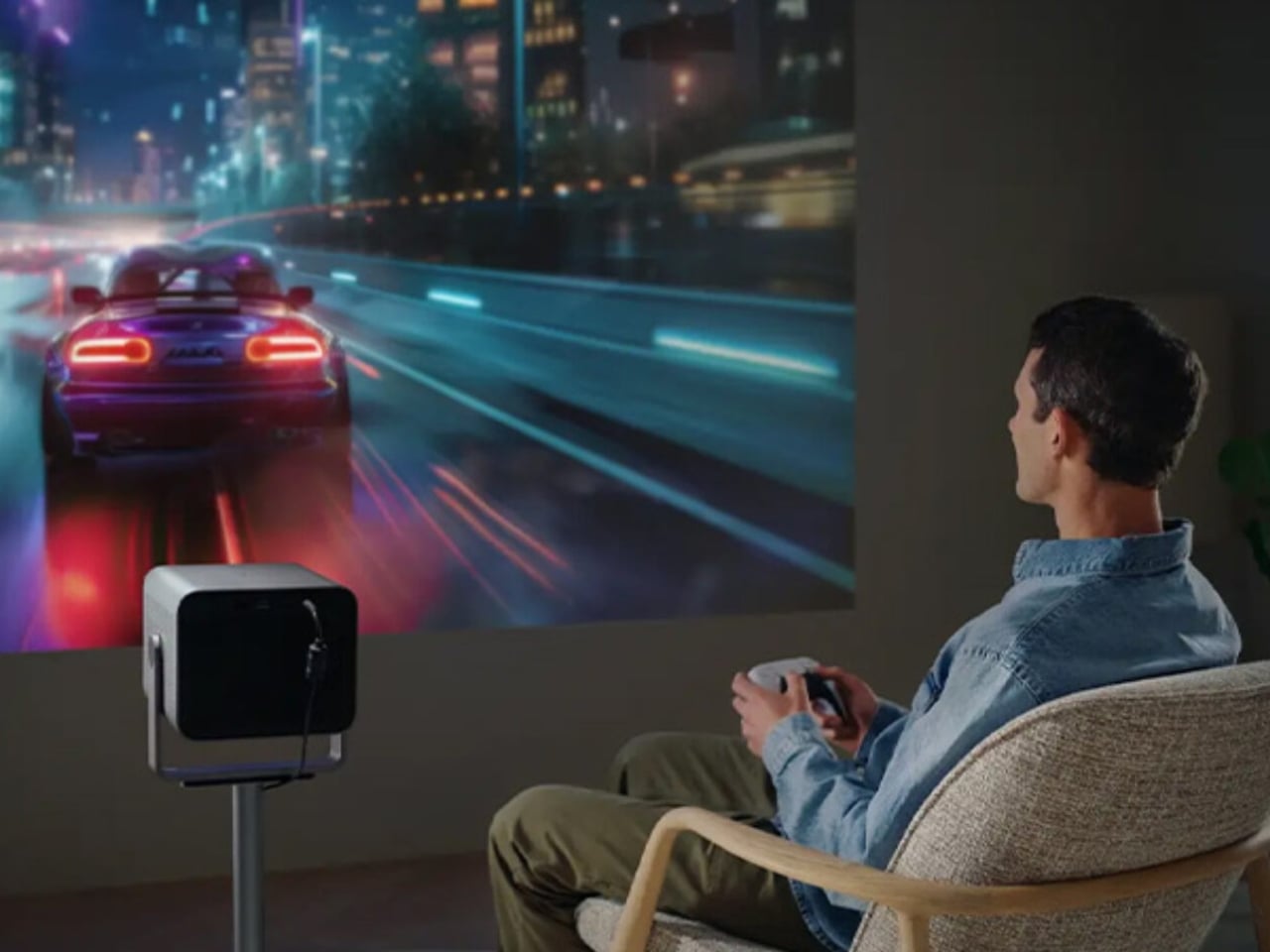
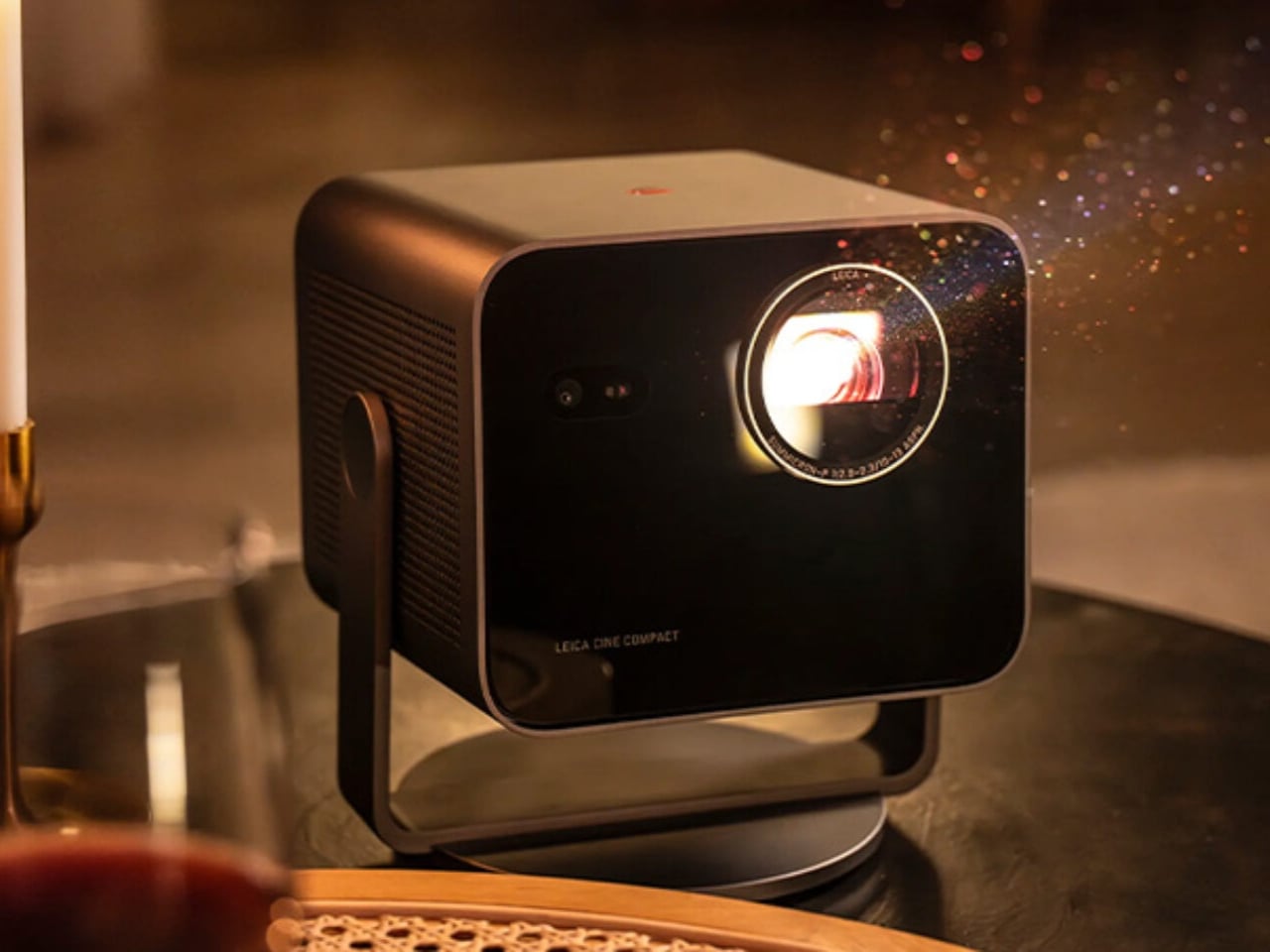
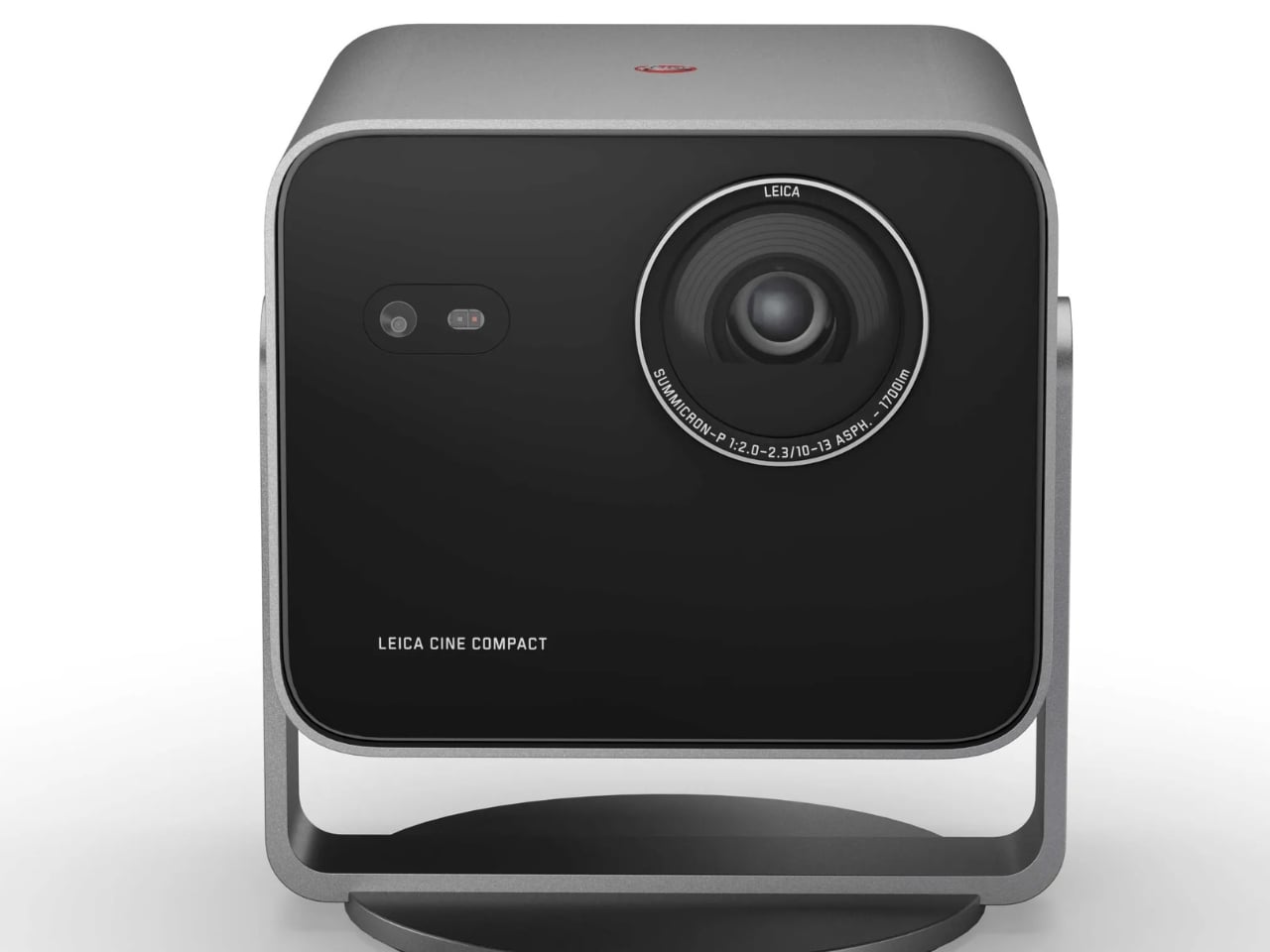
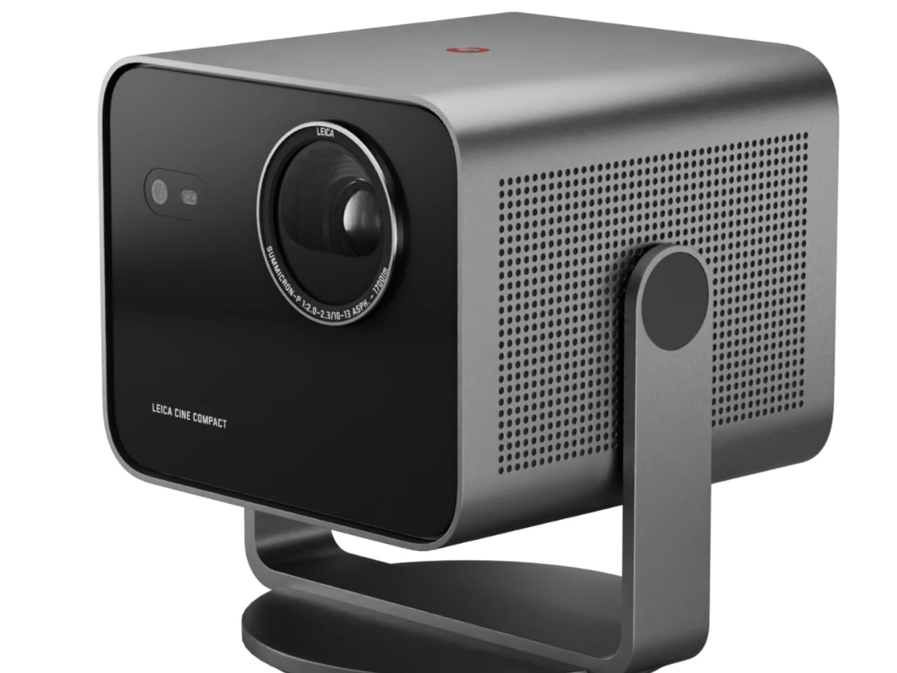
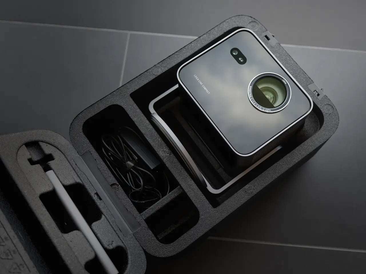
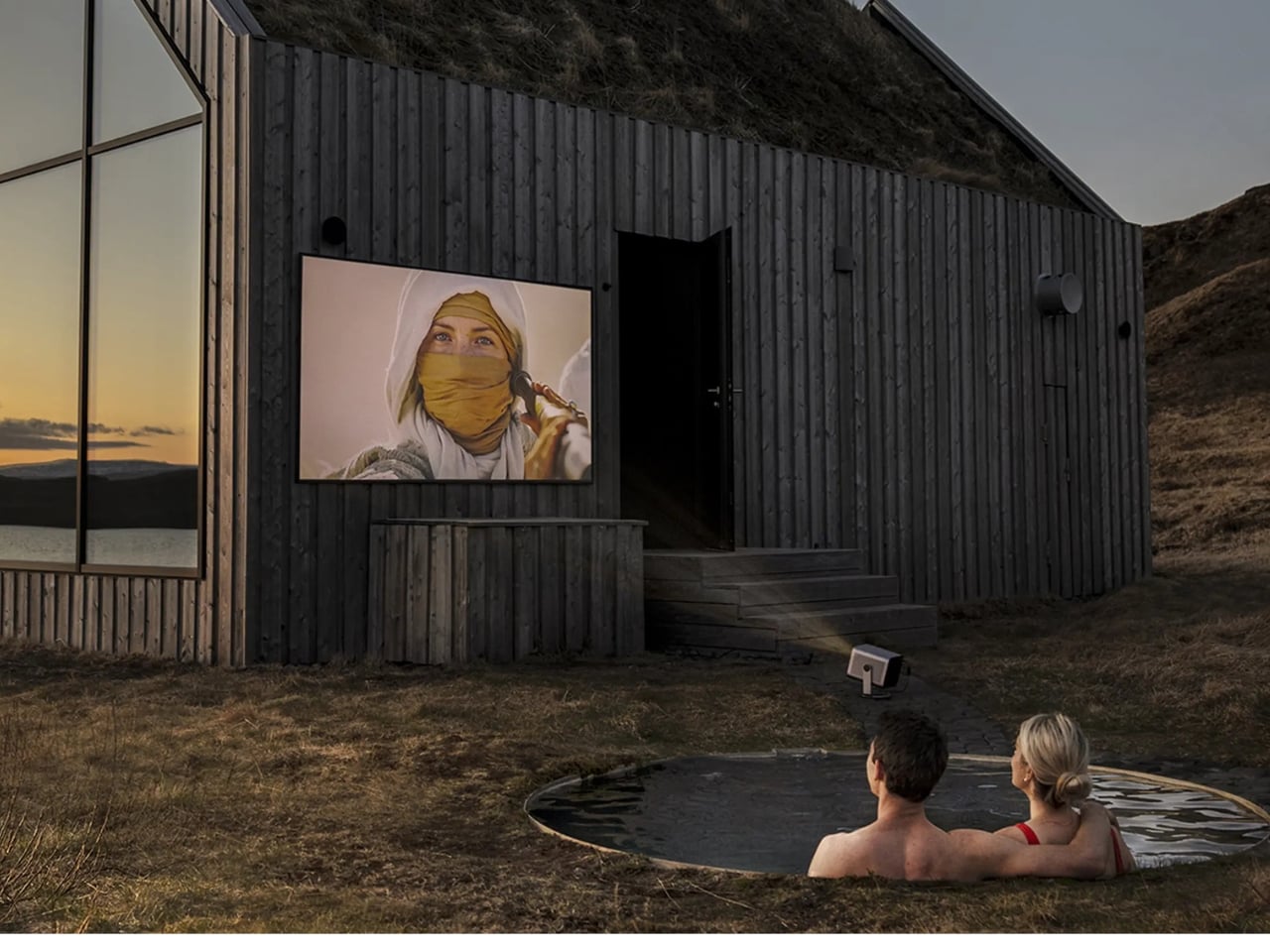
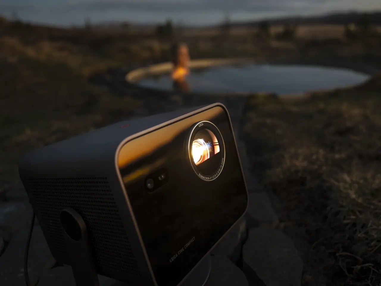
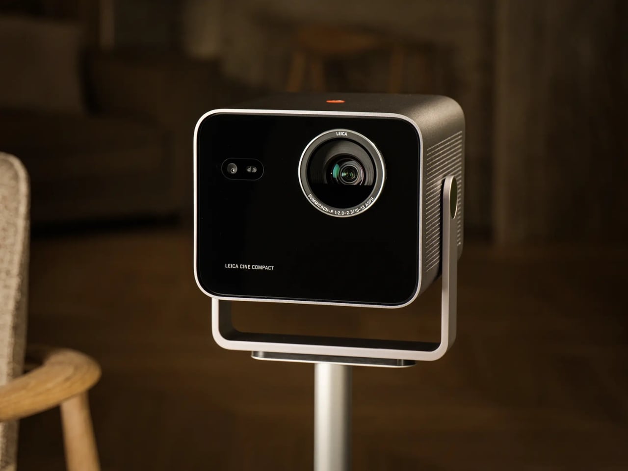
So what exactly is it? At the core, the Cine Compact 1 is a compact mini projector built around a Leica Summicron zoom lens with aspherical elements, a 0.47-inch DMD image chip, and Triple RGB laser technology. It delivers 4K resolution at up to 1,700 ANSI lumens, which is bright enough to produce a usable image in a room that is not completely blacked out. The maximum projection size is 220 inches diagonally, which is an absurd number for something small enough to sit on a coffee table.

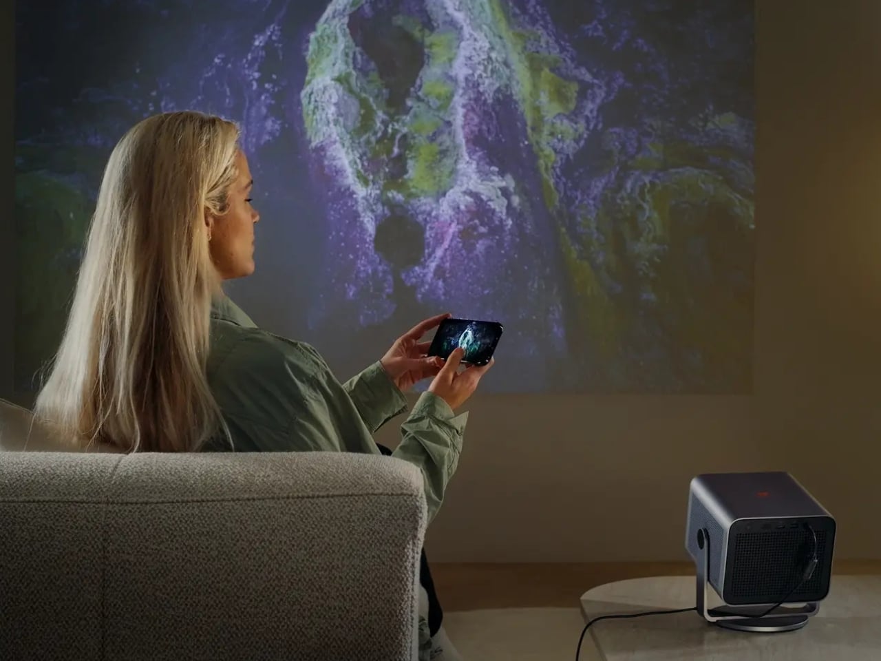
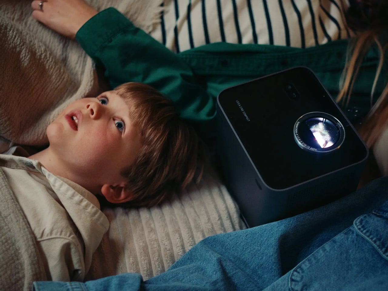
The 360-degree rotation system is the detail I keep thinking about. Most projectors are prisoners of their setup requirements: flat surface, blank wall directly ahead, dedicated space. The Cine Compact 1 abandons that formula entirely. Wall, ceiling, anywhere in between. That flexibility is not just a convenience feature. It actually changes your relationship with watching at home. Ceiling projection during a movie night is a categorically different experience from staring at a flat panel mounted above a console.

Leica also built in their proprietary image processing technology, called Leica Image Optimization (LIO), to maintain consistent picture quality regardless of projection size or location. Pair that with Dolby Vision for contrast and brightness precision, and Dolby Digital and DTS Virtual:X for audio, and this is not a glorified slideshow device. It is a serious piece of home cinema equipment disguised as a coffee table accessory.

The design is Leica through and through: solid aluminum housing, a glass front, clean lines that read as refined rather than attention-seeking. Even switched off, it looks like it belongs on a shelf rather than something you drag out reluctantly. Its projected lifespan is 25,000 hours, which at a few hours of daily use amounts to decades of service. Smart streaming runs on VIDAA, so most of what you want to watch is accessible without plugging anything extra in.

My honest read on the Cine Compact 1 is that it is designed for a very specific kind of frustration: the one that comes from building your entire living space around a television. We spend years arranging furniture toward screens, painting walls in “TV-friendly” neutrals, negotiating actual square footage with a device that has one function. A projector like this shifts that equation. The screen exists when you need it. The room is yours the rest of the time.

Is it for everyone? No. Projectors still require more thought than a TV on a wall, and Leica’s pricing tends to reflect the brand’s premium heritage. But the people who will love this will love it unconditionally. The design-conscious person who thinks as carefully about how their space looks at two in the afternoon as they do at nine at night. The perpetually mobile person who wants a real cinema experience wherever they land. The person who is simply done negotiating living space with a large black rectangle.

Leica is not chasing a trend here. If anything, they are returning to something they were doing before most modern tech companies existed. The form is smaller, smarter, and more portable. The commitment to image quality behind it is exactly the same.

The post Leica’s 220-Inch Mini Projector Wants to Replace Your TV first appeared on Yanko Design.
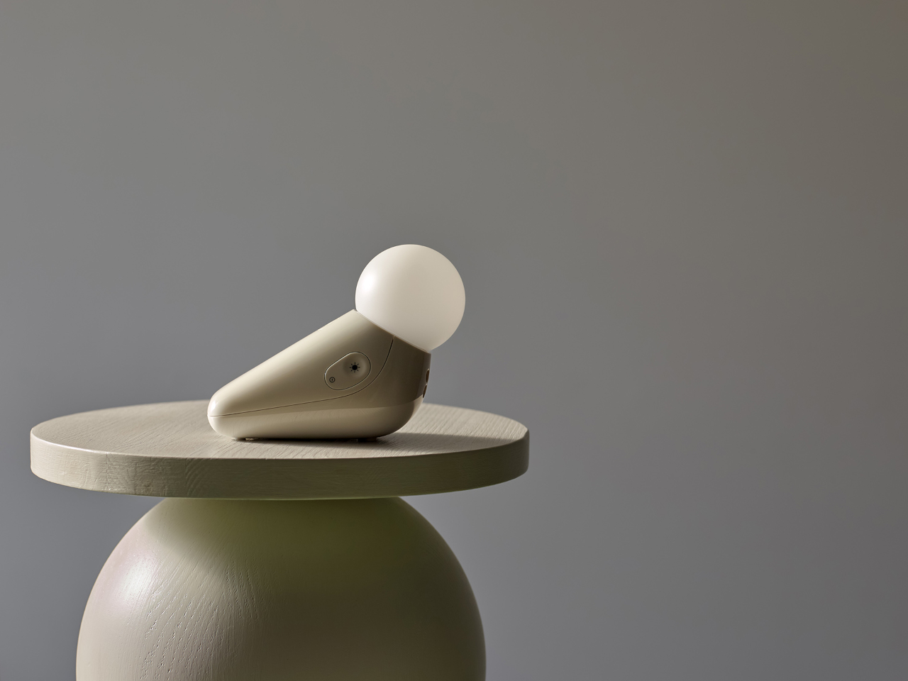
adidas Trionda Pro brings connected-ball technology to the FIFA World Cup 2026

The much-awaited FIFA World Cup kicks off with an opener between co-hosts Mexico and South Africa at Mexico City Stadium on 12 June. While the fandom and the love for the most popular sport on earth remain constant off the field, there is a lot that’s changing on the field. The Virtual Assistant Referee (VAR) is getting more control of the game, with the power to intervene in spotting fouls and also identify real-time data from the specially designed football to make faster offside decisions, or pick out individual ball touches in a crowded set piece.

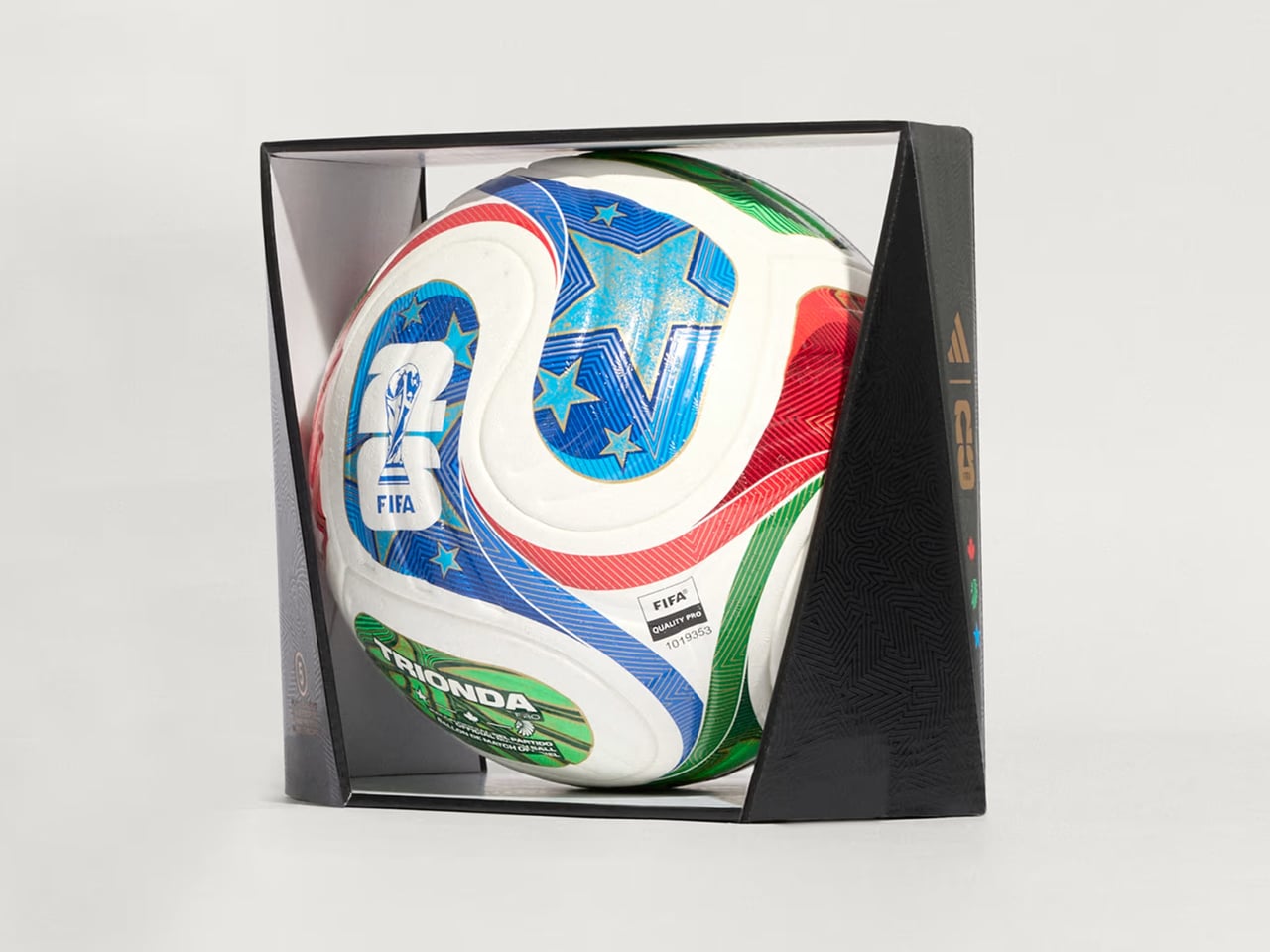
The football designed especially for match day is called Trionda Pro, which means “three waves.” It is styled in the colors and motifs of the three co-hosting nations, Mexico, Canada and the United States of America, and is said to arrive with a built-in motion sensor, which would send real-time ball data to VAR. The ball is now available for $170.

Designer: adidas

Created by adidas for the FIFA World Cup 2026, Trionda Pro is the official match ball of the tournament. It will arrive in a tricolor wave panel design with red, green, and blue graphics, which pays tribute to Canada, Mexico and the USA. The ball also features maple leaf, eagle, and star – again representing the nations – visible across the four-panel construction of the ball.

“The Trionda Pro has a textured surface for a more predictable trajectory, better touch and lower water uptake, combined with a thermally bonded seamless construction for added performance and design benefits,” adidas notes on its webpage dedicated to the match ball.

Even though the impactful silhouette makes the ball pretty identifiable on the ground, adidas and FIFA wanted more from it. To that accord, Trionda Pro features a 500Hz motion sensor installed inside of its specially created layer in one of the four panels. The other three panels are provided with counterbalances ensuring flight stability in all playing conditions. The sensor is part of adidas’ in-house Connected Ball Technology and used in the match ball. It sends accurate ball movement analytics to the VAR in real time and also helps identify individual touches precisely.

The data of the ball movement, then combined with AI and player-positioning data, can allow the virtual referee to assist with correct offside calls and also identify a handball from headers in a crowded space on the field. Accurate and fast decisions regarding off-sides and fouls can make a big difference in high-octane games, especially on the world stage. So, Trionda Pro is a viable tech upgrade to the sport, which is going into a mega tournament for a period of 39 days starting 11 June through 19 July, 2026.

The post adidas Trionda Pro brings connected-ball technology to the FIFA World Cup 2026 first appeared on Yanko Design.
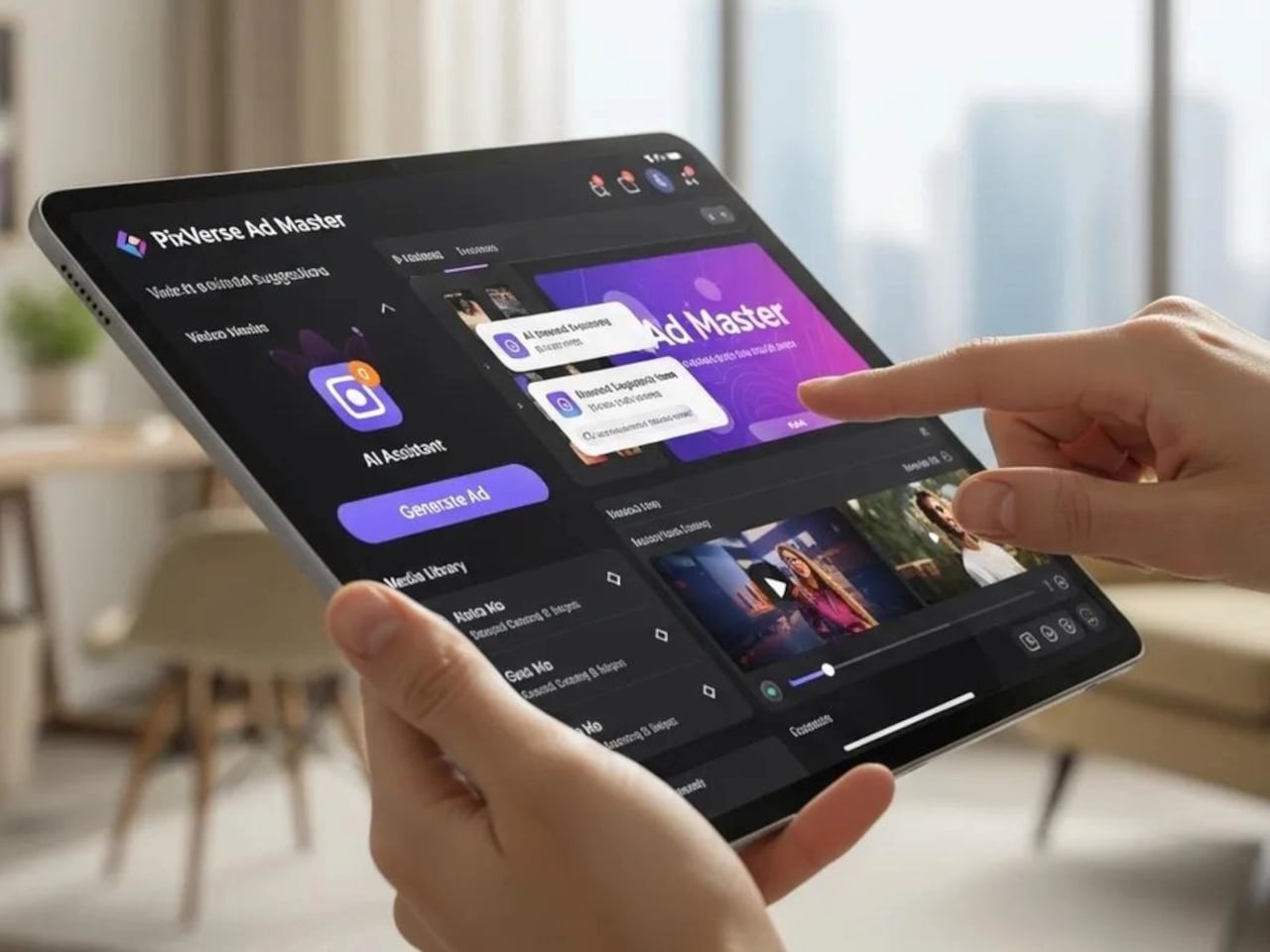
This $99 Rugged Phone Has a Keypad and Won’t Let You Doomscroll

The case for a second phone has gotten easier to make over the past few years. Whether it’s for a work line, a travel SIM, or simply a device that doesn’t pull you into a scroll every time you pick it up, the idea of carrying something smaller and simpler alongside a primary smartphone has moved from eccentric habit to reasonable strategy. What that second device should actually be, though, has been harder to settle.

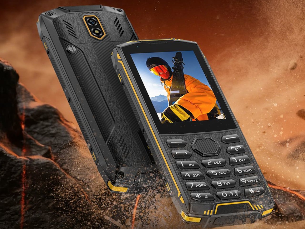
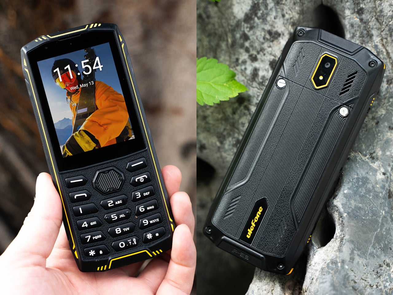
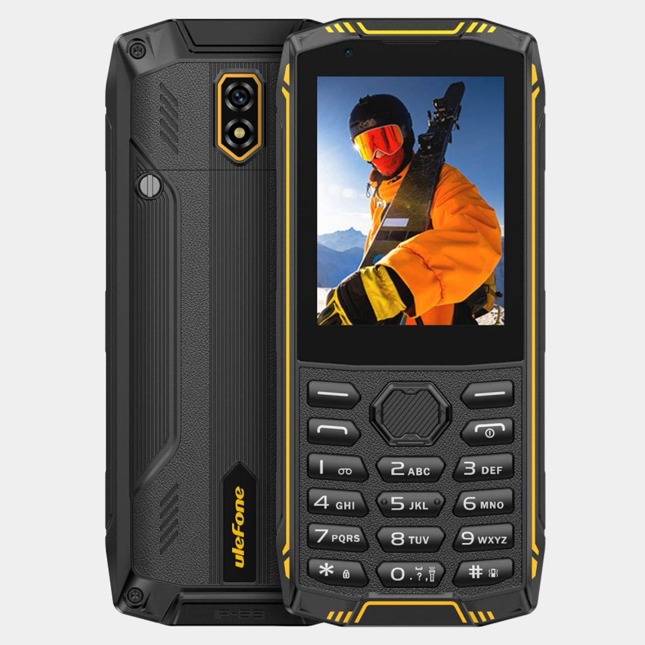
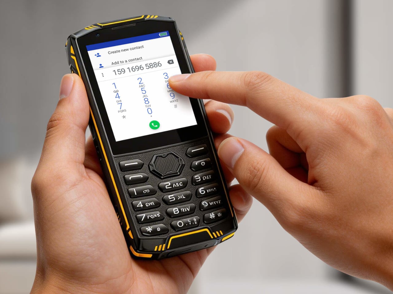
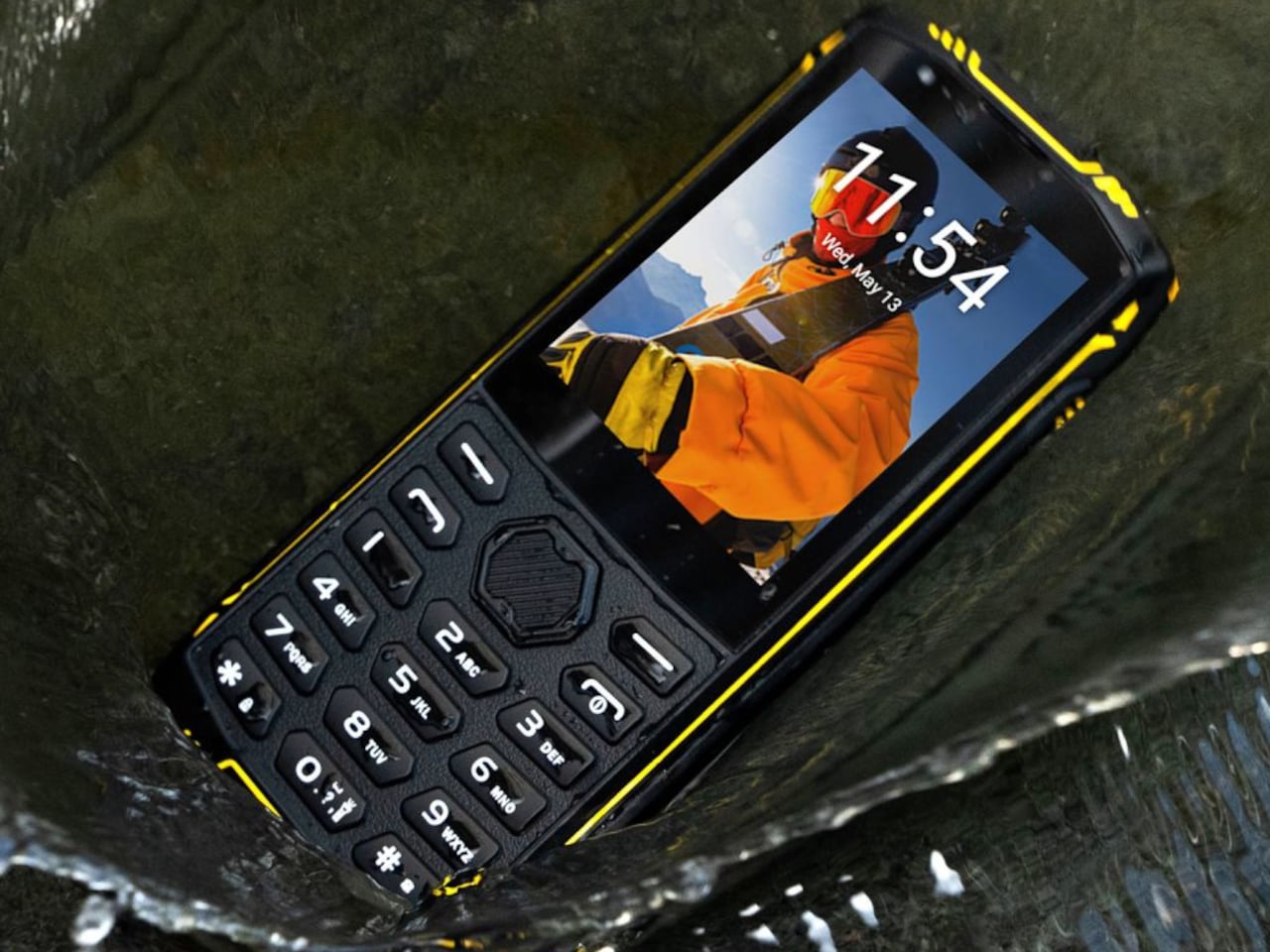
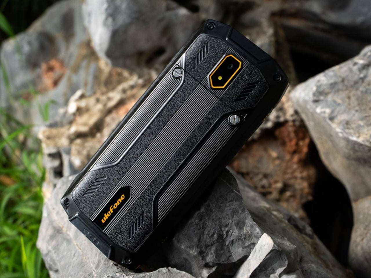
Ulefone’s Armor Mini 5 answers that question with a format that most people assumed was retired alongside early BlackBerries and Nokia candy bar phones. It combines a physical alphanumeric keypad at the bottom with a 2.8-inch touchscreen above it, runs Android 11, and wraps the whole thing in a rugged shell certified to IP68, IP69K, and MIL-STD-810H standards. The result is something that sits deliberately between a feature phone and a smartphone.

Designer: Ulefone

The display at 240×320 pixels isn’t going to run any graphically demanding apps, and that’s clearly the point. Ulefone pre-loads WhatsApp and markets the device explicitly as a way to stay in touch with the people you care about while sidestepping the attention-draining machinery of a modern phone. WhatsApp calls, voice messages, and texts work fine at this resolution. Instagram doesn’t, which is by design.

At 142mm x 62mm x 16.5mm and 170g, the Armor Mini 5 fits comfortably in a chest pocket where most modern 6-inch devices wouldn’t. The physical keypad keeps texting fast for anyone comfortable with predictive T9 input, and the number keys double as a quick-dial interface, the kind of interaction muscle memory that never quite goes away once it’s formed. Calls are the first-class experience here, with the touchscreen adding access to apps when needed.

The rugged credentials are serious ones. IP68 means submersion up to 2 m for 30 minutes. IP69K adds resistance to high-pressure water jets, which is the standard applied to equipment that gets hosed down in industrial or outdoor settings. MIL-STD-810H covers drop, vibration, humidity, altitude, and temperature extremes. A phone this small is significantly more likely to be dropped than a larger device, so the reinforced shell earns its place.

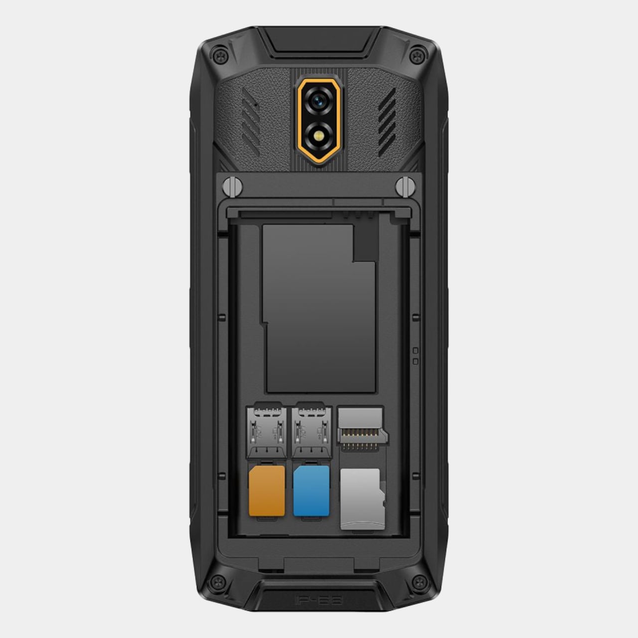
Battery management is where the form factor pays its most practical dividend. The 2,500mAh cell powers up to 12 days of moderate use and reaches 311 hours of standby, numbers that come from the low-resolution display and efficient quad-core MediaTek MT6739 chipset rather than from a massive capacity. The battery is also removable, which hasn’t been a feature on most consumer phones for nearly a decade, and it means carrying a spare for genuinely extended off-grid use.

Storage is 8GB internally with 1GB of RAM, paired with a triple-card slot that accepts two nano SIMs alongside a microSD card. For a phone that handles calls, texts, and WhatsApp, 8GB is more than sufficient. The dual-SIM configuration makes it practical as a travel device, keeping a local data SIM and a home number active simultaneously without buying a second handset.

The Armor Mini 5 currently sells for $99.99, down from a regular price of $109.99. For a phone that most people would describe as a deliberate step backward in screen size and software capabilities, it makes a surprisingly coherent argument that fewer features, handled well and built to survive a job site, might actually be the more useful device for what a second phone is actually supposed to do.

The post This $99 Rugged Phone Has a Keypad and Won’t Let You Doomscroll first appeared on Yanko Design.
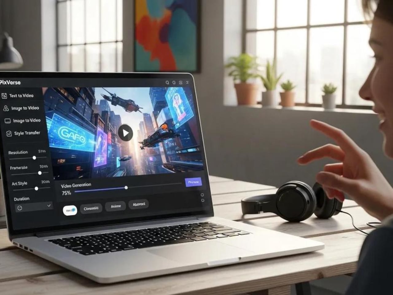
This $172 Raspberry Pi Handheld Doubles as a USB Keyboard

The Raspberry Pi Compute Module has always been more useful as a component than as a standalone board. Stripped of the standard ports that make the full-size Pi easy to reach, the CM5 was designed to disappear into purpose-built hardware, doing exactly what a system needs it to do in exactly the space available. That modularity invites projects, and Pi handheld computers have been a natural expression of it for years. Most of them never quite cross the line from capable experiment to genuinely polished device.

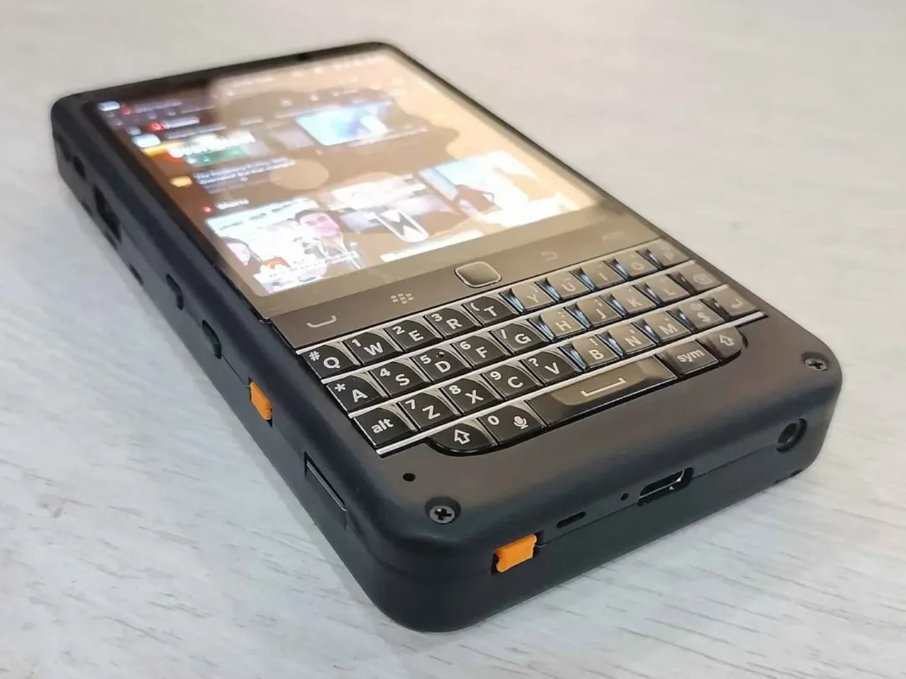
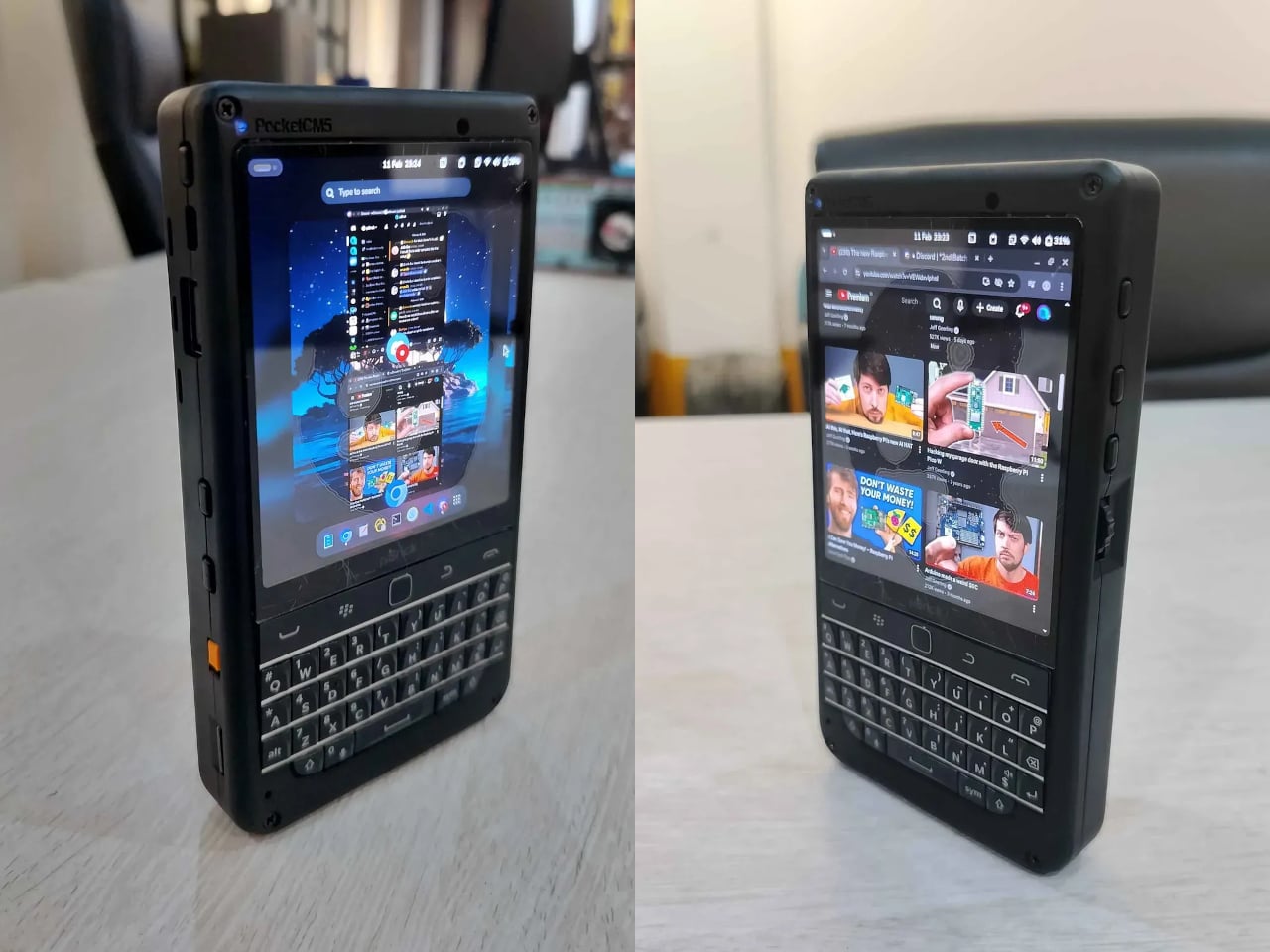
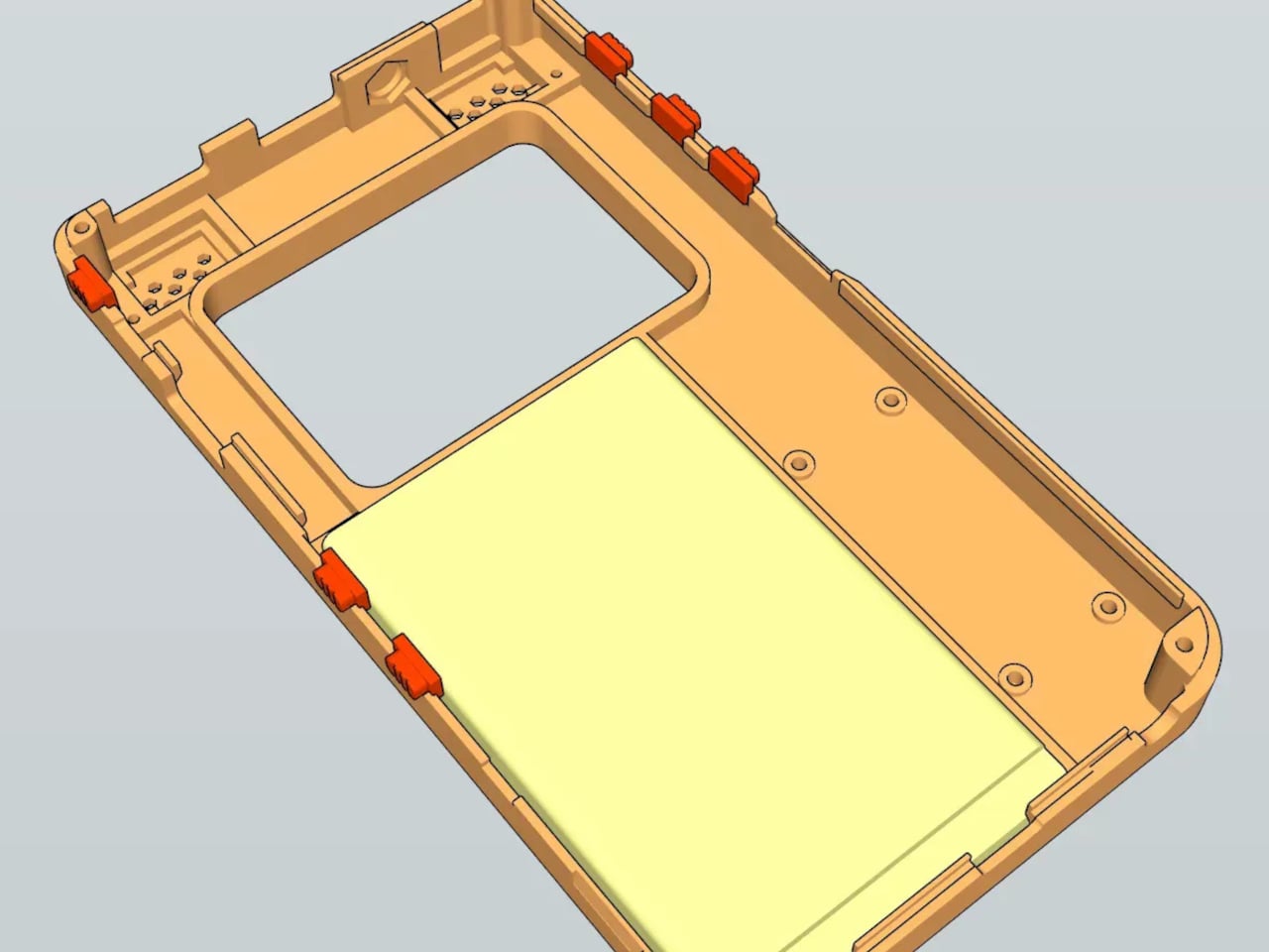
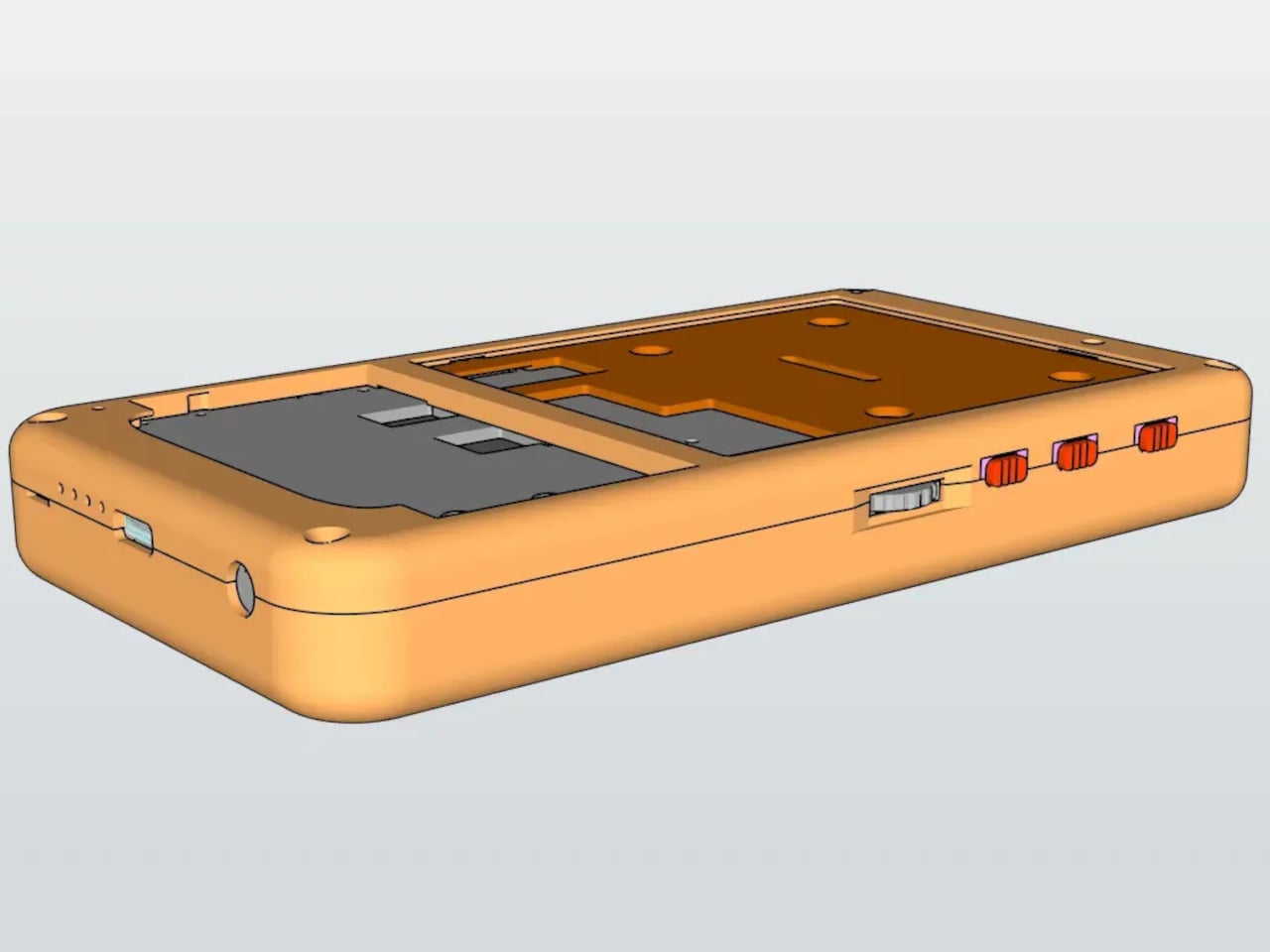
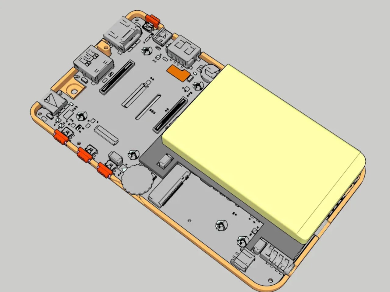
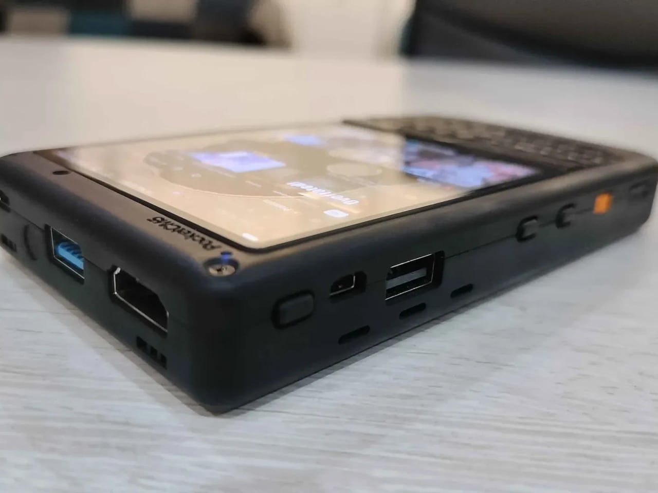
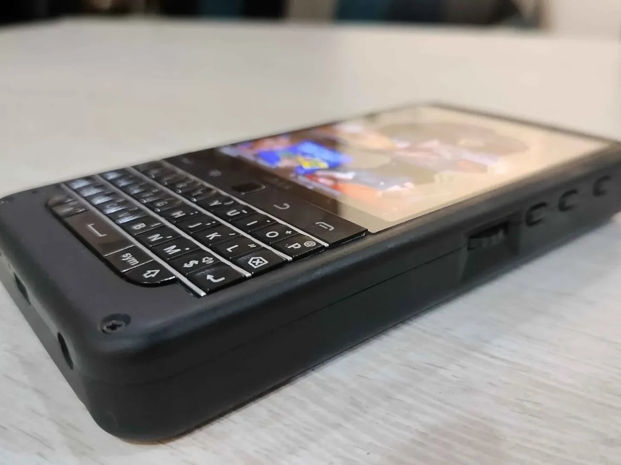
The piBrick Pocket-CM5 is an open-source hardware project that comes significantly closer than most. Built from a custom PCB designed for manufacturing at JLCPCB, a 3D-printed shell, and a parts list that totals around $172, it lands at smartphone proportions, 80mm x 145mm x 19.6mm, with the kind of feature density that makes it credible as a daily carry tool rather than a desk ornament.

Designer: Ahmad Amarullah

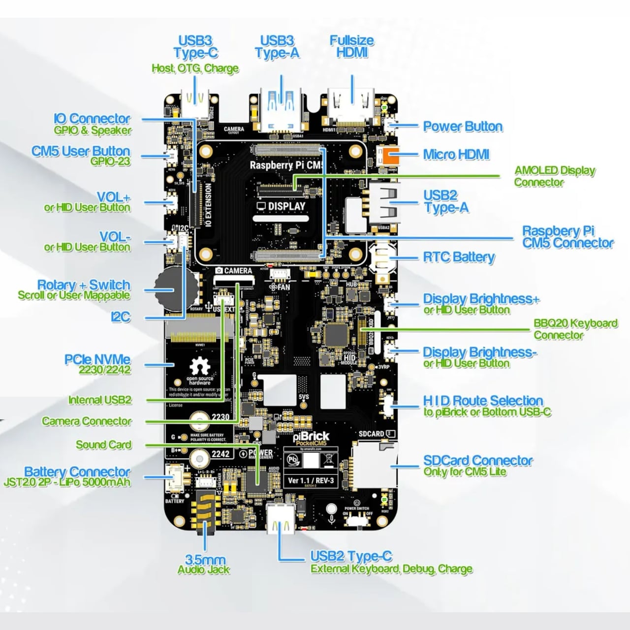
The display is a 3.92-inch AMOLED panel running at 1080 × 1240 pixels and 90Hz, with 560 nits of brightness and capacitive multitouch for up to five fingers. A custom Asahi Tempered Glass cover sits over the top, which is the kind of detail that separates a considered design from a prototype that happens to work. Full-size and micro-HDMI outputs mean the same device can drive an external display, when a keyboard and mouse are more useful than a pocket-sized one.

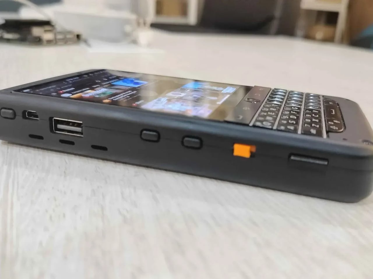
That keyboard is a BBQ20, a compact QWERTY design with an integrated trackpad derived from the BlackBerry layout. Side rotary encoders and five user-programmable buttons extend the input options beyond a standard phone form factor, giving the device a tactile depth that touchscreen-only handhelds don’t have. The battery is a 5,000mAh LiPo, and the USB port set covers both USB 3 and USB 2 in Type-A and Type-C configurations, plus an internal expansion header for add-on modules.

One of the more quietly useful features sits at the intersection of the keyboard and the USB stack. The BBQ20 can operate in USB-HID mode, which means plugging the piBrick into any external computer or server turns its keyboard and trackpad into a fully functional USB input device, independent of the Pi. A sysadmin arriving at a server rack without a spare keyboard doesn’t need to find one; the piBrick already is one. That framing, as a tool for engineers and sysadmins rather than simply a hobbyist novelty, runs through the whole project.

A full Linux desktop runs on the CM5, alongside the system administration and networking tools that tend to be useful in those situations. NVMe SSD support in 2230 or 2242 formats adds storage headroom when the SD card isn’t enough. Stereo speakers, a microphone, and an optional camera module round out a spec sheet that covers more ground than the form factor suggests. The project files, schematics, and build instructions are all available as open source, which means the $172 cost is the floor, not a retail price, and the design itself belongs to anyone who wants to build on it.

The post This $172 Raspberry Pi Handheld Doubles as a USB Keyboard first appeared on Yanko Design.
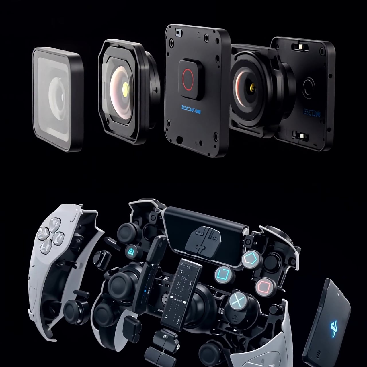
WiiM’s First Soundbar Has a Round Touch Display Built Into the Front

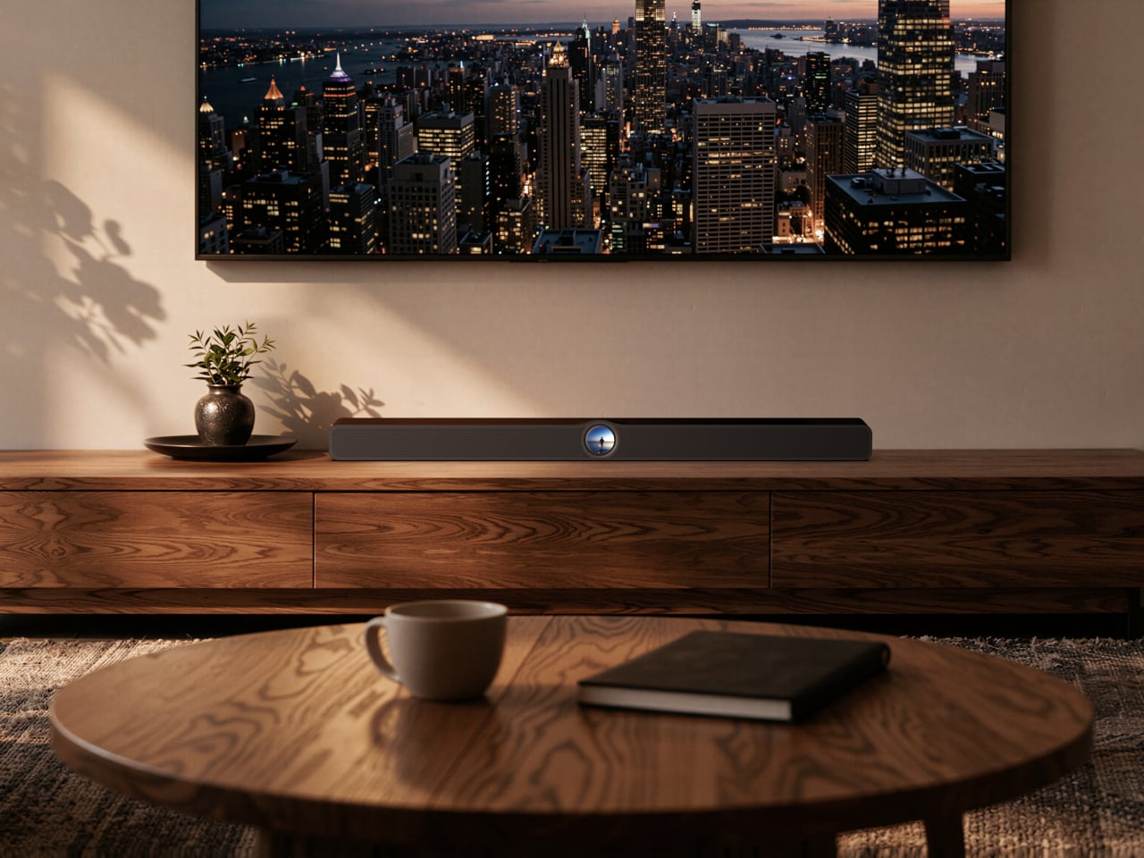
The soundbar has become the default home theater upgrade for anyone who doesn’t want to fill a room with floor-standing speakers and receiver cabinets. It’s a sensible trade-off, but most soundbars operate as completely passive objects once they’re set up, reflecting nothing about what’s actually playing or offering any real interaction beyond a remote nobody can ever find. The visual side of the experience has always been an afterthought.

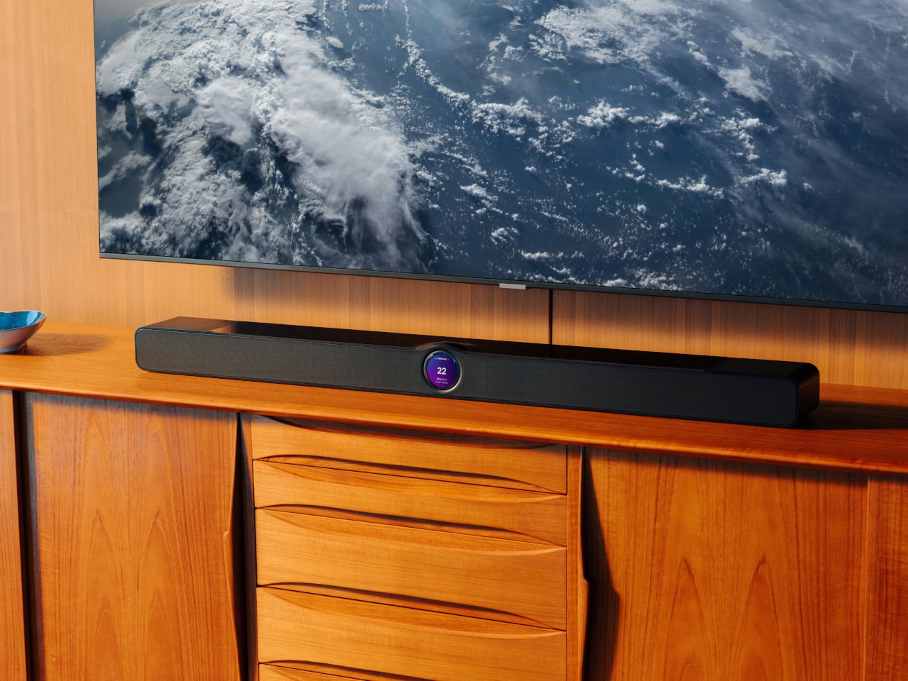
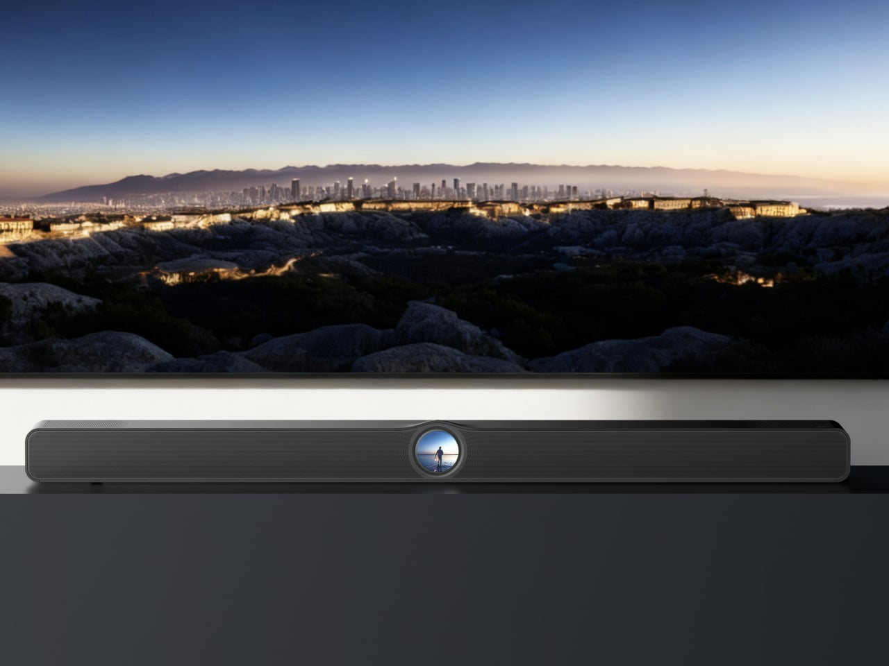
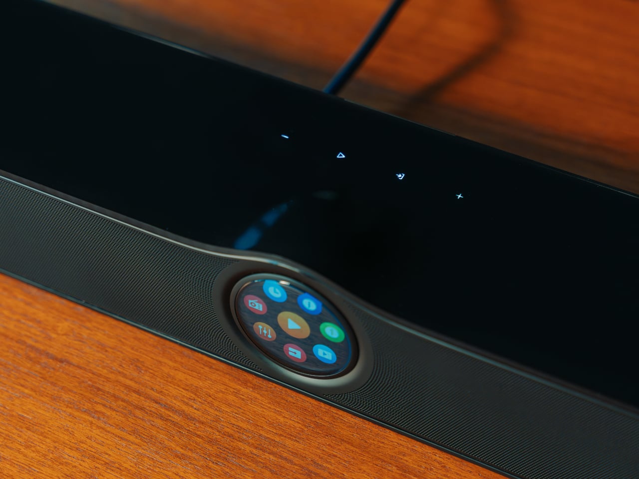
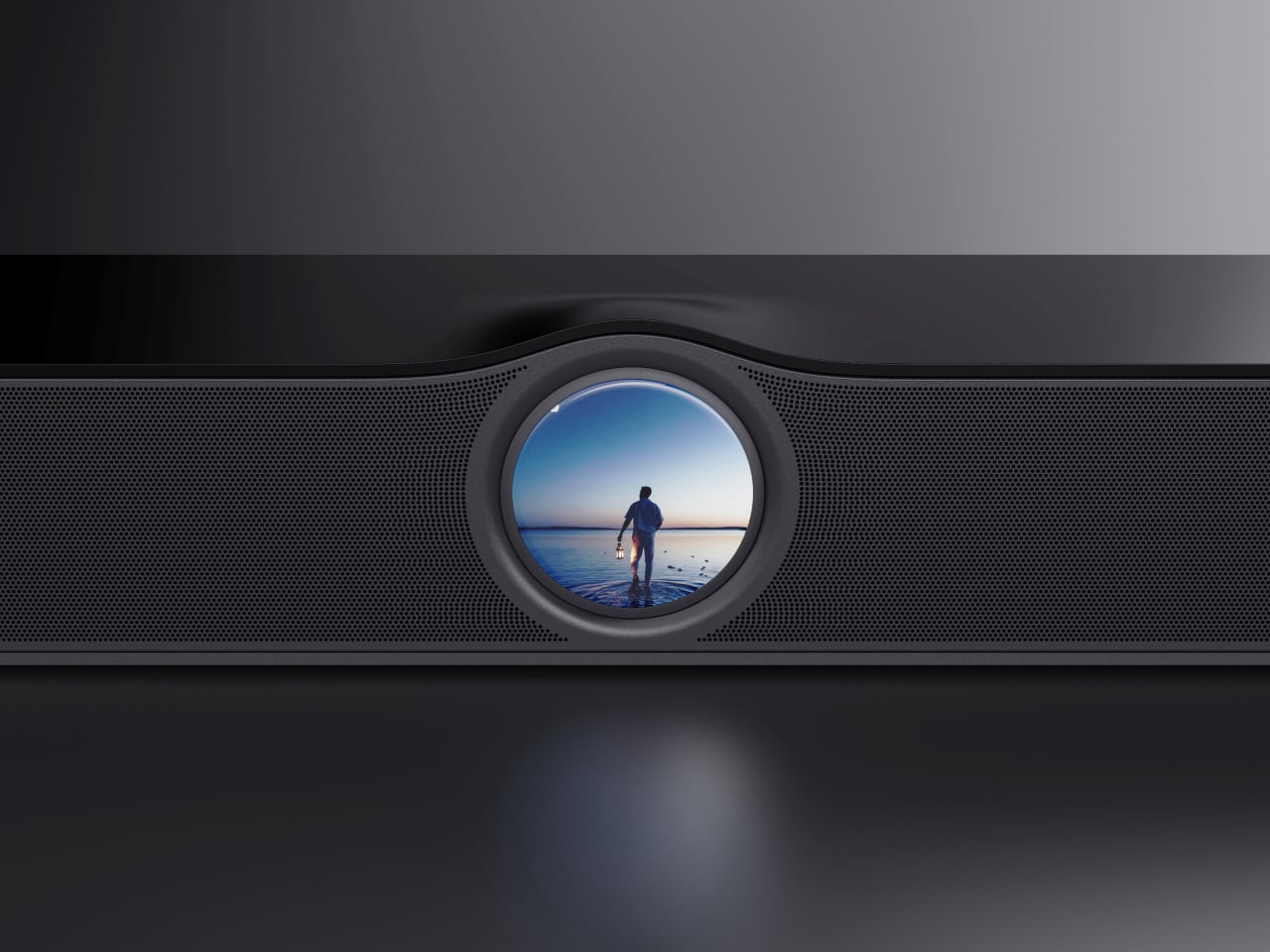
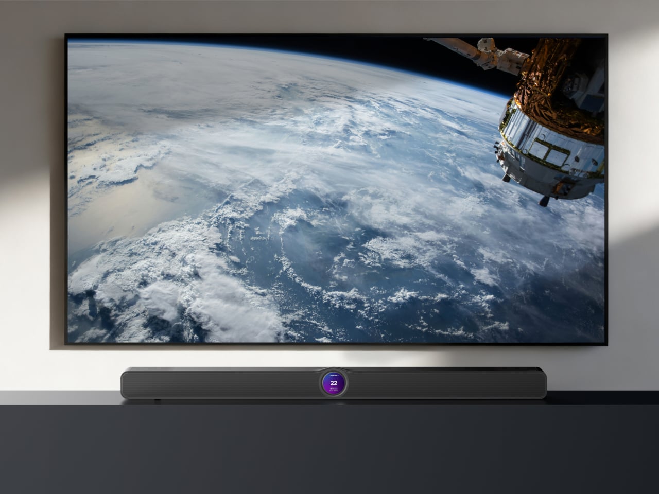
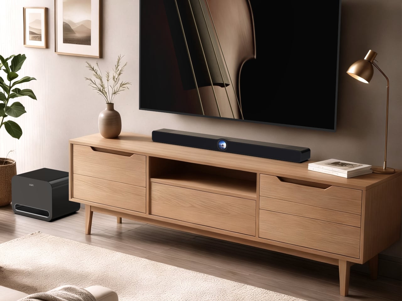
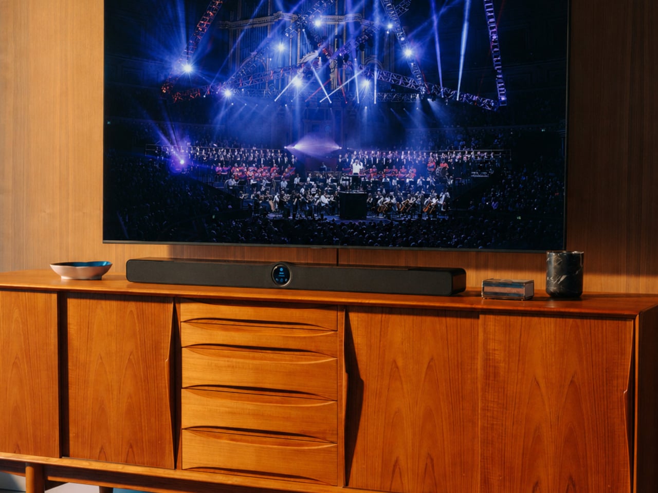
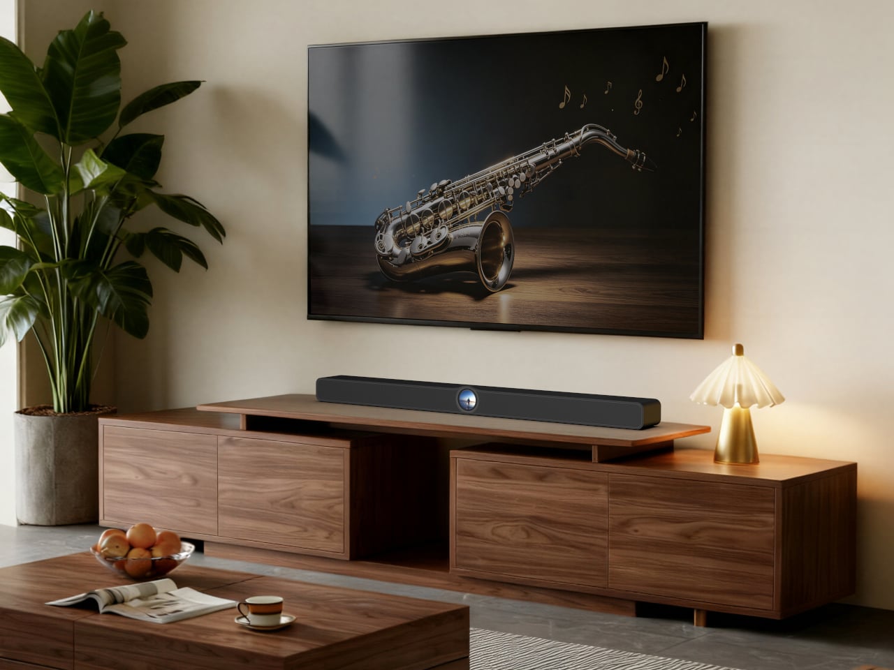
WiiM is entering the soundbar market for the first time with the WiiM Bar, and the defining choice it made is a 2.1-inch round touch display embedded in the center of the bar’s front face. That decision drives the entire product concept, making the soundbar itself a point of interaction rather than something you control exclusively from your phone or a remote that lives behind a couch cushion.

Designer: WiiM

The glass-covered round display sits within a gentle wave-shaped recess on the bar’s surface, showing album art, track info, the time, EQ settings, Smart Presets, and Recently Played content in a format readable from across the room. A tap plays, pauses, skips, switches sources, or selects an EQ profile without reaching for anything else. Clock faces and dynamic wallpapers take over when nothing’s actively playing.

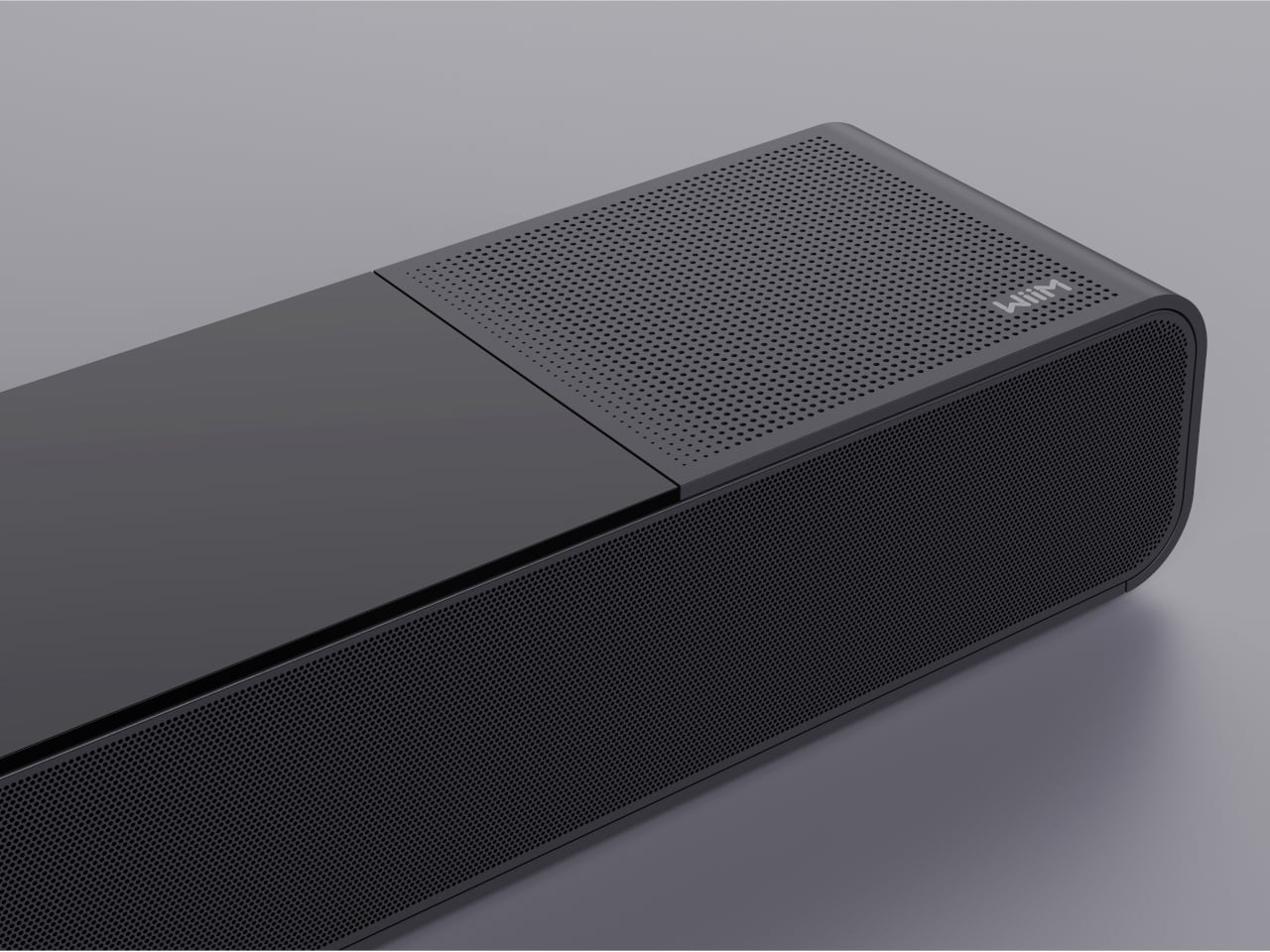
Sonically, the WiiM Bar delivers a true 3.0.2 Dolby Atmos configuration using an eight-driver array: three front mid-woofers, three front tweeters, and two full-range drivers on top that fire upward for height effects. Four passive radiators, two on the front and two on the rear, extend the bass response. The system peaks at 135W and includes HDMI eARC alongside optical, line-in, and configurable USB audio connections.

RoomFit auto-correction measures the acoustic characteristics of the space and adjusts the output accordingly, so placement against a wall doesn’t work against the sound. A Clear Voice mode uses AI-powered dialogue separation in real time, which is genuinely useful for anyone who reaches for subtitles not because a show is quiet, but because the mix buries speech under effects. Night Mode keeps that clarity intact at lower volumes.

The 3.0.2 configuration is a starting point rather than a ceiling. Compatible WiiM devices can be added wirelessly as surrounds and a subwoofer, taking the system to a full 5.1.2 home theater without additional wiring. The WiiM Home App manages EQ, Smart Presets, and multi-room grouping, letting the bar sync with WiiM Amp, Ultra, Pro, and Mini devices across the rest of a home.

Streaming reaches over 20 services through the app, with direct casting via Spotify Connect, TIDAL Connect, Qobuz Connect, Google Cast, Roon, and Amazon Music Cast. Wi-Fi 6E covers all three bands, Ethernet offers a wired fallback, and Bluetooth 5.4 with LE Audio handles device pairing. A USB host port lets the bar serve a personal media library to other WiiM and DLNA devices on the network.

The WiiM Bar ships in July 2026, priced at $479, available for pre-order now through wiimhome.com, Amazon, and select retail partners. For a market full of soundbars that treat control as an afterthought and expansion as an expensive aftermarket exercise, it offers a fairly direct argument: an on-device touch interface, honest Dolby Atmos performance, and a clear path to a proper surround setup whenever the moment calls for it.

The post WiiM’s First Soundbar Has a Round Touch Display Built Into the Front first appeared on Yanko Design.
OneXPlayer 3 Just Turned the Gaming Handheld Into a 3-in-1 PC

Gaming handhelds have settled into a fairly predictable shape. A display, a battery, a chip, and controllers, all sealed into a body you carry as a single unit. That works well for most people in most situations. It doesn’t, however, work especially well when you want the same device to handle a different role, because the controllers are permanently in the way and the laptop mode simply doesn’t exist.

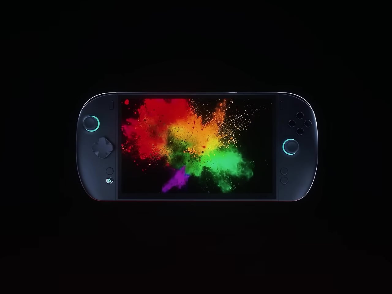
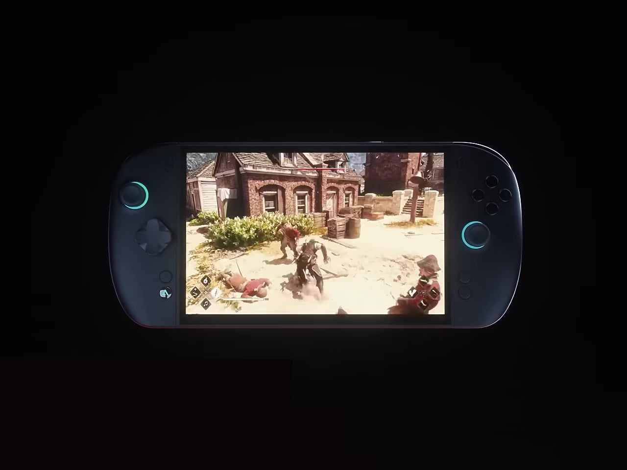
The OneXPlayer 3 is built around a different idea. Announced at Computex 2026, it runs Intel’s Arc G3 Extreme processor, a chip designed specifically for handheld gaming on the Panther Lake platform, with 14 CPU cores, 12 Xe3 GPU cores, and up to 180 TOPS of total platform AI compute. What sets it apart from every other Arc G3 device shown at the same event, though, isn’t the chip. It’s the structure.

Designer: ONEXPLAYER/ONE-NETBOOK

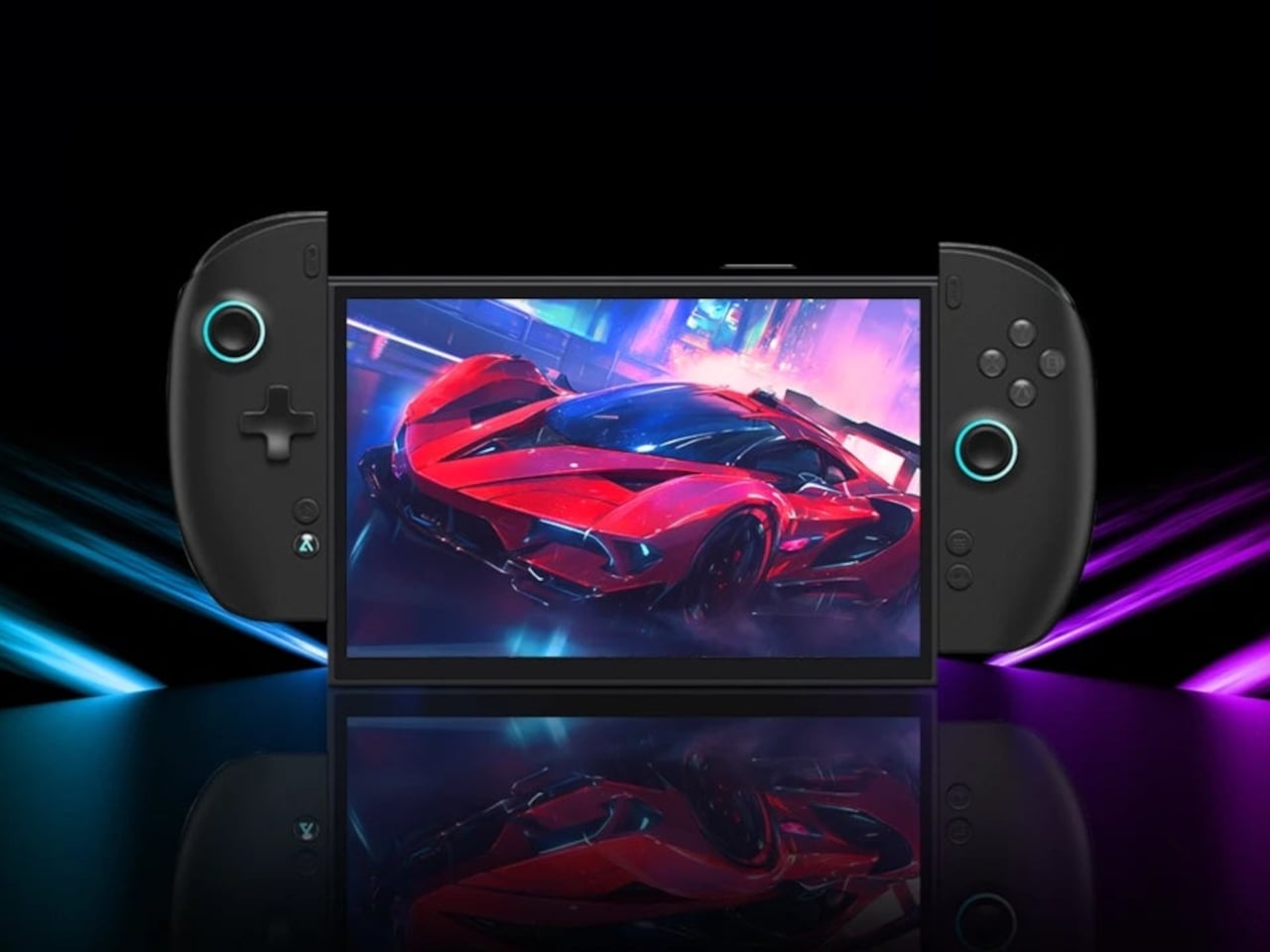
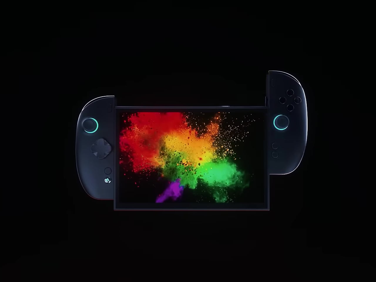
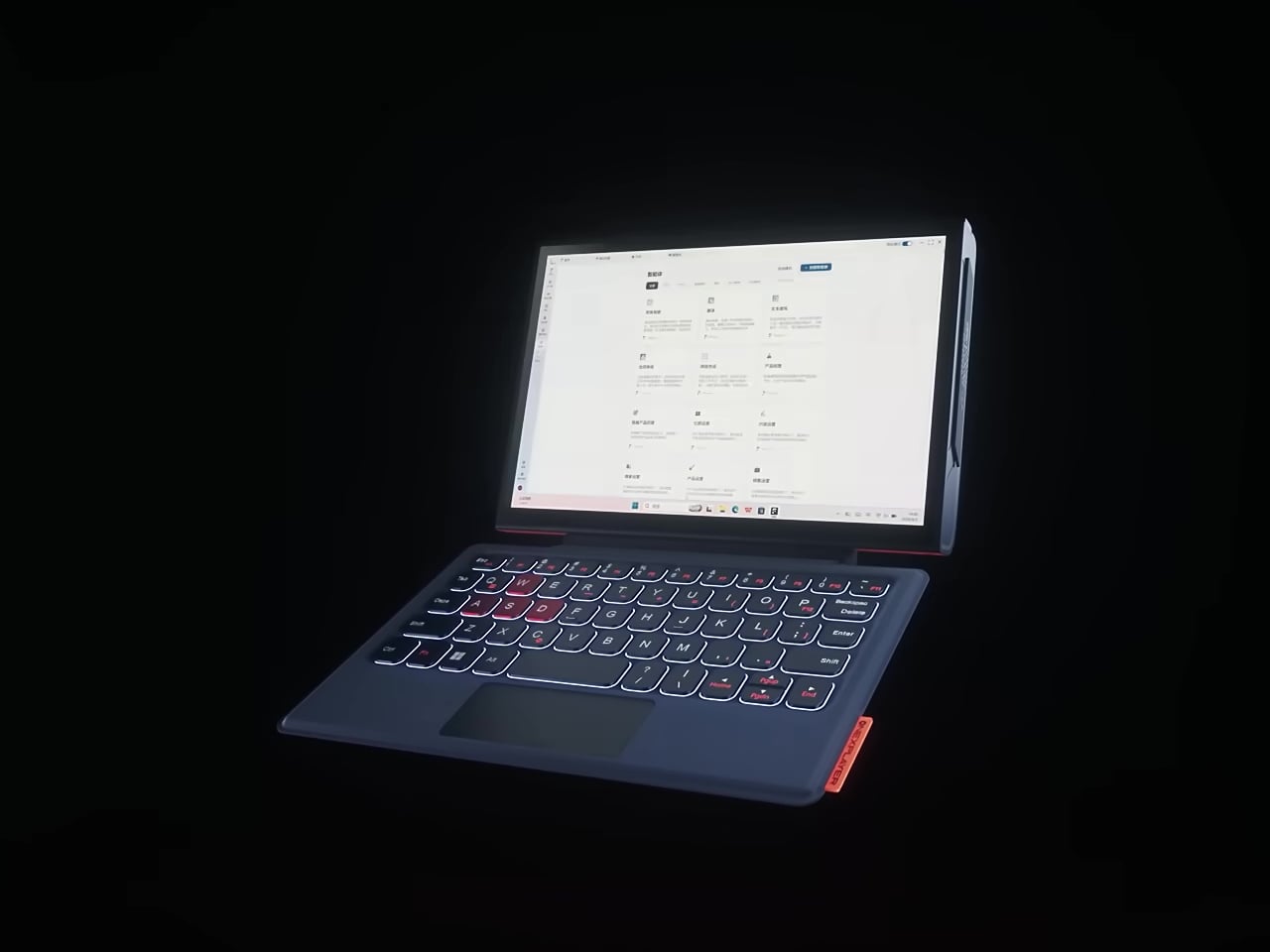
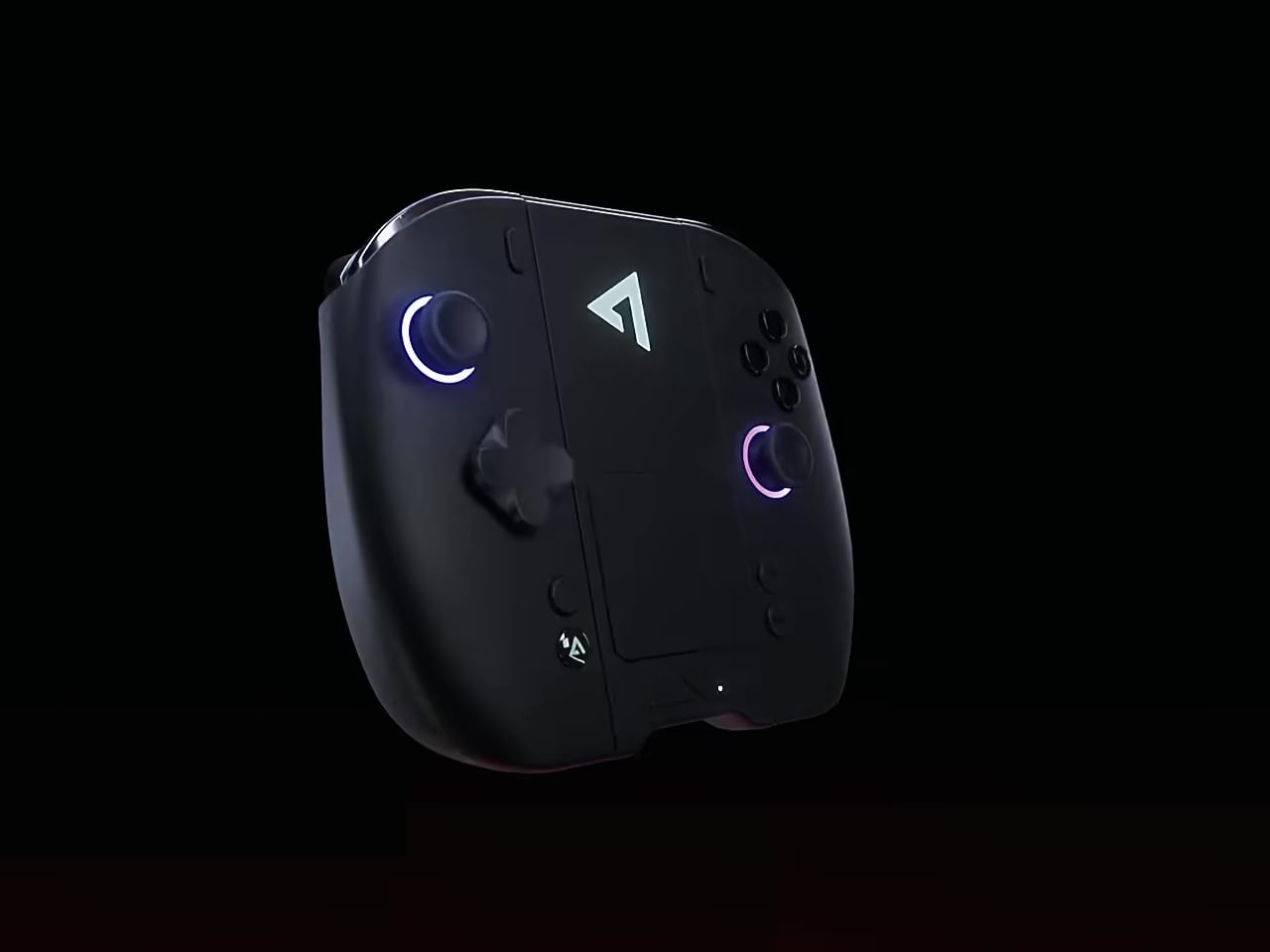
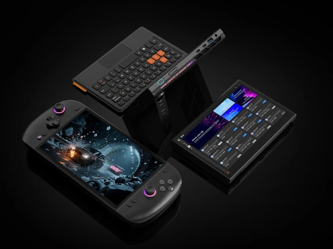
The controllers detach. Clip them onto both sides, and it’s a gaming handheld. Remove them and add the magnetic backlit keyboard, and it becomes a compact laptop. Pull that off too, and what’s left is a standalone tablet with an 8.8-inch AMOLED display in native landscape orientation. That last detail matters: most handhelds use portrait panels rotated sideways, which introduces subpixel layout issues. The OneXPlayer 3 doesn’t have that problem.
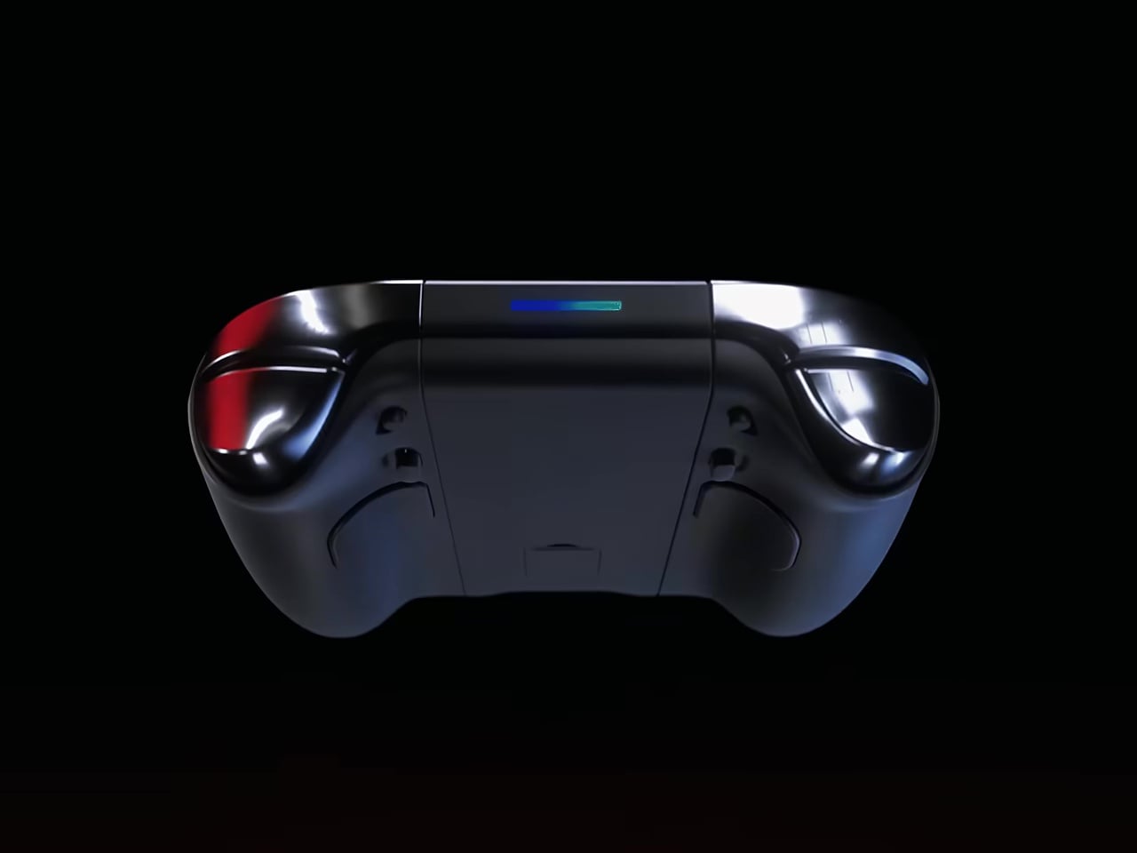
The display runs at 144Hz with VRR and HDR support, which counts during fast-paced titles where motion clarity and input responsiveness make a concrete difference. The detachable controllers aren’t simplified accessories, either. They carry Hall Effect joysticks for drift-resistant precision, two-stage triggers, a capacitive touchpad for cursor control without needing an external mouse, and rear buttons that keep extra inputs within reach during play.

Battery capacity sits at 85Wh, which is among the largest in any current gaming handheld. An extended session doesn’t mean much, though, if the chip is running too hot to maintain performance throughout. OneXPlayer addresses that with a liquid cooling system designed to manage the sustained thermal output of the Arc G3 Extreme under gaming loads, rather than leaning on a conventional fan arrangement alone.

The port selection reflects how the device wants to be used. USB4 opens up external display connections and eGPU docking that most handhelds simply don’t support. USB-A, a mini SSD expansion slot, MicroSD, and a 3.5mm audio jack fill out the rest, covering both gaming peripherals and the connectivity and storage needs that come up during productivity work.

Intel’s Panther Lake platform also delivers up to 50 TOPS of NPU AI performance alongside the GPU’s compute capabilities, contributing to that 180 TOPS total. That headroom targets AI-assisted gaming features and on-device content creation tools that will roll through software updates, giving the hardware a longer useful life than a device designed purely for gaming today.

Pricing hasn’t been confirmed, though the hardware points to a starting figure above $1,500, with higher configurations likely pushing well past that. A global release is expected in 2026. For a market where most handhelds look and function almost identically, the OneXPlayer 3 is asking a direct question about what a handheld should do when the gaming is done and the bag needs to close.

The post OneXPlayer 3 Just Turned the Gaming Handheld Into a 3-in-1 PC first appeared on Yanko Design.