KLH’s $1,000 Floorstanding Speaker Actually Fits in Your Apartment

Serious hi-fi speakers have long demanded a certain kind of listener, one with a dedicated room, a generously sized space, and the freedom to place enclosures wherever the acoustics dictate. That’s a fine arrangement for a fortunate few, but most people live in apartments, condos, and first homes where the furniture stays where it is, and the speakers need to fit around it, not the other way around.

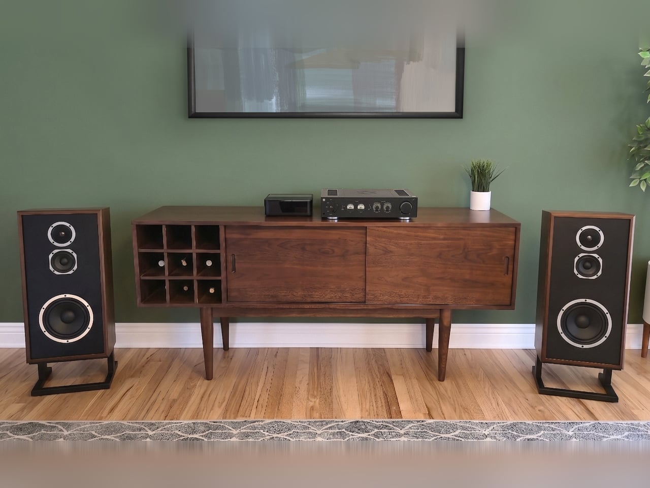
KLH Audio has spent nearly seven decades building speakers for exactly that reality, and the Model Four is its latest expression of it. Unveiled at High End Vienna 2026, it’s a three-way acoustic suspension loudspeaker designed to fill the gap between the bookshelf-sized Model Three and the fuller Model Five, bringing genuine floorstanding performance into a cabinet compact enough to sit comfortably close to a wall.

Designer: KLH Audio
The technology that makes this possible is acoustic suspension, the sealed-enclosure design that KLH pioneered in the 1950s. Unlike ported enclosures, which become muddy and bloated when pushed against a wall or tucked into a corner, a sealed cabinet performs consistently wherever it lands. The Model Four delivers tight, accurate bass with just a few inches of rear clearance, a freedom that ported designs simply can’t match.
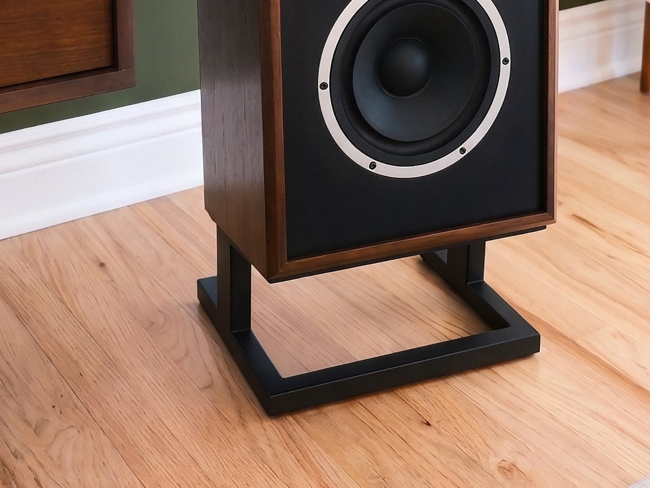
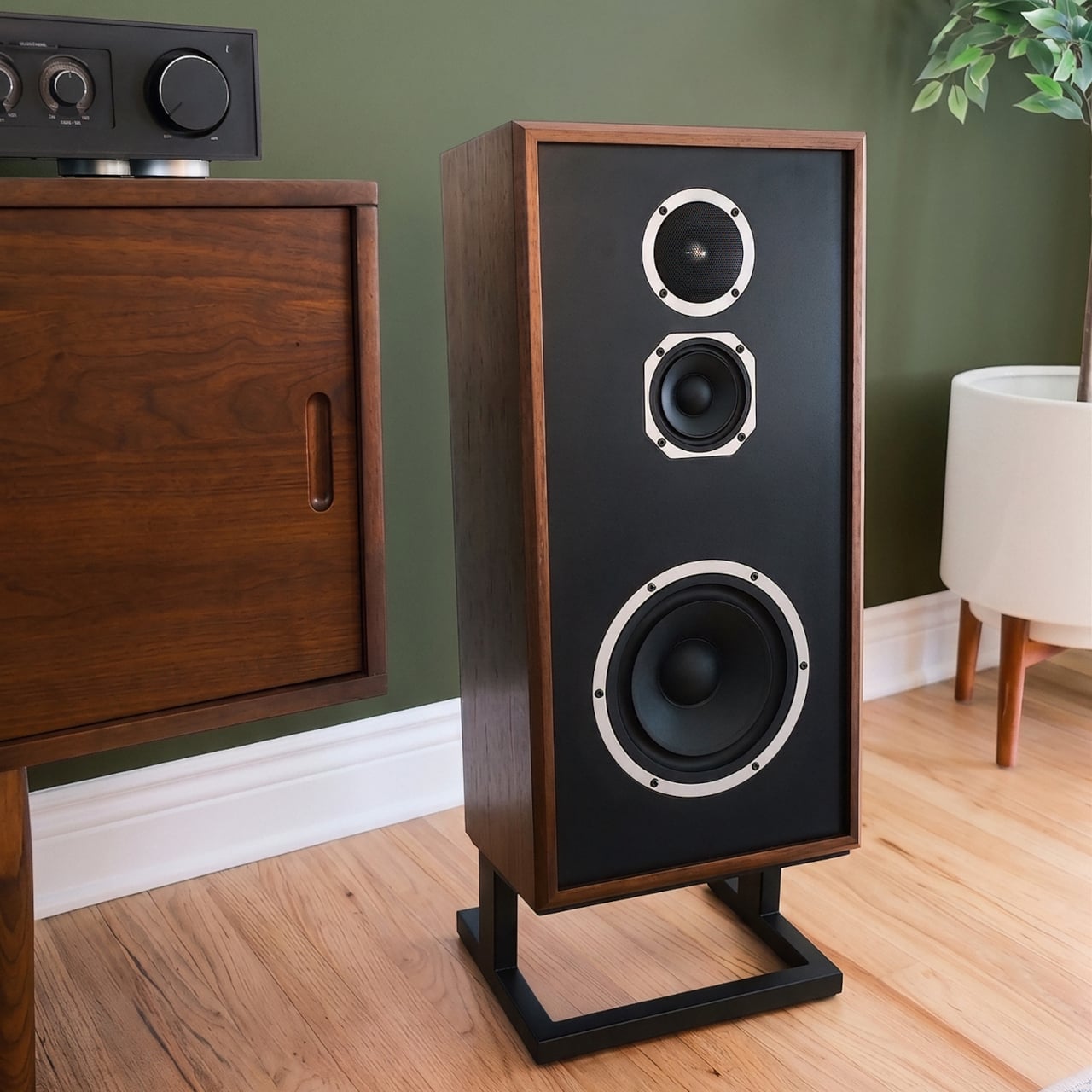
The cabinet measures 26 inches tall and just 8.25 inches deep, making it the shallowest floorstanding speaker in KLH’s lineup. The included 6-degree slanted riser adds the angle needed to align the tweeter and midrange with the listener, bringing the total depth to just under 11 inches. That’s narrower than many bookshelves and considerably thinner than the floor plans most audiophile floorstanders require before they’ll sound right.

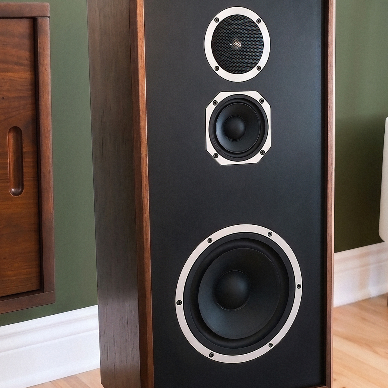
Inside the sealed, reinforced MDF enclosure is a three-driver system assembled from the best parts of the broader Model Collection. An 8-inch pulp-paper cone woofer reaches down to 46Hz, a 4-inch pulp-paper midrange handles vocals and instruments with the same clarity that earned Model Five its reputation, and a 1-inch aluminum dome tweeter extends the response to 20,000Hz. Power handling reaches 150 watts, with peaks up to 600 watts.
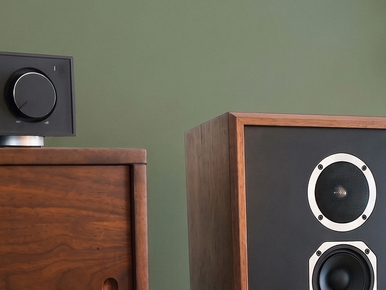
Not every room sounds the same, which is why KLH carried over its three-position Acoustic Balance Control switch, a feature the brand introduced in the 1960s. It gives listeners a way to adjust the mid and high-frequency character to match their room’s natural acoustics, a practical acknowledgment that the speaker will land in spaces KLH can’t anticipate. Five-way gold-plated binding posts handle connectivity on the back panel.

The visual side of the package is equally considered. KLH’s mid-century modern design language shows up in the knit grilles and wood-veneer cabinetry, available in English Walnut with a Stonewash Knit Grille, Black Ash with a Grey Knit Grille, and White Oak with a Black Knit Grille. The matte black riser stand ships with the speaker, keeping the total out-of-pocket cost honest from the start.
The Model Four arrives in September 2026 through premium audio dealers and directly from KLH Audio, priced at $999.99 per speaker, or $1,999.98 per pair, with a 10-year warranty and the riser stand already included. For anyone who has spent years making peace with bookshelf speakers because larger alternatives demanded a dedicated room, it’s the kind of offer that closes the argument.

The post KLH’s $1,000 Floorstanding Speaker Actually Fits in Your Apartment first appeared on Yanko Design.
Vertu AlphaFold starting at $6,880 makes the Galaxy Z Fold seem ultra-affordable

When mainstream smartphone designs became too generic, the next evolution took the form of foldable phones. These devices, targeted towards power users who want the dual utility of a phone and a tablet in one, are quite popular and becoming mainstream, so much so that their look and feel have again come full circle and become boring. We do live in a pace-paced tech world where every next trend is longing for the next exciting evolution.

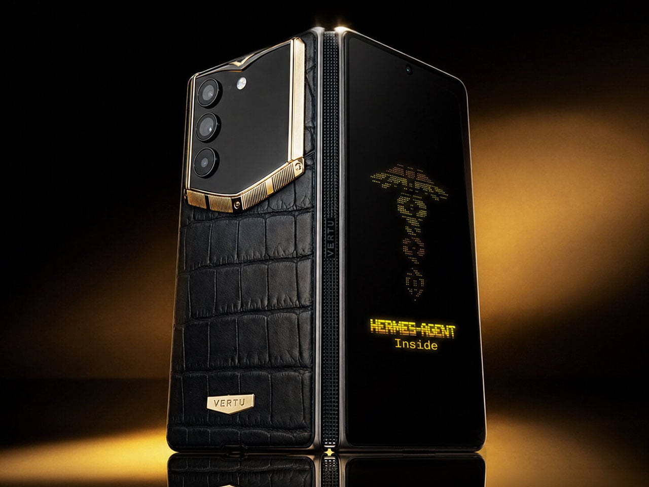
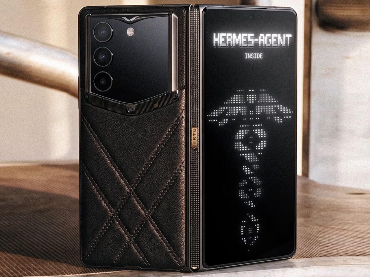
Making all the other foldables on the market feel boring and obsolete as far as design is concerned, the Vertu’s AI-powered folding smartphone is here for fat-pocketed tech whizzes who are willing to shell out anywhere between $6,880 to $46,880. For a price tag as exorbitant as that, the $3,000 Galaxy Z Trifold or the expected-to-be-pricey iPhone Fold also seems reasonable!

Designer: Vertu

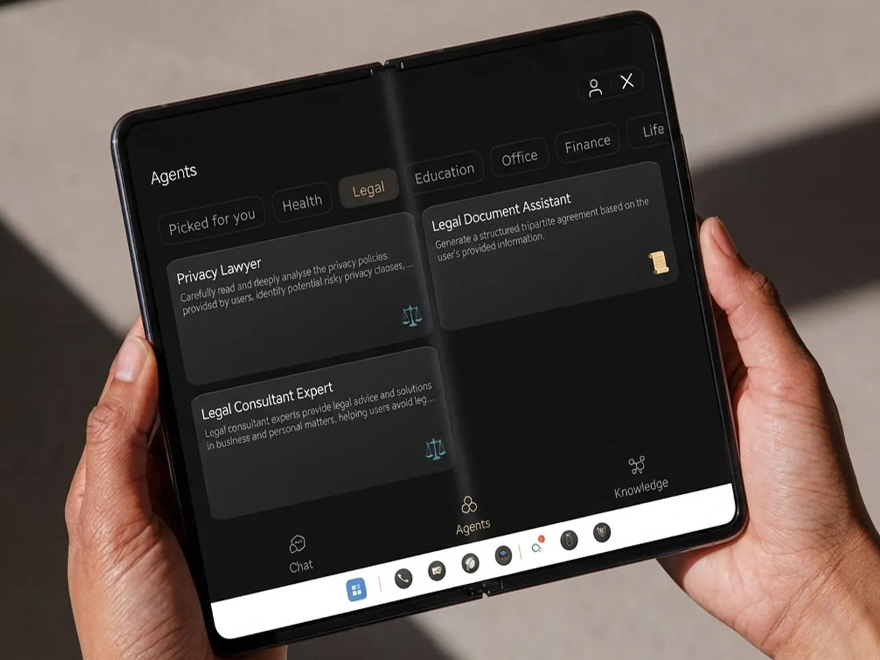
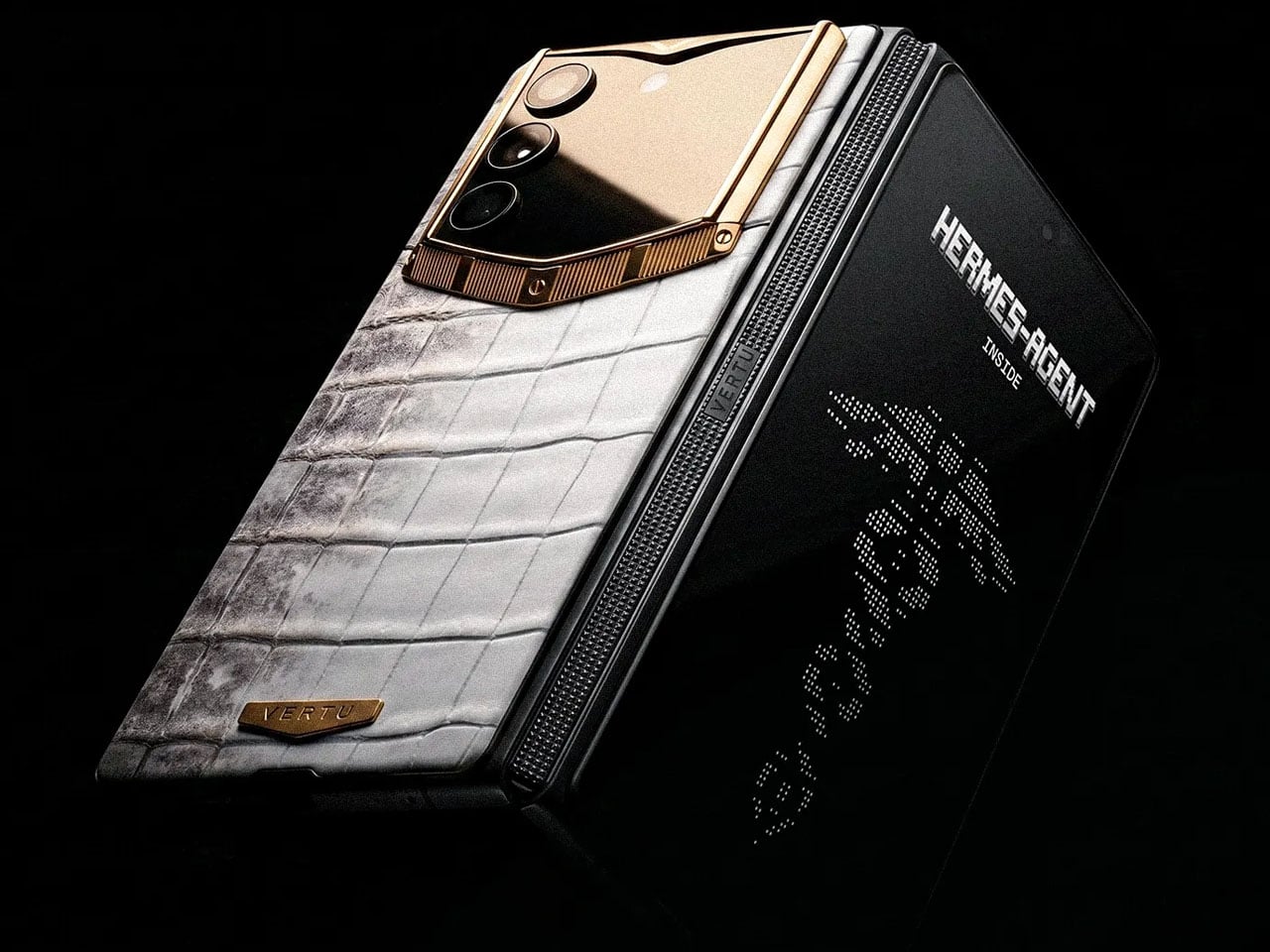
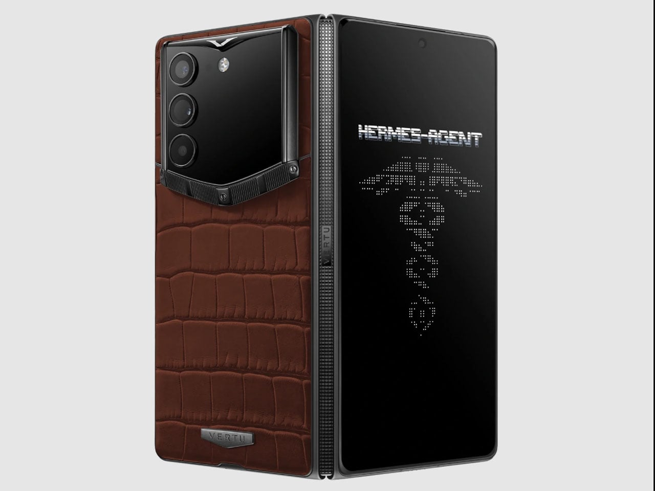
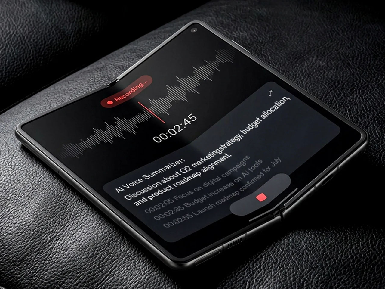
The Hong Kong-based luxury premium smartphone maker has just dropped the Alphafold foldable, which is based on the reskinned Nubia Fold. If bling is your thing, the device goes perfectly well with your lavish lifestyle, even though it doesn’t boast the latest and greatest specifications, considering the eye-watering price tag. In the latter half of 2025, the brand released the AI-powered Agent Q phone, which was equally exorbitant, but this one hits different. The Android foldable comes with a business-oriented AI dubbed Hermes Agent that is tailored for completing productivity tasks thrown at it.

Things like managing workflows, schedules, and business tools, or simply identifying a sudden drop in sales attributed to hidden issues. Hermes can seamlessly interact with a suite of apps like Google’s tools, Amazon Shopping, Expedia, Booking.com, X, Facebook, WhatsApp, and many more. The agent works with the Enterprise Resource Planning (ERP) software, organizing all your business-related activities into a single dashboard.

Vertu’s custom UI on top of the Android 15 layer manages all this for a custom solution. Since you’ll be sharing a lot of personal and professional data with the in-built AI, Vertu promises the device-level security systems via the A5 security chip only process the data locally, and sensitive information like financial transfers or assigning roles still requires the user’s permissions in real time. The maker extends the concierge service beyond the AI agent, offering human managers to handle needs such as booking private jets or gaining access to exclusive events.

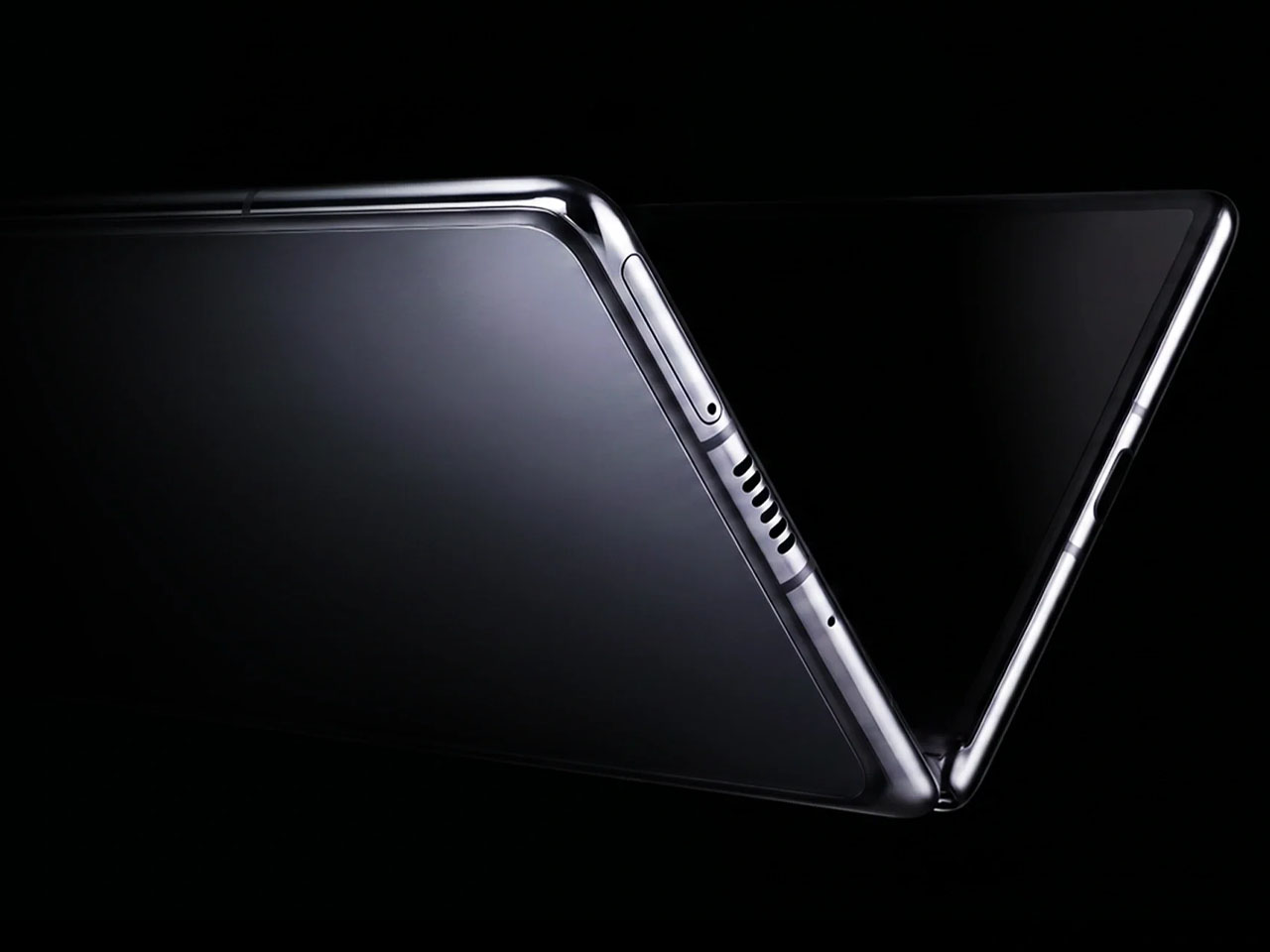
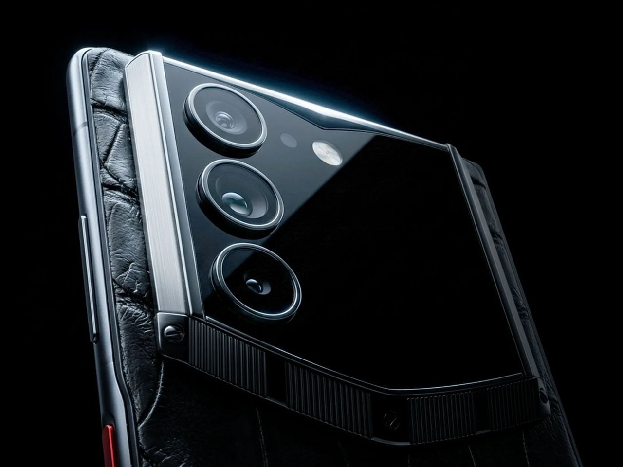
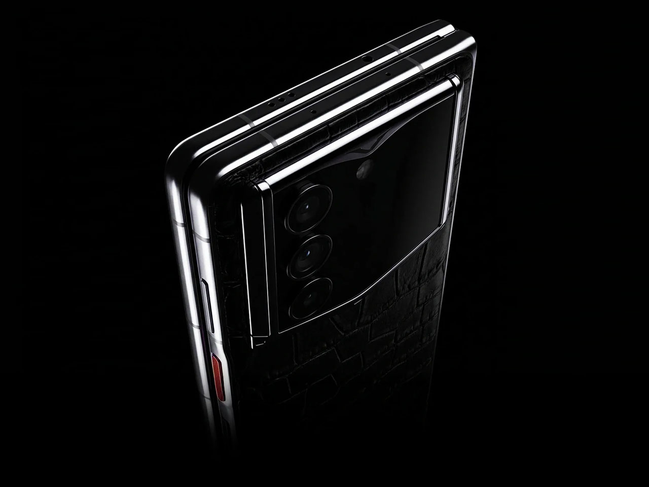
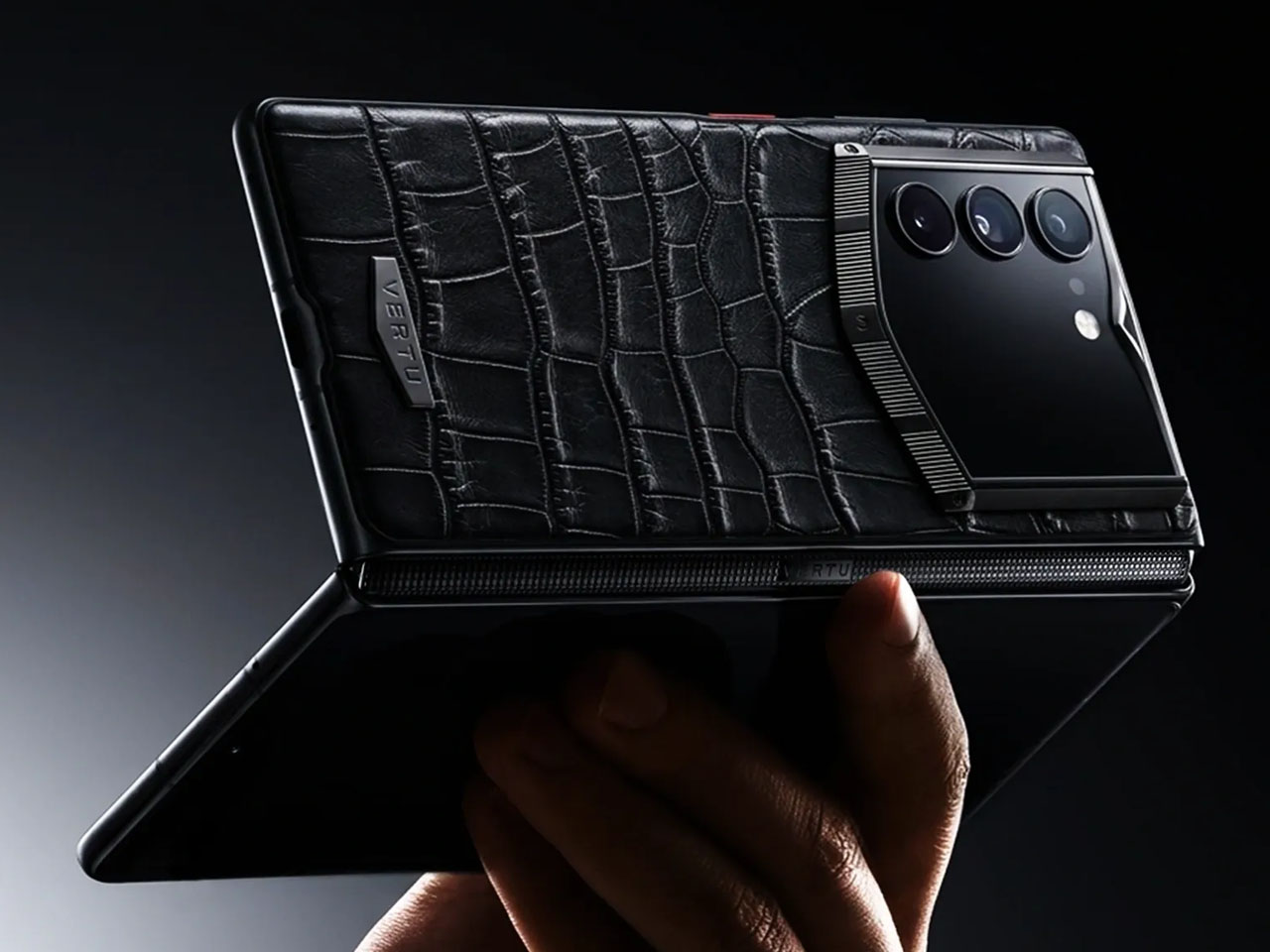
Coming on to the hardware, AlphaFold comes with a primary creaseless folding display measuring 8.05 inches (2480 x 2200 pixel resolution), and an external screen that measures 6.53 inches (2748 x 1172 pixel resolution). Both the screens are LTPO OLED’s with a refresh rate of 120Hz, and shielded on the sides with the carbon fiber and titanium hinge that can withstand 650,000 folds. Powering the innards is the Snapdragon 8 Elite Gen 4 processor; however, we wished it had the latest Elite Gen 5 SoC. The CPU is mated to 16GB RAM and has a fixed storage capacity of 1TB. The phone gets a rear triple camera array including a 50-MP primary sensor, a 50-MP ultrawide camera, and a 5-MP telephoto lens. In the mix is a modest 20 MP selfie camera. The device gets a 6,500mAh silicon-carbon battery, which can be fast charged with a 68W wired charger, and wireless charging support.

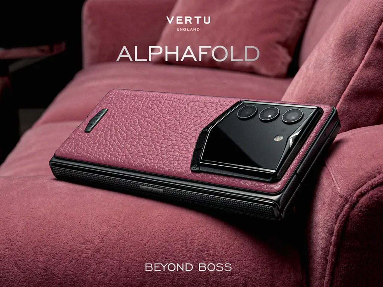
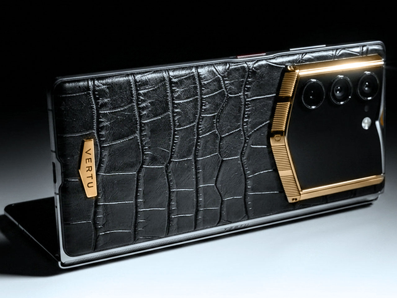
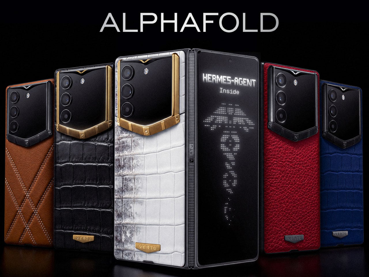
Talking point of the smartphone is the use of premium materials in the back panel that is handcrafted from Calfskin (priced $6,880), or Italian alligator belly leather (price tag of $8,880 – $13,800), depending on the color and variant chosen. You can also all-in with Himalaya Gold IV or diamond inserts that’ll set you back $46,880. Have that amount of money to spare on a phone without breaking a sweat? Then you can pre-order it right away, globally.

The post Vertu AlphaFold starting at $6,880 makes the Galaxy Z Fold seem ultra-affordable first appeared on Yanko Design.
Louis Vuitton Just Made a One-of-a-Kind Clock for UNICEF

Not every luxury piece earns the word “meaningful.” Beautiful, yes. Covetable, absolutely. But meaningful is a harder category to land in, and the Louis Vuitton Unity Time Object lands there without trying too hard about it.

Unveiled at the Fall-Winter 2026 Men’s Fashion Show in Paris, the piece was created to mark ten years of the Louis Vuitton for UNICEF partnership. A decade of fundraising, direct action, and advocacy for vulnerable children around the world. That’s the kind of milestone that deserves more than a press release, and Louis Vuitton clearly agreed.

Designer: Louis Vuitton

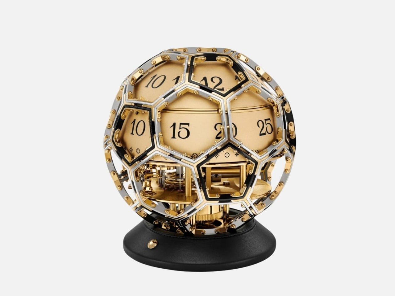
The form alone is worth sitting with for a moment. The clock takes its shape from the LV Soccer Ball, one of the house’s most recognized sporting objects, now reimagined as a sculptural timepiece that functions equally as objet d’art and design statement. A sphere has no front or back, no implied hierarchy, no right way to face. It looks the same from every corner of the room, every corner of the world. For a partnership rooted in the idea that every child deserves access and dignity regardless of where they were born, the shape isn’t just aesthetic. It’s a quiet argument made in steel and gold.

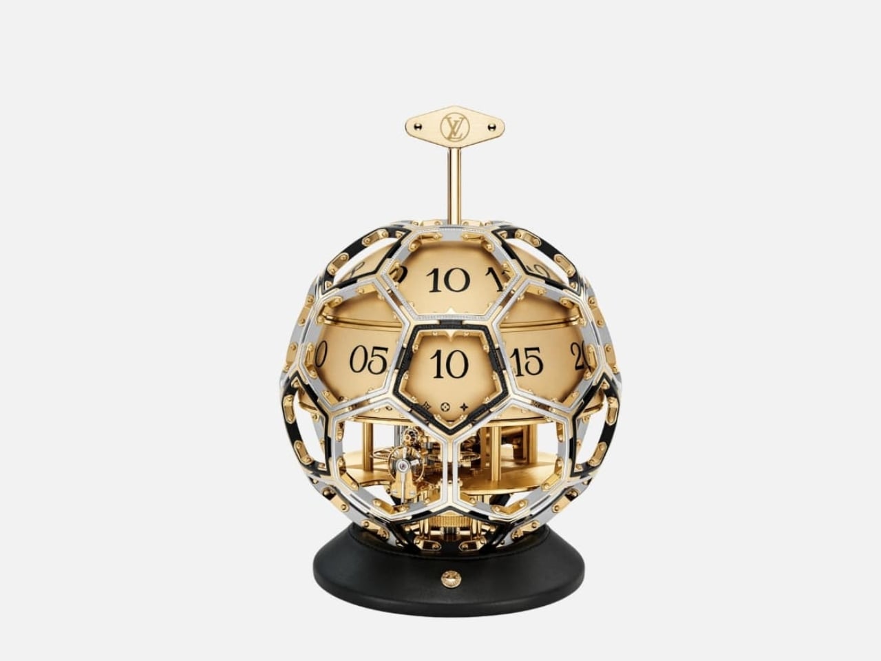
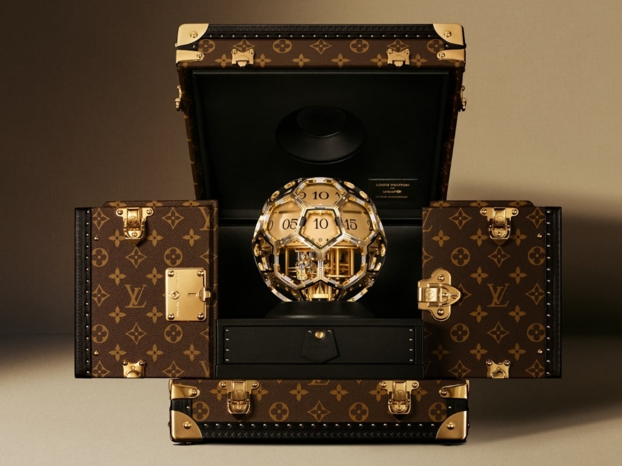
Time on the Unity Time Object is told through two rotating cylinders rather than conventional hands. A sculpted golden steel dome forms the upper half of the clock, and beneath it, one cylinder tracks the hours while the other handles the minutes. The minute cylinder is engraved with Louis Vuitton’s Monogram motif and flowers, with “Louis Vuitton Paris” running along its top. You wind it with a key inserted at the side or top, and the act carries an almost ceremonial quality. It asks you to slow down, to pay attention. In a product era built on digital convenience, that small ritual feels genuinely countercultural.

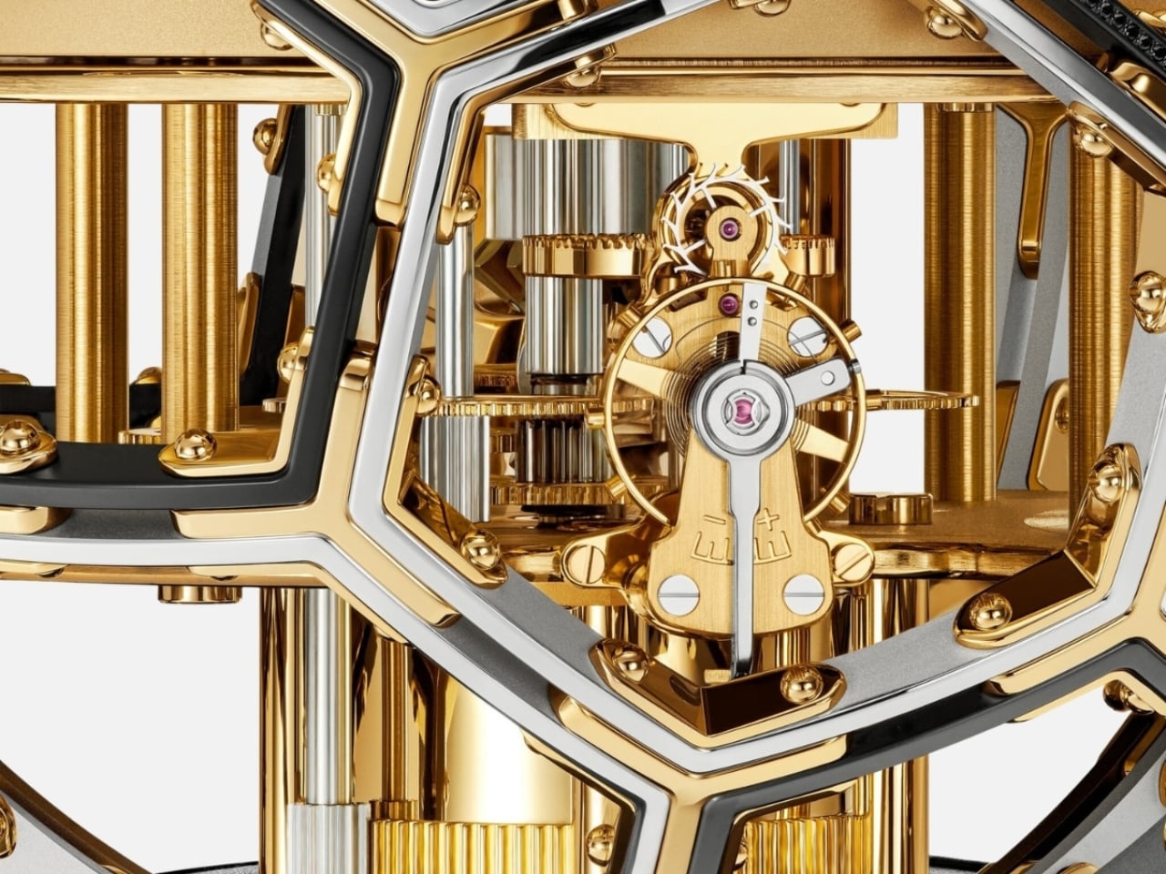
The movement was developed in collaboration with L’Épée 1839, the Swiss clockmaker with nearly two centuries of history behind it. It’s entirely visible through the skeletonized structure, with every screw and movement plate worked with the Monogram flower. Diamond-set details add richness without overwhelming the mechanical poetry underneath. The whole piece reads like a conversation between decoration and precision, and neither side loses.

The clock arrives in a trophy-style trunk made from Louis Vuitton’s Monogram canvas, handcrafted at the house’s historic Asnières workshop. The brass corner protectors, lock, and clasps are the same ones found on Louis Vuitton trunks going back to the 1860s. A display case built with 160 years of muscle memory, housing an object shaped like a ball. It shouldn’t cohere as well as it does, and yet here we are.

The Unity Time Object is classified as a pièce unique at Sotheby’s, meaning one exists in the world, full stop. It goes to auction on June 9, 2026, with the sale closing June 18, and all proceeds going directly to UNICEF and its work supporting children globally. The estimate is available upon request, which is auction-house language for a number most of us should simply appreciate from a respectful distance.

What I keep returning to is the simplicity of the choice. Louis Vuitton could have marked a ten-year UNICEF partnership with a capsule line or a limited-edition accessory. Something accessible, something scalable. Instead, they made a single, unrepeatable object with no commercial return for the house. Every dollar from the sale goes to the cause. That kind of gesture is rare in luxury, where even the most philanthropic moves tend to benefit the brand as much as the cause.

Good design holds meaning without over-explaining it. The Unity Time Object doesn’t need paragraphs of context to communicate its weight. A sphere. A clock. A trunk built by the same craftspeople who have been making trunks for generations. Whether you’re drawn to the horology, the design, or just the idea of what luxury could stand for at its very best, the Unity Time Object makes a compelling case that beauty and purpose don’t have to be separate conversations.

The post Louis Vuitton Just Made a One-of-a-Kind Clock for UNICEF first appeared on Yanko Design.
The Designer Who Hid His Dumbbells Built Bronze Ones Worth Displaying

Home fitness equipment has quietly moved into the living room, but most of it hasn’t earned its place there. Dumbbells in particular are purely functional objects, usually made with rubber-coated iron and sold on practical merits alone. They get used, then tucked away or left on the floor because nobody really wants them on display. For most people, what’s out of sight tends to be out of mind.

Tokyo-based designer Kenji Abe knows this from personal experience. He would put his own dumbbells in a drawer when friends came over, and then forget about them entirely. That specific frustration became the brief for MANTLE, a pair of bronze dumbbells produced under the ifuki brand in Takaoka City, Japan. The goal was a dumbbell you’d actually want to leave out, all day, even on a good shelf.

Designer: Kenji Abe

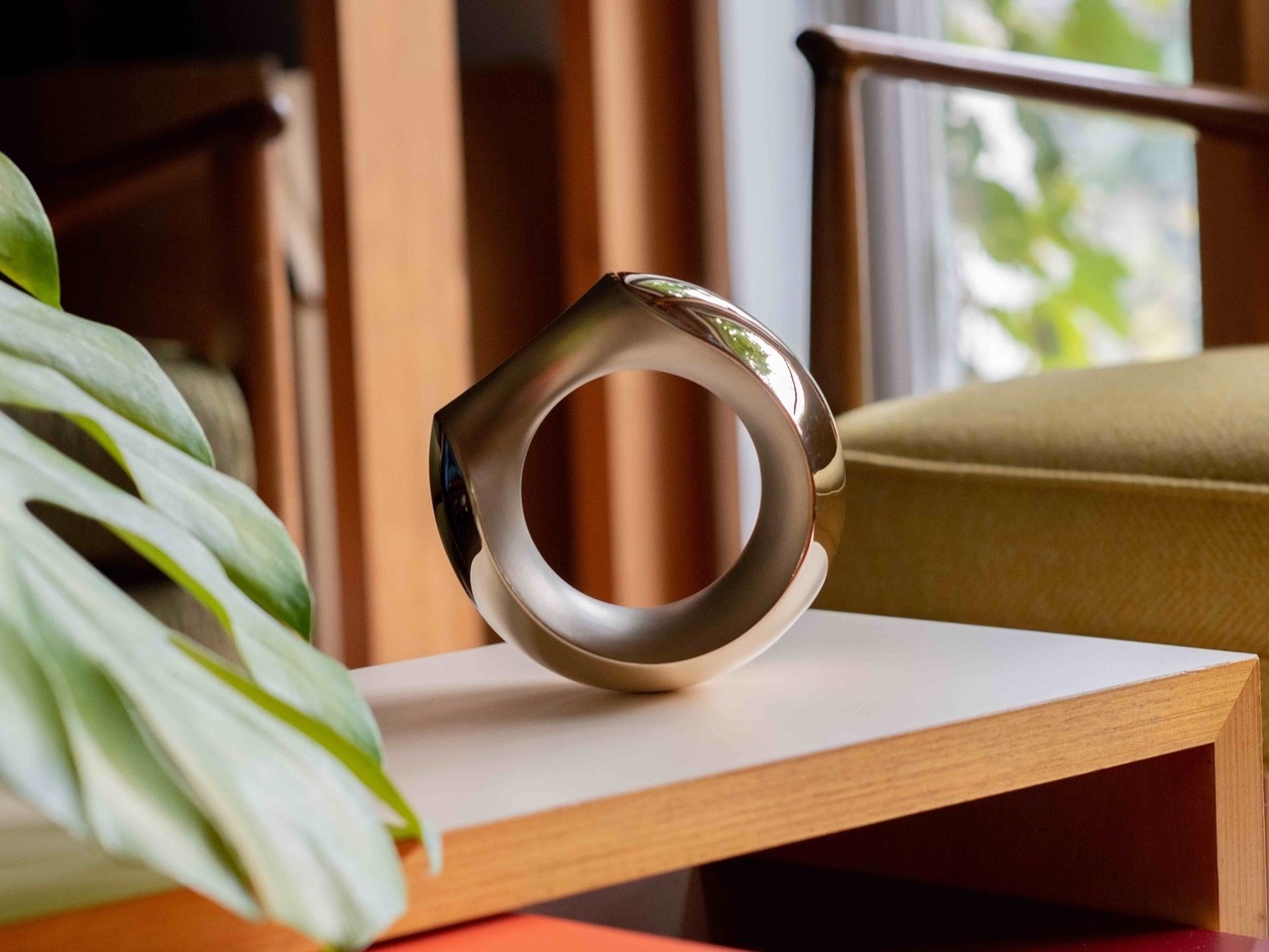
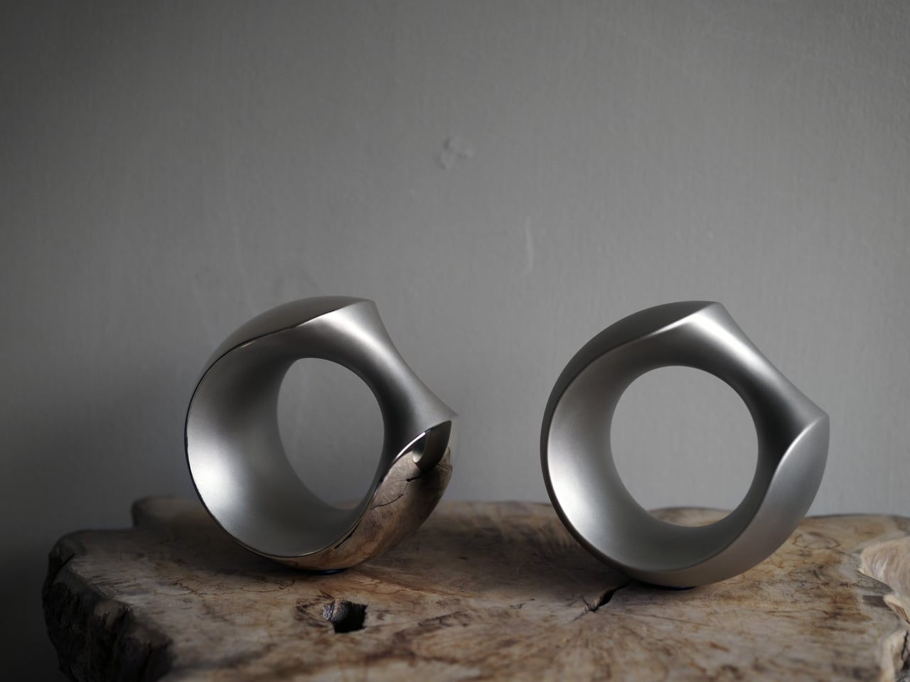
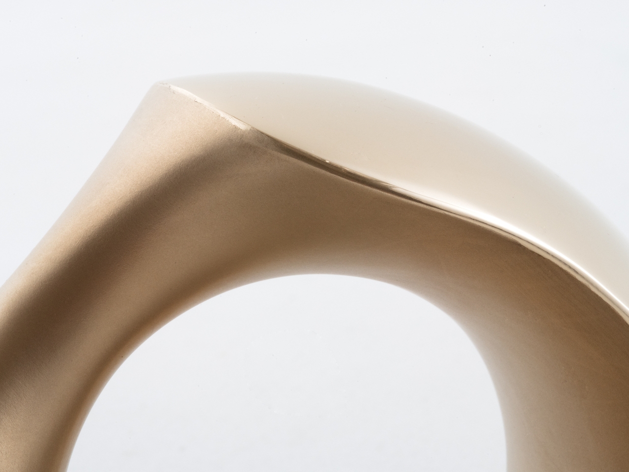
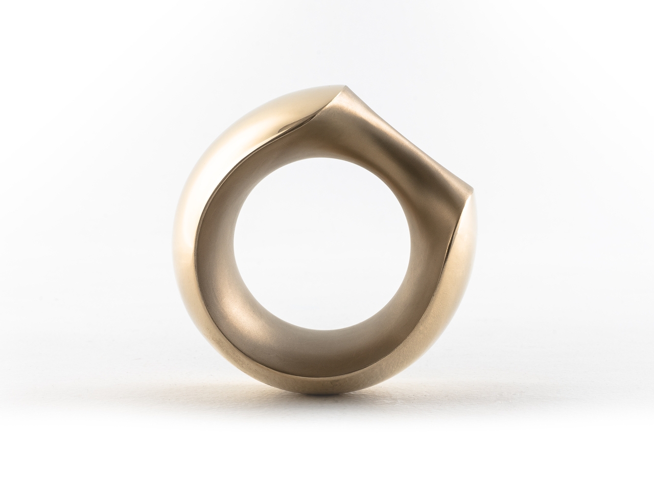
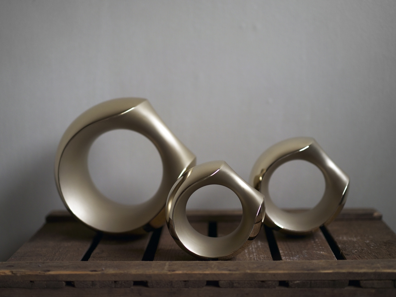
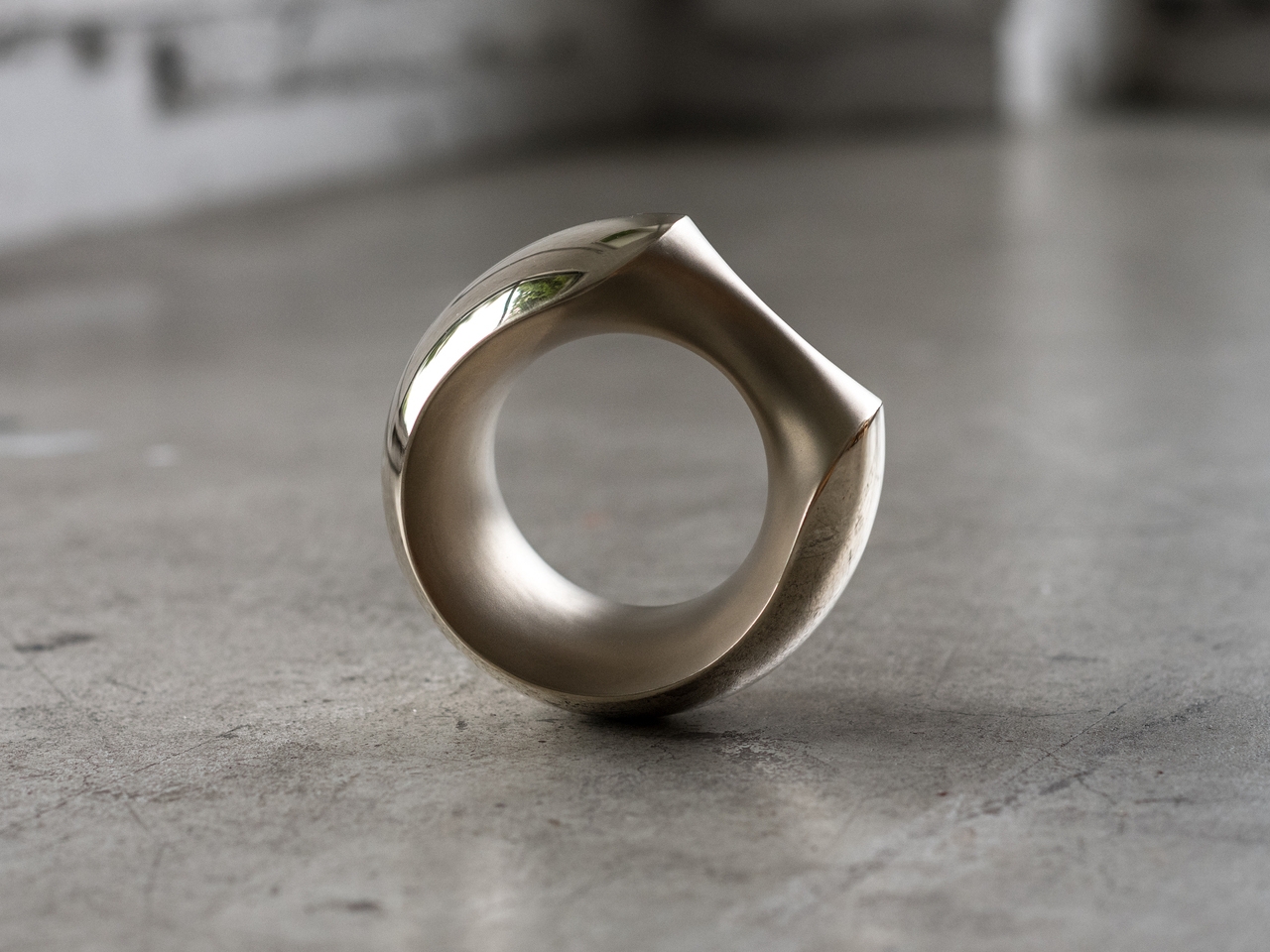
That required rethinking the object from the start. MANTLE combines several surface treatments on a single cast form, with sandblasted sections contrasting against mirror-polished areas. The result carries the visual weight of a sculpture or a piece of jewelry rather than exercise equipment. Set on a side table, it reads as an intentional object, not something that ended up there because there was nowhere else to put it.

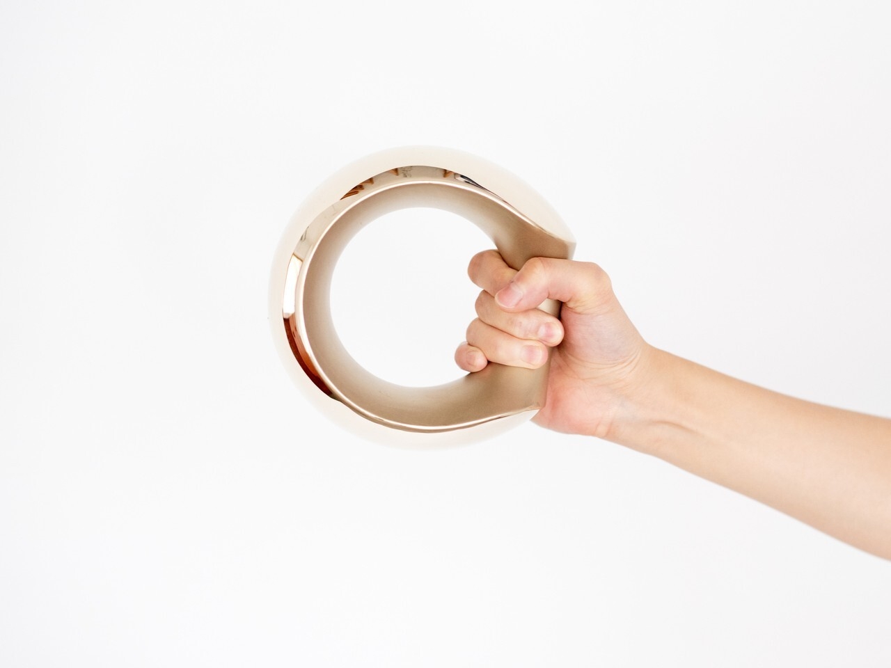
The form is just as deliberate. Inspired loosely by the armadillo, the sculptural shape is perfectly balanced, which means the dumbbell stands upright on its own without tipping. A grip tilted at 45 degrees makes it easy to pick up from any angle, and the smooth bronze surface was selected specifically to feel comfortable against skin rather than abrasive during a workout.

The versatility goes further than the grip. You can hold it conventionally for curls or presses, slide it over a wrist to add resistance to arm movements, or hook it around a foot for leg raises. The same object adapts across different exercises without needing adjustments, and the balanced form means it doesn’t fight you regardless of how you’re holding it or what you’re doing.

MANTLE also ages gracefully. Bronze develops character over time, and the combination of matte sandblasting and mirror polishing makes that aging process something worth watching. The material catches light differently across its surfaces, and the contrast in textures gives it a depth that most gym equipment doesn’t have the ambition to pursue.

MANTLE won the Grand Prize at the Toyama Design Competition in 2018 before being developed into a commercial product through ifuki. Abe’s reasoning has always been straightforward: a well-designed dumbbell doesn’t get hidden away, and one that doesn’t get hidden away is one that actually gets used. The drawer stays empty, and the habit becomes a little harder to abandon.

The post The Designer Who Hid His Dumbbells Built Bronze Ones Worth Displaying first appeared on Yanko Design.
This Marc Newson designed Jaeger-LeCoultre clock tracks Earth, Moon and seasons with cosmic precision

Like Jaeger-LeCoultre doesn’t need an introduction, neither does the Australian design icon, Marc Newson. If you want to know what the two in collaboration can create, look no further than the Atmos Hybris Artistica Tellurium. Powered by the in-house caliber 590, it is one of the most enticing horological marvels I have seen. Trust me when I say this, because I have actually seen some fascinating timepieces in the last decade, and I have spent time writing about watches and clocks.

The new Atmos Hybris Artistica Tellurium is ‘inspired by the beauty and the mystery of the cosmos.’ Not the solar system we are a part of, but the ‘cosmos beyond the Earth’s solar system,’ the company notes. It is the result of over 18-years of partnership between Jaeger-LeCoultre and the design genius, which has been designed to run on the most advanced and complex Atmos movements from the watchmaker that is respected for its expertise in mechanical movements.

Designer: Jaeger-LeCoultre

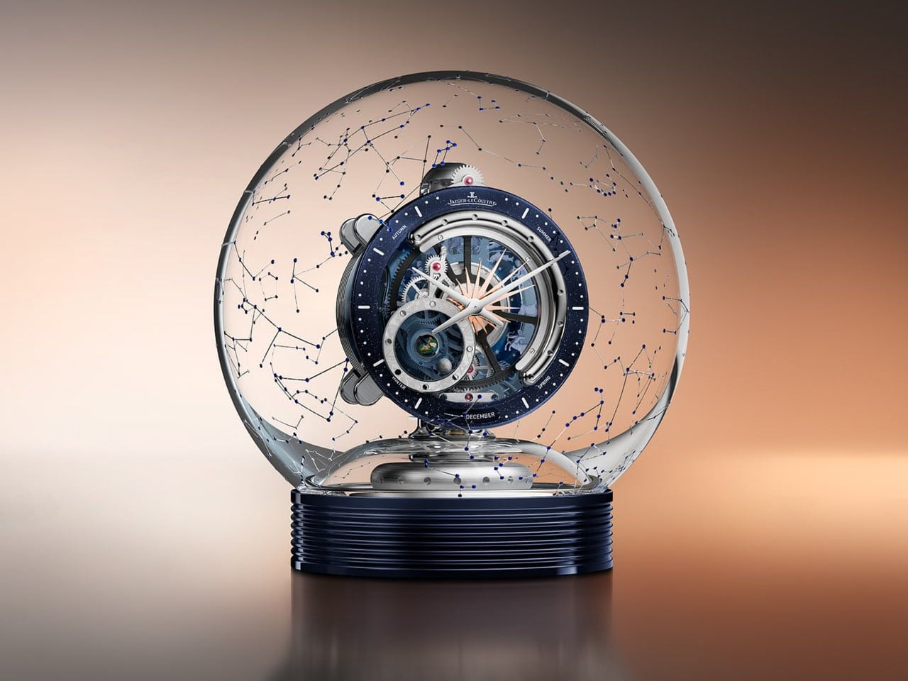
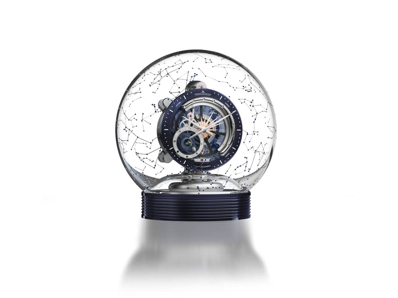
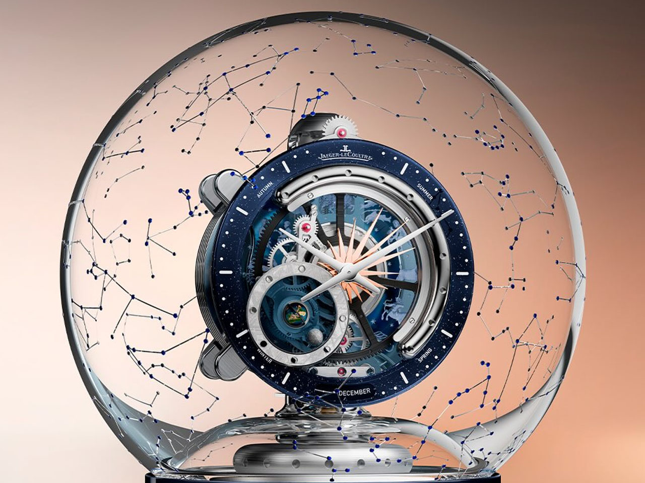
The clock has been through a great deal of iterations to arrive at the current version, which features a new cabinet for the Atmos Tellurium designed by Newson. The glass features 64 constellations that are visible in the Northern Hemisphere, engraved on it, while 539 cabochon-cut sapphires here represent the principal stars.

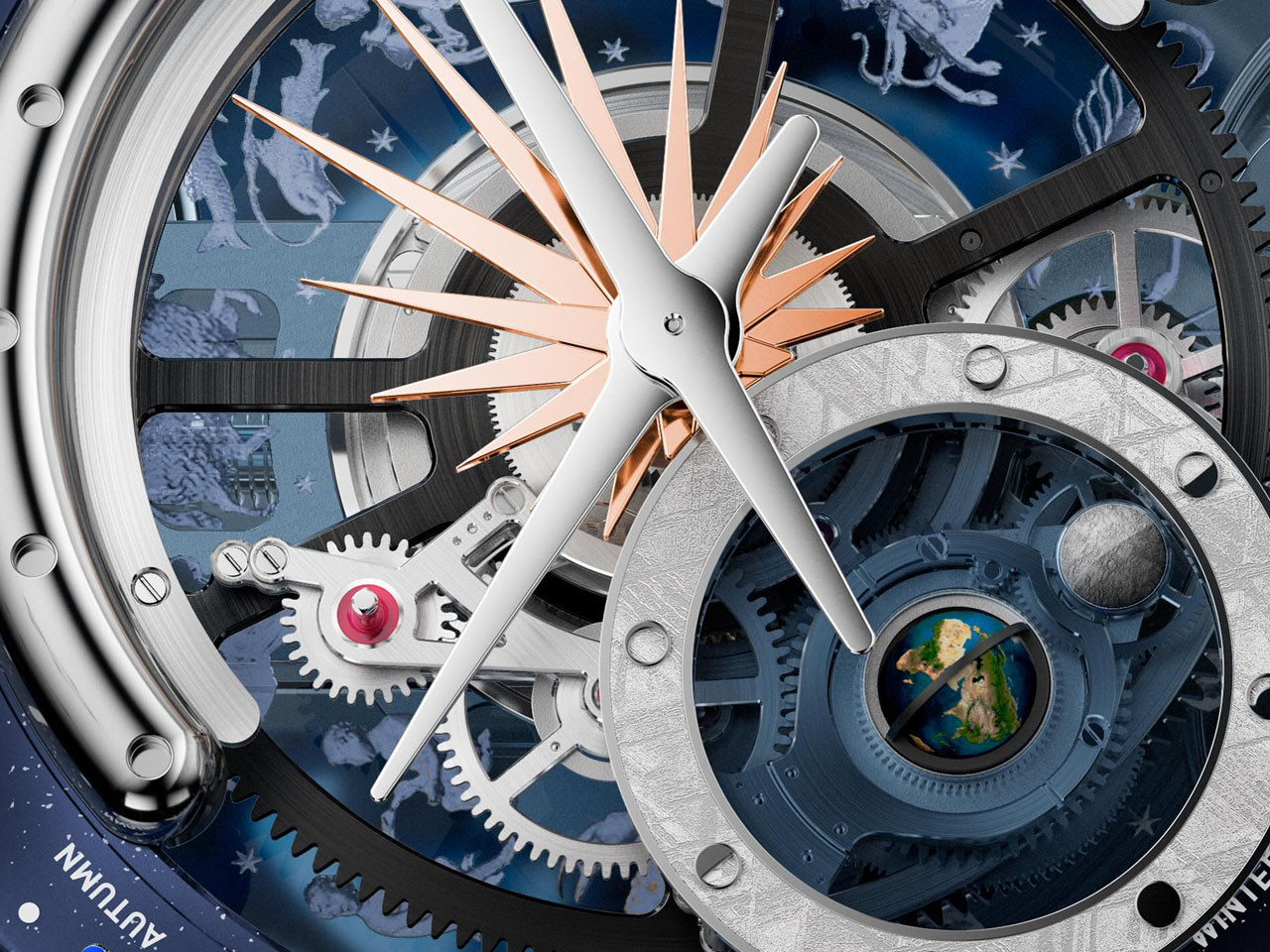
A pinnacle of haute horlogerie, the Jaeger-LeCoultre Atmos Tellurium is a limited-edition piece (strictly limited to three units) featuring a meteorite dial with hand-painted, 3-dimensional earth inside the glass globe. The clock is created to precisely track Earth’s rotation alongside the lunar phases as the moon rotates around the Earth. The clock recreates the cycles of the sun, earth, and moon with great precision in 3D.

Measuring 188mm thick, the clock’s miniature earth rotates on its axis (like the real thing) in 24 hours, providing the day and night indication. While the Earth rotates, the Moon is seen orbiting it in a complete moon phase (averaging 29 days, 12 hours, 44 minutes and 2 seconds). This allows the moon, revolving on its own axis, to display its phases accurately. According to the watchmaker, the moon phase has complete accuracy with a discrepancy of only one day every 5,770 years.

The sun resides in the center of the Atmos Tellurium and the earth, and the moon is designed to orbit around it in one complete year, indicating the seasons (listed on the parameter of the clock) as it turns. In addition to displaying corresponding months and seasons, the clock also displays the zodiacal calendar. The Atmos Tellurium clock is powered by an in-house caliber 590 perpetual movement that operates without human intervention. Yes, as with all Atmos clocks, the Atmos Hybris Artistica Tellurium also winds itself by the expansion and contraction of a gas mixture within an airtight capsule.

The post This Marc Newson designed Jaeger-LeCoultre clock tracks Earth, Moon and seasons with cosmic precision first appeared on Yanko Design.
The Hermès Birkin Finally Has a LEGO Version and It Opens to Reveal A Secret Runway Inside

The Hermès Birkin has one of the most theatrical purchasing rituals in luxury retail. You cannot simply walk into a boutique on Rue du Faubourg Saint-Honoré and buy one. Hermès makes you earn it, building a relationship with a sales associate over months, sometimes years, demonstrating cultural fluency with the house before they’ll even have the conversation. The result is an object that carries as much mythology as it does resale value, a handbag that has become shorthand for a particular kind of aspirational excess that the internet finds endlessly fascinating.

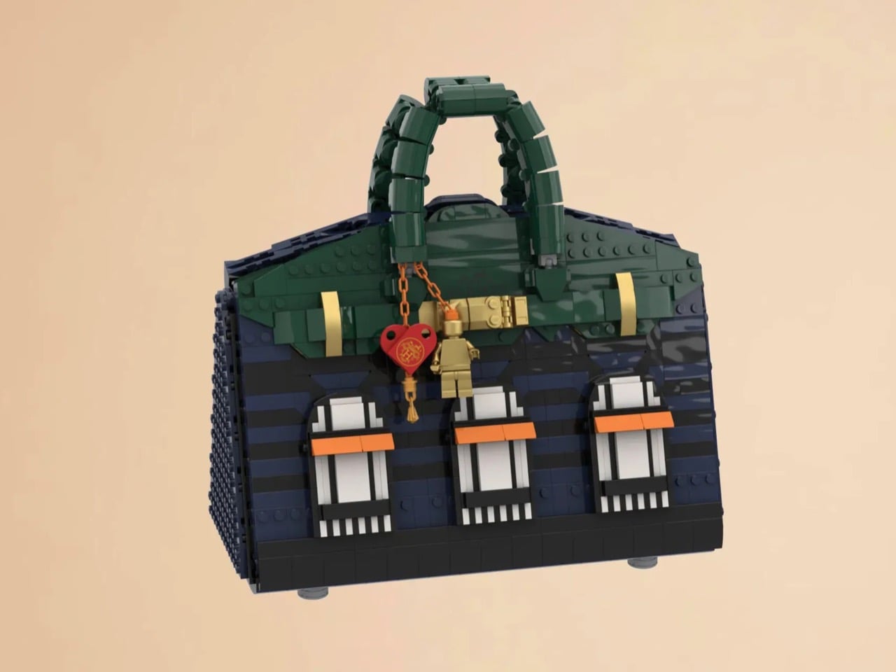
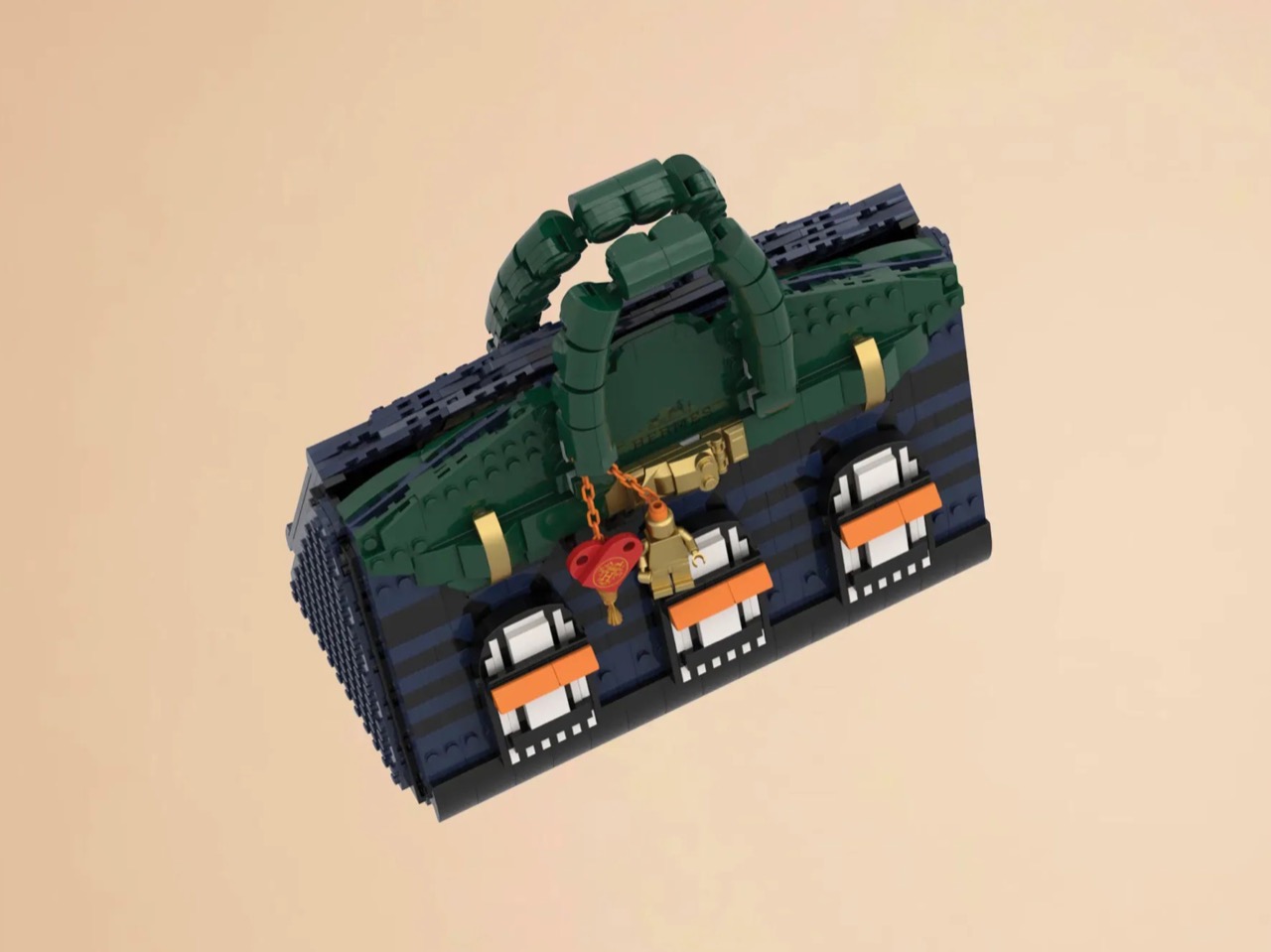
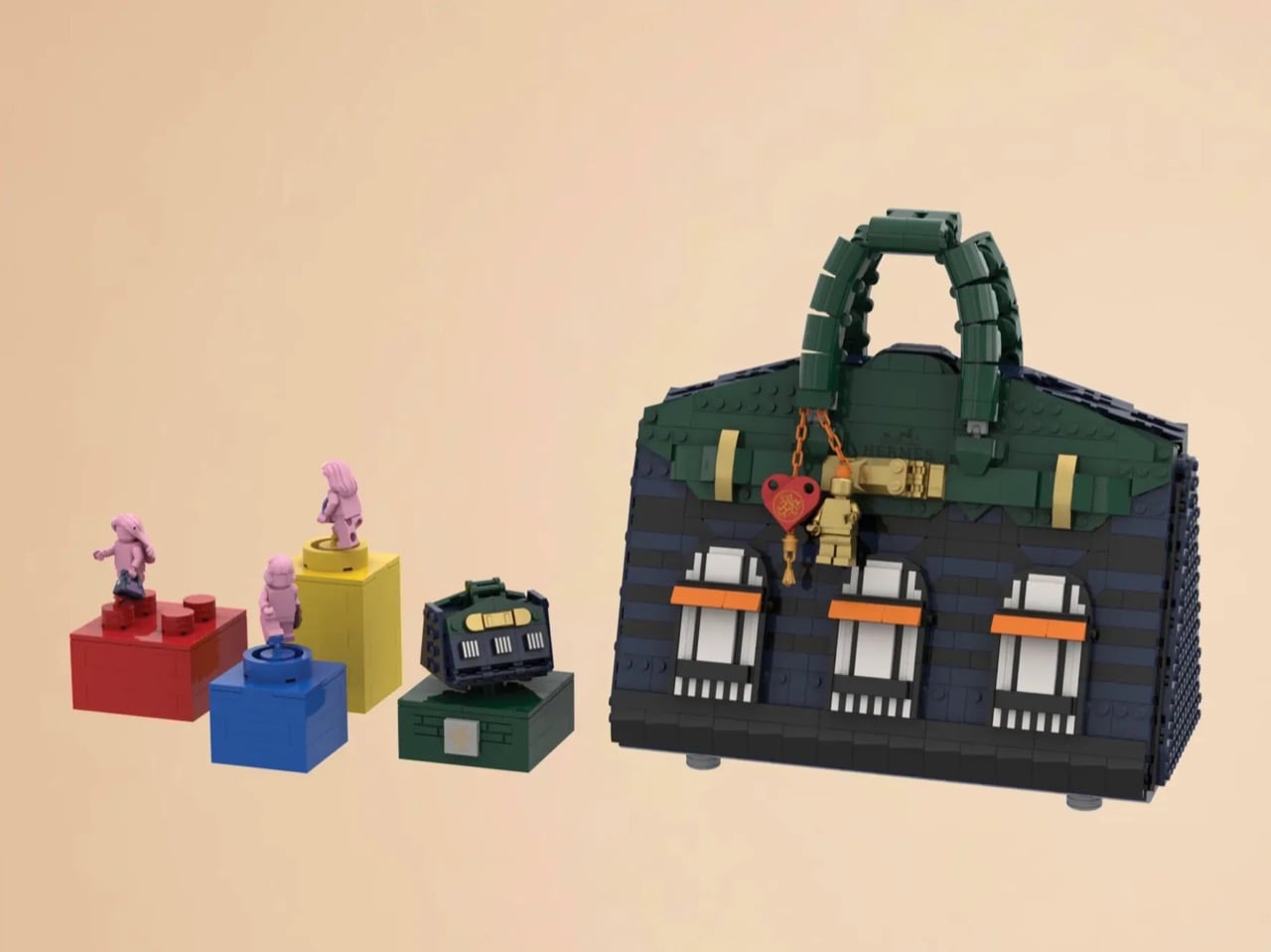
LEGO Ideas builders BOI_Design and KittyJW found a rather elegant workaround. Their MOC (My Own Creation) reimagines the Birkin 20 Faubourg, the special edition inspired by Hermès’s flagship Paris store, as approximately 1,400 bricks of deep navy, dark green, and gold. The exterior facade doubles as a miniature rendering of 24 Rue du Faubourg Saint-Honoré itself, complete with arched boutique windows and orange awnings. And it opens.

Designers: BOI_Design and KittyJW

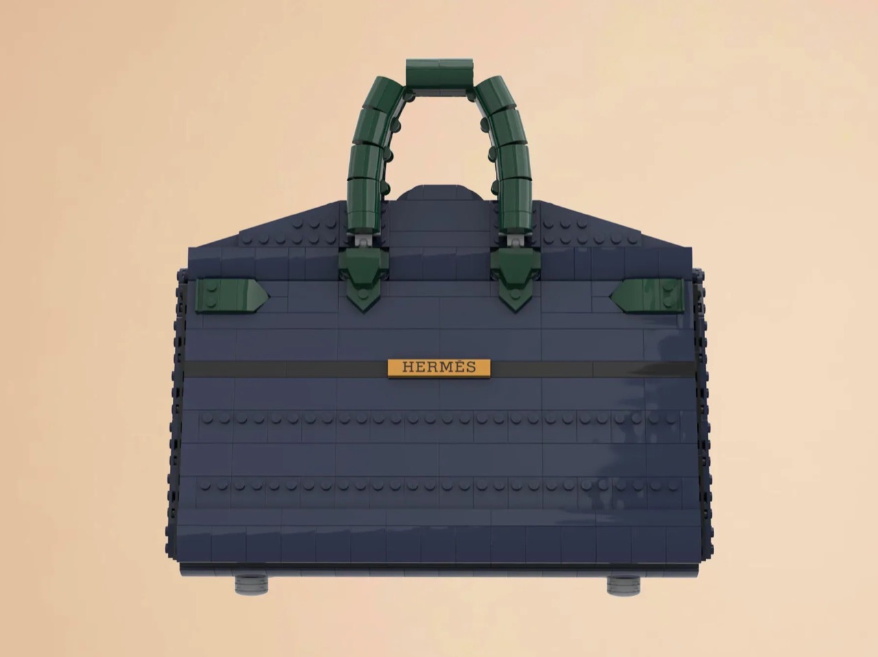
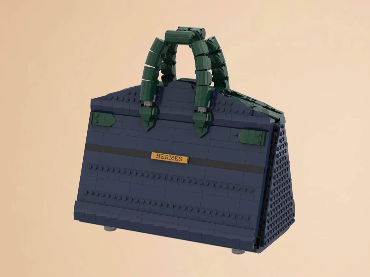
The silhouette is immediately recognizable to anyone who has spent time in the vicinity of luxury retail, or, more realistically, scrolled past one on Instagram. The trapezoidal body is rendered in deep navy blue tiles, layered with a subtle horizontal banding that gives the surface genuine texture and depth. The handles arc overhead in dark green, assembled from linked Technic-adjacent elements that convincingly mimic the soft curve of the real bag’s leather grip. Gold hardware details sit at the clasp, at the side buckles, and along the turnlock assembly, and a tiny linked orange chain drops a red heart charm and a gold minifigure pendant in a detail that reads as both playful and surprisingly precise. Flip the bag around and the back panel is clean and quiet, just navy tiles and a gold Hermès tile sitting on a dark strap, which is exactly how the real thing looks.

The front face depicts three arched windows dressed with crisp white frames and orange awnings are spaced across the lower body, referencing the Haussmannian rhythm of the actual boutique facade at Faubourg Saint-Honoré. It takes a second to fully resolve in your eye, this thing that is simultaneously a handbag and a building, and that slight double-take is very much the point. The builders describe it as merging fashion and architecture into a single object, and looking at it straight on, that framing holds up completely.

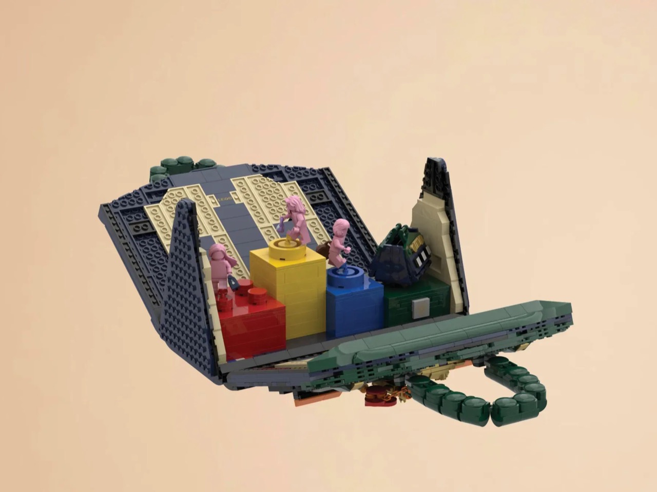
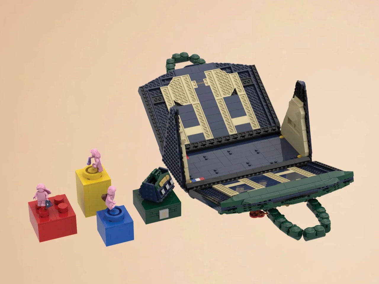
My favorite detail, however, is what happens when you open it. The lid swings up to reveal a hidden interior scene that commits fully to the bit. Three pink minifigures, each carrying a tiny handbag, are posed on oversized primary-color bricks in red, yellow, and blue, the kind of bold, joyful color blocking that feels distinctly LEGO while also evoking a fashion week runway setup. Nestled alongside them is a miniature Birkin 20 Faubourg bag rendered at a smaller scale, a self-referential easter egg that will land immediately with anyone paying attention. The interior lining is lined in cream and tan tiles, a genuinely considered touch that mirrors how a real Birkin’s suede interior contrasts against its exterior leather. At 28.5 centimeters wide and 29 centimeters tall, the whole thing has real physical presence on a shelf.

The build is currently gathering votes on LEGO Ideas, the community platform where fan submissions need to reach 10,000 supporters before LEGO’s internal team will formally review them for potential production. It’s early days for this one, but the concept has the kind of crossover appeal, fashion collectors, LEGO enthusiasts, Paris romantics, people who just want the Birkin experience without the two-year waitlist, that could carry it a long way. You can head to the LEGO Ideas page here to cast your vote.

The post The Hermès Birkin Finally Has a LEGO Version and It Opens to Reveal A Secret Runway Inside first appeared on Yanko Design.
This Wine Cooler Scans the Label and Sets Its Own Temperature for You

Wine culture has never been more accessible, with good bottles showing up at rooftop dinners, backyard gatherings, and weekend trips just as often as they do at restaurant tables. What hasn’t quite kept up, though, is how we actually serve them once we’re there. Temperature is the detail that most people overlook, and it’s arguably one of the most important variables in how a wine actually tastes.

That’s the gap that Porta is designed to fill. It’s a smart, portable wine cooler that keeps a bottle at the right serving temperature without ice, without a power outlet, and without any of the fuss that usually comes with trying to manage these things outside of a dedicated wine space. It’s compact, rechargeable, and built for the kind of drinking occasions that happen well beyond the kitchen.

Designer: Metaproi

Click Here to Buy Now: $249 $599 (58% off). Hurry, only 363/500 off. Raised over $57,000.

A bottle can come from a great producer, be stored perfectly, and still taste flat if it’s poured too warm or too cold. Serve a red too warm, and the alcohol starts to overwhelm everything else. Too cold, and the aromas shut down. There’s a narrow window where the flavors actually show up the way they were intended, and that window closes faster than most people realize.

Cellars and wine fridges solve the storage part just fine. But once the bottle comes out and ends up on the dinner table, or worse, goes into an ice bucket, the situation changes pretty quickly. An ice bucket drops the temperature too far and strips the wine of the very character you chose it for. Porta addresses that moment specifically, which is where it actually matters.

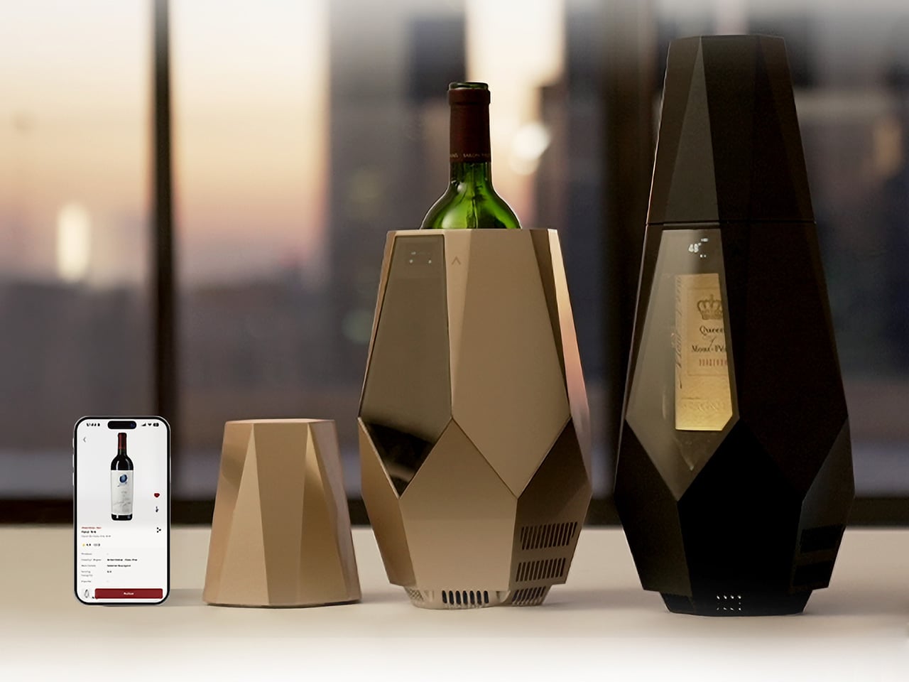
The companion app is where Porta’s smarter side comes in. Pair it with your phone, point the camera at the label, and the app identifies the grape variety and sets the chiller to an appropriate temperature automatically. You can also adjust manually, log wines, add tasting notes, and build a personal wine list, making it quite useful for something that just sits quietly on your table.

There’s also a decanting timer built into the workflow, a small detail that makes a real difference. Once you open the bottle and let it breathe, Porta tracks the time and lets you know when it’s ready to pour. It removes the guesswork from a process that casual drinkers tend to skip entirely, adding a bit of structure to the ritual without making it feel like homework.

What makes Porta genuinely interesting as a design object, though, is how cordless it actually is. It runs on an internal 10,000 mAh battery good for up to eight hours of sustained cooling, and charges via USB in about three and a half hours. That makes it as useful on a terrace or a picnic blanket as it is at a formal dinner table.

The cooling itself is handled by a thermoelectric system that operates without any mechanical movement, which keeps things quiet and vibration-free. The interior circulates chilled air around the bottle while a cork-filled insulating frame holds the temperature steady, even when the ambient conditions outside change. It can bring wine down to 46°F and sustain those conditions throughout a meal without needing you to fuss over it.

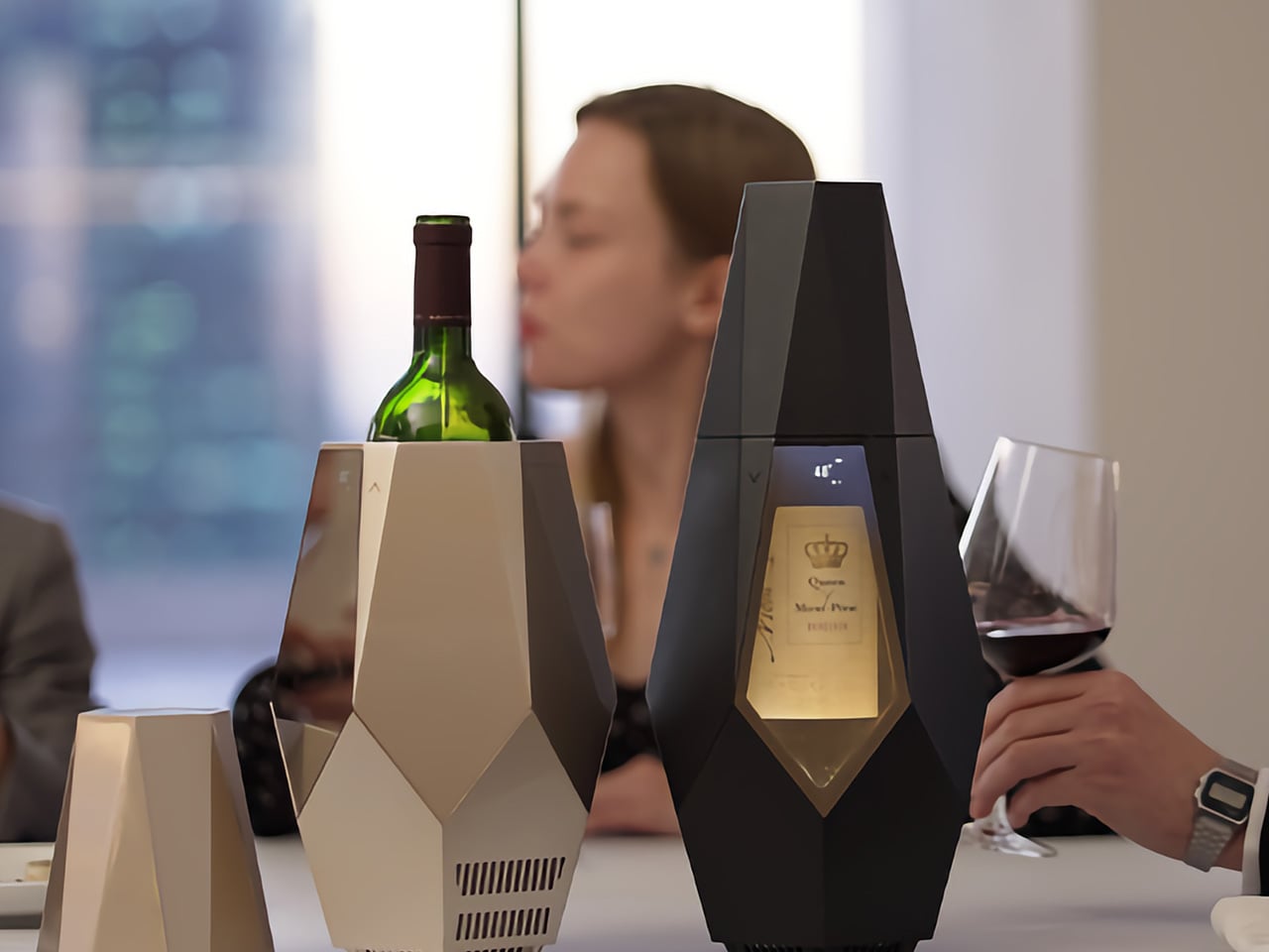
Two angular wine coolers on a table, one holding a green bottle, with a glass of red wine and a blurred person in the background.

The design itself is worth noting separately. Porta comes in Champagne Gold and Matte Black, with a faceted, geometric silhouette that tends to draw attention at the table. That’s intentional. The front window keeps the label visible while the bottle chills, turning it into part of the setting rather than something to be tucked away. It’s the kind of object that actually belongs where the drinking happens.

Click Here to Buy Now: $249 $599 (58% off). Hurry, only 363/500 off. Raised over $57,000.

The post This Wine Cooler Scans the Label and Sets Its Own Temperature for You first appeared on Yanko Design.
If Fidget Spinners Were Furniture: This Marble Table Has a Brass Sphere You Push Around Endlessly

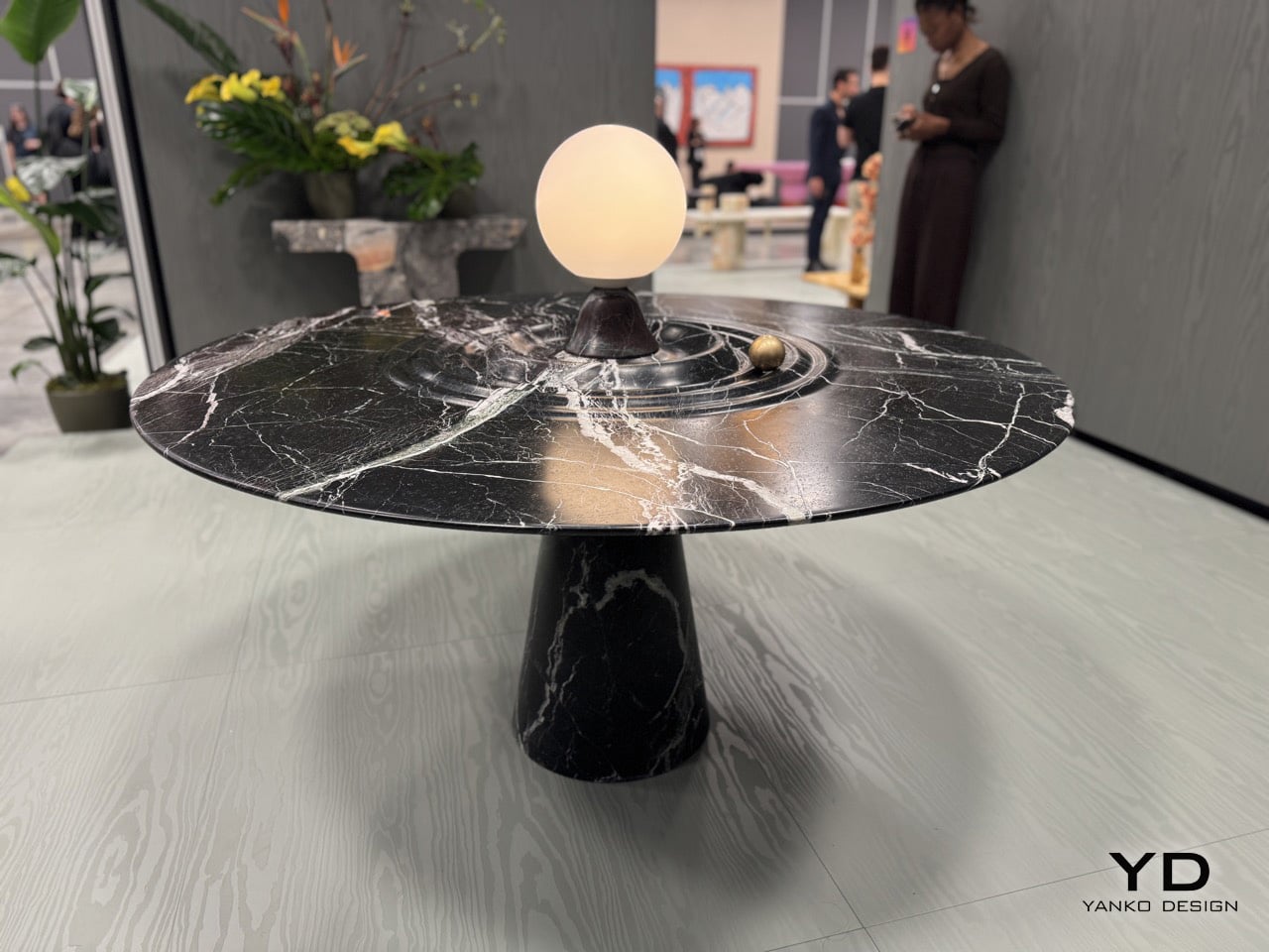
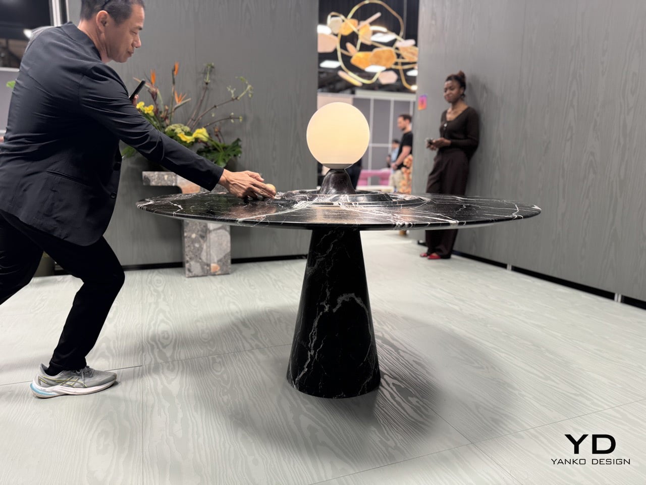
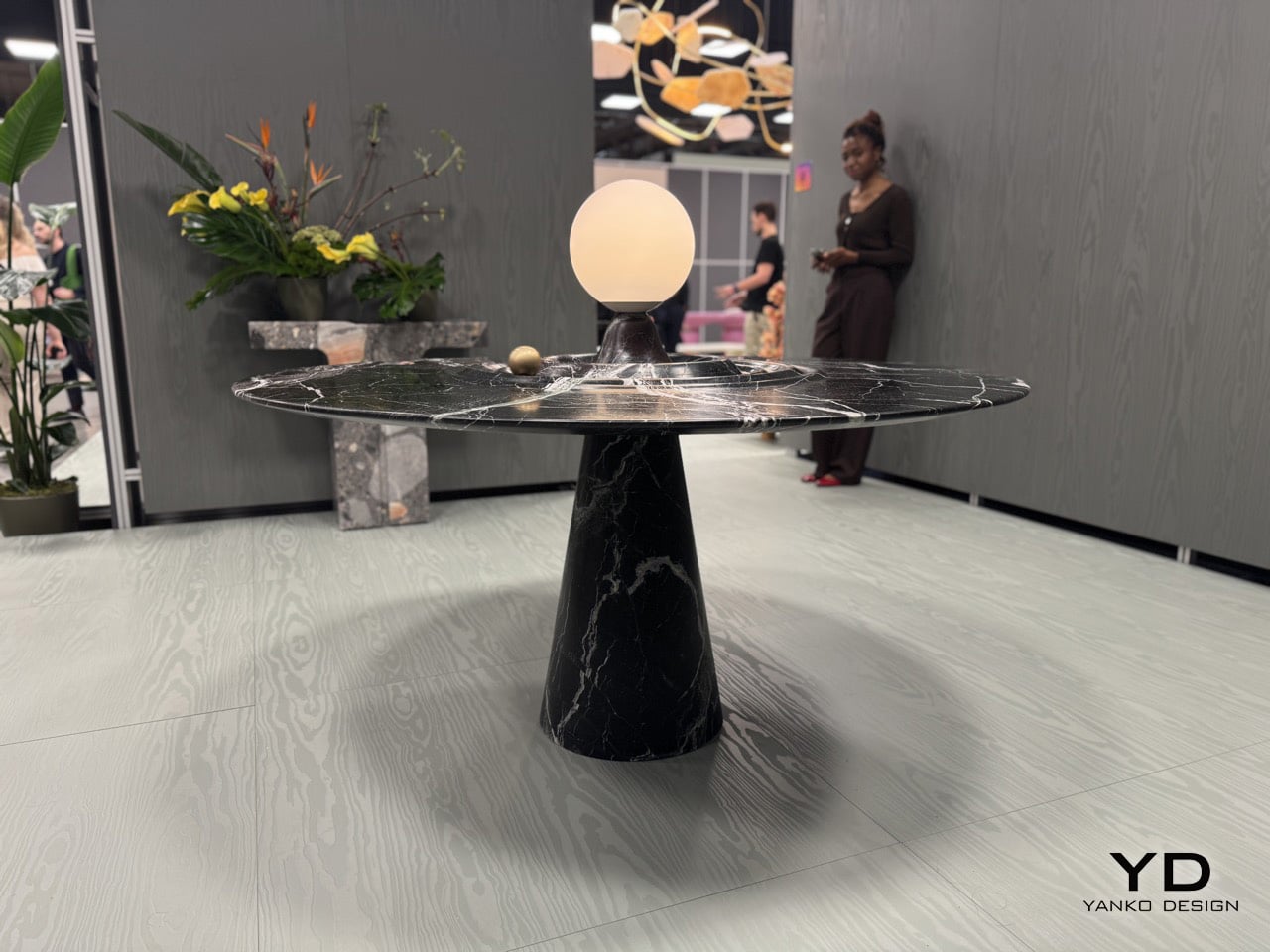
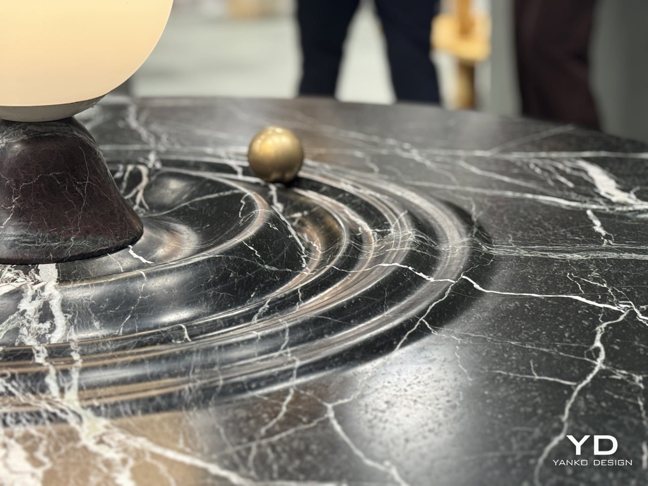
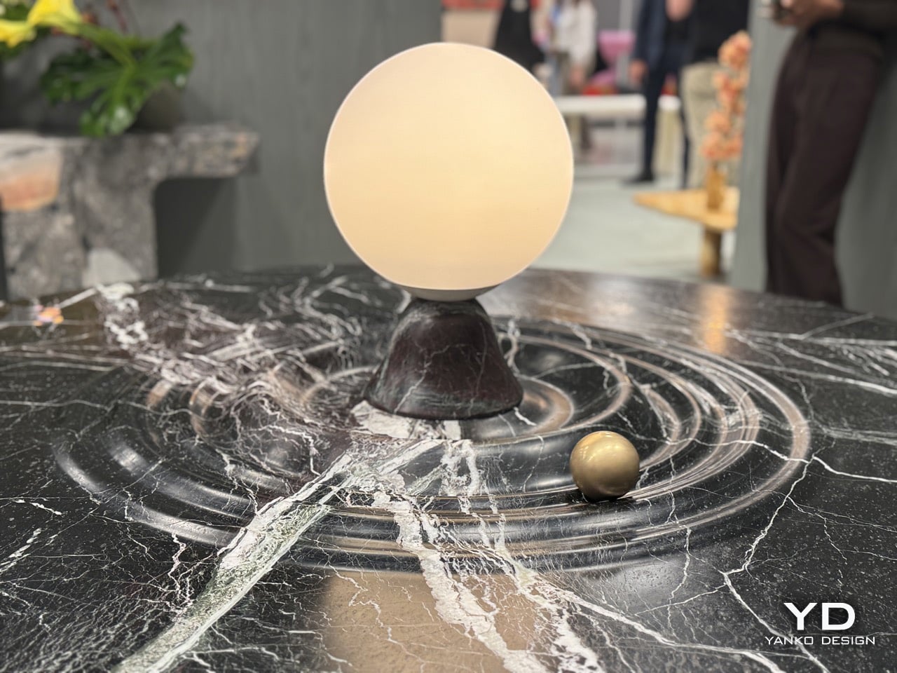
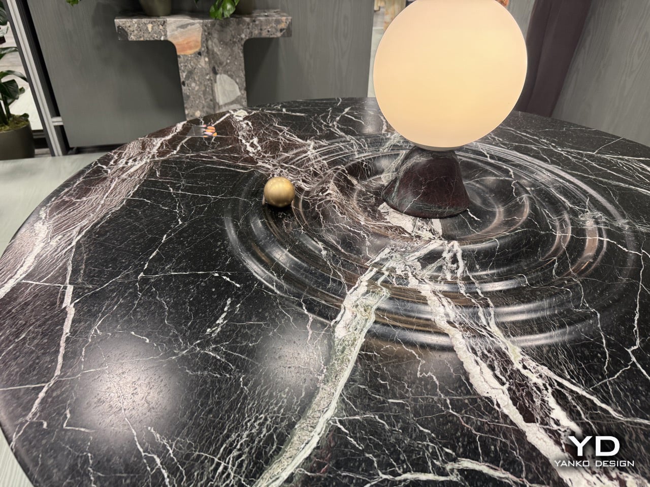
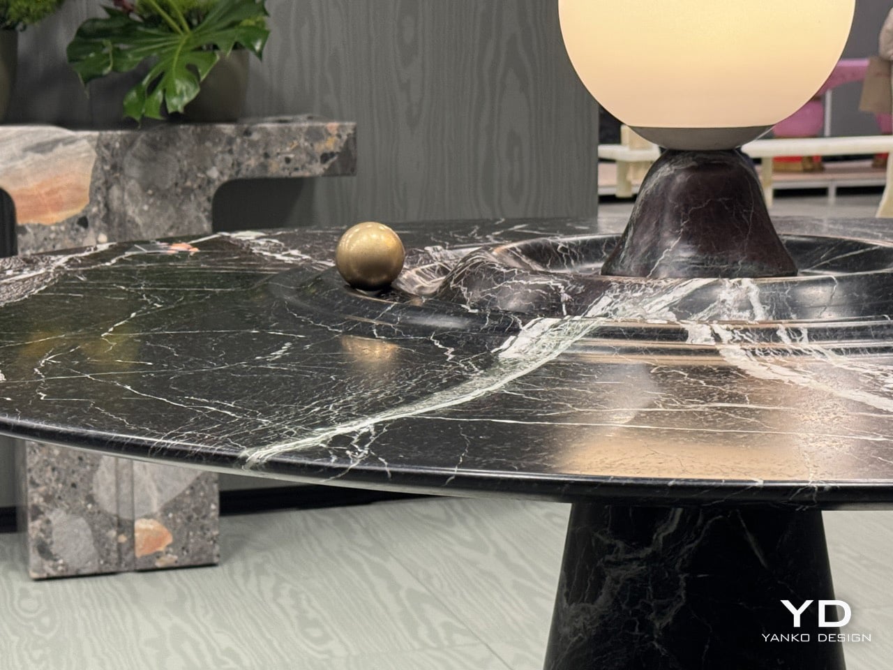
Furniture should probably stay still. That’s the basic contract between you and the table: it holds your dinner plates, you don’t worry about physics. Alessio Scalabrini decided that contract was negotiable. The Animo table, produced by Italian marble workshop Serafini, features a brass sphere that rotates around a central lamp fixture, tracing concentric ripples carved into the marble surface like a tiny planet orbiting its sun. The table functions perfectly well as a static dining surface, but it also invites you to set something in motion every time you walk past it, turning what could’ve been another high-end marble slab into an interactive kinetic object that happens to hold glassware.

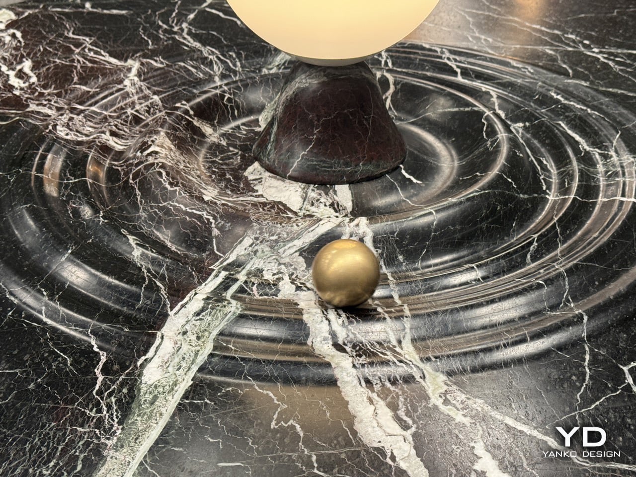
Named after the Italian word for Soul, the Animo table adds some animated joy with a dash of luxury to your space. The table, made entirely from Italian Rosso Levanto marble, is hand-finished with ripples that break the illusion of stillness, making it look fluid. Nestled in one of those ripples is a brass sphere, adding a dash of gold to the table’s ultra-dark burgundy and white-vein design. The result is furniture you can fidget with. It’s art and play combined brilliantly, with the kind of craftsmanship you can only expect from an Italian brand showcasing at Salone del Mobile!

Designer: Alessios Calabrini for Serafini

The table first attracts you with how it looks, then how it feels. The marble finish is impeccable, with the ripples crafted to absolute perfection. The perfection plays an important part here, because a brass sphere needs to seamlessly roll around the table, with the smoothness of a fidget spinner. The sphere has solid heft to it, giving it a fair amount of momentum when you nudge it around the table. It moves with little to no effort, completing tens of rotations before coming to a very gradual halt. Any other material would falter. Wood might end up deforming after years, metal would make the table feel unpleasant, rough stone wouldn’t cause the sphere to move as freely.

The central lamp adds another layer of functionality, illuminating the table from within while serving as the gravitational anchor for the sphere’s orbital path. The whole composition balances three distinct roles: functional dining surface, sculptural marble centerpiece, and interactive kinetic object. Most designers would’ve picked one and committed. Scalabrini made all three work simultaneously.

Scalabrini runs a Paris-based design studio with 18 years of experience merging traditional craftsmanship with contemporary fabrication technology, and that dual approach is visible throughout the Animo. The table uses Serafini’s established production methods, combining precision CNC machining with hand-finishing by Italian artisans who’ve been working marble their entire careers.

If you want to see the Animo table in person and experience the satisfying physics of that brass sphere yourself, Serafini is showing it at Salone Raritas during Salone del Mobile. The difference between seeing photos and actually pushing that orb around the channels is substantial. Photos capture the visual design, but they can’t communicate the tactile satisfaction of setting something that heavy into smooth, controlled motion.

The post If Fidget Spinners Were Furniture: This Marble Table Has a Brass Sphere You Push Around Endlessly first appeared on Yanko Design.
Lexus LS Concept First-Look: The Six-Wheel Flagship Turning Heads at Milan Design Week 2026

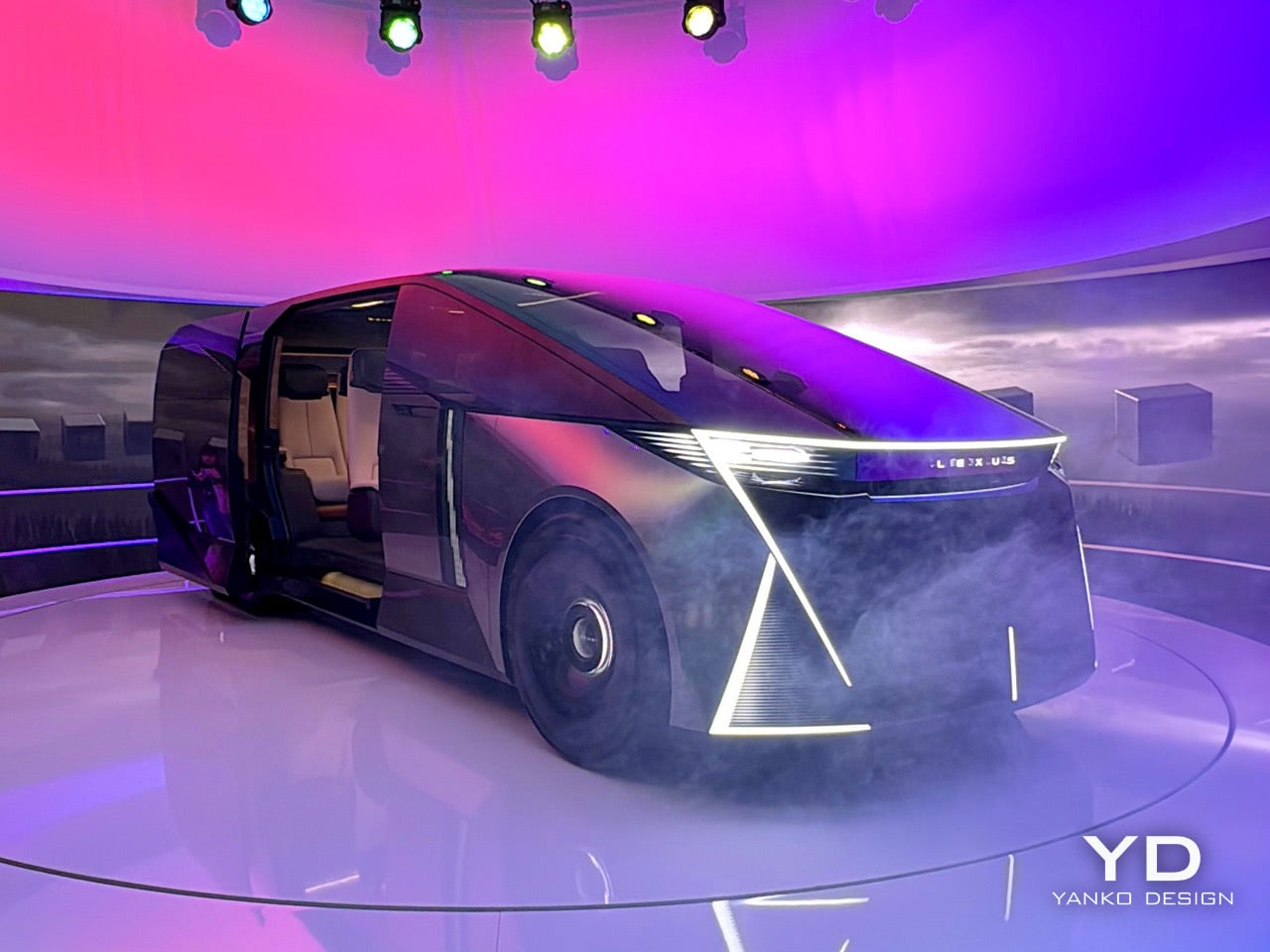
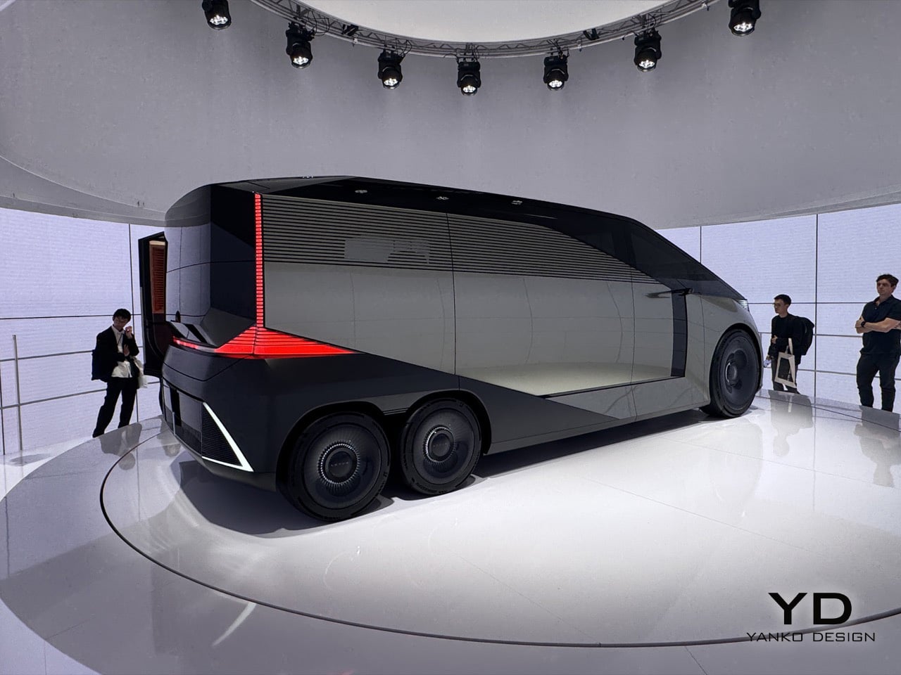
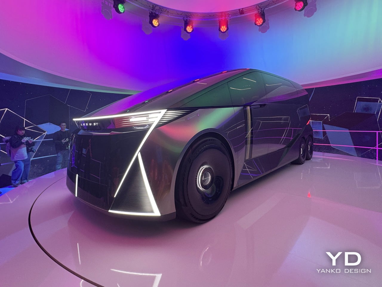
Six wheels on a Lexus, at a furniture fair in Milan, sounds like either a provocation or a punchline. At this year’s Milan Design Week, Lexus is betting it’s the former. The brand rolled into Superstudio Più in the Tortona district with its LS Concept, a long-body, flat-roofed, twin rear-axle machine that first appeared at the Japan Mobility Show in 2025. It’s a chauffeur-driven vehicle built entirely around the passenger, and it’s Lexus’s clearest statement yet about where its flagships are going. In fact, Chief Branding Officer Simon Humphries said it plainly: the “S” in LS no longer stands for Sedan. It stands for Space.

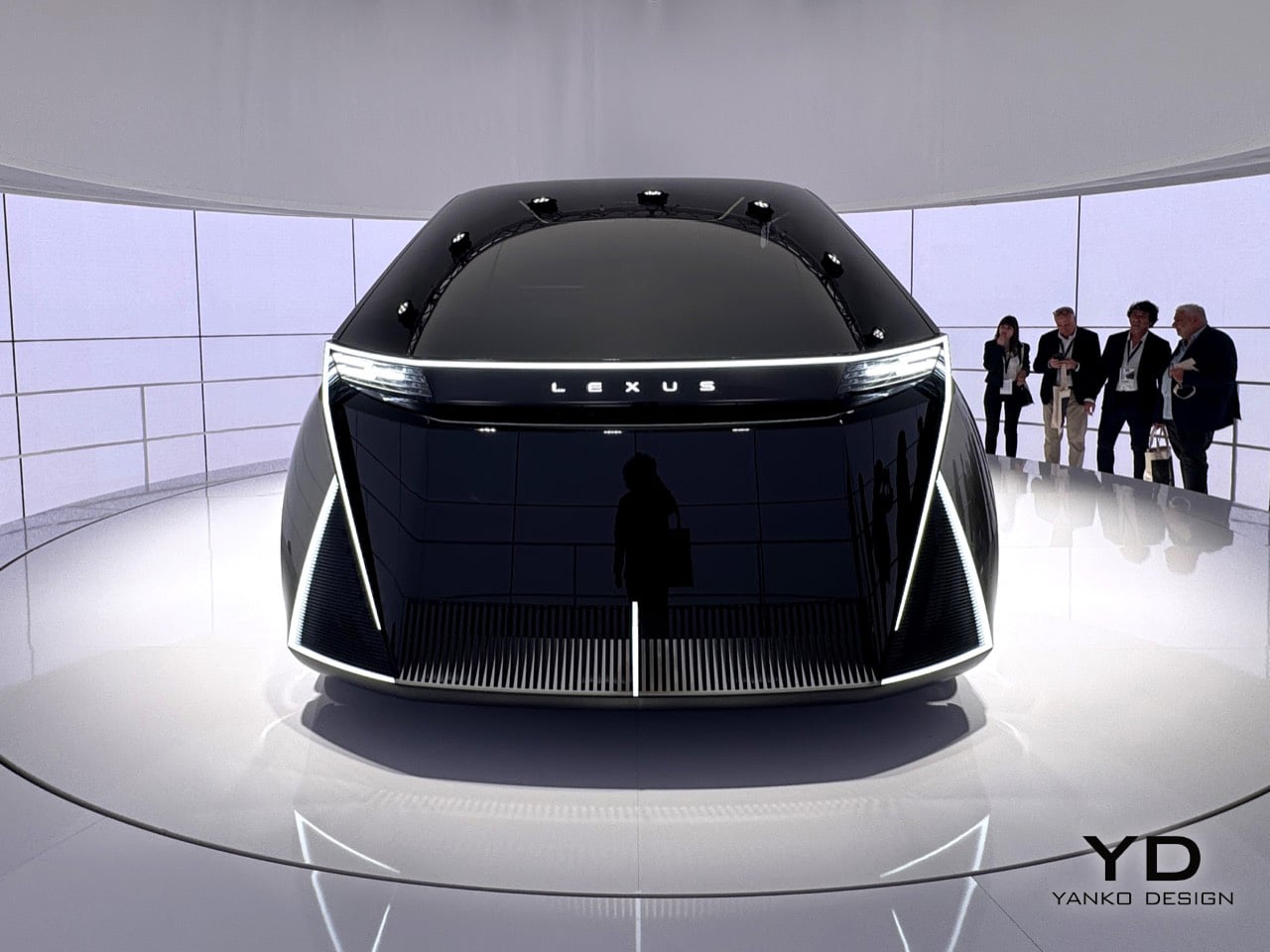
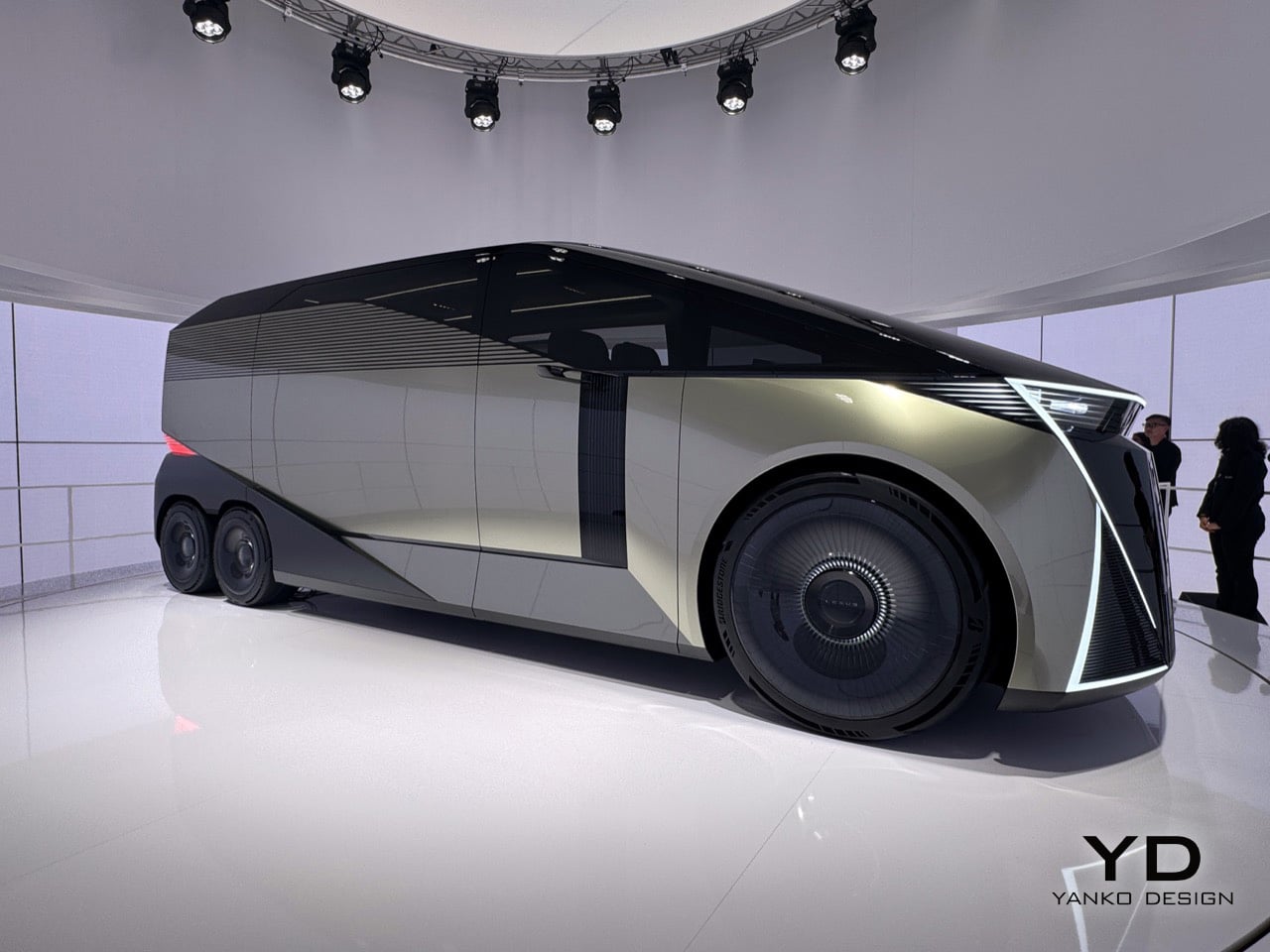
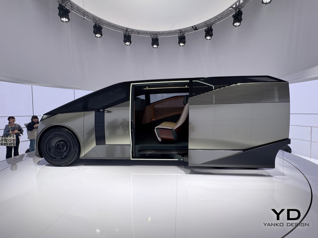
The car sits inside an installation called SPACE, a fittingly simple name for a big idea. The LS Concept is wrapped in a cylindrical LED screen that’s always moving, cycling through textures and color palettes that wash over the car’s matte metallic finish. The whole thing sits on a low turntable, rotating slowly so you can take in every angle while the screen behind it blurs the line between the vehicle and its environment. From the back, the body is dark and geometric, with red light cleanly tracing the corners and the LEXUS wordmark centered like a final statement. The front has no grille at all, just a wide bar of white light, a dark glassy face, and some sharp diagonal cuts at the lower corners. The side profile is what really sells the scale of it all; the greenhouse is so long and flat it forces you to rethink what a luxury car is supposed to look like.

Designer: Lexus

You’ll notice those sharp diagonal white light signatures at the corners of both the front and back, and they do a great job of anchoring your eye so you don’t get lost in all that surface area. The front is an exercise in restraint, especially for Lexus. There are no intakes, no heritage cues, and definitely no spindle grille, which defined the brand’s look for fifteen years. Instead, a single, clean bar of white light carries the Lexus name across the top, and below it, dark glass sweeps down like a theater curtain. The back is just as clean, with black geometric planes and red light tracing the corners so precisely it feels more like sculpture than taillights. There’s also a louvered panel on the rear quarter that looks both cool and functional, the kind of detail you have to go back and look at a second time.

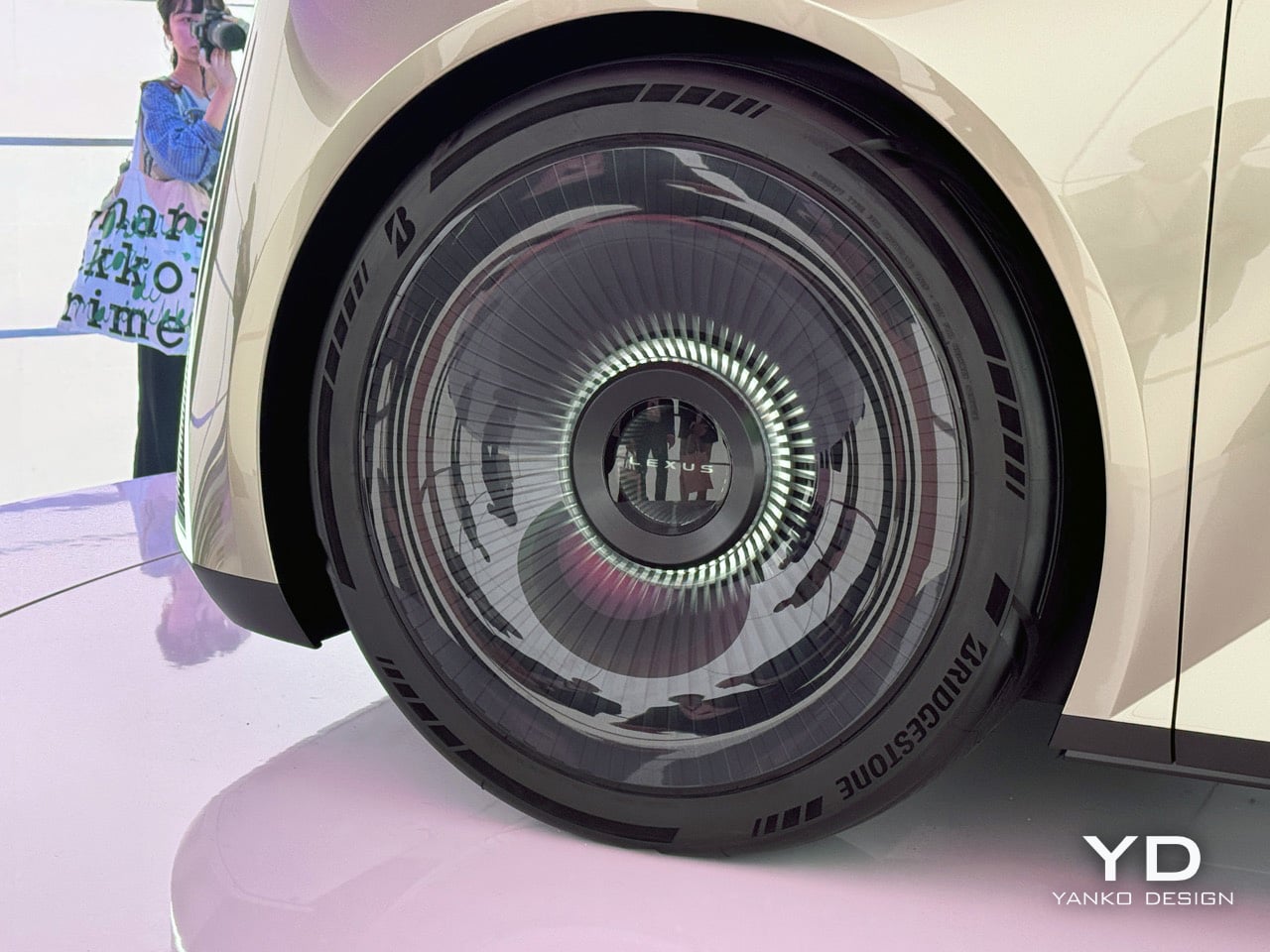
The twin rear wheels are probably the first thing that throws you off, but the more you look at them, the more they make sense. A six-wheel layout, something you usually see on overland vehicles or high-end coaches, lets Lexus pack in a huge amount of interior volume without the big wheel arches that eat up space in most long cars. The turbine-style wheel covers keep the look clean, where normal spokes would have ruined the effect. When you see it from the side, the lower body looks like a single sculpted piece, and the way it tucks under itself makes the whole thing feel like it’s floating. Lexus is basically saying that a vehicle with the footprint of a small bus can be the next word in luxury, and after a few minutes, you start to believe them.

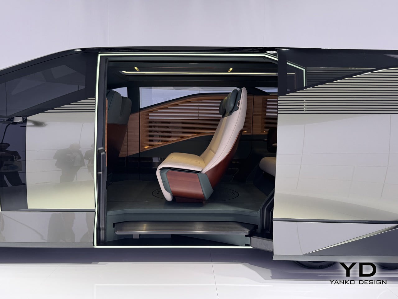
Step through the door, framed in a bright white light, and you see what they mean by hospitality. A slatted wood panel runs up the entire wall of the cabin, a single rear seat is finished in cream and burgundy leather, and the floor is so open you get the sense it was designed for standing as much as sitting. The real achievement here is how Lexus managed to package so much genuine room inside; it feels more like a small, well-designed living space than a stretched-out car. Whether any of this makes it to production is anyone’s guess, and Lexus seems happy to leave that question hanging in the air.

What Lexus is showing here is a clear signal of where its design thinking is headed, and that alone makes it one of the most interesting things you can see in Milan this year. If you want to see it for yourself, you can experience the SPACE installation and the Lexus LS Concept at the Daylight Hall in Superstudio Più, located in the Tortona district, from April 21st to the 26th.

The post Lexus LS Concept First-Look: The Six-Wheel Flagship Turning Heads at Milan Design Week 2026 first appeared on Yanko Design.

A Gaming Executive Said “Build Me a Crystal House.” This Is What 7,300 sq. ft. of Pure Glass Looks Like

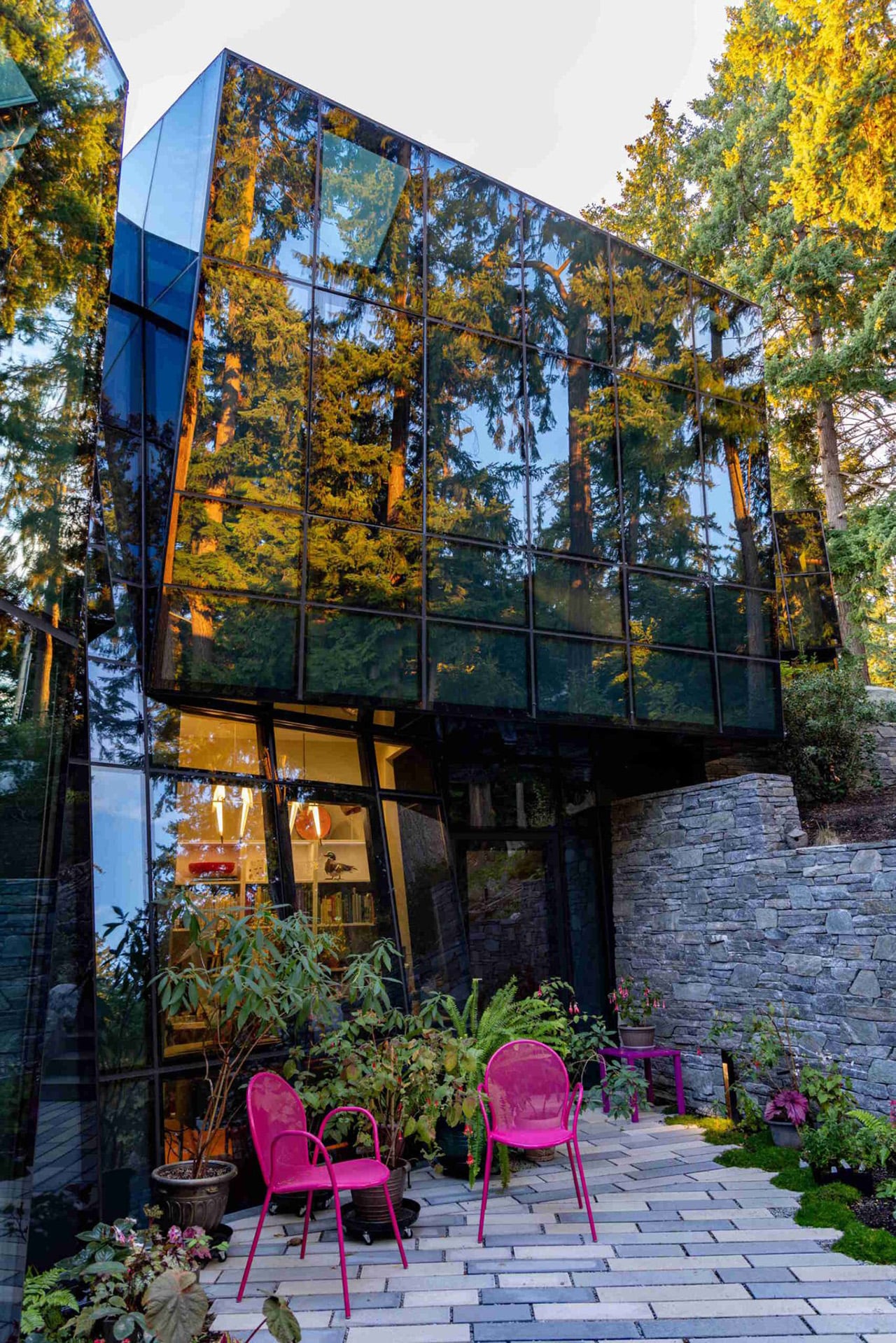
Glass is the most psychologically loaded material in architecture. It promises transparency and delivers ambiguity, reads as weightless while demanding extraordinary structural engineering, and has the strange property of making a building simultaneously present and absent depending on where you stand and what the light is doing. Architects have been exploiting these contradictions since Joseph Paxton’s Crystal Palace in 1851, and the conversation has never really stopped. F-House, a private residence on Lake Washington in Kirkland, Washington, designed by Goble Berriman Design with facade specialist Pulp Studio, pushes that conversation to a place most residential architects would consider genuinely unreasonable.

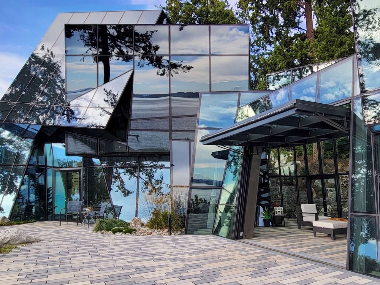
The brief, issued by a client working in the computer gaming industry, was a single directive: build a crystal house. What followed was years of design development, engineering collaboration, and custom fabrication to produce a home with zero conventional exterior cladding. Every surface is glass, cut into angular, irregular panels that assemble into a faceted form inspired by shattered ice erupting through terrain. The steel structure supporting all of it is hidden. The fixings are concealed. Even drainage details disappear behind custom direct-to-glass printed borders, because Goble Berriman understood that one visible downspout would break the entire illusion.
Designer: Goble Berriman Design & Pulp Studio

The pedigree behind this project deserves context. Stuart Berriman spent years at The Jerde Partnership working on large-scale mixed-use developments across Asia before co-founding Goble Berriman. Partner Angus Goble was a founding member of Front Inc., a leading facade consultancy whose client list included Frank Gehry, OMA, Herzog and de Meuron, and SANAA. That lineage matters here, because F-House reads less like an ambitious residential project and more like a commercial-grade facade engineering exercise that happens to contain bedrooms. The crystalline exterior geometry, which shifts from mirror-flat reflectivity to deep angular shadow depending on the hour, is the kind of work you expect from firms operating at institutional scale, not on a private lakeside lot in Kirkland.

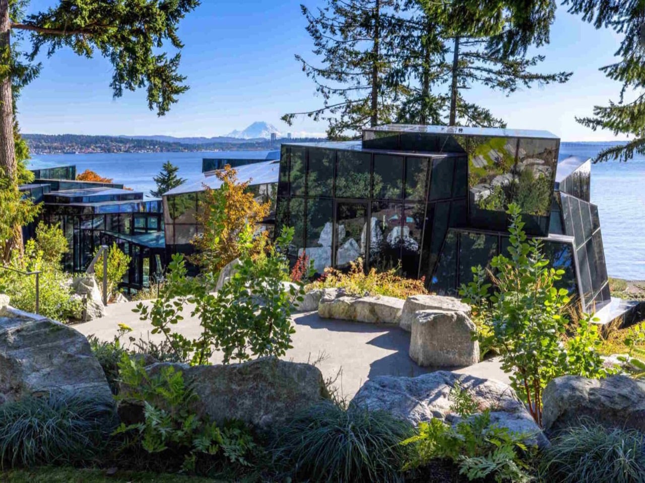
The home spans 7,300 square feet and sits surrounded by natural rock formations and dense Pacific Northwest greenery, with Mount Rainier visible across the water. That landscape pairing is doing real compositional work. The hard, faceted glass skin reads against the softness of the firs and boulders as a deliberate counterpoint, the same logic that makes mineral specimens so visually arresting when you set them against organic matter. The building doesn’t try to blend into its site. It announces itself as something foreign to the natural order, which, given the crystal brief, is precisely correct.

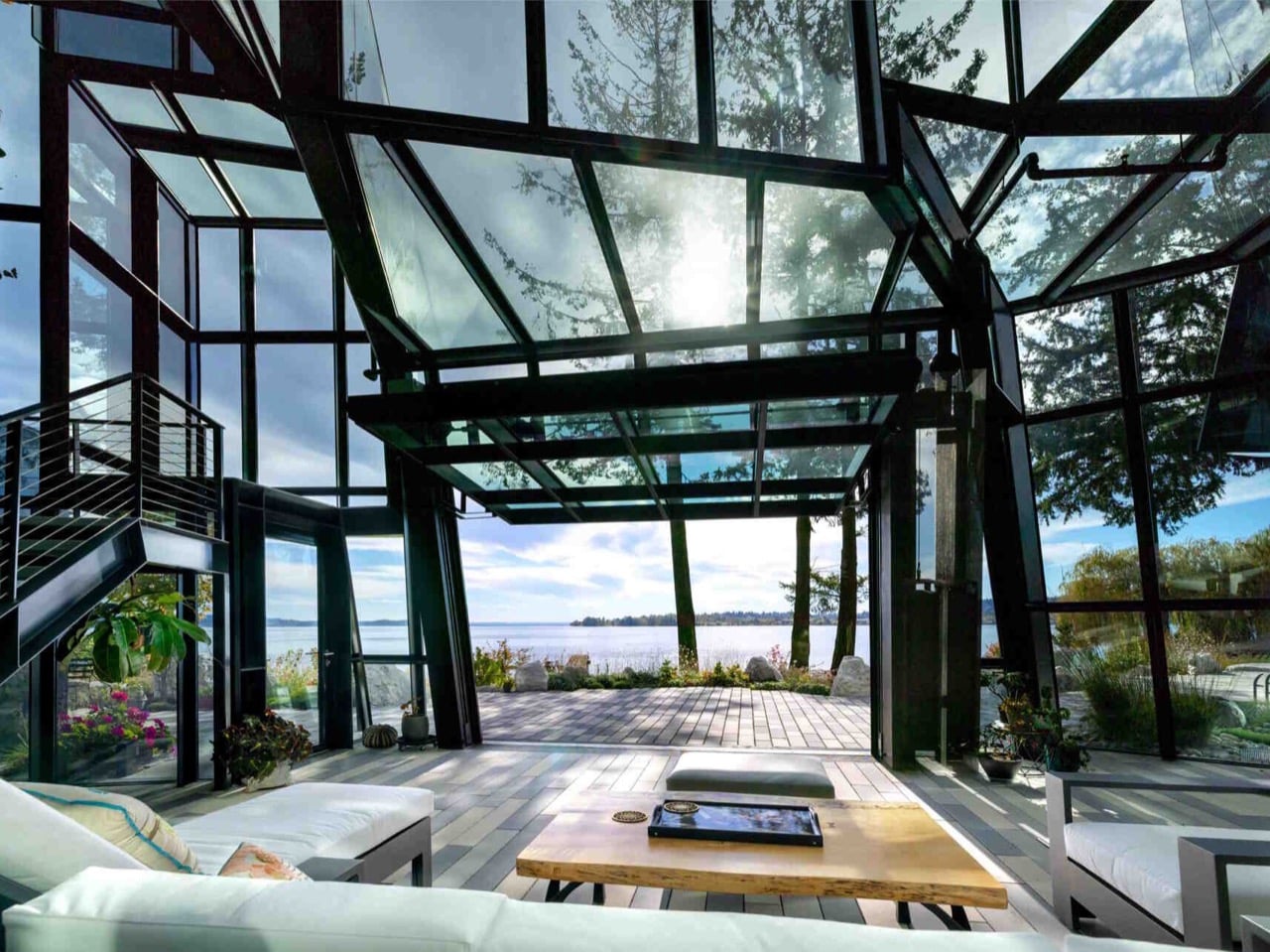
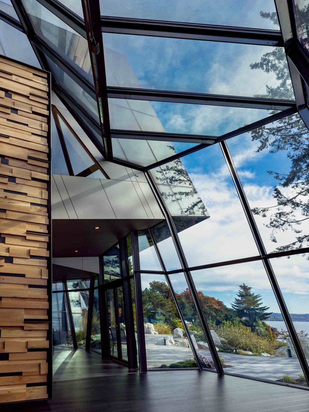
The thermal and privacy engineering required to make a fully glazed house actually livable is where the project earns its most serious design credibility. Double silver-coated glass handles the main residence, while solar-protected glass was selected for the winter garden. Low-emissivity coatings regulate temperature across the envelope, and custom dot-pattern shading improves energy performance without introducing visible blinds or screens that would compromise the exterior reading. Each glass unit is a layered assembly with an air gap and Saflex interlayers that can shift from clear to opaque, giving occupants control over privacy without resorting to curtains. Insulated spandrel panels handle transitions where solid construction was unavoidable. The result is a house that performs like a thermally responsible building while looking like it was assembled from a single continuous material.

The interior layout is organized around a winter garden that acts as a central divider, separating the main residence from the studio and garage, the latter featuring a glazed hangar door. A continuous skylight stretches from the entry through to the dining area and garden terraces, and a glass bridge connects to the master bedroom, turning what would ordinarily be a corridor into a suspended, luminous passage. Goble Berriman ran the entire project through a shared 3D model across every consultant and contractor, and the homeowner navigated the design in VR goggles long before construction began. By the time the building was finished, it felt entirely familiar to the client, confirmation that years of immersive pre-visualization had done their job in a way that no flat drawing ever could.

F-House sits in a tradition of glass architecture that runs from Mies van der Rohe’s Farnsworth House through Philip Johnson’s New Canaan Glass House and into the parametric facade work of the last two decades. What separates it from most of that lineage is the refusal of orthogonal geometry. There are no flat planes meeting at right angles here, no clean curtain wall logic. Every panel is its own negotiated shape, and the whole facade behaves more like a cut gemstone than a building skin. Whether that reads as the most literal client brief ever executed, or as a genuinely new formal proposition for residential glass architecture, probably depends on where you’re standing and what the light is doing. On the shores of Lake Washington with Mount Rainier in the background, I’d argue it’s both.

The post A Gaming Executive Said “Build Me a Crystal House.” This Is What 7,300 sq. ft. of Pure Glass Looks Like first appeared on Yanko Design.