How A Simple Angle Makes Outdoor Seating Feel More Social

Public furniture has a quiet way of shaping how people move through the day. A bench can make someone pause. A table can turn an empty courtyard into a lunch spot. A slight angle in a seat can change whether people feel separate, side by side, or gently invited into conversation. Take-Out Wedge, part of Landscape Forms’ Take-Out collection designed by Rodrigo Torres, works within that subtle space between object and behavior.

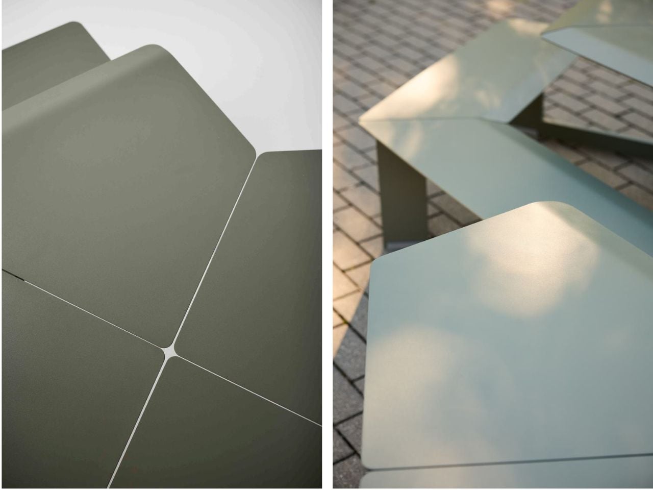
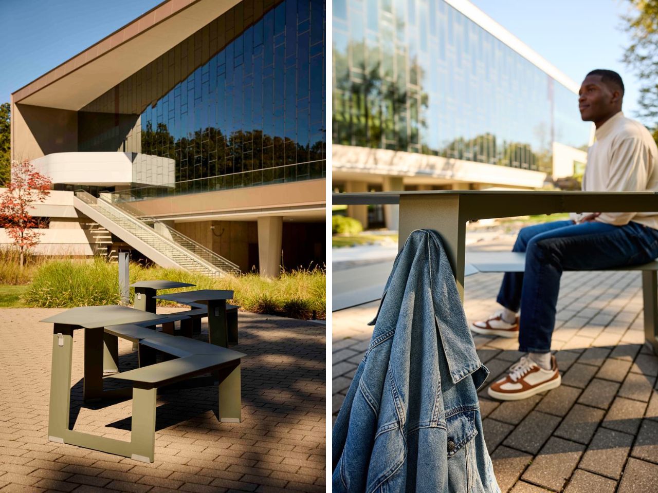
The Take-Out collection expands Landscape Forms’ connected seating and dining table category through a system that feels clean, adaptable, and easy to reconfigure. The family includes singles, doubles, triples, wheelchair-accessible triples, tall versions, wedge units, and mini pieces for younger users. Each piece can stand on its own or come together with others, allowing outdoor spaces to shift throughout the day as people gather, separate, work, eat, wait, or simply linger.

Designer: Rodrigo Torres
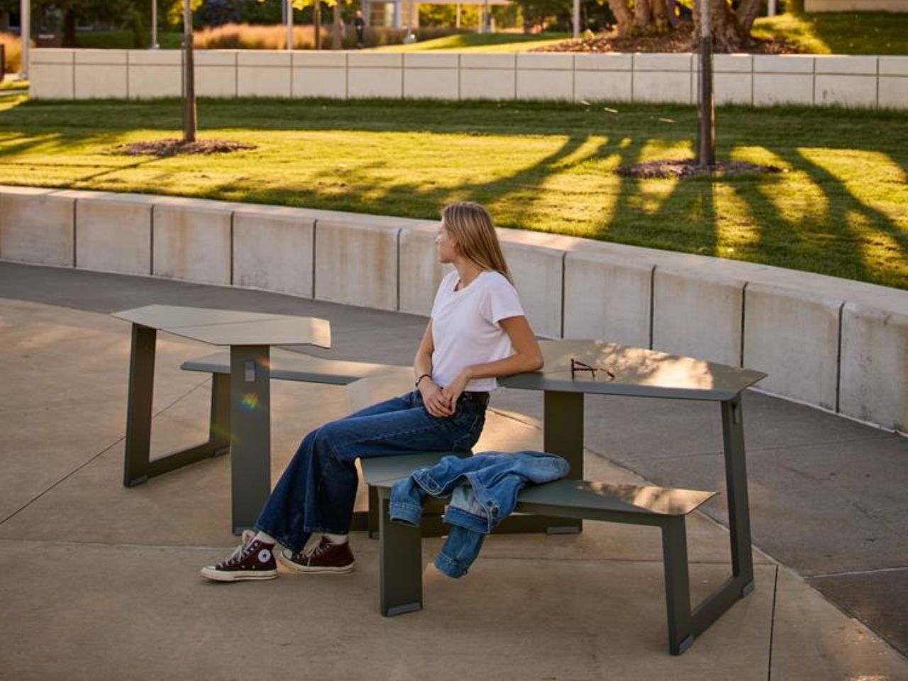
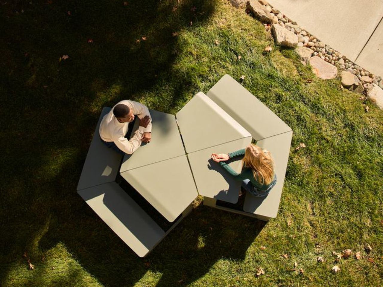
The Wedge is especially compelling because its form is doing more than creating a distinctive silhouette. Its angle changes the relationship between people. Traditional seating often places us in familiar social positions. Side by side feels relaxed and effortless, with both people sharing the same outward view. Face to face feels more direct, suited to conversation, focus, or collaboration. The Wedge creates something softer between the two: a posture where people can look outward together while still feeling naturally turned toward one another.

That middle ground is what gives the design its social intelligence. It does not push people into interaction, but it makes interaction easier. It allows connection to happen casually, without the intensity of a formal setup. In a campus courtyard, public plaza, hotel terrace, office garden, retail district, or civic space, that kind of nuance matters. People often need places that support informal moments: a quick chat, a shared break, a quiet lunch, a spontaneous meeting, or a pause between destinations.
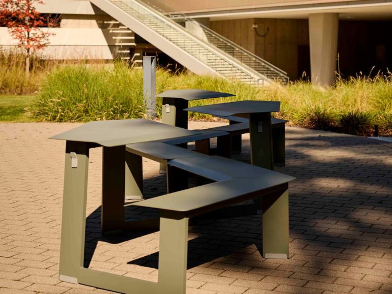

The beauty of Take-Out Wedge lies in how much spatial variety comes from such a simple geometric move. The wedge form allows designers and users to create soft arcs, faceted curves, radial clusters, and enclosed hexagonal hubs. A few units can support a small conversation. More pieces can shape a larger social zone. Arranged differently, the same system can feel open, intimate, directional, playful, or communal.

This is where Take-Out begins to feel less like standalone furniture and more like a framework for outdoor life. It does not need walls to define space. It can frame a pause point, activate an overlooked corner, shape a gathering area, or bring rhythm to an open setting. Placed side by side, the pieces can create long runs of seating for meals, meetings, or collaborative work. In a grid, they can give an outdoor area the energy of a café. Face to face, they become an expandable communal table.

The system also understands that flexibility has to work in real life. Color-matched connector brackets can secure adjoining units when a more permanent arrangement is needed. One-sided tables help make better use of edges, walls, or tighter spaces. An umbrella-hole tabletop option brings shade into the setup, with semi-circular cutouts that align when two units are placed across from each other. These details make the collection feel practical without taking away from its visual simplicity.
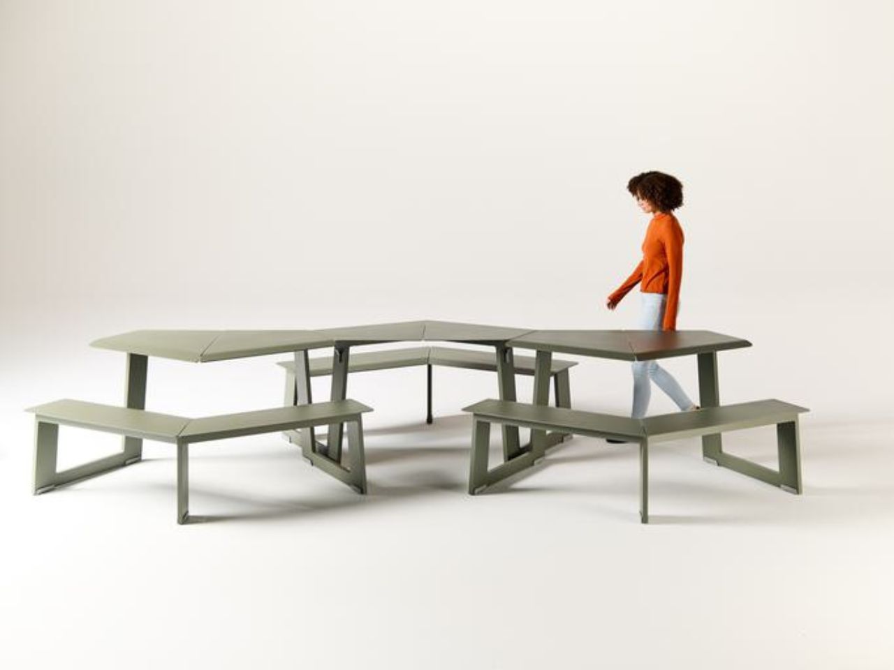
Comfort is handled with the same restraint. The form is minimal, but not cold. Gently curved edges soften the points where elbows and knees meet the furniture. Users can enter from either side or from behind, avoiding the awkwardness that often comes with shared outdoor tables. Sheet metal tops, extruded aluminum verticals, powdercoated finishes, and durable nylon glides support the realities of public use, where furniture has to withstand weather, movement, cleaning, and constant rearrangement.

Take-Out also feels relevant because public and commercial spaces are being asked to do more. A campus lawn may need to support outdoor study in the morning, lunch in the afternoon, and casual hangouts by evening. A workplace terrace might shift between focused solitude and team conversation. A commercial plaza may need to feel active without becoming crowded. Take-Out responds to these changing needs by keeping the space open-ended.
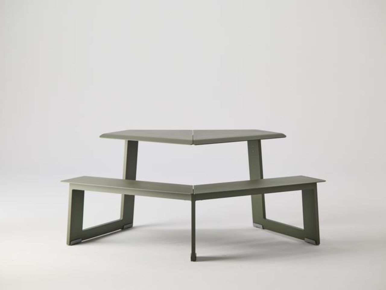
The mini version brings the same thinking into children’s environments, from schoolyards and outdoor classrooms to family-friendly public spaces. It recognizes that younger users also need furniture that encourages gathering, movement, play, and shared experience. Good public furniture should work across ages, settings, and rhythms of use.

What makes the Wedge memorable is that it treats connection as something spatial. The way people sit in relation to one another carries emotional meaning. A small angle can make a space feel more open, more welcoming, or more alive. Public furniture has always had this potential, especially in urban commons where small moments of social life happen between larger routines. A good seating system can make people stay a little longer, notice each other more, and feel more at ease in shared space.
The same value carries into commercial environments. Offices, mixed-use developments, hospitality spaces, and retail campuses often bring people into proximity without really helping them connect. A system like Take-Out Wedge softens that distance. It creates casual opportunities for people to gather without making the moment feel staged. It helps shared spaces feel warmer, more active, and less siloed.

Take-Out Wedge is versatile because it understands that connection does not happen in one fixed format. Sometimes people want to sit beside each other and look out at the world. Sometimes they want to face each other and talk. Sometimes they need something in between. The Wedge gives form to that in-between moment, turning a simple angle into an invitation to share space more naturally.
The post How A Simple Angle Makes Outdoor Seating Feel More Social first appeared on Yanko Design.

A Turnip on Top: London’s Most Unexpected Design Win

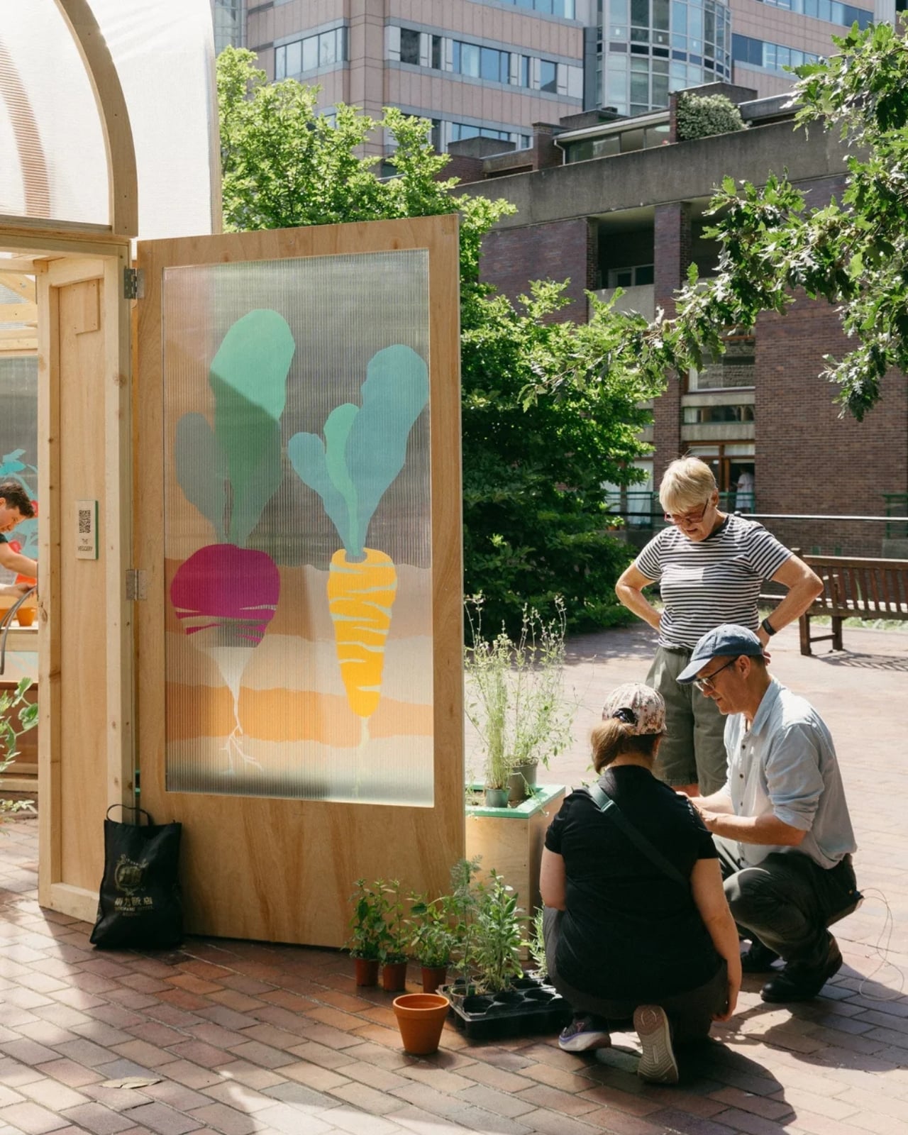
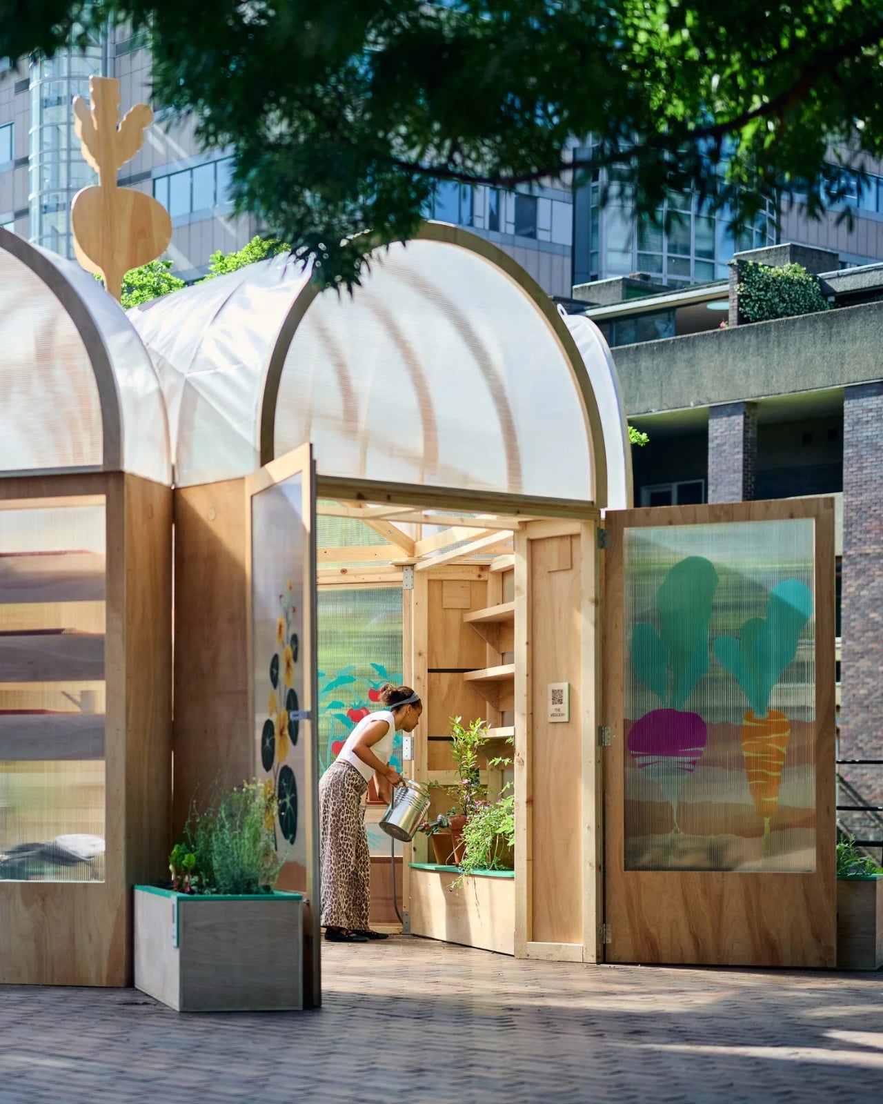
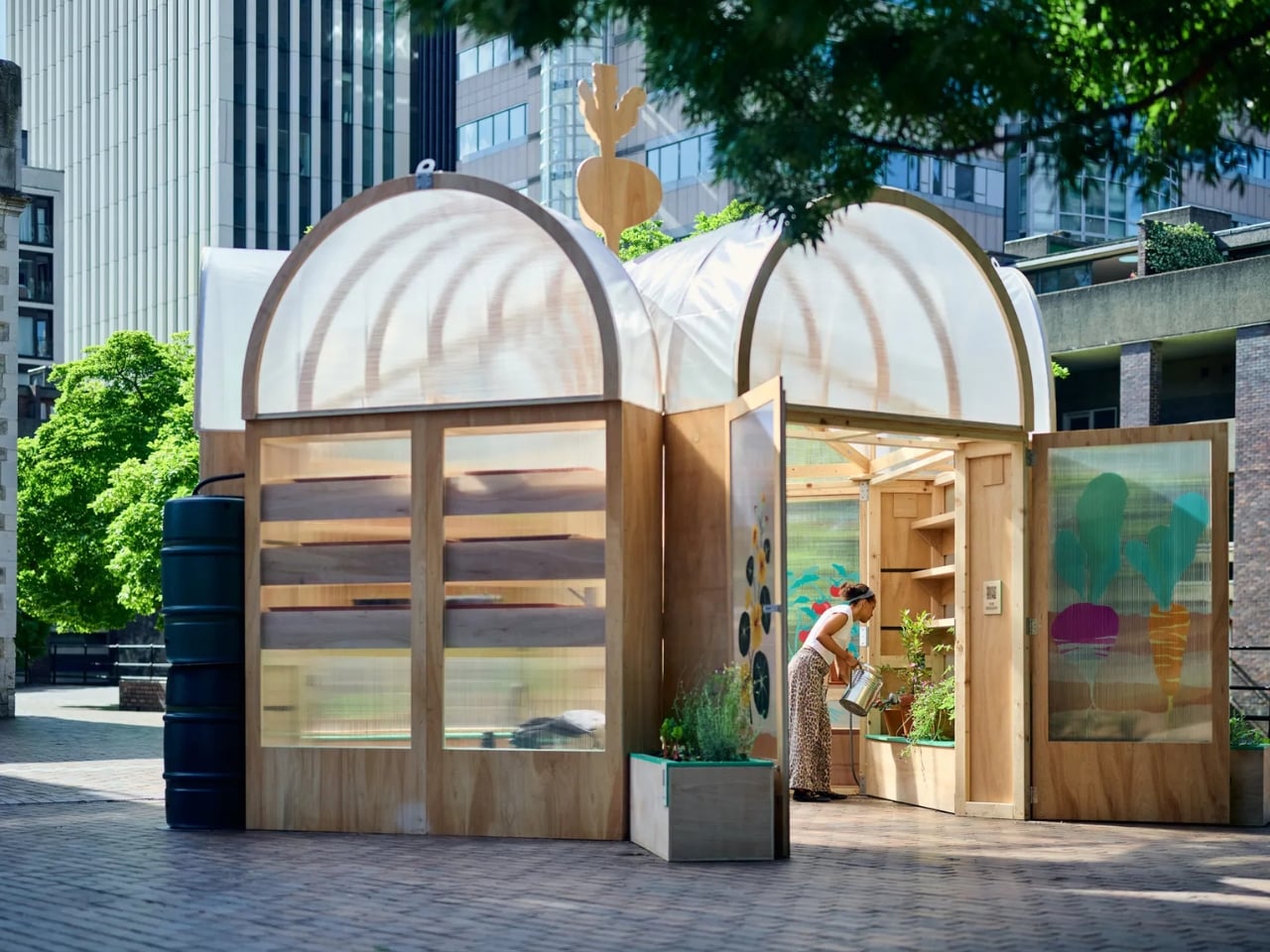
Most architecture competitions produce something sleek, serious, and slightly self-important. The Veggery is none of those things, and that’s precisely why it deserves your attention. Installed at the Barbican Estate’s St Giles Terrace in London, The Veggery is a temporary greenhouse pavilion designed by Studio Folk Architects and design-and-build studio Raskl. It was the winning entry to the “Seeds in the City” competition, organized by the Culture Mile Business Improvement District as part of the closing stretch of the 2026 London Festival of Architecture.

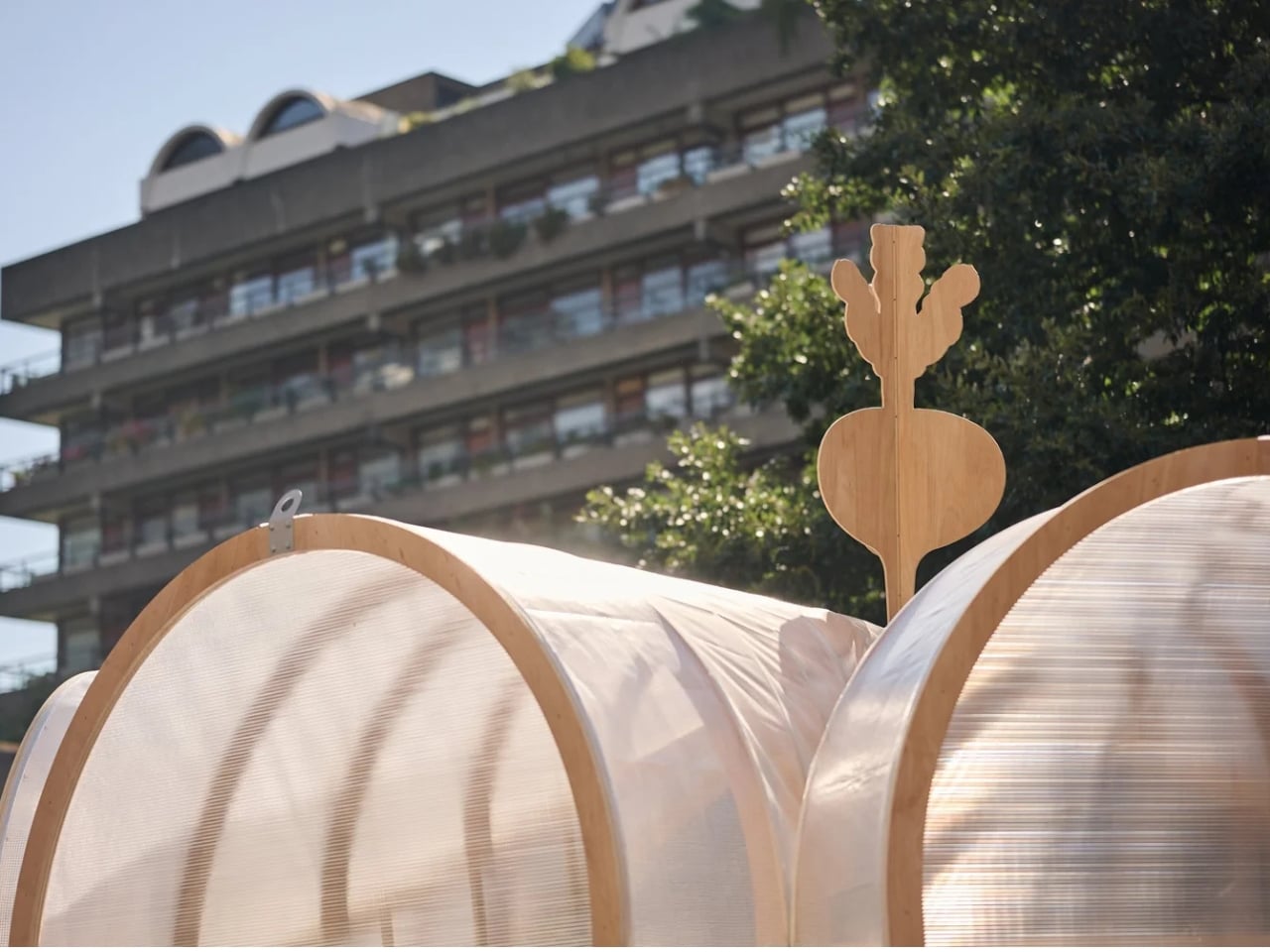
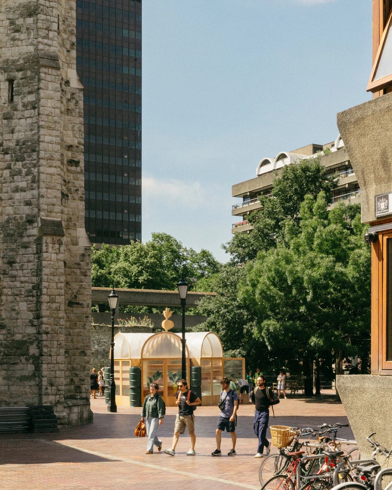
The brief asked designers to create a community-focused structure around food growing and sustainability. What came back was a hexagonal, domed greenhouse with a vaulted polytunnel roof, recycled water butts standing in as columns, and a one-metre-tall turnip finial sitting right at the top. Yes. A giant turnip. Perched at the apex of a greenhouse pavilion. On the Barbican Estate. I love it.

Designers: Studio Folk Architects and Raskl

The Barbican is one of those places that takes itself extremely seriously, and rightly so. Its brutalist architecture is globally revered, its arts centre is a cultural institution, and its residents are fiercely protective of its character. Dropping a whimsical garden folly into that context feels almost mischievous, except that Studio Folk Architects clearly thought very carefully about how to make it fit. The Veggery’s silhouette actually echoes the estate’s own barrel-vaulted roofscape, and its proportions nod to English landscape garden traditions. The turnip, though playful, is no accident. It roots the whole design in something very specific: the act of growing food, of getting dirt under your fingernails, of doing something tangible in a city that can feel relentlessly abstract.

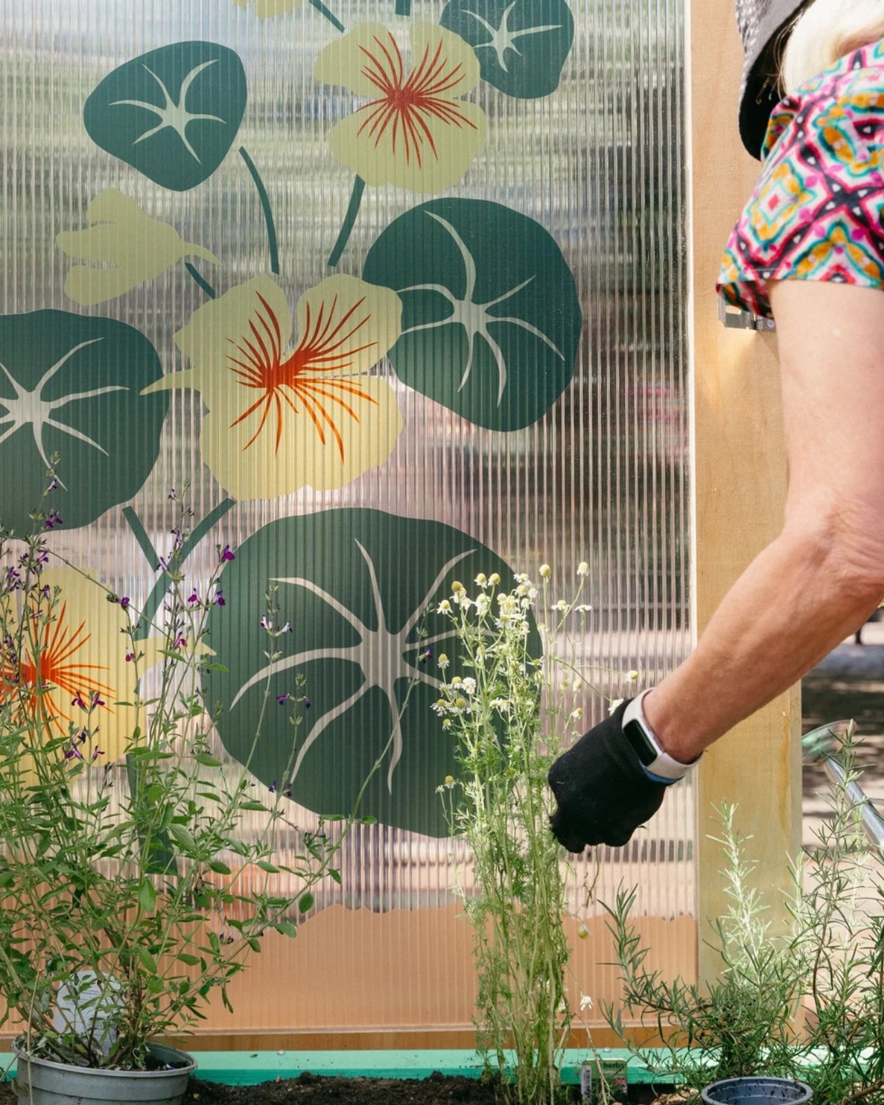
The detail work is where it gets genuinely interesting. The patterns pressed into the structure’s surfaces weren’t generated by a computer or lifted from an archive. They came from giant paper collages made by students at the neighbouring City of London School for Girls during design workshops. That decision changes the whole feel of the pavilion. These are not decorative gestures by designers working behind a screen. They are marks made by actual people who live and study next to this space, which is exactly the kind of community integration that too many public design projects only claim to have.

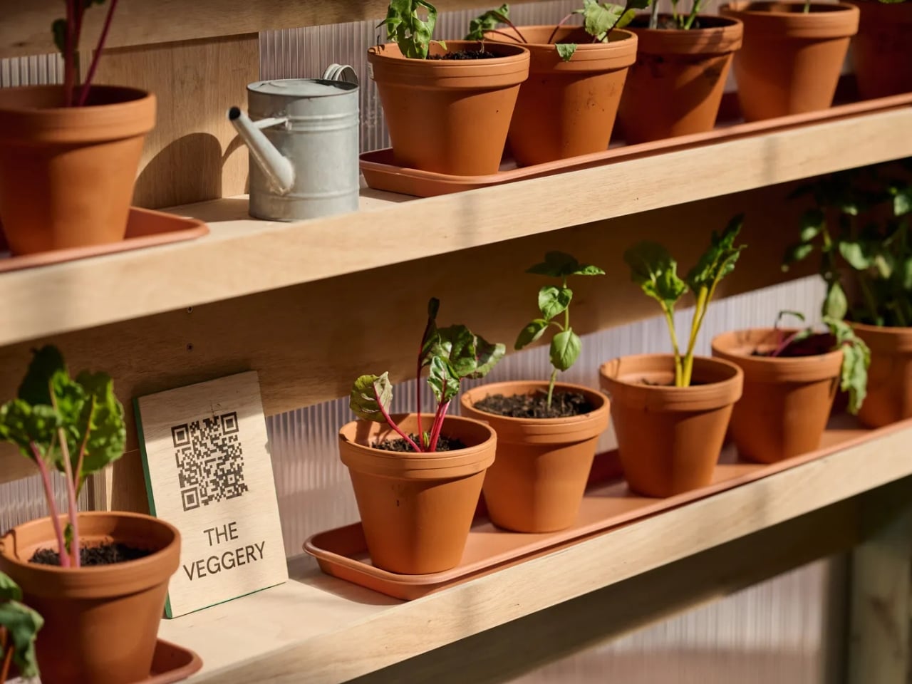
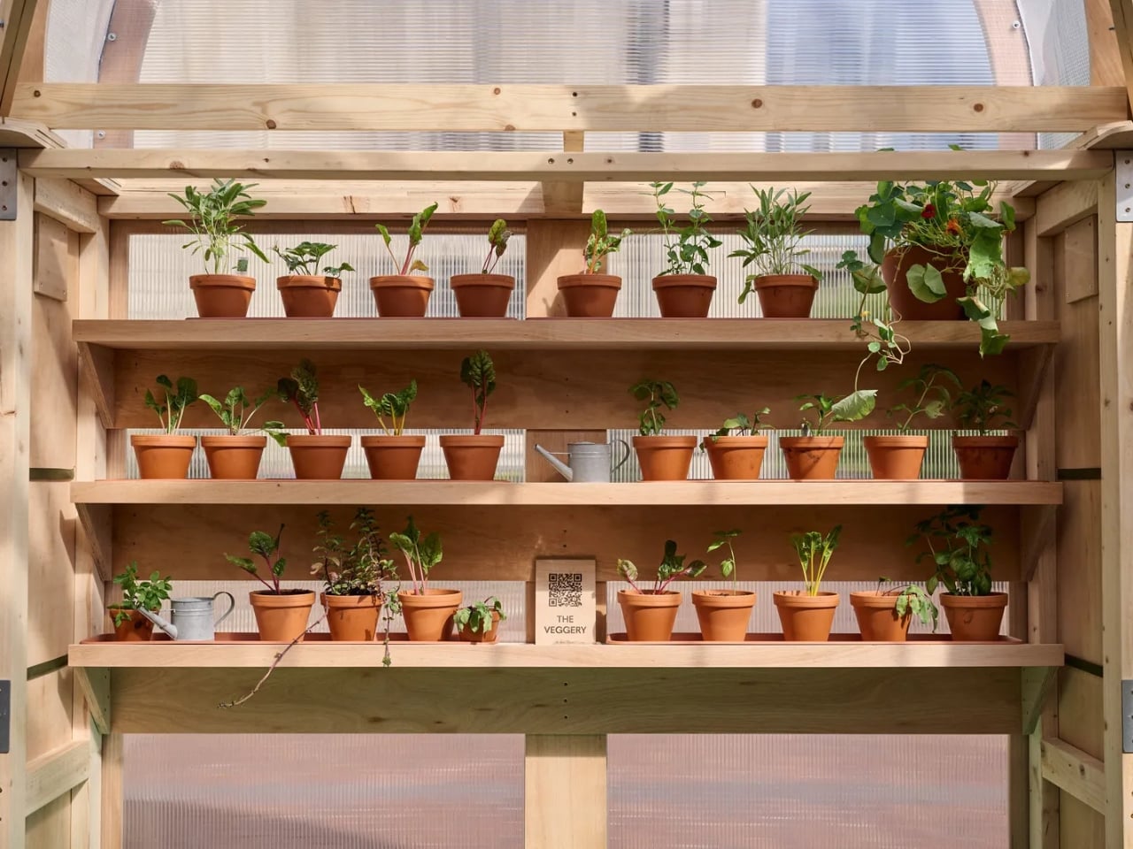
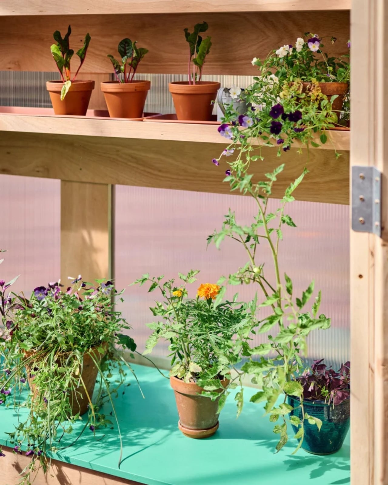
Inside, the pavilion functions as a working greenhouse. Three bays of flexible shelving hold plants and potting benches, with a clear open area that can be used for talks, workshops, and events. The Barbican Horticultural Society, local residents, and school groups all contributed to the planting itself. The structure’s timber framing is also demountable and designed for easy disassembly. It is not precious about itself, which is refreshing given how many temporary pavilions seem more interested in Instagram than in actual use.

The £50,000 budget strikes me as modest for what they pulled off, and it shows what a clearly considered design brief and genuine collaboration between an architecture practice and a fabrication partner can achieve. Raskl’s hands-on, design-and-build approach seems to have kept the whole thing grounded in practicality without sacrificing ambition.

The theme of the 2026 London Festival of Architecture was “Belonging,” and The Veggery answers that prompt with more honesty than most. Belonging, at its most basic, means having somewhere to go that actually wants you there. Not to look at, not to photograph, but to use. A potting bench and a shelf of seedlings is not glamorous, but it is welcoming in a way that a lot of elevated design is not. The fact that the pavilion sits within one of London’s most architecturally celebrated estates makes that contrast land even harder.

The Veggery is only temporary, which feels like the one genuinely unfortunate thing about it. For now, it is open, free to visit, and growing things. Which is more than can be said for most of what wins design competitions.

The post A Turnip on Top: London’s Most Unexpected Design Win first appeared on Yanko Design.

This Kia PV5 Modular Camper Kit Disappears Completely When the Weekend Is Over

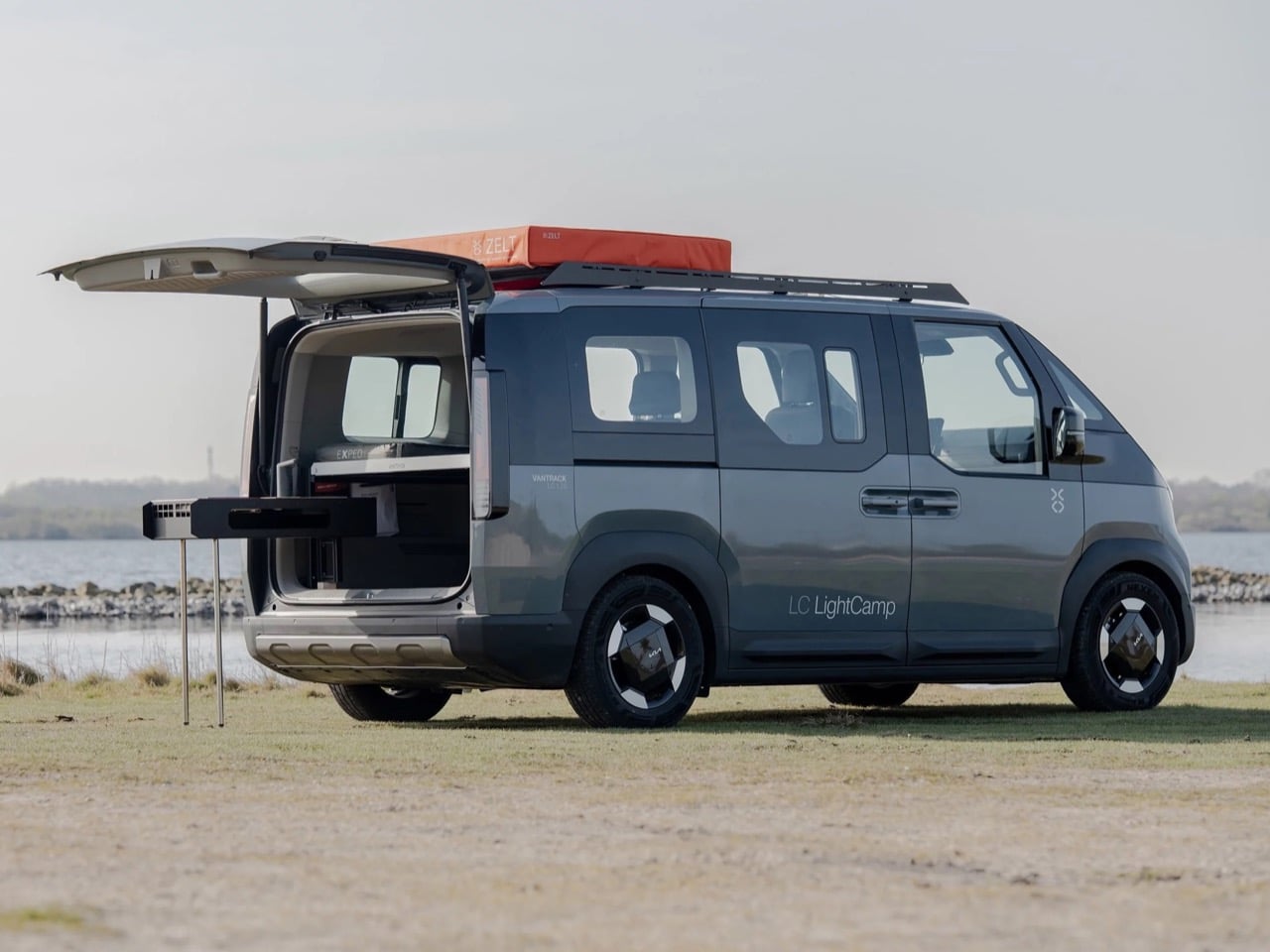
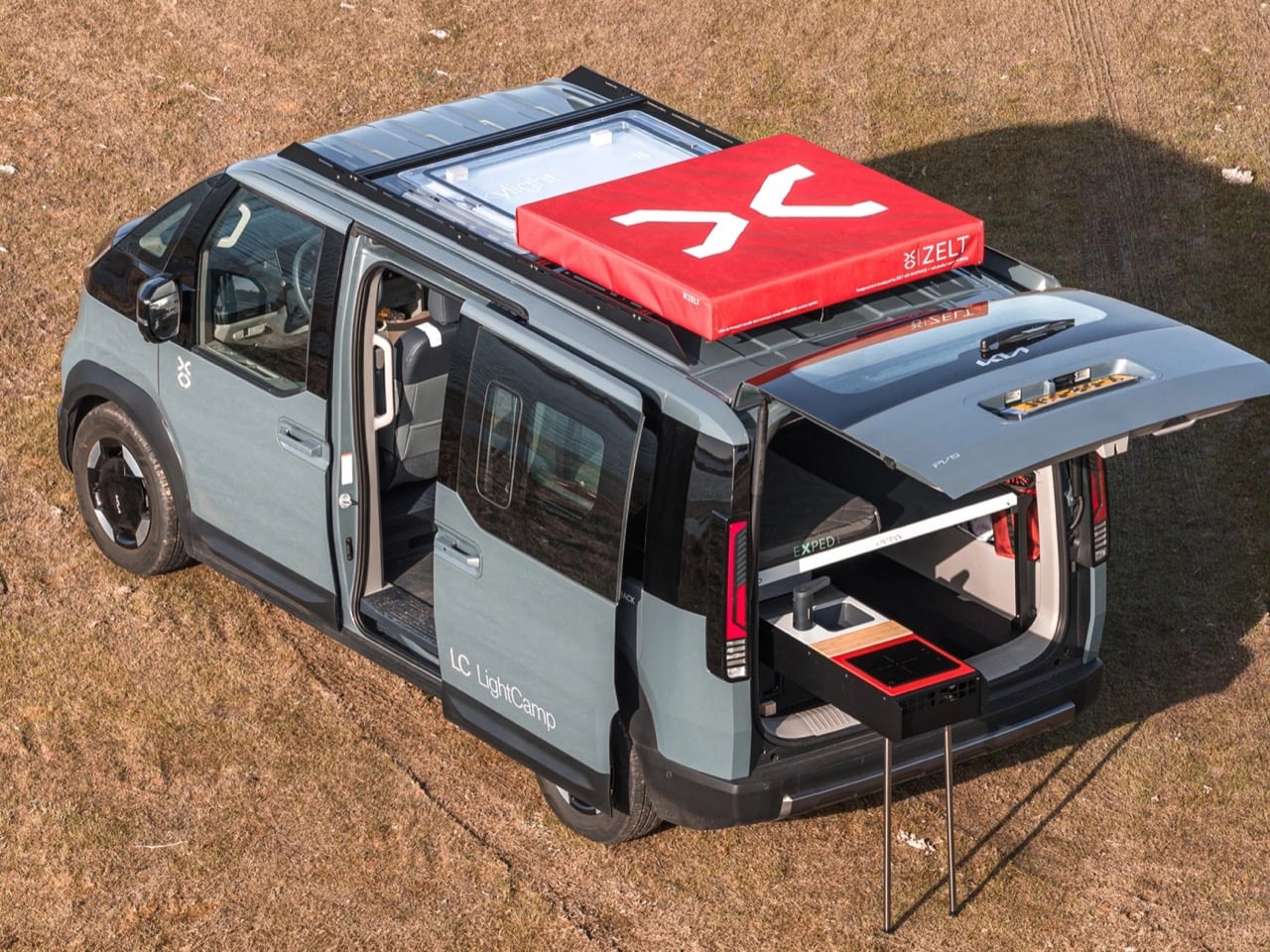
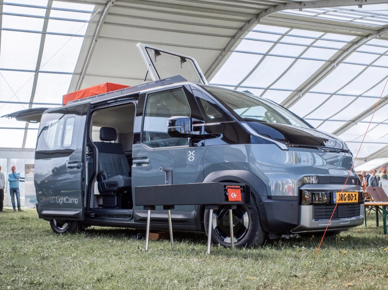
Camper conversions usually leave a mark. Cabinets get bolted in, headroom gets swallowed by a pop top roof, and the donor vehicle spends the rest of its life looking and feeling like a camper even when it is just running errands. Dutch outfit Vantrack decided that trade off did not have to be permanent, at least not for the Kia PV5 Passenger. Its Lightcamp package turns the compact electric van into a four person mini camper on Friday and hands it back as a stock e-MPV on Monday, with almost nothing left behind to prove the transformation happened.

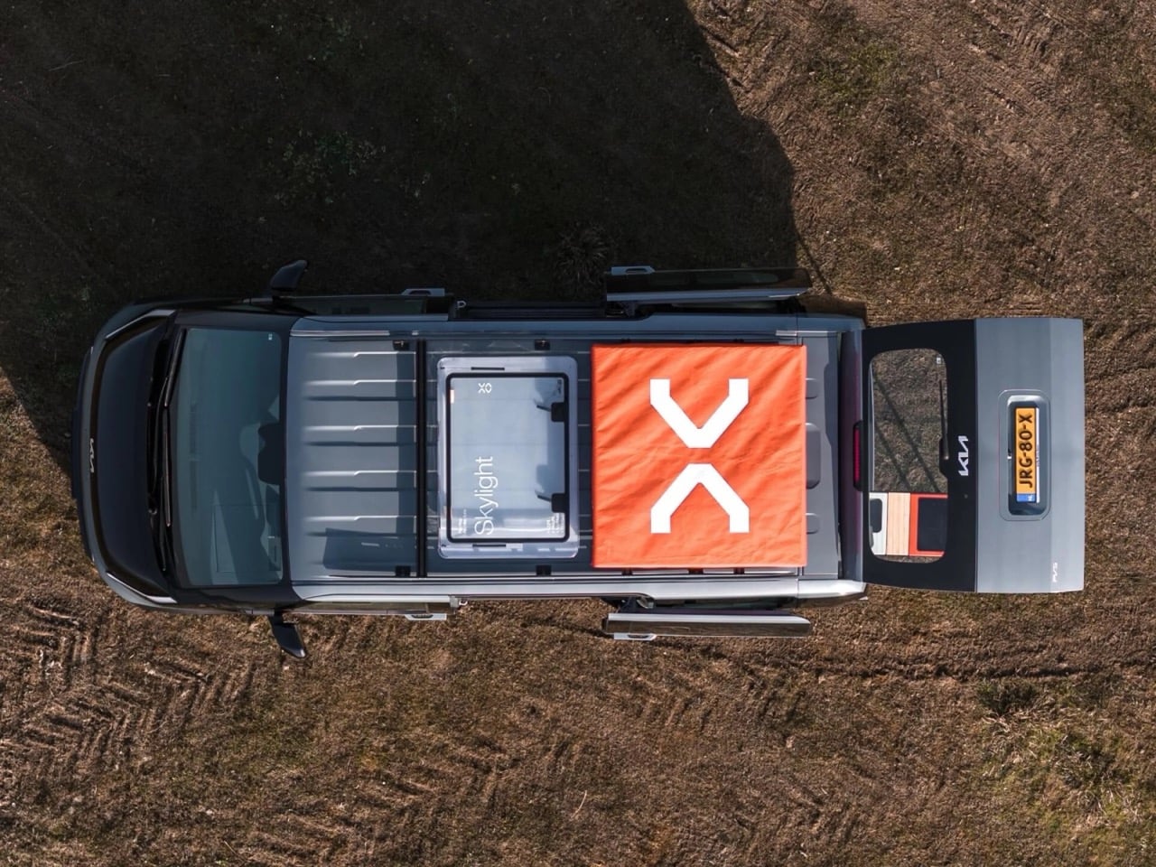
The trick lies in how little of the kit actually stays attached. A slide out kitchen, an inflatable sleeping platform, and a rooftop tent all come off in minutes, leaving only a fixed skylight as evidence anything changed. Vantrack plans to reveal the production version in September at the Netherlands’ Camper Trade Fair, with complete conversions starting around €65,000 based on the PV5 Passenger Essential trim.

Designer: Vantrack

The exterior graphics set the tone before you even open a door. Large, neat lettering spells out “LC LightCamp” along the flank, paired with a stark X logo that reads more like a Scandinavian furniture brand than a typical outdoor equipment maker. That restraint suits the PV5 itself, a van whose crisp panel lines and boxy proportions already look like they were drawn with a ruler. The single splash of orange canvas on the roof, visible from a drone shot as clearly as from the ground, keeps the whole package from feeling clinical. It is minimalism doing actual work, not just decoration for a trade show floor.

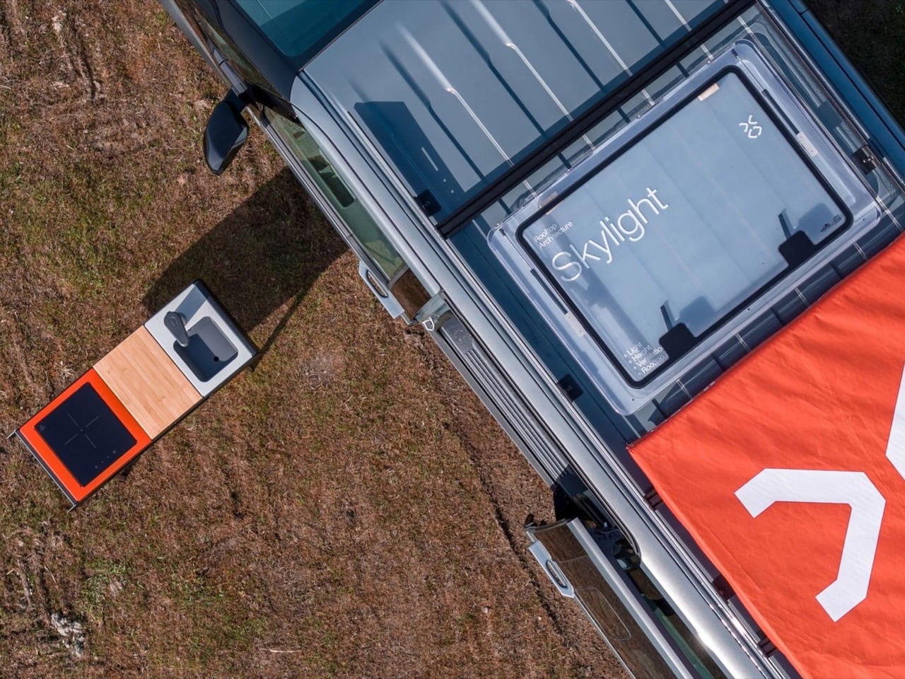
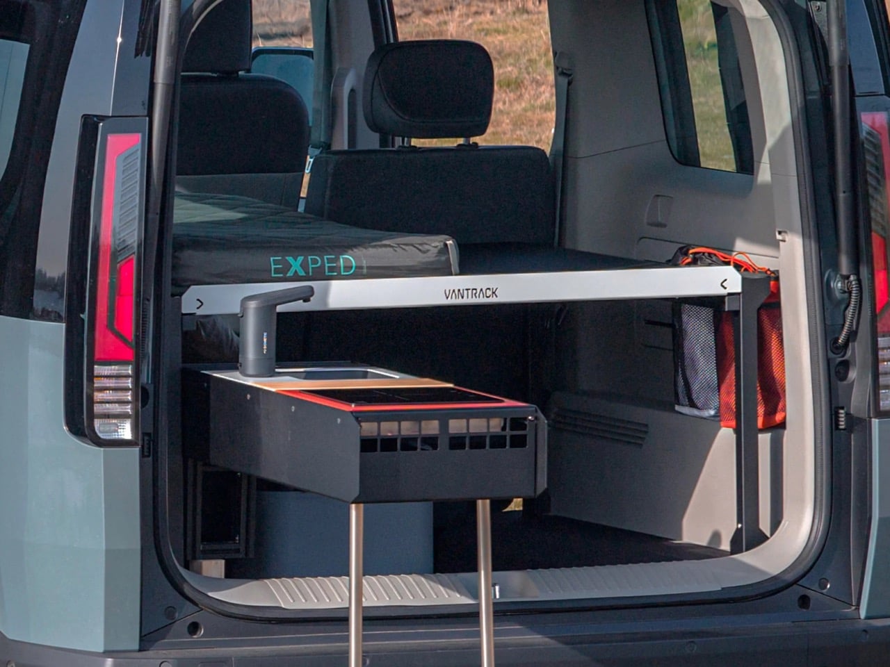
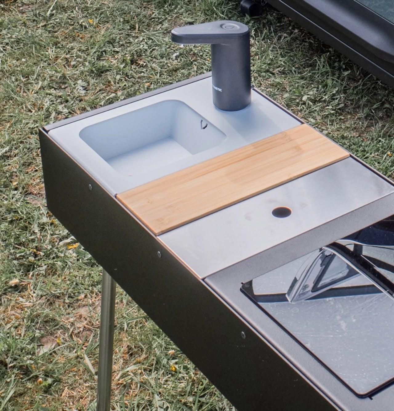
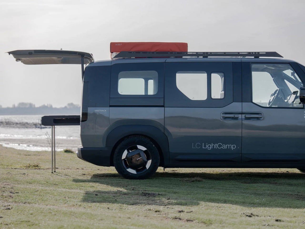
Vantrack’s real party trick sits at the tailgate. Instead of the thick, stacked foam mattress that most camper kits rely on, Lightcamp uses a slim pull out bed platform paired with two Exped Luxemat inflatable sleeping pads, each one rolling down to about 26 x 8 inches for storage underneath the platform itself. That frees up cargo space for gear rather than burying it under bedding. Below that platform rides the kitchen module, a compact unit with an induction cooktop, a bamboo cutting board, a small sink, and a Dometic Go faucet drawing from an 11-liter water canister. Slide it out on its own folding legs and it works as either a tailgate galley or a standalone cook station away from the van entirely.

Rather than fitting a heavy pop up roof, the company installed a fixed skylight that doubles as an access hatch into a rooftop tent it calls its Rooftop Architecture. The tent itself packs down small enough to sit on the rear of the roof rack, unfolding forward to create a two person sleeping area roughly 51 by 79 inches. That is lighter than a traditional pop top and, more importantly, it stays out of the way entirely when the tent gets pulled off for the off season. Vantrack has done similar rear cargo racks on its Volkswagen T6.1 builds, and Lightcamp borrows that same building block logic throughout.

None of this would matter much without a capable base vehicle underneath it. The PV5 Passenger’s Utility Mode lets owners tap the traction battery for climate control and V2L power while parked, running lights, a speaker, or a coffee maker without a separate leisure battery. Combined with a 256 mile WLTP range and 30 minute fast charging from 10 to 80 percent, the PV5 handles the drive to a campsite with more confidence than most dedicated camper vans manage on a full tank.

What makes Lightcamp worth watching is not any single component but the discipline behind leaving so much of it removable. Full pop top conversions commit an owner to a camper shaped life whether they are camping that week or not, while Vantrack’s kit lets the PV5 Passenger slide back into being an ordinary five seat van the moment the trip ends. Whether that modularity survives the jump from concept to the finished September reveal is the real question, but the underlying idea, that a camper should be something you deploy rather than something you permanently become, feels overdue.

The post This Kia PV5 Modular Camper Kit Disappears Completely When the Weekend Is Over first appeared on Yanko Design.

The Tent That Packs Down to One Bag, Bed Included

The camping tent hasn’t had a genuine rethink in decades. You still buy poles, you still wrestle with fiberglass or aluminum sleeves in the dark, and you still forget to pack the footprint. It’s a ritual we’ve accepted as part of the experience, which is either charming or maddening depending on the day. Puffer, a small outdoor brand out of Utah, is betting on maddening.

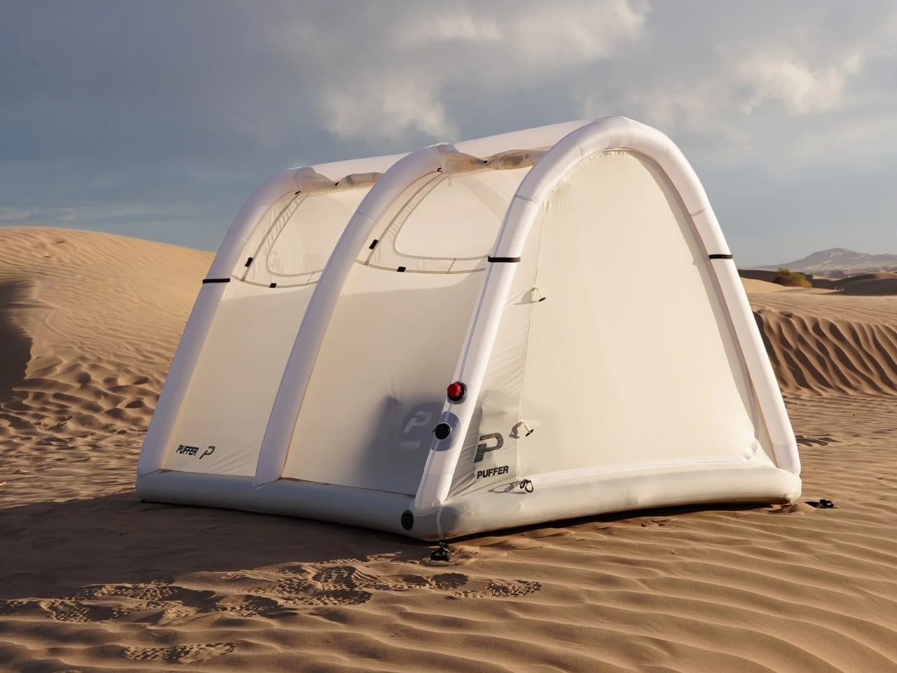
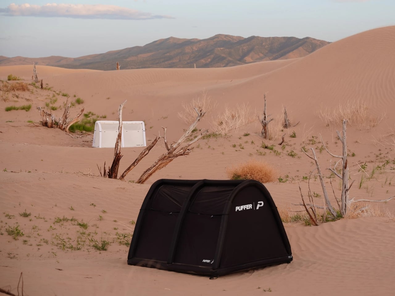
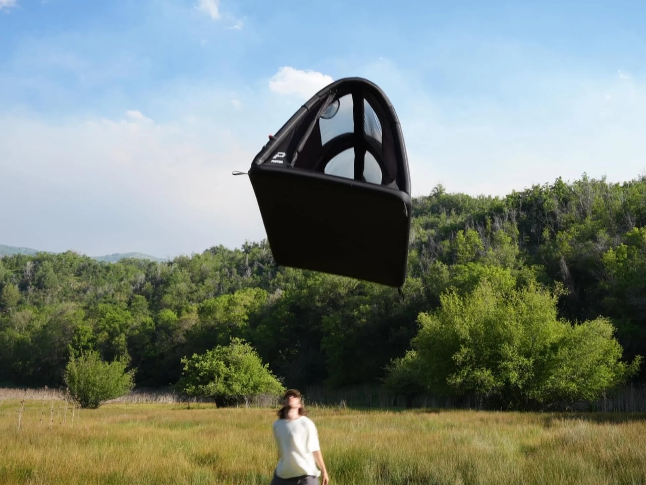
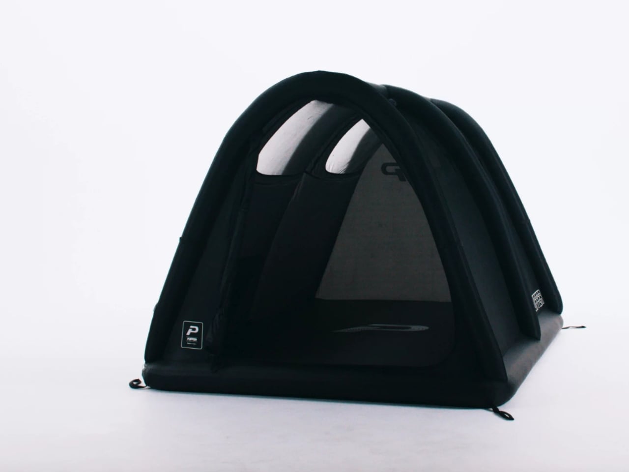
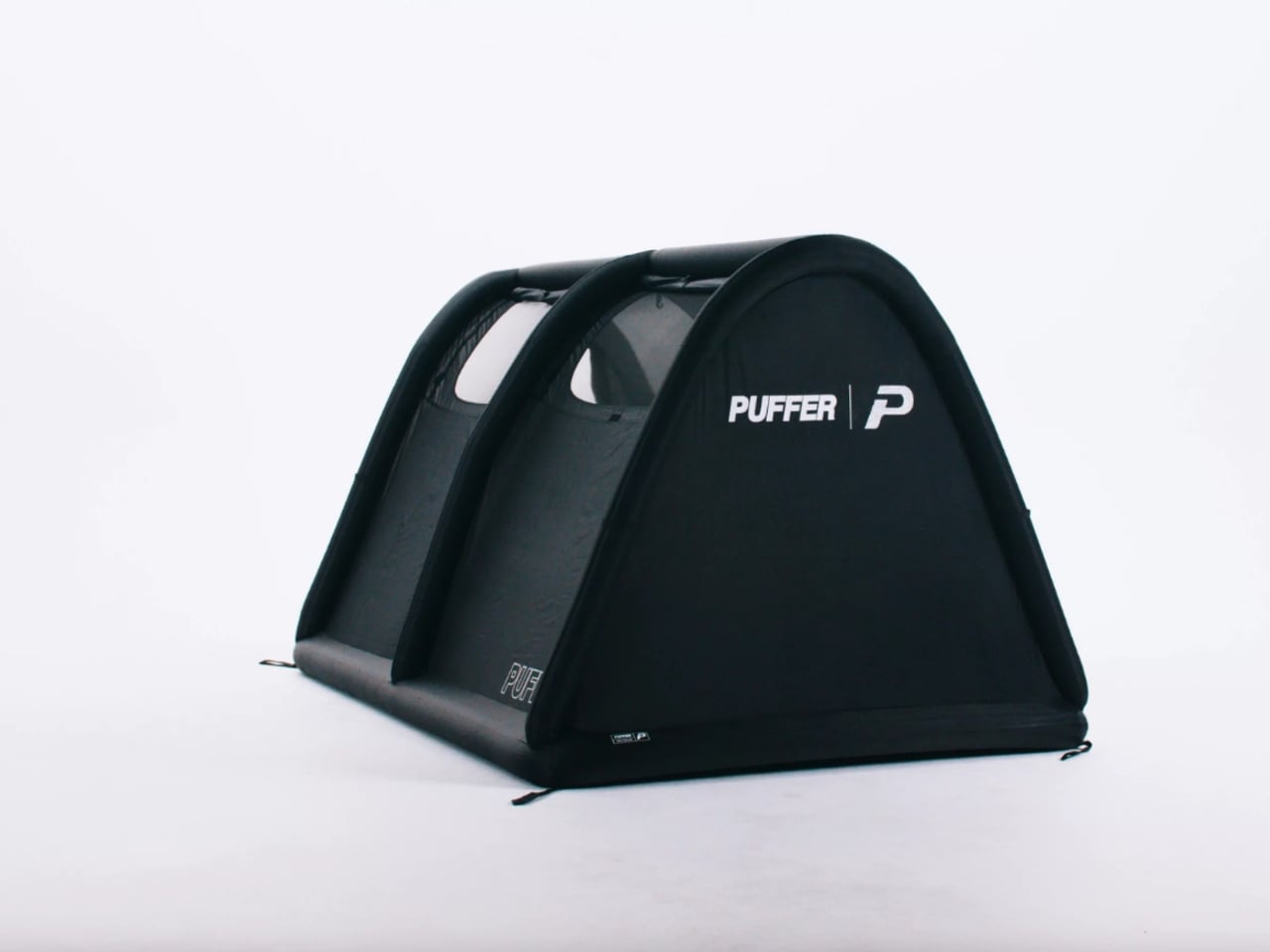
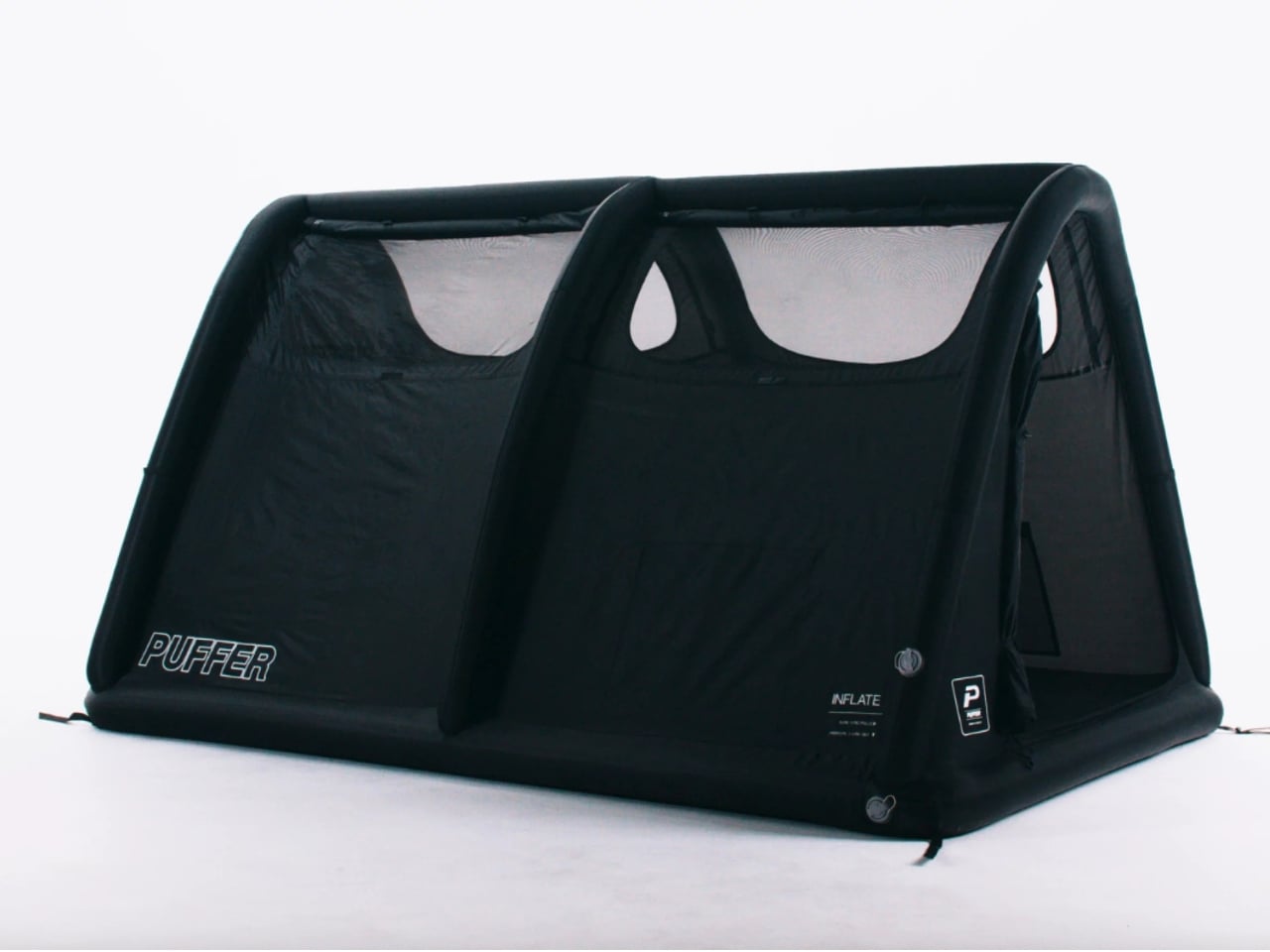
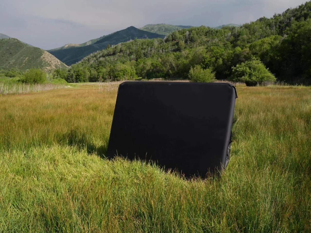
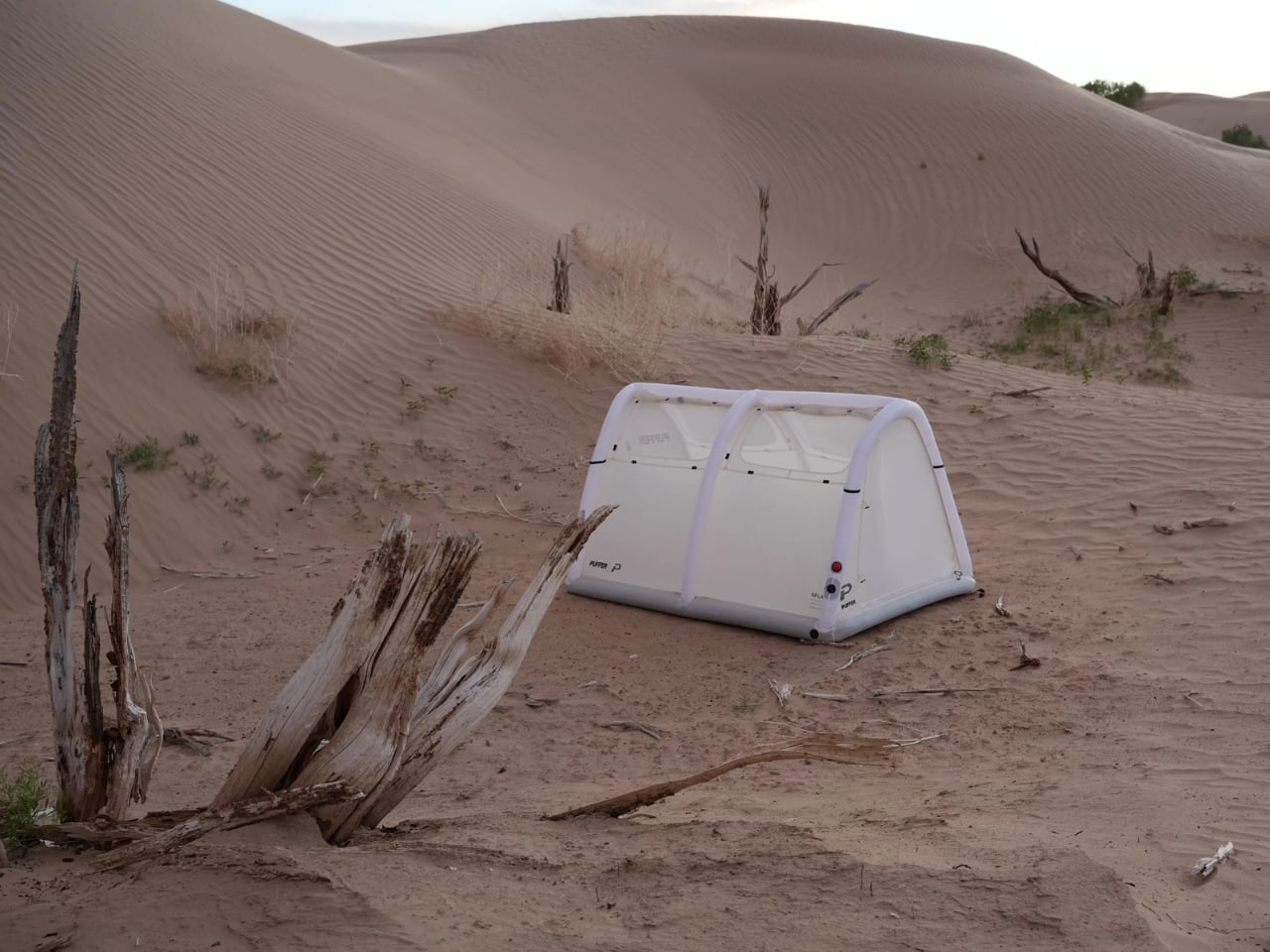
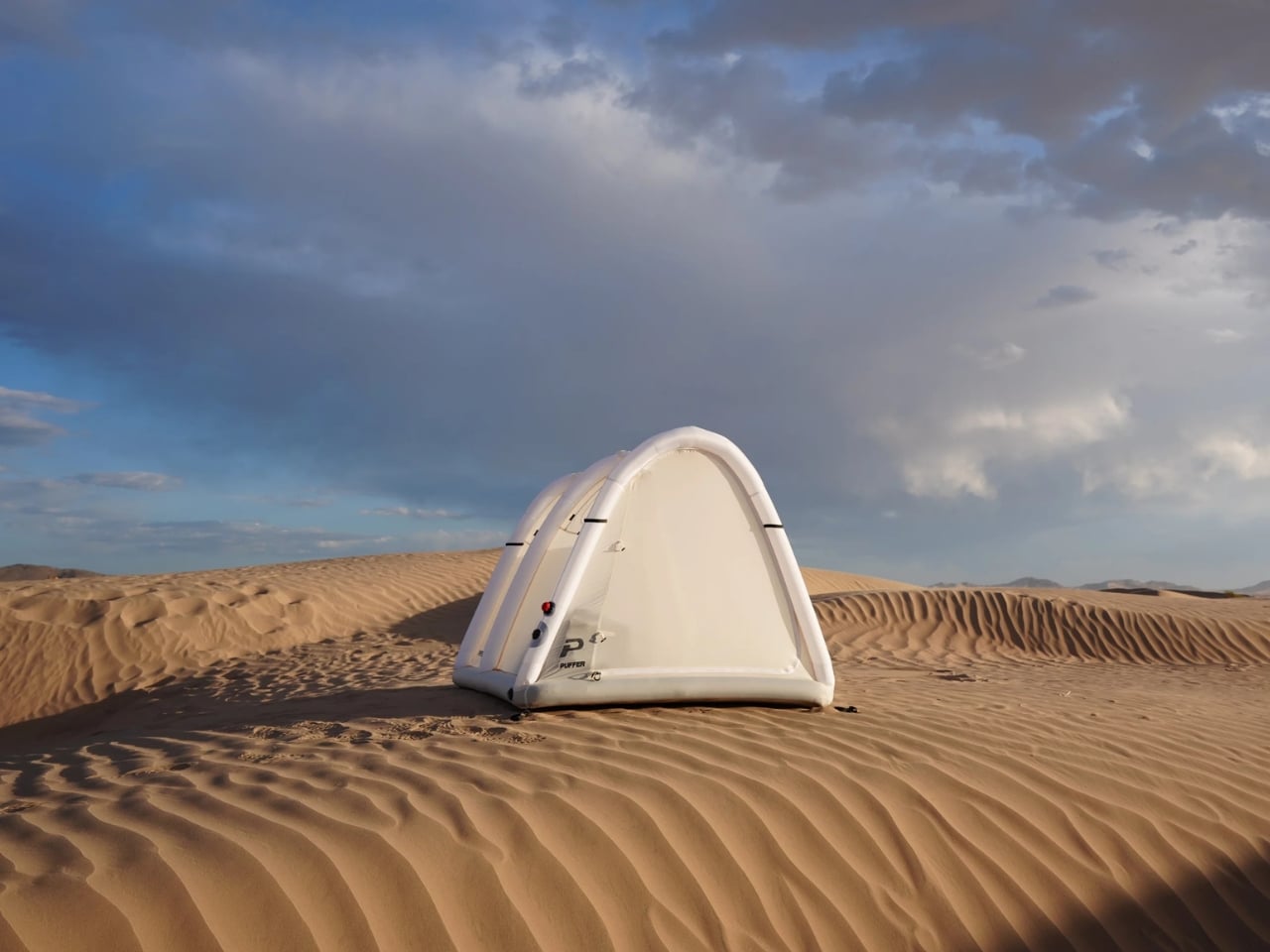
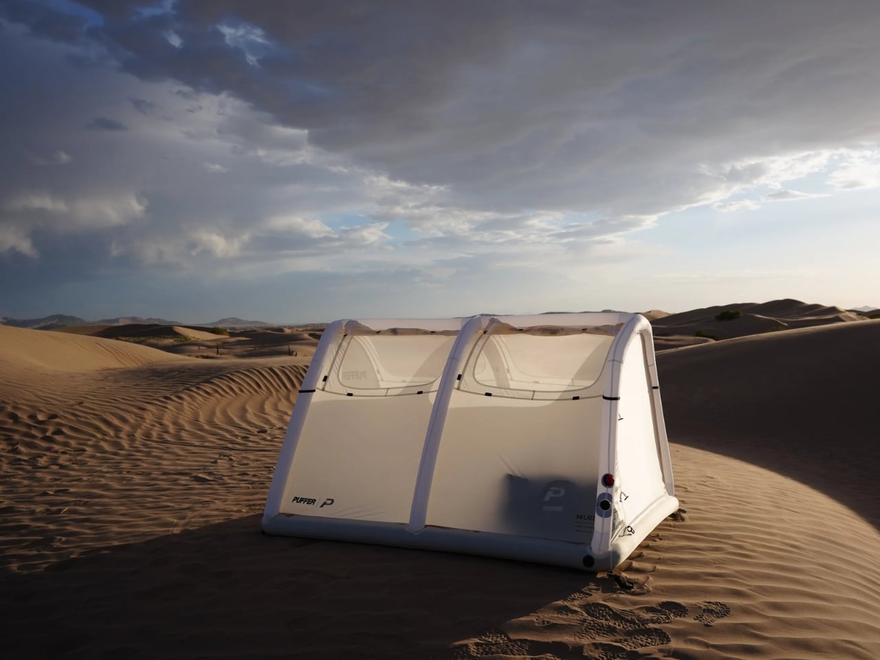
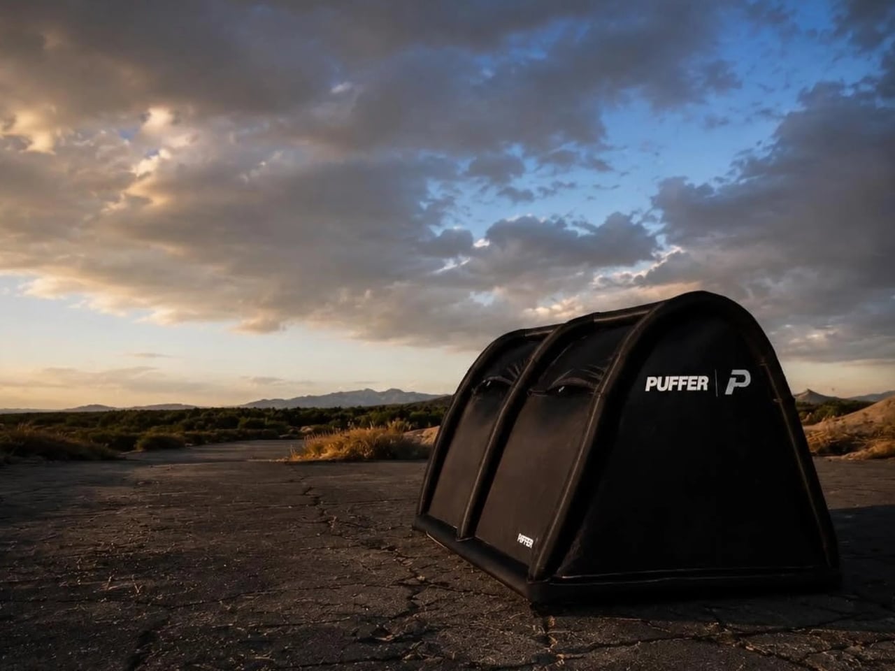
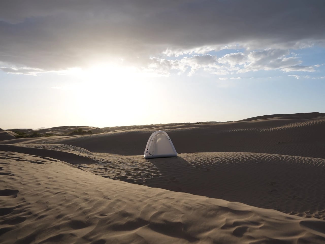
The Puffer tent is an inflatable A-frame that forgoes metal poles entirely in favor of pressurized air chambers, and it works exactly the way you’d hope it would. The setup is three steps: drop it, unroll it, inflate it. An included electric pump handles the airframe and the integrated air base, stops automatically when it hits the right pressure, and the whole thing is done in about two minutes. That’s not a marketing promise. That’s just physics.

Designer: Puffer

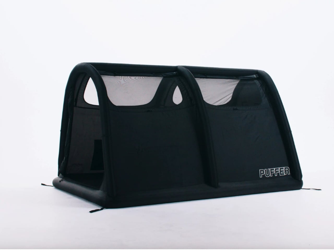
The design sits somewhere between a classic A-frame and a tunnel tent, with curved air arches that give it a silhouette unlike anything you’d typically find at a campsite. Visually, it reads more like something you’d see at a boutique glamping retreat than a standard campground. It’s sleek, matte black, and low to the ground in a way that feels considered. The brand’s roots are in skateboarding, snowboarding, and motocross, and that sensibility comes through. It doesn’t look like traditional camping gear. It looks like something someone actually cared about designing.

Interior dimensions are 84.6 inches long and 42 inches wide, with a peak height of 42 inches. It comfortably sleeps two, and the floor is the tent’s most interesting element: a fully integrated air mattress built directly into the base. You’re not rolling out a pad separately or inflating a separate sleeping surface. It’s all one system, and you can even adjust the firmness based on preference, from soft to firm to hard. The idea that you’d arrive at a campsite with a single bag containing both your shelter and your bed is a small thing in theory and a very large thing in practice.

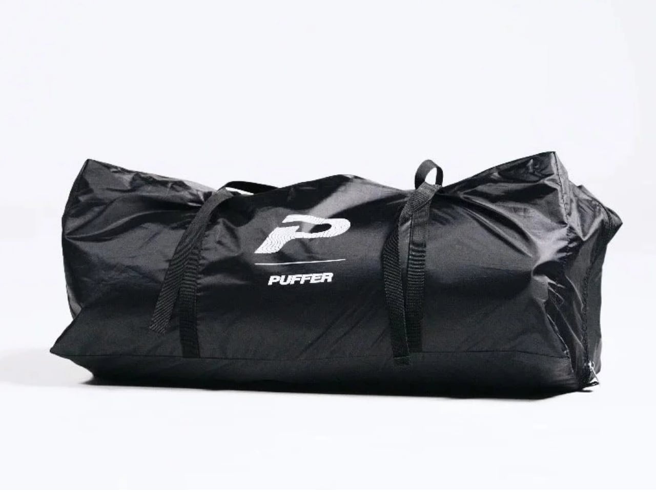
Total packed size is 10 x 25 x 10 inches, which is genuinely compact for what you’re getting. The weight, at 18.2 pounds for the tent alone (around 22 pounds with the full kit), is not featherlight. This isn’t a backpacking tent and Puffer doesn’t pretend it is. The target is car camping, overlanding, and festival use, and for those contexts, the trade-off is entirely reasonable. You’re saving setup time and sleeping better; a few extra pounds in the back of a vehicle is not a real sacrifice.

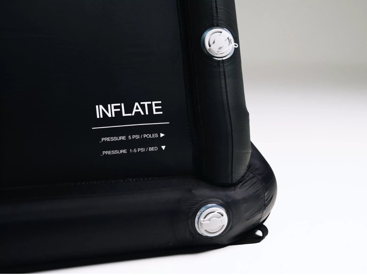
Founder Sam Peery spent five years prototyping the design, with his wife Bree helping sew and heat-seal the early versions through what the brand describes as a lot of sleepless nights and physical burns from the sealer. That kind of origin story matters, not because it makes the product work better, but because it explains why the details feel intentional. The valve placement, the pressure labels printed right where you need them, the way the pump connects and disconnects cleanly. These aren’t the details of a brand that licensed a factory spec and slapped a logo on it.

The price is $649.99, with the electric pump included. Is that expensive? Compared to a $40 tent from a big box store, yes. Compared to a quality backpacking tent from a premium brand, it’s actually competitive, and you’re getting a mattress included. The more useful comparison might be against a rooftop tent setup, which can run thousands of dollars and requires a vehicle with a rack. The Puffer works on the ground, anywhere, without any of that infrastructure.

The outdoor gear market is crowded, and tent innovation has been slow. Inflatable tents have existed in the premium glamping space for years, but they’ve largely been expensive, bulky, and targeted at a very specific buyer. Puffer’s approach is different: take a genuinely clever engineering idea, strip it down to the essentials, and make it accessible. Whether or not it replaces every tent you own, it makes a strong case that it could.

The post The Tent That Packs Down to One Bag, Bed Included first appeared on Yanko Design.

Your Dish Rack Stays Home When You Go Camping. This $75 One Doesn’t.

Ask anyone who camps regularly about washing dishes at camp and you will get the same answer: a damp tea towel laid flat on a folding table, bowls and mugs stacked on top of it, drying at whatever pace the outdoor air allows. It works. It has always worked. And until now, it was the only option – because dish racks are kitchen objects, fixed in place, belonging to a counter they never leave.

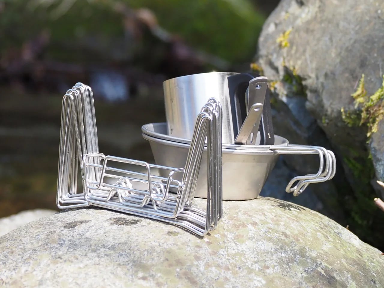
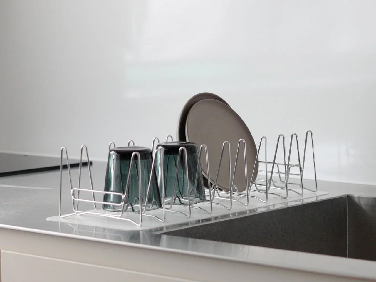
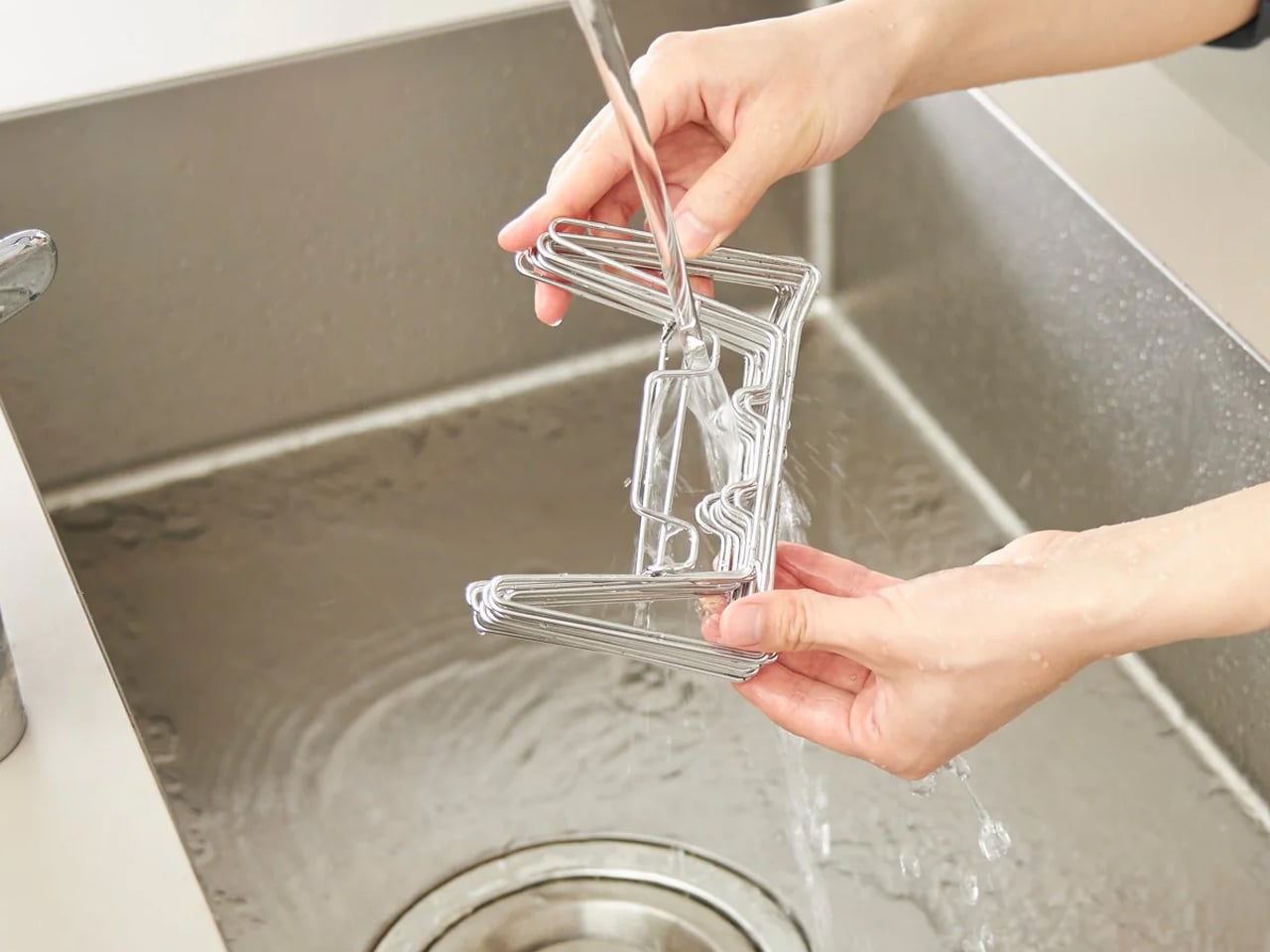
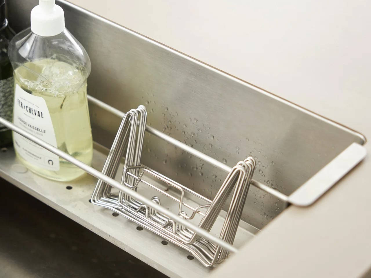
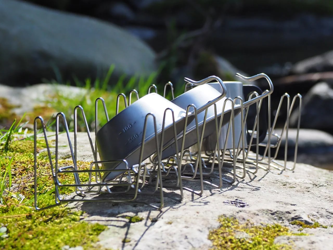
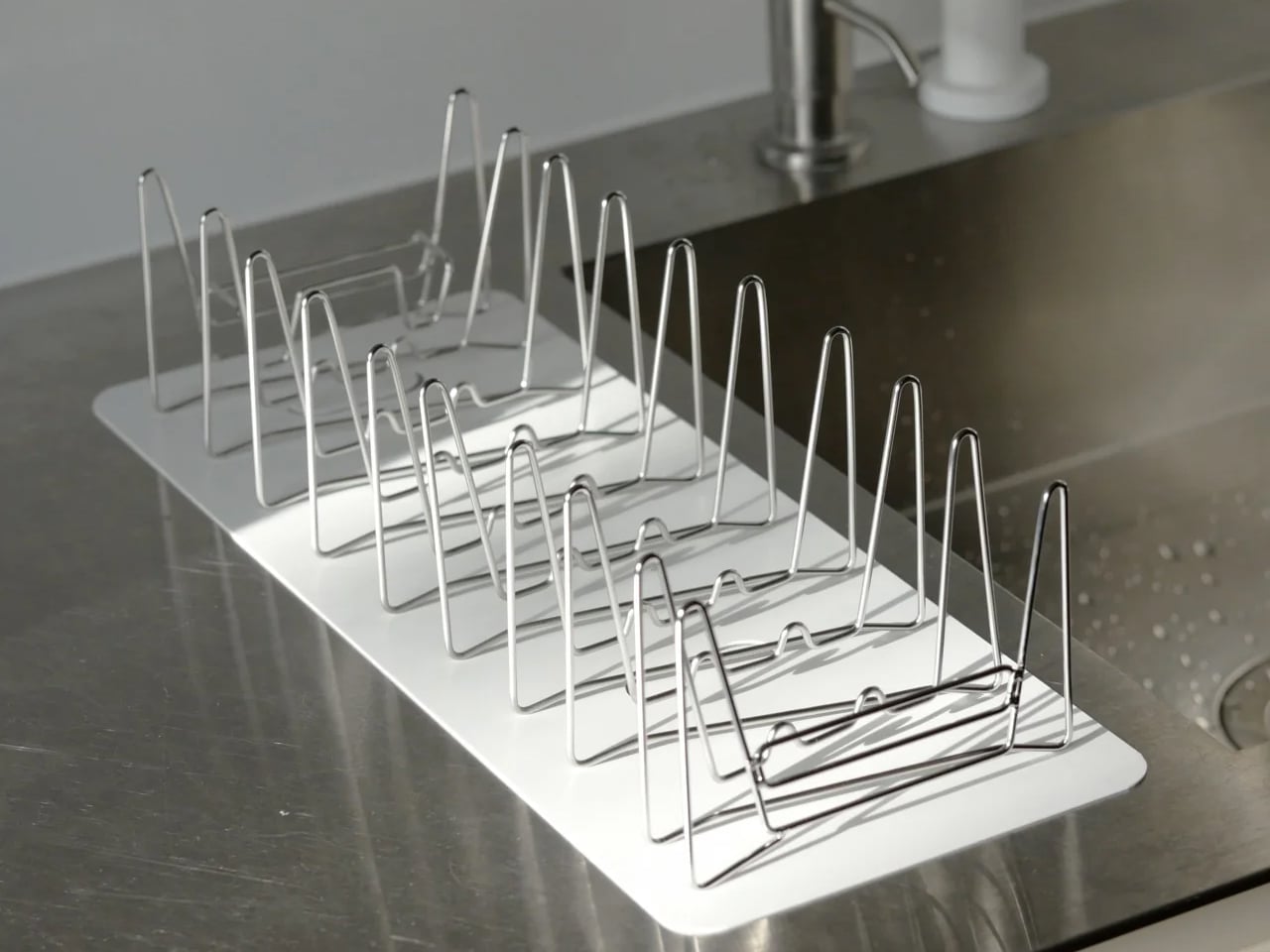
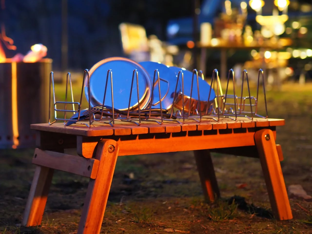
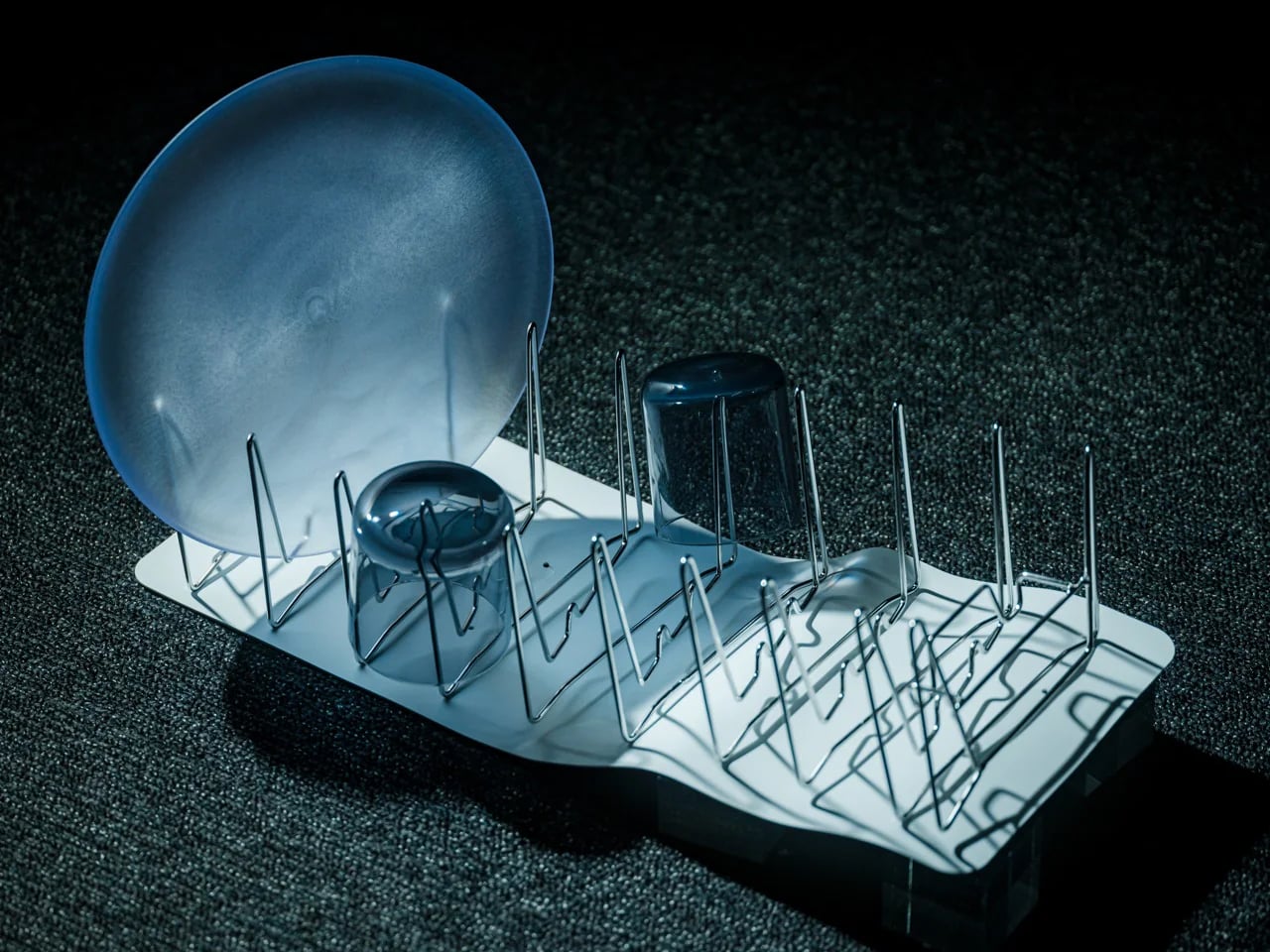
The Slim Fold Dish Rack is the first dish rack that was designed to go where the meal goes. With a patent-pending spring mechanism that collapses the full 14-inch (36cm) drying surface to 1.2 inches (3cm) flat in under a second, it packs alongside tent poles and sleeping bags without complaint, opens at the campsite in one motion, and handles a full post-dinner load of dishes before folding back down to nothing. At $75 without a carrying case and $90 with one, it is an answer to a problem every camper has solved with a tea towel for their entire life.

Click Here to Buy Now: $75.00

The Slim Fold Dish Rack collapses from 14 inches of full drying surface to 1.2 inches flat in under a second and the carrying case means your camp kitchen finally has the one thing it’s always been missing.

One Second Flat, One Motion Open

The 1.2-inch figure is the number that earns the trust. Not folded-smaller. Not collapsed-to-a-reduced-profile. One point two inches – thinner than most paperback novels, thin enough to slide into a camping bag between a rain jacket and a cutting board, thin enough that it takes up less space in a car boot than the wet towel it replaces. That is what the patent-pending spring mechanism delivers: a 14-inch dish rack that becomes a 1.2-inch object in under a second, and snaps back to full drying surface with the same speed in reverse.

We ran the rack through a week of use – counter, campsite, and cabin – and the spring action is more satisfying than any mechanism this utilitarian has any right to be. It snaps open with authority. It folds shut with the quiet certainty of something engineered to repeat this motion a thousand times without softening. There are no hinges to align, no prongs to press down individually, no two-handed wrestling match that most folding racks silently require. One motion open. One motion flat. The whole operation takes less time than shaking out a tea towel.

The 14-inch surface, once open, handles a full camp dinner’s worth of dishes, including the plates, mugs, bowls, the cooking pot you rinsed, without asking you to queue anything or balance a bowl at a precarious angle on a folding table. It works on any flat surface. Picnic table, tailgate, kitchen counter, cabin sideboard – the rack makes no distinction. It simply opens, does its job, and folds away when the job is done.

Built for the Kitchen That Goes With You

The carrying case option is the detail that separates this from every other space-saving dish rack on the market. A dish rack that folds flat is a home upgrade. A dish rack that folds flat and comes with a carrying case is a piece of camp kit – and at $90 for the case option, it is the most considered piece of camp kitchen equipment most people have never thought to own.

This is the rack for the campsite where everyone eats well but nobody thought to bring anything to dry on. For the cabin weekend where the kitchen is functional but the counter is already full. For the Airbnb where the host’s fixed rack is occupied and the tea towel is the backup plan. For anyone who has driven four hours to a national park, cooked a proper meal at the campsite, and then stared at a pile of wet dishes with nowhere to put them.

At $75 for the base model and $90 with the case, the Slim Fold sits above the budget collapsible rack market – where $15 buys a plastic accordion that folds halfway and still takes up counter space – and below the premium European designs. Only five units remain in current stock, which is not an artificial scarcity note. It is a factual one. If it is available when you are reading this, that is the signal.

What We Like

  • Folds from 14 inches to 1.2 inches (3cm) in under a second via patent-pending spring mechanism – not a partial collapse, a genuine flat profile thin enough to pack in a camping bag alongside kit that has never shared space with a dish rack before
  • Opens to a full 14-inch (36cm) drying surface with the same single motion in reverse, handling a complete camp dinner’s worth of dishes on any flat outdoor surface without compromise
  • Optional carrying case at $90 makes this the only dish rack in the comparable price range with a credible outdoor and travel use case – campsite, cabin, Airbnb, van, tailgate
  • Works indoors and outdoors equally – the spring mechanism performs the same on a picnic table at altitude as it does on a kitchen counter in a New York apartment
  • Spring action is consistent and repeatable – not the flimsy fold of budget plastic collapsibles, but a mechanism engineered to load and release with the same clean resistance across hundreds of cycles

What We Dislike

  • The base $75 model ships without the carrying case, which is the feature that makes helps the outdoor use case become a complete package
  • Folded dimensions are confirmed at 1.2 inches but full packed dimensions (length and width when flat) are not published, which makes it harder to confirm specific bag or drawer fit before purchasing

The Dish Rack That Finally Goes Where You Go

The Slim Fold Dish Rack does not fix a problem most campers knew they had. It reveals one. Once you have dried a full camp dinner’s worth of dishes on a 14-inch rack that then disappears into 1.2 inches of flat profile and slides into your bag, the damp tea towel on the folding table feels exactly like what it is – a workaround you were never given a reason to stop using.

For the camp kitchen-minded, it is the one piece of kit that serious outdoor cooks somehow overlooked, designed with a spring mechanism precise enough to earn a patent and a form factor disciplined enough to go anywhere. For everyone else, the Slim Fold Dish Rack is a $75 object that earns its place in the camping bag all summer and earns it again on the kitchen counter every other month of the year.

Either way, once it comes on one trip, it does not stay home again.

The post Your Dish Rack Stays Home When You Go Camping. This $75 One Doesn’t. first appeared on Yanko Design.

This GPS dog tracker uses Starlink satellites to work anywhere cell service doesn’t

Satellite connectivity used to be reserved for phones, off-grid communicators, and specialized outdoor gear. Now it is showing up in far smaller devices, and Fi Ultra pushes that trend into pet care. The tracker taps into the Starlink satellite network to keep dogs locatable in places where cell towers never reach, a capability that would have sounded unrealistic in a consumer pet product only a few years ago. Hikers, hunters, and rural dog owners have spent years accepting blind spots in their tracking apps as a fact of life. Fi Ultra treats that blind spot as a problem worth solving with real infrastructure instead of a bigger antenna.

Fi built its business on GPS trackers that relayed location through LTE, a system that worked well until a dog wandered beyond cellular range. Fi Ultra closes that gap by adding satellite as a fallback layer, switching automatically between Bluetooth, Wi-Fi, LTE, and satellite depending on what is available. Priced at $199, with an additional $189 a year for satellite access, it signals how quickly satellite technology is trickling down into everyday consumer products. This is the same T-Satellite infrastructure conversation phone carriers have been having for the last two years, except here it is stitched into a dog collar instead of a flagship handset.

Designer: Fi

Satellite transmission is power hungry by nature, since the tracker has to punch a signal far enough to reach orbit rather than the nearest cell tower. Fi’s answer is a connection hierarchy that always defaults to the cheapest option available, quietly downgrading from satellite to LTE to Wi-Fi to Bluetooth the moment a lower power option exists. It is the same logic your phone uses when it prefers Wi-Fi over cellular data, just applied to a device with a fraction of the battery capacity. The result is a tracker that only reaches for its most expensive connection when nothing else will do the job.

An Apple AirTag runs for a year on its coin cell battery, and Fi’s own Fi 3+ lasts up to three months, but Fi Ultra is rated for only several days between charges. That is a steep drop, and it says something about how much energy satellite radios actually demand compared to the low power Bluetooth chips inside most trackers. Fi is betting that owners in genuinely remote areas will accept more frequent charging in exchange for a tracker that never goes dark, which is a reasonable bet for search and rescue dogs, hunting companions, and anyone hiking well outside cell coverage. It is a much harder sell for a dog that mostly patrols a suburban backyard.

Fi Ultra also carries over Fi Callback, a feature that lets owners send sound and vibration cues through the smartphone app to recall a dog from a distance, alongside standard support for both collar and harness mounting. None of that is revolutionary on its own. What makes Fi Ultra worth watching is the precedent it sets. Satellite hardware has spent years shrinking from ships and expedition gear down to phones, and now down to a dog collar. The next logical step is livestock tags, wildlife collars, and eventually anything small enough to wear that still needs to be found. Fi just got there first.

The post This GPS dog tracker uses Starlink satellites to work anywhere cell service doesn’t first appeared on Yanko Design.

The Folded Aluminum Kayak That’s Almost Too Beautiful to Use

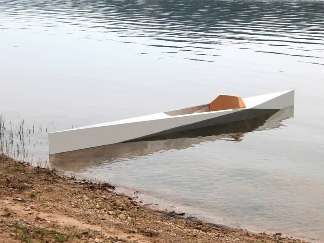
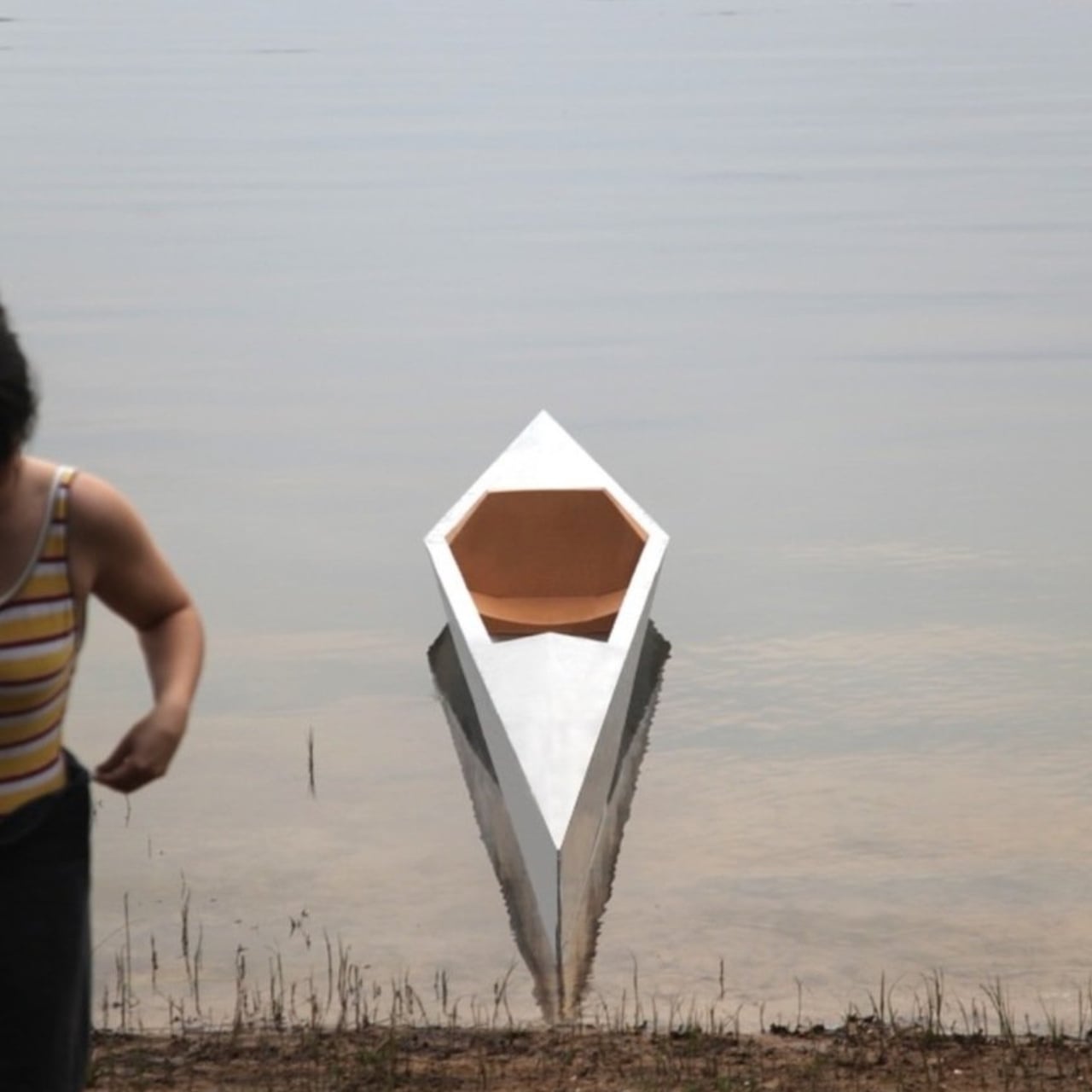
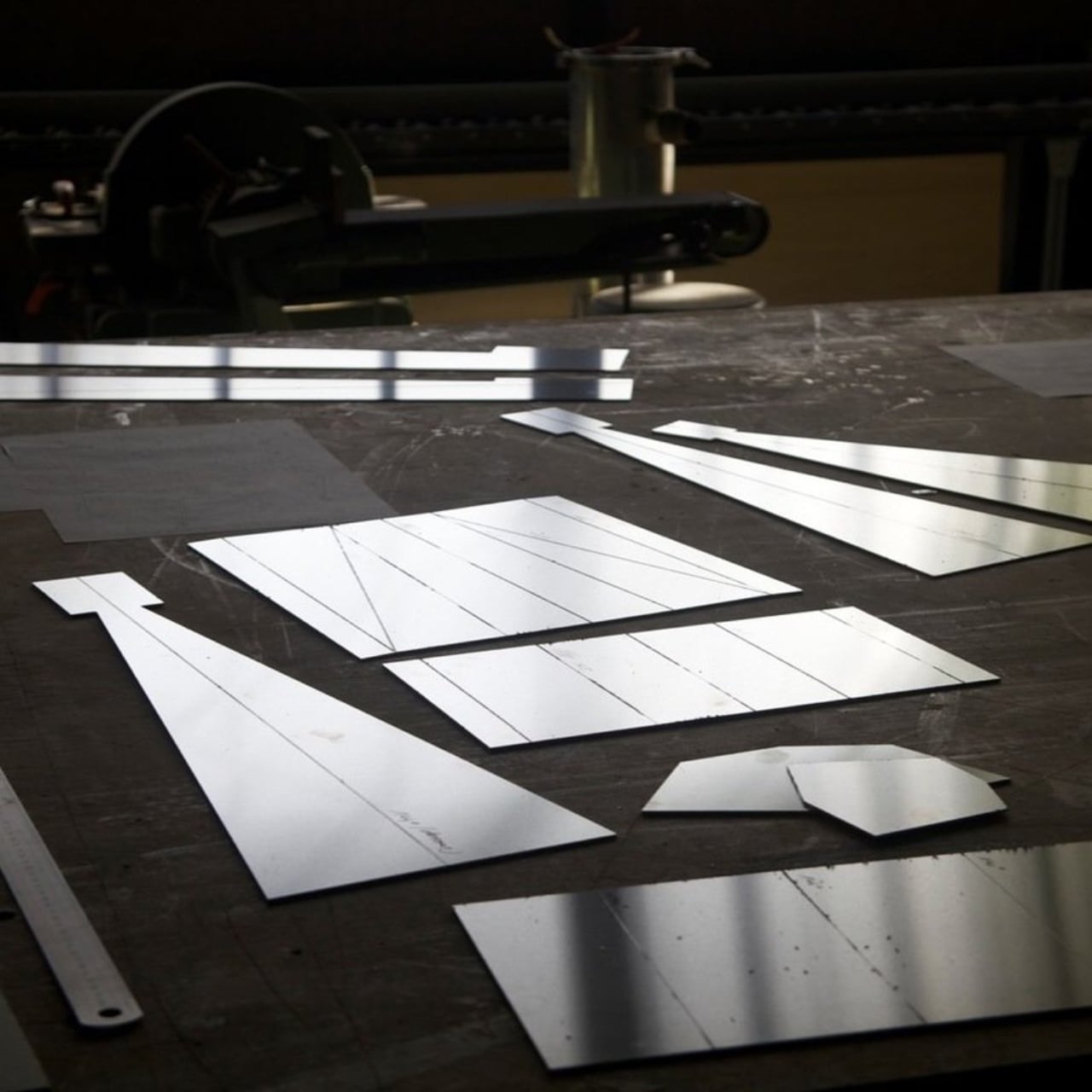
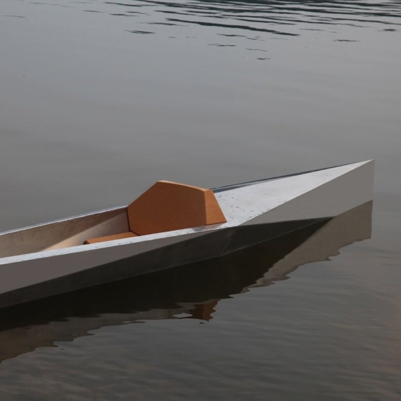
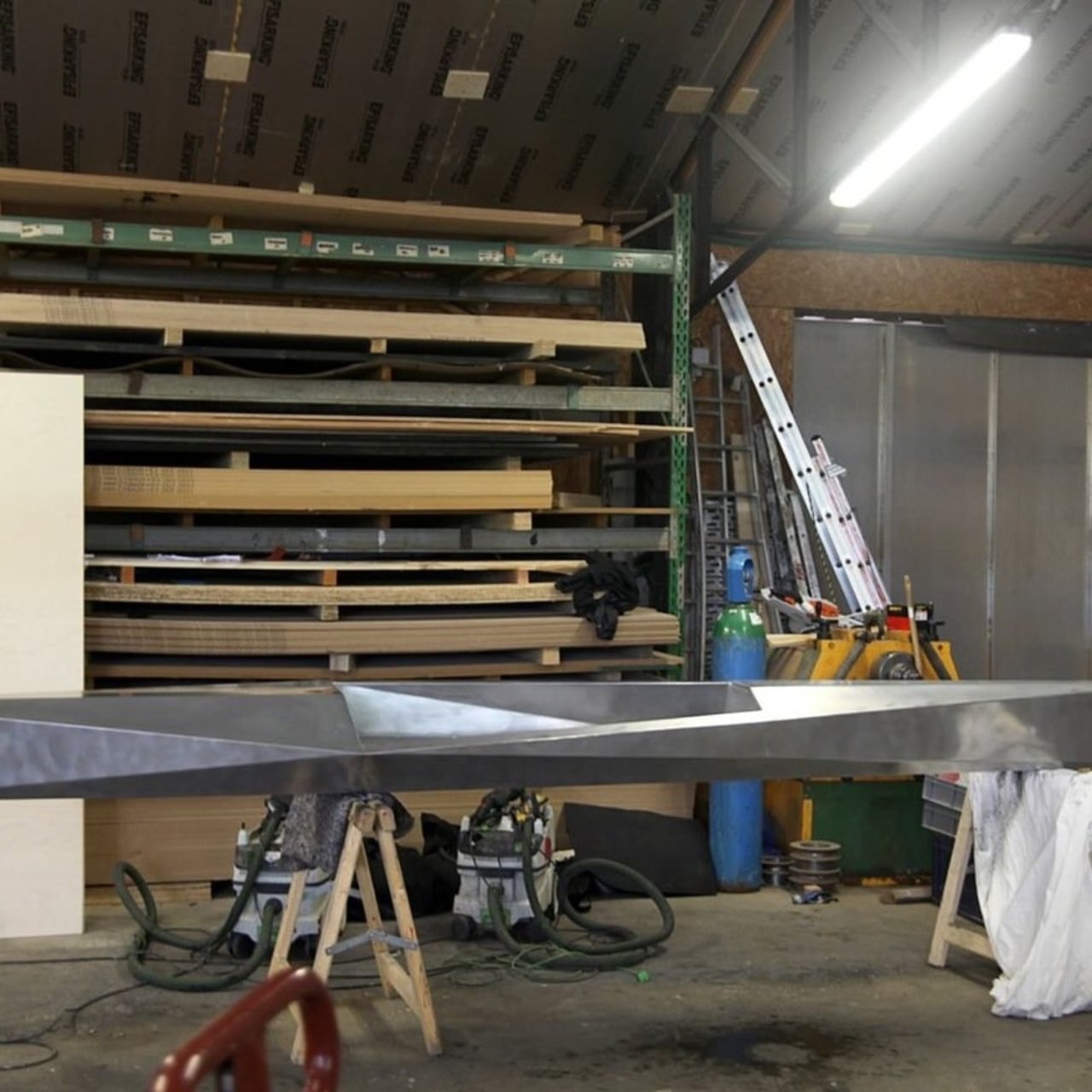
When Guillaume Bloget arrived at France’s Rhizome Association for a research-creation residency, he was surrounded by lakes. Most people would have simply enjoyed the view. Bloget looked at the water and immediately started thinking about how to cut through it. The result is Sharp, a kayak built from folded aluminum sheet and cork, and it’s one of the more quietly compelling design objects I’ve come across recently.

It’s one of those designs that stops you cold the moment you see it. Not because it’s trying to be shocking or provocative, but because it gets the balance so right. The silhouette is clean and geometric, almost architectural, and yet it moves your eye the way a good piece of sculpture does. You keep looking at it, trying to figure out exactly why it works so well.

Designer: Guillaume Bloget

Kayak design, as a category, doesn’t get nearly enough attention. We tend to treat watercraft as purely functional objects, things that should perform and get out of their own way visually. Sharp pushes back on that assumption without making a big show of it. Bloget worked on a hydrodynamic hull to produce what he describes as “a good sliding sensation,” which tells you the function was never an afterthought. But the execution goes well beyond the purely practical.

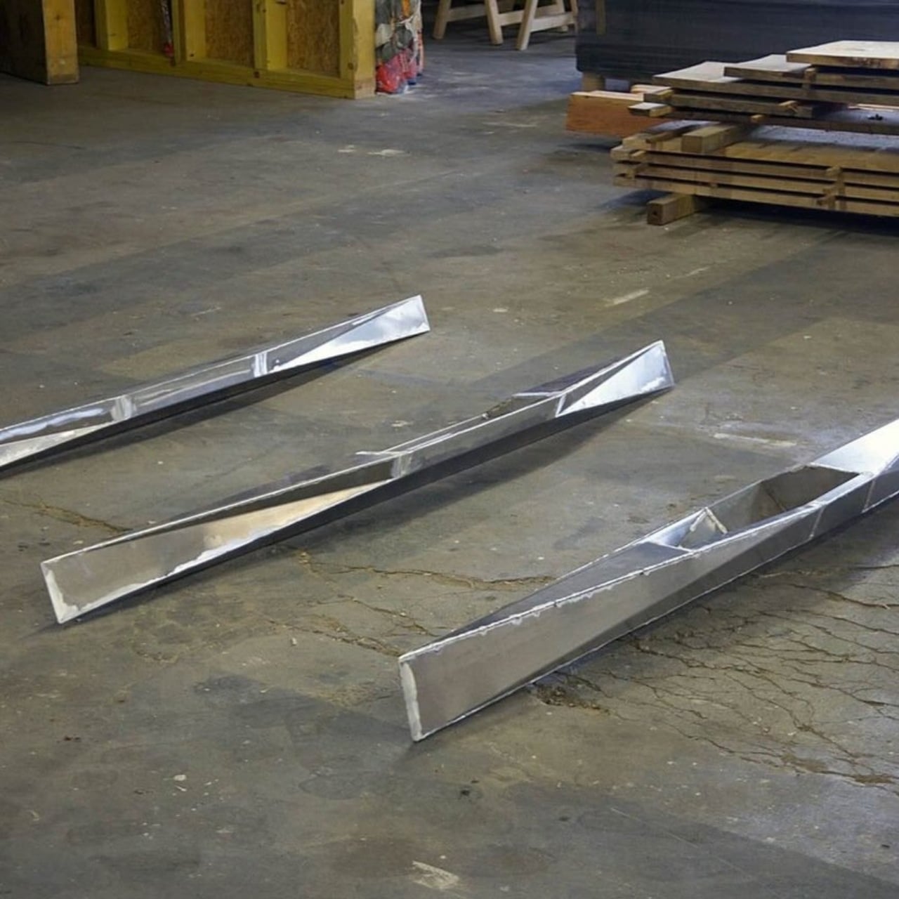
The folded construction is where things get genuinely interesting. The kayak’s structure relies entirely on folding, and the double-wall design makes it unsinkable. That’s not just a clever engineering solution; it’s the kind of constraint-driven thinking that separates good design from great design. When a structural requirement also produces an aesthetic, you know the designer was really paying attention. The angular folds give Sharp its name and its personality. It looks sharp. It feels intentional in a way that a lot of so-called “design-forward” products don’t quite manage.

Cork makes a quiet but important appearance too. The seat is cork, mediating between the angular geometry of the aluminum hull and the organic curves of a human body. It’s a thoughtful detail. Cork is warm where aluminum is cool. Cork is soft where the hull is rigid. Placing it exactly where your body meets the boat is not an accident. It’s the kind of material decision that you might not consciously register the first time you look at the photos, but that you’d definitely feel the moment you sat down.

The aluminum itself is doing double duty. Beyond the structural logic of folded sheet metal, Bloget noted that the shine of the material plays with the reflections of the water. That’s a level of environmental awareness that most product designers don’t even consider. Sharp wasn’t designed for a studio backdrop. It was designed for a lake, where light and surface and movement are all part of the experience. The kayak is meant to participate in its environment, not just occupy it.

Sharp sits in an interesting space right now. It was produced during a 2023 residency in Ouroux-en-Morvan alongside craftsman Antoine Rivière, labeled as a Mushroom Edition, which suggests it was made in a very limited run. Whether it ever becomes commercially available at any real scale is unclear. And that’s a little frustrating, because designs like this deserve to actually exist in the world, not just in portfolios and Instagram posts. Residency projects often produce beautiful ideas that quietly disappear, and it would be a genuine loss if Sharp became one of them.

The broader point here is about what we expect from everyday objects. A kayak is a practical thing. You paddle it, you store it, you use it to get somewhere or to simply be somewhere on the water. None of that changes because it’s beautiful. But when a practical object is also genuinely well-designed, the experience of using it shifts. You treat it differently. You notice things you wouldn’t have otherwise. The aluminum catches the light and so do you, briefly, on a lake somewhere in France. Bloget gave something useful a little poetry. The least we can do is pay attention.

The post The Folded Aluminum Kayak That’s Almost Too Beautiful to Use first appeared on Yanko Design.

Sealed in 10 Seconds: LifePods Changes Disaster Survival

The year was 2011. A tsunami slammed into the Japanese coastline, killed more than 20,000 people, and set off the Fukushima nuclear disaster. For most of us, it became a chapter in the news cycle. For French industrial engineer Cédric Choffat, it became an obsession that eventually became a company.

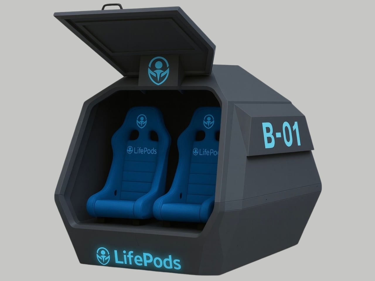
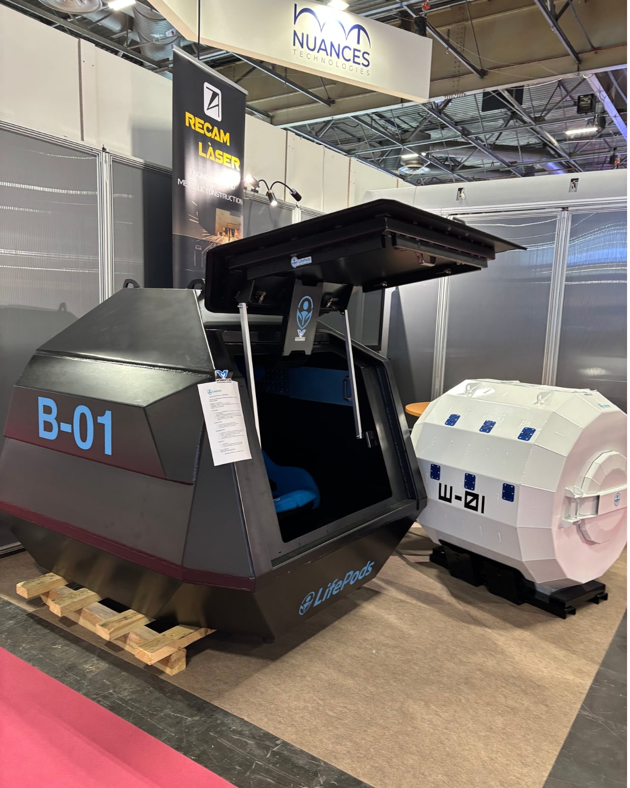
That company is Momentum Technologies, and what they’ve built is called LifePods: a line of portable survival capsules designed for the precise, terrible moment when the infrastructure around you stops working. Not “might stop working someday.” Right now, while you’re still inside.

Designer: Momentum Technologies

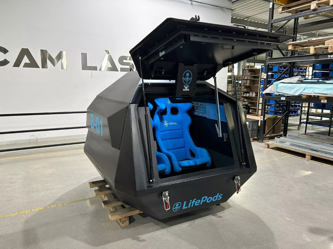
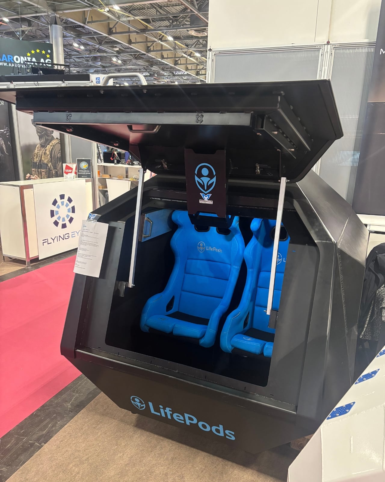
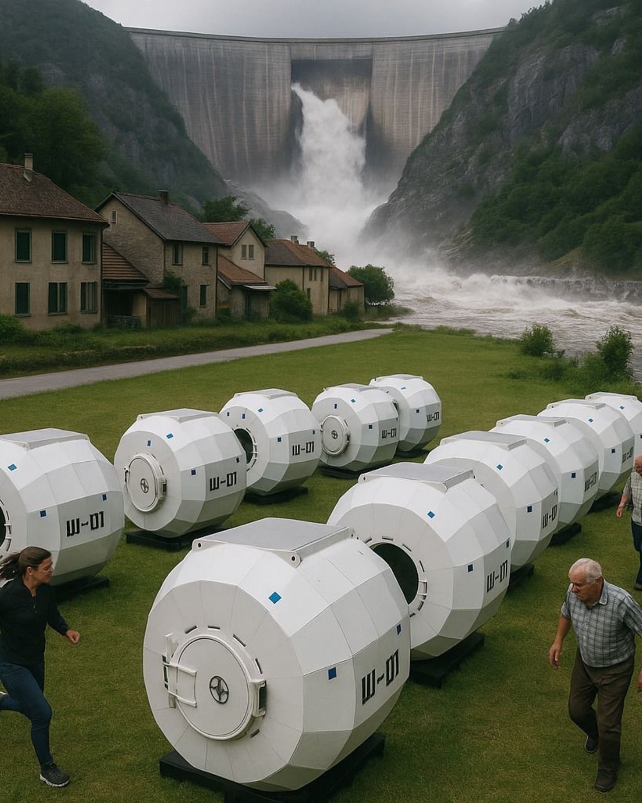
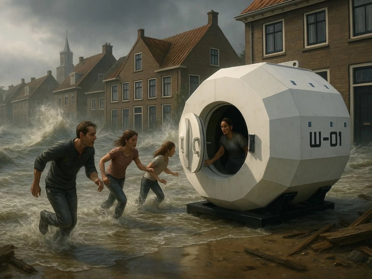
The concept is bluntly simple. You climb in, pull the lever, and the hatch seals in roughly 10 seconds. After that, the pod takes over. No special training required. The entire locking sequence was inspired by vault engineering and professional security hardware, which means if you can close a bank safe, you can operate one of these.

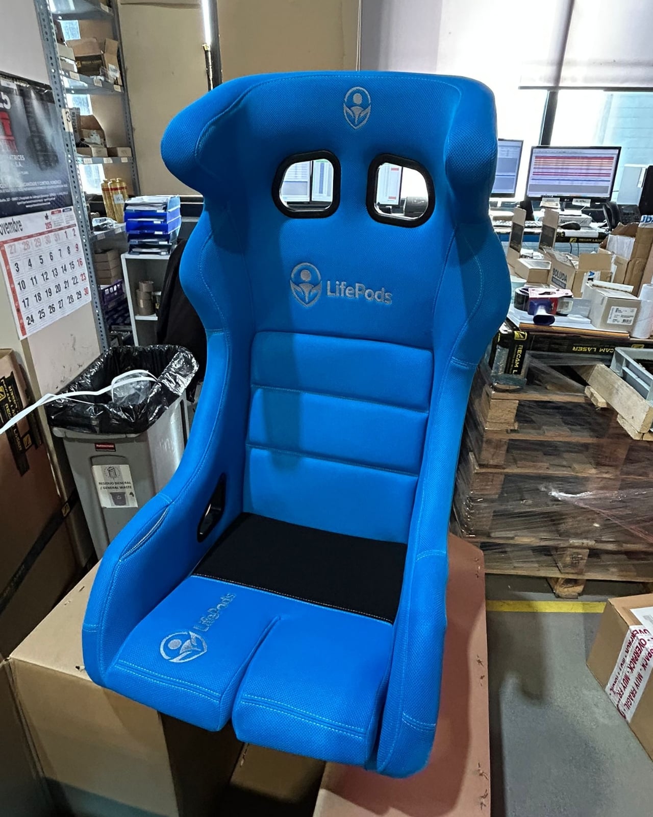
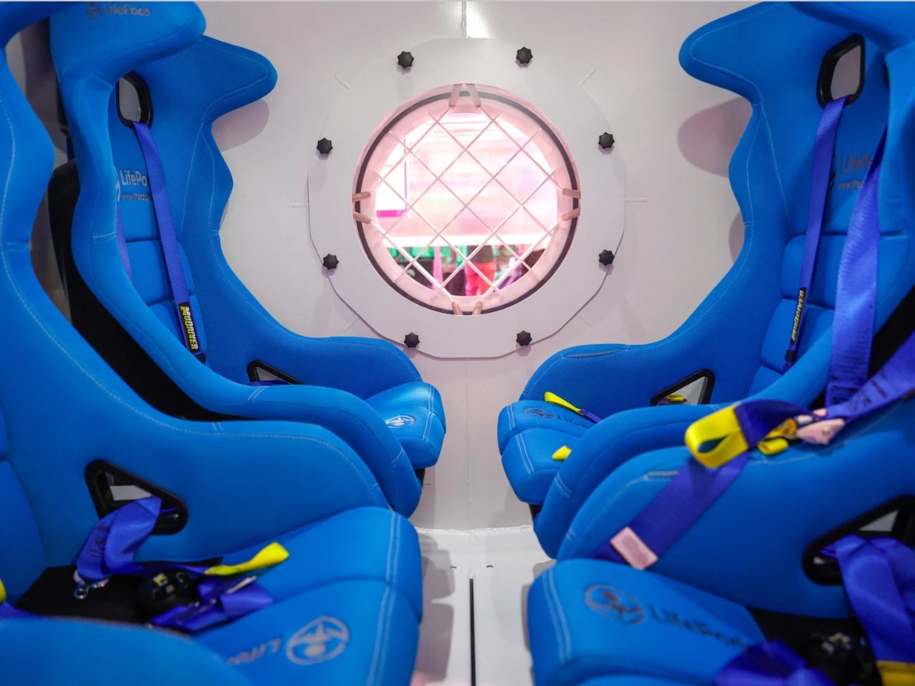
From the outside, a LifePod doesn’t look like panic. It looks like a serious design object, the kind of thing that could sit in a garage or a garden without completely unraveling the aesthetics of the space. But the engineering underneath is built to military standards. The B-01, the land-based version, is constructed from high-strength technical steel with specialized insulation layered through it, built to resist bullets, blast pressure, and fire. The W-01, the flood model, goes further: it’s unsinkable, with a ballast system that flips it upright if it rolls, and it can hold four adults and four children. The kids, as the specs somewhat soberly note, would sit on laps.

Both models carry integrated CO2 scrubbers guaranteeing 72 hours of respiratory autonomy. Optional add-ons include food rations, two weeks’ worth of drinking water, a GPS tracking beacon, and an inflatable emergency raft. The pod is designed not to be your home forever, but to keep you alive and locatable until help arrives. That’s a meaningful distinction. This isn’t a bunker fantasy. It’s a bridge.

I keep thinking about who actually buys this. The obvious answer is preppers, and yes, that market exists and it’s growing. But Momentum Technologies seems to be aiming at something broader: households in flood zones, schools in earthquake regions, industrial facilities in volatile areas. The W-01 was designed for tsunamis, flash floods, dam failures, and marine submersion. The B-01 covers armed attacks, explosions, and fires. Then there’s a third model in development, the Q-01, built for seismic collapse scenarios. Together, they form a kind of taxonomy of modern catastrophe.

LifePods also sidesteps the dread that typically surrounds survival gear. No camouflage, no tacticool aesthetic, no implicit politics of distrust baked into the design language. The capsules look considered. They look engineered. They were shown at VivaTech 2026 and Eurosatory, not at a prepper expo in a convention center parking lot. That placement matters. It signals that the designers want this conversation to be mainstream, not fringe.

And maybe it should be. We’ve watched wildfires consume entire towns in hours. We’ve seen floods arrive faster than evacuation orders could. The argument Momentum Technologies is making, that preparedness should be as accessible and normalized as a smoke detector, is not a paranoid one. It’s arguably just overdue.

The price, around €26,000 for the entry model, does put it out of reach for most individuals. But the company is also targeting governments, schools, and institutions, and there’s a logic there that makes the per-person cost less jarring when you do the math. Four adults and four children in a W-01 changes that number considerably.

Is it strange that a product designed around worst-case scenarios can feel genuinely compelling from a design and engineering standpoint? Maybe. But the appeal of LifePods isn’t rooted in fear. It’s rooted in that specific human impulse to not be helpless when everything outside is falling apart. You step in, pull the lever, and the door closes behind you. Ten seconds, and you’re still here.

The post Sealed in 10 Seconds: LifePods Changes Disaster Survival first appeared on Yanko Design.
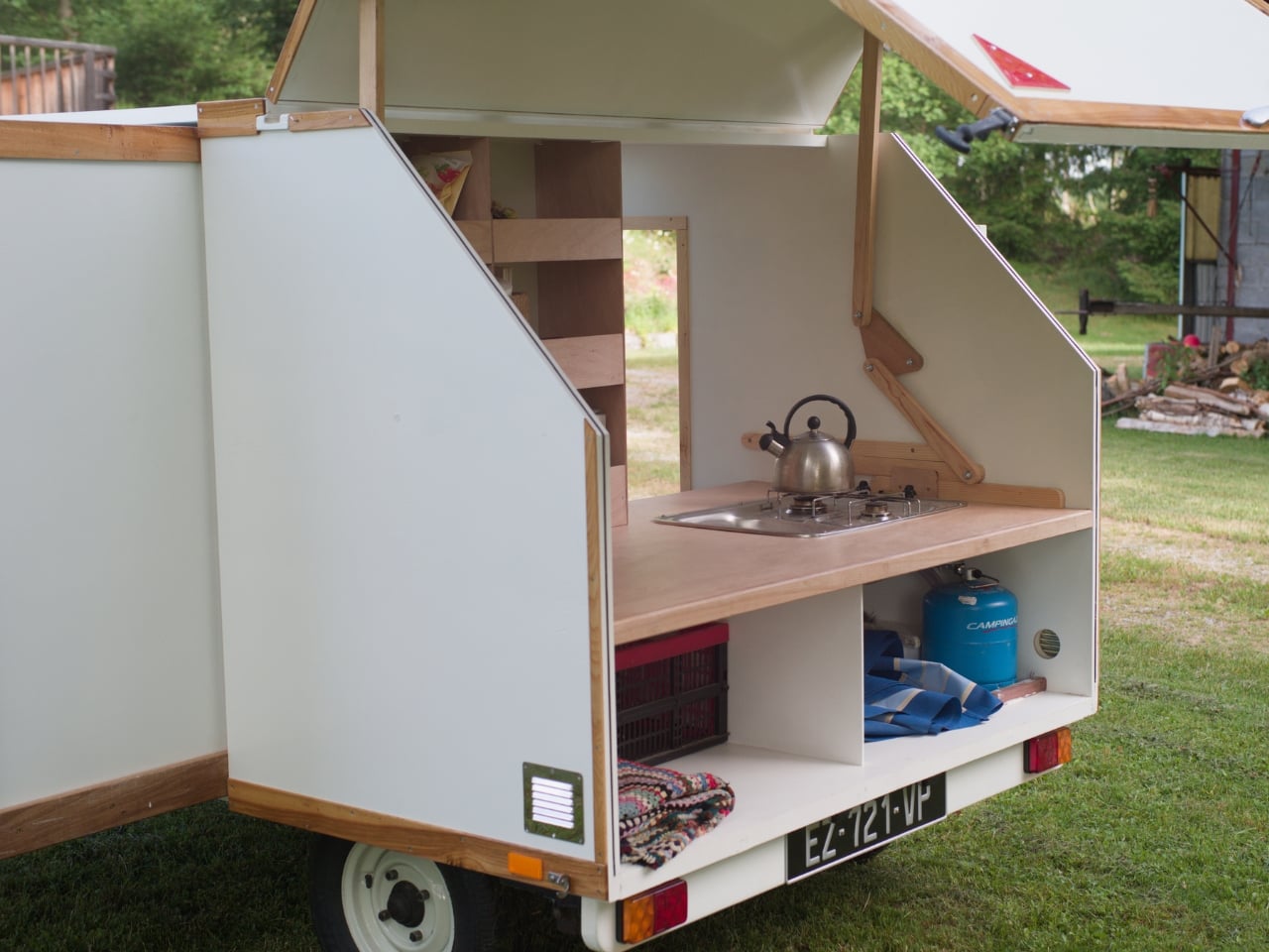
A 300kg Caravan That Slides Open Into a Full Camp Kitchen

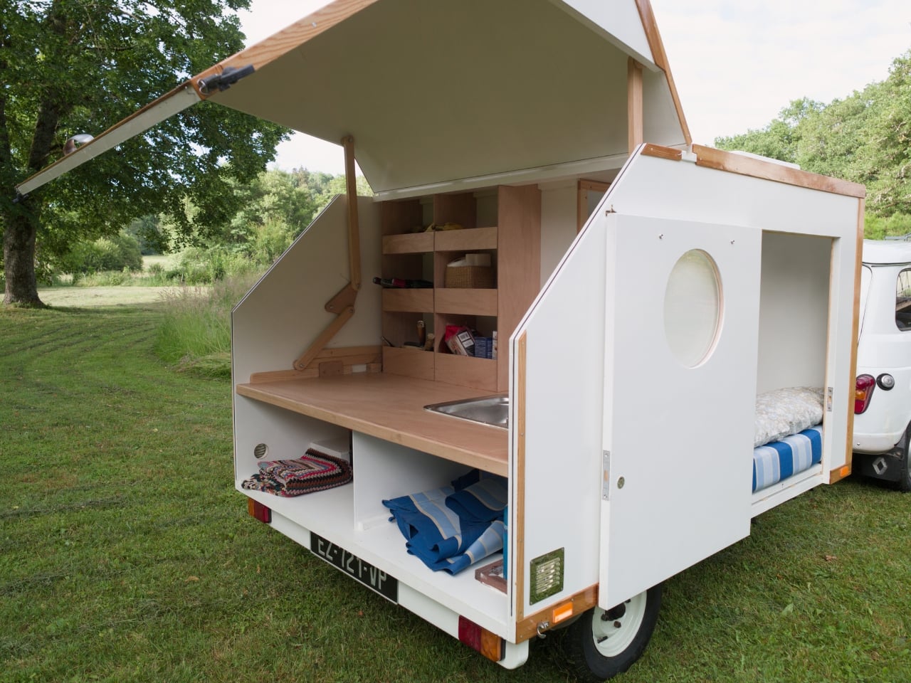
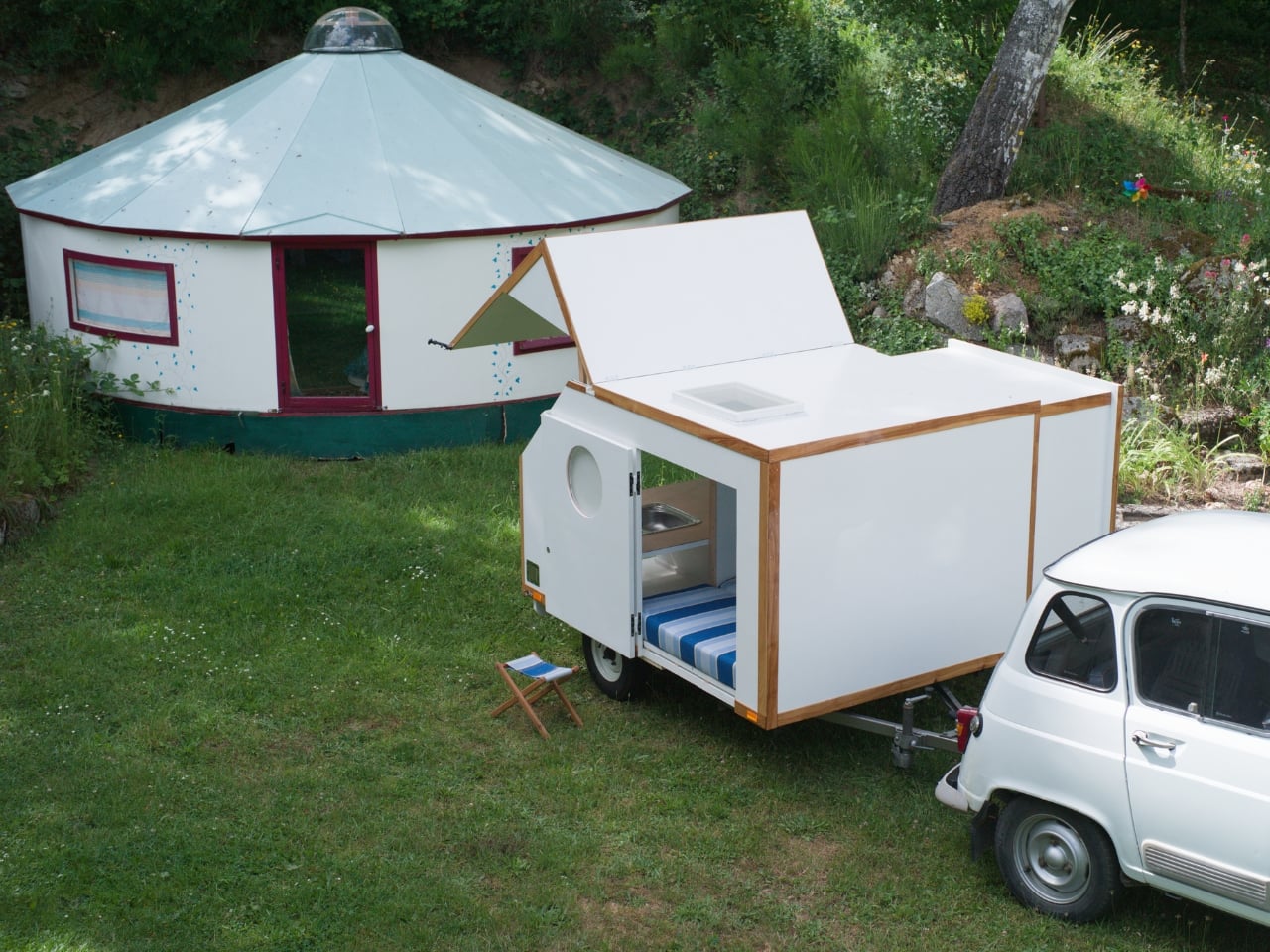
The fantasy of just packing up and going somewhere is one most of us indulge from time to time. The hard part is figuring out the logistics without sacrificing everything that makes a trip worth taking in the first place. Robin Benjamin’s Slidabox, the latest design from Woodenwidget, marking 20 years of ingenious designs for the spatially challenged, is a genuinely compelling answer to that problem. Not a perfect one, necessarily, but a thoughtful and rather beautiful one.

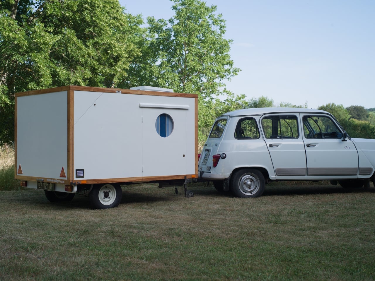
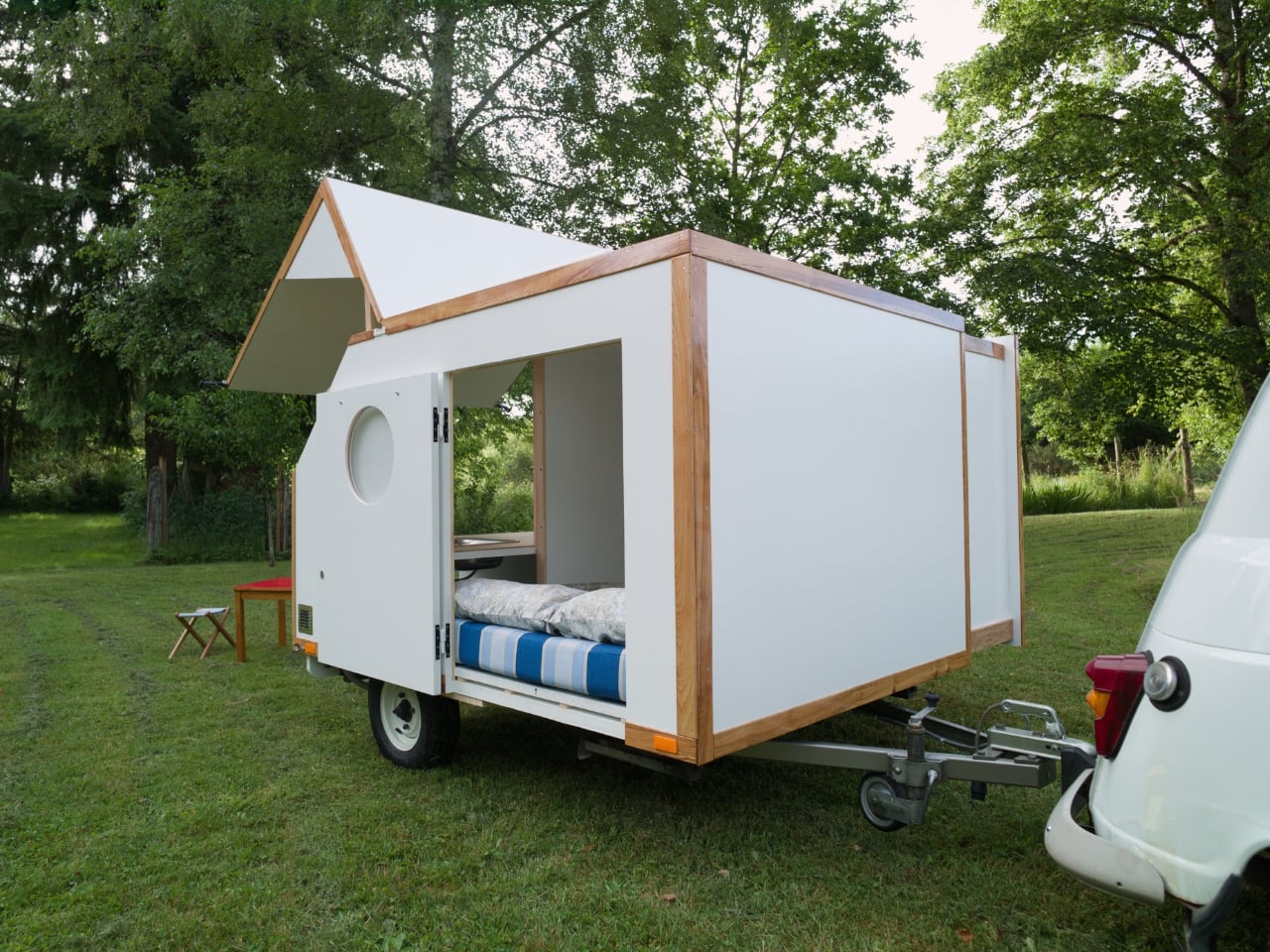
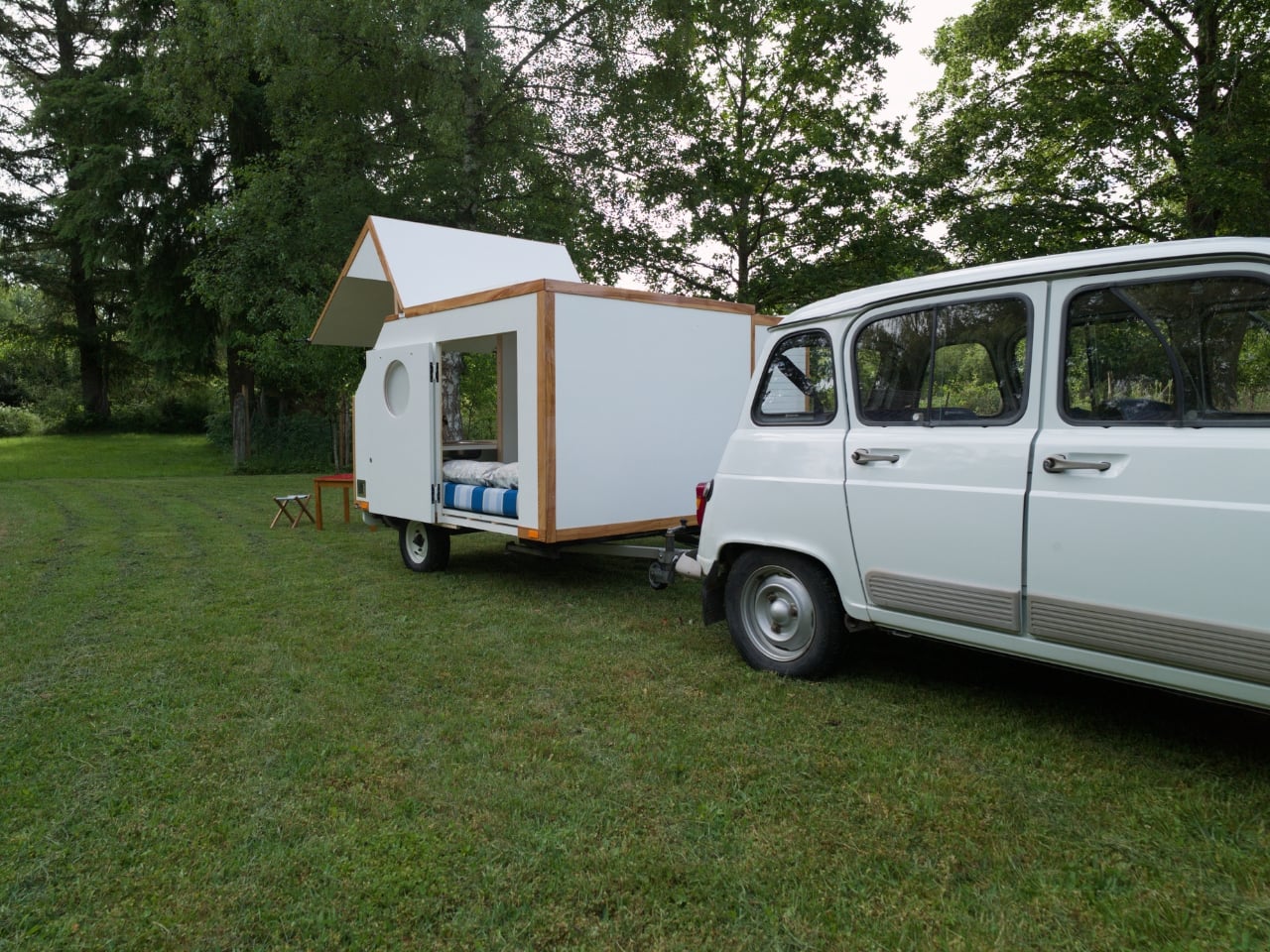
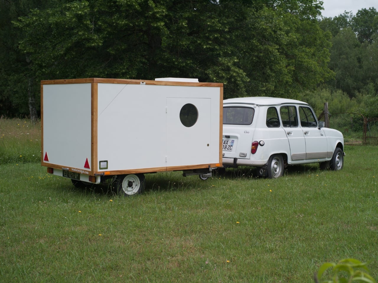
At first glance, the Slidabox reads as a clean white box on a small trailer. That’s not a criticism. It’s a deliberate design choice that works precisely because it doesn’t try to announce itself on the road. It tucks neatly behind the tow car, and because of its compact proportions, the aerodynamics issue largely disappears, with fuel consumption barely affected. It also weighs less than 300 kilos, which means you’re not dragging a second house down the motorway. You’re barely even noticed.

Designer: Robin Benjamin

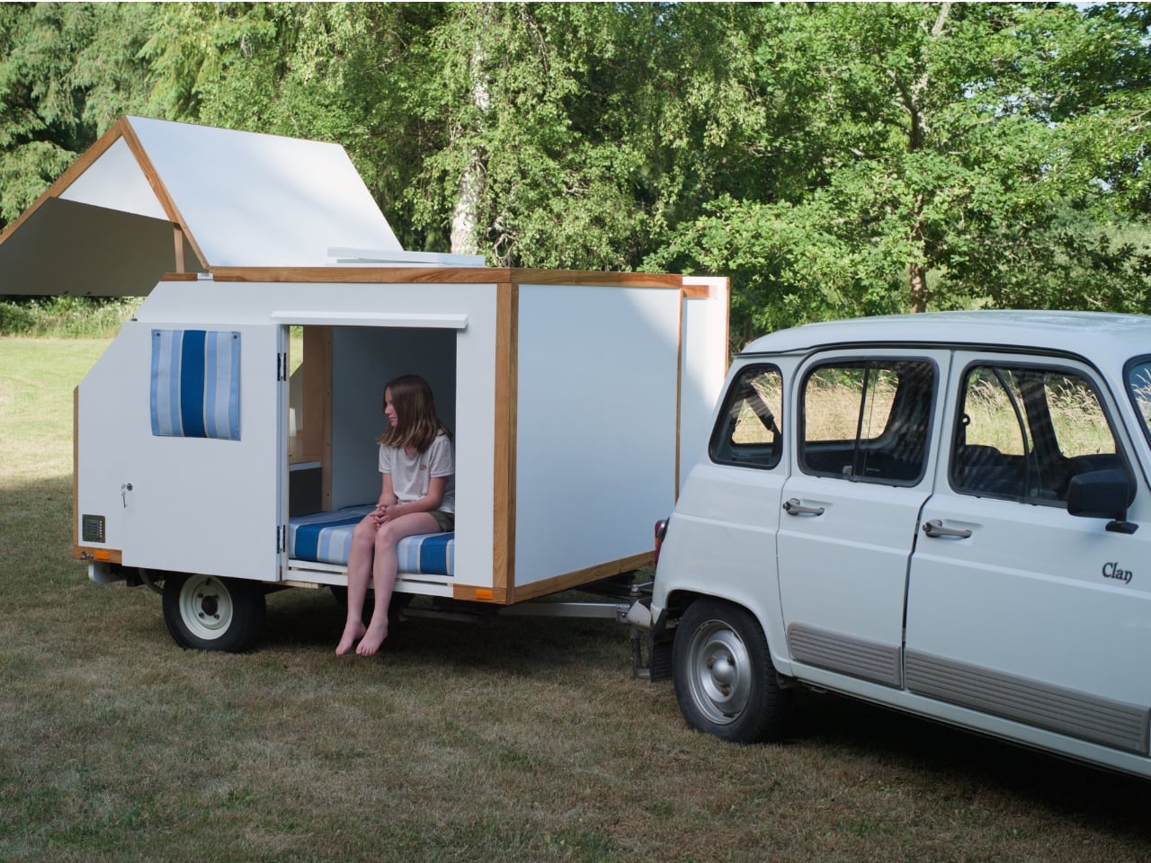
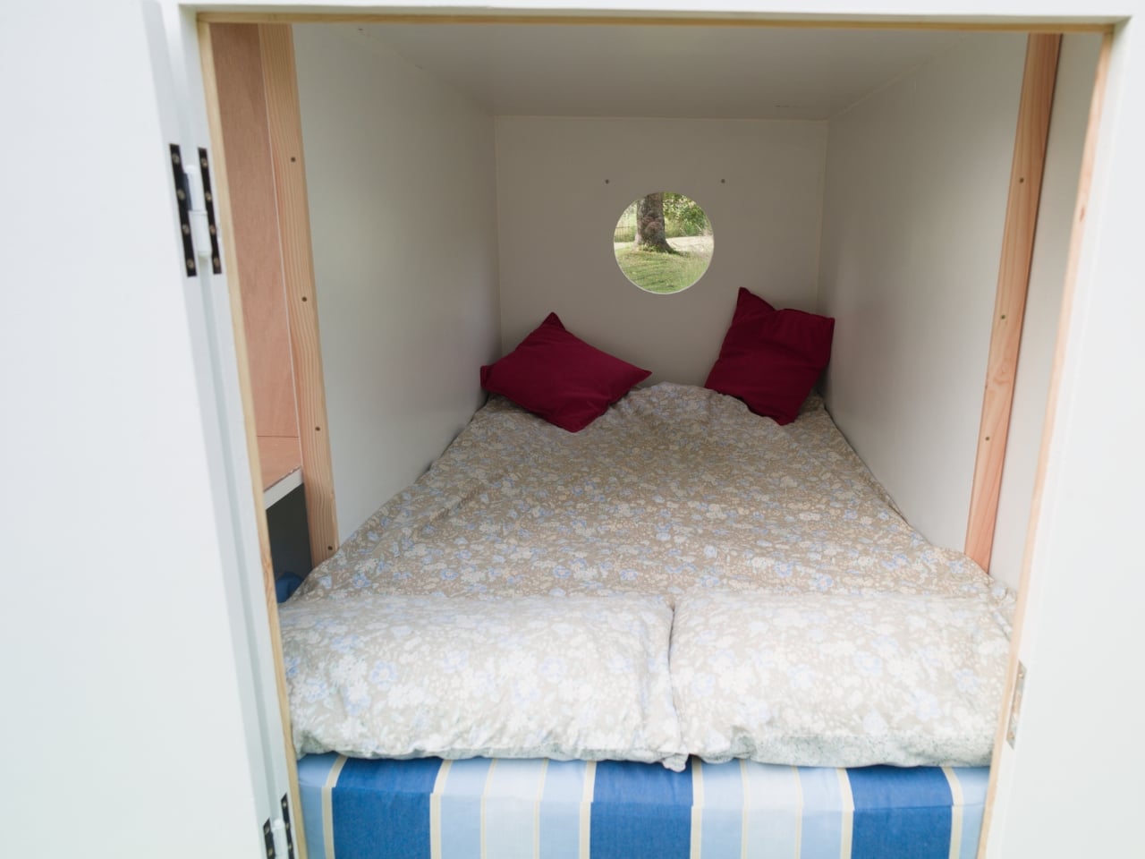
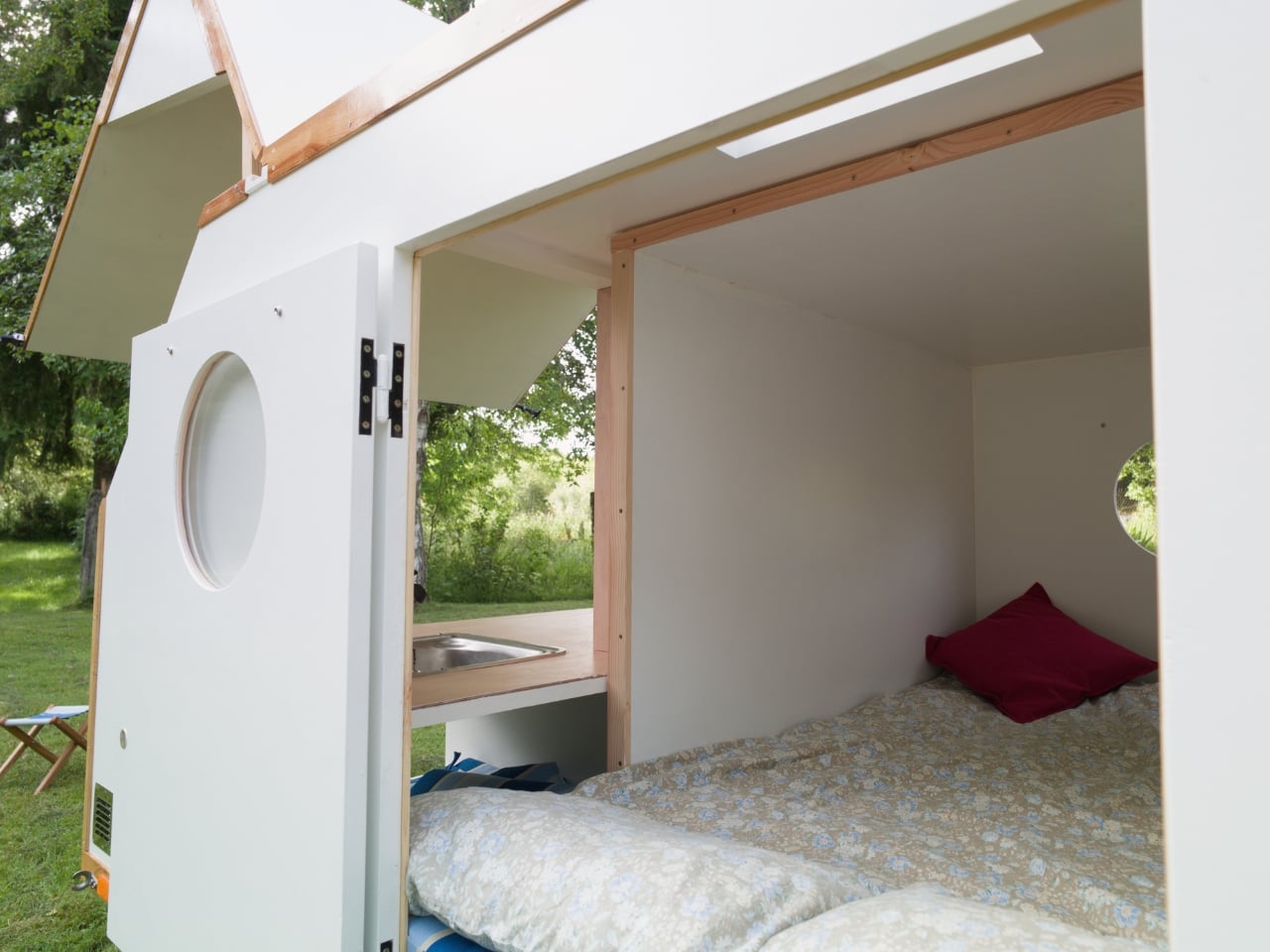
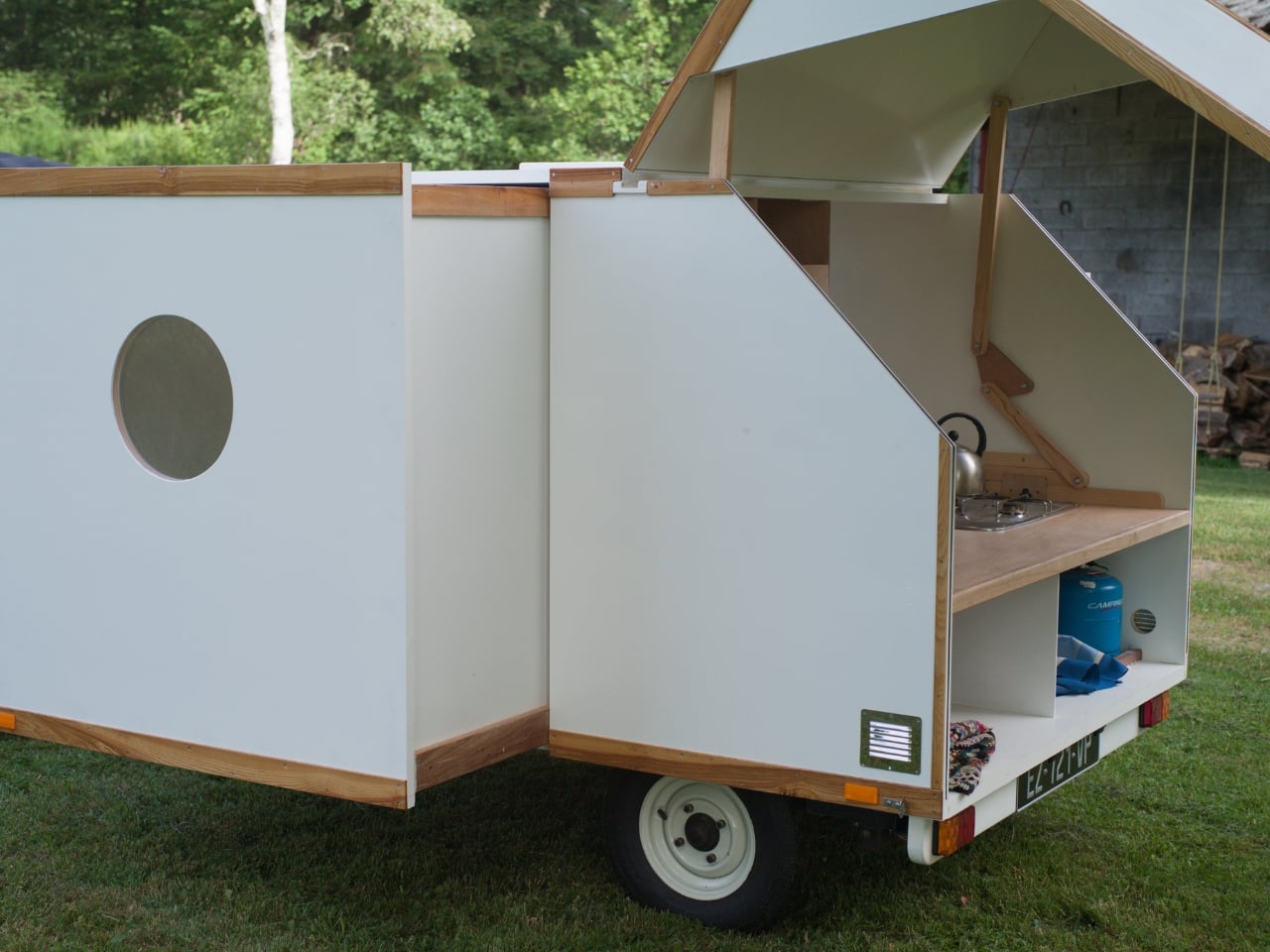
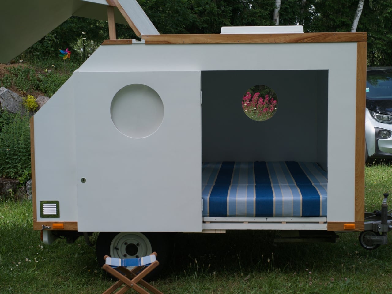
The clever part is what happens when you actually arrive somewhere. Slide out the drawer built into the body and the sleeping space extends to a full two metres long, which is genuinely generous for a build this size. Most compact campers compromise on sleeping length in ways that leave taller travellers in uncomfortable negotiations with their own bodies by morning. The Slidabox doesn’t do that. The composite construction uses insulation as a structural element, keeping the build light without sacrificing strength, and making it easy to construct and cost effective. It’s the kind of quietly intelligent engineering decision that sounds dry on paper but translates directly into how the thing actually feels to live in, even briefly.

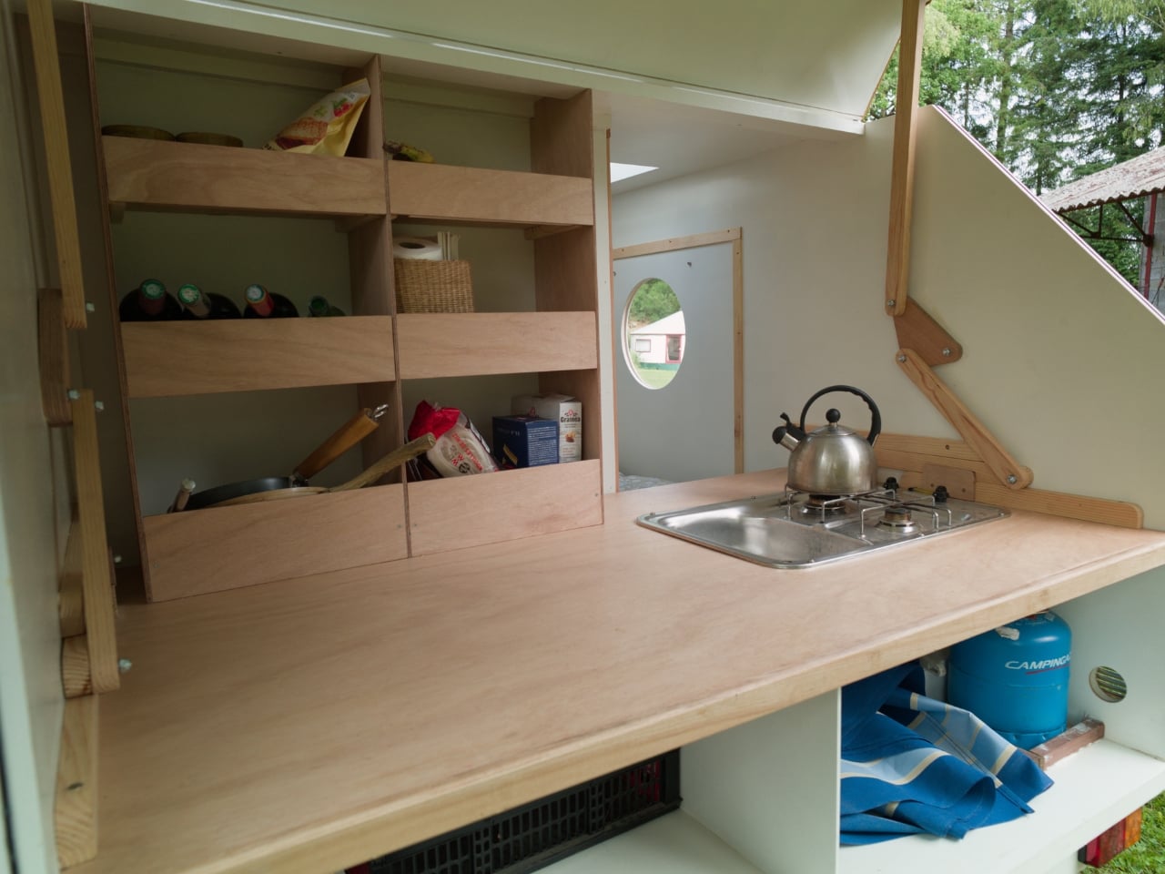
The interior is brightly lit and, more importantly, designed with access to the galley area, a feature lacking in most similar campers. It sounds like a minor convenience until you’ve actually spent a grey afternoon at a campsite fumbling with a portable stove in the rain, trying to figure out where you put the matches. The fact that you can make tea without needing to go outside changes the tone of the entire trip. It’s not luxury, exactly. It’s the difference between enduring camping and actually enjoying it.

Under the rear hatch, there’s plenty of headroom, and with the simple addition of a curtain the area becomes a private place to change or even shower. The galley itself is generously proportioned for its footprint, with a good-sized work surface and massive storage below. Benjamin has clearly prioritised what people actually need over what could theoretically be crammed into a small box. That restraint, in design, usually signals confidence.

The other thing worth noting is that the Slidabox is designed to be built, not just bought. Woodenwidget sells plans, not a finished product. It can be built using metric or imperial materials on just about any small trailer, and the comprehensive illustrated plans explain every step in great detail, with additional guidance on materials and tool use. For every set of plans sold, Woodenwidget plants five trees. That last detail probably shouldn’t move me as much as it does, but here we are.

The DIY angle will put some people off, and that’s fair enough. Not everyone wants to spend weekends in a garage working from plans. Building your own caravan requires time, tools, and a real commitment to the process. But for those who are drawn to that kind of making, the Slidabox offers something that ready-made alternatives rarely can: a direct relationship between the builder and the thing they’ll eventually sleep in. You know every seam. You understand exactly how it holds together because you put it together yourself. That’s a different kind of ownership.

Twenty years is a long time to keep producing genuinely interesting small-space designs without retreating into gimmick territory. The Slidabox is proof that Robin Benjamin and Woodenwidget haven’t run out of ideas yet. If anything, it suggests they’re just getting started with them.

The post A 300kg Caravan That Slides Open Into a Full Camp Kitchen first appeared on Yanko Design.
Beatbot’s AquaSense X Proves the Best Technology Goes Unnoticed

Smart home products have a funny habit of promising to simplify your life while quietly adding to your list of things to manage. Pool cleaning robots are a sharp example. They roam the floor, collect debris, and surface when finished, but someone still has to rinse the filter, empty the basket, and reset the machine before the next cycle. The automation, it seems, doesn’t quite finish what it starts.

Beatbot seems to have noticed this gap and designed AquaSense X around a different question altogether. Rather than asking how to make pool cleaning more autonomous, it asks how to make the whole experience, cleaning and cleanup both, feel like it barely happened. That sounds like a marketing promise until you start looking at how the system actually works, at which point it becomes something closer to a design thesis.

Designer: Beatbot

Click Here to Buy Now: $3999 $4250 ($251 off). Hurry, deal ends in 48-hours!

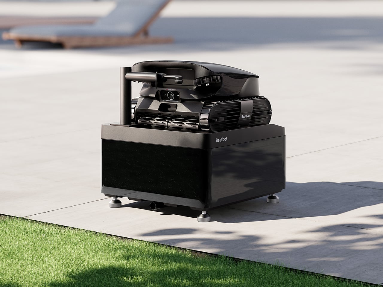
AquaSense X isn’t sold as a single robot but as an ecosystem, and that distinction matters. The system pairs the AI robotic pool cleaner with the AstroRinse cleaning station, and the pairing is the point. The robot cleans the pool. The station cleans the robot. That self-sustaining cycle sets AquaSense X apart from every other autonomous pool cleaner on the market, which still leaves the messy part to you.

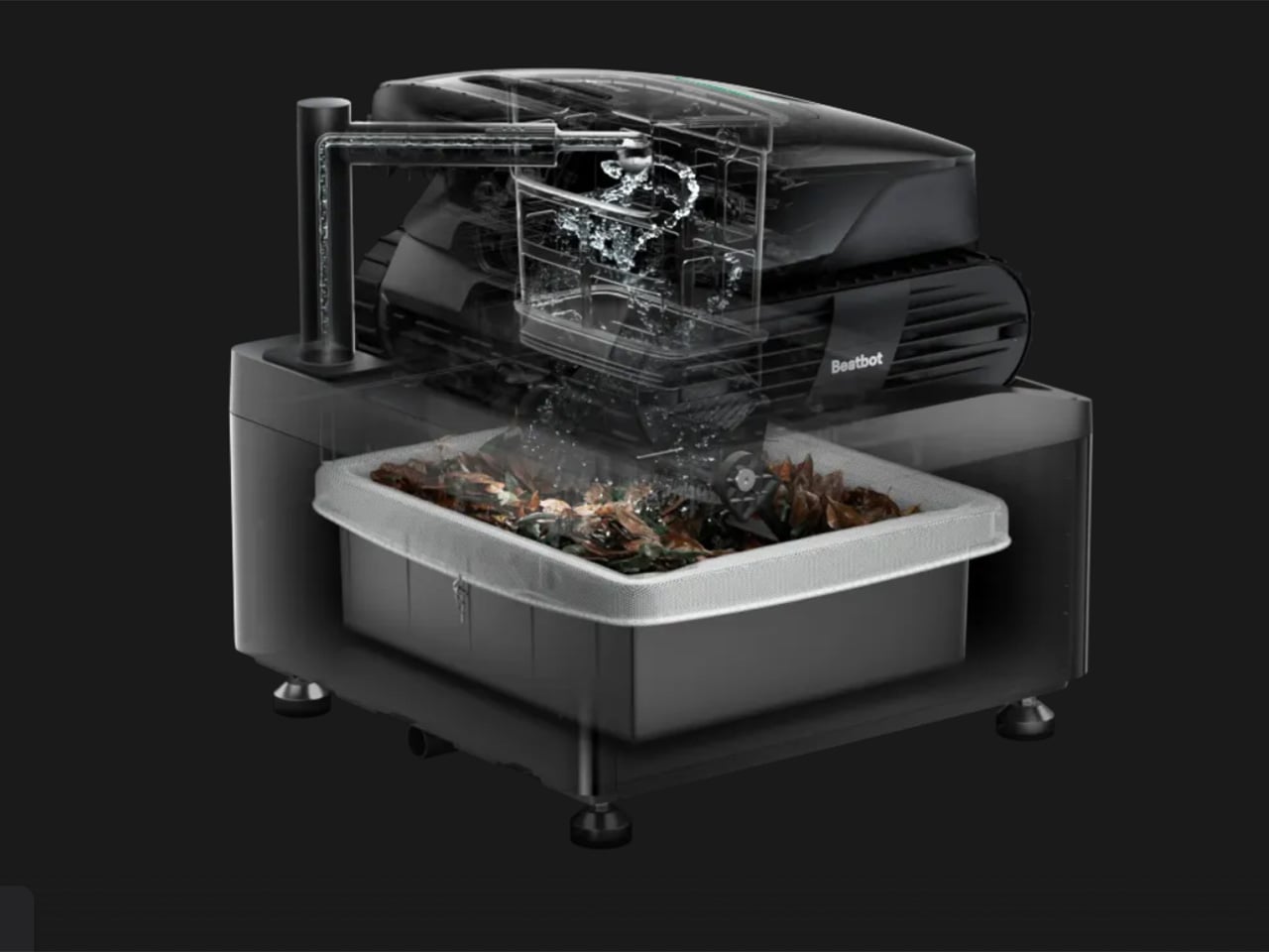
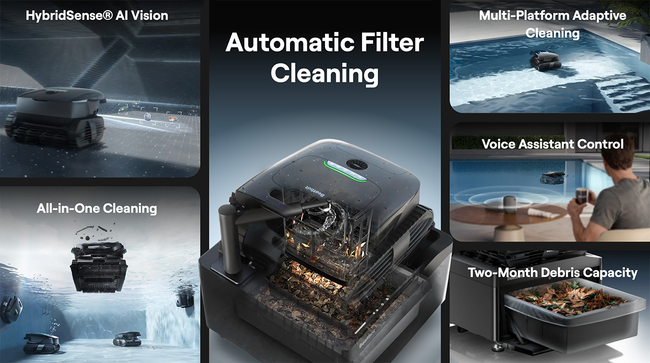
After each cleaning cycle, docking the robot is all that’s required. Once it’s seated in the station, a high-pressure rotating nozzle enters the filter basket, backflushes the trapped debris, and transfers everything directly into the station’s sealed bin. The filter basket opens from the bottom to make sure nothing gets left behind. The whole process takes about three minutes, and you don’t touch a thing.
When the filter is clean, charging starts automatically, and the robot is ready for its next run without any intervention from you. The station’s debris bin holds 22 liters, which under typical conditions translates to roughly two months of operation before it needs emptying. That’s not a small number. It means pool maintenance stops being something on your weekly checklist and becomes something you handle a few times a season.

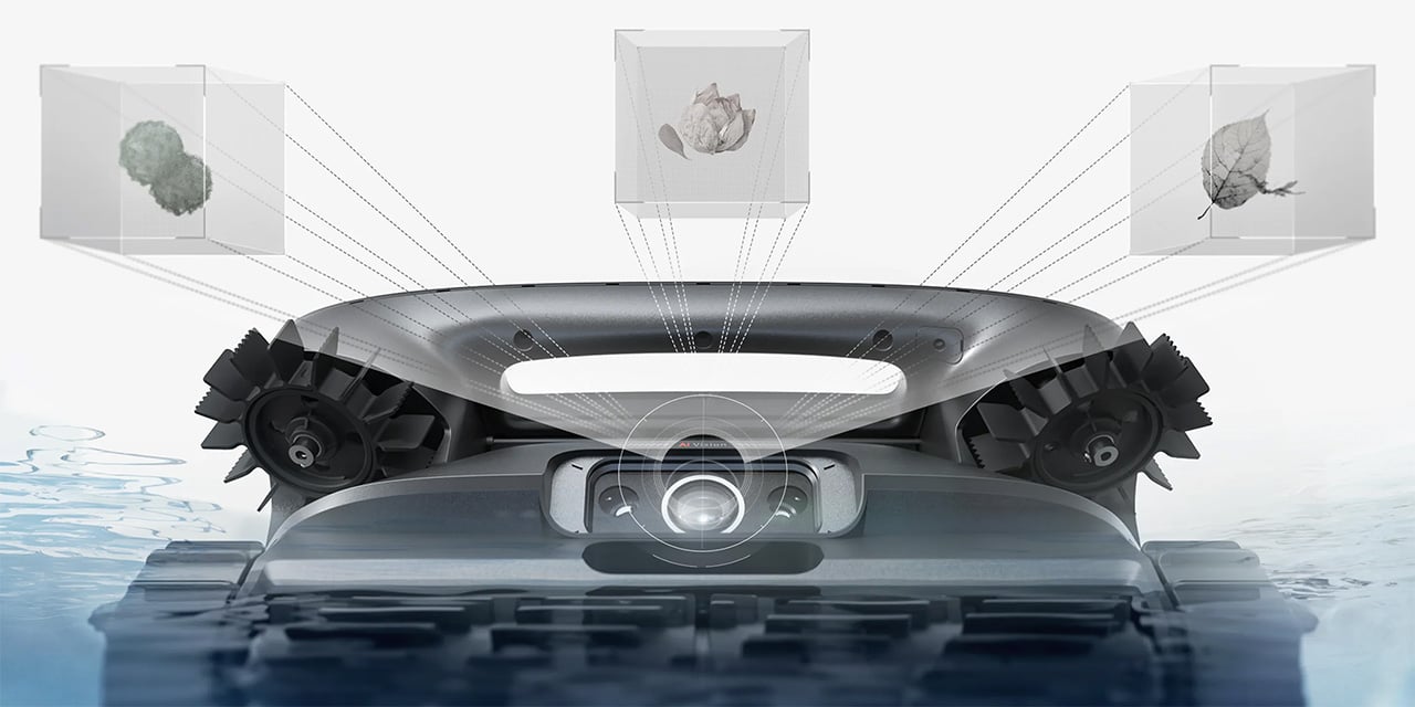
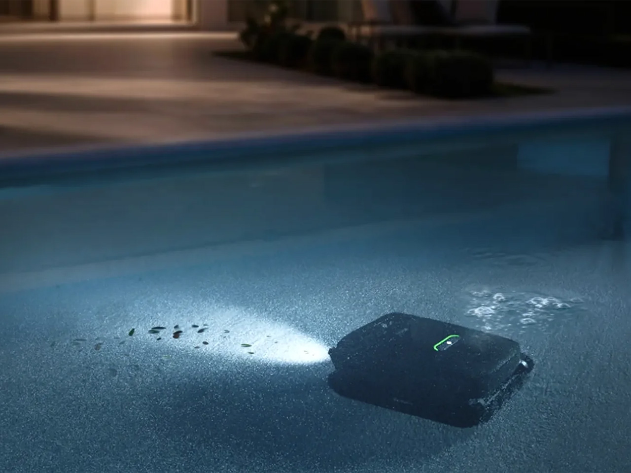
What makes the robot itself worth talking about is that its intelligence is tied to genuine utility. HybridSense AI Vision, which combines an AI camera with infrared and ultrasonic sensing, recognizes 40 debris types, twice what the previous generation could identify, and extends that detection to the water surface, not just the pool floor. That broader scope means fewer spots get overlooked after the robot surfaces and calls the job finished.

Coverage also runs deeper than detection. A single AquaSense X handles the water surface, the floor, the walls, the waterline, and elevated platforms like shallow entry steps and tanning ledges, all without swapping attachments. Using 11 motors and a submarine-style propulsion system, the robot transitions between floating and diving seamlessly, while dual downward-facing ultrasonic sensors detect edges on raised platforms so it never tumbles off one.

Then there’s the water clarification piece, which is perhaps the most invisible feature in the entire system. As the robot cleans, it automatically dispenses Beatbot’s AquaRefine 3-in-1 Clarifying Agent, a formula made from recycled crab shells that removes fine particles, oils, and residue without any mixing or measuring on your part. One 300mL kit treats up to 99,000 gallons, so it’s not something you’ll be restocking constantly.

Voice control through Google Home, Amazon Alexa, and Apple Siri adds another layer to the hands-off experience. From outside the pool, you can start or stop a cleaning cycle, check battery status, enable the child lock, or get an alert when the session wraps up. The Beatbot app handles scheduling, pool mapping, cleaning mode selection, and over-the-air software updates, so the system keeps improving without asking for much in return.

Beatbot describes its mission as making technology disappear into the background, giving users back their time without demanding constant attention. AquaSense X makes that feel tangible rather than aspirational. The robot cleans, the station resets, and the pool stays clear, and the most you’ll probably do is glance at an app notification. That’s the kind of ownership that feels less like managing a device and more like just having one.

Click Here to Buy Now: $3999 $4250 ($251 off). Hurry, deal ends in 48-hours!

The post Beatbot’s AquaSense X Proves the Best Technology Goes Unnoticed first appeared on Yanko Design.