For better or for worse, depending on where you stand on the debate, artificial intelligence has changed and will continue changing how we create and communicate. Services like ChatGPT, Midjourney, Gemini, and Copilot are pretty popular with those who are adventurous enough to experiment with AI. We can expect that over the next few years, we’ll see more services, gadgets, and devices that can help us use the technology and integrate it into our workflow and every day lives.
Designers: Mingwan Bae, Sohyun An, Junyoung Min, Youngsuh Yoo
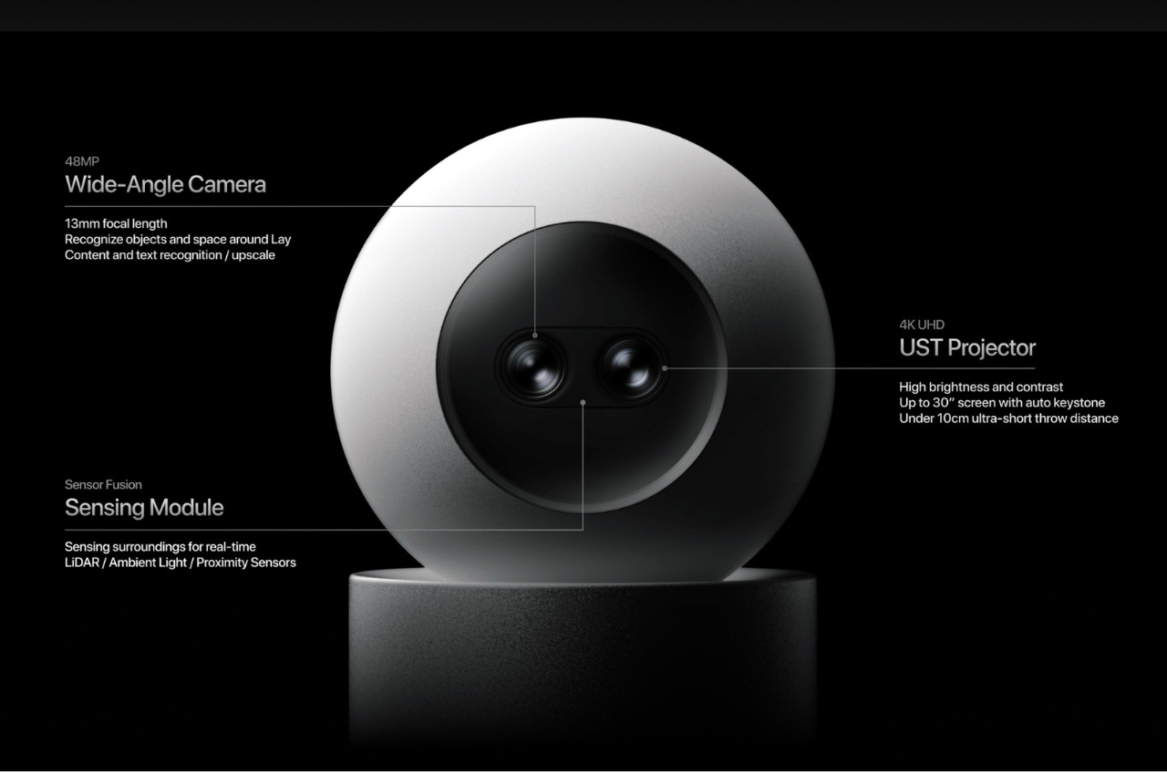
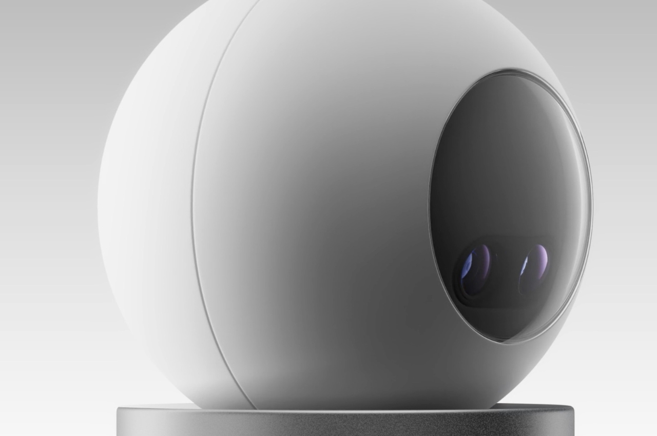
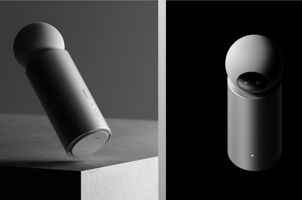
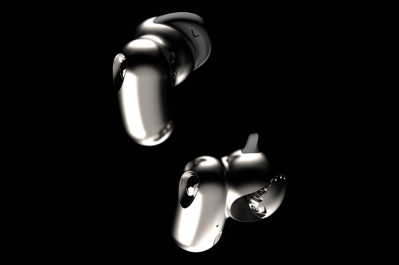
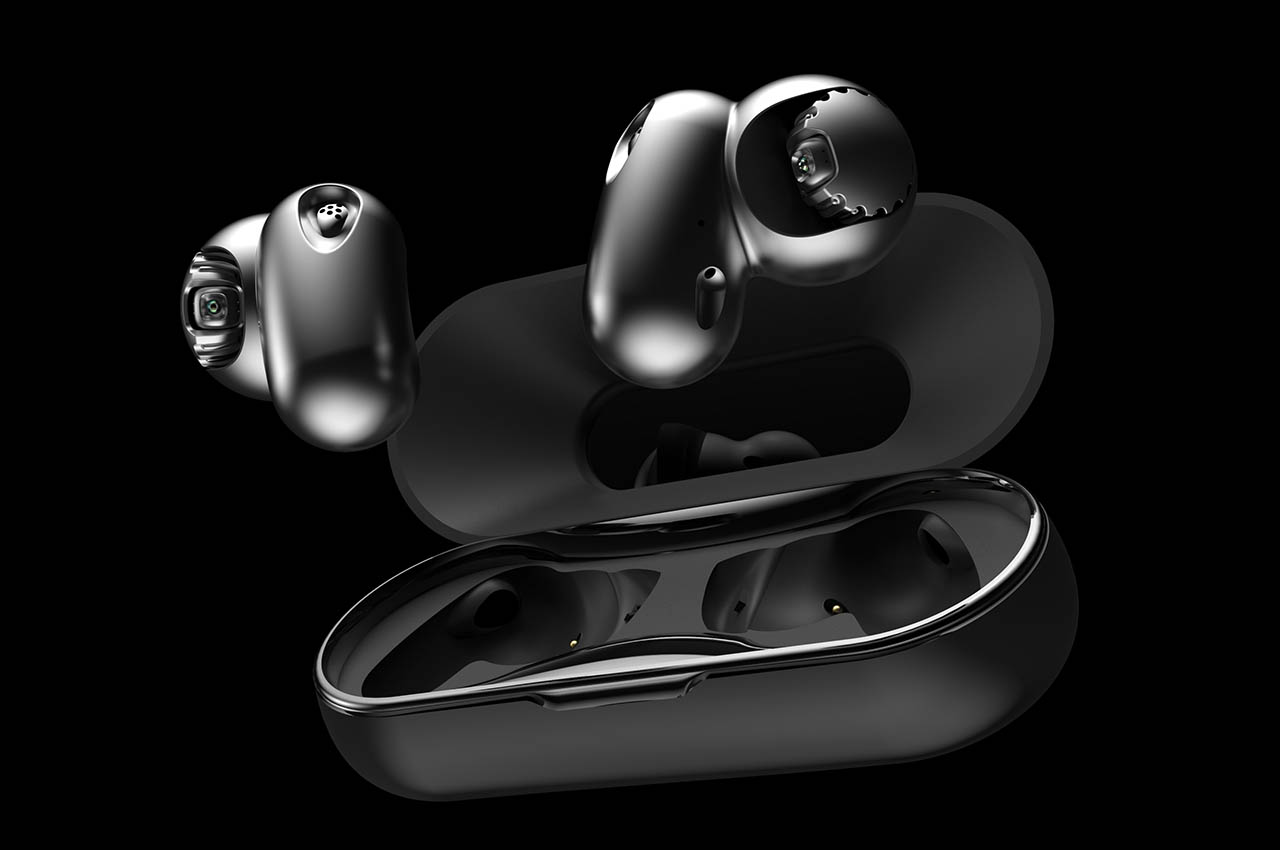
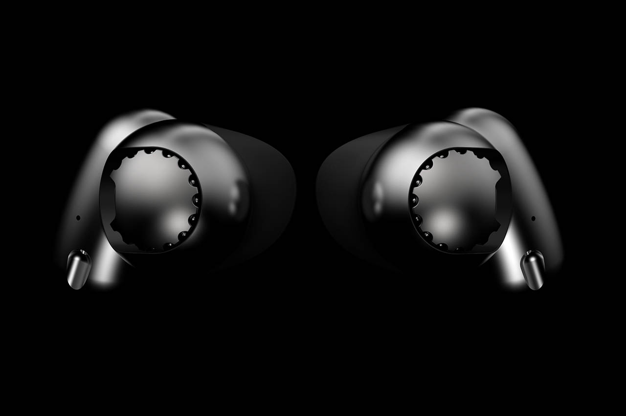
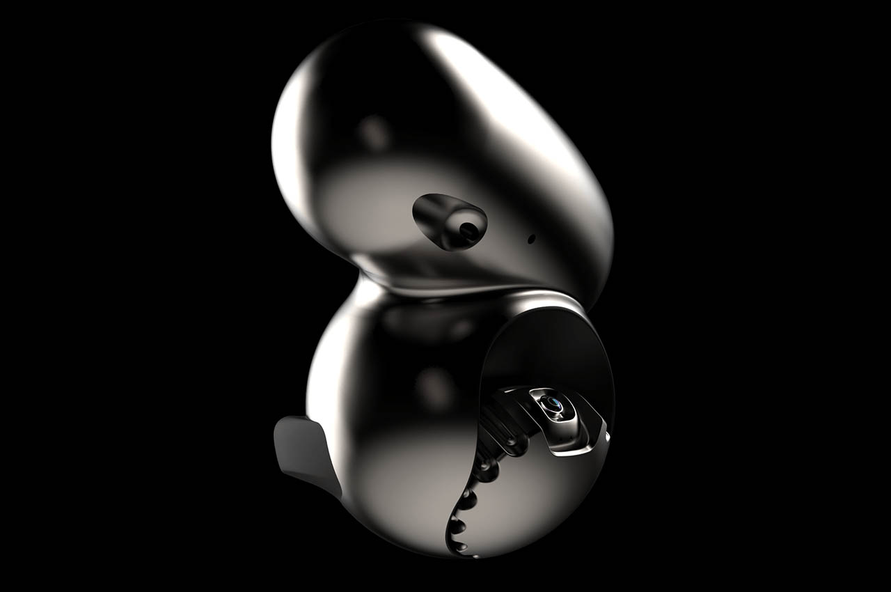
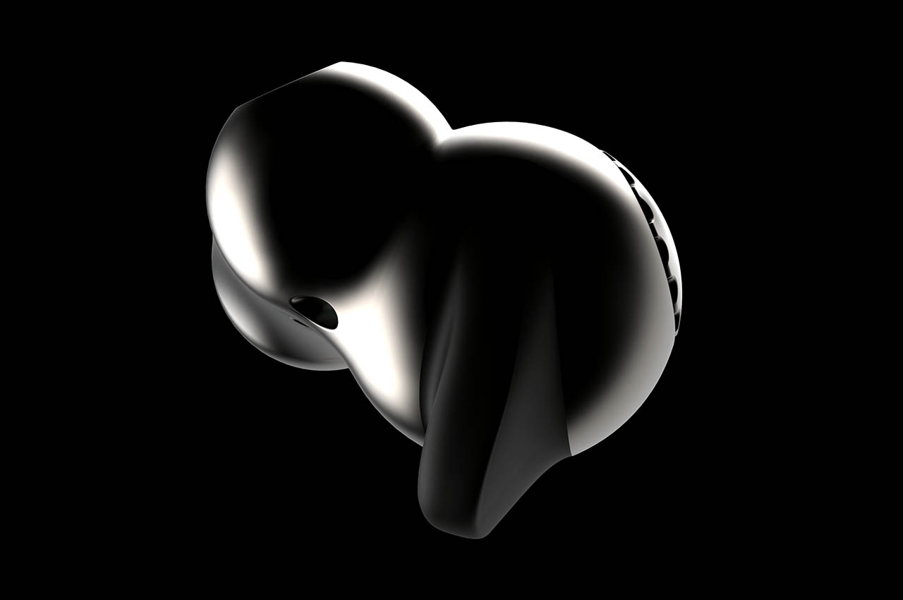
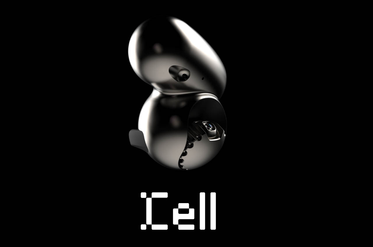
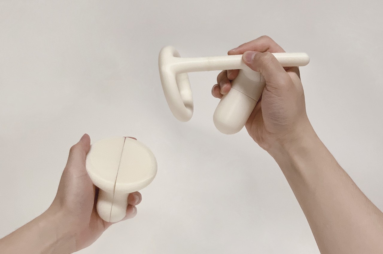
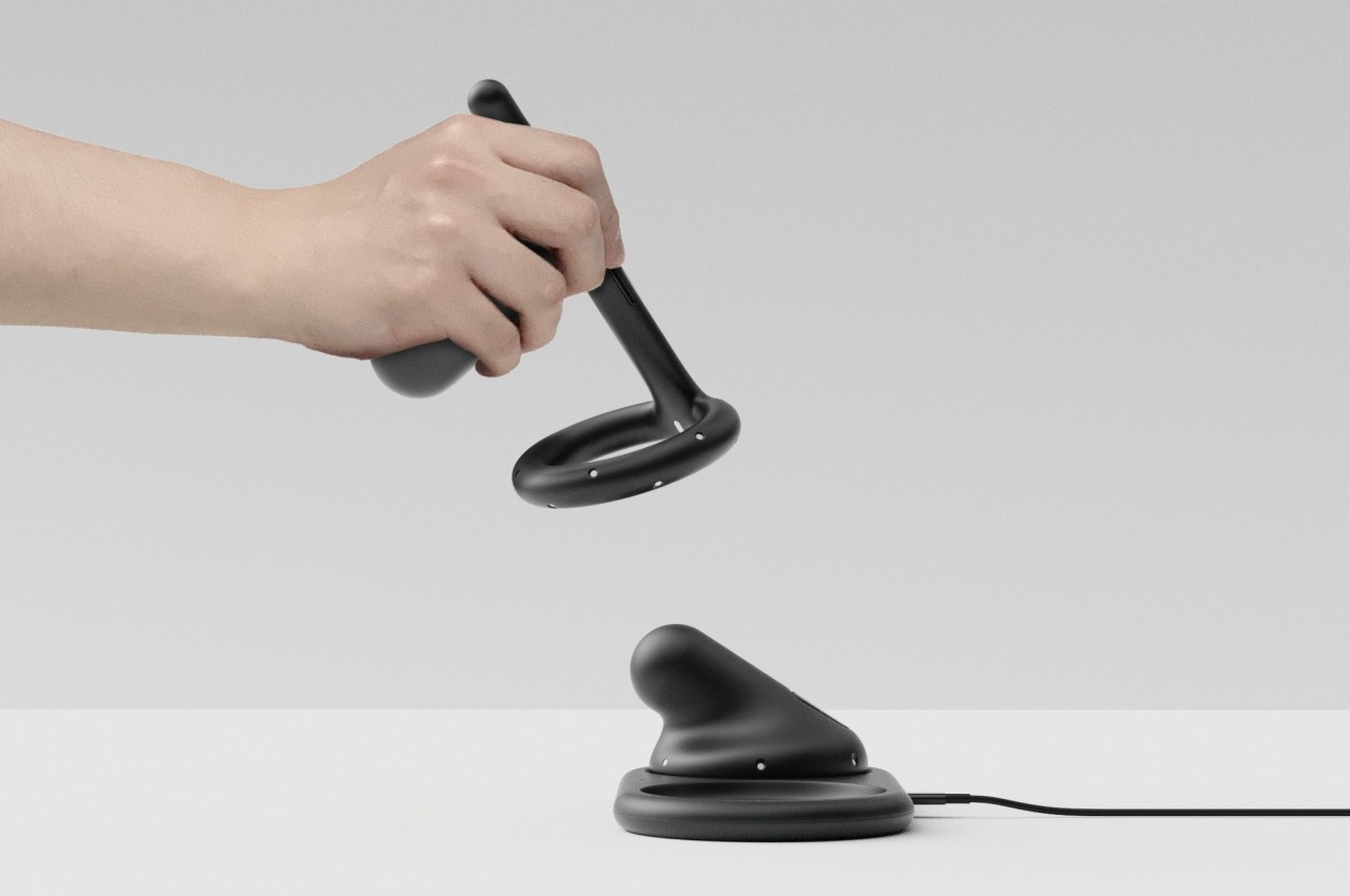
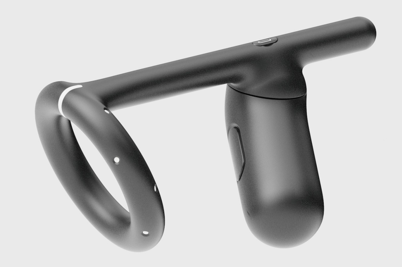
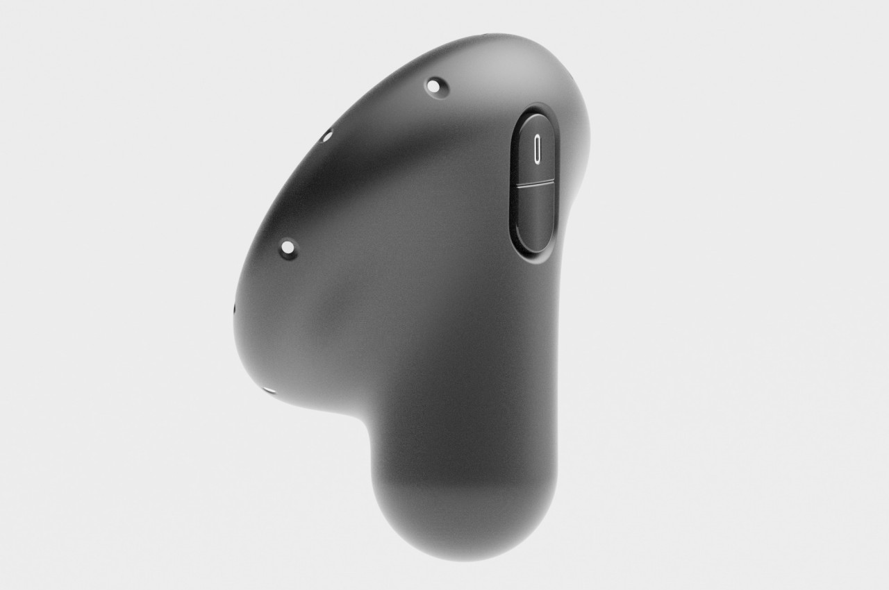
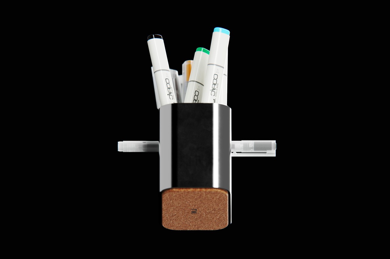
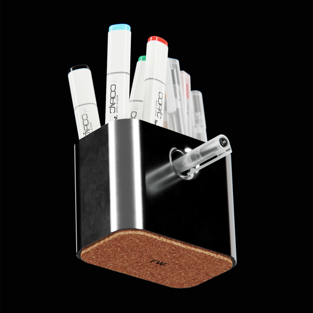
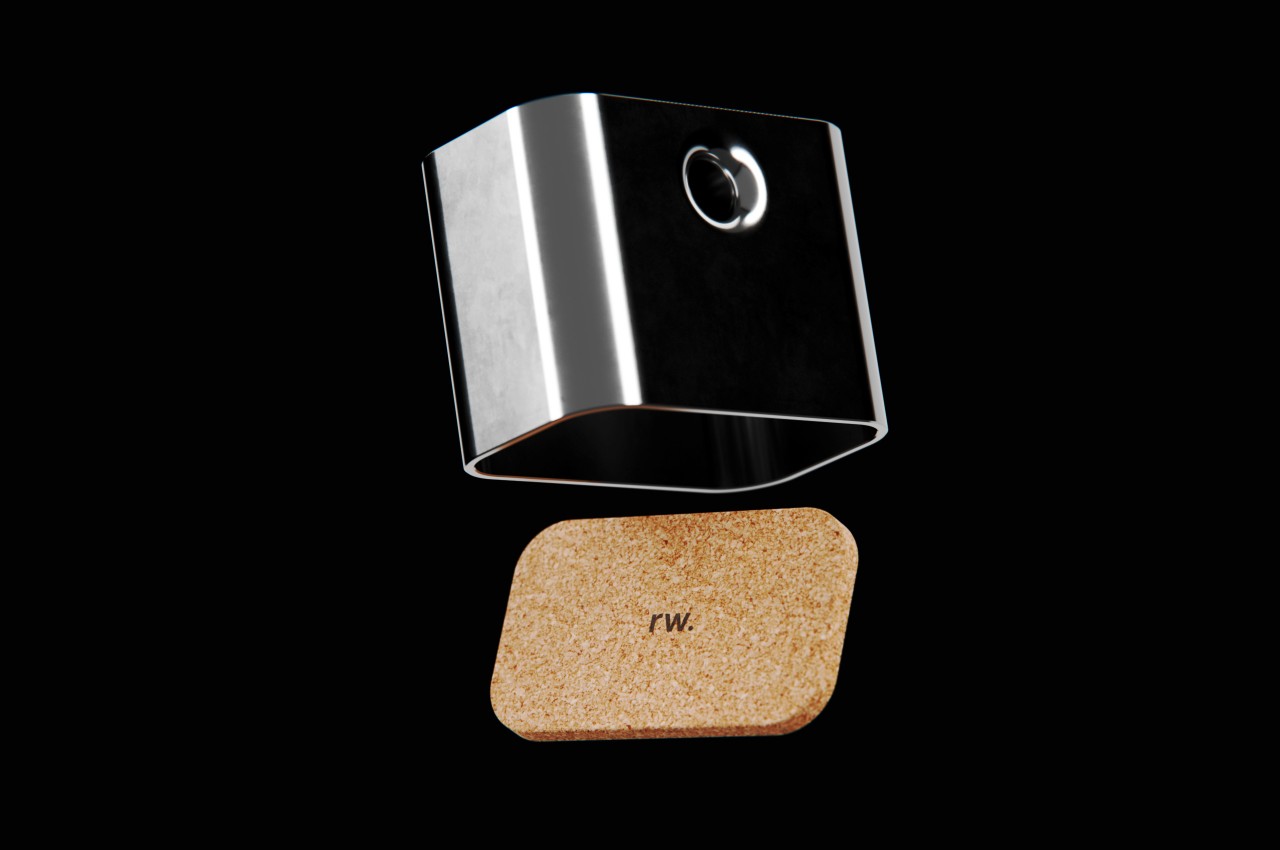
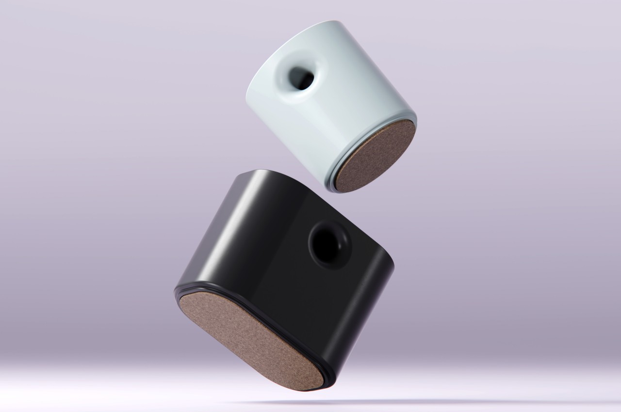
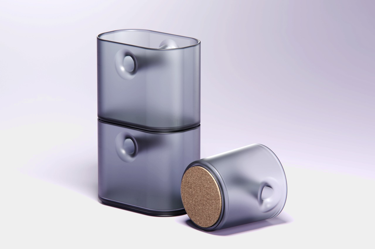
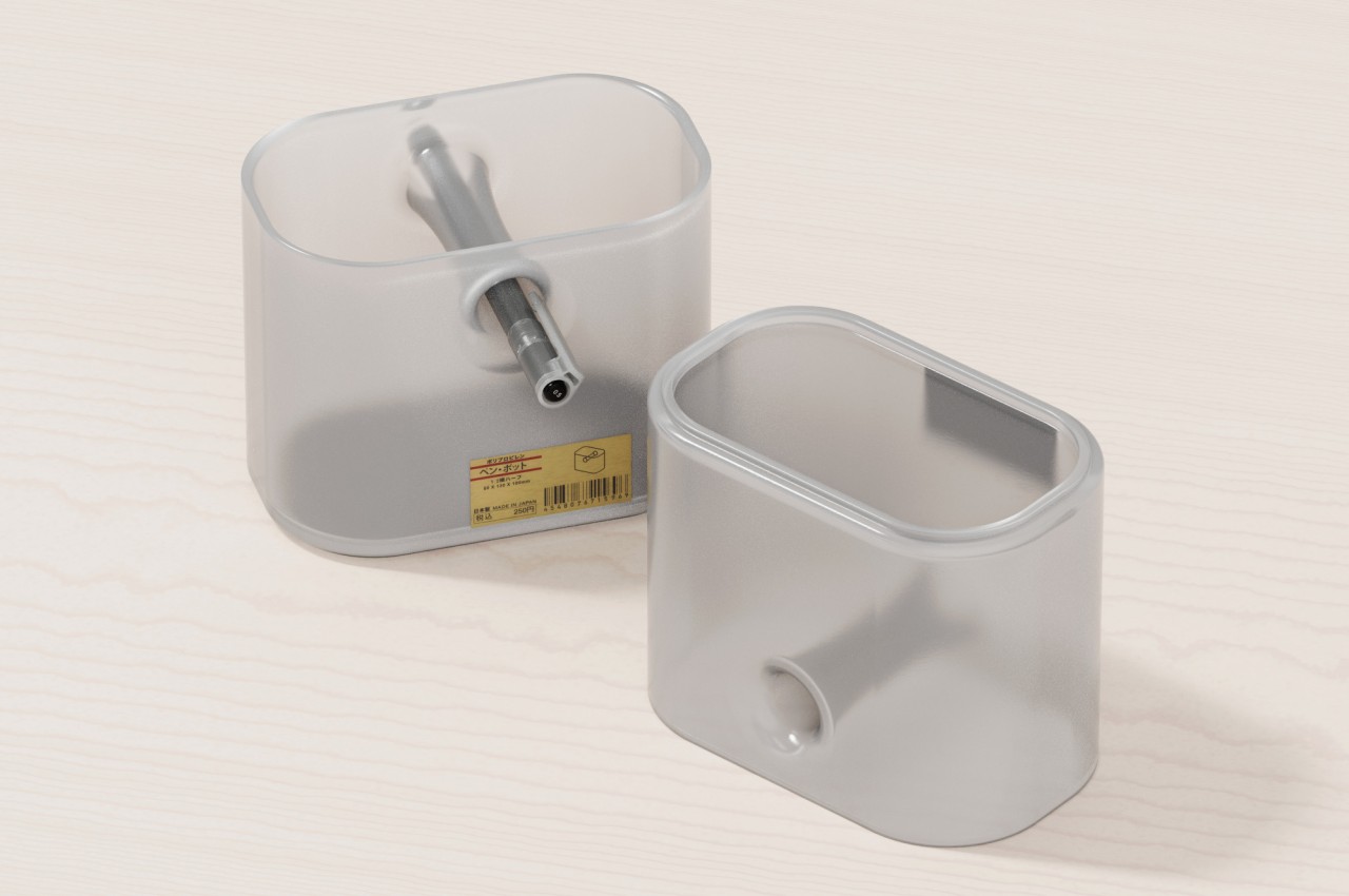
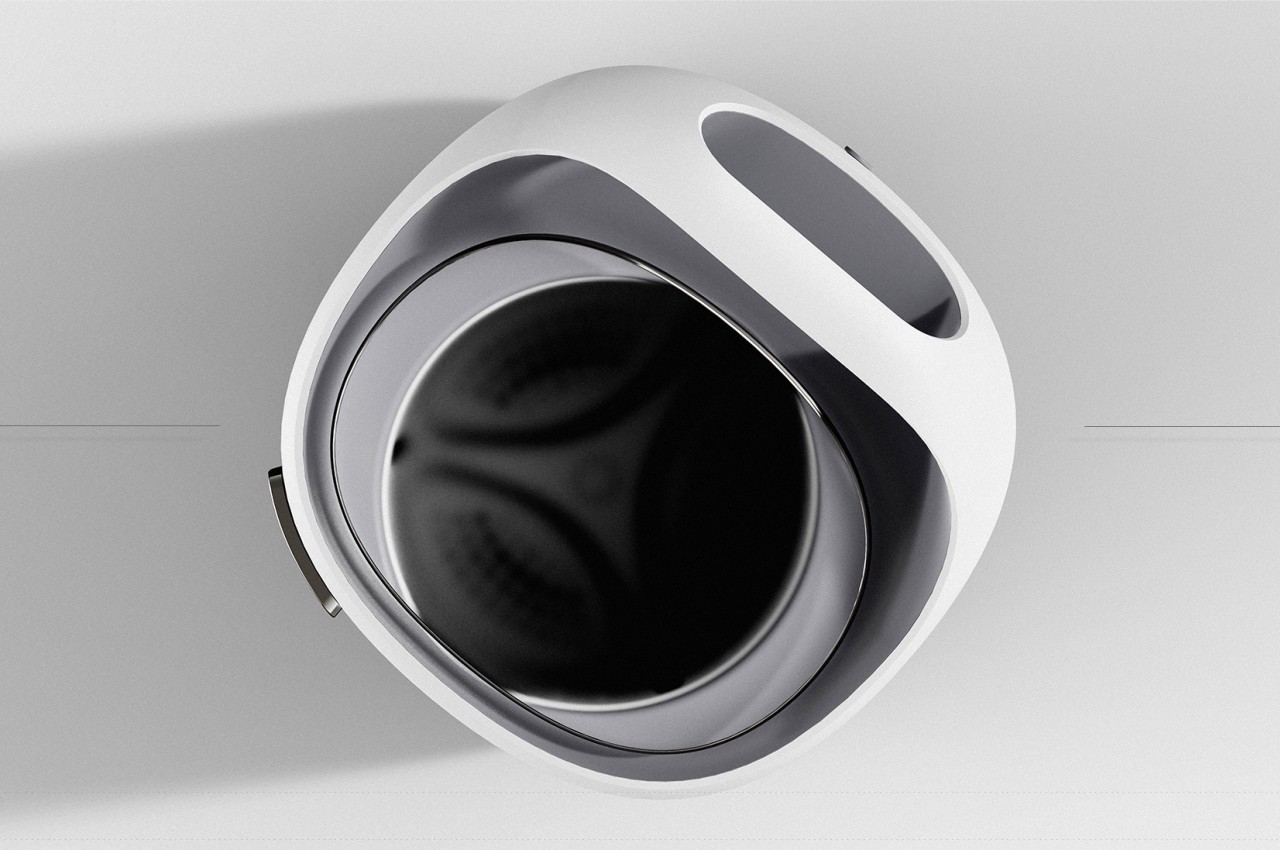
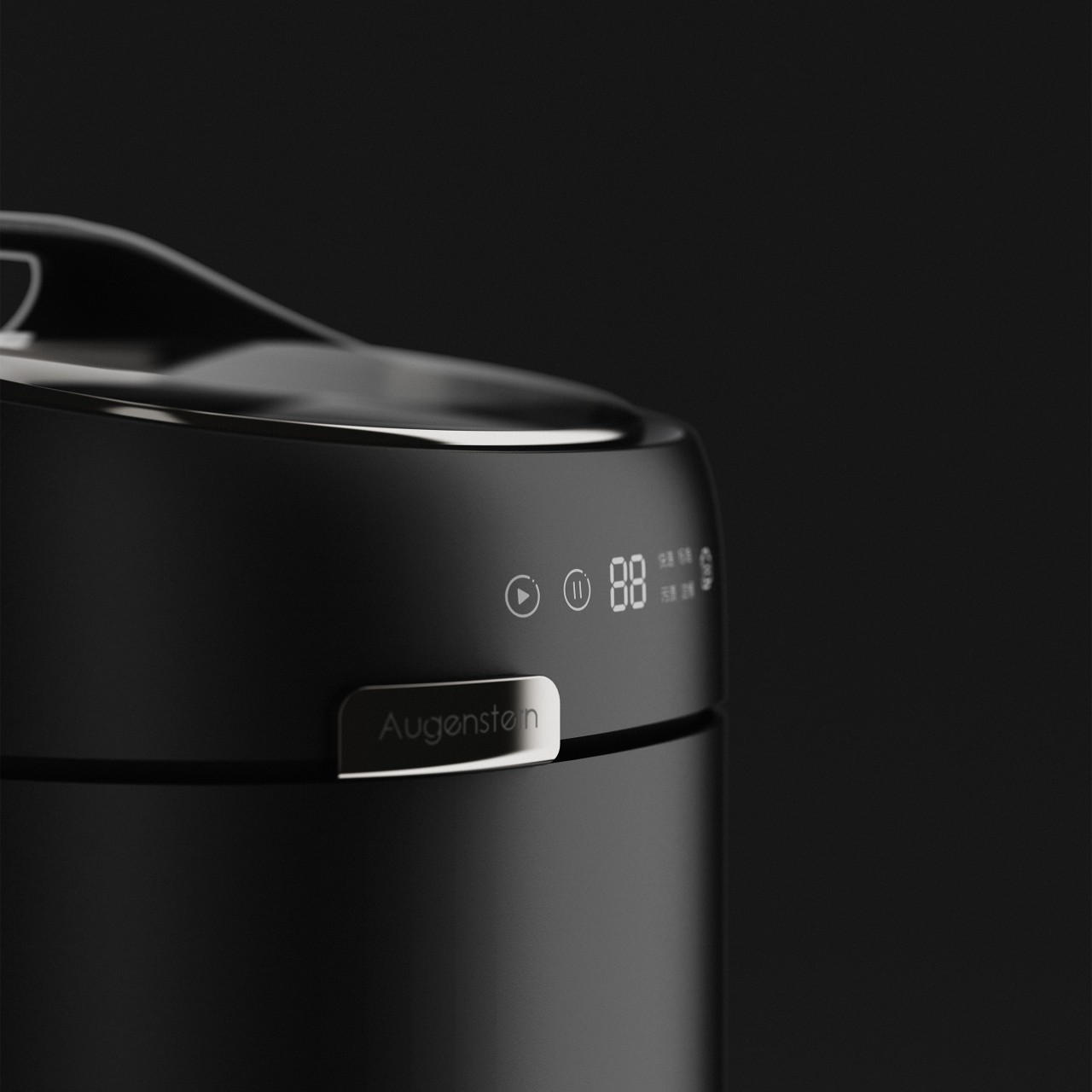
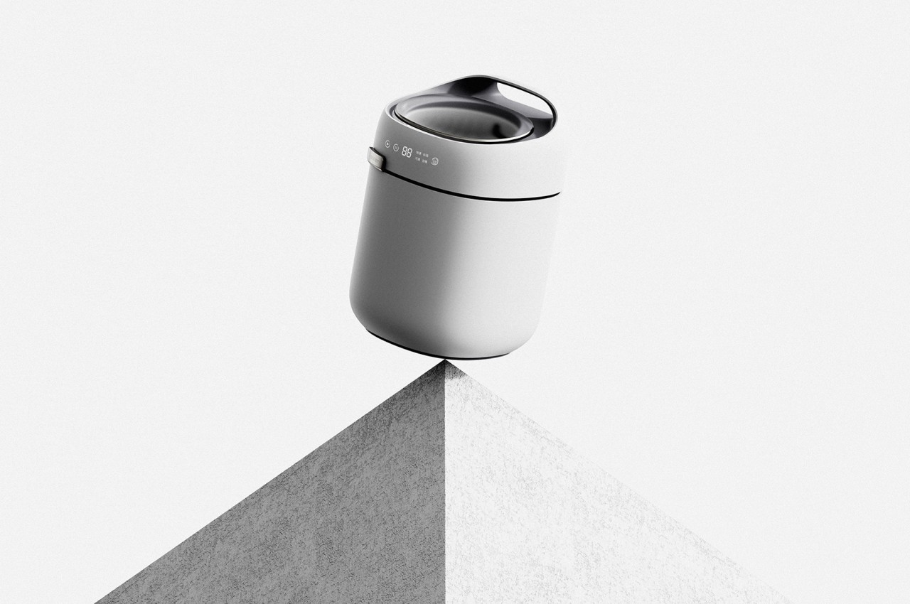
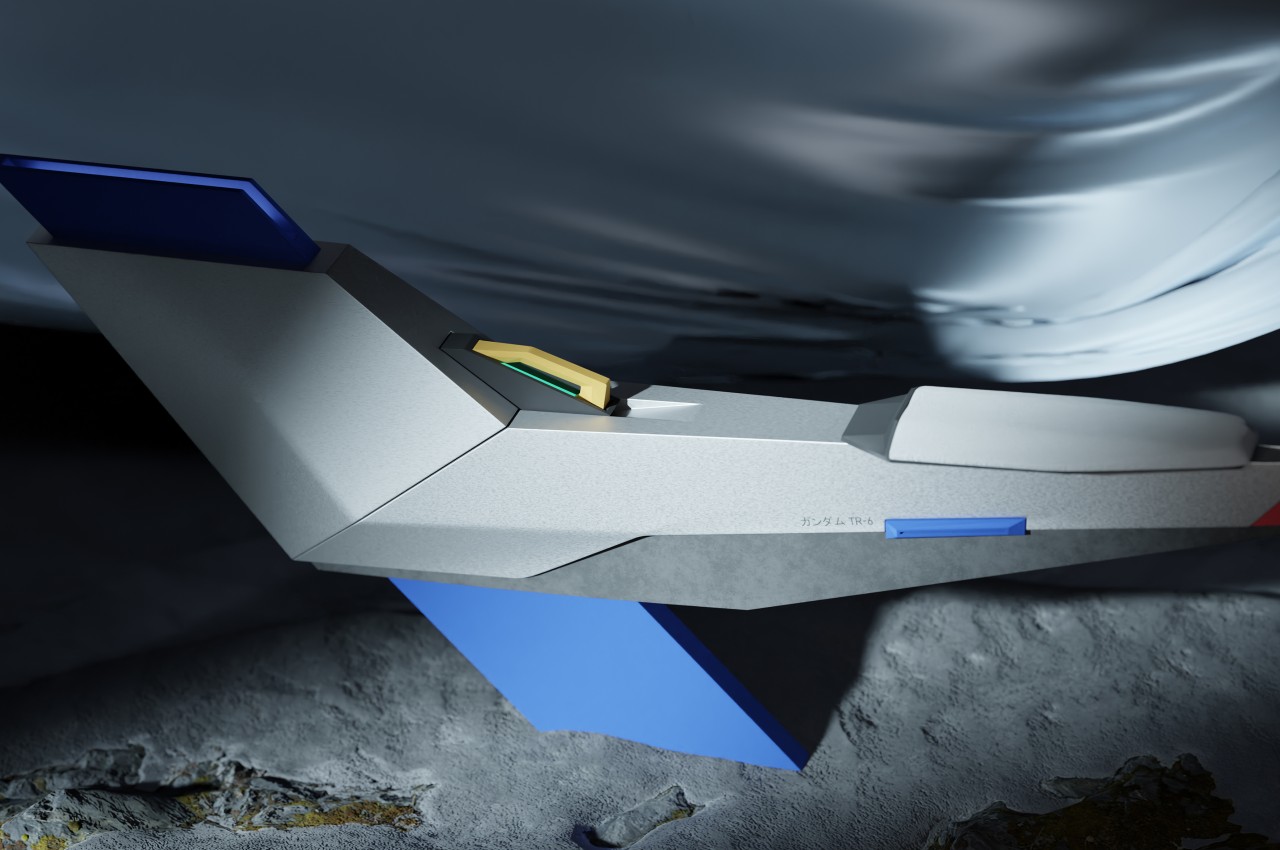
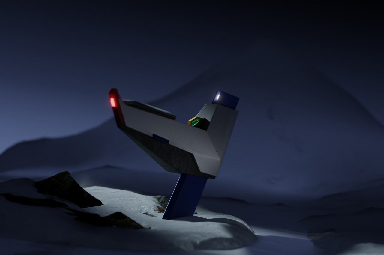
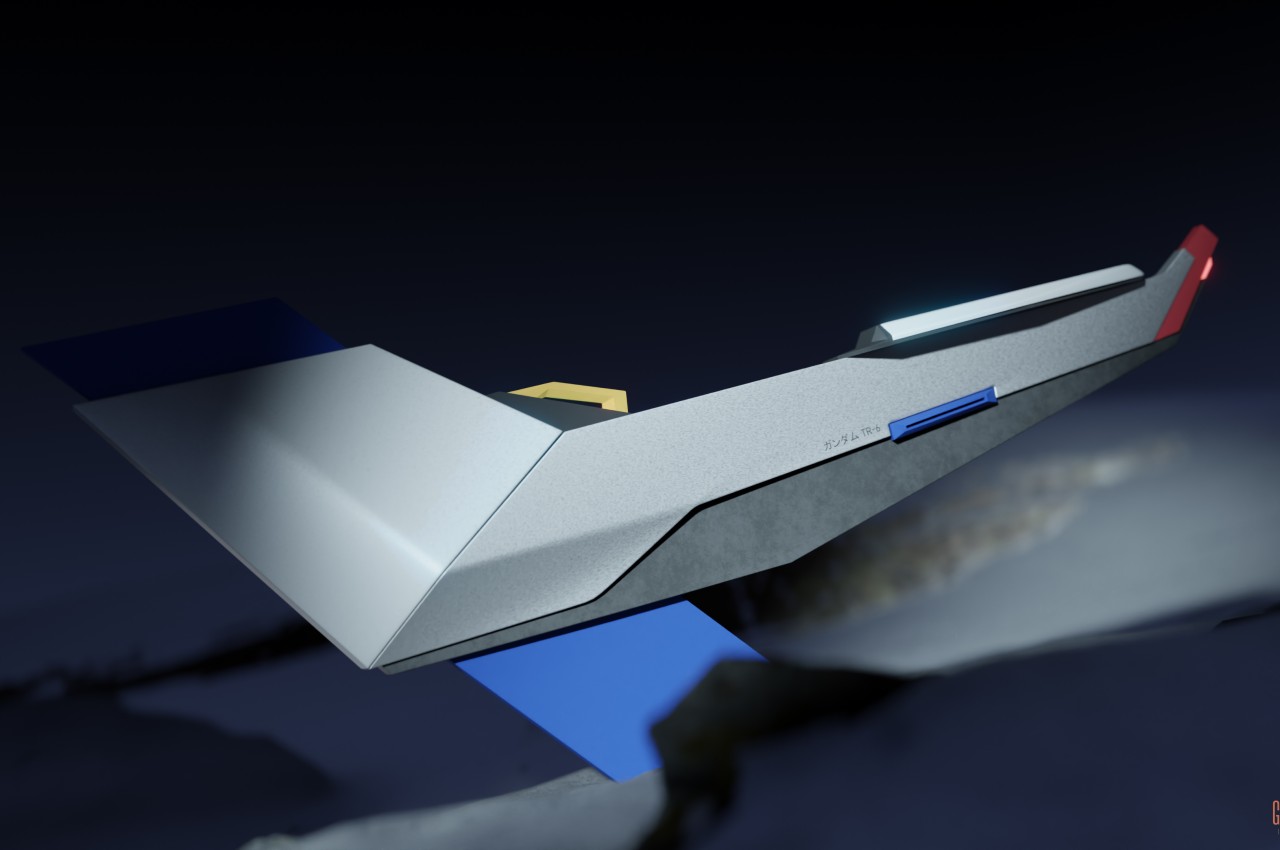
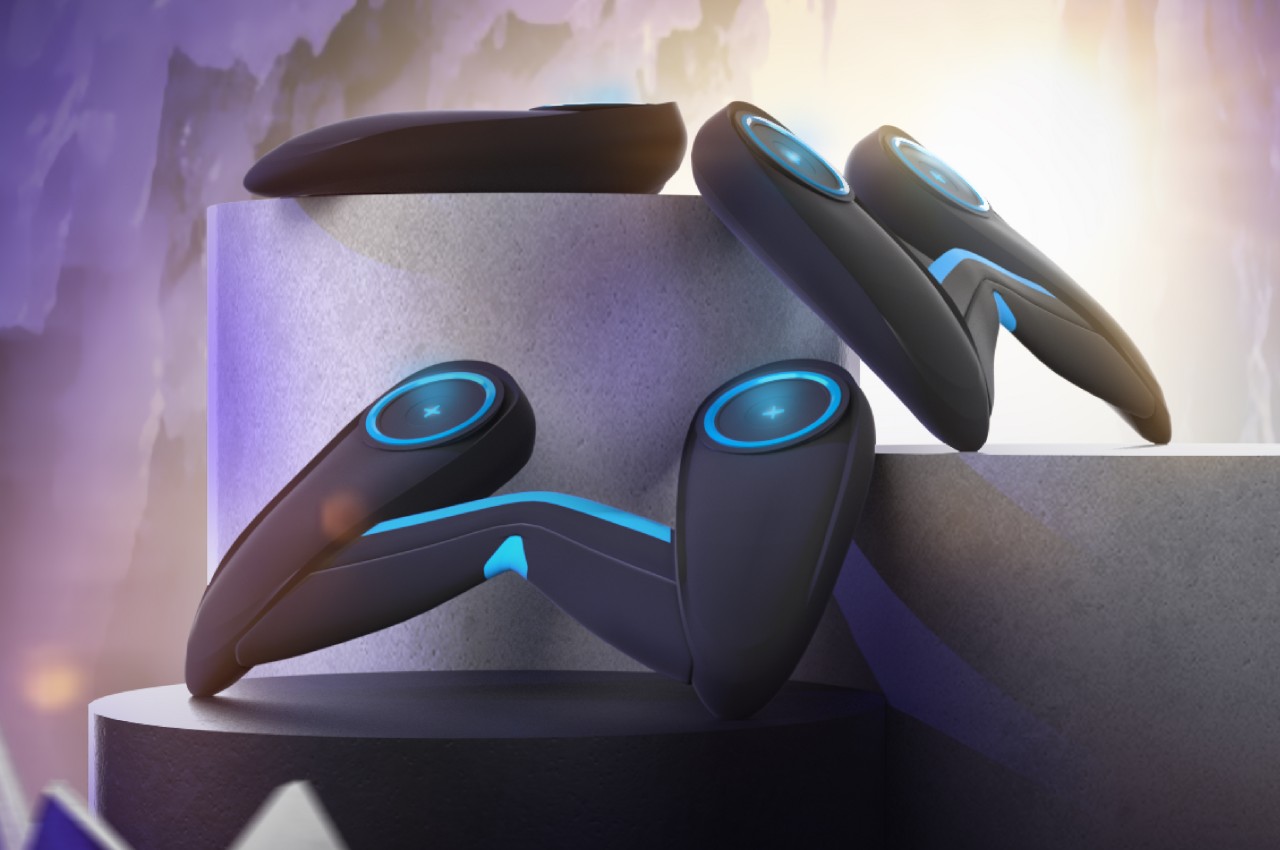
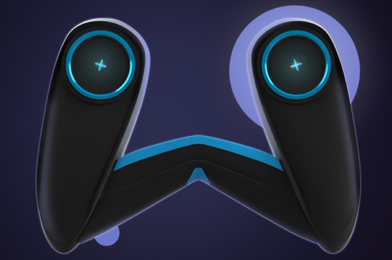
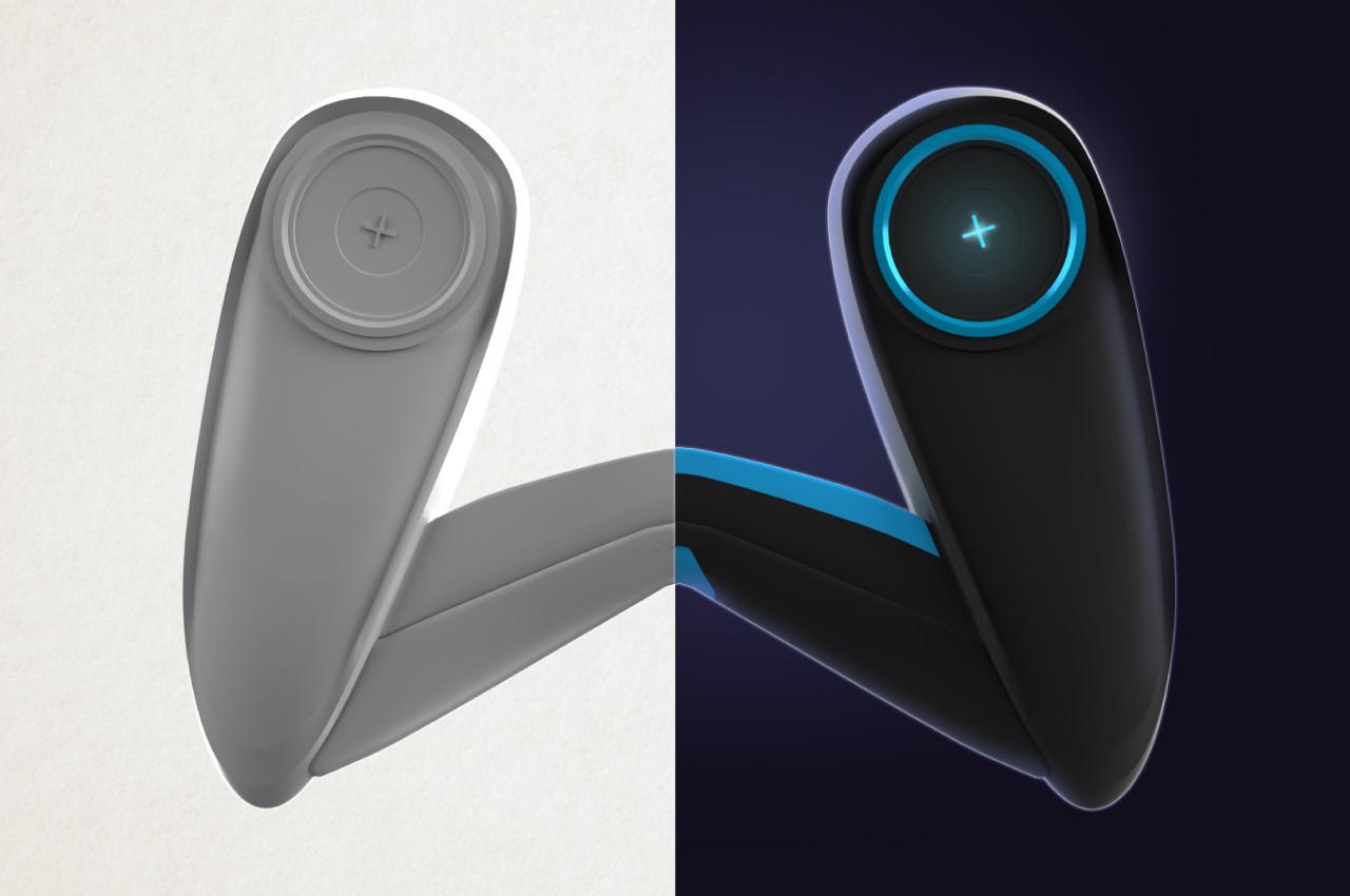
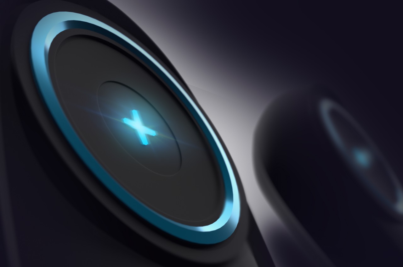
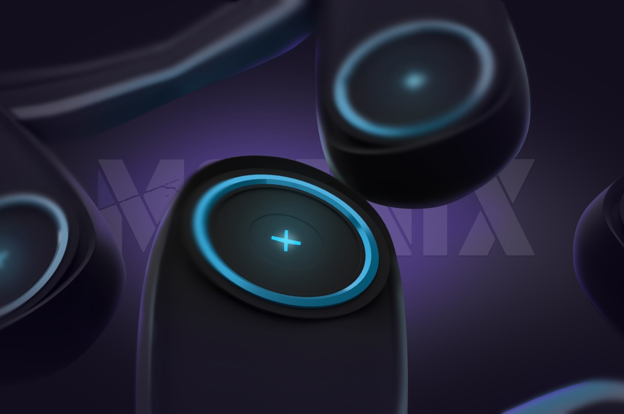
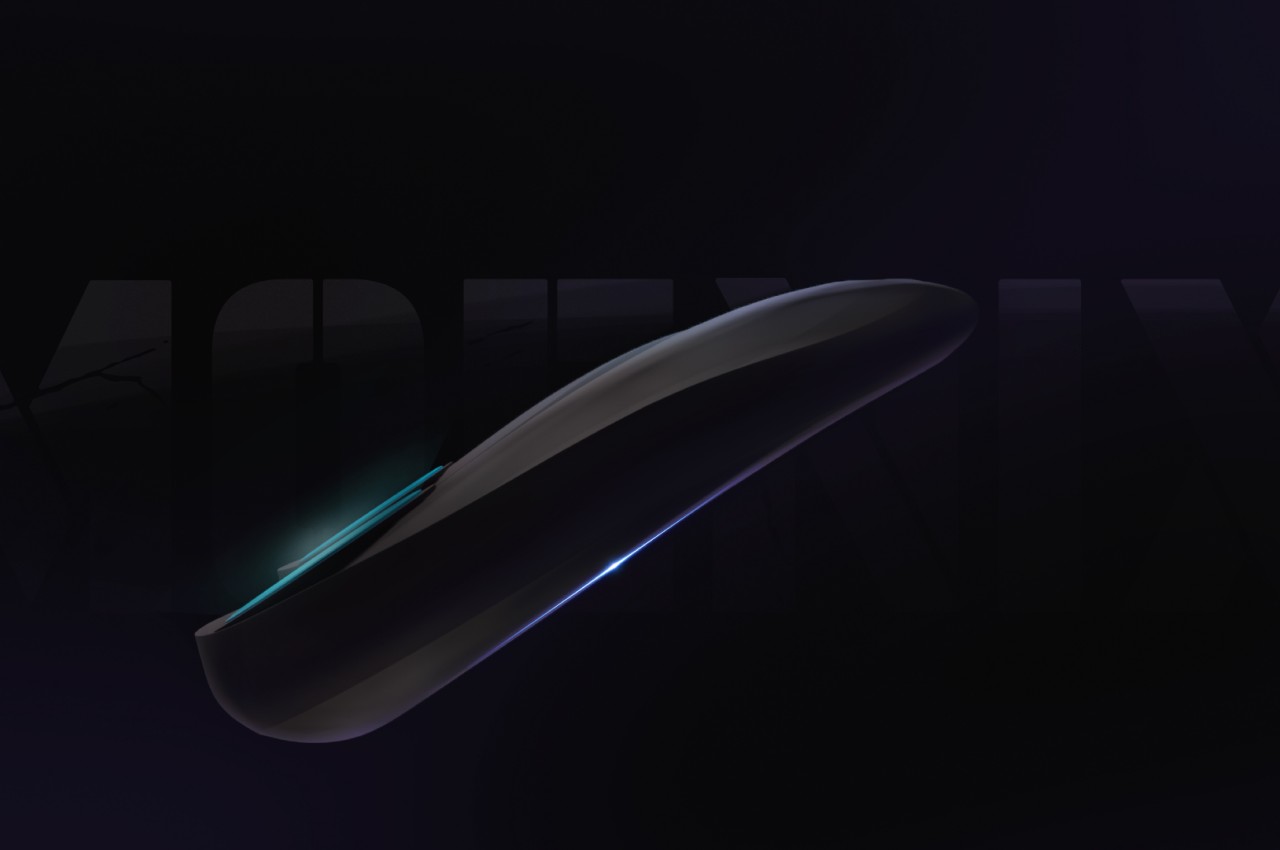
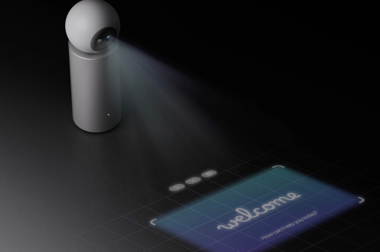
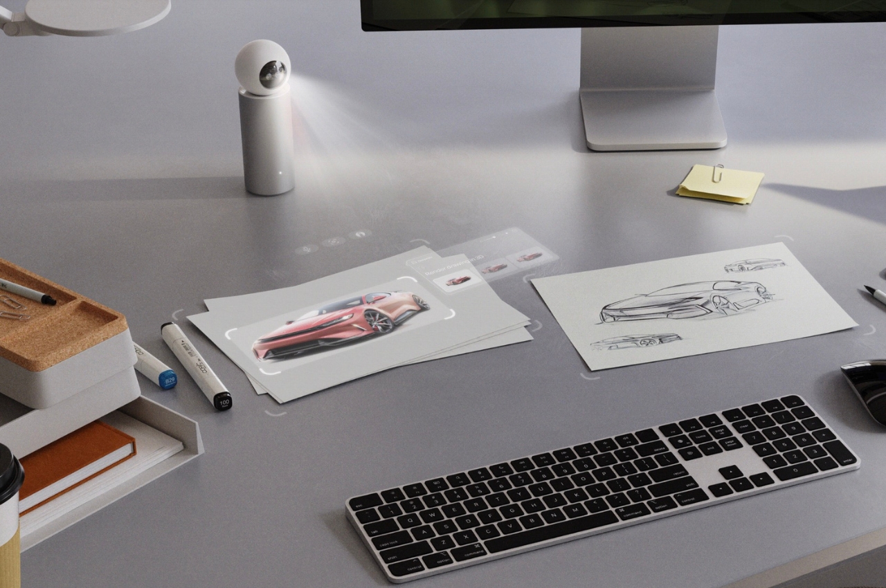
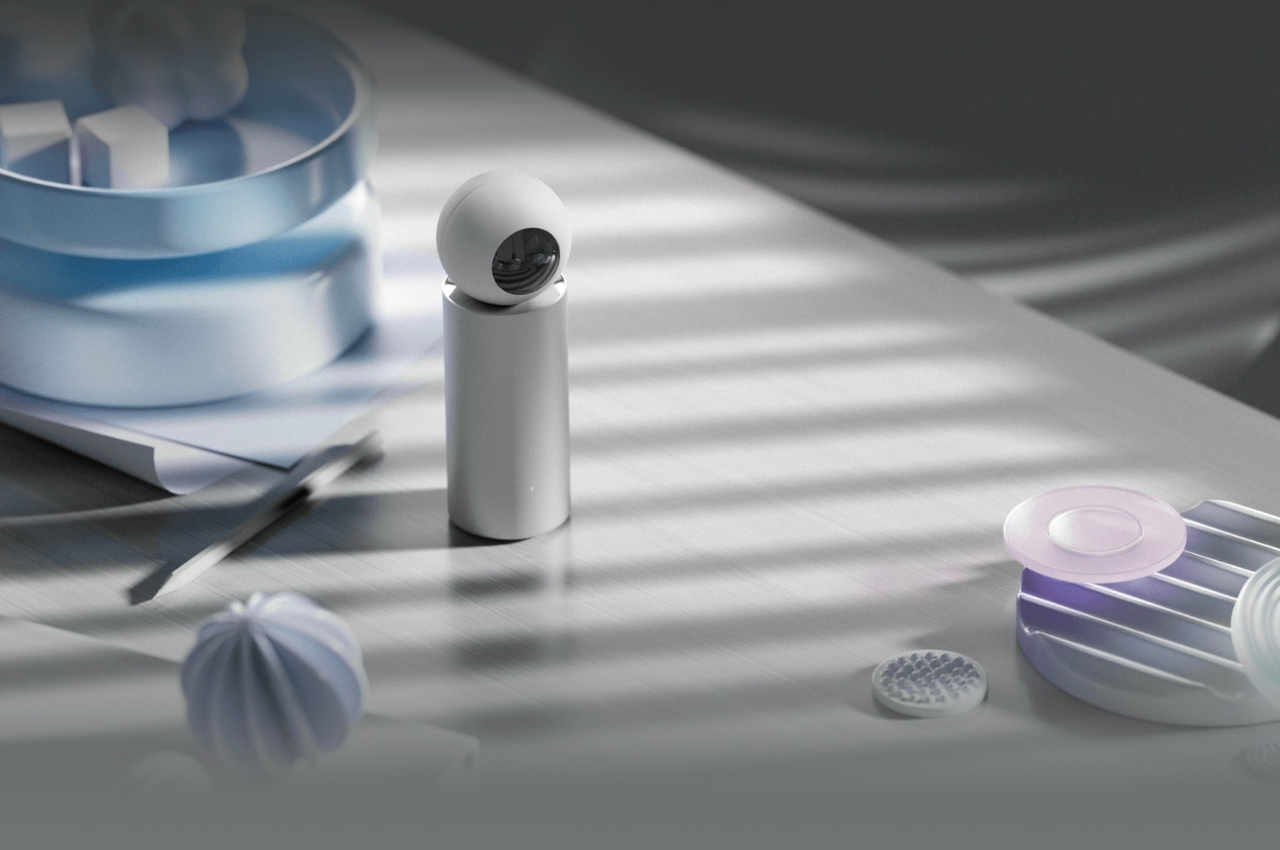
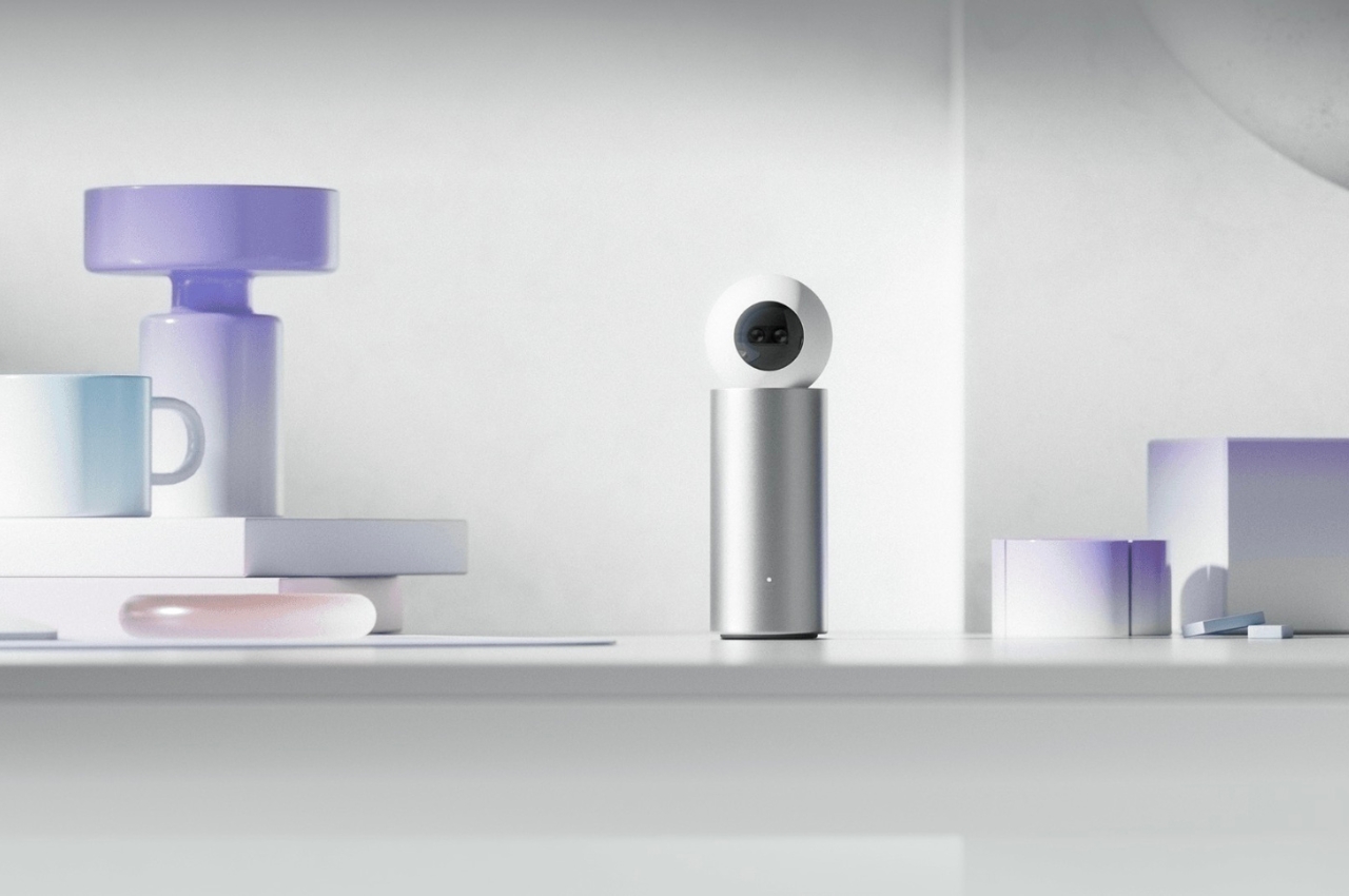
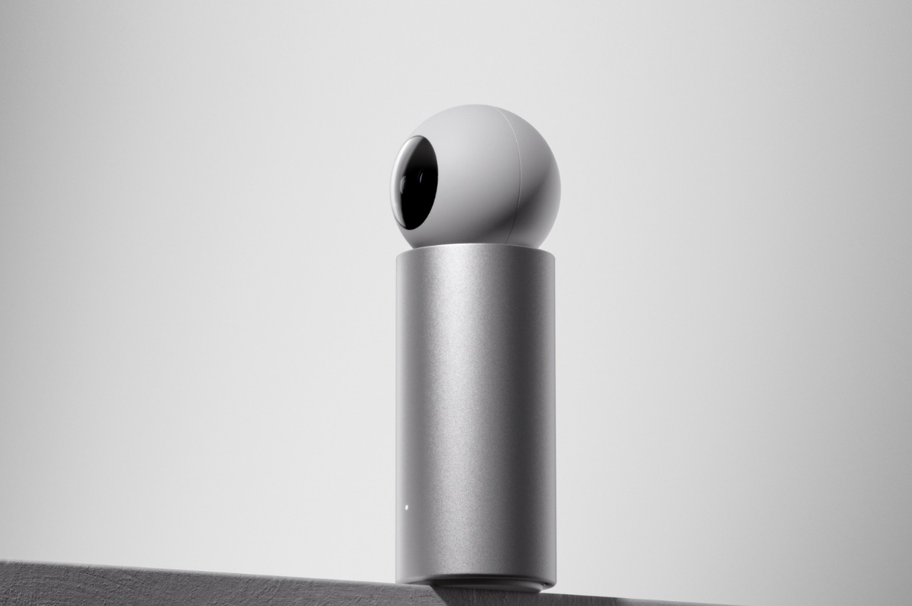
Lay is a concept for a portable AI device that is equipped with a wide-angle camera, a projector, and a sensing module. The 48MP wide-angle camera has a 13mm focal length and is able to recognize objects and space as well as have text recognition and upscale objects it can scan. The 4K UHD projector can project up to 30 inches screen with auto keystone and has under 10cm ultra-short throw distance and high brightness and contrast. The sensing module, which includes LiDAR, ambient light, and proximity sensors, is able to sense its surroundings in real time.
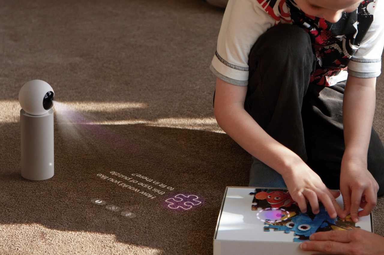
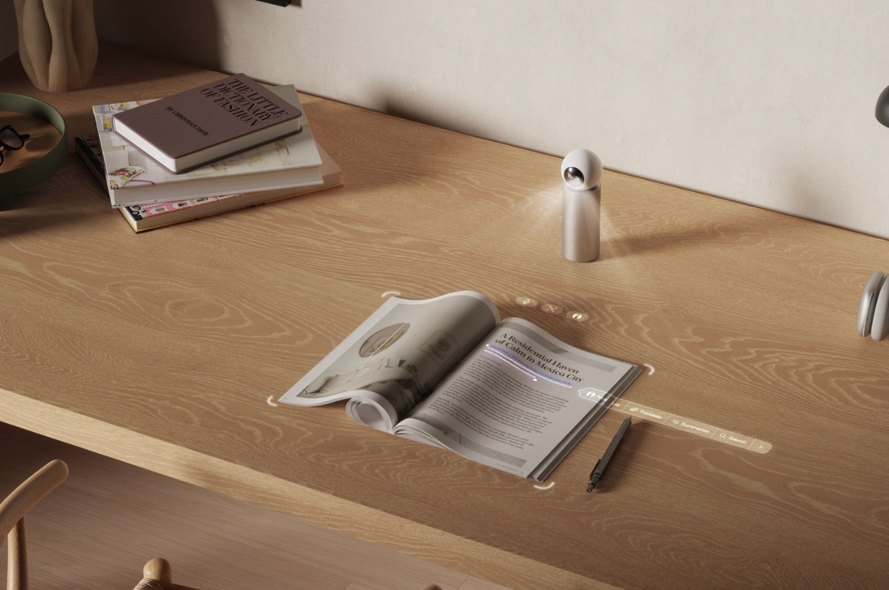
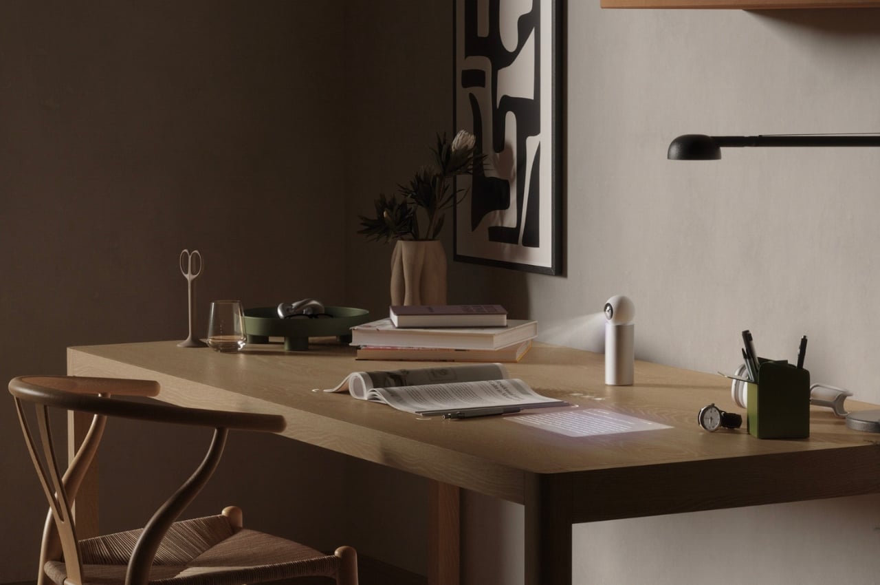
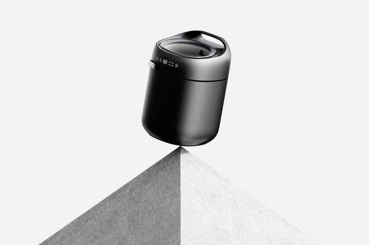
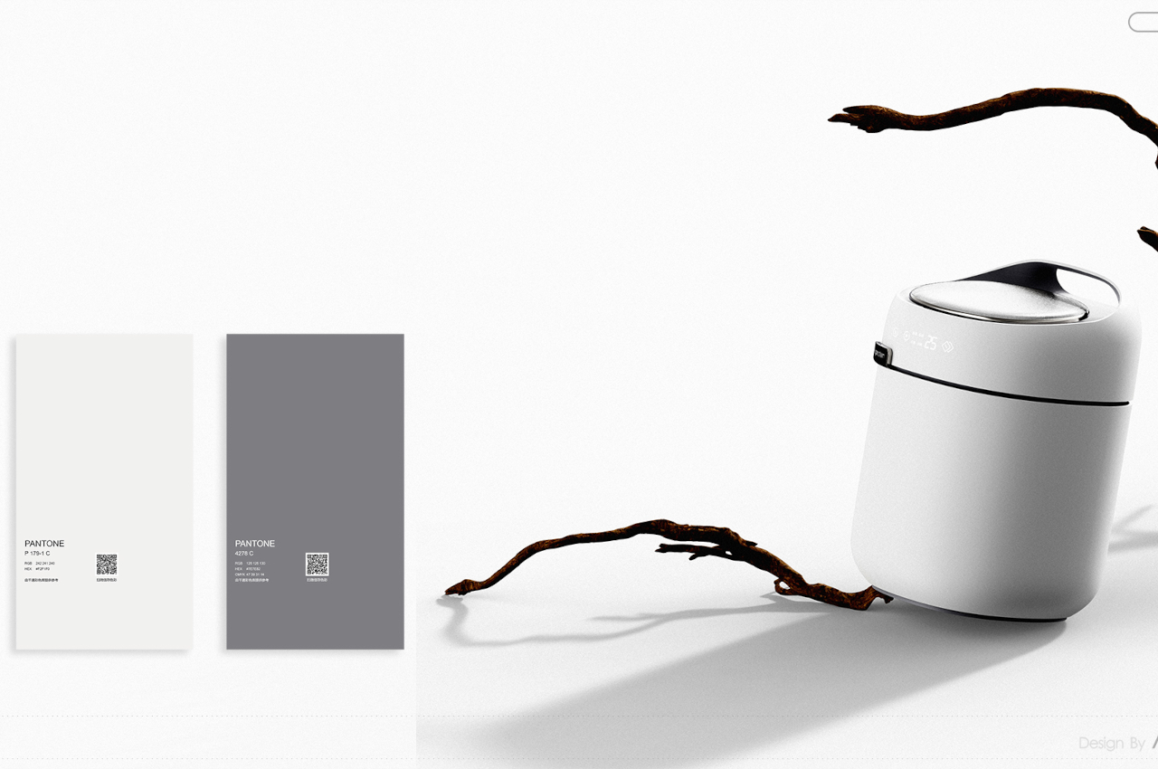
The device basically scans your surroundings and then leverage AI to make suggestions and give assistance on tasks that you can do to as you’re working, drawing, reading, scribbling, building, creating, or just leisurely browsing. It looks like a small spherical robot with a round head that moves around and that you can carry around and place on your desk or space as it helps you make your workflow smoother. It projects onto a surface which will serve as your screen as you do your different tasks. It can recognize and select text, drawings, photos, sketches and then all the content and information are updated in your real-time cloud.
The device still seems to be mostly theoretical and specific tasks you can do or that it can suggest are still a bit vague. But it’s an interesting concept for an AI-powered device that you can carry around with you especially if you’re a digital nomad. And with the speed at which some digital natives and early adapters are using and exploring AI, this can actually be a real device soon.

The post Portable AI device uses camera, projectors, sensors to make you more productive first appeared on Yanko Design.