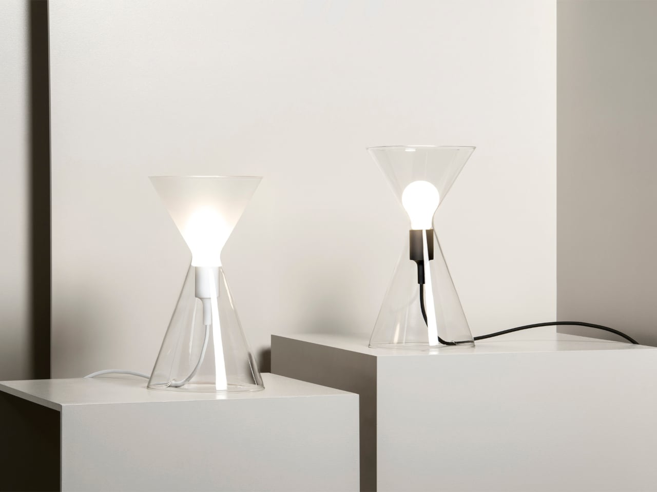
Industrial heritage sites have a way of disappearing quietly. The machinery goes silent, the workers move on, and the buildings either get repurposed or left to rust. What rarely survives is the craft knowledge, the particular way a community understood and worked a material. Slovakia’s copper-processing history is one of those stories, rooted in a small central region that once hummed with the sounds of metalwork and fire.
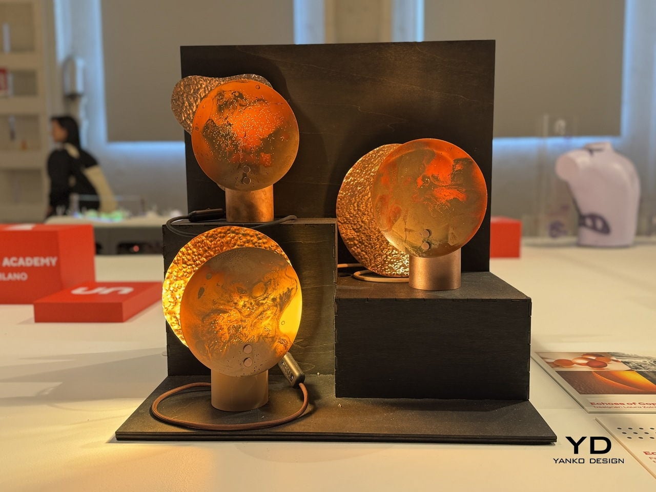
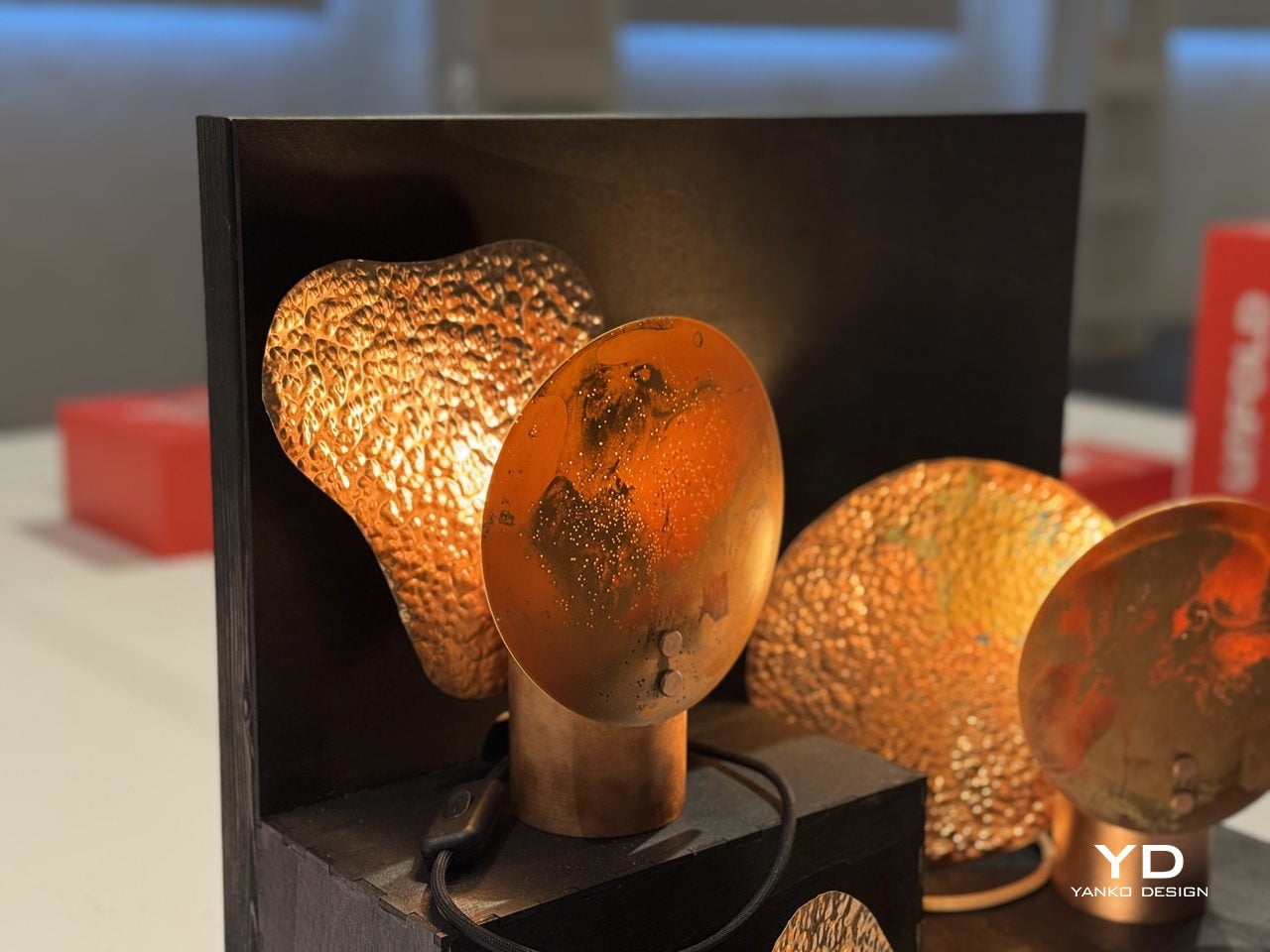
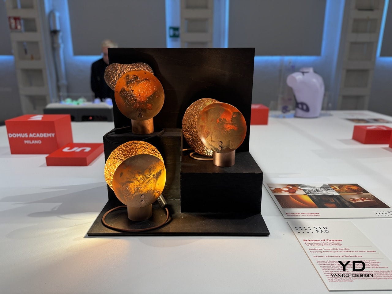
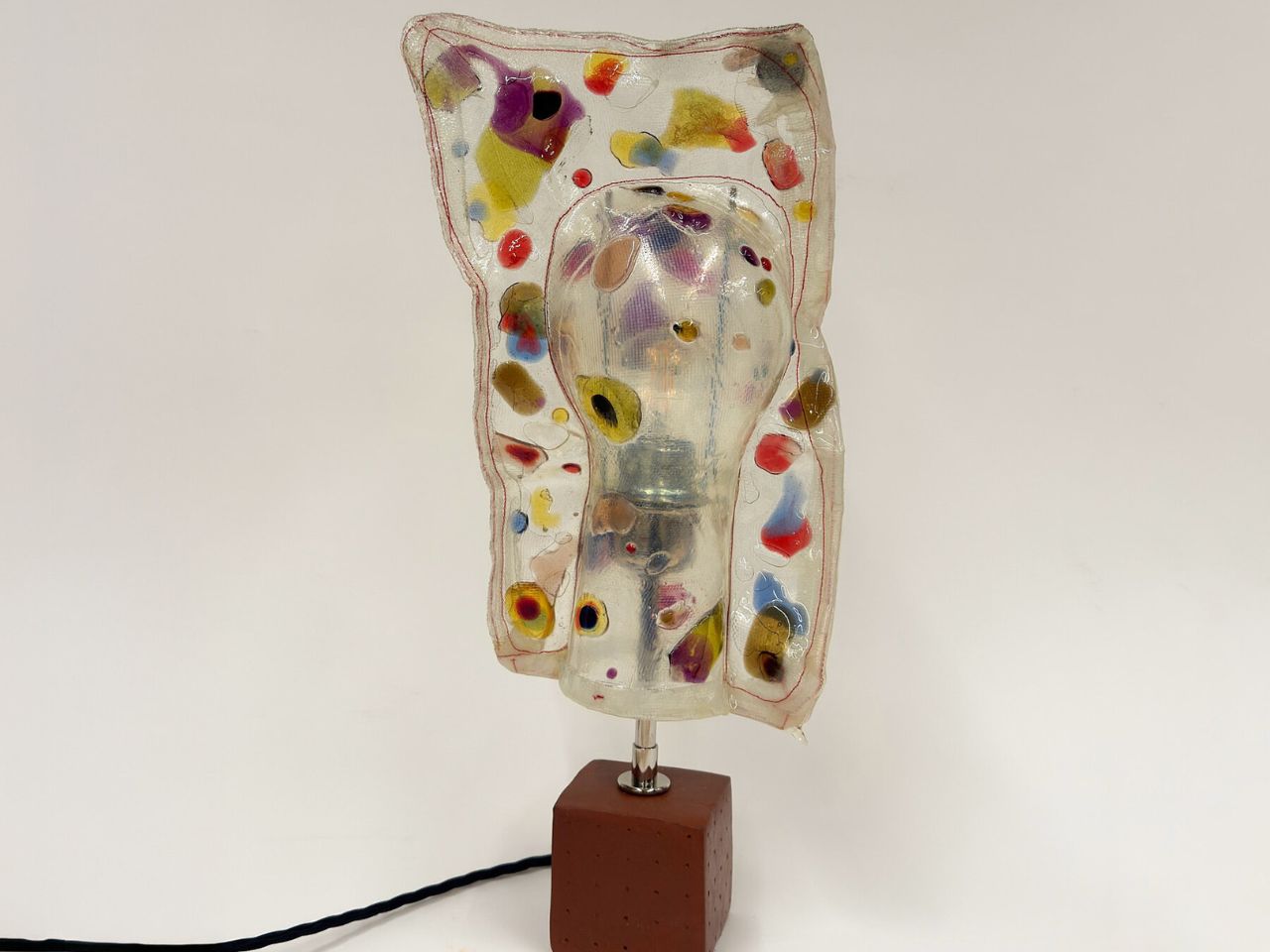
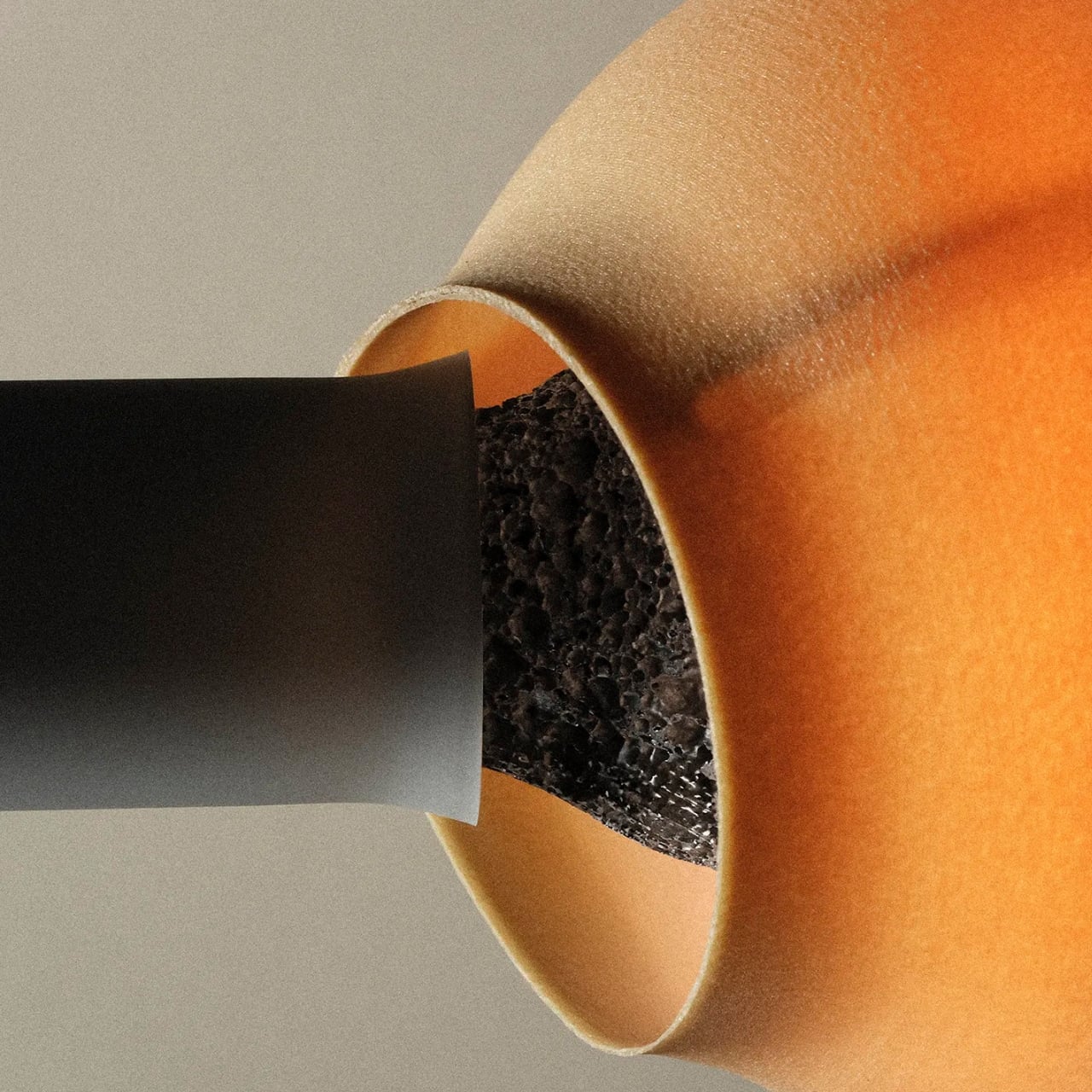
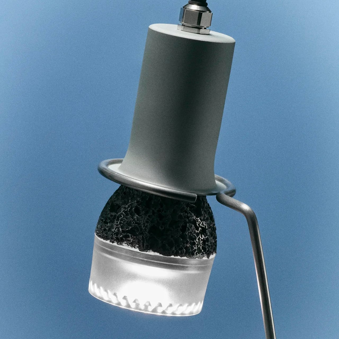
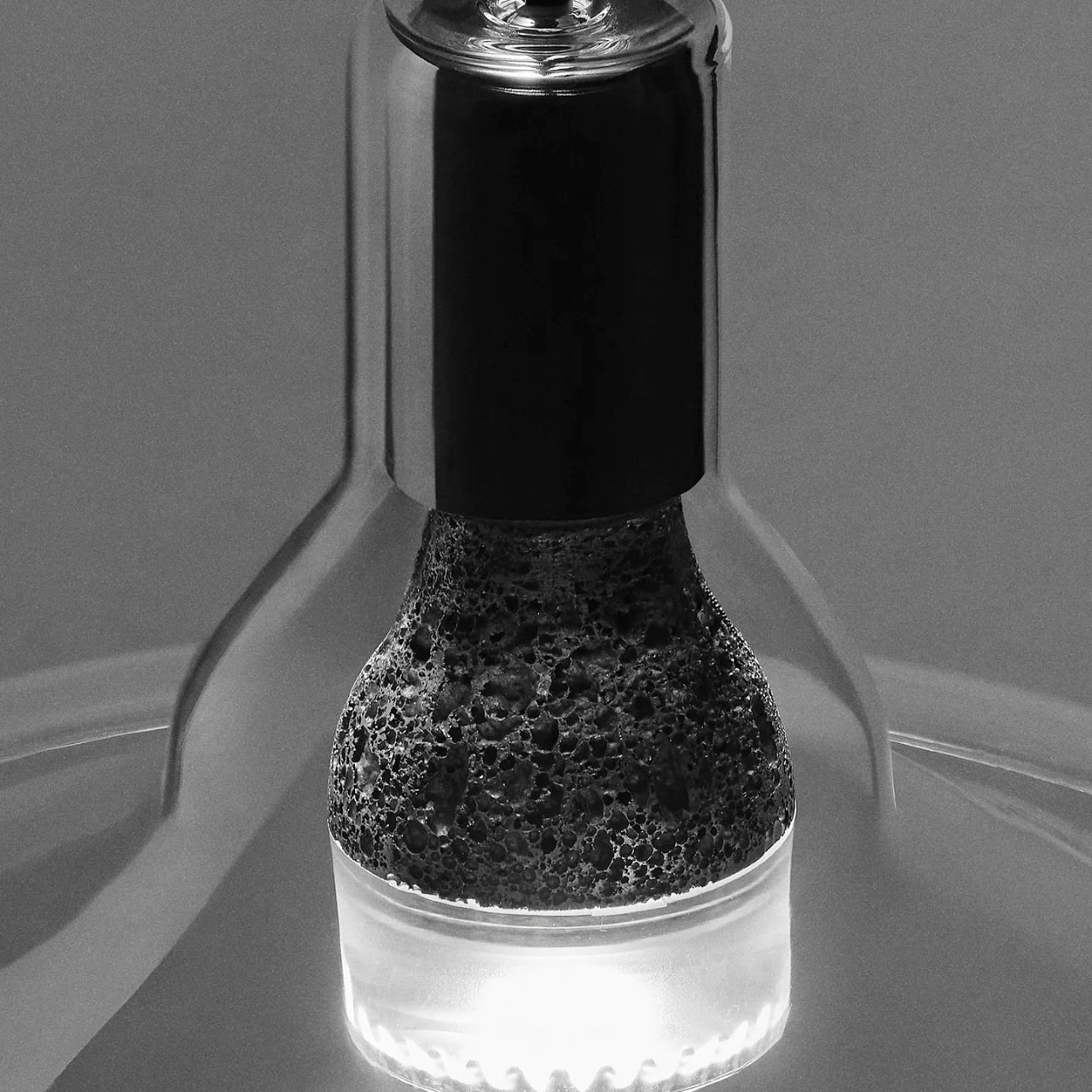
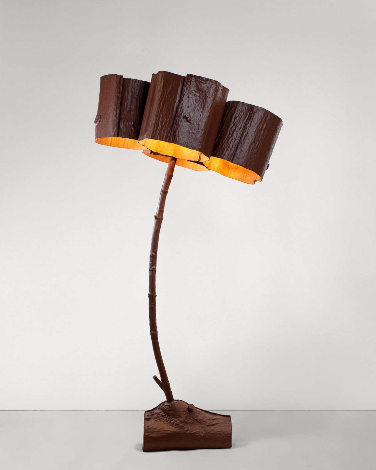
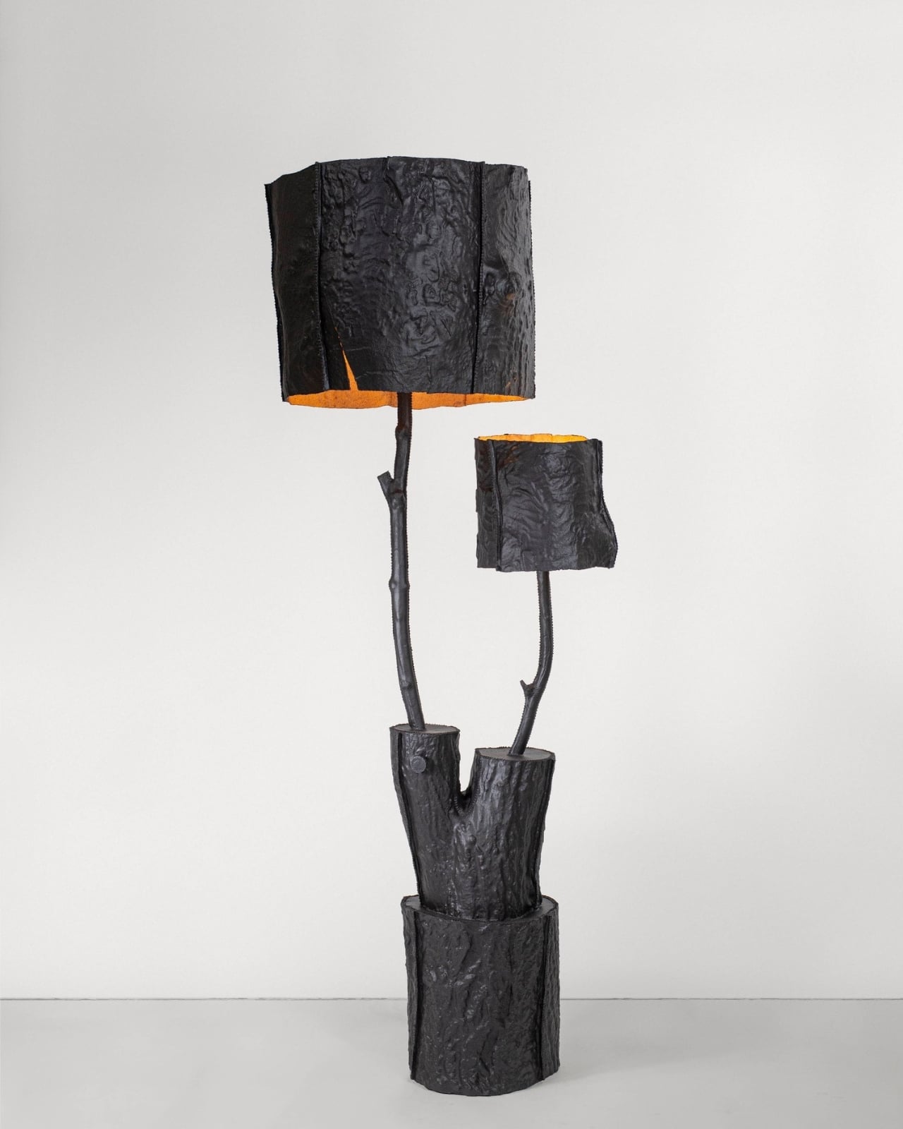
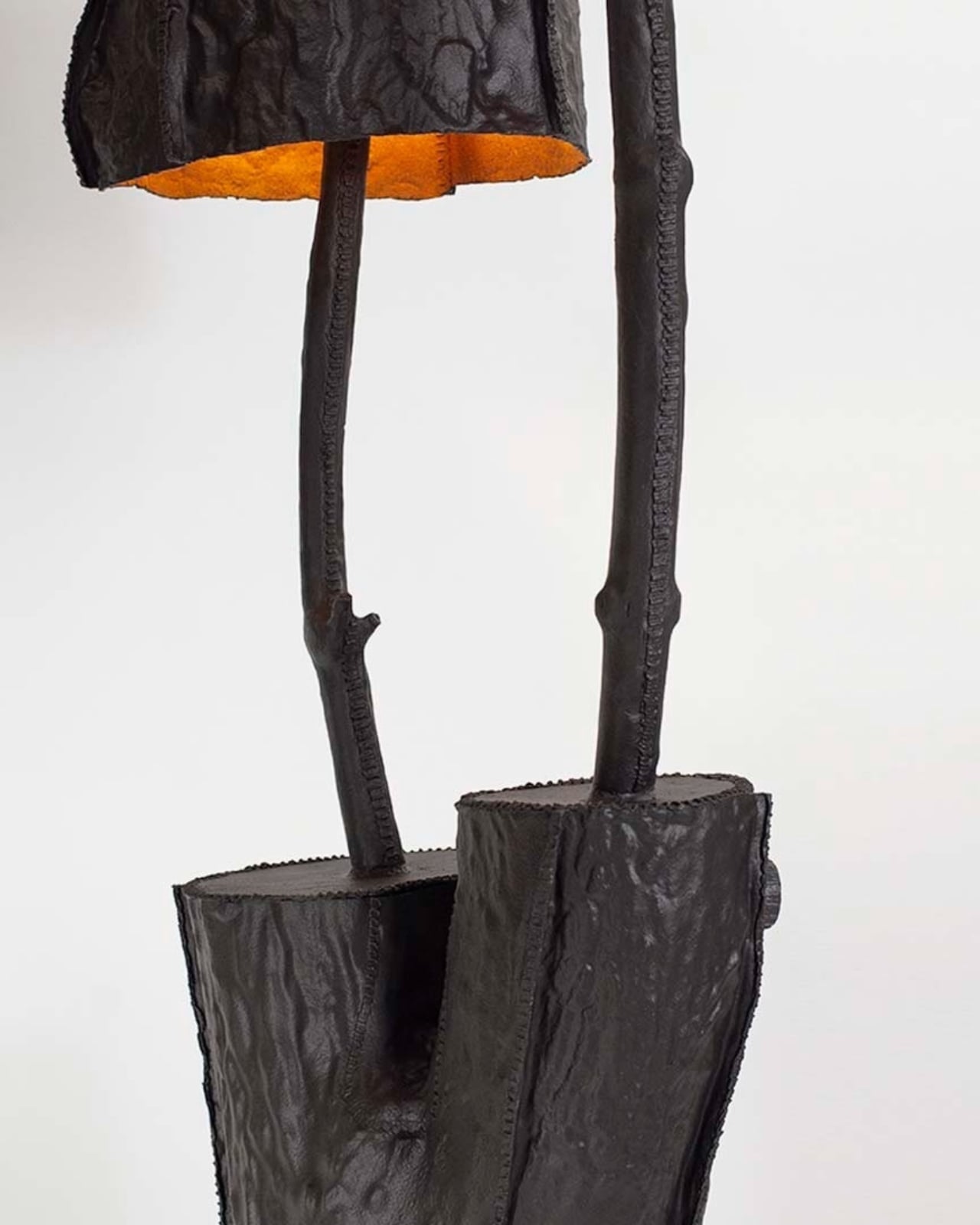
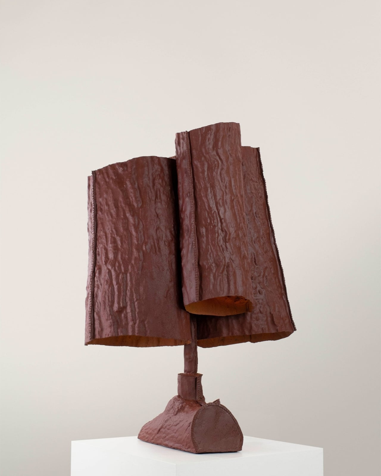
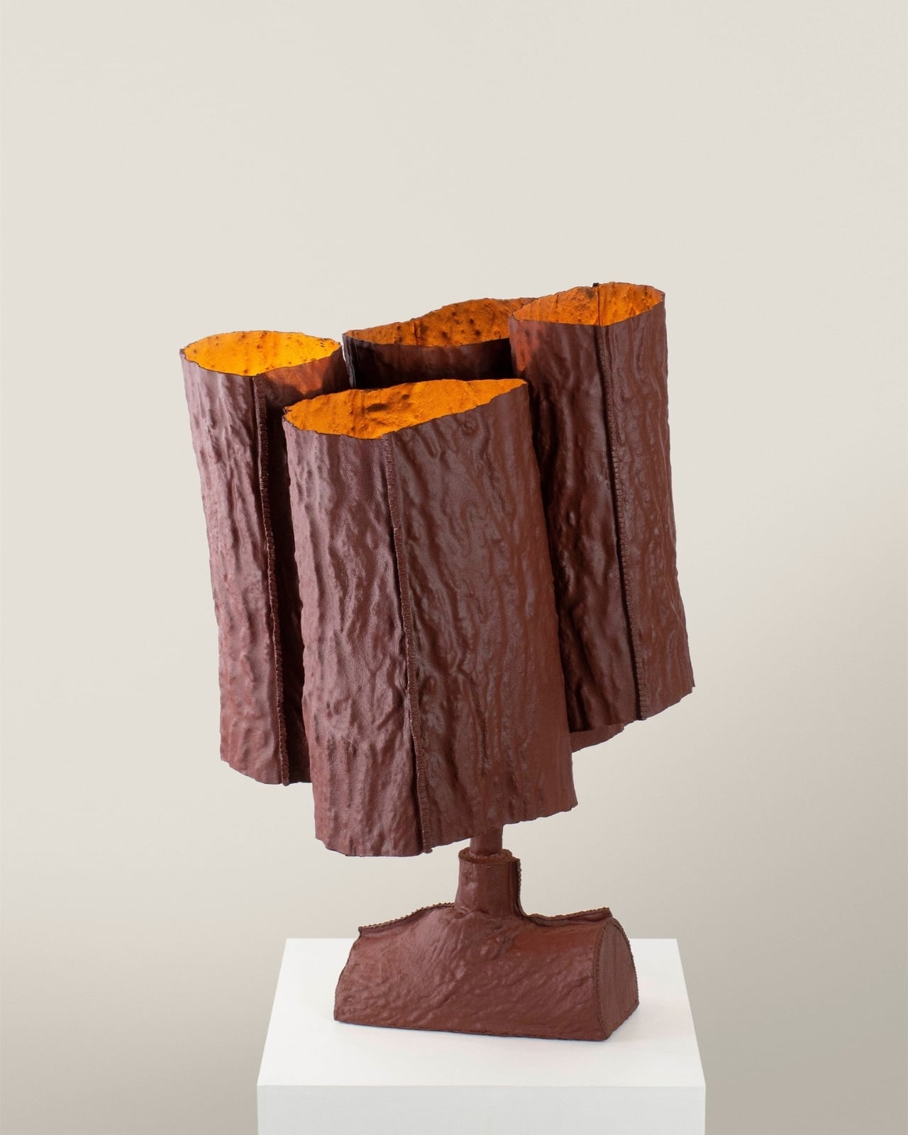
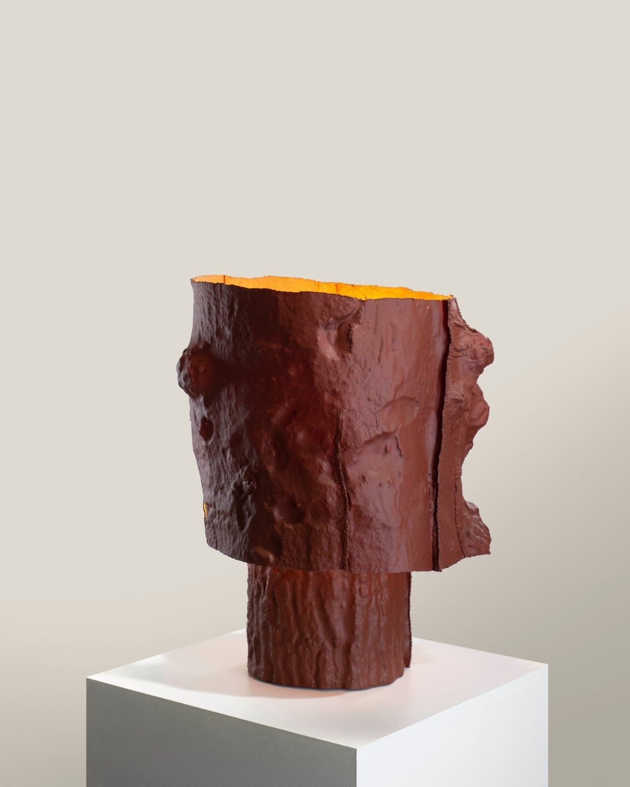
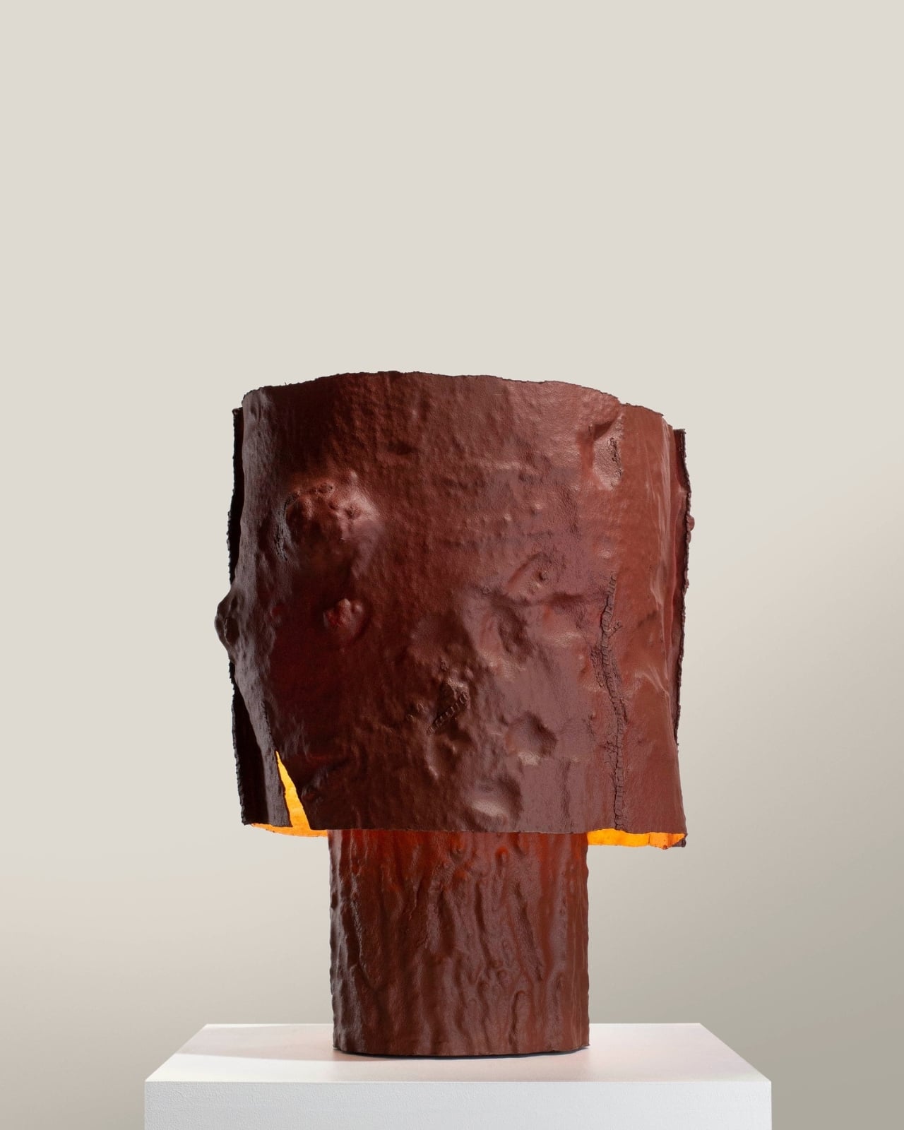
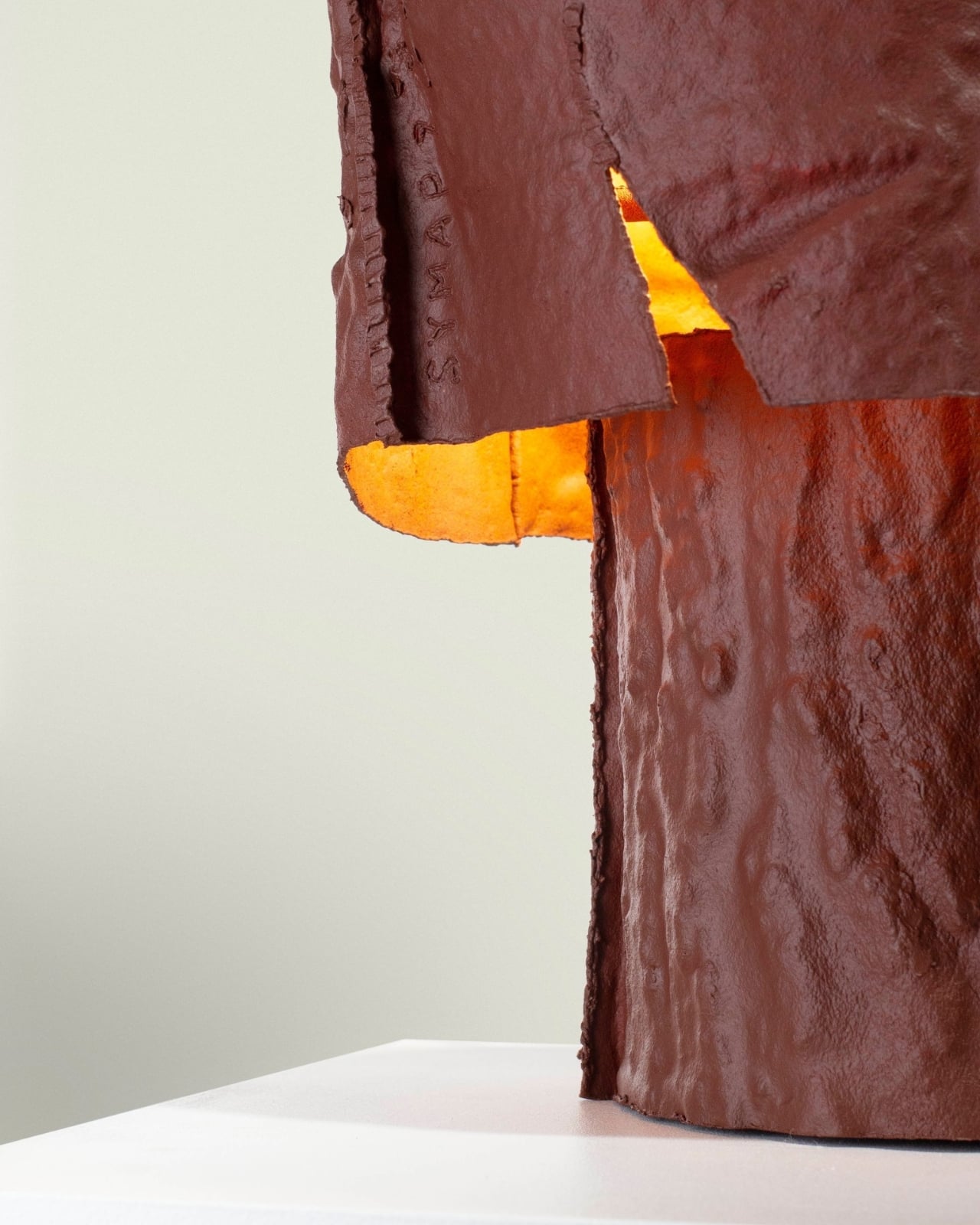
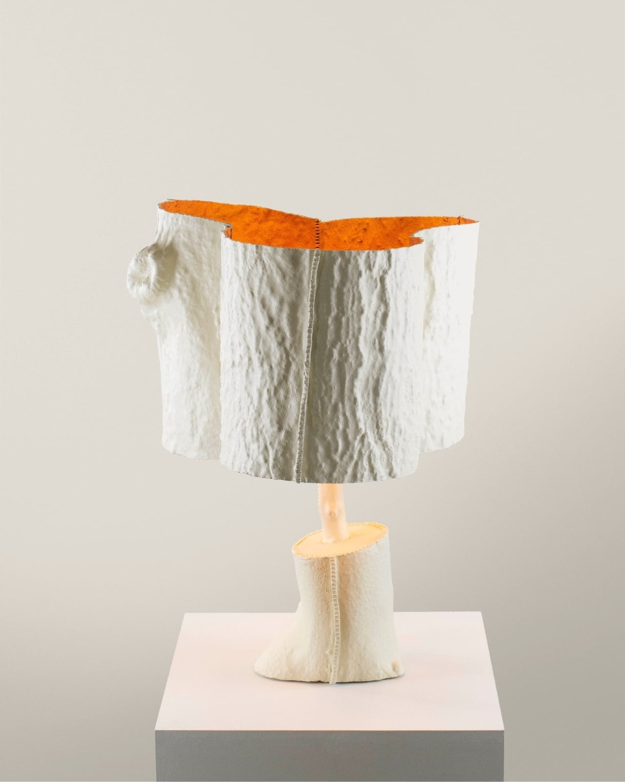
That’s the history Laura Zolnianska, a student at the Slovak University of Technology’s Faculty of Architecture and Design, decided to pull back into the present. Exhibited at BASE Milano as part of the 2026 Fuorisalone UNFOLD showcase, Echoes of Copper is a lamp collection drawing from the copper-processing traditions of Medený Hamor in central Slovakia, combining them with digital fabrication and an entirely experimental material of her own development.
Designer: Laura Zolnianska (Slovak University of Technology, Faculty of Architecture and Design)
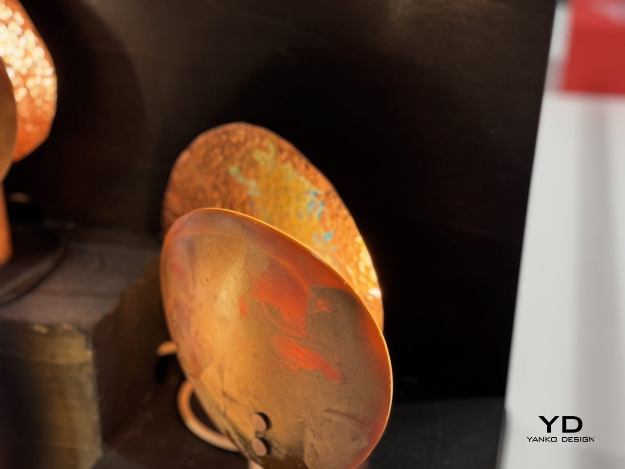
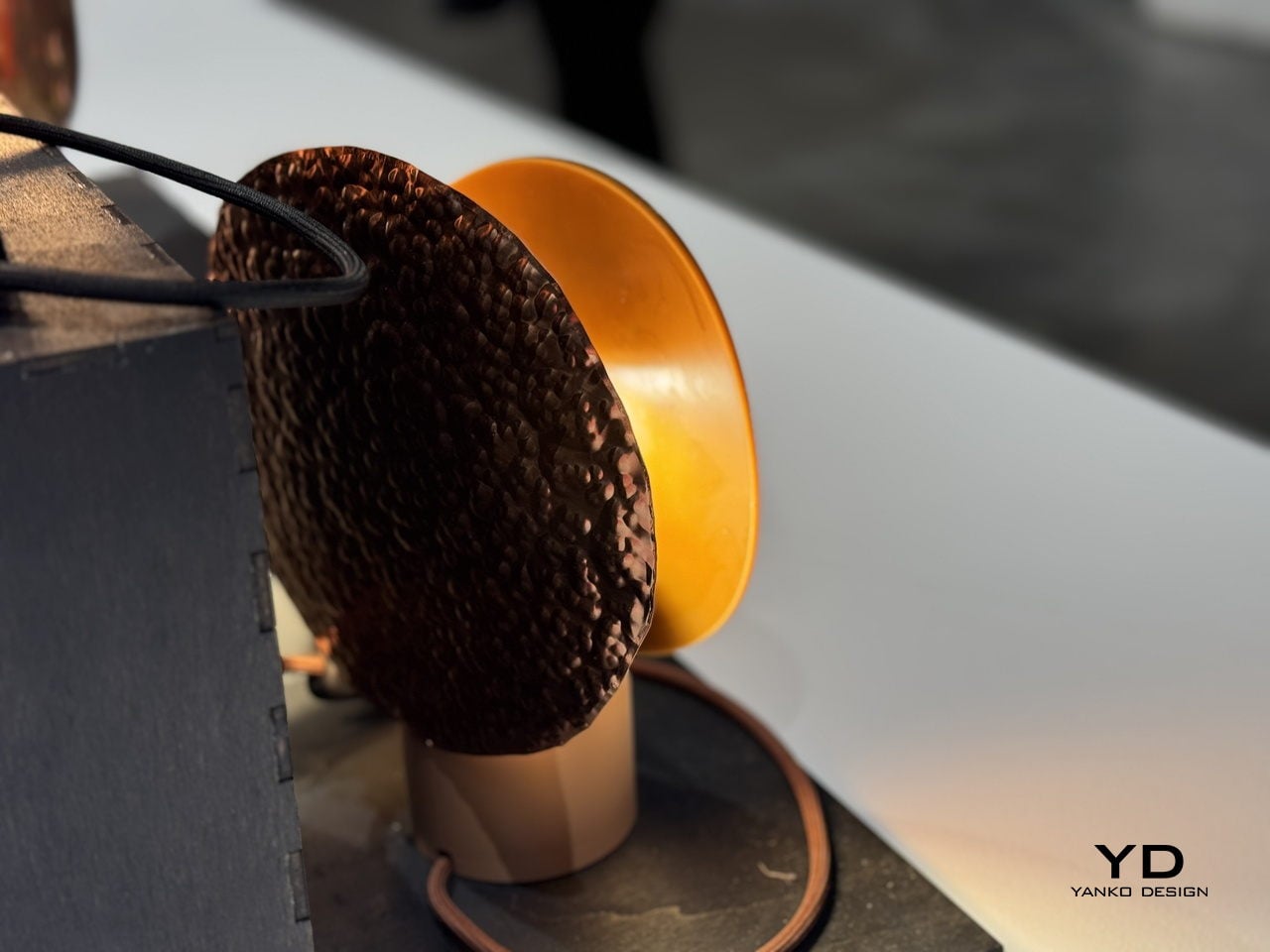
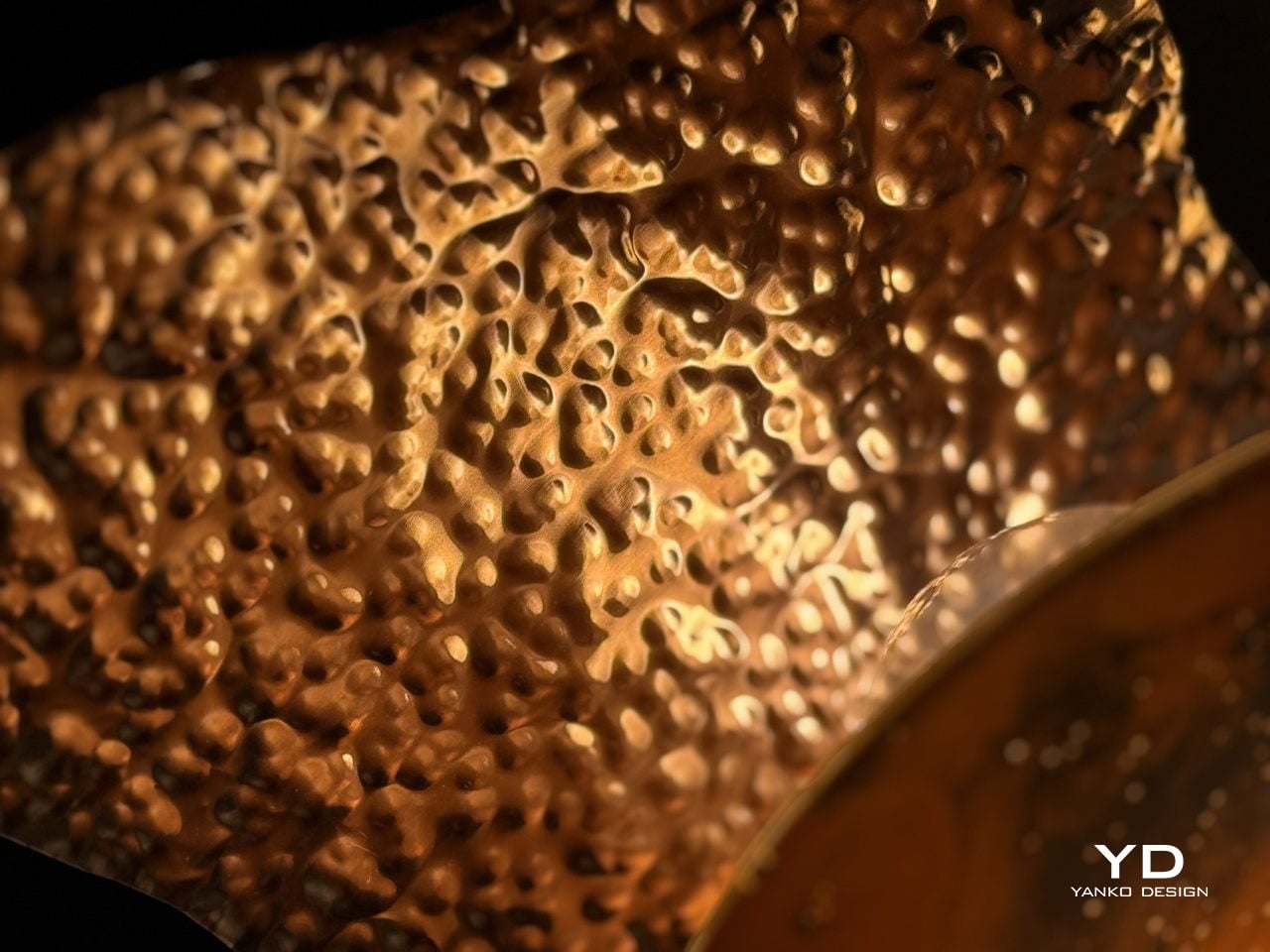
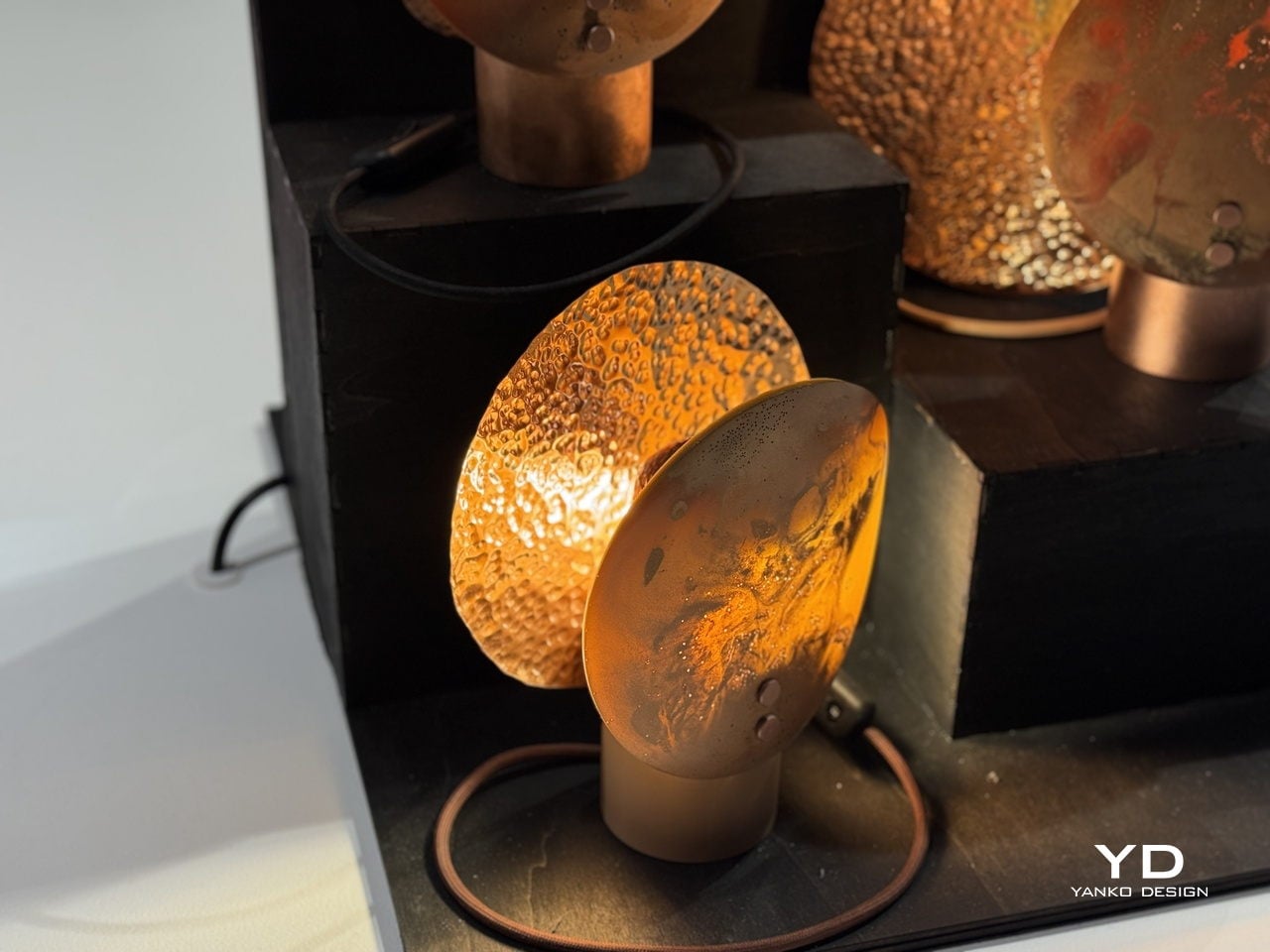
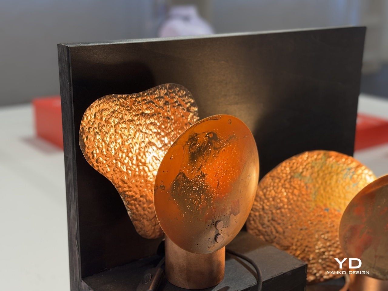
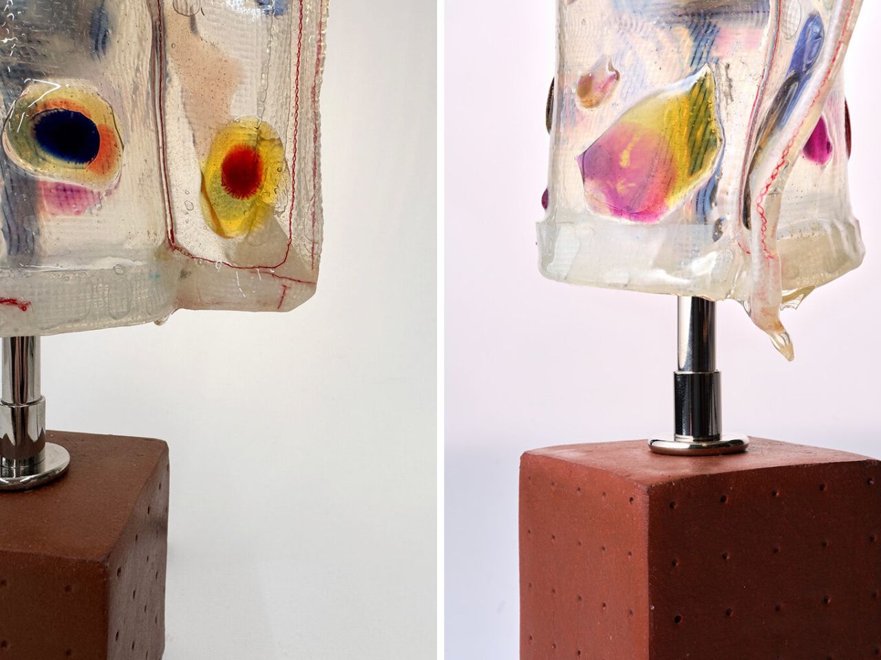
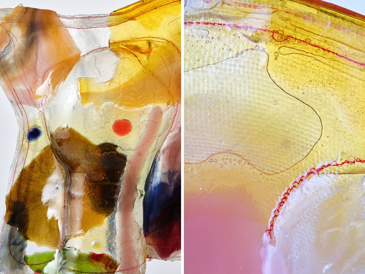
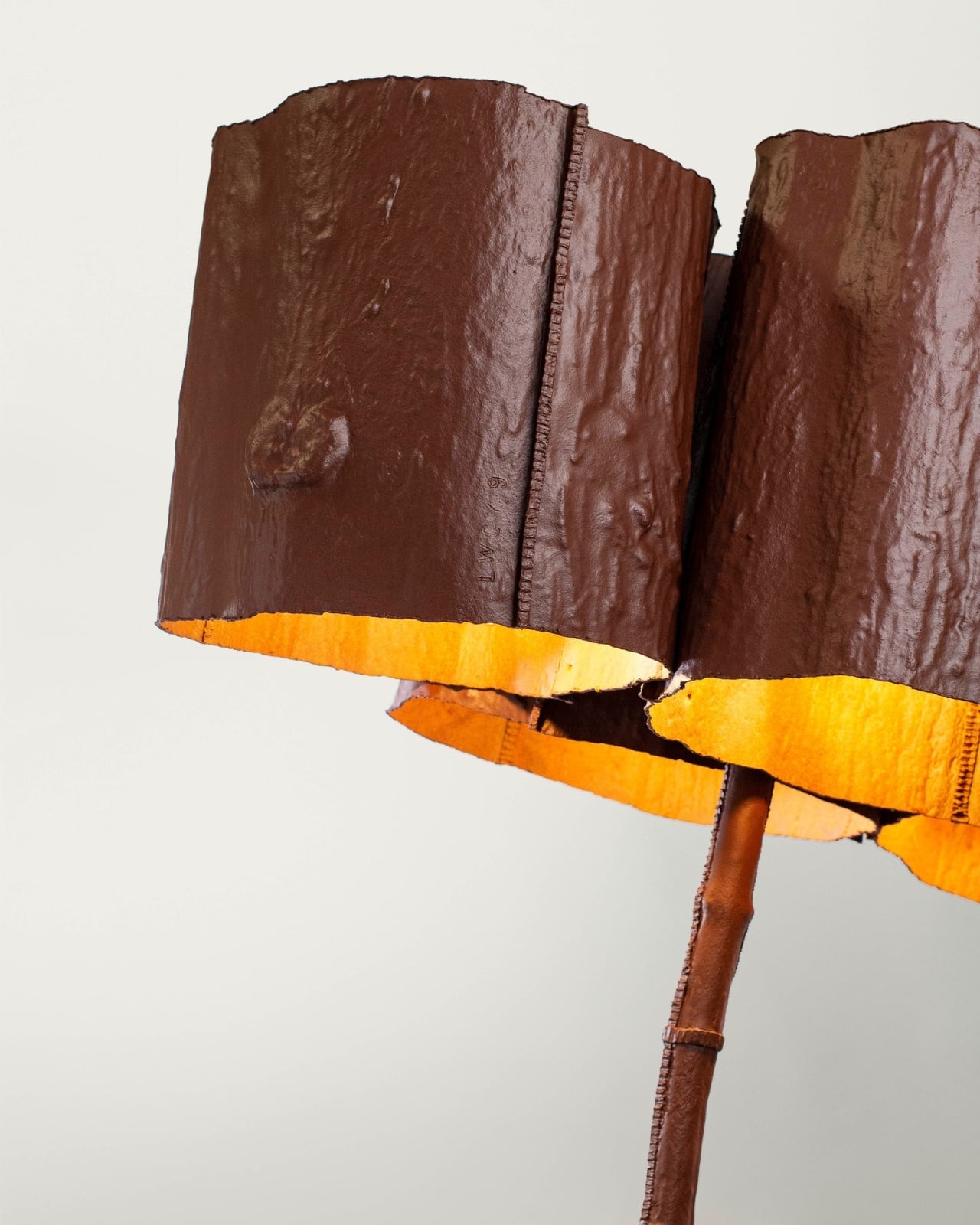
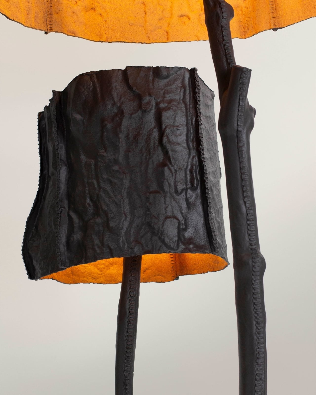
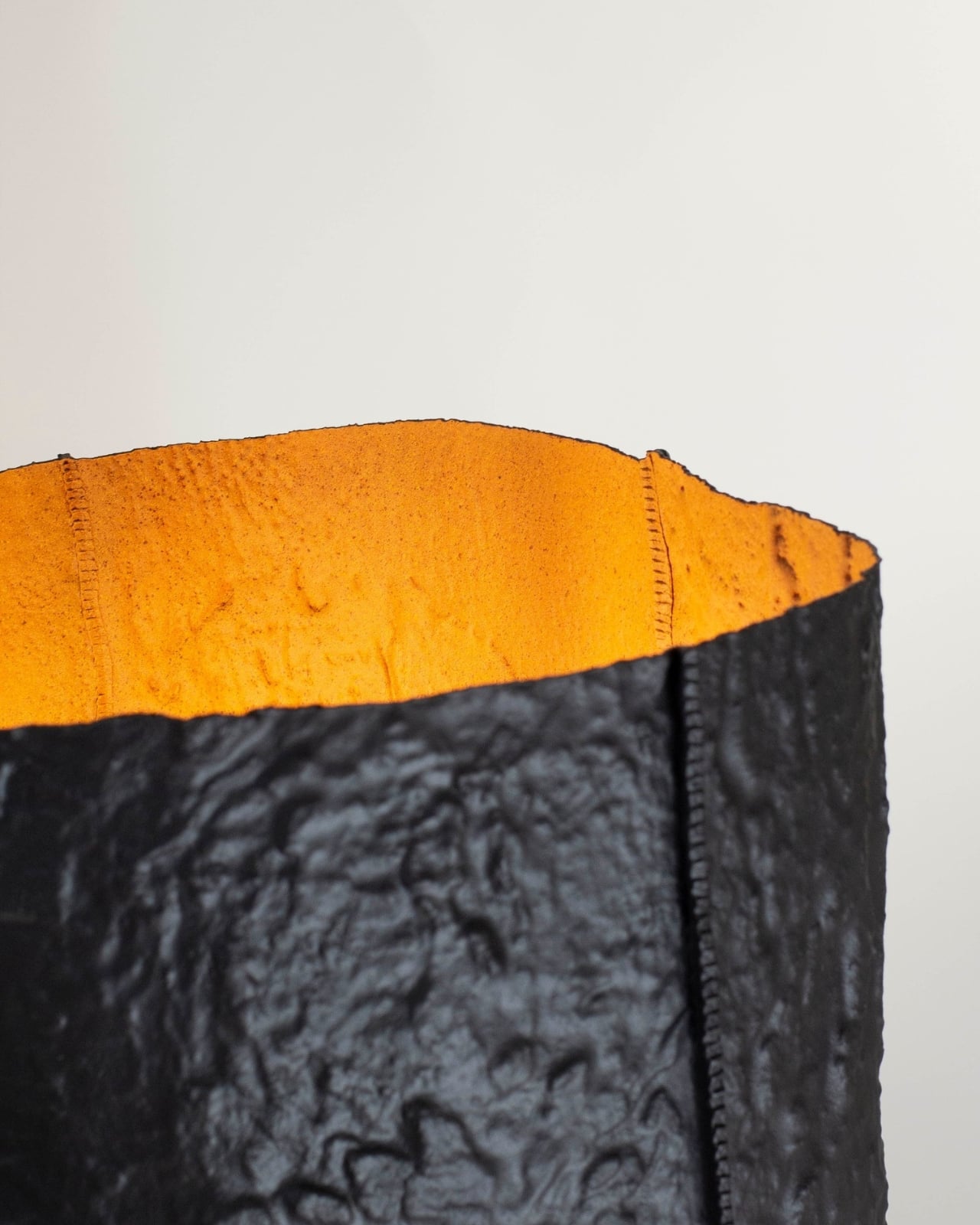
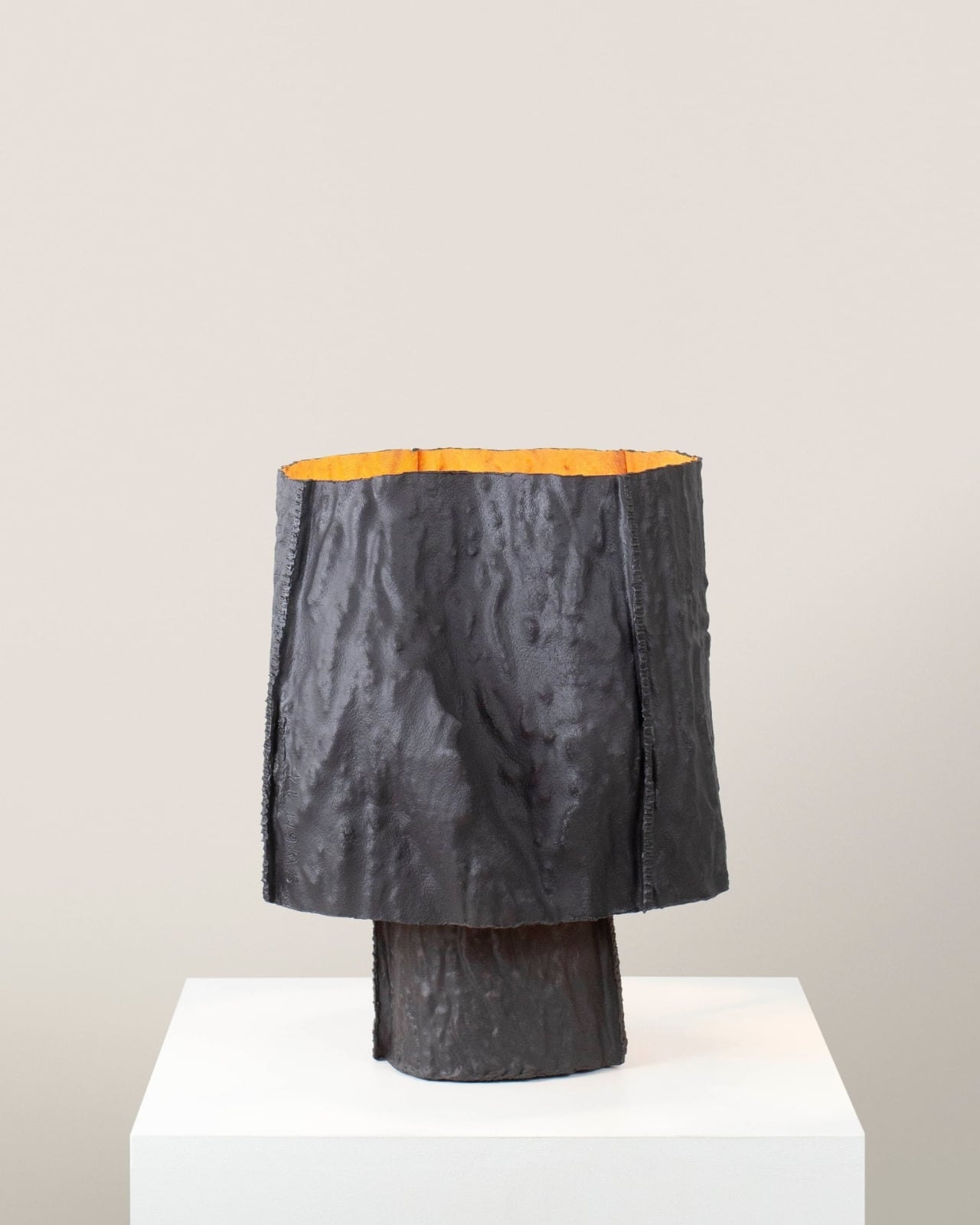
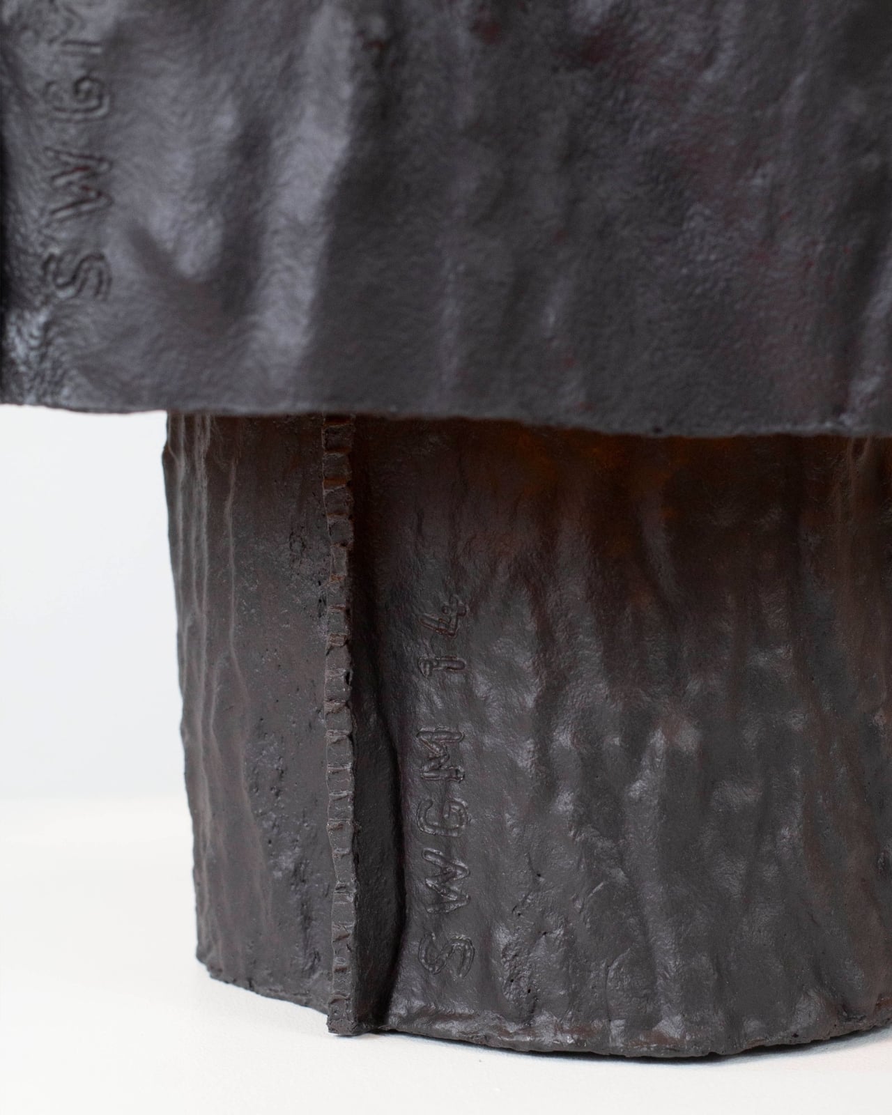
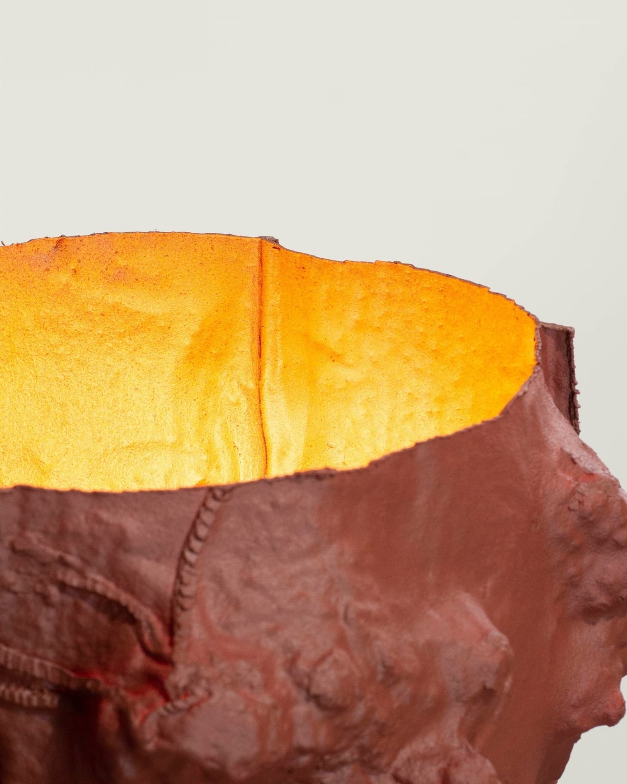
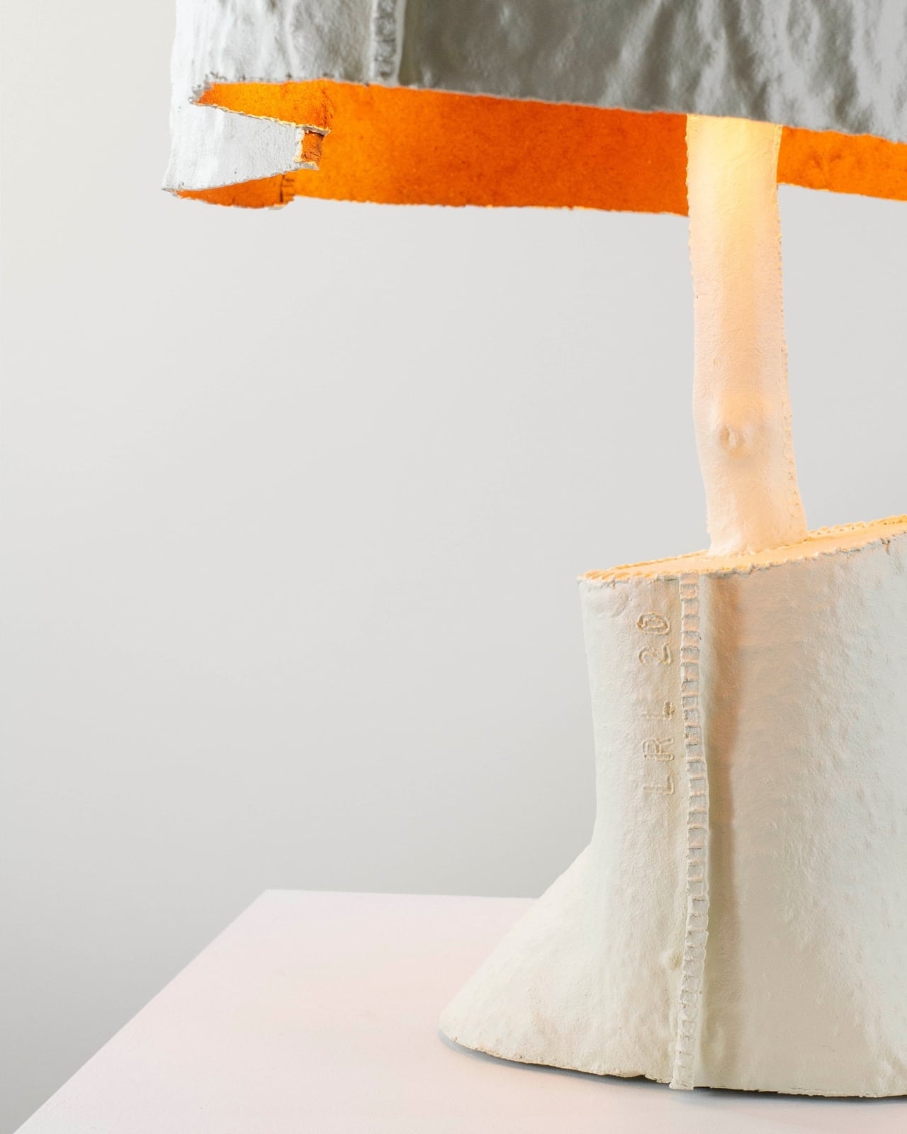
The material is the most interesting part. Zolnianska created a copper-wax composite that forms the shades, a substance that behaves differently every time it’s worked. Some shades come out smooth and disc-like, with swirling oxidation patterns that look almost planetary when lit. Others emerge heavily textured and volcanic, their deeply pitted surfaces catching and scattering light in ways that can’t be planned or predicted. No two pieces are the same.
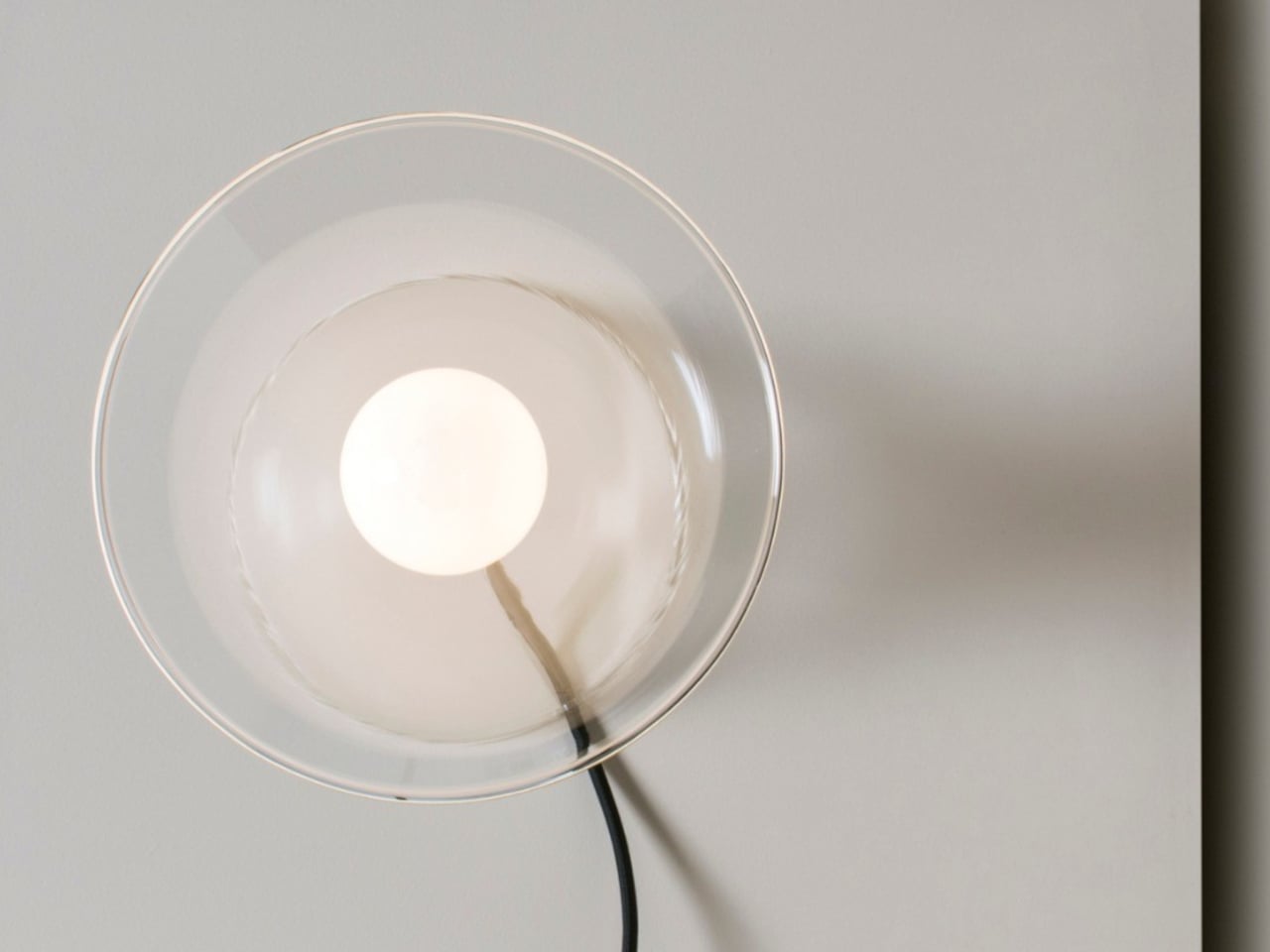
Each lamp sits on a polished copper cylinder base with a matching copper-toned cord. When lit, the shades glow a deep amber orange, with translucent sections illuminating like stained glass while the denser, hammered areas cast dramatic, irregular shadows. The warmth of the light feels almost geological, as if it’s being filtered through something that took centuries to form rather than a material coaxed into shape in a studio.
The project isn’t purely a lighting exercise, though. Zolnianska designed Echoes of Copper around a workshop model where participants can create their own version of the lamp at the former Medený Hamor site itself. The idea is to bring people back to a place of faded industrial significance and give them a hands-on connection to the craft traditions that once defined their community.
Medený Hamor, which translates roughly to “Copper Hammer,” was a copper-processing site in central Slovakia’s Banská Štiavnica region, an area with a centuries-old metallurgical history. Using that heritage as a creative prompt rather than a museum exhibit is itself a meaningful design decision. Of course, craft doesn’t have to end up behind glass to be preserved; sometimes it ends up glowing amber on someone’s bedside table.
Echoes of Copper was exhibited at BASE Milano during Milan Design Week 2026 as part of UNFOLD, a student showcase bringing together emerging designers from institutions across Europe. It’s the kind of project that deserves more attention than student exhibitions typically get. Zolnianska didn’t just make a lamp; she made an argument that industrial communities don’t have to lose their identity to time.
Most rooms treat lighting as an afterthought. A fixture goes on the ceiling, a floor lamp fills a corner, and the result is illumination without real personality; technically functional, completely forgettable. The lamps that actually change a room belong to a different category entirely. They’re worth looking at before you’ve switched them on, with forms that say something specific about how light should behave and how a space should feel.
These five designs earn that standard. Some rethink where light is allowed to exist. Others change their function with a single physical gesture. A few carry material quality that improves over time rather than fade. None of them are lamps you choose because something needs filling. They’re the kind of objects that make everything else in the room feel like it’s working harder just by being there.
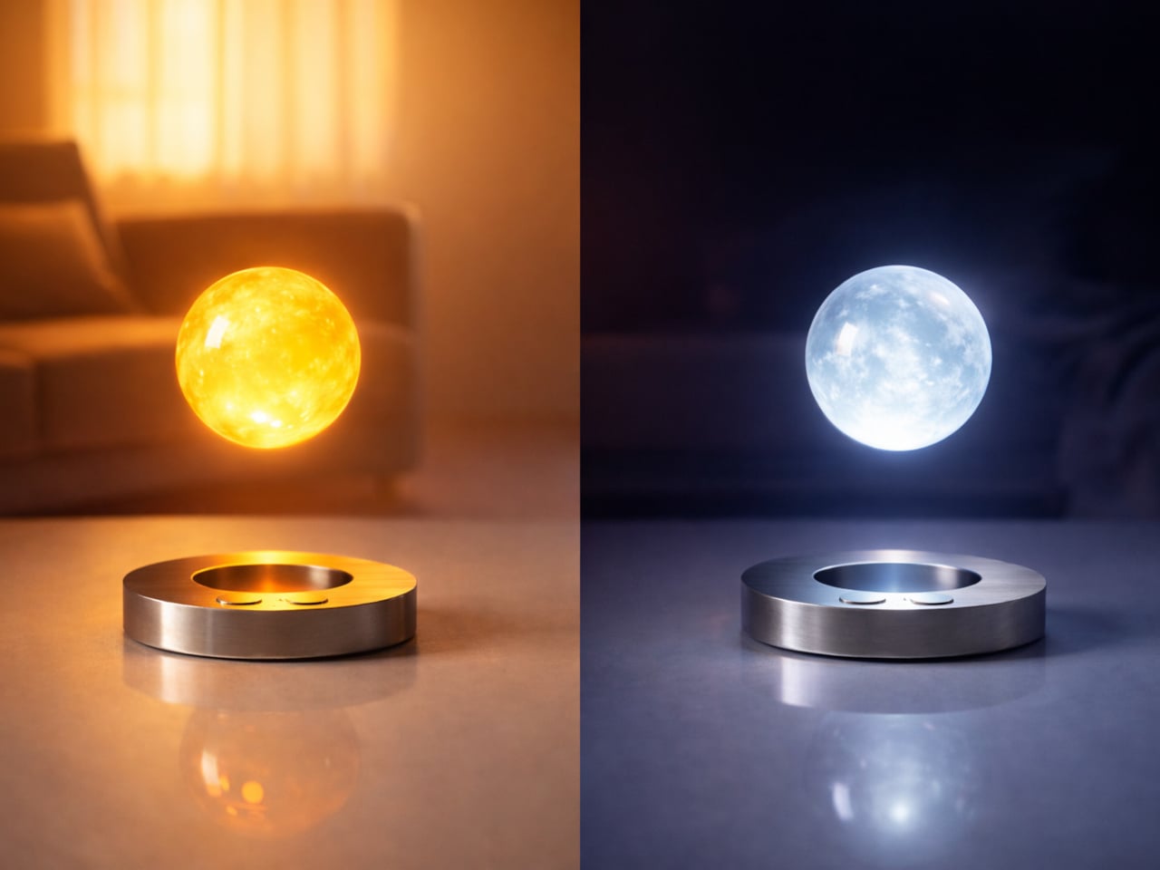
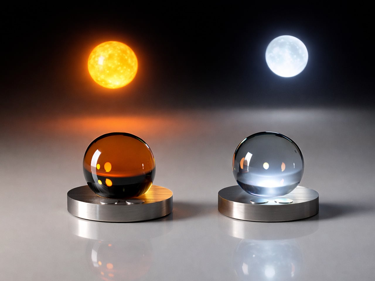
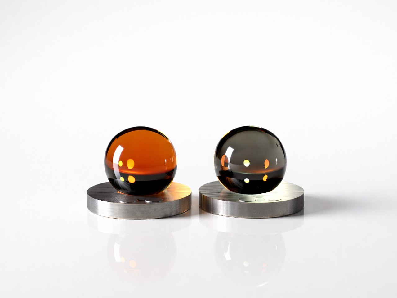
1. Flying Moon & Sun
Ivana Nedeljkovska’s Flying Moon & Sun flips the usual assumption about lighting — instead of walking toward the light, the light walks toward you. The concept takes shape as two glass orbs, one in warm amber drawn from the energy of the sun and one in cool frosted blue that mirrors the moon’s quieter character. Each levitates above a brushed circular metal base through magnetic force, that floating quality expressing the central idea: a light that doesn’t need to be anchored anywhere in a room.
Living with it means giving up the idea that a room’s light is fixed and neutral. The amber orb suits an evening wind-down or a reading session, anywhere overhead lighting handles the mood badly. The cool blue shifts the atmosphere entirely, bringing a calm ambient quality that works differently in a bedroom than it does in a living room. For anyone tired of reaching for a switch, this concept points clearly in a direction worth following.
What We Like
Dual orbs deliver two distinct lighting characters — warm amber and cool blue — without any additional hardware
Levitation through magnetic force gives it a presence no cord-tethered or wall-mounted fixture can replicate
What We Dislike
Currently a concept design and is unavailable to purchase
Real-world performance around battery life, sensor accuracy, and magnetic durability remains untested
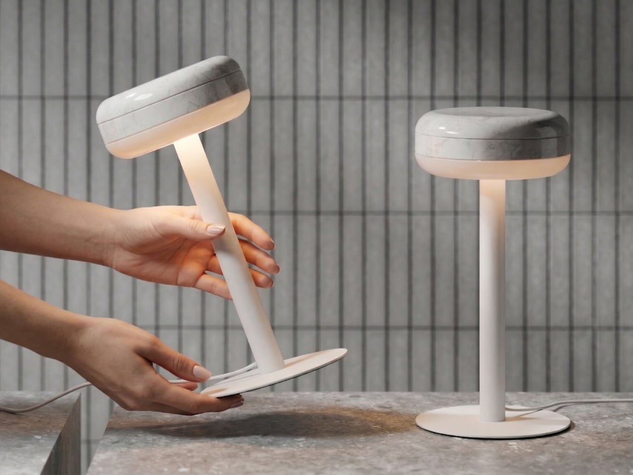
2. Anywhere-Use Lamp
The Anywhere Use Lamp is one of the few portable lamps that actually looks like it belongs in a room. The mushroom silhouette is clean and minimal, available in black, white, and an Industrial edition with a scratch-detailed metal base that reads as honest material character rather than decoration. Six high color rendering LEDs produce a warm, soft glow calibrated toward mood over task — a distinction most battery-powered lamps in this category never bother to consider.
Running on four AA batteries, it disassembles flat enough to slide into a bag and sets up wherever you carry it. Pressing any edge of the cap cycles through four brightness levels with a satisfying tactile click — a detail that makes the lamp genuinely pleasurable to use every day. For a dinner table without an outlet nearby, a reading corner mid-renovation, or a patio gathering that deserves better than a string of bulbs, it places the right quality of glow exactly where it’s needed.
Fully modular and battery-powered — complete location freedom with no outlet planning required
Tactile click feedback on each brightness cycle is a deliberate sensory detail that elevates daily use above anything else in its portable category
What We Dislike
Standard AA batteries require ongoing replacement, adding a recurring cost that a built-in rechargeable option would eliminate
The mushroom silhouette, while clean, is familiar enough in this market to lack the full visual distinction the Industrial edition’s scratched base brings
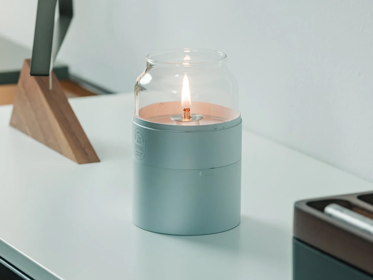
3. Fire Capsule Oil Lamp
The Fire Capsule is an oil lamp in a cylindrical glass form, and it works because everything has been reduced to exactly what the object needs. A precision-engineered lid keeps the chimney clean between uses. An 80ml capacity delivers up to 16 hours of continuous light — enough for a full dinner or a slow evening without refilling. An included aroma plate lets you layer scent alongside the glow, turning the lamp into a multi-sensory presence on any surface it occupies.
The flat-topped design allows multiple units to stack cleanly, and paraffin oil with insect-repelling properties extends its usefulness outdoors — on a patio, a terrace, or any table where atmosphere and comfort both belong on the list. For a dining setup that already has overhead light and simply needs something warmer at eye level, the Fire Capsule handles it without consuming space you can’t spare. A drawstring pouch makes it as easy to carry as it is to use.
A 16-hour burn time from a single fill makes it a genuinely practical choice for extended gatherings, not just decorative use
The aroma plate adds a scent layer most lamps never attempt, turning a light source into a full atmosphere object
What We Dislike
Paraffin oil requires regular restocking, and the insect-repelling outdoor variant may need sourcing through specialist retailers
The glass chimney, while protected by the lid between uses, requires careful handling when packing for travel
4. JAL
JAL is built from two glass cones joined tip to tip in a form that reads immediately as an hourglass. The bulb sits inside this sealed geometry and appears to float in mid-air — a quality that gives the lamp real presence before you’ve considered what it actually does. Available in transparent or frosted glass with a colored cable as the only other visible element, the form does all the work. It belongs on a sideboard, a console, or a bedside, and holds that position without competing with anything around it.
The more you interact with it, the more considered it reveals itself to be. Place the lamp with the bulb facing upward, and it behaves like a conventional table lamp, sending light toward the ceiling. Flip it so the bulb faces downward, and it becomes a softer source that pools light onto the surface below — closer to a glowing object than a reading companion. One rotation, two completely different functions, no settings required.
What We Like
Flipping the lamp changes its function entirely with a single physical gesture — no apps, dimmers, or remote controls involved
The hourglass form holds its own as a visual object even when it’s switched off
What We Dislike
All-glass construction requires careful handling with no obvious protection during storage or transport
The colored cable adds character but limits neutral styling options for more minimal setups
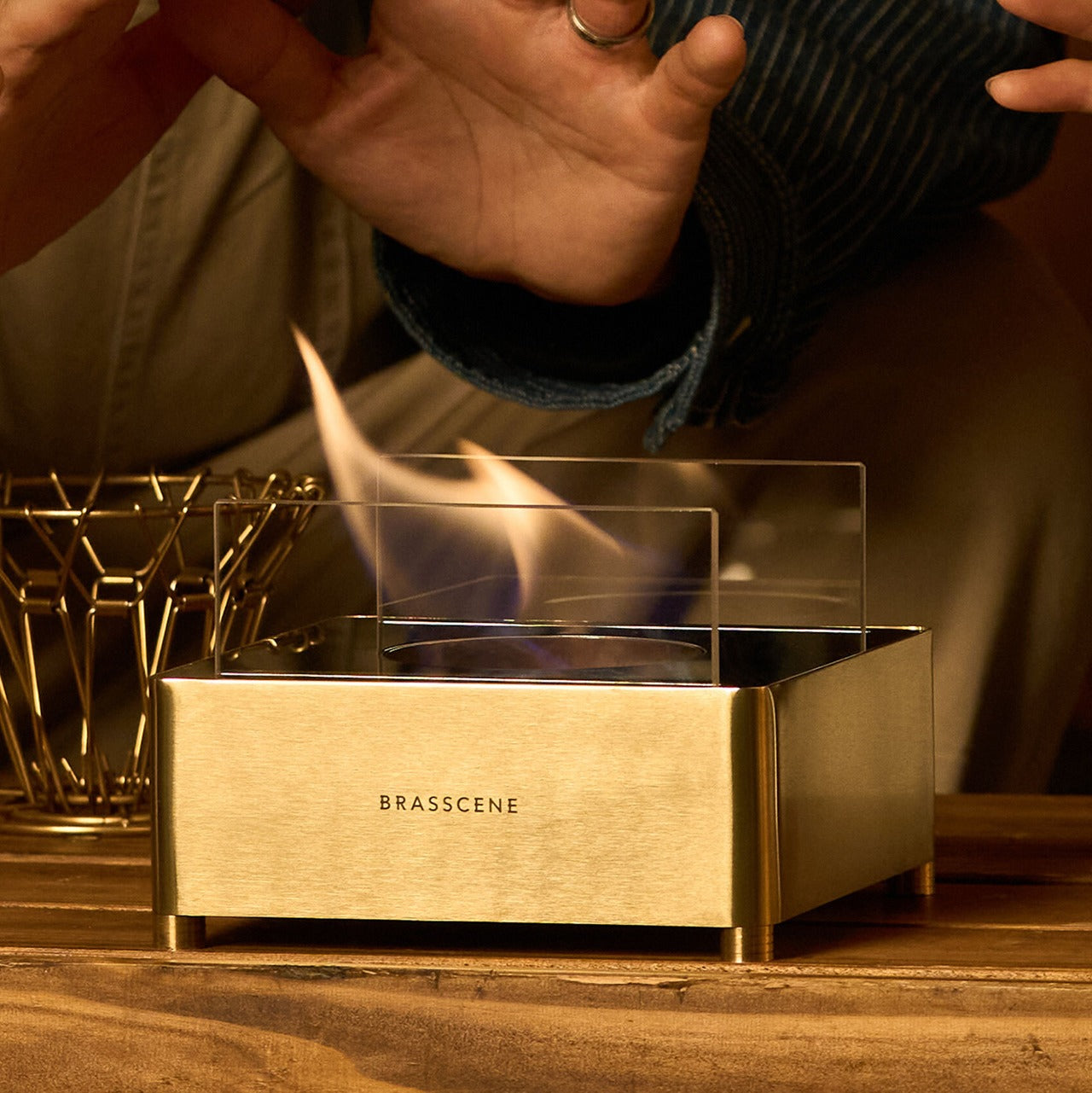
5. Harmony Flame Fireplace
The Harmony Flame Fireplace is made by craftsmen who build brass musical instruments, and that connection is visible in the finish and felt in the weight of the object. It burns bioethanol that is odorless, smokeless, and clean enough for indoor use, and the flame plays against the reflective brass interior in a way that creates a shifting, living quality of light no bulb can replicate. Shadows move on the surrounding walls. The room feels different. No installation, no wiring, no planning — you fill it and the space changes.
Brass develops a patina over time that makes the object more interesting rather than less — a quality that cheaper materials never manage and most design objects don’t survive long enough to demonstrate. For a dining table that earns its centerpiece through material presence rather than novelty, or an outdoor setting that deserves something more honest than a string of lights, the Harmony Flame Lamp delivers with real authority. It’s also the one on this list that people are most likely to ask about by name.
Hand-crafted brass construction develops genuine character over time, giving it depth no manufactured alternative can match
Bioethanol burns without odor or smoke, making an open indoor flame genuinely practical — rare in a lamp this well-made
What We Dislike
An open flame requires standard fire safety awareness and isn’t suitable for unsupervised use around young children or pets
Bioethanol fuel is not universally stocked and may require a specialist supplier, depending on your location
The Right Lamp Changes Everything Else
Good lighting doesn’t announce itself — it changes how a room feels before you can explain why. These five designs each do something specific: one proposes a new relationship between light and movement, one turns a single rotation into a full shift in function, and one brings the right quality of warmth to wherever the evening happens to be. None of them are objects you choose simply because a corner needed filling.
One works through scent as much as one does through light. One earns its presence through material quality that only improves with time. Another proposes a concept so specific it makes every fixed lamp feel like a missed opportunity. You don’t need all five. But the right one changes how the rest of the room reads — and that’s what separates a lamp worth noticing from one that simply occupies space.
There’s a quiet exhaustion in modern lighting design. Too many fixtures make a statement at the expense of the light itself, and too many others disappear so thoroughly into the background that they bring nothing to the room. The ones that manage to be genuinely beautiful objects while still doing their job well are rare enough to stop and look at twice.
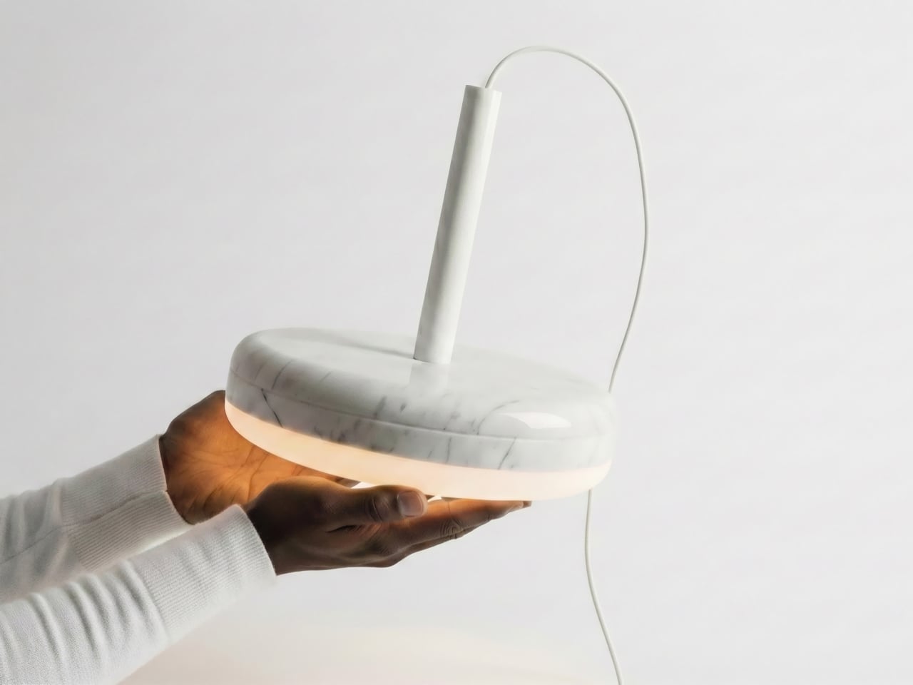
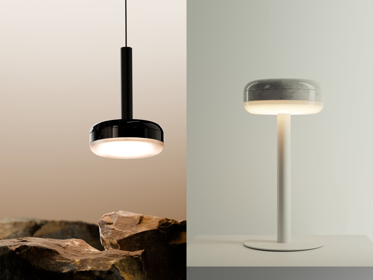
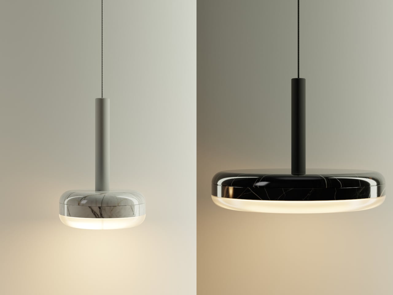
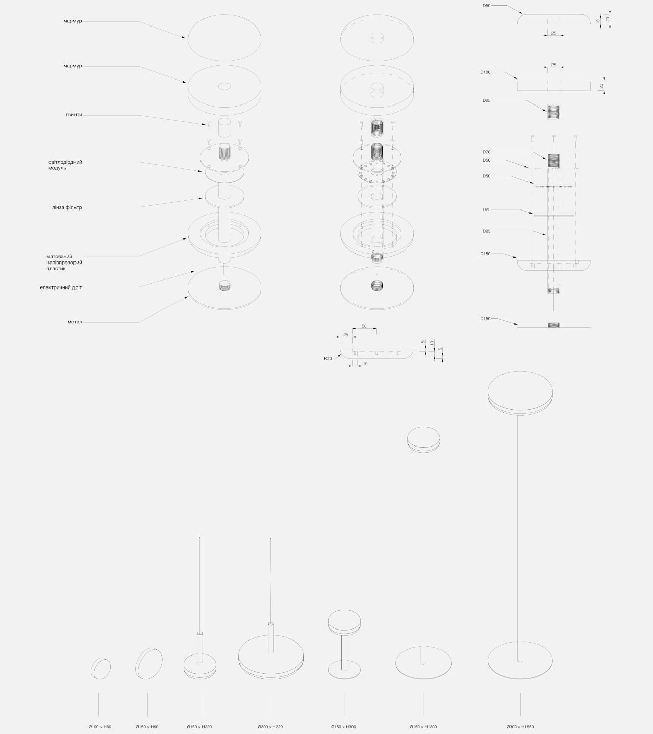
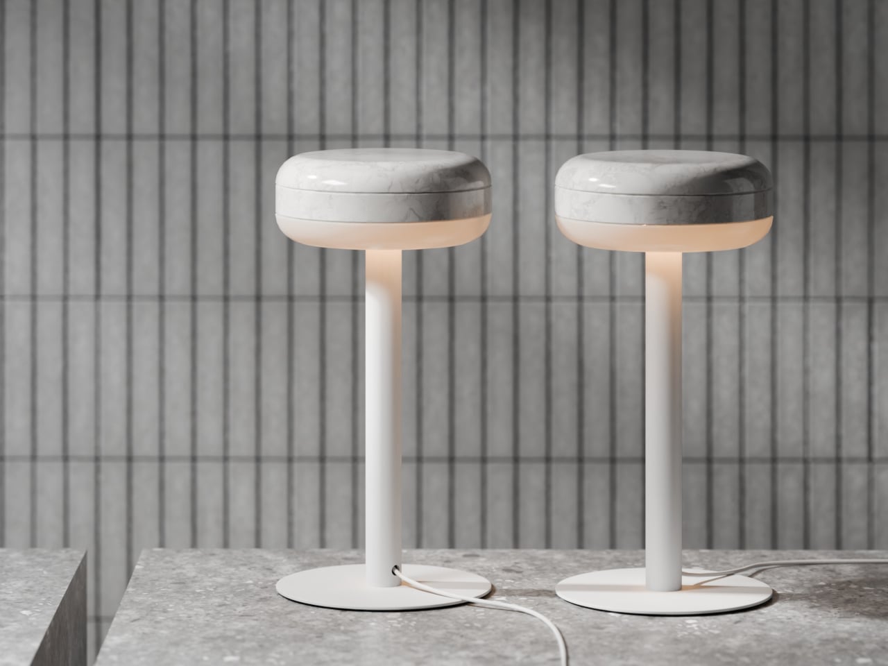
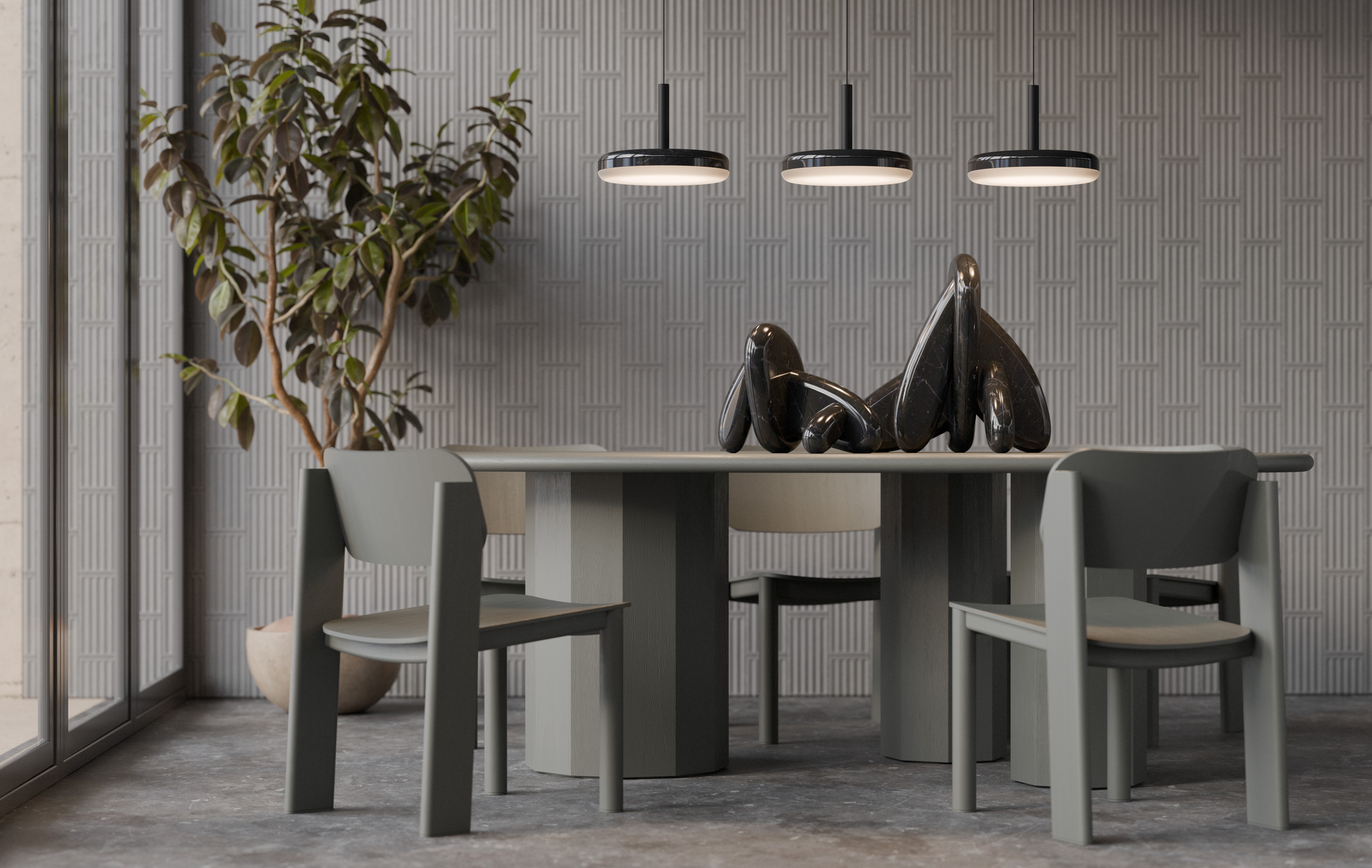
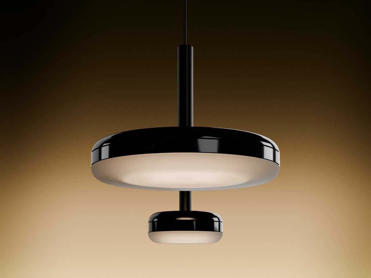
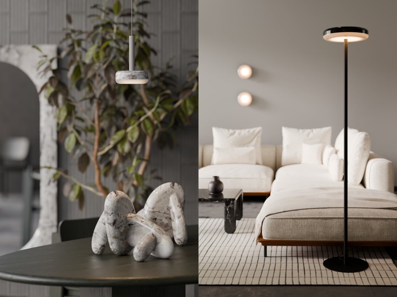
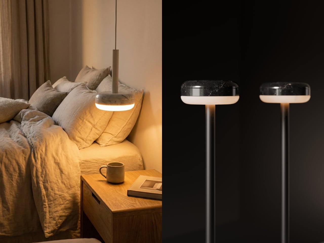
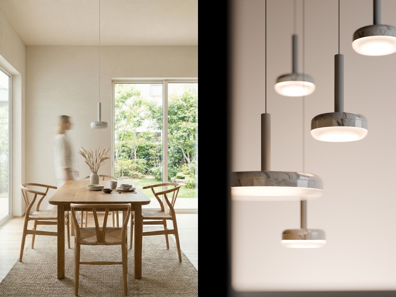
The DIP lighting collection, designed by Denys Sokolov for deday, sits comfortably in that rare middle. The central idea is simple and visual: a marble disc that appears to have been dipped in light, absorbing just enough of a warm glow to carry it back out. It’s a lamp that earns attention as a decorative object long before anyone switches it on.
The name itself tells you what Sokolov was after. Rather than treating the stone as decoration or the light as the point, the idea positions both materials as equal contributors to a single, quiet gesture. A disc of marble that carries a glow in its belly, as if it spent some time in contact with something luminous, and the evidence hasn’t fully faded yet.
What makes the collection work beyond aesthetics is how carefully it treats the light. At the base of each marble disc sits a semi-transparent diffuser that catches the glow before it escapes, softening it into a warm, controlled halo. The result doesn’t feel like a lamp that’s been switched on so much as one that’s quietly breathing, which is a harder effect to achieve than it sounds.
The DIP collection is designed to adapt without compromising its identity. The same disc and halo at its core translate into table lamps, floor lamps, pendants, wall sconces, and ceiling-mounted fixtures, all sharing the same quiet character. Put one over a dining table, another on a bedside surface, or mount one beside a sofa, and the result feels deliberate and composed in each setting.
The marble itself does a lot of the talking. The stone comes in lighter and darker colorways, each reacting differently to the light beneath it. The veining and texture that look merely decorative in daylight become something more layered when the lamp is on, and the contrast between the material’s weight and the gentle halo it produces is the collection’s most compelling quality.
The DIP collection fits within a design practice focused on material honesty and formal restraint. There’s no attempt to overcomplicate the object with excessive ornamentation or extra features. It’s a disc of stone that glows from its underside, and that single idea, handled with care, turns out to be more than enough.
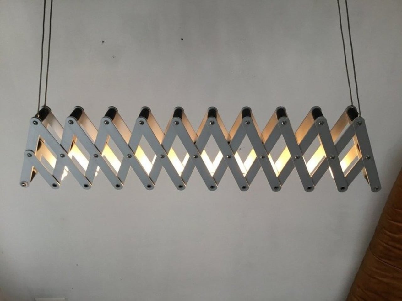
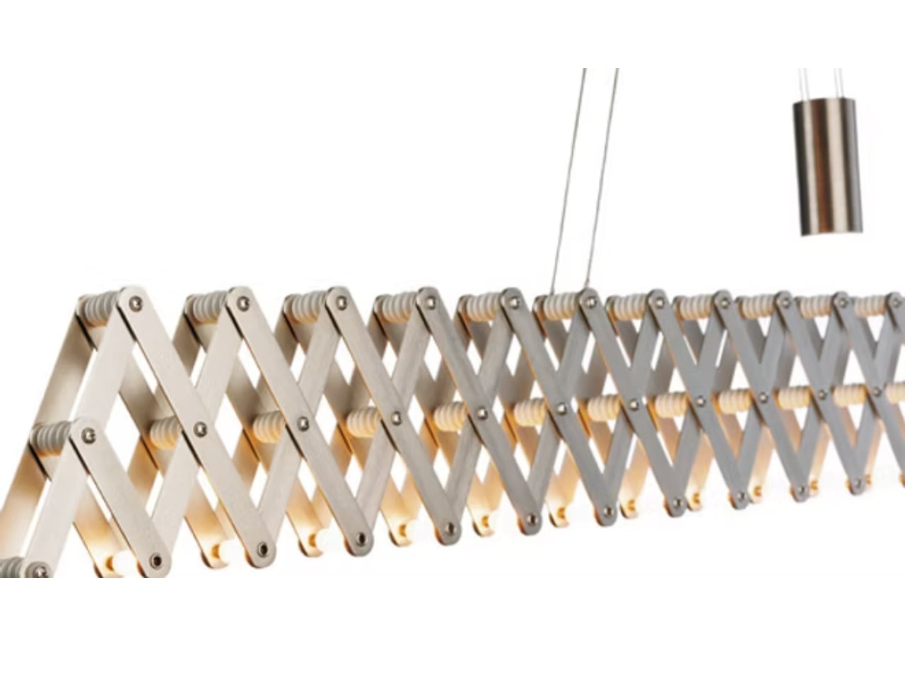
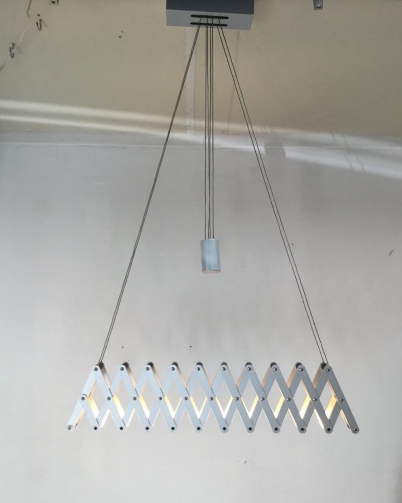
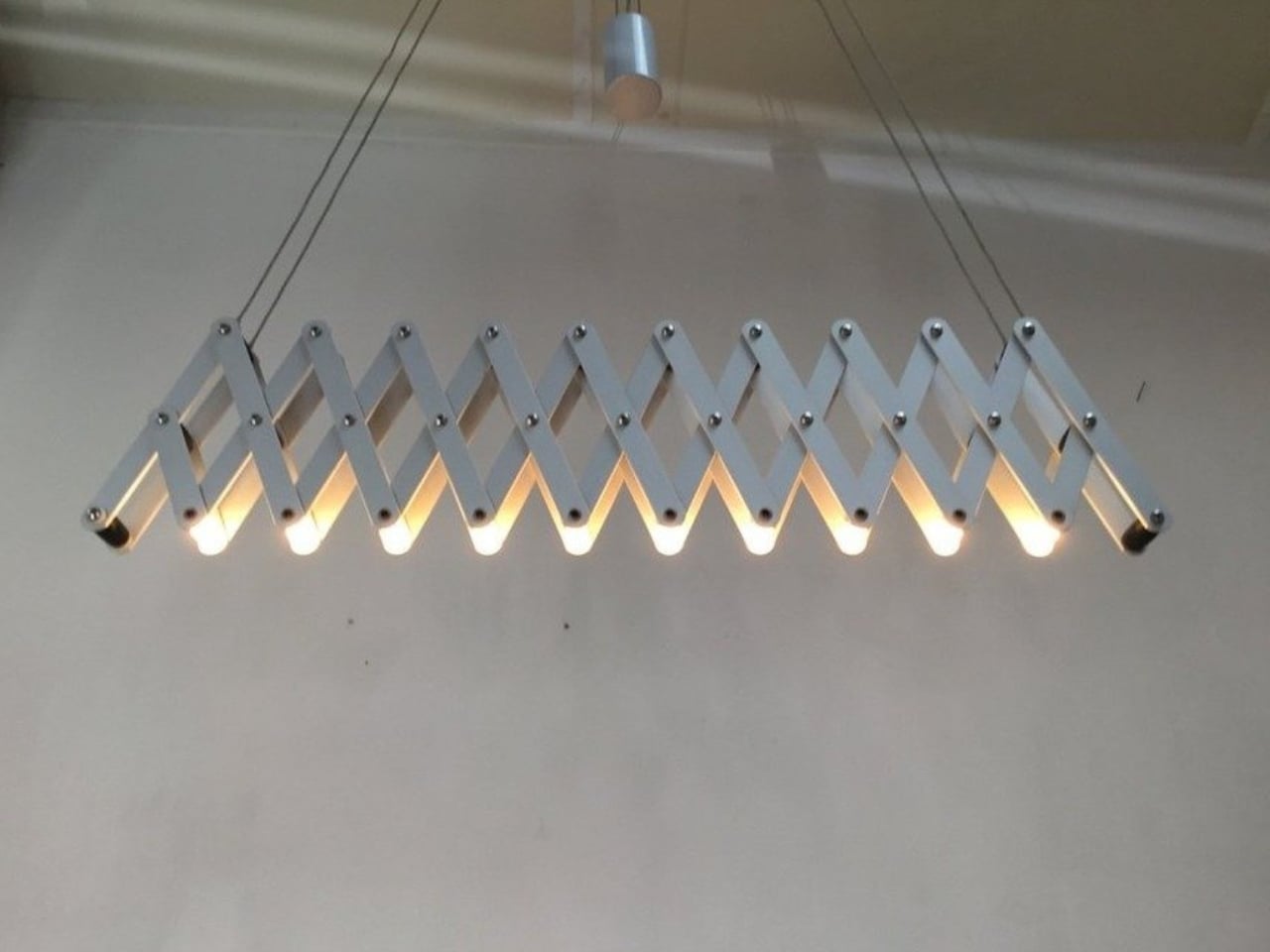
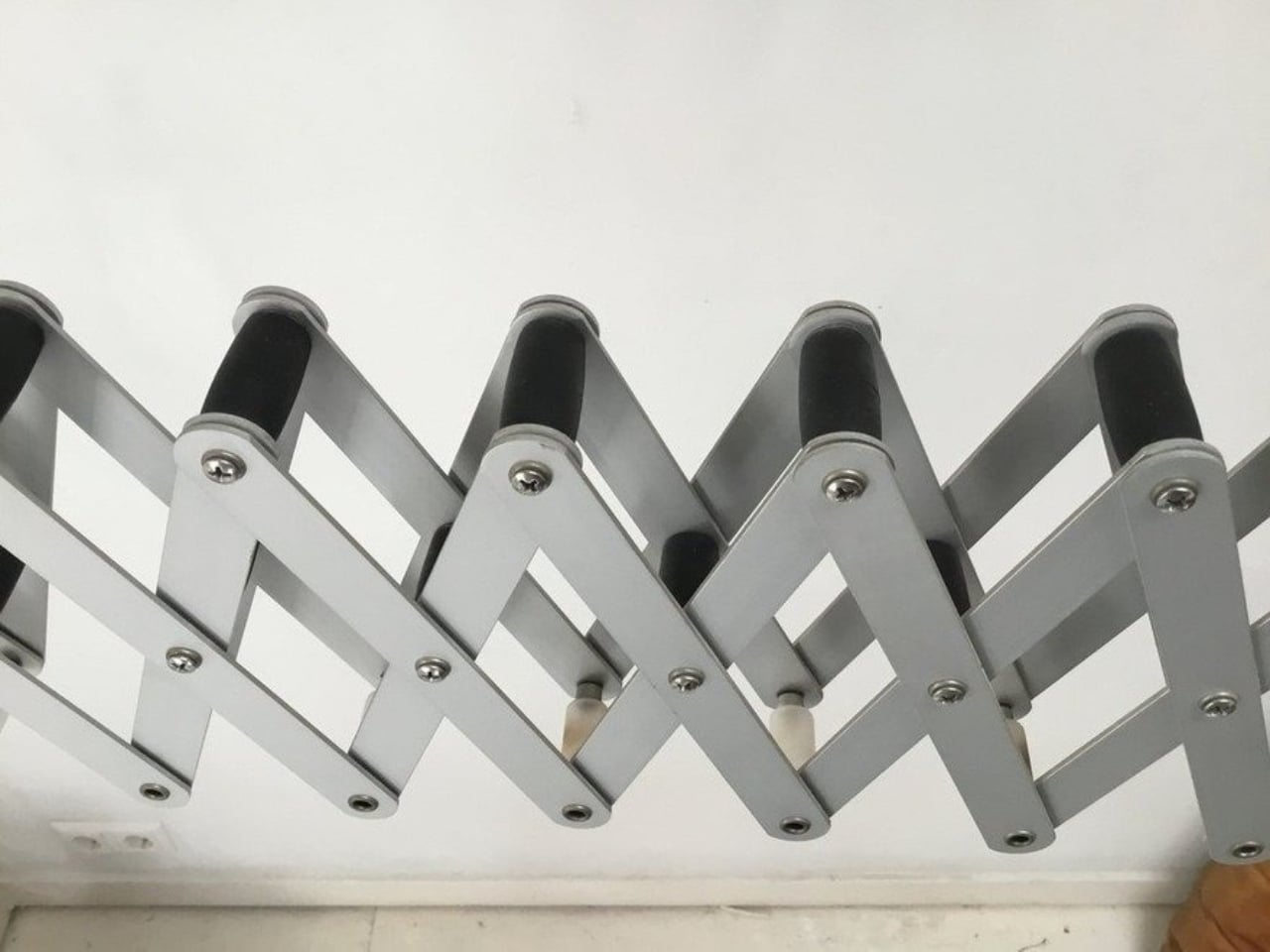
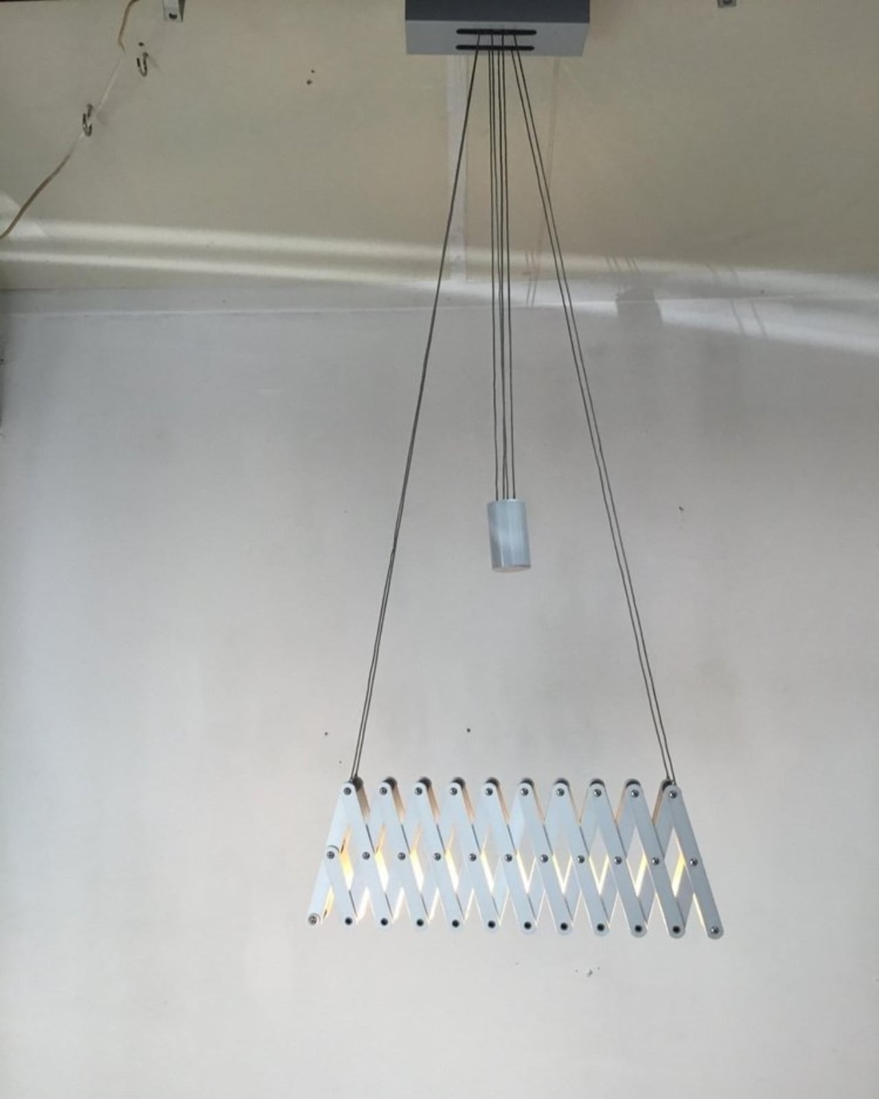
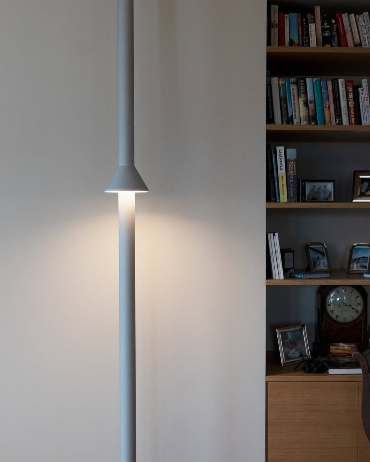
Some design ideas are so quietly right that they take decades to find their full audience. Oliver Michl’s Architect’s Lamp from the 1980s is exactly that kind of piece. It is a ceiling-mounted light that borrows its entire visual logic from equal space dividers, the spring-loaded drafting tools that architects and engineers use to plot perfectly even intervals across a surface. The concept sounds almost too clever when you say it out loud. And yet, the moment you see it, it just makes sense.
Michl designed the lamp during a very specific cultural pivot. The 1970s had been all about flowing, organic plastic forms. Soft curves, warm earth tones, a kind of material optimism that felt almost comforting. Then the 1980s arrived and jolted design in the opposite direction. Hard lines, industrial materials, a theatrical confidence in structure that felt almost confrontational compared to what came before. Michl, a German lighting designer who would later found Lucelab in Berlin, built the Architect’s Lamp squarely in that spirit. Steel and aluminum, full articulation, no softness anywhere.
What makes the lamp genuinely interesting, beyond its visual bravado, is how it actually functions. The scissor-like expanding structure allows the piece to adjust both in height, ranging from about 41 to 79 inches, and in width, from 41 to 60 inches. Because it hangs from the ceiling rather than sitting on a desk or floor, the light it casts is ambient rather than task-focused. This was never a reading lamp. It was always a statement, and a rather bold one. Michl made the deliberate choice to take a mechanism that belongs at a drafting table and scale it up for overhead use. That kind of lateral thinking, the willingness to transplant a tool from one context and drop it into a completely different one, is harder than it looks. Most attempts at it feel gimmicky. This one feels inevitable.
There is a particular intelligence in designing a lamp that operates like this. Most lighting from that era leaned one way or the other, either purely functional or purely decorative, rarely both at the same time. The Architect’s Lamp refuses that binary entirely. It performs, and it reads as kinetic sculpture. The expanding grid of its structure, when viewed from below, creates a repeating geometric pattern that visibly shifts with every adjustment. You are not moving a lamp. You are editing a composition, and that distinction matters more than it might sound.
Michl has always worked at that intersection of function and spectacle. His FleXXXibile luminaire, also produced under Lucelab, became a cult object among designers for similar reasons. It features a concertina lattice that can be precision-aimed at a specific point, and it has never really left the design conversation. The Architect’s Lamp arrives at the same sensibility from a different angle. Both pieces suggest a designer who finds moving parts not just practical but genuinely compelling. The mechanism, in Michl’s work, is always part of the message.
The lamp currently lives at Blackman Cruz, the Los Angeles gallery that specializes in exactly this kind of historically significant object. It is listed at $5,500, which is real money, but it is also an original piece from Germany, circa 1980, in steel and aluminum. It has survived four decades intact, which tells you something. The pieces that do not hold up tend to disappear. The ones that keep getting rediscovered tend to deserve it.
The reason this lamp keeps resurfacing in design conversations right now is not nostalgia. It is recognition. The industrial-meets-sculptural vocabulary that dominates so many contemporary interiors, the hard edges, the mechanical articulation, the idea that a light fixture can function as architecture, all of it circles back to what Michl was already doing forty years ago. He was early, and the design world was not paying close enough attention. The Architect’s Lamp is a reminder that some of the most interesting ideas do not announce themselves loudly. They just wait.
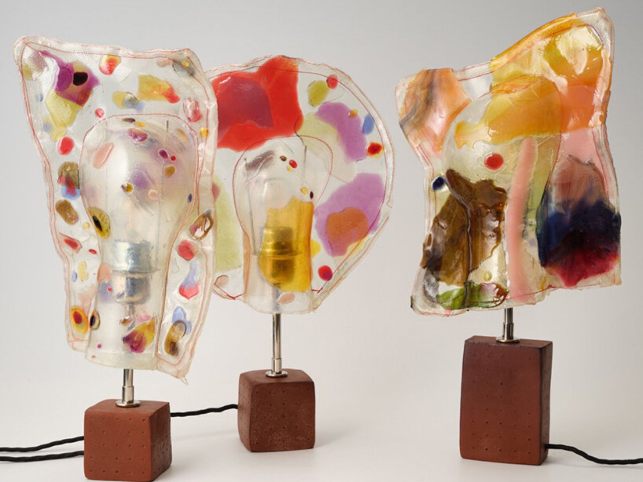
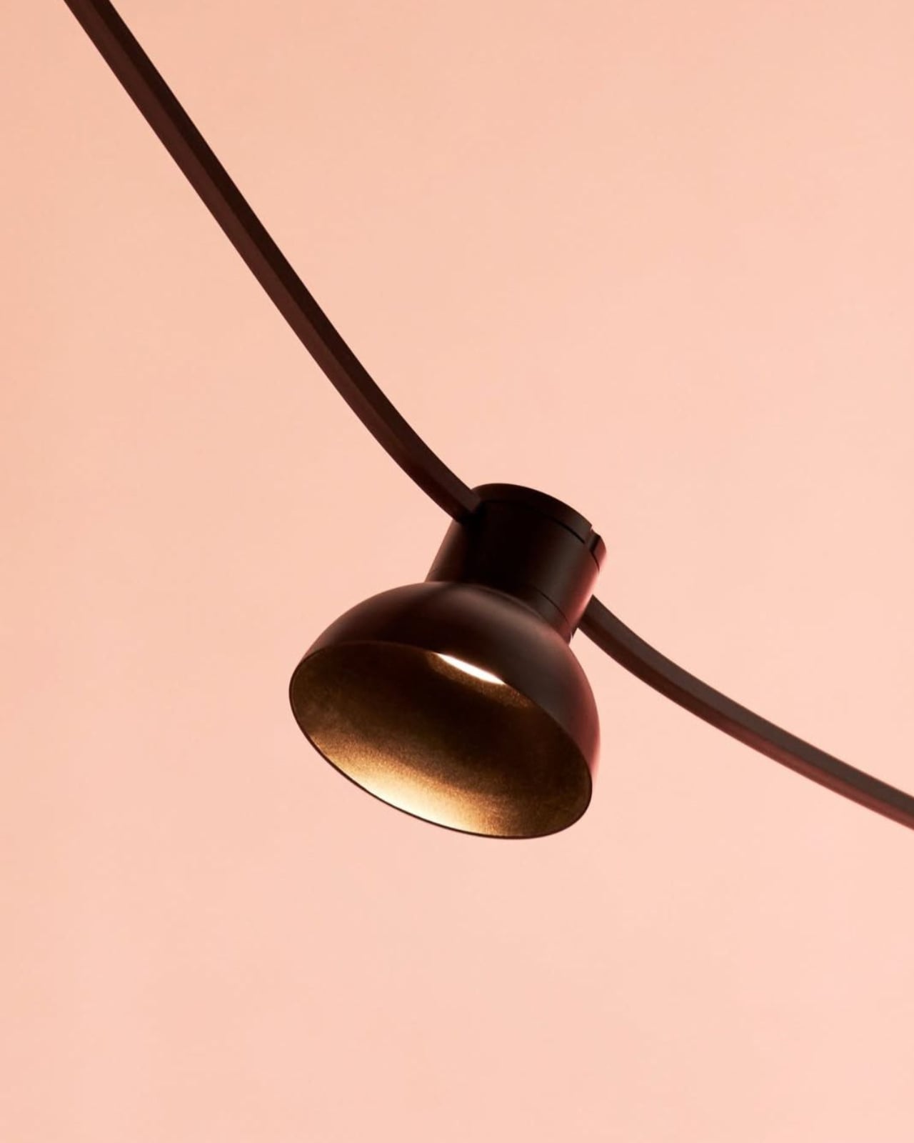
Architectural and furniture designer Marten Herma Anderson draws from an unexpected source for his latest series of lamps, translating a fleeting childhood memory into a tactile and atmospheric lighting object. What began as a simple moment of melted candy resting on a warm bulb has evolved into a refined material exploration, where memory, color, and light converge. Rather than treating this recollection as nostalgia alone, Anderson uses it as a starting point to investigate how form can emerge from softness and how materials can hold onto moments of transformation.
Central to the series is Anderson’s long-standing fascination with translucent color and the way light interacts with materials not originally meant to glow. He references everyday visual experiences such as candy wrappers and gummy textures, where color becomes luminous through accident rather than intention. Using resin, he recreates this effect by suspending pigments in fluid states, allowing the shades to appear as though they are gently collapsing or settling around the bulb. This approach gives each lamp a sense of movement and impermanence, as if the form is still in the process of becoming.
The material choices further reinforce this tension between spontaneity and control. Each lamp features a resin shade paired with a glass fiber structure and a raw, waxed ceramic base. The shades retain visible traces of their making, including fine mesh impressions, small air bubbles, and delicate seams that outline their edges. These details are not concealed but emphasized, lending the objects a sense of immediacy and authenticity. In contrast, the ceramic bases introduce a grounded, earthy presence that stabilizes the composition, ensuring that the visual energy of the upper form remains balanced.
When illuminated, the lamps shift from static objects to immersive experiences. Light moves unevenly through the resin, creating areas of soft diffusion alongside denser, more saturated zones. This variation reveals subtle embedded details that remain understated when the lamp is off, allowing the object to transform with use. The result is not just functional lighting but a dynamic interplay between material and illumination, where the act of turning on the lamp activates its full expression.
Anderson frames the project as an extension of personal habit and observation, noting his enduring interest in candy not only for its taste but for its visual qualities. A childhood experiment of placing a gummy shape on a bulb becomes, in this context, a formative moment that informs the entire series. Through careful material control and thoughtful scaling, he transforms that early curiosity into a cohesive body of work that balances playfulness with precision. The lamps ultimately demonstrate how design can emerge from attentive observation, turning an ephemeral experience into a lasting object that reshapes how light is perceived.
The ambient lighting market keeps growing, and yet most table lamps still work the same way they always have: they point light directly at you and call it a day. That’s fine if you’re reading, but it doesn’t do much for a room that needs to ease down in the evening. The growing appetite for softer, more atmospheric home lighting reflects a shift in how people want their spaces to feel, and it’s a gap that most conventional lamp designs haven’t quite caught up with.
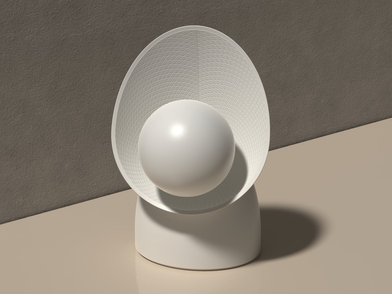
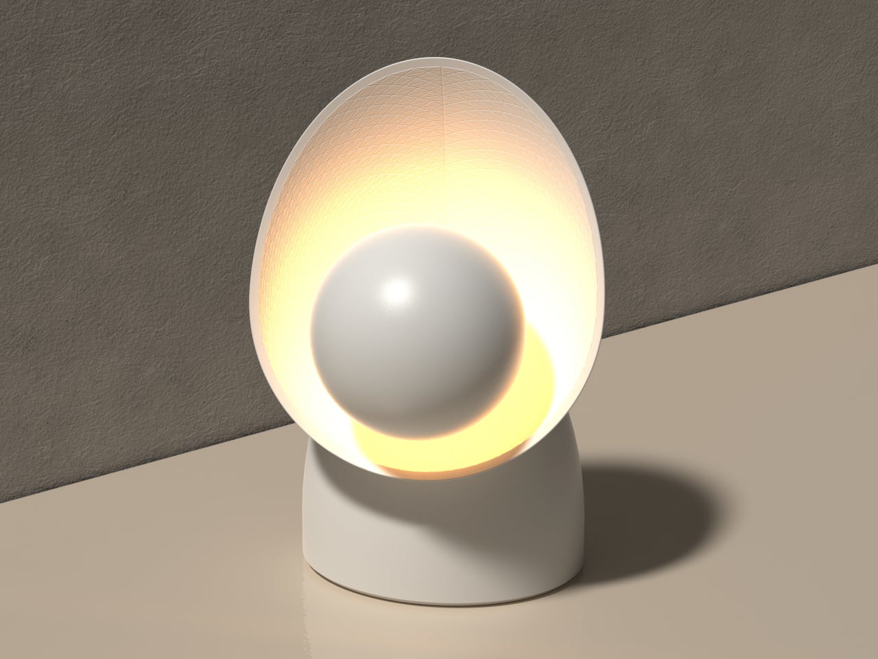
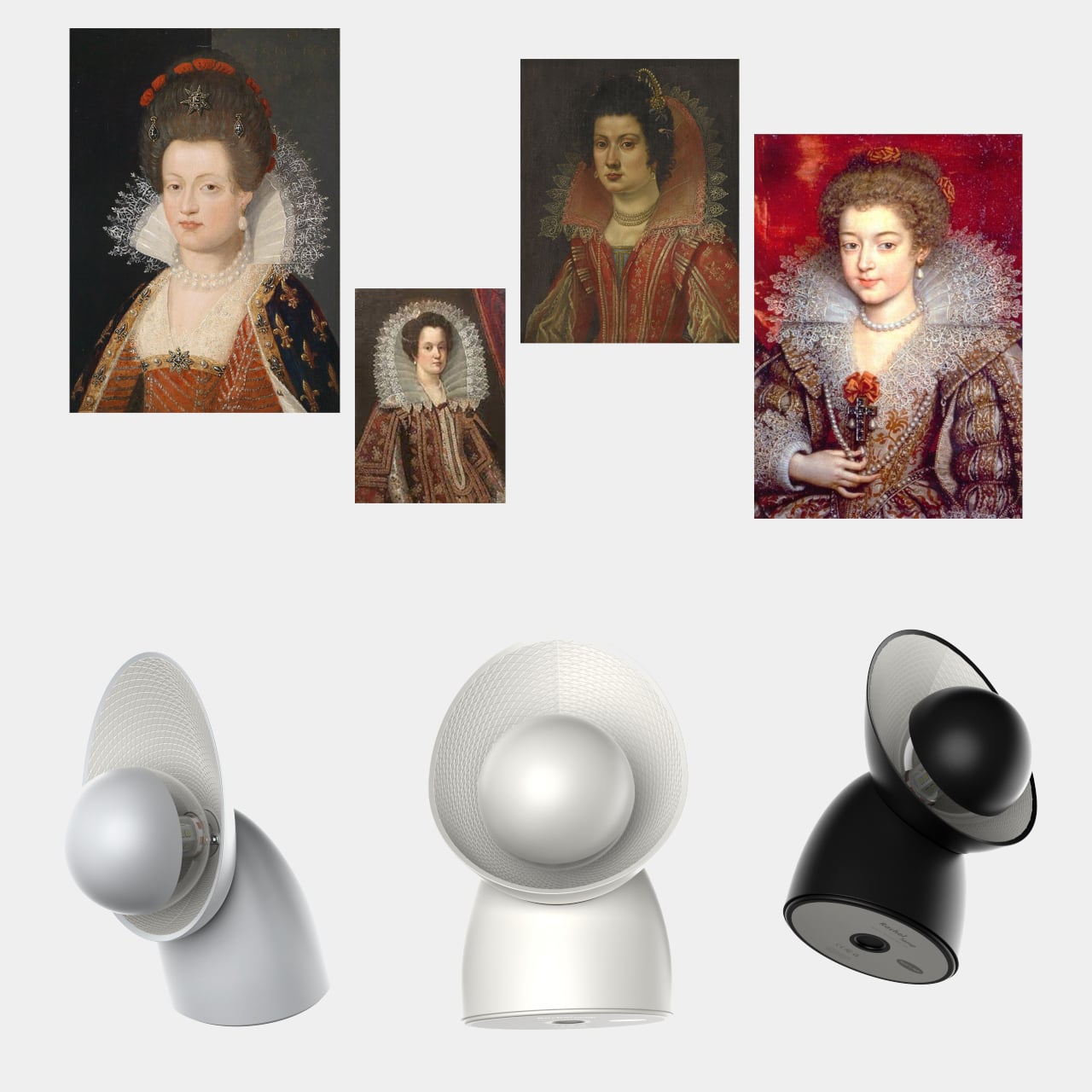
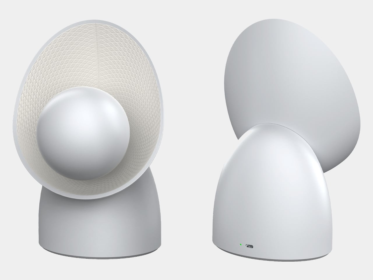
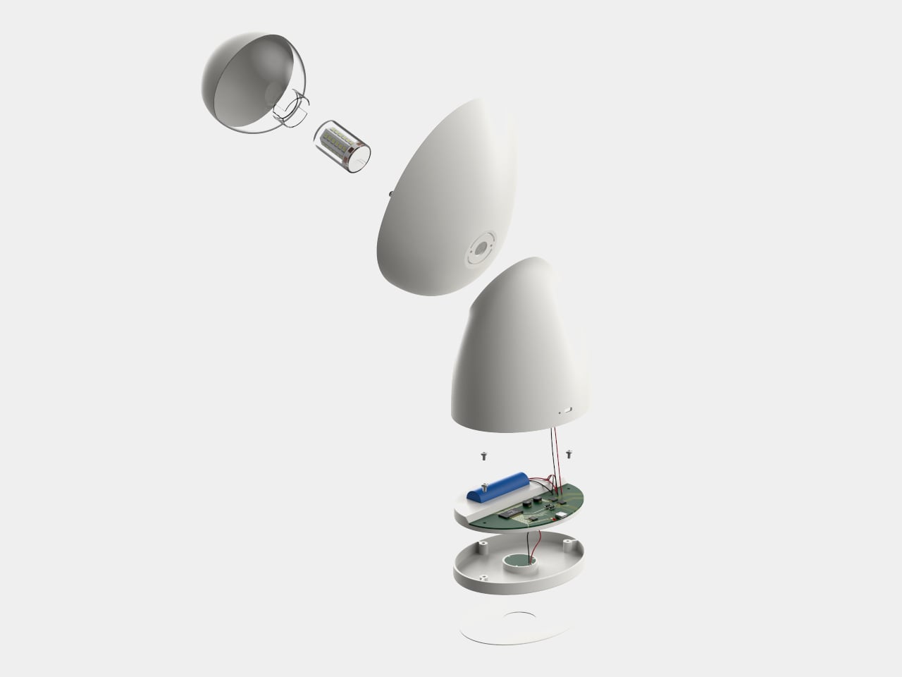
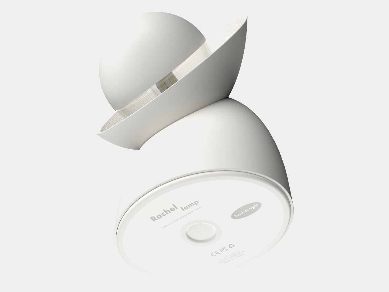
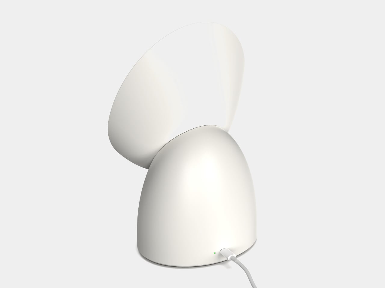
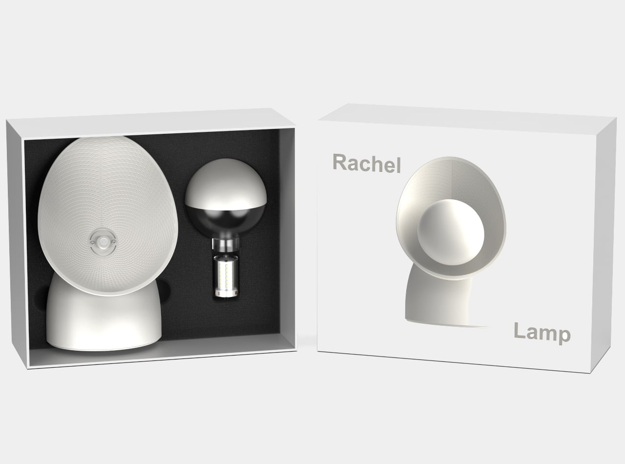
Rachel Lamp is a considered answer to that problem: a compact table lamp that doesn’t aim its light outward at all. Instead, it bounces everything against a curved back panel to create a uniform, diffused glow across the room. What makes the design genuinely interesting is where that form came from, because the geometry behind it predates electricity by a few hundred years.
The inspiration is the Medici collar, a garment fashionable from the late 16th century to the early 17th century, known for a soft, curved silhouette that began at the back of the neck and swept forward along both shoulders. Noh adapted that same arc into the lamp’s reflector panel, which curves around the spherical bulb globe in a way that’s both functional and immediately recognizable. The form isn’t decorative for its own sake; it’s borrowed from history because it happens to describe the right shape.
The indirect lighting approach is the lamp’s central idea. Rather than hitting the space head-on, the G4 LED fires its light backward into the curved reflector, which then spreads it evenly outward. This removes the harsh contrast that direct lamps create, making the Rachel a natural fit for a bedroom nightstand, a living room shelf, or a desk where you’d rather not be squinting at harsh light after dark. It casts the kind of glow that a room can actually relax in.
The reflector panel isn’t just shaped to catch light; it’s also textured. A diamond pattern across its surface induces diffuse reflection, scattering the light further and keeping glare out of the equation entirely. It’s a detail that works on two levels: it gives the lamp visual texture when it isn’t on, and it does genuine optical work when it is.
The lamp ships with the main body, bulb, and lighting cover, and assembly is straightforward enough that it doesn’t need instructions to feel self-explanatory. The G4 LED is a standard format, so replacing it when the time comes isn’t a difficult or costly process. It comes in gray, white, and black, and all three colorways share the same clean, minimal silhouette that makes it easy to fit into almost any interior without having to rethink the rest of the room around it.
What’s notable about the Rachel is that the designer didn’t arrive at its form by trying to create something that looked unusual. He started with a fashion reference from the 1600s, one that happened to describe the exact geometry needed to redirect light softly and evenly, and worked outward from there. It’s a quiet kind of reasoning, and the lamp is better for it.
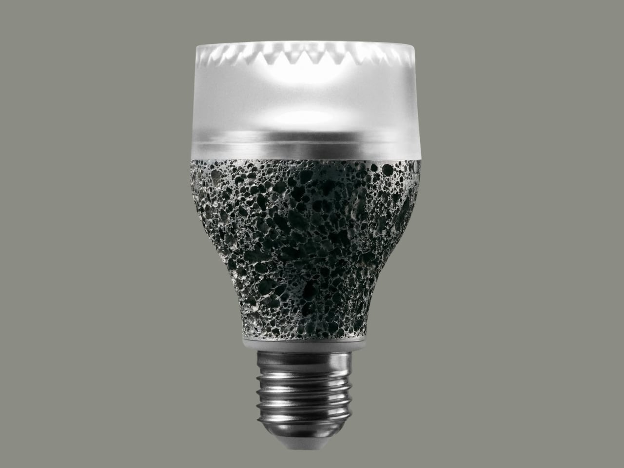
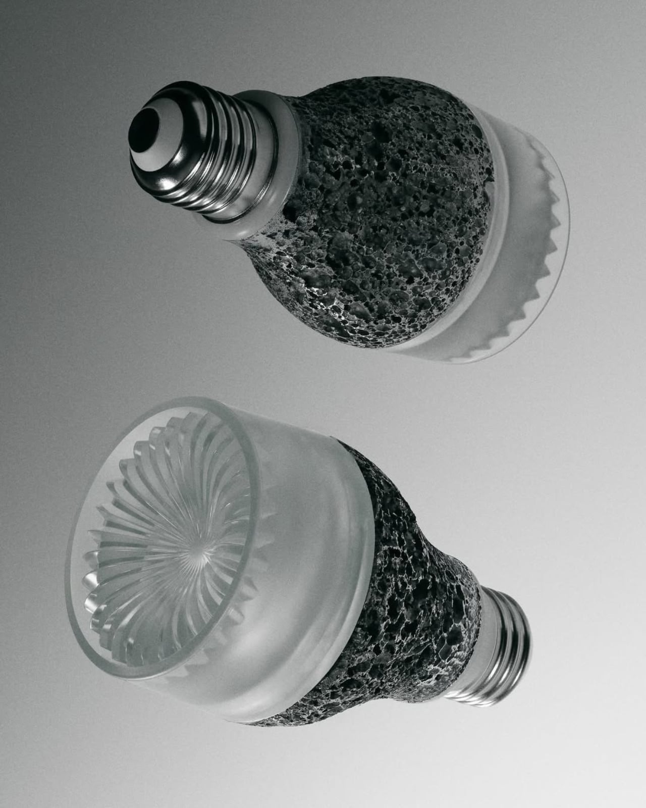
We have been screwing the same shape of light bulb into our lamps for over a century. Think about that for a second. The smartphone in your pocket has been redesigned thousands of times since it launched. Your running shoes have gone through countless iterations. But the humble light bulb? More or less, the same. Which is exactly why iiode’s Re27 feels so refreshing, and so overdue.
iiode is a Swiss studio that specializes in sustainable electronics, and the Re27 is their first product. It’s a retrofit E27 LED bulb, meaning it fits into the same socket your current bulb uses right now. But the similarities to your average LED stop there pretty quickly.
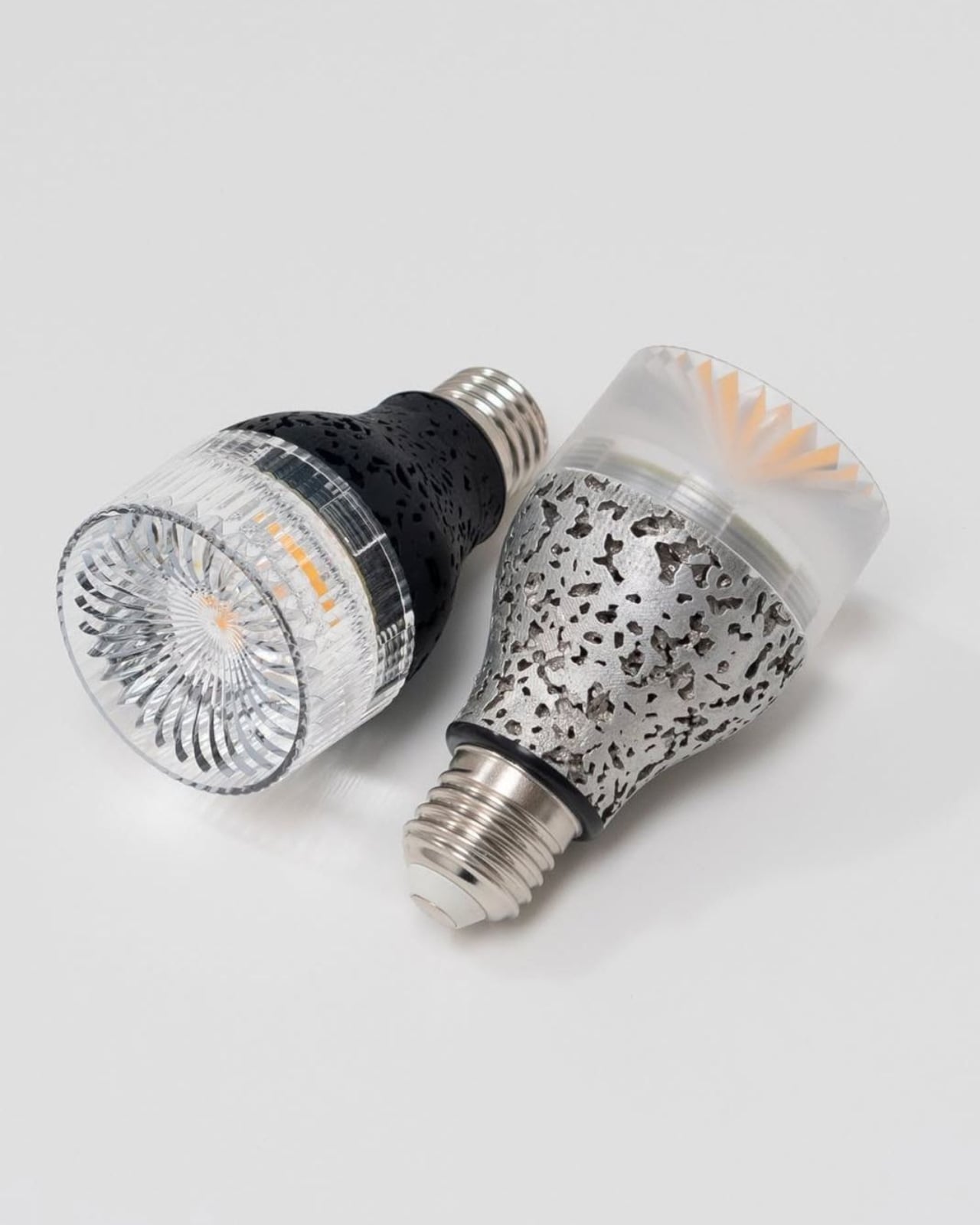
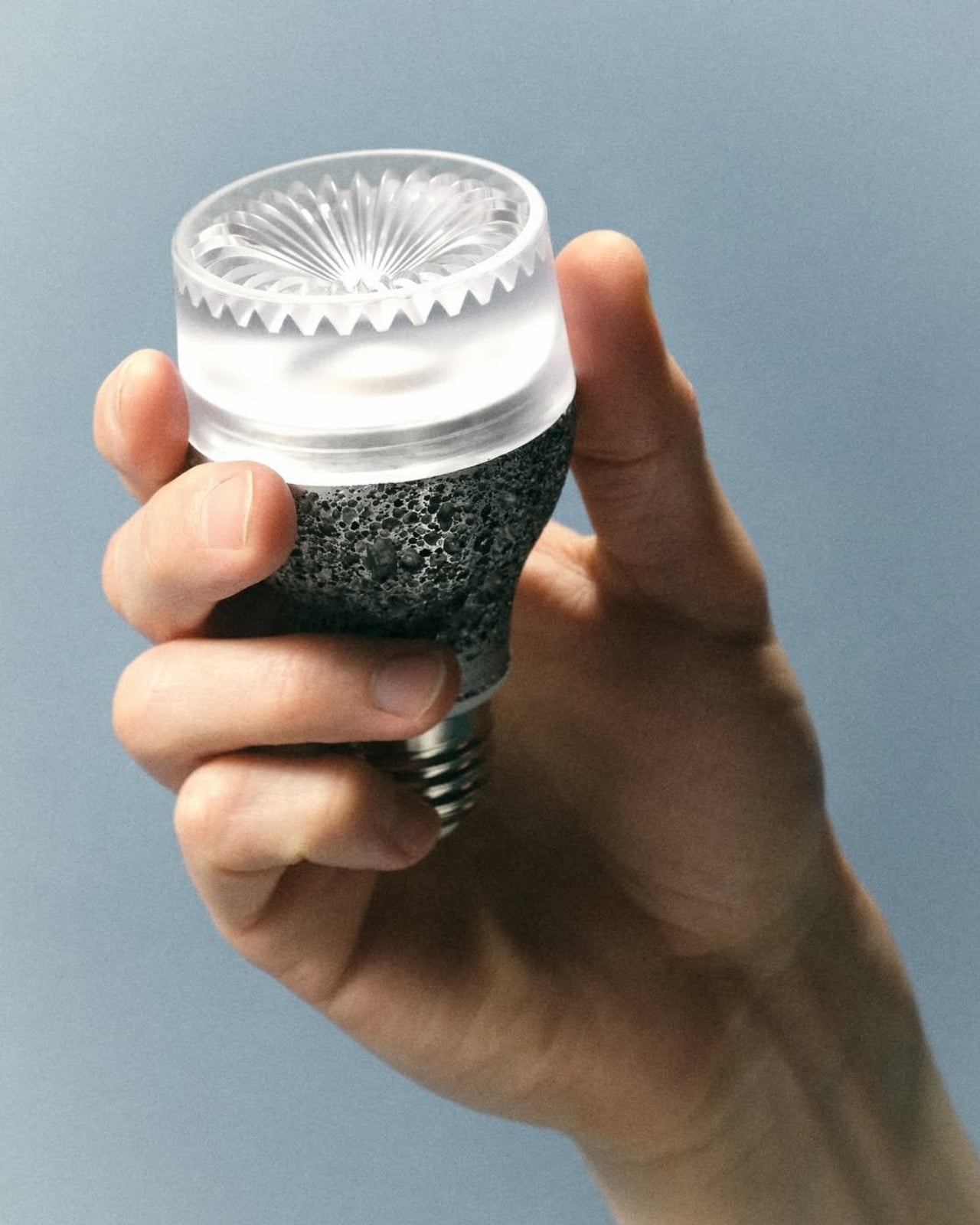
The Re27 is built around an idea that the lighting industry has, for the most part, chosen to ignore: that a light bulb should be something you repair, not just replace. The bulb is modular, with clip-in components that can be swapped out when one part fails. You don’t have to toss the whole thing. You don’t have to buy a new one if one section gives out. The design actually encourages you to keep it going, which is a genuinely rare thing in consumer electronics of any kind.
The body is die-cast aluminum, and not the smooth, polished kind you might expect. The porosity of the casting creates a natural texture that helps dissipate heat while also giving the bulb a physical presence that’s hard to describe without actually seeing it. Domus called it a texture that “overturns expectations regarding the materiality and aesthetic presence of this everyday object,” and I think that’s a fair read. It’s a bulb you actually want to look at, which sounds like a strange thing to say about something that usually lives inside a shade.
Almost all of the materials are recycled, and the whole thing is assembled in Switzerland using mostly EU-made parts. For anyone who has started paying attention to where their products actually come from, that matters. The Re27 doesn’t just gesture at sustainability the way so many products do now, folding it into their marketing as an afterthought. It builds it into the structure of the object itself.
The light quality is where iiode earns serious points. The Re27 delivers a high CRI output, which means colours under its light look the way they’re supposed to, the way they’d look in natural daylight. It’s flicker-free, which is one of those things you don’t notice until you’ve been sitting under bad lighting for three hours and your eyes are tired for no apparent reason. The colour temperature and intensity are tunable, and the smart control is integrated directly into the bulb, so you don’t need a separate hub or app ecosystem to make it work.
To celebrate the launch, iiode invited eight design studios to create lampshades specifically for the Re27. It’s the kind of move that tells you a lot about how a brand sees its own product. They’re not treating it as a commodity. They’re treating it as an object worth designing around, worth collaborating over, worth dressing up. That creative confidence comes through in every aspect of what they’ve built.
The Re27 is currently available for pre-order, and iiode is presenting it during Milan Design Week 2026 as part of the House of Switzerland Milano showcase. Seeing it make its way into that conversation, alongside furniture, installations, and collectible pieces, makes complete sense. The Re27 belongs there not because it’s trying to be art, but because it’s genuinely well-considered design applied to something we use every single day.
Lighting is one of those things most of us don’t think about until it’s wrong. The Re27 is a bulb made by people who clearly think about it all the time, and the result is something that makes you want to pay attention too. Sometimes the most interesting design isn’t the flashiest object in the room. Sometimes it’s just the light that makes the room worth being in.
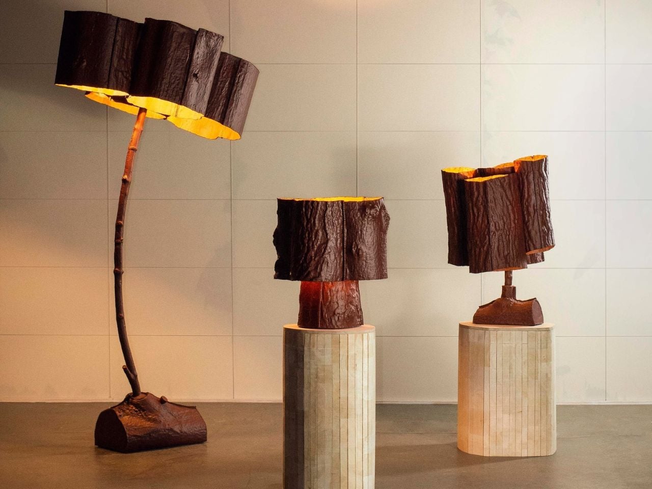
Most lamps get designed around a concept. MJ Fraser designed his around a memory. His Trees From The Garden collection started not with a mood board or a material swatch, but with the actual trees that grew in his childhood garden. He pressed the bark and branches directly into moulds, one section at a time, and the result is a series of lamps that look like they were pulled straight from the forest floor, still carrying the warmth of something lived in.
That personal starting point matters more than it might seem at first. A lot of sustainable design today leans heavily on the idea of nature while keeping a safe aesthetic distance from it. Fraser collapsed that distance entirely. The irregular textures across each piece, the way no two lamps in the series look exactly alike, these aren’t stylistic choices made in a studio. They’re what happens when you let nature do the actual drafting.
The material Fraser works with is Worbla, a biodegradable thermoplastic that contains roughly 30 percent waste sawdust. That sawdust detail is worth sitting with for a moment. The material is literally made, in part, from the same kind of organic matter it’s being shaped to resemble. It’s a closed-loop logic that feels almost poetic, and it carries through into the production process as well. Offcuts from fabrication don’t get discarded. They get reheated and folded back into the work as welding material or as internal structural support for the pieces. The heat-activated adhesive properties of the material mean no additional bonding agents are needed, which removes one more synthetic component from the equation. Surfaces are finished with natural mineral paint, keeping the material story clean from start to finish.
All of that restraint shows up in the final objects. These aren’t lamps trying to look rustic, and they’re not performing sustainability for a press release. They carry an honesty that is harder to manufacture than the pieces themselves. Looking at them, you get the sense that Fraser wasn’t chasing recognition for the materials. He just wanted the materials to be right.
I’ll be upfront: I think the design conversation around sustainable materials has grown a little comfortable with congratulating itself. A project announces it uses a bio-based material and that tends to become the whole story. What Fraser is doing here is structurally different. Every decision in the process has a reason, and those reasons loop back into each other. The sawdust in the thermoplastic connects to the trees. The scrap material folds back into the structure. The moulds taken from real bark connect back to the childhood garden where the whole thing began. Nothing in this collection is decorative justification.
The lamps also resist the visual sameness that tends to flatten sustainable design into a single recognizable aesthetic. Because each mould comes from a specific section of a specific tree, each piece in the collection reads differently. The series is unified by process and material, not by uniformity, and that’s a meaningful distinction. It means the collection gets more interesting the more pieces you encounter, rather than feeling like variations on the same idea.
There’s a growing appetite right now for objects with a legible origin, things you can trace back to a source, a decision, a place. Consumers are more skeptical of greenwashing than they’ve ever been, and the visual language of sustainability, the linen textures, the muted tones, the vague nods toward nature, has started to feel hollow when it’s not backed by real process thinking. Trees From The Garden lands as a direct answer to that skepticism, not because Fraser set out to make a statement, but because the work is too specific to be anything other than genuine.
A lamp made from a mould of bark from a childhood garden is, on one level, an incredibly quiet object. On another level, it’s a pretty compelling argument for what design can look like when nostalgia and material rigor are given equal weight.
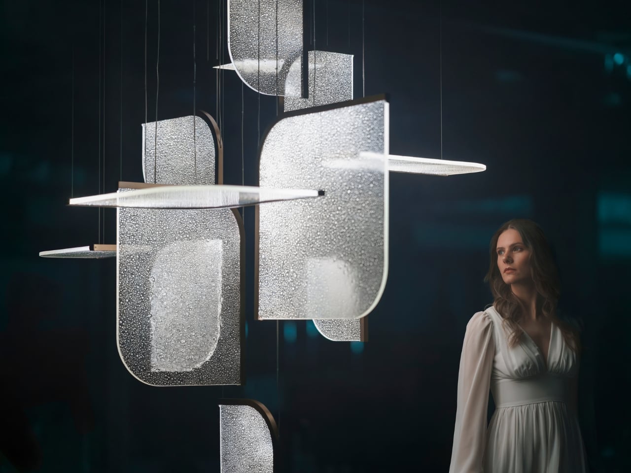
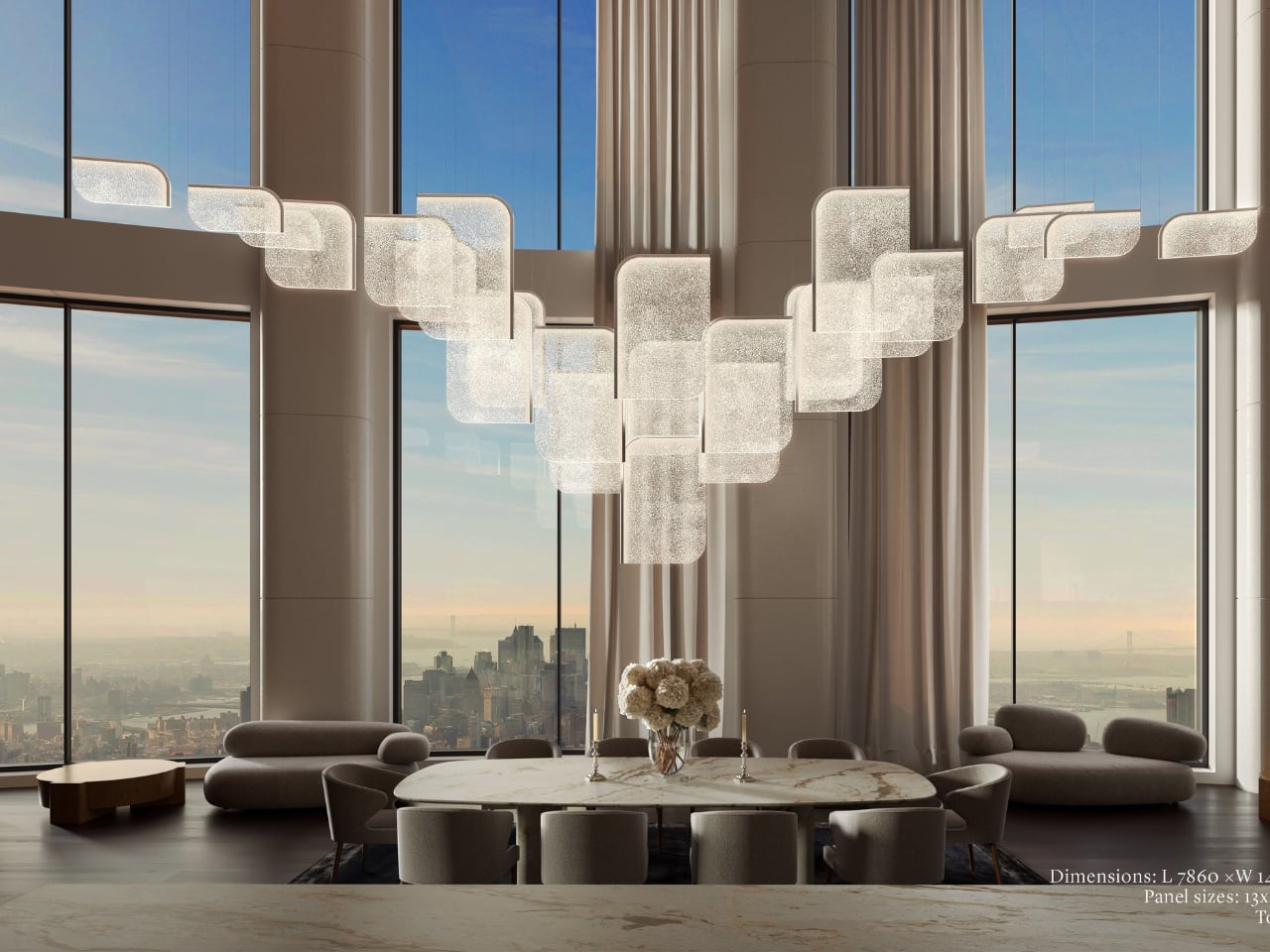
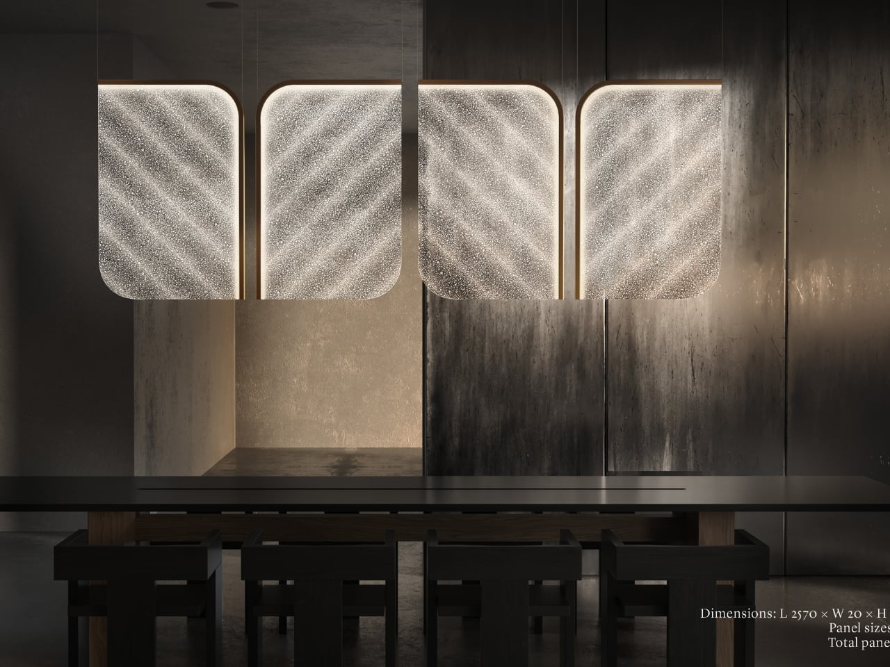
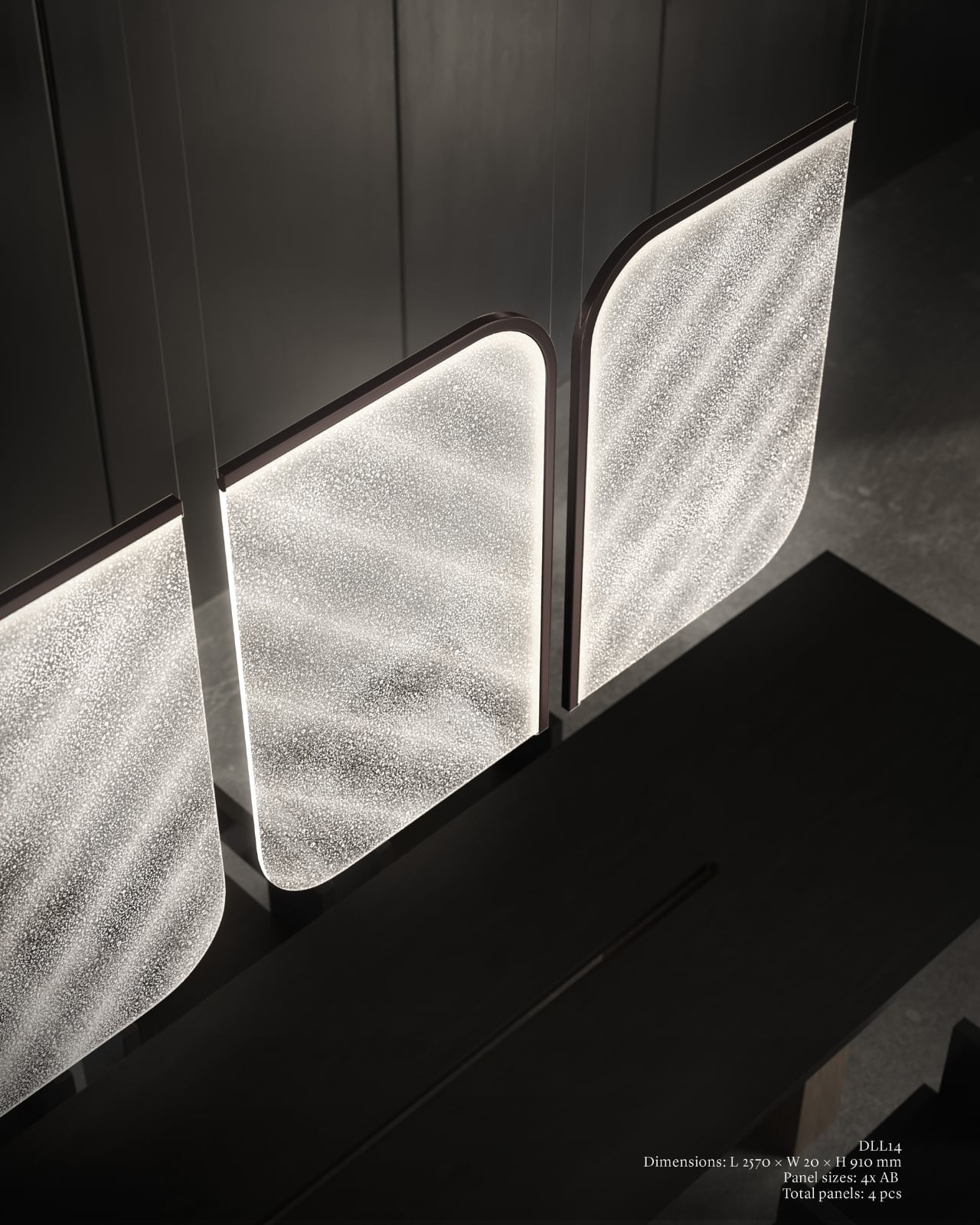
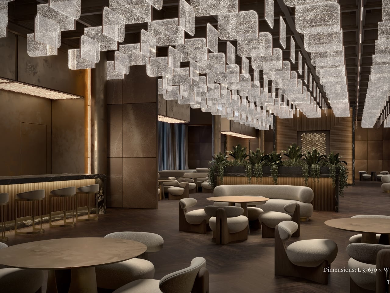
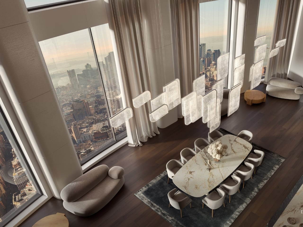
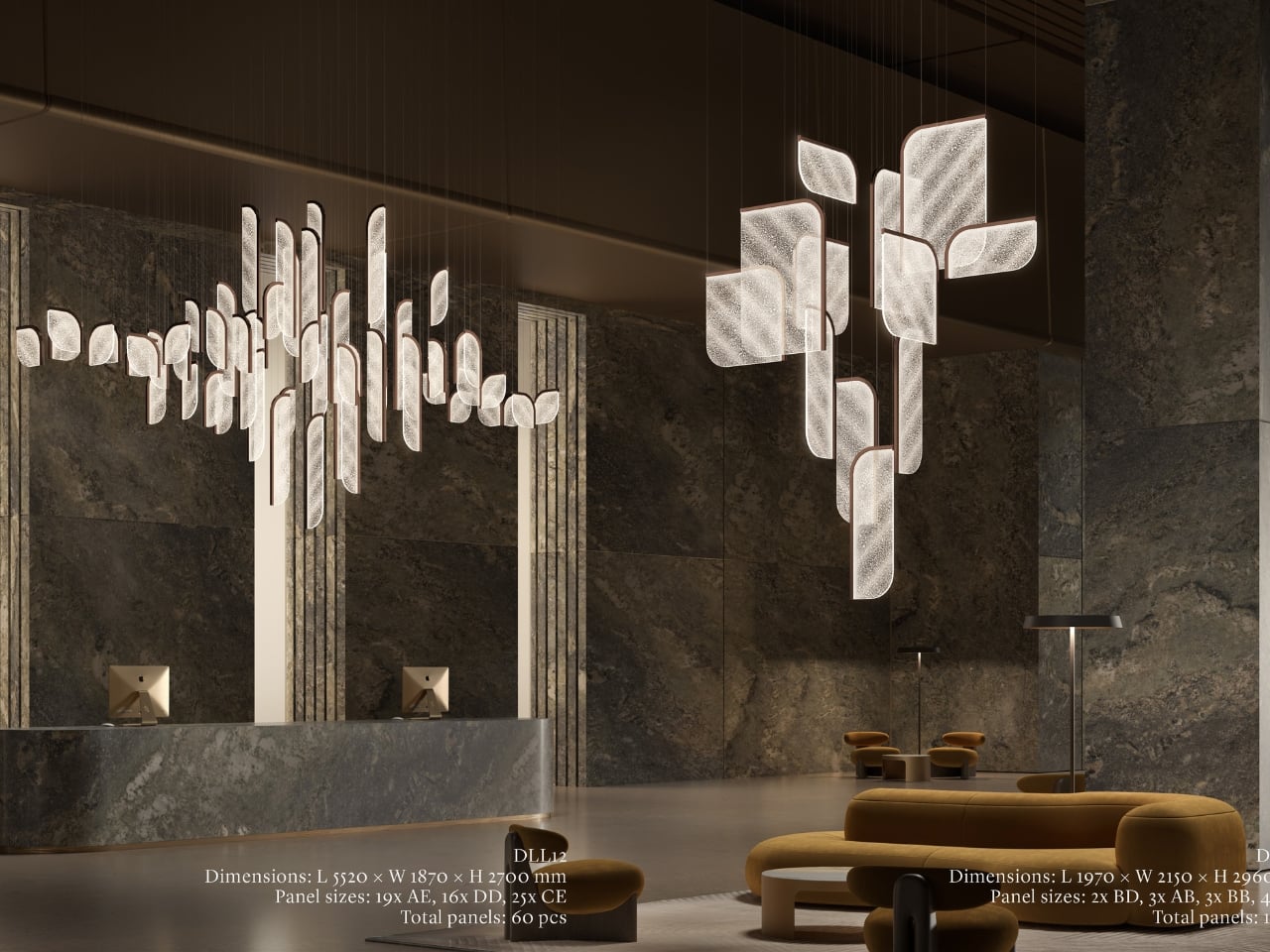
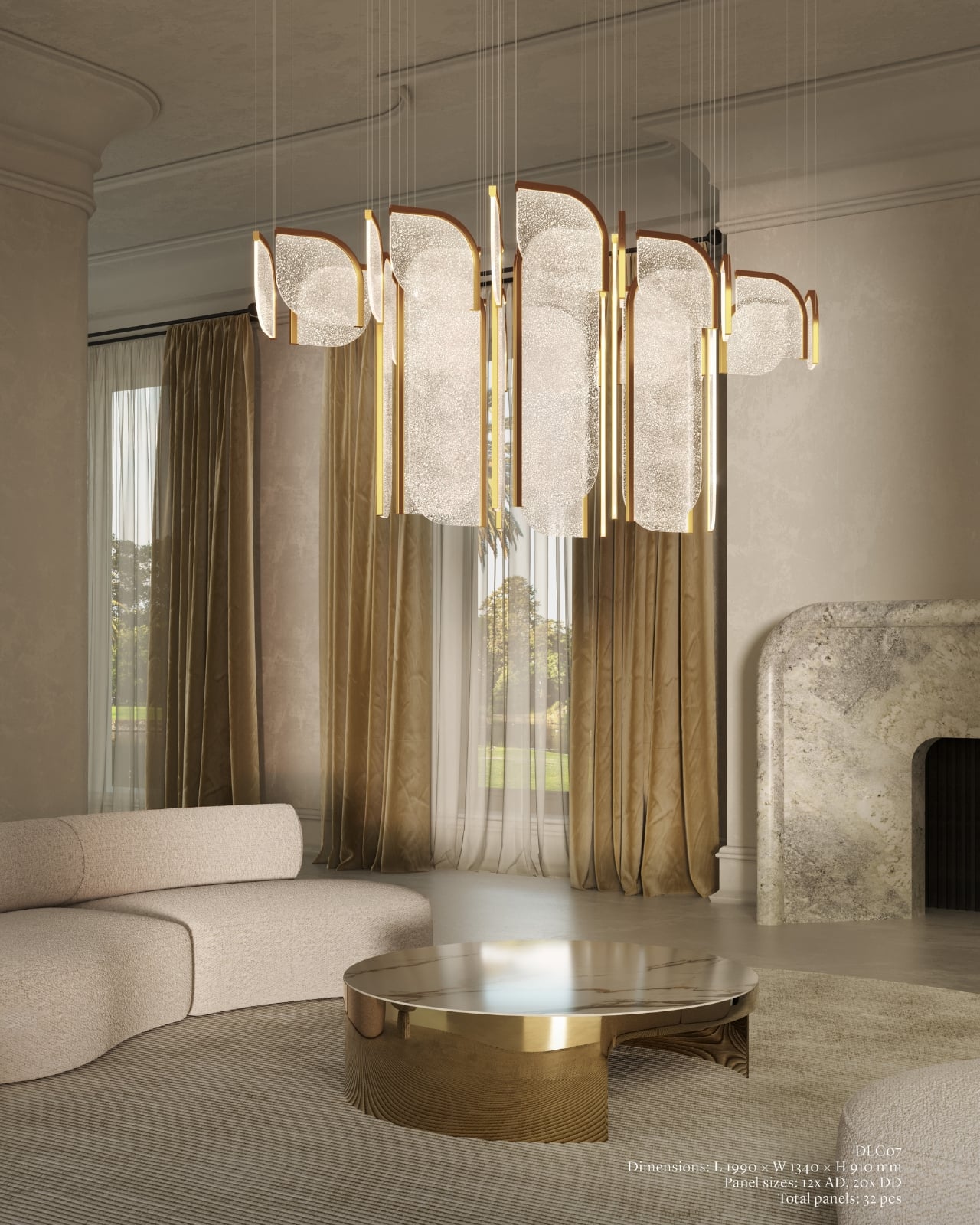
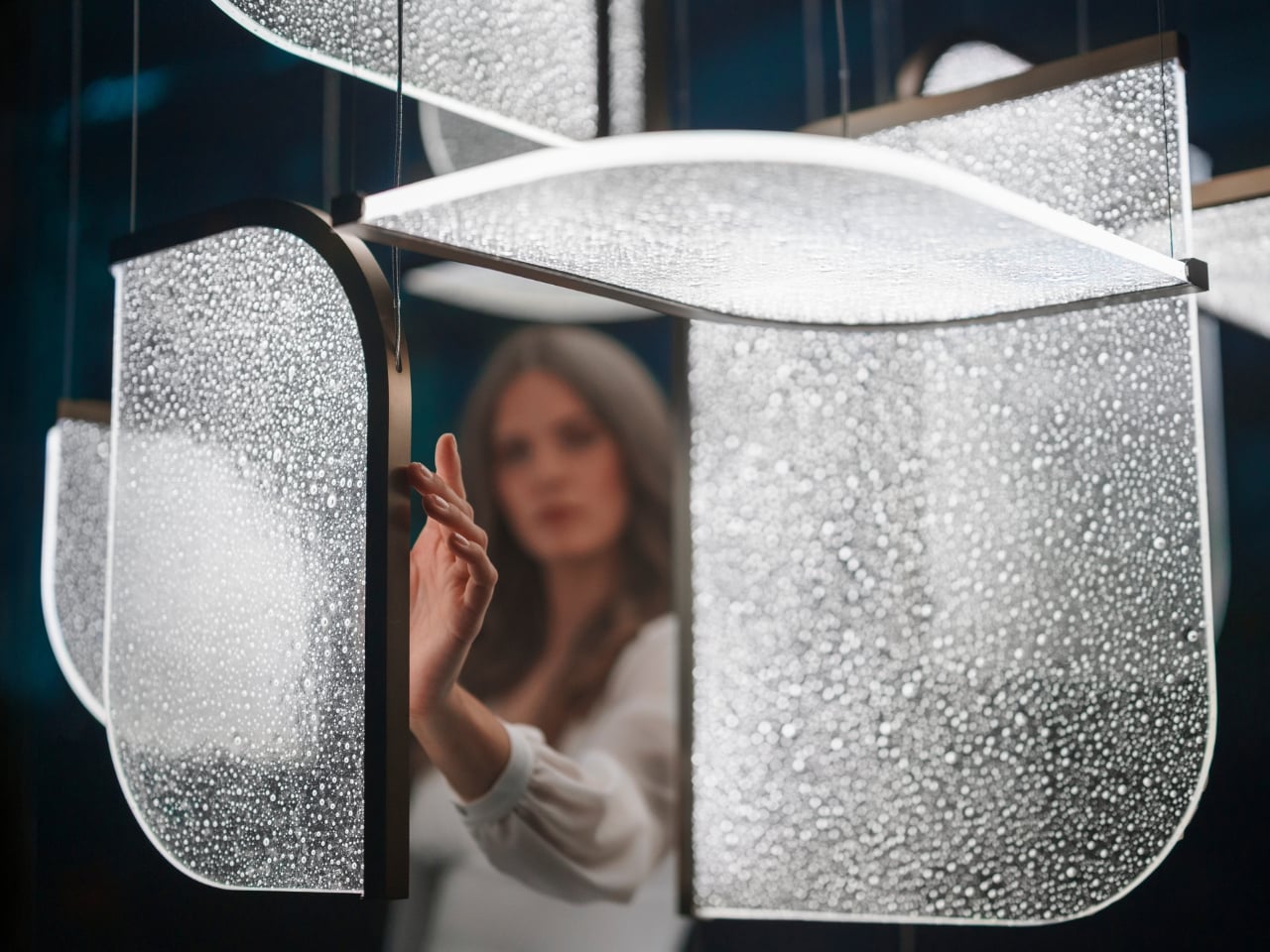
Light has always been design’s most underrated material. We talk endlessly about furniture, textiles, and surfaces, but light? It usually plays the supporting role, the thing that makes everything else look good. Preciosa Lighting is quietly changing that conversation, and their latest collection, Drifting Lights, might be the most convincing argument they’ve made yet.
The Czech brand has been doing this long enough to know the difference between novelty and genuine craft. Their heritage is rooted in traditional glassmaking, but what they’ve built with Drifting Lights feels like a very deliberate step forward. Each piece is made up of oblong and square glass panels slotted into a stainless-steel frame that discreetly conceals an LED strip. Inside each panel, the glass has been infused with countless tiny air bubbles. When light passes through, it doesn’t just illuminate the glass. It gets lost in it, scattering through those bubbles in a way that looks less like electricity and more like light deciding where it wants to go.
For Milan Design Week 2026, Preciosa is bringing the full Drifting Lights experience to the Tempesta Art Gallery in Brera, and the scale alone is worth paying attention to. The installation spans approximately 30 square metres and features 60 glass panels suspended vertically and horizontally, forming a structure measuring 8.7 by 3.2 by 3 metres. Set against a dark interior, the panels will be animated using 3D spatial mapping and RGBW technology, cycling through colour sequences from red to pink to green. Co-Creative Directors Michael Vasku and Andreas Klug put it plainly: the installation aims at “creating space to slow down, pause and wonder.”
I appreciate that framing, because Milan Design Week is genuinely relentless. Every brand is competing for the loudest moment, the most shareable installation, the boldest statement. There is a real temptation to optimise for the 15-second video clip rather than the actual experience of standing in a room. Preciosa is betting on the opposite, and I think that’s the smarter play. The colour sequence from red to pink to green reads like an emotional arc rather than a tech demo, referencing love, passion, and inner peace. Whether or not you buy the symbolism, you can’t argue with the atmosphere it creates.
A design object earns its place when it works just as well outside a gallery as inside one, and Drifting Lights has clearly been thought through on that level. The panels come in ten sizes, with different metal frame finishes and the option to orient them vertically or horizontally. The same collection can fill a grand hotel lobby or anchor a living room without losing its character. For bespoke projects, Preciosa can apply a painting technique that introduces pigment bubbles into the glass, giving each panel a layer of quiet individuality. The bubbled glass can also be enhanced with their Fused Veil pattern, which shifts the direction of light and adds even more visual complexity.
Under static illumination, Drifting Lights is calm and composed. Switch to dynamic mode and the panels come alive, with light moving from one to the next like ink dispersing through water. The gradients bloom, soften, and recombine. It’s the kind of effect that makes you stay in a room longer than you planned, which is, ultimately, what great lighting is supposed to do.
Preciosa has had a strong run at Fuorisalone in recent years, with recognised installations at Zona Tortona and Euroluce. The move to Tempesta on Foro Buonaparte suits the work well: a contemporary art gallery setting that lets the installation breathe without competing with showroom furniture. It’s a confident choice for a collection that clearly doesn’t need much help making a room feel different. If you’re heading to Milan, the installation runs April 20 to 26 at the Tempesta Art Gallery on Foro Buonaparte, and this one is worth the detour.