This $152 Laptop Backpack Has 7 Features Most Business Bags Skip

The office is no longer a place. For a growing number of professionals, work happens across a rotating cast of locations, on trains, in hotel lobbies, at standing desks in co-working spaces, at airport gates between meetings. What gets carried through all of that has quietly become one of the more personal decisions in a working day. The bag has to hold a laptop, a water bottle, travel documents, chargers, and sometimes a change of clothes, while still looking appropriate in every environment it passes through. Most bags manage the functional half of that requirement passably well; the visual half tends to be where the compromises show.

Nayo Smart designed the Herman Pro around exactly this reality. The half-roll-top silhouette keeps things looking composed from the outside, while the internal architecture handles an impressive amount of organized complexity. A dedicated laptop compartment sits separately from the main storage zone, accessible directly from the back panel for quick retrieval at security. The L-shaped main opening lays nearly flat for visibility and easy packing. A FIDLOCK magnetic buckle secures the flap in one motion, and hidden pockets, a side waterproof sleeve, and a luggage strap round out a carry system built around real transit habits rather than feature checklists.

Designer: Nayo Smart

Click Here to Buy Now: $152.10 $169 (10% off) Free Waterproof Packing Cube included with your Herman Pro


The most immediate visual quality of the Herman Pro, looking at it against the body, is how settled the silhouette stays. Many contemporary backpacks have evolved into highly technical, feature-heavy products that prioritize utility, and the result is often a bag that reads more like field gear than office carry. The Herman Pro’s exterior has been edited rather than accumulated. A clean rectangular body in dark nylon, a structured top flap held down by the FIDLOCK buckle, and a vertical webbing strap running the full length of the front panel make up the entirety of what faces the world. Both colorways, the deep black and the muted forest green, land firmly on the right side of understated, and the structured base gives the bag a stable, planted quality that prevents the slouching common in softer nylon designs.
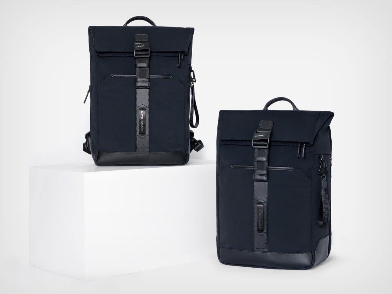
Beyond durability and weather resistance, equal importance was placed on tactile quality, structure retention, visual texture, and long-term everyday usability, and the parachute-inspired water-repellent NA-TEX fabric was ultimately selected because it balances performance with a more refined and premium visual character. The surface has a matte density to it that holds its character under different lighting conditions, which matters for a bag that moves between a boardroom and a café in the same afternoon. Water beads off without leaving marks or altering the fabric’s structure, the kind of weather performance that earns trust over months of daily use rather than in a single dramatic rain test. A slightly firmer, smoother material at the base grounds the bag both structurally and visually, adding subtle zoning to the exterior without making a statement of it. Tactile quality was clearly weighed alongside durability here, and the difference from a generic nylon backpack is noticeable at first contact.
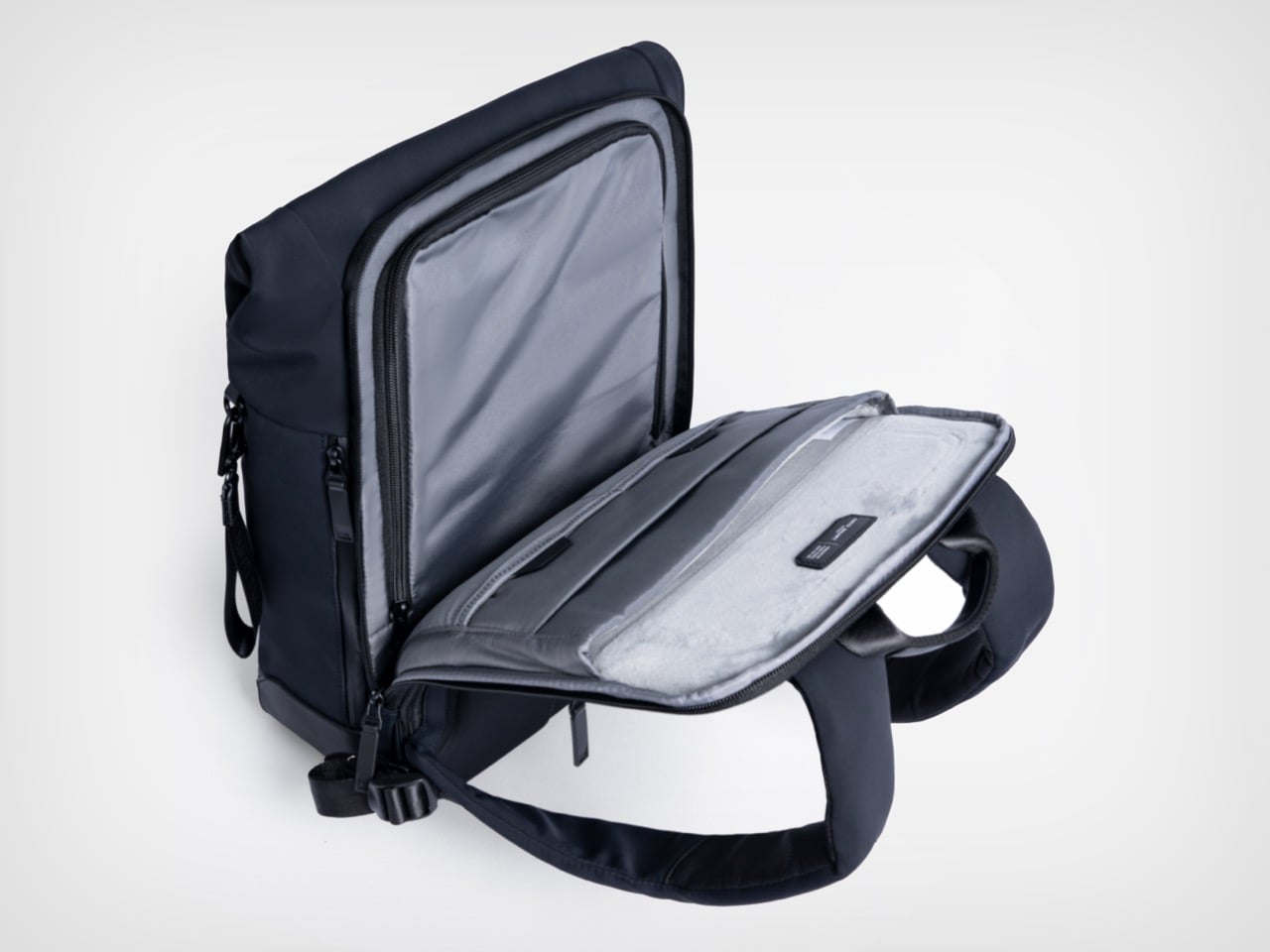
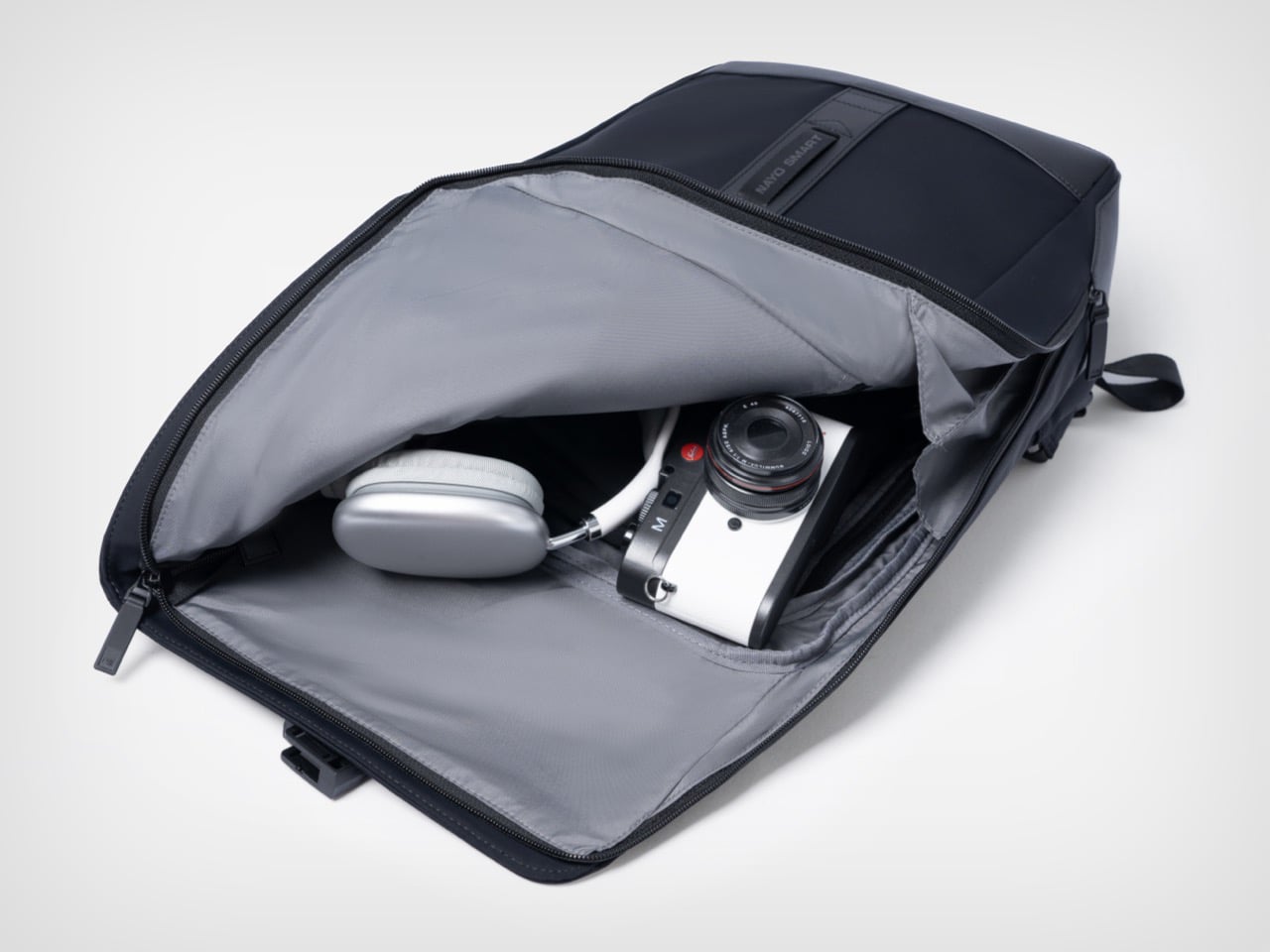
The L-shaped opening improves packing visibility and access in a way that is genuinely hard to go back from once you’ve experienced it. A conventional top-loader reveals its contents in layers, demanding that you excavate through whatever went in last to find what you need now. The L-shaped zipper runs across the top and down one full side, so the flap swings away and the entire main compartment opens in a single motion, nearly flat. The light gray interior lining amplifies this, creating strong contrast against dark items so headphones, cables, and loose accessories are immediately locatable rather than lost at the bottom. Cameras, over-ear headphones, and a tablet all fit comfortably in the main zone without competing for space with the laptop, which lives in an entirely separate section of the bag.
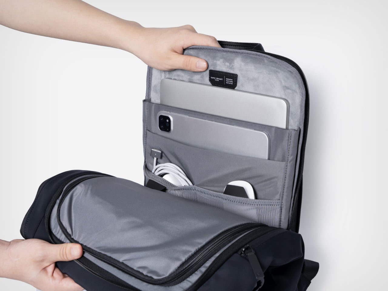
The independent laptop compartment, accessed directly from the rear panel, is one of the more practically useful organizational decisions in the Herman Pro’s design. Airport security typically means pulling the laptop out in a motion that requires setting the whole bag down, opening the main compartment, and digging through accumulated carry chaos. The back-access panel changes that entirely, allowing the laptop to slide out cleanly without touching the main storage zone. The dedicated laptop and digital device organization helps separate work essentials from personal items, and the compartment fits modern 15-inch laptops without forcing anything, with a padded tablet slot sitting alongside it. What looks like a relatively minor structural decision on paper becomes one of those carry conveniences that is hard to give up.
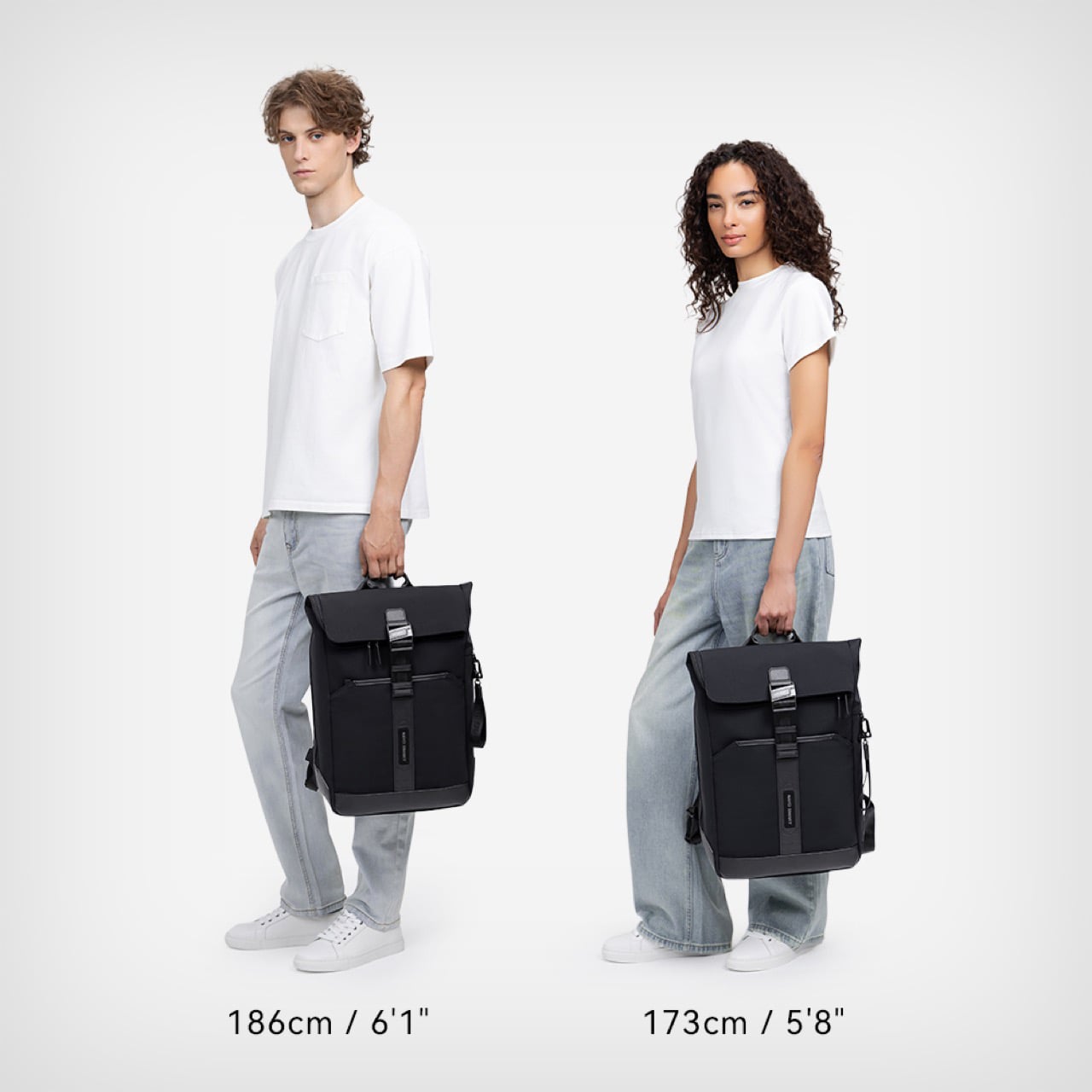
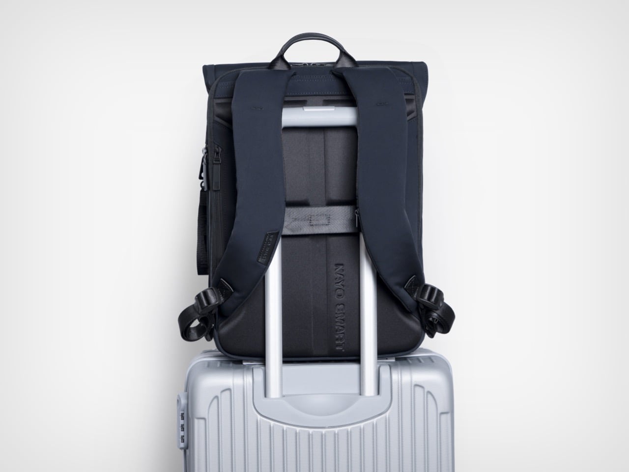
FIDLOCK’s magnetic buckle system has been appearing across premium outdoor and travel gear for several years now, and its inclusion here reads as a purposeful hardware specification rather than a borrowed credential. The mechanism snaps shut with one hand in a single motion and releases just as cleanly, removing the small but cumulative friction of a conventional buckle from what might amount to dozens of open-and-close cycles across a travel week. Hidden anti-theft pockets add a layer of security for passports and cards, while a hidden front zipper pocket handles flat documents or a transit card in a separate zone entirely. The side waterproof pocket accommodates a water bottle or umbrella without disrupting the bag’s profile from the front. A nylon luggage strap on the rear panel completes the transit toolkit, locking the Herman Pro cleanly onto a roller case handle when the load demands it.

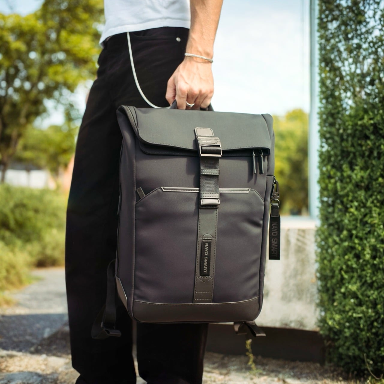
Nayo Smart is a Singapore-based brand operating in a market that has gotten genuinely competitive at this price tier. The Herman Pro starts at $169 for the black colorway, placing it in direct conversation with well-regarded carry brands like Aer, Boundary Supply, and Tropicfeel, all of which have raised baseline expectations around what a commuter or travel backpack should deliver. Reviewers have already been reaching for the “affordable Tumi alternative” framing, which is a pointed comparison given how aggressively Tumi’s pricing has drifted upward over the past decade. The more interesting discussion may not simply be how functional a backpack can become, but how modern business backpacks are evolving alongside changes in work culture, mobility, and contemporary everyday lifestyles, and the Herman Pro fits into that conversation as a considered example of how a business travel backpack can become more organized, more comfortable, and more visually restrained without losing the practical performance that modern professionals expect. Both colorways are available directly through nayosmart.com, in standard 20L and large 25-30L sizing.

Click Here to Buy Now: $152.10 $169 (10% off) Free Waterproof Packing Cube included with your Herman Pro

The post This $152 Laptop Backpack Has 7 Features Most Business Bags Skip first appeared on Yanko Design.
5 Best Desk Objects That Help You Do Deeper Work Without Opening Your Phone

The phone is always the easy answer. Timer goes off — reach for it. Stuck on a thought — reach for it. Five minutes later, you’ve watched three videos and forgotten what you were working on. The real cost of deep work isn’t effort; it’s attention. And attention is exactly what these five desk objects are designed to protect, each one quietly replacing a digital habit with something more physical and deliberate.

None of these are apps or subscription tools. They’re objects — things you touch, twist, write on, and look at from across the room. Some are already on shelves. Others are still concepts. All of them point in the same direction: toward a desk that improves your focus so your phone can do less. Here are five designs worth making room for.

1. Air Powered Segment Clock

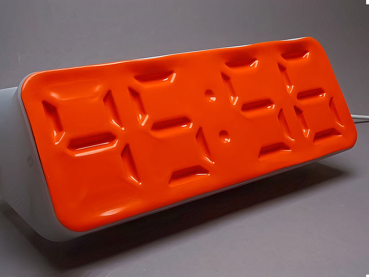
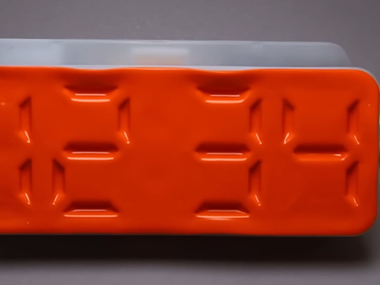
Time-checking is one of the most common reasons people pick up their phones — and one of the quickest ways to lose focus. The Air Powered Segment Clock answers that with something genuinely unlike anything else on a desk: a four-digit display that uses no LEDs at all. Instead, vacuum pressure pulls sections of a flexible silicone membrane inward to form each digit, the way a pneumatic system flexes a muscle. It’s mechanical, quiet, and mesmerizing to watch change.

What makes the engineering remarkable is that each segment behaves like a memory cell — holding its shape after pressure is removed, only resetting when the next command arrives. The architecture mirrors how RAM functions. The clock is DIY-built from 3D-printed parts, a small vacuum pump, solenoid valves, and an Arduino, and it includes a stopwatch mode. It lives on your desk to tell you the time, and that’s it — there’s nothing else it can tempt you with.

What we like:

  • The pneumatic segments hold each digit without continuous power, making it a genuinely low-energy timekeeping system
  • Watching the silicone membrane shift and settle is a micro-moment of calm between tasks

What we dislike:

  • As a DIY build, it requires significant technical skill to replicate — this isn’t something you can simply order
  • The vacuum pump and solenoid system adds mechanical complexity that may require periodic maintenance

2. OrigamiSwift Mouse

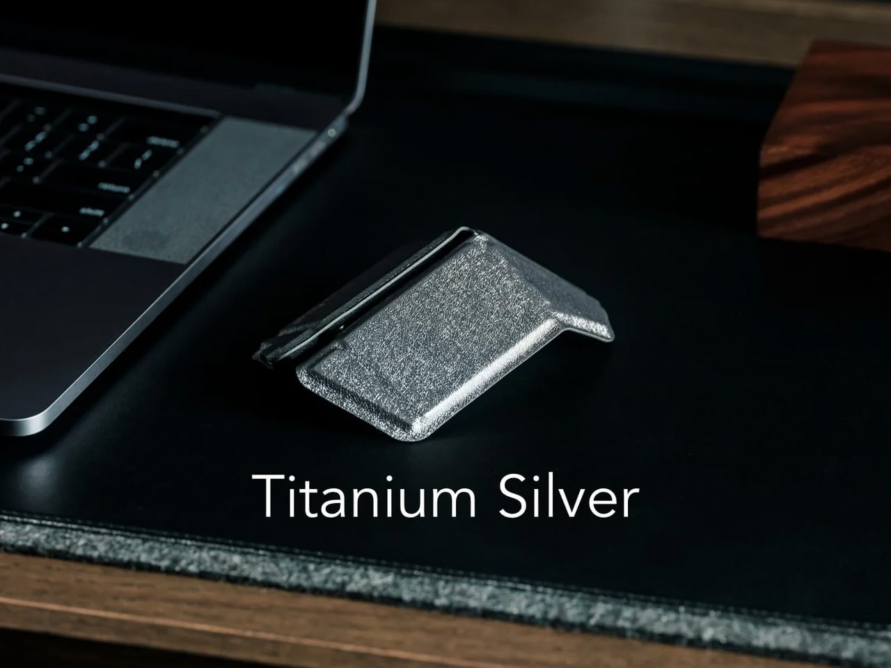
A mouse might seem like an unlikely candidate for this list, but the Origami Swift earns its place by making your physical workspace feel intentional. Designed by Horace Lam and inspired by the art of origami, it folds completely flat — just 4.5mm thin and 40 grams — and snaps into full mouse form in under half a second. That small ritual of unfolding and clicking into position is a quiet but real signal to your brain that work is starting now.

Bluetooth 5.2 keeps connectivity fast and reliable, with a wireless range of up to 32.8 feet in open areas, and the USB-C rechargeable battery lasts up to three months on a single charge. Soft-click buttons and a smooth glide keep sessions quiet and distraction-free. Compatible with Mac, Windows, and Android, it performs like a full-sized mouse when open and disappears into a bag without drama when the day is done.

Click Here to Buy Now: $85.00

What we like:

  • The fold-to-activate gesture creates a physical transition into work mode that a trackpad or standard mouse doesn’t offer
  • At 40 grams with a three-month battery life, it’s both genuinely portable and technically capable

What we dislike:

  • The folded form factor requires adjustment for users accustomed to traditional palm-grip mice
  • Soft-click buttons may feel less satisfying for those who prefer strong tactile feedback

3. Note

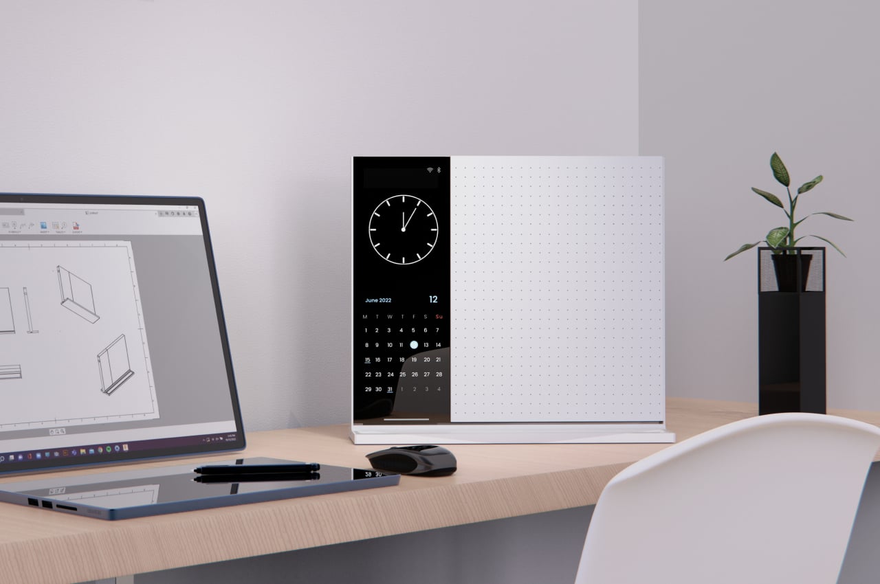
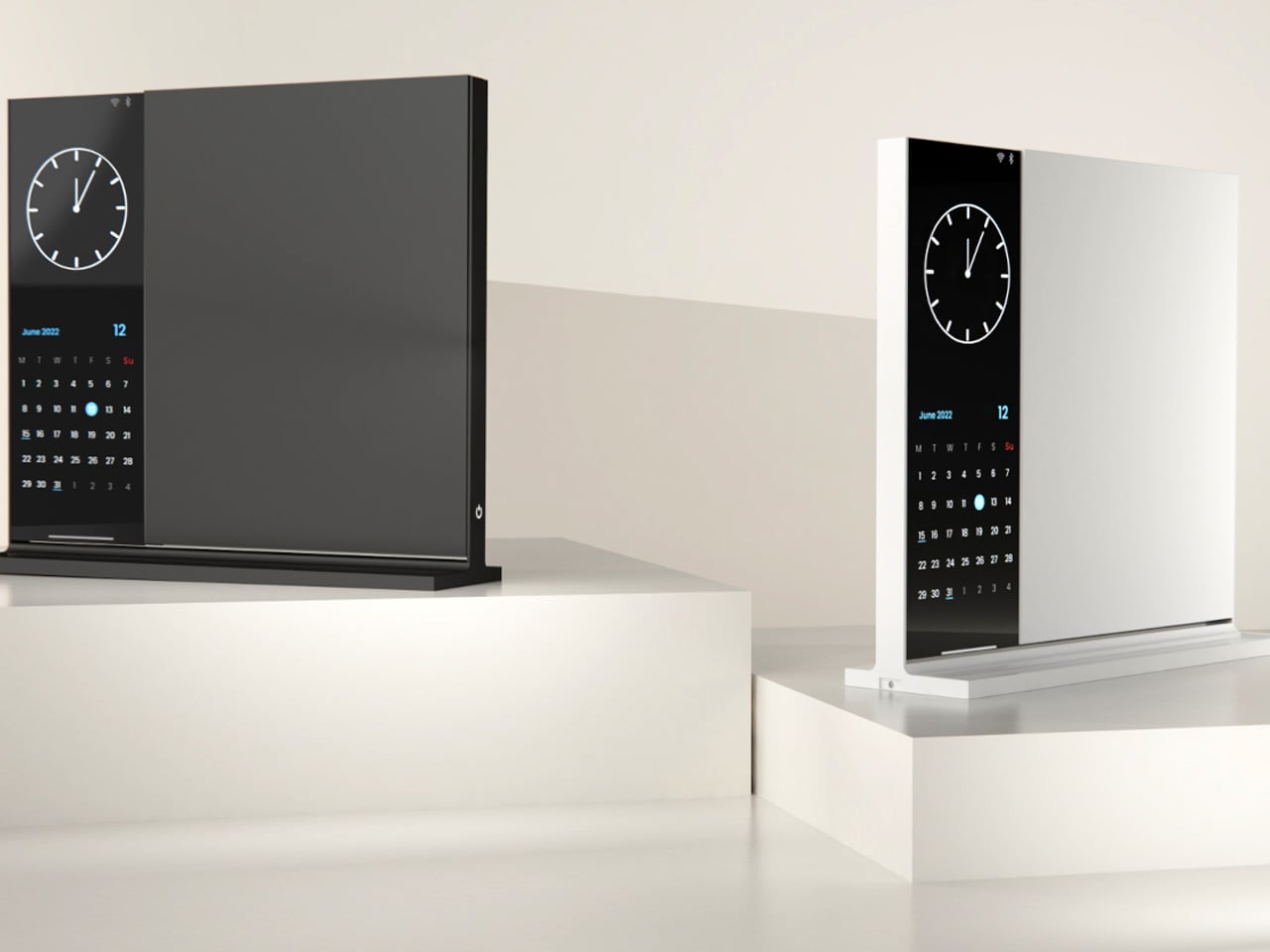
The Note is deceptively simple: a desk object that bridges analog note-taking with just enough digital utility to make it genuinely useful. The device pairs a whiteboard surface for jotting ideas with a small built-in display on the left side that shows the time, date, and music controls. Rather than asking you to open an app or unlock a screen, Note keeps that essential information directly in your peripheral vision, fixed and passive.

The design addresses something real: the modern digital workstation is so fully loaded that reaching for anything — a timestamp, a song, a quick note — means crossing through a notification minefield. Note keeps those basic needs on the desk and offline. Sketch an idea on the whiteboard, check the time from the side display, and keep moving. It doesn’t replace your technology. It quarantines the parts of it that constantly pull your attention away from the work directly in front of you.

What we like:

  • Combining a whiteboard surface with a peripheral display eliminates two of the most common reasons for picking up a phone
  • The minimal form factor stays present without demanding attention

What we dislike:

  • Note remains a concept with no confirmed production timeline or retail availability
  • The side display’s feature range is limited compared to a full smart display, which may frustrate users who want more

4. Immerge Desk Timer

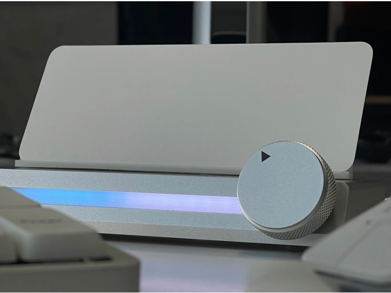
There’s a reason so many people use the Pomodoro method but can’t stick to it: phone timers live on the same device that breaks focus. The Immerge Desk Timer by Adam Cole Edwards is a concept for a CNC-machined aluminum timer with an anodized finish, designed to sit on your desk as a physical commitment to a work block. A smooth-rotating wheel sets the desired interval. There’s no screen, no app, and no chance of a notification bleeding through from something else.

A built-in note card slot on the front holds a small index card — space to write the day’s top priority, a single task, or a short reflection. That combination of timer and intention-setting turns the Immerge into something more considered than a countdown. The design language is deliberately understated, built to complement any desk without demanding to be noticed. It’s still a concept, but the idea it represents — analog focus as a deliberate cultural choice — feels overdue.

What we like:

  • The integrated note card slot pairs time management with written intention, reinforcing focus before a session even begins
  • CNC-machined aluminum with an anodized finish places it firmly in premium desk object territory

What we dislike:

  • The Immerge remains a concept with no confirmed production timeline or pricing
  • A purely analog timer offers no connectivity for users who track productivity data or want to log sessions

5. MagBoard Clipboard

Paper has a focus advantage that screens don’t: it notifies you of nothing. The MagBoard Clipboard leans into that advantage while solving the one real problem with loose paper — keeping it together. A Magnet x Lever mechanism secures up to 30 sheets without a traditional spring clip, and releasing or adding pages takes nothing more than a light press on the edge. It’s made in Japan, and the material quality reflects that without needing to announce it.

The hardcover design means you can write on it standing up, on a couch, or anywhere a thought shows up. The surface is water-resistant and easy to clean. Available in A4 and A5 sizes, it accepts any paper you choose — blank, grid, dotted, printed, perforated, or mixed. There’s no prescribed format and no app syncing required. You write what you think, in whatever order makes sense, and reorganize whenever the work demands it.

Click Here to Buy Now: $45.00

What we like:

  • The Magnet x Lever system secures any combination of paper types without marking or damaging sheets
  • Water-resistant hardcover construction makes it practical well beyond a standard desk setup

What we dislike:

  • The 30-sheet capacity may feel limiting for users who work through large volumes of material in a single session
  • Unlike digital tools, there’s no built-in way to search, tag, or retrieve older pages

The Best Tools Are the Ones That Stay Out of the Way

The phone isn’t going anywhere, and none of these objects pretend otherwise. What they offer is friction — the deliberate, productive kind. A clock that reads time through air pressure. A timer shaped from aluminum. A clipboard that holds whatever paper you choose. Each one introduces a small ritual into the day, and rituals are how deep work actually gets done. The setup matters more than most people give it credit for.

Good desk design is quiet. It works without asking to be noticed and keeps your attention where it belongs. These five objects don’t promise a productivity revolution — they just remove one more reason to reach for your phone. Sometimes that’s enough to finish the thing you’ve been putting off. Not because you became more disciplined overnight, but because nothing interrupted you long enough to break the thread.

The post 5 Best Desk Objects That Help You Do Deeper Work Without Opening Your Phone first appeared on Yanko Design.
Herman Miller’s Aeron Just Broke Its Decades-Long Neutrals-Only Rule

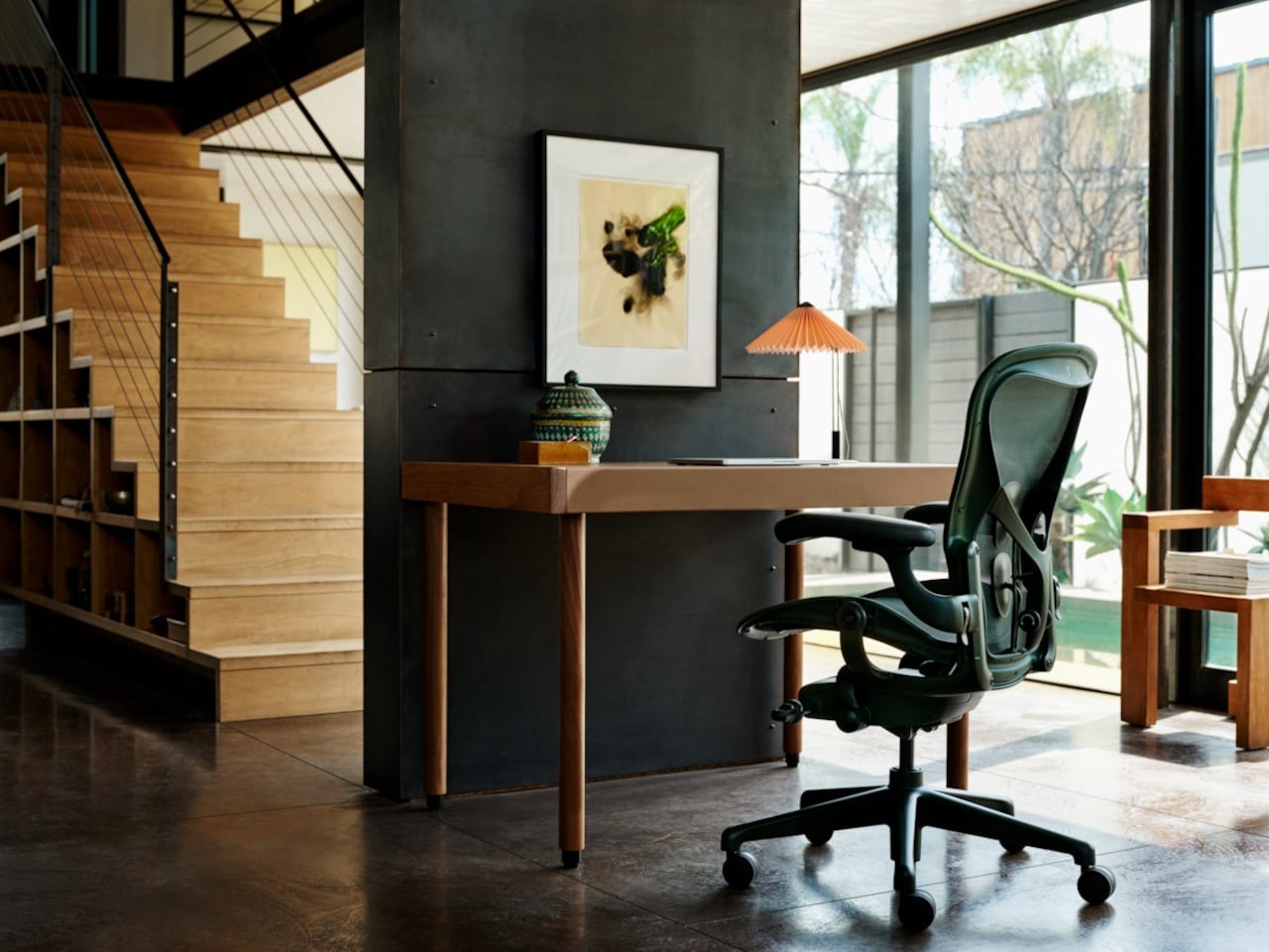
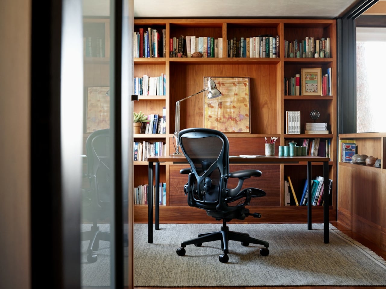
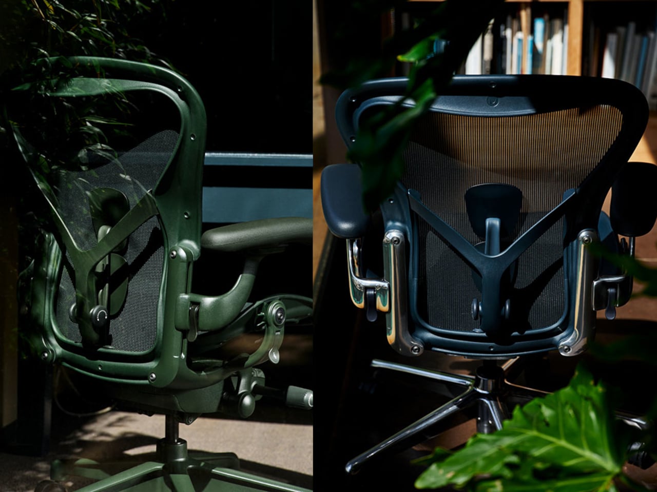
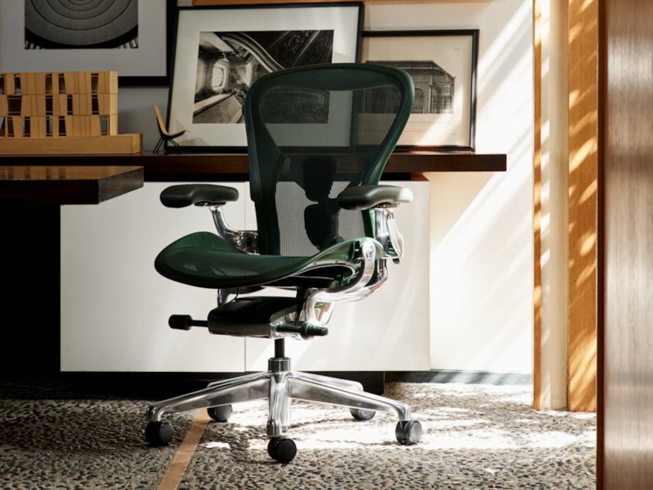
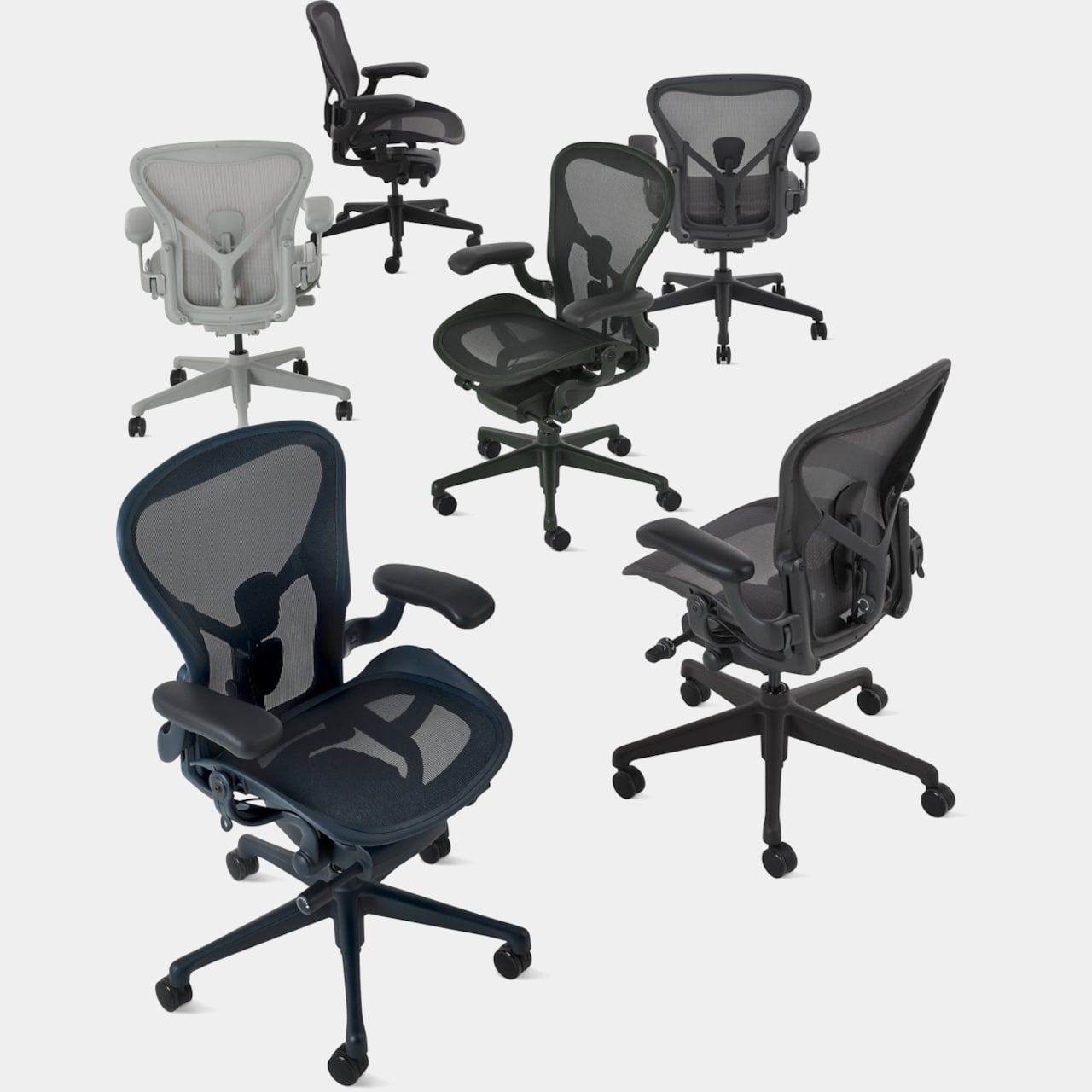
Office chairs have largely operated on a color vocabulary of one. Black. Occasionally dark gray. The reasoning is defensible enough: a chair meant to work in any office, boardroom, or home studio needs to disappear into the background, and neutrals are the safest way to guarantee that. The Aeron has lived by that rule since its 2016 remaster, offering four restrained options that leaned charcoal and graphite and asked very little of the rooms they occupied.

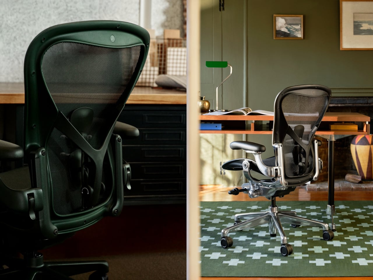
Herman Miller is breaking from that constraint in 2026, though only just. The two new Aeron colors, Jasper and Nightfall, aren’t a departure toward the bold or the playful. Jasper is an earthy olive green calibrated to read almost as a neutral while gesturing toward the biophilic design sensibility that has been moving through workplace interiors for several years. Nightfall is a sophisticated midnight blue already present across the MillerKnoll portfolio, added partly to make specifying a cohesive space easier.

Designer: Herman Miller

The full palette now sits at six hues, Onyx, Graphite, Carbon, Mineral, Jasper, and Nightfall, all drawn from natural references and all quietly confident about their ability to belong without demanding attention. For designers specifying a lounge, a studio, or a home office with a more considered material palette, those two additions open the door to pairings that the existing neutrals couldn’t quite reach. The chair’s structure and ergonomics stay entirely intact.

But the more substantive changes in this update aren’t visible from across the room. The team mapped where the chair carried the most weight and substituted in lighter materials, including post-industrial recycled content and bio-based nylons, with the result that the chair’s global average embodied carbon drops by 12% compared to the previous version.

That 12% follows years of prior reductions. In 2021, the Aeron became the first Herman Miller chair to incorporate ocean-bound plastic. As of June 2026, the company has diverted more than 660 metric tons of that material since its last tally in 2023, the equivalent of roughly 79 million plastic water bottles. Today, the Aeron is composed of more than 50% recycled content and is up to 91% recyclable, carrying both BIFMA Level 3 and Indoor Advantage Gold certifications.

Size inclusivity received a quiet update as well. The Aeron has always come in three sizes, A, B, and C, covering nearly the full range of human body types. Recent testing confirmed that the largest size, C, now meets all structural requirements to support users up to 400 lb, a formal expansion of what the existing design had been capable of without being officially stated.

The new Aeron is debuting at Fulton Market Design Days in Chicago, June 8 through 10, as part of an exhibition called “Living with Change.” It’s available now through hermanmiller.com, Herman Miller showrooms, and MillerKnoll dealers, starting at around $1,520 in base configurations and $2,050 for fully specified versions. The new colors arrive on a chair that already sells one unit every 17 seconds, which says most of what needs to be said about whether the core design needed changing.

The post Herman Miller’s Aeron Just Broke Its Decades-Long Neutrals-Only Rule first appeared on Yanko Design.
This $99 USB-C Hub Also Runs GPT-5, Gemini, and Claude at the Same Time to AI Transcribe Your Meetings

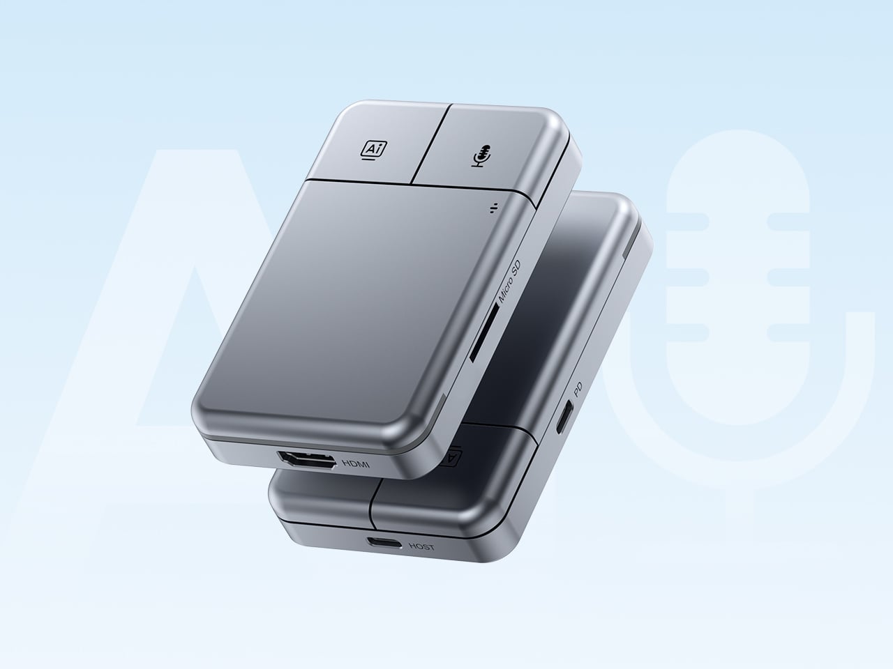
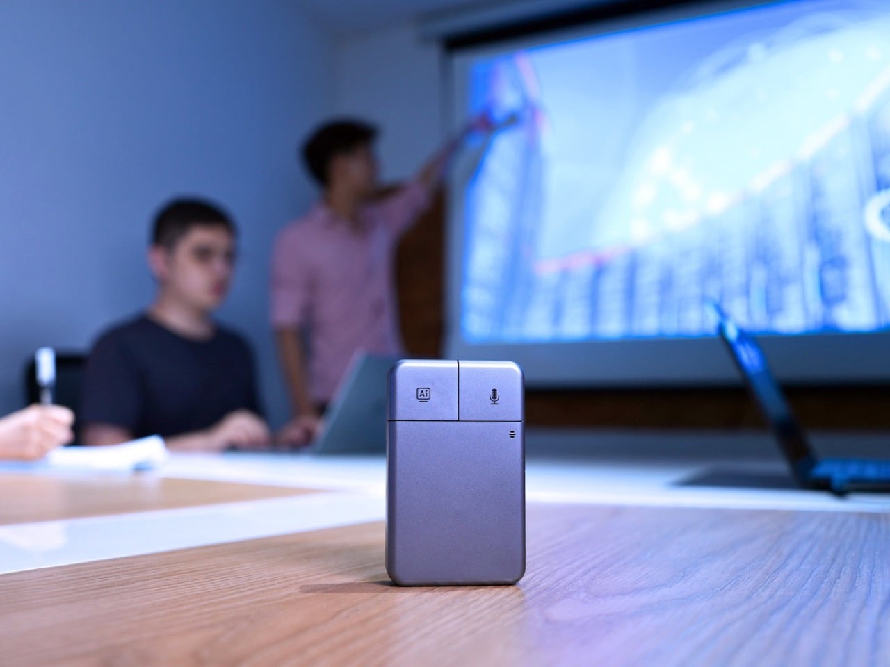
Put the DockOrb A1 on a conference table without context and someone will reach for it expecting a scroll wheel. The gray brushed-aluminum slab, the gently rounded corners, and two physical buttons in familiar left-right symmetry on the top face read entirely as peripheral hardware. What the device actually does is listen, think, and report. Powered by OpenAI GPT-5, Google Gemini 2.5 Pro, and Anthropic Claude Sonnet 4, DockOrb A1 is a professional AI meeting and desktop assistant. The label on the box says meeting assistant; the object in the hand says otherwise.

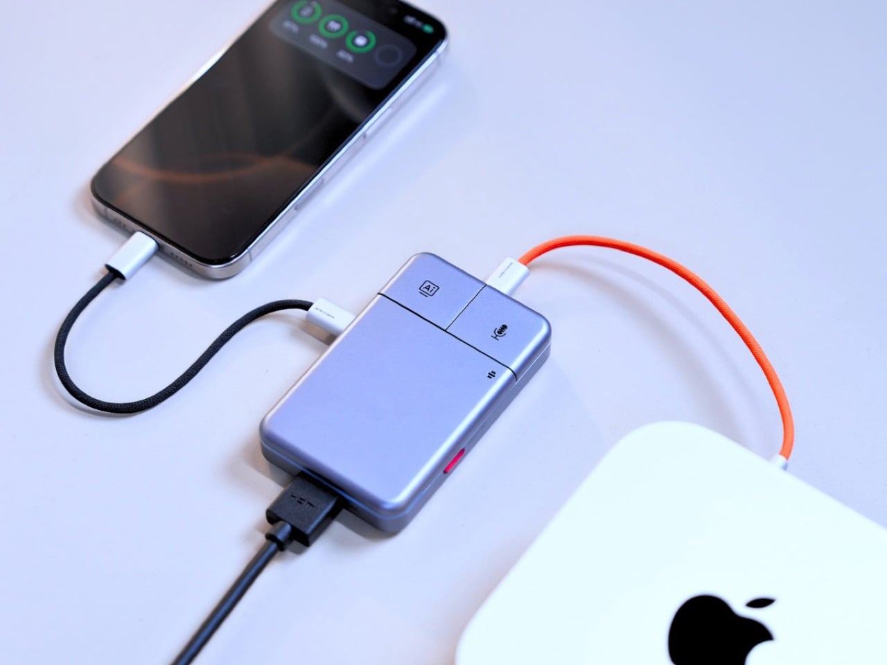
The category it operates in has been filling up quickly. Plaud built a card-thin wearable that magnetically clips to your phone. HiDock shaped a USB-C hub into a ChatGPT-powered meeting stenographer, and we covered that launch here at YD. DockOrb’s A1 lands somewhere between those two worlds, combining a fully functional multiport dock with a multi-model AI engine, 100W PD, and 4K@60Hz HDMI output. Unlike either of those predecessors, it handles display output and power delivery in the same housing, making the desk real estate argument for a single device considerably more loaded.

Designer: DockOrb

Click Here to Buy Now: $99 $149 ($50 off) Hurry! Hurry, only a few left!

The mouse silhouette is instantly familiar, and anyone who’s ever used a computer will be able to navigate the DockOrb intuitively. Two buttons arranged horizontally on a flat top surface is the correct solution for a device that needs to be operated with a single press in a meeting context, no fumbling, no menus, no distraction. With a dedicated AI button and real-time processing, DockOrb A1 analyzes ongoing discussions and provides actionable suggestions and insights, helping teams improve collaboration and make decisions more efficiently without interrupting the meeting flow. LED status is handled by a single indicator, white for idle and blue for active capture, readable from across a conference table without breaking eye contact with whoever is speaking. The problem is that all of this correct ergonomic logic is housed inside a form that the product world has spent two decades teaching people to recognize as a pointing device.

Rather than anchoring to a single AI model, the A1 integrates with Esteno, an advanced AI fusion-processing software platform. Esteno integrates multiple advanced AI models, including OpenAI GPT-5, Google Gemini 2.5 Pro, and Anthropic Claude Sonnet 4. Each model is optimized for tasks such as speech-to-text, summarization, contextual reasoning, and insight generation. By intelligently routing tasks to the most suitable model, the system delivers efficient, flexible, and high-quality meeting intelligence across different use cases. That architectural approach is genuinely unusual in this category, where most competitors commit to a single backbone and build their entire brand identity around it.

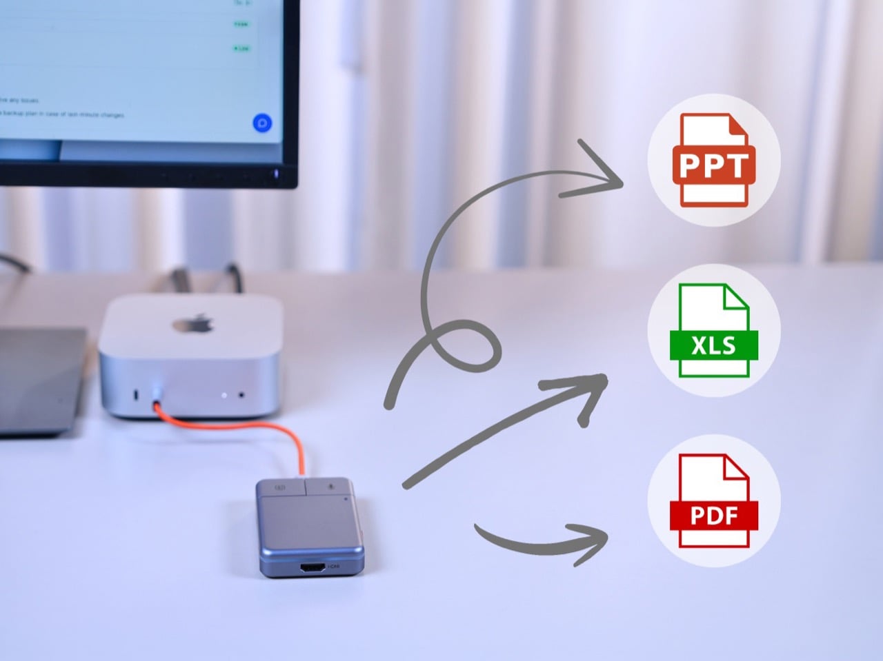
Plaud’s card-thin approach to meeting intelligence, at 2.9mm thick and MagSafe-compatible, is built on the premise that the recorder travels everywhere with you, riding on the back of your phone. The A1 has no such intention, operating through USB power without a built-in battery, with a compact design, dedicated recording button, and AI activation key for stable and simple meeting operation. In exchange for that fixed-desk commitment, it handles 4K video output at 60Hz over HDMI and 100W power delivery over USB-C, turning the dock into the single device your entire workstation routes through. After transcription and analysis, DockOrb A1 automatically generates structured meeting reports highlighting key decisions, action items, and follow-up tasks, which can be exported directly in PDF, Excel, or PowerPoint formats. Getting a properly formatted, structured report out of a recorded conversation without manual reformatting is a genuine subtraction from the post-meeting to-do list, and it’s the kind of output that separates a real workflow tool from a novelty recorder.

Following ISO and SOC data protection standards, DockOrb A1 secures recorded audio and AI-generated content through encrypted storage and processing, allowing users to export, archive, or delete files at any time while ensuring full control over their data. That’s pointed positioning in a market where corporate IT departments are increasingly skeptical about meeting audio being routed through third-party AI servers without accountability. Recordings, transcripts, summaries, and reports from multiple meetings can be stored and organized within a centralized memory archive, with AI-powered indexing and searchable meeting names, content, or dates, so teams can quickly retrieve past discussions, track long-term decisions, and build a continuously growing knowledge base. Built on a platform-independent architecture, DockOrb A1 processes audio from Zoom, Teams, Google Meet, mobile devices, and more, delivering consistent transcription, analysis, and structured outputs. Retrieving a specific discussion from three months prior becomes a search query rather than a manual scroll through unlabeled audio files.

The Kickstarter campaign prices the A1 at $89 for the Super Early Bird tier against an MSRP of $149. Shipping is targeted for August 2026, with production beginning the month prior. Plaud’s Note Pro retails at $169 on the market and handles no dock hardware whatsoever, making the A1’s value calculation sharper for anyone already planning to put a USB-C hub on their desk. The Esteno software platform tiers at $8 per month for Basic, covering 600 minutes of monthly transcription, and $15 per month for Pro, which adds 2,400 minutes, unlimited AI features, and priority processing. That’s a fully loaded meeting intelligence setup, dock and display output included, for a first-year cost that lands well under what most enterprise-grade transcription tools charge for software alone.

Click Here to Buy Now: $99 $149 ($50 off) Hurry! Hurry, only a few left!

The post This $99 USB-C Hub Also Runs GPT-5, Gemini, and Claude at the Same Time to AI Transcribe Your Meetings first appeared on Yanko Design.
The 5 Best Home Office Gifts for the Guy Who Thinks He Has Everything — He Doesn’t Have These

The home office has become the most personal room in the house — and somehow still the hardest room to shop for. He already has the monitor arm, the mechanical keyboard, the cable organizer that never actually organized anything. The things worth giving now aren’t upgrades to what he owns. They’re objects that introduce something genuinely new to how a desk feels, functions, and performs — gifts that earn a permanent spot rather than a polite shelf appearance.

The best home office gifts of 2026 share one quality: they’re genuinely hard to explain without handling them. A pen that never needs ink. A lamp that works anywhere without a single cord. A speaker bar that makes RGB feel like a design choice rather than a gamer’s checkbox. These aren’t novelties with a short shelf life. They’re tools and objects with real staying power — the kind of things you’d buy for yourself if someone hadn’t already beaten you to it.

1. Mosaic

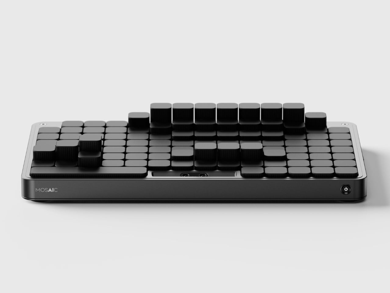
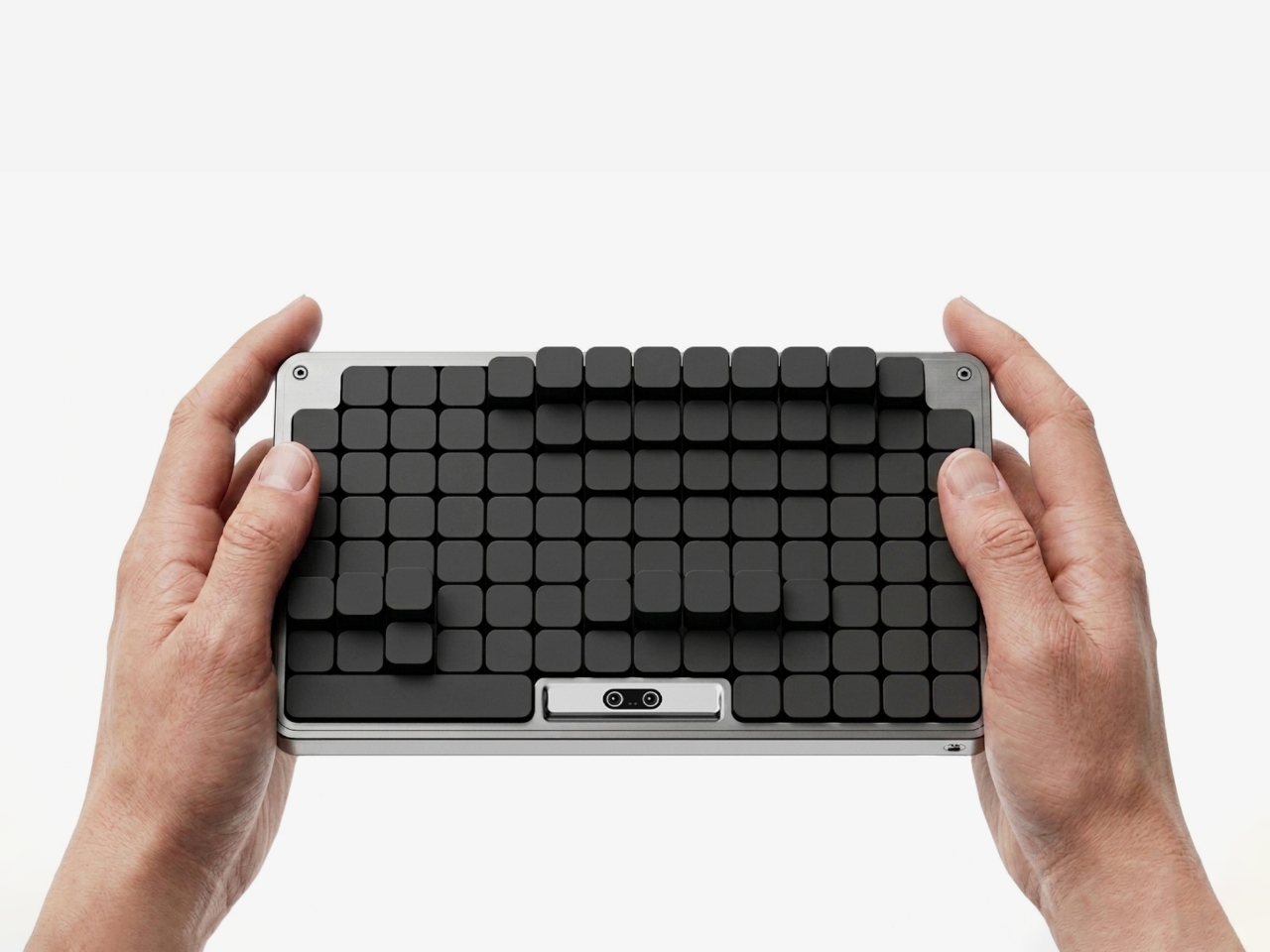
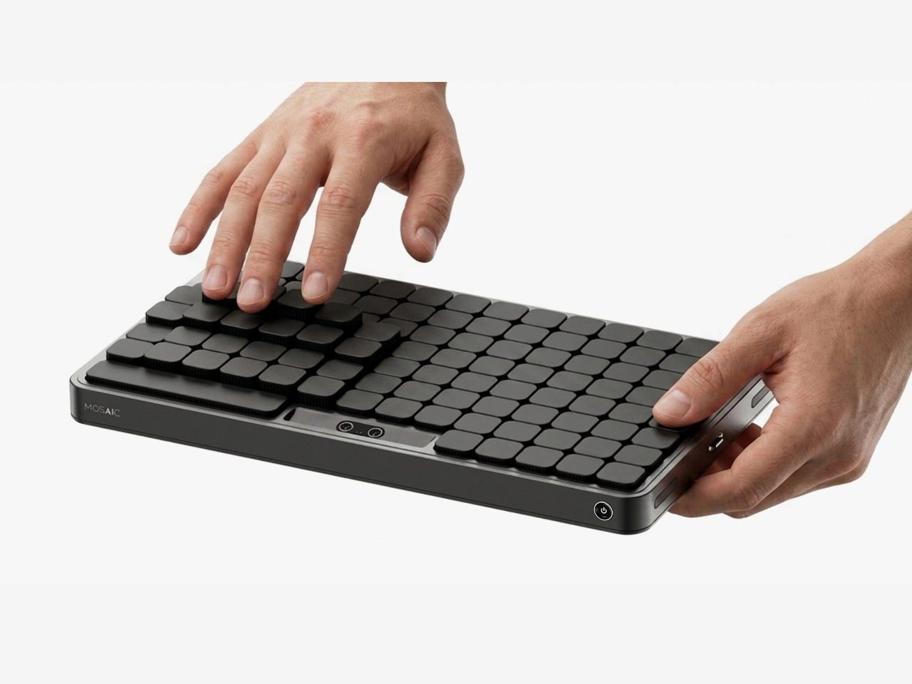
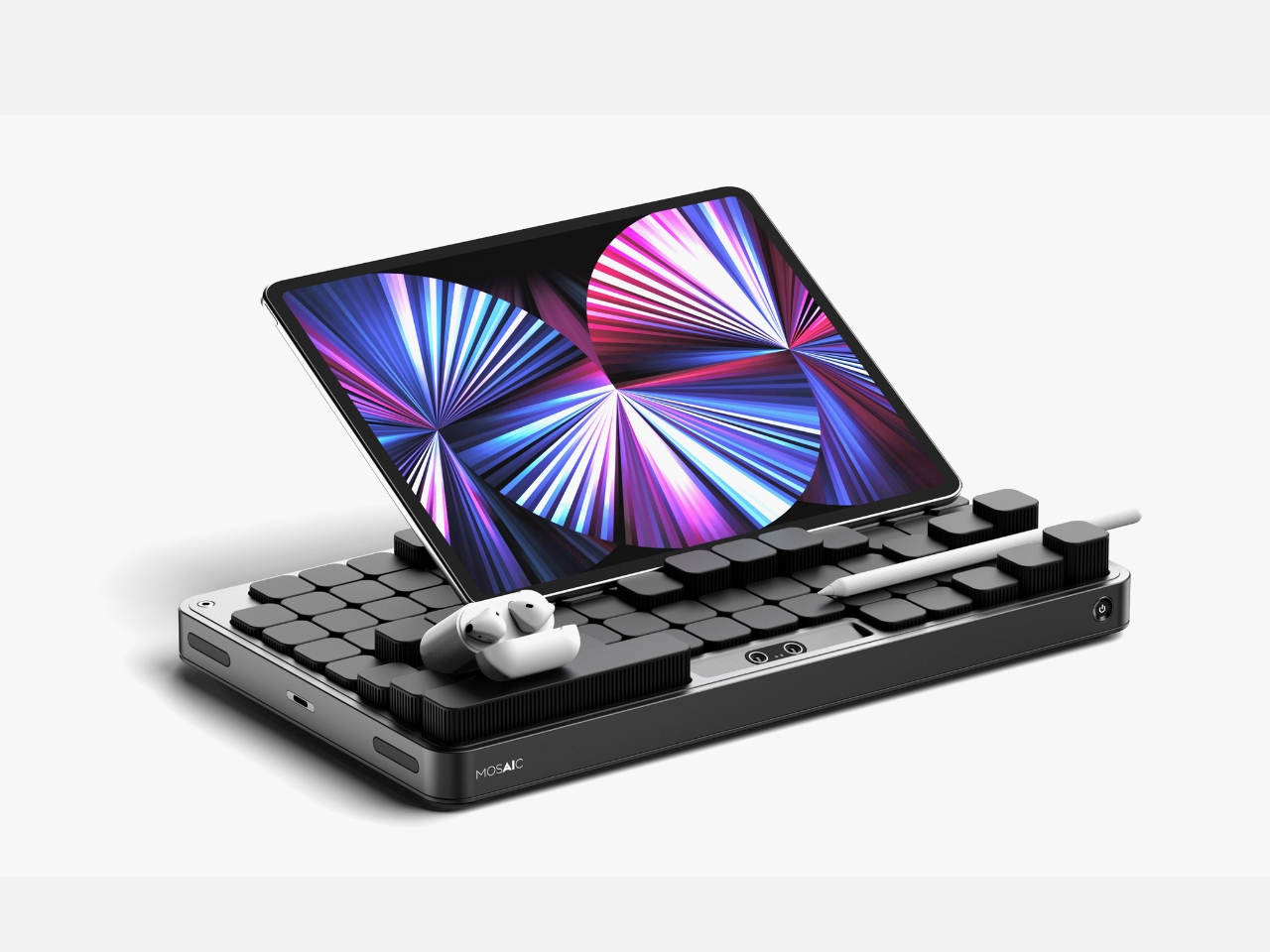
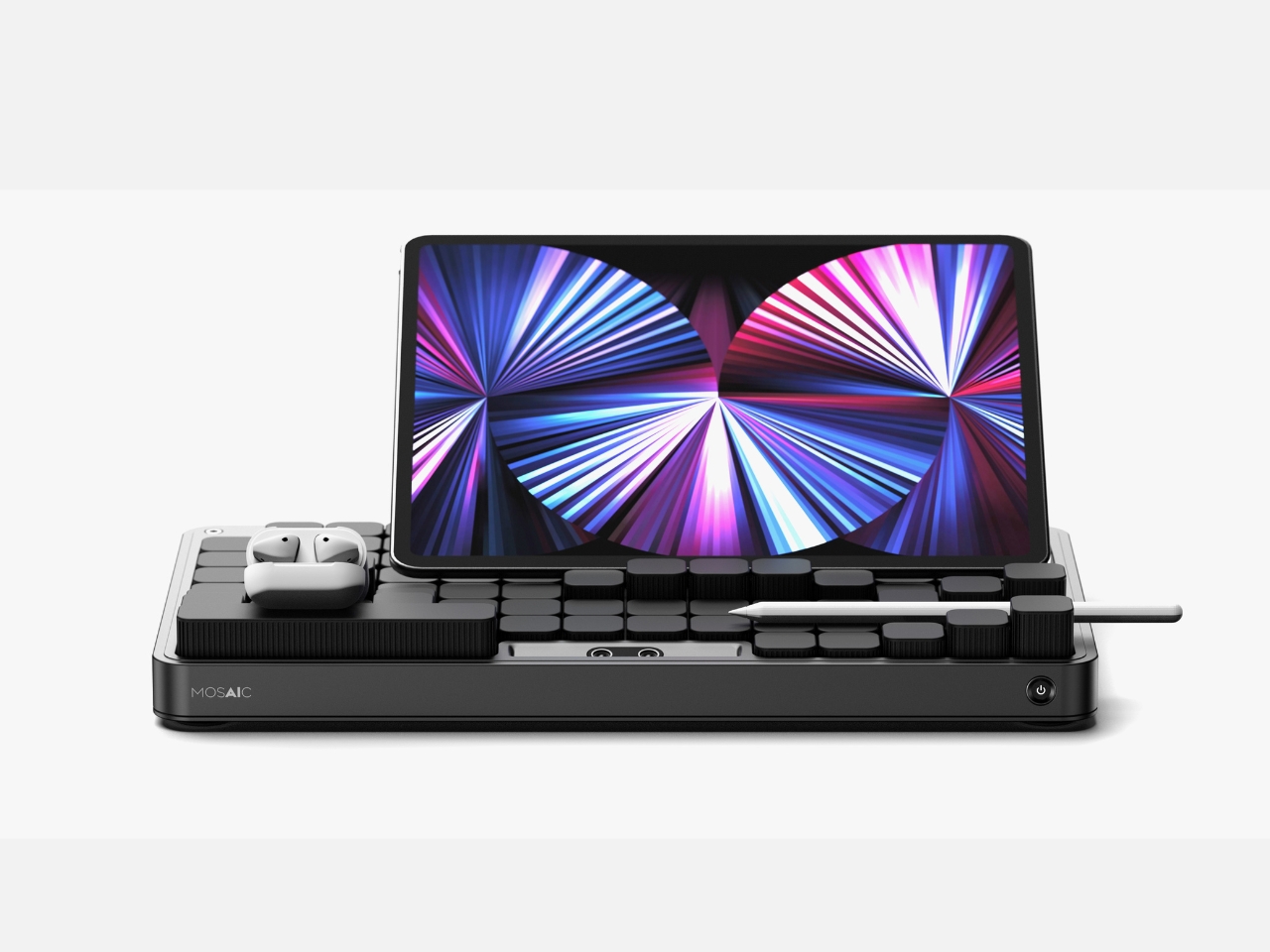
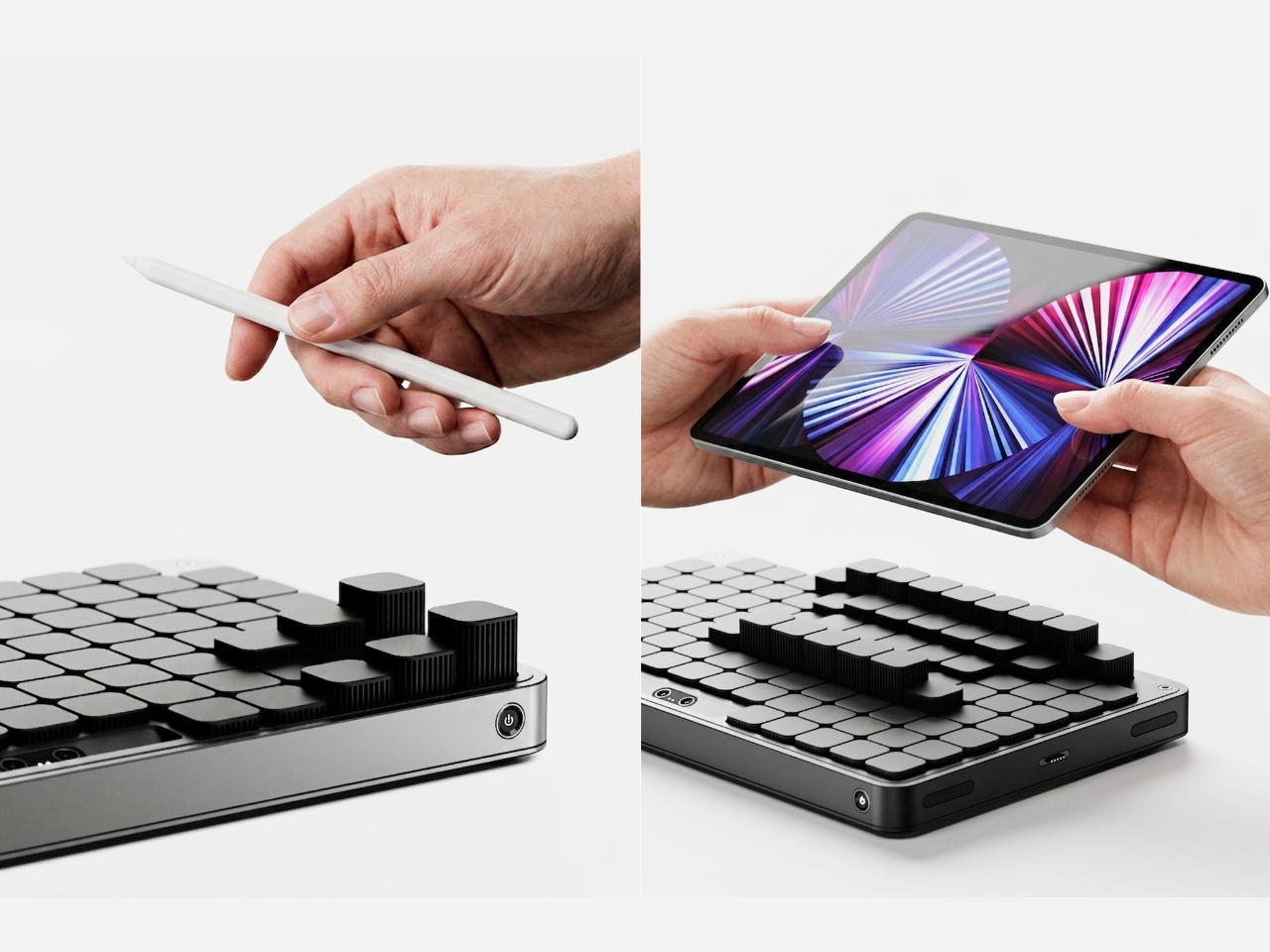
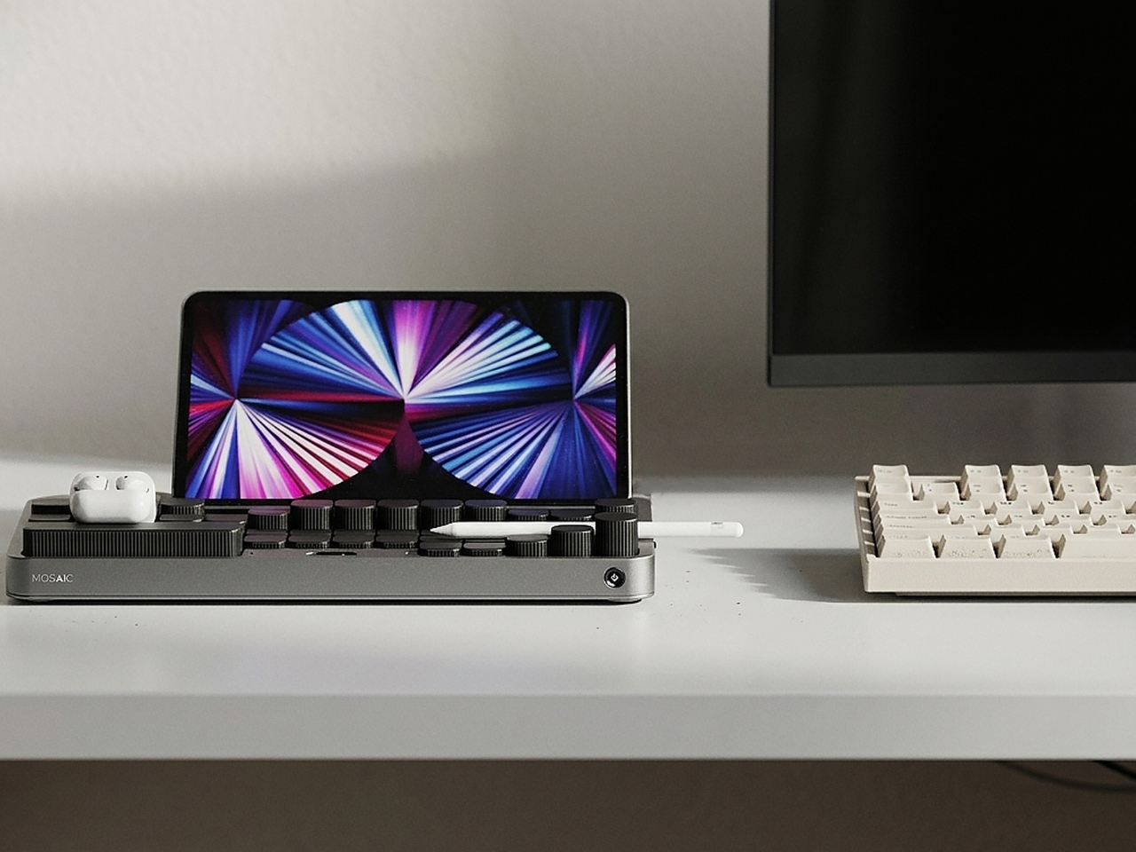
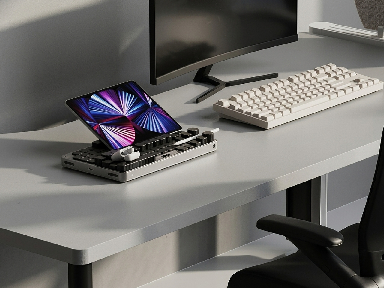
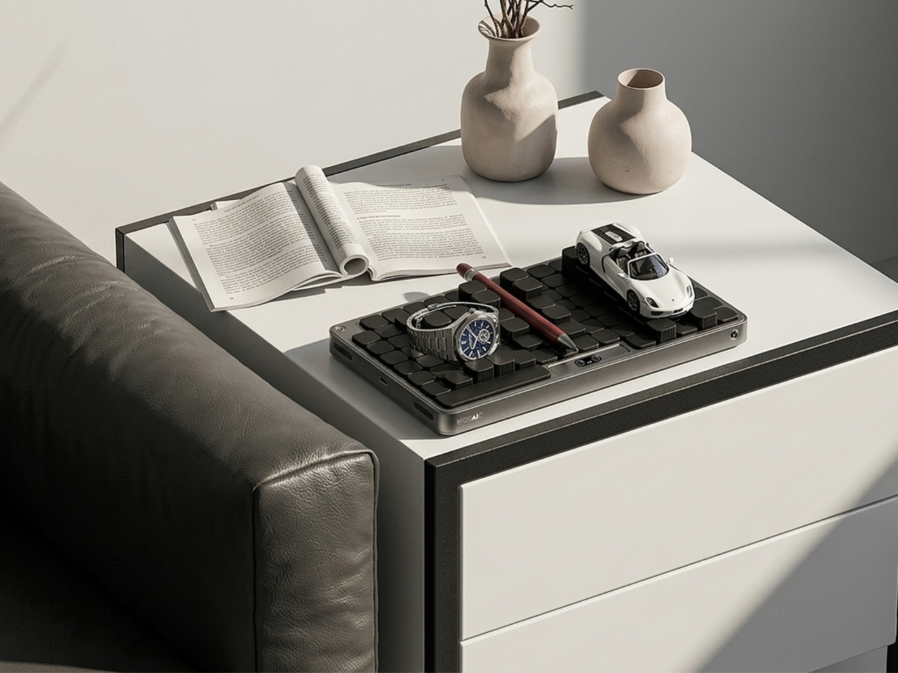
The most striking thing about the Mosaic isn’t what it does — it’s what it undoes. Most desk organizers arrive with a fixed grid of compartments and expect you to adapt, which is exactly why most of them end up abandoned in a drawer within weeks. The Mosaic flips the dynamic entirely, using AI to learn how objects get arranged and rearranged on a real desk over time, then reshaping its modular surface to match those habits rather than a designer’s assumptions about them.

What that looks like in practice is a tray that never quite looks finished — and that’s entirely the point. As a setup evolves, it moves with you, accommodating a new phone dock here, a relocated notebook there, without requiring a full reset. The dark modular surface carries a kind of purposeful architecture that reads as considered rather than cluttered. For anyone who has bought a beautiful organizer only to abandon it two weeks later, the Mosaic is the version that actually earns its permanent place.

What We Like

  • Learns and adapts to actual desk behavior instead of imposing a fixed layout
  • Modular surface reads as architectural on the desk — purposeful rather than busy

What We Dislike

  • AI calibration takes time before it fully understands desk patterns and adjusts accordingly
  • Darker aesthetic may not suit lighter or more minimal setups

2. Precision Sakura Metal Puzzle

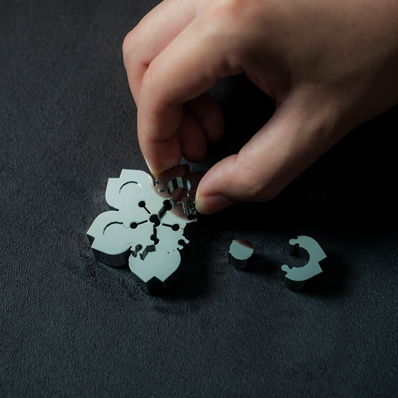
The Precision Sakura Metal Puzzle is the kind of object that earns its spot on a desk by doing almost nothing visible — until you pick it up. Machined to a 0.004mm tolerance, it captures the shape of Japan’s most iconic flower in a set of pieces so similar to each other that distinguishing them becomes its own discipline. No solution is included. The intent was never to finish it quickly. The intent is to spend sustained, satisfying time with something that genuinely demands your attention.

For the person who says he has everything, this is a rare thing: an object that introduces something entirely new to the desk. It works as a precision puzzle and a sculptural display piece simultaneously, the polished metal finish clean enough to hold its own against far more expensive objects. Even unsolved, it belongs on the desk. When you finally do close it, the satisfaction is the kind no app or productivity widget has ever come close to delivering.

Click Here to Buy Now: $299.00

What We Like

  • 0.004mm machining tolerance makes every piece feel intentional and genuinely premium
  • Functions as desk sculpture whether actively mid-solve or sitting completed

What We Dislike

  • No solution included — a real test of patience for anyone expecting a guided experience
  • Small scale means pieces are easy to lose on a desk that isn’t kept clear

3. Pininfarina Aero Ethergraf

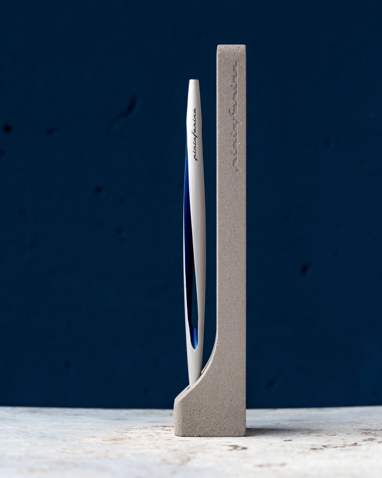
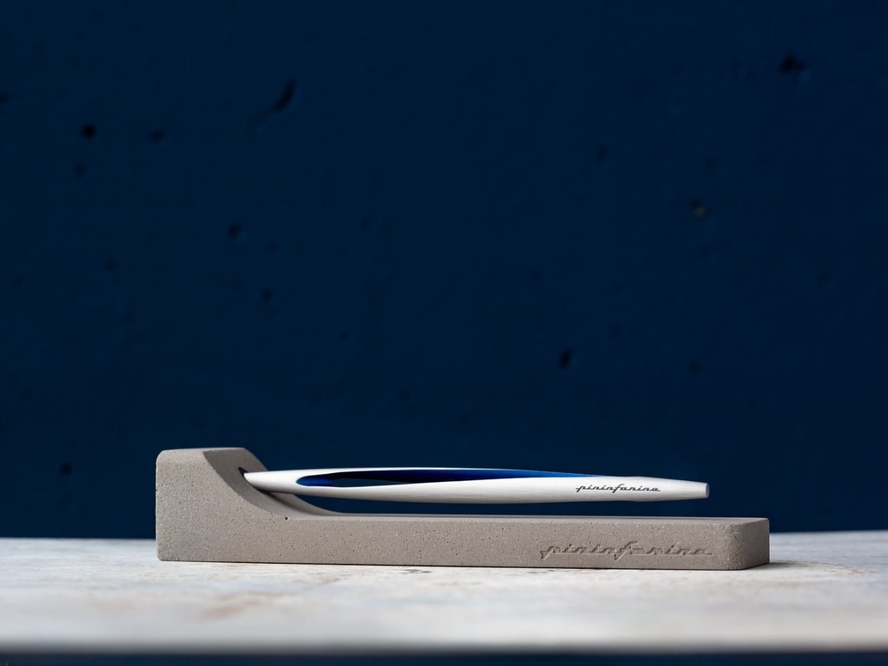
Pininfarina’s name lives in the curves of Ferraris and Maseratis, but the Aero Ethergraf makes a more interesting argument — that restraint is the harder design problem. Made from aerospace-grade aluminum, it weighs 17 grams and measures 160mm, numbers that don’t fully prepare you for how it sits in the hand. The tip is Ethergraf, a patented metal alloy that writes through oxidation, leaving a permanent mark on paper without a single drop of ink. No cartridges. No refills. No maintenance, ever.

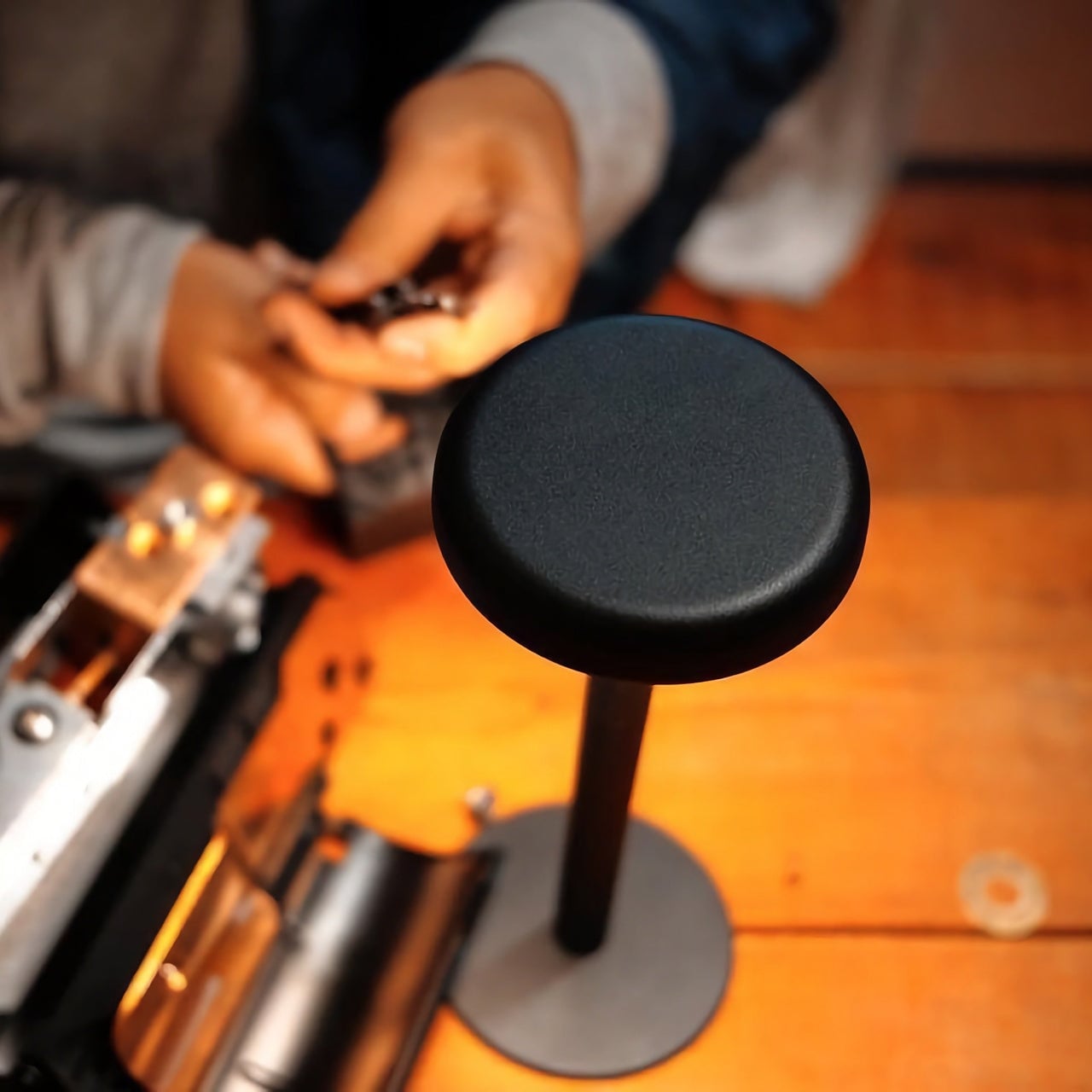
It ships paired with a raw concrete stand — a deliberate material contrast that, on a desk, reads as sculpture rather than office supply. Handcrafted in Italy and rooted in a technique older than the modern ballpoint, the Aero makes every other writing instrument on the desk feel temporary by comparison. For a man who already has everything, it’s a quiet, permanent counterargument. Because nothing else quite like it exists on any desk, anywhere.

What We Like

  • Ethergraf tip writes indefinitely through oxidation — zero maintenance, zero refills, ever
  • Concrete stand creates genuine material tension that turns the pen into desk sculpture

What We Dislike

  • Performs best on dedicated paper — not every standard notebook will reveal the tip’s quality clearly
  • Concrete stand adds bulk that may feel heavy in a stripped-back minimal setup

4. Anywhere-Use Lamp

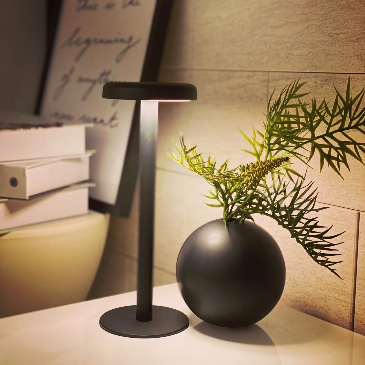
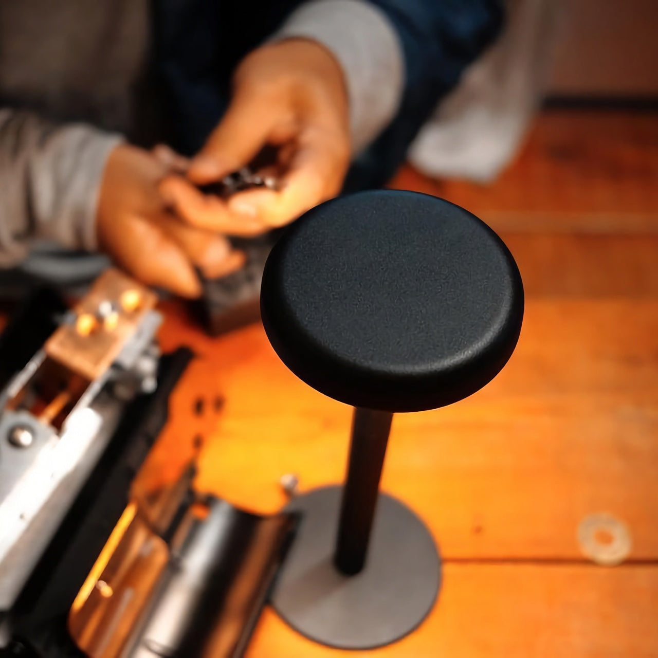
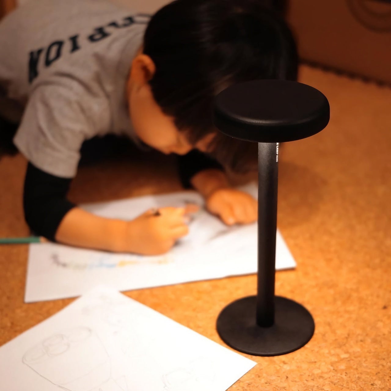
The Anywhere-Use Lamp starts from one honest premise: good light shouldn’t be tethered to a wall. Running on four AA batteries, it removes every cord and cable from the equation, making it as functional in a hotel room, on a bookshelf, or in an outdoor corner as it is on a permanent desk. Six high color rendering LEDs produce warm, soft output that settles naturally into a space without announcing itself as the room’s loudest design decision. The result is light that feels like it always belonged where you put it.

Available in black, white, and an Industrial edition with a scratch-detailed metal base that treats surface wear as character rather than damage, it holds across every desk aesthetic without effort. Pressing any edge of the cap cycles through four brightness levels with a haptic click that makes even that small interaction feel considered. Modular construction means it breaks down flat for a bag. At $149, the Anywhere-Use Lamp is one of the most versatile objects on this list — earning its price through location freedom alone, before you’ve even switched it on.

Click Here to Buy Now: $149.00

What We Like

  • AA battery power removes all cord dependency and gives it genuine, unconditional location freedom
  • Industrial edition’s scratch-detailed base treats material wear as intentional character, not a flaw

What We Dislike

  • AA batteries mean ongoing replacement costs compared to a rechargeable alternative
  • Four brightness levels may feel limited for those who prefer more granular control over output

5. Edifier Melo Bar

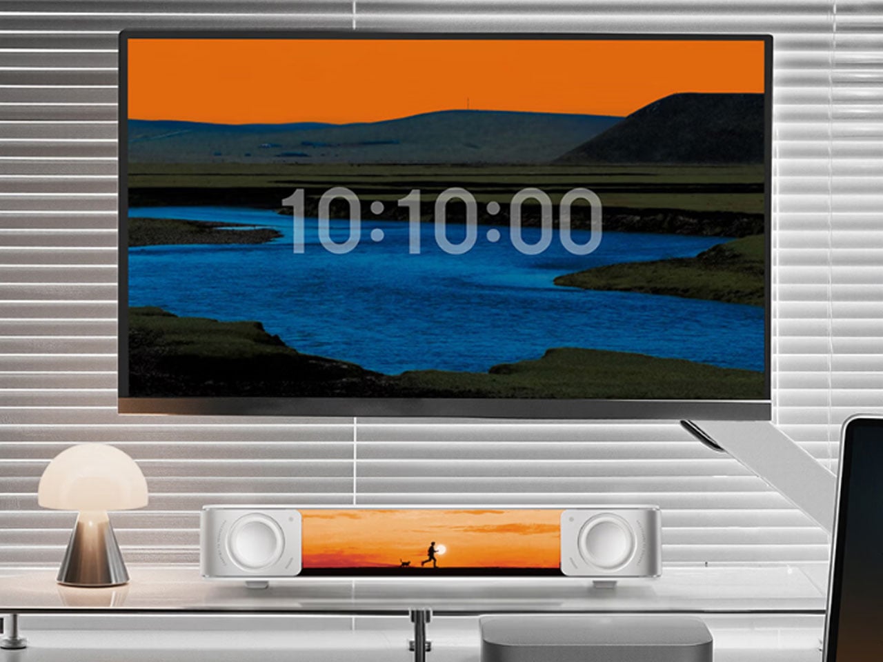
The Edifier Melo Bar does the thing most desk speaker bars never quite pull off — it makes RGB feel like a design decision rather than a hardware checkbox. Three distinct audio modes handle music, gaming, and movie listening, each tuned differently and each backed by near-field sound clear enough to remind you how much you’ve been tolerating laptop audio. The interchangeable front panels are the detail that separates it from every other bar on the market, letting the object adapt to the desk instead of demanding the desk adapt around it.

The light output is deliberately understated for something that supports 16.8 million colors and 15 carefully tuned lighting themes. It frames a setup rather than overwhelming one — adding ambient depth without demanding that the desk revolve around it. For a home office that already has the monitor, the keyboard, and the cable routing handled, this is the piece that completes the sensory experience rather than complicating it. Sound and light are treated as a single designed object. That’s harder to achieve than it sounds, and the Melo Bar gets it consistently right.

What We Like

  • Interchangeable front panels let the speaker blend into or intentionally accent any desk aesthetic
  • Three dedicated audio modes handle every use case without asking for a compromise

What We Dislike

  • RGB-heavy profile may feel redundant on setups that already favor a completely dark aesthetic
  • Near-field performance is strongest close to the desk — less effective across a larger open room

The Right Desk Tells You Something About the Person Behind It

Each of these five objects earns its place for reasons that go further than specs. The Mosaic learns. The Sakura puzzle challenges. The Aero Ethergraf lasts forever. The Anywhere-Use Lamp untethers. The Melo Bar performs and illuminates. None of them exist because a spec sheet demanded them — they exist because someone asked what a desk should actually feel like and then had the discipline to build the answer without compromise.

The man who says he has everything doesn’t need another gadget. He needs the object he didn’t know was missing — and all five of these are exactly that. Each carries intention, permanence, and the kind of quiet confidence that makes a desk feel genuinely complete rather than just assembled. Buy one, and it earns its keep. Buy all five, and you’ve given someone the most considered setup they’ve ever worked from.

The post The 5 Best Home Office Gifts for the Guy Who Thinks He Has Everything — He Doesn’t Have These first appeared on Yanko Design.
8 Best Digital Nomad Gadgets of 2026 That Make Your Laptop Bag Look Like a Design Studio

The bag you carry into every café, co-working space, and airport lounge tells a story before the laptop opens. For years, that story was graceless — a tangle of cables, a charger shaped like a building block, a mouse that felt borrowed from a hotel business center. Nomad gear was assembled around survival rather than intention. Every surface it landed on looked worse for the visit.

Something has shifted. The tools built for people who work from everywhere are beginning to reflect the same care as the work itself. These eight gadgets share a quality that is harder to name than it is to recognize: they look considered. Each one earns its place in the bag not just by solving a problem, but by solving it in a way that leaves nothing clumsy on the table.

1. OrigamiSwift Folding Mouse

The travel mouse problem has never been about making mice smaller. Smaller mice create smaller hand cramps. The real solution is transformation, not compression, and the OrigamiSwift understands this from the geometry up. Borrowing the logic of its name, it collapses to card-sized flatness and snaps open — via magnetic clips — into a fully contoured ergonomic mouse that actually fits a palm. At 40 grams, it weighs less than a pen and disappears into a jacket pocket without announcing itself.

The polygonal folded surface earns its grip through geometry rather than rubber texture, which gives the form a visual coherence that most travel mice never achieve. Bluetooth 5.2 connects without a dongle, and three months of battery life on a single USB-C charge keeps it out of the daily rotation entirely. For the nomad whose work demands precision that a trackpad fails to deliver in the critical stretch of an afternoon, this removes every excuse for not carrying a proper mouse.

Click Here to Buy Now: $85.00

What we like:

  • Folds to true card-size flatness without compromising full ergonomic comfort when open, which is the only trade-off that actually matters in a travel mouse
  • Three-month battery life means it charges about as often as a passport gets stamped

What we dislike:

  • The hinge mechanism is structurally the most complex part of the design, and daily fold cycles over the years could introduce wear that a solid-body mouse would never accumulate
  • Scroll feedback is softer than premium stationary alternatives, something certain users notice immediately, and others never register

2. Lana Laptop Stand

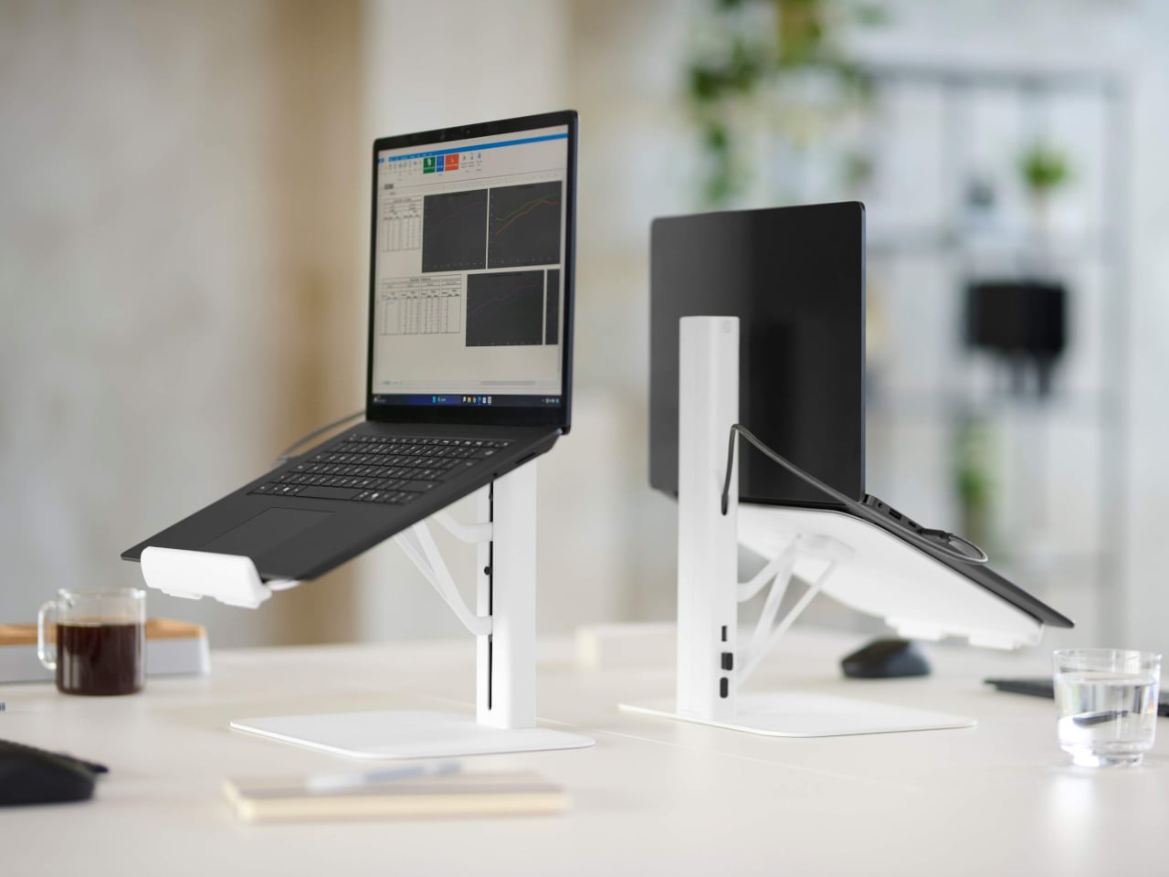
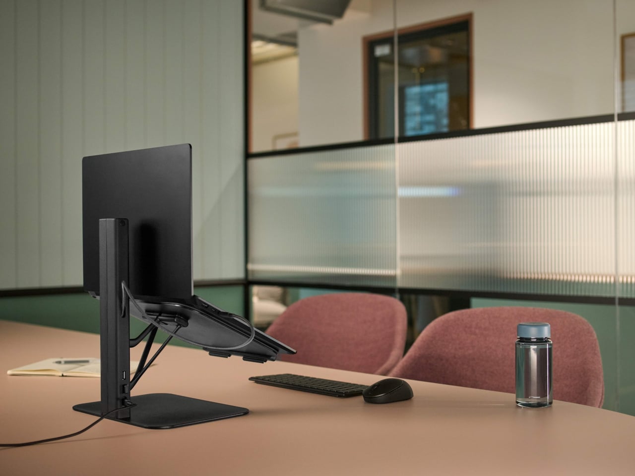
Working from borrowed surfaces has always involved a compromise that people accept rather than solve. Laptop too low, neck forward, shoulders rounded inward — the session ends the same way regardless of how productive the hour before felt. The Lana laptop stand from Colebrook Bosson Saunders is a compact riser with a USB hub integrated directly into its spine, meaning a single USB-C cable connects the laptop, keyboard, mouse, and power simultaneously. The temporary desk stops feeling improvised from the moment everything clicks into place.

Lana was designed specifically for the shared spaces nomads actually inhabit: pods, booths, communal benches — furniture built for lunch breaks, not extended output. The footprint is small enough for a café booth table, but tall enough to bring the screen level. A 12-year warranty from a British-designed and engineered product communicates something important. This is not a disposable gadget but a long-term fixture in a kit that gets used every single day, on surfaces that were designed for everything other than this.

What we like:

  • An integrated USB hub means one cable manages everything, collapsing the connectivity setup into a single plug-in rather than a small archaeology project
  • The 12-year warranty reflects an engineering confidence that most portable accessories never earn the right to claim

What we dislike:

  • Works best alongside an external keyboard, meaning it adds an item to the bag rather than replacing one
  • Price sits at the premium end of the laptop stand category, which is a real consideration for a product that functions before anything else as a riser

3. Nimble WALLY Pro Wireless

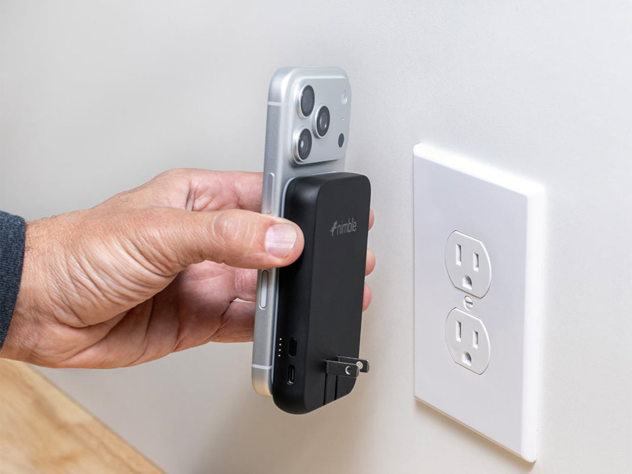
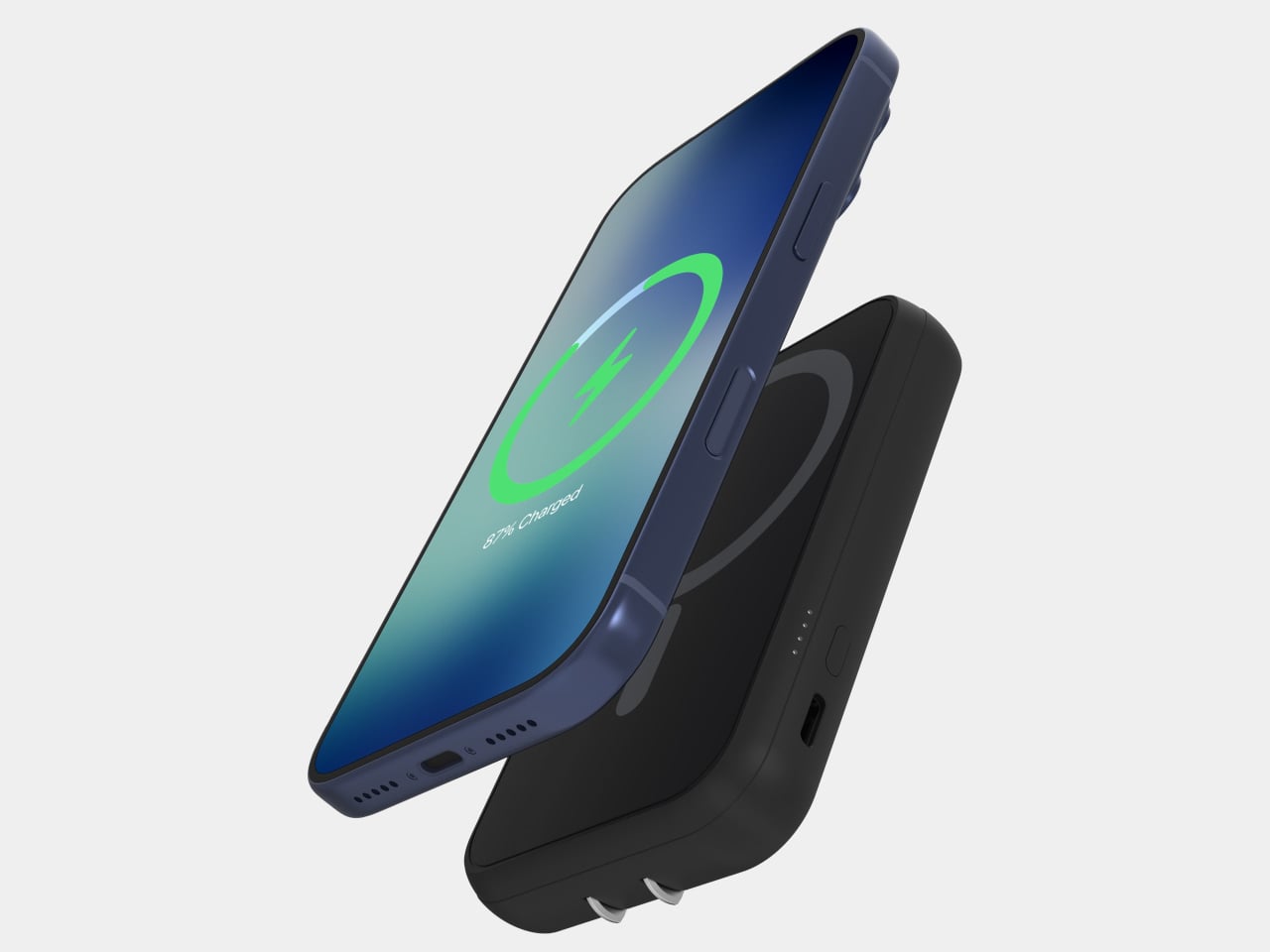
Traveling with electronics has long meant traveling with three separate charging accessories: a wall charger for the laptop, a power bank for the phone, and a wireless pad for overnight top-ups. Most people pack all three, use each one just enough to feel justified in carrying it, and leave one at a hotel room in a different country at least once a year. The Nimble WALLY Pro Wireless is a direct answer to that pattern. At 0.61 inches thin, it functions as a wall charger, a 5,000mAh power bank, and a Qi2 wireless charging pad, simultaneously.

Plug it into any outlet globally using folding prongs, and it charges its own internal battery while sending up to 15W wirelessly to a phone placed on its back. Pull it from the wall, and it switches to power bank mode without missing a step. The housing is 100% post-consumer recycled plastic, carbon-neutral certified, TSA-approved, and biodegradably packaged. At $49.95, it removes a genuine category of bag-packing anxiety rather than simply reducing it, which is the kind of simplicity that only feels obvious after someone else has done the work.

What we like:

  • Three accessories in one device, at under six ounces, address the entire charging layer of the nomad kit without requiring any rethinking of the rest
  • Recycled housing and carbon-neutral certification make the sustainability story as important as the engineering story

What we dislike:

  • A 5,000mAh capacity handles phones and earbuds cleanly, but will not meaningfully extend a laptop’s battery under any serious workload
  • Wireless charging tops out at 15W, which suits passive overnight top-ups more than emergency fast-charges before a gate closes

4. Rolling World Clock

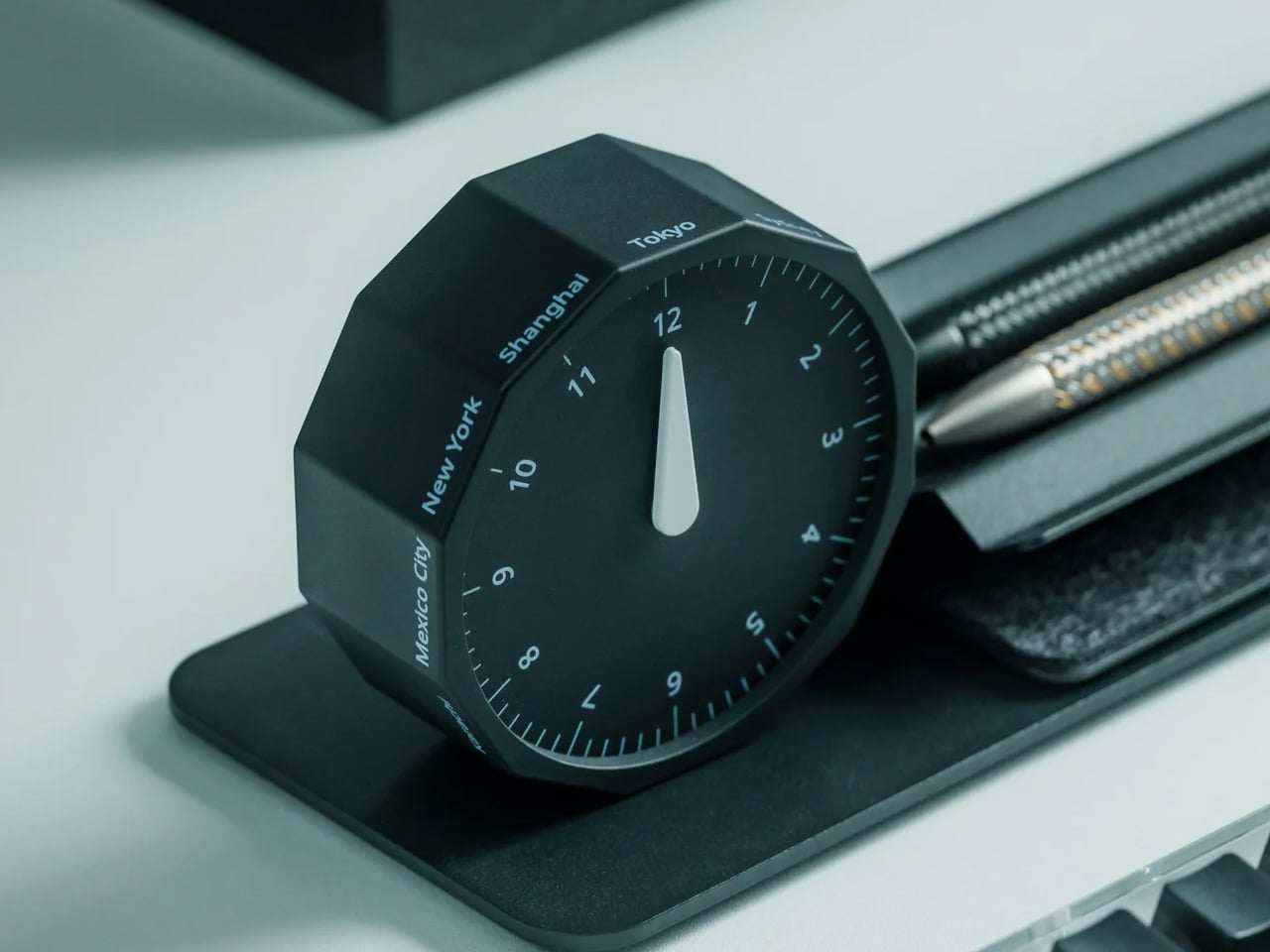
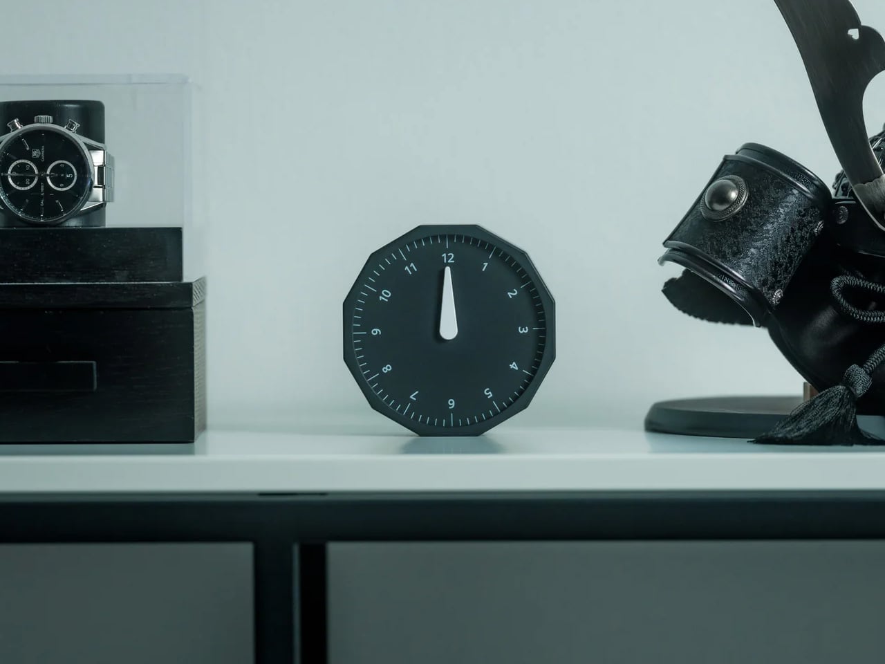
Working across time zones involves an arithmetic problem most people solve by unlocking a phone and navigating to a setting buried several menus deep. The Rolling World Clock removes the phone from that interaction entirely. A 12-sided dodecahedron, one analog hand per face, each face assigned to a city: roll it to any side, and it reads the correct local time in that location. The entire interaction takes less time than the lock screen.

Available in black and white at $49, it occupies the surface area of a hockey puck and sits at the precise intersection of functional object and desk sculpture. The design works because it resists adding more — no digital layer, no companion app, no charging port. On a surface full of screens and cables, a clock answered by physically rolling it is the object every person at the adjacent table wants to pick up and examine. That kind of unselfconscious utility is genuinely rare at any price.

Click Here to Buy Now: $49.00

What we like:

  • Rolling to read a time zone is a screen-free physical gesture that removes a phone unlock from the workflow without requiring any habit change
  • The form communicates its function completely without a label, a tutorial, or a single button

What we dislike:

  • Twelve faces cover most regular international relationships, but nomads managing more than twelve cities regularly will need a secondary solution
  • The face-to-city mapping takes roughly a week of regular use before the interaction becomes fully automatic

5. RedMagic Power Bank with Flight Mode

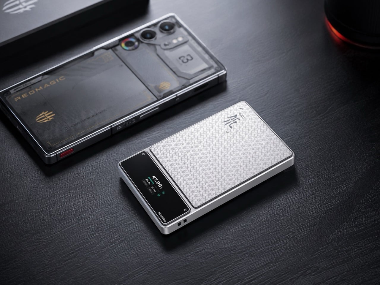
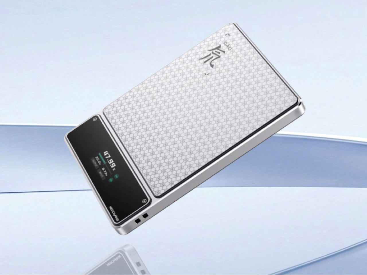
Aviation rules around lithium batteries have changed significantly in 2026 — multiple major carriers now ban in-flight power bank use entirely, and the regulations are still tightening. Most power bank manufacturers have responded to this by doing nothing. RedMagic responded by designing for the regulation directly. Their power bank includes a dedicated flight mode switch that disables active output functions on command, aligning with carrier requirements that previously involved gate-side arguments about a device nobody could quickly verify.

The one-touch flight mode cuts wireless transmission instantly, transforming a potential boarding problem into a one-press demonstration. Beyond the compliance story, the honeycomb aluminum finish suggests RedMagic wants you to leave this on your desk even when you are not traveling — a power bank that earns surface rights rather than disappearing into a pocket. For a brand that built its credibility making hardware for people who care about how their tools look and feel, the application to travel infrastructure is a natural extension rather than a category stretch.

What we like:

  • The dedicated flight mode switch turns a potential boarding conflict into a physical demonstration rather than a verbal explanation
  • Honeycomb aluminum finish gives the device a desk presence that most power banks, designed purely for pocket anonymity, never consider

What we dislike:

  • The flight mode feature is more useful than ever, but represents a design workaround for a regulatory gap that clearer aviation policy could simply close
  • Gaming-adjacent branding will read as the wrong register for some professional nomads who prefer their gear to carry no identity beyond the work

6. Centarui80

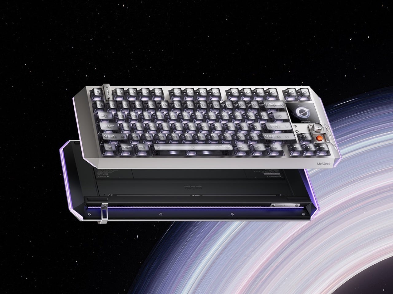
Fifty years of keyboard design produced better switches, heavier plates, and an entire hobbyist economy built around sound profiles — but the object itself stayed stubbornly analog in its ambitions. The Centauri80 breaks that contract. MelGeek embedded a 1.78-inch OLED touchscreen directly into the board at 325 PPI, the same pixel density as an Apple Watch face, alongside a physical rotary encoder called the Super Dock. Live wallpapers, macros, and lighting adjustments happen on the board itself, without alt-tabbing out of whatever the afternoon actually requires.

The engineering underneath supports the ambition. Six microcontroller chips drive TTC Flip King Hall Effect magnetic switches to 0.125ms latency at an 8000Hz polling rate — numbers that make the 80% aluminum unibody the most responsive input device on most desks, not just the most considered one. At $299 from MelGeek’s own store, the Centauri80 competes directly against the Wooting 60HE and the rest of the Hall Effect field while carrying something none of them have: a visual interface that turns the keyboard into a control surface with its own design language.

What we like:

  • A 325 PPI OLED screen embedded into the board makes macro and lighting control a keyboard-side interaction rather than a software detour through a menu nobody enjoys navigating
  • Hall Effect magnetic switches at 8000Hz polling deliver the kind of input responsiveness that makes every other keyboard in the same price range feel noticeably behind

What we dislike:

  • An onboard touchscreen and six microcontroller chips add genuine complexity to a device category where simpler hardware has historically outlasted ambitious feature sets
  • At $299, the Centauri80 is considered a purchase rather than an impulse one — the OLED and polling rate premium asks for conviction before checkout

7. Orbitkey Desk Mat

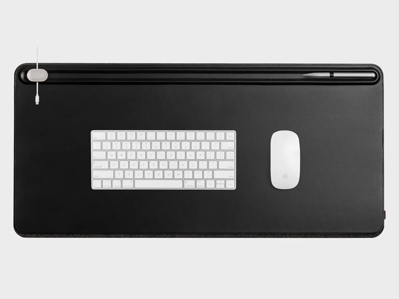
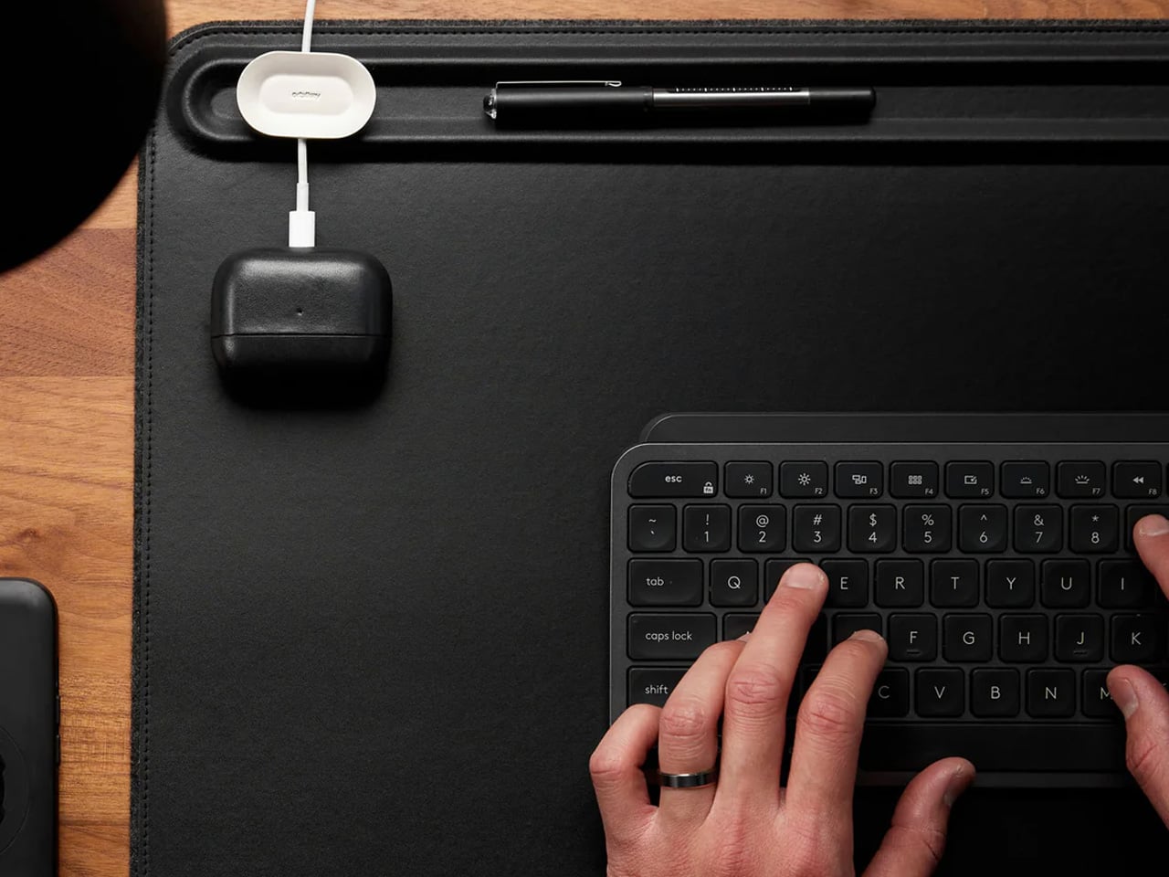
A borrowed table is still a borrowed table until something on it says otherwise. The Orbitkey Desk Mat doesn’t announce itself — it simply reframes the surface it occupies. Full vegan leather across the top, recycled PET felt underneath, a document slot along the upper edge, and Qi wireless charging embedded invisibly into the upper-right zone. Place a phone there, and it charges. No cable surfaces anywhere in the composition. The mat claims the desk and turns it into something that belongs to you, at least for the session.

It rolls tight enough to travel inside most laptop sleeves, deploys completely flat, and develops a surface character over months of use that reads as the quality indicator it actually is. Magnetic cable holders keep charging cables from drifting off the edge mid-session. A pen loop stitched into the left side holds exactly one pen. These details were thought through rather than listed on a spec sheet, which is the difference between a product designed for desk photography and one designed for daily work. At $99.90, it is the kind of surface investment that compounds quietly over the years.

What we like:

  • Wireless charging disappears so cleanly as a feature that it stops being a feature and becomes simply a behavior: phone down, phone charges
  • Rolls compactly enough to travel inside a laptop sleeve, adding no dedicated bag volume to the packing equation

What we dislike:

  • Wireless charging tops out at 10W, making it a passive convenience layer rather than a serious fast-charging solution
  • The leather surface requires periodic conditioning at the fold line after extended travel use to maintain its original finish

8. HubKey Gen2

Every modern ultrabook ships with two USB-C ports. Every modern nomad workflow needs more than two ports running simultaneously. The HubKey Gen2 resolves the gap with eleven connections in one compact 7 × 7 × 3cm cube: dual 4K/60Hz HDMI outputs, USB-A 3.1, USB-C 3.1, SD and TF card readers, 2.5Gbps ethernet, a 3.5mm audio jack, and 100W power delivery through a single cable into the laptop. The port problem disappears from the workflow rather than being permanently managed around it.

The programmable shortcut keys and central control knob on the top panel are what distinguish this from a standard travel hub. Volume, mute, display toggle, and screenshot become physical actions handled by the left hand while the right hand stays on the mouse. For nomads driving external displays across video calls and creative sessions in co-working spaces, turning a connectivity device into a tactile control surface is the kind of upgrade that feels immediately obvious on the first day and genuinely irreplaceable from the second. The cube form fits anywhere without announcing itself.

What we like:

  • Dual 4K/60Hz HDMI outputs let you build a two-monitor workstation from a single cube that fits inside a laptop sleeve pocket
  • Programmable shortcut keys and a control knob give the desk a physical control layer that no other travel hub currently offers

What we dislike:

  • Tightly spaced ports mean thick cables or large flash drives can crowd each other along the edges during a fully loaded setup
  • The cube form, while genuinely compact, is less pocketable than flat card-style alternatives when volume and weight are being counted carefully

The Desk You Build Is Better Than the One You’re Given

The kit assembled here is not a packing list. It is a position that the tools a nomad carries every day deserve the same design attention as the work those tools are used to produce. A mouse that folds with geometric logic. A clock answered by rolling it. A charger that stopped being three separate objects. A hub that turned its top surface into a control panel. Each object solves a specific problem in a way that leaves the desk better than it found it.

The best version of working from anywhere is not about freedom from a particular address. It is about arriving at any table with a kit that makes the table feel chosen. These eight products do that together in a way that none of them manages alone — and that is the standard worth holding to when every other square centimeter of the bag is already spoken for.

The post 8 Best Digital Nomad Gadgets of 2026 That Make Your Laptop Bag Look Like a Design Studio first appeared on Yanko Design.
90,300 Empty Offices Are Becoming Apartments Across the US. “Adaptive Reuse” Just Hit Critical Mass.

Across America, downtown office towers sit half lit and half leased, their elevators still running, their HVAC systems still humming, their floorplates waiting for people who are never fully coming back. At the same time, rents keep climbing, vacancy stays tight in the places people actually want to live, and homelessness pushes further into public view in city after city. The contradiction is so stark it barely needs interpretation. The office building has too much space and hardly any occupants. Millions of prospective homeowners, however, have no permanent place to call their residence.

More than 90,300 apartments are now planned through office-to-residential conversions across the U.S., marking a dramatic expansion of adaptive reuse at the exact moment cities need housing most. For years, adaptive reuse lived in architecture circles as a smart, sustainable idea. If you’ve ever seen an old warehouse repurposed into a club, a factory into an office space, or a tiny rural church into a quaint home, that’s adaptive reuse – the ability to take a structure and adapt your needs around it without demolition and rebuilding. Now it is entering the market at national scale, and forcing cities, developers, and designers to answer a blunt question. When housing demand is urgent and office demand has collapsed, how long can empty office buildings maintain the status quo instead of transforming into meaningful housing?

From Virtue to Volume

RentCafe’s March 2026 report confirmed what a lot of people in real estate and architecture had been watching build for years: 90,300 U.S. apartments are currently mid-conversion from former office buildings. That figure is up 28% year over year from 70,600 units in early 2025, and it is nearly four times the total recorded in 2022. New York City alone has 16,358 units in the pipeline. Washington, D.C. follows with 8,479. Chicago has 4,360. Los Angeles, 4,340. Dallas, 3,966. Denver, 2,991. Philadelphia, 2,697. Atlanta, 2,642. Cleveland, 1,771. Cincinnati, 1,770. Three cities, Philadelphia, Denver, and St. Louis, more than doubled their pipelines in a single year, recording year-over-year jumps of 119%, 114%, and 110% respectively. Office conversions now account for 47% of all 193,900 future adaptive reuse projects nationwide, up from 42% the year before. The pipeline is approaching 100,000 units and shows no sign of slowing.

The real-estate press has covered this exhaustively, and fairly, as a finance story. Vacancy rates hovering near 20%, physical occupancy in office buildings sitting around 50-55%, loan maturities forcing owners to act. The incentives are real. New York City offers tax exemptions of up to 90% for converted buildings that designate at least 25% of units as affordable housing. Los Angeles passed its Citywide Adaptive Reuse Ordinance in February 2026, rewriting zoning rules to make the process significantly less painful. The policy environment is, for the first time, actually moving in the same direction as the market.

But here is the thing almost nobody is writing about: this is, at its core, a design problem. A brutal, fascinating, genuinely unsolved design problem. And the 90,300 number only looks tidy from the outside.

The Floorplate Doesn’t Care About Your Floor Plan

Image Credits: Gensler

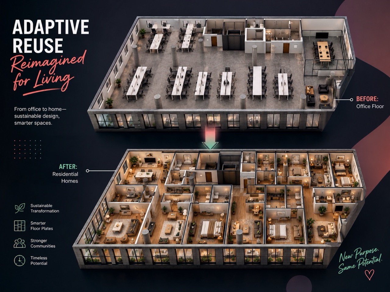
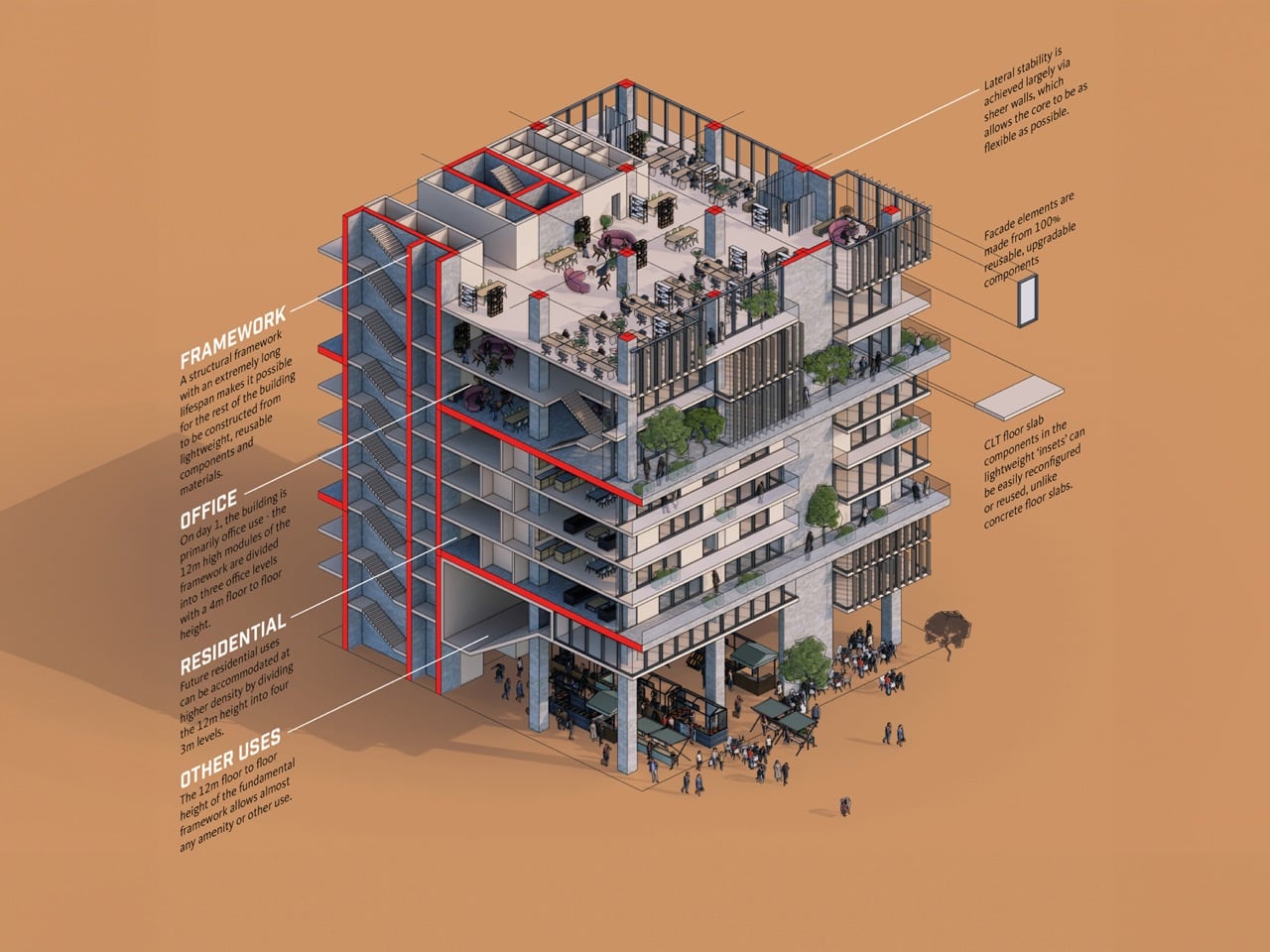
Walk into a typical Class B office building from the 1980s or 1990s, and you are standing on a floorplate that might run 25,000 to 40,000 square feet. The structural core, housing elevators, stairwells, and mechanical shafts, sits somewhere in the middle. Windows ring the perimeter. Everything between the core and the glass is open, column-interrupted, and completely indifferent to the concept of a bedroom.

Residential building codes in most U.S. cities require natural light and ventilation in every habitable room. That is a reasonable ask for a building designed around people sleeping in it. It is an architectural puzzle when your building was designed around people sitting at desks under recessed lighting for eight hours and going home.

The further you get from the perimeter windows, the darker and more unusable the space becomes for residential purposes. Architects working on these conversions are solving this in a few different ways. Some carve light wells through the floorplate, essentially punching holes through multiple stories to bring daylight deep into the plan. Others reorganize the unit layout so that bedrooms and living spaces claim the window line, while kitchens, bathrooms, corridors, and storage absorb the windowless interior. Some projects rezone that dead center space entirely, turning it into shared amenity areas, lobbies, or co-working zones that don’t require natural light by code.

None of these solutions are clean. All of them require an architect to fundamentally rethink what a floor plan can be when the building has already decided its own geometry.

Pipes, Cores, and the Part That Really Costs Money

Office buildings run their plumbing infrastructure in centralized wet walls, concentrated near the core, because nobody on a 30,000 square foot trading floor needs a bathroom in the southeast corner. Apartments, by contrast, need kitchens and bathrooms distributed across every unit, which means new drain lines, new vent stacks, and new penetrations through concrete slabs that were poured without any of that in mind. On a large building, this is closer to surgery than renovation. The structure has to accommodate changes its engineers never anticipated, and every floor compounds the cost.

This is partly why the conversion wave took so long to arrive despite the office vacancy crisis being years in the making. The economics only started making sense when office asset values dropped far enough that the acquisition cost left room for the renovation budget a real conversion actually requires.

What Kind of City Does This Build?

The embodied carbon argument for adaptive reuse is well established at this point. Demolishing a building and rebuilding it releases all the carbon locked into its existing steel, concrete, and glass, materials whose production already happened and cannot be undone. Keeping the structure and changing its use is, from a climate accounting standpoint, one of the most effective things the construction industry can do.

There is a longer-term design question buried inside the 90,300 number, though. Office buildings were placed, massed, and programmed for a specific kind of urban life: daytime population density, ground-floor lobbies designed for badge-tap arrivals, parking structures calibrated for 9-to-5 peaks. Converting them into housing changes the rhythms of the neighborhoods around them. Ground floors that were lobbies become storefronts, or stay lobbies and deaden the street. Parking structures sized for daily commuters become oversized and awkward for residents who do not own cars.

The cities that will get this right are the ones treating conversion as a neighborhood redesign project, not a building-by-building transaction. Los Angeles’s new ordinance is a start. New York’s tax incentives are a start. The design discipline this moment actually demands, though, is urban, not just architectural.

Adaptive reuse at 90,300 units is no longer a niche. It is the dominant form of new housing supply in several major American cities. The question the industry spent two decades asking, whether it works, has been answered. The question now is whether it produces cities that are genuinely good to live in, and that one is still very much open.

Data sourced from RentCafe’s 2026 office-to-apartment conversion report, based on Yardi Matrix data.

The post 90,300 Empty Offices Are Becoming Apartments Across the US. “Adaptive Reuse” Just Hit Critical Mass. first appeared on Yanko Design.
Fin Fixes Five Tape Dispenser Problems You’ve Accepted as Normal

The tape dispenser has been sitting on desks for decades without anyone seriously reconsidering it. It slips when you pull, it tips unless you hold it down, and it leaves tape edges ragged enough that finding the end again becomes a small recurring ritual. For something used constantly in homes, classrooms, and offices worldwide, it carries a surprisingly stubborn set of unresolved frustrations.

One designer decided to document those frustrations rather than assume them. He observed 49 people all performing the same simple task and cataloged five recurring problems with standard dispensers. The result is Fin, a concept built around solving each one through deliberate engineering. There’s nothing here for decoration. Every choice traces back to something that was genuinely broken and worth fixing properly.

Designer: Abhishek Sharma

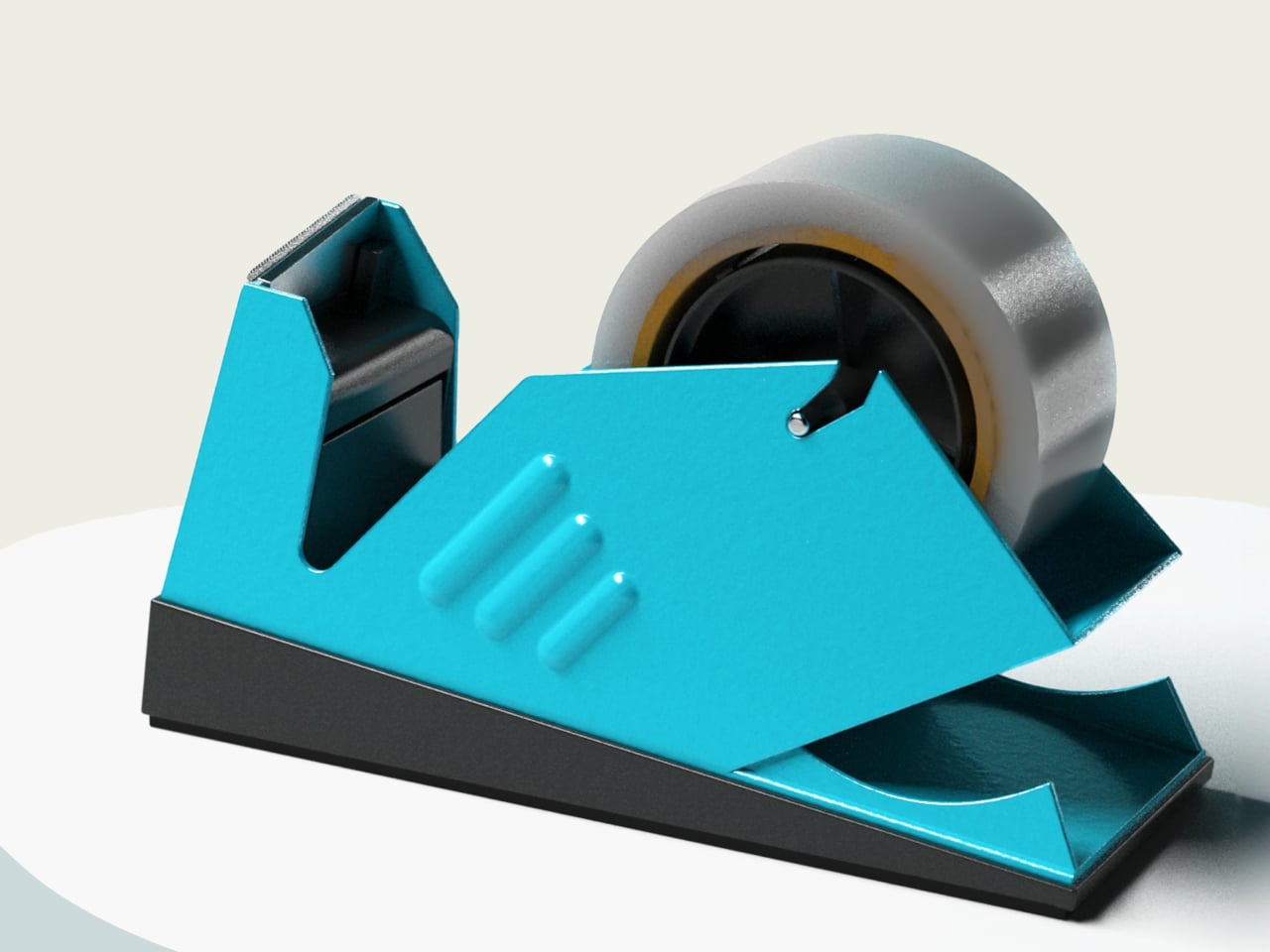
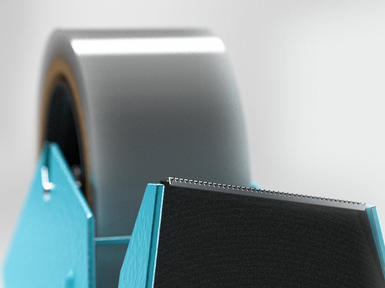
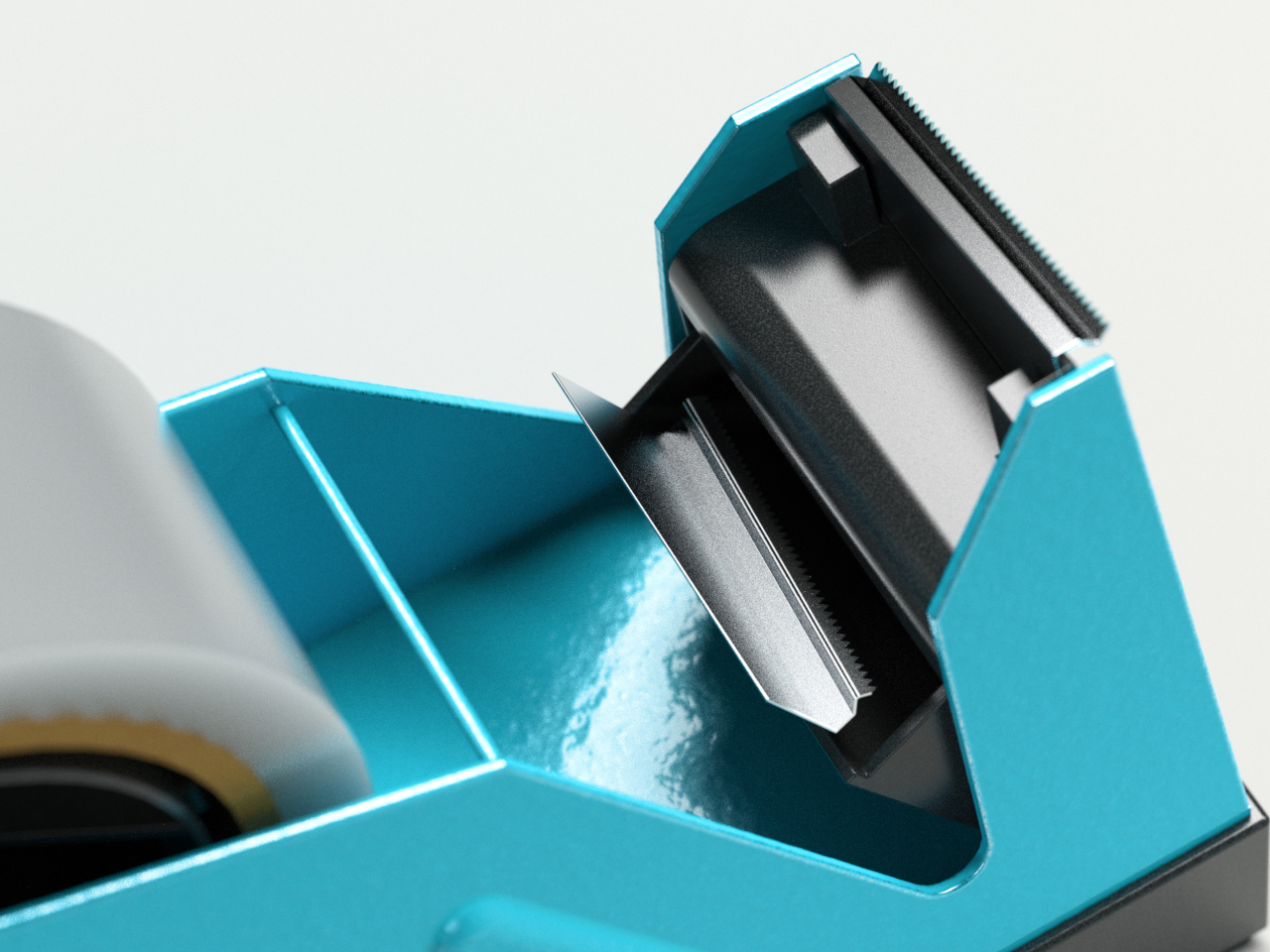
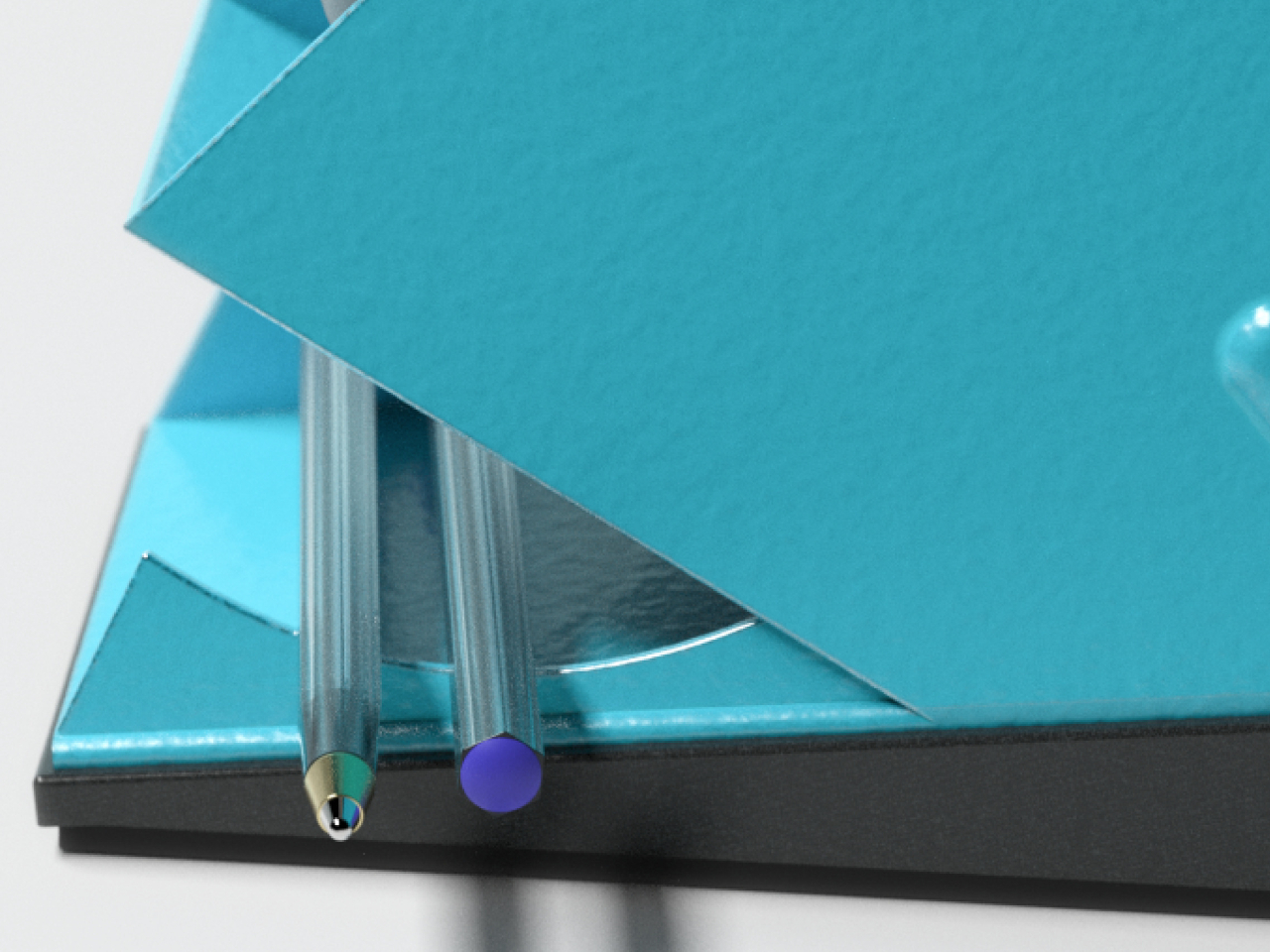
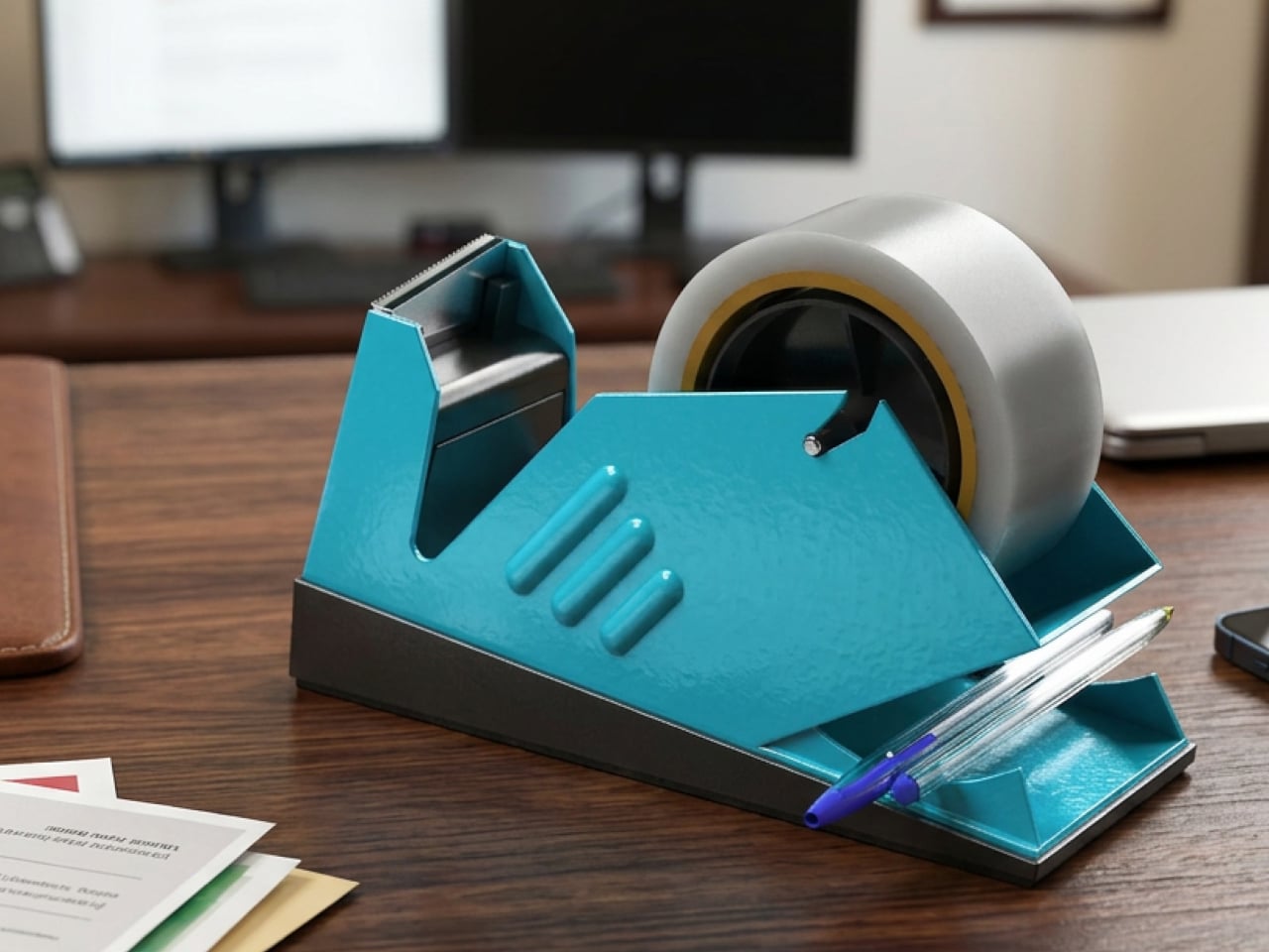
The most immediate change is at the cutting blade. Rather than lying flat, Fin’s blade tilts at 10 degrees. That angle concentrates pressure to a single point, so even when tape is pulled straight down, the cut starts cleanly, and the break travels through without resistance. The ragged edge that forces you to stop and peel back the tape before using it simply stops happening.

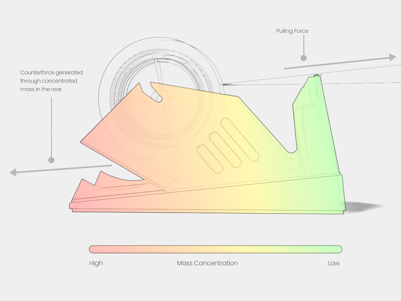
Slipping is addressed without adding bulk. Fin concentrates ballast at the rear through uneven weight distribution, creating a pivot point that resists horizontal movement when you pull tape. The front stays light, so repositioning is still easy when needed. Stability is selective, which turns out to be a more elegant answer than just making the whole dispenser heavier and harder to move.

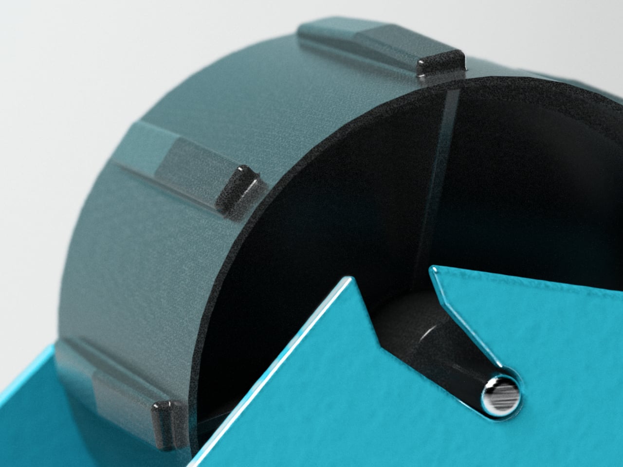
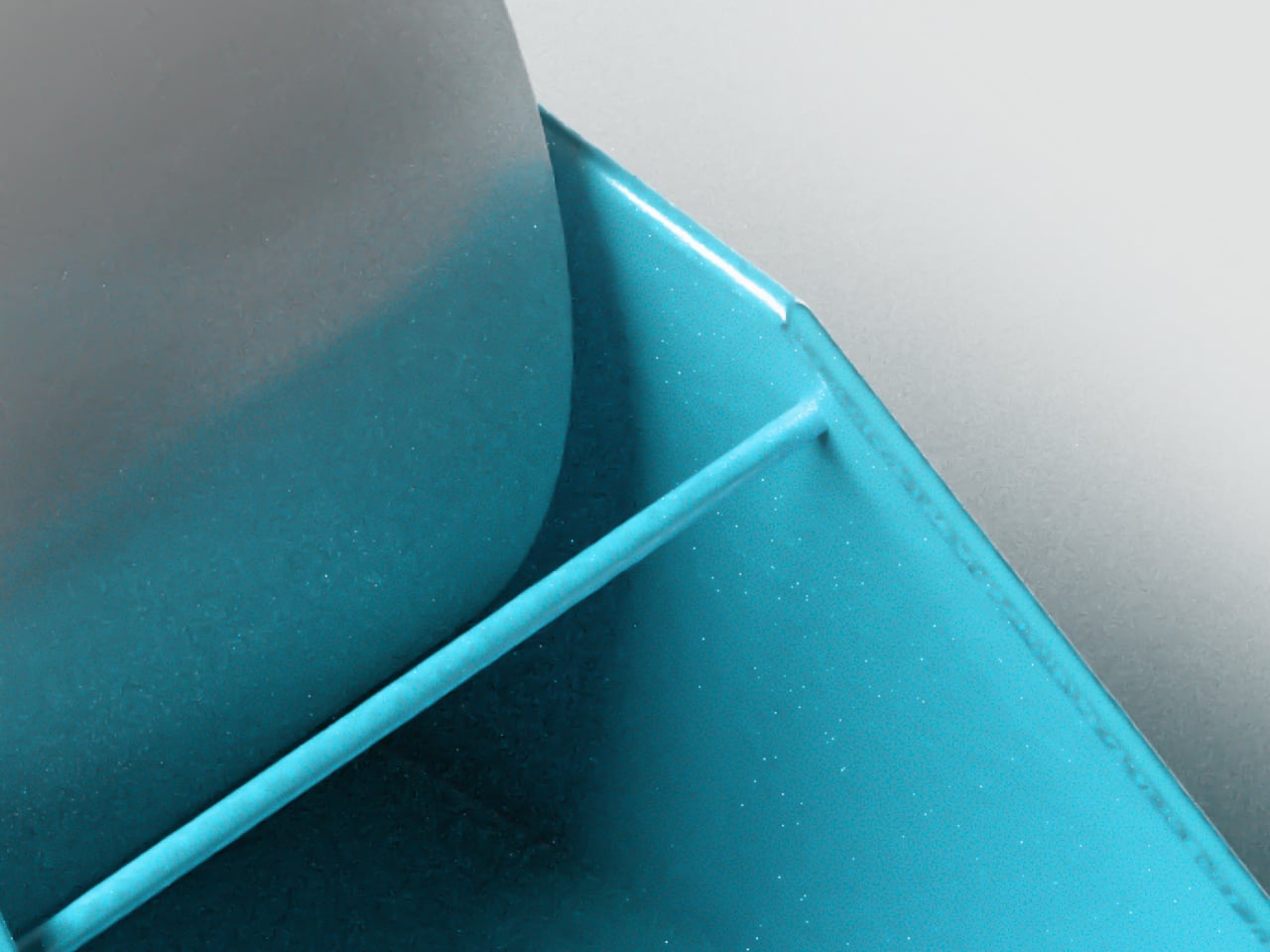
Two more irritants disappear just as quietly. Angled supports inside the tape cradle automatically stabilize narrow rolls so they don’t wobble regardless of tape width. A retention bar holds the tape edge after every cut, so the next time you reach for it, the end is right where you left it. That small predictability adds up across a day of repeated use.

The research also revealed that tape is rarely used alone. Scissors come out, pens get grabbed, and clips end up nearby. Sharma designed a storage compartment into the base, turning the dispenser into a compact workspace hub rather than a standalone tool. Replacement blades sit inside the cutting mechanism itself, where they’ll be found when inevitably needed rather than lost somewhere in a desk drawer.

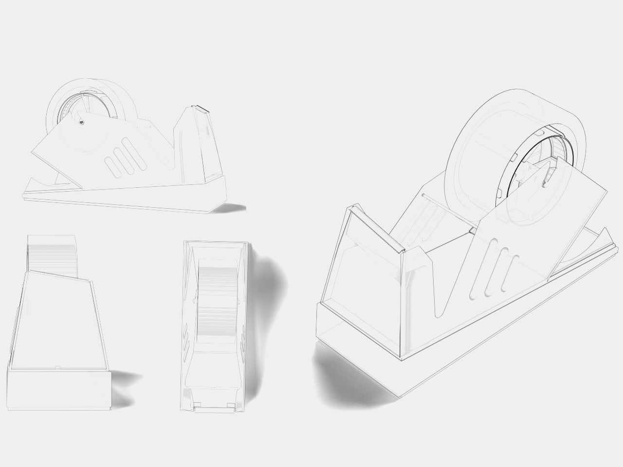
The tapered form that gives Fin its name isn’t incidental. Narrowing toward the front reduces grip surfaces and gently nudges users toward one-handed operation, discouraging the two-handed approach that keeps standard dispensers tipping. The shape wasn’t decided until every functional requirement had already settled it. What you’re left with is an object that looks like a design statement but is really just engineering made visible.

Fin is still a concept, not a product you can put on your desk yet. As a design exercise, it makes a solid argument for what happens when someone watches a problem carefully before trying to solve it. Tape dispensers have gone largely unexamined for a very long time, and this concept makes it genuinely difficult to use the one on your desk the same way.

The post Fin Fixes Five Tape Dispenser Problems You’ve Accepted as Normal first appeared on Yanko Design.
AI Finally Solved the Desk Organizer Nobody Actually Uses

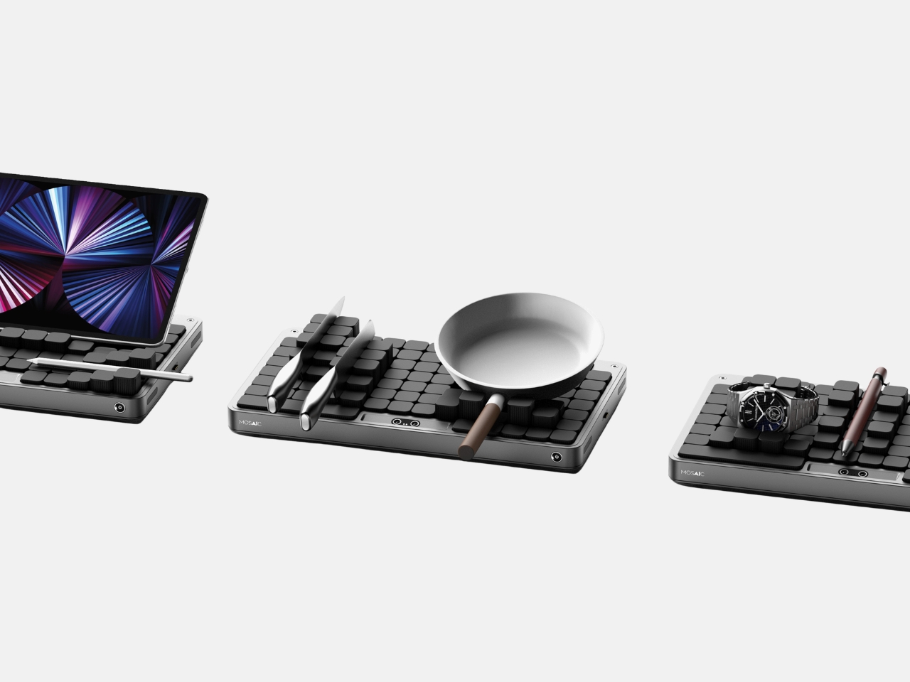
Most desk organizers ask you to adapt to them. You get a tray with fixed compartments, you shove your stuff in, and either it fits or it doesn’t. Then you give up, and everything ends up in a pile again. Seoul-based industrial designer Youngbin Kwon decided that the tray should be the one doing the adapting, and the result is Mosaic, a concept that’s quietly one of the more genuinely smart ideas to come out of the AI-meets-product-design conversation this year.

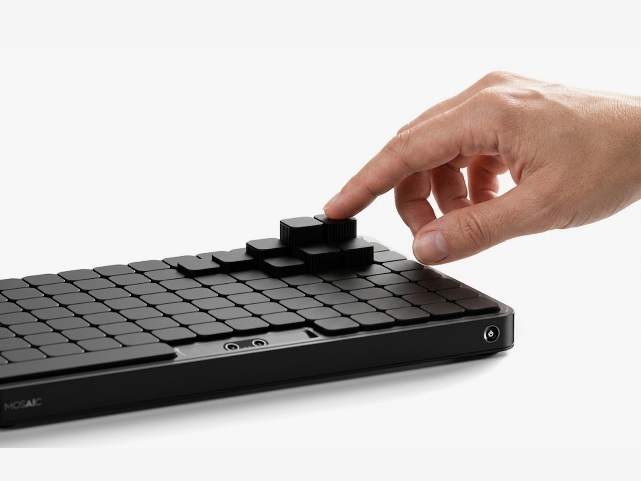
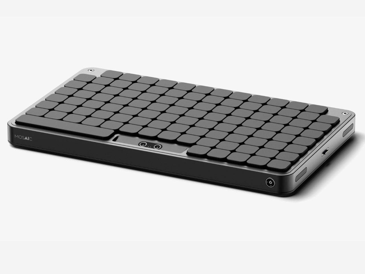
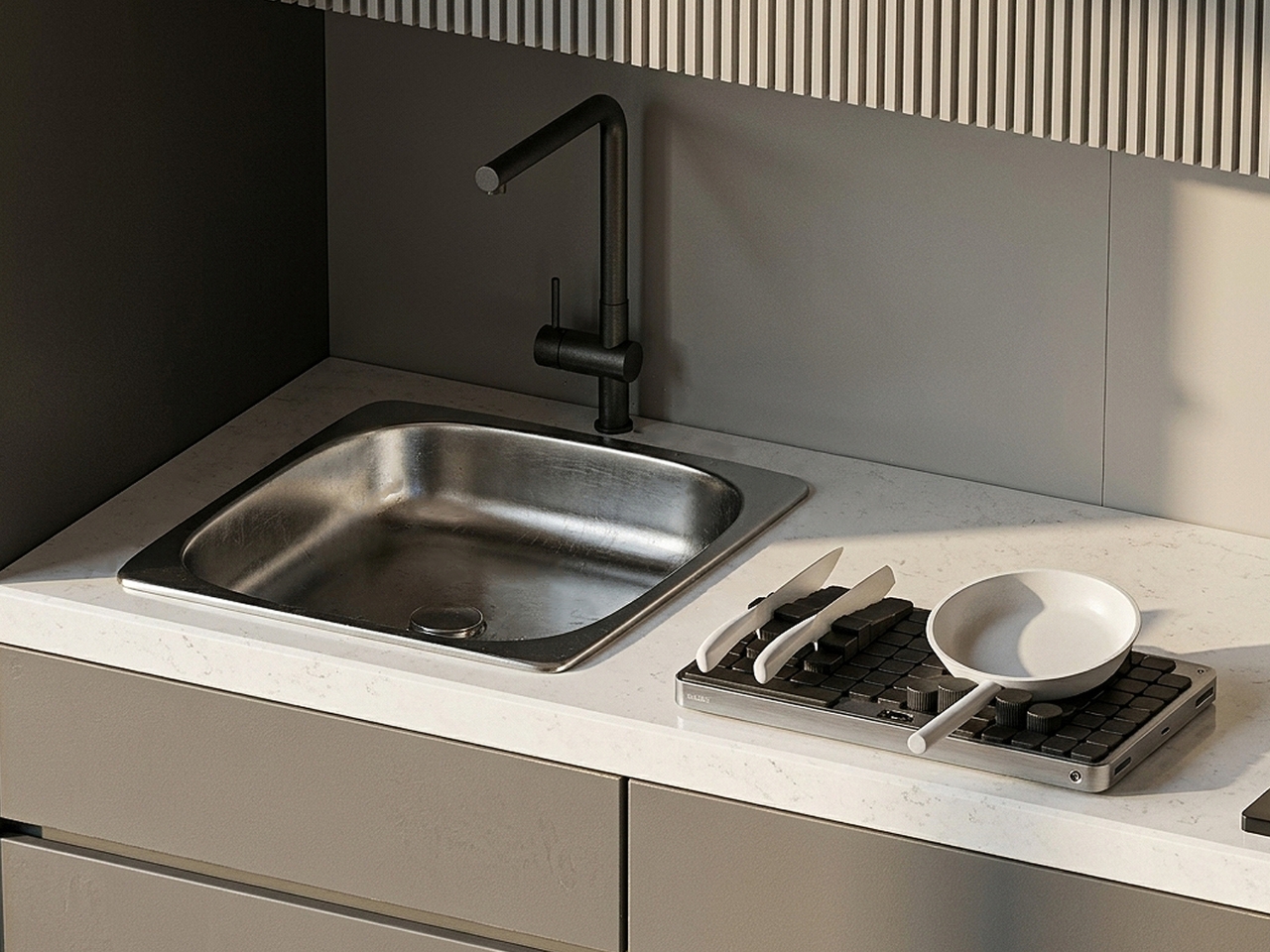
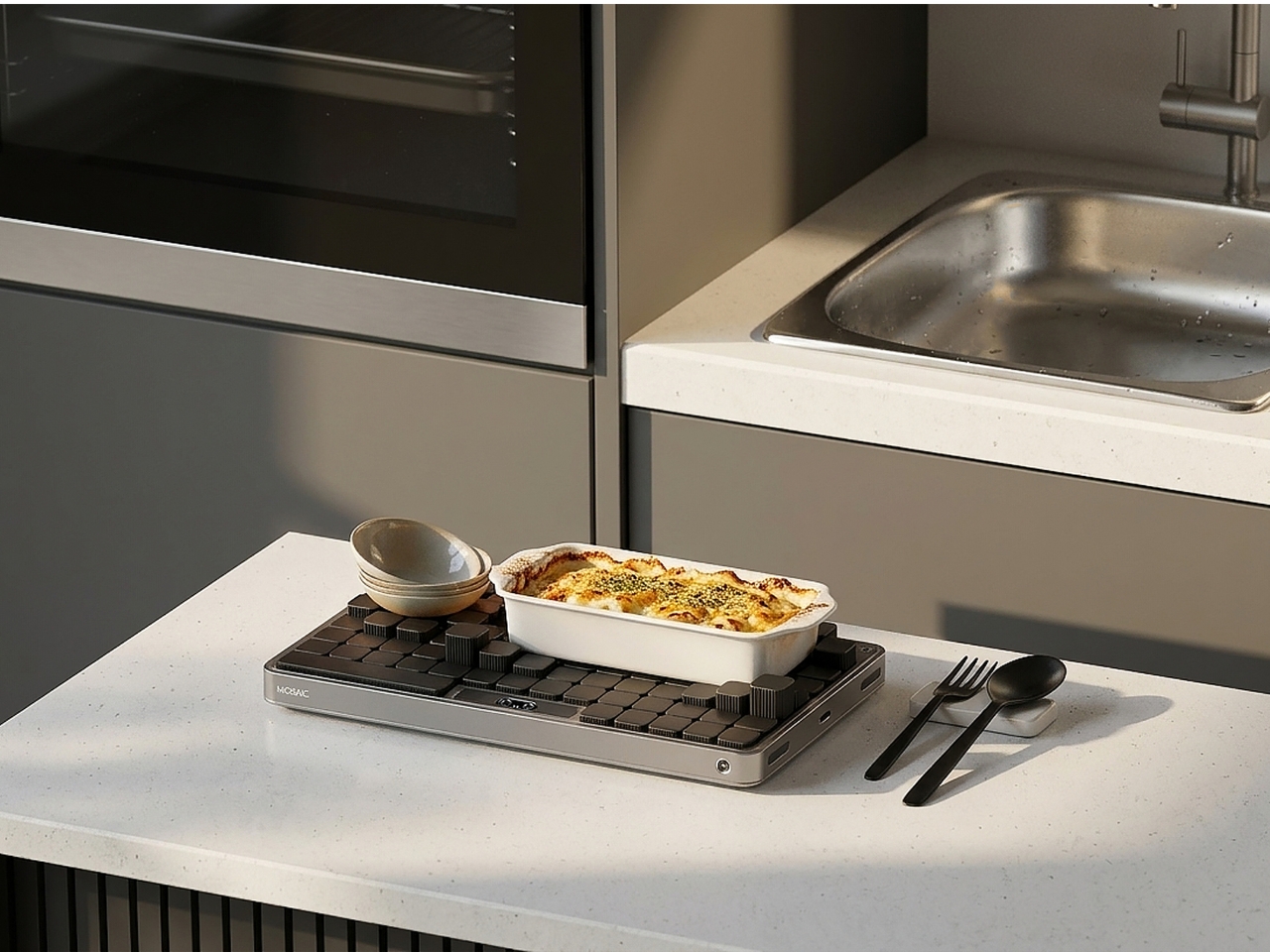
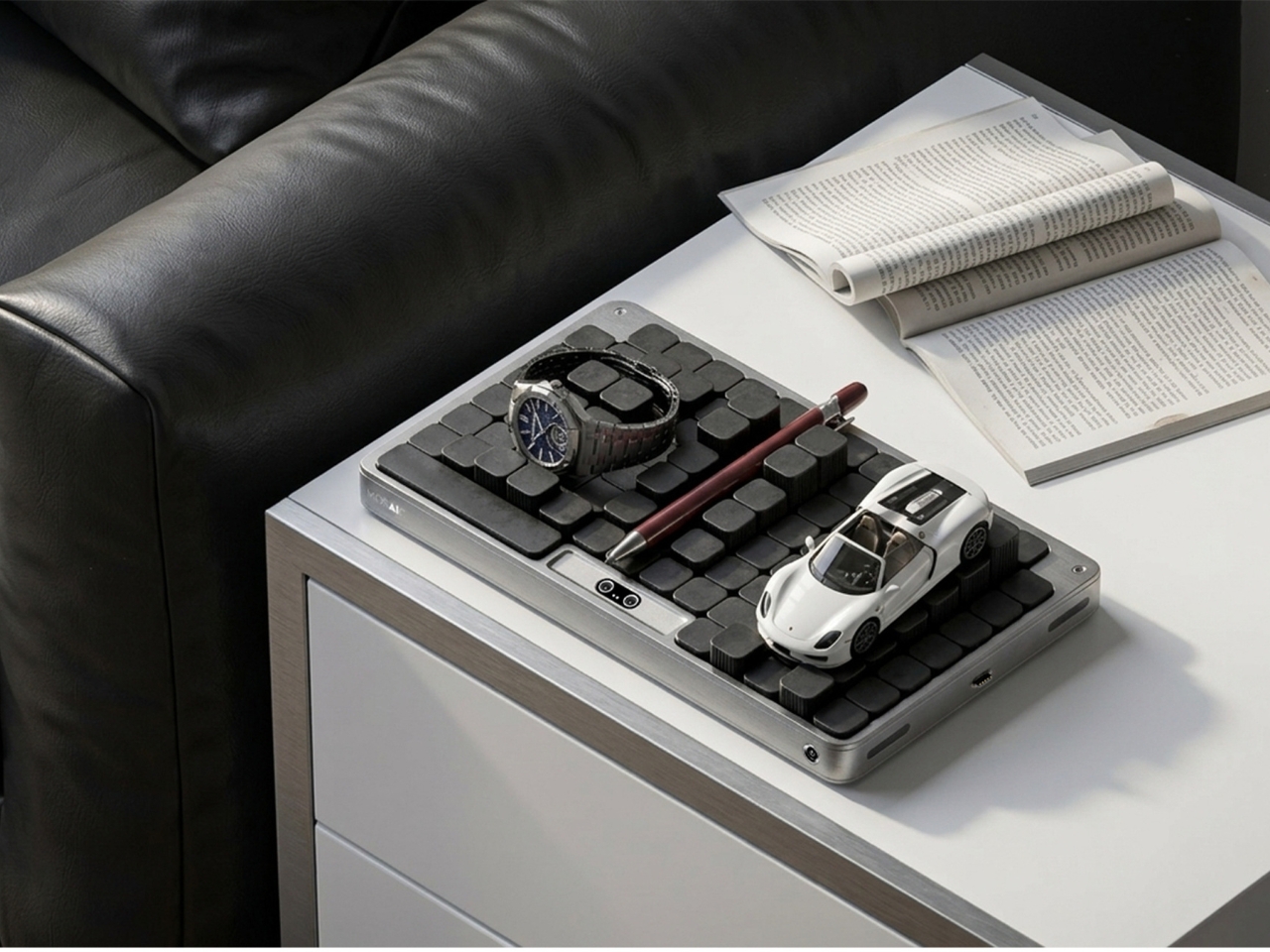
Mosaic is an AI tray that transforms its shape depending on what you place on it. The idea, at its simplest: put your things down, and the tray reconfigures around them. The modular structure shifts and reorganizes to accommodate whatever you’re dropping in: your phone, your keys, a charging cable, a stray lip balm. It reads the objects and makes room for them. What the concept proposes is essentially the end of the one-size-fits-all desk organizer, and I think that’s a very good thing.

Designer Name: Youngbin Kwon

The design is the work of Kwon, an industrial design student from Chung-Ang University in Seoul, published this May on Behance, where it’s been pulling in appreciations at a rate that suggests the design community noticed. Built in Rhinoceros and rendered in Keyshot, the concept is visually clean and grounded, with a restraint that keeps the focus on the idea rather than the spectacle. This isn’t speculative design that lives only in dreamland. It feels like something that could exist with the right engineering team behind it.

1

But the part of the concept that deserves more attention than the mechanics is the philosophy behind it. Kwon describes the act of placing objects with AI assistance as being “as if playing,” and the idea is that this playfulness is exactly what leads people to actually develop organizational habits over time. Not guilt. Not a beautiful, aspirational flat-lay that makes you feel bad about your desk. Just play. That distinction is easy to underestimate.

That reframing matters more than it might seem at first. The market for organization products is enormous, and so is the gap between things people buy to get organized and how long they actually stay organized. That gap usually comes down to friction. The system is too rigid, or too much effort to maintain. Mosaic proposes that if the system flexes with you instead of demanding you flex with it, you’re far more likely to stick with it. Gamification applied to the most mundane domestic task. It’s clever.

I’ll admit that the name Mosaic might be the most elegant thing about it. A mosaic is a picture made of small, individually unremarkable pieces that together create something intentional and whole. That’s exactly what the tray does. The modular components rearrange into a layout that looks curated, even when you’ve just dropped everything in at the end of a long day. The name does real conceptual work, and that’s rarer than you’d expect from a student project.

There are real questions left unanswered, as there always are at the concept stage. How exactly the AI identifies objects, whether it uses cameras, weight sensors, or something else, isn’t detailed in the project. The durability of moving parts in a daily-use context is worth thinking about. Whether the transformation happens visibly and slowly, like something mechanical, or snaps quickly into place, would change the entire experience of using it. These are the things that turn a concept into a product, and Kwon’s Mosaic is still very much a concept.

But good concepts don’t need to be finished products to be worth paying attention to. What Mosaic does well is identify a real and relatable failure mode, the organizational system that doesn’t survive contact with actual human behavior, and propose a solution that works with people rather than against them. The tray that meets you where you are. That’s not a small idea dressed up in a sleek render. That’s a fundamental rethink of what we expect everyday objects to do, and it’s worth watching where it goes.

The post AI Finally Solved the Desk Organizer Nobody Actually Uses first appeared on Yanko Design.
10 Minimalist Desk Accessories That Earn Their Footprint

The minimalist desk setup has become one of the most documented trends in home office design, particularly as hybrid work continues pushing people to invest more seriously in the spaces where they spend their days. Most products marketed toward that crowd lean hard on the visual side, neutral finishes, restrained forms, nothing that draws attention to itself. What they’re less reliable at is spatial logic.

The ten accessories on this list were chosen with that in mind. Each one has to pass a practical test, not just look calm on a desk, but actually justify the space it occupies. That means hiding clutter, combining functions, freeing surface area, or removing a small friction before it turns into a habit.

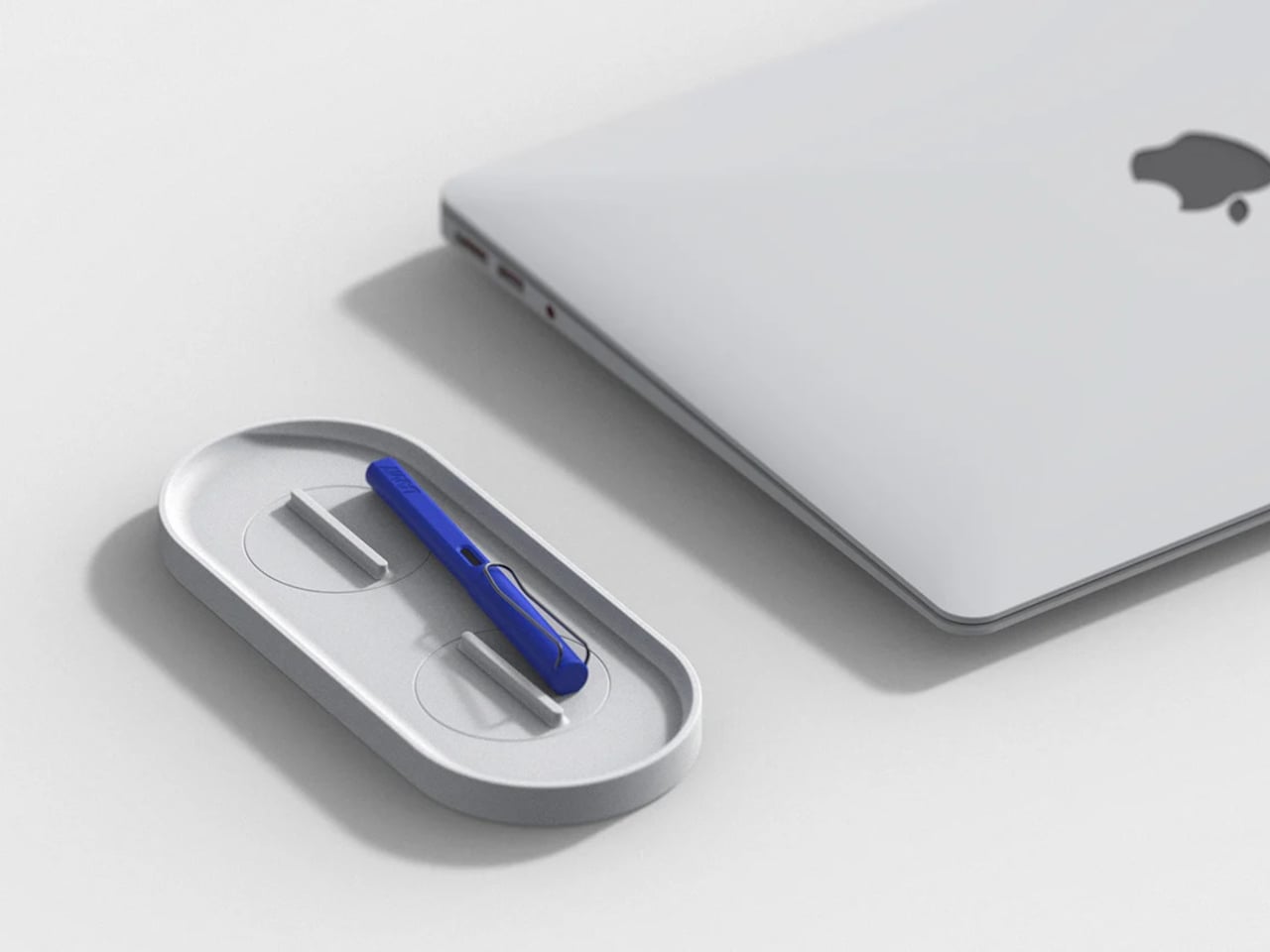
KNOB. Pen Tray

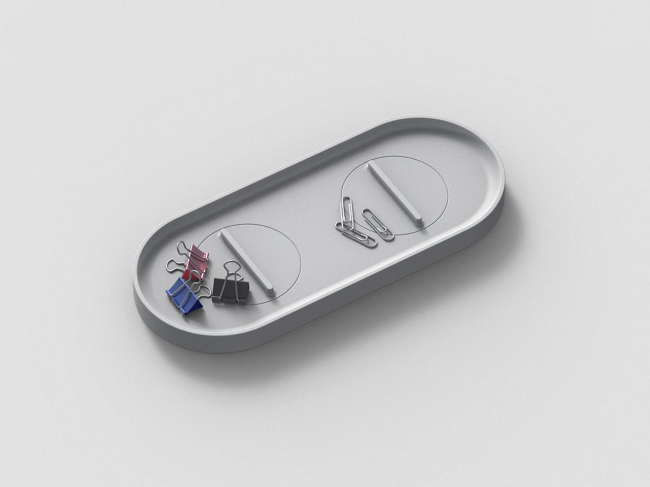
Most pen trays solve a narrow version of the problem. They give you a fixed layout, usually a rectangle divided into two or three compartments, and expect you to work around it forever. That’s fine until your tools change, and they always do. Changho Lee’s KNOB. Pen Tray takes a different approach by making the interior of the tray something you can actually reconfigure.

Designer: Changho Lee

The dividers are controlled by knobs that take their cues from gas burner controls, a design reference that also gives the tray its name. Turn them and the internal layout shifts, letting you organize pens alongside rulers, adapters, or whatever else needs a place. One tray handles what might otherwise require three, which makes a convincing case for its footprint. The mechanism can feel fiddly if you reorganize often.
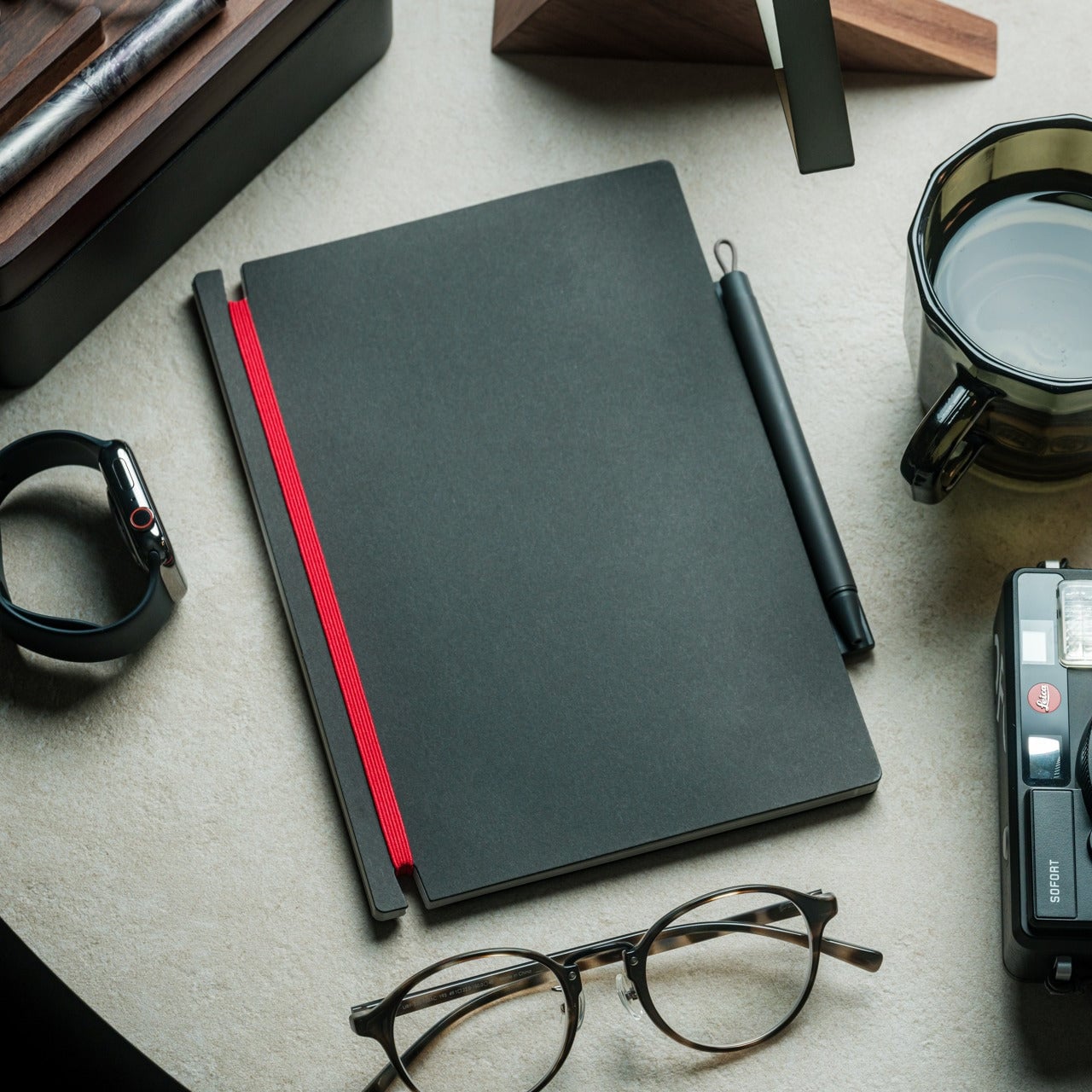
Inseparable Notebook Pen

There’s a particular kind of frustration that comes with reaching for a pen and finding it’s no longer where you left it. It’s small enough to ignore once, but it happens often enough to become a genuine irritant. The Inseparable Notebook Pen doesn’t try to solve desk organization broadly. It solves this one specific problem by keeping the pen attached to the notebook it belongs with.
Click Here to Buy Now: $19.95

A magnetic clip secures the pen directly to the notebook cover, so the two travel as a unit and stay that way on the desk. There’s also a built-in silencer that softens the attach-and-release motion, which sounds like a small detail until you use it daily. The pen works best when paired with its intended notebook, so it’s less convincing as a standalone writing instrument.

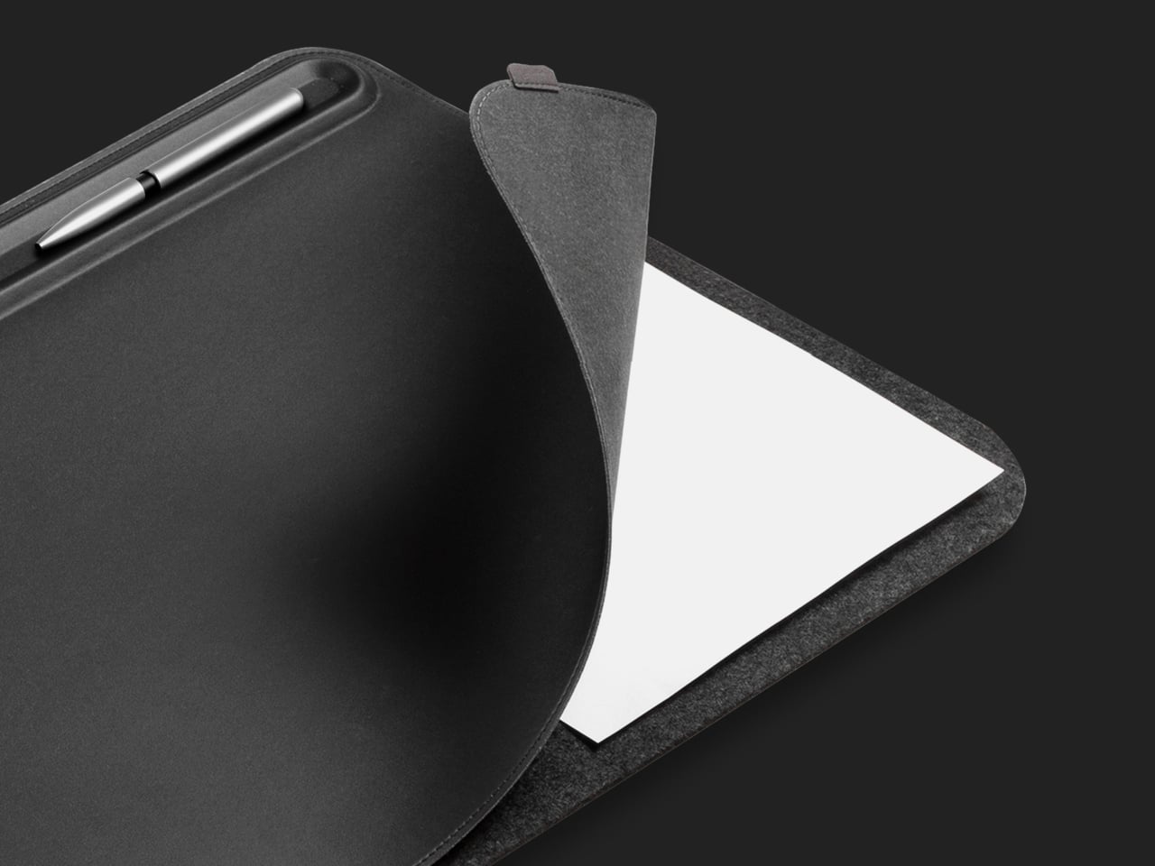
Orbitkey Desk Mat

Desk mats often get treated as the last layer of a setup, something you add once everything else is in place to make the whole thing look polished. The Orbitkey Desk Mat earns more than that role. It addresses one of the quieter problems on any active desk, the gradual spread of loose papers, sticky notes, and reference sheets that slowly take over the surface.

Designer: Orbitkey

A document hideaway built beneath the top layer lets you slip papers out of view without throwing anything away. They stay flat and within reach, invisible until you need them. A toolbar along one edge keeps stationery and smaller tools from drifting. Available in Black and Stone across two sizes, the mat works whether you’re running a compact home setup or a larger studio table.

ME-1 U-shaped Power Strip Concept

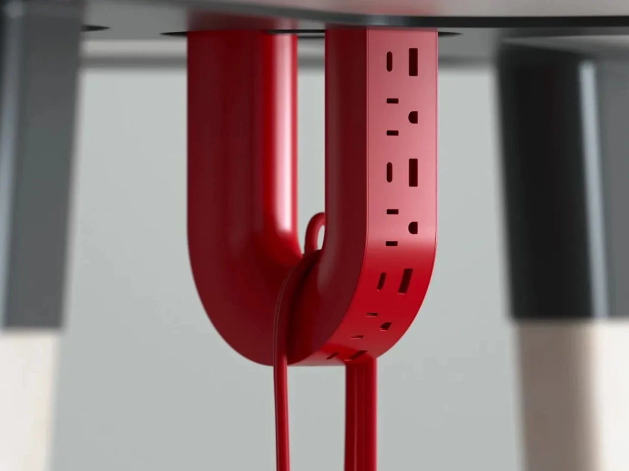
Cable management is one of those desk problems that most solutions only partially solve. You gather the cords, clip them together, maybe run them through a box, and the result is still visible, still part of the desk’s noise. Michael Kritzer’s ME-1 power strip concept takes a different position, arguing that the power strip itself should hang below the work surface rather than claim space on top of it.

Designer: Michael Kritzer

Curved into a U-shape, it can hang under a table or stick to metallic surfaces, while its two legs give you somewhere to wrap cables so they don’t trail freely. There’s also enough spacing between the alternating three-prong sockets and USB ports to fit bulky chargers without blocking each other. It’s still a concept, and questions about how far it protrudes remain, but the logic behind it is sound.

Oakywood Desk Shelf Pro

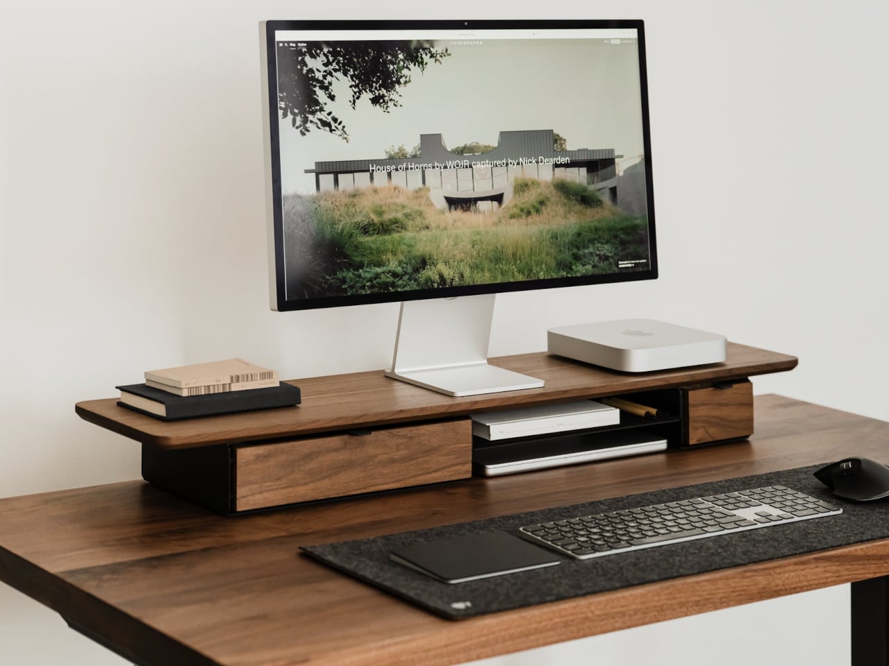
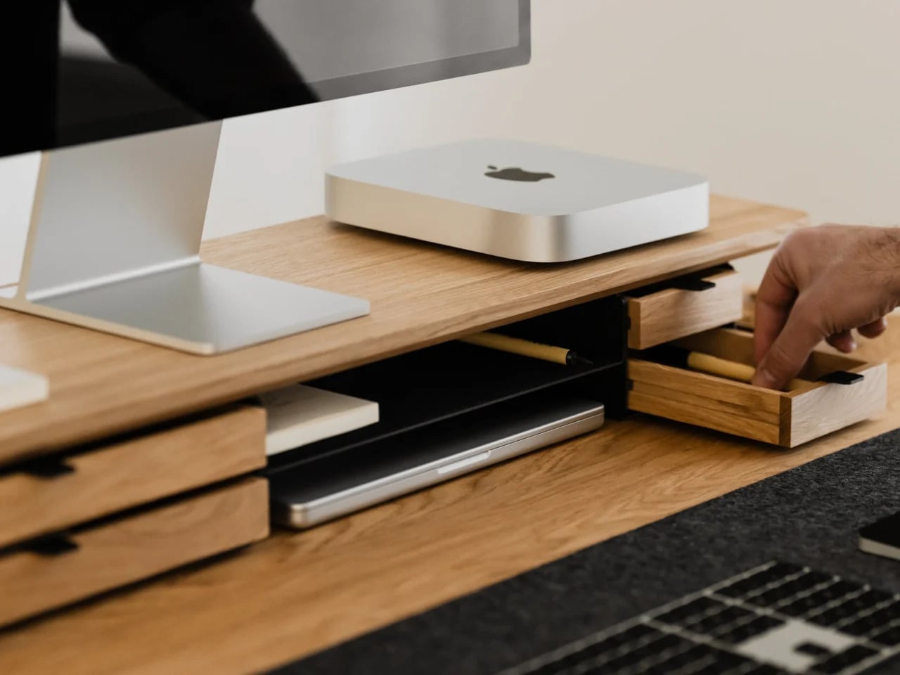
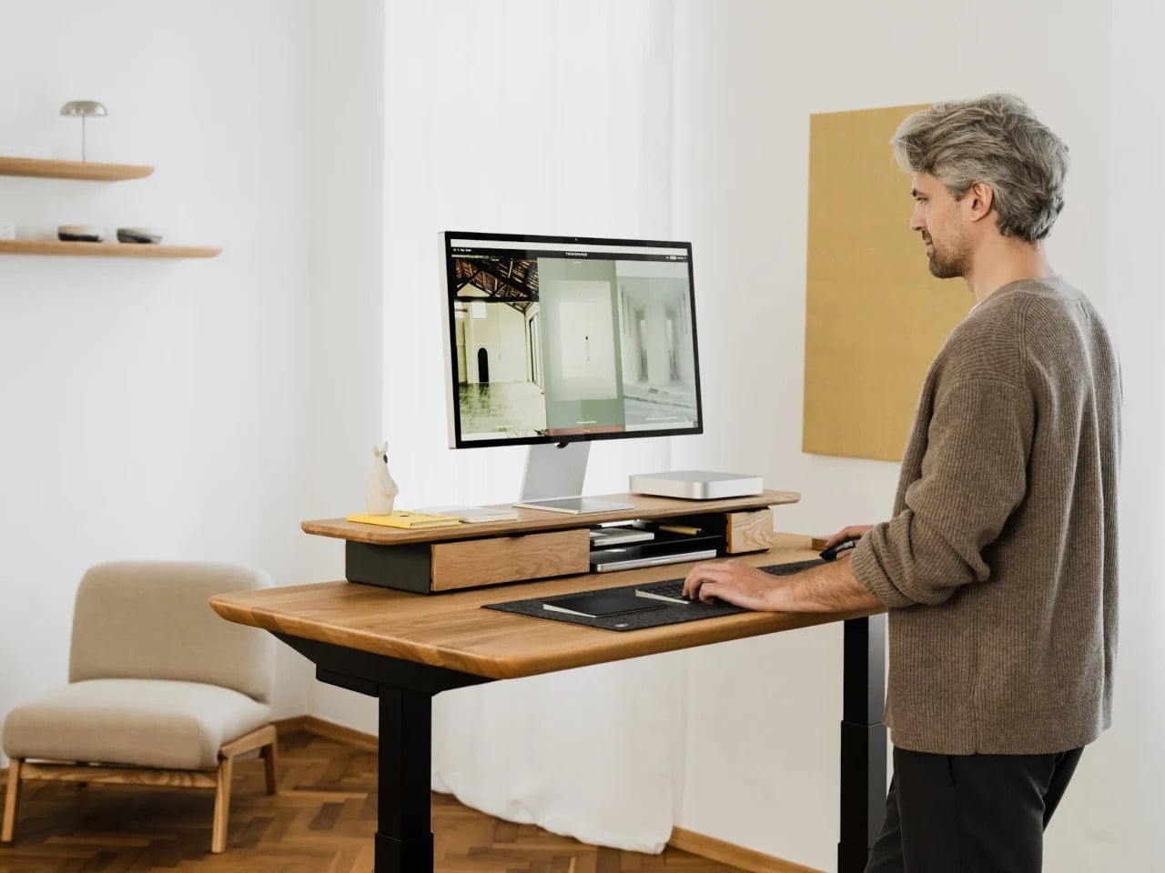
Monitor risers are supposed to help, and usually they do, but only as far as ergonomics go. The desk surface often ends up just as crowded as before, just with a platform sitting in the middle of it. The Oakywood Desk Shelf Pro approaches the problem differently, treating the riser not as an accessory but as furniture that earns its size by doing more than one job.

Designer: Oakywood

The shelf spans desk width, lifting the monitor to eye level while clearing space underneath for a keyboard or laptop, with steel legs at each end creating a floating effect. Built-in drawers tuck away stationery and small tech, and a felt-lined open shelf handles tablets or a closed laptop. It’s built from solid oak or walnut, not MDF with a plastic skin, and can hold up to 100 kg without flexing.

Practiko Otis Hanger 3.0

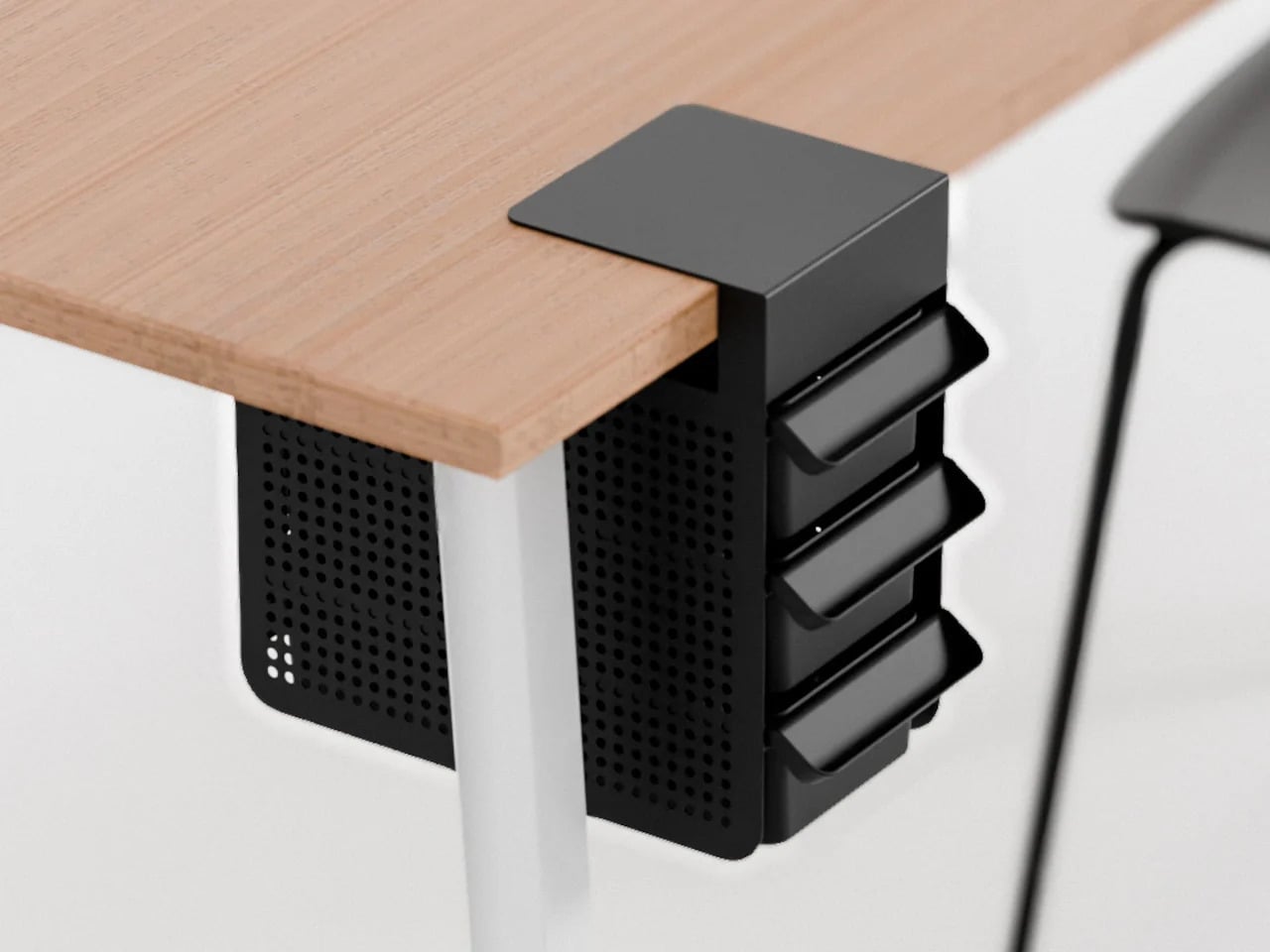
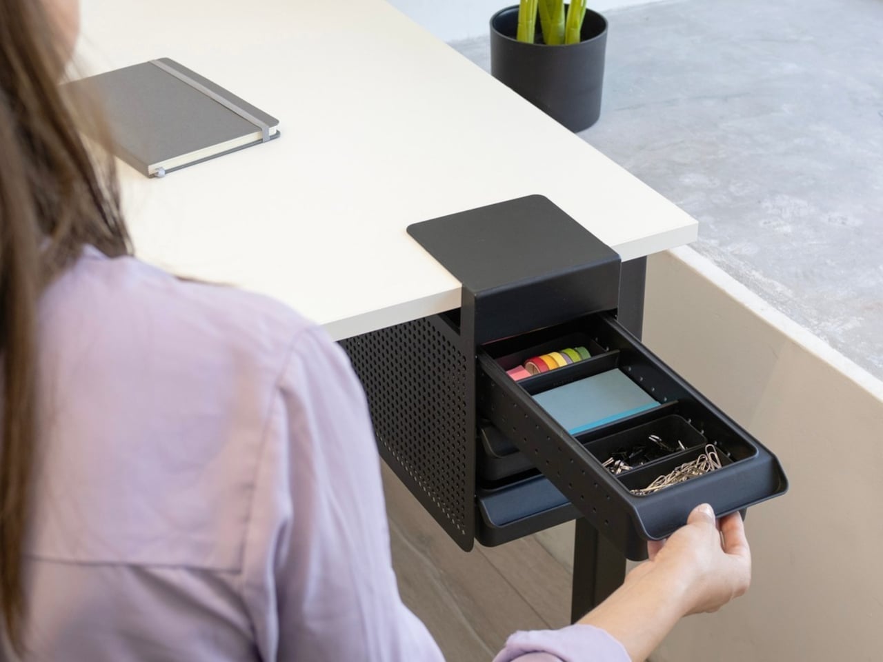
Minimalist desks look clean partly because many of them don’t come with built-in drawers. That’s a reasonable design choice until the pens, sticky notes, charging cables, and paper clips have nowhere to go and start accumulating on the surface instead. The Practiko Otis Hanger 3.0 adds that missing storage back without a single screw or permanent alteration.

Designer: Practiko

The system clips onto the desk edge and hangs beneath the work surface, giving you three trays and the full top plane back. The 3.0 version features more perforation points for finer divider adjustments, and three nested mini trays handle smaller items like paper clips, thumbtacks, or earbuds. Larger handles on each tray let you pull them out smoothly without looking down, which makes more of a difference in daily use than it sounds.

Nuka Eternal Stationery

There’s a version of minimalism that’s about owning as little as possible. There’s also one that’s about how much the things you do own keep asking of you. Nuka’s Eternal Stationery belongs to the second kind. Built around permanence rather than disposability, it’s a notebook-and-writing-tool system designed to stop demanding replenishment, which is its own quiet argument for staying on a well-edited desk.

Designers: Nikolay Lozinskiy (3D animation & Product Design), O0 design (Branding, 3D animation & Product Design), Evgenija Medvedeva (Product Design), vennndii (Product Shootings)

The notebook is waterproof and tear-proof, and pairs with a metal alloy tip that writes with the consistency of a traditional pencil but requires no sharpening and never breaks. Pages clear completely with the Nuka Magic Eraser, ready to be written on again. For anyone who writes regularly, the appeal is straightforward, though writers accustomed to ink on paper may need some adjustment time with the metal alloy tip.

Quiver Ruler

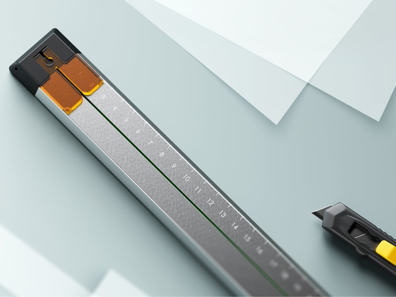
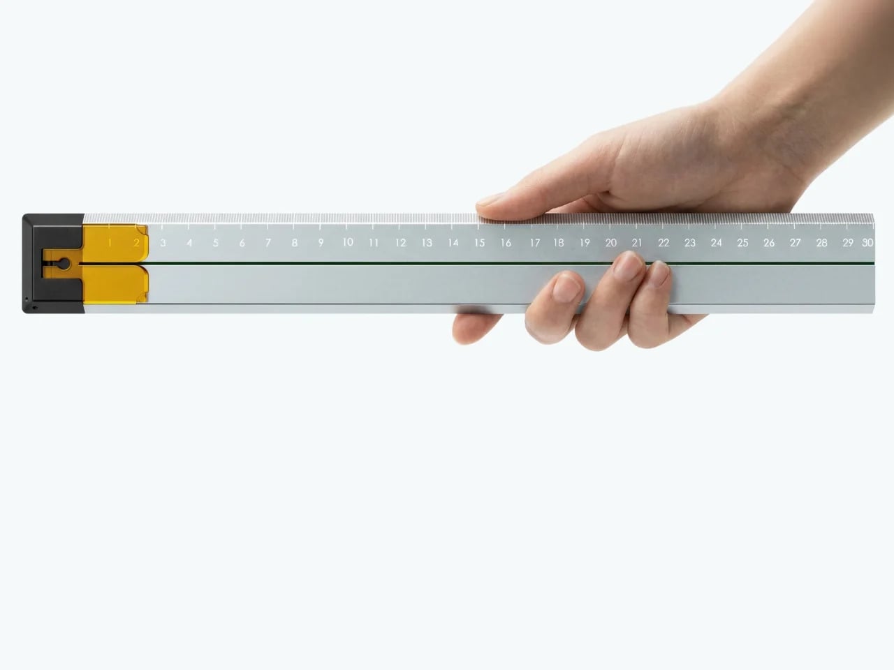
A ruler is one of the few tools that earns a place in a minimalist setup by compressing several small tasks into a single flat form. Tunir Maity’s Quiver does that more thoroughly than most. It’s an anodized aluminum ruler designed primarily for people who actually cut with one, not just measure. It treats shaky hands and imprecise cuts as design problems worth solving, not limitations the user is expected to compensate for.

Designer: Tunir Maity

A clip mechanism holds paper in place, a blade slit guides the cut in a straight line, and the weight distribution favors the cutting end, so you don’t have to press down as hard. It also includes a carabiner attachment for clipping to a bag. Quiver is currently a concept, so availability hasn’t been confirmed, and it’s more specialized than what a casual desk user would reach for day to day.

Ichi Portable Lamp

Desk lamps rarely fail in the obvious ways. Most give off enough light and last long enough. What they tend to get wrong is the base, which on wider models claims an entire desk corner, and the cord, which invariably ends up somewhere visible. The Ichi Portable Lamp, born from the collaboration between Fujita Kinzoku and TENT Design, keeps the form slim and goes cordless, addressing both without turning the lamp into a statement piece.

Click Here to Buy Now: $149

Powered by four standard AA batteries, it runs cordless without the limitations of proprietary chargers. Its warm, high-color-rendering CRI 95 LED creates a soft, radiant glow suitable for task work or winding down. The modular design disassembles into three parts and packs down to a slim 20mm thickness. It’s more portable than a permanent desk fixture, which is worth knowing if you need sustained, high-output lighting for long stretches.

Satechi 3-in-1 Foldable Wireless Charging Stand

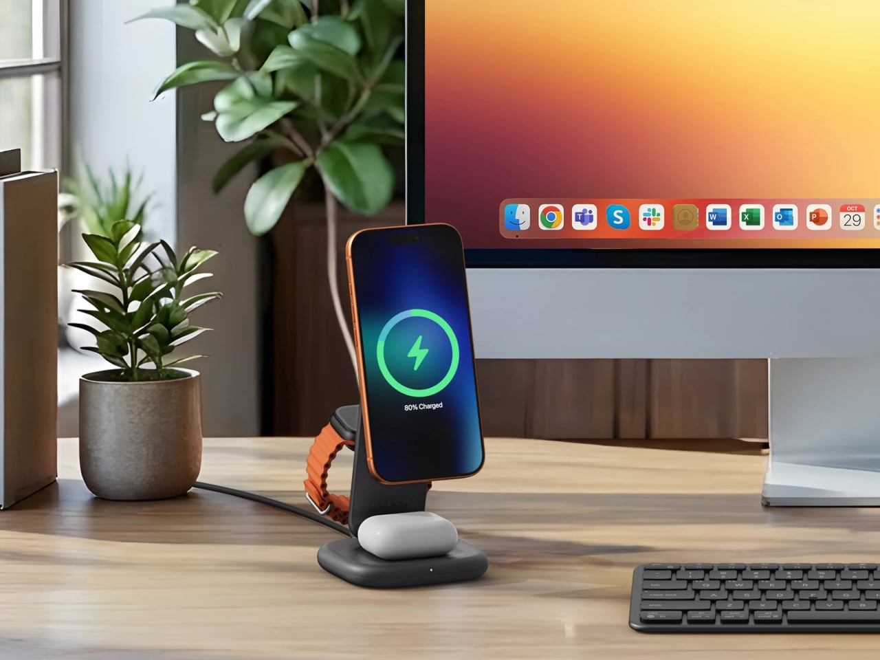
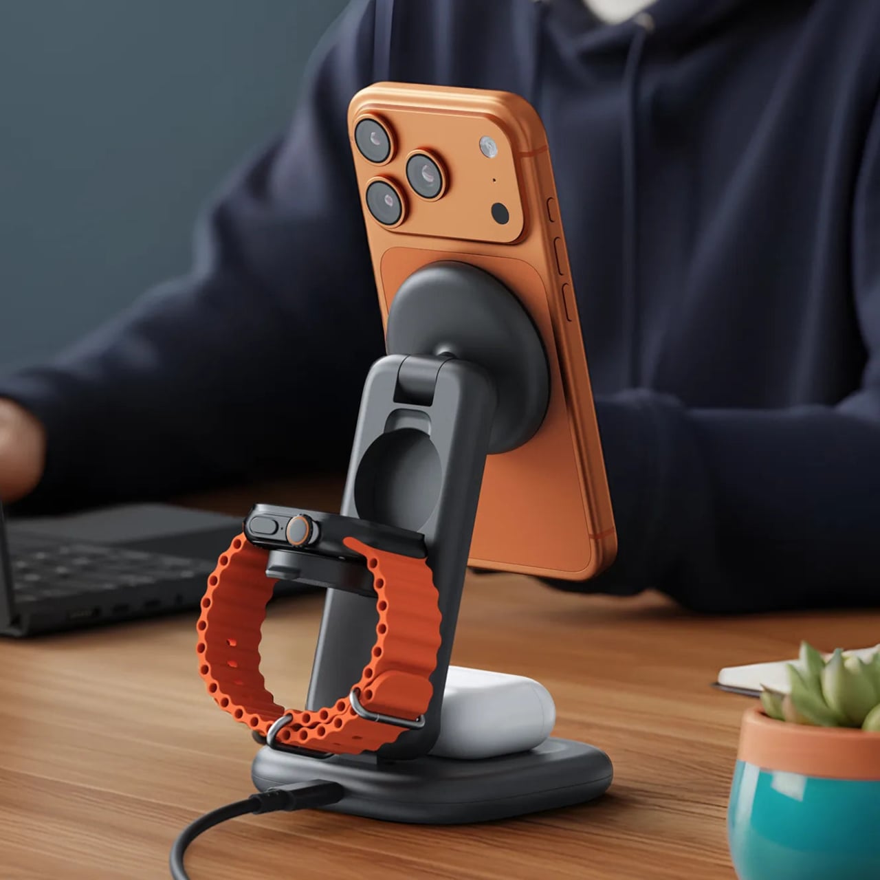
Getting a phone stand onto a minimalist desk requires a stronger argument than just holding the phone upright. The Satechi 3-in-1 Foldable Wireless Charging Stand with Qi2 25W makes that argument by doing three jobs at once, replacing the tangle of separate charging pads that Apple users typically accumulate. Wireless charging was supposed to simplify things, but most setups end up with a different kind of mess instead.

Designer: Satechi

Set the iPhone down, and Qi2 snaps it into position, the Apple Watch gets its own fast-charge arm, and the AirPods rest on a pad below, all drawing from a single cable to the wall. The stand folds flat for travel and fits easily in a carry-on. A 45W USB-C adapter with US, EU, and UK plugs ships in the box. It’s most compelling for people already working within the Apple ecosystem.

Building a cleaner desk comes down to the same question applied to every object on it: what is it giving back for the space it takes? Color and material can make things look minimal, but they don’t make them earn their place. That’s a footprint budget, and it’s a much better framework for deciding what stays than any mood board, setup guide, or neutral palette.

The post 10 Minimalist Desk Accessories That Earn Their Footprint first appeared on Yanko Design.