Xbox limited edition makes are nothing uncommon, as Microsoft often delves into collaborations for some really interesting themed consoles and controllers. The gaming brand just turned 25 this year, and Microsoft isn’t going to let go of the opportunity to amaze fans.
This is the limited edition Xbox 25th Anniversary Collection specifically designed to celebrate the quarter-century of Microsoft’s gaming brand. The special themed console and controller remember the platform’s historical development right from the time it came to the shelves, and also pays gratitude to its dedicated community of gamers.
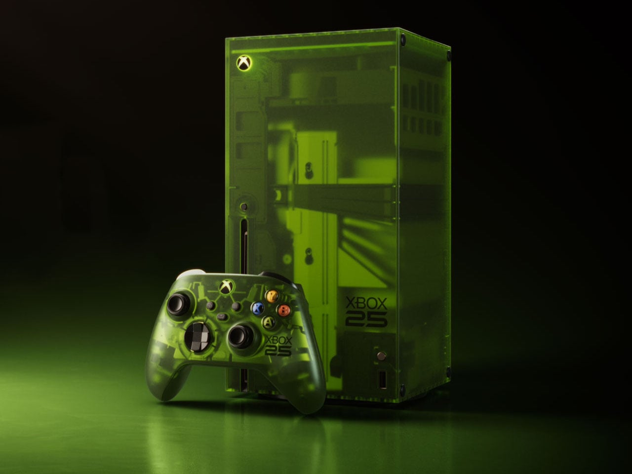
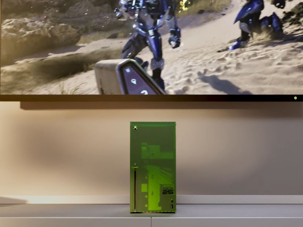
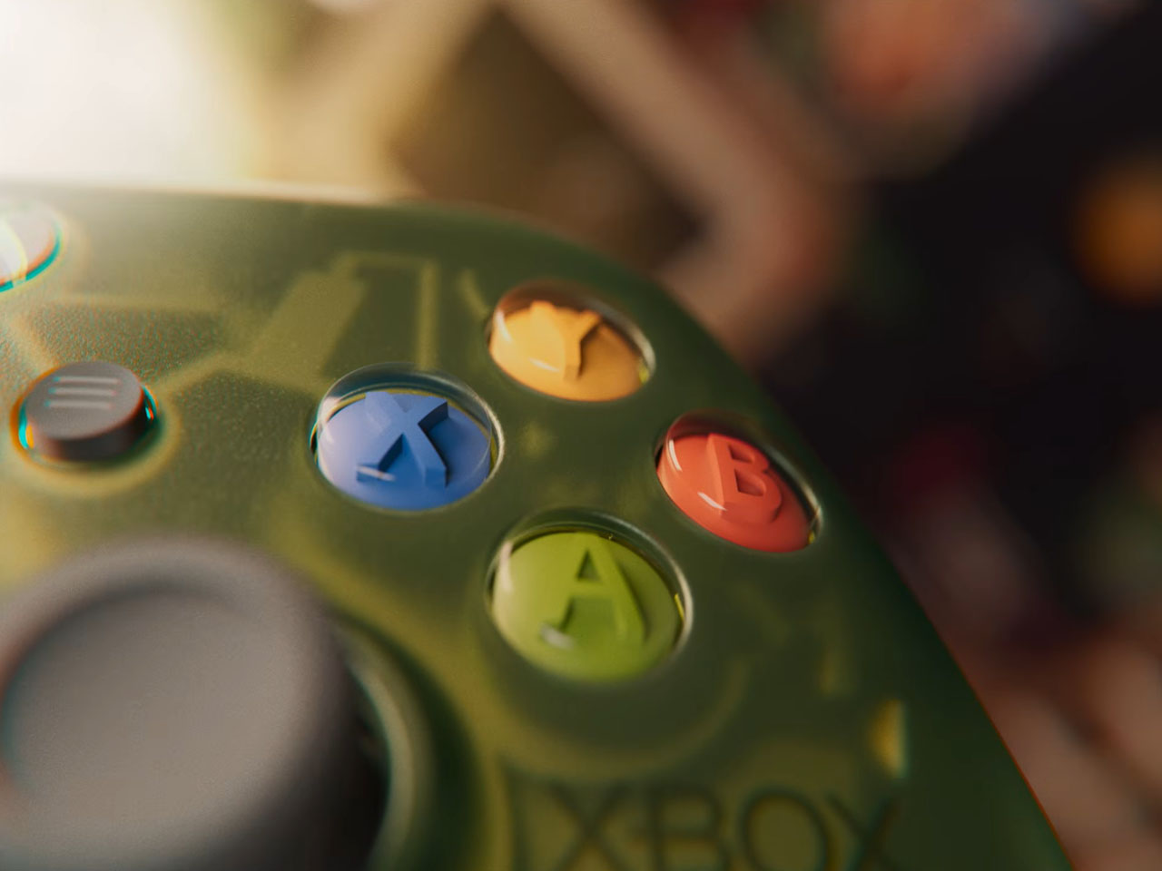
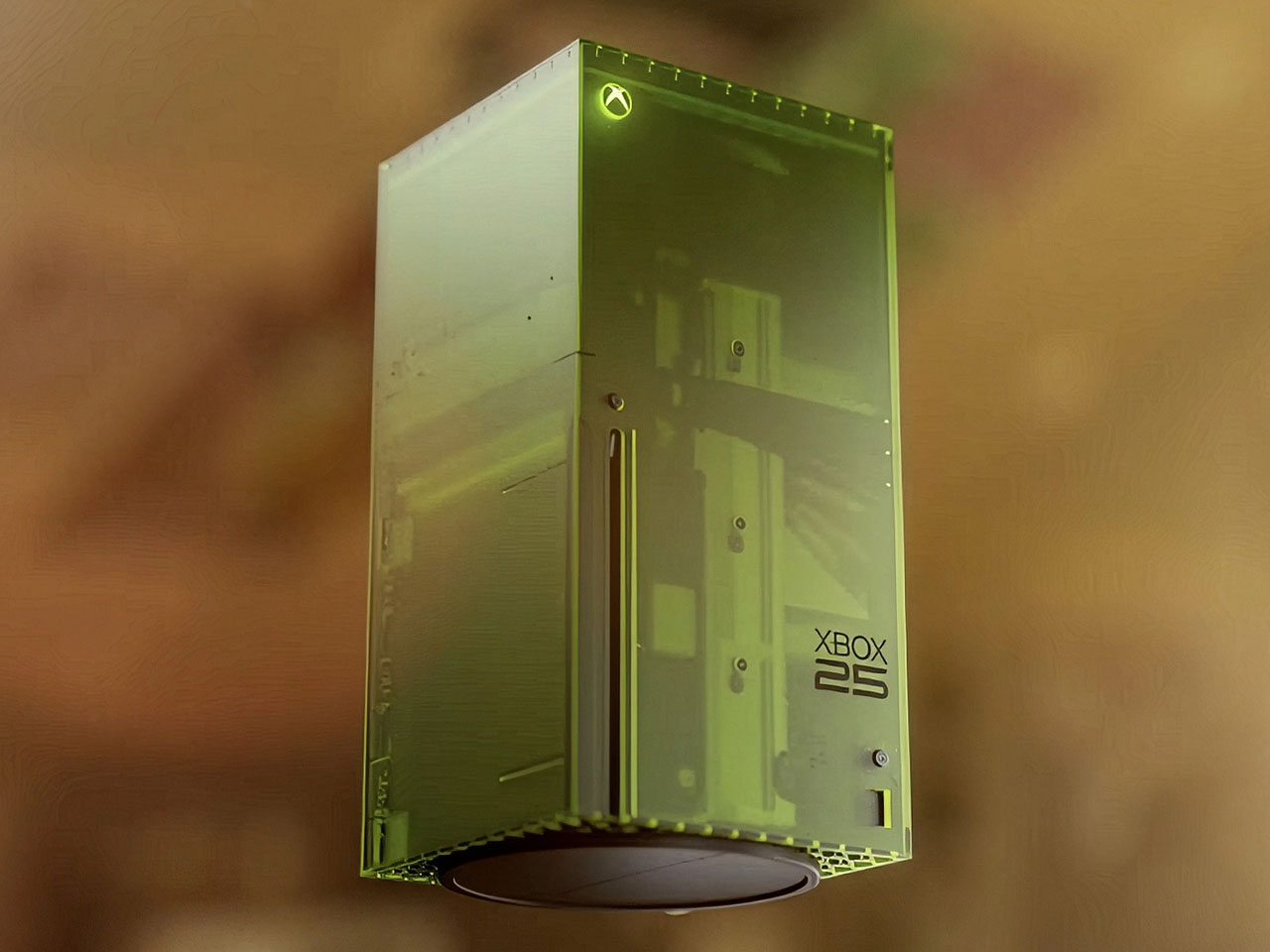
Since we are talking about the highly nostalgic element, the limited-edition creation is draped in the OG Green translucent theme. If you are an avid Xbox fan, that reminds me of the aesthetic worn by the original 2001 Xbox console. The fused hues of the outer shell are absolute dope, both on the console and the controller, while the backplate gets the more traditional black make. Apparently, this is the first time Microsoft has gone for the translucent treatment for the chassis on any current-generation console models. I’m glad they did, because the thing looks so magnetic.
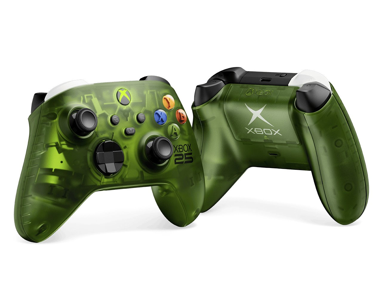
According to Jason Ronald, VP Next Generation, “The XBOX Series X25 Limited Edition respects our history, with the power and performance of the XBOX Series X, including 1TB of storage, and a design that reflects where we’ve been and the community that’s been with us along the way.” Both the console and the controller are etched with the “Xbox 25” anniversary logo on the front. That is complemented by the “X” button that turns green as soon as the console is switched on.
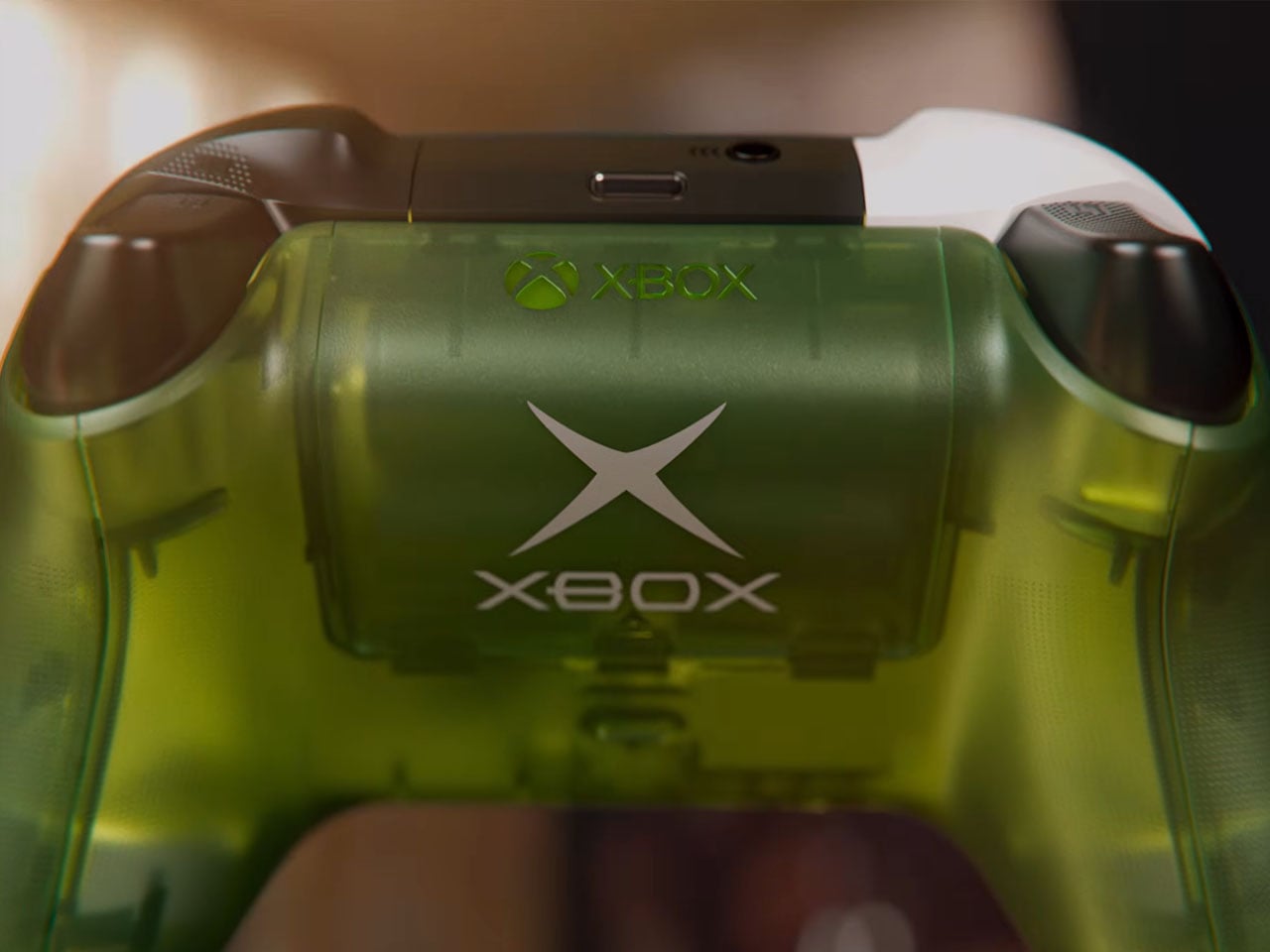
The controller comes with the original ABXY colors for the buttons, and the bumpers on the gamepad are black and white to go with the classic theme of the Duke controller. The translucent goodness flows to the rear, where the back case and the battery panel reveal the Xbox logo. That said, the texture feel and the ergonomic grip are more comparable to the current generation gamepads. Ronald added that there will be some “hidden surprises throughout” to keep things interesting for lucky owners.
Microsoft hasn’t detailed anything about the pricing of the special edition Xbox console, but it’ll be within bounds, I guess. Availability, though, is hinted at for select markets as a special edition collection in November. Those who fail to buy the collection can grab the XBOX Wireless Controller X25 Special Edition standalone as well, but that’s also a limited Edition offering.
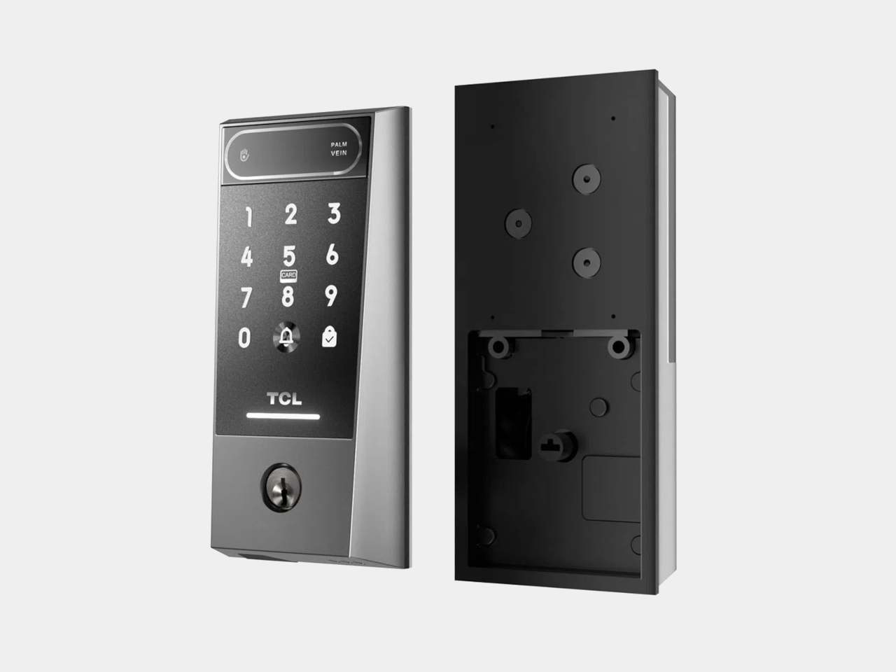
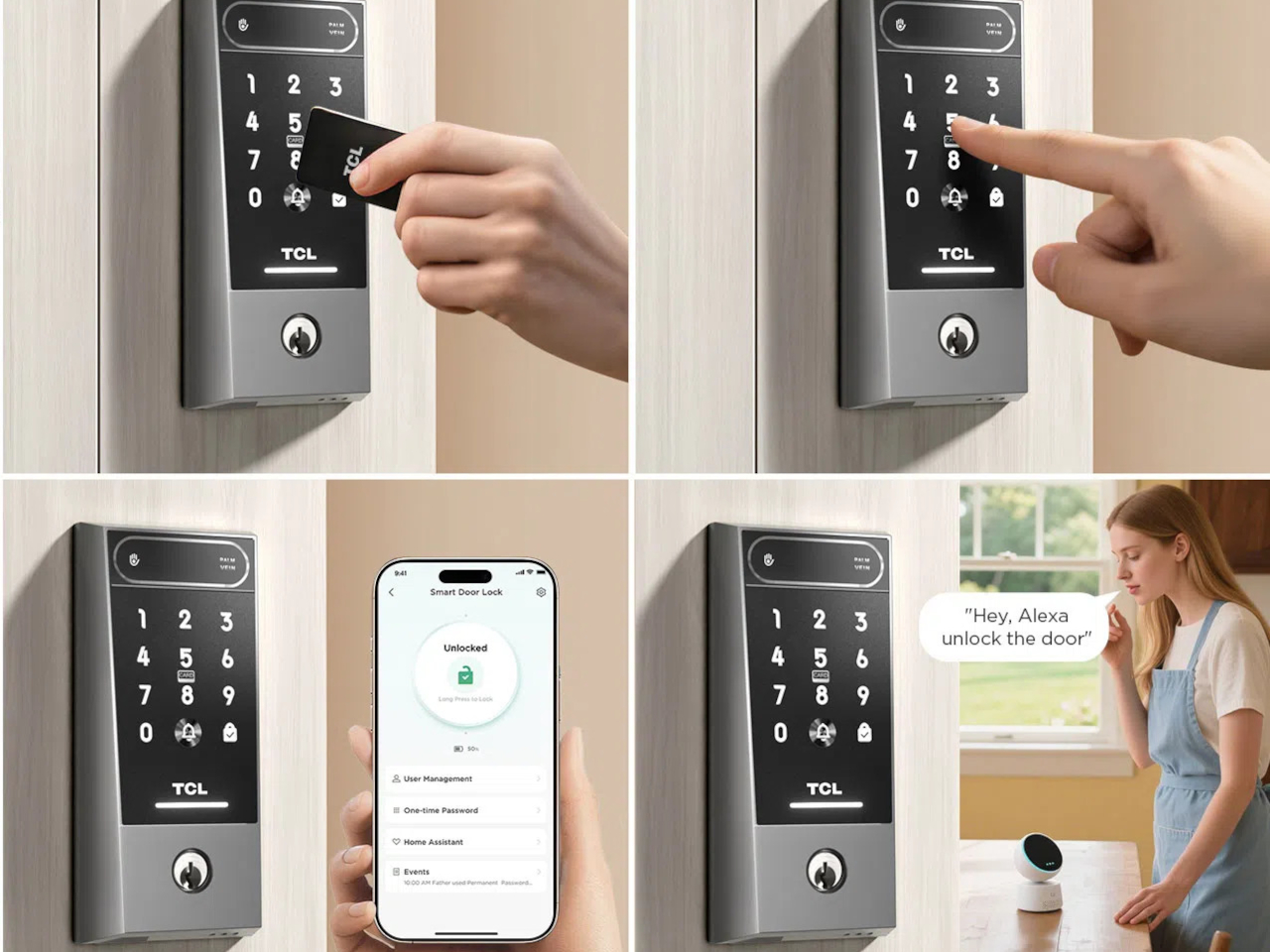
Smart locks are supposed to simplify entry into your home, but many of them just introduce a different set of frustrations in the process. Fingerprint sensors don’t always cooperate when your fingers are tired or wet. PINs get forgotten or spotted by someone standing too close. Key cards are easy to misplace. Despite years of innovation in home security, reliably verifying identity at the front door hasn’t been answered cleanly.
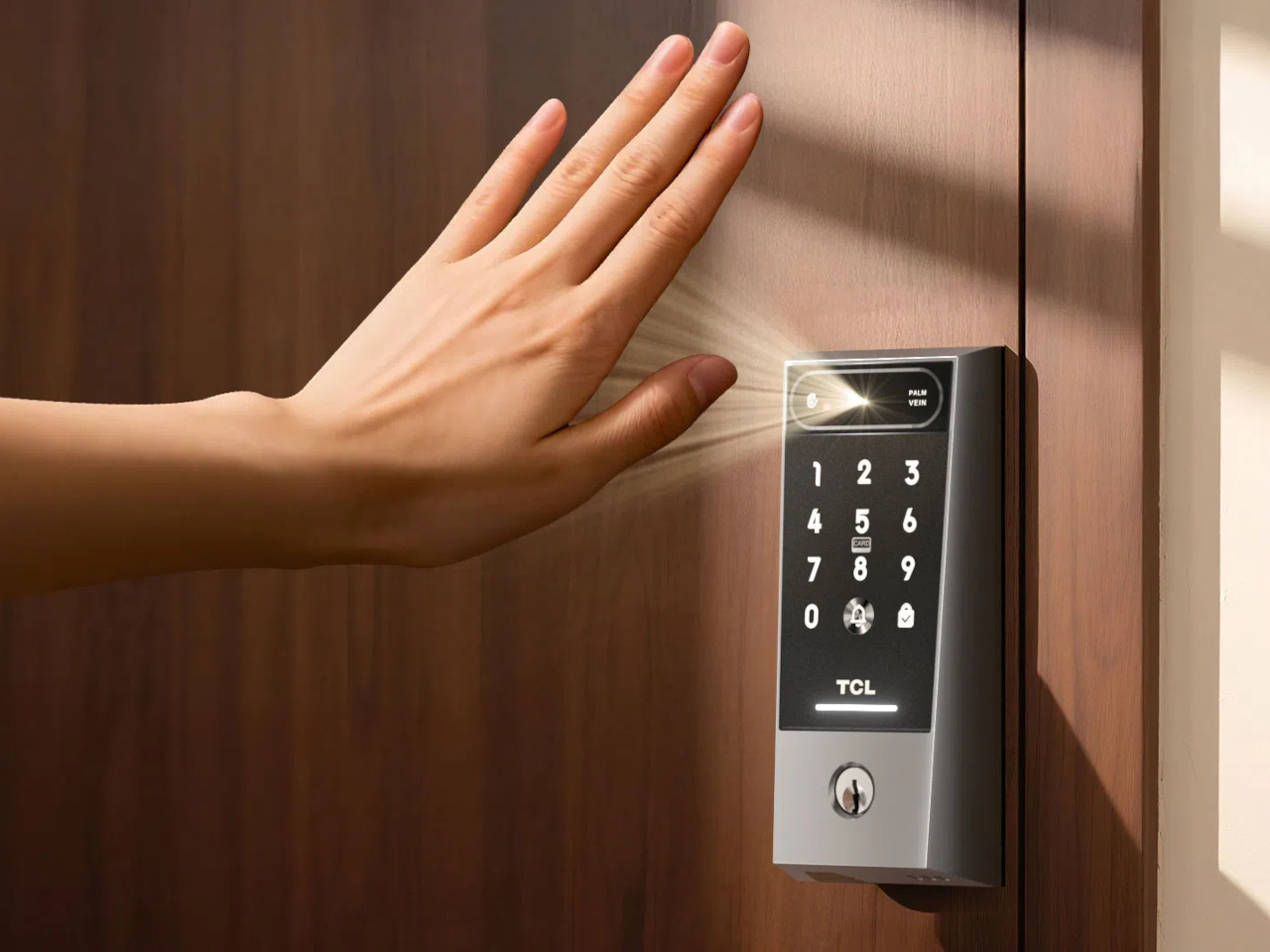
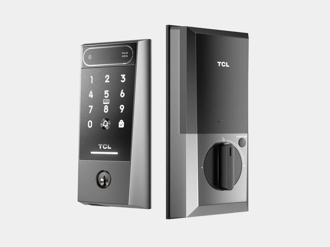
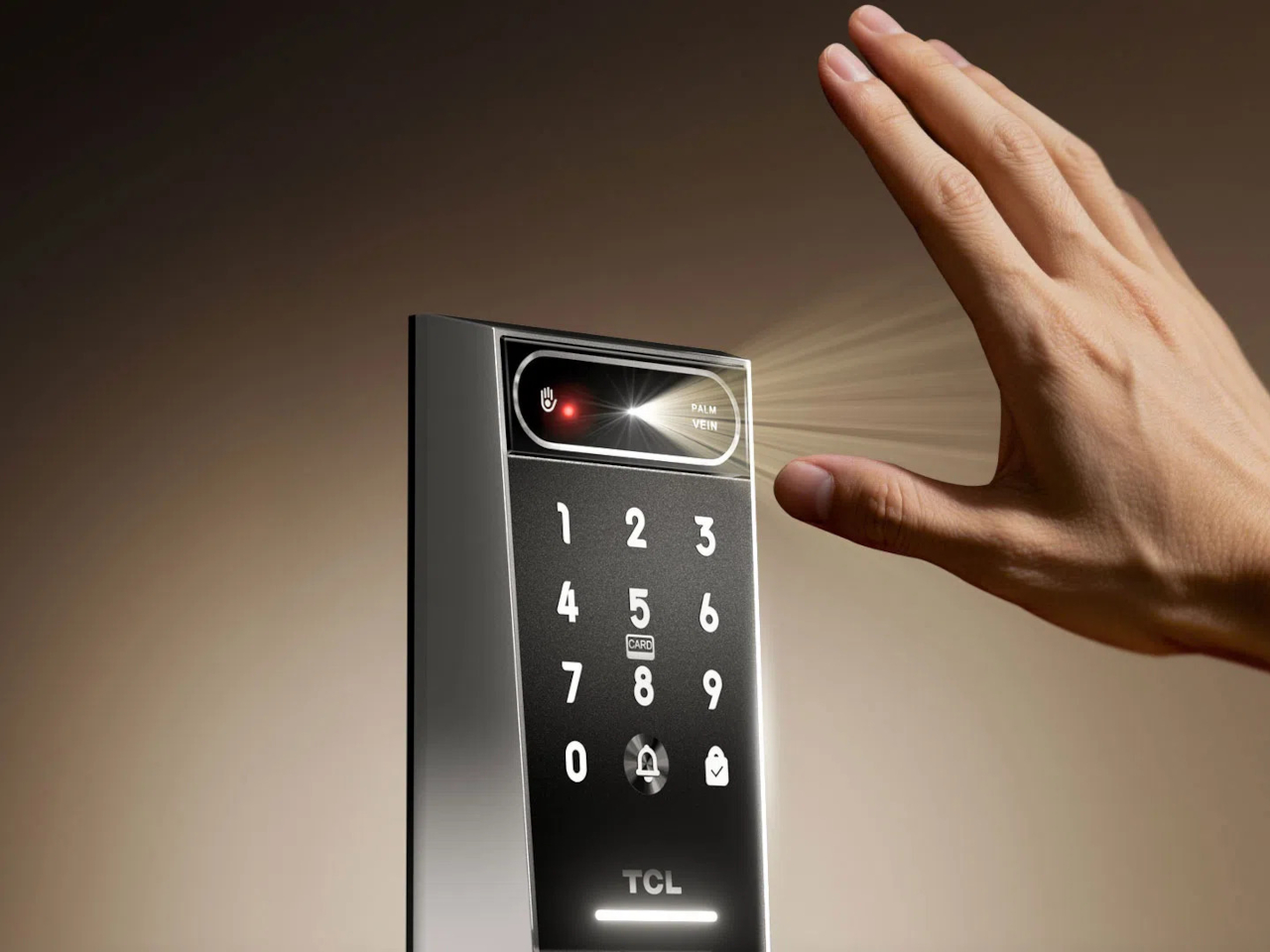
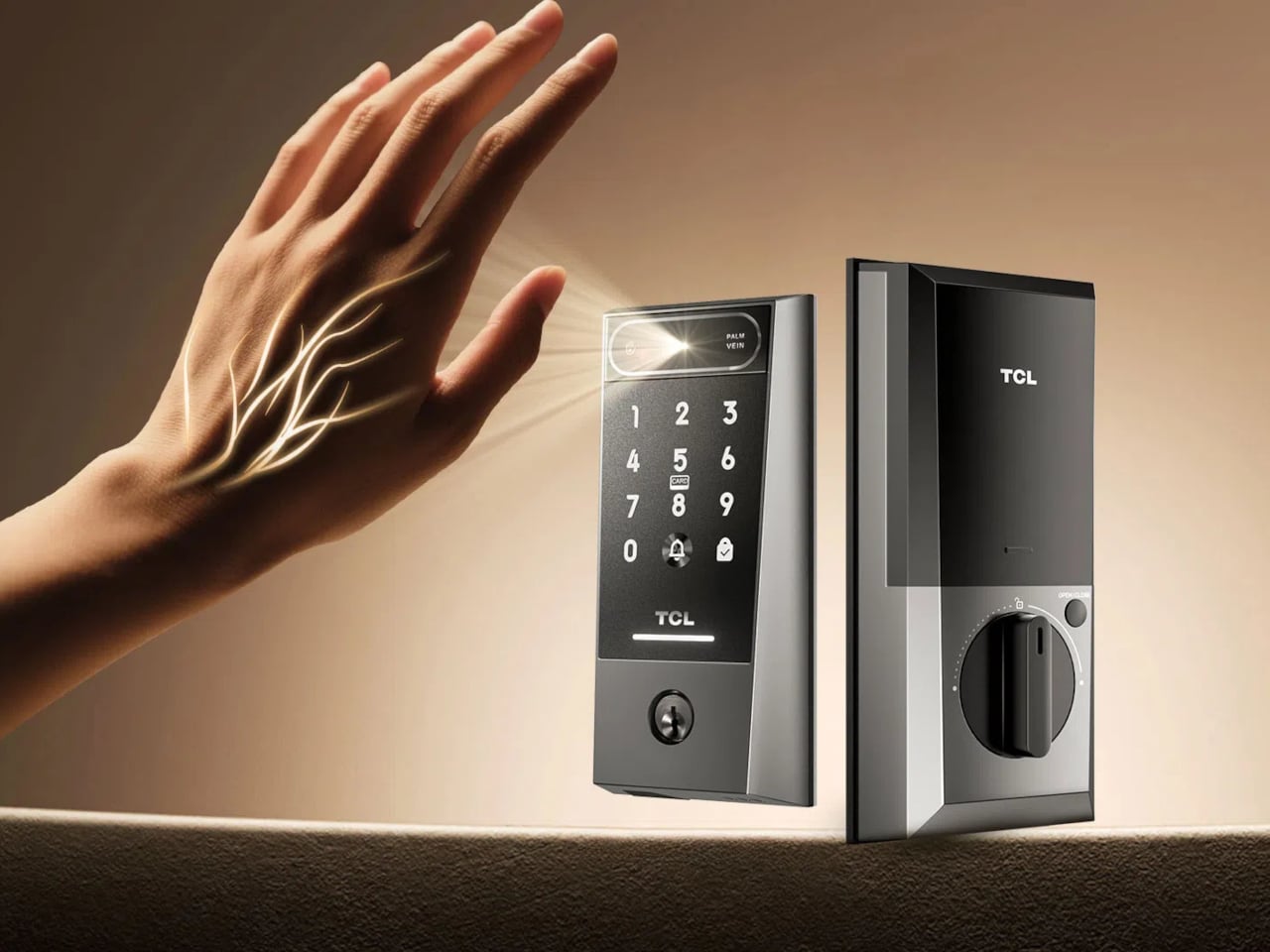
TCL’s D2 Pro approaches that question from a completely different direction. Instead of asking you to touch a sensor or remember a combination, it reads the unique vein patterns beneath the surface of your palm using infrared light. Those patterns are hidden under the skin, making them practically impossible to copy, replicate, or steal, which gives this particular solution a considerably stronger security foundation than most locks on the market.
Think about getting home late at night with both arms full of takeout and a bag swinging off your wrist. There’s no patting pockets for a key or squinting at a keypad in the dark. You raise your palm toward the reader, and the door opens in 0.3 seconds. It’s the kind of effortless entry that sounds like a small thing until you stop having to think about it altogether.
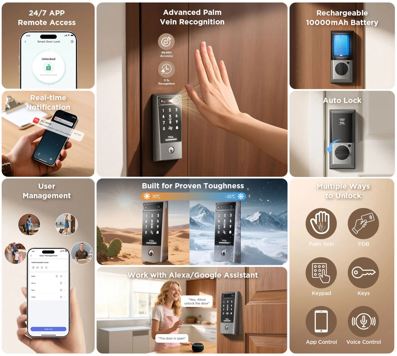
The D2 Pro also learns as it goes. Each time you unlock the door, the on-device AI quietly adjusts your palm vein profile, making recognition faster and more accurate over time. All that data stays stored on the device, so there’s no cloud dependency and no monthly subscription to worry about. A liveness detection system also comes built in, ensuring the scanner won’t respond to anything but a living hand.
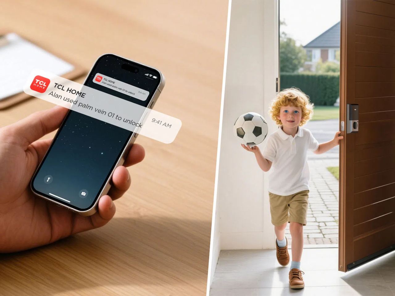
Sharing a home means sharing access, and the D2 Pro makes that manageable through the TCL Home app. You can register palm vein profiles for multiple household members, assign or revoke permissions from wherever you are, and receive real-time notifications whenever the door opens. For guests or anyone who doesn’t have a registered profile, the lock still accepts key cards, a physical key, and a backup keypad.
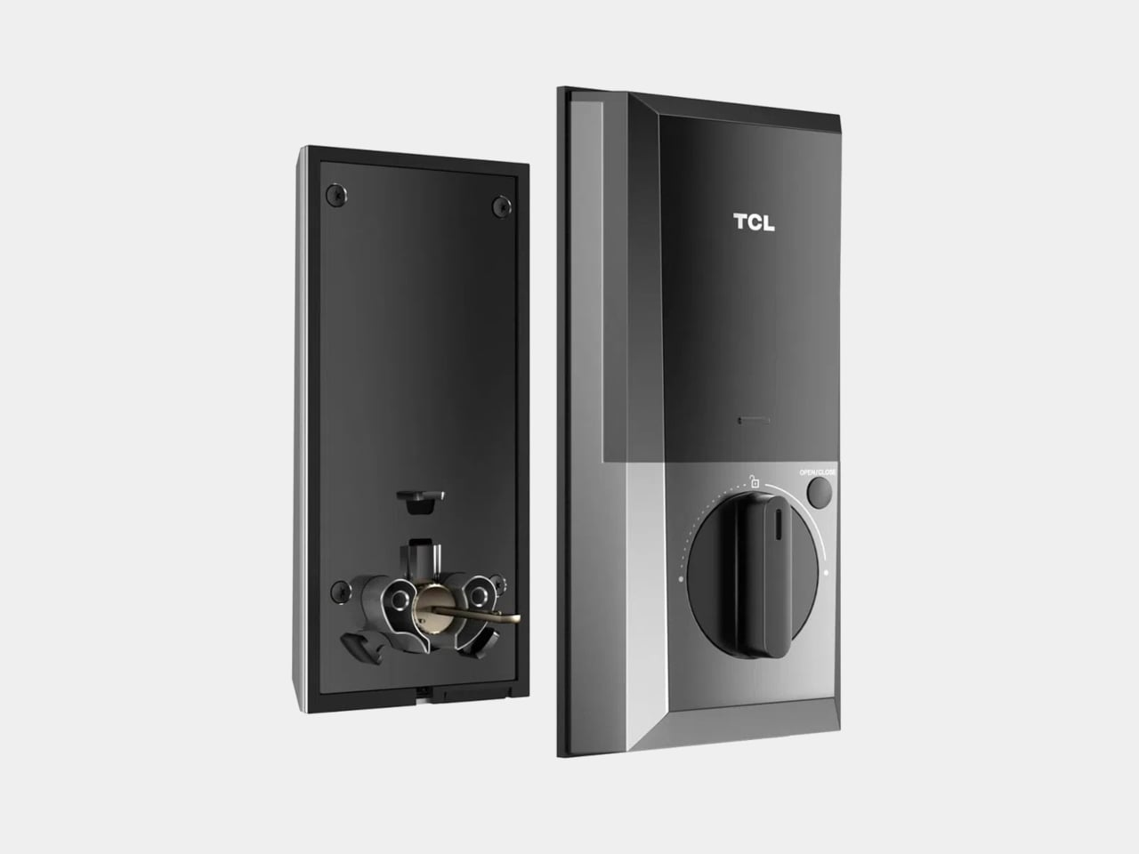
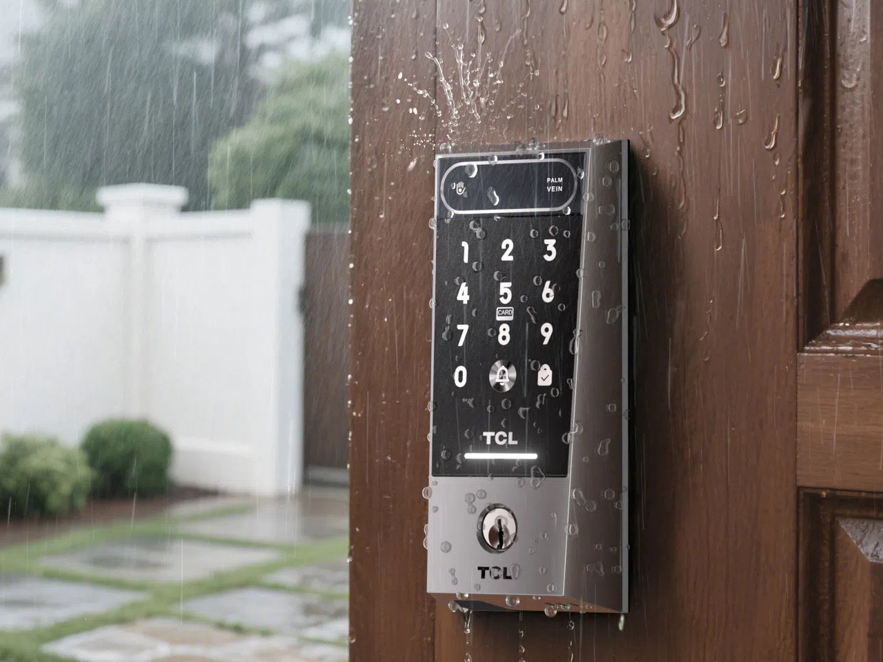
The hardware is built to stay outdoors in all conditions. The D2 Pro’s aerospace-grade aluminum alloy body carries an IP55 weather resistance rating, holding up against dust and water splashes day in and day out. Its operating temperature ranges from -25°C to 70°C, so climate extremes aren’t a concern. A built-in 10,000 mAh rechargeable battery connects via USB-C and is rated for up to eight months on a charge.
A Matter-compatible version of the D2 Pro connects to Apple Home alongside Alexa and Google Assistant, covering most major smart home platforms without needing a separate hub. An auto-lock feature re-engages the deadbolt automatically whenever the door closes, taking care of one more thing you’d otherwise have to remember. BHMA Grade 3 certification covers the structural side, and at $189, it costs significantly less than comparable palm-scanning alternatives.
Our obsession with productivity has created a technology landscape that values data over discipline. We are encouraged to believe the path to better work is paved with more features, more integrations, and more automation, leading to tools that are powerful yet overwhelming. These systems promise efficiency by tracking our every move, analyzing habits, and optimizing our schedules. But in doing so, they can strip away our agency, turning the human process of creative work into a set of metrics managed by an algorithm. The result is a strange irony where the tools we build to manage time quietly end up consuming it.
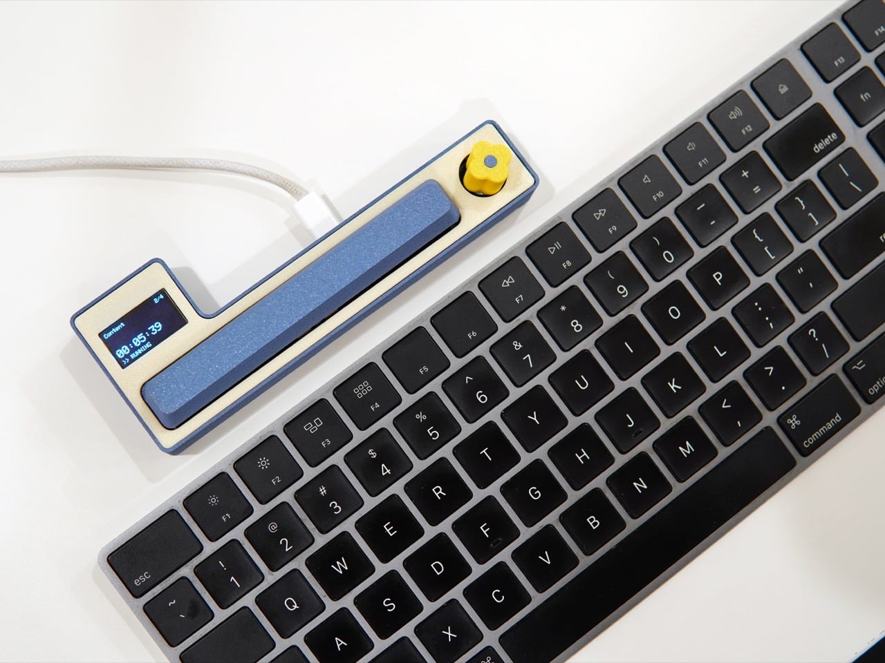
The Freelancer Macropad by Studio Playground is a quiet rebellion born out of the subculture of moonlighting and freelancing. It is a tool built on the belief that awareness is more valuable than automation. Its simple interface, a single knob and a large key, puts the user in complete control, demanding a moment of physical intention to log the passage of time. Creator Shivam Dehinwal could have easily made this a dream device for data enthusiasts by using AI to track time seamlessly in the background. Instead, he made the deliberate choice to build a tool that requires your participation, arguing that the most powerful productivity feature is your own focused attention.
For a salaried employee, time is the employer’s concern. The clock is managed by structure: a calendar of meetings, a fixed start and end to the day, a paycheck that arrives regardless of whether Tuesday was three hours of deep work or three hours of inbox archaeology. Freelancing dismantles that entirely. Every hour sold carries a direct monetary weight, and context switching between a branding project for one client and a deck for another can silently bleed a day into an unaccountable blur. The Macropad’s functionality is distilled for one purpose, to track your allocation of time, and that singular focus is precisely what makes it suited to the freelance condition.
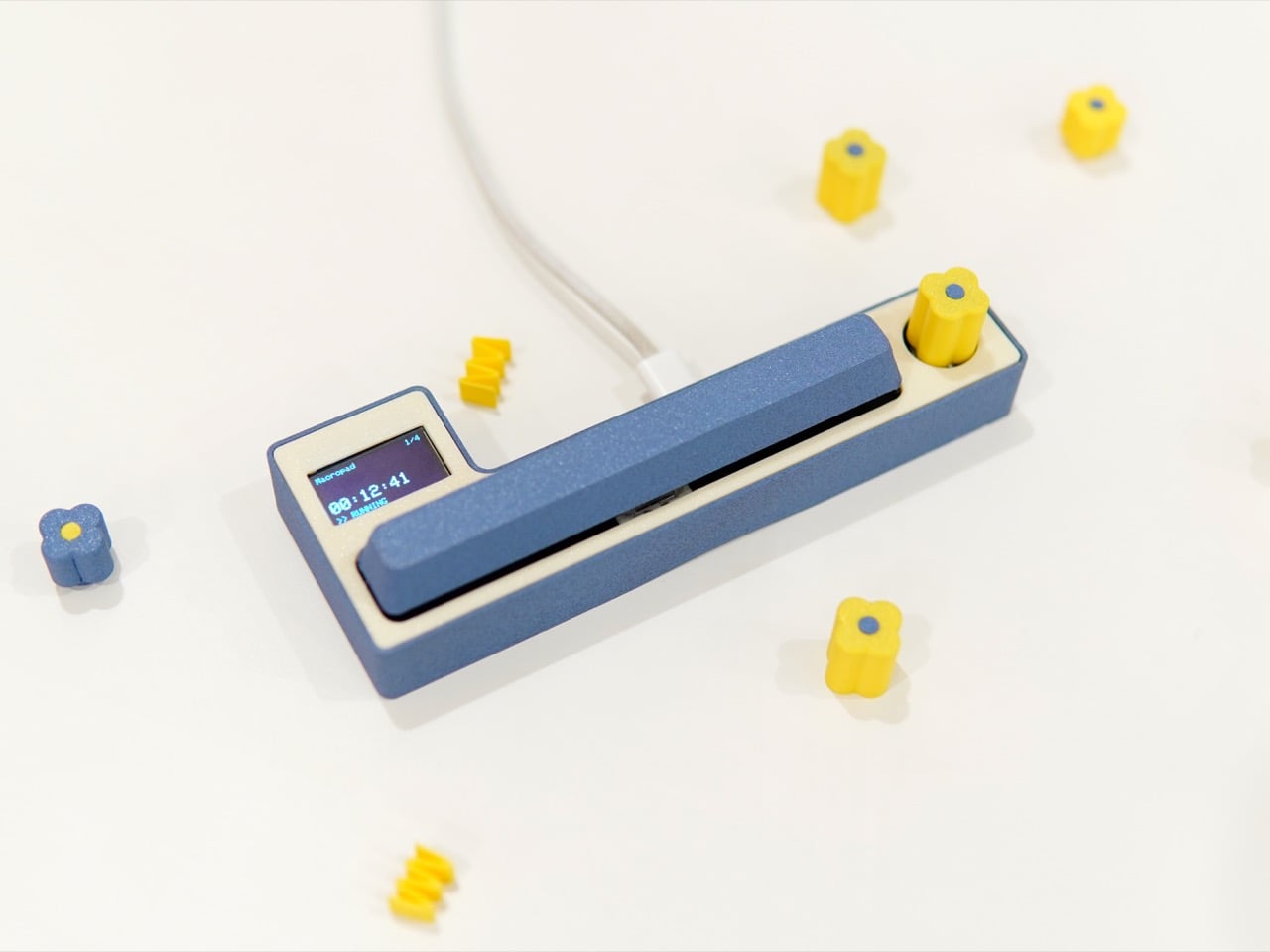
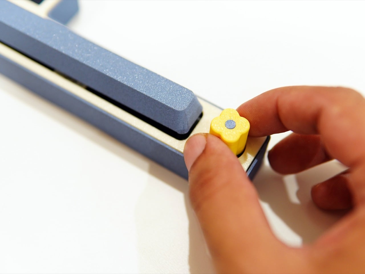
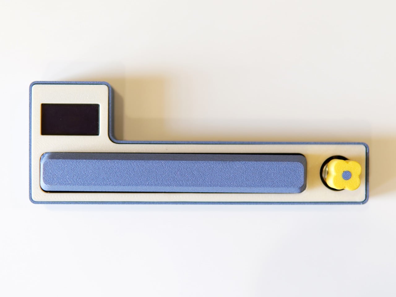
The body sits in a calm, muted blue against a cream-toned chassis, with a yellow flower-shaped rotary knob that reads as playful and precise rather than gimmicky. Using the knob you can switch between projects, and using the spacebar you can pause and play the time counter. A small OLED display to the left surfaces the active project name and elapsed time without tipping into information overload. You only need a computer during setup to add projects, and after that the Macropad runs independently from a phone, power bank, or computer. When you need the log, a long press of the spacebar outputs a time receipt directly into any text editor of your choice, a Google Doc, a Word file, even an email body.
Still in beta, the Macropad has already surfaced different modalities of use, and those insights are actively driving further development of the project. Pricing and broader availability remain open questions, and the product’s trajectory will depend on whether enough people see dedicated physical hardware as a ritual worth investing in. You can follow progress at Shivam’s Instagram, @shivam_playground. I suspect the people who need this most will know it the moment they see it, because what the Macropad quietly hands back is something the app ecosystem has been slowly taking away for years: a real sense of ownership over your own time.
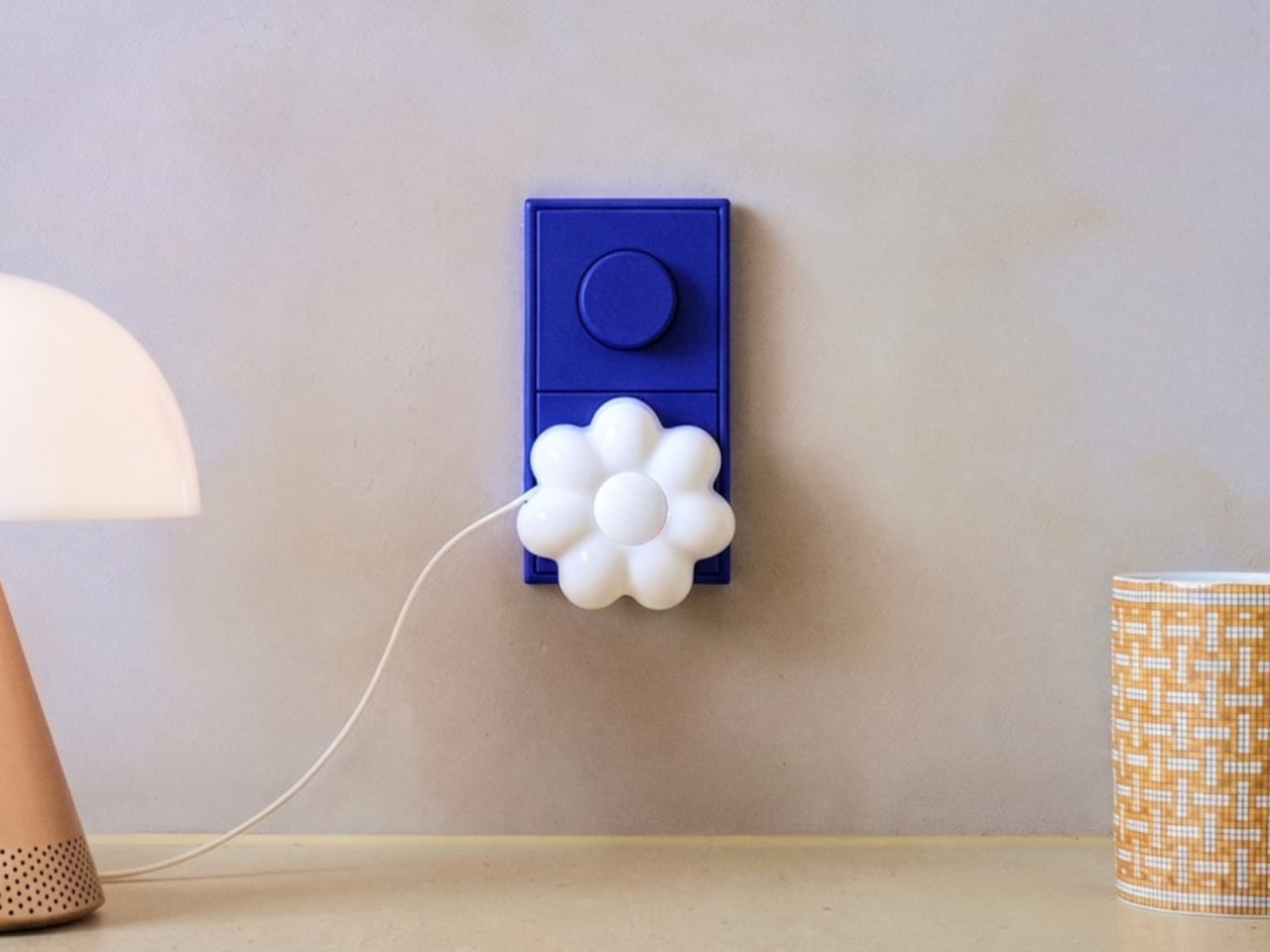
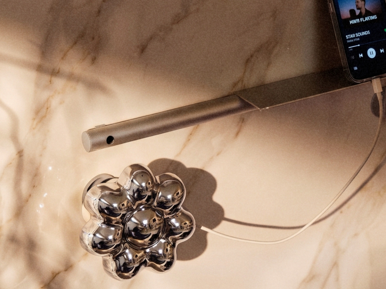
The wall charger is one of the most present objects in any home and one of the least considered. It sits on bedside tables, desk corners, and coffee tables for most of the day, then gets used for a few minutes and goes right back to being an uninvited presence. Nobody picks a charger because it belongs in their space. They pick it because it was cheap, available, and functional.
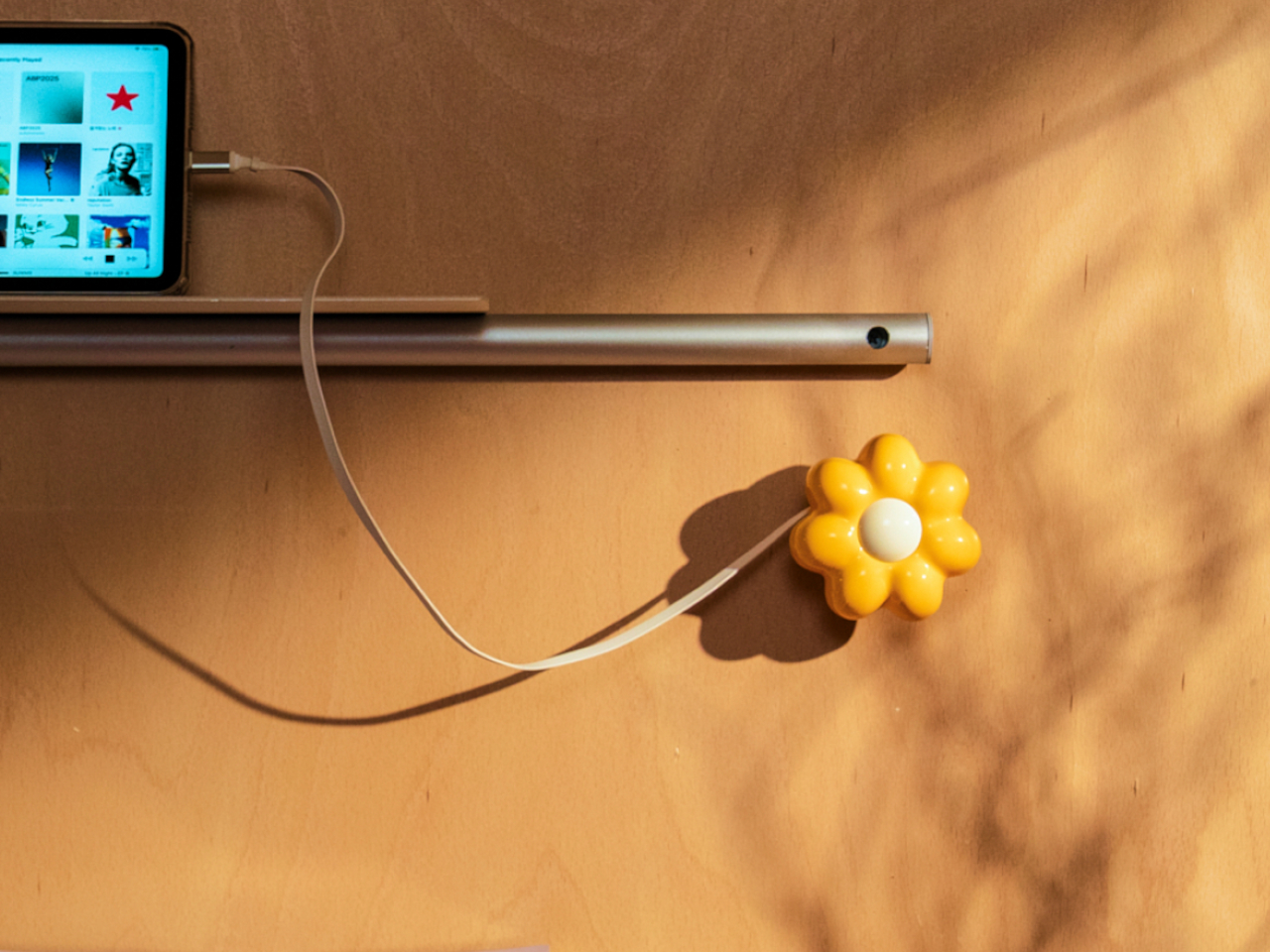
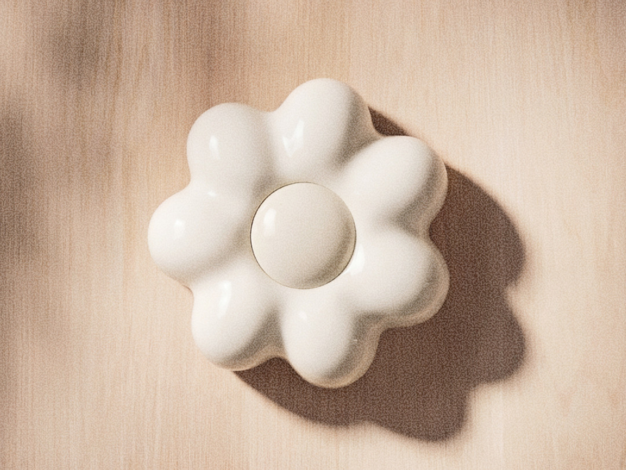
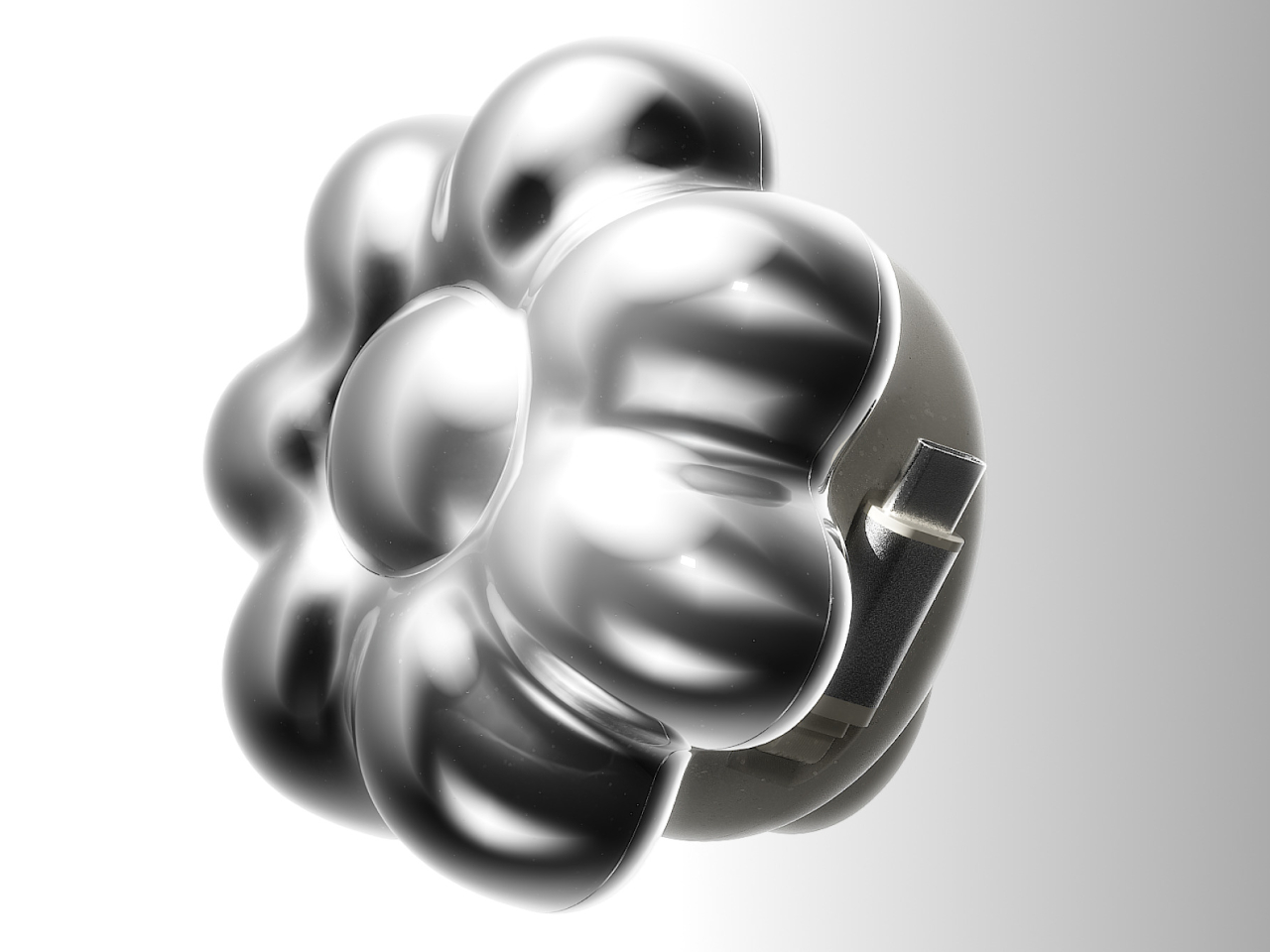
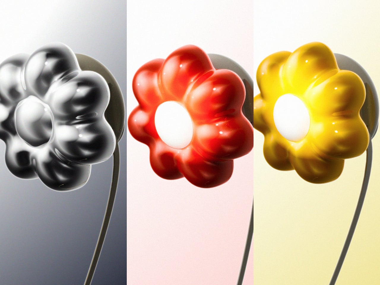
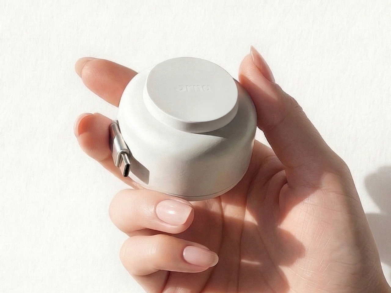
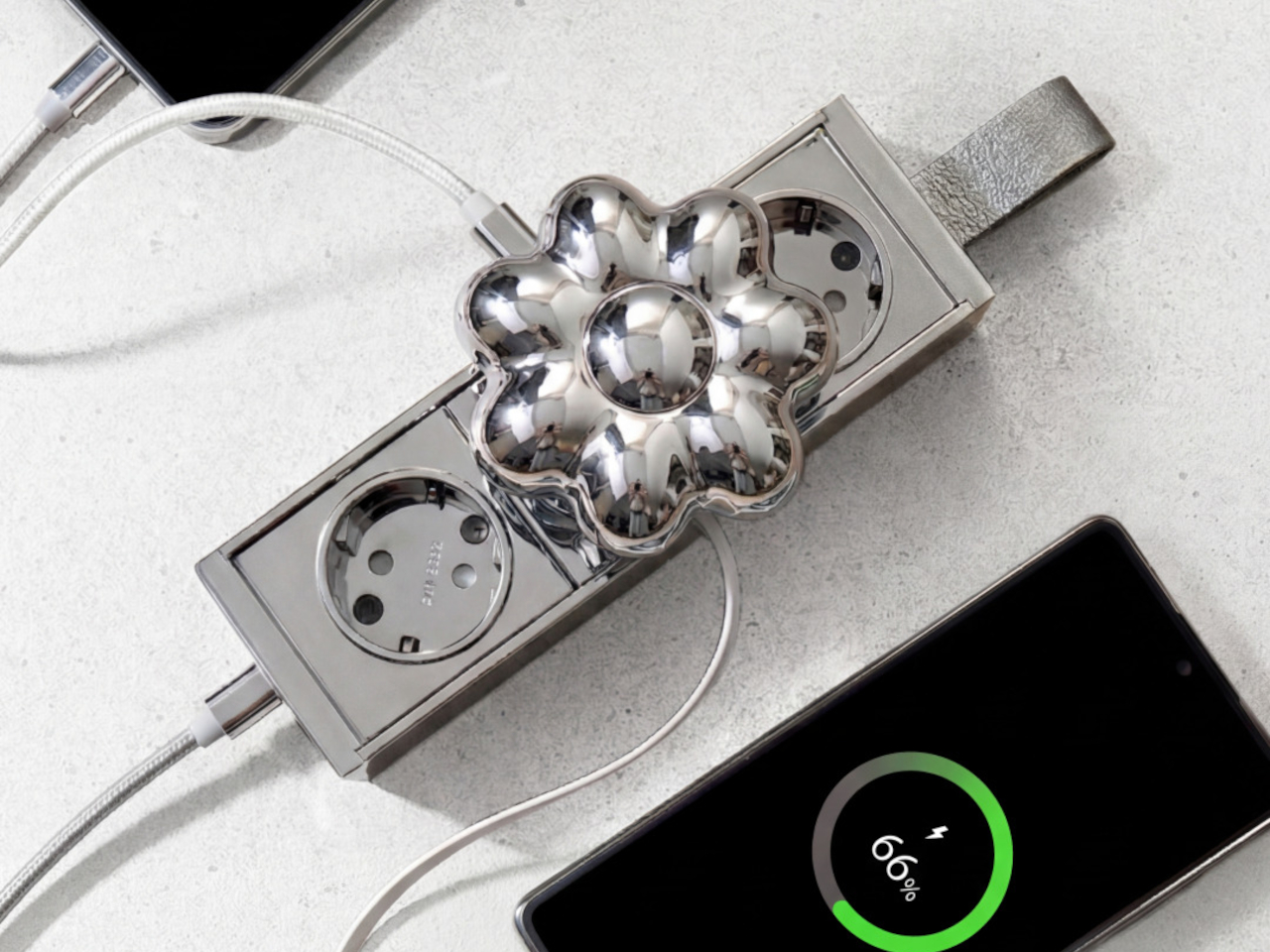
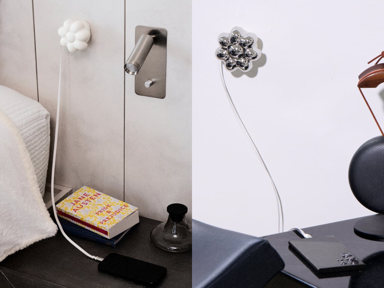
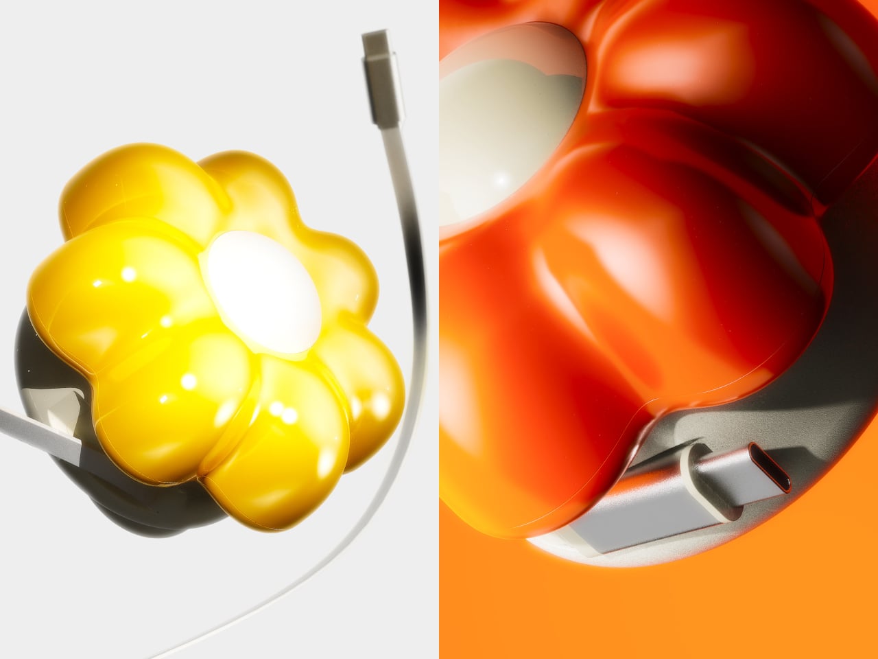
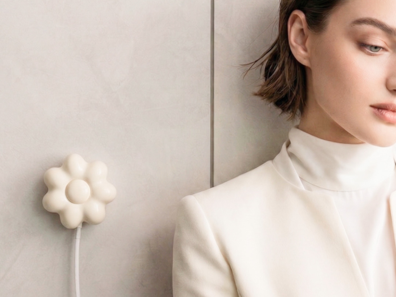
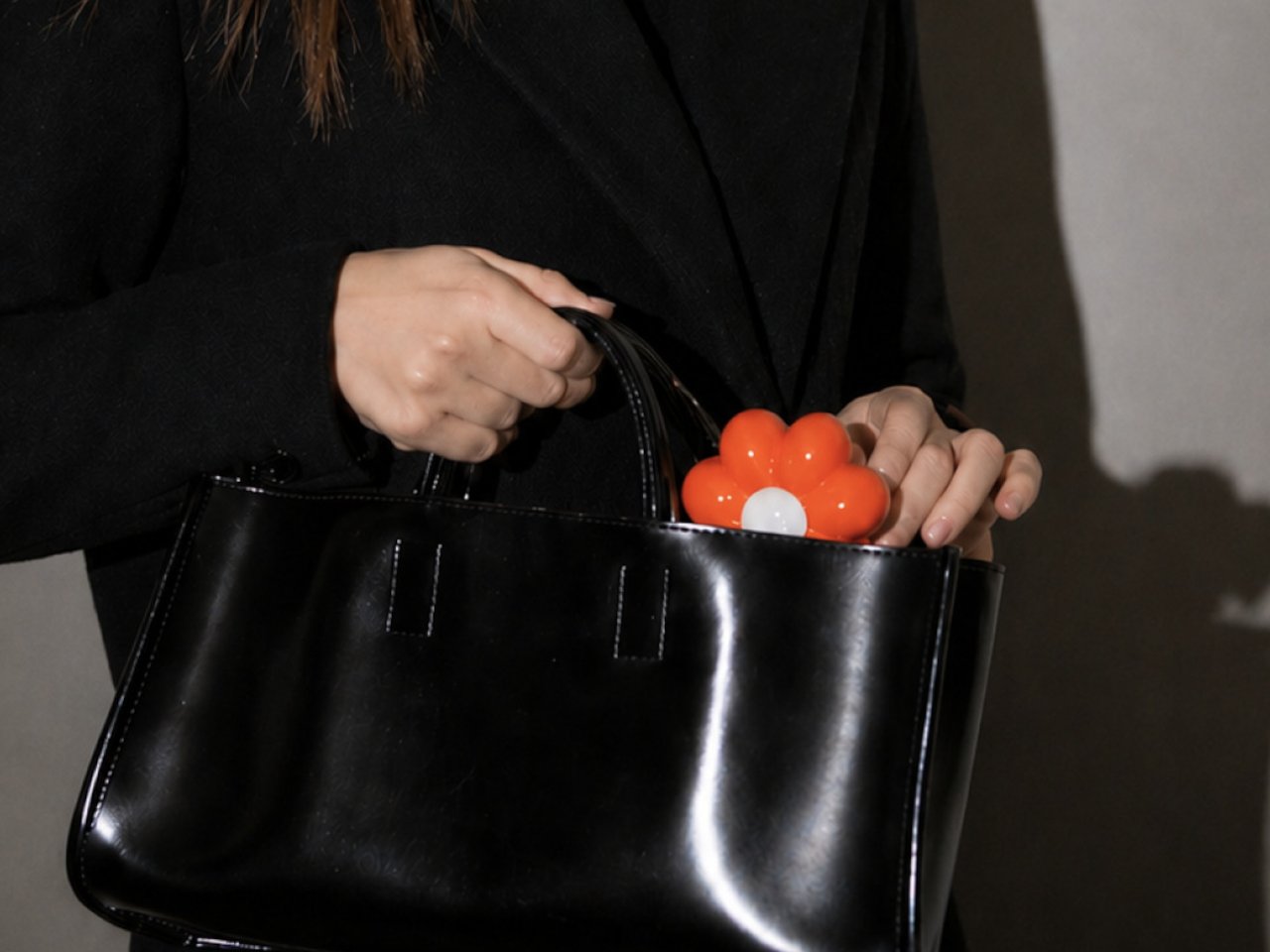
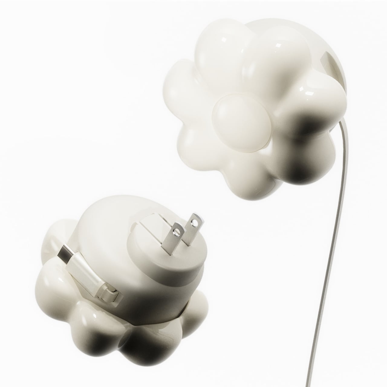
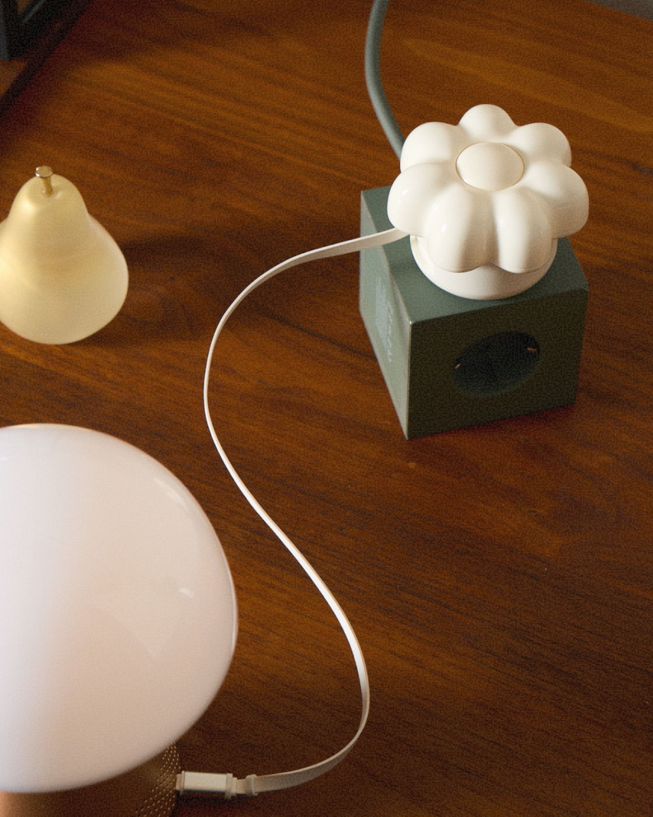
ORNA’s Objet Charger proposes a different starting point. It’s a 35W USB-C wall charger that treats the design of the object as seriously as the technology inside it. The key is a modular floral cover with a high-gloss, pop-art silhouette that attaches magnetically to the charger body and turns an overlooked utility item into a sculptural presence on any wall.
Designers: Kangnim Park, Jaehwa Lee, Jinsu & Jiwoong Studio for ORNA
The cover is the part that gets swapped out to suit personal taste. Four versions are available: Daisy White, Sunflower Yellow, Marigold Orange, and Chrome Silver, each finished in a high-gloss surface that reads differently by room. The magnetic connection makes switching instant, which is part of what makes the concept work. Changing the personality of the object doesn’t require a new charger, just a different flower.
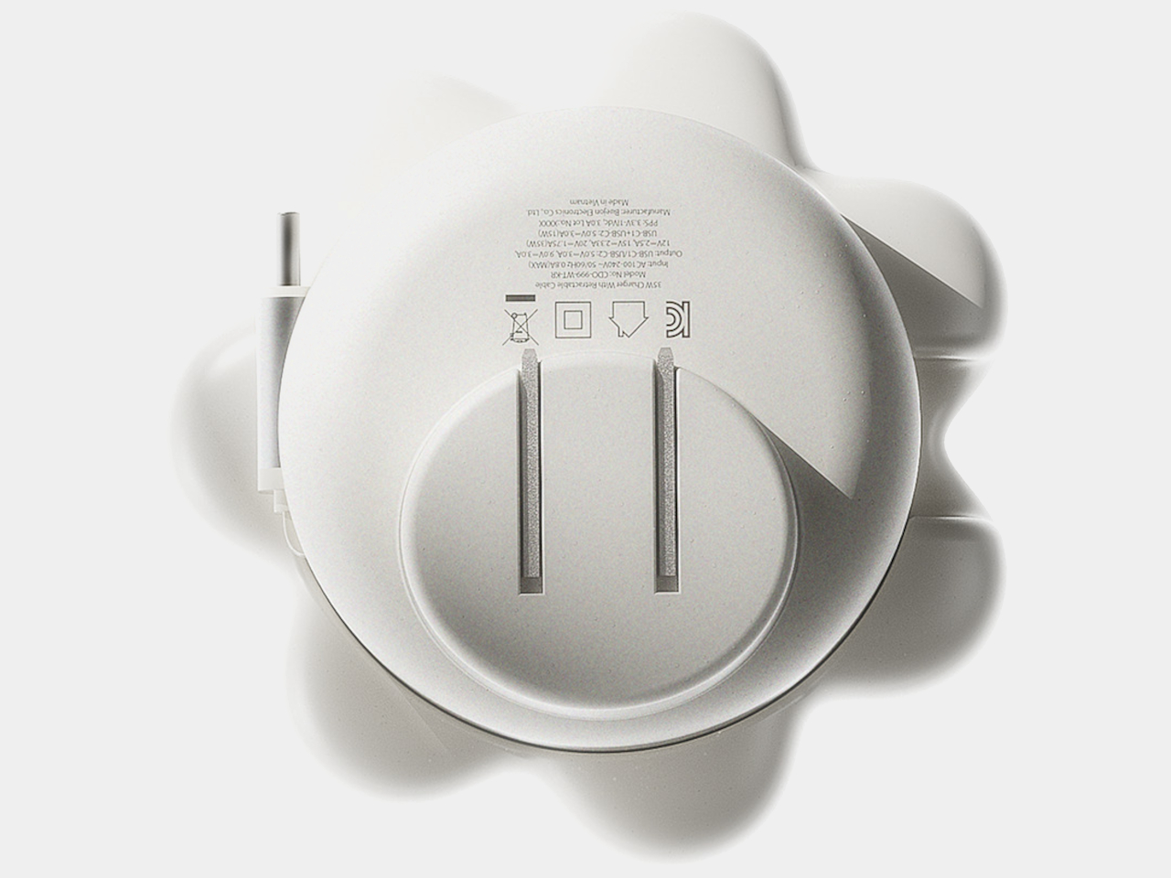
Underneath the sculptural exterior is a charger built for serious daily use. A one-meter USB-C cable is integrated into the body and retracts cleanly, so there’s no loose cord when the charger isn’t in use. A secondary USB-C port on the base handles a second device simultaneously, with the total output shared at 15W when both are active. Single-device charging peaks at 35W with full fast-charge protocol support.
The base of the charger was designed with the proportions of a traditional Korean Moon Jar in mind, a ceramic form known for the quiet completeness of its rounded body and the restraint of its surface. That design context matters more than it might sound. The charger is meant to occupy the wall the same way a carefully selected object occupies a shelf, present, purposeful, and unhurried.
Flower Objet covers are sold separately from the charger base, starting at $49 for the Daisy White and Sunflower Yellow finishes and $99 for the Chrome Silver variant. The modular logic means the same base stays in place for years while the floral cover changes with the seasons, the room, or simply a shift in taste. The foldable plug keeps the package compact enough to carry between rooms or pack into a bag without a trailing cable. It’s a long-term object, not a disposable tool.
ORNA frames the proportion of the charger’s daily existence as roughly 23 hours of visual presence for every one hour of active use. That framing captures why most chargers feel like failures: they’re designed entirely for the one hour and ignored for the 23. The Objet Charger is built for both, which is the kind of quiet attention most objects in our homes never receive.
Steve Jobs pulled the original MacBook Air out of a manila envelope in 2008 and the laptop industry never recovered. What followed was nearly two decades of manufacturers treating thinness as the primary measure of ambition. Apple refined the aluminum unibody chassis into a design language so influential that Dell, Samsung, HP, and virtually every other PC maker began chasing the same silhouette. The problem was that aluminum unibody construction left almost no room for battery expansion. The chassis became the constraint, and battery capacity was the thing that gave way. Users got a premium-feeling machine that needed a charger by mid-afternoon.
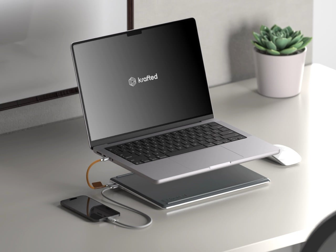
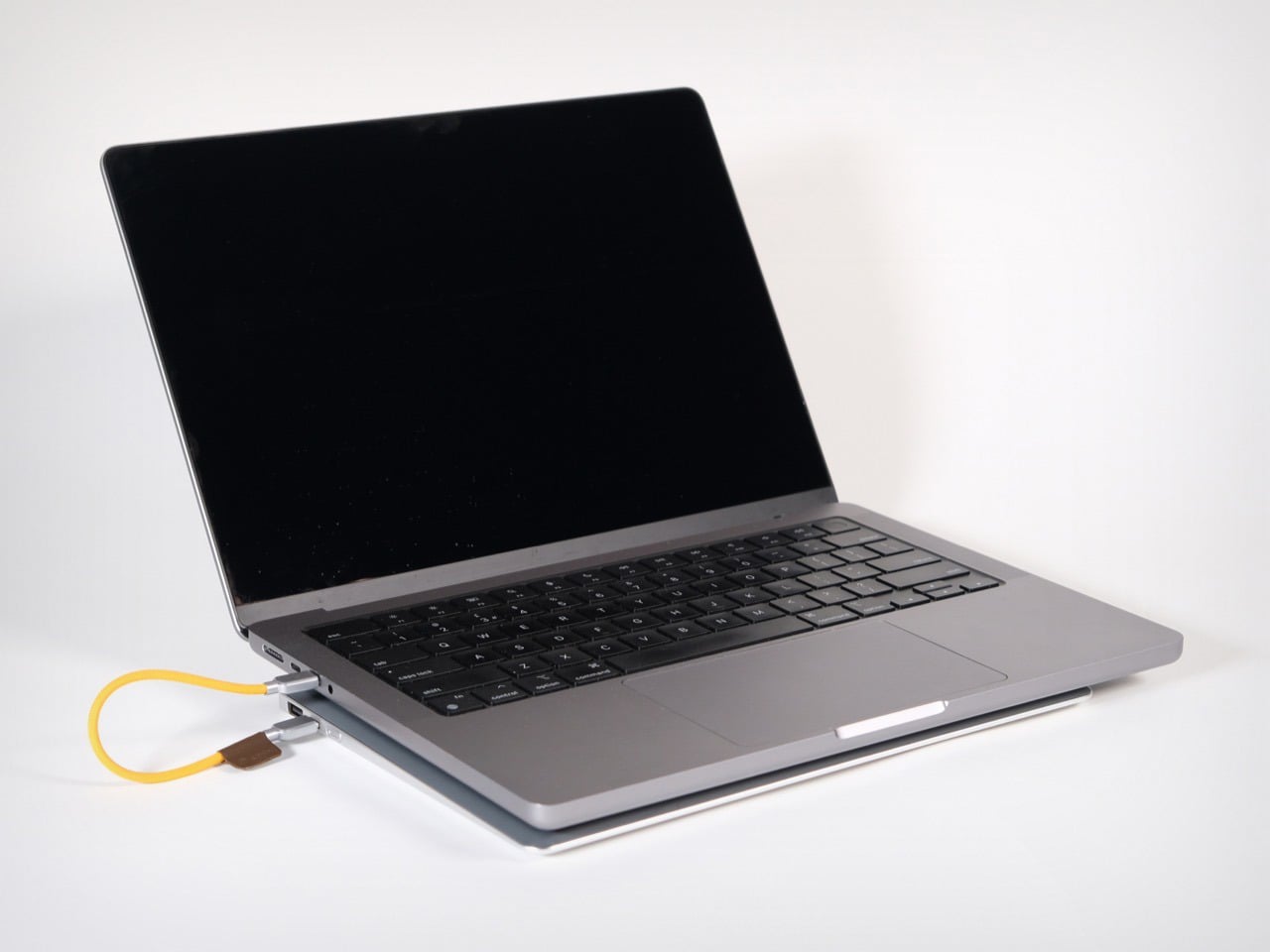
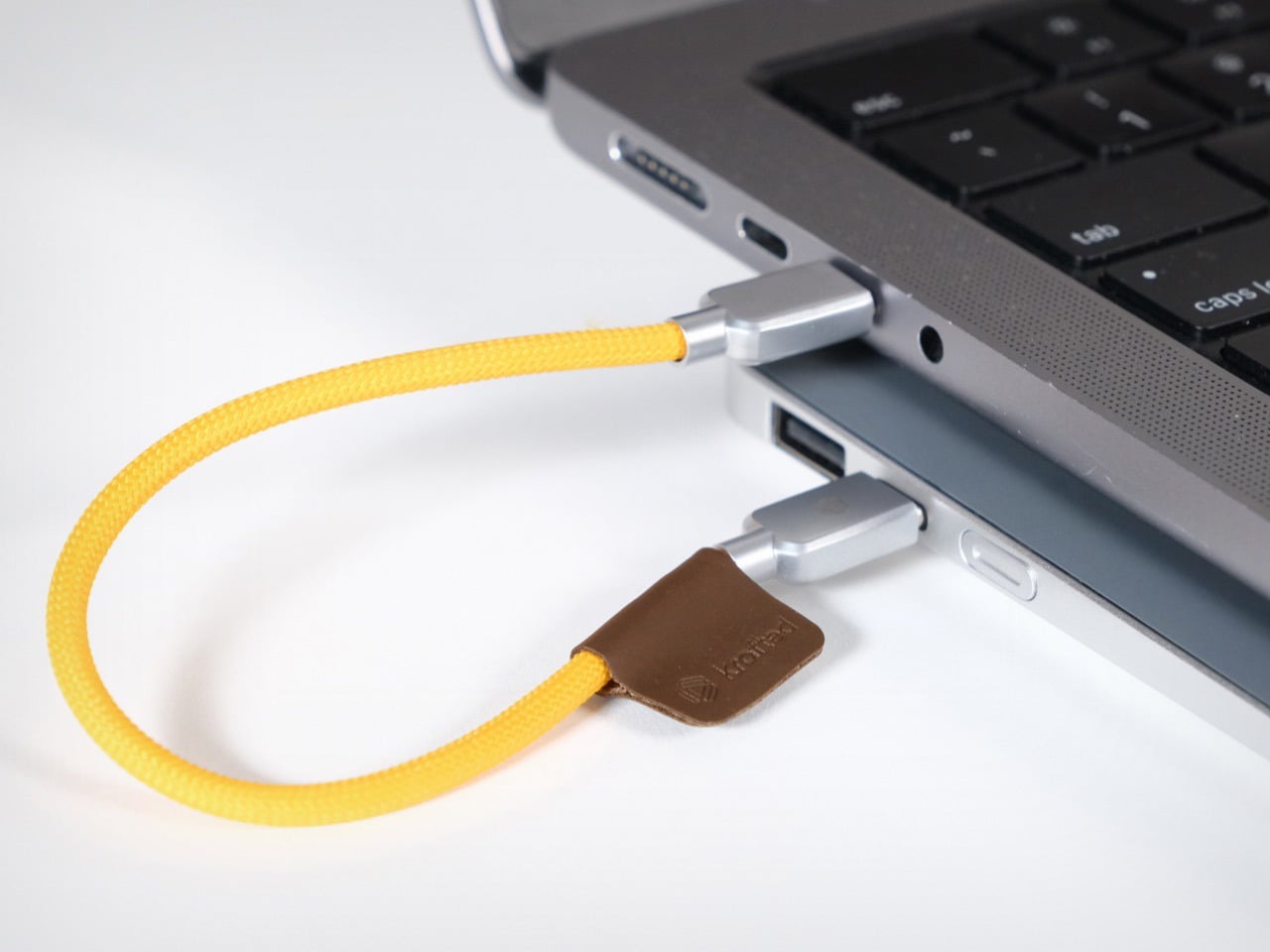
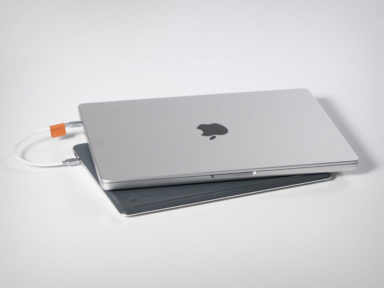
Krafted Edge, from a London-based team currently 14x funded on Kickstarter, takes that surrendered battery volume and turns it into a dedicated companion slab. At 12.88mm thin, matched to a laptop’s footprint, it slides into the same bag sleeve and sits flush underneath the machine on any desk. The 65W USB-C output handles a MacBook or Dell XPS at full charge speed, and a user-replaceable battery module means the unit survives well beyond the obsolescence cycle that Apple’s own design philosophy helped normalize.
Most power banks are designed as self-contained objects, with their own visual identity, their own color language, their own form factor logic. Edge is designed to be a subordinate layer, a second slab that borrows the laptop’s rectangle and adds nothing extraneous. Silicone ventilation bars on the underside keep the laptop’s chassis from sitting flush against the battery surface, managing heat without vents or fans. That is a detail most companies would have skipped in the name of simplicity, and Krafted chose to solve it instead.
Twenty thousand milliamp hours at 65W USB-C output means Edge can push full-speed charging to a MacBook Air or Dell XPS, a level of output most portable batteries cannot match for laptop use. In practical terms, that translates to up to three full laptop charges, four phone charges, and thirty-five headphone charges from a single Edge. The USB-C and USB-A ports run simultaneously, meaning a laptop and phone can charge at the same time, the actual use case for anyone working through a long travel day. The USB-A port covers older devices and accessories from the same slim device. The spec sheet reads like something Krafted reverse-engineered from real-world work patterns rather than from what was cheapest to manufacture at a given wattage.
Aircraft-grade aluminium forms the housing, with ocean-bound plastic components used for the detailing, braided metal connectors on the cable, and a plant-based leather tag, meaning the material story carries a traceable supply chain rather than a footnote about corporate responsibility. On the certification side, Edge carries CE, UKCA, and UN38.3 compliance, and at approximately 74Wh, it falls comfortably below the 100Wh threshold that most international airlines enforce as the carry-on limit for lithium battery devices, no special permission required. That number matters more than it might seem right now. Airlines across multiple jurisdictions have been tightening restrictions on portable power devices in cabin luggage, and the last thing a frequent flyer needs is a power bank confiscated at security. Edge is built to travel as cleanly as the laptop it supports, which is the whole point of matching its form factor in the first place.
The replaceable battery system means Edge has a limitless lifespan. You do not throw it away when the battery degrades, you replace the module. Krafted breaks the single-use cycle that defines the category, so the aluminium chassis, the cables, the connectors, and the circuitry all outlive the cells inside them. That is a sustainability argument, but also a value proposition, because an object built to outlast a single battery’s lifespan is fundamentally different from a disposable product dressed up in premium materials. For a category historically treated as a commodity, the replaceable module puts Edge in the same conversation as tools you service rather than gadgets you replace. In a world where Apple sells its own batteries as non-serviceable components and charges accordingly, that philosophy lands as a genuine design position.
The Krafted Edge is available at a discounted $139 price tag, while the MSRP reads $200 if you wait to buy it after the Kickstarter campaign ends. A dual pack costs you $249 right now, netting you 37% savings. The Krafted Edge ships globally, with deliveries set for July 2026.
There is a different kind of that happens in late June. Your feed fills with gear photographed in good light, linked before the image has finished loading, and gone from stock by the time you circle back. Some of it is noise. Some of it quietly solves a problem you have been working around for years without naming it. The ten products here belong to the second category, and every one of them is genuinely worth the attention.
They cover the full arc of a summer day, from the first outdoor coffee to the last photograph before the light drops. Not one of them asks you to sacrifice design quality for function, or function for form. These are the products that spread because they earn it, objects that change something specific about the next few months. Whether you find three of them or all ten, your summer bag has room for the upgrade.
1. Camera (1)
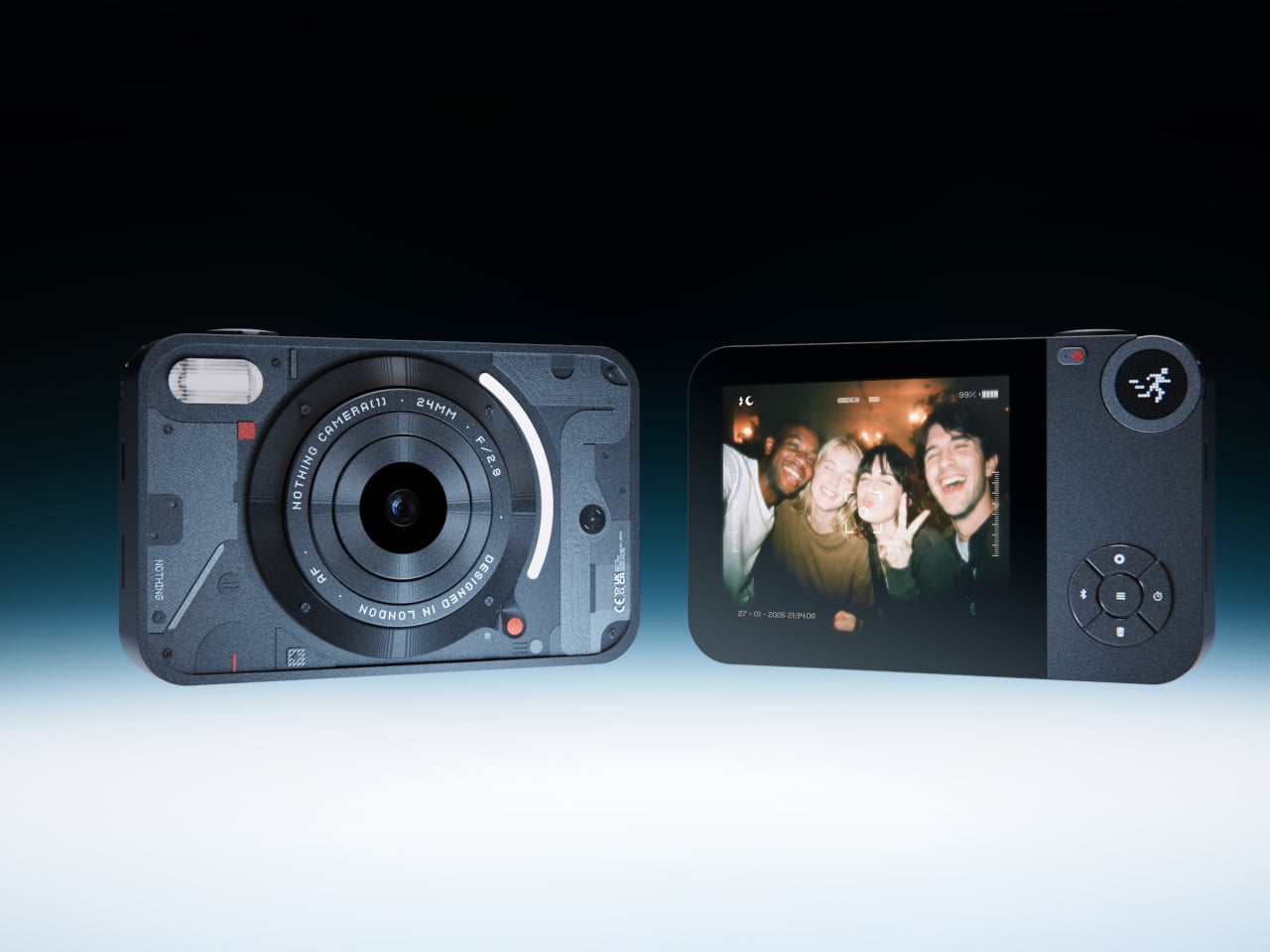
Most photographs live inside phones now, buried between notifications, grouped by algorithm, and rarely looked at twice. A growing number of people have started picking up older digital cameras to make shooting feel like a separate, deliberate act. Camera (1) is a concept design by Rishikesh Puthukudy that explores what a modern compact could feel like if built around physical controls and tactile feedback rather than software layers and touchscreen menus. All main controls sit on one edge, placing the shutter, a mode dial with a small glyph display, and a D-pad within reach of thumb and index finger without shifting grip or touching a screen.
The concept draws its design language from Nothing’s transparent, hardware-forward aesthetic. A curved light strip around the lens pulses during the self-timer, confirms focus lock, and signals when video is being recorded. The engraved lens ring, marked with focal length and aperture, turns zoom and focus into a physical twist rather than a digital pinch. A bead-blasted metal shell, circuit-like relief panel, and small red accents give it a technical, considered character.
What We Like
Physical edge controls and glyph-based mode dial put the entire interaction in the hand rather than on a screen, which is exactly what compact camera design has been missing
Bead-blasted metal body and red accent details communicate material intent and quality without relying on branding
What We Dislike
A concept with no confirmed production path means you are left admiring the idea rather than buying the object
The design draws heavily from Nothing’s visual language, which will feel derivative to those who follow that brand closely
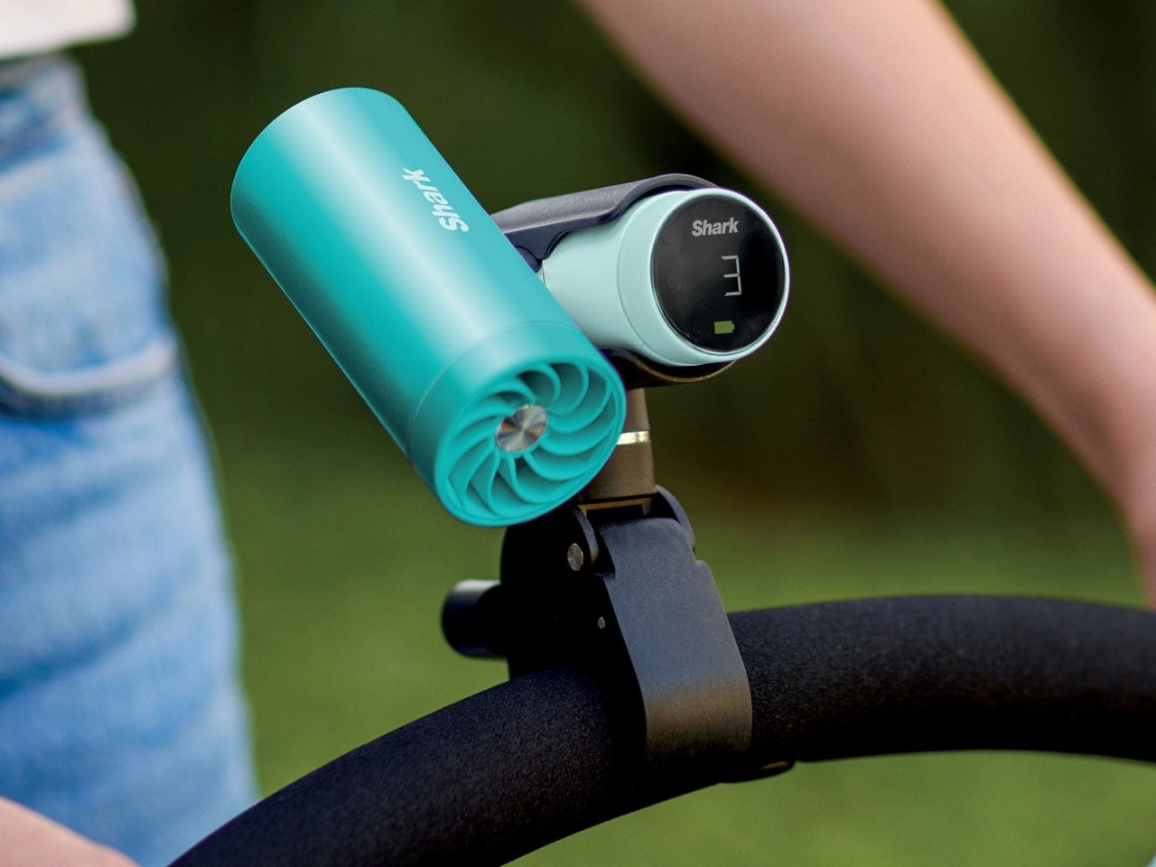
2. Shark ChillPill
Most personal cooling devices ask you to make a simple trade: accept bulk, noise, or mediocre performance in exchange for staying cool. The Shark ChillPill declines the trade. Its three-function body is compact enough to clip to a bag strap, a wristlet, or a stroller bar, and each mode does something genuinely distinct. A bladeless fan with ten adjustable speed settings delivers steady airflow at up to 25 feet per second. An evaporative mist system produces what SharkNinja calls a dry-touch effect, refreshing skin without the soaked-fabric sensation most spray fans leave behind.
The third function sets it apart. The InstaChill cooling plate, a cryo-inspired metal surface, reduces skin temperature by up to 16 degrees Fahrenheit within seconds when pressed against a pulse point on the neck or wrist. Battery life reaches eleven hours on the lowest fan setting, with USB-C charging returning it to full in roughly three and a half hours. Priced at $149.99 and available in seven colorways including Glacier, Matcha, and Rose Gold, it is the rare piece of personal tech that adapts to the activity rather than defining it.
What We Like
Three distinct cooling modes in one portable body that clips, sits, or wears across any outdoor context
Eleven-hour battery on low covers a full outdoor day without any recharging anxiety
What We Dislike
Maximum fan output reduces runtime to around ninety minutes, requiring some planning on longer days
The premium price over single-function portable fans requires commitment before knowing how much all three modes get used
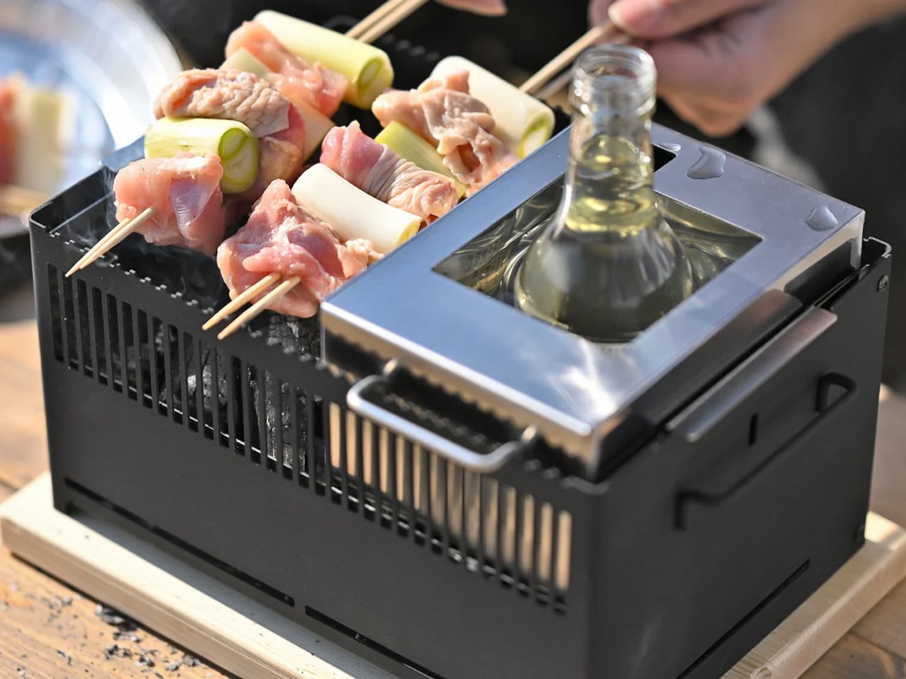
3. All-in-One Grill
Outdoor cooking has always had a logistics problem. Bring a single-function grill and eat variations of the same thing all weekend. Haul a full kit and spend the first hour on setup rather than cooking. The All-in-One Grill, made by a small family-owned Japanese factory specializing in sheet metal fabrication, takes a third position. Interchangeable cooking modules cover barbecuing, frying, grilling, steaming, smoking, and stew cooking from a single portable tabletop base designed to maximize limited space without dominating any camp table it lands on.
A dedicated upright module warms bottles directly, mulled wine included, a specific practical detail that most outdoor cooking systems treat as someone else’s problem. The modular construction that makes it versatile also simplifies cleanup: each component can be handled independently rather than breaking the whole unit down at once. One device handles what most setups need four for, and it packs into a footprint that leaves room for everything else.
Six cooking methods from one portable base without multiple fuel sources or separate devices
Dedicated bottle-warming module covers a specific outdoor ritual that most cooking systems overlook entirely
What We Dislike
Modular systems accumulate small components that are easy to misplace in the field
Tabletop-only design limits cooking capacity for groups larger than four or five people
4. DraftPro Top Can Opener
Drinking from a can is convenient. Actually tasting what is inside it requires something better. Designed by award-winning Japanese designer Shu Kanno and built in Japan, the DraftPro Top Can Opener removes the entire lid of a standard can to create a wide-mouth, glass-like opening that changes the experience immediately. The aroma lifts the moment the top comes off. The first sip feels more direct, more open, more intentional. A smooth-edged finish removes the safety concern that has historically made full-removal openers feel like a rough trade rather than an upgrade.
The function extends well past beer. With the top removed, ice drops in directly. A mixer or citrus can be added without needing a separate cup. The can itself becomes a cocktail vessel that requires no additional tools. It works with domestic and international can sizes, making it as useful at a campsite abroad as in a backyard.
Full top removal releases aroma and creates a draft-style drinking experience that a standard can opening physically cannot deliver
The can-as-vessel format allows ice, mixers, and garnishes without reaching for additional cups or shakers
What We Dislike
Single-function design earns its place only if canned drinks appear regularly in your outdoor routine
No published specification for how the cutting mechanism holds up across extended use over time
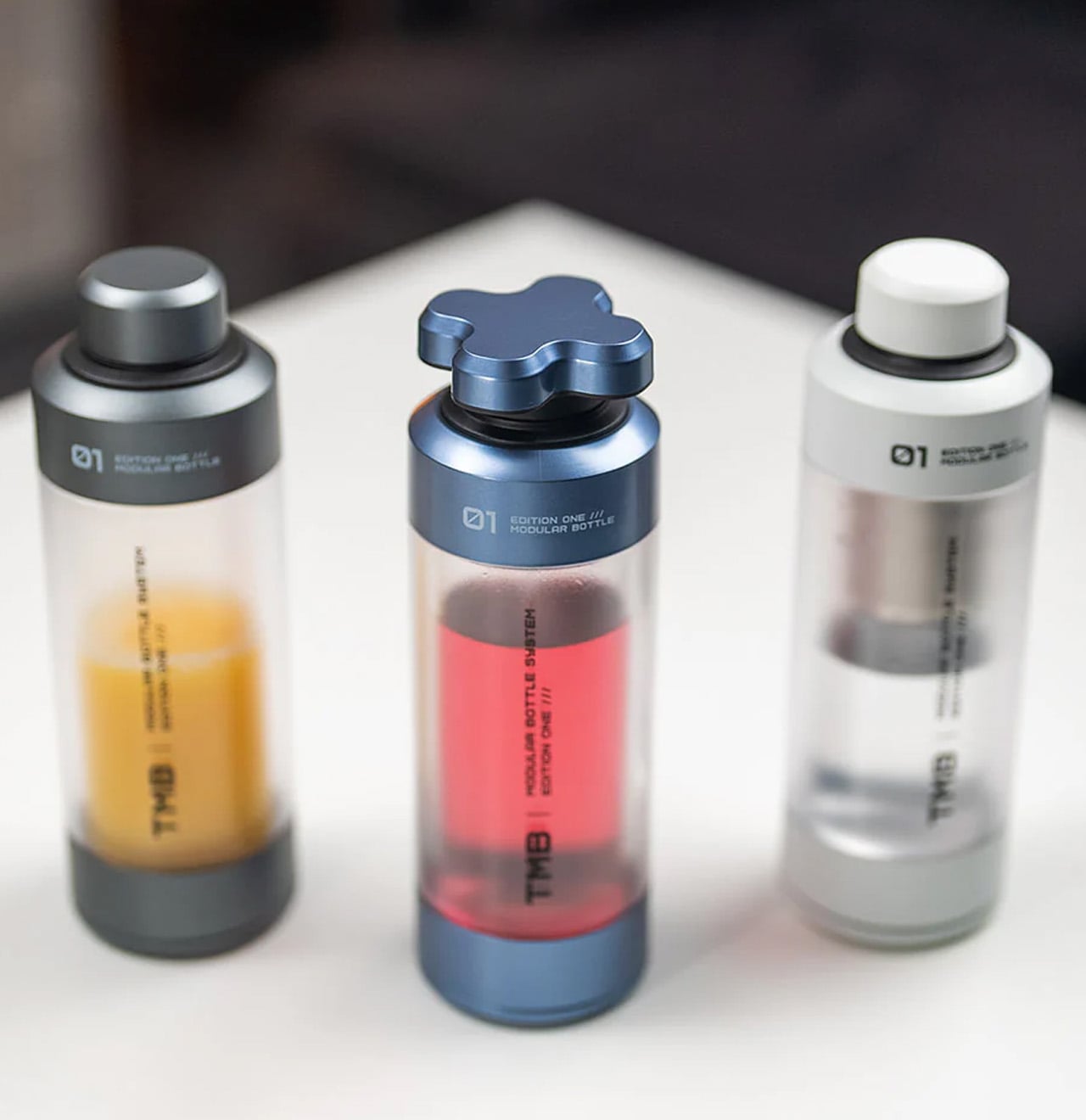
5. TMB: The Modular Bottle
Most bottles make one implicit promise: hold liquid without leaking. The TMB Modular Bottle starts from that baseline and keeps going. The borosilicate glass interior keeps every drink tasting like itself rather than the container, a material property that separates it decisively from the steel and plastic alternatives dominating this category. A translucent mid-section gives a real-time view of remaining liquid without removing the lid. Modular tops include a tea infuser, a shaker ball, and interchangeable caps, shifting configuration based on what the day or activity requires.
A built-in secret compartment handles small EDC items, supplements, or snack portions. The glass interior cleans thoroughly without the residual odor buildup that makes most reusable bottles unpleasant after weeks of regular use. For summer travel, the modularity earns its weight because the same bottle that starts a morning with loose-leaf tea covers an afternoon of plain water and an evening cocktail shaker setup without adding anything else to the bag.
What We Like
Borosilicate glass interior preserves drink flavor without absorbing taste or odor regardless of what you put in it
Modular tops cover tea brewing, protein shaking, and standard hydration from a single body without any additional vessels
What We Dislike
Glass interior carries more breakage risk than steel alternatives under rough outdoor handling or travel
Modular assembly adds cleaning complexity compared to a straightforward single-piece bottle
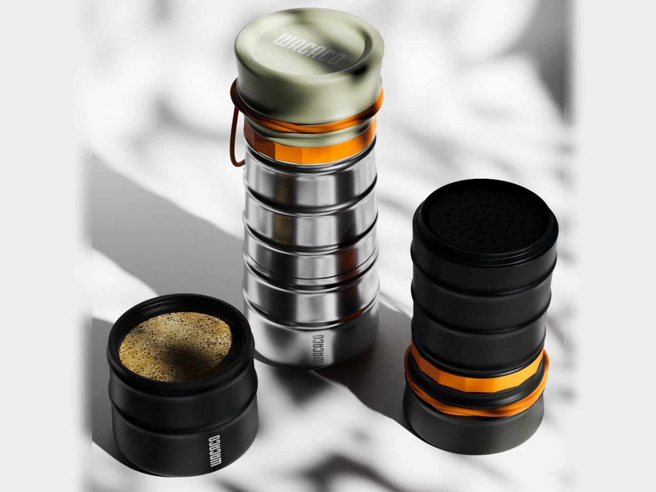
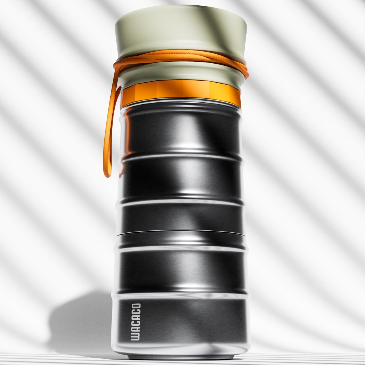
6. MokaMax
The campsite coffee situation has always been a negotiation between quality and effort. Every solution asks you to accept some version of the compromise: gritty grounds, a cold mug, a disposable capsule, a second bag of kit. The MokaMax resolves it by integrating a full pressure brewer into a ridged stainless steel travel mug, delivering espresso-style coffee in under three minutes using boiling water from any source. The brewer, the vessel, and the lid, which doubles as a cup, are a single sealed system with no loose components to lose between campsites or cities.
At 400 grams fully loaded, it fits in the front pocket of most travel backpacks and carries nothing superfluous. The ridged stainless exterior gives it a visual identity distinct from every other travel mug on a shelf, communicating outdoor utility without the rubberized bulk that most portable coffee gear defaults to. For summer mornings at a campsite, a hotel room in a new city, or a long train ride through somewhere worth paying attention to, the MokaMax handles the coffee ritual with equipment that fits the occasion without requiring a word of explanation.
What We Like
Pressure brewer and carrying vessel integrated into one sealed body means no separate components and no compromises across a summer of movement
Ridged stainless form integrates visually with quality outdoor gear rather than looking out of place beside it
What We Dislike
Cleaning the pressure chamber thoroughly on the road requires a sink and a few uninterrupted minutes that travel rarely provides on schedule
Espresso-style output will not satisfy those who prefer larger-volume filter coffee while camping or traveling
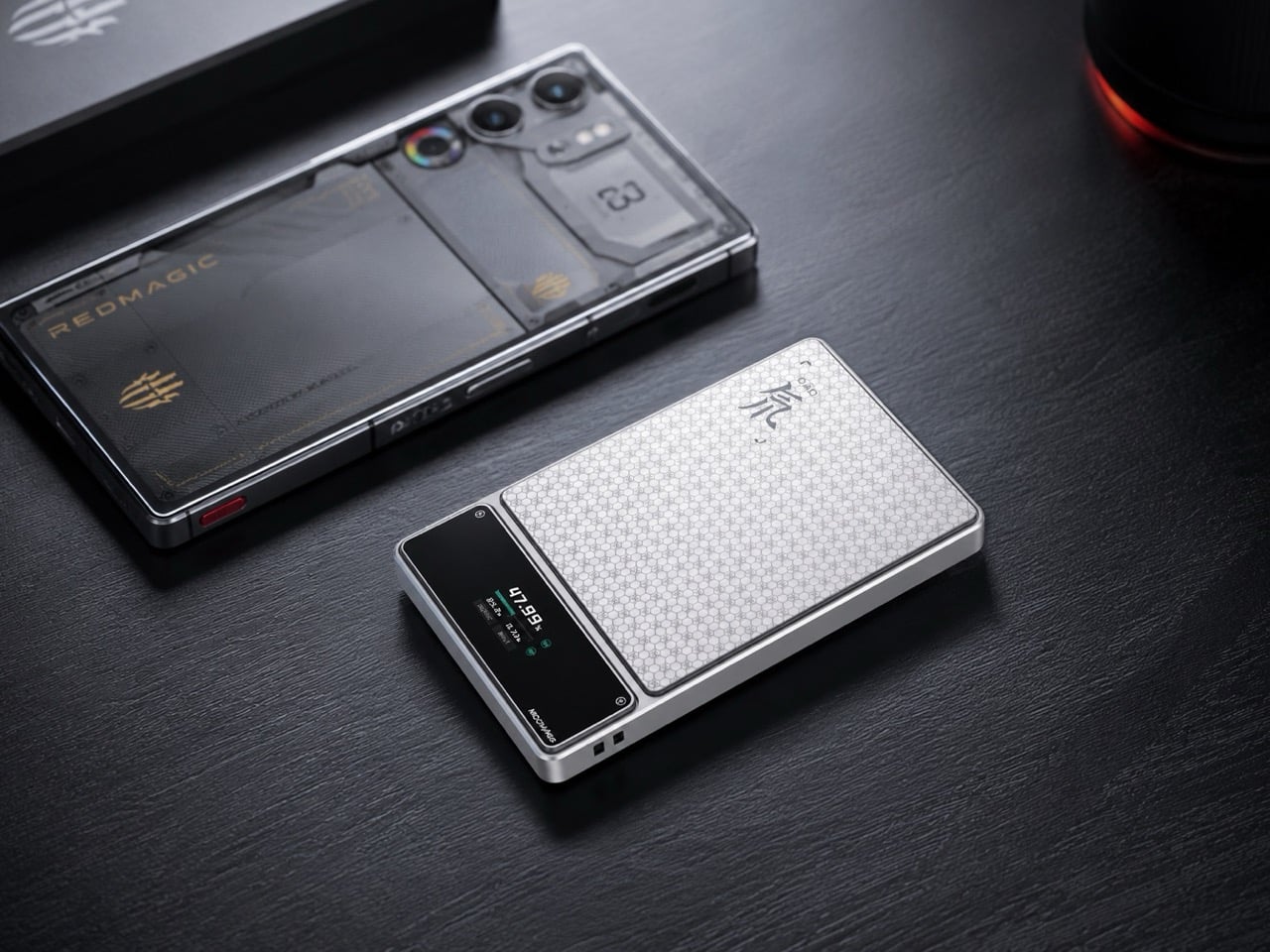
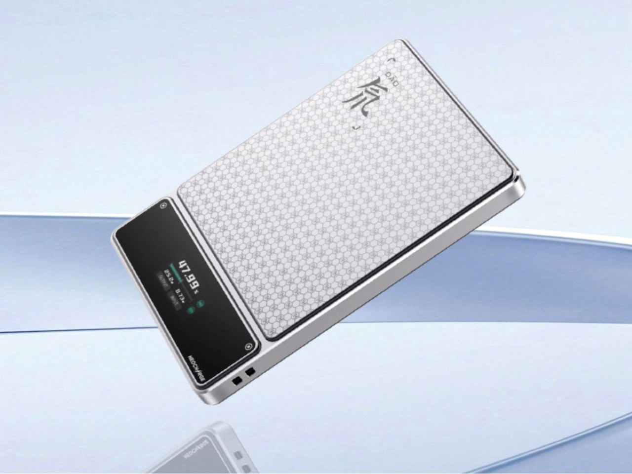
7. RedMagic Deuterium Power Card Pro
Aviation rules around lithium batteries keep tightening, and most power bank manufacturers have responded by adding a line to the FAQ. RedMagic responded by adding a dedicated hardware button to the device. The Deuterium Power Card Pro includes a one-touch flight mode that cuts wireless transmission immediately at the press of a single control, addressing the airline regulations that have turned gate-side power bank checks into a genuine inconvenience. The H21 honeycomb pattern engraved into the anodized aerospace aluminum body gives it a texture that reads as premium hardware rather than commodity carry gear.
A 25W wireless charging pad and 45W wired output handle most modern smartphones at full speed. An AI-assisted thermal management system monitors a five-layer heat dissipation stack in real time, keeping surface temperatures controlled during wireless charging where cheaper alternatives tend to run noticeably warm. A rectangular status display shows exact battery percentage rather than the single LED indicator dot that most power banks still ship with. Available in 5,000 and 10,000 mAh configurations, with pricing and a confirmed release date still pending at the time of publishing.
What We Like
One-touch flight mode solves the airline power bank regulation problem that every other manufacturer currently treats as the passenger’s responsibility
Rectangular display showing exact battery percentage is a small but genuinely useful upgrade over the LED dots most competitors use
What We Dislike
Pricing and release date remain unconfirmed, making it the most compelling item on this list that cannot yet be added to a cart
The RedMagic brand identity is built around gaming hardware, which may feel tonally mismatched for travelers whose gear skews toward neutral aesthetics
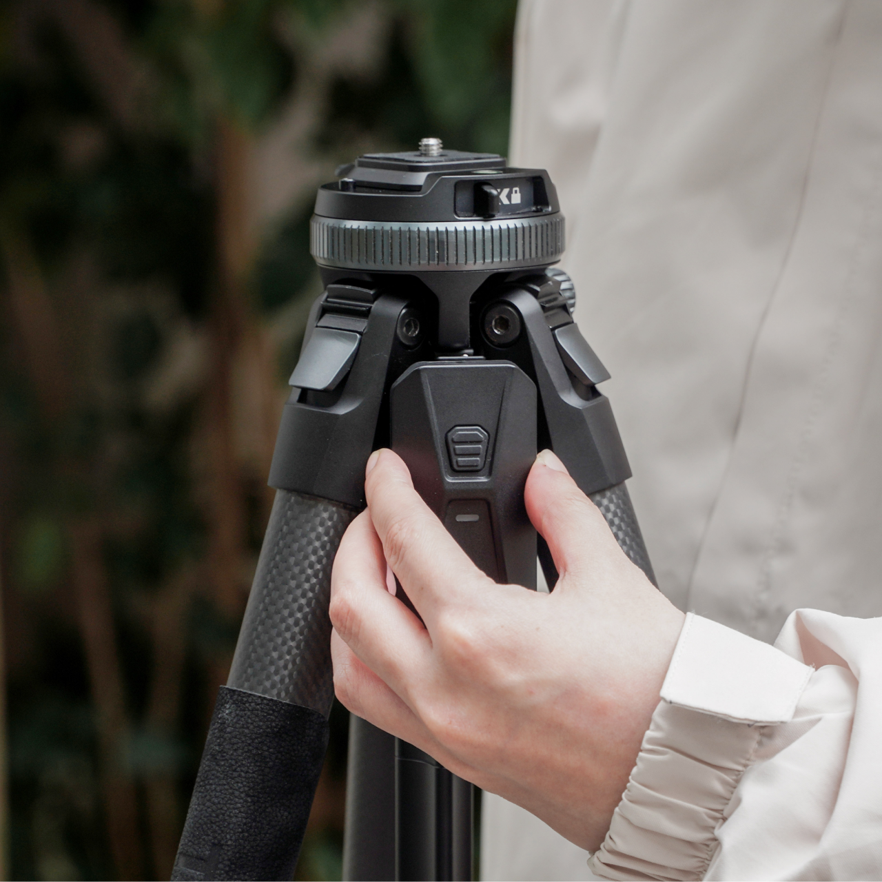
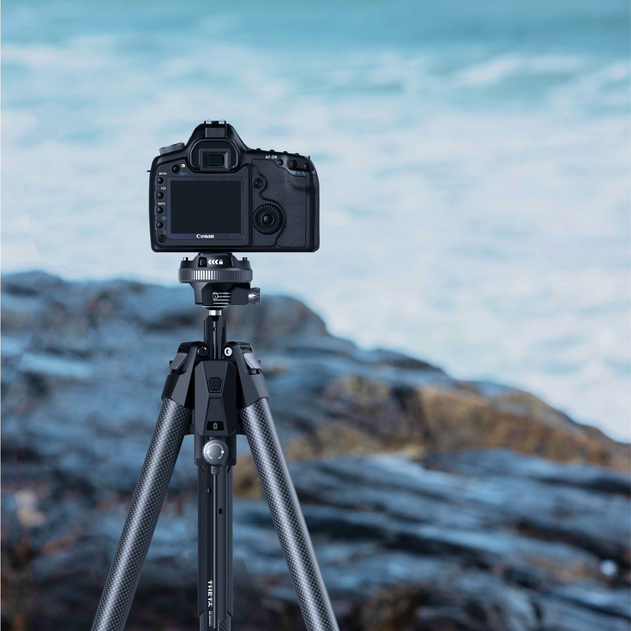
8. Benro Theta Tripod
A level horizon used to be a manual discipline. You twisted the head, watched a bubble, made small corrections, twisted again, repeated. The Benro Theta removes that entire sequence with a motorized auto-leveling system that reads the surface, adjusts the head, and confirms the camera is plumb before you look through the viewfinder. Benro positions it as the world’s first smart modular travel tripod, and the auto-leveling claim holds, particularly for photographers who regularly set up on uneven terrain and have run out of patience for repeating the process twice every time.
The body weighs 331 grams and runs on a 2500 mAh battery that delivers up to three hours of motorized operation. Arca standard compatibility keeps it immediately compatible with existing head and plate systems without requiring new accessories to bridge the gap. The modular construction adapts the Theta across shooting configurations without needing a separate travel head. For the summer photographer who sets up quickly and moves rather than spending the golden hour leveling equipment, the auto-leveling feature alone covers the cost of the upgrade. Available from Benro directly at benrousa.com.
What We Like
Motorized auto-leveling removes the most time-consuming manual step in tripod setup, especially on uneven outdoor terrain
Arca standard compatibility integrates immediately with existing accessories without requiring additional purchase
What We Dislike
Three-hour battery means extended shooting sessions require either a recharge mid-day or a backup power source
Premium construction and motorized system place it above conventional travel tripods at the same weight class
9. Battery-Free Amplifying iSpeakers
The pitch is simple enough to sound too good: set your phone in the slot, and Duralumin, the aircraft-grade aluminum alloy used in aerospace construction, does the amplification. No Bluetooth pairing. No battery charging. No setup at all. The metal body channels and amplifies your phone’s speaker output through material physics rather than electronics, adding warmth and volume with zero power draw. Golden ratio proportions give it a visual presence that reads as a considered object on a surface, not another piece of audio hardware waiting to be plugged in.
For summer specifically, the always-ready quality matters in a way that becomes obvious the first time you do not have to think about it. There is no battery level to check before heading outside, no cable to remember, no update that delays the morning. Set the phone in and music plays. Optional Bloom and Jet modular accessories let you direct the sound output if the environment calls for more control.
No battery, no power, and no setup required means it is always immediately ready without any preparation
Aircraft-grade Duralumin construction shaped to golden ratio proportions is a genuine material and design achievement at any price
What We Dislike
Amplification quality depends entirely on the phone’s own built-in speaker, so the result varies significantly by device
Sound-directing modular accessories are sold separately at additional cost
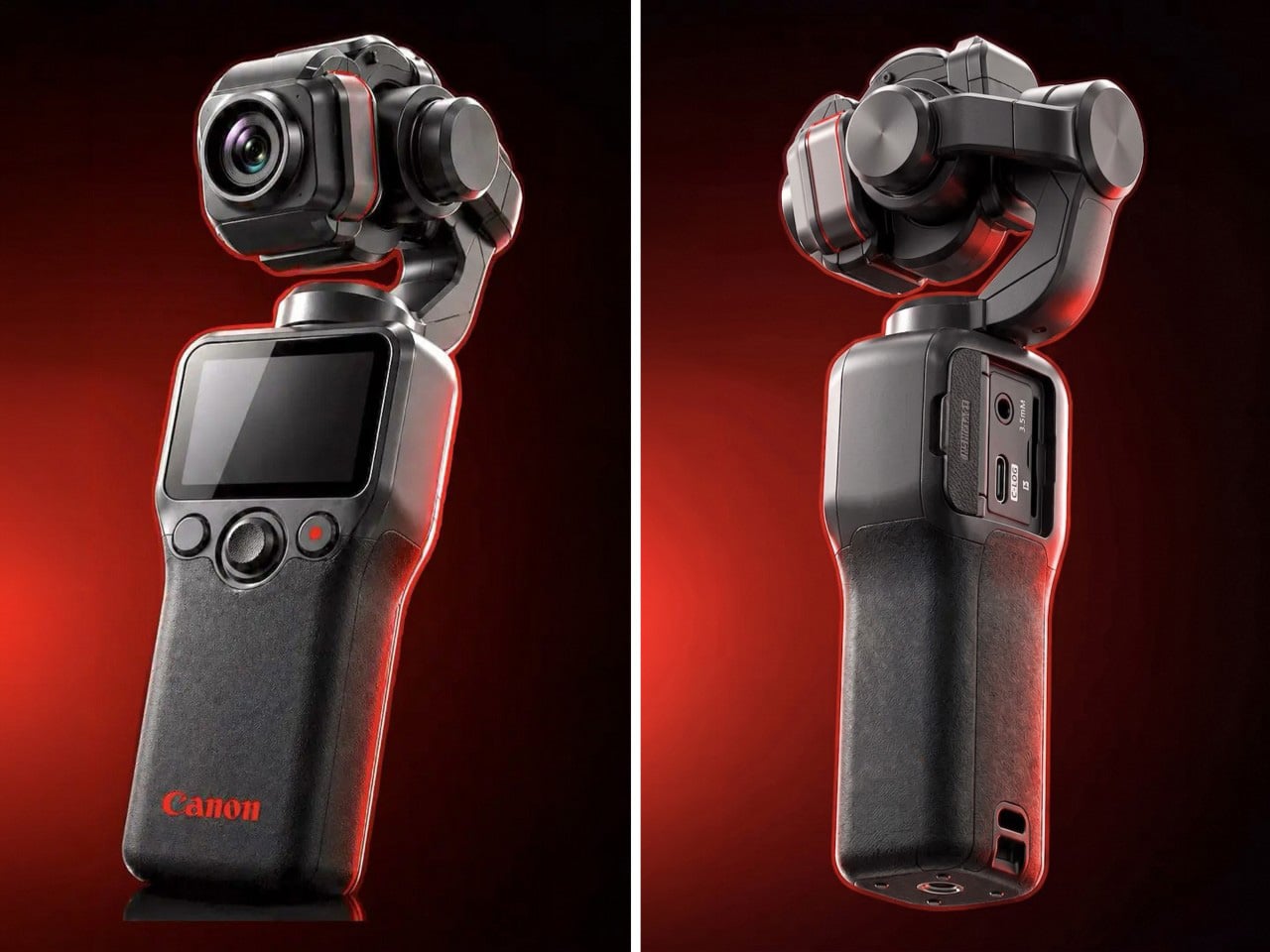
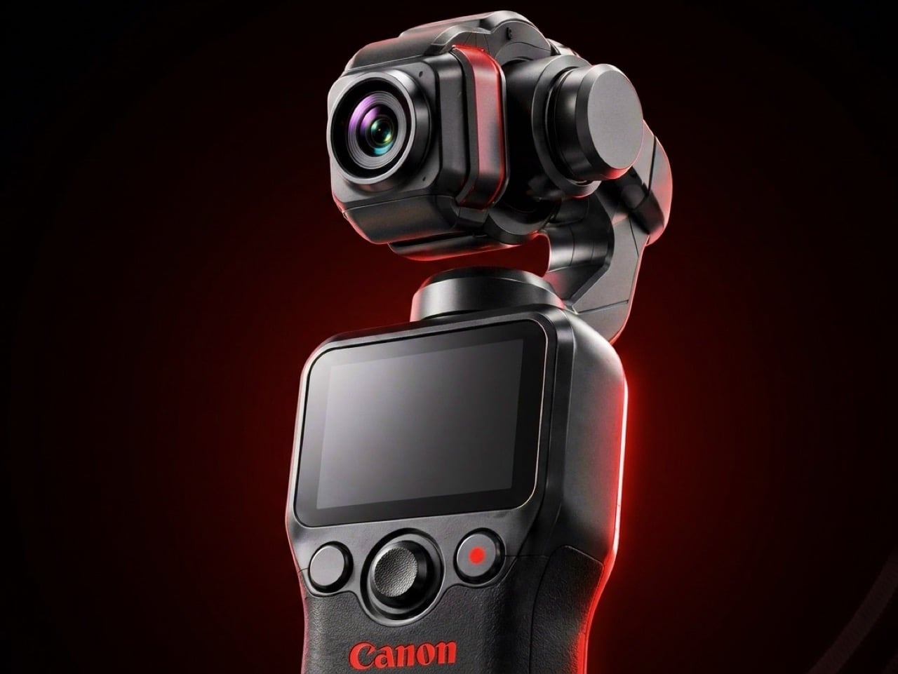
10. Canon Gimbal Camera
Canon has filed three gimbal camera patents since 2021, each one more practically minded than the last. The April 2026 filing describes a compact handheld body with a fixed lens, three-axis stabilization, a grip-mounted screen, and a folding mechanism that guides the gimbal head into a safe resting position before cutting motor power. That shutdown sequence is the engineering detail most readers will pass over, and the one that signals the most serious product thinking. Mechanical wear from limp-motor shutdowns is the quiet failure mode that causes cameras in this category to age faster than their owners expect.
DJI launched the Osmo Pocket 4 in April 2026 with a 1-inch sensor and 4K at 240fps. Insta360 followed closely. Canon is entering the category with five years of increasingly precise engineering, a fixed-lens form factor that prioritizes portability over interchangeable versatility, and a color science reputation that outdoor and travel shooting consistently validates. No release date has been confirmed and no pricing announced. Based on the patent arc from 2021 through 2026, this reads like a company that has done the homework carefully and is nearly ready to deliver.
What We Like
Smart folding shutdown mechanism addresses a real mechanical failure point that the rest of the pocket gimbal category has consistently ignored
Five-year patent arc spanning increasingly specific engineering detail signals a product shaped by sustained development rather than a reactive market response
What We Dislike
Remains a patent with no confirmed launch date or price, making it the most compelling item on this list and still out of reach
Canon’s track record in premium compact formats suggests a launch price that will require serious consideration before committing
The Right Gear Stays in the Bag Past August
Summer tends to reveal what gear actually holds up. The items that stay in the bag past August are the ones that solve something specific without creating new problems to manage. Not every product on this list is purchasable today. The Canon Gimbal and Camera (1) both exist in the space between a promise and a product. The RedMagic Power Card Pro is close. Everything else is available now and worth the decision.
The best summer kit is not the most comprehensive one. It is the one built around the things you actually reach for. Three of these will make more difference than ten purchased out of obligation. Pick the gaps your current setup has never filled properly, and start there. Everything on this list was designed by someone who looked at a specific problem and decided it deserved a real answer. Summer is a good time to find out which answers fit yours.
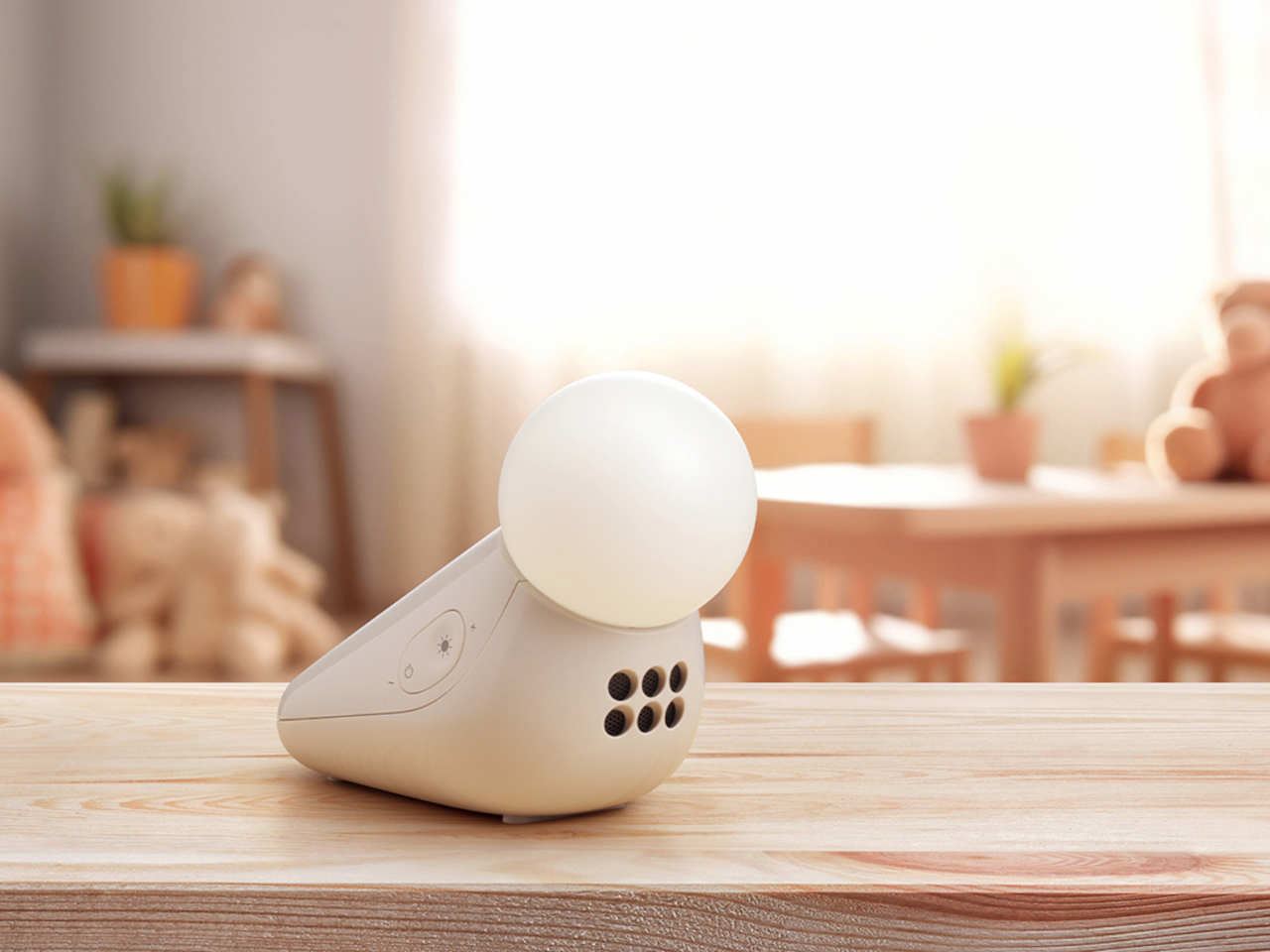
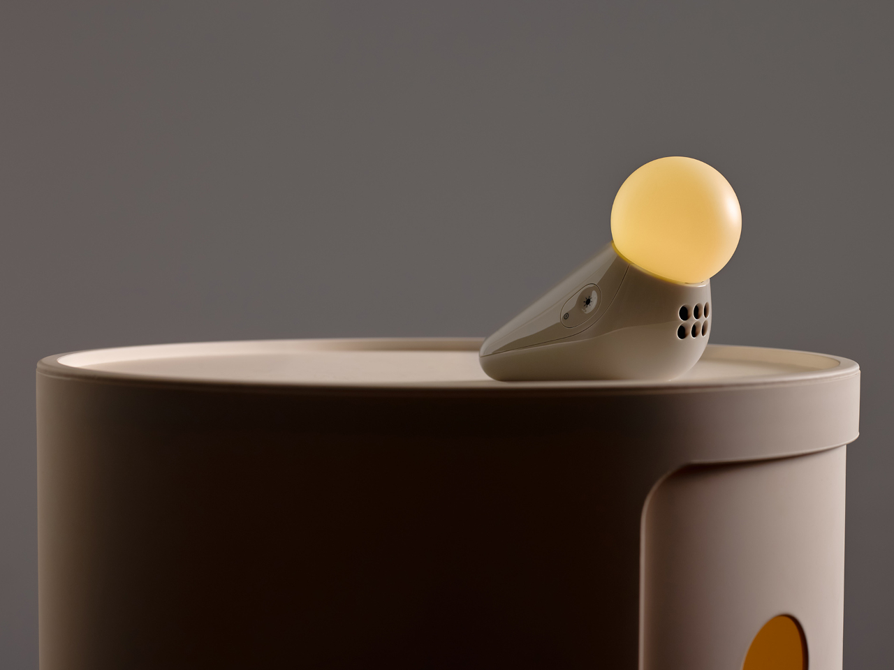
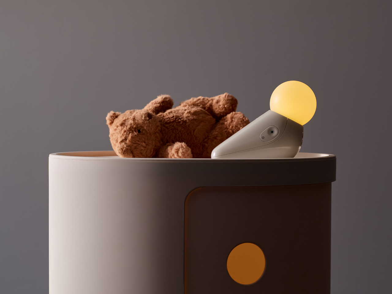
Nursery products have generally been designed around the assumption that function is the only thing that matters. A baby monitor that broadcasts clearly, a sound machine that blocks noise, a nightlight that stays on through the small hours without overheating. These things work, and most of them look exactly like what they are: appliances with a secondary mission, built from a brief that never included the word “beautiful.” The emotional dimension of the room they live in is almost never part of the specification.
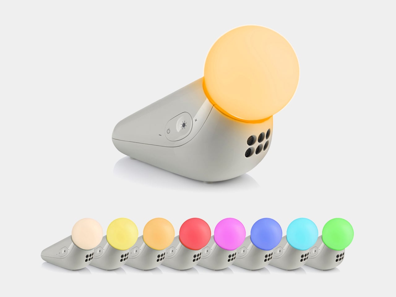
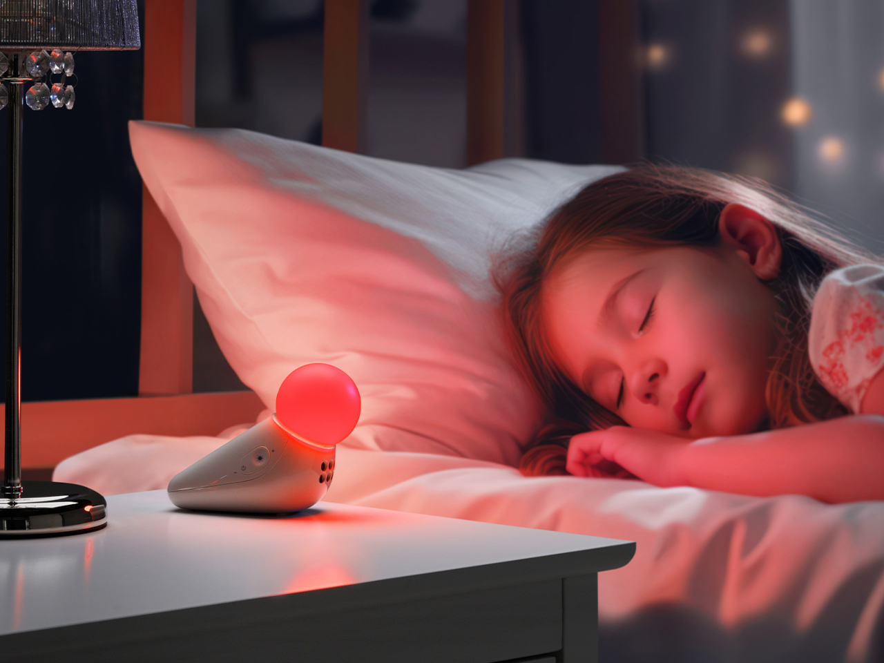
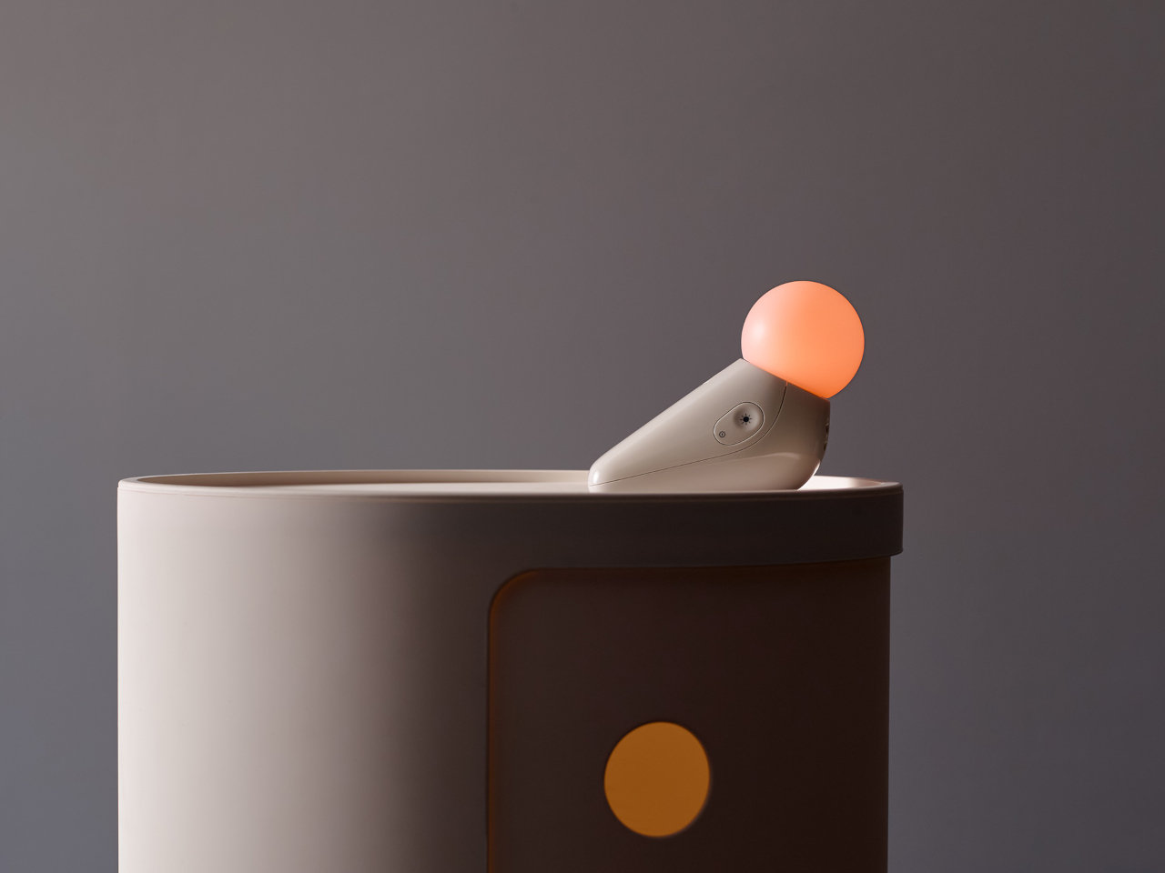
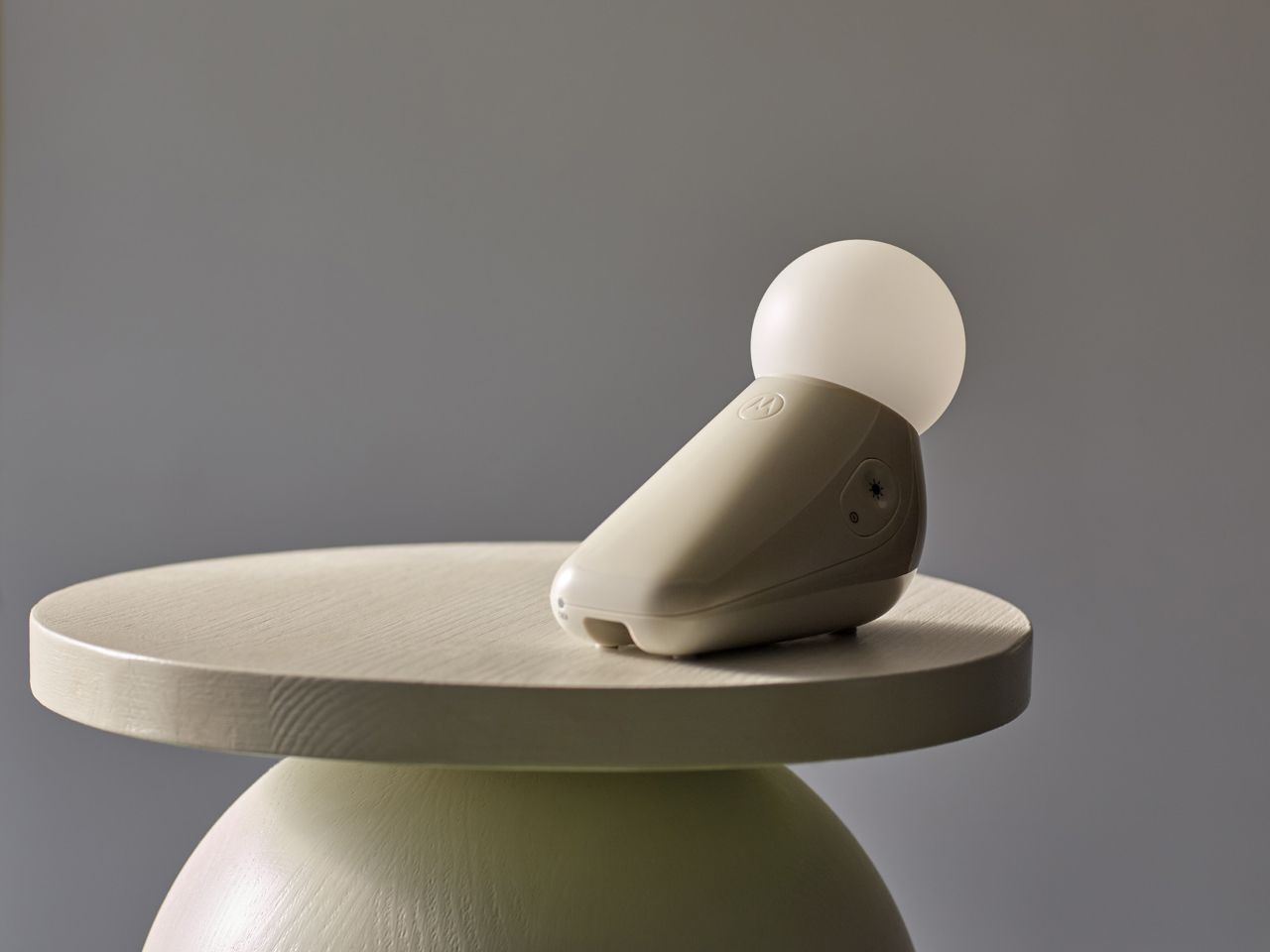
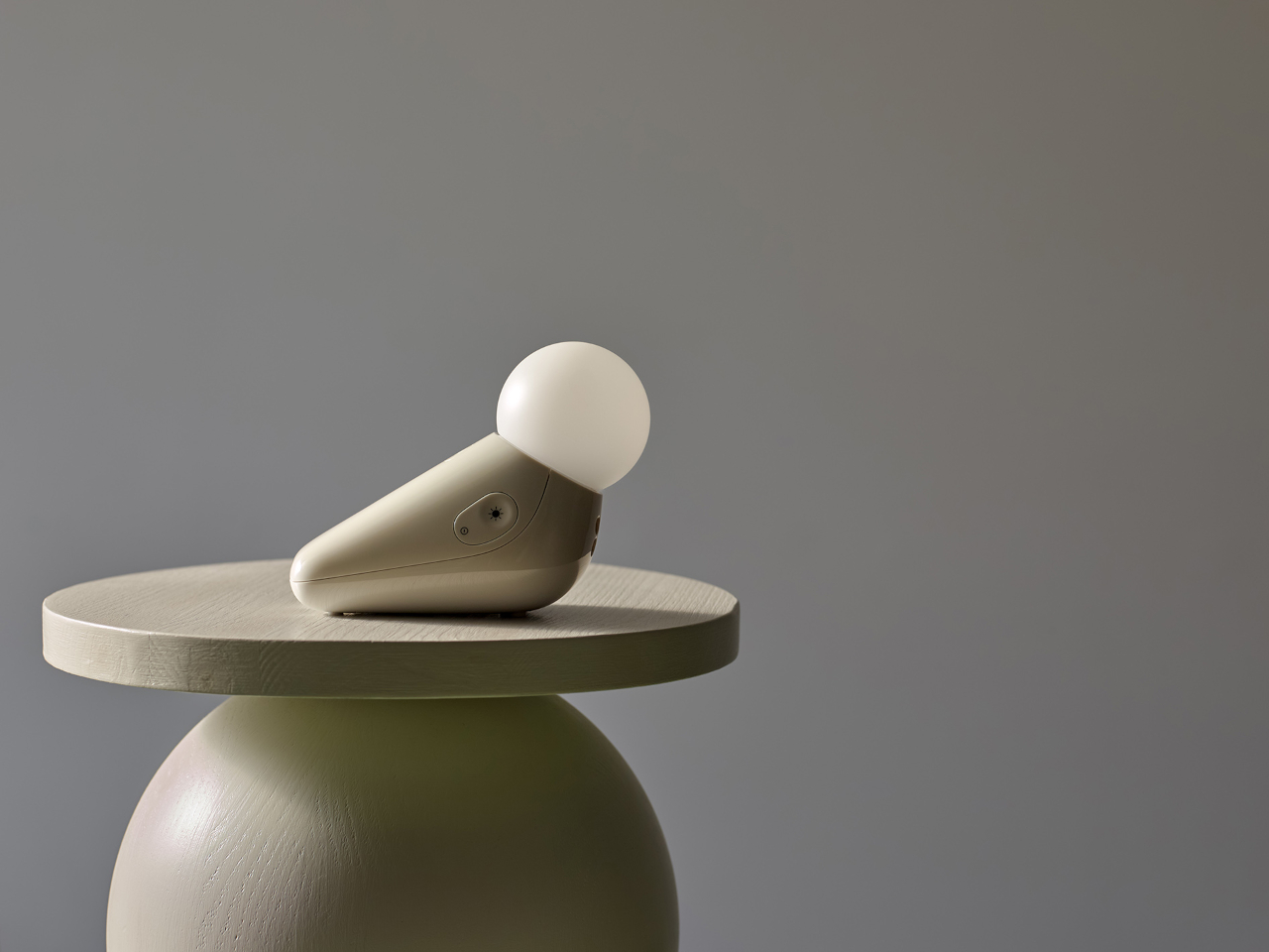
Industrial designer Tej Chauhan rethought that assumption through Motorola Nursery’s PIP collection, and the S1 Soother is the latest product from it. It begins with a sketch of a little seal, a soft, neotenic form drawing on the same mechanism that makes baby animals universally disarming. The rounded shape isn’t decorative padding over a functional core. It’s part of the reason the device works as well as it does.
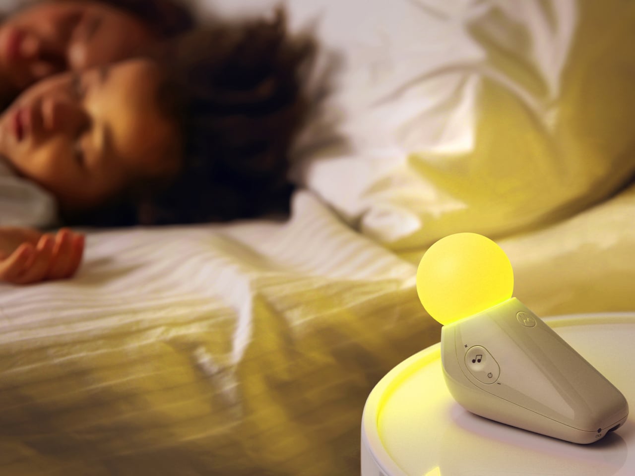
The form achieves something most nursery devices don’t: it looks considered even when it’s not on. Switched off, the S1 reads as a small sculptural object that a parent with a carefully arranged room wouldn’t feel compelled to hide. Switched on, the round tip glows in one of seven colors: yellow, orange, red, pink, blue, cyan, and green, adjustable across five brightness levels. The light is calm and diffuse by design.
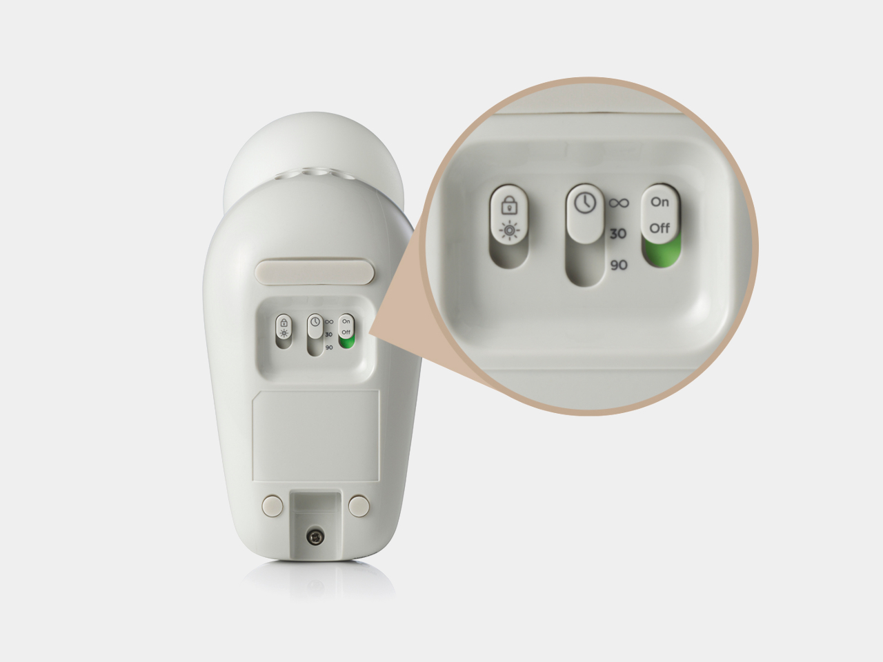
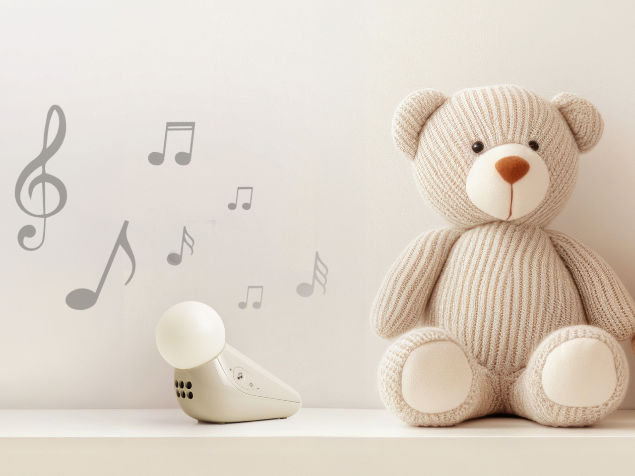
The sound side offers ten options: three lullabies, three nature sounds, white noise, brown noise, a fan loop, and a womb sound, covering the range that different babies respond to. Parents who’ve cycled through multiple sound machines will appreciate that breadth in a single device. Volume adjusts across five levels, and USB-C charging sustains up to 50 hours of use per charge, covering weeks of nap times before the next top-up.
Portability isn’t incidental. The S1 travels in a bag without cables, without a base that won’t fit a hotel nightstand, and without the visual clash of a device that clearly belongs somewhere it isn’t. Non-toxic materials and rounded edges address the physical dimension of baby safety that gets less marketing attention than certification ratings but matters considerably more at close quarters with a curious infant.
Chauhan has described the goal as inviting warmth into an everyday routine while making something beautiful enough to live anywhere in the home, goals that usually don’t apply to baby gear. The neotenic seal shape suggests calm before it does anything else, which is the point. A device that parents genuinely want in the room works harder than one they merely tolerate because it does the job.
The objects that occupy a nursery carry more emotional weight than the ones in any other room. Chauhan’s goal, inviting warmth into an everyday routine while making something beautiful enough to keep, sounds loftier than a $29.99 nightlight deserves. But the design argument is sincere, and so is the result. Parents who’ve spent months chasing the right combination of light and sound will recognize what they’re getting.
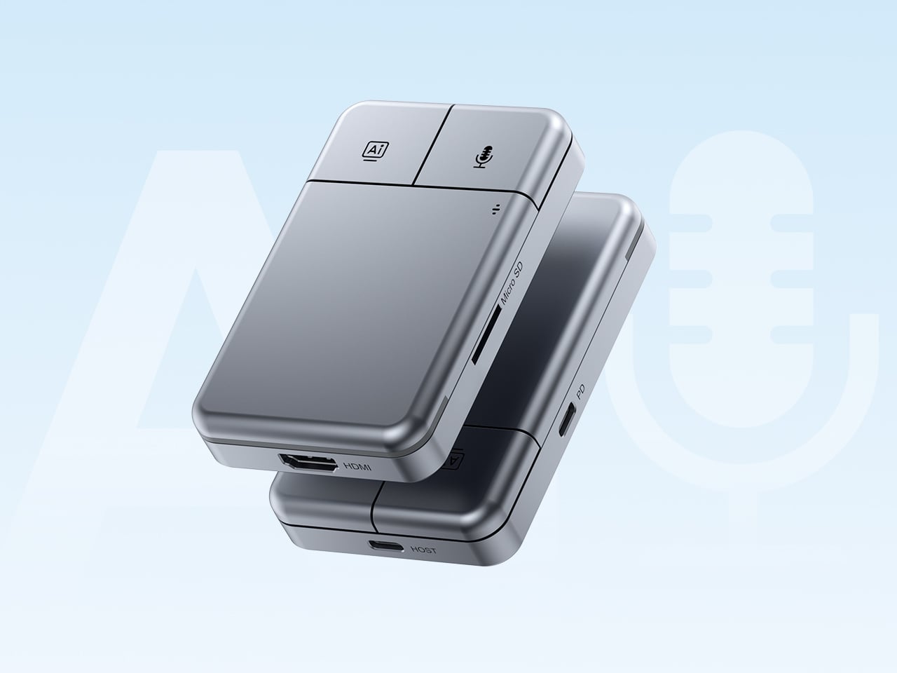
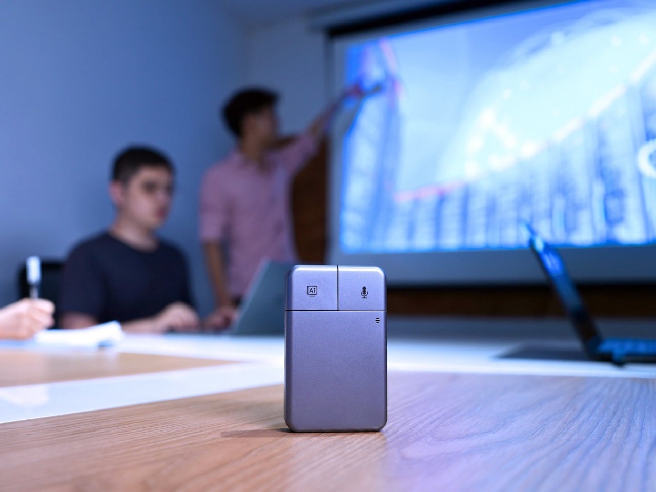
Put the DockOrb A1 on a conference table without context and someone will reach for it expecting a scroll wheel. The gray brushed-aluminum slab, the gently rounded corners, and two physical buttons in familiar left-right symmetry on the top face read entirely as peripheral hardware. What the device actually does is listen, think, and report. Powered by OpenAI GPT-5, Google Gemini 2.5 Pro, and Anthropic Claude Sonnet 4, DockOrb A1 is a professional AI meeting and desktop assistant. The label on the box says meeting assistant; the object in the hand says otherwise.
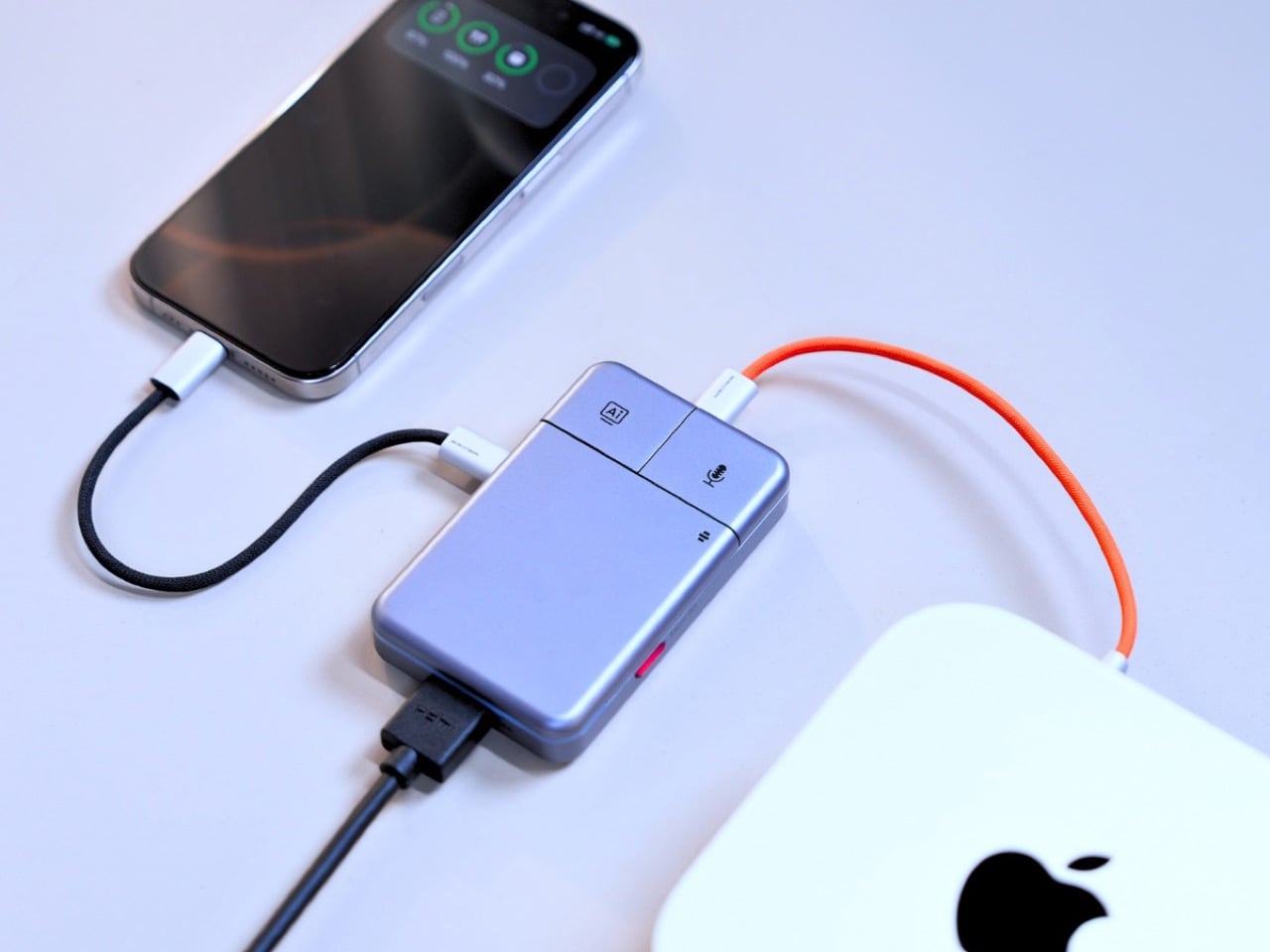
The category it operates in has been filling up quickly. Plaud built a card-thin wearable that magnetically clips to your phone. HiDock shaped a USB-C hub into a ChatGPT-powered meeting stenographer, and we covered that launch here at YD. DockOrb’s A1 lands somewhere between those two worlds, combining a fully functional multiport dock with a multi-model AI engine, 100W PD, and 4K@60Hz HDMI output. Unlike either of those predecessors, it handles display output and power delivery in the same housing, making the desk real estate argument for a single device considerably more loaded.
The mouse silhouette is instantly familiar, and anyone who’s ever used a computer will be able to navigate the DockOrb intuitively. Two buttons arranged horizontally on a flat top surface is the correct solution for a device that needs to be operated with a single press in a meeting context, no fumbling, no menus, no distraction. With a dedicated AI button and real-time processing, DockOrb A1 analyzes ongoing discussions and provides actionable suggestions and insights, helping teams improve collaboration and make decisions more efficiently without interrupting the meeting flow. LED status is handled by a single indicator, white for idle and blue for active capture, readable from across a conference table without breaking eye contact with whoever is speaking. The problem is that all of this correct ergonomic logic is housed inside a form that the product world has spent two decades teaching people to recognize as a pointing device.
Rather than anchoring to a single AI model, the A1 integrates with Esteno, an advanced AI fusion-processing software platform. Esteno integrates multiple advanced AI models, including OpenAI GPT-5, Google Gemini 2.5 Pro, and Anthropic Claude Sonnet 4. Each model is optimized for tasks such as speech-to-text, summarization, contextual reasoning, and insight generation. By intelligently routing tasks to the most suitable model, the system delivers efficient, flexible, and high-quality meeting intelligence across different use cases. That architectural approach is genuinely unusual in this category, where most competitors commit to a single backbone and build their entire brand identity around it.
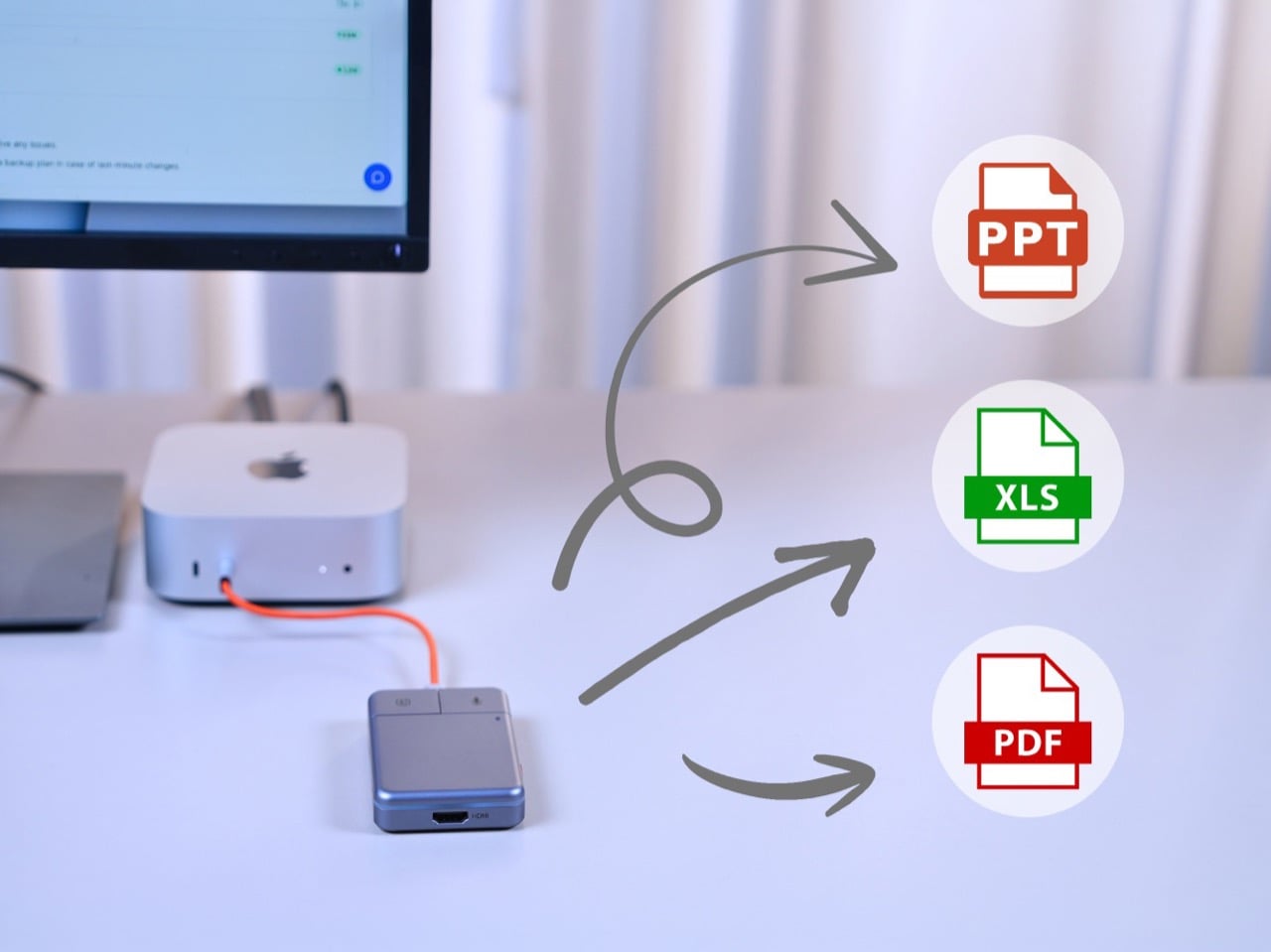
Plaud’s card-thin approach to meeting intelligence, at 2.9mm thick and MagSafe-compatible, is built on the premise that the recorder travels everywhere with you, riding on the back of your phone. The A1 has no such intention, operating through USB power without a built-in battery, with a compact design, dedicated recording button, and AI activation key for stable and simple meeting operation. In exchange for that fixed-desk commitment, it handles 4K video output at 60Hz over HDMI and 100W power delivery over USB-C, turning the dock into the single device your entire workstation routes through. After transcription and analysis, DockOrb A1 automatically generates structured meeting reports highlighting key decisions, action items, and follow-up tasks, which can be exported directly in PDF, Excel, or PowerPoint formats. Getting a properly formatted, structured report out of a recorded conversation without manual reformatting is a genuine subtraction from the post-meeting to-do list, and it’s the kind of output that separates a real workflow tool from a novelty recorder.
Following ISO and SOC data protection standards, DockOrb A1 secures recorded audio and AI-generated content through encrypted storage and processing, allowing users to export, archive, or delete files at any time while ensuring full control over their data. That’s pointed positioning in a market where corporate IT departments are increasingly skeptical about meeting audio being routed through third-party AI servers without accountability. Recordings, transcripts, summaries, and reports from multiple meetings can be stored and organized within a centralized memory archive, with AI-powered indexing and searchable meeting names, content, or dates, so teams can quickly retrieve past discussions, track long-term decisions, and build a continuously growing knowledge base. Built on a platform-independent architecture, DockOrb A1 processes audio from Zoom, Teams, Google Meet, mobile devices, and more, delivering consistent transcription, analysis, and structured outputs. Retrieving a specific discussion from three months prior becomes a search query rather than a manual scroll through unlabeled audio files.
The Kickstarter campaign prices the A1 at $89 for the Super Early Bird tier against an MSRP of $149. Shipping is targeted for August 2026, with production beginning the month prior. Plaud’s Note Pro retails at $169 on the market and handles no dock hardware whatsoever, making the A1’s value calculation sharper for anyone already planning to put a USB-C hub on their desk. The Esteno software platform tiers at $8 per month for Basic, covering 600 minutes of monthly transcription, and $15 per month for Pro, which adds 2,400 minutes, unlimited AI features, and priority processing. That’s a fully loaded meeting intelligence setup, dock and display output included, for a first-year cost that lands well under what most enterprise-grade transcription tools charge for software alone.
Smart speakers have become some of the most visually forgettable objects in modern homes. A cylinder, a puck, a fabric-wrapped drum, placed wherever the Wi-Fi is strong and largely invisible once the novelty wears off. They do their jobs well enough, but none of them look like they belong in a collection or on a desk that someone cares about. The hardware has always been purely functional, and the design has always shown it.
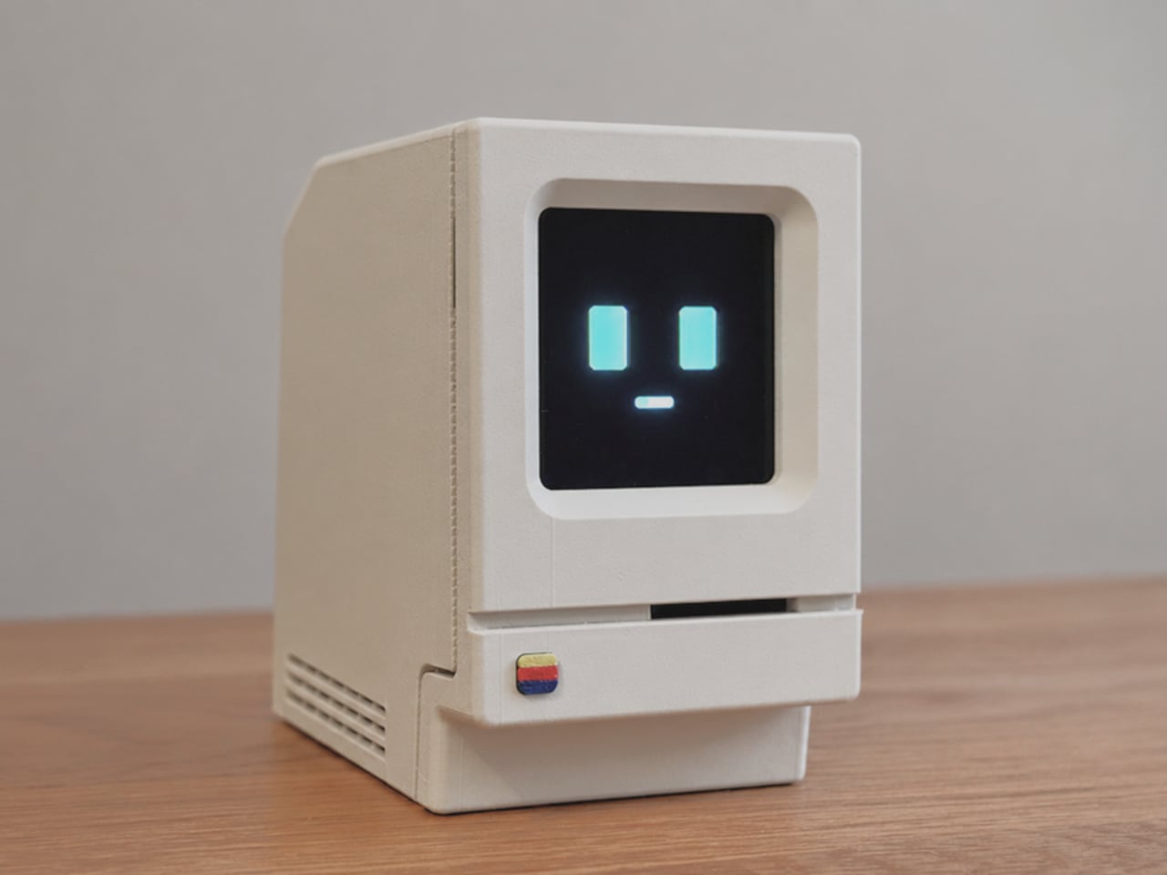
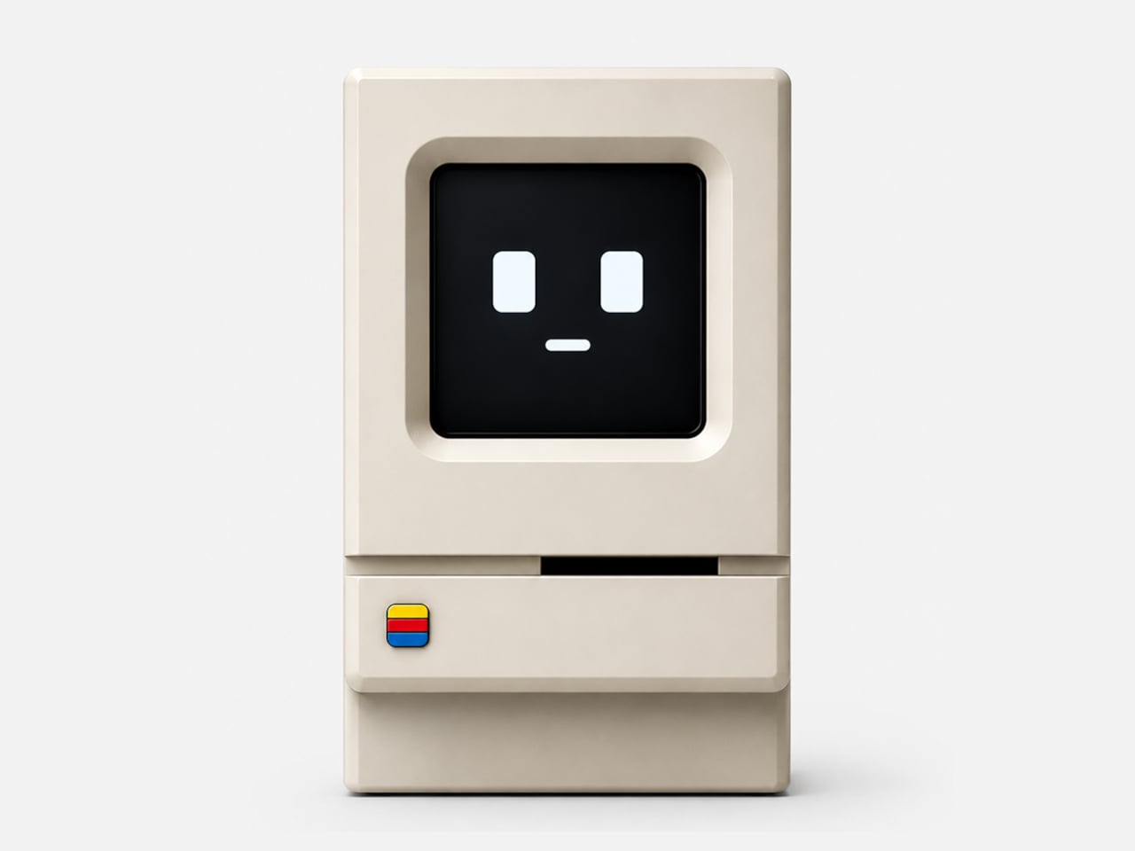
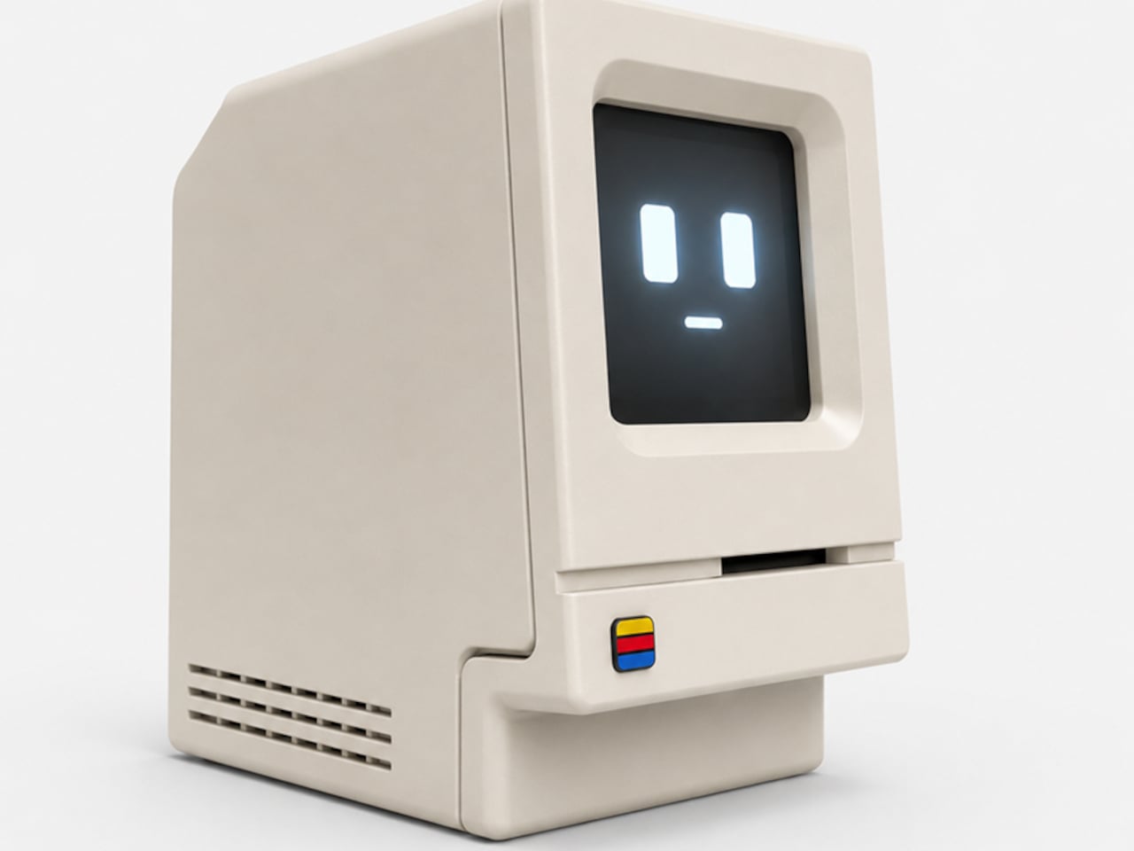
Alisher Ashimov approached the idea of a desk-based AI assistant from a completely different direction. Kira, his open-source project, takes its visual cues directly from the original 1984 Macintosh, a machine whose beige monolith silhouette is arguably the most iconic in personal computing history. The result is a voice-activated AI companion that looks more like a cherished collectible than a utility device.
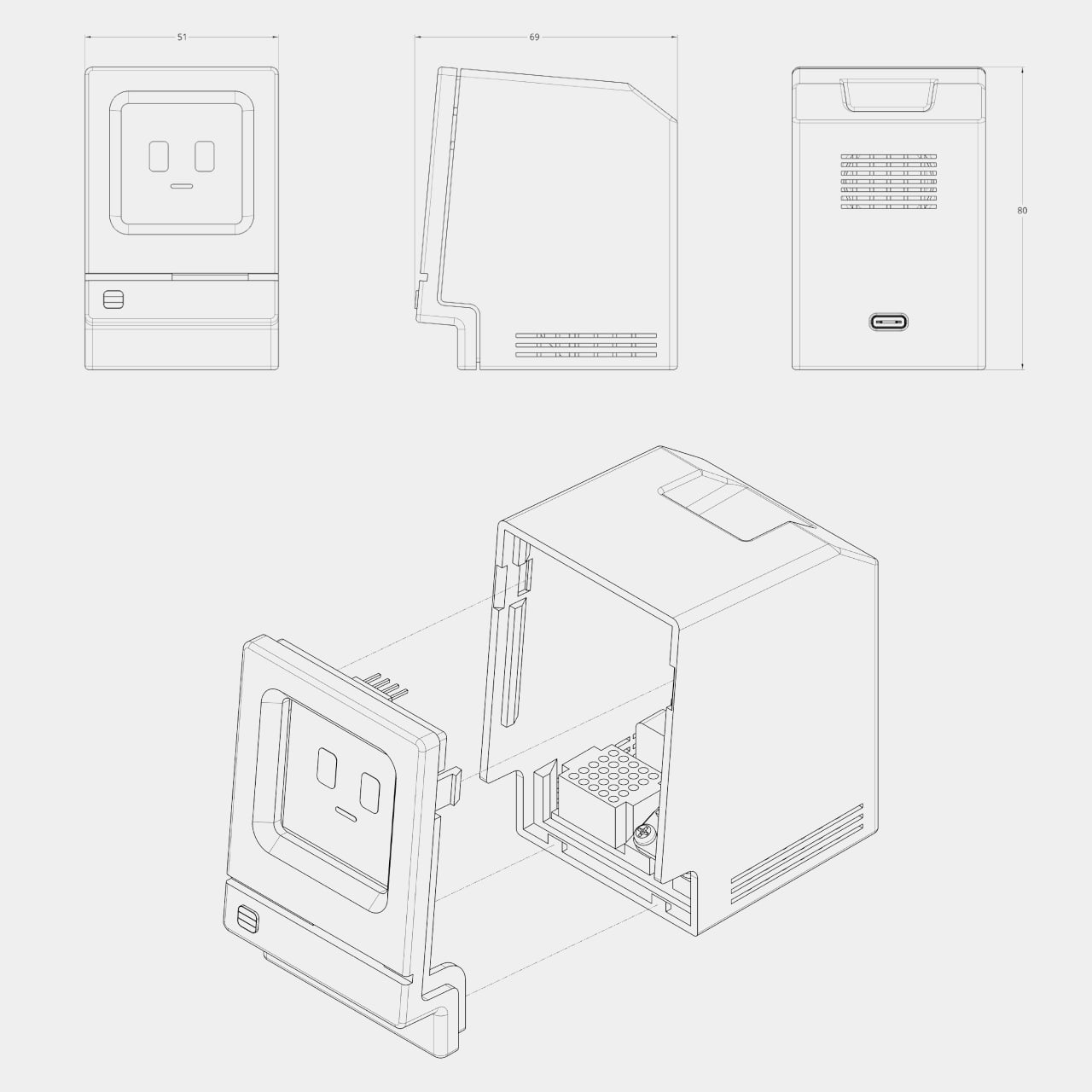
The enclosure is 3D printed in a single recommended filament color: Light Khaki matte PLA, the closest approximation of that distinctive Apple beige. Rounded top corners, a recessed front panel, horizontal side vents, and a decorative floppy-drive-style slot below the display all reproduce the original’s proportions at pocket scale, somewhere around 80mm wide. A small four-color badge on the lower front panel adds the final recognizable touch.
Where the original Macintosh showed a desktop environment, Kira shows a face. The 1.5-inch OLED display renders two rectangular eyes and a small dash mouth, animating expressively in response to interaction. The wake word is “Hey, Kira,” and from there, a built-in microphone picks up questions while a 4Ω, 3W speaker delivers spoken answers through the sculpted housing. It handles everyday voice queries the same way any smart assistant does, just with considerably more personality sitting on the shelf.
The electronics are deliberately approachable. The core is a Seeed Studio XIAO ESP32-S3 Sense, a capable and compact microcontroller with built-in Wi-Fi, Bluetooth, and a microphone. The rest of the bill of materials, a speaker, amplifier, SH1107 OLED module, mini breadboard, and jumper wires, are available on Amazon for modest amounts. The 3D-printed enclosure is optimized to print in about three hours across two plates with minimal support material, and an assembly guide walks builders through wiring, assembly, and firmware flashing.
The software carries the same open-ended spirit as the hardware. Voice, language, the assistant’s character, and memory settings are all user-definable, which means Kira isn’t locked into a single personality or a single cloud service. Tinkerers can tune the firmware directly. Ashimov has published the files freely, with no commercial barriers between the design and anyone with a printer and an afternoon to spare.
The objects people choose to keep on their desks tend to say something about them. A tiny Macintosh-shaped AI assistant that you built yourself and tuned to your own preferences says rather a lot. It combines a piece of design history, a genuinely capable voice interface, and an honest invitation to understand exactly how the thing works, all in a form that most people will stop and ask about the moment they see it.
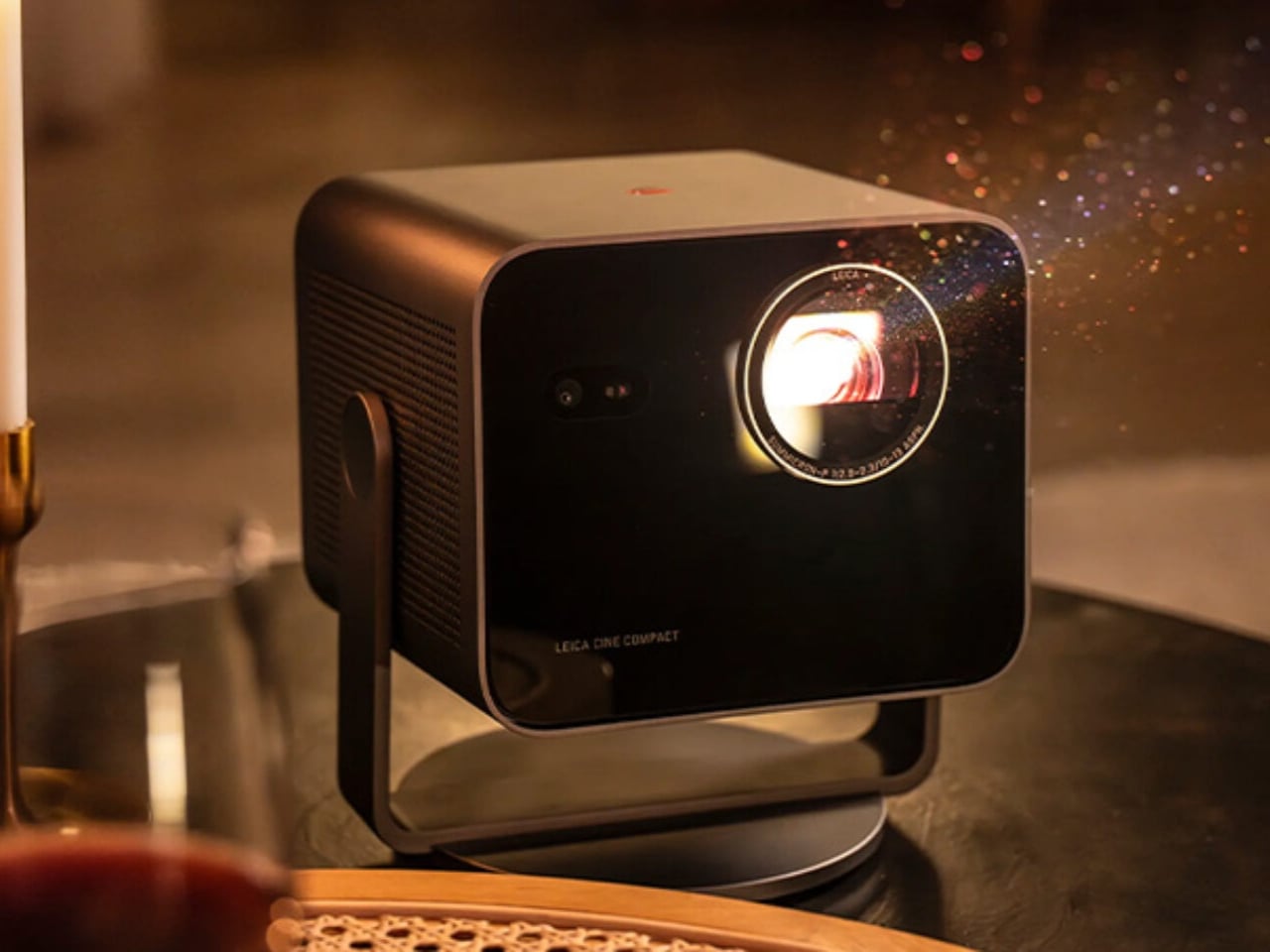
When Leica announced the Cine Compact 1, my first reaction landed somewhere between genuine curiosity and mild skepticism. Leica is a camera brand. A camera brand, the kind photographers carry like a quiet badge of honor, the kind that has defined a certain visual language for over a century. And now they want to replace my television?
Here is the thing: Leica has been making projectors since 1926. Before streaming was a concept, before most of us were born, they were already in the projection business. The Cine Compact 1 is not a prestigious camera brand drifting beyond its territory. It is one returning to an old, familiar one.
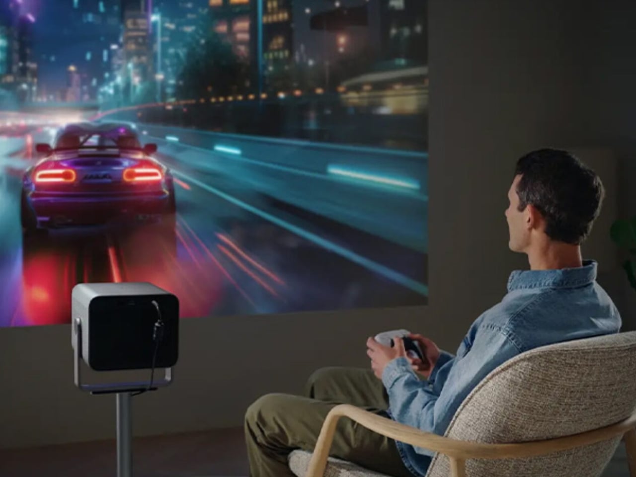
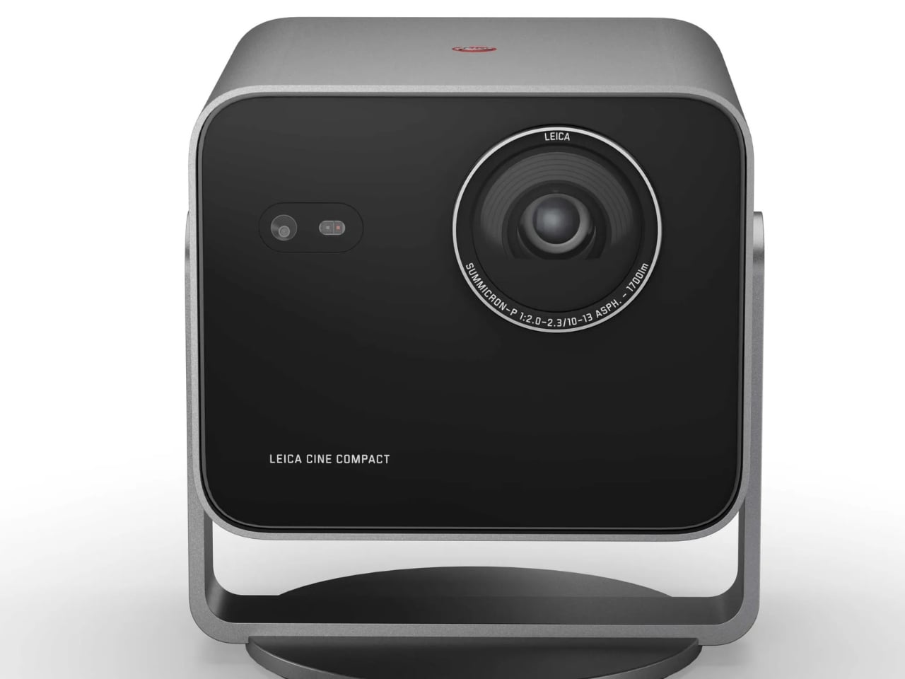
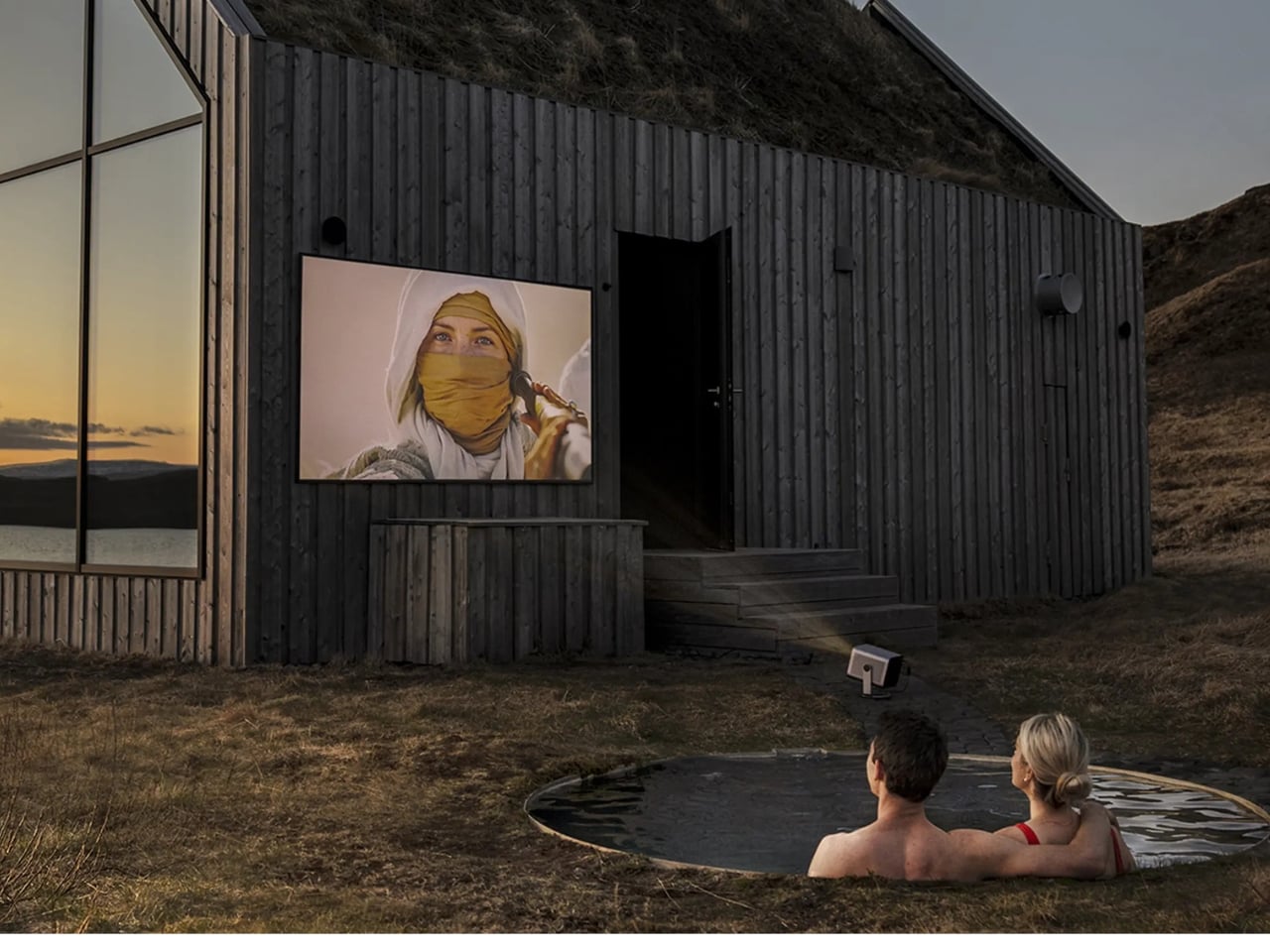
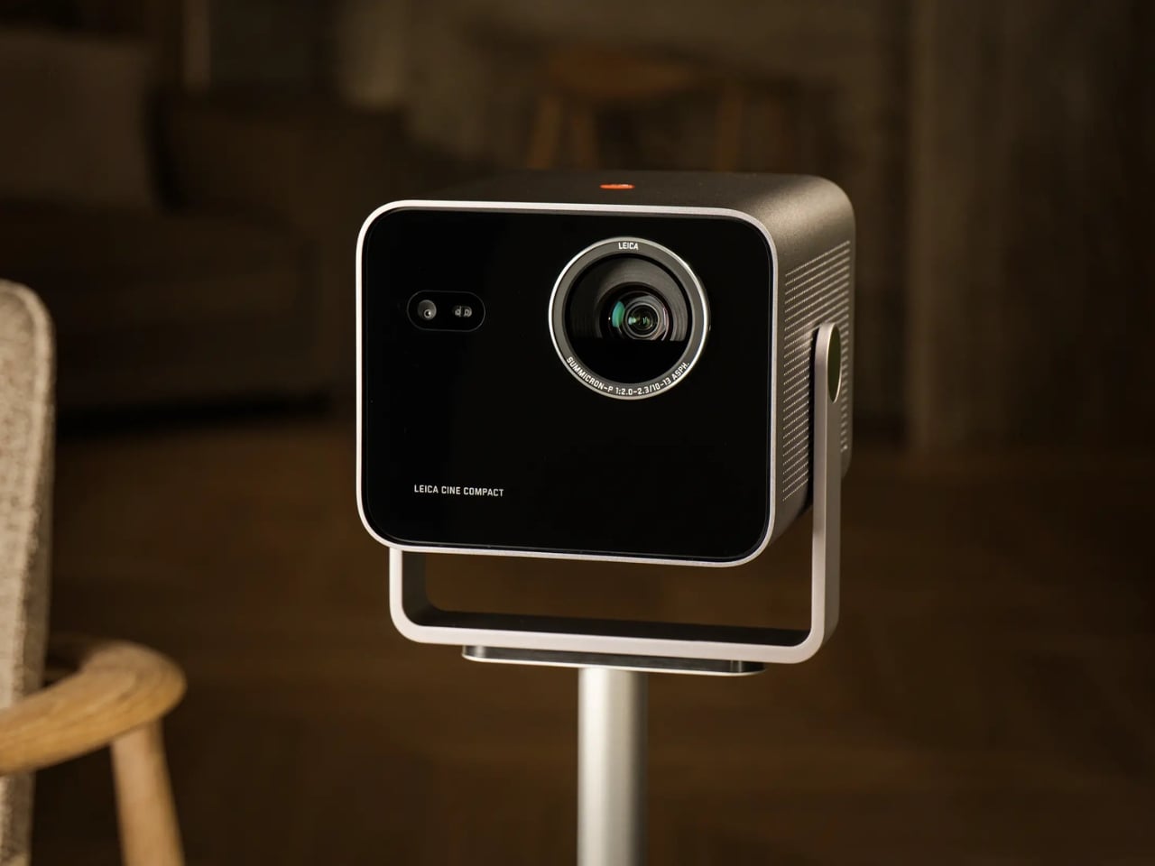
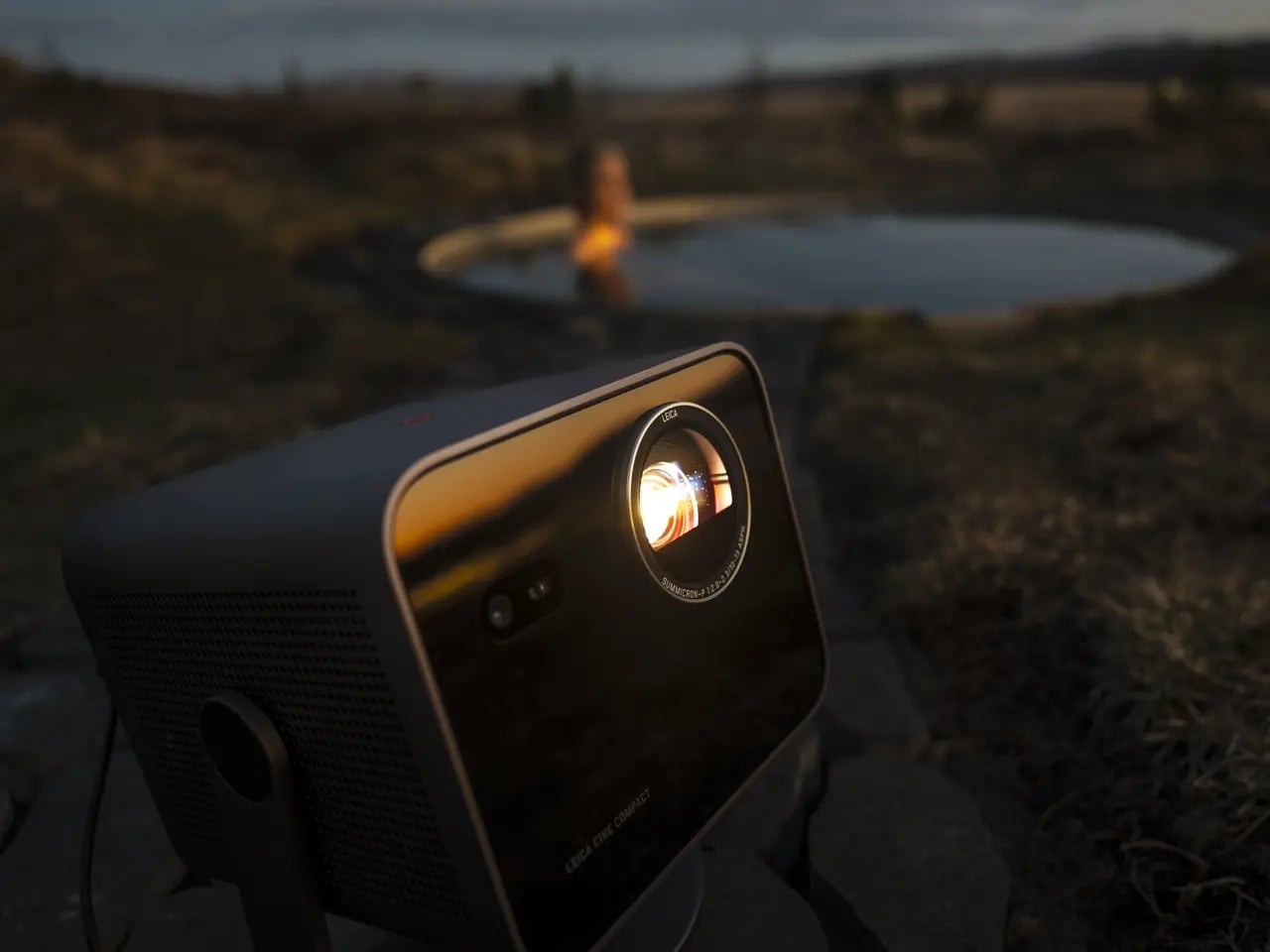
So what exactly is it? At the core, the Cine Compact 1 is a compact mini projector built around a Leica Summicron zoom lens with aspherical elements, a 0.47-inch DMD image chip, and Triple RGB laser technology. It delivers 4K resolution at up to 1,700 ANSI lumens, which is bright enough to produce a usable image in a room that is not completely blacked out. The maximum projection size is 220 inches diagonally, which is an absurd number for something small enough to sit on a coffee table.
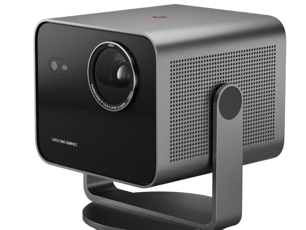
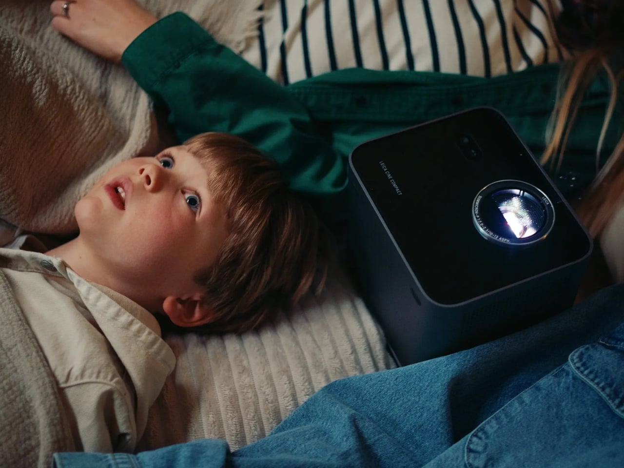
The 360-degree rotation system is the detail I keep thinking about. Most projectors are prisoners of their setup requirements: flat surface, blank wall directly ahead, dedicated space. The Cine Compact 1 abandons that formula entirely. Wall, ceiling, anywhere in between. That flexibility is not just a convenience feature. It actually changes your relationship with watching at home. Ceiling projection during a movie night is a categorically different experience from staring at a flat panel mounted above a console.
Leica also built in their proprietary image processing technology, called Leica Image Optimization (LIO), to maintain consistent picture quality regardless of projection size or location. Pair that with Dolby Vision for contrast and brightness precision, and Dolby Digital and DTS Virtual:X for audio, and this is not a glorified slideshow device. It is a serious piece of home cinema equipment disguised as a coffee table accessory.
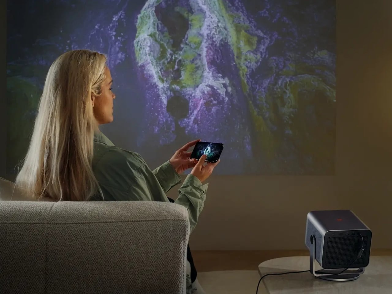
The design is Leica through and through: solid aluminum housing, a glass front, clean lines that read as refined rather than attention-seeking. Even switched off, it looks like it belongs on a shelf rather than something you drag out reluctantly. Its projected lifespan is 25,000 hours, which at a few hours of daily use amounts to decades of service. Smart streaming runs on VIDAA, so most of what you want to watch is accessible without plugging anything extra in.
My honest read on the Cine Compact 1 is that it is designed for a very specific kind of frustration: the one that comes from building your entire living space around a television. We spend years arranging furniture toward screens, painting walls in “TV-friendly” neutrals, negotiating actual square footage with a device that has one function. A projector like this shifts that equation. The screen exists when you need it. The room is yours the rest of the time.
Is it for everyone? No. Projectors still require more thought than a TV on a wall, and Leica’s pricing tends to reflect the brand’s premium heritage. But the people who will love this will love it unconditionally. The design-conscious person who thinks as carefully about how their space looks at two in the afternoon as they do at nine at night. The perpetually mobile person who wants a real cinema experience wherever they land. The person who is simply done negotiating living space with a large black rectangle.
Leica is not chasing a trend here. If anything, they are returning to something they were doing before most modern tech companies existed. The form is smaller, smarter, and more portable. The commitment to image quality behind it is exactly the same.