Fiat Multiplina concept rincarnates Classic Multipla as a clever four-seat electric urban vehicle

Urban mobility is evolving rapidly as cities become more congested and the demand for compact, efficient electric vehicles continues to grow. Building on the success of the Topolino and its expanding micromobility lineup, Fiat has now revealed the Multiplina Concept, a compact four-seat electric vehicle that previews the brand’s vision for practical city transportation. Rather than replacing a conventional car, the concept is designed to be a lightweight quadricycle and a full-fledged automobile, offering greater versatility while maintaining a small footprint.

Multiplina draws inspiration from the original 1956 Fiat 600 Multipla, one of the earliest examples of a space-efficient people mover. While the new concept embraces a thoroughly modern electric platform, it preserves the classic model’s philosophy of maximizing interior space within minimal exterior dimensions. The upright stance, rounded bodywork, expansive glasshouse, and cab-forward proportions create a distinctive retro-modern appearance that prioritizes visibility and cabin room over aggressive styling.

Designer: Fiat

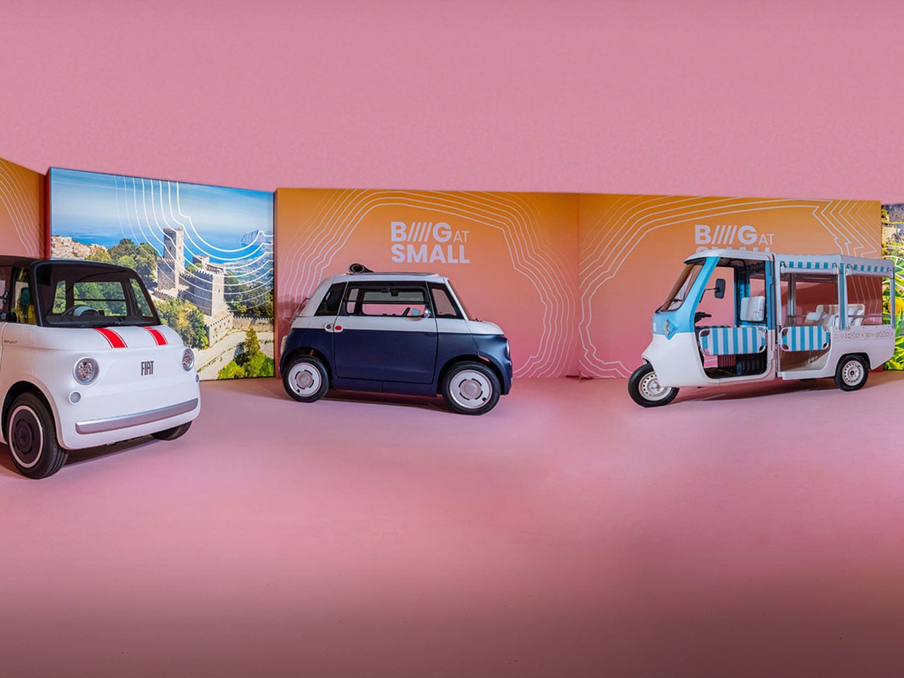
Unlike the two-seat Topolino, the Multiplina features seating for four occupants in a two-door configuration, making it more suitable for families, shared mobility services, or urban commuters who occasionally need extra passenger capacity. Fiat describes it as the “missing link” between the Topolino and a conventional passenger car, projecting it as a practical solution for people who find existing microcars too limiting but do not require the size or complexity of a standard hatchback.


The concept was unveiled as part of Fiat’s broader micromobility strategy during a dedicated event in Rome, where the company showcased an expanding ecosystem of electric transportation solutions. Alongside the Multiplina, Fiat introduced new Topolino variants and highlighted the Tris electric three-wheeler for commercial use, illustrating how the brand intends to serve personal transportation, urban logistics, and shared mobility through a unified lineup. According to Fiat CEO Olivier François, the company aims to make mobility simpler, smarter, and more accessible while reinforcing its long-standing focus on compact vehicles designed specifically for urban environments.


Although Fiat has yet to disclose technical specifications, battery details, or performance figures, the Multiplina is expected to remain compact enough for crowded city streets while offering improved everyday usability over existing quadricycles. Reports indicate that the production model is targeted for a 2028 launch, with expectations that it will fit within Europe’s heavy quadricycle category, enabling lower operating costs and greater accessibility in markets where these vehicles benefit from simplified licensing requirements.


The timing of the concept is significant as Fiat continues to strengthen its position in Europe’s growing micromobility sector. The company reports that the Topolino became Europe’s best-selling electric quadricycle in 2025, with demand continuing to rise in 2026. As more cities introduce low-emission zones and prioritize compact transportation, vehicles like the Multiplina could offer an appealing alternative for short-distance urban travel without the size and expense of traditional passenger cars.

The post Fiat Multiplina concept rincarnates Classic Multipla as a clever four-seat electric urban vehicle first appeared on Yanko Design.

This 368 Sq Ft Tiny Home Has a Murphy Bed, Incinerating Toilet, and More Clever Storage Than Most Apartments

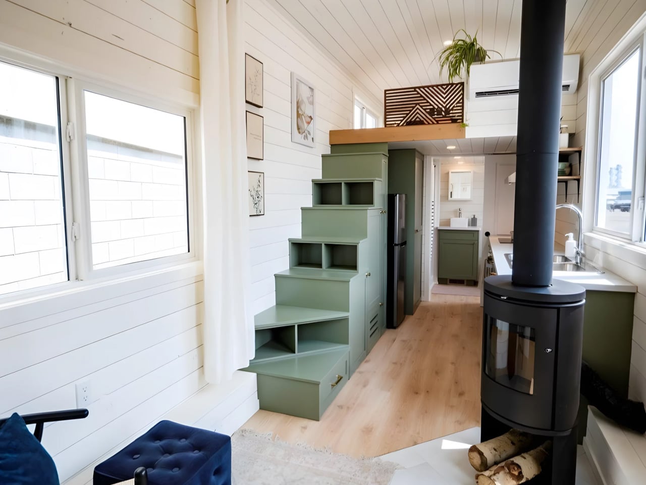
Most 30-foot tiny homes feel like they’re apologizing for their size. The Smidge, a new build from Alberta-based Teacup Tiny Homes, doesn’t bother — every wall, staircase, and fold-down surface has been quietly doing double duty the whole time.

Sitting on a triple-axle trailer, the Smidge stretches 30 feet long and wraps 368 square feet of living space inside a clean exterior of horizontal lap siding and a black standing-seam metal roof. It’s a familiar silhouette in the tiny home world, but the interior is where Teacup’s thinking gets interesting.

Designer: Teacup Tiny Homes

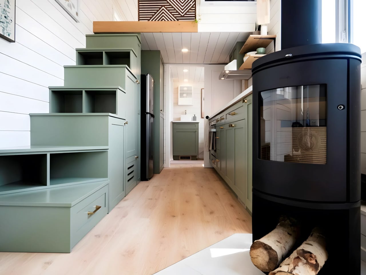
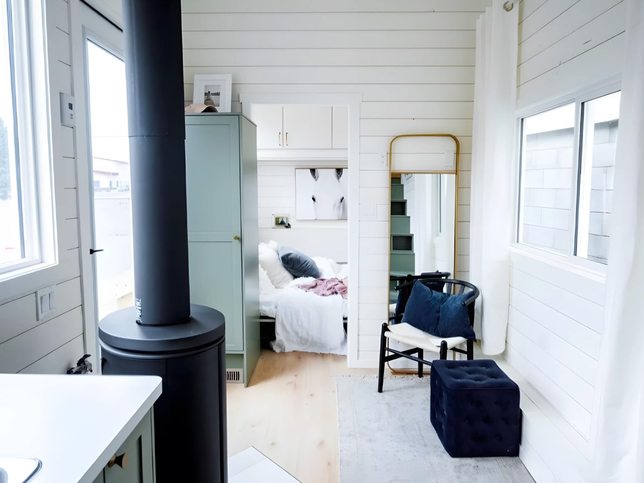
The entry opens directly into the living room, which features a full-size storage unit, space for a sofa, and a wood-burning stove tucked against the wall. Underfloor heating and a propane-powered forced-air furnace handle the cold — a deliberate choice for a builder that operates in Alberta and knows Canadian winters aren’t gentle. Windows run generously along the walls, pulling in natural light and keeping the interior from feeling like a cabin.

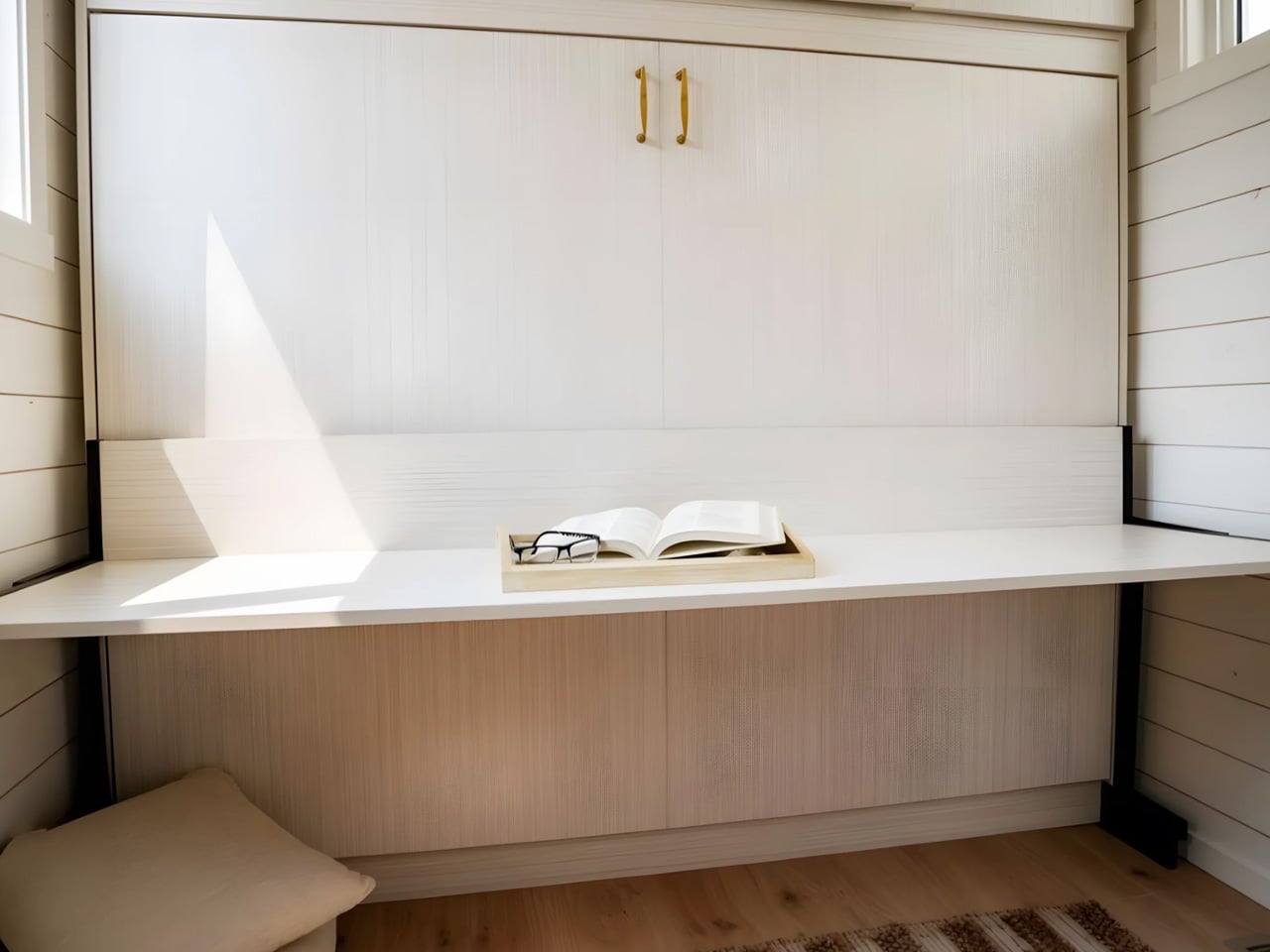
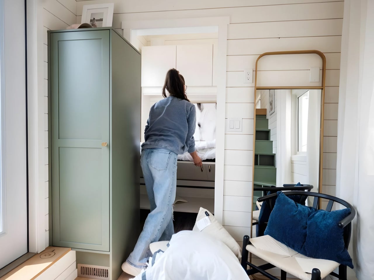
Just off the living room sits what Teacup calls an office, though calling it that undersells it. The space houses a Murphy-style bed with a folding desk mounted to its underside. During the day it functions as a proper work area; at night, the whole unit folds down to reveal a queen-sized bed. It’s one of those solutions that feels obvious in retrospect and rarely gets executed this cleanly.

The kitchen manages to fit a double-basin sink, induction cooktop, oven, fridge/freezer, and washer/dryer without feeling like a galley. The storage-integrated staircase beside it — fitted with drawers, cupboards, and a pull-out pantry — is the kind of detail that makes you look twice. Every riser is pulling weight.

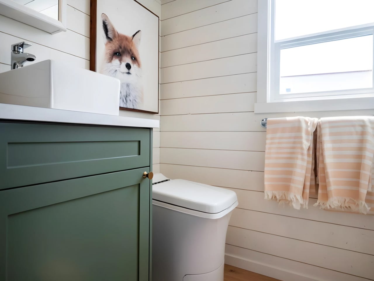
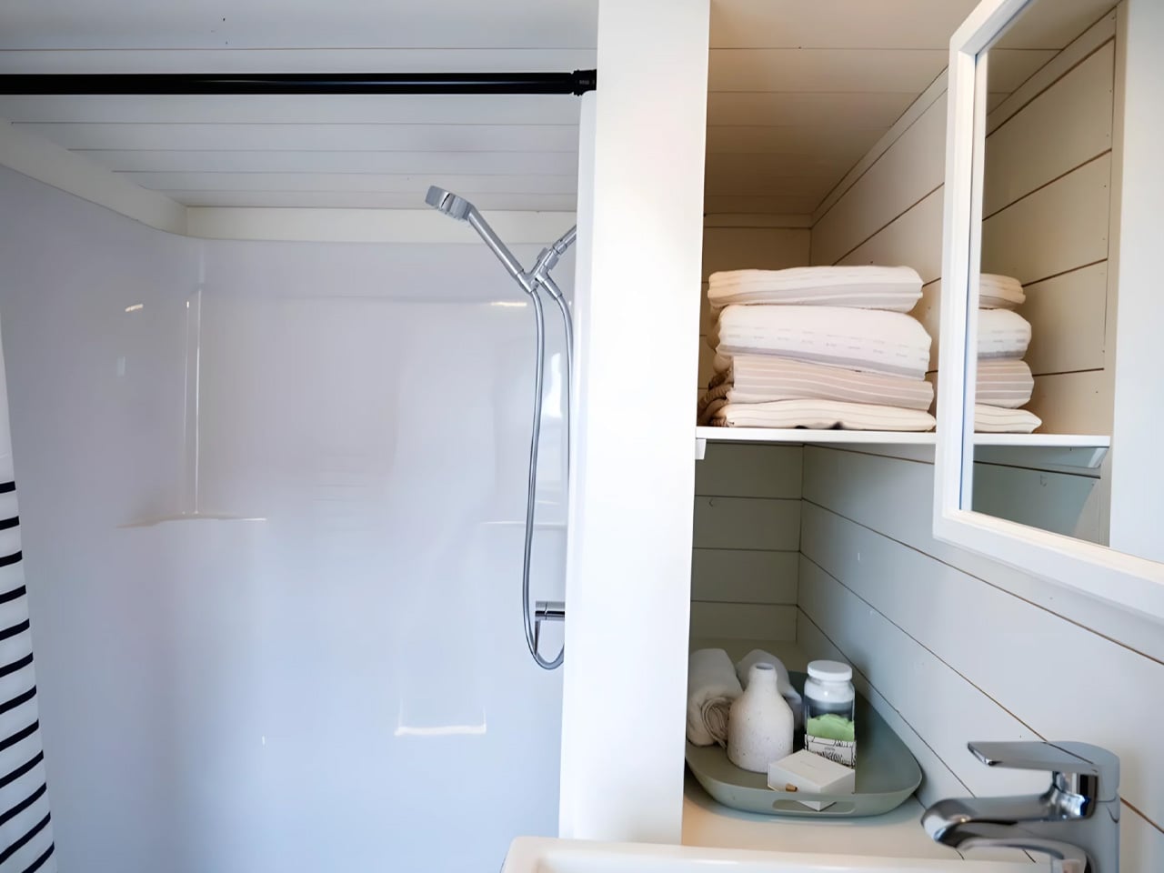
The bathroom holds a walk-in shower, vanity sink, and an incinerating toilet, which burns waste down to ash. Teacup compares the system to an air fryer, which is either reassuring or unsettling depending on how you look at it, but off-grid functionality is rarely poetic.

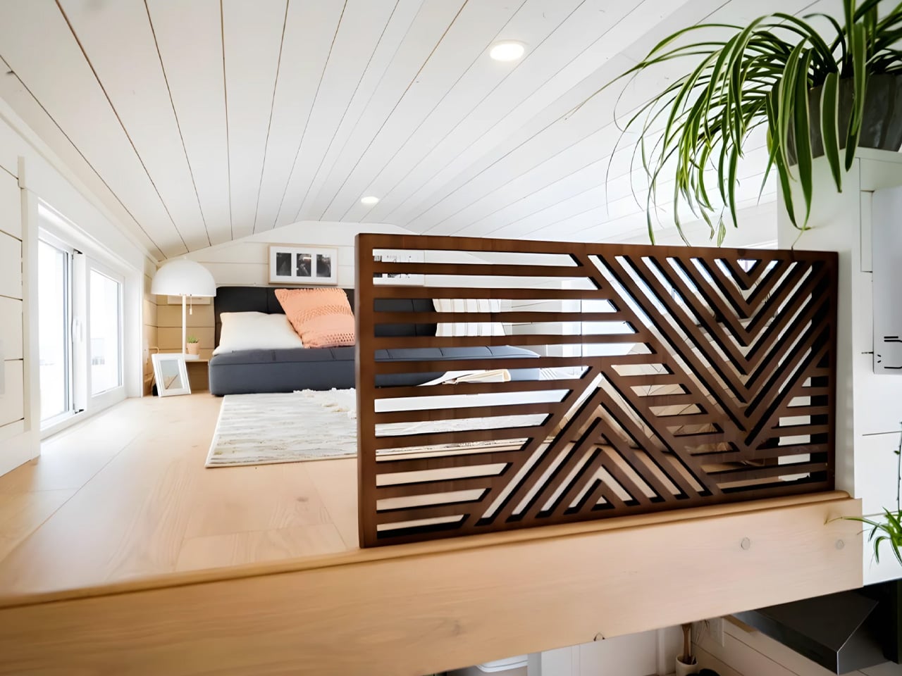
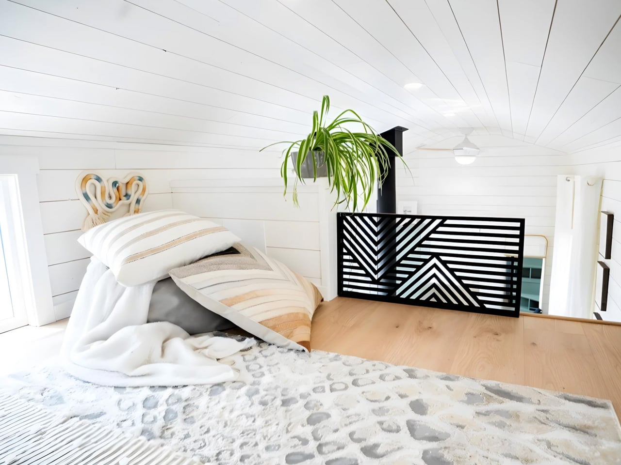
Upstairs, a loft bedroom with a double bed sits under a low ceiling, accessed by that same storage staircase. It’s cozy rather than cramped — the difference being entirely in how you frame it. The Smidge is based on Teacup’s Margo range, which starts at approximately US $116,000, with pricing varying by configuration. Custom commissions are available directly through the builder.

The post This 368 Sq Ft Tiny Home Has a Murphy Bed, Incinerating Toilet, and More Clever Storage Than Most Apartments first appeared on Yanko Design.

Monai’s New Baby Crib Monitors Heart Rate With 4K Sensors

Baby gear has always been functional. Safe. Practical. But design, real design, has rarely been part of the conversation when it comes to infant furniture. The Monai Sleepod Baby Crib is trying to change that, and it’s doing it with enough technology packed inside to make your phone feel a little insecure.

Designed by Wen Rui, Shi Zongjing, and Shen Jiahao for Kaiwang, a Shenzhen-based design team, the Sleepod made its debut at CES 2026 and later turned up at Milan Design Week 2026. Two events that rarely share the same audience, and showing up at both is a clear statement of intent: this is a product that wants to be taken seriously as both technology and design.

Designers: Wen Rui, Shi Zongjing, Shen Jiahao for Kaiwang

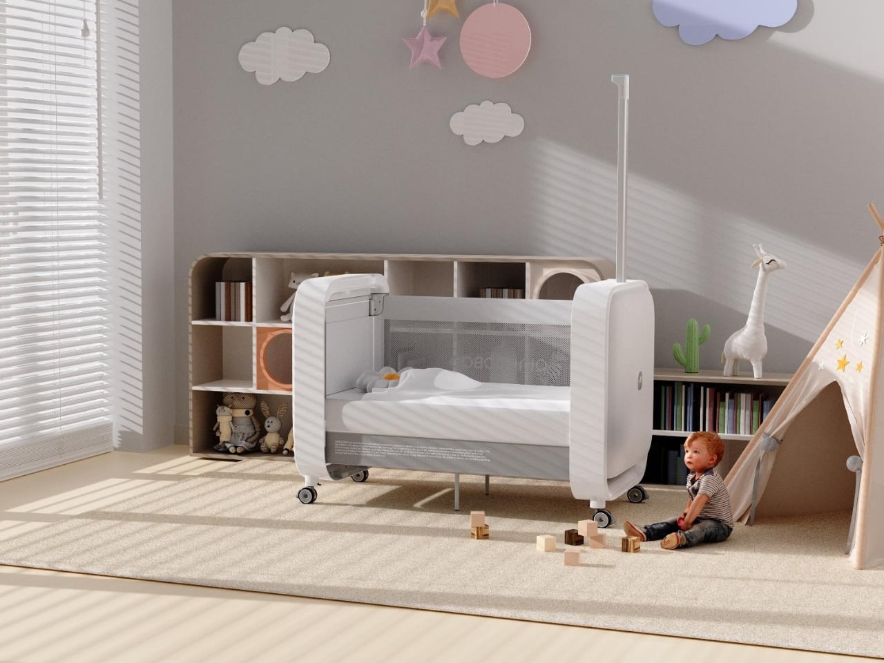
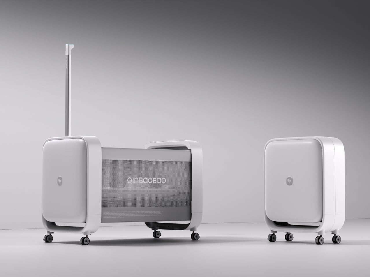
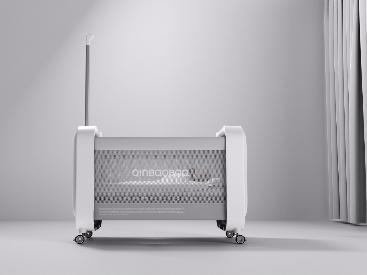
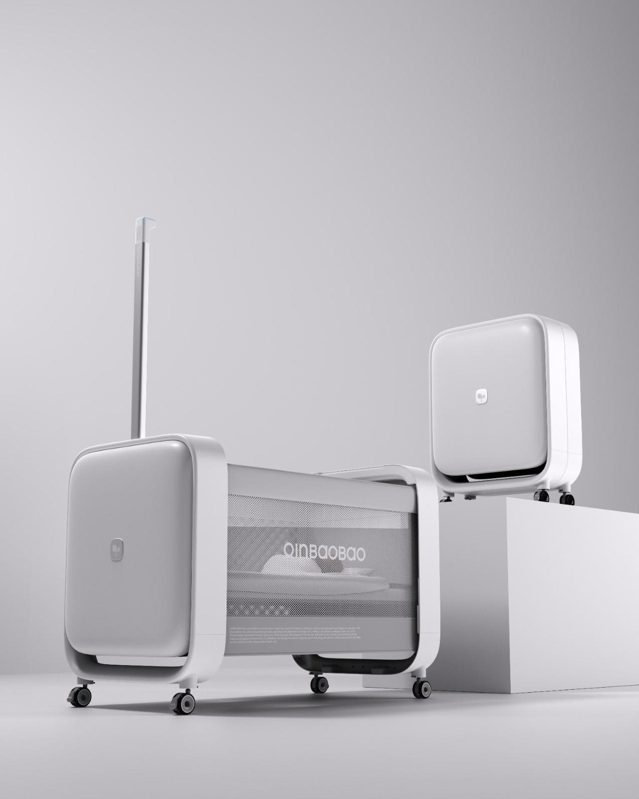
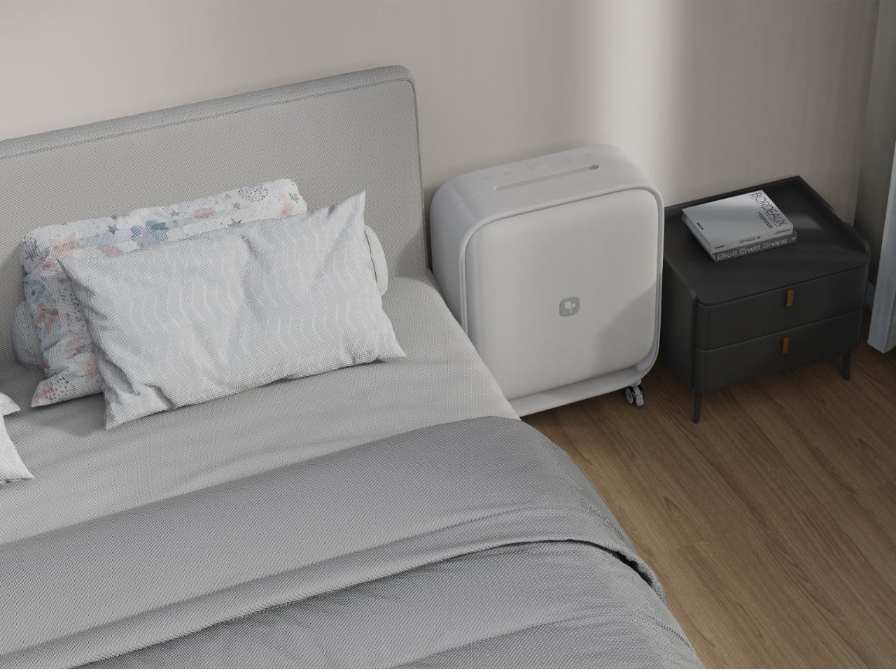
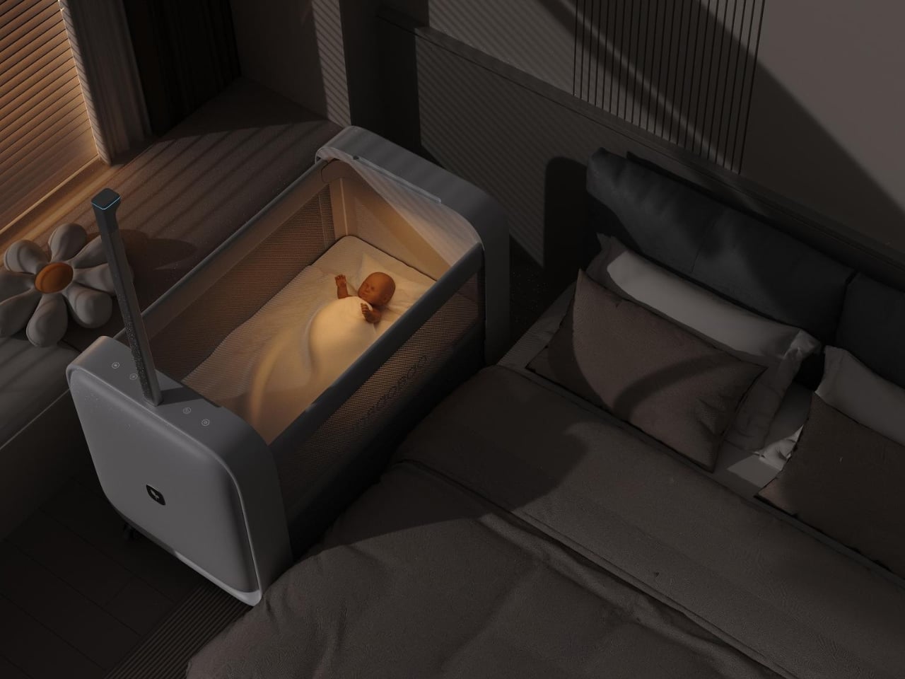
At a glance, the Sleepod looks clean and considered, more like something you’d see at a Scandinavian design fair than in the baby aisle of a big box store. Its collapsible, luggage-style frame packs down quickly with a one-button folding mechanism, making setup fast and storage genuinely easy. The adjustable bed and railing heights let the crib adapt as a baby grows, rather than becoming obsolete after a few months. For parents used to baby gear that seems designed more for showroom appeal than real daily life, those are practical wins that add up quickly.

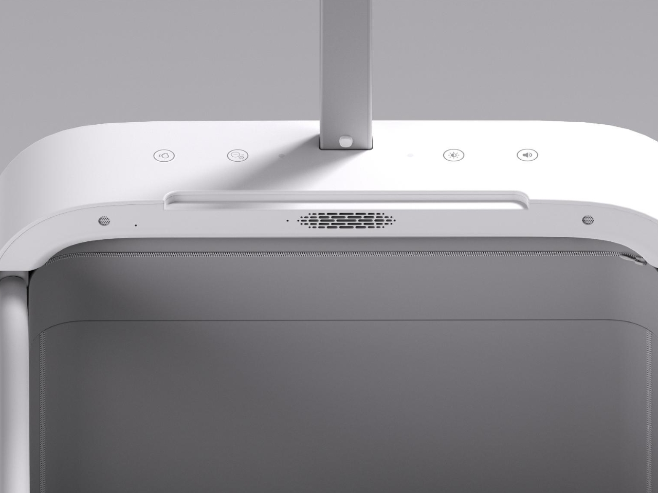
The technology is where the Sleepod really separates itself from everything else on the nursery floor. Inside the compact frame is a stack of sensors that would feel at home in a medical monitoring setting: a 4K full-color camera with low-light imaging, millimeter-wave radar, and thermal infrared sensors. Together, they track a baby’s activity, sleep quality, breathing, heart rate, and body temperature around the clock. The camera detects covered faces and proximity to the railings, triggering alerts before a situation has a chance to become dangerous. It also reads cry patterns and monitors sleep cycles, giving parents actual data rather than anxious guesswork at 3 a.m.

There’s also a negative-ion air purification system built into the design, along with gentle audio features intended to help soothe babies to sleep. The whole system runs on full-stack, in-house AI technology, and Monai describes it as the first application of embodied intelligence in baby care, which essentially means the crib is built to understand and respond to its occupant rather than simply containing one.

As a piece of design, the Sleepod makes me think the baby furniture industry has been dramatically underestimating what a crib could be. Most cribs ask parents to do the sensing, the watching, and the worrying. The Sleepod redistributes some of that cognitive load. For anyone who has spent a night lying awake, listening for sounds that may or may not mean something, that shift in responsibility feels genuinely meaningful.

The design language is notably restrained, and that reads as a deliberate choice. Nothing here is trying to be cute or playful in the way baby products so often default to. It feels like something built for the parent as much as for the baby: calm, precise, and considered. The foldable frame and portable form suggest a team thinking about modern parenting realistically, including families who travel, move frequently, or simply don’t have space for furniture that works only one way.

The questions around always-on AI monitoring in a nursery are worth naming. Multi-sensor fusion with 4K imaging running continuously is a significant data footprint, and parents will reasonably want to know what’s being processed on the device versus what’s sent to the cloud. These are conversations the industry needs to get better at having openly as smart baby tech shifts from novelty to expectation.

Still, as an object and as an idea, the Monai Sleepod Baby Crib is a genuinely compelling piece of work. It doesn’t treat technology and furniture as two separate concerns parents have to manage on their own. It makes them one coherent thing, designed around what it actually takes to keep a small, new person safe, healthy, and sleeping well.

The post Monai’s New Baby Crib Monitors Heart Rate With 4K Sensors first appeared on Yanko Design.

Police Officers Spent Three Years Redesigning the Lifesaver To Make It As Small As A Hockey Puck

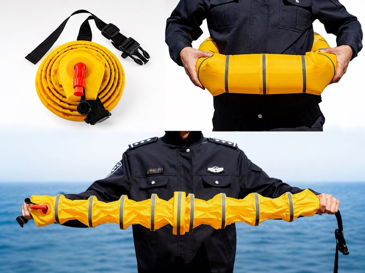
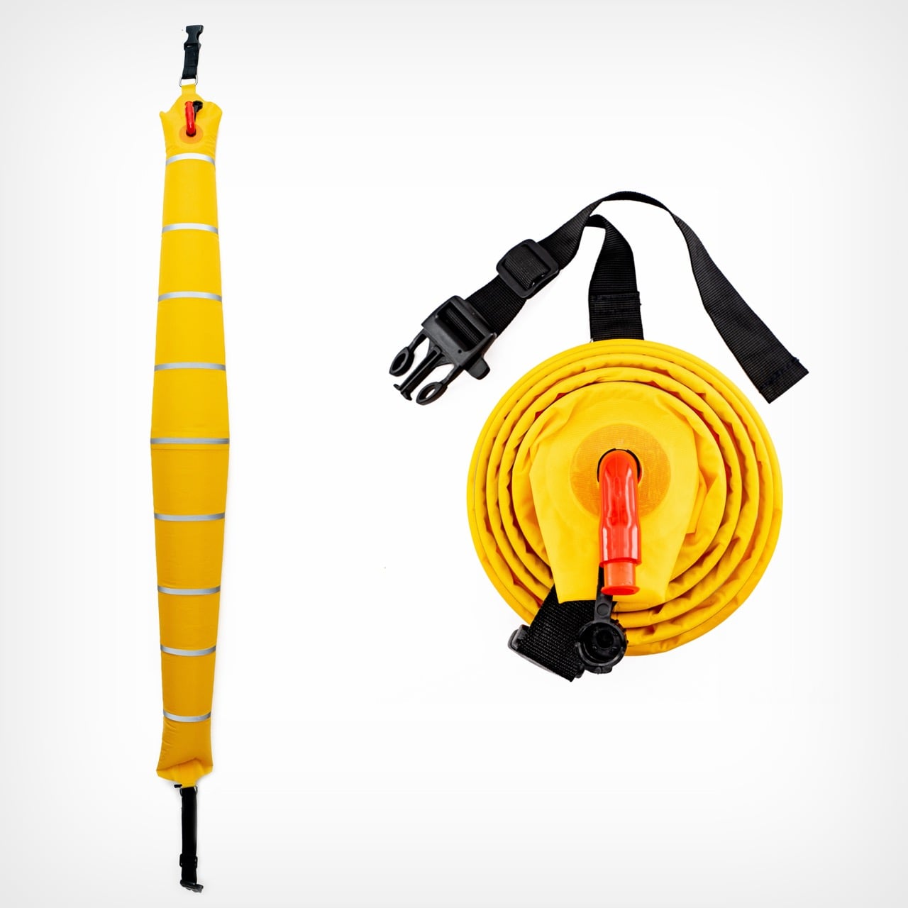
Rolled up, Ark Hero No.1 looks like a hockey puck with a zipper. Nothing about it announces itself as rescue equipment. Pop the shell open and a coiled yellow tube spirals inside, capped by a red hand pump that would look at home on a bicycle. Pump it for a few seconds and the coil stretches into a segmented shaft that spans shoulder to shoulder, jointed like a stalk of bamboo and wrapped in reflective silver bands built to catch headlights at 3 AM. The whole sequence takes about as long as opening a bag of chips.

That transformation, from puck to rescue tool, is the entire pitch. Ark Hero No.1 is a 2025 Design Intelligence Award Future Talents winner developed over three years by frontline police officers who kept watching the same tragedy play out from the same design gap. Traditional life rings live on piers and boat railings, tethered to places where drownings often do not happen. A car that leaves the road at 2 AM lands nowhere near a lifeguard tower. The brief was simple: build the life ring that could have been in the trunk.

Designer: wanglicheng

Losing the CO2 cartridge is the single biggest upgrade, more so than the actual innovative design. High-pressure gas kills casual storage: it expires, complicates air travel, sits inside a regulatory maze at customs, and demands specialist replacement after every deployment. Swap it for the red hand pump poking out of the case and the same ring can live in a squad car or family sedan for years without anyone thinking about it. The trade-off is a few extra seconds of pumping. Given that the alternative is often no life ring at all, that math works out fast.

Ark Hero No.1 spreads its buoyancy across a chain of joined segments instead of pooling all the air in one giant doughnut. A conventional ring holds its air in a single chamber, so one puncture compromises the whole thing. The segmented design lets a tear in one pod leave the rest of the shaft floating, which matters when the tube is scraping metal edges or broken glass after an accident. The jointed geometry also lets the tube flex around a body or drape across a car window frame during rescue. Silver reflective bands wrap every segment, doing their real work in dark water where solid yellow gets lost in glare and chop.

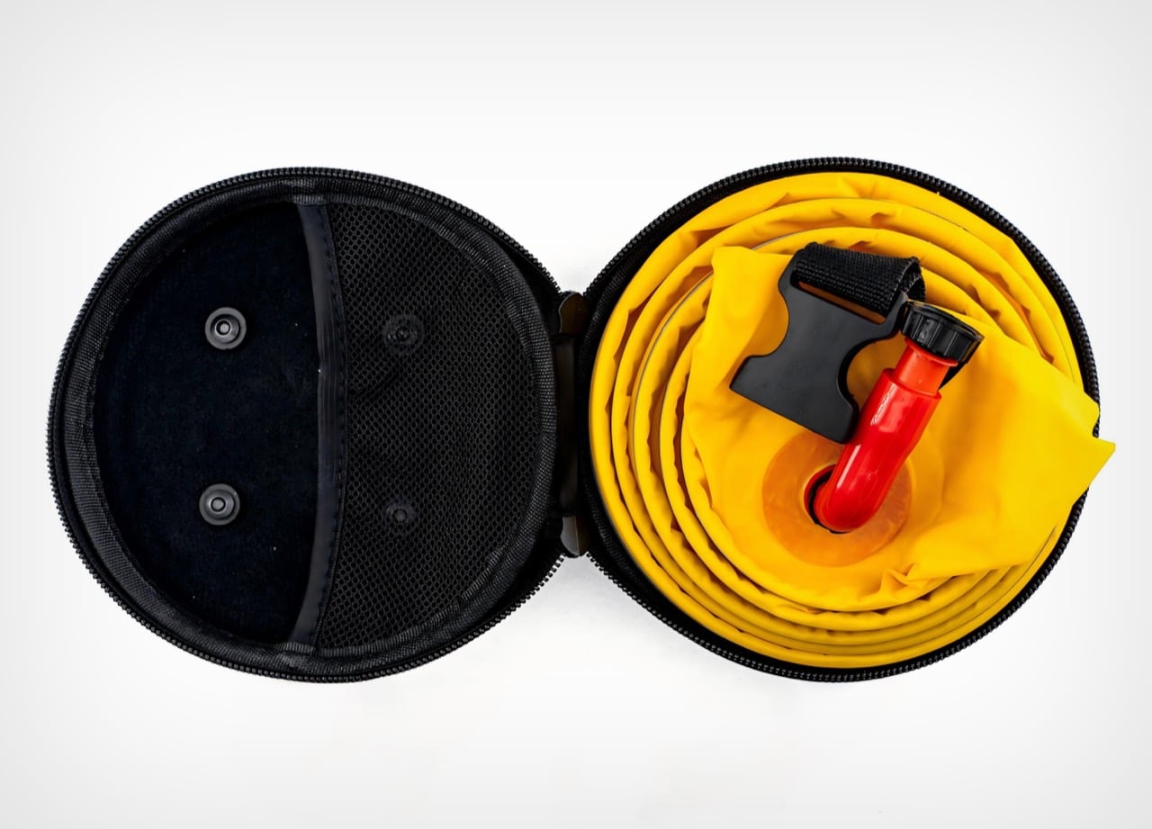
The hard-shell case turns the whole system into something a procurement officer can plan around. Rolled up, the coiled tube snaps into a puck-shaped shell with a full-perimeter zipper and a mesh interior pocket that holds the pump and buckle in place. The form factor standardizes storage footprint, protects the fabric from years of abrasion, and clips easily to duty belts, headrests, and boat racks. An officer can carry one on the hip. A patrol vessel can rack a dozen without eating floor space.

For a project born from three years of frontline police fieldwork, the visual restraint tells its own story. No branding drama, no styling flourish, no lifestyle gadget affectation. The yellow is loud because loud yellow gets seen from a helicopter. The red is loud because red hands find red pumps in a panic. Every element exists because someone once needed it and did not have it, and that tends to end well when the equipment finally reaches the people who kept improvising without it.

The post Police Officers Spent Three Years Redesigning the Lifesaver To Make It As Small As A Hockey Puck first appeared on Yanko Design.

Polaroid Just Upgraded the Tiny Camera Collectors Love

There was a time when the only people you would see carrying around Polaroid cameras were the hipster film or art students or the always-on-a-nostalgic-trip enthusiasts. But now, analog cameras have become part of the lives of those who are into photography or those who just like collecting printed photos to tuck into their journals or cork boards.

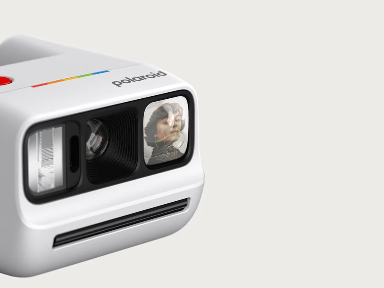
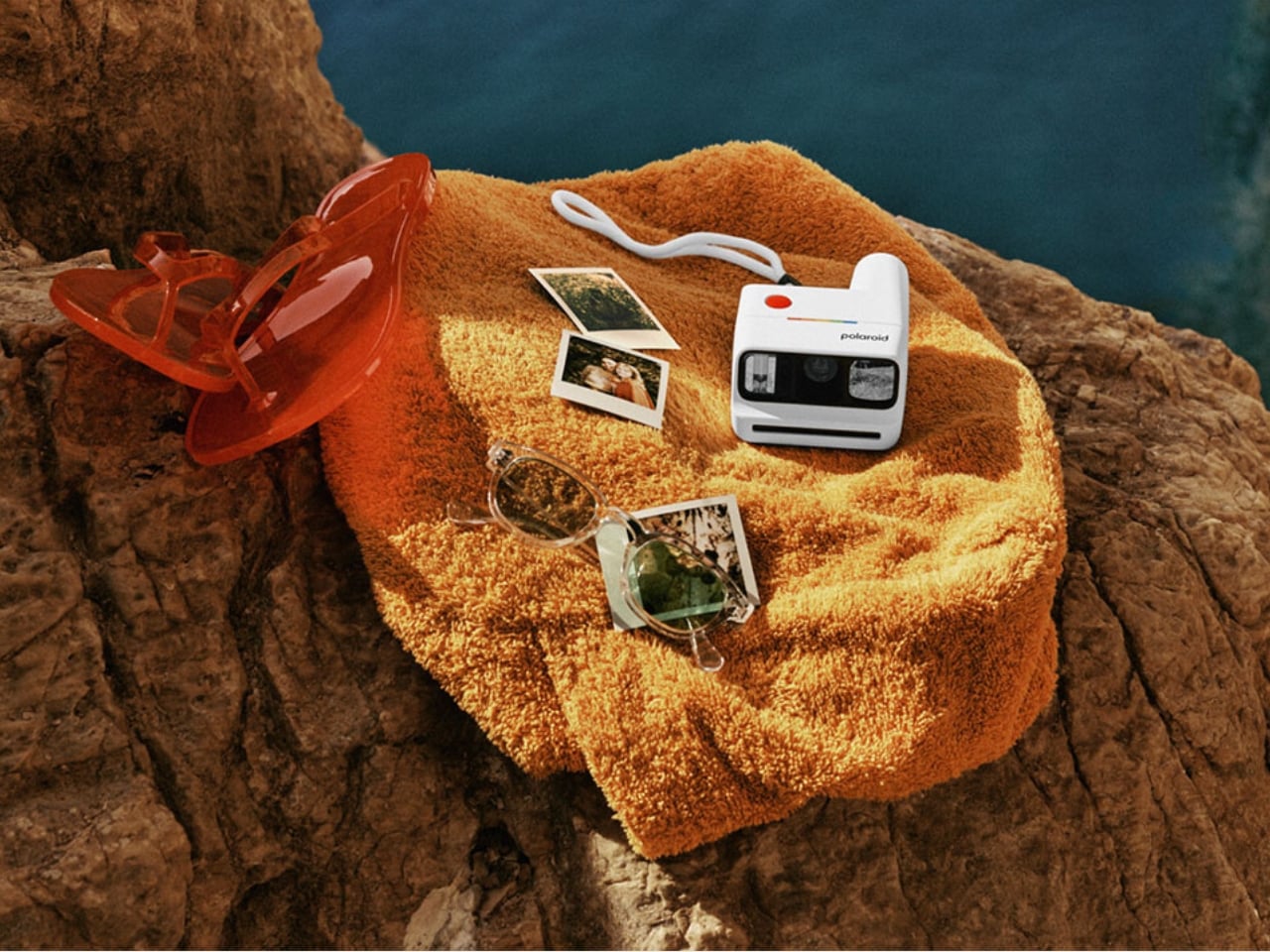
Polaroid is one of those brands that has really gotten into this whole analog-digital hybrid lifestyle by consistently releasing new products that the market gobbles up. Their latest release is the Polaroid Go Generation 3, the newest iteration of this product line that brings exciting new features, fresh vibrant colorways, and even more ways to capture those memories.

Designer: Polaroid

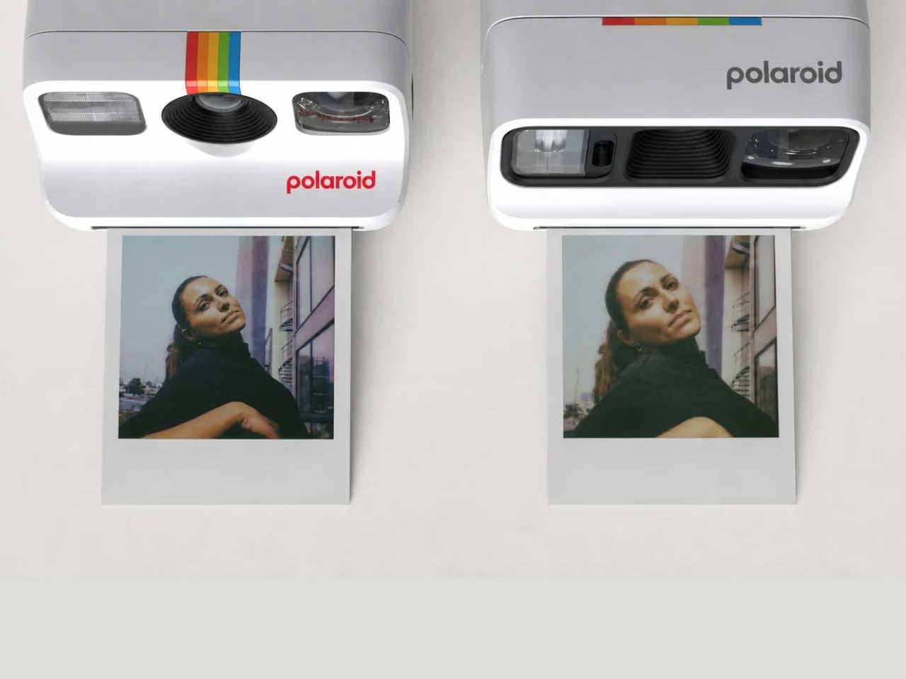
This new version of this beloved Polaroid camera offers several new things that collectors and enthusiasts will enjoy. The biggest upgrade is that the new polycarbonate optic brings you sharper and clearer photos. I know the lo-fi nature of a lot of these analog cameras is part of the appeal, but of course, sometimes you’d still want to have something that has higher quality.

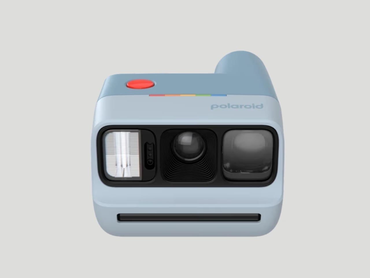
This camera, which is the world’s smallest instant analog one, now also has a better Xenon flash which performs better than the LED flashes on modern cameras when taking low-light photos. It is also able to handle lens flaring better, and the selfie mirror now also has less glare.

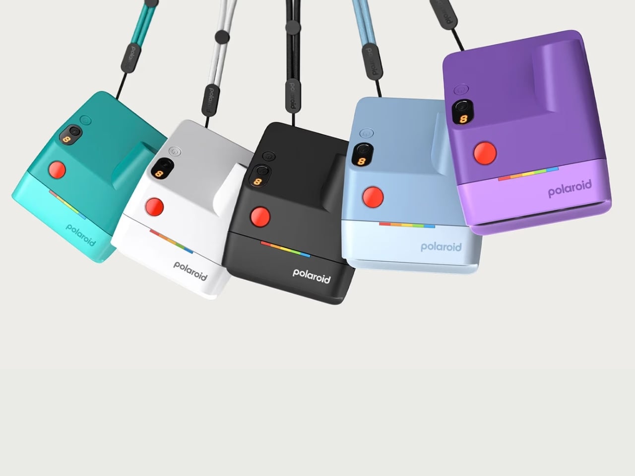
For collectors who are focused on the design of the camera itself, this version comes in five new vibrant colors: purple, teal, light blue, black, and white. Personally, I can’t wait to have the purple one and carry it around with its pocket-friendly dimensions.

Another upgrade worth getting excited about is the improved viewfinder. The new wider design with its elongated eyepiece lets you see your full composition comfortably, with no more awkwardly pressing your face against the camera just to frame a shot. It is a small but impactful change, especially when you’re trying to capture a spontaneous group moment and need to get the framing right on the first try. No more accidentally cut-off heads or missed expressions.

What also stays from the previous generations, and that is very much a good thing, are the beloved shooting modes. Use the self-timer for those full-group shots where everyone actually needs to be in the frame, or activate the double exposure mode for dreamy, creative layered shots that give your photos a truly artistic edge. Flash control is also all handled through a single button, keeping the whole experience intuitive and fuss-free. It is simple, fun, and exactly the kind of energy you want from a camera this size.

And for those who still want a little digital in their analog life, the Polaroid Go Gen 3 pairs nicely with the free Polaroid app. You can scan your prints and share them online, so you truly get the best of both worlds. The physical photo to stick on your wall, tuck into your journal, or swap with a friend, plus a digital copy ready to share whenever you feel like it.

The rechargeable lithium-ion battery holds up impressively too, giving you up to 15 film packs per charge, more than enough for a full weekend getaway or a long day of adventures without worrying about it dying on you at the worst possible moment. And at just $89.99, it is an accessible and very giftable entry into the world of instant analog photography.

Whether you are a die-hard Polaroid collector, a photo journaler, or someone who simply wants to step away from the overly curated world of digital photography and capture something real and unfiltered, the Polaroid Go Generation 3 is worth every penny. It is small enough to slip into a bag, beautiful enough to show off, and capable enough to make your memories look genuinely great. Big energy in the tiniest package, and honestly, is there anything more Polaroid than that?

The post Polaroid Just Upgraded the Tiny Camera Collectors Love first appeared on Yanko Design.
What the First Galaxy Z Fold 8 Wide Teaser Reveals About Samsung’s Next Move

What the First Galaxy Z Fold 8 Wide Teaser Reveals About Samsung’s Next Move Galaxy Z Fold 8 Wide

Samsung has sparked widespread excitement with its latest teaser campaign, signaling a potential design evolution for the highly anticipated Galaxy Z Fold 8. By wiping most of its previous Instagram posts and replacing them with cryptic visuals and phrases such as “new shape, new joy,” the company has set the stage for what could be […]

The post What the First Galaxy Z Fold 8 Wide Teaser Reveals About Samsung’s Next Move appeared first on Geeky Gadgets.

Posted in Uncategorized

Flipper One Behind The Scenes: “Sharper, Smarter, More Cunning, Brutal” says Flipper CEO

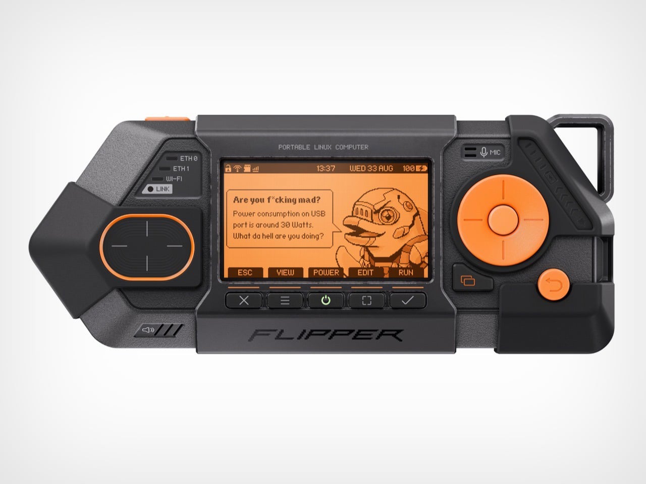
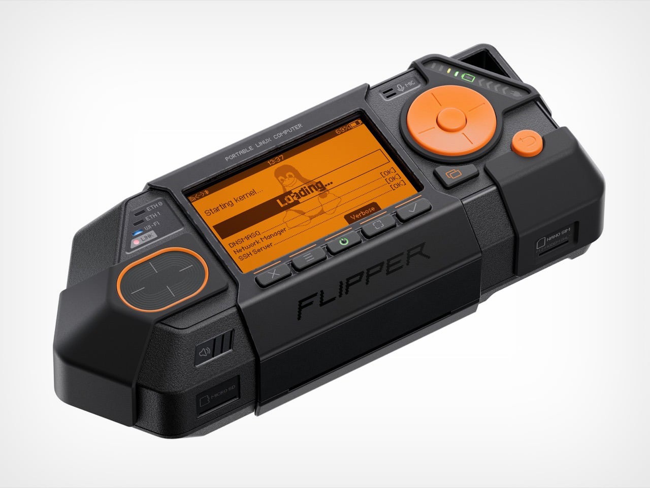
When you first see the Flipper One, it’s clear something has changed. Its predecessor, the Flipper Zero, had the playful, almost toy-like charm of a 90s gadget. It was clever, compact, and just a little bit mischievous. The Flipper One, by contrast, is not playing around. With its exposed metal, ruggedized shell, and dense, purposeful form, it looks less like a hacker’s Tamagotchi and more like something you’d find bolted to the dashboard of a military vehicle. The design language has become, in the words of Flipper’s CEO Pavel Zhovner, “sharper, smarter, more cunning, more brutal.”

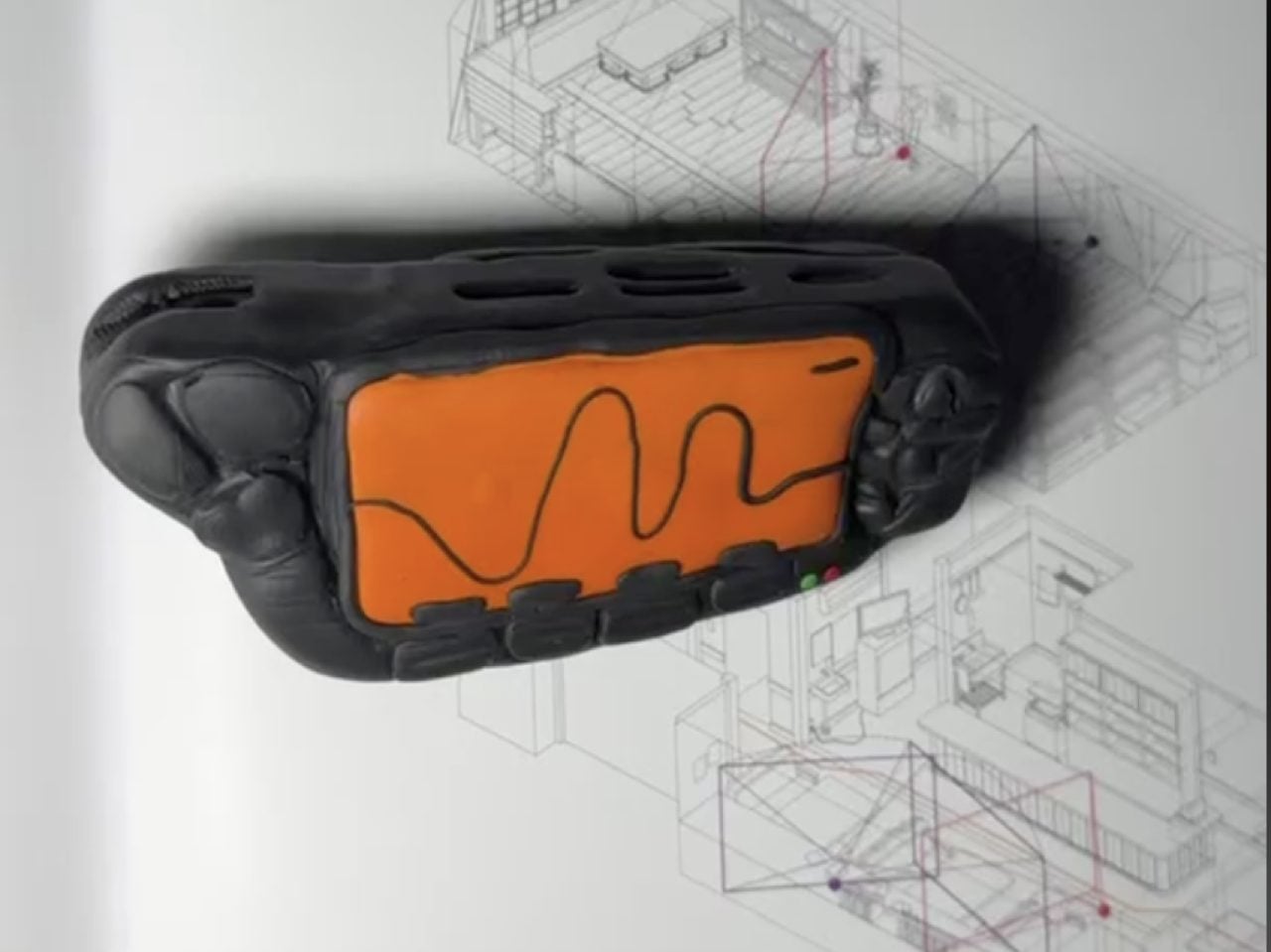
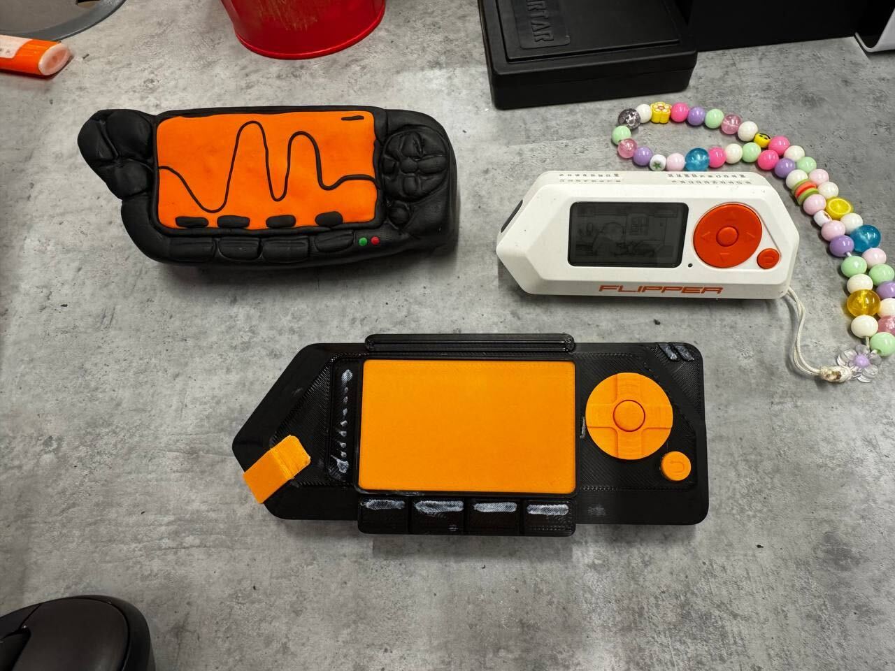
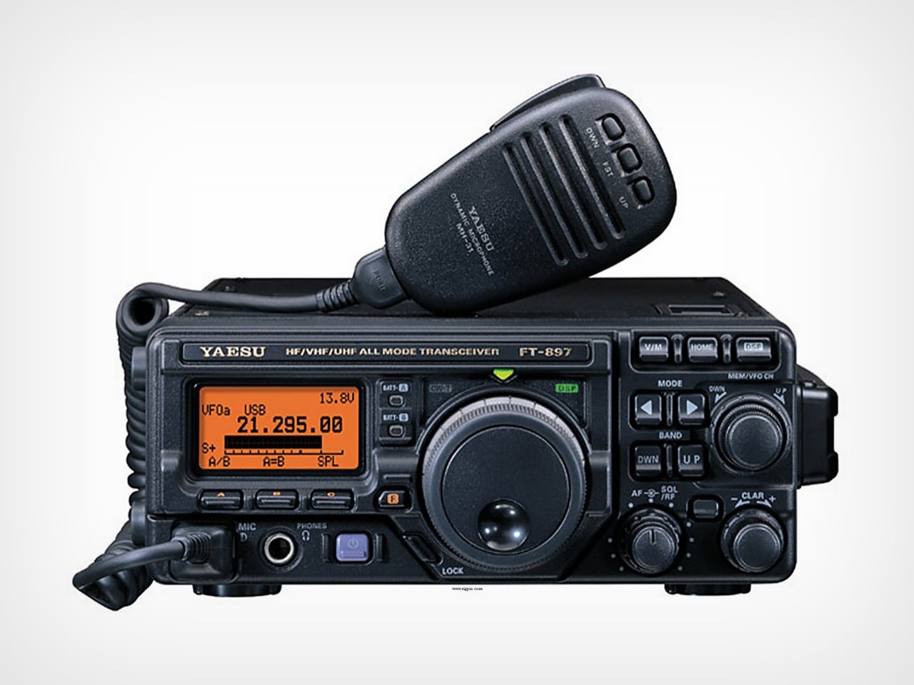
The source of this aesthetic shift isn’t another cyberpunk movie. While the team’s love for William Gibson’s Johnny Mnemonic is still part of the lore, the Flipper One’s design was shaped by a much more tangible artifact. “There was a very tangible, physical reference this time too,” Zhovner explains in an exclusive interview with Yanko Design, “the Yaesu FT-897D radio transceiver. It’s serious field communications equipment.” That single object unlocks the entire story behind the Flipper One’s aggressive new form. The team’s earliest prototypes, he notes, were shaped by hand in polymer clay to mimic the radio’s rugged, function-first ergonomics, and even then, they “looked remarkably close to it.”

Designers: Pavel Zhovner & Flipper Devices

Yaesu FT-897D radio transceiver

This move from fiction to field equipment wasn’t just a stylistic choice; it was a direct response to the device’s new capabilities. The core challenge in creating the Flipper One wasn’t about living up to the Zero’s reputation, but a years-long technical quest. “For years, we were chasing the right balance between performance, battery life, and price,” Zhovner recalls. Every processor they considered “forced a compromise we weren’t willing to make.” The breakthrough finally came with the arrival of the RK3576 chip. “The moment we looked at its performance specs and peripheral support, we knew – this was it.”

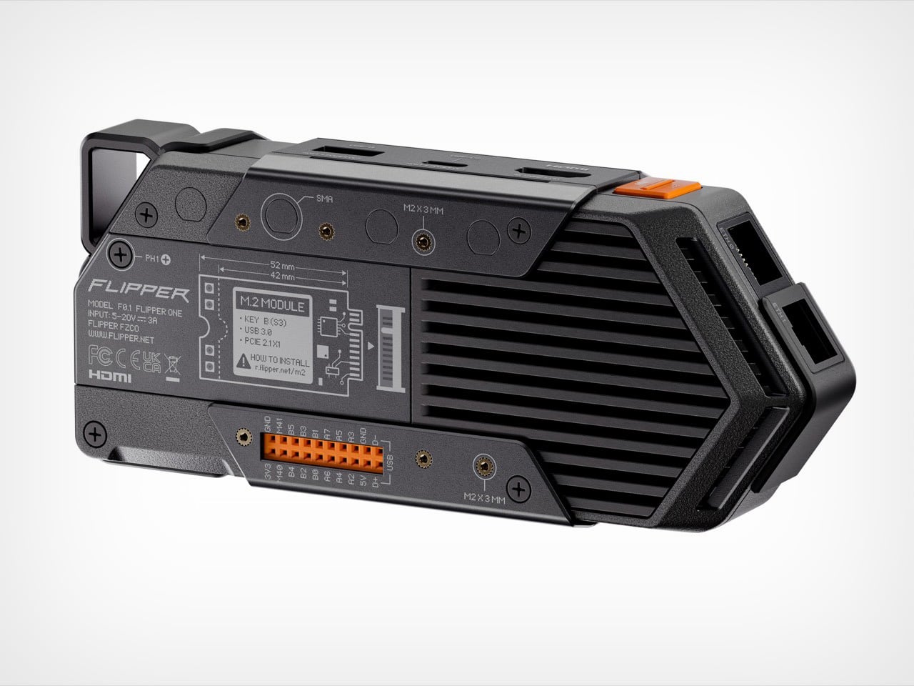
But that power came at a cost: heat. “Unlike Flipper Zero, Flipper One runs hot,” Zhovner says. Suddenly, the housing couldn’t just be a passive shell; it had to become an active part of the thermal solution. This is where the Yaesu’s design influence became critical. The rugged, armored look isn’t just for show. “The metal elements are doing real thermal work, acting as part of the cooling system,” Zhovner points out. The design team decided to lean into this necessity, creating a device that visually communicates its own power and thermal demands. The Flipper One wears its cooling system like armor because, in a very real sense, it is.
This philosophy of brutal honesty extends to the iconic dolphin mascot, which has also evolved. It’s now sharper, more angular, and decidedly less friendly – a reflection of the smarter, more powerful machine it represents. This commitment to a cohesive design language is rooted in the team’s belief in their core visual element. “We’re simply in love with our aggressive triangle,” Zhovner states. “It was never up for debate.” The goal was to preserve that instant recognizability while adapting it to a more demanding set of functional requirements.

Preliminary clay model of the Flipper One

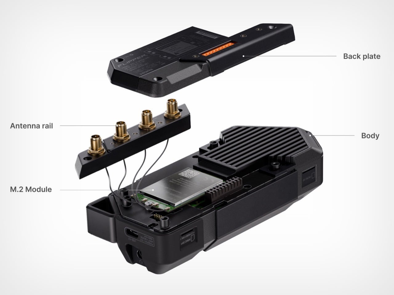
The device’s functionality was also shaped by hard-won lessons from the Flipper Zero. One of the biggest takeaways was that expandability should never come at the expense of usability. “With Flipper Zero, the moment you plug in any module, the whole experience degrades,” Zhovner admits. “It becomes harder to carry and pocket, and the port takes a beating over time.” For Flipper One, this led to a strict design mandate: modules had to integrate seamlessly. The team landed on two types – M.2 and GPIO – both designed to either “disappear completely under the back cover, or they extend flush along the rear surface.” It’s a small detail that reveals a mature approach to product design, focused on the realities of daily use.

Ultimately, the Flipper One’s serious, function-driven design is meant to signal that it’s an entirely different kind of tool. Zhovner is quick to clarify that this isn’t a replacement for the Flipper Zero. Instead, the two devices operate on different technological layers. Flipper Zero is a “Layer 0” offline tool for NFC, RFID, and other low-level interfaces. Flipper One is a “Layer 1” IP/network cyberdeck – a pocket-sized, open Linux computer. It can be a portable gateway, a smart home hub, a media center, or a radio platform for listening to everything from pilot communications to satellites.

By grounding its design in the world of serious hardware, Flipper has created a device that feels less like a controversial gadget and more like a piece of portable infrastructure. It’s a tool that, despite its aggressive looks, is designed to be quietly useful, whether as a travel router in a hotel or a honeypot sensor guarding your home network. The Flipper One’s journey from a clay model inspired by a ham radio to a finished cyberdeck is a story of a company, and a product, that is growing up.

The post Flipper One Behind The Scenes: “Sharper, Smarter, More Cunning, Brutal” says Flipper CEO first appeared on Yanko Design.