Your Bench Vise Can’t Hold Round Parts, This One Grips Anything

Most workshop tools haven’t changed much in decades, and bench vises are a good example of that. They’re big and heavy, and they work well enough when you’re clamping flat stock between parallel jaws. But the moment you try to hold something round, irregular, or fragile, a standard vise quickly becomes more of a problem than a solution, and you’re left wishing for an extra hand.

The maker community has grown considerably over the past decade, pulling in everyone from miniature painters and watch tinkerers to 3D printing hobbyists and electronics enthusiasts. These people aren’t using industrial-grade machine tools; they’re working at a desk, dealing with small parts in odd shapes that standard vises simply weren’t designed for. MetMo’s Fractal Vise feels like it was built specifically with that reality in mind.

Designers: Sean Sykes & James Whitfield

Click Here to Buy Now: $297.

The idea behind the Fractal Vise isn’t entirely new. It traces its origins to a patent filed in 1913, though the original concept was built for heavy industrial machinery rather than desktop use. What MetMo has done is take that same engineering principle and scale it down into something compact enough to sit on a workbench or desk without taking over your entire workspace.

The magic is really in the jaws. Instead of two flat clamping surfaces moving in a straight line, the Fractal Vise uses jaws made up of independently articulating segments, six in total, that shift and pivot as they close around an object. That means it can grip round tubes, tapered forms, and irregular parts just as easily as flat ones.

What makes this even more compelling is how seriously MetMo has approached the construction. The body is machined from aerospace-grade anodized aluminum, the jaws from hardened martensitic stainless steel, and the whole assembly runs on precision-ground linear rails for a backlash-free feel. There’s also a fine-threaded adjuster and a hex drive point for when you need more torque than your fingers can deliver.

Person soldering a small circuit board secured in a vise on a wooden workbench, soldering iron touching a component.

The Fractal Vise comes in two sizes, 32mm and 82mm clamping zones, and two material configurations. The Black version uses a hard-anodized aluminum body for a lighter, more portable build that’s ideal for detail-oriented work like model painting, watch repairs, or delicate 3D printing tasks. The aluminum construction keeps it light enough to reposition freely around your desk without feeling like you’re dragging a miniature anchor from one spot to another.

Close-up of a metal hole-punch tool on a wooden workbench, beside a blue-grid cutting mat with a wooden ruler laid diagonally across it.

The Stainless Steel Fractal Vise takes a different approach. Made entirely from heavy-duty steel, it offers considerably more mass and stability for tasks that need a firmer base, whether that’s light metalwork, filing, or anything where cutting forces might otherwise shift a lighter tool out of position. It’s the version you’d reach for when the work itself gets a bit rougher.

Beyond straight clamping, the Fractal Vise has a few other tricks. Its jaws are reversible, letting you clamp the inside diameter of hollow objects like glassware or pottery for engraving and painting work. Each face of the body is also precision ground, so you can stand the vise on its end and access a held part from a different angle without disturbing what you’ve already set up.

There’s also a parallel design that lets you drop the Fractal Vise straight into any standard bench vise or machine tool, effectively adding fractal jaw capability to equipment you already own. It’s fully bolted together and serviceable, with removable and reconfigurable parts, all of which says a lot about how MetMo thinks about the long-term life of what it builds.

At its core, the Fractal Vise is what happens when someone decides to stop accepting that a category of tool hasn’t kept up. Not every maker needs one, but anyone who’s spent time trying to keep a round part from rolling away while working on it will understand immediately why this design exists, and why it took this long for something like it to land at desk scale.

Click Here to Buy Now: $297.

The post Your Bench Vise Can’t Hold Round Parts, This One Grips Anything first appeared on Yanko Design.

8 Best Pens and Writing Instruments That Make You Actually Want to Pick Up a Pen Again

There is an argument happening on desks everywhere, and it is not about productivity systems or the right notebook grid. It is about whether the thing you write with deserves the same design attention as everything else you choose to own. For most people, a pen is a pen. For a small and growing number, it is the one object that connects thought to surface, and that connection is worth getting right. The instruments on this list take that idea seriously.

What unites them is not price or prestige. It is that each one treats the act of writing as a design problem worth solving from the beginning — the weight, the mechanism, the material, the way it sits in the hand before the nib or tip ever touches paper. Some are concepts. Some are products you can order today. All of them make the case that the writing instrument is still one of the most interesting objects in design.

1. Yamaha Swing Scribe

Yamaha’s answer to the question nobody thought to ask — what if a pen had a heartbeat? Part of the brand’s Scribe Tool Design 2024 project, the Swing Scribe draws its logic from the quill: as a feather naturally wobbles under air resistance while writing, it gives the act a physical rhythm. Yamaha made that incidental quality intentional. A weighted tip attached to a metal bar swings as the pen moves, feeding a small, steady pulse back into the hand with every stroke. No batteries. No app. Just physics.

The weight slides along the bar, letting you dial in the arc of the swing to match how you’re writing at any given moment. Pull it close to the pivot for a tighter, faster beat. Let it run wide for slow, deliberate work. This is the kind of design thinking that earns the word Kando — the Japanese concept of emotional resonance that sits at the core of everything Yamaha builds, from concert grands to this pen. It doesn’t make writing faster. It makes it more felt.

What we like:

  • The pendulum mechanism works without any power source, making it completely self-contained
  • Adjustable weight position means it adapts to the writer rather than demanding the writer adapt to it

What we dislike:

  • The swinging arm adds visual complexity that won’t suit every context or desk aesthetic
  • The concept hasn’t been tested across extended, high-volume writing sessions yet

2. Inseparable Notebook Pen

The premise is embedded in the name. Most pens and notebooks exist in a state of constant near-separation — the pen migrates to a bag, a pocket, another room, and the notebook sits waiting and useless. The Inseparable concept addresses this directly, building pen and notebook as a single resolved object rather than two products that happen to be sold together. The pen lives within the notebook’s architecture rather than being clipped to it as an afterthought, and removing it feels deliberate rather than accidental.

What makes this design interesting isn’t just the integration — it’s that the integration is the premise, and everything else follows from it. The proportions of the pen are dictated by the notebook. The notebook’s form is shaped around the pen’s presence. Neither object is compromised to serve the other, which is harder to achieve than it sounds. When a design solves a problem this specific and this common, it has a right to exist.

Click Here to Buy Now: $19.95

What we like:

  • Eliminates one of the most common and most irritating failures of the writing ritual entirely
  • The formal resolution between pen and notebook is tight — neither object feels like a concession

What we dislike:

  • Integration at this level commits you to one notebook format, limiting flexibility for writers who move between sizes
  • Writers who prefer their own paper choices will find the pairing restrictive

3. Da Vinci Pencil

Gabrilevich Design’s Da Vinci pencil concept earns its name not through ornamentation but through the kind of cross-disciplinary thinking that made Leonardo’s notebooks worth studying in the first place. The design draws from da Vinci’s own mechanical sketches — the geometry, the visible logic of moving parts, the sense that an object should reveal how it works rather than hide it. The result is a pencil that functions as a small piece of mechanical sculpture, beautiful precisely because nothing about its construction is concealed.

The concept challenges the pencil’s conventional muteness. Most pencils look like nothing in particular. The Da Vinci concept looks like something that was thought about — that has a position, a point of view about what a mark-making tool should communicate about the hand that uses it. Whether it writes better than a standard pencil is beside the point. It writes differently, and it makes you think about the act differently, which is often the more interesting design outcome.

What we like:

  • Treats a pencil as a vehicle for design philosophy rather than a commodity object
  • The exposed mechanical logic gives it a conceptual depth that most stationery completely lacks

What we dislike:

  • Concept-driven designs at this level of visual complexity often struggle in extended daily use
  • Visible mechanisms can introduce maintenance friction that disrupts the writing ritual

4. Levitating Pen 2.0 Cosmic Meteorite Edition

The levitating pen is a category that could easily slide into novelty, and the original versions of magnetic levitation pens leaned into that direction unapologetically. The 2.0 Cosmic Meteorite Edition changes the conversation by adding material seriousness to the spectacle. The pen itself incorporates genuine meteorite fragment material — iron-nickel alloy from outside the atmosphere — which gives the levitation a context it previously lacked. The object that hovers above its base is, in a measurable sense, from space.

That combination of astronomical material and magnetic suspension creates an object that earns its place on a desk in a way that pure spectacle cannot. It is a writing instrument that happens to be made partly from the oldest solid material you will ever hold, suspended above a surface by the same electromagnetic principles that govern planetary orbits. The writing experience is secondary to what the pen communicates as a resting object, and for a desk piece that doubles as a conversation anchor, that hierarchy is entirely appropriate.

Click Here to Buy Now: $399.00

What we like:

  • The meteorite material elevates the concept from a gadget to a genuine collectible
  • The levitation serves the narrative of the material rather than competing with it

What we dislike:

  • The magnetic base required for levitation eliminates any possibility of portability
  • Its function as a writing instrument is always secondary to its function as a display object

5. Qui Magnetic Pencil System

Qui operates on the premise that the friction between a pencil and the surface it lives on — a desk, a notebook, a wall — should be designed rather than incidental. The magnetic system allows the pencil to attach and detach from its designated surface with a satisfying, calibrated resistance, making the act of picking it up and setting it down feel considered rather than casual. This is a small interaction, but it happens dozens of times a day, and designing it well changes the quality of the entire writing practice.

The system thinking extends beyond the magnetic connection. The pencil’s geometry is resolved with the mounting surface as part of the design problem, not as a separate accessory. The result is that Qui occupies space well even when not in use, which is most of the time. A pencil that looks intentional when it is sitting still is a harder design challenge than one that merely writes well, and Qui understands that the resting state is part of the design.

What we like:

  • The system approach treats the pencil and its environment as a single design problem
  • The resting interaction — picking up and setting down — is as considered as the writing experience itself

What we dislike:

  • The magnetic system creates a dependency: without its base, the pencil loses its defining characteristic
  • Committing to a fixed mounting point works against the natural portability of a pencil

6. PENTAPA

Konstantin Diehl’s PENTAPA takes its name and its logic from the pentagon — five sides, each one a resolved surface rather than a generic round barrel. The five-sided form is unusual enough to read as a design decision the moment you pick it up, and practical enough to hold well once you begin writing. Pentagons don’t roll off desks. They register against the fingers in a way that circular barrels don’t, giving you tactile information about the nib’s orientation before the tip reaches paper.

PENTAPA belongs to a tradition of geometric pen design that runs from the hexagonal tradition of rOtring and Kaweco through to contemporary CNC-machined objects, but it finds its own position in that tradition rather than merely referencing it. Five sides is not the expected answer. It is the interesting one — the number that offers enough symmetry to feel resolved and enough irregularity to feel considered. That balance between the expected and the surprising is where most good pen design lives.

What we like:

  • The pentagonal form solves the rolling problem with more formal interest than a standard hexagon
  • The five-sided barrel gives the pen a distinct tactile identity that rewards extended daily use

What we dislike:

  • The unconventional geometry won’t suit every grip style or hand size
  • Finding a compatible pen case or sleeve requires more effort than standard round or hexagonal barrels

7. Everlasting All-Metal Pencil

The all-metal pencil solves a problem that the pencil has had since its invention: it runs out. A graphite core depletes. A pencil shortens. Eventually, it disappears entirely and takes with it whatever patina or character it had developed through use. The everlasting all-metal pencil replaces graphite with a metal alloy tip — typically an aluminum or similar soft-metal formulation — that deposits a mark through controlled abrasion rather than core consumption. The pencil does not shorten. It does not run out.

The mark is different from graphite — lighter, slightly metallic in tone, with a distinctive quality that serious writers and sketchers tend to either embrace or reject immediately. The design interest is in what remains when the core is removed: a pure metal object whose entire form is determined by how it feels to hold, since there is no pencil-to-grip ratio to manage, no sharpener to carry, no length to account for. The result is one of the most resolved objects in everyday carry design.

Click Here to Buy Now: $19.95

What we like:

  • Removes the pencil’s built-in obsolescence entirely, changing the object from consumable to permanent
  • With no core to deplete, the entire form is determined purely by how it feels to hold

What we dislike:

  • The mark quality is distinct enough from graphite to require genuine adjustment and won’t suit every application
  • Some writing and sketching tasks — particularly those requiring dense, dark marks — simply don’t translate well to a metal alloy deposit

8. The Bolen

The James Brand has built its reputation on EDC objects with no unnecessary elements — knives, tools, and pens that look like they were designed by someone who uses them. The Bolen is the brand’s pen, and it carries the same design logic as everything else in their catalogue: machined from quality materials, resolved in form, designed to be carried without thought and used with satisfaction. The clip works. The mechanism engages cleanly. The proportions sit right in the hand without adjustment.

What distinguishes the Bolen from most EDC pens is that the James Brand comes from a tool-making tradition rather than a stationery one, which means the pen is designed for carry first and desk presence second. That priority ordering produces a different object than you get from pen-first design — one that is slightly more aggressive in material and slightly more considered in how it lives in a pocket. It is the writing instrument for someone who doesn’t think of themselves as a pen person, and that is exactly who needs it most.

What we like:

  • The tool-making heritage produces genuine material integrity, with nothing present without a reason for being there
  • Carry-first design logic makes it the most naturally portable instrument on this list

What we dislike:

  • The EDC-first approach means it lacks the expressive personality of instruments designed for desk use
  • Writers who want the pen to feel special on the page rather than merely functional in the pocket may find it underwhelming

The Object in Your Hand Shapes the Thought on the Page

Eight instruments that represent eight different positions on what a writing tool should be. The Yamaha asks what happens when you give a pen a pulse. The Levitating Pen asks what happens when the material itself carries a story. The Bolen asks what happens when you design for the pocket before the page. None of these answers is the same, which is the point. The best design in any category is the kind that expands your sense of what the category can contain.

What they share is the conviction that the instrument matters — that the weight, the mechanism, the material, and the form of the thing in your hand have a real effect on what ends up on the page. That conviction used to belong only to serious writers and professional draughtsmen. The fact that you can now find it in a magnetic pencil system, a levitating desk object, and a pen designed by a motorcycle company suggests the rest of the world is catching up.

The post 8 Best Pens and Writing Instruments That Make You Actually Want to Pick Up a Pen Again first appeared on Yanko Design.

This Portable Keyboard Has a 13-Inch 4K Touchscreen Built In, and It Fits in Your Laptop Sleeve

Closed, the VitaLink looks like a very flat book, silver, about the footprint of a large paperback, with nothing to suggest it carries a 4K display inside. At 20mm thick with a CNC-machined aluminum shell, it weighs 1200 grams and travels the way a slim notebook does; it fits in a laptop sleeve, takes up a predictable corner of a bag, and requires no dedicated case beyond what you already carry. Then it unfolds at 180 degrees. The screen lifts above the keyboard, the whole unit settles into a 34 by 15 centimeter footprint, and what you have is a self-contained dual-screen workspace that happened to be a thin slab a moment ago.

The keyboard is the part that usually betrays products like this. Portable keyboards compress key spacing to save millimeters, shorten travel to save thickness, and leave you typing on something that feels like a shallow membrane rather than actual keys. VitaLink went in the opposite direction, widening key spacing to 3.27mm and setting travel at 0.8mm, with scissor switches tuned for speed and quiet actuation. The display above it runs at 3840×1600 with a 2.4:1 aspect ratio, a cinematic proportion that gives the screen an unusually wide horizontal span, well-suited to keeping a reference panel open alongside a working document without feeling like you’re squinting at either side.

Designer: VitaLink

Click Here to Buy Now: $299 $658 (55% off). Hurry, only 379/600 left! Raised over $286,000.

The resolution translates to 298 pixels per inch, which puts it in the same territory as Apple’s Retina displays and well above the pixel density of most portable monitors in this category. Text holds sharp at native scaling, fine details in images stay crisp, and the 60Hz refresh rate keeps touch input feeling immediate. Ten-point multitouch means gestures respond the way they do on a tablet, with swipes, pinches, and drags registering without lag. The screen covers 100 percent of the sRGB color gamut, which makes it viable for color-sensitive work where you need confidence that what you see on the display matches what the final output will deliver. That 2.4:1 ratio keeps showing up as the design’s defining decision; it gives you enough horizontal real estate to run a code editor with a console window beside it, or a timeline with a preview panel, without either side feeling like it’s been compressed into a narrow strip.

Typing on the VitaLink is designed to feel deliberate in a way that most travel keyboards do not. The 0.8mm of key travel sits in a range where the keys actuate fast but still give tactile confirmation that you pressed them, a balance that makes a difference during long writing sessions where you need speed without sacrificing accuracy. The 3.27mm key spacing is wider than what most compact keyboards offer, eliminating that cramped sensation where your fingers feel like they’re hunting for keys in tight quarters. RGB backlighting runs through three modes, activated with function key shortcuts: a breathing gradient, a solid single-color backlight, and a rainbow wave that ripples across the keys as you type. The backlighting does actual work in low-light environments, but the rainbow mode leans more toward visual flair than strict utility.

CNC machining means the aluminum body starts as a solid block and gets precision-carved, producing the kind of structural rigidity that protects the screen during transit and prevents flex when you’re typing hard. The 180-degree hinge lets the unit lay completely flat, which matters both for stability on uneven surfaces and for low-angle use when you’re working on a cramped airplane tray table or a café counter. Dual USB-C ports handle video, data, and power delivery up to 65W, so a single cable from your laptop, tablet, or phone brings the display to life with no drivers to install. Compatibility spans Windows, macOS, Linux, and Android, with plug-and-play recognition across all of them. Connect a Steam Deck or a Nintendo Switch via USB-C, and the VitaLink becomes a 13-inch 4K external display for handheld gaming, turning a small console screen into something considerably more immersive.

VitaLink offers eight keyboard layout options, covering US Windows (the default), US Mac, German QWERTZ, Japanese JIS, UK, French AZERTY, Nordic, Italian, and Spanish. The standard US Windows layout ships at no extra cost; upgrading to US Mac adds ten dollars, German or Japanese layouts add twenty, and UK, French, Nordic, Italian, or Spanish layouts add thirty. The layouts require specific laser engraving and dedicated production runs, so they’re available as optional add-ons rather than default configurations. You select your preferred layout during checkout or in a post-campaign survey if you miss it the first time.

VitaLink is currently available on Kickstarter starting at $299, down from a retail price of $658. The package includes the VitaLink keyboard and display unit plus two USB-C cables. Eight keyboard layout options are available as add-ons, including US Mac, German QWERTZ, Japanese JIS, UK, French AZERTY, Nordic, Italian, and Spanish, with upgrade fees ranging from $10 to $30 depending on the layout. Shipping is scheduled for September 2026, with delivery fees ranging from approximately $18 to $33 depending on region. VitaLink covers all taxes and customs duties, so the listed shipping fee is the only additional cost beyond the pledge amount.

Click Here to Buy Now: $299 $658 (55% off). Hurry, only 379/600 left! Raised over $286,000.

The post This Portable Keyboard Has a 13-Inch 4K Touchscreen Built In, and It Fits in Your Laptop Sleeve first appeared on Yanko Design.

10 Best Kitchen Tools and Appliances Designed to Live on Your Counter, Not in Your Cupboard

The kitchen counter is prime real estate. Most appliances waste it, sitting there looking generic and visually forgettable until they get pushed to the back and eventually into a box. A smaller category of kitchen objects earns that space differently. They are worth looking at, whether in use or not. The ten products here belong to that category, and each one makes a quiet but convincing case for staying exactly where it is.

The question has never really been about function alone. It is about form meeting function so completely that putting the object away would feel like a loss. A Dutch oven with architectural presence. A kettle that handles like nothing you have owned before. A grater shaped like a curled sheet of paper. These are not kitchen tools that happen to look good. They are objects that happened to end up in the kitchen and have no intention of leaving.

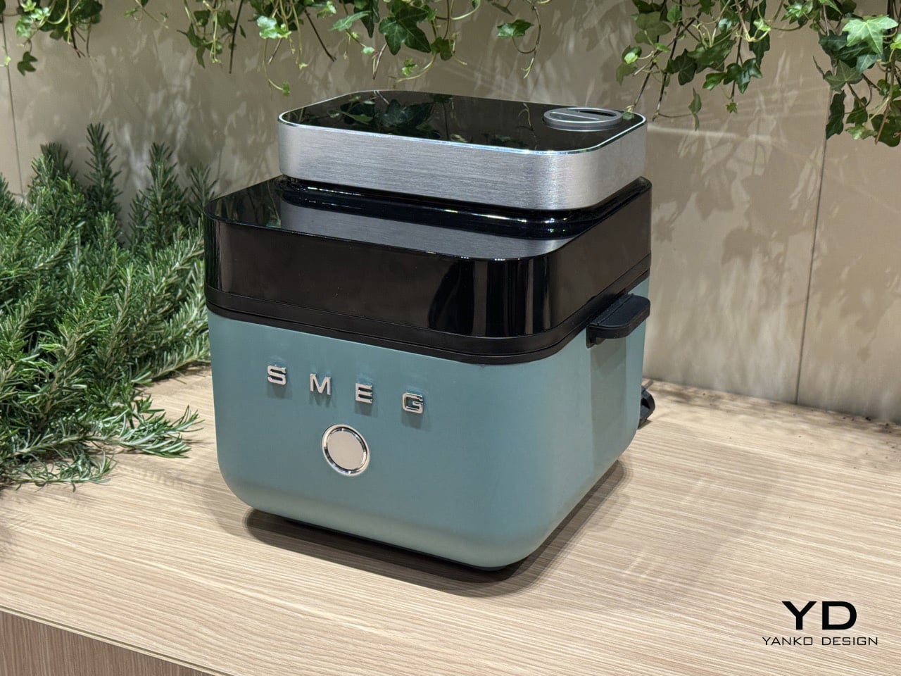
1. Smeg Air Fryer + Steam

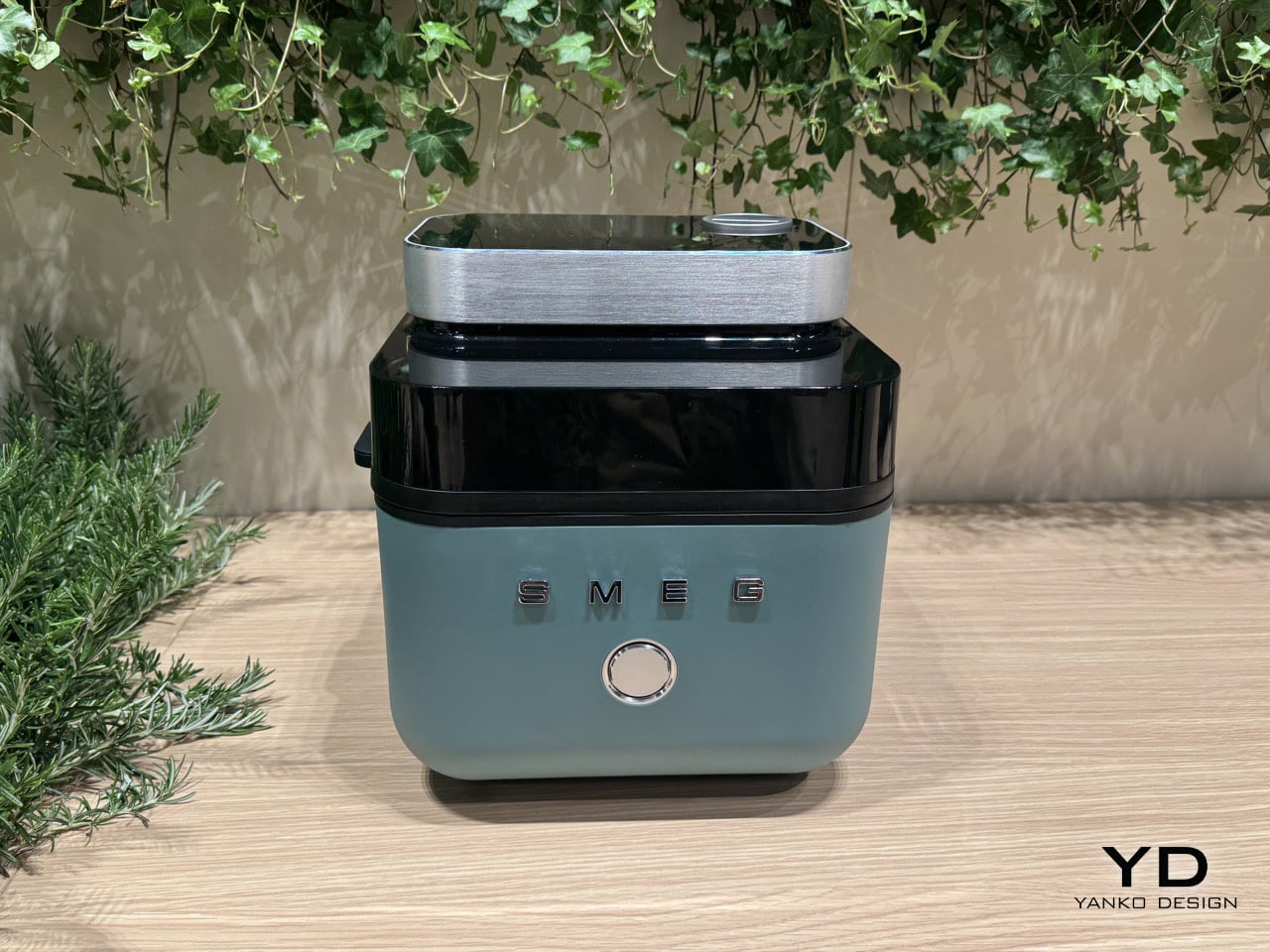
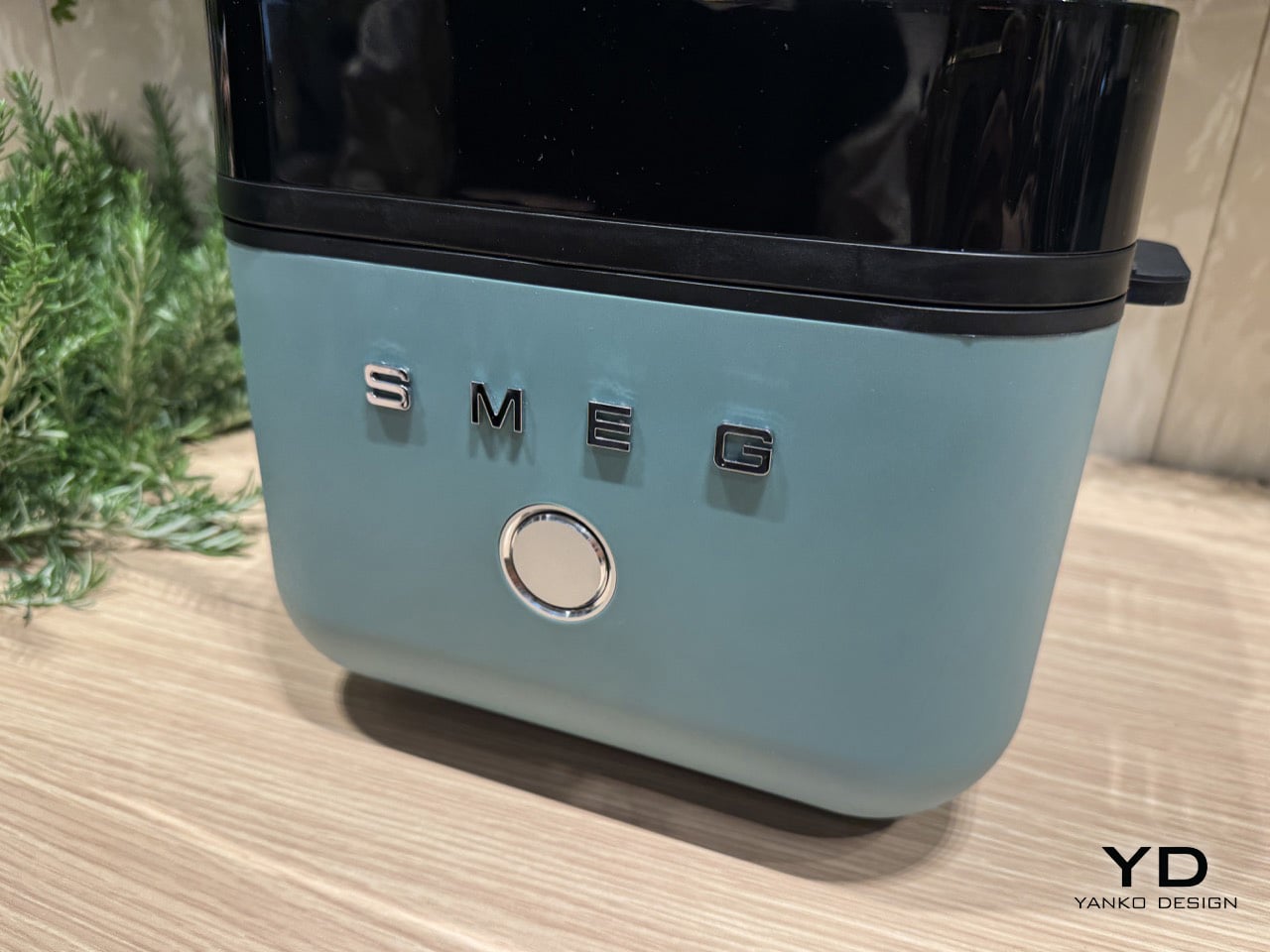
Smeg’s origins are in enamel technology, not the candy-colored kitchen appliances the brand became famous for. At Milan Design Week 2026, the Italian company debuted a concept air fryer that brings genuine cooking innovation to a form that could hold its own in any design-forward kitchen. The fryer opens from the top rather than the front, its lid ejecting at the press of a button to reveal a 7-liter basket, an exposed heating coil, and a tinted black visor that lets you see inside while it works.

What separates it from the broader category is a built-in steam function. A removable water cartridge feeds moisture into the basket via a top-mounted nozzle, creating an environment where food crisps on the outside while retaining moisture within. Chicken wings come out with a fried texture and no oil. Bread develops the kind of crust usually reserved for a professional oven. Currently a concept with no confirmed launch before 2027, it already sets the benchmark for where the category is heading.

What we like

  • The steam function produces results that no standard air fryer can replicate
  • The top-opening form and enameled body make it worthy of permanent counter placement

What we dislike

  • Not available to purchase, with no confirmed launch before 2027
  • Bold color options lean maximalist, which won’t suit every kitchen aesthetic

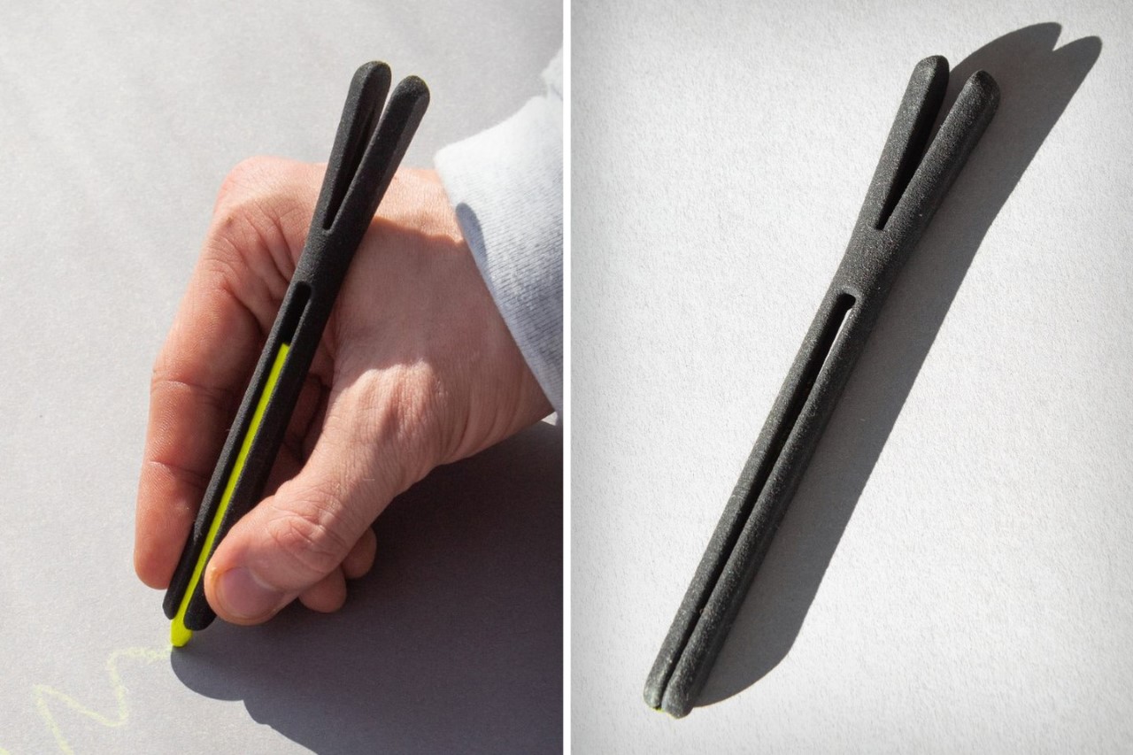
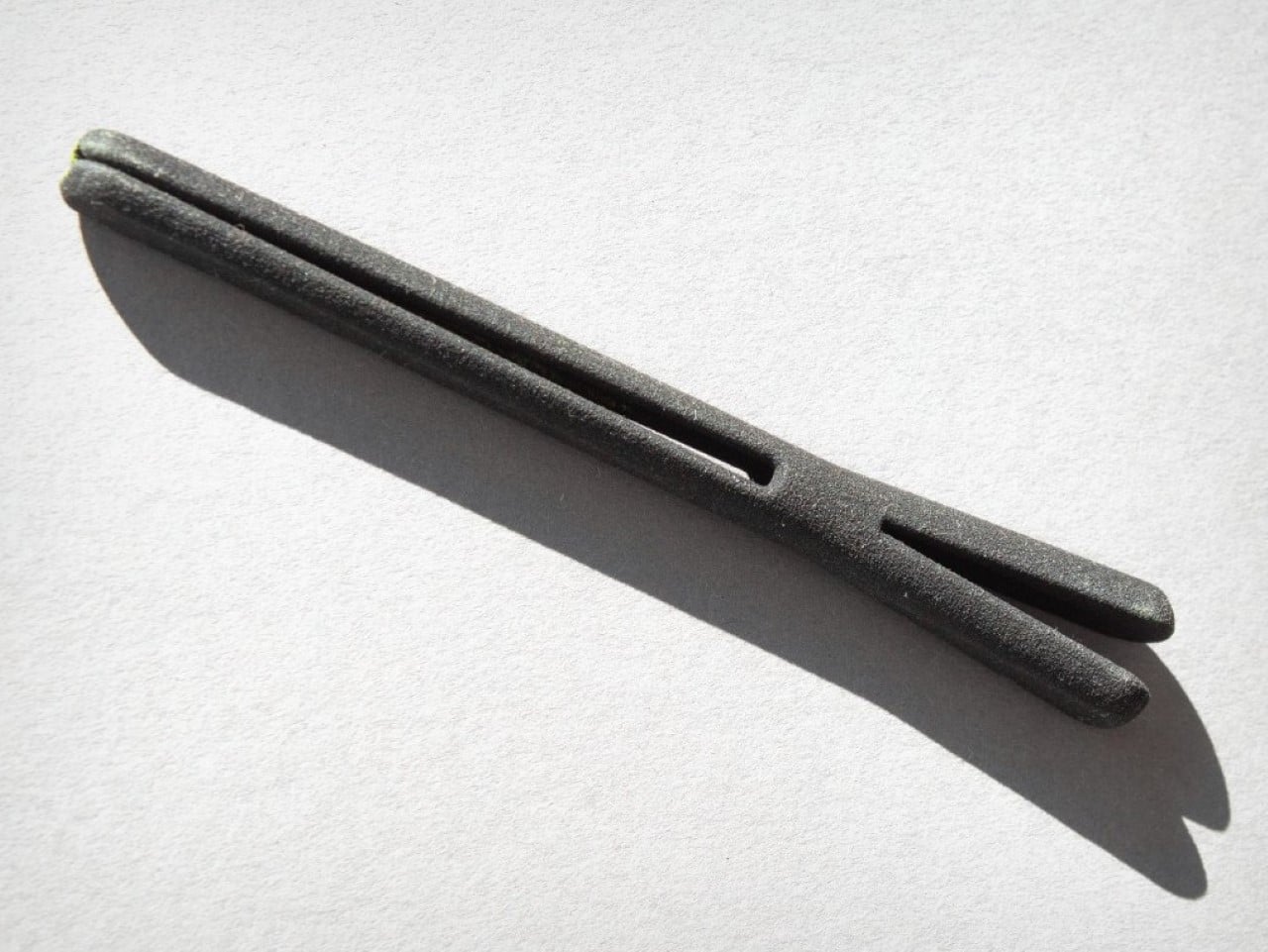
2. Playful Palm Grater

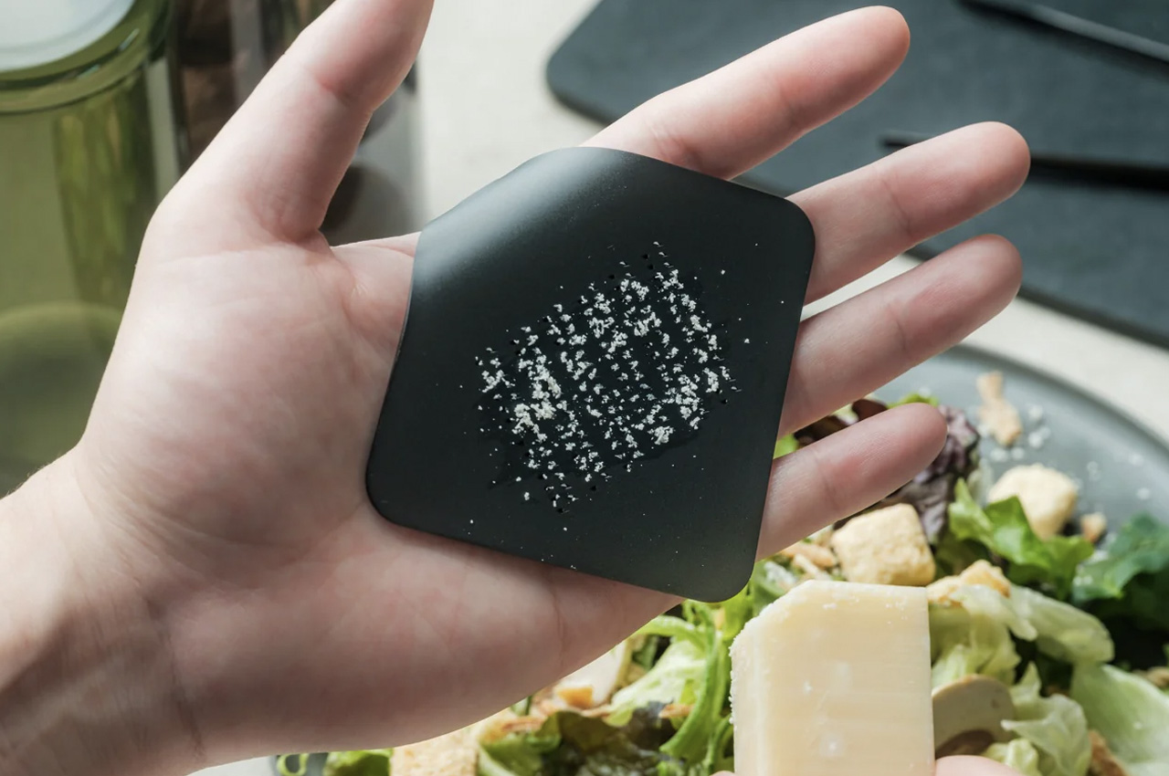
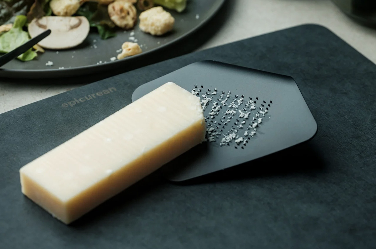
Most kitchen tools that try to be playful end up decorative and useless. The Playful Palm Grater avoids that completely. Designed to look like a sheet of paper curled at one corner, its form solves the ergonomic problem that plagues standard graters: it sits inside the palm of your hand, keeps knuckles clear of the surface, and contains what you are grating rather than scattering it across the counter. The object makes a strong aesthetic case while being entirely serious about its purpose.

At $25, it is the price anchor of this list and arguably its sharpest surprise. Guests who pick it up typically ask what it is before they realise it is a grater, which is the clearest signal that the design is working at the level it intends to. Hard cheese, citrus zest, ginger, chocolate: it handles all of it without protest. It also stores flat, so the playfulness does not come at the cost of practicality.

Click Here to Buy Now: $25

What we like

  • Palm-hold grip makes grating more controlled than any flat or box grater alternative
  • A genuine design achievement delivered at a $25 price point

What we dislike

  • Compact surface area limits it to small-quantity grating tasks
  • Not suited for bulk preparation, where a larger, fixed grater would serve better

3. Mitsubishi Bread Oven

The Mitsubishi Bread Oven exists at the opposite end of the appliance spectrum from multi-function, multi-mode, multi-button. It does one thing: toast a single slice of bread to a standard that no conventional toaster approaches. It’s a sealed, thermally insulated chamber that locks moisture in during the process, producing a slice that is crisp at the edges and genuinely fluffy at the center. The boxy silhouette and matte finish make it look less like a toaster and more like an object recovered from a mid-century Japanese archive.

For anyone serious about morning rituals, it rewires the relationship between bread and appliance entirely. One slice goes in, and a considered, unhurried result comes out. Its compact footprint occupies less counter space than most four-slice toasters while commanding considerably more visual presence. The Bread Oven is the kind of appliance that prompts questions from anyone who enters your kitchen, not because it looks complicated, but because it looks so deliberately, confidently simple.

What we like

  • A sealed thermal chamber produces toast that no pop-up toaster can replicate
  • Minimal Japanese form earns counter presence through restraint rather than spectacle

What we dislike

  • Limited to a single slice at a time, which doesn’t suit households cooking for multiple people

4. BØYD Espresso Machine

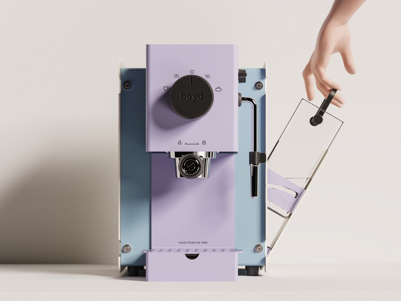
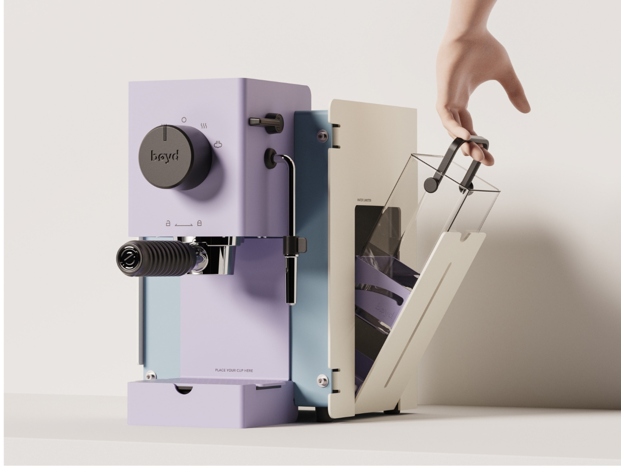
The BØYD Espresso Machine is a coffee machine that reads as modern sculpture before it reads as equipment. Its smooth curves and pure lines result from stripping the object back to what the design actually requires. No panel clutter, no unnecessary controls. Just form shaped around the daily ritual of pulling a shot, and a counter presence that justifies every centimeter it occupies.

It belongs to a growing movement of coffee equipment that treats the counter as an extension of living space rather than a working surface. BØYD understands that an espresso machine is often the first thing reached for in the morning and the last object you look at before leaving the kitchen. Making that object worth looking at is not superficial. It is the point. For a home barista who cares as much about the counter as the cup, BØYD answers both without compromise.

What we like

  • Sculptural form elevates the morning coffee ritual beyond the purely functional
  • Minimal interface keeps the countertop visually clean and uncluttered

What we dislike

  • The stripped-back aesthetic works best in kitchens that can match its visual confidence
  • Design restraint offers little warmth for kitchens that lean more traditional in character

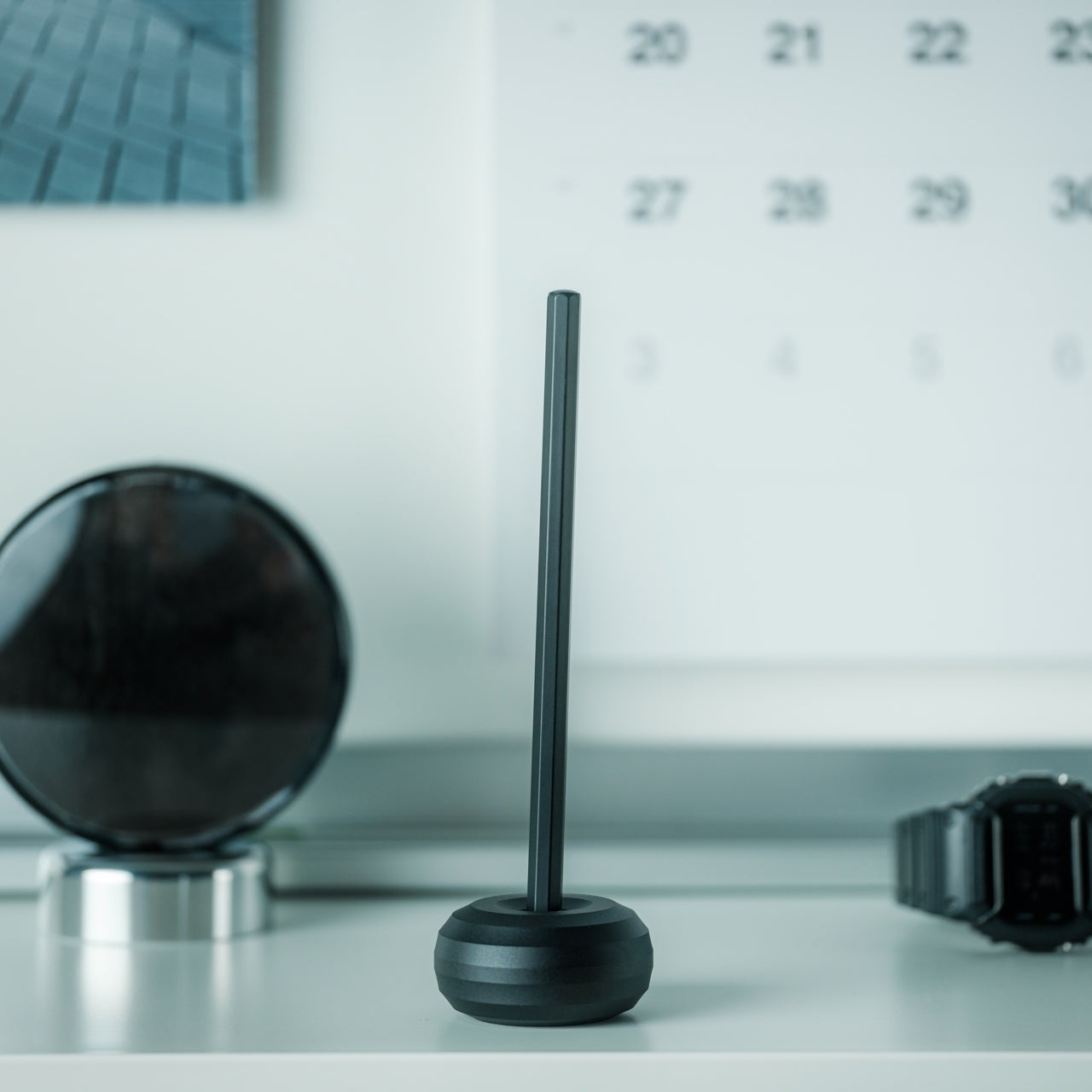
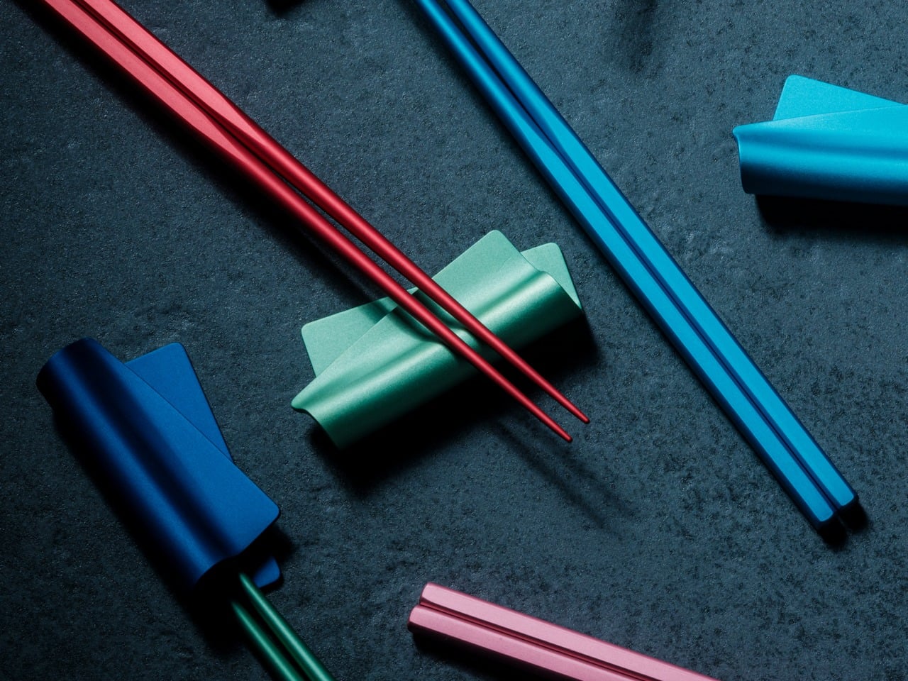
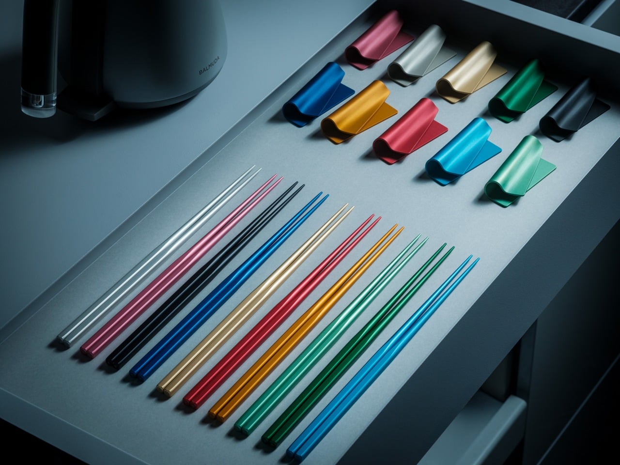
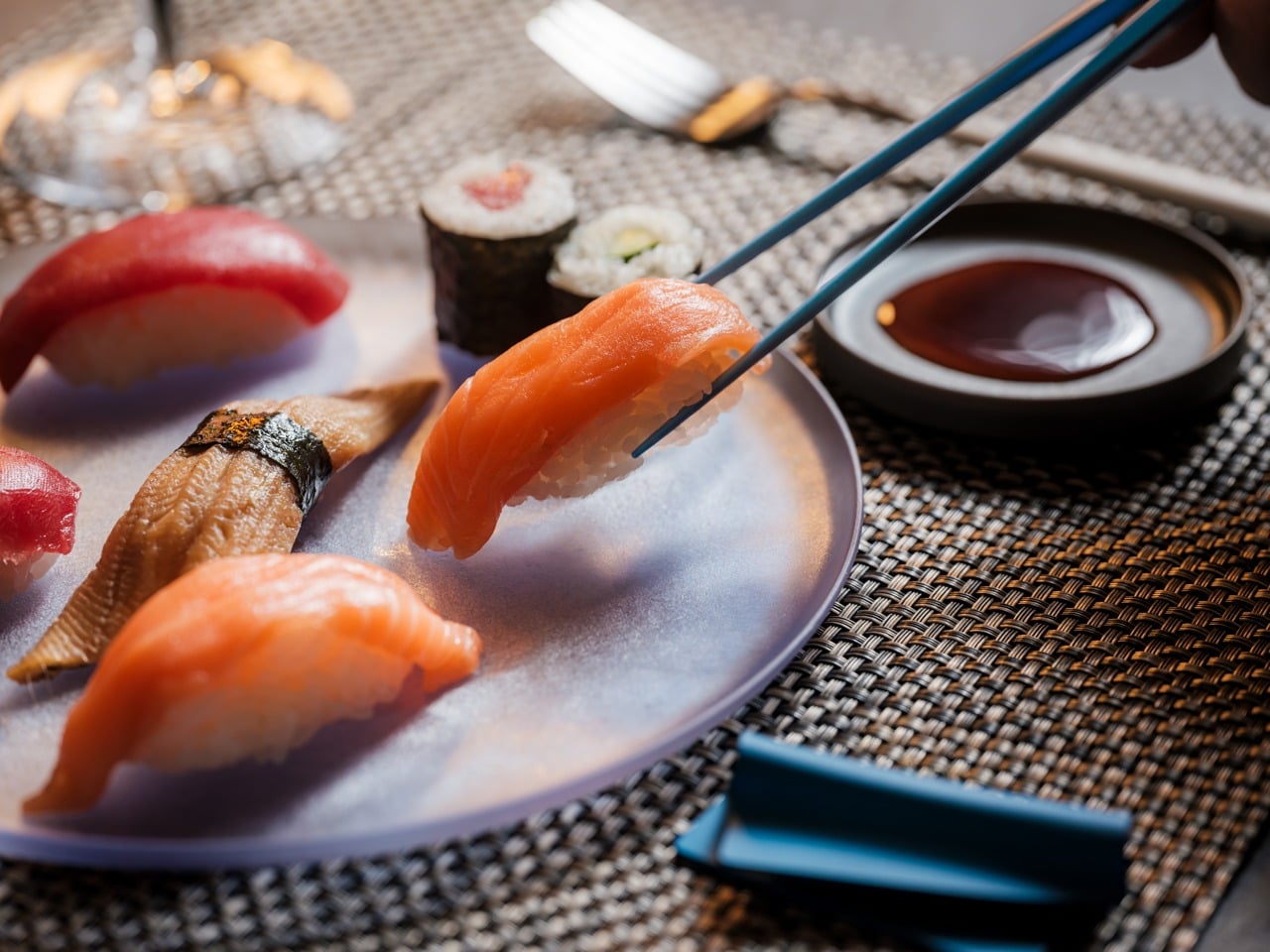
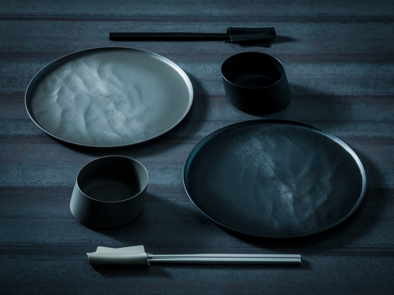
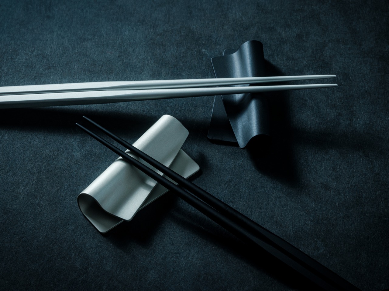
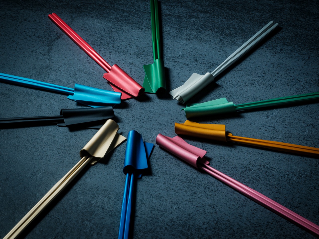
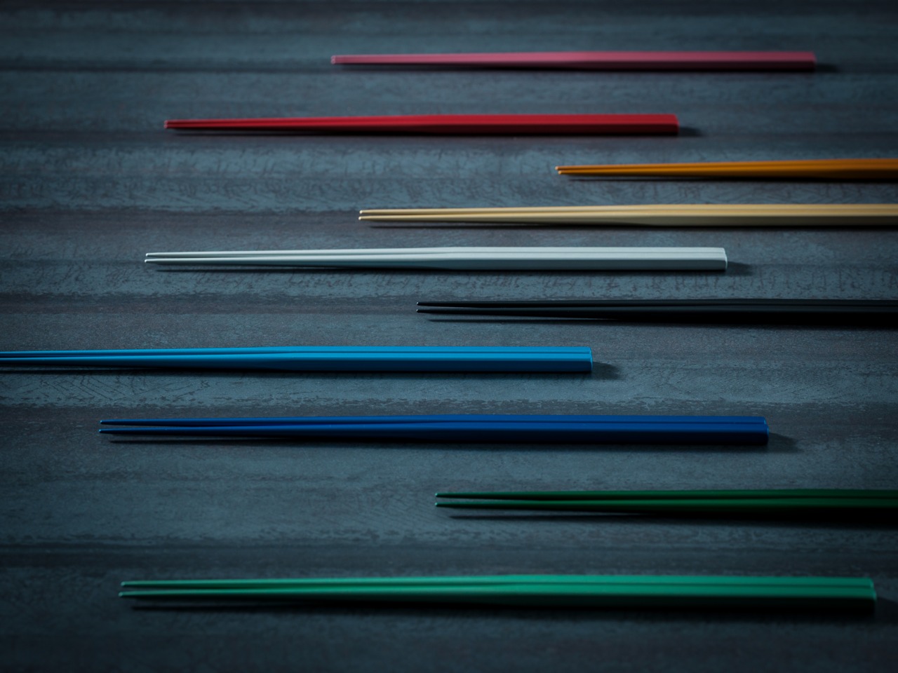
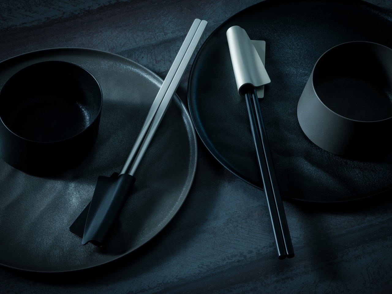
5. FineLine Aluminum Chopsticks

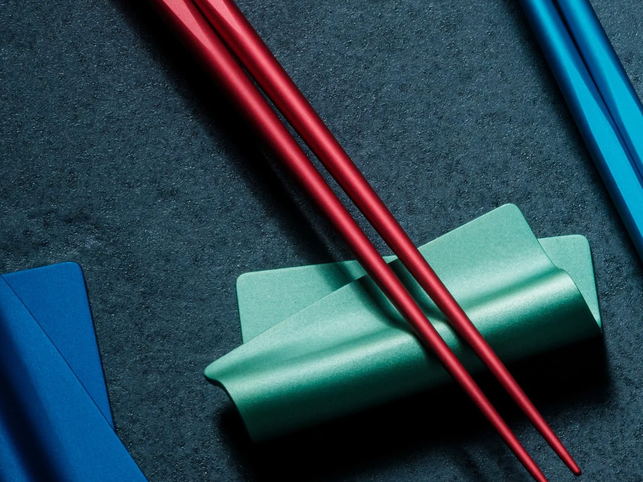
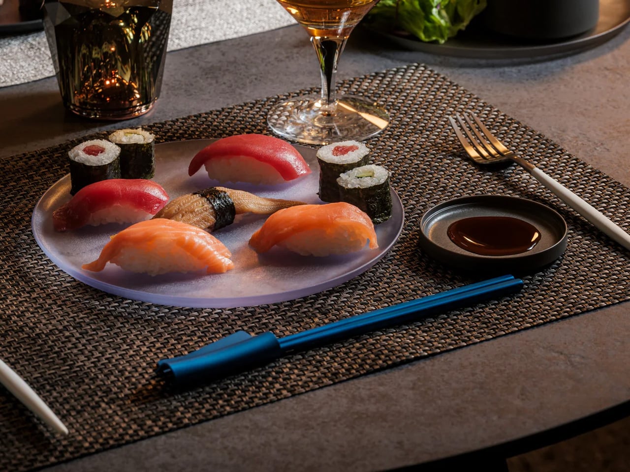
Chopsticks are rarely considered as design objects in Western kitchens, which is precisely the space the FineLine Aluminum Chopsticks occupy. Machined from aluminum with a finish that sits somewhere between tool and instrument, they bring the same material confidence to the table that a well-made knife brings to the counter. For everyday use, the grip is secure and the balance calibrated enough that switching from wooden chopsticks feels immediately like a step worth taking.

Left beside the matching chopstick rest, they form a composition rather than a cutlery arrangement. That distinction makes them worth the counter space: they are objects you would display even without daily use. Aluminum resists staining and absorbs minimal heat, so hot dishes do not require the caution that some metal utensils demand. The design is one of those cases where the material logic and the aesthetic argument arrive at the same answer.

Click Here to Buy Now: $30.00

What we like

  • Machined aluminum delivers a material precision and weight that wooden chopsticks cannot match
  • The finish reads as a considered object rather than a utensil, earning a counter display

What we dislike

  • Aluminum conducts heat, which can be uncomfortable with very hot food over an extended period of contact
  • The refined finish requires careful washing to maintain its quality over time

6. Kenwood Go Compact Stand Mixer

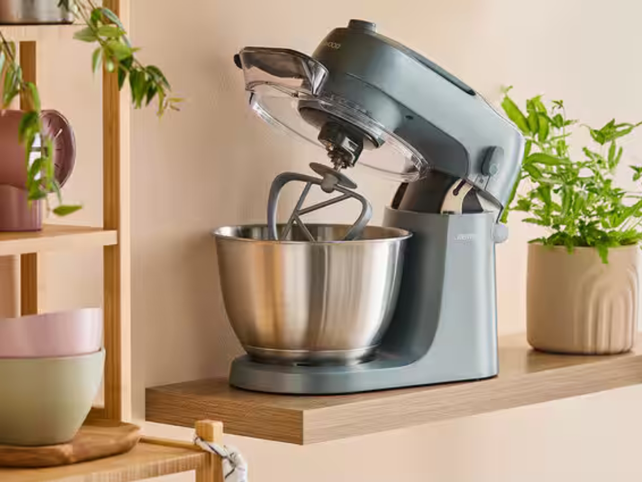
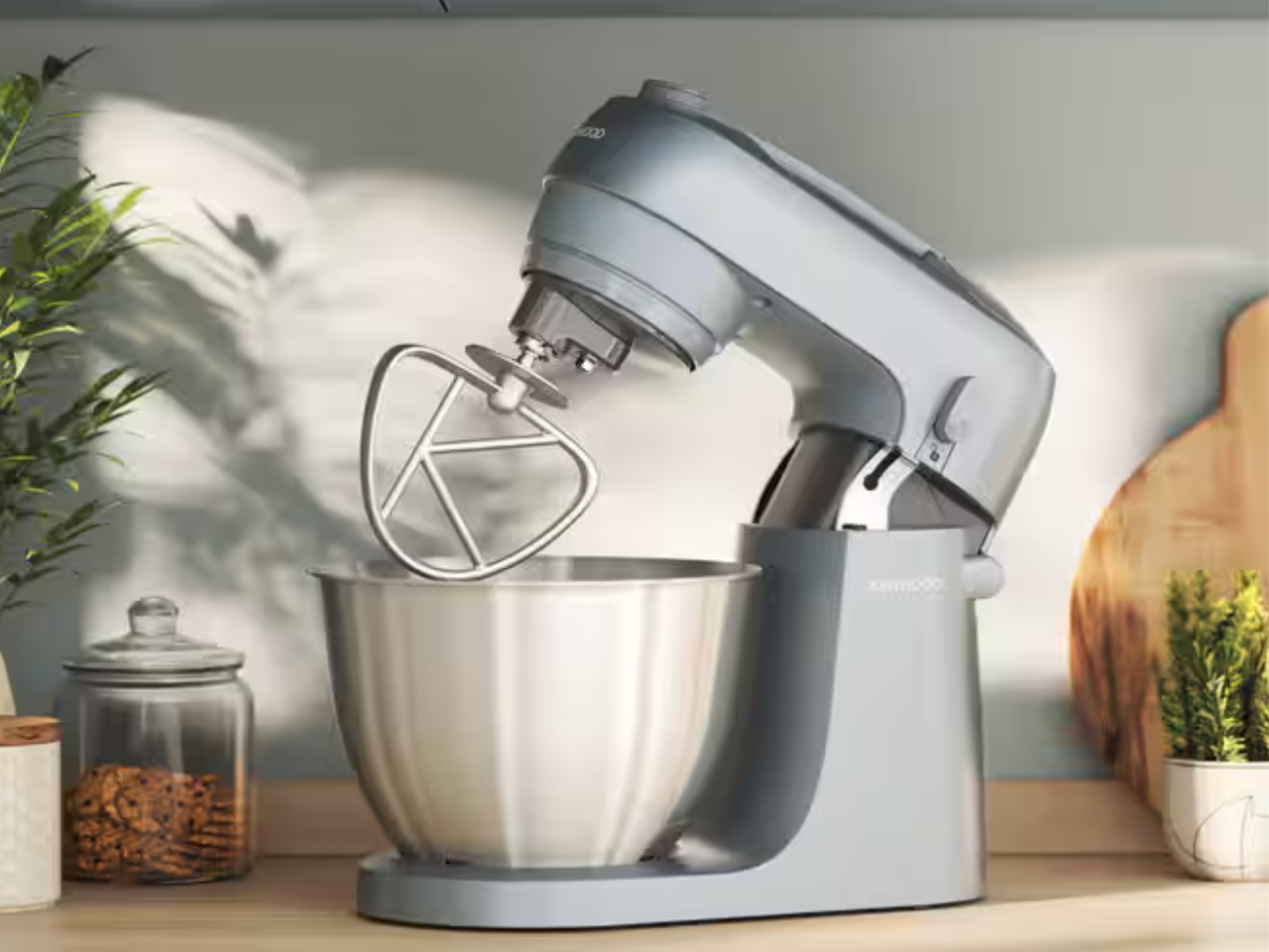
The stand mixer has always been a counter occupant by necessity rather than by design. They are large, heavy, and most look like they belong in a professional bakery. Kenwood’s Go Compact reframes the category. It packages the performance of a full stand mixer into a footprint small enough to coexist with everything else on a compact counter without requiring the kitchen to reorganize itself around one machine.

Its value is in the everyday bake rather than the occasional showpiece production. It handles the mechanical work of mixing dough, whipping cream, or folding batter without demanding that the kitchen dedicate itself to the task. That restraint in form, paired with Kenwood’s track record for motor reliability, makes it a counter object rather than a stored appliance. Compact proportions mean it stays where it sits, ready for the next session, without becoming a visual intrusion between uses.

What we like

  • Compact footprint genuinely rethinks the stand mixer for smaller kitchens without sacrificing performance
  • Kenwood’s motor reliability means the scaled-down size doesn’t compromise on results

What we dislike

  • Smaller bowl capacity limits batch sizes for high-volume or professional-scale baking sessions
  • Can feel less stable than full-size alternatives when working with particularly stiff doughs

7. JIA Inc. Rolling Mortar

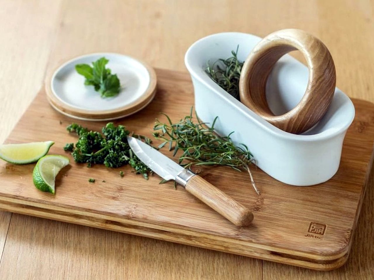
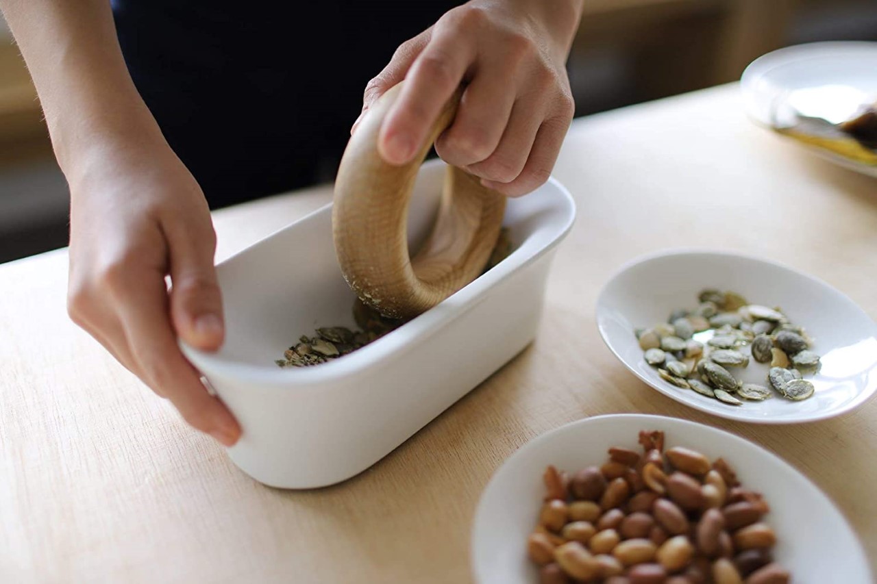
The mortar and pestle have been functionally unchanged for roughly 35,000 years, which is either a testament to the design or an invitation to rethink it. JIA Inc., a Taiwan-based design brand, chose the second view. Their Rolling Mortar replaces the vertical pounding motion with a rolling action: a stone sphere moves across a curved ceramic base, grinding herbs and spices through rotation rather than force. The gesture is more intuitive, considerably less tiring, and far more interesting to watch.

On a counter, it reads as a sculptural object long before it reads as a kitchen tool. The sphere and base form a self-contained composition that earns its space whether in use or not. Fresh pesto, ground spices, crushed garlic: the results are consistent, and the process is more enjoyable than the traditional method. It also cleans easily, which is the practical detail that tends to close the case for anyone still on the fence.

What we like

  • The rolling mechanism reduces the physical effort of traditional pounding significantly
  • The sphere-and-base composition is sculptural enough to justify permanent counter display

What we dislike

  • Slower than traditional methods for particularly coarse or hard spices, requiring significant force
  • The sphere needs adequate clearance to move freely, demanding more counter space during active use

8. Toru Kettle

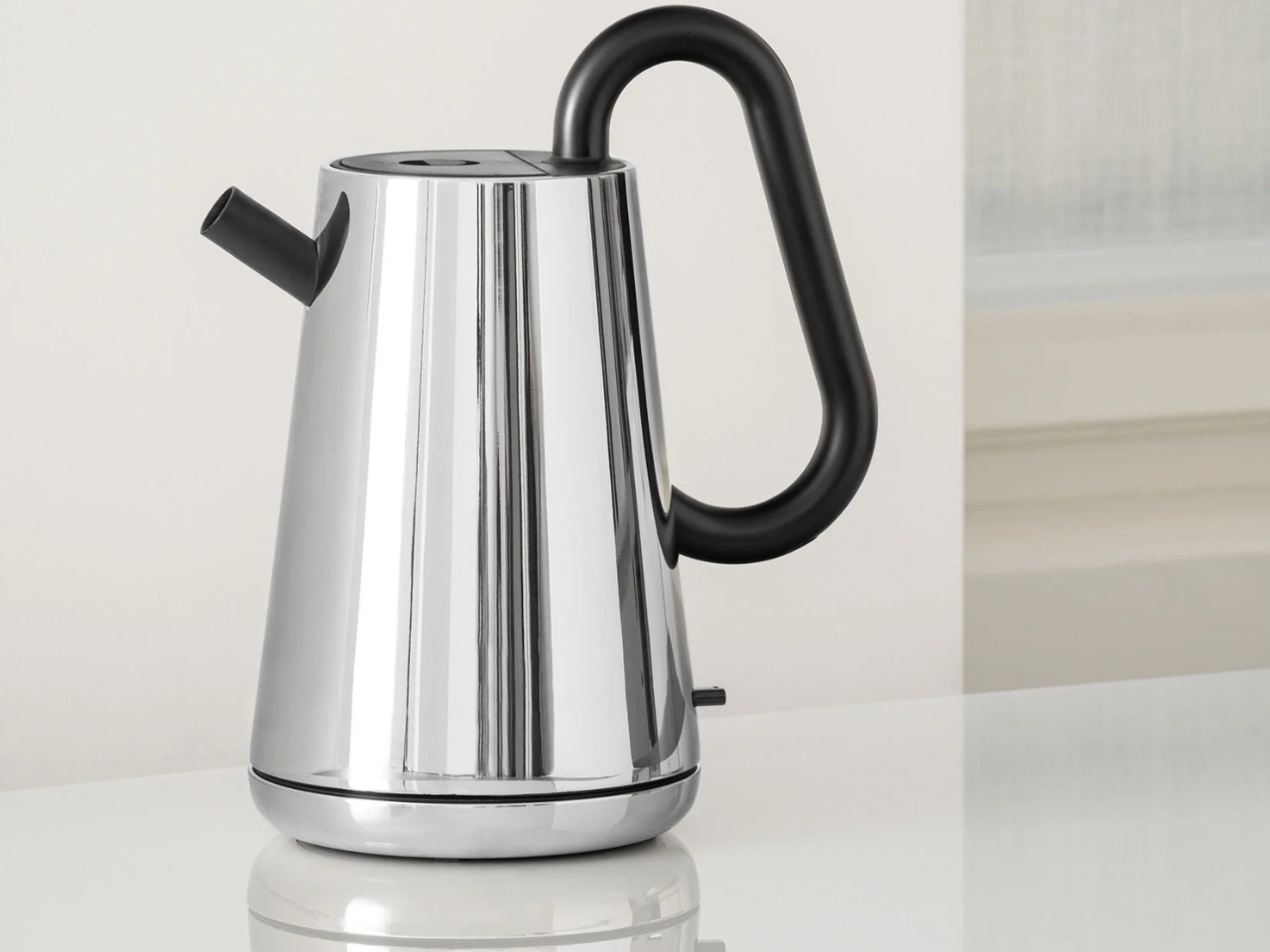
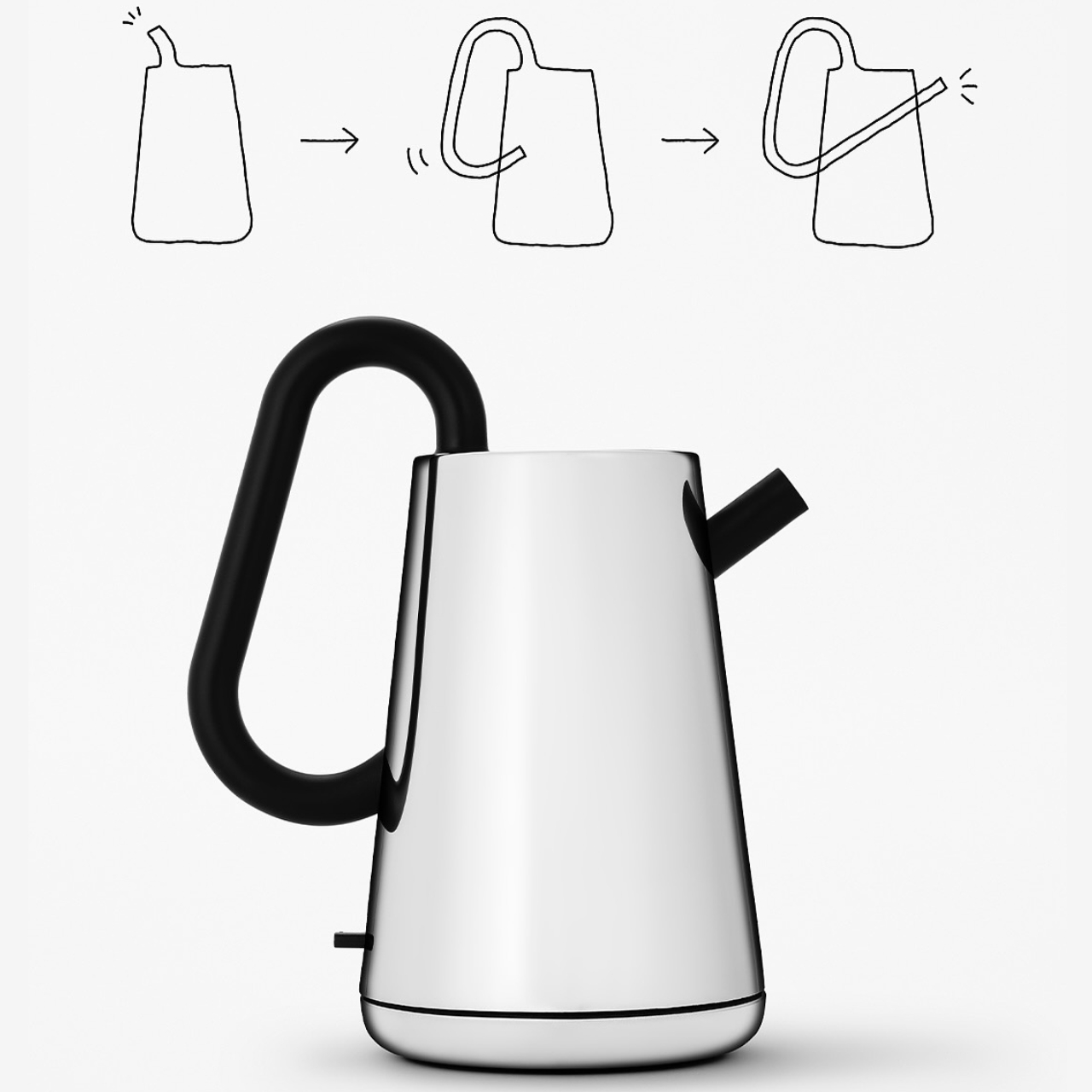
Nendo’s design work is consistent in one quality: it takes a familiar object, finds the assumption buried inside it, and quietly dissolves it. With the Toru kettle for Alessi, that assumption is how a kettle is held. Rather than a handle attached to the side, a black tube runs through the body of the stainless-steel vessel, becoming the grip itself. Toru means “through” in Japanese, and the name describes the design principle with complete accuracy.

Alessi’s metalworking precision is evident in the finish, and the contrast between the brushed steel body and the matte black tube creates a tonal balance that reads as sculpture before it reads as kitchen equipment. On the counter, it occupies the same visual register as a considered ceramic object or a well-made vase. Boiling water in it feels slightly ceremonial, which is not incidental to the design. Nendo and Alessi intended the daily ritual to feel like one.

What we like

  • The through-handle design transforms a routine gesture into something worth noticing every morning
  • Alessi’s metalworking gives it a material quality that mass-market kettles cannot replicate

What we dislike

  • The unconventional grip takes some adjustment, particularly when pouring with precision
  • The stainless and matte-black palette, while refined, can feel cool in warmer-toned kitchens

9. Hesslebach Dutch Oven

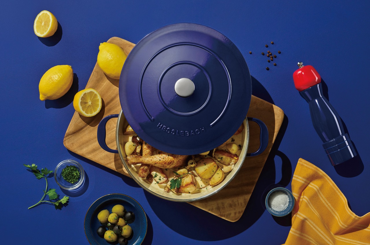
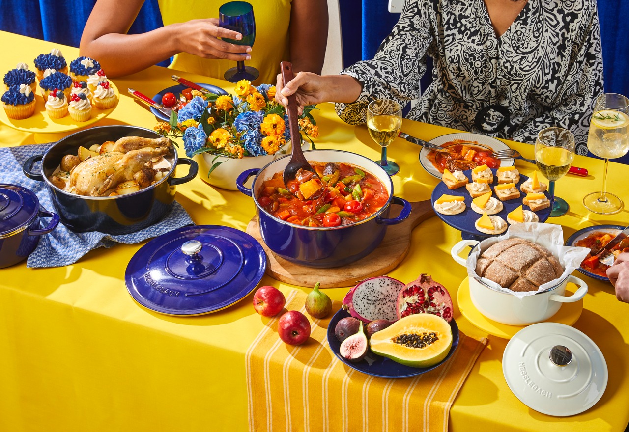
The Dutch oven is the kitchen’s most honest piece of cookware. It travels from stovetop to oven to table without changing character, and the finest examples improve with use rather than degrade with it. HK Kim’s Hesslebach takes that functional lineage and applies a design sensibility that treats the vessel as an object worth placing rather than simply setting down. Its counter presence communicates something deliberate about the kitchen it occupies, a quality very few pieces of cookware achieve.

A well-made Dutch oven retains and distributes heat in a way that makes slow-cooked dishes genuinely superior in result. Braises develop deeper flavor, bread develops a crust that rivals a professional deck oven, and soups reach a depth of reduction that stovetop-only pots rarely match. The Hesslebach is built to that standard, and its form carries the confidence of its material. Left on the counter between sessions, it functions as an aesthetic anchor for the kitchen space around it.

What we like

  • Heat retention and distribution deliver cooking results that lighter cookware simply cannot match
  • A form confident enough to remain on the counter between uses without apology

What we dislike

  • Weight and material density demand more deliberate handling than lighter everyday cookware
  • The investment required places it well above casual kitchen upgrade territory

10. FineLine Chopstick Rest

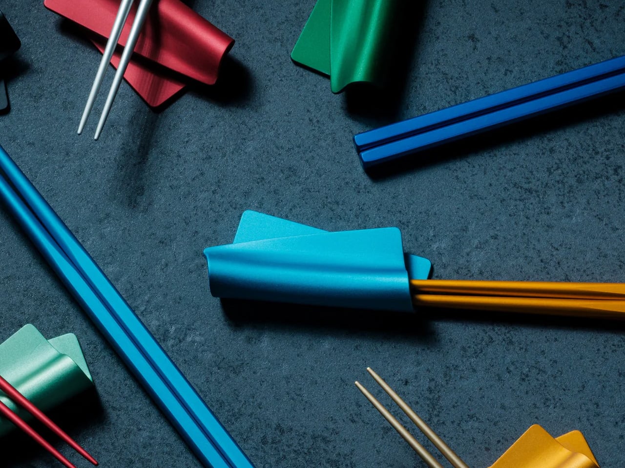
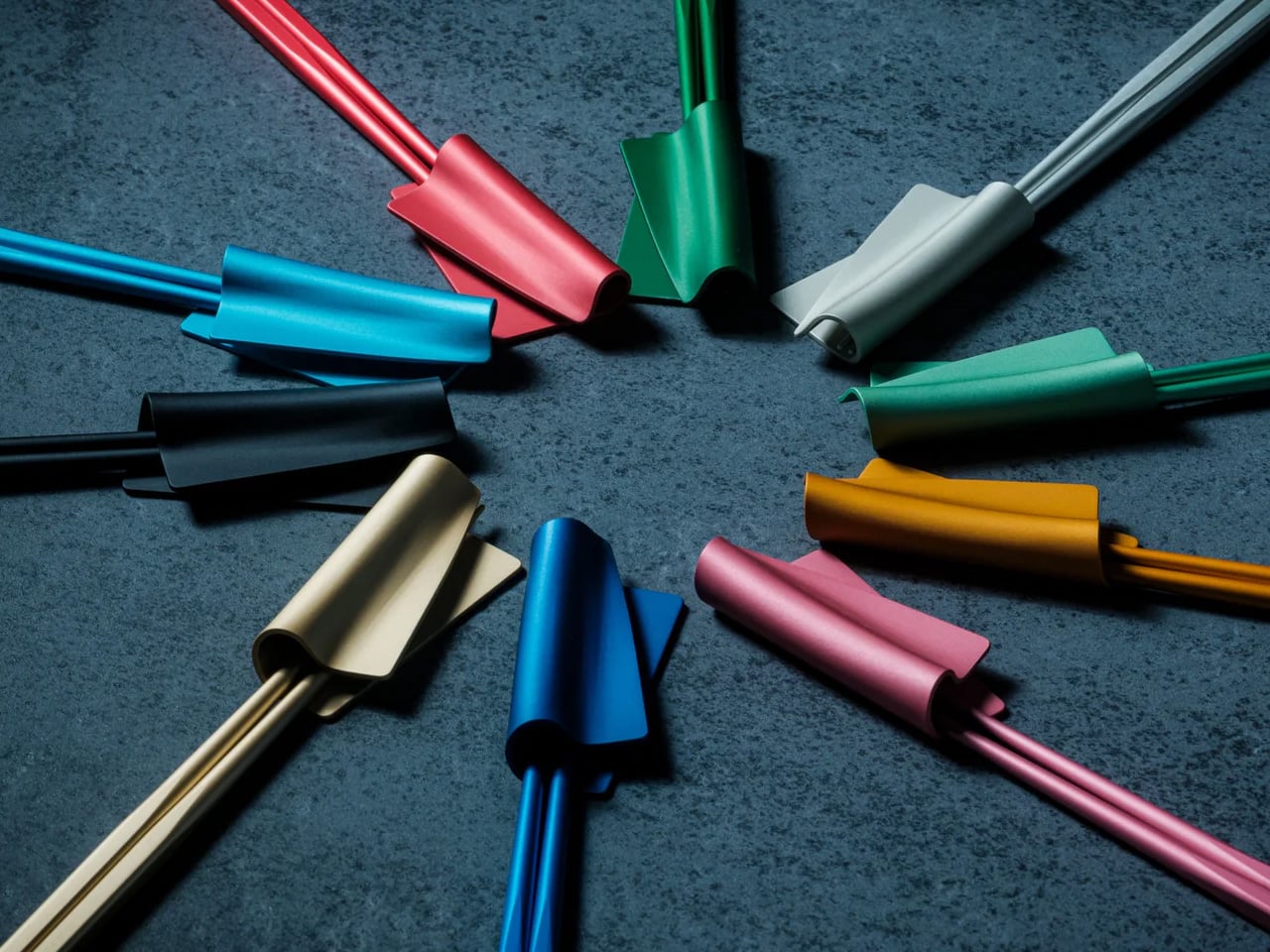
The chopstick rest is the punctuation mark of a table setting: small enough to be overlooked, significant enough to shift the character of everything around it. The FineLine Chopstick Rest is machined from the same aluminum as the chopsticks it accompanies, creating a material consistency across the table that reads as intentional rather than assembled. Its form is architecturally proportioned, a precisely angled piece that holds the chopsticks cleanly off any surface.

What it does for the FineLine chopsticks is what any well-designed accessory does for its counterpart: it completes the object. Chopsticks left flat on a table look forgotten. Placed on a form machined to hold them, they look arranged. That distinction carries through to the counter, where rest and chopsticks together become the kind of small arrangement that makes a kitchen feel curated rather than accumulated. Very few objects at this price point deliver that quality of visual return.

Click Here to Buy Now: $20.00

What we like

  • Machined aluminum matches the FineLine chopsticks precisely, creating a coherent tabletop object
  • The angled form elevates the chopsticks from a utensil to a display piece between uses

What we dislike

  • Designed specifically around the FineLine chopsticks, which limits pairing with other styles
  • The minimal form is unforgiving if placed on a visually cluttered or busy surface

The Objects That Stay

A kitchen that looks considered doesn’t happen through a single purchase. It accumulates through a sequence of decisions, each one small enough to seem insignificant until the room starts to reflect them. The ten objects here span different categories, different price points, and different materials. What they share is a refusal to be hidden away. Each one earns its counter space not through function alone but through the integrity of its form.

The Smeg fryer shows where cooking technology is heading. The Mitsubishi Bread Oven shows what happens when a brand stops trying to do everything. The Toru Kettle shows that the most familiar object in a kitchen can still be entirely rethought. The rest follow the same logic: that good design and daily use are not competing priorities. They are, at their very best, the same thing.

The post 10 Best Kitchen Tools and Appliances Designed to Live on Your Counter, Not in Your Cupboard first appeared on Yanko Design.

Your Old Film Camera Can Now Shoot 4K Video and 26MP RAW Files Without Any Modifications. Here’s How.

Somewhere in your home, there’s likely a camera that used to mean something. A Nikon FM2 inherited from a parent, a Canon AE-1 found at a flea market, a Pentax K1000 that still smells faintly of old leather. These bodies were built with a precision and intention that most modern cameras rarely replicate. The feel of a metal shutter, the resistance of a manual aperture ring, the satisfying click of the film advance lever. None of that ever became obsolete. What became obsolete was the film inside.

Samuel Mello Medeiros decided to use that space where the film cartridge would go, and create a retrofittable module that turns any analog camera into a digital one. Medeiros’ module slides into the film chamber of any compatible 35mm film camera, and packs a Sony IMX571, a 26.1-megapixel back-illuminated APS-C sensor along with up to 256FB of internal storage, Wi-Fi, Bluetooth, and a rechargeable battery. Dubbed the “I’m Back Roll APS-C”, it’s designed to be compatible with cameras from Canon, Nikon, Leica, Pentax, Olympus, Minolta, and dozens of others. Just put the module into the film canister and you’re ready to shoot. The camera goes untouched. The shutter fires the same way it always did. Images accumulate on internal storage and transfer wirelessly once the shoot wraps. Nothing hangs off the body. Nothing changes on the outside. Future-proofing at its finest.

Designer: Samuel Mello Medeiros

Click Here to Buy Now: $449 $699 ($250 off). Hurry, only a few left! Raised over $1 million.

At the heart of I’m Back Roll is the Sony IMX571, a professional APS-C sensor used in astronomy cameras, where image quality is pushed to its absolute limits. Astrophotography demands sensors that extract clean signal from vanishingly faint sources, which requires exactly the qualities that make a sensor excellent for general photography: low noise, wide dynamic range, and clean performance at elevated ISO. The IMX571 is a back-illuminated design, meaning the photodiodes are exposed to light before the wiring layer rather than behind it, collecting more photons per pixel and delivering measurably better high-ISO output than front-illuminated sensors of equivalent resolution. At 26.1 megapixels, it is designed to preserve the optical character of classic cameras. The APS-C plane measures 23.4 x 15.6mm, producing a 1.5x crop factor, so a 50mm Nikkor on an F3 behaves as a 75mm equivalent, worth accounting for if your collection runs heavy on wide primes.

There is no rear display, making for pure, distraction-free photography. You use the camera as you normally would, setting focus, aperture, and shutter speed just like with film. When ready to shoot, you press the remote control button to activate the digital sensor, then immediately press the camera shutter release. You have roughly one to two seconds after activating the sensor to trigger the shutter. After a few shots, this movement becomes natural and intuitive. For those who prefer a cleaner approach, the new sync button lets you take photos with a single click, just like a normal analog camera, screwing onto the shutter if available, or fixing on top of the button. One press activates the system and triggers the camera instantly. No remote. No extra step. Think of it as just you retrofitting an electric motor on your existing analog bicycle – everything stays the same, but you get a remarkable performance bump.

The structure is CNC-machined aluminum, built for durability, heat dissipation, and full internal integration. Running a 26-megapixel sensor inside a sealed metal body with no active airflow is a genuine thermal engineering problem, and aluminum’s conductivity is doing real work here. The battery is compact, stable in power delivery, safe, and easy to replace, enclosed in a protective housing and connecting to the PCBA through a sliding rail system that allows easy and secure replacement. The battery itself takes the exact form factor of a 35mm film canister, sitting in the chamber exactly where your Kodak Ultramax would load, swapping out the same way. The module works like a film roll, approximately 4mm thick. I find the replaceable battery design to be the most quietly clever decision in the entire product. It asks nothing new of the photographer.

The I’m Back Roll is compatible with most 35mm film cameras, including Nikon (F, F2, F3, F4, F5, FM, FM2, FE, FE2), Canon (AE-1, A-1, AT-1, F-1, EOS series), Minolta (X-700, X-500, XG series), Pentax (K1000, LX, ME Super, Spotmatic), Olympus (OM-1, OM-2, OM-3, OM-4), Contax (139, RTS, G1, G2), Yashica, Leica M and R series, Fujica, Konica, Ricoh, Chinon, and Praktica. A dedicated solution was designed for Leica M cameras specifically, featuring a custom back with integrated sensor, no change to camera feel, and the full mechanical experience preserved. Your Leica stays analog, but becomes digital. A semi-transparent frame overlay shows the exact sensor area, using a very light adhesive that is non-permanent and easily removable, placed directly on the viewfinder window so you always know what is inside the final image. Cameras with vertically opening backs, including the Nikon F, Contax II, and Alpa, may require a dedicated back cover produced via 3D printing, though based on previous experience, only three models out of hundreds tested required this.

The I’m Back Roll captures RAW and JPEG, 4K video, and film-inspired color profiles. The fact that it captures 4K video is impressive, since shooting video on a Contax RTS through a Zeiss Planar T* 50mm f/1.4 is a creative proposition nobody had access to when that camera was in production. The unlocked stretch goal brings extra color profiles and film-inspired looks, plus a clean digital mode. The profile lineup covers Kodacolor, Kodak Portra, Tri-X 400, Fujifilm, Ilford HP5, Agfa Vista 200, Cinestill 800T, and Kodak Ektachrome E100, each tuned to the color science and tonal character of its namesake stock. Cinestill 800T carries its signature tungsten-halation glow, Tri-X delivers the high-contrast grain that defined a generation of photojournalism, and Portra’s skin-tone-saturated warmth translates faithfully. The optional external touchscreen display runs 2.5 inches at 400 x 712 pixels on an OLED panel, with up to 1000 nits of peak brightness, connected to the I’m Back Roll via a flexible flat cable.

Storage tiers run 64GB for everyday use, 128GB for creators who shoot more, and 256GB for maximum freedom, with Leica M versions for dedicated rangefinder users. Every reward includes the I’m Back Roll APS-C, remote control, USB-C cable, and a 2-year warranty. The $499 Discovery Kit saves 29% off the MSRP of $699 (with 64GB storage). Concretely, that puts the the Creator Kit with 128GB between $499 and $549 (for the Leica M edition), and the Master Kit with 256GB at $599. All backers also receive a 3-year warranty, with global shipping starting August 2027.

Click Here to Buy Now: $449 $699 ($250 off). Hurry, only a few left! Raised over $1 million.

The post Your Old Film Camera Can Now Shoot 4K Video and 26MP RAW Files Without Any Modifications. Here’s How. first appeared on Yanko Design.

This 1.5mm Japanese Chopstick Might Ruin Ordinary Ones for You

Most chopsticks are never designed. They’re just made. Wide enough to produce cheaply. Consistent enough to ship by the millions. Familiar enough that nobody questions them.

Until someone finally did.

The FineLine Aluminum Chopsticks are the result of more than 40 rounds of refinements in Tsubame-Sanjo, Japan—adjusting the tip diameter, taper angle, grip texture, and balance in increments as small as 0.1mm.

Not to reinvent chopsticks. Just to remove the small frustrations people stopped noticing years ago. And surprisingly, most of those frustrations start with rotation.

Neatly arranged colored pencils in a rainbow gradient across a gray desk, with color swatches in the background on the right.

Plate of assorted nigiri and maki sushi on a gray platter, with soy sauce, a wine glass, and blue chopsticks on a woven placemat.

The Chopsticks That Changed How Dinner Felt

At first, the difference felt almost too small to explain. Then I noticed I wasn’t squeezing sashimi as hard. I wasn’t correcting the tips halfway through a bite. I wasn’t adjusting my grip every few minutes without realizing it.

The chopsticks stayed aligned. The tips held cleanly. Long meals felt calmer somehow. And once I noticed that, ordinary chopsticks started feeling strangely unfinished.

Salmon nigiri being picked up by chopsticks over a plate of assorted sushi and soy sauce nearby.

Designed for the Details

  • 1.5mm precision tip: Roughly half the diameter of most standard chopsticks, creating cleaner contact and more precise control.
  • Faceted anti-rotation body: Prevents the constant drifting and micro-corrections caused by round chopsticks.
  • Machined anti-slip texture: Built directly into the tip instead of added as a coating that eventually wears away.
  • 40 rounds of refinements: Tip diameter, taper angle, grip texture, and balance were adjusted repeatedly in increments as small as 0.1mm.
  • 14.5g balanced weight: Controlled enough for precision without becoming tiring across a full meal.
  • Anodized aluminum construction: Resists moisture, warping, stains, and dimensional drift over time.

Available in ten satin anodized tones, the finish adds grip without roughness while maintaining the same feel years later as it did on day one.

Flat lay of black minimalist dinnerware: two large round plates, two cups, and a pair of chopsticks on a dark textured surface at top and bottom center.

The Friction You Stop Noticing

Standard chopsticks taper to around 3–4mm at the tip. That’s not really a design decision—it’s a manufacturing default. It works, but it quietly asks something of you every time you eat. A little extra pressure to hold slippery food. A slight grip adjustment. A constant realignment of the tips.

Round profiles make it worse. They rotate in your fingers constantly. Subtly, continuously—your hand is always correcting them, always bringing the tips back into alignment. It’s the kind of friction that never rises to the level of complaint but accumulates quietly across every meal.

White chopsticks laid across a curved ceramic rest on a dark textured surface with black chopsticks nearby.

Most people never notice it because they’ve adapted to it for years.

The FineLine was designed to remove that friction entirely. Not through dramatic reinvention, but through refinement precise enough that the tool eventually disappears from your awareness altogether.

Colorful plastic twist ties arranged in a circle around a central point on a dark textured surface, creating a starburst pattern.

Design That Disappears

The workshop behind the FineLine was founded in Tsubame-Sanjo in 1907, a region known for precision metalworking where tolerances measured in fractions of a millimeter completely change how a tool feels in use.

That same philosophy shaped these chopsticks.

Metal chopsticks done poorly feel clinical and slippery because aluminum hides nothing. Wood and bamboo naturally absorb small inconsistencies in manufacturing. Aluminum doesn’t. Every imbalance in taper, texture, and weight becomes immediately obvious in the hand.

That’s precisely why this level of precision mattered here. The same discipline required to hold 0.1mm tolerances across professional tools is what allows a 1.5mm aluminum tip to feel stable instead of precarious.

The matching FineLine Chopstick Rest completes the system, carrying the same anodized finish, color language, and quiet restraint. Together they create a table setting that feels considered without asking for attention.

Colorful chopsticks laid diagonally across a dark textured surface, forming a rainbow arrangement.

Who It’s For

  • Daily Chopstick Users
    Once you’ve used a 1.5mm tip on a properly balanced stick, ordinary chopsticks start feeling strangely unfinished.
  • Japanese Craft Enthusiasts
    This isn’t craft as decoration. It’s a century of metalworking precision applied to one of the most ordinary tools on a Japanese table.
  • Gift Givers with Taste
    Not displayed. Not saved for guests. Just quietly reached for without thinking—which is exactly the point.

Minimal black tableware setting: two plates with a small black bowl and a pair of chopsticks resting on the plates on a dark textured surface.

Where The Meal Takes Over

You don’t think about chopsticks when they work. You think about the food, the conversation, the rhythm of the meal. That’s the quiet achievement of the FineLine Aluminum Chopsticks. The grip stays aligned. The tip holds cleanly. The weight never asks for attention.

Not just chopsticks. A better way to feel every meal. The FineLine Chopsticks are available now for $30.

The post This 1.5mm Japanese Chopstick Might Ruin Ordinary Ones for You first appeared on Yanko Design.

This Ceramic Vase Is Actually a Phone Speaker That Needs No Power

The home has become increasingly cluttered with gadgets that need charging, pairing, and their own dedicated spaces. Even something as simple as playing music from a smartphone often involves a Bluetooth speaker sitting on a shelf, waiting for its battery to drain. There’s been a quiet counter-movement in product design, where objects do their jobs without power and sit in a room the way a vase or a mug would.

Kenji Abe’s ECHO is exactly that kind of object. It’s an analog speaker that amplifies smartphone audio simply by being set on top of the phone, requiring no power, no pairing, and no setup beyond placing it down. The concept takes its cues from wind instruments and seashells, two forms that have been shaping and projecting sound for centuries without the help of electricity.

Designer: Kenji Abe

The inside of ECHO works like a chamber, built to catch the phone’s audio and carry it outward in soft, diffused waves rather than projecting it directly. The geometry draws from the same logic as a cupped hand, but with more control over how sound travels. The result isn’t a dramatic volume boost so much as a room-filling quality that feels warmer than a powered speaker on a desk.

The choice of material makes as much of a statement as the form. Abe uses glazed ceramic, the same material found in vases, mugs, and tableware, giving ECHO a texture and presence that belongs in a home rather than on a tech shelf. It doesn’t look like an accessory. It looks like something that was always there, something that simply happened to be placed near a phone.

That quality matters when the phone is on the kitchen counter and you want music while cooking, or on a desk where you’d rather not have a speaker taking up permanent residence. ECHO doesn’t need to live next to a charging cable or be put away between uses. It sits on the table and becomes part of the room, as unobtrusive as any other ceramic piece nearby.

A guest walking in wouldn’t necessarily clock it as a tech product. That’s partly the point. The glazed surface catches light the way pottery does, and the form is quiet enough to sit beside books or plants without demanding attention. When a phone is slid underneath it, it starts doing its job. When the phone is gone, it just stays there, still looking like it belongs. The same underlying principle runs through the Battery-free Amplifying iSpeakers, where a Duralumin metal enclosure amplifies a smartphone’s audio without any power.

Abe designed ECHO to exist comfortably in a room even when it isn’t doing anything, a goal most speakers never consider. Most audio accessories announce themselves. This one quietly waits, and when a phone is close enough to fill the cavity with sound, the room gets a little warmer and a little fuller without anyone having to reach for a power button.

The post This Ceramic Vase Is Actually a Phone Speaker That Needs No Power first appeared on Yanko Design.

The 5 Best Tech Gadgets of May 2026

May 2026 is a good time to be paying attention. Gadgets aren’t just getting faster or thinner; the best ones this month are getting more intentional. There’s a shared thread running through every standout: each was built around a real constraint, a real behavior, or a real cultural moment, rather than a spec sheet searching for an audience. Five products rose above the rest, and each earns its spot for a distinctly different reason.

From a foldable phone that demolishes the category’s $800 price floor to a Nintendo Switch add-on that turns a gaming console into a live production rig, the range here is unusually wide. What connects them is the quality of thinking underneath. These aren’t renders looking for investment. They’re real objects designed to change how you work, listen, create, and move through a day. That’s the only brief that actually matters.

1. NASA Artemis Watch 2.0

NASA’s Artemis II lifted off from Kennedy Space Center on April 1, 2026, carrying four astronauts on humanity’s first crewed lunar journey in over 50 years. CircuitMess timed the NASA Artemis Watch 2.0 directly into that cultural gravity. At $129, it’s a fully assembled, ready-to-use programmable smartwatch built around a dual-core ESP32 microcontroller, with a full-color LCD screen, accelerometer, gyroscope, compass, and temperature sensor packed into a wristband designed for anyone aged nine and up who wants more than a fitness tracker strapped to their wrist.

What makes it worth your attention is the depth it offers without demanding anything upfront. Out of the box, it pairs with iOS and Android over Bluetooth for activity tracking and notifications. When curiosity takes over, the firmware is fully open-source and reprogrammable in Python, CircuitBlocks, or the Arduino IDE. Build custom watch faces, write your own apps, and modify sensor behavior as far down as you want to go. The Artemis Watch 2.0 is one of the rarer gadgets at this price: it genuinely grows with the person wearing it.

What we like

  • Fully open-source firmware supports Python, CircuitBlocks, and Arduino, giving both beginners and experienced coders meaningful room to explore and build
  • Ships fully assembled and ready to use straight out of the box, lowering the barrier to entry without removing any of the technical depth underneath

What we dislike

  • At $129, it asks for more commitment than most impulse purchases in the kids’ tech category allow for
  • Screen performance in direct sunlight hasn’t been addressed in any available documentation

2. OrigamiSwift Mouse

Every frequent traveler has made the same quiet compromise: leave the proper mouse at home or carry something too small to work with comfortably for more than an hour. OrigamiSwift was built precisely around that problem. It’s a Bluetooth mouse that folds flat when not in use, weighs just 40 grams, and opens into full working position in under half a second. The origami-inspired form isn’t a styling exercise. It’s a structural answer to the oldest tension in portable peripherals: comfort has always cost you size.

The ergonomic shaping holds up across extended work sessions, which matters more than most product pages acknowledge. Whether you’re finalizing a presentation at an airport gate or editing documents in a co-working space, OrigamiSwift stays comfortable in your hand and disappears into a bag when you’re done. The ultra-thin profile and minimal build weight mean it never adds anything meaningful to your load. For anyone who genuinely works from wherever they happen to be, this is the mouse that finally makes sense to own.

Click Here to Buy Now: $85.00

What we like

  • 40-gram weight and flat-fold profile make it practically invisible in any bag, disappearing entirely until you actually need it
  • Sub-0.5-second activation means there’s no friction at all between being packed and being productive

What we dislike

  • Available listings don’t confirm DPI range or scroll wheel responsiveness for anyone doing precision work
  • Bluetooth-only connectivity may create compatibility friction with older desktop setups that lack wireless support

3. Ai+ Nova Flip

The foldable phone category has spent five years convincing itself that the flip experience carries a natural premium of $800 or more. Ai+ is testing that assumption head-on with the Nova Flip, launched in India at Rs 29,999, roughly $320, making it the most accessible foldable phone on the market. The inner display is a 6.9-inch AMOLED panel resolving at 2790 x 1188 pixels, complemented by a 3.1-inch AMOLED cover screen. MediaTek’s Dimensity 7300 handles processing, paired with 8GB of LPDDR4X RAM and 256GB of internal storage.

The spec list doesn’t read like a budget compromise. A 50-megapixel primary camera, a 32-megapixel front shooter, and a 4325mAh battery with 33W wired charging all hold credibly against devices at double the price. 5G, NFC, and an IP64 dust and splash rating close out a package that would feel serious in any category. The Nova Flip doesn’t just undercut the competition on price. It quietly forces a harder conversation about what the flip form factor has genuinely been worth at $1,000 all along.

What we like

  • $320 pricing opens the foldable phone experience to an entirely new audience that the category has ignored since its beginning
  • The 4325mAh battery is a genuinely surprising capacity for the flip form factor at any price point, let alone this one

What we dislike

  • The 2-megapixel depth lens reads as the weakest component in an otherwise strong and well-considered camera array
  • Long-term hinge durability at this price tier is unproven and worth tracking carefully over time

4. Akai MPC Switch

Alquemy’s Akai MPC Switch concept asks a question that feels obvious the moment someone finally puts it to you: if laptop-grade software can run on portable hardware, why can’t a capable gaming console handle serious music production? The MPC Switch is a pair of controller units designed to snap directly onto the sides of a Nintendo Switch, replacing the Joy-Cons with MIDI inputs, outputs, and a full DAW running on the console’s own screen. The control layout reflects real production workflows rather than a stylized render built for social media.

The appeal runs deeper than the novelty of the form. The concept treats the Switch as a legitimate interface surface: something you game on when you need to and produce or perform on when the moment calls for it. Swap the Joy-Cons for the MIDI setup, and you’re there. Whether Nintendo or Akai ever moves this into production is a separate question entirely, but Alquemy has made a persuasive case that the idea deserves a real answer. The best concepts don’t just look good. They make you wonder why nobody shipped it first.

What we like

  • MIDI integration and a credible DAW interface position the Switch as a serious production platform rather than a novelty peripheral
  • The Joy-Con snap mechanism makes the transition between gaming and music production genuinely seamless in concept

What we dislike

  • No confirmed production timeline means this remains aspirational, with no clear path in your hands
  • The Switch’s processing ceiling may be a real constraint for complex, multi-layer production sessions

5. StillFrame Headphones

Most headphone designs land at one of two poles: the over-ear build that announces itself before you even put it on, and the in-ear solution that disappears but gives nothing back in soundstage. StillFrame lands somewhere more considered than either. At 103 grams, it sits closer to weightless than wearable. The 40mm drivers are tuned for a wide, open soundstage that pulls spatial detail and melodic texture out of tracks that most headphones flatten into undifferentiated background noise.

Active noise cancellation closes you off when focus demands it. Transparency mode reconnects you to the room when the world around you matters more. Battery holds at 24 hours, covering a full workday, an overnight flight, and the morning after with no cable required. Switching between modes takes a single tap. StillFrame was designed around the premise that how you listen should adapt to where you are, not the other way around. That’s a harder brief to execute cleanly than it sounds, and the weight alone suggests it’s been taken seriously.

Click Here to Buy Now: $245.00

What we like

  • 103 grams is a genuinely rare achievement for an over-ear headphone carrying both ANC and full-size 40mm drivers
  • 24-hour battery life covers the kind of all-day, real-world use that most headphones in this category only claim to handle

What we dislike

  • No published information on codec support, like LDAC or aptX, for listeners who prioritize wireless audio fidelity
  • Colorway and finish options appear limited in current listings, which may be a sticking point for buyers who care about visual identity

The Only Standard That Matters Is the One You Can Feel

May 2026’s strongest gadgets share something harder to write into a spec sheet than battery life or pixel count. Each was designed around a specific friction point and resolved it with a precision that feels purposeful rather than accidental. The Artemis Watch converts a cultural moment into a learning platform. The Nova Flip resets the floor of an entire category. The OrigamiSwift solves a portability problem that dozens of mice before it never genuinely addressed.

StillFrame and the Akai MPC Switch represent opposite ends of the development spectrum, one shipping and one conceptual, but both make the same underlying argument: that considered design changes the terms of what a product is allowed to be. Whether you’re optimizing a travel bag or rethinking a music studio from a gaming console, the standard these five set is worth taking seriously. The best gadgets this month aren’t the loudest ones in the room. They’re the most resolved.

The post The 5 Best Tech Gadgets of May 2026 first appeared on Yanko Design.

This 4-in-1 Hands-free Flashlight Clips To Clothes, Snaps to Your Phone, and Stands on Its Own

A Red Dot Design Award and a $210,000 Kickstarter campaign are two very different kinds of validation. One comes from a jury of design professionals evaluating form, function, and coherence. The other comes from tens of thousands of people who looked at a product and handed over money before it shipped. SparkO, the compact wearable EDC flashlight from California’s ScoutLite, earned both. That combination suggests something specific about the object: it reads clearly to designers and solves something real for everyday people. At $45.99 and 40 grams, the barrier to entry is low enough that hesitation becomes difficult to justify.

Two photos of SparkO are enough to grasp the concept: a disc-shaped body, a silicone loop that clips and doubles as a kickstand arm, and a circular LED array wrapped in a fine prismatic lens ring. The anodized metal bezel is color-matched to whichever of the four options you pick, Forest Moss, Basalt Black, Glacier Blue, or Canyon Clay. It clips to a bag strap or jacket, snaps magnetically to a MagSafe iPhone, props upright on the optional ring stand, or rides on clothing as a hands-free wearable. That range of deployment is the whole argument for SparkO, and ScoutLite backs it with 300 lumens, three color temperatures, four brightness levels, a red light mode, CRI 95+ rendering, a 14.5-hour runtime, and USB-C charging. At a campsite, a workbench, or a dim restaurant table, the light adapts to the situation rather than demanding you adapt to it.

Designer: Ten

Click Here to Buy Now: $41.40 $45.99 (10% off, use coupon code “YK10”). Hurry, deal ends in 48-hours!

The disc form is a real departure from the cylindrical tube that has defined flashlight design for over a century. A cylinder forces you to hold it; a disc invites you to wear it, clip it, or set it down facing wherever light needs to go. The silicone loop is soft enough to flex over thick fabric and structured enough to hold position once seated, its geometry doubling as the kickstand arm when the magnetic ring base enters the picture. The circular LED face is surrounded by a concentric prismatic lens ring that distributes light broadly and evenly, borrowing visual language from photography ring lights rather than from tactical torches. That framing signals the breadth of SparkO’s intended audience: the tradesperson and the camper, but equally the commuter, the hobbyist, and the photographer working in low light.

Clipped to a chest pocket or jacket collar, SparkO illuminates whatever your hands are working on without requiring you to hold anything, which is the core use case that conventional EDC lights have historically fumbled. Snapped to the back of an iPhone Pro via the magnetic base, it becomes a fill light for close-up photography, turning a phone into something resembling a professional lighting rig for the cost of a decent lunch. The ring stand converts the same unit into a bedside reading lamp or a compact task light with a footprint smaller than a drink coaster. Each scenario calls for a different mounting method, and the transitions between them take seconds rather than a setup ritual. Four modes sounds like a marketing stretch right up until you’ve run through all of them in a single day, and then it starts to feel like the accurate count.

Three hundred lumens is the right range for a light this size: capable outdoors, tolerable at close range, and not so aggressive that it becomes a problem in tight spaces. The three color temperature options matter more than the lumen figure in daily use, covering the gap between a warm amber reading mode and a cooler beam suited to detailed work. CRI 95+ color rendering is what sets SparkO apart from most of the EDC lighting field, reproducing colors accurately enough that the light reads close to natural daylight, which makes a genuine difference for craftspeople and photographers. The red mode preserves night-adapted vision on a trail or at a campsite, a small but real addition for outdoor use. Runtime at 14.5 hours and USB-C charging put SparkO on a weekly recharge cycle with a cable it shares with everything else in a modern carry kit.

ScoutLite has built a product that lands on the right side of the three virtues the EDC community consistently responds to: compact, accessibly priced, and solving a problem the existing field handles poorly. The Red Dot Award carries credibility for an audience that pays attention to such things, while the $210,000 Kickstarter result is a harder signal to argue with, because crowdfunding backers are betting on a design that communicates its own value clearly enough that waiting feels unnecessary. At $45.99, the decision practically makes itself, especially given that the clip, the magnet, the stand, and the wearable mode collectively cover more scenarios than most EDC kits manage with multiple dedicated tools. Whether ScoutLite follows this up with accessories or a higher-output variant, SparkO sets a credible benchmark for what a wearable EDC light should cost, weigh, and do. The category has needed something this considered for a while.

Click Here to Buy Now: $41.40 $45.99 (10% off, use coupon code “YK10”). Hurry, deal ends in 48-hours!

The post This 4-in-1 Hands-free Flashlight Clips To Clothes, Snaps to Your Phone, and Stands on Its Own first appeared on Yanko Design.

7-in-1 Titanium Ruler That Draws Perfect Circles, Measures Angles, and Works as a Caliper. Yes, Really.

EDC and stationery have been moving closer together for years. Pens became precision objects. Rulers became desk jewelry. Pocket tools started borrowing the language of industrial design, while analog work tools picked up the portability and finish standards of everyday carry. Somewhere in that overlap, products began chasing a sharper balance between usefulness and desire.

UnioArc feels tailored for that exact overlap. It carries the visual language of titanium EDC, but its purpose lives firmly in the world of measurement, drawing, and layout. That combination gives it an immediate hook. It speaks to the person who keeps a notebook close, notices edge quality, values compact gear, and wants a tool that can move from workbench to sketchbook to shirt pocket without feeling out of place.

Designer: TiBang

Click Here to Buy Now: $55 $95 (42% off). Hurry, only a few left! Raised over $85,000.

Seven measurement and drawing functions collapse into a single folding titanium ruler. Closed, it measures 145mm, roughly smartphone length. One motion releases the magnetic lock, the sleeve joint clicks straight, and it extends to 295mm for full A4 coverage. No sliding mechanisms. No multi-step deployment. The transformation happens edge to edge, from zero to full length in a single click. Three scales cover metric, imperial, and a dedicated millimeter track. All markings are laser-engraved into the titanium surface, which means they will never fade, peel, or rub off. The zero point starts right at the tip, eliminating offset math when measuring depth or inserting the edge into tight spaces.

A 0.5mm recessed groove runs along the bottom edge. It catches a pen tip, holds it stable, and lets you mark immediately after measuring. That same groove improves grip when you’re holding the ruler at an angle or cutting against it. The flat middle edge guides craft knife blades flush against the surface for clean cuts without wobble. The top edge carries a 25-degree bevel to reduce glare and improve readability under direct light. Three edge profiles, three distinct jobs, one continuous form. This kind of multi-layer thinking shows up throughout the design, where individual features earn their place by doing multiple things well instead of one thing adequately.

Precision compass holes span 140mm in 10mm increments. Insert one pen through a hole near the pivot (the sleeve joint), insert another at the desired radius, and draw smooth circles from 10mm to 140mm diameter. No center puncture. No damaged paper or leather. Swap the stylus pen for a craft knife and you can cut perfect circles in paper, thin materials, or vinyl without leaving a center mark. For woodworkers and leather crafters, this solves a persistent workflow annoyance. A full 180-degree protractor sits engraved at 5-degree increments. Need to mark 35 degrees? 55 degrees? Read it directly, no interpolation required. A 90-degree quick-check corner handles faster right-angle verification. A small arrow indicator simplifies complementary angle reading: subtract the arrow-aligned angle from 180 degrees and you have the answer without rotating the tool or doing mental math.

Fold the ruler to 90 degrees, align the reference line with your scale, and set any spacing you want for parallel lines. The arms lock into a true right angle with no wobble or drift as you move across the page. For architectural sketches, textile patterns, or technical drawings, this turns a multi-tool task into a single-ruler operation. The locking mechanism holds firm enough for consistent spacing across long runs. The same two arms that handle linear measurement also slide apart while staying parallel, clamping around boards, straps, or stock to give direct thickness readings. It functions like a simplified caliper without requiring a separate tool. In workshops or on job sites where you need quick material checks, this compresses another measurement step into the same instrument you’re already holding.

No screws hold the sleeve joint together. No washers. Nothing to tighten or maintain. Resistance comes from precision fit between machined titanium surfaces. The two arms slide into each other and lock at 180 degrees with zero gap, zero step, zero play. That interlocking geometry prevents the common folding ruler problem where pen tips drop into gaps or lines skip at the hinge. The transition from one arm to the next reads as seamless. This is critical because any interruption in the edge breaks the flow when you’re drawing continuous lines or cutting long paths. TiBang solved it by making the joint itself part of the measurement surface instead of treating it as a hinge that happens to sit between two rulers.

Grade 5 Titanium throughout, CNC-machined from solid stock rather than stamped or cast. That process ensures consistent dimensional accuracy across every unit and allows for fine detail work in the compass holes, protractor markings, and edge profiles. Sandblasted titanium gives a raw, matte appearance that develops micro-patina over time. PVD Black applies a deep black coating with increased surface hardness for a technical, permanent look. Both finishes share identical machining tolerances and functional geometry. Weight sits at 66.5 grams, just over two ounces. Light enough to carry all day without noticing, heavy enough to feel substantial when you pick it up. The 5mm thickness keeps it shirt-pocket slim, fits inside notebook sleeves, slides into small tool rolls. Fold it shut and magnets snap the arms together with a tactile click. No rubber bands. No retention clips. It stays closed in your pocket and opens when you want it to.

Architects, product designers, woodworkers, leather crafters, engineers, and EDC enthusiasts will recognize the workflow this tool targets. Anyone who moves between sketching, prototyping, and layout work carries some version of this measurement kit already. UnioArc compresses that kit into a single pocketable object, which is exactly the kind of consolidation that makes sense for people who work across locations or keep minimal setups. TiBang has two previous Kickstarter campaigns behind them, both shipped with 100% fulfillment and zero missed deliveries. Mass production and backer surveys are scheduled for May and June 2026, with quality inspection and packaging slated for July and August 2026. The timeline accounts for buffer periods around international shipping and customs clearance, which suggests they’ve learned from previous campaigns how to build realistic delivery windows.

Close-up of a hand using a metal scale ruler over architectural sketches on a drafting mat.

UnioArc is live on Kickstarter with a Launch Day pricing of approximately $55 USD (42% off MSRP of $95) and Super Early Bird pricing climbing to $60. The ruler works standalone, but optional add-ons include a leather sheath in two colors for $12, a PVD Black finish upgrade for $15, and a Pocket Titanium Everlasting Mini Pen for $9. Shipping begins in July and August 2026 following quality inspection. All reward tiers include free worldwide shipping with no additional fees. TiBang manufactures, ships globally, and communicates throughout the process.

Click Here to Buy Now: $55 $95 (42% off). Hurry, only a few left! Raised over $85,000.

The post 7-in-1 Titanium Ruler That Draws Perfect Circles, Measures Angles, and Works as a Caliper. Yes, Really. first appeared on Yanko Design.