A $2,699 Gaming PC That Doubles as a Display Case for Figurines

Cables are the dirty secret of PC building. No matter how carefully chosen the components are, or how expensive the case gets, the tangle of power, data, and fan connectors that crisscross the interior of most gaming desktops eventually undermines every effort at a clean aesthetic. The glass side panel that was supposed to show off the build ends up framing a web of wires that even the most diligent cable manager struggles to fully tame.

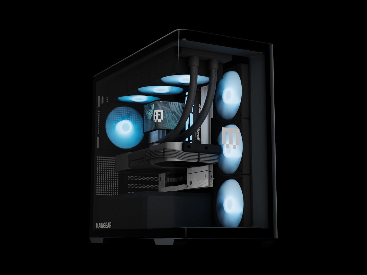
The Maingear Zero treats that problem as the actual design brief. Its patented MG-RC, or Rear Connection, system moves every motherboard connector to the back and underside of the board, clearing the visible interior of cables entirely. Paired with a single, seamless 4 mm tempered glass curve that wraps the front and side of the chassis without a single seam or pillar, the result is a desktop that looks like it has nothing to hide, because it genuinely doesn’t.

Designer: Maingear
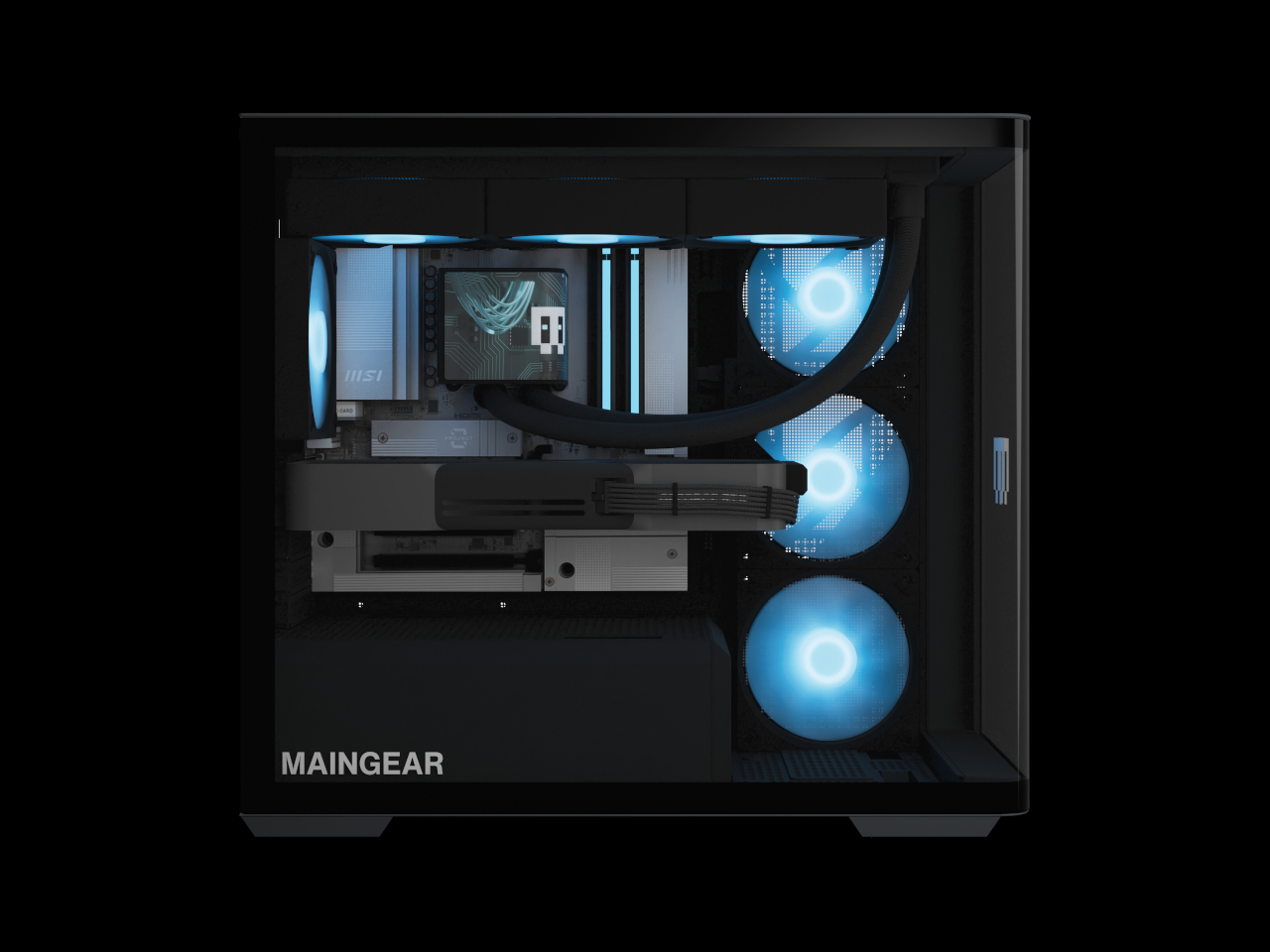
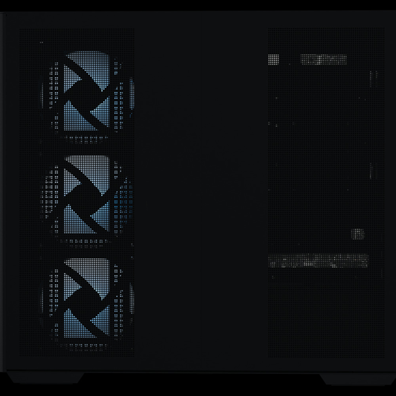
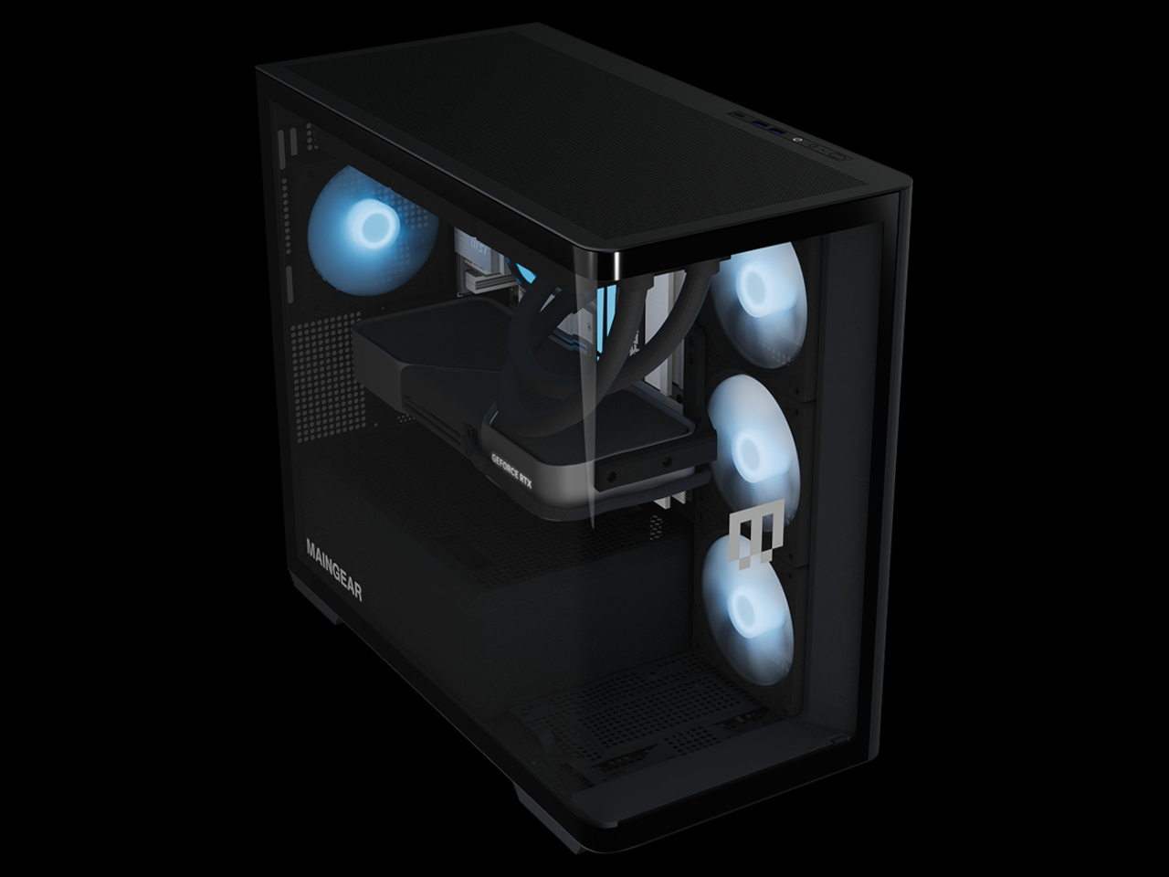
Seven fans work to keep the hardware running at full performance without drawing much attention to themselves. A mix of standard and reverse-blade units pushes cool air in through the front and exhausts it out through a 360mm AIO liquid cooler at the top, all following a single front-to-back airflow path. The reverse-blade intakes are specifically designed so the fan blades themselves don’t interrupt the view through the glass, which is a level of detail that most cases simply don’t think to address.
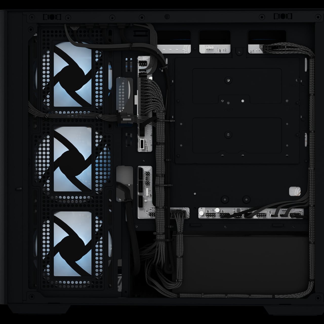
All RGB lighting inside the Zero is diffused rather than sourced from visible diodes, meaning the light saturates the interior without any glowing point of origin to break the illusion. The whole package measures 236mm wide, 421mm tall, and 460mm deep, which is more compact than a traditional mid-tower while still accommodating a full-sized GPU and the 360mm cooler overhead. It doesn’t look like a PC that compromised on size to achieve the aesthetic.
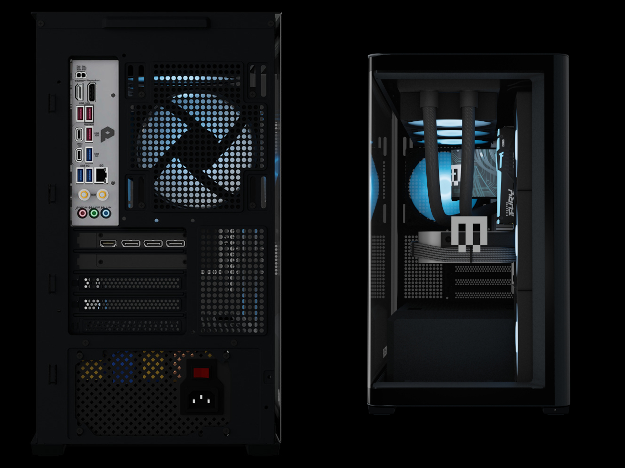
The hardware ceiling is genuinely high. Configurations top out at an NVIDIA GeForce RTX 5090 paired with an AMD Ryzen 7 9850X3D or Intel Core Ultra 7 270K Plus, 32GB of DDR5 memory, and a 2TB NVMe SSD. The chassis uses standardized mATX components throughout, with no proprietary parts, so future upgrades don’t require a trip back to the manufacturer.
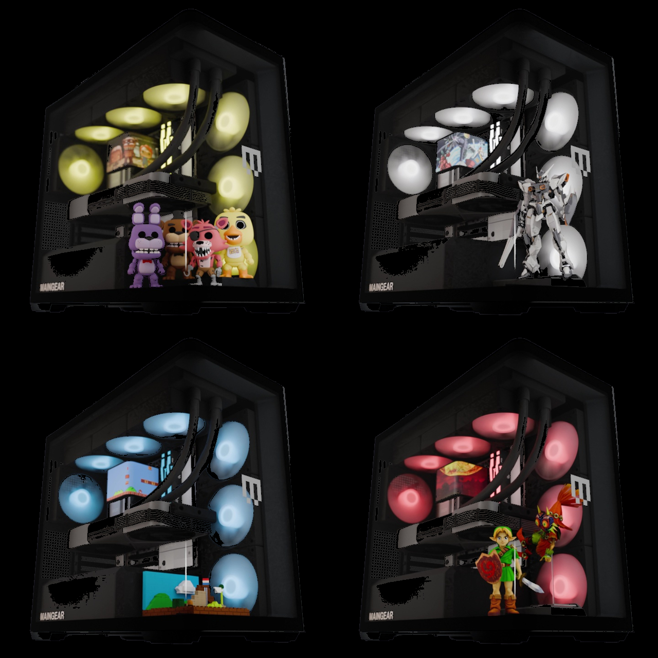
Beyond the hardware, the Launch Edition adds a pair of tool-free snap-in display stands inside the chassis, one for figurines and one for brick builds. The stands sit inside the case floor where passive airflow keeps whatever’s displayed inside dust-free. It’s the kind of feature that turns the interior from a hardware showcase into something closer to a display cabinet, which only makes sense given how much effort went into eliminating everything else that wasn’t worth looking at.

Every system is hand-built in New Jersey and ships with no bloatware pre-installed. Pricing starts at $2,699 for the base configuration, with the top-end Launch Edition Champion reaching $6,799. Built around the premise that nothing inside should be hidden, the Zero demonstrates how the best-looking gaming PC doesn’t have to sacrifice anything to get there.
The post A $2,699 Gaming PC That Doubles as a Display Case for Figurines first appeared on Yanko Design.

A Coin-Sized Disc Just Reinvented the Multi-Tool Nobody Could Fix

The multi-tool has been around long enough that most people have developed a frustrated relationship with it. You carry one because having a blade, a screwdriver, and a bottle opener in one place sounds practical, and then you grumble when you actually need something. Getting to the right tool means prying at a tightly packed frame with both hands, and that dynamic hasn’t changed much in decades.

GEO, designed by Invento Design, takes issue with that familiar frustration. Rather than folding tools out from a layered frame, it uses a patent-pending rotating disc mechanism that cycles through five tools, exposing each one through a single opening. It’s a deceptively simple reframing of an old idea, and one that makes you wonder why nobody had taken this approach before.

Designer: Francisco Molina (Founder of Invento Design)

Click Here to Buy Now: $45 $70 (36% off). Hurry, only a few left!

The way it works is fairly intuitive. Outer index levers let you rotate the internal mechanism until the tool you want lines up with the access window. A sliding lock then holds the selected tool in position before you start. The whole operation happens in one hand, without setting anything down first or needing a second hand to hold the frame steady.

The five tools cover a surprisingly practical range of everyday needs. You’d reach for the blade and scraper when a label refuses to peel cleanly, the box opener when a taped-up package isn’t cooperating, the bottle opener at the end of a long day, the flathead driver for a loose screw or a stubborn paint can lid, and the string cutter when scissors aren’t anywhere nearby.

Carrying something with a blade in your pocket raises the obvious question of what happens when it isn’t in use. GEO handles this with a dedicated safety mode, a neutral rotational position where no edges are exposed. The sliding lock serves a separate purpose, preventing the mechanism from turning mid-task. Together, they make it safe enough to pocket, clip to a belt, or drop into a bag.

The form factor makes carrying it a fairly easy decision. At 53.5mm in diameter and only 8.7mm deep, GEO lands somewhere between a large coin and a watch face. The integrated belt clip adds some depth but keeps the total thickness under 15mm. It fits in a jeans pocket, clips to a gear bag, or disappears into a drawer without demanding much space.

There’s something worth noting about how it actually feels to use, too. The rotation isn’t purely functional but also incredibly satisfying. Each position clicks into place with enough tactile feedback that you know exactly where you’ve landed, and the smooth lever action makes it oddly enjoyable to cycle through even when nothing needs doing. It tends to stay in your hand a bit longer than the task requires.

The construction does a good job of reinforcing the premise. GEO’s tool body is milled from 440C stainless steel hardened to 57–59 HRC, placing it in the same material territory as quality kitchen blades. Cover panels come CNC-machined from either 6061-T6 aluminum or Grade 5 titanium, with internal hardware in 304 stainless steel throughout, a quietly serious specification for something this compact.

GEO isn’t meant to replace the full-size tools sitting in workshop drawers or on a fully loaded belt. It’s better understood as something for the other moments: the stubborn tape, the loose screw, the cord that needs a clean cut. Its compact, circular form makes it easy enough to keep close that reaching for it becomes the natural first move rather than an afterthought.

Click Here to Buy Now: $45 $70 (36% off). Hurry, only a few left!

The post A Coin-Sized Disc Just Reinvented the Multi-Tool Nobody Could Fix first appeared on Yanko Design.

Chuwi Just Put a Real Performance Chip in a $469 Tote-Bag Laptop

Mini laptops have never quite shaken the reputation of being underpowered novelties. The appeal is undeniable: a real Windows laptop that slips into a small bag is genuinely useful for anyone who spends their days moving between locations. But the processors that typically power these tiny machines have struggled to keep up with even moderate workloads, which turns the form factor’s biggest selling point into a quiet disappointment.

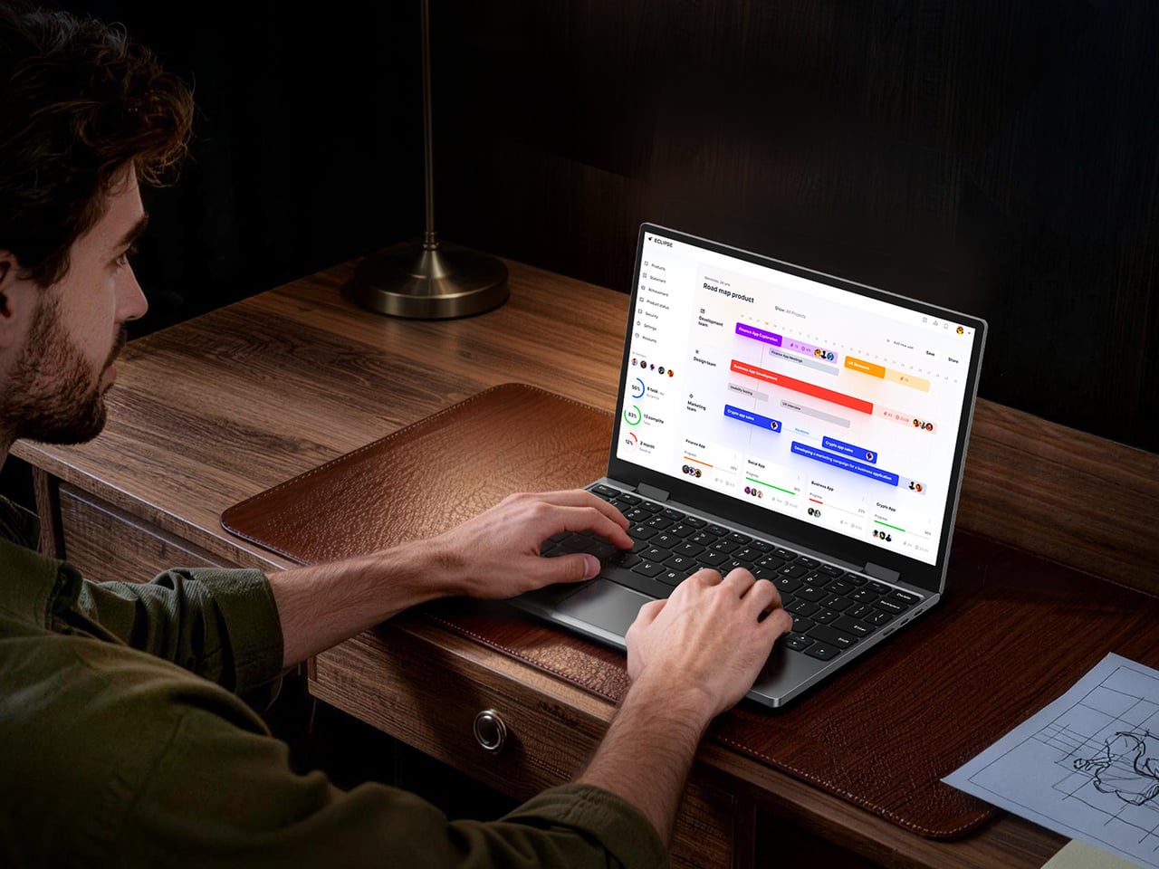
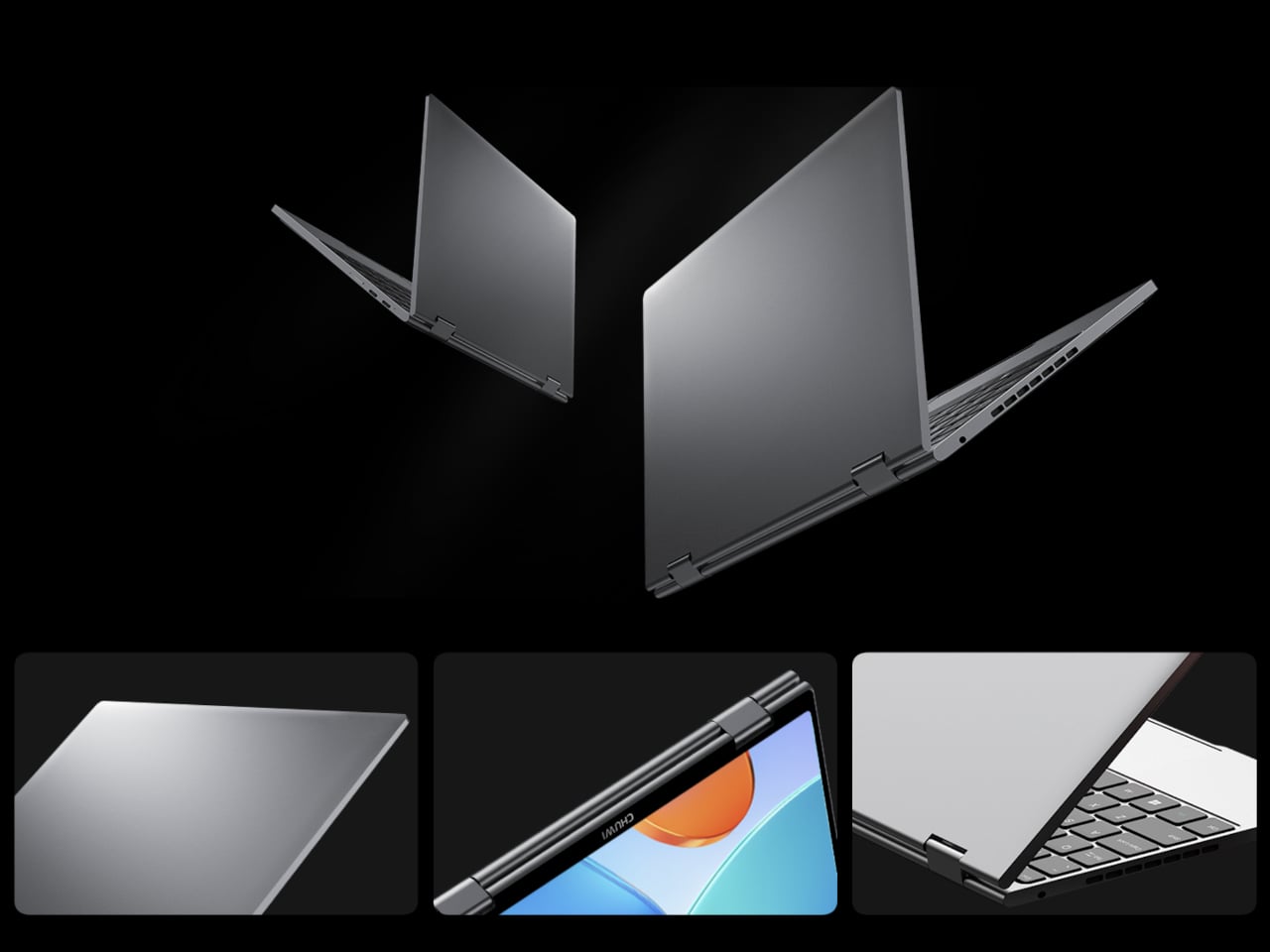
The Chuwi MiniBook X U300 addresses that by pairing the same compact, 360-degree convertible format with Intel’s U300 processor, a 13th-generation Raptor Lake chip with five cores and a dedicated performance core at its center. That shift from the pure efficiency cores found in N100 and N150 machines delivers stronger single-core speed and better multitasking headroom, without meaningfully adding to the machine’s size, weight, or thermal footprint.

Designer: Chuwi

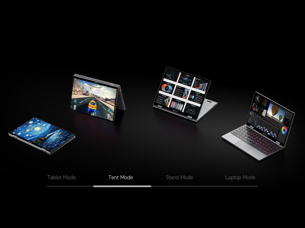
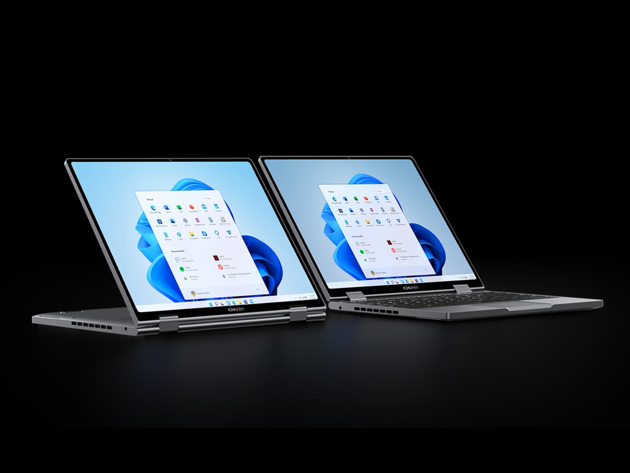
The 10.51-inch WUXGA display packs a 1920×1200 resolution into the compact chassis, with a 16:10 aspect ratio and 100% sRGB coverage. At 300 nits, it handles well-lit rooms comfortably and stays readable during extended sessions. The in-cell IPS touchscreen sits behind ultra-thin bezels, and the 360-degree hinge lets it shift between laptop, tablet, tent, and stand modes to suit whatever task is on the table.

That four-mode flexibility is where the touchscreen earns its keep most convincingly. In tablet mode, the screen becomes the only interface you need, making it natural for note-taking on the go. Flip it back partway for tent or stand mode during a presentation, and it becomes a display you can position toward an audience without spinning a full laptop around.

16GB of LPDDR4X memory and a 512GB PCIe SSD handle everyday tasks without hesitation, and the M.2 slot accepts PCIe 4.0 and SATA III drives if you decide to upgrade later. The Intel UHD Graphics runs 48 execution units, double the count found in earlier MiniBook X versions, which makes a noticeable difference for smooth 4K video playback and lighter creative workloads without switching to a dedicated card, or at least on paper.

Both USB-C ports are full-featured, handling charging, data transfer, and external display output from the same two connections. Unfortunately, there’s no mention of Thunderbolt compliance. A 3.5mm audio jack covers wired headphones, Wi-Fi 6 and Bluetooth 5.2 take care of wireless, and an active cooling system keeps temperatures under sustained loads without causing distracting fan noise. A 2MP front-facing webcam handles video calls, which is about what you’d expect from a machine this compact.

Unlike earlier MiniBook X models that shipped with Windows 11 Home, the U300 version comes pre-installed with Windows 11 Pro. That’s not a minor footnote: it means BitLocker encryption, remote desktop access, and other tools that the Home edition locks away are available right out of the box. For anyone who travels with sensitive documents or manages devices remotely, it’s a practical upgrade that earlier models didn’t include.

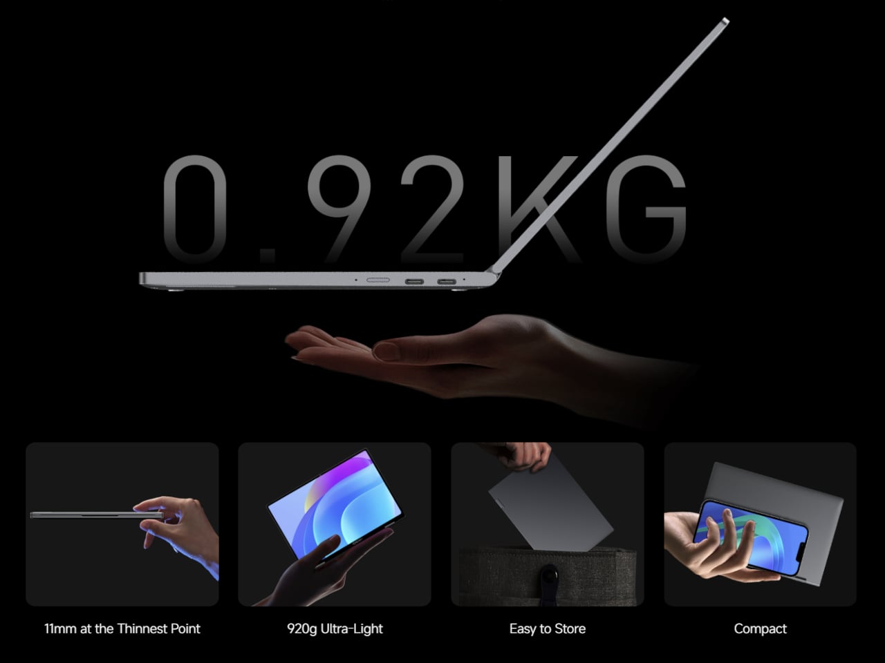
The whole package measures 244mm x 166.4mm x 17.2mm and tapers to 11mm at its thinnest, all wrapped in an aerospace-grade aluminum alloy unibody shell. At 920 grams, it disappears into a tote bag or slides under a seat without much thought. The 28.88 Wh battery charges at up to 36 W via USB-C, and the full-layout keyboard completes a package priced at $469.

The post Chuwi Just Put a Real Performance Chip in a $469 Tote-Bag Laptop first appeared on Yanko Design.
Khadas Just Made a $199 Amp That Snaps to Your iPhone Like a Wallet

Portable audio has long been a game of compromise. DAC dongles give you a modest step up from your phone’s built-in output, but connect anything more demanding than a pair of featherweight earbuds, and they start to run out of steam. Desktop amplifiers solve the power problem but chain you to a desk, a power outlet, and a bag heavy enough to make you think twice about bringing them anywhere.

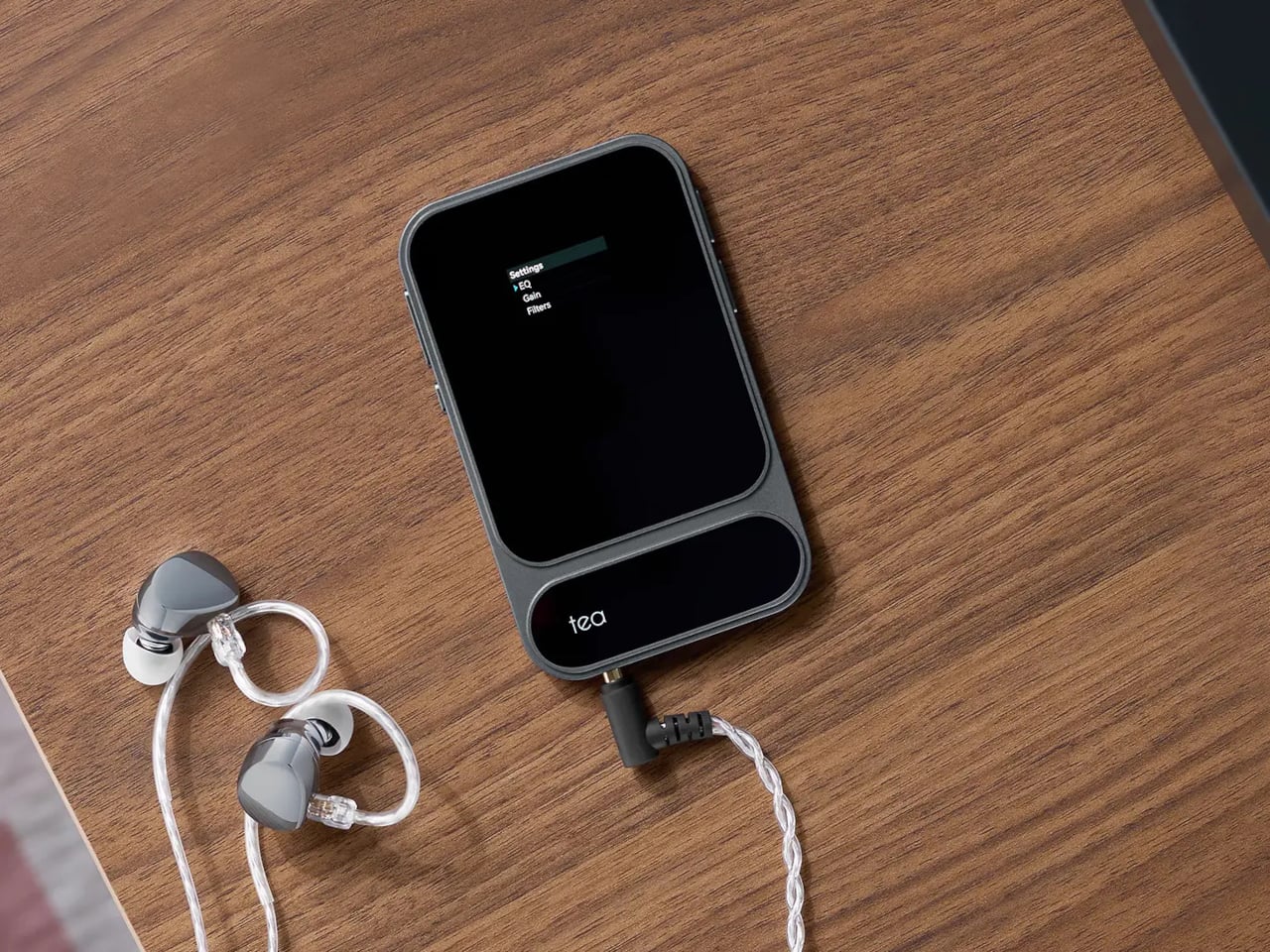
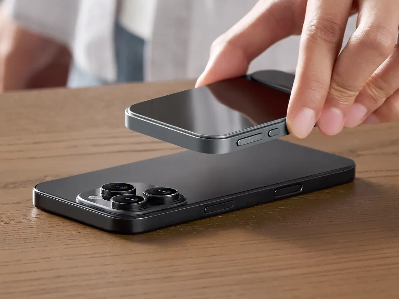
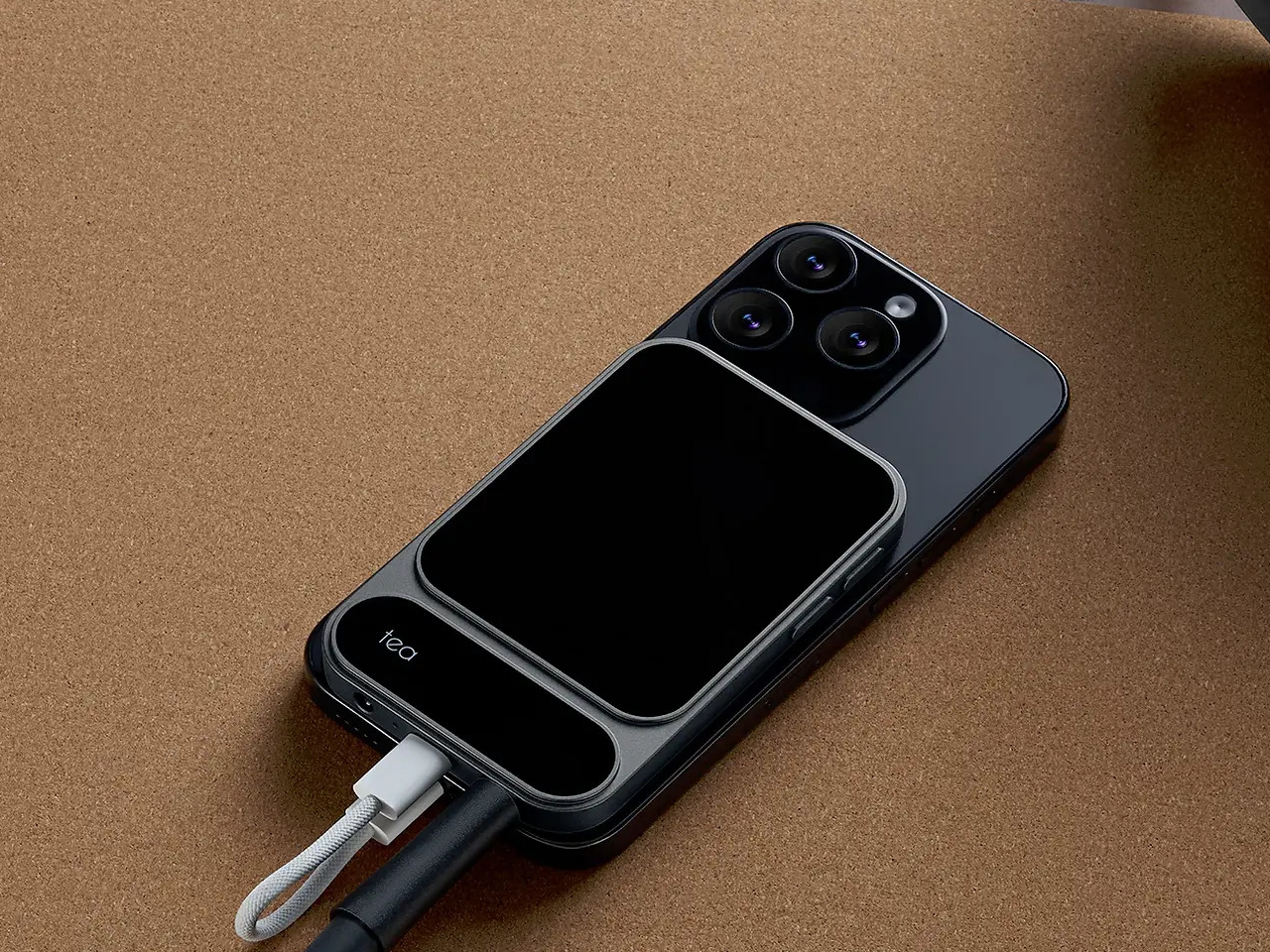
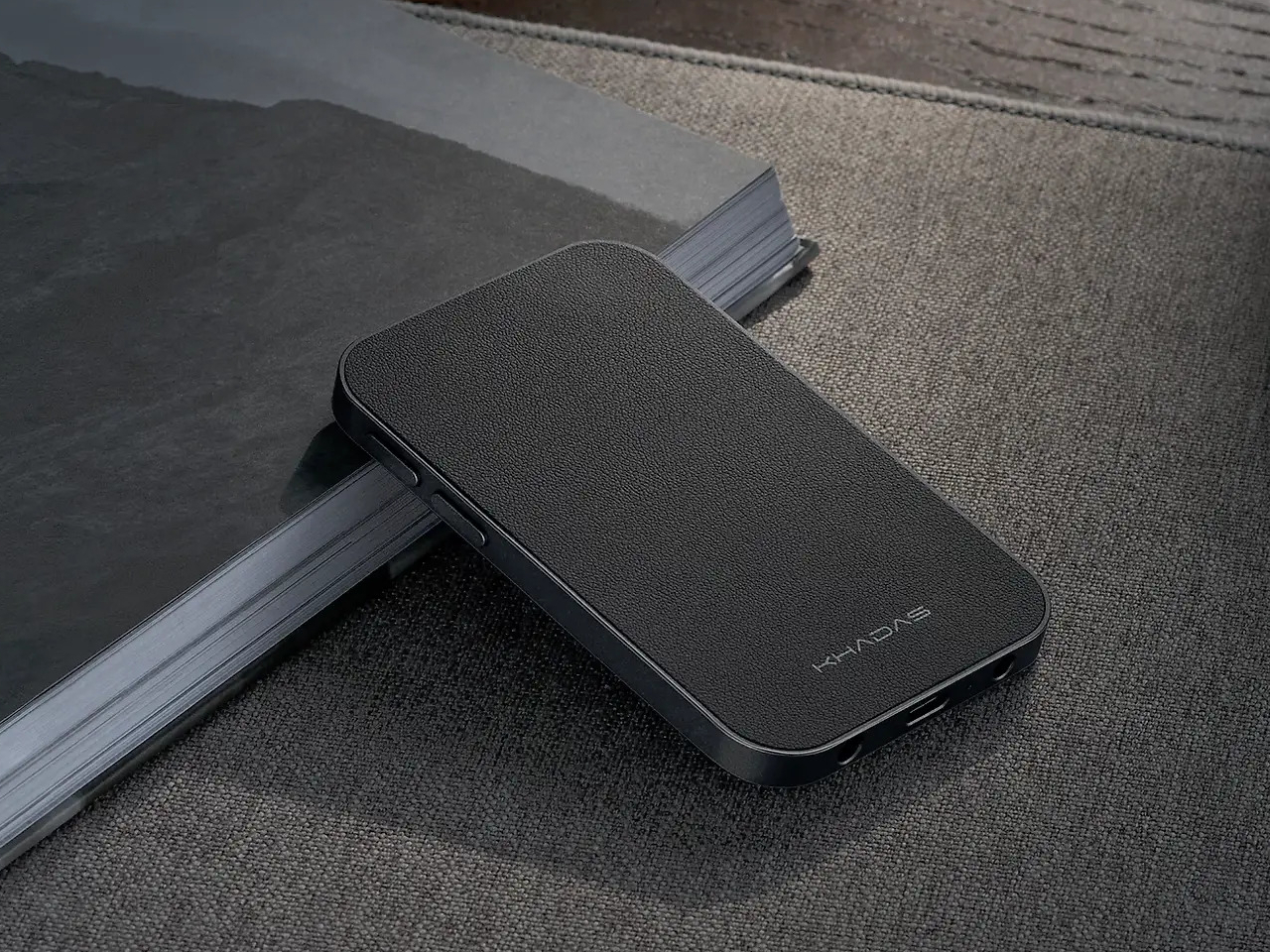
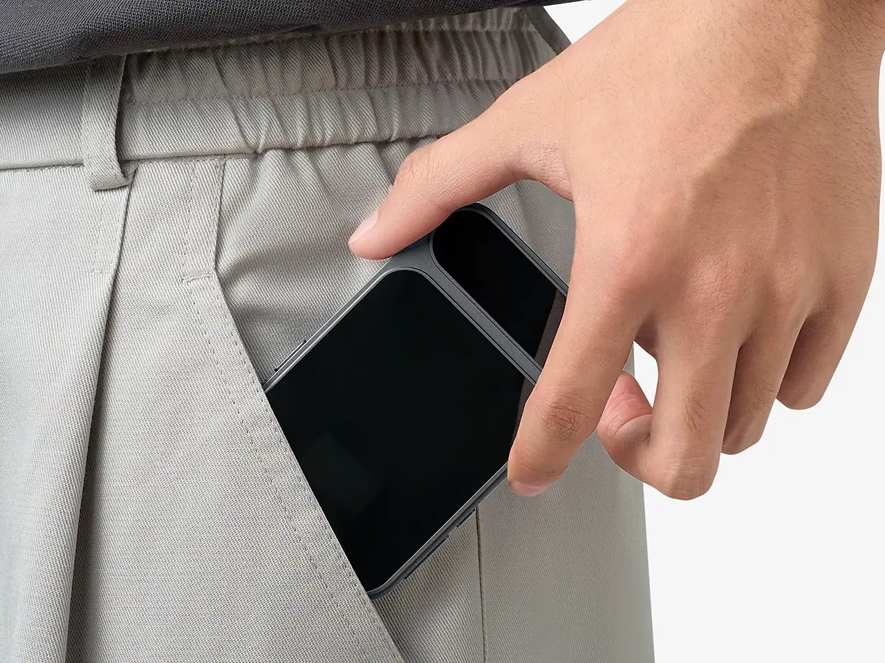
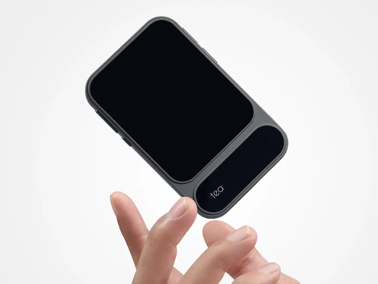
The Khadas Tea Pro sits firmly in the space between those two options, offering enough amplification for serious headphones without the bulk or the cable tangle. At 7.85 mm thin and 96 grams, it genuinely disappears into a pocket, and its magnetic back panel snaps directly onto any iPhone 12 or later, turning your phone and DAC into a single, tidy unit that doesn’t need a pouch of its own.

Designer: Khadas

The connection is handled by 19 N56SH magnets, holding the Tea Pro against the back of the phone without straps or brackets. Android users and those with older iPhones can attach a magnetic ring to their case and get the same result. A premium wear-resistant leather panel covers the back, giving the device a tactile quality that’s a step removed from the usual plastic-and-aluminum DAC dongle aesthetic.

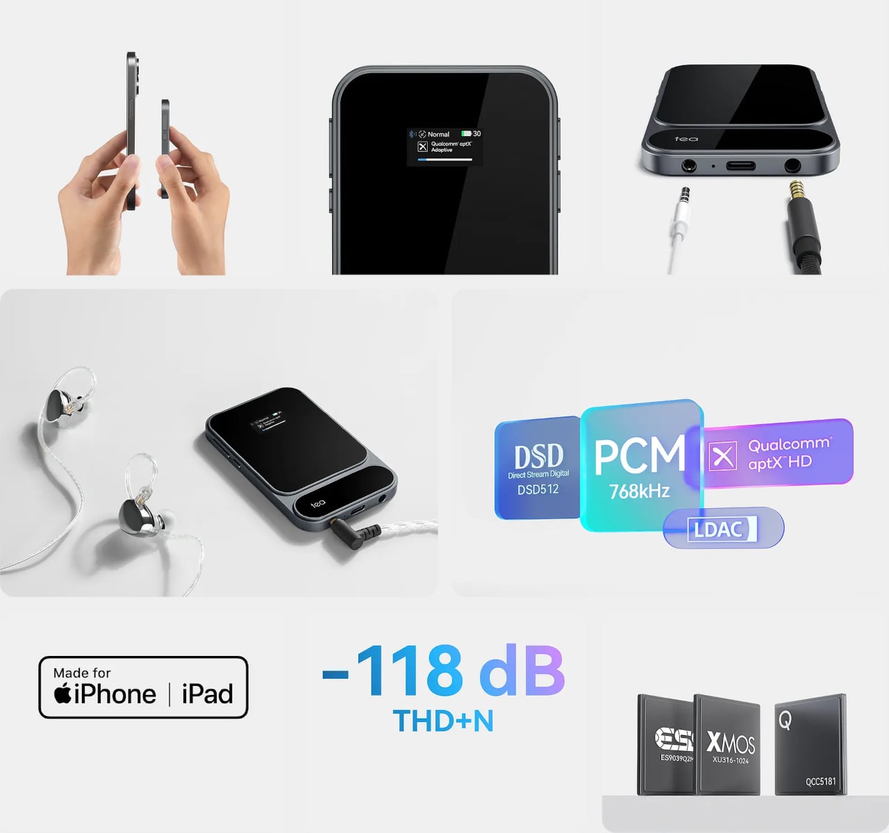
Inside, an ESS ES9039Q2M DAC chip works alongside an XMOS XU316 USB bridge for wired playback, delivering PCM up to 768kHz at 32-bit and DSD up to 512 native. The signal chain runs through TI OPA1612 op-amps and Ricore RT6863 amplifier chips, achieving a total harmonic distortion of -118 dB, a specification more at home in a studio rack than a 96-gram device that slips into a shirt pocket.

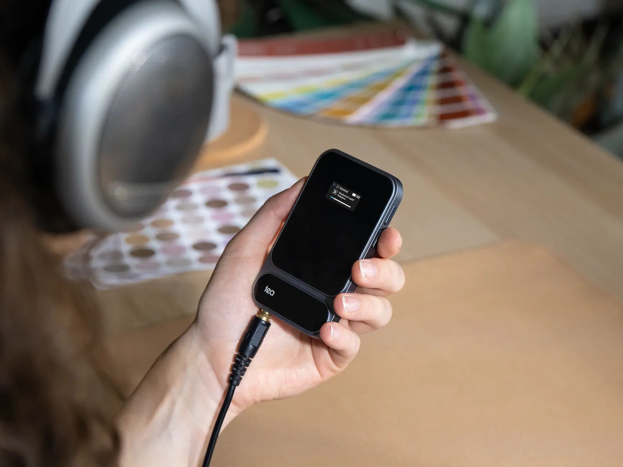
Both a 4.4mm balanced and a 3.5mm unbalanced output are on board, with the balanced jack putting out 165mW into 33 ohms and the unbalanced delivering 120mW. The Tea Pro also manages 41.67mW into 600 ohms, meaning even demanding full-size headphones with high impedance get a fully powered signal rather than an underpowered afterthought by a device that’s trying too hard to be small.

Wireless connectivity comes via a Qualcomm QCC5181 Bluetooth 5.4 chip that covers SBC, AAC, aptX, aptX Adaptive, aptX HD, and LDAC, keeping the Tea Pro compatible with virtually any device. The Khadas app adds a feature-rich equalizer that works over Bluetooth, letting you shape the sound to your taste without touching the hardware. There’s also a built-in microphone, so taking a call doesn’t require unplugging anything.

A 2100mAh battery supports up to 11 hours of wireless playback or just over eight hours wired, enough to outlast a full day of commuting without reaching for a charger. A 0.95-inch AMOLED color display on the front keeps output format, volume, and battery status visible at a glance, while independent power management keeps the battery from draining your phone when you aren’t connected to a power source.

Volume control runs through a dedicated analog chip rather than a software slider, keeping noise out of the signal path. The Tea Pro is priced at $199, which puts it well above the typical dongle but far below a battery-powered desktop DAC/amp that requires its own carrying case. For a device that fits in a jacket pocket and holds itself to the back of your phone, that’s a narrowing of the gap that’s hard to argue with.

The post Khadas Just Made a $199 Amp That Snaps to Your iPhone Like a Wallet first appeared on Yanko Design.
This $400 Tablet Comes With a Stylus, a Case, and Eyes That Don’t Hurt

Screen time on tablets has never been higher, but comfort hasn’t kept pace. Most tablet displays are still optimized for brightness and color gamut, with eye protection largely an afterthought or a toggle buried in settings. Reading long documents, annotating notes, or watching videos for hours on a typical panel can leave your eyes feeling the aftermath in ways that aren’t exactly encouraging.

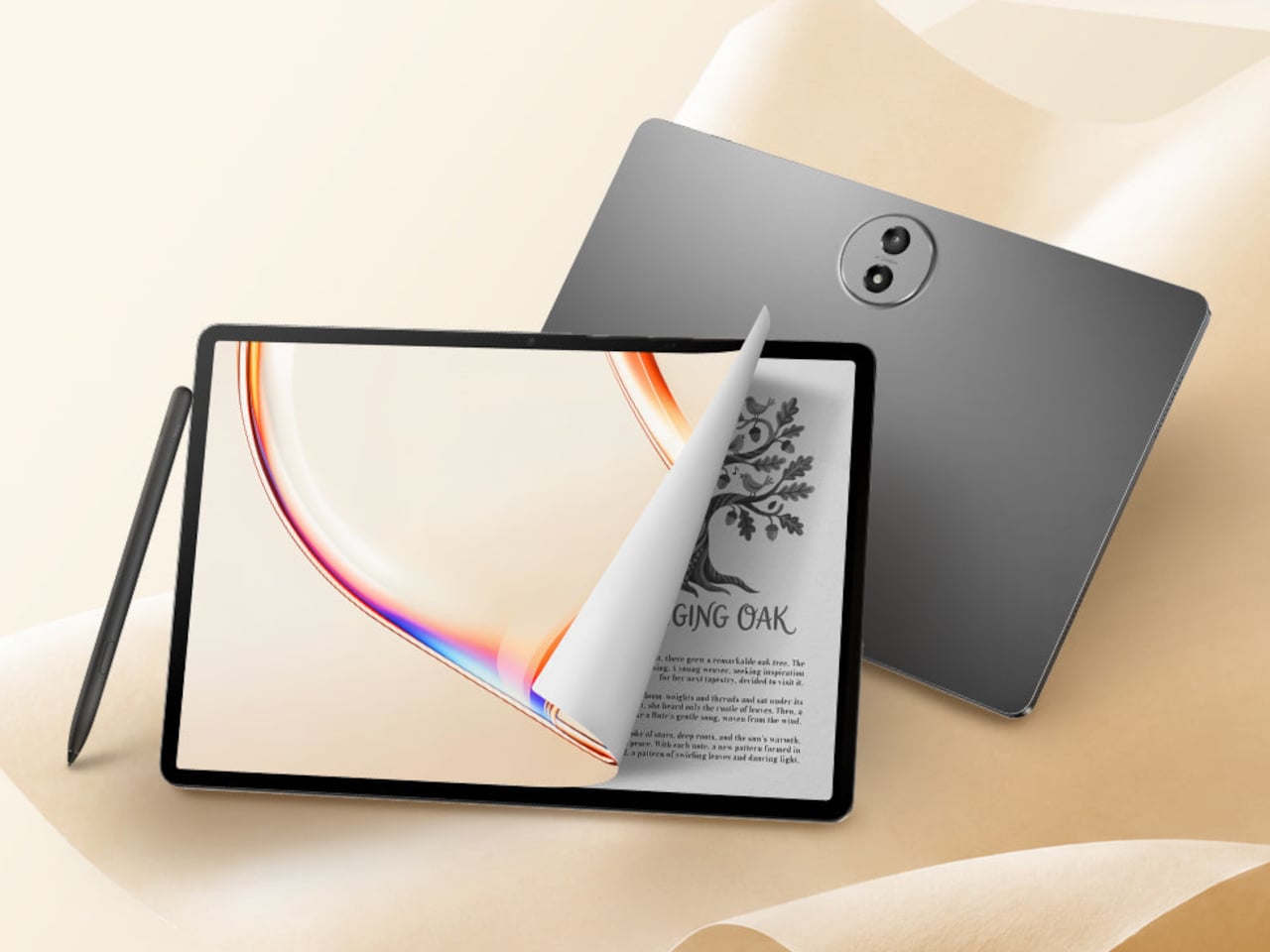
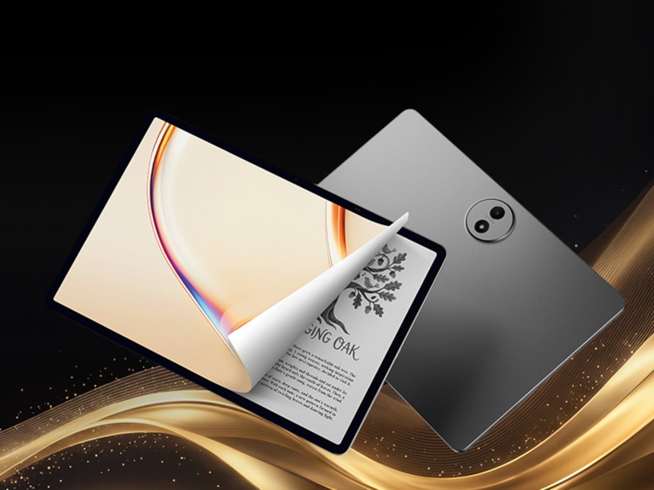
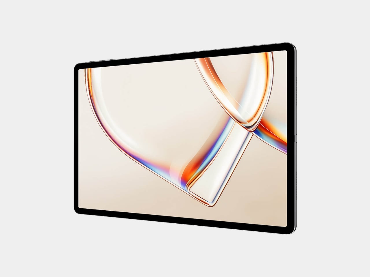
TCL’s TAB A1 Plus NXTPAPER approaches that problem with something more deliberate than a simple blue-light filter. Built around the brand’s fourth-generation NXTPAPER display technology, it brings a large 12.2-inch 2.4K panel that combines seven integrated eye-comfort technologies, including Nano Crystal Shield Glass and an OmniSoft Light System, to more closely replicate the gentler, less fatiguing qualities of reading on paper.

Designer: TCL

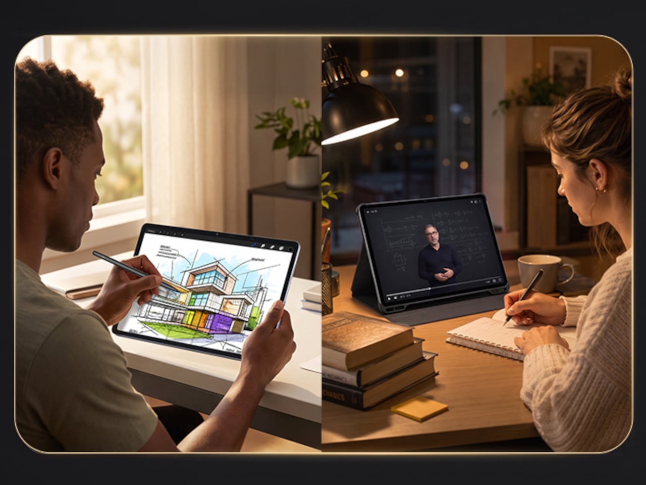
The aspect ratio is worth noting too. At 3:2, the screen is taller than typical tablets, which means more of a document or webpage fits on screen without endless scrolling. That might sound like a minor detail until you’re cross-referencing notes during a study session or keeping track of multiple open documents across a long work afternoon. The adaptive 120Hz refresh rate keeps every interaction smooth throughout.

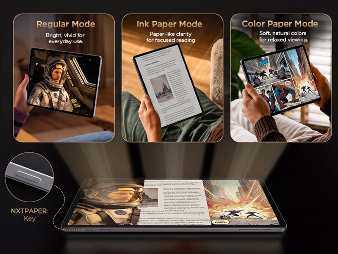
Switching between display modes is handled by the dedicated NXTPAPER Key, which cycles through paper-like and standard color modes without digging into settings menus. The 3-in-1 VersaView feature goes a step further, letting you pin specific apps to stay in full color while the rest of the interface remains in the easier-on-the-eyes paper mode. It’s a level of personalization that’s genuinely thoughtful.

NXTPAPER isn’t attempting to replicate E Ink or compete with dedicated e-readers on texture alone. It preserves the advantages of a conventional color display, including smooth video playback and vivid visuals, while adding the glare reduction and light softening that make extended reading sessions less punishing. The result is a screen that can move from a video stream to a study session without demanding any trade-off.

A suite of built-in AI tools handles the more tedious parts of daily work. Google Gemini and Circle to Search are onboard, alongside Writing Assist, Text Assist, a Smart Translator, and Smart Voice Memo. The tablet also runs Android 16 with Split Screen, Floating Windows, and Sidebar features built in, which means going from writing a draft to pulling research doesn’t require closing anything.

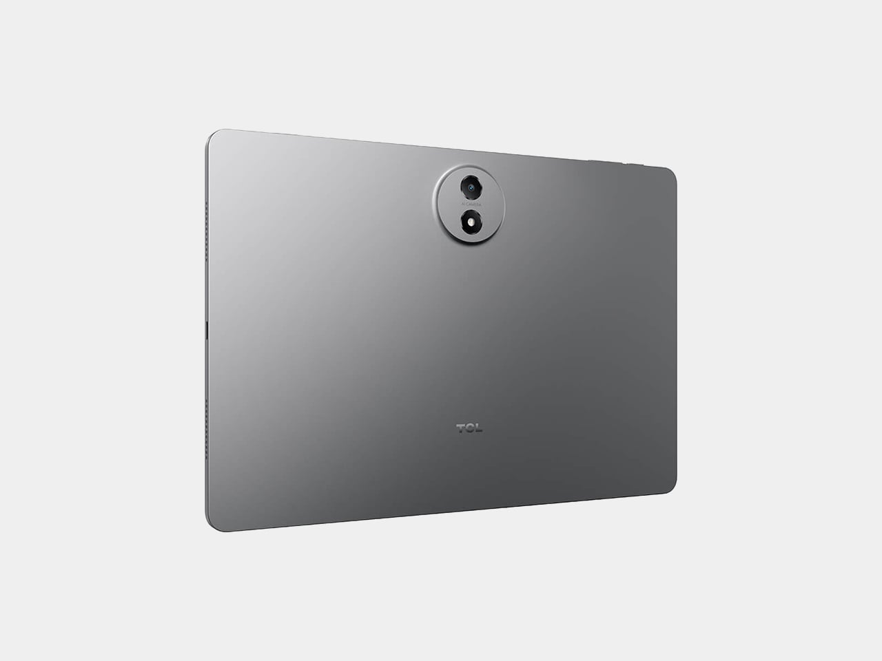
Under the hood, the Snapdragon 4 Gen 2 chip pairs with up to 16GB of RAM and 256GB of storage, expandable to 2TB via microSD. The 10,000mAh battery is large enough to carry through extended sessions without anxiety, and the 33W fast charging means a dead tablet doesn’t stay that way for long. The metal unibody keeps the whole package under 6.70mm thick.

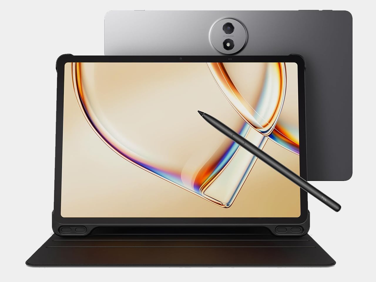
The IP54-rated splash and dust resistance is a practical safeguard for a device that moves with you, and the build weighs in at 556 g. It comes in Aerolite Grey, and the box includes the tablet, a stylus, and a flip case, making the $399.99 asking price a fairly well-rounded deal for a package that doesn’t require additional accessories just to get started.

The post This $400 Tablet Comes With a Stylus, a Case, and Eyes That Don’t Hurt first appeared on Yanko Design.

A $420 Phone Just Proved BlackBerry Fans Have Been Right All Along

Physical keyboard phones have been largely absent from the mainstream market for the better part of a decade. The touchscreen revolution swept them away so completely that finding a new phone with actual keys now means wading through a very short list of niche products. That’s fine for touchscreen loyalists, but for those who still swear by tactile typing, the options have been frustratingly limited.

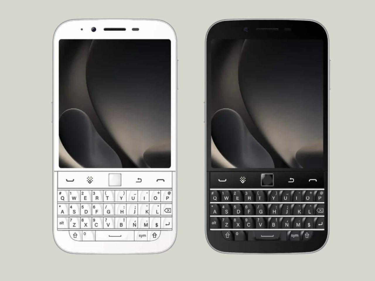
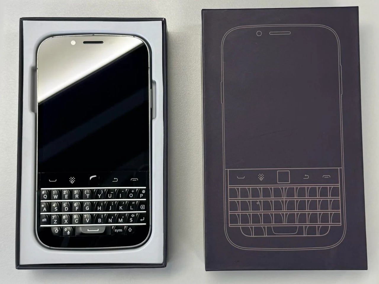
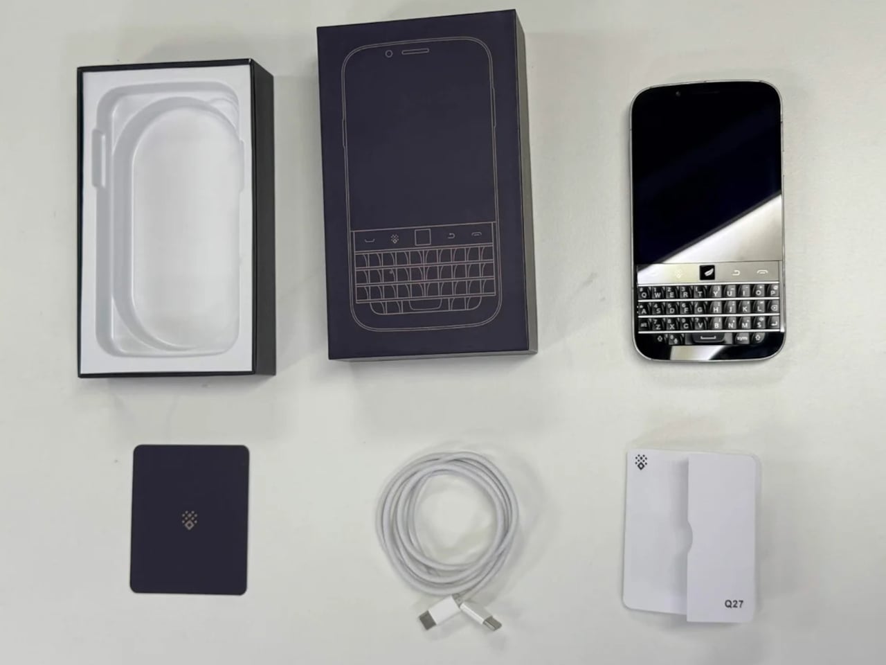
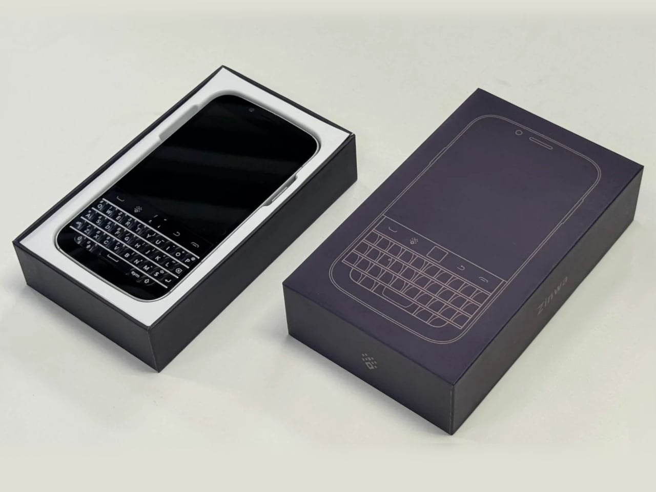
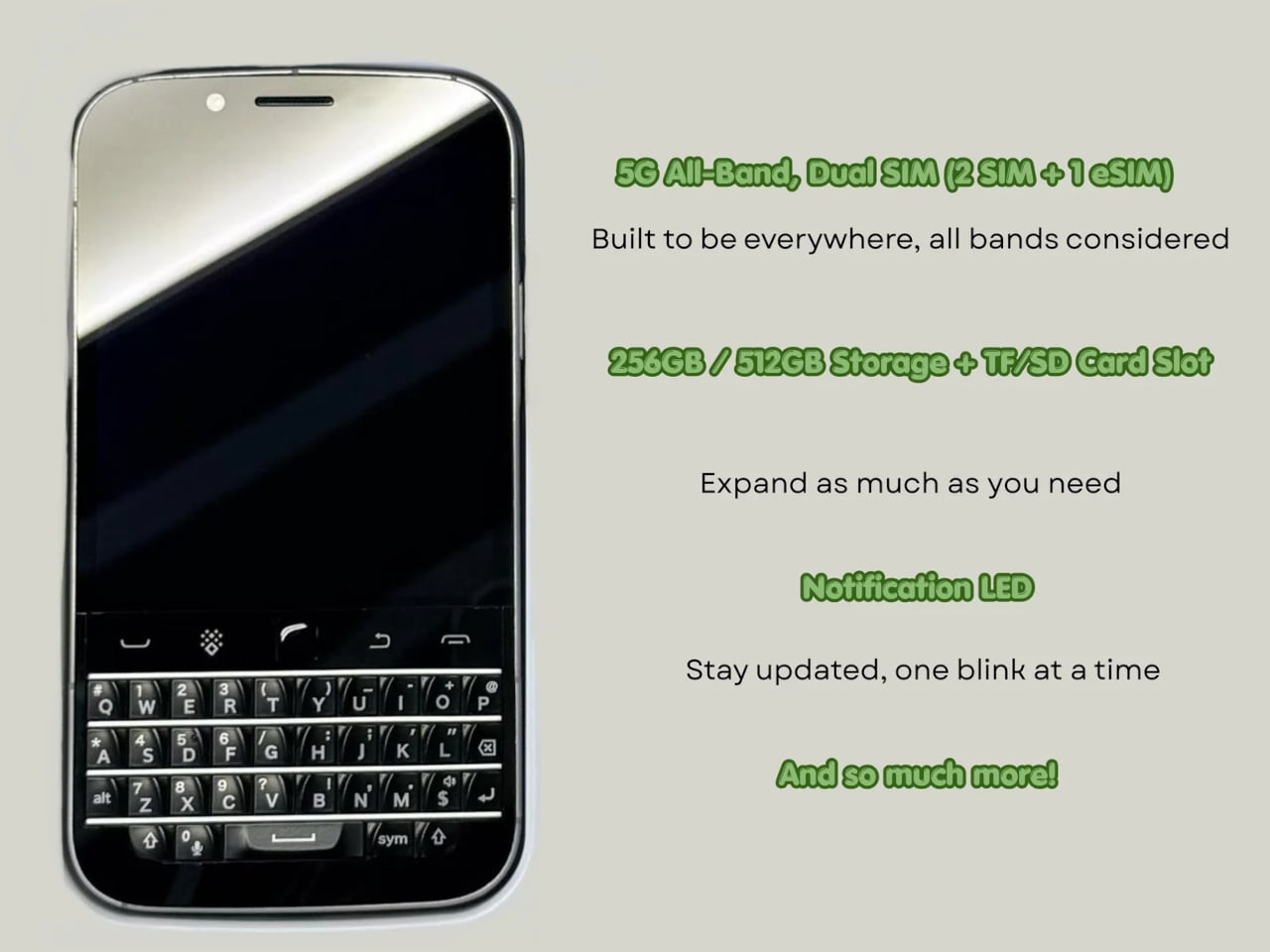
The Zinwa Q27 addresses that shortage head-on, arriving as a 5G Android smartphone built entirely from scratch with a physical QWERTY keyboard at its center. It isn’t a renovation of old hardware and doesn’t recycle any components from existing devices. The Q27 is an original design, and it channels the spirit of the BlackBerry Classic openly, as if daring you to forget how satisfying real keys felt.

Designer: Zinwa

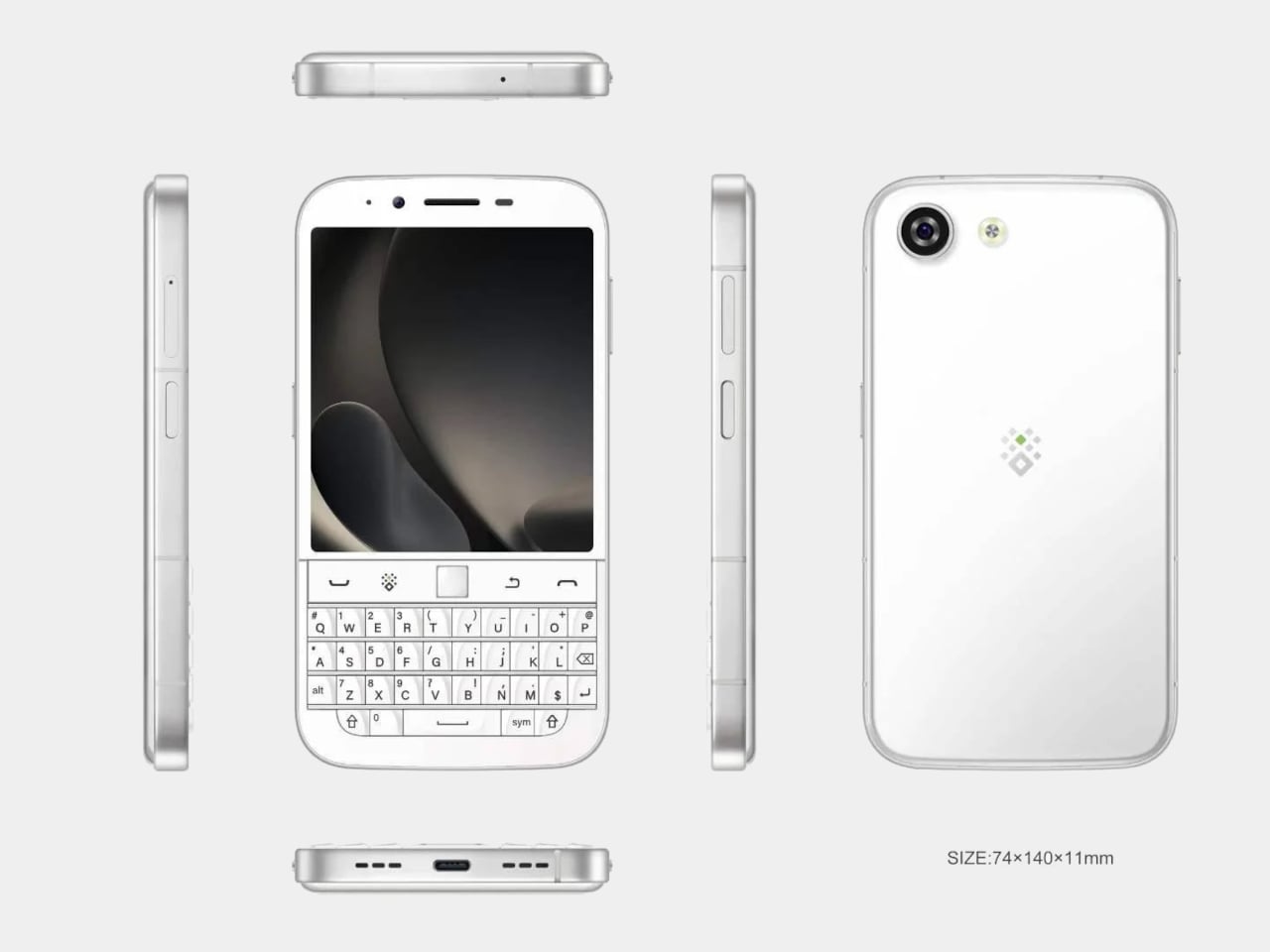
The layout places a 4-inch, 1080×1240 pixel AMOLED display above the thumb keyboard, keeping everything reachable in a single hand. At 140mm x 74mm x 11mm and 192 grams, the footprint is compact by today’s phablet-dominated standards. Anyone who once fired off emails on a BlackBerry will recognize this form factor instantly, and probably won’t need long to feel at home with it.

A MediaTek Dimensity 7300 chip and 12GB of RAM give the Q27 enough processing headroom for a full day of heavy multitasking. Storage options cover 256GB and 512GB, with microSD expansion available on both. It’s a configuration that suits the kind of user who lives in productivity apps, keeps a dozen conversations going at once, and can’t afford to babysit a slow phone between tasks.

Photography comes via a 50MP rear camera and a 16MP front-facing camera, while the 4,000mAh battery handles daily endurance with both 33W wired fast charging and 15W Qi wireless charging available. NFC, dual-SIM support alongside eSIM compatibility, and 5G connectivity round out the hardware, making the Q27 a surprisingly complete package for a phone designed to scratch such a specific itch.

Smaller details add to the overall impression. An X-axis linear motor delivers a crisper, more lateral haptic feel than the basic rumble of typical budget devices, while a dedicated notification LED and a Hi-Fi speaker bring back features that most modern phones quietly retired. There’s no headphone jack, which some will take issue with, but the USB Type-C port covers both charging and wired audio without trouble.

It ships with Android 16 and full Google Mobile Services, and comes in black or white, each unit with a pre-applied screen protector and protective case included. A charger isn’t in the box. Pricing starts at $420 for the 256 GB model and $480 for the 512 GB version, and because production will match pre-order quantity, there’s no confirmed ship date yet.

The Q27 also marks a shift in Zinwa’s approach. Previous models from the company involved transplanting modern internals into refurbished BlackBerry shells, but the Q27 is a wholly new design with no borrowed chassis. For a small outfit trying to keep the physical keyboard phone alive, that’s a significant step, and it shows the kind of commitment this particular corner of the market genuinely needs right now.

The post A $420 Phone Just Proved BlackBerry Fans Have Been Right All Along first appeared on Yanko Design.
A Designer Just Answered Facial Recognition With a Medieval Visor

Facial recognition has become one of the fastest-growing forms of infrastructure in public life. Cameras in airports, transit systems, retail spaces, and city streets capture biometric data routinely, often without the awareness of the people being scanned. The face has gradually become something closer to a credential, an identifier read by systems that process it instantly against databases that are constantly growing.

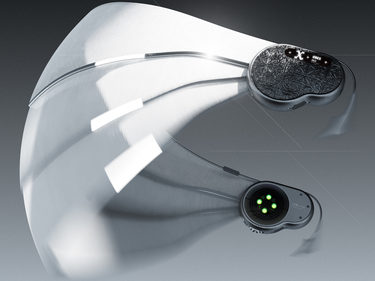
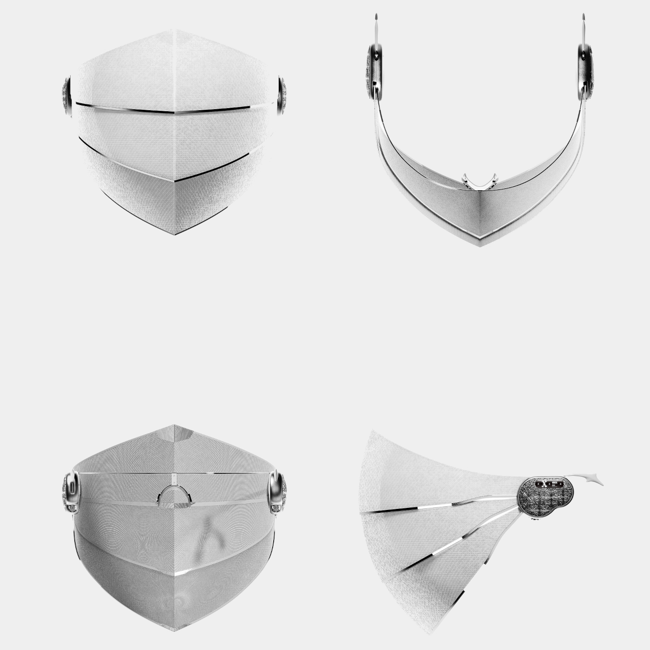
OBEX is a conceptual wearable that treats this shift as a design problem worth addressing through physical form. Rather than responding to surveillance with software or policy, it proposes a new category called “privacy armor,” a tangible boundary between the wearer and systems of biometric recognition. Its form language doesn’t come from consumer electronics but from something much older, the medieval visor.

Designer: Haechan Ryu

In medieval warfare, a knight’s visor concealed identity while creating distance between the person and the world beyond the armor. The logic behind OBEX borrows that idea and applies it to a different kind of threat, one that’s less physical and more informational. As surveillance systems continuously collect and analyze biometric data, the face becomes a vulnerable interface, and OBEX imagines what it would mean to shield it.

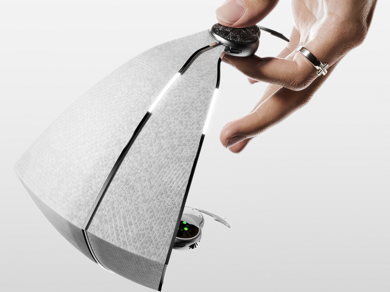
The visor itself is made from a micro-perforated optical film that allows the wearer to see out clearly while appearing opaque from the outside. It’s a deliberate asymmetry, the kind that surveillance systems rely on, reversed and put in the hands of the individual. The shielding motion references the sliding visors of historical armor, and the weight distribution is engineered to reduce strain across the head during long wear.

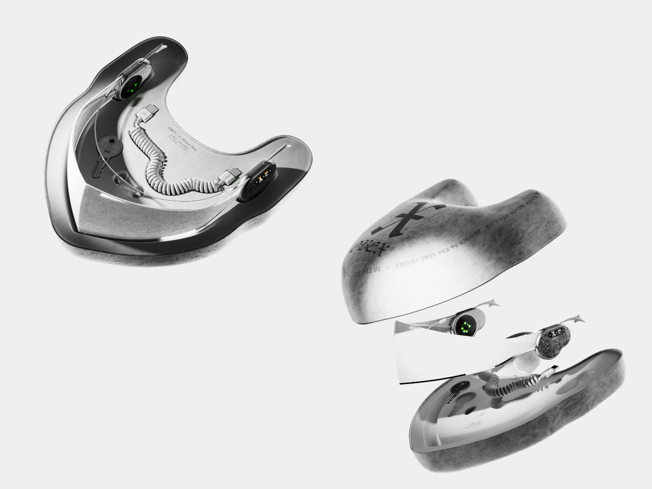
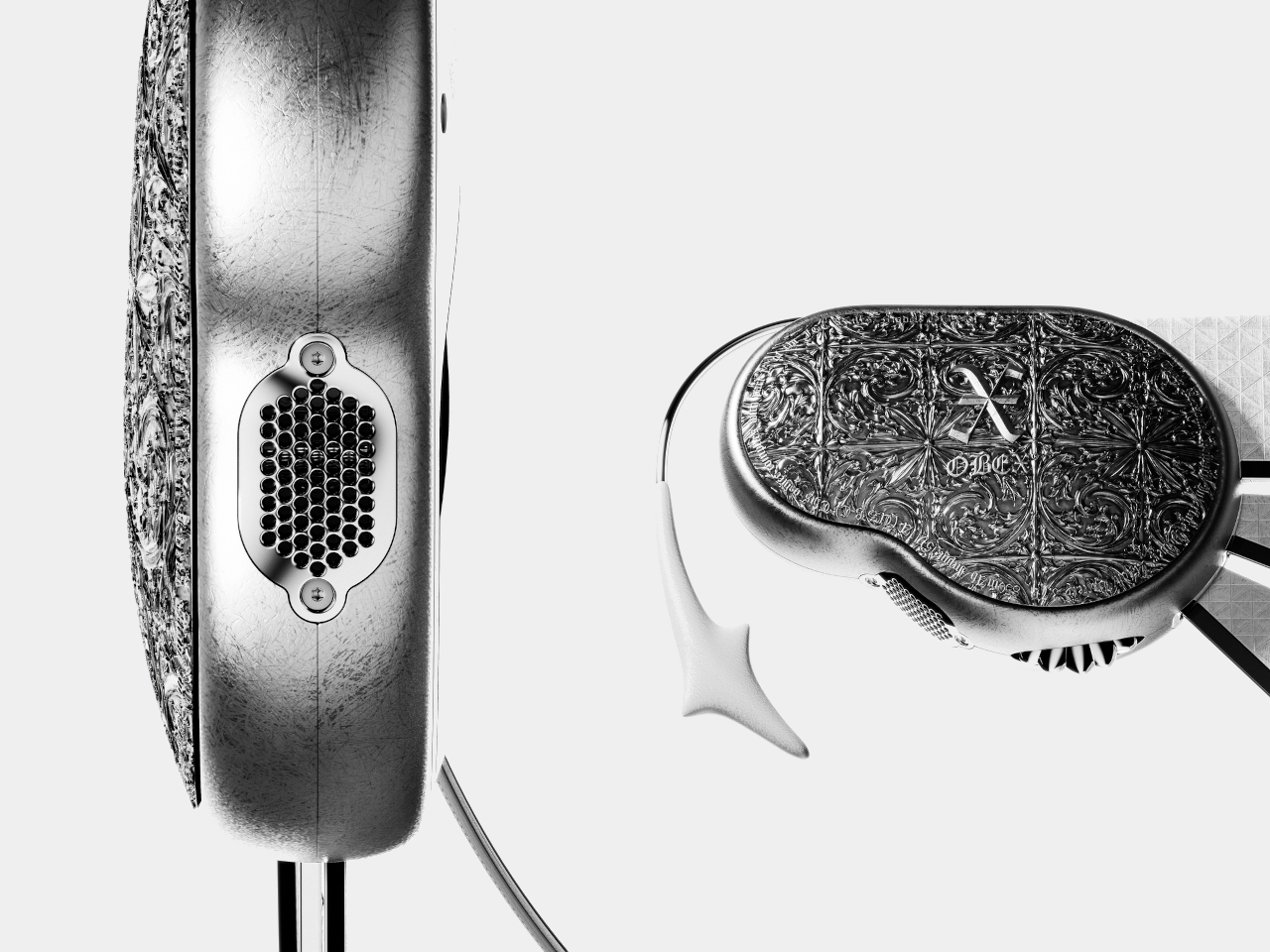
The temple module anchors the visor to the head and holds most of the active technology. Embedded PPG sensors monitor physiological data in real time, enabling continuous biometric monitoring through the wearer’s own biological signature. Dual directional speakers deliver audio feedback without cutting the wearer off from surrounding sounds, and a small bitmap display on the side communicates system status and shield activation modes at a glance.

The frame is precision-engineered titanium, chosen for its balance of strength and low weight. The outer surface carries a refined micro-texture that improves grip while minimizing visible wear over time. The ornamental detailing on the temple module draws from the craftsmanship traditions of medieval armor, with intricate surface patterns that make the component read more as a personal artifact than as a piece of hardware.

OBEX isn’t proposing that everyone should walk around in a visor. It’s asking what protection means when the thing being protected isn’t the body but the face’s function as an identity signal. The concept sits at the edge of speculative design and industrial practice, using grounded materials and structural logic to imagine an object that doesn’t quite exist yet, but one that feels increasingly necessary.

The post A Designer Just Answered Facial Recognition With a Medieval Visor first appeared on Yanko Design.
Tablets Sound Bad, So Motorola Just Put 9 JBL Speakers in One

Entertainment tablets have come a long way in terms of screen quality, but audio often tells a different story. Most of them ship with a pair of speakers that merely get the job done, leaving users reaching for headphones or a separate Bluetooth speaker the moment things need to get louder. The gap between how tablets look and how they actually sound has never been more apparent.

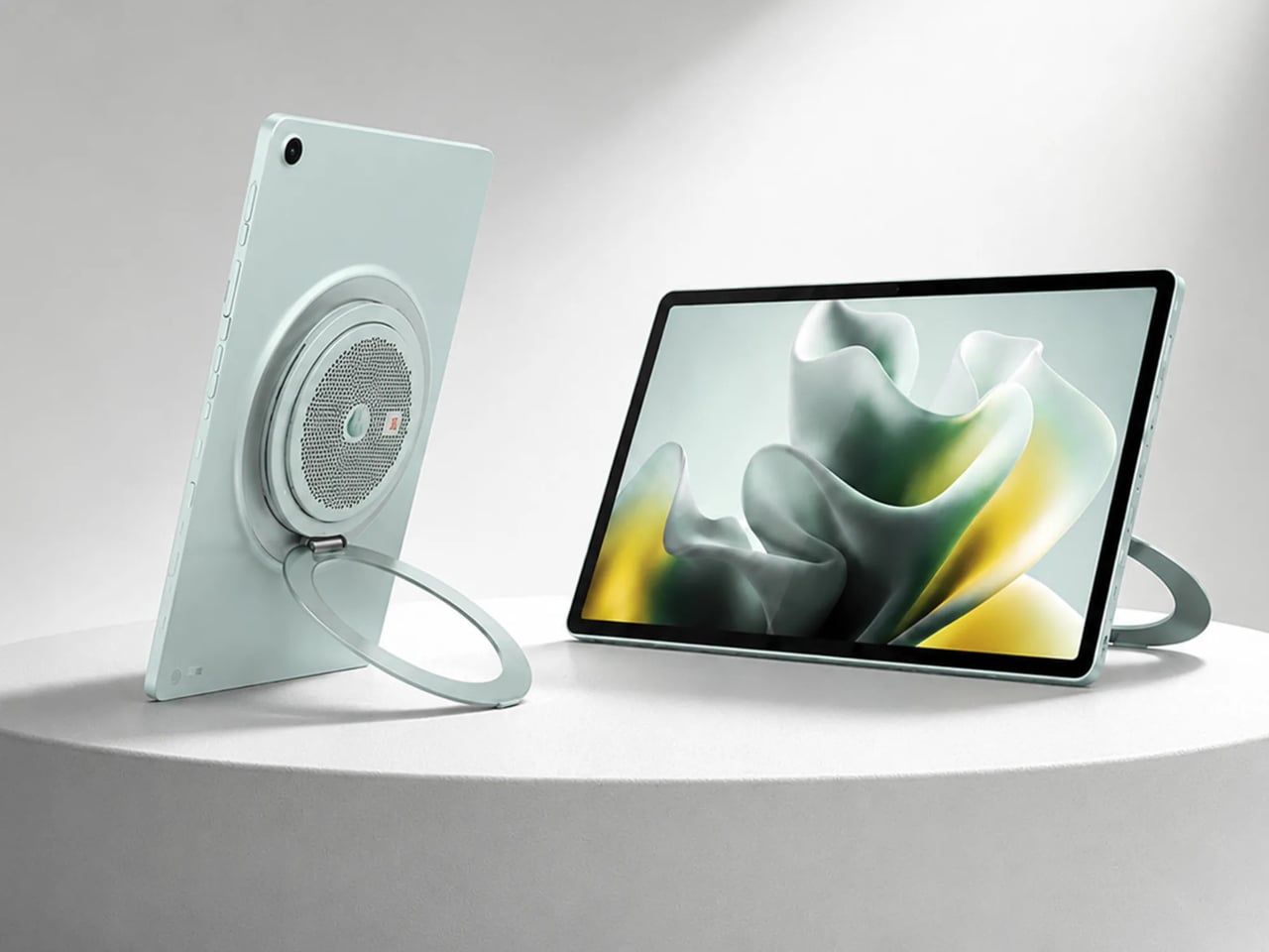
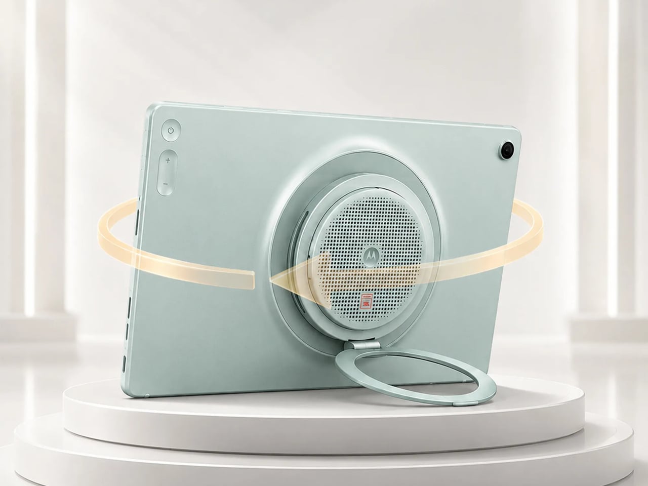
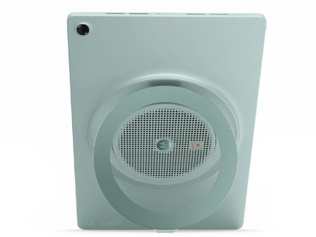
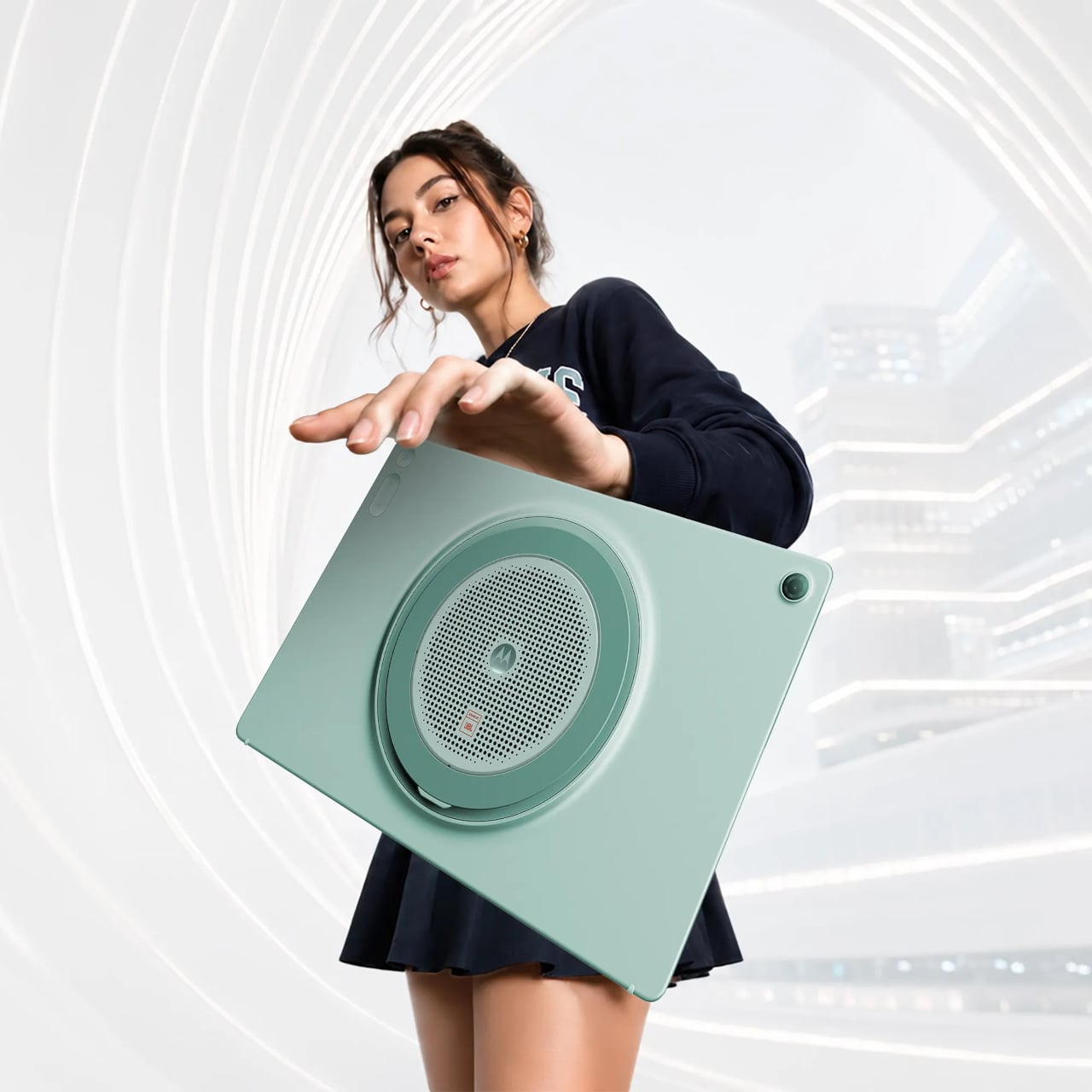
The Motorola Moto Pad 70 Groove is built around a premise that most tablets don’t dare fully commit to: making audio the centerpiece, not an afterthought. It arrives loaded with a nine-unit JBL Pro speaker system, a 12.1-inch 2.5K display, and a 360-degree built-in kickstand, addressing the kind of everyday entertainment scenarios where a standard tablet simply wouldn’t be enough.

Designer: Motorola

The display is well suited for this audio-first identity. The 12.1-inch IPS LCD panel runs at 120 Hz with a 2560×1600 resolution, HDR10 and Dolby Vision certification, and a peak brightness of 800 nits. It’s a smooth, vivid canvas for streaming content, though the real draw is what’s happening on the edges of that screen, where all those speakers live.

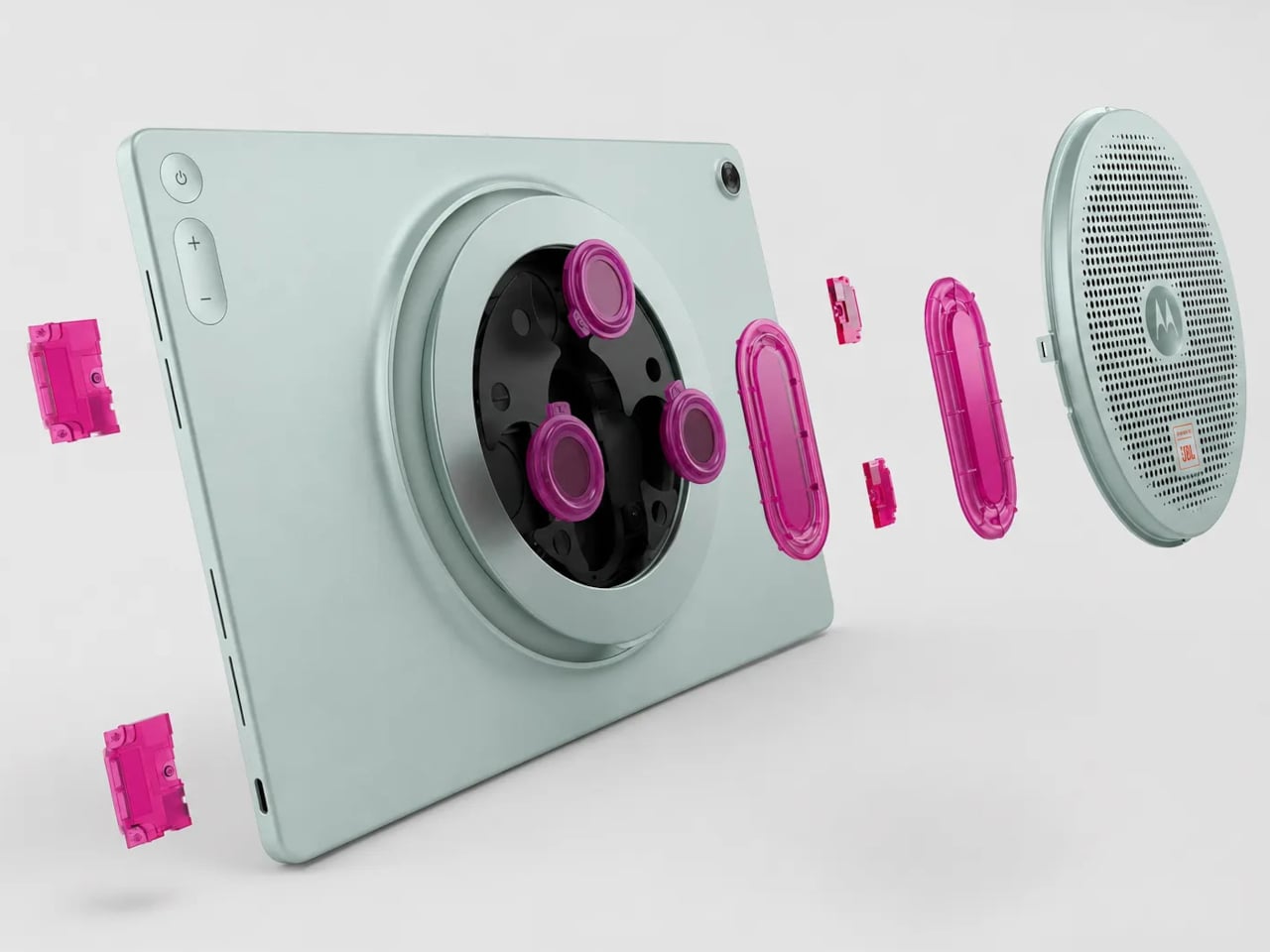
Nine speakers sound like a gimmick until you see what they’re actually made of: four tweeters, three woofers, and two passive radiators, all tuned by JBL and backed by Dolby Atmos. Together, they’re rated to push up to 48W of audio output, which is a lot to ask from a tablet-sized device. It’s the kind of setup that makes you rethink whether you actually need a separate soundbar.

What makes the audio system more interesting is the built-in Bluetooth speaker mode, which turns the Groove into a standalone speaker your phone can control wirelessly. It’s a clever trick for situations where you want music filling a kitchen or a living room during a gathering, without having to keep the tablet actively streaming the content. Dolby Audio further adds Dynamic, Movie, and Music modes for more tailored listening.

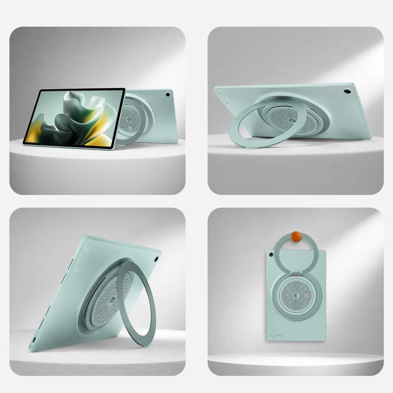
The 360° Kickstand 2.0 adds another layer of flexibility. It supports four positions named Lean, Stand, Theatre, and Hanging, each suited for a different viewing situation. Prop it up on a desk for a video call, tilt it back for a movie in bed, or hang it from a hook when counter space runs out. It’s a practical piece of engineering that doesn’t feel like an afterthought.

Under the hood, a MediaTek Dimensity 7400 chip handles daily tasks alongside 8GB of RAM and 256GB of storage. The 10,200mAh battery keeps extended streaming sessions going, and the 45W TurboPower charging keeps downtime short. The all-metal body in Pantone Blue Surf measures 6.8 mm at its thinnest, though the speaker array at the back raises that to 22.7 mm, creating a distinctive ridge. The Groove ships with Android 16 and Google Gemini out of the box, with Motorola committing to updates through Android 18 and security patches through 2030.

The post Tablets Sound Bad, So Motorola Just Put 9 JBL Speakers in One first appeared on Yanko Design.
Forget Tracking Kids After School, This Cute Device Lets Them Check In

Working parents of school-age children face a particular kind of worry during the hours between the end of the school day and the end of the workday. Phone calls get missed, text messages go unread, and the ones that do get through usually carry just enough information to confirm a child made it home. What they rarely carry is any sense of how the child is actually doing, and that gap tends to get filled with parental anxiety rather than reassurance.

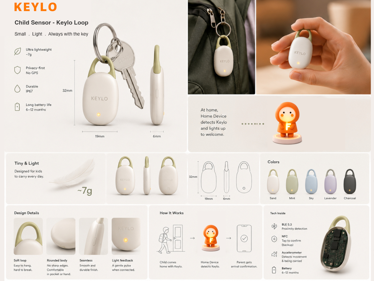
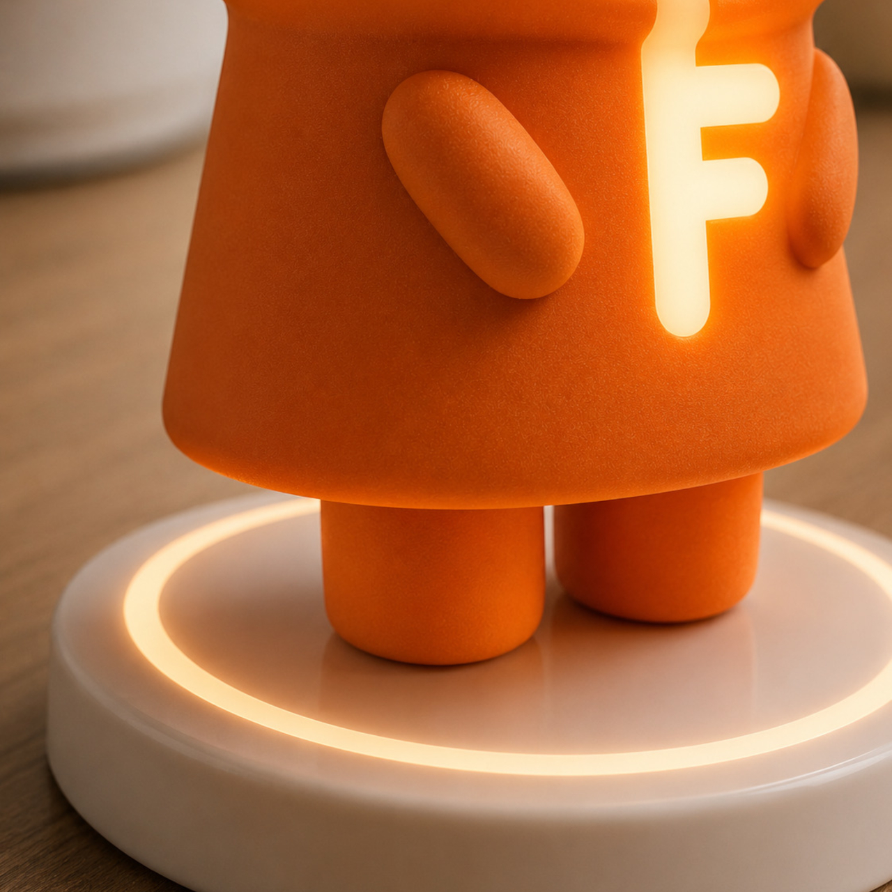
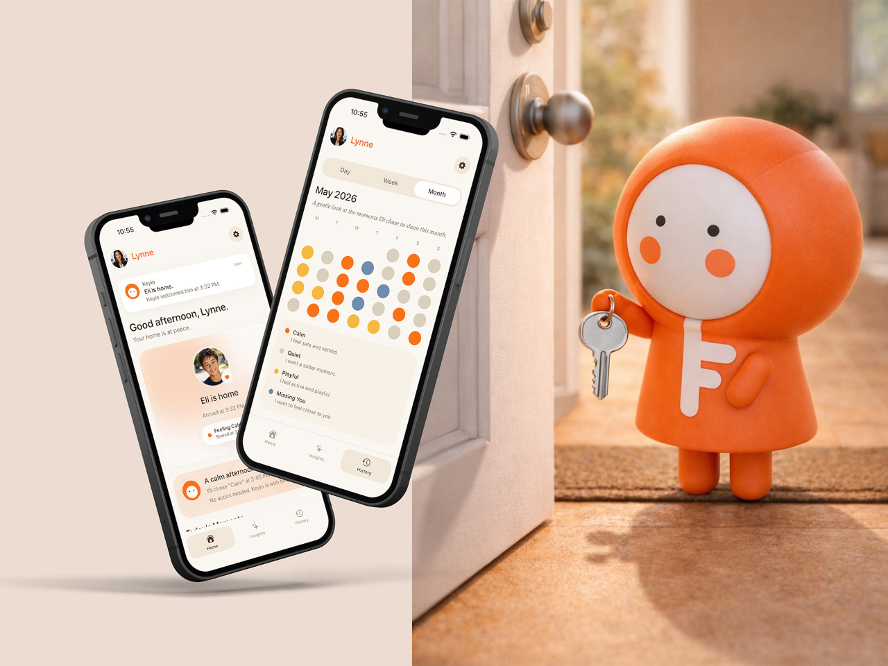
Keylo is a conceptual companion device designed around that specific gap. Rather than giving children another screen to manage or another app to navigate, it offers a single, tactile interaction: a tap that lets them express how they’re feeling. No typing, no calling, no notification chain. The child touches the device, cycles through a color to represent their emotional state, and the parent’s app receives it.

Designer: Miaonan Li

The system consists of three physical parts. The main companion unit sits on a home dock, usually somewhere a child passes when they get home. A smaller key fob clips to a backpack and travels with the child throughout the day. Both are made from soft matte silicone and deliberately avoid any screen or complex interface, giving the object a quality that’s closer to a familiar household item than a piece of consumer electronics.

The four emotional states Keylo recognizes are kept intentionally broad. A soft orange glow indicates the child feels relaxed; bright yellow signals something more playful or energetic; a neutral white tone signals a preference for quiet or personal space; and a calm blue light carries a specific message from child to parent: I’m thinking of you. Each one is simple enough for a young child to understand and expressive enough to actually mean something when it arrives on a parent’s phone.

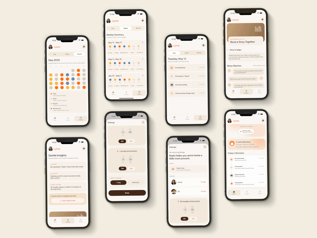
That arrival is handled by the companion app, which mirrors the same color language as the physical device. The distinction the project draws between this and conventional parental monitoring is deliberate. Rather than showing parents a location, a screen time report, or a camera feed, the app delivers a single emotional moment. A notification that says a child is feeling calm and playful carries a different quality of information than a location ping, and it asks for a different kind of response.

The device is designed to work without any input from the child beyond that single tap. There are no prompts to answer, no questions to read, and no follow-up required. For a child who has just walked in the door after school, the low threshold is significant; the gesture stays small enough that it doesn’t feel like a chore, which is probably the main reason most family communication apps get abandoned within a few weeks of being set up.

What Keylo explores through its design is how much emotional information can be conveyed through the simplest possible interaction. A color chosen by a child carries less data than a voice call but far more than no contact at all, and it arrives without interrupting anyone’s afternoon in the way a ringing phone does. The project makes a case for the idea that the volume of communication matters less than whether it happens at all, and on terms that feel natural to the person sending it.

The post Forget Tracking Kids After School, This Cute Device Lets Them Check In first appeared on Yanko Design.

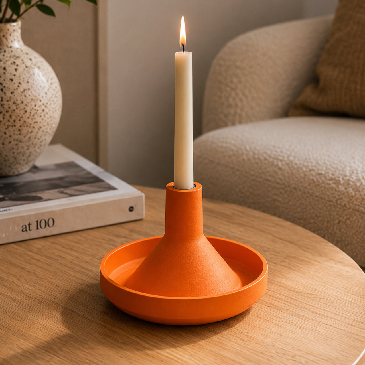
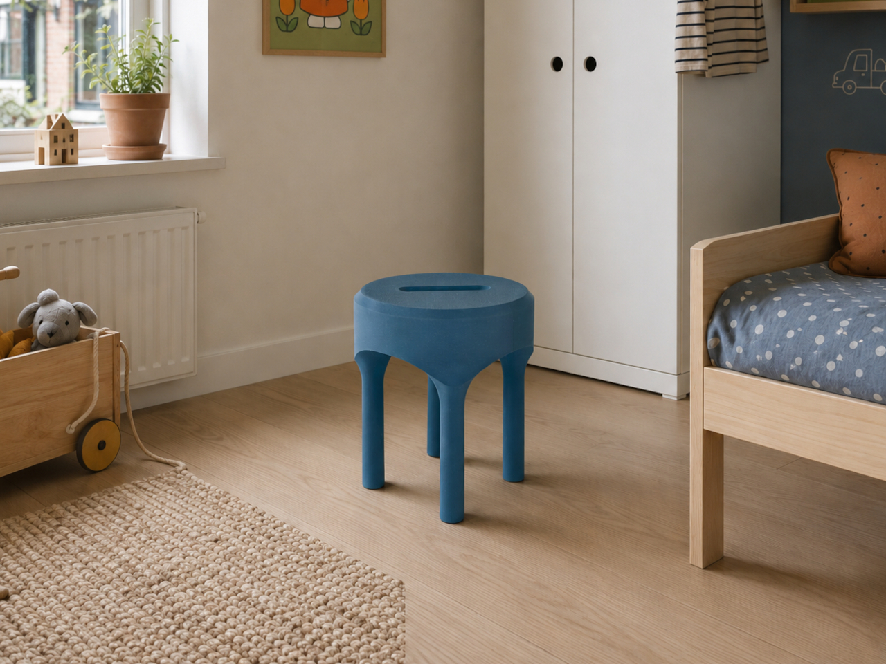
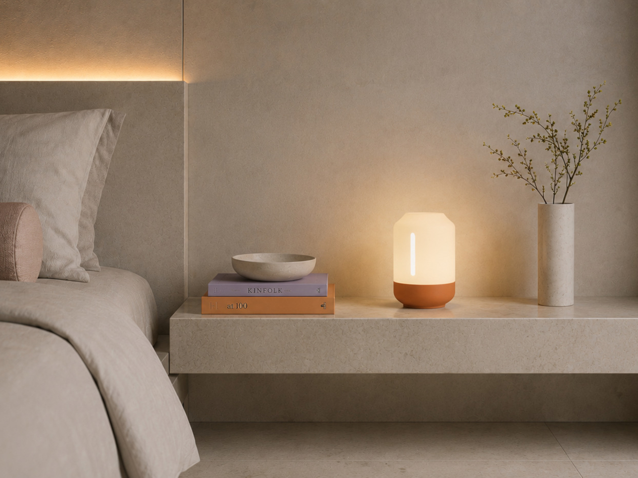
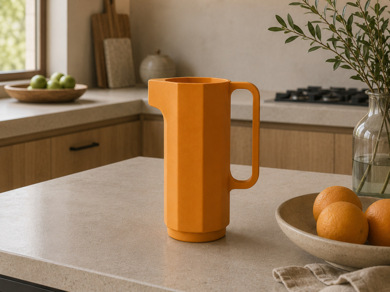
Artefilo Makes Home Objects From Elephant Grass and Hospital Cabinets

The sustainable home goods market has a specific credibility problem. Products marketed as eco-conscious often get there through incremental adjustments, reducing a percentage of virgin plastic, switching to a recyclable box, or sourcing from a slightly shorter supply chain. The result is a kind of sustainability theater that satisfies certification requirements without fundamentally changing either what objects are made from or how they find their way into a home.
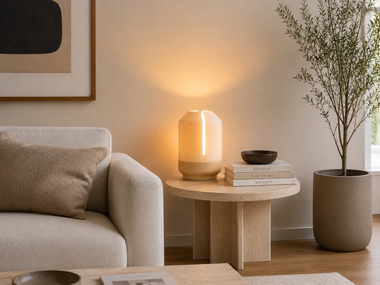
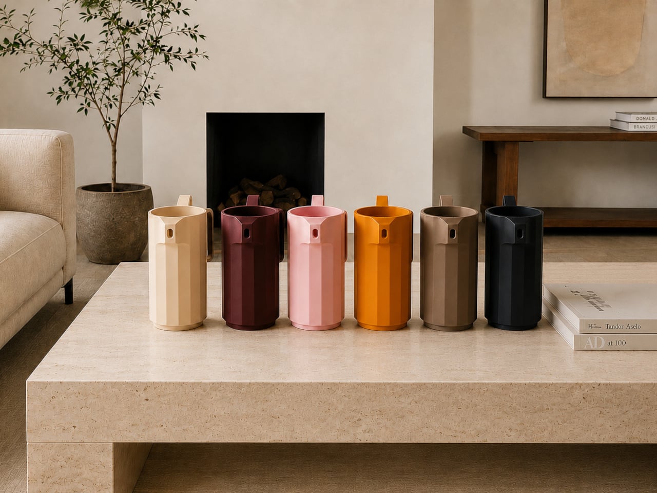
Artefilo approaches that question differently. Based in Edam in the Netherlands, the independent design atelier makes contemporary home objects from materials most manufacturers wouldn’t consider: elephant grass combined with recycled plastic, reclaimed wood fibres, brick dust, and salvaged hospital cabinetry. Each piece is made locally in small batches, and the materials are chosen with the specific intention of giving discarded resources a renewed place in a living space.

Designer: Guido Baratta

The choice of Edam isn’t incidental. The city has a long tradition of ceramics craftsmanship, and Artefilo draws on that heritage without replicating it, taking the spirit of making by hand and applying it to a different material palette. Elephant grass combined with recycled plastic, for example, produces a surface that reads as handmade pottery without the environmental cost of extracting virgin clay or new plastic.

The rest of the material list is equally unexpected. Reclaimed wood fibres and brick dust bring texture and warmth to objects that might otherwise feel too composed, while recycled hospital cabinets contribute rigidity and durability that wouldn’t be obvious from the source. Finding these materials requires locating waste streams that industry hasn’t already claimed, then working out what form they can credibly take in a domestic setting.

Making in small batches has real consequences for what the objects can be. It means pieces that are genuinely one-of-a-kind, because material conditions are never exactly repeatable from one batch to the next. Brick dust carries different tones from different sources; reclaimed wood fibres vary in density and grain. That variability isn’t a flaw in the production model; it’s built into it deliberately.

The underlying premise is that objects shape the atmosphere of a space, not dramatically, but persistently. Something placed on a windowsill or bookshelf gets seen many times a day, and that repetition adds up. Artefilo’s design philosophy treats each piece as something that participates in the daily texture of a home rather than simply occupying it. The materials reinforce that, each carrying a visible trace of its previous life.

The atelier distributes through its own online store and through a local stockist in Edam. The collection is small, deliberately so, and the material sourcing means it isn’t trying to scale into something it isn’t. For a design category that often talks about slowing down without quite managing it, Artefilo appears to have structured itself around that idea from the ground up.

The post Artefilo Makes Home Objects From Elephant Grass and Hospital Cabinets first appeared on Yanko Design.