E Ink displays have earned a devoted following among people who spend long hours reading or writing. The technology produces virtually no flicker, doesn’t use the same harsh backlight as a typical LCD or OLED, and is considerably easier on the eyes over extended sessions. The catch has always been speed; these screens refresh slowly, making them suitable for e-readers but impractical for real-time interaction.
Color E Ink made things more complicated. Adding a color layer came at the cost of even slower refresh rates, keeping these monitors firmly in the reading-only category for most users. Bigme’s B251 Pro takes direct aim at that limitation, pushing a 25.3-inch color E Ink screen to reach up to 60 frames per second, a meaningful first for this panel type.
The screen uses Kaleido 3 technology at a 3200×1800 resolution, and at 145 DPI, it’s modest by LCD standards but respectable for E Ink, where the color filter layer tends to soften detail. The panel supports 4,096 colors and 16 levels of grayscale, while an adjustable front light with warm and cool modes lets you set the tone for your workspace.
What 60 frames per second changes practically is the range of tasks the monitor can handle without resistance. Scrolling through a long document doesn’t leave a trail of ghost images. A video clip doesn’t dissolve into motion blur on every cut. It’s not yet the fluidity of an LCD, but it’s the first time a color E Ink monitor has felt fast enough for an ordinary workday.
The B251 Pro accepts input through HDMI and DisplayPort. The USB-C port is reserved for firmware updates only, not video signal, which is worth knowing before assuming you can use it with a laptop’s Thunderbolt port. A wireless mirroring option covers that gap for cable-free setups, and the monitor ships with a remote control for switching display modes from your desk.
Spend enough hours at a standard monitor and eye strain becomes a familiar background discomfort: dull headaches, dry eyes, and that particular kind of fatigue that sets in before the day is even over. The B251 Pro is built for people in that position, specifically those whose work keeps them at a screen for most of the day and who’ve started looking for a less punishing alternative.
Bigme lists the B251 Pro at $1,599, currently reduced to $1,279 at launch. That’s a significant sum for a monitor that tops out at 4,096 colors and 145 DPI, and it won’t appeal to anyone who needs accurate color for professional photo or video work. For people who simply need a large, easy-to-live-with display and have started counting the hours their eyes spend under artificial light, the math looks different.
The B251 Pro doesn’t ask you to trade speed for eye comfort, and that compromise has defined this category since its beginning. Writers, coders, and anyone whose work is mostly text and reference material will find the 60FPS upgrade more compelling than any spec sheet can convey. The original B251 already built a devoted following at lower speeds; this version gives that crowd considerably less to apologize for.
Budget tablets have always played a peculiar role in consumer electronics. They aren’t meant to be powerful; they’re meant to be just capable enough to get through a streaming queue, a few Kindle chapters, or a morning of casual browsing. Amazon’s Fire lineup has mastered that balance for years, finding a loyal audience among people who want a large enough screen that doesn’t hurt to drop.
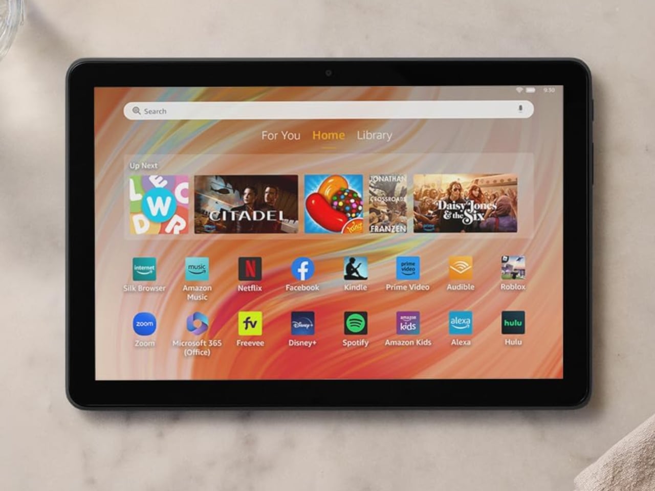
The Fire HD 10 has been Amazon’s flagship Fire tablet for a few years now, and it hasn’t seen new hardware since 2023. That’s unusual for a company that used to refresh its lineup almost every year. Rather than launch a new generation, Amazon quietly added 1GB more RAM to one specific configuration of the existing tablet and made no formal announcement about it.
Designer: Amazon
What makes this update slightly overdue is that the cheaper Fire HD 8 had already been available with 4GB of RAM, while the more expensive Fire HD 10 was still capped at 3GB. That’s a strange hierarchy for a product line, where the lower-tier model offers more memory than the flagship. The new 4GB variant fixes that imbalance, at least for buyers who land on the right configuration.
The extra gigabyte makes a real difference for a tablet you use this casually. Jumping between Prime Video and a browser tab without one of them reloading, or keeping music playing while you scroll through a shopping cart, are the kinds of small interruptions that 3GB quietly introduced. It’s the sort of upgrade you only notice once the problem it fixed stops happening.
There is a catch worth knowing before getting excited. The 4GB version is only available in one specific setup: 32GB of storage, Black, with lock screen ads. Anyone who wants 64GB of storage, a different color, or an ad-free tablet is still working with 3GB. It’s a narrower window than most buyers might expect, particularly given how long this model has gone without any changes at all.
Everything else about the tablet stays the same as the 2023 model. The 10.1-inch 1080p Full HD display, the octa-core processor running at 2GHz, the 13-hour battery life, and the USB-C charging port are all unchanged. The microSD card slot still accepts up to 1TB of additional storage, and Fire OS keeps the usual Amazon ecosystem running front and center.
Amazon has priced the 4GB variant at $154.99, up $15 from the previous $139.99 that the 32GB, 3GB model carried. For a tablet that hasn’t had new hardware in three years, it’s a modest increase tied entirely to the memory upgrade, especially considering the rising costs of RAM. The extra cost is easy to justify if the RAM difference affects how smoothly the device runs for your typical day.
Power banks are among the most purchased tech accessories around, yet they’re rarely something anyone is proud to pull out in public. Most are plastic rectangles with LED indicators and brand names that read like Wi-Fi passwords. Even among the better-designed ones, the focus has always been on capacity and wattage, leaving the physical object as an afterthought. The result is a category full of capable but thoroughly forgettable hardware.
That’s an unusual entry point for Bang & Olufsen. The Danish brand isn’t known for accessories you’d stash in a drawer; it’s known for objects you’d set on a shelf and admire. So when it announced its first power bank, questions about specs felt almost secondary. What mattered was whether B&O could apply the same design conviction to something this ordinary. Going by what’s been revealed, the answer is yes.
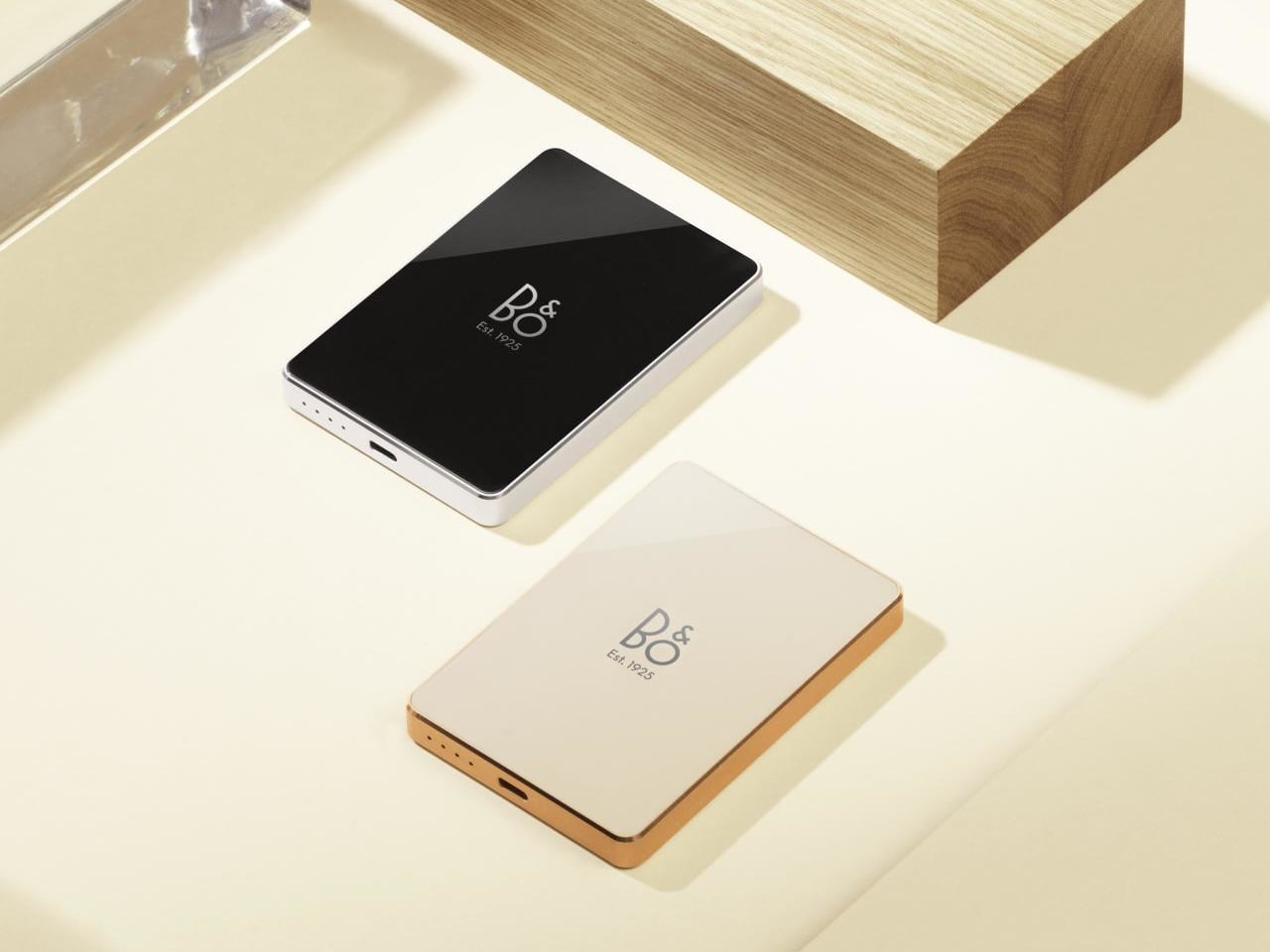
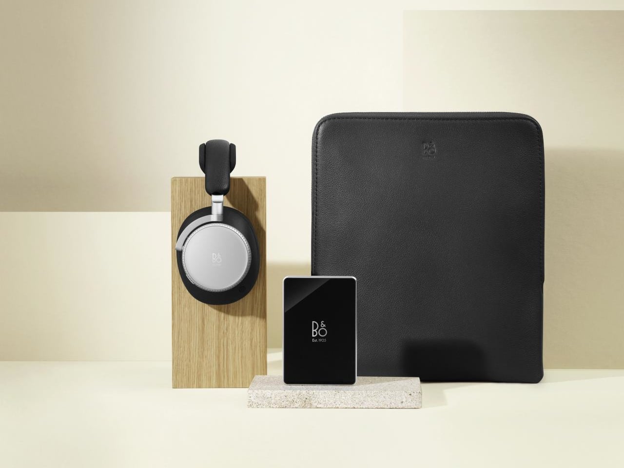
The B&O Powerbank combines a glass surface with an aluminum frame, finished with diamond-cut edges and pearl-blasted textures. It’s the kind of hardware that feels deliberate in the hand, each surface treated with the same attention typically reserved for consumer electronics that cost a great deal more. It comes in two colorways, Infinite Black and Hourglass Sand, both chosen to match the Beoplay H100 headphones.
That pairing with the H100 isn’t incidental. The Powerbank was designed as a companion to B&O’s flagship headphones, a way to keep them running through long travel days without having to negotiate with airport power sockets. The colorway matching is no accident; the two pieces are meant to feel like a coordinated set rather than a spare part someone remembered to design at the last minute.
On the technical side, the Powerbank holds 5,000 mAh and supports Qi2 magnetic wireless charging at up to 15W, alongside a 20W USB-C output for wired devices. It accepts up to 18W via USB-C to recharge itself. Those aren’t record-breaking figures for the category, but it works cleanly with most Qi2-compatible devices, including the iPhone 17 series and the Google Pixel 10.
The more revealing figure is what B&O highlights for H100 owners specifically: five minutes of charging delivers up to 3.5 hours of additional playback. For someone wearing those headphones through a long-haul flight or an extended studio session, that’s a meaningful top-up that doesn’t require a hunt for an outlet. Snap the Powerbank on, keep listening, and put it away when you’re done.
There is, however, the price. At €145 in Europe and £125 in the UK, the Powerbank sits well above most Qi2-certified alternatives in this capacity range. Comparable 5,000 mAh magnetic chargers from brands like Anker and Ugreen come in at around $50 to $60. B&O is clearly charging a premium tied to design and heritage rather than specs, and buyers who understand the brand won’t be surprised.
B&O has spent decades building a reputation around objects that earn their place in a room, not just on a spec sheet. The Powerbank extends that same sensibility to the pocket. Pull it out at an airport lounge, and it won’t look like something that came bundled in a blister pack, which, for a certain kind of buyer, is precisely the point.
Handheld gaming PCs have come a long way, but most still force an uncomfortable compromise. The ones built around controllers and portable gaming rarely double as decent work machines, while those that lean toward productivity often handle demanding games with apology. Anyone wanting both usually ends up carrying two devices, a proper laptop for meetings and a gaming handheld for the commute home.
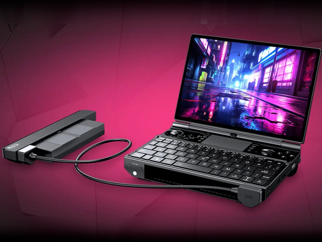
The GPD WIN Max 3 tries to sidestep that problem entirely. It looks like a compact clamshell laptop at first, complete with a keyboard, a Precision touchpad, and a 9.06-inch display on a hinged lid. Lift those magnetic panels above the keyboard, though, and a set of capacitive joysticks appears alongside linear Hall-effect triggers, two programmable rear buttons, and a full Xbox-style controller layout.
That 9.06-inch screen doesn’t cut corners on quality. GPD is listing an AMOLED panel with a 2400×1504 resolution, a 165Hz refresh rate, and HDR10 support, protected by Gorilla Glass 6. Peak brightness reaches 1,050 nits, making it readable in brighter environments, while the 313 PPI pixel density keeps text and graphics crisp whether you’re reviewing a document or mid-fight in a demanding AAA title.
Underneath the hood, the WIN Max 3 is listed with either the AMD Ryzen AI Max+ 395 or 388, both Zen 5 Strix Halo chips with Radeon 8060S integrated graphics that go well beyond what typical handhelds can offer. Configurations scale up to 128GB of LPDDR5x-8000 memory in a quad-channel setup, with storage stretching to 4TB, figures that feel more at home in a workstation than a portable gaming device.
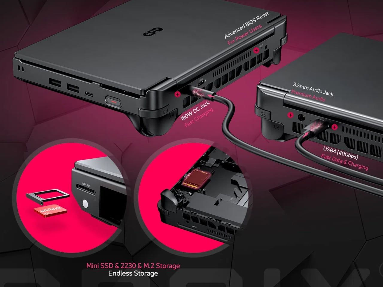
What sets the WIN Max 3 apart is its power architecture. Rather than a sealed internal battery, it uses a 97Wh hot-swappable module that attaches externally, letting you swap it mid-session without shutting down. You can also run the machine straight from a 180W DC adapter without any battery installed. An external 110W fan module clips on separately to push sustained performance to its TDP ceiling.
The connectivity options for a device this compact are genuinely broad. A USB4 port with 40Gbps bandwidth and DisplayPort 2.1, a USB 3.2 Gen 2 Type-C, two USB 3.2 Gen 2 Type-A ports, and HDMI 2.1 FRL mean you can connect to external displays, docking stations, or even GPD’s G2 graphics dock for extra GPU performance the moment you sit down at a desk.
Finish a report during a flight, swap out the battery at the gate, and boot up a graphically demanding title in the hotel room, all without a second device in your bag. That’s the scenario the WIN Max 3 is built around, and for the perpetual traveler who also games, it makes an honest case for consolidating two things you’d otherwise pack separately.
There are legitimate trade-offs, naturally. The base unit weighs 815g, climbing to 1,220g with the battery module in place, which rules out jacket pocket carry. Pricing is expected to start around $2,000. For a device that can handle a board meeting and a late-night gaming session in the same bag, that price feels both like a luxury and an honest calculation.
Air purifiers have quietly become household staples, tucked into corners and set to auto, doing their work without much acknowledgment. The fundamental assumption behind every stationary model is that polluted air will eventually drift past the filter if you wait long enough. That’s not entirely wrong, but it means the unit is always reacting to something that’s already spread rather than catching it at the source.
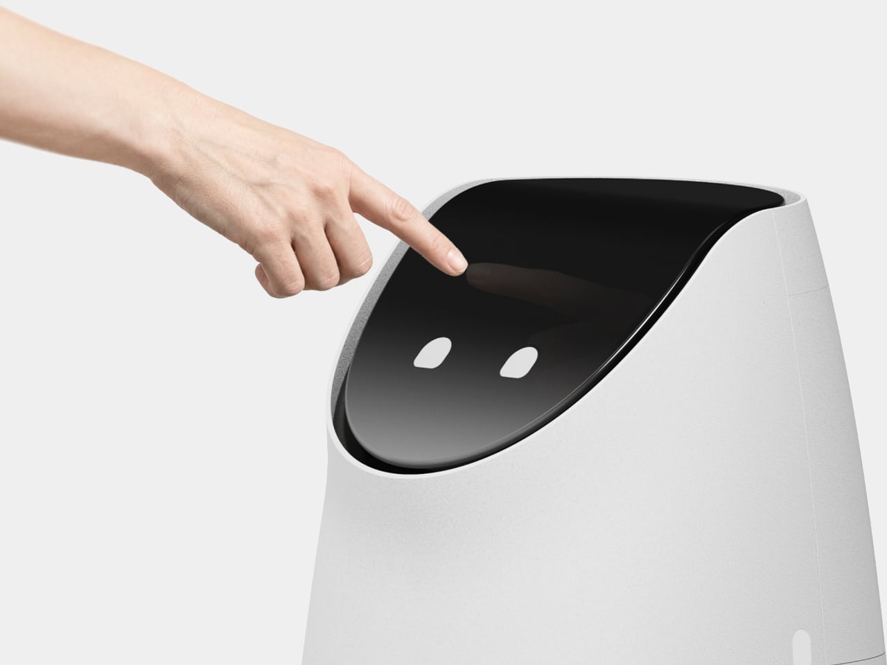
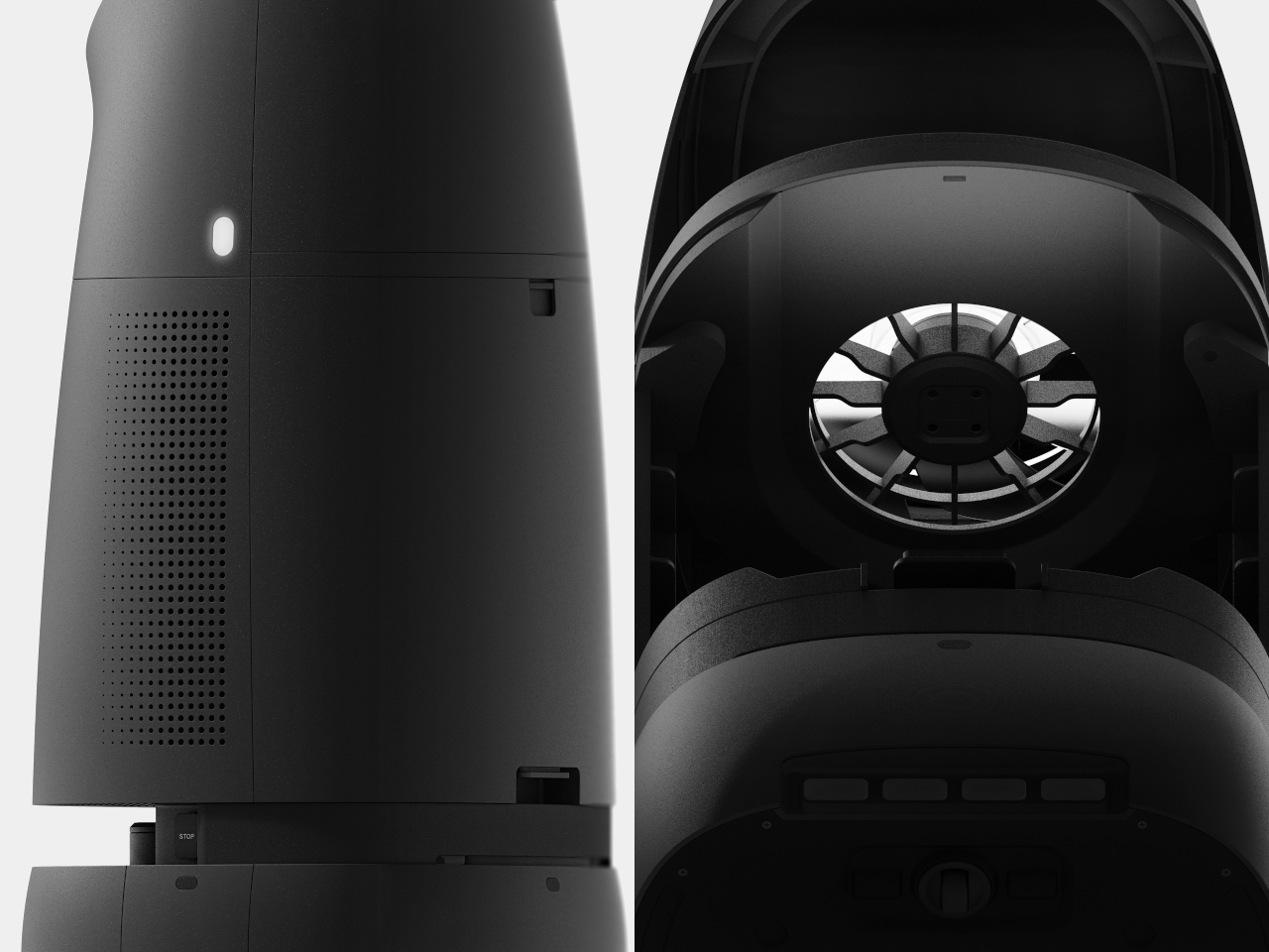
Omnipure reframes the whole premise. Rather than sitting in one corner hoping the air comes to it, this autonomous robot concept maps the home, learns the occupant’s routines, and moves toward pollution before it has a chance to disperse. Catching cooking smoke at the stove rather than after it fills the room is the kind of meaningful difference that makes a purifier genuinely useful rather than marginally helpful.
The behavior is where the design makes its most interesting decisions. When someone walks through the front door, Omnipure rolls to the entryway and greets them while clearing entryway dust at the same time. Framing that as a welcome rather than a clinical alert is a deliberate choice. A robot charging toward you the moment you arrive home communicates something quite different from one that simply seems glad you’re back.
The kitchen scenario captures the same thinking. When cooking raises PM2.5 levels or volatile organic compounds spike from a hot pan, Omnipure navigates toward the source and announces its arrival with “Smells Good!” rather than an alarm. If TVOC levels climb too high, it suggests opening a window rather than filtering at maximum capacity, because the better response to a ventilation problem isn’t a better filter.
The ventilation behavior adds another dimension. Rather than treating indoor air as automatically preferable to outdoor air, Omnipure monitors both and suggests airing out when outdoor conditions are favorable. When a window is opened, it positions itself in the airflow to filter incoming air before it circulates. The messages it displays at these moments frame its function as a conversation rather than a status readout.
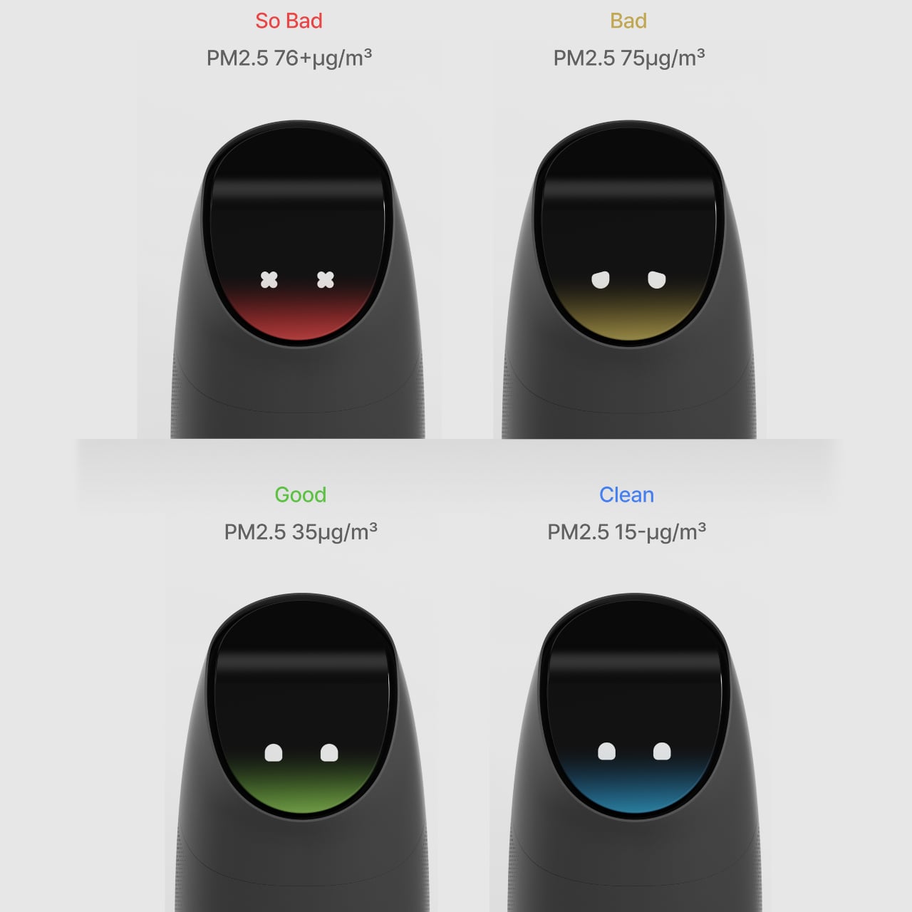
The face display communicates air quality through four states tied to PM2.5 levels. Clean air below 15 μg/m³ reads as a blue glow with relaxed eyes, acceptable conditions around 35 μg/m³ show green, poor air at 75 μg/m³ appears amber, and hazardous readings above 76 μg/m³ trigger a red glow with X-shaped eyes. A glance across the room is enough to know what you’re breathing without unlocking a phone.
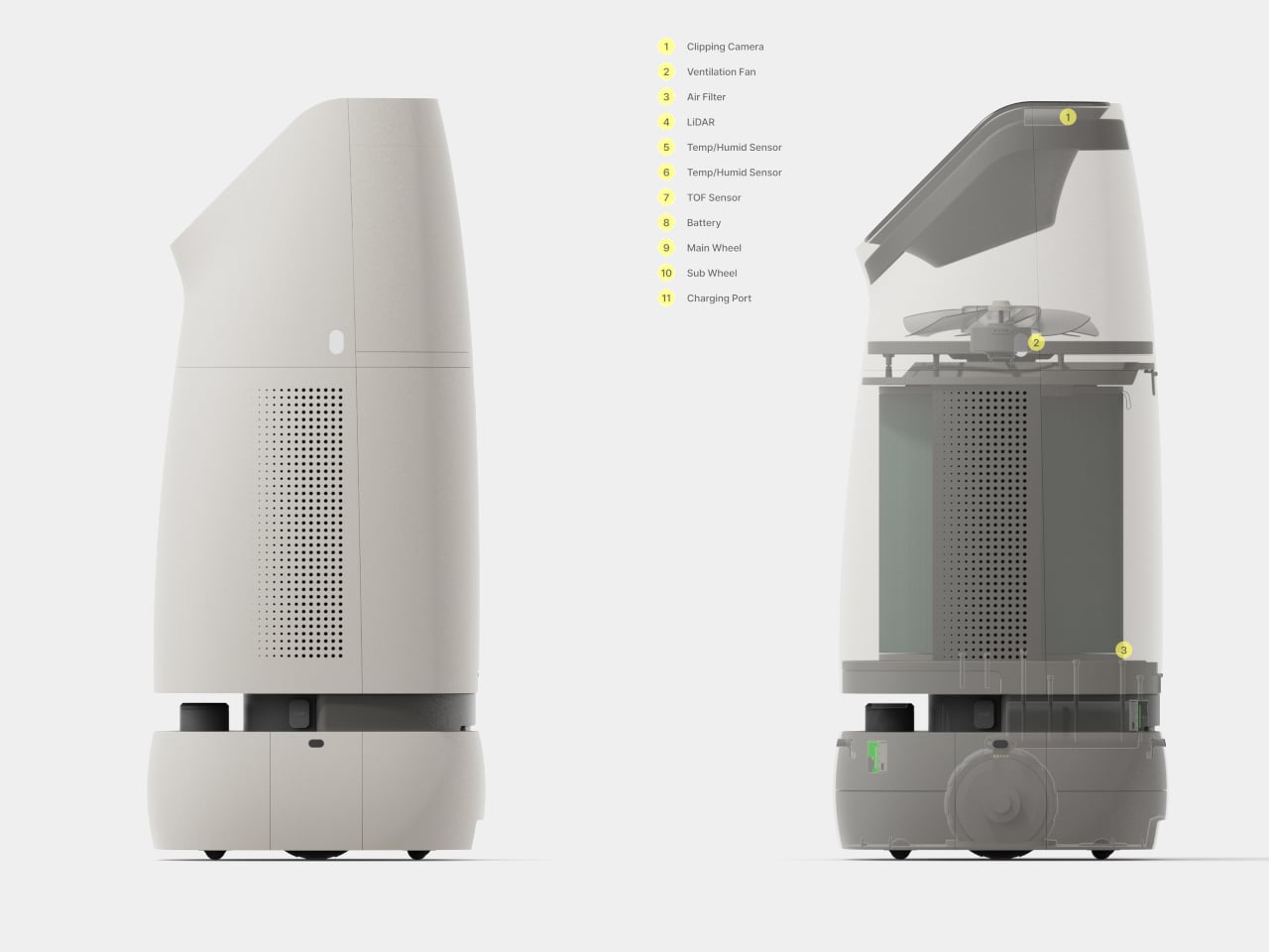
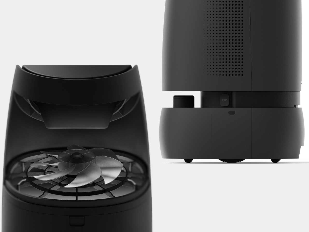
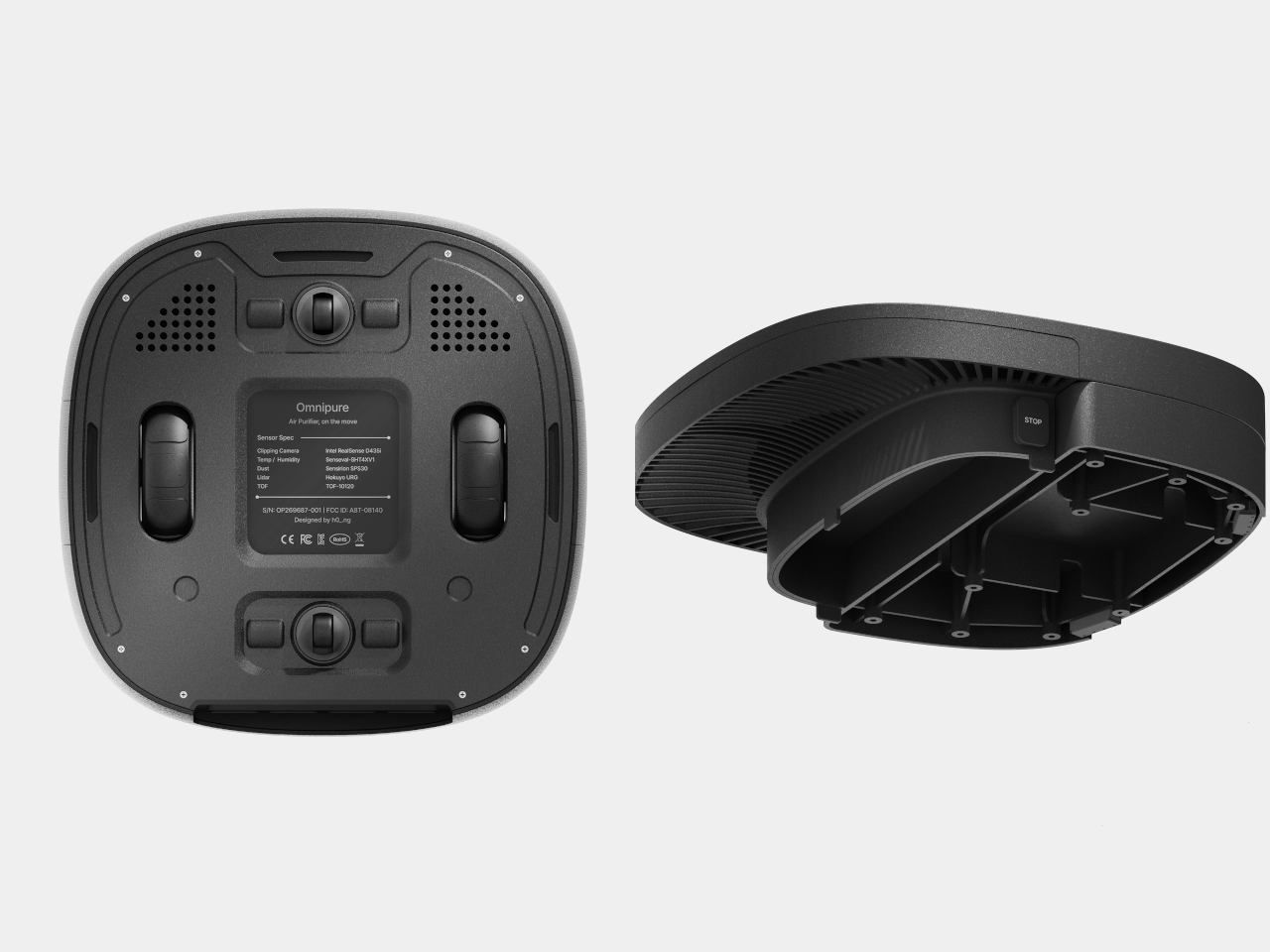
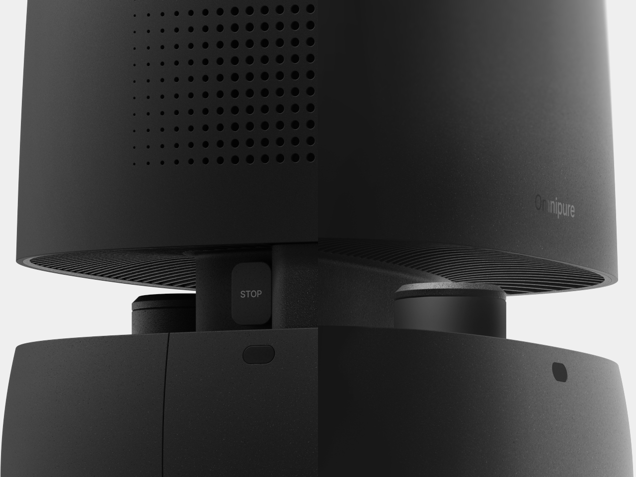
Internally, Omnipure runs on LiDAR and time-of-flight sensors for navigation, a clipping camera, dual temperature and humidity sensors, and a centrifugal ventilation fan drawing air through a large replaceable filter housed in the lower body. The filter slides out from the side for maintenance, which turns what’s usually a buried, tool-required task into something that takes about as long as changing an ink cartridge.
Omnipure is a concept rather than a product on shelves. But the problem it identifies is real: stationary purifiers can only clean the air that eventually reaches them. A device that maps a home, learns activity patterns, and positions itself where pollution is forming solves a fundamentally different problem from one that simply runs on auto in a corner, hoping the air comes to it.
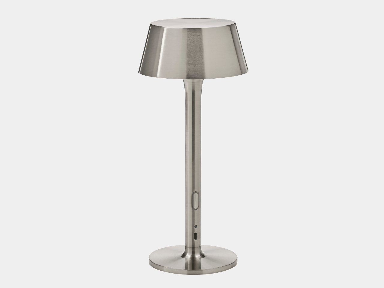
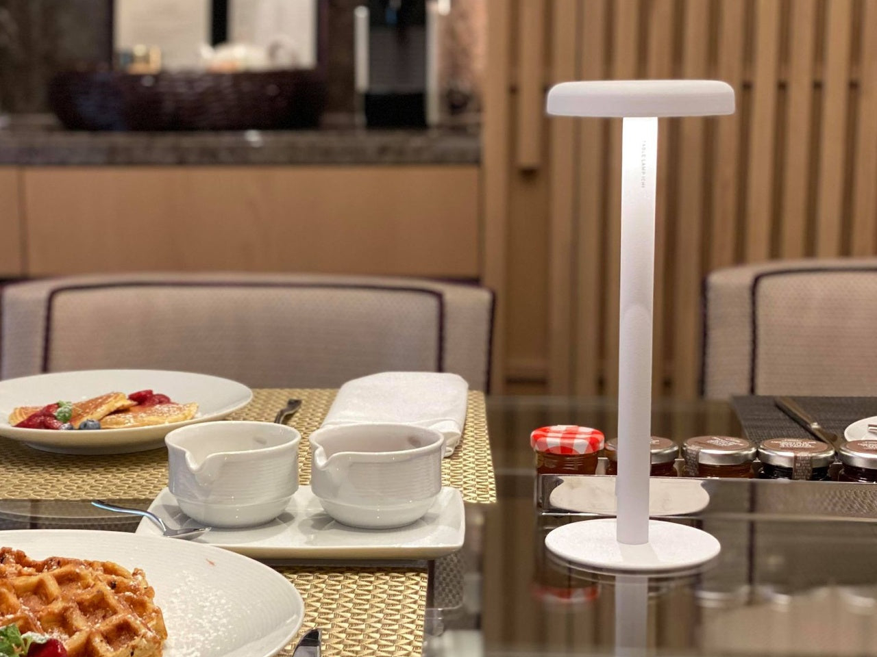
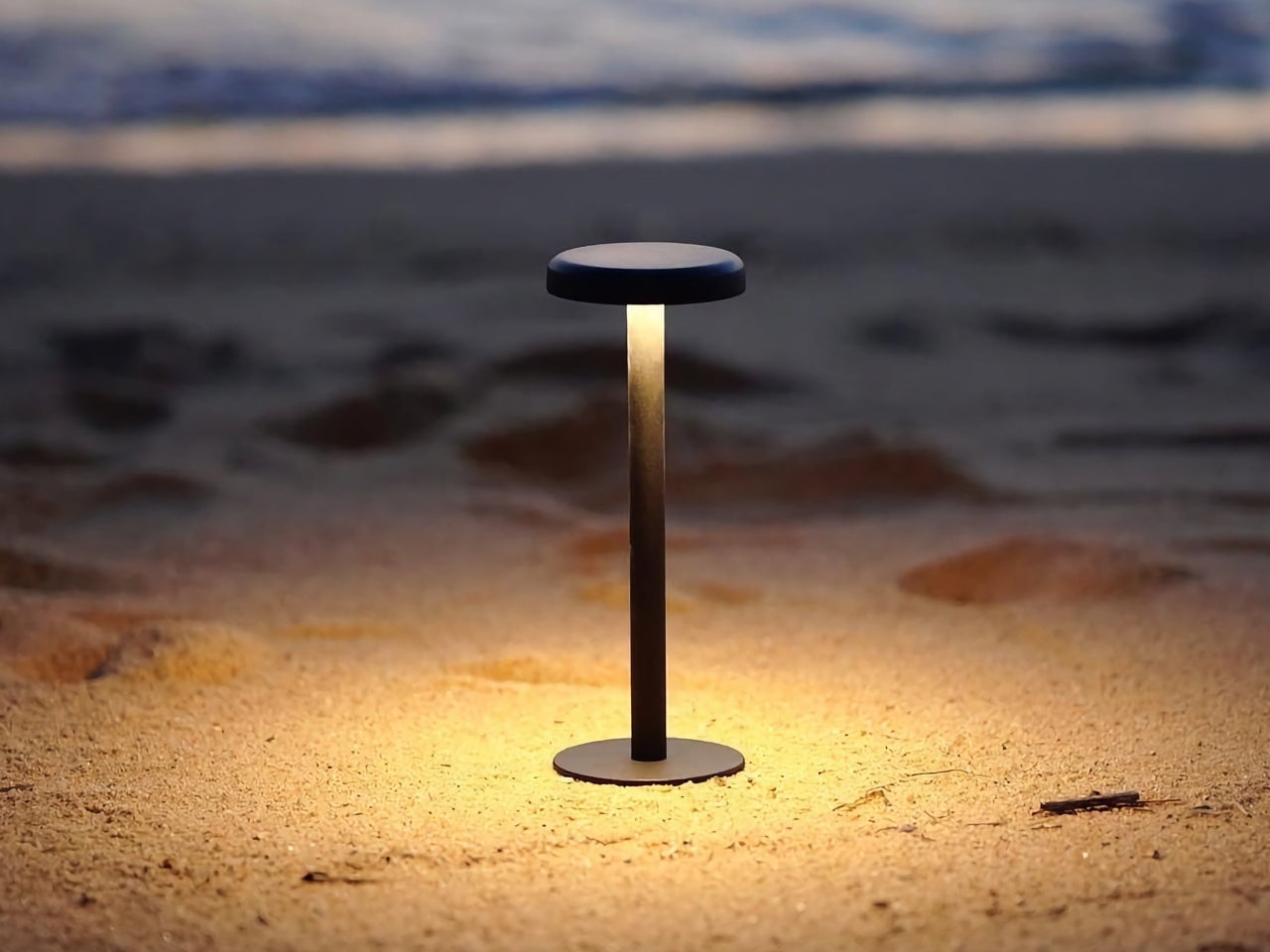
The rechargeable table lamp has been around for a while, but it hasn’t always been something designers were excited to work on. For most of its life, it was a category of hotel patios and restaurant terraces, objects tolerated for their practicality and forgiven for looking like camping gear. Most of them leaned on lantern shapes, chunky handles, and rubberized finishes that communicated utility before anything else.
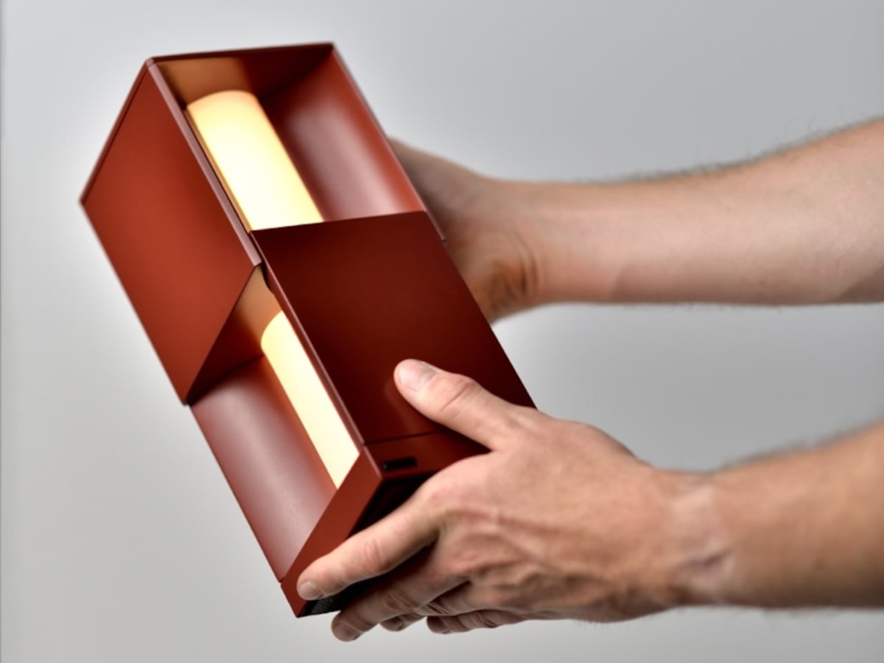
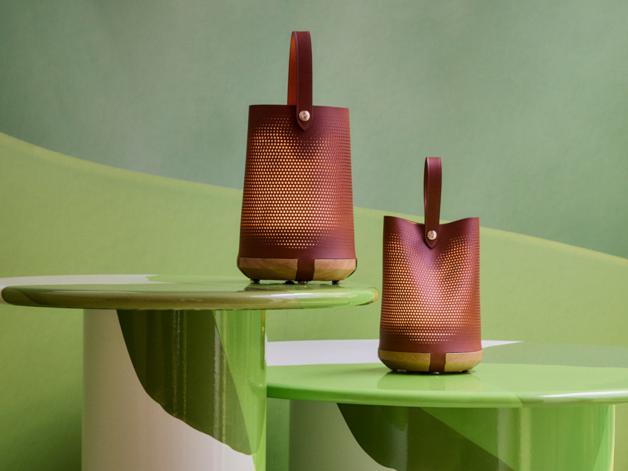
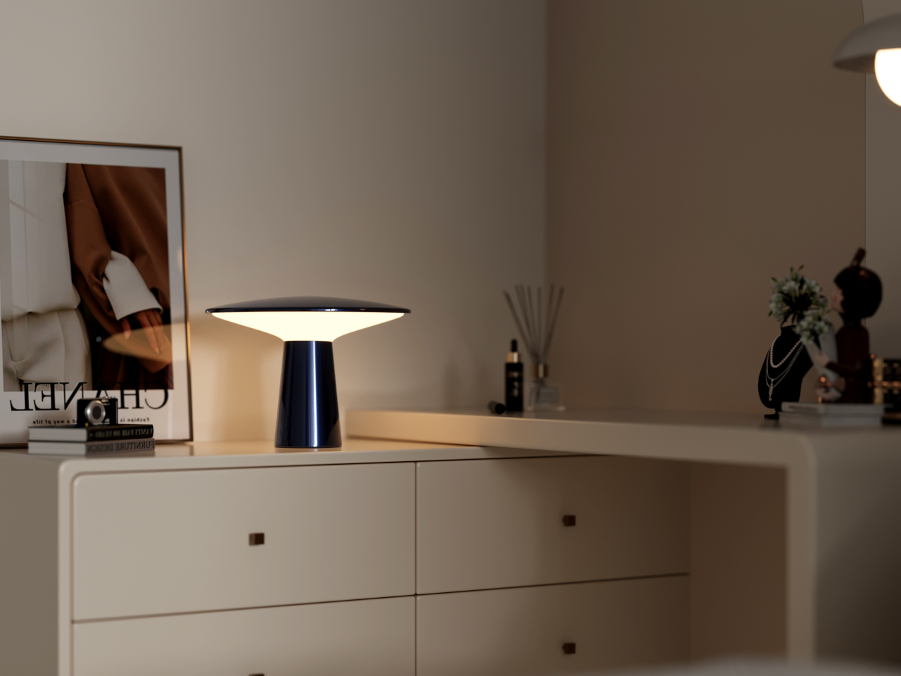
That started to change noticeably around Milan Design Week 2026, when the cordless lamp stopped being a hospitality accessory and became something designers were treating as a proper object type. Alexander Pott did one for IKEA’s PS Collection. Studiopepe built an entire lamp family around it for Rakumba. Patrick Jouin wrapped one in micro-perforated leather for Longchamp. Suddenly, the rechargeable table lamp had a design argument behind it.
IKEA PS 2026 brings Alexander Pott’s cordless lamp to the mainstream
There’s a certain logic to watching what IKEA does with its PS Collection. The line has a history of giving up-and-coming designers a platform to push against convention, which means that when a rechargeable lamp shows up there, it’s worth paying attention. It signals that portable lighting has moved far enough into the mainstream that it deserves a considered, well-designed answer at an accessible price point.
Alexander Pott’s design for the IKEA PS 2026 line keeps things deceptively simple: a metal-and-glass body with three dimming levels and a battery that frees you from thinking about where the nearest socket is. It comes in a few color combinations that make it feel more playful than precious, and it’s light enough to move from a dining table to a windowsill without making it a whole thing.
Studiopepe’s Torre family gives Rakumba a fully rechargeable lamp line
One-off cordless lamps are easy enough to find, but a whole family of them built around a consistent design language is something else. It suggests that whoever made it isn’t treating the rechargeable lamp as an afterthought or a novelty but as a genuine product category worth investing in. That’s the kind of thinking Studiopepe brought to their Torre line for Rakumba, and it shows.
The Torre family doesn’t try to hide what it is. The forms are clean and architectural, built for spaces where the lighting is meant to feel intentional rather than improvised. The concealed light source keeps it calm in a room, and being rechargeable means it can move between an indoor shelf and an outdoor table without losing any of that composure in the process.
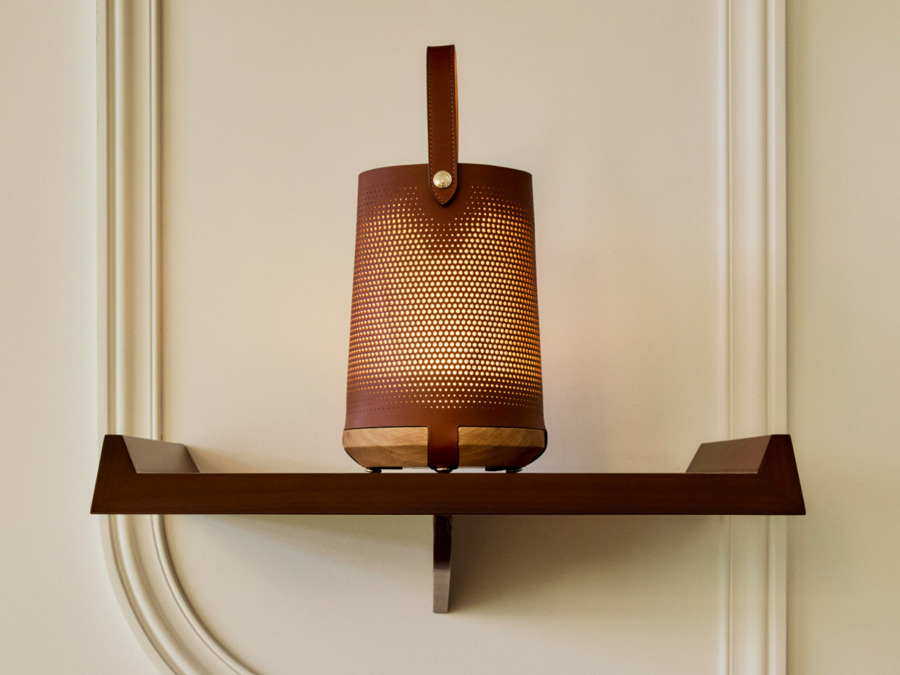
Ostara is what happens when Longchamp and Patrick Jouin design a lamp together
Fashion and luxury brands don’t wander into product design unless they see a genuine opportunity to say something with the object. The result is usually either impressive or awkward, with little in between. With Ostara, Longchamp and Patrick Jouin landed on the right side of that line, producing a rechargeable lamp that feels less like a lifestyle extension and more like a considered design object.
Jouin used micro-perforated leather for the shade, which gives the light that comes through it a texture that’s harder to achieve with glass or plastic. Being wireless and rechargeable means it can sit on a dining table or a bedside surface without the visual interruption of a cord, which matters more in a lamp built around intimacy and atmosphere than around raw output.
IKEA AVHÅLL goes outdoors without looking like it belongs there
There’s a frustrating design problem at the heart of most outdoor-rated portable lamps. They want to be taken seriously as practical objects, so they usually adopt a rugged aesthetic that makes them look slightly out of place indoors. Bringing one in from the balcony feels like dragging a piece of patio furniture into the living room, which is exactly the kind of visual compromise most people don’t want to make.
The AVHÅLL handles that transition more gracefully than most. It’s a metal lamp with three dimming settings and enough weather tolerance to live on a terrace, but it doesn’t dress itself up in tactical styling or rubberized finishes to make that point. At $39.99, it’s the kind of object that can light an outdoor dinner, come back inside afterward, and not look out of place in either setting.
The Anywhere-Use Lamp makes the case for AA batteries over built-in cells
Not every cordless lamp needs to carry a built-in battery to justify its place in this conversation. The Anywhere-Use Lamp makes a different kind of case: four AA batteries instead of a sealed internal cell, which sounds like a step backward until you factor in that rechargeable AAs are widely available, easy to swap, and don’t degrade the way built-in batteries do after a couple of years of daily use.
It moves freely between a desk, a bookshelf, a bedside table, or an outdoor corner without needing a socket or a charging cable. Four brightness levels cycle through a tap of the cap, and the whole thing breaks down flat when you need to pack it. At $149, it isn’t cheap, but the placement freedom it offers is the kind that genuinely changes how you think about where light belongs.
Melt is one of the more dramatically finished lamps on this list
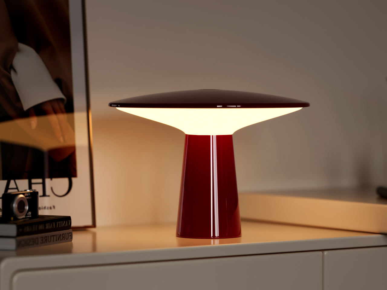
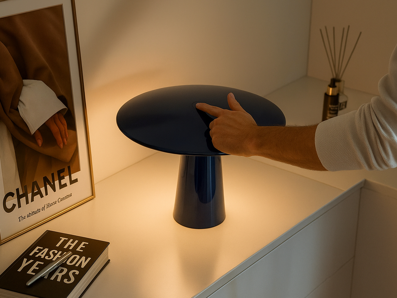
Once the rechargeable lamp stopped having to justify itself as a practical solution, designers had more room to get expressive. The form no longer had to be neutral or apologetic, which opened the door for objects that could hold their own in a room even when they weren’t switched on. That’s a higher bar than most lamps are held to, and one worth reaching for.
Melt leans into that idea pretty directly. Its surface treatment mimics the look of metal mid-pour, giving it a kind of arrested-motion quality that makes it genuinely interesting to have around. It also runs for up to 10 hours on a single charge, which means it can handle a long evening without going dark before the conversation does. At around $300, it’s the most overtly expressive lamp on this list.
Monir skips the app, the cord, and all the usual complications
There’s a growing exhaustion with lamps that want to be smart home hubs. At some point, the dimming app, the voice controls, and the tunable spectrum start feeling like overhead for something that’s supposed to quietly light a corner of the room. Not every lamp needs to be a connected device, and it’s becoming clearer that the most relaxed interiors are often lit by the least complicated objects.
Monir makes no effort to be anything other than a lamp. No app required, no cord in sight, and the whole thing is built from 100% recycled aluminum, which gives it a quieter kind of design intention than most objects in this space. Its moon-inspired form is soft enough to fit into a bedroom or reading corner without demanding attention, just providing a warm, ambient glow when you need it.
Fluted questions what the portable lamp’s silhouette should look like
The lantern is the oldest visual reference point in portable lighting, and it’s also one of the hardest to escape. Designers keep reaching for it because it signals mobility and self-sufficiency, but it also carries a lot of campsite and emergency-preparedness baggage that’s difficult to shed. Younger designers seem more interested in questioning those associations rather than just refining them, which is where things get more interesting.
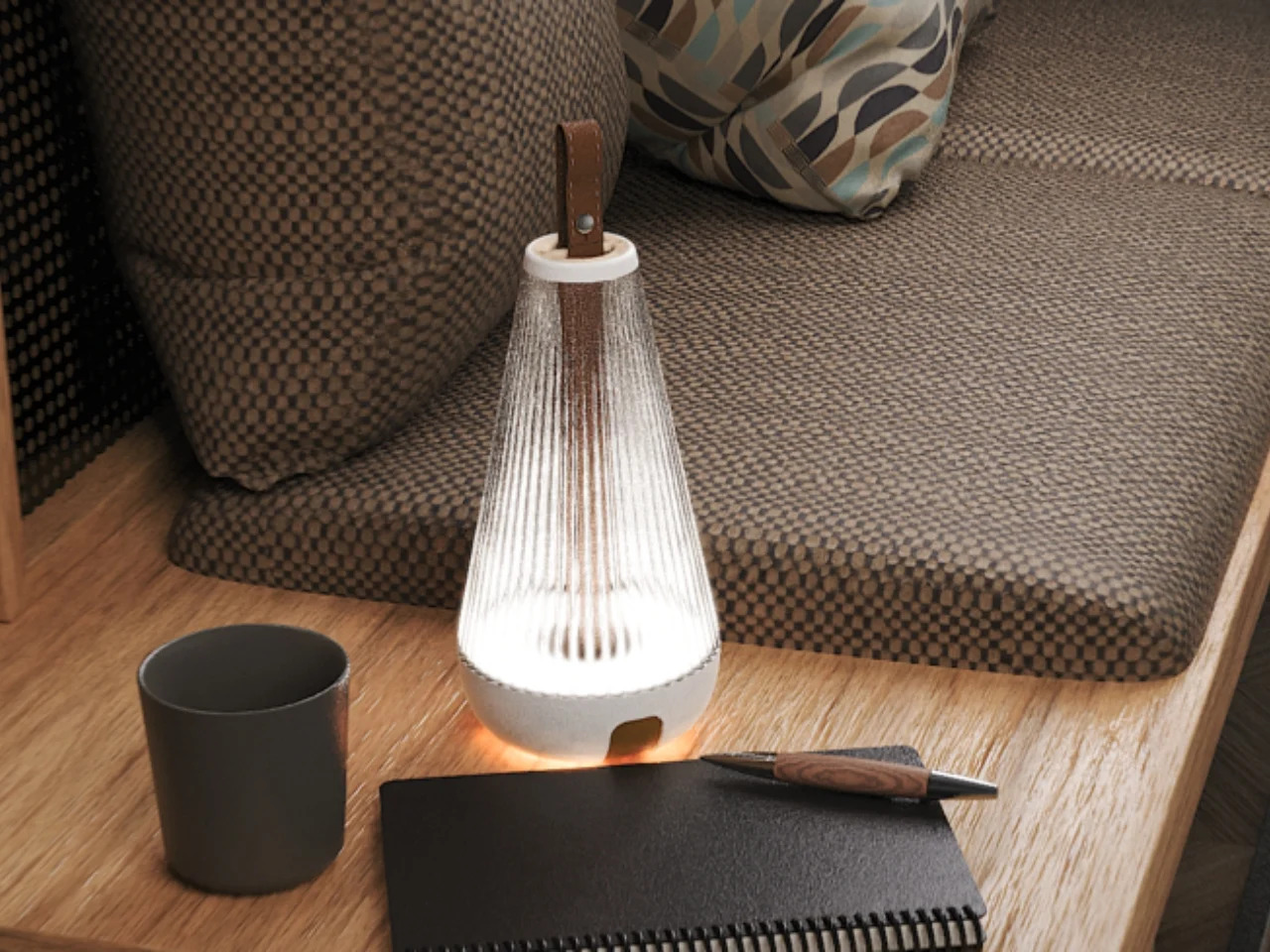
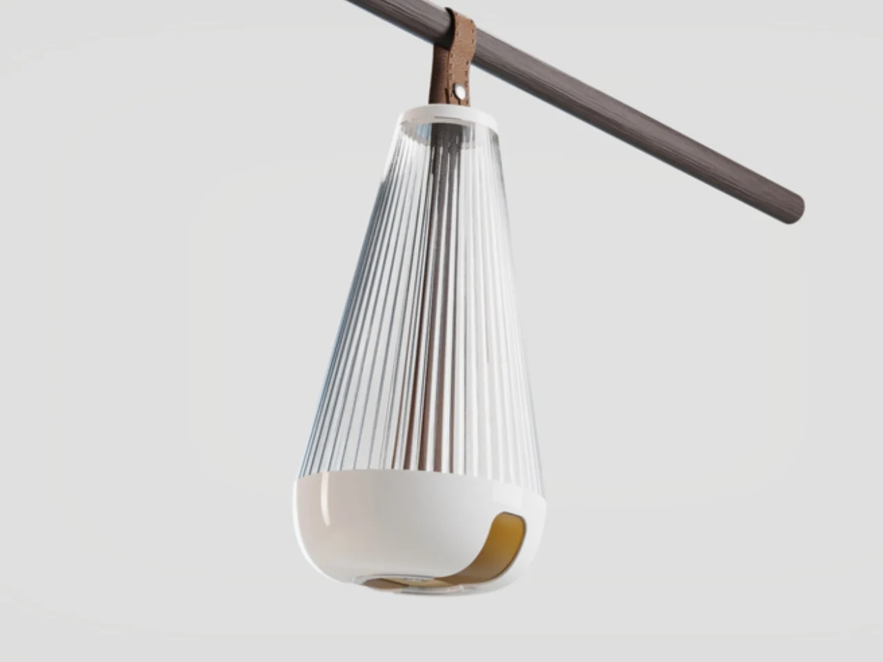
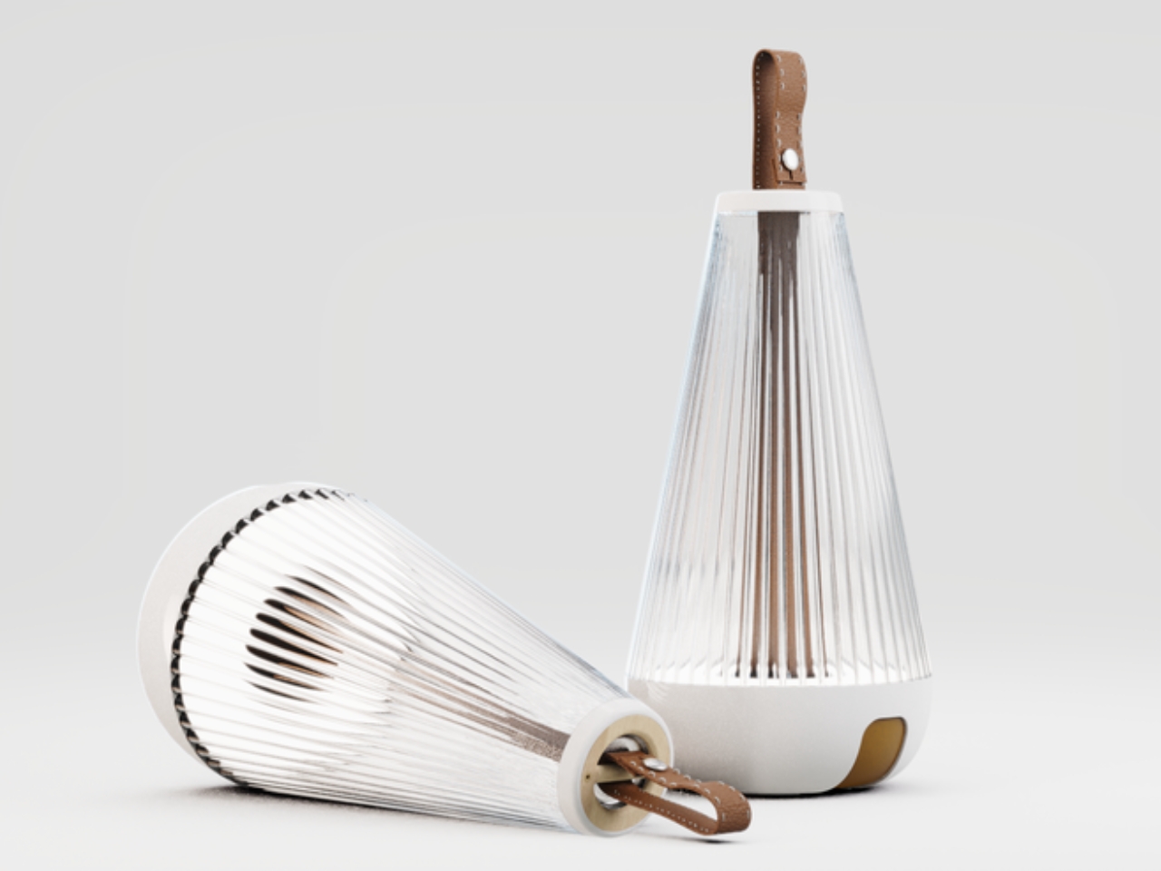
Fluted, a student project recognized at the Core77 Design Awards, does exactly that. It borrows the lantern’s silhouette but softens its edges and refines its finish into something that reads less like outdoor gear and more like an object you’d actually want to keep on a shelf. It’s a concept rather than something you can order today, but it points at where the category’s visual language could go next.
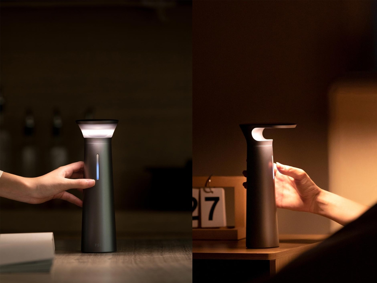
The FSL Wireless Portable Desk Lamp doesn’t know which category it belongs to
Desk lamps and table lamps have always played by slightly different rules. A desk lamp is positioned and pointed; a table lamp is placed and left alone. That distinction made a lot of sense when both types were tethered to a wall, but it starts to feel less rigid when the power source is no longer doing the work of keeping the object in one place.
The FSL Wireless Portable Desk Lamp sits comfortably in that gap. It carries the directed functionality of a task light with the portability of an object that doesn’t belong to any single corner of the room. It can move from a desk to a dining table to a nightstand without asking for a socket along the way, which quietly makes the case for what cordless lighting could become.
Electric scooters have largely avoided any serious design ambition. The category is dominated by folding aluminum stems, plastic covers, and an aesthetic that prioritizes manufacture over emotional response. They’re practical, they’re cheap enough to flood city streets, and they look almost uniformly forgettable. The functional argument for the e-scooter has been made convincingly; the case for it as an object worth caring about has barely been attempted.
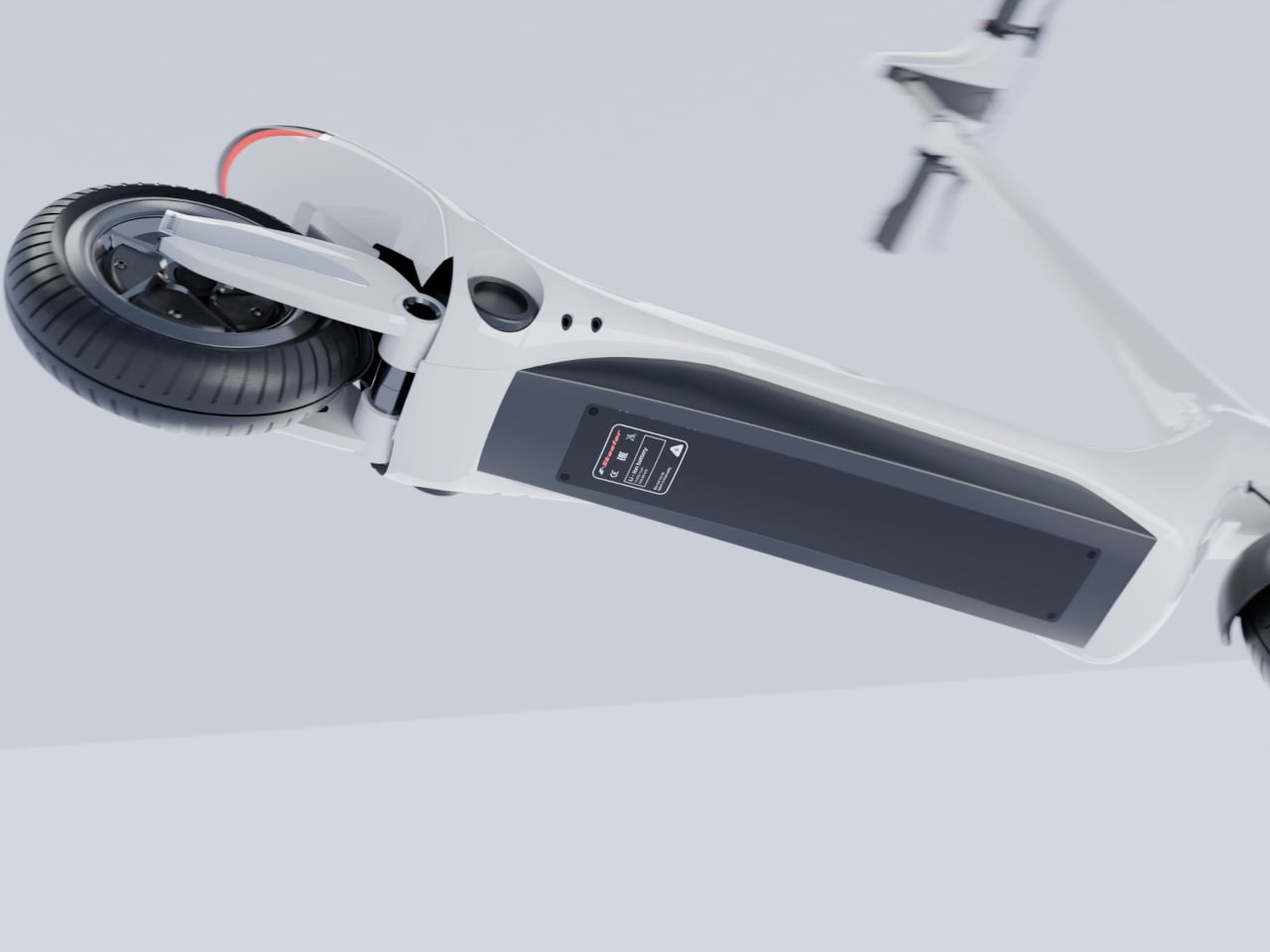
This conceptual design sets out to change that premise by applying Ferrari’s design principles to the everyday electric scooter, and the key distinction here is “principles” rather than “branding.” It’s not about putting an emblem on a commuter vehicle. It’s about understanding what makes Ferrari’s cars genuinely compelling: the sculptural tension of every surface, the sense that the body is always in motion even while standing still.
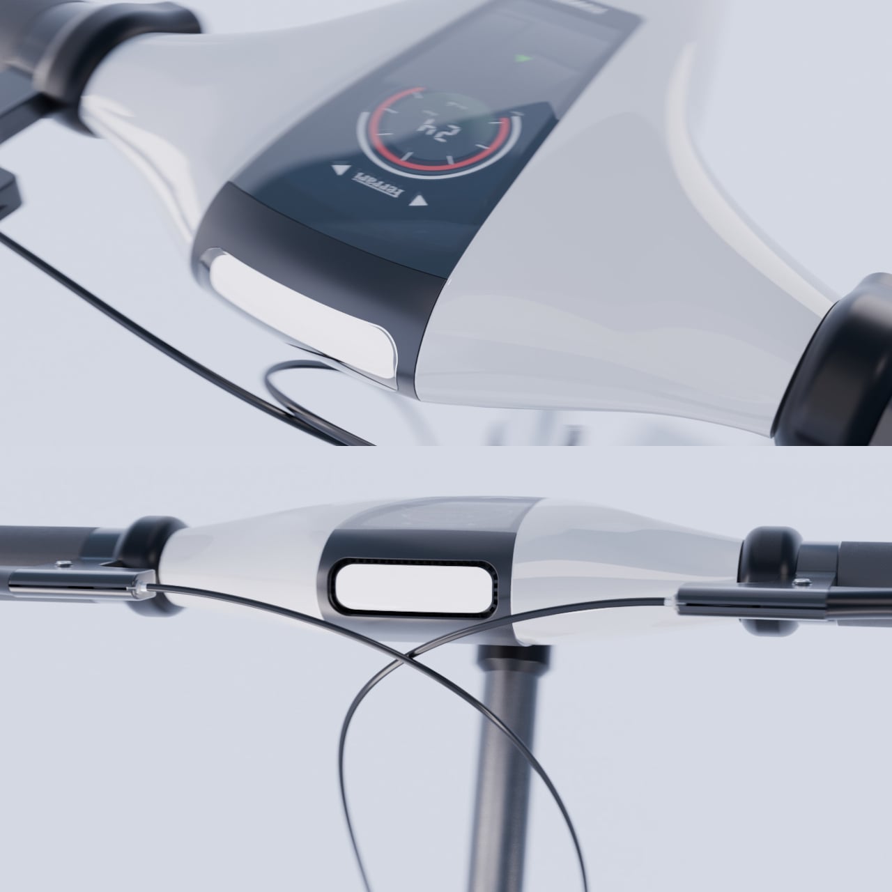
The result is a seamless, monolithic body with aerodynamic surfaces that flow cleanly from deck to stem without visible joints or interruptions. Where most scooters expose their mechanical reality through folding hardware and clamped connections, this concept wraps everything inside a sculptural shell. The proportions run deliberately long and low, creating a silhouette that reads closer to a sports motorcycle than anything you’d typically find parked outside a train station.
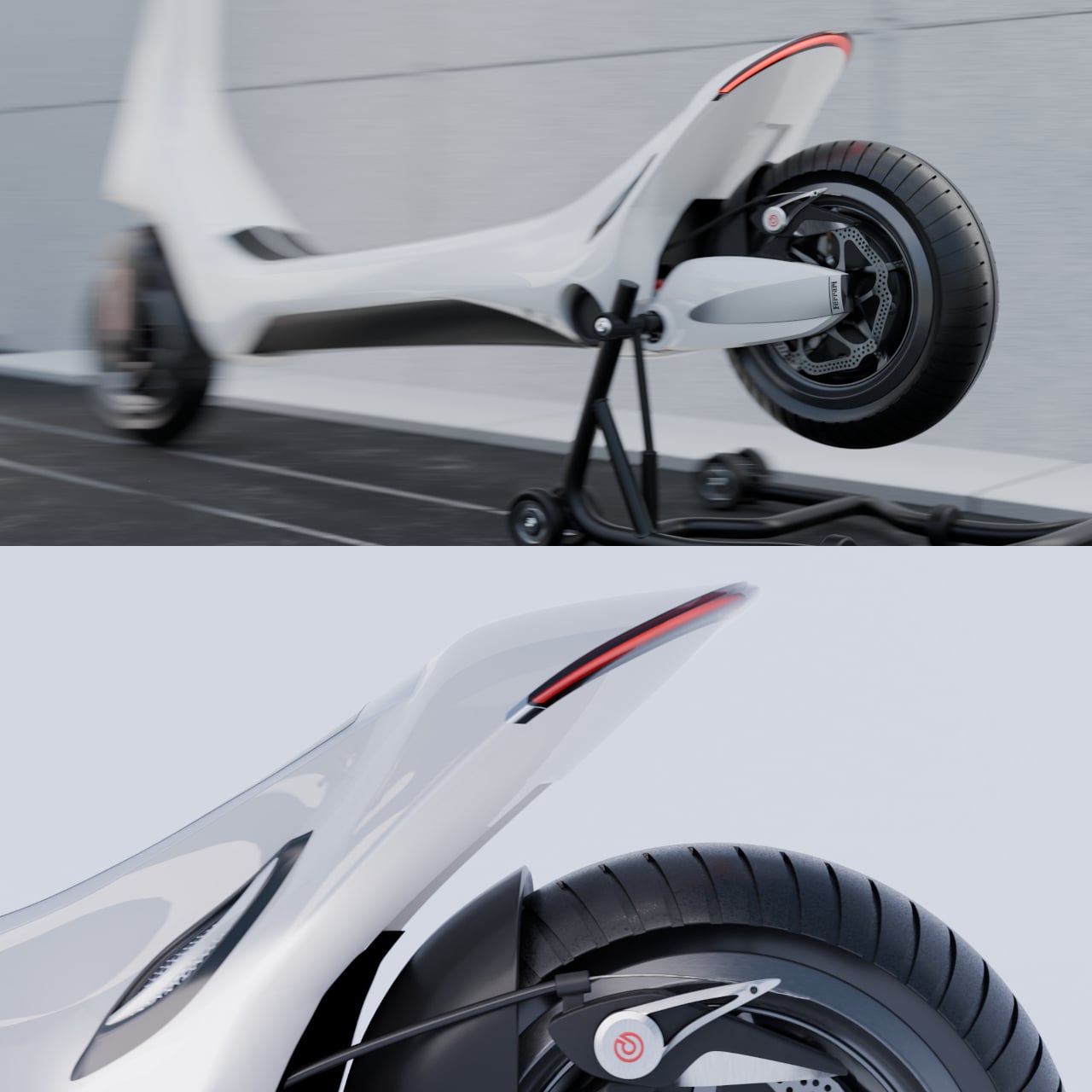
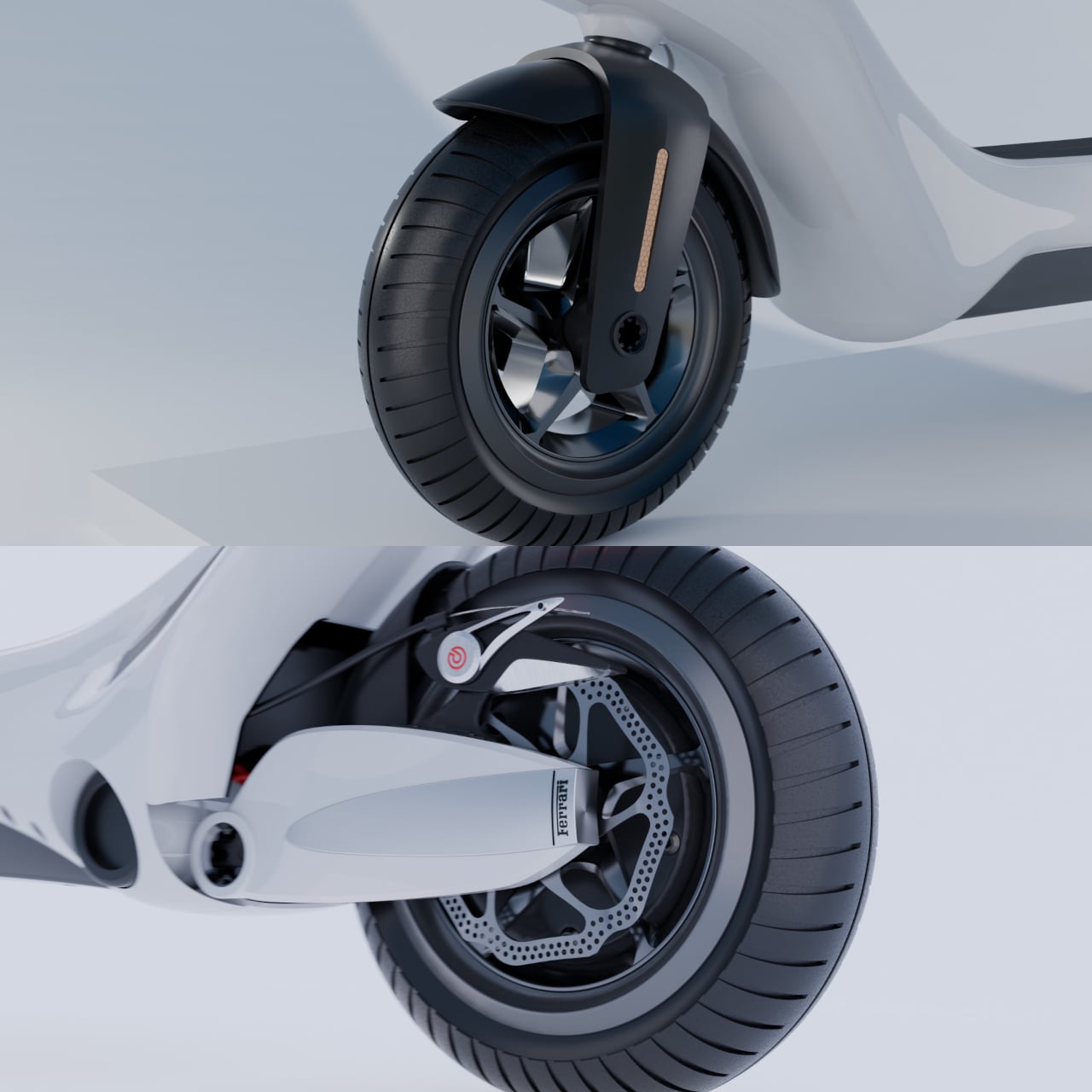
The rear end is where the design stakes its biggest claim. A sharp, swept-back tail section with a thin red LED strip carries the kind of visual tension Ferrari builds into a rear diffuser, resolved here as a knife-edged fin rising above the rear wheel. Disc brakes with red-accented calipers carry the performance suggestion further, lending mechanical credibility to surfaces that might otherwise read as purely decorative.
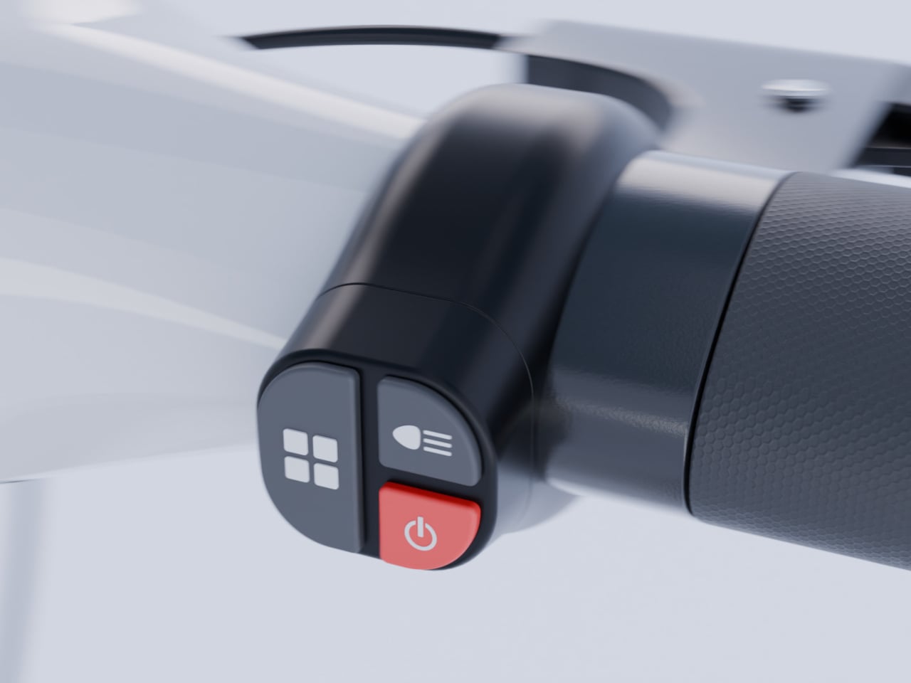
The handlebar assembly takes a similar approach to the cockpit of a performance car, centered on an instrument pod flanked by brake cables that cross in a deliberate V pattern. It’s a small detail, but it’s the sort of detail that separates a design study from a styling exercise. Everything here has been considered for how it communicates intent rather than how it minimizes production cost.
The body is rendered in white with dark carbon-fiber accents on the deck, a combination that keeps the visual weight low while the red LED taillight acts as the single chromatic accent. There’s a restraint to the palette that reflects Ferrari’s own approach to color, which tends to let the form do the talking and reserve color for punctuation rather than decoration.
Getting around a city on this concept would feel different from anything currently on the market, which is arguably the entire point of the exercise. Most urban e-scooters communicate nothing beyond the utilitarian function they serve. This one communicates something about the person who chose it, which is something Ferrari’s cars have always done and something electric mobility design has almost entirely failed to deliver.
Noise-canceling headphones have become the default answer to the mismatch between music and the world around you. The premise baked into every iteration of that technology is straightforward: if you can’t hear your music, silence the noise. Each generation pushes harder toward complete auditory isolation, treating the environment as a problem to be solved rather than a condition to be accommodated.
Live Beats is a conceptual wearable that starts from a different assumption entirely. Rather than treating ambient noise as the enemy, it accepts that there will be moments when music simply can’t reach you through sound and finds a different channel for it. When the surrounding volume overwhelms the earpiece, the device redirects the experience from your ears to the skin of your face.
Designer: Haji Yang
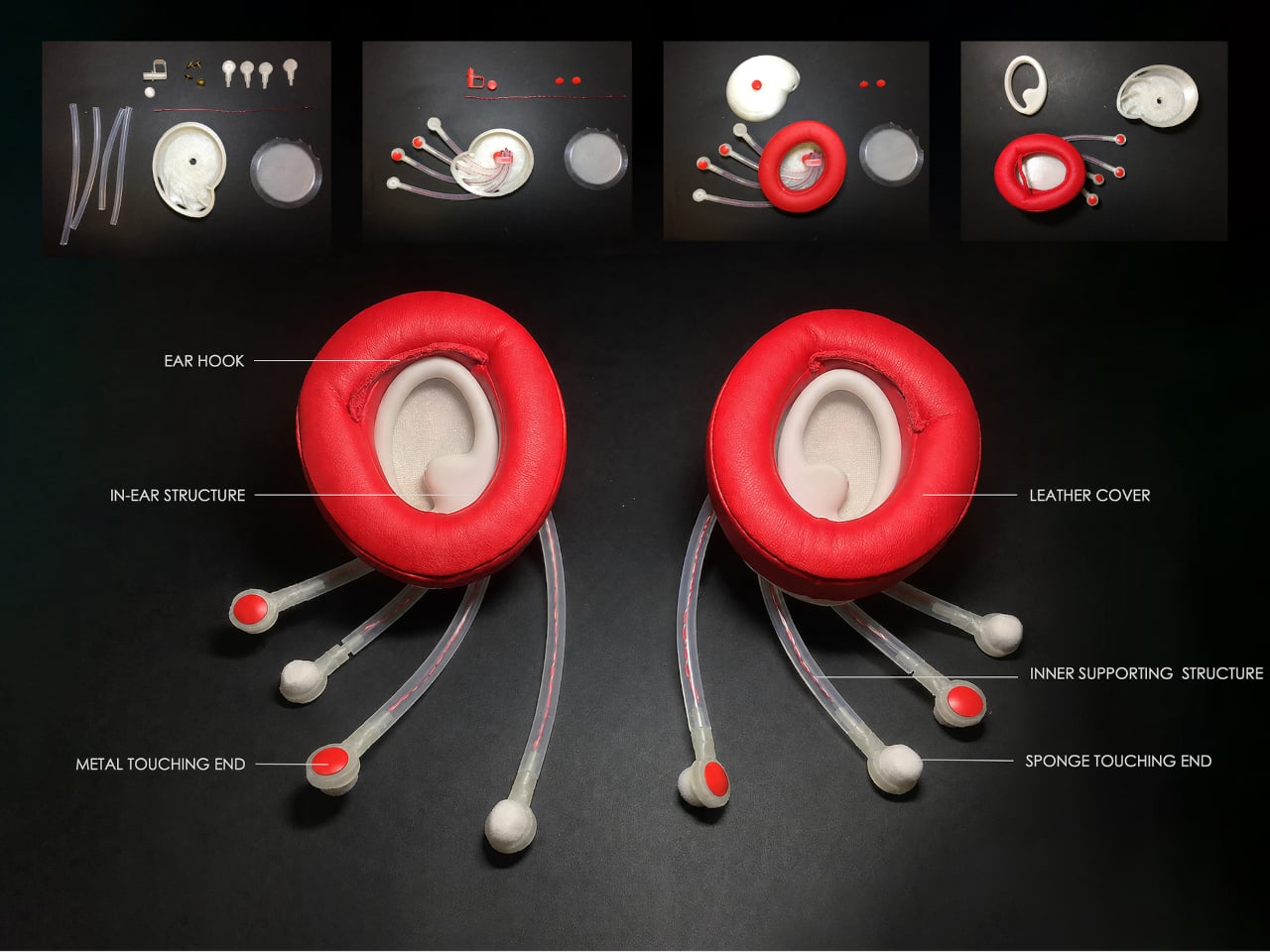
The mechanism relies on four soft, flexible tentacles extending from each unit and resting against the cheek. A built-in ambient sensor monitors the surrounding noise level continuously, and when it crosses a threshold, it triggers the tactile feedback system. The tentacles begin tapping the cheek in synchronized patterns, carrying the rhythm of the music forward even when the audio itself has disappeared into the noise.
A companion app handles the musical analysis, pulling the track apart into bass, percussive elements, and melodic themes, then assigning each layer to specific tentacle movements. The system doesn’t try to replicate every nuance of the song through touch. It focuses on rhythm, which is enough, because rhythm is identifiable through the skin in a way that melody simply isn’t when hearing fails.
The form draws from the conch shell and octopus tentacles rather than anything recognizably technological. A translucent outer shell hints at the internal structure beneath, while a red spiral framework running through each tentacle echoes both DNA and blood vessel forms. It rests against the ear the way a creature might settle there, which is either unsettling or quietly beautiful depending on how you feel about bionic aesthetics.
That commitment to organic form goes further than aesthetics. Most audio hardware declares itself immediately through its shapes: driver housings, plastic frames, and visible hardware. Live Beats deliberately abandons that vocabulary in favor of softer, biologically inspired curves that make the device harder to identify as a technology product at all, which is either the point or a happy side effect, depending on how you read it.
The end of each tentacle accepts a replaceable touch head in either soft sponge or cool metal. Users can switch between them depending on temperature, music style, or personal preference. A cool metal tap against the cheek during something percussive registers differently than a soft sponge contact during something slow and ambient, making the choice of contact type feel like a deliberate part of how the music lands.
Live Beats is a concept rather than a product ready for market, but the principle it demonstrates has implications well beyond music. A device that communicates reliably through touch could carry notifications, navigation cues, or environmental alerts without the ears being involved at all. That’s a genuinely different way to think about what a wearable can do, and one that doesn’t need silence to work.
Rhythm games went through a period where they were everywhere, then went quiet, and now they’re back in a way that feels more persistent than the last time. Fortnite Festival brought the genre back to a mainstream audience, Clone Hero and YARG kept a dedicated community alive through the lean years, and Rock Band 4 never really went away. The one thing that has lagged behind the revival is the hardware, with most players making do with aging instruments or basic alternatives that don’t feel particularly inspired.
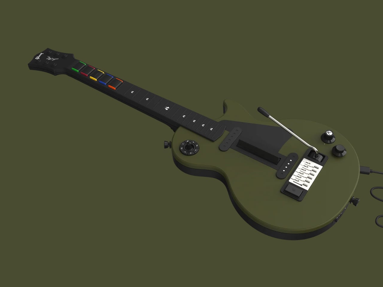
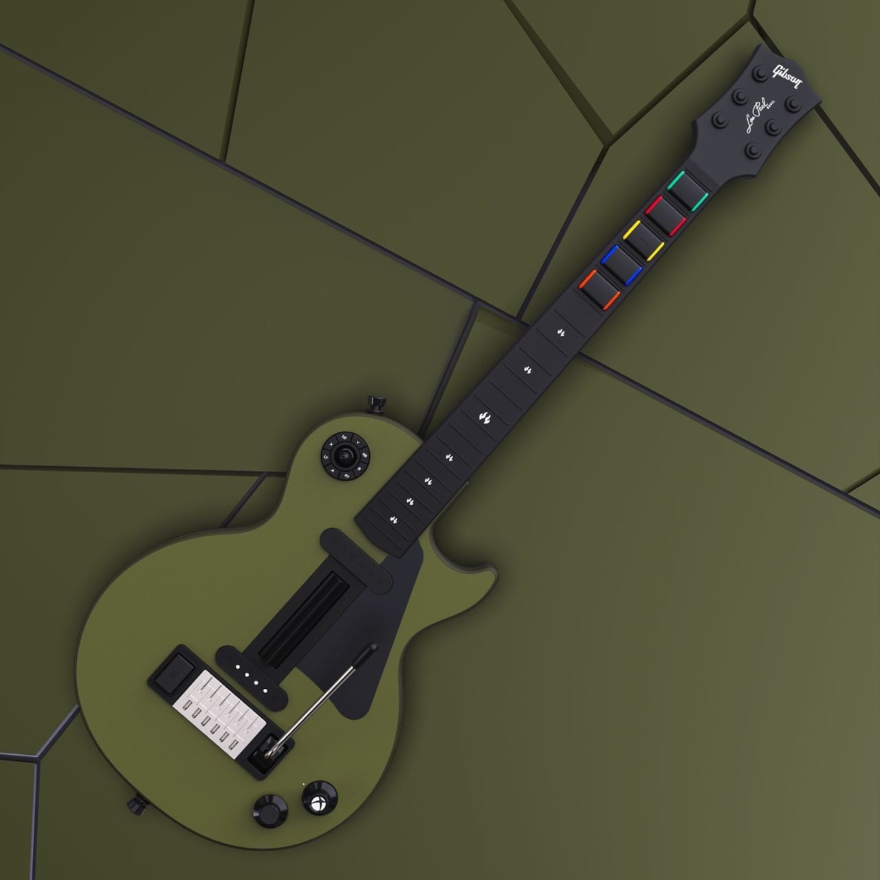
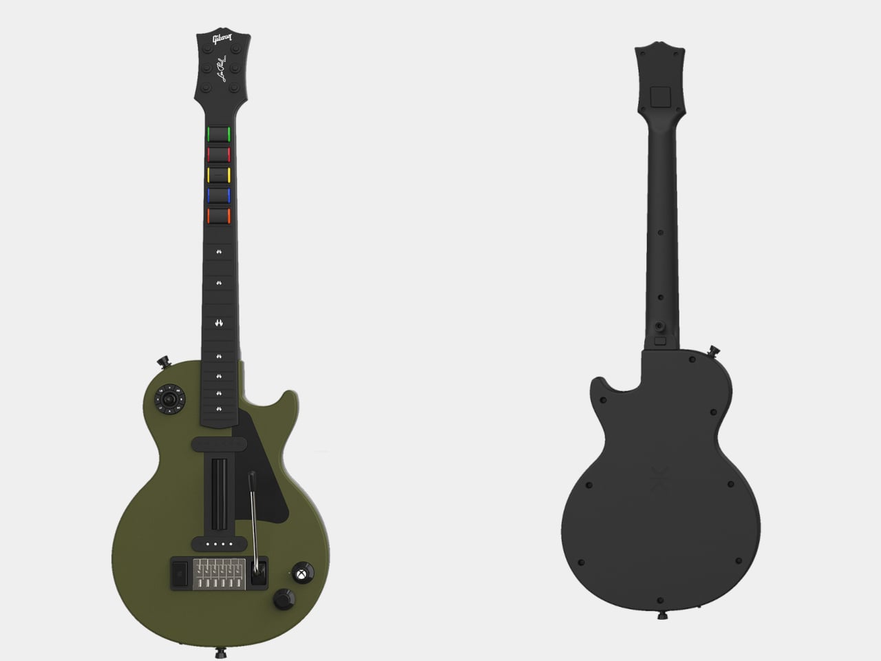
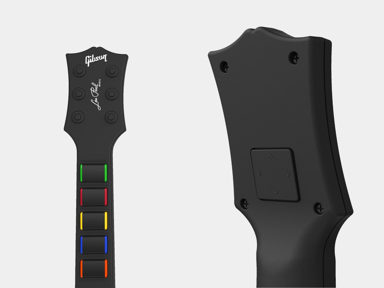
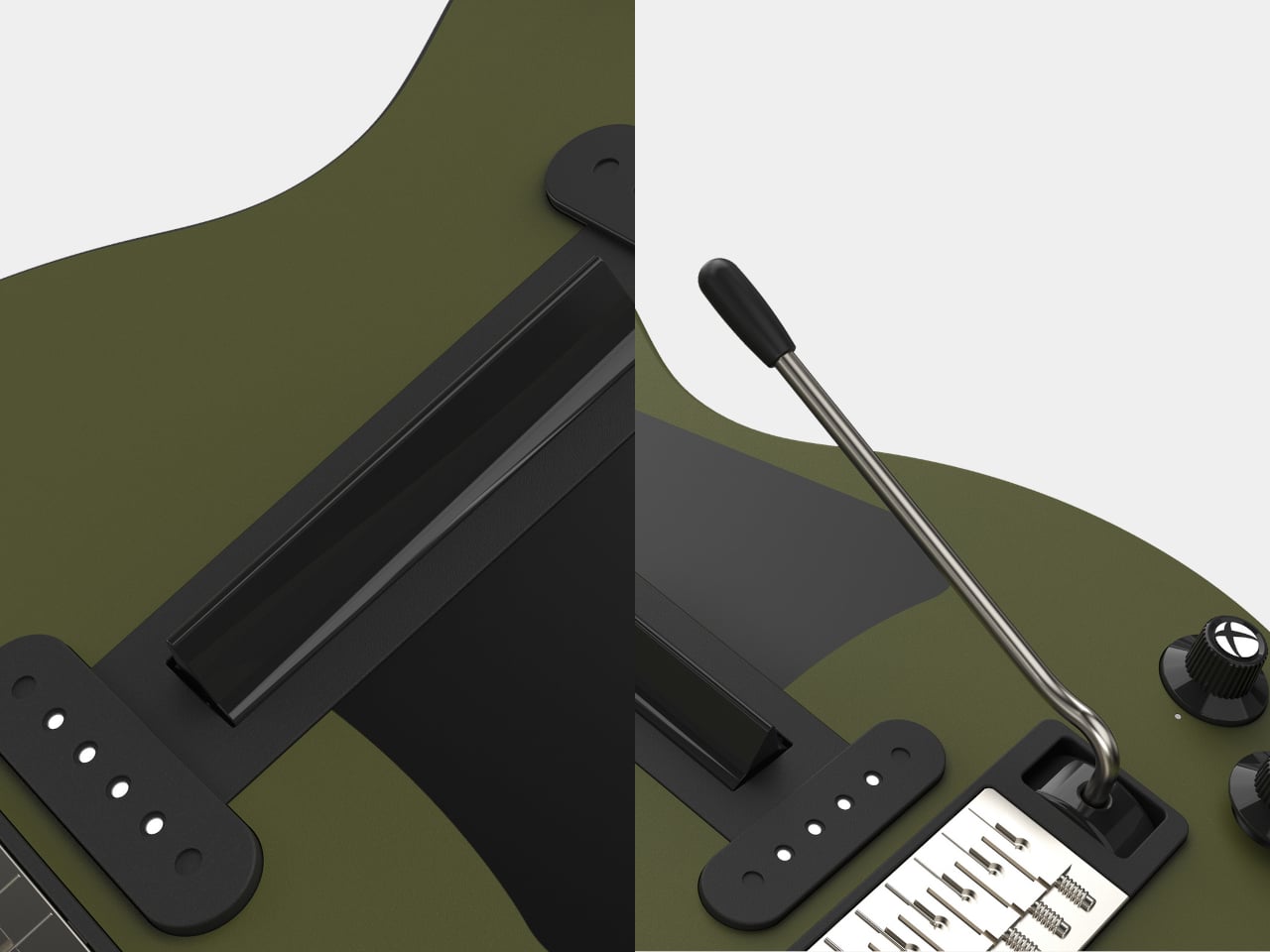
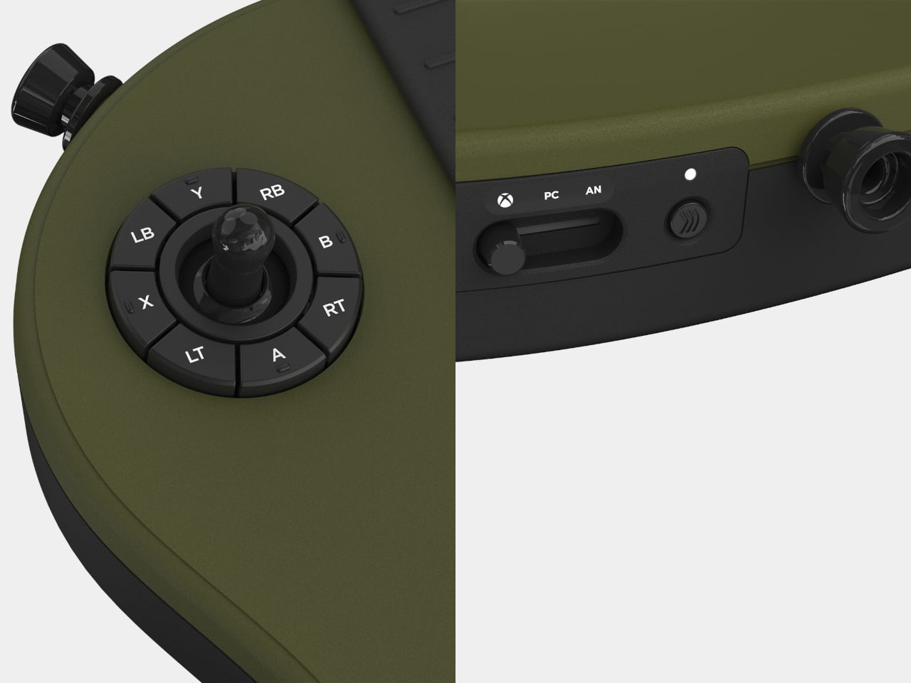
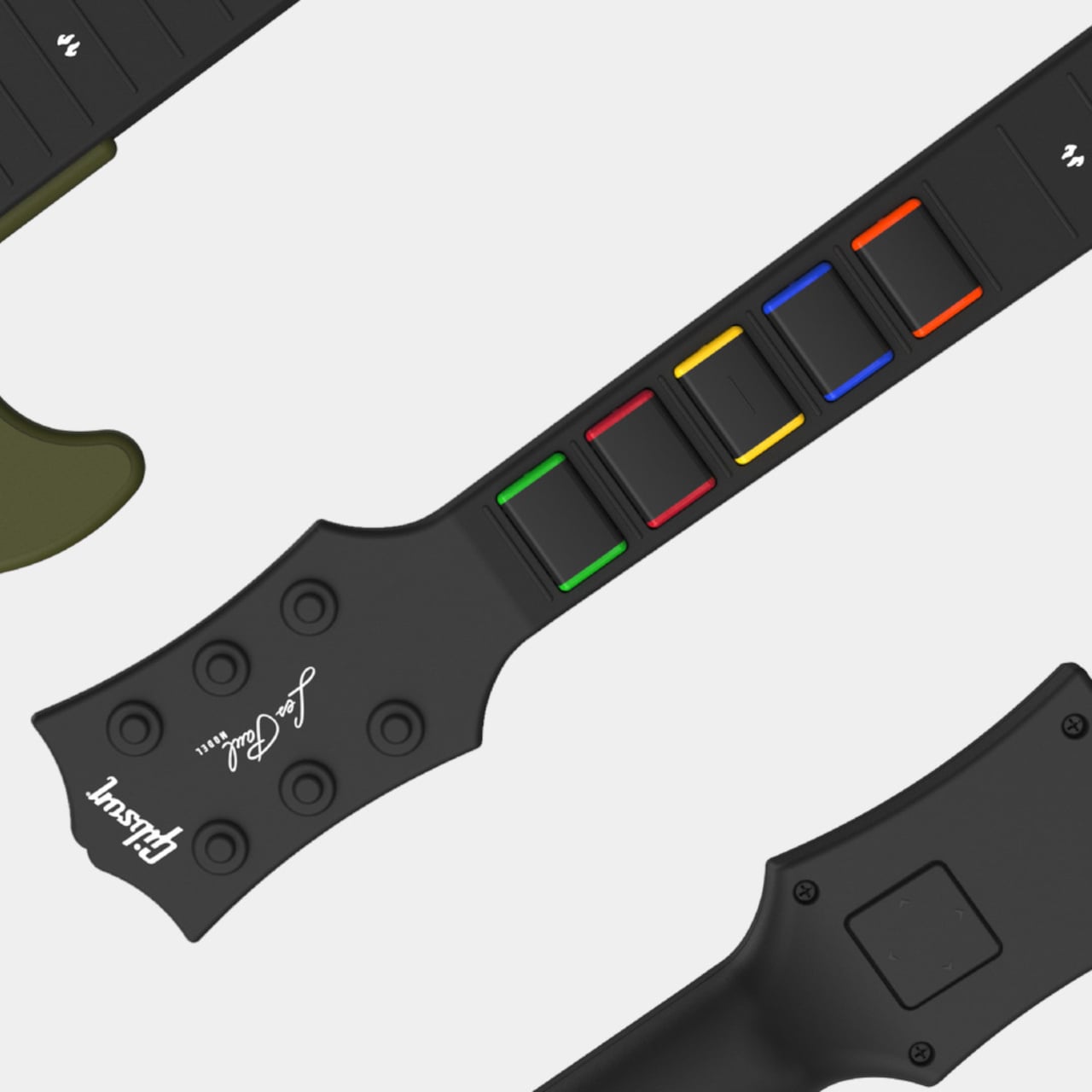
The CRKD x Gibson Les Paul Olive Drab Pro Edition is a guitar controller that takes the instrument side of that equation seriously. Built on the silhouette of the actual Gibson Les Paul Olive Drab electric guitar and officially licensed by both Gibson and Xbox, it’s designed for Xbox Series X|S, Xbox One, and PC, with a finish that stands apart from the more conventional options the brand has previously released.
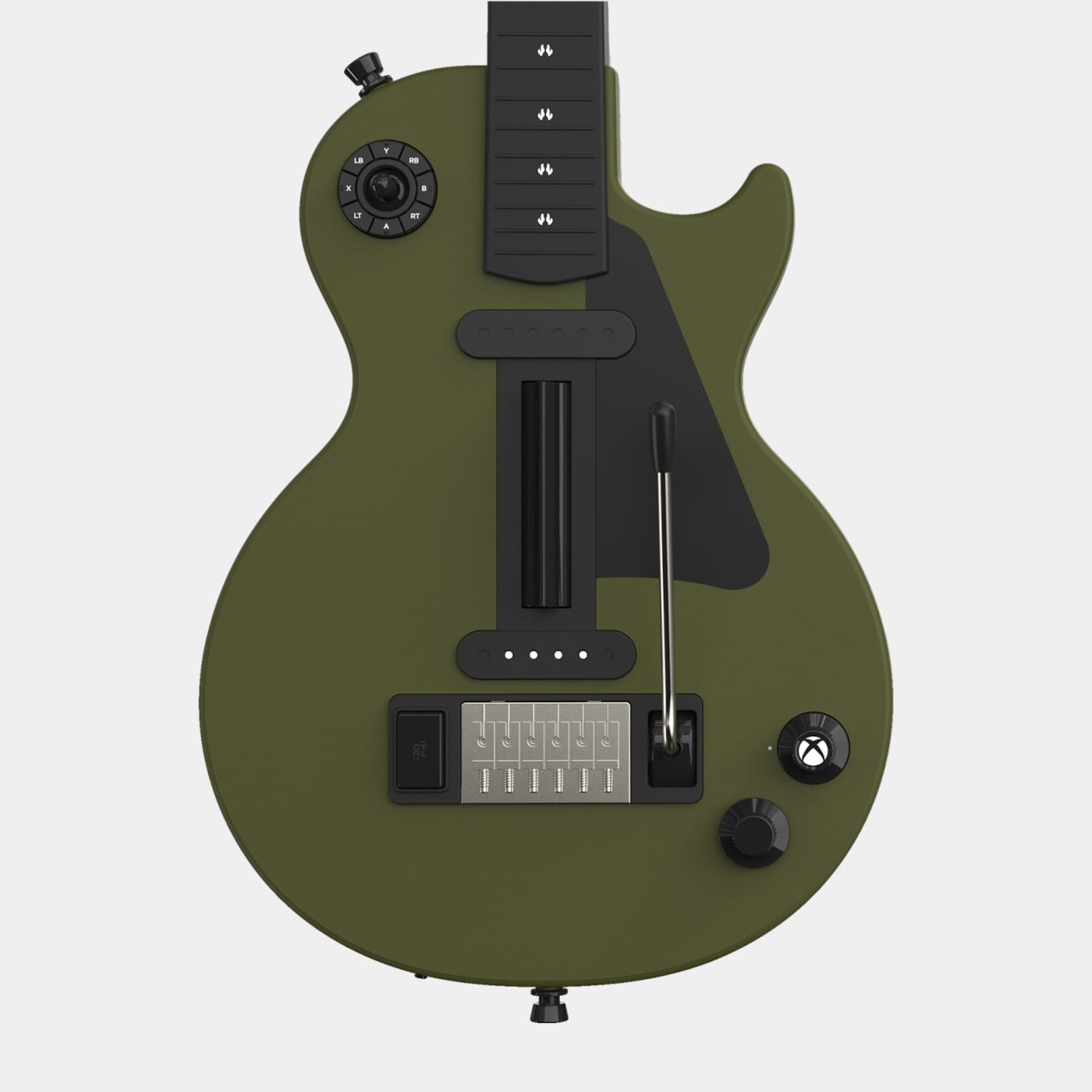
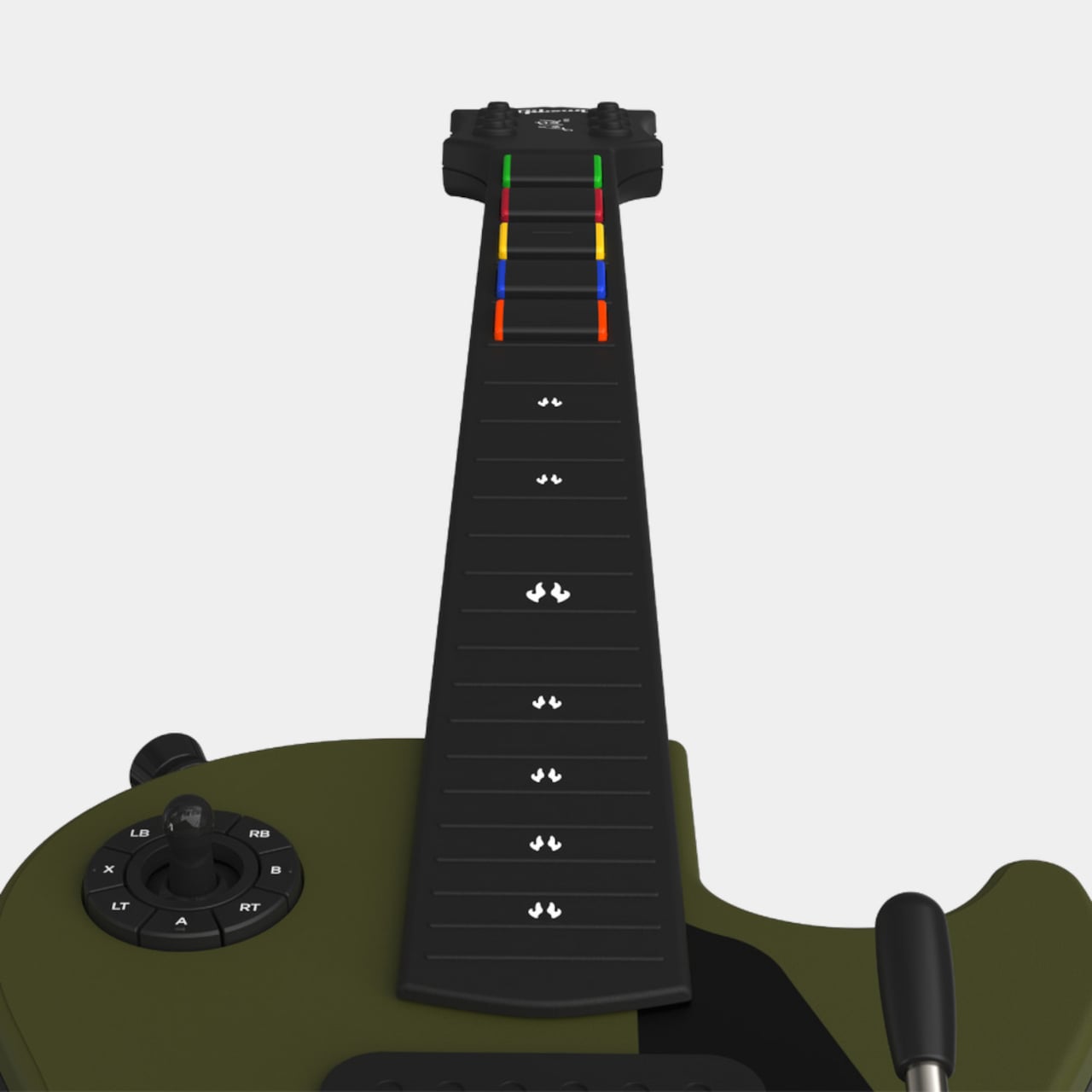
The two hardware decisions that define the playing experience are the EZ Glide mechanical fret buttons and the Hall Effect strum bar. The fret buttons use mechanical switches rather than the rubber membranes found in standard guitar controllers, giving each press a tactile click that registers precisely and consistently. The strum bar relies on Hall Effect technology rather than physical contacts, which means it doesn’t degrade with repeated use, and its sensitivity and actuation points can be dialed in through the CRKD app.
That companion app also handles everything the previous model’s physical 9-mode dial used to cover. CRKD removed that dial from the Olive Drab Pro Edition after extended playtesting found it added friction to getting started. Game presets, button remapping, custom profiles, and firmware updates now all live in the app. For players who want the depth, it’s all still there, and for those who just want to plug in and play, nothing stands in the way.
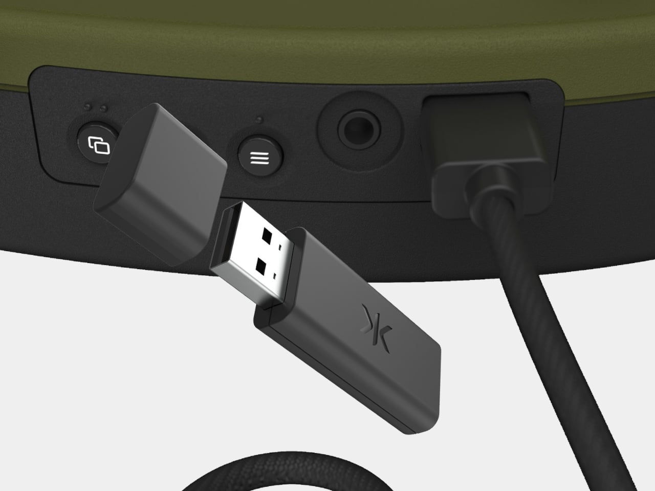
Connectivity covers three modes: wired via USB-C, low-latency 2.4 GHz wireless through the included USB dongle, and Bluetooth. The package also comes with a shoulder strap and a removable rechargeable battery. Rapid polling technology keeps response times tight across all connection methods, which matters considerably once you’re trying to hit precise timing windows in harder difficulty tiers.
The Olive Drab colorway is worth noting as more than just an aesthetic decision. CRKD has positioned this release as the first in an evolving line of Pro Edition controllers, setting up the platform for Stage Tour, its upcoming rhythm game, which the hardware will also support. It’s a calculated move to give players both a current controller that works across today’s library and a stake in whatever the next chapter of rhythm gaming looks like.
Production is limited to a single batch, priced at $134.99 USD, €149.99, or £129.99 depending on region. Compatible games include Fortnite Festival, Rock Band 4, Clone Hero, YARG, and the upcoming Stage Tour. CRKD has confirmed this is strictly a one-run release, shipping now while stock holds. For anyone who’s been waiting for a guitar controller worth taking seriously, this is about as deliberate a design statement as the category has produced.
Returning from a grocery run with multiple bags in each hand is one of those small, everyday annoyances that people have accepted as inevitable. The plastic or fabric handles dig into the fingers, usually along the narrowest bones, the load swings unevenly with each step, and somewhere between the car and the front door, your hands remind you that they weren’t really designed for this. It’s not a dramatic problem, but it adds up in a way that genuinely wears on you over time.
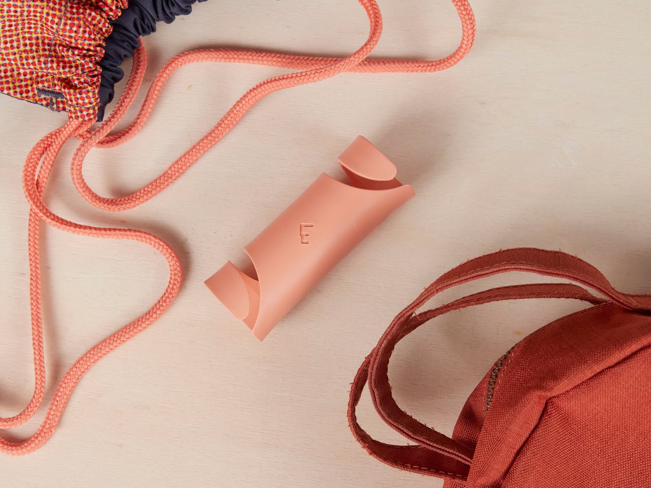
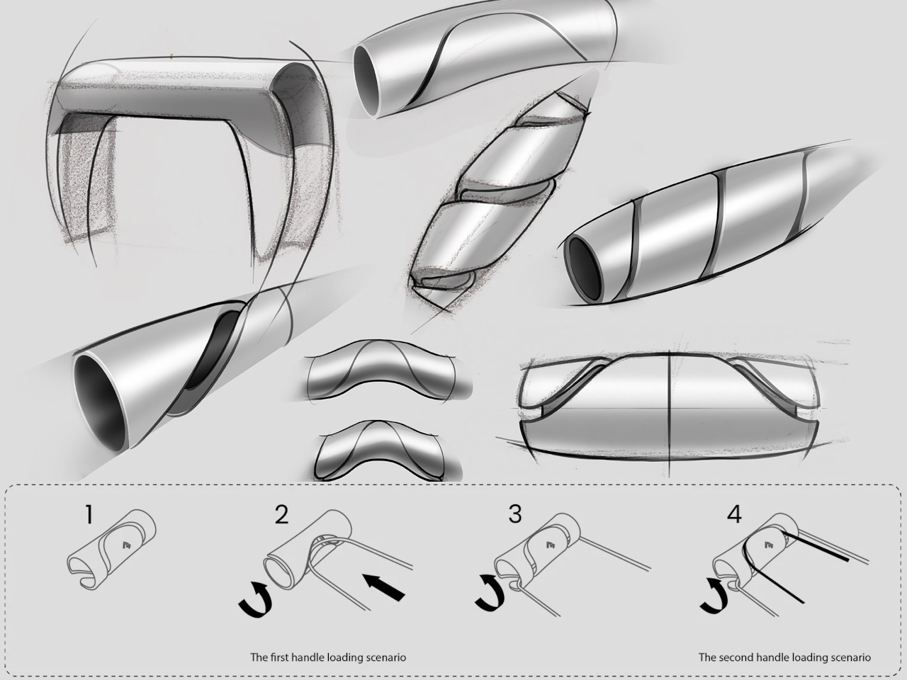
Carryfix is a compact portable handle that collects all those separate bag handles into a single controlled grip. A twist-lock mechanism lets you slide the handles in and out with a simple rotation, gathering paper bags, plastic bags, totes, and fabric handles together regardless of how thick or thin each one is. Four or more bags become one balanced load rather than a shifting, hand-numbing mess of individual handles.
The mechanism handles the consolidation, but the handle geometry is where the design work shows. Rather than defaulting to the easiest shape to produce, the grip follows the natural resting curve of the hand, spreading pressure across the entire palm instead of concentrating on the flexor tendons. That’s where standard bag handles tend to cause the most discomfort, and the difference is noticeable fairly quickly, especially on longer walks or when the bags are heavier than planned.
It also solves a secondary problem that most bag carriers ignore. When you set a loaded Carryfix down, the bags stay grouped rather than fanning out and toppling over. That might sound minor until you’ve set down several bags only to watch them scatter across a parking lot floor while you’re still fumbling for your keys. Having them locked in place is one of those small wins that ends up mattering more than the feature list suggests.
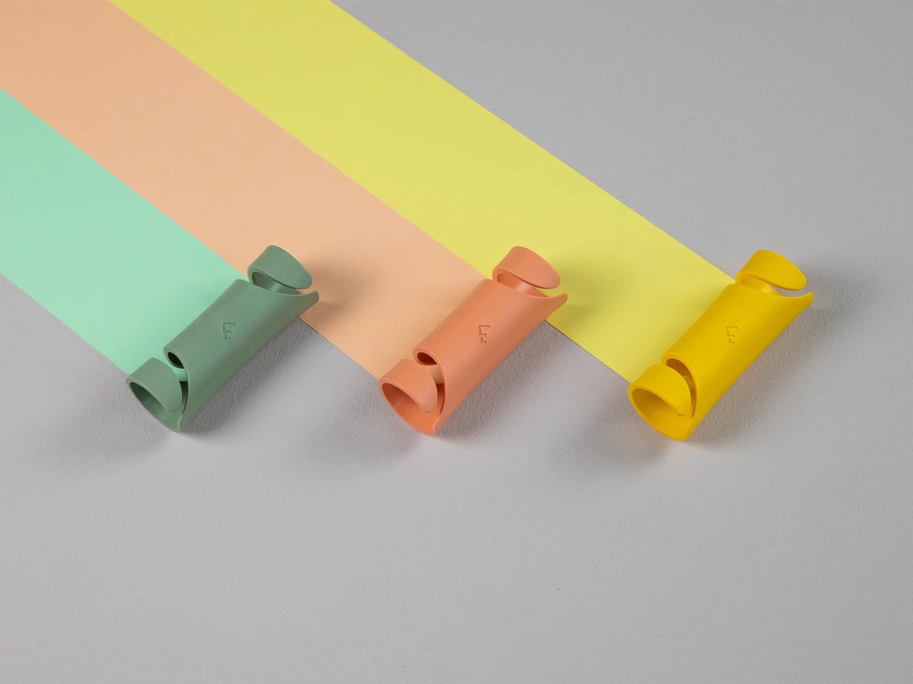
The same principle works just as well beyond the supermarket. Carryfix is compact enough to clip onto a keychain, so it travels with you without requiring any deliberate packing. A beach outing with multiple bags, a trip to the sports ground with gear spread across several carriers, or managing a handful of bags while traveling are all situations where consolidating the load into a single grip makes an immediate difference. It’s already selling across European markets in six color options.
There’s a long history of bag carriers with similar ambitions, most of which solve the handle-cutting problem by adding bulk or requiring a specific bag type. Carryfix avoids both. The compatibility across bag materials and handle thicknesses means it works on whatever bags you happen to have, rather than demanding that your bags be designed for it. Keeping it small enough for a keychain removes the final friction point, since a tool that lives on your keys is one you actually have with you at the moment you need it.