One Revolution Per Minute: How THE MIROR Makes Time Visible

Most lamps exist to solve a problem: you need light, so you buy a lamp. THE MIROR Collection, by design studio MIRORlab, starts from a completely different premise. Rather than asking how to illuminate a room, it asks what light could be if it were designed to make you feel the passage of time. The answer is a kinetic lighting system that is part optical instrument, part ambient installation, and one of the more quietly radical design concepts I’ve come across in recent memory.

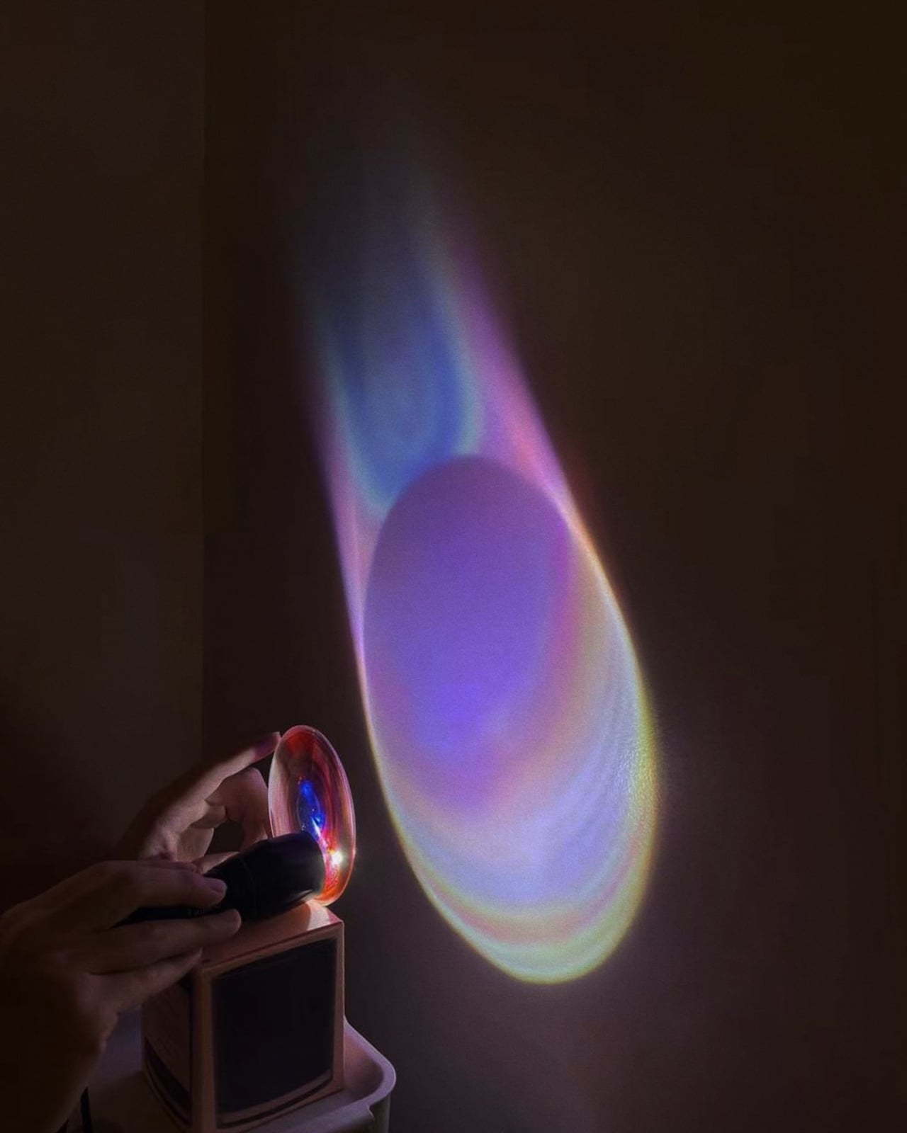
At its heart, THE MIROR is built around a slowly rotating light source paired with a set of six interchangeable magnetic glass lenses. Each lens contains embedded micro-patterns and textures that refract and fragment light into shifting projections across walls, ceilings, and floors. Nothing in the room physically changes. Yet from one minute to the next, the space looks and feels entirely different. The effect is genuinely mesmerizing, the kind of thing you notice out of the corner of your eye and then can’t stop watching.

Designer: MIRORlab
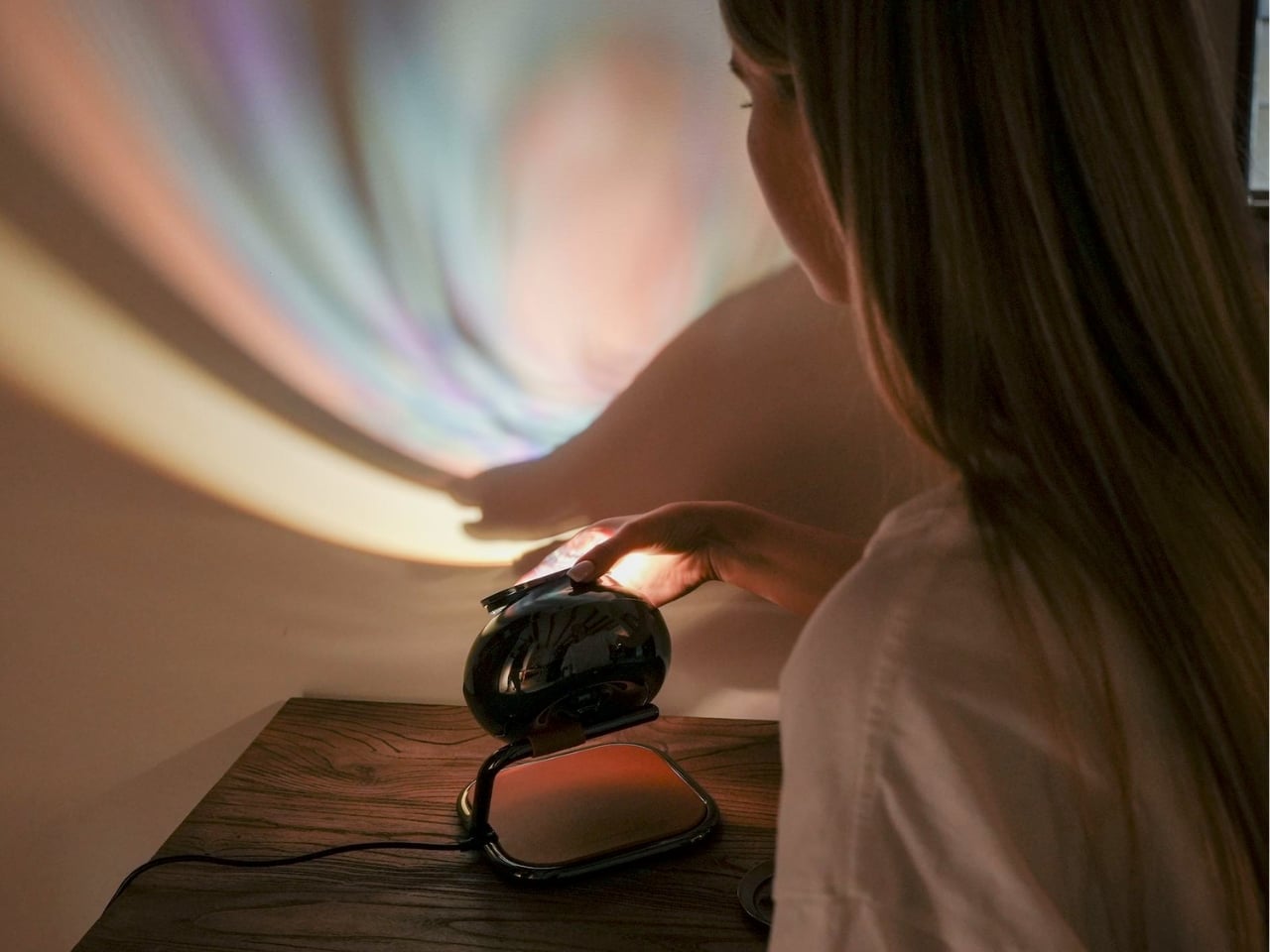
The detail worth dwelling on is the rotation speed: exactly one revolution per minute. That’s not an arbitrary number. It’s calibrated to align with a natural perceptual rhythm, slow enough to feel meditative rather than dizzying, but active enough that you remain aware of it at all times. The light is always doing something. It’s the design equivalent of a really good ambient soundtrack, present without being intrusive, affecting the room without demanding your full attention.

What MIRORlab is essentially arguing is that most lighting design treats time as irrelevant. You flip a switch, the room is lit, and that’s the end of the relationship. THE MIROR reframes light as a time-based medium, something that unfolds, rotates, and transforms continuously. No two projected moments are ever identical, even with the same lens. In that sense, it has less in common with conventional lighting and more in common with kinetic sculpture or generative art. The lamp isn’t just a tool for visibility. It’s a system for experiencing duration.
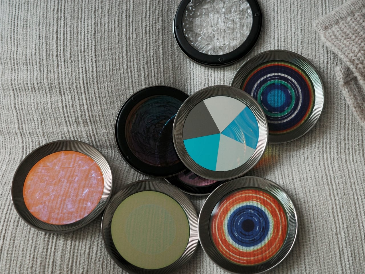
The six lenses, named Earth, Nebula, Dune, Bloom, Warmwhite, and Metropolis, were each developed through research into atmospheric perception and environmental light conditions. The reference points are genuinely cinematic: sunset diffusion across open landscapes, deep-space nebula imagery, solar eclipse transitions, water reflections under shifting cloud cover, and city lights seen from altitude at night. Most product designers think in finishes and colorways. MIRORlab thought in atmospheres. Swapping a lens doesn’t just adjust the quality of the light; it changes the entire emotional register of the room, and that’s a remarkable thing to get out of a piece of magnetized glass.
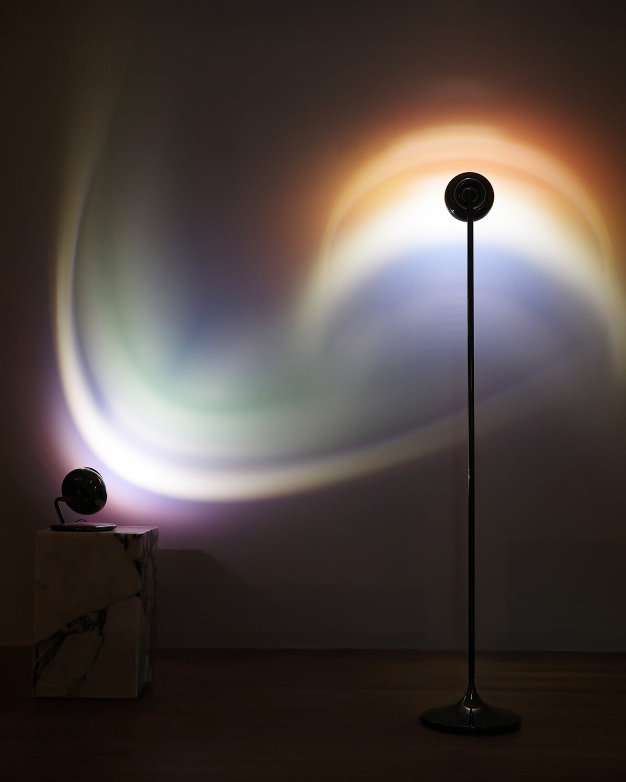
I think the broader cultural moment makes THE MIROR feel especially timely. We spend more time than ever in rooms that don’t change, and the relationship between a person and their living space has become both more intimate and more psychologically loaded. Design has started responding to that shift with a growing category of objects that prioritize atmosphere over function: white noise machines, scent diffusers, smart lighting systems, biophilic elements. All of them are answers to the same underlying question about how space should make us feel. THE MIROR fits cleanly into that conversation, but with a level of optical and conceptual depth that most of its peers simply don’t reach. It doesn’t just set a mood. It gives the room a sense of time passing, which is a genuinely different thing.

The more I sit with THE MIROR Collection, the less it feels like a lighting product and the more it feels like a quiet philosophical statement. It suggests that a room should move with you rather than simply surround you, that ambient experience doesn’t have to be passive, and that something as unassuming as a lamp can carry a real point of view about how we inhabit space. That’s a significant ask of a rotating glass lens. But if the projections look anything like the concept promises, it’s a completely fair one.
The post One Revolution Per Minute: How THE MIROR Makes Time Visible first appeared on Yanko Design.

RIMOWA’s Pokémon Collab Proves Nostalgia Travels Well

Thirty years ago, Pokémon taught an entire generation that the real adventure was the journey, not the destination. Now, RIMOWA is making that philosophy literal, and the result is one of the most covetable travel accessories of the year.

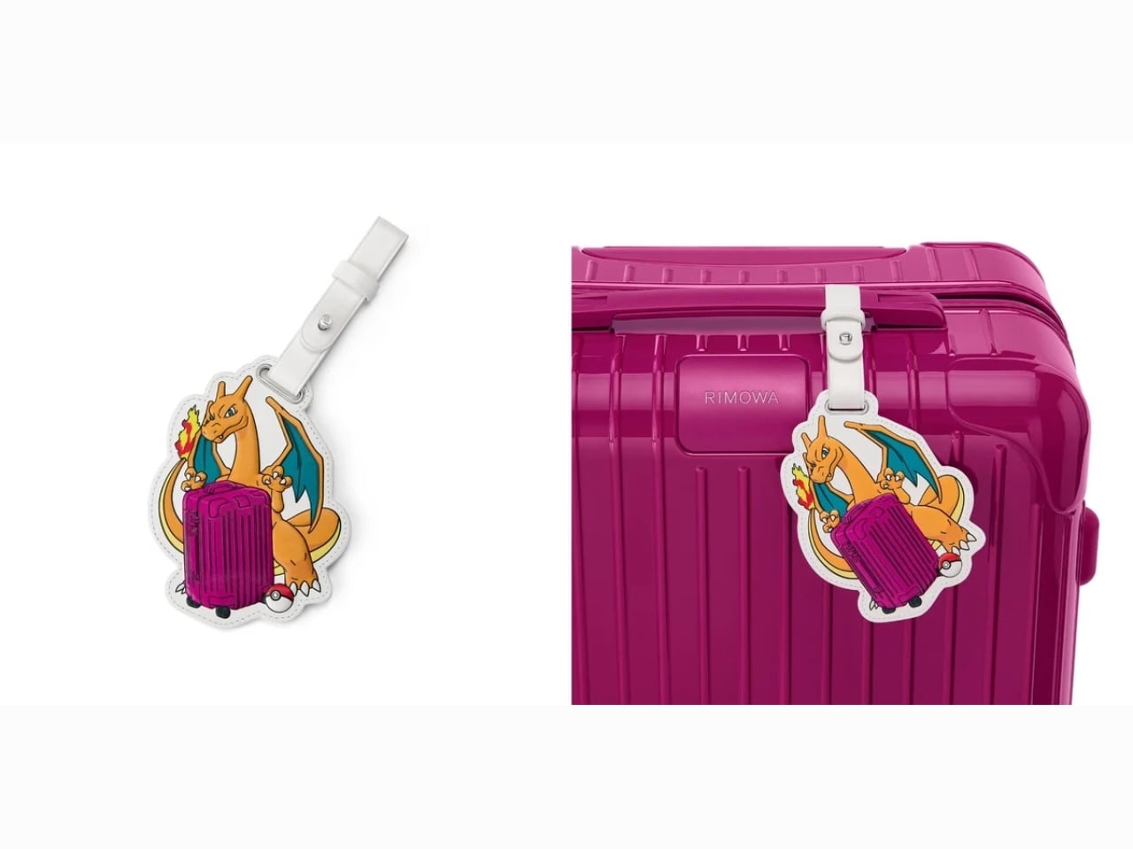
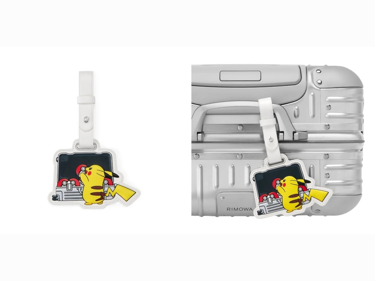
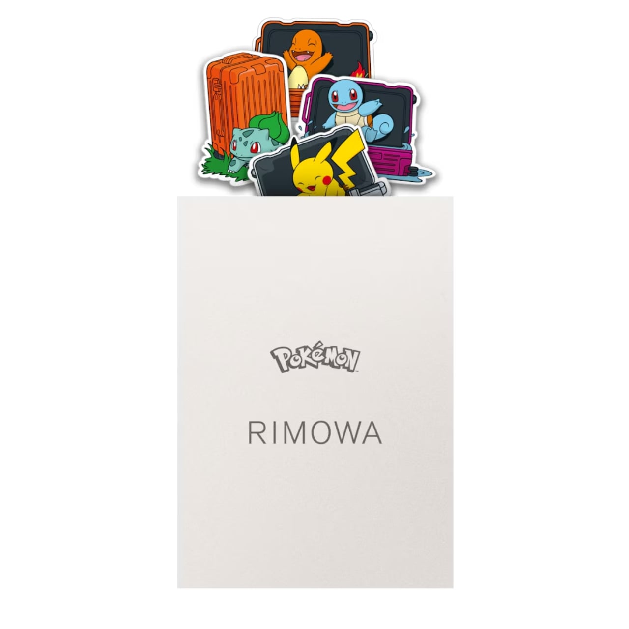
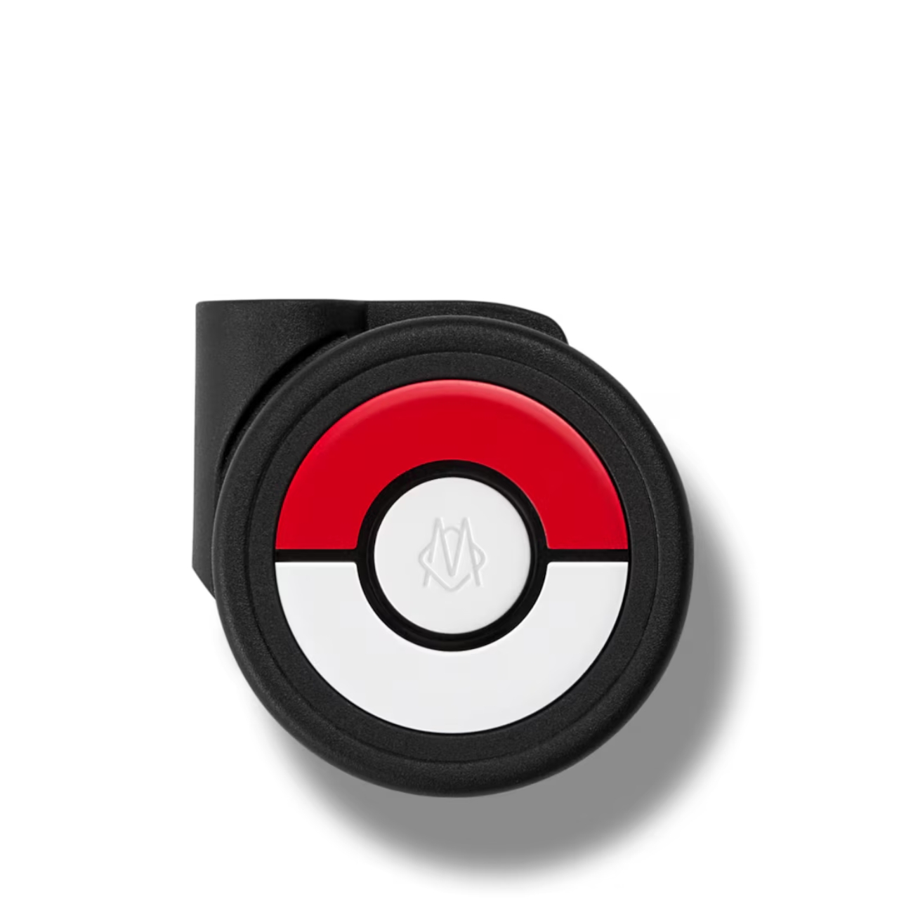
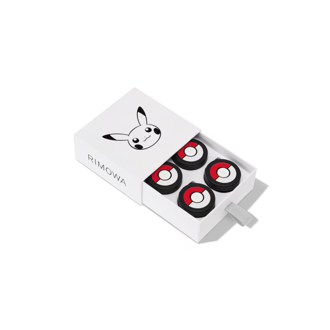
The collaboration, a Japan-exclusive capsule released on June 2, brings Pokémon-themed accessories to RIMOWA’s iconic suitcase lineup. We’re talking Poké Ball wheel sets, Pokémon-inspired luggage tags, and a limited-edition sticker set. The pieces are showcased alongside RIMOWA’s Essential line in bold Orange and Magenta, and the classic Original Cabin in Silver. If you need a moment to process how good that combination looks, take it.

Designer: RIMOWA

Collaborations between luxury brands and pop culture franchises are not new. We’ve seen high fashion shake hands with anime, streetwear collide with fine art, and sneakers morph into collector’s items worth more than a month’s rent. But the RIMOWA x Pokémon drop feels different, and not in the way that brands usually claim something is “different.” The distinction is in the credibility of both sides. RIMOWA has spent over a century building a reputation for precision engineering and design integrity. Pokémon has spent thirty years becoming one of the most enduring cultural franchises in history. When these two come together, the output isn’t just a product. It’s a statement.

The luggage tags are the quiet stars of this collection. Most people treat luggage tags as an afterthought, just a way to identify your bag on the carousel. But a Charmander or Charizard tag dangling from a polished aluminum case changes the conversation entirely. It turns your luggage into a flex, and the best kind: one that’s playful rather than pretentious. Charmander and Charizard are arguably the most beloved starter evolution line in the franchise, which means these tags carry genuine sentimental weight for anyone who spent their childhood glued to a Game Boy.

Then there are the stickers, and they matter more than you might think. RIMOWA has long encouraged travelers to use their suitcases as a canvas, a rolling record of everywhere they’ve been. The Pokémon sticker set fits that tradition naturally. It gives you something to place with intention, something that says a little about who you are before you even open your mouth at baggage claim. There’s a generational intimacy to Pokémon stickers on a luxury suitcase that feels earned rather than gimmicky.

The Poké Ball wheel sets round out the collection in the most theatrical way possible. You only really see them when the suitcase is moving, which makes the reveal almost cinematic. It’s design thinking at its most fun, and I appreciate that neither brand tried to make it subtle.

The Japan-exclusive angle is worth sitting with, though. It makes sense: Japan is the birthplace of Pokémon, and RIMOWA has a strong presence in the Asian market. A region-specific drop honors that cultural connection and keeps the collection genuinely limited. But if you’re a Pokémon fan, a RIMOWA enthusiast, or both, and you happen to not be in Japan, you’re essentially watching this happen through glass. Resale prices will be predictably painful, and that accessibility gap is the one thing that slightly dulls the shine of an otherwise excellent collaboration.

Still, Pokémon’s 30th anniversary has been a celebration done right. The franchise has rolled out collaborations across fashion, collectibles, and experiential activations throughout 2026, and the RIMOWA partnership sits at the top of that list in terms of design quality and cultural resonance. It understands its audience. It doesn’t try to be ironic or overly self-aware. It simply takes two well-crafted worlds and lets them coexist beautifully.

Good design is about making people feel something. A Charizard luggage tag on a polished aluminum suitcase makes you smile before your flight, and that’s not a small thing. Travel can be exhausting and deeply impersonal. A little bit of joy attached to your carry-on goes further than any airport lounge ever could. For collectors, this one is worth the chase. For everyone else, it’s a good reminder that luxury and nostalgia can share the same overhead bin, and sometimes, the most unexpected pairings are the ones that last.

The post RIMOWA’s Pokémon Collab Proves Nostalgia Travels Well first appeared on Yanko Design.

Seoul Has a New Shade of Cool, and It Folds Flat

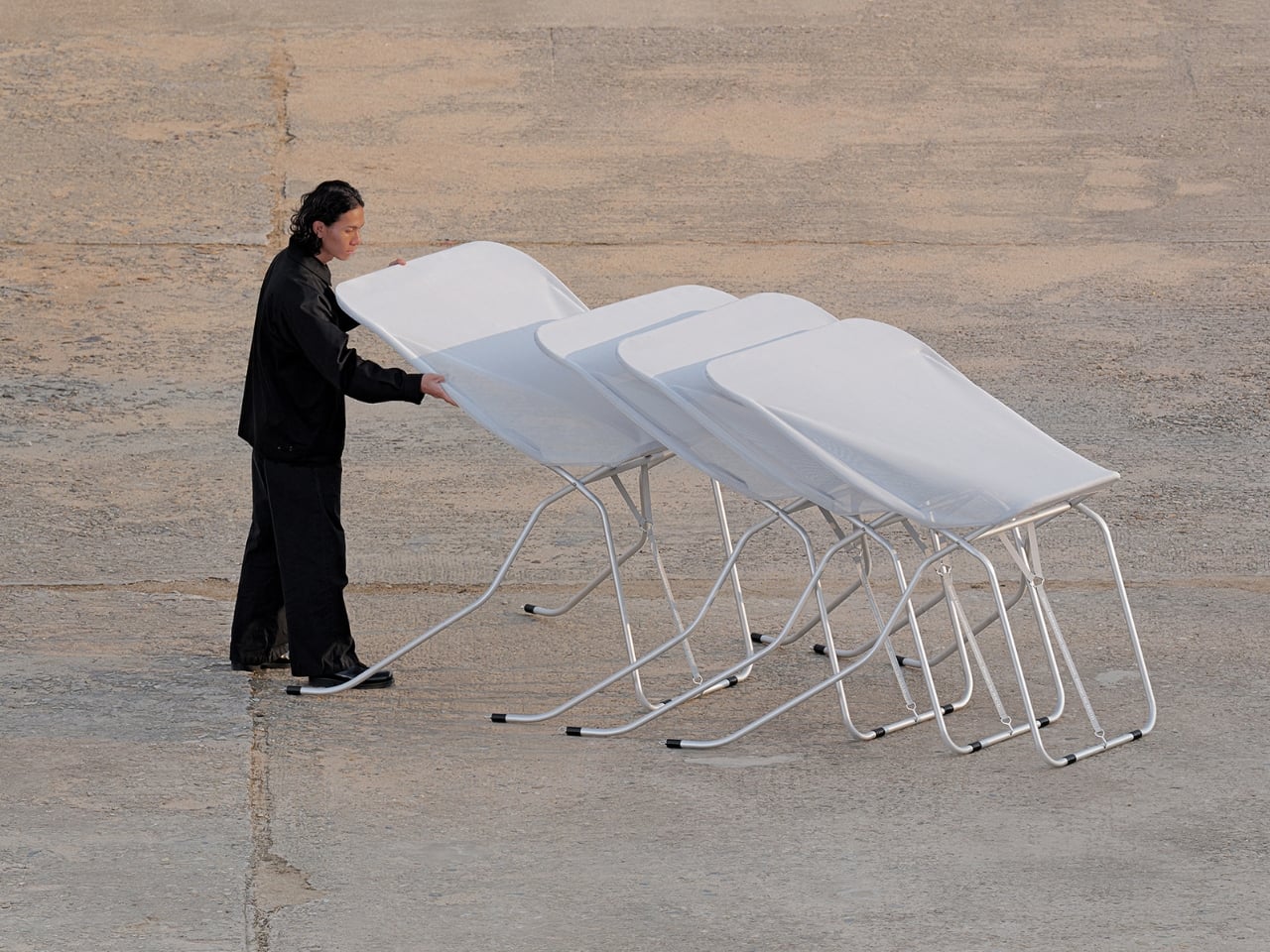
Most urban design conversations center on permanence: the building, the plaza, the park. Fixed, costly, and slow to adapt. Seoul-based studio BKID Co is thinking differently, and the result is the Seoul Shade, a compact, foldable sunshade that quietly challenges the idea that public comfort has to be built into the ground.

BKID, founded by BongKyu Song in 2006, is the kind of studio that doesn’t stay in one lane. Song is a former Samsung designer who helped lead the design of the original Galaxy Tab. Over the years, BKID has built a portfolio that spans medical devices, car diffusers, furniture, and smart home tech, earning 13 iF Design Awards along the way and ranking number one in Korea for public design. The Seoul Shade feels very much like a continuation of that public-minded design ethos, this time applied to something deceptively simple: personal shade.

Designer: BKID Co

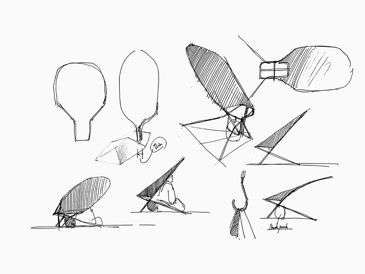
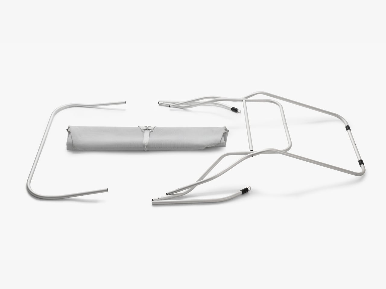
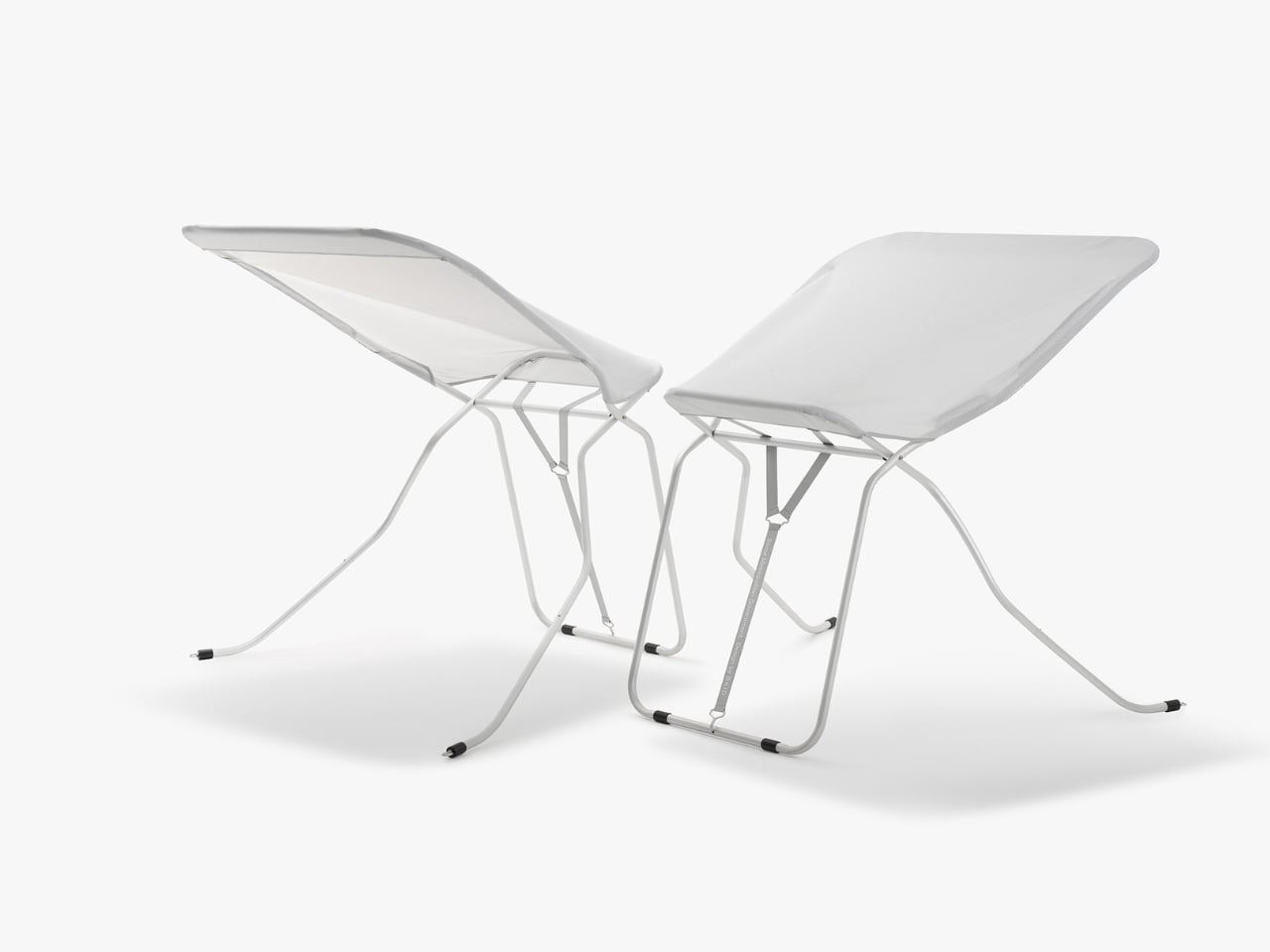
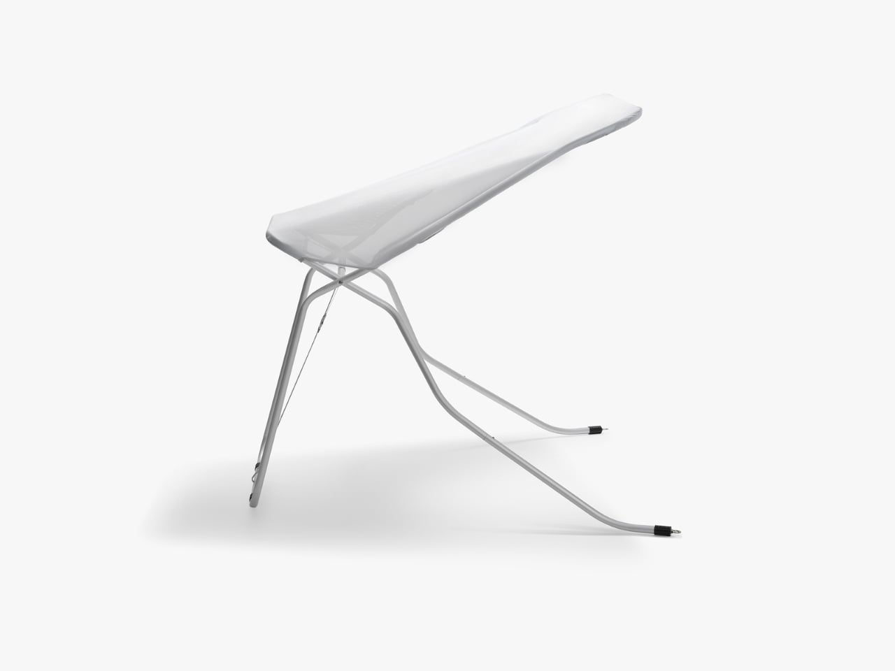
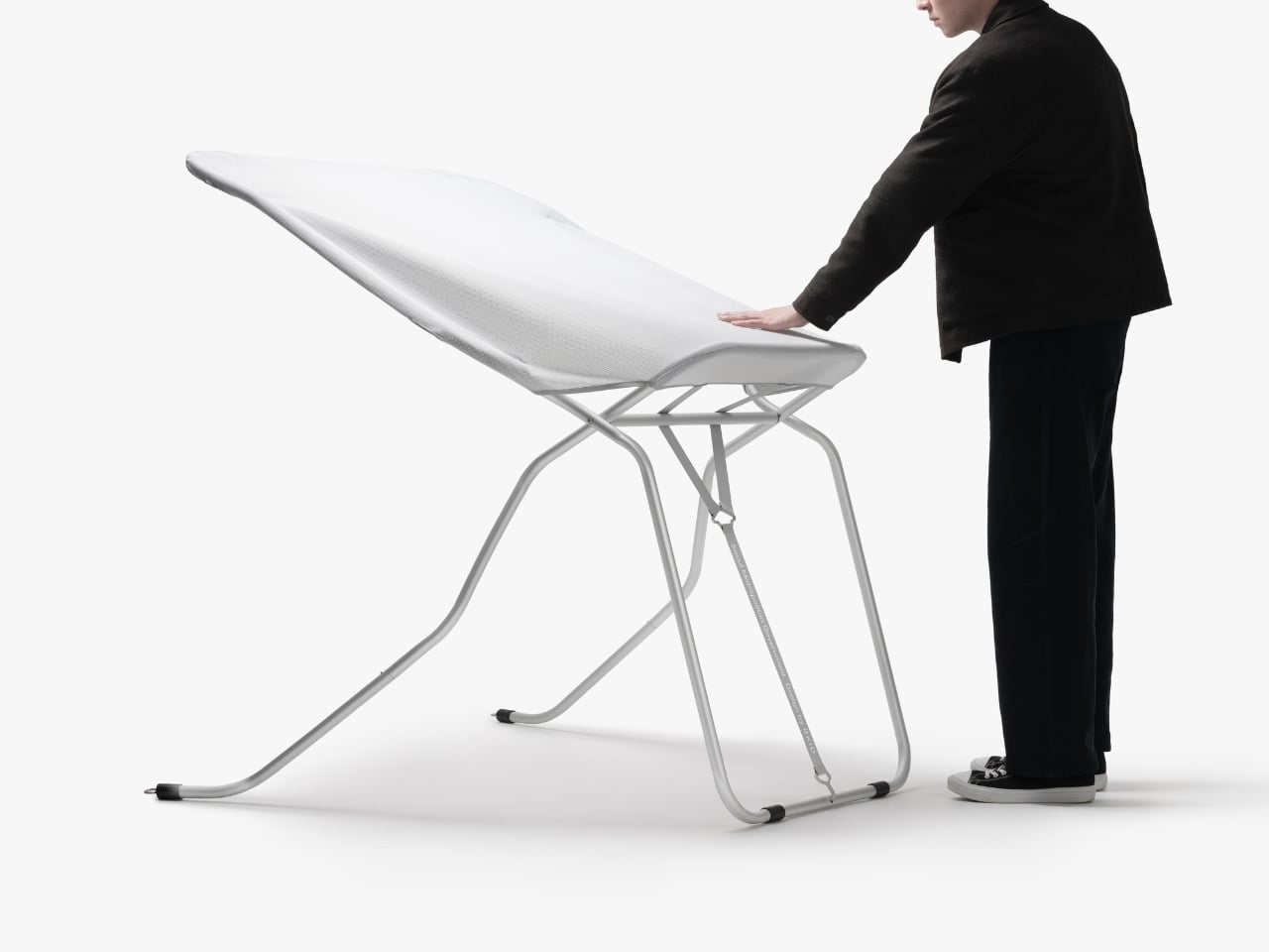
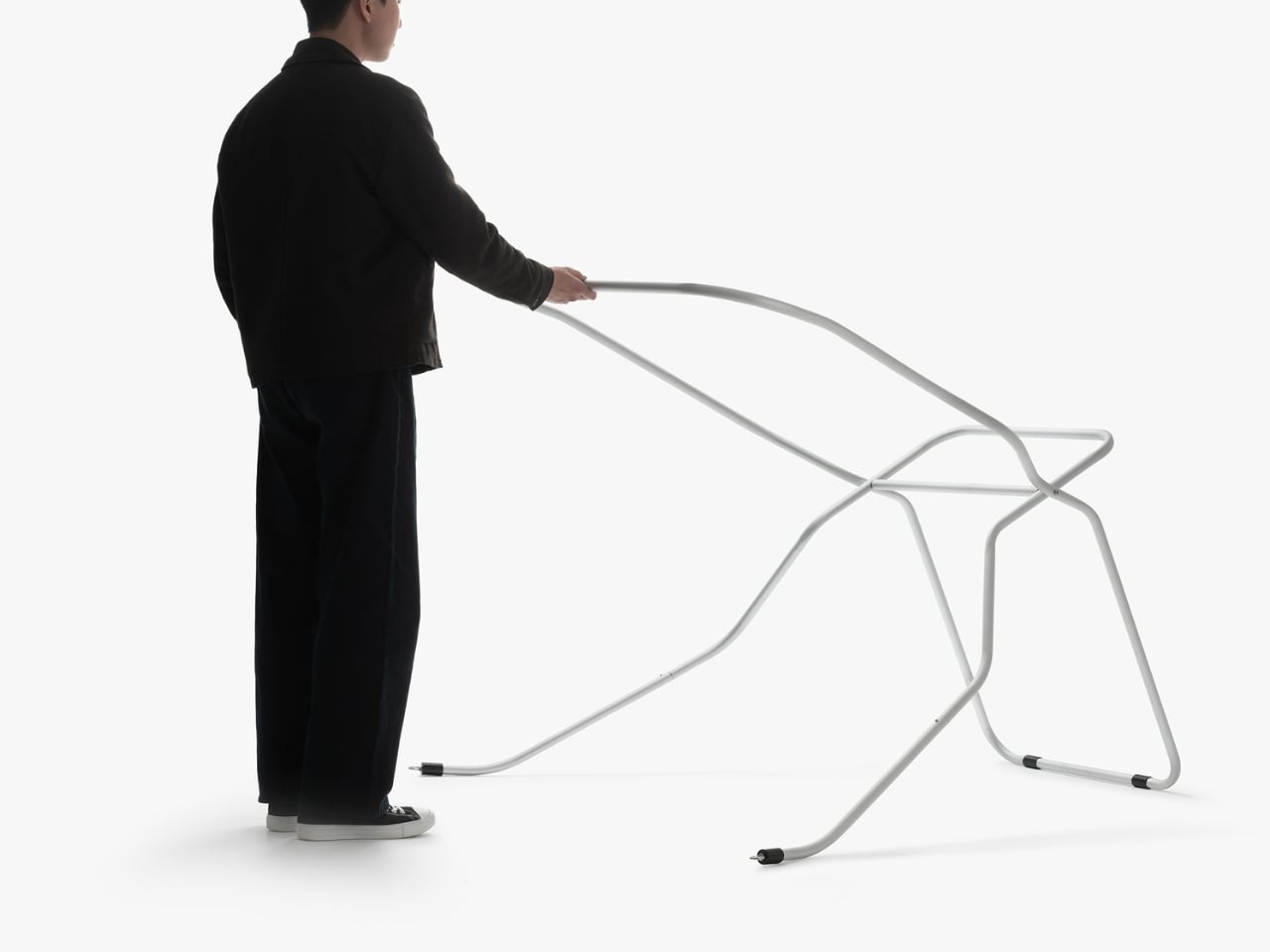
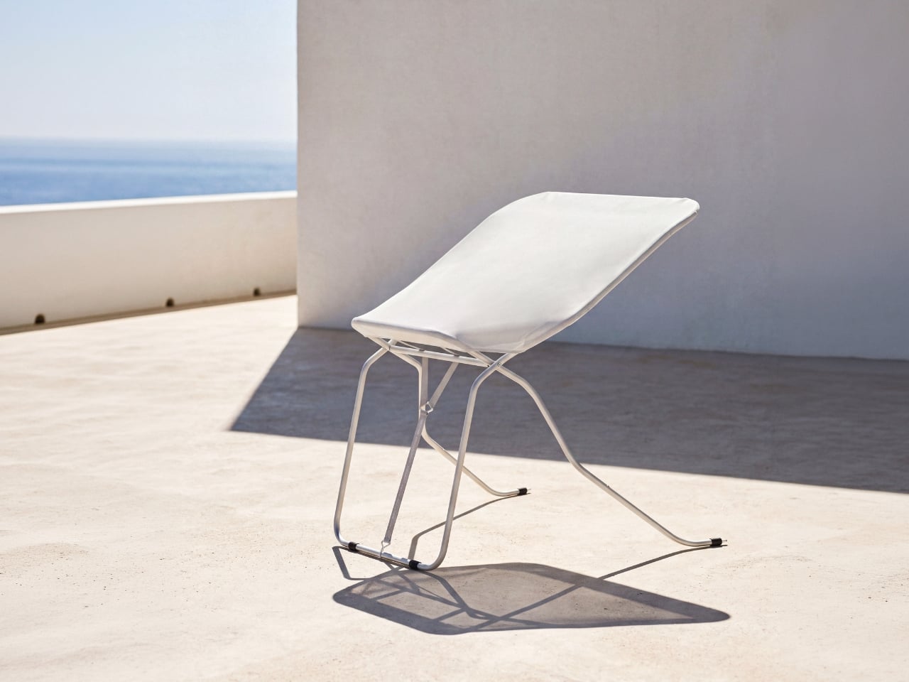
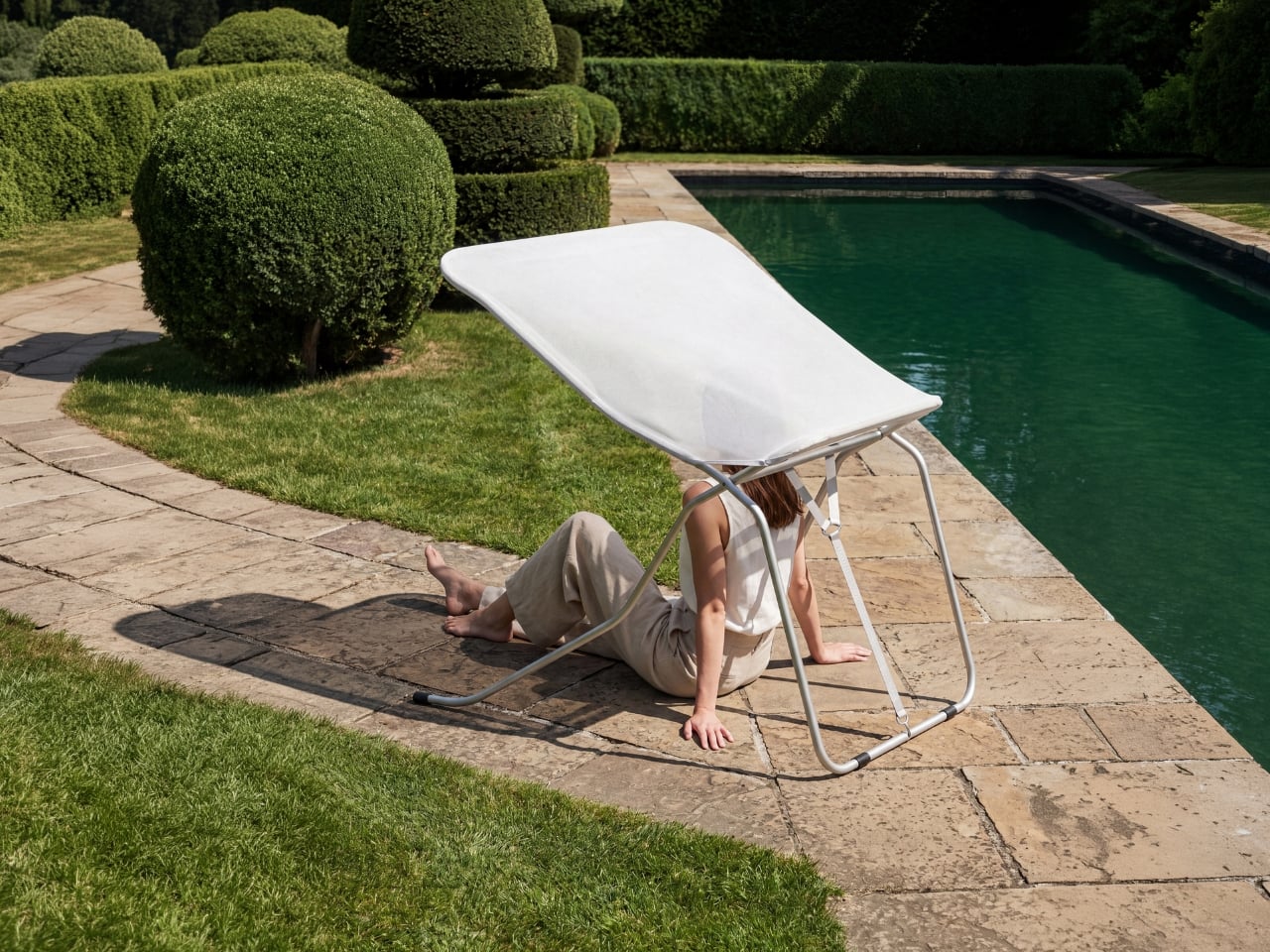
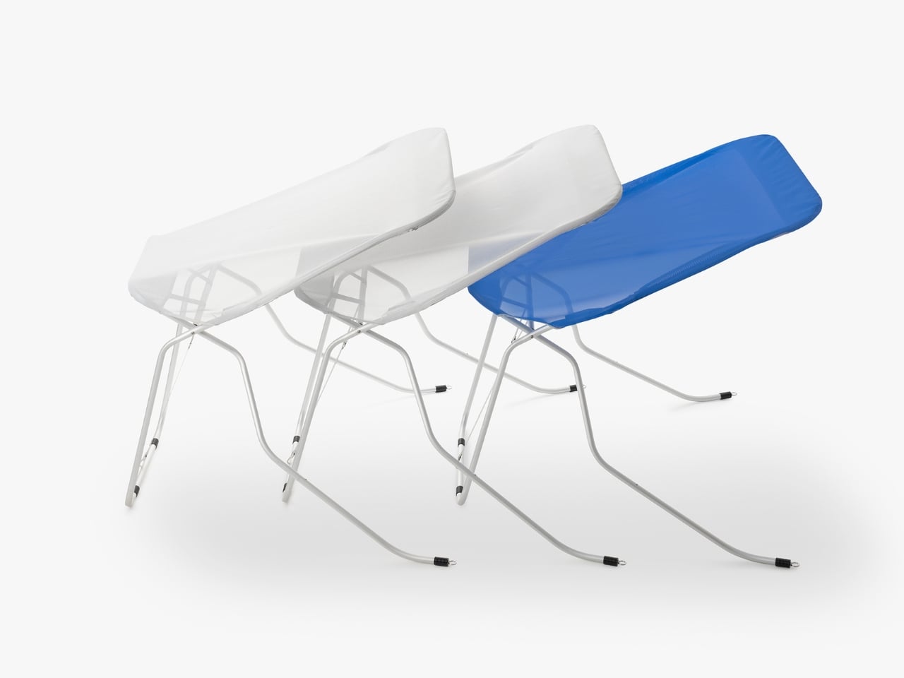
The concept takes the folding mechanism of a camping chair and applies it to a canopy structure sized for one to two people. Set it up in a few steps, pack it down flat, carry it with you. The whole thing is disarmingly low-tech, which is actually the point. When a design works this well without a battery or an app, you notice.

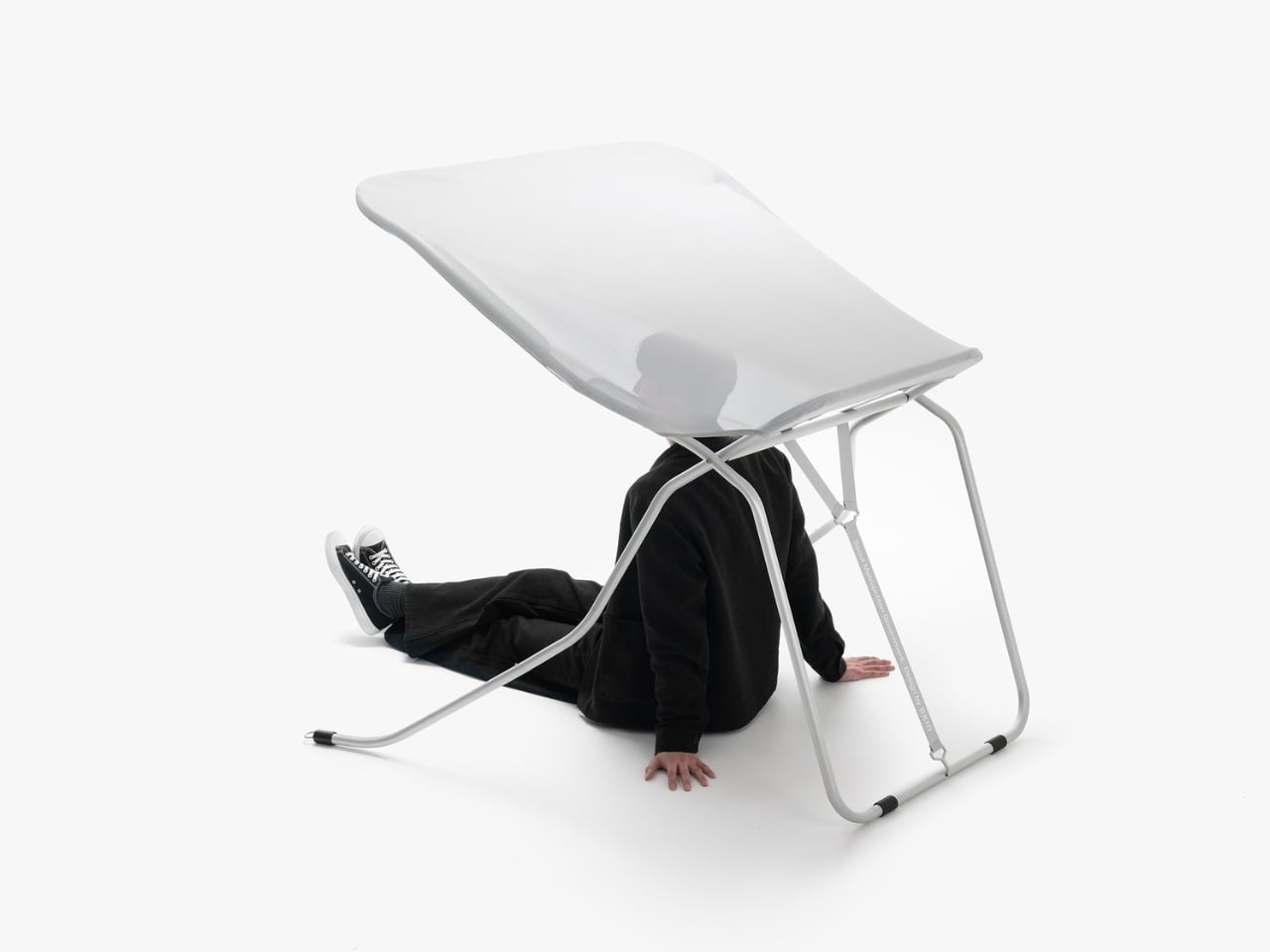
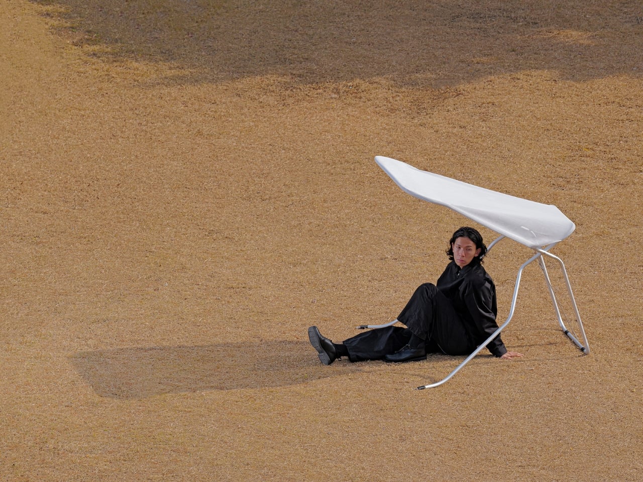
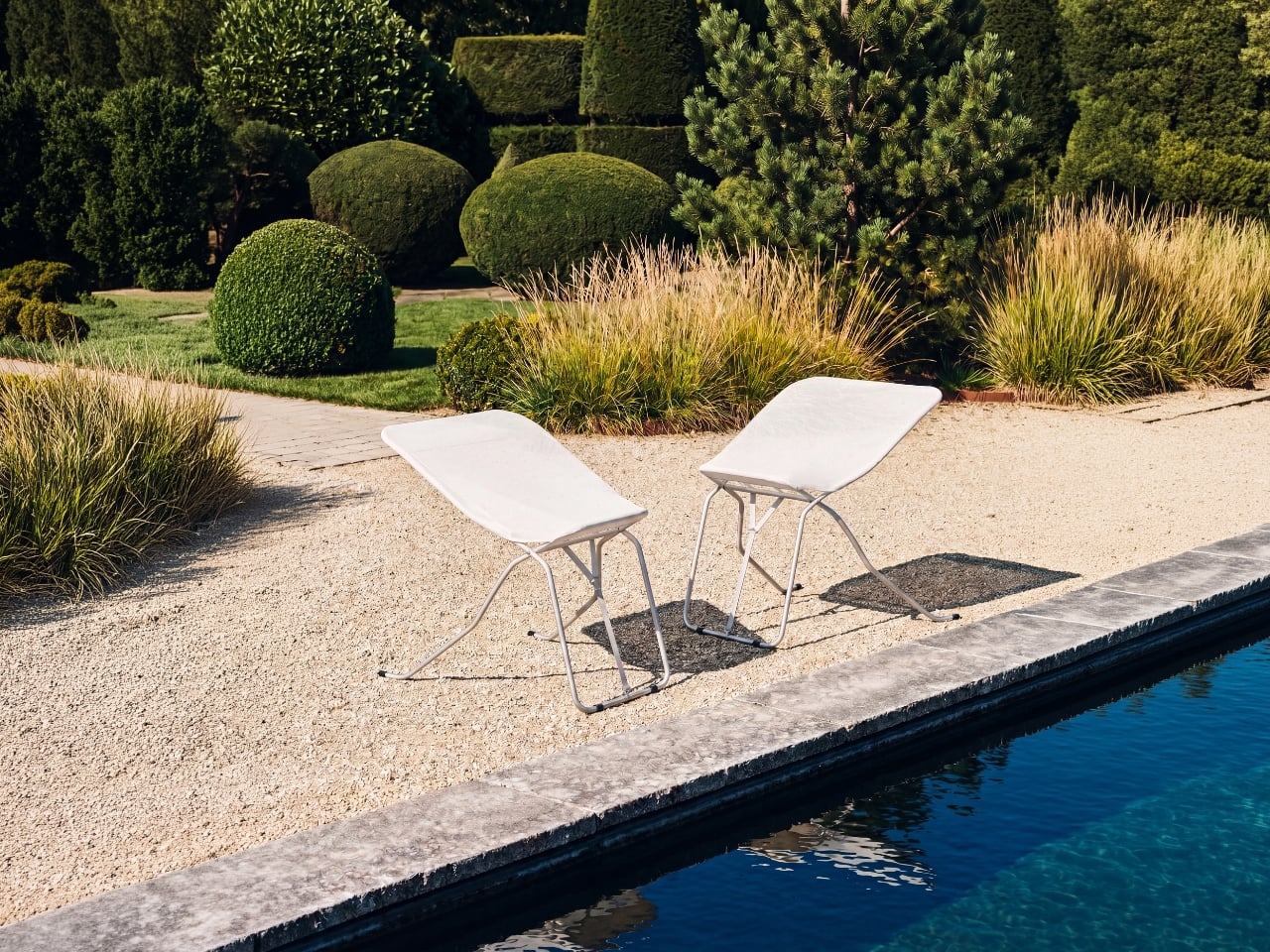
Visually, the Seoul Shade earns its place. The canopy is a stretched fabric panel held aloft by a lightweight tubular frame, and depending on the angle you catch it from, it looks like a wing, a sail, or a sculptor’s study of tension and curve. The product shots are beautiful, with users tucking themselves underneath in sandy fields and poolside terraces, which might feel aspirational to the point of absurdity, but they do communicate one thing clearly: the form has real presence. It’s not just a utility item. It looks considered.

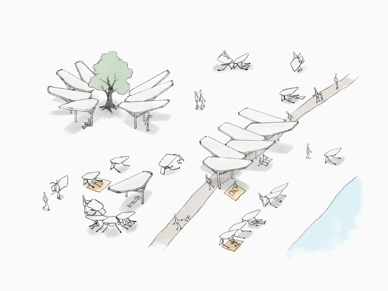
What makes this more than a clever camping accessory is the urban application BKID has built into the concept. The studio envisions these shades deployed collectively, arranged in rows along pathways, fanned out around trees, clustered at event spaces. A single unit is practical. A fleet of them becomes temporary infrastructure, which is genuinely interesting from a city planning standpoint. Seoul’s summers are increasingly brutal, and heat-related interventions at the city scale are becoming less optional. The Seoul Shade proposes a lightweight, human-scale response that doesn’t require the city to commit to anything permanent.

There’s a part of me that wonders how this holds up in actual use. Wind is the obvious concern for any canopy-style structure that isn’t staked to the ground, and the images, as carefully styled as they are, don’t really address that. But this is still a concept, and BKID has a track record of bringing things to production in ways that account for those engineering realities. The studio describes its process as a balance between emotional aesthetics and logical engineering, which suggests they’re not ignoring the practical questions so much as staging the presentation around the vision first.

The broader appeal here, I think, is that the Seoul Shade represents a shift in how we think about personal comfort in public spaces. The expectation has long been that cities provide the shade, usually through trees that take decades to mature or structures that cost a fortune to install. Seoul Shade flips that: it says maybe comfort is portable, personalized, and doesn’t have to wait for infrastructure funding. That’s a genuinely useful reframe.

BKID has been consistent about designing objects that propose new behaviors rather than just solving obvious problems. The Seoul Shade is less about fixing shade scarcity and more about introducing the idea that public space can be made adaptive, one foldable canopy at a time. Whether it ends up being produced for mass distribution, deployed as a public event furnishing, or stays a proposal, the conversation it starts is worth having.

The post Seoul Has a New Shade of Cool, and It Folds Flat first appeared on Yanko Design.

KantorGG Just Built a Tropical Home That Faces the Wrong Way

Most tropical homes try to open up. Floor-to-ceiling glass, wraparound terraces, the constant push-pull between inside and outside air. It’s practically a formula at this point. So when a house comes along that deliberately turns away from that instinct, you stop and pay attention.

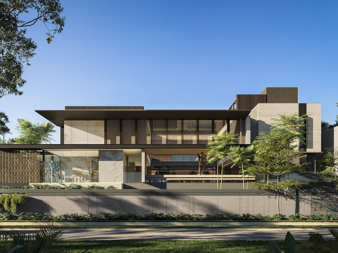
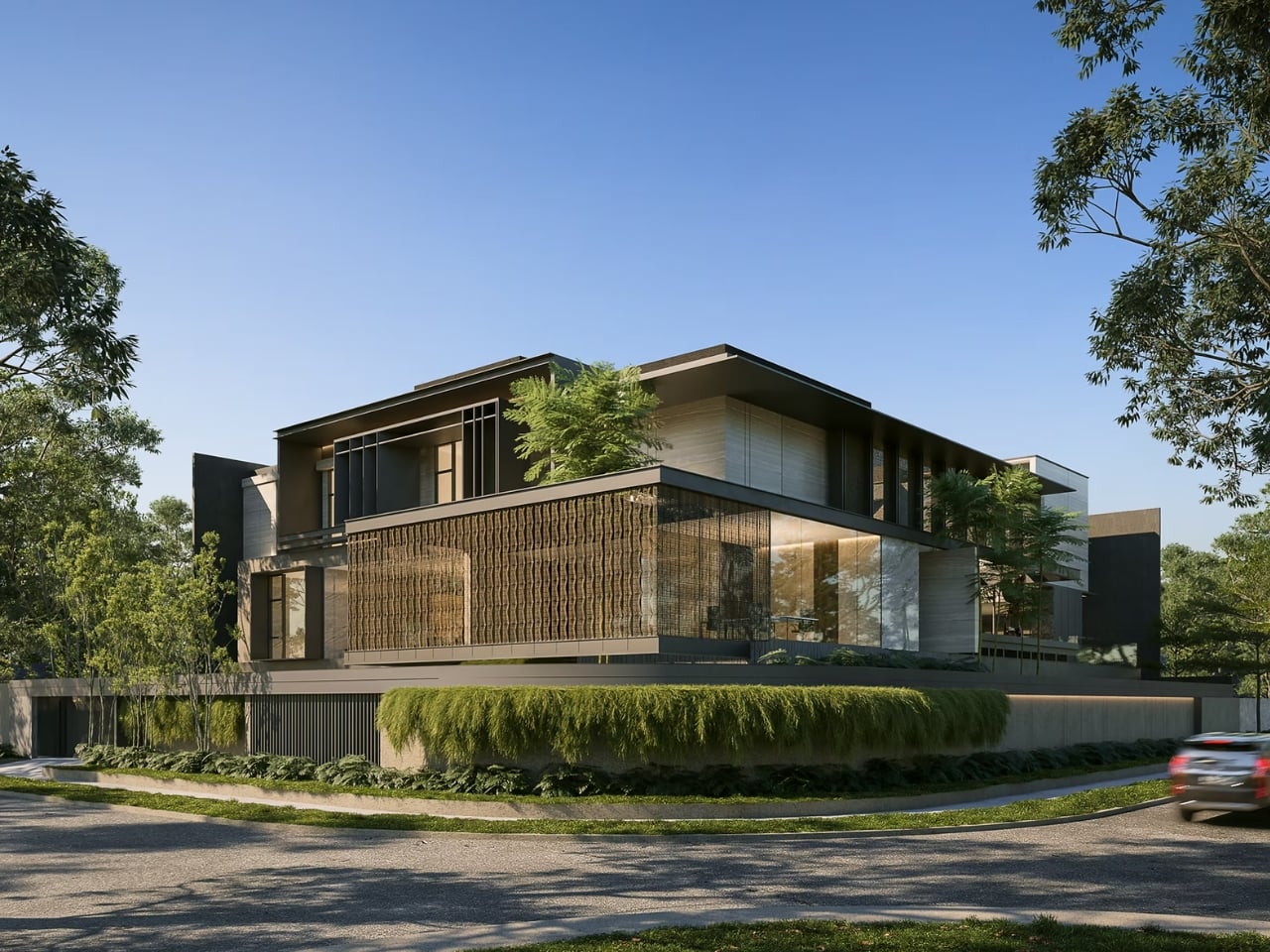
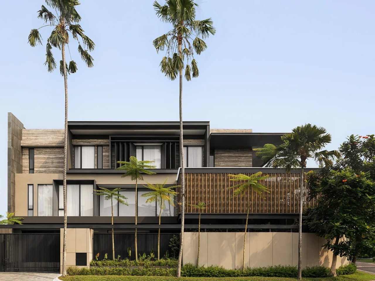
SE House, designed by Giovanni Gunawan of Surabaya-based studio KantorGG, sits at one of the city’s most recognizable residential corners and does something quietly radical: it pulls inward. Not to close off or shut the world out, but to create a kind of depth that most houses spend their entire floor plan actively avoiding.

Designer: Giovanni Gunawan for KantorGG (photos by Tristan Salim)

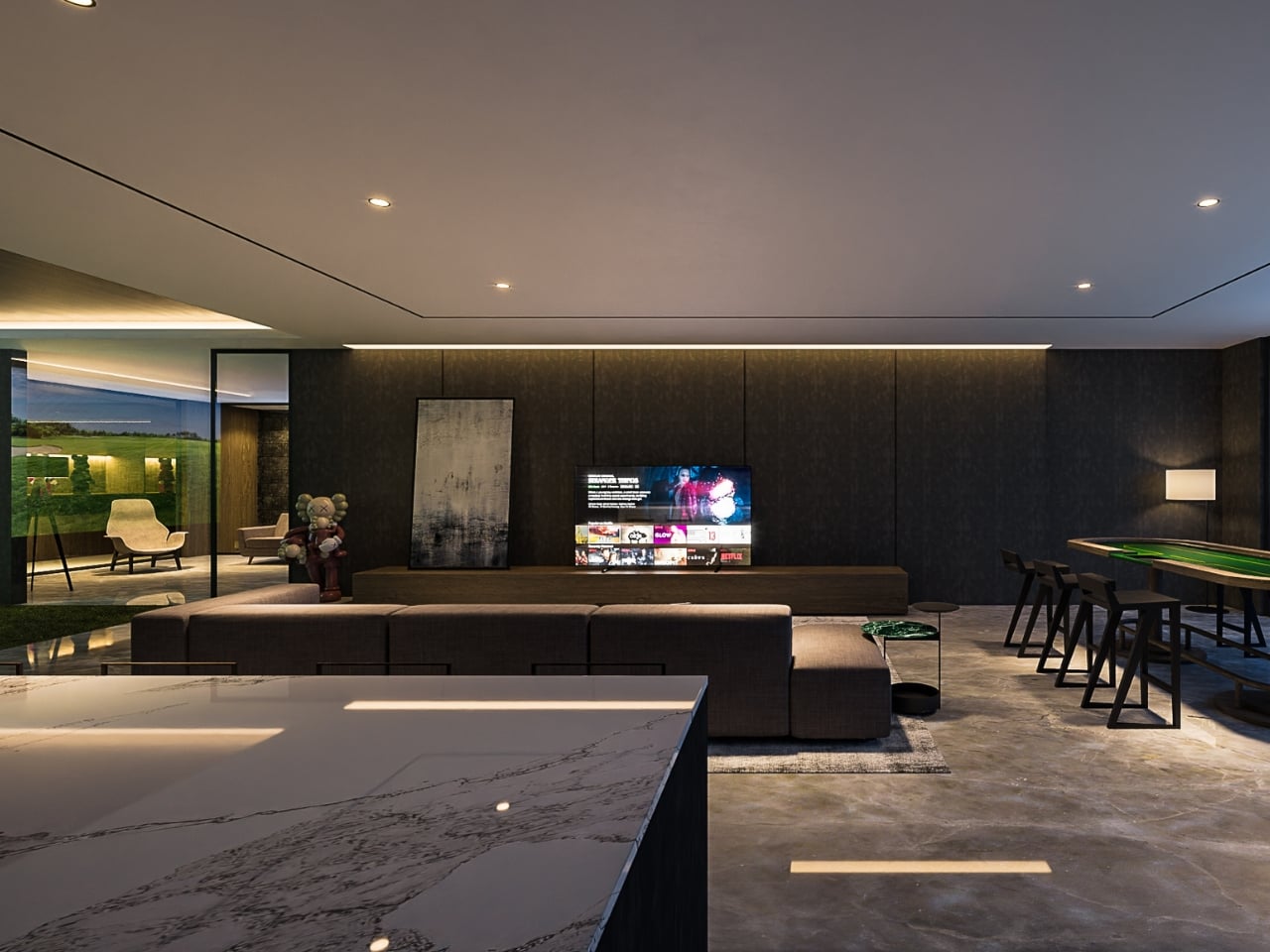
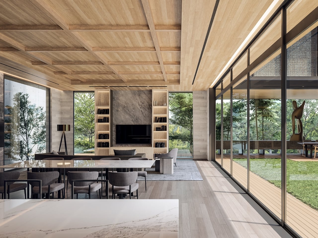
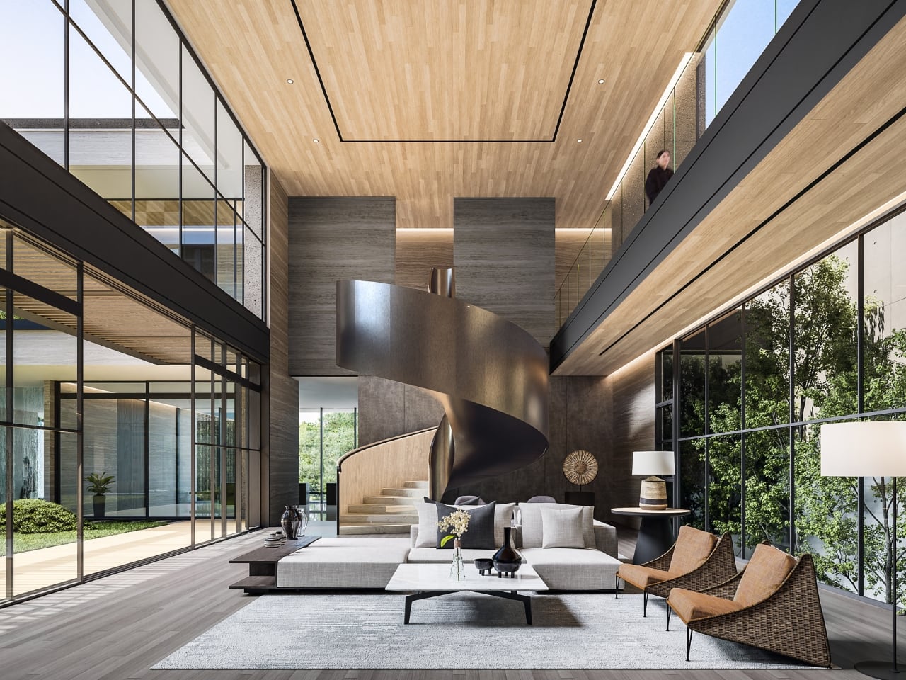
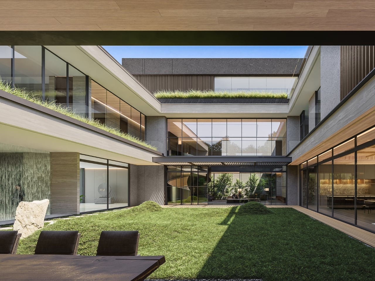
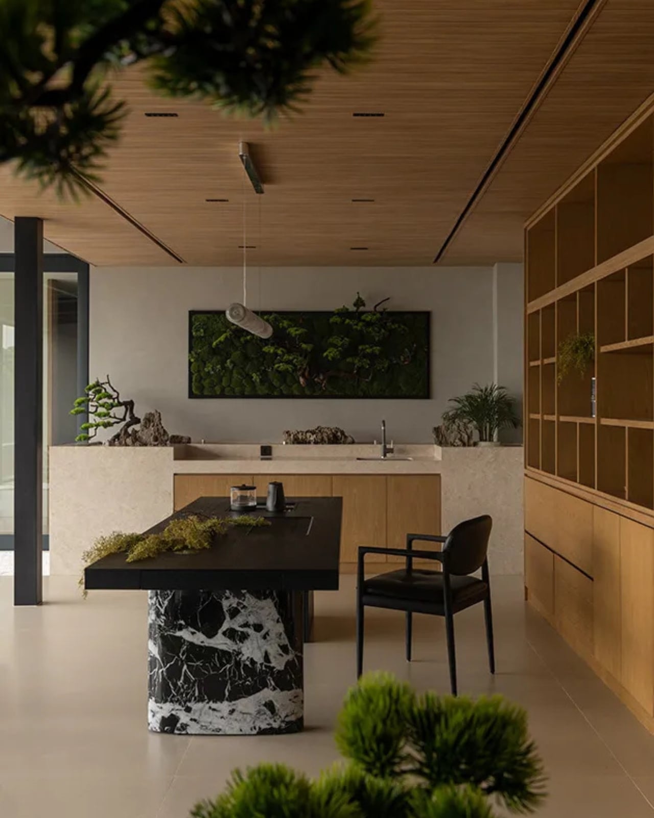
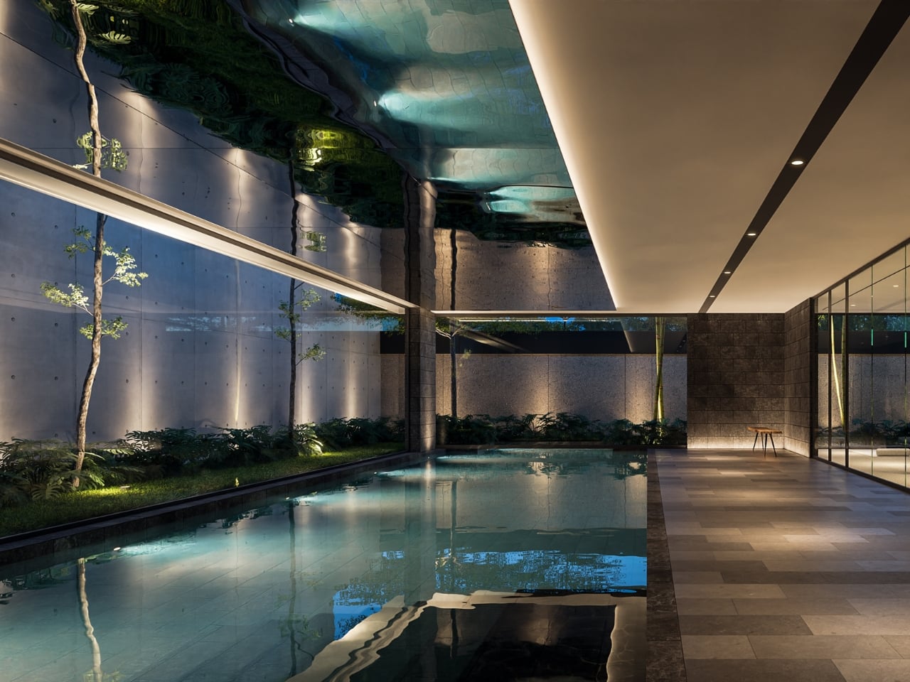
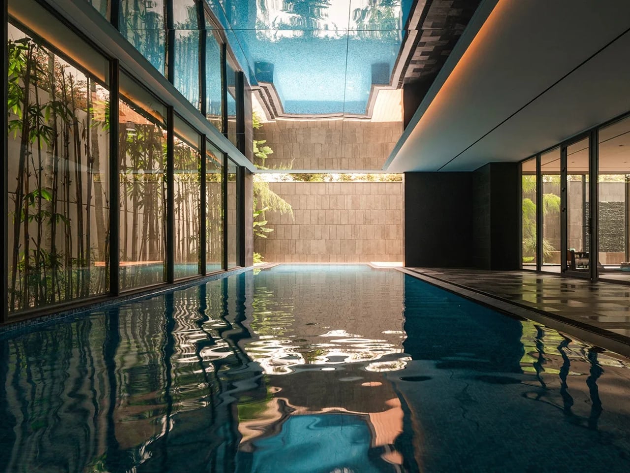
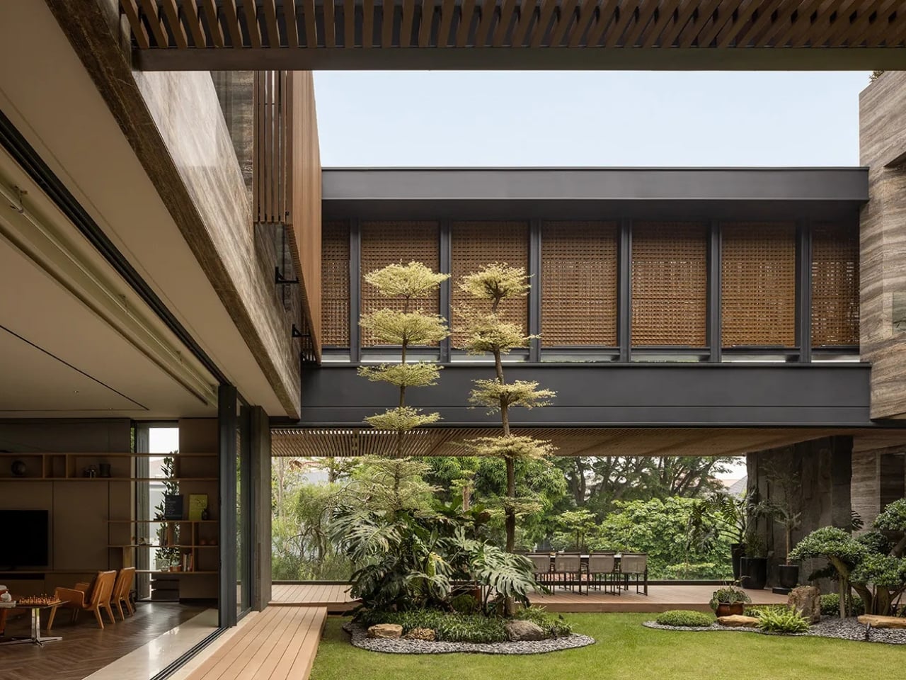
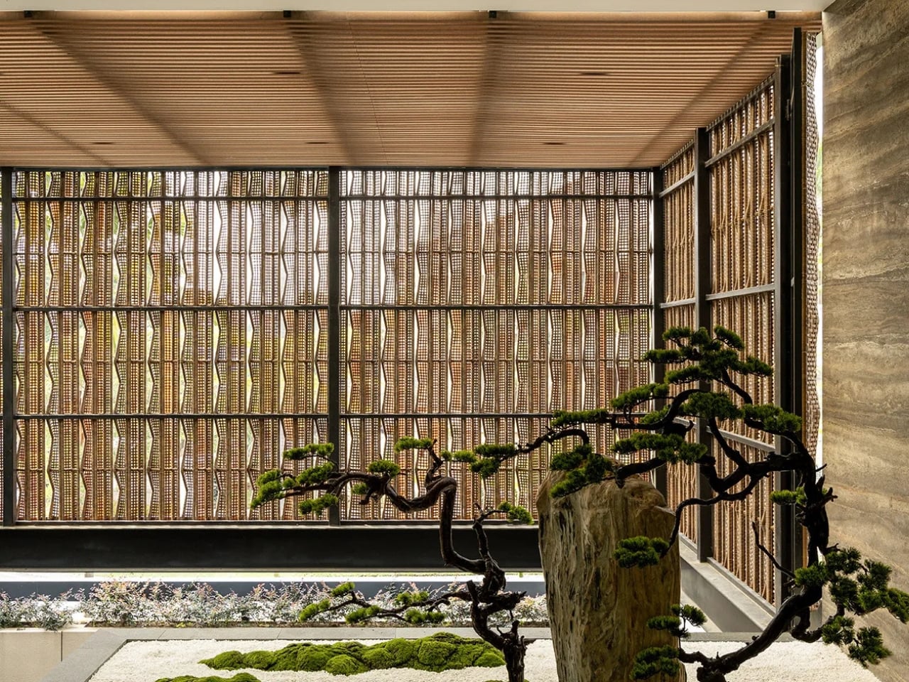
The concept is organized around a central courtyard, natural airflow, dry gardens, and the kind of deliberate voids that make space feel intentional rather than accidental. Gunawan placed dry gardens between the masses and the voids so residents experience the outdoors without sacrificing the comfort of being inside. It sounds simple enough. The execution is anything but. This is Gunawan’s stated interpretation of what tropical living can actually become, and I think he’s asking a question the design world has been skating past for years. We’ve gotten very good at making tropical homes look beautiful in photographs. We are considerably less practiced at making them feel like somewhere genuinely worth inhabiting on an ordinary Tuesday.

KantorGG’s design ethos centers on “living with nature, inside and out,” and SE House is probably the clearest expression of that philosophy yet. The existing mature trees on the site weren’t cleared to make room for clean lines. They were preserved as spatial anchors, the kind of decision that takes real confidence because it limits what you can do architecturally, and then rewards you generously in return. Shaded seating under dappled light, shifting reflections, the particular quality of sitting beneath something old and rooted. That’s not something you can manufacture after the fact.

The Australian-inflected sensibility woven through the design deserves a closer look. Gunawan studied abroad, and that cross-pollination shows up in SE House’s structure without being heavy-handed about it. The house doesn’t read as imported or imitated. It reads as absorbed and reissued through a sensibility that is distinctly Indonesian. That tension between influences, when handled well, produces architecture that belongs nowhere else and everywhere at once.

The 360-degree courtyard layout is worth sitting with on its own terms. It means the house has no single dominant view, no privileged front-row seat. Every room must negotiate with the central space, which keeps the architecture from becoming a spectacle and makes it a place to actually live inside. I find that rare, and more genuinely considered than most high-concept residential projects that pass through design media these days.

SE House has attracted the kind of attention that usually gravitates toward buildings with louder ambition. The buildings that announce themselves as you walk in. This one whispers, and that’s precisely why people are listening. Gunawan described it as a quiet manifesto for tropical living, and the word choice matters. A manifesto doesn’t have to be loud to carry weight.

The broader argument SE House seems to be making is that restraint isn’t the enemy of richness. The absence of visual noise isn’t emptiness. The voids aren’t what’s missing from the design. They are the design, or at least a fundamental part of what makes the rest of it land. That’s an architectural lesson, but it also translates well into how we think about design at every scale, from the objects we choose to live with to the spaces we build up around ourselves over time.

SE House is the kind of project that stays with you not because of one striking image but because of the underlying logic. It makes you want to look at your own spaces differently, and ask whether you’ve been opening up when you should have been pulling inward the whole time.

The post KantorGG Just Built a Tropical Home That Faces the Wrong Way first appeared on Yanko Design.

The Space Age Never Left, RETROCORE Just Made It Official

Every few years, design circles get swept up in nostalgia for a very specific era: the 1960s vision of the future. The curved furniture, the orbital shapes, the warm glow of a lamp that feels both alien and oddly cozy. We keep returning to it because, as futures go, it was a beautiful one to imagine, full of optimism and clean lines and a belief that living beautifully was something everyone deserved.

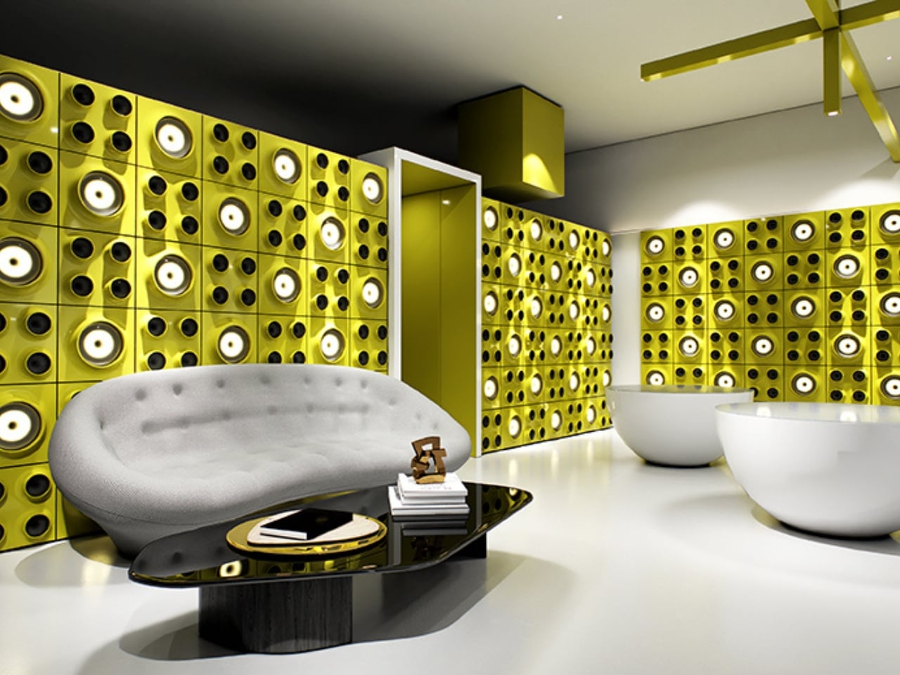
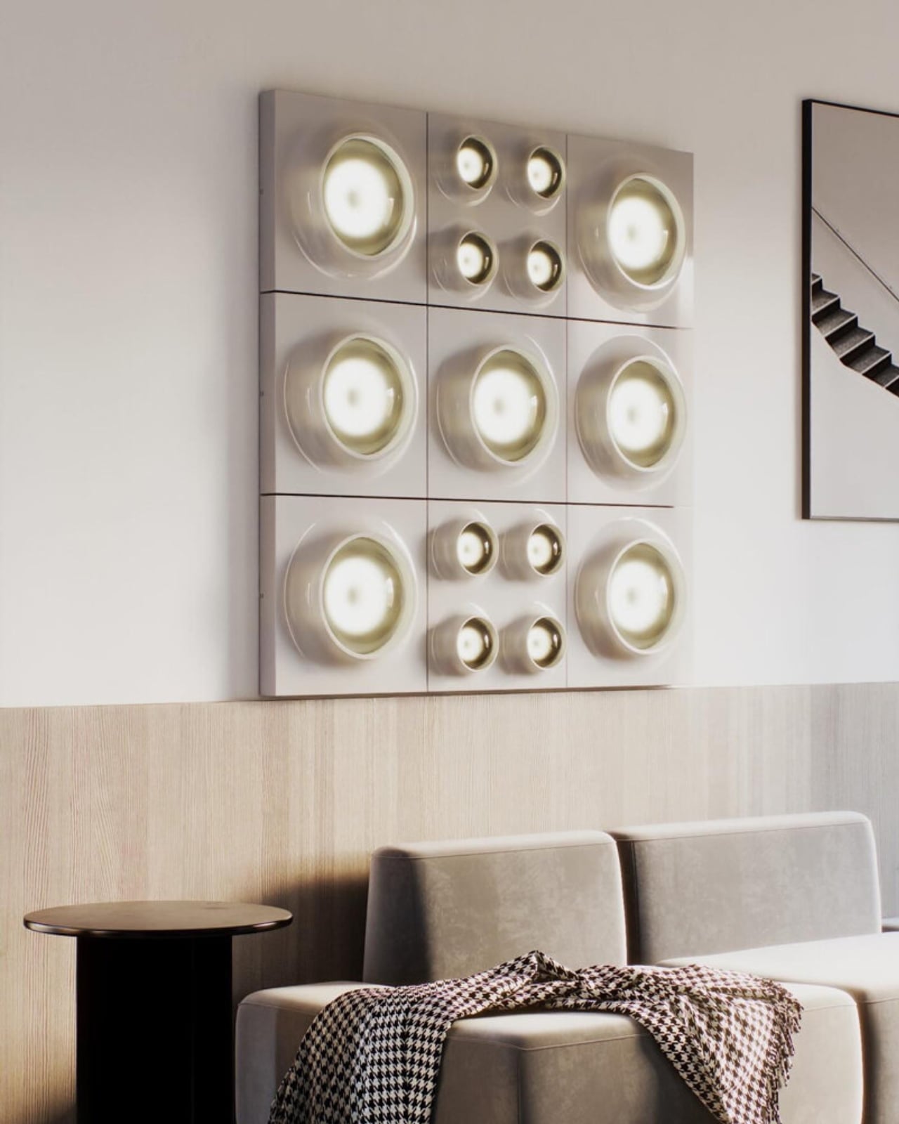
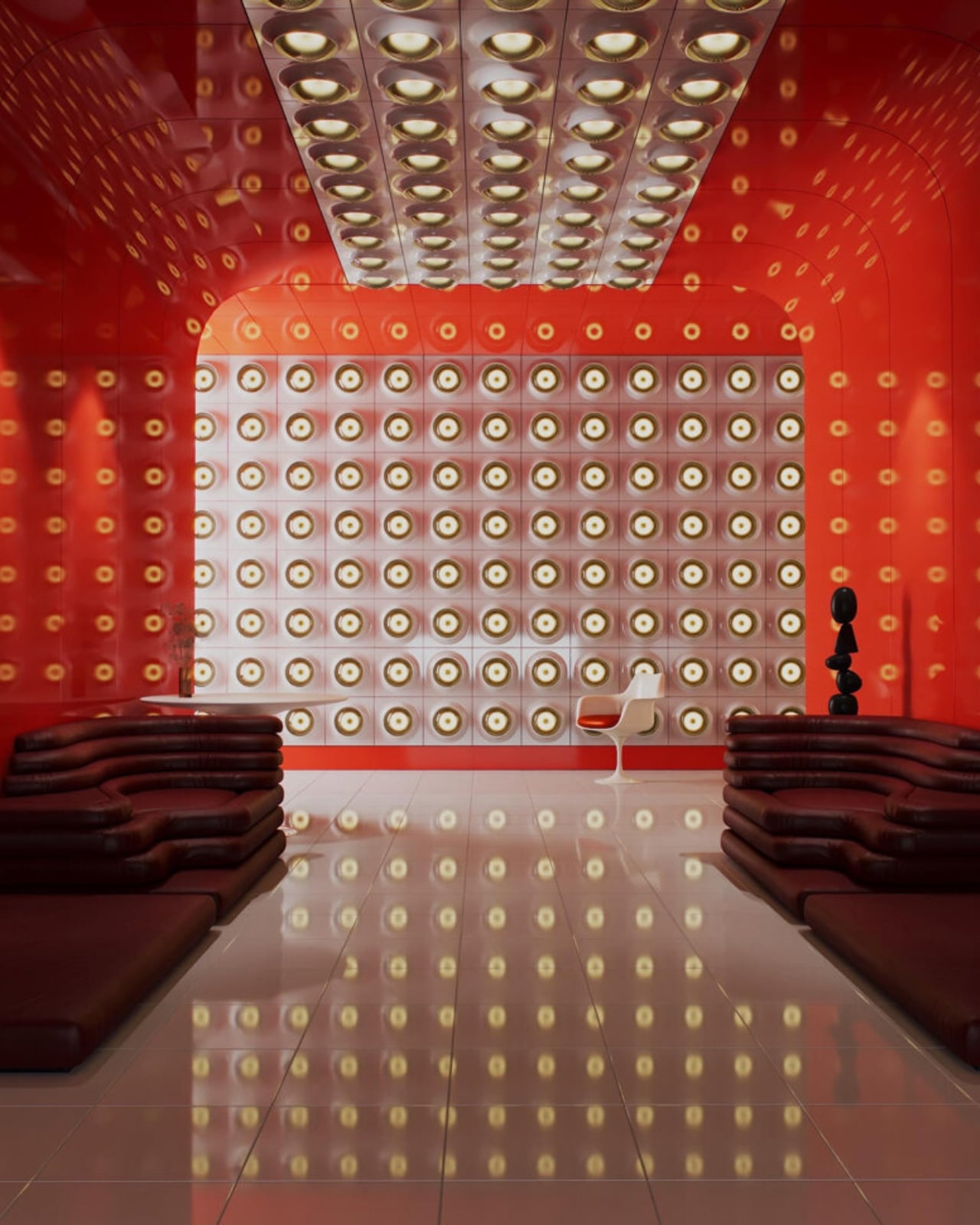
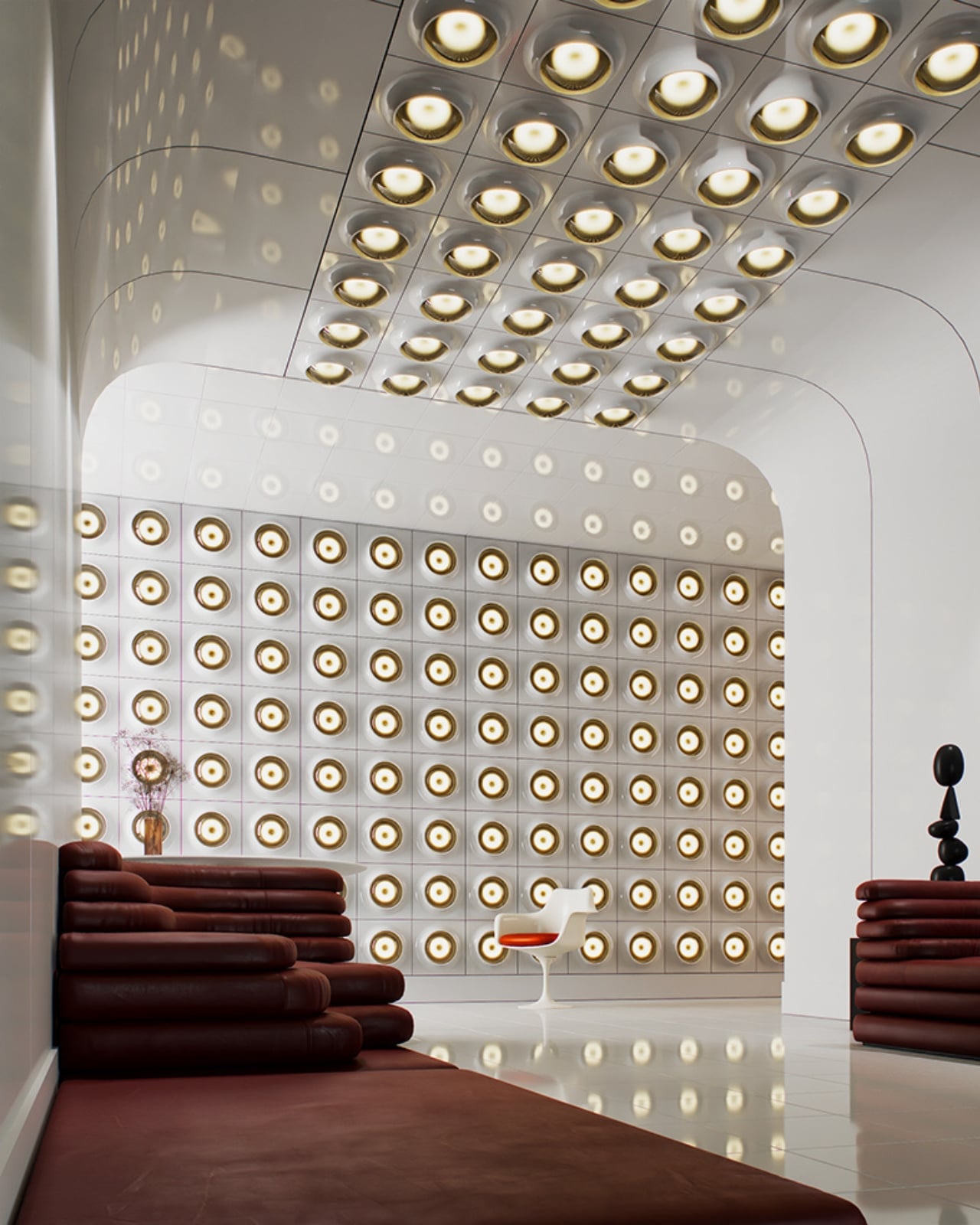
RETROCORE, the latest project from the team behind WOLOLOW, understands that pull completely. Designed by Arthur Koshatahyan and Kostya Trunov, it’s a modular wall and ceiling lighting system that borrows the visual language of Space Age design and reframes it as something you can actually build into your home, your studio, or anywhere light and personality intersect.

Designers: Arthur Koshatahyan and Kostya Trunov

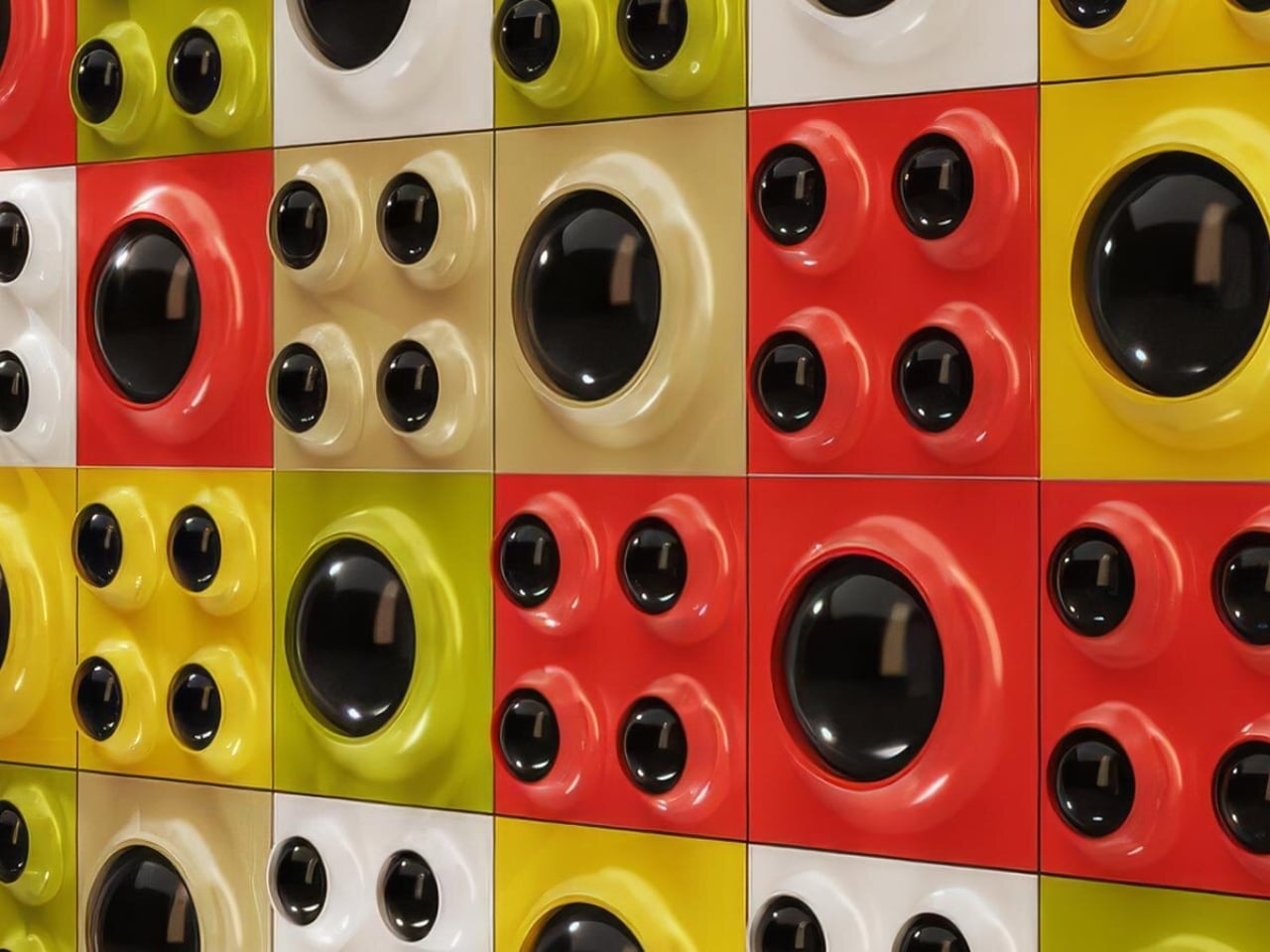
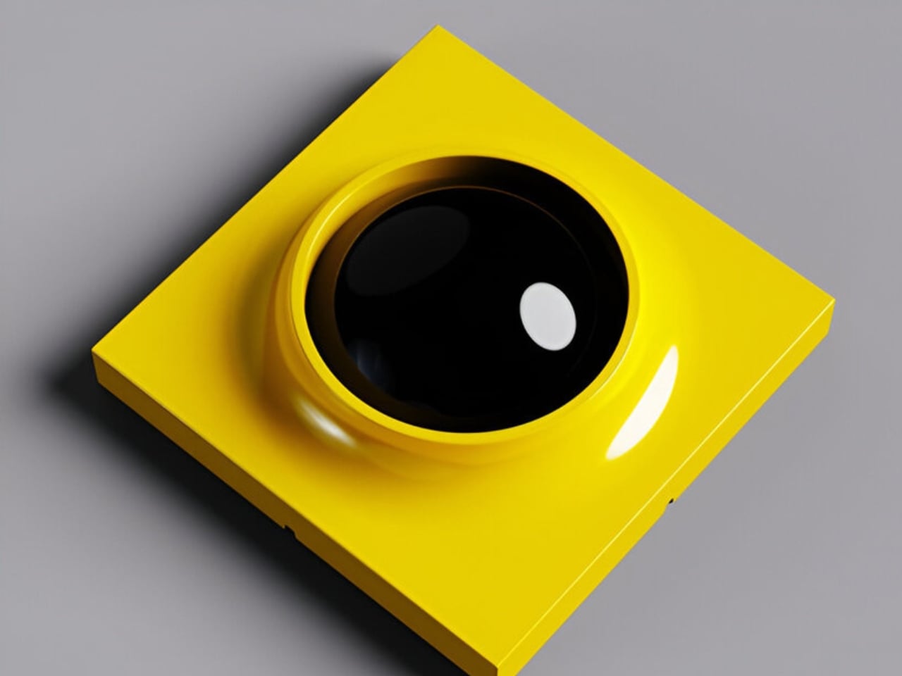
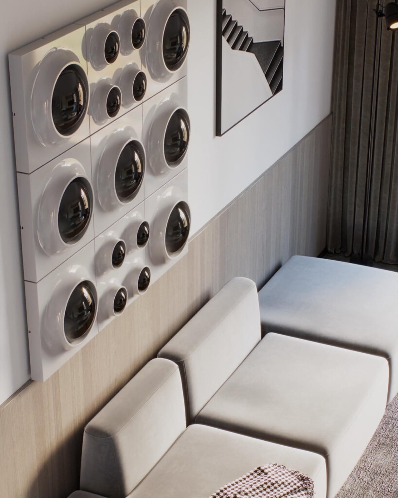
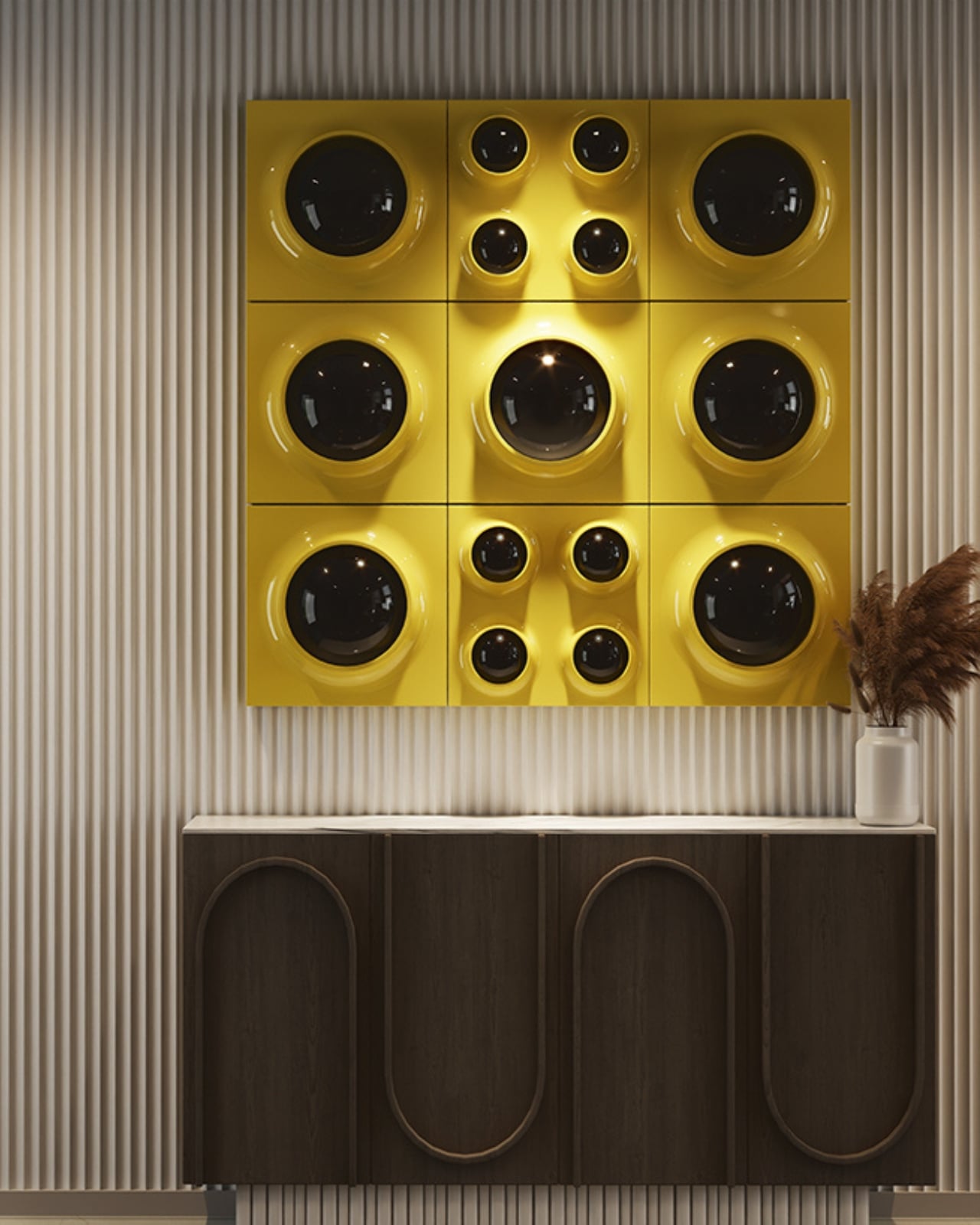
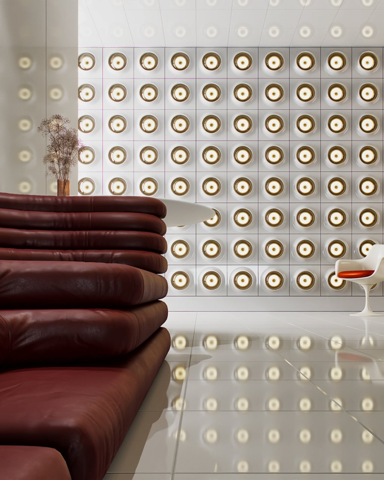
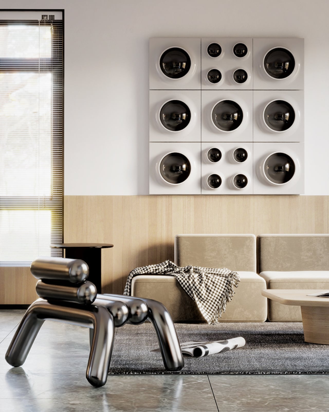
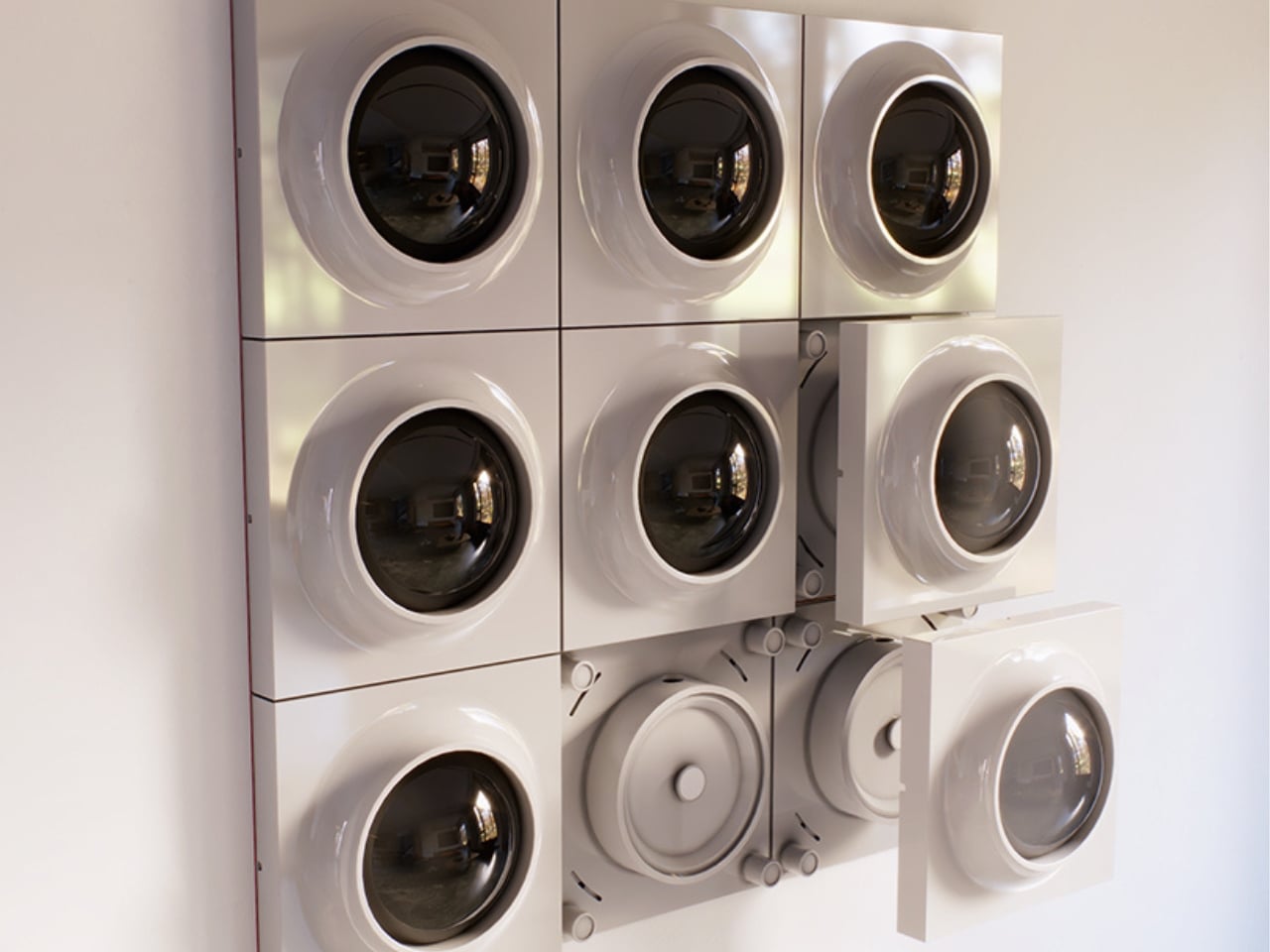
The concept is deceptively simple. At its core, RETROCORE is made up of individual light panels that combine into custom configurations, scaling up from a single accent piece to a full architectural installation. Two panel types do the heavy lifting: MONO, which features a single illuminated aperture, and QUATRO, which carries four within the same square format. Snap them together in different arrangements and you’re essentially composing with light, the way someone might arrange art on a wall or tiles across a floor. The configurations can stay small and subtle or grow into something that commands the room entirely.

That modularity is the whole point, and it’s where RETROCORE separates itself from the usual retro-inspired lighting piece that looks great in a showroom and then sits stubbornly in one corner forever. Koshatahyan and Trunov describe it as “a new way to bring Space Age design into modern interiors, not only as a lamp, but as a modular building block of light.” And that framing matters. It positions RETROCORE not as decor, but as infrastructure, something that can grow, change, and adapt alongside the spaces it inhabits.

The backstory is worth knowing. WOLOLOW began as a UFO-shaped night light, a miniature riff on the iconic Futuro House, that tiny flying-saucer dwelling designed by Finnish architect Matti Suuronen in the late 1960s. That first product found an audience, went through the full crowdfunding process, and the lessons from building, manufacturing, and shipping a physical design object directly shaped what came next. RETROCORE isn’t a pivot so much as an evolution, a deeper commitment to the same aesthetic universe but with far more ambition built in.

One quietly clever detail: the white version of the panels can be repainted after installation. That means the lighting can blend seamlessly into a surface, disappearing into the ceiling or wall and leaving only the glowing apertures visible, or it can be deliberately contrasted against a painted background. It’s a small thing, but it shows the kind of considered thinking that separates a product designed to be sold from one designed to be lived with over time.

Retro-futurism as an aesthetic tends to get treated as a costume. You slap some Jetsons curves on a lamp, call it Space Age, and move on. RETROCORE doesn’t quite fall into that trap. The modular logic behind it feels genuinely contemporary, even as the visual references are firmly rooted in mid-century optimism. It’s the difference between wearing a vintage look and actually understanding why it worked in the first place, and why it still does.

Whether you install one panel as a quiet nod to the era or map out an entire ceiling composition, RETROCORE offers what a lot of statement lighting simply can’t: the ability to keep editing. Your room changes, your taste shifts, your wall gets repainted, and the system accommodates all of it without you having to start over.

For a design moment that often prizes the singular, precious object, there’s real appeal in something built to be rearranged. RETROCORE is currently on Kickstarter, and if it delivers on what the images promise, it could work just as well in a minimalist apartment as it does in a maximalist creative studio. That flexibility, more than the retro aesthetics, is the actual sell.

The post The Space Age Never Left, RETROCORE Just Made It Official first appeared on Yanko Design.
Frankfurt’s Solar Lights That Look Better Than Your Living Room Lamp

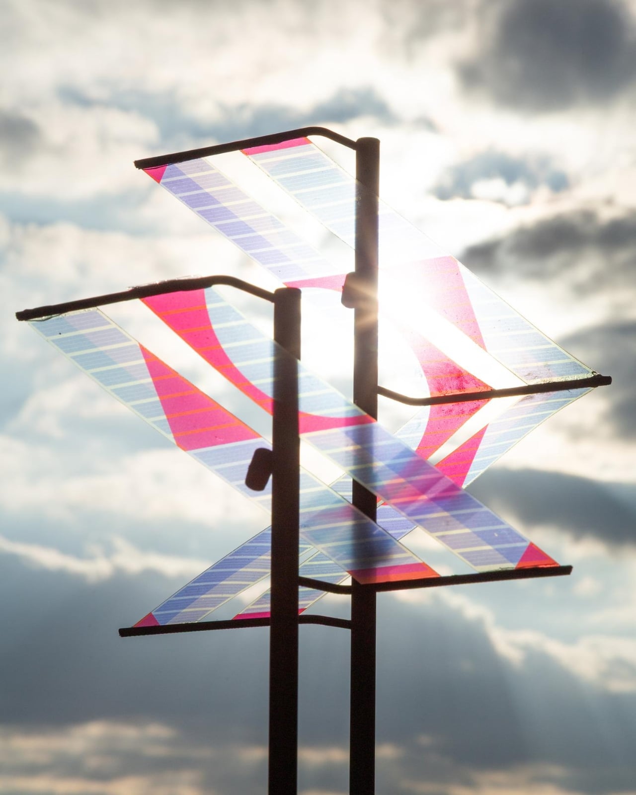
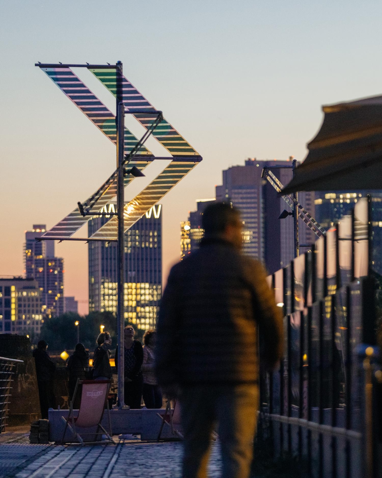
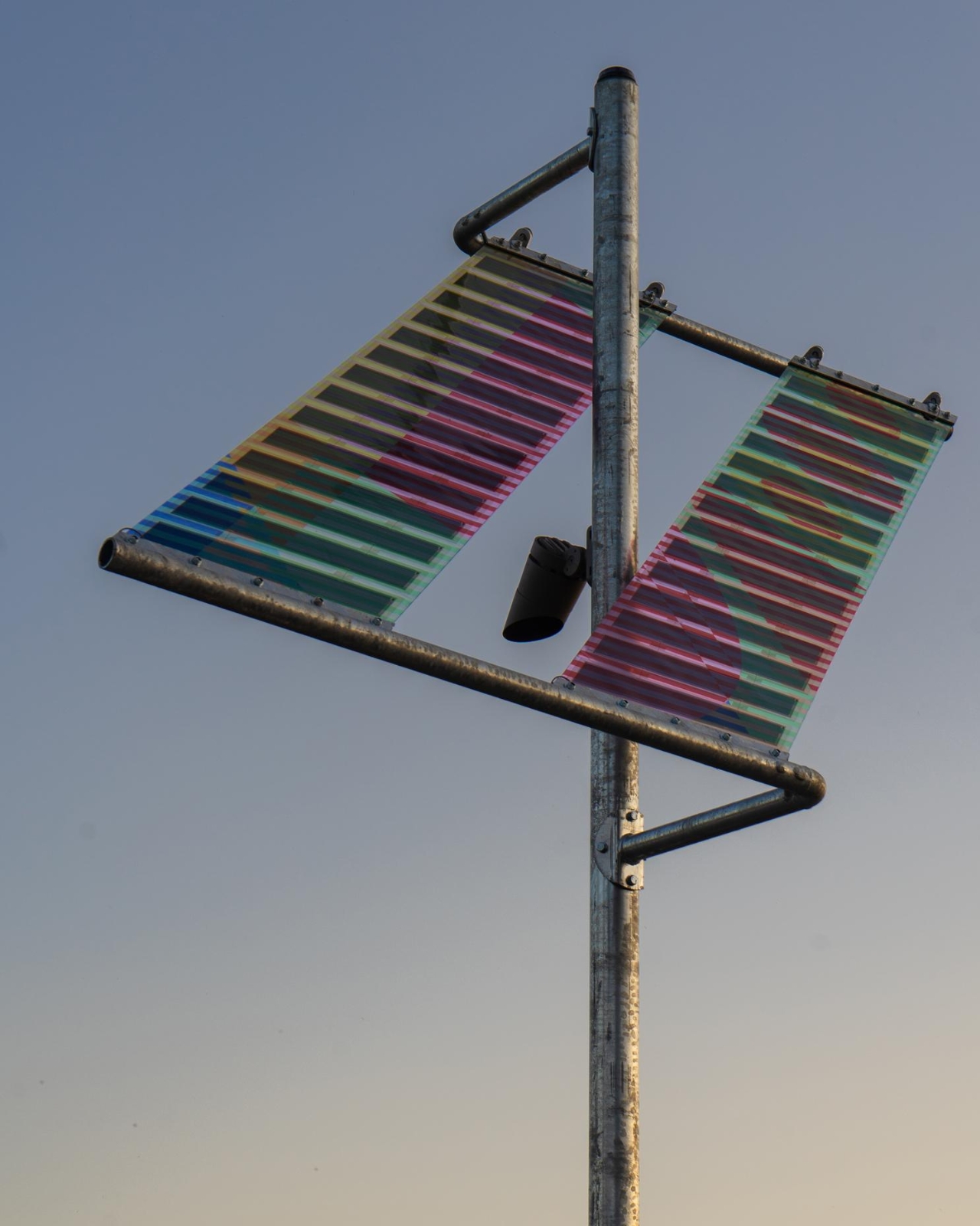
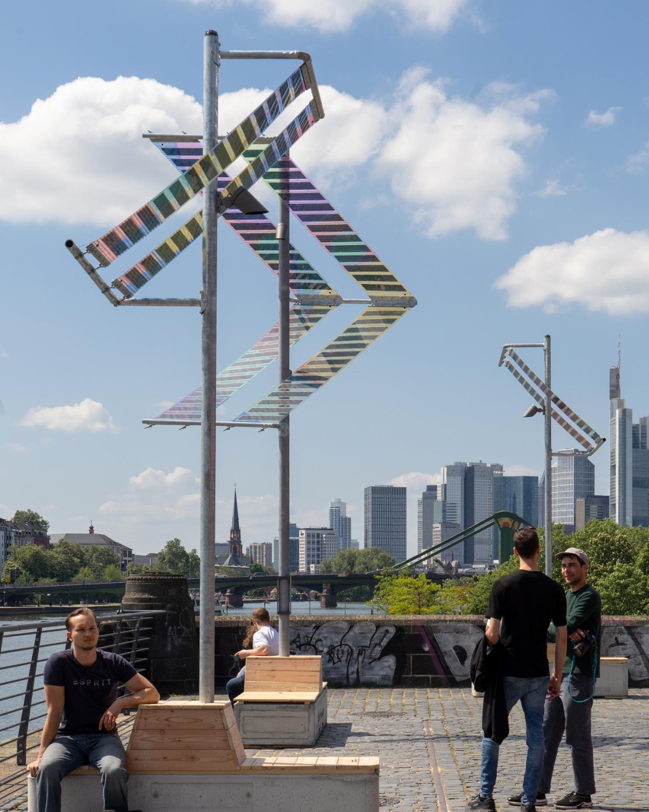
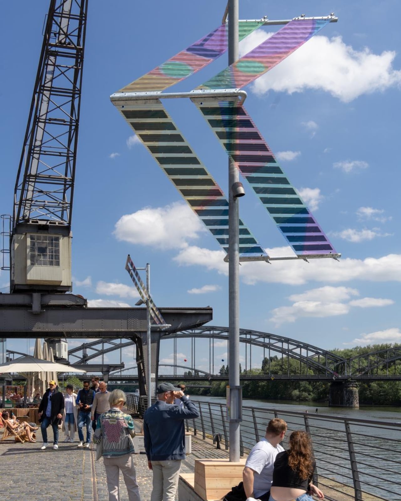
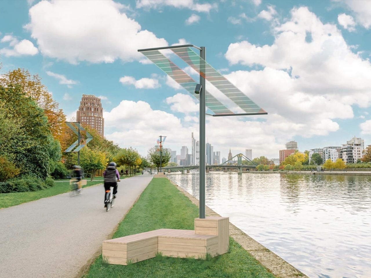
If you’ve ever walked along a riverbank at night and squinted up at a buzzing fluorescent streetlamp wondering who designed that thing and why, Munich-based duo ttal just made that question feel very urgent. Their installation Main Light, currently glowing along Frankfurt’s Weseler Werft as part of the World Design Capital Frankfurt RheinMain 2026 programme, is one of those rare projects that makes you rethink infrastructure entirely.

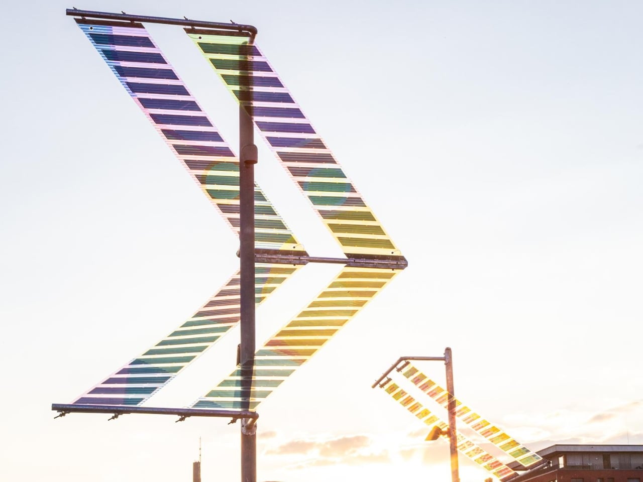
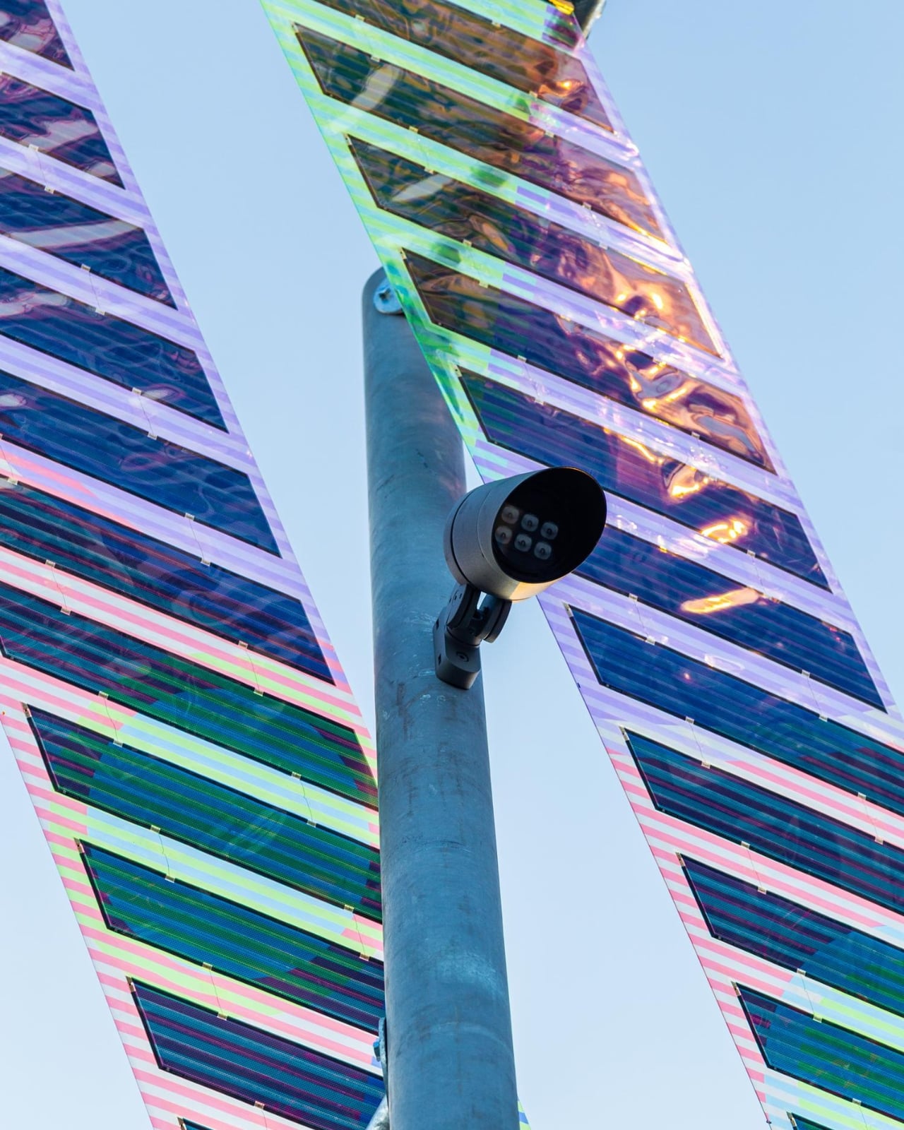
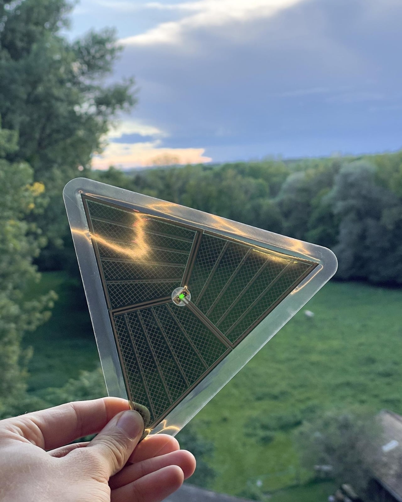
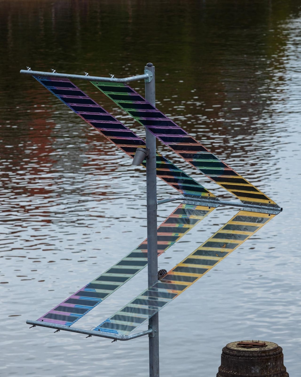
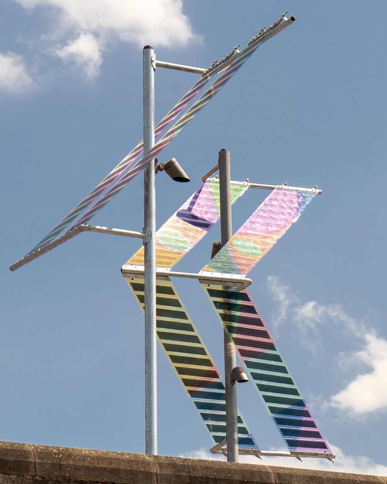
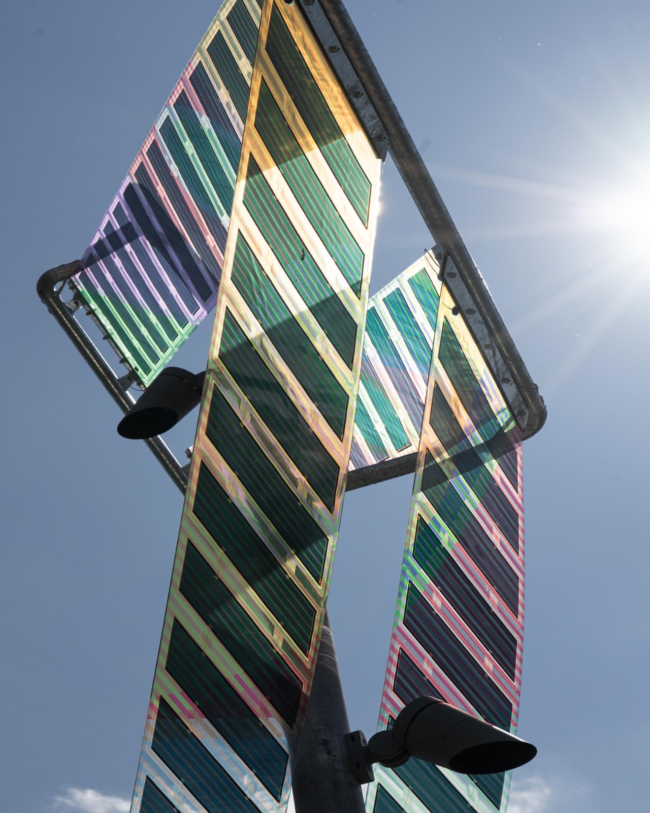
ttal, the design studio formed by Tobias Trübenbacher and Andreas Lang, built Main Light around a deceptively simple premise: public lighting doesn’t have to be ugly, energy-hungry, or ecologically reckless. The result is a self-sufficient solar installation that runs completely off-grid, no power lines buried underground, no permanent excavation, and no connection to the city grid whatsoever. It generates its own electricity through organic photovoltaic (OPV) solar films, those wonderfully colorful translucent panels that make the whole structure look like it belongs in a design museum rather than on a bike path. And that’s exactly the point.

Designer: Tobias Trübenbacher (ttal)

During the day, the solar surfaces catch the light and cast shifting, multicolored patterns across the riverbank. The horizontal stripes of the laminated solar cells aren’t hidden away or treated as a necessary evil. They’re the main visual event. The design essentially says: clean energy can be beautiful, and we should stop pretending otherwise. Trübenbacher, who was named Newcomer of the Year by the German Design Council at the German Design Award in 2023, has described design as a tool for social change, and Main Light reads exactly like that philosophy made physical.

The ecological thinking goes deeper than solar panels, too. Main Light only switches on when a motion sensor detects a person nearby, meaning it doesn’t flood the riverbank with unnecessary light through the night. More quietly significant is its light spectrum. The installation deliberately avoids the blue-heavy frequencies common in most modern LED street lighting, opting instead for an insect-friendly spectrum that’s gentler on nocturnal ecosystems. Light pollution is one of those invisible crises we rarely talk about loudly enough, and seeing it addressed this thoughtfully in a public installation feels quietly radical.

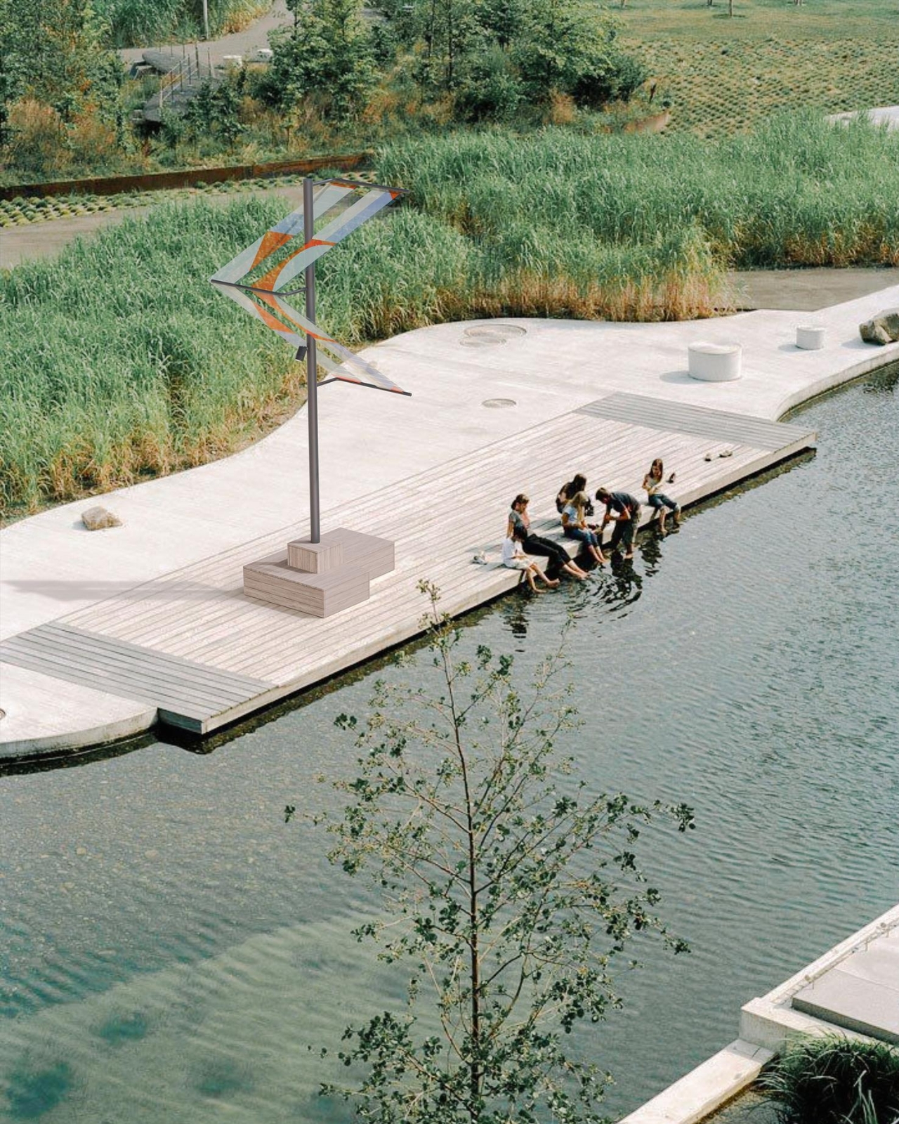
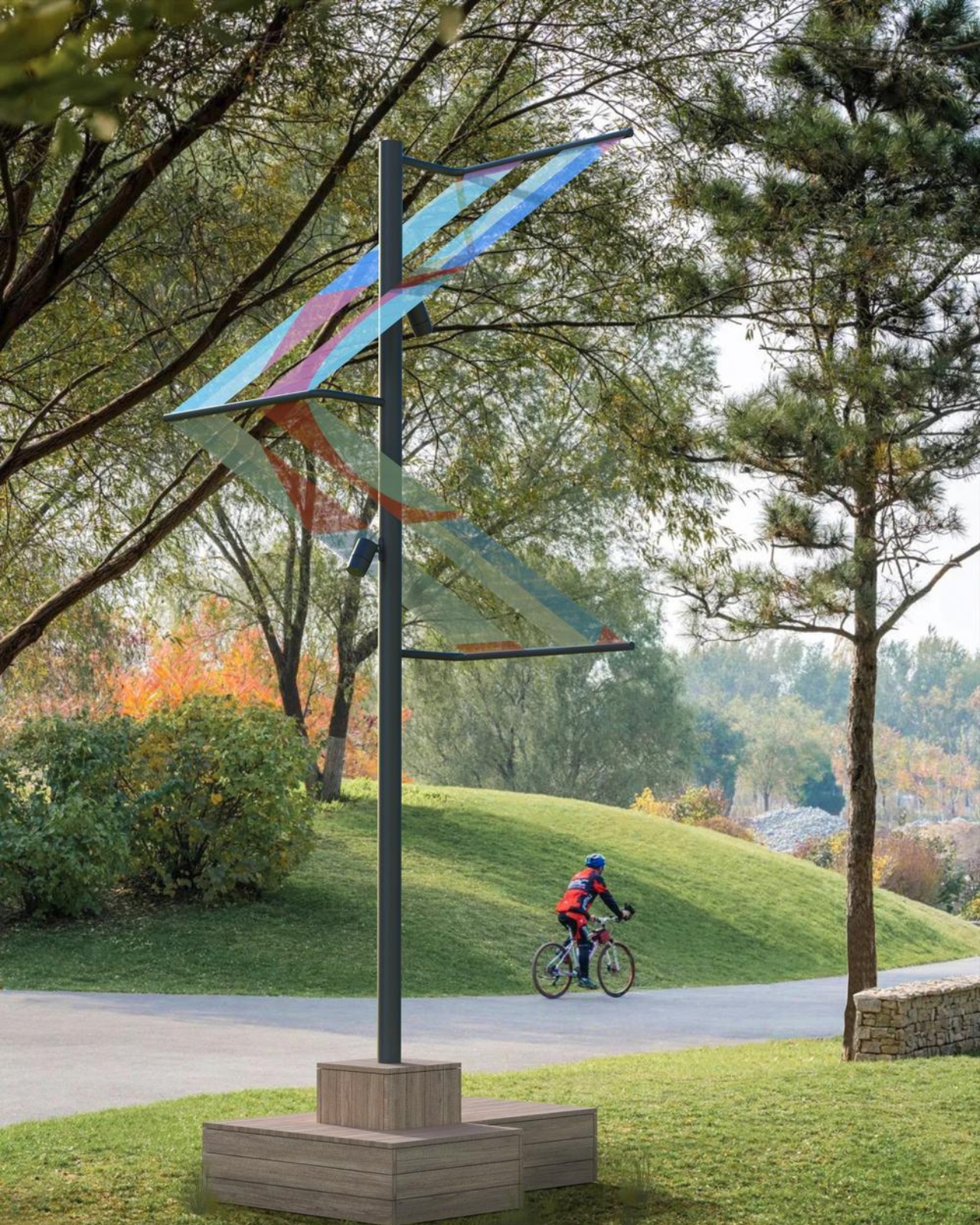
The structural decisions are just as considered. The foundations are reversible concrete bases that also function as urban furniture, places to sit, to pause, to look at the river. Trübenbacher and Lang worked with ewo GmbH on lighting and control technology, ASCA GmbH on the organic photovoltaic systems, and Schake GmbH on the steel construction. Four structures in total were installed near the Oosten restaurant, one large and three smaller units, running from May to November 2026.

The installation sits within a broader conversation about what public infrastructure is allowed to look like. For too long, sustainability has been sold with a kind of visual apologetics, the clunky panel, the utilitarian form, the implicit suggestion that doing the right thing means sacrificing aesthetics. Main Light refuses that trade-off. The colored OPV panels turn the energy-generation process into something visible, even celebratory, a reminder that the transition away from fossil fuels doesn’t need to be grey and joyless.

The duo is also running workshops and public events alongside the installation through the summer months, which matters. A beautiful object without discourse risks becoming wallpaper. The conversations ttal wants to start are about energy, public space, and who gets to decide what our streets look like. These aren’t niche design industry questions. They affect how livable, how safe, and how ecologically responsible our cities actually become.

Cities across Europe and beyond are already reaching out about scaling the project, and it’s easy to see why. Main Light doesn’t require the ground to be torn up. It doesn’t need a power grid. It works, it glows, and it looks genuinely gorgeous against the Frankfurt skyline. The bike paths and riverbanks of the world deserve better than what they usually get. Trübenbacher and Lang have proven, at least along one stretch of the River Main, that we’re already capable of delivering it.

The post Frankfurt’s Solar Lights That Look Better Than Your Living Room Lamp first appeared on Yanko Design.
Coca-Cola Just Turned Its Iconic Bottle Into Chopsticks

If you visit most parts of East Asia and Southeast Asia, you will find something on almost every dining table, whether it’s at home or a public dining establishment: a pair of chopsticks. If you live there, then you learned to use them starting when you were a young child. If you’re visiting, then you will have to learn to use a pair when eating, or else you embarrassingly ask for other utensils. But in any case, chopsticks are part of every dining experience in that part of the world. They are more than just tools; they are a cultural staple, passed down through generations and deeply woven into the rituals of everyday life.

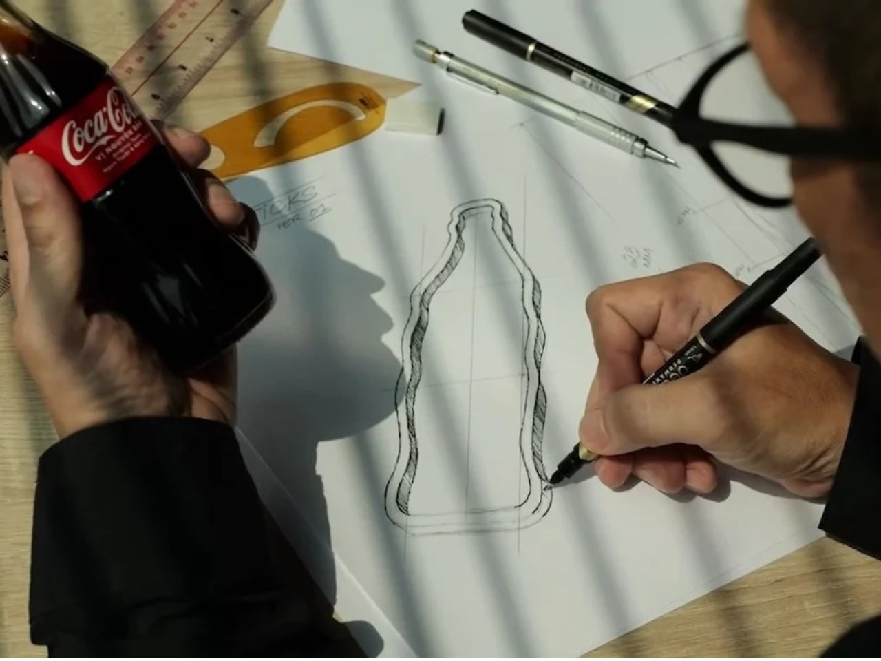
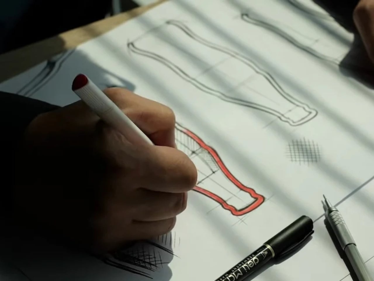
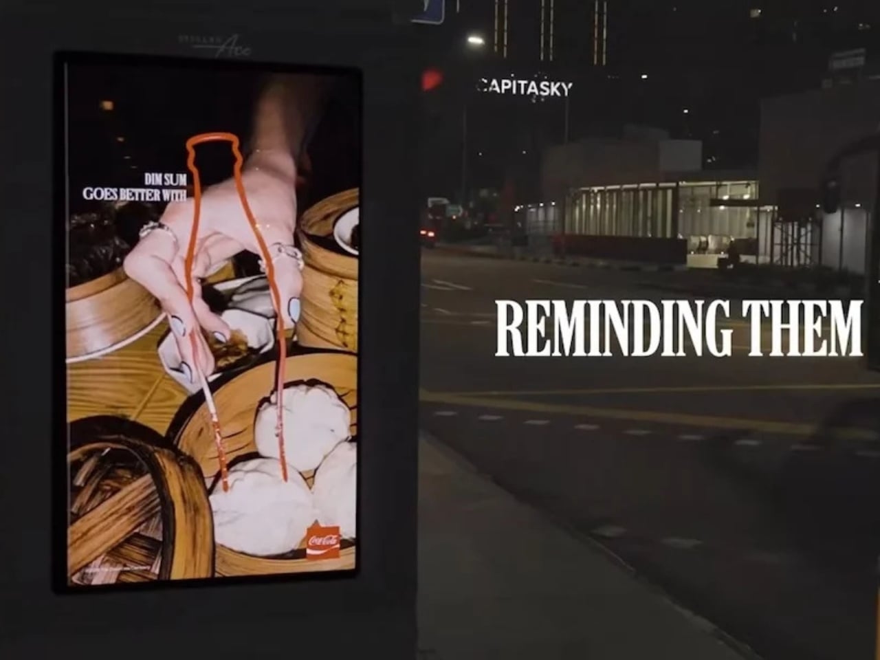
Wherever you live in the world, chances are you’re familiar with Coca-Cola’s iconic contour bottle, whether or not you drink it. Yes, there are cans and plastic bottles now, but even the latter has that distinct shape that was introduced in 1915 to make the brand identifiable wherever you see it, even if broken, even in the dark. That silhouette has since become one of the most recognizable forms in consumer branding history. Coke wants to bring the two together, as many parts of Asia don’t necessarily have the Coke bottle as a regular part of their dining table. So they decided to launch a campaign and create a product that would bridge the two worlds: CokeSticks.

Designer: Coca-Cola

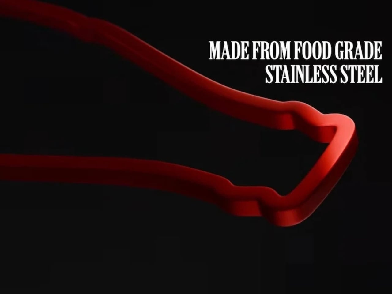
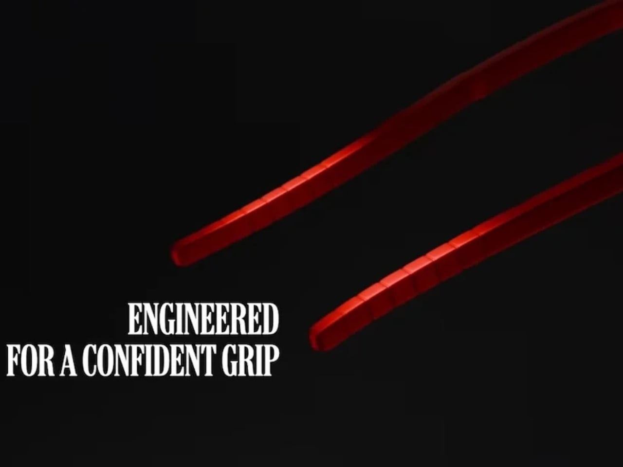
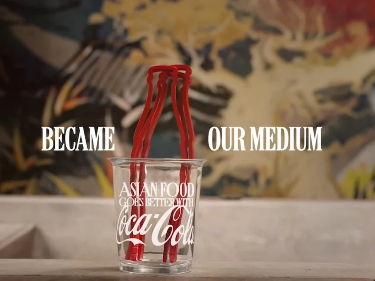
The product is just like what its name sounds like. It reimagines the famous contour bottle as chopsticks that people can actually use when eating. They’re not relying on a logo or any label, but purely on the power of its most iconic form and of course, the equally iconic Coke red color. It’s the kind of idea that feels both obvious and brilliant once you see it: strip away everything but the silhouette and the color, and the brand is still unmistakably there. It proves that this bottle is so distinctive that it can function as something else entirely, because it has its own design language that needs no introduction.

The CokeSticks are made from food-grade stainless steel and are designed to be fully usable despite their unconventional source of inspiration. They are also a clever crossover between packaging design and product design, which has been one of the brand’s strongest suits over the past decades. Coca-Cola has long understood that their bottle is more than just a container; it’s a visual icon, and CokeSticks is perhaps the boldest proof of that yet.

This concept and the campaign are also very specific to Asian dining culture, which goes to show that this is a market they really want to pick up, pun intended. The functional nature of the product can also be seen as both a branding exercise and an industrial design object. And if you’re a fan of the brand and love using chopsticks, then this could easily become part of your daily dining experience. It sits at a fascinating intersection: something that is both deeply familiar and completely new.

There’s also something satisfying about the idea that an object as everyday as chopsticks can carry that much brand storytelling. You don’t need the logo. You don’t need the label. Just those curves, that Coke red, and you already know exactly what you’re holding. It’s the kind of design thinking that collectors and design enthusiasts will appreciate, because it’s not just a gimmick. It’s a genuine extension of one of the world’s most iconic visual identities into a new, functional form.

Well, that is, if you’ll be able to get them. It doesn’t seem like something they’ll be selling anytime soon, as CokeSticks will be distributed to restaurants and food delivery experiences in the region. They are targeting this to reach 700,000 people, so hopefully, if you live in Southeast Asia, this will eventually make its way to your table.

The post Coca-Cola Just Turned Its Iconic Bottle Into Chopsticks first appeared on Yanko Design.
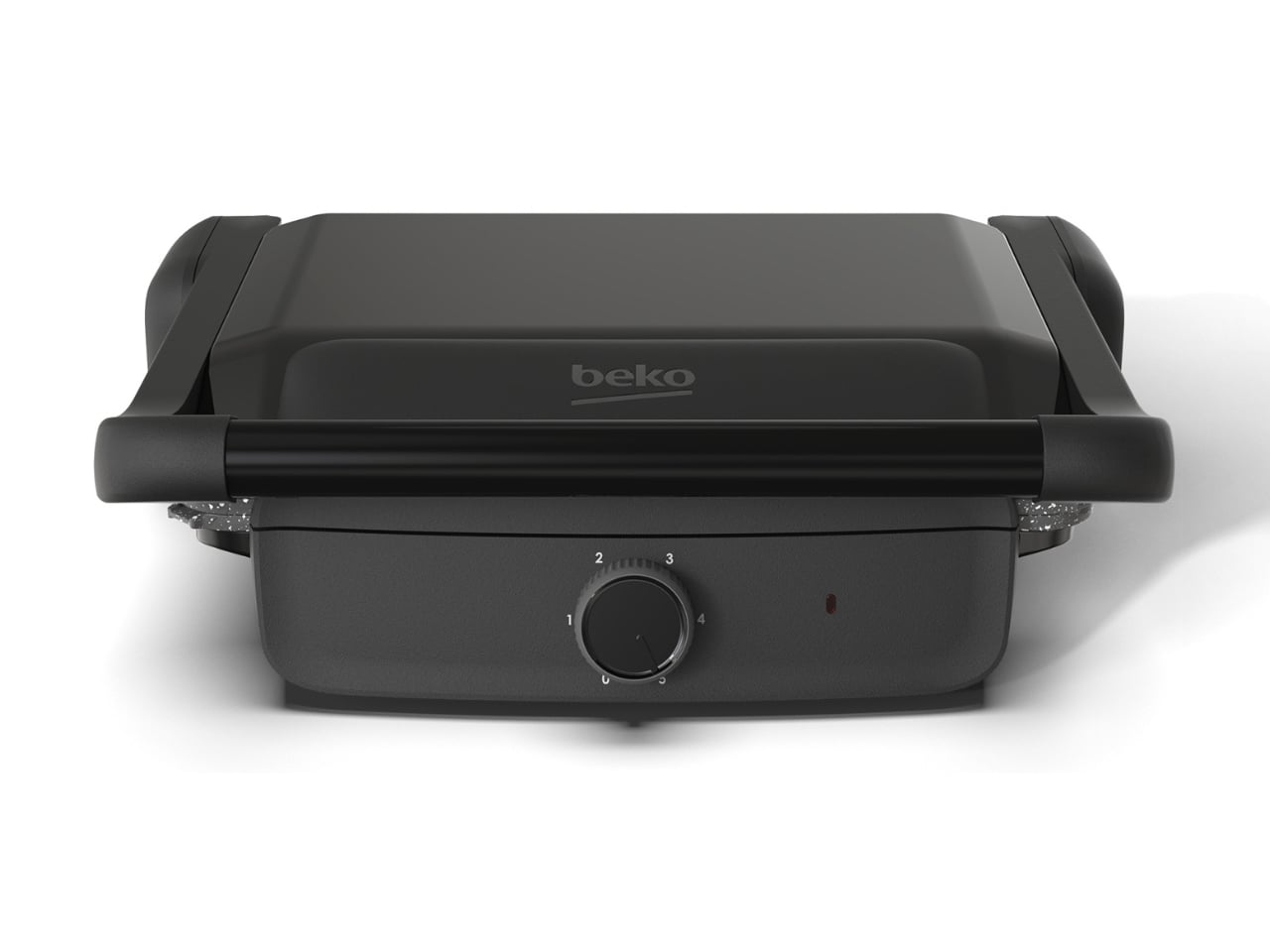
A Designer Just Gave the Sandwich Maker the Concept It Deserved

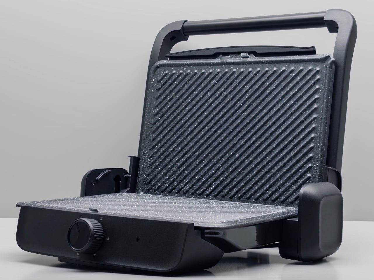
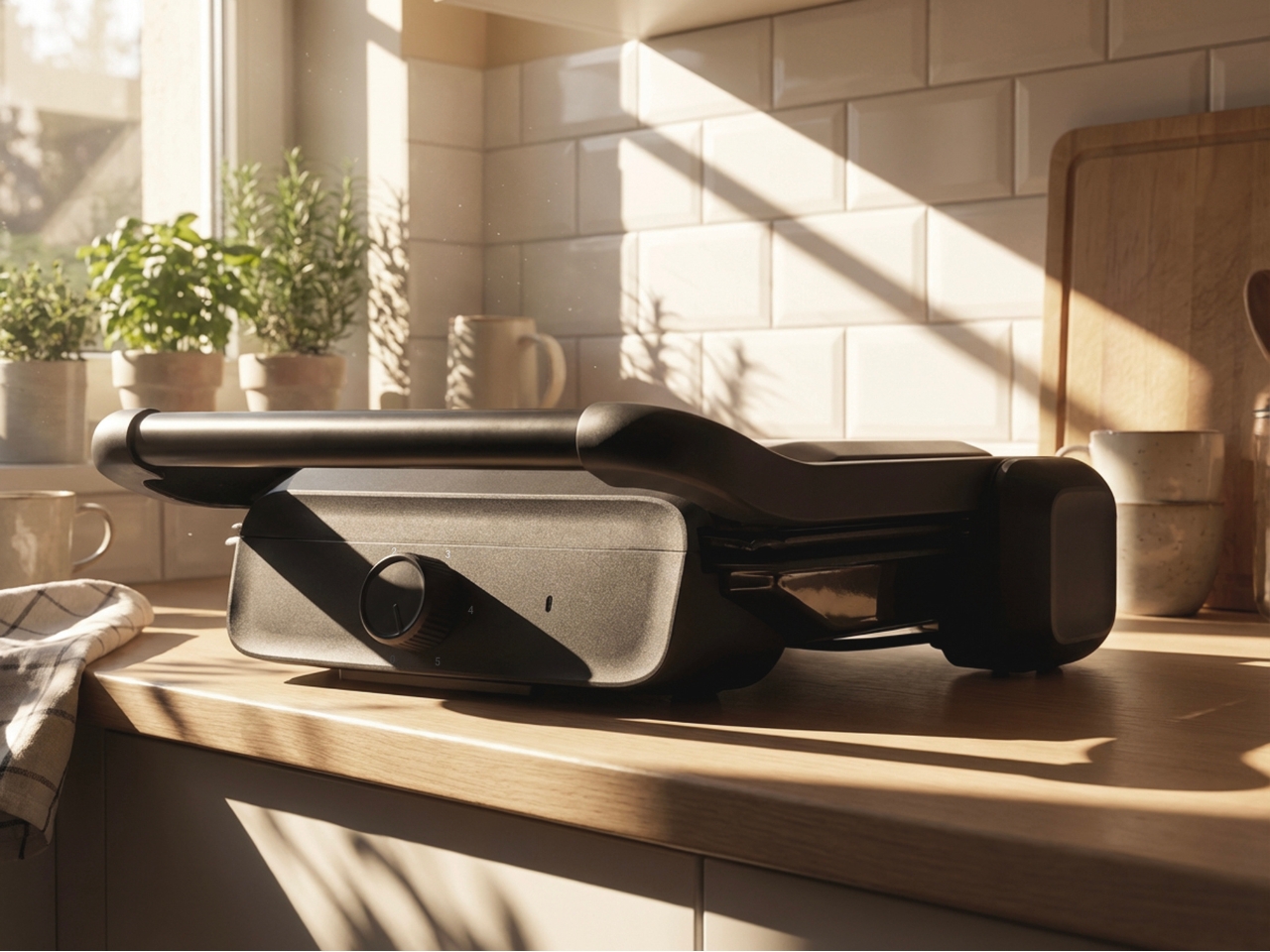
Small appliances are the forgotten middle children of industrial design. We obsess over espresso machines and standing mixers, but the humble sandwich maker? It usually gets whatever plastic shell a product team could push through engineering fast enough to hit a price point. That’s exactly why Dogac Can Sagirosmanoglu’s sandwich maker concept caught my attention, and I suspect it’s catching a lot more than mine.

Sagirosmanoglu is a Lead Industrial Designer based in Istanbul, and he posted this concept project on Behance, where the numbers speak for themselves: over 560,000 views and more than 4,000 appreciations. For a sandwich maker concept. That response says less about novelty and more about something the design community rarely applies to small countertop appliances: genuine intention.

Designer: Dogac Can Sagirosmanoglu

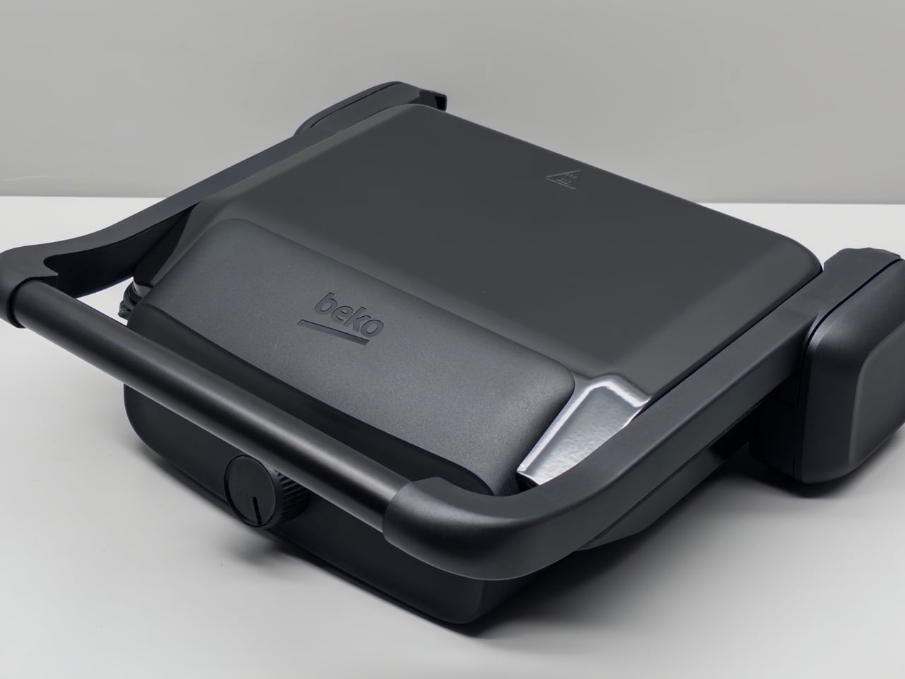
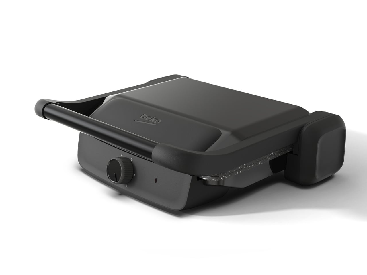
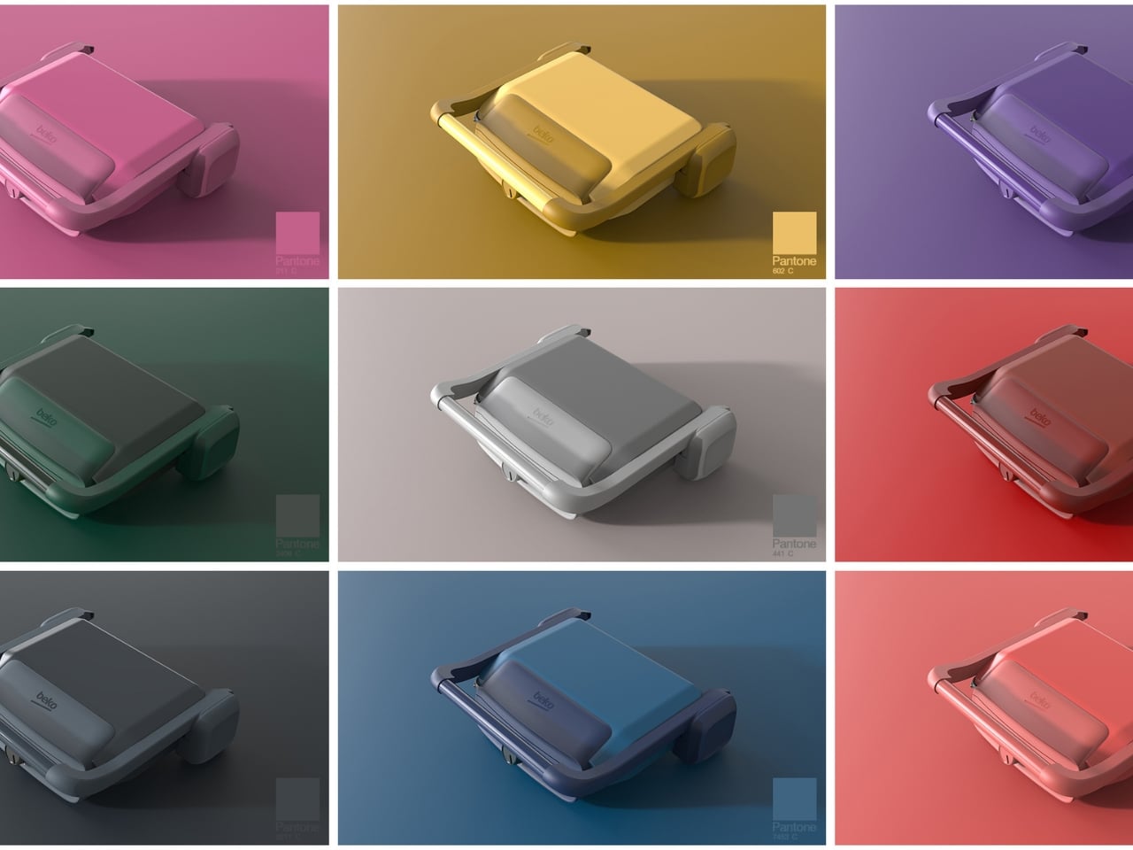
The concept is presented under the Beko name, though it exists as a portfolio project rather than an officially announced product. That distinction matters, but it doesn’t make the design any less compelling. If anything, it makes it more interesting. A designer working within the constraints of a real brand’s visual language, applying that kind of care to a product category that nobody asked him to elevate, is a different kind of creative statement than a fully unconstrained concept. It says something about what he thinks good design actually owes the everyday object.

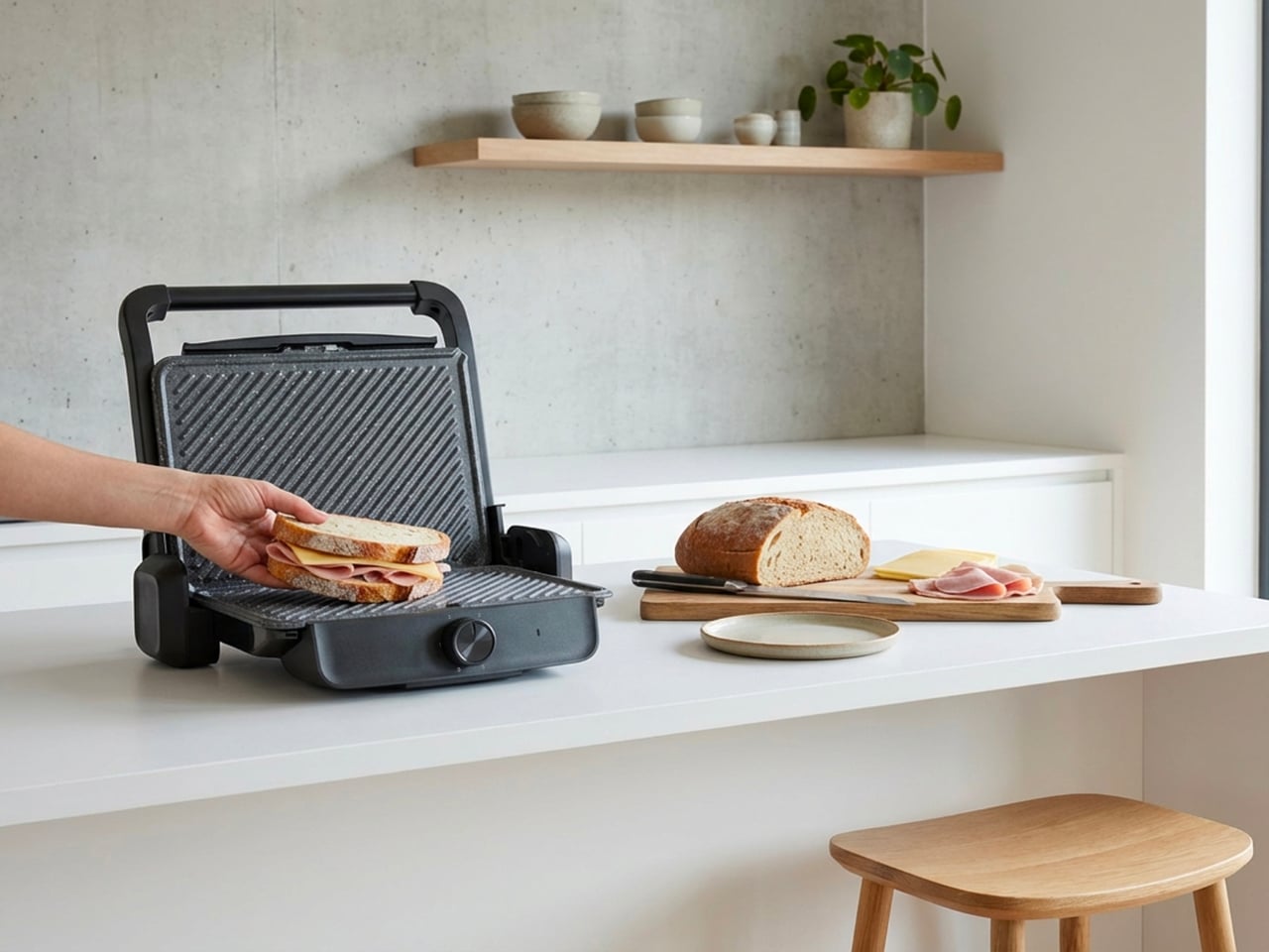
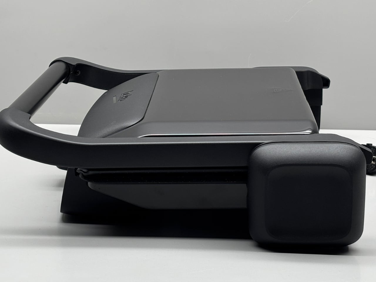
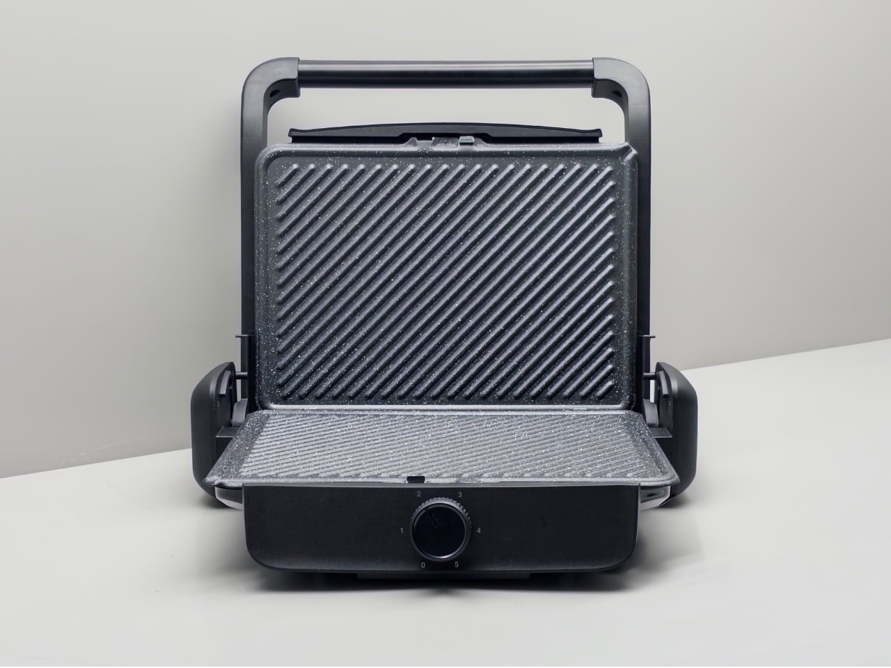
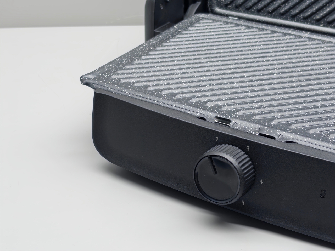
The design itself carries the kind of restraint that only looks effortless after a lot of work. Clean lines, a minimal form language, and a clear understanding that this object will live on someone’s kitchen counter, which means it has to look right whether it’s in use or not. Most sandwich makers are things you hide in a cabinet. This one looks like it was designed to stay out. That shift in thinking, from kitchen tool you tolerate to one you actually want to see, is a more significant design decision than it sounds.

There’s also something honest about the proportions. This isn’t a concept that drifts into fantasy, all floating surfaces and materials that will never survive a production line. It feels buildable. Considered. The kind of design where you can tell the person behind it was asking whether every decision was earning its place, rather than simply asking whether it looked good in a render.

I’ll admit I’m personally drawn to small appliance design right now. We’ve reached a moment where the home, and specifically the kitchen, has become a genuine expression of identity for a lot of people. Social media has made countertops aspirational real estate. The appliances sitting on them aren’t invisible anymore, and the industry is only just beginning to catch up to that shift. Concepts like this one feel like someone who understands that change and is designing accordingly, even before the brief exists to demand it.

It’s also worth noting that this kind of work, a concept developed with real brand context and real production sensibility, is increasingly how design culture moves forward. The conversation doesn’t only happen at Milan or in the pages of Wallpaper. It happens on Behance, where a designer in Istanbul can rack up half a million views on a sandwich maker concept and start a conversation that ripples through the industry. That’s genuinely exciting, and more democratizing than most design institutions would like to admit.

The bigger question this concept raises is why we settled for so long. Kitchen appliances are touched multiple times a day. They shape the experience of a space we spend real, meaningful time in. A sandwich maker that someone put thoughtful effort into isn’t a luxury, it’s just respect for the user. And once you see a design that gets it right, the ones that don’t become very difficult to look at.

Sagirosmanoglu’s sandwich maker concept doesn’t solve every problem with small appliance design. But it makes a compelling argument that someone should be trying. Whether or not it ever gets made, that argument is already winning.

The post A Designer Just Gave the Sandwich Maker the Concept It Deserved first appeared on Yanko Design.
How One Loop of Bent Wood Became a Complete Chair

Every so often, a piece of furniture stops you the way a good sentence does. You read it once, then go back and read it again just to understand how it works. The Sori Chair by Portugal’s Teixeira Design Studio is exactly that kind of piece. It started, as the best ideas often do, from a daily ritual of sketching. Not a brief, not a client request, just the quiet, intuitive kind of drawing you do before the day gets loud. And somewhere in that process, a loop took shape that became something worth talking about.

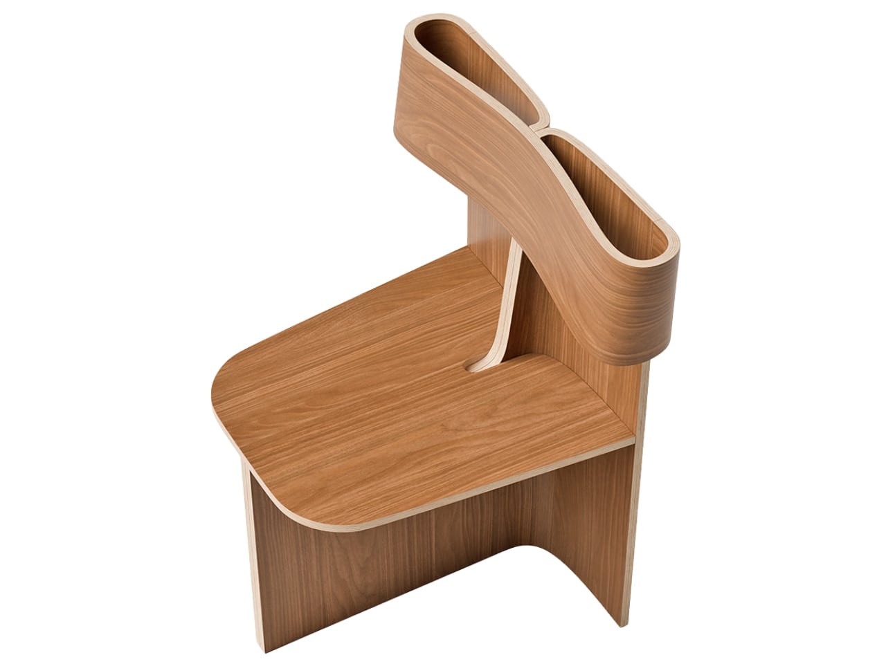
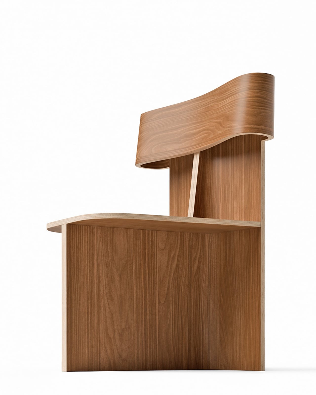
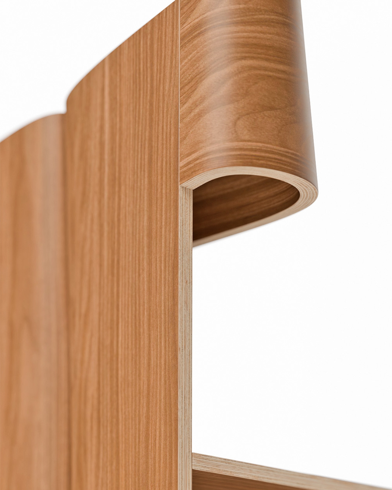
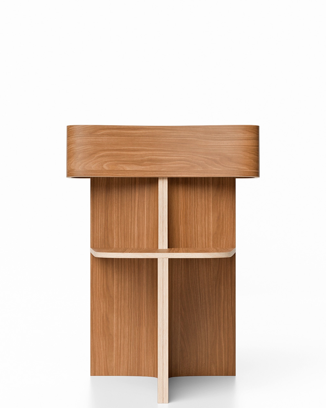
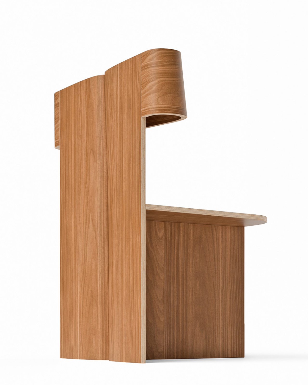
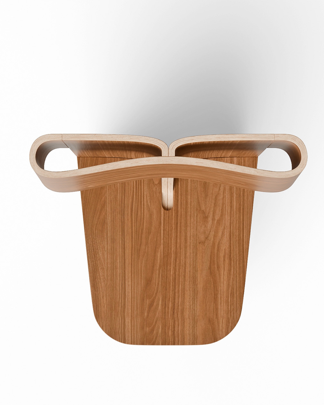
What came out of that ritual is a chair that feels completely resolved. A single, continuous ribbon of bent wood loops upward from the seat to form the double-ply backrest, open at the center like a hollow frame, and the contrast it creates against the chair’s firmly geometric base is fully intentional. Below that fluid loop, the structure is all right angles and clean planes, held together by a cross-shaped base that looks as if it was drawn with a ruler and a very steady hand. That tension between the organic and the architectural is where the Sori Chair lives, and it’s a genuinely compelling place to be.

Designer: Teixeira Design Studio

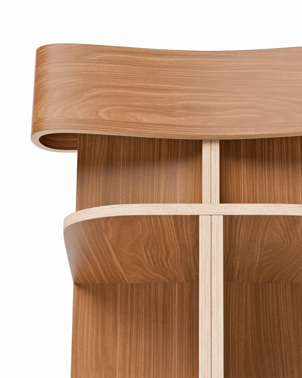
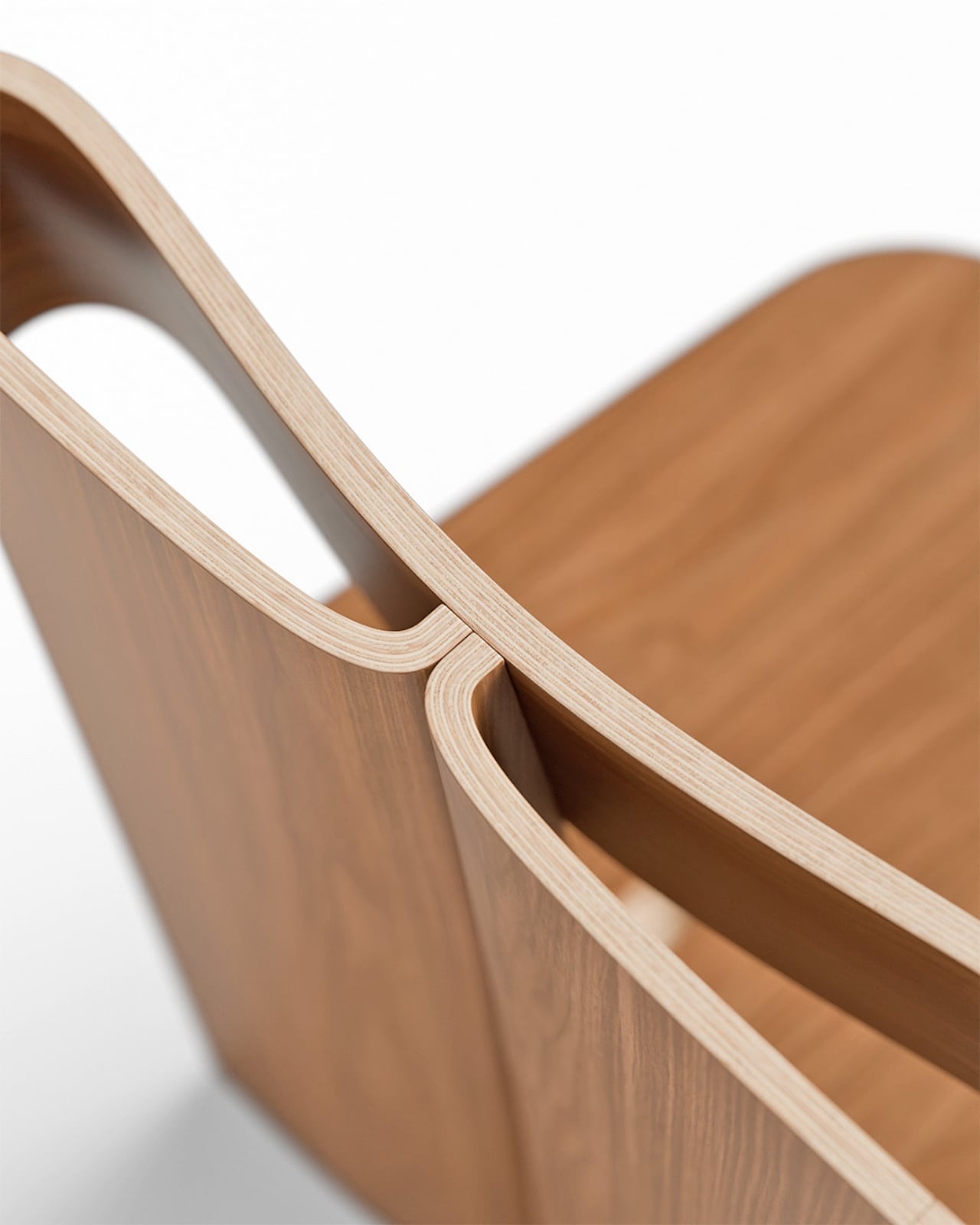
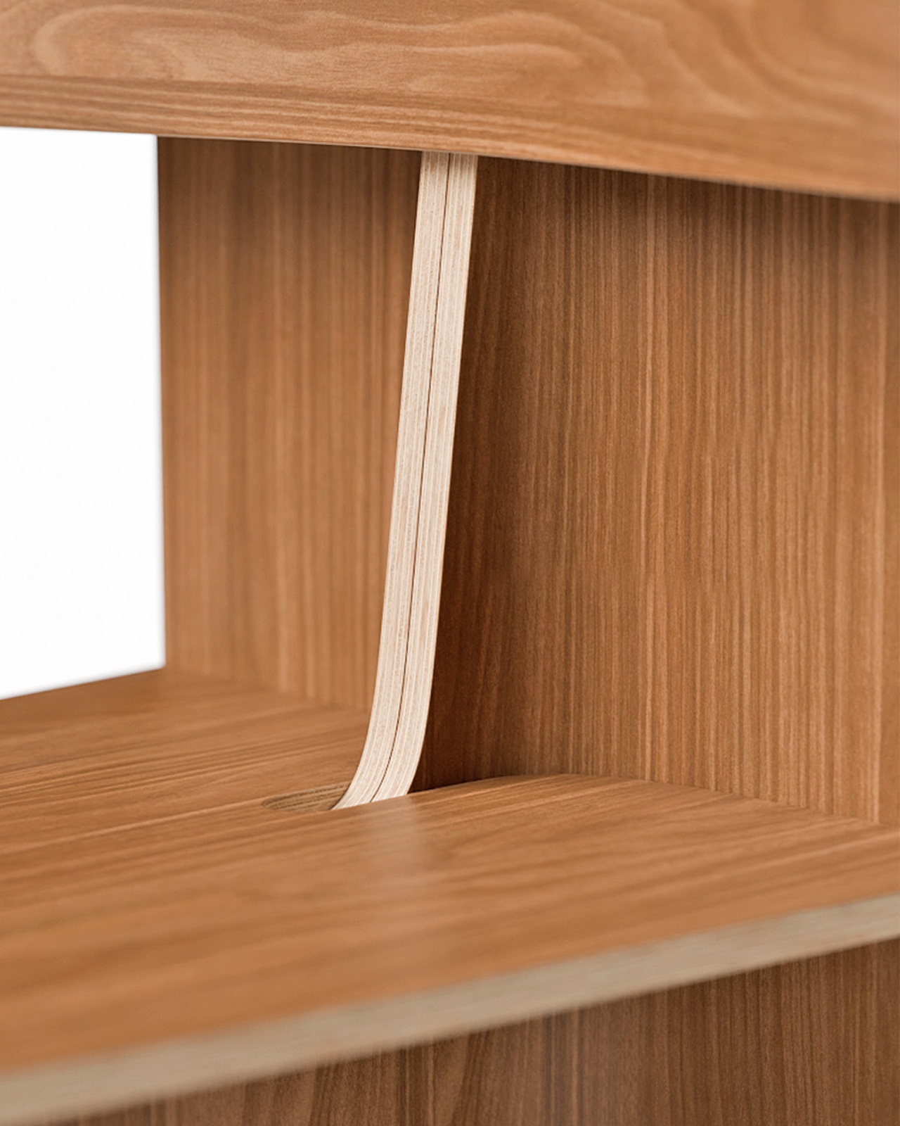
The technical side of this piece deserves more attention than it usually gets in design coverage. That backrest loop doesn’t just sit on top of the seat. It rises through it, emerging from a precise cutout with the kind of considered joinery that takes real craft to execute. The layered plywood edges are fully exposed throughout, and rather than hiding them, the design leans into them. You can see the pale strata of wood at every bend, every curve, every corner. It reads as an honest material and an honest process, and that matters more now than it perhaps ever has. In an era where furniture is increasingly flat-packed and finish-wrapped, a chair that shows you exactly how it was made feels almost countercultural.

The name is worth pausing on. Sori is a Japanese word for the natural curvature or warp of wood, the subtle bow that timber develops over time or when shaped under heat and pressure. Whether the studio intended that specific reference or landed on it instinctively, naming the chair after that particular quality of the material says something about how this work is approached: not as a battle against the material’s limits, but as a genuine conversation with them.

Teixeira Design Studio, based in Viana do Castelo in northern Portugal, has built a portfolio that consistently returns to this idea of using plywood and bent wood to find new formal possibilities. Earlier pieces like the Void Chair explored how a single sheet of plywood could fold into a form that contained seating and hidden storage simultaneously. With Sori, the focus narrows considerably. No secondary function, no added utility. Just the pursuit of one fluid, structural gesture, executed as cleanly as it possibly can be.

That restraint is what gives the chair its real weight. Designers who know how to do more but choose to do less are often the most interesting ones to follow, and Sori feels like a quiet, confident declaration of that philosophy. Every angle you approach it from reveals something new. From the front, it reads almost architectural, like a small building with an open courtyard. From the side, the loop of the backrest curls inward like a wave at the moment before it breaks. From above, the cutout in the seat and the twin arcs of the backrest create a composition that could hold its own as a flat drawing.

Good design holds up under scrutiny. It doesn’t just photograph well and vanish once you look too closely. The Sori Chair gets richer the longer you sit with it, and that, more than anything else, is the standard worth measuring any piece of furniture against.

The post How One Loop of Bent Wood Became a Complete Chair first appeared on Yanko Design.
The Hive Tower That Could Change How Cities Build Tall

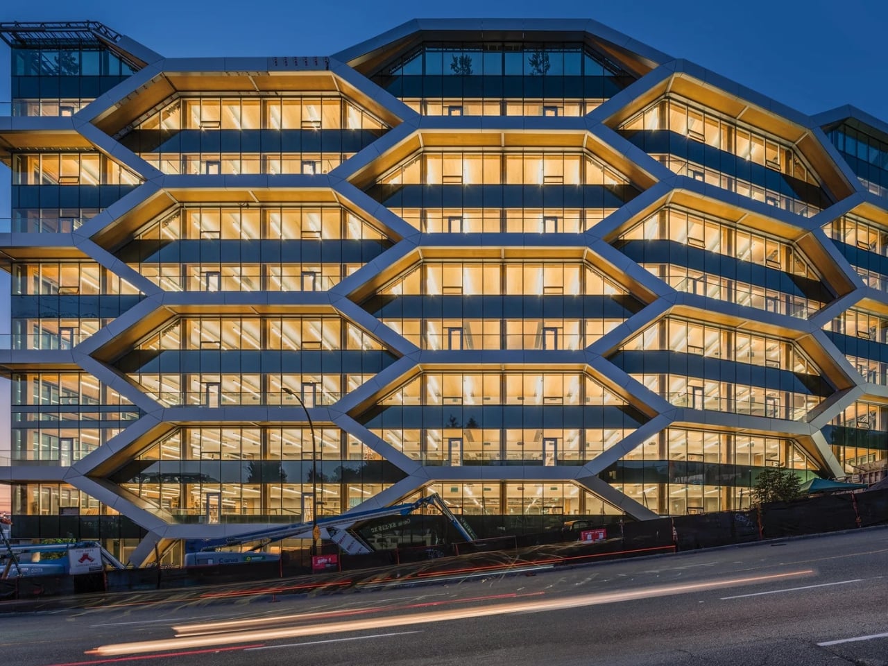
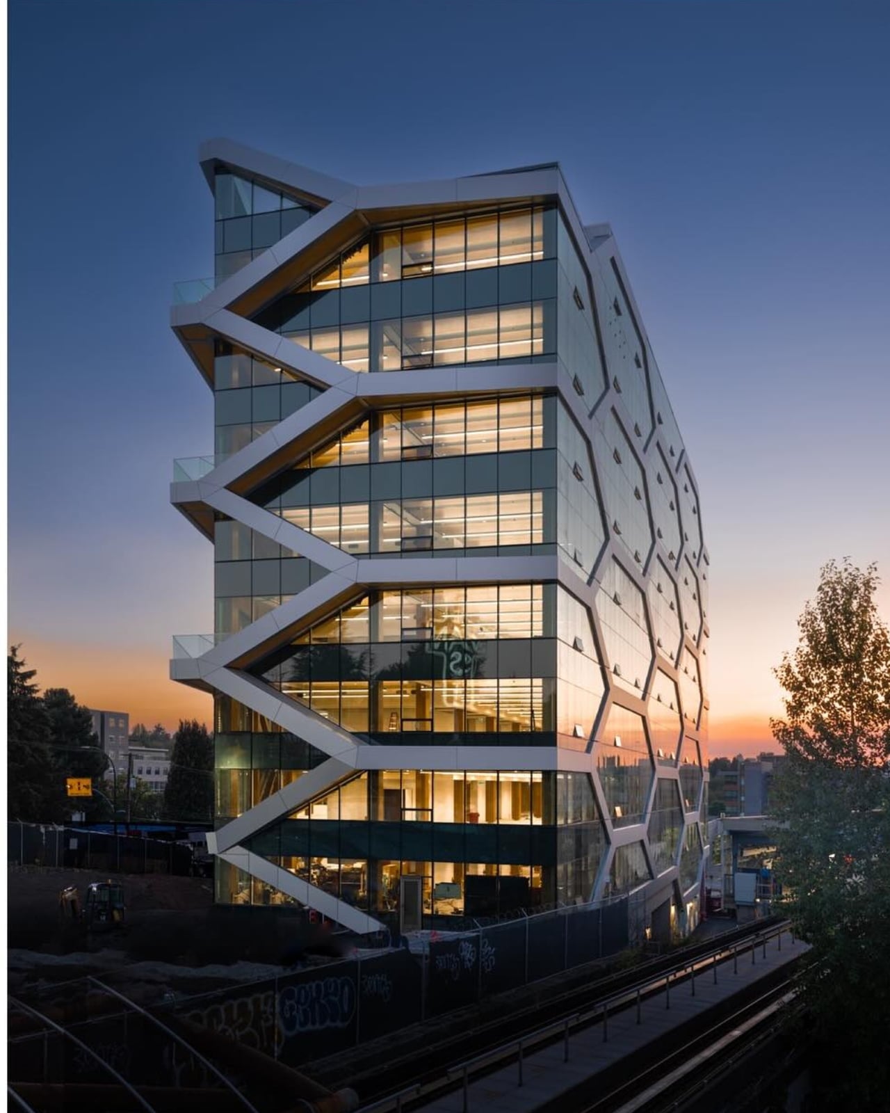
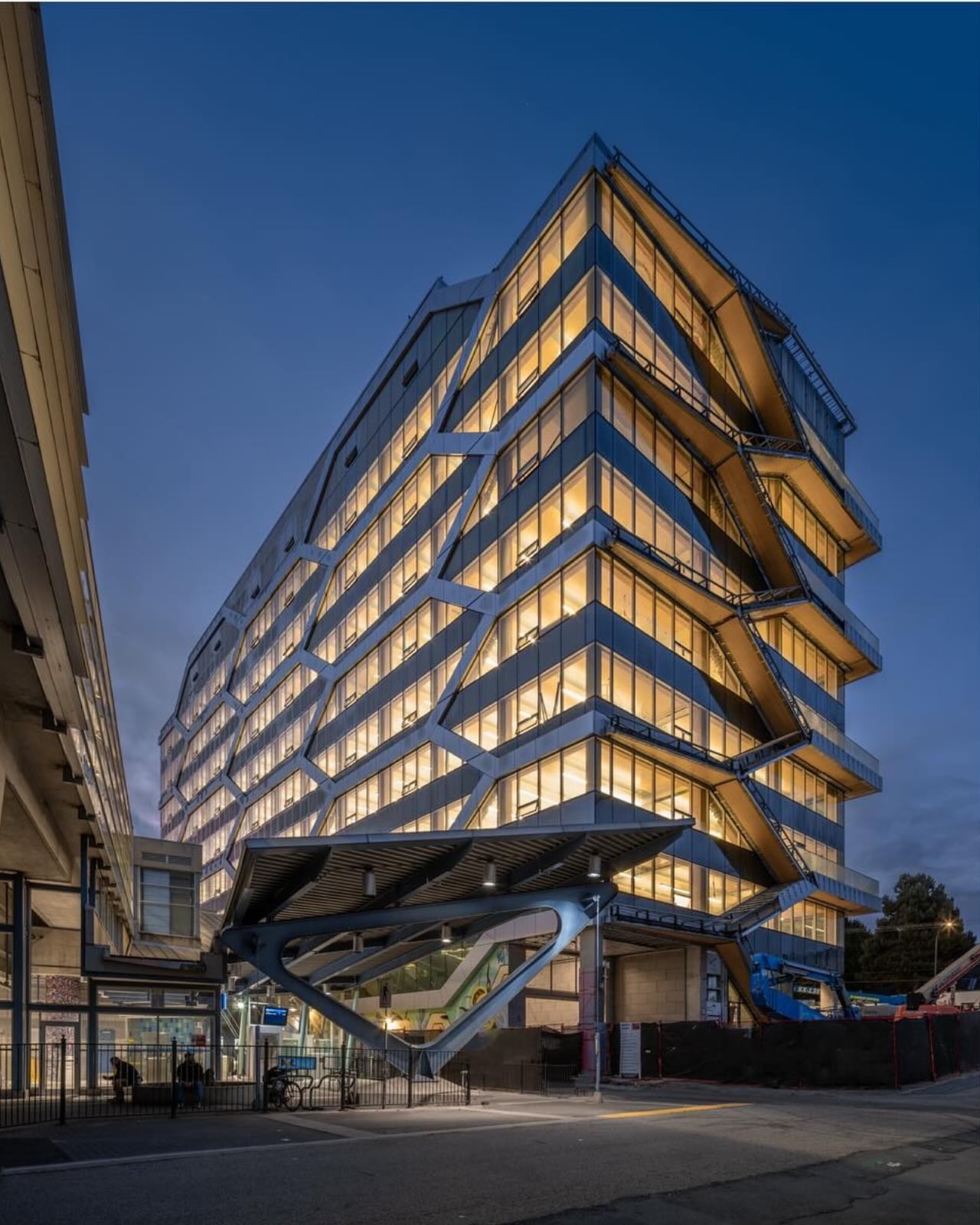
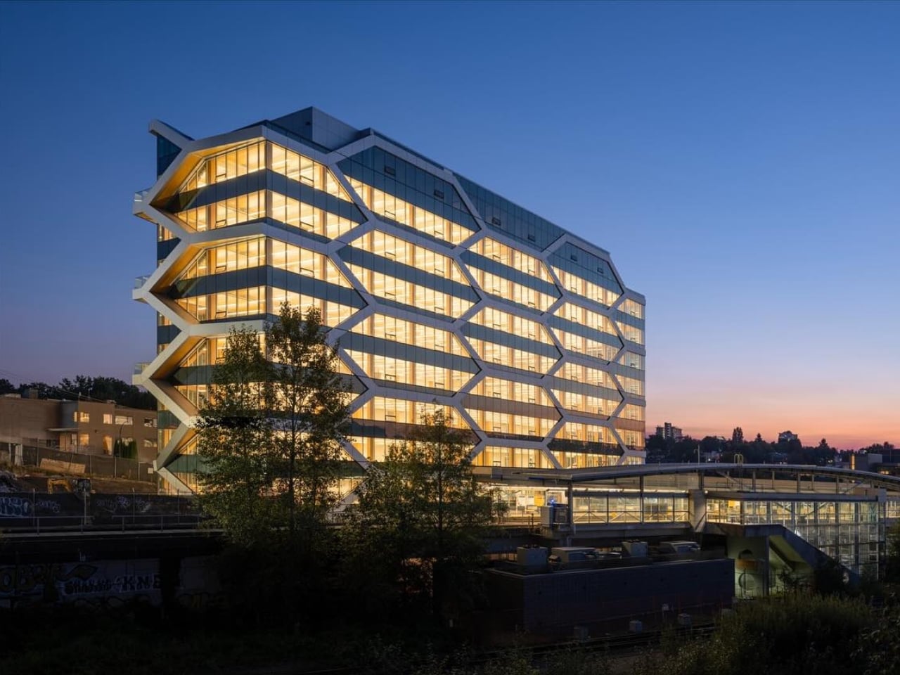
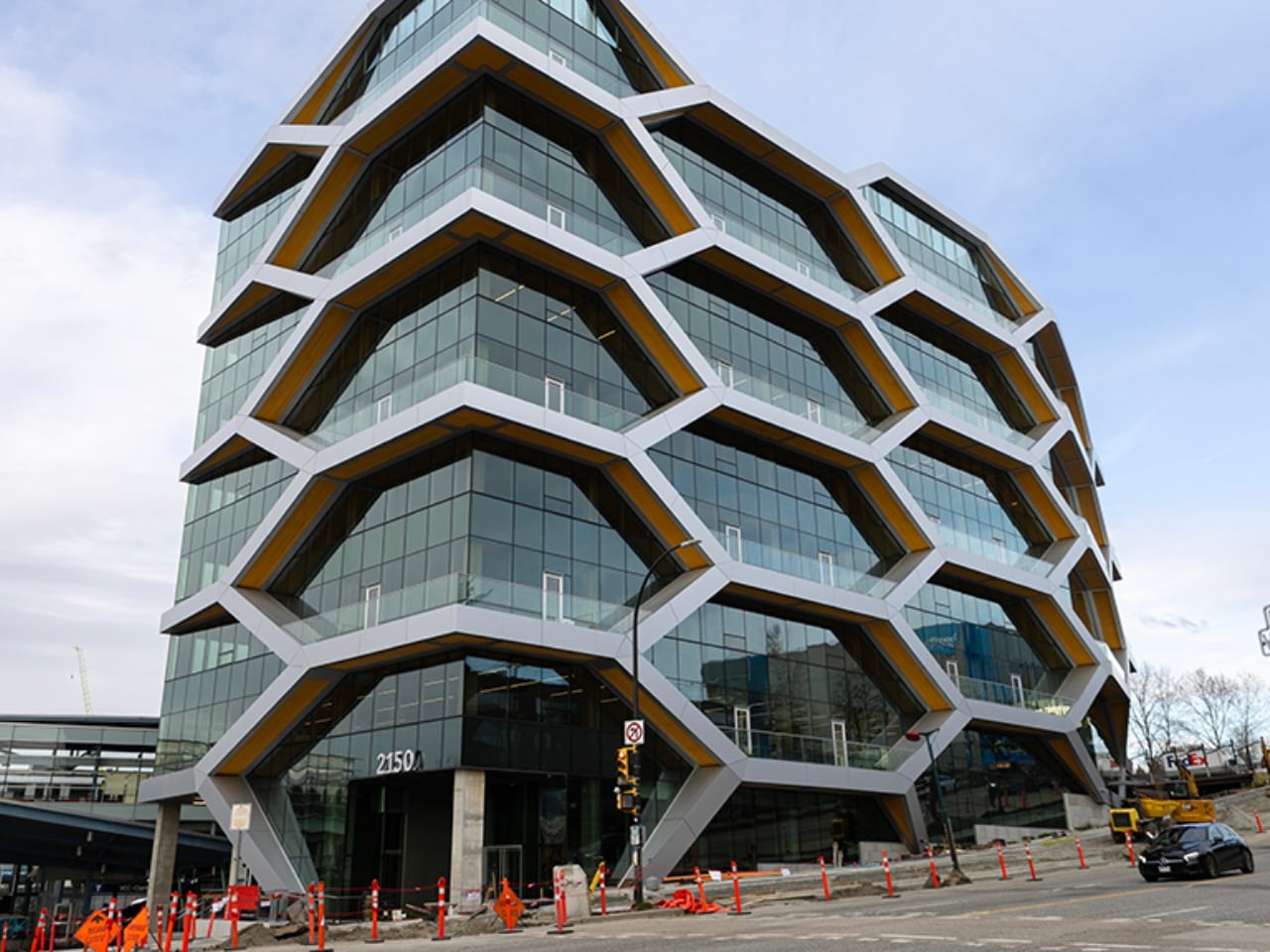
Vancouver just opened a building that looks like it was sketched from a bee’s imagination. Ten stories of glulam diagonal bracing arranged in a cellular honeycomb pattern, climbing above the False Creek Flats neighborhood at 2150 Keith Drive. No concrete core. No steel skeleton hiding inside. Just engineered wood, a very smart structural idea, and 106 seismic dampers quietly doing something extraordinary.
The Hive, designed by Dialog in collaboration with structural engineers Fast+Epp, is officially the tallest seismic-force-resisting mass timber building in North America. Nature’s Path Foods was an early believer in the project. The Insurance Corporation of British Columbia (ICBC) just signed on as anchor tenant, which matters more than it sounds. When an insurance company chooses to occupy a timber building designed for earthquake territory, it’s a signal about confidence, not just aesthetics.

Designer: Dialog Design (photos from Michael Elkan)

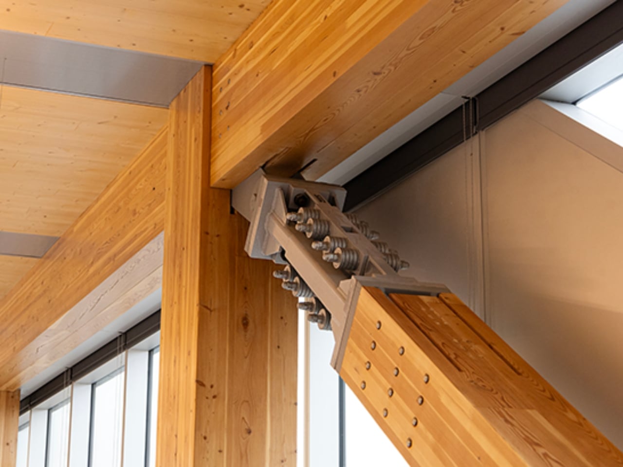
The structural decision at the center of this building is worth pausing on. Most architects building in seismic zones lean on a concrete core to handle lateral loads, then wrap wood or steel around it. Dialog chose not to do that here. Instead, the glulam diagonal braces run along the building’s perimeter, forming that honeycomb grid that reads immediately as a design statement but is actually the load-bearing logic made visible. The structure isn’t decorating the facade. The facade is the structure.
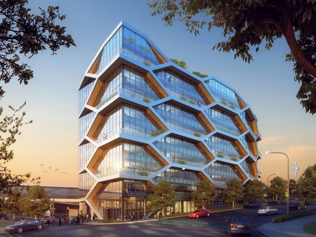
Paired with those diagonal glulam braces are 106 Tectonus damper connections, a system borrowed conceptually from how tectonic plates behave during seismic events. Rather than resisting an earthquake by brute force, the building is designed to move with it, absorbing energy through the dampers and then self-centering once the shaking stops. Testing was carried out at the University of Alberta using large physical mockups to prove the system would hold. That kind of pre-construction stress testing is not a given, and it reflects the level of scrutiny this project had to pass to exist at all.

The reason that scrutiny was so high comes down to code. Canada updated its National Building Code in 2020 to permit mass timber buildings up to 12 stories, with changes taking effect in 2022. Vancouver sits in a high-seismic zone, which added requirements beyond the base code. Getting a tall timber building approved here required not just meeting those new standards but helping to write the engineering case for them. The team received $4 million in research funding from federal and provincial governments to do exactly that, covering destructive testing, fire testing, and constructability analysis. The Hive didn’t just benefit from the regulatory shift. It helped earn it.

The comparison to other celebrated mass timber towers is instructive. Milwaukee’s Ascent is remarkable at 25 stories, and buildings like Neutral Edison have made compelling arguments for timber in dense urban settings. But neither sits in a high-seismic zone. The Hive isn’t the tallest timber building; it’s the most structurally tested in the conditions most buildings actually fear. Seismic credibility is the specific gap it fills, and filling it in a major North American city with a government-insurer anchor tenant is a different kind of proof than any design award.

The honeycomb wasn’t chosen to be pretty. It was chosen because the diagonal brace geometry at the perimeter is the most efficient seismic solution for a building this size without a concrete core. And yet the result is one of the most graphically immediate buildings to open anywhere this year. When the structural diagram and the brand identity are the same thing, something has gone right at a foundational level in the design process.

Mass timber has been in a years-long tug-of-war between its admirers and its skeptics. The admirers point to carbon storage, warmth, biophilic benefits. The skeptics point to fire risk, insurance costs, and seismic uncertainty. The Hive answers the hardest skeptic argument directly, in one of the most seismically demanding cities in Canada. Whether it fully tips the debate probably depends on what gets permitted and built next. But as an opening move, it’s a strong one.

The post The Hive Tower That Could Change How Cities Build Tall first appeared on Yanko Design.