Tesla used deceptive language to market Autopilot, California judge rules

Tesla’s sales in California should be suspended for 30 days because its marketing around Autopilot and Full Self-Driving misled consumers, a California administrative law judge has ruled. Back in 2022, the California DMV accused the automaker of using deceptive language to advertise those products and making it seem like its vehicles are capable of level 5 autonomous driving. Tesla has since added the word “Supervised” to the name of its Full Self-Driving assistance technology.

As Bloomberg notes, the DMV asked the administrative law judge if a suspension is warranted based on the evidence it presented. Even though the judge has agreed that it is, the agency will give Tesla 90 days to explain its side and remove any untrue or misleading language in the marketing materials for the products. Tesla’s sales and manufacturing in California will only be suspended if it doesn’t comply within that timeframe.

“We’re really asking Tesla to do their job, as they’ve done in other markets, to properly brand these vehicles,” said California DMV director, Steve Gordon, in a statement.

A suspension in California could be devastating for the automaker. While new Tesla registrations in the state plummeted earlier this year, Reuters says California accounts for nearly a third of the company’s sales in the country. In addition, Tesla only manufactures its Model S and X vehicles in its Fremont plant, where it also produces Model 3 and Model Y units.

This article originally appeared on Engadget at https://www.engadget.com/transportation/evs/tesla-used-deceptive-language-to-market-autopilot-california-judge-rules-035826786.html?src=rss

YURON 4K Transmitter Connects Instantly, No Network or App Required

Getting a laptop or tablet onto a TV or projector usually involves digging for the right cable, switching inputs, or wrestling with built-in casting that drops connections at the worst moment. This happens in meeting rooms, classrooms, and living rooms, turning simple screen sharing into a minor technical puzzle. A small, dedicated wireless bridge feels like a relief when it just works without software or setup rituals that waste five minutes before anything appears.

YURON is a plug-and-play 4K transmitter and receiver pair that lives in a bag or drawer until needed. One end plugs into a device over USB-C or HDMI, the other into a display’s HDMI port, and the link comes up automatically over its own 5G Wi-Fi connection. No apps, no pairing, no joining a network, just a direct path for video and audio that starts working the moment both sides power on.

Designer: YURON

Click Here to Buy Now: $59 $129 (54% off). Hurry, only 67/1000 left! Raised over $158,000.

YURON handles 4K 60 Hz HDR10 video up to 45 m, using H.265 compression, adaptive 5G Wi-Fi, and error correction to keep the picture smooth. It is fast enough for presentations, movies, and casual gaming, with audio and video traveling together, so there is no awkward lag. The point is to make the wireless link feel as transparent as a cable, without the cable running across the floor or desk.

1

Walking into a meeting room or classroom, you plug the receiver into the display once, then let different laptops or tablets take turns with the transmitter. YURON supports both mirror and extended modes, so someone can present slides on the big screen while keeping notes or chat on their own display. The 45 m range means it works in larger rooms without needing to huddle near the projector.

1

In a living room or dorm setup, a laptop, handheld console, or streaming box can send 4K content to a TV without an HDMI run. The low latency and 60 Hz refresh make it comfortable for games and sports, and the lack of app dependencies means guests can plug in and share videos or photos without installing anything. It becomes a quiet upgrade to movie nights and couch sessions.

1

The one-click control lets you cut the link instantly from the transmitter, useful when switching between apps with sensitive content or when you want to check something privately before sharing it again. A single receiver can pair with up to eight transmitters, with a button press cycling through them. In a studio, office, or classroom, multiple people can share the same screen without swapping cables or logging into accounts.

1

The hardware is compact and light enough to live on a key shelf or in a laptop sleeve, with a USB-C port that supports up to 100W Power Delivery, so a laptop can stay charged through the same connection. The internal cooling design, with multiple thermal zones and ventilation holes, keeps performance stable during long 4K sessions. It is the kind of detail that makes a small device feel engineered rather than improvised.

YURON turns screen sharing from a minor technical hurdle into something almost invisible. Instead of planning around cables or hoping a TV’s casting feature cooperates, you plug in a small pair of devices and treat any display as if it were directly connected. For people who move between work, study, and play, that kind of quiet reliability is often what makes a tool worth keeping in the bag, especially when the alternative is fumbling with adapters or explaining why the screen is still blank three minutes after the meeting was supposed to start.

Click Here to Buy Now: $59 $129 (54% off). Hurry, only 67/1000 left! Raised over $158,000.

The post YURON 4K Transmitter Connects Instantly, No Network or App Required first appeared on Yanko Design.

Remember “The Ghiblification”? We Treated Ghibli As Disposable Because That’s How We Treat Everything

First, it was cottagecore, filling our feeds with sourdough starters and rustic linen. Then came the sharp, symmetrical pastels of the Wes Anderson trend, followed by a tidal wave of Barbie pink that painted the internet for a summer. Each aesthetic arrived like a weather front, dominating the landscape completely for a short time before vanishing just as quickly, leaving behind only a faint digital echo. They were cultural costumes, tried on for a season and then relegated to the back of the closet.

Into this cycle stepped Studio Ghibli, its decades of patient, handcrafted animation compressed into a one-click selfie generator. The resulting “Ghibli-fication” of our profiles was not a deep engagement with Hayao Miyazaki’s themes of environmentalism and pacifism; it was simply the next costume off the rack. The speed with which we adopted and then abandoned it reveals a difficult truth. Our treatment of Ghibli was a symptom of a much larger cultural pattern, one where even the most profound art is rendered disposable by the internet’s insatiable appetite for the new.

When everything becomes an aesthetic, nothing remains itself

Platforms thrive on legibility. Content needs to be instantly recognizable, easily categorized, and simple enough to reproduce at scale. This creates enormous pressure to reduce complex cultural artifacts into their most surface-level visual markers. A Wes Anderson film becomes “symmetrical shots in pastel.” A hit song from Raye (that marked her leaving a music label and following creative freedom) becomes just a fleeting 20-second TikTok dance about rings on fingers and finding husbands. Ghibli’s intricate storytelling about war, labor, and the natural world gets flattened into “soft colors and big eyes.”

The reduction is not accidental. It is the cost of entry into viral circulation. An aesthetic can only spread if it can be copied quickly, applied broadly, and understood immediately. Nuance, context, and depth are friction. They slow down the sharing, complicate the reproduction, and limit the audience. So they get stripped away, not out of malice, but out of structural necessity. What remains is a shell, a visual shorthand that gestures toward the original without containing any of its substance.

This process turns cultural works into raw material. A film, a book, a philosophical tradition, any of these can be mined for their most photogenic elements and reconfigured into something that fits neatly into a grid post or a TikTok filter. The original becomes less important than the aesthetic it can generate. Once the aesthetic stops performing well in terms of engagement metrics, the entire package gets discarded. The algorithm does not care about preservation or reverence. It cares about what is getting clicks and views today.

The appetite that cannot be satisfied

Social media platforms are built around a fundamental economic problem: they need to hold attention, but attention is finite and easily exhausted. The solution is constant novelty. If users get bored, they leave. If they leave, ad revenue drops. So the feed must always be serving something new, something that feels fresh enough to justify another scroll, another click, another few seconds of eyeball time.

This creates a culture of planned obsolescence for aesthetics. A look can only stay interesting for so long before it becomes familiar, then oversaturated, then tiresome. At that point, it has to be replaced. The cycle repeats endlessly, chewing through visual languages, artistic movements, and cultural traditions at a pace that would have been unthinkable even twenty years ago. What took decades to develop can be extracted, popularized, and discarded in a matter of weeks.

The speed of this churn has consequences. It trains us to engage with culture in a particular way: superficially, briefly, and without much attachment. We learn to skim surfaces rather than dig into depths. We participate in trends not because they resonate with us personally, but because participation itself is the point (the ice bucket challenge boosted ALS awareness for precisely 6 months). Being part of the moment, being visible within the current aesthetic wave, these become more valuable than any lasting connection to the work that aesthetic is borrowed from.

What sticks when the wave recedes

The irony is that while trends are disposable, the works they feed on often are not. Ghibli films continue to be watched, analyzed, and loved by new audiences long after the selfie filters have been forgotten. Wes Anderson’s movies did not become less meaningful because people used his color palettes for Instagram posts. The underlying art survives because it contains something that cannot be reduced to a visual shorthand.

What separates durable culture from disposable trends is substance that exceeds its surface. A Ghibli film rewards attention over time. The more you watch, the more you notice: the way labor is animated with dignity, the long quiet stretches that mirror real life’s pace, the refusal to offer simple moral answers. None of that fits in a filter. None of that can be mass-produced. It requires the viewer to bring time, focus, and openness to complexity.

This is what the trend cycle cannot replicate. It can borrow the look, but it cannot borrow the experience. It can create a momentary association with the aesthetic, but it cannot create the slow, layered engagement that builds lasting attachment. So the original work persists beneath the churn, waiting for the people who want more than a costume, who are looking for something to return to rather than something to discard.

Resisting the rhythm of disposability

Recognizing this pattern is not the same as escaping it. We are all embedded in systems that reward rapid consumption and constant novelty. The feed is designed to keep us moving, to prevent us from lingering too long on any one thing. Resisting that rhythm requires deliberate effort, a conscious choice to slow down when everything around us is accelerating.

That resistance can look small and personal: rewatching a film instead of merely watching a snippet of it on YouTube Shorts, reading longform essays instead of liking someone’s reel about it, spending time with art that does not immediately reveal itself. If anything, the pandemic allowed us to spend days culturing sourdough starter so we could bake our bread. The curfew ended and sourdough became a distant memory… but for those 6 months, we actually indulged in immersion. These acts do not change the structure of the platforms, but they change our relationship to culture. They create space for depth in an environment optimized for surface.

The broader question is whether we can build cultural spaces that do not treat everything as disposable. Platforms will not do this on their own; their incentives run in the opposite direction. But audiences, creators, and critics can push back by valuing longevity over virality, by rewarding substance over aesthetic repackaging, by choosing to engage with work in ways that cannot be reduced to a trend cycle.

Ghibli survived its moment as a disposable aesthetic because it was never fully captured by it. The films remain too slow, too strange, too resistant to easy consumption. They stand as a reminder that some things are built to last, even in an environment designed to make everything temporary. The real work is recognizing that difference and choosing to treat what matters accordingly.

The post Remember “The Ghiblification”? We Treated Ghibli As Disposable Because That’s How We Treat Everything first appeared on Yanko Design.

French Tiny House Masters Baluchon Create Light-Filled Sanctuary For Mother & Daughter

Baluchon, the renowned French tiny house builder known for its artisanal craftsmanship, has unveiled its latest creation: a compact dwelling that challenges conventional notions of small-space living. Named “Into the Woods,” this 20-foot home was custom-built for Sandrine and her daughter, who plan to make it their permanent residence. The project represents another successful collaboration between the celebrated French builder and clients seeking a simpler, more intentional way of life in a beautifully designed space.

The exterior immediately signals Baluchon’s signature aesthetic that has made them stand out in the tiny house movement. Red cedar cladding wraps the structure, complemented by a metal roof and those distinctive pops of color that set the French builder apart from competitors. At just 6 meters long, the home sits on a double-axle trailer, embodying the typical European tiny house proportions that feel intimate rather than cramped. This artisanal approach to exterior design ensures that while all Baluchon homes feature traditional wood cladding, they never appear dull or repetitive.

Designer: Baluchon

Step inside, and the spatial magic remarkably reveals itself. Despite the modest footprint, the interior feels remarkably open and airy, defying expectations for a home of this size. This isn’t accidental but the result of careful planning. Baluchon deployed extensive glazing throughout the design, flooding every corner with natural light and eliminating the dark, cramped spaces that often plague smaller dwellings. The living and dining area benefits most from this approach, with oversized windows on two sides creating an indoor-outdoor flow that makes the space feel significantly larger than its measurements suggest. This luminous quality transforms the tiny house into a genuine sanctuary.

The layout prioritizes functionality without sacrificing comfort, demonstrating Baluchon’s years of experience. A full kitchen lines one wall, while a compact bathroom sits tucked away with a full-size closet positioned strategically next to it. The closet features multiple cabinets, drawers, and hanging space, proving that minimalist living doesn’t mean compromising on storage solutions. Access to the upper level comes via a fixed ladder with wider treads, a design choice that maximizes floor space below while remaining easy to navigate daily. Every element serves a purpose while contributing to the home’s overall aesthetic.

The real innovation happens upstairs, where Baluchon implemented a truly creative solution. Rather than creating two separate, potentially dark sleeping lofts, the builder connected the bedrooms with a stretched net. This clever design serves multiple purposes simultaneously: it maintains visual connectivity between the two spaces, allows light to penetrate throughout the upper level, and adds an element of playfulness to the design. The net transforms what could have been isolated sleeping quarters into a cohesive, light-filled sanctuary that feels both practical and imaginative. This approach perfectly balances the needs of the mother-daughter duo who will call this space home.

The Into the Woods represents more than just another tiny house completion; it embodies a growing movement toward intentional living, where people choose to downsize not out of necessity but as a conscious lifestyle decision. For Sandrine and her daughter, this home offers an opportunity to live in harmony with nature, away from urban density, while maintaining all the essential comforts of modern life. Baluchon continues to prove that small doesn’t mean sacrificing quality or livability. With each new build, they demonstrate how thoughtful design can transform compact spaces into genuine homes where families can thrive long-term. Into the Woods stands as a testament to this philosophy, showing that 20 feet is more than enough space when every inch is carefully considered.

The post French Tiny House Masters Baluchon Create Light-Filled Sanctuary For Mother & Daughter first appeared on Yanko Design.

Hublot Big Bang Meca-10 Street Art: When Concrete Becomes Wearable Art

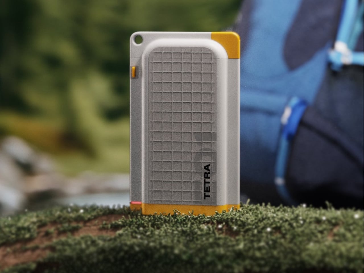
Imagine taking a chunk of concrete from a Miami street wall, complete with cracks and spray paint, and somehow turning it into a luxury watch. That’s exactly what Hublot has done with the Big Bang Meca-10 Street Art collection. The result is four watches that look like someone ripped pieces of graffiti-covered urban architecture and strapped them to your wrist.

Designer: Hublot

The idea sounds absurd until you see the execution. The cracks in the surface aren’t flaws. They’re designed that way, filled with glow-in-the-dark paint that shifts color depending on whether you’re standing in daylight, darkness, or under the ultraviolet lights of a nightclub. One watch becomes three different visual experiences depending on where you take it.

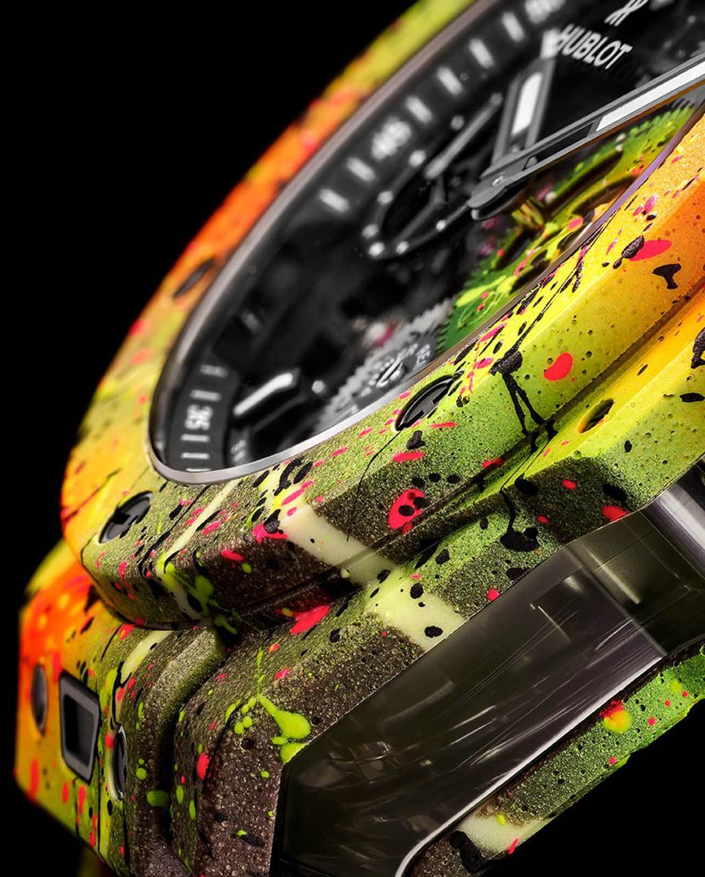
This isn’t just a watch wearing a costume. The concrete composite forms the actual structure of the case, meaning the material choice affects weight, texture, and how the watch feels against skin. Every crack pattern is unique because the material naturally fractures differently each time.

Why Concrete Makes Sense (Even Though It Shouldn’t)

Before going further: is that really concrete on your wrist? Technically, it’s a concrete composite rather than the stuff you’d pour into a building foundation. Hublot mixes actual cement with polymers and resin binders, so calling it a “concrete case” isn’t wrong, but watch nerds will correctly note that raw structural concrete would crumble the first time you bumped a doorframe.

That said, the material still chips, cracks, and absorbs moisture in ways that make it seem like the last thing you’d want wrapped around delicate mechanical parts. Hublot approached the problem by treating concrete not as a building material but as a canvas that happens to be structural.

The bio-based epoxy resin mixed into the cement changes the rules. Traditional concrete relies on water evaporation to harden, leaving behind microscopic pores that weaken the structure over time. This composite skips that process entirely, binding the cement particles with plastic polymers instead. The addition of graphene creates a reinforcement network at the molecular level, boosting strength by roughly 15 to 20 percent compared to standard concrete while keeping the rough, porous surface texture that makes the material visually interesting.

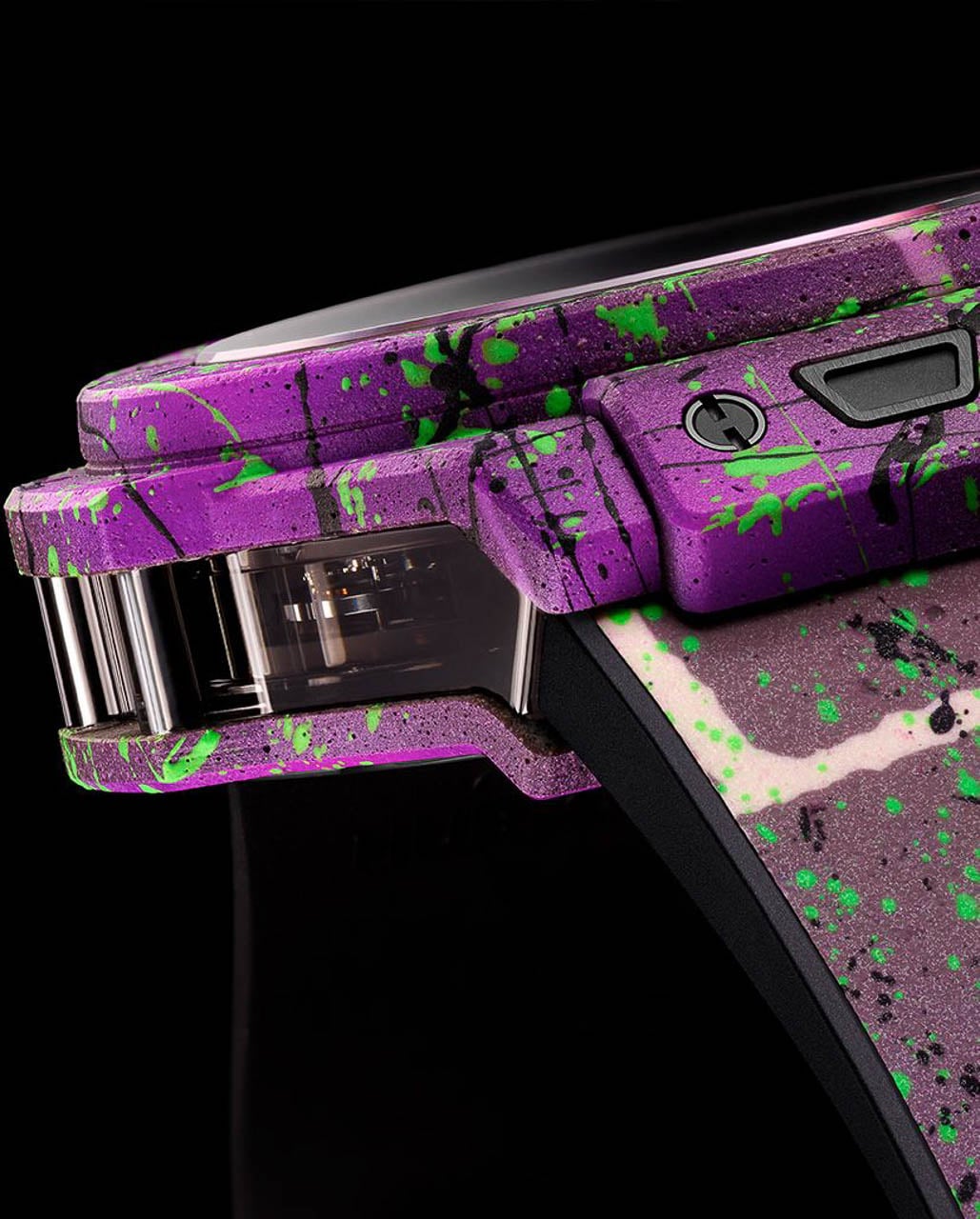
What you end up with is a material that looks fragile but behaves like a proper watch case. The matte, weathered surface invites touch in a way that polished steel or ceramic never could. Run your finger across the face and you feel actual texture, tiny ridges and valleys that remind you this started life as construction material. The painted cracks catch light unevenly, creating shadows that shift as you move your arm. The weight sits noticeably on the wrist. At 44 millimeters across and over 15 millimeters thick, this isn’t a subtle timepiece. But the density feels purposeful rather than clumsy, grounding the visual chaos of the paint job in something physically substantial.

The Paint Job That Transforms Three Times

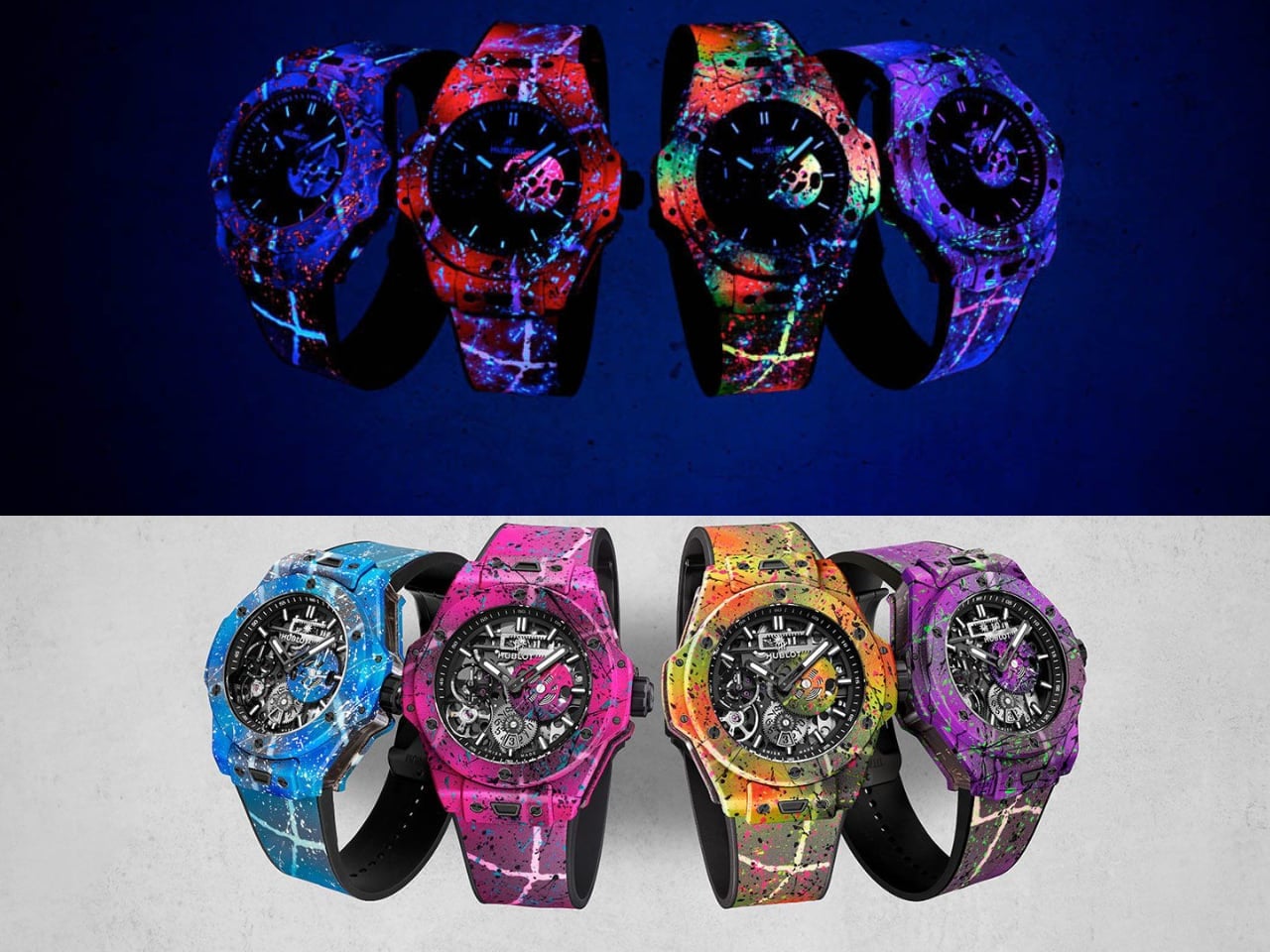
Street artist Saiff Vasarhelyi handled the hand-painting, layering splatter patterns and graffiti gestures across the concrete surface in a way that looks spontaneous but required careful planning to execute at this scale. Each of the four colorways targets a different slice of Miami’s visual landscape.

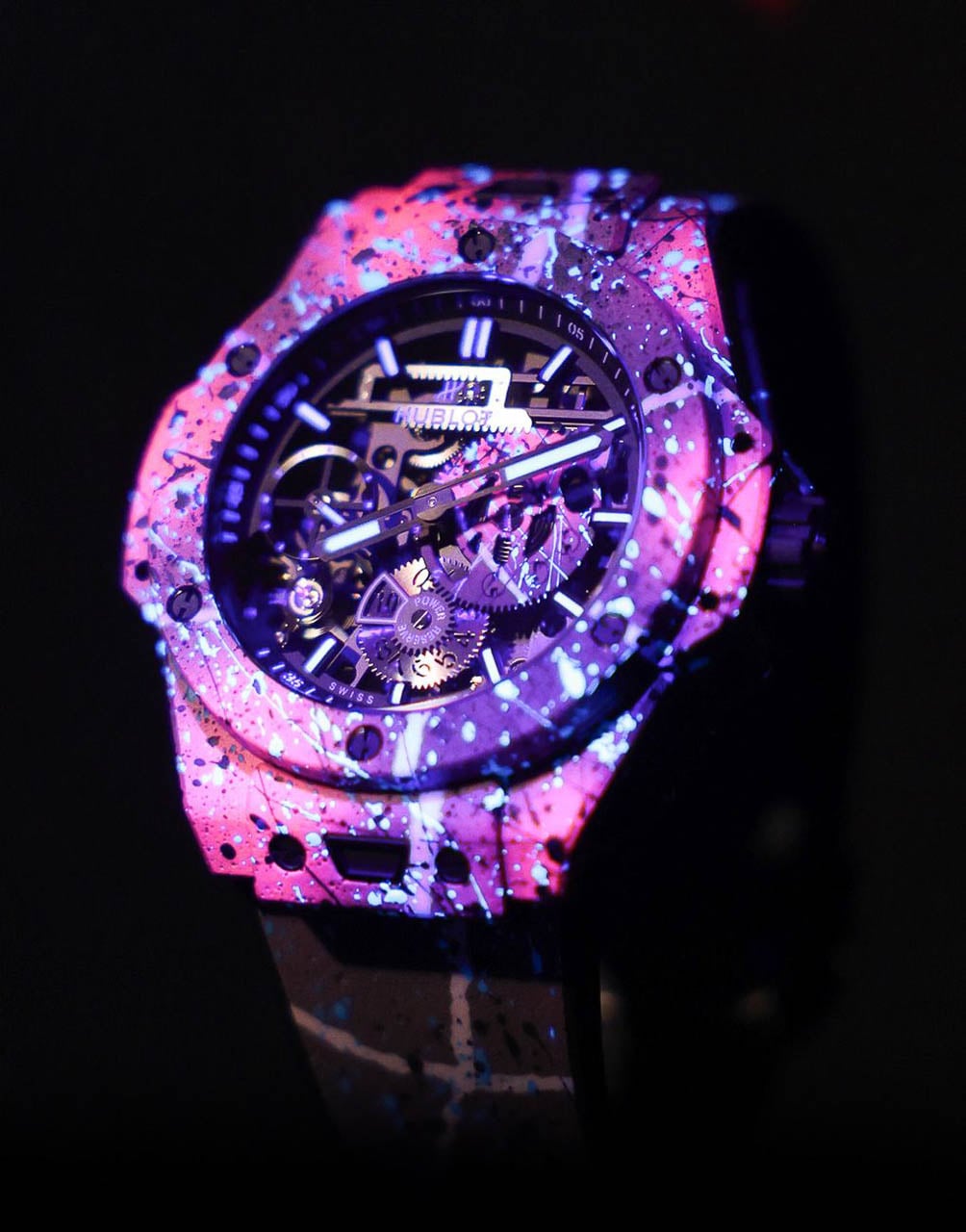
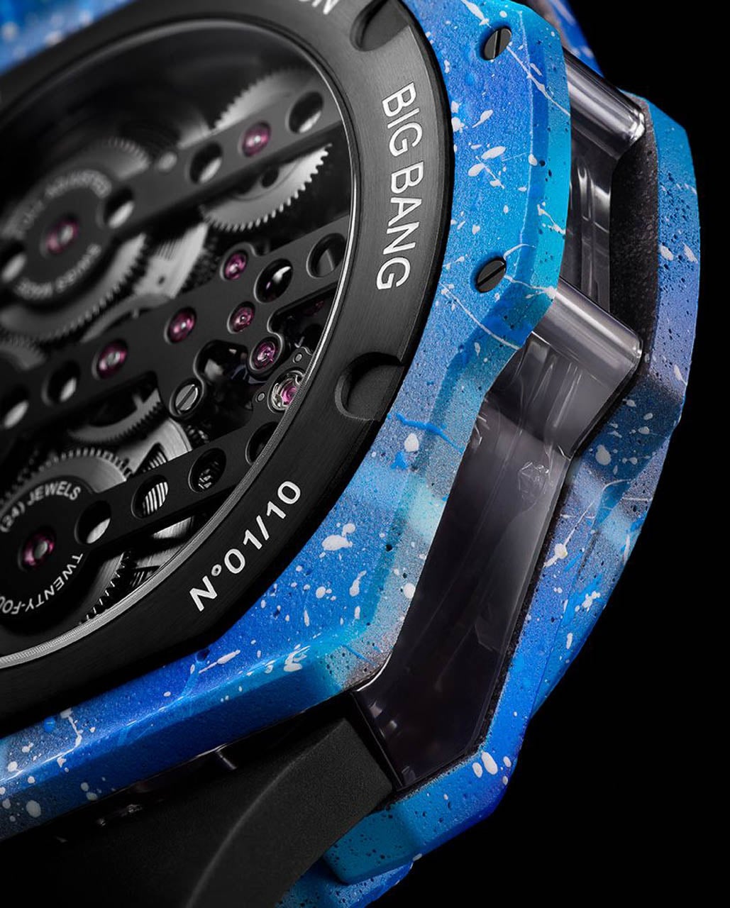
Magic City uses purple and green tones that glow pink under blacklight, capturing the neon palette of the city’s nightclub district. Vice pushes harder into hot pink with splashes of blue, channeling the saturated colors of club lighting after midnight. Big Water shifts to aqua and turquoise, evoking ocean tones and lit swimming pools at night. Sunshine goes warm, layering yellow, orange, and green in patterns that recall sun-faded murals and citrus groves.

The paint contains UV-reactive luminova pigments, which is a fancy way of saying these watches absorb light during the day and release it slowly in darkness. Whether this transforms the watch into wearable art or an expensive novelty depends on how often you actually find yourself under blacklights. But unlike typical watch lume that just makes hands visible at night, this application turns the entire case into a light source. The cracks glow along their full length, and the splatter patterns that looked chaotic in daylight suddenly reveal hidden geometry when the lights go out.

Under actual ultraviolet light, the effect intensifies again. Colors that appeared muted in normal conditions snap into vibrant intensity, and additional pigment layers that were invisible before suddenly appear. The watch literally changes appearance depending on the environment, which sounds gimmicky until you consider that Hublot launched these at Art Basel in Miami, where moving between gallery lighting, afternoon sun, and club blacklights happens multiple times per night.

The Mechanical Heart Underneath the Chaos

Strip away the paint and concrete, and you find the HUB1201 Meca-10 caliber, a movement Hublot introduced in 2016 specifically to showcase power reserve engineering. The name refers to the 10-day power reserve, meaning you can wind this watch on Monday morning and it will keep running until the following Thursday without additional attention.

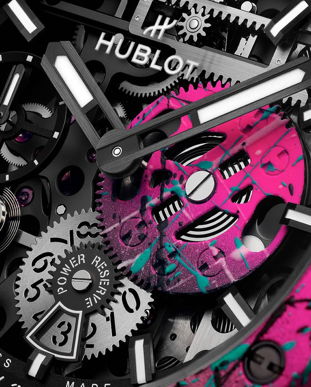
Most mechanical watches store energy in a single barrel, a coiled spring that slowly releases tension to drive the gear train. The Meca-10 uses two barrels working in parallel, effectively doubling the stored energy while keeping the watch thin enough to remain wearable. The trade-off is complexity. More barrels means more gears, more potential failure points, and more cost to service when maintenance time comes.

The power reserve display dominates the upper half of the dial through a rack-and-pinion system that looks more like industrial machinery than traditional watchmaking. As energy depletes over the 10-day cycle, a rotating disc gradually reveals a red warning zone that tells you winding time approaches. The mechanism is completely visible through the openworked dial, turning the act of checking remaining power into a visual experience rather than just a number readout.

Hublot finished the movement bridges in matte black for these editions, creating contrast against the silver metallic elements and making the painted splatter accents on the power reserve disc cover pop more aggressively. The balance wheel sits toward the front of the movement, oscillating at 21,600 vibrations per hour, visible through the smoked sapphire crystal that forms the case midband.

Who Actually Buys This

At $57,500 per watch with only 10 pieces of each colorway available through Hublot boutiques, these aren’t entry points into watch collecting. The price positions them as art objects that happen to tell time, targeted at collectors who already own multiple Hublots and want something that can’t be replicated.

The concrete composite material, the hand-painted surfaces, and the natural variation in crack patterns mean no two examples will ever look identical. This appeals to a specific collector psychology that values uniqueness over consistency, the same mindset that drives people to collect original artwork rather than prints.

The launch context reinforced this positioning. Hublot unveiled the collection during Miami Art Week at a party featuring a 50 Cent performance, targeting an audience that views watch purchases as part of a broader lifestyle statement. The watches were designed to look correct in that environment, where blacklight, loud music, and celebrity adjacency form the natural habitat.

Whether this represents the future of watchmaking or a temporary detour into spectacle depends on your perspective. Hublot has built its identity on exactly these kinds of polarizing releases, betting that the collectors who love them will love them intensely enough to offset the collectors who find them absurd. Twenty years into the Big Bang platform, the strategy keeps working.

The Design Verdict

The Big Bang Meca-10 Street Art collection succeeds by committing fully to its premise. The concrete isn’t a surface treatment applied to a conventional case; it’s the case, with all the texture, weight, and visual unpredictability that implies. The paint job doesn’t just decorate; it transforms the object depending on lighting conditions, giving owners a different watch for every environment.

The execution required solving genuine engineering problems around material strength, moisture resistance, and paint adhesion to rough surfaces. Other brands have pushed unconventional case materials, from Richard Mille’s forged carbon to Panerai’s carbotech composites, but none have attempted something this visually chaotic or deliberately fragile-looking. Hublot could have achieved a similar visual effect through ceramic printing or enamel work, but the tactile experience would have been entirely different. Touching these watches feels like touching urban infrastructure, which is either brilliant or terrible depending on what you want from a timepiece.

For readers who appreciate design as problem-solving, the collection demonstrates how material innovation can drive aesthetic outcomes that would be impossible to achieve through conventional means. For readers who appreciate watches as status objects, the limited production and five-figure pricing check those boxes efficiently. For readers who simply want to know what time it is, there are roughly 10,000 more practical options available.

Hublot knows exactly which audience it serves. The Big Bang Meca-10 Street Art exists for the third category of buyer: people who want their watch to start conversations, and who would rather defend an unusual choice than blend in with conventional taste.

Key Specifications

Specification Details
Case Size 44mm diameter, 15.3mm thick
Case Material Concrete composite with graphene reinforcement and bio-based epoxy resin
Movement HUB1201 Meca-10, manual wind
Power Reserve 10 days (240 hours)
Frequency 21,600 vph (3 Hz)
Water Resistance 50 meters
Price $57,500
Limited Edition 10 pieces per colorway (40 total)
Colorways Magic City, Vice, Big Water, Sunshine
Artist Collaboration Saiff Vasarhelyi


The post Hublot Big Bang Meca-10 Street Art: When Concrete Becomes Wearable Art first appeared on Yanko Design.

X was spooked enough by new Twitter to change its terms of service

Despite changing its name and using decidedly bird-free branding, X is trying to hold on to its original Twitter trademarks, TechCrunch reports. The xAI-owned social media platform has updated its terms of service to include references to Twitter after previously only mentioning X, and seemingly attempted to counter a startup's petition to cancel the company's Twitter trademarks with a petition of its own.

The startup X appears to be responding to is Operation Bluebird, a company cofounded by former Twitter general counsel Stephen Coates that went public last week with plans to capture what remains of Twitter for its own use. The first step in that process was filing a petition with the US Patents and Trademark Office to cancel X's control of Twitter’s trademarks.

"The TWITTER and TWEET brands have been eradicated from X Corp.’s products, services and marketing, effectively abandoning the storied brand, with no intention to resume use of the mark," Operation Bluebird explained in the petition. “Petitioner seeks to use and register the TWITTER and TWEET brands for new products and services, including a social media platform that will be located at the website twitter.new."

In fairness to Operation Bluebird, Elon Musk was very open about his plan to abandon the Twitter name and bird logo after he acquired the company in 2022. "And soon we shall bid adieu to the twitter brand and, gradually, all the birds," Musk posted in July 2022, not long before Twitter was rebranded to X. Even after the platform rebranded, though, at least one remnant of the original Twitter brand has stuck around: Twitter.com still redirects to X.com.

The updated terms of service TechCrunch spotted now say that as of January 16, 2025, "nothing in the Terms gives you a right to use the X name or Twitter name or any of the X or Twitter trademarks, logos, domain names, other distinctive brand features, and other proprietary rights, and you may not do so without our express written consent." The company's counterpetition also reiterates that the Twitter trademarks are X's "exclusive property."

In a statement to Engadget, Coates said that Operation Bluebird’s cancellation petition was “based on well-established trademark law” and that he believes the upstart will prevail. “X legally abandoned the TWITTER mark, publicly declared the Twitter brand ‘dead,’ and spent substantial resources establishing a new brand identity. Our cancellation petition is based on well-established trademark law and we believe we will be successful. They said goodbye. We say hello.”

At the time of writing, Operation Bluebird has convinced over 145,200 people to claim a handle on the company's new social platform. Maybe X sees that early interest as a threat, but it's just as possible Operation Bluebird's public comments were enough to tip the company off so it could try to hold on to trademarks it clearly believes still hold some value.

Update, December 16, 2025, 4:13PM PT: This story was updated to add a statement from Stephen Coates.

This article originally appeared on Engadget at https://www.engadget.com/social-media/x-was-spooked-enough-by-new-twitter-to-change-its-terms-of-service-231138305.html?src=rss

This Flat Bottle Becomes a Kettle When You Need It Most

There’s something satisfying about products that do more with less. You know the feeling: when you discover a gadget that’s been cleverly engineered to solve multiple problems without adding bulk to your life. Tetra, a new travel bottle concept by designer Amal SS, nails that sweet spot between everyday practicality and outdoor functionality in a way that actually makes sense.

At first glance, Tetra looks like a streamlined water bottle dressed in a minimalist gray shell with sunny yellow corner accents. It’s flat, roughly the size of an A5 notebook, which immediately tells you someone thought hard about how this would actually fit in a backpack. But here’s where it gets interesting: that yellow base section? It’s not just decorative. It’s a detachable heating deck that transforms your water bottle into a portable kettle when you need it.

Designer: Amal SS

The modular approach is what sets Tetra apart from the crowded field of travel bottles trying to be all things at once. Instead of permanently integrating heating elements that add weight and complexity to something you might carry daily, Amal SS separated the functions. Need just a water bottle for your commute or gym session? Leave the Thermo-Deck at home and travel light. Heading into the wilderness for a camping trip? Snap it on and you’ve got hot water capability wherever you land.

This kind of thinking feels refreshingly practical in a world where most products seem designed to cram in every possible feature whether you need them or not. The architecture here respects how people actually use things. Your daily hydration needs don’t require heating functionality, so why carry that extra weight around? But when you’re watching the sunrise from a mountaintop or setting up camp after a long hike, having the ability to heat water for coffee or tea without packing separate equipment becomes genuinely valuable.

The design language speaks to durability and thoughtful interaction. Those yellow corner guards aren’t just visual punctuation, they’re protective reinforcement for the spots most likely to take impact when you inevitably drop this thing on a rocky trail or concrete floor. The recessed grip grid textured across the surface gives your hands something to hold onto, even when wet or wearing gloves. Every detail seems considered from the perspective of actual use rather than pure aesthetics, though the clean lines and confident color blocking certainly don’t hurt.

What really catches the eye is how Tetra manages to look tech-forward without screaming “gadget.” The flat profile feels almost architectural, like something that could live comfortably in a design studio or strapped to a hiking pack with equal credibility. The proportions are balanced, the material transitions feel intentional, and those yellow accents provide just enough visual interest without tipping into gimmicky territory.

The A5 form factor deserves special mention because it solves a genuine packing problem. Cylindrical bottles, no matter how well-designed, create awkward gaps and wasted space in bags. A flat profile nestles against laptops, books, and clothing layers much more efficiently. For anyone who’s played Tetris with their backpack contents before a trip, this thoughtful approach to dimensionality will resonate immediately.

There’s also something appealing about products that acknowledge different contexts of use. Tetra doesn’t pretend you’ll need a kettle function at your desk job, and it doesn’t force you to commit to carrying unnecessary weight just to have that option available. The snap-on, snap-off modularity respects your intelligence as a user and trusts you to configure the tool for your actual needs. This kind of flexible functionality reflects a broader shift in how we think about everyday carry items. The best products increasingly recognize that our days aren’t one-size-fits-all, and neither should our gear be. Something that works for Monday’s office routine might need different capabilities for Saturday’s mountain trail. Tetra’s modular design bridges that gap without compromise.

Whether you’re a design enthusiast who appreciates thoughtful industrial solutions, a tech person drawn to smart functionality, or an outdoor adventurer tired of juggling multiple pieces of equipment, Tetra presents an intriguing answer to the eternal question: how do we carry less while being prepared for more? Sometimes the smartest design move isn’t adding another feature. It’s knowing exactly which features to make optional.

The post This Flat Bottle Becomes a Kettle When You Need It Most first appeared on Yanko Design.

The Hermes Yacht Concept Has Bronze Panels and a Glass Canopy, and It’s Stunning

The contrast could hardly be more striking. Traditional gondolas drift past weathered Venetian buildings while the Hermes Yacht commands attention with its angular, contemporary form. Paolo Demel designed this concept vessel to embody what he calls “futuristic elegance,” a concept that bridges luxury marine craft with the precision and artistry of high fashion design.

Measuring 49 feet in length, Hermes combines lightweight fiberglass and aluminum with sustainable materials, proving that environmental consciousness and aesthetic ambition can strengthen rather than limit design possibilities. The yacht’s retractable systems transform it from docked mode to cruising configuration, while enhanced hydrodynamics improve both speed and fuel efficiency. From its inception in Milan through final development in Venice, this project spent eighteen months evolving into an award-winning example of how modern yacht design can honor craftsmanship while embracing innovation and responsible material choices.

Designer: Paolo Demel

Paolo Demel spent 18 months developing the Hermes Yacht concept between Milan and Venice, and the work shows in how thoroughly considered everything appears. The proposed 49-foot hull would use fiberglass and aluminum to keep weight down while maintaining structural integrity, which directly improves fuel efficiency through basic physics. Less mass means less energy required to push through water at speed. The glass canopy wrapping around the cabin does double duty, flooding the interior with natural light while creating that visual continuity between inside and outside spaces. Those bronze-toned panels along the flanks have a textured, almost perforated appearance that adds depth without looking overwrought. Demel pulled inspiration from fashion rather than other yacht designers, studying how haute couture handles material combinations and surface finishes.

The dimensions spec out at 49 feet long, 14.5 feet wide, and 9.5 feet tall, landing in that middle range where you have actual interior volume but can still maneuver through tighter waterways. Visualizing this concept in Venice’s canals probably shaped some of these decisions, since those narrow passages force you to think about turning radius and sight lines differently than open water would. The knife-edge bow cuts drag, which would show up in improved top speeds and better fuel economy with the same powerplant. You see this kind of aerodynamic thinking in automotive design constantly, and it translates well to marine applications where you’re fighting fluid resistance constantly.

Demel designed retractable systems for the keel and sails, letting the yacht physically reconfigure between docked and cruising modes. Most vessels compromise with a fixed setup that works okay in both scenarios but excels in neither. Shallow draft when docked makes berthing easier. Deeper keel and larger sail surfaces when cruising improve stability and performance. The mechanical complexity of moving parts would introduce maintenance considerations, but the operational flexibility seems worth that tradeoff if anyone actually produces this design. CNC machining would handle precision components where tolerances matter, then hand finishing would take over for surfaces requiring human judgment. That hybrid manufacturing approach has become standard in high-end fabrication because automated and manual processes each handle what they do best.

Rendering a yacht in Venice carries obvious symbolic weight, placing futuristic design against Renaissance architecture. Demel understood that contrast when choosing where to visualize Hermes. The juxtaposition works because the yacht holds its own visually without trying to blend in or apologize for looking different. Those bronze panels catch light differently depending on angle and time of day, creating visual interest that static renders can only hint at. Whether anyone builds this remains to be seen, but as a design exercise it demonstrates how cross-pollinating ideas from fashion into marine design produces results that feel fresh in a category that tends toward conservative iterations on established themes.

The post The Hermes Yacht Concept Has Bronze Panels and a Glass Canopy, and It’s Stunning first appeared on Yanko Design.

Steam Replay 2025 is here to recap your PC gaming habits

‘Tis the season for gift-giving, family feasts and companies turning their harvested user data into lighthearted recaps. Valve's take on the year-end rewind, Steam Replay, is now available. It follows similar offerings from Spotify, Apple Music, PlayStation and, increasingly, just about every service you use. Hell, even Uber and The New York Times somehow justified getting in on the action this year.

This is the fourth edition of Valve’s wrap-up, which looks back on the titles you spent the most time with in 2025. You’ll find your top games, the number of titles you played, achievements unlocked and longest streaks. You can see how your habits break down by genre, Steam Deck use and whether they're new releases, recent or classic games. Monthly breakdowns and the percentage of time played (by title) are also included.

The review compares your stats to the average Steam user. For example, I played 28 games this year; the Steam median is only four. My longest play streak was 15 days; the median is six. I’m only an intermittent gamer, so people who barely play at all are clearly weighing down the averages.

You can check out your Steam Replay 2025 by heading to the website and logging in.

This article originally appeared on Engadget at https://www.engadget.com/gaming/pc/steam-replay-2025-is-here-to-recap-your-pc-gaming-habits-205430951.html?src=rss