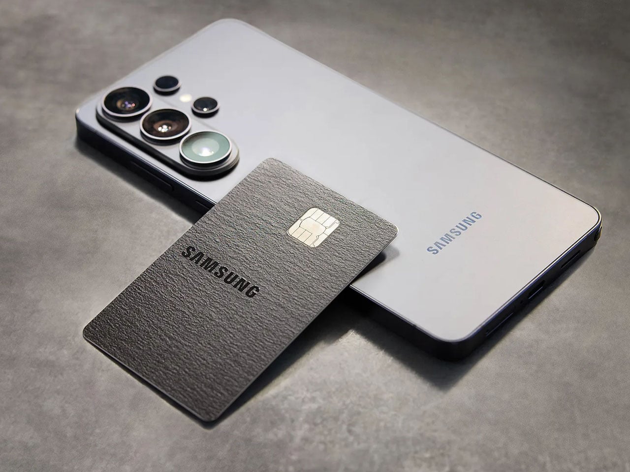
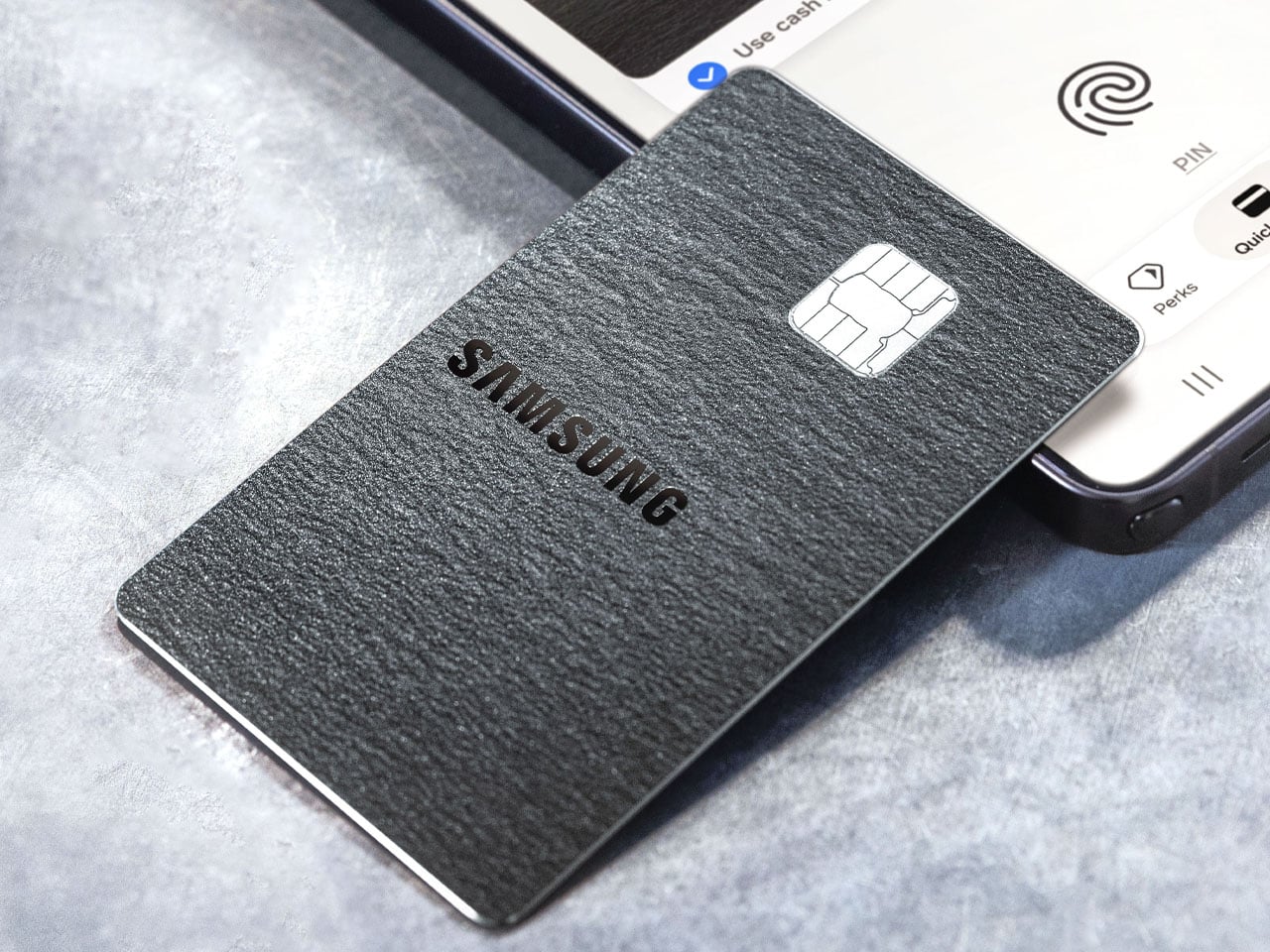
Samsung and Apple have been known to take a leaf out of each other’s book when it comes to features and product design. Now the South Korean giant has done something that Apple has already been offering its users. After much speculation and rumors, the Samsung Galaxy Card is finally revealed for U.S. users.
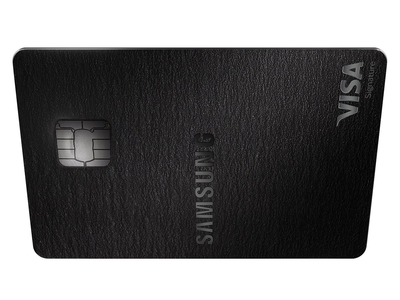
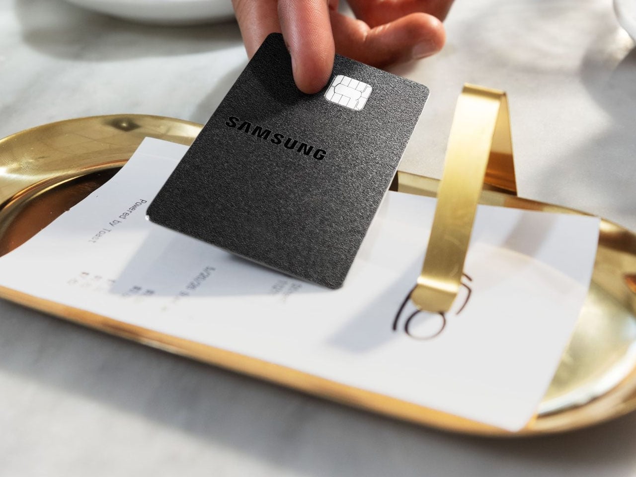
Samsung already offers the Samsung Card in its native region, but this is the first time they’ve come up with a credit card in the West. Offered via Barclays on the Visa network, the branded credit card is more or less the same as the Apple Card in terms of the perks and financing options being offered. For early adopters, the card will be offered free of cost with no hidden annual charges.
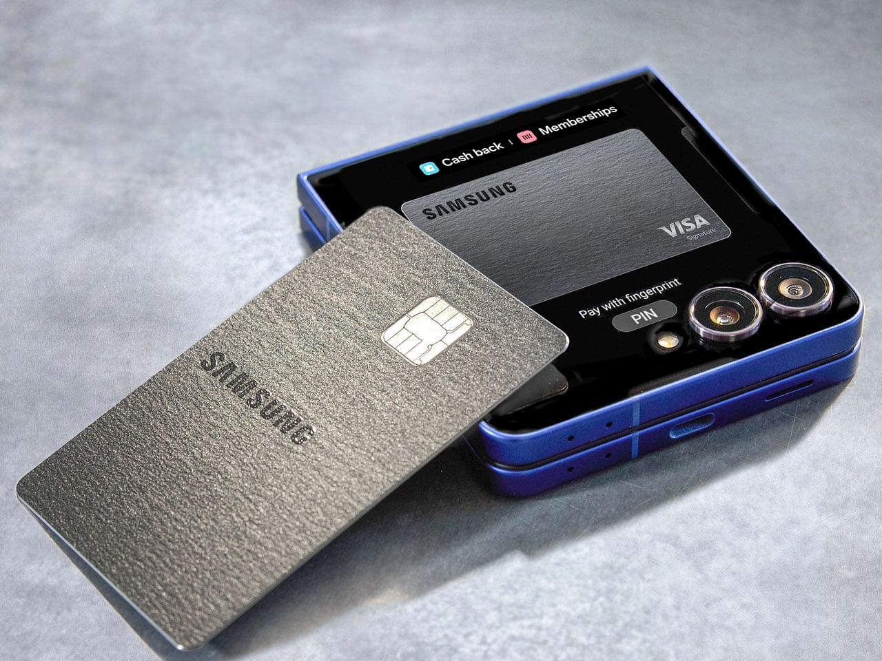
Samsung wants to take the fight to Apple; therefore, they’re offering more cashback discounts, which should lure in users who are stuck between deciding to go for the Apple or Samsung ecosystem. The card is integrated into the Samsung Wallet, as it prompts users to tie in more deeply into the ecosystem. You can manage payments, IDs, digital keys, or passes. Surprisingly, this comes ahead of the Galaxy Unpacked event slated for the Z Fold 8’s release, signaling the consumer electronics company’s affinity for going far beyond just hardware innovations. This move at this time of the year also signals a stronger push by Samsung to engage users before major events. Let’s be honest, people are upgrading their devices and gadgets less frequently, as hardware has become difficult to differentiate from the competition.
Coming back to the Galaxy Card, any purchases made on Samsung products directly will earn a cashback of 5 percent. Any spending done using the Samsung Wallet gets users a 3 percent cashback. The cardholders are also eligible for a 20 percent discount on the VIP Advantage, as well as the Samsung membership and extended warranty program. If any eligible OTT subscriptions, including Netflix, Disney+, or Spotify, are made, the cashback earned is 2 percent. For any other purchases, the cashback is 1 percent.
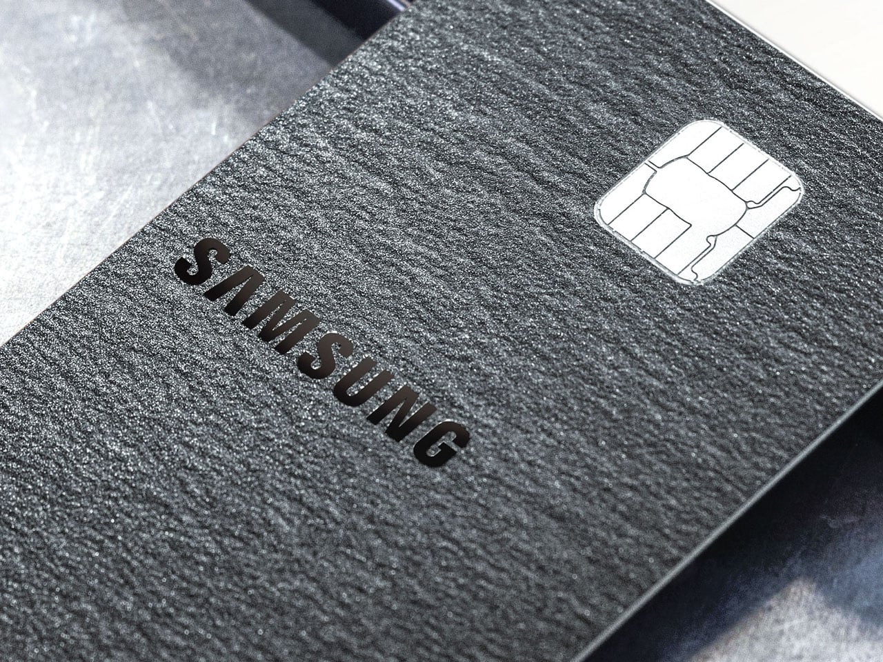
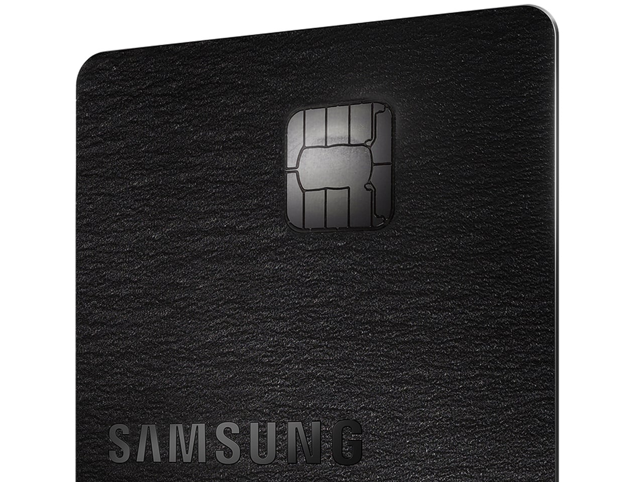
Knox security layer is embedded into the card’s ecosystem to ensure all the financial information remains securely on the Galaxy devices. The credit card can be acquired starting July 22, and Samsung will offer a $200 bonus cashback reward on purchases of $2,000 or more made in the first 90 days. The card is offered in virtual and premium metal physical versions. Existing Samsung users will like the prospect of it, as more cashbacks mean more savings. Anyone switching their ecosystem from Apple to Samsung for the higher cashbacks is less likely, though.
Keeping houseplants alive has become something of a modern ambition, especially for those living in smaller spaces where a bit of greenery goes a long way. The problem is that most people have a complicated relationship with plant care. Forgetting to water on time, struggling with repotting, and watching plants suffer because the pot can’t keep pace can make the whole experience feel more discouraging than rewarding.
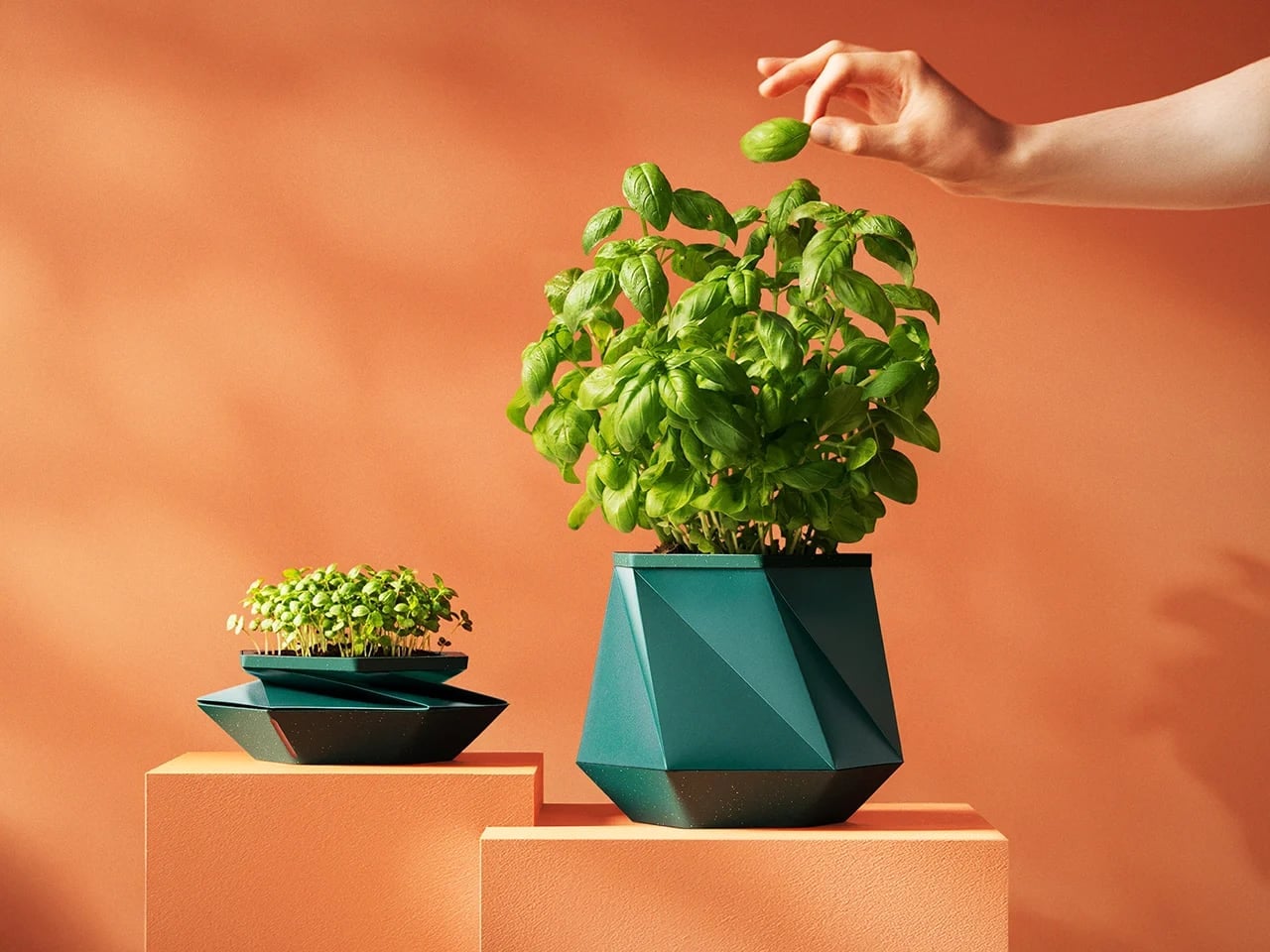
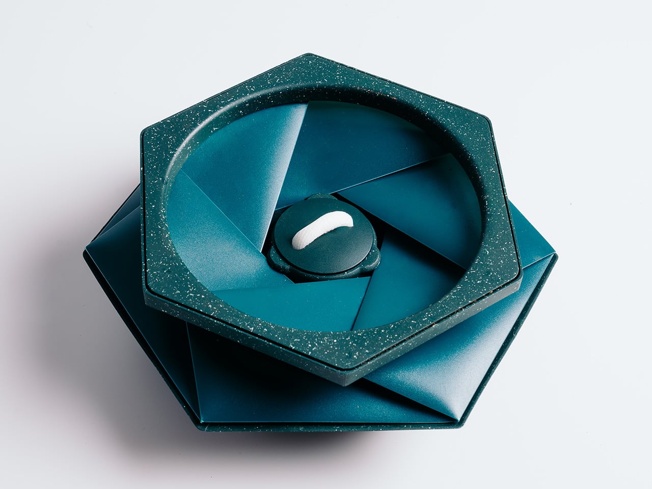
That’s what HELIX was designed to address. Created by Andrew Flynn, former industrial design lead at Dyson and the mind behind the Airwrap, Corrale, and Airstraight, HELIX is what POTR describes as the world’s first self-watering pot that physically grows alongside your plant. Its origami-inspired form isn’t purely decorative; the folds are the functional mechanism that lets the pot expand as roots develop.
At the heart of HELIX is a capillary wicking system tucked into the base. Fill the 300 ml reservoir, and a wick draws moisture steadily upward into the soil, letting the plant absorb exactly what it needs. The result is consistent hydration for up to two weeks between refills, meaning you’re no longer guessing whether you’ve overwatered, underwatered, or simply forgot entirely.
What really sets HELIX apart is what happens when a plant outgrows its space. Rather than pulling it out, cleaning up the mess, and starting over in a bigger container, you simply twist the pot open and add fresh compost around the root ball. The structure expands from 7cm to 16cm tall, accommodating up to 2 litres of soil without disturbing the roots.
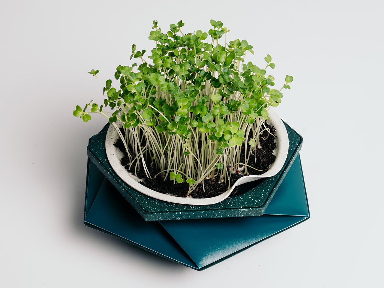
For those who want to start from scratch, the Sprout Plate turns HELIX into a seed-starting setup. It sits inside the pot and works with the self-watering reservoir to keep seeds consistently moist, which is exactly what herbs like basil, mint, coriander, and parsley need to get going. As the seedlings grow taller, the pot simply expands around them, no transplanting required.
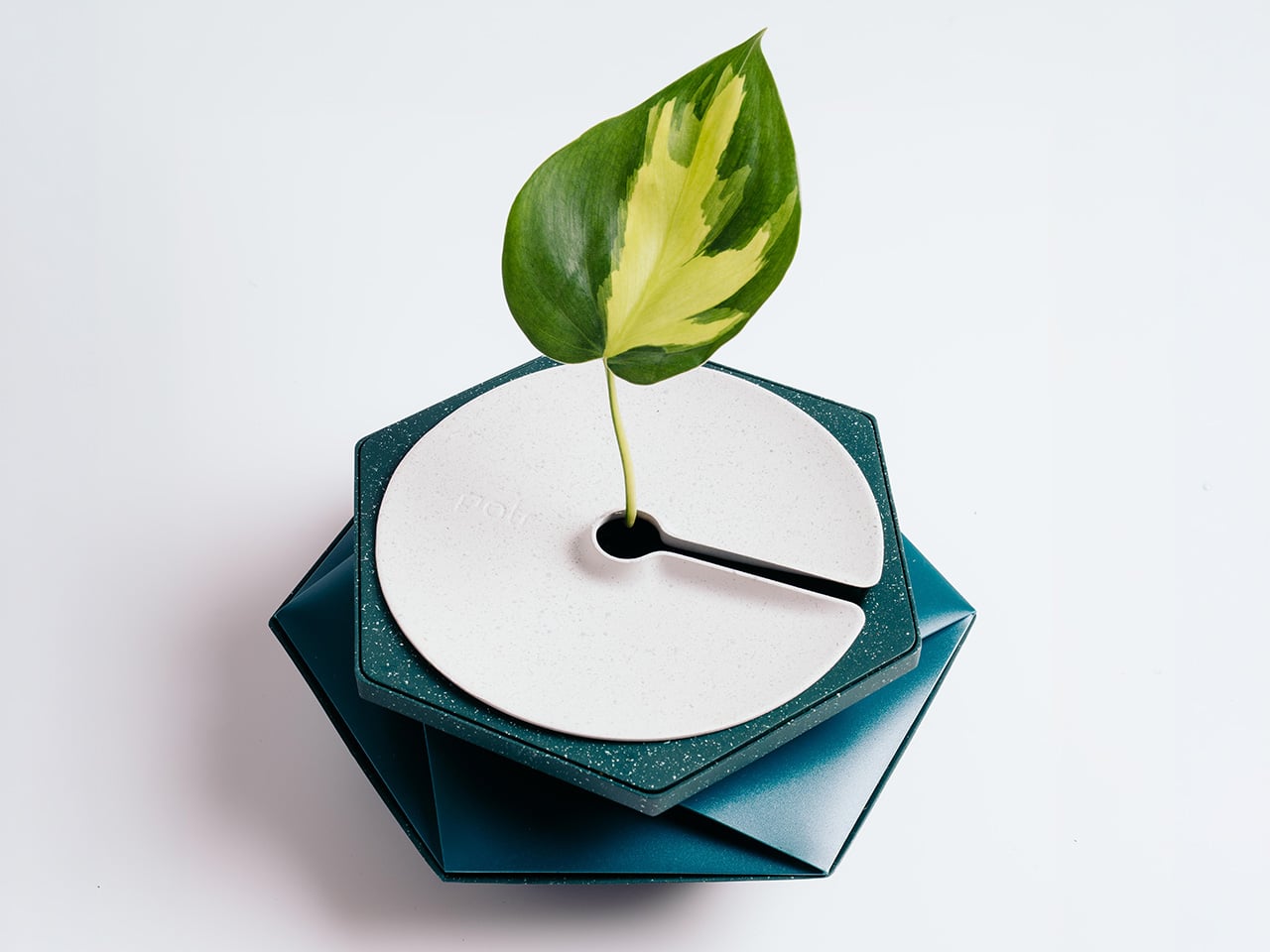
The Sprig Plate handles something slightly different. It’s designed for propagating cuttings, holding them above the water reservoir so stems can develop roots before being moved into soil. It works well for popular houseplants like pothos, monstera, and Chinese money plants, and the smart part is that once those roots have taken hold, the same HELIX pot expands to become their permanent home.
Then there are climbing plants, which have their own needs entirely. The Expanding Trellis plugs into the soil and can be extended upward in layers as the plant grows, with stems clipped into the folded origami structure for support. It borrows from the same geometric design language as the pot, turning something aesthetic into a functional vertical guide for climbers like pothos, hoya, or jasmine.
What makes HELIX even more interesting is that its hexagonal footprint lets multiple pots sit flush against each other without awkward gaps. Line up several on a counter or windowsill, each growing a different herb or microgreen, and you end up with a surprisingly coherent indoor herb garden that you can keep adding to. It’s a modular setup that scales with your appetite for growing.
The sustainability angle is woven into the design rather than tacked on as an afterthought. HELIX ships completely flat, which cuts both packaging volume and transport emissions compared to conventional rigid planters. It’s made entirely from recycled polypropylene, a waste plastic that often ends up in landfill, and uses roughly 70% less material than a comparable concrete or ceramic pot, making the eco credentials feel genuinely earned.
Plant care has always been about patience and attention, but it’s rarely been about the pot itself. HELIX shifts that dynamic by asking what a container could look like if it were as invested in a plant’s progress as the person tending to it. Whether you’re growing something you plan to eat, something to look at, or something you simply don’t want to kill, that’s a compelling thought.
Health apps and wearables have become remarkably precise at reading the human body. They can tell you how restorative last night’s sleep was, how stressed your body was during a presentation, and whether your recovery is on track after a hard week. What most of them don’t do, at least not in any concrete way, is hand you a tool to act on what they’ve just told you.
That’s the gap MobiFren founder and CEO Juwon Heo set out to address with the HealingFit TWS, a true wireless earbud built to go beyond standard listening. It earned a CES 2026 Innovation Awards recognition in Headphones and Personal Audio, but the more compelling aspect isn’t the accolade. It’s the design thinking underneath it, and what that thinking could mean for the broader world of digital health.
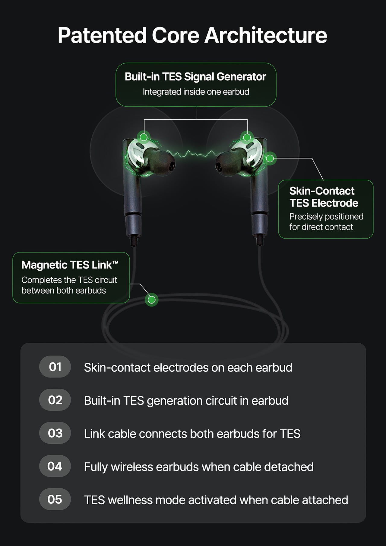
During normal use, HealingFit TWS functions as a premium pair of true wireless earbuds with Bluetooth 6.0, Hybrid ANC, and five tunable sound modes built on MobiFren’s own MSTS sound tuning system. The shift into wellness mode happens when you attach the Magnetic TES Link, a cable that snaps magnetically onto both earbuds. There’s no separate gadget involved, and no new category of hardware to carry.
TES, or Transcranial Electrical Stimulation, is a non-invasive approach widely studied in neuroscience. HealingFit TWS translates it into a controllable daily routine, running calibrated microcurrents through skin-contact electrodes built into each earbud. The intensity is adjustable across 15 levels, and most people describe the sensation as a subtle, rhythmic pulse. It’s designed to support the nervous system’s natural shift toward rest or focus, not force it there.
Three wellness modes organize the experience. Sleep is the bedtime routine, pairing TES with binaural audio tracks to help you gradually settle for the night. Healing is a shorter session for mid-afternoon or post-work moments when the day has felt relentless. Study is a focus-priming routine to run before anything demanding real concentration. Each mode comes with five dedicated tracks, though you can also layer TES over your own music.
That three-mode framework reads differently from the perspective of a digital health platform. Platforms like Samsung Health, Apple Health, Google Health, and Fitbit have become genuinely capable at detecting sleep quality, stress levels, recovery readiness, and daily activity. They generate scores, flag patterns, and surface recommendations. What they don’t typically offer is a connected, device-level way to act on those signals in the moment they appear.
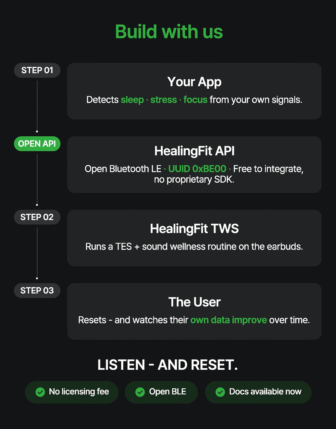
HealingFit TWS addresses that with an open Bluetooth LE interface that developers and platform teams can connect to without a licensing fee or a proprietary SDK. The technical entry point is UUID 0xBE00, and documentation is publicly available through mobifrenglobal.com. The intent is clear: the earbud becomes the intervention hardware, while the app or platform provides the health context that determines when and which session a user might benefit from.
Think about what that could look like in practice. A sleep app detecting elevated pre-bed stress could suggest a Sleep session. A recovery platform flagging low readiness after a demanding training week could prompt a Healing routine. A focus tool that spots declining concentration before a deadline could surface the Study mode. In each case, the platform has done its analysis. HealingFit TWS handles what comes after.
The core architecture places a TES-generating circuit inside one earbud, with electrodes on the front of each earbud that contact the ear canal, and a TES Link cable that connects both earbuds. Detached, it functions as flagship-grade wireless earbuds; connected, it transforms into a wellness device designed to support sleep, stress relief, focus, and memory.
What makes the TES architecture appealing to hardware teams isn’t just the open API. The circuit that generates TES signals relies on entirely standard, commercially available components, totaling just 18 parts: a dual-transistor chip, one FET, and a set of RLC components. The earbud’s existing charging contacts also serve as the TES link contacts, so no extra contact points or major structural changes are needed.
The design has received formal IP recognition across multiple jurisdictions. The U.S. patent application covering the core architecture has been allowed and is proceeding to registration, with the patent expected to be granted soon. There are also registered patents in Korea and Japan, as well as a published application in Europe. FCC certification was granted on July 1, 2026.
Heo founded MobiFren in February 2002, originally as a contract developer for Samsung Electronics feature phones. The company started building its own Bluetooth audio products in 2005 and brought its first Bluetooth earphones to market in 2006. MobiFren has maintained an ongoing relationship with Samsung through smartphone software verification work ever since. That two-decade grounding in Bluetooth audio is what gives HealingFit TWS its engineering footing.
The choice to build this platform on earbuds specifically is, in that context, a deliberate one. Earbuds are already the personal technology closest to the human body for most of the waking day. They’re phone-paired, habitually worn, and typically owned by the same people most likely to be using a health app. Embedding TES therapy into a device people already carry daily removes most of the adoption barrier entirely.
The hardware reflects that audio-first foundation. Alongside the TES system, HealingFit TWS delivers up to 6.5 hours of playback and up to 4.5 hours in TES mode, with Hybrid ANC, three microphones per side, and wear detection for auto-pause when an earbud is removed. Both earbuds and the Magnetic TES Link cable dock in a cylindrical charging case finished in anodized aluminum, designed to carry without fuss.
What Heo is ultimately proposing is a platform category that doesn’t quite have a name yet. His comparison is to how true wireless earbuds, from AirPods to Galaxy Buds, turned personal audio into a mainstream daily habit. The longer ambition is for this patented TES architecture to be adopted into future products from those same companies, giving their health platforms a connected hardware layer for the signals they already detect.
The more compelling case might be for the health platforms themselves. Apple Health, Google Health, Samsung Health, and Fitbit have spent years becoming sophisticated at detecting when something is off: poor sleep, elevated stress, slow recovery. What they don’t yet widely offer is a hardware path from that detection to user-controlled action. HealingFit TWS was built to be exactly that path, and it’s open to anyone willing to test it.
That’s a bold bet, and the category he’s describing doesn’t fully exist yet. But HealingFit TWS makes a credible early case for it, with a patent-allowed architecture, open developer access, and a hardware design that doesn’t ask users to change anything about how they already carry and use earbuds every day.
E Ink phones have spent years selling one idea: a calmer screen, a longer battery, and a slower relationship with your phone. That promise has almost always come with a catch. You’d get the paper-like display but lose the processing power. You’d get the focus-friendly software but sacrifice half the apps you actually need. The category thrived on convincing buyers that every compromise was worth making.
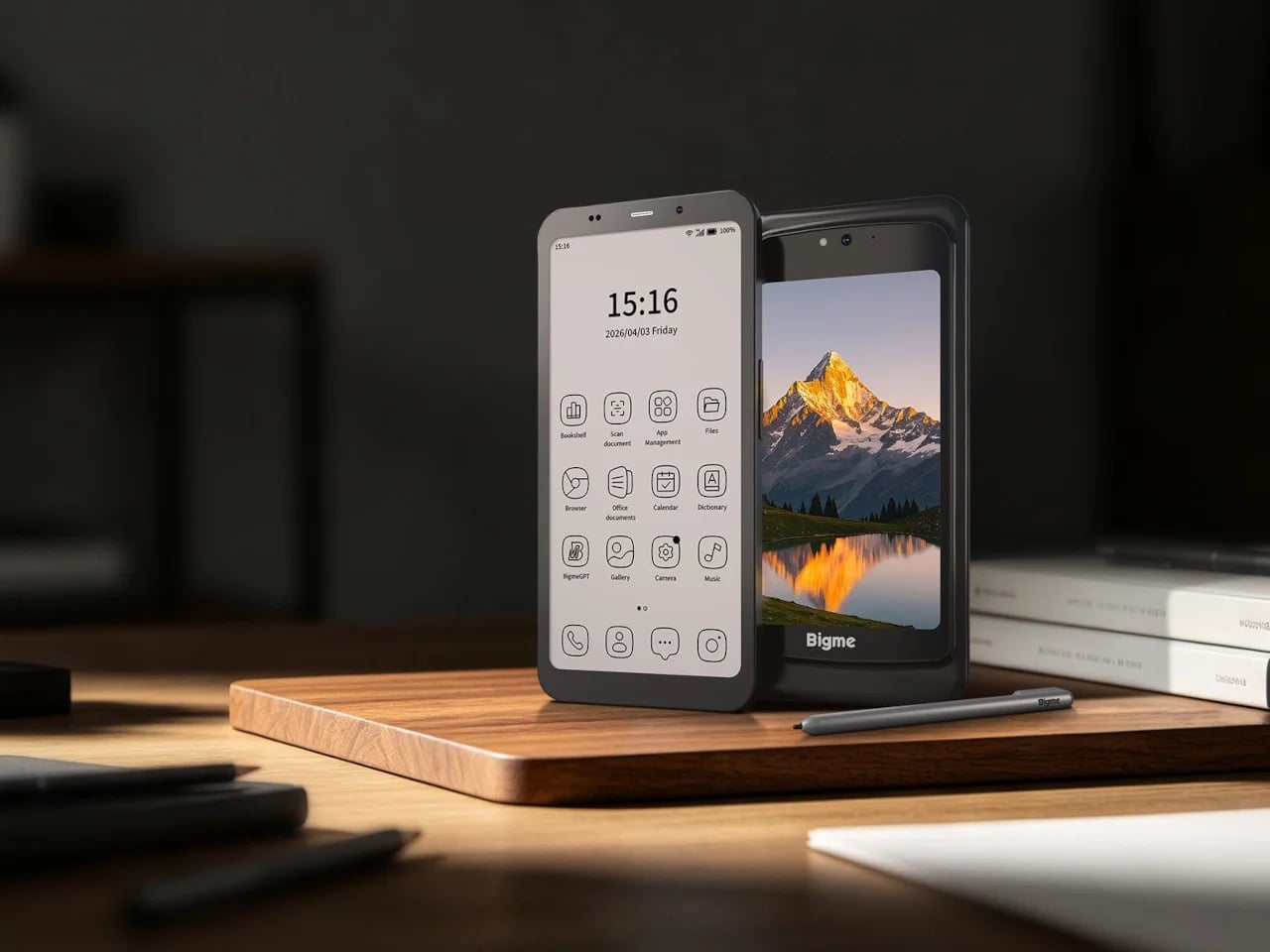
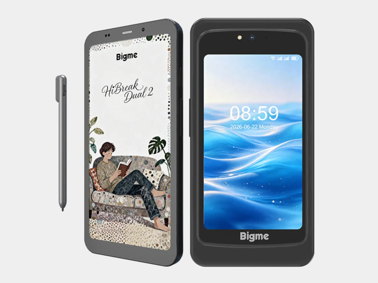
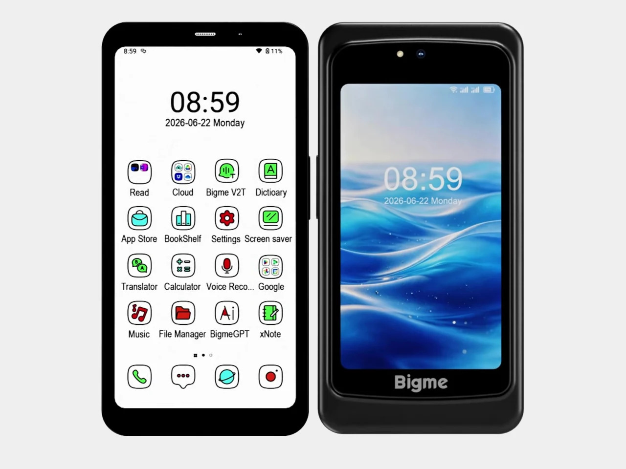
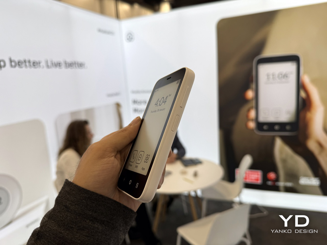
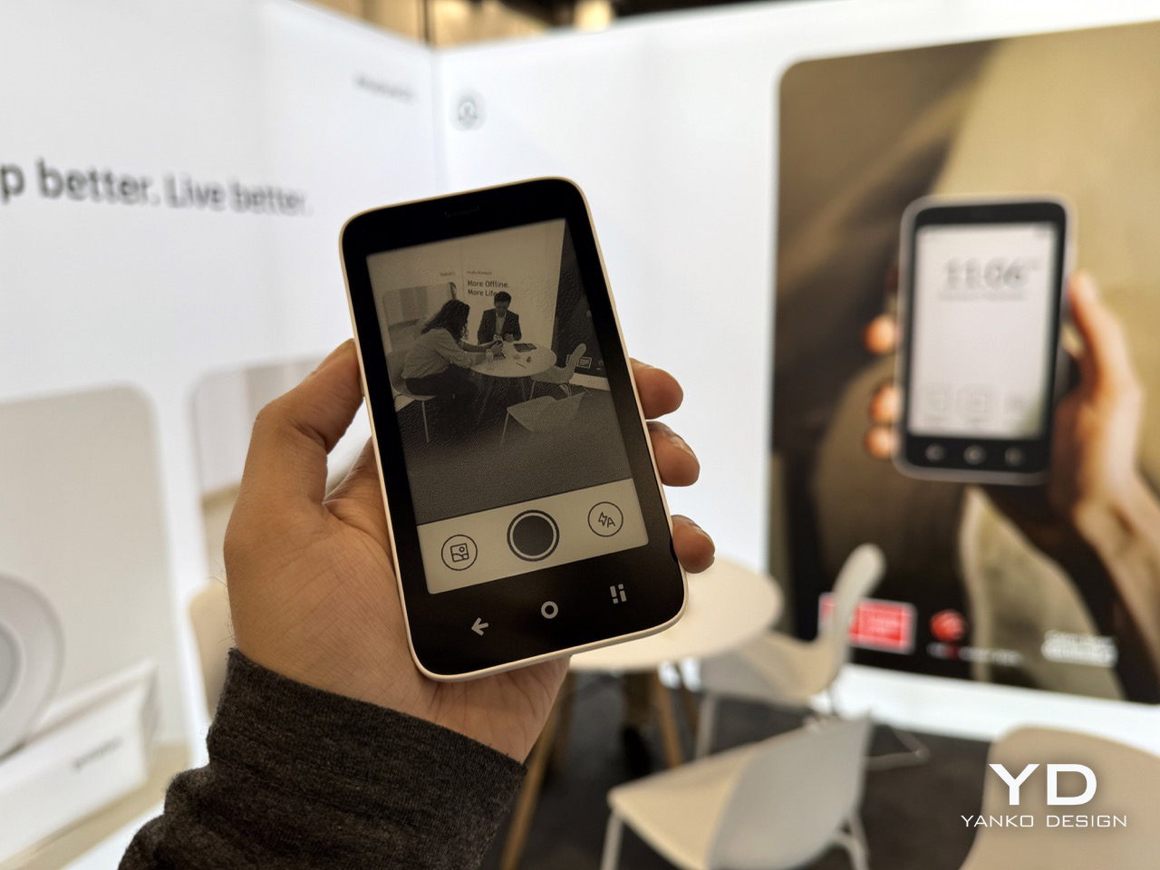
Bigme’s HiBreak Dual 2 doesn’t improve on the E Ink formula. It changes the question entirely. Pairing a 6.13-inch color E Ink front panel with a 5-inch LCD on the back and running Android 16 on a Dimensity 8300 chip, it removes the old forced choice between paper-like calm and normal smartphone capability. That shift forces every rival to explain what they’re still asking you to give up.
Bigme HiBreak Dual 2
It’s a refreshingly practical premise. When E Ink handles the task, reading, taking notes with the optional stylus, or checking messages, the front panel does the work quietly. When it can’t, the 5-inch LCD on the back handles video calls, maps, or anything that moves too fast for a paper display. You’re not forced to pick a lane. The phone picks it based on what you’re actually doing.
The familiar trade-offs don’t apply anymore. With 12GB of RAM, a 50MP camera, dual SIM 5G, NFC, and Google Play on Android 16, the Dual 2 closes every gap this category used to own. What it still costs is simplicity. A two-screen phone with an optional stylus isn’t a minimalist object, but that’s the honest bargain. The sacrifice shifted from capability to preference, and at $574, that’s an easier trade.
Minimal Phone
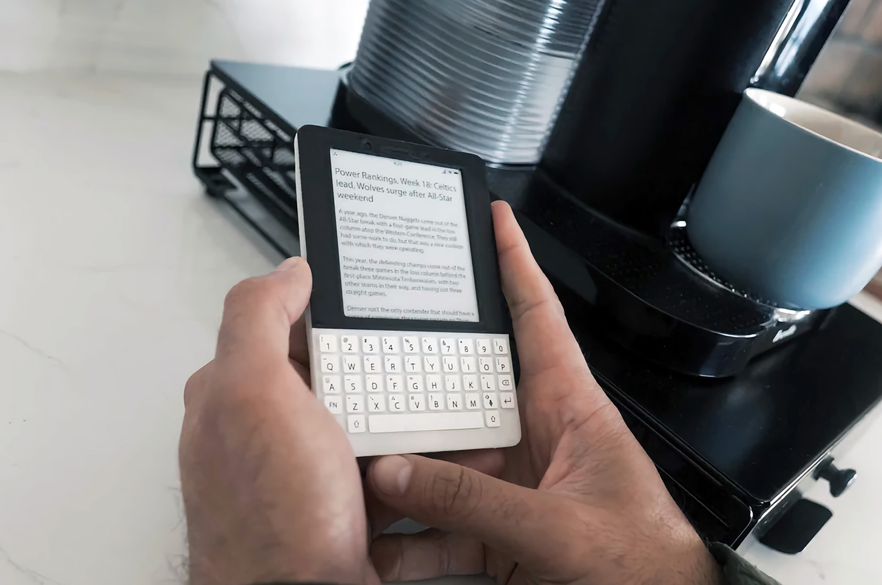
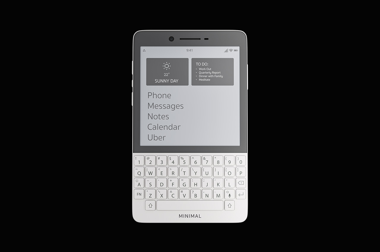
Before the HiBreak Dual 2, the Minimal Phone offered what felt like a reasonable compromise: a full Android 14 experience on a 4.3-inch E Ink touchscreen grounded by a physical QWERTY keyboard. Google Play works out of the box, NFC and wireless charging are onboard, and battery life is strong enough that charging feels less urgent. It starts at $499 for 6GB of RAM and 128GB of storage.
The keyboard is the whole identity, and that’s either the appeal or the limitation, depending on who you are. If you prefer typing with actual resistance, this phone still makes a strong case. But after Bigme, the keyboard has to work harder as a justification. It’s no longer the pragmatic path through the category. It’s a deliberate preference, which means it now belongs to a more specific kind of buyer.
Mudita Kompakt
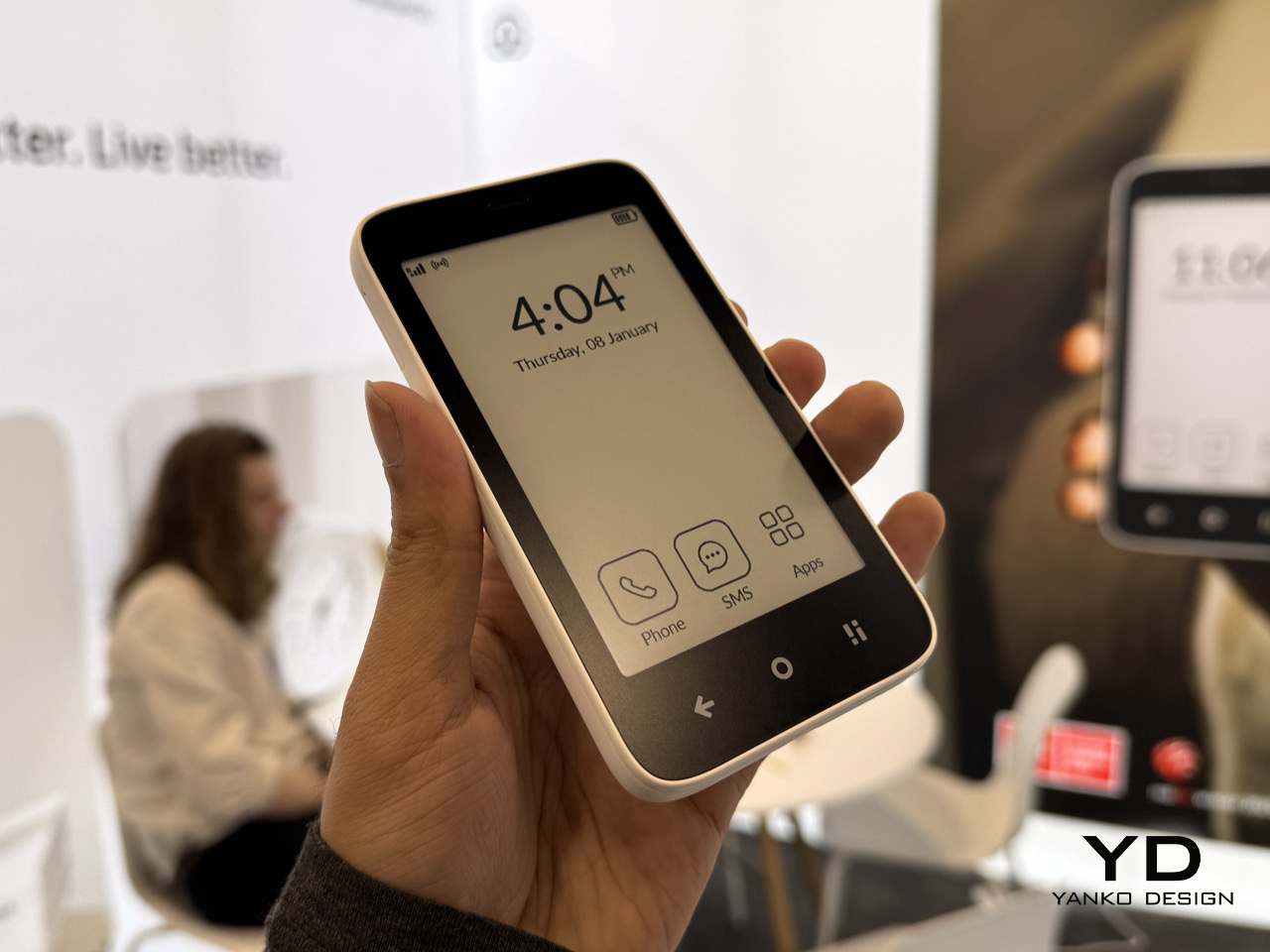
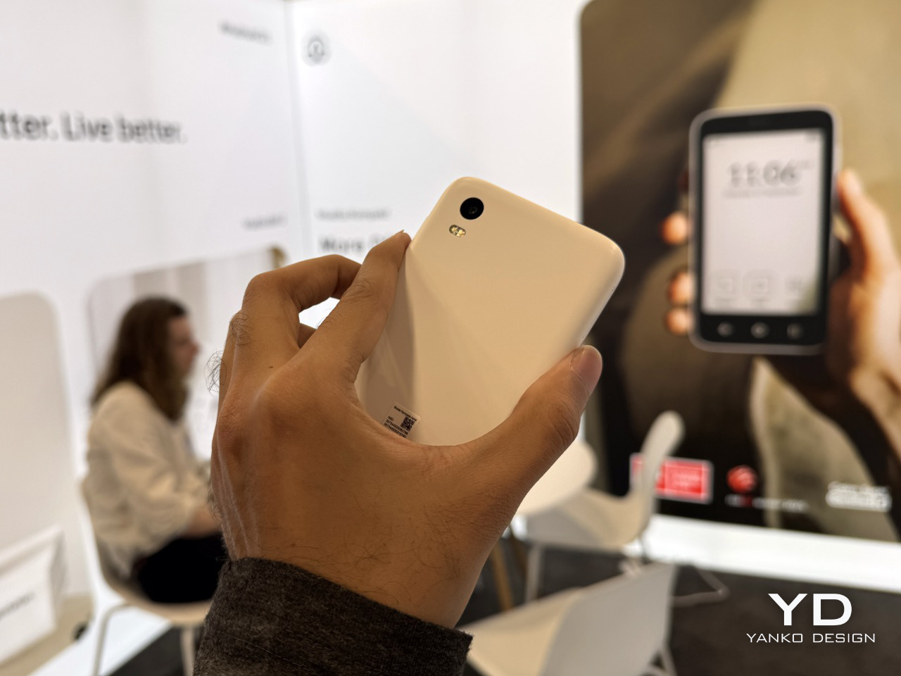
The Mudita Kompakt doesn’t compete on specs and isn’t trying to. It runs a custom OS stripped down to calls, texts, offline maps, music, and not much else. There’s no app store, no browser built for scrolling, just a 4.3-inch E Ink display, a 3,300 mAh battery with up to six days of life, and a phone that genuinely expects to be set down often. It’s available for $399.
What Mudita charges you is breadth. The Offline+ Mode disables every signal at once, including GSM, Wi-Fi, Bluetooth, camera, and microphone, which sounds drastic until you realize that’s exactly the point. The trade-off goes beyond app access. It’s the assumption that a phone should keep expanding. For anyone exhausted by that expectation, the Kompakt feels less like a device with missing features and more like one that refused them deliberately.
Light Phone III
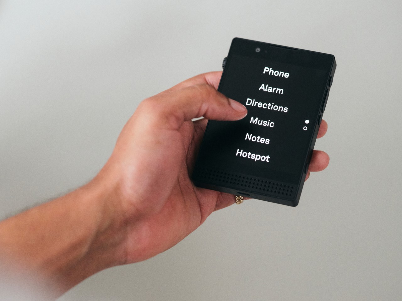
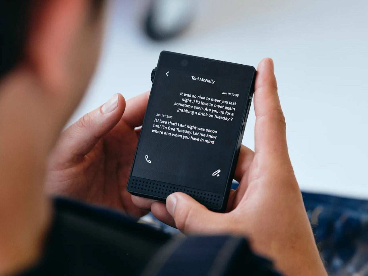
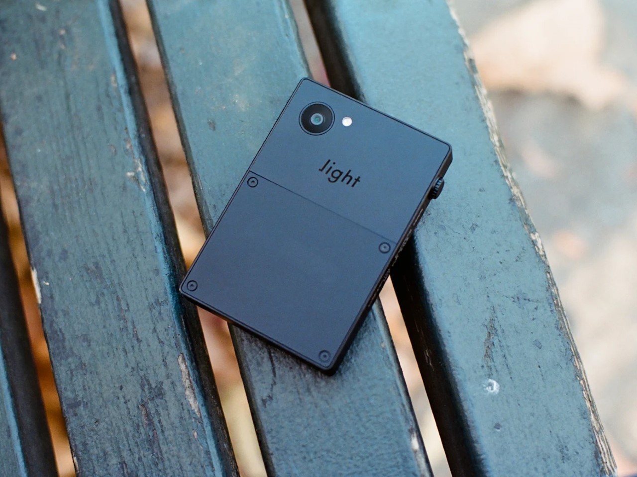
The Light Phone III is the most philosophically clear product here, and the only one without E Ink. It runs a 3.2-inch OLED in grayscale, no app store, no browser, and a proprietary OS with a short, curated list of tools. What it does carry is 5G, NFC, and the kind of calm that comes from removing things rather than restraining them. At $799, it’s priced like a considered commitment.
That clarity is also its challenge. After Bigme, the Light Phone III’s restrictions no longer read as a necessary cost of the category. They read as a position statement. You’re not settling for less because less is all that exists. You’re paying more for less because you’ve decided that’s the better way to live. That’s a meaningful shift, and it makes the Light Phone III a conviction purchase, nothing more.
BOOX Palma 2 Pro
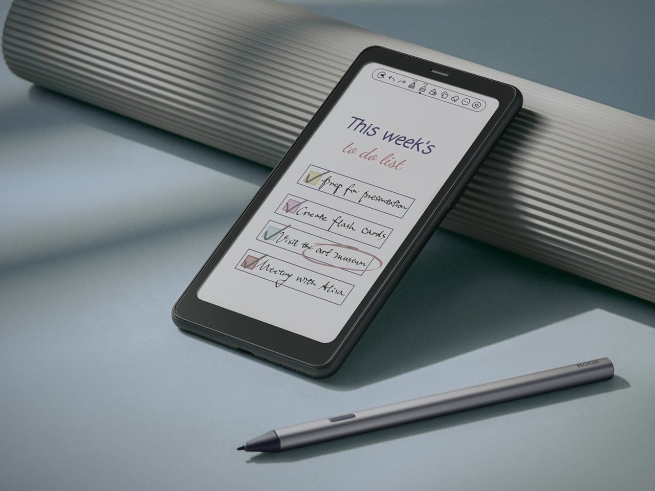
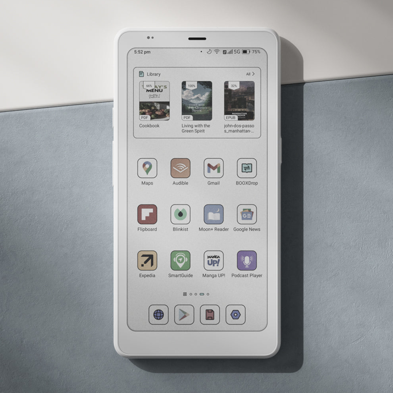
The BOOX Palma 2 Pro sits in its own corner of this category. It’s a 6.13-inch Kaleido 3 color E Ink device running Android 15 with full Google Play access and 8GB of RAM. A hybrid SIM provides 5G data, so you can run messaging apps, make VoIP calls, and browse freely. Native cellular calls and SMS aren’t officially supported, though some users have found workarounds that get reasonably close.
Phone legitimacy is the sacrifice here, which is a harder ask than anything else on this list. But the Palma 2 Pro delivers the best E Ink reading experience in a pocketable form right now. If your communication needs fit through apps like WhatsApp or Google Voice, and you’ve always wanted a reading device that travels independently, it’s a compelling choice at $399 that doesn’t fit any category neatly.
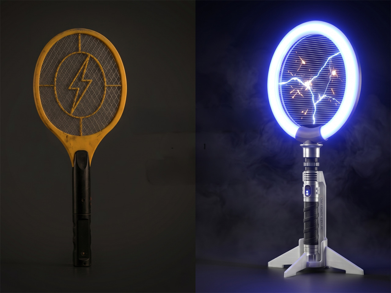
Bug zappers haven’t had a design moment yet. They’ve existed in more or less the same form for decades, somewhere between forgettable and mildly unpleasant to look at. Most of them get tucked into corners or mounted out of sight, which is exactly where most people prefer them. They do the job, roughly speaking, but nobody’s ever been genuinely excited to reach for one.
Brightbeam Solutions seems to have taken that as a challenge. Bug Saber is the brand’s attempt at rethinking what a bug zapper can feel like, not just what it can do. The concept is simple enough: take pest control, which has always been a thankless task, and design it to be something you’d actually want to pick up. Nobody in the category had really tried.
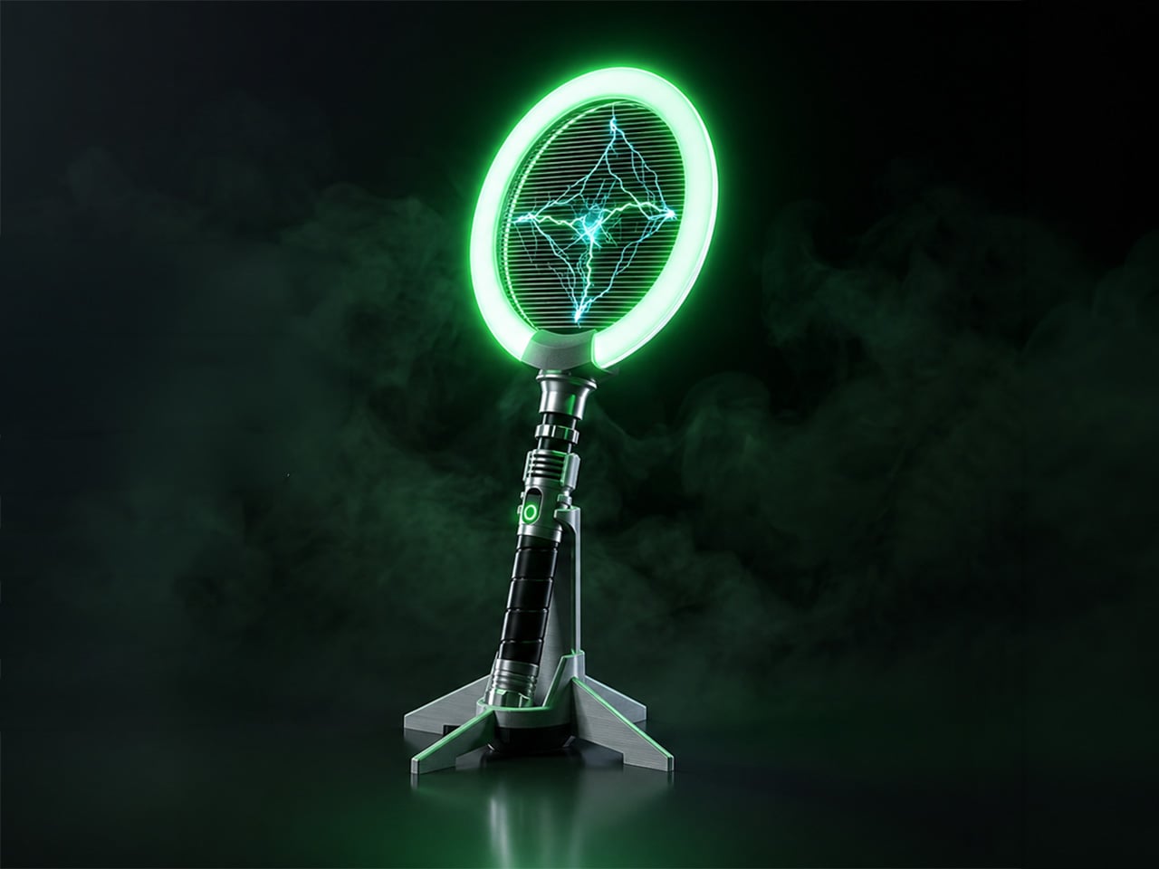
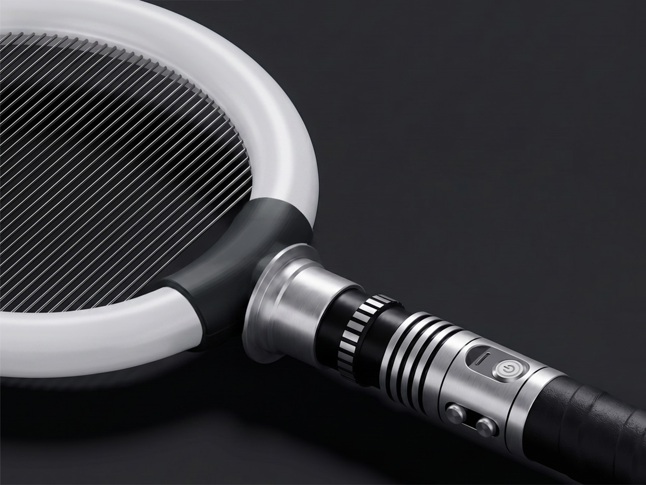
The design makes that clear immediately. Bug Saber is built around a high-voltage zapping grid framed by a glowing LED ring, mounted on a lightsaber-style hilt with a distinctly mechanical character. It doesn’t look like anything from a hardware store, and that’s entirely the point. The aesthetic borrows from sci-fi gadget culture rather than home appliance conventions, and it’s surprisingly hard to ignore when it’s nearby.
Switch it on, and everything shifts. The LED ring glows, saber-style sound effects kick in, and insects are naturally drawn toward the light. When one gets close enough, the 4,000V high-voltage grid takes care of it instantly, with no waiting and no cleanup. The entire sequence takes only seconds, and the combination of light, sound, and immediate result makes each instance feel surprisingly satisfying.
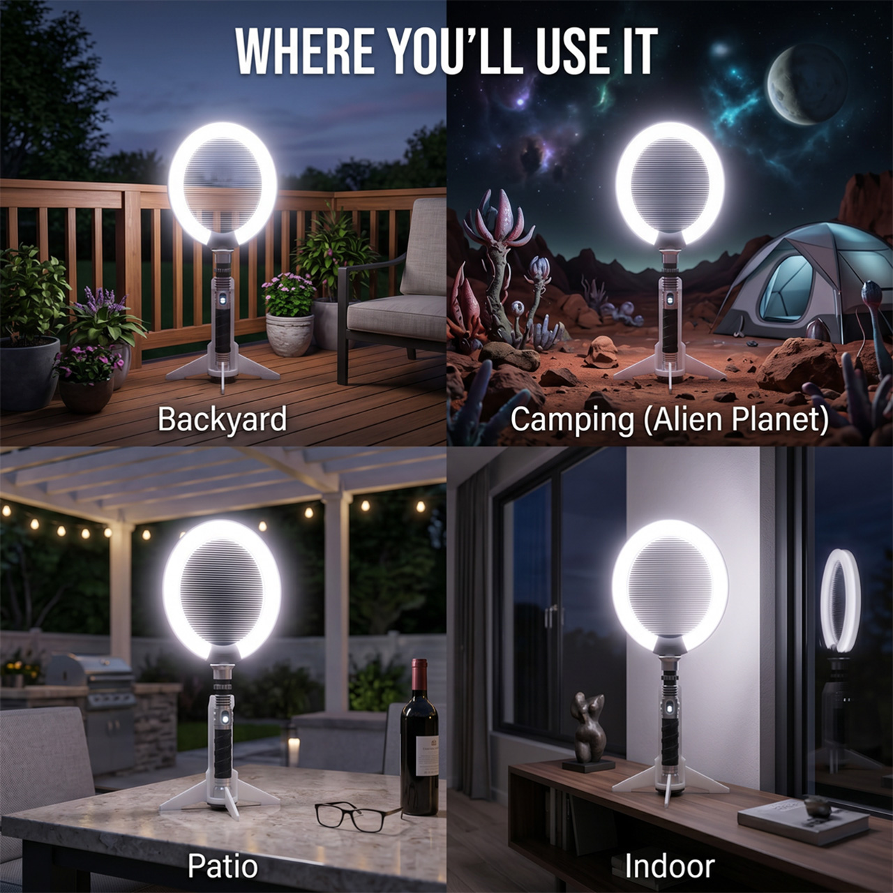
That satisfaction makes sense in practice. Picture a summer evening on the back porch, a fly that’s made itself at home, and the usual frustration of swatting blindly at the air. With Bug Saber in hand, you’re in control rather than reacting. The act feels deliberate in a way that pest control rarely does, which is a strange thing to say and yet completely accurate.
Not every situation calls for hands-on use, though. Bug Saber can sit on its vertical stand with the illuminated ring running on its own, drawing in insects without you having to do anything. This works especially well at night, when flying pests are most active, and you’d rather not be involved. It handles things quietly in the background, whether you’re inside or out on the patio.
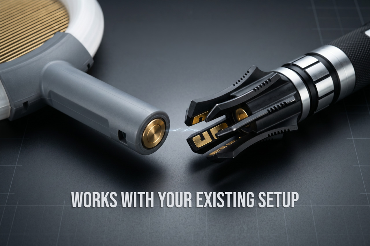
Bug Saber is built around three core components: the Bug Saber Head, which houses the ring and zapping grid; an entry-level hilt for those starting fresh; and the vertical stand. People who already own a compatible saber-style hilt, the kind used in cosplay or collecting communities, can swap in the head directly, converting their existing setup into a functional bug-control device without needing anything else.
What makes Bug Saber work so well is how the experience reinforces itself over time. The glow, the sound, and the instant result work together to create something that feels rewarding rather than routine. You pick it up the first time because there’s a fly in the room. The second time, you reach for it a little more quickly than strictly necessary.
There’s a broader shift in product design, one where objects that used to be purely functional are being reconsidered as things worth looking at. Routers, speakers, and kitchen appliances have all gone through some version of this. Bug Saber brings that same sensibility to a category that’s rarely had it, which on paper sounds like a stretch and in practice feels entirely overdue.
The strangest thing about Bug Saber might also be the most telling. A bug zapper with a sci-fi hilt, a glowing LED ring, and sound effects that respond to movement really shouldn’t feel like a natural addition to a patio or living room shelf, and yet here we are, genuinely glad that someone decided this particular category was finally worth a proper redesign.
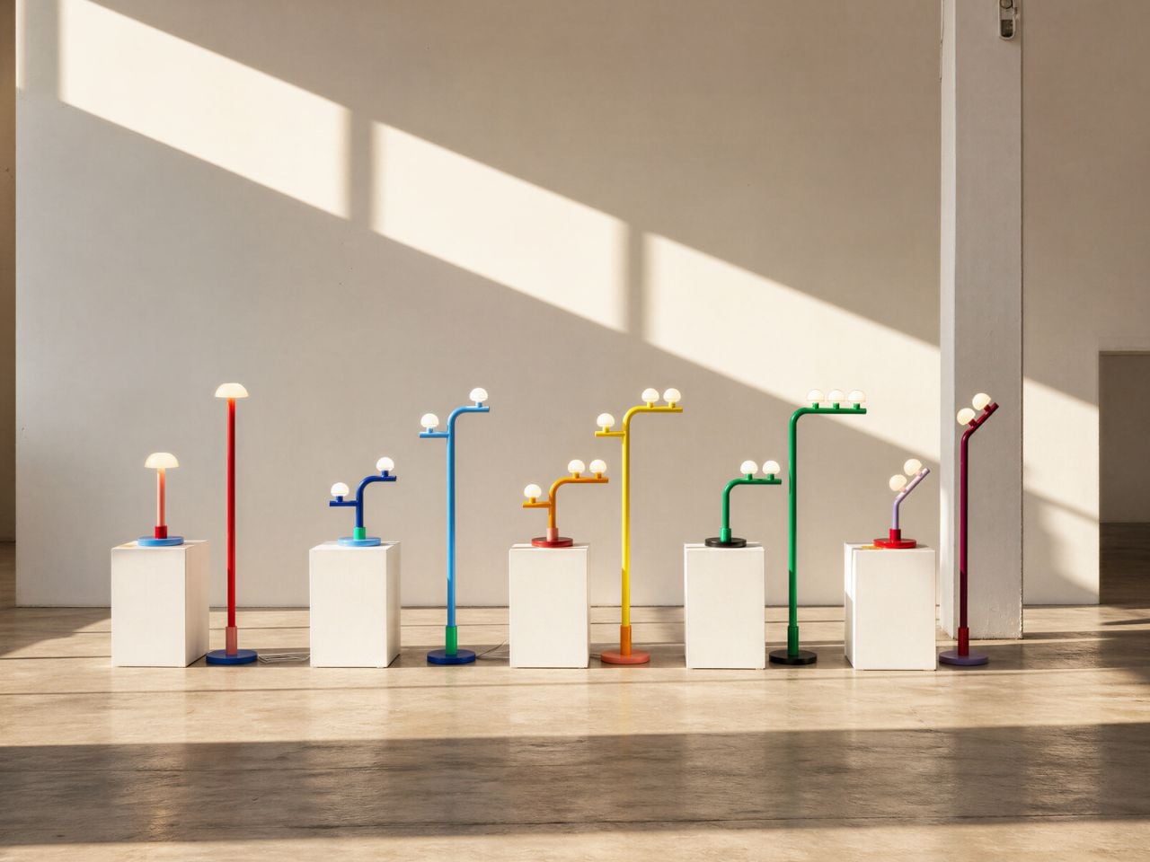
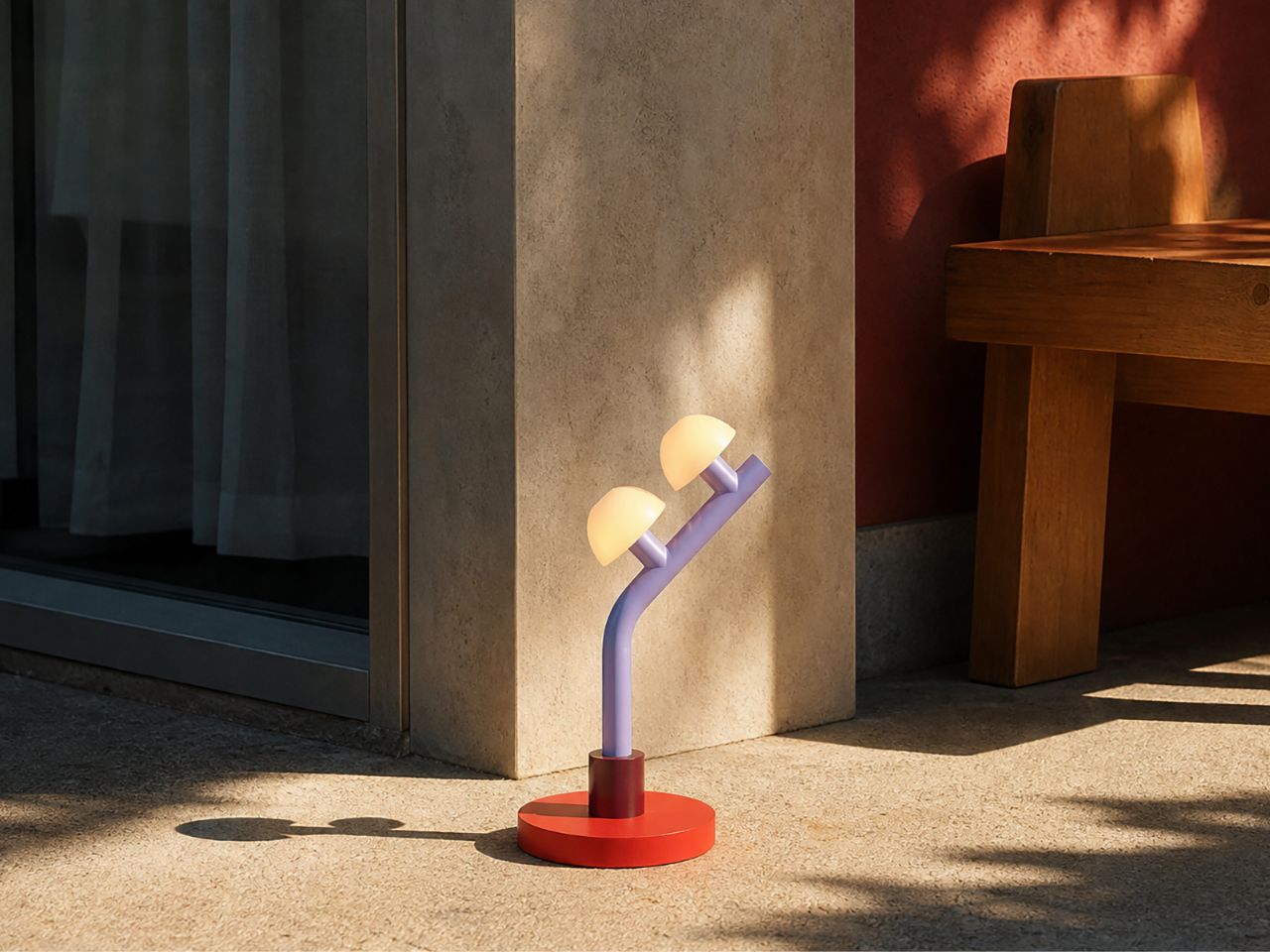
Lighting often sits at the meeting point of function and feeling. A lamp is expected to brighten a room, but the best ones do more than that: they shift the mood, add character, and sometimes become the object people remember most when they leave. With the Woaw collection, Dubai-based lighting designer Nader Gammas takes this idea in a playful and unexpected direction. Instead of treating the candelabra as a formal, traditional object, he reimagines it through bold color, simplified geometry, and the joyful memory of childhood toys.
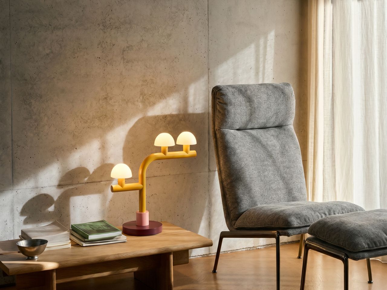
Introduced through his brand Mr. John’s Goods, the Woaw collection feels like a deliberate break from the seriousness often associated with designer lighting. These table and floor lamps are not quiet background pieces. They are bright, sculptural, and full of personality. Inspired by toy-like forms and vivid color combinations, each lamp brings a sense of fun into the home while still remaining refined enough to sit comfortably in a modern interior. The result is a lighting collection that feels both nostalgic and contemporary.
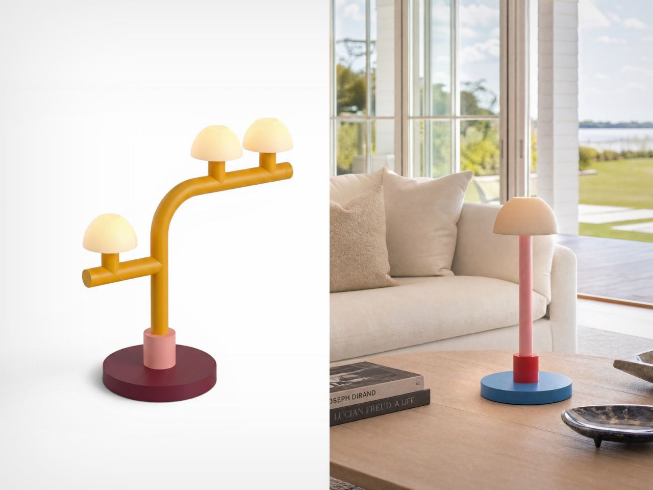
What makes Woaw especially interesting is the way it transforms a familiar object. The candelabra has long been associated with elegance, tradition, and ornamentation. Gammas keeps the idea of multiple light sources, but strips away the heaviness and formality. In its place, he introduces clear shapes, clean lines, and unexpected color blocking. The lamps almost feel like they have been built from oversized toy blocks, yet their proportions and material choices keep them from feeling childish. They are playful, but not silly; expressive, but not chaotic.
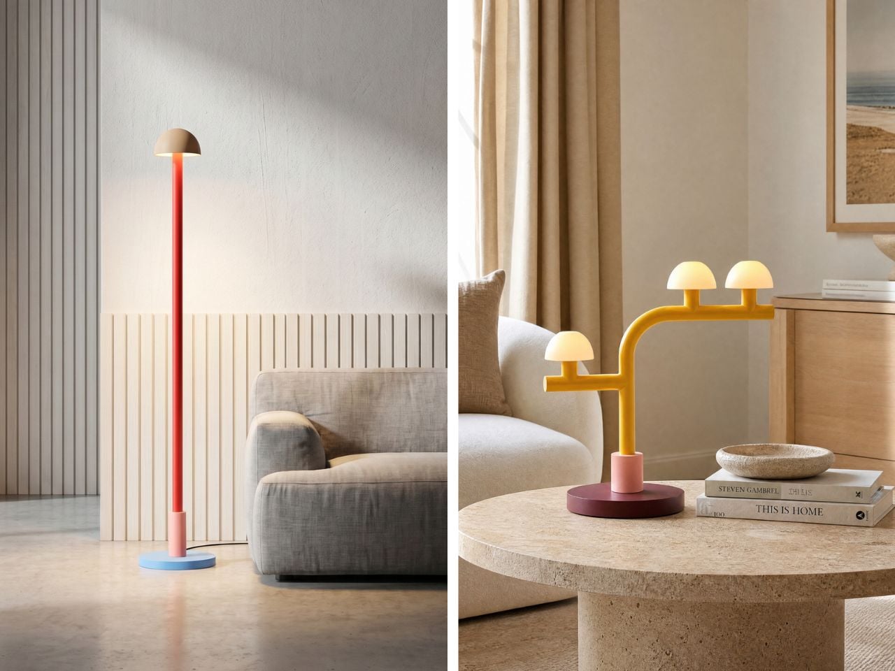
There is also a subtle connection to the spirit of the Memphis Group, especially in the use of bold colors and geometric expression. However, Woaw feels more restrained. Rather than relying on busy patterns or visual excess, the collection uses color as its main tool of reinvention. The forms are simple and direct, allowing the palette to carry much of the emotion. This balance gives the lamps their charm: they are instantly eye-catching, but still easy to imagine in a real living space.
That sense of visual surprise also makes Woaw a natural conversation starter. In a room filled with familiar furniture and expected design choices, these lamps interrupt the ordinary in the best way. Their toy-like silhouettes, cheerful colors, and reworked candelabra structure invite people to pause, look closer, and ask about them. They carry just enough nostalgia to feel familiar, and just enough strangeness to feel fresh. A guest might see one and think of building blocks, candy colors, retro design, or childhood objects, which is exactly where the charm lies. Woaw does not simply sit in a space; it gives people something to respond to.
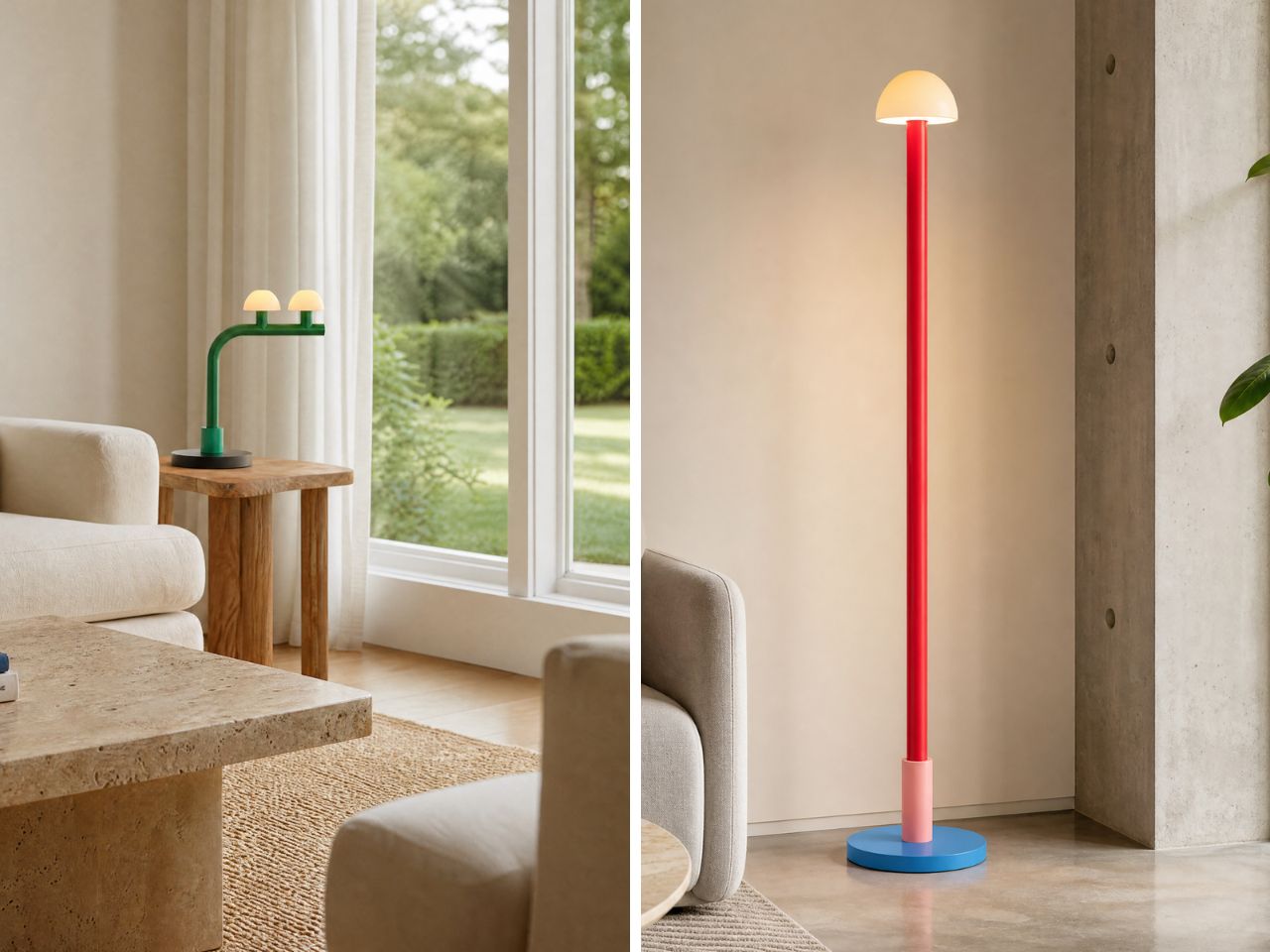
The collection is also flexible in scale and arrangement. The table lamps come in single, single single, single double, double, and double tilt versions, making them suitable for desks, shelves, side tables, or smaller corners. The floor lamps are designed for larger spaces and come in single, single single, single double, triple, and double tilt versions. This variety allows the collection to move between being a small accent piece and a major focal point in a room. Whether placed beside a sofa or on a work desk, the lamps bring an immediate sense of energy.
Beyond their visual appeal, the Woaw lamps are designed with durability and usability in mind. Both the table and floor versions combine sturdy steel bodies with ceramic shades, which help soften the light and give the object a crafted quality. The use of 6W LEDs adds an energy-conscious layer to the design, while the 3-region plug makes the lamps suitable for homes across the US, UK, and EU. This practical detailing supports the larger goal of Mr. John’s Goods: making designer lighting feel more accessible without losing its sense of imagination.
The Woaw collection succeeds because it understands that functional objects do not have to be visually ordinary. A lamp can illuminate a room, but it can also spark memory, joy, and conversation. By bringing together the language of toys, the structure of the candelabra, and the clarity of modern sculpture, Nader Gammas creates lighting that feels fresh, approachable, and full of life. Woaw is not just about seeing better; it is about making a room feel more alive.
The EDC community has, over the past decade, upgraded nearly everything it carries. Wallets went from leather bricks to carbon fiber cardholders. Pens became precision instruments. Knives became an art form. Notebooks became rituals. The one item nobody touched was the key ring – because most key rings are inherited, not chosen. They arrive with a car purchase, a spare apartment key, or a hotel checkout, and they stay for years without ever being questioned. In fact, the maximum you change is the decoration on the keychain, and break a nail in the process. The Painless Key Ring from Yanko Design is built specifically for that oversight.
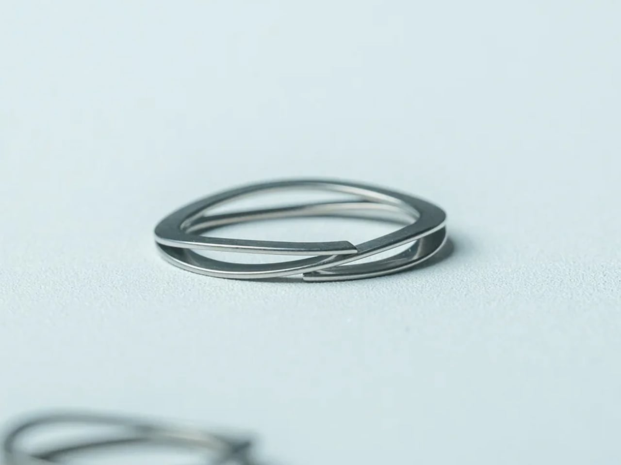
It uses a wave spring mechanism instead of the double-coiled split ring that has dominated keychains for over 130 years. Press the release, the ring opens. Let go, it closes. No gap to find, no coil to fight, no thumbnail to sacrifice. At $29, it is the last piece of a considered carry that most people still have not upgraded.
The Painless Key Ring replaces a mechanism that has not meaningfully changed in over 130 years – and the moment you press it open, you will understand why that matters.
One Press, A Different Keychain
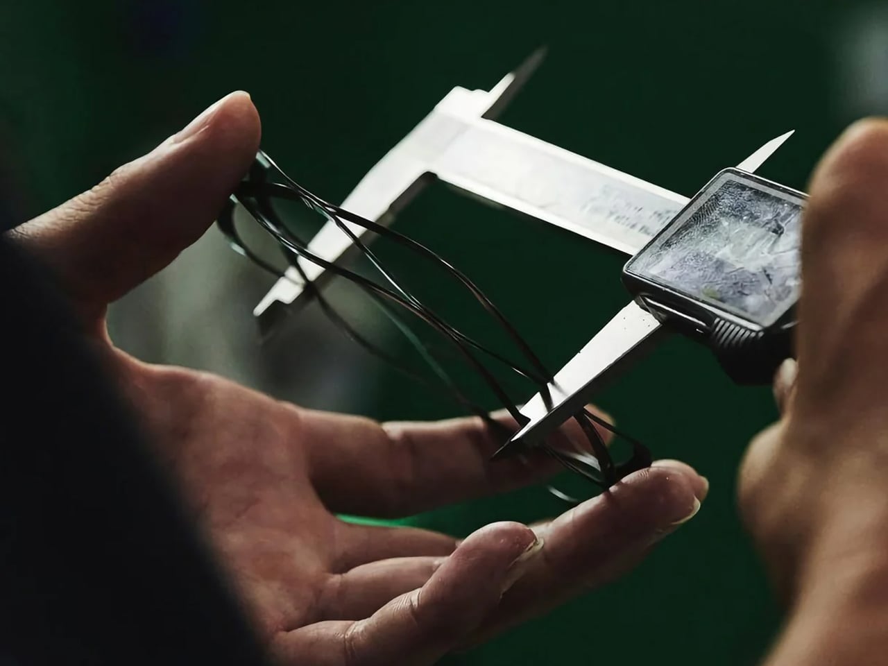
The wave spring is the engineering story at the center of this ring. Where a traditional split ring requires you to find the gap in the coil, work a fingernail or coin underneath it, and pry it open one agonizing millimeter at a time, the Painless Key Ring opens the moment you press the release point. Let go, and it closes with the same clean tension that holds your keys secure throughout the day. There is no gap to find, no coil to fight, and no nail to sacrifice. The motion is immediate, deliberate, and completely controlled.
The result is not just faster – it is fundamentally different. Keys slide on and off cleanly, without resistance, without the micro-damage that repeated split-ring prying inflicts on key stems over time. For anyone who swaps keys regularly – between an office badge, a rental car, a gym locker, or a new apartment – the difference in daily time alone justifies the switch.
Built for the Pocket That Has Everything Else Figured Out
The Painless Key Ring is slim, lightweight, and flat enough to disappear into a pocket without announcing itself through the fabric. It comes in Silver and Black, and each set at $29 includes one large ring and three smaller ones for modular grouping, with configuration options available up to $65. Nothing about the form overreaches. The profile is restrained in the way considered EDC hardware tends to be – present only in the hand, invisible everywhere else.
The build matches the premise. Wave spring construction handles the daily abuse a keychain absorbs – pockets, concrete drops, car ignitions, repeated pressings – without compromising the release action over time. This is not a piece of hardware designed to photograph well and degrade in six months. It is designed to outlast the question of whether you should have bought it.
What We Like
Wave spring opens on a single press point – no gap to find, no coil to pry, no coin or tool required; keys on and off in under two seconds, every time, without exception
Modular set design includes one large and three smaller rings, allowing keys to be grouped logically and swapped between rings without any additional hardware or effort
Slim, flat profile sits against the pocket without bulk, jangle, or the key-cluster silhouette that announces itself through light fabric
Build quality that outlasts the question of whether you should have bought it – wave spring construction holds its action through the friction, drops, and repeated pressings that daily carry demands
US availability with sets starting at $29 – the right price point for the last EDC upgrade most people have not made yet, with Silver and Black finishes that hold alongside a considered kit
What We Dislike
Only a few units currently available, which makes this a limited purchase rather than a reliably restocked item
Individual rings cannot be purchased separately, which means replacing a single ring from the set requires buying a new set entirely rather than sourcing the one piece you need
The Key Ring That Fixes What You Stopped Noticing
The Painless Key Ring does not fix a problem most people knew they had. It reveals one. Once you press open a wave spring ring and feel a key slide on in under two seconds, the split coil that has been in your pocket for years – possibly decades – feels exactly like what it is: a 130-year-old mechanism you were never given a reason to question until now.
For the EDC-minded, it is the final overlooked piece of a considered carry, finally resolved. For everyone else, the Painless Key Ring is a $29 correction to a daily friction point so familiar it stopped registering as friction at all. Either way, once it earns its place on your keychain, the old ring is not going back.
Vases occupy an awkward corner of product design. Most exist somewhere between functional and decorative without committing to either, and the result is a category that rarely surprises. Ceramic ones carry craft tradition, glass ones depend on color and transparency, and the novelty options try to be sculptural without much conviction behind them. It’s a crowded space that doesn’t often ask interesting questions.
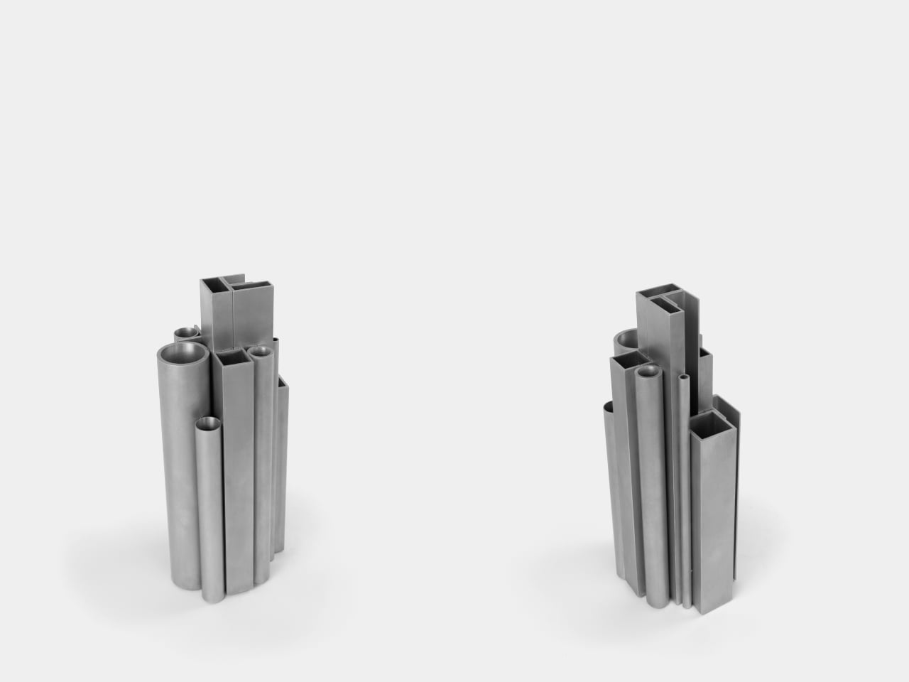
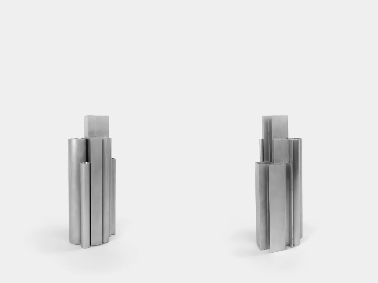
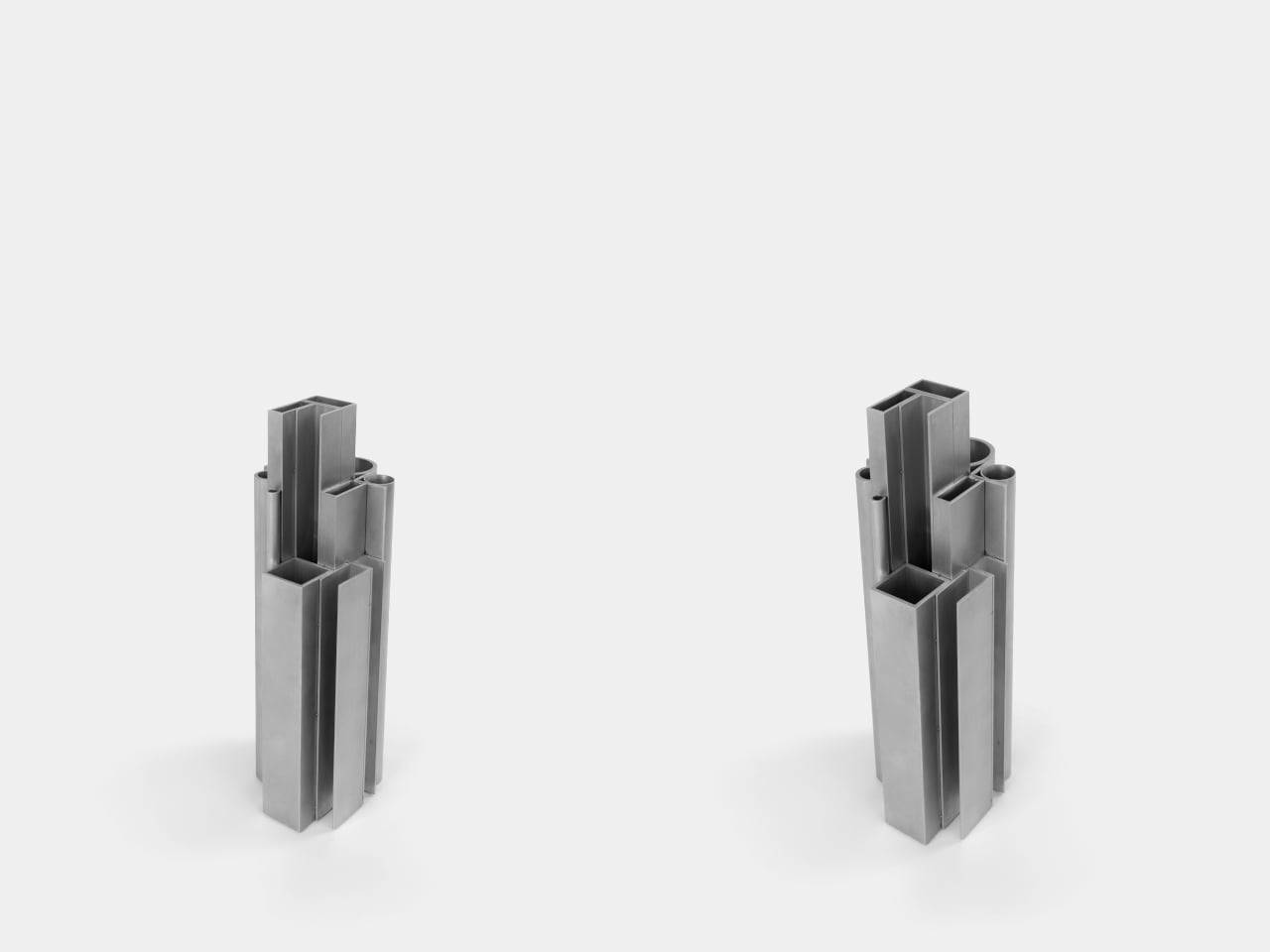
The Offcut Aluminum Vase starts from a different premise. Its form didn’t come from sketching vessel shapes or looking for the next minimalist curve. It came from staring at the end of a rack of industrial aluminum profiles, tubes, and sections waiting to be put to use. That cross-sectional view of bundled profiles, the overhead pattern nobody usually notices, is where the whole design began.
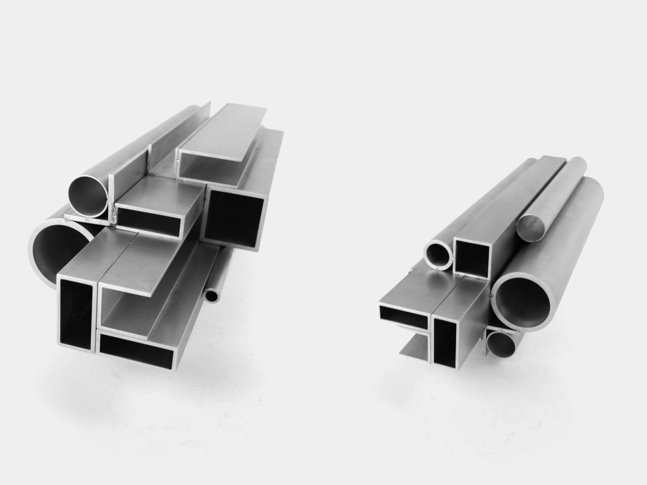
The construction is direct: actual aluminum offcuts bundled together, each piece a different cross-section. Circular tubes of varying diameters sit alongside square and rectangular hollow channels, all cut to different lengths that create a staggered, stepped silhouette when assembled. The look is instantly readable to anyone who has spent time near a metalworking shop or materials supplier, and distinctly strange to everyone else.
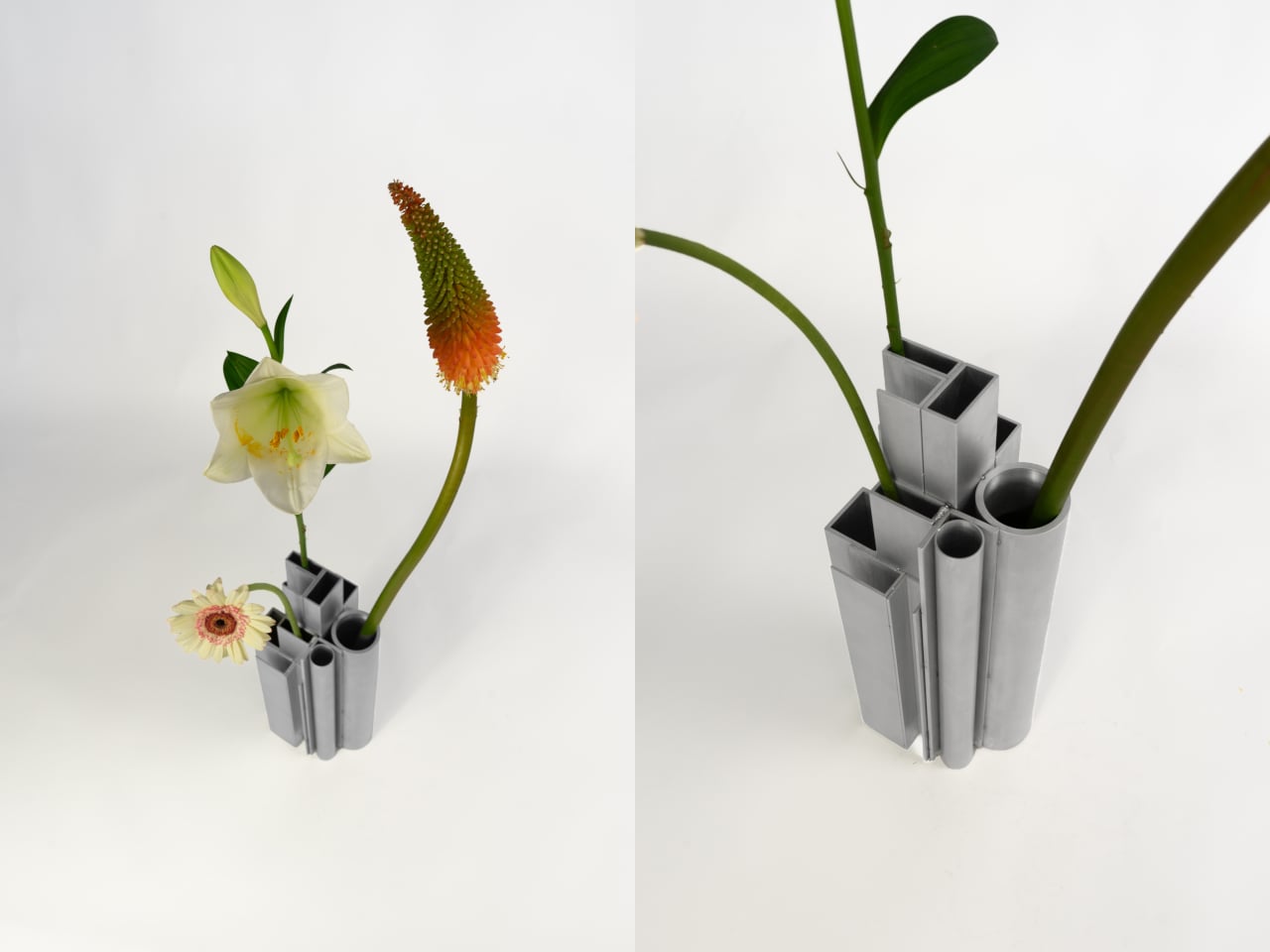
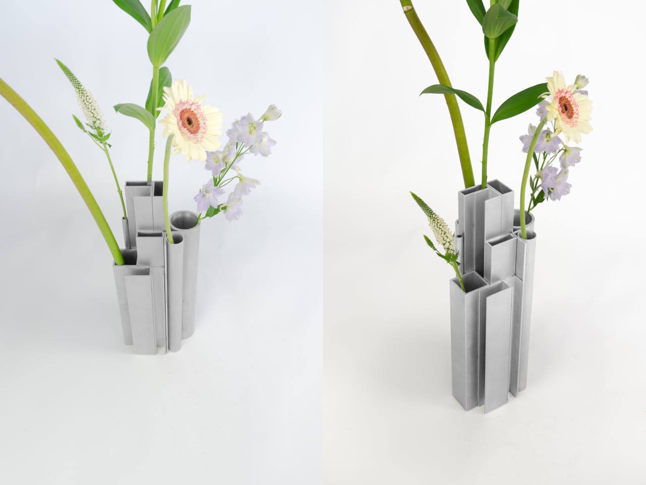
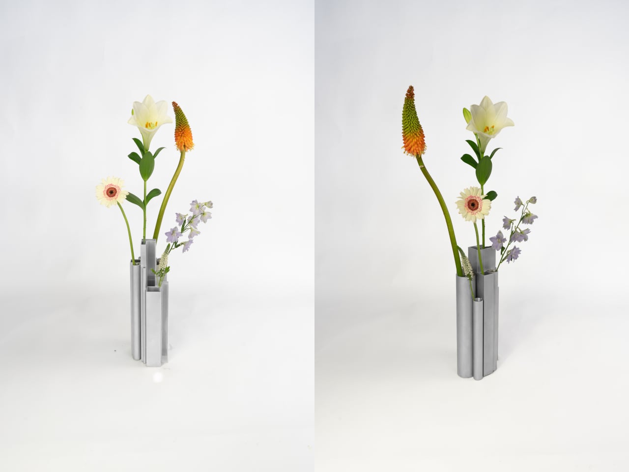
What’s surprising is how naturally it functions as a vase. Each opening, whether a round tube or a square channel, holds a single stem at a height set by that profile’s cut length. A tall flower finds one tube, a shorter bloom another, a delicate, small-stemmed flower a third. The structure of the object quietly distributes stems at different levels without any deliberate arrangement on your part.
The visual tension between the material and its setting is part of the appeal. Aluminum profiles don’t belong on a shelf with fresh flowers, and that friction is doing real work. The matte silver surface reads as cold and precise until something organic is placed inside it, and the contrast becomes the whole point. The industrial origin doesn’t disappear; it becomes what makes the flowers harder to ignore.
The choice to use actual offcuts rather than new aluminum cut to look like offcuts also matters. Most of this material would otherwise end up as leftover stock or be discarded at the end of a production run. Using it this way doesn’t require additional processing; the profiles arrive already shaped, already finished, and carrying the full character of their industrial origin without modification.
The vase holds its own even without flowers in it. The stepped arrangement of sections at different heights reads as a small sculptural object that could sit on a shelf as comfortably empty as it does full. The form doesn’t need flowers to complete it, which means that when you do add them, the combination feels considered rather than accidental.
It’s a rare thing when a design object’s material, form, and function all trace back to exactly the same source. Here they do. The offcuts are the structure, the structure is the form, and nothing about their industrial origin has been hidden or softened along the way. The workshop and the shelf turn out to have considerably more in common than most vases would ever admit.
What is a country? The question usually leads to answers about people, laws, culture, and shared history. We define nations by their political structures and the lines we draw to contain them. These are human constructions, frameworks built to organize society and create a sense of collective identity. A country becomes a set of agreements, a shared story we tell ourselves about who we are. But underneath all of that lies a more fundamental truth, an identity that is millions of years older than any government.
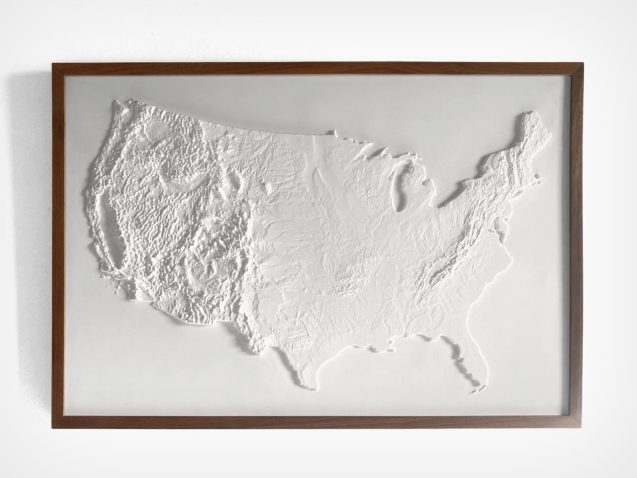
This is the truth captured by Muir Way’s 3D Raised Relief Map. It answers the question by presenting the United States as a physical entity, a vast and intricate piece of the Earth’s crust. The map argues that the country’s primary identity is its terrain. The story of America is inseparable from the formidable barrier of the Rockies, the fertile plains of the Midwest, and the strategic harbors of its coasts. It is a beautiful and potent reminder that a nation is, before anything else, a piece of land.
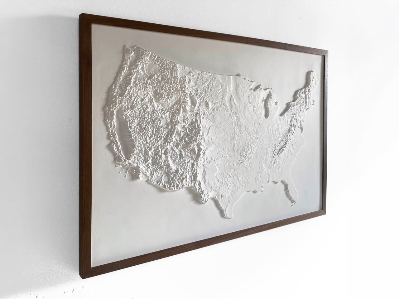
Rendered entirely in white, the piece hangs on the wall more like a sculpture than a conventional map. There are no colors to decode, no labels to parse, and no political borders to trace. Shadow does all the work instead. Light raking across the surface reveals the Rockies as a mass of jagged, compressed ridges, the Appalachians as a quieter but persistent ripple running along the eastern flank, and the Great Plains as a kind of vast, deliberate calm between them. The Great Lakes read as deep, smooth voids, which gives the northeastern quadrant an almost architectural quality. The effect is genuinely striking, the kind of thing that looks like it belongs in a museum dedicated to geography rather than a shop dedicated to maps.
Muir Way, a San Diego-based map studio, builds each piece by digitally scanning and georeferencing source map data, then aligning it with modern elevation data to cut a precise three-dimensional mold. The surface is then printed on durable plastic and vacuum-formed over that mold, a process that translates topographic information into physical depth with real fidelity. The finished piece is mounted to foamboard and hand-finished. NASA elevation data underpins the accuracy of the terrain, which means the relief is cartographically honest rather than decoratively approximated. Muir Way works primarily with materials made in the USA, and a portion of the proceeds from each sale goes to outdoor-related charities including the Sierra Club Foundation, Leave No Trace, and the Waterkeeper Alliance.
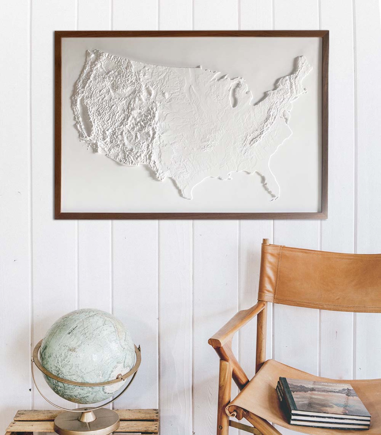
The map is priced at $199, with a sale price currently from $169.15 through the Muir Way website. A solid walnut frame, visible in most of the product photography and providing a warm contrast to the stark white surface, is available separately. As a July 4 gift, a housewarming piece, or simply an object for someone who takes their walls seriously, it holds up.
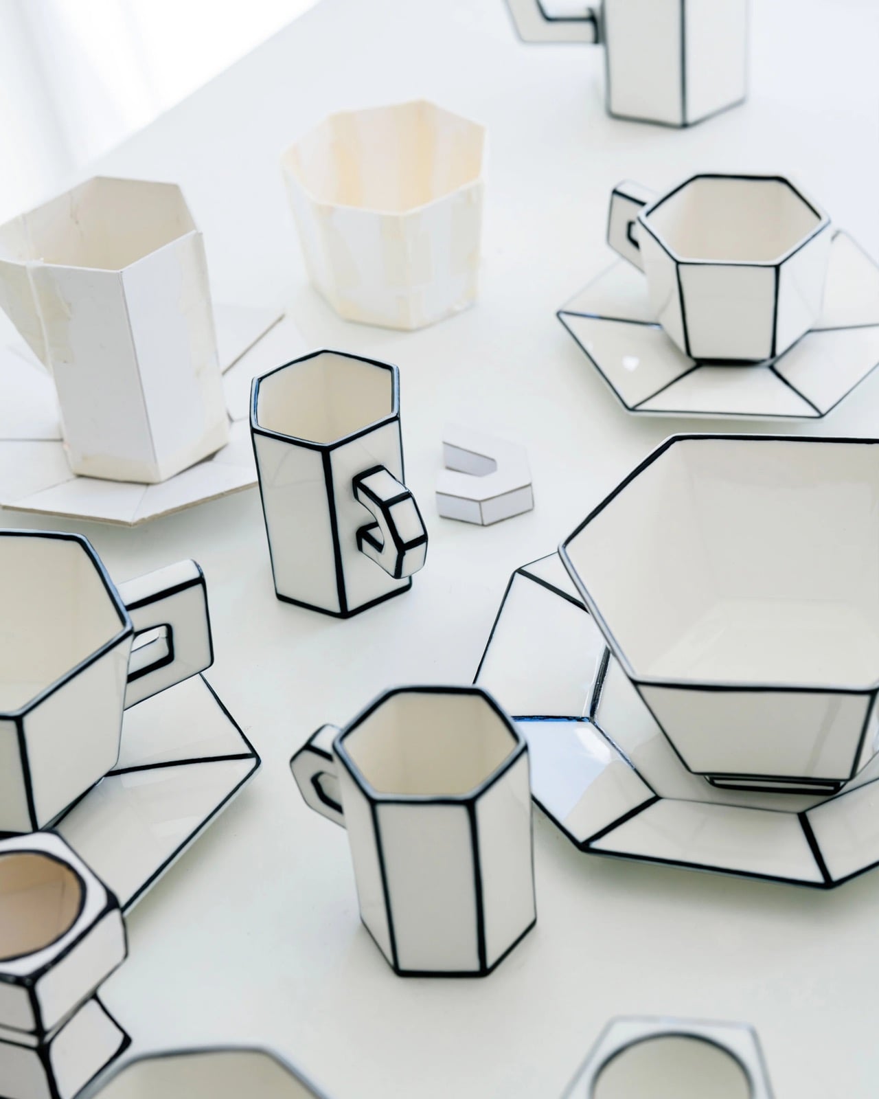
The potter’s wheel is the oldest mass-production machine humanity ever built, a spinning disc that let a single craftsman turn out dozens of near-identical bowls before lunch. That gift arrived with a tax written into physics, because anything formed on a wheel is a profile revolved around a central axis, exactly like a shape cut on a lathe. Bowls, cups, vases, and plates all inherit the same radial DNA, which is why round has quietly ruled tableware across every civilization that ever touched clay. Serax’s Carte Blanche collection abandons the axis completely, swapping revolved curves for faceted, folded geometry that no wheel could ever spin. It then pulls a second trick, flattening the porcelain visually until a solid cup reads as a drawing of one.
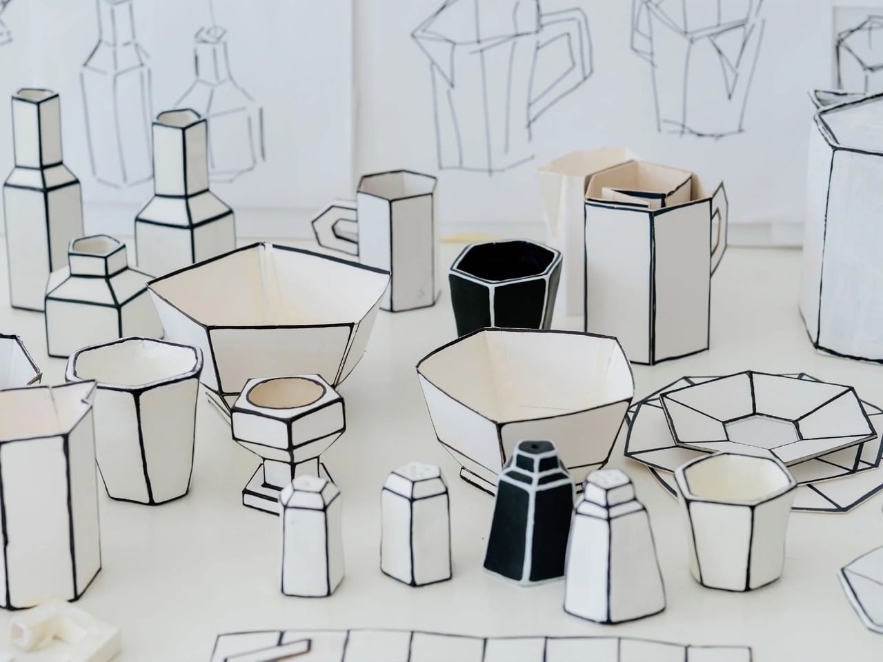
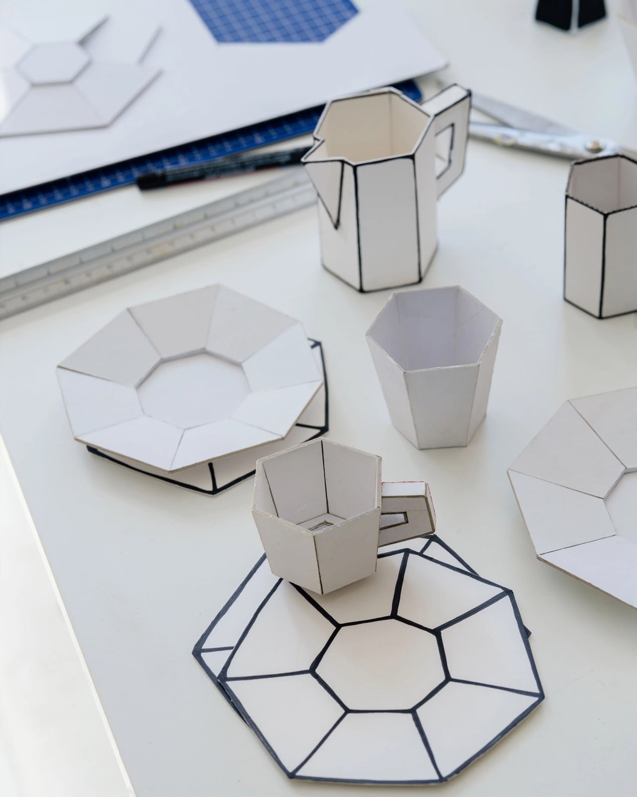
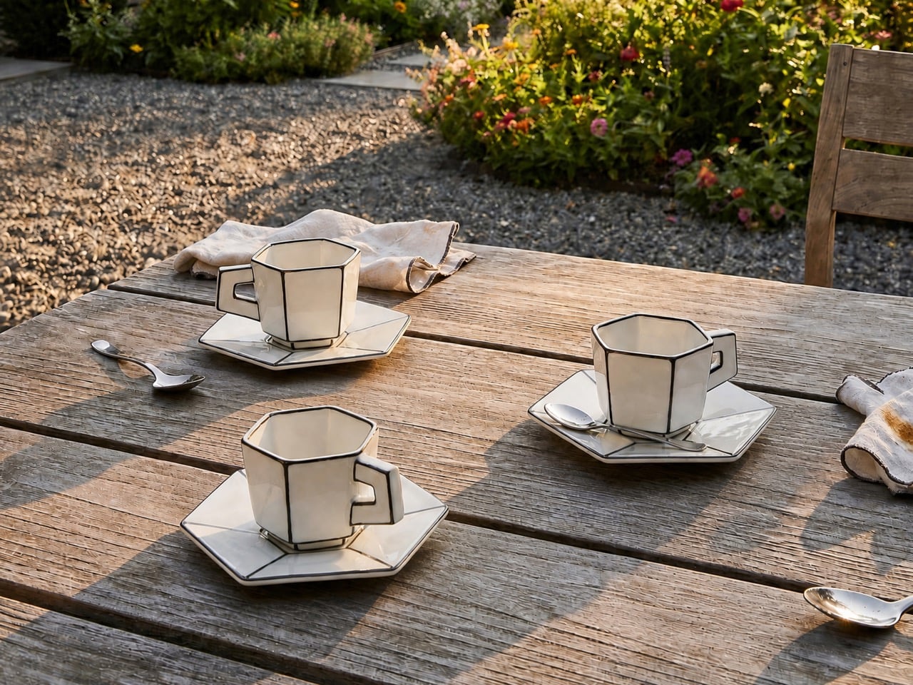
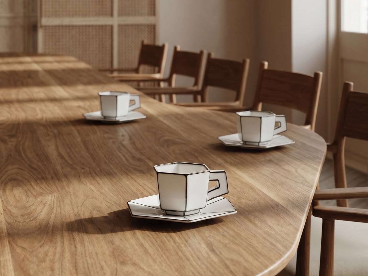
Dutch designer Annebet Philips developed the range with Belgian brand Serax, and she began the whole thing in cardboard rather than clay. She cut childlike shapes with deliberately uneven edges, treating the blank page and the humble cutout as her starting brief, which the name Carte Blanche translates almost literally. Those paper prototypes became the design language itself, their creases and wobble carried into glazed porcelain instead of being sanded into anonymity. Hand-painted black lines trace every fold and seam, lending each cup, saucer, and teapot the flattened quality of ink on paper. The collection opened as a coffee and tea service, espresso through milk jug, before expanding into plates, a breakfast bowl, an egg cup, and a salt and pepper set.
Designers: Annebet Philips and Serax
Ceramics is the most stubbornly three-dimensional of the applied arts, since clay has mass and casts a shadow no matter how thin you throw it. Carte Blanche fights that condition with pure graphic force, using a heavy black outline to convince your eye it is reading a two-dimensional sketch rather than a glazed object with genuine volume. The octagonal facets do half the work, catching light in flat planes that refuse the soft gradient a rounded surface would hand you. Photographed straight on, a cup collapses into what looks like a cartoonist’s line drawing, the handle reading as a doodled loop rather than a fired ceramic ear. Philips is forcing a volumetric craft to impersonate the flat page it was first sketched on.
Trompe-l’œil (or ‘deceives the eye’ in French) ceramics have a rich recent lineage, and French artist Jacques Monneraud has built a following throwing porcelain so convincingly corrugated that studio visitors ask whether he has switched to actual cardboard. Monneraud freezes the material itself, pressing a handmade wooden tool into leather-hard clay to fake corrugation and mixing glaze to imitate strips of packing tape. Philips chases something else, freezing the gesture rather than the substance, the outline and the fold instead of the fibrous grain. Where Monneraud wants you fooled until you lift the piece, Philips wants you to register the drawing instantly and enjoy the contradiction. Both approaches prove that a black line, correctly placed, reshapes how we read an object more than any amount of sculpted volume.
YD watched the same optical idea scale up to 1,578 horsepower a few days ago, when Bugatti unveiled the one-off W16 Mistral “Blanc Éternel” wrapped in hand-painted black linework. That car traces the NURBS surface patches from its own digital model across a porcelain-white body, exposing the CAD wireframe that normally stays hidden inside the software. The effect is identical in spirit to Carte Blanche, a three-dimensional object drawn back down into black lines on white, geometry converted into graphic. One costs somewhere north of five million dollars and eulogizes a dying engine, the other holds your morning espresso and survives a dishwasher cycle. Both understand that a contour line is the fastest way to make a solid thing look like an idea of itself.
The illusion grows directly from how the objects were designed, the paper maquette preserved in glaze rather than discarded once the shape was set. Every line being painted by hand means no two pieces match exactly, so the industrial porcelain underneath still carries a one-off wobble. The pieces stay microwave and dishwasher safe, which keeps the concept from retreating into the vitrine where most trompe-l’œil ceramics eventually go to die. Philips has taken the two assumptions a potter’s wheel hardwired into the craft, that vessels are round and that vessels look solid, and quietly canceled both in a set you can actually eat off. That is a rarer achievement than the cheerful, cartoonish surface first lets on.