RayNeo Just Split Smart Glasses Into Two, and Neither One Compromises

The smart glasses category has long struggled with identity. Most devices try to do too much and end up doing nothing all that well. RayNeo’s answer to that is two entirely separate glasses for opposite ends of the spectrum: the iO as a discreet all-day AI companion and the GT Series as a portable personal theater. It’s a straightforward bet that specialization beats compromise.

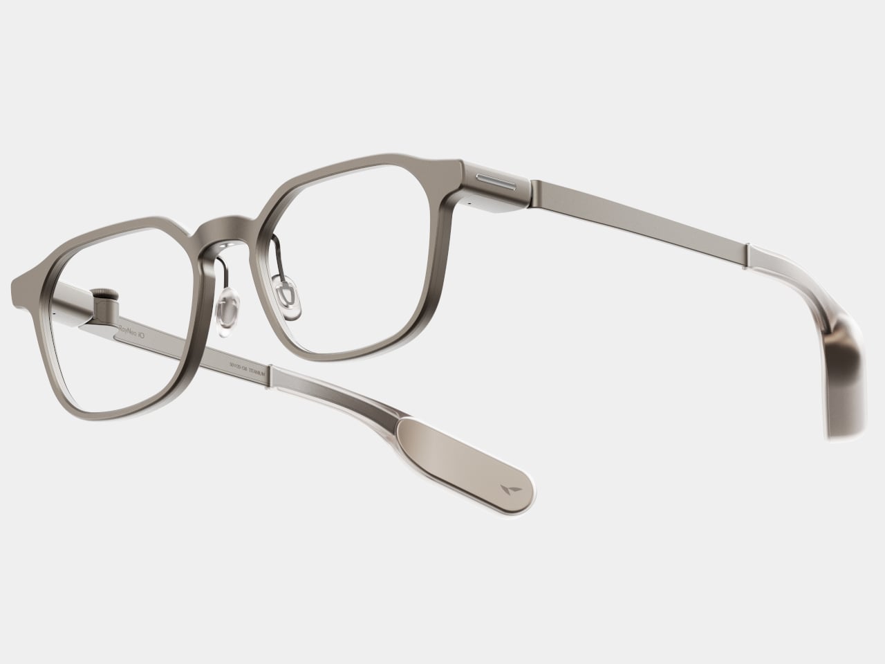
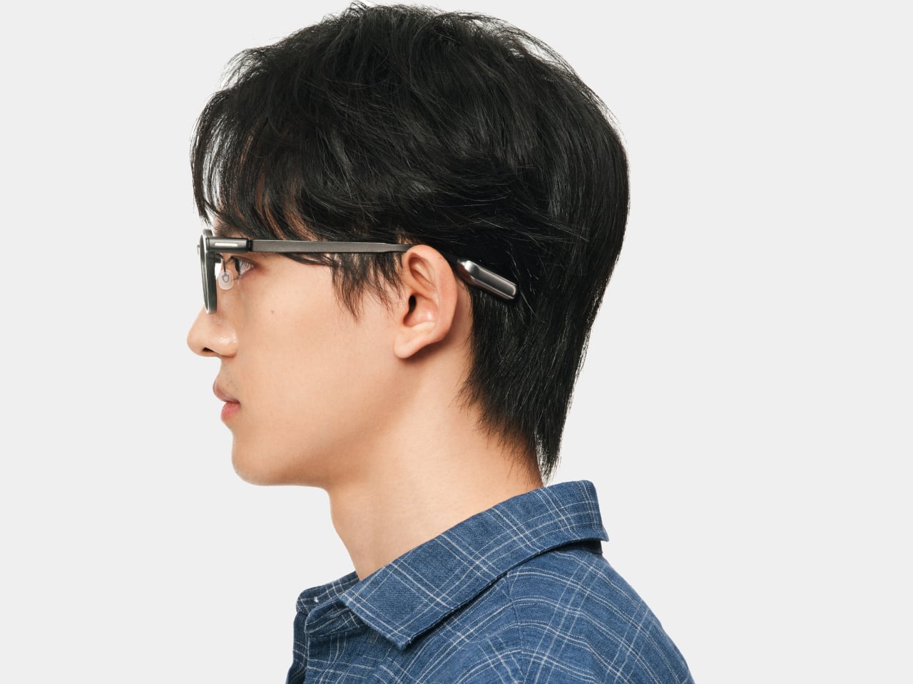
The iO is the one you’d wear to a meeting and forget you have on. At 33 grams, with an aerospace-grade titanium frame and magnesium-aluminum alloy construction, it distributes weight evenly enough to disappear on your face. The display is invisible to anyone looking at you, a 97% transparent waveguide that delivers text at 1,300 nits of brightness while looking like ordinary eyewear to everyone else in the room.

Designer: RayNeo

What the iO actually does with that display is where things get interesting. Sit through a meeting, and it’s quietly logging the conversation, capturing context, and flagging action items that you can approve with a nod. Step up to give a presentation and its Auto-Teleprompter scrolls your script in sync with your speaking pace. For frequent travelers, it translates across 55 languages and 109 accents in near real time.

The iO doesn’t have speakers or a camera, which is a deliberate call. A four-mic array paired with a bone conduction sensor picks up your voice clearly even in noisy environments, and the 240mAh battery stretches to two days of regular use. Bluetooth 5.4 with MFi certification, IP54 water resistance, and a tactile Smart Crown rotary dial on the right temple complete the hardware.

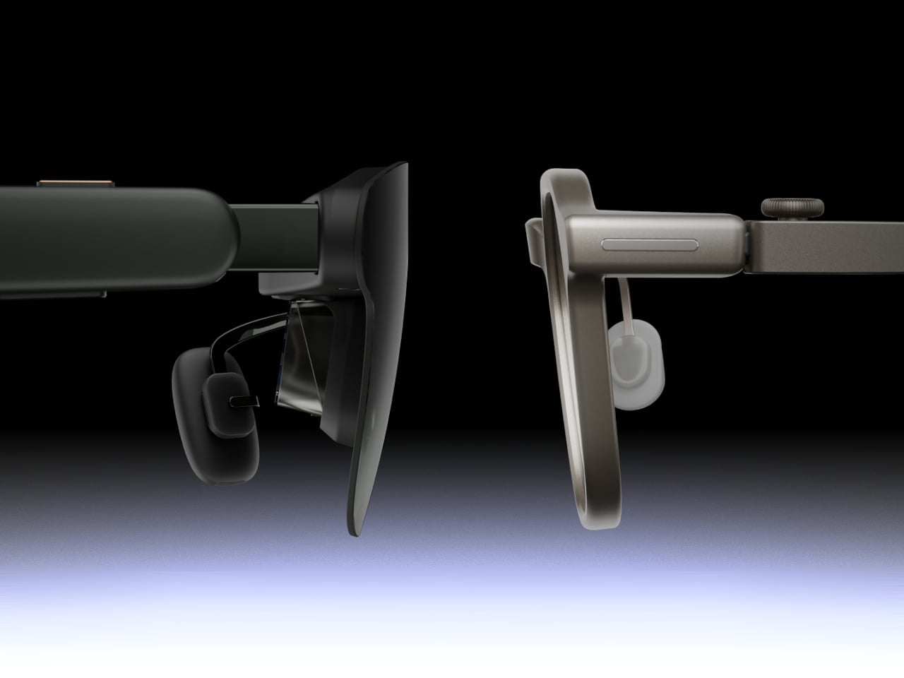
The GT Series is a completely different proposition. Where the iO blends in, the GT and GT Max make no apologies for what they are: personal cinemas you wear on your face. The standard GT projects a 231-inch virtual screen at a 46° field of view, and the GT Max scales that up to a maximum of 307 inches at 59°, adjustable across three selectable sizes.

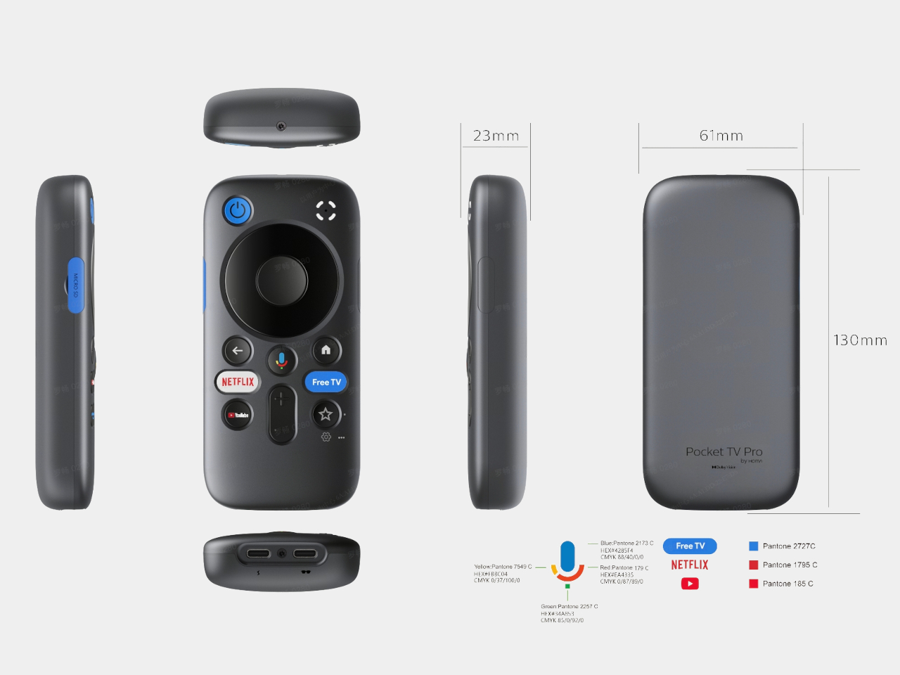
Paired with the RayNeo Pocket TV Pro, a Google TV-powered streaming device with a 6,500mAh battery, the GT Series is also the world’s first AR glasses system to support native Dolby Vision playback. That companion device powers both itself and the glasses for about 5.5 hours of streaming, which means actual Dolby Vision on a screen that fills more of your visual field than most living room televisions.

Audio in the GT Series comes from a quad-speaker system co-tuned by Bang & Olufsen, using a six-magnetic circuit design that delivers a 5dB boost in low-frequency sensitivity. Head-tracked spatial audio keeps the soundstage anchored as you move, and a dedicated Steady Mode in the 3DoF chip filters out turbulence and vehicle vibration, making it a natural companion for long flights or train journeys.

Both products go on sale September 4, 2026, via RayNeo’s website and Amazon. The GT starts at $299 and the GT Max at $399, with pricing for the iO still to be confirmed. Custom prescription lens inserts are supported across both GT models, and the GT Max comes in three IPD sizes to accommodate different face shapes. It’s a two-pronged launch that doesn’t hedge its bets on either end.

The post RayNeo Just Split Smart Glasses Into Two, and Neither One Compromises first appeared on Yanko Design.

This Foldable A2 Scanner Fits in a Bag and Doubles as a Live Presenter

Scanners haven’t changed much in how they occupy a workspace. A flatbed sits in the middle and claims that real estate whether it’s in use or not. Overhead models are more flexible, but they still tend to take up a fixed spot in any setup. For anyone working from a compact home office or shared studio, that trade-off rarely gets a proper answer.

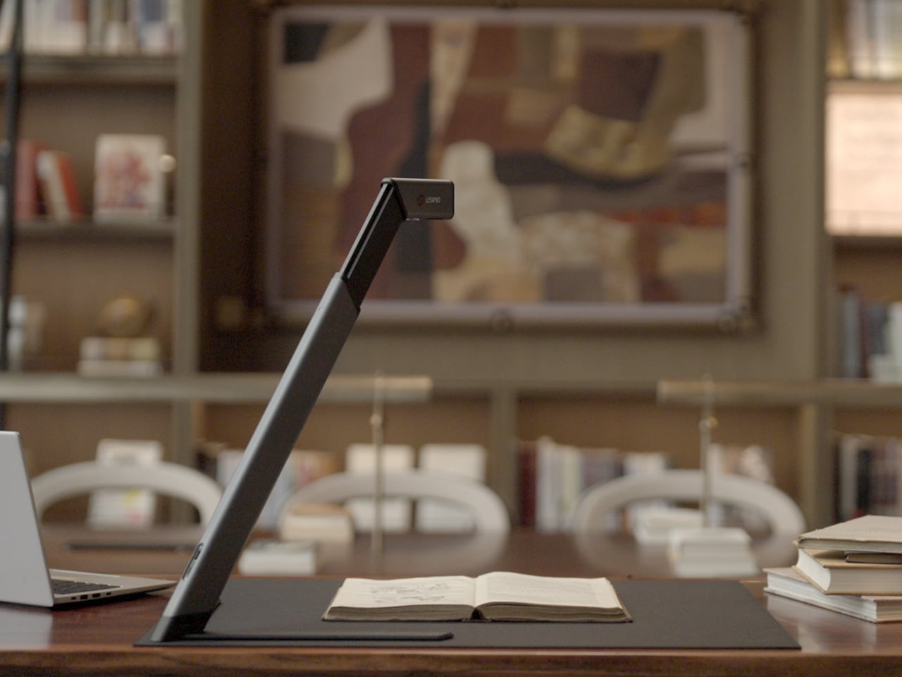
Joyusing’s ScanMax 320 approaches the problem from a different angle, quite literally. Rather than occupying the center of a workspace, it’s built to sit at the edge of a desk, positioned in the corner while its arm reaches overhead. It handles documents, books, artwork, and large-format materials up to A2 size, without taking over the surface it’s meant to serve.

Designer: JOYUSING

Click Here to Buy Now: $379 $649 (42% off). Hurry, only 32/220 left! Raised over $88,000.

Folded down, the ScanMax 320 measures 355mm x 68mm x 51mm, slim enough to slip into the included carrying bag and move between rooms without any effort. It runs entirely on USB-C power, so getting started means plugging in a single cable. There’s no proprietary adapter to hunt down, no driver installation ritual, and nothing complicated to deal with before the first scan. You can directly use the ScanMax 320 as a live presenter camera, and scanning as well as other advanced features simply require the free Joyusing Scanner intelligence software.

The shooting area extends to a full A2, or 594mm x 420mm, with a 32-megapixel sensor capturing at up to 380 DPI. That covers blueprints, double-page book spreads, large technical drawings, and oversized artwork in a single pass. An intelligent auto-switching system detects whether the material is A2 or A3 and adjusts accordingly, so there’s no manual input needed between sessions.

Overhead scanners tend to have a lighting problem, particularly near edges or when capturing materials that aren’t perfectly flat. The ScanMax 320 uses a rectangular illumination system shaped to match the scanning area, distributing light evenly and keeping shadows from washing out fine detail near the sides. Three brightness levels, at 30%, 70%, and 100%, are accessible with a single touch for quick adjustments in different environments.

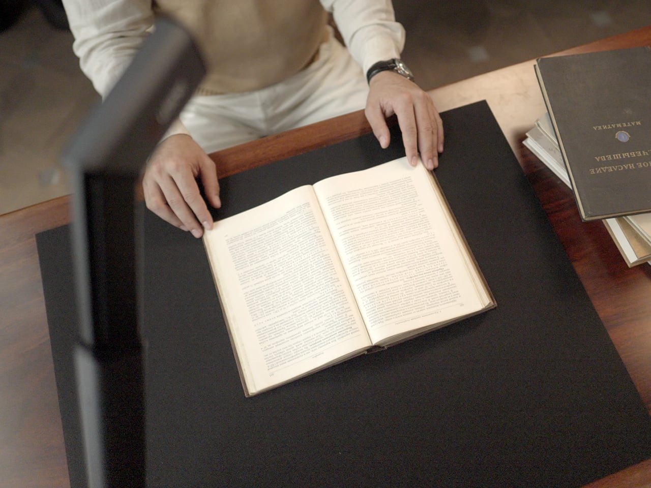
Book scanning is where overhead devices tend to earn their keep, and also where they tend to frustrate. Pages curve at the spine, fingers get in the way, and binding shadows creep in from the edges. The ScanMax 320’s software handles most of this automatically, applying auto-flattening, finger removal, de-skewing, and shadow removal without manual adjustment. Book mode, paired with the included finger cots, keeps pages steady for continuous capture.

Once everything is captured, the software’s OCR engine converts printed text into editable, searchable files, with support for 180 languages and export options including Word, PDF, and TXT. A page of Japanese text, a technical report, or a multilingual research paper can go from physical to fully searchable in seconds, turning raw captures into documents you can actually search, copy, and share.

What’s less obvious about the ScanMax 320, and arguably more interesting, is that it also functions as a live visual presenter. Point it at a printed page, a hand-drawn sketch, or a physical object, and the feed goes live to whatever screen or projector it’s connected to. For a teacher going through annotated notes or a designer reviewing a layout with a client, that extra mode earns its place quickly.

Software compatibility covers Windows, macOS, and several Linux distributions including CentOS, Ubuntu, and Debian, though macOS users will find some features limited compared to the Windows version. Everything connects over USB-C, keeping the setup free of dongles and extra cables. Built-in annotation tools allow for direct markup of scanned content, which makes it easier to prepare materials before presenting or sharing them.

There’s something refreshingly considered about a scanner built to work with your desk rather than on top of it. The ScanMax 320 doesn’t ask you to clear space or rearrange anything. It folds, parks at the edge, and gets on with the job. Whether you’re archiving a collection, digitizing a sketchbook, or presenting something in a meeting, the fact that it stays in its corner is, in itself, the point.

Click Here to Buy Now: $379 $649 (42% off). Hurry, only 32/220 left! Raised over $88,000.

The post This Foldable A2 Scanner Fits in a Bag and Doubles as a Live Presenter first appeared on Yanko Design.

SonicMax Finally Built a Wireless Cutter That Stays Cool Enough to Use

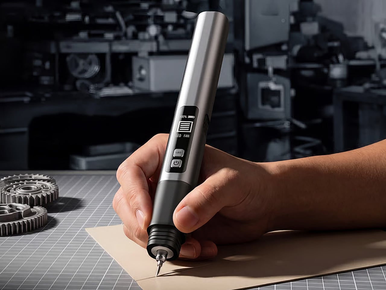
Ultrasonic cutters have been a genuine revelation for makers. Running at 40,000 vibrations per second, the blade doesn’t force its way through material; it glides, leaving clean, precise edges on foam, leather, plastic, and 3D-printed parts. The SonicMax Slice 10 takes that concept further by going completely cordless and, more importantly, addressing the one frustration that has followed every similar tool: heat.

The appeal of cutting without cords is obvious. What’s less appealing is when the tool becomes too hot to hold, forcing a break every five to 10 minutes. That kind of heat doesn’t just affect the experience; it affects the output, too. Plastic melts unevenly, detailed prints deform at the edges, and cuts that were supposed to be clean end up looking anything but.

Designer: SonicMax

Click Here to Buy Now: $119 $215 (45% off). Hurry, only 80/500 left! Raised over $104,000.

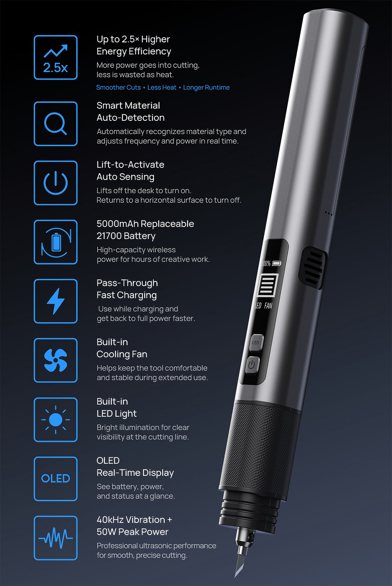
SonicMax addressed this with a redesigned transducer that, according to the company, achieves a quality factor, or Q value, of over 500, compared to around 200 for typical designs. The higher that number, the more energy goes into cutting rather than radiating as heat. It doesn’t make for a flashy headline, but it makes a tangible difference in how long you can actually work without stopping.

The Slice 10 also adjusts in real time as it cuts. Rather than operating at a fixed power level, the system reads resistance from the material and changes its output power and vibration frequency accordingly. This means that whether you’re cutting through a soft piece of EVA foam or pushing through a thicker section of a 3D-printed model, the tool is constantly self-correcting to keep the cut smooth and consistent.

That combination shows up quickly in a working session. Support removal on a detailed 3D print comes out clean instead of tearing. Leather cuts without compression or fraying. Foam and plastic sheet separate with sharp, neat edges. For anyone doing post-processing work on resin or FDM prints, building cosplay armor, or finishing scale models, the improvement is fairly immediate and fairly obvious.

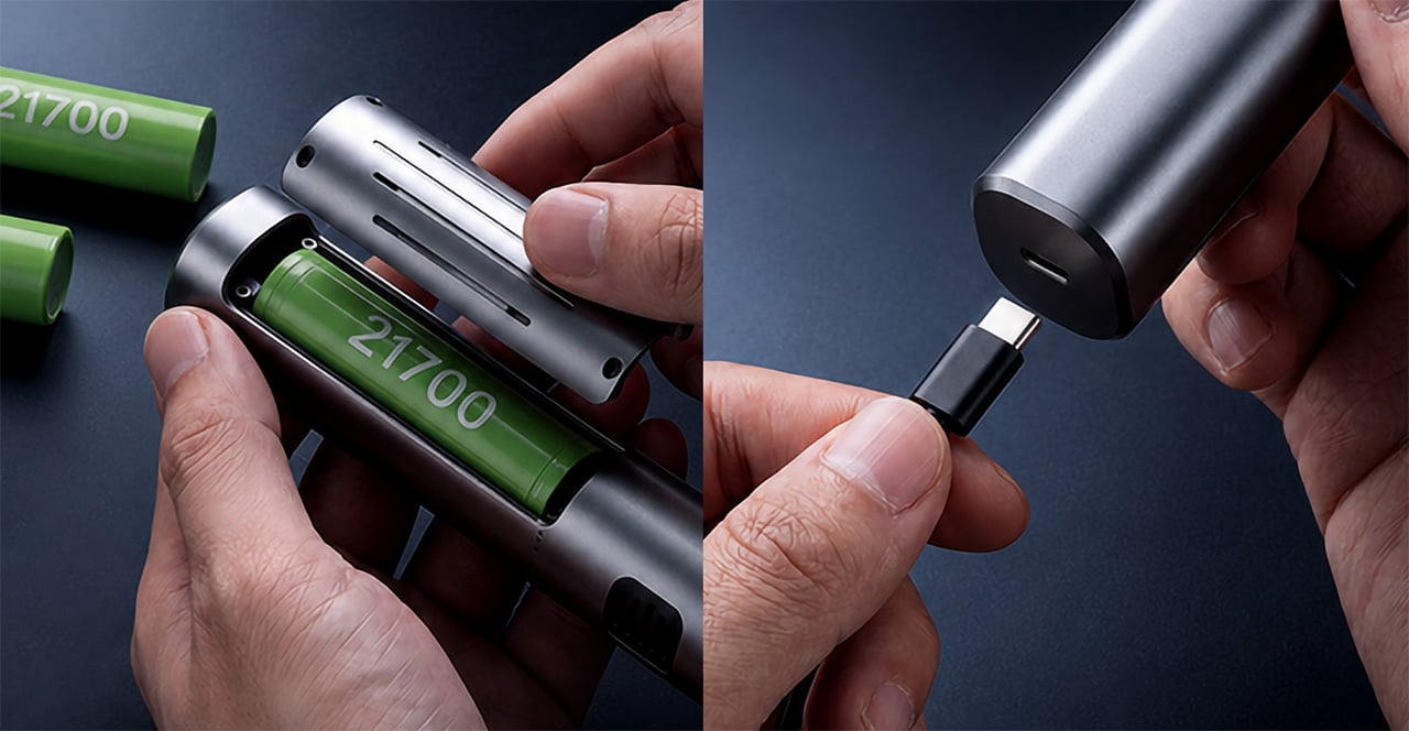
The cordless experience is backed by a 5,000mAh 21700 lithium-ion battery that SonicMax says can deliver up to four hours of cutting on a single charge. What’s more practical, though, is that the cell is user-replaceable. Standard 21700 format means you can carry a spare and swap it out in seconds if needed, essentially extending a session indefinitely without waiting for anything to charge.

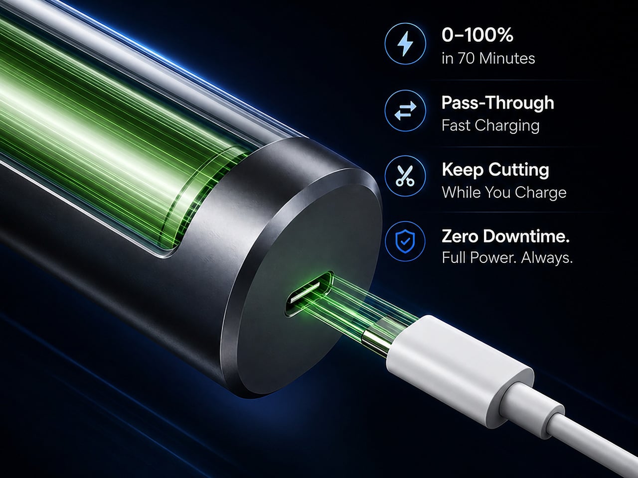
For those who’d rather stay plugged in, the Slice 10 supports pass-through charging via USB-C, so you can keep cutting while the battery tops up. A full charge from zero takes roughly 70 minutes, supported by 18W of fast charging. It’s the kind of flexibility that accounts for the reality of a busy workshop, where stopping to wait for a tool to charge isn’t really an option.

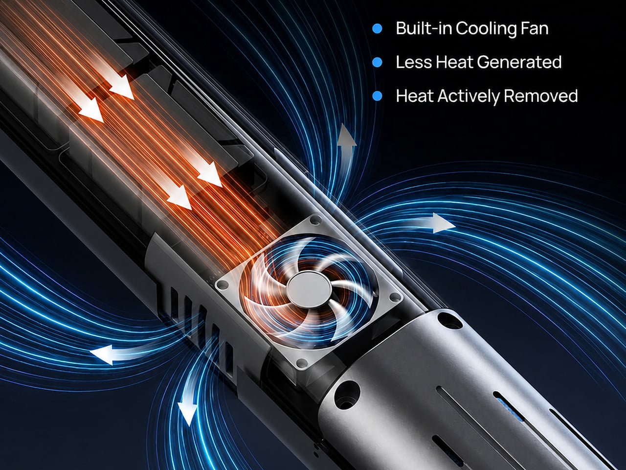
Keeping temperatures down is a two-part approach. The redesigned transducer generates less waste heat by design, and a built-in active cooling fan moves whatever heat builds up away from the blade area. There’s also a lift-to-activate sensor that powers the tool on when picked up and shuts it off when set down, quietly helping with both battery life and heat management throughout the session.

Rounding things out is an OLED display showing live battery level, output power, and tool status, so you’re never guessing how much runtime you have left. A built-in LED light illuminates the cut line, especially useful for intricate detail work on small model parts. Overheat protection activates at 80°C motherboard temperature, and the tool shuts itself down after five minutes of idle time.

At 236g and 260.5mm long, it’s light and slim enough for extended use without fatigue. Each unit ships with 10 spare blades, a hex wrench, a blade retaining block, four fastening screws, a dual USB-C cable, and a user manual. SonicMax has built this as a system where thermal management, adaptive control, and battery flexibility serve one consistent goal: more time cutting.

Click Here to Buy Now: $119 $215 (45% off). Hurry, only 80/500 left! Raised over $104,000.

The post SonicMax Finally Built a Wireless Cutter That Stays Cool Enough to Use first appeared on Yanko Design.

Huawei Pura 90s Pro Max Review: A Beautiful Comeback With Caveats

PROS:


  • Distinctive design with bold color options

  • Large, sharp display with anti-reflective treatment

  • Excellent main and telephoto cameras

CONS:


  • Performance is not class-leading

  • Weak cross-platform file sharing

  • No clear update policy

RATINGS:

AESTHETICS
ERGONOMICS
PERFORMANCE
SUSTAINABILITY / REPAIRABILITY
VALUE FOR MONEY

EDITOR'S QUOTE:

The Pura 90s Pro Max feels less like a safe flagship and more like a characterful one, which makes it easier to admire than to recommend without hesitation.

It has been a long time since I last reviewed a Huawei phone. The last one was the Huawei P50 Pocket Premium Edition. I still remember that phone well because it was genuinely beautiful. It had the kind of design that instantly felt premium, and it reminded me how good Huawei can be when it wants to make a phone stand out.

A lot has changed since then. The P series is now called Pura, but Huawei’s approach to hardware and design still feels very familiar. The company still knows how to make a flagship look different, and in a market where so many phones are starting to blend together, that still matters.

Designer: Huawei

This time around, Huawei is offering the Pura 90s Pro and the Pura 90s Pro Max. What is interesting is that there is no Ultra model in the lineup, unlike before. That means the Pura 90s Pro Max now sits at the top of the range. It also brings back 5G, which makes this release feel a bit more important than just another yearly update.

The Pura 90s Pro Max has all the right flagship ingredients at first glance. Big screen, ambitious cameras, premium build, and fast charging are all here. The question is whether that is enough to make it a great phone overall.

Aesthetics
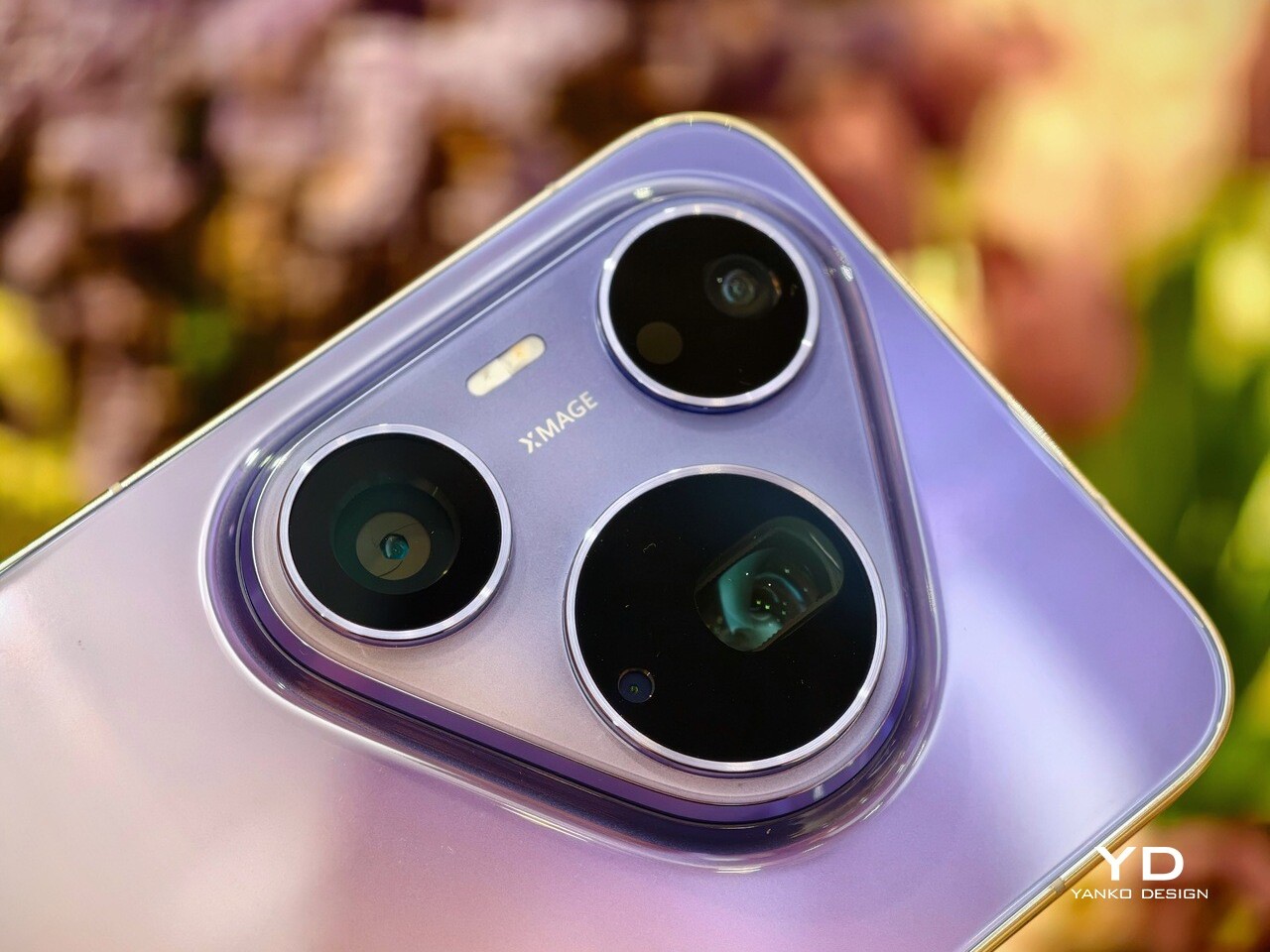
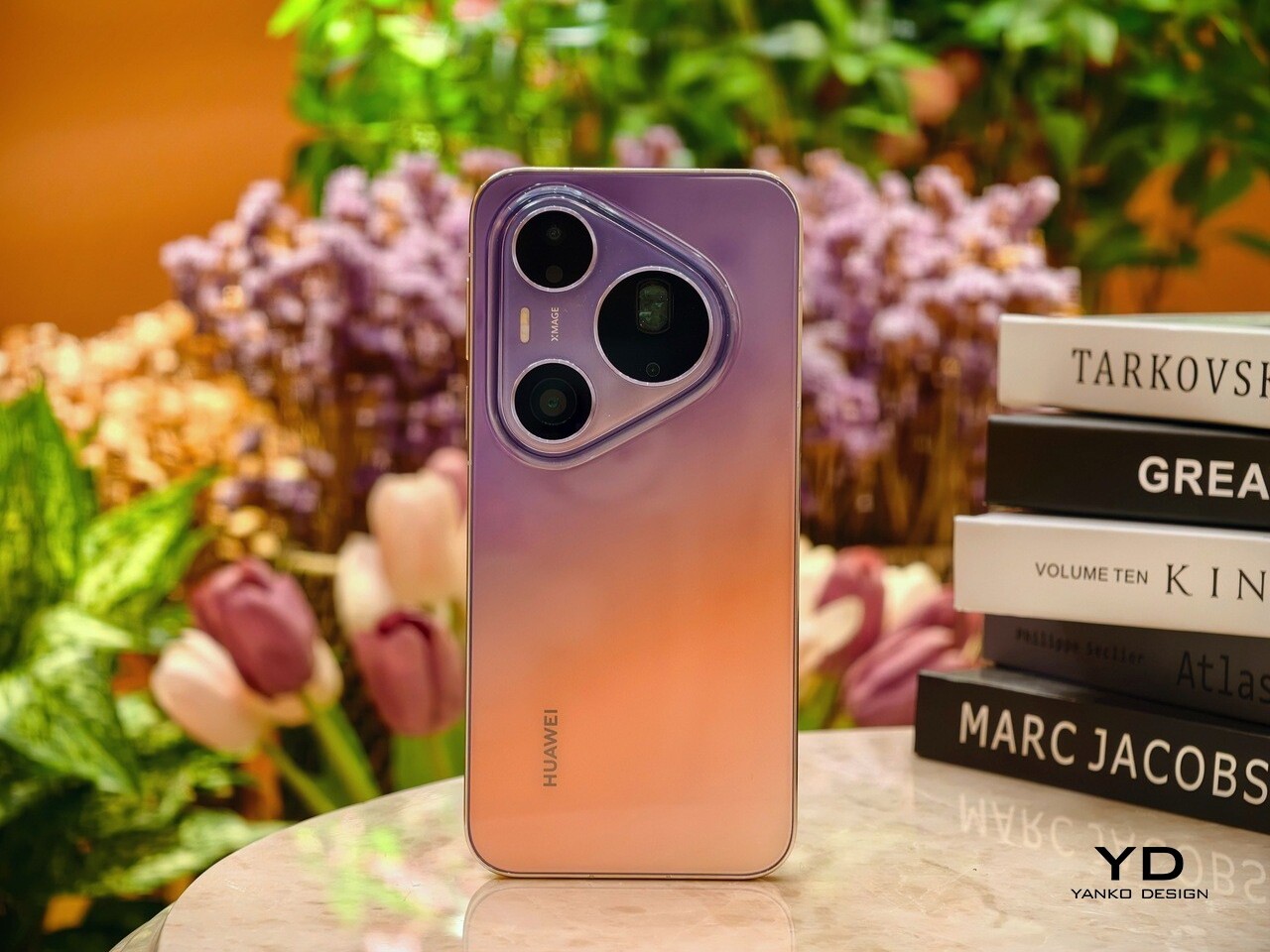
The Huawei Pura 90s Pro Max carries the now-familiar triangular camera island that has become a signature since Pura 70. It features two black circular cutouts for the ultra-wide and main cameras, along with a larger black circle for the telephoto camera. A pill-shaped LED flash also sits within the module, completing the layout. It is the kind of design detail that makes the phone instantly recognizable from across a table.

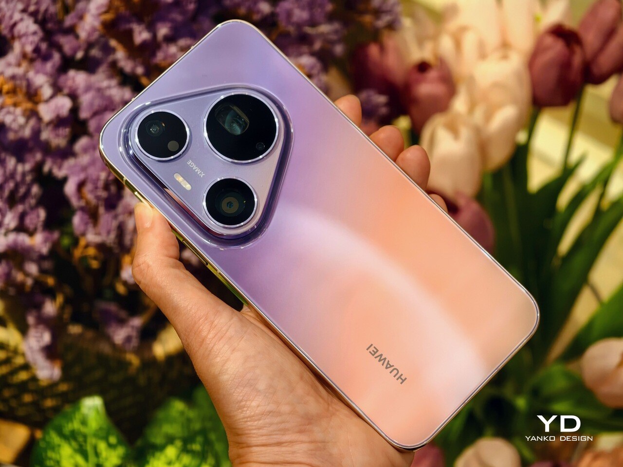
Huawei has also put real effort into the color finishes this year. The Pura 90s Pro Max comes in four colors, and two of them stand out immediately because of their dual-tone gradient treatment. The Blaze Purple unit I received pairs a purple upper half with an orangish-pink lower section, matched with a glossy gold frame that adds even more flair. It is bold, but it never tips into looking gaudy. Instead, it still feels polished and premium.
The other standout is Orange Ocean, which arguably takes the two-tone concept even further. It combines light blue at the top with orange at the bottom, while the center transitions smoothly between the two shades. Even the side frame follows the same color story, which makes the overall design feel more cohesive and more intentional. It is the kind of finish that feels playful at first glance, yet refined enough to belong on a flagship.

For those who prefer something safer, Huawei also offers Blush Gold and Graphite Black. These are more traditional options, but that is not necessarily a drawback. Not everyone wants their flagship phone to double as a statement piece. Still, if you are buying a Huawei at this level, the more expressive finishes are where the personality really comes through.

Ergonomics

In hand, the Pura 90s Pro Max feels better balanced than its bold design might suggest. I was unsure at first whether the large triangular camera island would make the phone feel awkward, but in daily use it never really did. If anything, when I held it one-handed in my right hand, the raised module gave my index finger a natural place to rest.
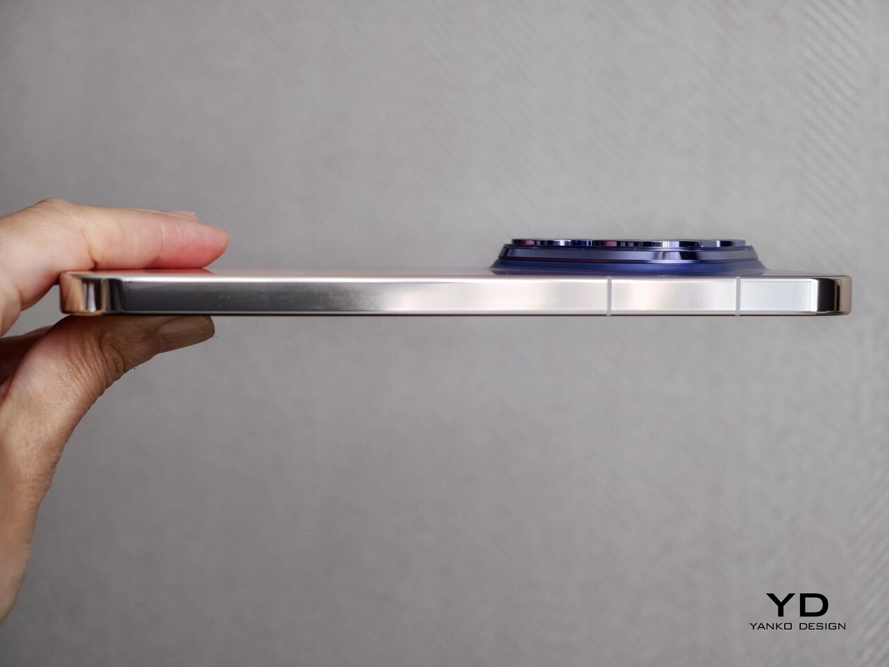
There is a tradeoff, though. When holding the phone horizontally for gaming, the camera island becomes more noticeable and can get in the way a bit. It is not a huge problem, but it stands out more in landscape use than it does during normal day-to-day handling.

The finish also looks better from a distance than it does up close. Both the glossy back panel and the glossy side frame tend to pick up fingerprints and smudges quite easily, so the phone does need regular wiping if you want it to stay looking clean. That is a little disappointing for a device that puts so much emphasis on design.
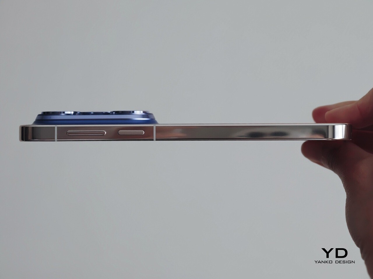
Huawei has also gone with a side-mounted fingerprint scanner rather than an in-display one. The power button on the right side doubles as the fingerprint reader, and in practice it feels intuitive enough. It is a small detail, but one that fits naturally with the overall handling experience.

Performance

The Pura 90s Pro Max is powered by Huawei’s Kirin 9030S, paired with 12GB of RAM and either 256GB or 512GB of storage. It also supports 5G, which makes it feel more competitive than some of Huawei’s recent flagships. In daily use, the phone feels fast enough. Scrolling is smooth, apps open quickly, and multitasking is handled well. For things like web browsing, social media, messaging, navigation, and streaming, it behaves like a proper flagship.

The bigger question is whether that is enough at this price. Huawei is not really chasing benchmark dominance here, and that may matter more to enthusiasts than to casual users. If all you want is a phone that feels quick and responsive day to day, the Pura 90s Pro Max delivers. If you expect class-leading performance, though, it is less convincing.
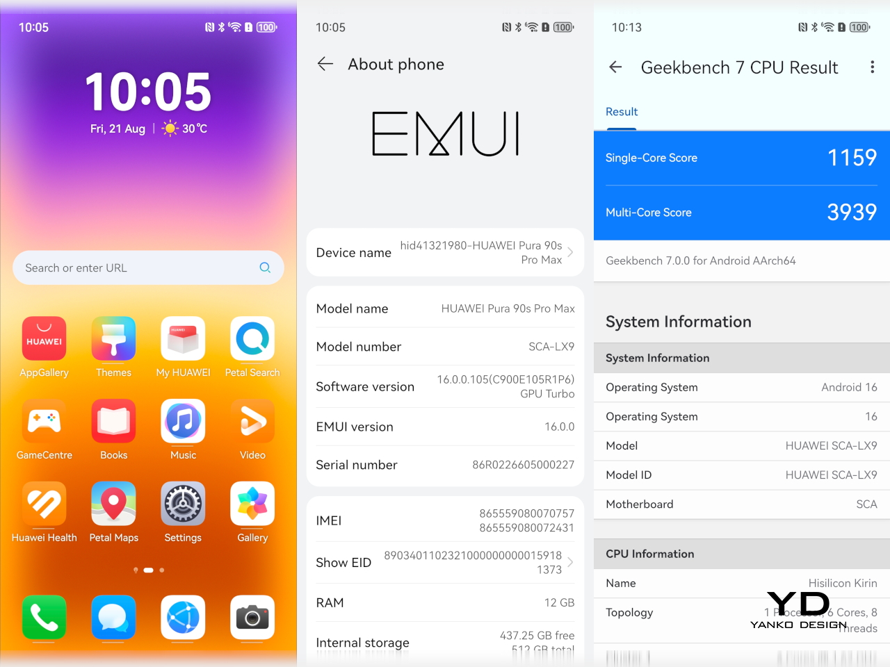
The phone runs EMUI 16, and Huawei has spent years building a more workable ecosystem around its devices. The experience today feels much less daunting than it used to, and most of the apps people need can be downloaded easily through GBox, which is now available via Huawei AppGallery.

For me, one of the biggest remaining inconveniences is file sharing across different phone ecosystems. Huawei does offer solutions such as Huawei Share for transferring files to other devices, but the experience still does not feel as seamless or as universal as what you get with iPhones or across the wider Android ecosystem. That becomes especially noticeable if you regularly share photos and videos between phones from different manufacturers.
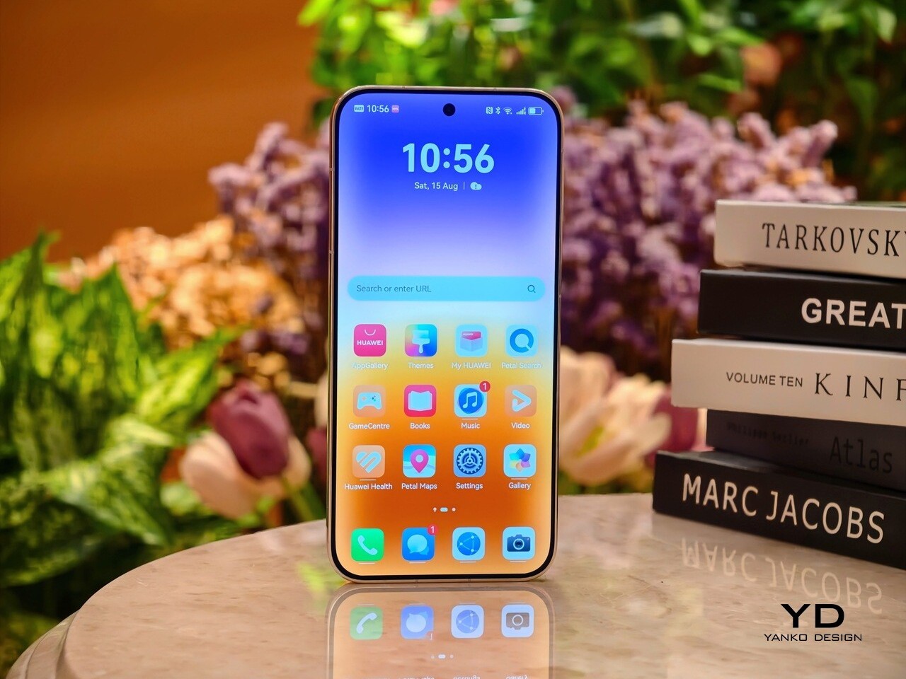
The display is one of the easiest things to like about the Pura 90s Pro Max. It is a 6.9-inch panel with a resolution of 2880 x 1308 and a refresh rate that scales from 1Hz to 120Hz. It is large, sharp, and well suited to a phone of this size and price.

Huawei says the anti-reflective screen reduces reflections by up to 70 percent compared with conventional glass. It is not as effective as the matte-style display treatment Huawei uses on some of its tablets, but it still makes the screen easier to view outdoors under bright sunlight.

The speaker setup is solid too. The stereo speakers are good enough for videos, games, and casual listening, with enough volume to avoid sounding weak in everyday use. They do not deliver especially rich or powerful sound, but they do the job well and help round out the phone’s media experience.

Main Camera, 1x

Telephoto Camera, 10x
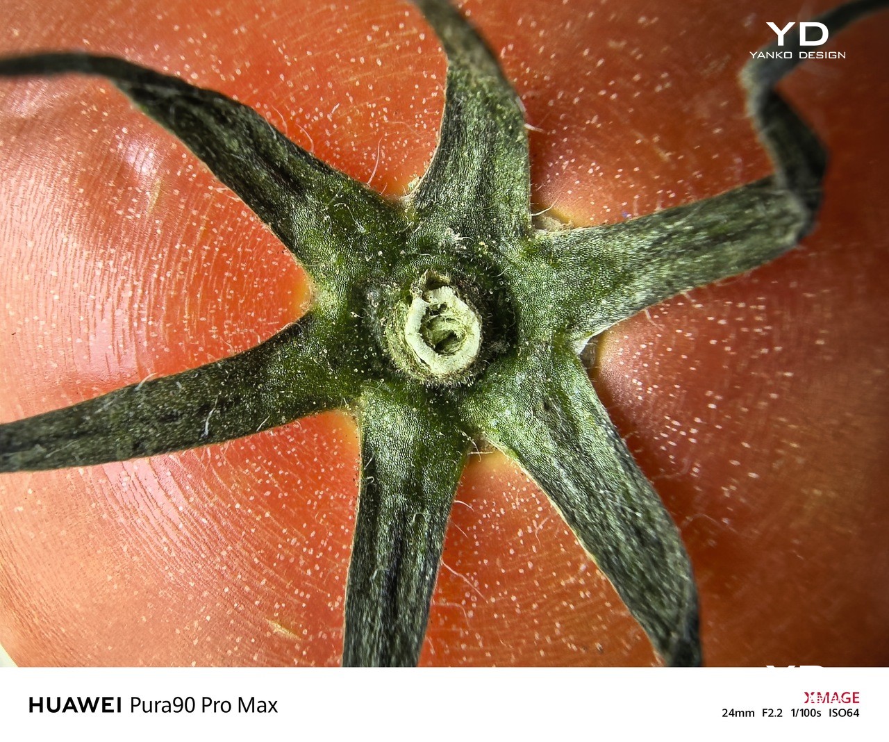
Main Camera, Macro Mode

Cameras remain one of the main reasons to pay attention to Huawei’s flagship phones, and that is still true here. The Pura 90s Pro Max has an ambitious camera setup, even if some of Huawei’s decisions this time feel a little unusual. On paper, it is a system that feels both impressive and slightly puzzling at the same time.

Telephoto, 4x, Portrait Mode

Telephoto camera, 4x, Snapshot mode

Telephoto Camera, 10x, shot from a moving car

Most notably, Huawei has moved from a 1-inch main sensor to a smaller 1/1.28-inch sensor. That is not entirely unprecedented, and other brands have made similar moves before, but it still feels surprising at this level. The new 50MP main camera uses an RYYB sensor with LOFIC technology, OIS, and a 10-step physical aperture from f/1.4 to f/4.0, though aperture control is limited to Pro mode.

Huawei has also dropped the dual telephoto setup with sensor-shift technology. In its place is a 200MP 4x telephoto camera with a 1/1.28-inch RYYB sensor, an f/2.6 aperture, and OIS. The rear setup is completed by a 40MP ultra-wide camera with an f/2.2 aperture, while the front camera is a 13MP unit.

Main Camera, 1x, Night

Telephoto Camera, 4x, Night

Telephoto Camera, 20x, Night

In actual use, though, the cameras are excellent. The main and telephoto cameras are the standouts, but the ultra-wide and front cameras are also very good. Colors are generally accurate thanks to Huawei’s True-to-Color Camera system, although the XMAGE Vivid profile can look a little oversaturated in some scenes.

Switching to XMAGE Original gives images a more natural look. Photos also tend to be slightly bright and a touch over-sharpened. Even so, the overall image quality is consistently strong and easy to like.
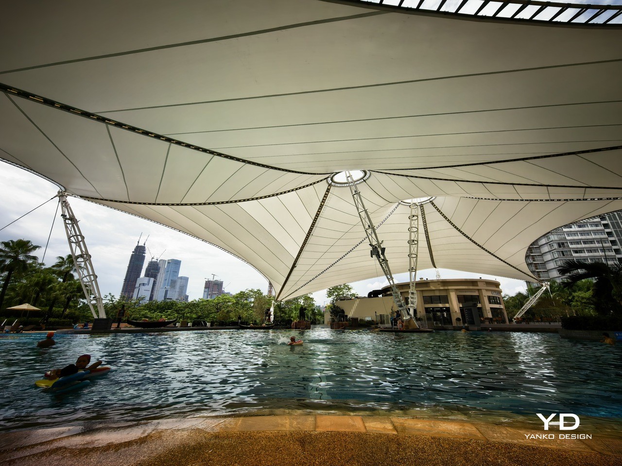
Ultra-wide Camera, 0.6x

Main Camera, 1x

Video is strong too. All four cameras can record at up to 4K 60fps, and the footage is crisp, sharp, and pleasingly colorful. The tradeoff is that there is no 8K, no 24fps option, and no Log recording, which may be down to chipset limitations.

The weaker part of the experience is usability. There is no timer shortcut in the main camera interface, so you have to dig into settings to find it. Double-tapping the preset zoom levels also does nothing, unlike on many rival phones.

Telephoto Camera, 10x

Telephoto Camera, 20x

Telephoto Camera, 100x

They are small issues, but they make the camera app feel less polished than the image quality itself. It is a little frustrating because the hardware and output are strong enough to deserve a more refined shooting experience. Huawei gets the fundamentals right, but some of the smaller interface decisions still feel oddly behind the curve.

The EU version of the Pura 90s Pro Max comes with a 5,270mAh battery, while other regions get a larger 6,000mAh cell. Even so, battery life was still solid in my use. The phone comfortably lasted a full day with a mix of camera use, browsing, and general daily tasks.

Main Camera, 2x, B&W

That said, 5,270mAh does not feel especially big by current flagship standards. The good news is that charging is very fast. The phone supports up to 100W wired charging and up to 80W wireless charging with compatible chargers.

Sustainability

On paper, the Pura 90s Pro Max looks well protected. It is rated IP68 and IP69 for dust and water resistance, and Huawei says its Kunlun Glass offers 25 times better drop resistance and 16 times better scratch resistance. Those are strong claims, and they help reinforce the sense that this is a phone built to handle daily wear reasonably well.
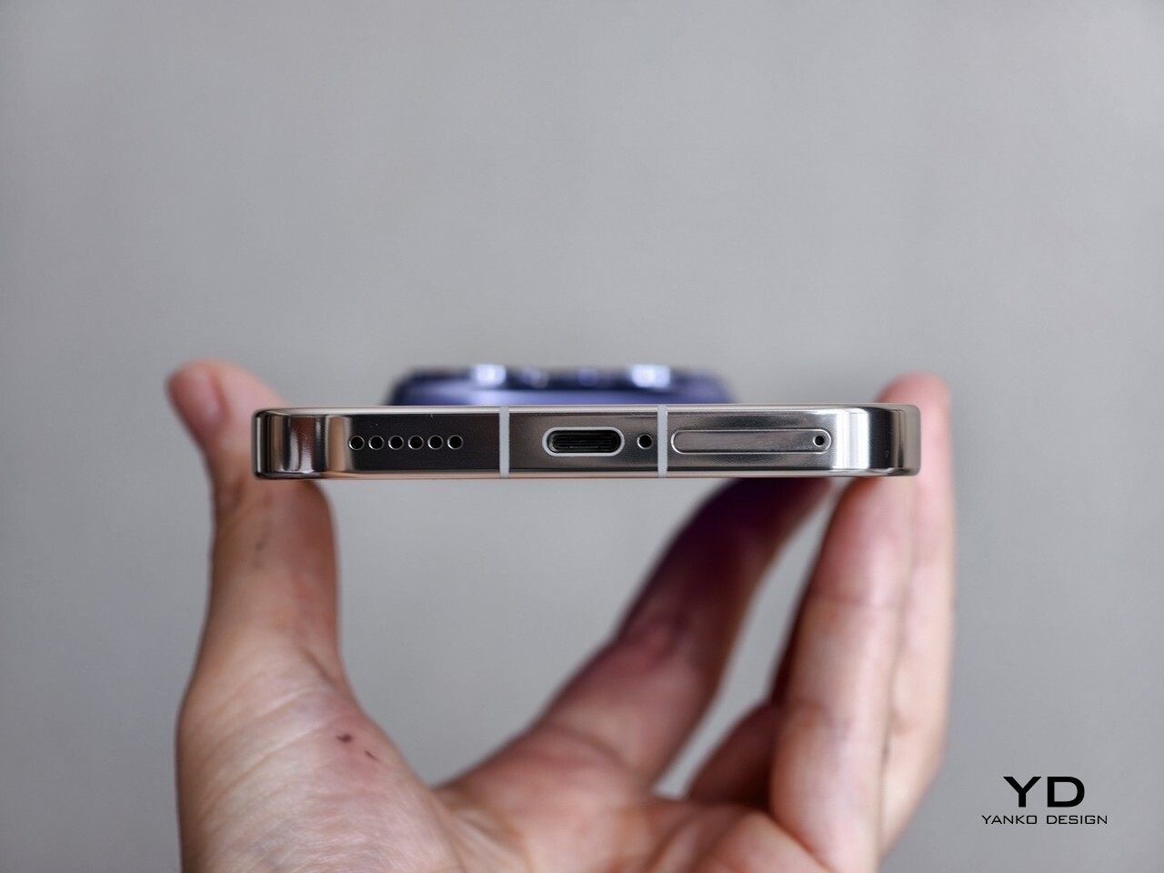
The bigger issue is what happens over time. Huawei still does not clearly say how long the phone will receive software updates or security patches, and that matters just as much for a flagship at this price. Good physical protection is important, but long-term software support is what really determines how well a phone ages.

Value

Starting at €1,149, or roughly $1,250, the Pura 90s Pro Max sits firmly in flagship territory. That is still a lot of money, but compared with some other camera-focused flagships like the Xiaomi 17 Ultra, Vivo X300 Ultra, and Oppo X9 Ultra, it is around €500 to €800 cheaper. Huawei is also offering the kind of hardware you would expect at this level, including a standout design, strong cameras, a large high-quality display, and very fast charging.
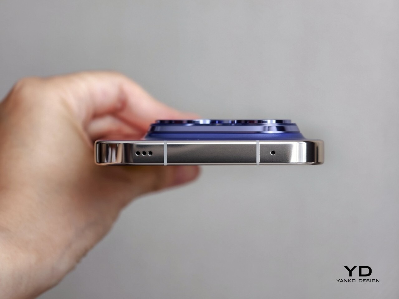
At the same time, that price leaves less room to overlook the phone’s weaker points. Performance is solid rather than class-leading, the software ecosystem still comes with some friction, and Huawei remains unclear about long-term update support. That makes the Pura 90s Pro Max feel less convincing on value than some of its rivals, even if the hardware itself is often impressive.

Verdict

The Pura 90s Pro Max is a phone I ended up liking more than I expected. It looks distinctive, feels premium, and delivers where Huawei has long been strongest, especially in camera performance. There is a lot here that feels thoughtfully done, even if some of Huawei’s decisions remain a little hard to understand.

At the same time, it is not a flawless flagship. The chipset does not feel best in class, the software ecosystem still asks for compromises, and the lack of clarity around long-term support is difficult to ignore at this price. The Pura 90s Pro Max is still a very good phone, but whether it makes sense for you depends a lot on how much you value Huawei’s design and camera strengths over a more complete all-round flagship experience.
The post Huawei Pura 90s Pro Max Review: A Beautiful Comeback With Caveats first appeared on Yanko Design.


Watti Is the Robotic Desk Lamp That Wants to Know What You’re Doing Before You Ask for Light

The desk lamp has been, essentially, a solved problem since Edison. A light source, a shade to direct it, and a switch. Every design evolution since then has adjusted the aesthetics or added a dimmer; the functional premise, that a lamp sits passively until pointed and switched, has remained largely untouched for more than a century. Watti is an attempt to challenge that premise at every level, simultaneously and on purpose.

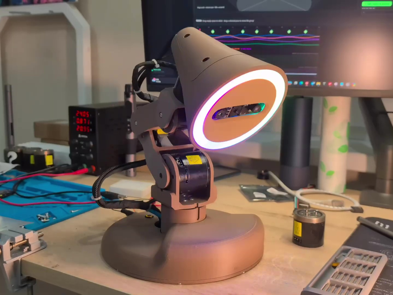
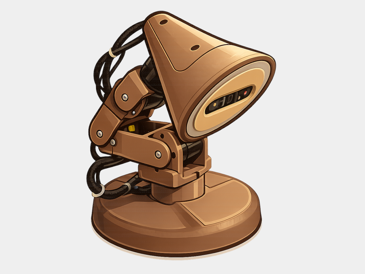
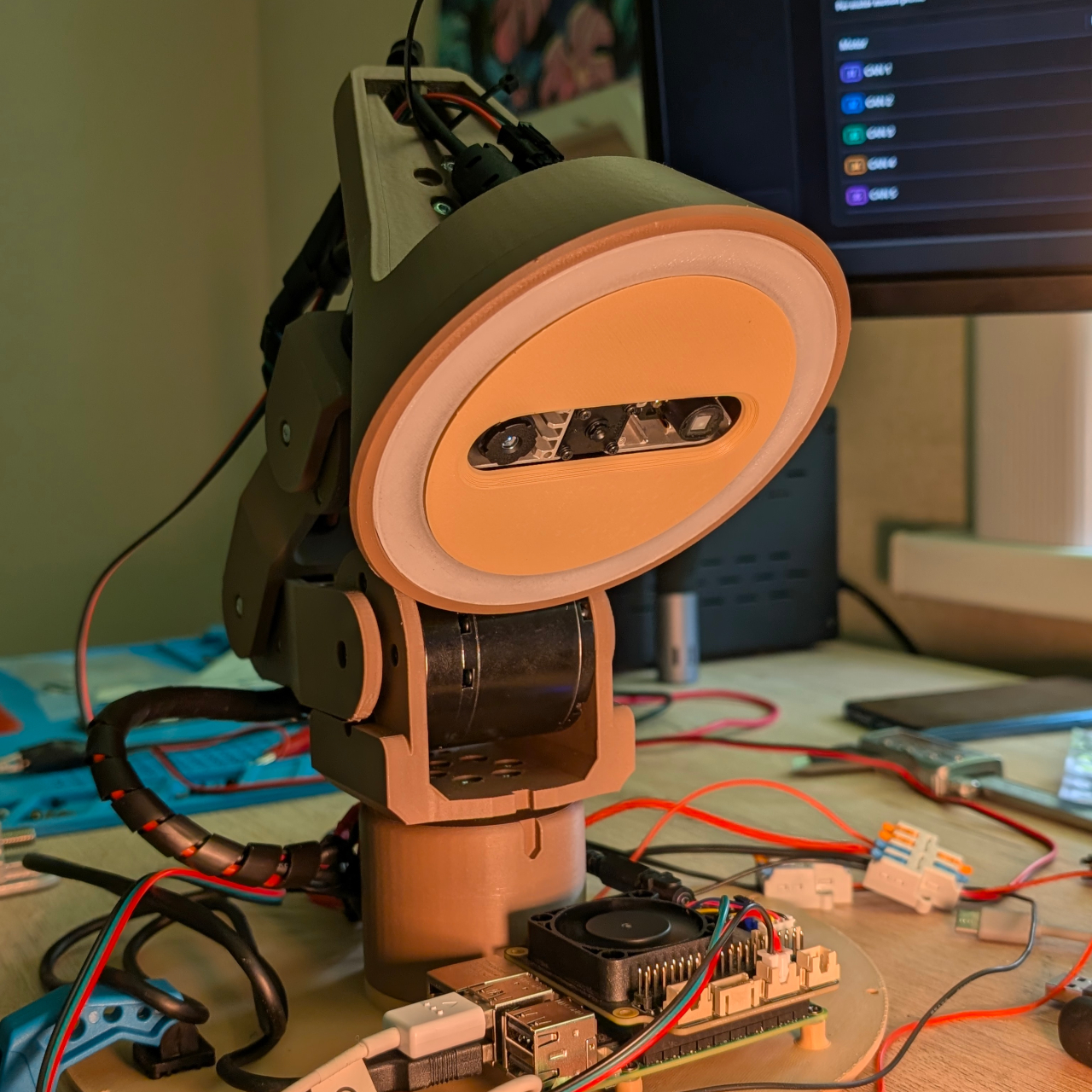
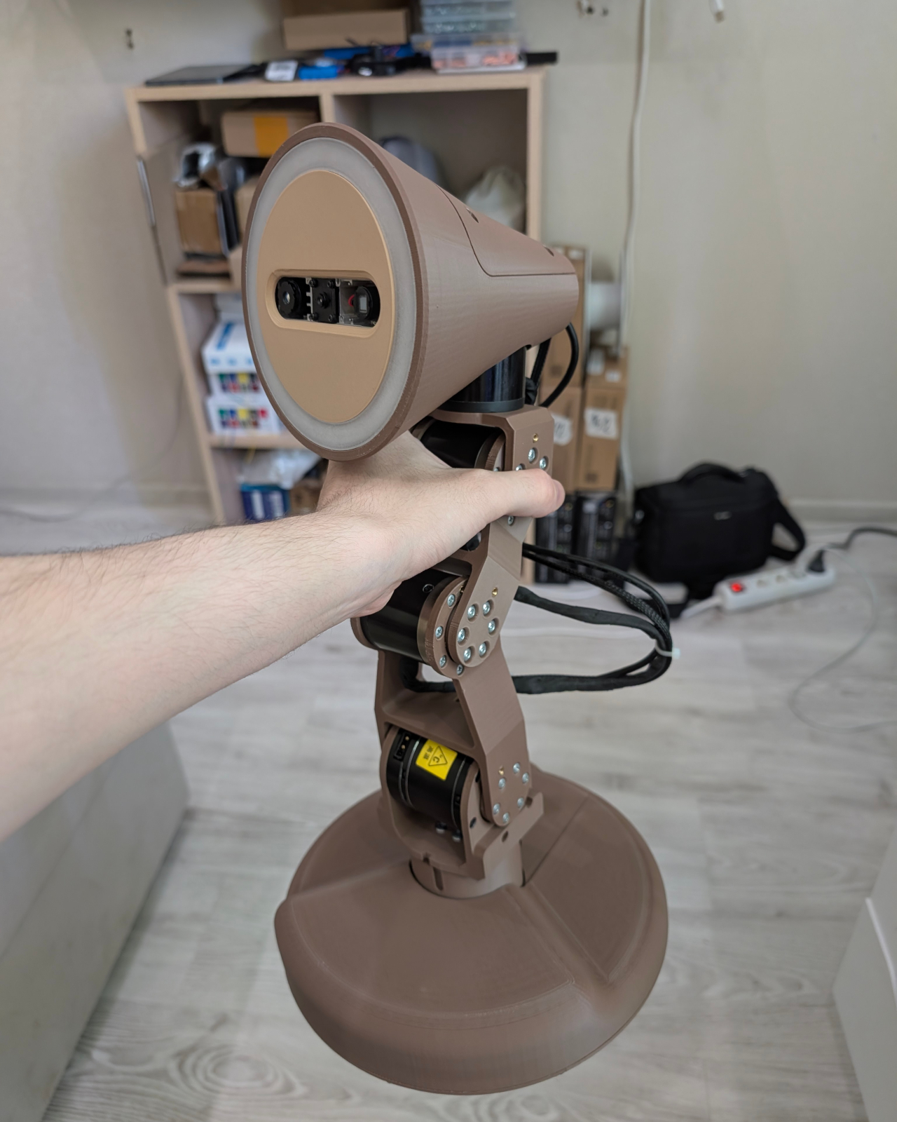
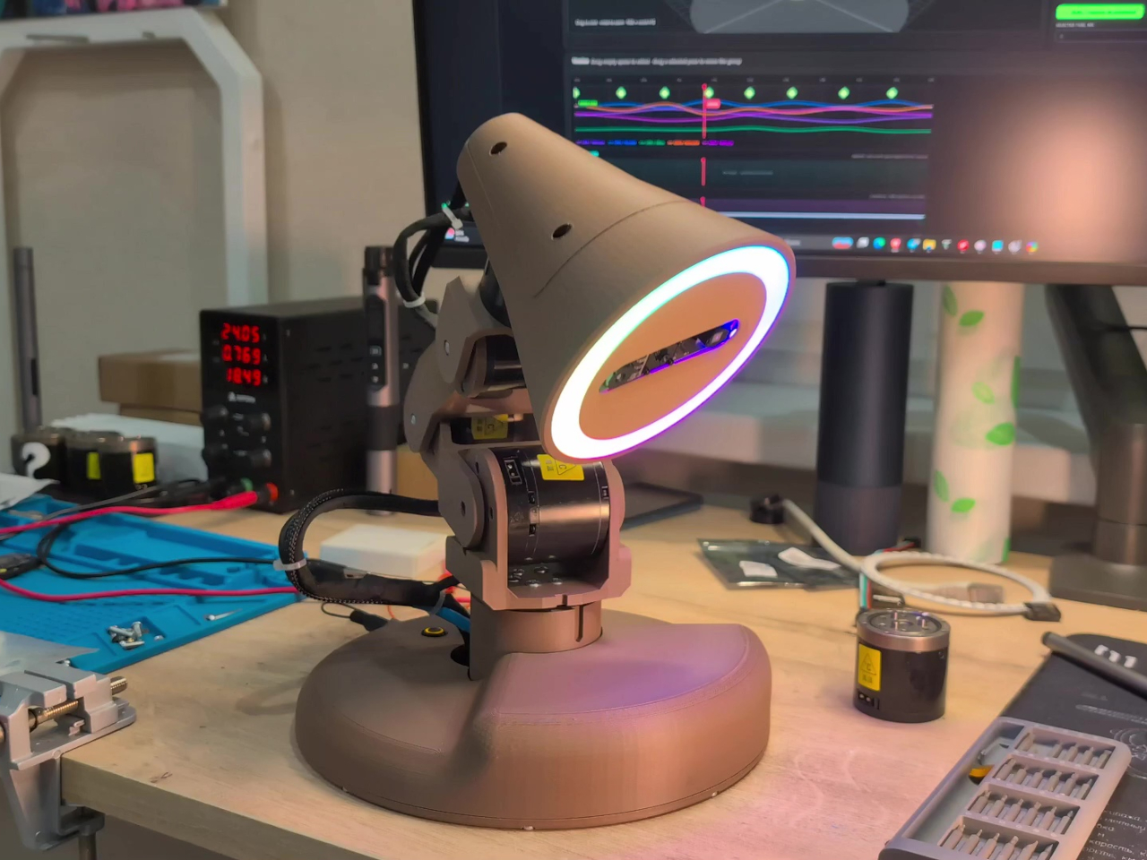
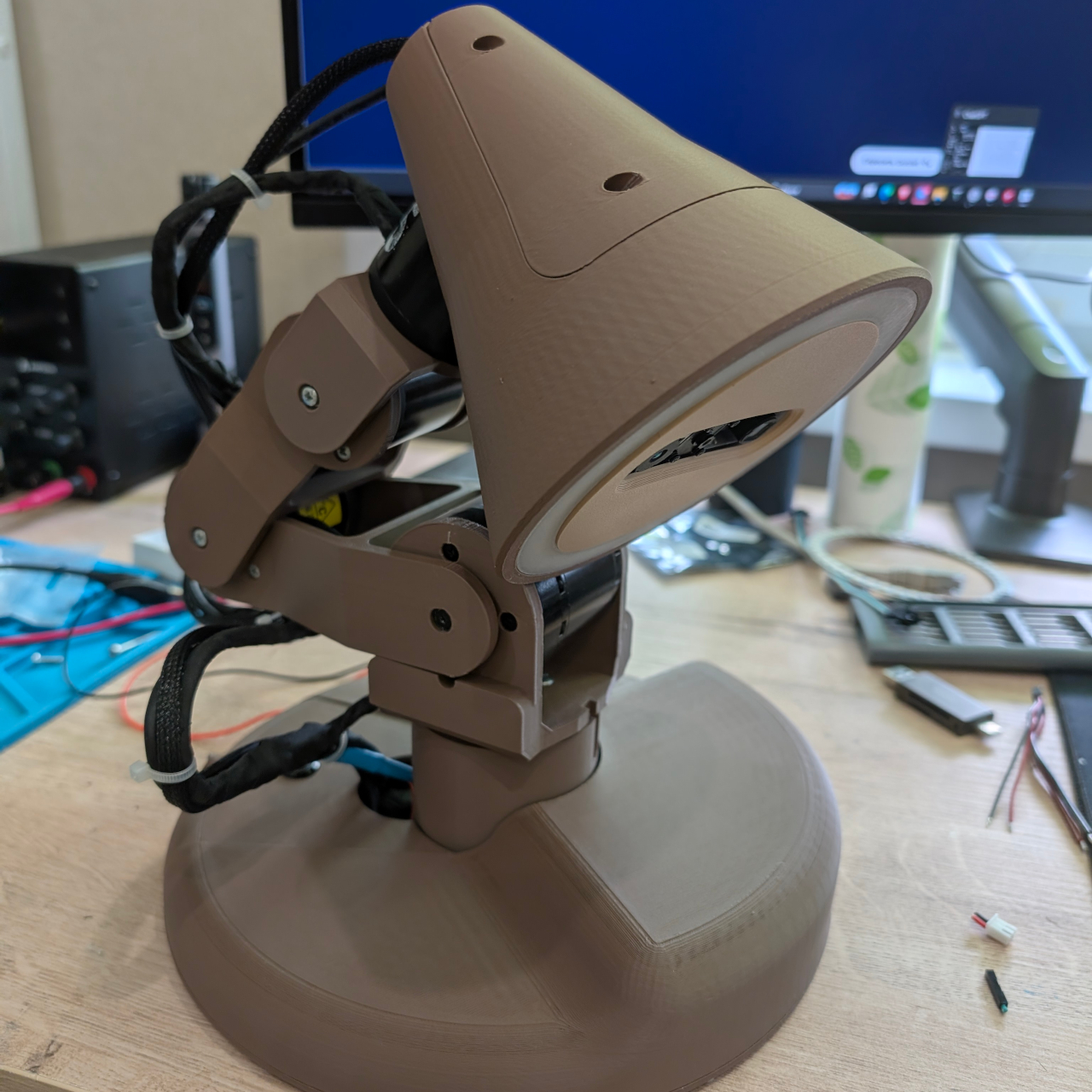
At first glance, Watti reads as a robotic arm that happens to have a light on the end. Five independently motorized axes control the base, shoulder, elbow, neck, and head, each driven by a RobStride motor that reports its position back to the computer. That range of motion gives the lamp the articulation of a traditional Anglepoise-style design, except it can get there on its own with measured precision.

Designer: Nikolay Tyulkin

A ring of 45 individually addressable WS2812 RGB LEDs provides the actual light output, and a Raspberry Pi 5 running ROS 2 coordinates the whole system. The camera is what separates Watti from a sophisticated motorized fixture. An Orbbec Astra Mini S captures both color and depth data at 640×480 resolution and 30 frames per second, giving the system a three-dimensional view of whatever sits in front of it.

Those streams are visible in the companion software but not yet acted on in a meaningful way; the lamp can see the desk without fully understanding what’s happening there. That gap is precisely what the project is working to close. Hand tracking, automatic work-area illumination, and 3D scanning are all on the development roadmap, which would let the lamp decide where to point itself based on where hands are positioned and what is being worked on, without any manual adjustment.

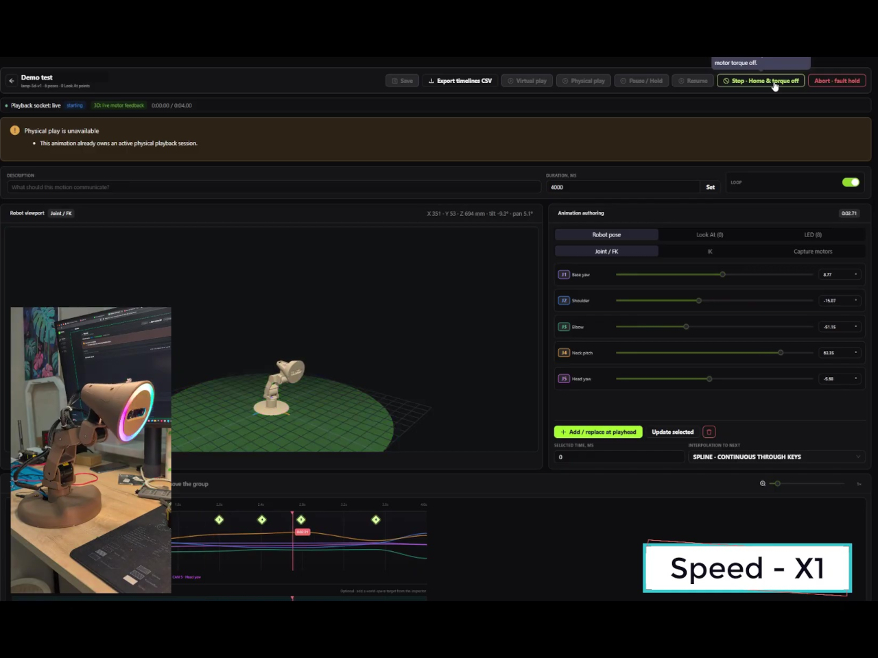
Even before those features arrive, Watti is already more programmable than most dedicated lighting tools. Watti Studio, a browser-based visual editor, lets users compose scenes that coordinate motion and light on a shared timeline. A virtual model of the five-axis lamp renders in the editor so poses and LED configurations can be arranged, previewed, and refined without a physical unit present. When a scene is ready, it’s packaged and transferred to the Raspberry Pi, which runs it locally without a continuous connection back to the browser.

The prototype runs on an external 24 V, 10 A power supply and uses approximately $700 worth of parts. That puts it firmly in research and enthusiast territory for now. Plans to release hardware files, the bill of materials, electrical diagrams, the communication protocol, and example scenes would eventually make it a fully buildable project for others who want to take the concept further.

What Watti points toward is a lamp that treats lighting as a spatial and contextual problem rather than a manual adjustment. A light that can track where work is happening, adapt its position in real time, and coordinate color and intensity without interrupting the task at hand is a fundamentally different object than a lamp with a flexible neck. The premise sounds obvious once stated, which is usually a sign that someone should have built it sooner.

The post Watti Is the Robotic Desk Lamp That Wants to Know What You’re Doing Before You Ask for Light first appeared on Yanko Design.

10 Best Tech Gadgets for Men In 2026 Who Think Their Smartphone Has Gotten Too Big for Its Boots

The smartphone got away from us. What started as a communication tool is now an alarm clock, a boarding pass, a camera, a bank, a navigation system, a social anxiety machine, and a reason to check the time without ever actually knowing what time it is. The problem is not the phone. The problem is that the phone agreed to do everything, and now it does nothing particularly well.

The products on this list make a quieter argument. Not that you should live off the grid or carry a brick from 1997, but that some jobs are better left to objects designed specifically for them. A dedicated music player sounds better than Spotify on a phone. A screen-free band tracks your sleep without lighting up your wrist at 2 am. Seven gadgets. One idea.

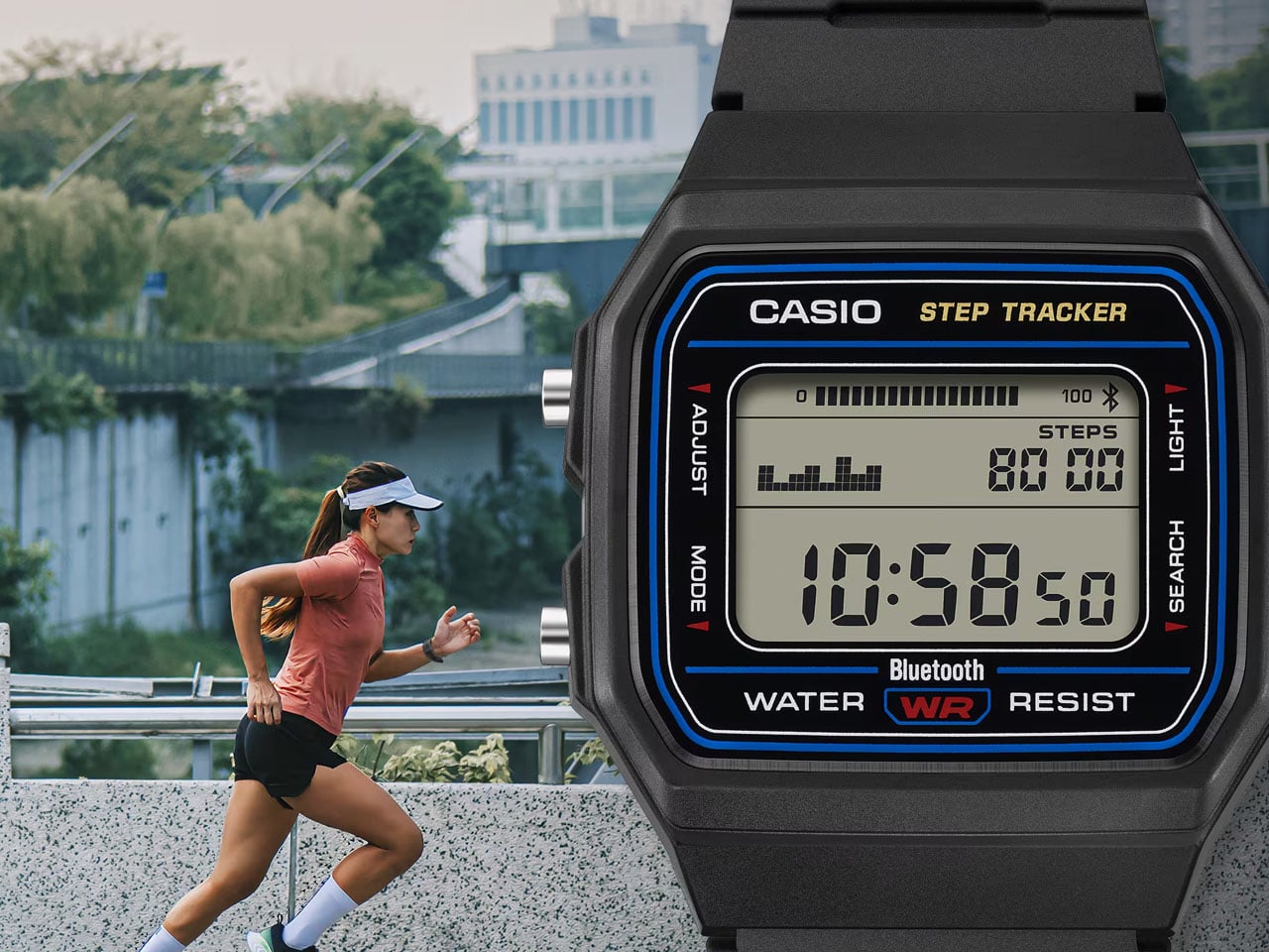
1. Casio F-B100W

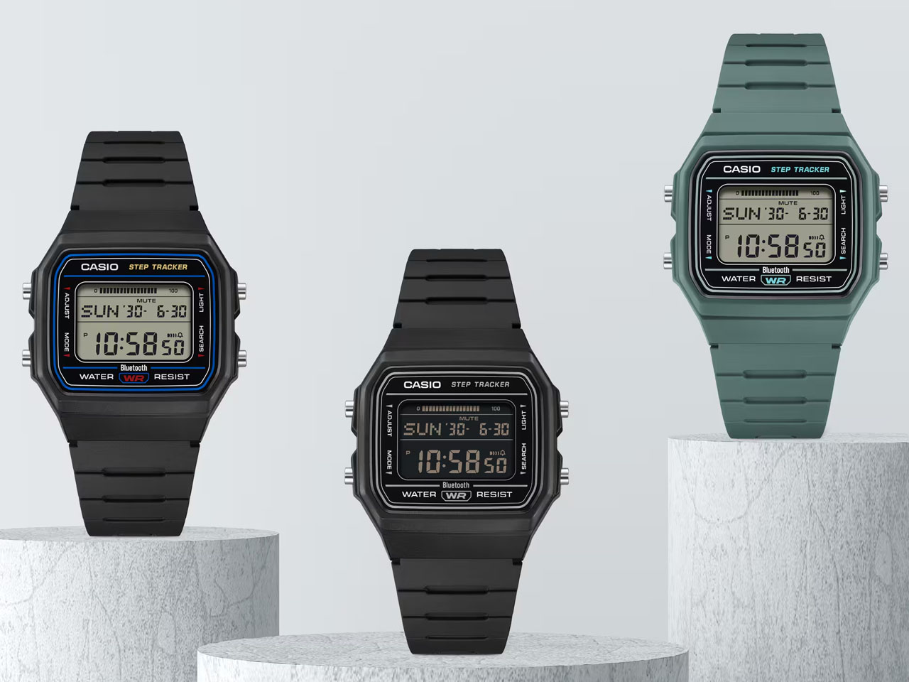
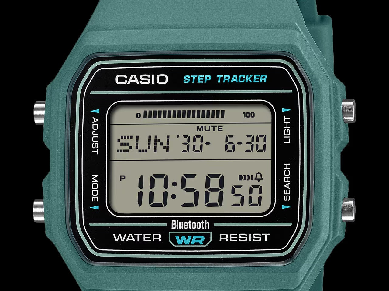
The F-91W is 37 years old and still in production because Casio got it right the first time. The F-B100W takes that template and adds exactly what a watch in 2026 needs and nothing it does not. Bluetooth syncs the time automatically and lets you find your phone when you can’t. A step counter and 200-lap timer handle the fitness side. A 2-year battery means you will have forgotten you own this before you need to charge it.

At 26 grams and 41.9mm across, it fits on the wrist without announcing itself. The bio-based plastic strap has ventilation slits for comfort during long wear, and the amber LED backlight handles low-light legibility without theater. Five daily alarms and water resistance round out the spec sheet. Japan launched it at ¥8,800, roughly $55, and it sold out immediately. That tells you most of what you need to know about whether this needed to exist.

What we like:

  • Bluetooth time sync and phone finder cover the only two reasons you would reach for your phone while wearing a watch
  • 2-year battery life means this costs $55 once, not $55 plus ongoing attention

What we dislike:

  • No heart rate monitor or sleep tracking will rule it out for anyone replacing a fitness device rather than a fashion statement
  • Currently sold out in Japan; US availability not confirmed at time of publishing

2. FiiO Echo Mini

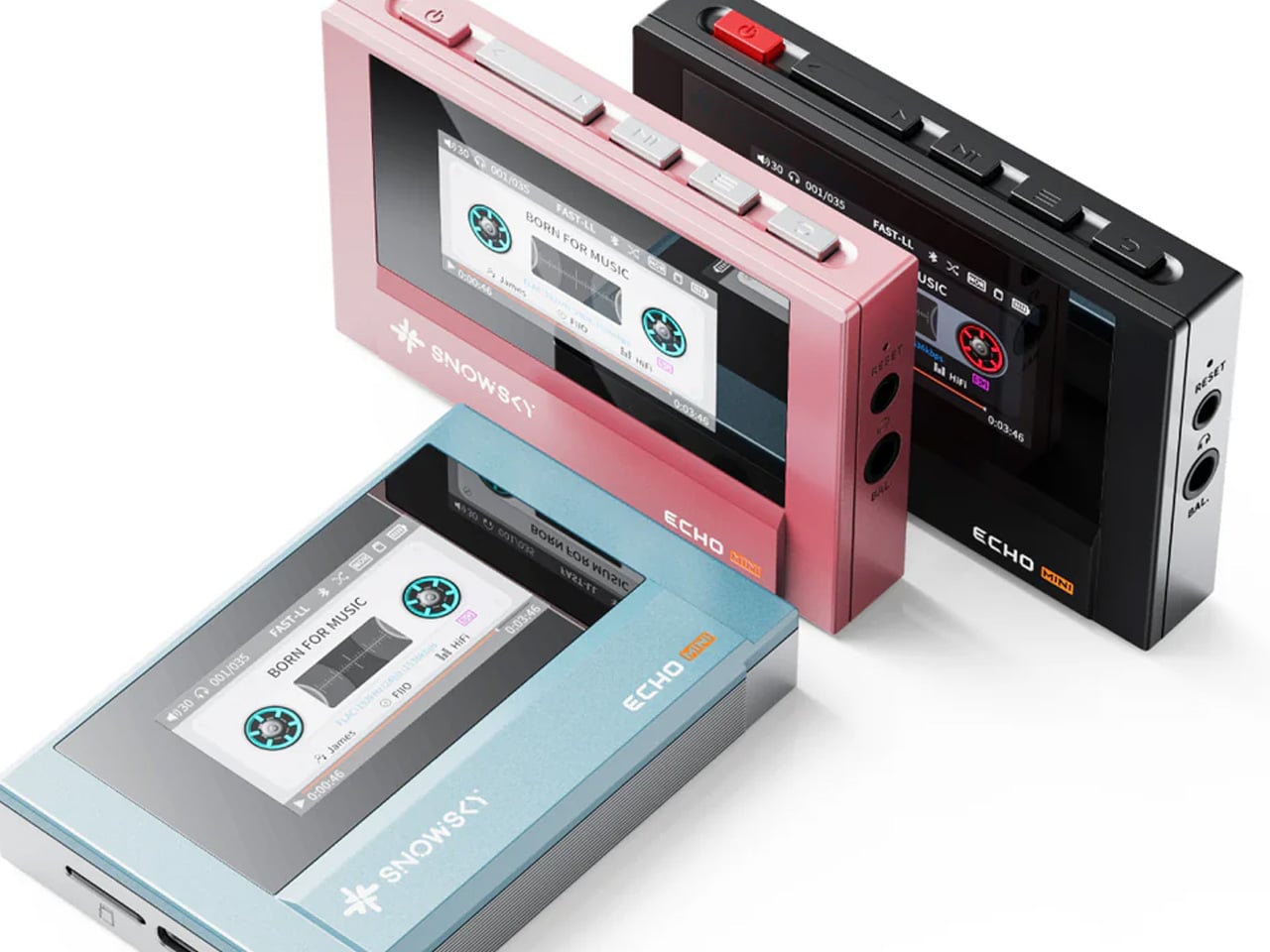
Your phone is a mediocre music player that borrowed the job from something better. The FiiO Echo Mini, released under the Snowsky imprint, takes it back. Inside a body shaped like a vintage portable player sit a pair of Cirrus Logic CS43131 DAC chips and a Hi-Res certification from the Japan Audio Society, which is not a marketing claim but a measured standard. The sound it produces from lossless files is categorically different from the same tracks streamed through a phone speaker.

It supports FLAC, DSD, WAV, and OGG, and accepts microSD cards up to 256GB, so a library that would have filled an entire shelf in 1988 now fits in a slot smaller than a thumbnail. Dual headphone outputs handle both wired and wireless listening from the same device. An independent power supply isolates the audio circuitry from interference, which is the kind of engineering detail that does not show up in marketing copy but surfaces immediately in how it sounds. The design references early Sony and Aiwa portables with enough conviction that it earns the comparison rather than simply borrowing the silhouette.

What we like:

  • Dual DAC chips and Hi-Res certification produce a measurably better result from lossless audio, not just a perceived one
  • 256GB microSD support means a serious library travels in one pocket

What we dislike:

  • Playback only, with no recording function, which rules it out for anyone who wants to make their own mixes
  • The retro cassette aesthetic is a strong visual commitment that will not suit every context

3. RetroWave 7-in-1 Radio

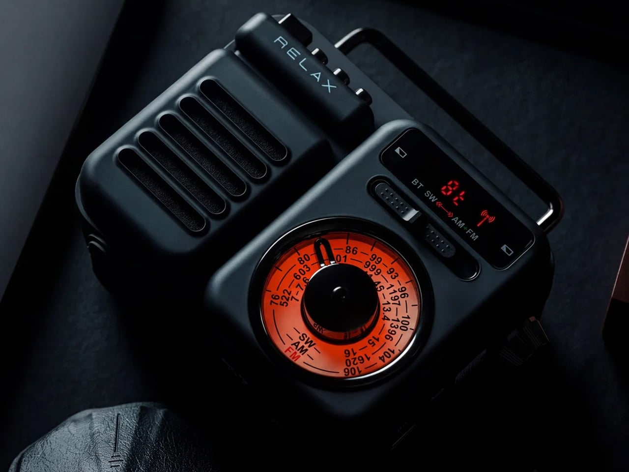
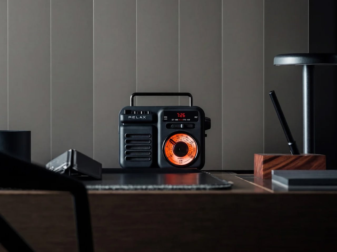
Your phone does radio badly because it was never designed to do radio specifically. The RetroWave was. AM, FM, and shortwave reception with no Wi-Fi dependency and a tactile tuning dial that works the way tuning dials are supposed to. The Japanese-inspired frame houses seven functions: radio, Bluetooth streaming, MP3 playback from USB or microSD, an LED flashlight, an SOS alarm, hand-crank charging, and solar charging. At $89, it is the most practical object on this list per dollar spent.

The 2000mAh power bank charges other devices when yours runs low, and 20 hours of radio playback on a single charge means it runs a full working week without returning to a socket. The hand-crank and solar inputs are genuine backup systems rather than novelty features, which places it in the emergency preparedness category as much as the desk companion one. For a device that replaces your phone as a radio, this is the one that actually means it.

Click Here to Buy Now: $89.00

What we like:

  • AM/FM/shortwave with no internet dependency means it works exactly when your phone cannot
  • Seven functions at $89 is the most direct value proposition on this list

What we dislike:

  • 8W speaker output is modest and will not satisfy anyone expecting outdoor or room-filling volume
  • Solar charging supplements rather than replaces a proper charge and cannot refill the battery independently

4. BOOX Go 6 Gen II

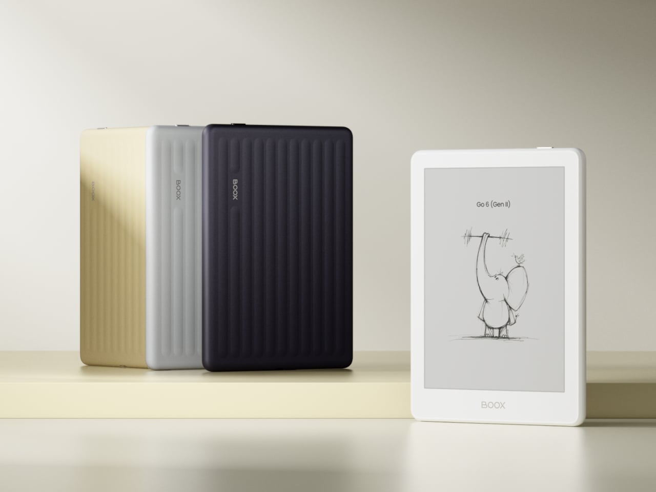
The e-reader has always made a better case for itself than most people give it credit for. The Go 6 Gen II is built around a 6-inch 300 ppi E Ink display in a body genuinely small enough to pocket, and unlike a standard Kindle, it runs Android underneath, which means the reading experience is not locked to a single storefront or ecosystem. The addition of stylus support in this generation moves it further from a dedicated reader and closer to a carry-anywhere notebook.

What it cannot do is exactly what makes it useful. There is no notification shade worth checking. No camera. No feed. The E Ink display is too slow for video and too monochrome for social content, which means using it for anything other than reading or note-taking feels like the wrong tool for the job. That deliberate friction is not a limitation. It is the design working as intended, built into the hardware itself rather than dependent on your own willpower to enforce it.

What we like:

  • Android underneath means your reading library is not tied to one retailer or ecosystem
  • Stylus support in Gen II turns it into a portable note-taking device, not only a reader

What we dislike:

  • E Ink refresh rate makes it a poor experience for anything requiring fast screen updates, which is the point but may frustrate new users
  • 6 inches is genuinely pocketable but small for extended document review or annotation

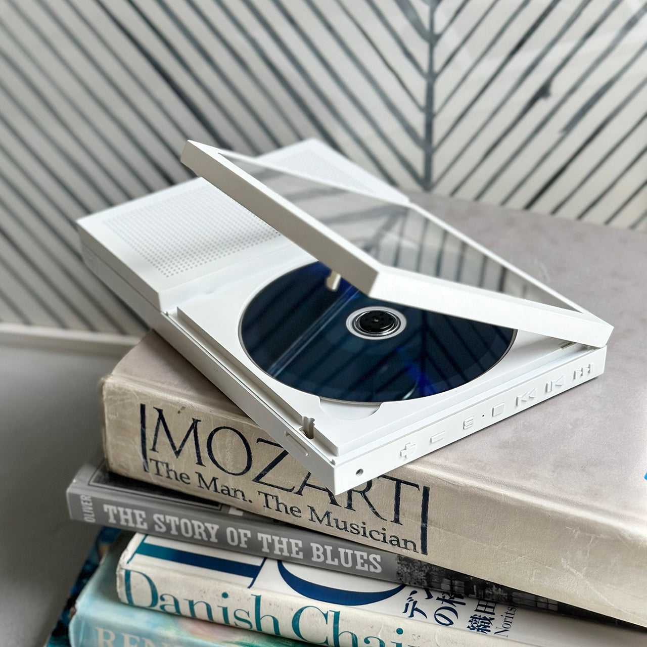
5. Portable CD Cover Player

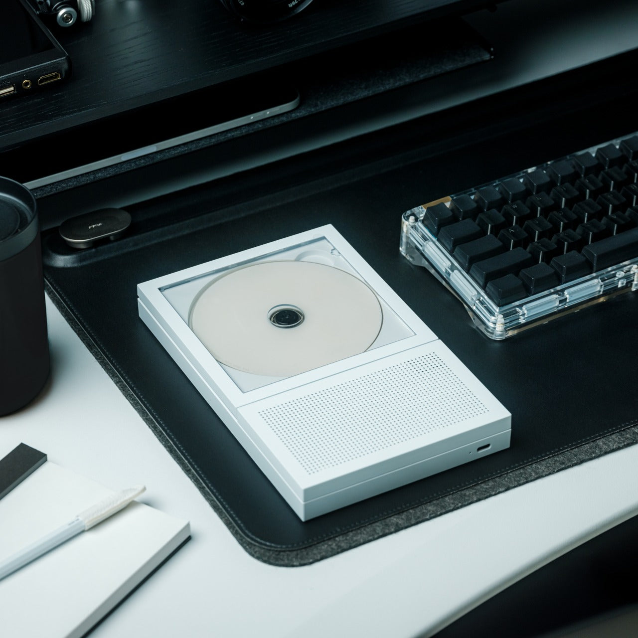
Streaming reduced most music libraries to a scrollable grid of thumbnails no larger than a postage stamp. The Portable CD Cover Player puts album artwork back at the physical center of the listening experience. The form factor echoes the proportions of a CD sleeve — slim enough to carry on a commute or into a hotel room without planning. It is built for the kind of listening that requires an album, a decision, and an uninterrupted hour to follow through.

The CD format offers something streaming has never replicated — intentionality. You chose this album. You put it in. You listened front to back, the way it was meant to be heard. At a moment when cassette players and vinyl decks have staged a credible commercial comeback, there is a real and growing audience for physical music hardware that does not apologize for existing in 2026.

Click Here to Buy Now: $199.00

What we like:

  • Restores album artwork as a physical, tactile part of the listening experience rather than a compressed thumbnail on a scrollable grid
  • The intentionality of the CD format — choosing one album and committing to it — is something streaming has not managed to replicate

What we dislike:

  • The $199 price requires an existing or rebuilt CD collection to justify the investment

6. Garmin CIRQA

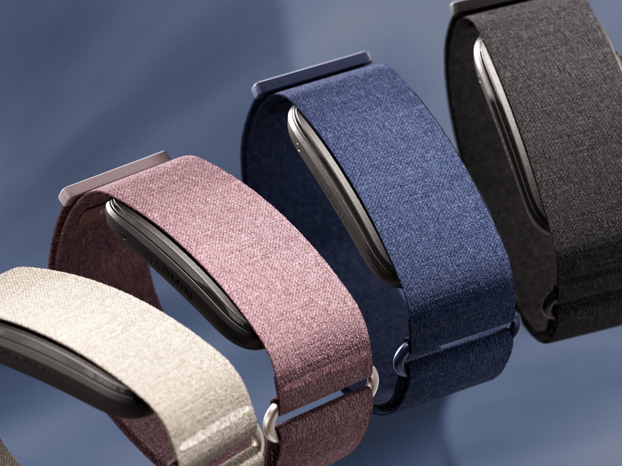
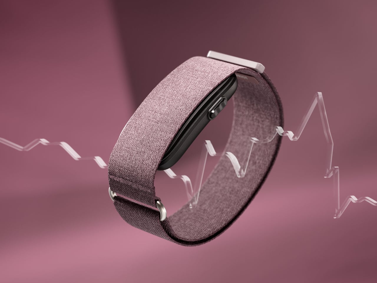
The smartwatch has a notification problem that nobody at the smartwatch companies will admit is a design problem. The screen is the issue. Put a screen on the wrist, and the wrist becomes another surface for the phone to reach you. Garmin solved this by removing the screen entirely. The CIRQA is Garmin’s first screen-free smart band, tracking sleep, HRV, strain, and recovery with the same sensor quality as their wrist-worn GPS watches while showing you nothing in real time.

Data syncs to your phone when you ask it to, not whenever the band decides it has something to say. At $199.99, it undercuts Whoop by removing the subscription entirely, which is either the most straightforward value proposition in the wearable category right now or the one that somehow took the longest to arrive. The band disappears into daily life in a way that a glowing watch face never fully manages. You stop thinking about your wrist. That is the whole idea.

What we like:

  • No screen means no notification surface on the wrist, which breaks the feedback loop the smartwatch quietly created
  • No subscription at $199.99 makes the comparison with Whoop uncomfortable for Whoop

What we dislike:

  • Screen-free design means you cannot check anything on the band itself, which will feel like a regression to anyone coming from a smartwatch
  • All data lives in the phone app, which adds a dependency the hardware does not fully acknowledge

7. Polaroid Now Generation 3 Instant Camera

Your phone takes hundreds of photographs a week, and you have looked at almost none of them. The Polaroid Now Generation 3 makes that impossible by design. Autofocus handles the technical side; everything else is deliberate. You frame a shot knowing there is no burst mode, no undo, no near-identical folder to sort through later. The print emerges from the front of the camera, develops in your hand, and exists as an object. That constraint is not a limitation. It is photography made meaningful.

The Now Generation 3 continues the line’s proven mechanics: i-Type and 600 film compatibility, a built-in flash, double exposure mode, and USB-C charging. The direction is refinement over feature expansion, which suits a camera built around a single clear purpose. Image quality is not competing with your phone’s computational photography and was never trying to. It produces a credit-card-sized print with warmth and grain that no filter has convincingly replicated, because the artifact is the point, not the resolution.

What we like:

  • Physical prints cannot be scrolled past, filed away, or forgotten in a camera roll — they exist and stay existing
  • The deliberate, one-shot-per-frame process changes how you think about framing before you press the shutter

What we dislike:

  • Film cost per shot makes casual, consequence-free shooting expensive relative to a phone camera
  • Exposure in bright outdoor conditions can be inconsistent without careful management of the built-in flash

8. Light Phone III

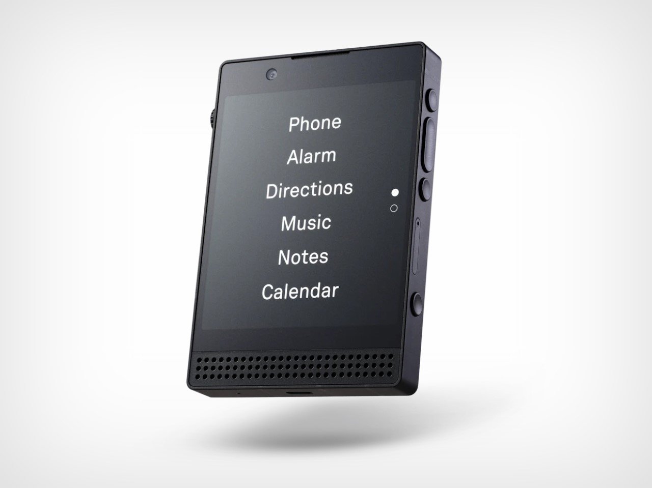
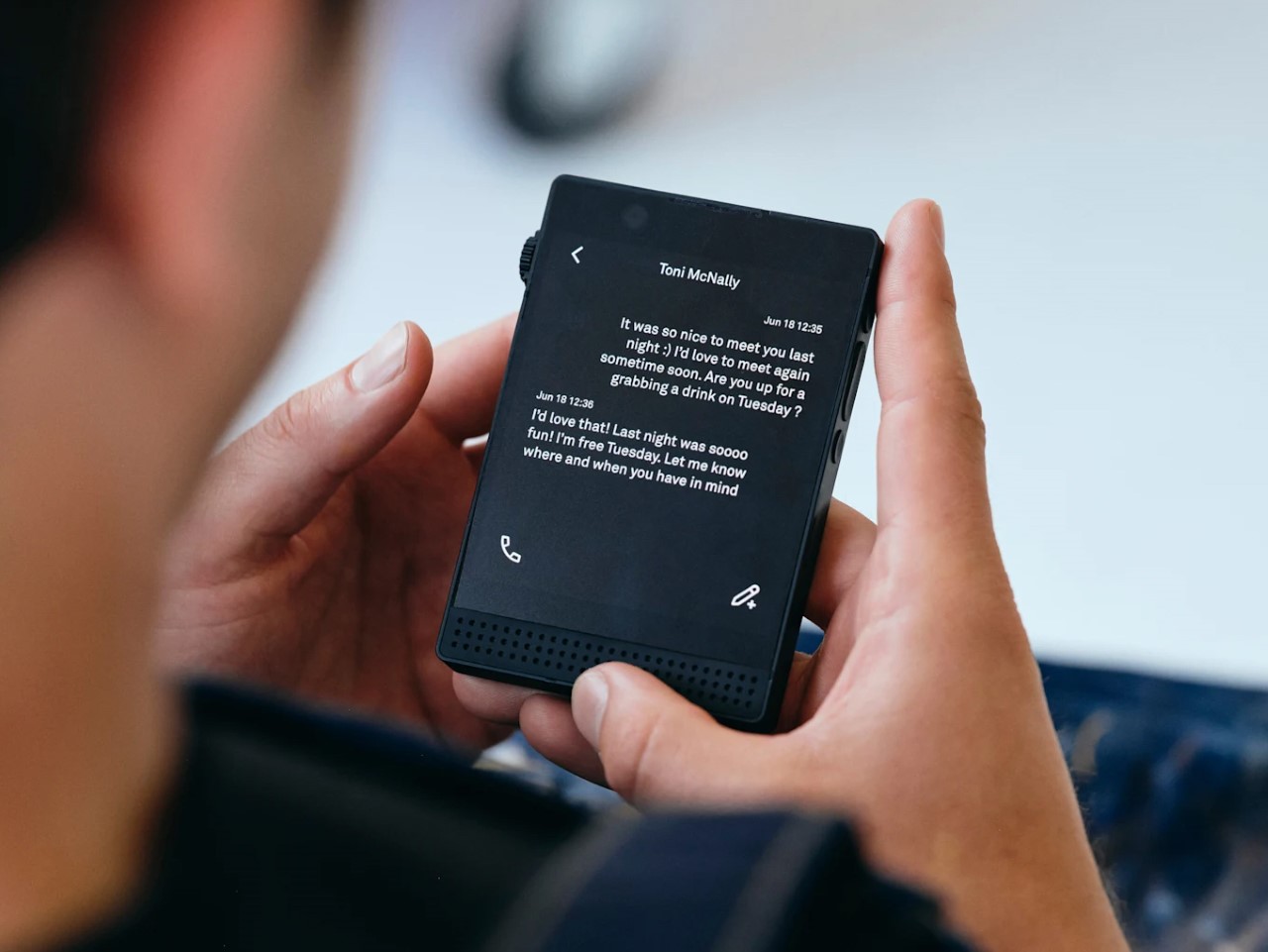
The Light Phone III costs more than most flagship Android devices and does less than any of them. Calls, texts, maps, music, and a small set of tools the company determined were useful rather than engaging. No browser. No social media. No email. No rabbit holes. The $799 price is the editorial provocation: you are paying a premium specifically for what it refuses to do, and the people who buy it tend to find that the most honest price tag in consumer electronics.

Building on a decade of iteration across two previous models, the design is confident enough not to explain itself. The screen is small. The interface is slow by smartphone standards, which turns out to be a feature rather than a limitation. Reaching for it in a meeting does not result in 40 minutes disappearing into a feed. Putting it in your pocket while walking somewhere means you notice the walk. The Light Phone III does not make you a better person. It removes several of the reasons you might not be.

What we like:

  • No browser and no social media means the phone cannot become a distraction device regardless of willpower
  • A decade of development across three models shows in the coherence of the product, not just the philosophy behind it

What we dislike:

  • $799 for a device that does less than a $200 Android requires genuine philosophical commitment rather than casual interest
  • The restricted app set means practical tools some users rely on daily are simply not available

9. Camp Snap 2

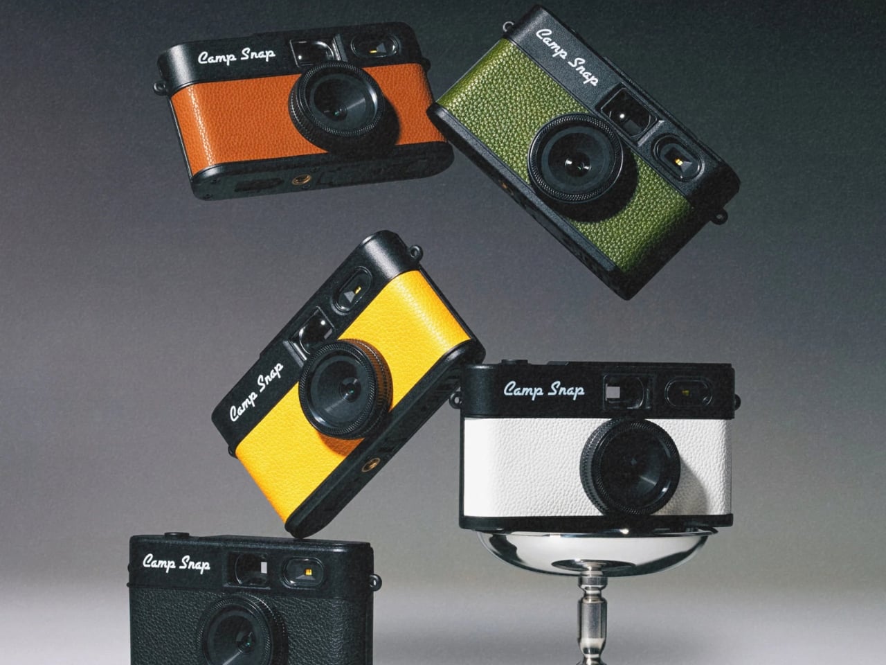
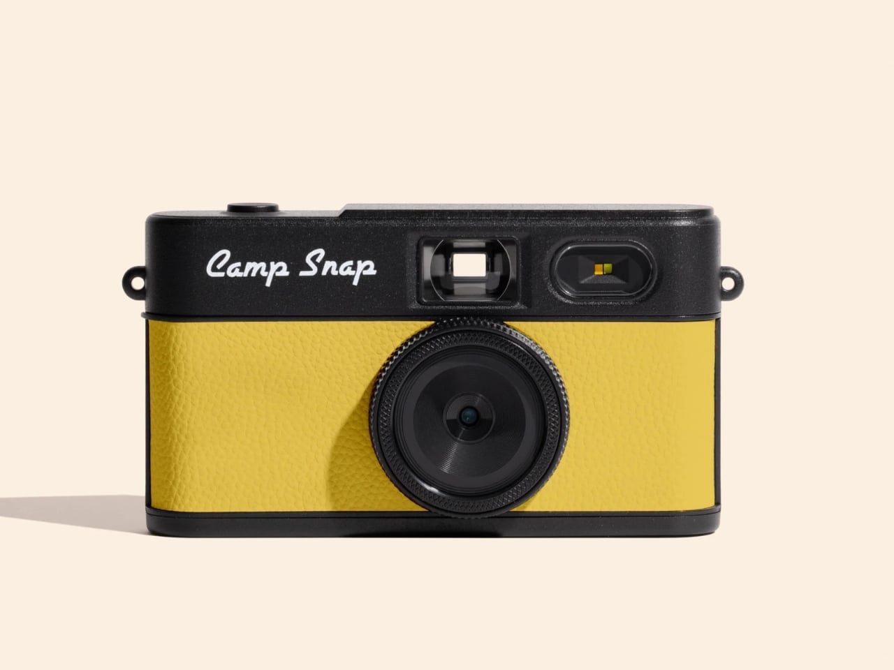
Your phone takes hundreds of photographs a week, and you have reviewed almost none of them. The Camp Snap 2 makes that behavior structurally impossible. There is no rear LCD, no Wi-Fi, no delete button, and no ability to check what you captured before downloading later. You shoot. You find out what you got when you get home. That removal of the review loop is not a limitation. It is the only camera built around the premise that the moment itself is the point.

The second generation is 15 percent slimmer than the original and genuinely pocketable now. An 8-megapixel sensor handles capture. A new filter button cycles through six built-in looks — Standard, Vintage 1, Vintage 2, Vintage 3, Analog, and Black and White — without needing a computer, which was the friction that kept most V1 owners on the default setting permanently. Nine colorways include translucent jelly finishes that land somewhere between Y2K nostalgia and fully intentional. At $69.95, it costs less than most phone cases.

What we like:

  • No screen means no delete button — every shot taken is a shot kept, which changes how deliberately you frame before pressing the shutter
  • Six filter options now cycle on-device with a single button, solving the only meaningful complaint against the original

What we dislike:

  • 8-megapixel resolution does not compete with computational phone photography and was never designed to
  • Exposure errors only surface at the download stage, too late to reshoot the moment that mattered

10. Divoom FlowToo

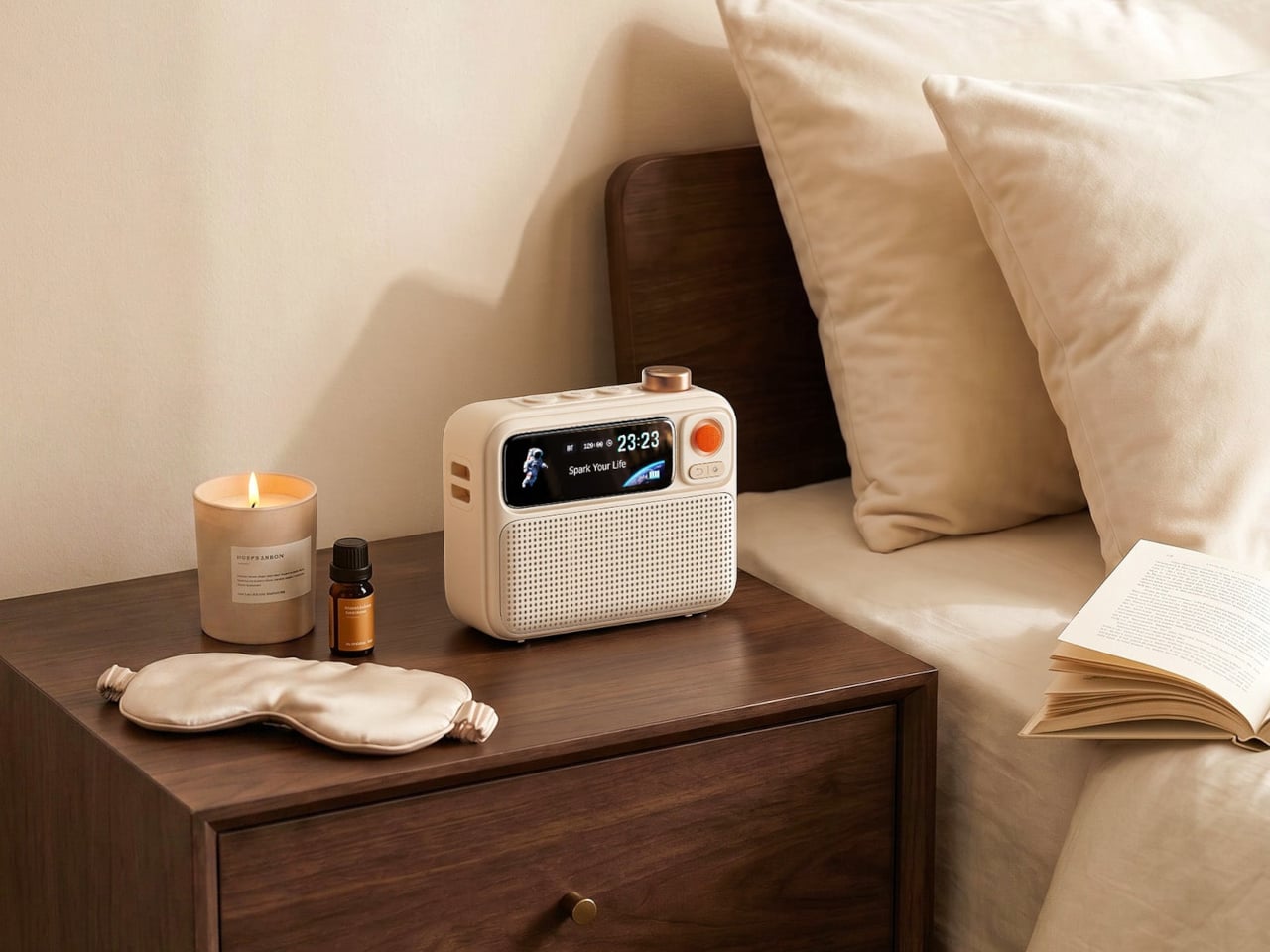
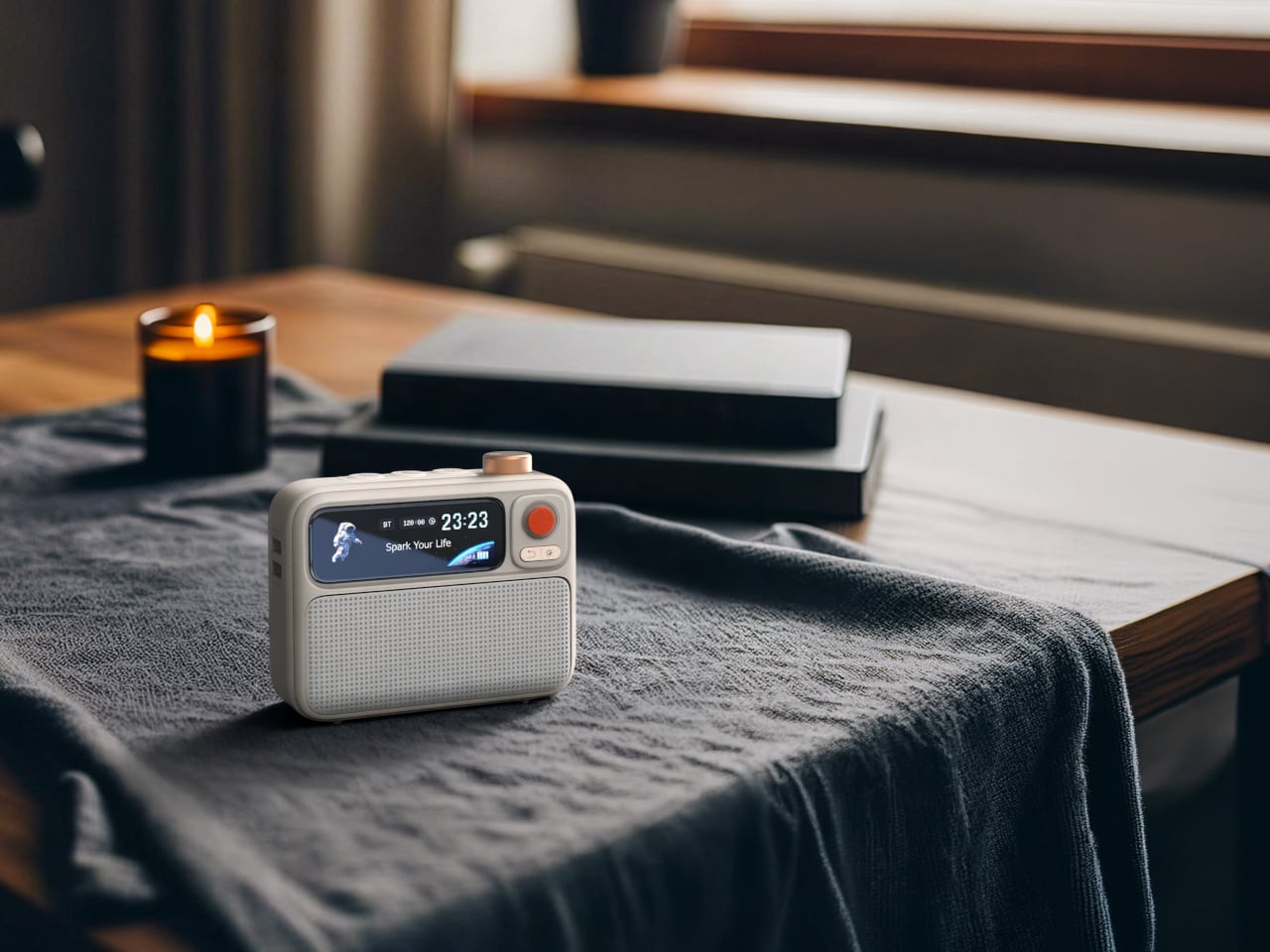
The reason your phone stays on the nightstand is not that you need it there. It is that the phone is also the alarm, the white noise machine, and the speaker, and nothing has offered a convincing single replacement — until now. The Divoom FlowToo costs $99.99, sits where the phone used to be, and handles all three jobs without demanding anything in return except a power socket. That is the most straightforward case for removing a phone from the bedroom that the category has produced.

A 10W amplifier and 45mm full-range driver make this a real speaker rather than an alarm clock with Bluetooth added as an afterthought. More than 90 built-in sounds cover rain, ocean, forest, and focus ambience without needing your phone open. The 2.26-inch display cycles through clock faces, music visualizers, and sleep animations depending on the time of day. The wake-up sequence builds naturally — sounds that increase in volume while the screen gradually brightens. Available in White and Black.

What we like:

  • Replaces three separate nightstand devices with one object that does all three without a subscription or an app permanently open
  • The gradual light-and-sound wake sequence is a meaningfully better way to start the morning than a jarring alarm tone

What we dislike:

  • Full feature access requires the Divoom app, which adds a phone dependency to a device designed to remove the phone from the equation
  • Dedicated white noise machines and standalone speakers will each outperform it in their individual categories

The Best Tech Knows When to Stop

None of these products asks you to give up modern life. The Casio has Bluetooth. The Echo Mini has wireless output. The RetroWave streams over Bluetooth when the AM signal drops. The Camp Snap 2 charges over USB-C. The FlowToo pairs to your phone when you want it to. The argument they make together is not that technology is the problem, but that objects built for one job tend to do it better than a single object built for everything.

The smartphone is not going anywhere. What these ten suggest is that not everything needs to live inside it. A watch that tells time without a notification. A camera that hands you a physical print. Another that makes you earn every shot. A nightstand unit that ends the phone-as-alarm excuse for good. A CD player that demands you choose an album and see it through. The sum of what they replace is not a phone. It is the version of a phone that borrowed more of your attention than it ever needed.

The post 10 Best Tech Gadgets for Men In 2026 Who Think Their Smartphone Has Gotten Too Big for Its Boots first appeared on Yanko Design.

Bixdo Glossonic Brush Air (W30) Review: The Toothbrush That Replaces Your Whitening Strips

PROS:


  • Striking design with ambient light effect when docked

  • 120-day battery life greatly simplifies portability

  • Effective whitening process combined with brushing

CONS:


  • Handle might be too large for some hands

  • Very limited color options

RATINGS:

AESTHETICS
ERGONOMICS
PERFORMANCE
SUSTAINABILITY / REPAIRABILITY
VALUE FOR MONEY

EDITOR'S QUOTE:

By making the whitening happen in the background, the Bixdo Glossonic Brush Air (W30) electric toothbrush doesn't overhaul a bathroom routine so much as quietly upgrade it.
award-icon

At-home teeth whitening has never been more accessible, yet most people can’t stick with it. Whitening strips take 30 to 45 minutes and often cause sensitivity. Whitening toothpastes rely on mild abrasives that can wear down enamel over time. Professional treatments work well, but they’re expensive and require appointments that take time out of your schedule. The category has a compliance problem that no stronger formula or new packaging seems to fix.

The Bixdo Glossonic Brush Air (W30) takes an entirely different approach. Rather than adding another product to the routine, it builds whitening into the process of brushing, something most people already do twice a day. Paired with a Bixdo’s whitening toothpaste and blue light technology, it turns a daily habit into a gradual brightening system that doesn’t ask much of the person using it.

Designer: Bixdo

Click Here to Buy Now: $139.99.

Aesthetics

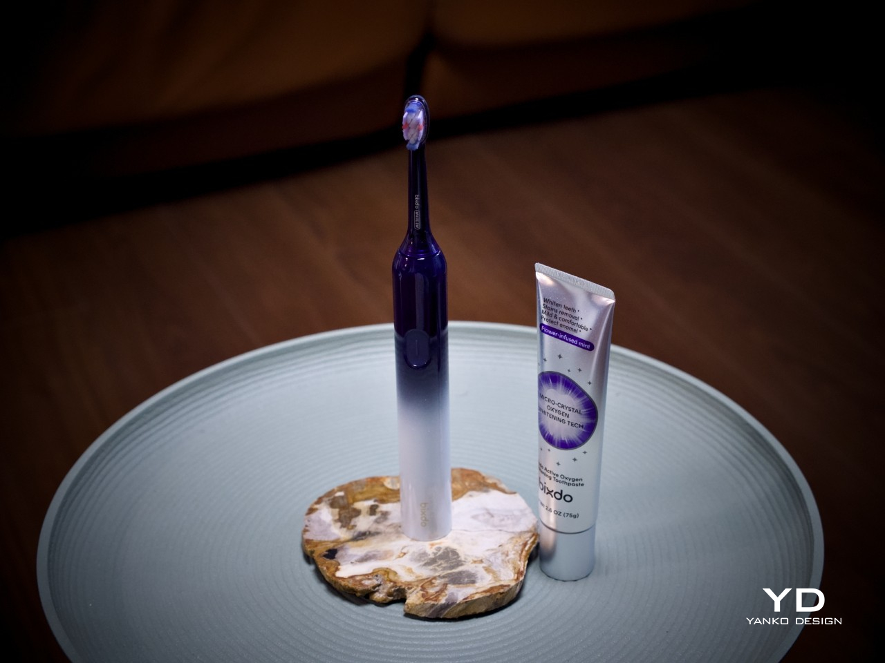
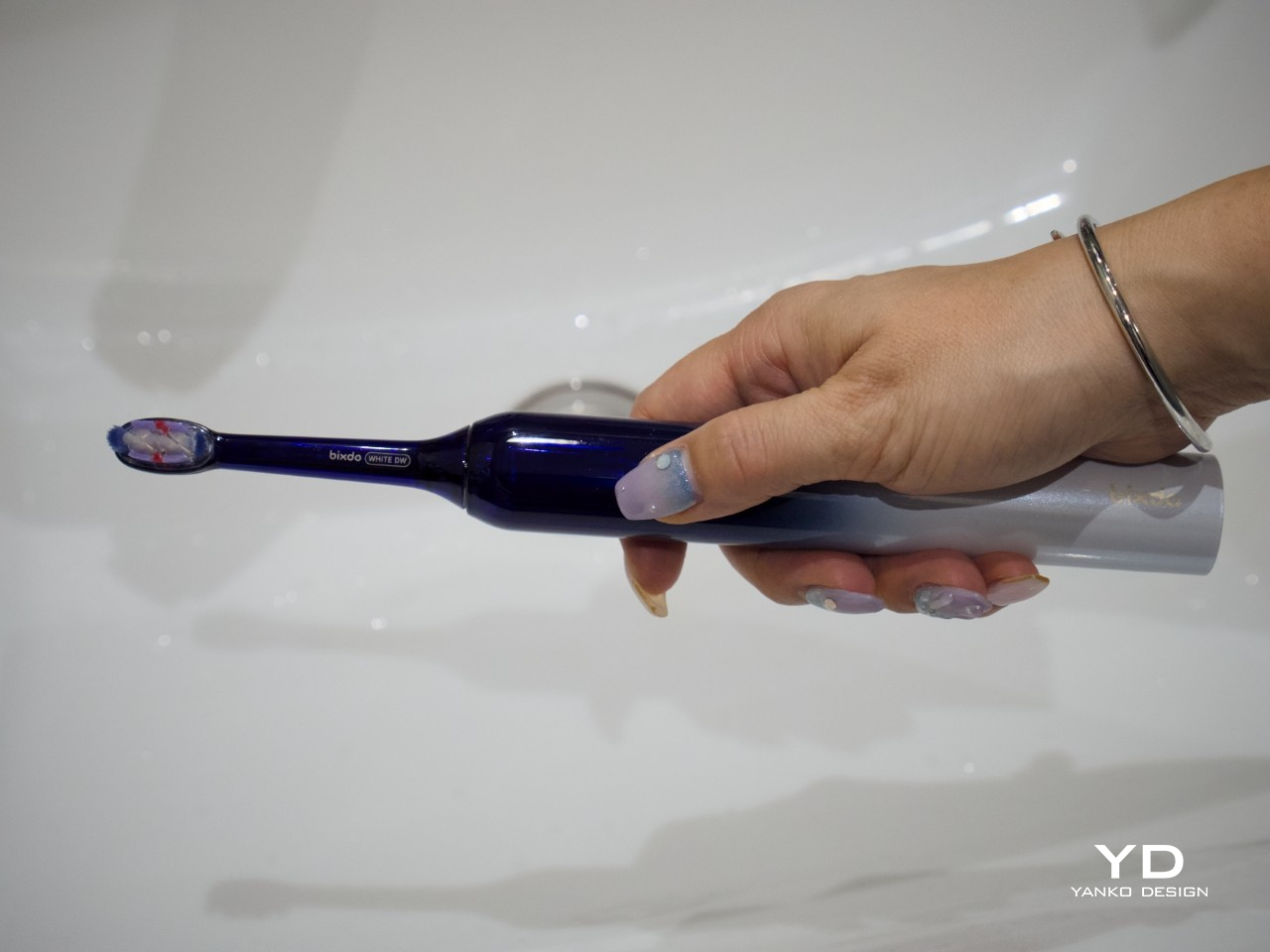
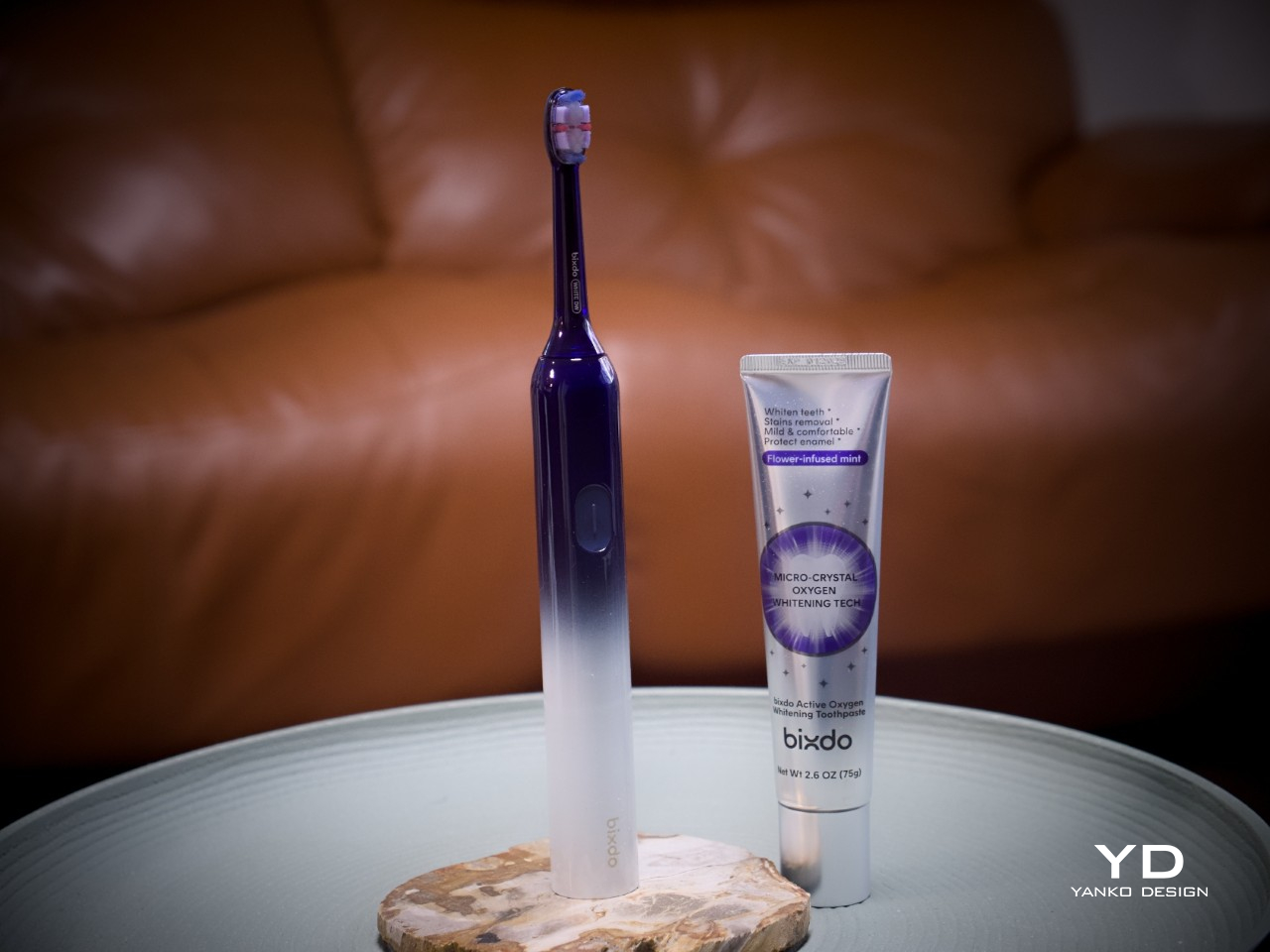
Most electric toothbrushes lean into a clinical aesthetic. The Bixdo W30 departs from that with a sleek, lacquered silhouette in deep navy blue fading into a frosted white at the base, a gradient that’s genuinely eye-catching for a toothbrush. That finish gives it a quality closer to personal-care hardware than a dental appliance, and it’s the kind of object you’d actually want on a vanity rather than stashed under the sink.

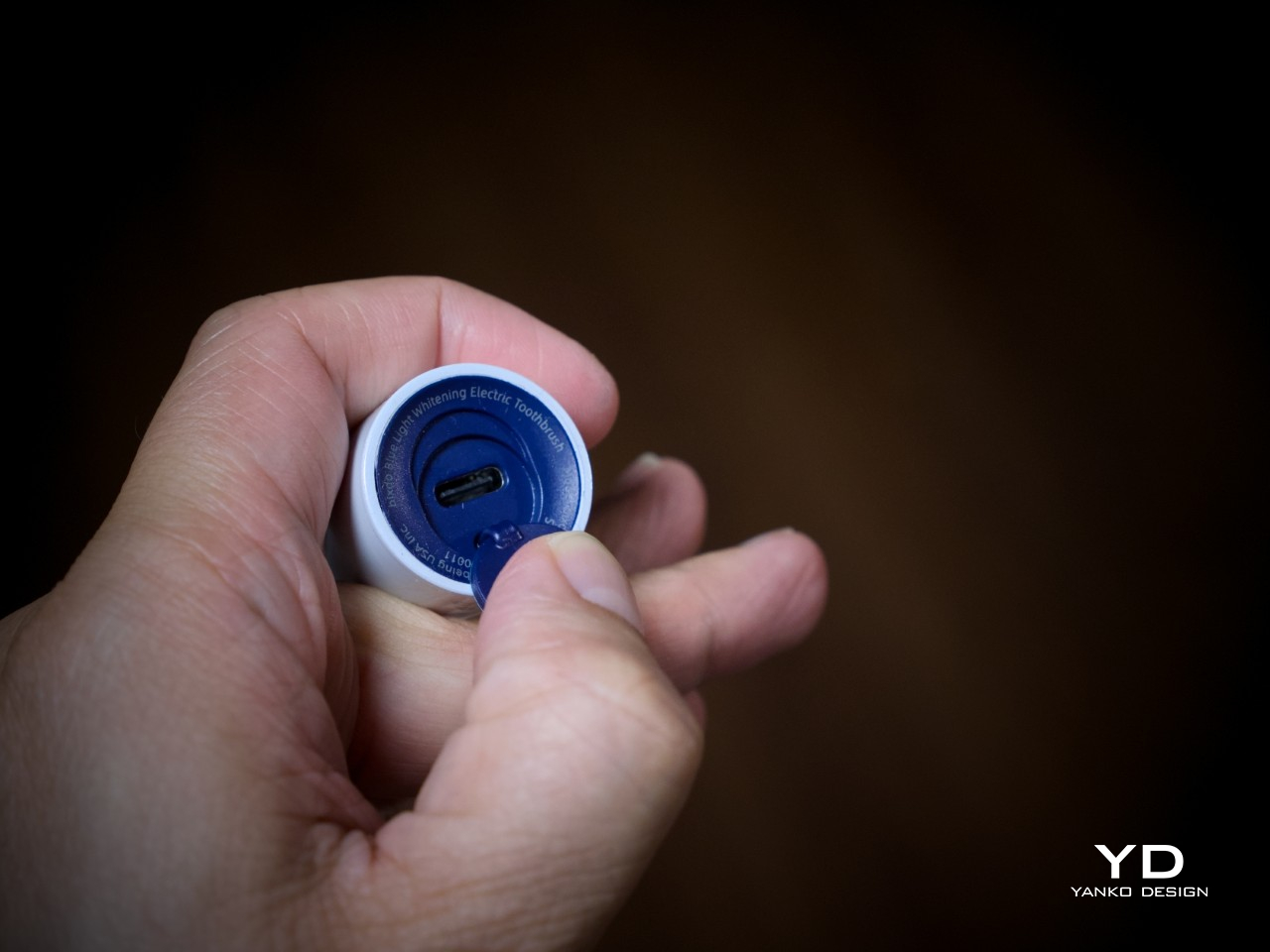
The Bixdo W30 charges via a USB-C port built into the base of the handle, which is a small but telling design choice. It keeps the whole package clean and self-contained, with no proprietary dock or cradle to misplace. For a bathroom counter that’s already busy, that kind of restraint matters. It’s the kind of detail that doesn’t announce itself but would be noticeably annoying if it were handled differently.

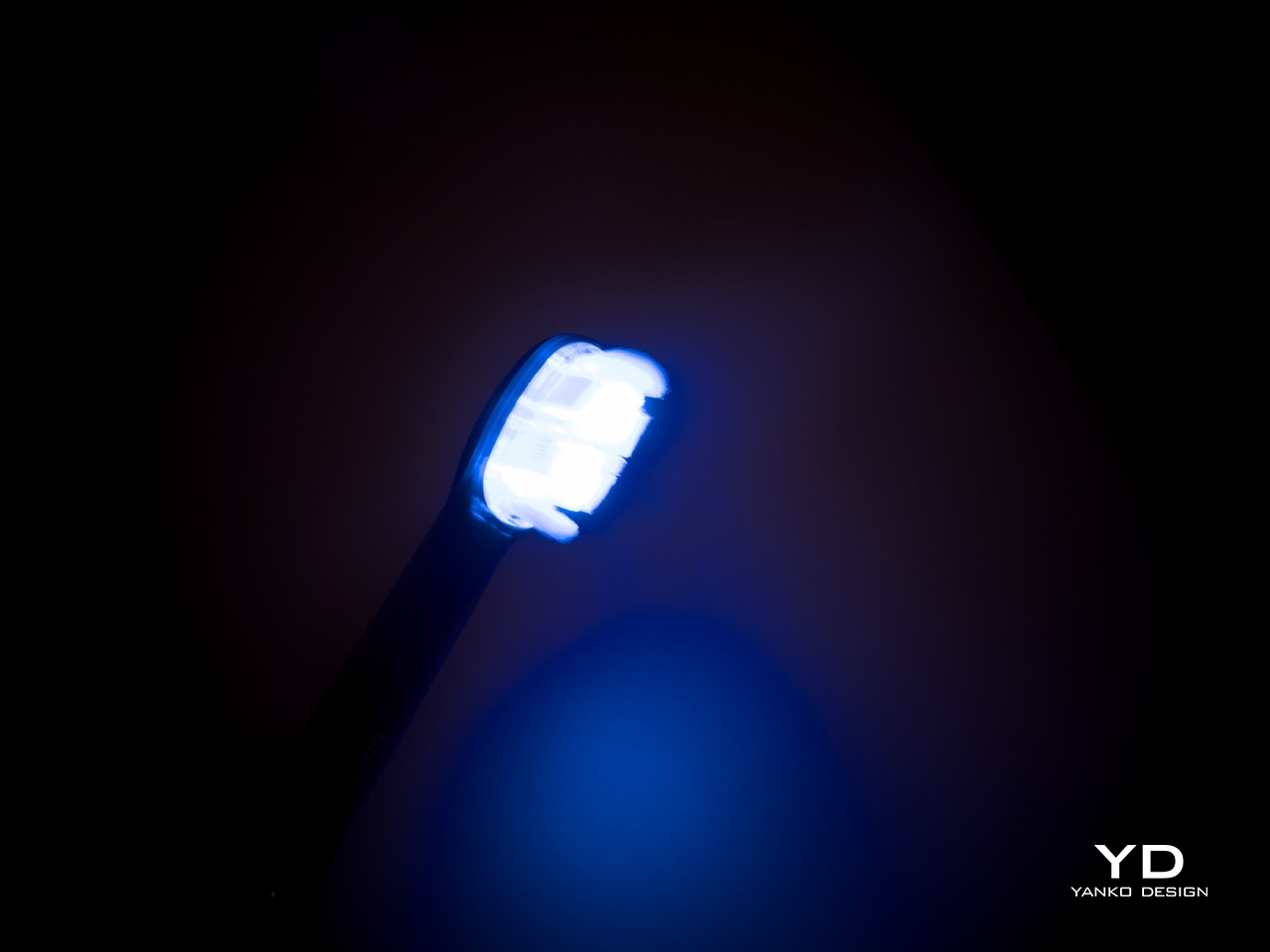
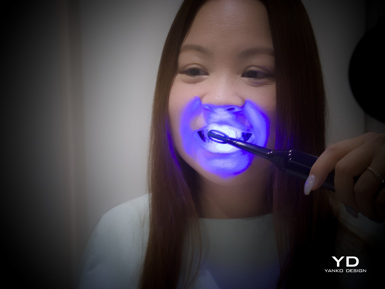
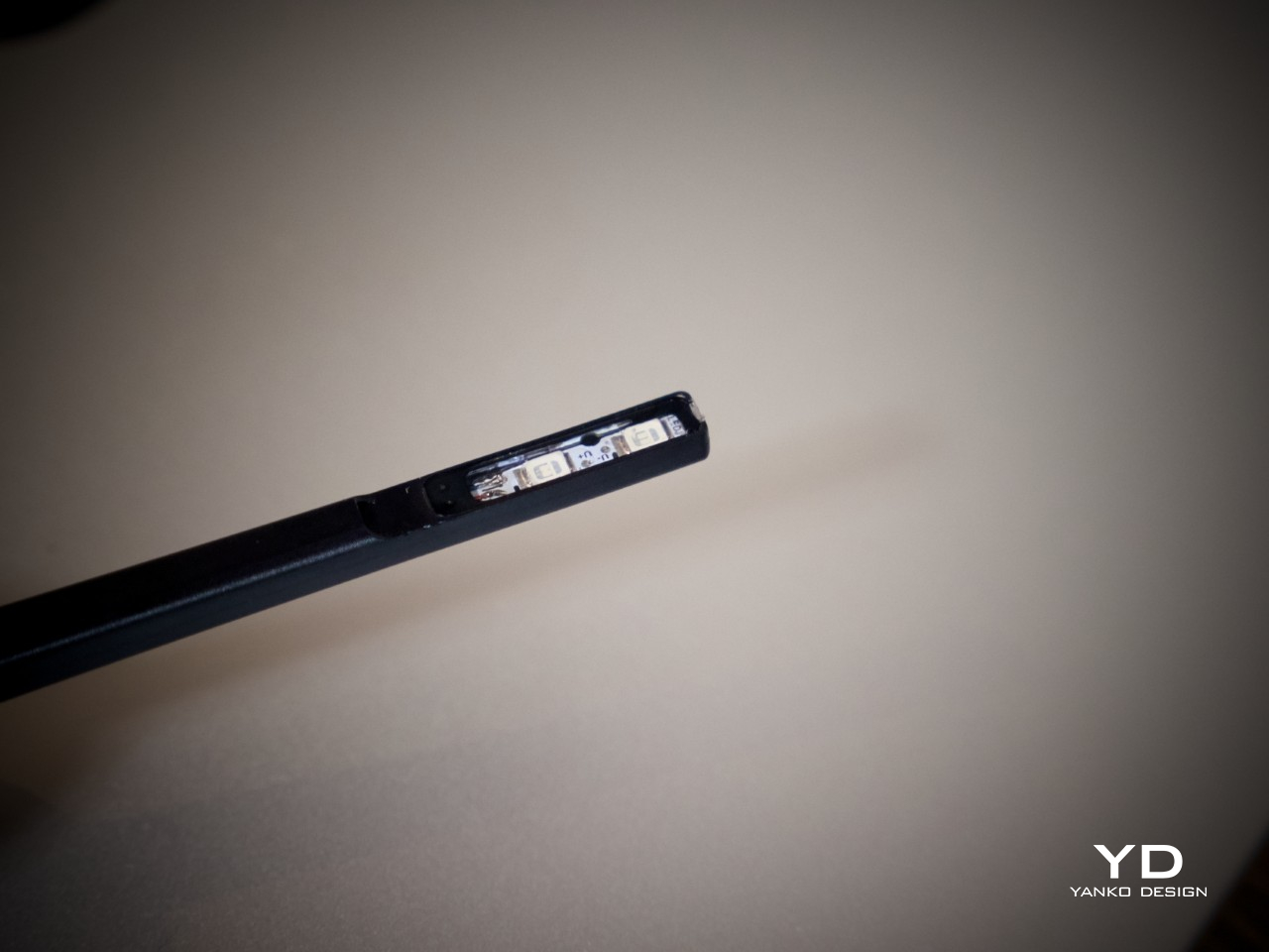
The brush head is where the design gets interesting. The filaments are made from translucent material specifically to channel blue light from inside the handle outward to the tooth surface, supporting the Bixdo whitening system directly at the point of contact. The effect is genuinely dramatic: when active, the entire head blazes with a vivid blue glow, making the whitening feel tangible rather than abstract.

Ergonomics

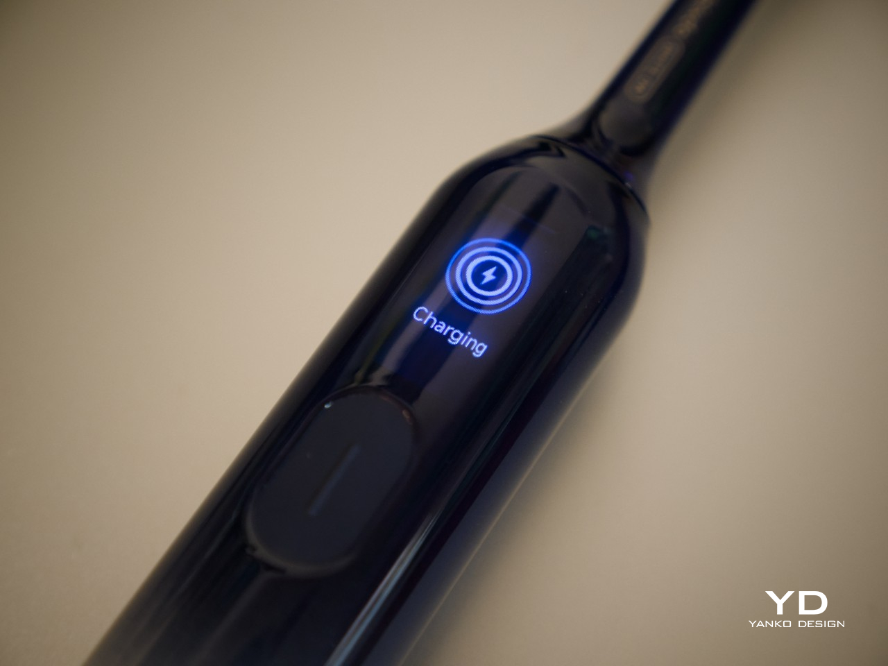
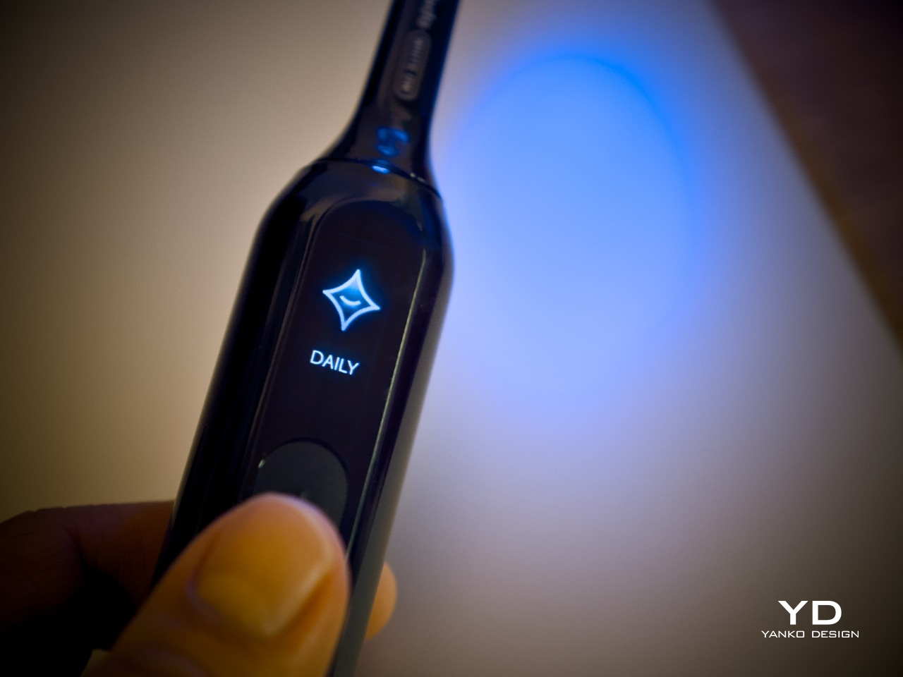
Picking up the Bixdo Glossonic Brush Air (W30), the weight feels deliberate, and the glossy finish stays comfortable without feeling slippery. A single oval button sits below a small embedded display on the handle face, keeping the interface minimal and uncluttered. The display shows mode icons and labels clearly at a glance. The form is easy to grip, whether the brush is used straight on or at an angle for back teeth.

A single press of the button gets the brushing started, and the display confirms the active mode at a glance. The brush sends a brief vibration every 30 seconds as a prompt to shift to the next brushing zone, a useful nudge that keeps the routine thorough rather than habitual. When the session ends, the screen shows a brushing result to indicate how the session went.

Performance

The cleaning side of the Bixdo W30 isn’t an afterthought. Its sonic brushing action drives a thorough clean across the tooth surface and into the spaces between teeth, putting it on level ground with mainstream premium electric toothbrushes in terms of mechanical cleaning power. Teeth feel noticeably cleaner and smoother after each session, and it performs that way consistently, before the whitening layer even factors in.

The whitening mechanism is built around the Bixdo whitening system, where the blue light works together with the PAP-based whitening toothpaste and light-guiding brush head to address everyday surface stains. Many devices use blue light, but how those elements are designed to work together determines whether it actually does anything useful. The Bixdo W30 is built around that coordination rather than around any single feature.

The system pairs with a PAP-based whitening toothpaste specifically designed for everyday whitening care. Unlike many whitening products that rely on hydrogen peroxide and are intended for occasional high-intensity use, the PAP-based formula fits naturally into a twice-daily brushing routine. It’s the kind of formulation that makes sense for something meant to be used consistently, day after day, rather than as an occasional treatment.

There are four brushing modes: DAILY, DIAMOND, and GENTLE, which all activate the blue light in three-minute sessions at varying intensities, and GUM CARE, a two-minute vibration-only option for users with sensitive teeth and gums. Results build gradually with consistent use, which suits the broader logic of a product designed to work within a daily routine rather than deliver a single dramatic result.

Battery life is another standout. The Bixdo W30 is rated for 120 days on a single charge, which means charging it roughly twice a year at most. For anyone who travels regularly, this essentially eliminates the charger from the packing list entirely. The brush is also IPX7 waterproof, so rinsing it off or using it in the shower isn’t a problem.

Sustainability

The 120-day battery life has an environmental dimension worth noting. Most electric toothbrushes get charged weekly or more often, adding up to dozens of charge cycles a year that slowly degrade the battery’s overall capacity. The W30’s extended battery means fewer cycles, less energy consumed over time, and a device that’s more likely to stay in good working condition longer before the battery becomes an issue.

The brush head is designed to be replaced at least every three months, in line with standard dental guidance, which gives the routine a clear and easy-to-follow maintenance rhythm. That’s a more sustainable ownership model than replacing the full device. The refill toothpaste and replacement-head model together mean the handle stays in service rather than becoming disposable hardware when something wears out.

Value

The Bixdo W30 sits at the premium end of the consumer toothbrush market. But its intended comparison isn’t other electric toothbrushes. It’s meant to replace a combination of products: a capable electric brush and a separate whitening system. Professional in-office treatments run anywhere from $350 to $1,200 per session, and most people need more than one session a year to maintain results.

Compared to whitening strips, the math becomes even more interesting. A pack of good-quality strips can run $40 to $60, lasts a couple of weeks, and needs to be repurchased on a regular cycle. The Glossonic Brush Air’s ongoing cost is the companion PAP toothpaste, a reasonable daily-use repurchase for something doing double duty as both toothpaste and whitening treatment. As a consolidated system, that recurring expense starts to look quite reasonable.

Most whitening products separate plaque removal and whitening into two different steps. The Bixdo W30 brings both together, with brushing handling the mechanical clean while the blue light, PAP-based toothpaste, and light-guiding brush head work as part of the Bixdo whitening system. The toothpaste refill is the only recurring cost once the brush is in hand, which is a straightforward trade-off for a product that effectively replaces two separate categories.

Verdict

After extended use, the Bixdo W30 comes across as a product that’s been thought through rather than simply assembled. The results are gradual, building up like good skincare, and no increased sensitivity was experienced throughout the testing period. Teeth look noticeably brighter after two to three weeks of consistent daily use, particularly along the edges where stain buildup from coffee tends to accumulate first.

For regular coffee or tea drinkers who’ve struggled to stay consistent with strips, the Bixdo Glossonic Brush Air (W30) is genuinely worth considering. It doesn’t overhaul a bathroom routine so much as quietly upgrade it, one session at a time. The whitening happens in the background while the brush does its cleaning job, which is a pretty elegant way to address a problem most people have quietly given up on.

Click Here to Buy Now: $139.99.

The post Bixdo Glossonic Brush Air (W30) Review: The Toothbrush That Replaces Your Whitening Strips first appeared on Yanko Design.

Xiaomi Takes the IFA 2026 Spotlight as Samsung Makes A Quiet Exit After 35 Years

Imagine spending 35 years building the most recognizable booth at the world’s biggest consumer electronics show, then deciding one year to just… not. That is exactly what Samsung is doing at IFA 2026. The company is hosting its own event at the Humboldt Carré, a conference venue in central Berlin, eight kilometers from Messe, starting September 2, two days before the official show opens. Samsung frames this as a focused environment for media briefings, retail meetings, and product launches, following the same logic it applied at CES 2026 when it left the Las Vegas Convention Center for the Wynn Hotel. Doing it twice in the same year starts to look less like a pivot and more like a policy.

While Samsung manages its event across town, Xiaomi is inside Messe Berlin, confirmed for Hall 6.2, with a full ecosystem pitch and no obvious competitor stealing the spotlight. Xiaomi announced its IFA commitment at the official IFA Kick-Off on June 30, attaching a €7.4 billion AI R&D budget to the news, covering electric vehicles, robotics, and operating systems through 2028. Its IoT platform connects over 1.16 billion devices as of mid-2026, which gives the “Human x Car x Home” pitch real substance beyond the marketing copy. Samsung will sponsor the IFA Creator Hub, a content studio for influencers at Palais am Funkturm. But a sponsorship is a very different thing from anchoring a show floor, and Xiaomi is anchoring the show floor.

Photo Credits: IFA

At CES 2026, Samsung left the Las Vegas Convention Center for the Wynn Hotel and applied museum-style layout techniques to give visitors more time with each product. The Humboldt Carré plan at IFA runs on exactly the same idea, consolidating launches, tech forums, and partner meetings under one roof with dedicated space for hands-on AI appliance experiences. Samsung also has a footprint inside Messe Berlin as the main sponsor of the IFA Creator Hub, a content studio for influencers at Palais am Funkturm. It will run its own programming there throughout show week. But sponsoring a content studio is a different brand position from anchoring a product booth, and on the Messe floor, that position now belongs to whoever occupies it.

Photo Credits: IFA

Reports place the Galaxy S26 FE launch on September 4, the same day IFA officially opens, which means every journalist in Berlin will be writing about a Samsung phone from inside a building Samsung chose not to be in. LG, TCL, and Hisense all held their hall bookings and published their stand numbers months ago. Xiaomi is in Hall 6.2, a short walk from the main press areas. The reporters who glance up from S26 FE coverage will be standing next to Samsung’s biggest competitors. The brand generating the most ambient attention on the Messe floor will simply be the one that actually showed up.

Xiaomi’s pitch at IFA 2026 carries weight because the company has actually built the ecosystem it is selling. Its IoT platform connects over 1.16 billion devices as of June 2026, phones and laptops excluded, which gives the “Human x Car x Home” framing real shelf-stocking credibility for European retailers. The €7.4 billion AI R&D commitment for 2026 to 2028, spanning electric vehicles, robotics, and operating systems, is sized for institutional buyers rather than spec-sheet readers. Xiaomi landed on the Fortune Global 500 for the seventh consecutive year in July 2026, ranked 232nd. It arrives at IFA knowing exactly what it wants from a European room, and with the numbers to back that up.

Photo Credits: IFA

Samsung’s controlled-environment strategy has a clean logic that gets harder to apply the bigger the show it leaves behind. Moving off the floor eliminates accidental comparisons, crowded aisles, and competitor booths visible from your own press conference, but it also removes the organic brand visibility a trade show generates just by being a trade show. Xiaomi does not have that problem this year. It is physically present in the room where buying decisions happen, where retail partnerships get formed over product demos, and where IFA’s roughly 220,000 annual visitors walk through looking for the next big thing. If the floor plan is the argument, Xiaomi is winning it before the doors even open.

The post Xiaomi Takes the IFA 2026 Spotlight as Samsung Makes A Quiet Exit After 35 Years first appeared on Yanko Design.

The New $1,300 Espresso Machine That Sets Itself Up for You

If you’ve ever spent twenty minutes dialing in your grinder before 8am, you already understand the particular madness of home espresso. It’s a hobby disguised as a morning routine, and a punishing one at that. Somewhere between the tamping pressure, the grind size, and the extraction time, the actual coffee gets lost. Datum is betting that most people are over it, and they might be right.

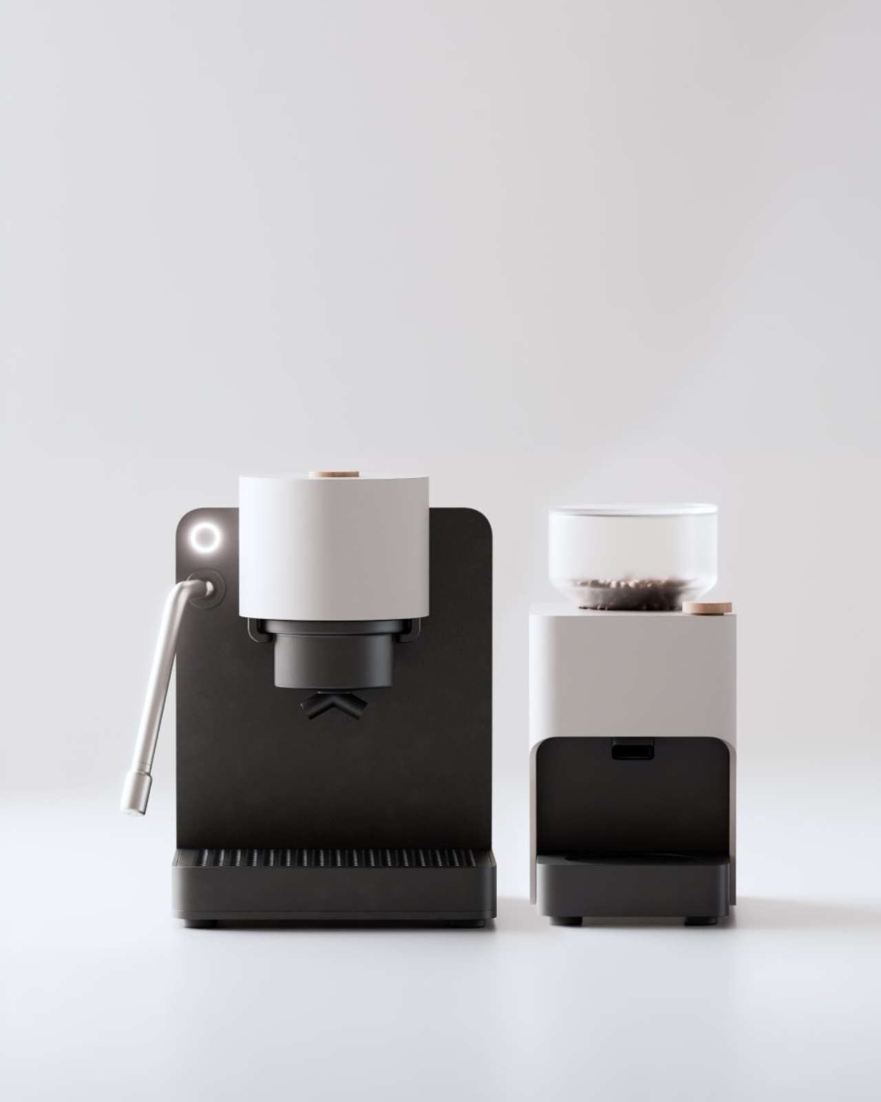
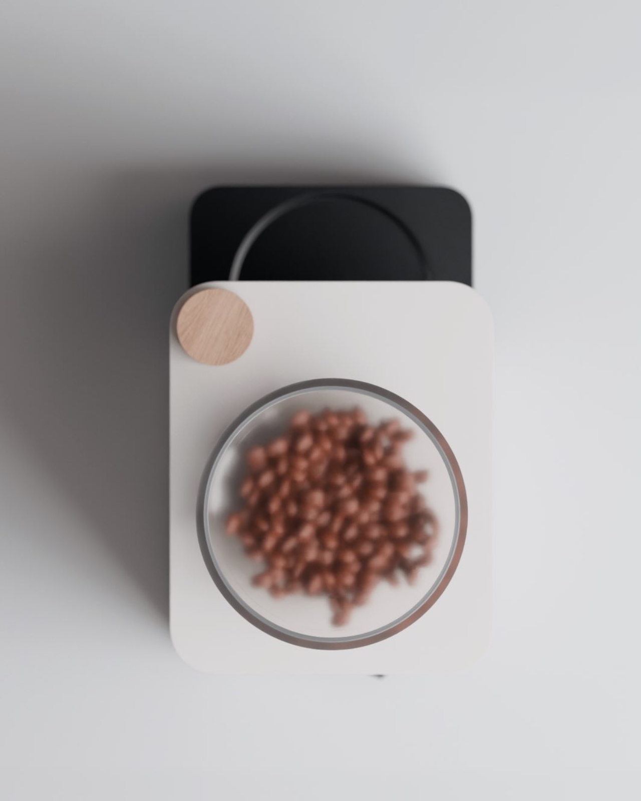
Datum is an Austrian startup founded by two 28-year-old mechanical engineers and designers, Christoph Konheisner and Nikolaus Potapow, out of Innsbruck. What they’ve built, or rather what they’re building, is an espresso machine and grinder designed as one cohesive system, paired with an open recipe platform that connects the machine directly to the roaster’s knowledge. The concept is deceptively simple: scan your coffee bag once, and the machine sets itself up to brew it exactly the way the roaster intended. No guesswork, no wasted shots.

Designer: Datum

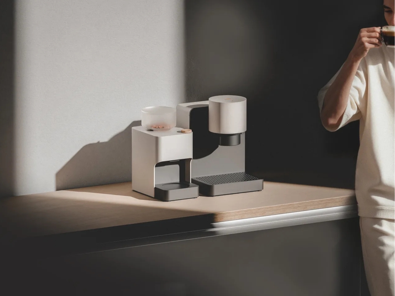
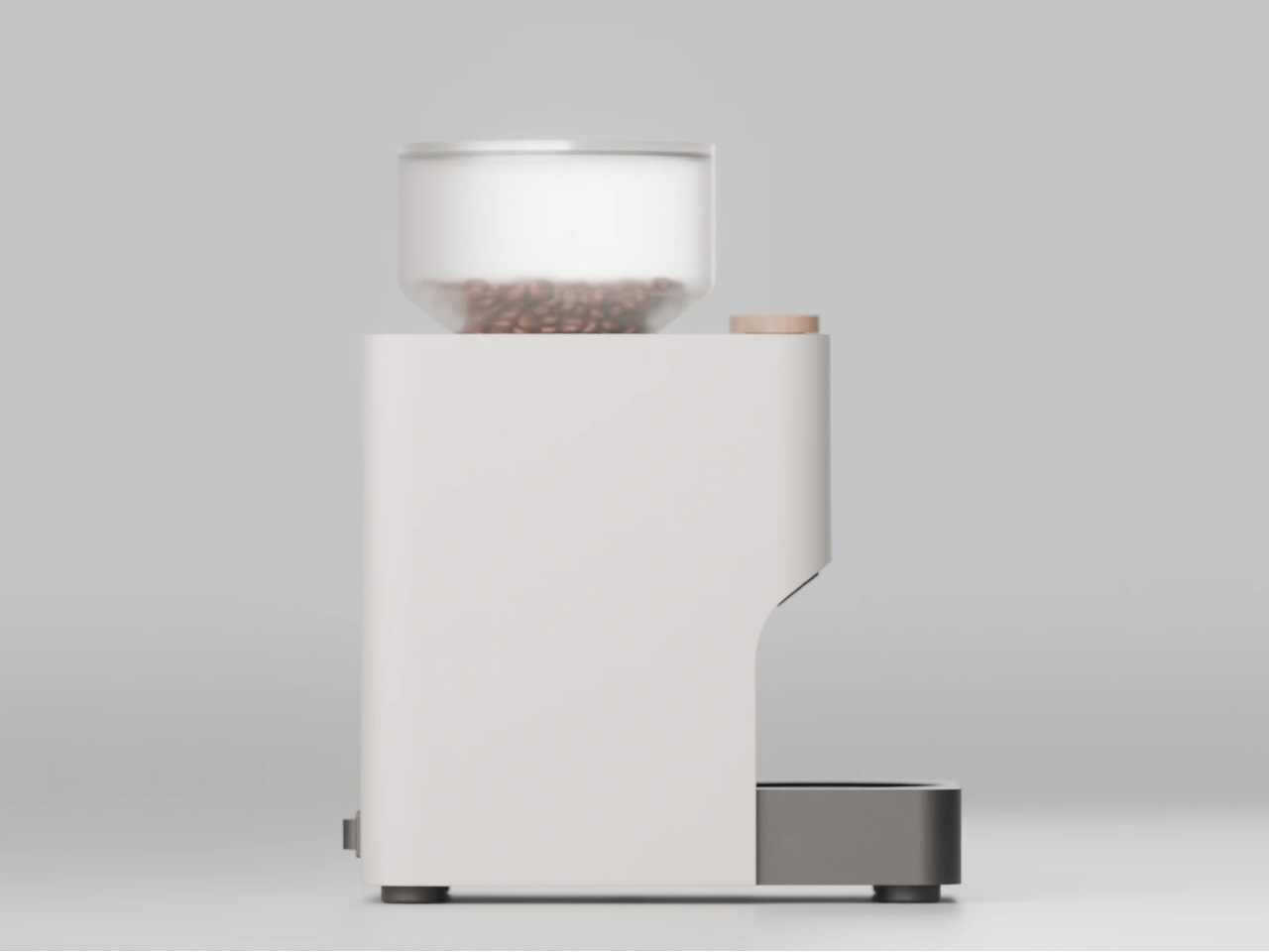
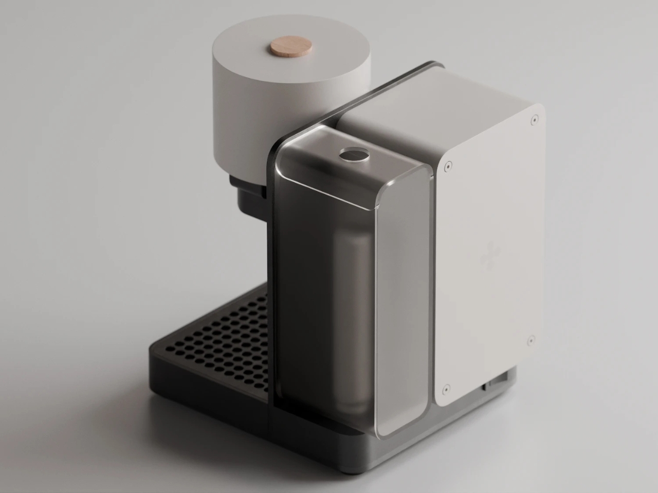
The hardware is where Datum earns its design credibility. The espresso machine and grinder aren’t just sold together; they’re built to talk to each other. The machine heats up while the grinder is running, which means no standing around waiting for it to get up to temperature. The grinder itself uses 64mm flat burrs with digital grind size adjustment at micrometer precision, which on paper sounds like specialty coffee jargon and in practice means your grind is never accidentally off. The portafilter basket is a standard 58mm, which coffee purists will appreciate, but the real conversation-starter is the integrated auto-tamp function built directly into the brew head. Insert your portafilter, press start, and the machine takes care of tamping before brewing. Pressure, flow, and temperature are all handled automatically.

I’ll be honest: the auto-tamp alone feels slightly revolutionary to anyone who has ever pulled a bad shot because their tamp was uneven on a Monday morning. It’s such an obvious pain point in the home espresso experience that it’s almost surprising no one has tackled it this elegantly before.

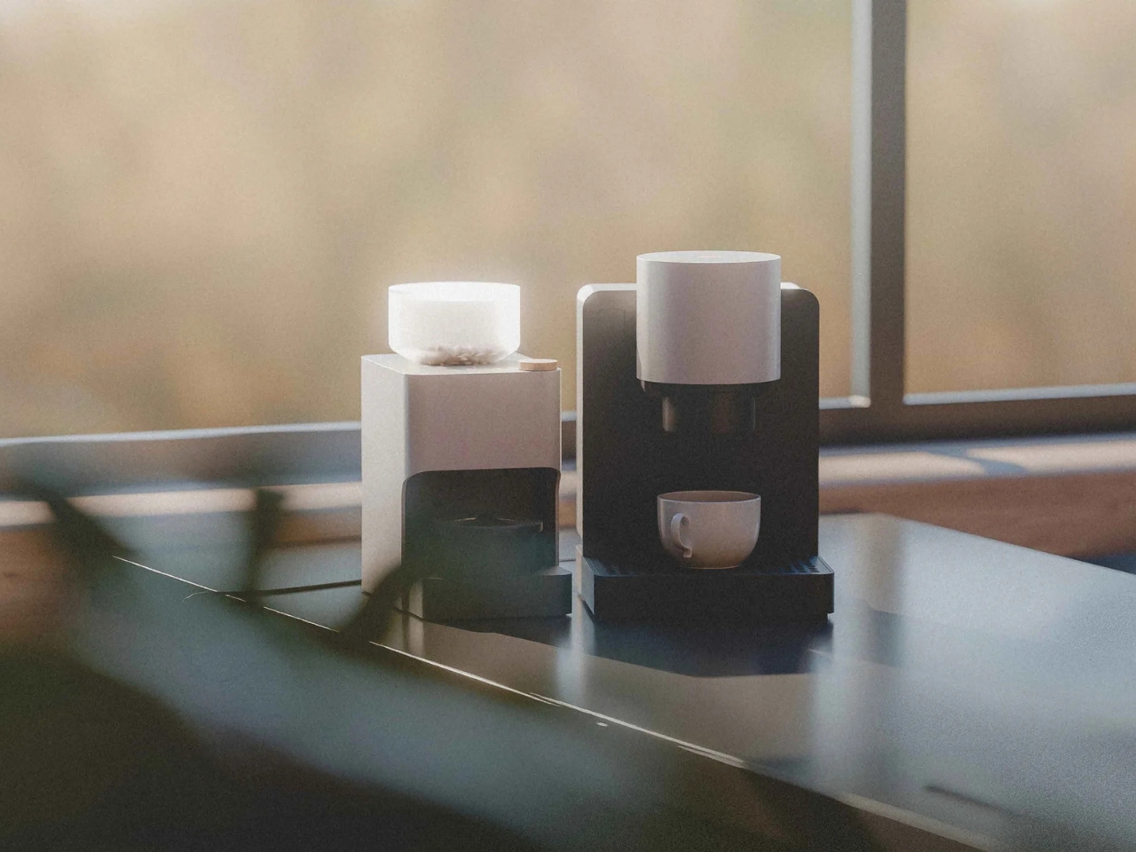
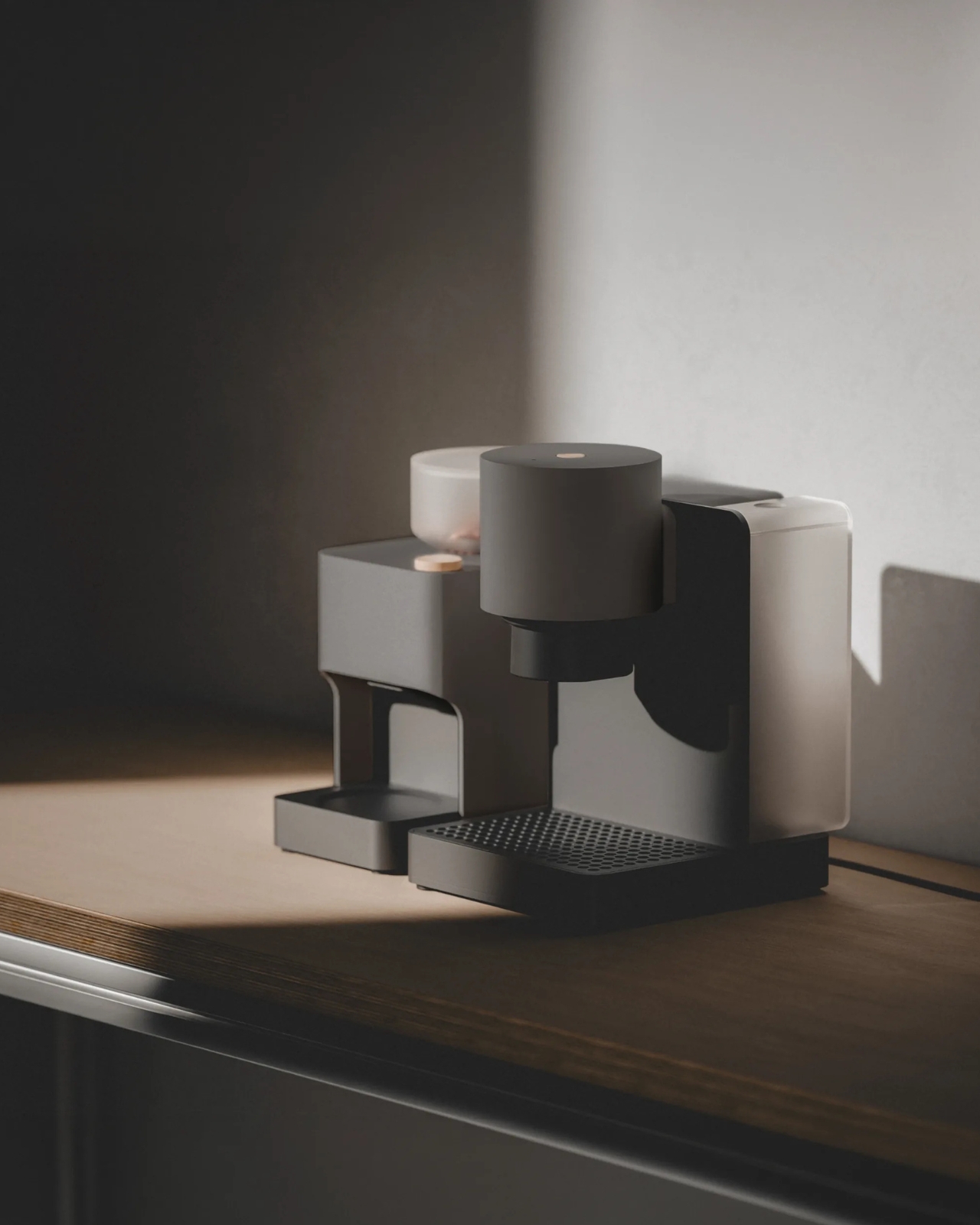
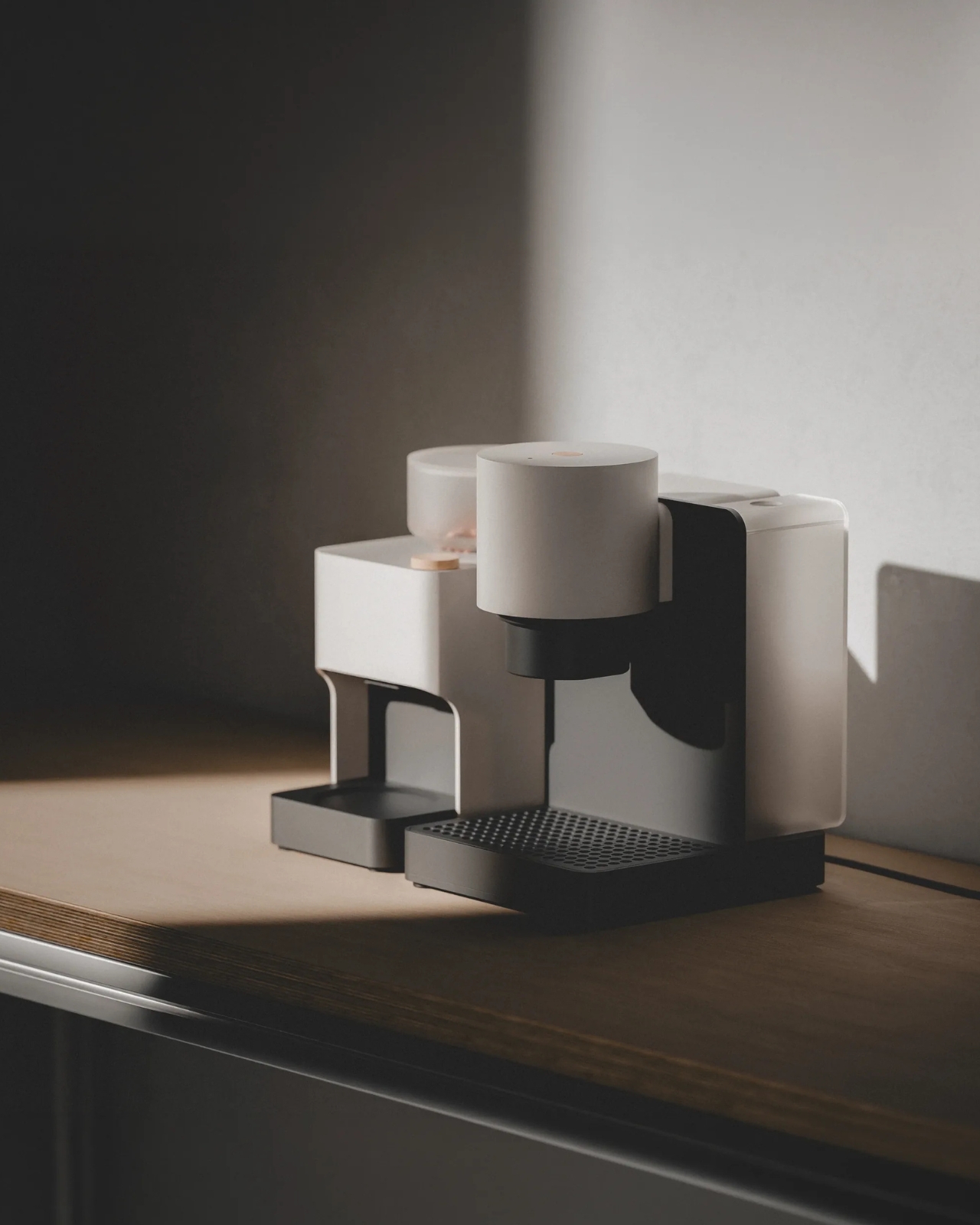
Aesthetically, Datum is very much a product of its design moment. The palette is stark and monochromatic, a matte off-white and deep charcoal that reads more Scandinavian architecture than countertop appliance. Soft surfaces, clean geometry, and what the team describes as “small natural details” give it a quietly confident look. It photographs beautifully, which is not an accident when your target audience lives on Instagram and Pinterest, but it also seems to be built with intention beyond surface beauty. The machine is designed around circular economy principles: modular, dismantlable, and repairable. The continuous flow heating system reduces energy consumption, and even the compact footprint is deliberate, minimizing material use in the build.

The third layer of Datum, and arguably the most ambitious, is the platform. Datum wants to create an open ecosystem where roasters upload their ideal recipes and home brewers simply access them through a scan. Every coffee bag becomes a kind of instruction set. For roasters, it’s a way to extend their craft directly into a customer’s kitchen. For drinkers, it removes the barrier between buying excellent coffee and actually doing it justice. It’s the kind of idea that sounds almost too sensible, and it genuinely changes the relationship between the person who sources the bean and the person who drinks the cup.

Datum is still a prototype. The Kickstarter is planned for late 2026, with delivery expected sometime in 2027. The early bird price sits at €1,199 for the machine and grinder as a set, which, for what’s on offer, is actually competitive in a market where serious espresso setups regularly cost double that before you even account for the grinder. Whether it delivers on its promises at that price point remains to be seen.

But the concept is genuinely worth paying attention to. Coffee culture has spent years pushing consumers toward either expensive, complicated setups or oversimplified pod machines with no soul. Datum is reaching for the middle ground, and doing it with real design intelligence. That’s harder to pull off than it looks.

The post The New $1,300 Espresso Machine That Sets Itself Up for You first appeared on Yanko Design.

The Alarm Clock Built for People Who Lose 20 Minutes to Phone Alarms

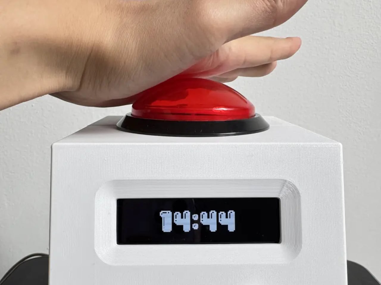
There’s a specific failure mode that most bedside alarms share. You reach for your phone to set an alarm, and by the time you’re done, you’ve also checked your messages, scrolled through something you didn’t mean to read, and lost twenty minutes of wind-down time to a screen that was already too bright. The phone isn’t bad at being an alarm; it’s just not designed to stop there, and that distinction costs more than most people acknowledge.

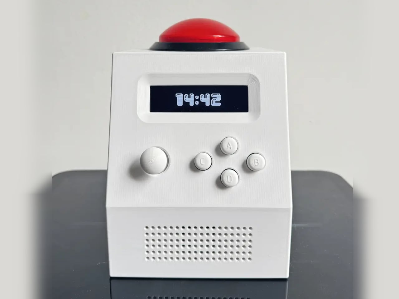
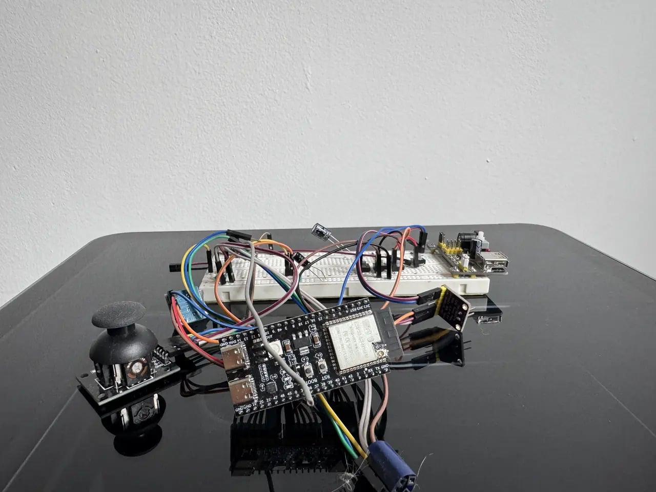
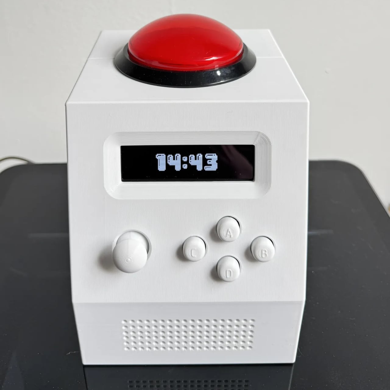
The CinderClock was designed with exactly that failure mode in mind. It’s a multi-purpose standalone desktop clock built to handle the things a bedside table needs without handing those tasks back to a phone. The device runs entirely on itself: no app, no cloud connection, no subscription, and WiFi that stays off at boot unless deliberately switched on to push a firmware update. What it does, it does without outside assistance.

Designer: Aqnazar Arysbek

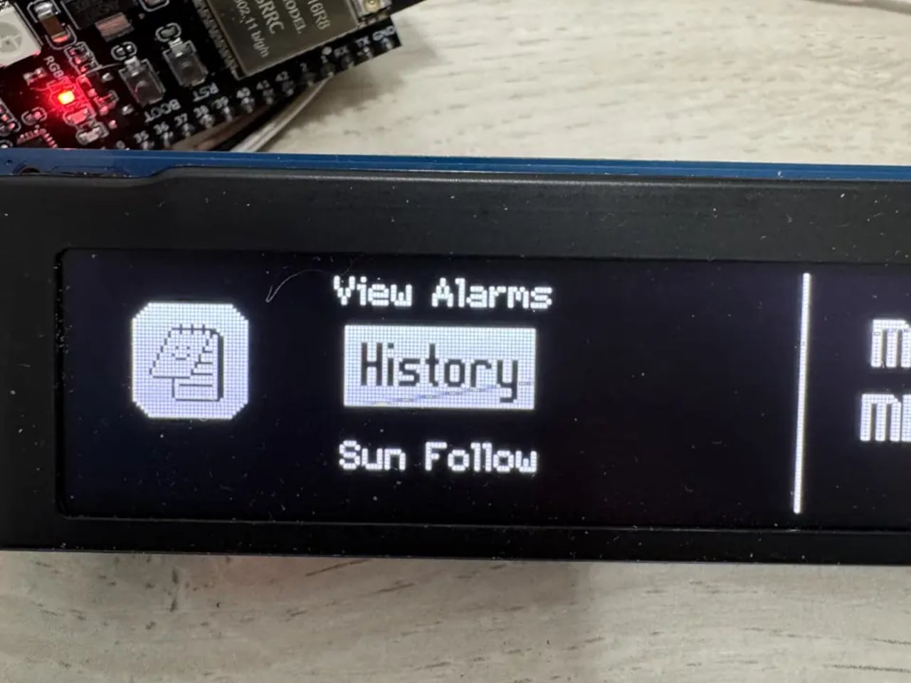
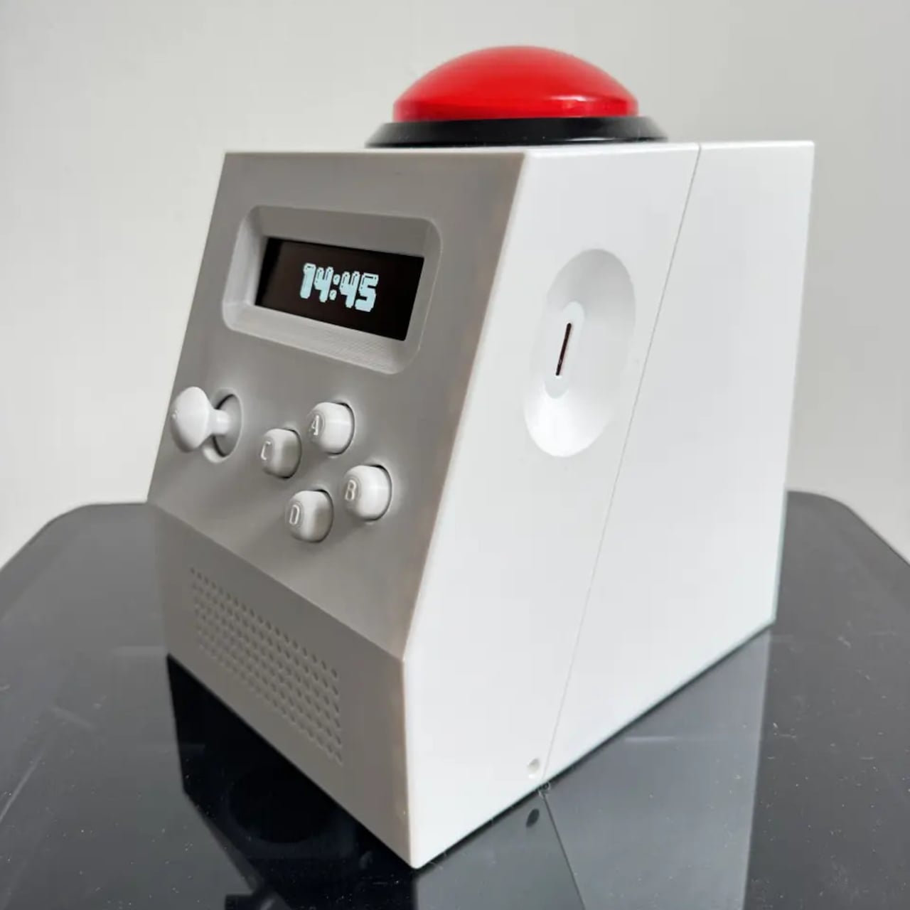
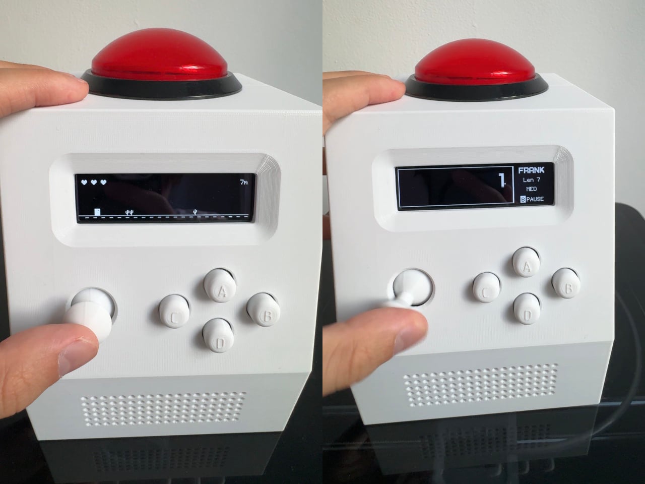
The feature set covers the practical range of what a desk clock might reasonably be asked to do. Alarm history holds ten entries, a countdown timer runs while you navigate elsewhere in the menus, and the stopwatch tracks four laps with centiseconds. The fast-changing stopwatch display can be hidden, because a rapidly updating number on a desk is a distraction rather than information. Two Pomodoro presets store work and rest periods from 1 to 999 minutes, each phase signaled by a distinct jingle. Local temperature and humidity are monitored continuously, and sunrise and sunset times are available for anyone whose schedule tracks natural light rather than a fixed shift.
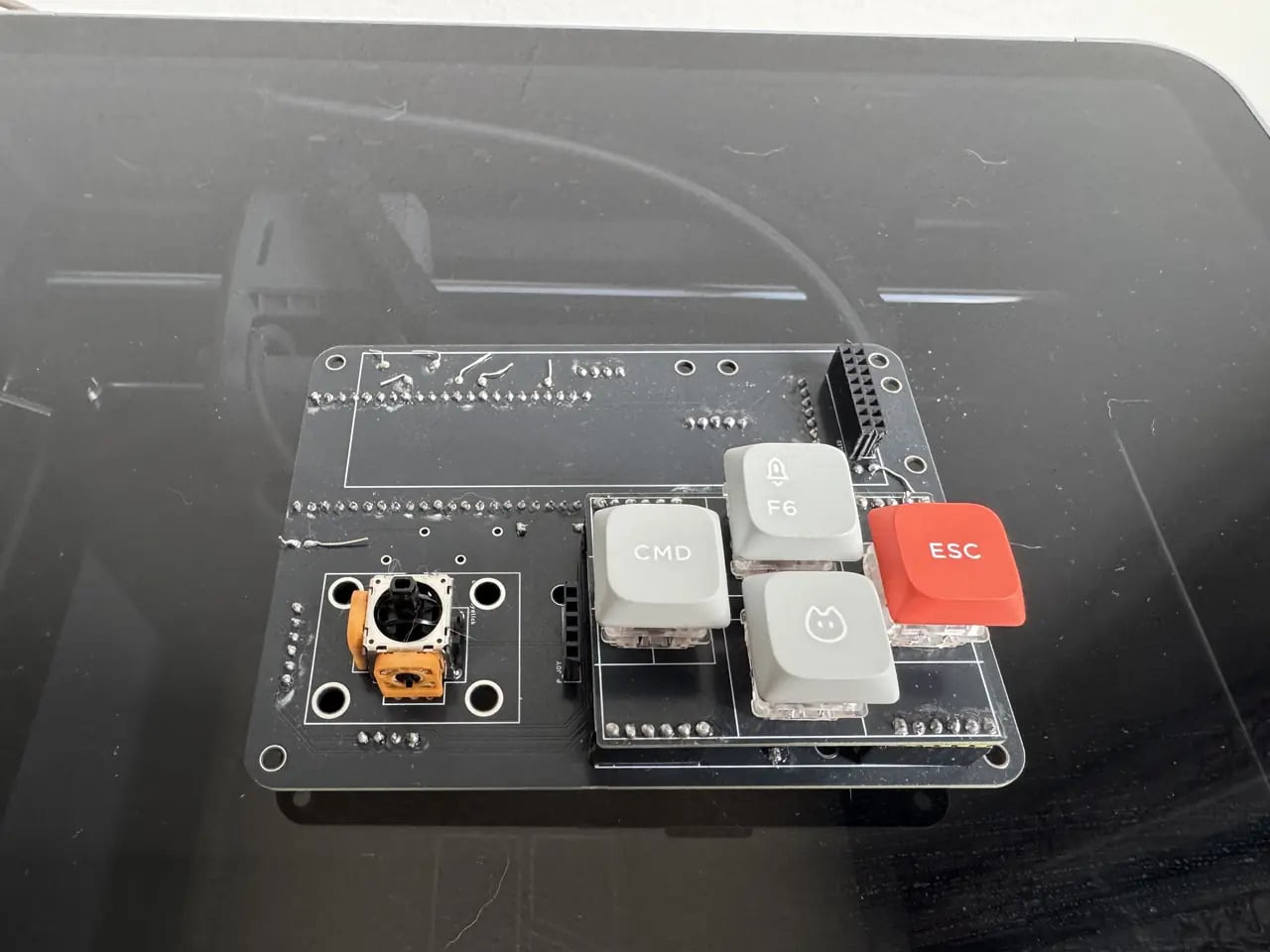
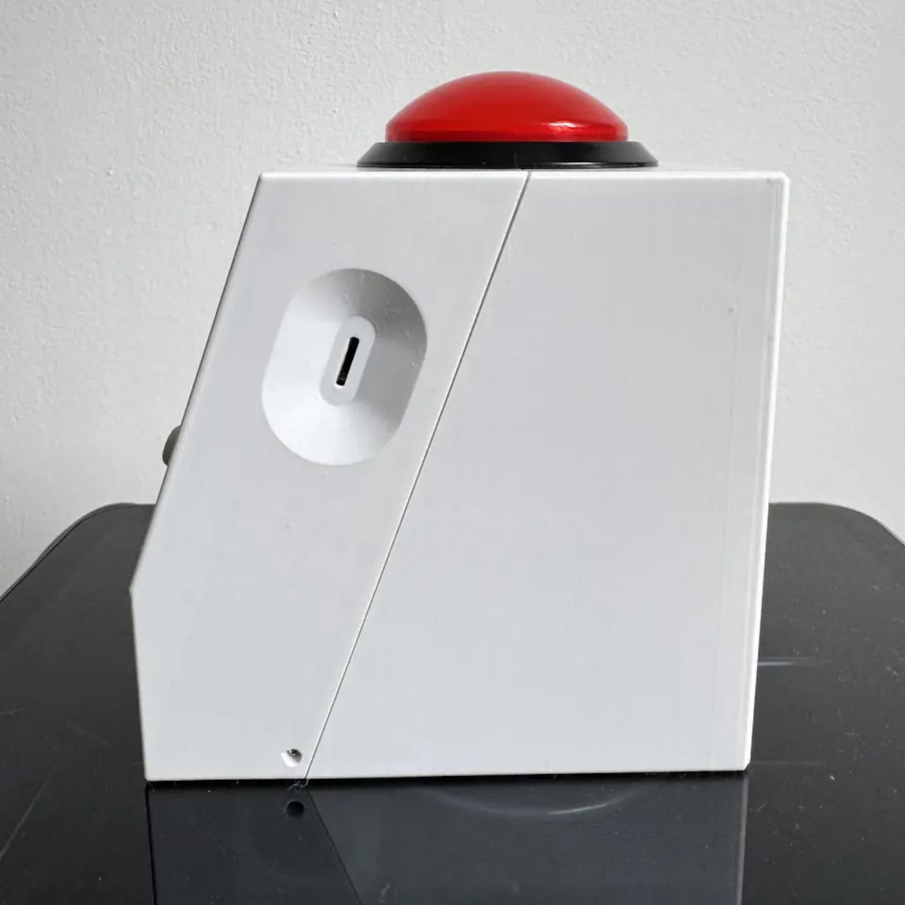
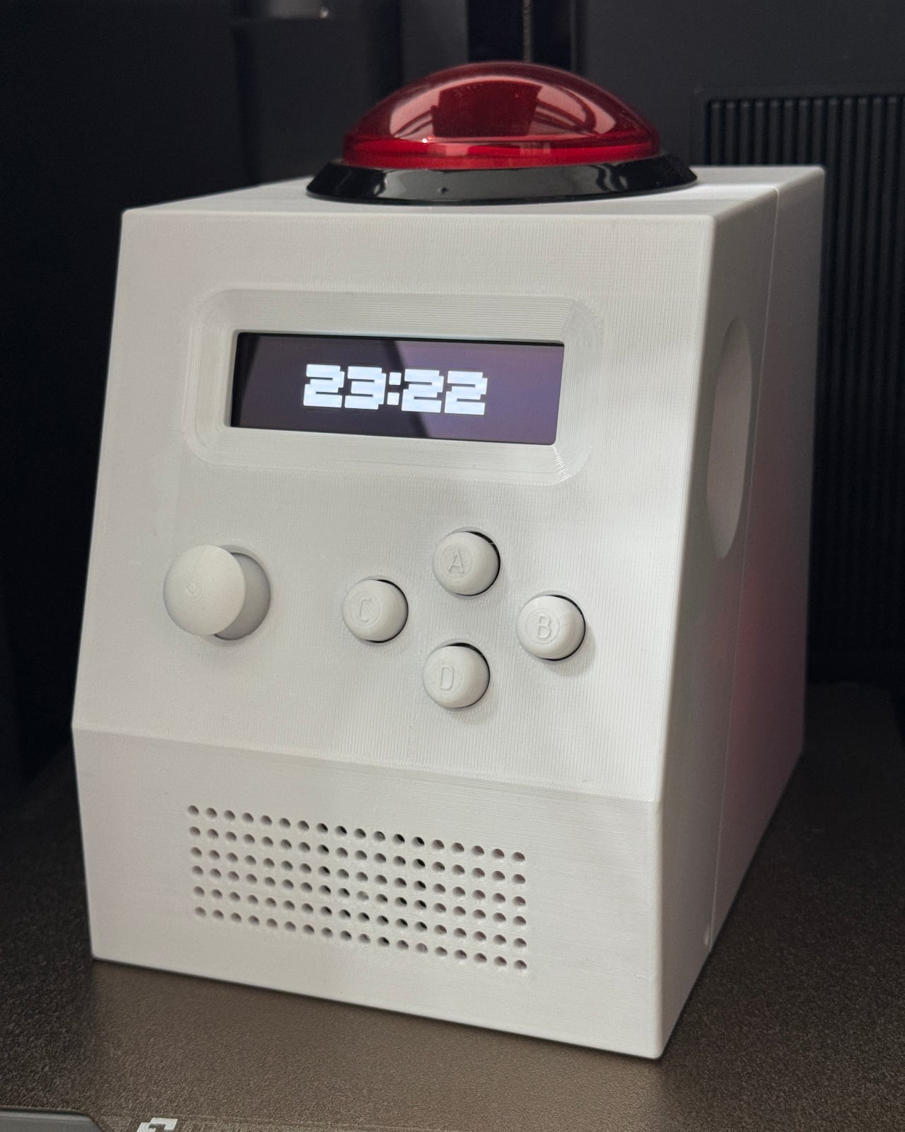
The physical form follows the logic of something designed to live on a desk permanently. The face is raked at an angle chosen for legibility whether the clock sits low on a nightstand or higher on a shelf. Navigation uses four keys and a joystick, with one move from standby opening a quick menu for alarm, timer, and stopwatch. The 3D-printed enclosure integrates the speaker grille into the same shell. The processor sleeps between seconds to work toward a two-week battery target, though the actual runtime won’t be published until measured.

The repairability case is where the design earns a different kind of attention. The bill of materials, PCB design files, and enclosure models are all published at launch. The firmware is already on GitHub under a permissive Apache 2.0 license. Every module position is labeled on the back of the main board. The preference for common, well-documented components isn’t primarily about cost; it’s about sourcing availability, which is what keeps a device repairable years from now, when original sellers may no longer be around.

Most alarm clocks are priced to be replaced rather than fixed, and their design reflects that assumption. The CinderClock treats longevity as a design value rather than a bonus, and it makes that case consistently, from the open-source firmware down to the labeled circuit board that any careful owner can understand and service. It’s a more demanding thing to build, which is probably why it’s rare.

The post The Alarm Clock Built for People Who Lose 20 Minutes to Phone Alarms first appeared on Yanko Design.